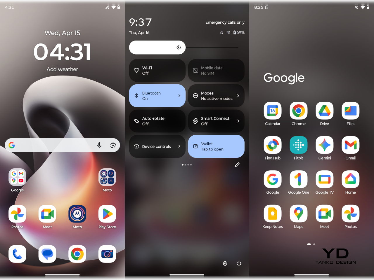
Motorola’s latest family of Razrs includes its first book-style foldable
The new Razr Fold even has native stylus support, unlike Samsung's most recent flagship.
Despite and in spite of the growing number of screens and disembodied artificial voices around us, there remains a strong culture and argument for handwritten words. But while there might be plenty of benefits to putting ink to paper, there’s no denying that paper doesn’t provide the benefits of digital artifacts such as files, photos, and videos. For years, the stylus has been trying to bridge the best of both worlds, but it has so far been only within the reach of those who can afford it.
Since 2020, Motorola has been working to provide that kind of experience to more people through its Moto G Stylus line, but there have always been compromises. Ironically, most of those revolved around the very feature that gave the product line its name. With the moto g stylus – 2026, however, the brand is making its most daring leap forward yet, aiming for a title held only by the most luxurious of Samsung’s (non-foldable) handsets. So does it fly or does it fall? Read on to find out.
Designer: Motorola
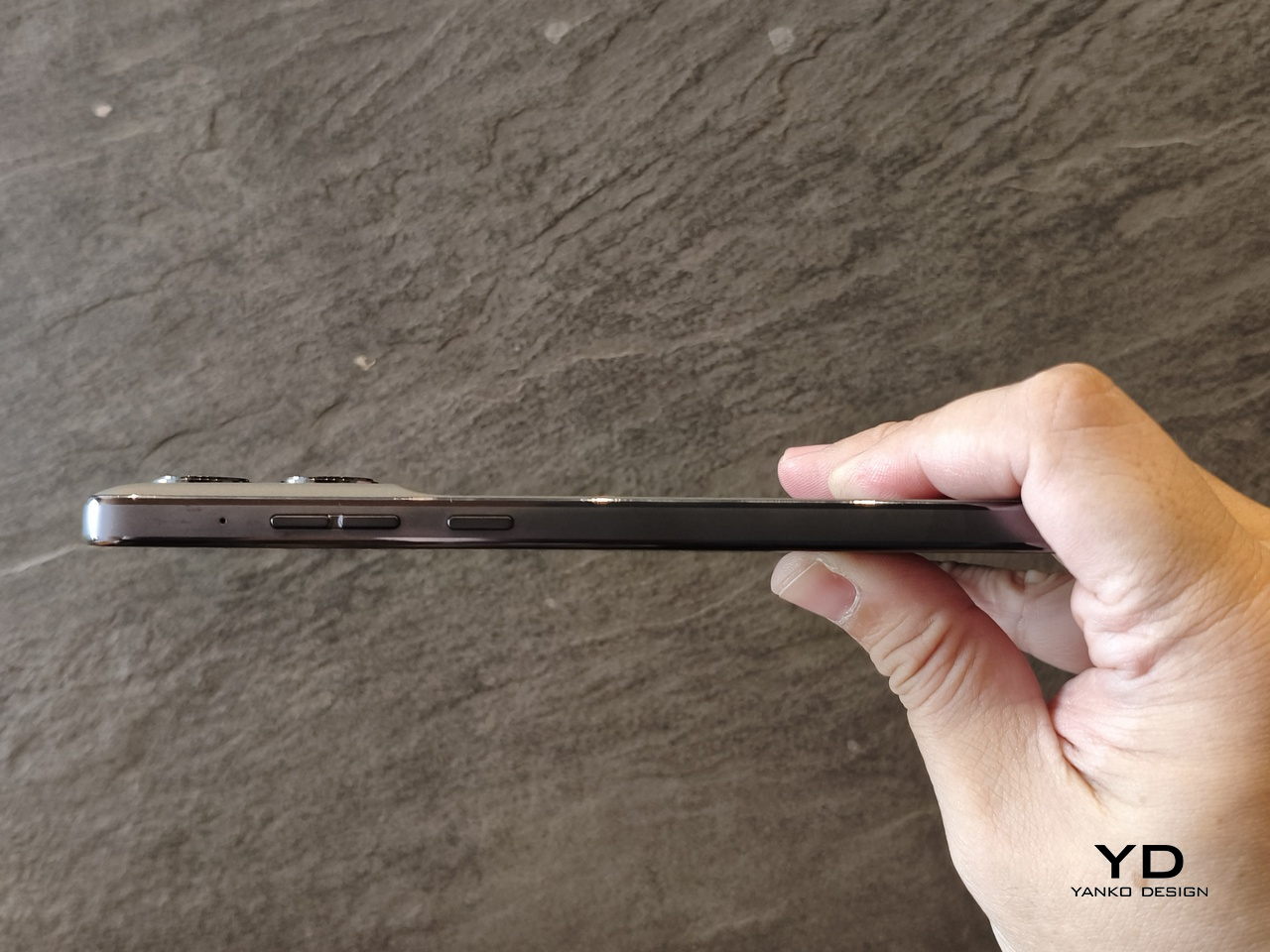
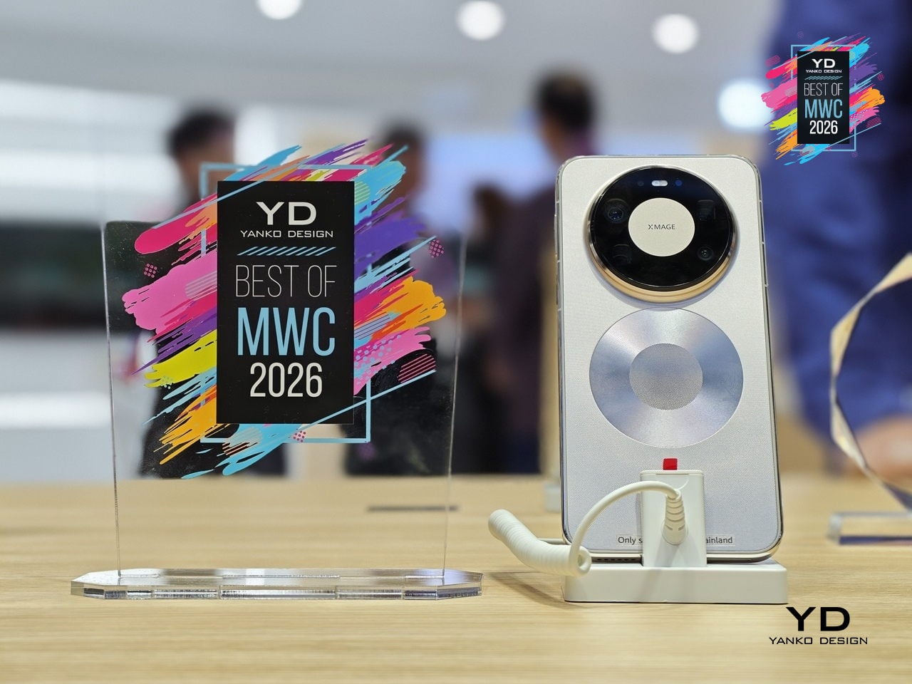
The moment you pull the moto g stylus – 2026 out of the box, you are immediately struck by how different it is from most phones of this generation. It doesn’t scream for attention with a ridiculously large camera module, nor does it attempt to dazzle your eyes with tricks of color and light. It is, in a nutshell, a minimalist lover’s dream.
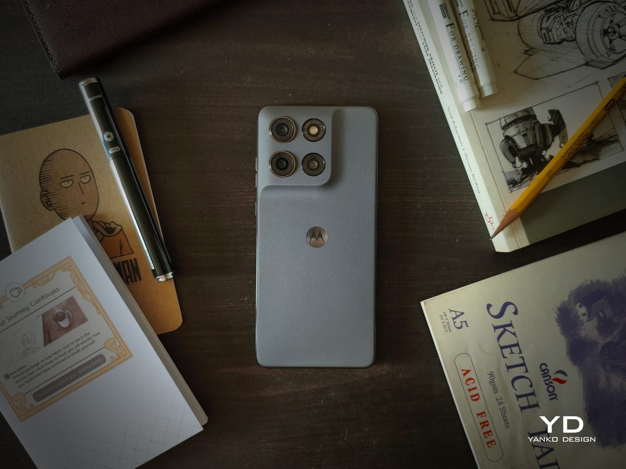
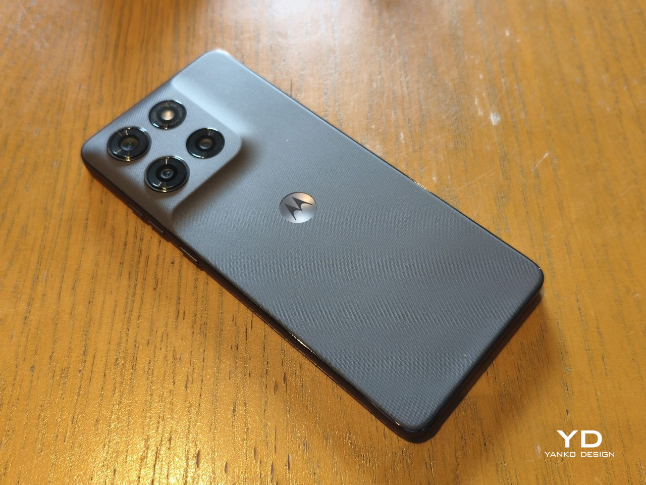
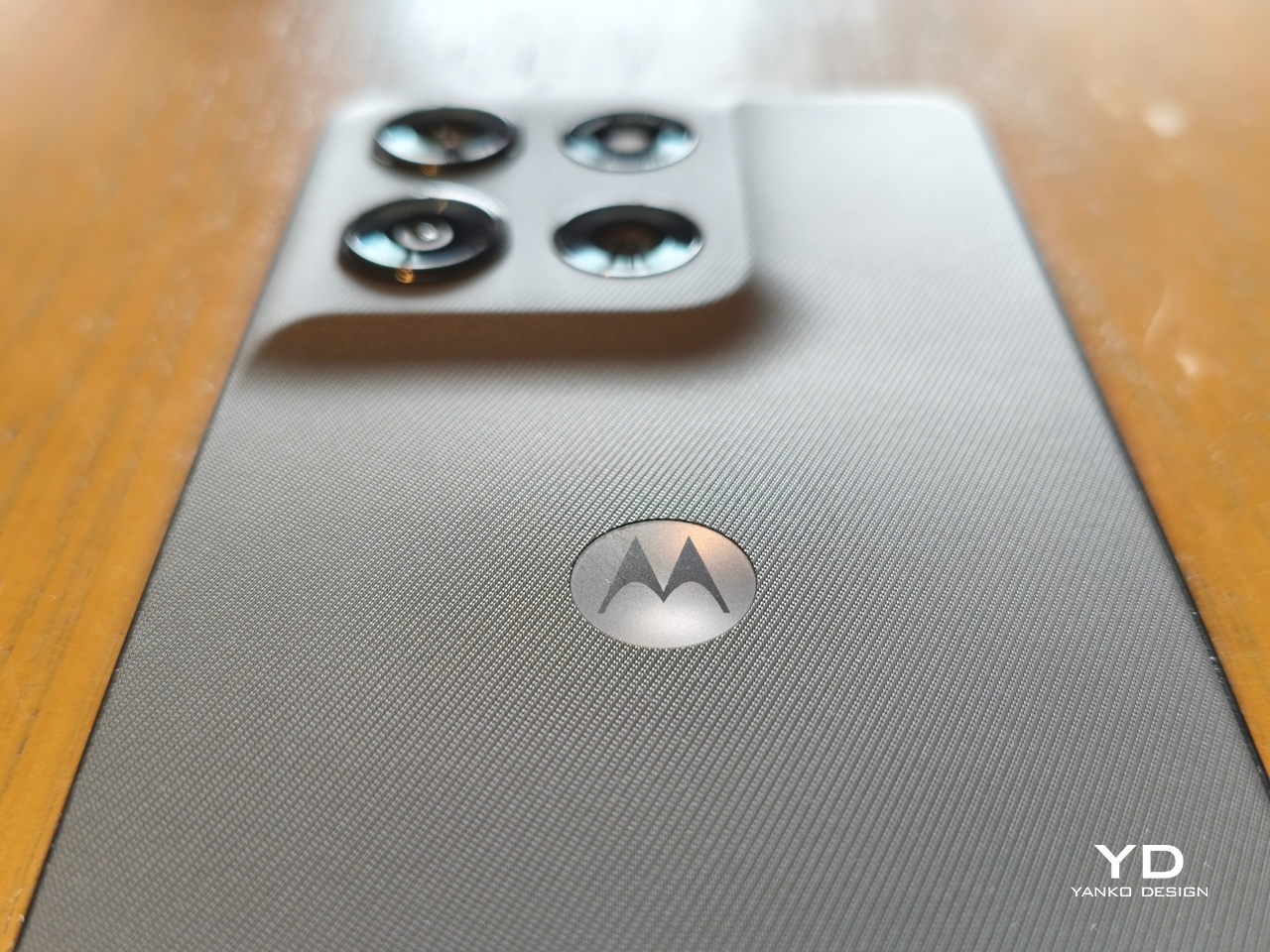
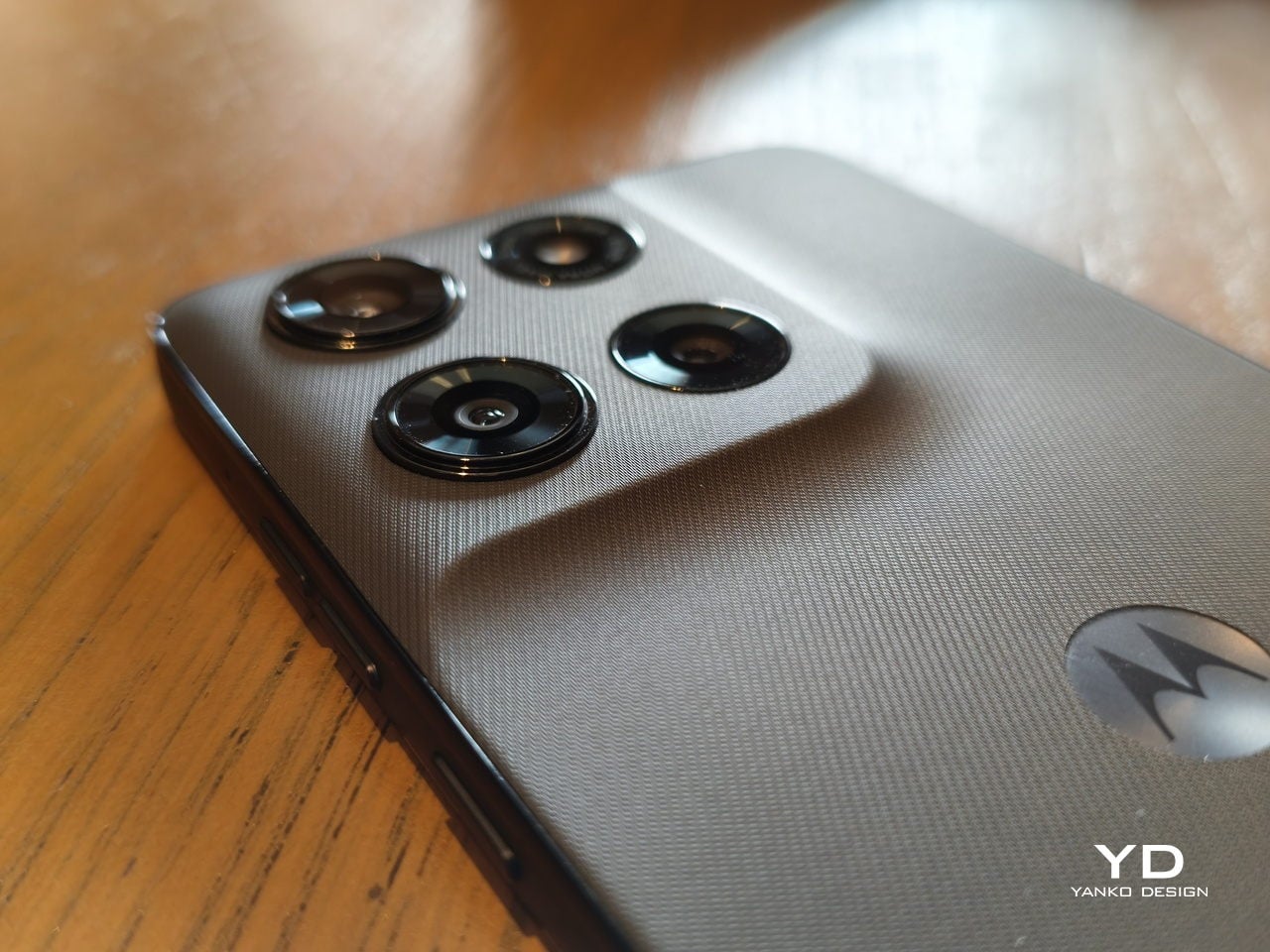
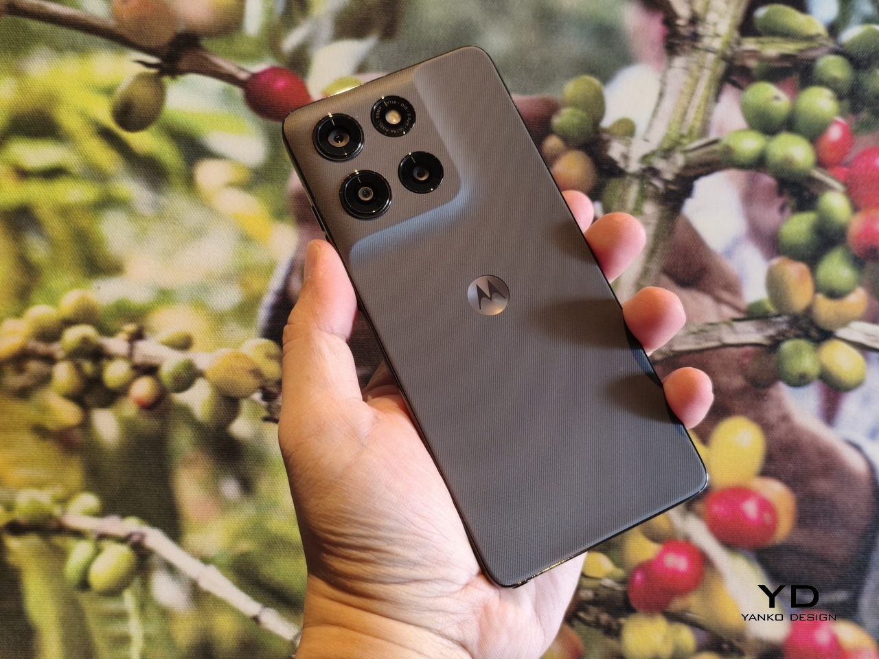
The back of the phone, which is always the most expressive side of the design, is covered with a vegan leather-inspired material that gives the phone both visual and tactile texture. Continuing its partnership with PANTONE, those covers are available in subtle Coal Smoke (our review unit) and Lavender Mist colors, with the flat edges matching the hue. Other than the iconic “Batwing” logo and minuscule markings around the LED flash, the design is bare and plain, a refreshing change from the active and noisy rears of most smartphones these days.
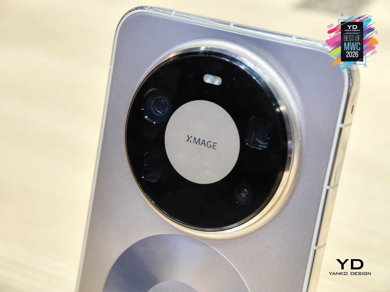
The camera bump follows that same pattern, rising from the back plate with a gentle slope. There’s no separate structure caging the lenses, creating a seamless and unbroken surface that almost has a calming effect, especially when your finger starts to glide over the textured surface. There’s almost a sense of Zen, so to speak, which is almost how many pen and paper lovers describe their favorite notebooks.
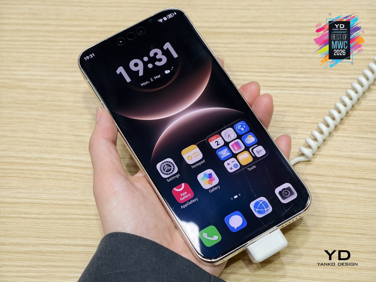
Of course, the front is the polar opposite, but only because of its bright and vibrant screen. The thin and almost symmetrical bezels and the flat glass, however, serve to provide balance that keeps that liveliness in check. All in all, the moto g stylus – 2026 is both simple and sublime. It doesn’t call attention to itself with some fancy visual or material gimmick, but you can’t help but pay close attention to its minimalism just the same.
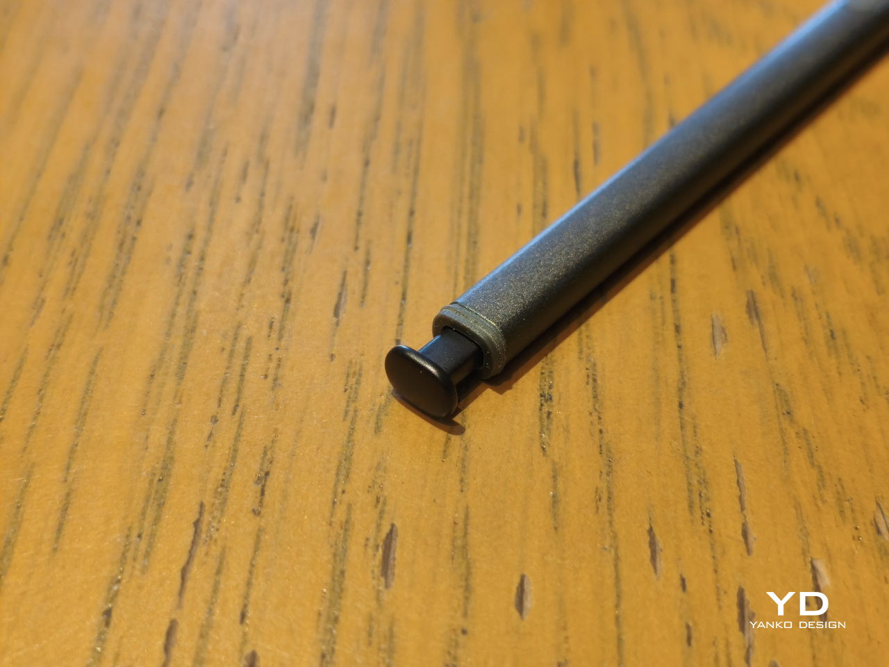
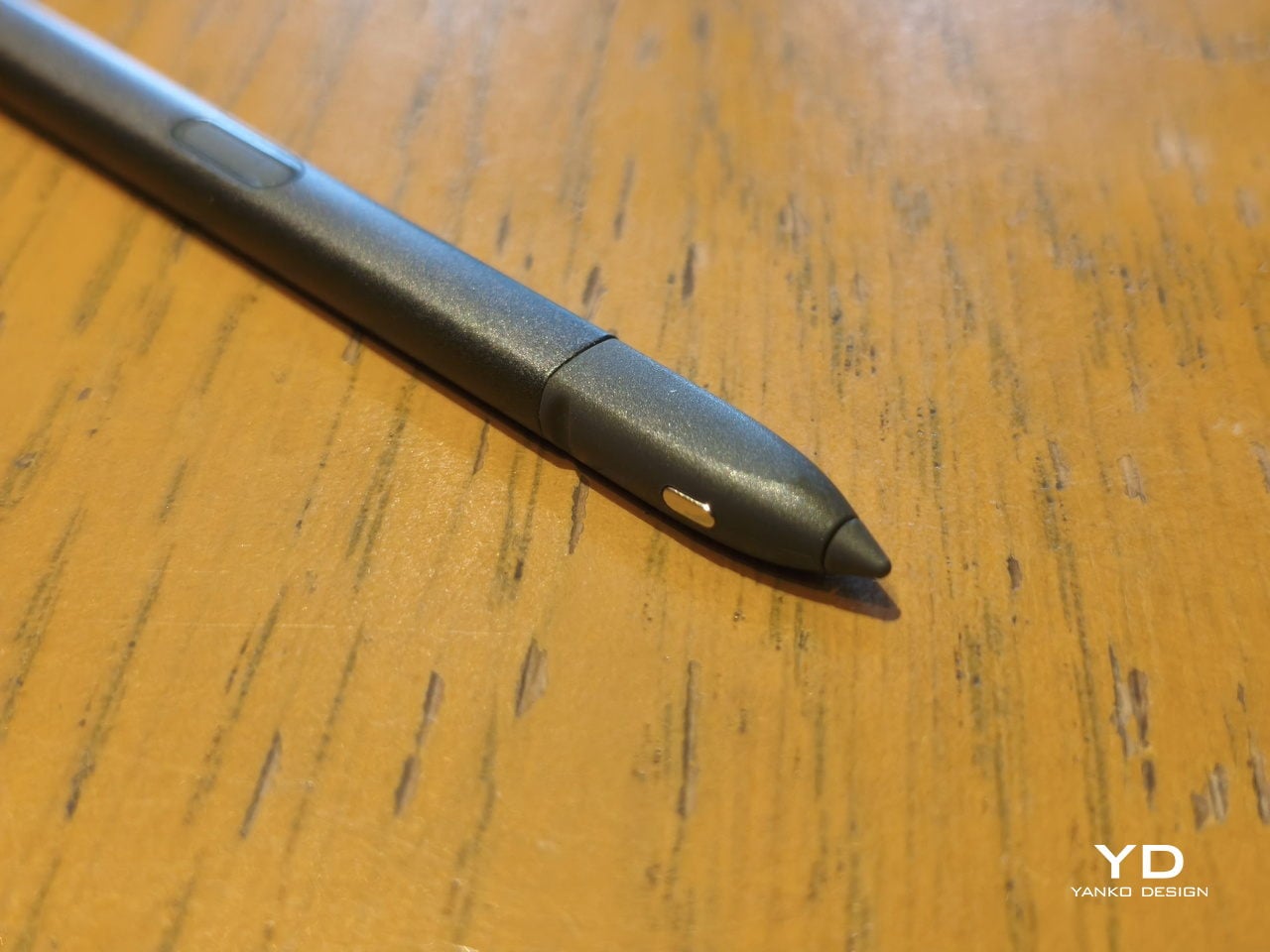
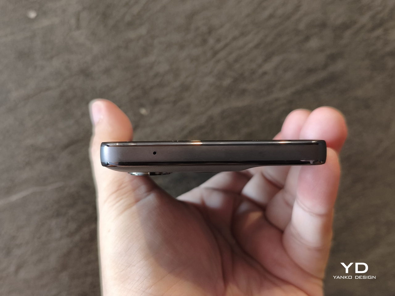
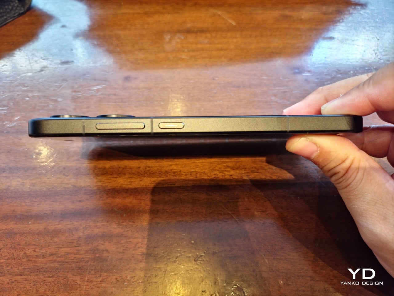
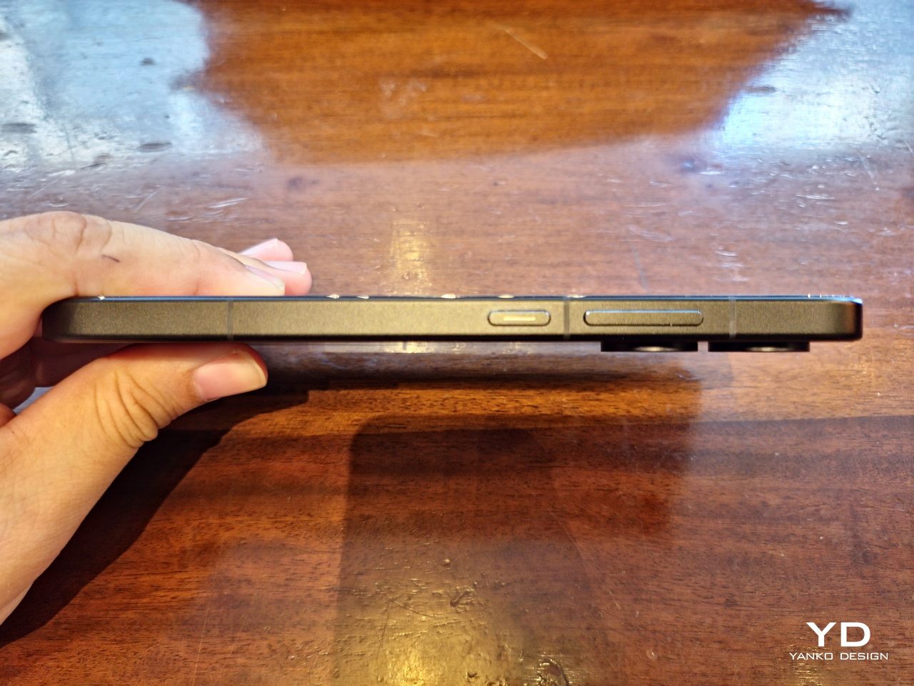
The stylus is cut from the same cloth, with a design that might be familiar to those who have held a Samsung “Ultra” flagship. It’s basically a somewhat flat stick, with a spring-loaded rear that easily resembles the (addictive) clicky ends of retractable pens. But unlike the small but stubby nibs of its predecessors, there is now a proper tapered, conical tip. Of course, it’s not just an aesthetic change, as we’ll get to in a bit.
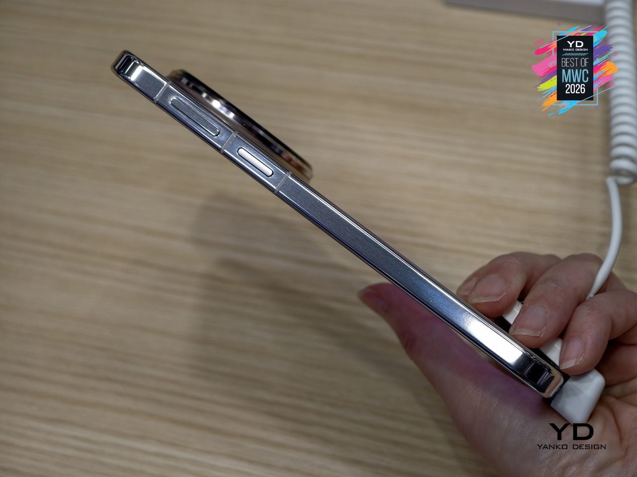
Another thing you’ll notice the moment you lift the moto g stylus – 2026 out of the box is how light it is. At only 192.3g, even with the 4.7g stylus inside, it’s easily one of the lightest phones in the market today. Given that it has a 6.7-inch screen and a large 5,200mAh battery, that’s even more surprising.
That lightness, however, is a double-edged blade. On the one hand, it might make the phone feel a little flimsy, almost like it could easily fly out of your hand. It almost makes the vibration haptics feel hollow, as if there’s not enough substance in there.
On the other hand, it strains your hand less when holding it for a long time, especially as you might find yourself constantly scribbling or doodling on it. The phone’s textured back and flat edges also help deliver a more confident hold. It just won’t accidentally slip from your hand that easily. A protective case almost feels redundant if grip is your only reason for putting one on.
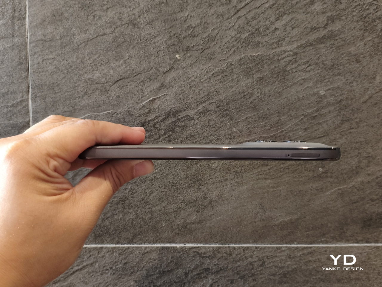
One thing to note about the camera module is that although it is thin and subtle, it still lifts a single corner of the phone when you put it on a flat surface. That means it will wobble, which can be pretty annoying when you’re writing with a stylus. Funnily enough, that might actually be a more pressing reason to put a case on, just to create a balance. Unfortunately, you do lose out on feeling the phone’s textured surface.
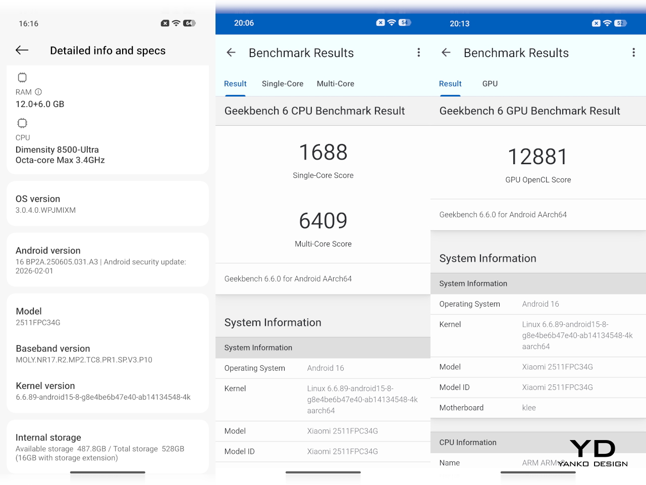
The moto g stylus – 2026 makes no qualms about its specs, clearly marking it for the mid-range smartphone market. There’s only 8GB of RAM, which can be expanded up to 24GB with RAM Boost, which basically eats up some of the already modest 128GB or 256GB of storage. Thankfully, you can also expand that storage with a microSD card of up to 1TB capacity, definitely a rare sight these days, even among phones on the same tier.
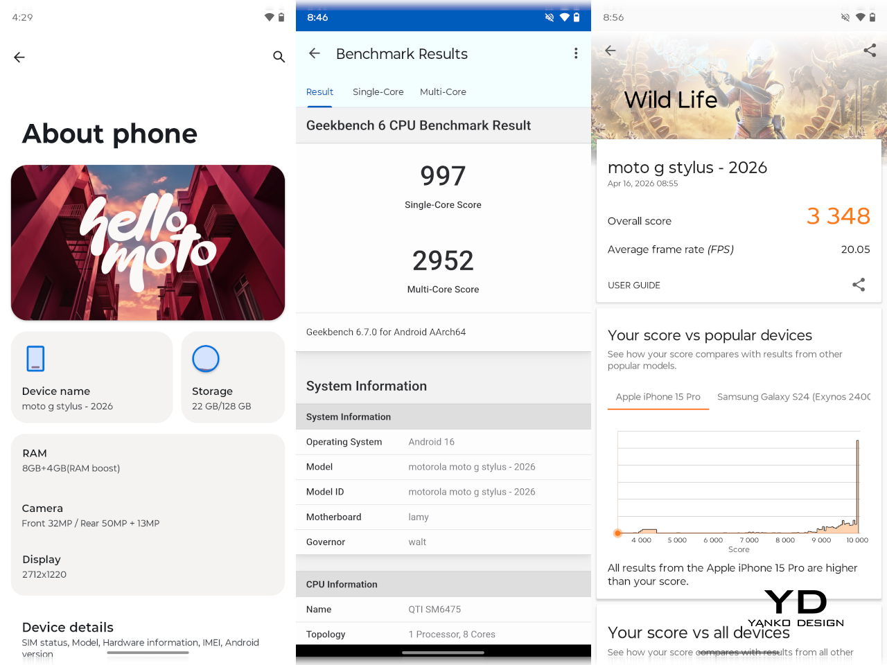
The biggest disappointment is the Qualcomm Snapdragon 6 Gen 3 processor, which is a holdover from last year’s moto g stylus. In fact, if you look closer, you’ll see plenty of similarities between the 2025 and 2026 models, from processor to cameras. It’s not always a bad thing, but given the price hike, you’d be forgiven for expecting a bit more.
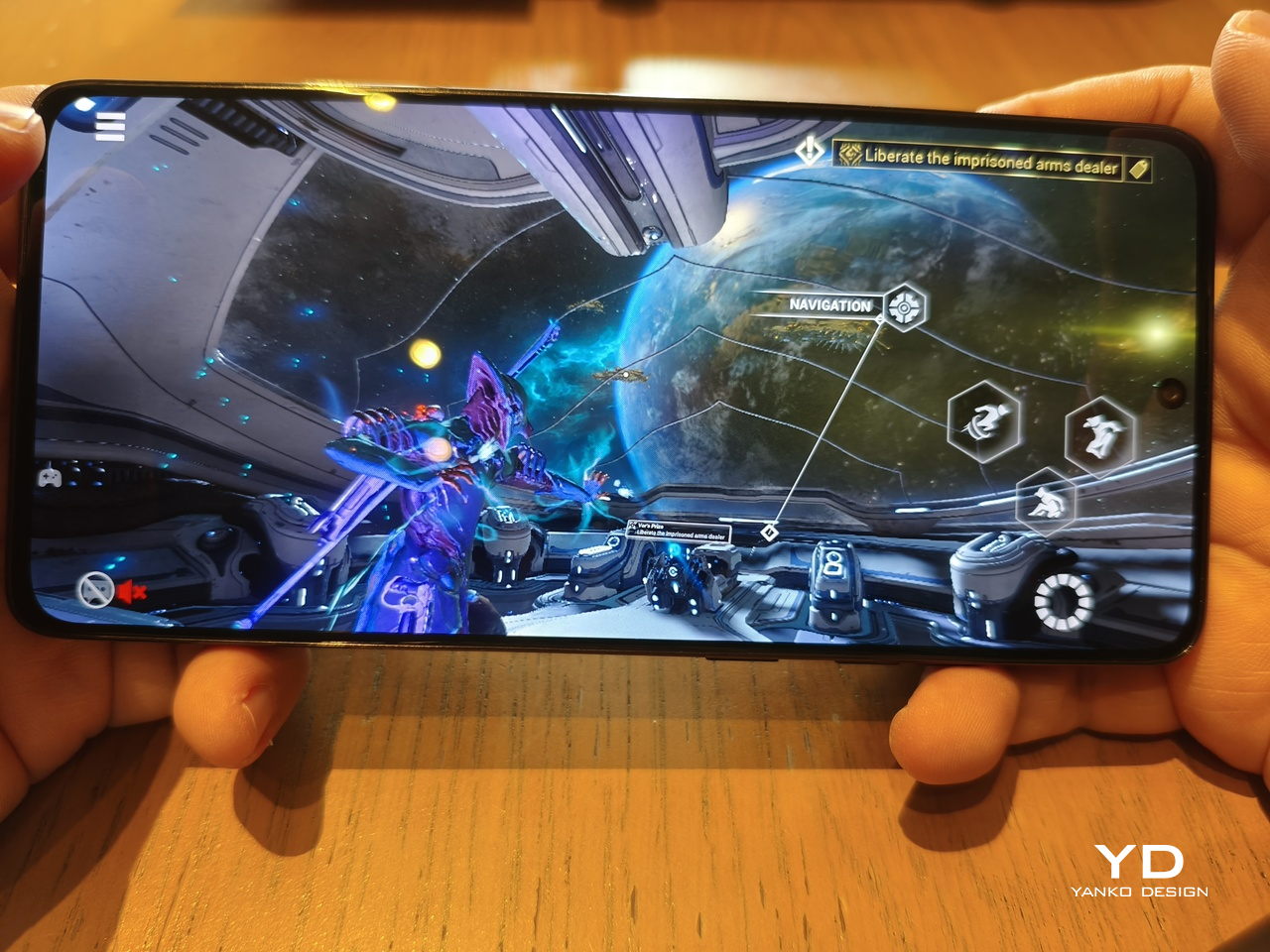
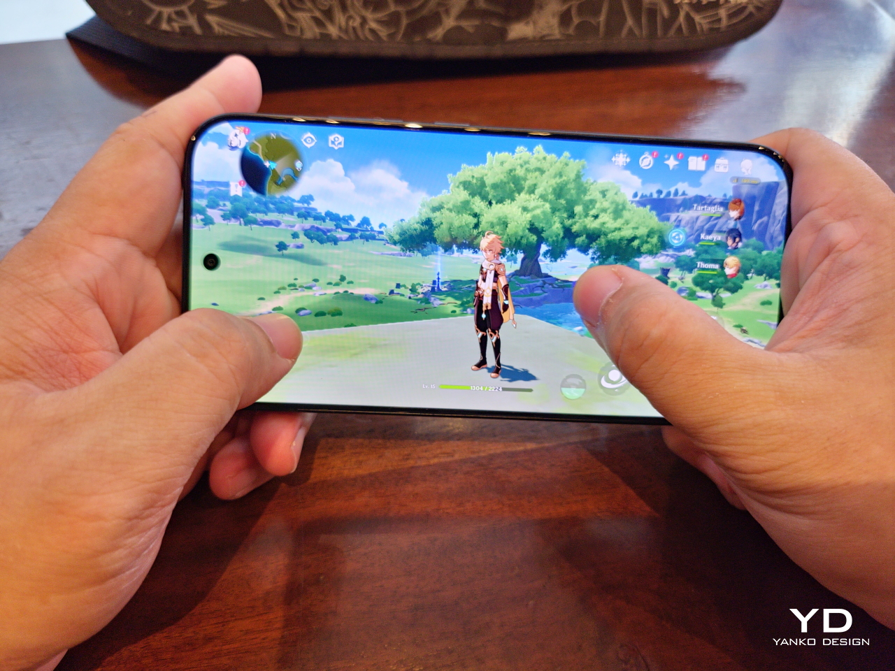
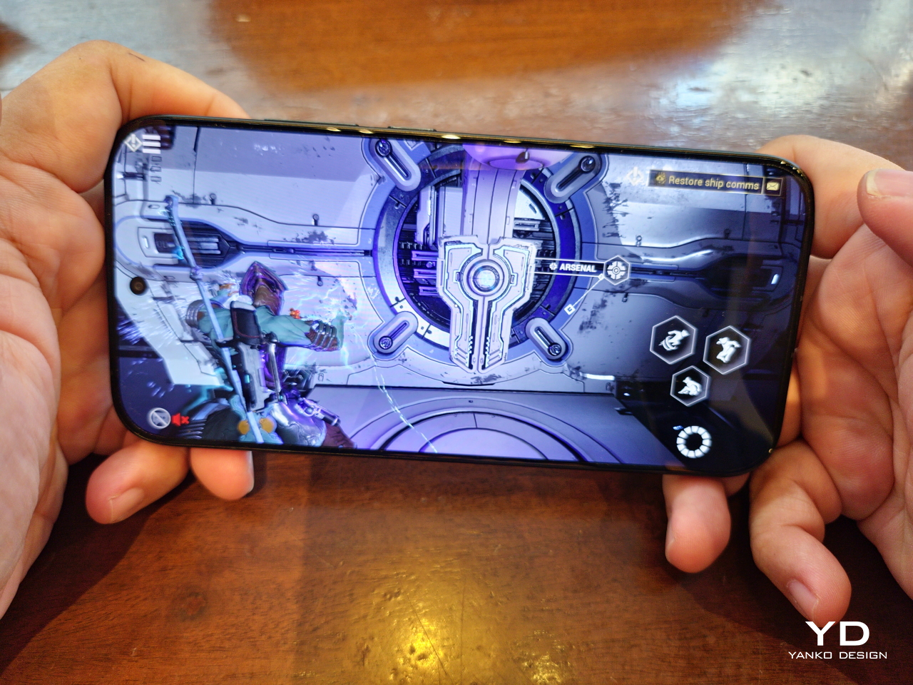
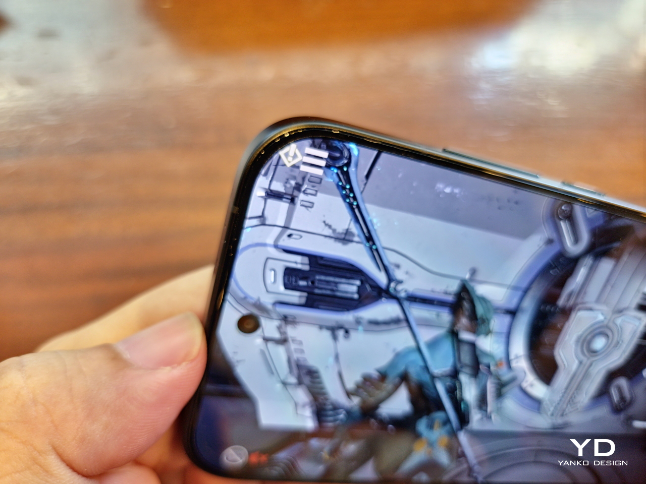
Make no mistake, though, the moto g stylus – 2026 is plenty capable. It won’t win trophies on benchmarks, but it does get the job done without breaking too much of a sweat. It’s even surprising how it can handle a game like Warframe on high settings. It doesn’t get too warm, either, and the vegan leather material probably helps make it feel a little less warm as well.

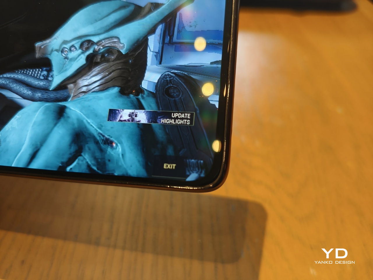
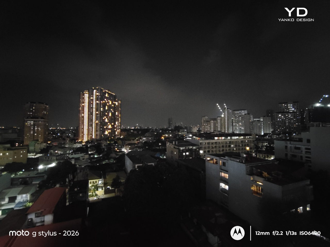
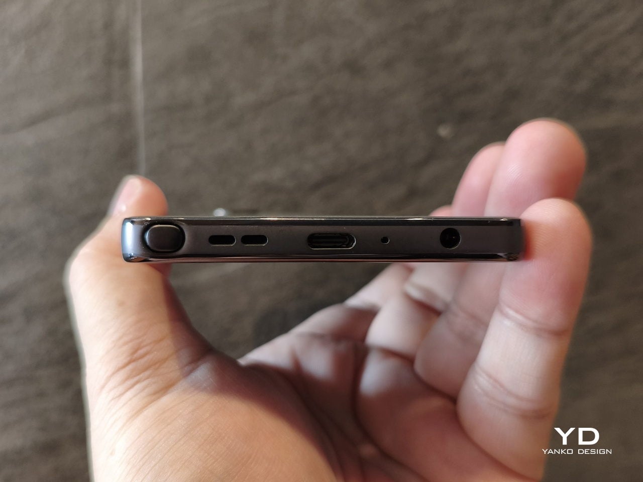
And that’s perfect because the moto g stylus – 2026 has such a gorgeous screen to play and watch on. The 6.7-inch 2712 x 1220 AMOLED display boasts a peak brightness of 5000 nits, definitely one of the brightest in the market, making it easily usable under sunlight. The rounded corners are also less curved, so UI elements are not obstructed, especially in games. Plus, the 3.5mm headphone jack, another rare sighting, can perfectly complement the visuals with hi-def wired audio.
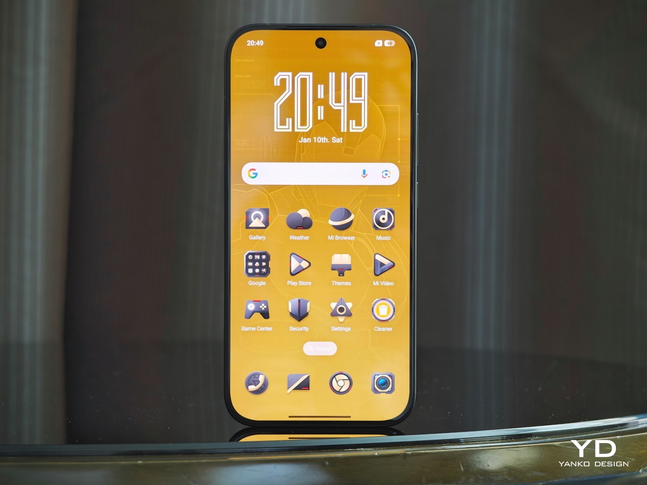
The moto g stylus – 2026 runs the latest Android 16, and given Motorola’s history, the skin is pretty minimal and non-invasive. It’s probably the closest you can get to a Pixel experience outside of Google Pixel phones, which is light, fast, and probably barebones if you’re coming from other brands like Samsung and Xiaomi. There’s almost no bloatware, unless you count the dozen or so pre-installed Google apps, which would be the same situation on a Google Pixel phone anyway.
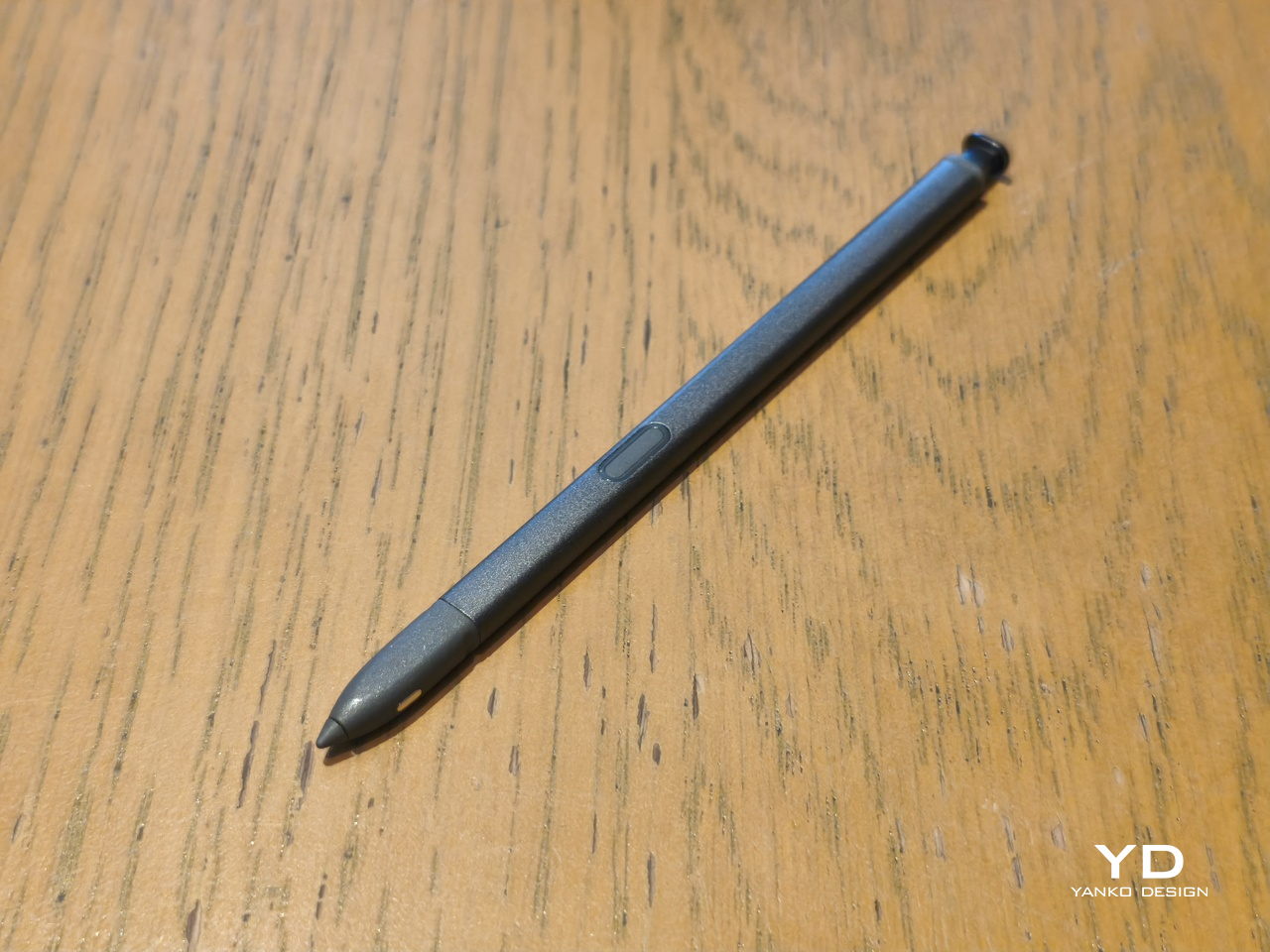
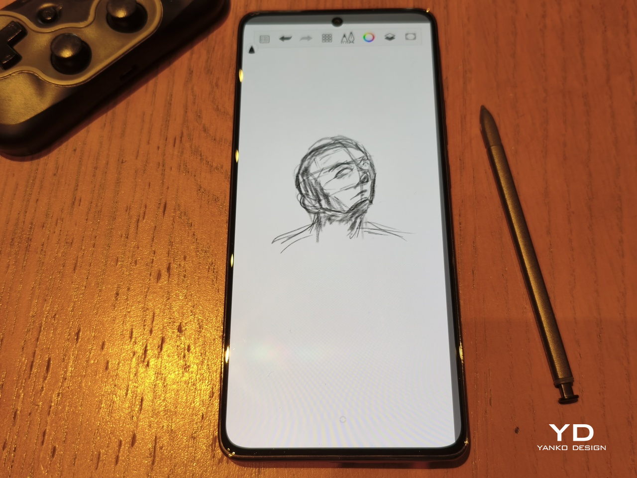
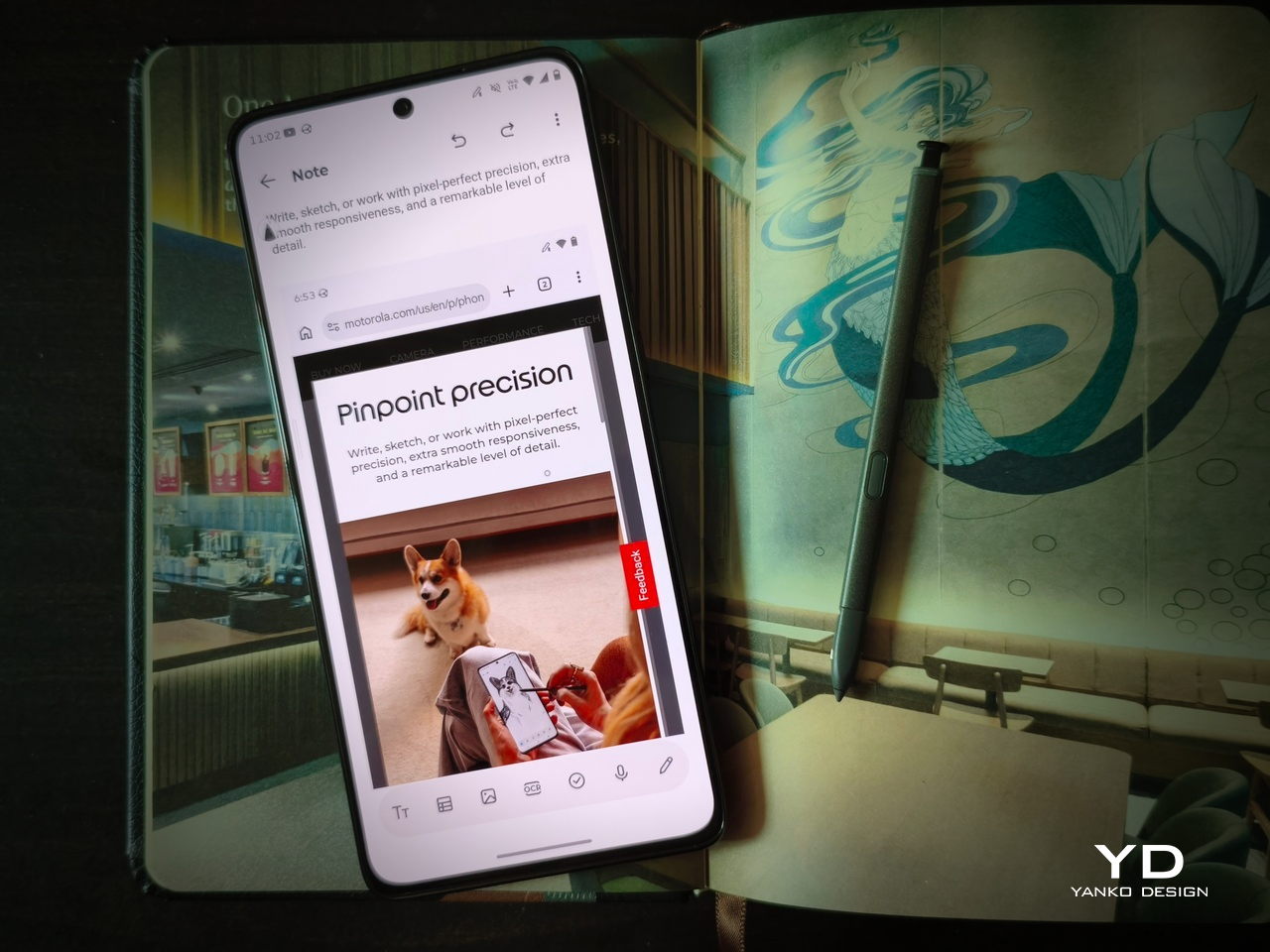
There’s no beating around the bush: the only reason you’d even give the moto g stylus – 2026 is because of its stylus. For the first time, that stylus is no longer just a very thin stub standing in for your finger tip. For the first time, it is supporting pressure and tilt sensitivity, features that only Samsung offers at nearly three times the price.
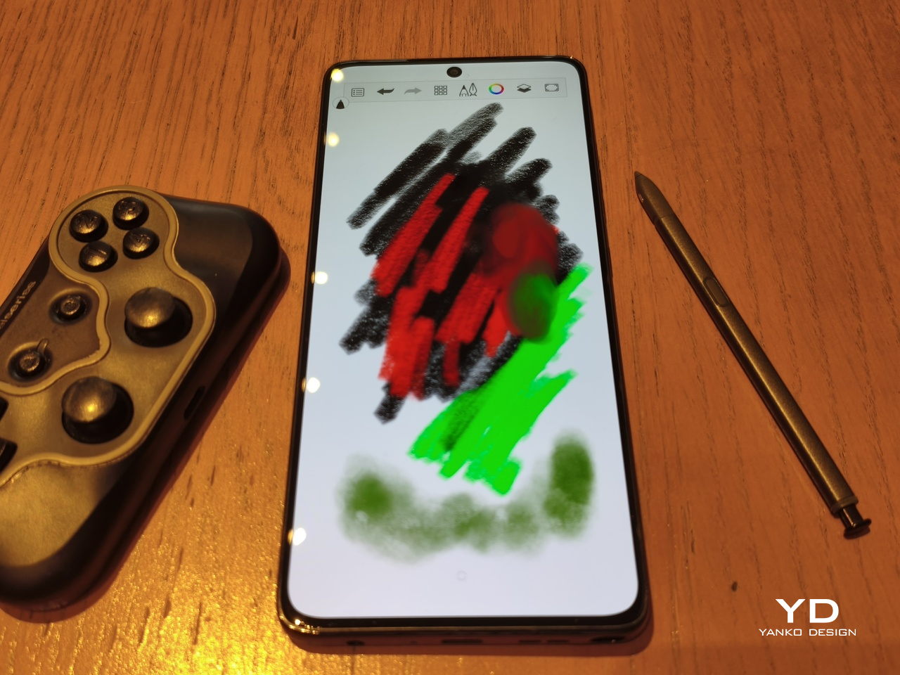
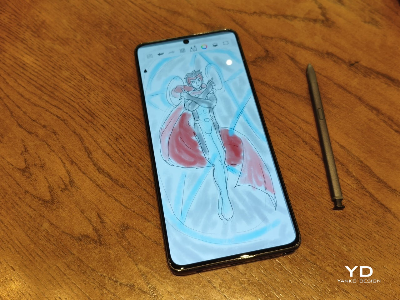
The older stylus designs were practical and usable, but this new pen opens the door to even more possibilities, especially when it comes to creative activities like drawing, designing, and editing photos. It gives you much better control and precision, while also offering more styles in terms of pen width, brushes, and the like.
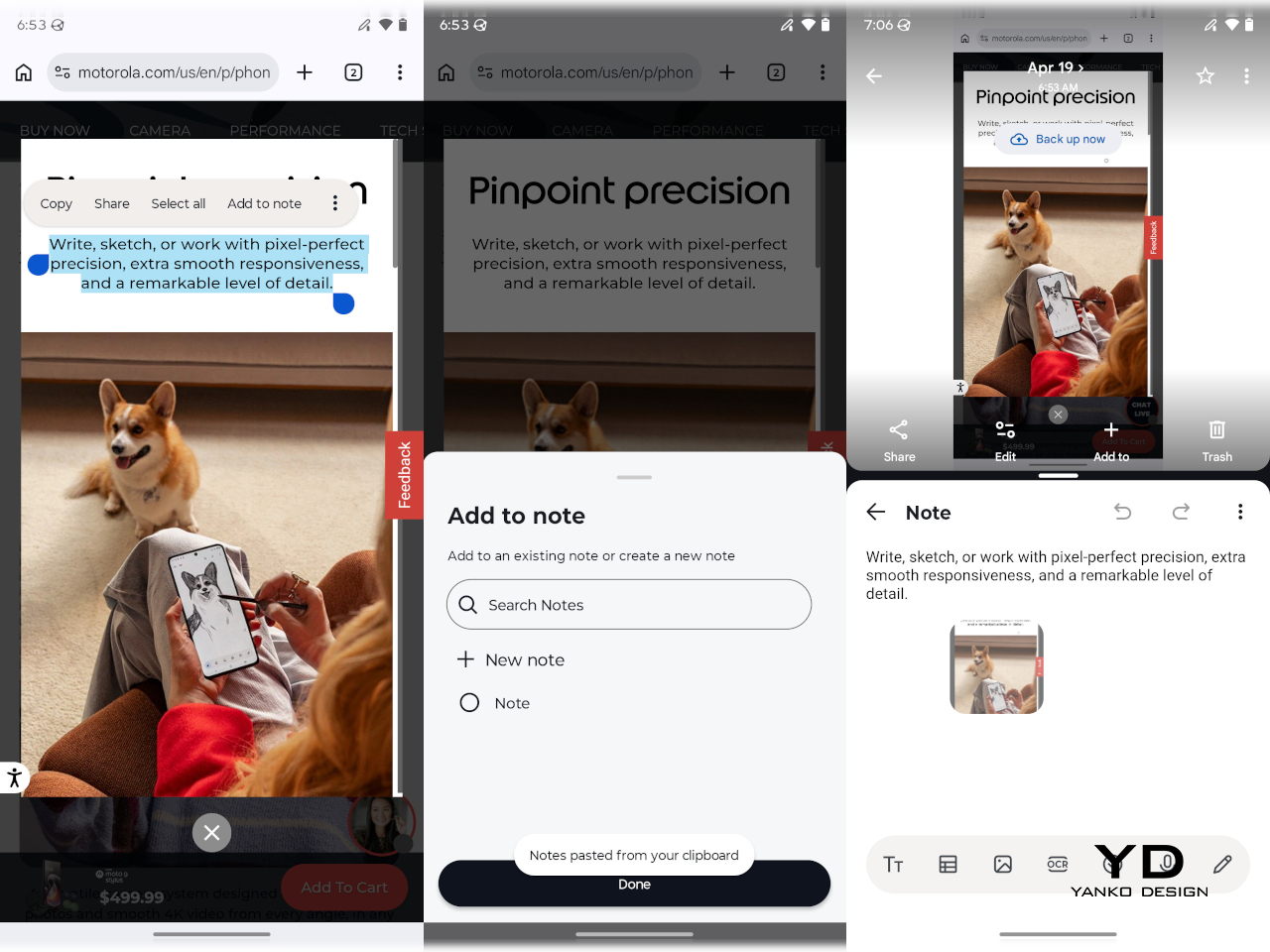
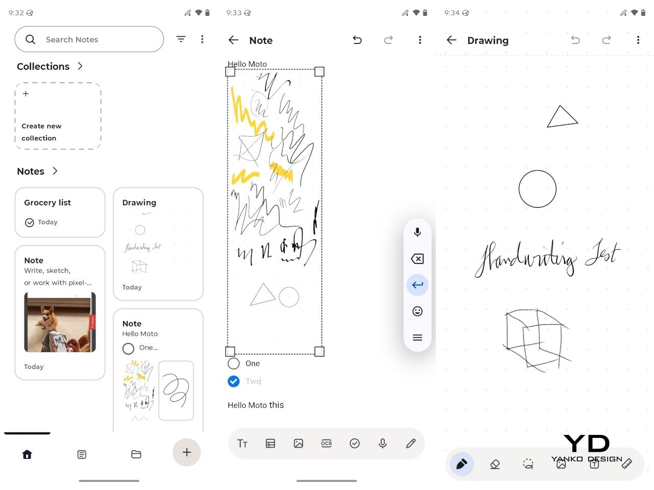
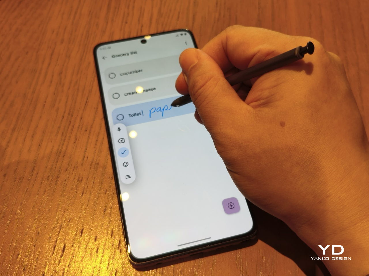
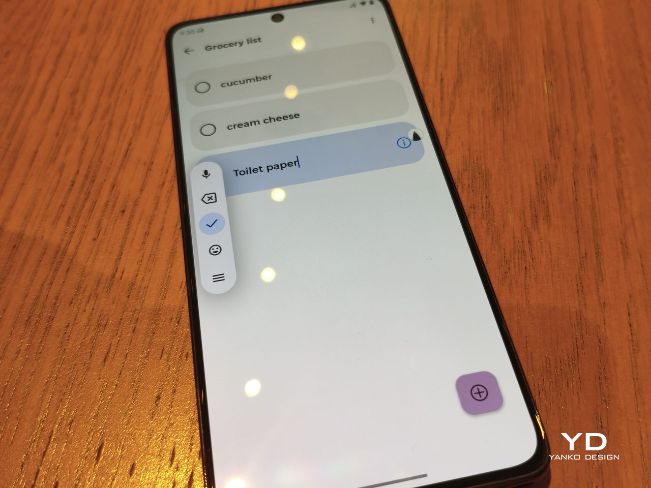
The stylus is also crucial in some productivity workflows, like when dragging images to a note in split-screen mode, highlighting and copying text to a note, or for sketching a crude representation of a cat and using AI to turn it into a photorealistic masterpiece. Part of this upgraded experience is made possible with the Moto Notes app, which supports drawing on an infinite canvas that can then be embedded into notes.
The new stylus also has a button that can be mapped to some actions depending on whether you press or long-press it, though the actions are not that varied. The pen now also has to be charged, which is how it’s able to pull off that pressure sensitivity stunt, and you can only charge it when it’s inside its silo.
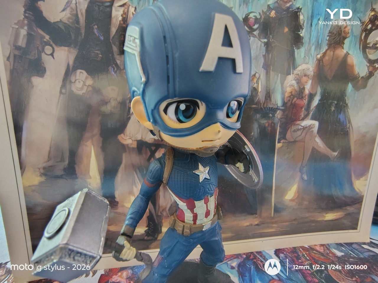
The moto g stylus – 2026’s camera story is rather underwhelming. On the hardware side, it doesn’t exactly differ from last year’s cameras, which include a 50MP Sony LYTIA 700C sensor and a 13MP Ultra-wide shooter that doubles as the Macro camera. In a nutshell, these are serviceable and decent, but they wouldn’t be something you’d want to rely on if you were planning on being a professional shutter bug.


The main shooter does a pretty good job of capturing detail, but its dynamic range seems to be on the narrower side, making subjects look a little flat. The AI-enhanced Signature Style can try to compensate, but it also oversaturates the output.

Normal

Signature Style
Normal
Night Vision
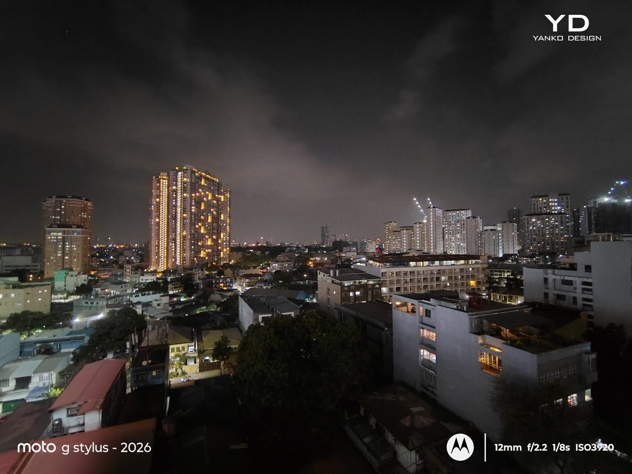
Nighttime photography is what you’d expect, as there wouldn’t be enough light information to work with. Night Vision Mode definitely kicks things up a notch, brightening things up enough to make out the details. This is one of those moments where the difference is, pardon the pun, night and day.


Given the hardware, ultra-wide shots are naturally less impressive but still get the job done for a quick panoramic picture. There’s no dedicated telephoto lens, so it does double duty as the macro camera. Unfortunately, it doesn’t make much of a difference. Portrait shots are pleasant and accurate, though, and you can select from 24mm, 35mm, and 50mm focal lengths.
Macro

Macro
One of the few upgrades this year is the moto g stylus – 2026’s larger 5200mAh battery. It still supports 68W wire Turbo Charging and 15W wireless charging, the latter with no magnetic tricks. With the right power brick, you’re promised a full charge in just 44 minutes, but even a 65W charger managed to top the phone off in just a little over an hour.
That charging won’t happen frequently though, as the phone can last more than a day with normal use, including browsing the web, social media, and even watching videos on that bright, large screen. With less frequent use, it can actually extend to two days, though you’ll want to be on Wi-Fi rather than cellular to pull that off. Needless to say, it’s a reliable daily partner that won’t have you scrambling for a charger before you head home.
Motorola has been pretty vocal about its sustainability efforts, but the moto g stylus – 2026 is a bit of a hit and a little miss. The compact, plastic-free packaging is superb in that regard, ditching the redundant charging brick as well. Motorola also boasts about longevity, given the IP68, IP69, and MIL-STD-810H certifications.
Where the story takes a sad turn, however, is in the software upgrades. Only two years of Android upgrades and three years of security updates, figures that would have sounded generous almost a decade ago. This lags way behind the likes of Xiaomi, notorious for its short software support cycles, and is quite disappointing for an Android user experience that is almost as pure and unencumbered as the Google Pixel.
There’s no going around the fact that the moto g stylus – 2026 has a price tag that’s a little difficult to swallow. It’s more than a $100 jump from last year’s model, and at $500 or $600, for 128GB and 256GB storage, respectively, other brands might give you better specs for the same price. Granted, Motorola often throws in bundles and discounts to sweeten the deal, but the initial price shock is unavoidable.
That said, that price could be a bit justifiable, especially if you factor in how electronics prices are going up these days anyway. For that amount, you get a solid, reliable, and beautiful phone that is almost literally a digital Field Notes notebook in your pocket. Considering that the closest competition is actually a $1,300 Samsung Galaxy S26 Ultra, then there’s almost no contest. Sure, it doesn’t have the glamorous bells and whistles, but neither would a trusty notebook.
More than any mainstream smartphone in the market today, the moto g stylus – 2026 is clearly aimed at a particular audience: people who don’t want their productivity and creativity to be hampered by not having their notebook or their computer around. They say the best tool is the one that you have with you, and almost everyone has their smartphone in their pocket. And what better way to capture fleeting inspiration or sketch inspiring vistas than by whipping out your phone and pulling out the stylus?
By no means is the moto g stylus – 2026 perfect. In fact, you might even call it dated if you judged it by its specs alone. But with a talented stylus, a gorgeous screen, a reliable battery, and a beautiful minimalist design, it is definitely worth every penny. There is no perfect productivity tool or notebook, but the moto g stylus – 2026 comes pretty darn close.
The post moto g stylus 2026 Review: Accessible Pocket Productivity and Creativity first appeared on Yanko Design.
Mobile gaming has come a long way from simple puzzle games and endless runners. Today’s smartphones can run graphically demanding titles at high frame rates, rivaling dedicated gaming hardware in raw power. But the way we actually control these games hasn’t kept pace. Playing shooters on a touchscreen has always meant thumbs blocking the very action they’re trying to aim at.
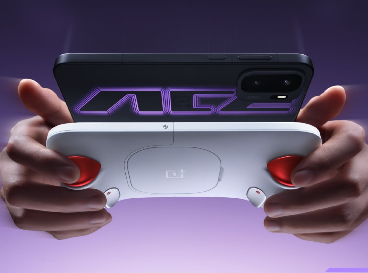
Gaming phones like the OnePlus Ace series have tried to bridge that gap with cutting-edge chips, cooling systems, and specialized gaming software. These upgrades help, but they don’t solve the fundamental issue of using glass as a controller. The Ace 6 Ultra changes that approach entirely by pairing with a snap-on accessory called the Gun God Game Controller, designed specifically for competitive shooter titles.
Designer: OnePlus
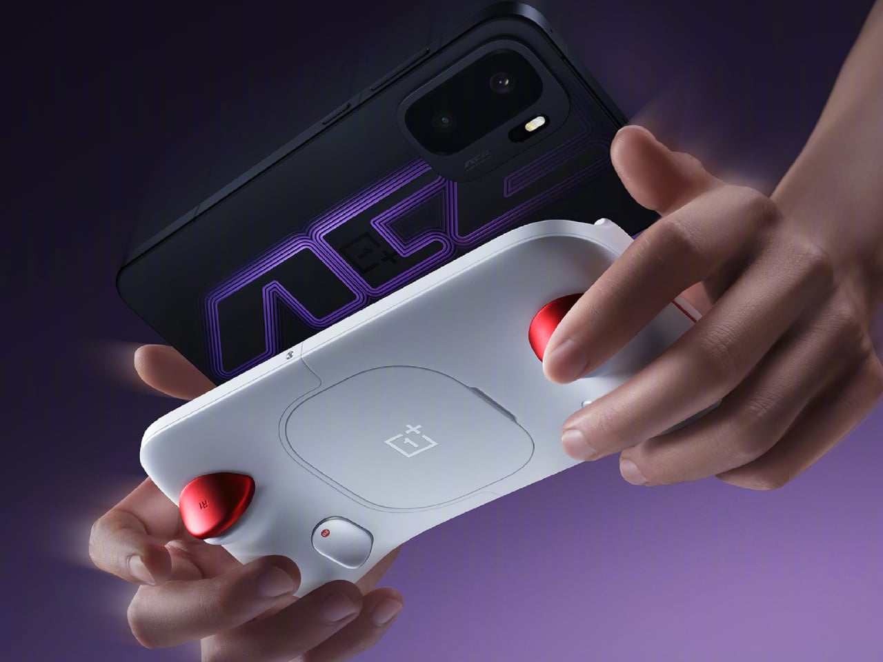
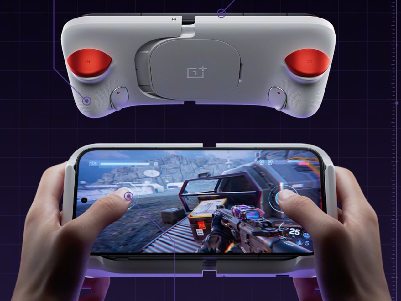
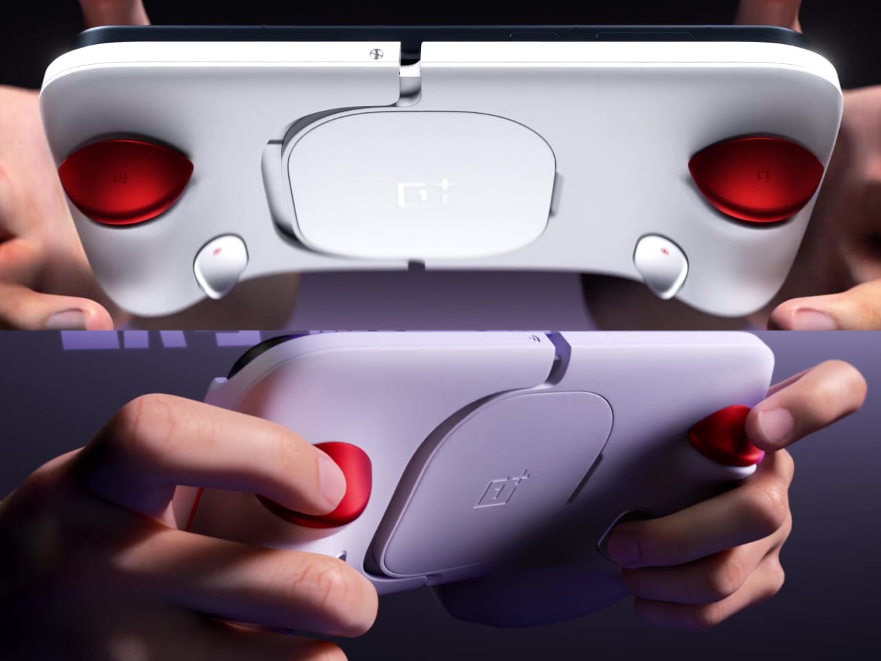
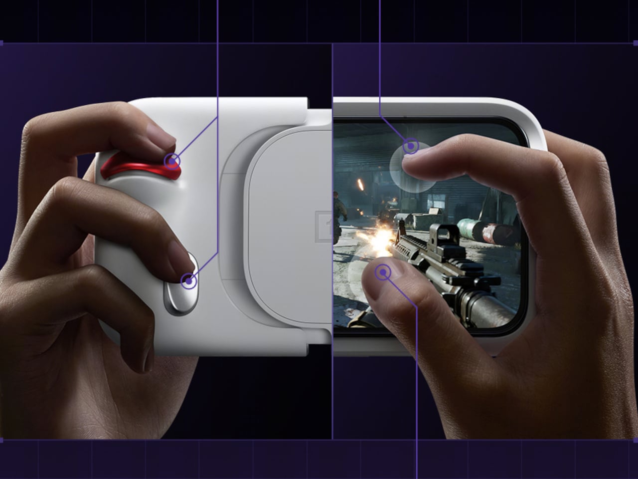
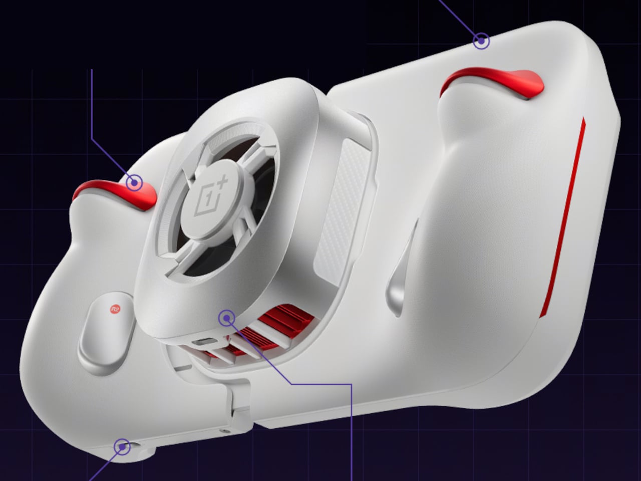
OnePlus calls the combined setup the “Gun God Handheld,” a new category somewhere between a smartphone and a portable gaming console. The controller is a lightweight shell that the phone snaps into, giving the whole rig a contoured, comfortable grip built for extended sessions. The multi-finger controls relocate to the back, clearing the screen and keeping the player’s field of view unobstructed.
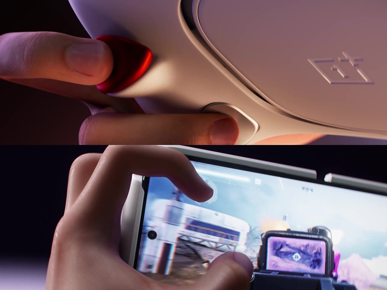
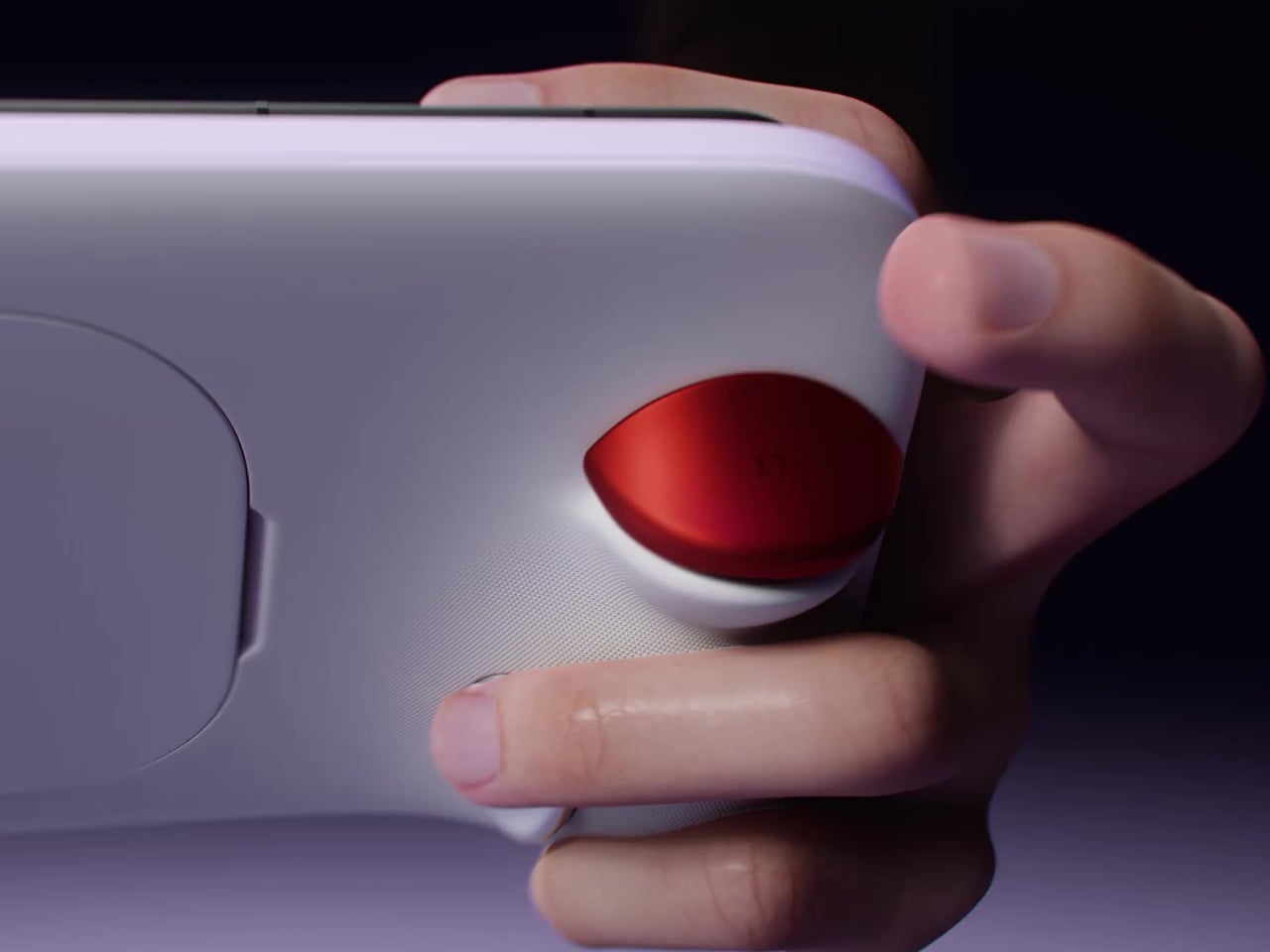
That involves four physical back buttons: two bumpers (L1 and R1) and two triggers (L2 and R2). The thumbs stay on the screen for movement and aiming, while extra fingers take over shooting and special moves. All four are fully customizable, and OnePlus describes this as a “Touch × Button Fusion” that preserves the game’s native touchscreen logic while layering physical input on top.
What sets those buttons apart is what’s inside them. The micro-mechanical switches have a 1,000Hz polling rate and a 1.8ms response time, which means the gap between pressing a trigger and registering the action is almost imperceptible. A built-in esports antenna helps maintain a stable signal during play, which matters when a moment of lost connection is enough to throw off a well-timed shot.
Long gaming sessions bring heat, and the controller doesn’t ignore that. It includes a built-in heat spreader along with a magnetic suction cooling fan for sustained thermal performance. A USB-C port along the bottom keeps charging available while playing, so the battery isn’t a concern mid-session. Together, these let you push through long sessions without the heat-related slowdowns that typically creep in on demanding mobile titles.
Backing all of this is the OnePlus Ace 6 Ultra itself, which runs on a MediaTek Dimensity 9500 chipset. Its GPU is 33% faster than the previous generation, with 120 FPS gameplay support and ray tracing for a more visually immersive experience. An 8,600mAh battery with 120W fast charging handles the power demands, ensuring the phone itself keeps up with the hardware strapped to its back.
The Gun God Controller and Ace 6 Ultra launch together in China on April 28, with no confirmed global release date. For mobile gamers who’ve long wished their phone felt more like a proper handheld, this combo is a genuinely interesting answer. It’s still a phone when you need it to be, and something far more deliberate when the game demands it.
The post The OnePlus Ace 6 Ultra Finally Fixes the Thumbs-on-Screen Problem first appeared on Yanko Design.
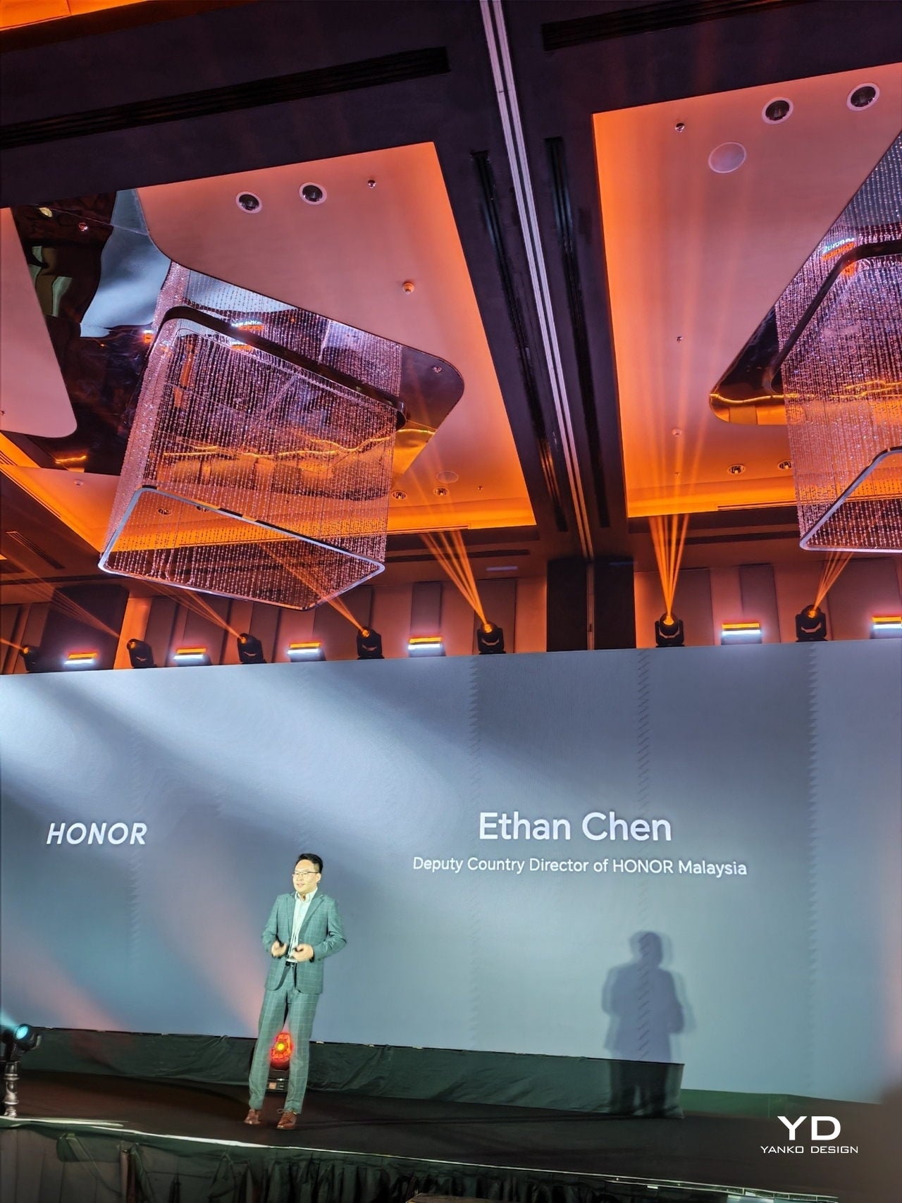
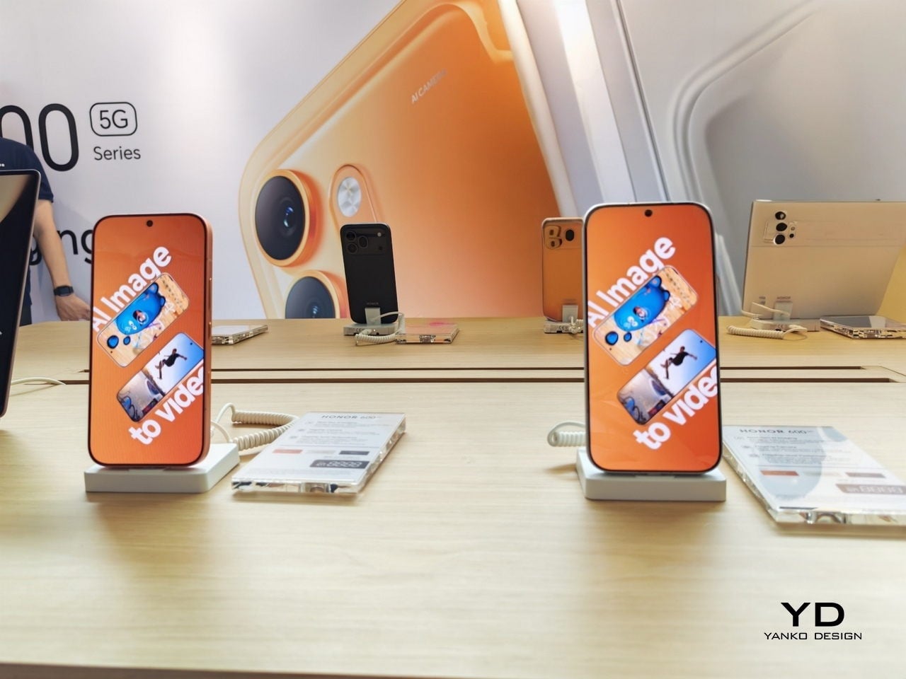
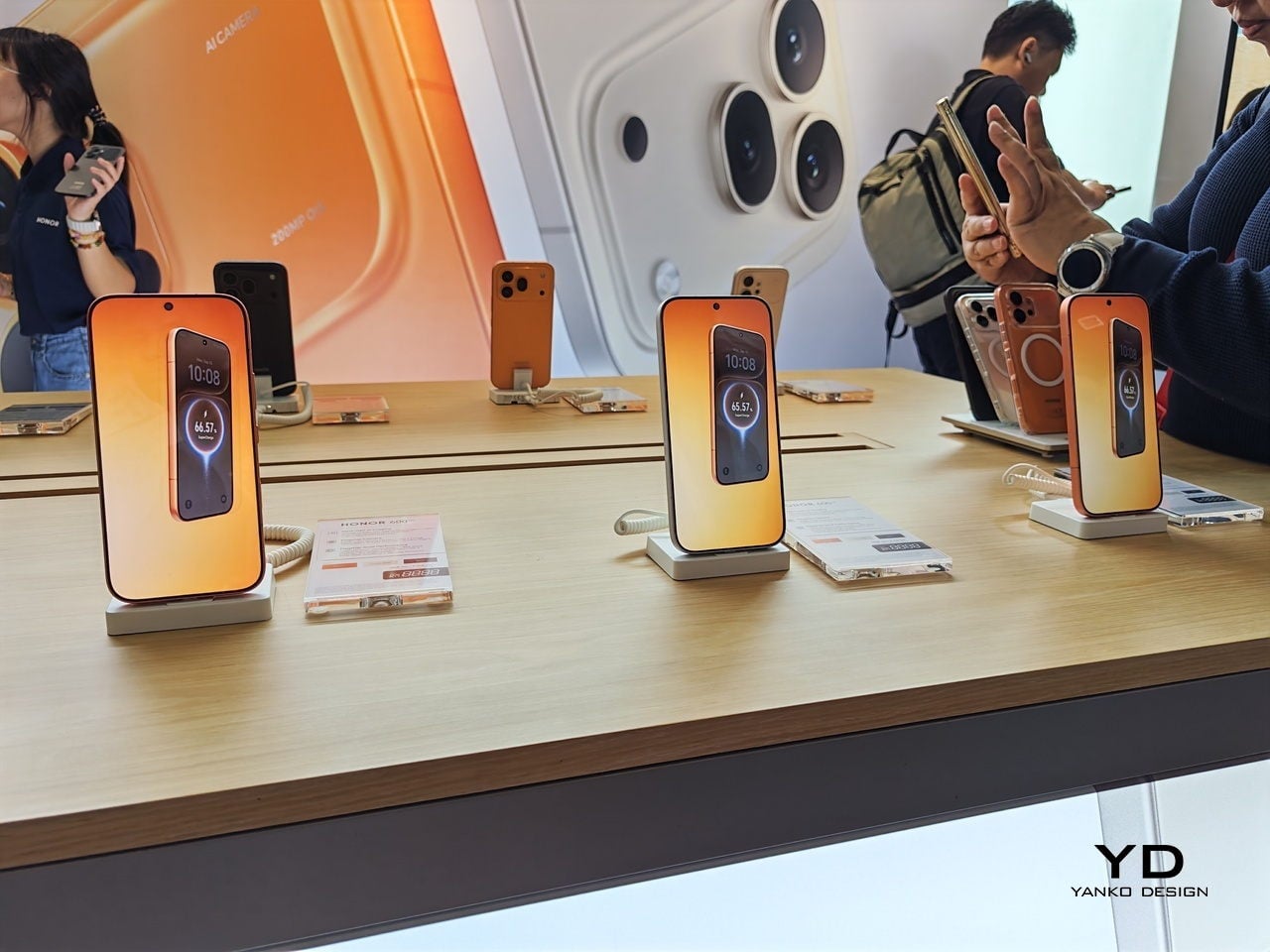
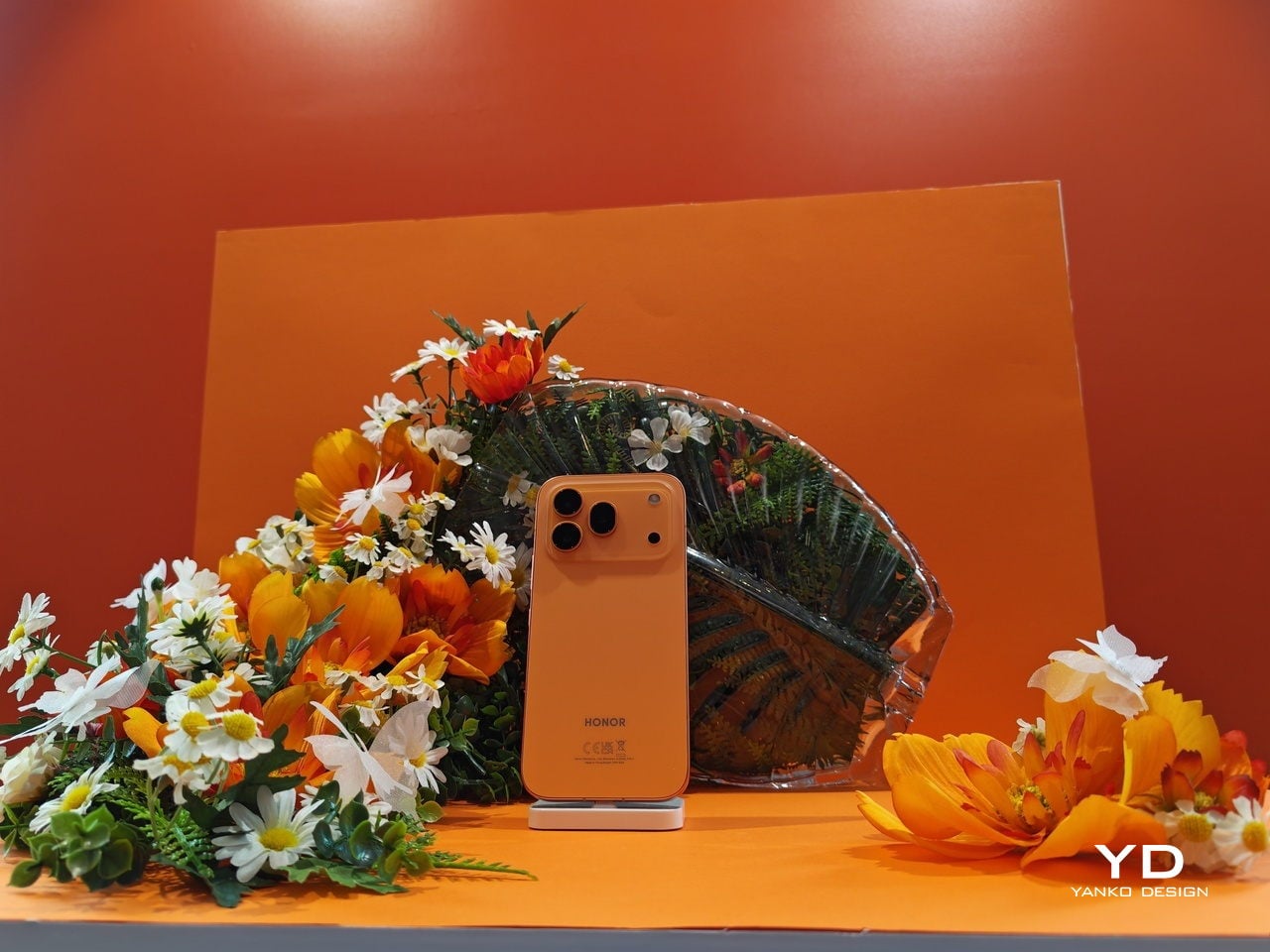
Malaysia doesn’t always get to be first. So when HONOR chose Kuala Lumpur as the global stage for the HONOR 600 Series launch, it felt less like a marketing decision and more like a statement. The kind brands make when they actually believe a market is ready, not just willing to buy, but ready to appreciate what’s being offered. I walked into the event expecting a standard product unveiling. What I got was something closer to a creative manifesto.
Ethan Chen, Deputy Country Director of HONOR Malaysia, set the tone early. The brand currently holds the number one spot in Android sales volume in Malaysia, and rather than simply leaning on that achievement, Chen framed it as a responsibility. “Pushing boundaries of what technology can do” wasn’t a tagline on a slide. It was the running thread of everything that followed, including why the device is focusing on its AI-powered features.
Designer: Honor
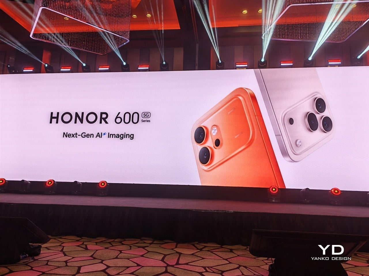
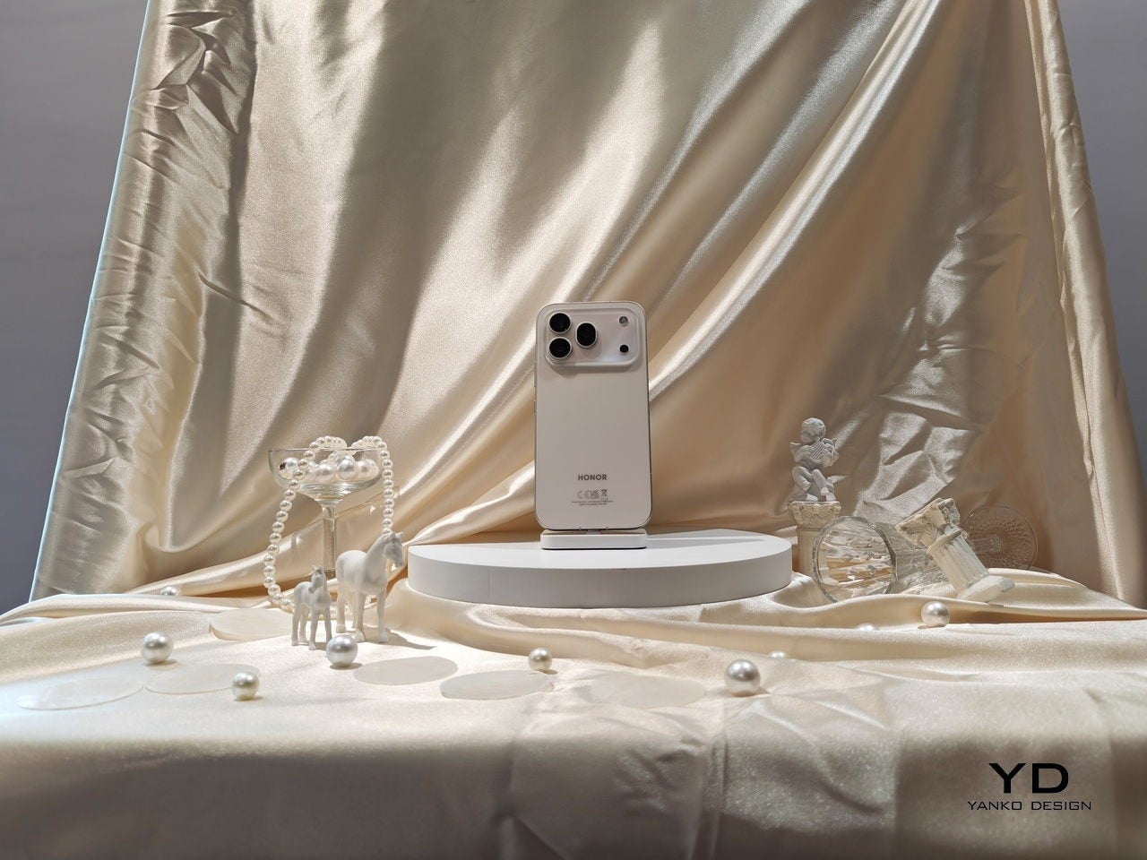
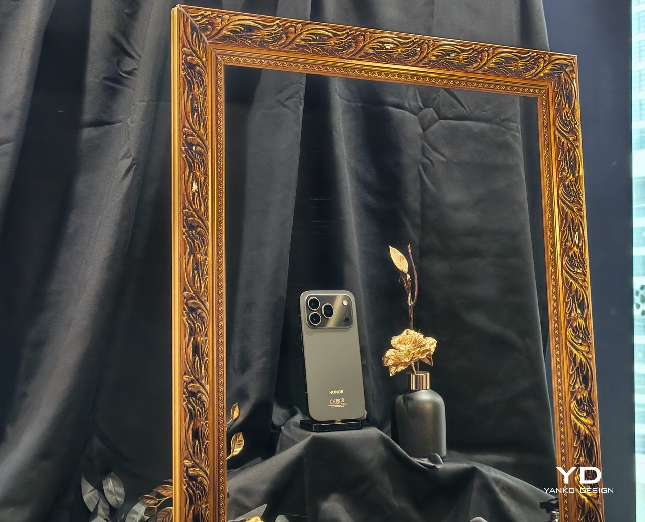
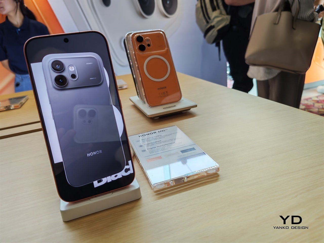
The design conversation alone was worth showing up for. HONOR used what they’re calling an integrated cold carving process to achieve a flagship-grade matte metal finish on a phone that looks premium but without the expected premium price tag. The bezels measure 0.98mm, an industry first, and they literally compared it to the string of a badminton racket, which is a very Malaysian way to explain precision and I respect it entirely. Holding the device, you feel the difference immediately. It doesn’t feel like a phone built to a budget. It feels like a phone that’s been decided upon.
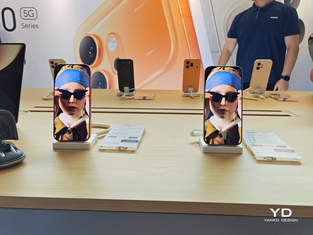
On the camera front, HONOR Imaging System Expert Dr. Weilong Hou walked through what the 200MP sensor and the 120x telephoto zoom with industry-highest CIPA 6.5 image stabilization actually means in practice. The Pro model can lock onto distant subjects with a steadiness that used to require dedicated camera equipment. For anyone who shoots street photography or travel content without a full kit, that’s a genuinely useful upgrade. The AI Image to Video 2.0 feature lets you combine up to three photos with a text prompt to generate short video sequences, no third-party apps needed. It’s the kind of feature that sounds gimmicky until you see the demo, and the on-stage result looked surprisingly natural.

The moment that stayed with me most, though, wasn’t about megapixels. It was when the conversation turned to one of the reasons why they’re bringing AI into the conversation of transforming creativity. Mr. Harald Neerland, the president of Autism Europe, shared how AI tools like what can be found on the Honor 600 series can help autistic children tell and share their stories through imagery and videos. The line that landed: “True innovation should serve humanity, especially those who communicate differently.” It’s easy to be cynical about corporate purpose statements, but this one felt grounded and specific rather than vague. Whether it fully delivers on that promise over time is the real question, and worth watching.
Back to the specs, because they matter. The 7,000mAh silicon carbon battery was demonstrated through an F1-style simulation that put the HONOR 600 up against an iPhone and a Samsung in an endurance test that was also quite funny, with the Honor car pushing Samsung towards the finish line when it ran out of “gas”. Another standout feature that was highlighted was that the 8,000-nit display with HONOR’s Eye Comfort technology means you can actually use the phone in full Malaysian sun without squinting, while also protecting your eyes during late-night scroll sessions. The IP69K rating, the highest water and dust protection available, means a heavy downpour is genuinely not a concern. Neither is dropping it, thanks to the SGS 5-star Drop and Crush Certification.
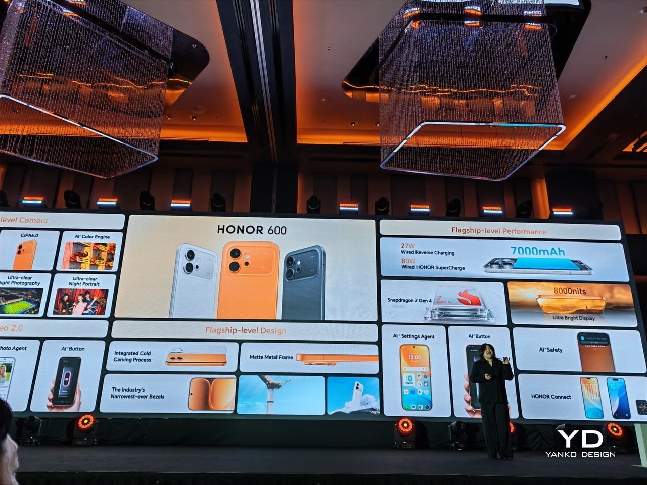
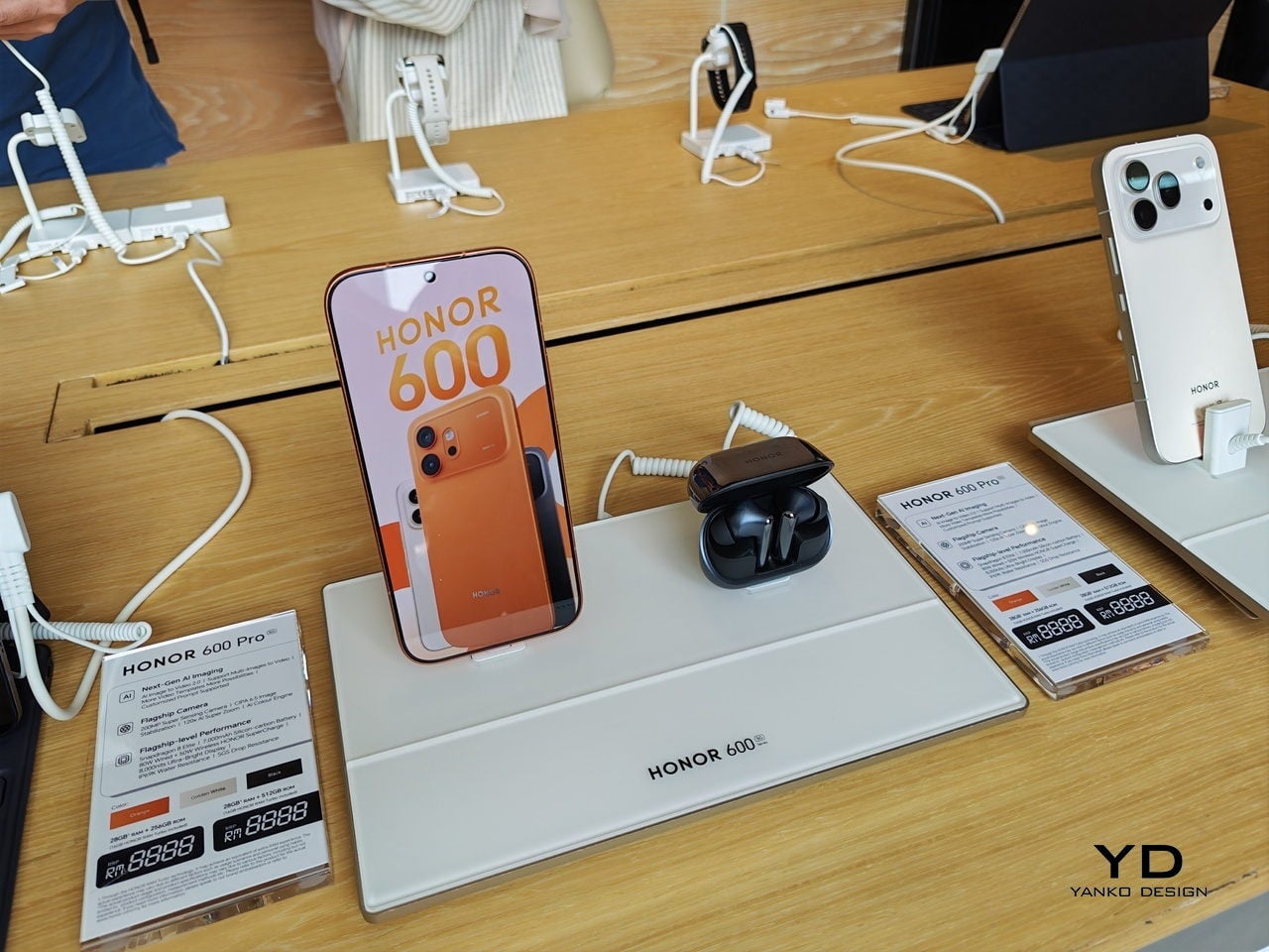
With a price range between $650-850, the HONOR 600 Series is pitching itself squarely in the accessible flagship bracket, the space where most people actually shop. It’s not trying to out-premium the ultra-luxury tier. It’s trying to make flagship-level hardware feel normal, attainable, and beautifully designed. Malaysia being the first market for this global launch isn’t just a footnote. It’s a signal. And if the 600 Series performs the way it looks, HONOR may have just made their most compelling argument yet for staying at the top of that Android chart.
Full review of the Honor 600 coming soon!
The post Honor Just Made Malaysia Its Global Launch Pad for the Honor 600 first appeared on Yanko Design.
Staring at a phone screen for hours isn’t kind to your eyes, and more people are finally taking that seriously. The backlit displays on most modern smartphones are tuned for vivid color and fast scrolling, but sustained use can lead to real fatigue. That growing awareness has pushed E Ink displays into smartphone territory, where their paper-like readability makes a lot of practical sense.
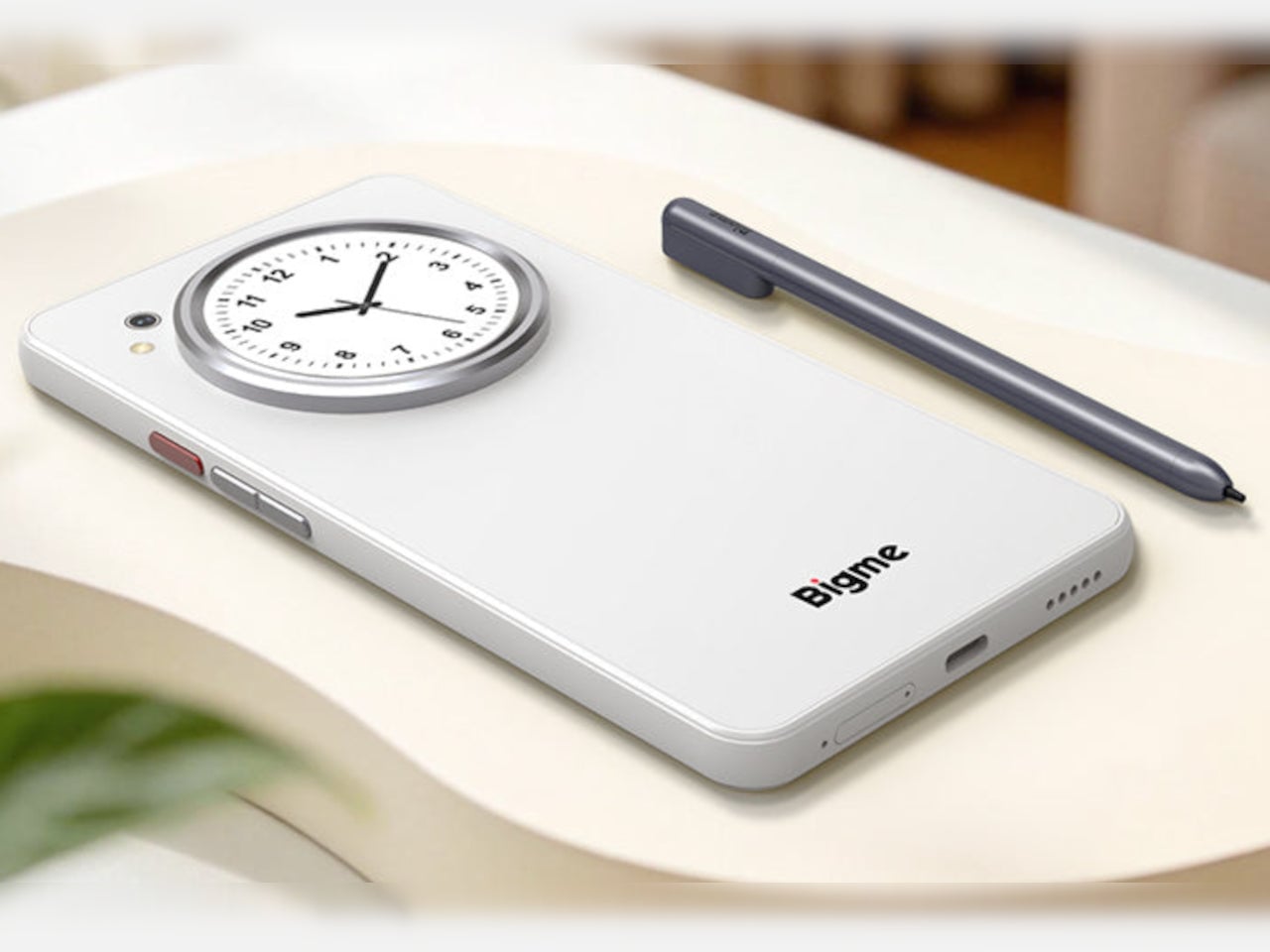
Bigme has been building its HiBreak series into a line of Android smartphones centered on E Ink displays, and the HiBreak Dual is its newest entry. Rather than simply updating the screen, Bigme gave this model two displays: a full-sized E Ink panel on the front and a compact circular LCD on the back, letting the phone handle information at two different levels of urgency.
Designer: Bigme


The main display is a 6.13-inch E Ink screen at 824 by 1,648 pixels, delivering 300 pixels per inch in greyscale mode. The color model supports up to 4,096 colors, and a frontlight with 36 brightness levels covers both dim interiors and bright outdoor settings. Because E Ink reflects ambient light rather than emitting it, reading outdoors is comfortable in a way that backlit displays simply aren’t.
What sets the HiBreak Dual apart from the rest of the lineup is its stylus support, a first for the HiBreak series. A 4,096-level pressure-sensitive pen lets you write, sketch, and annotate directly on the E Ink surface, turning the phone into something closer to a digital notebook. The paper-like texture of the display makes the experience feel more tactile and far less clinical than a standard touchscreen.

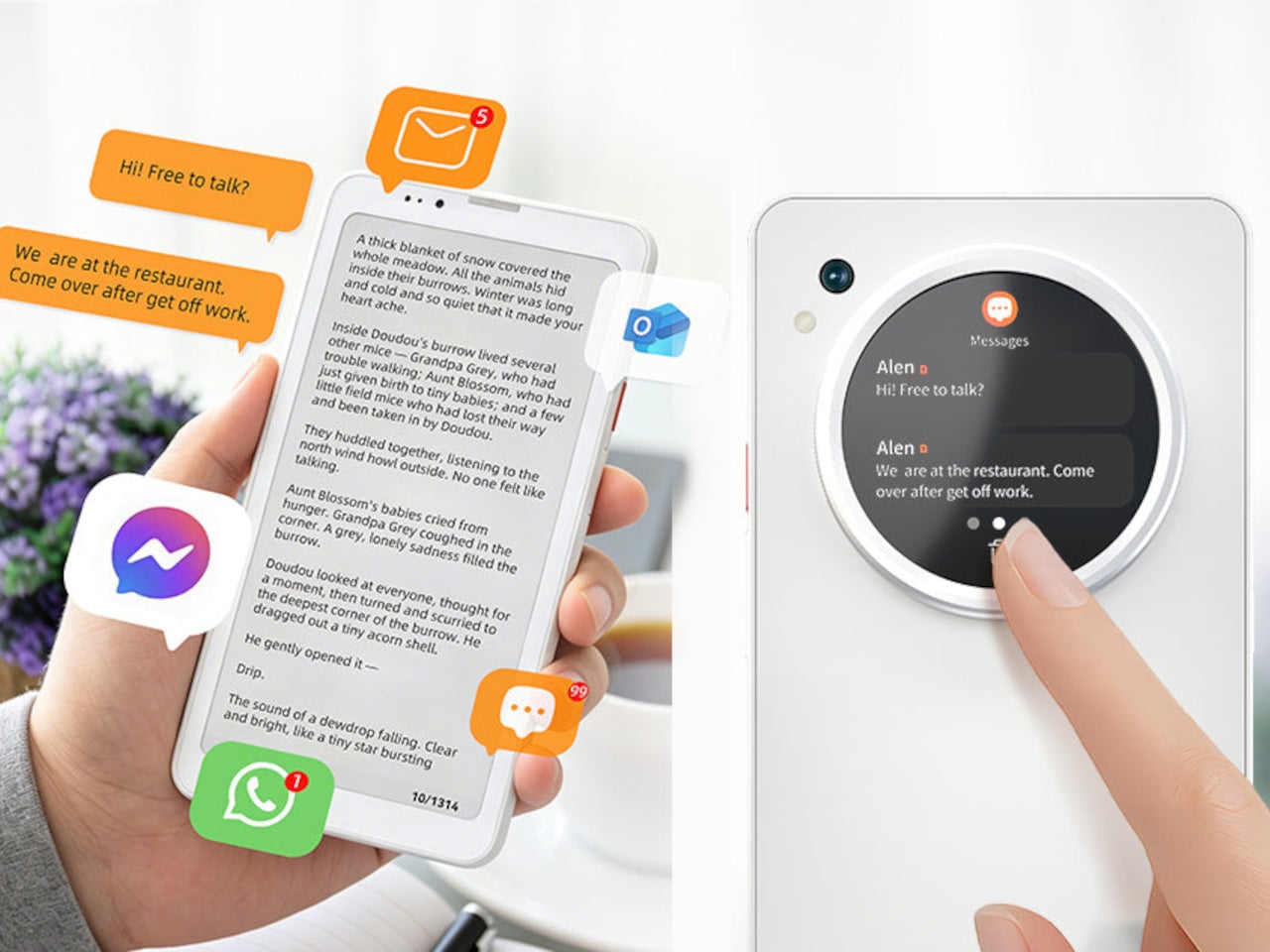
The circular LCD on the back measures 1.85 inches and pulls off a surprisingly wide range of tasks. It shows the time, notifications, music controls, and weather at a glance, and also doubles as a viewfinder for the 20MP main camera. Bigme even added an AI pet feature that generates an animated version of your actual pet from a photo, keeping it alive on that small round screen.
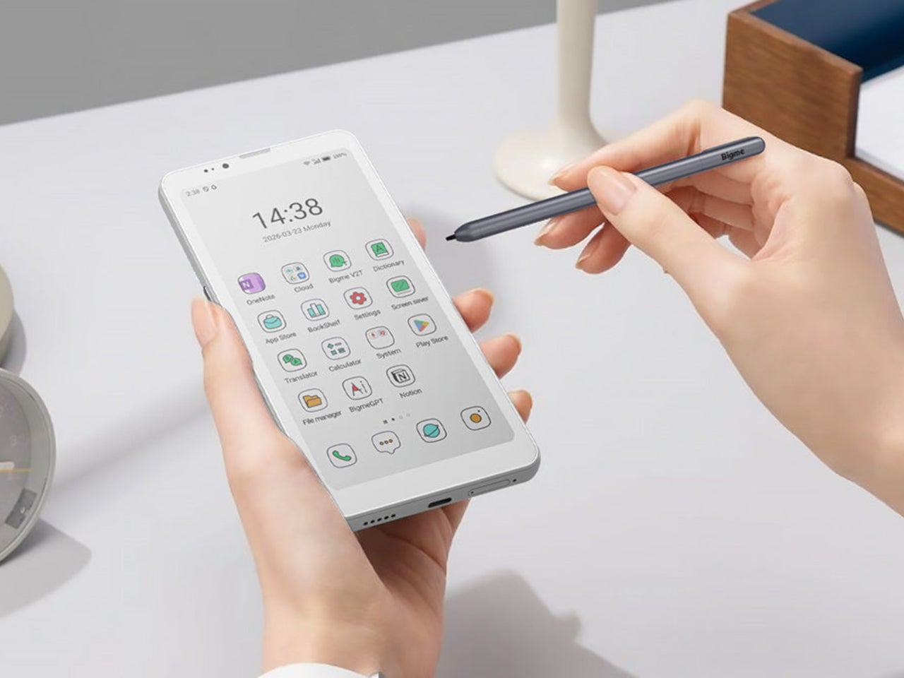
Despite the unconventional display setup, the HiBreak Dual doesn’t skimp on the fundamentals. Although dated, Android 14 with full GMS certification keeps the entire Google Play library accessible, and NFC support means Google Wallet and contactless payments work just as they would on any standard Android device. The 5MP front camera handles video calls and everyday selfies without issue, while a fingerprint sensor takes care of security.
Under the hood, the phone runs on a MediaTek Dimensity 1080 processor paired with either 8GB or 12GB of RAM and up to 256GB of internal storage, further expandable by an additional 2TB via microSD. A 4,500mAh battery gets through a full day without much drama, while 5G on dual SIM cards, Bluetooth 5.2, and dual-band WiFi take care of the rest.
Pricing starts at $519 for the 8GB/128GB model, with early bird options in the $359 to $409 range and a 12GB/256GB version also available. It’s a phone designed for people who spend a significant part of their day reading, writing, and staying on top of things through a mobile device, and who’d genuinely rather do it on a screen that asks a little less of their eyes.

The post Bigme HiBreak Dual Has E Ink Up Front and a Round LCD in Back first appeared on Yanko Design.
The premium smartphone market has gotten very good at producing flagships that look and feel essentially identical. Brighter displays, larger sensors, and faster chips are standard expectations now, and while the results are impressive, they rarely feel purpose-built for a specific kind of user. The phones that genuinely stand out tend to commit to a clear identity and organize everything, from hardware to aesthetics, around it.
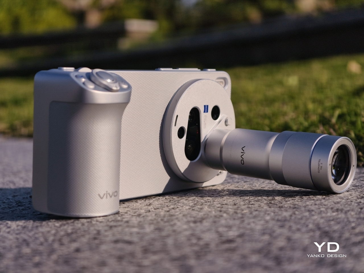
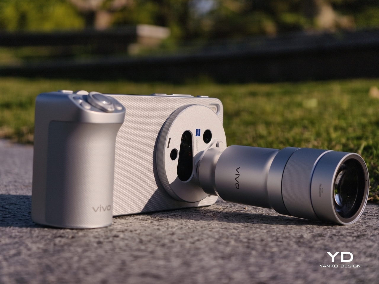
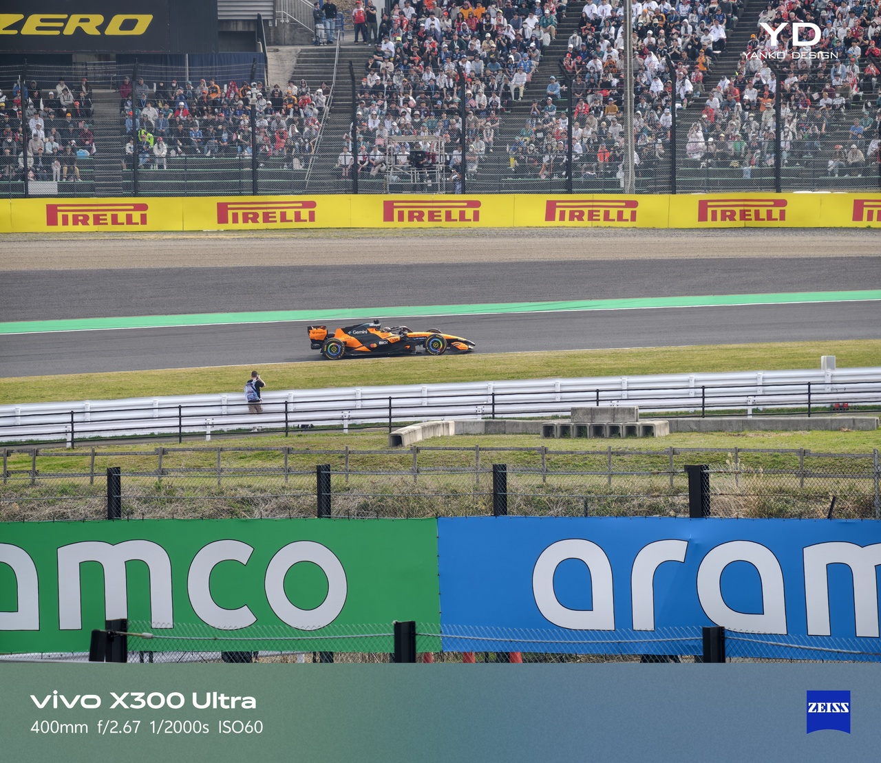
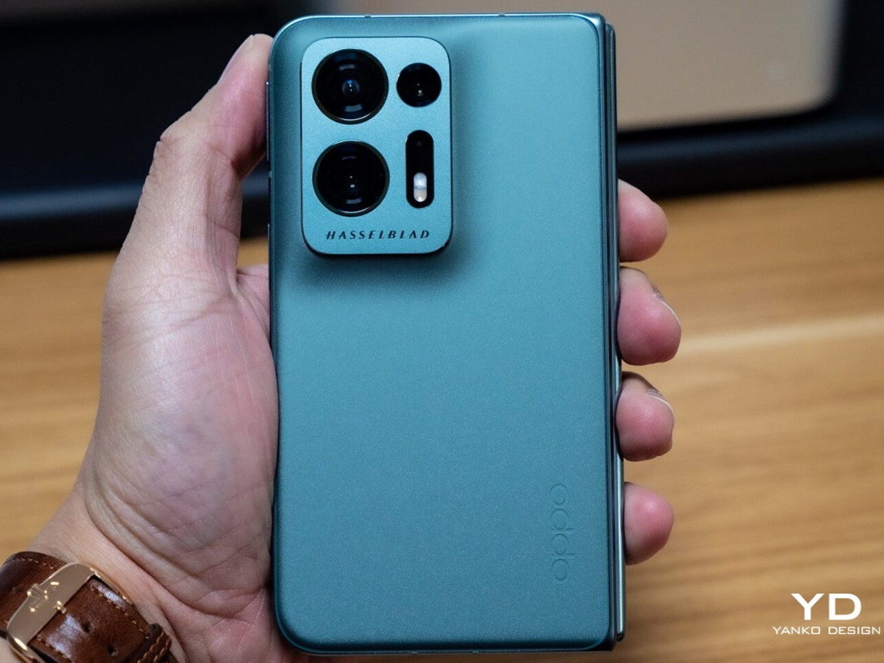
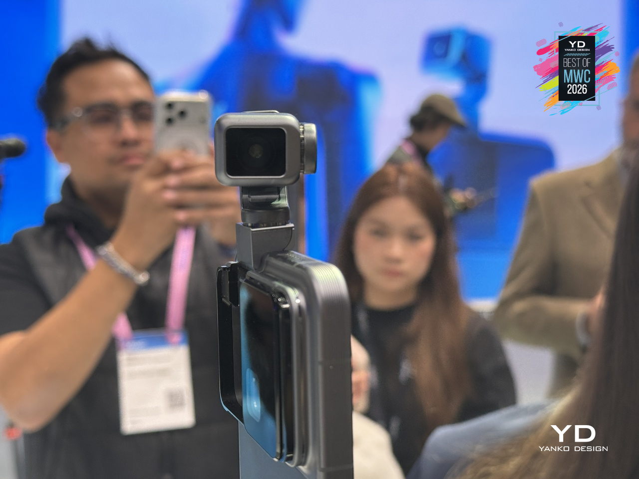
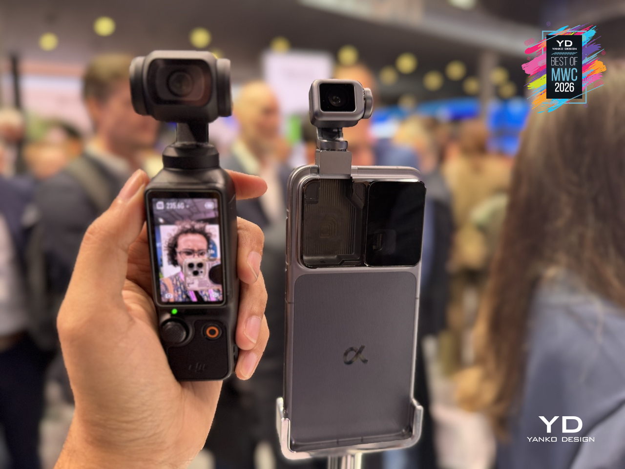
The vivo X300 Ultra is making its global debut right now, the first time vivo’s top-tier X Series flagship has launched outside of China. It arrives with a clear, photography-first premise built around the ZEISS Master Lenses Collection, offering professional creators unprecedented creative freedom through pioneering telephoto solutions, three prime-equivalent focal lengths, and a modular telephoto system that turns the phone into something closer to a portable camera platform than a smartphone that happens to have good cameras.
Designer: vivo
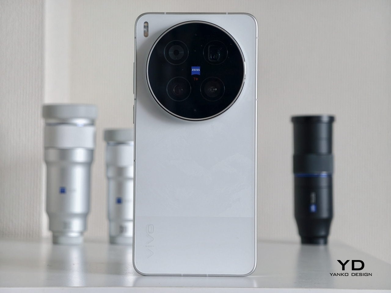
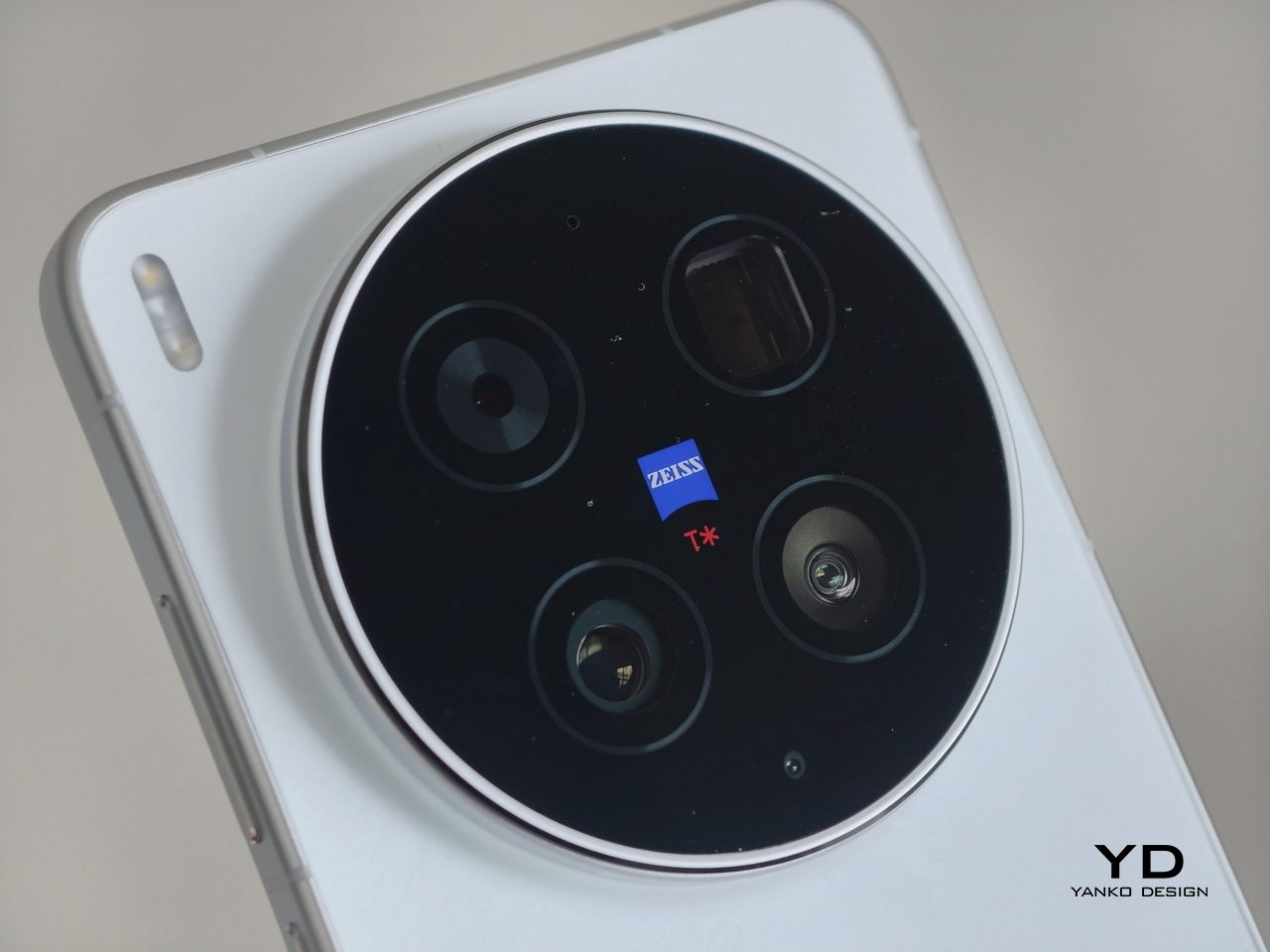
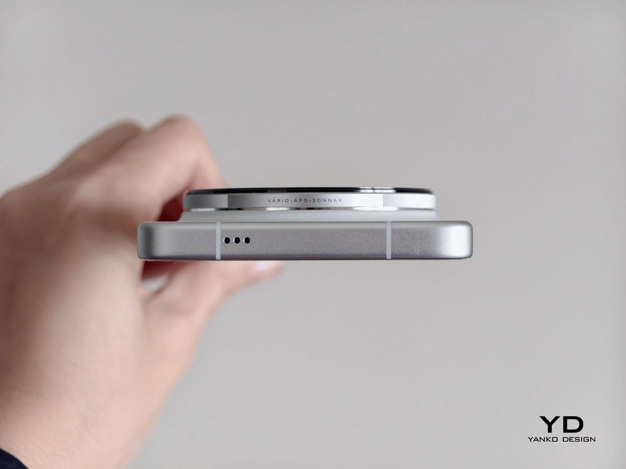
The X300 Ultra doesn’t hide what it’s about. The rear is dominated by a large circular camera module, a bold black disc rimmed in polished metal with ZEISS T* branding at the center. It’s a confident, unapologetic choice that reads as a statement of intent rather than a feature shoehorned into standard smartphone form. The module doesn’t merely support the design; it is the design.
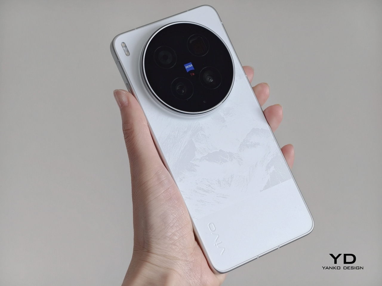
Our review unit is the white colorway, and it’s a particularly considered finish. The back panel has a subtle, almost etched texture beneath the surface, giving it more depth than you’d expect from a white phone. The polished frame and classic split design, inspired by the hues of unprocessed film, create a striking visual contrast while maintaining a slim, premium presence without relying on glossy flash or loud visual contrast.
The camera-inspired detailing rewards a closer look. The device features a metal “biscuit-style” camera bump with a knurled texture and engraved lettering on the sidewall of the camera bump, adding a precision-tool quality you feel the moment you hold it. These aren’t details that show up in a spec sheet, but they make a real difference in how the phone feels to own and carry every day.
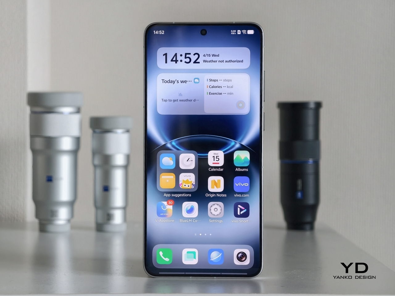
The front takes a different approach entirely. The 6.82-inch 2.5D flat screen sits behind slim, even bezels with a small centered punch-hole for the 50MP front camera, and the whole face feels clean and uncomplicated. That contrast with the expressive rear works in the phone’s favor, keeping the display experience neutral and focused while the camera side carries all the personality.
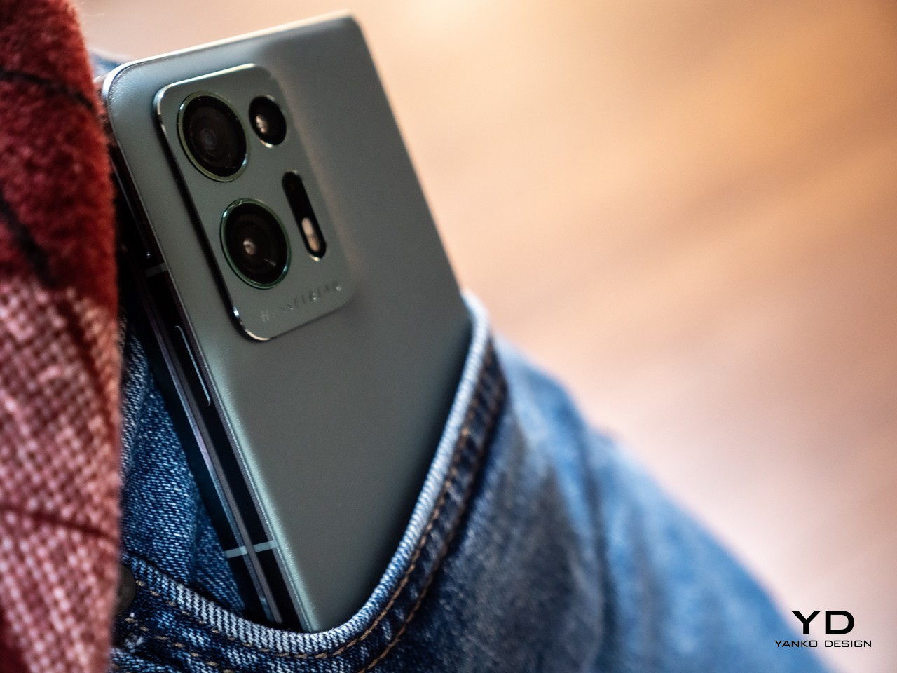
The first thing you notice when picking up the vivo X300 Ultra is the weight. At 237g, the white model is among the heaviest flagship phones currently on the market, and the substantial camera module adds to that presence both physically and psychologically. The Unibody 3D Glass Fiber Design of the Black edition results in a lighter 232g, but regardless of colorway, the flat-sided metal frame distributes the weight well, making the phone feel grounded and deliberate rather than awkwardly front-heavy.
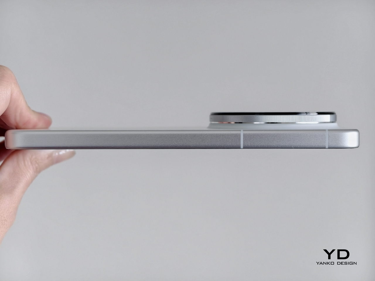
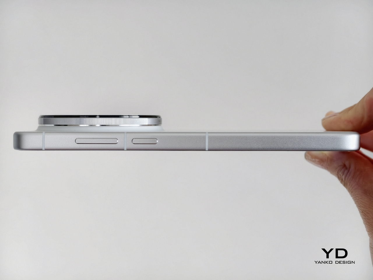
One-handed use is possible, but not the most comfortable for extended periods, which is expected for a device of this size. The flat sides help with grip, giving you a firm hold, and the 8.49mm slim profile feels justified by the optical hardware packed inside. It’s a noticeable phone in the pocket, though that’s really true of any flagship with serious camera ambitions.
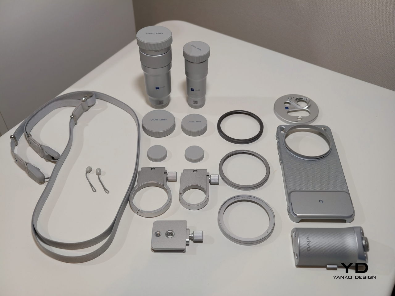
The ergonomics shift noticeably when the telephoto extenders enter the picture. The protective case becomes a functional necessity, as the lens mount system requires it to interface with the accessories. Once a telephoto extender is attached, the modular grip moves from optional to practically essential, providing the stability and comfort that the added length and weight demand.
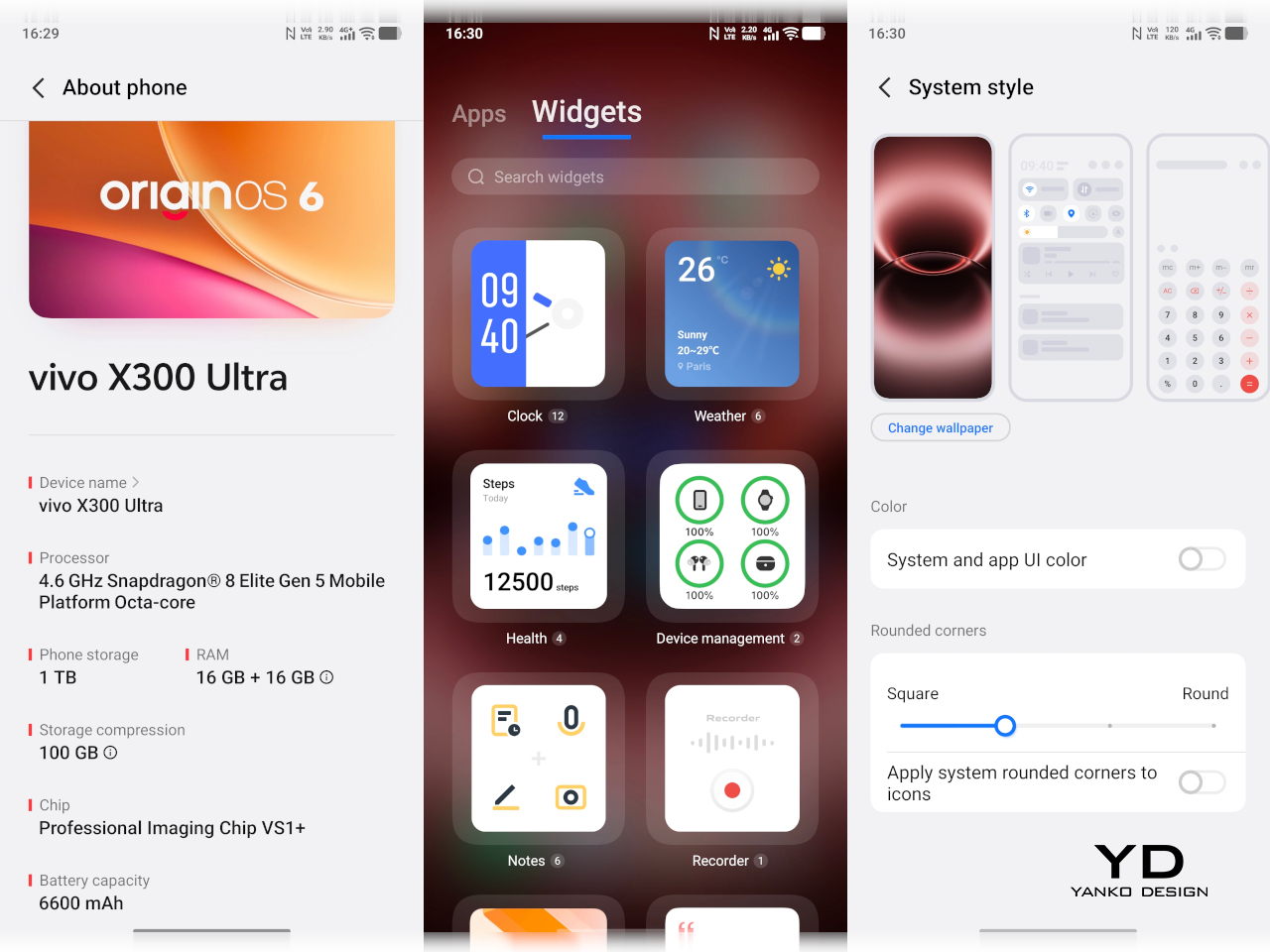
At the core lies the Snapdragon 8 Elite Gen 5, paired with vivo’s own Pro Imaging Chip VS1+ and up to 16GB of RAM with up to 1TB of storage. Day-to-day performance is exactly what you’d expect from a 2026 flagship: fast, fluid, and unfazed by demanding tasks. OriginOS 6, based on Android 16, keeps things running smoothly with an Origin Smooth Engine that keeps the interface feeling responsive even after extended sessions.

The display is a 6.82-inch 8T LTPO panel running at 3,168 x 1,440 with a 144Hz adaptive refresh rate. It’s bright enough to review shots comfortably outdoors, with 4,500 nits of local peak brightness and certifications for Dolby Vision, HDR10+, and Netflix HDR. As a viewfinder for the camera system, it performs its job well, delivering accurate colors that reflect what the camera is actually capturing.
Battery life is solid for a phone with this level of imaging ambition. The 6,600mAh BlueVolt Battery supports 100W wired FlashCharge and 40W wireless charging, making it easy to top up quickly between shoots. Bypass charging with smart temperature control also keeps heat in check during longer sessions, which matters when you’re shooting all day.
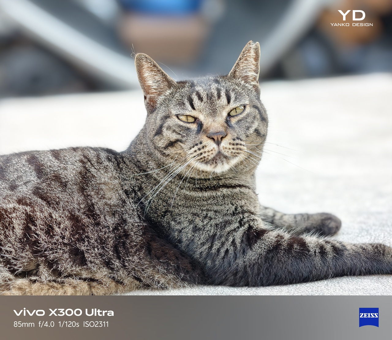
The camera system is, of course, where the X300 Ultra makes its most interesting argument. Rather than organizing three cameras as “main, ultrawide, and telephoto,” vivo builds them around three prime-equivalent focal lengths, each treated as a dedicated imaging tool. The 35mm ZEISS Documentary Camera, equipped with a Sony LYTIA 901 sensor at a 1/1.12-inch sensor size and 200MP direct output, is the natural storytelling lens with a field of view close to the human eye. It’s ideal for portraits, street photography, and everyday moments, particularly in low light, where it delivers sharp, naturally detailed results.

Color Profile: Authentic

Color Profile: Vivid
Portrait Mode

Macro Mode
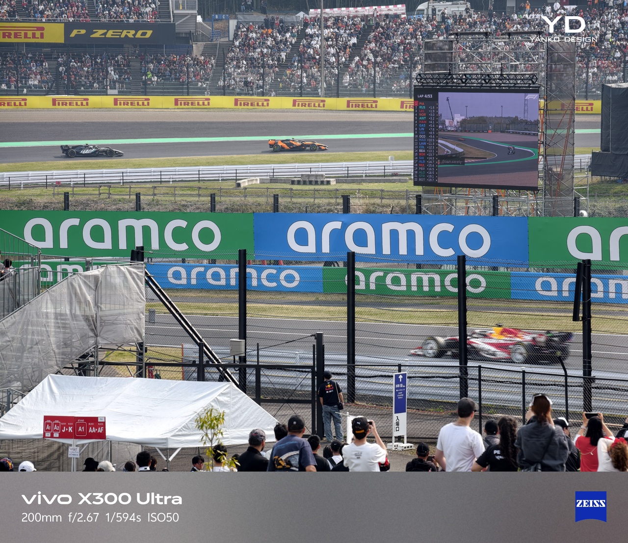
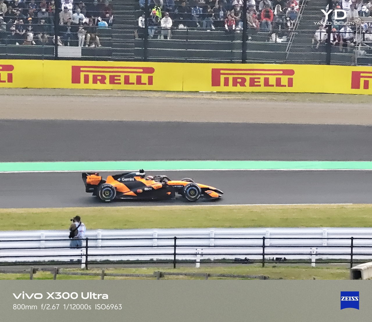
The 85mm ZEISS Gimbal-Grade APO Telephoto Camera is arguably the most technically ambitious of the three. Its 200MP sensor captures extraordinary detail even at high zoom levels, meeting ZEISS APO standards for optical precision. With 3-degree gimbal-level OIS and 60fps AF tracking in Snapshot mode, it handles fast-moving subjects with a composure that most telephoto cameras on phones can’t manage. Concerts, wildlife, and sports are where this lens makes the clearest case for itself, letting you track and capture decisive moments with confidence.
Telephoto Lens (No Mode)
Telephoto Lens (Pro Sports Mode)
Telephoto Lens (Pro Sports Mode)

Ultra-wide
The 14mm ZEISS Ultra Wide-Angle Camera rounds things out at 50MP, with a large aperture that makes it more capable than the typical ultrawide found on most flagships. It isn’t an afterthought; vivo positions it as a main-camera-grade lens designed for natural landscapes and broader compositional work, and that ambition shows in the results.

Main

Telephoto Camera (No Lens Extender)
The telephoto extenders add another layer to the whole system. The 200mm equivalent vivo ZEISS Telephoto Extender Gen 2 connects to the phone via the case’s lens mount and delivers optical-grade output at a focal length that no internal module can match, all at a more manageable 153g, refined down from 210g in the previous generation. The 400mm equivalent Telephoto Extender Gen 2 Ultra takes things further still, built on a Kepler-inspired optical design with 15 high-transmittance glass elements and support for 200MP optical output. Both extenders support gimbal-grade OIS and up to 60fps AF tracking, and together they extend the X300 Ultra’s imaging range into territory that genuinely blurs the boundary between smartphone and dedicated camera.

200 mm ZEISS Telephoto Extender Gen 2

400 mm ZEISS Telephoto Extender Gen 2 Ultra
The X300 Ultra is built to last, and that conviction shows in the hardware choices. Armor Glass protects the exterior, and the phone carries both IP68 and IP69 dust and water resistance ratings, covering both prolonged submersion and high-pressure water exposure. These are meaningful standards for a device that’s meant to travel and shoot in varied conditions.
The strongest sustainability argument, though, is software longevity. vivo is committing to five years of OS upgrades and seven years of security maintenance, a support window that puts the X300 Ultra ahead of most Android flagships and signals genuine confidence in its long-term relevance. For a phone at this price point, that kind of assurance matters, extending the useful life of the device considerably.
Like most sealed flagship phones, however, the X300 Ultra isn’t particularly repair-friendly, and vivo doesn’t make any specific claims about recycled or sustainable materials in this build. That’s a common gap across the ultra-premium phone category, and the long support window and durable construction go some way toward compensating for it.
The X300 Ultra sits squarely in the ultra-premium flagship tier, and it makes no attempt to be a broadly accessible phone. It’s a specialized, photography-first device with a modular accessory system, three prime-equivalent focal lengths, and a build quality that communicates its ambitions at every turn. The starting price in China begins at CNY 6,999, roughly in line with other high-end imaging flagships globally, though global pricing hasn’t been officially confirmed at the time of this review.
For the right buyer, that price feels well-matched to what the phone actually delivers. Photographers and creators who think in focal lengths, who want to shoot 200MP RAW files on a 35mm lens, track birds or performers at 85mm, and then extend to 200mm or 400mm with an optically serious external lens, will find it harder to justify a more generalist flagship. The X300 Ultra covers a lot of creative ground that most phones simply can’t.
That said, buyers looking for the lightest or simplest ultra-premium smartphone, something to carry easily through a full day without thinking twice about it, may find the X300 Ultra’s weight and accessory ecosystem a bit more demanding than they bargained for. It’s a phone that asks for a certain kind of engagement, and it rewards that engagement handsomely.
The vivo X300 Ultra is one of the most coherent camera-first flagships to arrive in years. The design, the optics, the telephoto ecosystem, and the software are all pulling in the same direction, creating a product that knows its audience and delivers on their priorities with real conviction. The 237g weight and accessory dependency aren’t oversights; they’re the cost of a system this capable, and for the right user, that’s a perfectly reasonable trade.
What makes it genuinely memorable, though, isn’t any single spec. It’s the feeling that the whole thing was designed by people who actually think about photography, not just camera marketing. The focal lengths are deliberate, the extenders are optically serious, and the hardware detailing reinforces the idea that this is a tool as much as it is a phone. For anyone who shoots with intent, that kind of commitment is exactly what a flagship should offer.
The post vivo X300 Ultra Review: Putting the Camera at the Center of Everything first appeared on Yanko Design.
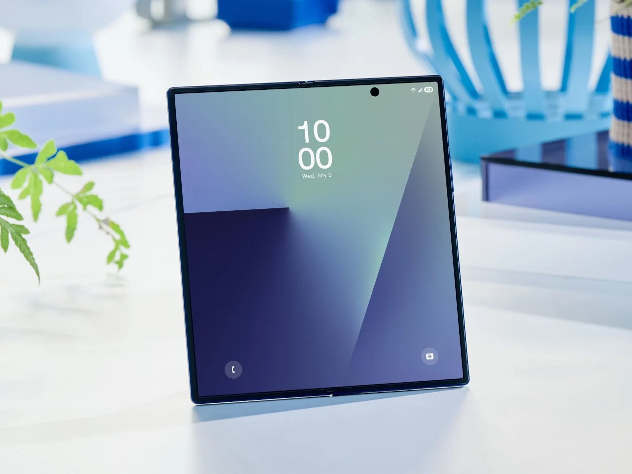
Foldable phones have been around long enough that the novelty has worn off. Samsung pioneered the book-style fold, and the hardware has genuinely matured. Foldables today are thinner, lighter, and far more durable than the early prototypes that worried everyone. But one nagging issue hasn’t gone away after seven years of refinement. The proportions still feel like a compromise, and most buyers can still sense it.
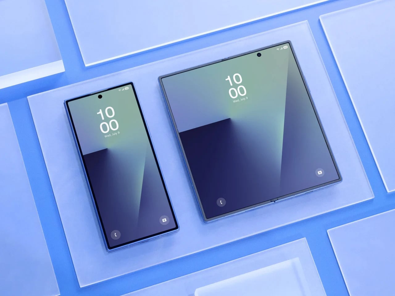
That’s exactly what the Galaxy Z Fold 8 Wide seems designed to address. Rather than continuing the tall, narrow approach that has defined the Fold lineup since the beginning, the Wide version reportedly takes a shorter, broader form factor, with the inner display pushing toward a 4:3 aspect ratio. It’s a subtle-sounding change, but one that could shift how the device feels in every single moment you actually use it.
Designer: Samsung (renders by Steve Hemmerstoffer/OnLeaks via AndroidHeadlines)
Anyone who has used a Galaxy Z Fold for a while knows the friction of the cover screen. It’s tall, narrow, and requires more thumb effort than you’d expect from a daily driver. Reaching the notification shade with one hand usually means repositioning your grip, and typing on that narrow layout takes some getting used to. It works, but it always feels like a device asking you to meet it halfway.
Galaxy Z Fold7
The Galaxy Z Fold 8 Wide reportedly carries a 5.4-inch cover display that is wider and shorter than what the Fold 7 offered. That brings it closer to the feel of an ordinary compact phone, one that sits comfortably in your hand without requiring thumb acrobatics. It sounds like a small win, but if you’ve ever owned a phone from before screens started growing taller every year, you know exactly how much that sense of balance matters.
There’s a quiet awkwardness to watching a video on current book-style foldables. The cover screen’s narrow shape forces letterboxing on most content, and even the inner display’s near-square proportions aren’t ideal for widescreen formats. Games feel slightly cramped, and browsing feeds in landscape doesn’t quite deliver the comfortable experience you’d expect from a screen that size. For a device this premium, that’s a surprisingly persistent design limitation.
A 4:3 inner display changes that dynamic considerably. The Galaxy Z Fold 8 Wide’s 7.6-inch screen reportedly lands in proportions that suit media consumption far better, making landscape video less of a letterboxed compromise and gaming more spatially generous. Rotating to portrait for reading or scrolling also starts to feel intentional, like the device was built to handle those orientations rather than merely tolerating them. That’s a meaningful difference in day-to-day comfort.
Foldables have always carried a bit of an identity crisis. They’re marketed as phone-tablet hybrids, but the tablet side of that pitch has always been shakier than the phone side. Apps designed for tablet layouts don’t always know what to do with a nearly square display, and the result is often stretched content, oversized sidebars, or awkward layouts that remind you this device is still figuring out what it wants to be.
![]()
Google Pixel Fold (2023)
The 4:3 ratio is a well-understood canvas. It’s the same one the iPad has used for years, and developers have been designing for it far longer than they’ve been designing for foldable proportions. Not every app on the Galaxy Z Fold 8 Wide will look perfect, but the number that feel genuinely at home on that inner screen stands to increase considerably. It’s a format the software world already knows how to fill.
There’s a certain appeal to a device that opens up to something resembling a pocket notebook. Not a productivity gimmick, but an actual blank-page-sized surface where you can think out loud. The Galaxy Z Fold 8 Wide, when unfolded, reportedly sits at dimensions close to a small memo book’s proportions. That makes it a surprisingly natural surface for quick thoughts, rough sketches, and anything else worth capturing before it slips away.
OPPO Find N2
The device is also reportedly thicker than the standard Fold 7, measuring around 9.8mm when folded, which gives Samsung more internal room to work with. It’s hard not to wonder whether some of that space is being reserved for S Pen support, which Samsung hasn’t confirmed yet. A stylus-compatible screen at these proportions would make the Galaxy Z Fold 8 Wide feel genuinely notebook-like, less like a big phone you write on and more like something actually worth reaching for.
Foldables still carry a reputational burden. The people who haven’t bought one yet aren’t always hesitating because of price or specs. Often, it’s the lingering sense that this is still experimental hardware, a category that hasn’t quite committed to a definitive form. Even Samsung’s most polished efforts can feel like stepping into an ongoing experiment, and that feeling keeps a large group of potential buyers watching from a distance.
iPhone Fold (Renders)
Apple’s rumored foldable iPhone is expected to sport dimensions strikingly similar to the Galaxy Z Fold 8 Wide, with a wider, shorter profile that closely mirrors what Samsung is building. When Apple commits to a hardware direction, cautious buyers tend to pay attention. It doesn’t guarantee anyone will rush out to buy a Samsung instead, but Apple’s presence in the same design space lends the wider foldable format a credibility that Samsung alone hasn’t quite managed to manufacture on its own.
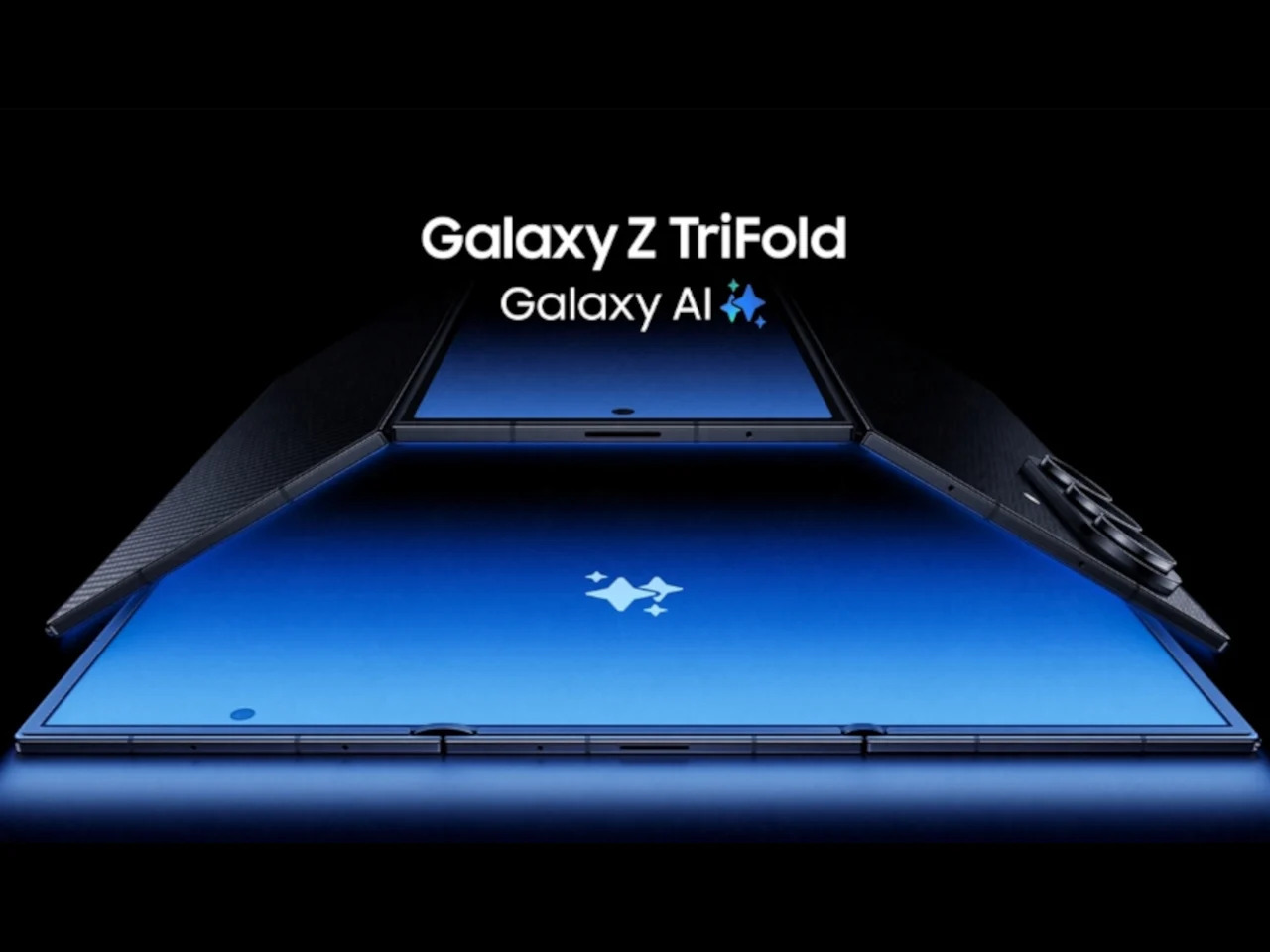
Here’s the part that’s harder to shake. Samsung has a demonstrated pattern of building genuinely interesting experimental devices and then quietly stepping back when the numbers don’t perform. The Galaxy Z TriFold is the most recent example, a compelling piece of hardware whose long-term future already feels uncertain. Buying into the Galaxy Z Fold 8 Wide means betting that Samsung will stay committed long enough to make the second and third generations worth waiting for.
That concern is more meaningful here than it is for a standard phone. Accessories take time to mature. Software optimization accumulates across generations. And the design refinements that make a device feel truly polished rarely arrive on the first attempt. The Galaxy Z Fold 8 Wide might be a genuinely thoughtful piece of hardware, but Samsung’s track record with experimental form factors hasn’t yet inspired the long-term trust that a device like this quietly depends on.
The post 5 Reasons the Galaxy Z Fold 8 Wide Could Win and 1 Reason It Might Not first appeared on Yanko Design.
Interests and fandoms number in the hundreds, and when you take into account the number of smartphone brands and models, it’s statistically impossible for manufacturers to cater to everyone’s tastes. That’s why when smartphone makers come out with devices especially designed to appeal to fans of certain characters or brands, there’s no small amount of excitement over a collab that finally feels like rewarding their brand loyalty. After all, you won’t need to dress your phone up in a thick case just to show off your style.
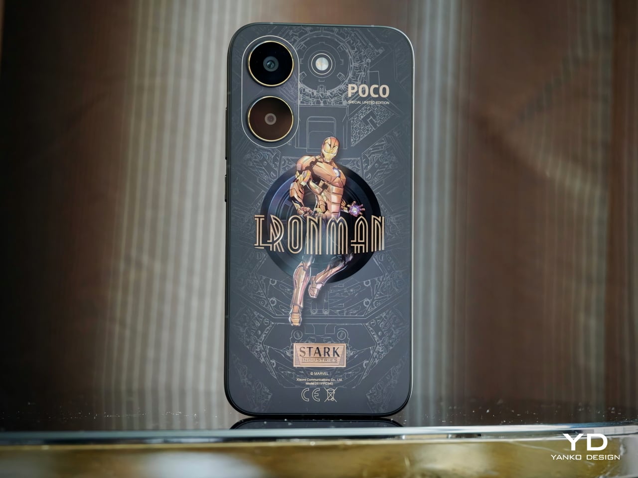
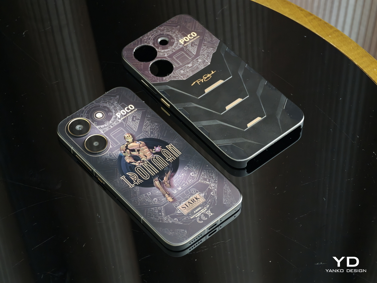
For the second time, POCO is releasing an Iron Man-themed version of one of its flagships, the POCO X8 Pro. While last year’s POCO X7 Pro Iron Man edition brought the flashy, head-turning red and gold motif that has become synonymous with the superhero, the latest iteration brings maturity and elegance while still maintaining that hi-tech character. Best of all, it’s still a device that Tony Stark himself would probably give his seal of approval. Read on to find out why.
Designer: POCO
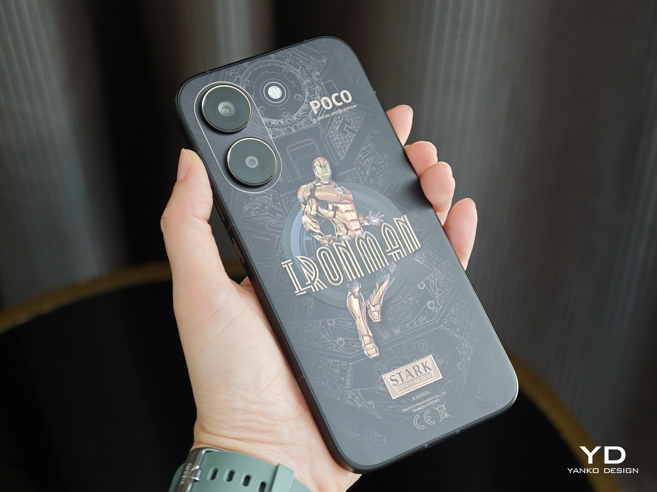
Tony Stark is more than just Iron Man, symbolized by the heroic and explosive colors of red and gold. As the famous movie quote goes, he’s also a genius, billionaire, and philanthropist (let’s ignore that other part of that phrase for now). The POCO X8 Pro Iron Man Edition seems to represent that other side of the coin, displaying an often-forgotten aspect of Tony Stark’s identity, without losing what makes Iron Man Iron Man: the fearless and relentless drive to push boundaries.
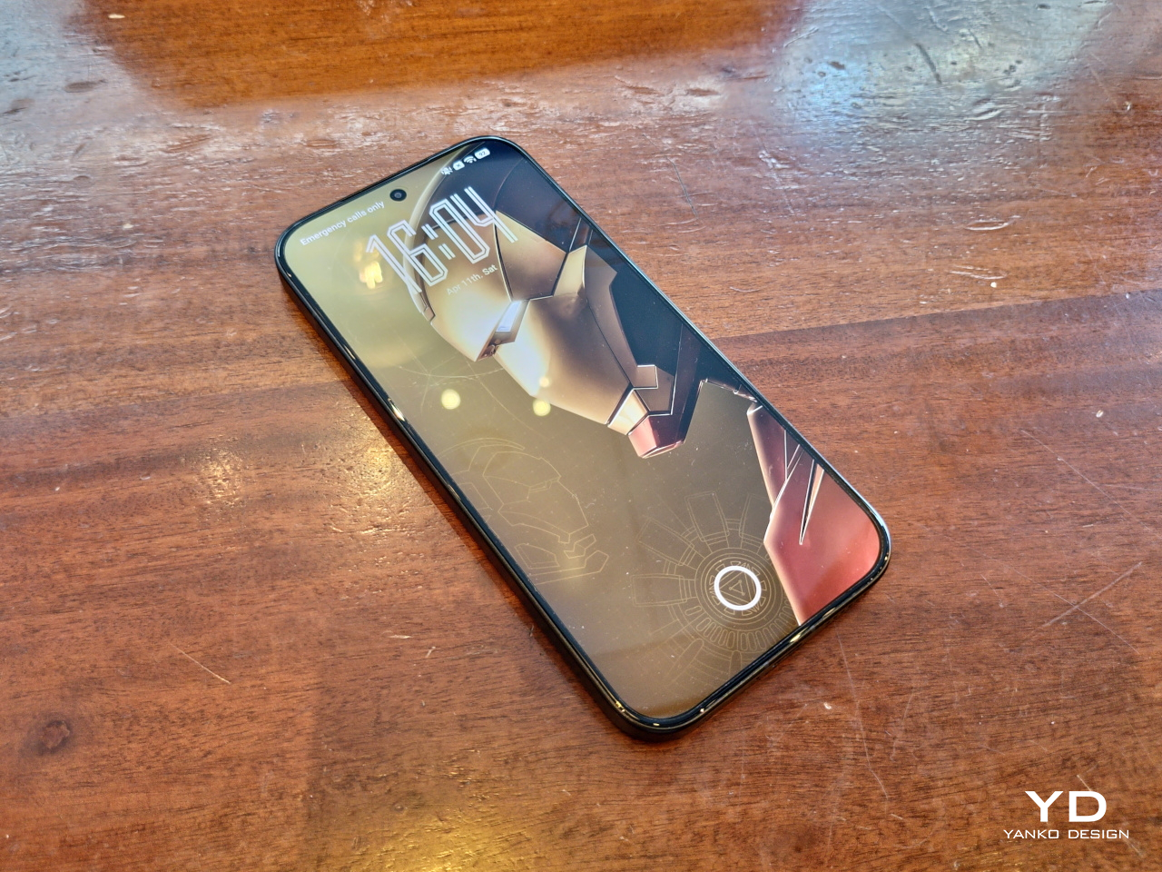
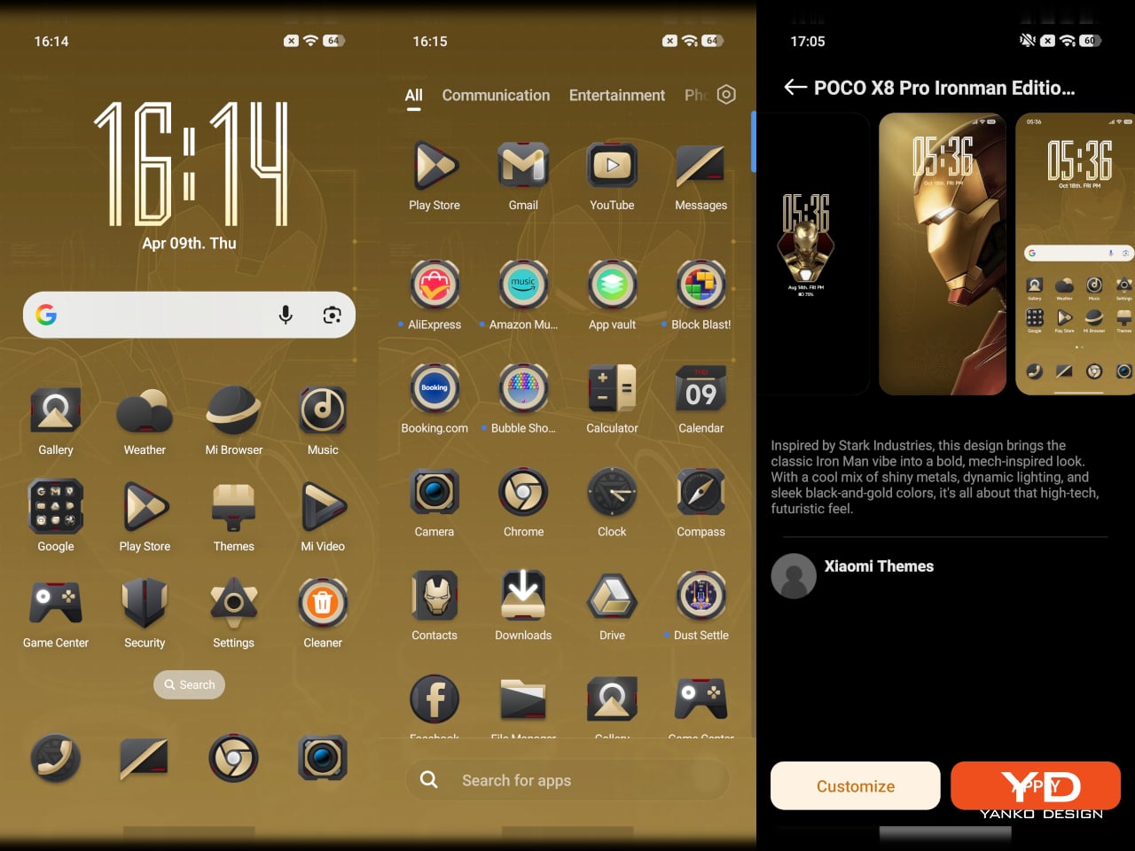
This year’s color scheme revolves around a black and gold combination, which rarely makes an appearance in both comics and film, that carries a sense of class and style befitting one of the richest people in the Marvel universe. The phone itself embraces the modern design language of sides sandwiched by a flat screen and a flat back panel. There’s almost an Art Deco vibe to the aesthetic, a design language that is immediately associated with opulence and luxury.
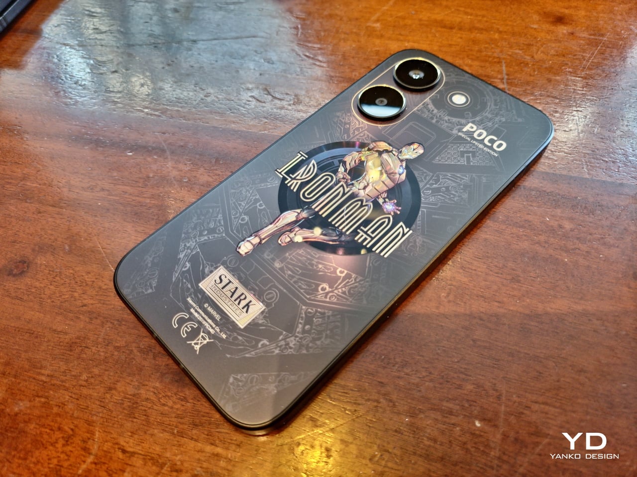
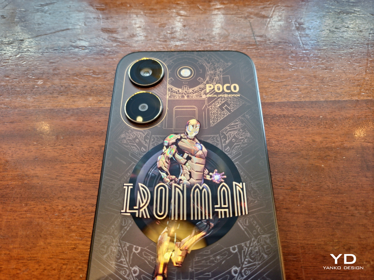
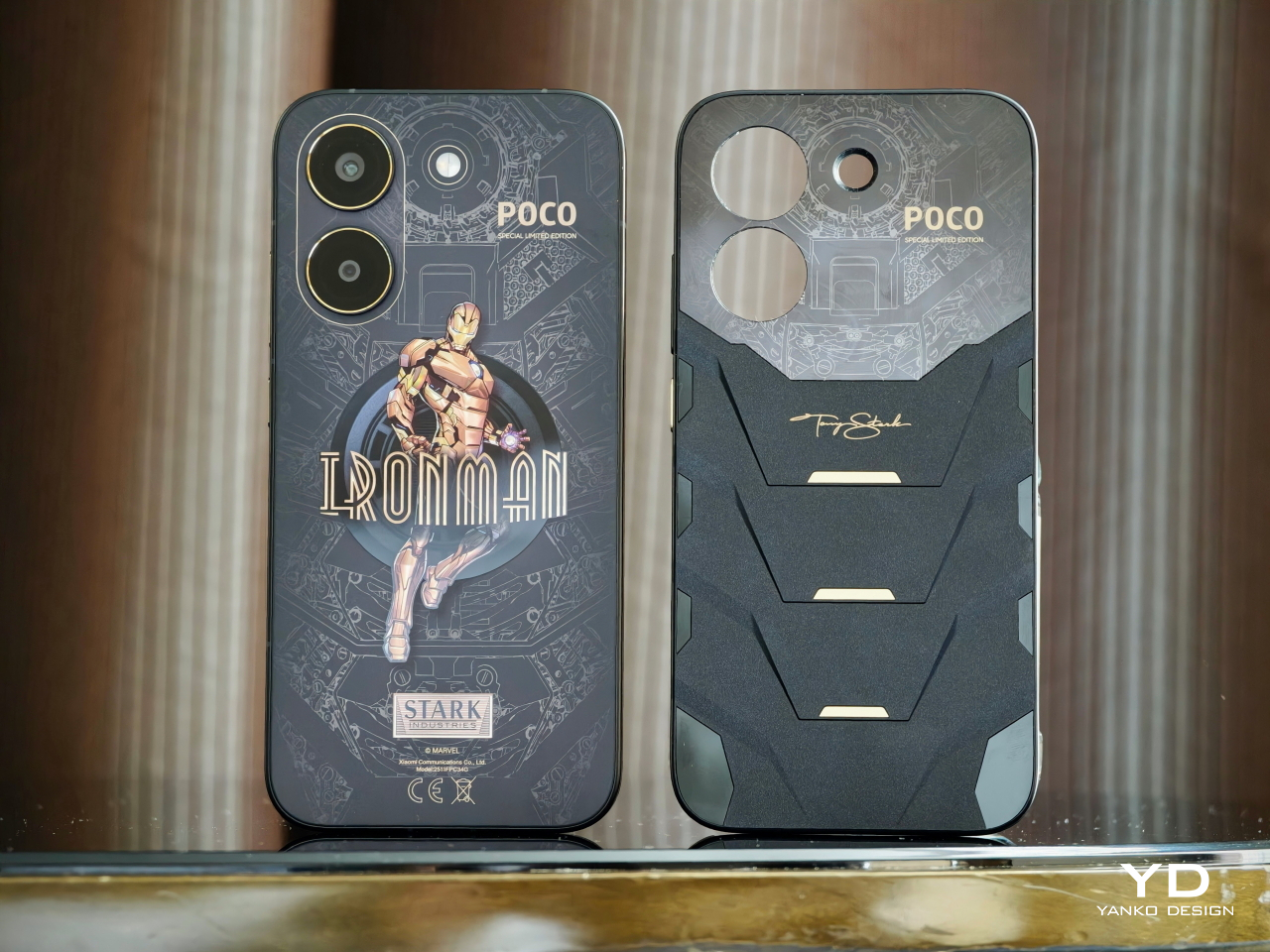
Of course, the most attention-grabbing part of the POCO X8 Pro Iron Man Edition’s design is its rear. The back panel has a matte black surface with holographic gold accents detailing a circuit diagram of Iron Man’s armor. Smack in the middle is a full-body armor decal of the titular superhero, complete with his name in case you couldn’t identify him from appearance alone. The decal has a glossy material that contrasts with the smooth matte texture of the rest of the phone’s back.
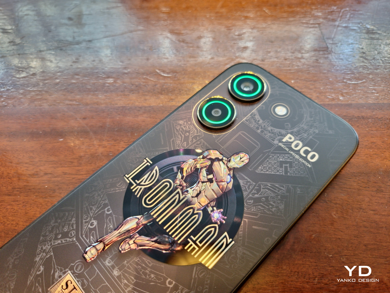
Unlike other smartphones of this era, the POCO X8 Pro’s two cameras stand on their own, with the lenses also accented with a gold ring. These cameras have a special power, displaying different RGB colors depending on the situation and enhancing that sci-fi aesthetic. The LED flash stands beside them, positioned in such a way that it is reminiscent of the Arc Reactor in the center of Iron Man’s chest. In reality, the flash is actually off-center, though the design easily fools the eye into believing that’s not the case.
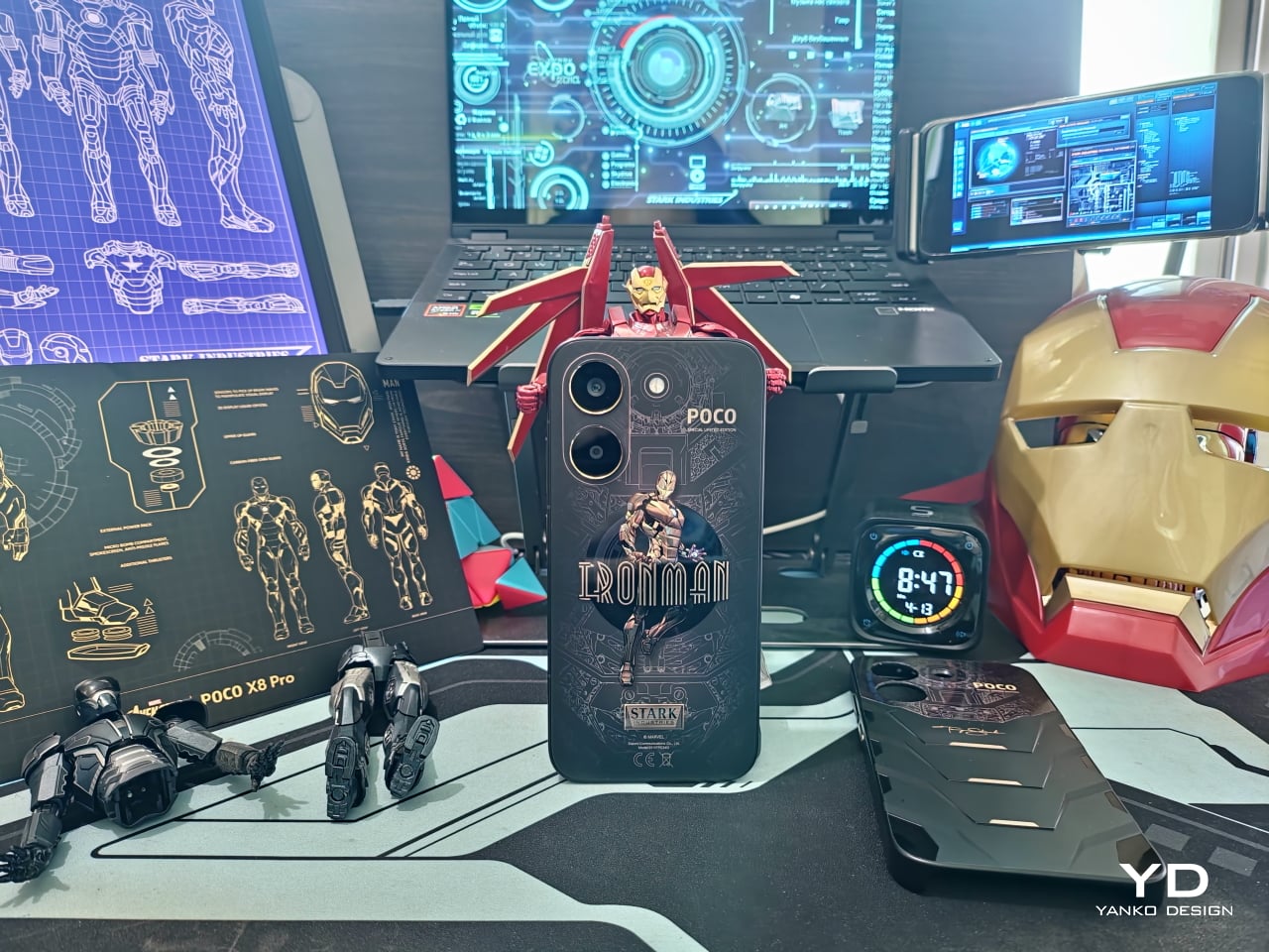
Special mention needs to be made to the packaging for this year’s Iron Man edition. Though not as elaborate as the realme 15 Pro Game of Thrones Edition, the POCO X8 Pro Iron Man edition comes in a box that instantly identifies the theme of its contents. Specifically, it emulates Iron Man’s armor in the form of a briefcase, yet another nod to the comics, and comes with a MARVEL-branded SIM ejector pin and a red charging cable with Tony Stark’s signature on it.
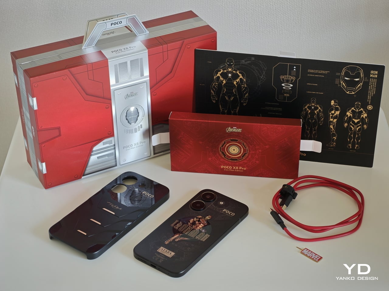
At only 201.47g and with a 6.59-inch screen, the POCO X8 Pro Iron Man Edition is surprisingly light and comfortable to hold in the hand, despite the large 6,500mAh battery sitting inside. The 8.38mm chamfered edges add to the grip without biting into your skin, which would normally result in a confident and secure hold, if not for the rather slippery matte surface of both the aluminum frame and most of the phone’s back.
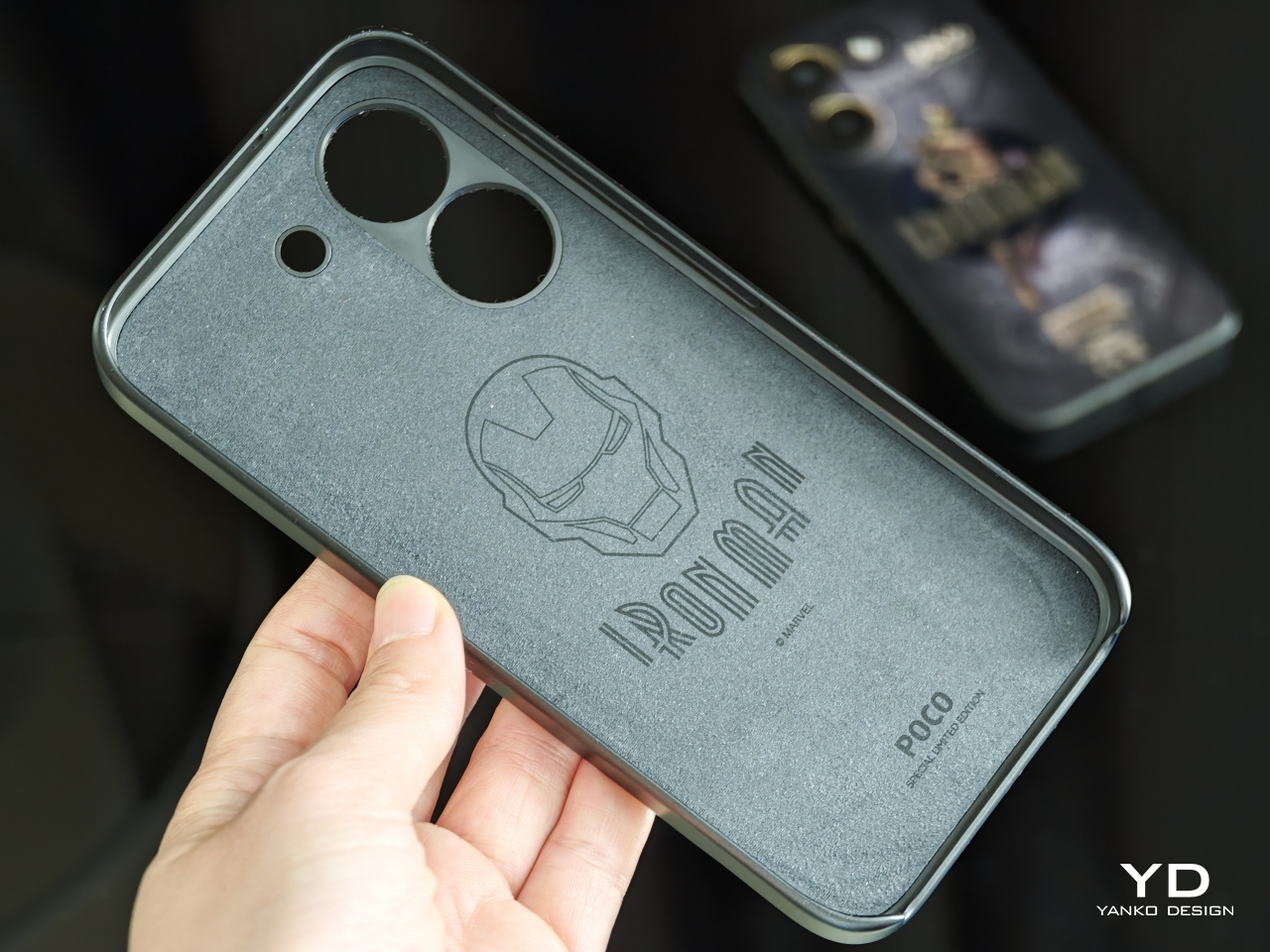
Almost ironically, the glossy Iron Man decal in the middle adds a bit of stickiness to prevent slipping. Thankfully, it isn’t much of a smudge magnet, so you can rest your fingers on it without much worry. If you’re still unsure, however, the POCO X8 Pro Iron Man Edition comes with a matching protective case that doesn’t add much bulk or heft to the phone. Given how the case is designed like Iron Man’s torso, it’s almost like literally putting armor on your phone.
Sadly, there is no such relief for the under-screen fingerprint sensor, which is positioned quite close to the lower edge of the phone. This might require shifting your hand down a bit to unlock the phone with one hand, which carries the risk of the phone slipping from your grasp. Fortunately, the sensor is accurate enough to allow you to partially place your thumb above the ring indicator to successfully unlock it.
An Iron Man-themed smartphone that only looks good on the outside but falls flat on its face in actual use would be a terrible insult to the tech genius that is Tony Stark. Thankfully, that isn’t the case, and the POCO X8 Pro performs as you would expect from a superhero-branded piece of technology. Running on a MediaTek Dimensity 8500 Ultra with 12GB of RAM and 512GB of storage, the POCO X8 Pro has enough muscle to help you triumph over life’s daily battles.
The user interface is fluid and responsive, and there are no issues with multitasking and switching between running apps. Gaming is also no problem, though with some caveats. This is definitely no Pro Max, but the POCO X8 Pro can definitely handle titles like Genshin Impact or Warframe, even at high settings. It does get warm quickly, and it doesn’t cool down as fast, but it never gets unbearably hot. You’ll have to play around to find the sweet spot between performance and comfort, especially with POCO WildBoost Optimization and Game Turbo feature at play. Pun totally intended.
The POCO X8 Pro Iron Man Edition’s bright and vivid 6.59-inch screen perfectly complements the phone’s power. With a 1.5K resolution of 2756×1268 pixels and a 120Hz refresh rate, the screen delivers sharp and crisp visuals whether you’re gaming or binging videos. One detail worth noting, however, is the curved corners of the screen, which could make some parts of a game’s interface difficult to access with a simple tap.
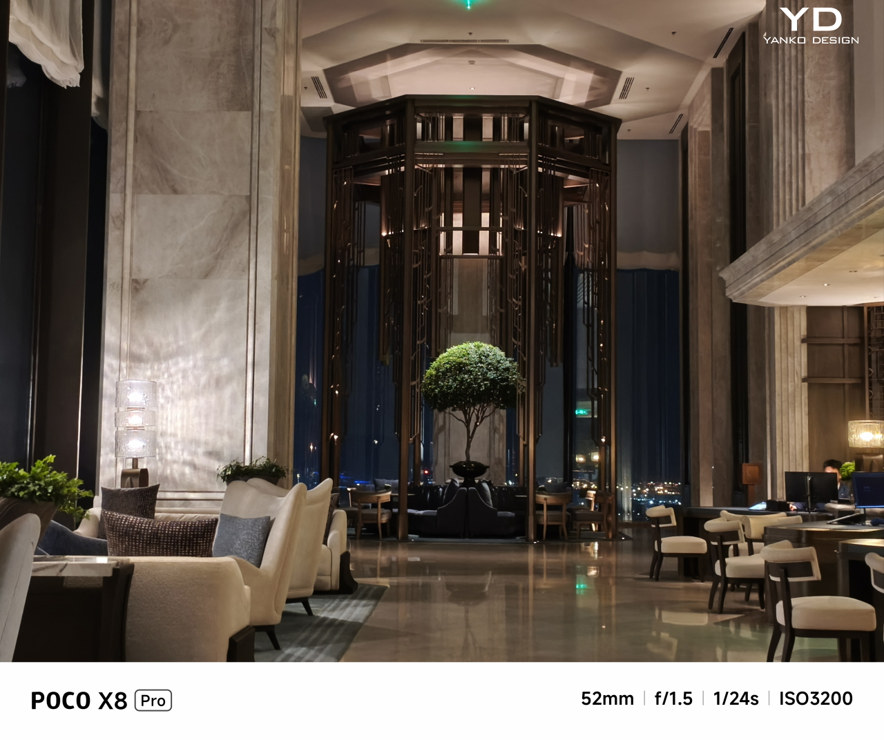
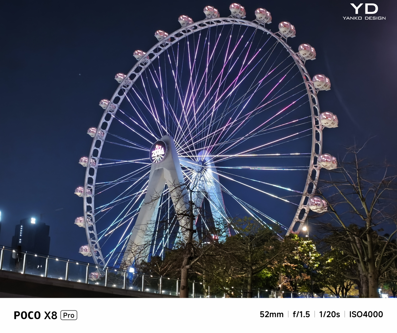
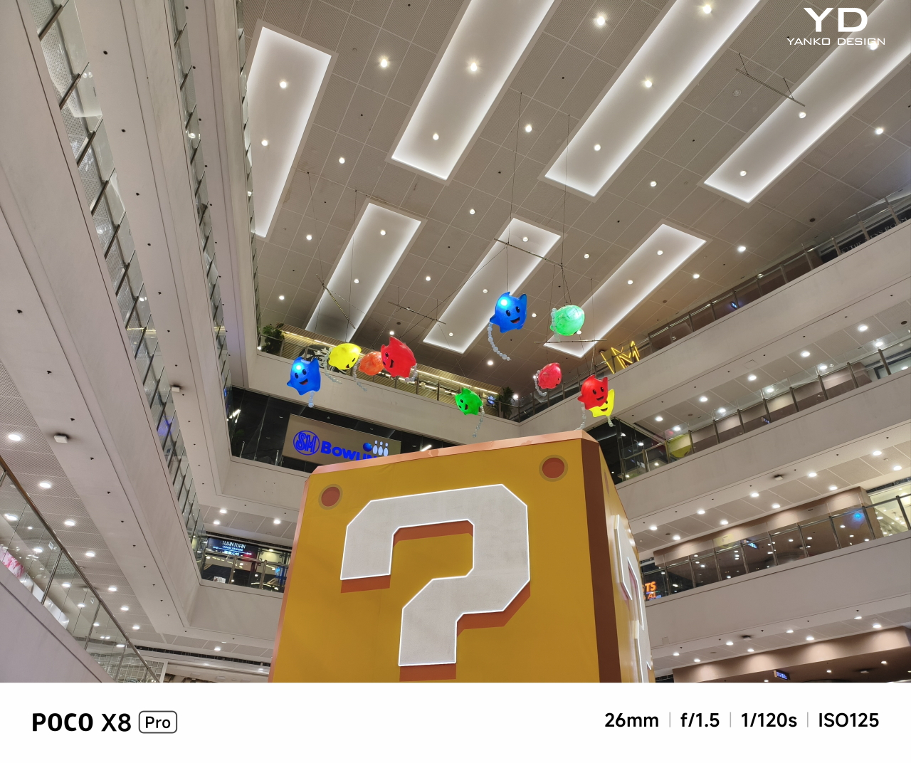
While the POCO X8 Pro checks a lot of boxes in terms of performance, its photography game leaves a bit to be desired. Make no mistake, the 50MP Sony IMX882 main camera takes great photos, especially with its 6P f/1.5 lens. Colors are rich, and details are accurate, whether in perfect lighting conditions, overcast skies, or at night. The camera app lets you pick between 26mm or everyone’s favorite 35mm as the default focal distance, as well as offering pro controls that will delight more seasoned shutterbugs.

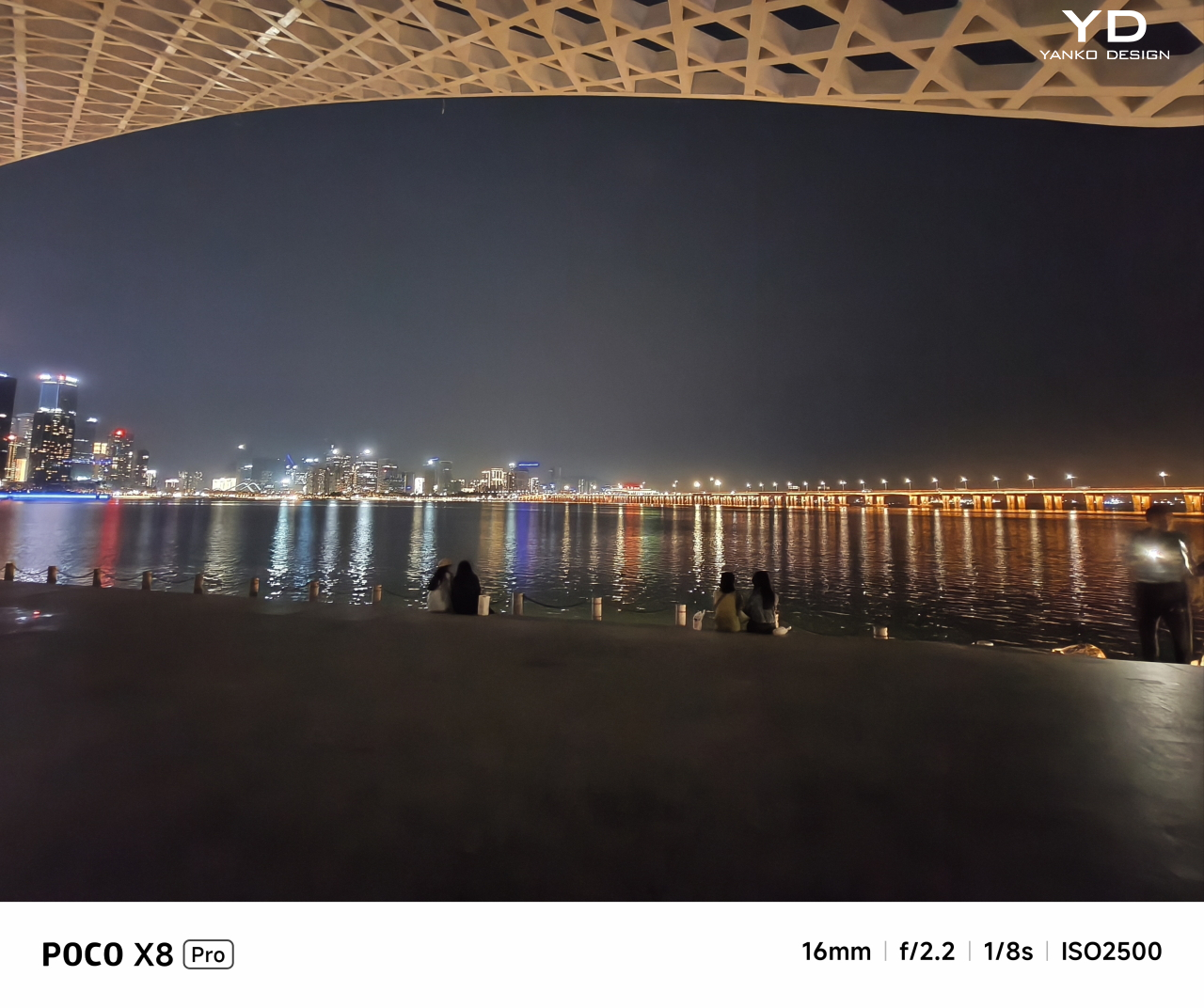
The 8MP f/2.2 ultra-wide camera, however, is a bit of a let-down in this day and age. It’s serviceable, yes, but nothing to write home about if you’re trying to survey the site for a new Avengers tower. There is no telephoto camera either, which truly earmarks the phone for the mid-tier segment. The front 20MP camera maxes out at 1080p 60fps, so your superhero conferences will be pretty basic.

The large 6,500mAh battery provides enough juice for the Poco X8 Pro Iron Man Edition to last the whole day with still plenty to spare before you need to plug it in. With 100W HyperCharge technology, it takes less than 50 minutes to get it from empty to fully charged for battle. The catch is that, like any other proprietary charging technology, you’ll need the official POCO/Xiaomi charger and cables to pull off this feat.

POCO doesn’t say a lot about the materials it uses for its phone, especially special editions like this Iron Man-themed POCO X8 Pro. The focus, instead, is on reliability, durability, and longevity. With IP68 dust and water-resistance, the phone can survive more than a few mishaps. Corning Gorilla Glass 7i protects the screen, the most critical part of the phone that’s always exposed to danger, from scratches and cracks, at least under normal circumstances.
Beyond the physical device itself, the POCO X8 Pro is also being promised six years of security updates, though major Android updates are limited to four years. Given how it’s running HyperOS 3 based on Android 16 out of the box, this theoretically guarantees it will remain fresh until Android 20. This is a major improvement to Xiaomi’s product family, which includes Redmi and POCO, though it remains to be seen how well it will be able to keep its promises.
Overall, the POCO X8 Pro Iron Man Edition is a beautiful smartphone, inside and out. It is surprisingly powerful and capable for what is labeled as a mid-tier phone, especially when you consider the $399 price tag. And if you’re an Iron Man or Marvel fan, this combination of impressive performance and elegant fan service is definitely a tempting option for an everyday partner.
It is by no means perfect, as can be seen in its camera selection or inconsistent thermals, but it gets the job done without much fuss. Even the vanilla POCO X8 Pro makes for an excellent choice, especially as the Pro Max offers only a few advantages, like processor and battery size, but with a $130 premium. The lines between smartphone tiers continue to blur, and the Poco X8 Pro Iron Man Edition is testament to that.
Iron Man stands out among superheroes because, like Batman, his strength lies not in any supernatural power or even his exorbitant wealth (though that definitely helps). His power is in pushing himself, his mind, and his technology beyond the limits to achieve victory. That’s the association that POCO is trying to push with the X8 Pro Iron Man Edition, and it works!
More than just the tasteful and elegant design, the POCO X8 Pro Iron Man Edition also embodies one of Tony Stark’s less-cited traits: his practicality. He doesn’t always aim for the most advanced and most expensive technologies but uses what’s available and pushes them to the limit to achieve amazing feats without too much cost. Just like the POCO X8 Pro Iron Man Edition, a mid-range phone that punches above its weight.
The post POCO X8 Pro Iron Man Review: Hero-Level Performance for only $399 first appeared on Yanko Design.

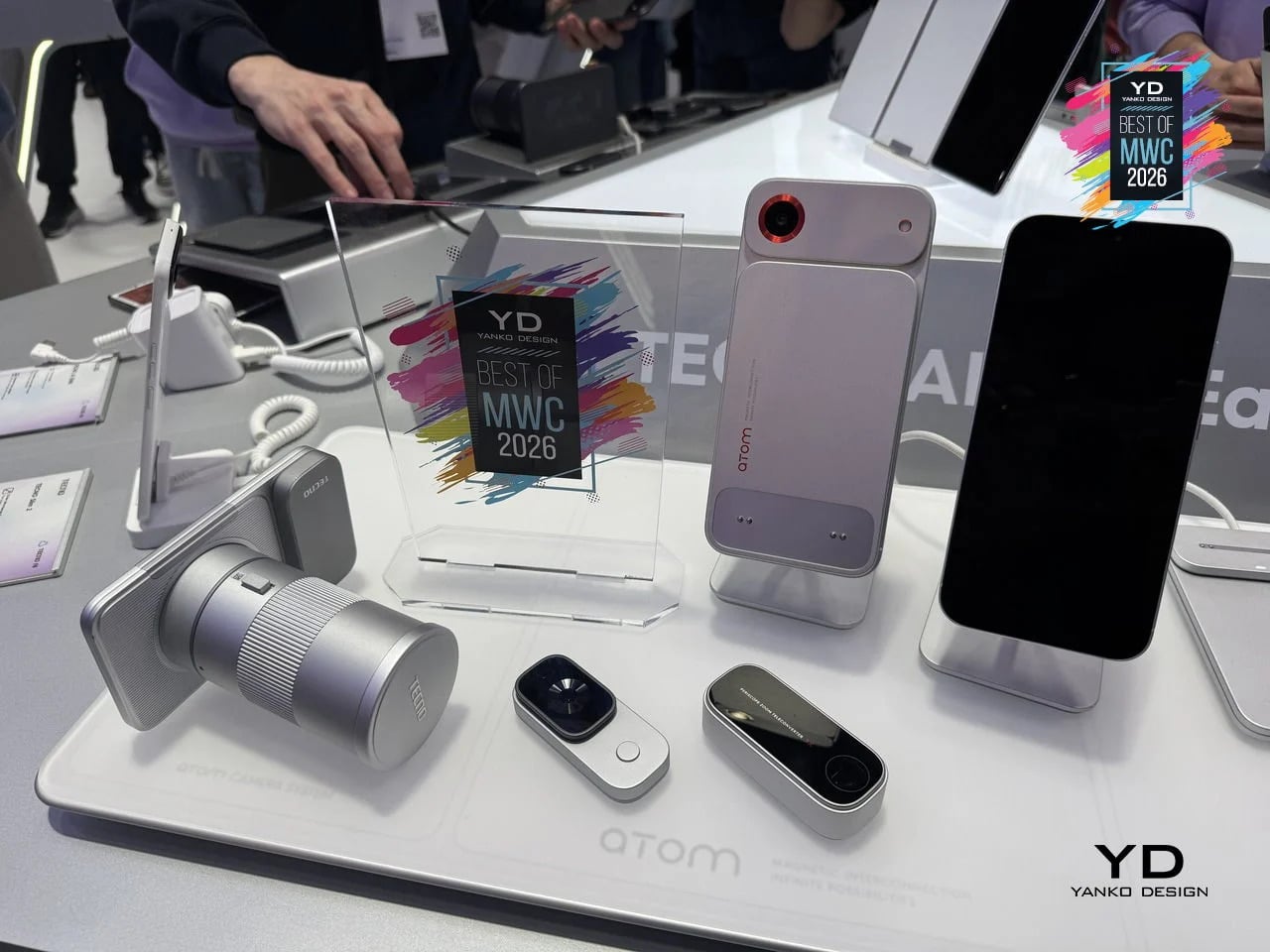
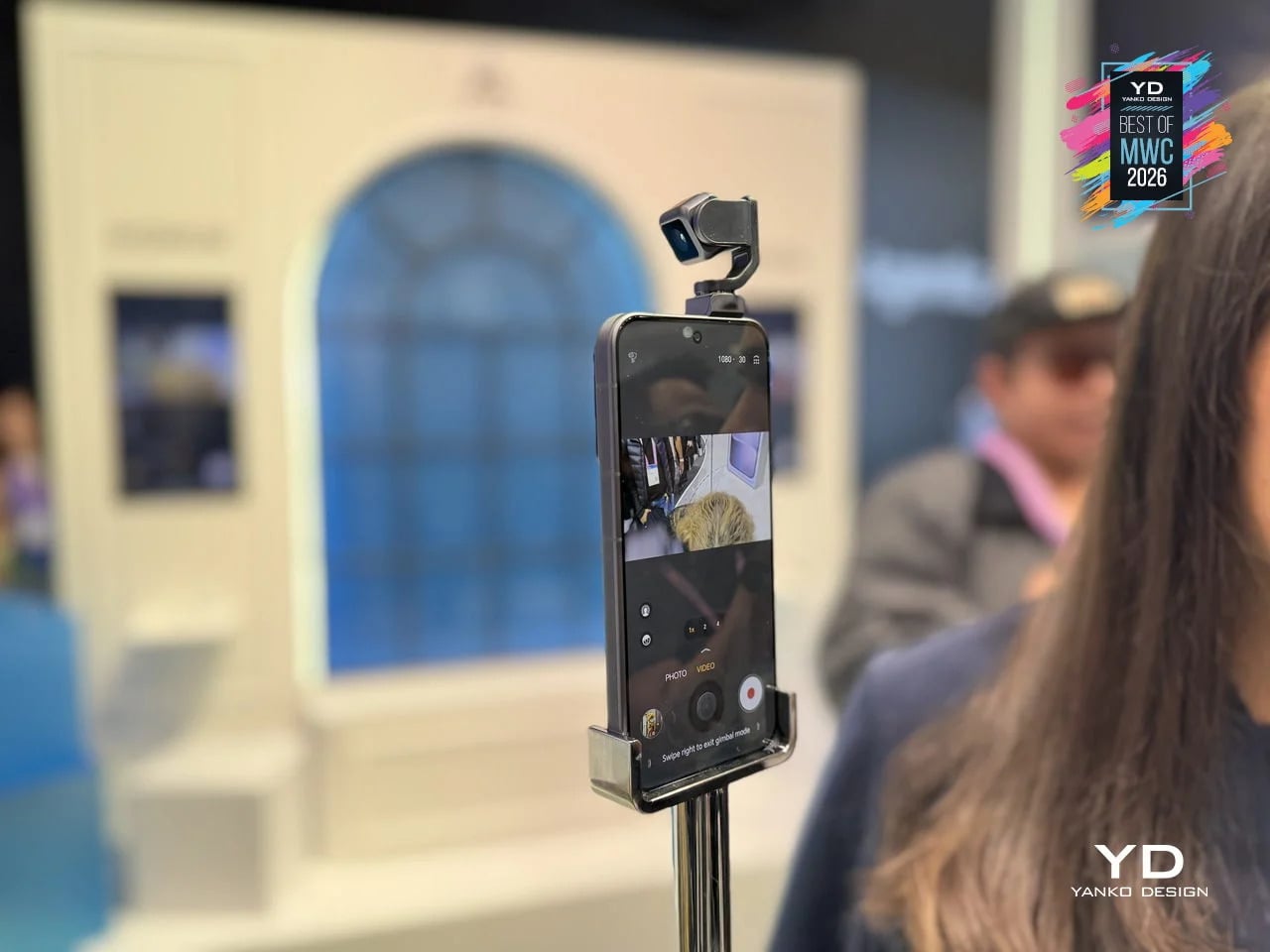
Look at the phones announced this year, like those revealed at MWC 2026 last week, and you will notice something. They are all faster, thinner, and shinier than last year’s models, and yet none of them feel particularly surprising. Cameras gained another sensor. Bezels shrank another millimeter. Battery life improved by an amount that is technically measurable but practically indistinguishable from the model before. The industry has gotten so good at making phones incrementally better that it has almost forgotten to ask whether they could be genuinely different.
That is where concept phones come in. Not all of them are practical, and not all of them will ship. But the five designs here do something that the latest Galaxy or iPhone cannot: they make you pause and reconsider what a phone actually is, and what it could be if the people designing it were not also worrying about carrier approvals, supply chains, and quarterly earnings. Some are functional prototypes shown on actual show floors. Others exist purely as design arguments. All of them are worth thinking about.
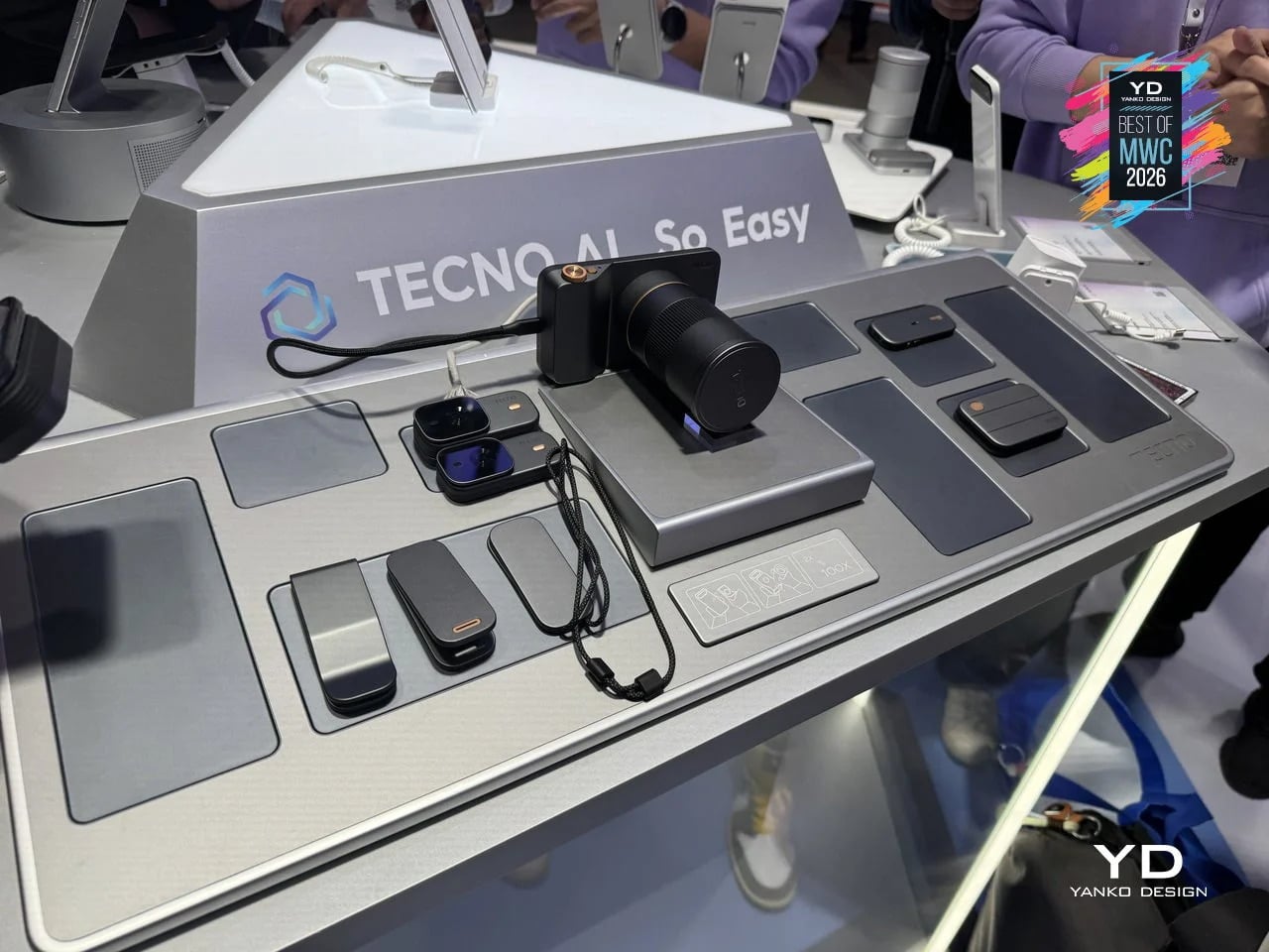
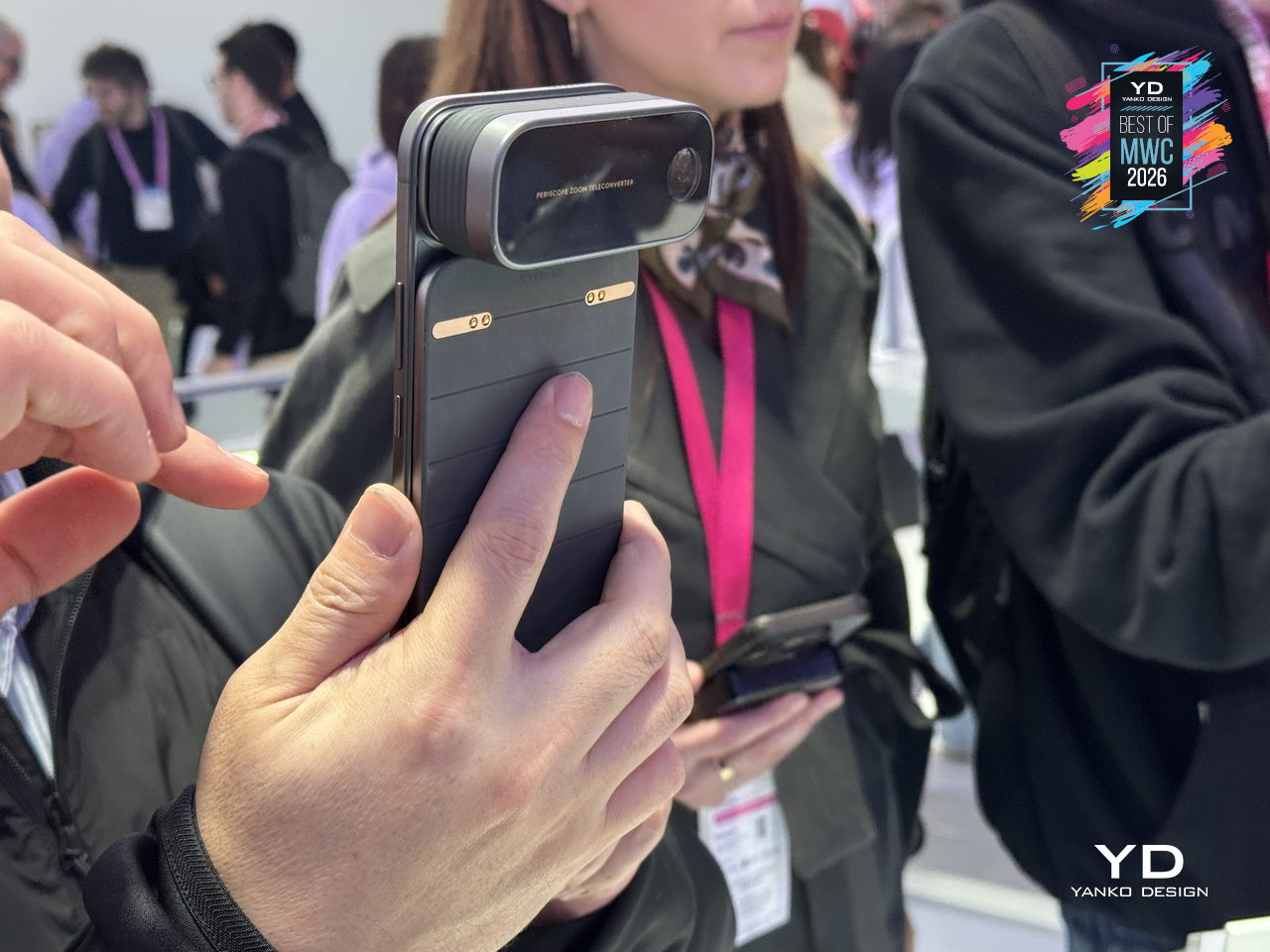
Phones have been getting thinner for years, which sounds like progress until you think about what got traded away in the process. Removable batteries went first, then expandable storage, then headphone jacks. Every feature that required physical complexity was quietly dropped in the name of a slimmer profile. TECNO’s Magnetic Modular System, shown at MWC 2026, challenges that logic directly. Rather than cramming every possible capability into a single fixed body, it keeps the phone lean by design and lets you snap on what you need, when you actually need it.
Designer: TECNO
The system works through a magnetic interconnection technology that attaches hardware modules directly to the phone. Telephoto lenses, action cameras, additional battery packs, and over a dozen other components can be added or removed in seconds. The core argument is straightforward: a phone that tries to do everything is permanently weighed down by everything it carries. A phone that adapts to the moment is only as heavy as today demands. Whether TECNO can pull off what Google’s Project Ara could not is another matter, but the design thinking here is at least pointed at the right problem.

Most phones sit on a desk and wait. The HONOR Alpha does not. Demonstrated as a functional prototype at MWC 2026, this is a phone with a 4DoF gimbal system inside the camera bump, built around what HONOR describes as the industry’s smallest micro motor. Three-axis mechanical stabilization runs alongside an AI tracking engine, and a double-tap locks onto any subject, following it through movement, obstructions, and sudden changes in direction. The person who used to carry a separate DJI Osmo just to get steady footage now has a reasonable question to ask.
Designer: HONOR
The gimbal also does something harder to categorize. HONOR designed it to express what they call embodied AI interaction, meaning the phone physically responds to its environment. It nods during video calls. It reframes itself to keep you centered without being asked. It moves when music plays through its speakers. Phones have had personalities before, mostly through notification lights and ringtones. The Alpha just happens to have something closer to a neck.
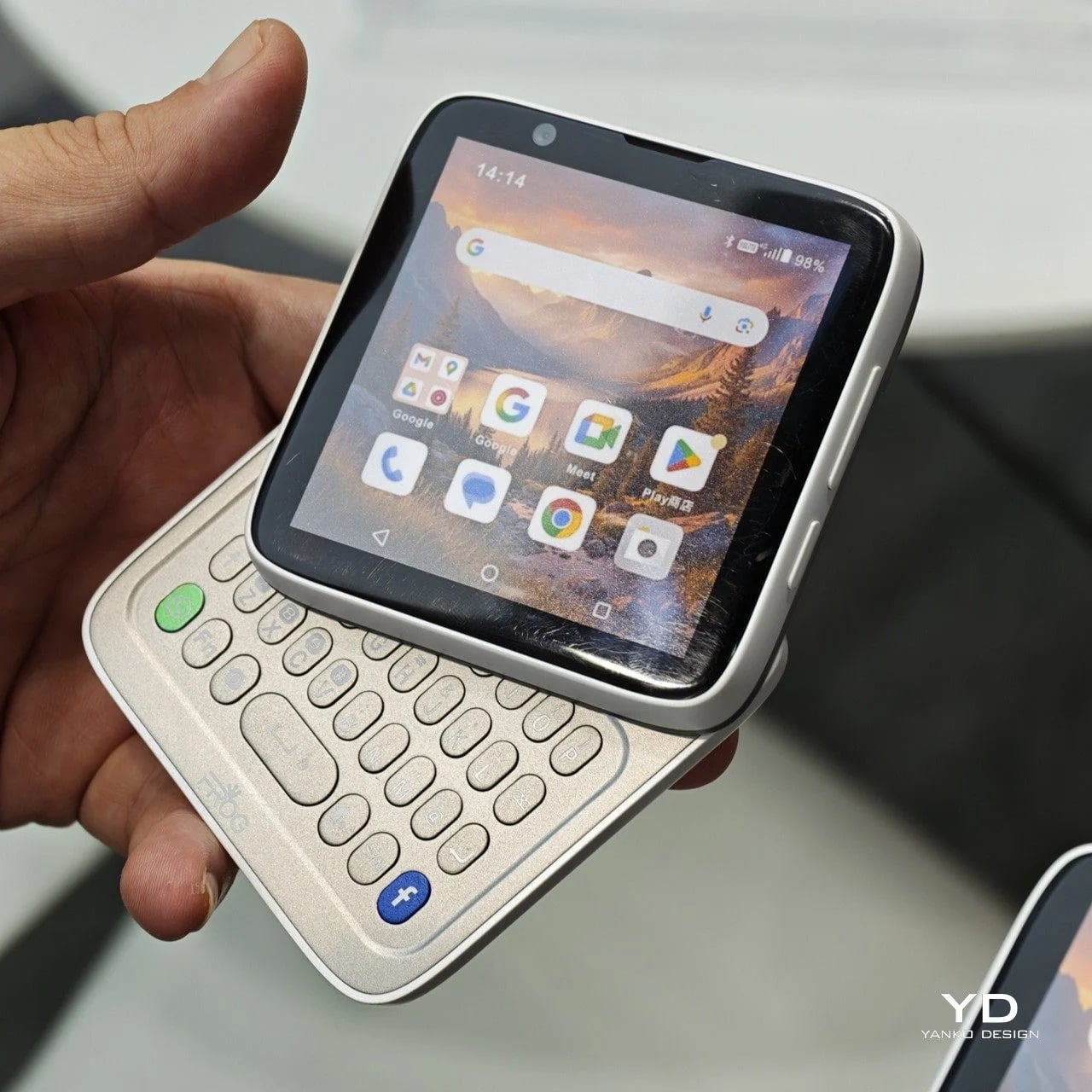
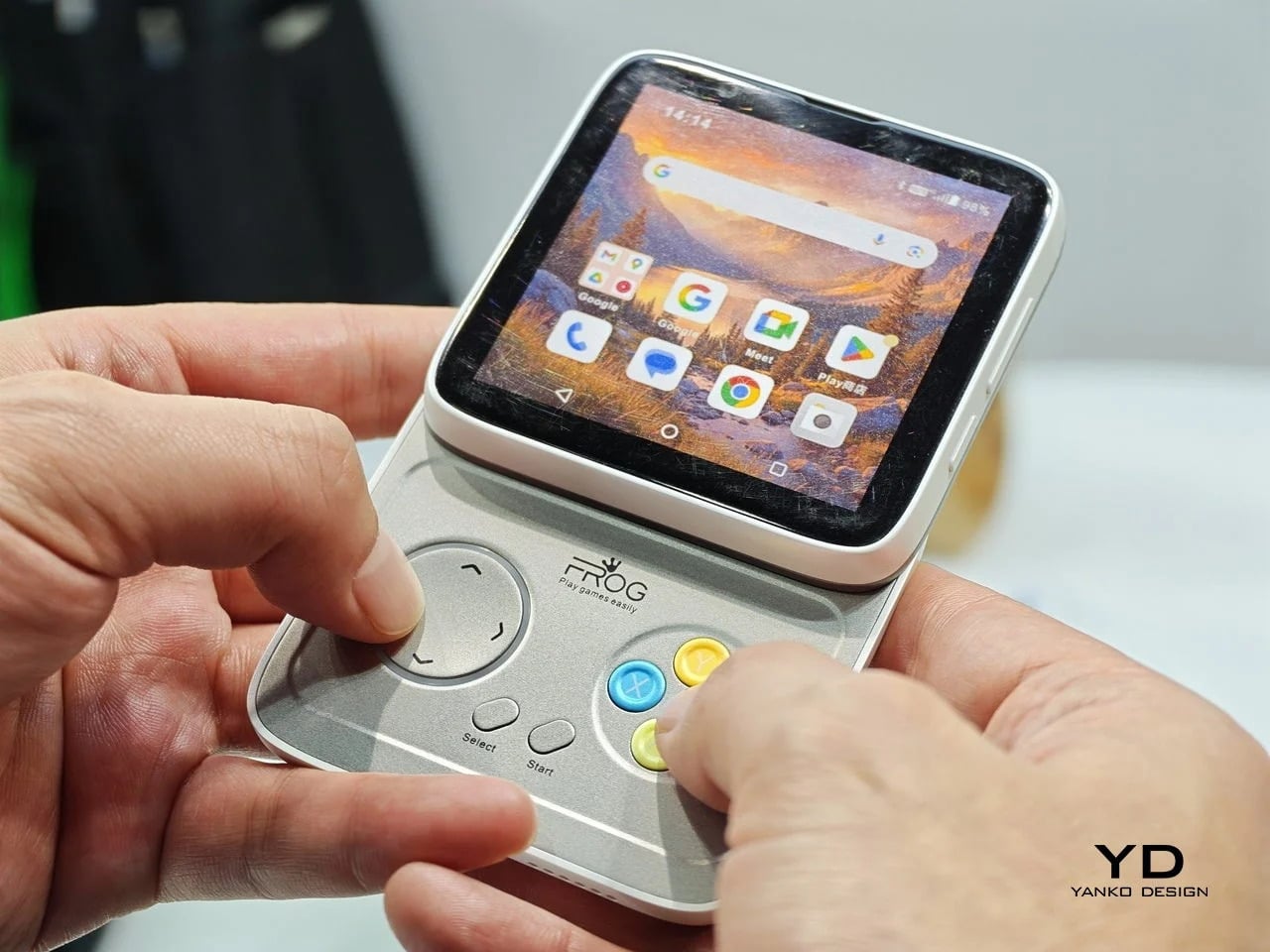
Every phone released this year is a tall rectangle, some taller than others. The iFROG RS1, shown at MWC 2026, is a square, which already makes it unusual before you get to the part where it twists open. Built around a 3.4-inch square display, the RS1 has a rotating lower section that reveals one of two things depending on the variant you’re looking at: a full QWERTY keyboard with raised, tactile keycaps, or a gamepad with a D-pad, a four-button cluster, and Select and Start. No price and no release date were announced at MWC, because the hardware itself is the pitch.
Designer: iFROG
The keyboard variant has a clear and underserved audience. The people who have quietly resented touchscreen typing for fifteen years are not a small group, and the Unihertz Titan has been proving that niche quietly for a while. The gamepad version is a stranger and arguably more interesting proposition. Running Android with physical controls in a square body draws instant comparisons to the Motorola Flipout, a 2010 Android phone that did something structurally similar and was adored by a small crowd before being largely ignored by everyone else.
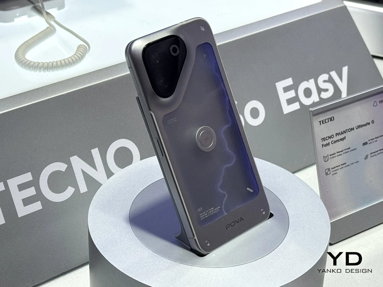
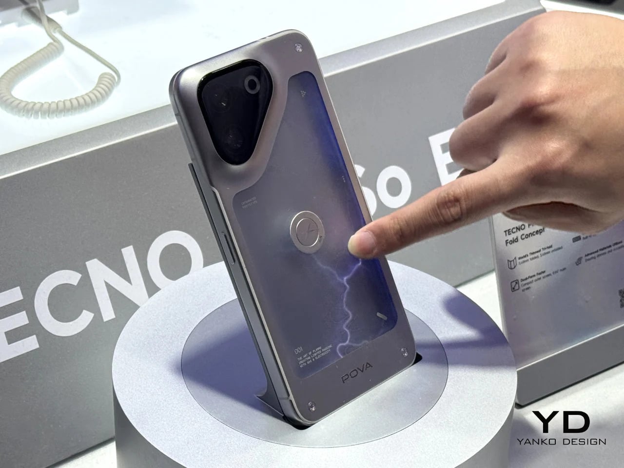
Some phones try to solve a problem, but the POVA Neon honestly isn’t that kind of phone. TECNO’s other MWC 2026 concept uses ionized inert gas lighting, the same technology that gives neon signs their glow, to create a branching luminescent effect on the back panel that sits somewhere between a lightning bolt and a circuit trace. TECNO is not claiming this makes the phone faster or the camera better. The claim is simpler and more honest: a phone’s back doesn’t have to be an inert sheet of glass waiting to collect fingerprints.
Designer: TECNO
As design statements go, that one is actually worth taking seriously. Most phone backs are the most visible surface on a device that billions of people carry every day, and they’re almost universally empty. The POVA Neon asks what happens when that surface does something. The answer here is that it glows, which is not practical and doesn’t need to be. Concept work isn’t obligated to be practical. It’s obligated to make you look at a familiar object differently, and a phone that pulses with light like a neon sign in a diner window at least does that.
Foldable phones keep running into the same set of problems. The phone has to fold, which means the screen has to fold, which means the screen eventually creases at the hinge line, the hinge develops resistance over time, and the finished device ends up thicker than either of the two things it’s trying to be. Pixel Dynamic’s iPhone Fold concept approaches the whole premise from a different direction. Keep the iPhone exactly as it is. Add a separate foldable screen to the back.
The main iPhone body stays rigid and conventional. A thin, flexible secondary display sits raised on a platform above the rear panel, and when needed, it unfolds outward to create a larger, roughly square tablet surface. The phone itself does not flex, leaving the primary display completely untouched. In daily use, it feels and functions like a normal iPhone, because it essentially is one. That said, the raised platform adds thickness, wireless charging is probably absent, and using the camera while the secondary screen is unfolded becomes nearly impossible since it sits directly over the lenses. Apple almost certainly will never endorse the design, but as a thought experiment about whether a foldable screen and a foldable phone actually need to be the same thing, it’s one of the more original answers anyone has put forward.
The post Your $1,200 Phone Looks Boring Next to These 5 Concepts first appeared on Yanko Design.
Every year, MWC arrives like a controlled flood of announcements, each one louder than the last. Cameras with more megapixels, batteries with bigger numbers, screens with higher refresh rates than the human eye can meaningfully appreciate. It’s easy to walk away from Barcelona with a head full of specs and no clear sense of what any of it actually felt like to hold, use, or live with. The products that matter don’t always win the spec sheet battle.
The ones worth paying attention to are the ones built around a specific, almost stubborn design conviction. A team that decided thinness wasn’t a compromise but the whole point. Engineers who spent years rethinking how a GPS antenna sits inside a running watch. Designers who asked what a laptop would look like if it finally adapted to the user instead of demanding the opposite. Those are the products that stopped people on the MWC 2026 show floor, and these are the design decisions that made them worth stopping for.
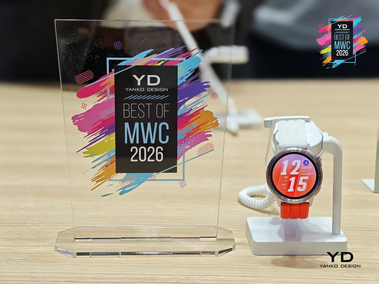
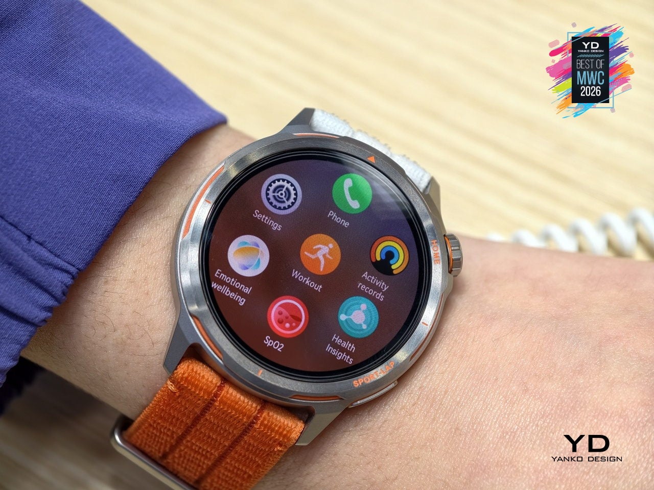
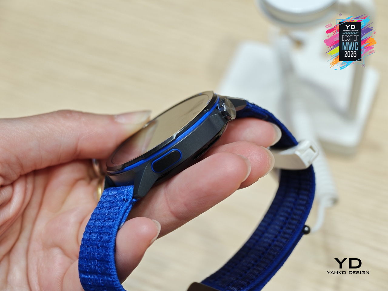
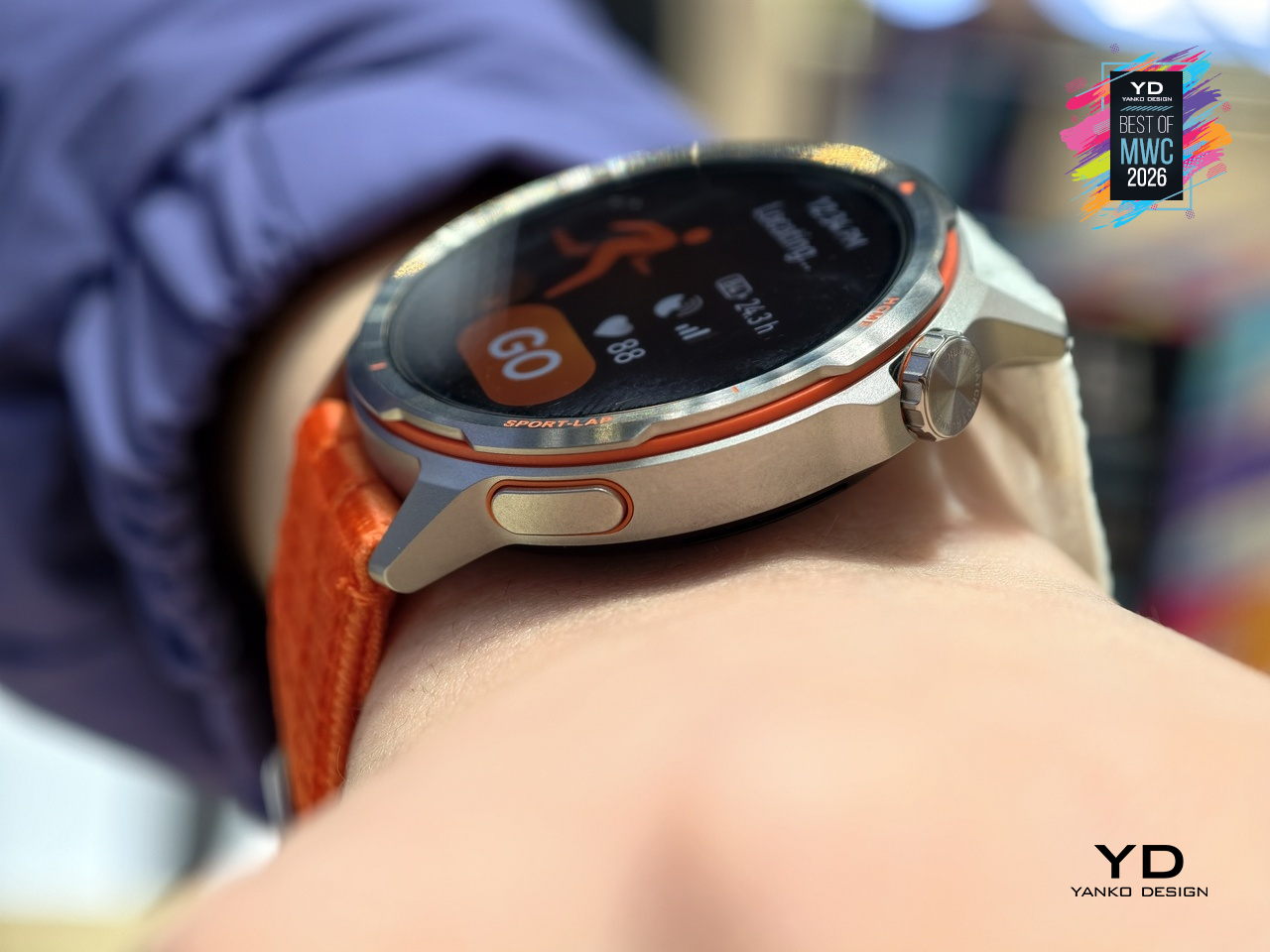
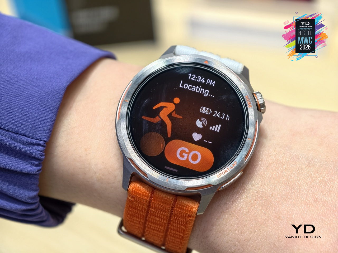
GPS watches for runners have always played both sides of a strange contradiction: the more seriously you take running, the more you end up wearing a small computer that weighs down your wrist and distracts you with irrelevant notifications. Huawei’s answer to that tension is the Watch GT Runner 2, a dedicated running watch built around the single question of what a wrist-worn device actually needs to do well for someone logging serious miles.
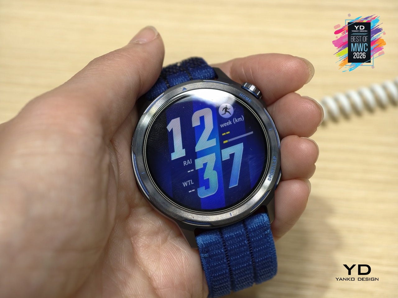
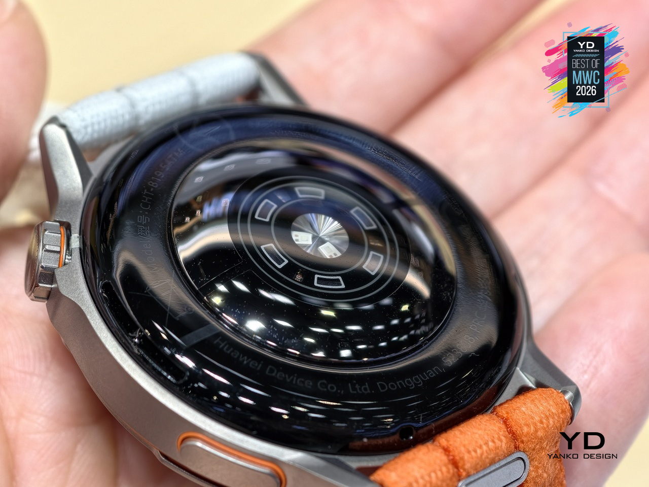
Five years of development went into the GPS architecture, which tells you where Huawei’s engineering priorities landed. The 3D floating antenna design, paired with an intelligent converged positioning algorithm, claims 20% better accuracy than its predecessor, holding signal through tunnels and tree cover where most watches lose the thread. The body itself is nanomolded aerospace-grade titanium at just 34.5 grams, with a 10.7mm profile that doesn’t fight the wrist wearing it.
Designer: Huawei
The Intelligent Marathon Mode is where the Huawei Watch GT Runner 2 really shines. Developed alongside the dsm-firmenich Running Team, it functions as an on-wrist coach with customized training plans, real-time pace charts, a digital pacer showing how far ahead or behind your target you are, and a personalized fueling reminder so you don’t bonk at kilometer 30. Performance prediction uses your Running Ability Index and physical data to estimate finish times, which either motivates you or quietly humbles you.
Health monitoring goes beyond the usual heart rate and step counts. ECG analysis triggers 30 minutes post-exercise, HRV is tracked throughout the day, and the PPG sensor can flag potential atrial fibrillation risks. Battery life reaches 32 hours in outdoor workout mode with GPS active, backed by a cell with 68% higher energy density than the previous generation. Curve Pay integration also lets you leave your phone and wallet behind on long runs entirely.
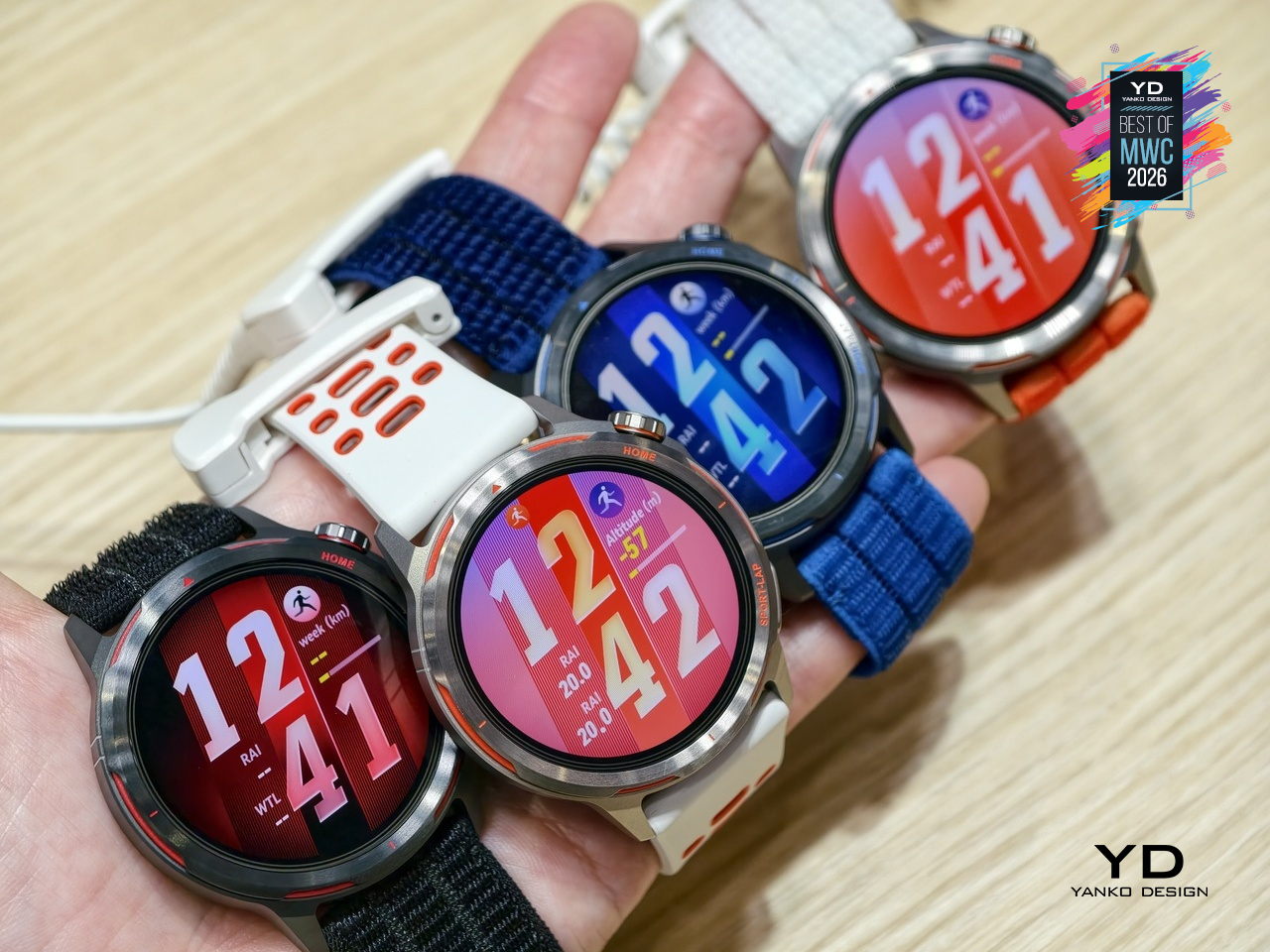
The Huawei Watch GT Runner 2 covers both ends of the spectrum, from amateurs wanting a smart training companion to athletes chasing records with lactate threshold and power metrics. At 34.5 grams with a breathable AirDry woven strap, it’s built to disappear on your wrist. What remains to be seen is whether marathon coaching calibrated with elite runners translates meaningfully to the rest of us.

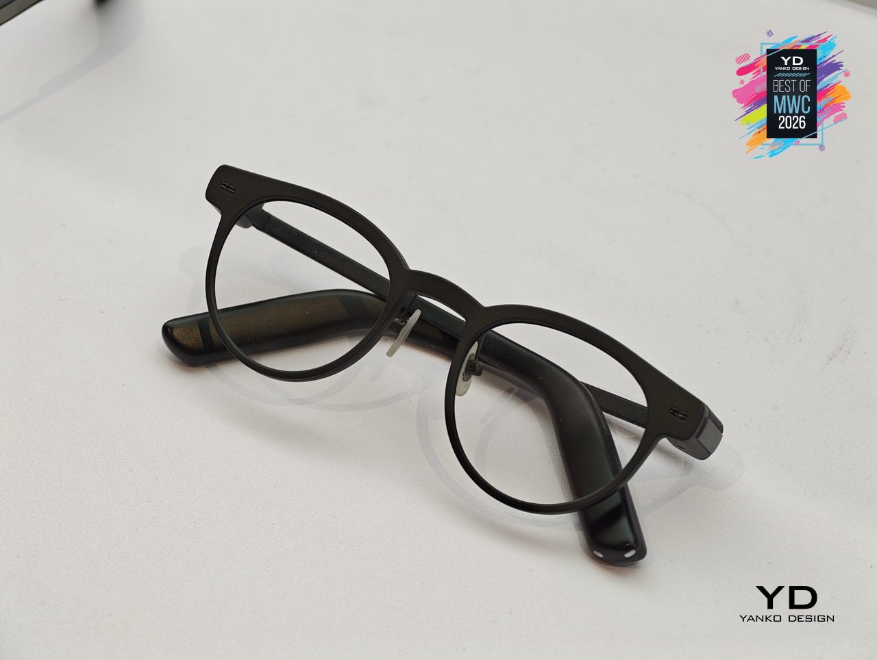
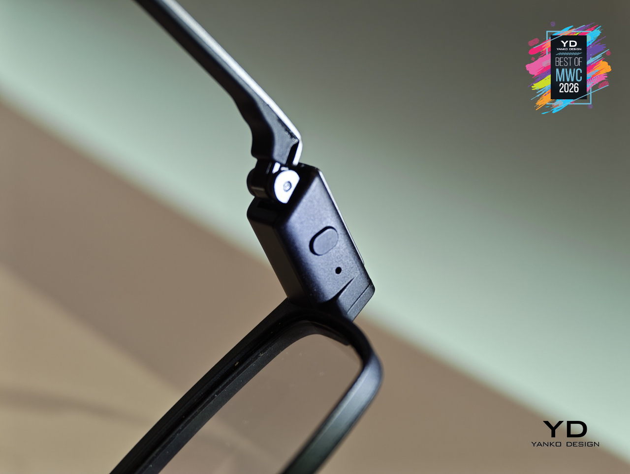
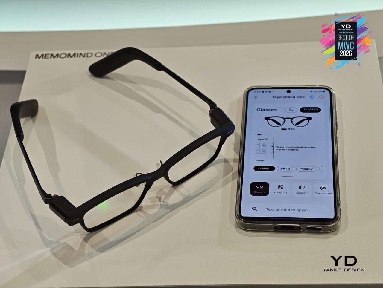
Most AI glasses have made the same mistake: designing around the technology first and hoping the wearability sorts itself out later. The result is eyewear that signals to everyone around you that something unusual is happening on your face. MemoMind, a new AI hardware brand incubated by projector company XGIMI, took the opposite approach with its debut product, building from a decade of optical engineering experience to make glasses that simply look like glasses.
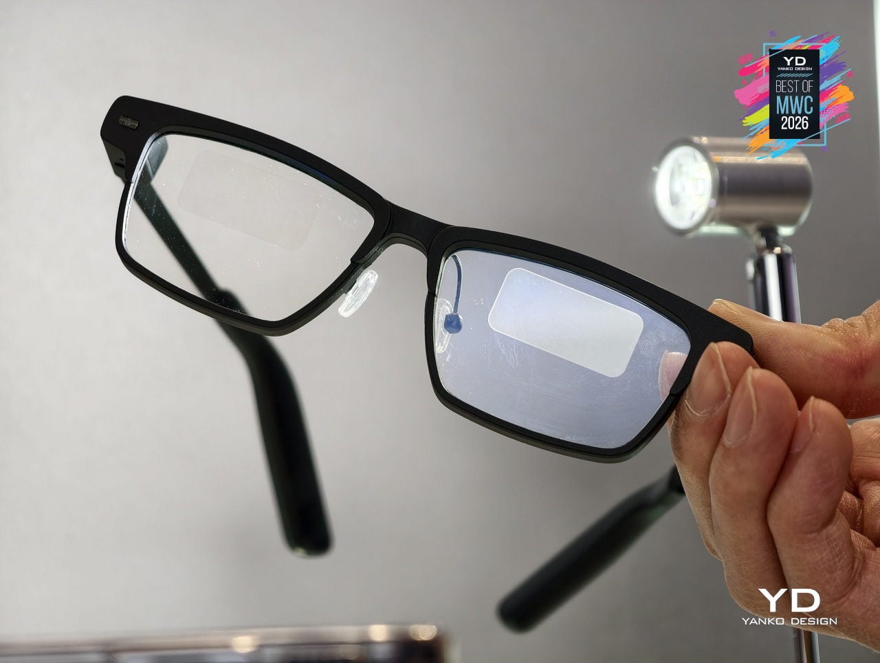
The MemoMind One is the flagship of the lineup, combining integrated speakers with a dual-eye air display that layers information over your field of view without demanding your full attention. The multi-LLM hybrid operating system handles real-time translation, voice summaries, transcription, and contextual reminders, all accessible through head-motion controls and a conversational interface. Since its CES 2026 debut, software updates have expanded navigation integration and refined how the AI delivers information without interrupting natural interaction.
Designer: XGIMI
Personalization sits at the center of the MemoMind design philosophy in a way most wearable tech ignores entirely. Frames are fully customizable, temples are interchangeable, and the glasses support prescription lenses, meaning you can actually wear them as your everyday eyewear rather than carrying a second pair of frames. That design decision alone separates MemoMind from most competitors, where the hardware dictates the look and the wearer adapts accordingly.

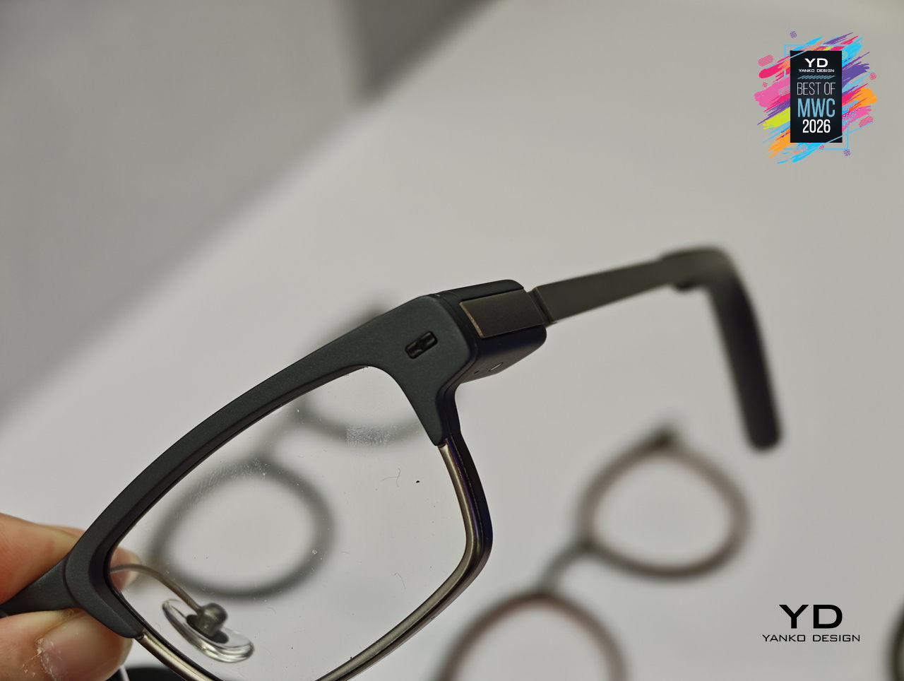
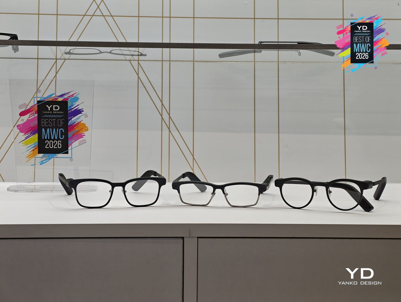
The broader MemoMind lineup shows how deliberately the brand has thought through different user needs. The MemoMind Air Display weighs just 28.9 grams and uses a single-eye monocular display for a lighter-touch AI presence, aimed at commuters and minimalists who want information without visual density. The MemoMind Air goes further still, dropping the display entirely for a microphone-only model that makes the AI presence nearly invisible, present when useful and undetectable when not.
MemoMind One is set for preorder in April 2026, with the Air Display and Air models following later in the year. What XGIMI has built here is a clear and considered answer to the question of how AI should sit on your face: quietly, comfortably, and without announcing itself to the room. The design conviction behind MemoMind is that the best wearable AI is the kind you stop noticing you’re wearing.
Smartphones have been flat rectangles for so long that the design conversation around them has largely shifted to cameras, refresh rates, and how thin the bezels are. Honor arrived at MWC 2026 with a genuinely different question: what if the phone itself could move? The Robot Phone concept puts a 4DoF gimbal system inside a handheld device, built around what Honor calls the industry’s smallest micro motor, with the motor size reduced by 70% compared to existing solutions.
Designer: Honor

The gimbal does two distinct things, and they pull in interestingly different directions. On the imaging side, three-axis mechanical stabilization works alongside an AI stabilization engine to keep footage steady through complex, dynamic movement. A double-tap locks the AI onto any subject, tracking it even through sudden changes or brief obstructions. Honor also introduced an AI Spinshot mode, supporting 90-degree and 180-degree rotations, a move that borrows directly from cinema camera rigs and scales it down to one hand.
The second application is where the concept gets harder to categorize. Honor has designed the gimbal to express what it calls embodied AI interaction, meaning the phone physically responds to what’s happening around it. It nods during agreement in video calls, adjusts its orientation to keep you in frame automatically, and moves to the rhythm of music playing through its speakers. These are features that a spec sheet cannot really describe, and that makes the Robot Phone one of the more genuinely curious things shown at MWC 2026, even as a concept still working toward a commercial release.
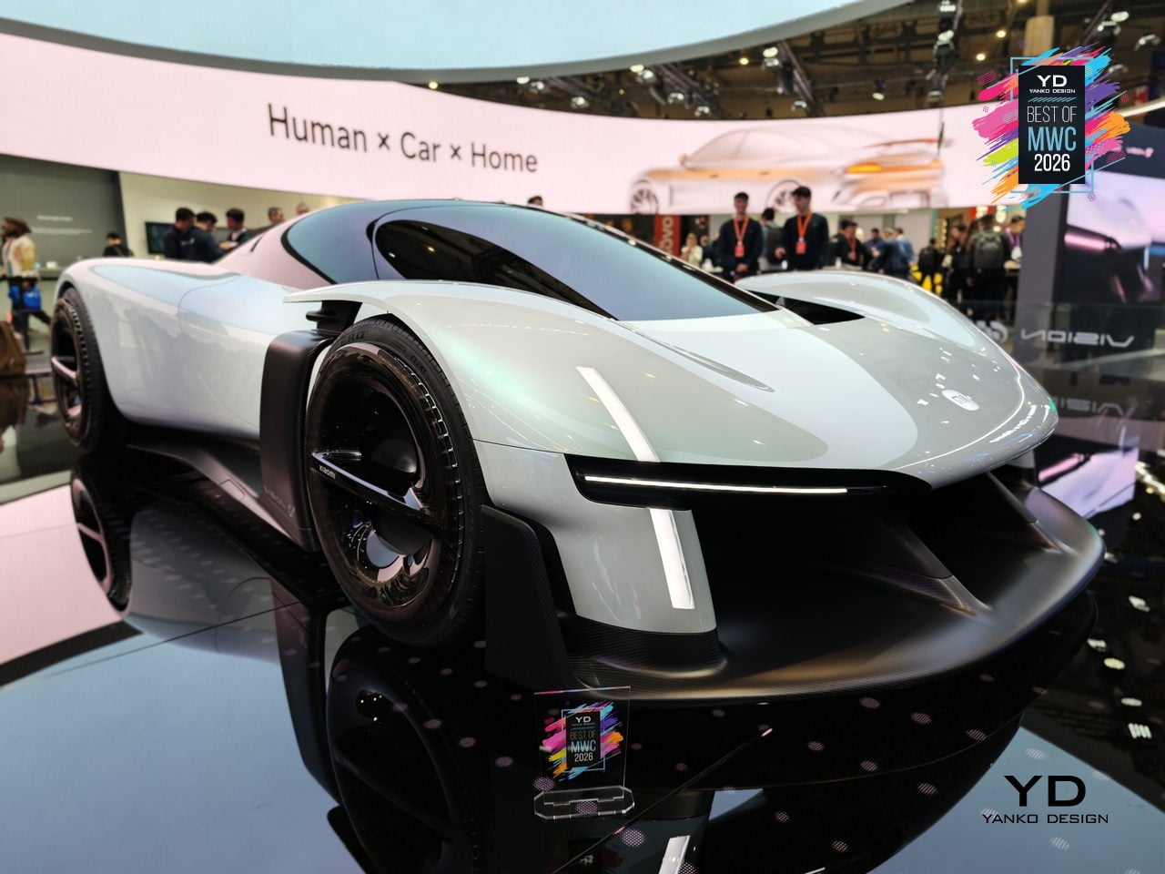
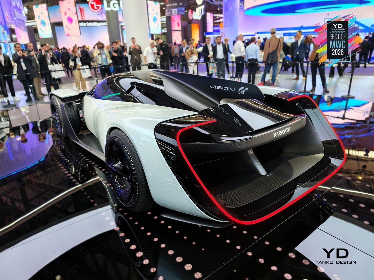
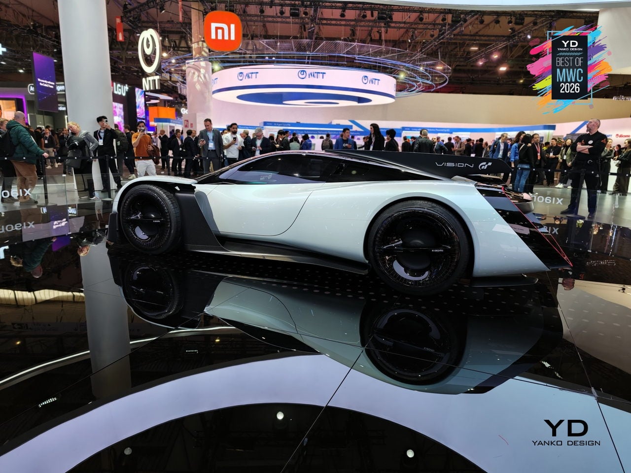
The Vision Gran Turismo program is where car brands go to design without consequences. No production targets, no crash tests, no accountants in the room. Ferrari has done it. Porsche has done it. Now Xiaomi, a company that started by selling smartphones and rice cookers, has become the 36th brand to join and the first technology company ever invited. Gran Turismo producer Kazunori Yamauchi extended the invitation personally at the GT World Series in London.
Designer: Xiaomi
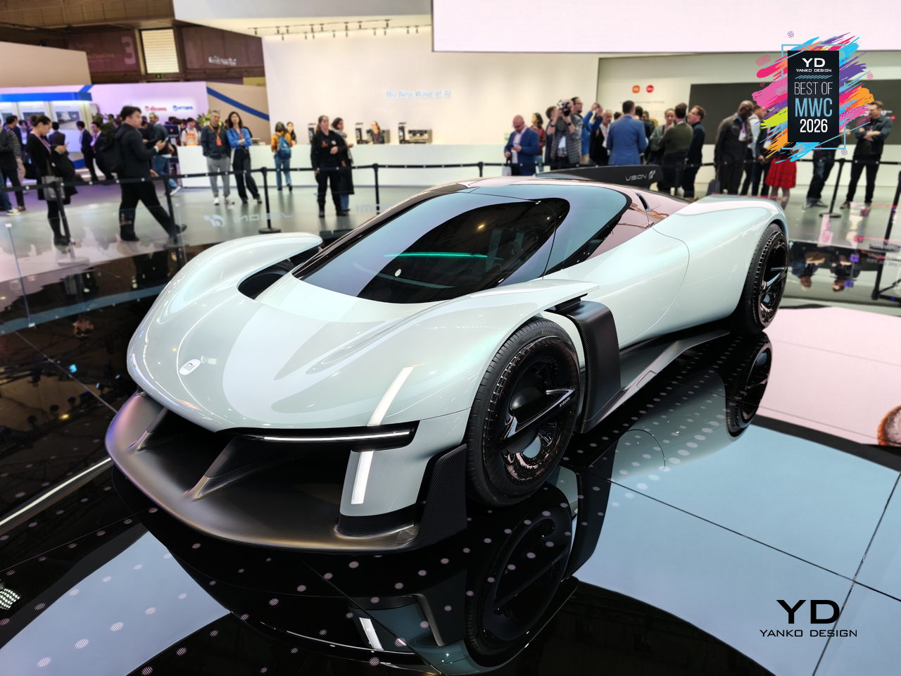
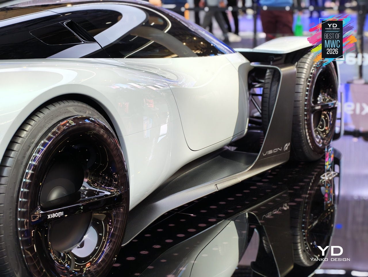
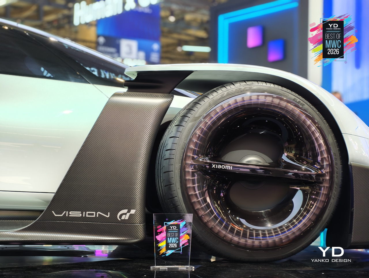
The design problem Xiaomi decided to obsess over is one every hypercar team faces: low drag gives you straight-line speed, high downforce gives you corners, and optimizing hard for either one usually compromises the other. Xiaomi’s answer was to eliminate the trade-off entirely by building aerodynamics into the body itself. No bolted-on wings, no add-on splitters. A teardrop cockpit, airfoil-shaped structural members, and embedded channels that guide air from nose to tail. The Accretion Rims are the detail worth pausing on: magnetically held wheel covers that stay perfectly still while the wheels rotate beneath them, cooling the brakes through internal turbine fins while cutting drag from spinning surfaces.
Inside, Xiaomi replaced the usual carbon-and-leather tension of a hypercar cockpit with something it calls the Sofa Racer, a continuous loop of dashboard, doors, and seating upholstered in 3D-knitted fabric pulled from sportswear manufacturing. The Xiaomi Pulse system reads driver state through sensors and responds through light and sound rather than screens and alerts. It all connects to Xiaomi’s broader Human x Car x Home ecosystem, which is either a genuinely interesting idea about how cars fit into a connected life, or a lot of ecosystem language wrapped around a very beautiful virtual concept car.


The modular phone idea has been attempted before, most famously by Google’s Project Ara, which spent years promising a phone you could rebuild like Lego before quietly disappearing in 2016. The premise was compelling, and the execution proved stubborn. TECNO’s approach at MWC 2026 is different in one important way: rather than replacing the phone’s internal components, the Modular Magnetic Interconnection Technology keeps the phone slim and complete on its own, then lets you snap additional hardware onto it magnetically when you actually need it.
Designer: TECNO
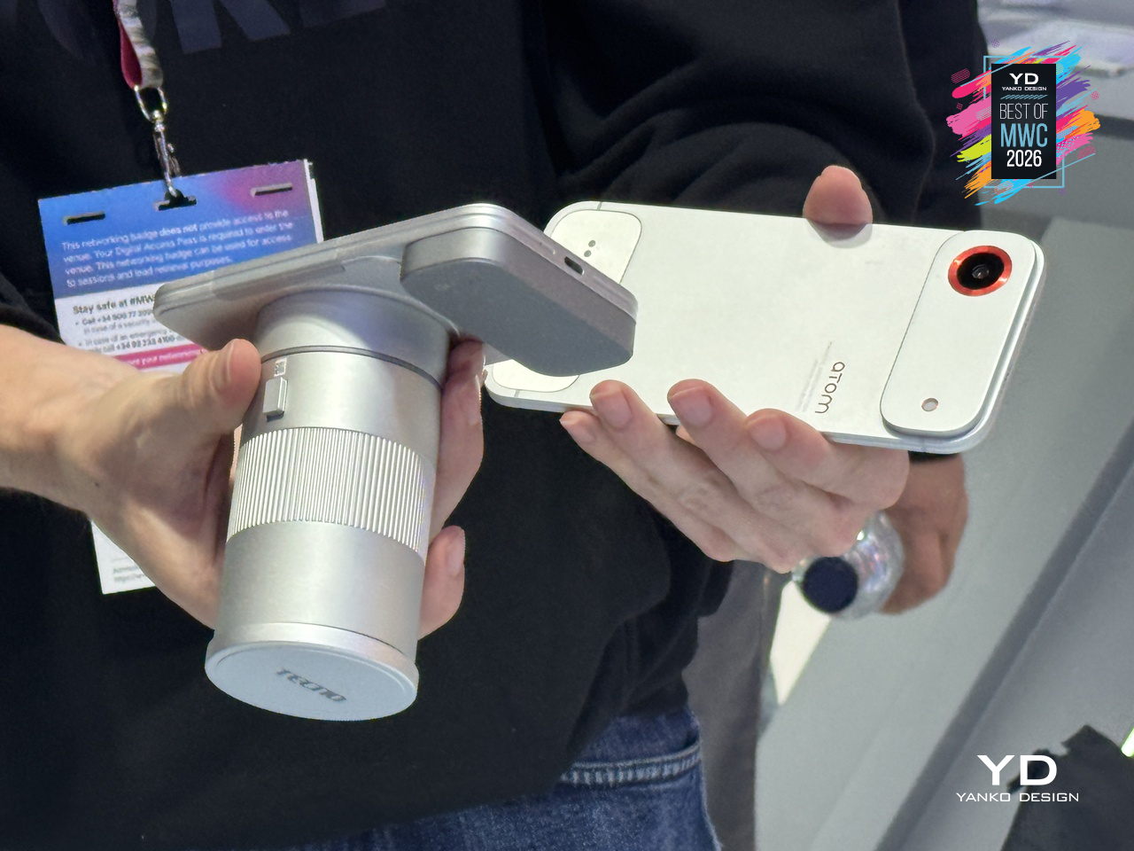
The concept arrives in two visual flavors, ATOM and MODA, but the underlying system is the same across both. Over a dozen modules compose the Customizable Modular Suite, covering stackable battery packs, action cameras, telephoto lenses, and more, each attaching and communicating through the magnetic interconnection system. The scale and visual coherence of the accessory ecosystem is genuinely striking. Everything shares a design language, sits flush when attached, and reads as a single object rather than a phone with things stuck to it.
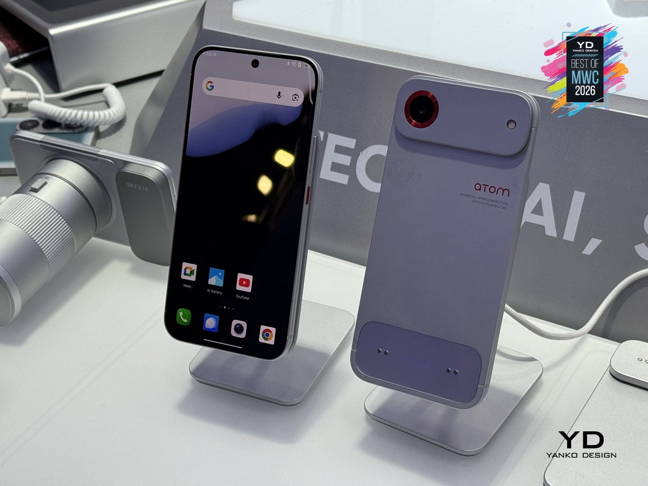
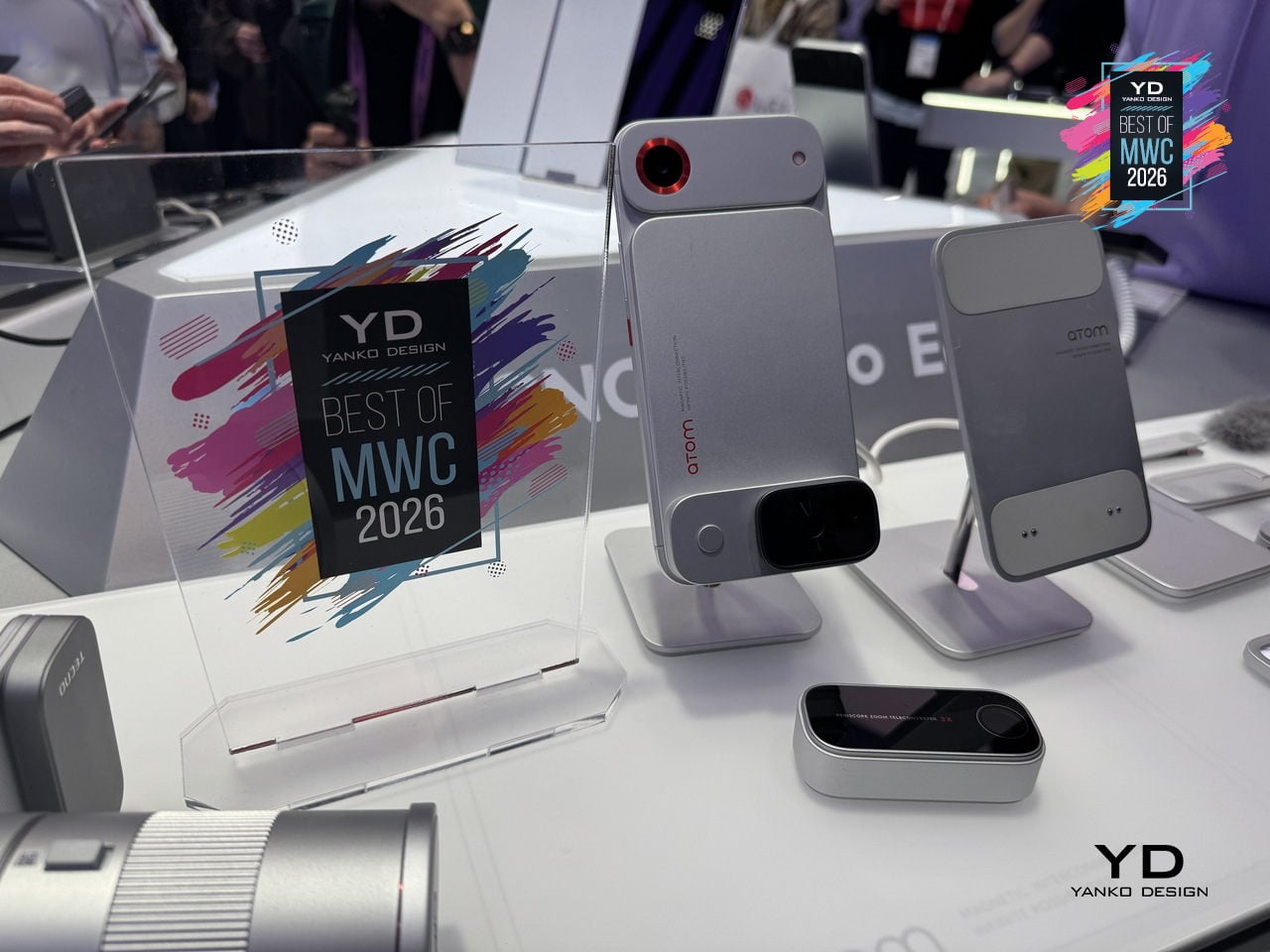
The ATOM edition makes the clearest design statement of the two, with its white and red palette, ribbed surfaces, and a camera module that looks pulled straight from a mirrorless system. TECNO’s core argument is that keeping the phone genuinely slim in daily use, while letting the modules handle the heavier lifting on demand, sidesteps the trade-off that has defined smartphone design for years. Add what you need, remove what you don’t, and the phone adapts to the moment rather than trying to anticipate every one of them in advance.
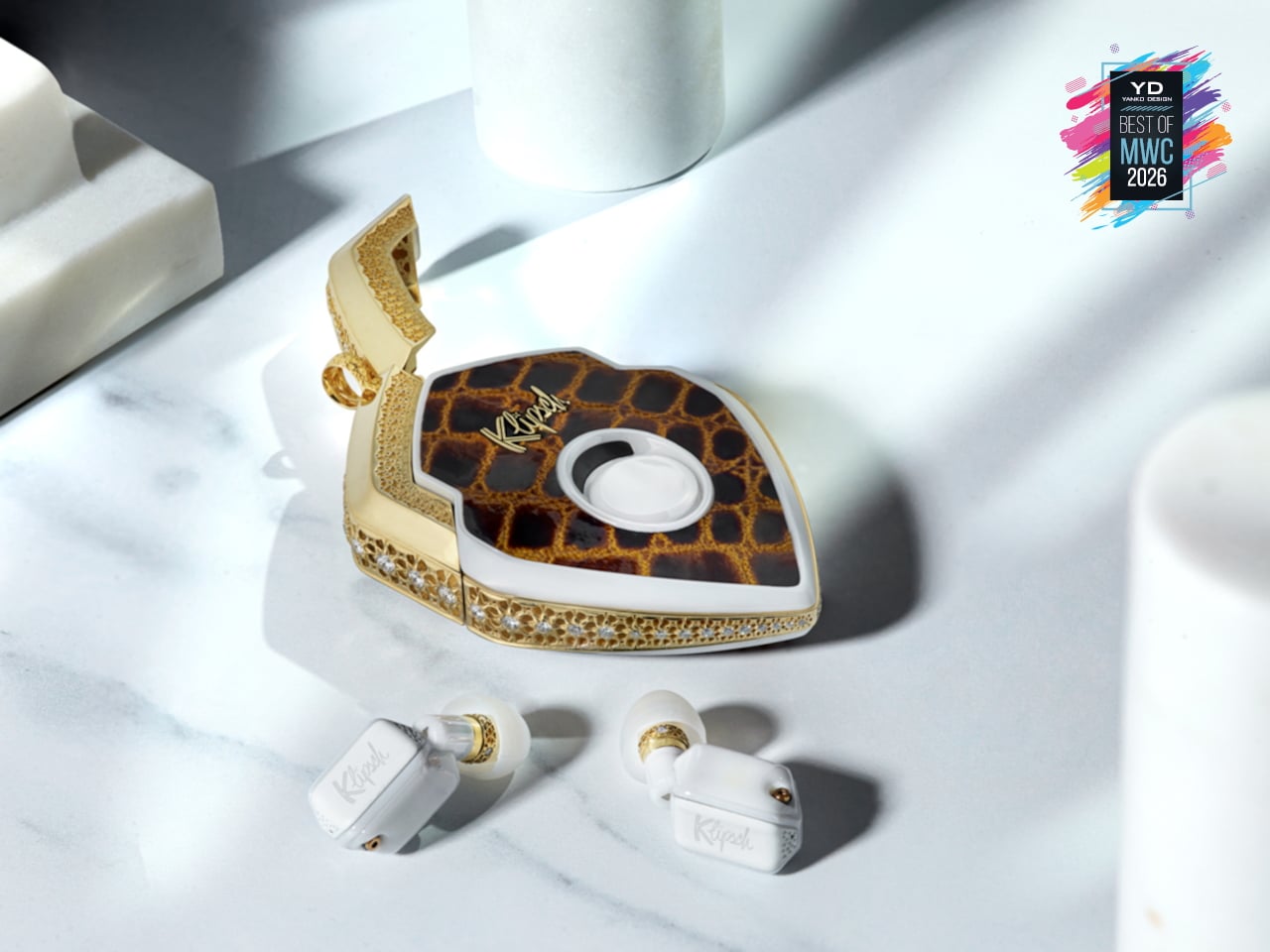
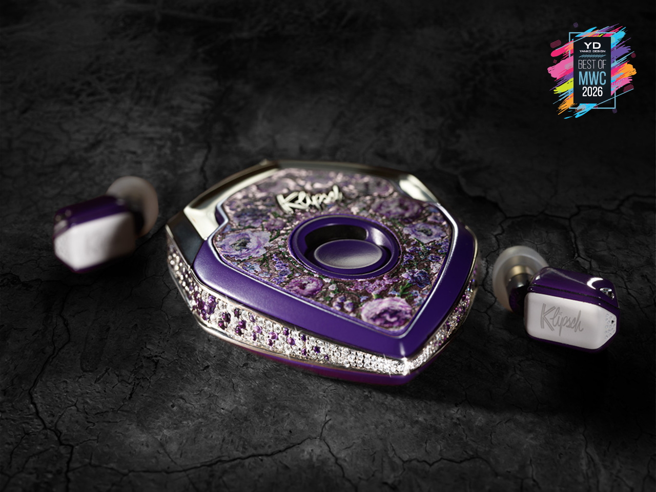
There are 150 of these made each year. That’s it. Each one starts as a conversation, not a product listing, where you sit down with the team and work through finishes, metals, and sculptural forms until the result is entirely yours. The chassis is ceramic zirconium, machined to roughly half the volume of an AirPod and assembled with micro-screws and gaskets the way a Swiss watchmaker approaches a movement. Some configurations arrive in mirror-polished obsidian black YTPZ ceramic with 24k rose-gold plating over solid bronze. Others wear navy-blue Cerakote over polished zirconia with hand-rubbed tung-oil burl wood inserts. The newest collection reaches into diamonds, amethysts, and fine metals, with one-of-a-kind builds priced past $115,000. These aren’t earbuds that happen to look expensive. They’re objects you’d keep in a case and hand down.
Designer: EAR Micro, Klipsch
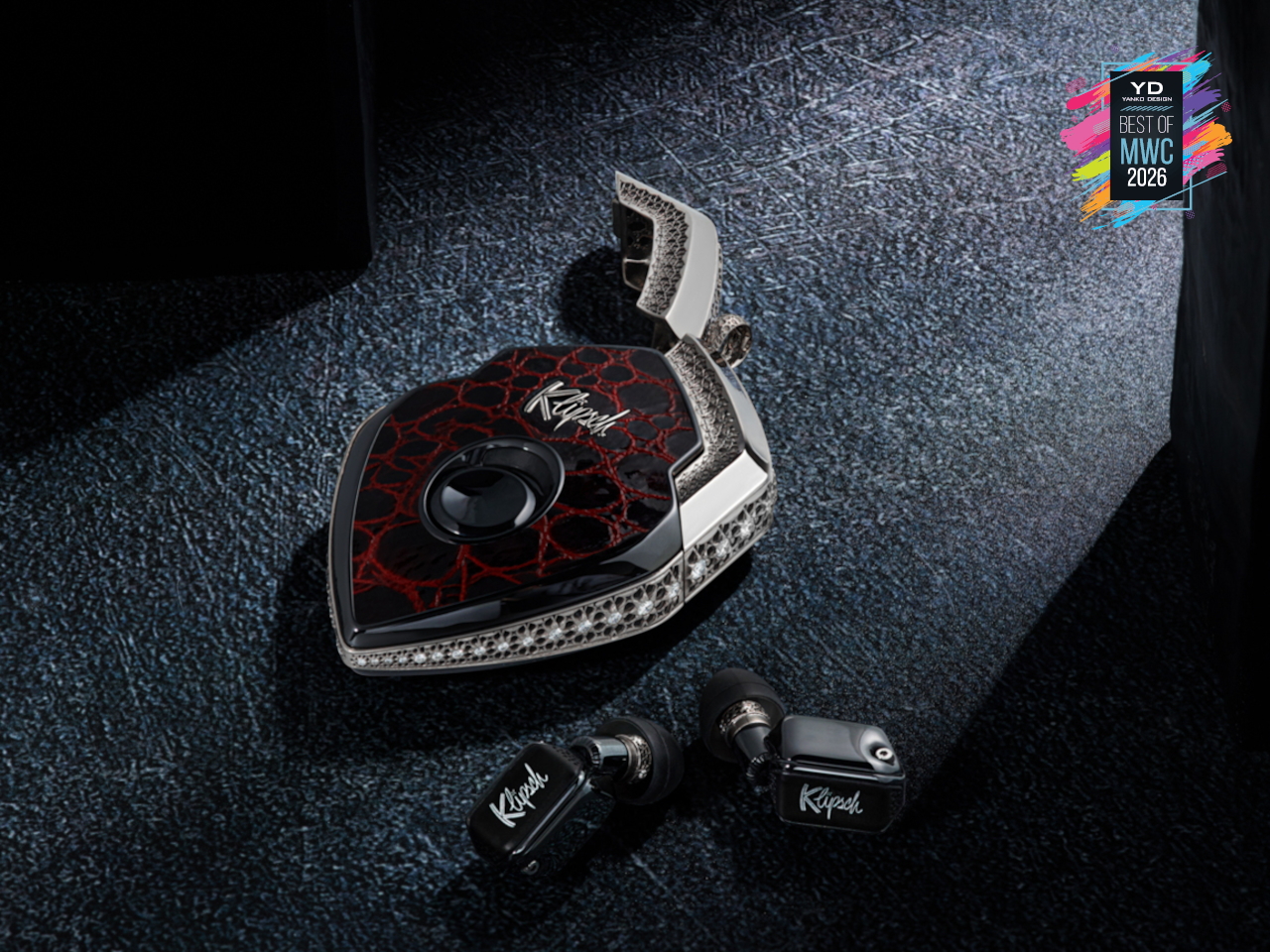
What separates the T10 Bespoke from anything else isn’t just the materials. It’s what’s packed into that tiny chassis. An ARM primary processor runs alongside a dedicated co-processor, with twin Cadence Tensilica Hi-Fi DSPs handling the signal chain. You get selectable amplifier modes, Class D for efficiency, and Class A/B when you want the fuller analog character. The Sonion Balanced Armature driver, tuned with Klipsch from the X10 lineage, feeds from a signal path that supports Sony LDAC at 24-bit/96kHz. That resolution matters because the hardware can actually deliver it. The PCB inside spans less than 1.13 square centimeters, with folding wings to fit the geometry. It’s the kind of engineering that usually stays behind a rack somewhere. Here it’s in your ear.
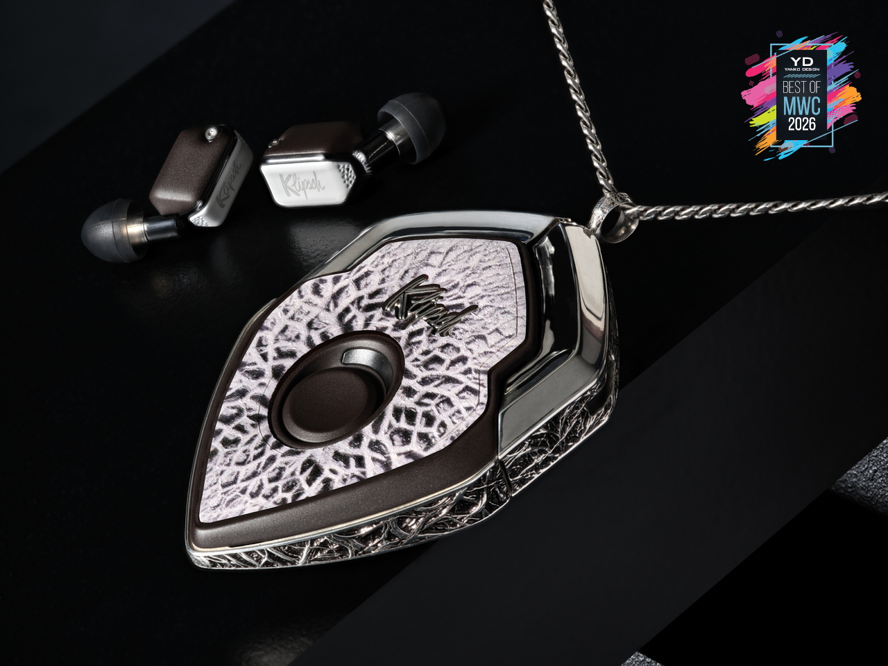
The interaction layer is equally thoughtful. Bragi OS powers the whole thing, supporting touch controls, voice commands, and head-motion gestures so you rarely have to reach for your phone. Battery life runs 8 to 9 hours per earbud, stretching past 30 hours with the case, and a 15-minute fast charge gets you to 85%. ANC is tuned in-house, and the founder calls it best in class, which is a claim that holds up in context, given the hardware underneath it. The deeper point is that this isn’t a product built to a price point or a roadmap. The chassis is replaceable. The battery is replaceable. The shell is replaceable. You’re not buying a device with a two-year lifespan. You’re buying something designed to stay with you, improve over time, and still be relevant long after everything else has been recycled.
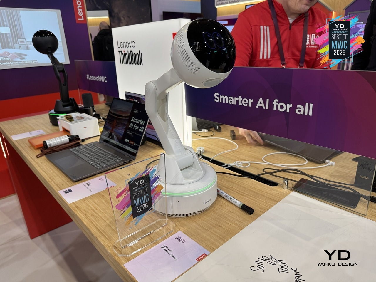
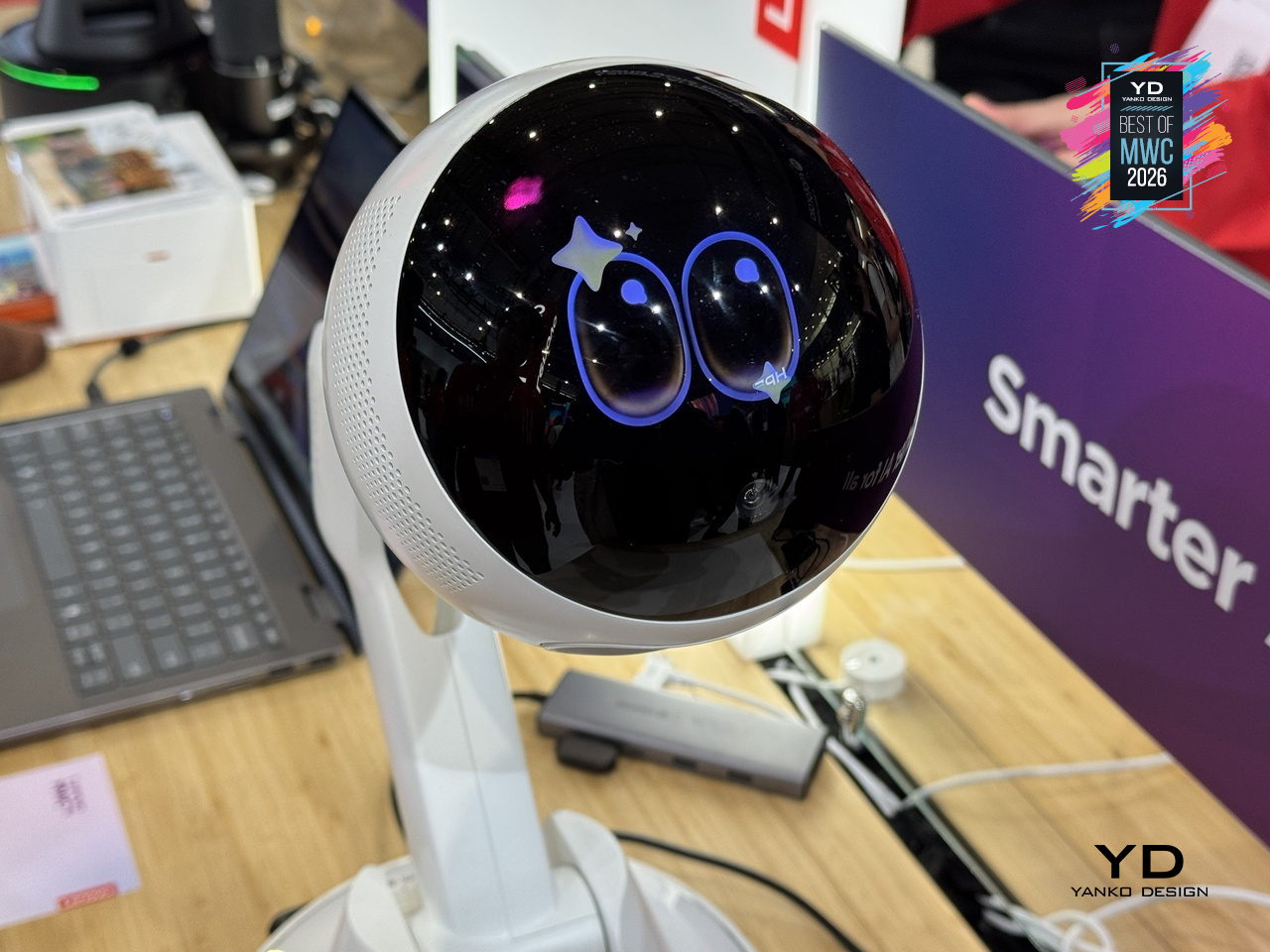
Most AI assistants live inside a screen, which means interacting with them still involves picking up a device, unlocking it, and navigating to something. Lenovo’s AI Workmate Concept takes a different position, literally: it sits on your desk as a physical object, a spherical head on an articulated arm mounted on a circular base, designed to be always present and always on without requiring you to go looking for it.
Designer: Lenovo
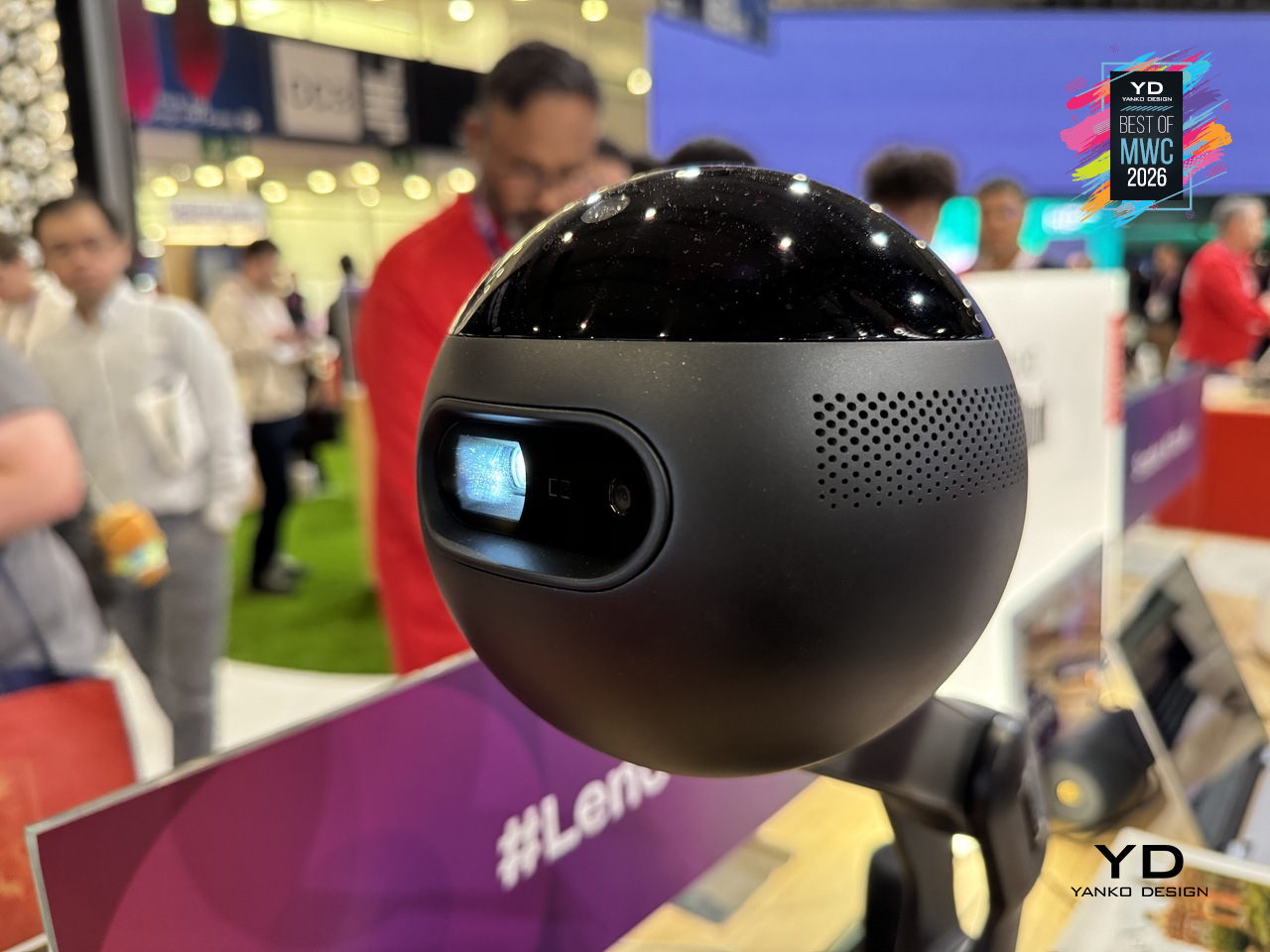
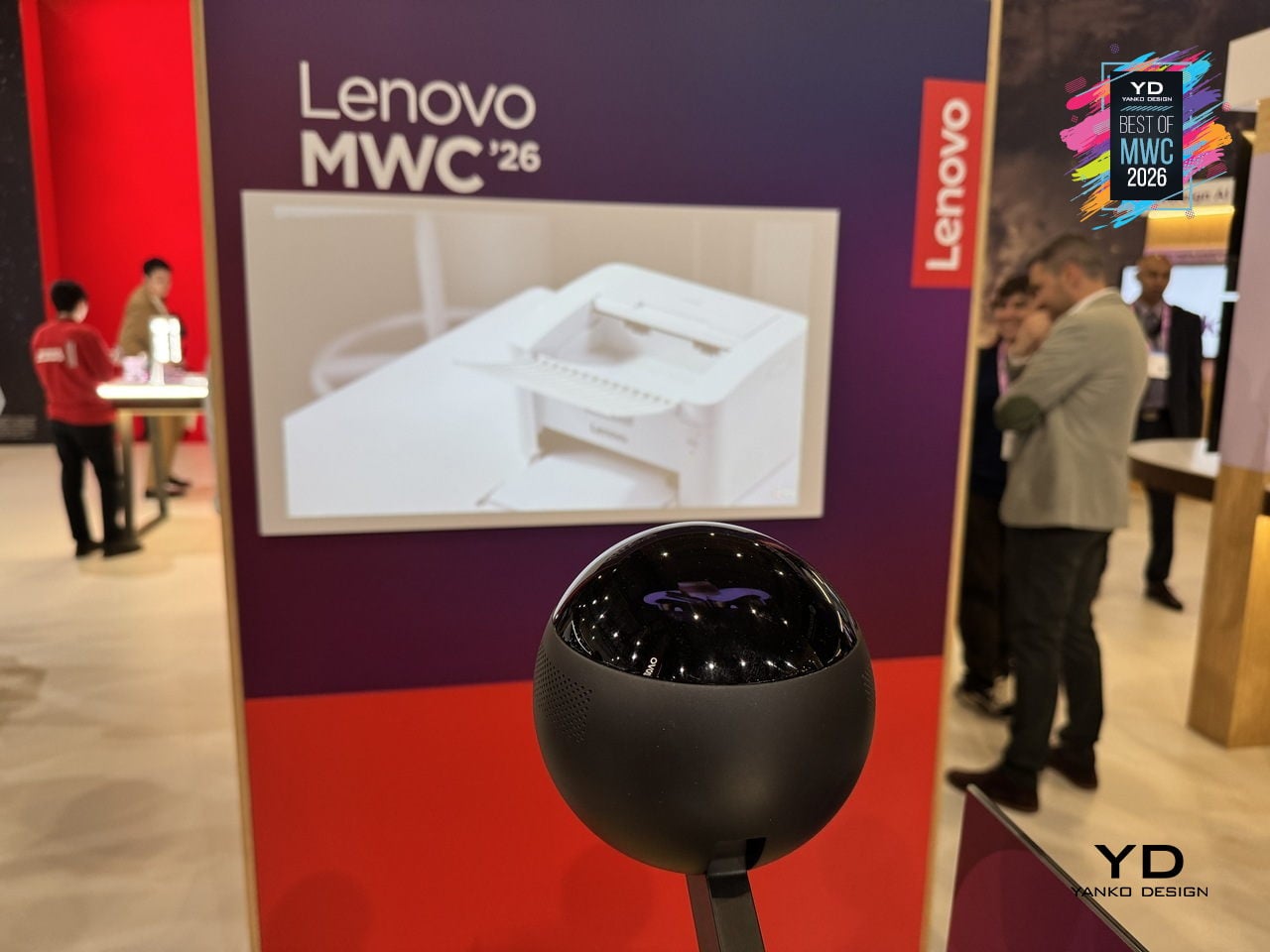
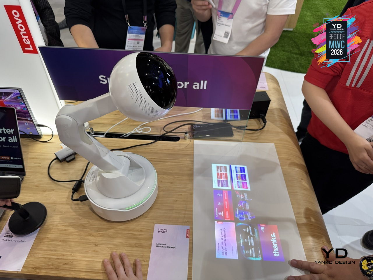
The design is built around natural interaction rather than typed commands or app interfaces. It responds to voice, gesture, and writing, with on-device AI processing inputs locally for privacy. The more distinctive capability is spatial output: the Workmate can project content directly onto a nearby surface, turning a desk or wall into a temporary display for documents, presentations, or notes. It also handles practical business tasks like scanning and summarizing documents and assisting with content creation, positioned as a desk companion rather than a novelty.
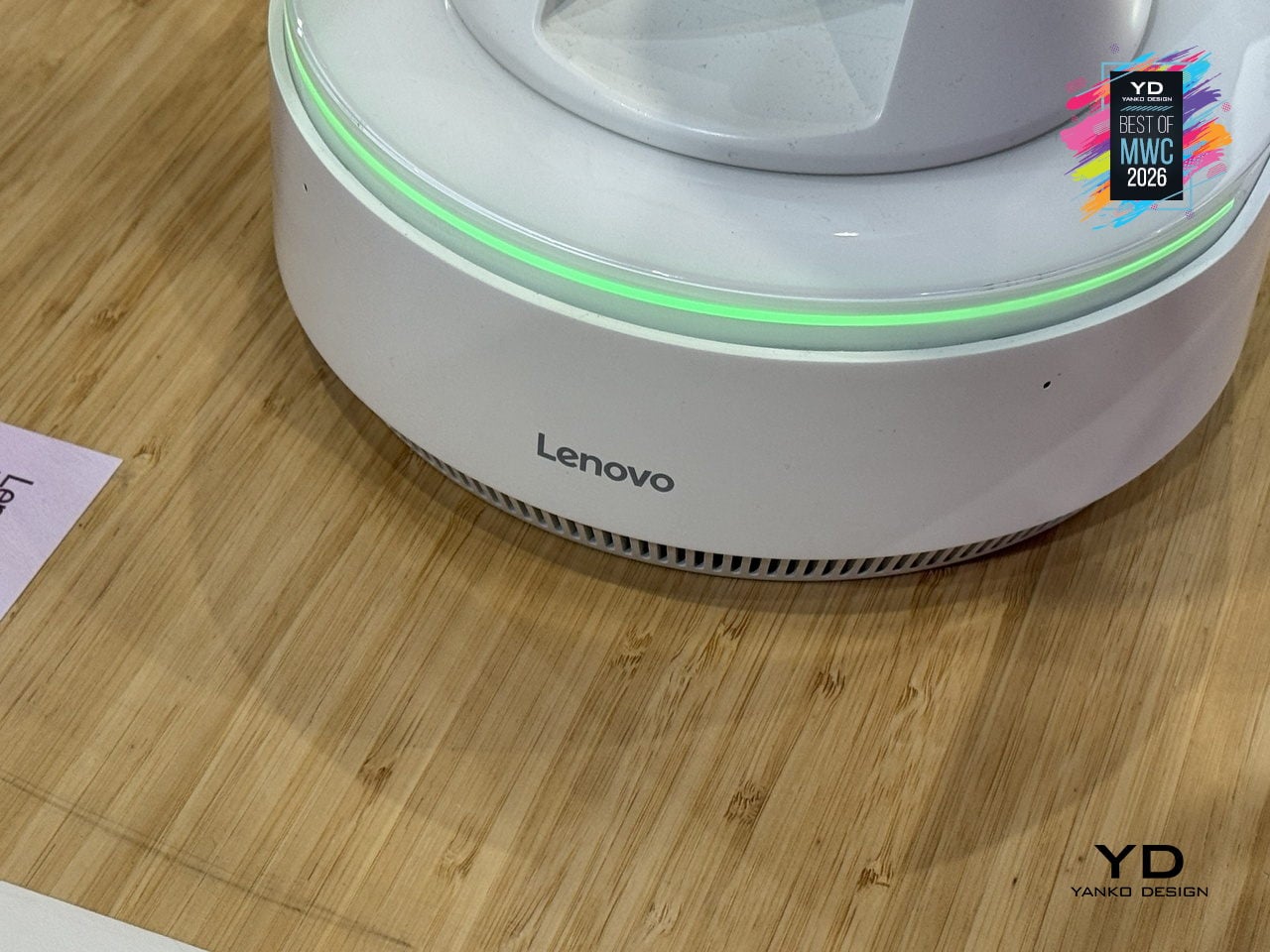
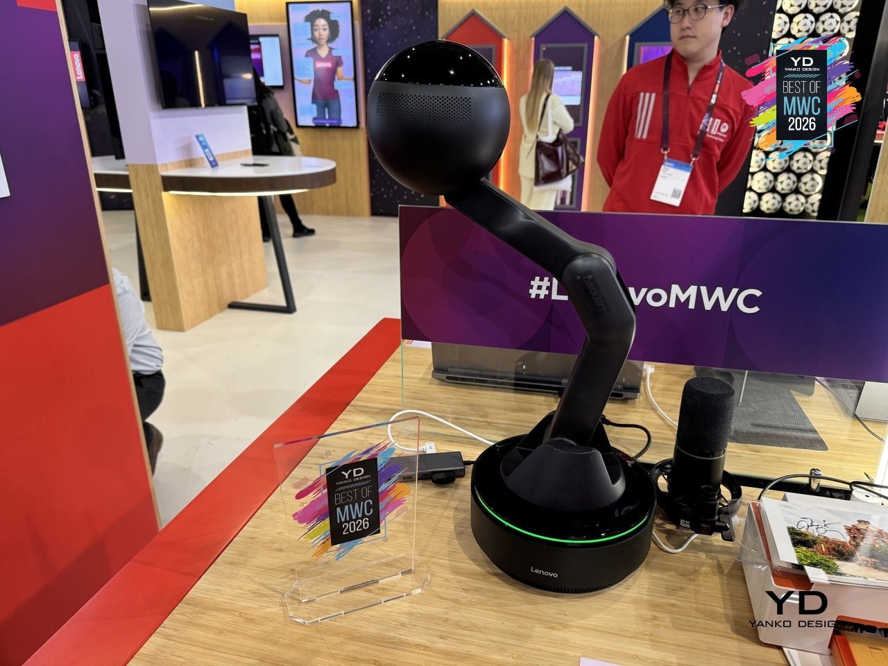
The physical form is what makes the concept worth paying attention to as a design argument. The spherical head, articulated arm, and glowing base ring give the device a clear presence and orientation, somewhere between a desk lamp and a friendly robot, without tipping into either. It acknowledges you spatially rather than waiting to be summoned from a notification panel. Whether a desk companion with animated eyes and a projector becomes something people actually want next to their laptops is the real design question Lenovo is exploring here, and MWC 2026 was its first public test of that answer.

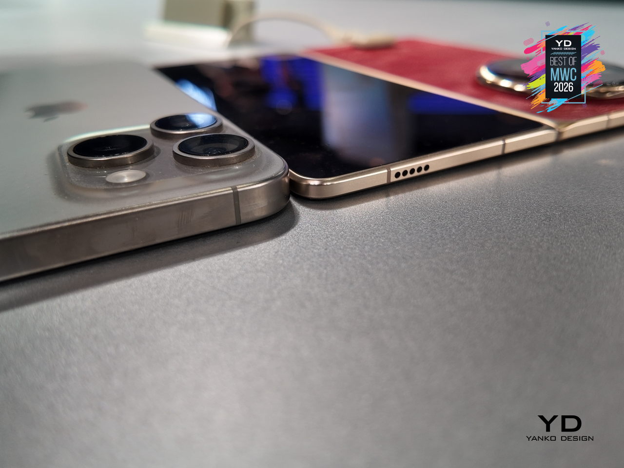
Huawei’s Mate series has always been the line where the company makes its clearest design statements, and the Mate 80 Pro Max carries that further with a body that steps away from the fiber-reinforced plastic back of the standard Pro in favor of an aluminum alloy construction throughout. The result is a phone with more physical presence and a slightly larger footprint. Both share the same Dual Space Rings camera module design that has become the Mate family’s most recognizable feature, two concentric rings framing the rear cameras in a configuration that reads as intentional rather than incidental.
Designer: Huawei
The display on the Pro Max stretches farther to 6.9 inches while keeping the same LTPO OLED panel with 1440Hz PWM dimming and Kunlun Glass 2 protection. Powered by the same Kirin 9030 Pro chipset in their top configurations, the Max differentiates itself through physical scale and materials rather than raw internals. The battery also steps up to 6000mAh, though paired with the same 100W wired charging. The color options shift too: where the Pro comes in Black, White, Green, and Gold, the Max trades the softer tones for Black, Silver, Blue, and Gold.
What the Mate 80 Pro Max represents is a familiar kind of product logic: take the established design, make it bigger, make the materials more premium, and add the battery capacity to match the larger chassis. The Dual Space Rings identity carries across both models intact, so the design conversation between the two is less about direction and more about degree. With a significantly higher price tag, the Pro Max is considered step up for buyers who want the full physical expression of what the Mate 80 series is about.
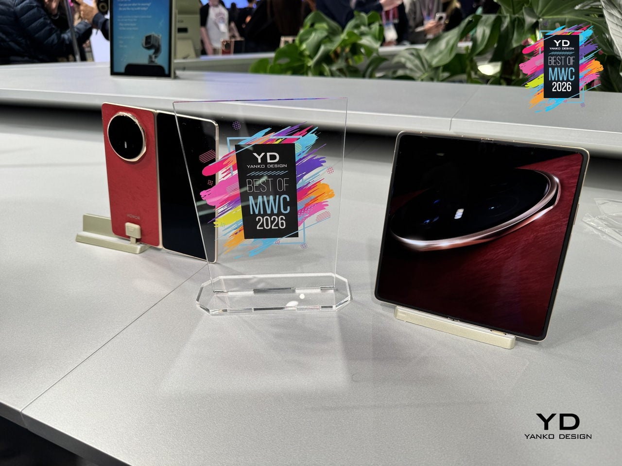
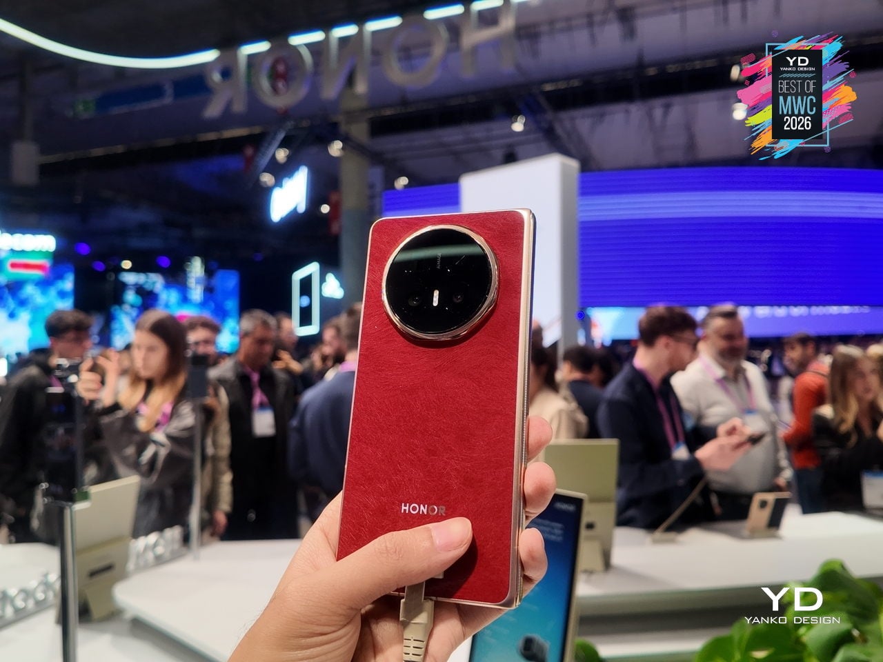
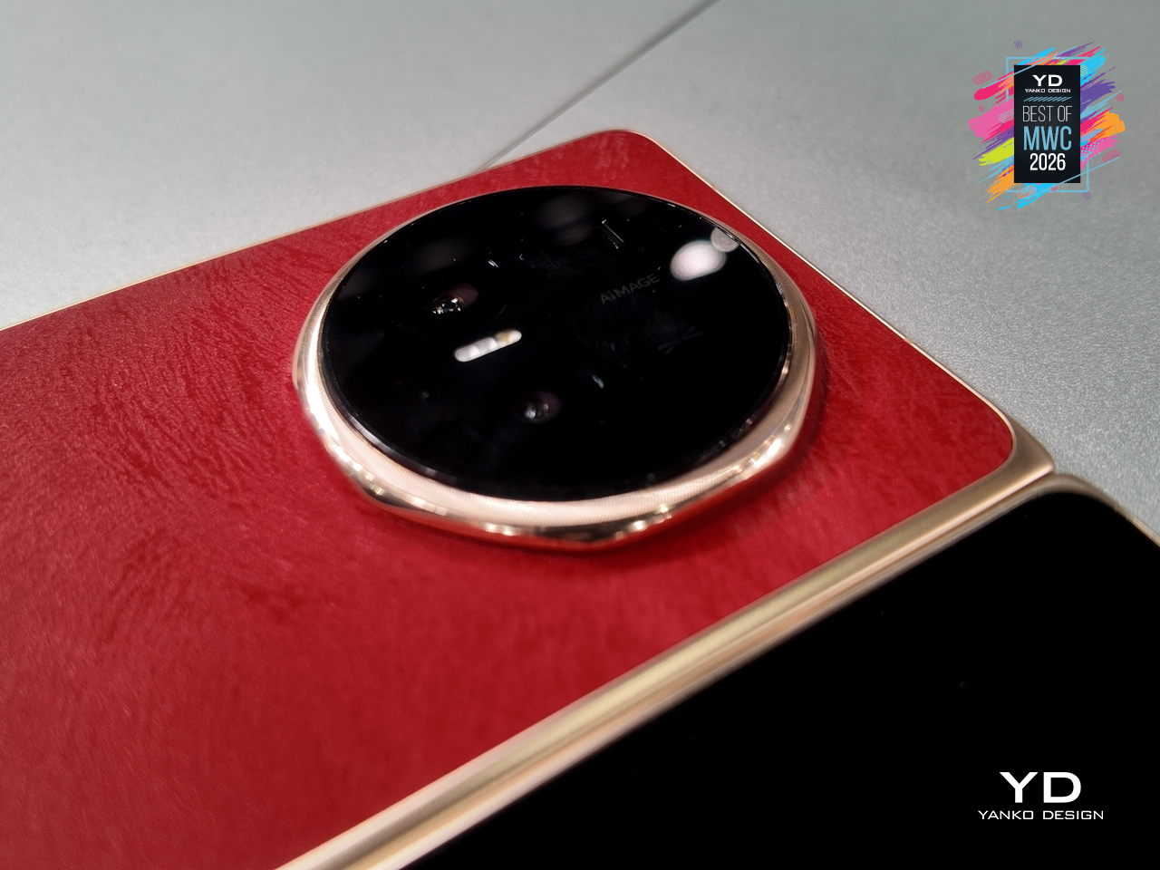
Foldable phones have spent years promising the future while feeling fragile, bulky, and anxious about rain. Honor’s design obsession with the Magic V6 was to solve all three problems at once without letting any of them compromise the others. The result is an 8.75mm folded profile, putting it in iPhone-thin territory, paired with a 6,660mAh silicon-carbon battery, the largest ever fitted into a foldable at this thickness.
Designer: Honor
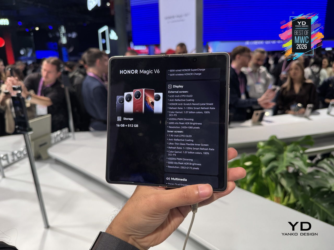
That battery figure is where the real engineering story lives. Silicon-carbon cells pack more energy into less space than conventional lithium-ion, but higher silicon content creates expansion stress that can crack cells over charge cycles. Honor’s fifth-generation silicon-carbon material, developed with ATL, reaches 25% silicon content. That’s what allows the capacity and the thinness to coexist without one compromising the other.
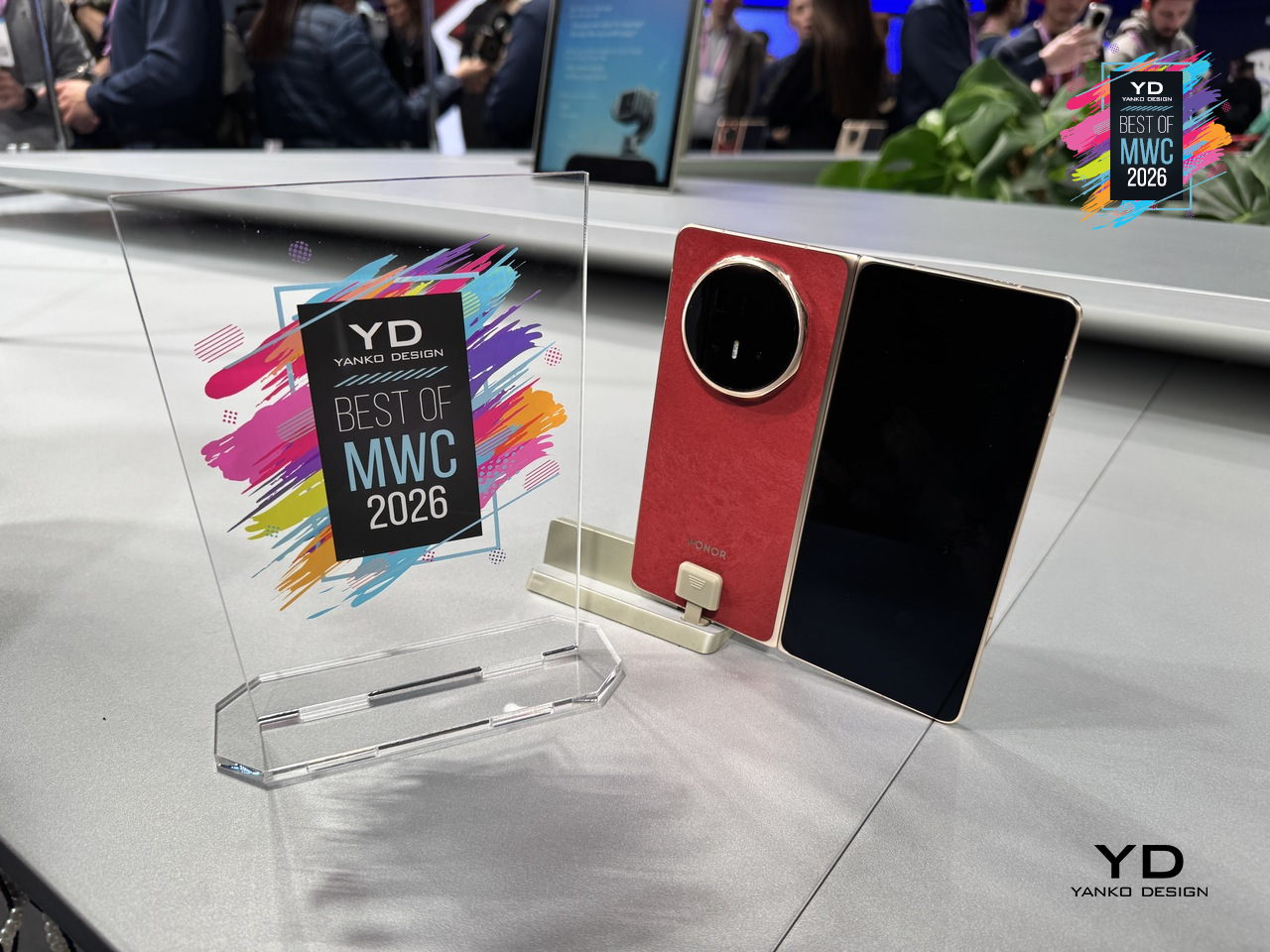
The Magic V6 also carries both IP68 and IP69 ratings, a first for any foldable. IP68 handles submersion; IP69 covers high-pressure, high-temperature water jets. Getting both on a device with a moving hinge, a crease depth reduced by 44% over the previous generation, and a display reflectivity as low as 1.5%, reflects how much structural engineering went into something that still opens and closes hundreds of times daily.
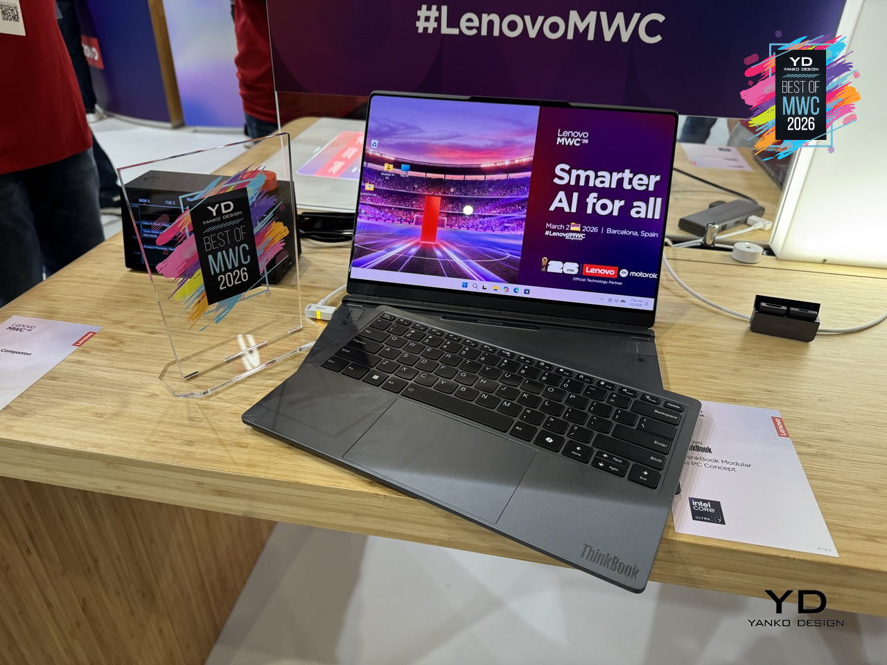
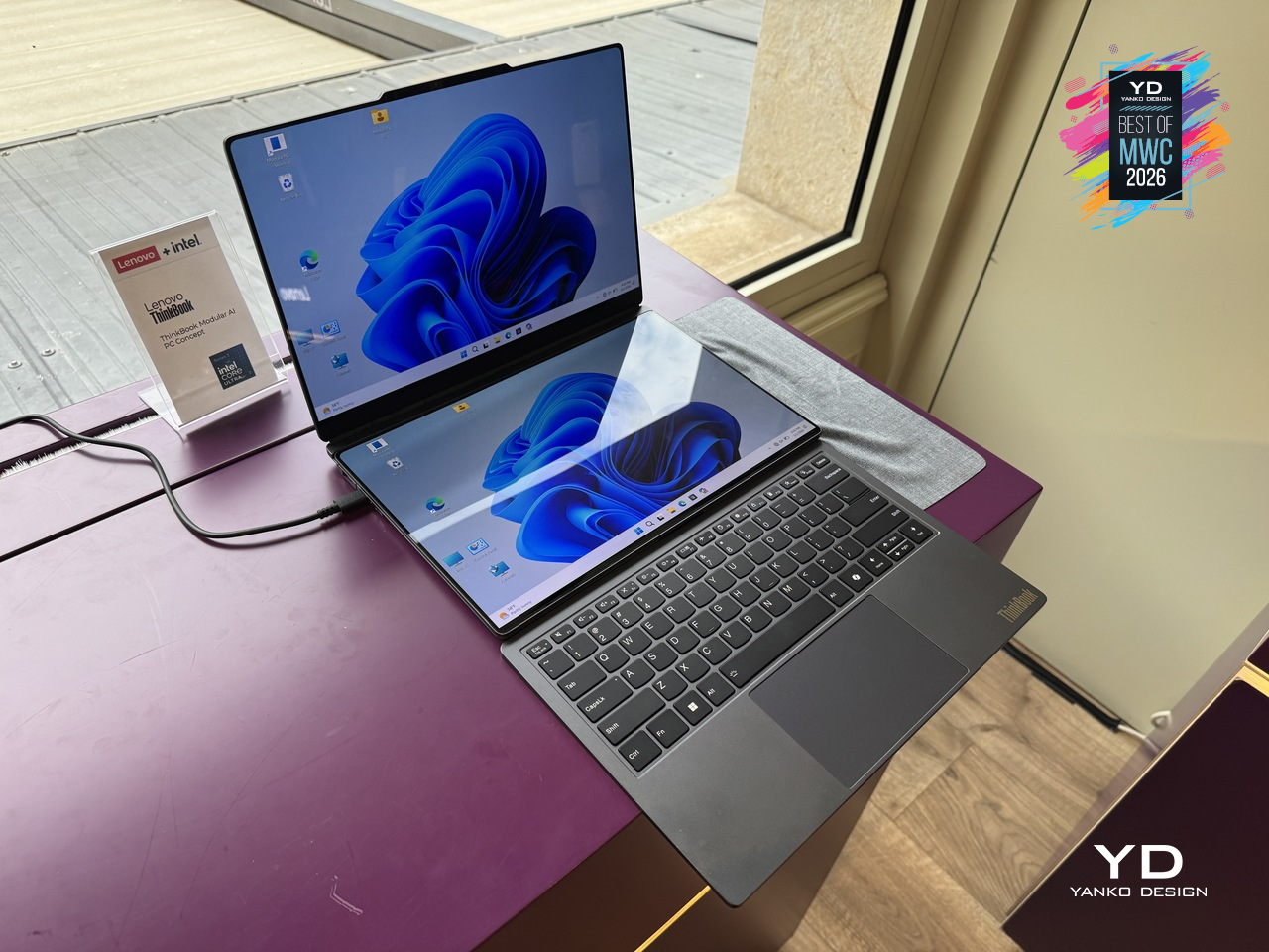
Laptops have been making the same basic promise for decades: here is one device that does everything, carry it everywhere. The trade-off has always been that “everything” means compromises, a screen too small for real work, a body too thick for a bag, a keyboard that disappears when you want a tablet. Lenovo’s ThinkBook Modular AI PC Concept at MWC 2026 takes a different position entirely, built around a “carry small, use big” philosophy that lets a single 14-inch base system reconfigure itself depending on where you are and what you’re doing.
Designer: Lenovo
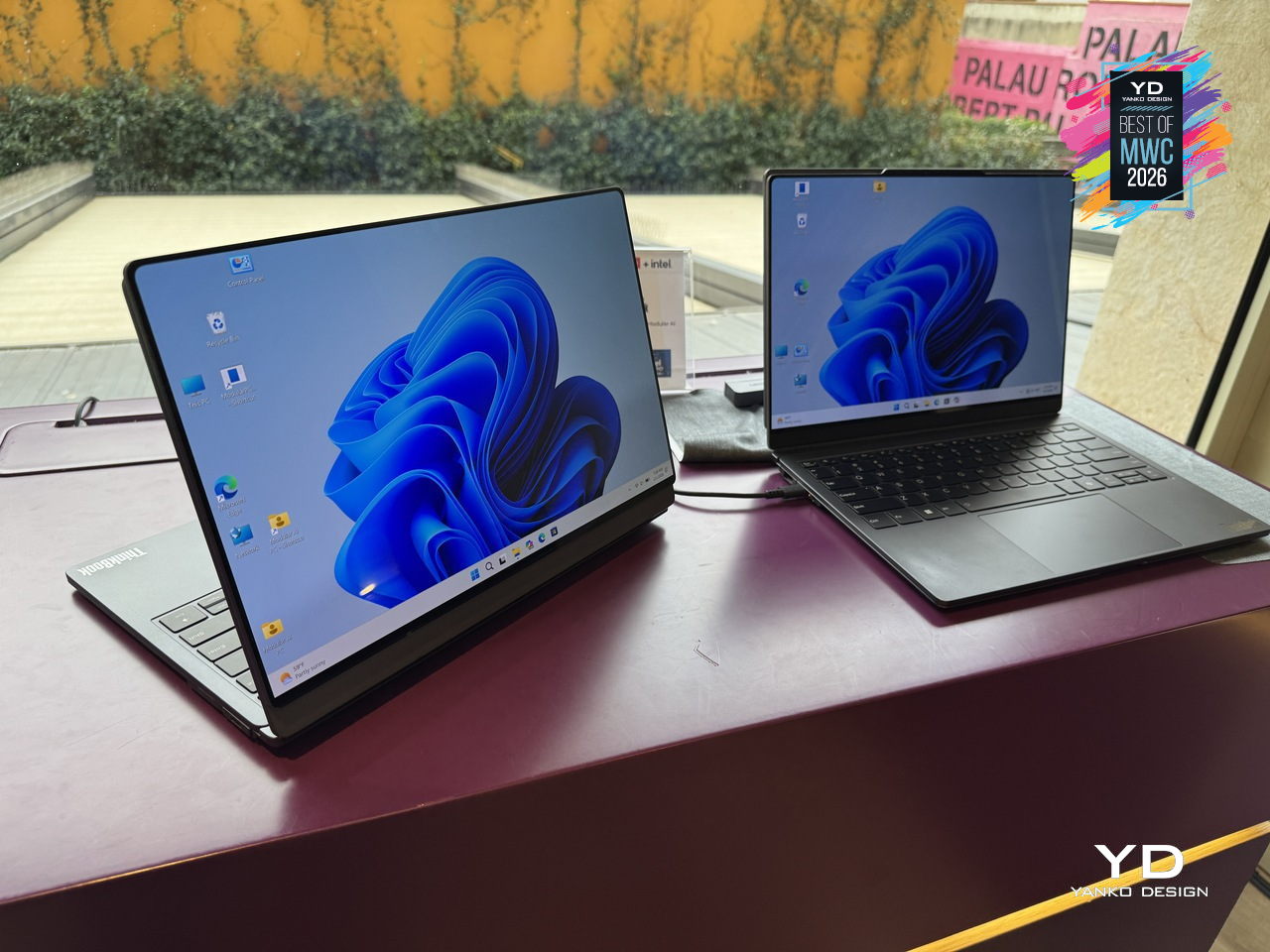
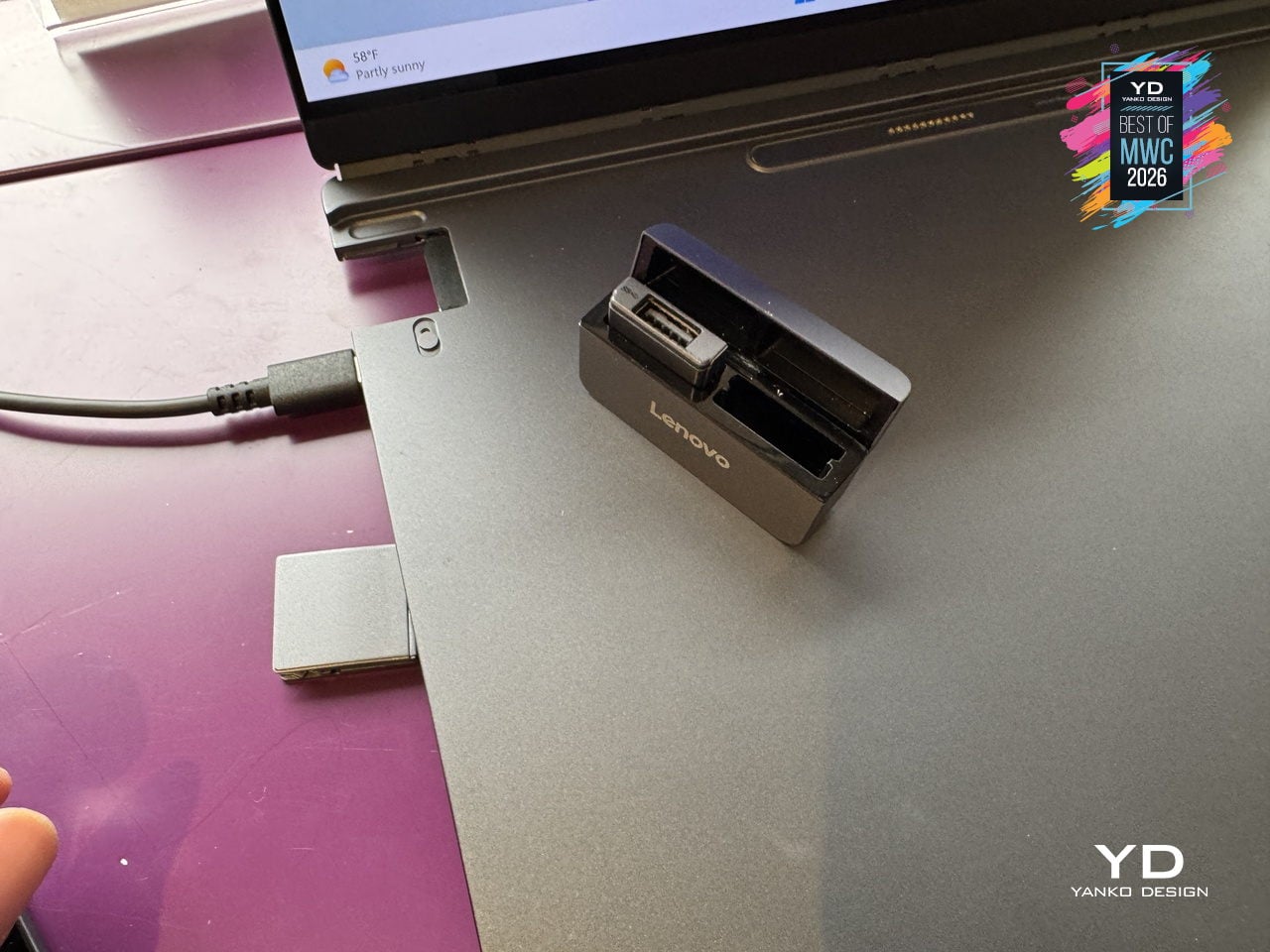
The modularity here is practical rather than speculative. A secondary display attaches to the top cover for face-to-face sharing or closed-lid use, sits alongside the base on an integrated kickstand as a portable travel monitor in portrait or landscape, or swaps with the keyboard to create a dual-screen setup stretching the combined workspace to roughly 19 inches. The Bluetooth keyboard detaches entirely. IO ports, including USB Type-A, USB Type-C, and HDMI, are interchangeable depending on what a given day requires. Pogo-pin connectors handle power and data transfer between modules, keeping the system stable and self-contained throughout all the rearranging.
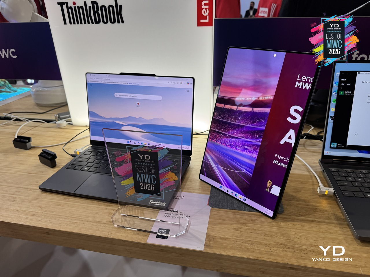
What makes the ThinkBook Modular concept worth paying attention to as a design argument is the restraint behind it. Rather than trying to anticipate every scenario inside one fixed chassis, Lenovo accepted that the device itself should be the smallest possible useful thing and let the user decide what gets added to it. A laptop that adapts to the workflow instead of the other way around is an old idea that has never quite landed in a form people actually use. This concept is still exactly that, a proof of concept with no confirmed release date, but the underlying logic is more considered than most modular hardware that has come before it.
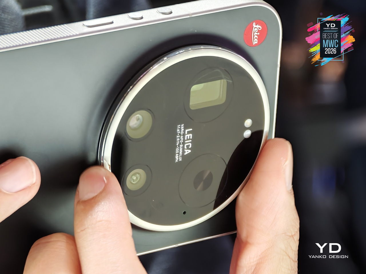
Xiaomi has made plenty of capable camera phones, but the Leica Leitzphone takes a different approach entirely, treating the smartphone less like a spec competition and more like an extension of Leica’s century-old obsession with optical craft. The silver aluminum frame carries tactile knurling, a rotatable camera ring, and the iconic Leica Red Dot, sitting against a black fiberglass back pulled directly from classic Leica rangefinder design language.
Designer: Xiaomi x Leica
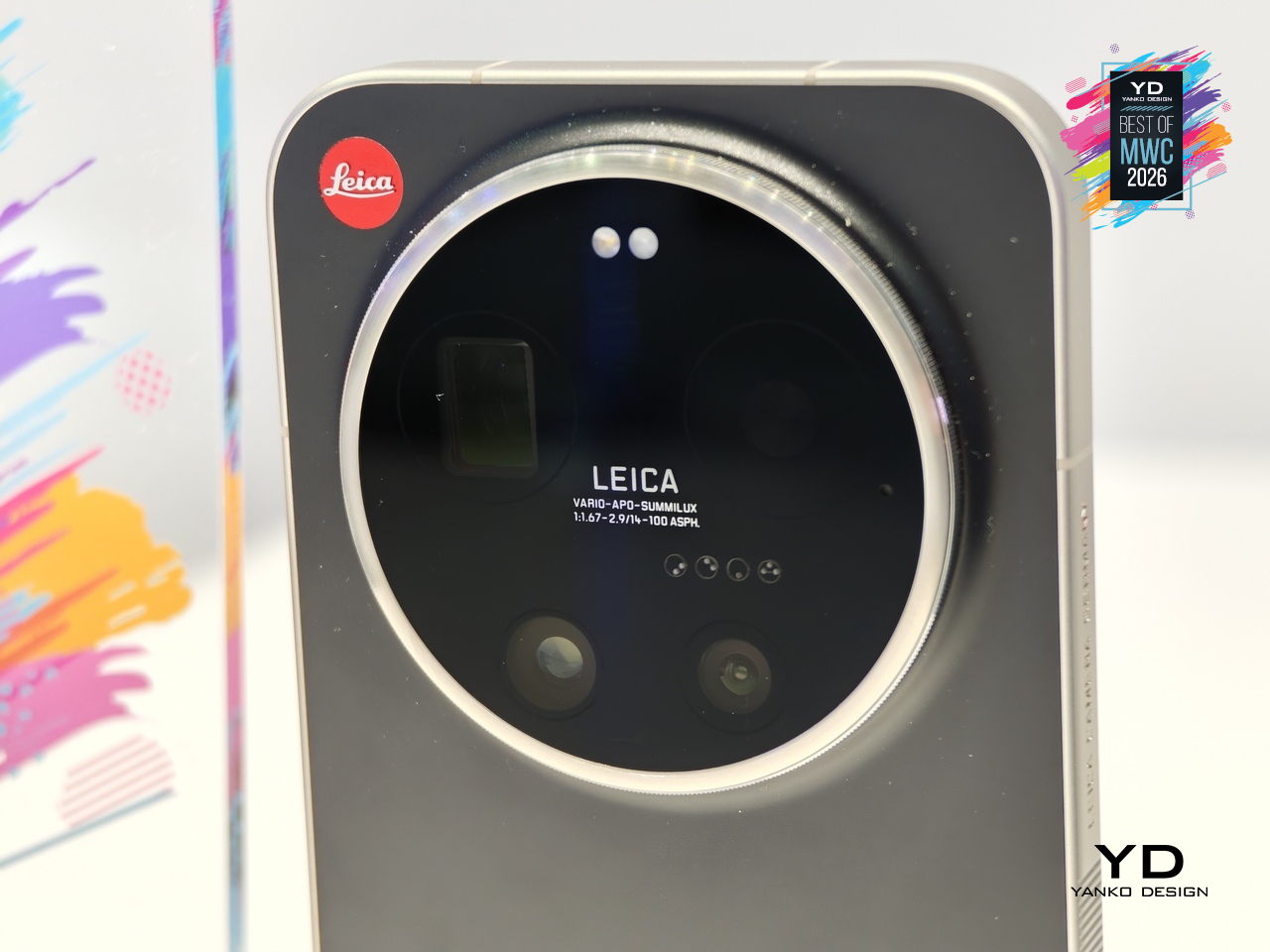
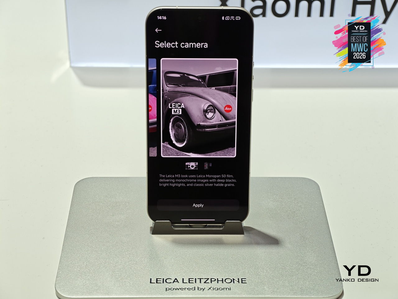
That camera system is where the conviction becomes most legible. A 1-inch sensor with LOFIC HDR technology handles the main shooting duties, alongside a 200MP telephoto at 75 to 100mm and a 14mm ultra-wide. The rotatable physical camera ring, assignable to focal length, focus, or bokeh, gives the experience a tactile dimension that touchscreen sliders simply cannot replicate. Thirteen Leica color styles and a dedicated Essential Mode recreating the Leica M9 and M3 look complete the package.
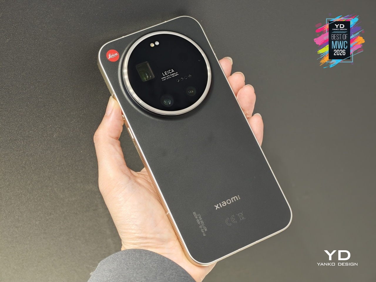
The rest of the hardware keeps pace: Snapdragon 8 Elite Gen 5, a 6.9-inch 3500-nit OLED display, and a 6000mAh battery with 90W wired charging. The Leica UX layer goes further than a cosmetic theme, reshaping system fonts, icons, and widgets into a coherent visual identity rooted in Leica’s design language. For anyone who has wanted smartphone photography to feel less like operating software and more like handling a real camera, this is the most direct answer yet.
Kids’ smartwatches have gotten good at keeping children connected to parents while they’re out, but they go dark the moment they come off the wrist. That’s the gap TCL is trying to close with the Tbot, a magnetic desktop dock that pairs with TCL’s kids’ watches, like the MoveTime MT48, to keep the experience going at home during charging. Rather than letting the device sit idle on a nightstand, the Tbot turns that downtime into something more purposeful.
Designer: TCL
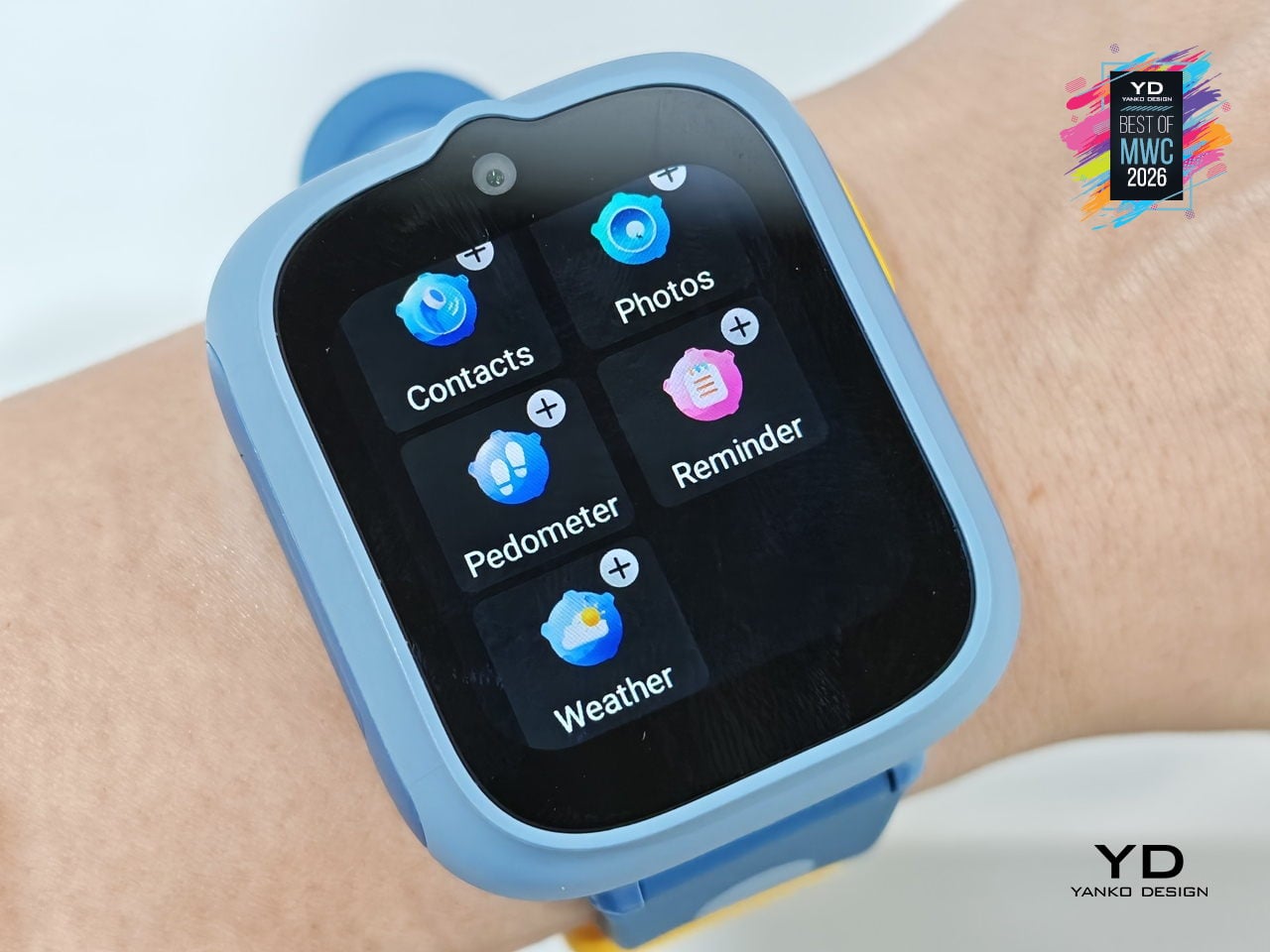
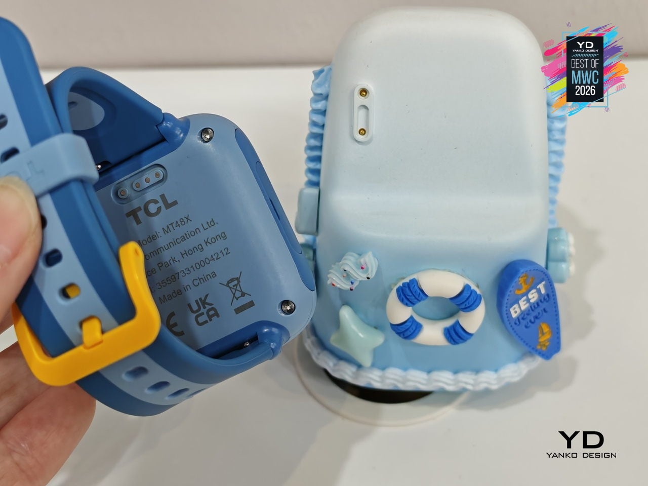
The companion functions as an AI assistant shaped around a child’s daily rhythm, setting wake-up alarms, bedtime reminders, and Pomodoro-style study timers through age-appropriate guidance. It also doubles as a learning partner for guided discovery, a sleep companion that tells bedtime stories, and a parental alert hub that sends configurable notifications when parents need to stay in the loop. The idea is continuity between the outdoors and the home, with the watch and dock working as two parts of the same connected experience.
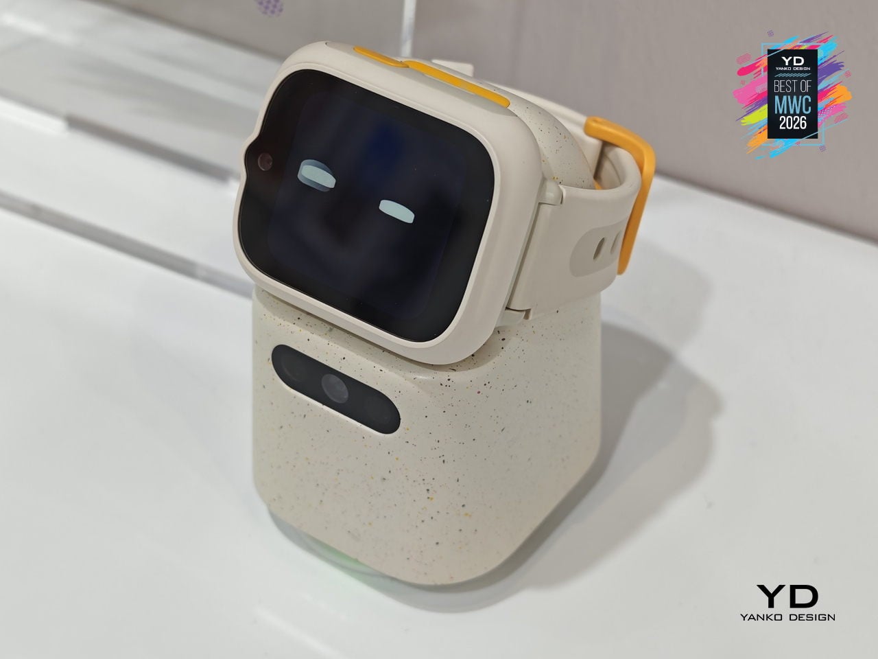
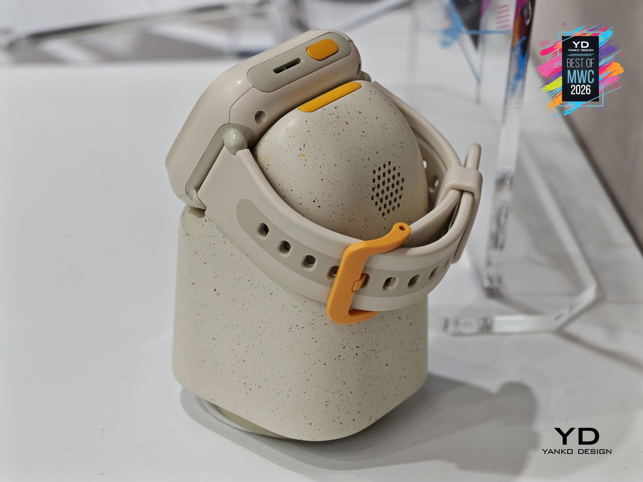
TCL is positioning the Tbot as a concept for now, still in its development phase while the company works through applicable regulations around AI features for children. That measured approach actually makes sense given the audience, since parental permission and age-appropriate guardrails are built into its design from the start. Getting that balance right between a helpful AI companion and appropriate boundaries for kids is exactly the kind of design problem worth taking slowly.
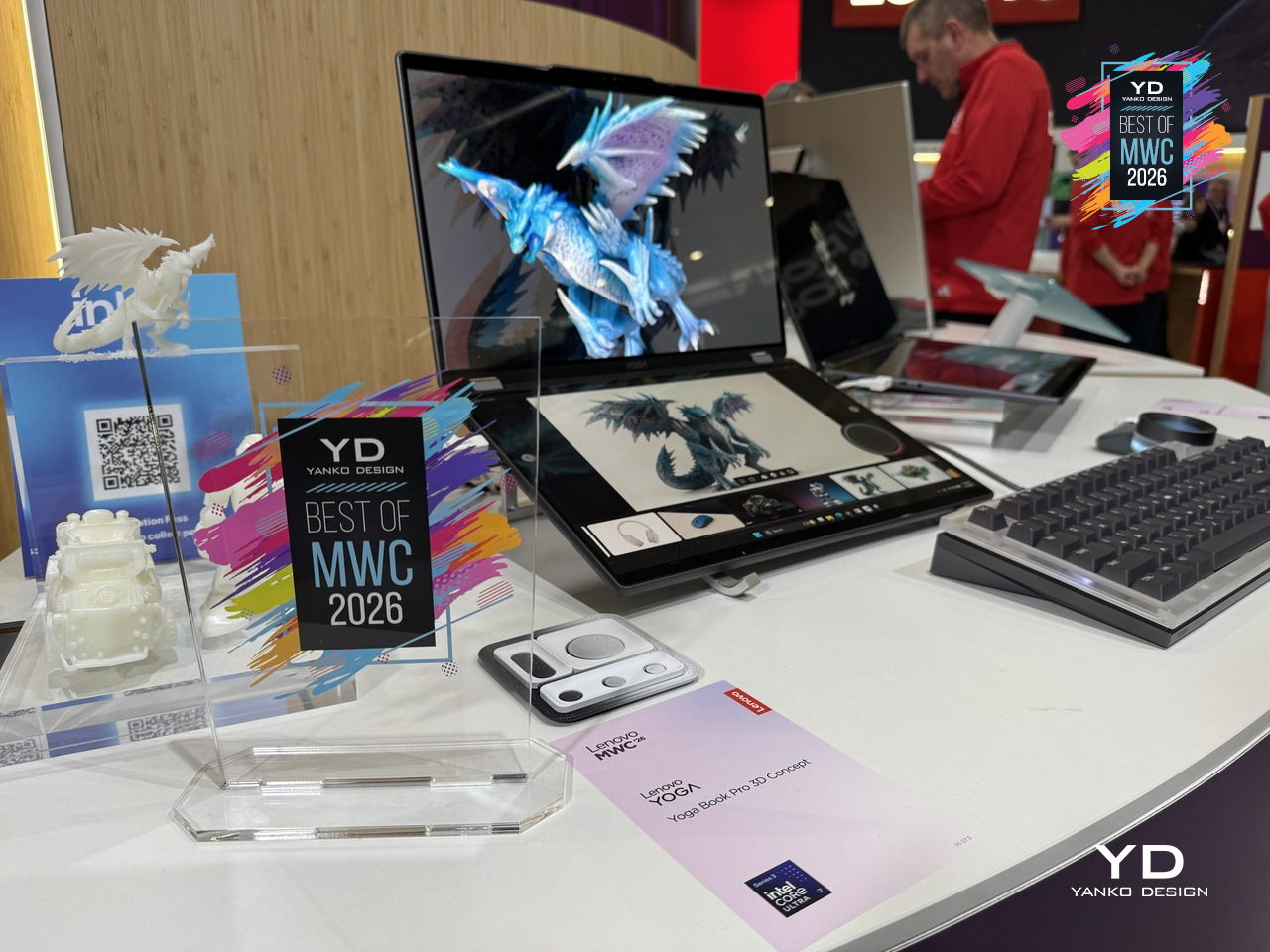
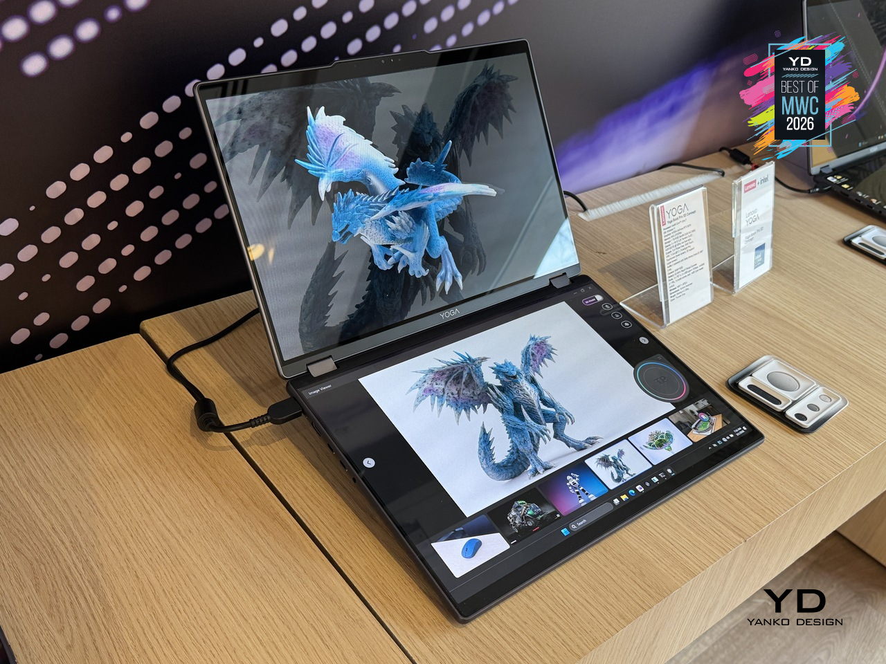
3D creation on a laptop has always involved a certain amount of peripheral management, between mice, styluses, and the occasional spacemouse bolted to the side of the desk. The Yoga Book Pro 3D Concept takes aim at that setup by building a glasses-free 3D display directly into a dual-screen laptop, letting creators view depth, form, and spatial relationships on screen without any additional equipment. Lenovo’s AI software handles 2D to 3D conversion on the upper PureSight Pro Tandem OLED display, and can even generate an environment around the converted object on command.
Designer: Lenovo
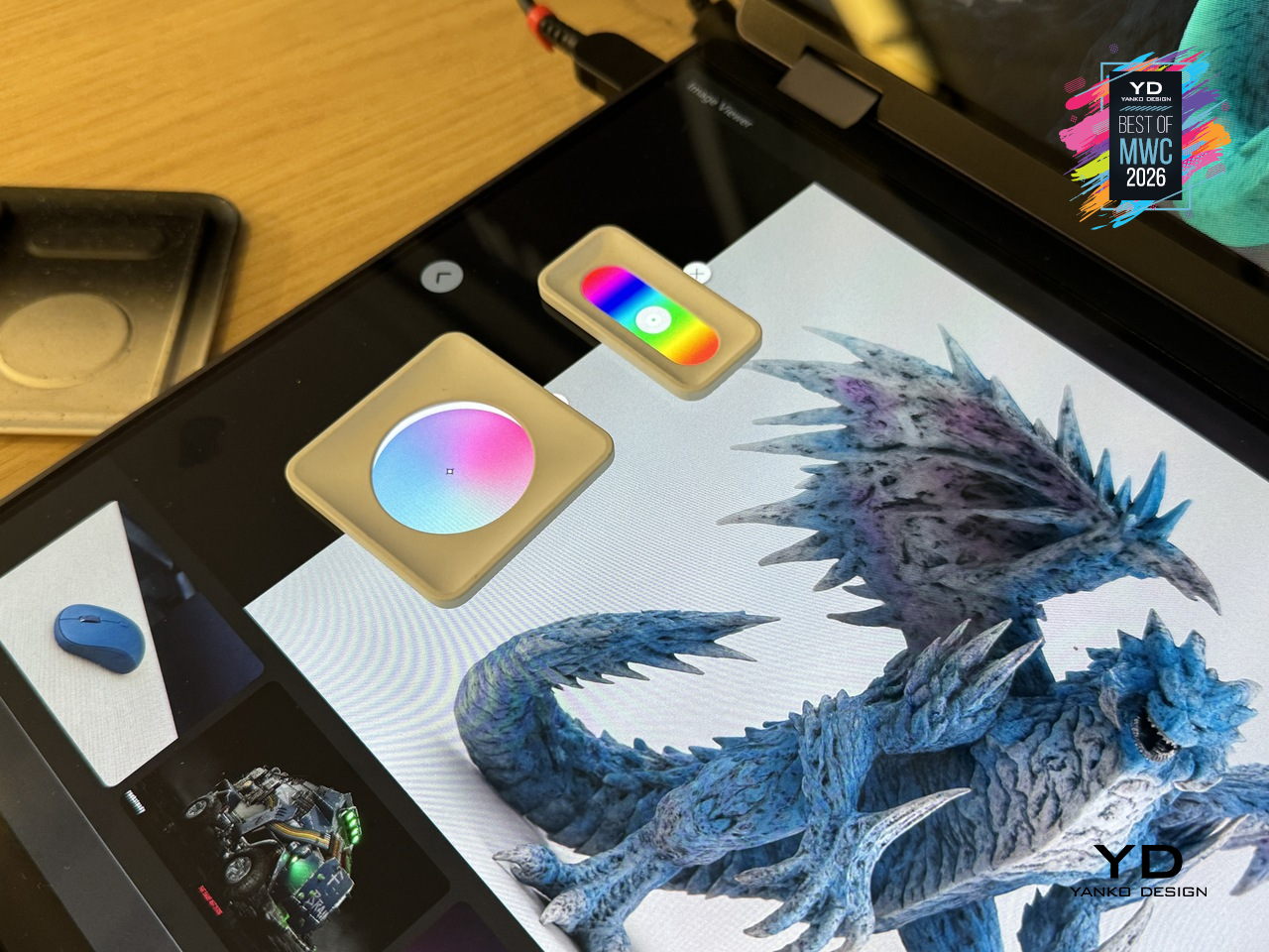
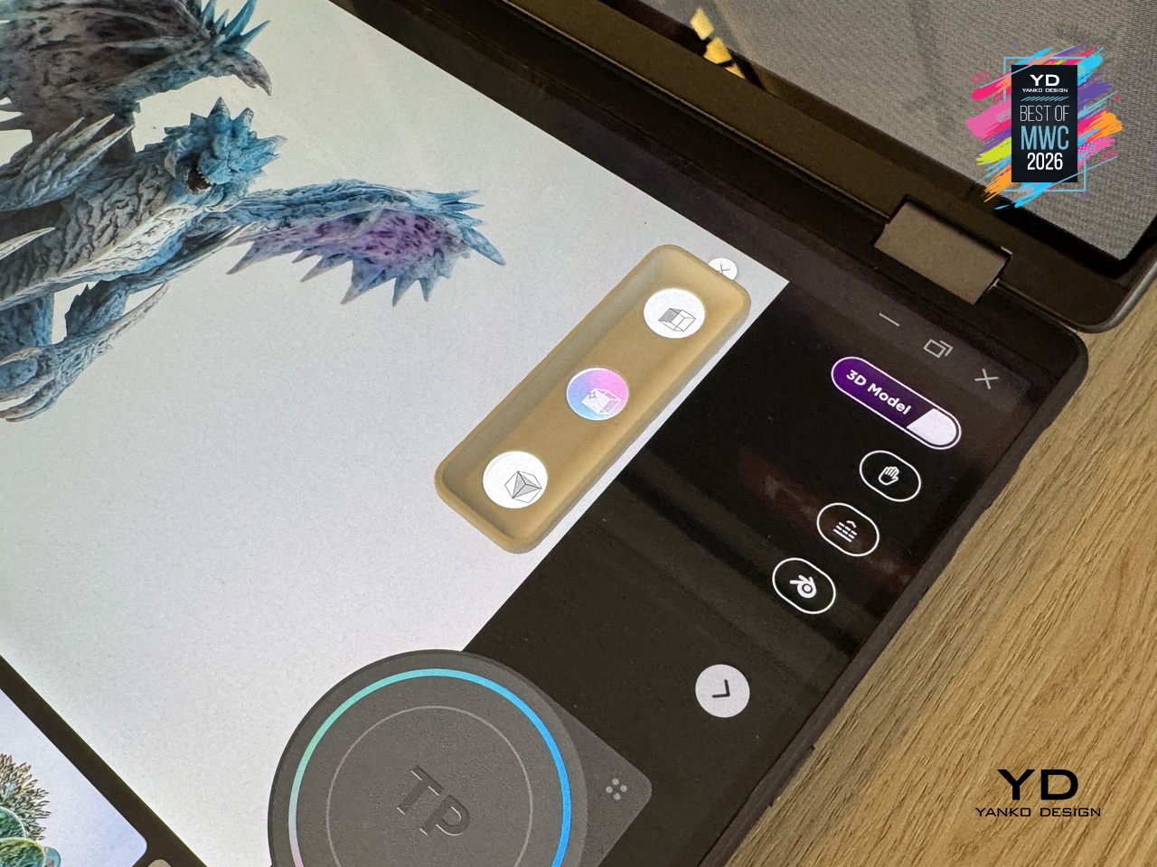
The dual-screen concept laptop also offers a rather interesting interaction feature. Zero-touch gestures read hand movements in front of the RGB camera, letting users zoom and rotate 3D objects without touching the screen at all. The lower display acts as a touch surface with snap-on physical pads that pop up adjustment controls, like lighting and viewing angle, wherever they’re placed. It’s a workflow designed to keep creators in the work rather than hunting through menus.
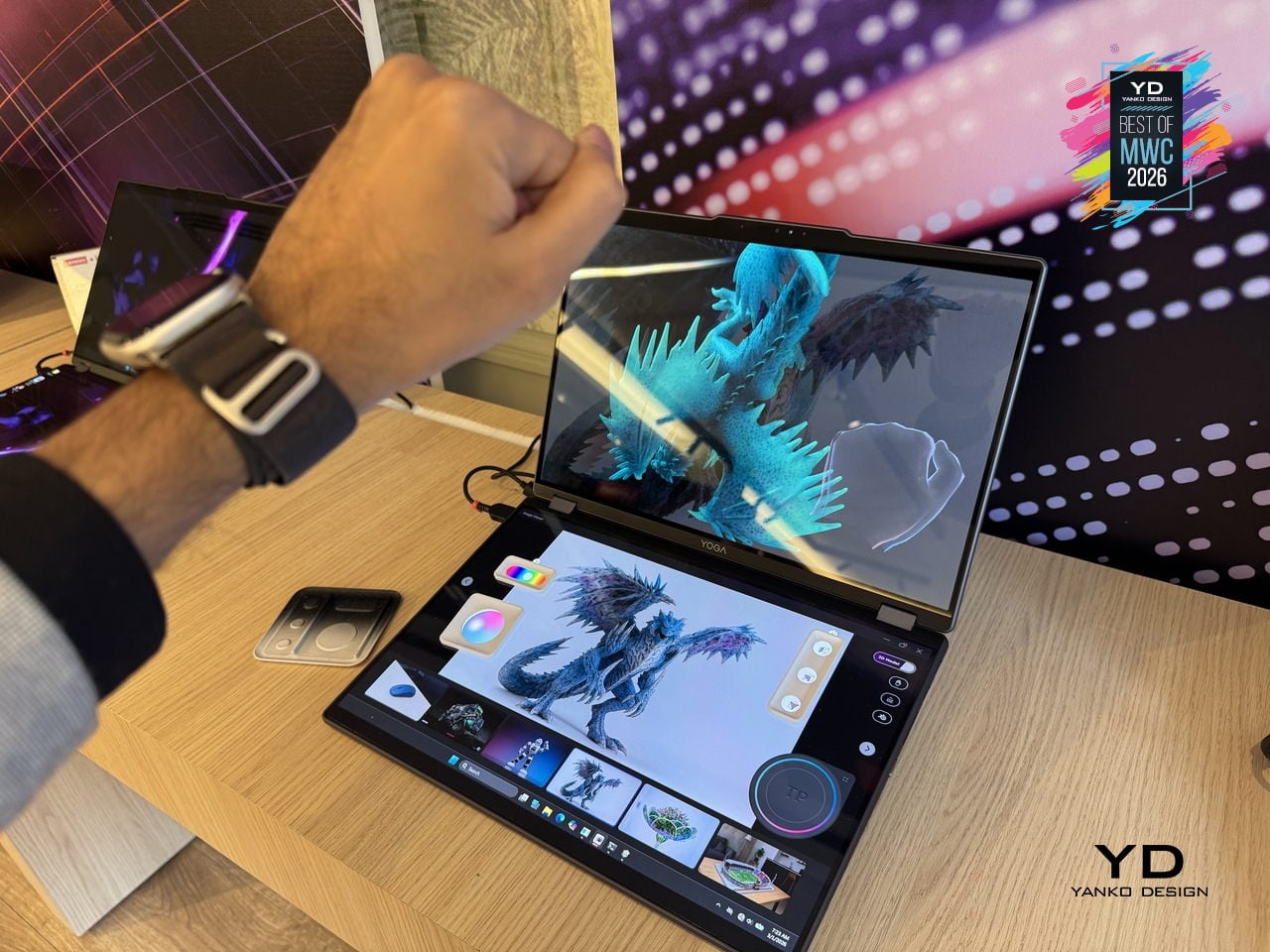
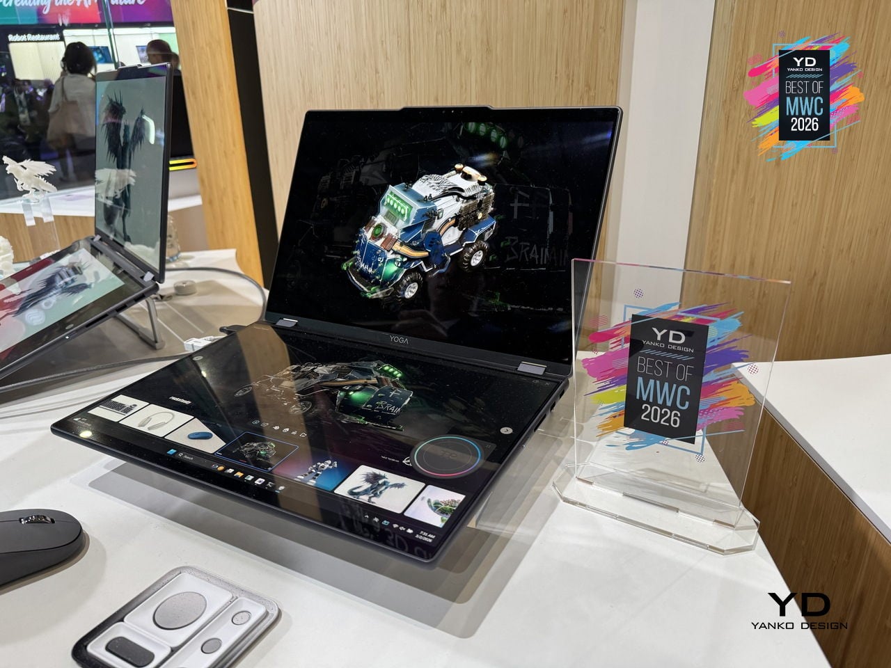
As a concept, the Yoga Book Pro 3D is still a proof of intent rather than a product you can buy, but it represents a genuinely specific design problem solved with unusual conviction. Glasses-free 3D displays have struggled to convince outside of niche applications, so how well the actual display holds up for extended professional use will be the real test when this moves closer to production.
Most smartphone camera rigs are an afterthought, a collection of third-party mounts and adapters held together by optimism. Vivo is taking a different approach with the X300 Ultra’s dedicated Camera Cage, a pro-grade frame designed specifically around the phone rather than adapted from generic cinema accessories. Dual grip handles, cold shoe mounts, quick-release ports, and dedicated physical buttons for shutter and zoom come built into one coherent system.
Designer: vivo

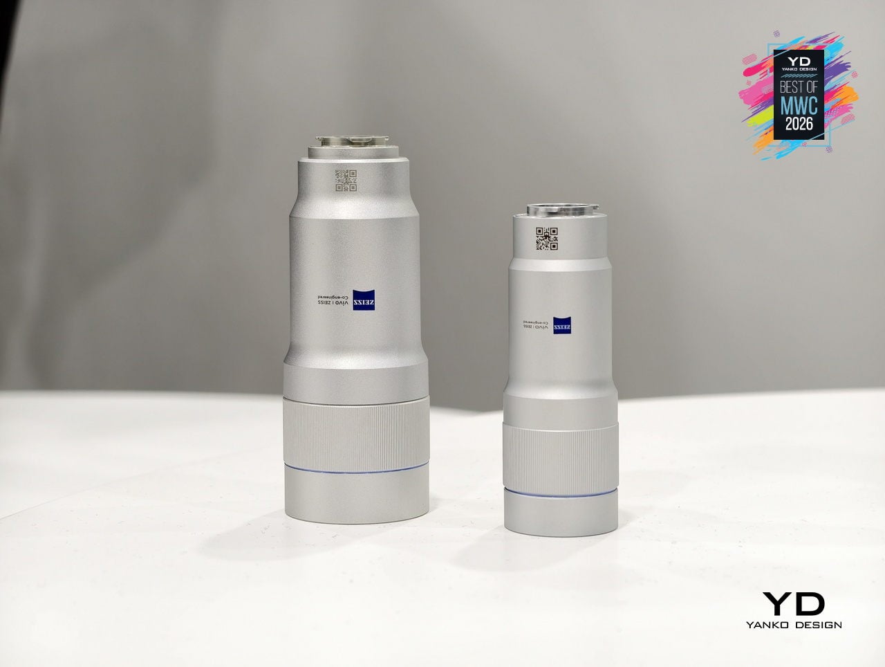
The cage is also where the ZEISS Telephoto Extender Gen 2 Ultra slots in, an APO-certified lens co-engineered with ZEISS that pushes the X300 Ultra to a 400mm equivalent focal length with full 200MP optical output. Gimbal-grade optical image stabilization and motion-tracking focus sit underneath all of that reach. An integrated multi-level cooling fan handles thermal load during extended video shoots, solving the problem that turns most “pro mobile video” sessions into a race against an overheating warning.
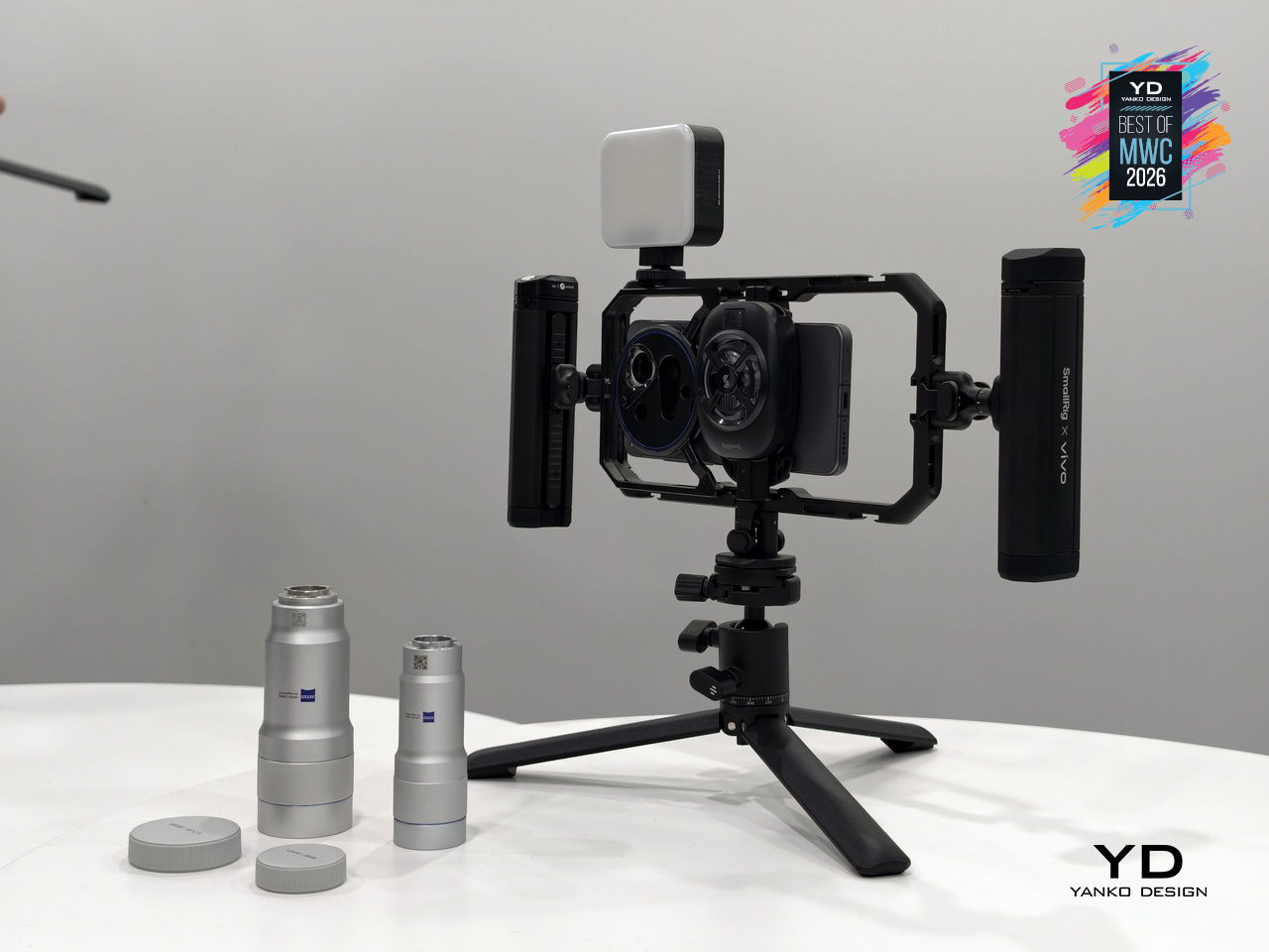
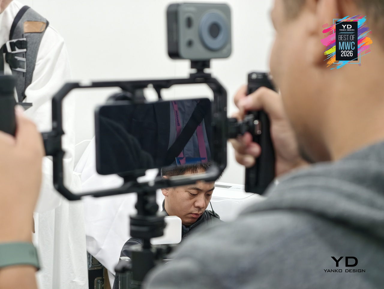
What makes the setup genuinely interesting is the conviction behind it. Vivo isn’t treating the cage as a novelty accessory but as the central argument for how a smartphone can function as a serious production tool. The phone alone is one thing; inside this cage, with the extender attached and physical controls in hand, it becomes a fundamentally different experience.
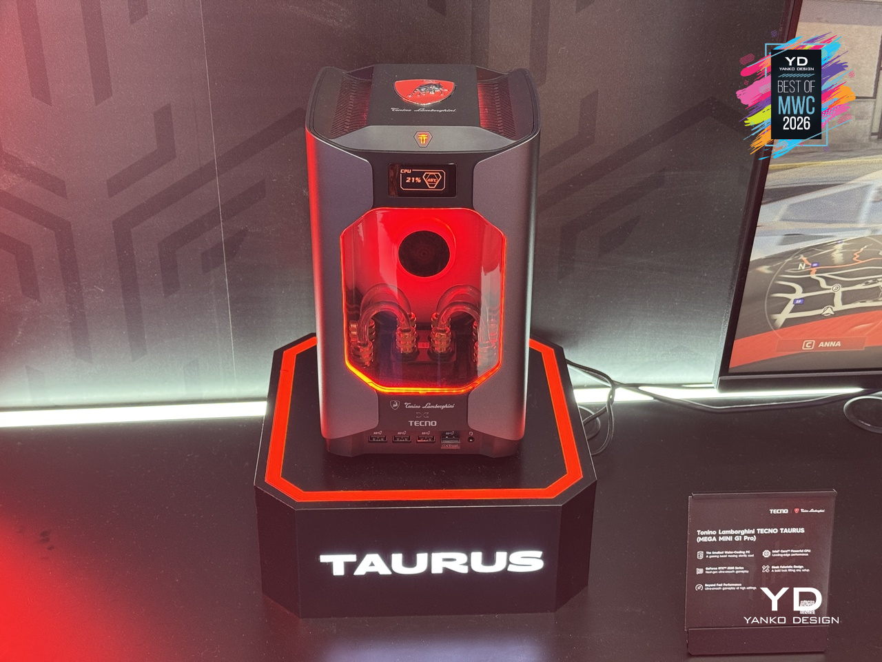
Gaming PCs have never been shy about their presence, big towers, aggressive angles, and enough RGB to illuminate a small runway. The Tonino Lamborghini TECNO TAURUS compresses all of that energy into a mini PC chassis, with an all-metal body, red-accented lighting, and see-through panels that put the water-cooling loop on full display. It’s unapologetically theatrical, and that’s clearly the entire point of the exercise.
Designer: TECNO
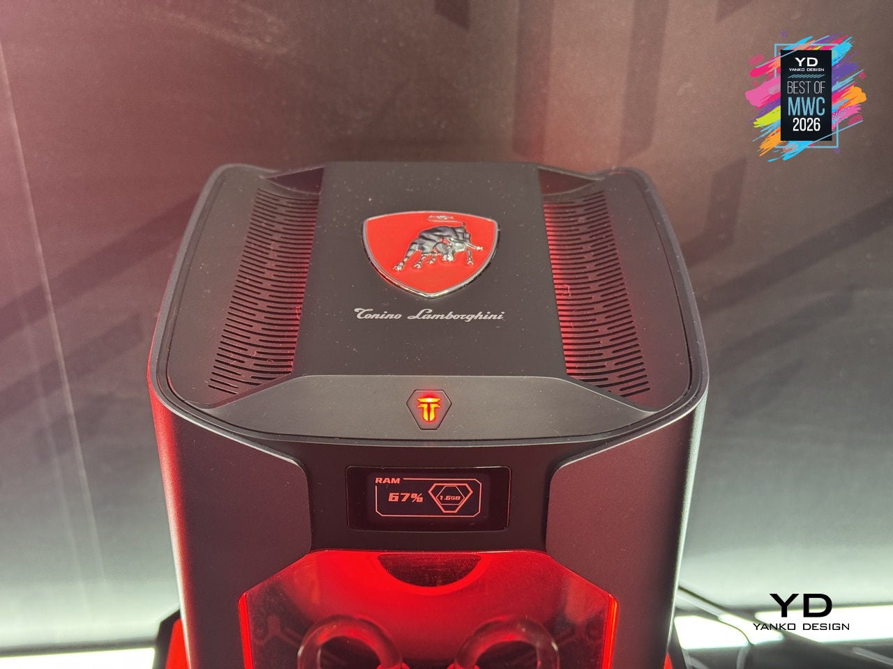
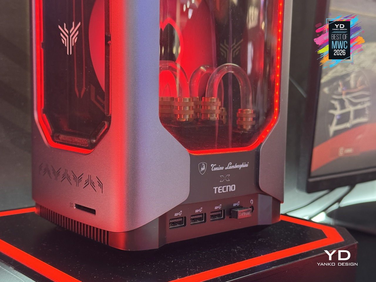
Under that showpiece exterior sits an Intel Core i9-13900HK with 14 cores running up to 5.4GHz, alongside an NVIDIA GeForce RTX 5060 on the Blackwell architecture at 145W total graphics power. A roughly 10,000mm² pure copper water-cooled cold plate and triple-fan setup handle thermals in that compact body. A real-time performance monitor on the chassis lets you watch CPU and GPU loads without opening a single app, which feels very on-brand for a machine this self-aware.
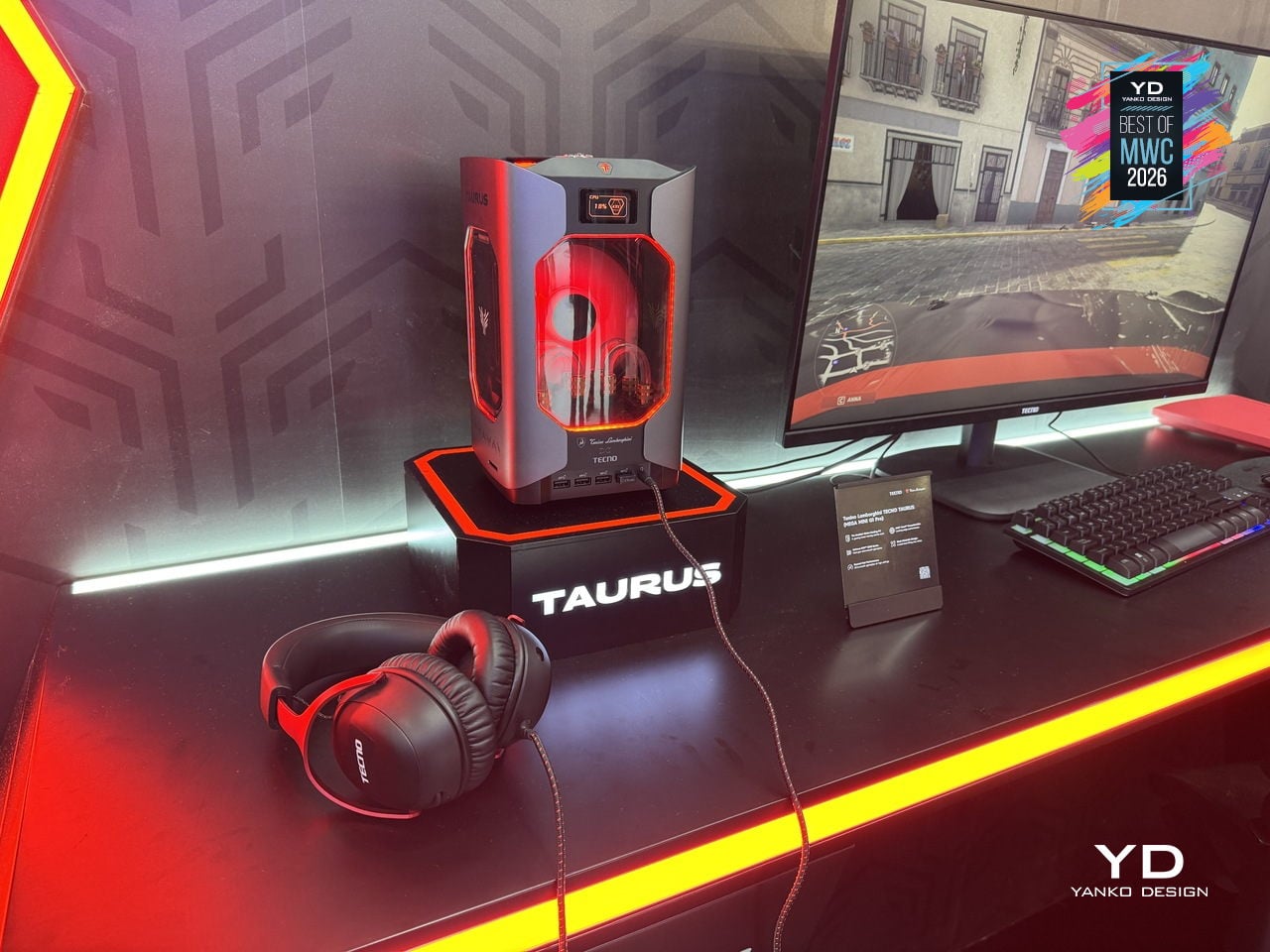
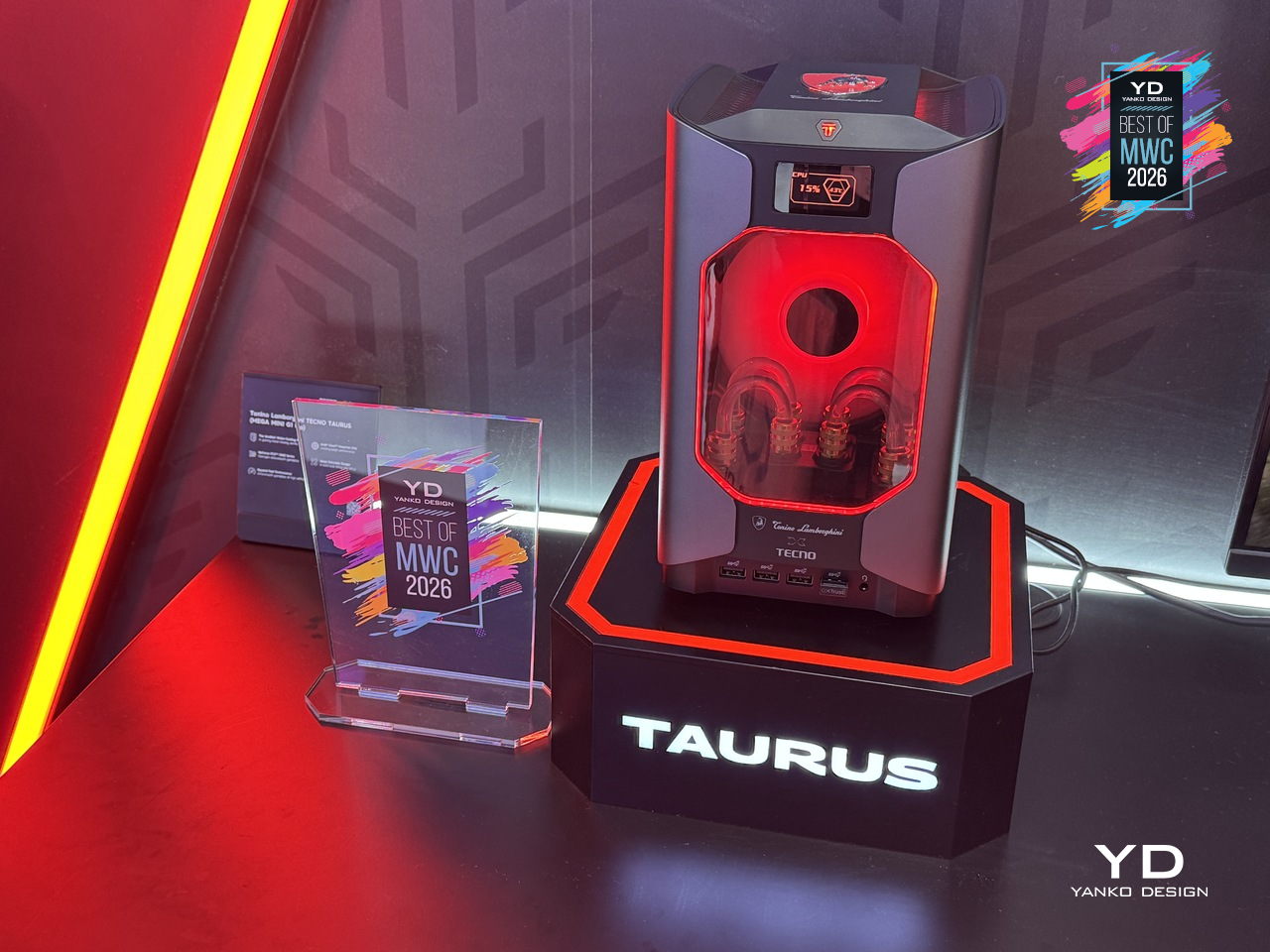
TECNO’s first collaboration with Tonino Lamborghini positions this as a desktop you’d put on your desk rather than under it, treating the machine as a design object as much as a gaming rig. Fifteen ports and WiFi 6E keep the practical side well covered. What’s genuinely interesting is how much of the design budget went into making the cooling system the visual centerpiece, turning thermal engineering into the main aesthetic argument.
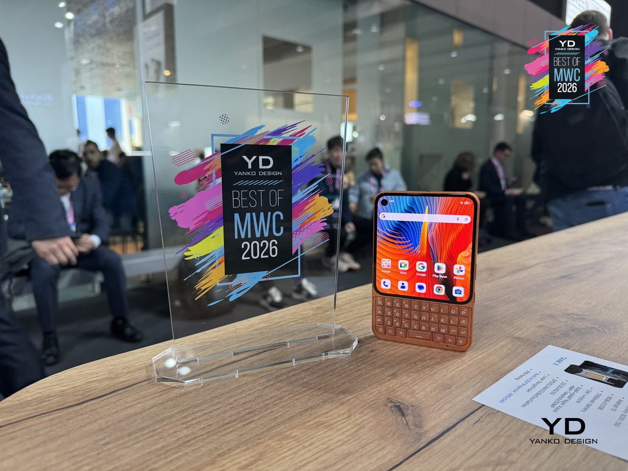
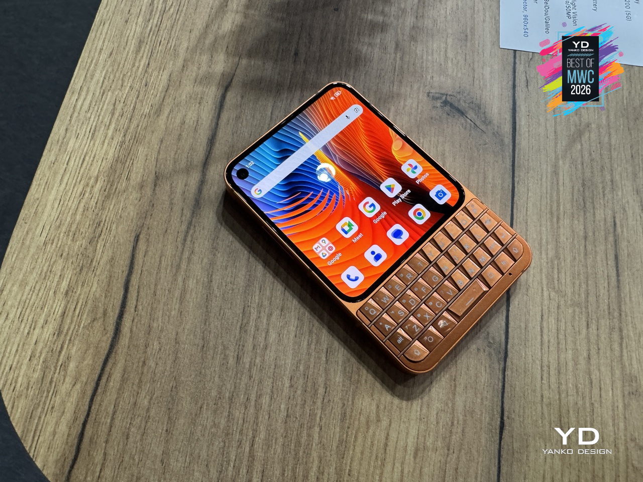
Physical keyboard phones never really died; they just quietly retreated to a corner of the internet where people complained loudly about touchscreen autocorrect. Unihertz has been serving that corner for years with its Titan series, and the Titan 2 Elite is the most refined version yet. Gone is the chunky frame of its predecessor; in its place comes a slimmer 75mm-wide body, a 4.03-inch 120Hz AMOLED display with a punch-hole camera, and the same four-row QWERTY keyboard that the series built its following on.
Designer: Unihertz
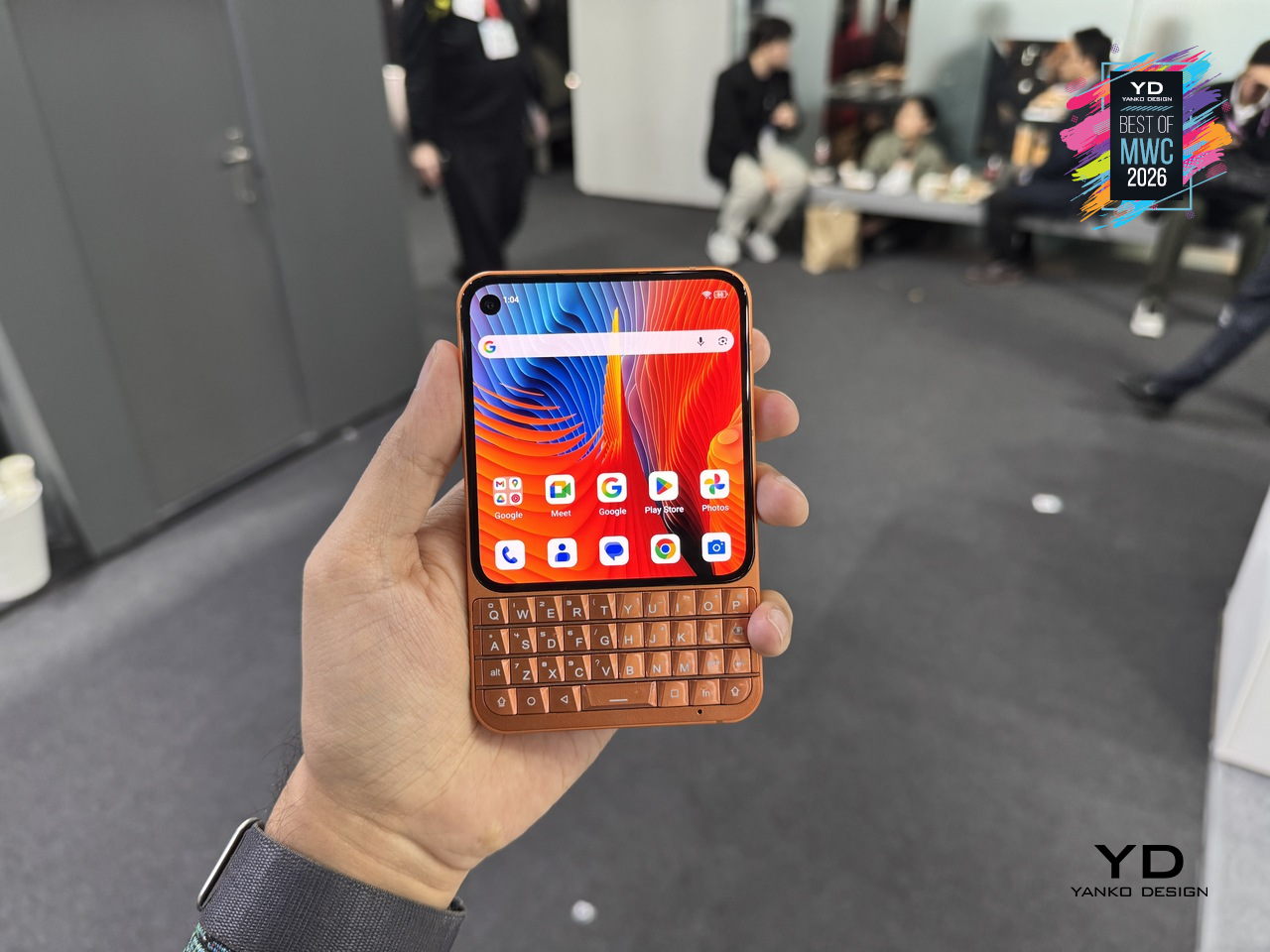
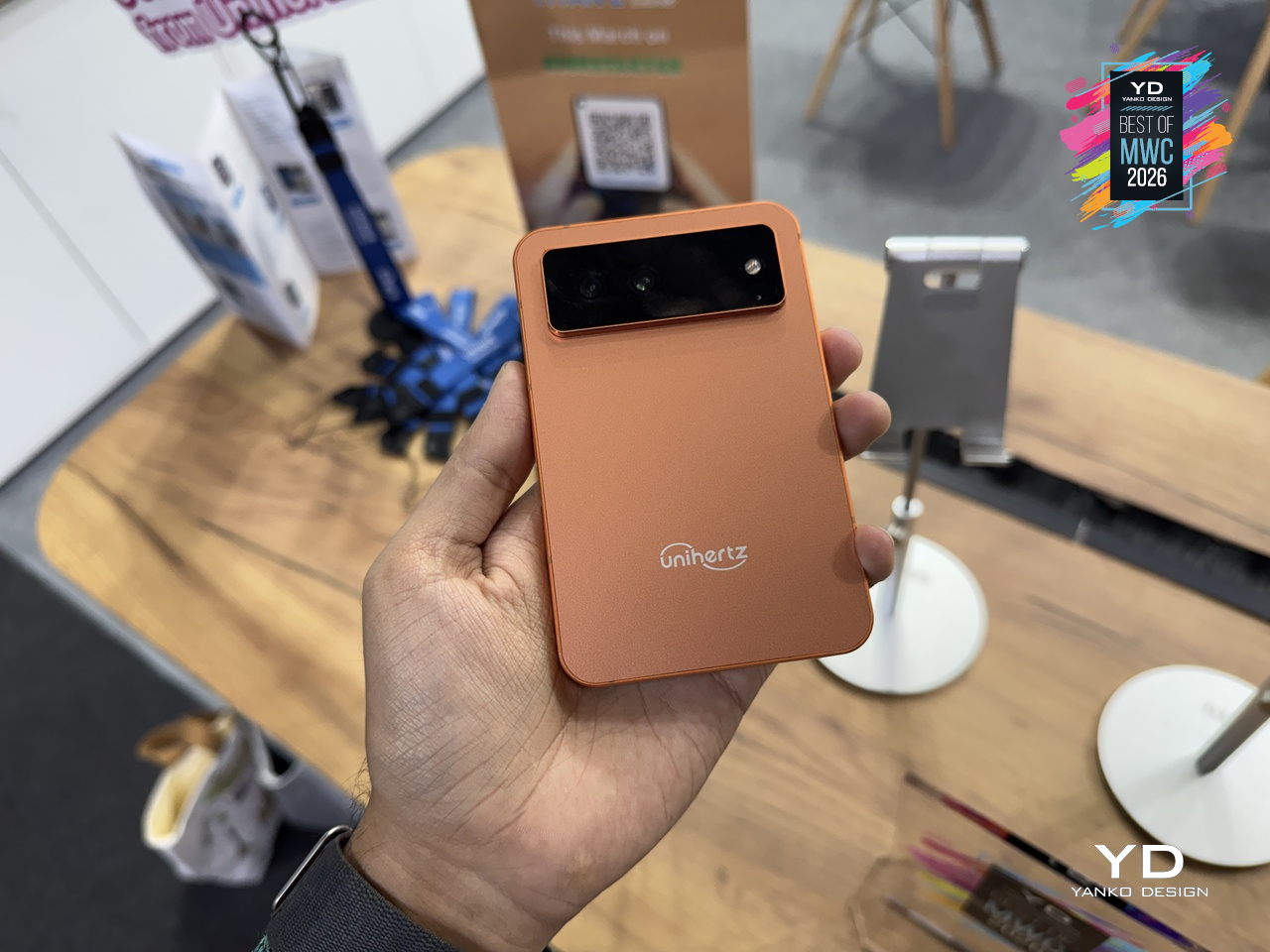
The keyboard itself doubles as a touchpad, letting you scroll and navigate with a thumb swipe across the keys, a trick carried over from earlier Titans that still feels genuinely useful. Although nothing’s confirmed yet, it’s expected to run on a MediaTek Dimensity 7300 with 12GB of RAM and 512GB of storage, which is a solidly capable mid-range setup for a phone that’s really selling you on input, not raw performance. More notable is the software commitment: Android 16 out of the box, updates promised through Android 20, and security patches running until 2031, a rare five-year horizon for a device in this price range.
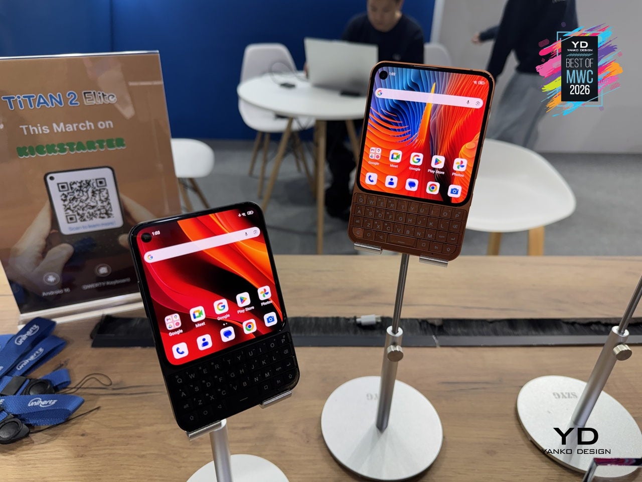
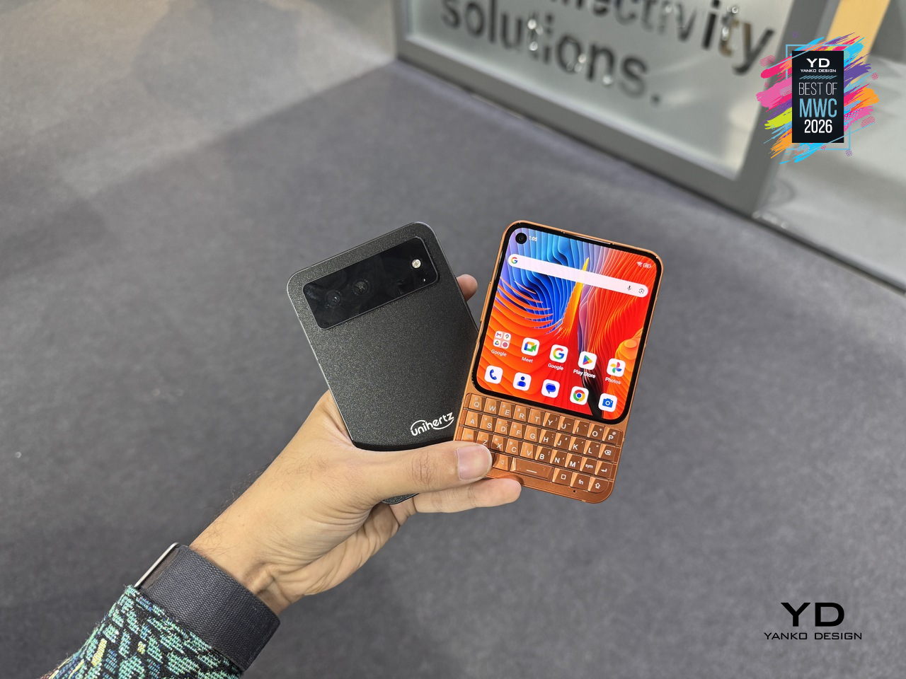
The Titan 2 Elite arrives at an interesting moment, with the Clicks pulling attention toward keyboard accessories for iPhones and Unihertz countering with a dedicated standalone device instead. There’s a meaningful difference between treating the keyboard as an add-on and building an entire phone around it, and that’s the bet Unihertz is making here.
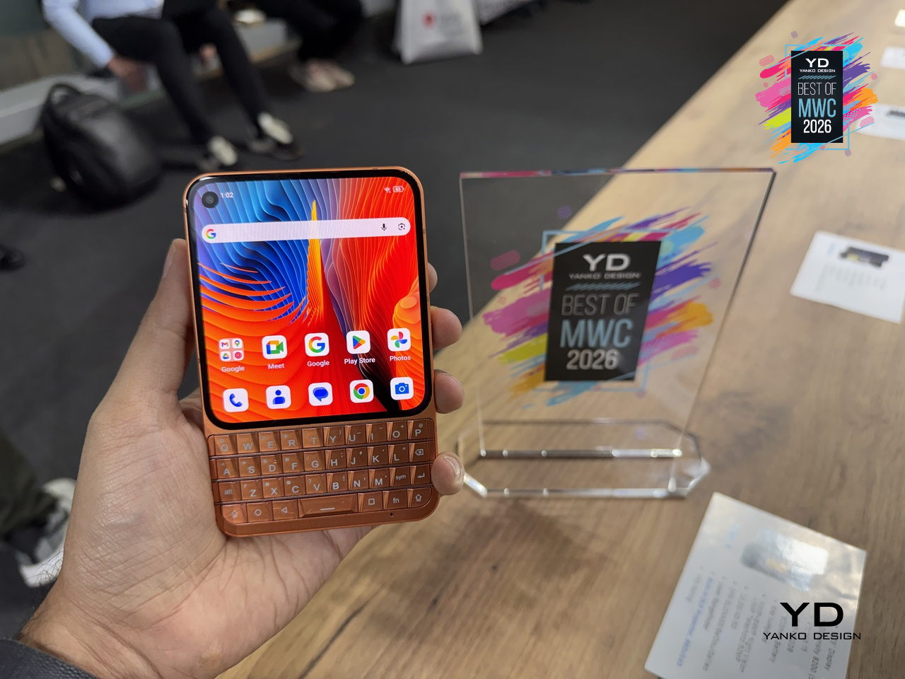
The post Yanko Design’s Best of MWC 2026: When Engineering Gets Obsessive first appeared on Yanko Design.