Urwerk and Ulysse Nardin’s $122K UR-Freak Watch Might Be The Most Interesting Collab Of 2025

The Ulysse Nardin Freak has always been more of a horological platform than a static model. Since its debut, it has served as a canvas for the brand’s most forward-thinking ideas, from pioneering silicon components to its signature “movement as the hand” display. It was the watch that proved a piece of high watchmaking could look and function like nothing that came before it. Now, for the first time, Ulysse Nardin has opened that platform to an outside collaborator.

It is fitting that the partner is Urwerk, another independent force that has consistently challenged the conventions of time display. Instead of a simple cosmetic update, the two brands co-developed a new caliber that integrates Urwerk’s wandering hour satellites into the Freak’s rotating carousel. The watch is still fundamentally a Freak, using its entire movement to indicate the time, but the language it speaks is now filtered through Urwerk’s sci-fi, dashboard-inspired lens.

Designers: Urwerk & Ulysse Nardin

What makes this partnership click is the deep mechanical fusion they achieved. The purpose-built UN-241 caliber is proof of this, a movement born from over 150 new components designed to get these two very different systems to play nice. You can see Ulysse Nardin’s massive silicon oscillator beating right in the middle, the technical heart of the machine. But orbiting around it is an assembly that is pure Urwerk. The three satellite arms, each carrying a rotating hour block, are mounted directly onto the Freak’s carousel, creating a layered, kinetic sculpture. You are looking at a Ulysse Nardin movement carrying an Urwerk complication like a backpack, all rotating as one cohesive unit.

Even with all that movement, reading the time is surprisingly straightforward. Your eye is drawn to the right side of the watch, where a single active satellite points a bright yellow arrow toward a linear minute track. The number on the corresponding hour block gives you the hour. It is an intuitive system, a classic Urwerk touch, but it’s made more dynamic by the constant, slow rotation of the Freak platform underneath. It feels like Urwerk’s dashboard display has been mounted on a revolving space station.

The 44 mm silhouette is clearly from the Freak ONE, with its crownless architecture and smooth, sandblasted titanium. But you can see Urwerk’s influence in the fluted, notched sections of the bezel, which add an industrial texture that feels different from the Freak’s usually sleek profile. You still set the time by rotating this bezel, secured by a locking tab at six o’clock that now reads “UR-FREAK.” It is a clear signal that this is a Freak that has been properly Urwerk-ified. The electric yellow strap, Urwerk’s calling card, drives the point home, a splash of aggressive color against the muted gray case.

Getting one will not be easy, or cheap. The UR-Freak is a limited run of just 100 pieces, and with a price tag of around 122,200 USD, it is aimed squarely at serious collectors in the independent scene. For those looking to acquire one, inquiries will have to be made directly to either brand. The UR-Freak is the kind of watch that makes you wonder why it did not happen sooner, and at the same time, be amazed that it happened at all.

The post Urwerk and Ulysse Nardin’s $122K UR-Freak Watch Might Be The Most Interesting Collab Of 2025 first appeared on Yanko Design.

Apple Vision Pro Expands Its Immersive Universe: New Content and Award-Winning Apps Redefine Spatial Computing

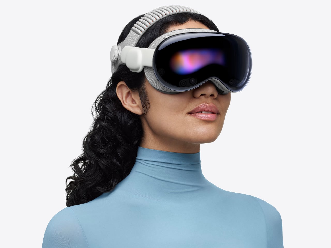
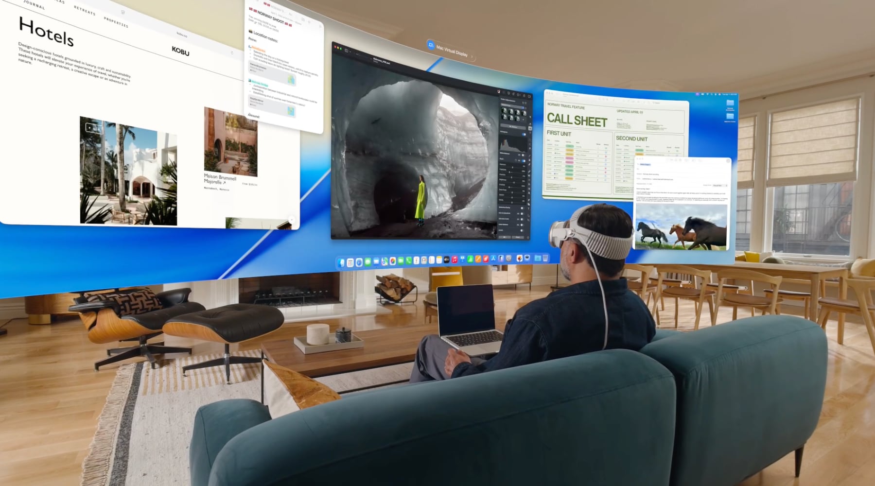
Apple just dropped a wave of announcements that prove the Vision Pro isn’t just a headset. It’s becoming a legitimate platform for experiences you can’t get anywhere else. From backcountry skiing with Red Bull athletes to stepping inside Real Madrid’s locker room, the content pipeline is starting to deliver on spatial computing’s promise.

Designer: Apple

The Dual Knit Band Finally Solves Vision Pro’s Comfort Problem

The original Vision Pro had a fatal flaw. You could wear it for 30 minutes before the front-heavy weight started digging into your forehead. The Solo Knit Band slipped. The Dual Loop Band created pressure points. Extended viewing sessions meant discomfort, which meant the immersive content didn’t matter if you couldn’t stay immersed.

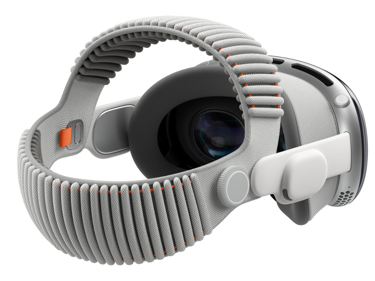
Apple’s new Dual Knit Band addresses this directly. The design looks simple but hides serious engineering.

3D-Knitted Counterweight Engineering

The band is 3D-knitted as a single piece with upper and lower straps forming a dual-rib structure. The lower strap contains flexible fabric ribs embedded with tungsten inserts. These aren’t decorative. They’re counterweights that balance the front-heavy Vision Pro by adding weight at the rear. The result is a headset that feels stable without the constant forward pressure that plagued earlier bands.

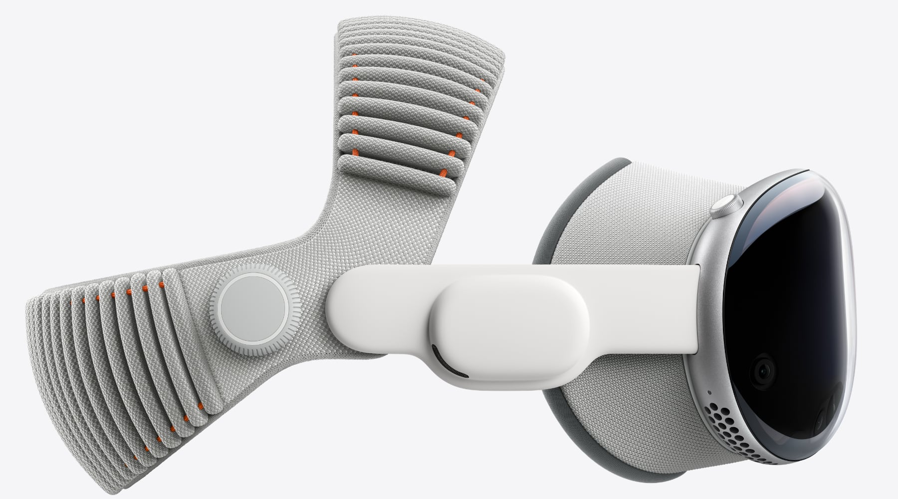
The upper strap provides cushioning and stretch. The dual-rib structure creates airflow channels that keep your head cooler during long sessions. The entire assembly prioritizes breathability without sacrificing support.

Dual-Function Fit Dial

The Fit Dial is now dual-function, letting users adjust both the top and rear straps independently. Previous bands forced you to choose between secure fit and comfort. The Dual Knit Band lets you dial in both. Tighter at the rear for stability. Looser at the top for comfort. Or whatever combination works for your head shape.

This matters more than it sounds. Vision Pro works through eye tracking and precise positioning. If the headset shifts during use, the tracking fails. The Dual Knit Band keeps the Vision Pro stable without creating pressure points.

Universal Compatibility

The band comes in small, medium, and large sizes. Apple uses iPhone Face ID scanning through the Apple Store App to recommend the correct size. The interesting detail: it works with both the new Vision Pro M5 and previous-generation models. If you bought a Vision Pro at launch and have been living with the Solo Knit Band’s compromises, you can buy the Dual Knit Band separately for $99.

Why This Matters for Content

The Dual Knit Band isn’t about specs. It’s about whether you can actually watch the World of Red Bull backcountry skiing episode all the way through without adjusting the headset. It’s about whether the Real Madrid documentary’s immersive locker room access works when you’re constantly aware of the weight on your forehead.

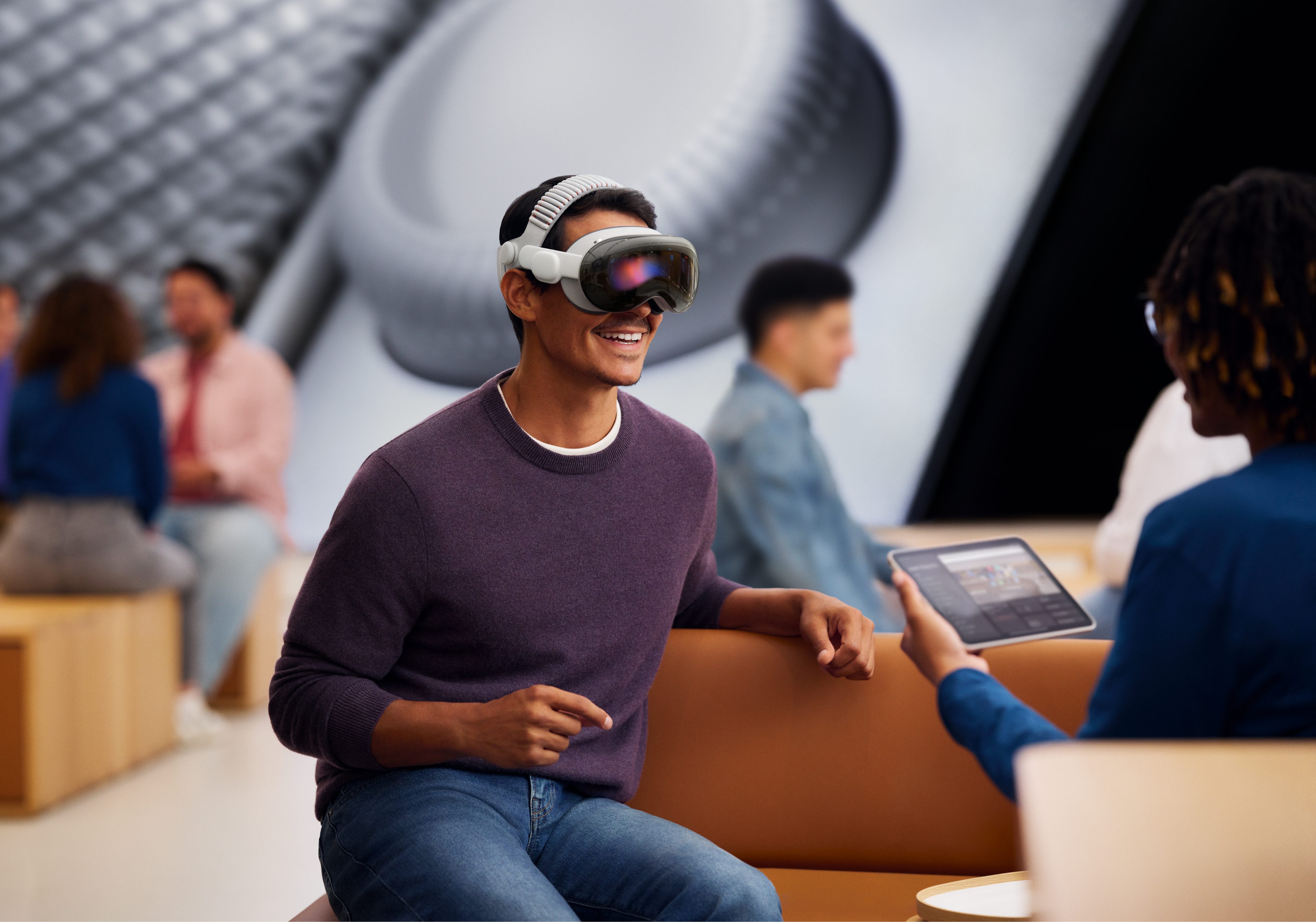
Previous Vision Pro bands made extended viewing uncomfortable. The Solo Knit Band worked for demos. The Dual Loop Band worked for specific head shapes. The Dual Knit Band is engineered for universal comfort during the 2.5-hour battery life the Vision Pro M5 delivers.

The tungsten counterweights in the lower rib are a subtle detail that makes a significant difference. The dual-function Fit Dial turns comfort from compromise into customization. Apple’s immersive content pipeline is finally delivering. The Dual Knit Band ensures you can actually experience it.

Red Bull Takes Immersive Video to Remote Slopes

World of Red Bull debuts December 4 with its first episode, “Backcountry Skiing.” The series uses Apple’s Immersive Video format to transport you into Revelstoke, British Columbia, where the world’s top freeskiers push their limits on remote, untouched slopes. This isn’t watching skiing on a screen. It’s being there as athletes carve through powder in terrain most of us will never access.

Red Bull’s built its brand on putting cameras in impossible places. Apple Immersive Video gives them a format that matches that energy. The result is content that uses the Vision Pro’s strengths instead of fighting against them.

Real Madrid Opens the Locker Room Door

Next year, Apple and Real Madrid are teaming up on an immersive documentary filmed during the 2025-26 Champions League. Over 30 Blackmagic immersive cameras captured Real Madrid versus Juventus, bringing you inside the world’s most decorated club with access fans have never experienced before. Practice sessions. Pre-game tension. Pitch-level intensity. This is spatial computing applied to sports storytelling.

The documentary arrives in 2026, but it signals where this platform is heading. Premium content from premium brands, shot specifically for spatial viewing.

What to Watch Right Now

The content library keeps expanding with experiences that show what spatial computing can do:

Elevated: Maine flies you above autumn landscapes with Oscar-winning actor Tim Robbins as your guide. Rugged coastlines, pristine lakes, and forests of the Pine Tree State unfold below you in ways that make traditional nature documentaries feel flat.

Flight Ready straps you into an F-18 fighter jet on the USS Nimitz flight deck. Full-throttle rides through the skies with real fighter pilots. No green screen. No simulation. Actual carrier operations captured in immersive video.

The Fine Dining Bakery premieres this Friday on the Theater app. Australian filmmakers Ben Allan and Clara Chong created an immersive documentary short about an iconic strawberry watermelon cake. They’ve also authored a book about immersive filmmaking, available exclusively on Apple Books this Friday.

“No Brainer” is an immersive music video from Dallas music collective Cure for Paranoia, filmed with the Blackmagic URSA Cine Immersive. It’s available for free on Amplium, and also from the Groove Jones website using Spatial Browsing in Safari. Music videos in spatial format are just starting to happen, and this is one of the early experiments worth watching.

Fantastic Four: First Steps in 3D brings Marvel’s first family to Vision Pro. Set against a 1960s-inspired, retro-futuristic world, viewers meet the team as they face a daunting challenge. The 3D presentation uses depth in ways traditional 3D movies can’t match.

2025 App Store Awards Spotlight Vision Pro Innovation

Yesterday, Apple announced the finalists for the 2025 App Store Awards. The Vision Pro categories showcase apps and games that exemplify technical innovation, user experience, and design.

Apple Vision Pro App of the Year Finalists

Camo Studio offers creators a more flexible way to livestream and create videos, turning Vision Pro into a production tool.

D-Day: The Camera Soldier pioneers the future of immersive storytelling by putting you in the boots of soldiers during the Normandy invasion. Historical storytelling gets a spatial computing treatment that makes the events feel immediate and personal.

Explore POV transports users through its library of Apple Immersive videos filmed around the world. It’s a curated collection that shows off what spatial video can do when shot properly.

Apple Vision Pro Games of the Year Finalists

Fishing Haven immerses players seeking a retreat into calm waters. Transform your surroundings into beautiful fishing locations for a peaceful escape.

Gears & Goo combines strategic gameplay with endearing characters in a spatial gaming experience that uses the Vision Pro’s unique capabilities.

Porta Nubi builds atmospheric puzzles that make users feel like a light-bending superhero. The spatial puzzles work because you’re physically moving around them, not just looking at a screen.

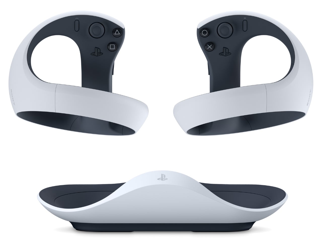
PlayStation VR2 Controller Support Expands Gaming Options

The PlayStation VR2 Sense Controller and Charging Station is now available from the Apple Store online in the U.S. This opens up new gaming possibilities with haptic feedback and adaptive triggers designed for VR. Here’s what you can play:

Porta Nubi works with the PS VR2 controller for more precise puzzle manipulation.

Pickle Pro turns your surroundings into your own personal pickleball court. With PS VR2 Sense controller support, every swing feels natural and precise with proper haptic feedback.

Spatial Rifts invites players to team up in the same space and fight waves of monsters. This Apple Vision Pro exclusive uses spatial gaming in ways that make co-op play feel genuinely different.

FunFitLand blends spatial interaction, real movement, and guided coaching into one seamless fitness experience. The PS VR2 controller adds tactile feedback to workout routines.

New Games Arriving on the Platform

Following last month’s announcement about expanded controller support, new compatible games are arriving:

Sniper Elite 4 delivers hours of gripping single-player campaign gameplay, with cross-save capabilities to seamlessly pick up where you left off across iPad, Mac, and Vision Pro. The tactical shooting translates surprisingly well to spatial computing.

POOLS offers no typical story. It’s slow, reflective, and intentionally uneventful. This relaxing, unnerving, eerie, and immersive experience rewards patience and quiet attention. It’s the kind of meditative experience that works when you’re fully immersed.

Glassbreakers: Champions of Moss lets players lead their squad of Champions into a fast-paced and immersive arena where tactics, magic, and power collide. This new spatial game is available on Apple Arcade.

The iPad Game of the Year finalists DREDGE and Prince of Persia Lost Crown are also available to play on Apple Vision Pro, showing how Apple’s gaming ecosystem is starting to connect across devices.

The Platform Is Maturing

A year ago, the Vision Pro launched with promise but limited content. Now the pipeline is filling with experiences that justify the hardware. Red Bull backcountry skiing. Real Madrid locker room access. Award-winning apps and games that couldn’t exist on flat screens.

Spatial computing still feels early. But with content like this arriving regularly, it’s starting to feel less like a tech demo and more like a platform with staying power. The question isn’t whether immersive content works on Vision Pro. It’s whether there will be enough of it to matter.

Based on what’s coming in the next few months, that answer is starting to look like yes.

The post Apple Vision Pro Expands Its Immersive Universe: New Content and Award-Winning Apps Redefine Spatial Computing first appeared on Yanko Design.

This Shape-Shifting Classroom Setup Lets Students Build Their Own Learning Space

In traditional classrooms, furniture rarely moves, but learning does. Eduba, the adaptive modular furniture system developed by designer Roie Avni, challenges the static environment of conventional education by introducing a new kind of classroom: one that shifts, evolves, and responds to its users. Through a clever blend of modularity, lightweight construction, and intuitive mechanisms, Eduba transforms the act of sitting and studying into a dynamic experience shaped by students themselves.

At its core, Eduba is a chair-and-table duo designed for versatility. Each piece can be connected, detached, flipped, or reconfigured within seconds. The table offers three height levels depending on how it is placed on its geometric base, while the chair shifts between high, mid, and low seating positions through a simple handle mechanism that locks and unlocks the frame. With no tools required, the furniture can be taken apart and rebuilt on the fly, supporting seamless transitions between different modes of learning.

Designer: Roei Avni

Eduba is rooted in the belief that learning is not one-size-fits-all. Instead of forcing every student into the same posture, the system enables each learner to personalize their physical setup based on their comfort, task, or energy level. Low seating supports relaxed learning, free-flow discussion, and floor-level exploration. Mid-level, more conventional seating mirrors structured, front-facing layouts. High seating encourages movement, collaboration, and active engagement, turning the classroom into an interactive space rather than a passive one.

This fluidity empowers teachers as well. Whether a lesson calls for intimate small-group work, focused heads-down concentration, or an energetic collaborative session, the classroom can be rearranged in minutes. Different areas of the same room can support different activities simultaneously, from quiet individual study to lively project clusters.

Constructed from durable plastic and lightweight aluminum, Eduba strikes a balance between strength and portability. Its components are sturdy enough for daily school use yet light enough for rapid reconfiguration. The intuitive handle-based mechanism enables seat and table height changes without effort, encouraging students to interact with the furniture and take ownership of their own learning environment.

This adaptability extends beyond function, shaping a philosophy of what education can be. Eduba transforms the classroom into a living, breathing ecosystem, one where posture, space, and interaction evolve throughout the day, reflecting the needs and rhythms of its users.

Roie Avni’s Eduba is a statement about the future of learning. By promoting movement, flexibility, and student-centered design, it reframes the classroom as a place that grows, shifts, and responds, mirroring the organic, ever-changing nature of curiosity itself.

The post This Shape-Shifting Classroom Setup Lets Students Build Their Own Learning Space first appeared on Yanko Design.

This Open-Source Retropunk Computer Solves Distraction by Removing Everything Except Writing

Your laptop can do anything, which increasingly means it’s optimized for nothing. This isn’t a new observation, but the solutions have mostly been software-based: distraction-blocking apps, focus modes, website blockers that you can disable the moment willpower falters. The Typeframe project takes a more permanent approach – build a computer that literally cannot do anything except let you write.

Jeff Merrick’s open-source writerdeck designs come in two flavors. The PX-88 is a desktop-style portable with a full keyboard and integrated screen, styled after the 1985 Epson PX-4 that inspired it. The PS-85 shrinks down to a 40% keyboard layout while maintaining that same retro-futuristic aesthetic. Both use Raspberry Pi boards as their brains, and both are documented with the kind of step-by-step detail that assumes you’ve never touched CAD software or soldered components together.

Designer: Jeff Merrick

For the uninitiated, the Epson PX-4 was a chunky CP/M portable that field engineers actually carried into the field, with swappable keyboards and modular components that could turn it into different tools for different jobs. It ran on batteries and had a tiny 40×8 character display that virtually expanded to 80×25. The appeal wasn’t raw computing power – it was that the thing did exactly what you needed and nothing more. Merrick’s designs capture that purposefulness while swapping in modern components that are actually available and affordable.

The community around writerdecks has been growing quietly alongside the broader cyberdeck movement. Where cyberdecks lean into the hacker aesthetic with exposed electronics and tactical mounting points, writerdecks prioritize the writing experience itself. There’s active discussion on Reddit’s r/cyberDeck forum, open-source software projects like WareWoolf and ZeroWriter built specifically for distraction-free writing, and a thriving market for vintage AlphaSmart Neo devices – basically the original writerdecks from the early 2000s that are still beloved for their springy keyboards and complete lack of internet connectivity.

Merrick freely admits this is his first project at this scale, and he’s documented it with that beginner perspective intact. The full documentation lives at typeframe.net, with all the CAD files and electronics details on GitHub. It’s the kind of project that invites participation rather than demanding expertise, which feels increasingly rare in maker spaces that sometimes forget not everyone solders for fun.

The broader question is whether dedicated writing devices actually help people write more. The answer seems to be yes, but not because of any technical magic. Sitting down at a machine that only does one thing creates a kind of ritual commitment. You’re not just opening a document – you’re physically moving to a different device that exists solely for this purpose. It’s closer to the experience of sitting down at a typewriter or picking up a pen, except what you write is instantly digital, searchable, and portable. The AlphaSmart Neo proved there’s real demand for this experience, and projects like Typeframe are making it accessible to anyone willing to spend a weekend with a soldering iron and some determination.

The post This Open-Source Retropunk Computer Solves Distraction by Removing Everything Except Writing first appeared on Yanko Design.

The Px8 S2 McLaren Edition: Papaya Orange, Carbon Cones, and Racing Pedigree

The Px8 S2 McLaren Edition wears its racing heritage proudly. That signature McLaren Papaya finish dominates the design, paired with Anthracite Grey accents that create instant visual impact. The McLaren Speedmark logo appears on both the headband and earcups, with diamond-cut bright edges on each elliptical plate that catch light like the carbon fiber details on a McLaren supercar.

Designer: Bowers & Wilkins + McLaren

Every material choice screams premium. The memory-foam cushions and headband come wrapped in soft Nappa leather, the same material you’ll find in McLaren’s Ultimate Series cars. The diecast aluminum arms provide structural integrity while keeping weight down to just 0.31 kg. This is what happens when automotive designers and audio engineers collaborate without compromise.

Carbon Cone Drivers: The Performance Story

Inside each earcup sits a custom 40mm Carbon Cone driver, completely redesigned from the previous Px8 generation. Bowers & Wilkins rebuilt everything: new chassis, upgraded voice coil, improved suspension, and a more powerful magnet system. The drivers sit angled within each earcup, ensuring consistent distance from every point on the driver surface to your ear. Translation: better imaging and a wider soundstage.

The result is audio that reviewers are calling deeper, tighter, and more holographic than the already-impressive original Px8. Bass hits harder without bleeding into the mids. Vocals sit precisely in the soundstage. Highs remain crystal clear without any harshness. This is 24-bit/96kHz high-resolution audio delivered wirelessly through Qualcomm’s aptX Adaptive and aptX Lossless technology, with Bowers & Wilkins’ DSP (Digital Signal Processing) fine-tuning everything in real-time.

The Smart Features

The Px8 S2 McLaren Edition connects to the Bowers & Wilkins Music app, giving you control over everything from noise cancellation to sound customization. A five-band EQ lets you dial in your preferred sound signature and save multiple presets. The transparency mode toggles between full isolation and ambient awareness. A physical Quick Action button puts your most-used functions one press away.

Eight microphones power the adaptive noise cancellation system while handling call quality duties. The ANC falls slightly short of what Bose and Apple achieve with their flagship models, but it preserves musicality in a way that overly aggressive noise canceling often destroys. The headphones prioritize sound quality first, noise cancellation second. For audiophiles, that’s the right priority order.

Battery life hits 30 hours on a single charge. A 15-minute quick charge delivers seven hours of playback. Connectivity options include aptX Lossless, aptX Adaptive, aptX HD, aptX Classic, AAC, and SBC codecs, plus USB-C wired listening when you want to bypass wireless entirely.

The Partnership Behind the Product

Bowers & Wilkins and McLaren have been developing audio systems together since 2015, starting with the McLaren 540C and continuing through to the recently unveiled McLaren W1 supercar. The audio system in the W1 features the same Continuum Cone technology found in Bowers & Wilkins’ flagship 800 Series Diamond loudspeakers. This partnership runs deeper than logos and color schemes.

The collaboration mirrors the precision demanded in Formula 1 racing with the acoustic perfection Bowers & Wilkins has pursued since founder John Bowers established the company in 1966. Both brands obsess over details. Both refuse to compromise on performance. The Px8 S2 McLaren Edition represents that shared philosophy translated into a wearable product.

Following the Pi8 McLaren Edition earbuds from earlier this year, these headphones give McLaren fans another way to connect with the team’s visual identity while getting genuinely excellent audio hardware. This isn’t a corporate partnership slapping logos on existing products. This is two performance-focused brands creating something together that neither could build alone.

The Details That Count

The Px8 S2 McLaren Edition launches November 19, 2025, priced at $899 (£729 UK, €829 EU). You can grab them directly from Bowers & Wilkins or through selected retailers. The price positions these firmly in premium territory, competing with the Mark Levinson 5909 ($999) and Focal Bathys ($799).

Early impressions highlight the improved comfort over previous generations, making these suitable for extended listening sessions and long flights. The slimmer profile and redesigned headband distribute weight more evenly. The Nappa leather cushions remain breathable even after hours of wear. For frequent travelers and music enthusiasts who value both design and performance, that comfort factor matters as much as sound quality.

The McLaren Edition offers music lovers, audiophiles, and Formula 1 fans a chance to own headphones that deliver on both aesthetic appeal and acoustic excellence. Sometimes partnerships create products that feel forced. This one feels natural, like both brands speaking the same performance-obsessed language.

The post The Px8 S2 McLaren Edition: Papaya Orange, Carbon Cones, and Racing Pedigree first appeared on Yanko Design.

E-ink Vocabulary Card E2 Fits Language Learning Into a Gum Pack

Most language learning apps live on phones, competing with notifications, social media, and every other distraction fighting for your attention. Opening Duolingo between classes usually turns into five minutes of vocabulary followed by twenty minutes of scrolling through feeds you’ve already checked twice. Designers are starting to build tiny, single-purpose devices that turn fragmented time into focused practice instead of another excuse to stare at your phone screen until your eyes hurt.

The E-ink Vocabulary Card E2 is one of those tools, a chewing-gum-sized e-ink vocabulary device aimed at students but usable by anyone learning a new language. It pairs with a phone via Bluetooth to pull in study materials and memory modes from an app, then lets you review words on a 2.7-inch e-ink screen without opening your phone. It’s small enough to live in a pocket yet designed to feel like a dedicated learning tool.

Designer: DPP .

The form factor is remarkably simple. A slim rectangular bar about the size of a pack of gum, weighing only thirty grams. Rounded corners, soft edges, and a two-tone color scheme in orange, pink, green, or grey make it look friendly and approachable. The main action button is tilted at five degrees, tuned for thumb reach when you hold it in one hand, while the simple layout keeps the interaction logic easy to understand.

The 2.7-inch e-ink touch screen is the real selling point. Low blue light and low radiation make it easier on the eyes than a phone, and the high contrast gives a reading experience close to paper. Because e-ink only draws power when the screen changes, the device can reach around one hundred fifty days of standby time, which means it’s always ready when you pull it out between classes or on a commute.

E2 connects to a mobile app over Bluetooth. The device supports nine built-in languages, and the app lets you import more content and choose different study modes or memory patterns that match your learning style. You can load word lists, practice exercises, and review sessions, then leave the phone in your bag while the card handles the actual on-the-go practice.

The IP68 protection rating makes the card dust-tight and waterproof enough for more adventurous use. The renders show it in a gym, on a train, and even in a futuristic space scene, reinforcing that it’s meant to live in pockets and hands without babying. A matching wrist strap accessory clips into the body, adding security and a bit of personality to the tiny device.

The visual language is intentionally soft and playful. Big icons, rounded rectangles, and cheerful colorways make it feel more like a friendly gadget than test prep gear. The E-ink Vocabulary Card E2 treats vocabulary learning like checking a notification, but without the noise of a full smartphone, turning spare seconds into small, focused steps toward fluency.

The post E-ink Vocabulary Card E2 Fits Language Learning Into a Gum Pack first appeared on Yanko Design.

Lumia 2 smart earrings combine blood flow tracking, other vital body insights in smallest wearable ever

Since the COVID pandemic, undeniably, most people have started taking extra care of their body metrics, which has given unprecedented rise to the number of wearable devices for health and fitness monitoring. Most of these devices: smartwatches, fitness bands, and even tech-enabled jewelry, do not have a gender inclination. Somehow, the Lumia 2, promoted as the smallest wearable in the world, is designed for women of style first.

This earring of sorts does not require piercing. The Lumia 2 is built to clip onto the earlobe and monitor your blood flow, while also tracking other vital metrics such as heart rate variability. If you were unaware, irregular blood flow can have a negative impact on health. The Lumia 2, designed as a piece of timeless jewelry and is meant to keep track of the blood flow.

Designer: Lumia

Of course, the device is primarily targeted at women with chronic blood flow disorders, to always be on top of their vitals. But Lumia co-founder and CEO Danial Lee affirms that the people within the team, without any blood flow issues, have also “discovered fascinating blood flow patterns” that are helping them live better. The smart earring looks like a regular piece of jewelry with sensors hidden behind the wearer’s ear. It certainly looks discrete and wouldn’t give out its actual existence until someone really goes deep into finding it out. Notably, Lumia 2 is also attachable to an existing ear-stud, if you want.

While we contemplate the viability of the Lumia 2’s ability to measure blood flow and the feature’s practical usage, let’s take a moment to understand what else the smart earring brings to the table and challenges the other types of wearables in the market. In addition to monitoring the body’s blood flow, Lumia 2 can also track heart rate variability and resting heart rate to notify the wearer when their body is ready for running, exercising, or indulging in a strenuous physical activity.

In addition to knowing how ready your heart is to face the world, with the Lumia 2 clipped onto your ear, you can also track how well you have slept overnight. It can also do the pedometer stuff and keep track of your step count. The Lumia 2 provides information about how to increase the blood flow or recover from its shooting levels, along with information regarding how hydrated or stressed you are while running or through the reps in the gym. With a decent battery life of up to eight days, the Lumia 2, starting at $249, should make a statement wearable when it’s launched in the near future.


The post Lumia 2 smart earrings combine blood flow tracking, other vital body insights in smallest wearable ever first appeared on Yanko Design.

Top 5 Gifts For Creative Professionals Under $50

Creative professionals live between the tangible and the imagined. Their tools need to keep pace with ideas that arrive at odd hours and demand immediate capture. Finding gifts that match this rhythm means looking beyond generic stationery sets toward objects that respect both craft and practicality. These five selections balance functionality with thoughtful design, each priced under fifty dollars and built to earn permanent desk space.

The best gifts for creators are the ones they use daily without thinking about it. Tools that disappear into the workflow rather than interrupting it. Products that solve small frustrations before they compound into creative blocks. This list avoids novelty for its own sake, focusing instead on items that designers, illustrators, architects, and artists consistently reach for when the work demands precision, portability, or simple reliability.

1. Everlasting All-Metal Pencil

The ritual of sharpening pencils belongs to a slower era. Breaking graphite mid-sketch or hunting for a sharpener disrupts the momentum that creative work desperately needs. This full-metal pencil eliminates both problems through a special alloy core that writes like traditional graphite while lasting exponentially longer. The aluminum body feels substantial without being heavy, and the core produces consistent marks without requiring any maintenance beyond occasional cleaning.

What makes this pencil remarkable is its defiance of planned obsolescence. The graphite and alloy particles leave marks dark enough for sketching and light enough for technical work, erasing cleanly with standard erasers. The core doesn’t wear down at anything resembling the rate of cedar-encased Number 2 leads. Artists working with watercolor or water-based markers particularly appreciate how the metal core doesn’t bleed when liquid is applied, maintaining clean lines beneath transparent washes.

Click Here to Buy Now

What we like

  • Works seamlessly with watercolor and water-based markers without bleeding.
  • Eliminates the waste and interruption of traditional pencil sharpening.

What we dislike

  • The metal body can feel cold during extended use in cooler environments.
  • The fixed core diameter doesn’t offer line variation like traditional pencils.

2. Horizon Helvetica Multi-Tool Ruler, Titanium S Pencil & Hypatia A5 Notebook

Horizon earned its reputation by putting drafting precision into wallet-sized tools. The 2025 Helvetica lineup maintains that philosophy while expanding in two directions: vibrant colorways for the credit card rulers and a hand-machined titanium mechanical pencil for collectors who want permanence over portability. Byzantine Purple, Irish Green, and Classic Blue join the existing finishes, while improved silk screening and UV protection prevent measurement fade from daily handling. The Helvetica Max measures six inches and fifteen centimeters, packing protractor markings, dual compasses, circle templates, and isometric grids into stainless steel cut by Swiss Bystronic lasers.

TSA approval means airport security stays simple. But Horizon’s actual move is the Hypatia A5+ Notebook, sized at 150 × 220mm with machine-sewn binding and hand-applied endbands across 140gsm ivory pages. It opens completely flat, handles fountain pens without bleed-through, and turns their ruler system into something cohesive rather than clever. The titanium pencil bridges both worlds: numbered editions for the collectors, practical heft for daily marking. Pull the ruler from your wallet, flatten the Hypatia on your desk, and suddenly you’re not juggling separate tools but working within an intentional ecosystem. The notebook’s limited to 1,125 copies with hand-applied cotton labels about infinite potential, which sounds overwrought until you realize the whole point is making analog precision feel worth the effort again.

Click Here to Buy Now: $32 $40 (20% off). Hurry, only 10/170 left!

What we like

  • Credit card size fits in wallets without bulk or awkward carrying solutions.
  • Swiss-made laser precision ensures accurate measurements for technical work.

What we dislike

  • The compact size limits the measurement range compared to traditional rulers.
  • Premium titanium pencil requires dedicated pocket space rather than wallet storage.

3. Rocketbook Reusable Sticky Notes

Sticky notes achieve brilliance through simplicity. Small enough to fit anywhere, flexible enough to rearrange endlessly, and instantly visible without digital friction. The wastefulness always bothered people who used dozens daily. Rocketbook’s reusable version maintains everything that makes sticky notes indispensable while eliminating the environmental cost. The special paper works with Pilot FriXion erasable pens, allowing marks to be wiped away with water and cloth rather than discarded.

The genius lies in preserving the original sticky note formula. The adhesive surface sticks reliably without requiring magnets or clips, and the small writing area forces the kind of concise thinking that longer formats encourage users to abandon. Teams can rearrange these notes across whiteboards or walls exactly as they would with paper versions, building visual hierarchies that make sense to their specific workflow. The notes essentially become immortal, limited only by the availability of FriXion pens rather than the depletion of paper pads.

What we like

  • Maintains the adhesive flexibility of traditional sticky notes perfectly.
  • Small format encourages concise thinking and clear communication.

What we dislike

  • Dependency on a specific Pilot FriXion pen line limits ink options.
  • Water-based cleaning requires keeping a cloth and a moisture source nearby.

4. Pantone Mug

Color authority matters in design work. Pantone built that authority over decades, establishing a universal language for communicating precise hues across industries and continents. Their mugs translate this system into everyday objects that designers reach for without thinking. The new colors include the 2025 Color of the Year, Mocha Mousse, a warming brown that evokes chocolate and coffee while maintaining sophisticated restraint. Each mug features its specific Pantone number, turning morning caffeine into a small reminder of color theory.

The mugs are individually packed and available across the full Pantone spectrum, allowing designers to match their workspace aesthetic or collect favorites over time. Made from fine china ceramic, they hold twelve ounces and survive both dishwasher and microwave use. The color band wraps around the exterior while the interior remains white, ensuring the beverage color doesn’t interfere with the exterior identification. For designers who spend their days matching colors digitally, having a physical Pantone reference at hand grounds the work in tangible reality.

What we like

  • Instant color reference provides physical grounding for digital color work.
  • Individual packaging allows collectors to build custom sets over time.

What we dislike

  • The white interior might show coffee or tea staining with regular use.
  • The limited twelve-ounce capacity feels small for larger beverage preferences.

5. Leuchtturm1917 Classic Notebook

Notebooks either fade into backgrounds or become extensions of thinking itself. Leuchtturm1917 earns the latter status through features that creative professionals actually use rather than ignore. Available across six formats from pocket-sized A6 to expansive A4+ Master, these notebooks adapt to different workflows instead of forcing everyone into identical constraints. The Medium A5 hardcover holds 251 numbered pages, while softcover versions offer 123 pages for lighter carrying. Thread-bound construction means pages lie completely flat without fighting the spine.

The difference lies in the details most notebooks overlook. Two-page markers instead of one let you track current work while keeping reference pages accessible. Numbered pages and a table of contents turn random notes into searchable archives. Eight perforated sheets tear cleanly when sharing becomes necessary. The 80gsm FSC-certified paper handles fountain pens and markers without ghosting through to the next page, and the slightly chamois tint reduces eye strain during extended sessions. Personalization options let you mark ownership directly on the cover. Available in hardcover or softcover across four ruling types, these notebooks accommodate sketching, writing, planning, or technical drawing with equal competence.

What we like

  • Numbered pages and a table of contents transform notebooks into searchable reference tools.
  • Two-page markers provide simultaneous access to multiple sections without bookmarks.

What we dislike

  • Higher page count makes hardcover versions heavier than basic notebooks.
  • Premium features push pricing above budget alternatives despite remaining under fifty dollars.

Why These Gifts Belong on Every Creative’s Desk

These five tools share a common thread beyond price point. Each one removes friction from creative work rather than adding steps to existing processes. The metal pencil eliminates sharpening. The Horizon system consolidates multiple tools into a coherent workflow. Rocketbook’s sticky notes preserve the format while removing waste. The Pantone mug makes color reference automatic. The Leuchtturm1917 notebook transforms casual notes into organized archives.

Gifts that simplify rather than complicate earn permanent places in daily routines, which is exactly where the best creative tools belong. The professionals in your life will recognize quality that respects their craft, and these selections prove that thoughtful design doesn’t require premium pricing. Each item here solves real problems that creative work creates, making them the kind of gifts that get used immediately and appreciated long after the initial presentation.

The post Top 5 Gifts For Creative Professionals Under $50 first appeared on Yanko Design.

This Aluminum Sphere Pencil Makes You Draw Like a Caveman

Early humans scratched lines on stone walls with rocks, and that primal act sits at the root of every sketch we make today. Most modern pencils are optimized for control and detail, shaped like sticks to give you precision over every line and curve. Alberto Essesi’s unnamed pencil concept takes a deliberate step back toward that raw, gestural way of drawing, translating it into a highly refined spherical object that looks more like a polished pebble than any conventional pencil.

Essesi designed this tool for himself after watching a documentary about prehistoric mark-making and then trying to draw with an actual rock. He noticed how the stone forced him into long, bold lines and larger forms rather than tight details, and decided to capture that feeling in a modern drawing instrument. The result is a palm-sized aluminum sphere with a small conical graphite tip emerging from its edge, held like a stone in your hand.

Designer: Alberto Essesi

The form is deceptively simple. A sphere with a polished aluminum band around the middle and sand-blasted, anodized surfaces on the sides. In use, your hand cups the sphere like you’re gripping a smooth rock, which encourages whole-arm movement instead of fingertip control. That naturally pushes your sketches toward sweeping strokes and energetic shading, exactly the kind of drawing Essesi wanted to encourage by changing the shape of the tool.

The material choices are deliberate. The body is hollowed out to reduce weight, avoiding the fatigue a solid metal ball would cause during long sessions. The polished equator catches light and emphasizes the perfect geometry, while the matte sides diffuse reflections and feel softer against your fingers. That contrast between mirror and satin surfaces gives the object a quiet drama even before it touches paper.

The tip uses an infinite graphite insert, a long-lasting graphite alloy that wears down extremely slowly and doesn’t need traditional sharpening. The conical tip is easily replaceable and is designed to replicate the sensation of a smooth stone grinding against a surface. On paper, it lays down a mark closer to charcoal or a soft pencil, ideal for big shapes and confident lines rather than tight technical work.

The exploded render shows the hollow shell, threaded ring, and domed cap polished as carefully as the exterior. Essesi says he loves making every part, even the invisible ones, as refined as what you see. That approach turns disassembly into its own kind of pleasure, revealing a tiny piece of mechanical jewelry rather than a rough interior with leftover machining marks or unfinished edges.

The pencil nudges you away from fussing over details and toward exploring volume, rhythm, and energy. By abandoning the stick form and embracing a stone-like grip, it changes your drawing style simply by changing the shape of the thing in your hand. It’s less a tool for everyday note-taking and more an invitation to sketch differently.

The post This Aluminum Sphere Pencil Makes You Draw Like a Caveman first appeared on Yanko Design.

Google TV Solar Remote G32 Never Needs Battery Replacements

TV remotes have a habit of dying at the worst possible time, usually right before you finally find something worth watching. The familiar hunt for AAA batteries begins, followed by the quiet pile of dead cells that builds up in a drawer until you remember to recycle them. Google’s new G32 reference remote for Google TV takes a different route by running on ambient indoor light instead of disposable batteries.

The G32 is a Google TV reference remote built by Ohsung Electronics and powered by Swedish startup Epishine’s indoor solar cells. This isn’t a one-off concept, but a template TV makers can adopt for their own Google TV devices. The goal is a self-charging, maintenance-free remote that never needs disposable batteries and quietly reduces waste in the background while sitting on your coffee table between Netflix binges.

Designer: Epishine, Ohsung

Epishine’s technology is tuned specifically for indoor conditions. Thin, flexible, bifacial solar cells made from organic materials are printed at industrial scale and designed to harvest the light already in your living room from lamps and windows. They turn it into a slow, steady trickle of power rather than relying on bright sunshine. Because they are bifacial, they capture light from both sides, no matter how the remote is resting on the couch.

This changes the remote’s design in subtle but meaningful ways. There is no battery door on the back, no need to stock AAAs, and no reason to open the shell once it leaves the factory. The solar window at the bottom of the front face is integrated like a dark glass panel, keeping the silhouette clean. As long as you use the remote in a reasonably lit room, it quietly tops itself up and stays ready.

Current Google TV Remote Reference Designs (G10, G20)

Current Google TV Remote Reference Designs (G10, G20)

The G32 keeps the familiar Google TV layout. A large circular D-pad sits at the top, with home and back keys, dedicated buttons for YouTube and Netflix, and a bright blue “Free TV” key in the middle. The solar area occupies the lower third. In photos, it looks like a normal Google TV controller that just happens to have an extra screen at the bottom, even though it is really the light-harvesting zone.

Of course, Epishine and Google highlight that billions of batteries are thrown away each year, and remotes are one of the few devices almost everyone owns. Swapping disposable cells for indoor solar in a product that ships by the millions has a different impact than doing it in a niche gadget. It also nudges manufacturers toward thinner, simpler shells without battery compartments cluttering the back.

The G32 solar remote is a small but smart change to an object we rarely think about. It doesn’t ask users to change habits or remember to charge yet another device. Instead, it quietly uses the light already in the room to keep working. If TV makers pick up this reference design, the most boring gadget on the coffee table might end up being one of the more thoughtful ones.

The post Google TV Solar Remote G32 Never Needs Battery Replacements first appeared on Yanko Design.