LuneUp Ceramic Basins Can Double as Barbecue Grills

Italian bathroom brand Terzofoco has launched LuneUp, a versatile system of hand-thrown ceramic pedestals that challenges conventional thinking about bathroom design. Created by designer Emanuel Gargano, this modular collection transforms ceramic from a simple finishing material into a central living element that works both indoors and outdoors. The LuneUp concept centers on customization, allowing users to select from interchangeable elements, including washbasins, planters, and even barbecues, all supported by sculptural ceramic pedestals.

This total-living system approach means the same foundational pieces that hold a washbasin in your bathroom can support outdoor cooking equipment on your terrace. The design deliberately blurs the line between functional bathroom fixture and lifestyle furniture. Gargano’s vision extends beyond traditional bathroom boundaries, with ceramic elements serving as supports for various configurations. Each piece is handcrafted using traditional throwing techniques, ensuring an artisanal quality that brings organic variation to every installation. The system includes various heights and formats, from freestanding basins to console configurations, offering remarkable possibilities for contemporary spaces.

Designer: Emanuel Gargano for Terzofoco

The LuneUp Bench composition features an aluminum top that doubles as both a surface and a seat, bringing unexpected versatility to what might otherwise be purely utilitarian pieces. Available finishes include Terra rossa, Raku clay, and Terra nera, each bringing distinct character while maintaining the system’s cohesive visual language. The LuneUp Pouf adds another dimension, functioning as both a ceramic laundry container and a stool. The minimalist aesthetic enables these pieces to stand alone or be combined into more intricate arrangements, adapting to various spatial needs and personal preferences. The modular system is so versatile that its offering ranges from a single wash basin to more complex combinations that serve multiple functions simultaneously.

What makes LuneUp particularly compelling is its rejection of bathroom design conventions. Rather than treating ceramic as decorative tile or simple basin material, Gargano positions it as structural and sculptural. The hand-thrown quality brings organic variation to each piece, ensuring no two installations look identical. This artisanal approach aligns with growing interest in craft-based design within the luxury bathroom sector, where consumers increasingly value pieces that showcase maker’s marks and individual character over mass-produced uniformity.

Terzofoco presented the collection at Milan Design Week in April 2025, where it attracted significant attention for its innovative approach to modular bathroom systems. The industry took notice earlier when the LUNE vanity unit earned recognition as one of the top 10 products at the Salone Internazionale del Bagno in June 2024. This acknowledgment from one of the bathroom industry’s most prestigious events validated Gargano’s unconventional thinking and confirmed that the market was ready for designs that transcend traditional category boundaries.

The system’s indoor-outdoor flexibility addresses contemporary living patterns where boundaries between interior and exterior spaces continue to dissolve. A ceramic pedestal holding a washbasin inside can support a planter outside, creating visual continuity across different zones. The barbecue option takes this further, suggesting that design languages typically confined to bathrooms can migrate to entertaining spaces. Photography by Gian Domenico Troiano captures the system’s sculptural qualities, emphasizing how light plays across the ceramic surfaces and aluminum accents. The images show LuneUp pieces in various settings, from traditional bathroom contexts to outdoor terraces, illustrating the system’s adaptability. Communication design by Simone Scimmi Design Studio presents the collection with clarity that matches its minimalist aesthetic, allowing the ceramic work itself to take center stage.

The post LuneUp Ceramic Basins Can Double as Barbecue Grills first appeared on Yanko Design.

Barilla Snowfall Pasta Just Claimed Winter: Is This The New Pumpkin Spice?

Just when the last of the pumpkin spice dust settles, a new seasonal harbinger arrives, and this one you can boil. Barilla’s Snowfall Pasta is stepping up as winter’s official mascot, a tiny, edible snowflake designed to signal that it is now socially acceptable to cancel all plans in favor of a blanket and a large bowl of something warm.

The whole concept is a fascinating piece of product marketing. Instead of merely suggesting pasta for a cold night, Barilla has manufactured the cold night in pasta form. It’s a limited edition play that transforms a pantry staple into a piece of seasonal decor you can actually eat, making it the perfect centerpiece for the official sport of winter: hibernation.

Designer: Barilla

This move is part of a larger, more deliberate calendar Barilla seems to be building. According to their own press releases, Snowfall Pasta is the official kickoff for “cozy season,” a term they are clearly trying to own. It’s the winter bookend to their other successful limited run, the heart-shaped Love Pasta that appears just in time for Valentine’s Day. This isn’t just about selling a novelty shape; it’s about creating a recurring, seasonal ritual. Barilla is conditioning us to associate their brand with specific emotional moments on the calendar, turning a trip to the grocery store into a timely, festive occasion.

Of course, the engineering behind a shape like this is where things get interesting. Anyone who has cooked with novelty pasta knows the risks: delicate points that break off in boiling water, or a shape so intricate it turns to mush while the thicker parts remain undercooked. The real test for Snowfall Pasta is whether its snowflake design is robust enough to survive the journey from box to bowl. You have to assume Barilla’s food scientists and die-cut engineers spent considerable time finding the balance between a recognizable shape and structural integrity. A well-designed novelty pasta will also have plenty of surfaces and ridges to catch sauce, which is the ultimate functional purpose of any pasta shape.

The post Barilla Snowfall Pasta Just Claimed Winter: Is This The New Pumpkin Spice? first appeared on Yanko Design.

Nintendo Switch-inspired DJ Console Splits Into Two So You Can Deejay With A Friend

It was pretty game-changing back in 2015 when Nintendo dropped the Switch, ushering in a wave of 2-player gaming on the same console. Two joy-cons, one console, mano-a-mano gaming. You didn’t need an extra controller – Nintendo built right one into the Switch. Designer Eunjun Jang wants to bring that same modular multiplayer culture to deejaying… because it’s an activity that is conducive to socializing.

Nobody plays music alone, the act of deejaying is inherently social. Look at the Boiler Room sets, where the deejay is surrounded by sometimes a hundred or more people, absorbing the energy emanating from the console and the speakers. The ‘Twin’ DJ Console just turns that emotionally social activity into a physically social one. Two player decks, one mixer in the middle, quite like a Nintendo Switch but for music. The units snap together to create a single 2-player console, but split them apart and they’re like a mano-a-mano setup for two deejays trying to collab in real-time.

Designer: Eunjun Jang

The Twin has this clean-yet-fun design, sort of like if Teenage Engineering met Braun. The console strays away from extra fluff, giving each player just a tiny screen that lets them monitor effects and whatnot. The music itself plays from smartphones which pair with each of the player units. Run the Twin app and place each phone above the player and you sort of see how the entire setup looks like a Pioneer XDJ or something. The controls are simplified, and the entire device is nearly 60-70% smaller than your average DJ console. This makes the Twin perfect for using on the go, in your bedroom, or at a café.

The design is truly fascinating, although it begs for some color and vibrancy. You’ve got the mixer front and center, with EQ knobs, a cue button for each deck, channel faders, and a crossfader that lets you swap between left and right decks, so you’re shifting between songs. On the player themselves, you’ve got a tempo key to let you manually sync songs, a cue key that lets you trigger a particular part of a song, and a play-pause key that form the most crucial set of controls. There are 4 extra keys on the top corner, along with a shift key, and while most DJ consoles have a disc that you spin to rewind/forward or scratch music, the Twin ditches that for an elegant jog-wheel on the side. It’s cute, and it gets the job done, although seasoned deejays may have their own hot-takes.

The modularity is what sets the Twin apart. You can pull the individual parts together and sit across each other, mixing music from your phones. Why build a Spotify playlist when you can literally play a deejay set in your jammies? It feels much more involved, allowing friends to bond and jam together in a way that Spotify or Apple Music just won’t let you.

Pogo pins allow you to snap the elements together or pull them apart, quite like the Nintendo Switch. Ultimately, that’s exactly the vibe Eunjung was going for. Games are nice, but music is just *chef’s kiss*. Each player gets their own dedicated deck, but you might end up fighting for the mixer if you’re not careful! You want to vibe together like Disclosure, not call it quits like Daft Punk!

That said, the Twin still feels like just a toy right now. It lacks the extra features that most professional DJs would really need. Proper effects, looping, the ability to add separate vocal channels, or even shift pitch. Then again, most amateur-level DJ kits stick to the basics, allowing for more simple techniques so that people can master those before moving onto larger tasks. Although, that’s where Twin’s modularity does come in handy. Imagine if Eunjung just designed a set of Pro-grade players that you could snap to your mixer, turning your entry-level DJ set into something enough to sustain a bloc party!

The post Nintendo Switch-inspired DJ Console Splits Into Two So You Can Deejay With A Friend first appeared on Yanko Design.

Apple, Hear Me Out… An iPhone Pocket, but for the Vision Pro’s Battery Pack

Decades after giving Steve Jobs his iconic turtleneck, Japanese fashion behemoth Issey Miyake returned to Apple with a product that somewhat felt absurd at first. The iPhone Pocket is an oddly specific handbag for just your phones (and maybe some other bits and bobs), but here’s a reality check the folks at Apple probably didn’t get. Your phone doesn’t need a dedicated solo-bag. It fits in most pockets, and when it doesn’t, people carry handbags or purses. If there’s a single Apple product that DOES need its own ‘holster’, it’s probably the Vision Pro Battery Pack.

This concept from Nathaniël de Jong cleverly gives that power bank a dedicated holster to make spatial computing more convenient without the added bulk. Almost everyone who’s reviewed the Vision Pro has railed against that silly little appendage that simply hangs off the already heavy Vision Pro. Apple just assumed you’d end up putting it in your pocket… but somehow it decided to make a dedicated holder for its phones, but not for this?!

Designer: Nathaniël de Jong

The beauty of this entire arrangement is that nothing needs to change. Apple just needs to ALSO market the iPhone Pocket as a perfect holder for the Vision Pro’s Battery Pack. It’s roughly the same size as a small phone, probably weighs a bit thanks to its thick metal design, and gives the Vision Pro a slightly fashionable touch… with the 3D woven iPhone Pocket matching the 3D weave on the Vision Pro’s headbands. It’s synergy just waiting to happen, and I love that someone decided to cobble up some renders and put them out there just to show us all that there’s a great alternative use for this fairly expensive fabric accessory.

The iPhone Pocket is limited to just 10 stores worldwide, and will only be sold in limited stock. Is that a deal-breaker? Probably not, because most Vision Pro users probably live in one of these 10 fancy cities (New York, Paris, Milan, Hong Kong, Singapore, etc.). The limited stock isn’t a problem either, because the Vision Pro’s fairly limited in its consumer reach too… and I don’t mean that as a diss. I just think these two are a match made in heaven!

The post Apple, Hear Me Out… An iPhone Pocket, but for the Vision Pro’s Battery Pack first appeared on Yanko Design.

Apollo 8’s “Earthrise” Photo Just Became A LEGO Ideas Set, Nearly 60 Years Later

It’s nearly 60 years since we first got to actually see our blue marble from afar. Not in some geography book as a painting, not in the form of a VFX shot in a Hollywood movie. But as an actual color photo clicked by an astronaut from space. Taken by William Anders during the Apollo 8 mission in 1968, this iconic photo set the earth against its nearest neighbor, the moon.

It’s a perspective mankind had never seen before, a photo that looked at the earth from the moon rather than the other way around. It’s a perspective that’s still etched into a lot of memories… and now this LEGO set turns it into a brilliant visual cast in plastic bricks. Built by LEGO creator BuildingDreams, this rendition was designed to be hung on your wall as you admire its sheer beauty. Under 900 bricks come together to celebrate one of mankind’s true milestones… but let’s just also take a second to appreciate just how gorgeous this build looks, even on its own.

Designer: BuildingDreams

This is the year 1968, a year before the famed moon landing. The Apollo 8’s mission was to do a mere lunar orbit without a touchdown, and William Anders, a scientific crew member and photo enthusiast, took this photo on his Hasselblad 500 EL – the first ever color photo taken of the earth from space. The name Earthrise came from the fact that it looked like the Earth was rising from the surface of the moon, quite like the sun rises in Earth’s sky. The photos played a pivotal role in helping with the research that then put Neil Armstrong and Buzz Aldrin on the moon in the following year.

This rendition stands at 48cm tall and 32 cm wide (1.5″ x 1″), and comprises 859 pieces. That might sound like a lot but it’s actually a fairly conservative amount, given that a lot of these bricks help convey the details of the artpiece. The black void of space, the cloud-filled blue marble we call home, and our fair friend, the moon, with its mottled, cratered surface.

“Earthrise is designed to be as close to the real photo as you can get in Lego, with its classic bright art print style and with a simple and striking frame and detailing that will look great on any wall. This build is perfect for anyone who loves space and history and wants to celebrate such a unique part of our history,” says Building Dreams.

Although not an official kit yet, Earthrise is currently gathering eyeballs on the LEGO Ideas forum, a website where people contribute their fan-made builds and vote for their favorites. If this build hits the 10k vote mark, it gets sent to LEGO’s internal team for an official review before being turned into a box set. If you want to see that happen, head down to the LEGO Ideas website and cast your vote for this MOC (My Own Creation)!

The post Apollo 8’s “Earthrise” Photo Just Became A LEGO Ideas Set, Nearly 60 Years Later first appeared on Yanko Design.

Top 5 Reasons 3D-Printed Homes Are the Future of Affordable Housing

The growing fascination with 3D-printed homes stems from their remarkable potential to cut construction costs and drastically shorten building timelines. By embracing this cutting-edge technology, the housing sector is entering a transformative era where homeownership becomes more affordable, sustainable, and accessible. Traditional construction methods are gradually giving way to a streamlined, tech-driven approach that promises efficiency without compromising on quality.

This addresses global housing challenges, such as the construction of resilient, budget-friendly homes in developing regions, and highly personalized, eco-conscious designs. Here is how 3D printing enables the creation of smarter, functional, and visually striking homes for the future.

1. Reduces Construction Costs

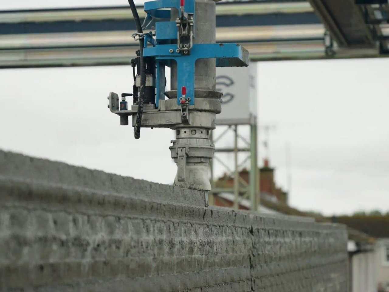
One of the biggest advantages of 3D printed homes is their ability to sharply lower construction costs. Automated robotic systems print walls layer by layer, reducing the need for large on-site crews and expensive labor. By incorporating locally sourced, affordable materials, builders can further cut expenses, making homeownership more attainable.

This approach is not only faster but also highly precise. A machine can construct a home in days rather than months, using only the material required. The result is less waste, lower costs, and a more environmentally friendly building process, benefiting both your budget and the planet.

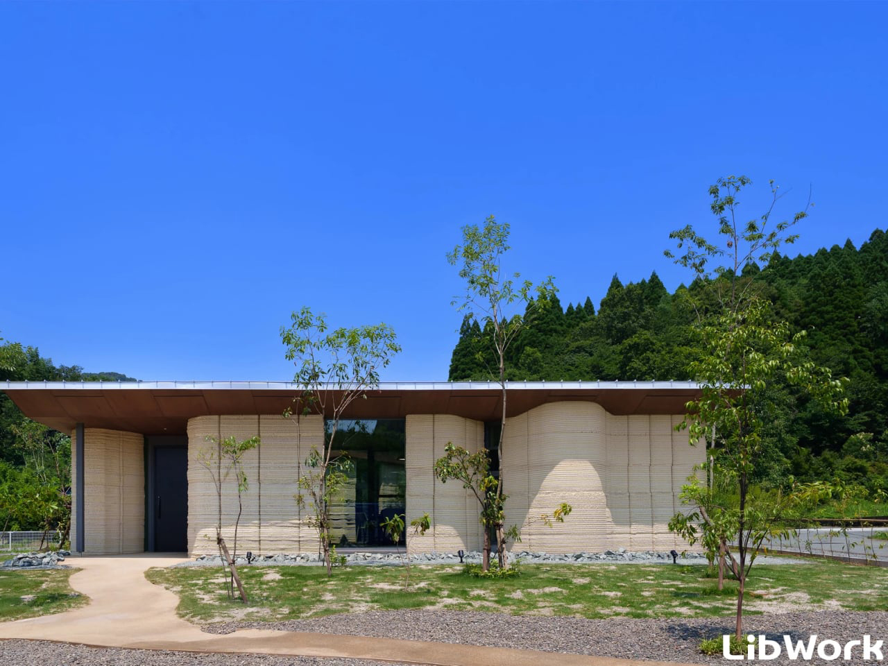
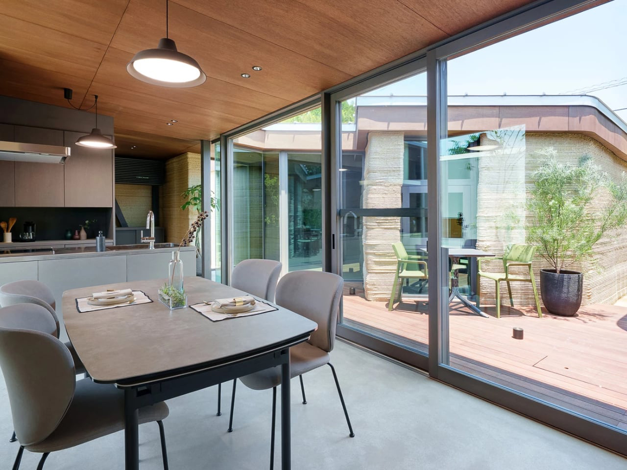
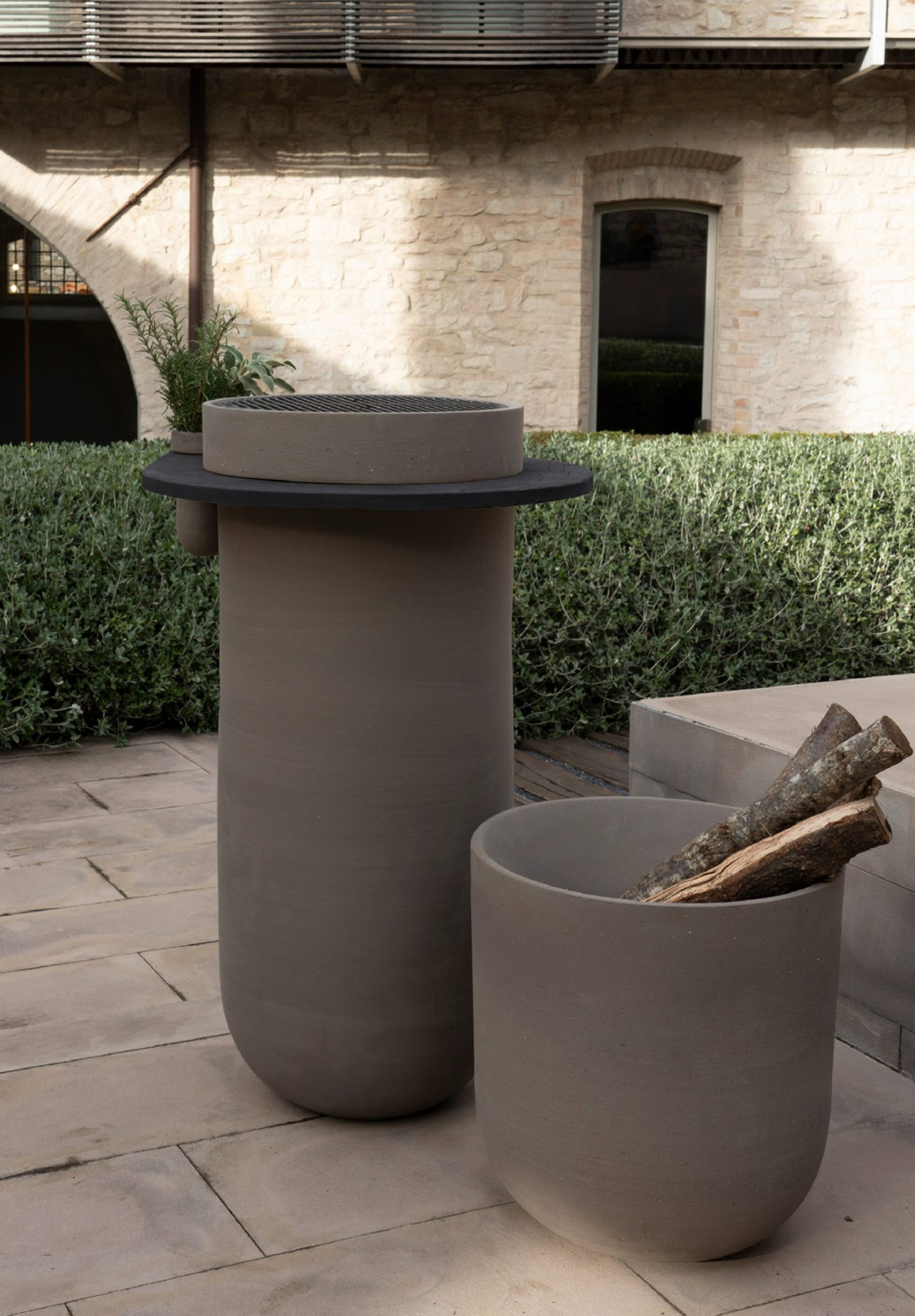
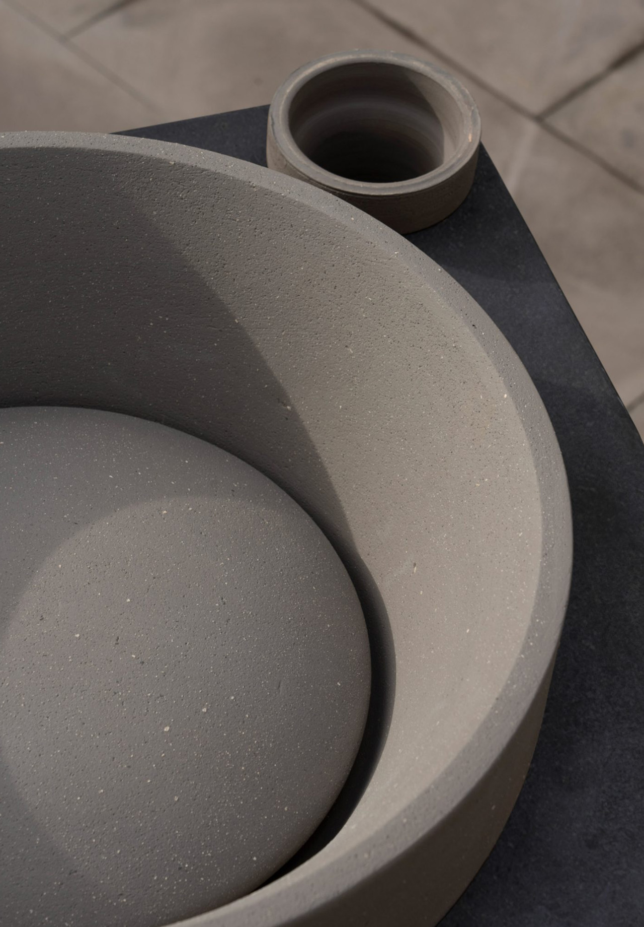
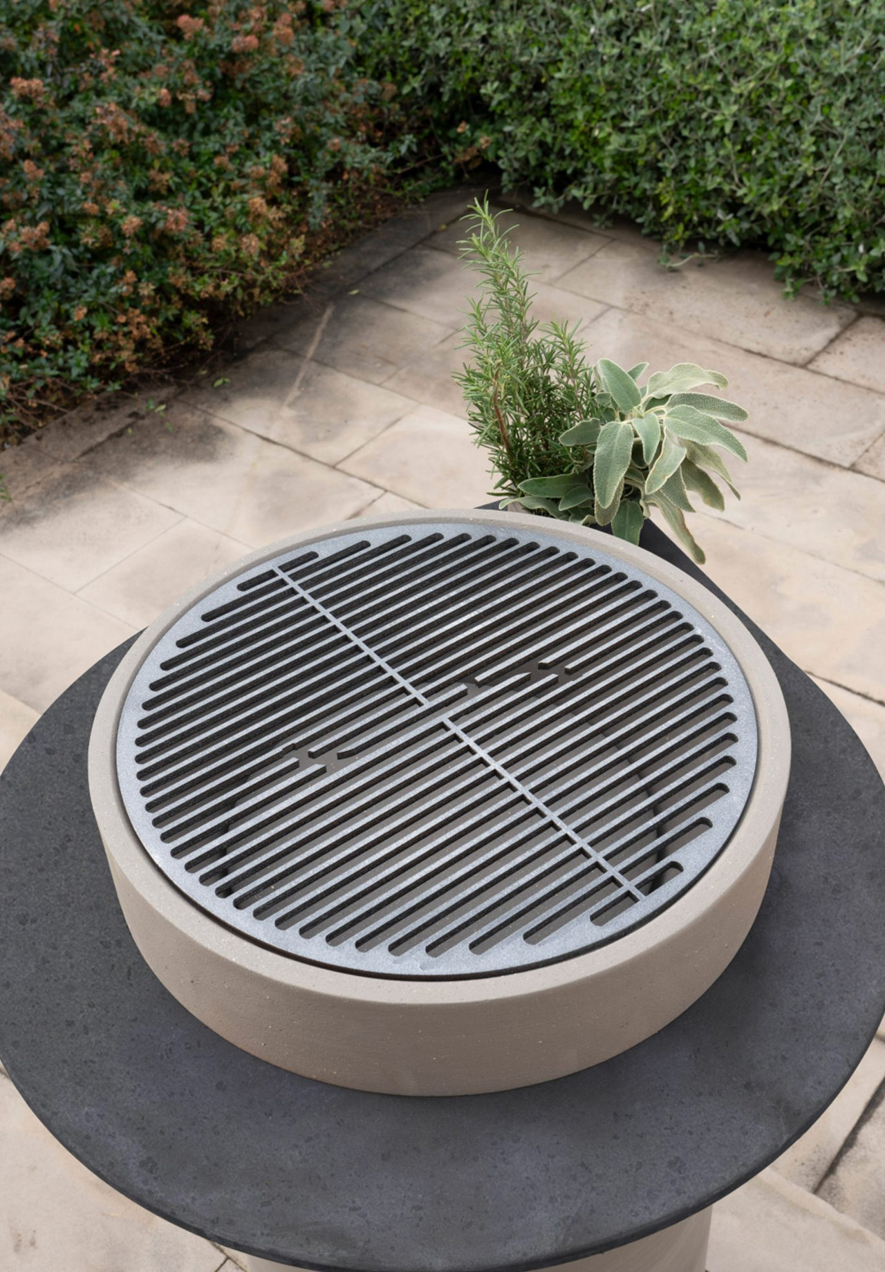
Japanese architecture studio Lib Work, in collaboration with Arup and WASP, has introduced the Lib Earth House Model B, a 1,076-square-foot residence 3D-printed primarily from soil. This single-story home in Kumamoto Prefecture demonstrates how ancient, locally sourced materials can be transformed through modern technology to create environmentally conscious architecture. With gently curved walls, ribbed textures, and a flat roof designed for solar panels and rainwater collection, the structure is subjected to natural constraints while offering a futuristic yet rooted aesthetic.

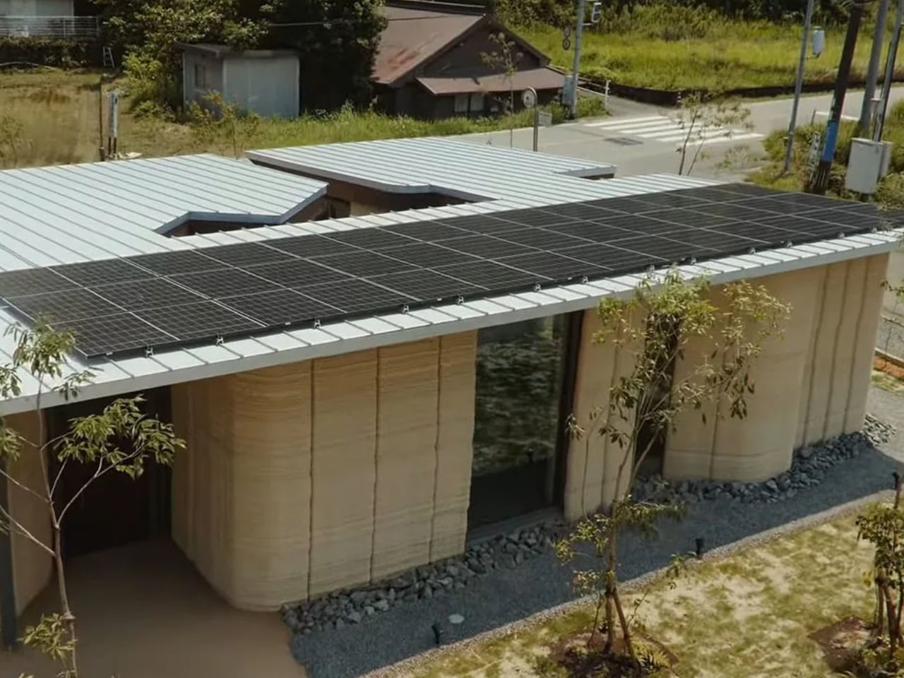
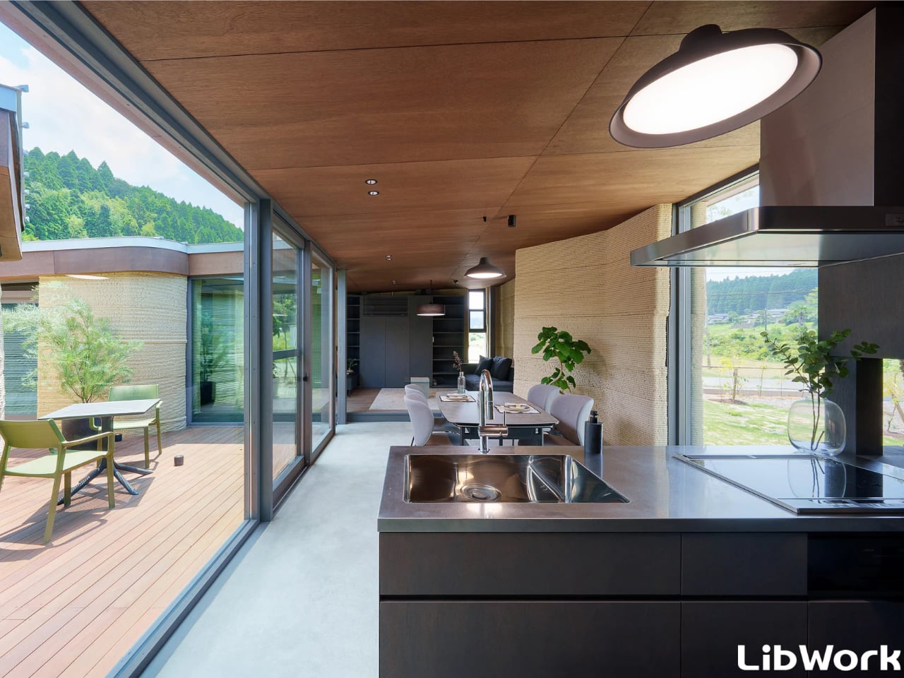
Built from a mix of soil, sand, lime, and natural fibers, the house celebrates imperfection through visible striations and organic textures that evolve beautifully over time. Inside, the design merges earthy warmth with modern comfort, featuring open-plan spaces, natural light, and climate-regulating walls. Discreet sensors monitor performance, ensuring durability and efficiency. The project redefines sustainable architecture, blending tradition, innovation, and adaptability into a living blueprint for eco-conscious design.

2. Faster Construction

3D-printed homes can be built at remarkable speed, setting them apart from traditional construction. Walls for a small house can be printed in just 24 to 48 hours, a task that would take conventional crews weeks or months. This rapid pace is especially crucial in areas with urgent housing needs, such as disaster-hit regions or communities facing shortages.

The faster building process allows homeowners to move in sooner and turns lengthy projects into efficient, streamlined undertakings. For developers, it means quicker returns and easier scaling. Accelerated construction makes quality, affordable housing more accessible to those who need it most.

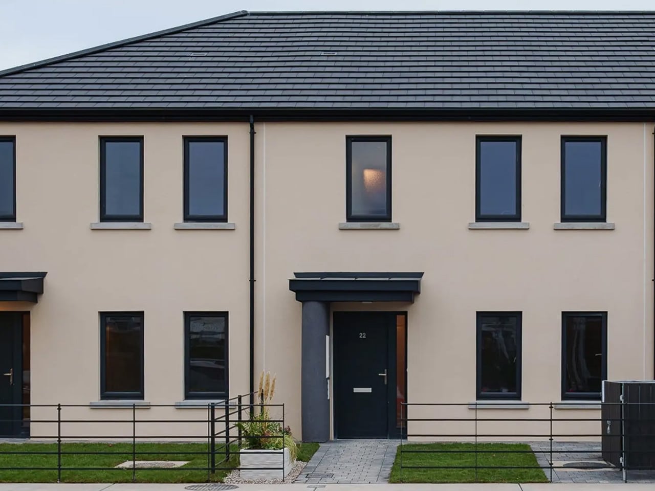
3D-printed architecture is moving beyond novelty to become a practical solution for affordable and sustainable housing. In Louth, eastern Ireland, HTL.tech has completed Grange Close, a three-unit terraced social housing project spanning 330 sq m (3,550 sq ft). Each home offers 110 sq m (1,184 sq ft) across two levels, constructed with COBOD’s BOD2 printer. The project was delivered in just 12 working days, from site preparation to handover, making it 35% quicker than conventional methods. Walls were printed using a cement-like mixture extruded layer by layer, while builders added roofing, electrical systems, and finishes.

The homes blend seamlessly into modern housing design, avoiding the ribbed texture typically associated with 3D printing. This contemporary appearance ensures residents feel they are living in fully finished, high-quality dwellings. HTL.tech expects future builds to be completed in as little as nine days, signaling how 3D printing can revolutionize construction by providing faster, cost-effective, and sustainable homes.

3. Enhances Design Flexibility

3D printing gives architects design possibilities beyond traditional construction. Complex curves, unconventional shapes, and intricate details that are costly or impossible with wood or brick become achievable. This technology enables the creation of truly unique, personalized homes that break free from standard rectangular layouts.

From sweeping curved facades to detailed interior wall patterns, 3D printing makes full customization accessible. Homeowners can design spaces that reflect their personal style and lifestyle, turning houses into bespoke works of art. The possibilities are nearly limitless, empowering creativity and allowing each home to be as distinctive and individual as the people who live in it.

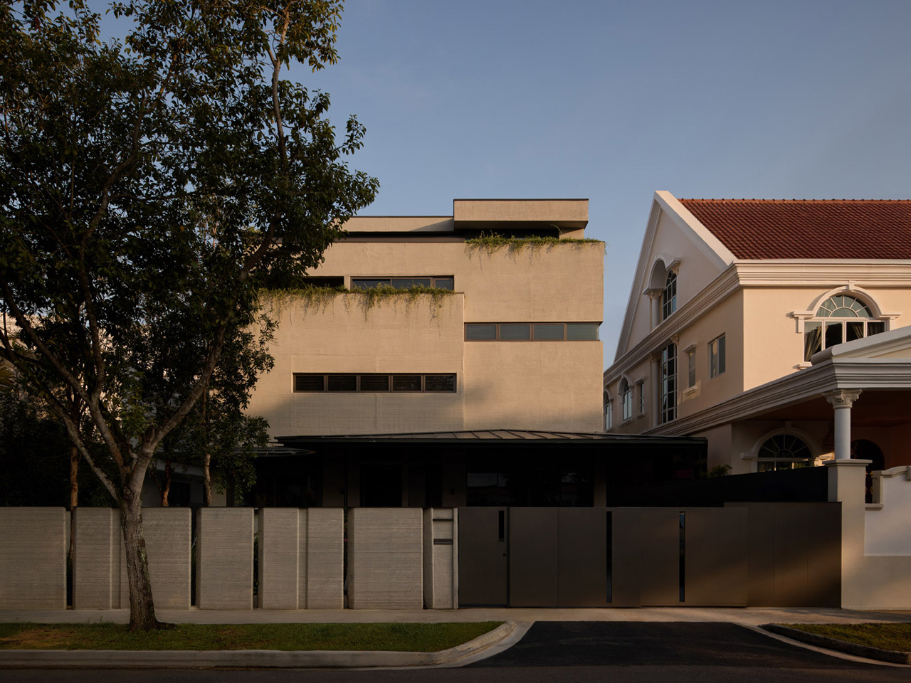
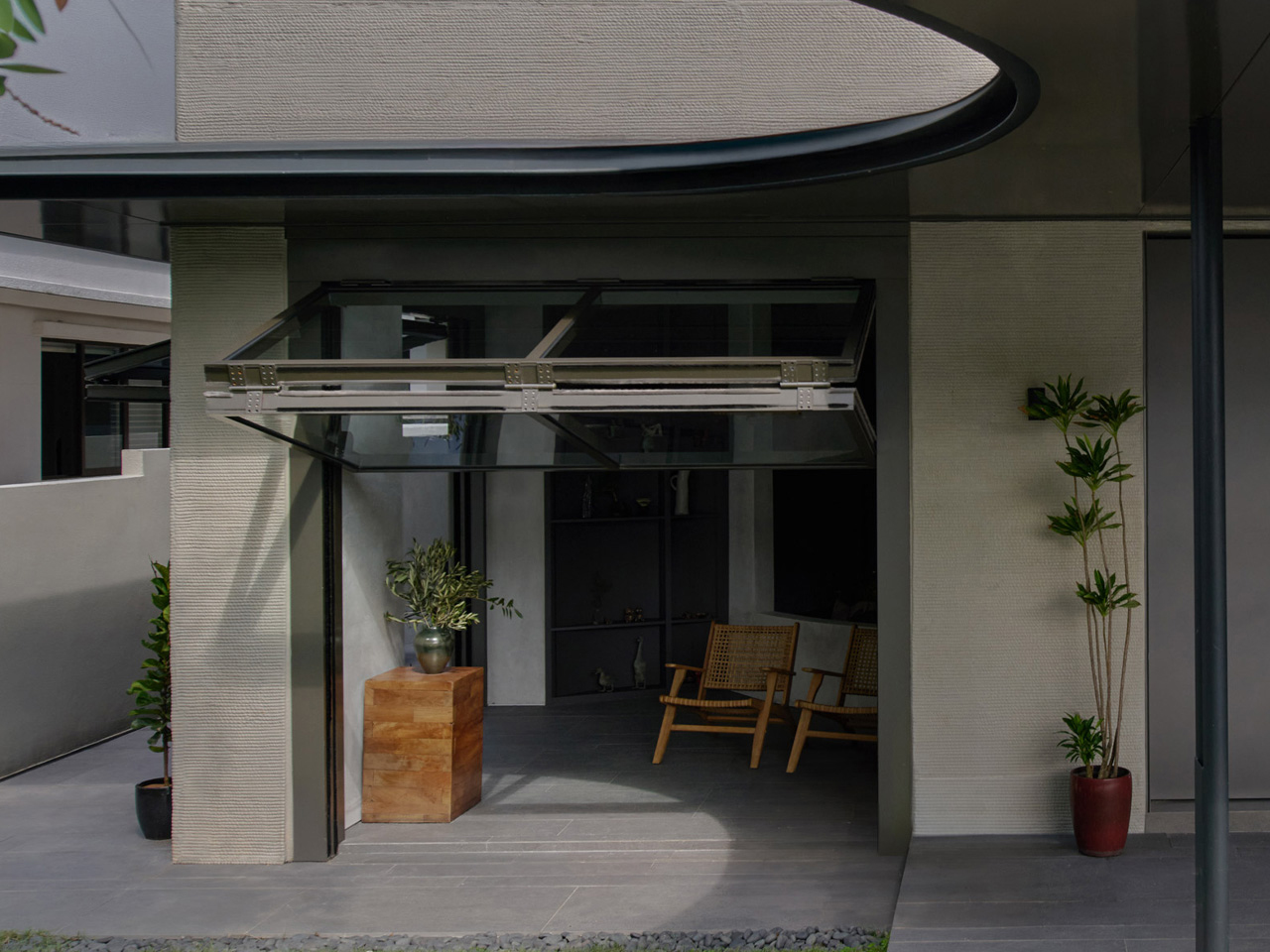
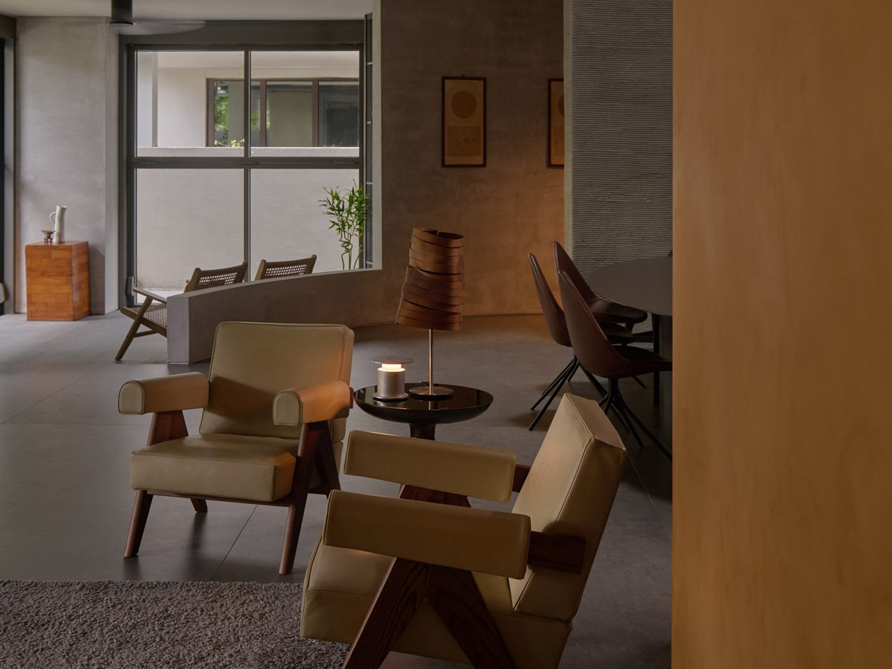
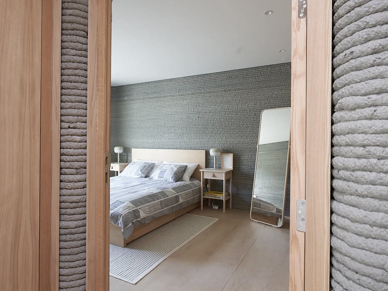
QR3D, designed by Park + Associates, is Singapore’s first multi-storey 3D-printed home and a striking vision of future domestic architecture. Rising four stories in Bukit Timah, the house explores how digital manufacturing can transform urban living in a city where space is scarce and innovation is essential. Its façade departs from convention with layered, grooved concrete that openly reveals its 3D-printed origins. With 97% of the walls printed on-site, the structure unites precision and
craft, using texture as both finish and framework while creating visual continuity that flows from exterior to interior.

Inside, a dramatic central void ties the four levels together, bringing daylight and ventilation deep into the plan while amplifying spatial openness. Floating stairs and bridges soften the vertical expanse, turning the void into the home’s defining feature. Combining expressive form with functional efficiency, QR3D showcases how technology and design can converge to create sustainable, adaptable, and distinctly modern housing.

4. Enhancing Sustainability

Sustainability is a major advantage of 3D-printed construction. The process applies materials precisely where needed, producing far less waste than traditional methods. Many 3D printing materials are recycled or locally sourced, reducing transportation and environmental impact while lowering the project’s overall footprint.

Beyond efficiency, 3D-printed homes can incorporate durable, energy-saving features like improved insulation and optimized ventilation. By cutting waste and using eco-friendly materials, these homes support climate-conscious building practices. They benefit the planet while also offering homeowners long-term savings on energy costs, proving that sustainable design can be both practical and environmentally responsible.

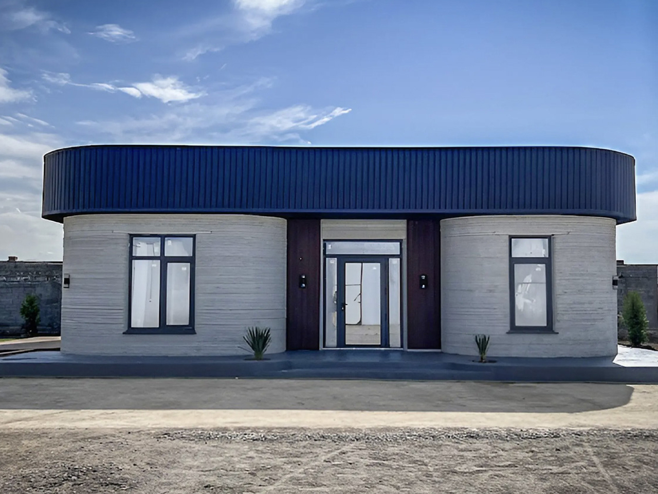
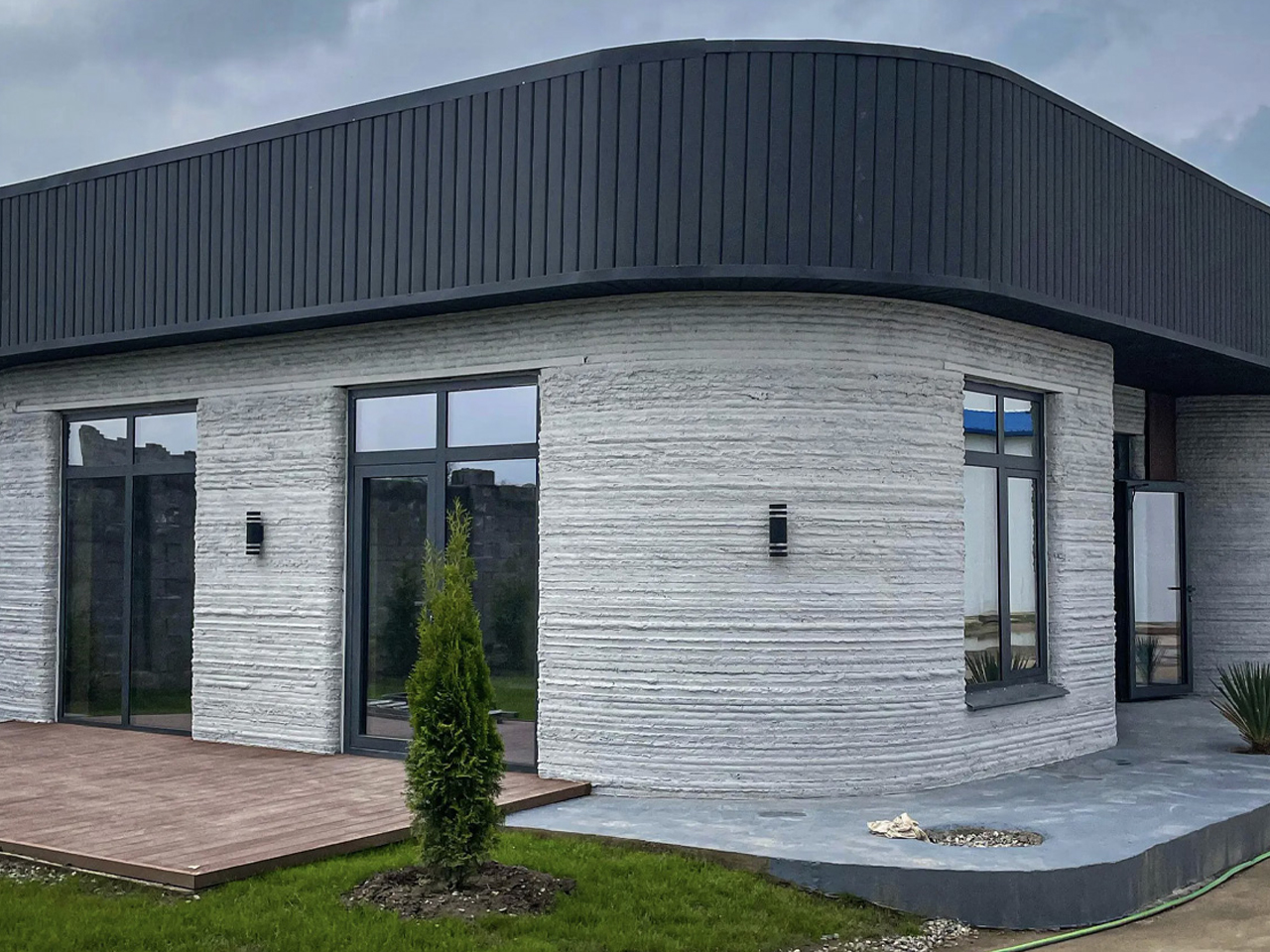
Designed by BM Partners and built with COBOD’s BOD2 printer, this residence in Almaty, Kazakhstan, stands as Central Asia’s first 3D-printed home. Created to endure seismic risks and extreme weather, it showcases the resilience of 3D construction. The walls were formed using a specially developed cement mix with a compression strength of nearly 60 MPa, which is much higher than conventional brick or stone, enabling it to withstand earthquakes up to magnitude 7.0. To address Kazakhstan’s harsh climate, insulation of expanded polystyrene concrete was incorporated, ensuring strong thermal and acoustic performance against temperatures ranging from –57°C to +49°C.

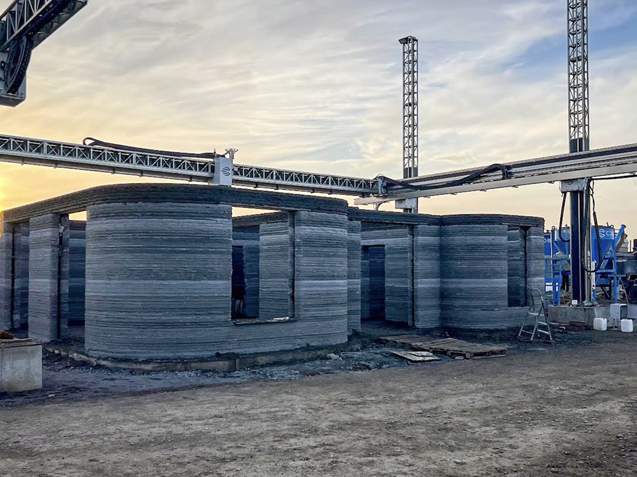
After the layered printing process, the structure was finished with doors, windows, and interiors using traditional techniques. The single-floor home spans 100 sq m, featuring a simple yet functional layout, generous glazing, and a bright living space. Completed within two months, it demonstrates the efficiency, durability, and design possibilities of modern 3D-printed construction.

5. Resilient and Accessible Housing

3D-printed homes offer exceptional strength, often exceeding that of traditional construction. Their continuous, monolithic walls have no weak points, making them highly resistant to extreme weather, earthquakes, and other natural disasters. This durability provides safety and peace of mind, especially in vulnerable regions.

Beyond resilience, 3D printing makes housing more accessible worldwide. Lower costs and faster construction allow organizations to deliver high-quality, permanent homes to disaster-affected areas and low-income communities. This technology serves as a powerful tool for social impact, providing secure, dignified housing and helping to address global housing challenges efficiently and effectively.

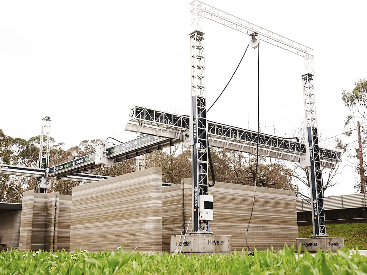
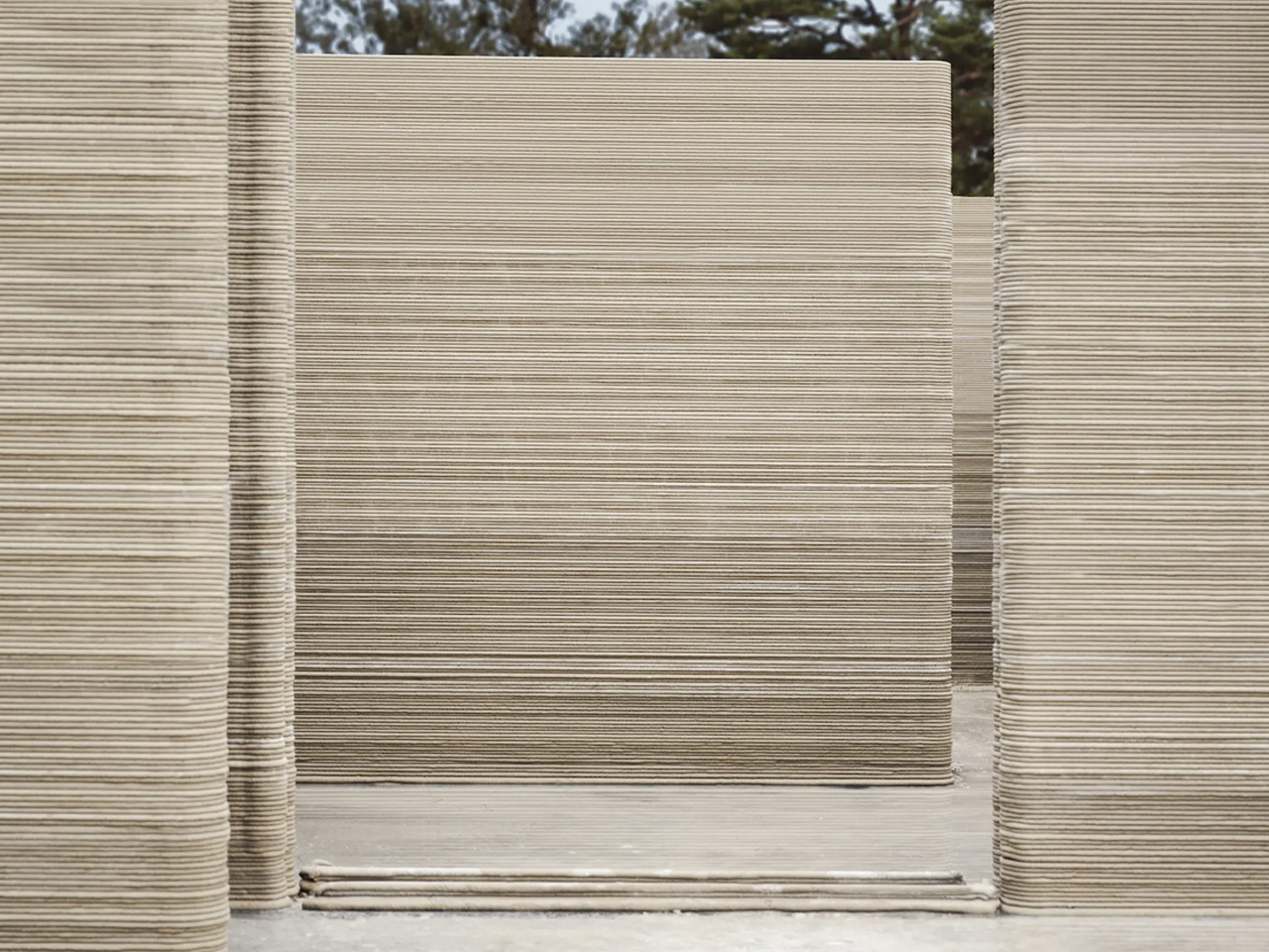
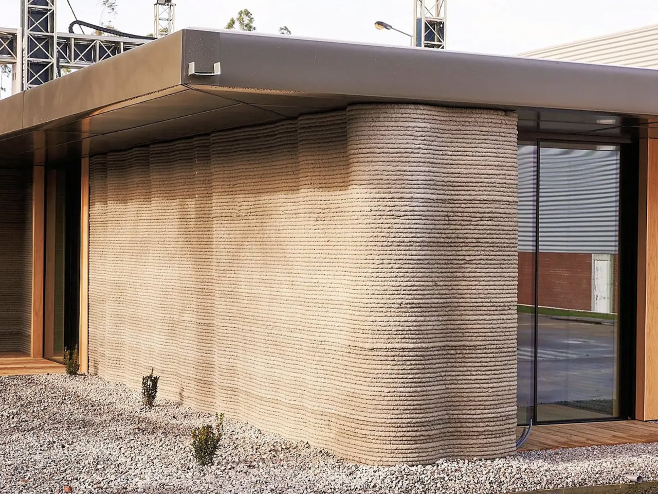
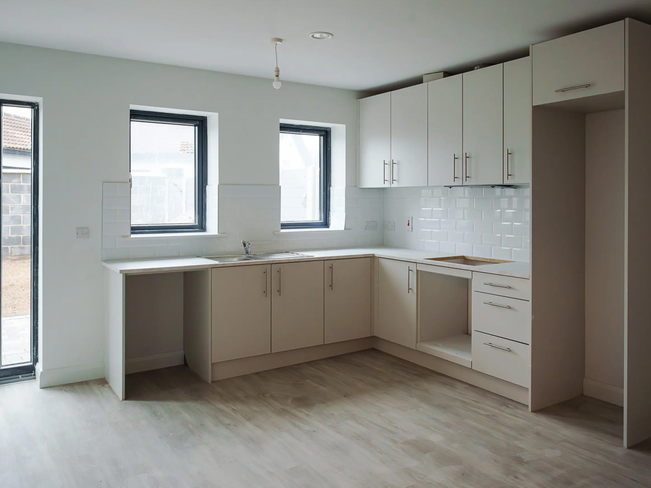
3D-printed architecture is proving to be a promising answer to housing accessibility, by Portugal-based Havelar. The single-storey home spans 80 sq m and was printed in just 18 hours using COBOD’s BOD2 printer. The process involved extruding a cement-like mixture in layers to form the structure, followed by traditional building work such as adding windows, doors, roofing, and other amenities, and the project was completed within two months.

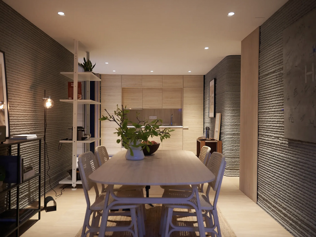
The residence features ribbed walls that reveal its 3D-printed origin, with a layout comprising a central kitchen and dining area, two bedrooms, a living room, and a bathroom. Though modest compared to luxury printed homes, it prioritizes practicality and efficiency.

3D-printed homes deliver remarkable durability, often surpassing traditional construction. Their seamless, monolithic walls eliminate weak points, making them highly resistant to extreme weather, earthquakes, and other natural hazards. This inherent strength ensures safety and peace of mind, particularly in areas prone to environmental risks.

The post Top 5 Reasons 3D-Printed Homes Are the Future of Affordable Housing first appeared on Yanko Design.

These No-Drill Window Blinds Install in 30 Seconds Without Damaging Your Walls

There is a moment of hesitation familiar to anyone who has ever wanted to personalize their living space: the moment before drilling a hole into a pristine wall. For renters, it brings the risk of a lost security deposit. For homeowners, it is a small but permanent commitment, a mark that will need to be patched and painted over if they ever change their minds. This single action is often the barrier between the generic, builder-grade blinds that came with a property and a window treatment that truly reflects personal style and serves a specific need. It is this universal reluctance that has given rise to a new class of home solutions, designed around ingenuity rather than brute force. Window coverings are no longer a project requiring a tool belt and a steady hand; instead, they are evolving into something far more accessible.

This friction point in home improvement is where clever design really gets to shine. It is one thing to make something look good, but it is another thing entirely to re-engineer the user experience from the ground up. The best products eliminate the most painful step of the process so effectively that you wonder why it ever existed in the first place. This is precisely the space Keego has stepped into, offering no-drill blinds that promise a complete transformation in about a minute, turning a once-dreaded task into a simple, satisfying upgrade. The core mechanism is a tension rod system, essentially a sophisticated pressure mount that wedges the entire blind assembly securely into the window frame. It is a simple, elegant solution to a problem that has plagued homeowners and apartment dwellers for decades.

Designer: Keego Blinds

Click Here to Buy Now: Hurry, use coupon code “YANKO16” at checkout. Honeycomb Cellular Shades | Zebra Shades.

Honeycomb Cellular Shades

First up is the Extra Wide Top Down Bottom Up Honeycomb Cellular Shade, which solves a problem most blind manufacturers pretend does not exist: oversized windows. This variant supports custom widths up to 78 inches, a dimension that immediately makes it relevant for bay windows, sliding glass doors, or any architectural feature where standard sizing falls embarrassingly short. The top down bottom up functionality is the real highlight here, allowing you to lower the shade from the top or raise it from the bottom independently. This gives you surgical precision over privacy and light, perfect for ground-floor rooms where you want daylight streaming in overhead while keeping neighbors from peering inside. The honeycomb structure still delivers the thermal insulation you would expect, trapping air in those hexagonal cells to regulate temperature and dampen street noise.

What separates this from the standard honeycomb offerings is the sheer flexibility it provides. Opening from both directions turns a passive window covering into an active design element you can adjust throughout the day as the sun moves and your needs shift. The cordless mechanism operates smoothly in both directions, which is critical when you are managing a shade this wide. The blackout fabric options are effective, creating near-total darkness when fully deployed, while the light-filtering versions provide that soft, diffused glow that keeps a room feeling open without sacrificing privacy. This is the choice for anyone dealing with non-standard window dimensions or who wants granular control over how light enters their space, all without committing to permanent hardware.

Zebra Shades

Then we have the Zebra shades, which take a completely different approach to the same problem. Where the Honeycomb is about brute-force light blocking, the Zebra is about nuanced light management. The design consists of two layers of fabric that slide over one another, with alternating horizontal stripes of sheer and opaque material. This construction gives you granular control over the amount of light entering the room. You can align the solid bands for privacy and room darkening, align the sheer bands to let in diffuse daylight, or set them anywhere in between to strike the perfect balance. It is an incredibly clever system that feels more dynamic and interactive, turning the window into a feature rather than just an opening.

The Zebra shades lean more into the tech and design-forward category, especially with the motorized option. The system comes with a remote capable of controlling up to 15 blinds at once, which is a fantastic quality-of-life feature for rooms with multiple windows. The fabrics often have a texture, like an imitation linen, that adds a layer of softness and visual interest to a space, preventing it from feeling too sterile. This style is for the person who wants to actively shape the light in their room throughout the day, treating it as another element of their interior design. The Zebra shades are a statement piece that merge a clever mechanical concept with a modern aesthetic, all while retaining that brilliantly simple no-drill installation.

Ultimately, the choice between the two comes down to a fundamental difference in philosophy. The Extra Wide Top Down Bottom Up Honeycomb Cellular Shade is the pragmatic solution for oversized windows and surgical light control, combining thermal efficiency with the flexibility to adjust from both top and bottom. The Zebra is the expressive design object, offering a more artistic and flexible way to interact with natural light. Both, however, are built on that same foundation of accessibility. By removing the drill from the equation, Keego has made a meaningful upgrade to a home’s comfort and style something that can be achieved on a lunch break.

These blinds are available to order directly from the Keego website and can also be found on major online retail platforms like Amazon and Walmart. Custom sizing is a key part of the offering, ensuring that the pressure-fit system works perfectly for a wide range of window dimensions.

Click Here to Buy Now: Hurry, use coupon code “YANKO16” at checkout. Honeycomb Cellular Shades | Zebra Shades.

The post These No-Drill Window Blinds Install in 30 Seconds Without Damaging Your Walls first appeared on Yanko Design.

TOLO Stacks Tea Lights in a Vertical Tube Like Polo Mints

Candle holders have always favored traditional taper candles and their elegant, statuesque forms. Tea lights, meanwhile, get relegated to shallow dishes and basic glass cups, functional but hardly inspiring. The problem is practical as much as aesthetic. Most holders treat tea lights as single-use items, offering no solution for storage or replacement beyond keeping a stash somewhere in a kitchen drawer. That leaves you with a scattered collection of metal tins and the constant need to hunt for spares when one burns out.

The TOLO Tea Candle holder takes a different approach, drawing inspiration from an unexpected source to solve both issues at once. Designer Liam de la Beyodere looked at how Polo mints stack neatly inside their cylindrical wrapper and applied the same logic to tea lights. The result is a minimalist metal tube that holds multiple candles vertically, with one sitting at the top ready for use while others wait below. It’s a simple idea that gives tea lights the height and presence of traditional candles without any of the usual mess or inconvenience.

Designer: Liam de la Beyodere

The holder itself is straightforward in construction. A seamless metal tube, likely brass or gold-plated steel, features a precise cutout at the top that exposes just enough of the uppermost candle for lighting. The polished finish adds a touch of elegance, while the clean cylindrical form fits easily into modern interiors. Different heights are available depending on how many tea lights you want to store inside, turning what’s typically a storage problem into part of the design’s appeal.

Of course, the real advantage is how effortless this makes candle replacement. When the top tea light burns out, you simply remove the spent tin and the next one rises into position. No rummaging through drawers, no loose candles rolling around in cabinets, and no need to interrupt your evening to fetch replacements. The tube keeps everything organized and accessible, which is exactly the kind of thoughtful detail that separates good design from merely functional objects.

What sets TOLO apart is how it reframes tea lights entirely. Instead of treating them as cheap alternatives to proper candles, the design gives them structure and verticality that command attention. The holder looks intentional even when unlit, standing as a sculptural object rather than just another utilitarian accessory. That shift in perception, from disposable to deliberate, is what makes the concept feel genuinely fresh rather than just clever packaging.

TOLO remains a concept for now, existing only as renderings rather than a finished product. That said, the design’s simplicity and practicality suggest it could translate well into production, offering a more elegant solution for anyone who prefers the convenience of tea lights but wants something better than the usual uninspired holders cluttering store shelves.

The post TOLO Stacks Tea Lights in a Vertical Tube Like Polo Mints first appeared on Yanko Design.

George & Willy’s Cafe Table Mounts to Walls and Lifts Off Daily

Small cafes and bistros face a constant battle with space. You need enough seating to make the business worthwhile, but cramming too many tables and chairs into a narrow sidewalk or patio turns the whole setup into an obstacle course. Floor-standing tables claim precious real estate even when they’re not in use, and moving them around every day to accommodate different crowds or weather becomes a hassle nobody wants to deal with.

George & Willy’s Wall-mounted Cafe Table solves this by eliminating the floor space problem entirely. The table attaches directly to the wall or a bench seat with a reversible bracket that lets you position it high or low depending on your needs. When the day’s done, you can slot the table out of its bracket and bring it inside, leaving nothing behind but a small wall plate. It’s a simple approach that makes flexible seating actually flexible.

Designer: George & Willy

The table itself features a round aluminum top available in two sizes, either 40 cm or 60 cm in diameter, both with a clean powder-coated finish in black or white. A curved stem extends from the wall bracket, creating a graceful arc that supports the tabletop without needing legs underneath. The whole thing weighs just 8.4 pounds but can hold up to 17.6 pounds, which is plenty for coffee, pastries, laptops, or small meals.

Of course, the real cleverness is in the bracket system. You can mount it in a tall orientation, where the table attaches to a bench seat and sits higher and closer to the wall, or in a short orientation, where it mounts directly to the wall and extends further out for more legroom. The same bracket handles both setups, so you’re not locked into one configuration when your space inevitably needs to change.

The table’s weatherproof construction means it works just as well outdoors as it does inside. Rain, humidity, and temperature swings won’t damage the aluminum or zinc-coated steel, which is why you see these tables installed on patios, sidewalks, and garden walls. The removable design also makes cleaning straightforward since you can take the whole thing down, wipe it off, and slot it back in without any tools.

What makes the Wall-mounted Cafe Table feel genuinely smart is how it adapts to different situations. You can install multiple tables in a row along a wall for group seating, space them out for solo customers, or mix tall and short orientations to accommodate benches and stools in the same area. That kind of modularity is rare in furniture that also looks this minimal and intentional.

The table’s slim profile and clean lines fit seamlessly into modern cafes, but the design works just as well in home settings where space is tight. Balconies, small patios, or even compact kitchens can benefit from a surface that doesn’t claim floor space and can be tucked away when you need the room. It’s the kind of simple, thoughtful design that makes you rethink how furniture occupies space.

The post George & Willy’s Cafe Table Mounts to Walls and Lifts Off Daily first appeared on Yanko Design.

PENT Made Dumbbells Too Pretty to Actually Work Out With

There’s something slightly absurd yet completely mesmerizing about the idea of working out with equipment covered in Swarovski crystals. But here we are in 2025, and Polish luxury fitness brand PENT has partnered with Swarovski to create gym equipment that looks like it belongs in a museum rather than your basement workout space.

Let’s be honest. Most of us have dumbbells tucked away in closets or gathering dust under the bed. They’re functional, sure, but they’re not exactly objects you’d want to display on your coffee table. PENT is completely flipping that script with their “Embellished with Crystals by Swarovski” collection, which features handcrafted dumbbells and kettlebells that are as much about aesthetics as they are about bicep curls.

Designer: PENT x Swarovski

The collection includes the COLMIA dumbbells and LOVA kettlebells, each one meticulously handmade in Poland using materials that sound more suited to a luxury yacht than a home gym. We’re talking walnut or ash wood handles, Italian leather, stainless steel, and of course, those signature Swarovski crystals hand-applied to every piece. Even the storage racks are designed with architectural precision, so the equipment becomes a sculptural element in your space rather than something you need to hide away.

What makes this collaboration particularly interesting is how it challenges our assumptions about where luxury belongs. Fitness equipment has traditionally been purely utilitarian. You want something that works, not something that sparkles. But as home wellness spaces have evolved from dingy garage setups to carefully curated environments, there’s clearly a market for equipment that doubles as design objects. According to Iron House Design, which is bringing the collection to the U.S. market, these pieces are intended for luxury home gyms, private spas, hotel suites, and superyacht interiors.

The price tag reflects this positioning. The collection starts at around $613 for dumbbells with a wooden stand and goes up to $681 for kettlebells, though more customized sets can reach $25,000 depending on the level of crystal detailing and personalization you want. That’s a significant investment for equipment you could theoretically replace with a $30 set from a sporting goods store.

But that misses the point entirely. These aren’t meant to be practical purchases in the traditional sense. They’re statement pieces that happen to be functional. Tanya Ryno, founder of Iron House Design, describes them as being “for those who make bold statements with every choice.” It’s for the person who wants every element of their home to reflect a certain level of taste and refinement, from the artwork on the walls to the weights on the floor.

The collaboration also taps into a broader cultural shift around wellness and self-care. Exercise is no longer just about breaking a sweat or hitting certain fitness goals. For many people, especially in the luxury market, it’s about the entire experience. The space you work out in matters. The equipment you use matters. And increasingly, people are willing to invest in making those experiences feel special.

That said, there’s an inevitable question hovering over the whole thing: would you actually work out with crystal-covered dumbbells, or would you just keep them on display? According to reports, many owners treat them more like collectible art pieces or conversation starters rather than everyday workout tools. Some designers are even using them purely as decorative elements in high-end spaces. Technically, these pieces are engineered to meet professional fitness standards, so you absolutely could use them for your actual workouts. The wooden handles are smooth and ergonomically designed, and the stainless steel ends are weighted properly. But when something is that beautiful and that expensive, there’s an understandable hesitation to actually get your sweat all over it.

What the PENT x Swarovski collection really represents is the ongoing blurring of boundaries between different design categories. Furniture looks like art. Kitchen appliances become sculptural centerpieces. And now, gym equipment gets the high-jewelry treatment. It’s all part of a world where the objects we surround ourselves with are expected to be both functional and beautiful, practical and aspirational.

The post PENT Made Dumbbells Too Pretty to Actually Work Out With first appeared on Yanko Design.