Victorinox and Leatherman did something remarkable beyond building useful tools. They each created a visual identity so strong that it became the default answer to the question of what a portable multitool should look like. The Swiss Army Knife turned the folding pocket knife into a miniature toolkit, with blades and tools layered along a single spine in a form almost anyone on the planet would recognize on sight. Leatherman took the opposite route, putting a plier at the center and folding the handles outward to reveal a dozen more functions. These were genuinely different design philosophies, and both became iconic. Between them, they defined the category for most of a century.
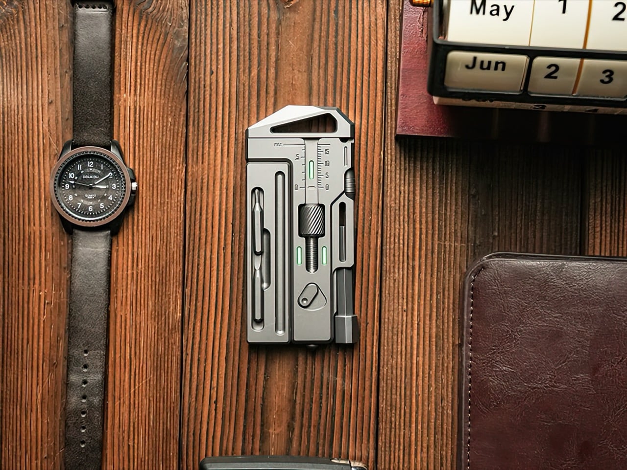
The format nobody seriously explored is the one that fits naturally into the same spaces as a phone, a wallet, or a slim notebook. A flat rectangular slab, sized somewhere between a pocket knife and a small notepad, turns out to be an almost perfect geometry for daily carry, because that is exactly the geometry your pockets, bags, and cases were already designed around. The OmniPro Wrench 3.0 from Los Angeles-based IF is a Grade 5 titanium multitool system that occupies that territory, built around a genuine 0 to 18mm adjustable wrench and packed with fifteen practical tools. It is currently on Kickstarter, where it has raised over $57,000 against a $3,000 goal with two weeks still remaining.
Designer: Team IF
Click Here to Buy Now: $169 $259 ($90 off) Hurry! Only 89 of 100 units left.
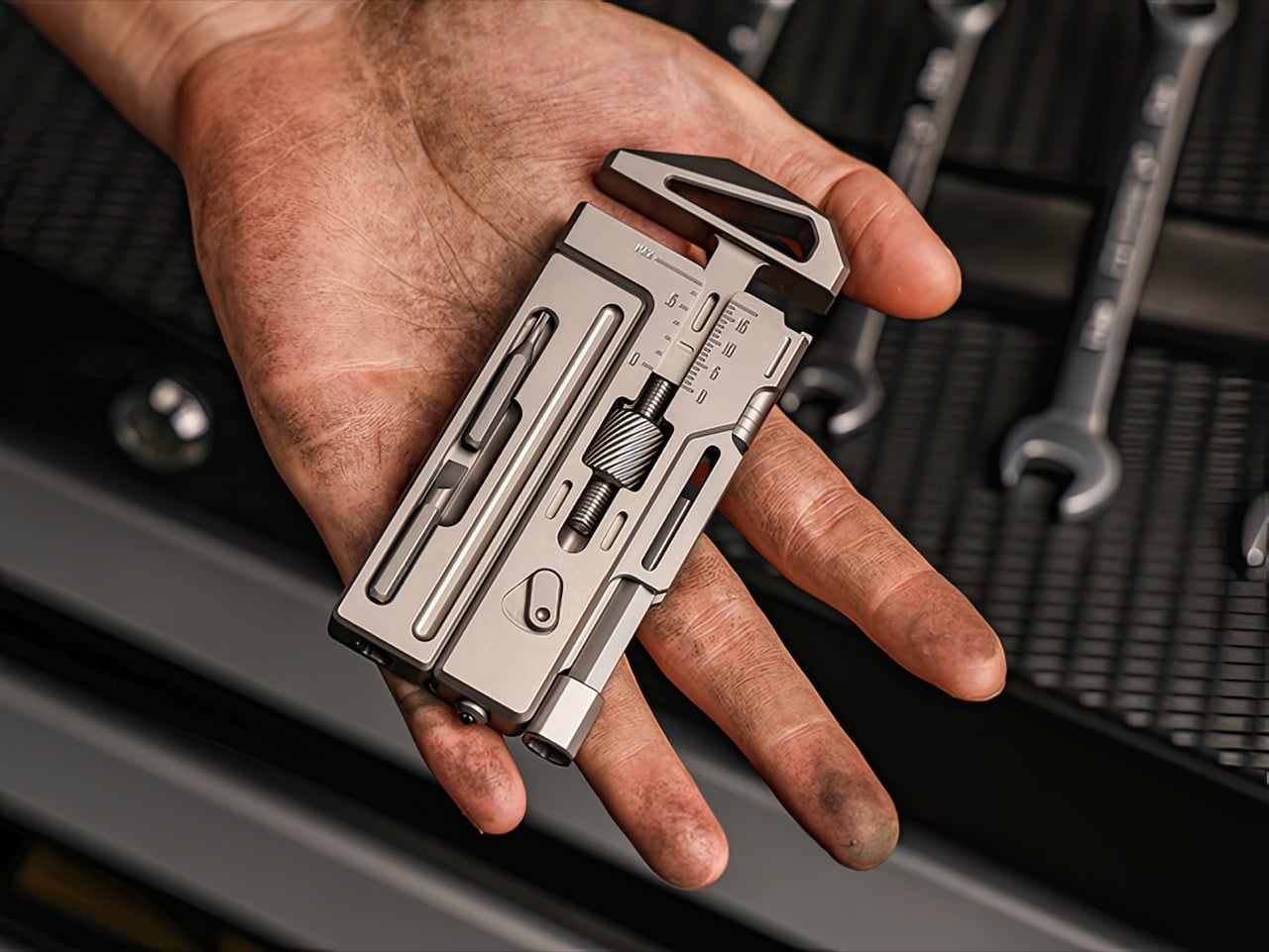
IF built the OmniPro 3.0 around the wrench function first, treating everything else as secondary. The adjustable jaw spans 0 to 18mm, which covers the majority of fasteners you encounter in daily repairs, from furniture assembly to bike maintenance to plumbing fixes. The adjustment mechanism is smooth, with a knurled thumbwheel that grips positively even when your hands are sweaty or oily. The wrench jaws themselves deliver genuine torque, the kind you need when a bolt refuses to budge or when a fitting needs real pressure to seal properly. This feels like an actual wrench that happens to live in a multitool body, rather than a novelty wrench grafted onto a keychain gadget.

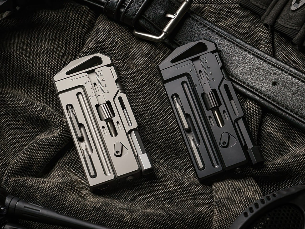
Grade 5 titanium, the same Ti-6Al-4V alloy used in aircraft landing gear, forms the entire body. Each OmniPro 3.0 starts as a solid titanium billet and gets CNC-machined down to final form, then hand-finished with micro chamfers on every edge to eliminate sharp corners. The result weighs 174 grams, lighter than most smartphones but substantial enough in hand to communicate durability. Titanium brings corrosion resistance that steel cannot match at this weight, which means sweat, rain, and salt water leave no trace. The sandblasted finish feels matte and slightly textured, the way raw titanium emerges from machining. A black PVD coating option offers a stealthier aesthetic for those who prefer darker gear.
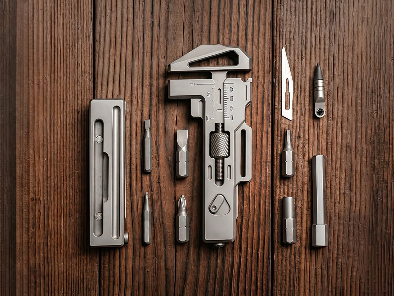

The three-position bit driver system addresses one of the most persistent frustrations with compact screwdrivers, insufficient clearance. Most pocket tools force you into a single driver orientation, which works fine on a workbench but fails spectacularly inside a cramped electronics enclosure or underneath a desk. The OmniPro 3.0 gives you top, side, and bottom bit ports, so you can switch angles to match whatever clearance the space allows. The ratchet mechanism reverses direction with a single flick of an external switch, eliminating the need to remove the ratchet head entirely just to change from tightening to loosening. That small detail saves several seconds per fastener, which compounds into real time savings across a full repair session.

The extension rod was one of the most requested features from earlier OmniPro backers, and the third generation integrates it through a snap-on magnetic latch system. Pull the rod from its slot, snap it onto the bit driver, and you gain several centimeters of reach for recessed screws or deep cavities. The modular bit storage cabin holds three 6mm bits, two 4mm bits, and a 6mm-to-4mm adapter, all retained magnetically so they stay secure during movement but release cleanly when you need them. The storage module itself latches to the main body with the same satisfying snap mechanism as the extension rod, the kind of tactile feedback that makes you open and close it twice just because it feels good.
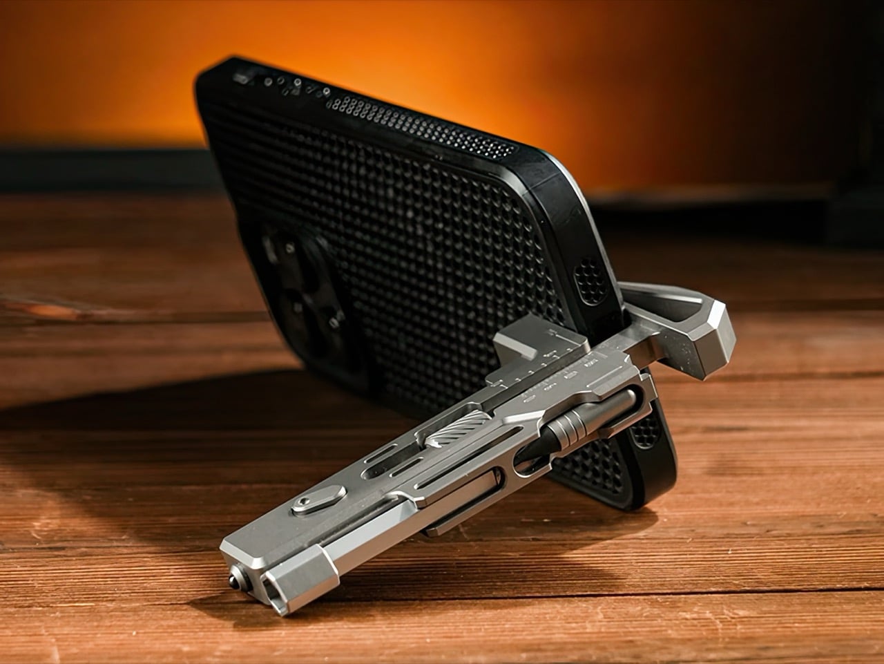
A built-in caliper scale runs along the wrench body, precision-lasered directly into the titanium. Measure bolt diameters, check material thickness, verify part dimensions, all without pulling out a secondary tool or guessing by eye. The magnetic eternal pen uses a graphite tip that writes on nearly any surface without ink, and it pulls from either side of the body through dual access grooves. A side-mounted #11 scalpel blade sits in a protective finger groove for safe cutting. The bottle opener relocates to the rear of the tool, away from the wrench jaws, which improves both grip clarity and caliper accuracy. A phone stand groove props your device up at a hands-free viewing angle. Eight tritium slots glow for 25 years without batteries or charging, making the tool visible in total darkness. A tungsten carbide glass breaker handles emergency escape scenarios with a single sharp strike.
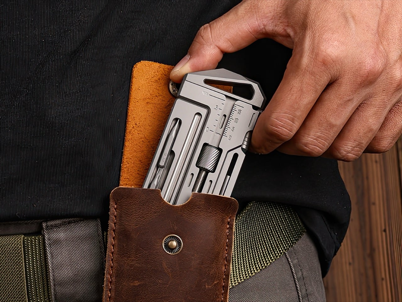
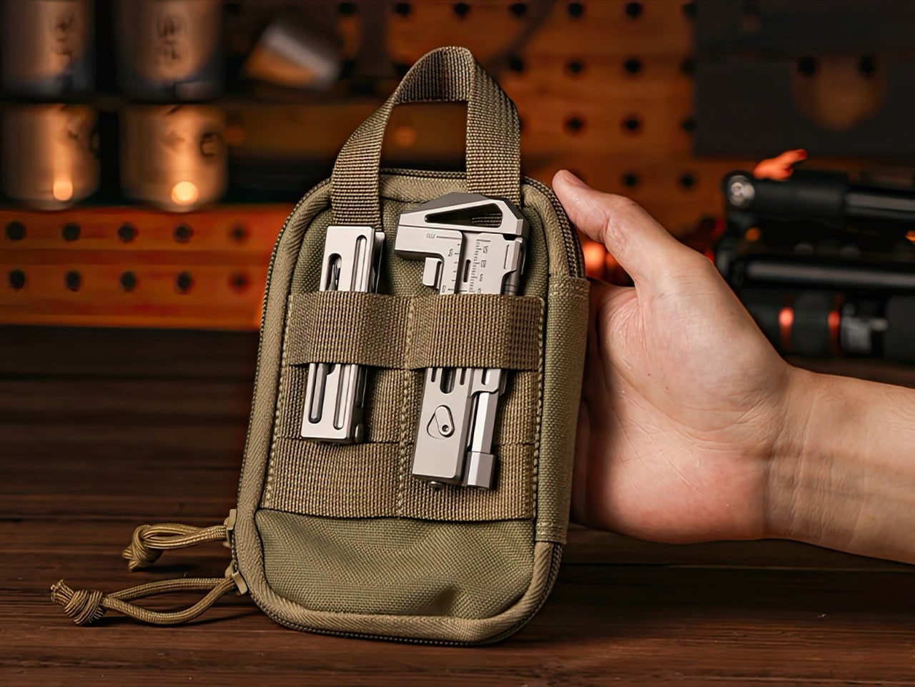
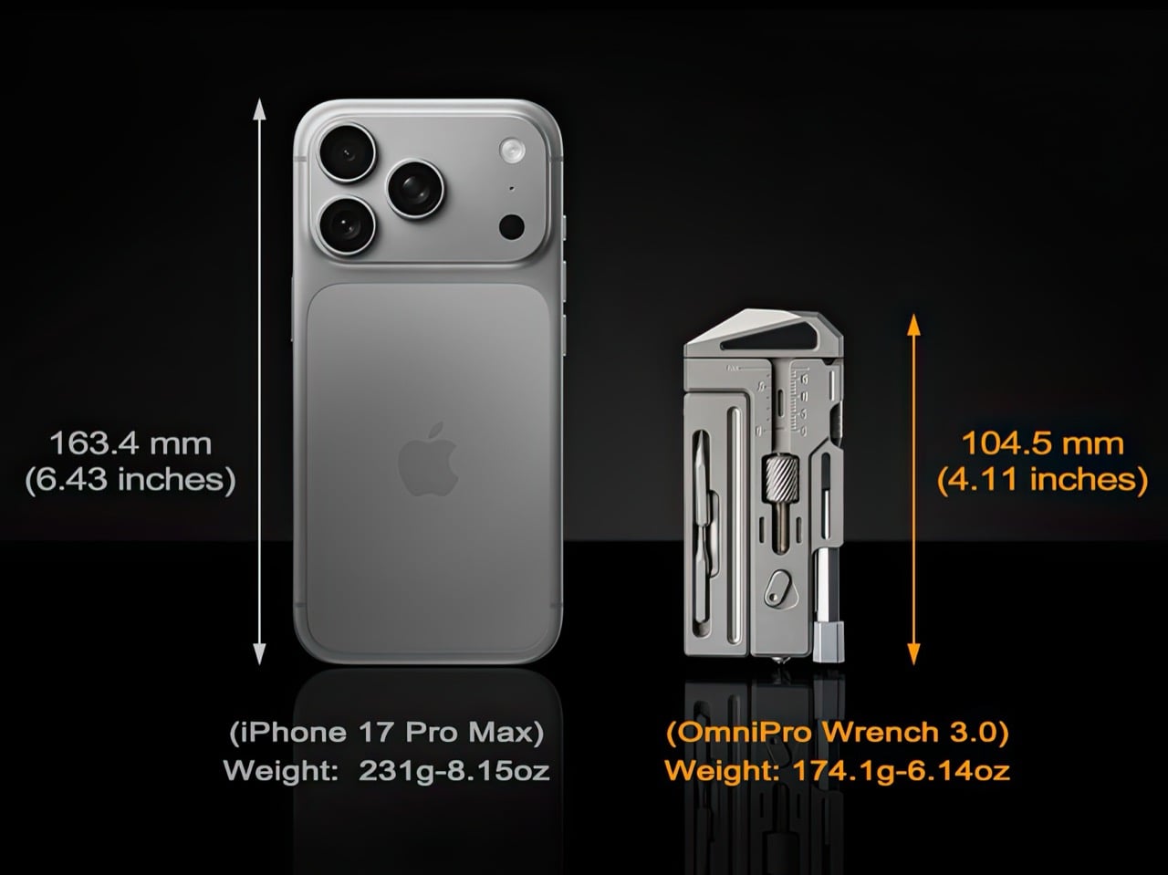
At 104.5mm by 46mm, the OmniPro 3.0 slips into a front pocket alongside a phone or wallet without printing awkwardly. It works equally well in a bag side pocket, a gear pouch, or clipped to a belt loop with the optional leather sheath. The sheath itself is belt-compatible with a hanging hook for fast-access carry. Two finishes, sandblasted titanium and black PVD, offer different aesthetic directions with identical material performance underneath.
The OmniPro Wrench 3.0 is available now on Kickstarter with discounted pricing starting at $169 for a single wrench, which includes a bit converter, two 1/6-inch bits, one 1/4-inch bit, and an everlasting pen, representing a 35% discount off the planned retail price of $259. A two-pack bundle is available at $309. The campaign runs through June 22, 2026, with shipping scheduled to begin in September 2026.
Click Here to Buy Now: $169 $259 ($90 off) Hurry! Only 89 of 100 units left.
The post This Titanium EDC Wrench Hides a Caliper, Ratchet, Pen, and Scalpel in a Palm-sized Body first appeared on Yanko Design.