Galaxy S24 Ultra by Caviar is a luxurious way to mark the Year of the Dragon

Smartphones are quite expensive these days, especially the fully-featured, high-end premium models, but that might still be enough for a few “well-funded” people. Limited Editions are not uncommon in this industry, but nothing says “limited edition” more than an extremely limited number of devices being made with extremely extravagant materials and designs. Luxury brand Caviar has for years been making these kinds of exquisite variations of already pricey smartphones, and Samsung’s latest flagship is unsurprisingly getting the same treatment. With the launch of the Galaxy S24 series so close to the Chinese New Year, the marque took the opportunity to welcome the Year of the Dragon with a special edition that’s laden not just with gold and jewels but with references to the union of East and West that Samsung’s smartphones embody.

Designer: Samsung x Caviar

Just one look at this Caviar interpretation of the Galaxy S24 Ultra and you can already tell it’s far from being ordinary. That golden Korean dragon is no mere painting or sticker but is a highly-detailed bas-relief covered with 24-karat gold. That dragon is seen descending from the top of the phone, in other words, the heavens, and wraps around the analog watch that is at the center of this design.

Yes, there is an honest-to-goodness mechanical watch on this phone’s back, one that boasts a CVR ELT3350A Tourbillon with a manual winding mechanism and 19 stones. This element does add quite a bit of thickness to the phone’s otherwise slim profile, but its novelty and beauty could very well be worth that price. Curiously, the watch is encircled by the 12 signs of the “Western” Zodiac, not the Chinese roster you would expect from a phone that commemorates the Chinese New Year. These symbols, made of enamel on PVD-coated titanium, represent that mix of European and Eastern culture that is representative of Samsung’s own business.

Every inch of this rather elaborate design was made with meticulous attention to detail and symbolism. The three diamonds in the corner not only mimic a constellation but is actually a homage to Samsung’s original logo, the “three stars” from which the company takes its name. The green color of the watch dial might seem like an odd mix to the prevalent gold and black motif, but it symbolizes rebirth and prosperity, which also happens to be the color and theme of the Year of the Wood Dragon.

If the $15,070 price tag isn’t enough to mark this design as something only the elite can afford, the fact that there will only be 24 such devices made will definitely cement that image. The chances of meeting another VIP holding the same phone would be as low as meeting a mythical Korean dragon, but the prestige of owning a rare and enchanting piece of craftsmanship is all that matters to those who will be scrambling to fall in that very short queue.

The post Galaxy S24 Ultra by Caviar is a luxurious way to mark the Year of the Dragon first appeared on Yanko Design.

The Minimal Phone mixes BlackBerry and E Ink to minimize your phone use

As useful as our powerful smartphones might be, they have also become the bane of modern society. Not only are they the source of most of the distractions that bombard our consciousness day in and day out, they also developed this rather odd scenario of paying more attention to a social circle of virtual strangers than to the people physically present around us. It’s practically too late to go cold turkey and turn our backs on smartphones, regardless of whether we actively use social media or not, which is why there have been attempts to distill the experience down to the essentials, both in software as well as in design. The latest attempt at a minimalist phone, literally called The Minimal Phone, puts a rather interesting twist to that idea by marrying the gentle and almost laid-back nature of an E Ink screen with a QWERTY keyboard that’s long been associated with productivity and busyness.

Designer: Andre Youkhan (The Minimal Company)

You’d be forgiven if you looked at this design and presumed it was a variant of the BlackBerry Passport or a shrunken-down old Kindle with a Keyboard (yes, those existed at one point in time) because that is exactly how this device would look like to those who have seen enough of tech history to know these devices. It’s a hardware combination that has been done before, albeit now in a smaller and more modern style, but the purpose is completely different. Rather than encouraging the use of the device, the design is, in fact, ironically meant to make you use the phone even less.

BlackBerry Passport

While E Ink is great for reading text for long periods of time without straining your eyes as much, their low pixel density, low refresh rate, and lack of vibrant colors would make them terrible for the most distracting uses of smartphones, namely social media, videos, and aimless web browsing. The relatively smaller size and square aspect ratio of the display, something familiar to BlackBerry users, is also less conducive to most online content that presumes a tall smartphone screen. The idea behind The Minimal Phone, then, is to still provide the common smartphone experiences but in an environment that would make you want to just get a reply out quickly or search for the correct information and then stop.

Kindle Keyboard

Strangely enough, The Minimal Phone almost does a U-turn by squeezing a QWERTY keyboard into the design, which would normally make typing and productivity easier. That said, typing on a slow E Ink screen can be an infuriating experience and would be contrary to the mindfulness that the phone wants to cultivate. A QWERTY keyboard offers a faster and more pleasant experience so that users can swiftly peck out a post and then put The Minimal Phone back in their pocket.

While the theory sounds reasonable, there is still a lot about the implementation that is unknown at this point, other than having a 4,000mAh battery that’s promised to last around 4 days. There will be a custom Android-based OS that will take advantage of the unique form factor and objectives of the design, but there’s no guarantee that Google Play will make its way to the unconventional device. A crowdfunding campaign set to launch next month will judge whether the concept will strike a chord with people tired of noisy smartphones or if it will be just another forgotten attempt at curbing our tendency to be distracted by every ping and buzz.

The post The Minimal Phone mixes BlackBerry and E Ink to minimize your phone use first appeared on Yanko Design.

LG MyView 32-inch 4K monitor is like having a smart TV for your desk

The lines that separate large displays at home are becoming blurrier by the day. Although TVs still have the size advantage, the computer monitors on our desks are catching up slowly but surely. And that’s not even considering how many of the functions they have are now being shared by both devices, especially when it comes to supporting a variety of input sources, both wired and wireless. In fact, smart TVs are pretty much gigantic computer monitors, if you want to hook up your desktop, laptop, or even handheld to your living room screen. LG’s latest batch of smart monitors is now turning the tables by incorporating those very same features and putting them at the service of computer users, allowing them to switch between work and play seamlessly, without even mixing those worlds together.

Designer: LG

The needs of computer users and TV owners can be very different, but that doesn’t mean they don’t have things in common as well. In addition to picture quality, both groups probably want to have a wealth of content to choose from, whether it’s for productivity or for entertainment. To some extent, smart TVs actually have the edge with a multitude of connectivity options and built-in support for streaming services. The latter is what LG’s MyView line of smart monitors is bringing to the table, quite literally, giving users a bit more freedom in what they can do on their desks.

The 2024 LG MyView lineup consists of 31.5-inch 4K monitors that, to be honest, might not make PC gamers that happy with their 5ms response time and 60Hz refresh rate. Content creators, in contrast, will be satisfied with the DCI-P3 95% color gamut support and adjustable stands that will let them work at a more comfortable level. Simply based on those specs, the LG MyView sounds pretty mediocre, but as they say, wait, there’s more!

The real highlight here is that the monitors are running webOS, which practically makes them 32-inch smart TVs. This gives them access to a variety of streaming services as well as apps such as Microsoft 365 and Google Calendar, all without even connecting to a computer. Of course, you’re most likely to already have a computer attached anyway, but this independent mode will let you enjoy watching videos without distractions from your computer’s notifications.

Admittedly, it might sound like a niche use case, one that will cost you $599.99 if you do subscribe to that kind of workflow. It could even encourage unhealthy habits, with people preferring not to get up from their desks since they can just watch their favorite flicks from there anyway. Then again, this isn’t LG’s first MyView monitor, nor is it alone in this market, so it might only be a matter of time before all computer monitors become smart computer monitors without exception.

The post LG MyView 32-inch 4K monitor is like having a smart TV for your desk first appeared on Yanko Design.

OPPO Find X7 Ultra Review: Inching Closer to Photography Perfection

PROS:


  • Distinctive and stylish design with a nice touch of vegan leather

  • Impressive Quad Main Camera output

  • Bright and vibrant display

  • Excellent hardware performance across the board

CONS:


  • Available only in China

RATINGS:

AESTHETICS
ERGONOMICS
PERFORMANCE
SUSTAINABILITY / REPAIRABILITY
VALUE FOR MONEY

EDITOR'S QUOTE:

With four nearly co-equal cameras packaged in a gorgeous design, the OPPO Find X7 Ultra makes real the prophesied smartphone that could rival professional cameras.

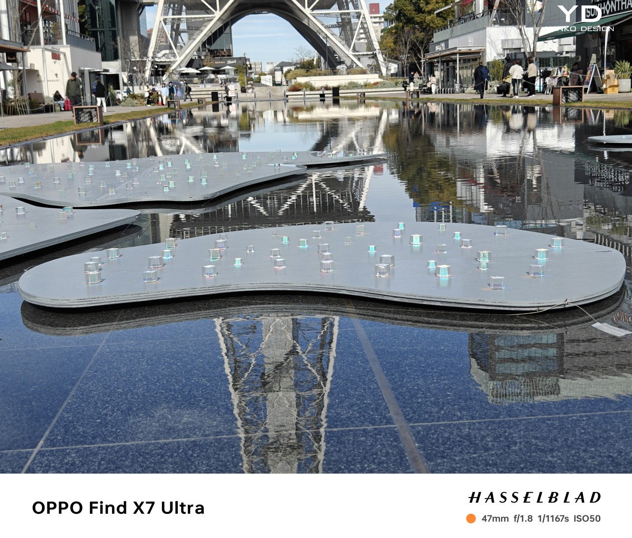
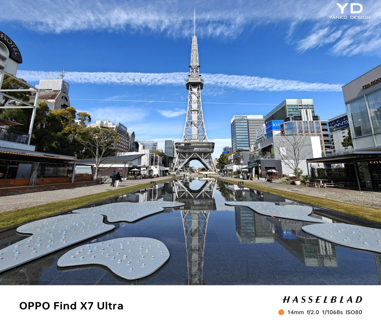
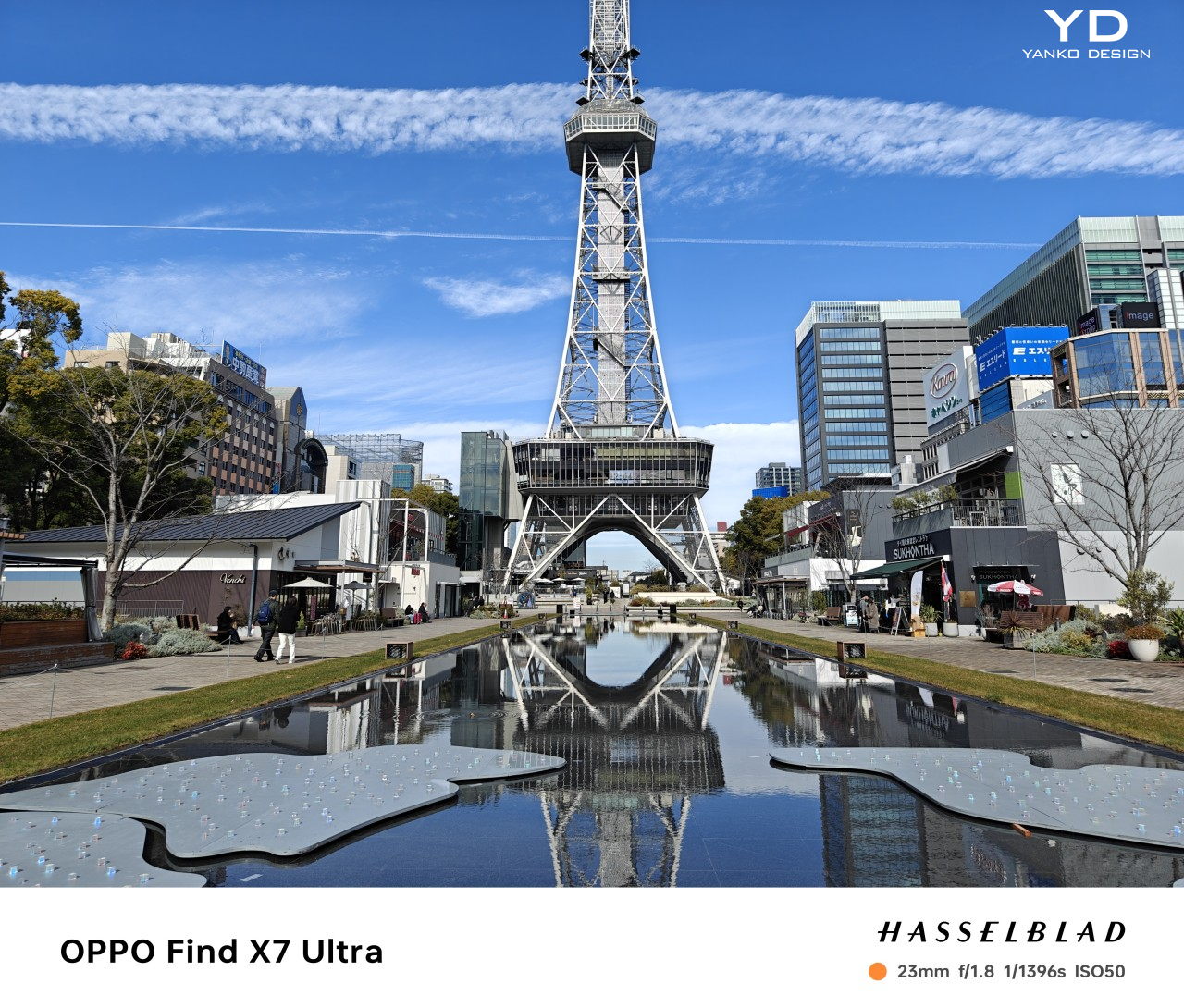
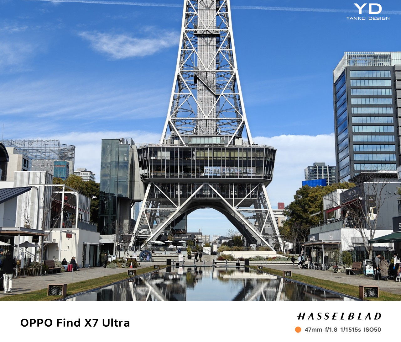
Photography has become an important part of the smartphone experience to the point that it could be considered one of the most critical deciding factors in a purchase. Companies have been working left and right to provide an excellent experience, but no matter how good the output is, they still can’t compare with the flexibility of a dedicated camera, especially mirrorless and DSLR cameras. You can only cram so much inside the thin body of a smartphone without either compromising on quality or leaving a distasteful bump on the phone’s back. Technology, however, is starting to catch up with smaller but more powerful sensors and lenses that could really give cameras a run for their money. The OPPO Find X7 Ultra embodies that promise, so we give the smartphone and its cameras a good test to see if it’s worth that large disc on its back.

Designer: OPPO

Aesthetics

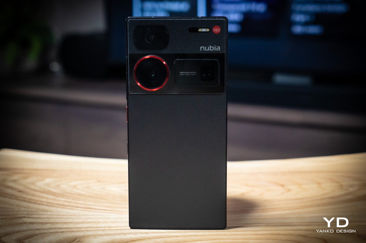
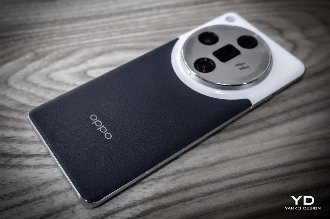
If you’re familiar with OPPO’s premium smartphone line, then the Find X7 Ultra will immediately look familiar. But even if you aren’t, you’re still in for a treat with one of the most beautiful devices to grace the market so far. Just like its predecessor, the Find X6 Pro, it bears a dual-tone color scheme and a large circular camera bump that others have dubbed the “camera Oreo,” though a resemblance with the top of a soda can wouldn’t be off the mark either. It’s a peculiar design, but one that has a reason and actually serves another purpose, intentional or not.

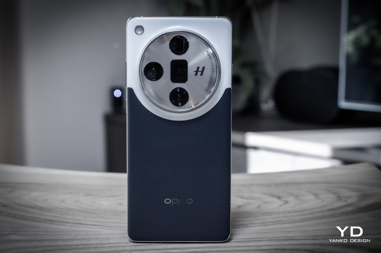
That said, the OPPO Find X7 Ultra isn’t just a rehash of the 2023 flagship. The colored vegan leather that makes up two-thirds of the rear area has a pleasant curve that arcs around the camera at a distance where the two elements intersect. It’s a subtle yet significant change that prevents visual elements from just abruptly cutting into each other. It also has the visual effect of giving the camera Oreo more prominence, with the leather seemingly giving way to this important part of the phone’s design.

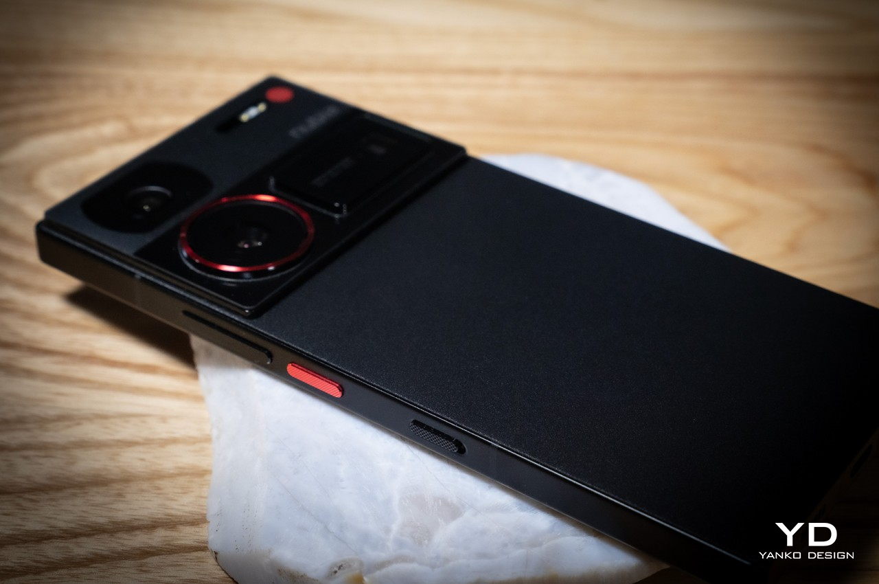
The color options for the phone differ in more than just their hues this year, though. Both the Orange and Blue colorways do share a similar design, with the white top of the design looking like a familiar ceramic that OPPO has used in the past. The black colorway, on the other hand, has a few more interesting details, like the stitching on the vegan leather surface. Instead of ceramic, the top looks more like metal but still feels like glass. The mid-frame is also different, using some sandblasted finish that complements the phone’s darker looks.

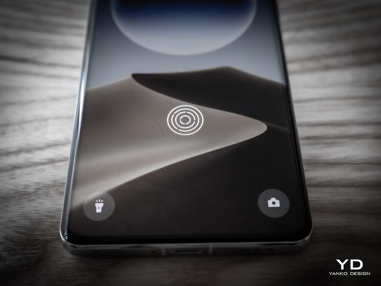
All three do have the same basic design, with a back that curves at the sides toward the edges. On the flip side, the screen is mostly flat but does curve sharply at those same edges, typical of the premium design carried by phones in the past. Admittedly, it’s going to be a divisive design choice, given how flat is back these days. There’s no denying, however, that the OPPO Find X7 Ultra still looks great with this style and probably wouldn’t be as appealing if was completely flat all around.

Ergonomics

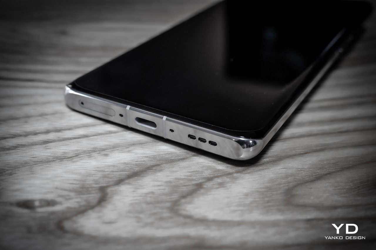
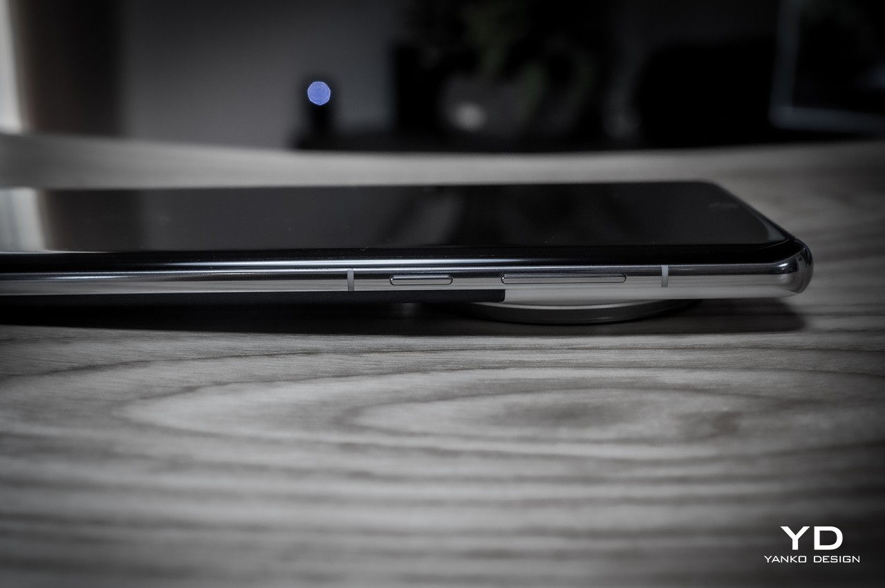
The OPPO Find X7 Ultra is a large piece of metal and glass, there’s no getting around that fact. As with any large smartphone, there will be a problem of straining your hand with its weight and making it less comfortable and stable to hold over time. Fortunately, the phone is also unbelievably thin at 9.5mm only, and at 221g, it’s not exactly a heavyweight. It also feels well-balanced and not top-heavy as you might suspect given the size of the camera bump.

Even better, the rest of the phone’s design also contributes to helping secure a more confident grip. The vegan leather, for example, provides enough texture for your skin to grip comfortably. Even that camera Oreo becomes a place where your index fingers can rest when holding up the phone, especially with a ribbed rim that, again, adds texture and friction to stop the phone from slipping out of your hands. You will still have some difficulty reaching higher areas of the screen if you’re holding it in one hand, but other than that, the size of the Find X7 Ultra doesn’t get in the way of an enjoyable experience when using it.

Performance

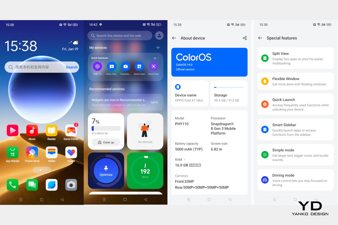
The OPPO Find X7 Ultra is a premium flagship through and through, which means it also bears the best of the best hardware available in the market to date. That means a Qualcomm Snapdragon 8 Gen 3, 16GB of RAM, and 512GB of storage, right at the top of the list. Suffice it to say, the phone isn’t wanting in terms of silicon power and it blasts through all kinds of tasks, including heavy gaming, without breaking a sweat. Your hands won’t be sweating either thanks to an impressive cooling system. Mind you, it does get a bit warm with heavier loads, but not to the point of making you want to drop it like a hot potato.

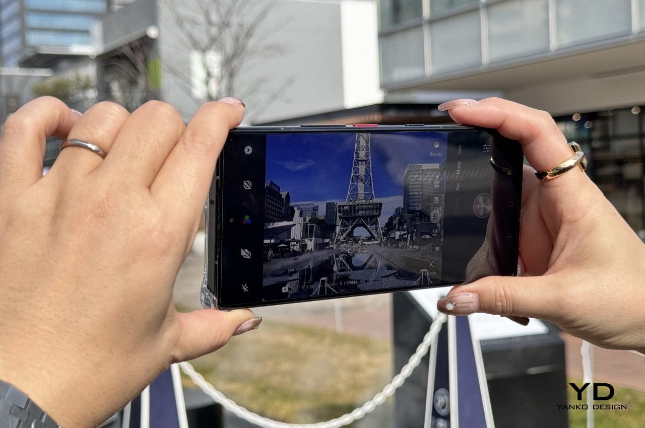
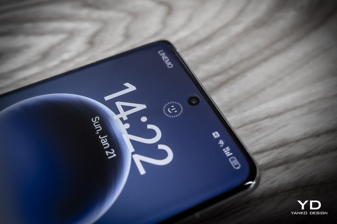
It would be such a shame and a waste if those specs were matched with a mediocre screen and, fortunately, OPPO didn’t fail to impress here either. The huge 6.82-inch LTPO AMOLED display is bright, fast, responsive, and vibrant. It perfectly complements the phone’s luxurious back with an equally gorgeous display that supports the industry-standard HDR10+, OPPO’s own ProXDR, and soon, Google’s new Ultra HDR. Given you’ll want to view the photos you take on this screen, OPPO really needed to make sure that it was up to the task.

OPPO crammed a 5,000mAh battery inside, which is both common yet also mildly disappointing. With all its capabilities, a higher capacity would have been a better choice, but that would have also weighed down the phone considerably. Fortunately, it does last a day on a single charger, at least with constant use, and the super-fast 100W charging is enough to bring it back to full in about half an hour. 50W wireless charging is also plenty fast, which is a rarity in this regard.

Quad Main Camera and HyperTone System

Much of OPPO’s rhetoric revolves around the OPPO Find X7 Ultra’s Quad Main Cameras, and to be fair, it does deserve some praise for pulling off what comes naturally to professional cameras but not to smartphones. DSLRs and mirrorless cameras can easily change lenses when they need a different focal length or field of view while keeping the same high-quality imaging sensor built into the camera. Smartphones, on the other hand, use a different camera for different focal lengths, but due to space and price constraints, also use different sensors that aren’t always up to the task.

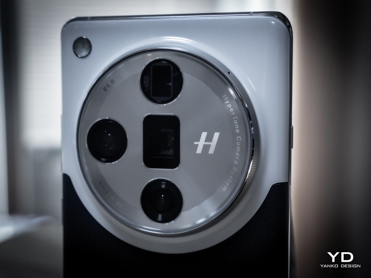
What the OPPO Find X7 Ultra accomplishes is to have four different cameras with different lenses, all of which have 50MP sensors. Yes, these sensors have different sizes and specs and, therefore, different overall quality, but the differences are very marginal at best. No longer do you have to sacrifice quality just to jump from wide to ultrawide to telephoto, nor will you get that jarring effect whenever you switch between cameras.

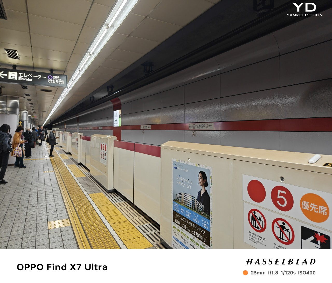
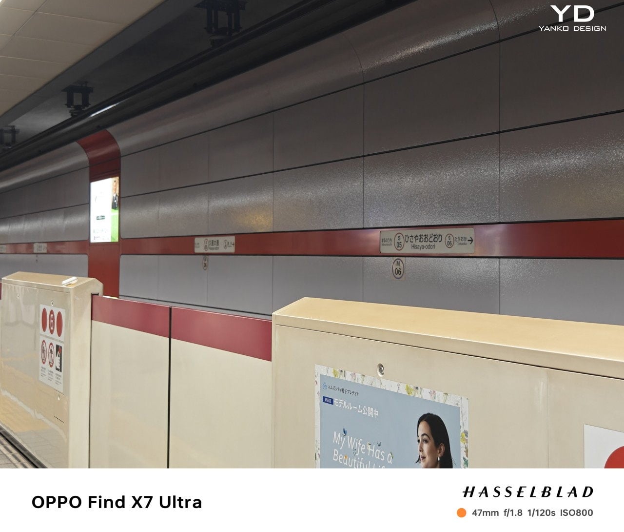
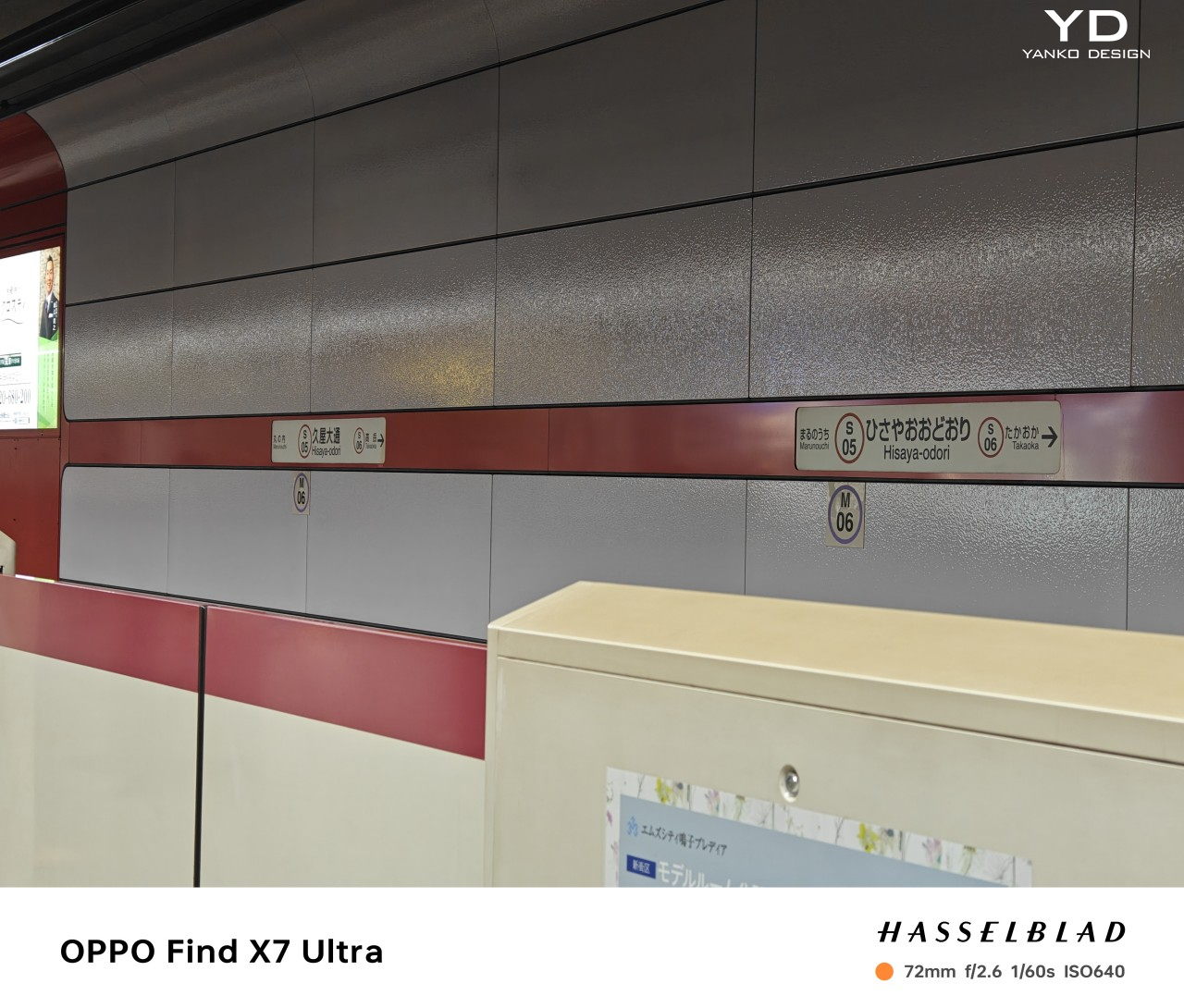
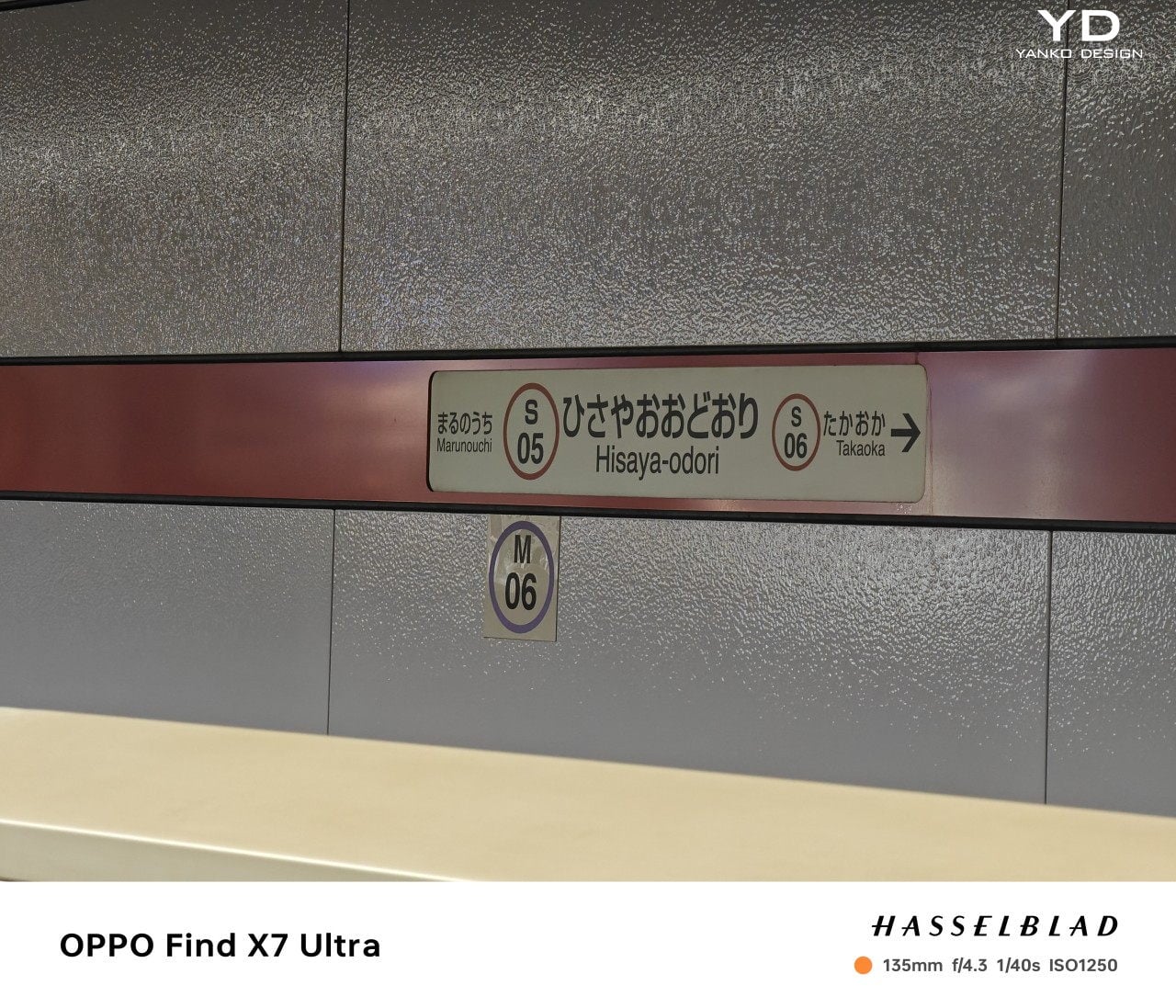
The phone’s mighty camera roster includes a 1-inch 50MP Sony LYT-900 with a 23mm focal length equivalent, a 1/1.95-inch 50MP Sony LYT-600 ultrawide (14mm equivalent), a 1/1.56-inch 50MP Sony IMX890 3x periscope telephoto (65), and a 1/2.51-inch 50MP Sony IMX858 6x periscope telephoto (135mm). With this set, the OPPO Find X7 Ultra practically covers the whole range of lenses used by photographers, including 10x zoom at 270mm with some computational photography. OPPO’s software also allows users to select more common focal lengths, like 35mm for the wide (main) camera, though it does that with a bit of cropping.

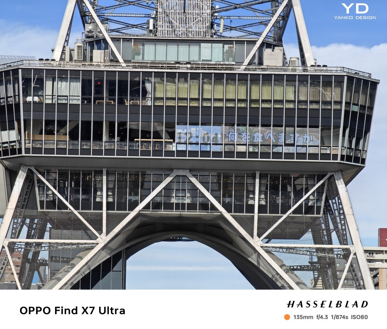
As you might have already noticed with the camera samples, these aren’t just numbers or empty words. OPPO definitely delivered on its promise of professional-quality photos in any field of view, zoom, or even lighting condition. Part of that magic is thanks to its partnership with Hasselblad, which also led to the Computational Photography aspect of its HyperTone camera system. In a nutshell, it tries to avoid oversharpening, overexposure, and other exaggerations that most camera software apply to compensate for poor image quality, resulting in more natural-looking photos you might have never thought came from a smartphone instead of a pro camera.

Sustainability

As one of the world’s top 5 smartphone vendors, OPPO has taken its responsibility for preserving the environment quite seriously. In addition to a few models that made use of recycled or sustainable materials, the company also has a concrete program for reducing the negative impact its business has on the planet. That involves reducing its carbon footprint, optimizing its packaging and logistics, and offsetting its harmful emissions.

Unfortunately, the OPPO Find X7 Ultra itself doesn’t have the clear marks of a sustainable phone. Sure, it uses vegan leather across all models, but that synthetic material isn’t completely environment-friendly either, despite the name. One upside is that the phone is IP68-rated, which is one of the highest dust and water resistance levels for smartphones, promising a mostly durable product that should last you quite a while before you have to throw it away, responsibly, of course.

Value

If you’re anything of a mobile shutterbug, it’s hard not to get excited over the OPPO Find X7 Ultra. Although it’s not going to dethrone an expensive DSLR, it really comes close to it with its HyperTone Quad Main Camera System. And all that imaging hardware is packed into a thin and stylish device that you can also use for more than just taking photos. What’s not to like?

Unfortunately, the product’s value takes a nosedive because of the fact that, as of this writing, OPPO has no plans yet to bring the OPPO Find X7 Ultra to international markets, making it exclusive to a Chinese audience. Yes, you can probably import the phone through other channels, but that won’t change the fact that the version of ColorOS software running on it isn’t made for global users. Yes, you can install Google Play Store unofficially, but that still won’t give you access to some basic platform capabilities you’d expect from international versions of these devices. It’s definitely a shame that such a treasure would be out of reach, and hopefully, OPPO will change its mind very soon.

Verdict

Smartphones are sometimes a victim of their own success, or at least of marketing hype. It wasn’t that long ago when they were said to devour the lower end of professional cameras, but they haven’t managed to surpass the bulkier and more powerful shooters in terms of flexibility and quality. It’s just impossible, given the restraints on design, price, and engineering, so smartphones have to make do with workarounds and software solutions.

The OPPO Find X7 Ultra, however, comes pretty close to that ideal. It still can’t change lenses physically, but it provides almost the same experience through a perfect combination of hardware and software. Of course, it’s not just a digital camera, and it manages to excel in almost every field with very few flaws. It’s tragic that most people won’t be able to experience all of that, though, but hopefully, they will soon be able to get their hands on what could very well be this year’s most beautiful and most capable smartphone camera.

The post OPPO Find X7 Ultra Review: Inching Closer to Photography Perfection first appeared on Yanko Design.

Cute Camera for Kids Concept gets budding shutterbugs started early

Smartphone photography is a huge part of modern culture today, whether it’s for preserving precious memories or for taking food photos to flaunt on social media. And just like how big touch screens like tablets have become children’s toys in one way or another, it might only be a matter of time before the younger generation becomes interested in taking photos. Of course, camera apps even on the most kid-friendly tablet aren’t exactly kid-friendly, not to mention the device itself won’t be the best medium for inducting toddlers into the wonderful world of digital photography. This concept design tries to address those issues by turning a digital camera into an object that kids are most familiar with: a toy.

Designer: Nicola Morelli

While smartphone manufacturers are indeed trying to make taking photos as simple as tapping on the shutter button, especially with the help of AI, there will always be occasions when you need to manually adjust some settings. That’s true not just for changing ISO, focus, and shutter speed, but also for the selfie timer. Typical camera apps make these settings easy to change if you’re an adult, but toddlers 3 years or older are a very different story. And there’s the fact that a touchscreen isn’t exactly the best interface for kids still developing cognitive and motor abilities.

This Camera for Kids concept design attempts to transform the digital camera into a more tactile experience by using physical controls for using the camera. And it’s not just any old physical control, which would make it similar to a complicated professional camera. Instead, it uses metaphors that kids might be more familiar with for those same actions, ensuring that their functions remain understandable even if the underlying concepts aren’t.

1

1

1

The shutter button, for example, takes the form of a water gun trigger that most kids will probably know how to use. A crank lever is used to change focus and brightness, and taking selfies involves pulling a “TNT” string that shortens as it counts down to the shot. The toy-like operation as well as the appearance of these parts help instill a sense of confidence and fun, encouraging the child to explore and discover rather than be intimidated by the device.

The camera also has a modular design that makes it easier to use, like an actual mirror for those selfies, a flash for lighting, and a strap for carrying around the kid’s neck. Almost like building blocks, kids or their parents can mix and match these parts, depending on what they need or want to do at the time. It’s an example of a thoughtful design that truly puts the target audience, in this case, little photographers, at the center of the experience, shaping technology around them rather than forcing them to adopt to something their minds aren’t yet ready to tackle.

The post Cute Camera for Kids Concept gets budding shutterbugs started early first appeared on Yanko Design.

MSI Liberator GP10 Pedal Controller wants to make your feet as productive as your fingers

Despite stereotypes of living very sedentary lifestyles, gamers, especially those leaning towards pro levels, tend to have very dexterous fingers that seem to fly across keys or push buttons at superhuman speeds. That’s not exactly surprising, considering every second counts in a game, especially in the more competitive titles. Unfortunately, even the fastest gamer only has two hands with five fingers each, but those aren’t the only limbs available to humans, though. Musicians have long been utilizing their feet not just to tap to the beat but to also control the music they’re playing or add effects and flourish. Gamers are in just as much need of more controls, and this RGB-lit foot pedal from MSI is offering gamers that competitive edge they need to step up their game when their hands are already too busy to make that saving throw.

Designer: MSI

Pedal controllers aren’t exactly new, but they have mostly been more in use in the music industries, from traditional pedals on keyboards to the more nuanced controllers for MIDI devices, synthesizers, and other audio-creation equipment. Of course, everyone could do with a few more buttons or keys they can press to make their work easier or faster, especially gamers who often find their keyboards or controllers still insufficient to meet their demands. That’s what the MSI Liberator GP10 tries to bring to your setup so you can free your fingers for more important actions.

In a nutshell, this foot switch adds three programmable buttons you can map to almost any action you can think of. Think of having three more buttons on your mouse or three customizable keys on your keyboard, except you don’t need an extra finger to use them. And if three buttons aren’t enough, you can actually hook up as many as four of these footswitches at once, presuming you have the space and mental capacity to add 12 more buttons to your setup.

1

Unlike their musical cousins, however, you really can only tap the “button” at the bottom of your feet or hit the two side buttons by tilting your feet to the left or to the right. There’s no lever mechanism that you can gradually lower or raise, which would have been useful for actions like increasing or decreasing volume, brush sizes, opacity, and more. After all, the MSI Liberator GP10 isn’t just for gamers, though that’s the primary target audience. Even creators and coders can benefit from having a few extra keys at their disposal.

As usual as having extra buttons might be, it’s probably arguable whether such a controller would actually be comfortable or ergonomic in the long run. People are indeed advised to move their feet once in a while to keep the blood flowing, and MSI promises that the MSI Liberator is designed with ergonomics in mind. That said, the repetitive action that plagues mouse users could result in the same strain injury on your foot if you don’t pay attention and take breaks often, as you should always do anyway.

The post MSI Liberator GP10 Pedal Controller wants to make your feet as productive as your fingers first appeared on Yanko Design.

12.9-inch iPad Air renders suggest a cheaper way to go Pro

When Apple launched the iPad Pro, it tried to justify its existence with a slogan that questioned what computers really are these days. It pushed forward the thought of the iPad Pro as a laptop replacement, which made sense for an iPad with the largest display available of its kind. Although smaller models eventually launched, it was only the iPad Pro that could boast having the largest screen among Apple’s tablets, but that might no longer be the case soon. Leaked information suggests that Apple will be mixing things up a bit and might introduce a 12.9-inch iPad Air that could add more choice for consumers but also make its message a little bit more confusing as well.

Designer: Apple (via 91mobiles)

Putting the largest iPad under the “Pro” model makes perfect sense considering what it empowers users to accomplish. With that much screen real estate, multi-tasking with two apps side-by-side is not only easy but even comfortable, while having a large digital canvas frees creators to do their best work. The size also implies having bigger or better hardware capabilities, and indeed, the 12.9-inch iPad Pro always has the latest and greatest that Apple has to offer on any iPad.

Unofficial CAD schematics, however, herald the coming of a 12.9-inch iPad Air, a family of tablets better known for their accessible price tags and, more often than not, more modest specs. The renders don’t come with any launch date, which means it could happen this year or never at all. Leaks never carry 100% accuracy, but the mere idea that Apple will be launching what will be the largest iPad Air is quite curious and could spark even more interest in the iPad line.

For all intents and purposes, this 12.9-inch iPad Air is a stretched-out regular iPad Air, and all the design cues of the current model are evident. There are thick bezels, at least compared to the iPad Pro of the same size, and a single camera. That camera, however, is also the only place where the 12.9-inch design diverges, using a pill-shaped island to enclose both the camera and LED flash instead of a single circle for the lens itself.

This 12.9-inch iPad Air could be Apple’s attempt to offer an extra-large iPad without the bells and whistles that make the 12.9-inch iPad Pro quite expensive. It’s the same strategy it is using with the iPhone Plus models, which isn’t exactly raking in sales. It does give consumers more choices, but considering how the iPad Air is already a watered-down iPad Pro in terms of many features, including Apple Pencil support, it does weaken the appeal of the iPad Pro line by having what is practically a cheaper iPad Pro.

The post 12.9-inch iPad Air renders suggest a cheaper way to go Pro first appeared on Yanko Design.

Ambitious handheld gaming PC fuses Nintendo Switch and Microsoft Surface

PC gaming is taking on a rather interesting turn in terms of design, with the rise of handheld gaming devices. Valve’s Steam Deck fired the opening salvo, and soon the likes of ASUS, Lenovo, and now MSI have followed suit. While the big brands took their sweet time joining the bandwagon, other manufacturers have already been playing this game for quite some time and have even iterated over a few unusual designs. One of those happens to be arriving soon, with what could only be called the love child of the Nintendo Switch and the Microsoft Surface tablet, offering a single device for both work and play that stretches the definition of what “handheld” really means.

Designer: ONE-NETBOOK

To be even considered gaming-worthy, these handheld computers need to pack enough power to satisfy the greed of AAA titles. Of course, that power can also be used for other activities, but the design of a relatively small handset device isn’t exactly conducive to anything but gaming. You can, of course, connect the handheld PC to a dock and other peripherals, but you can only do that at home or in the office.

In order to satisfy the needs of both entertainment and productivity, the OneXPlayer X1 shatters a few conventions, especially when it comes to screen size. If you think the Lenovo Legion GO’s 8.8-inch screen is already massive, then you’re jaw will probably drop at this 10.95-inch 2.5K screen. That’s pretty much “netbook” size, which means it’s a little bit more comfortable to view documents and spreadsheets, especially when you have to type them out. Of course, that does also mean you have a larger view of your games, but it comes at the price of portability, though ONE-NETBOOK advertises the device will only be 789 grams thanks to the use of 6000 series aviation aluminum.

The OneXPlayer X1’s inspiration can clearly be seen from the detachable controls. Flanking the sides of the large tablet are removable controllers clearly inspired by the Switch Joy-cons. When it’s time to start typing, however, the keyboard cover, ala the Surface Pro, comes into play. While the laptop use case is a proven design, it remains to be seen whether the promise of lightweight handheld gaming will actually be delivered.

It’s interesting to see how the OneXPlayer X1 combines multiple designs gathered from computing history, from the canceled Razer Edge Pro to the unexpected Microsoft Surface Pro to the successful Nintendo Switch. Of course, simply combining successful designs doesn’t guarantee the same successful outcome, especially when that combination itself is still unproven and almost questionable. With an Intel Core Ultra processor and Intel’s ARC GPU, there might be some doubt as to its actual gaming chops. And with a price tag that starts at around $950 for the baseline specs, that’s too expensive a risk to take as well.

The post Ambitious handheld gaming PC fuses Nintendo Switch and Microsoft Surface first appeared on Yanko Design.

Unusual lounge chair uses sponge-filled ropes to mimic a certain insect

The human mind is such an incredible thing, capable of creating wonderful designs and life-changing products. Of course, it is really no match against the unfathomable “mind” of nature, as seen in the sometimes awe-inspiring, sometimes bewildering things we can find in the world, both living and non-living. The complexity of nature’s design has been an inspiration for many of mankind’s creations and inventions, great and small, either just in terms of the basic form or including their function. There are times, however, when such an inspiration takes an odd turn, like this lounge chair that half looks comfy and half unsettling, especially after you learn what the peculiar piece of furniture is inspired by.

Designers: Miray Ozlem ER

At first glance, the lounge already looks unconventional, like someone laid a series of fabric tubes across a metal frame. These “ropes,” as they are called, are indeed soft and cushy, filled with sponge material to give them both volume and softness at the same time. After all, who would want to lounge on a very hard surface, especially for a long period of time?

The entire piece, however, is supposed to resemble a caterpillar entering its cocoon phase, with each rope representing a segment of the insect’s body. It’s definitely an odd association, especially considering how some people might feel uncomfortable with such crawling critters. Then again, they don’t really have to know the details of the design’s inspiration. As it turns out, the way the sponge-filled tubes go over the frame and extends to the back also makes them look like a row of snakes draped over the chair, also not a comforting image for some people.

The lounge’s design is also unusual in that it doesn’t hide the skeletal frame of the chair. In fact, it’s meant to showcase the shiny metal chrome which contrasts and complements the soft fabric of the rest of the chair. At the same time, however, the image induces a sense of discomfort and uncertainty, especially with the gaps on both sides of the chair. Despite the lounge’s width, it’s a seat made for one, and this peculiar design tries to send that message across in a very striking manner.

The post Unusual lounge chair uses sponge-filled ropes to mimic a certain insect first appeared on Yanko Design.

nubia Z60 Ultra Review: Challenging Conventions

PROS:


  • Distinctive boxy design

  • Gorgeous, hole-less screen

  • Large, long-lasting battery

CONS:


  • A bit on the bulky and heavy side

  • "Metallic glass" material attracts dust too easily

RATINGS:

AESTHETICS
ERGONOMICS
PERFORMANCE
SUSTAINABILITY / REPAIRABILITY
VALUE FOR MONEY

EDITOR'S QUOTE:

Taking the road less traveled, the nubia Z60 Ultra's unconventional rectangular design, flawless screen surface, and choice of camera focal lengths are sure to leave a lasting impression on consumers tired of the same old things.

Despite how smartphone manufacturers try to differentiate the designs of their products, most of them still jump on the same trends, like the curved edge screens of the past, today’s flat sides, or camera bumps of different shapes and sizes. The same is true even for features you don’t immediately see, like camera sensors and lenses that everyone is using, just advertised under a different marketing name. It’s almost too easy to just do what everyone else is doing, riding the waves in the hopes of making a large catch as everyone else. Fortunately, there are outliers that dare to take a different path, and the nubia Z60 Ultra easily stands out as a nonconformist, so we take a closer look to see if it has more to offer than just a different yet oddly familiar face.

Designer: nubia

Aesthetics

The design of the nubia Z60 Ultra is admittedly divisive. Some will appreciate a fresh break from the smooth curves of the current breed of smartphones, while others might scoff at the blast from the past. Anyone who still remembers the Sony Xperia of the past might indeed see some resemblance to this late 2023 newcomer, and it’s not exactly a bad light to be in.

The nubia Z60 Ultra is unabashedly flat and angular, giving off an air of maturity and hardness at the same time. Even the camera bump diverges from circles, squircles, and any other round shape found on most smartphones. Two of the three cameras sit on a strip, not unlike the Google Pixel 8’s visor, except it’s also completely flat and more like a thin block stretching across the width of the phone. This boxy aesthetic is going to be subjective, even more so compared to other phone designs, but there’s no denying that it will leave a lasting impression, positive or otherwise.

If the shape and back of the phone are what immediately catch your attention, it will be the large 6.8-inch display that will probably draw you in. Admittedly, it’s not the brightest nor the most colorful panel, but it’s the flawless, unbroken surface of this screen that will really impress you. Under-display cameras (UDC) aren’t exactly novel, but they’re so rarely used that you’d still be surprised to see one up-close. Even better, the nubia Z60 Ultra uses the company’s fifth-generation UDC technology that improves the pixel density of that spot above the front-facing camera. The result is a screen that is full from edge to edge, and thanks to its completely flat surface, also visible and usable in its entirety.

There are different colorways available, including a “Starry Night” that makes no effort to hide its Van Gogh inspiration. nubia introduces an “AG Metallic Glass” material that covers the rear of the phone, and for the most part, it does offer your hand a new sensation that almost feels like metal. Unfortunately, for some reason, it also seems to act as a huge magnet for dust. It may stay free of oily fingerprint smudges, but you’ll still want to put on the included clear case to keep it clean, among other reasons.

Ergonomics

There’s still an ongoing debate on which design is better for your hand and your grip. Curved edges are claimed to be gentler on the skin, but some claim it makes the phone slip more easily from your grasp. Flat edges and sharp angles add a bit more tooth to improve your grip, but there are those who feel uncomfortable with how it bites into their palm. The latter, of course, is what applies to the nubia Z60 Ultra’s sharp figure, and like its design, is going to split camps.

What everyone will agree on, however, is how bulky and heavy the phone feels in your hand. At 8.78mm thick and 246g heavy, it’s definitely going to give your hand a bit of strain when held up for long periods of time. Add that to the phone’s sharp edges, and you might indeed find your hand feeling a bit uncomfortable sooner rather than later, at least with the protective case that makes all those moot. Fortunately, that heft isn’t without good reason, but it’s still something that prospective buyers will need to consider if they prefer phones that are impossibly thin and light instead.

Performance

The nubia Z60 Ultra has been compared to its gaming-focused cousin, the RedMagic 9 Pro, and the comparison isn’t without basis. Both sport top-notch hardware available in the mobile market, starting with the Qualcomm Snapdragon 8 Gen 3 that can be paired with up to 16GB of RAM. In terms of raw performance, the nubia Z60 Ultra is pretty much a gaming phone, sans the bells and whistles like a tiny fan or extra buttons on the edges. In a way, this is the more subdued and stylish version of the RedMagic 9 Pro.

The phone’s extra-large battery definitely supports that use case and then some. Rated at 6,000 mAh, it’s definitely one of the highest capacities in the market today, and while you might not hit that advertised 47-hour uptime with average use, you’ll get pretty close to more than a day’s worth. Charging, however, won’t be blazing fast, given it only supports 80W wired charging, pushing the charging time to a little over 30 minutes. This chunk of power is definitely to blame for the nubia Z60 Ultra’s size and weight, but it’s a price worth paying for those who value battery life over comfort and thin profiles.

It isn’t only in design that the nubia Z60 Ultra bucks the trend. While it does put a heavy emphasis on its cameras like any other flagship smartphone, it’s the details that truly make it unique. In a nutshell, nubia has opted to adopt narrower fields of view compared to most smartphones in an effort to appeal to photography enthusiasts who would be more familiar with these focal lengths.

The main 50MP camera, for example, has that 35mm focal length used by classic camera lenses, which is great for taking sharp photos, especially with a natural bokeh effect. Unfortunately, this field of view will be too narrow for videos that will look cropped at the edges. That’s probably why nubia used an ultra-wide camera with a similar 50MP sensor (though from a different manufacturer) to make the transition to a wider view look more seamless. That said, this ultra-wide camera is also narrower than what you’d find in the market, using an 18mm focal length only.

In practice, the nubia Z60 Ultra’s cameras perform impressively, producing images with rich detail, at least in well-lit environments. The small exception is the 64MP telephoto camera with an equally narrow 85mm focal length, which makes close-up shots less doable. The narrow field of view might find fans among more seasoned photographers, but it is also an odd and awkward detail for those already used to the wider range of camera smartphones, especially when it comes to video recording.

Sustainability

So far, the nubia Z60 Ultra is proving to be quite the nonconformist, embracing designs already eschewed by most manufacturers as well as camera specs more popular among photographers than smartphone users. It would have been even more impressive if nubia also became a rebel and embraced sustainable materials and practices wholeheartedly for this smartphone. Unfortunately, that’s not the case.

In this regard, the nubia Z60 Ultra is pretty typical when it comes to composition, durability, and repairability. It’s your typical mix of plastic, glass, and metal, none of which were made from post-consumer recycled materials, at least none that nubia is telling. The silver lining here is that the phone is IP68 rated, so it’s not going to join the masses of e-waste littering the planet after a slight splash or dive into water.

Value

The nubia Z60 Ultra is a premium flagship through and through, and its extra-large battery, hole-less screen, and pixel-dense camera sensors push it even higher among its peers. For all of that, you’d expect it to cost as much as your next late 2023 or early 2024 high-end handset, but here’s the clincher: it’s almost half that!

While it does start at $599 for a rather modest 8GB of RAM and 256GB of storage, the highest configuration with double that memory is only $779. And it’s not like nubia is a new, unknown, and unreliable brand, so such a price tag is downright crazy. Of course, there’s the matter of being able to buy one in the first place, since nubia isn’t available in all markets, but in those regions it does serve, the nubia Z60 Ultra is bound to make an irresistible proposition to go with its undeniable presence.

Verdict

While there is some wisdom in going with tried and true traditions, it’s never an excuse not to think outside the box. There’s no certainty that you will do better or worse, but what’s certain is that you will make some impact. That’s the kind of legacy that the nubia Z60 Ultra will have with a design that is both fresh yet classic, and features that have a clear purpose, even if it swings away from the mainstream smartphone crowd.

It definitely gets a lot of things right, like its impressive performance, its memorable design, and its blemish-free screen, but it’s far from being perfect. There’s no denying that part of its imposing character is its bulk and weight, and the narrow field of view will probably trip up some mobile shutterbugs. With a head-turning price tag, though, you might be willing to look past these flaws, especially if the flaws are features you actually value. Needless to say, the nubia Z60 Ultra is doing quite a difficult balancing act, and to its credit, it’s doing quite an admirable job in keeping on its toes.

The post nubia Z60 Ultra Review: Challenging Conventions first appeared on Yanko Design.