Standalone AirPods Pro 2nd-Gen USB-C charging case might not be worth the price

The newest iPhones have finally jumped on the USB-C bandwagon, but there are still a few Apple products that still cling to the older Lightning technology. That includes all iPhone models before the iPhone 15, older iPads, and the majority of charging cases for the AirPods. A few months back, Apple did release a version of the 2nd-gen AirPods Pro with a USB-C charging case, but you’ll have to buy the whole set to enjoy this upgrade, both earbuds and charging case. If you already have a 2nd-gen AirPods Pro that came with a Lightning charging case, however, you can now just buy the USB-C case on its own, but the price tag on this very optional accessory could have you thinking twice why you’d want to buy one in the first place.

Designer: Apple

To be fair, the USB-C charging case does have a few advantages, though the biggest one would be consistency between the most recent Apple devices. You won’t have to carry a separate Lightning cable, presuming you’ve gone all-in on USB-C already. There’s also this convenient reverse charging feature where you can charge the AirPods Pro case from an iPhone 15 using a USB-C to USB-C cable. Handy in an emergency but not exactly a ground-breaking game-changer.

Given the nearly similar features, the $99 price tag on this standalone USB-C charging case for the AirPods Pro 2nd-Gen might seem a little excessive. It also only makes sense if you already have the Lightning version of these AirPods Pro and only want to enjoy the benefits of USB-C mentioned above. Otherwise, it doesn’t offer any charging speed advantages between these two models and both support the same wireless MagSafe capability.

That said, you might want to upgrade from the 2nd generation Lightning AirPod Pro to its USB-C sibling for future-proof durability and features. The USB-C AirPods Pro 2nd-Gen has an IP54 rating, up from last year’s IPX4, which means it’s better protected against dust and small particles, though it’s still only splashproof rather than waterproof. It will, however, support lossless audio when paired with the Apple Vision Pro headset, at least if you can get your hands on one next year.

The USB-C case itself is also IP54 rated, but you won’t get the dust-proofing upgrade for the earbuds just by switching cases. That makes the standalone case less appealing for the majority of AirPods owners. Then again, there will always be someone who wants a complete and consistent set of products or may have had the misfortune of losing their original charging case. Fortunately, now you won’t have to buy a new set just to replace that.

The post Standalone AirPods Pro 2nd-Gen USB-C charging case might not be worth the price first appeared on Yanko Design.
Portable Theater concept combines projector and speaker in a unique shape

Home projectors are becoming more popular these days as more cord-cutters want to enjoy the freedom of streaming from almost anywhere in the house, even on the ceiling while lying in bed. Despite the growing number of these devices, however, most of them still have designs that originated from projectors made for professional use in board rooms and conferences. There are, of course, a few that have embraced more stylish aesthetics that try to match your living room’s decor, but these often still retain the boxy shapes of their ancestors. That might be a convenient form for cramming electronics, but they limit the potential of what these home appliances can do. This concept design, for example, eschews that traditional box and embraces an unconventional form that lets you tilt the projector’s angle without having to use stands or tripods.

Designer: Hana Belassi

Boxes are the most convenient shape for most electronic devices because you can easily cram so many components inside and arrange them in an efficient manner. They’re not the most visually interesting, though, no matter how much you cover them in premium materials like glass, leather, or fabric. The most common smart home projectors, however, still have that same basic design, which also puts limits on their functionality. Tilting the projector to the angle you want isn’t easy, and you either have to make do with short, built-in legs or have a tripod or stand nearby.

TRIPO is a concept design for a smart portable theater device that employs an odd shape of a rather thick disc that tapers toward the top. On its back are four flat sections that allow you to stand the projector upright or tilt it back in three angles, including 90 degrees to project your content on a ceiling. Because it operates wirelessly, you can achieve this without even having to get up from your couch or bed, providing the utmost convenience and comfort in any situation.

1

That’s not the only thing that makes the TRIPO concept special, of course. Every inch of the device was intentionally designed to blend well with other pieces of your home decor, from using fabric to minimalist design elements. Vents are well hidden underneath the fabric-covered discs on both sides, providing heat dissipation that doesn’t ruin the design. It isn’t all just looks either because the portable theater is intended to be a powerful yet convenient smart entertainment system, both at home and even outdoors. An ingenious sliding cover, for example, protects the buttons and the lenses during travel.

1

TRIPO can also function as a simple Bluetooth speaker for those times when you want to listen but not watch. And when not in use, it can almost stand as a piece of sculptural art, calling attention to itself without being overbearing and perfectly fitting with your lifestyle as well as your aesthetic tastes. There might be some compromises in terms of specs given today’s hardware options, but it will only be a matter of time before designs such as these become the norm rather than the exception.

The post Portable Theater concept combines projector and speaker in a unique shape first appeared on Yanko Design.
Upcycled skateboard factory rejects transform into warm wall lighting

Recycling is a great way to reduce the amount of waste that ends up in landfills, but the process itself can sometimes have some negative impact. There’s still a lot of energy and water involved in converting materials into something usable again, and there’s also some loss when the original design gets destroyed in the process. Upcycling is a more efficient and time-saving alternative, but not everything can be upcycled and not everything that can be upcycled can be used in newer and better ways. Sometimes, it takes a bit more creative thinking to transform one thing into a completely different thing, like how factory seconds from skateboard manufacturers are turned into these understated yet elegant wall lamps.

Designers: Michael and Mariel Upton

Skateboards are objects that bring up images of speed, tricks, and devilish stunts. They’re hardly associated with warmth, subtlety, or even light. Of course, these associations aren’t inherent in the shape of the skateboard’s wooden deck, which makes them open for reuse and reinterpretation, as the case of this trio of wall lamps demonstrates, providing stylish lighting that hardly gives a clue to their origins.

Considering the long oval shapes of skateboard decks, not to mention their upward curved ends, you definitely wouldn’t be able to guess that these wall lights are exactly made from those wooden parts. That’s because these pieces of 7-ply maple wood are taken from factory rejects, decks that obviously didn’t make the cut. Since the shapes of these boards are too specific for general use, they often end up simply being discarded. They’re thankfully made from wood, so they’re biodegradable and have fewer harmful effects on the environment, but they’re still waste and, more importantly, wasted opportunity.

Upton thankfully has the wonderful idea of using those boards to provide ambient lighting as well as a piece of minimalist wall art. The discarded decks are cut to create a shorter and straighter oval shape and then paired with lighting hardware on the back. Each of the three variants, namely, Heru, Cuna, and Mara, get a square piece of original art that becomes the visual center of the entire fixture. With this, even if the light is off, the designs act as decorative pieces that enhance a room’s ambiance in a subtle way.

When the light is on, however, you get a warm ambient halo of light that sets a calming and relaxing mood in any space. The light is emitted from the back and is reflected on the mounting surface, making it look softer and avoiding painful glare when you look in its direction. The wall lamp projects a character of calm and warmth, definitely not something you’d expect from a speedster skateboard that it would have become in some other lifetime.

The post Upcycled skateboard factory rejects transform into warm wall lighting first appeared on Yanko Design.

Triangle Side Table offers an interesting way to show off your books

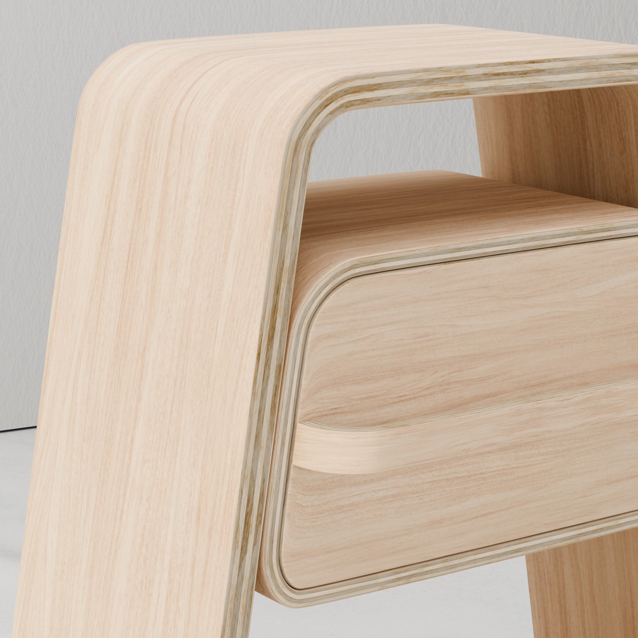
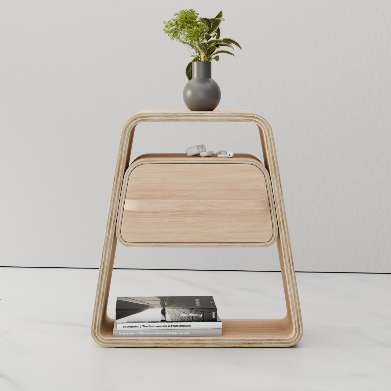
As the name suggests, a side table is a piece of furniture that’s often placed on the periphery, serving a secondary purpose to hold small objects temporarily. They’re a great location for placing drinks while you lounge on the couch and read a book, or for placing that same book when you need to put it down for a bit. Because of this function, it’s sometimes possible to let side tables take on less conventional forms, at least compared to common desks and tables. You might even be able to stretch the definition of a table to something that might not look like a table at all, like this hollow triangular prism that functions as a decorative piece and a resting place for your books.

Designer: Matthew Soule

The standard definition of a table is an elevated flat horizontal surface supported by vertical legs, but the exact interpretation of these elements is sometimes left to imagination and creativity. The only real requirement is that it should have a stable structure to hold items, though what objects it can hold is again open to interpretation. Side tables are often used to hold cups, mugs, pens, phones, notebooks, and books, and they sometimes have separate storage space for other, less-used objects.

With that in mind, there are plenty of sources for design ideas, like this Triangle Side Table that was supposedly inspired by kids’ toy blocks. It definitely challenges the definition of a table having a flat horizontal surface, though there is definitely an area for that on the back of the apex, like a ledge for your things. That flat area, however, is barely enough to hold a mug, a small notebook, or a smartphone, but only one at a time. There’s also a groove for securing a writing instrument, but you’ll have to make it your favorite or most-used tool since there’s only room for one.

The main focus, instead, is to have a resting place for what you’re currently reading, be it a book or a magazine. You place the partially opened book on top of the triangle, using the tip as a bookmark. It’s a popular design in many minimalist products these days, though it’s uncertain whether it will harm the book’s binding in the long run.

The open interior of the triangle is also another place to showcase reading materials, though it can also house a potted plant or even a pet mattress. The unique shape of the side table, its natural wood material, beveled edges, and the minimalist base that makes the table look like it’s magically floating all contribute to making the odd side table an attention-grabbing piece of furniture. Unfortunately, it’s also quite poor at actually functioning as a regular table, so you’ll definitely want to put it at the sides only.

The post Triangle Side Table offers an interesting way to show off your books first appeared on Yanko Design.

Samsung Galaxy A15 and A25 launched with an odd design element

Compared to its rather rowdy past, Samsung has been changing its phone designs less frequently these days. This allows the brand to cement its image, especially when those designs remain unique to it. The absence of a large camera bump, for example, has become a signature element in Samsung’s flagship Galaxy S phones, espousing a level of minimalism not found in other brands. It’s also becoming a standard even in its mid-range Galaxy A family, almost turning into Samsung’s design DNA. That’s not to say it no longer experiments with different designs, as demonstrated by its latest mid-range models that bear what might be the strangest design detail to have come across a Samsung phone in recent years.

Designer: Samsung

At first glance, the new Galaxy A15 and A25 look quite plain, almost like the smaller versions of the Samsung Galaxy S flagship. In fact, given what we know so far about next year’s upcoming Galaxy S24, you could almost say they prefigure Samsung’s next big thing. The Galaxy A15 and A25 feature very flat edges on all sides, at least except where the volume and power buttons are.

In most smartphones, the volume and power buttons are the only pieces that protrude from the side of an otherwise flat or featureless edge. It’s a necessary style to allow the fingers to immediately locate and press the buttons even without seeing them. Samsung, however, seems to have gotten the idea to raise not the buttons themselves but the area surrounding the buttons. It calls it “Key Island,” and it seems to be inspired by the common camera island or camera bump design on most smartphones.

The area flanking and in between these two buttons are raised almost to the same height as the buttons themselves. The sides of this mound gently curve upward while the island itself has a curved surface that contrasts with the flat edges of the rest of the phone. It’s not immediately clear, but it seems that the volume and power buttons still rise a little bit higher than the island, making it a two-step elevation also like some smartphone camera bumps.

While it adds a bit of visual uniqueness to the Galaxy A15 and A25, it is still puzzling why Samsung decided to go with this Key Island design in the first place. To some extent, it defeats the purpose of tactile physical buttons since it will be harder for fingers to sense where the correct buttons or areas actually are. The extruded portion might also snag more than simple buttons, not to mention taking up more space and becoming incompatible with cases that would have otherwise fit these two phones. Thankfully, these are mid-tier products and Samsung can afford to play around with what might become unpopular designs. Hopefully, this isn’t a foreshadowing of what the Galaxy S24 will have in a few months.

The post Samsung Galaxy A15 and A25 launched with an odd design element first appeared on Yanko Design.
Figma Creator Micro Keyboard gives designers all the shortcuts they need

Computers are powerful tools that enable all kinds of workflows, including designing products, architectures, or artwork. As powerful as they may be, the devices that we currently have for creating these digital artifacts aren’t exactly conducive to the creative process. Keyboards are large and clunky, and while there are indeed styluses that act like electronic pens, they still require the use of keys at some point or another. Keyboard shortcuts are supposed to help manage those dozens if not hundreds of actions available, but the finger gymnastics and memorization required create more stress and break the creative workflow. That is why custom-made keyboards are becoming popular among creators and designers, and this newest addition offers plenty of power in a small and cute package.

Designer: Figma x Work Louder

Almost all software for designers and creatives makes use of keyboard shortcuts so that you don’t have to dig through countless menus every time you need to do something. Sadly, the way keyboards work means you have to string a series of keys that may or may not have anything related to the action like Ctrl and Z keys to undo and Ctrl and Y to redo. Not only does it make it harder to remember these shortcuts, they can also be painful for your fingers in the long run.

Enter the Figma Creator Micro Keyboard, a small square keyboard with only 12 mechanical keys arranged in a cross formation. The idea is that you can map each of the keys to a single function so you don’t have to press two or more keys to get the same outcome. Of course, 12 keys won’t be enough for many software (Figma itself has over 150 possible actions), but the Figma Creator has four “layers” so that each key can actually have four actions. That gives you a total of 48 keys in groups of 12, available by simply tapping a capacitive sensor in the corner.

In addition to these keys, there are two analog controls available as well, a dial and a wheel, both of which are also clickable. These can be mapped to changing brush sizes or going through a sequence of undos and redos in rapid succession, basically, anything that would involve a slider or list of some sort. These are must-haves for digital painting and design software, proving how this keyboard was made with this kind of work specifically in mind.

The design of the keyboard itself is quite captivating and fun, using a frosted polycarbonate case that lets the RGB lighting inside shine through. The low-profile concave keycaps are replaceable, so you can pick your theme or design to match your mood and workflow. The catch is that the keyboard costs $139 and is currently still on pre-order, though it does make for a worthwhile investment if you find your fingers always aching and sore after an intense work session.

The post Figma Creator Micro Keyboard gives designers all the shortcuts they need first appeared on Yanko Design.
ASUS ROG Phone 8 design takes a very different direction

Almost every smartphone these days can play games, especially the expensive high-end ones, but there are a few that definitely take the cake. They’re labeled gaming phones not just because of some special feature, such as a tiny fan spinning inside, but also because of the gamer aesthetics that they embrace. For years now, the ASUS ROG Phone has held the crown of having the most gamer-friendly design, but it seems that it’s finally willing to let that title go next year. Based on its own teasers, the next Republic of Gamers smartphone might be embracing a more mainstream design in exchange for what might finally be more capable cameras as well.

Designer: ASUS (via GSMarena)

ASUS ROG Phone 7

To be fair, there is no guidebook on how to apply a gamer aesthetic to products, but you can bet it will have plenty of RGB lighting and lines going in multiple directions that suggest the presence of machine panels. Indeed, the previous ROG Phones have employed those design elements, sometimes even going as far as using small LED screens for more dynamic accents. Of course, none of these are essential to the actual gaming experience, but they do add a nice touch that marks the product as something truly designed with gamers in mind.

ASUS ROG Phone 6

ASUS ROG Phone 6

ASUS ROG Phone 6

Given its history, it’s a bit surprising that the ASUS ROG Phone 8 might do away with those design elements almost entirely. Although nothing’s set in stone yet, the brand’s official teaser suggests that it might be adopting a more minimalist and subdued design, one that eschews the lines and RGB colors. What we see instead is a clean dual-tone composition that, given the gray colors, looks more industrial than futuristic. There could still be some lighting underneath the ROG logo, but could very well be the only place it shows up.

Perhaps more curious is the camera bump design, a thick pentagon laid on top of a square. For generations, the ROG Phones have carried mediocre cameras, so a switch to a triple camera system could be big news for fans of the brand. It’s not a clear win yet, of course, but it’s commendable that ASUS is willing to shake things up to improve its performance.

To its credit, the ROG Phones have slowly been moving towards more conventional and less spectacular designs, but the ROG Phone 8 could have the most drastic changes if the teasers are to be taken at face value. On the one hand, it does help make the ROG Phones more acceptable in “regular” scenarios and won’t stand out as much. On the other hand, if you want a more conventional-looking smartphone that can handle mobile games, there are already plenty of those in the market, making the ROG Phone 8 redundant.

ASUS ROG Phone 7

The post ASUS ROG Phone 8 design takes a very different direction first appeared on Yanko Design.
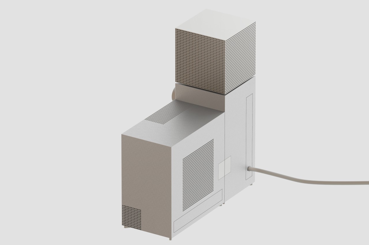
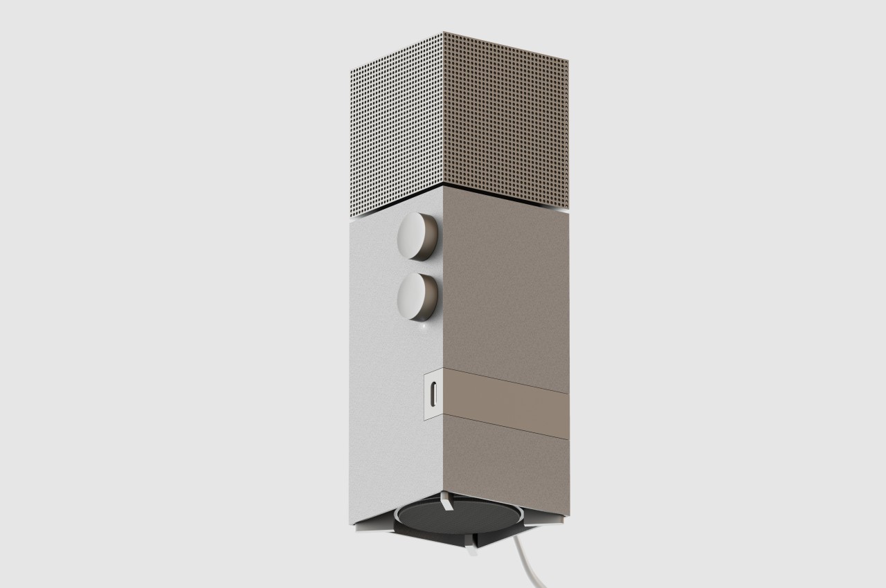
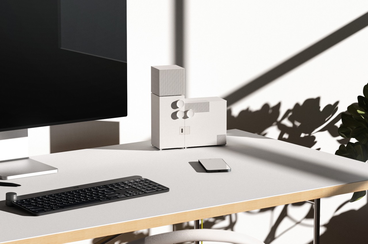
Minimalist wall-hanging CD Player visualizes your music in a unique way

Although digital music, especially through streaming channels, has become the most common way to listen to music these days, they are hardly the only options available. Vinyl has made a comeback in the past years, and audio CDs haven’t really disappeared despite their lower sales. Physical media such as these still have their advantages, especially when it comes to the jackets and sleeves they are packaged in. These usually have images and art that were carefully chosen to visually complement or represent the collection of music the album contains. For convenience’s sake, these jackets and sleeves are often set aside once the discs start turning, but this rather charming portable CD player gives them a special spot so that you can enjoy the art of both the music as well as the cover wherever you go.

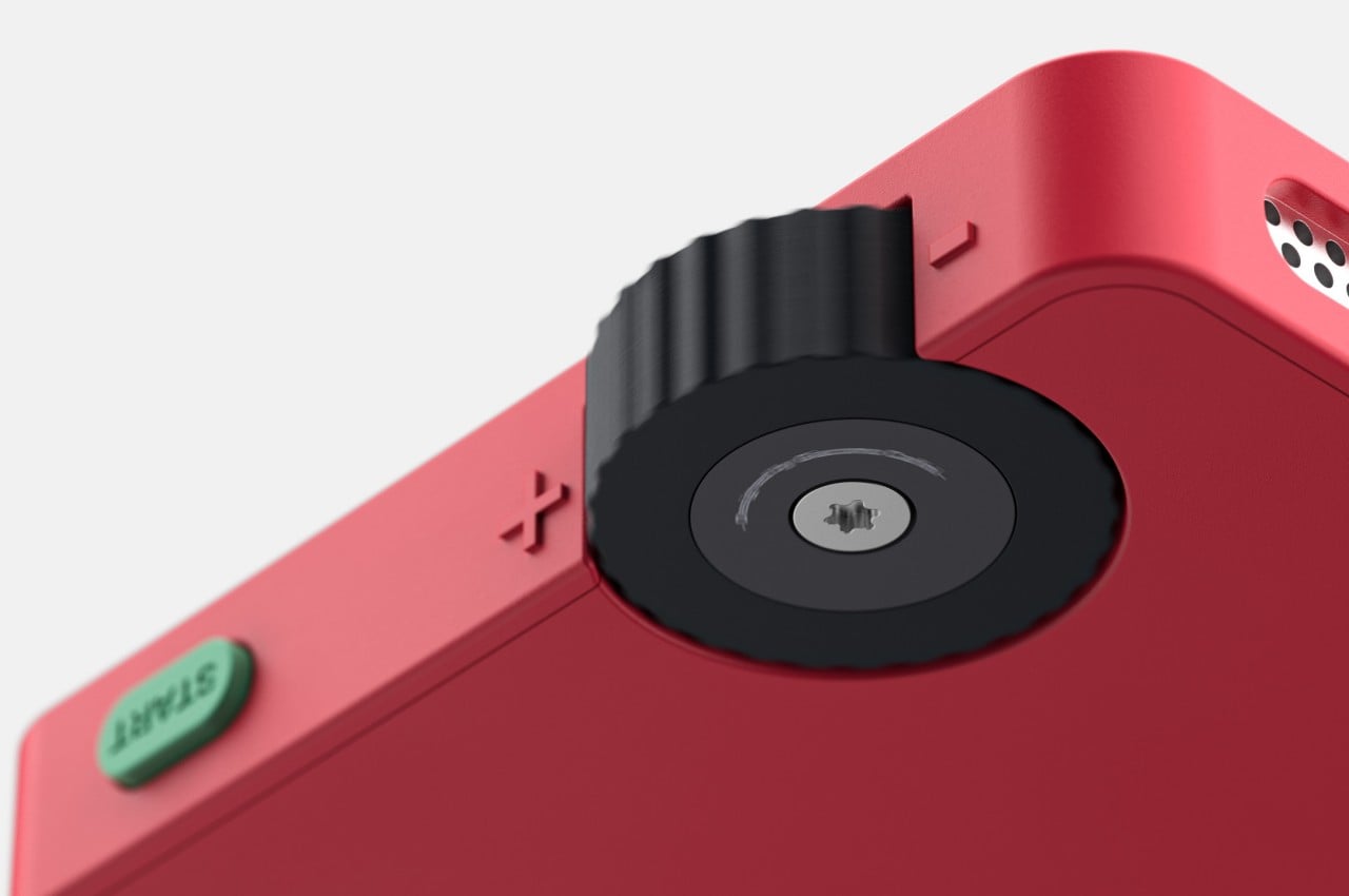
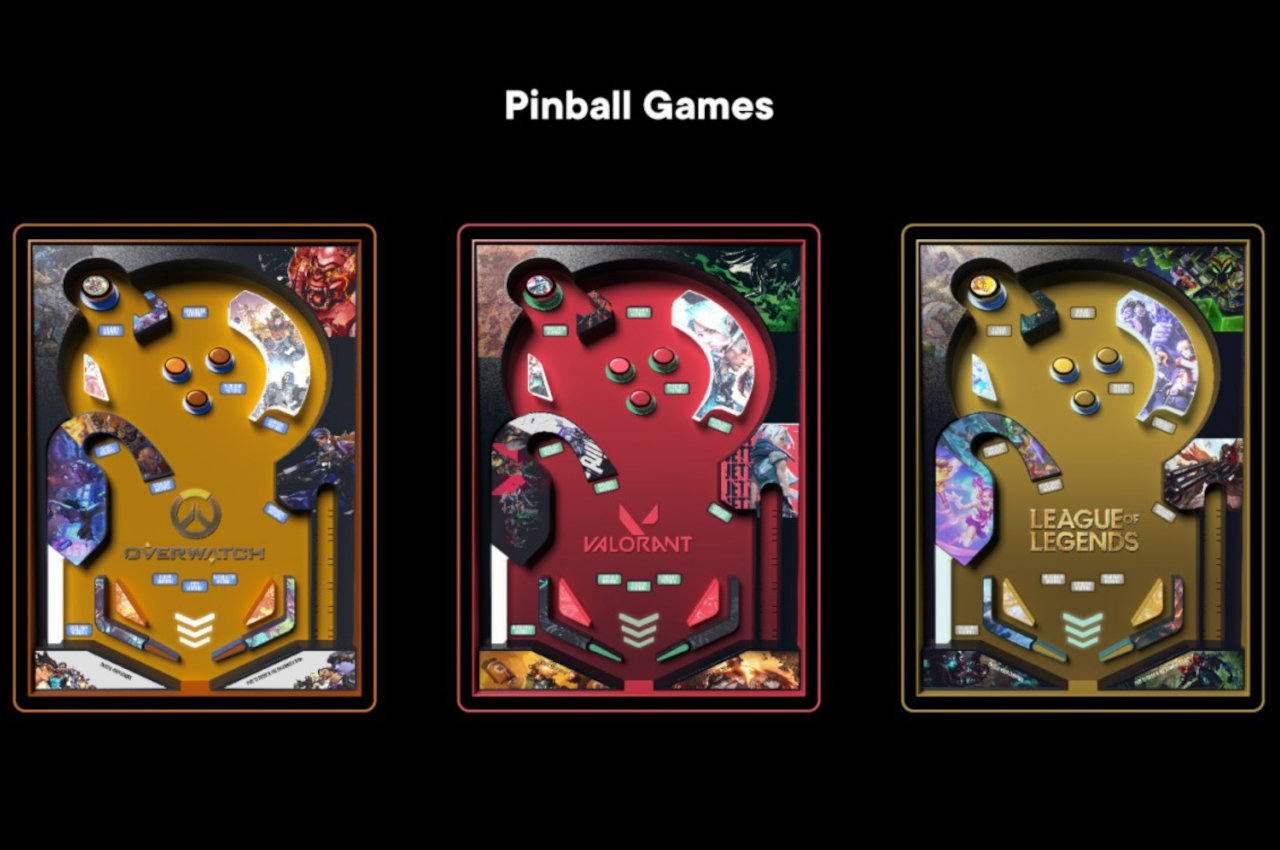
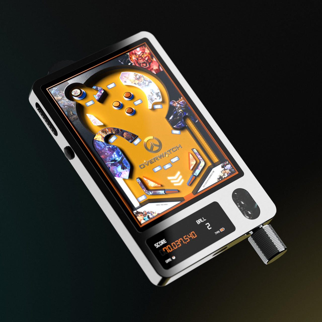
Click Here to Buy Now: $179 $199 (10% off at checkout).

Anyone who has used a music streaming service or media player app will probably be familiar with how these display the album art associated with the currently playing track. In a sense, these have replaced those jackets that come with physical CD cases, though the irony is that there is no physical equivalent to the way they function. Once you pop a CD into a player, the case and the jacket are practically forgotten until it’s time to put away the CD again. While practical, it loses the unique flavor that these CD jackets provide by adding a memorable visual element that can be associated with the music.

This minimalist CD player delivers a rather distinctive listening experience that combines the pleasure of audio with the impact of visual art. Rather than having to set aside the CD jacket or sleeve, you can slip it inside the specially-designed pocket so that you can show it off to anyone in view. It’s like the physical equivalent of displaying digital album art, except you have the opportunity to boast about owning the physical original CD, especially if it’s a rare, limited run.

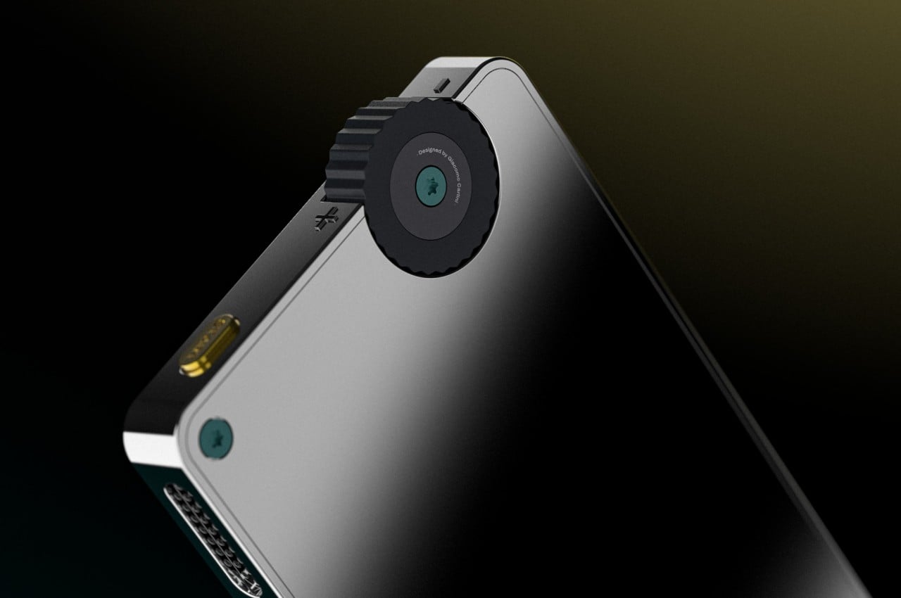
What makes this unique CD player extra special is its portability. It has a built-in 40mm full-range speaker as well as a woofer unit, ensuring that you can listen to your favorite albums wherever you are or wherever you place it in your room or home. The 1,800mAh rechargeable battery promises 7 to 8 hours of playback before you need to plug it in again. Of course, you can still connect an external speaker via the 3.5mm headphone jack or Bluetooth 5.1, but those would probably be the exception rather than the norm.

Despite the addition of a speaker and a battery, this Portable CD Cover Player retains a simple, minimalist, and thin design at only 27mm thick. Thanks to this and its wireless operation, the player can even serve as a piece of decoration, whether standing on a shelf or hanging from a wall. With this ingenious and elegant portable CD player, you get to enjoy your favorite music not just with your ears but also with your eyes.

Click Here to Buy Now: $179 $199 (10% off at checkout).

The post Minimalist wall-hanging CD Player visualizes your music in a unique way first appeared on Yanko Design.
Moment iPhone 75mm macro lens lets you get close and personal

Smartphones are wonderful tools that enable a great deal of functionality, from productivity to gaming to creativity. Their cameras, in particular, are powerful enough to threaten even point-and-click and entry-level cameras, but there are still some things that aren’t possible to achieve because of limitations in size and price. DSLRs, for example, have a wider variety of applications because they can swap out lenses depending on the need. That’s impossible with smartphone cameras, but a compromise has been developed that lets you augment or change the way those cameras work by attaching a separate lens, like this new accessory from Moment that enables a powerful macro shot that’s not normally available on the iPhone.

Designer: Moment

Some Android phones advertise having a macro camera, but those really don’t do justice to what macro lenses are truly capable of. Not only are the magnification levels low, the imaging sensors are also so substandard that it might be better to have no macro camera at all. The only way you’ll be able to pull off a pleasant or dramatic close-up shot is to pair an appropriate lens with a decent sensor.

That’s exactly what the new Moment macro lens brings to the table by attaching a lens with a 75mm focal length equivalent to the powerful wide or ultrawide camera of a smartphone like the iPhone 15 Pro. This kind of lens allows the mobile photographer to capture crisp foreground details with pleasant blurring in the background, even from a distance of four inches from the subject. With a 10x magnification, you can achieve an intense shallow depth of field while still including more of the background in the shot.

Normally, you wouldn’t be able to attach a different lens on a smartphone, but Moment’s T-Series lenses use an innovative yet easy-to-use system to make that possible. In a nutshell, you put a special protective case on the iPhone and then attach compatible lenses on the specially designed mounts to expand the camera’s capabilities using lenses that would have never fit inside the cramped space of a smartphone. This ingenious design means that this new Moment macro lens can also be used on other phones, including the Pixel 8 or Samsung phones, provided you use the matching case or special mount made for the T-series lenses.

With the Moment 75mm macro lens, you can take breath-taking close-up shots of natural objects or even moving subjects, allowing you to create better memories or even win some awards. The $119.99 price tag is a bit tough to swallow, but professionals will probably be able to justify such an expense if they can get more stunning images in every shot. Of course, there’s also the hidden cost of requiring that case to always be on, at least while you’re using the lens, and the lens jutting out from the phone’s back awkwardly, but these are the things that your social media followers will probably never see anyway.

The post Moment iPhone 75mm macro lens lets you get close and personal first appeared on Yanko Design.
Small iPhone 16 camera design change could have important implications

Apple is known for moving slowly but surely, changing things only when it really makes sense and after numerous tests. That can be especially seen in the iPhone’s cameras, which don’t change year after year, unlike the general trend in the mobile industry. Whether it’s the hardware itself or the design of the camera bump, Apple has been careful and meticulous in introducing changes. That’s why it’s a bit of a big thing that Apple is rumored to be changing the iPhone 16’s camera design for the first time in three years, but it’s a change that will bring a significant change in functionality, at least for the base iPhone models, and possibly a very different aesthetic as well.
Designer: Apple (via MacRumors)

Apple has traditionally been modest with its camera hardware because it is able to pull off great images even with sensors that look outdated on paper. It also doesn’t change the design of the camera island as often as other brands, introducing a pill-shaped bump in the iPhone 8 Plus in 2017 and only switching to a square enclosure in the 2019 iPhone 11. In the 2021 iPhone 13, it moved the position of the lenses so that they’d be diagonally opposite to each other, creating a visually more interesting composition than the plain vertical arrangement of the iPhone X.

According to rumors, however, Apple is switching back to a vertical design for the iPhone 16 cameras, and it’s unlikely just on a whim. There is a chance that this change will enable the Spatial Video function that’s only available on the iPhone 15 Pro models, a feature that allows recording video in three dimensions. This, however, requires using both the main wide camera and the ultrawide shooter in tandem, in which case these two sensors have to be aligned vertically or even horizontally.

What’s a little more interesting is that Apple is reportedly testing a different design for this new camera as well. There is one that looks exactly like the iPhone 11 and 12, with the cameras vertically arranged. Another potential design, however, places the vertical pill shape of the iPhone X on top of the square bump of the iPhone 15. As interesting as that may look visually, it’s a rather distracting design and would be a bit complicated and inconsistent with the current iPhone design language.

Changing the camera arrangement to enable Spatial Video recording is another sign that Apple is aiming to bring Pro features to the base iPhone 16. An earlier leak claimed that a redesigned Action Button will be available on all iPhone 16 models. That button will supposedly switch from a mechanical button to a pressure-sensitive capacitive surface, a feature that could expand what the button is capable of doing.

The post Small iPhone 16 camera design change could have important implications first appeared on Yanko Design.