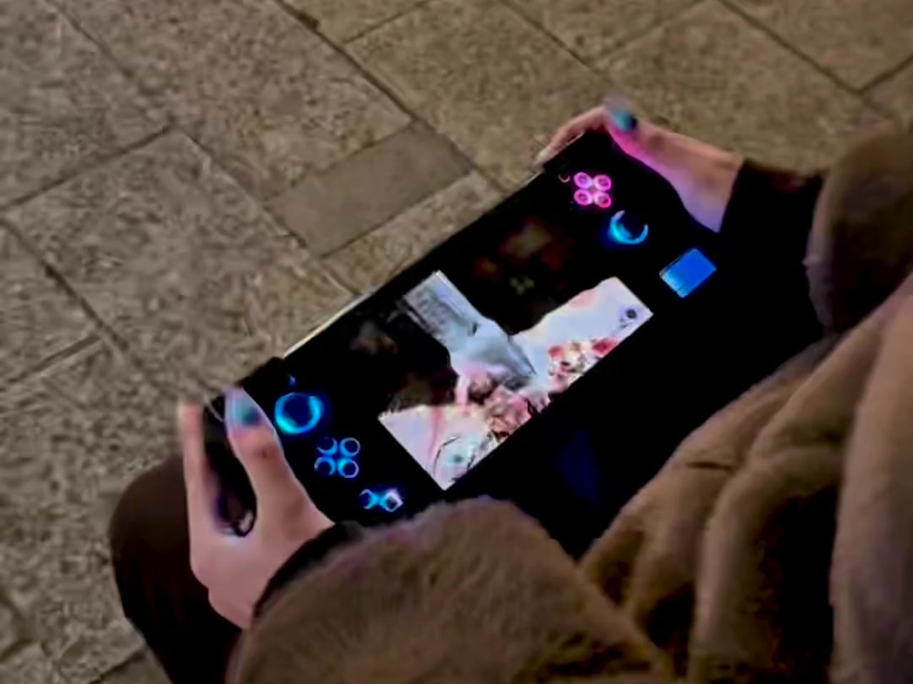
The PS4 era is over, but the library is still incredible, and the only way to enjoy it portably has been streaming or emulation with compromises in latency, compatibility, and control. The fantasy of a true PS4 handheld that runs games natively has floated around for years, but Sony never built one. Reddit user wewillmakeitnow decided to stop waiting and built it himself instead.
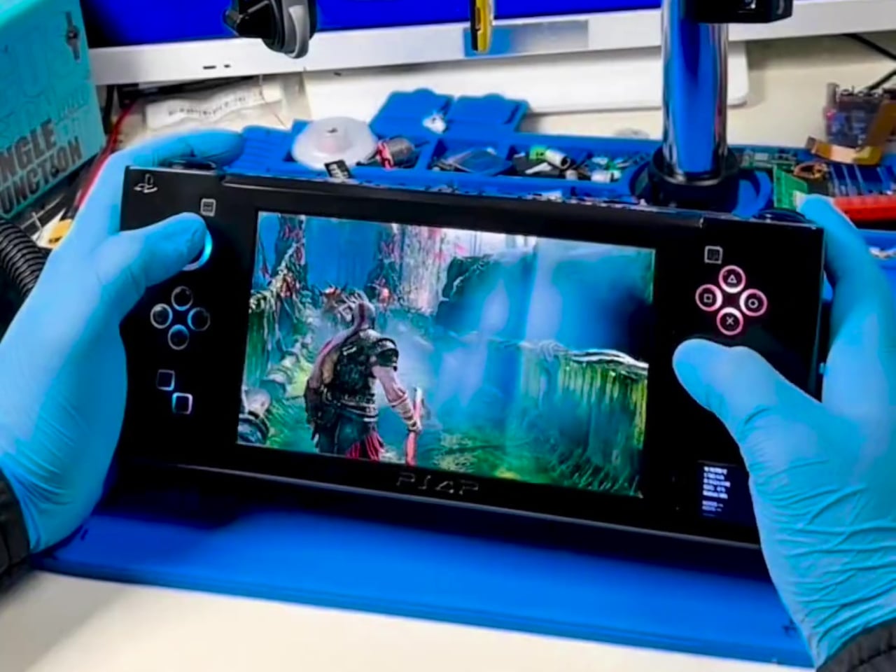
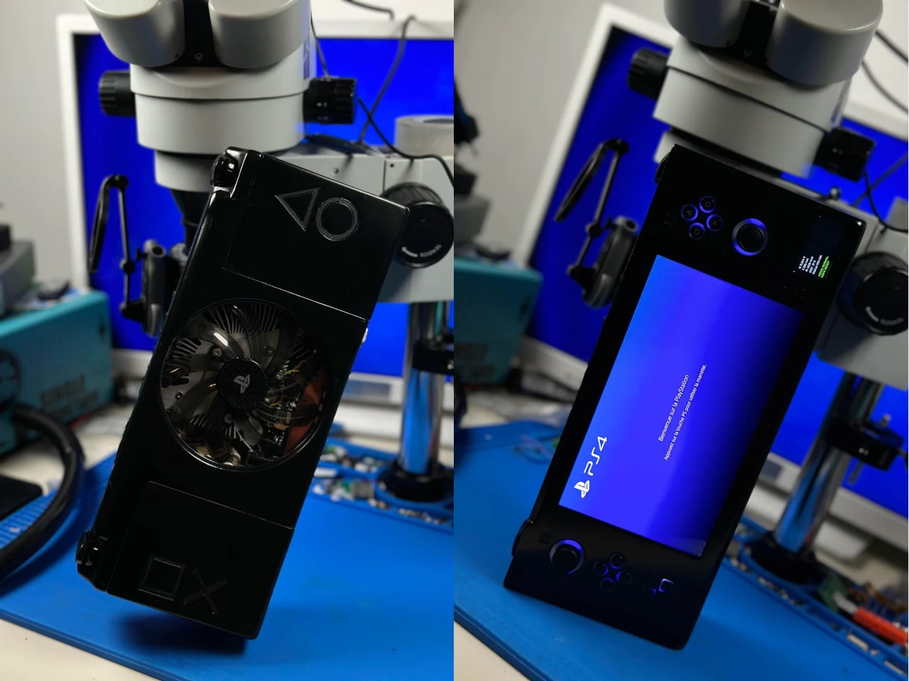
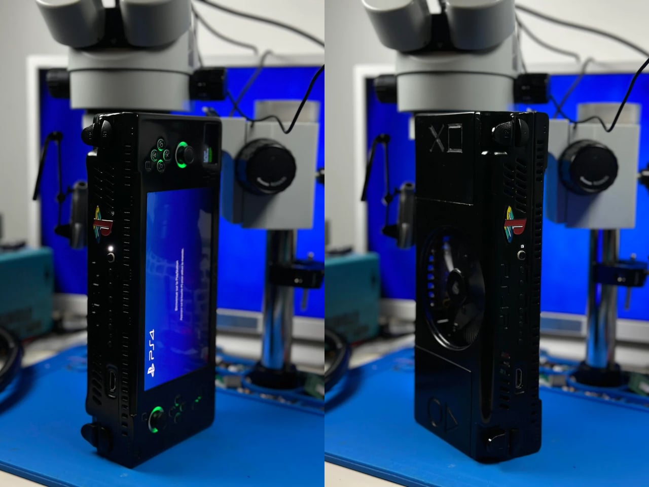
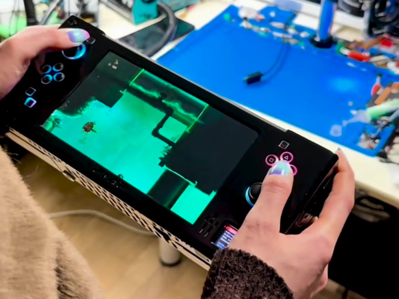
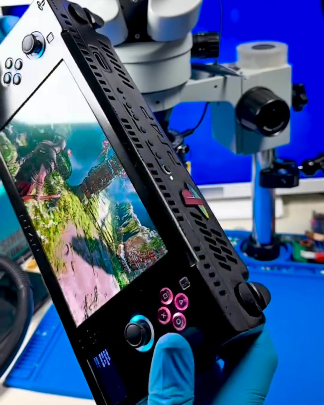
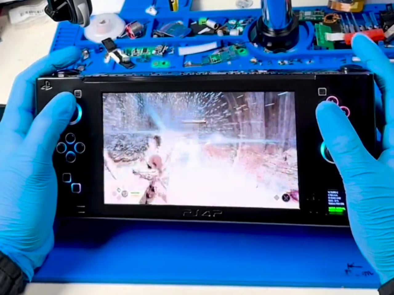
This is not a Raspberry Pi or a cloud device but a heavily modified PS4 Slim motherboard, cut and re-laid to be as compact as possible while keeping full functionality. The builder redesigned the layout for better power efficiency and thermals, then wrapped it in a custom ABS enclosure with full controls and a 7-inch 1080p OLED screen, turning a console into something that looks and plays like a handheld from an alternate timeline.
Designer: wewillmakeitnow
The cooling story is where most of the work lives. A new airflow path, custom heatsinks, and a large rear fan are managed by an onboard ESP32 microcontroller. The ESP32 runs custom firmware to watch temperatures in real time, enforce thermal thresholds, trigger emergency shutdowns, and supervise power draw and battery charging. It is the safety brain that makes running a console-class APU in your hands viable instead of a thermal disaster.
The power system uses six 21700 cells at 6,000 mAh each in a 3S2P configuration, roughly 130 Wh of energy. Under lighter loads, the system pulls around 44W for about three hours of play. In demanding games, it can draw close to 88W and land closer to an hour and a half before shutdown, at around 10V, which protects the pack. There is also a dedicated port for playing on AC.
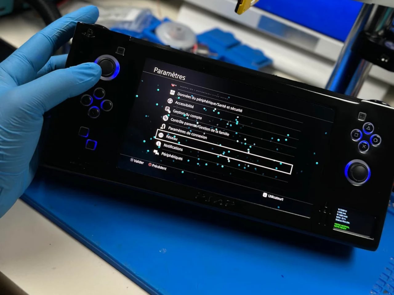
The handheld still behaves like a PS4 when you want it to. There is HDMI out for plugging into a TV, multiple USB-C ports for charging, configuration, and connection to controllers or external drives, plus a USB 3.0 port for storage. In that mode, it stops being a handheld and becomes a very small PS4 Slim you can drop next to a hotel TV.
All of this comes at a cost. The enclosure is about 113mm x 270mm x 57mm, with sharp edges and no sculpted grips, and the weight is likely well north of a kilogram once you add the board, cooling, and batteries. The builder chose to let the shell hug the motherboard as tightly as possible, sacrificing rounded comfort to keep the footprint from ballooning further.
This one-off build shows both the promise and limits of turning a living-room console into a handheld. It proves that a native PS4 portable is technically possible if you accept thickness, weight, and fan noise. It also quietly asks what might happen if a company with Sony’s resources took the idea seriously. Until then, it stands as someone picking up their favorite console and refusing to put it down.
The post Someone Built the PS4 Portable Sony Never Made with a 7-Inch OLED first appeared on Yanko Design.