MaClock Shrinks the 1984 Macintosh Into a $30 Rechargeable Clock

Nostalgia tech falls into two camps. Lazy references slap a retro logo on a modern object and call it vintage, while obsessive recreations feel like museum pieces. Most products lean too far in one direction, missing the sweet spot where memory and function coexist comfortably. The first feels cheap, the second feels precious, and neither ends up on your desk for very long once the initial charm wears off.

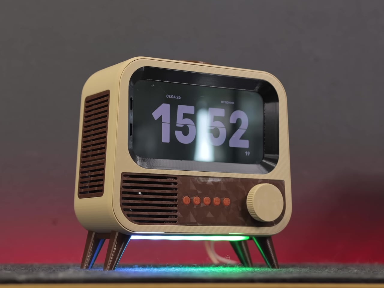
MaClock by Kokogol hits that balance. It is a miniature 1984 Macintosh that works as a rechargeable desk alarm clock, recreating the beige enclosure, rainbow Apple logo, CRT-style screen, and floppy disk slot at nightstand scale. It still behaves like a proper modern clock with 60-day battery life and USB-C charging, not just a static replica gathering dust next to other impulse buys that reminded you of childhood.

Designer: Kokogol

The physical details feel right. Warm beige ABS body, a recessed curved screen mimicking a cathode ray tube, horizontal ventilation grilles on the side, and a tiny floppy disk drive slot with a pink tab. At 80 x 91 x 112 mm, it is substantial enough to feel real in your hand, not a keychain trinket. The proportions match the original closely enough that it reads instantly as a Mac, even from across a room.

The included floppy disk acts as a power switch. You insert it to turn the clock on, a callback to the boot ritual of early Macs. The package includes a sticker sheet with rainbow Apple logos, a Macintosh label, and a dot matrix sticker, letting you customize and restore the design yourself. The unboxing becomes a small assembly project rather than a passive reveal, which makes it feel slightly more earned.

MaClock offers three display modes. Time mode shows large pixelated digits for hours, minutes, day, and temperature. Calendar mode centers the date in blocky characters. Easter egg mode wakes up Susan Kare’s Happy Mac icon, the smiling face from the original graphical interface. Seeing Happy Mac on your desk in 2025 is an unexpectedly emotional hit for anyone who grew up with early Macs and remembers what that face meant.

The adjustable backlight is controlled by a knob on the bottom left, which can be dialed down at night or turned off entirely. With the backlight off, the battery lasts up to 60 days, so it can sit on your desk for weeks without charging. It feels more like furniture than a gadget you babysit with a cable every few nights, which is exactly how a clock should behave.

MaClock treats nostalgia as something you participate in rather than just look at. The floppy disk, the stickers, the Happy Mac mode, and the CRT-inspired screen all ask you to engage with the memory. At just $30, it sits in the impulse buy zone, which might be the right price for functional nostalgia that earns its desk space by telling time and making you smile every morning when Happy Mac greets you with those chunky pixels.

The post MaClock Shrinks the 1984 Macintosh Into a $30 Rechargeable Clock first appeared on Yanko Design.

Sandmarc Lens Gives iPhone 17 Pro 16x Optical Zoom, No Digital Tricks

iPhone zoom has improved, especially with the 17 Pro’s tetraprism, but anything past 5x still leans heavily on digital tricks. Distant concert shots look like watercolor paintings, city skyline details collapse into mush when you pinch to zoom. If you actually care about long lenses, you usually end up carrying a separate camera and a chunky telephoto, which defeats the point of traveling light in the first place.

Sandmarc’s Telephoto Tetraprism Lens offers a different approach. It is a 48mm 2x optical telephoto that mounts directly over the 17 Pro’s 5x tetraprism camera, giving you up to 16x reach, roughly a 384mm equivalent. Real glass does the work instead of software interpolation. It is built specifically for Apple’s tetraprism module, not a generic clip on trying to cover all three lenses poorly.

Designer: Sandmarc

The lens is a multi element, multi coated cylinder weighing about 250 grams, closer to a compact mirrorless lens than a toy. The field of view narrows to 16.7 degrees, which gives you tight framing and real telephoto compression, the kind that pulls distant mountains closer or stacks city buildings into dense layers. The front element sits deep inside a metal barrel with blue anti reflection coating, machined rather than molded.

Where it shines is shooting where you physically cannot move closer. Standing on a ridge pulling in a faraway peak, shooting street portraits from across the road, grabbing architectural details from stadium seats without leaning on digital zoom that turns textures into paste. The lens only works with the 5x module, so you need a pro camera app to force the phone onto that sensor, but once dialed in, results look more like a small camera than a phone.

The front of the lens is threaded for Sandmarc’s own filters, so you can snap on an ND, polarizer, or diffusion filter just like you would on a regular camera. That opens up long exposures, glare control, and more cinematic looks. The included Ultra Slim case handles alignment and mounting without fiddling with clips, though it does mean swapping out whatever case you normally use when you want the lens attached.

The trade offs are real. The lens adds bulk and weight, only works with the 17 Pro and Pro Max tetraprism camera, needs Sandmarc’s case, and really wants a third party camera app. It is not something you leave on all day. It is the piece of kit you pack when you will be chasing distant subjects and want something better than cropped pixels, accepting your phone will feel like a small camera for a few hours.

Accessories like this make the iPhone feel less like a sealed black box and more like a modular camera system. For people who already think in focal lengths and filters, the Sandmarc Telephoto Tetraprism Lens turns the 17 Pro into a capable long lens rig, without asking you to give up having your main camera still live in your pocket when you are done shooting and need to check email or navigate to the next location.

The post Sandmarc Lens Gives iPhone 17 Pro 16x Optical Zoom, No Digital Tricks first appeared on Yanko Design.

This $3,500 Guitar Changes Colors via Bluetooth, No Repainting Needed

Guitarists obsess over finishes. Sunburst fades, metallic flakes, relic’d nitro that looks like it survived three decades of dive bars, all of it matters until you realize that once you pick a color, you are stuck unless you repaint. Stage rigs and LED walls morph through palettes every night while the guitar stays frozen, a static object carried by musicians who constantly reinvent their sound and visual identity.

Cream Guitars’ DaVinci wraps its entire body in an E Ink Prism 3 panel, turning the surface into a programmable skin that changes colors and patterns over Bluetooth. Instead of a single paint job, the guitar becomes a dynamic canvas. It is the first commercially available product to use Prism 3, which is usually reserved for architectural surfaces and product experiments, not instruments you plug into an amp and carry on tour.

Designer: Cream Guitars

Prism 3 is color changing ePaper, closer to a Kindle page than an LED screen. It does not emit light, just holds pigment using low power electrophoretic particles. DaVinci’s front divides into sixty four segments, each assigned one of seven colors, white, black, yellow, orange, blue, red, or green. That segmentation lets you build stripes, blocks, and faux pickguards, changing the visual structure without touching a spray can.

A guitarist could match the guitar to different projects without owning three instruments. One night, geometric patterns echo album art. Another, a minimalist scheme feels right. The ePaper only draws power when changing, so once set, it sits visible under stage lights without glowing like LEDs or draining the battery between songs or overnight in a case, ready to change again whenever the visual identity shifts.

Under the display sits a Voltage body with roasted maple neck, rosewood fretboard, extra jumbo frets, and Graphtech locking tuners. Fishman Fluence pickups offer three voices, single coil, traditional humbucker, and high output humbucker. The tech wraps around a serious guitar, not a prop with thin pickups that sound disappointing once the visual novelty wears off after the first show or when you need to track a real session.

Traditional refinishing is messy and permanent. Sand, spray, cure, repeat if you change your mind. DaVinci’s ePaper skin reprograms endlessly, with Prism 3’s low power profile positioning it as a more sustainable alternative to LED bodies or constantly changing finishes. The guitar becomes a long term canvas rather than a disposable fashion statement that needs repainting or ends up retired because the color fell out of style after one album cycle.

DaVinci hints at instruments as programmable surfaces that evolve with the player. It feels like a crossover between luthier craft and interface design, where the object in your hands can match your projected identity without needing backup guitars. Whether or not you want one at three thousand five hundred dollars, it is easy to imagine keyboards, drum shells, and amps following the same path, turning stage gear into surfaces that shift as often as setlists do.

The post This $3,500 Guitar Changes Colors via Bluetooth, No Repainting Needed first appeared on Yanko Design.

Motorola Edge 70 Accents Pantone’s 2026 Color with Swarovski Studs

Pantone’s Color of the Year 2026, Cloud Dancer, arrived with a thesis that we are all collectively tired and need visual relief from the chaos. The soft, lofty white was pitched as clarity over clutter and presence over pressure, a quiet protest against hyper saturated everything, including the phones buzzing in our pockets. It felt less like a trend forecast and more like a group therapy session disguised as a paint chip.

Motorola took that color story seriously. The Edge 70 special edition wraps Cloud Dancer around its thinnest chassis yet, embellished with crystals by Swarovski, continuing the design run that started with the Razr Brilliant Collection earlier this year. Where the Razr leaned extroverted and fashion forward, the Edge 70 Cloud Dancer edition feels like its quieter sibling, still sparkling but content to sit on a nightstand without demanding constant attention or Instagram documentation.

Designer: Motorola

Cloud Dancer, officially Pantone 11-4201, lands on the Edge 70 as a leather inspired, quilted back that reads more like a minimal clutch than a piece of consumer electronics. The finish has a silk like sheen that shifts slightly in light, soft enough to avoid sterility but restrained enough to avoid looking like a frosted cupcake. Motorola calls it an object of clarity and quiet confidence, which fits the brief so precisely it almost sounds rehearsed.

Crystals by Swarovski are embedded into the quilted back, small enough to catch light without shouting for attention. The Brilliant Collection, which debuted with the Razr a few months ago, focuses on meticulous craftsmanship and timeless luxury, treating phones like accessories that happen to also make calls. Here, the crystals feel less like decoration and more like strategic punctuation marks on an otherwise very calm sentence, little flickers that keep the white from feeling too monastic.

Underneath sits the regular Edge 70 hardware, Snapdragon 7 Gen 4, dual 50 megapixel cameras, a bright display, and moto ai that adapts quietly. Motorola emphasizes that the device is the thinnest in its category, hedged by footnotes about regional price bands but still impressive for something packing a 4800 milliamp hour battery and full day reliability without feeling fragile in the hand.

The approach contrasts with the usual luxury phone playbook, which tends toward loud colors, heavy logos, or aggressive patterns that scream performance. Cloud Dancer is almost the opposite, a discrete white Pantone describes as conscious simplification. The quilting and crystals prevent it from becoming sterile, but the overall vibe lands somewhere between spa robe and gallery wall, an unusual place for a smartphone to occupy.

Motorola seems intent on building a design ecosystem where color forecasting and material craft matter as much as chipsets. The Razr Brilliant Collection introduced Swarovski, and now the Edge 70 ties that to Pantone’s annual ritual. We live in a world where most phones blur into identical black rectangles, so a calm white device with a quilted back and a handful of crystals starts to feel surprisingly memorable, even if memorable was never the point.

The post Motorola Edge 70 Accents Pantone’s 2026 Color with Swarovski Studs first appeared on Yanko Design.

Ottagono Packs a Full Workout into a Luminous Octagonal Column

Home gyms have become unavoidable lately, creeping into corners with smart mirrors bolted to walls, fold‑out benches wedged behind sofas, and dumbbells scattered under coffee tables. Apartments keep shrinking, hotel suites need to multitask, and most fitness gear still looks like fitness gear rather than furniture. Even the sleekest mirror can’t pretend it belongs next to a credenza when a countdown timer starts blinking, and someone begins doing burpees in the reflection.

Ottagono by architect Giulia Foscari for Cassina Custom Interiors offers a different answer. It looks like a tall octagonal column, occupies less than one square meter, and hides a complete Technogym-powered workout behind faceted doors. Designed in collaboration with Technogym, it debuted during Milan Design Week and will be installed at Hotel du Cap Eden Roc in Antibes, positioning it squarely in the luxury hospitality world where space costs money and objects need to earn their floor area.

Designer: Giulia Foscari

When closed, Ottagono reads like a sculptural floor lamp rather than a cabinet full of kettlebells. The exterior is finished in gradient tones, deep blue fading lighter toward the top or emerald green transitioning upward, with clean facets and minimal seams. At its summit, an integrated uplight washes the ceiling in soft ambient glow. In a living room or suite, it sits quietly under that halo, looking more like art than utility, which seems to be exactly what Foscari and Cassina intended.

Open the doors, and the mood shifts completely. The interior glows in bright turquoise, with a vertical screen at eye level streaming Technogym workouts and a mirror on one door for checking form. Adjustable dumbbells nestle into octagonal cradles at the base, kettlebells hang on polished hooks, resistance bands drape from pegs, and a foam roller stands vertically alongside mobility balls. Foscari calls it “opening a room within a room,” which feels accurate because the inside genuinely reads like a micro gym carved from a single piece of furniture.

A typical session unfolds quickly. You roll out a mat, face the screen, and follow guided strength or mobility work using whatever equipment the program calls for, all stored within arm’s reach. When finished, everything returns to its slot, the doors swing shut, and the column becomes a lamp again. The entire footprint is smaller than a dining chair, which makes dedicating a spare bedroom to a treadmill and rack feel suddenly excessive when something this compact handles a full training cycle.

Ottagono is designed for contexts where space is scarce and expensive. Hotel du Cap Eden Roc will install it in suites, giving guests a Technogym experience without a visible gym. Cassina Custom Interiors positions itself for private residences, superyachts, and boutique hotels where clients expect wellness amenities but want them hidden until needed. It fits the current trend toward fluid, multifunctional spaces where every object does more than one job and looks presentable while idle.

The broader implication is that Ottagono hints at wellness furniture behaving like micro architecture. It treats the gym as a spatial program that can compress into a vertical volume, and it suggests that as homes and hotels juggle more functions per square meter, we might see more objects that act as rooms in disguise. The column becomes forgettable infrastructure when closed, which might be the most useful thing a piece of fitness equipment can do in a living room that needs to function as six different spaces by Thursday.

The post Ottagono Packs a Full Workout into a Luminous Octagonal Column first appeared on Yanko Design.

Stickerbox: Kids Say an Idea, AI Prints It as a Sticker in Seconds

Smart speakers for kids feel like a gamble most parents would rather skip. The promise is educational content and hands-free help, but the reality often involves screens lighting up at bedtime, algorithms deciding what comes next, and a lingering suspicion that someone is cataloging every question your child shouts into the room. The tension between letting kids explore technology and protecting their attention spans has never felt sharper, and most connected toys lean heavily toward the former without much restraint.

Stickerbox by Hapiko offers a quieter trade. It looks like a bright red cube, measures 3.75 inches on each side, and does one thing when you press its white button. Kids speak an idea out loud, a dragon made of clouds or a broccoli superhero, and the box prints it as a black-and-white sticker within seconds. The interaction feels less like talking to Alexa and more like whispering to a magic printer that happens to understand imagination.

Designer: Hapiko

The design stays deliberately simple. A small screen shows prompts like “press to talk,” while a large white button sits below, easy for small hands to press confidently. Stickers emerge from a slot at the top, fed by thermal paper rolls. The starter bundle includes three BPA-free paper rolls, eight colored pencils, and a wall adapter, turning the cube into a complete creative kit rather than just another gadget waiting for accessory purchases to feel useful.

The magic happens in three beats. A kid presses the button and speaks their prompt, as silly or specific as they want. The box sends audio over Wi-Fi to a generative AI model that turns phrases into line art. Within seconds, a thermal printer traces the image onto sticker paper, and the finished piece emerges from the top, ready to be torn, peeled, and stuck onto notebooks, walls, or comic book pages at home.

What keeps this from feeling like surveillance is the scaffolding Hapiko built around the AI. The microphone only listens when the button is pressed, so there’s no ambient eavesdropping happening in the background. Every prompt runs through filters designed to block inappropriate requests before reaching the image generator. Voice recordings are processed and discarded immediately, not stored for training. The system is kidSAFE COPPA certified, meaning it passed third-party audits for data handling and child privacy standards.

Thermal printing sidesteps ink cartridge mess entirely. Each paper roll holds material for roughly sixty stickers, and refill packs of three cost six dollars. The catch is that Stickerbox only accepts its own branded paper; using generic rolls will damage the mechanism. The bigger design choice is that every sticker is printed in monochrome, which is intentional. It forces kids to pick up pencils and spend time coloring, turning a quick AI trick into a slower, more tactile ritual.

Stickerbox gestures toward a version of AI-infused play that feels less anxious. The algorithm works quietly, translating spoken prompts into something kids can hold, cut, and trade, but the most important part happens after the sticker prints. It ends up taped inside homemade comic books, stuck on bedroom doors, or colored during rainy afternoons. The box becomes forgettable infrastructure, which might be the kindest thing you can say about a piece of children’s technology designed for creative independence.

The post Stickerbox: Kids Say an Idea, AI Prints It as a Sticker in Seconds first appeared on Yanko Design.

UltraBar X Replaces Your Stream Deck, Volume Knob, and Phone Apps

Most desks accumulate a scattered collection of control devices over time. There’s the keyboard and mouse, maybe a Stream Deck for shortcuts, a volume knob for your speakers, a phone running smart home apps, and a separate remote for the desk lamp. Each solves a specific problem, but together they create a landscape of disconnected gadgets competing for space and attention. The monitor sits above it all, while everything underneath becomes a tangled mess of cables and redundant functions.

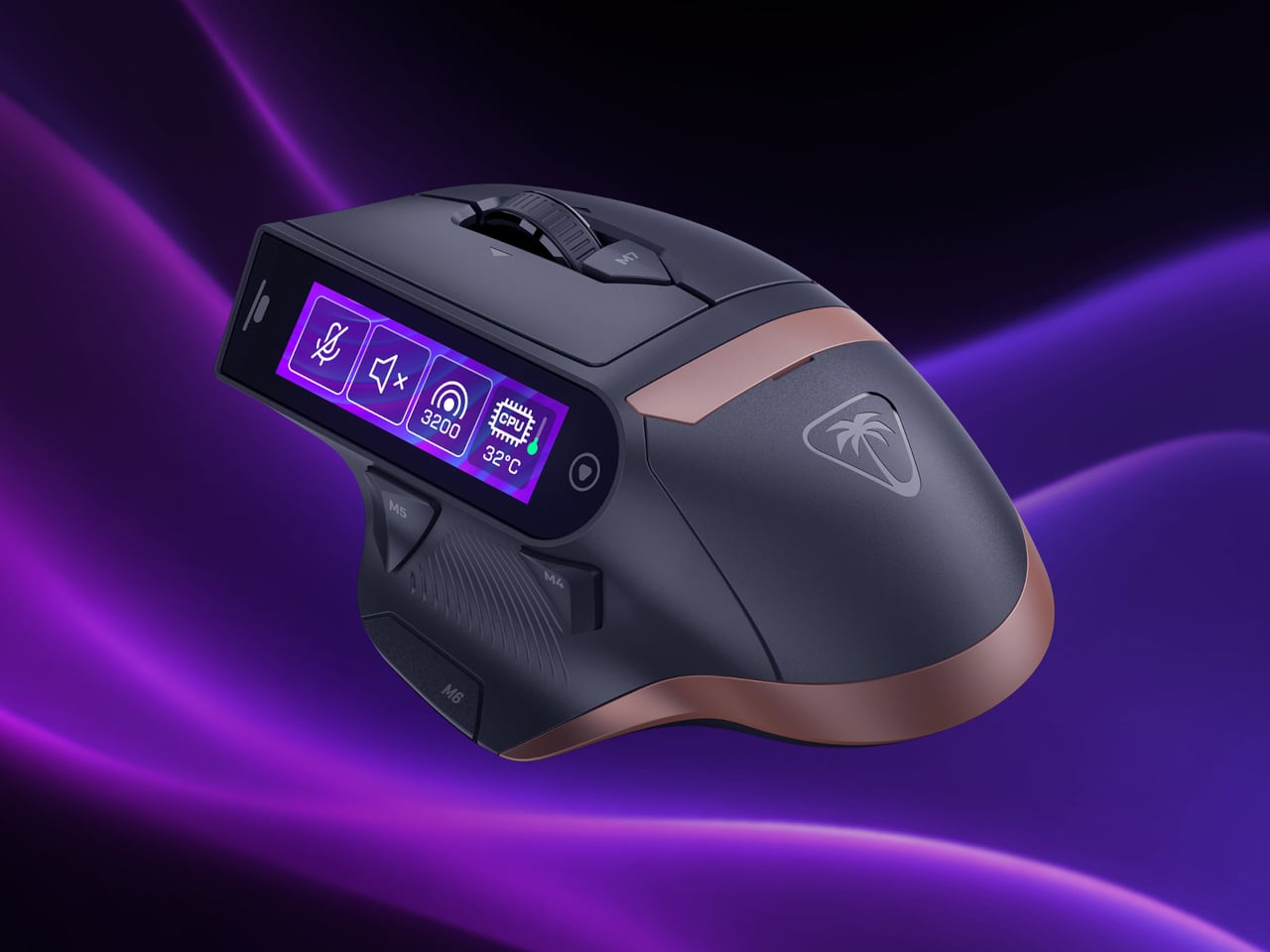
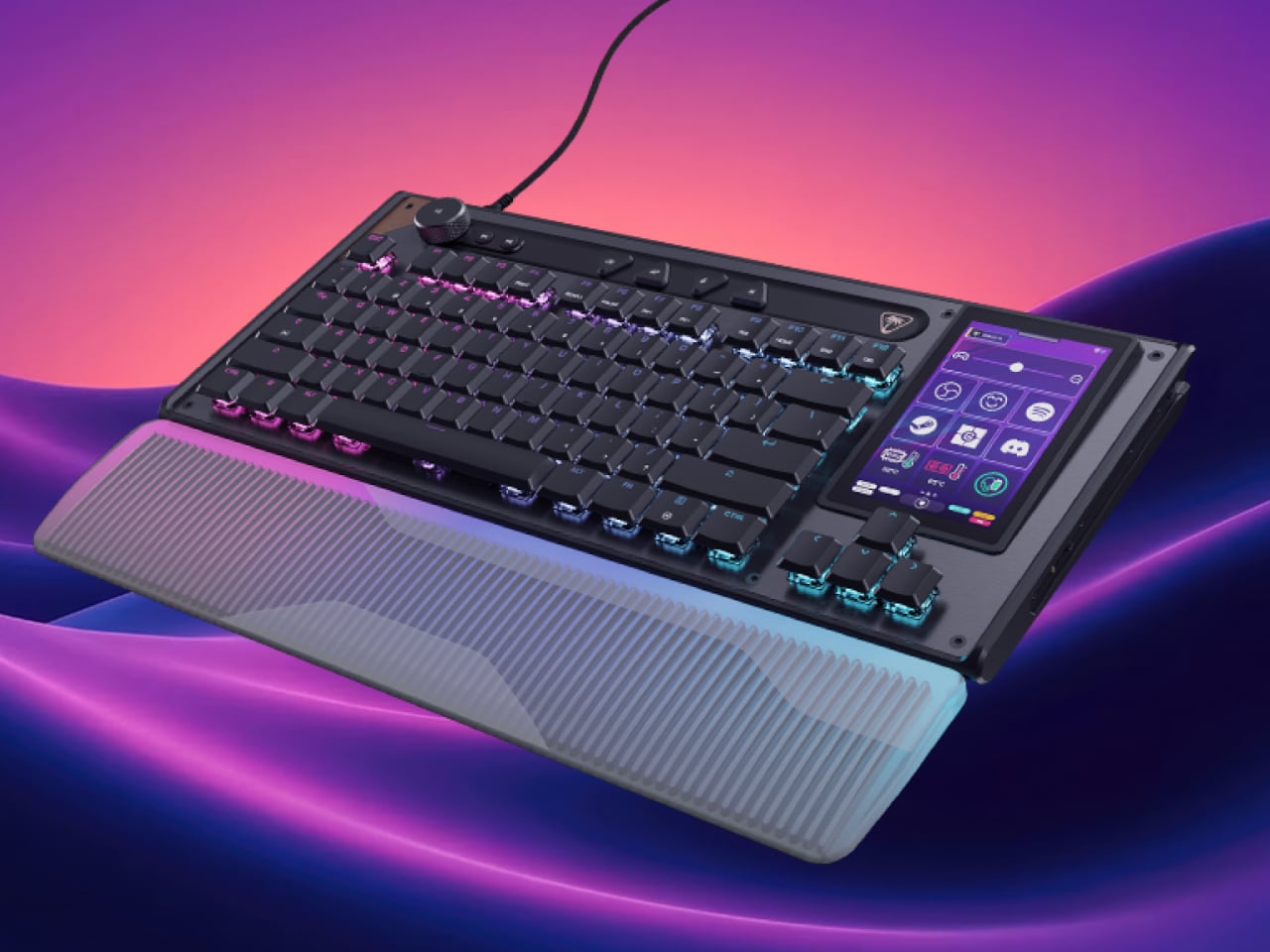
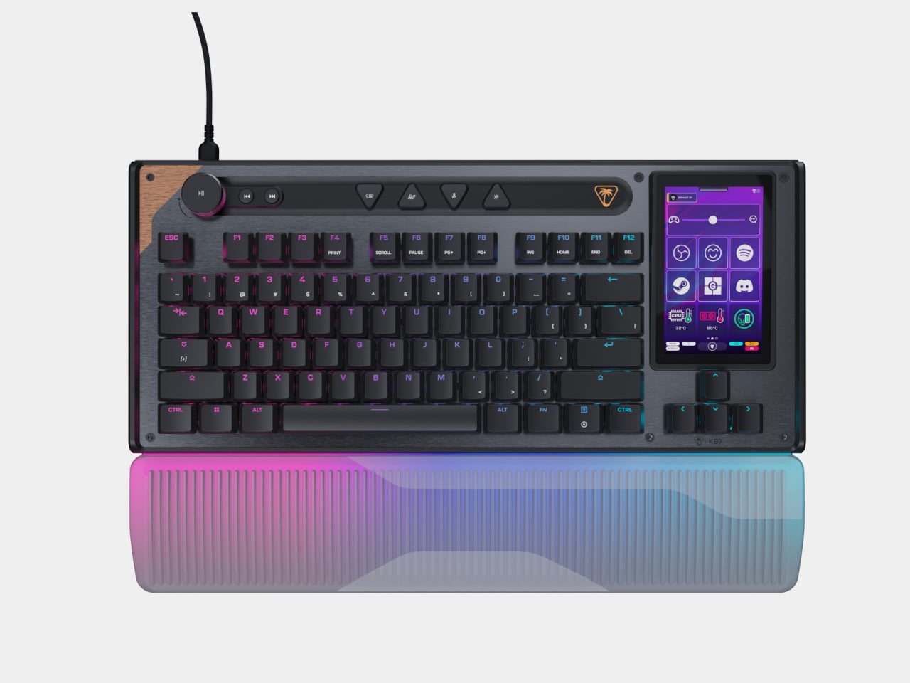
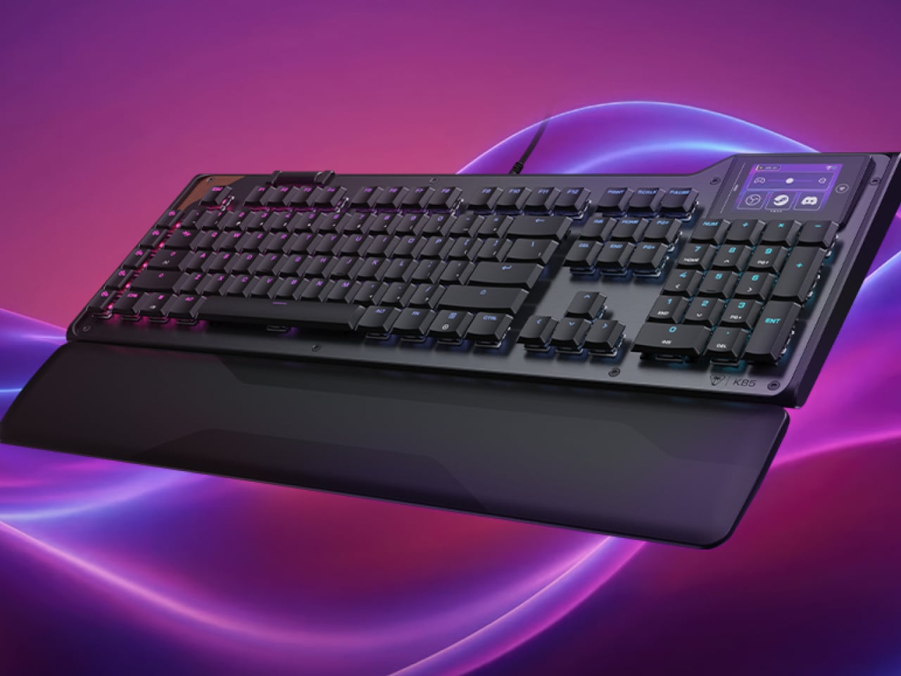
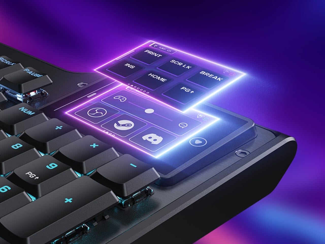
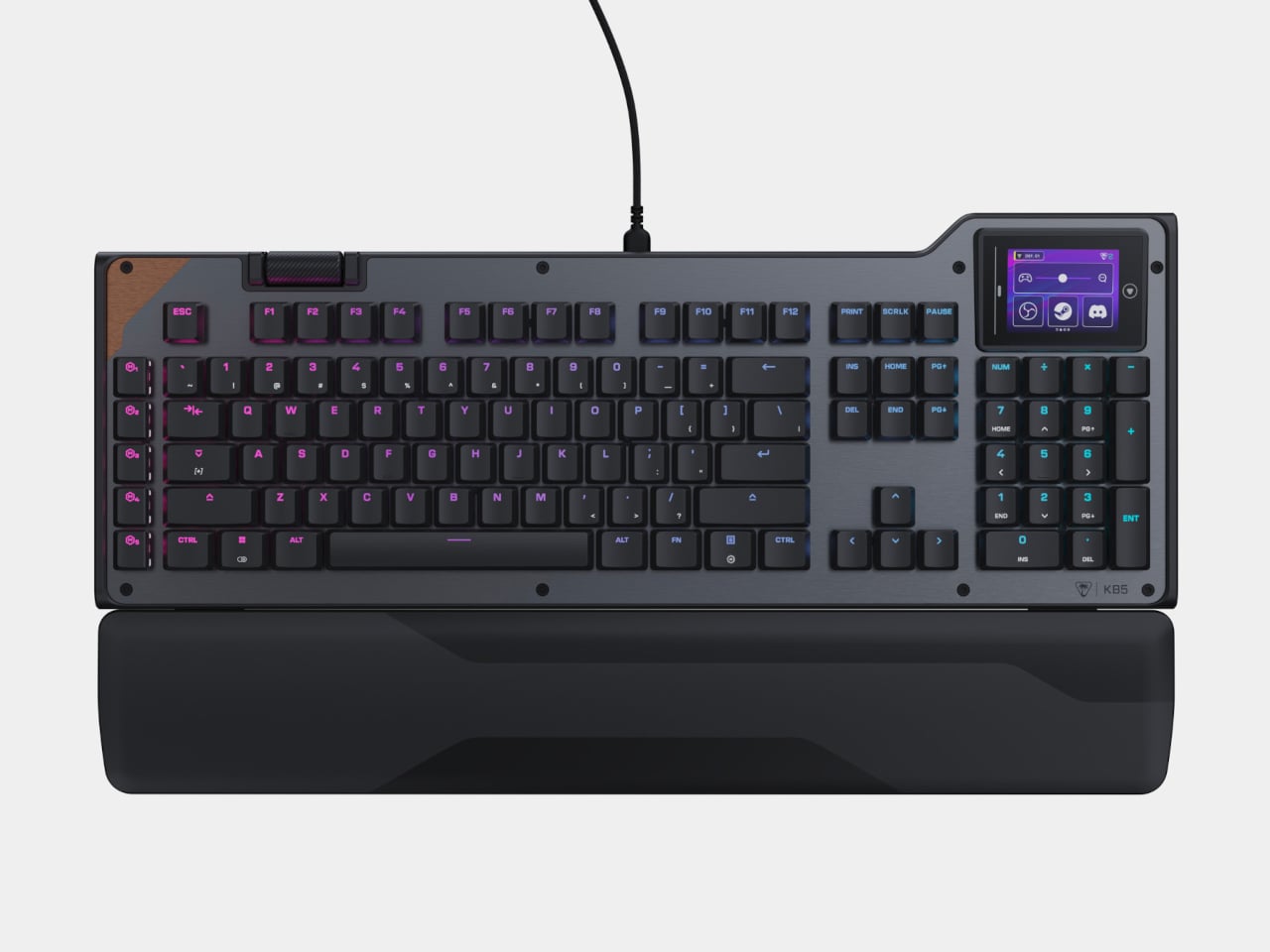
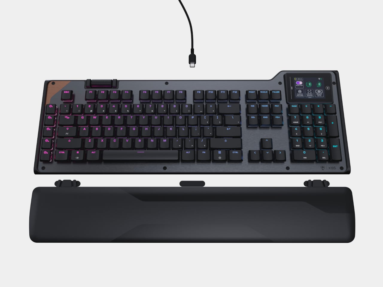
UltraBar X tries to consolidate that chaos into a single, modular strip that lives under your monitor. Built around a long, wedge-shaped bar with an ultra-wide display, it acts as a command center for your computer, applications, and even your smart home devices. Instead of a fixed product, it works more like a platform where you snap on magnetic modules to build the exact control surface your desk needs.

Designer: Team UltraBar

Click Here to Buy Now: $289 $429 (33% off). Hurry, only 379/500 left! Raised over $178,000.

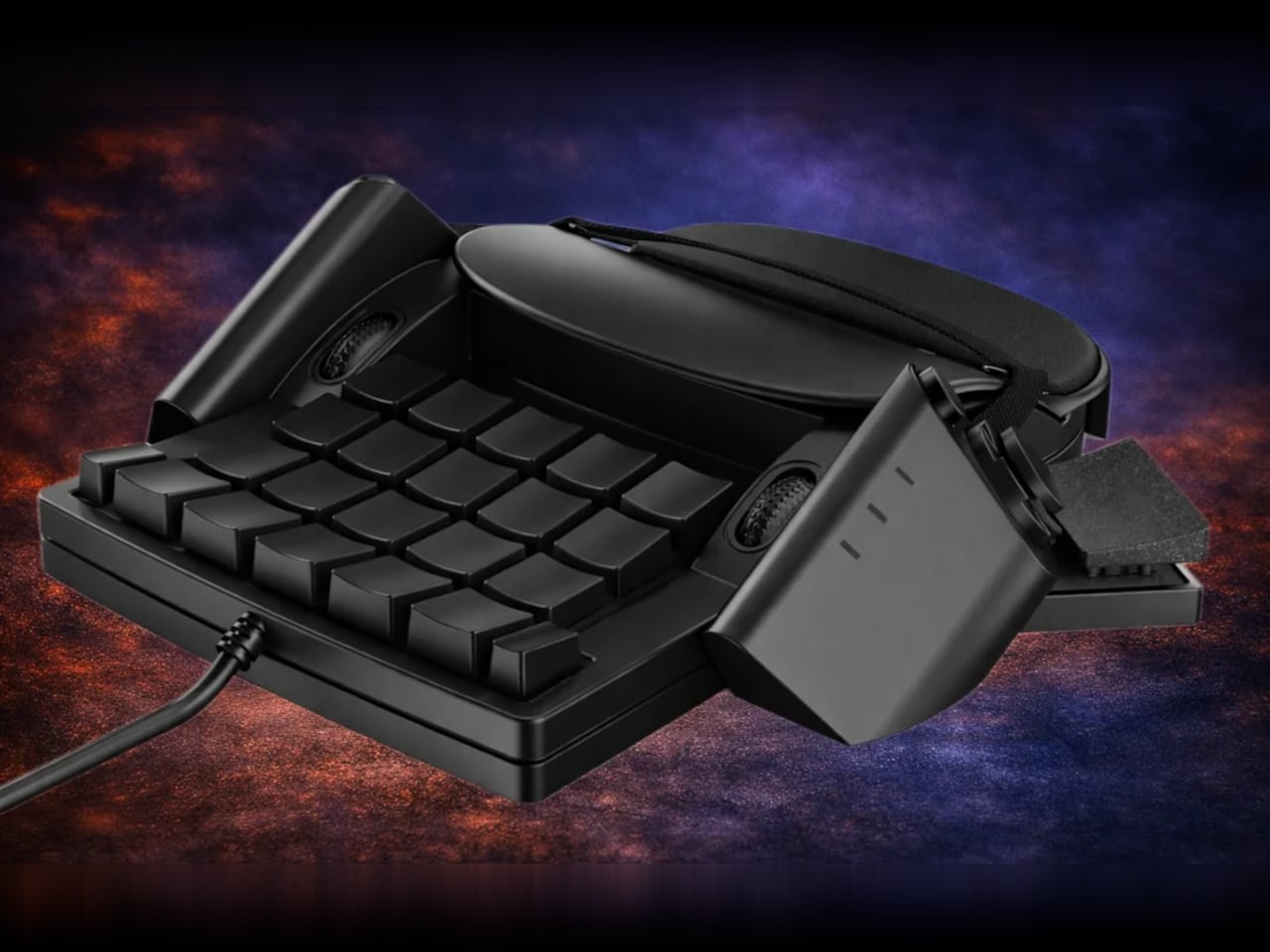
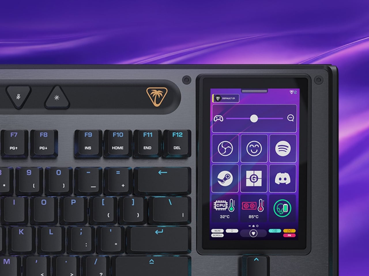
The central piece is CoreBar, a low, seven-inch display wedge-shaped bar tilted at forty-five degrees so it’s easy to glance at without adjusting your posture. The screen shows clocks, system stats, app icons, and customizable scenes that change based on what you’re doing. Tap the screen to wake your PC, jump between apps, or trigger macros, all from a touch interface that sits right where your hands naturally rest.

What makes the system feel different is how the magnetic modules expand it. DotKey snaps onto the side and brings a cluster of Cherry MX mechanical keys for shortcuts and macros. KnobKey adds a precision rotary dial that clicks crisply as you turn it, perfect for adjusting volume, brush size, or timeline scrubbing. VivoCube is a tiny controller with its own AMOLED screen and switches, small enough to hold or dock alongside the bar.

Of course, there’s also SenseCube, the environmental sensing module. Inside its small triangular shell are millimeter-wave radar and sensors for light, temperature, humidity, and vibration. This gives your desk a kind of ambient awareness, letting it detect when you sit down, notice changes in lighting, or respond when the room gets too warm. The workspace starts to feel less static and more responsive without constant input.

A typical morning might look like this. You walk up to your desk and tap CoreBar to wake the PC, which also brings up a layout tuned for writing and email. The mechanical keys are mapped to window management shortcuts, while the knob handles scrolling through long documents. Later, a single press shifts CoreBar into a design layout, and pretty much the same modules now control brush size, zoom, and layers in Photoshop or Illustrator.

The system doesn’t stop at the screen. Through its network connection, CoreBar can talk to Philips Hue lights to adjust the room based on your focus mode, or trigger a Sonos playlist with a single tap on an icon. The same bar that manages your open apps can also dim the lights or change the soundtrack, turning your desktop into a bridge between your computer and the rest of your space.

What keeps the experience from feeling overwhelming is how the software handles it. CoreBar runs a custom system with an app store and a library of templates for different workflows. Programmers get layouts for terminal, debugging, and IDE shortcuts. Designers get knobs and keys for brushes and layers. Streamers get scene controls and quick mutes. These templates bundle icons, animations, and logic, so you can load a complete setup without building from scratch.

That said, the modular approach means the system can grow over time. You can start with just CoreBar and add modules as you figure out what you actually need, swapping them in and out as your workflow shifts. The QuantumLink magnetic protocol means modules snap on, get recognized instantly, and can be reconfigured in seconds without tools or menus.

UltraBar X is made for people who enjoy shaping their tools rather than accepting whatever default interface their operating system provides. It doesn’t replace your keyboard or mouse, but it gives the space under your monitor a clear job beyond collecting dust and cable clutter. For anyone tired of juggling separate devices or hunting through nested menus, a modular bar that can sense, adapt, and consolidate feels like a thoughtful step toward desks that work the way you do.

Click Here to Buy Now: $289 $429 (33% off). Hurry, only 379/500 left! Raised over $178,000.

The post UltraBar X Replaces Your Stream Deck, Volume Knob, and Phone Apps first appeared on Yanko Design.
This Rugged Braille Reader for Kids Has a Built-In Carry Handle

Blind students often rely on expensive embossers, special paper, and slow production cycles just to get a few Braille books. Most assistive tools are bulky, fragile, or designed for adults sitting at desks, not children carrying them between crowded classrooms and shoving them into backpacks. There is a clear gap between what visually impaired kids actually need and what most assistive hardware looks and feels like on a daily basis.

Vembi Hexis is a Braille reader purpose-built for children by Bengaluru-based Vembi Technologies, with industrial design by Bang Design. It turns digital textbooks, class notes, and stories into lines of Braille on demand across multiple Indian languages and English. The device had to be rugged enough for school bags, affordable enough for institutions to buy in quantity, and portable enough that children would actually want to carry it around.

Designer: Bang Design

The device is a compact, rounded rectangle with softened corners and thick bumpers that make it feel closer to a rugged tablet than a medical device. The front face is dominated by a horizontal Braille display bar, with a small speaker grille and simple control buttons kept out of the way. Branding is minimal, just small HEXIS and VEMBI marks, so the object reads as a tool for kids first rather than a piece of institutional equipment.

A built-in carry handle is carved cleanly through the top of the shell, giving children a clear place to grab and slide their hand into without straps or clip-on parts. The reading surface is sculpted with a gentle slope leading toward the Braille cells in the reading direction and a sharper drop at the far edge. Those height changes quietly guide fingers along each line and signal where to stop without needing any visual feedback at all.

The durability details acknowledge that classrooms are not gentle places. Corner bumpers extend slightly beyond the body to absorb drops from school desks, the shell is thick enough to shrug off everyday knocks, and charging ports are recessed and shielded to resist spills. This is a device meant to survive water bottles, lunch boxes, crowded bags, and everything else that happens in a normal school day without feeling like a heavy brick.

Bang Design studied how children read Braille in real schools and designed every surface with heightened touch in mind. The soft geometry avoids sharp edges that could become uncomfortable during long reading sessions, while the slope and drop around the display give constant orientation feedback. For kids who navigate the world through their fingers, those subtle contours become part of the interface just as much as the moving dots themselves.

Hexis connects over Wi-Fi to Vembi’s Antara cloud platform so teachers and foundations can push textbooks, notes, and stories directly to devices. It supports multiple Indian languages and has been widely adopted across schools and NGOs, picking up recognition from programs like Microsoft’s AI for Accessibility Grant and Elevate 100. Those signals show that the design is not just elegant on paper but is actually working in classrooms and special education centers.

Assistive technology for children rarely gets the same design attention as mainstream classroom tools, but Hexis treats ruggedness, affordability, and friendly form as equally important constraints. For blind students, having a Braille reader that feels like a normal classroom companion rather than an exception is a quiet but meaningful shift. Hexis sits in school bags next to pencil cases and notebooks, looking and feeling like it belongs there instead of standing out as something separate or clinical.

The post This Rugged Braille Reader for Kids Has a Built-In Carry Handle first appeared on Yanko Design.
Momcozy Just Made Baby Gear That Doesn’t Look Like Baby Gear

Baby gear used to mean loud colors and chunky plastic that demanded its own corner of the living room. Most swings looked like they belonged in pediatrician waiting rooms, and breast pumps came with tubes and bottles that made discretion impossible. For parents trying to maintain some semblance of style in their homes, it meant choosing between function and aesthetics, rarely getting both in the same product.

Momcozy approaches parenting products differently, with a design philosophy they call Cozy Tech that blends performance with calm, contemporary aesthetics. Loved by over 4.5 million moms globally, the brand starts from the reality of modern parenting: hybrid work schedules, small urban apartments, and the need for tools that integrate into existing routines without demanding wholesale lifestyle adjustments or visual compromises that most baby gear traditionally required.

Designer: Momcozy

Engineering Meets Empathy

The gap Momcozy noticed was straightforward. Traditional baby swings assumed parents had unlimited space and patience for bulky furniture, while breast pumps were designed as if mothers had all day to sit in private rooms. The disconnect was obvious once you looked at it from the parents’ side: why couldn’t products work beautifully and look beautiful at the same time, especially when those products occupy your home for years?

Cozy Tech is the answer that emerged from that question. It is a design language that prioritizes both powerful performance and restraint. Soft forms, neutral tones, and quiet operation let the products blend into design-conscious homes rather than standing out as medical equipment. The hardware still does serious work, but the presence is gentle enough that you do not feel the need to stash things in closets when people visit.
Momcozy S12 Pro Wearable Breast Pump

Picture a mother pumping in a parked car between meetings, or quietly at her desk during a video call. The Momcozy S12 Pro Wearable Breast Pump sits inside a standard nursing bra, disappearing under clothing so there are no tubes or external bottles to manage. From the outside, it looks like any other workday, not a carefully orchestrated routine built around pumping schedules.

The S12 Pro is shaped to mold to the body for comfortable all-day wear, offering multiple modes and adjustable suction to match different stages of expression. The internal battery supports seven to eight sessions on a single charge, reducing the mental load of planning around power outlets. It is the kind of device that quietly acknowledges mothers have careers, meetings, and social commitments, building around that reality instead of ignoring it.

Click Here to Buy Now: $139.99.

Momcozy M9 Mobile Flow Hands-Free Breast Pump

The M9 Mobile Flow Hands-Free Breast Pump is designed for parents who need flexibility without compromising comfort. Imagine someone folding laundry or prepping dinner while the pump works quietly in the background, tucked inside a bra and barely noticeable. The soft, rounded shape and pink finish make it feel closer to a personal wellness device than clinical equipment, blending into the flow of a busy day.

What sets the M9 apart is the combination of smart control and efficiency. The DoubleFit Flange improves fit and reduces leakage, while the app lets parents choose from three modes and fifteen customizable settings to match their rhythm. The eighteen hundred milliampere-hour battery supports up to six sessions per charge, and the upgraded third-generation motor delivers hospital-grade suction without the noise or bulk of traditional pumps.

Click Here to Buy Now: $269.99.

Momcozy 2-in-1 Electric Baby Swing

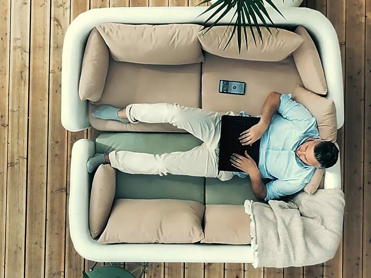
Shift to a different scene: a parent working from home in a small apartment, laptop open at the dining table while the baby rests in the Momcozy 2-in-1 Electric Baby Swing a few feet away. The swing’s neutral tones and clean lines blend into the living room rather than dominating it. Dual arms and a sturdy base keep everything steady, so there is no nervous checking every time the baby shifts position.

The swing mimics the natural soothing motions of a parent’s arms with four swing patterns and four speeds, helping babies stay calm outside of a caregiver’s embrace. The breathable seat adjusts to two recline positions, the cover zips off for machine washing, and when the baby outgrows the swing mode, it converts into a stationary seat that supports kids up to sixty-six pounds, turning it into furniture that lasts years instead of months.

Instead of asking parents to hide the tools that make their days possible, Momcozy designs swings and pumps that can live in the open, both visually and practically. They respect the spaces parents have built for themselves and the complex routines that run through them, showing that parenting gear can be gentle on the eyes while still doing serious work beneath the surface.

Click Here to Buy Now: $159.99.

The post Momcozy Just Made Baby Gear That Doesn’t Look Like Baby Gear first appeared on Yanko Design.