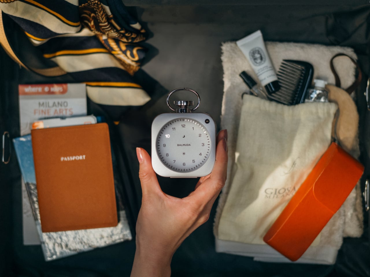
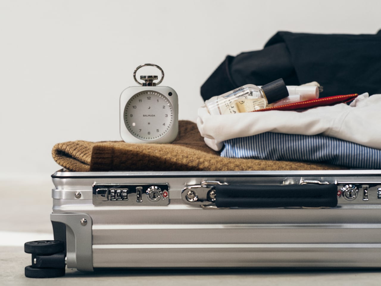
The phone on the nightstand is one of those design failures nobody talks about. It wakes you with a jolt, it glows through the night, and the first thing it offers each morning is not the time but a backlog of notifications demanding your attention before you’ve even sat up. The bedside clock was supposed to be the simple alternative, but most of them traded the problem of distraction for the problem of mediocrity.
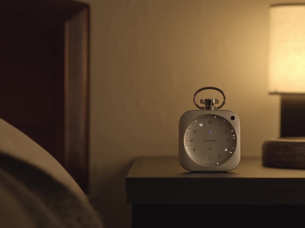
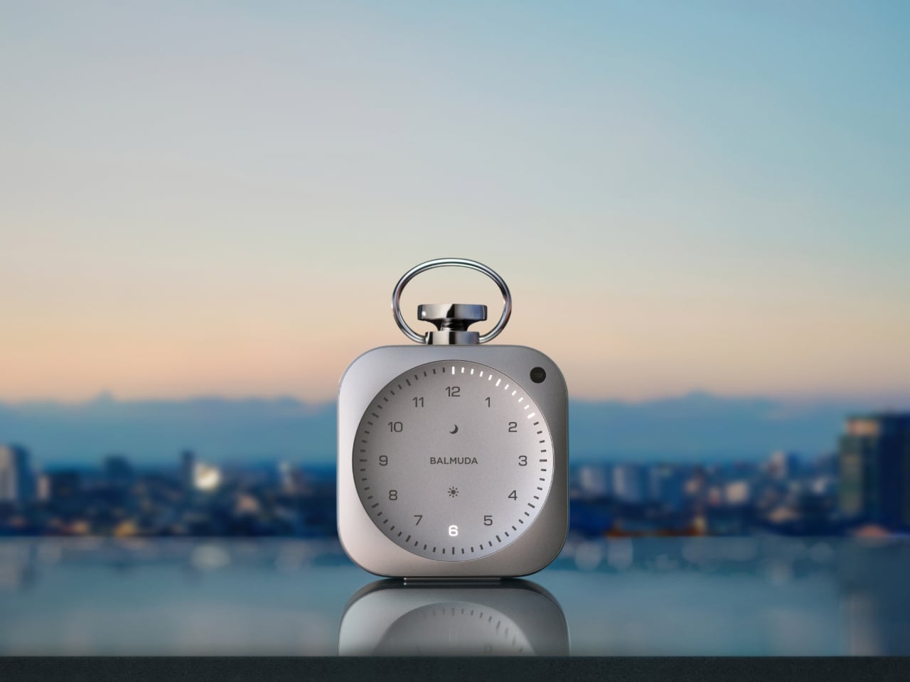
Balmuda, the Tokyo-based maker responsible for a limited-edition sailing lantern and an aesthetic humidifier, built The Clock around a specific frustration. Founder Gen Terao had been playing rain sounds on a tablet at night to help him sleep, then tolerating the screen’s glow from the bedside. The Clock is the object-form answer to that exact problem, designed to handle waking, focusing, and resting without once asking you to reach for your phone.
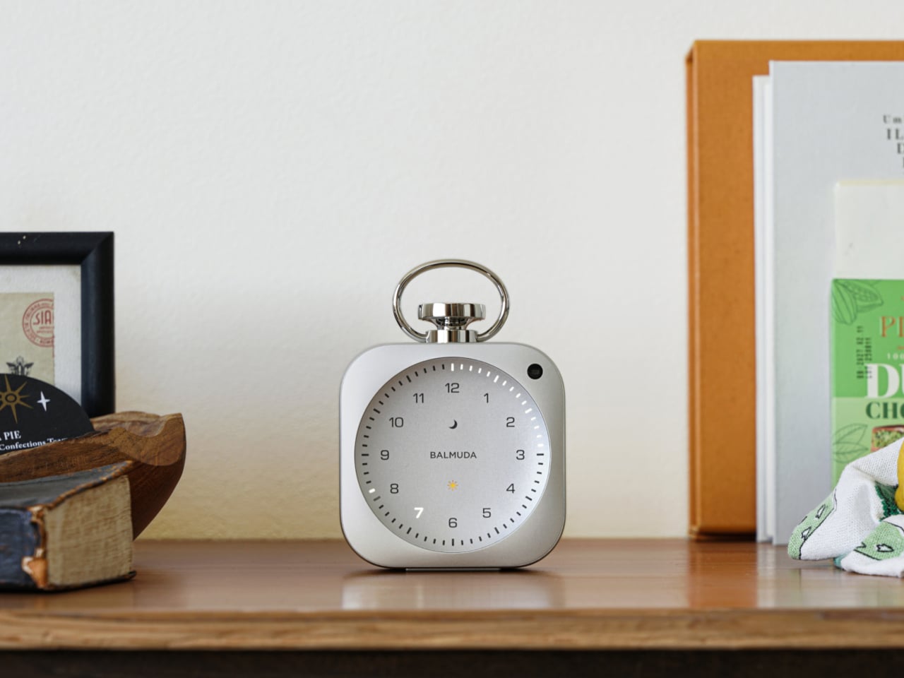
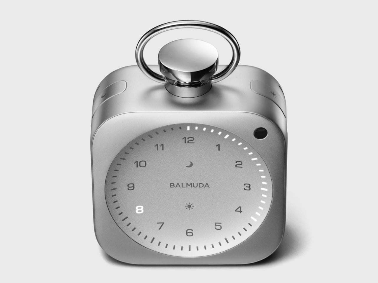
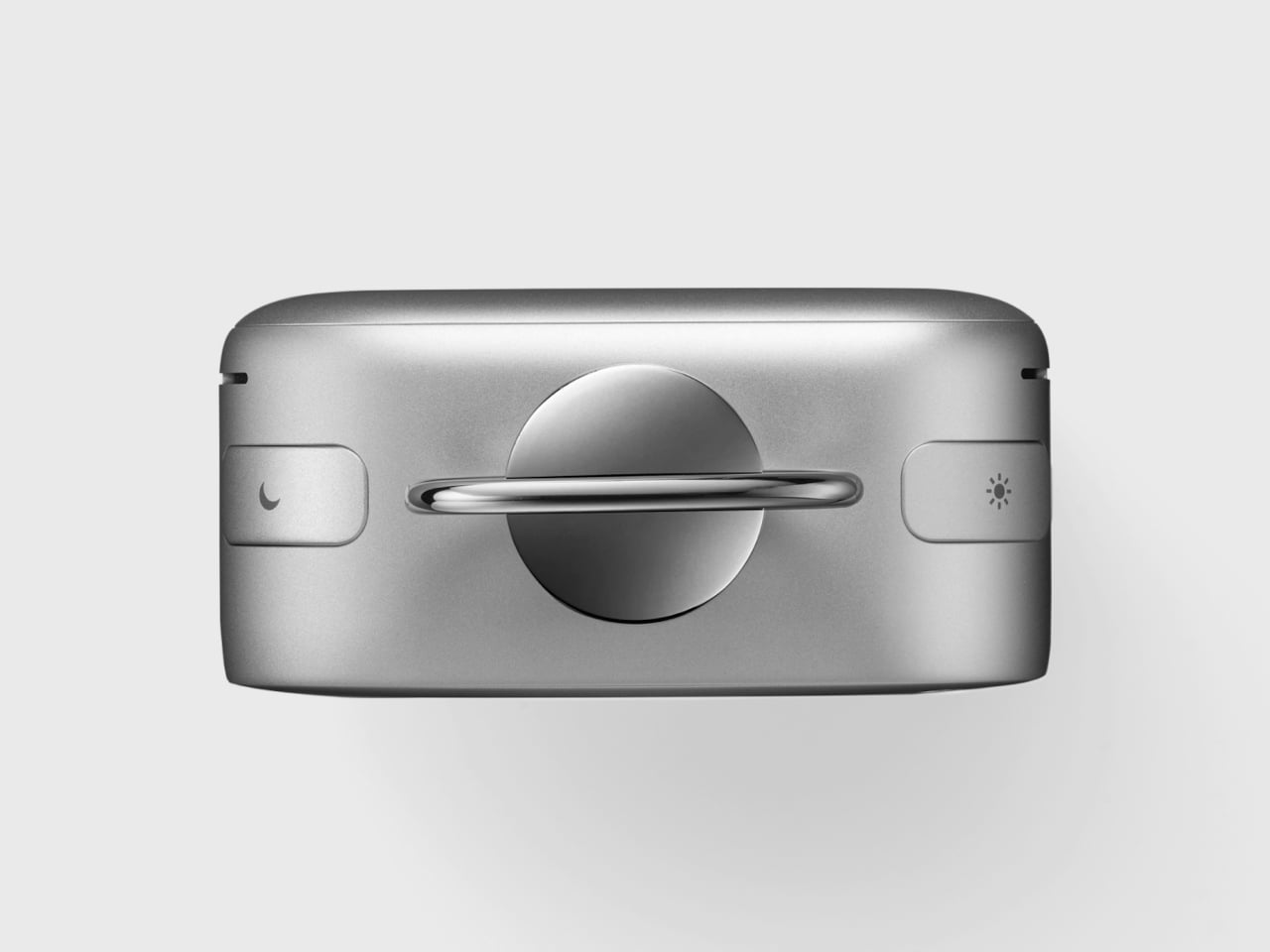
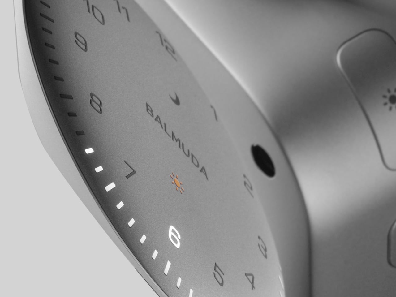
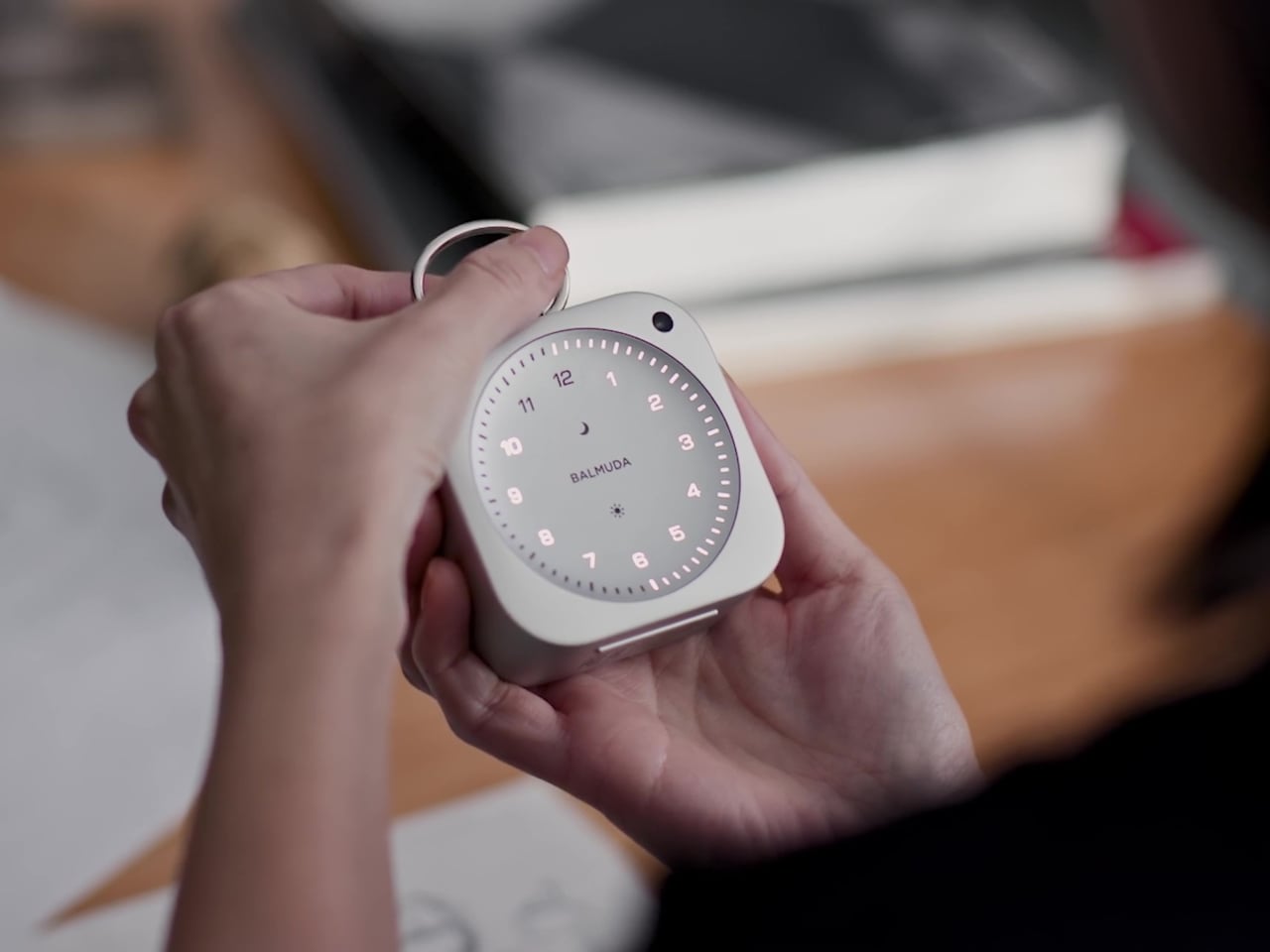
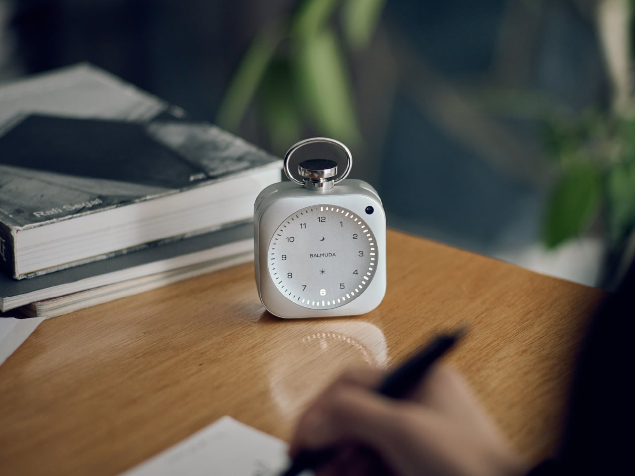
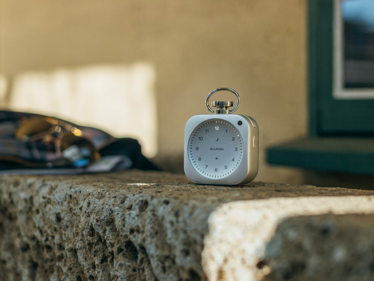
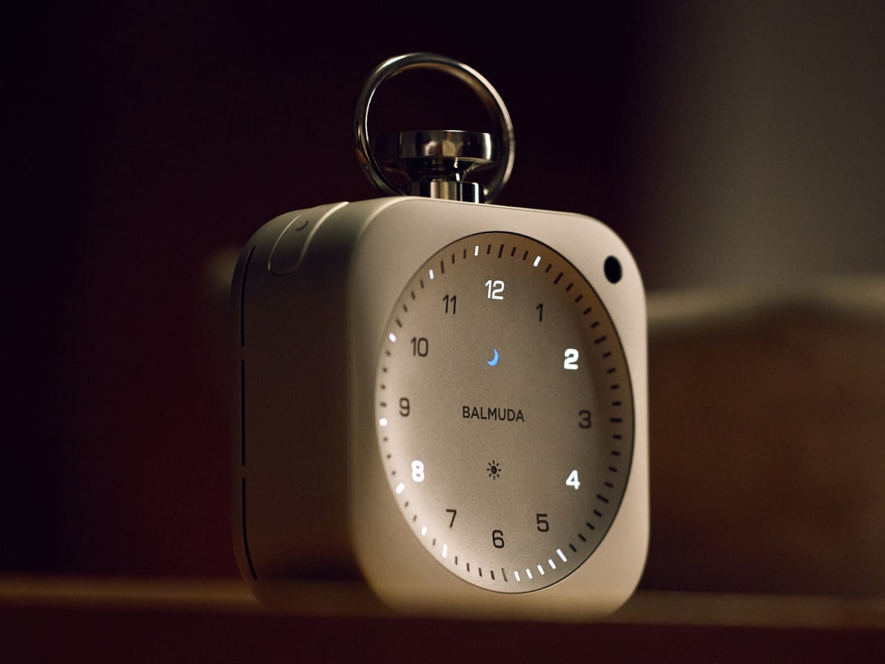
The dial has no physical hands. Balmuda’s “Light Hour” system expresses time through illumination alone, with a glow that reads more like something painted than something lit. The second-hand movement is slow and pendulum-like, and that quality was not accidental. The design team visited the Foucault pendulum at the National Museum of Nature and Science to study the movement before settling on the animation. That level of reference work is unusual for a clock.
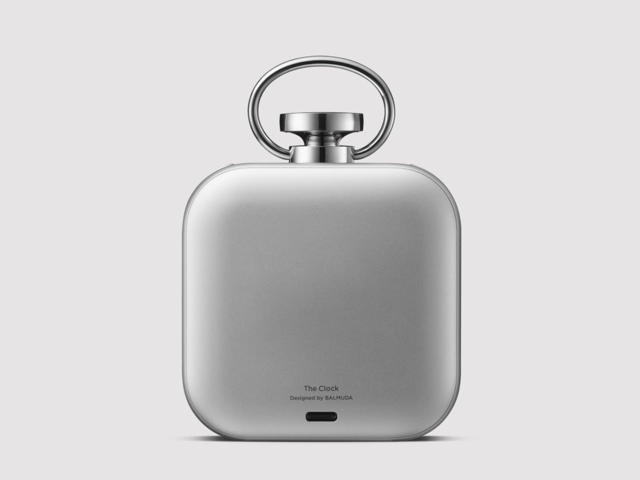
The aluminum body is machined from a solid block, finished to a polish that achieves both structural weight and surface quality in a 75mm square form. Getting there required resources Balmuda did not have independently. The company’s collaboration with Jony Ive’s design firm, LoveFrom, opened access to aluminum processing vendors with capabilities that, according to Terao himself, would not have been available otherwise. The result is a body with a density and finish that the specs alone do not prepare you for.
Three operational modes govern the day from the same pocket-sized object. Relax Time plays original ambient tracks, including rainfall, crickets, and thunder, all produced by an in-house sound team working with outside musicians. The focus timer layers white noise over a countdown. The alarm begins building volume gradually 3 minutes before it fully sounds, a small but considered alternative to the binary silence-then-noise of a standard alarm. Control over all three modes runs through the BALMUDA Connect app via Wi-Fi and Bluetooth 5.0, with options for multiple alarms, dial brightness, and a second time zone for travel.
At approximately 259g with a cloth carrying bag included and USB-C charging that restores a full 24-hour battery in about 2.5 hours, The Clock is portable without making portability the point. It is currently available in Japan at ¥59,400 (approximately $373), with no confirmed release date for other markets. At that price, it is asking to be taken seriously as an object rather than a category product, and the manufacturing pedigree behind it gives that ask some grounding.
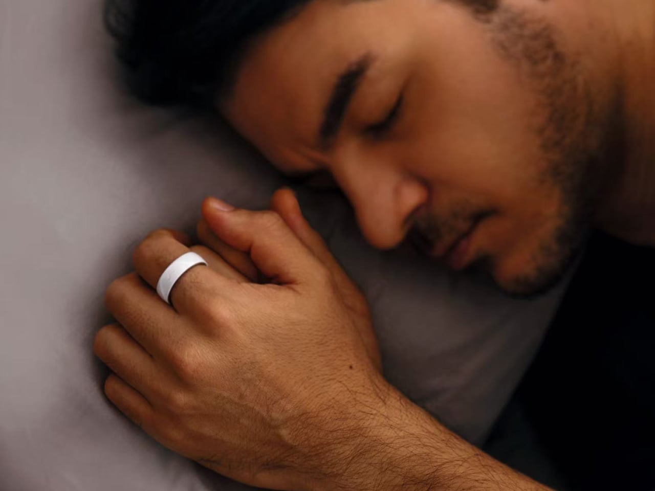
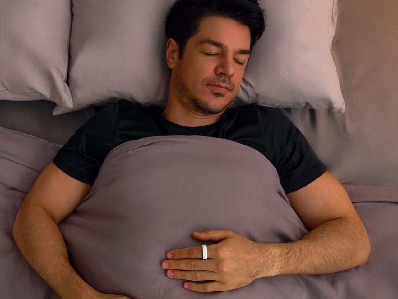
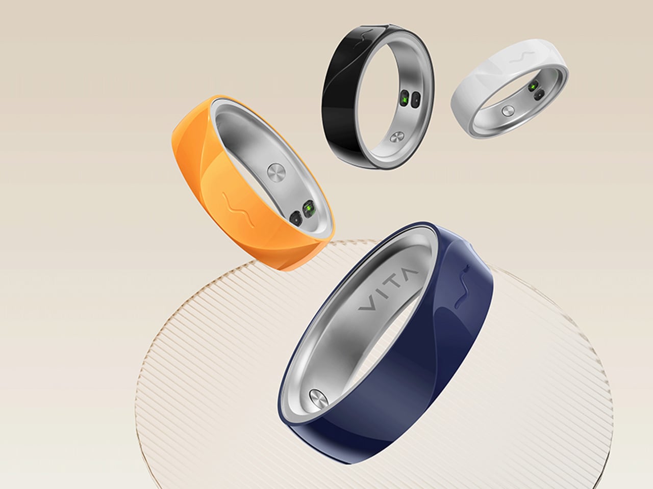
The fact that you have to charge your Apple Watch every 48 hours means there’s a small sliver of time in the day where it isn’t capturing data. Your body uses sleep to run its most important maintenance cycles, and the biometric signals during those hours carry real diagnostic weight: heart rate variability, breathing quality, blood oxygen levels during deep rest. These are the readings that can flag early signs of atrial fibrillation, sleep apnea, or chronic stress load well before symptoms appear in your waking hours. A device sitting on your nightstand during this window captures none of it. The form factor that makes the most sense for genuine 24/7 health tracking turns out to be one that never needs to come off. Something like a ring.
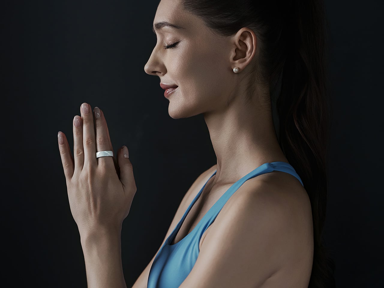
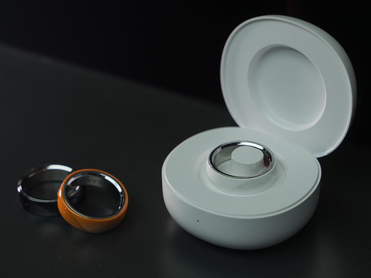
The VITA RING leans into this idea with a design that prioritizes both elegance and endurance. It uses a polished Aerospace Ceramic for its outer body, a material that feels more like a piece of refined jewelry than a piece of consumer electronics, and is 3x harder and scratch-resistant compared to titanium. This results in a device you are willing to live with twenty-four hours a day. With a battery that lasts up to a week on a single charge, it closes the data gap left by other wearables and operates silently in the background, using gentle haptic vibrations to deliver important alerts. It’s a design that ensures the ring remains forgotten until it has something important to share.
VITA’s core proposition organizes around three verbs: Alert, Advise, Act. The ring’s Multi-Agent Health System tracks over 17 health metrics continuously, watching for deviations from your personal baseline rather than population-level averages. When something shifts meaningfully, a gentle haptic pulse is the only output, keeping the alert channel completely separate from the noise of your phone screen. The AI layer contextualizes what it finds, identifying patterns across sleep, stress, recovery, and activity to surface insights specific to your body. For a market that has treated data volume as a proxy for intelligence, that distinction matters.
Where VITA separates itself is in how it handles sleep. Most trackers deliver a score after the fact; VITA monitors sleep stages, breathing quality, and runs Apnea Intervention in real time. The ring detects disrupted breathing and responds with a gentle vibration prompting the user to shift position, often helping restore a more regular breathing pattern. Sleep apnea affects an estimated 936 million people globally, the majority of them undiagnosed, and real-time intervention at the consumer level addresses a clinical gap most wearables have stepped around entirely. The seven-day battery earns its keep here specifically, because consistent nightly data is how health patterns actually emerge.
“In Tune With You” is VITA’s attempt to build women’s health tracking around biology rather than calendar math, covering cycle awareness, fertility window detection, and pregnancy monitoring, all anchored in continuous biometric data. Most mainstream wearables approach this space with a period date counter and little else. Layering temperature shifts and HRV patterns onto reproductive health tracking delivers a different category of insight, capable of identifying a fertile window or flagging a physiological change earlier than any date-based system. Women’s health has been chronically under-engineered in consumer wearables, and making it a first-class feature is a deliberate product statement.
Circle of Care extends private health monitoring into a shared experience, letting users choose which wellness insights to share with trusted contacts alongside AI-guided care tips and relevant context. The Emergency SOS feature lets users send their live GPS location to those same contacts with a single tap when they cannot reach their phone. For adult children with aging parents, or anyone managing a chronic condition within a family dynamic, this broadens the ring’s utility considerably. Health monitored in isolation often goes unacknowledged, and VITA has built the architecture to change that.
Oura Ring charges $5.99 a month for premium features on top of the hardware cost. WHOOP’s entire model is subscription-based, with users paying around $30 a month to access their own data. VITA is different: core health tracking is completely free, but AI Health features require a subscription. Kickstarter backers get 1 year of AI Health features at no extra cost. The VIP pre-launch price sits at $179, representing 53% off eventual retail, and early backers who sign up before March 17 receive a free sizing kit. The real measure of whether it all holds up comes when hardware reaches users, but the pricing structure alone will earn serious attention in a market that has normalized subscription fatigue.
Most people who game on a PC own two things that do roughly the same job at different times: a mouse for the desk and a gamepad for the couch. They live side by side, occasionally getting in each other’s way, and neither one is going anywhere. Pixelpaw Labs, a hardware startup from Bangalore, India, thinks that arrangement is wasteful and has built something to prove it.
The Phase is a wireless mouse that physically separates down the middle into two independent halves. Snapped together, it sits on a desk and works like a normal mouse. Pull it apart, and each half reveals a joystick, triggers, a D-pad on the left side, and face buttons on the right, a split gamepad that was hiding in plain sight the whole time.
That missing scroll wheel is not an oversight. Fitting a traditional wheel in the center of the body would have made the split mechanism impossible, so Pixelpaw replaced it with a capacitive touch strip along the top of the left button. Flicking a finger across it scrolls through documents and web pages, with a glide feature that lets the momentum coast rather than stop abruptly. It’s a trade-off that works around a real geometric constraint.
As a mouse, the Phase is competitive on paper. A 16,000 DPI optical sensor pairs with a 1,000 Hz polling rate when connected via the included 2.4 GHz USB dongle. Bluetooth LE is available for convenience and multi-device pairing across up to three devices, though the polling rate drops to 125 Hz in that mode, a gap that matters in fast-paced PC games.
Up to 18 customizable buttons are mappable through the Pixelplay companion app, and a Layer button doubles each button’s function capacity without adding physical complexity. Battery life is rated at 72 hours per charge over USB-C, which is more than enough to outlast dedicated gaming sessions on either side of its personality.
The controller halves use mechanical tactile switches, which is more than most mobile gaming clip-ons bother with. Pixelpaw also has an accessory called the Phasegrip, a bracket that holds the two separated halves apart with a smartphone mounted in the center, turning the setup into a handheld console for mobile gaming. The Phase works across PC, Android, iOS, iPadOS, and ChromeOS, so switching between devices doesn’t require swapping hardware.
Everything shown so far is pre-production, and the company has been upfront that the final surface finish will differ. That’s a meaningful caveat for a product whose physical fit and feel will determine whether the concept actually holds up. Whether they’ll be able to deliver this Holy Grail of PC gaming, however, is the real question that can only be answered in time.
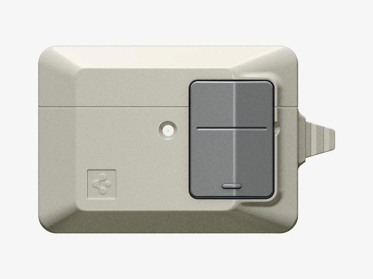
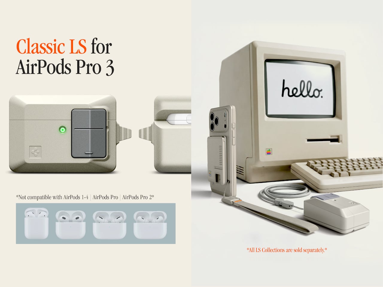
There’s something quietly odd about the era when Apple products were beige. Not bad, just odd. The Macintosh 128K, the boxy rectangular mouse, the Apple Lisa; they were made from a warm off-white plastic that aged into something stranger, a color that collectors now call “Pantone 453 approximately.” Spigen, a brand that usually channels its energy into clear polycarbonate shells, has decided this particular slice of computing history deserves a second life on your keychain.
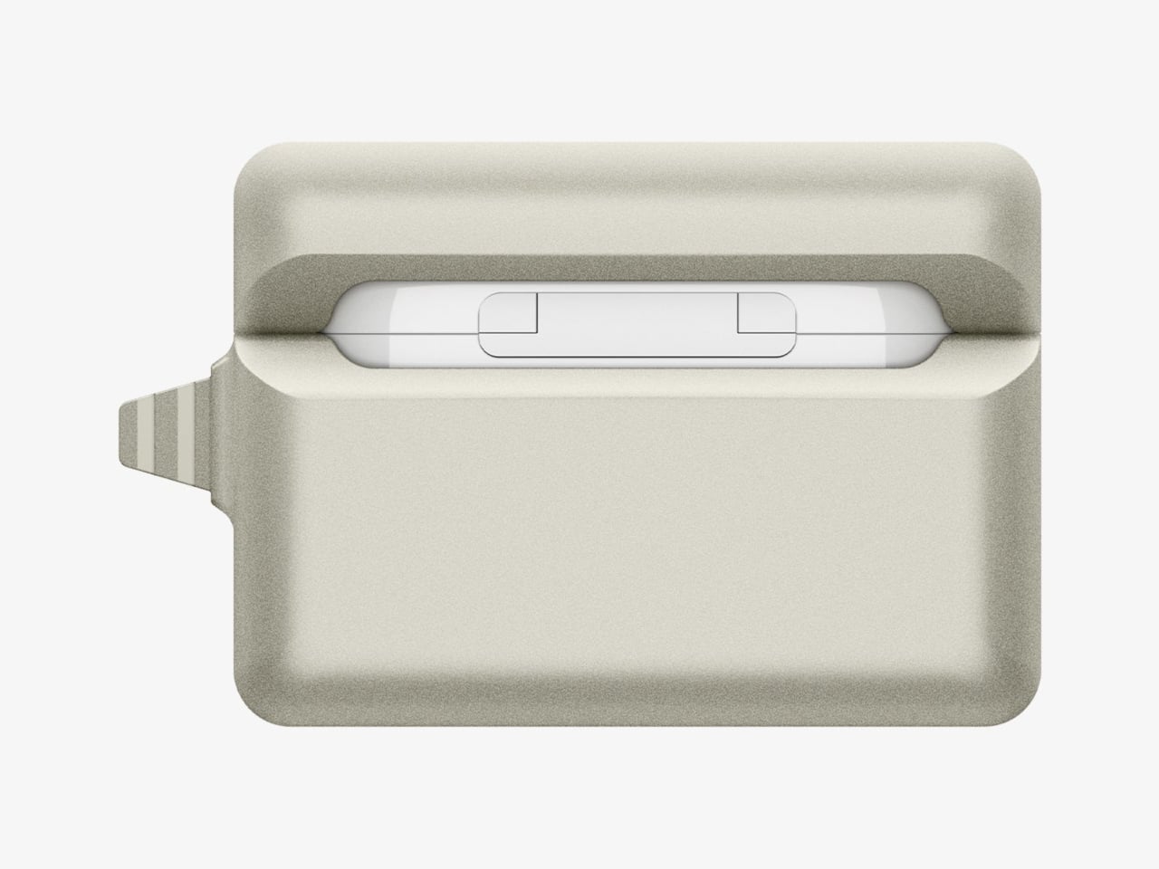
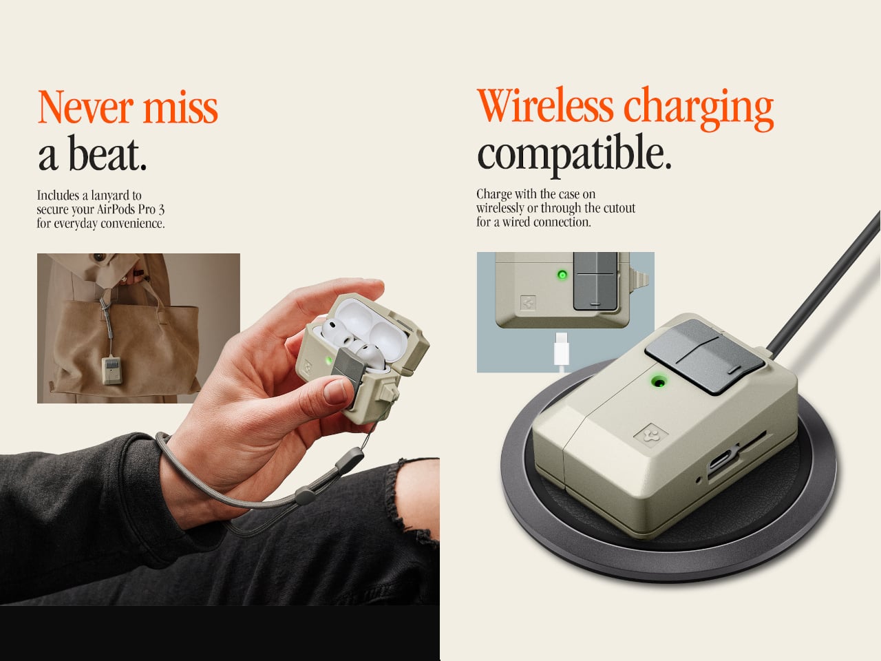
The Classic LS AirPods Pro 3 case is the latest piece of Spigen’s retro-Mac collection, which launched in January 2026 with an iPhone 17 case modeled after the Macintosh 128K and Apple Lisa. The AirPods case takes a narrower reference: the original Apple mouse, that flat, single-button input device that became an icon despite being spectacularly simple. It joins a phone strap and a MagFit wallet styled as a floppy disk reader, completing a four-piece set.
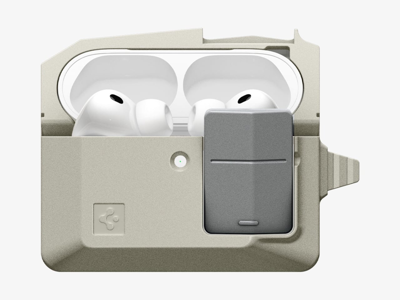
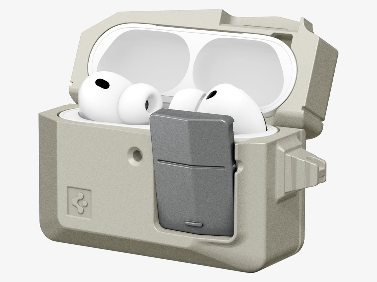
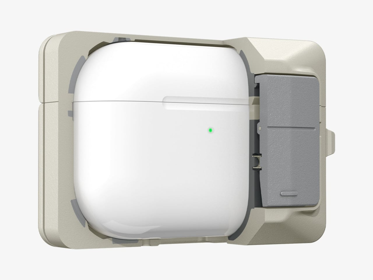
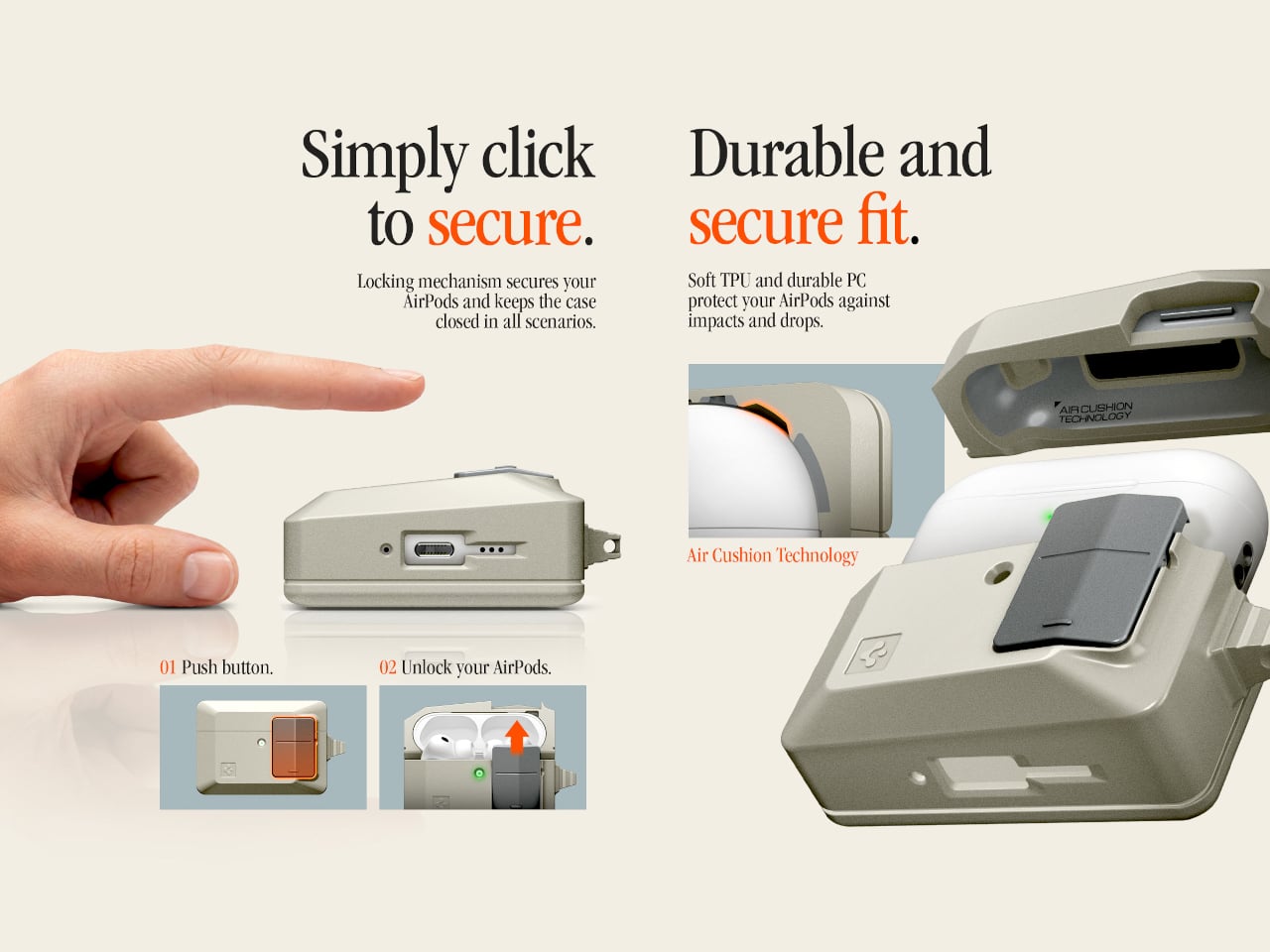
The case borrows the mouse’s proportions, its warm stone-colored plastic, and its most tactile feature. Spigen built a “Push to Unlock” locking mechanism into the front, positioned where the mouse button would have been. Press it and the hinged lid releases; snap it shut, and it clicks back into place. It’s a small mechanical gesture, but it makes opening and closing feel deliberate rather than accidental.
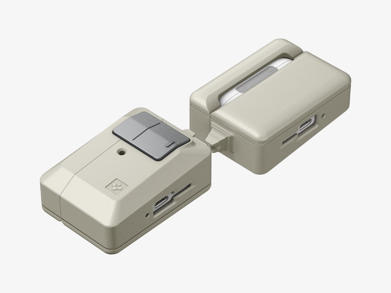
That security matters more than it sounds. For anyone who has found a lidless AirPods case rattling loose at the bottom of a bag, the locking mechanism is a genuine practical improvement over standard cases. The AirPods don’t pop out unexpectedly, and the lid doesn’t spring open on its own. An adhesive strip inside connects the lid to the top of the AirPods case, so the whole assembly opens cleanly as one unit.
The shell itself is polycarbonate, reinforced with what Spigen calls Air Cushion Technology, an internal structure designed to absorb impact at the corners and edges. The case wraps the AirPods Pro 3 charging case completely, with a cutout at the bottom for USB-C wired charging and a clear path through the back for wireless charging. Both work without removing the case.
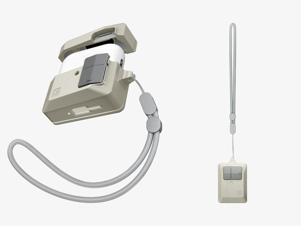
A braided lanyard comes included, threading through a loop on the side. This isn’t just a piece of decoration, as small charging cases have a remarkable talent for disappearing into coat pockets and bags, and a physical tether is a more reliable retrieval system than searching by feel. The Classic LS case retails for $44.99, which places it comfortably in the broader collection alongside the $40 MagFit wallet and well below the $60 iPhone case that started it all.
Winter pockets are forgiving. Thick jackets and layered coats offer deep storage, and the cold discourages the kind of outdoor tinkering that puts your gear to the test. Spring strips all of that away. Lighter clothing means fewer pockets, tighter fits, and a sudden reckoning with whatever you have been carrying for the past four months. The transition is a forced audit, and most people discover their loadout has gotten lazy, bloated, or both.
These seven products approach everyday carry from the direction that matters most once the temperature rises: density of function in the smallest possible footprint. No redundant tools. No objects that exist only to look tactical on a desk. Every item here earns its pocket space by solving a specific problem with engineering that is tight enough to disappear into a spring carry without adding bulk—time to swap out the winter loadout for something sharper.
1. ScytheBlade
The curved blade of a scythe does not seem like an obvious candidate for pocket carry, but the ScytheBlade makes it work through radical miniaturization. This titanium folding knife borrows the Grim Reaper’s iconic profile and compresses it into something closer to a tiger claw, creating a blade shape that looks aggressive because it is. At just 46mm when deployed, the ScytheBlade challenges the assumption that effective cutting tools need generous proportions. The curve concentrates force along its edge in ways that straight blades cannot replicate, and that geometry turns a small blade into something disproportionately capable.
Titanium construction keeps the weight to 8 grams, making it barely noticeable when clipped to a pocket. The material also offers corrosion resistance without requiring the constant oiling and maintenance that carbon steel demands, a real advantage for spring carriers when rain and humidity are part of the daily equation. The engineering here is in the confidence to go small. Most EDC knife makers chase longer blades and heavier locks to project seriousness. The ScytheBlade proves the opposite: that an unconventional blade geometry, executed at a micro scale with the right material, outperforms bulk.
What we like
At 8 grams in titanium, it disappears into a pocket and removes the excuse to leave a knife at home.
The curved blade concentrates cutting force in a way that straight-edge micro knives cannot match, making it more capable than its 46mm length suggests.
What we dislike
The 46mm blade length limits what the knife can realistically handle; anything thicker than a zip tie or packing tape will push its limits.
The scythe profile is polarizing, and its aggressive look may draw attention in settings where a discreet blade would be preferable.
2. Arcos Driver
Ratchet screwdrivers work well in open spaces. The problem is that screws rarely live in open space. They sit in recessed housings, tucked behind cables, angled into corners where a straight driver either cannot reach or forces an awkward wrist contortion that strips heads. The Arcos Driver addresses this with a folding titanium body that adjusts to 0, 30, 60, or 90 degrees, allowing the tool to adapt its geometry to match the access angle rather than requiring the user to twist around it.
Inside is a three-mode ratchet system: forward for driving with consistent torque, reverse for clean removal, and a fixed-lock mode for stable, precise control when the screw matters more than speed. Integrated bit storage keeps everything in one unit, which is the kind of detail that separates a tool you actually carry from one that lives in a drawer. The titanium build brings strength without the weight penalty that steel ratchets impose, and the folding mechanism locks securely enough at each angle to feel confident under load. Spring means more outdoor projects, more furniture assembly on balconies, and more repairs that winter made easy to postpone. The Arcos Driver fits all of that into a carry-friendly package.
Four distinct folding angles mean access to screws in tight, awkward spaces without the wrist strain that straight drivers cause.
Integrated bit storage keeps the tool self-contained, so there is no fumbling through a separate bit case mid-task.
What we dislike
Kickstarter-funded tools carry inherent delivery uncertainty, and backers should factor in the risk of timeline delays.
The folding mechanism adds complexity that could develop play over time, particularly at the 30-degree position where lateral force is highest.
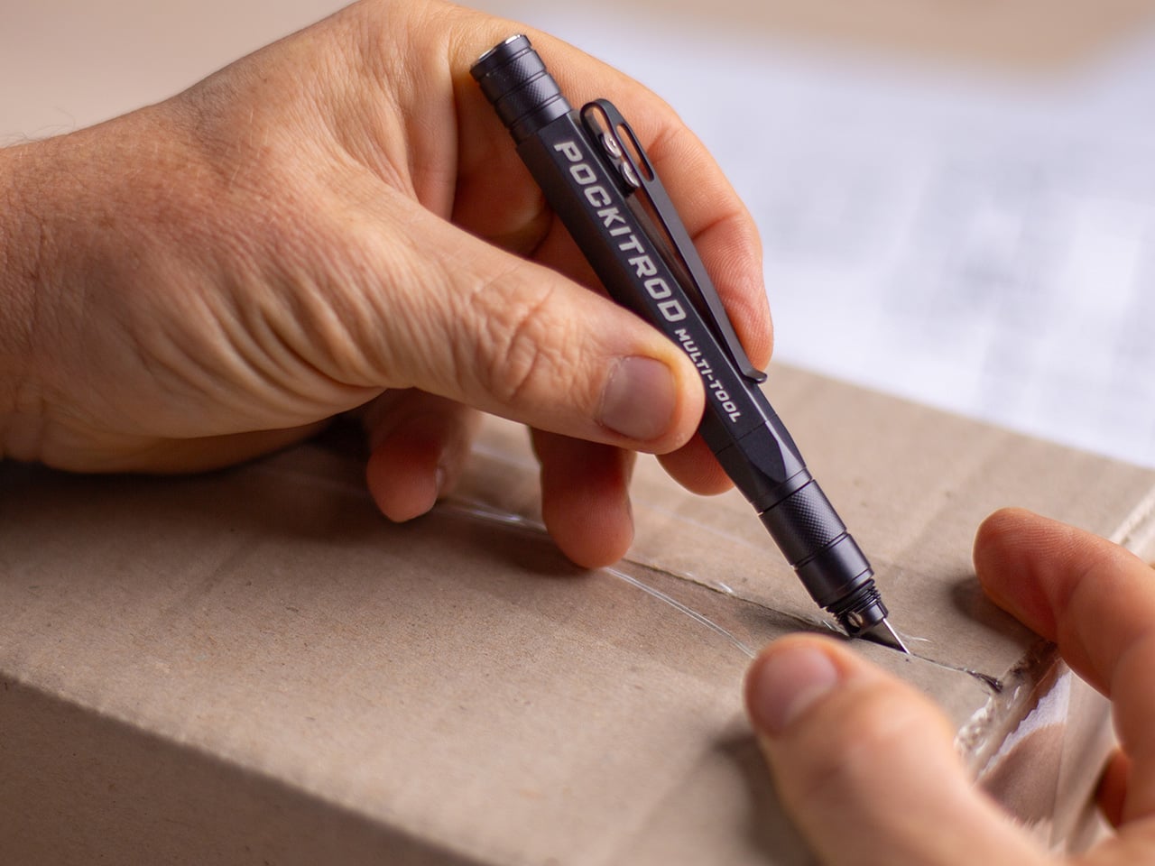
3. Pockitrod
The tactical pen market is full of cylinders that add one feature (usually a glass breaker) to a writing instrument and call it innovation. The Pockitrod is a different animal. Its 6061-T4 aluminum body is machined with a hex cross-section that doubles as a driver grip, and the tool system inside is genuinely modular: a central driver assembly housed within the handle, a box opener with interchangeable 20CV steel tips, an inkless writing implement, and a magnetic-base LED flashlight that threads on as an extension module.
Etched measurement markings along the body function as a built-in ruler, with the zero-reference aligned to the edge for practical, real-world measuring rather than decorative engraving. The pen form factor is the smartest part of the design. A pen lives in a shirt pocket or a bag without raising questions. Nobody looks twice at it. But when work starts, the hex body locks into a bit the same way a proper driver handle would, and the modular extensions transform a pocket pen into a lighting, cutting, and fastening system. It respects the classic pen silhouette while fundamentally expanding what that silhouette can do.
What we like
The hex-profile aluminum body works as a genuine driver grip, not a marketing claim; it locks onto bits with the same positive engagement as a dedicated tool.
Modular extensions (LED, box opener, driver) thread onto a single pen body, consolidating multiple pocket tools into one.
What we dislike
Modularity means more pieces to keep track of, and losing a single extension reduces the tool’s value proposition.
The 6061-T4 aluminum is lighter than steel but also softer, meaning the hex edges will eventually round with heavy driver use.
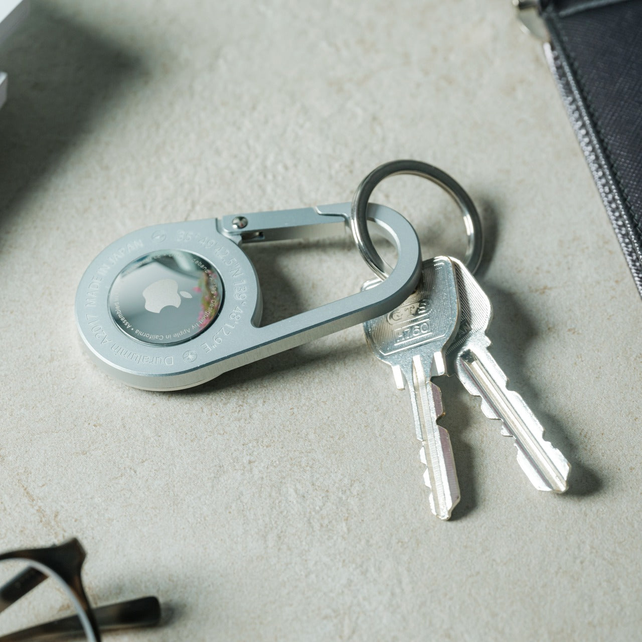
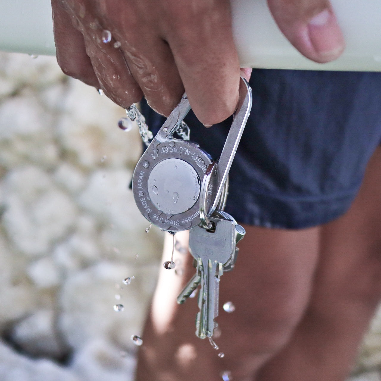
4. AirTag Carabiner
Losing keys is a winter problem that follows people into spring because nobody upgraded their keychain. This carabiner, made from Duralumin composite alloy (the same material used in aircraft and marine construction), is designed to house an Apple AirTag while clipping onto bags, bikes, umbrellas, or whatever tends to wander. The material choice matters because most AirTag holders are silicone or plastic, which means they degrade, stretch, and eventually drop the tag entirely.
Each unit is individually handcrafted from high-quality metal, and the carabiner is also available in untreated brass and stainless steel. The Duralumin version brings water and altitude resistance suited to actual outdoor conditions, not just controlled indoor environments. Spring carry means more time outside, more chances to leave something on a park bench or a cafe table, and a tracking solution that clips seamlessly onto whatever bag or gear you are carrying makes the transition from indoors to outdoors less risky. The lightweight form hides the fact that the alloy underneath is built to handle far harsher conditions than a keychain typically encounters.
Duralumin composite alloy provides aircraft-grade durability in a form factor that adds almost no perceptible weight to a bag or keyring.
Handcrafted metal construction outlasts silicone and plastic AirTag holders, which tend to stretch and lose grip over months of use.
What we dislike
Apple AirTag is not included, so the total cost of entry includes both the carabiner and the tag itself.
The tracking functionality is Apple ecosystem only, leaving Android users without a compatible option.
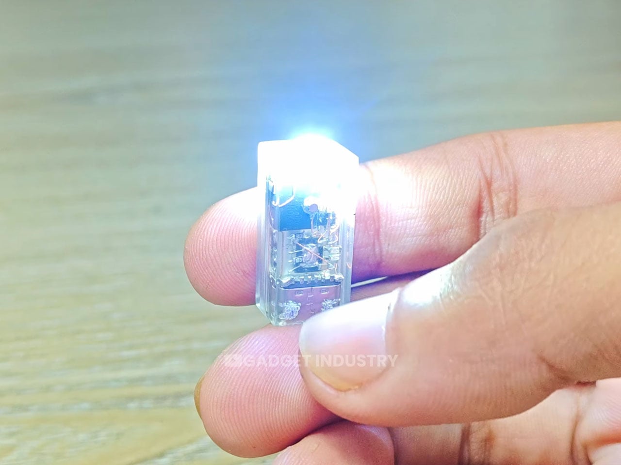
5. Fingertip-sized Rechargeable Flashlight
World’s smallest is a claim that usually comes with an asterisk. This flashlight, built as a DIY experiment by YouTube channel Gadget Industry, skips the asterisk. It sits on the tip of a finger. Inside that resin shell: a lithium-polymer battery, a charging circuit, a touch-based control system, and a white LED. That is a fully rechargeable, functional light source condensed into a form factor that most people would mistake for a button.
The scale alone is the point. In a crowded EDC landscape where flashlights compete on lumens, beam distance, and tactical modes, this micro torch takes the opposite approach. It prioritizes presence over power: a light source so small that it will always be with you, because forgetting it is almost impossible. Spring evenings still get dark, and the gap between leaving work and arriving home often involves poorly lit stairwells, parking garages, or bike paths. A light that lives permanently on a keychain or in a coin pocket fills that gap without adding any detectable weight. It is a reminder that miniaturization itself can be the innovation.
What we like
The form factor is so small that it can live permanently on a keychain without adding bulk, which means it is always available.
Fully rechargeable with touch controls, so there are no disposable batteries and no physical switches to break.
What we dislike
As a DIY build from a YouTube channel, it is not commercially available, which limits accessibility to viewers willing to replicate the project.
The tiny lithium-polymer battery means the runtime is limited, and the light output is functional rather than powerful.
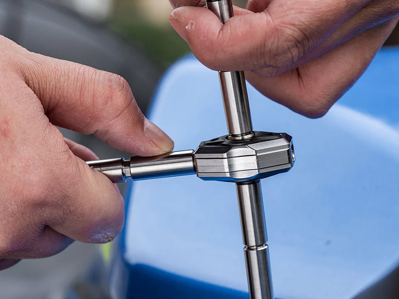
6. Titaner Swing Ratchet System
Most ratchets need at least 15 to 30 degrees of swing to engage the next tooth. In tight spaces, that range is the difference between completing a turn and stalling. The Titaner swing ratchet compresses that arc to 4 degrees, which means it can operate in gaps where conventional ratchets physically cannot cycle. Both sides of the ratchet core are functional, with CNC-engraved directional markers (one side locks, the other releases) for intuitive control without trial-and-error guessing.
At 29.8 grams, the system weighs 40% less than traditional ratchets while delivering full torque. The modular design allows different driver heads and bit configurations, so the same core handles multiple fastener types without carrying separate tools. Spring projects (tightening deck furniture, adjusting bike components, assembling outdoor gear) tend to involve screws in confined or partially accessible locations. A ratchet that fits those conditions at under 30 grams is the kind of tool that justifies its pocket space every week rather than sitting idle waiting for a big job. The precision here is not about power. It is about access.
What we like
A 4-degree swing arc allows the ratchet to function in spaces so tight that standard ratchets cannot even begin to cycle.
At 29.8 grams, it is 40% lighter than traditional ratchets, making it realistic for daily pocket carry rather than toolbox-only storage.
What we dislike
Ultra-compact ratchet heads can feel less confident under heavy torque loads compared to full-sized counterparts.
7. Cubik
Knife designers typically rely on springs, flippers, or complex bearing systems to get a blade open. The Cubik discards all of that in favor of gravity. Press the trigger, hold it upside down, and the blade drops into position. Release the trigger, and it locks. This mechanism eliminates the springs that rust, bearings that fail, and maintenance cycles that plague traditional folders. The knife works with physics rather than fighting it, and the satisfying weight of the blade swinging into place feels like the mechanism earned its simplicity.
That simplicity does not mean weakness. The Cubik locks firmly enough to pierce hardwood, which puts it in functional territory that most gravity-deploy designs cannot reach. The tungsten carbide glass breaker integrated into the rear end transforms what could be a gentleman’s folder into a legitimate emergency tool. When most EDC knives chase complexity through additional deployment systems, assisted-open mechanisms, and axis locks, the Cubik goes the other direction. One moving part. One material is doing the heavy lifting. The result is a knife with fewer failure points and a deployment method that never gets old to use.
What we like
Spring-free gravity deployment means zero mechanical parts that can rust, jam, or wear out over years of daily use.
The integrated tungsten carbide glass breaker elevates the knife from an everyday cutter to a genuine emergency tool.
What we dislike
Gravity deployment requires the knife to be held upside down, which is slower than a spring-assisted or flipper-based opening in time-sensitive situations.
The legal status of gravity knives varies by jurisdiction, and some regions classify them differently from standard folding knives.
Lighter pockets, sharper choices
The shift from winter to spring is not about adding gear. It is about compressing a function into less space. Thinner jackets, shorter pockets, and more time outdoors demand a loadout that earns its presence through utility rather than just occupying real estate. These seven tools share a design philosophy rooted in that compression: titanium, where weight matters; modularity, where versatility matters; and miniaturization, where pocket space is the constraint.
Spring carry is a constraint worth designing for. The tools that survive the seasonal edit are the ones that do their job without reminding anyone they exist, until the moment they are needed. That is the entire point of everyday carry, and these seven understand it.
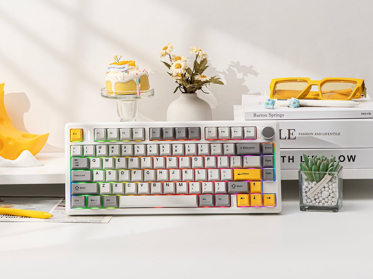
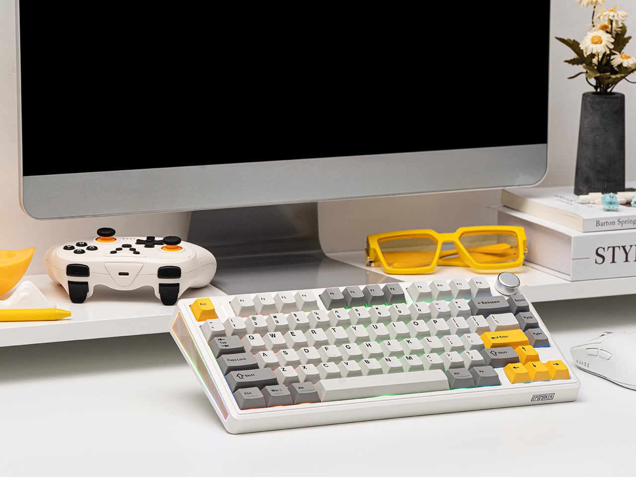
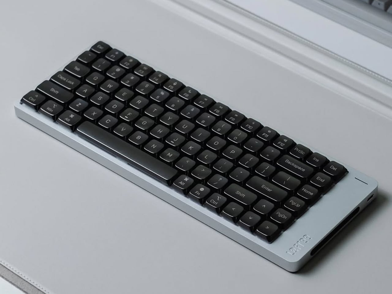
There is a particular kind of frustration that comes with wireless keyboards, and it always arrives at the worst possible moment. Mid-sentence, mid-meeting, mid-game, the low battery warning blinks, the charging cable is nowhere nearby, and the whole appeal of going wireless suddenly feels like a poorly negotiated deal. The TH80 V2 and TH80 V2 Pro from Epomaker were built with that specific frustration in mind.
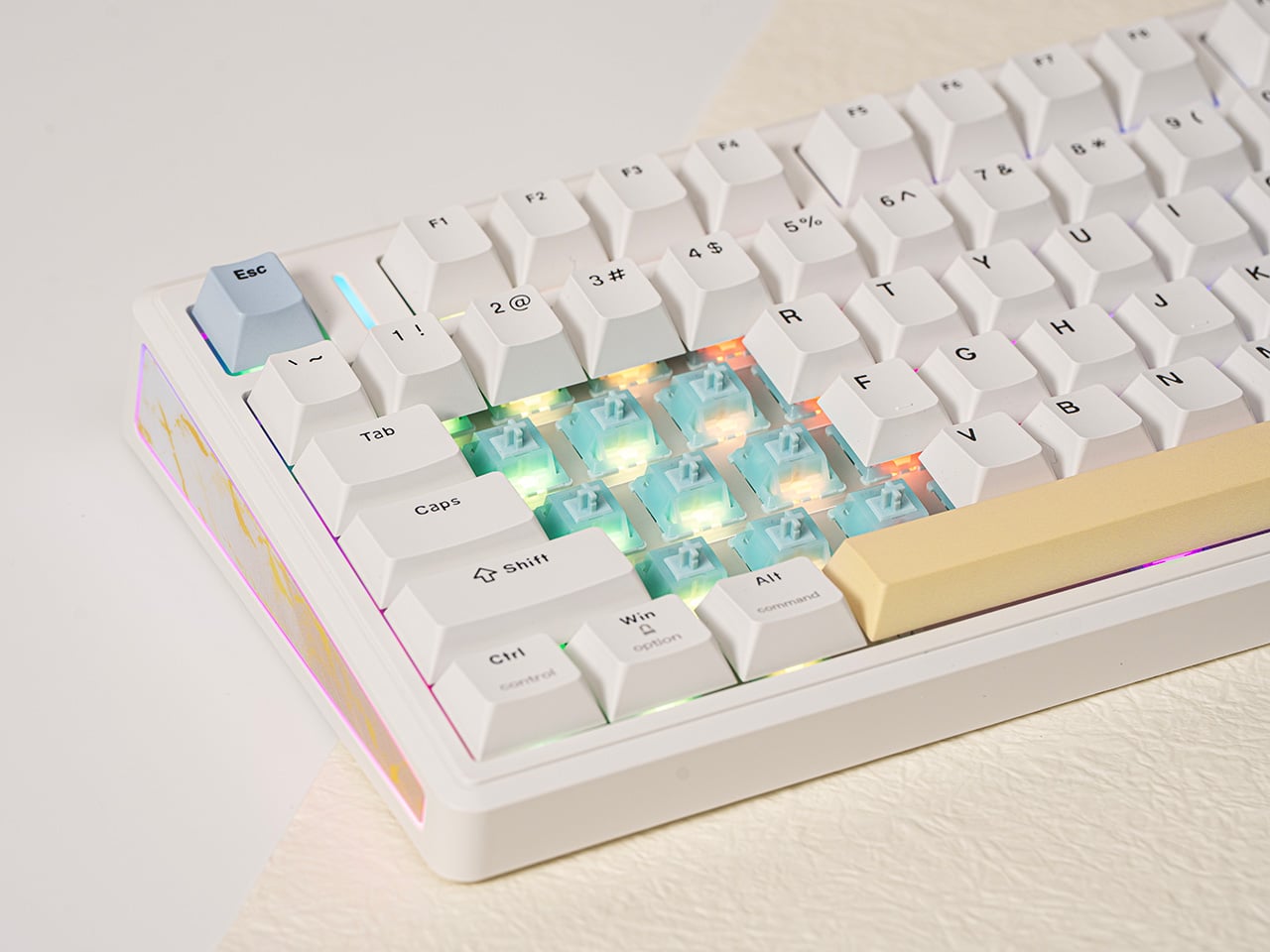
Both boards share a compact 75% layout, keeping the function row and dedicated arrow keys while shedding the numpad bulk that full-size keyboards carry everywhere. They are available in two switch flavors: the Creamy Jade linears for a smooth, consistent keystroke, and the Sea Salt Silent V2 switches for anyone sharing a space with people who would rather not hear every word being composed out loud.
Underneath each keystroke is a gasket-mount structure paired with a five-layer sound-dampening system. The polycarbonate plate adds some flex to the mix, and the result is that soft, cushioned thud the keyboard community has taken to calling “creamy.” It is one of those things that sounds like marketing until the first time a finger lands on a well-tuned gasket board, and then it just sounds like a very good reason to keep typing.
The battery is where both boards make their most persuasive argument. The TH80 V2 carries an 8,000 mAh cell rated at 200 hours with the RGB off, and the TH80 V2 Pro steps that up to 10,000 mAh. Most wireless keyboards in this price range ship with cells a quarter that size, which means charging becomes a weekly ritual rather than a distant afterthought. Both boards support 2.4 GHz, Bluetooth, and wired USB-C connectivity, remember up to five paired devices, and switch between Windows, Mac, and Android without any fuss.
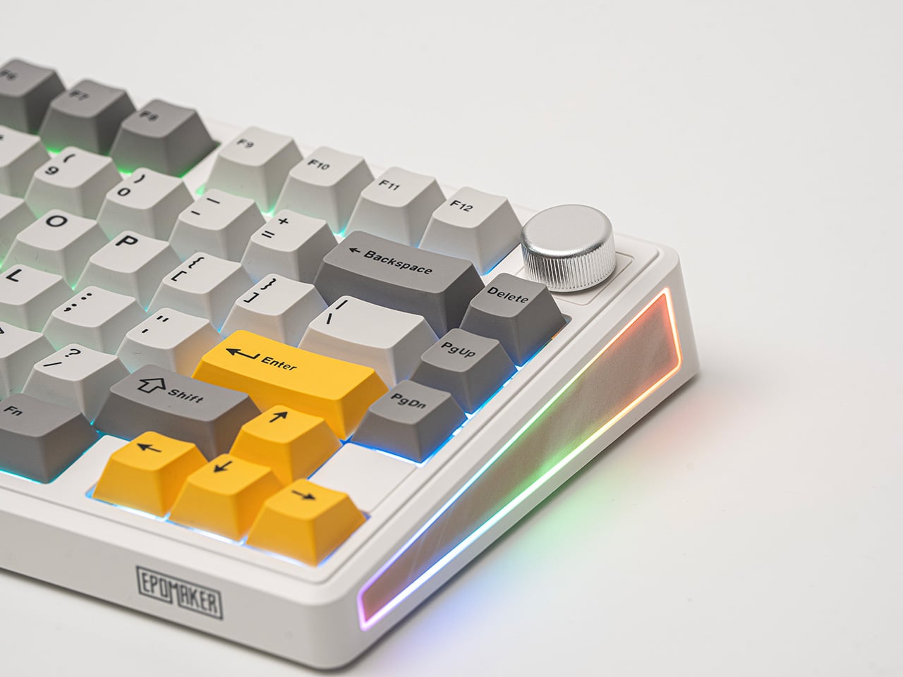
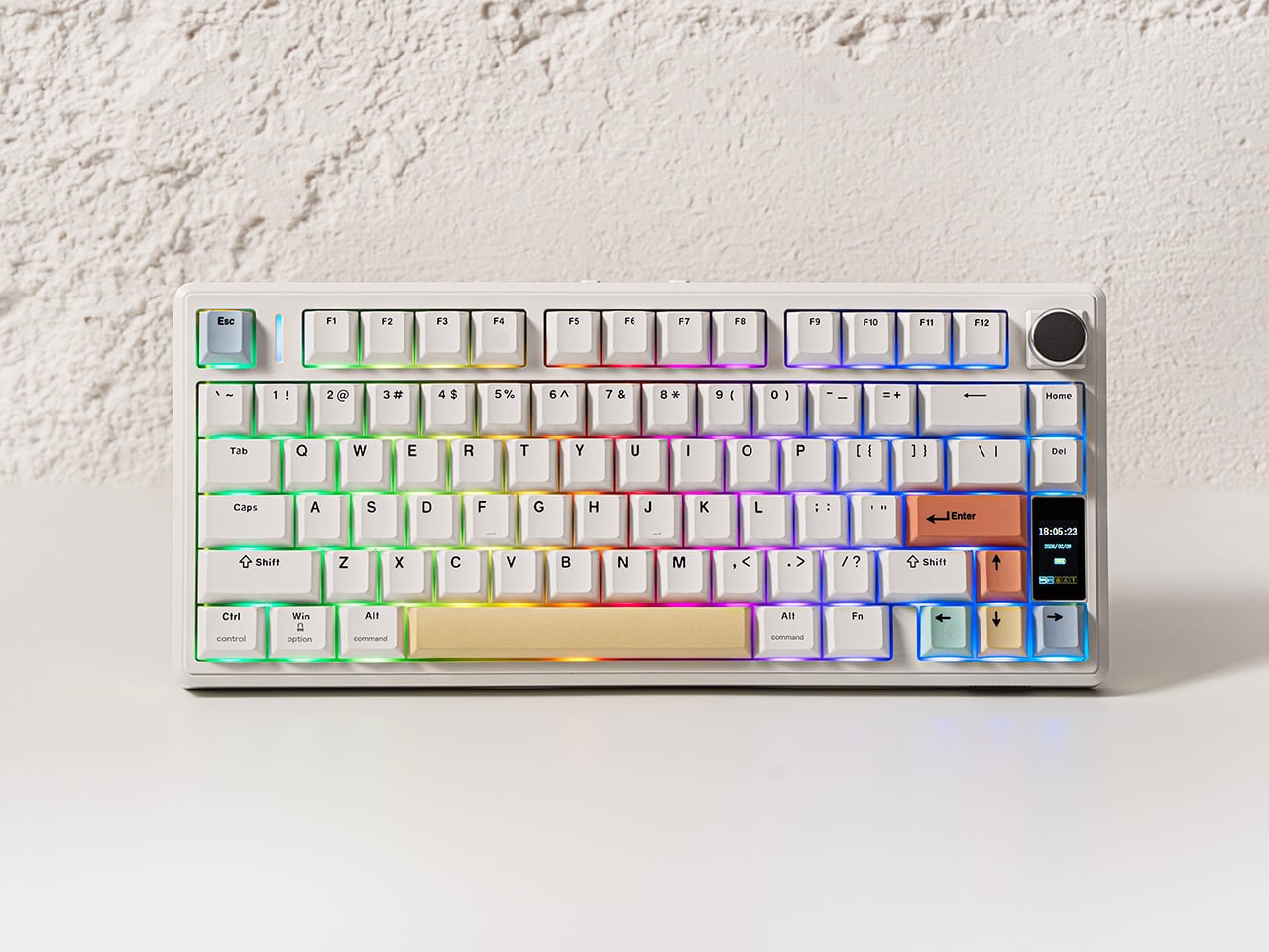
TH80 V2 Pro
The TH80 V2 Pro goes a step further with a 1.06-inch glass-covered TFT color screen tucked beside the rotary knob. It shows time, battery percentage, and connection status at a glance, which is genuinely handy. It also supports custom GIF uploads through Epomaker’s browser-based driver, so the screen can carry a small personal detail for anyone who treats their desk as a considered space. No software installation needed, either, which removes a step that should have been dropped from this category a long time ago.
Picking between the two is a fairly straightforward exercise in priorities. The TH80 V2 covers the gasket mount, the massive battery, hot-swappable switches, full per-key RGB, and a side-lighting bar, available in a subtle Black Grey or a composed White Grey Yellow. The TH80 V2 Pro adds the LCD screen, the larger battery, the browser-based driver, and more expressive colorways, including a striking translucent black and a fan-favorite Pink edition.
What the TH80 V2 series gets right is the part that rarely makes it onto spec sheets: the sense that someone thought carefully about what actually makes a wireless keyboard annoying to live with, and then addressed those things one by one. Good typing feel, a battery that lasts long enough to stop being a concern, and enough room for personalization that the board can feel like yours rather than just a peripheral you settled for.
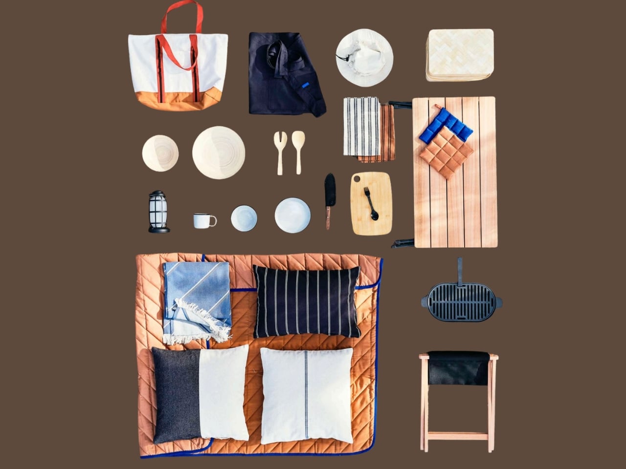
Most camping gear looks like it was designed for someone who thinks color theory is for the weak. It’s all neon-trimmed polyester and tactical buckles that somehow cost as much as a plane ticket. IKEA, of all brands, just called the bluff on that entire category.
The Swedish giant’s new SOLUPPGÅNG collection arrived this month, and it is genuinely one of the more interesting product drops to come out of the outdoor space in a while. The name translates to “sunrise” in Swedish, and the design philosophy follows that same unhurried logic: slow mornings, good light, fresh air, minimal fuss.
Designer Darja Nordberg of IKEA of Sweden drew from two very distinct wells. The first is friluftsliv, the Norwegian concept of open-air living that encourages outdoor time as a normal, everyday rhythm rather than a special event. The second is Japanese urban-outdoor culture, where city dwellers treat a quick weekend hike with the same thoughtfulness as a full expedition. The result is a collection that sits somewhere between a Muji catalog and a boutique camping outfitter, except it starts at $4.
That price point keeps coming up, and for good reason. The gear community has long operated on the assumption that beautiful outdoor equipment costs a fortune. Brands like Snow Peak have built entire identities around titanium cookware and minimalist camp furniture that sits firmly in the “aspirational” column of most budgets. SOLUPPGÅNG essentially covers the same aesthetic ground for a fraction of the spend, and the range of items is broader than you might expect from a first drop.
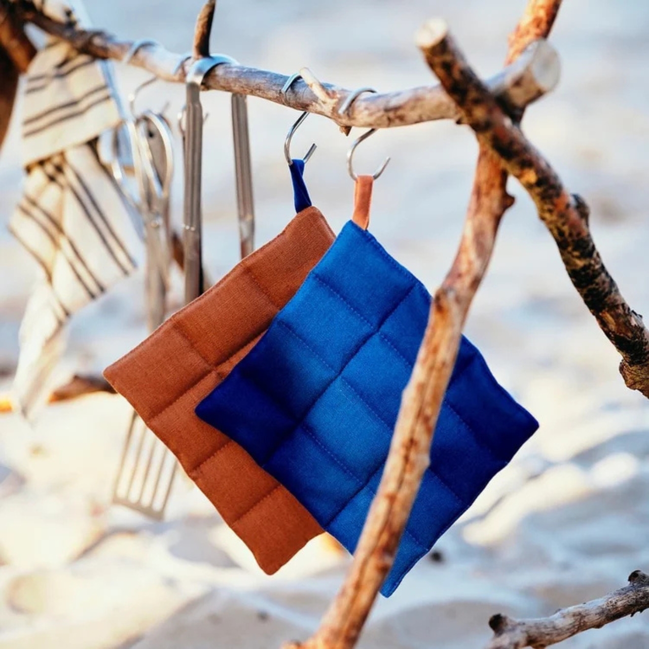
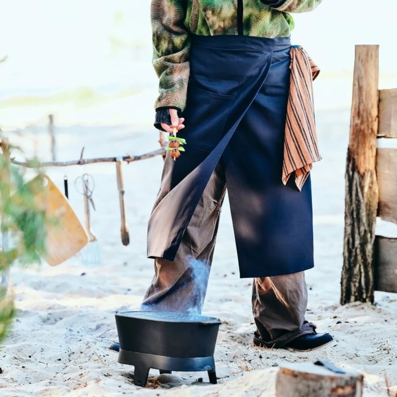
The furniture pieces anchor the collection. A folding stool with eucalyptus legs and a canvas seat comes in at $25, and a matching folding table at $39.99. Both are the kind of things that look considered without looking precious. The woven bamboo cooler basket at $34.99 follows the same logic: it functions well, travels easily, and looks like it belongs on an editorial shoot rather than a campsite supply list.
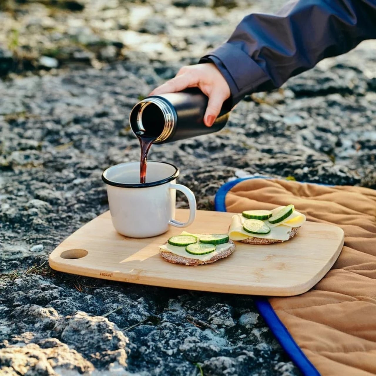
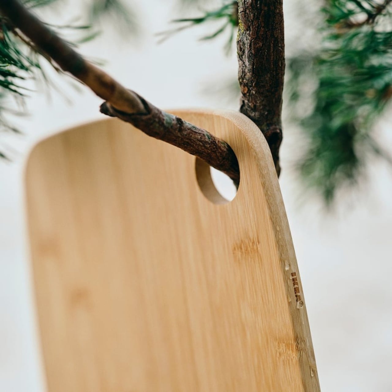
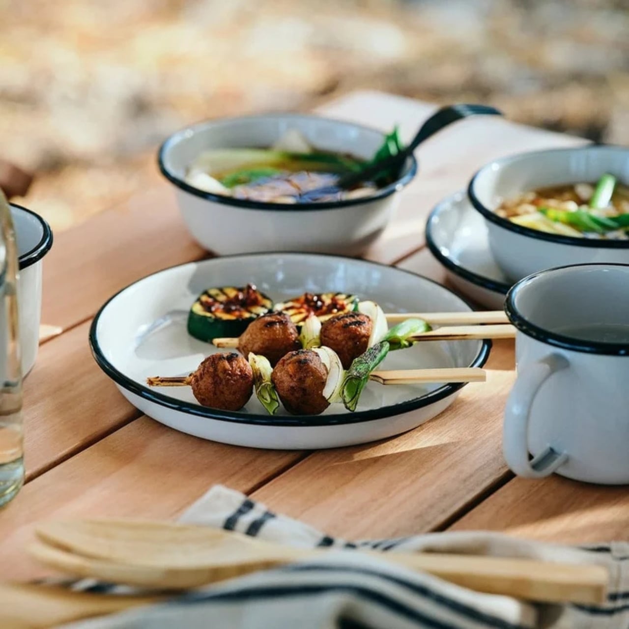
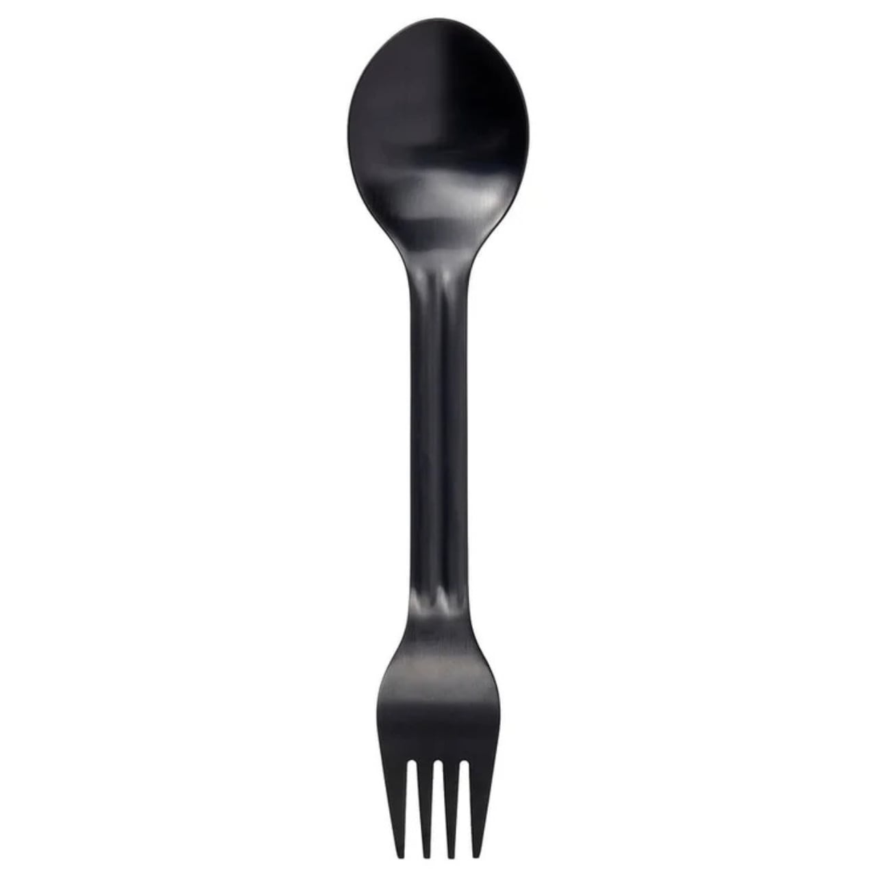
The cooking and dining side of the collection is where IKEA gets unexpectedly specific. The cast iron grill at $80 is compact, portable, and genuinely attractive in a way that cast iron grills rarely are. Enamel steel mugs come in at $5 or less, and the bamboo serving bowls, sold as a set of two for $24.99, have the kind of quiet material honesty that tends to photograph very well. The spork is worth singling out too. Rather than the standard fork-spoon hybrid that never fully commits to either identity, this one has a fork on one end and a spoon on the other, which sounds like a small detail until you realize how much more useful that actually is. It comes in at $4.
Beyond the cooking gear, the collection extends into territory that most camping lines don’t bother with. A dimmable LED lantern for $24.99 handles ambiance as much as function. A quilted throw at around $20 and cushion covers at $6.99 make the case that comfort outdoors shouldn’t feel like a compromise. A multi-pocket tote bag at $16.99 with a drawstring closure handles practicality, and a wide-brim cotton hat at $7.99 that folds flat rounds out the wearable end of things.
What makes all of this cohere is the palette. Off-whites, warm browns, deep greens, nothing is trying to be seen from a distance. It all looks like it belongs outside without screaming “outdoors,” and that restraint is harder to pull off across an entire collection than it sounds. SOLUPPGÅNG is also smartly non-prescriptive. None of these pieces demand a trailhead or a tent. They work equally well in a park, at the beach, in a backyard, or on a balcony. The idea is that a more considered relationship with being outside doesn’t require a grand occasion to justify it.
The collection is available now in the US, with broader rollout to stores in April 2026. Prices start at $4, which makes the barrier to entry lower than the cost of a flat white. The outdoor gear world has needed a credible mid-tier for a while. SOLUPPGÅNG makes a confident first argument for what that could look like.
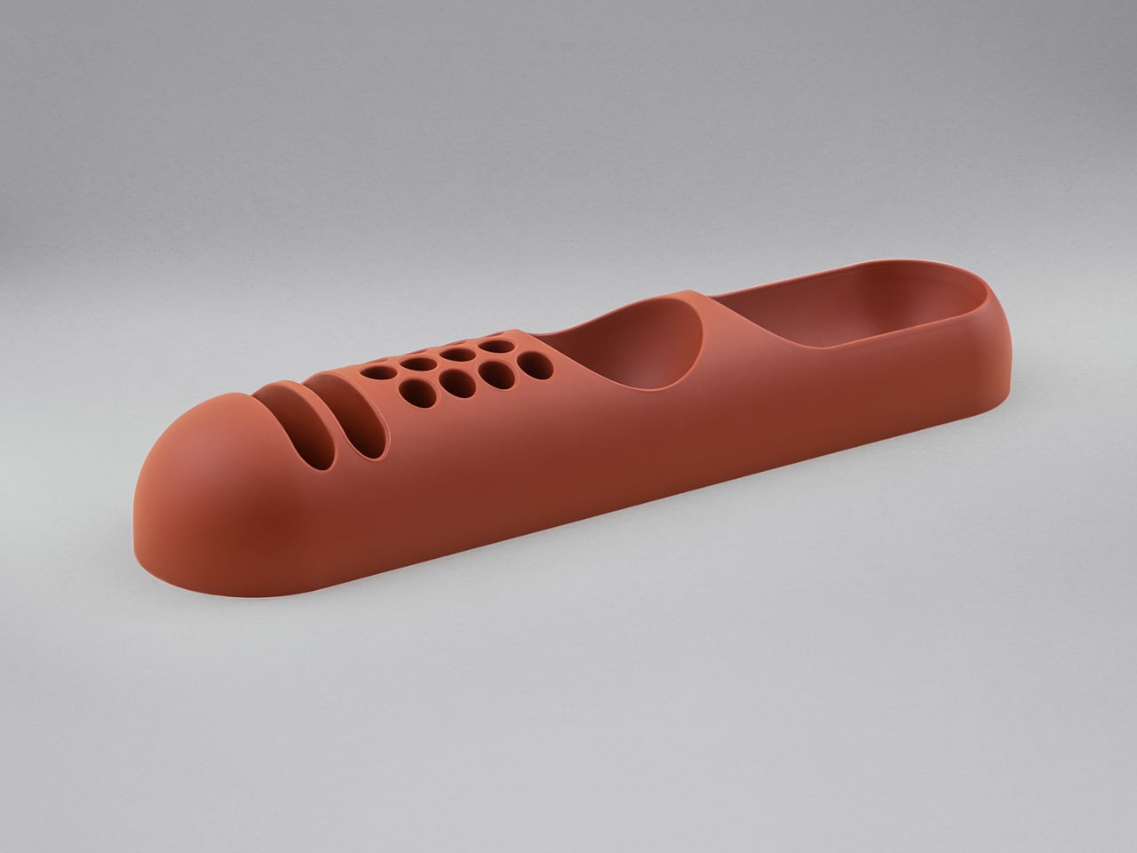
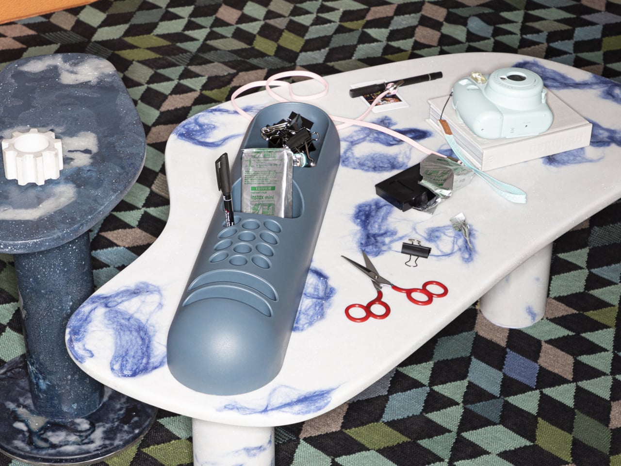
Desk organizers have a reputation problem. Most are either forgettable plastic trays that could have come from any office supply aisle, or overdesigned contraptions that look busier than the mess they’re meant to fix. Joe Colombo, the Milanese designer who died at just 41, had a very different take on this problem back in 1970, and it looked like nothing else on a desk then or now.
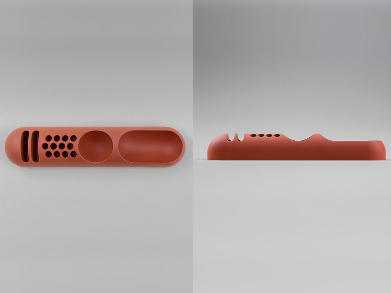
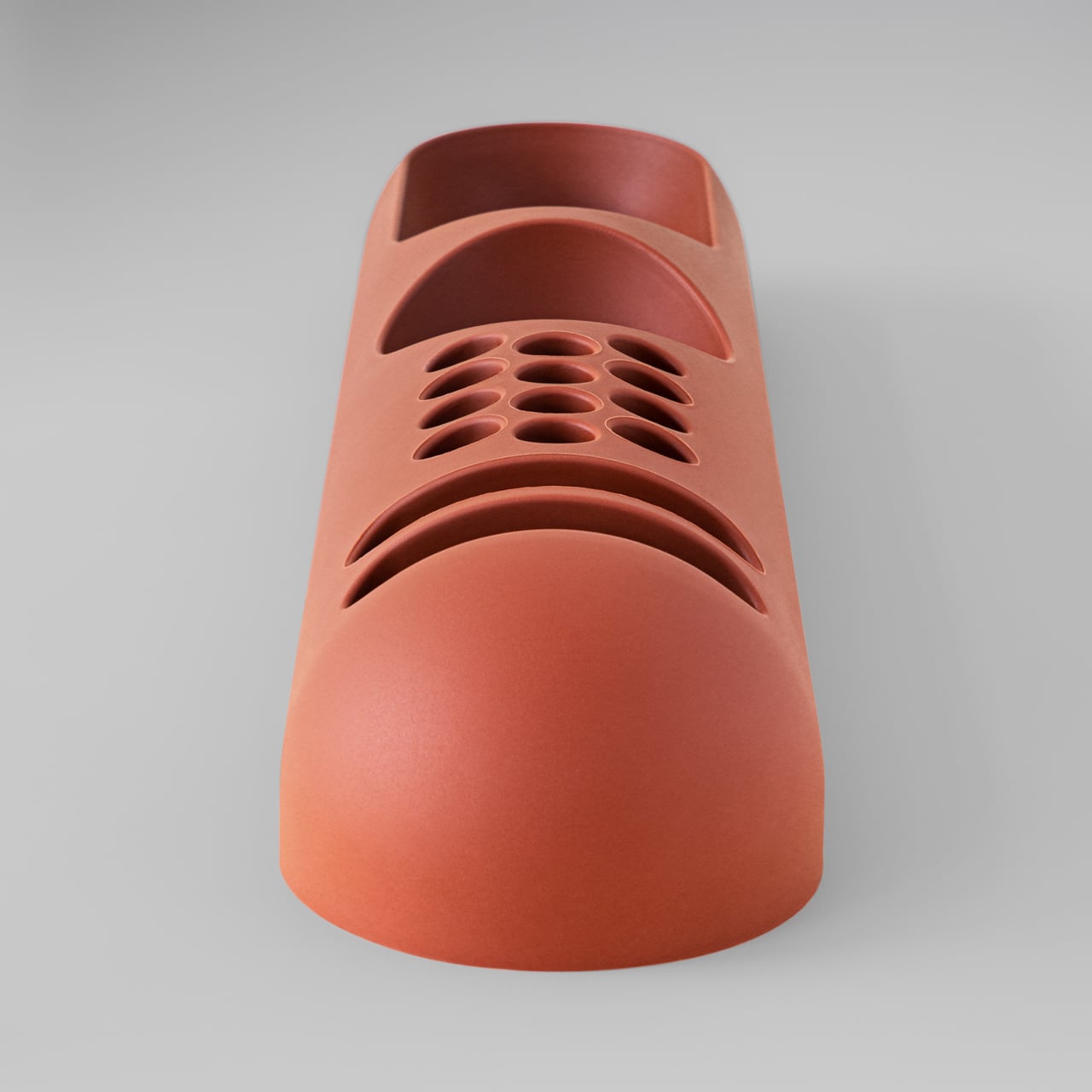
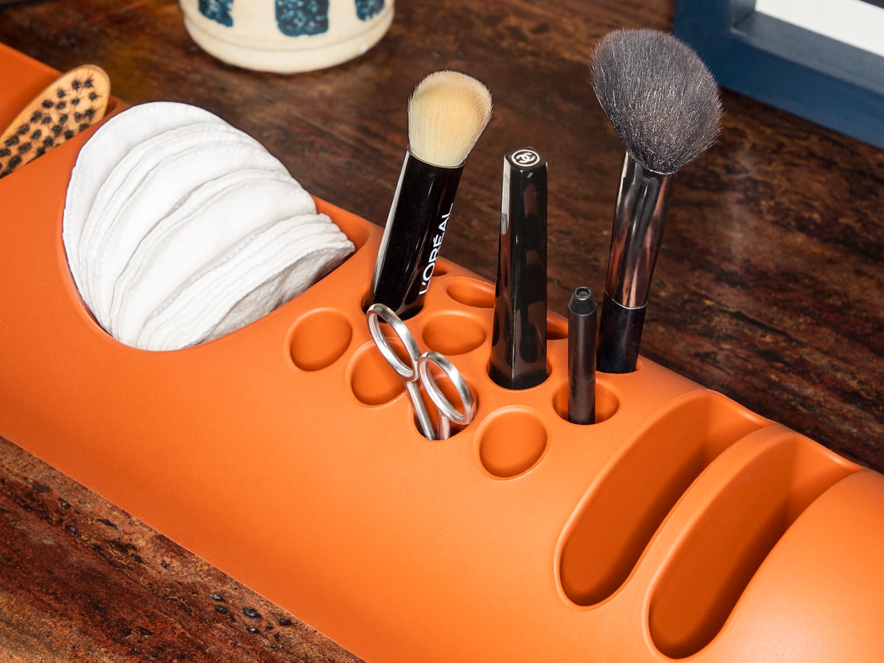
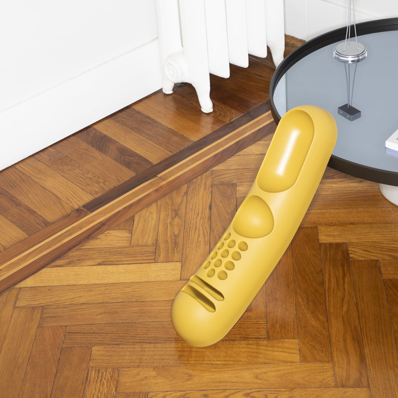
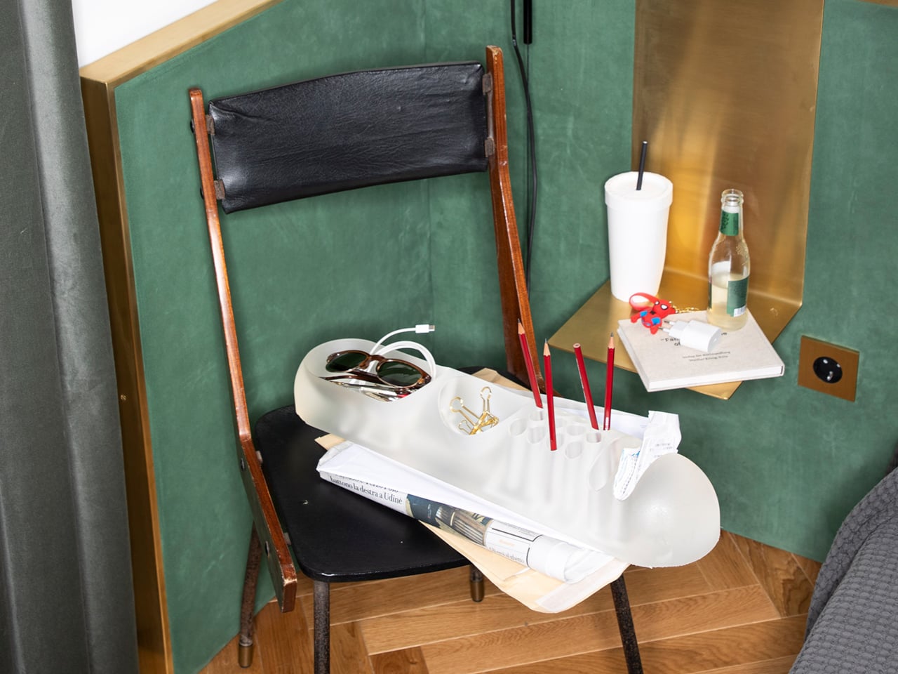
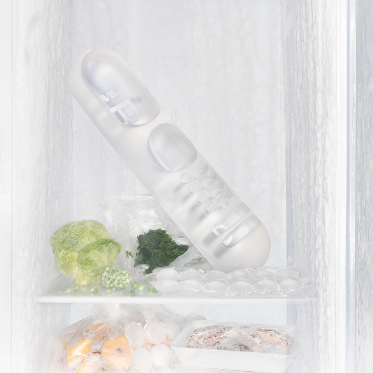
That design was BOB, a compact object holder made from polyurethane gel that Colombo shaped into something unmistakably organic. The form is elongated and low-profile, almost pill-shaped from above, with one end rising into a soft dome and the other tapering nearly flat. B-Line, an Italian label dedicated to acquiring original molds from discontinued Italian design objects, reissued it in 2023 in five colors: terracotta, slate blue, mustard yellow, warm white, and a translucent frosted version called “ice.”
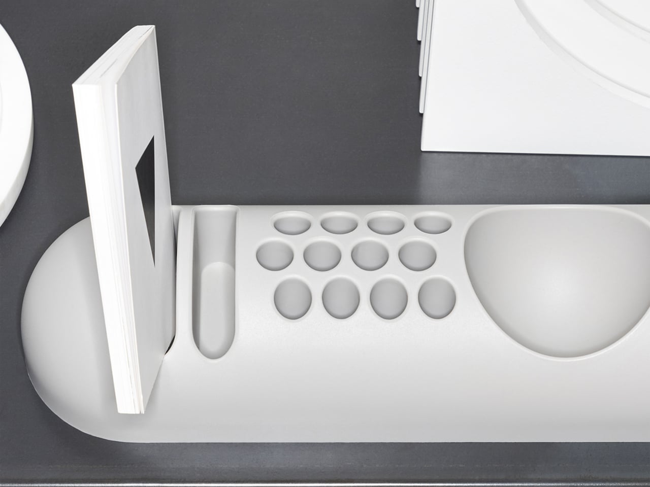
The top surface divides into three zones with no visible partition between them. The dome end opens into a large oval scoop for bulkier items; the center holds a 3-by-4 grid of individual circular holes, each sized for a single pen or brush; the tapered tail has two horizontal slot grooves that hold flat objects like rulers or small notebooks upright. None of this reads as a spec sheet in person. It reads as a single continuous gesture that happens to organize things.
Colombo was working at a moment when Italian design was treating plastic not as a cheap substitute for better materials, but as a medium with its own formal possibilities. Polyurethane gel has a tactile quality most rigid desk accessories never attempt: it gives slightly under pressure, has a matte surface that’s almost skin-like, and its flexibility is what makes the low, curved profile structurally possible in the first place. A stiffer material would have needed walls. This one doesn’t.
B-Line’s campaign photography makes a quiet argument for where BOB actually belongs. It appears on a marble coffee table holding binder clips and scissors, on a chair seat catching pencils and sunglasses, and on a bathroom vanity with makeup brushes in the pen holes and cotton pads in the scoop. One image places the ice-colored version inside a freezer, either a dry joke about the colorway name or a genuine hint that the flexible polyurethane handles cold fine. Probably both.
That flexibility is worth taking seriously. BOB lies nearly flat on any surface, which means it doesn’t create visual clutter the way upright organizers do. It also means the pen holes require implements long enough to stay upright on their own, which is a quiet limitation Colombo’s grid doesn’t advertise. Short lipstick caps, small erasers, and anything under roughly 10 centimeters will just rattle around rather than stand.
The price reflects provenance more than function. B-Line sells through retail partners, not directly to consumers, and those partners have set their own figures: Design Public at $190, Bauhaus 2 Your House at $427. Colombo’s other B-Line reissue, the Boby trolley, is in MoMA’s permanent collection. BOB is the quieter object from the same designer and the same era, and it raises a question the images don’t quite answer: how many rooms does a well-made desk organizer need to conquer before that price starts to feel reasonable?
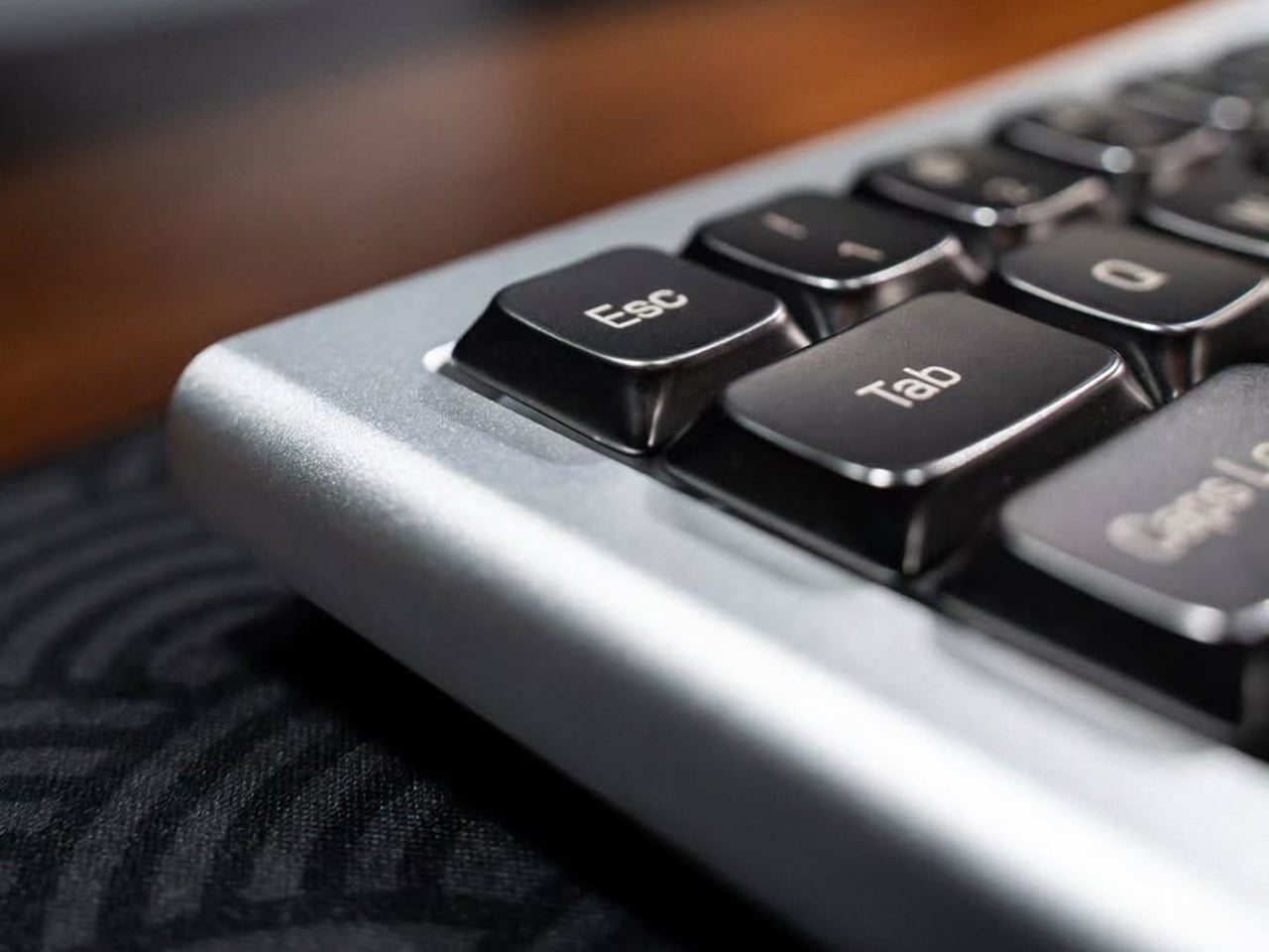
Low-profile mechanical keyboards have always had a bit of an identity problem. They look the part: slim, clean, desk-friendly. Set one beside a MacBook and it fits right in, at least until you start typing and the plastic keycaps remind you that the aesthetic only goes so far. It is not that PBT is bad. It is just that plastic has a ceiling, and once you have typed on a well-built board, you start to feel where that ceiling is. The sound is a little hollow. The surface wears down. For a form factor that sells itself on refinement, the keycaps have always been the weakest part of the pitch.
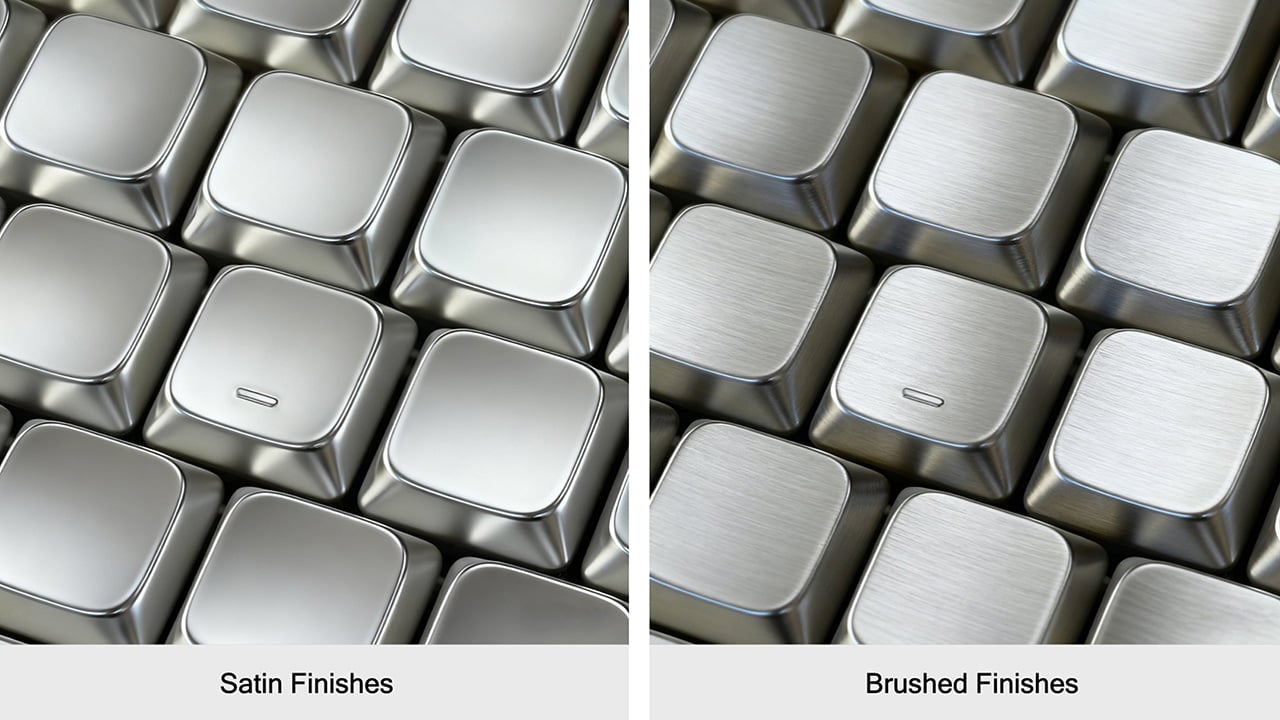
That gap is exactly what Awekeys Air is designed to fill. These are low-profile metal keycaps built from recycled cupronickel, a copper-nickel alloy most people know from coins rather than keyboards. Beyond the material upgrade, there is an immediate visual payoff. A set of Satin Copper or Satin Gold caps on a slim board transforms what was previously just a functional object into something that actually improves the desk around it, the kind of detail that catches the eye mid-conversation and holds it.
At 5 mm tall, the Awekeys Air is half the height of a standard keycap, which typically sits at around 11 mm. That gap matters more than it sounds. A slim keyboard paired with standard-height keycaps loses its whole visual argument, and any ergonomic board designed for low-profile switches defeats its own purpose if you pile taller caps on top. The Air keeps that geometry honest while upgrading what that geometry is made of.
As someone who writes for a living and codes on the side, I see the keyboard as less a tool and more a constant physical companion, and the I find that the Awekeys Air shifts that relationship in a way that is difficult to ignore. The cupronickel surface stays cool under extended sessions, the low profile keeps wrist angle natural, and the grip from the hand-brushed Special Edition means fingers land where they are meant to, without any of the slight drift that smooth plastic encourages over a long afternoon.
Finish is where the Awekeys Air earns a lot of its character. Seven keycap colorways cover the satin-style options: Satin Gold, Satin Silver, Satin Copper, Titanium Black, Obsidian Black in matte, Ivory White in matte, and Sakura Pink. Each of them reads differently on metal than on plastic. Satin Copper picks up warm ambient light in a way no dye-sublimated PBT can replicate. Titanium Black has that flat, composed surface that makes a keyboard look more like a precision instrument than a peripheral. Small distinctions, but they add up when the whole point is a desk setup that looks as considered as it feels.
The Special Edition hand-brushed finish takes things a step further, available in Gold, Silver, Copper, and Ti Black. Each keycap is brushed individually, which creates a directional texture that shifts under light and adds a grip that the satin versions do not have. It is the kind of finishing detail that is easy to overlook in a product photo and immediately obvious the moment you sit down to type.
Holding it all together is a second-generation nano-coating that Awekeys claims delivers twice the scratch resistance of its first version. For keycaps that will see thousands of actuations daily, surface protection matters more on metal than on plastic, where wear is expected and mostly forgiven. The coating is what keeps the finish consistent across the whole set over time, and on a metal that is this unforgiving of surface variation, that consistency is doing real work.
The recycled angle is worth taking seriously, too. Awekeys notes that processing recycled cupronickel requires roughly 15% of the energy needed for raw metal extraction. giving the material story a logic beyond a simple badge. The acoustic character completes the picture: denser, more planted, with a sound that leans satisfying rather than sharp. The slim keyboard has been waiting a long time for a keycap set built to match it, and the Awekeys Air makes a strong case that the wait is over.
Game controllers have not changed much in shape since the mid-1990s. They’re still two-handed symmetrical slabs built around adult grip dimensions, loaded with enough buttons to pilot a small aircraft. For a 10-year-old just getting into gaming, picking one up for the first time is a bit like being handed a TV remote and told to perform surgery, no sweat.
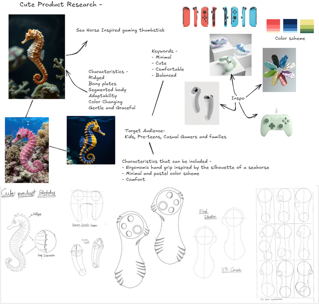
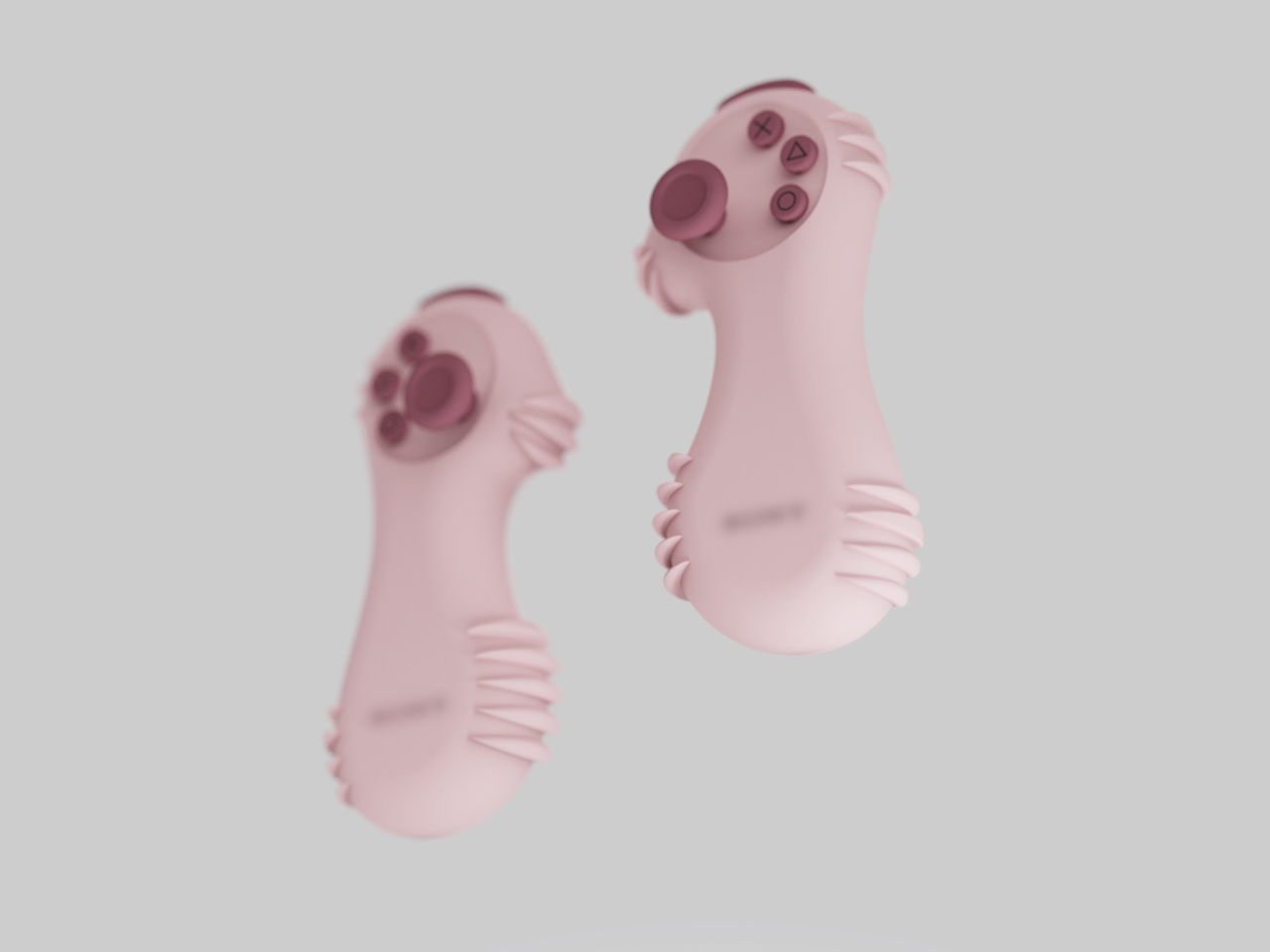
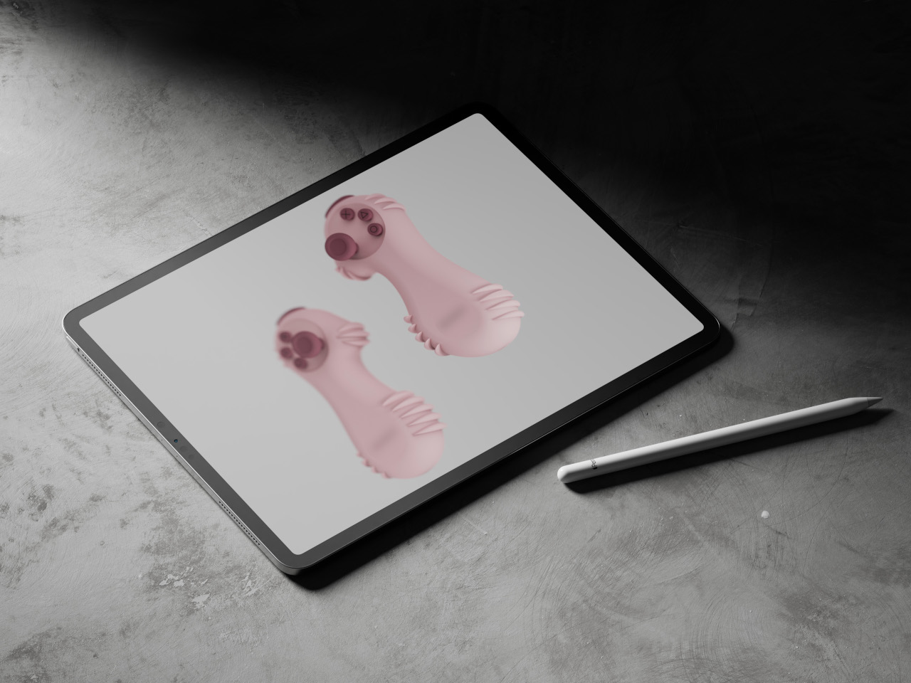
The concept is called LEVION, and it proposes a split controller: two separate units, one per hand, each sized for a pre-teen’s palm. It was designed as a rethink of the thumb stick from scratch, and the result looks like nothing in the current gaming peripheral market, which is mostly the point. And its inspiration comes from the most unlikely source you can imagine.
The form comes from a seahorse, specifically its upright posture, curved spine, and ridged body. Those horizontal ridges, translated into a soft frill around the base of each unit, are the structural logic of the grip. A seahorse’s bony plates give it stability without bulk, and LEVION’s ridges do the same thing for a small hand holding a rounded object across an hour of gameplay. It’s biomimicry that connects cause to effect rather than borrowing a shape for decoration.
Each unit carries a joystick, three face buttons, and a shoulder button, arranged on a circular head that sits atop a curved hourglass body. The silhouette is wider at the head and base, pinched at the waist, giving the thumb a natural landing zone and keeping the unit from rotating mid-game. The sketch process started with a seahorse drawing annotated “grip inspiration” before moving through VR console proportions to arrive at this form, so the shape isn’t just decorative shorthand.
The colorways lean into the pre-teen audience: pink, mint green, sky blue, and lavender, all in a soft matte finish that reads more like a toy than a peripheral. That positioning is deliberate. Standard controllers signal seriousness and capability. LEVION signals approachability, which matters when the target user is still sorting out that the left stick moves the character and the right one moves the camera.
The honest question is one of input coverage. A standard PlayStation controller has two joysticks, a D-pad, four face buttons, four shoulder buttons, and several system controls. LEVION offers a joystick, three face buttons, and one shoulder button per hand. For casual and younger audiences, that might be exactly right. For anything more demanding, the math gets uncomfortable, and the concept doesn’t address how that gap closes when the pre-teen turns 13.
That’s worth taking seriously, but it doesn’t diminish what LEVION gets right in the space it occupies. The design’s own research board lists the Nintendo Switch Joy-Cons as a reference point, and the parallel is fair: the Joy-Con also split a standard controller into two smaller units and found an audience that didn’t know it needed that format. LEVION asks the same question one step earlier in the age range, in a form that a kid might actually want to reach for.