These Solar Gazebos Have 4 Wind Turbines and Let You Charge Below

University campuses function like small cities. Students move between buildings, find outdoor spots to read or work, and constantly need power for phones and laptops. Sustainability tends to get communicated through plaques, rooftop panels, and annual reports, things you don’t interact with. There’s a gap between “this campus is reducing its carbon footprint” and “here’s a place where you can sit, charge your phone, and actually experience that in some tangible way.”

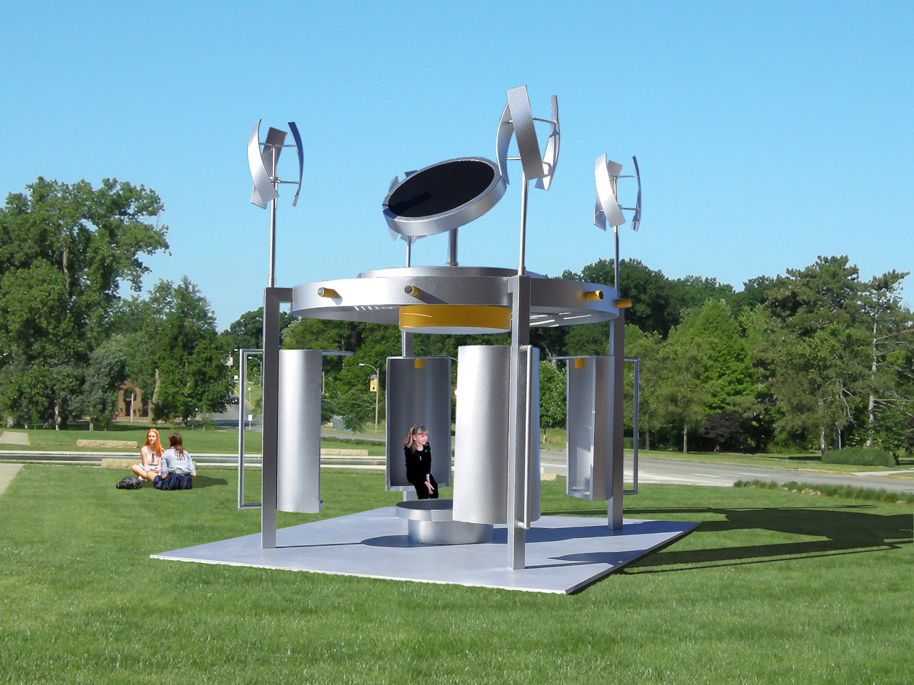
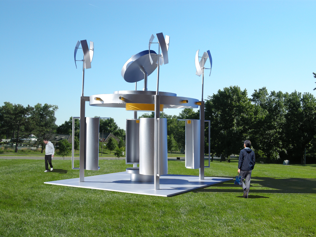
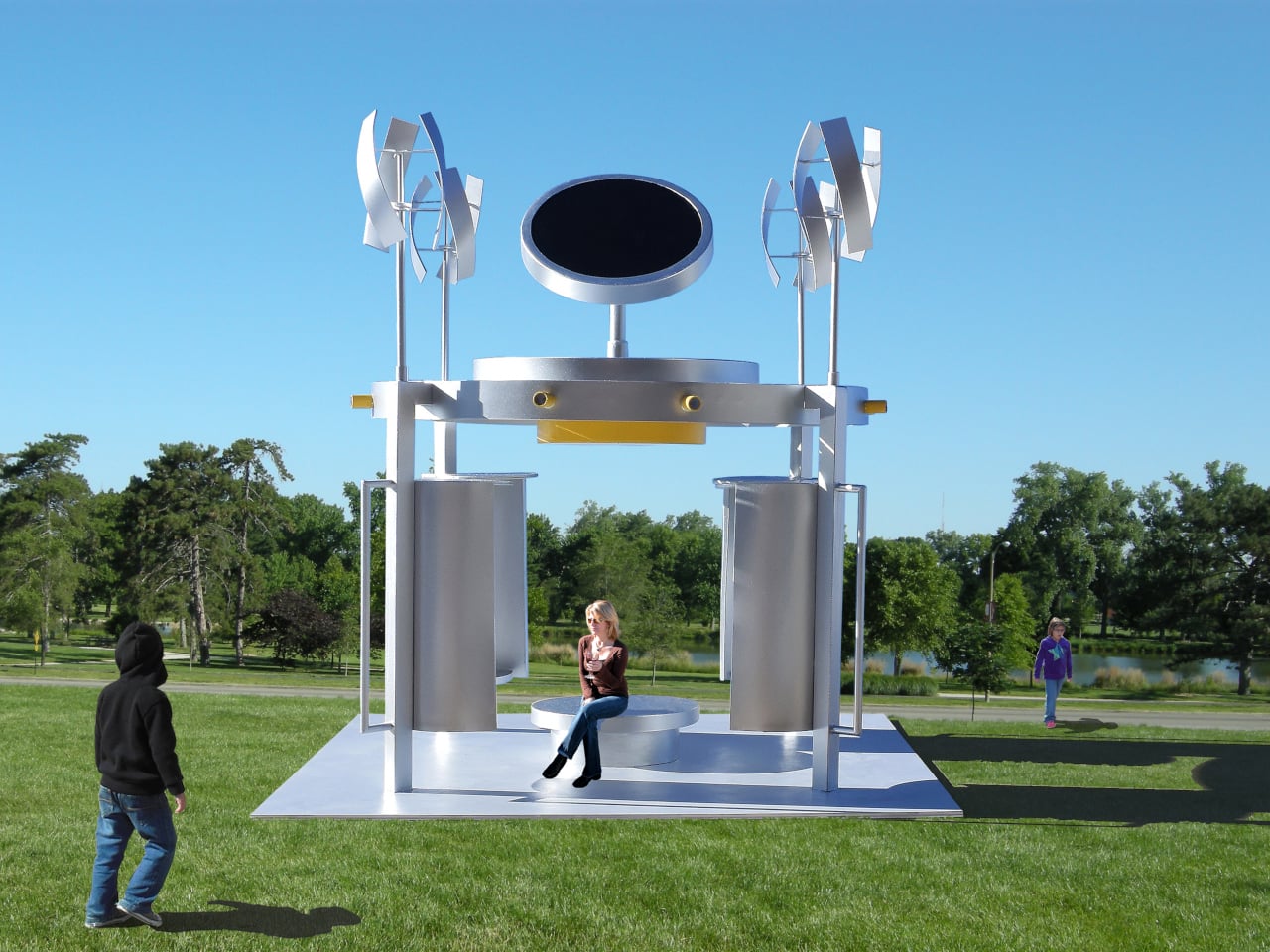
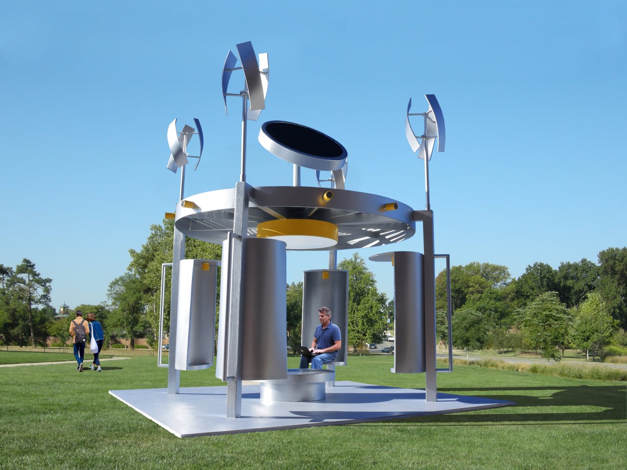
Michael Jantzen’s Solar Wind Gazebos are public pavilions designed to close that gap. Intended for university campuses, they function as gathering spaces while generating electricity from sun and wind, with the power feeding into the university’s grid. The proposal treats renewable infrastructure as a place to inhabit rather than a system to install, and it makes that infrastructure legible to anyone who walks up to one.

Designer: Michael Jantzen

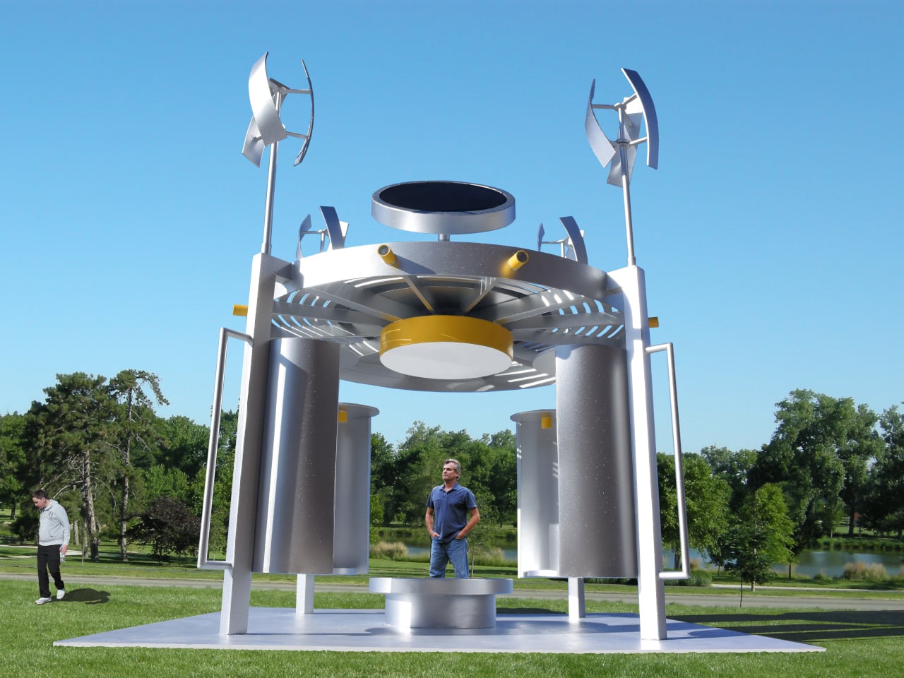
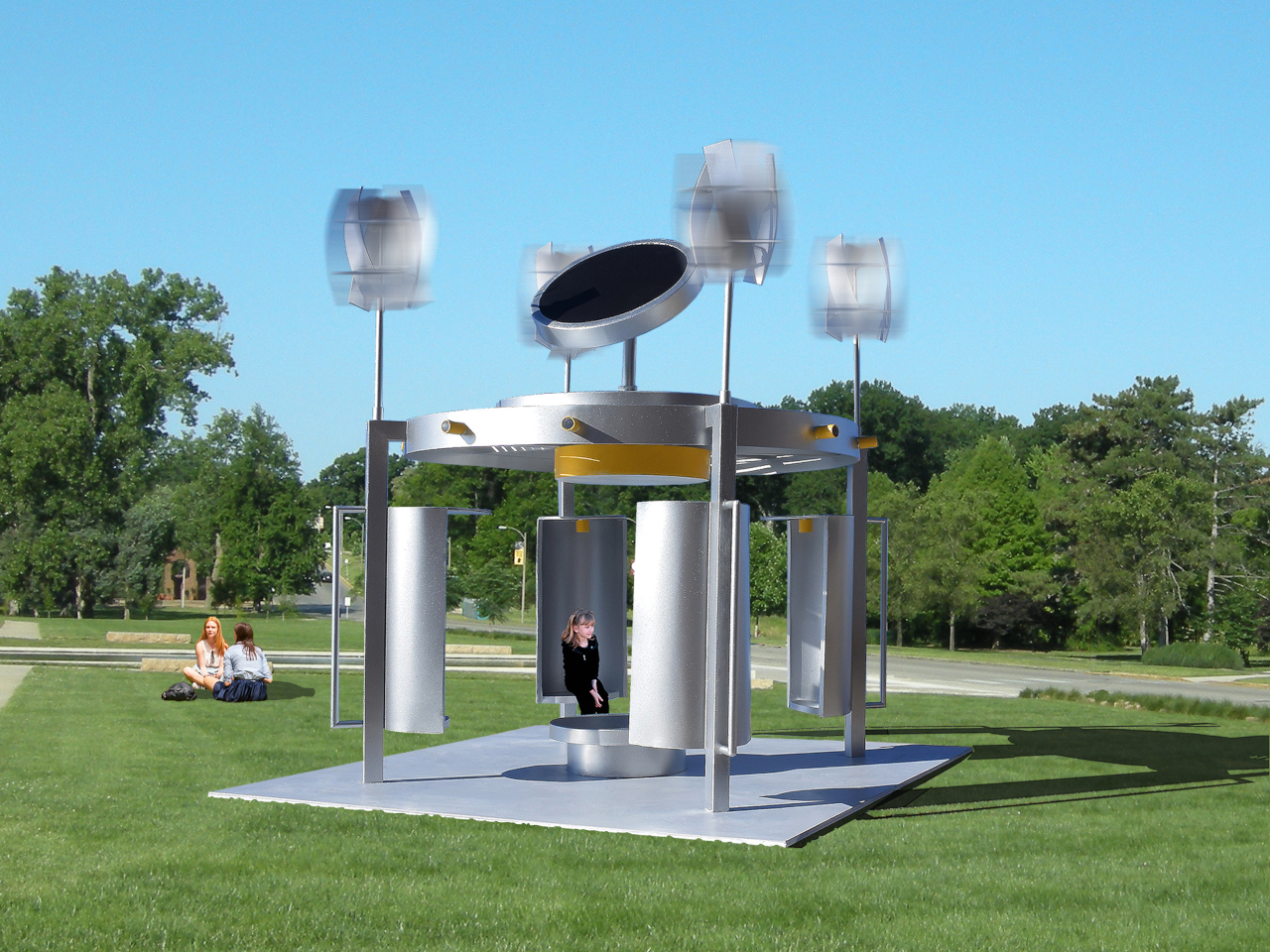
The roof does most of the communicating. Four commercially available vertical-axis wind turbines sit at the corners, while a large circular solar panel occupies the center. That layout is easy to read at a glance: wind at the perimeter, sun at the core. You don’t need a label to understand what’s happening because the structure’s own geometry explains its energy logic, which is something most utility infrastructure completely fails to do.

The frame is predominantly stainless steel on concrete bases, which is a deliberate choice for outdoor public installations. Campuses need structures that handle weather, seasonal temperature swings, and constant use without requiring frequent maintenance windows. Stainless steel and concrete aren’t glamorous materials, but they’re honest ones for a building type that needs to outlast a decade of students without becoming an eyesore or a liability.

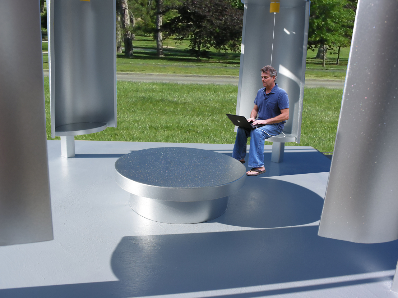
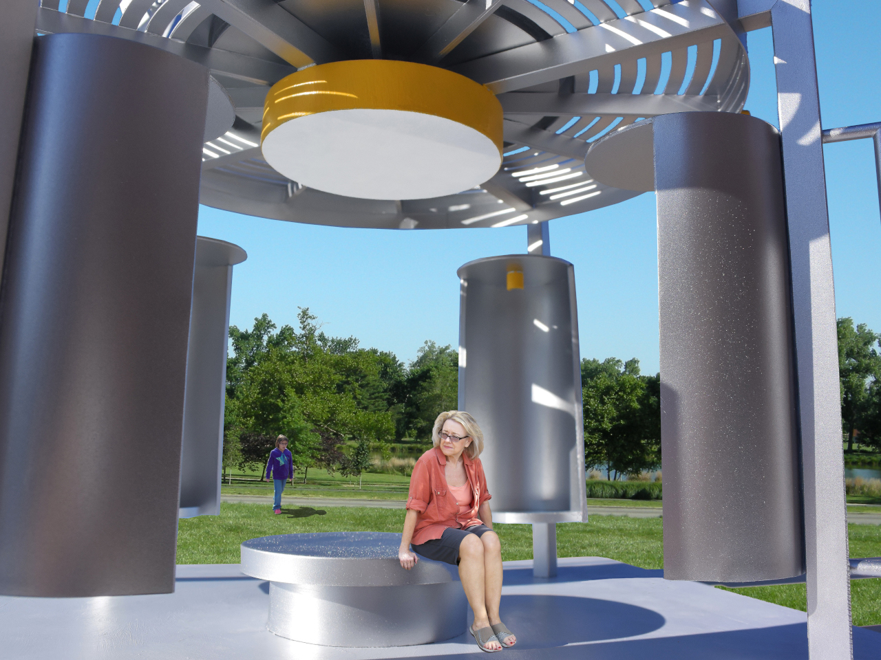
Inside, four cylindrical seating spaces are attached to the support columns, each with a receptacle at the top for plugging in devices. That detail is quiet but important, turning charging into a normal part of sitting down outdoors rather than a task that sends students hunting for an outlet inside a building. A large round central platform offers a shared surface for sitting or lying down, creating a mix of semi-private individual zones and an open communal gathering area.

A circular electric light mounted above the central platform runs off the same solar and wind generation, extending the pavilion’s usefulness into evening hours. The structure essentially powers its own ambience, which gives the whole thing a satisfying sense of completion, generation, use, and light running off the same rooftop.

The gazebos are designed to be reproduced as prefabricated structures in various sizes and installed across different landscapes. The same concept fits public parks, corporate campuses, and any open space where people gather and need shade, seating, and somewhere to plug in. The broader implication is that renewable energy infrastructure doesn’t always have to hide behind fences or sit on rooftops. Sometimes it can be the very thing you sit inside of on a Tuesday afternoon between classes.

The post These Solar Gazebos Have 4 Wind Turbines and Let You Charge Below first appeared on Yanko Design.

Mexico Just Turned Corn Waste Into 3D-Printed Buildings

Most of us think of corn as food. Maybe fuel, if you’re feeling generous. But a building material? That’s the kind of idea that sounds like it belongs in a sci-fi pitch until you look at what Mexico-based design practice MANUFACTURA has been quietly pulling off.

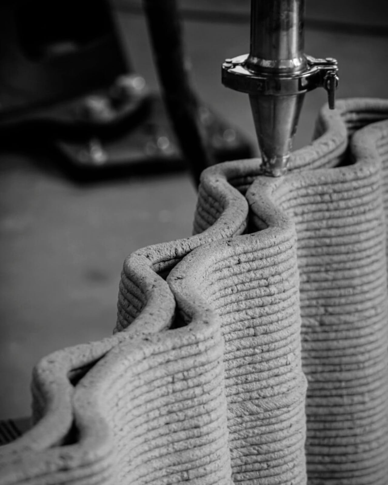
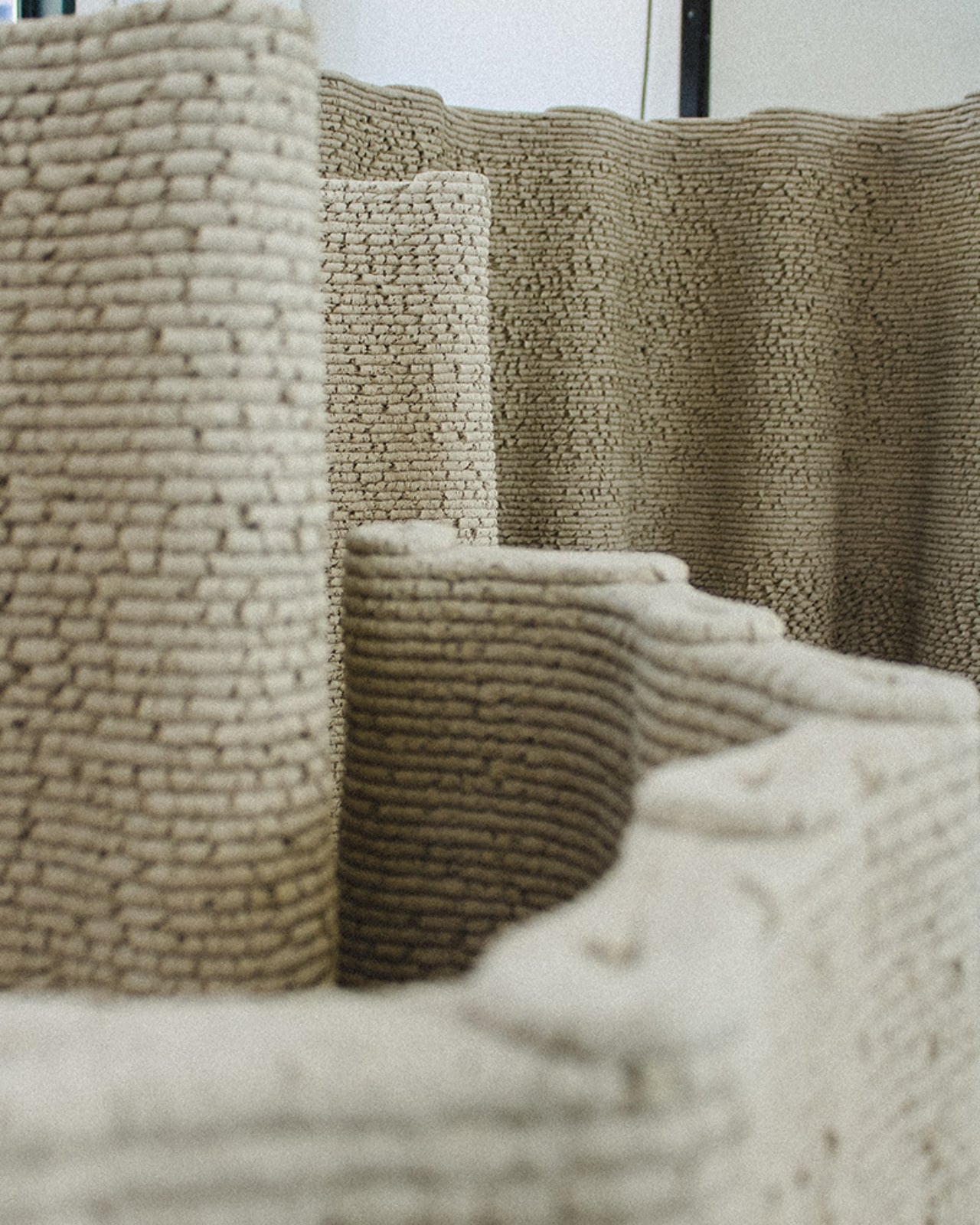
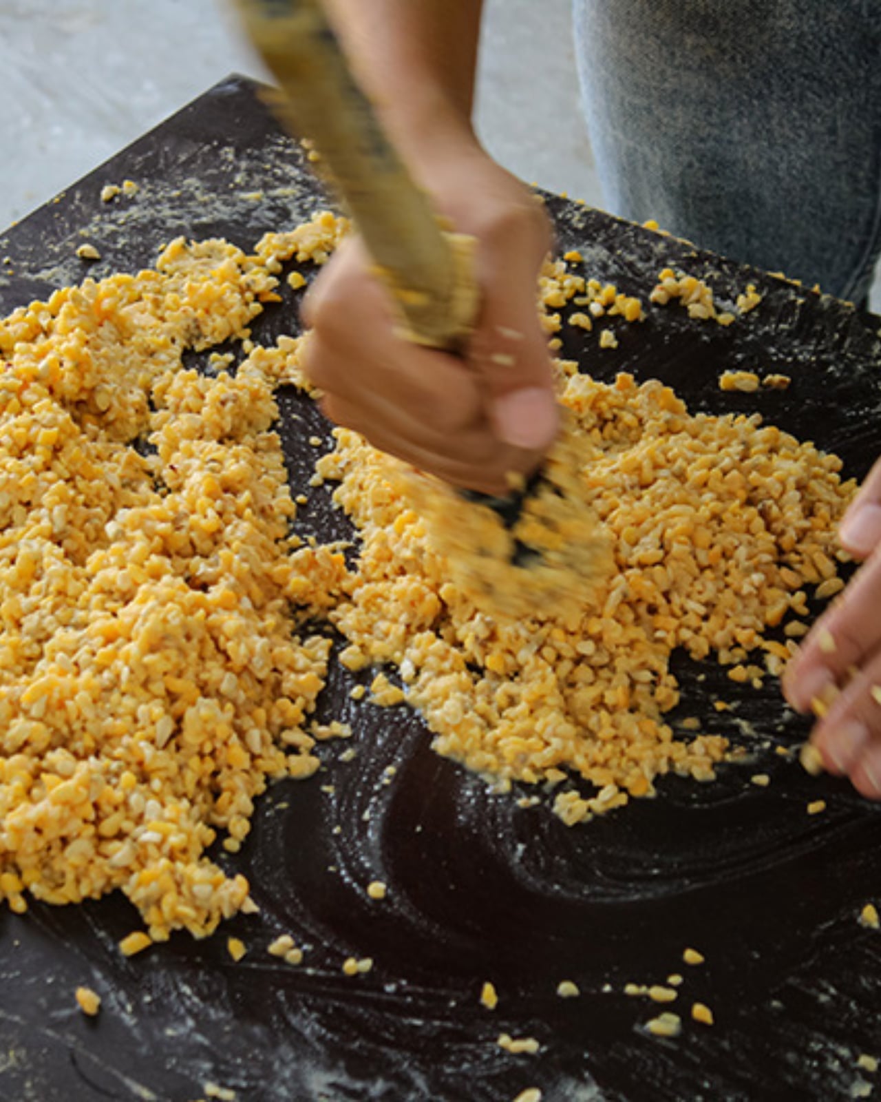
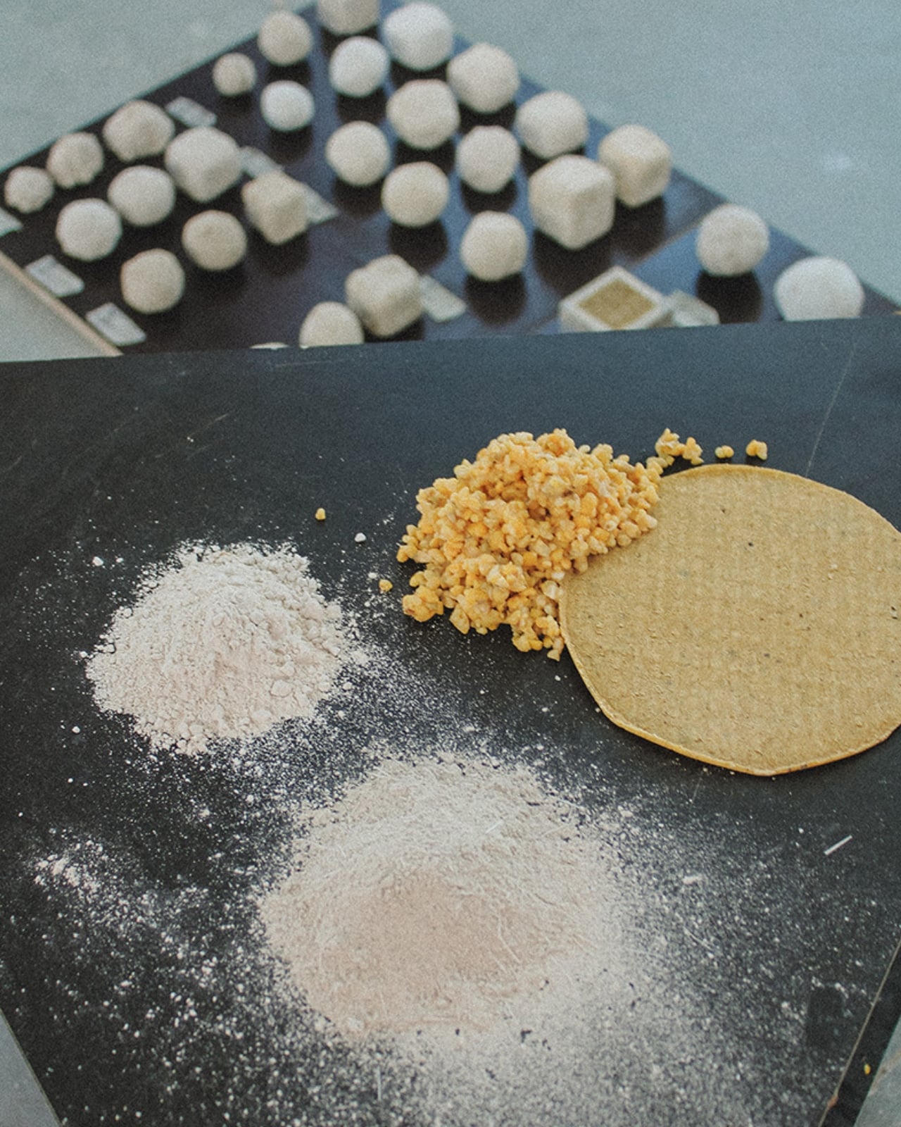
Their project is called CORNCRETL, and it is exactly what it sounds like: a bio-based construction material made largely from corn waste. Specifically, it combines limestone aggregates, dried corn residues, and recycled nejayote, which is the calcium-rich wastewater left over from nixtamalization, the ancient process of soaking corn in an alkaline solution that’s been used across Mesoamerica for thousands of years. That liquid, normally discarded after making tortillas and tamales, turns out to be a surprisingly useful ingredient in a next-generation building composite.

Designer: Manufactura

The name CORNCRETL is a clever mashup of corn and concrete, and the concept sits at the crossroads of ancestral knowledge and cutting-edge fabrication. MANUFACTURA drew direct references from pre-Hispanic Mayan construction techniques, which relied heavily on lime-based materials long before Portland cement ever existed. What they’ve done is take that legacy and run it through a robotic arm.

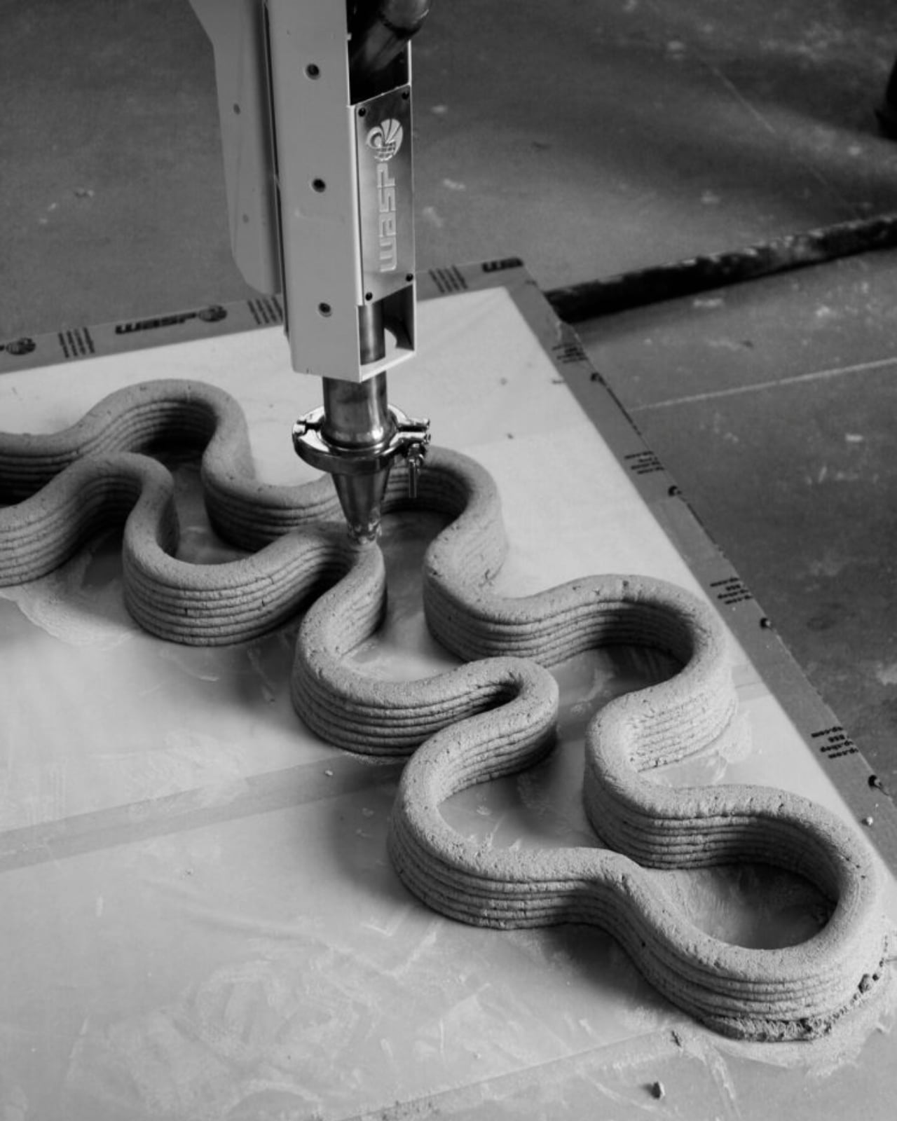
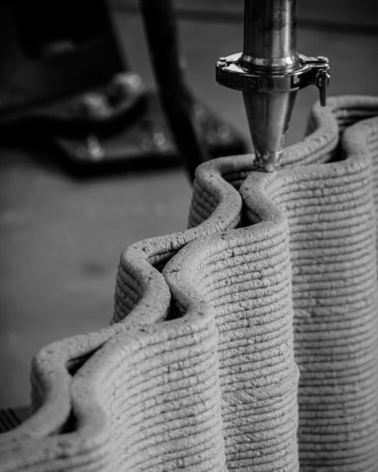
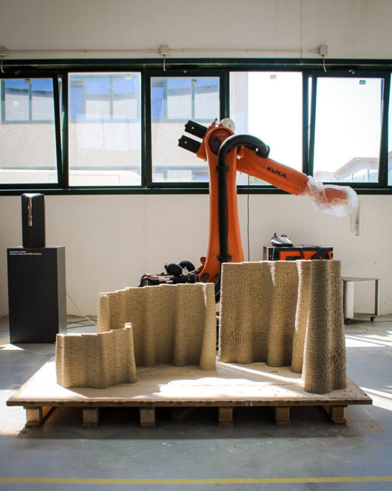
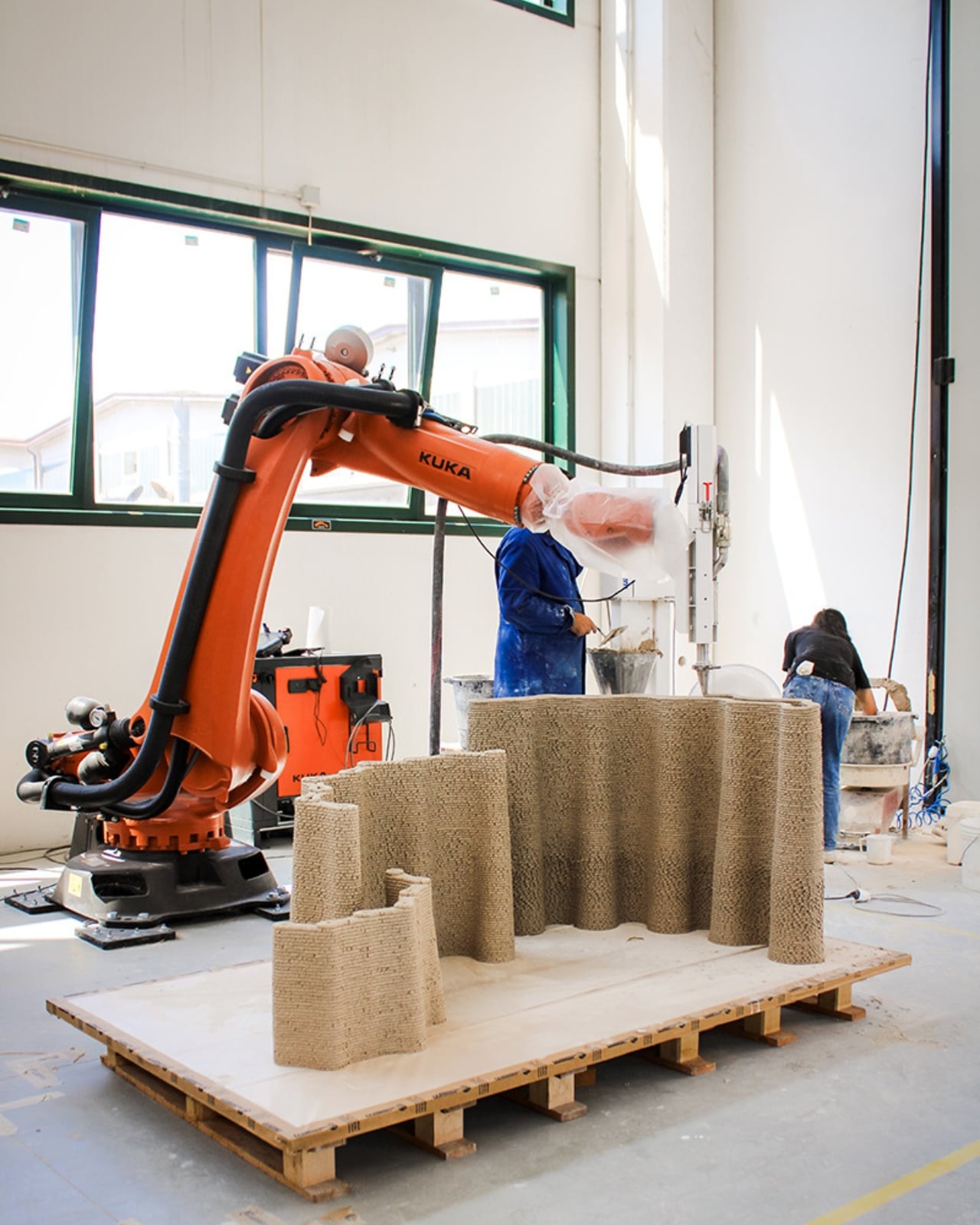
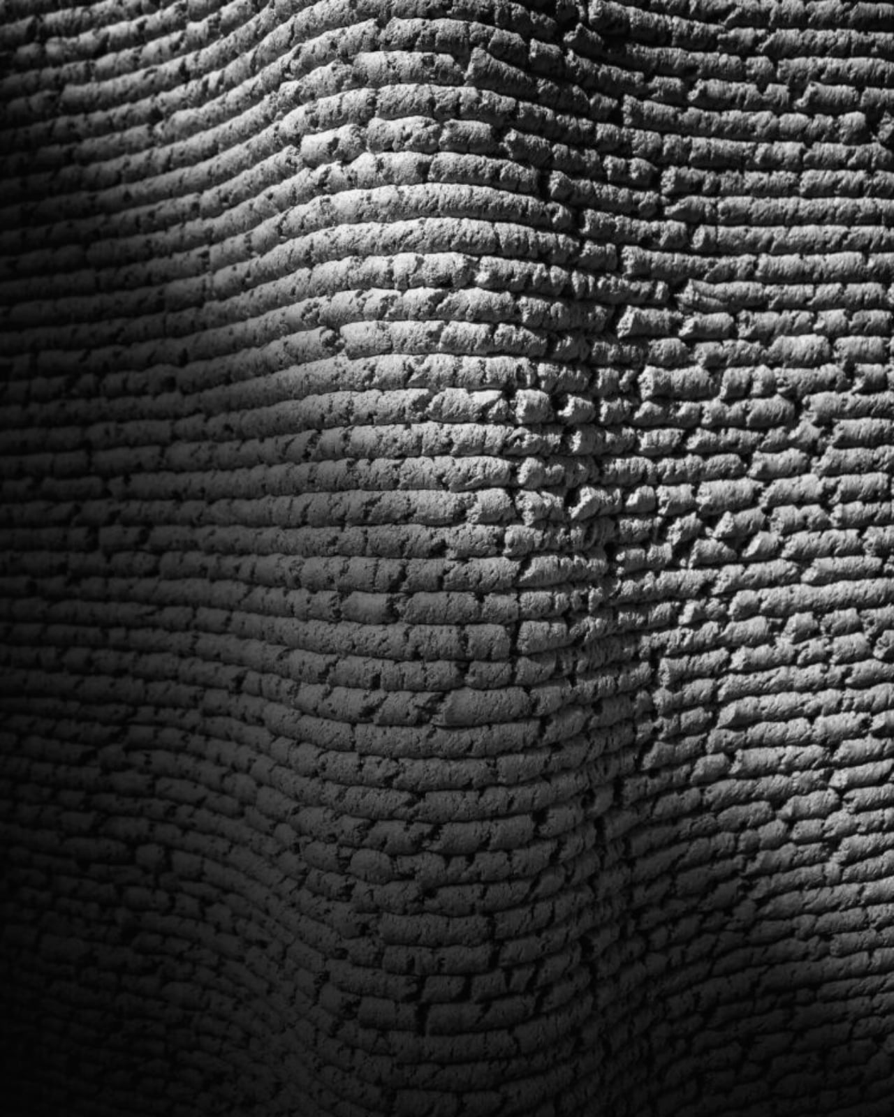
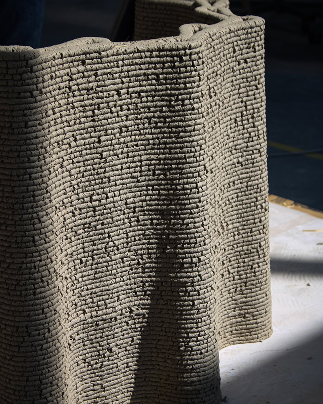
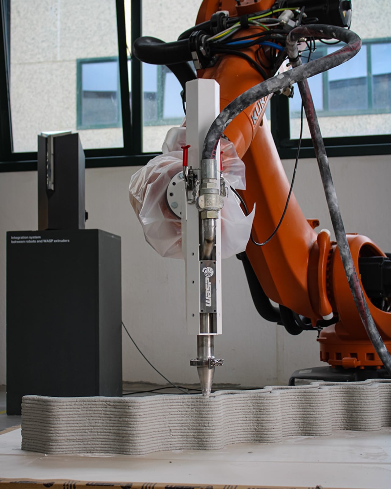
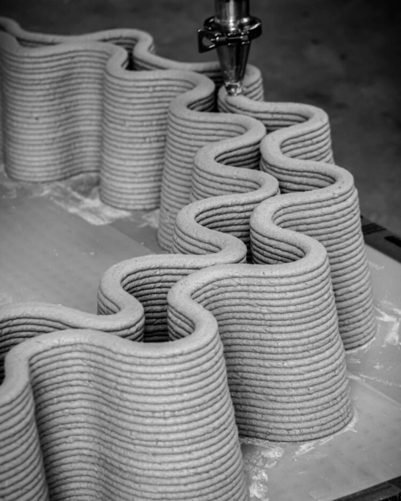
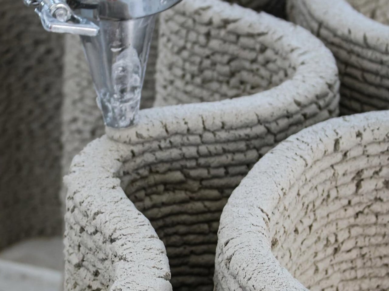
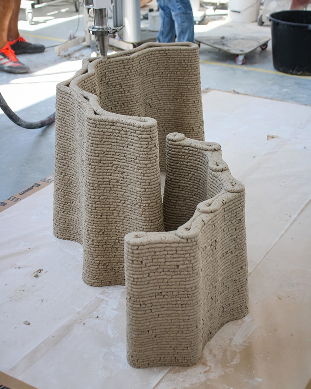
To produce the material, nixtamal waste is collected, dried, shredded, and pulverized down to a consistent particle size that works for extrusion. It’s then blended with mineral aggregates and organic binders to create a printable mixture. Printability tests were conducted using a WASP Concrete HD Continuous Feeding System integrated with a KUKA robotic arm, meaning the building process is precise, automated, and repeatable. The result doesn’t just look like a structural material. It performs like one.

One of the biggest knocks against conventional concrete is its carbon footprint. Cement production alone is responsible for a significant chunk of global CO2 emissions. CORNCRETL addresses this head-on. Compared to standard concrete, the material achieves up to a 70 percent reduction in carbon emissions. Part of that comes from how lime-based systems work: unlike Portland cement, they harden at room temperature and require lower calcination temperatures during production, which means less energy and fewer greenhouse gases released into the atmosphere.

Lime also brings a few bonus features to the table. It naturally regulates humidity and has self-healing properties for minor surface cracks, meaning the material can repair small imperfections on its own over time. For a building material, that’s a pretty remarkable quality.

The motivation behind CORNCRETL goes beyond just making something cool out of kitchen scraps. Mexico’s construction sector carries real environmental and social weight. Across the country, 64 percent of all waste is organic, and corn is a major contributor to that figure. At the same time, construction labor conditions remain difficult, with limited access to technical training and high occupational risk. MANUFACTURA’s approach proposes a circular material strategy that tries to address both sides of that problem, reducing waste while introducing more automated, accessible fabrication methods into the building industry.

The project has already moved beyond the lab. A full-scale prototype was built at the Shamballa open-air laboratory in Northern Italy, which is a long way from Mexico City but signals exactly the kind of cross-continental interest that a material like this can generate. It’s the kind of proof-of-concept that transforms a research idea into something you can actually stand next to.

CORNCRETL is led by designer Dinorah Schulte and project director Edurne Morales, with contributions from structural engineers and 3D printing specialists who helped optimize the material for real-world application.

What makes this project stick is that it doesn’t ask you to choose between tradition and technology. It holds both at once. Ancient techniques meet robotic fabrication. Food system waste becomes architectural possibility. And corn, of all things, might just have a future in the walls around us.

The post Mexico Just Turned Corn Waste Into 3D-Printed Buildings first appeared on Yanko Design.

OBRO Just Turned Leather Waste Into Luxury Material

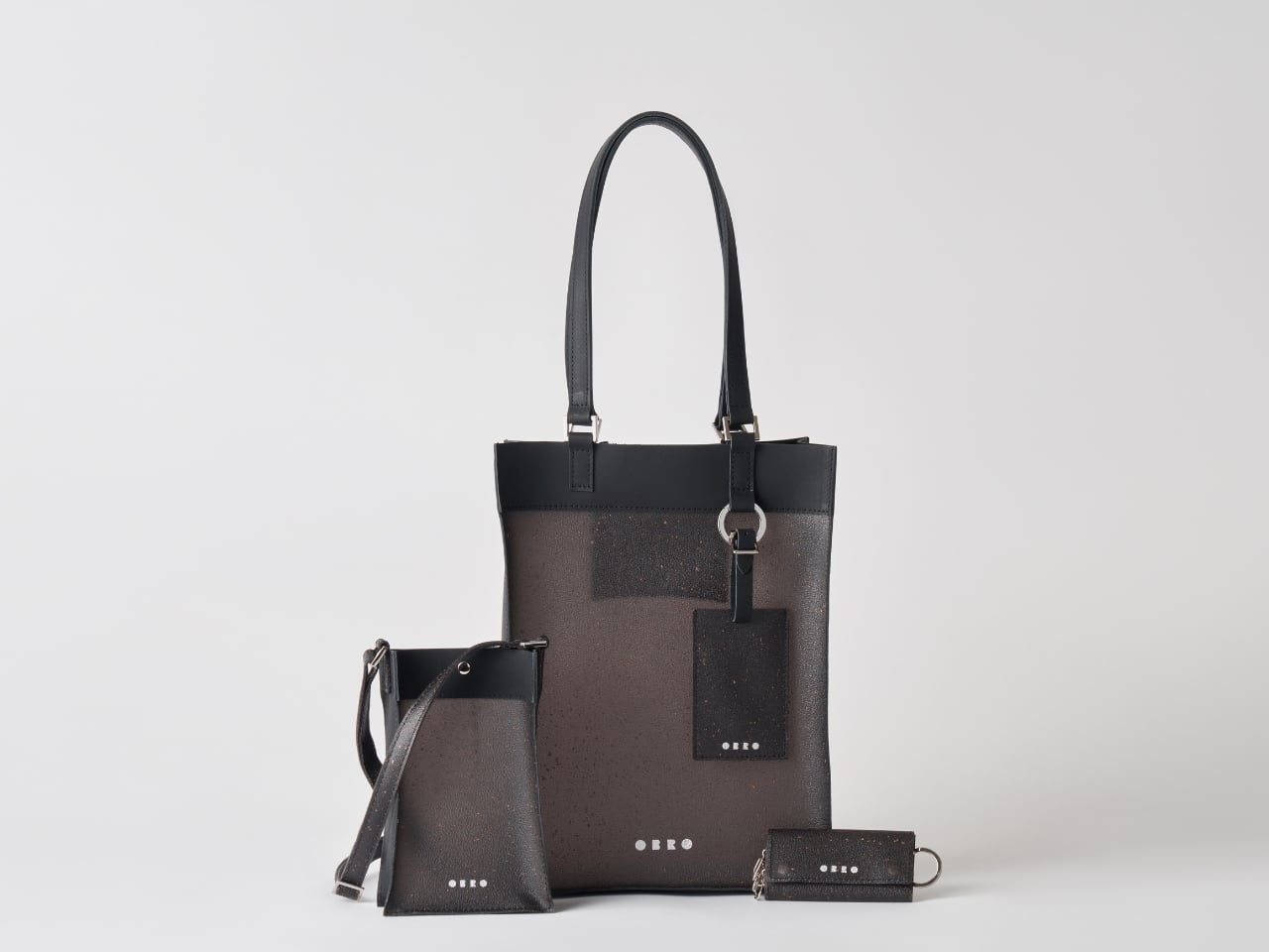
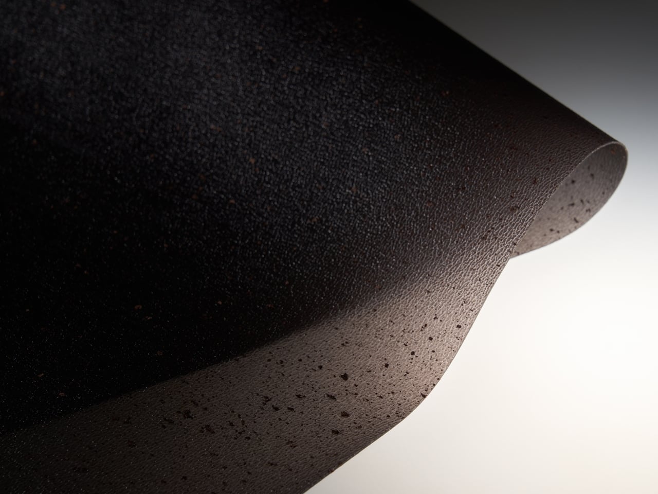
There’s something quietly radical about a material that refuses to hide what it’s made from. OBRO, a new composite from Japanese manufacturer Sanyo Co., Ltd., takes recycled leather powder and suspends it in transparent black PVC, creating a surface that looks like stars scattered across a midnight sky. Instead of disguising its origins, the material puts waste on full display, transforming discarded scraps into something you actually want to touch.

The name itself gives you a sense of the effect. OBRO comes from the Japanese word “oboro,” which translates to “hazy” or “softly blurred.” It’s that in-between quality where things aren’t quite solid, not quite translucent. Hold the material up to light and the leather fragments shimmer beneath the surface, shifting between metallic glints and organic warmth depending on the angle. It’s the kind of visual texture that photographs beautifully but probably demands to be seen in person to fully appreciate.

Designer: Satoru Shimizu / Sanyo Co., Ltd.

Sanyo Co., Ltd. has been around since 1947, so they’ve had plenty of time to understand leather as both craft and industry. What makes OBRO interesting is that it doesn’t try to replicate traditional leather. There’s no embossing to fake a hide pattern, no attempt to make you forget you’re looking at something engineered. The leather powder is ground fine enough to become part of a new material language entirely, one that feels more industrial poetry than nostalgic pastiche.

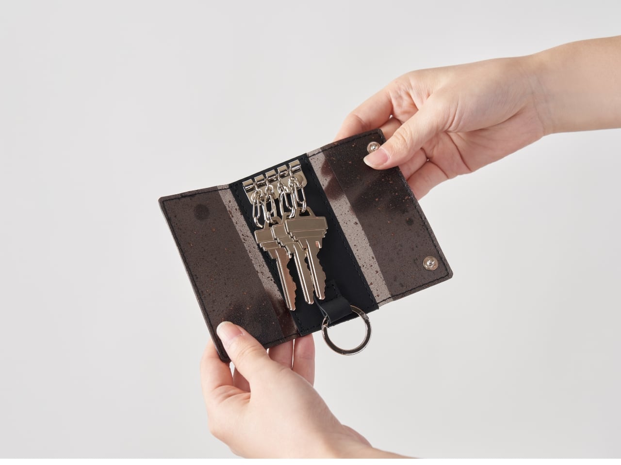
The debut collection keeps things refreshingly straightforward. There’s a tote bag, a sacoche (the compact crossbody style that’s become ubiquitous in streetwear), and a key case. All three are designed with a minimalist, gender-neutral aesthetic that lets the material do the talking. Genuine leather accents frame the OBRO panels, creating a contrast between the hazy composite and the solid, familiar texture of traditional hide. It’s a smart move that highlights what makes OBRO different without abandoning the tactile warmth people expect from leather goods.

From a practical standpoint, OBRO brings some unexpected benefits. It’s lightweight in a way full-grain leather rarely is, and the PVC component makes it water-resistant without needing chemical treatments. For anyone who’s watched a leather bag slowly absorb a rainstorm and then spent days trying to condition it back to life, that’s not nothing. The material holds its shape well, which matters when you’re talking about bags that need structural integrity but don’t want the stiffness of heavily lined leather.

What’s compelling here is the philosophy embedded in the material itself. Most sustainable design efforts focus on using less, sourcing better, or finding biodegradable alternatives. OBRO takes a different approach by celebrating the waste stream as a visible design element. Those leather fragments aren’t hidden away or ground so fine they disappear. They’re the whole point, catching light and creating depth in a way that pure PVC never could. It’s sustainability that doesn’t ask you to compromise on aesthetics or accept something less refined in the name of environmental responsibility.

Designer Satoru Shimizu and the team at Sanyo have essentially created a new category. OBRO isn’t vegan leather trying to pass for the real thing, and it isn’t traditional leather pretending it has no environmental cost. It’s a third option that acknowledges material waste as an inevitable part of production and then asks what happens if we make that visible, beautiful, and functional all at once.

The market for this feels broad. Design enthusiasts will appreciate the material innovation and Japanese attention to detail. Tech-minded people will respect the engineering that makes disparate elements work together cohesively. Fashion and streetwear audiences already gravitate toward pieces that tell a material story, especially when that story involves reimagining waste. And anyone tired of greenwashing will probably appreciate a product that shows its sustainable credentials literally on its surface.

The post OBRO Just Turned Leather Waste Into Luxury Material first appeared on Yanko Design.

5 Products Made from Cardboard: The Bench Supports 300 Pounds

Cardboard was once seen as just packaging, but it is now becoming a design hero. As sustainability and cost efficiency drive modern innovation, this humble material is being reimagined for far more than shipping boxes. Lightweight, strong, and easily recyclable, it inspires designers to create accessible, eco-friendly products without compromising on aesthetics or performance.

From furniture to sleek electronic casings, corrugated fiberboard is proving its versatility and value. This shift marks more than a passing trend. It represents a lasting transformation toward renewable, low-impact materials that are redefining how we think about design and environmental responsibility.

1. Sustainable by Nature

Cardboard’s greatest strength lies in its sustainability. Unlike plastics or materials that demand heavy mining and energy use, it’s made mostly from recycled paper and can be recycled repeatedly. Choosing cardboard means supporting a circular economy where resources are reused instead of wasted, a vital step toward protecting the planet’s future.

Its end-of-life journey is equally impressive. Rather than lingering in landfills, cardboard quickly breaks down and returns to the pulp stream within weeks, ready for reuse. This natural, non-toxic cycle makes it an ideal material for brands aiming to cut waste and attract eco-conscious consumers.
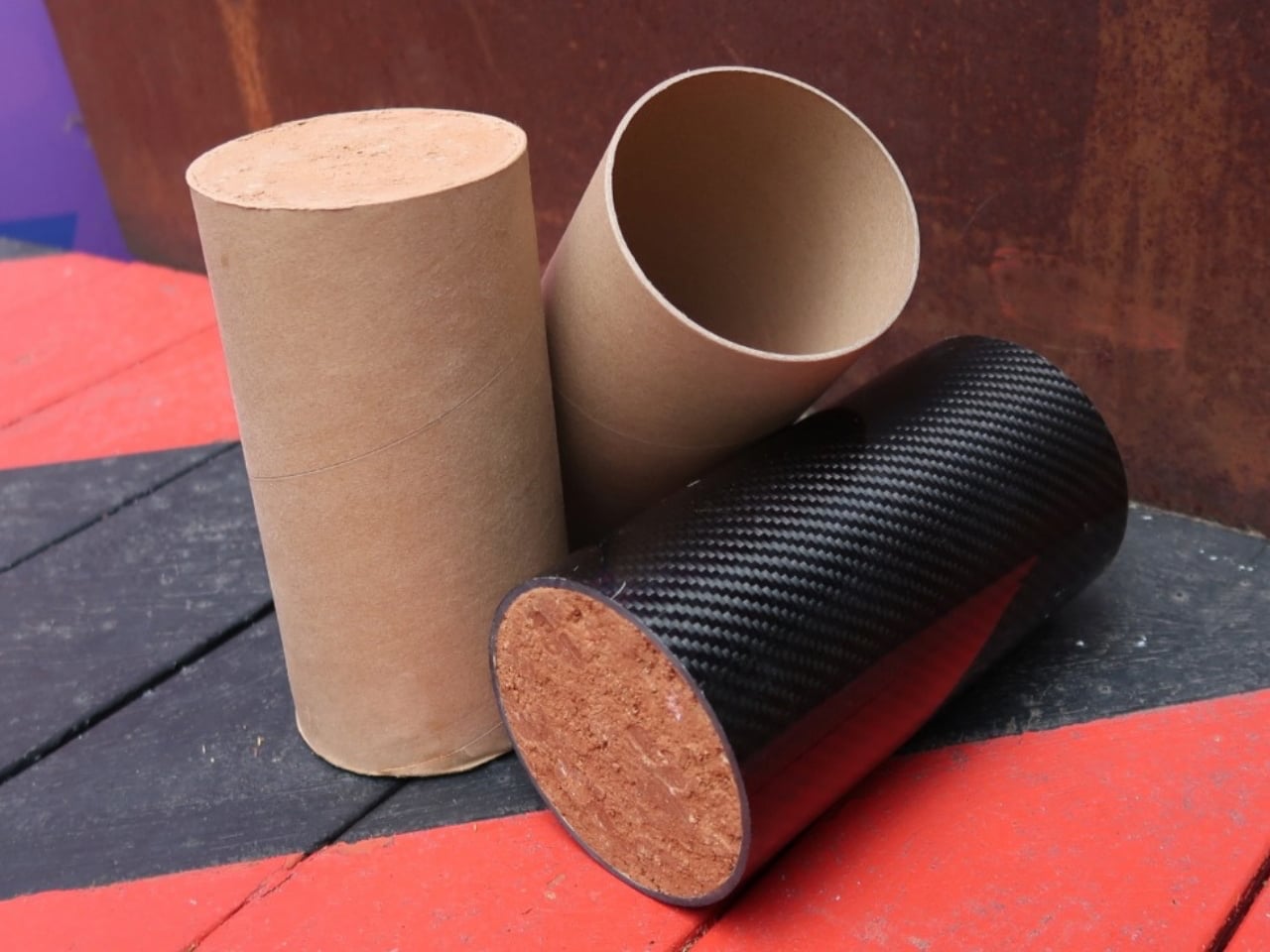
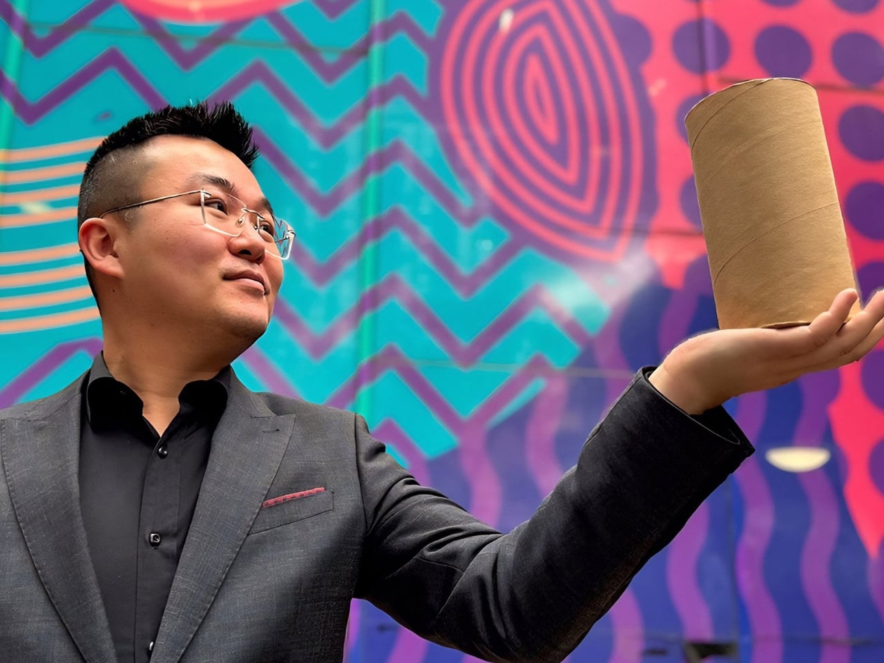
Imagine a sustainable construction material made from just soil, water, and cardboard. Researchers at RMIT University in Australia have turned this simple idea into reality with cardboard-confined rammed earth, or CCRE. By replacing traditional concrete and cement with cardboard tubes as permanent casings, they compact moistened soil inside these tubes to create strong, load-bearing structures. This method drastically reduces the carbon footprint, producing only one quarter of the emissions of conventional concrete while costing less than a third. It also repurposes cardboard waste, addressing both environmental and construction challenges simultaneously.
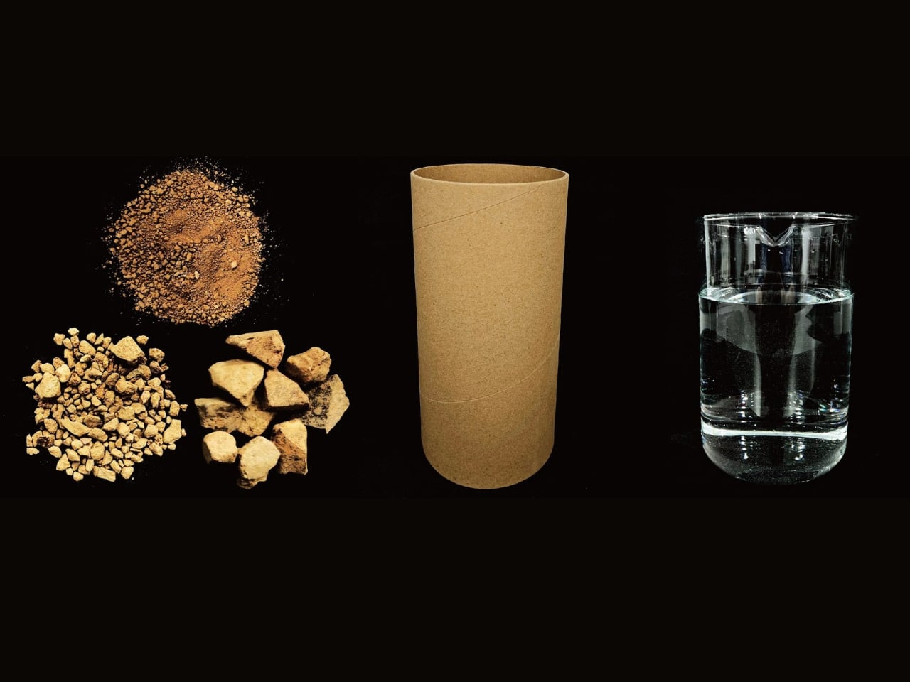
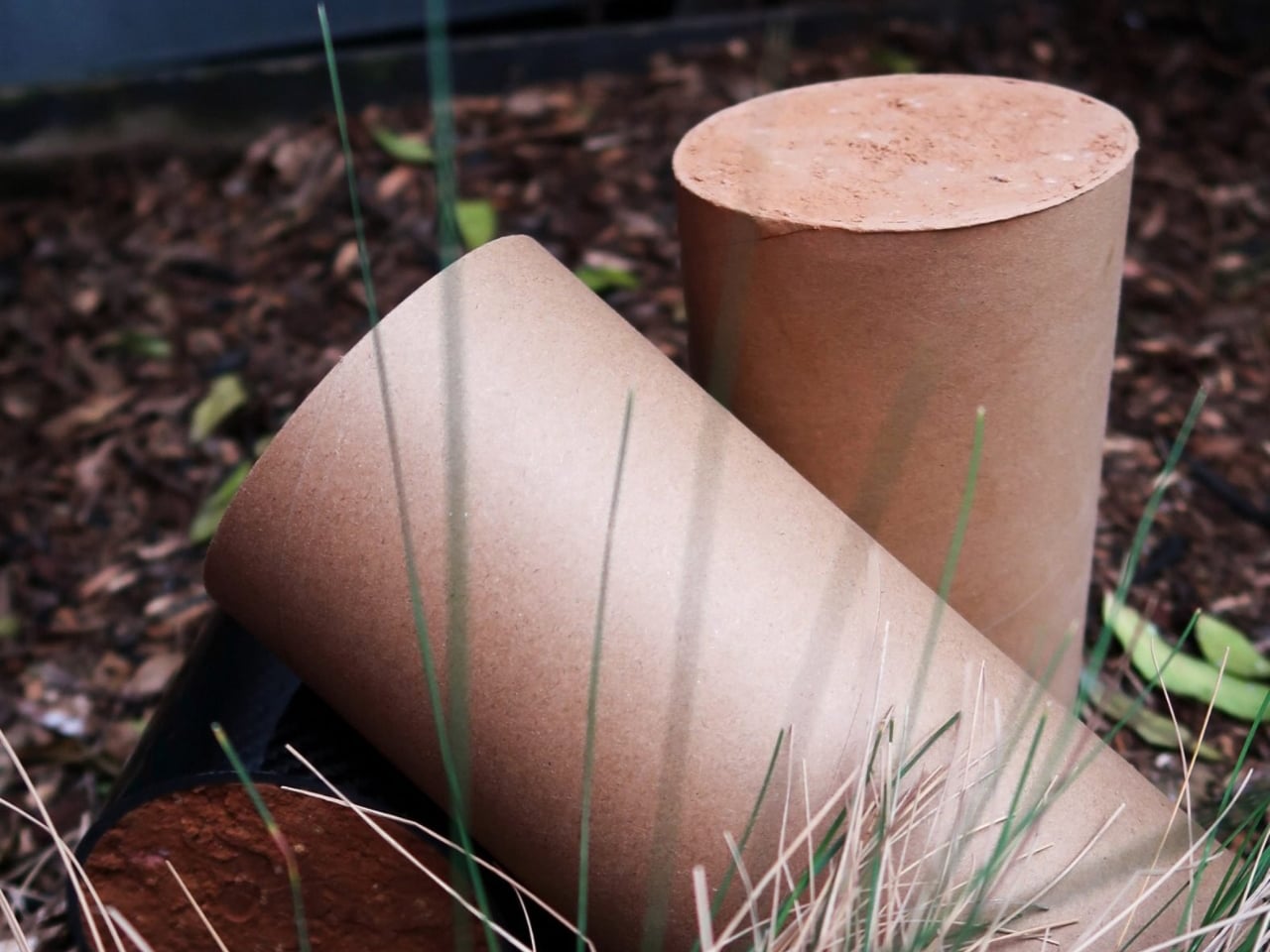
The process is accessible and adaptable, allowing construction teams to work on-site using local soils and lightweight cardboard. CCRE achieves comparable strength to cement-stabilized rammed earth after 28 days of drying, making it suitable for low-rise buildings. Its high thermal mass naturally regulates indoor climate, reducing energy needs.

2. Engineered for Strength

Cardboard’s reputation for weakness is outdated. Modern design has transformed it through advanced corrugation, folding, and layering methods that turn flat sheets into strong, load-bearing structures. By combining principles of origami with structural engineering, designers now produce interlocking components with impressive compressive strength that can rival lightweight wood composites.

This innovation enables the creation of durable, practical items like shelves, exhibition displays, and even temporary shelters. Lightweight and tool-free to assemble, these designs cut shipping costs, reduce fuel use, and store flat for convenience. It’s a perfect example of achieving maximum strength and function with minimal material.
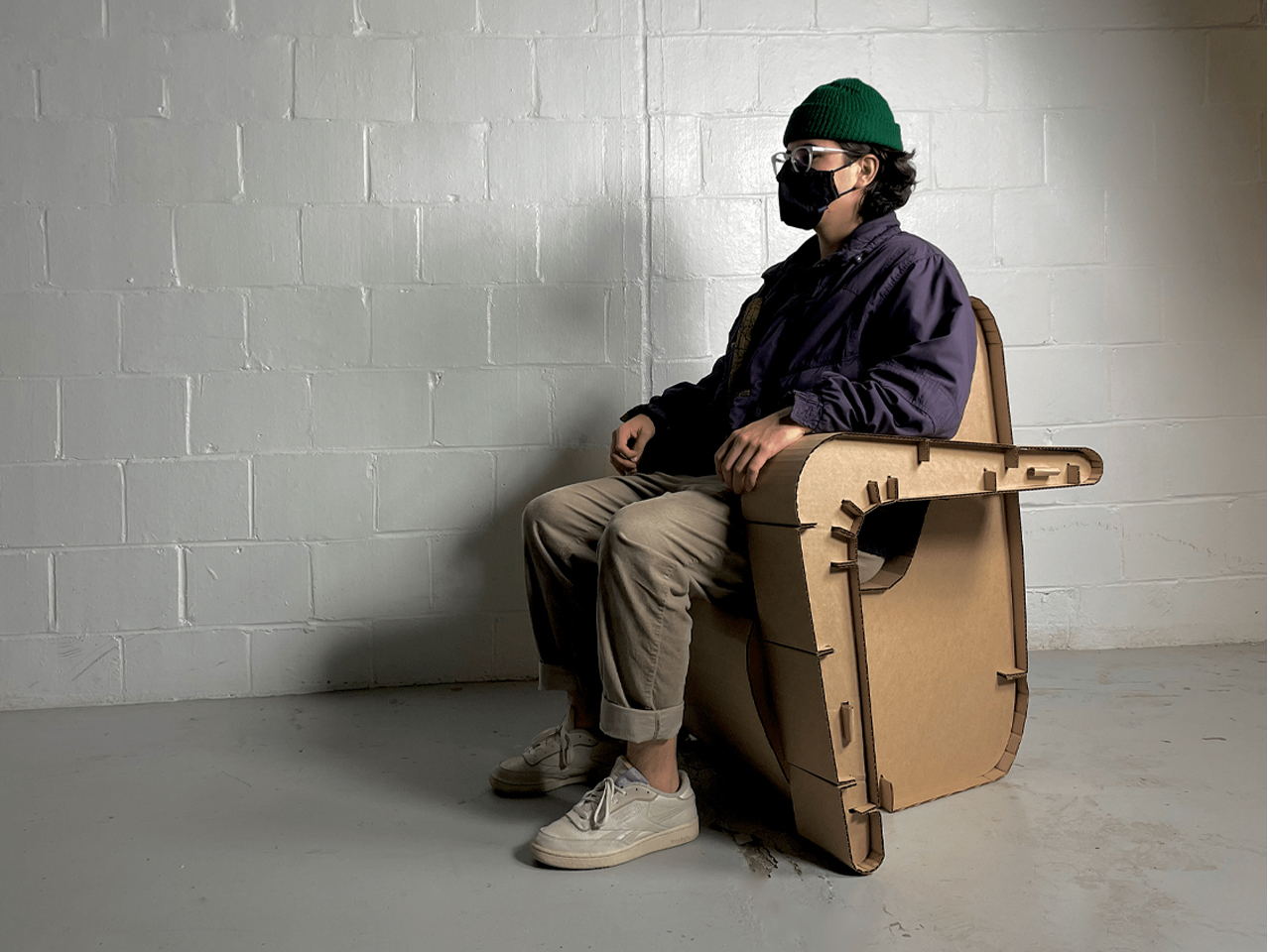
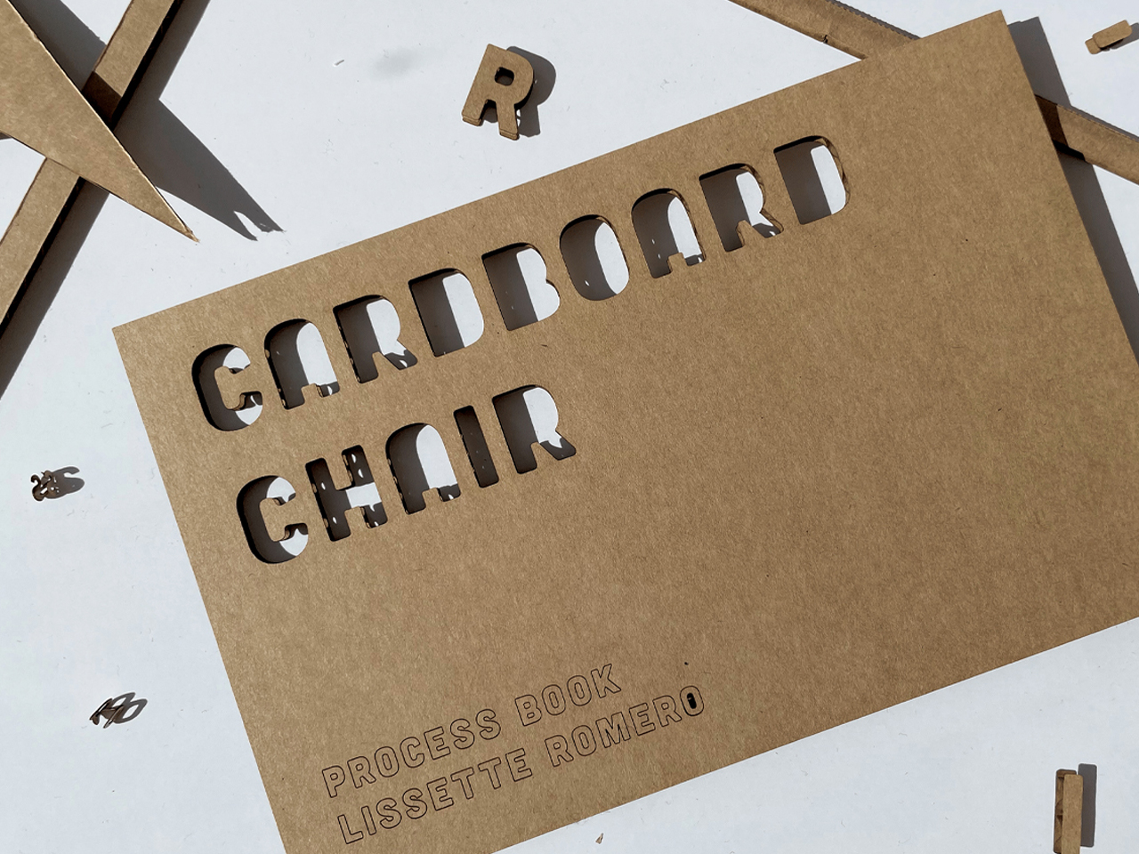
The Cardboard Chair Process Book is a design concept that creates custom cardboard chairs based on client interviews and anthropometric studies. Lissette Romero emphasizes that comfort depends on the chair’s intended use—a lounge chair for watching movies differs greatly from a desk chair for studying or gaming. Her process ensures that each chair is tailored to the sitter’s body, tasks, and personal aesthetic. By considering function, ergonomics, and context, Romero crafts designs that feel both practical and inviting, making comfort a personalized experience rather than a one-size-fits-all solution.
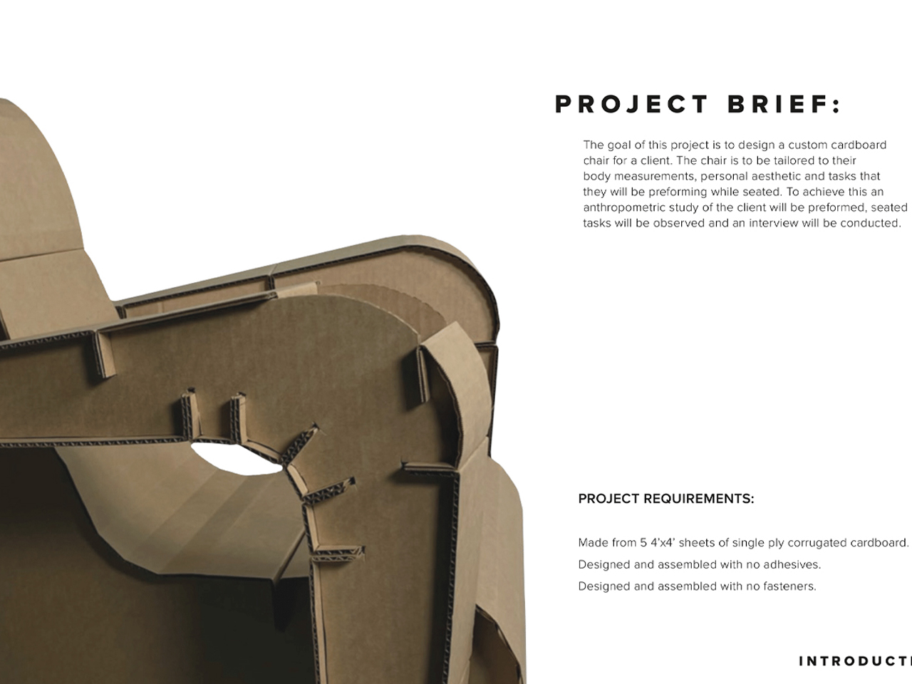
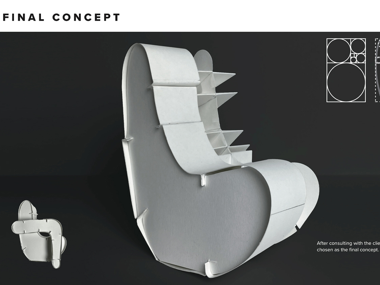
Each chair is constructed from five 4′ x 4’ sheets of single-ply corrugated cardboard and requires no adhesives, fasteners, or hardware. Romero begins by observing seated tasks and conducting detailed interviews, then develops three conceptual prototypes exploring different design languages. This method enables iterative refinement, resulting in chairs that are not only functional and structurally sound but also uniquely tailored to the client’s lifestyle and preferences.

3. Crafted with Character

Cardboard introduces a clean, tactile aesthetic defined by its matte texture and understated appeal. Its natural tones, warm brown or crisp white, reflect honesty and simplicity, resonating with today’s love for raw, authentic materials. Designers are embracing it as a symbol of mindful minimalism, where beauty lies in restraint and function blends seamlessly with form.

Beyond looks, cardboard is highly adaptable. Its surface welcomes printing, laser cutting, and embossing, allowing endless customization. Picture a lamp or storage box embossed with a brand’s logo, elegant yet eco-conscious. This flexibility makes cardboard ideal for small businesses, creative branding, and rapid prototyping.


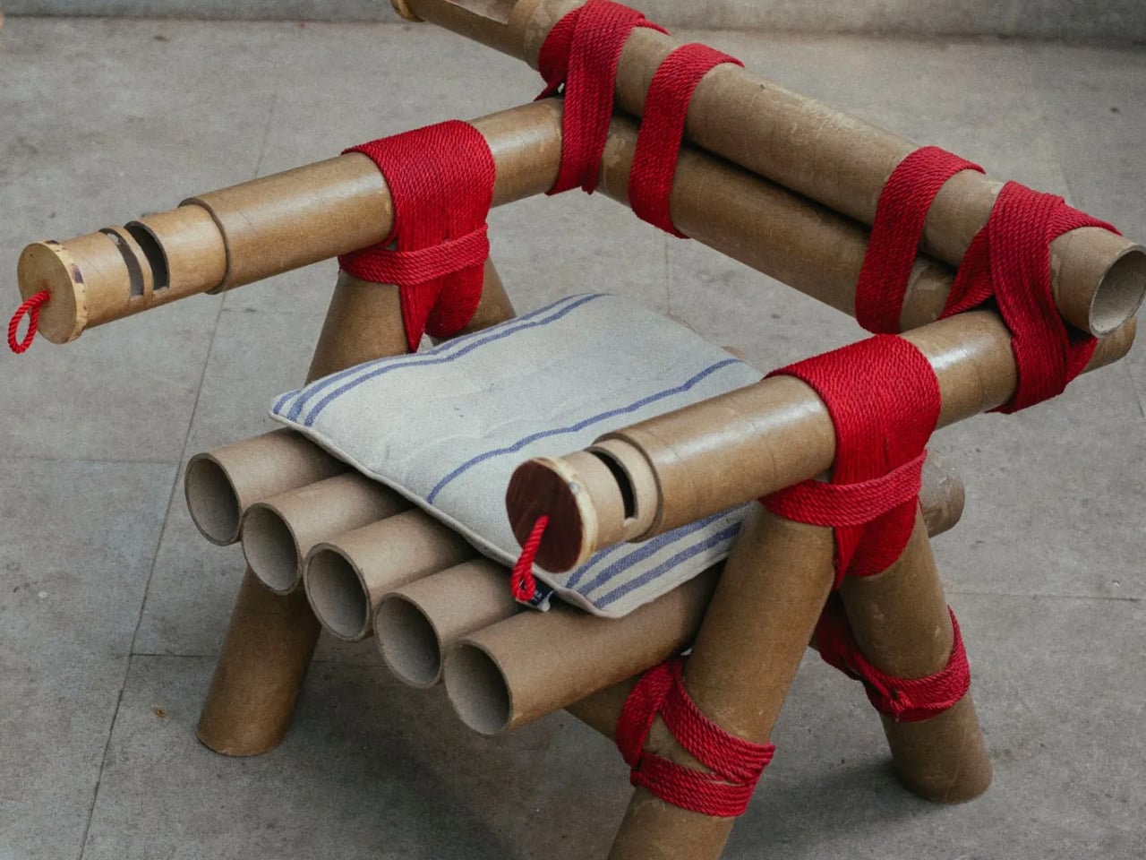
The Paper Tube Chair reframes design as a democratic act rather than a luxury pursuit. Conceived by the Dhammada Collective in Bhopal, founded by Nipun Prabhakar, it echoes Pierre Jeanneret’s library chairs yet replaces teak with discarded cardboard tubes. The studio advocates “joyful frugality”, applying strong design principles using overlooked materials so good furniture need not remain a metropolitan privilege. Cardboard cores from a print shop, destined for landfill due to glue layers that prevent recycling, are intercepted and cut like bamboo. Surplus vermilion rope from weaving workshops binds the tubes in a continuous figure-eight lashing that tightens under load and allows later repair.


Early collapse of prototypes informed a tension-based system with nested tubes at stress points. A light varnish preserves handling marks as a visible record of origin. The chair assembles and disassembles with simple tools, making replication viable in low-resource contexts. Released as open-source, it invites adaptation using local waste streams. Modernist geometry softened by vernacular craft creates an object that feels both contemporary and culturally rooted.

4. Flat-Pack Advantage

Cardboard is reshaping how products are shipped and stored. Structural designs like flat-pack furniture and packaging inserts can be transported completely flat, reducing shipment volume and cutting costs. This efficient approach lowers carbon emissions and benefits manufacturers and consumers by making logistics more sustainable and affordable.

Designing for disassembly and flat-packing also helps reduce clutter at home. Products become easier to move, store, and recycle once their use is over. This blend of practicality and sustainability highlights cardboard’s brilliance as a material that simplifies life while promoting conscious, eco-friendly living.
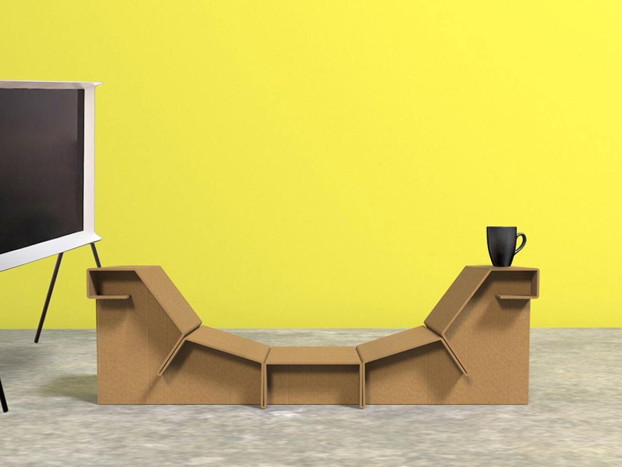
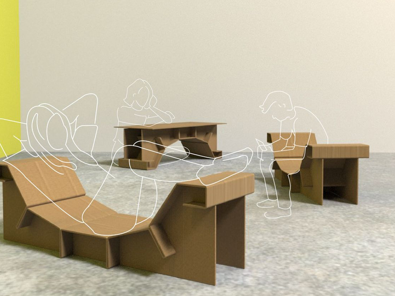
Innovative design often starts with a simple problem, and the Cuna furniture collection is a smart response to one we all recognise, and that is excess cardboard. Designed by Valeria Coello, Cuna turns ordinary packaging material into a functional, eco-friendly bench. Made from just two sheets of sturdy cardboard supported by five interlocking pieces, it requires no screws or glue, relying instead on joinery principles that make it both lightweight and structurally sound. The result is a sustainable piece that proves what is usually discarded can become useful, attractive, and durable.
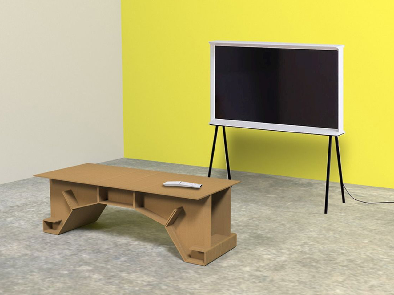
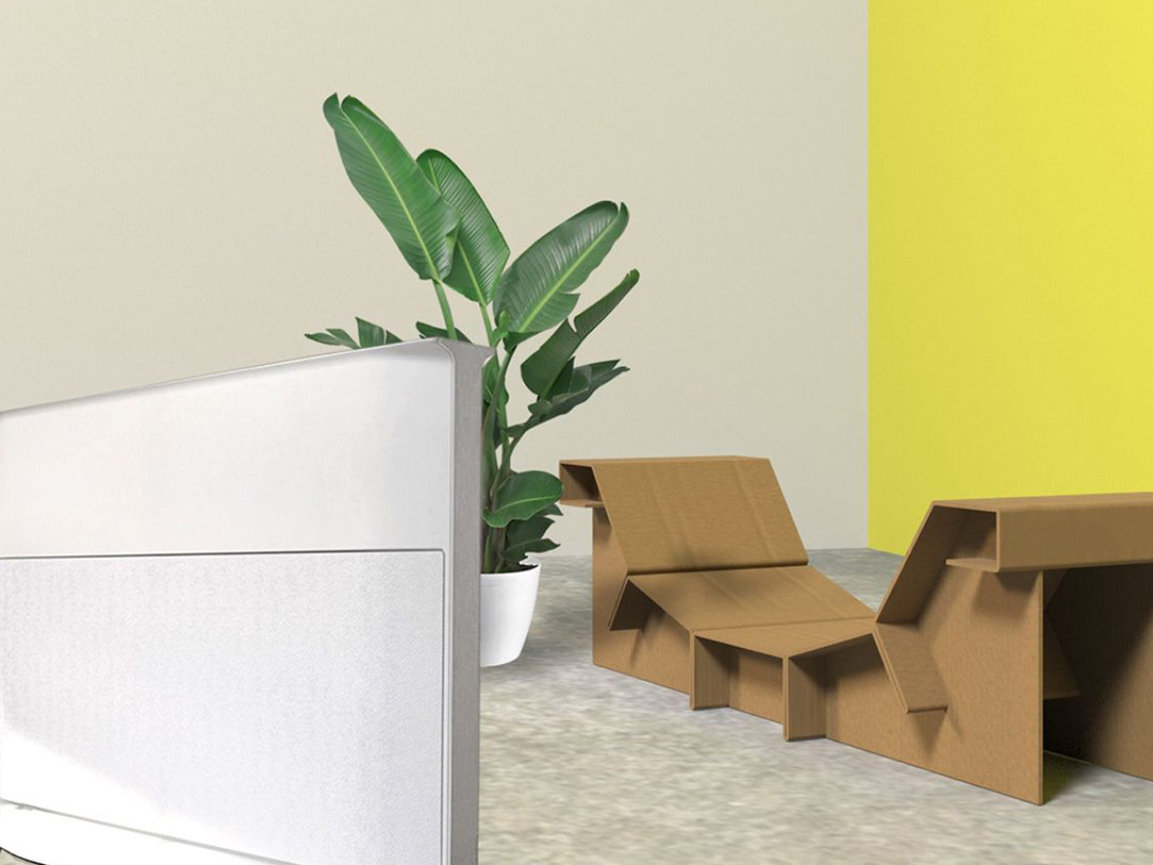
Cuna’s appeal lies in its versatility. When set upright, it offers a curved, single-seat bench with side portions that act as armrests or holding space. Flip it over and it becomes a flat bench or a low table; two units together create a complete seating set. Comfortable, adaptable, and affordable, it is ideal for students, renters, and anyone seeking practical, responsible design.

5. Rapid Prototyping Power

Cardboard’s affordability and flexibility make it a designer’s dream for fast prototyping. With simple tools, complex ideas can be cut, folded, and tested within hours, enabling quick exploration of structure, form, and usability. This hands-on approach encourages creativity without the expense or delay of specialized machinery.

Such rapid iteration dramatically shortens the path from concept to market. Businesses can respond swiftly to shifting trends and consumer needs, while everyday users benefit from faster access to innovative, affordable products. Cardboard has become the quiet driving force behind a more agile, democratic era of design and development.
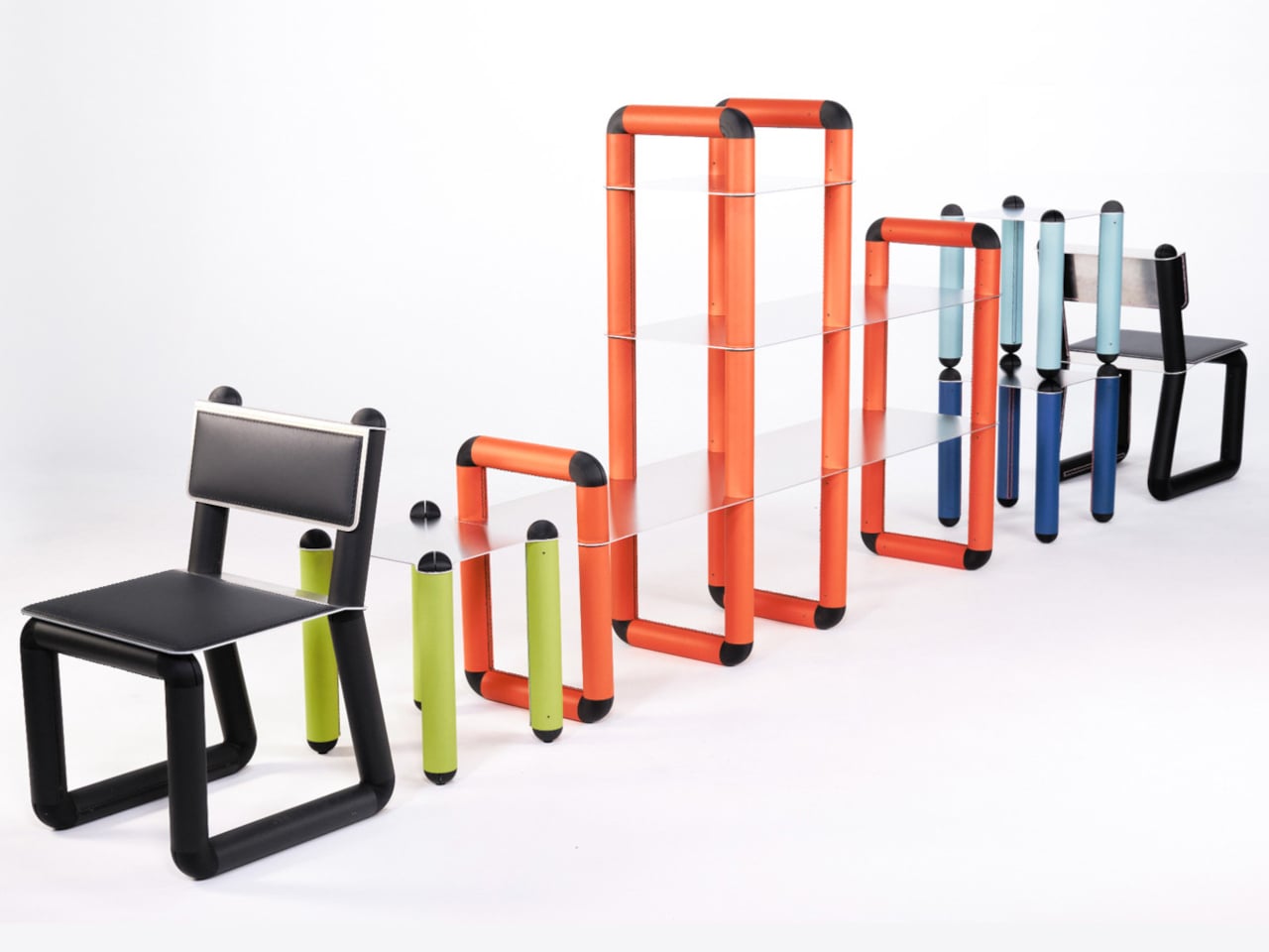
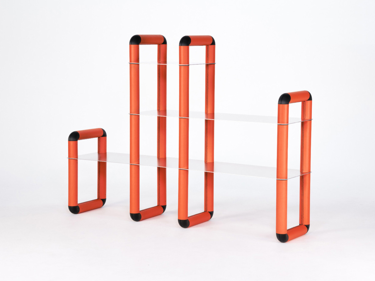
Furniture must work before it pleases the eye; otherwise, it is just a decorative object taking up space. Most pieces today rely on metal, wood, or plastic because these materials are familiar and sturdy, but they are not the only possible choices, and they are not always the most sustainable. With growing waste, reusing discarded materials can be a more responsible path. When designers think beyond convention, even unlikely resources can become viable solutions, as seen in this modular furniture system made from cardboard.
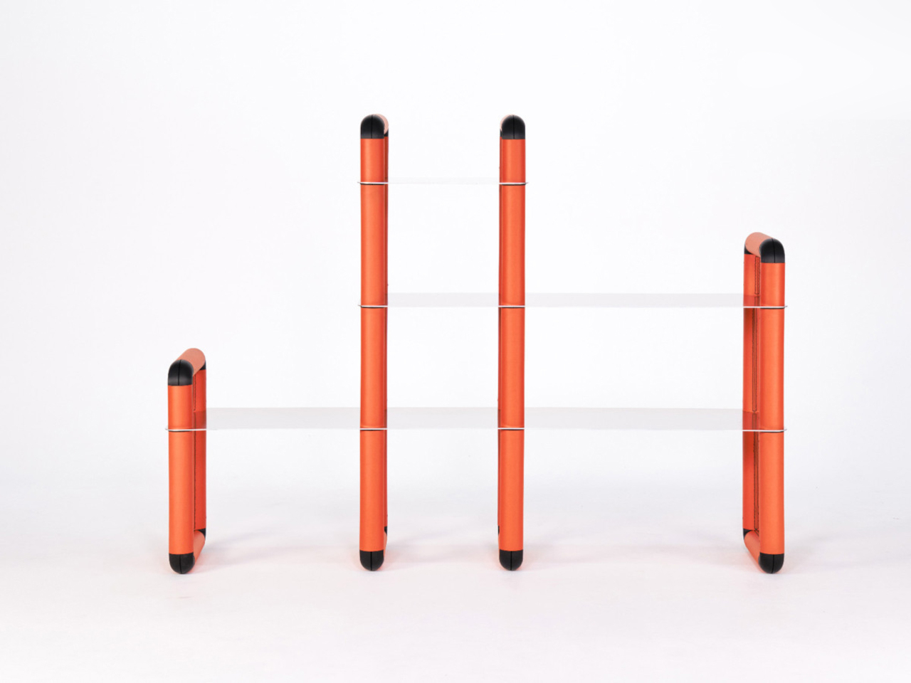
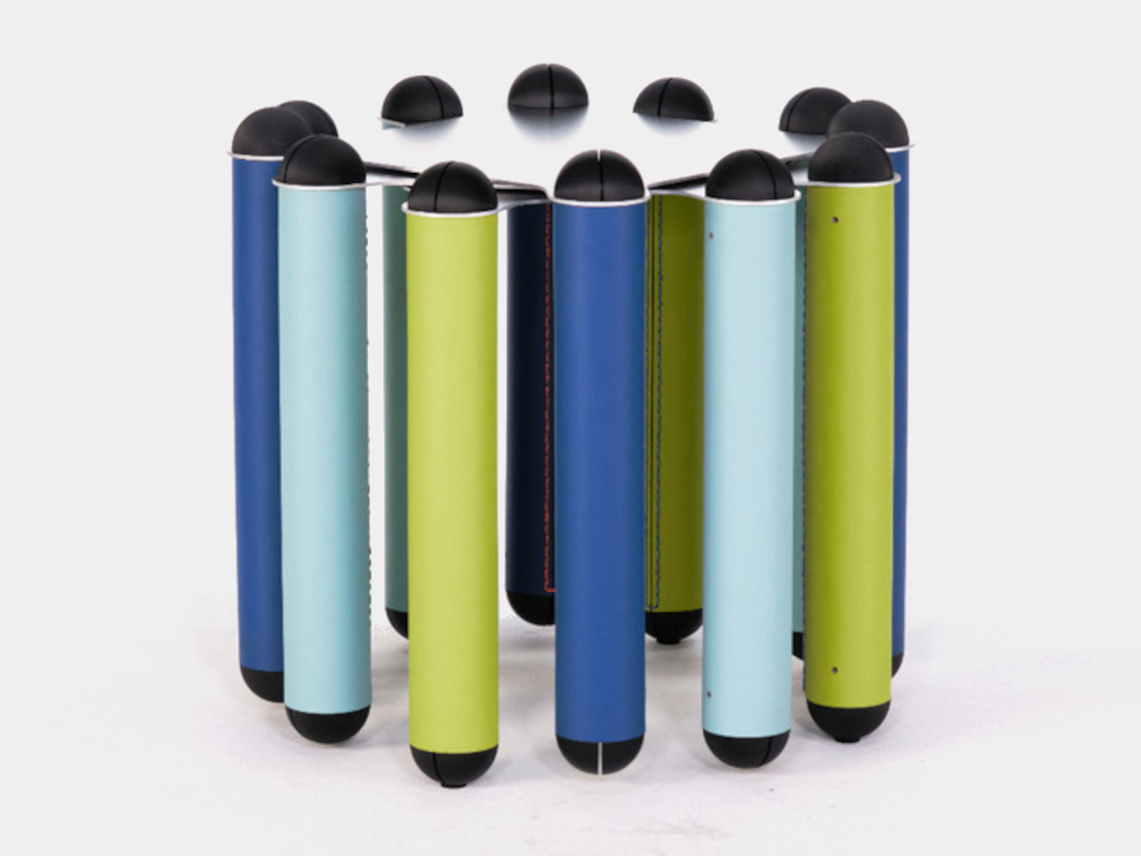
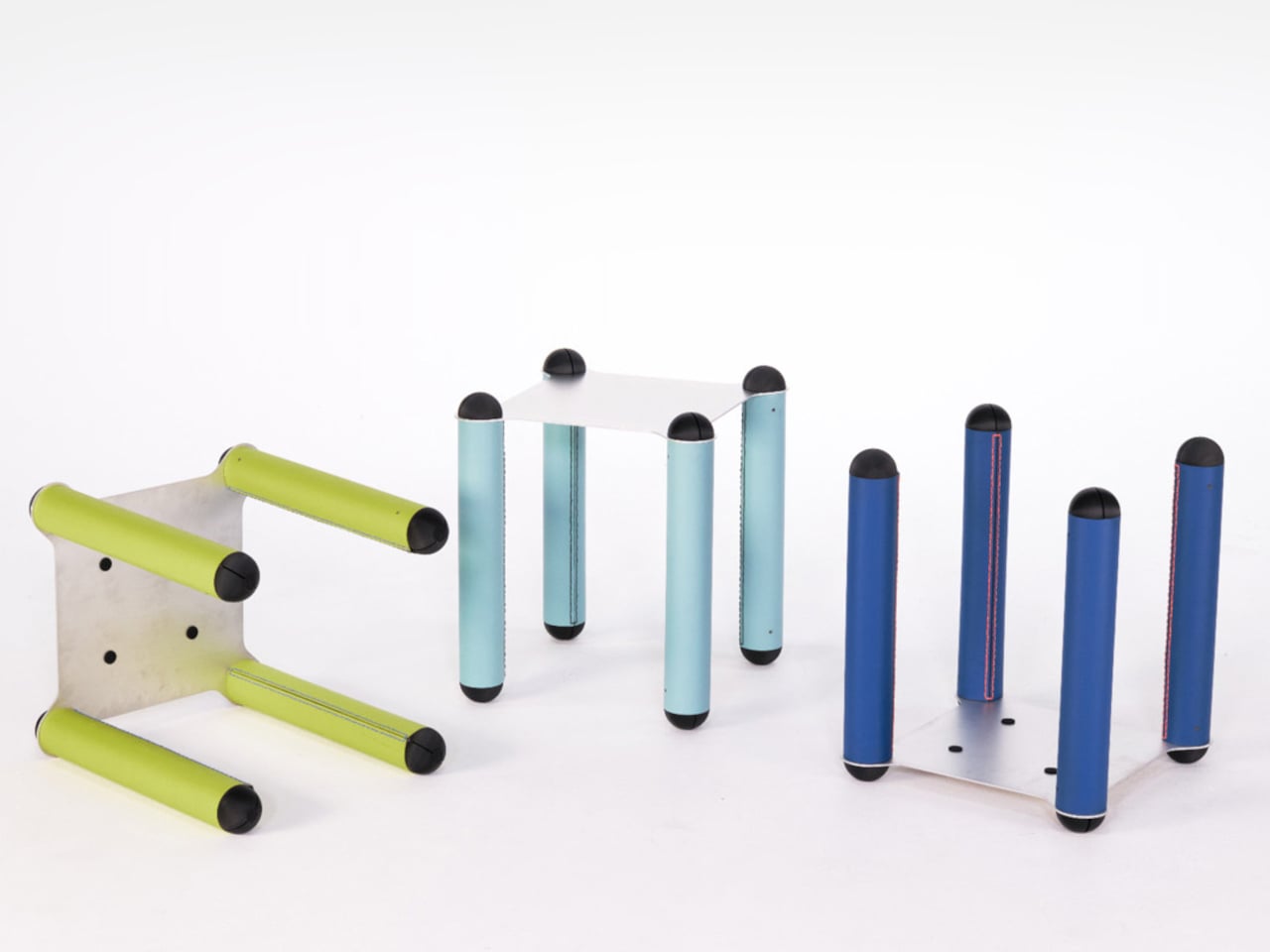
HIDDEN: PAPERS reimagines cardboard, typically discarded after packaging use, as a structural core. Thick tubes form the main frame, wrapped in removable linoleum sheets that are stitched rather than glued, so they can be replaced without damage. Recycled plastic nodes and a simple hex key allow the tubes to be assembled into shelves, side tables, or chairs finished with wood or metal surfaces. The result conceals its humble origins and proves cardboard can anchor refined, durable design.
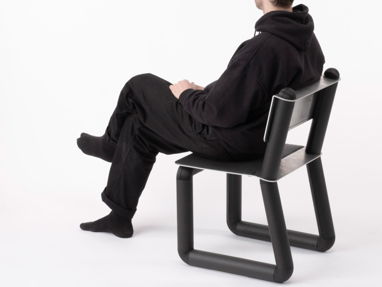
Cardboard’s evolution from utility to design essential shows how simplicity fuels innovation. With its strength, affordability, recyclability, and natural charm, it empowers creators to craft sustainable, beautiful products that respect both people and the planet. This shift reminds us that true progress lies in simple, conscious design and is a blueprint for a smarter, greener future.

The post 5 Products Made from Cardboard: The Bench Supports 300 Pounds first appeared on Yanko Design.
If Sci-fi Gardening met MC Escher: Meet The Holocene House’s Floating Jungle Canopy

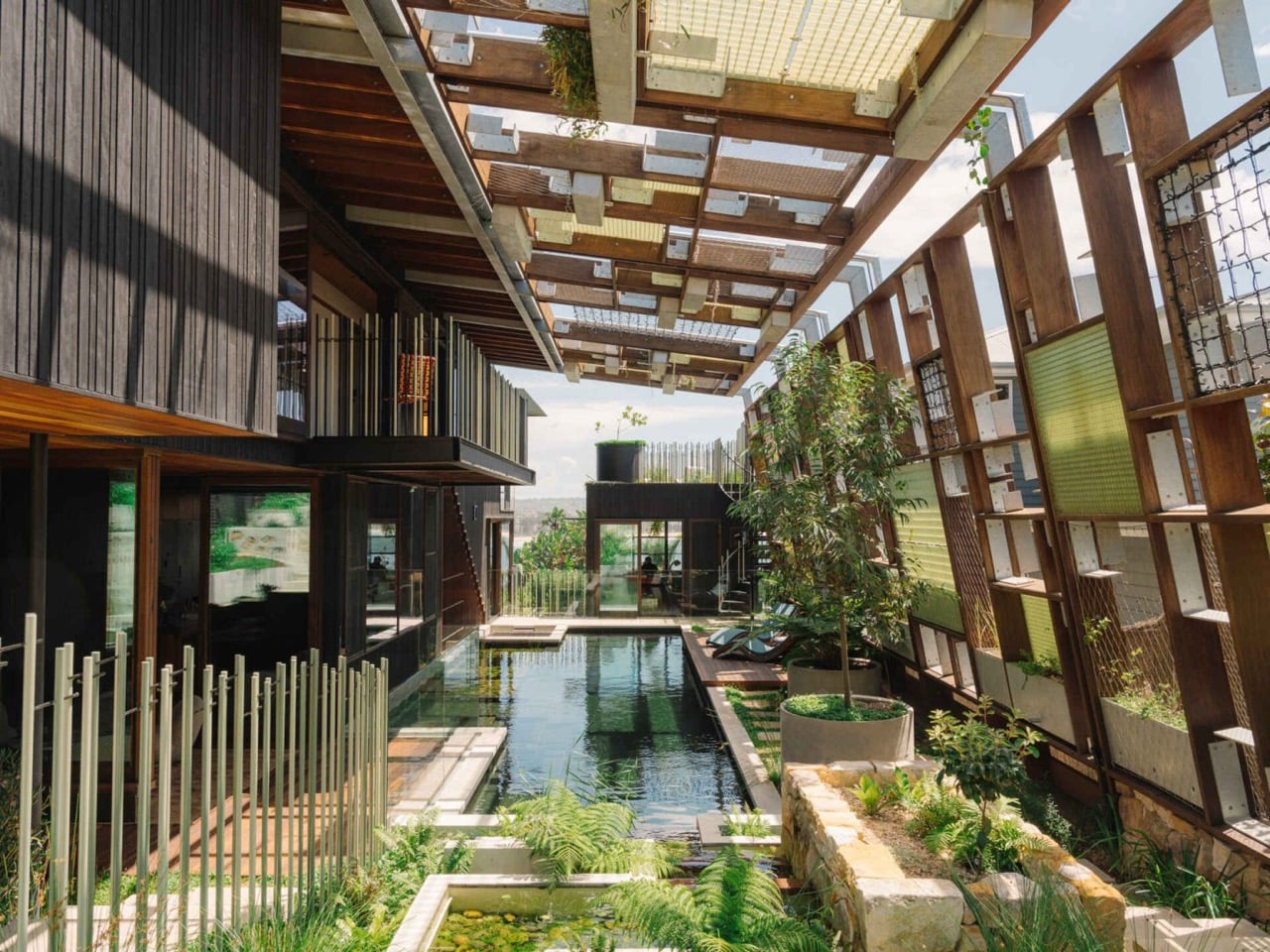
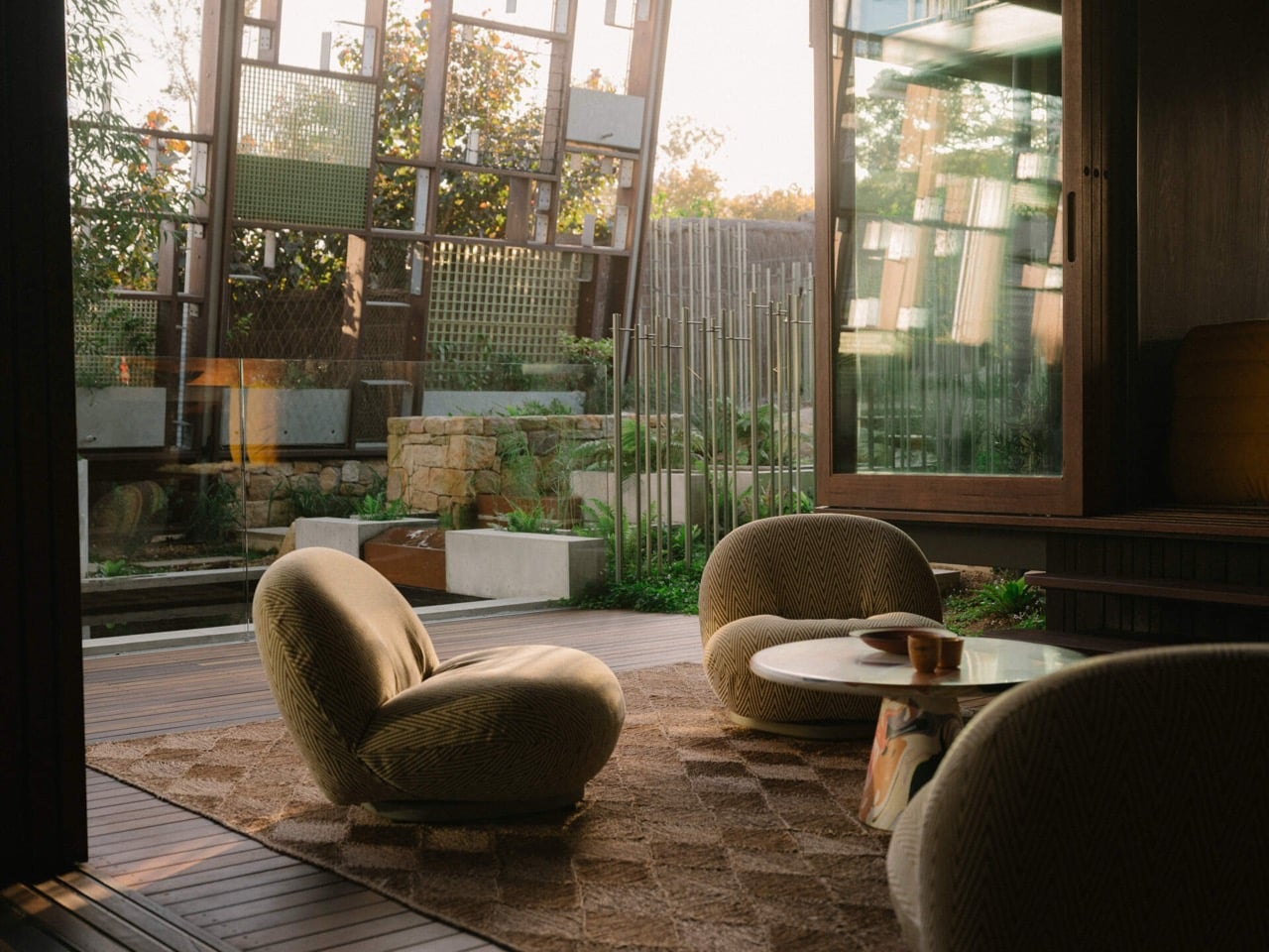
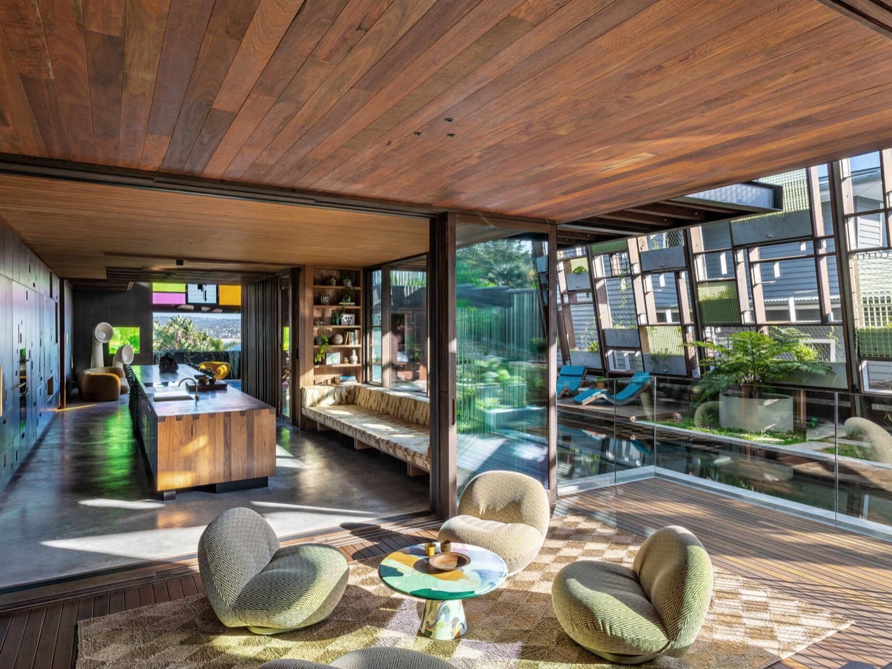
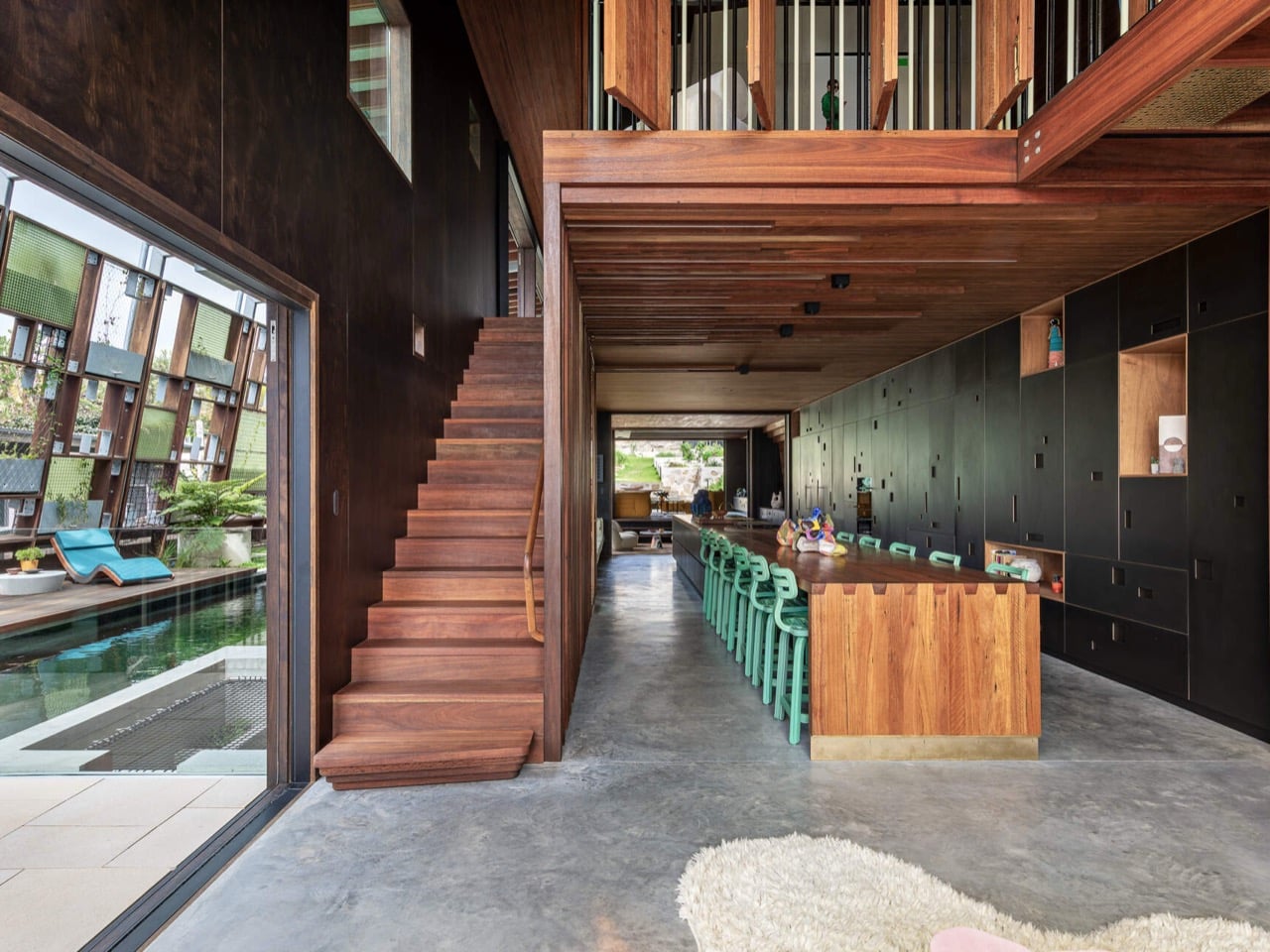
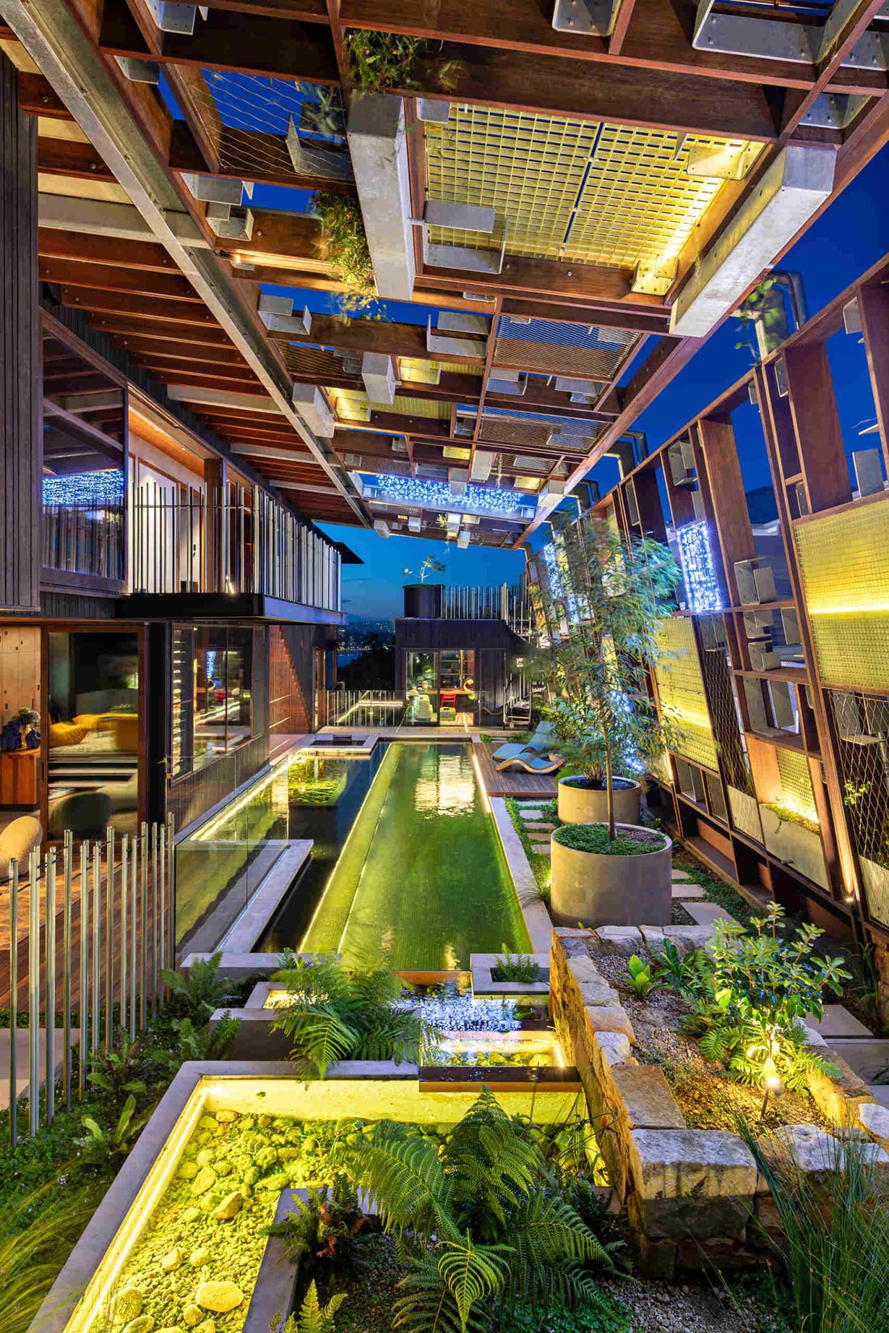
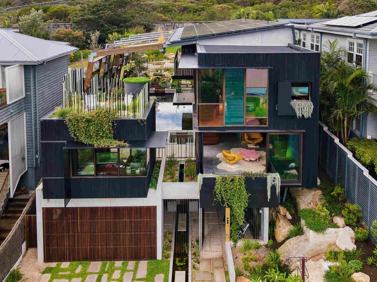
The pool doesn’t sit beside the house. It doesn’t occupy the backyard. It runs straight through the middle of the living space, dark-tiled and creek-like, with stepping stones crossing it at the entry. This is the organizing principle of Holocene House: water as hallway, water as climate control, water as the thing everything else revolves around.

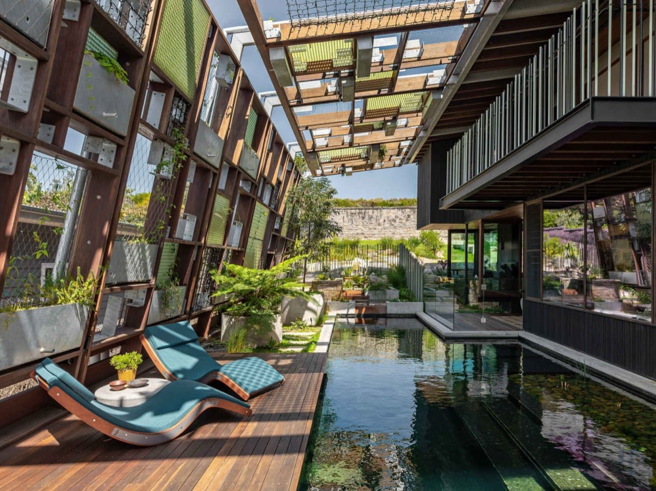
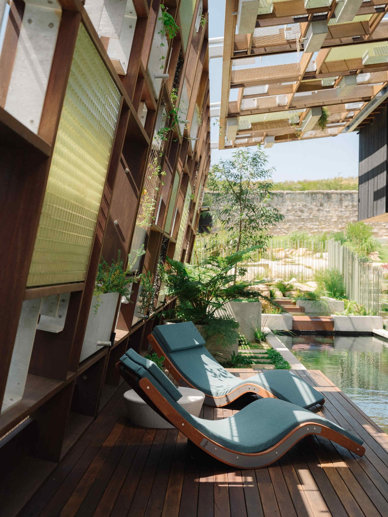
Above this central watercourse, a canopy of floating planters and geometric panels creates its own microclimate. Timber beams intersect with structural steel. Translucent jade FRP panels catch and scatter light. Plants spill from concrete boxes suspended in the grid. The whole structure has this disorienting quality, like multiple dimensions of garden folded into the same space. It’s both hyper-technical and completely organic, which makes sense for a home that’s carbon positive while feeling more like a living ecosystem than a building.

Designer: CplusC Architects + Builders

CplusC Architects + Builders designed this thing, and honestly, they went harder than they needed to. The brief could have been “nice sustainable house with pool,” but instead they built something that reorganizes how residential architecture relates to water and vegetation. The swimming pool measures roughly 12 meters long and runs parallel to the main living spaces. Dark tiles give it the appearance of a natural creek bed, which sounds precious in theory but actually works because the water is moving and filtering constantly through reed beds, polishing ponds, charcoal, and pebbles. No chlorine. The system mimics what happens in actual wetlands.

The canopy overhead is immersive and disorienting in the best way possible. Structural steel beams intersect with timber framing at multiple angles, supporting concrete planters that float at different heights. Between them, translucent jade-colored FRP (fiber-reinforced plastic) panels fill gaps in the grid. The whole assembly casts this dappled, constantly shifting light that changes character throughout the day. It’s functional shading that drops the temperature on the deck by several degrees, but it also creates this spatial ambiguity where you lose track of what’s ceiling, what’s wall, what’s garden. Very Escher. Very disorienting if you stare at it too long.

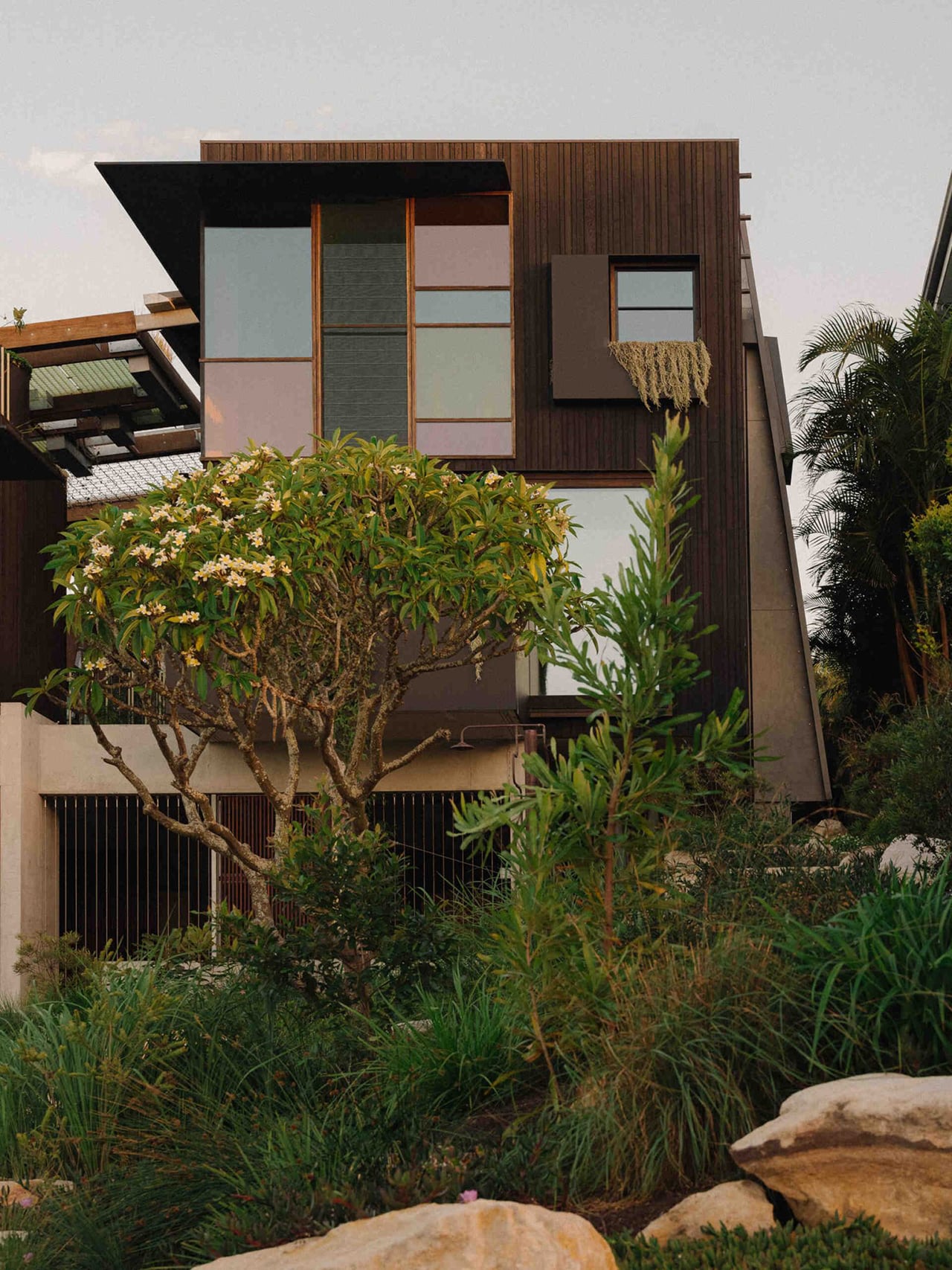
This is Australia’s first certified carbon-positive home under the Active House Alliance, which means it produces more energy than it consumes over a year. Solar panels handle the energy generation. Rainwater and greywater systems irrigate the productive garden, which includes fruit trees, vegetables, herbs, and even chickens. The spotted gum cladding on the exterior got the Shou Sugi Ban treatment, that Japanese charring technique that makes timber more resilient and gives it a charcoal finish. Low embodied energy material that will age well in the coastal climate near Shelly Beach.

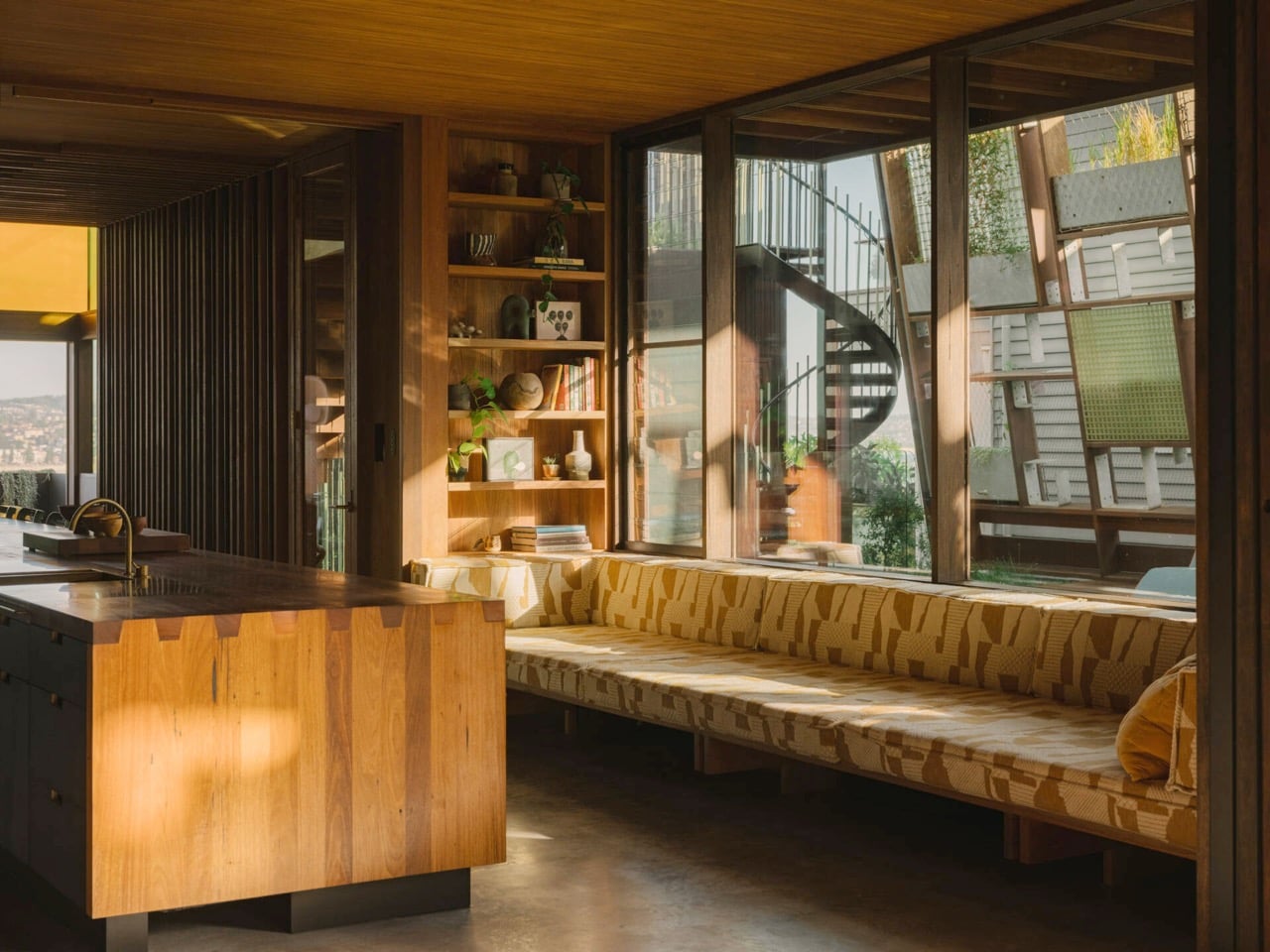
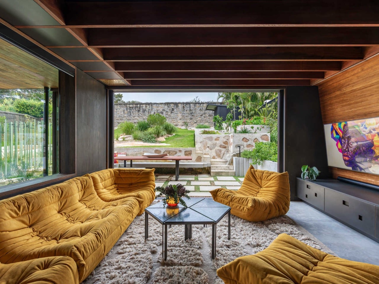
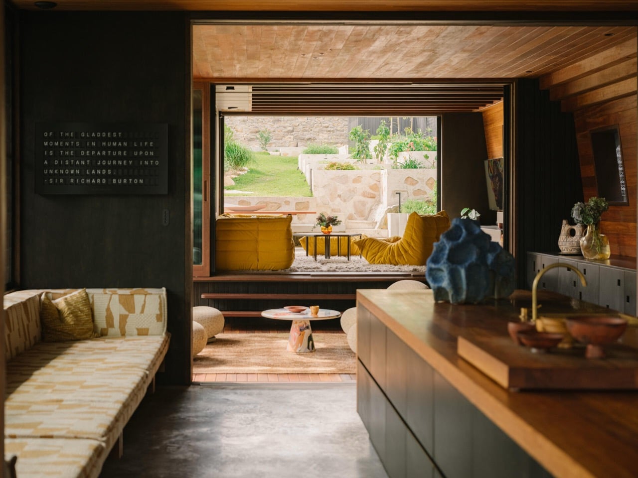
Inside, a 9.2-meter recycled hardwood island stretches through the kitchen and doubles as the dining table. That’s over 30 feet of continuous timber. The cabinetry uses Paperock, a composite material made from recycled paper and resin, formed into panels with these small perforations that create textured shadows. Floor-to-ceiling storage hides appliances and maintains clean sightlines. A built-in daybed sits in the kitchen area with views straight through to the pool and back garden. The whole spatial layout keeps pulling your attention back to that central water feature, which becomes the thing every other design decision orbits around.

What makes this work is that it’s rigorous about the systems. The natural pool filtration, the greywater recycling, the solar array, the thermal mass of the concrete, the cross-ventilation through operable walls. These aren’t aesthetic gestures. They’re load-bearing infrastructure that allows the house to function as a net positive contributor rather than just a less-bad consumer. And somehow that rigor produces spaces that feel loose and organic rather than over-engineered. You can see the thinking, but it doesn’t announce itself.

The project sits between a national park and million-dollar beach views, which is both an advantage and a responsibility. The landscape architect, Duncan Gibbs, designed the garden to support local bandicoot habitat while producing food for the residents. That’s a specific kind of design challenge: make it productive and beautiful and ecologically functional for native species all at once. The planting selections reinforce local ecology rather than importing exotic specimens that need constant maintenance. It’s a working garden that happens to look good, not the other way around.

Photos by Renata Dominik

The post If Sci-fi Gardening met MC Escher: Meet The Holocene House’s Floating Jungle Canopy first appeared on Yanko Design.
The Mile-High Tower That Grows Food, Harvests Clouds, and Heals Chicago

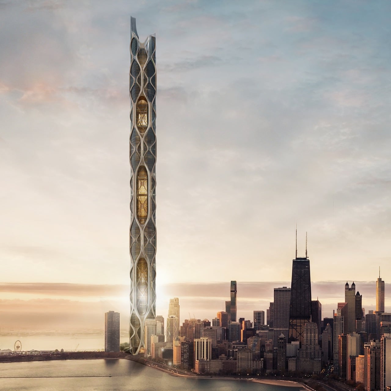
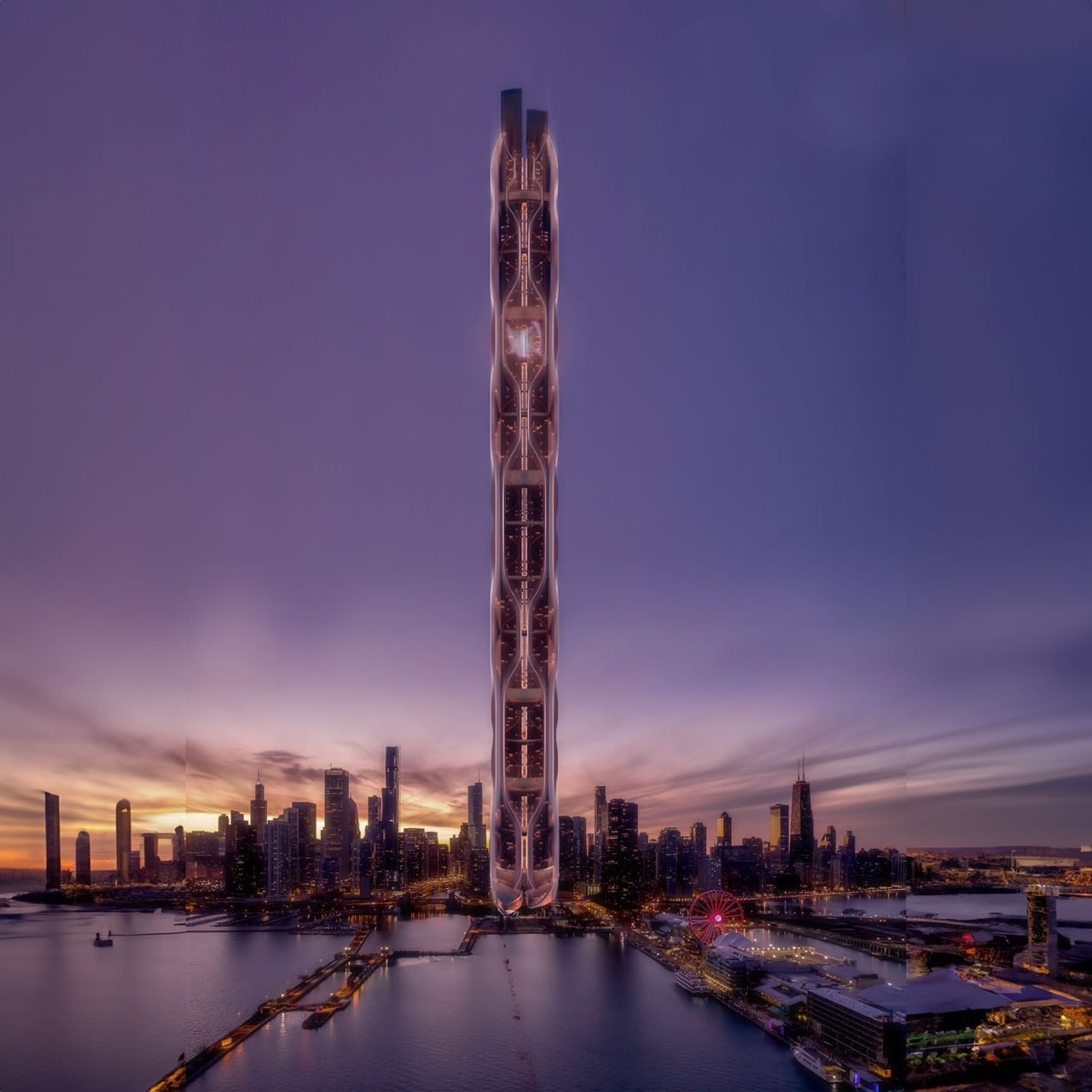
Imagine looking up at a city skyline and knowing that inside those towers, food is growing, water is being harvested from clouds, and entire communities are thriving in harmony with nature. The Eden Rise Vertical Eco Living Community is not just a building proposal. It is a bold reimagining of what a city can be when architecture becomes an ecosystem rather than an object.

The project tackles one of Chicago’s most urgent urban challenges: food deserts. In many neighborhoods, especially low-income ones, access to fresh and nutritious food is limited. Grocery stores are scarce, healthy options are expensive, and residents often rely on convenience stores or fast food. Eden Rise flips this reality by embedding vertical farms directly into a mile-high tower, allowing fresh produce to be grown where people live. Food no longer travels miles to reach a plate. It moves floors.

Designer: Yuhan Zhang and Dreama Simeng Lin

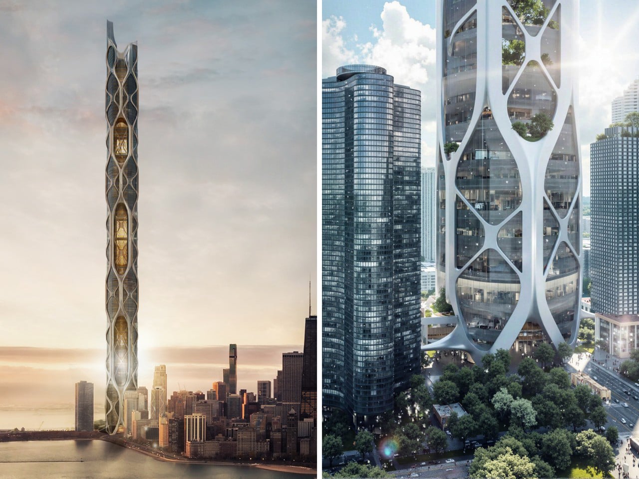
The tower’s design is as poetic as its purpose. Inspired by the fluid form of a water droplet, its organic silhouette reflects Chicago’s relationship with water while symbolizing life, renewal, and sustainability. This fusion of natural inspiration and urban ambition transforms the structure into a vertical extension of the city’s green belt, suggesting a future where skylines are defined not just by height but by ecological intelligence.

Inside, Eden Rise functions like a city stacked vertically. Homes sit alongside offices, hotels, schools, and recreational spaces, creating a complete lifestyle environment within a single structure. Residents can wake up, work, learn, relax, and socialize without ever needing to commute across town. Schools integrated throughout the tower ensure education is woven into everyday life, while hotels welcome visitors to experience this futuristic ecosystem from panoramic heights. It is urban life condensed, connected, and reimagined.

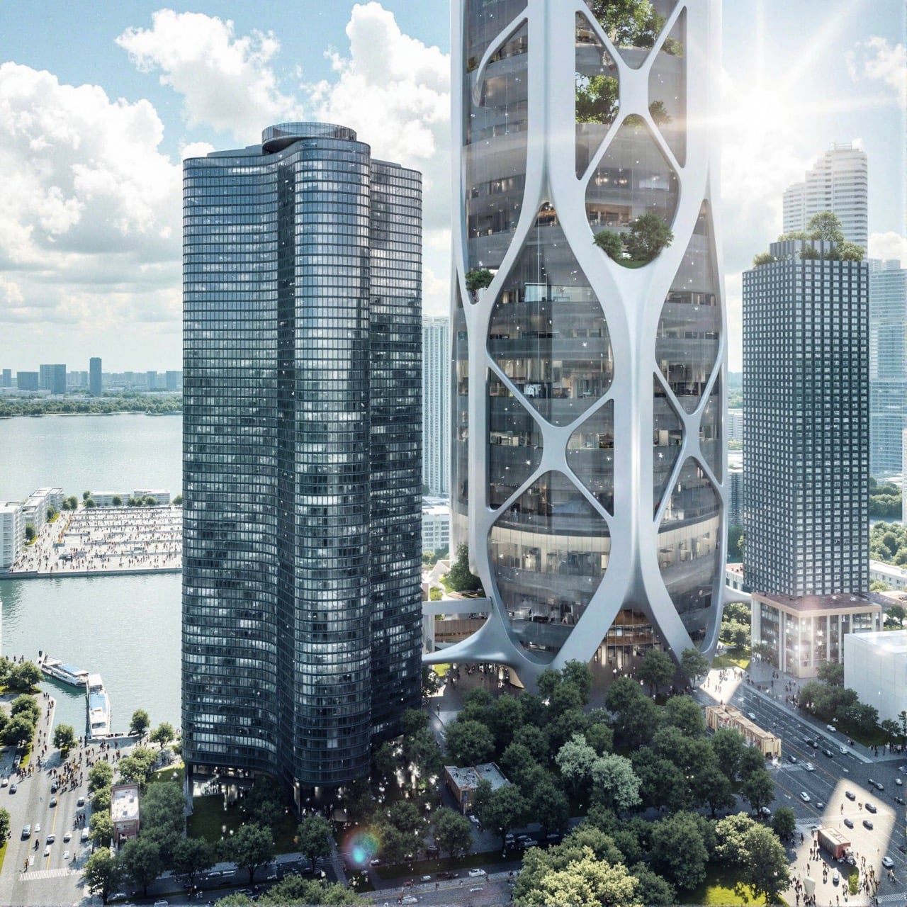
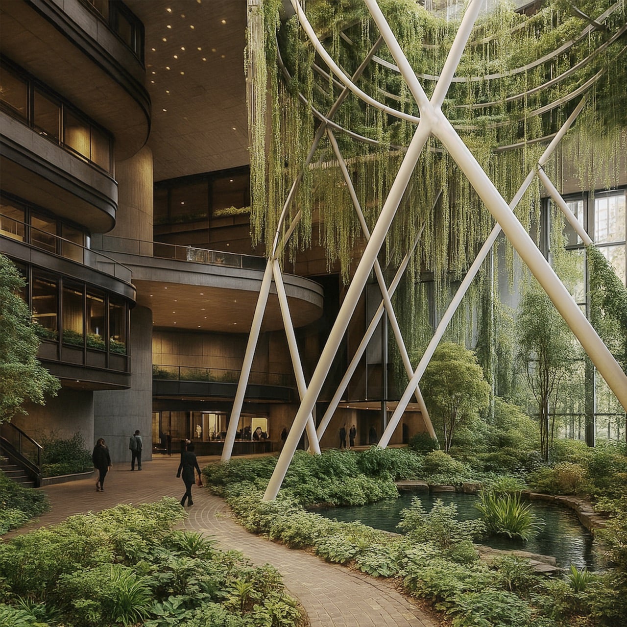
Scattered throughout the structure are sky terraces that act as elevated parks in the clouds. These lush communal spaces give residents places to gather, breathe, and reconnect with nature despite living in a dense vertical environment. They are not decorative add-ons but essential social and environmental anchors that support well-being and community interaction.

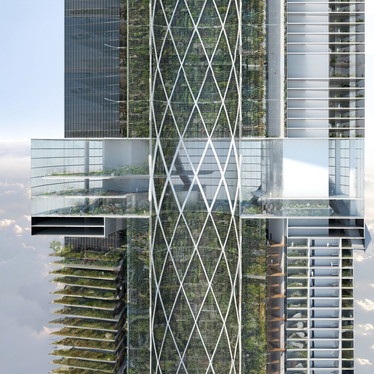
What truly sets Eden Rise apart is its seamless integration of advanced green technologies. Vertical farms in the core supply fresh food. Rainwater collection and cloud harvesting systems recycle water efficiently. Wind turbines built into the exoskeleton generate renewable energy. Natural ventilation and a breathable atrium maximize airflow and daylight, reducing energy use while improving indoor comfort. Each system works together like organs in a living body, turning the tower into a self-sustaining organism.

The engineering behind this vision is equally striking. Four conjoined towers are reinforced by layered bracing systems that provide structural depth and stability. A diagrid pattern spans multiple stories, weaving a network of structural lines that balance strength with elegance. Within this framework, an inner void allows light and air to travel deep into the building, ensuring that even its core feels open and alive.

Eden Rise is more than an architectural proposal. It is a manifesto for the future of cities. It shows how design can confront inequality, reduce environmental impact, and restore the relationship between urban life and nature. In this vision, skyscrapers no longer dominate the landscape. They nourish it.

If realized, the Chicago skyline would no longer be just a symbol of economic power. It would become a symbol of sustainability, equity, and imagination rising together.

The post The Mile-High Tower That Grows Food, Harvests Clouds, and Heals Chicago first appeared on Yanko Design.
The Mile-High Tower That Grows Food, Harvests Clouds, and Heals Chicago

Imagine looking up at a city skyline and knowing that inside those towers, food is growing, water is being harvested from clouds, and entire communities are thriving in harmony with nature. The Eden Rise Vertical Eco Living Community is not just a building proposal. It is a bold reimagining of what a city can be when architecture becomes an ecosystem rather than an object.

The project tackles one of Chicago’s most urgent urban challenges: food deserts. In many neighborhoods, especially low-income ones, access to fresh and nutritious food is limited. Grocery stores are scarce, healthy options are expensive, and residents often rely on convenience stores or fast food. Eden Rise flips this reality by embedding vertical farms directly into a mile-high tower, allowing fresh produce to be grown where people live. Food no longer travels miles to reach a plate. It moves floors.

Designer: Yuhan Zhang and Dreama Simeng Lin

The tower’s design is as poetic as its purpose. Inspired by the fluid form of a water droplet, its organic silhouette reflects Chicago’s relationship with water while symbolizing life, renewal, and sustainability. This fusion of natural inspiration and urban ambition transforms the structure into a vertical extension of the city’s green belt, suggesting a future where skylines are defined not just by height but by ecological intelligence.

Inside, Eden Rise functions like a city stacked vertically. Homes sit alongside offices, hotels, schools, and recreational spaces, creating a complete lifestyle environment within a single structure. Residents can wake up, work, learn, relax, and socialize without ever needing to commute across town. Schools integrated throughout the tower ensure education is woven into everyday life, while hotels welcome visitors to experience this futuristic ecosystem from panoramic heights. It is urban life condensed, connected, and reimagined.

Scattered throughout the structure are sky terraces that act as elevated parks in the clouds. These lush communal spaces give residents places to gather, breathe, and reconnect with nature despite living in a dense vertical environment. They are not decorative add-ons but essential social and environmental anchors that support well-being and community interaction.

What truly sets Eden Rise apart is its seamless integration of advanced green technologies. Vertical farms in the core supply fresh food. Rainwater collection and cloud harvesting systems recycle water efficiently. Wind turbines built into the exoskeleton generate renewable energy. Natural ventilation and a breathable atrium maximize airflow and daylight, reducing energy use while improving indoor comfort. Each system works together like organs in a living body, turning the tower into a self-sustaining organism.

The engineering behind this vision is equally striking. Four conjoined towers are reinforced by layered bracing systems that provide structural depth and stability. A diagrid pattern spans multiple stories, weaving a network of structural lines that balance strength with elegance. Within this framework, an inner void allows light and air to travel deep into the building, ensuring that even its core feels open and alive.

Eden Rise is more than an architectural proposal. It is a manifesto for the future of cities. It shows how design can confront inequality, reduce environmental impact, and restore the relationship between urban life and nature. In this vision, skyscrapers no longer dominate the landscape. They nourish it.

If realized, the Chicago skyline would no longer be just a symbol of economic power. It would become a symbol of sustainability, equity, and imagination rising together.

The post The Mile-High Tower That Grows Food, Harvests Clouds, and Heals Chicago first appeared on Yanko Design.
The Mile-High Tower That Grows Food, Harvests Clouds, and Heals Chicago

Imagine looking up at a city skyline and knowing that inside those towers, food is growing, water is being harvested from clouds, and entire communities are thriving in harmony with nature. The Eden Rise Vertical Eco Living Community is not just a building proposal. It is a bold reimagining of what a city can be when architecture becomes an ecosystem rather than an object.

The project tackles one of Chicago’s most urgent urban challenges: food deserts. In many neighborhoods, especially low-income ones, access to fresh and nutritious food is limited. Grocery stores are scarce, healthy options are expensive, and residents often rely on convenience stores or fast food. Eden Rise flips this reality by embedding vertical farms directly into a mile-high tower, allowing fresh produce to be grown where people live. Food no longer travels miles to reach a plate. It moves floors.

Designer: Yuhan Zhang and Dreama Simeng Lin

The tower’s design is as poetic as its purpose. Inspired by the fluid form of a water droplet, its organic silhouette reflects Chicago’s relationship with water while symbolizing life, renewal, and sustainability. This fusion of natural inspiration and urban ambition transforms the structure into a vertical extension of the city’s green belt, suggesting a future where skylines are defined not just by height but by ecological intelligence.

Inside, Eden Rise functions like a city stacked vertically. Homes sit alongside offices, hotels, schools, and recreational spaces, creating a complete lifestyle environment within a single structure. Residents can wake up, work, learn, relax, and socialize without ever needing to commute across town. Schools integrated throughout the tower ensure education is woven into everyday life, while hotels welcome visitors to experience this futuristic ecosystem from panoramic heights. It is urban life condensed, connected, and reimagined.

Scattered throughout the structure are sky terraces that act as elevated parks in the clouds. These lush communal spaces give residents places to gather, breathe, and reconnect with nature despite living in a dense vertical environment. They are not decorative add-ons but essential social and environmental anchors that support well-being and community interaction.

What truly sets Eden Rise apart is its seamless integration of advanced green technologies. Vertical farms in the core supply fresh food. Rainwater collection and cloud harvesting systems recycle water efficiently. Wind turbines built into the exoskeleton generate renewable energy. Natural ventilation and a breathable atrium maximize airflow and daylight, reducing energy use while improving indoor comfort. Each system works together like organs in a living body, turning the tower into a self-sustaining organism.

The engineering behind this vision is equally striking. Four conjoined towers are reinforced by layered bracing systems that provide structural depth and stability. A diagrid pattern spans multiple stories, weaving a network of structural lines that balance strength with elegance. Within this framework, an inner void allows light and air to travel deep into the building, ensuring that even its core feels open and alive.

Eden Rise is more than an architectural proposal. It is a manifesto for the future of cities. It shows how design can confront inequality, reduce environmental impact, and restore the relationship between urban life and nature. In this vision, skyscrapers no longer dominate the landscape. They nourish it.

If realized, the Chicago skyline would no longer be just a symbol of economic power. It would become a symbol of sustainability, equity, and imagination rising together.

The post The Mile-High Tower That Grows Food, Harvests Clouds, and Heals Chicago first appeared on Yanko Design.
The Mile-High Tower That Grows Food, Harvests Clouds, and Heals Chicago

Imagine looking up at a city skyline and knowing that inside those towers, food is growing, water is being harvested from clouds, and entire communities are thriving in harmony with nature. The Eden Rise Vertical Eco Living Community is not just a building proposal. It is a bold reimagining of what a city can be when architecture becomes an ecosystem rather than an object.

The project tackles one of Chicago’s most urgent urban challenges: food deserts. In many neighborhoods, especially low-income ones, access to fresh and nutritious food is limited. Grocery stores are scarce, healthy options are expensive, and residents often rely on convenience stores or fast food. Eden Rise flips this reality by embedding vertical farms directly into a mile-high tower, allowing fresh produce to be grown where people live. Food no longer travels miles to reach a plate. It moves floors.

Designer: Yuhan Zhang and Dreama Simeng Lin

The tower’s design is as poetic as its purpose. Inspired by the fluid form of a water droplet, its organic silhouette reflects Chicago’s relationship with water while symbolizing life, renewal, and sustainability. This fusion of natural inspiration and urban ambition transforms the structure into a vertical extension of the city’s green belt, suggesting a future where skylines are defined not just by height but by ecological intelligence.

Inside, Eden Rise functions like a city stacked vertically. Homes sit alongside offices, hotels, schools, and recreational spaces, creating a complete lifestyle environment within a single structure. Residents can wake up, work, learn, relax, and socialize without ever needing to commute across town. Schools integrated throughout the tower ensure education is woven into everyday life, while hotels welcome visitors to experience this futuristic ecosystem from panoramic heights. It is urban life condensed, connected, and reimagined.

Scattered throughout the structure are sky terraces that act as elevated parks in the clouds. These lush communal spaces give residents places to gather, breathe, and reconnect with nature despite living in a dense vertical environment. They are not decorative add-ons but essential social and environmental anchors that support well-being and community interaction.

What truly sets Eden Rise apart is its seamless integration of advanced green technologies. Vertical farms in the core supply fresh food. Rainwater collection and cloud harvesting systems recycle water efficiently. Wind turbines built into the exoskeleton generate renewable energy. Natural ventilation and a breathable atrium maximize airflow and daylight, reducing energy use while improving indoor comfort. Each system works together like organs in a living body, turning the tower into a self-sustaining organism.

The engineering behind this vision is equally striking. Four conjoined towers are reinforced by layered bracing systems that provide structural depth and stability. A diagrid pattern spans multiple stories, weaving a network of structural lines that balance strength with elegance. Within this framework, an inner void allows light and air to travel deep into the building, ensuring that even its core feels open and alive.

Eden Rise is more than an architectural proposal. It is a manifesto for the future of cities. It shows how design can confront inequality, reduce environmental impact, and restore the relationship between urban life and nature. In this vision, skyscrapers no longer dominate the landscape. They nourish it.

If realized, the Chicago skyline would no longer be just a symbol of economic power. It would become a symbol of sustainability, equity, and imagination rising together.

The post The Mile-High Tower That Grows Food, Harvests Clouds, and Heals Chicago first appeared on Yanko Design.
The Thoughtful Shopping Cart That Organizes, Protects, and Moves With You

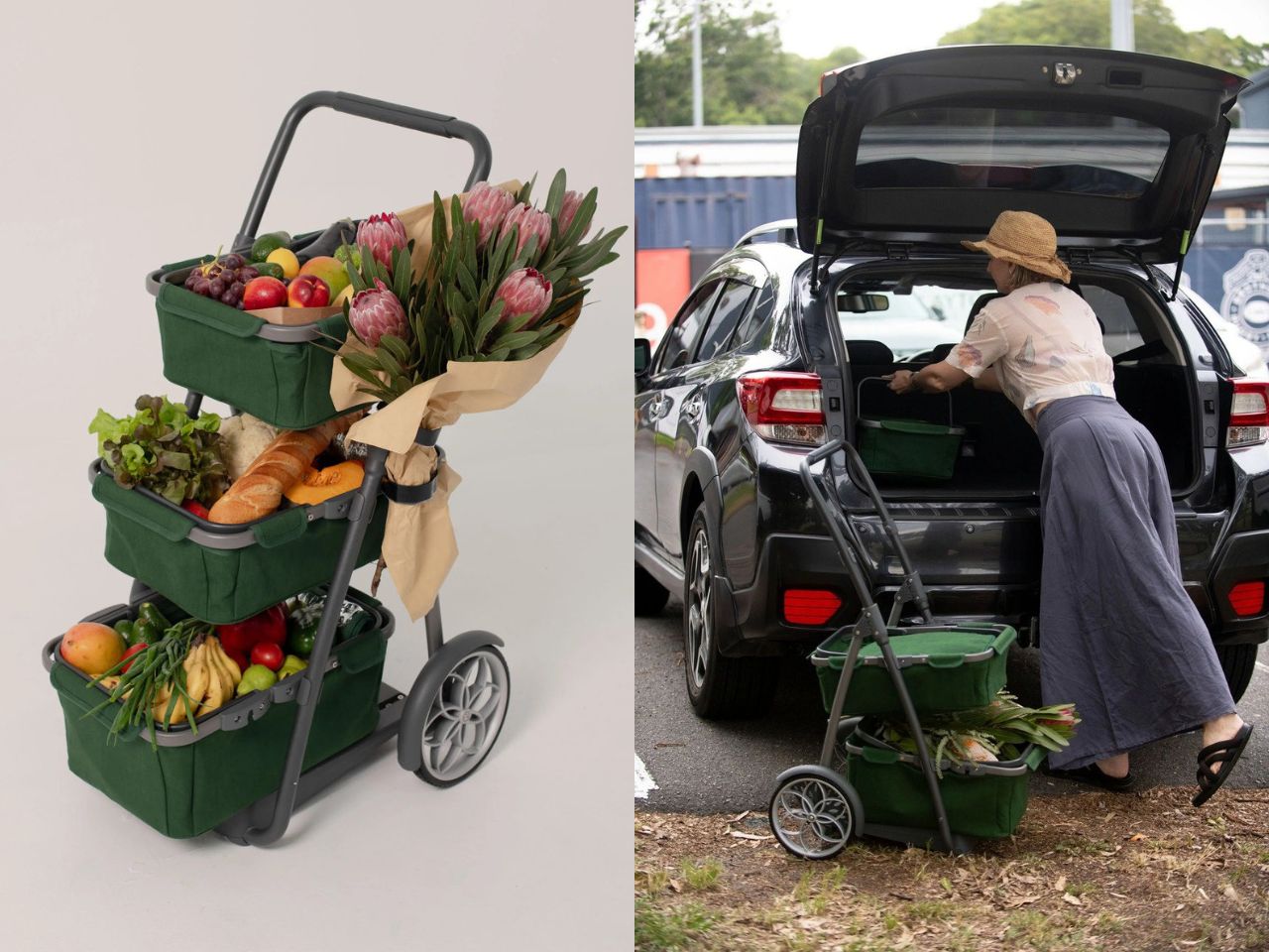
Some of the most meaningful design innovations begin with noticing small everyday frustrations. That is exactly what inspired Brisbane-based inventor Michelle Hildebrand to rethink the traditional shopping trolley. After watching how awkward it can be to move through farmers’ markets with bulky bags or classic granny carts, she realized the problem was not the shopper but the system. People were being forced to work around tools that were never designed for how they actually shop. Working with Australian industrial design firm Clandestine Design Group, she turned that observation into the Marketday Cart, a product that stands out not only for its practicality but for how thoughtfully it reflects user experience principles.

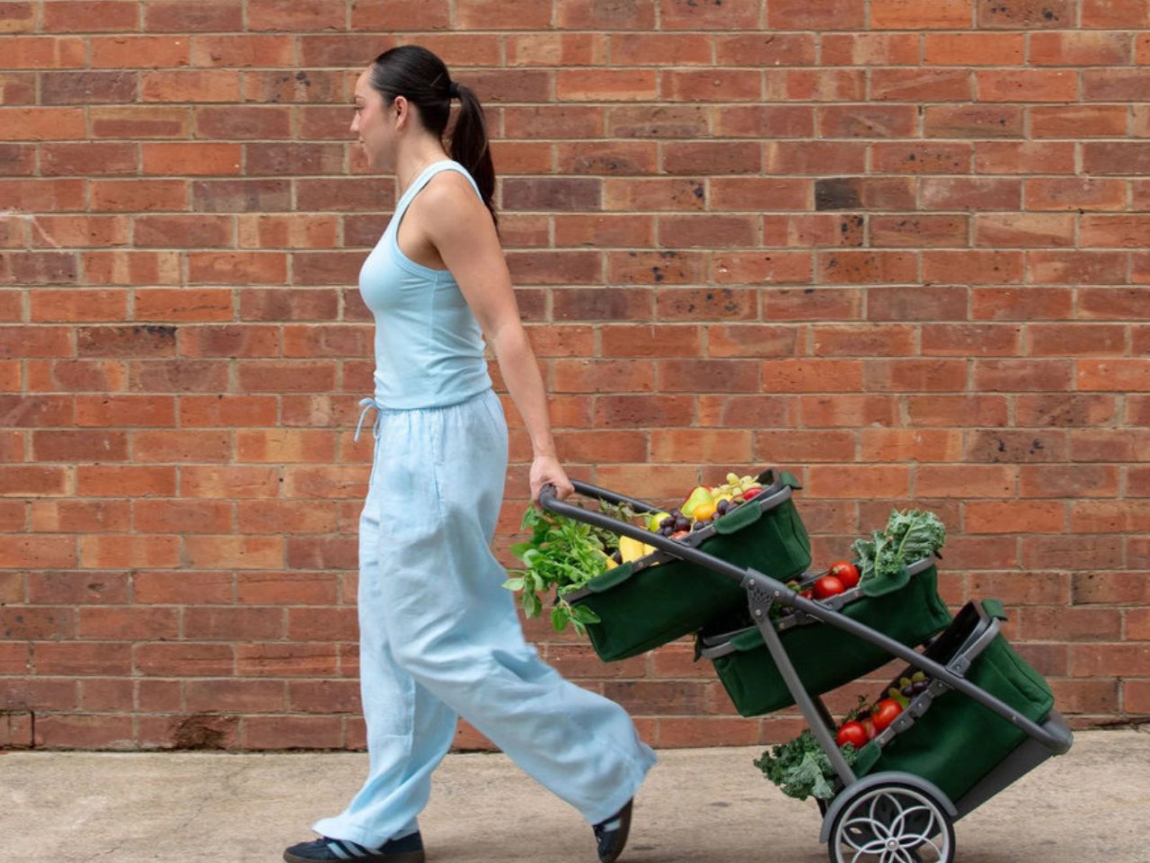
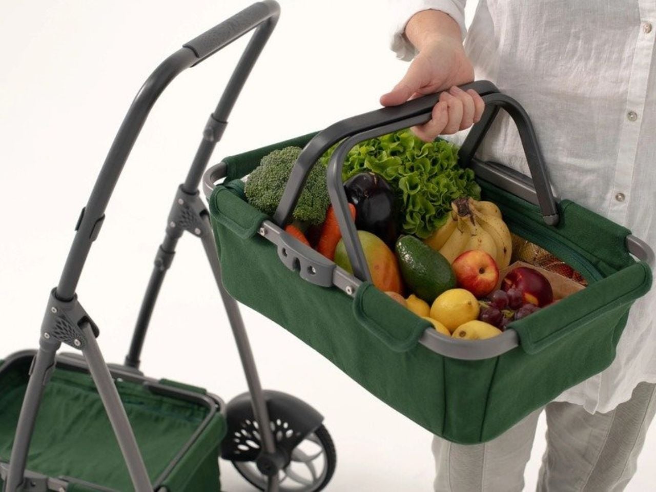
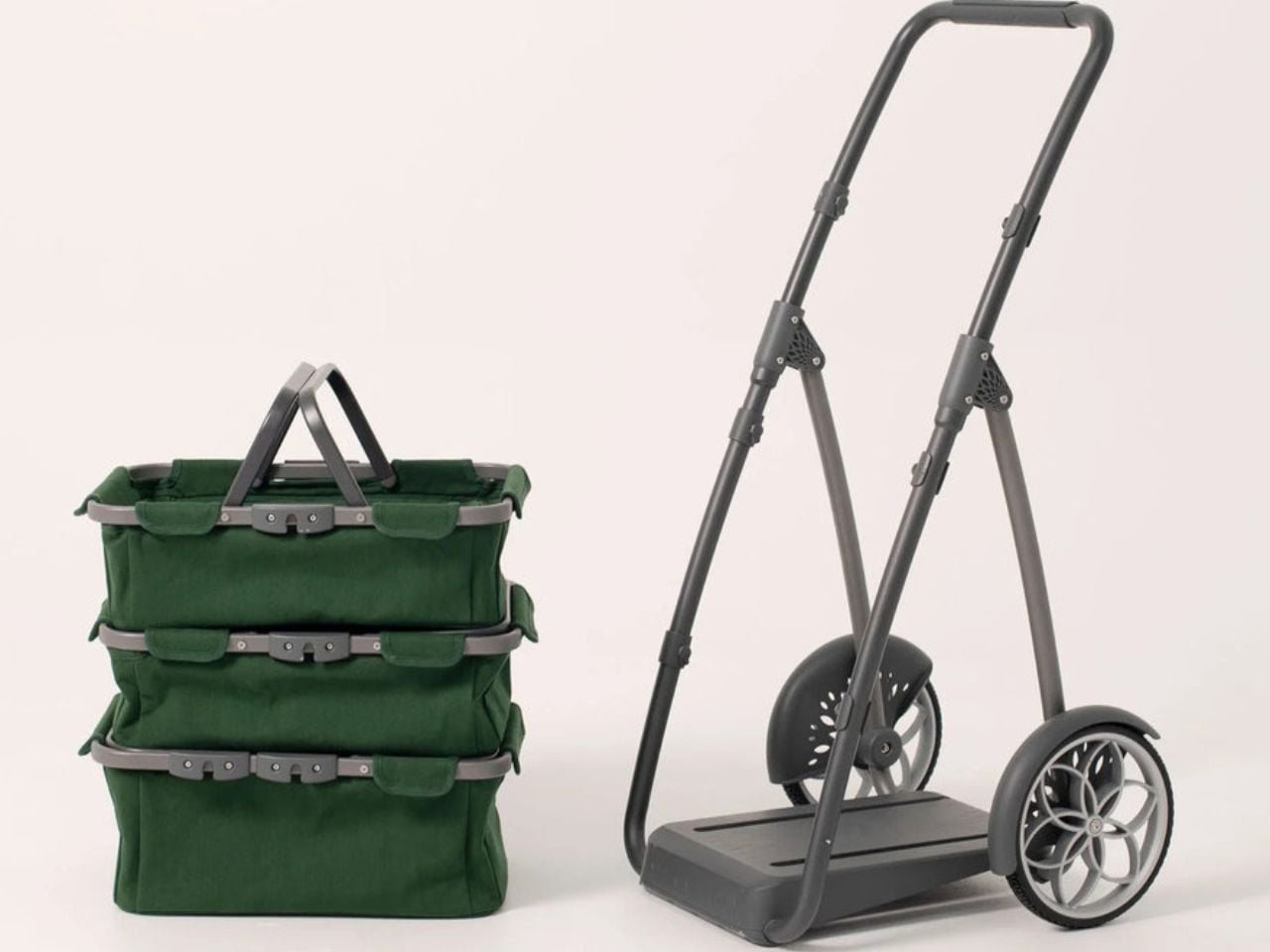
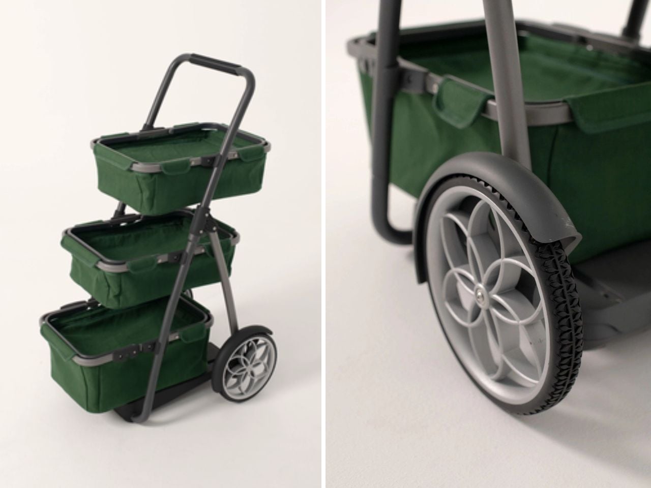
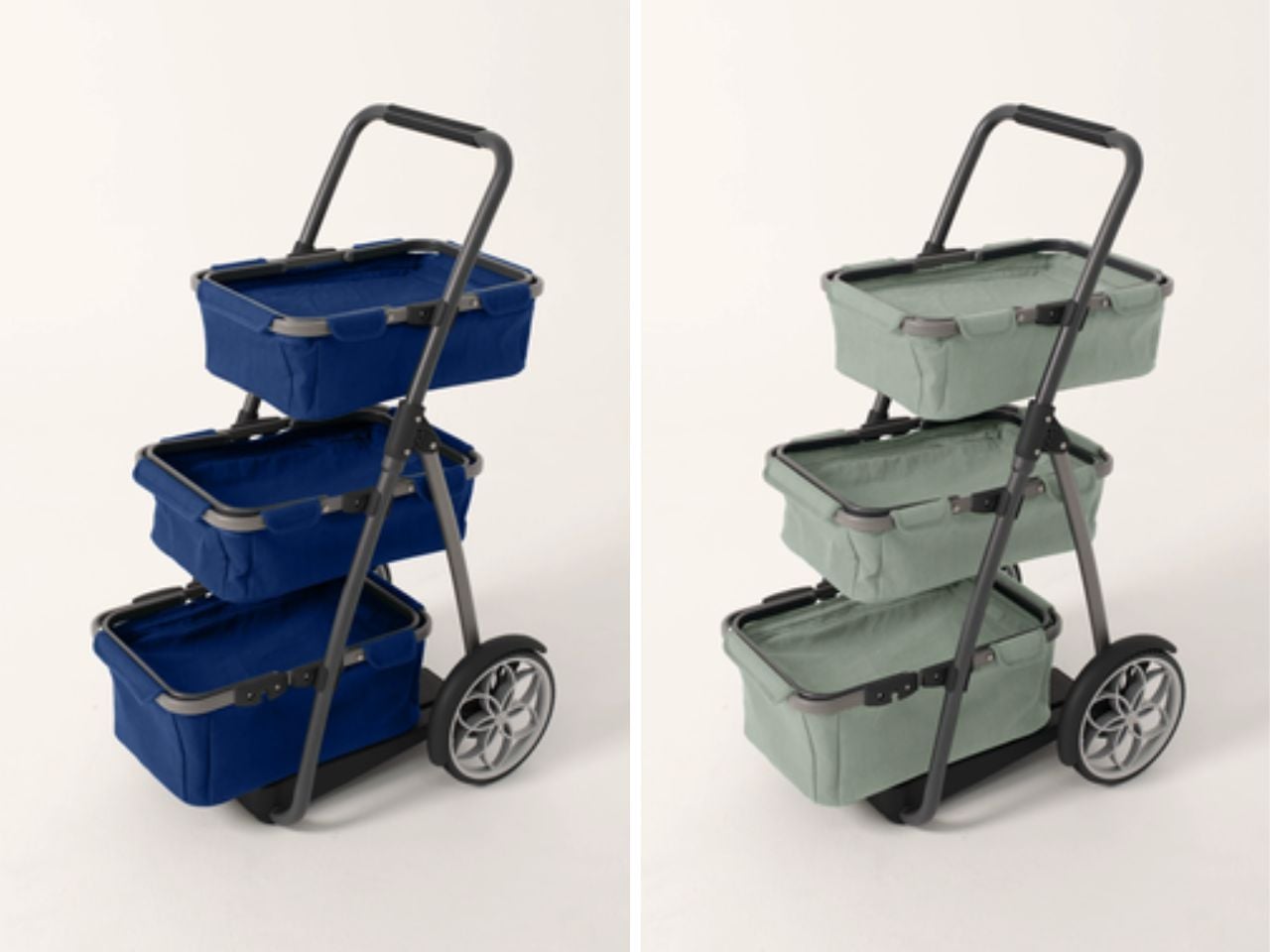
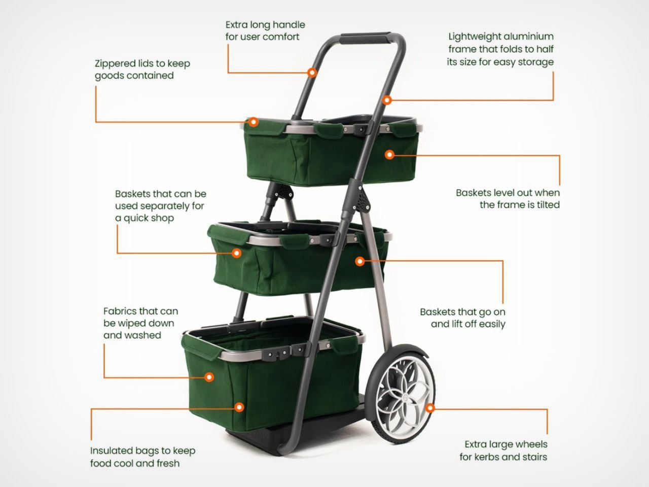
At its heart, the Marketday Cart is built around real human behavior. People like to see what they packed. They like knowing where things are. They do not enjoy digging through deep bags to find something they dropped five minutes ago. The cart solves this with three shallow stackable baskets that give users clear visibility and control. This layered structure keeps groceries organized and prevents delicate items from getting crushed. Soft produce can sit beside heavier goods without damage because everything has its own place. Instead of asking users to adapt to a bag, the bag adapts to them.

Designer: Michelle Hildebrand

Each basket is insulated and fully zippered, which keeps food cool, contained, and protected from outside conditions. This feature is especially useful for fresh food shopping, where temperature matters. The zippered lids also remove the constant worry that something might spill or fall out while walking. From a user experience perspective, this reduces mental effort. The system handles the problem so the shopper does not have to.

The baskets are also modular. They detach easily and can be used individually, which means the cart can function as one, two, or three bags depending on the trip. A quick errand does not require carrying the entire system, while a large grocery run can use all levels. This flexibility makes the product feel adaptable rather than rigid and supports different lifestyles without needing multiple tools.

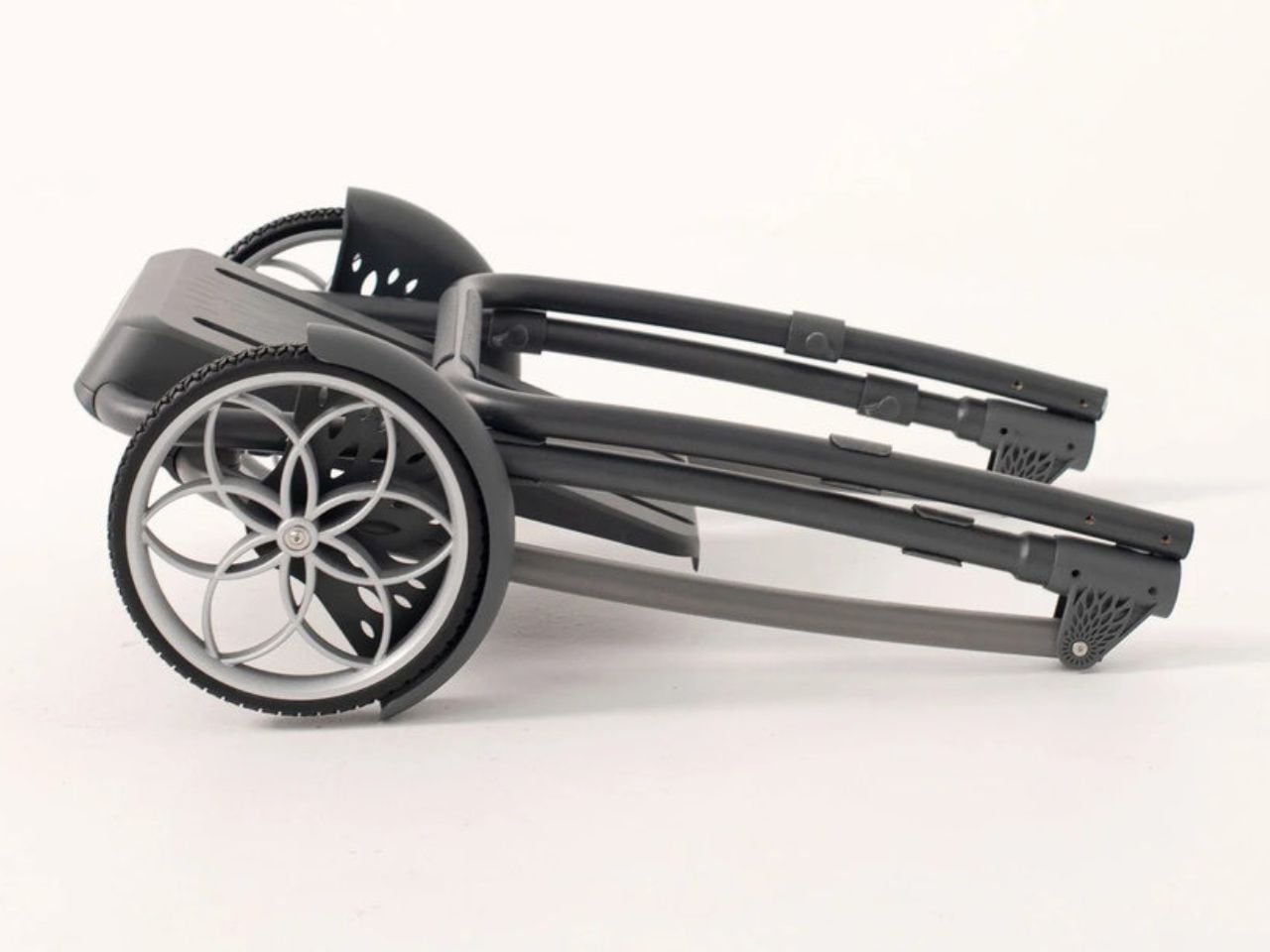
Mobility and comfort are equally well considered. The lightweight aluminum frame keeps the cart easy to maneuver while still feeling sturdy. When not in use, it folds down to half its size, making storage simple even in small apartments or tight entryways. An extra-long handle improves comfort, especially for taller users or anyone pulling heavier loads for longer distances. These details show attention to physical experience, which is often overlooked in everyday product design.
The oversized wheels further enhance usability. Built to handle curbs, stairs, and uneven pavement, they allow the cart to glide over obstacles that usually make shopping carts frustrating to use. This makes it especially practical for city environments where sidewalks, public transport, and market stalls all become part of the journey.
One of the most impressive features is the gimbal system connecting the baskets to the frame. When the cart tilts as it is pulled, the baskets automatically swing to stay horizontal. This keeps groceries level and prevents items from tipping or shifting. It is a subtle mechanical detail, but it makes a huge difference because it removes another small worry from the user’s mind. The cart quietly maintains balance so the shopper can focus on where they are going rather than what might spill.

Durability and maintenance were clearly part of the design thinking as well. The fabrics can be wiped down or washed, which is practical for real shopping situations where spills and mess are unavoidable. The baskets attach and lift off easily, which makes cleaning and reorganizing simple and quick.

Right now, the Marketday Cart is only distributed in Australia, but its logic is universal. It addresses common challenges such as organization, transport, storage, and food preservation with solutions that feel natural rather than complicated. More than just a shopping trolley, it shows what happens when designers treat everyday objects as experiences.

The Marketday Cart proves that thoughtful design does not have to be flashy or high tech to be innovative. Sometimes the smartest ideas come from simply paying attention to how people live and then making something that fits seamlessly into that reality.

The post The Thoughtful Shopping Cart That Organizes, Protects, and Moves With You first appeared on Yanko Design.