This Pen Case and Desk Stand Are the Same Object, and It’s Magnetic

The pen case is one of those objects that nobody seems to have genuinely rethought. The standard design is a zippered pouch: pens go in, pens pile up, you dig through until you find the right one, and then you close it again. That sequence repeats itself a dozen times a day, and most of the friction happens in that brief moment between needing a pen and actually having it in hand.

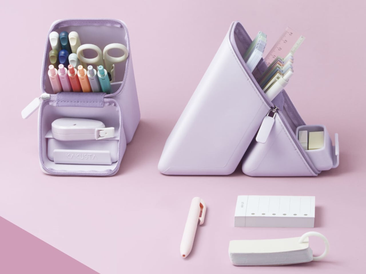
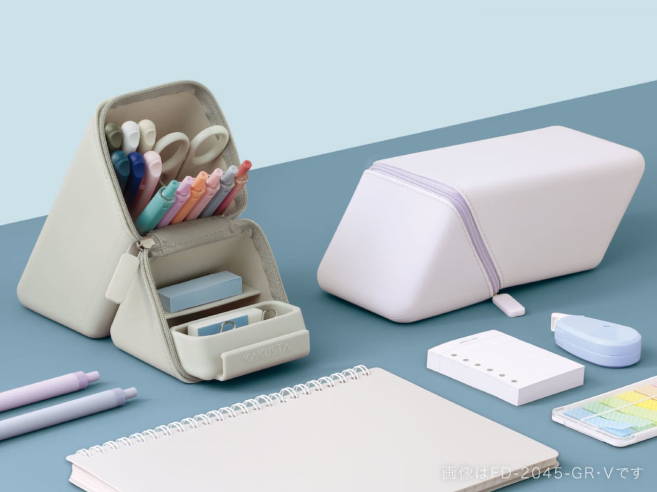
Sonic, a Japanese stationery manufacturer, focused specifically on that moment. Their Kakusta Portable Pen Holder is a silicone case that converts into an upright pen stand with a single unzip and fold. The idea isn’t just about carrying pens more conveniently; it’s about changing how you interact with them once you sit down to work, which is a different design problem entirely from making a better pouch.

Designer: Sonic
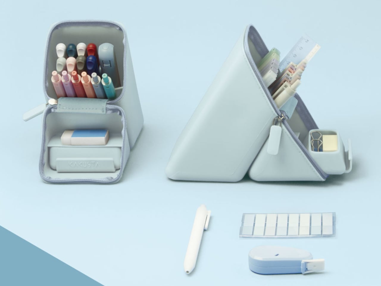
The transformation is central to the whole concept. When closed, the Kakusta is a flat, parallelogram-shaped case that fits easily in a bag pocket. Unzip it, fold the lid back, and it forms a triangular stand held in position by built-in magnets. Nothing needs to be assembled, no extra base is required, and there’s nothing to lose. The carrying case and the desktop holder are the same object.
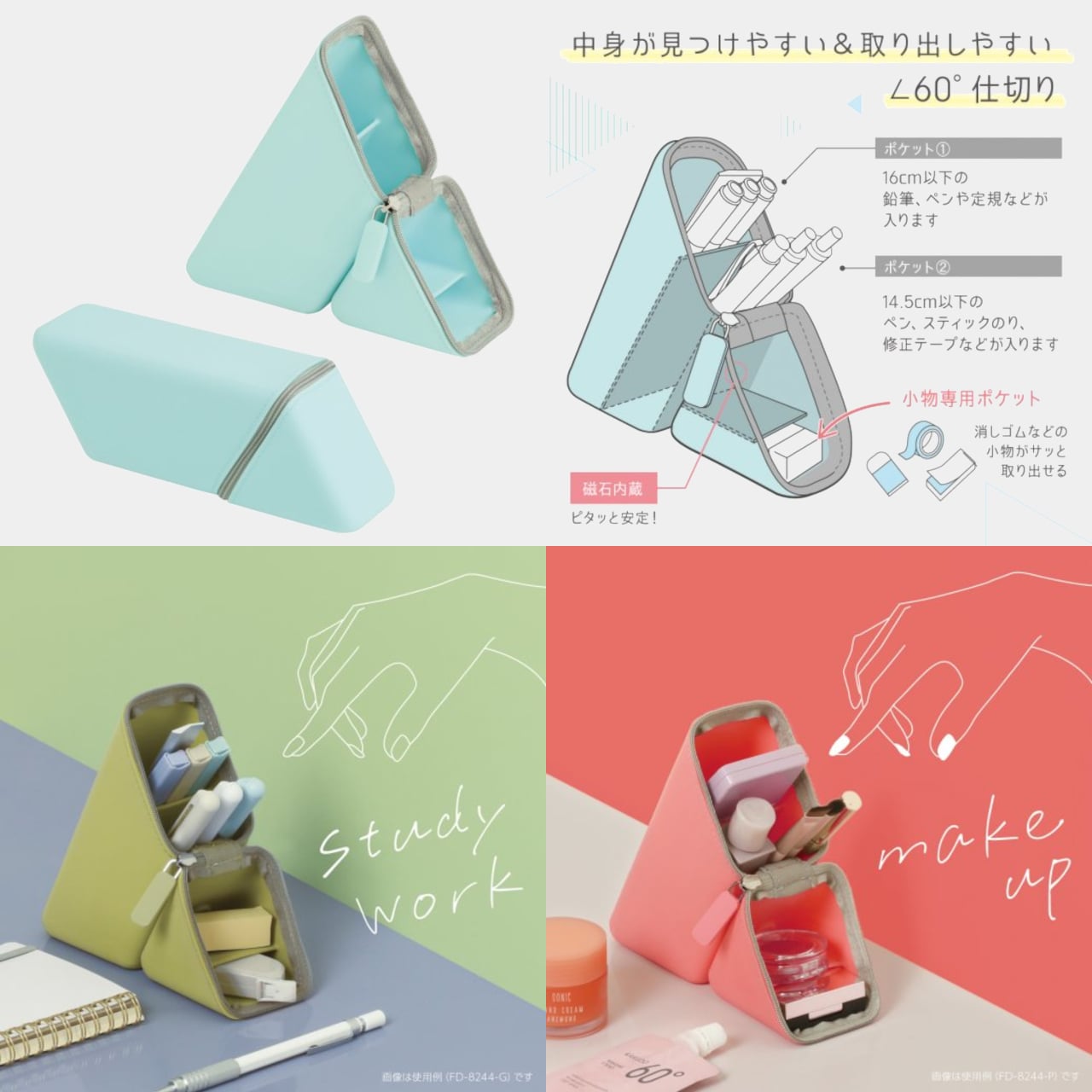
The interior follows the same logic. The 60-degree angled dividers run across the base of the stand, keeping each pen tilted and visible rather than lying flat against the others. In a conventional pen pouch, finding a specific pen means pulling out several to get to it. The angled dividers let you see everything at a glance, a small improvement that adds up over a full working day.

The silicone body is flexible enough to accommodate pens of varying sizes and soft enough to compress in a bag without warping. The triangular form is stable by geometry, and the magnets keep the folded lid from springing back while you’re working. A matte surface treatment on the exterior resists dust and fingerprints, which matters for something that moves between a bag and a desk multiple times daily.
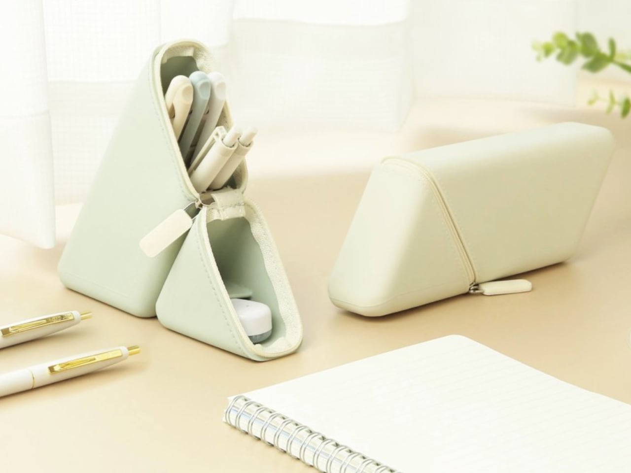
The magnets also allow the standing Kakusta to attach to metal surfaces, which is a small but genuinely useful detail. A student moving between classrooms can stick it to a locker door; someone working in an office can place it against a filing cabinet when desk space is limited. It’s the kind of secondary function that doesn’t announce itself in the pitch but gets used regularly once you notice it.
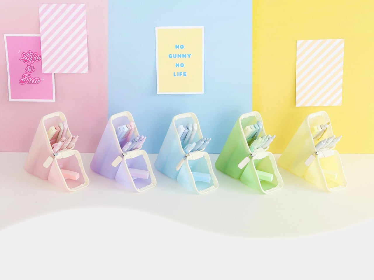
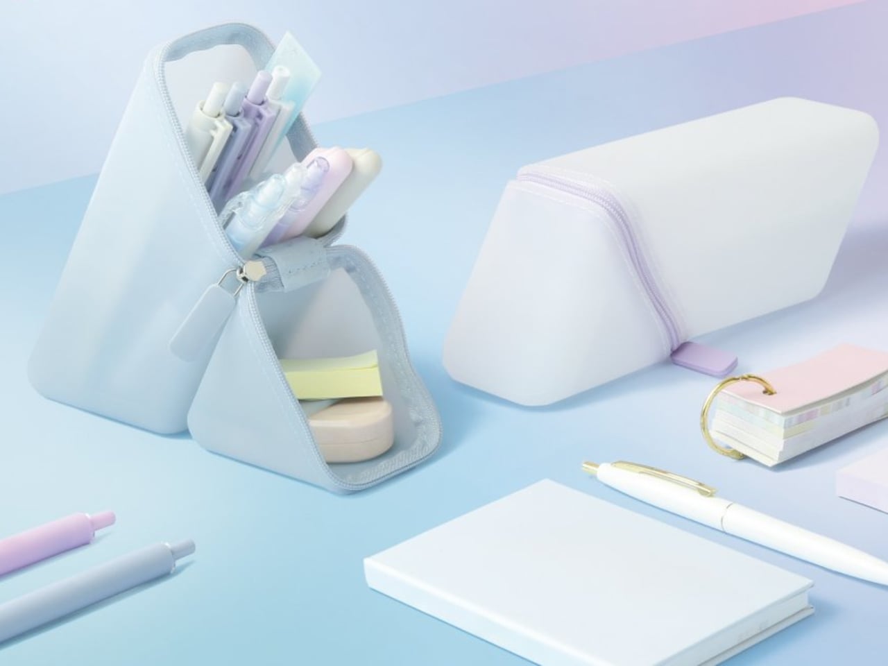
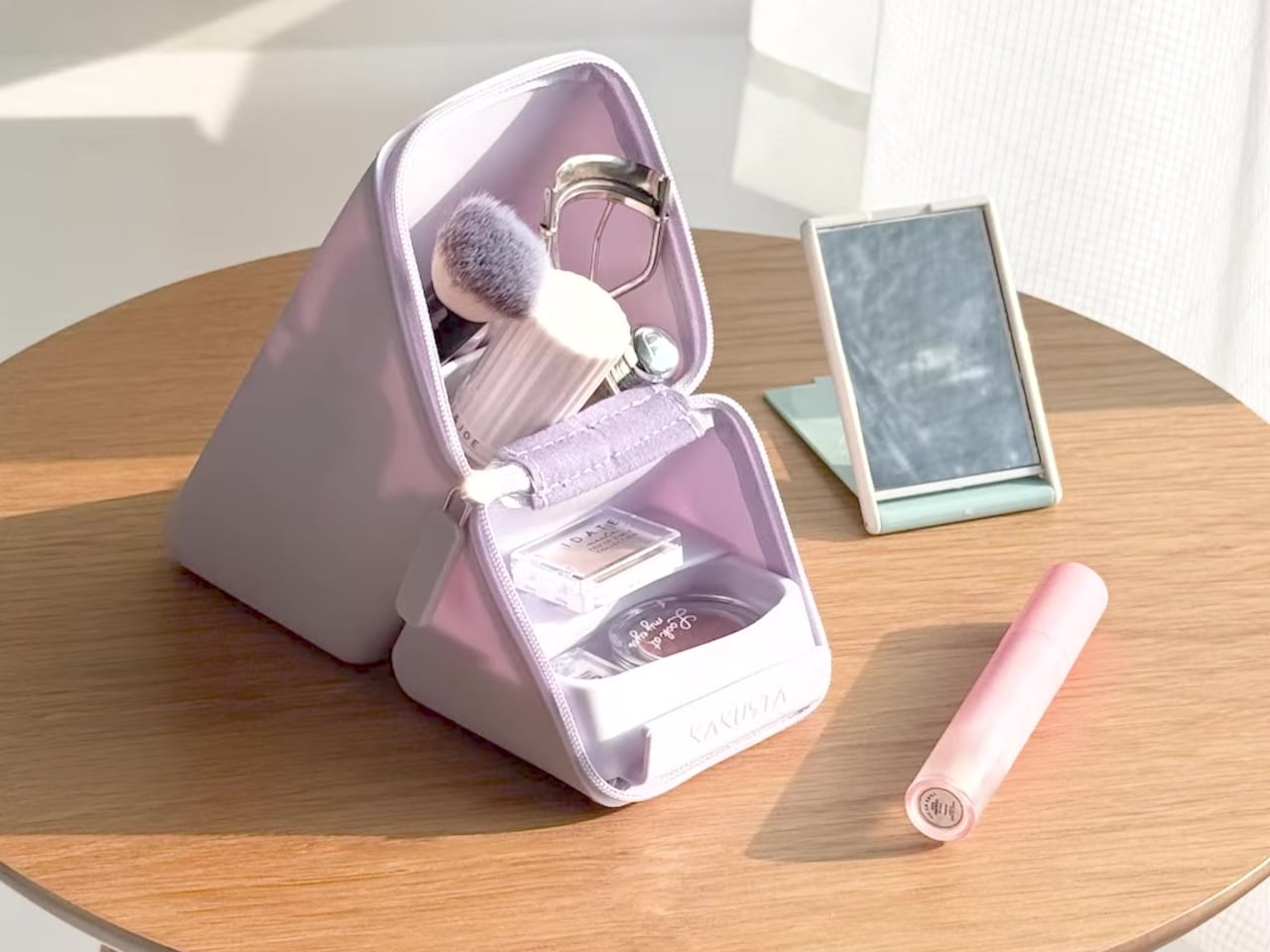
The case is compact enough to fit in a bag pocket without taking space meant for something else. Color options are restrained enough to sit on any desk without looking out of place. The palette leans toward the kind of tones that blend into a workspace rather than call attention to themselves. Kakusta is versatile enough to be used for other things, like holding makeup, proving that good design allows objects to extend beyond their initial purpose.
The post This Pen Case and Desk Stand Are the Same Object, and It’s Magnetic first appeared on Yanko Design.
Moser’s New Aura Collection Captures the Northern Lights in Crystal

Some things in design need no justification. They exist purely to be beautiful, and you either feel it or you don’t. Moser’s new Aura collection is one of those things, and I’ve been thinking about it since I first came across it.

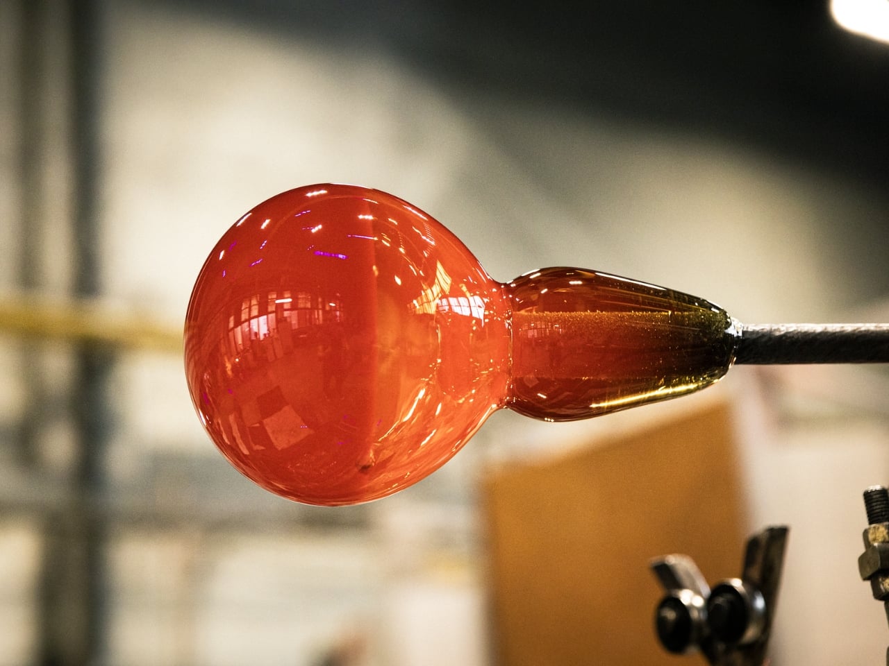
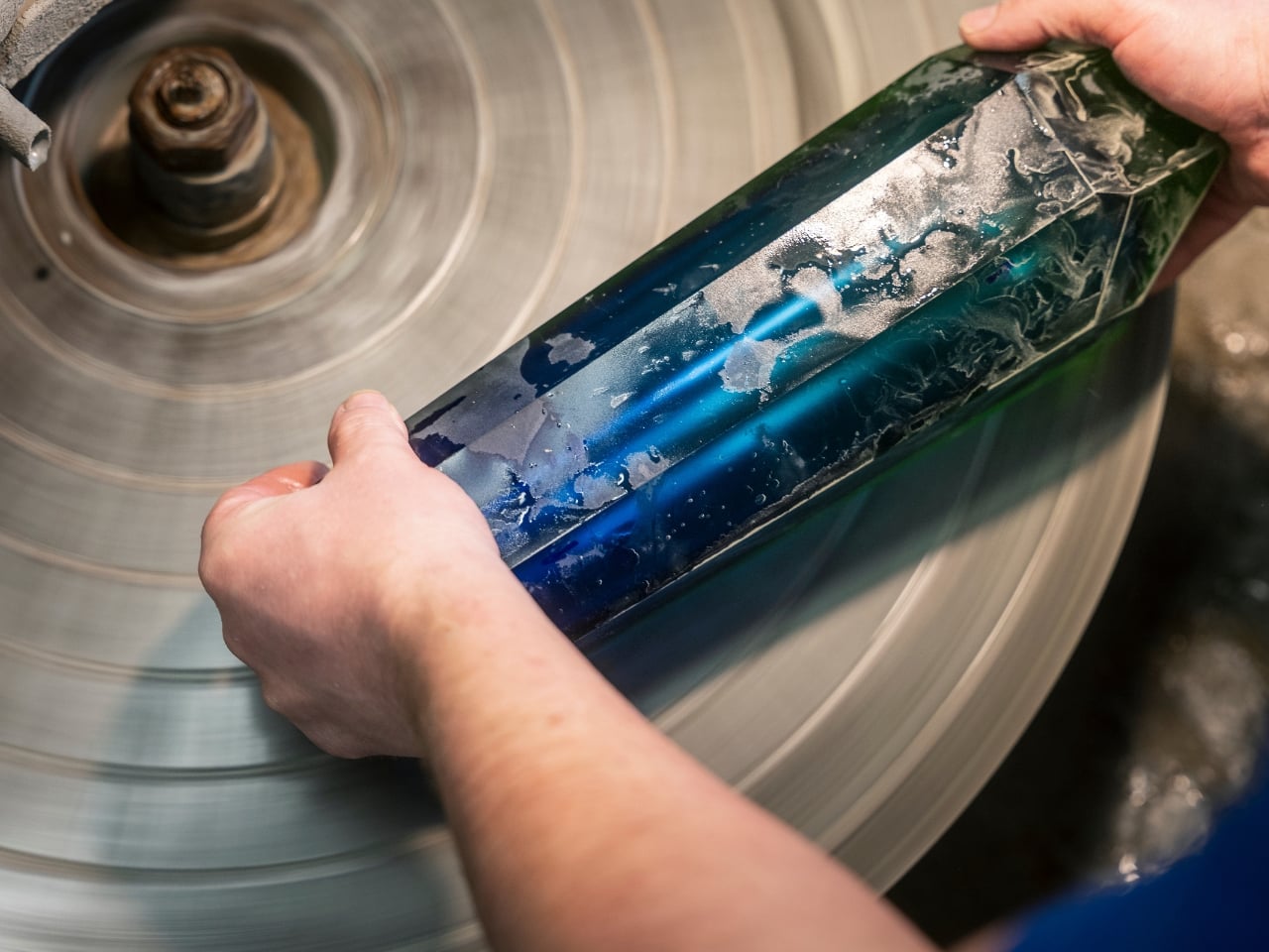
If you’re not familiar with Moser, let me fix that. Founded in 1857 in Karlovy Vary, Czech Republic, this is one of the most quietly prestigious names in the world of luxury glassmaking. The brand has been handcrafting lead-free crystal for 169 years, and that’s not a marketing angle; it’s a genuine legacy. Their work has graced the tables of royalty, filled the shelves of serious collectors, and caught the eye of names you’d recognize. The Kardashians are fans. Dan Brown, while promoting his Prague-set novel in the city itself, received his own engraved Magnus vase. It’s that kind of brand.

Designer: Moser

Moser occupies a specific and fascinating space in design. It’s neither ostentatious nor understated. It has weight to it, not just physically, but culturally. When you hold a piece of Moser crystal, you’re holding something shaped entirely by human hands, and that distinction matters more than ever in a market flooded with mass production.

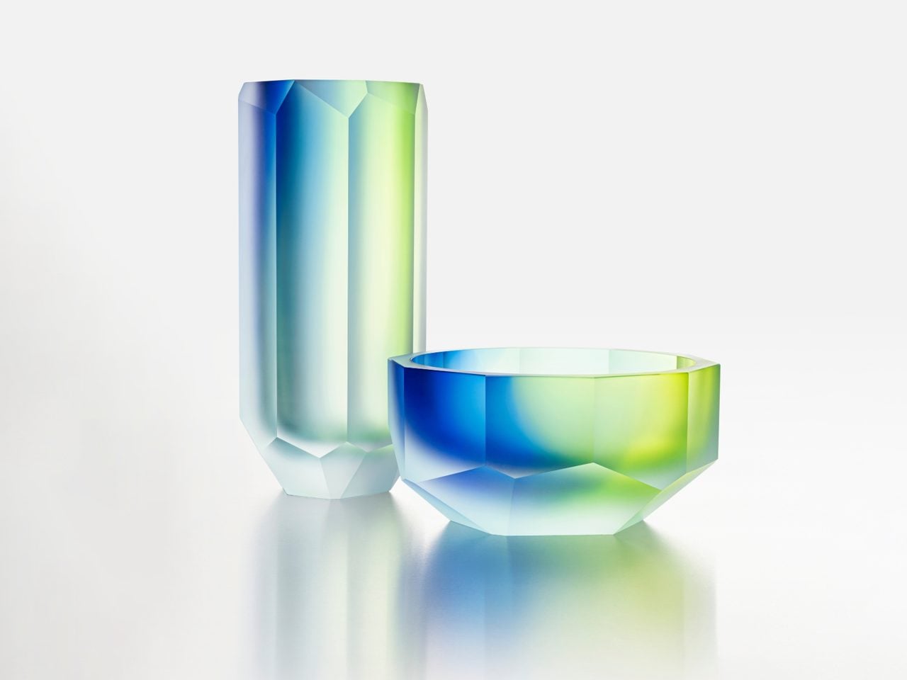
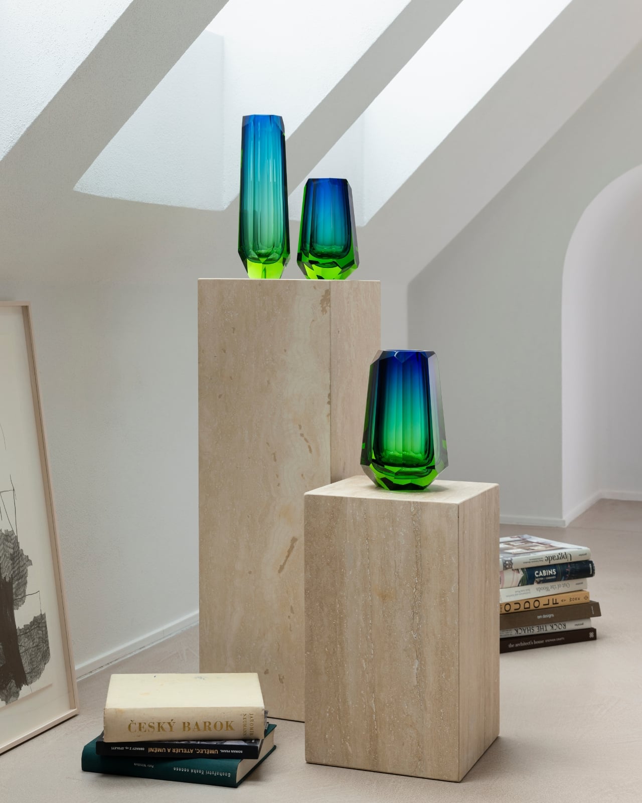
The Aura collection, their newest release, is inspired by the north. Not the idea of Scandinavia as an aesthetic trend, because we’ve all seen enough of that, but the raw, atmospheric reality of it. The icy cold. The depth of a darkened sky. The specific, almost spiritual moment when the aurora borealis ignites across the horizon. It’s an ephemeral experience most of us will only ever see in photographs, and somehow Moser has managed to capture it in glass.

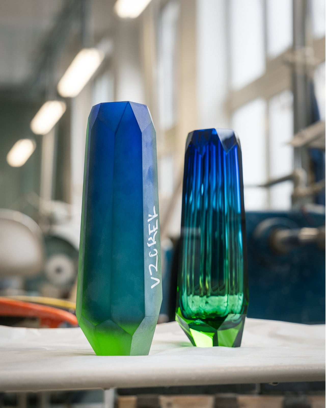
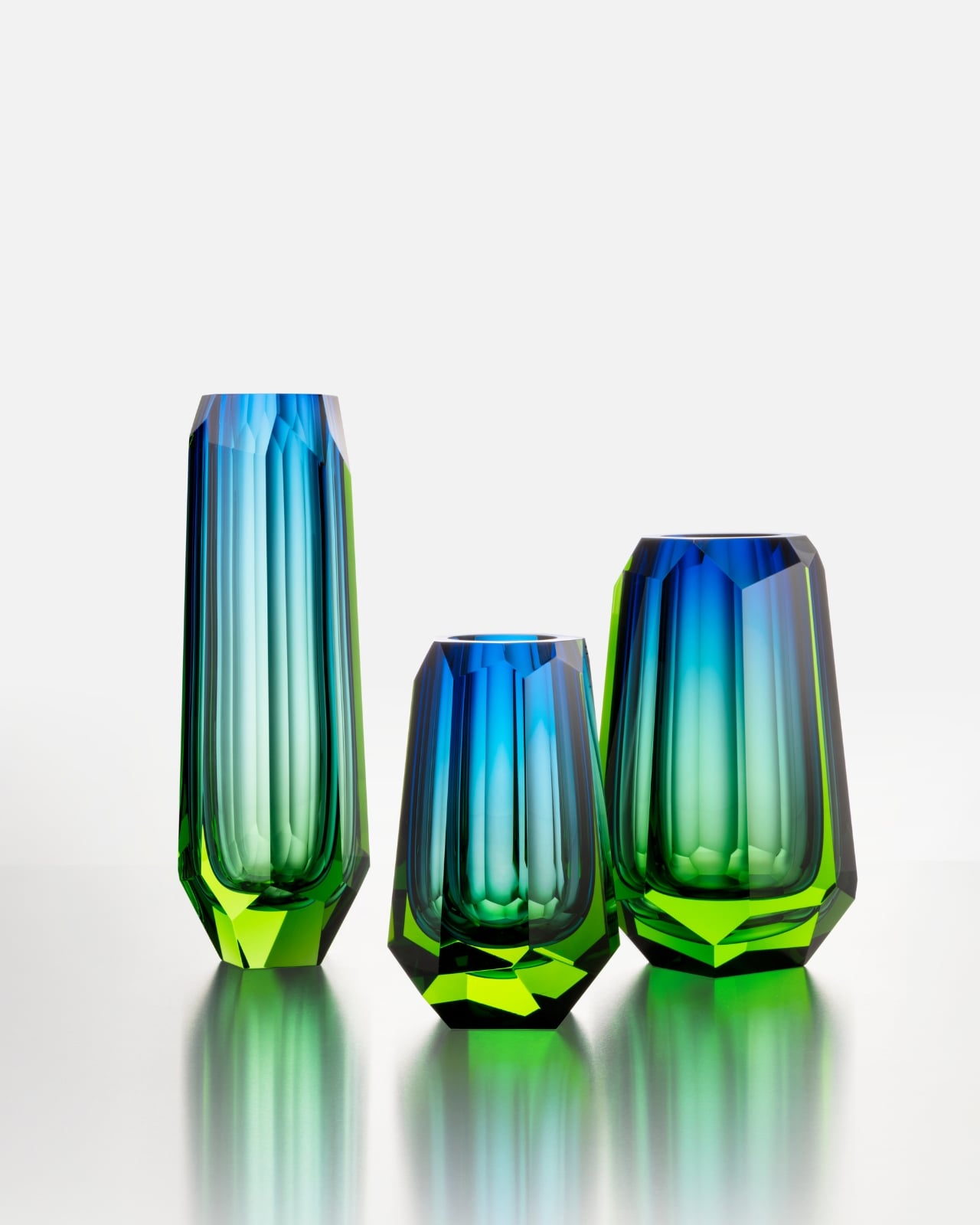
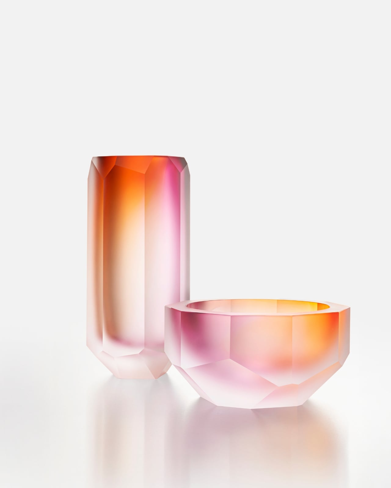
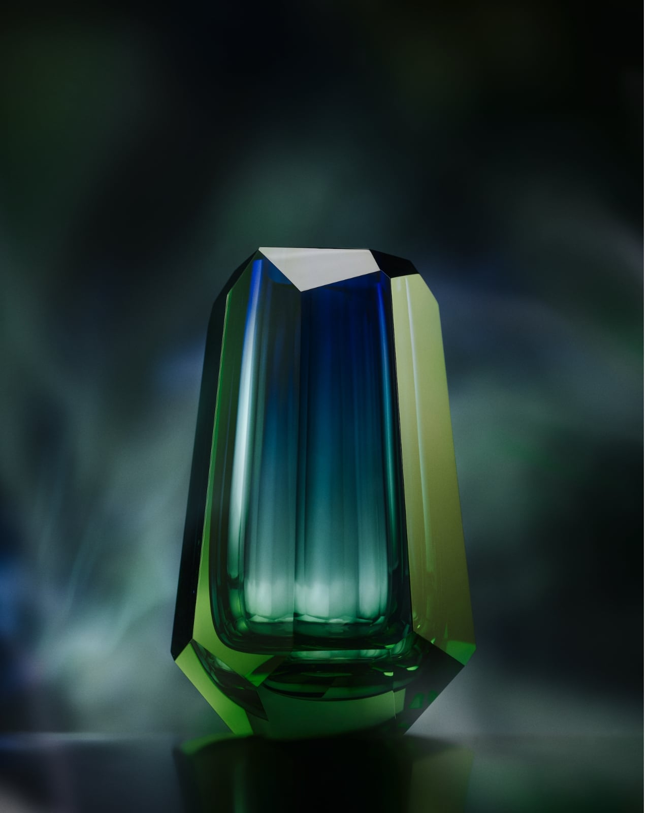
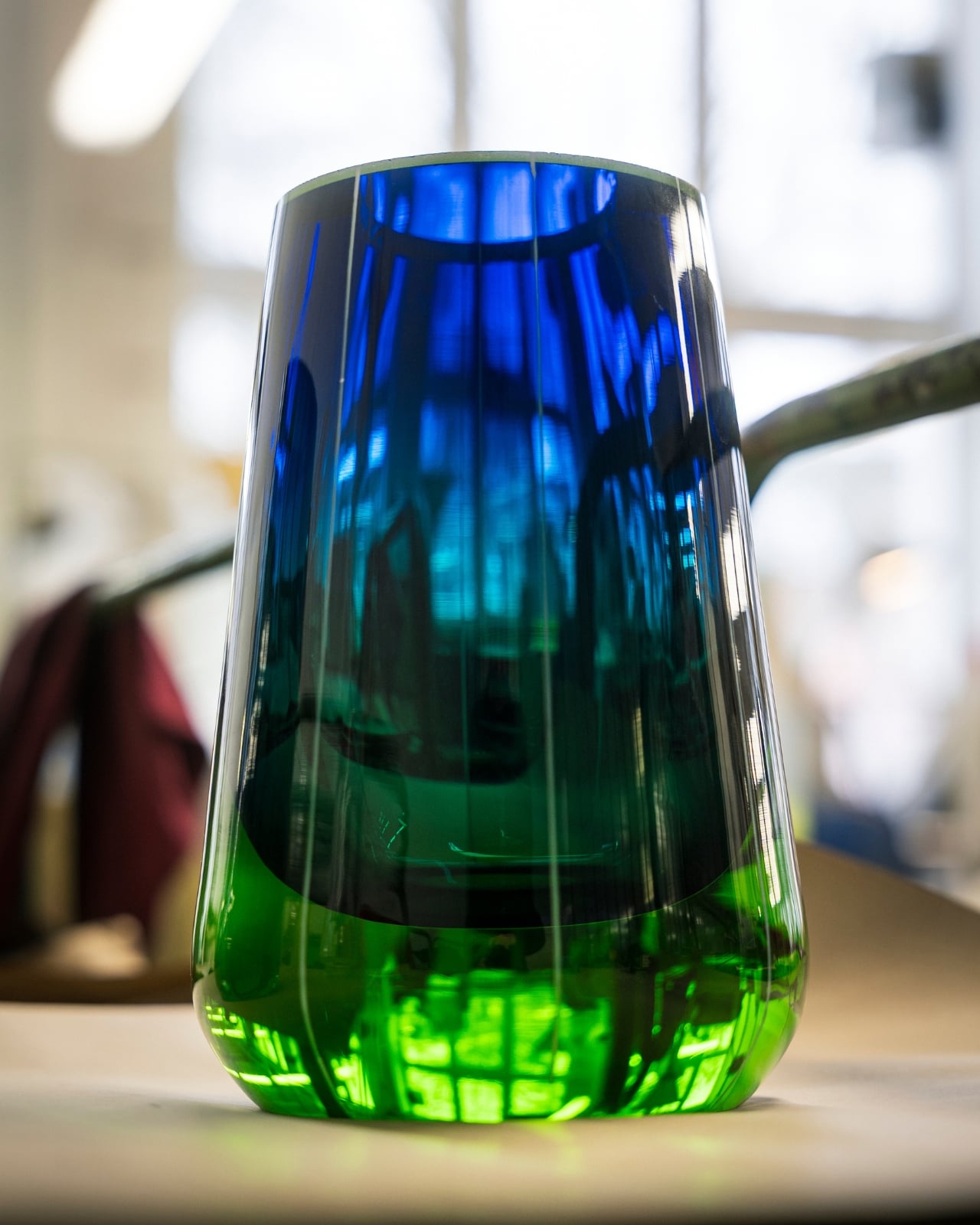
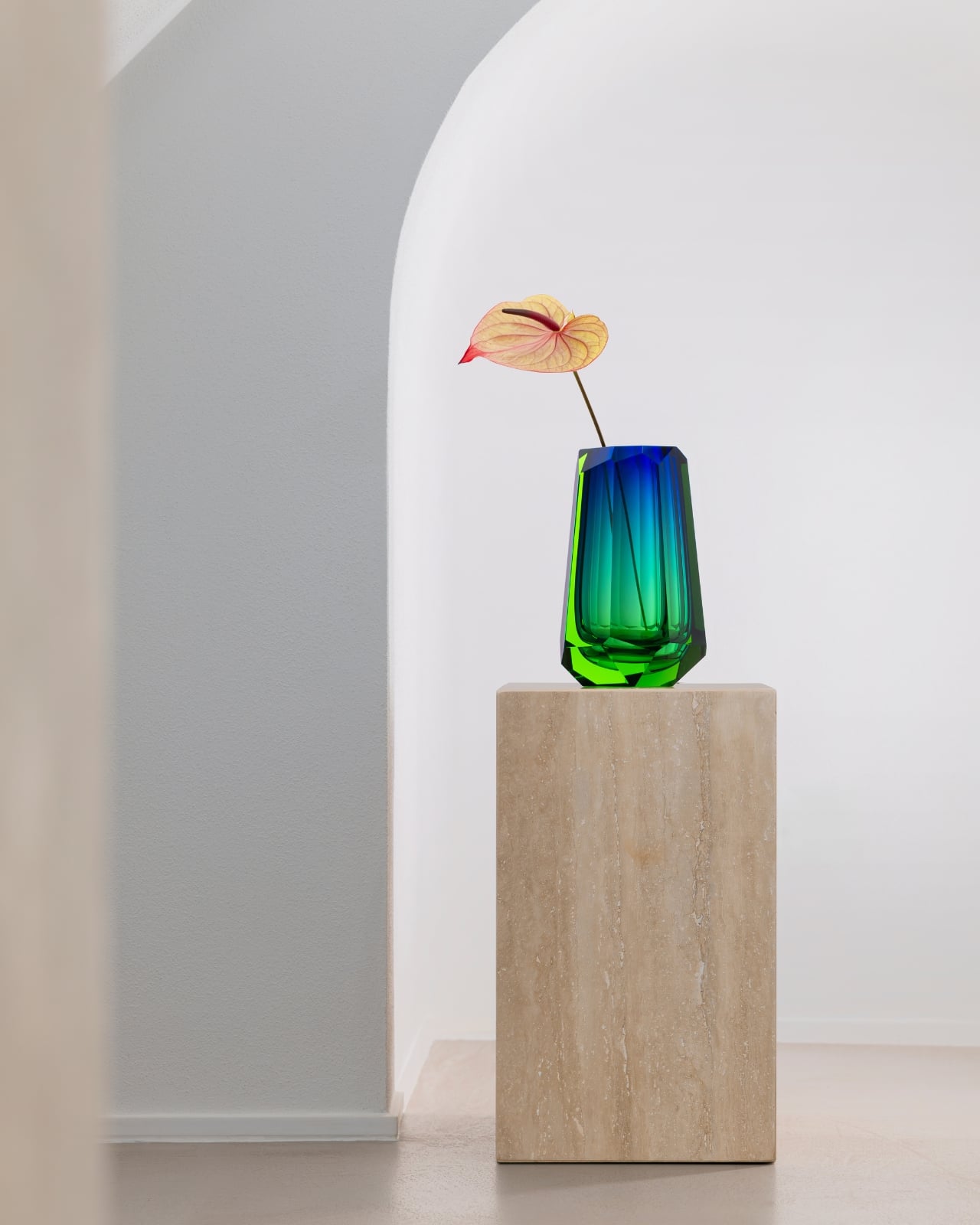
The collection’s standout pieces are the crystal vases, available in three heights: 21 cm, 26 cm, and 35 cm. Each captures the shifting color palette of the Northern Lights, that slow bleed from icy white into deep, oceanic blue, with striking cut edges that echo the geometry of the landscape itself. They’re atmospheric without being theatrical, and they carry the kind of quiet confidence that only comes from serious craftsmanship. These are objects you place in a room and simply let do the talking.

It’s rare to encounter a design that genuinely earns its inspiration. The aurora borealis is one of the most over-referenced phenomena in the aesthetics world. It shows up on wallpaper, yoga mats, screensavers. Moser’s version feels different because the glass actually does what the inspiration promises. The light moves through it. It shifts depending on the angle, the time of day, the room. It behaves like something alive, which is a strange thing to say about crystal, but it’s accurate.

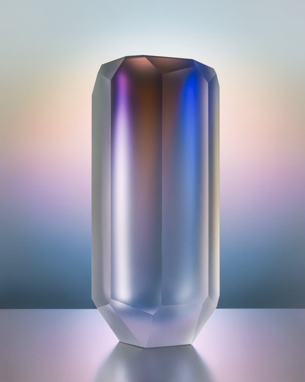
The matte vases and bowls in the collection deserve their own moment. These pieces feature a frosted surface that softens the drama and brings the aurora-inspired hues into something more intimate, like watching the lights through a quiet fog. The catch is that Moser’s masters can only produce 12 pieces of each type per year. Not 12 per collection. 12 total. That’s not scarcity as a marketing strategy. That’s simply the honest ceiling of human skill and time, and there’s a kind of integrity in that.

I’ve covered a lot of design collections, and “limited edition” has largely become white noise at this point. But this is genuinely different. These pieces take what they take to make, and no amount of consumer demand changes that. It’s a refreshing constraint in an industry that too often prioritizes volume over meaning. For anyone building a home with intention, collecting pieces that actually hold value, or just looking for something beautiful that won’t feel dated in five years, the Aura collection deserves your attention. It sits at the intersection of art, craft, and a deep reverence for the natural world, and it earns every bit of that description. Moser has been doing this for 169 years. At this point, they clearly know something the rest of us are still working out.

The post Moser’s New Aura Collection Captures the Northern Lights in Crystal first appeared on Yanko Design.
This $125 Glowing Pay Phone Charges the Smartphone That Killed It

The pay phone had a specific place in the urban landscape, usually on a corner, usually a little battered, and always surrounded by some combination of stickers and street art that turned it into an unintentional canvas. Cities spent decades pulling them out, convinced that no one needed them anymore now that everyone had a phone in their pocket. That logic was correct, of course, but it didn’t make the pay phone any less iconic.

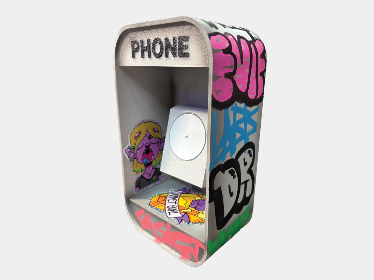
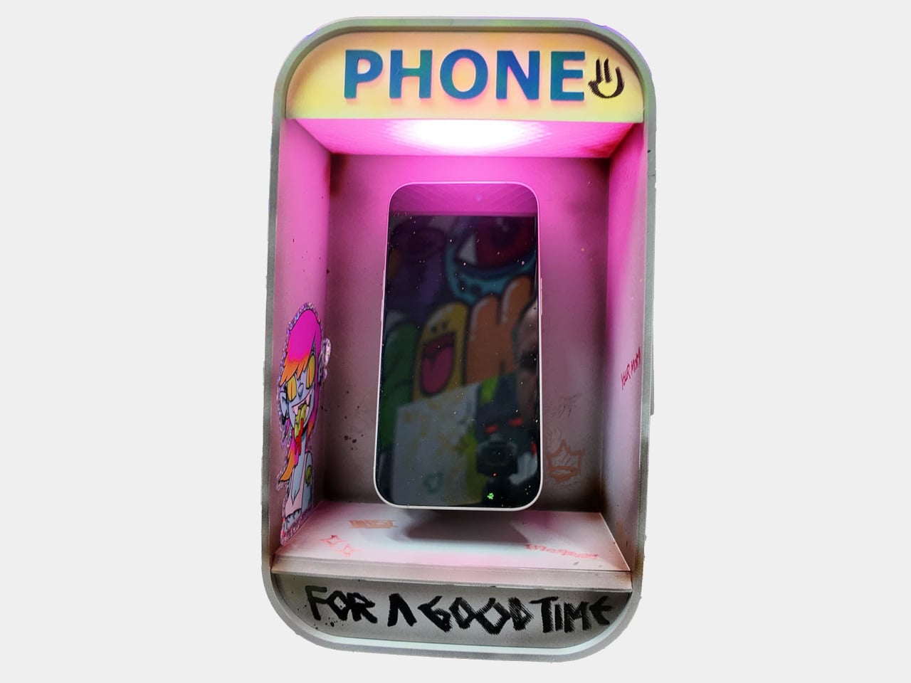
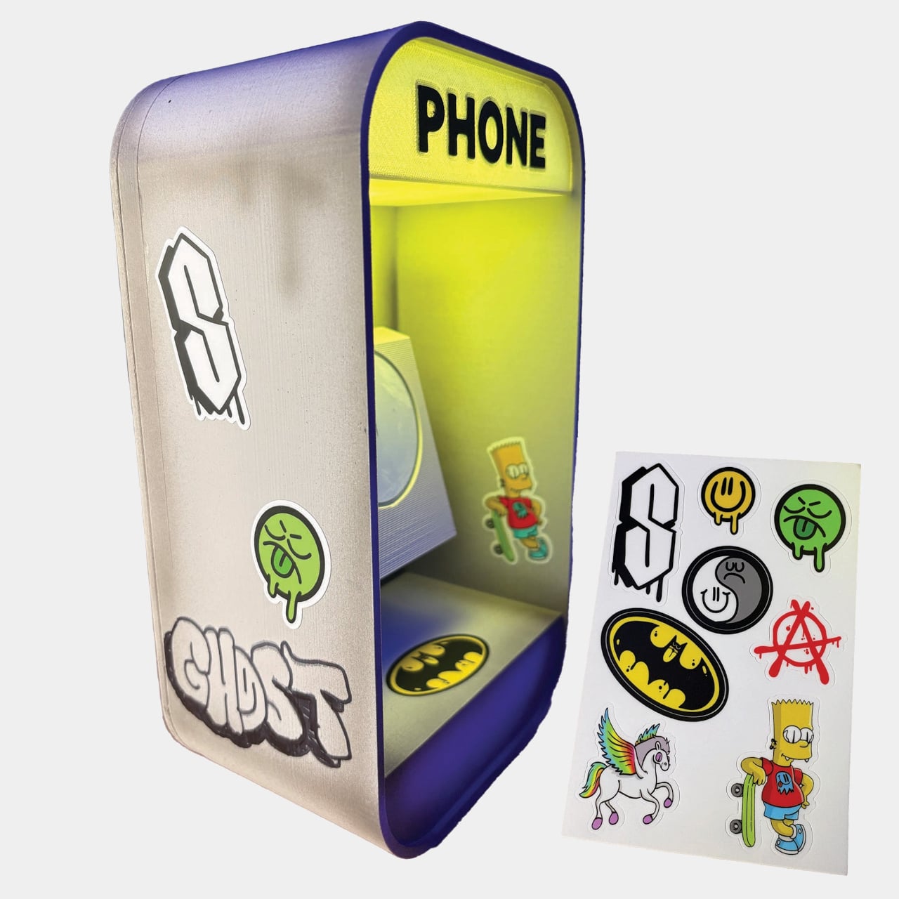
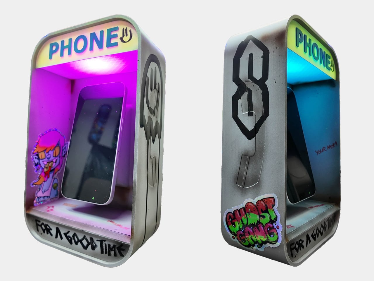
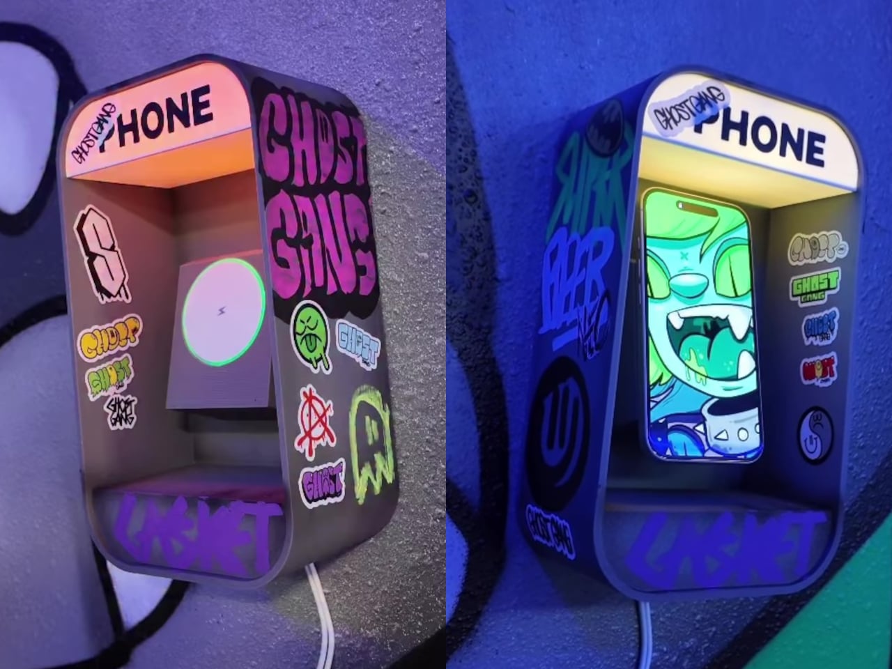
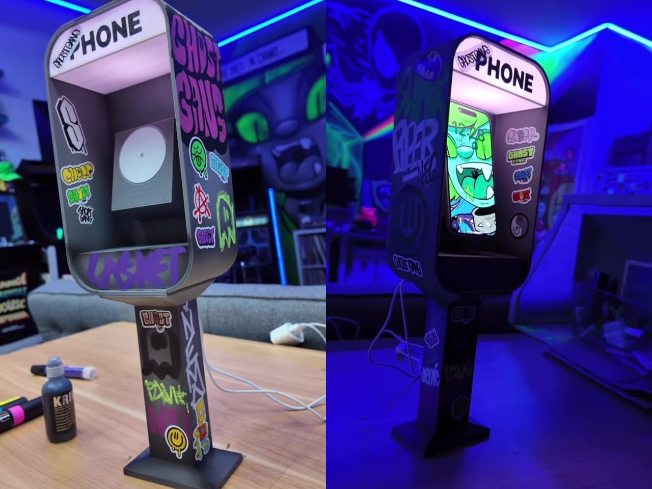
The Pay Phone Charger takes that object out of storage and puts it back on the desk, this time doing the one job the original never could: charging the very devices that replaced it. It’s a 3D-printed miniature pay phone booth with a built-in MagSafe-compatible wireless charger and RGB LED lights that illuminate the “PHONE” sign. Set your phone inside it, and it charges, while the lit-up booth sits on your nightstand or desk looking thoroughly unapologetic about the whole thing.

Designer: Nicky Davis

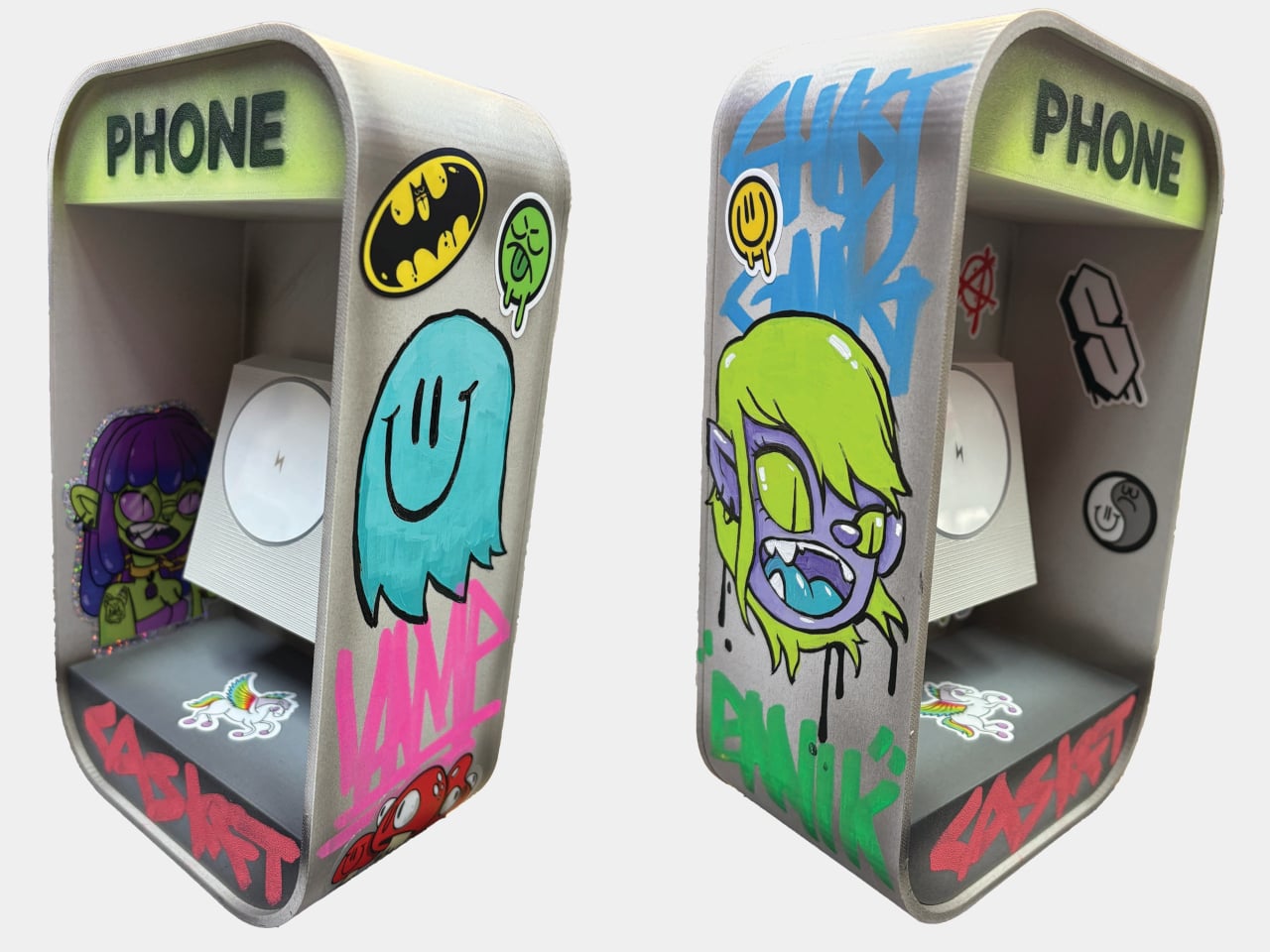
The version you receive depends on which style you choose at purchase. The DIY option arrives as a blank, undecorated body, with the MagSafe charger and LED lights included alongside a retro sticker sheet that lets you decorate it yourself. For anyone who’d rather skip that step, the Hand Painted and Graff version comes fully decorated with original artwork applied by hand before it ships.

Two more options lean into the aesthetic of pay phones in their natural habitat. The Graffiti Covered version is fully tagged across the body, the kind of treatment any phone booth in a city block would accumulate over a few years. The 90’s Worn Looking version takes a different approach, styled to look genuinely aged and battered, as if it survived decades of street corners before ending up on your desk. Custom designs are also available on request for anyone with a specific vision.

Graffiti Covered

Each piece is made individually, not manufactured in batches, which is a detail that matters when you’re looking at something styled after hand-tagged street furniture. The LED-lit “PHONE” sign is a small but exactly right touch, nodding to the illuminated panels that real pay phones used to make themselves visible at night. Placed on a nightstand, it gives the charger a presence that a flat wireless pad simply doesn’t.

90s Worn Looking

The irony at the center of the design doesn’t need to be overstated. A miniature pay phone charging a smartphone is a visual joke that explains itself the moment anyone sees it, and that’s part of why the product went viral before most people had even had a chance to order one. The waitlist that followed was long enough that the creator switched to a preorder system just to manage demand, making units one at a time as an independent artist.

The charging function works on any MagSafe-compatible device, which covers a broad range of current iPhones without needing an adapter. The 3D-printed body is compact enough for a bedside table or desk corner without demanding too much space, and the sticker-ready surface of the DIY version makes it something of a collaboration between the maker and whoever ends up with it.

Pay phones disappeared because they were replaced by something more convenient. The Pay Phone Charger acknowledges that fully, charges it anyway, and glows while it does it. Starting at $125, it’s the kind of object that usually needs a lot more explaining than this one does.

The post This $125 Glowing Pay Phone Charges the Smartphone That Killed It first appeared on Yanko Design.
This Italian-Designed Glass Hip-Flask Is the Most Thoughtful Gift You Will Find in 2026

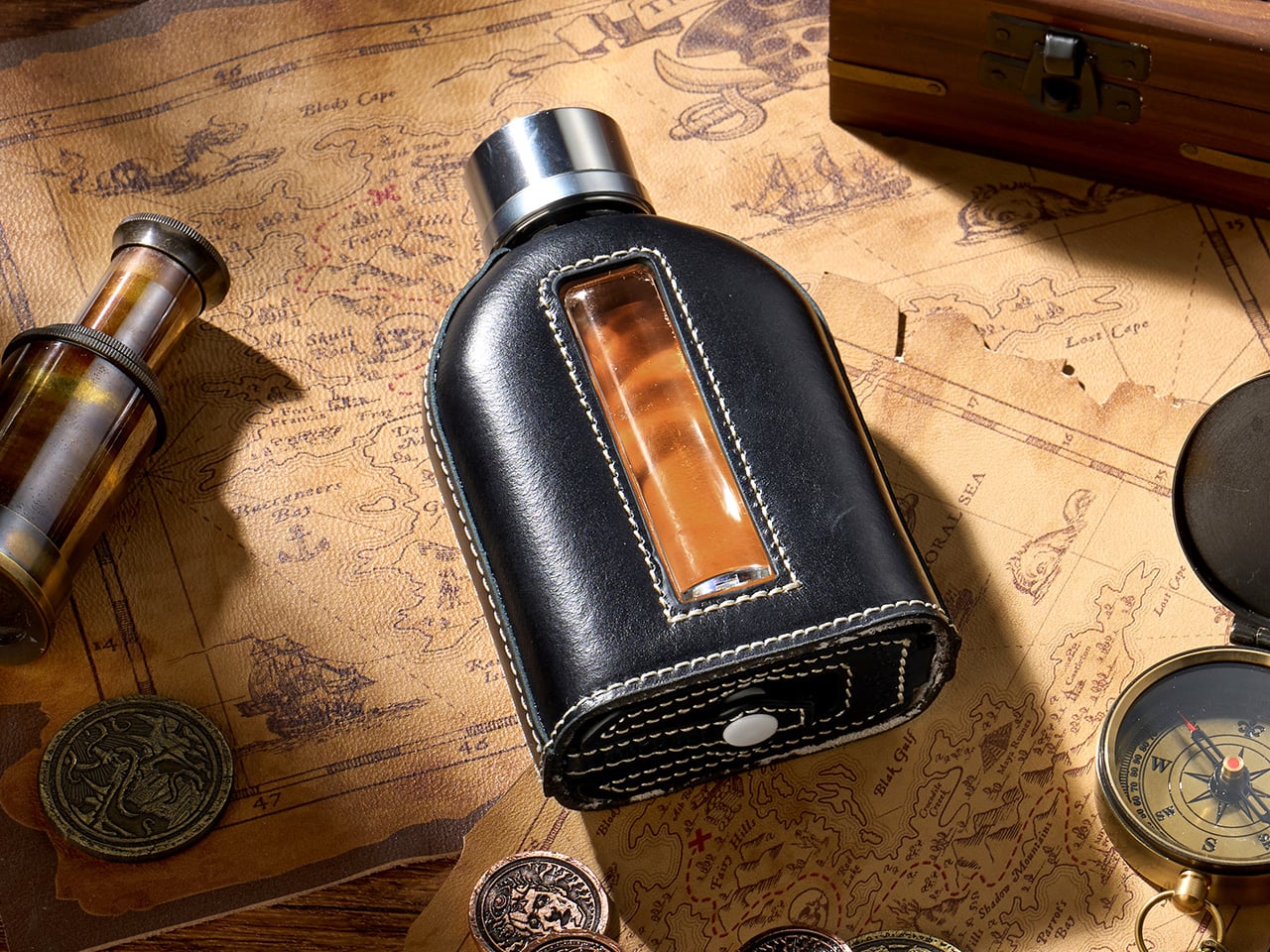
The spirits world has spent decades perfecting what goes inside the bottle. The vessel that carries those spirits once you leave home has received considerably less attention. BARKUTAN, a Hong Kong-registered brand with Italian design roots, spent 19 months asking why that gap exists, and the glass hip flask it produced is essentially its answer. The core is lead-free glass, the same material distillers trust to preserve aroma and flavor integrity, wrapped in a removable top-grain leather sleeve that covers every surface of the bottle in a 360-degree embrace.

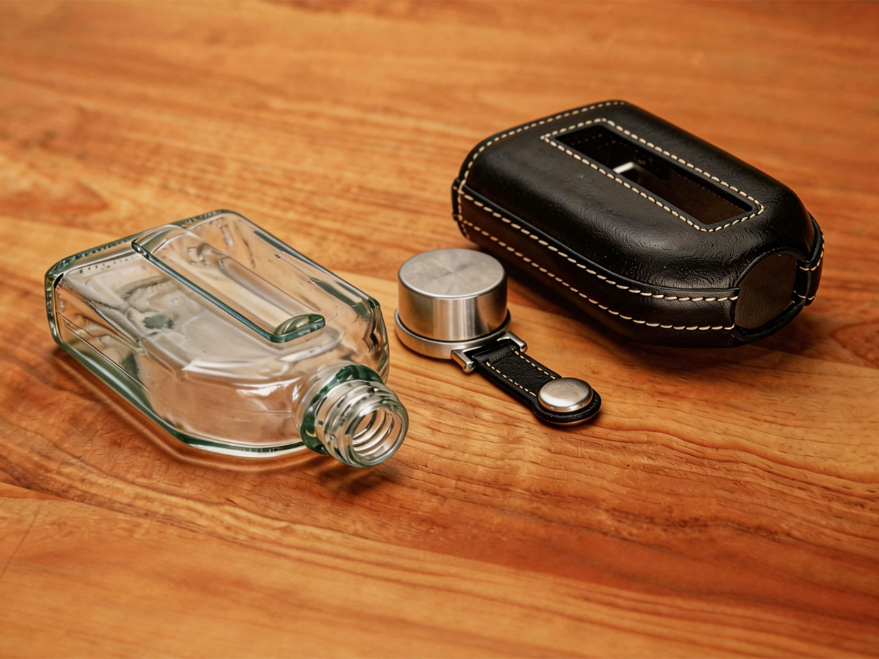
What separates this from leather-wrapped glass flasks already on the market comes down to how the sleeve attaches. Existing options either glue the leather to the glass permanently, meaning a cracked bottle wastes the whole product, or they use a removable sleeve that only wraps part of the flask. The BARKUTAN design wraps the glass completely and still allows the sleeve to be pulled off entirely, a combination the brand holds a premium patent on. Two capacities are available, 100ml and 210ml, in six leather colors.

Designer: BARKUTAN

Click Here to Buy Now: $109 $159 (31% off). Hurry, only 273/300 left!

At the heart of the BARKUTAN flask is a simple, powerful idea: your drink should taste like your drink. That metallic tang that often comes with a traditional flask is an accepted flaw, but it’s a flaw nonetheless. Using glass as the container material eliminates that issue entirely. Glass is neutral, it’s clean, and it respects the complex profile of a fine beverage. It’s the reason premium drinks are bottled in glass in the first place, so extending that logic to a portable vessel just feels like common sense that’s been a long time coming.

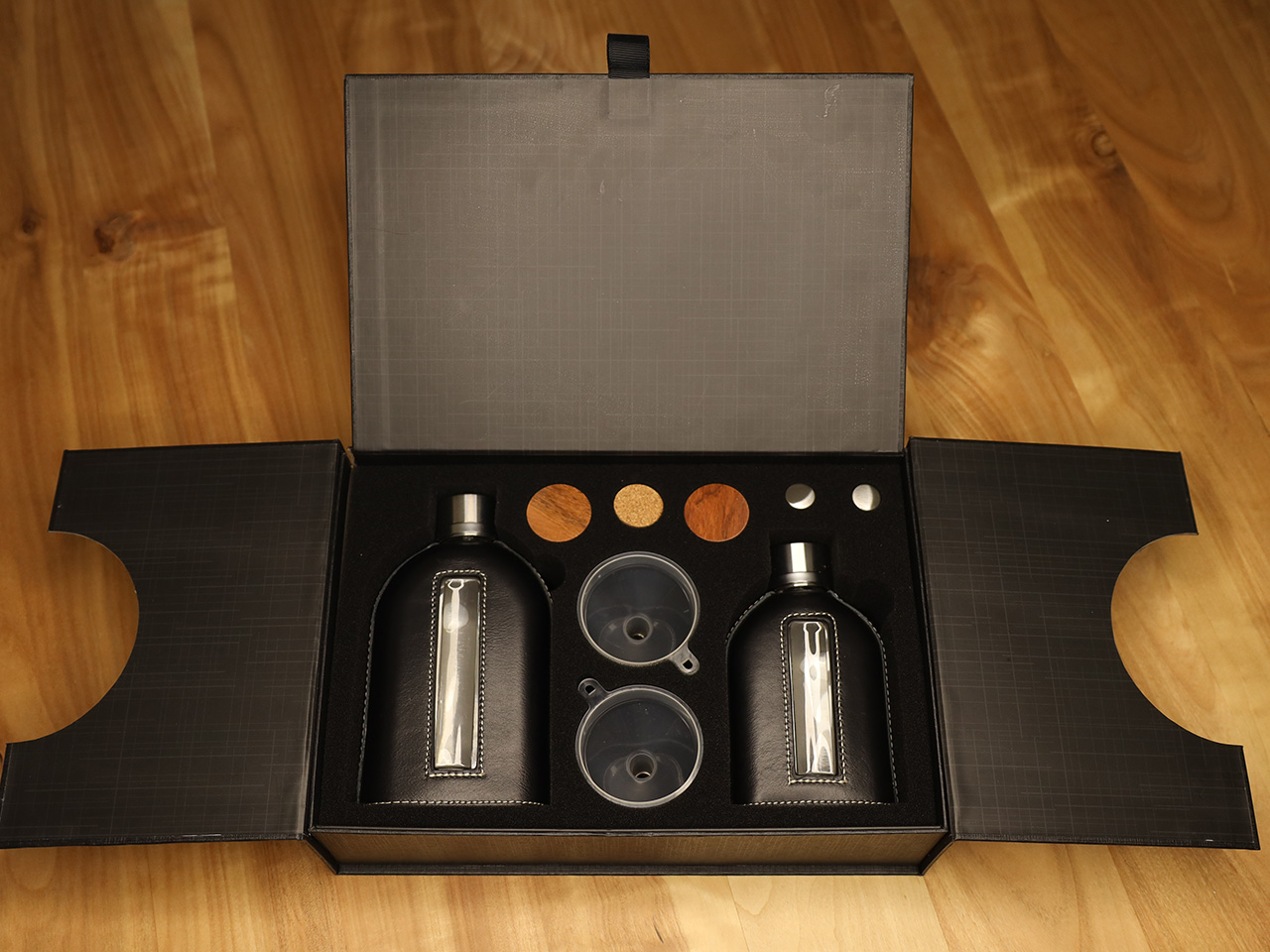
The design details show an obsessive level of thought. A beautiful, convex lens-style window is cut into the leather, letting you check the fill level at a glance. It’s a practical touch that also looks fantastic, sort of like a porthole into your own personal supply. The cap system is equally clever. It uses a combination of cork and silicone liners to create a genuinely leak-proof seal, because no one wants a damp pocket. The cap itself is connected to the flask with a custom snap-button tether, a feature common on metal flasks but rarely seen on glass ones, solving the age-old problem of fumbling with a loose cap outdoors. They even integrated a tiny label slot into the tether, so you can tell your different concoctions apart.

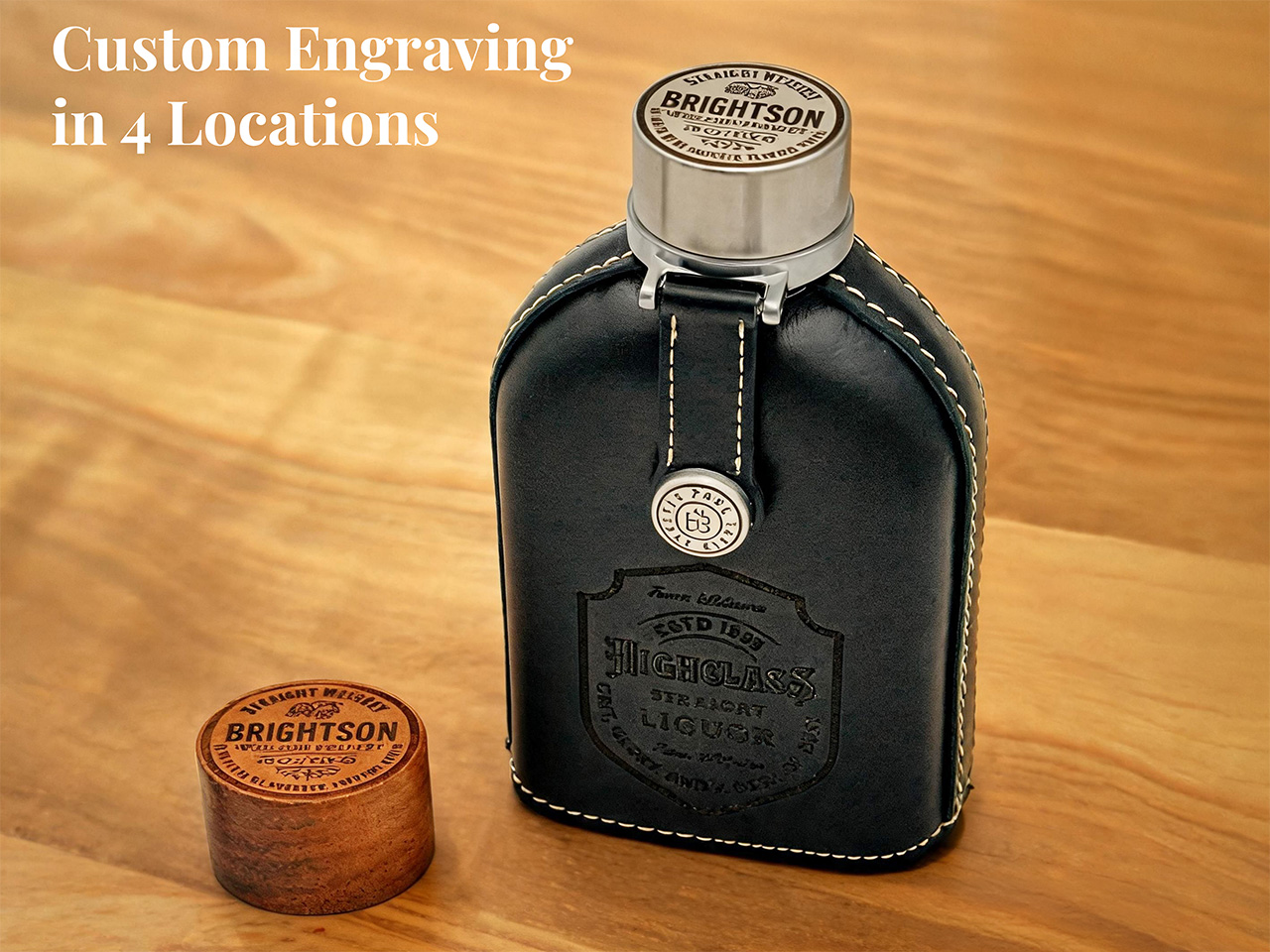
While it’s a great personal accessory, the BARKUTAN really shines as a gift. A flask is a classic choice for groomsmen, graduates, or any special occasion, but the personalization options here take it to another level. Unlike most brands that might offer a simple text engraving, BARKUTAN lets you customize up to four different areas: the leather sleeve, the stainless steel cap, the wooden cap, and even the cap tether’s snap button. With over 300 free templates to choose from, you can add names, dates, or custom emblems to create something truly personal. It already arrives in a premium gift box, so it’s ready to impress right out of the mail.

A great gift is also one that lasts, and this flask is designed for the long haul. The removability of the 360-degree leather sleeve is the main event. It provides full protection, but if the unthinkable happens and you drop it at just the wrong angle, the gift isn’t ruined. You just slide the sleeve off and pop in a new glass insert; every BARKUTAN even ships with a spare. This transforms the flask from a disposable item into a buy-it-for-life piece of gear. That spare wooden cap, full cleaning kit, and extra liners are all part of the package, making it a complete experience from day one.

BARKUTAN is offering the flask in two sizes. There’s a pocket-friendly 100ml version that’s TSA-compliant for your carry-on, perfect for a single responsible serving. Then there’s the larger 210ml flask for longer trips, bigger gatherings, or for those who just have a bit more of a habit to satisfy. Both sizes are available on Kickstarter with Early Bird pricing starting at $109 for the 100ml flask and $125 for the 210ml. You can grab a set with both sizes for $209. The top-grain leather sleeves come in six classic colors: Black, Brown, Dark Brown, Navy Blue, Olive Green, and a rich Cherry Red. The flasks come with a 1-year warranty and lifetime support, which, for a vessel built to be repaired instead of replaced, seems just about right.

Click Here to Buy Now: $109 $159 (31% off). Hurry, only 273/300 left!

The post This Italian-Designed Glass Hip-Flask Is the Most Thoughtful Gift You Will Find in 2026 first appeared on Yanko Design.
Leatherman’s Weirdest Tool Drop Yet Is Strangely Genius

Leatherman has always been the brand you could count on to do one thing extremely well: pack an absurd number of tools into a deceptively small package. But Garage Batch #009 doesn’t follow that playbook at all, and I think that’s exactly why it’s worth talking about.

The Garage line is Leatherman’s unofficial skunkworks. It’s where the company test-markets experimental tools in limited batches, which means low quantities, no guarantees of a permanent future, and a demographic of buyers who treat a tool drop like a sneaker release. Batch #009, officially named the Adapter, is a ratcheting bit driver that looks unlike anything else in Leatherman’s catalog. Core77 put it best when they noted that if you didn’t know any better, you’d think it was someone’s industrial design school thesis project. That’s not a criticism. It’s kind of a compliment.

Designer: Leatherman

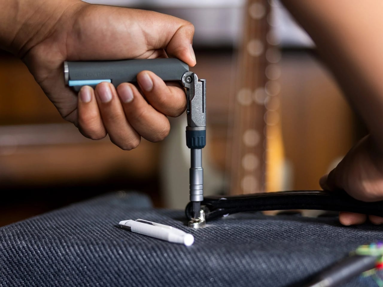
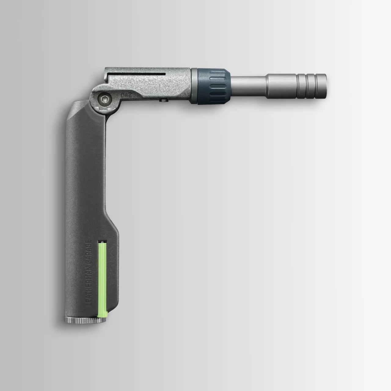
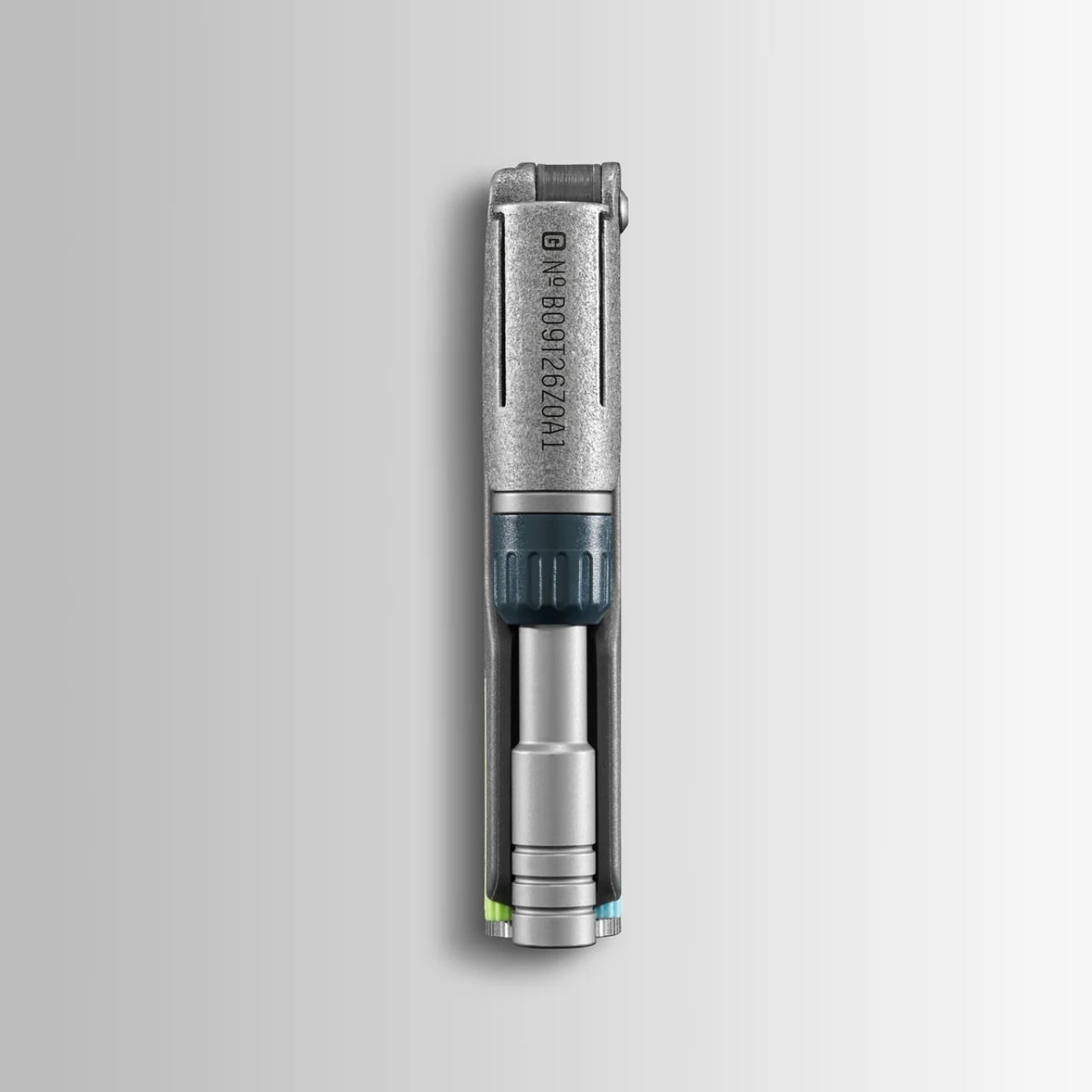
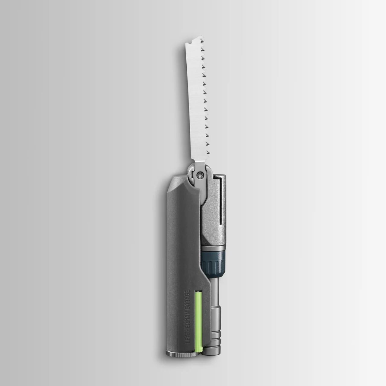
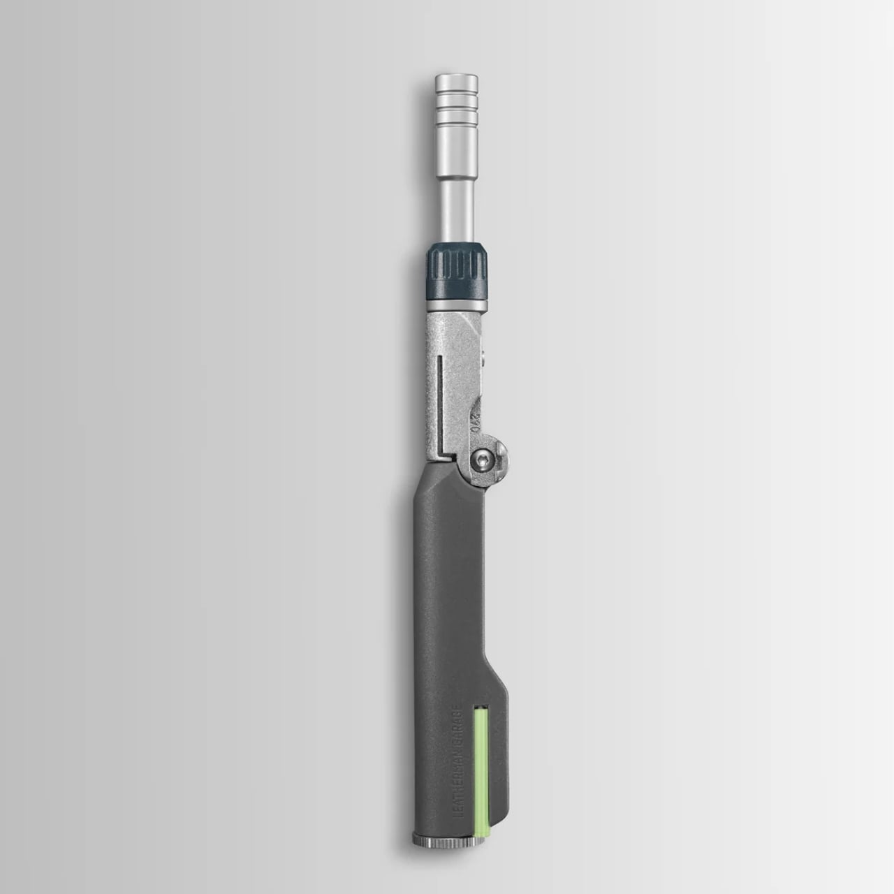
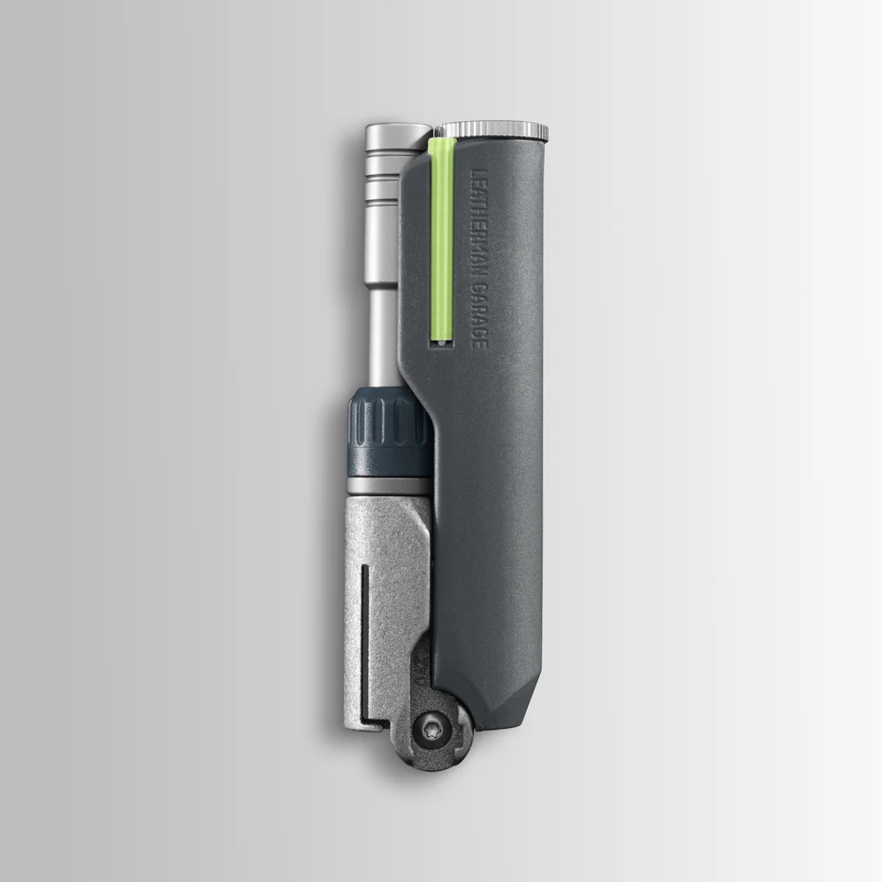
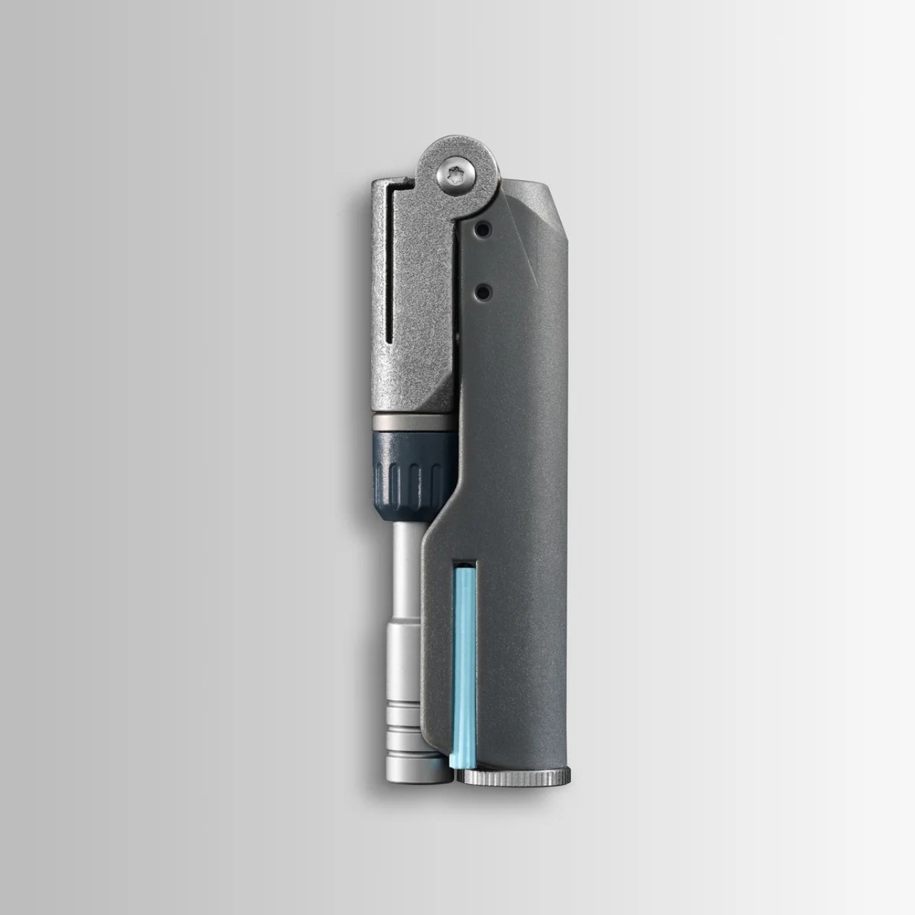
The Adapter is built from 3D printed titanium, which gives it that slightly precious, proof-of-concept feel you don’t usually associate with something you’d use to fix a cabinet hinge. It folds at a hinge joint and can be configured in three positions: fully extended for reach, bent at 90 degrees for torque leverage, and folded shut for compact carry. The ratcheting mechanism works in forward, reverse, and locked positions, so you’re not doing that annoying micro-repositioning shuffle every time you need to drive a screw. That alone is a genuinely useful upgrade over most compact bit drivers on the market.

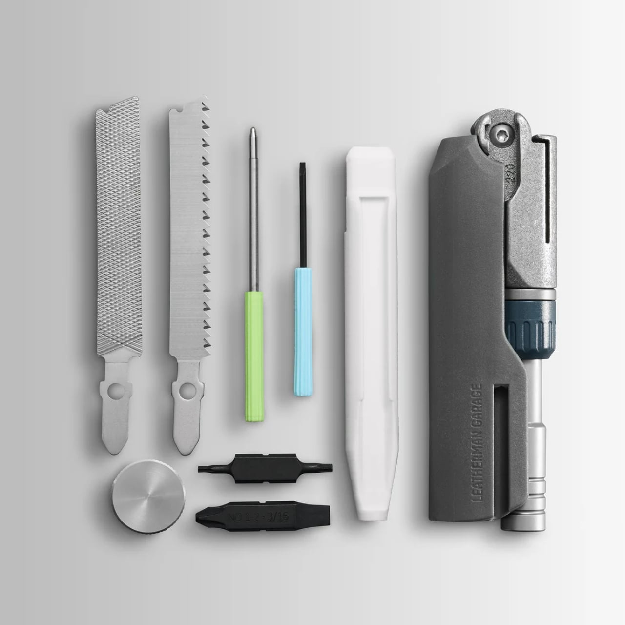
But here’s the part that turns this from “useful niche tool” into “object I want to own”: the handle. Leatherman tucked a wood saw, a metal file, and two bits inside the handle compartment, all secured with a screw cap. They also stowed a mini ballpoint pen and an eyeglass screwdriver in there. If that sounds like the setup for a very organized person’s favorite fidget toy, you’re not wrong. The neon green accent strip on the handle doesn’t exactly scream jobsite. It says something closer to “I paid attention in design school and I have opinions about EDC.”

I want to be honest about the audience here. The Garage line isn’t really for the electrician or the contractor who needs to pull a hundred screws before lunch. It’s for the person who has a Wave on their keychain and a thing for limited-edition objects that are also actually functional. One reviewer summed it up with a note of friendly resignation: “I guess I have to accept the reality that Leatherman is like Supreme now.” That quote has been floating around the internet, and whether it’s a dig or a badge of honor probably depends on who you’re asking. I’d argue it’s both.

The drop sold out fast. High demand on a small batch is Leatherman’s way of gauging whether something deserves to graduate into a full production run, which is a smart and low-risk way to innovate. Not everything from the Garage line makes it. But the Adapter feels like a strong candidate for becoming a permanent fixture, because once you get past the art-project aesthetics, the core concept is genuinely practical.

Compact ratcheting bit drivers with smart storage have a real market. People are constantly trying to slim down their tool kits without sacrificing capability, and a folding driver that also carries your most-reached-for accessories covers a lot of ground in a small footprint. The 3D printed titanium construction keeps it light without making it feel cheap, and the three-position folding system solves an actual ergonomic problem that flat bit drivers have always had.

Whether you’re a gear collector who watches tool drops the way other people watch sneaker releases, or just someone who wants a smarter carry for weekend projects, the Adapter makes a case for itself without needing to oversell anything. Leatherman took a weird swing, and it mostly landed.

The post Leatherman’s Weirdest Tool Drop Yet Is Strangely Genius first appeared on Yanko Design.
Twelve South Just Built a $130 Charger That Won’t Ruin Your Nightstand

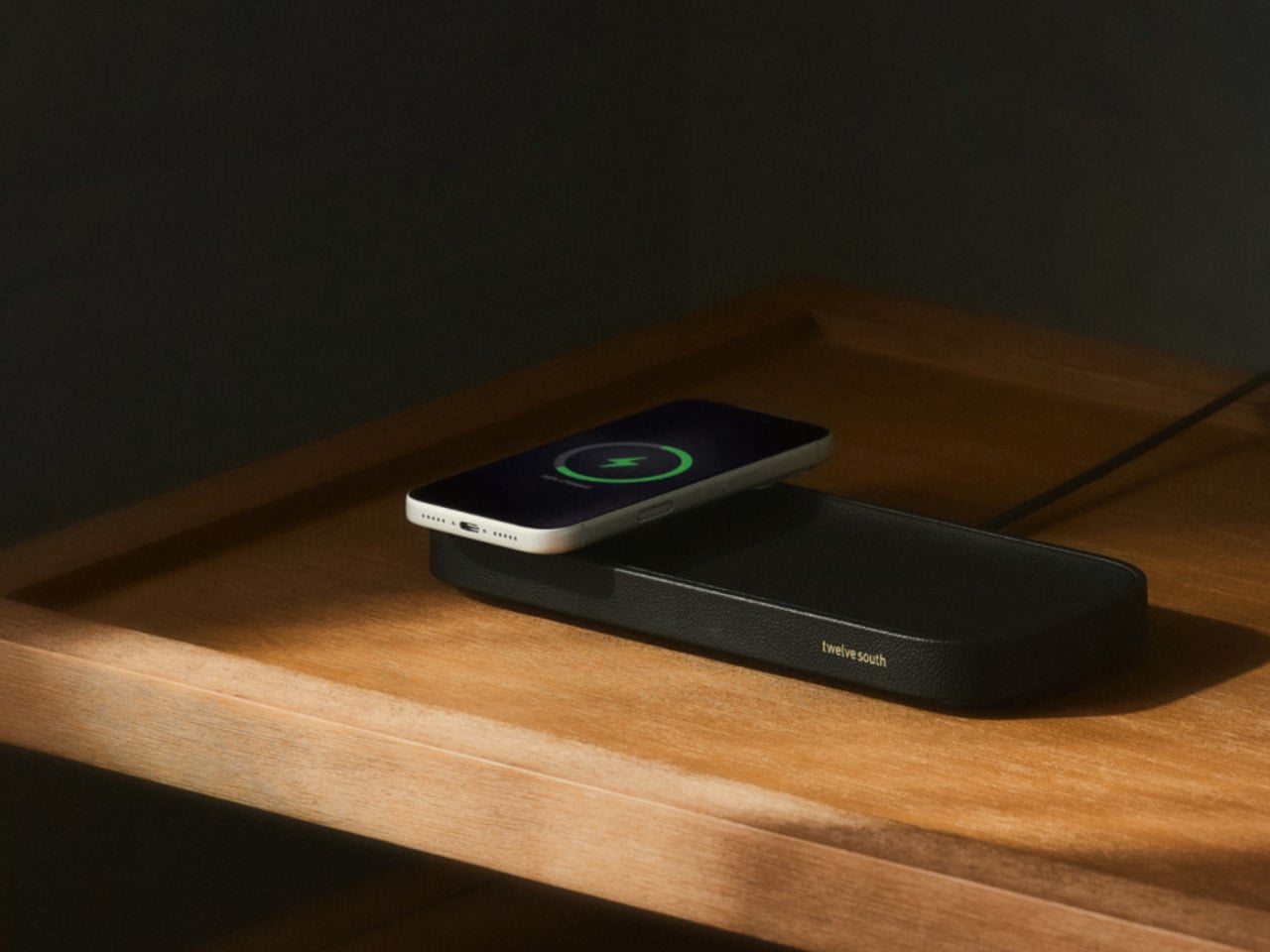
The nightstand has become one of the messiest surfaces in a home. A charging cable snaking across the top, a phone lying flat or propped against whatever happens to be nearby, maybe a watch charger completing the pile. Most accessories designed to address this solve the function while ignoring the furniture, leaving something clinical and plastic sitting next to things that actually belong in a bedroom.

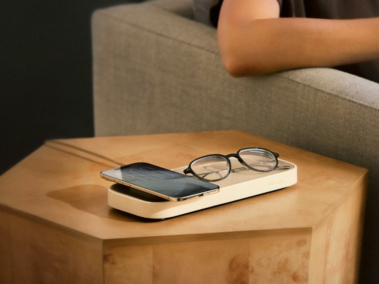
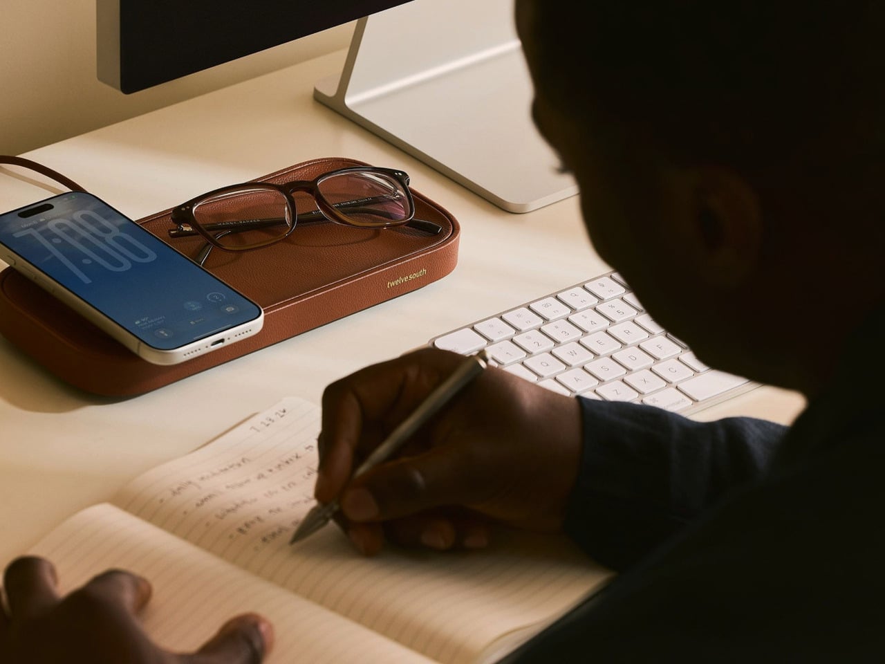
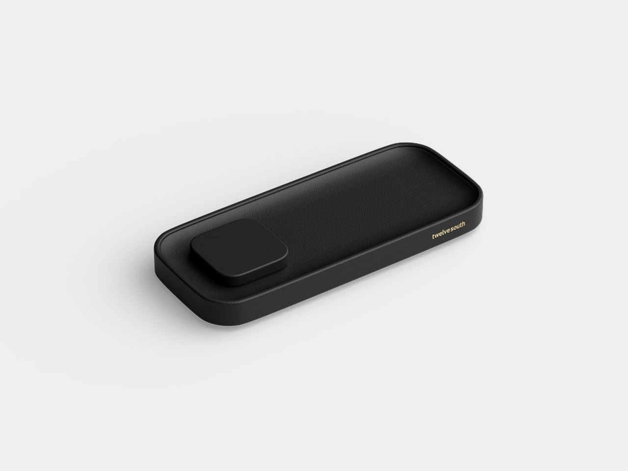
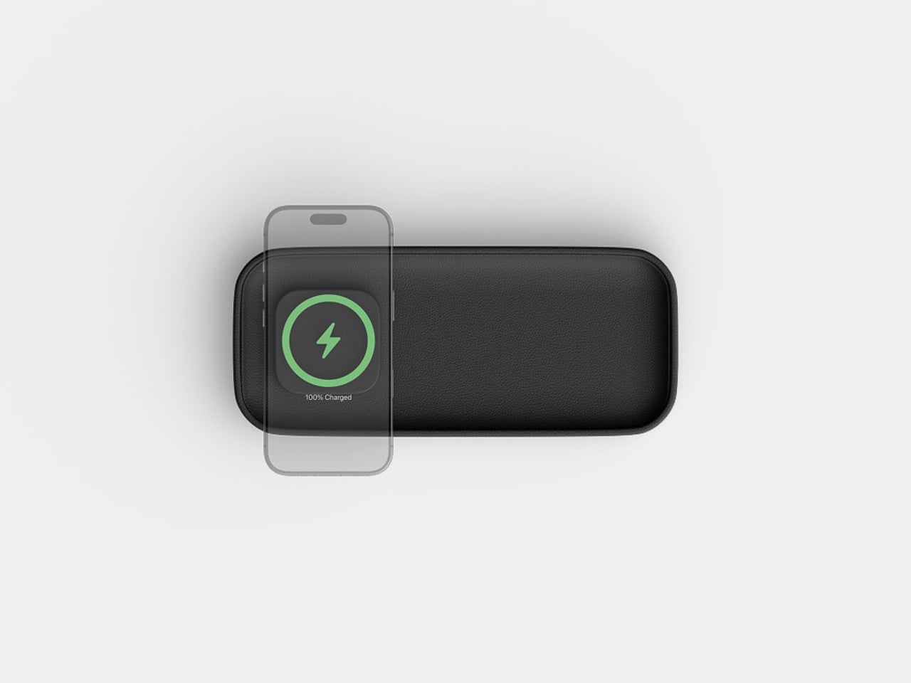
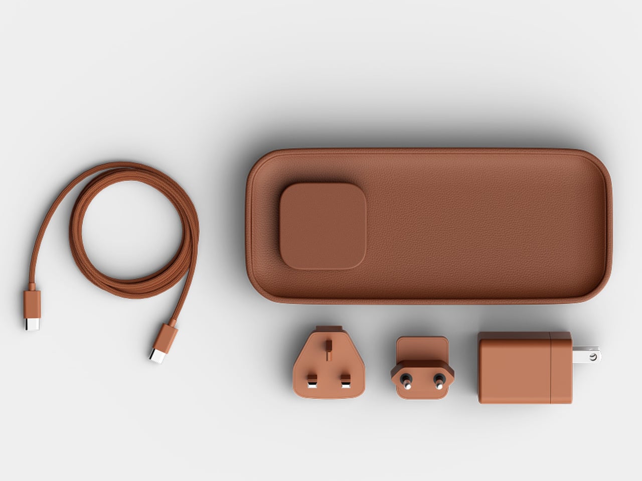
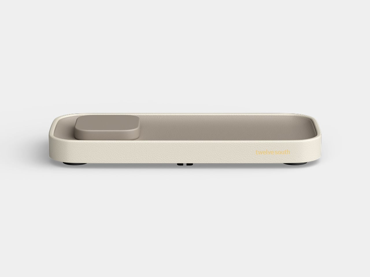
The Valet 4.25 from Twelve South approaches the problem differently. It’s a compact leather catchall tray with a 25W Qi2 wireless charger built into one end, sized specifically for nightstands and bedside tables. The idea isn’t to be a charger that fits in a room; it’s to be an object that actually belongs there, starting with its materials and ending with how it behaves overnight.

Designer: Twelve South

The base is a weighted zinc alloy frame wrapped entirely in Nappa leather, which keeps it planted on the surface without rubber feet or suction tricks. The tray measures 4.25 inches across, making it a tighter proposition than the brand’s original 7.5-inch Valet but considerably more appropriate for the average nightstand, where every spare inch is already committed to something else.

There’s a small but deliberate feature called the Goodnight Glow. When you set your phone down to charge, the tray pulses a soft light for eight seconds to confirm the connection, then fades completely. It doesn’t stay lit through the night. For something sitting beside you while you sleep, that restraint is more considered than it sounds, and it makes double-checking whether your phone is actually charging almost unnecessary.

The wireless output is a meaningful upgrade over the original Valet, which topped out at 15W via Qi2. The new model delivers 25W, which is the full MagSafe speed that newer iPhones can receive. The smaller size doesn’t come at the expense of performance; if anything, it corrects the one technical criticism that followed the larger model since it launched at CES earlier this year.

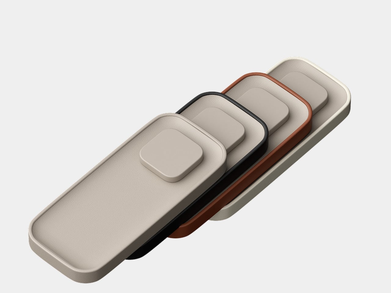
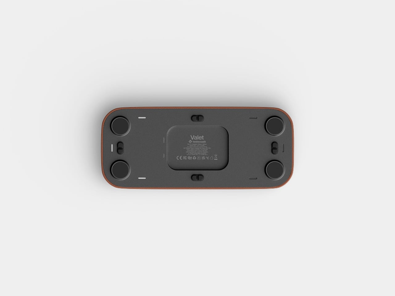
The outer frame is removable and interchangeable, available in four leather colors: black, taupe, brown, and ecru. The body itself comes in either black or taupe Nappa leather, giving you enough combination room to match most bedroom furniture without much deliberation. The tray can also be oriented four ways, letting you position the charging pad on either side or rotate the whole thing to fit a narrower nightstand.

There’s a USB-C port tucked under the base for a second device, though at 10W it’s a step down from the 35W the larger Valet offers. It’ll handle a pair of earbuds or a smartwatch overnight, but it’s not fast-charging territory. The smaller tray is the other concession, reducing the landing area for everyday items compared to what the 7.5-inch version can comfortably hold alongside a phone.

At $129.99, it’s $50 less than the larger model and carries the same premium material finish. The Valet 4.25 is narrowly focused for a specific spot in the home, the kind where spending more on something you see every morning is easier to justify when it actually looks right. The Nappa leather and zinc alloy construction give it a permanence that most chargers, regardless of cost, rarely manage.

The post Twelve South Just Built a $130 Charger That Won’t Ruin Your Nightstand first appeared on Yanko Design.
Your Phone and Laptop Stand Could Be Made From Recycled Coffee Grounds

Every morning, millions of people brew their coffee, toss the grounds, and move on. It’s such a routine act of disposal that few of us stop to think about where all that spent coffee actually goes. MOFT apparently did think about it, and the result is one of the more genuinely interesting design stories to come out of the tech accessories space in recent memory.

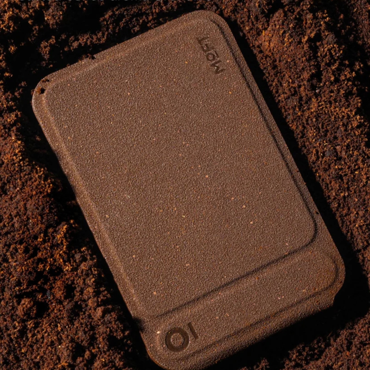
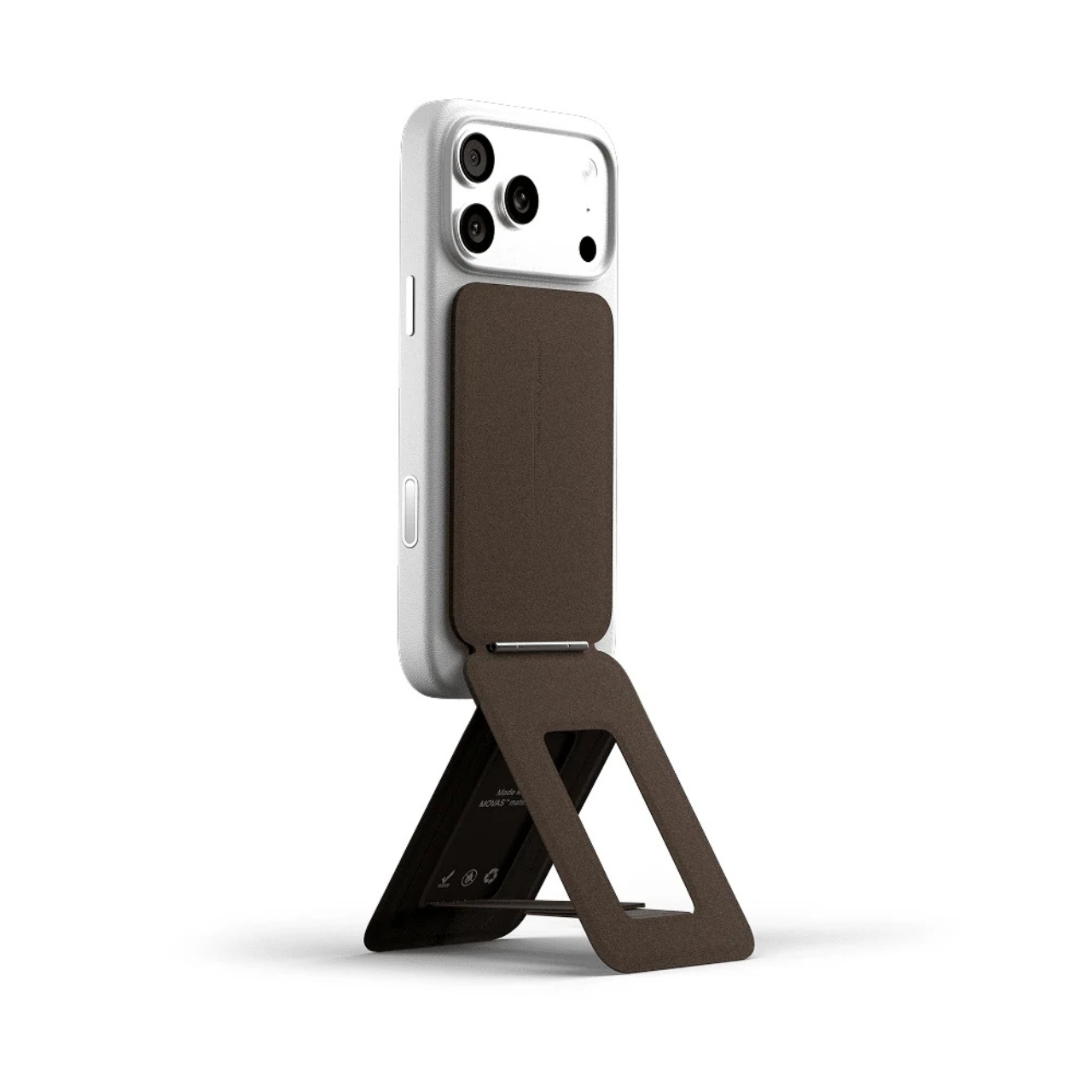
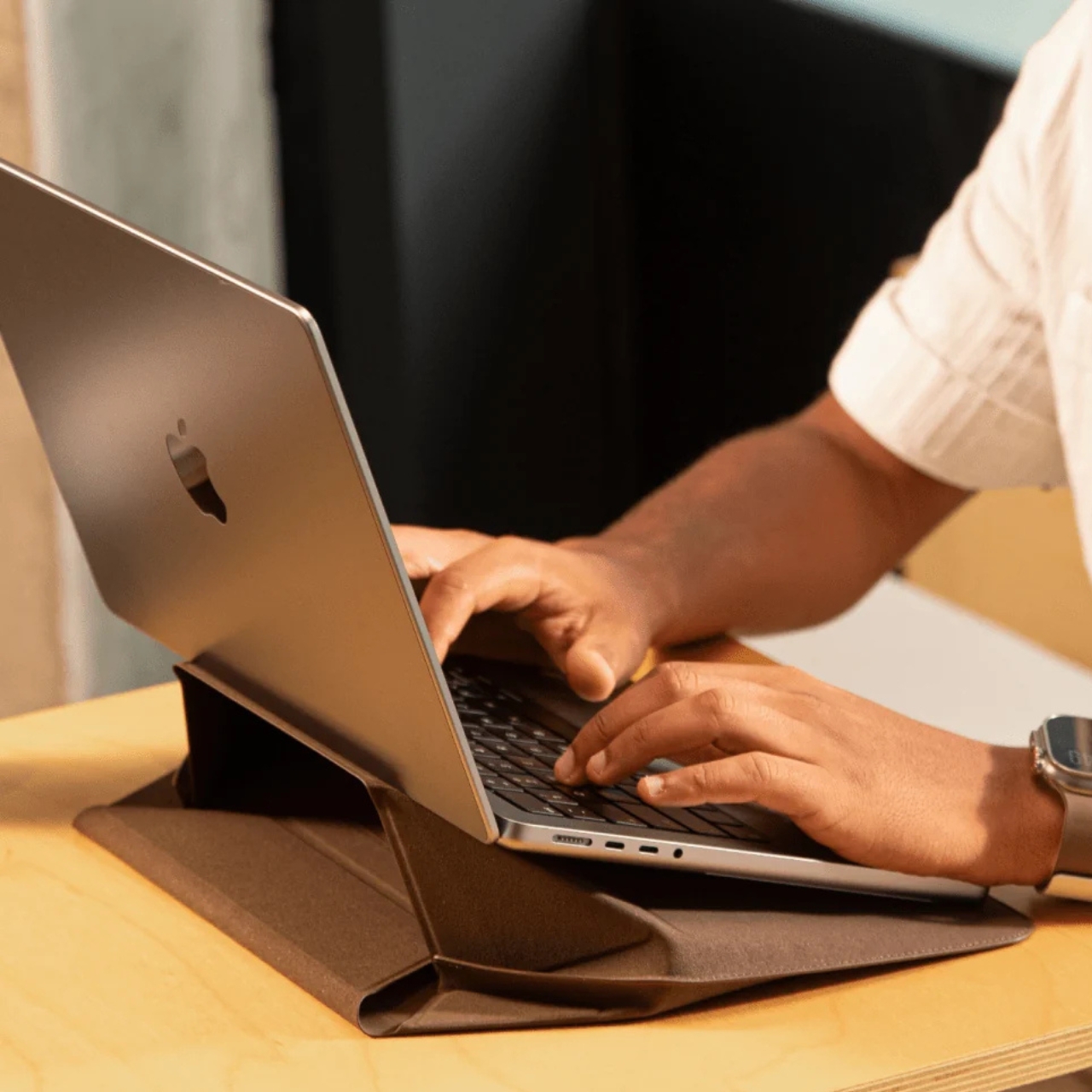
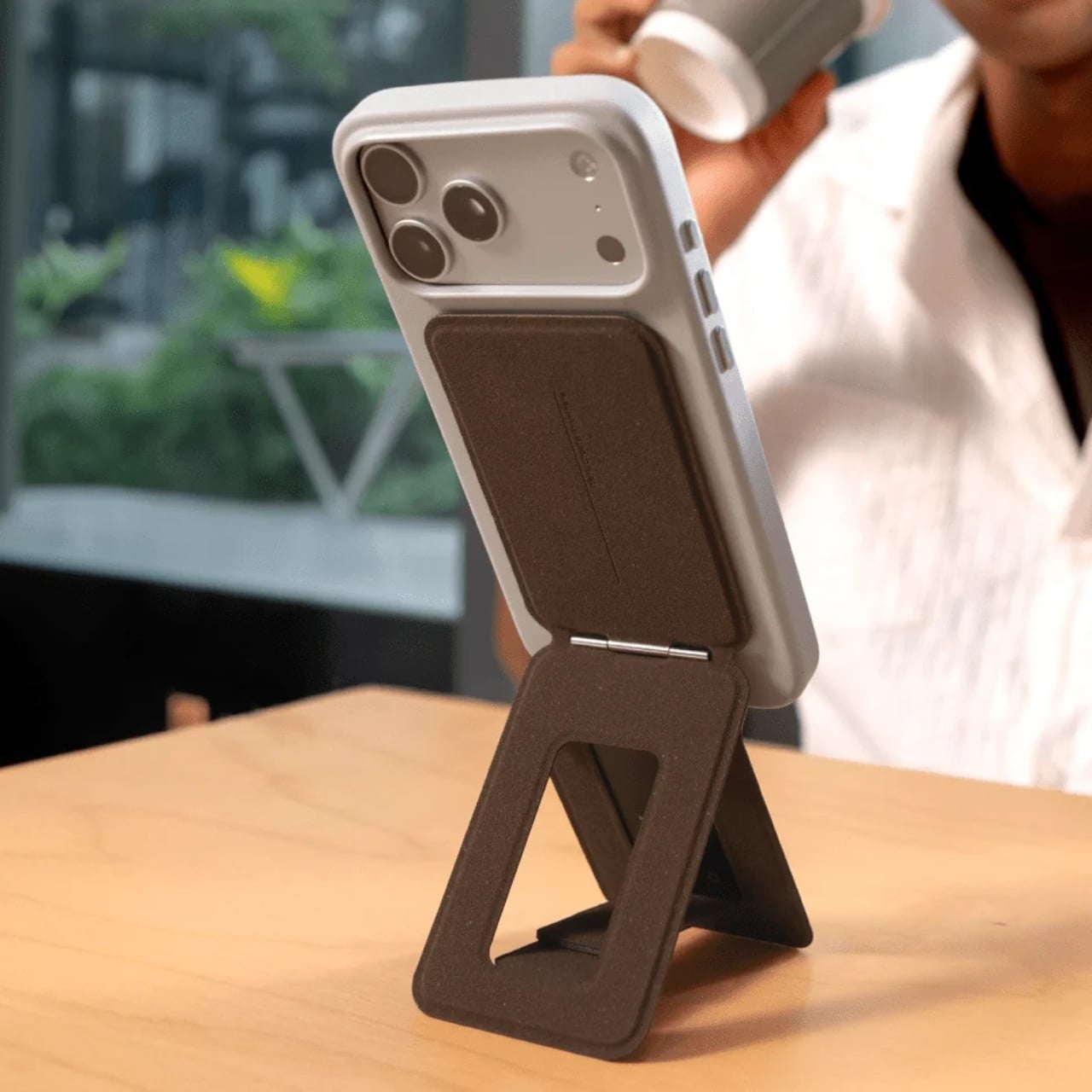
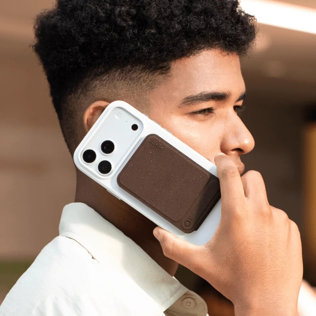
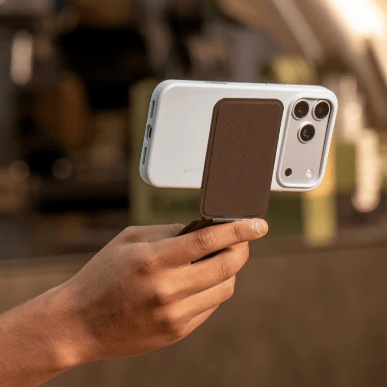
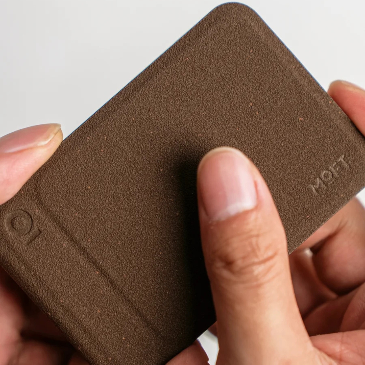
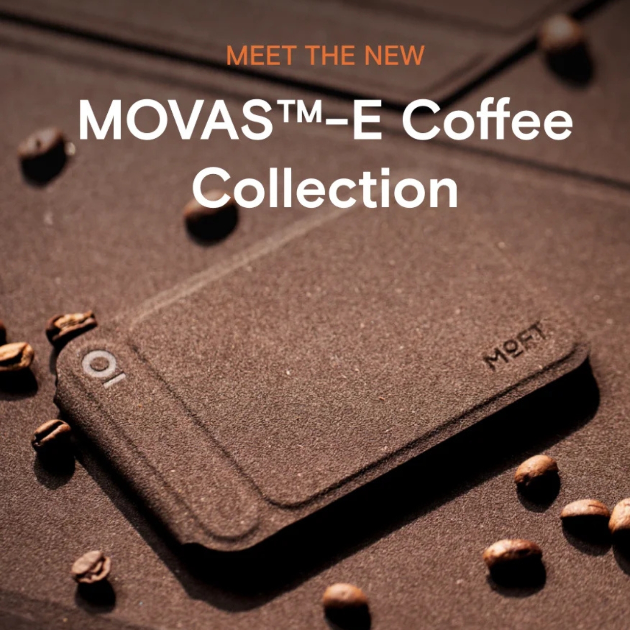
The MOFT MOVAS-E Coffee Collection is a new line of accessories built from a bio-based leather crafted from recycled coffee grounds. MOFT combined spent coffee grounds with waterborne bio-based polyurethane to create what they’re calling a new generation of bio-based leather. The material replaces both conventional leather and traditional synthetic alternatives, which makes the origin story feel less like a marketing angle and more like an actual shift in how the brand approaches materials.

Designer: MOFT

MOFT has already built a strong reputation for thoughtful material choices. Their MOVAS vegan leather line has been a staple in the premium accessories space for a while now, known for that soft, slightly textured finish that feels surprisingly luxurious on a phone MagSafe stand. The MOVAS-E Coffee Collection takes that established foundation and adds a genuine layer of purpose to it, pushing the material story well beyond aesthetics and into something more intentional.

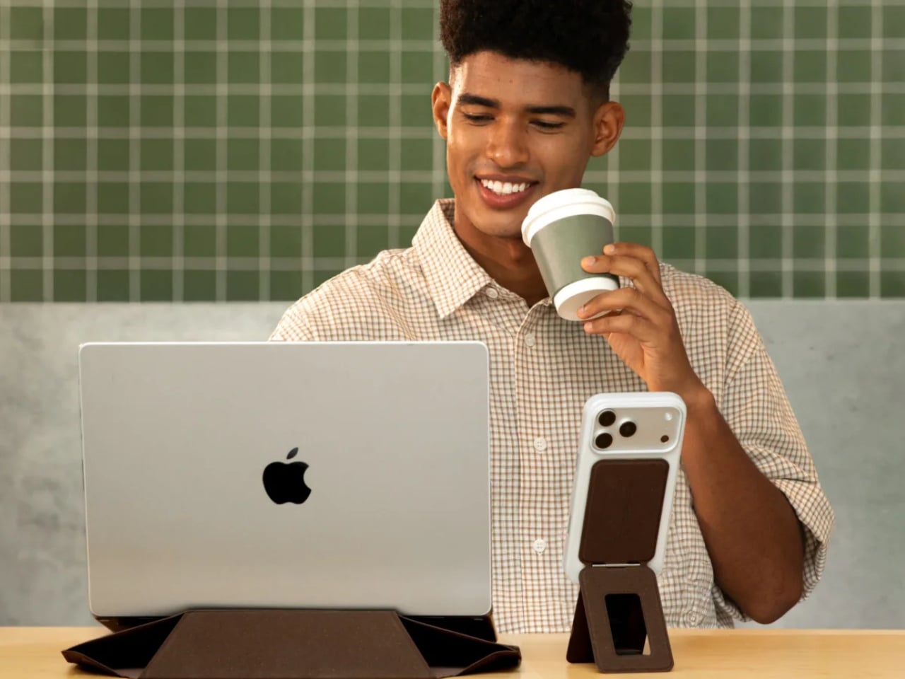
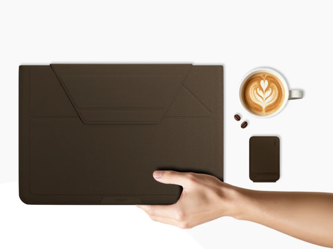
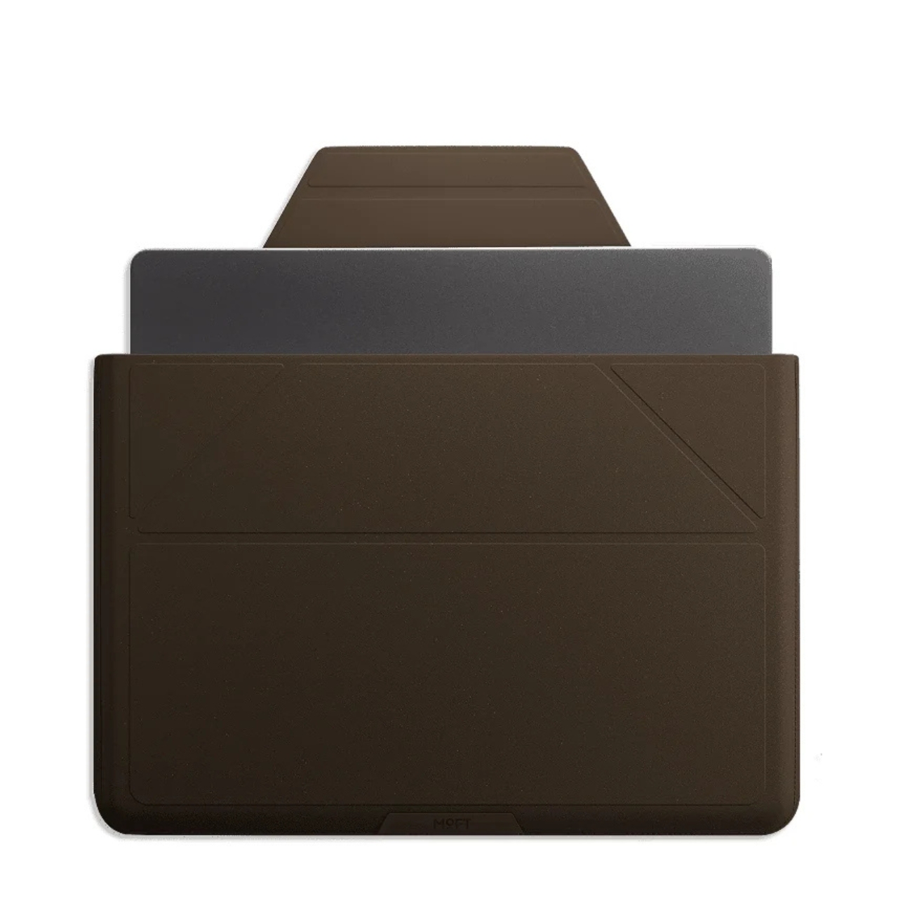
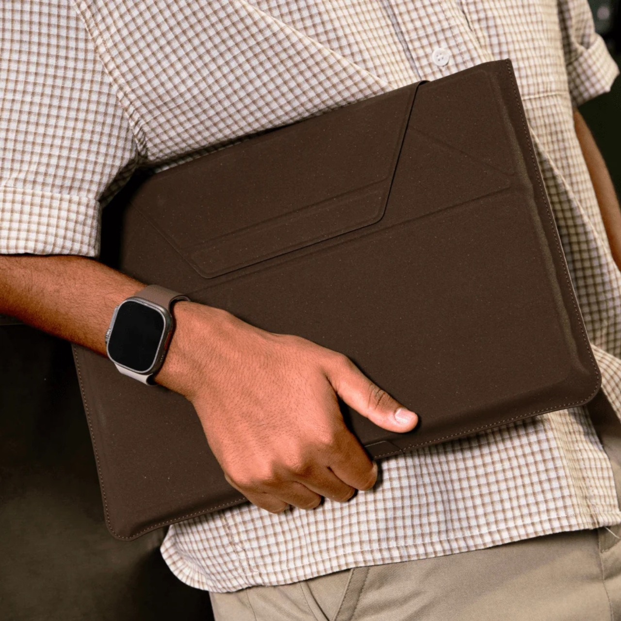
The collection includes products like a laptop Carry Sleeve, all finished in warm, coffee-toned colorways that look like they were pulled straight from a specialty café mood board. The tones are earthy and rich without veering into something overly minimal or clinical. If you’ve ever wished your tech accessories matched the aesthetic of a beautifully lit coffee shop corner, MOFT seems to have designed this one with exactly that feeling in mind. The tagline for the collection is “Brewed for Flow,” and it’s hard to argue with that framing.

The packaging is also part of the story. MOFT went with a frosted, minimalist design they describe as food-safe, durable, and fully recyclable. It’s the kind of packaging decision that often goes unnoticed by most buyers, but it signals that the sustainability angle here isn’t just surface-level. When a brand puts the same thought into the box as the product inside, that’s usually a sign the commitment runs deeper than a trend cycle.

I’ll be honest: the sustainable materials conversation in tech accessories can feel exhausting. Every other brand is slapping the word “eco” on something and calling it a revolution. MOFT’s approach feels different, not because they’ve reinvented the wheel, but because the product doesn’t sacrifice anything to get there. The MOVAS-E Coffee Bio-Leather still delivers the same premium tactile quality that made their original MOVAS line popular. It’s stain-resistant, smooth, and has that matte finish that photographs well without ever looking cheap. The material carries its origins gracefully.

The timing of this collection feels culturally right, too. Coffee has become more than a beverage. It’s an aesthetic, a lifestyle marker, a ritual that people build their mornings around. The idea that your phone stand or laptop sleeve could be a physical extension of that daily ritual is a small but clever act of brand storytelling. It doesn’t feel forced. It feels like a natural fit for the kind of person who already gravitates toward MOFT: someone who pays attention to the things they carry.

Whether or not bio-based leather made from coffee grounds becomes a broader standard for tech accessories, MOFT is asking the right questions here. What do we do with the waste streams already woven into our daily lives? How do we make sustainable choices feel desirable rather than merely dutiful? The MOVAS-E Coffee Collection doesn’t answer everything, but it’s a compelling and well-designed start.

If you’ve been looking for a reason to upgrade your tech carry, this collection offers one that goes a little deeper than color options. It’s the kind of purchase that earns a second look, and a story that’s surprisingly easy to tell when someone asks where you got your case.

The post Your Phone and Laptop Stand Could Be Made From Recycled Coffee Grounds first appeared on Yanko Design.
McDonald’s Built a Backpack With Side Pockets That Hold Actual Fries

Fast food brands have long extended their identities beyond the menu, but branded merchandise tends to follow a familiar template. A logo on a tote, a seasonal hoodie, maybe a novelty cup tied to a promotional window. There’s rarely much design ambition involved, and the results are usually forgotten by the time the campaign ends. McDonald’s China just made a strong case for doing it differently.

To celebrate the 12th edition of its annual Big Fries Day, the brand released a limited-edition backpack modeled almost exactly after the brown paper takeaway bag that goes home with every order. The connection isn’t superficial. The Big Fries Backpack translates McDonald’s own delivery packaging into a wearable object, keeping the visual language that makes it immediately recognizable and adding enough functional detail to make it more than a costume.

Designer: McDonald’s China

The concept started with a fan. A Chinese craft blogger had created a handmade backpack modeled after McDonald’s takeaway packaging and shared it online. The design attracted attention, and McDonald’s China worked with the creator to develop it into an official product, tying the release to Big Fries Day, an annual event held since 2015 around the Chinese solar term Dashu, also known as Major Heat.

Big Fries Day gets its name from a pun. Dashu, the Chinese solar term for Major Heat, sounds nearly identical to “da shu,” the shorthand for large fries, giving McDonald’s a seasonal hook that’s culturally specific and easy to build around. The backpack fits that same logic, turning the most recognizable piece of McDonald’s packaging into something fans could actually put on their back and walk out the door.

The exterior is made from a lightweight DuPont paper material that mimics the texture of a real takeaway bag, with the Golden Arches on the front alongside printed fry graphics and folded-bag details. A detachable charm shaped like a McDonald’s order receipt hangs from the bag, and the zipper pulls are designed to look like individual fries dipped in ketchup. Every visible element draws from the same ordering ritual.

The most conspicuous feature is a pair of red side pockets shaped like McDonald’s fry cartons. They attach to either side with Velcro and can hold actual fries, though keeping greasy food against a paper-textured backpack is one of those decisions best left to the owner. They detach easily when a cleaner profile is preferred, and a dedicated compartment inside the bag is reserved specifically for ketchup packets.

Inside, the novelty gives way to a practical design. The main compartment includes dividers and fits a 13- or 14-inch laptop, making the bag functional for a daily commute rather than just a conversation piece. The shoulder strap is also designed to hold a fry carton upright, which is either a brilliant detail or a very public declaration of priorities, depending on how you feel about eating on the go.
The post McDonald’s Built a Backpack With Side Pockets That Hold Actual Fries first appeared on Yanko Design.