PROS:
- Distinctive design with LED accents and visible liquid-cooling
- Strong gaming performance
- Useful GT triggers and bundled MagCharge cooler
CONS:
- Stereo speakers can sound slightly muffled at times
- Price has gone up noticeably from the GT 30 Pro
RATINGS:
SUSTAINABILITY / REPAIRABILITY
EDITOR'S QUOTE:
Distinctive, capable, and clearly built with gamers in mind, the Infinix GT 50 Pro delivers a focused experience, even if tougher competition makes the value story less straightforward.
The Infinix GT 50 Pro continues a formula the GT series has followed since its debut with the GT 10 Pro in 2023. This has always been a gaming-focused smartphone line, both in how it performs and how it looks. With the GT 50 Pro, Infinix stays true to that identity while adding stronger hardware, a few thoughtful extras, and a more refined overall package.
There is plenty here that stands out immediately, from the Dimensity 8400 Ultimate and 144Hz AMOLED display to the GT triggers and bundled MagCharge cooler. At the same time, the GT 50 Pro arrives in a more competitive market and at a higher price than its predecessor. That makes it a more interesting phone to evaluate, because the question is no longer just whether it performs well, but whether it still does enough to stand out.
Designer: Infinix
Aesthetics
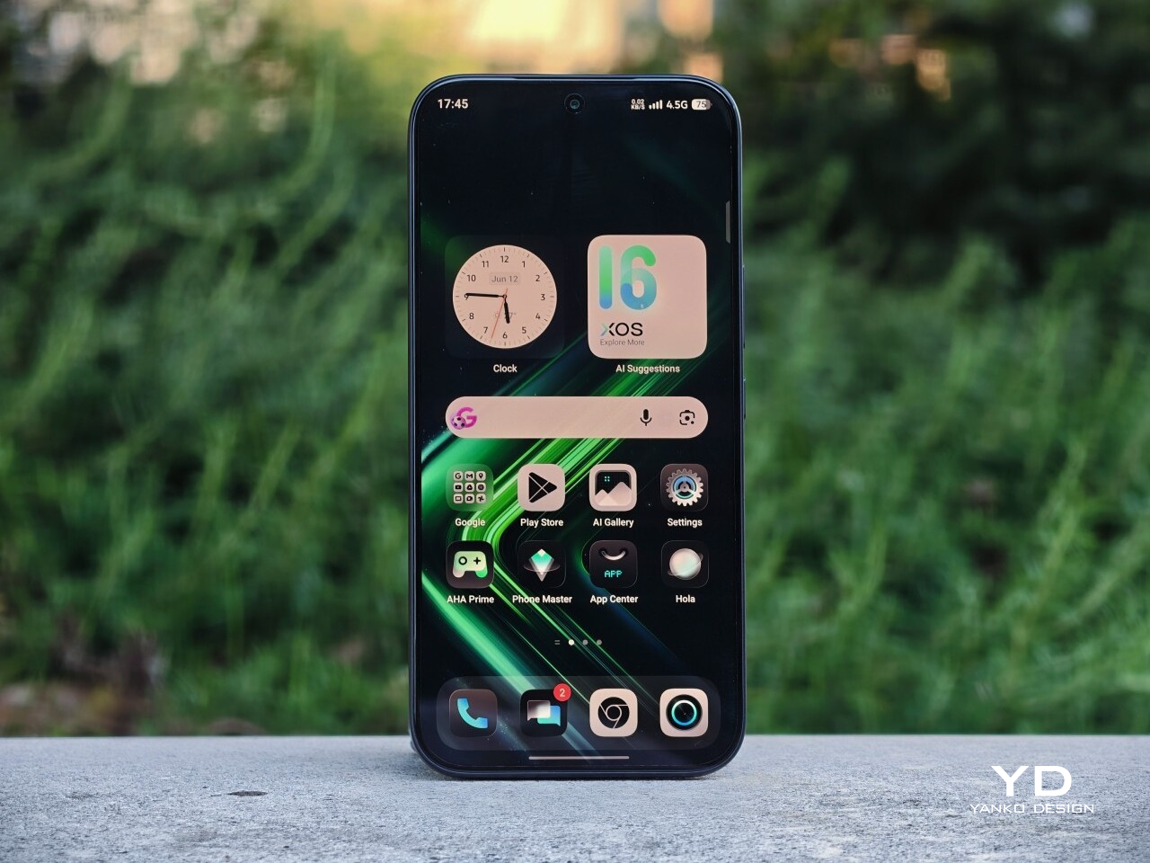
Ever since the GT 10 Pro debuted in 2023, Infinix has kept the GT series firmly anchored to one identity. This has always been a gaming phone line, and importantly, it has always looked the part. The GT 50 Pro continues that tradition with complete confidence, and the consistency gives the series a stronger sense of character.
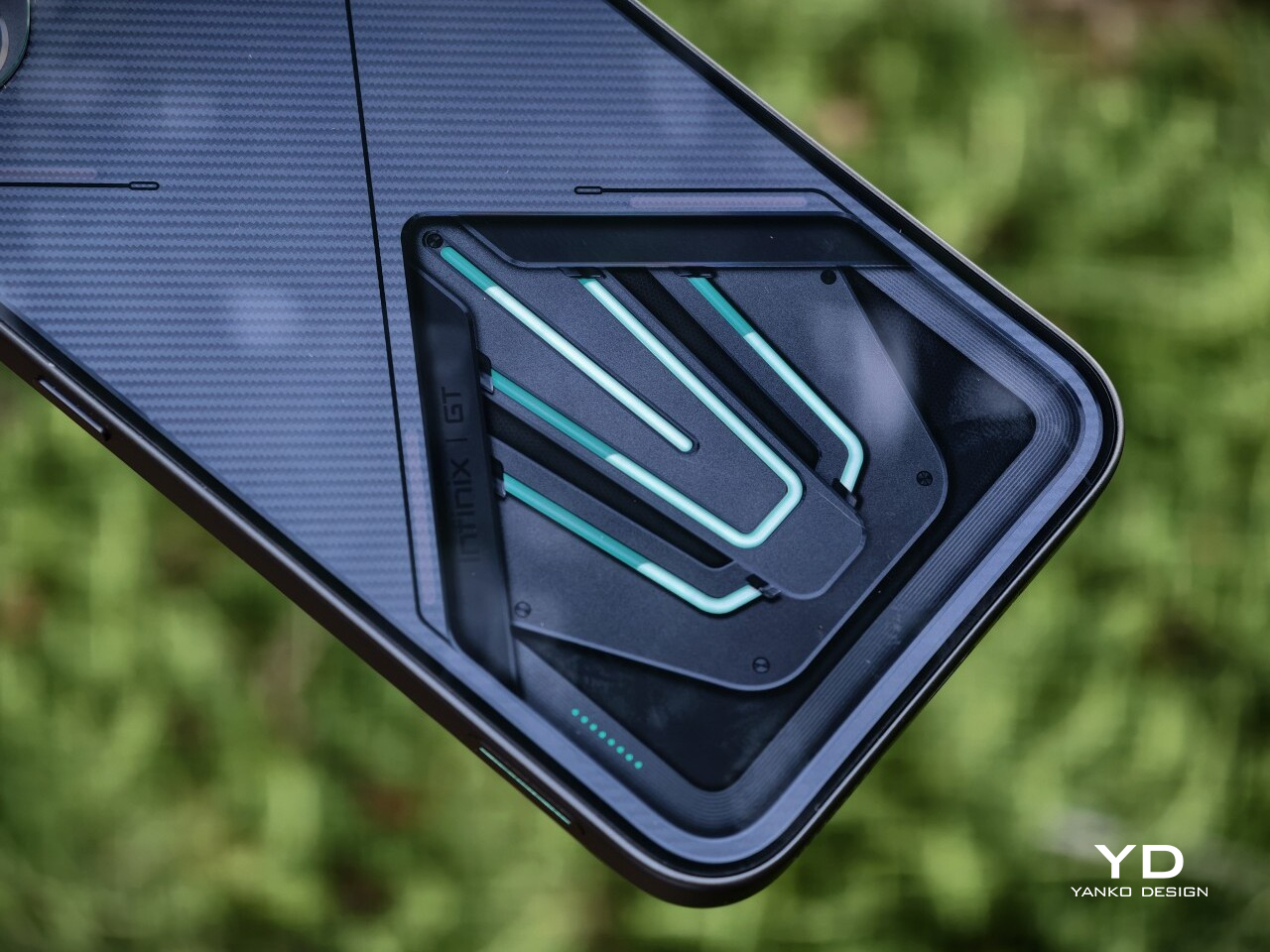
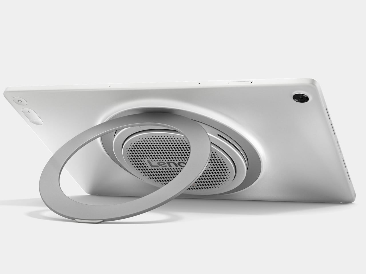
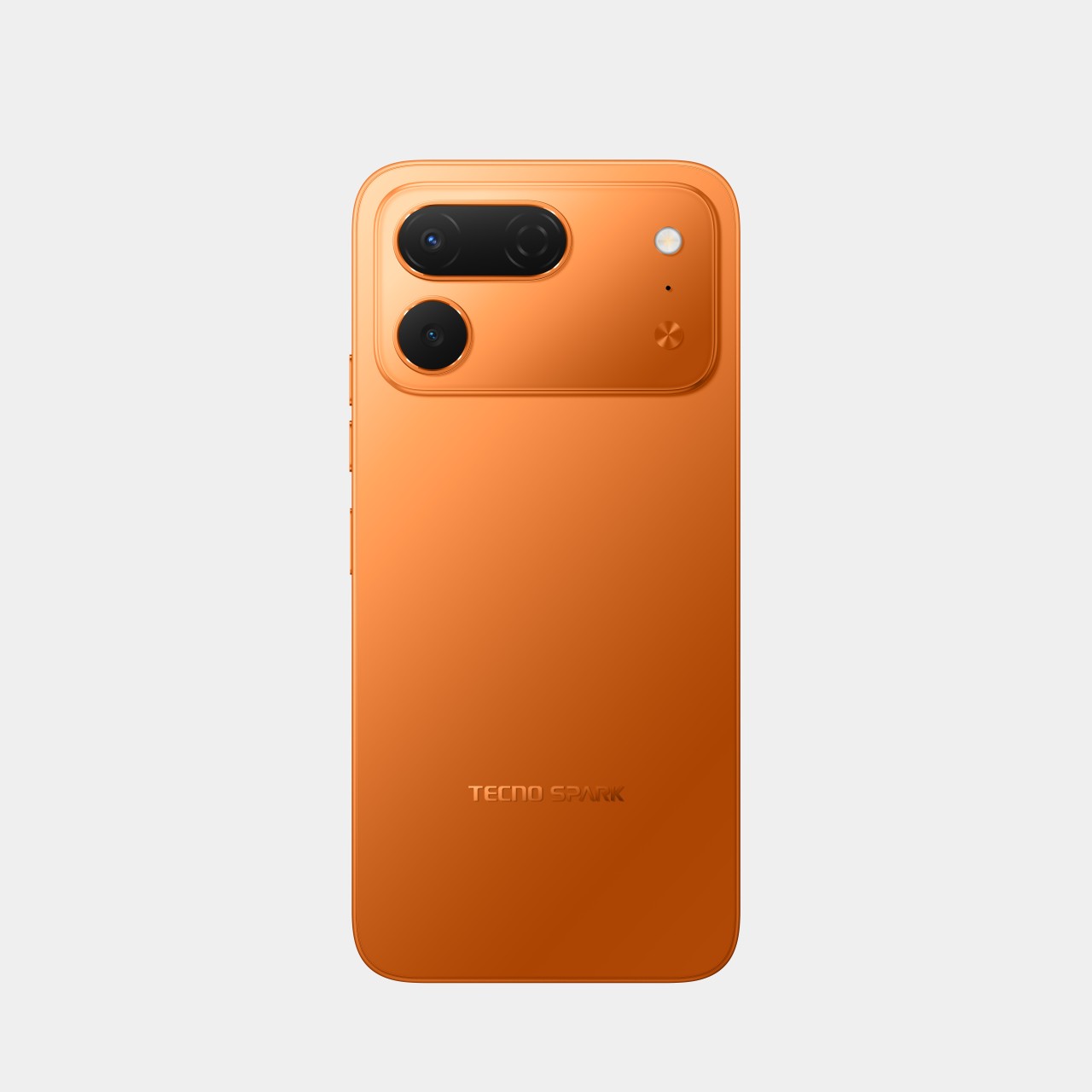
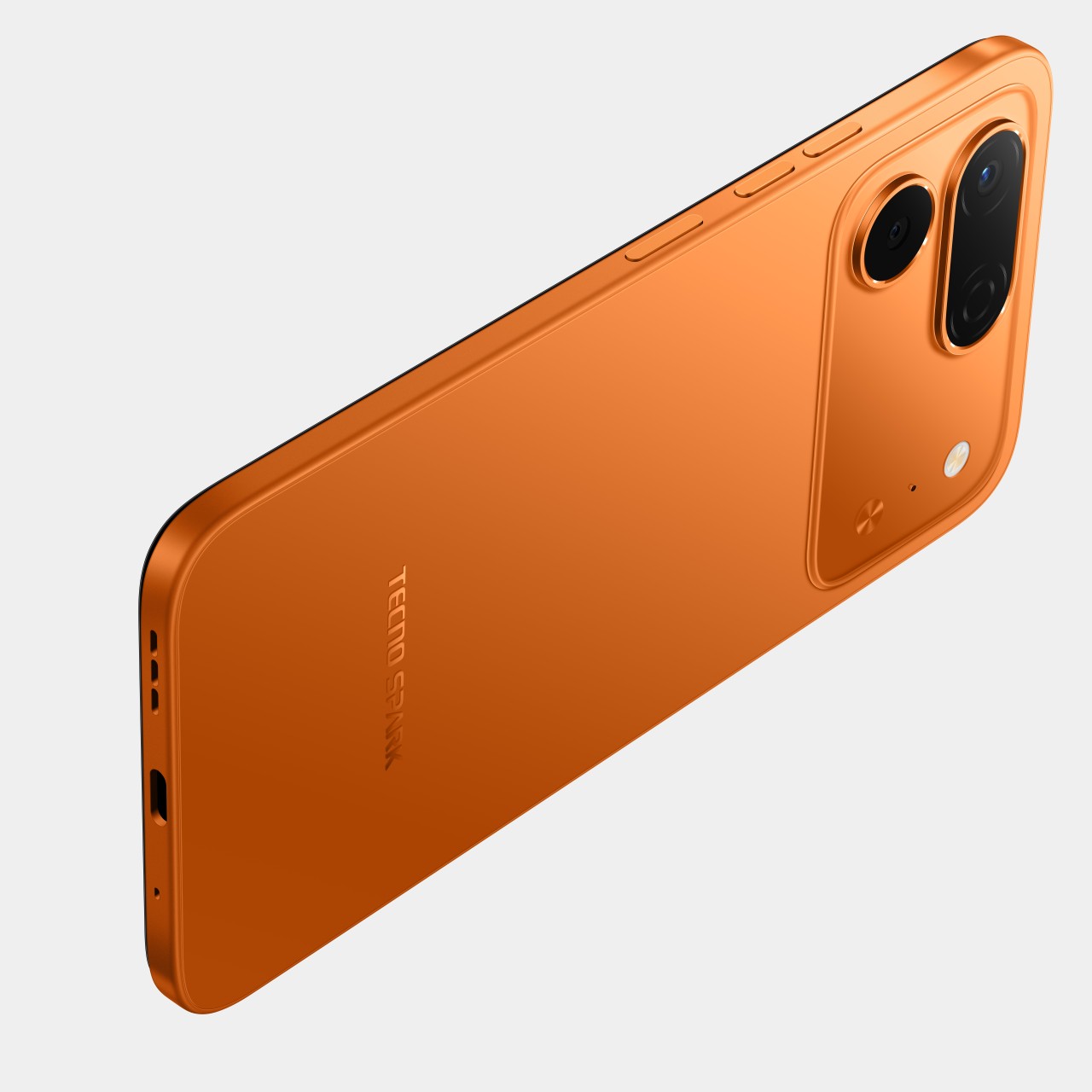
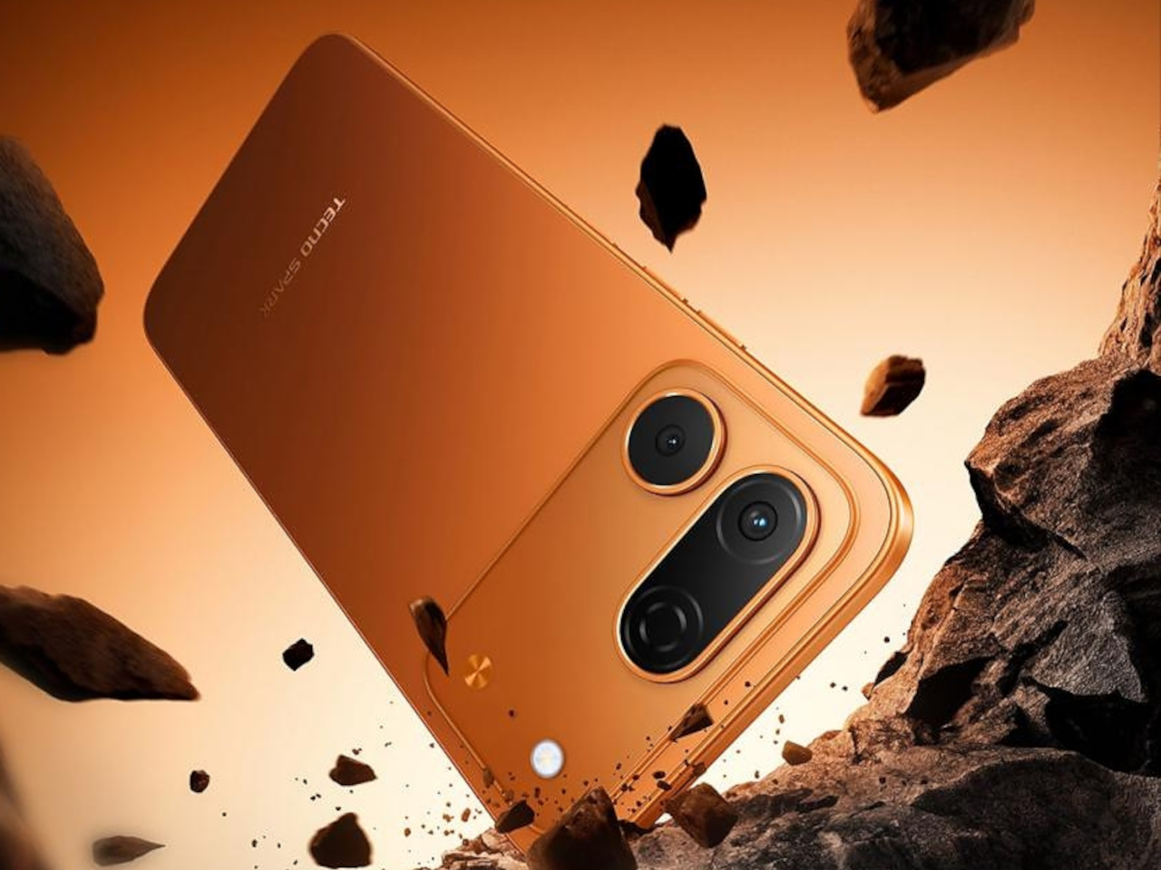
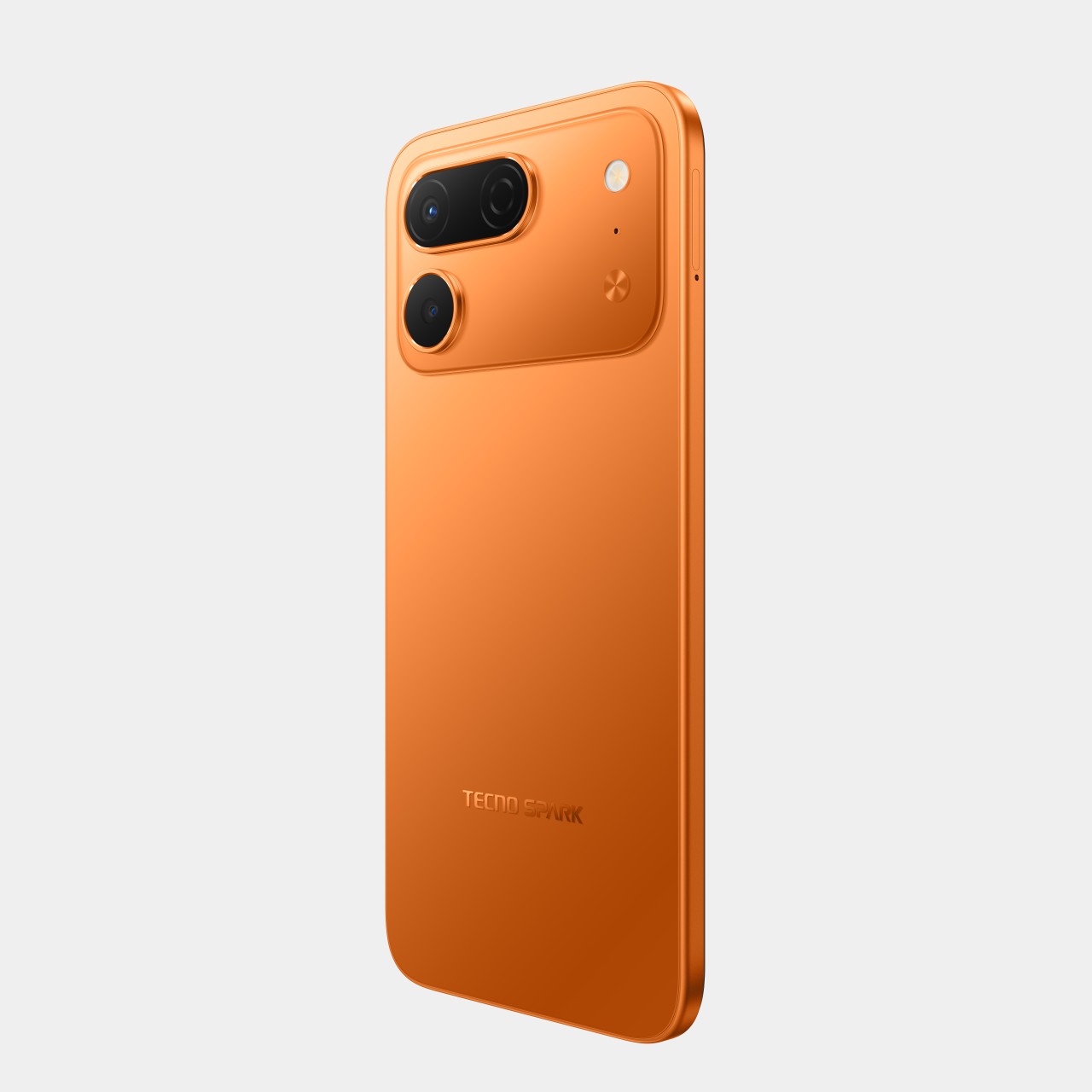
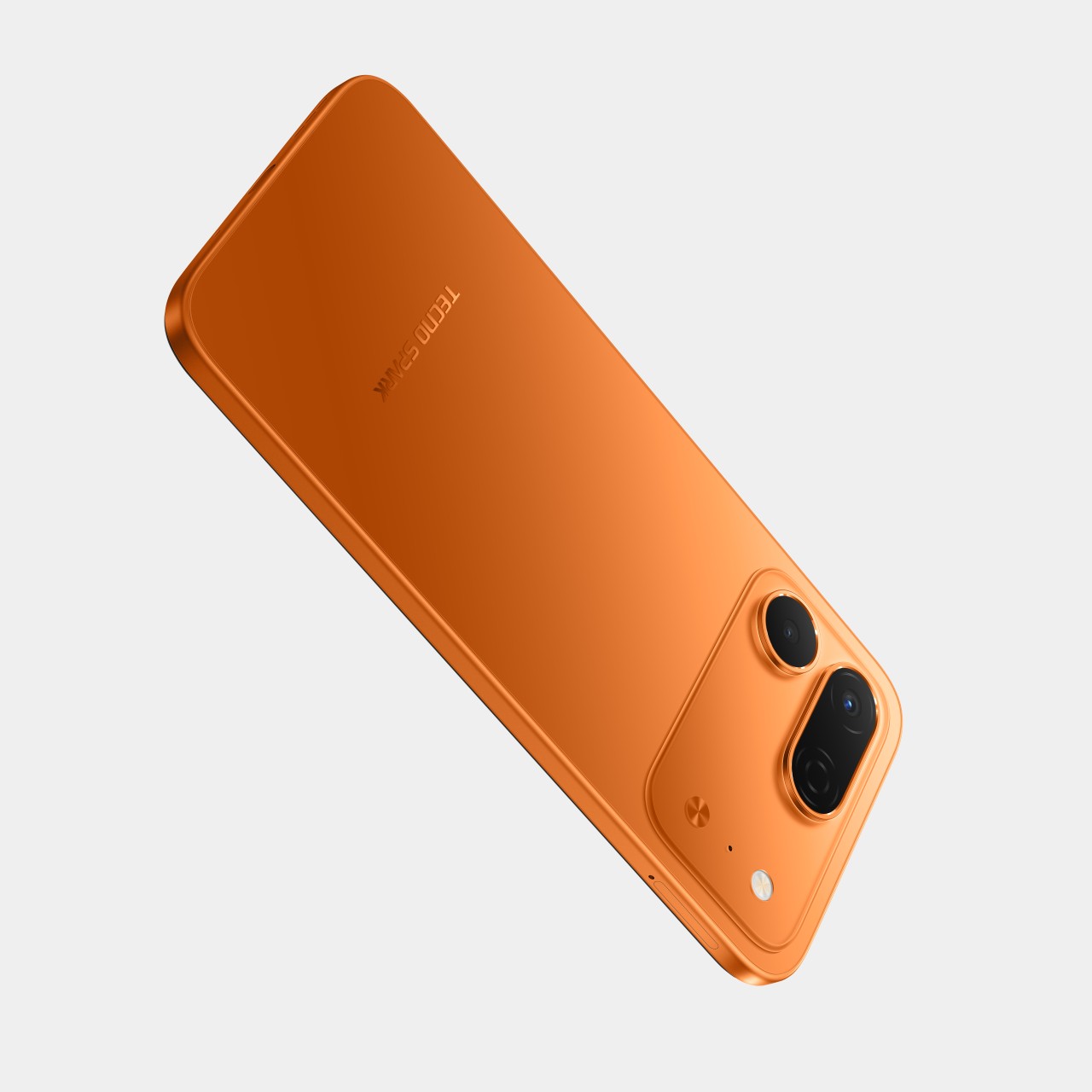
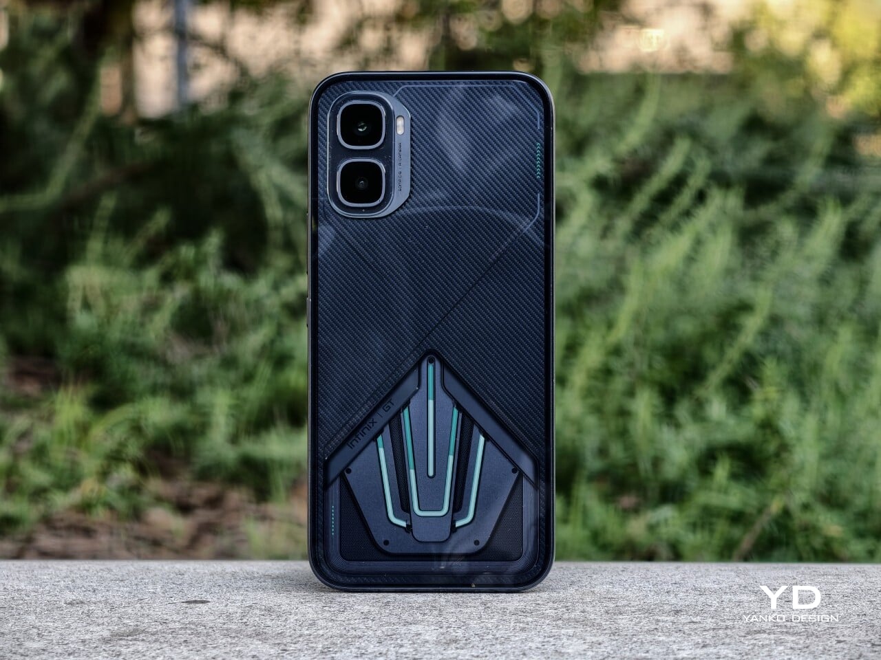
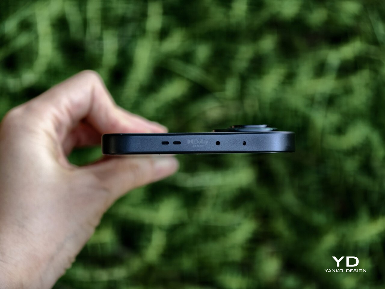
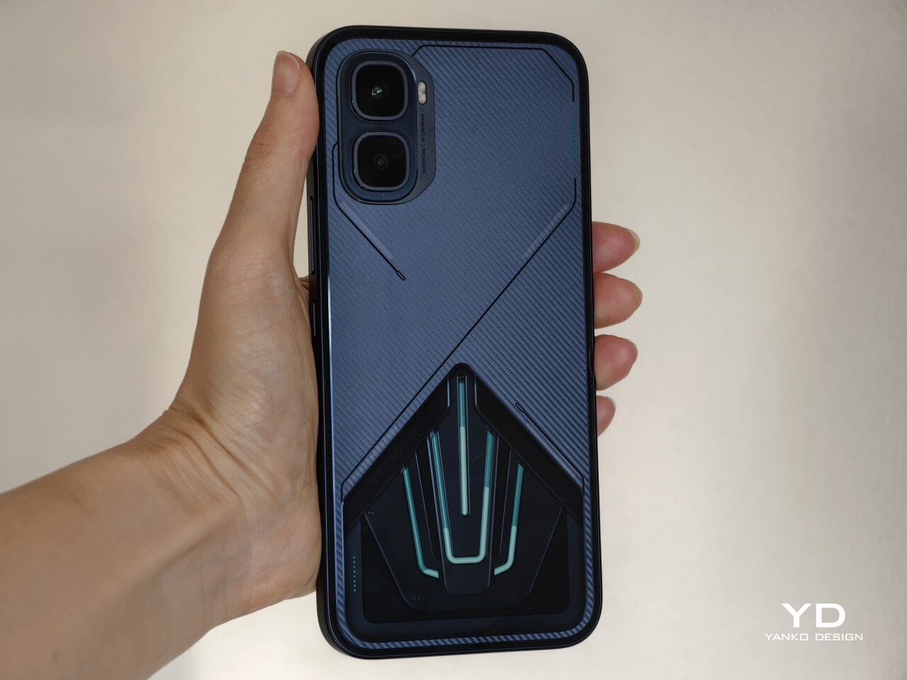
Flip the phone over, and there is no mistaking what it is. The rear panel embraces an aerodynamic, almost mechanical aesthetic, combining angular detailing, a carbon-fiber-like pattern, customizable LED accents, and a transparent section that showcases the liquid-cooling system underneath. There is a lot happening visually, but it feels controlled. Rather than coming across as excessive, the design feels cohesive and deliberately built around the phone’s gaming-first identity.
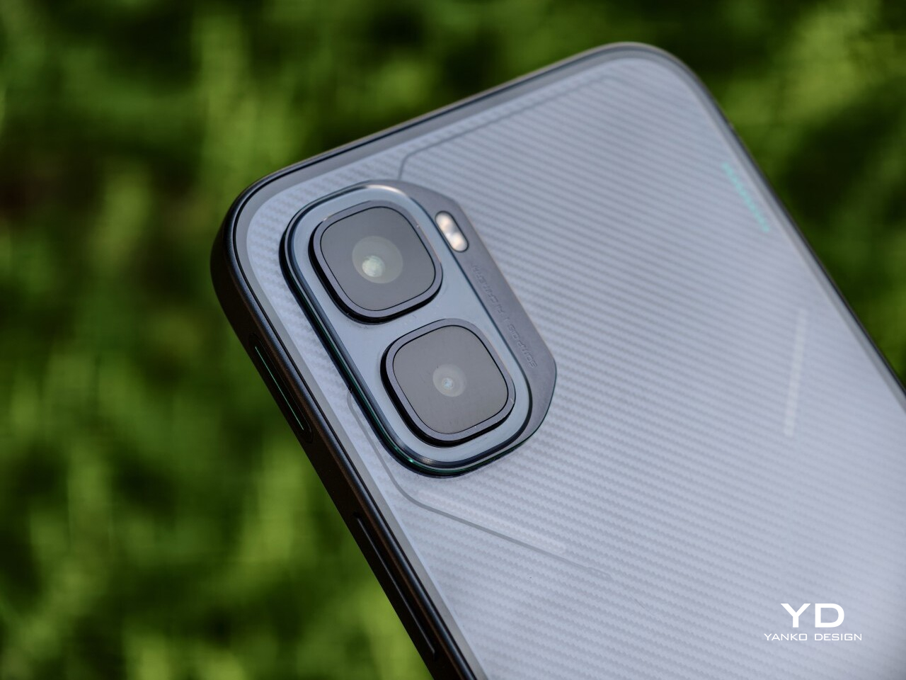
The camera module follows the same approach. Its two rear cameras are placed on a raised platform in the top-left corner, with each lens individually framed within a square border. It certainly adds to the industrial, structured look of the back, though I have never been particularly fond of this kind of layout since the separate frames tend to collect dust more easily and make the area slightly more annoying to wipe clean.
There are three color options, and each one changes the mood of the design. Black Abyss unit I received, paired with green liquid-cooling accents, looks the most understated while still retaining that gaming edge. Silver Glacier, with blue liquid cooling, comes across as the most futuristic of the lot. Red Blaze is easily the boldest finish here, and it is the variant for those who want the GT 50 Pro to attract attention instantly.
What ultimately stands out is the restraint behind the boldness. The GT 50 Pro is distinctive enough to feel special, but it never crosses into the kind of excess that would make it awkward to use in everyday life. More than anything, it feels like a more refined and self-assured evolution of the GT design language rather than a dramatic reset.
Ergonomics
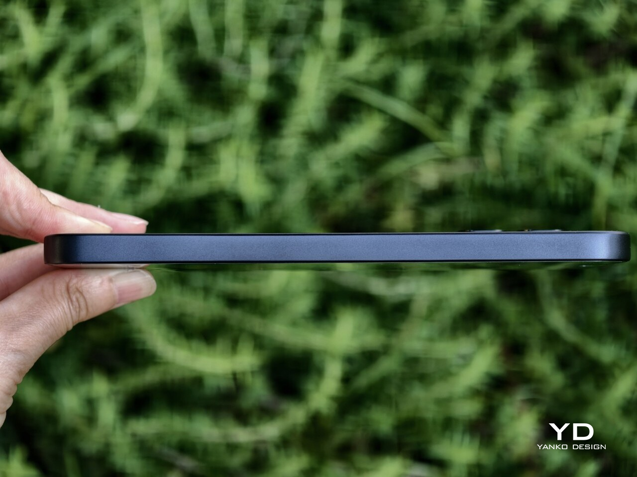
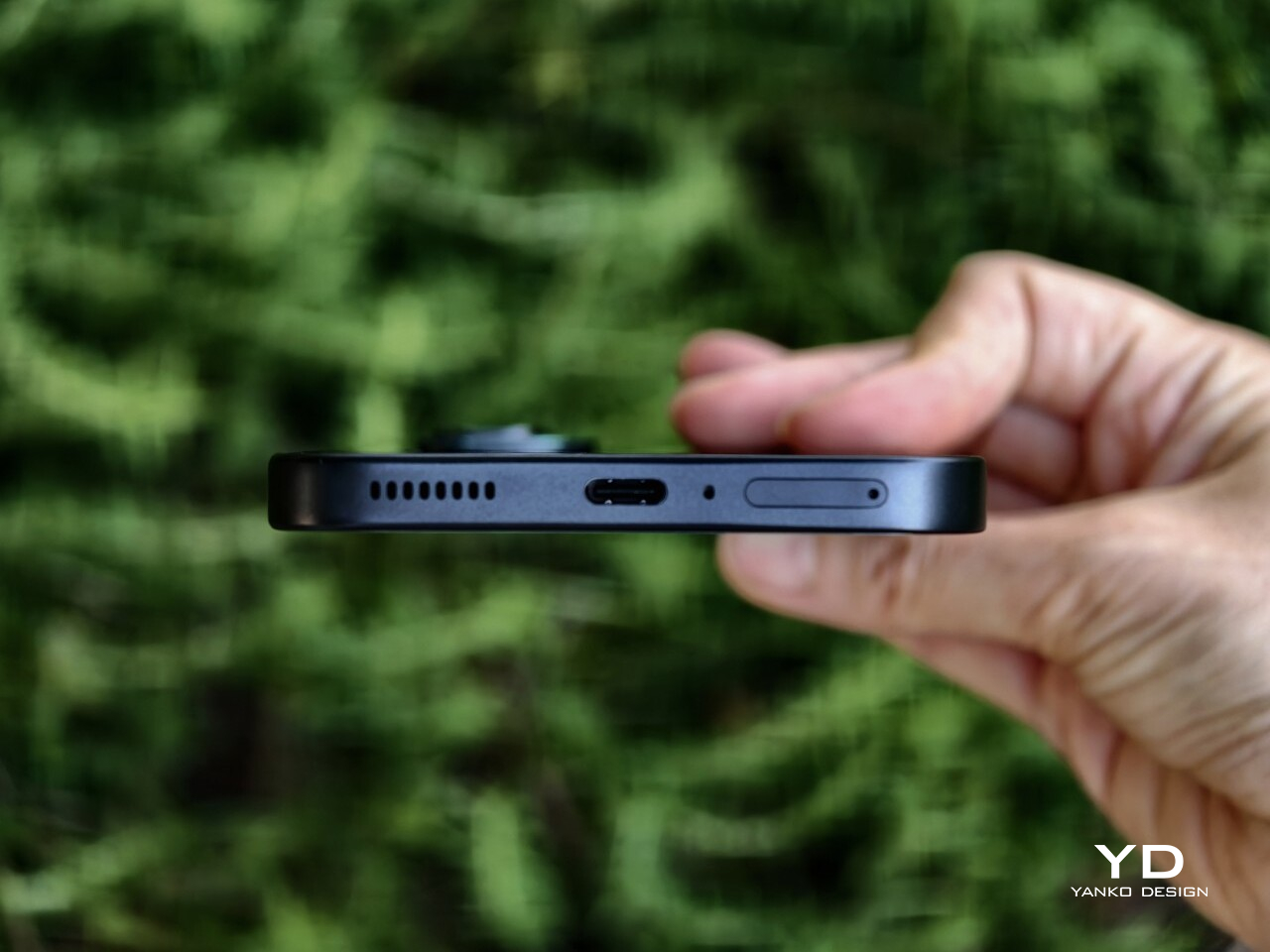
For a phone that leans this heavily into gaming aesthetics, the Infinix GT 50 Pro is surprisingly manageable in the hand. It measures 162.44 x 72.33 x 8.15 mm and weighs 198g, which firmly places it in large-phone territory, but it never feels unnecessarily bulky or awkward. The proportions are well judged, and the phone carries its size with more balance than the numbers might suggest.
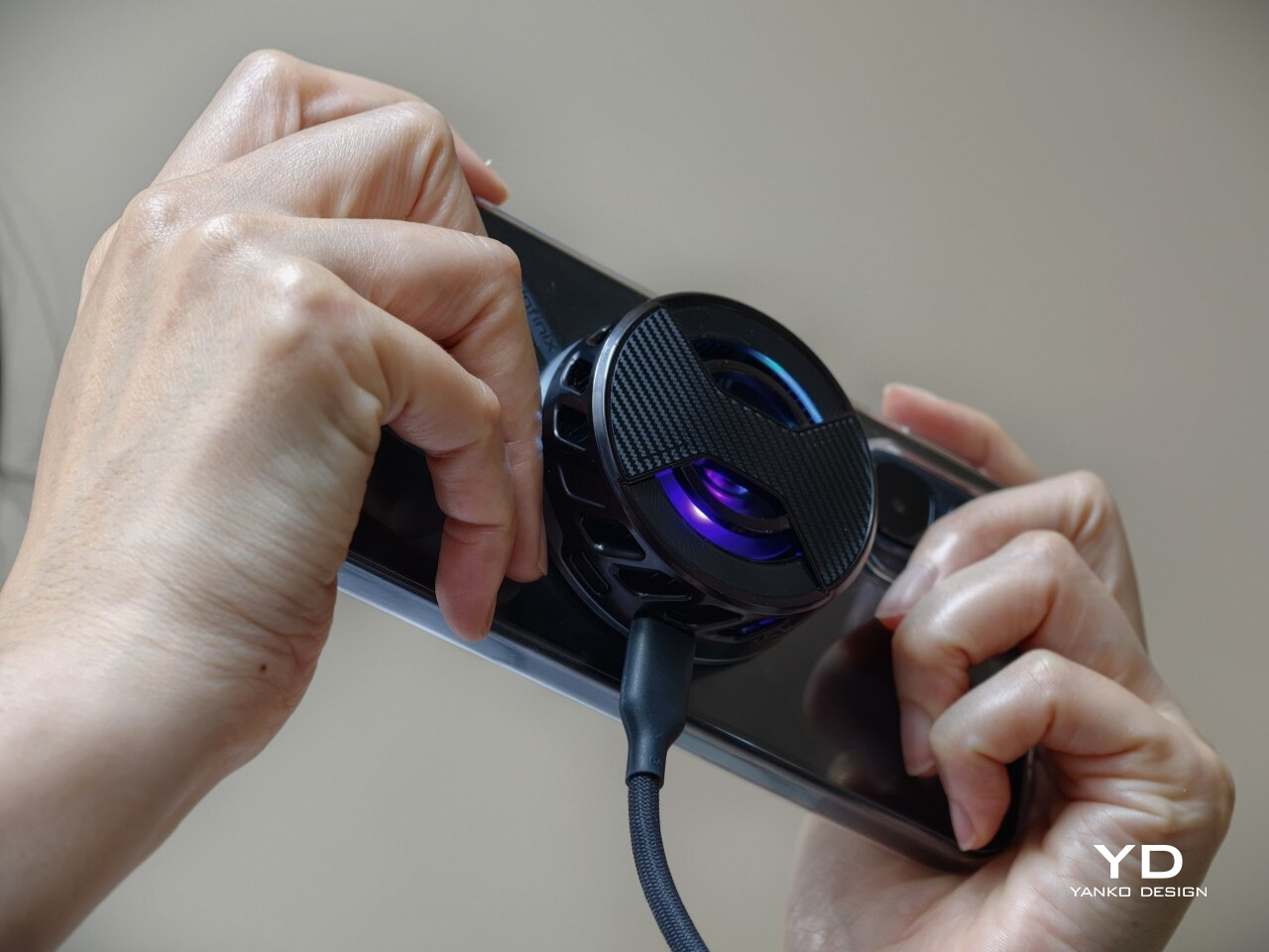
The flat sides do help with grip, especially during gaming or extended video sessions where a more secure hold matters. Paired with the glossy back, the GT 50 Pro still feels steady in the hand rather than overly slippery. The rear panel does pick up fingerprints quite easily, but thanks to the carbon-fiber-like pattern and the liquid-cooling visuals underneath, smudges are less obvious than they would be on a plain glossy surface. The included case, on the other hand, feels quite plasticky, though you will likely want to use it anyway if you plan on attaching the bundled MagCharge cooler, which I will get to later.
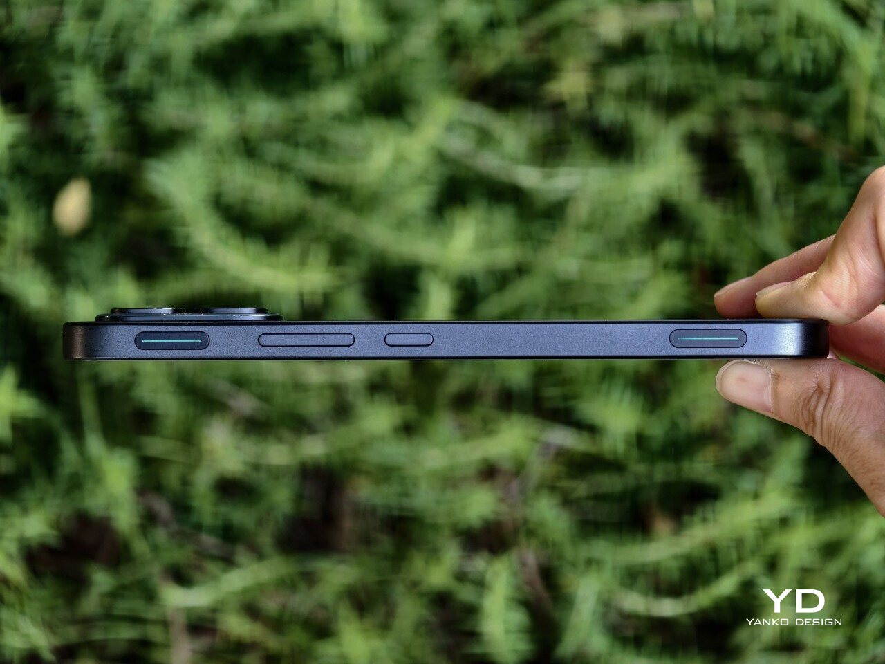
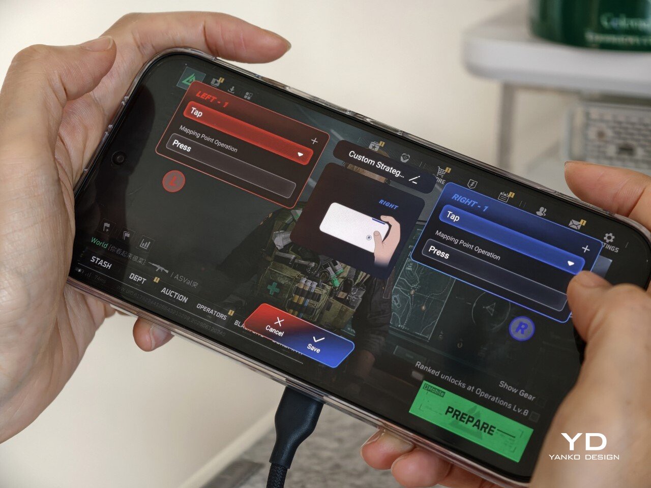
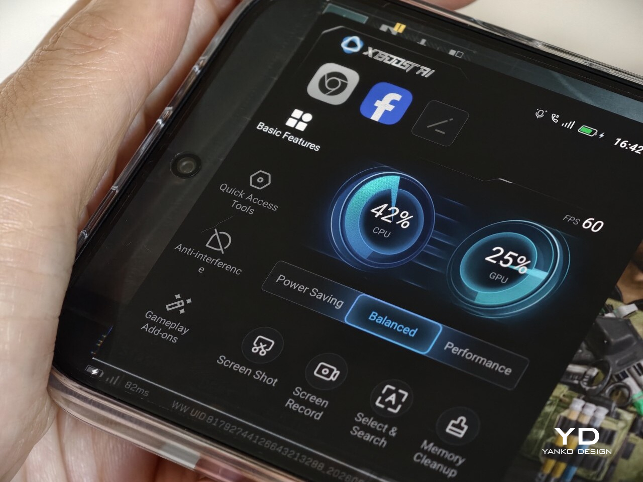
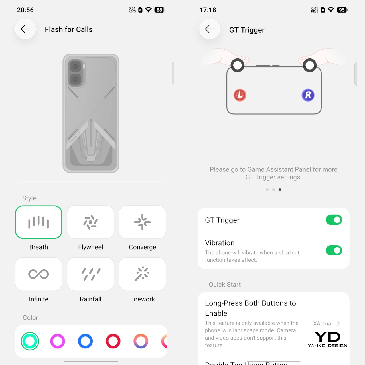
One of the more distinctive ergonomic features here is the pair of GT triggers. These customizable pressure-sensitive triggers add something genuinely useful to the physical experience of the phone, especially for gaming. In supported games, they can make actions like aiming, firing, or switching controls feel quicker and more tactile than relying entirely on the touchscreen. Even outside gaming, the fact that they are customizable gives them some practical value and keeps them from feeling like a one-note gimmick.
The rest of the layout is otherwise fairly standard. The power button and volume rocker are easy enough to reach, but the fingerprint sensor sits a bit too close to the bottom edge for comfort. It works quickly, but it is not the most natural placement. Overall, the GT 50 Pro feels built more around grip, control, and gaming comfort than one-handed ease, and that feels entirely appropriate for what it is.
Performance
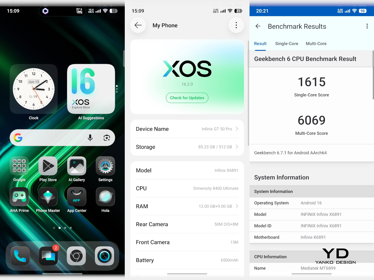
The Infinix GT 50 Pro is powered by the MediaTek Dimensity 8400 Ultimate, paired with 12GB of RAM and either 256GB or 512GB of storage. On paper alone, that already puts it in a very comfortable position for a phone in this segment. In day-to-day use, the experience lives up to that promise. Animations are smooth, apps open quickly, and there is enough headroom here that the phone rarely feels like it is under any real strain, even when several things are happening at once.
Gaming is where the hardware starts to make the most sense. The GT 50 Pro handles demanding titles with the kind of confidence you would expect from a device built around this purpose. Frame rates feel stable, touch response is quick, and the GT triggers add a layer of physical control that makes certain games feel more intuitive than they do on a standard touchscreen-only phone. It is not just about having enough power to run games well. It is also about making the whole experience feel more deliberate and more enjoyable.
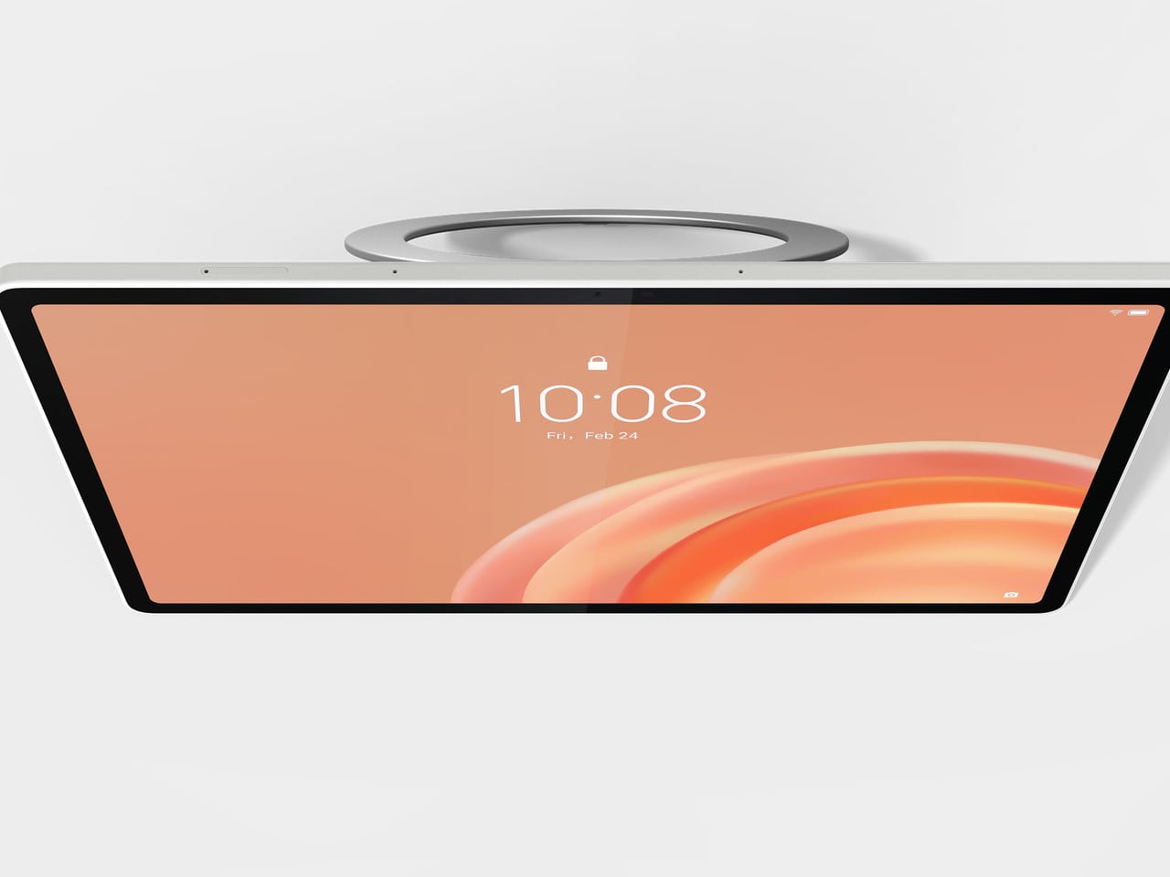
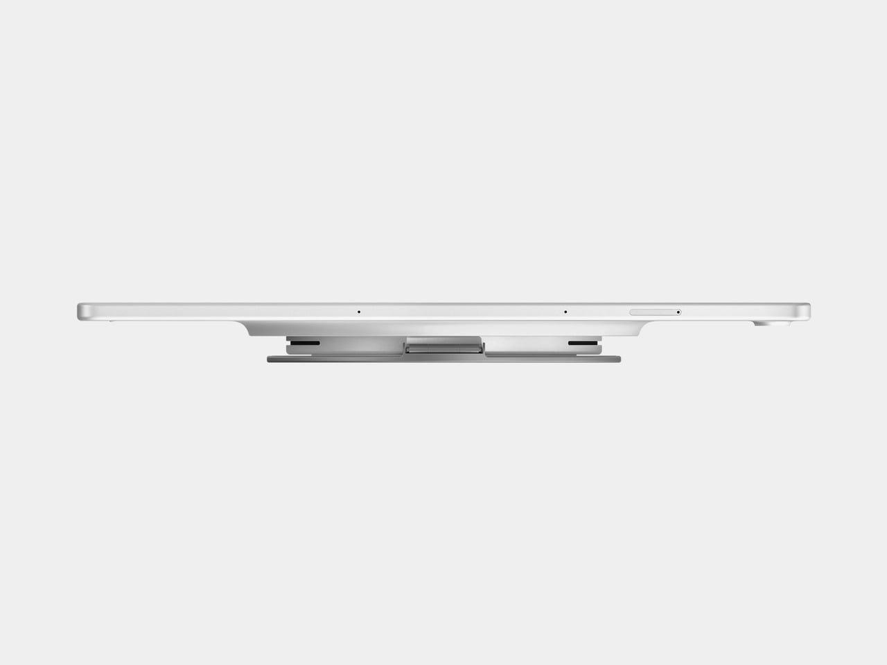
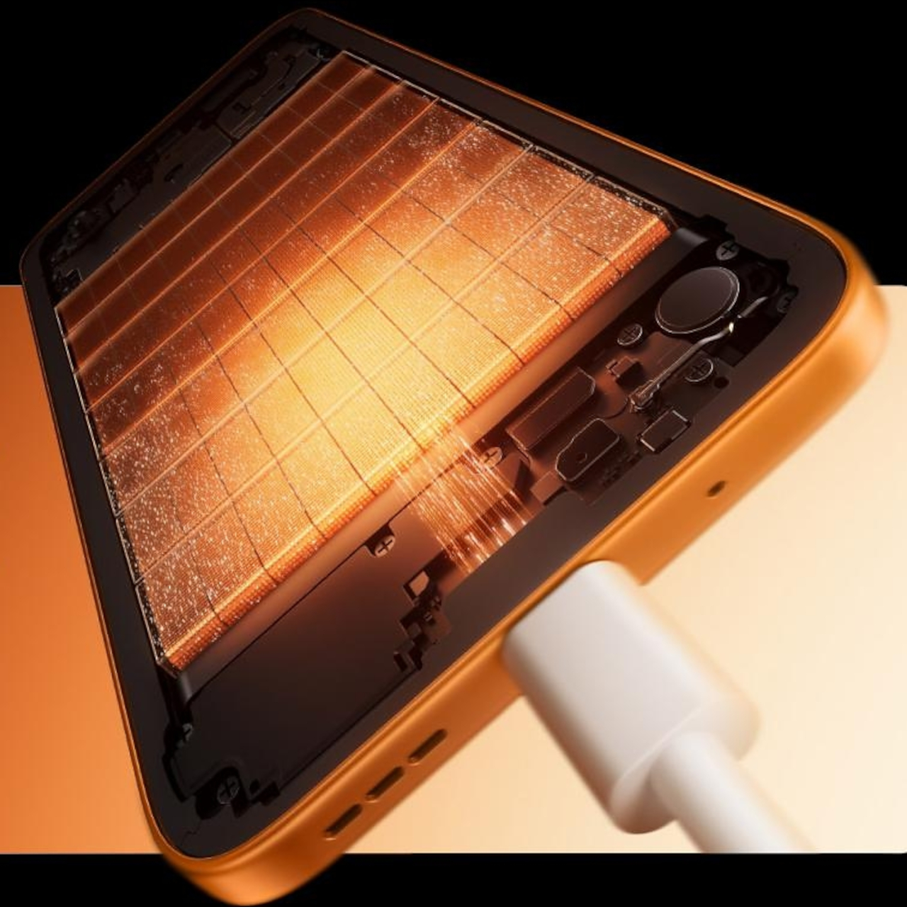
The bundled MagCharge cooler is part of the experience, too. Not everyone will need it all the time, but it does make the GT 50 Pro feel more complete as a gaming device. In my use, an hour of playing Delta Force at the highest settings kept the phone below 40 degrees Celsius, which is a reassuring result for extended sessions. It also works as a wireless charger while attached, so you can game for longer without having to put up with a cable jutting awkwardly out of the phone. The built-in lighting effects are a nice touch as well, and they fit neatly with the rest of the GT 50 Pro’s gaming-focused identity.

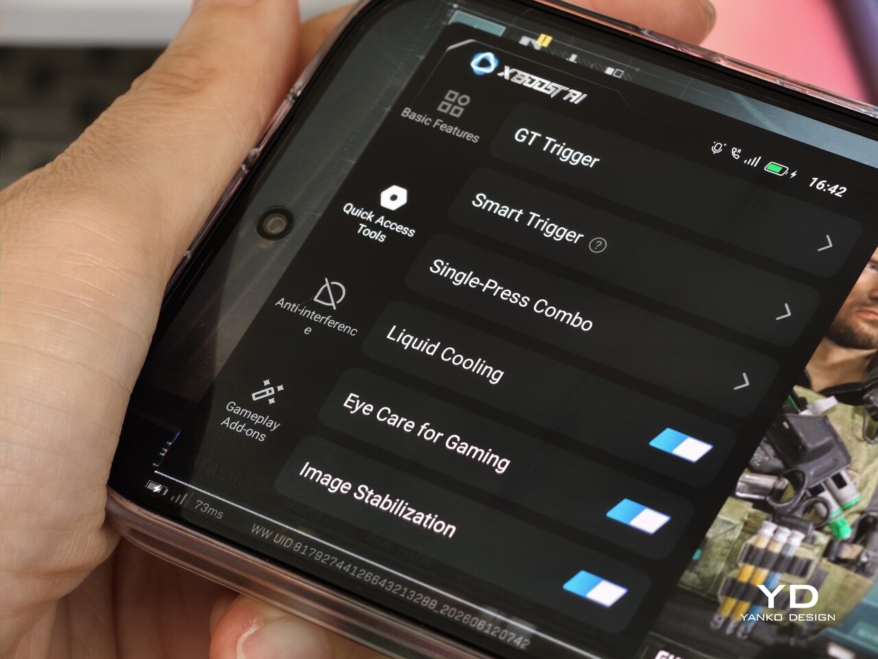
Software plays a major role in shaping that experience too. Running XOS 16 based on Android 16, the GT 50 Pro offers a wide range of gaming-focused features that fit the phone’s identity well. There is also a growing library of AI tools built into the system, though their usefulness will vary depending on how much you actually rely on those features in daily use.
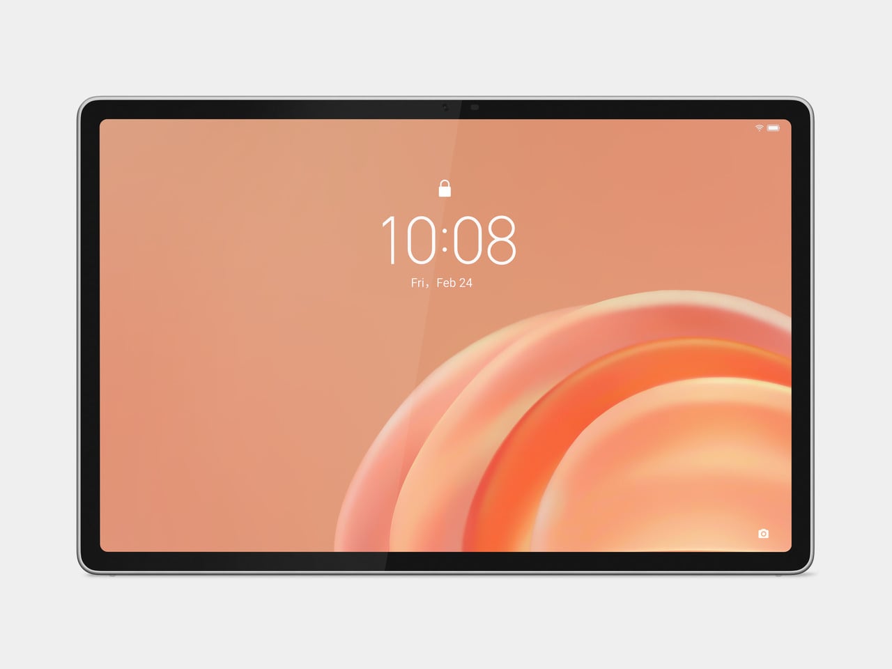
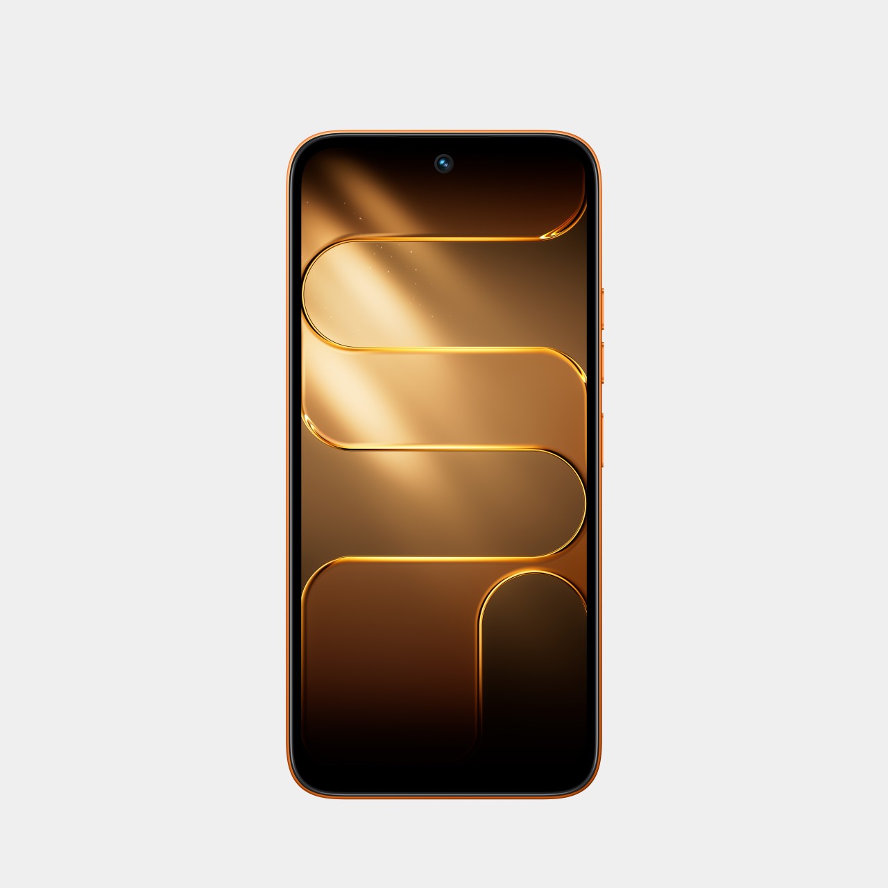
The GT 50 Pro features a 6.78-inch AMOLED panel with a 1.5K resolution and a 144Hz refresh rate, and it is one of the phone’s biggest strengths. Everything looks sharp, motion is fluid, and the high refresh rate makes a difference not just in games but also in everyday scrolling and navigation. With a claimed peak brightness of 4,500 nits and 1,600 nits in high brightness mode, the screen is generally easy to see even under harsh sunlight. That said, I did run into a few moments where automatic brightness felt a little too conservative, leaving the display dimmer than expected until I adjusted it manually.
The audio experience is less convincing. The stereo speakers are decent enough for casual use, but they do not leave much of an impression. At times, some sounds come across as slightly muffled, which takes away a bit from the otherwise immersive gaming and media experience. It is not a deal-breaker, but it is one area where the phone feels less polished than its display.

Ultra-wide, 0.6x

Main, 1x

Main, 2x
The camera system on the Infinix GT 50 Pro is more practical than ambitious, which feels fitting for a phone like this. You get a 50MP main camera with OIS, an 8MP ultrawide, and a 13MP front camera. The main camera does most of the heavy lifting, and in good lighting, it is capable of producing sharp, pleasing shots for everyday use.

Main, 1x

Main, 2x
Up to 2x zoom, image quality remains decent, but beyond that, the limitations become more obvious. The phone can go as far as 15x, though that upper range feels more like a bonus than something genuinely useful. Color processing also tends to lean warm and vibrant, which gives photos a lively look even if they are not always the most natural.

Main, 1x

Main, 2x
Battery life is another area where the GT 50 Pro benefits from its gaming-first priorities. Depending on the market, the phone comes with either a 6,150mAh or 6,500mAh battery, and either way, that is a generous capacity by current standards. The unit I received came with the 6,500mAh battery, and its endurance is impressive, easily lasting a full day even with a couple of hours of gaming mixed in. Charging support is also solid, with 45W wired charging and 30W wireless charging adding a welcome layer of convenience.
Sustainability
Sustainability is not always the first thing people look for in a gaming-focused phone, but it still matters, especially for a device that is likely to be used heavily over time. With the Infinix GT 50 Pro, the discussion is less about environmental branding and more about durability and software longevity. Those may not be the most exciting parts of the package, but they are often the ones that shape the ownership experience in the long run.
On the hardware side, the GT 50 Pro uses Corning Gorilla Glass 7i for added screen protection and carries an IP64 rating for dust and splash resistance. That does not make it a rugged device, and it is still worth being cautious around water since the protection is limited to splashes rather than full immersion. Even so, these are useful safeguards for a phone that is likely to be handled often and used intensively.
Software support strengthens the picture further. Infinix promises three years of Android OS version updates and five years of security patches, which may not lead the class but still counts as a meaningful commitment at this level. It gives the GT 50 Pro a better shot at remaining secure, relevant, and worth holding onto for longer.
Value
Value is where the Infinix GT 50 Pro still holds up well, but it is also where the conversation gets a little more complicated. In the Philippines, the 12GB + 256GB variant is priced at PHP 25,999, or roughly USD 427, while the 12GB + 512GB version comes in at PHP 29,999, or about USD 493. That is a noticeable jump from the GT 30 Pro, whose 12GB + 256GB version launched at PHP 19,999, or roughly USD 328.
To be fair, the GT 50 Pro still offers a lot for the money. You are getting a Dimensity 8400 Ultimate chip, a 144Hz AMOLED display, GT triggers, a bundled MagCharge cooler, and a large battery, which makes it a well-equipped gaming phone at this price. The challenge is that the improvements over its predecessor feel more incremental than transformative, and it now enters a market with tougher competition. So while the pricing is still reasonable, the GT 50 Pro may not feel quite as disruptive as the GT line once did.
Verdict
The Infinix GT 50 Pro is a capable gaming phone with a clear identity. It offers strong performance, a sharp and fluid display, useful gaming features, and dependable battery life, all wrapped in a design that feels distinctive without becoming impractical.
Its compromises are fairly clear, too. The camera system is decent rather than exceptional, the speakers could be better, and the higher price means it no longer feels quite as disruptive as earlier GT models did. Even so, if your priorities are gaming, display quality, and overall performance, the GT 50 Pro remains a compelling option in its class.
The post Infinix GT 50 Pro Review: Gaming Greatness With a Catch first appeared on Yanko Design.