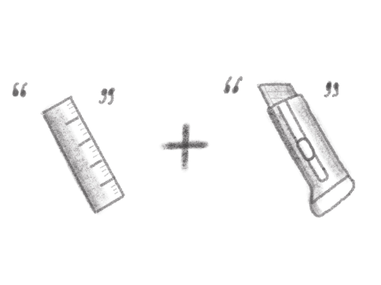
Cutting a straight line should be simple, but for anyone who’s ever measured, marked, and sliced the same piece of foam board or cardboard over and over, the process is anything but straightforward or efficient in practice. The classic “measure twice, cut once” mantra is great advice until you’re making dozens of identical cuts for a project, and the ruler starts to feel like a bottleneck slowing down your entire workflow and creative process.
The BLADEE box cutter concept is a rethink of the humble utility knife designed for modern makers and professionals. By building measurement and precision into the tool itself through integrated mechanics and a dial system, it promises to make repeatable, accurate cuts faster and easier throughout your day without external measuring tools. No ruler needed, no marking required, and no guesswork involved when you’re deep into production work.
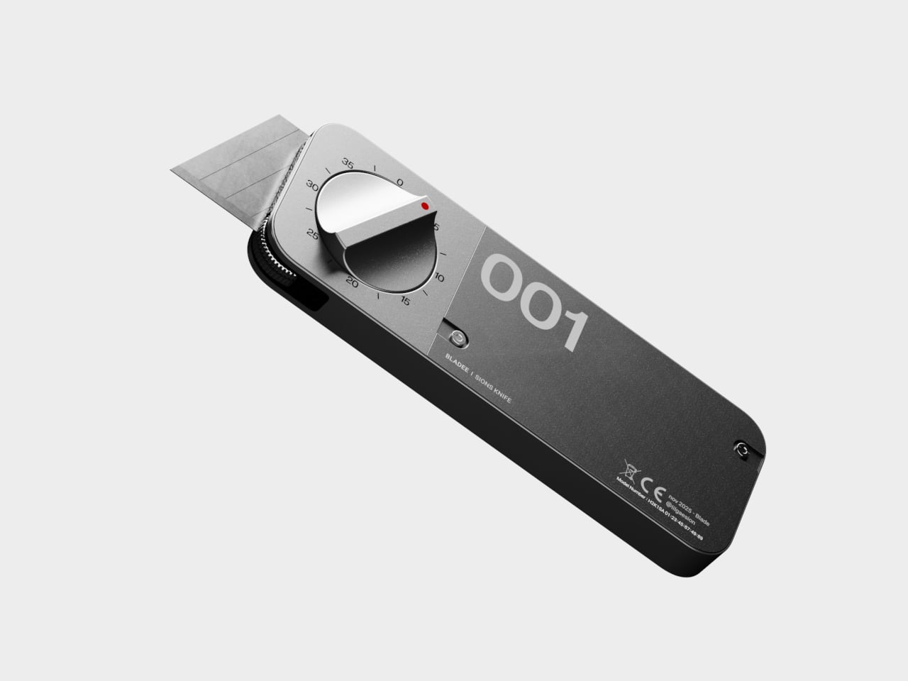
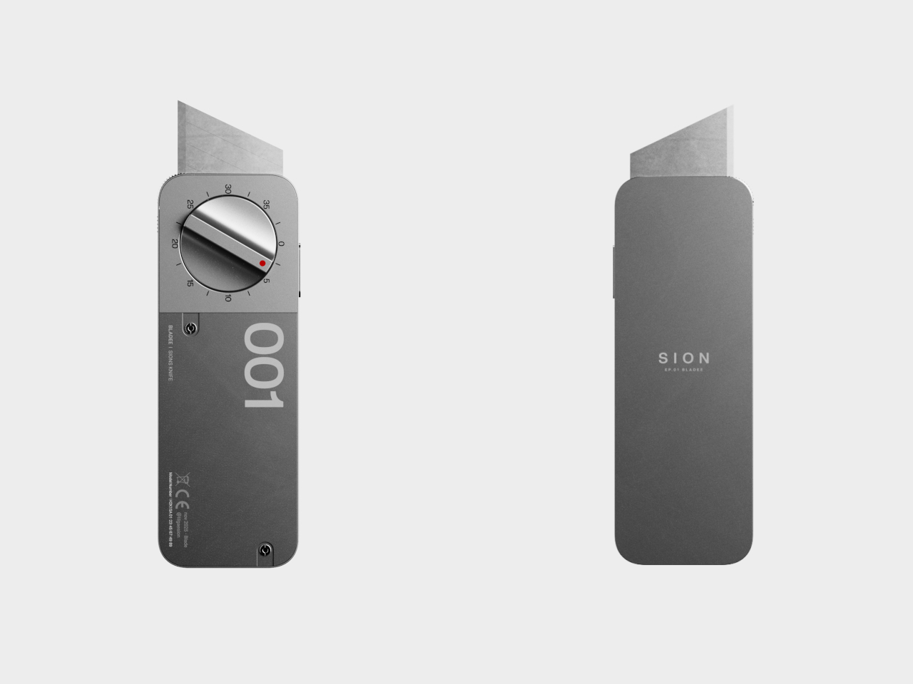
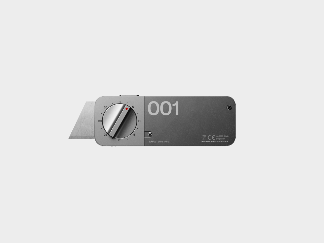
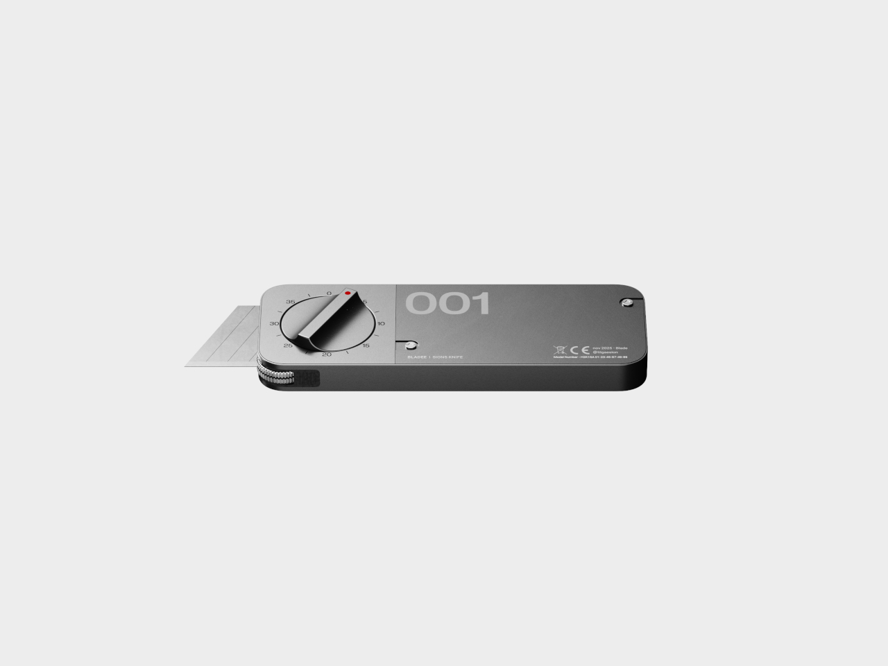
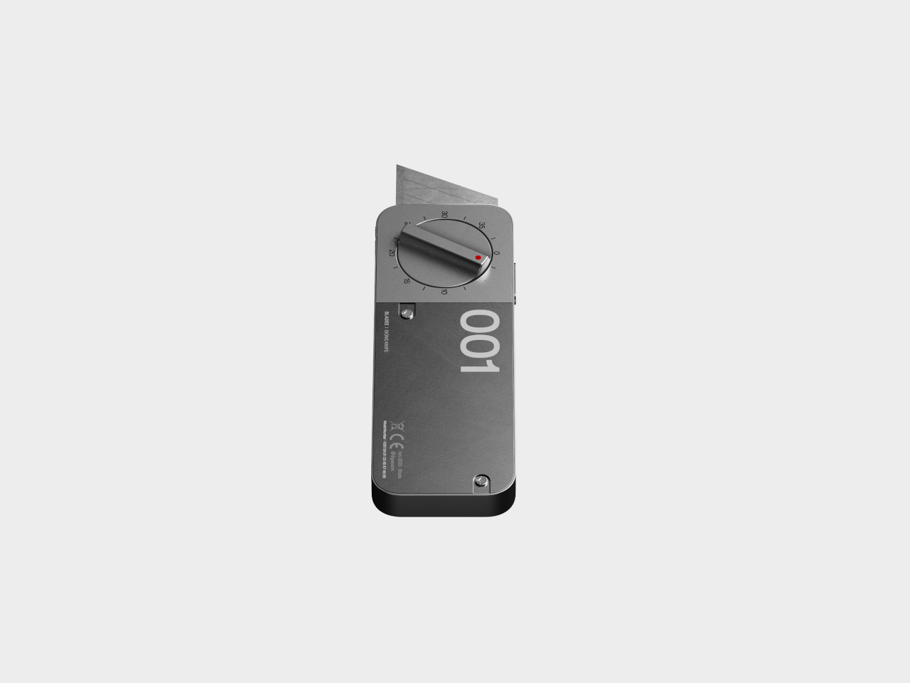
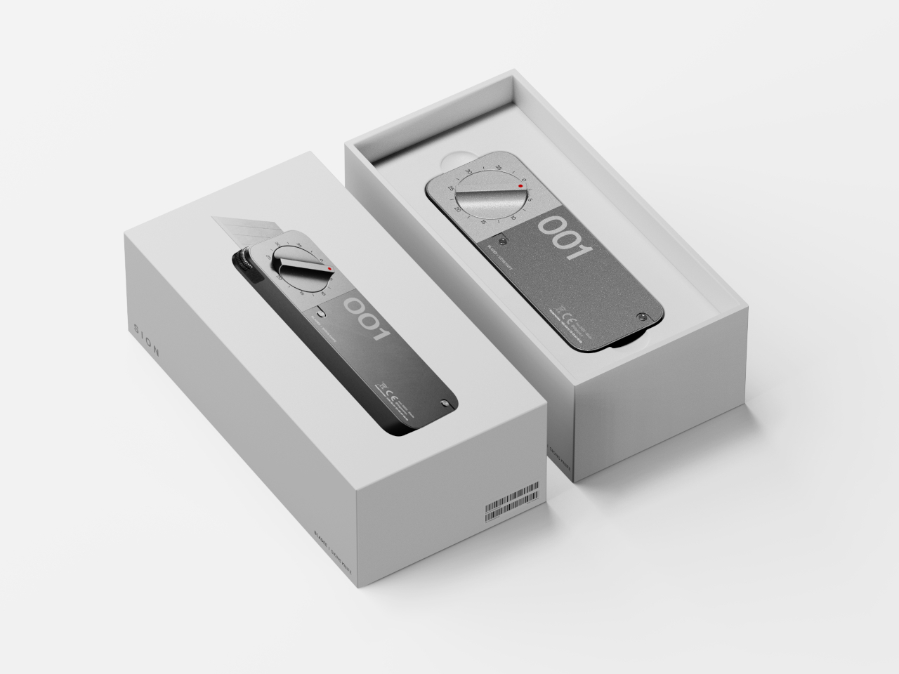
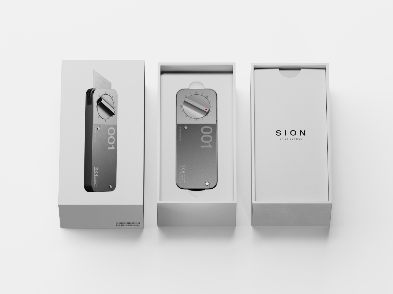
BLADEE’s minimalist, phone-sized body is all about clean lines, matte metal finishes, and a prominent dial that dominates the top surface for immediate visibility and control. The numbered dial lets you set your target cut length from 0 to 35 units, while a lower measurement wheel tracks your progress in real time as you slice through materials. As you approach the preset length, the blade gradually retracts automatically.
The blade always extends a fixed stroke for initial penetration, then withdraws at the set point to ensure every cut finishes smoothly and precisely at the same spot every time. The auto-lock at zero prevents accidental activation during transport or storage, and the dial only works when you press the side button for additional safety during use. This dual-safety system protects both the user and nearby materials.
The real magic is how BLADEE changes the workflow entirely for professional and hobbyist makers alike. No more juggling rulers, pencils, and knives across your workspace while trying to maintain precision and accuracy. Just set the dial to your desired measurement, cut with confidence, and repeat as many times as needed. Whether you’re prototyping packaging designs, building architectural scale models, or crafting at home, the tool eliminates tedious marking.
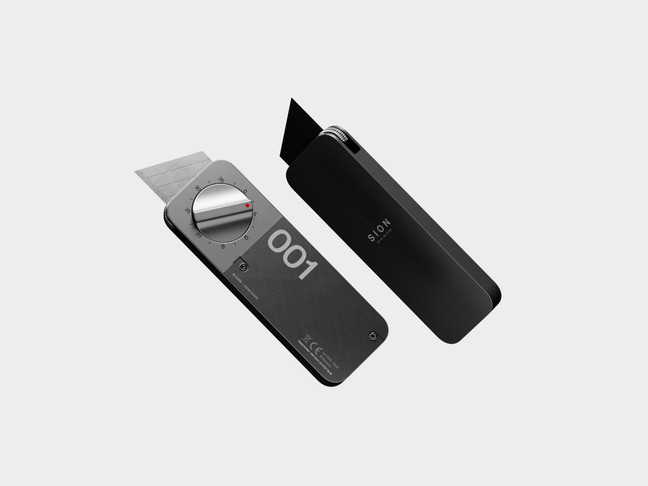
The right-hand cover is modular and swappable, letting you change colors, finishes, or even add project numbers or initials for organization and personalization. The measurement wheel rolls alongside the blade during cutting, counting travel with each pass and engaging the internal linkage for smooth, automatic retraction at the endpoint. This prevents over-cutting while reducing the risk of slips and accidents at the vulnerable end of each cut.
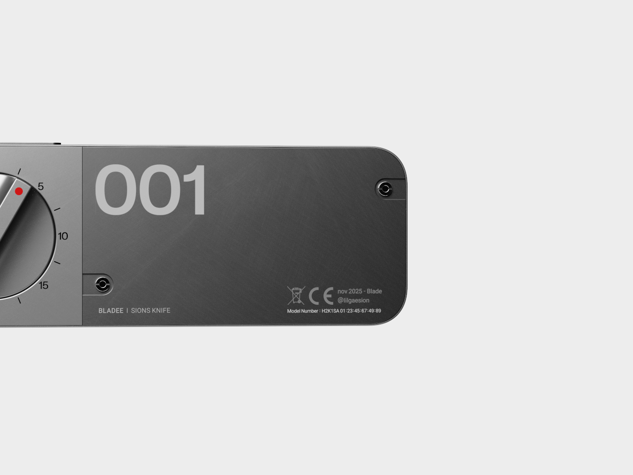
The robust metal construction, bold “001” graphics, and red pointer indicator give BLADEE a premium, professional feel that makes it as satisfying to use as it is to display prominently. For anyone who values accuracy and efficiency in their creative work, this concept offers a compelling reminder that even the most ordinary, everyday tools can be reimagined for modern workflows and contemporary creative needs when designers prioritize user experience and workflow efficiency.
Most mice and trackballs try to do it all with extra buttons, flashy RGB lights, and complicated software that requires constant updates and configuration tweaks through bloated apps. But sometimes simplicity wins when you just need precise control and reliability without the extras. For anyone who values portability and the freedom to tinker with their gear, finding the right pointing device can be a challenge in a market flooded with gaming-focused options.
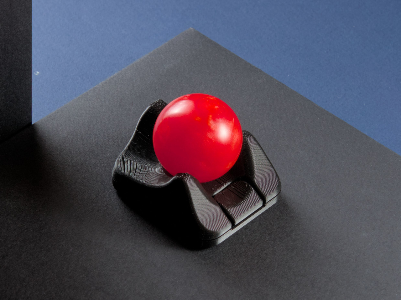
The Ploopy Nano 2 trackball is a refreshing alternative that strips away the unnecessary extras and focuses on what matters. It’s ultra-compact, open-source, and designed specifically for customization by users who want complete control over their tools. Priced at $59.99 CAD, about $43 USD, it’s made for makers, coders, and anyone who wants a mouse that fits their workflow perfectly without forcing adaptation to preset configurations.
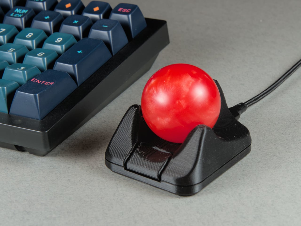
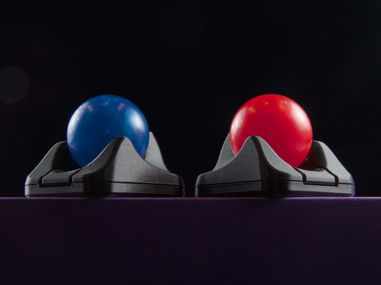
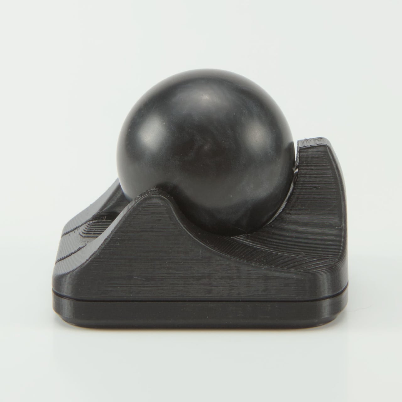
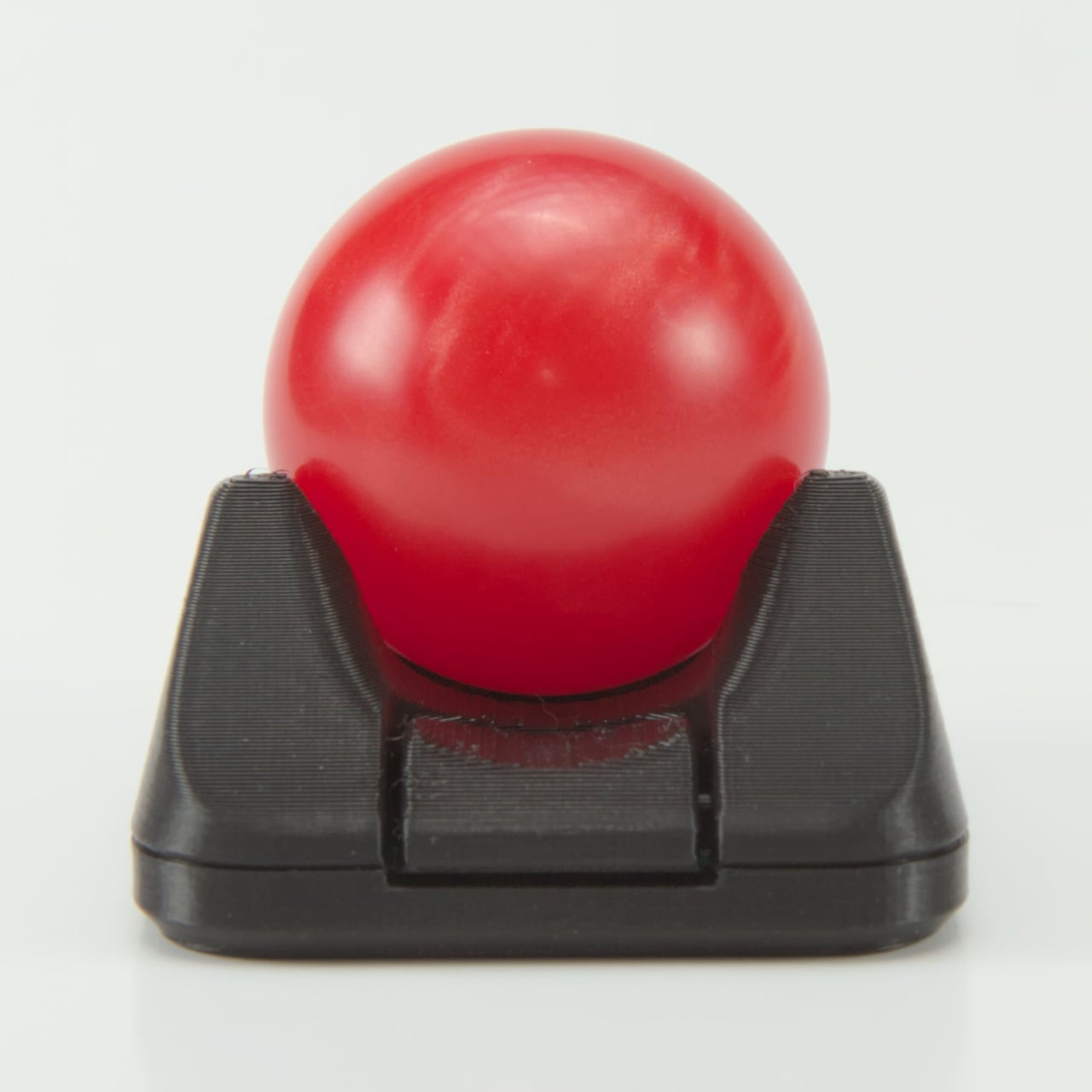
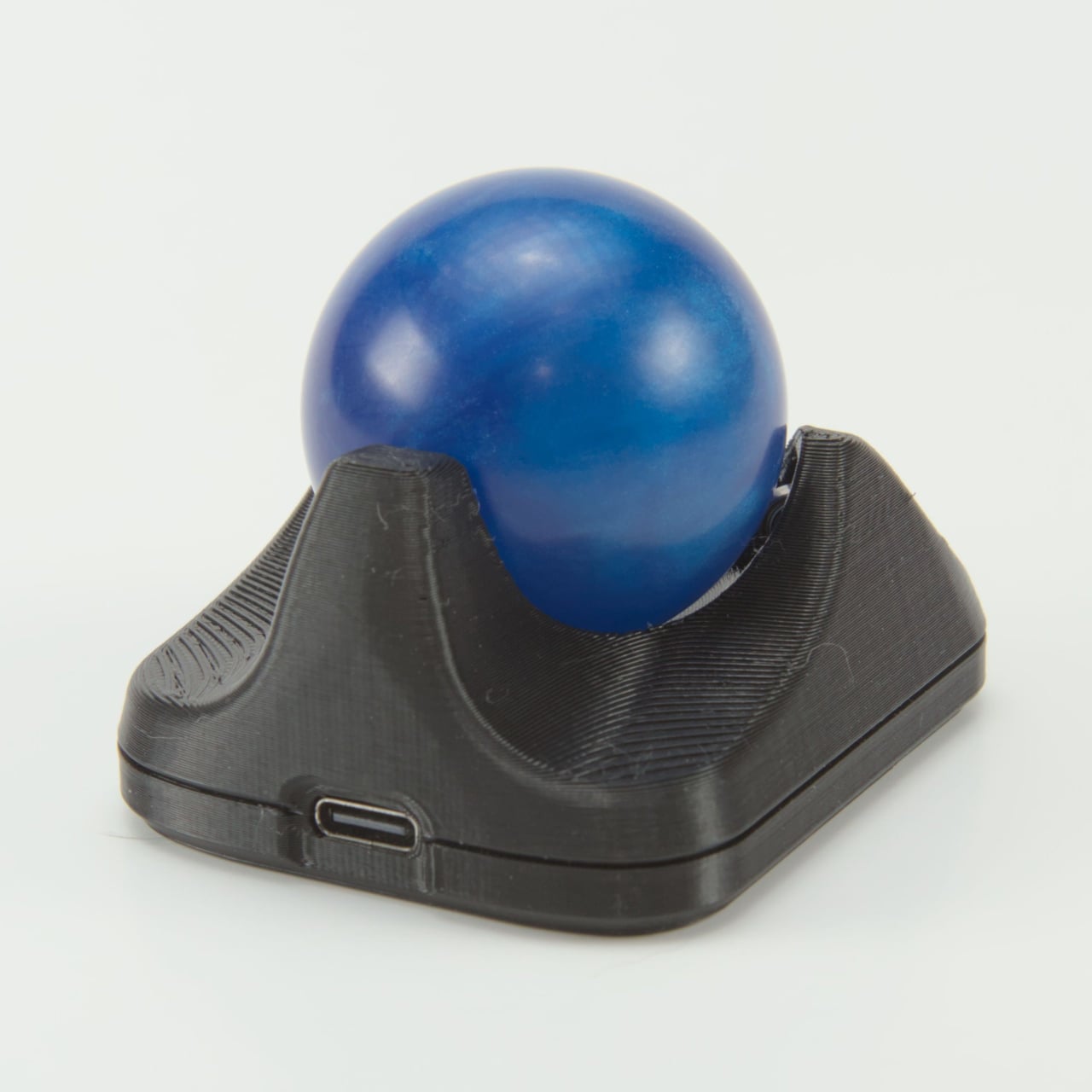
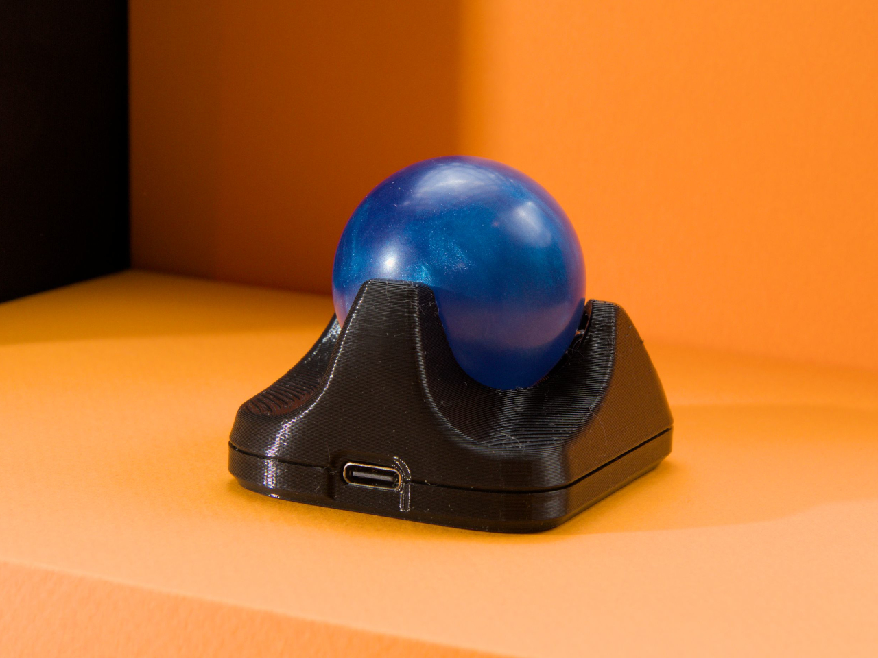
The Nano 2 features a compact footprint that sits easily beside any keyboard without dominating valuable desk space for other gear. The 3D-printed body in opaque black, paired with tracking balls in red, blue, or black for personal preference, feels solid and purposeful in use during extended sessions. The minimalist design and low profile make it easy to integrate into any setup, from home offices to creative studios, without clashing with existing equipment.
Roller bearings give the 1.5-inch ball a satisfying, tactile feel during use, though they do make a scratchy grinding sound that’s part of the Nano’s mechanical character and feedback. Some users love the audible feedback as confirmation of movement, while others may find it distracting in quiet library or office environments. The sound is noticeable but adds to the analog, mechanical feel that distinguishes it from silent optical trackballs.
The big upgrade is the PAW-3222 sensor, which delivers a polling rate over 1,000Hz, up to 4,000 CPI, and 10g acceleration for smooth, precise tracking during demanding design or coding work. The new button triggers drag scrolling by default out of the box, but thanks to QMK and VIA support, you can remap it to anything you need instantly, from click to macro to custom functions.
USB-C replaces the old micro-B port found on the original Nano, improving durability and making charging and programming easier for modern setups with universal cables you already own. As with all Ploopy devices, the Nano 2 is fully open-source, with hardware under the CERN OHL license and firmware under the GPL for complete transparency and user freedom. Assembly guides, modding tips, and all design files live on GitHub.
Whether you’re coding complex projects, designing graphics, or just want a minimalist pointer for your laptop bag during travels and commutes, the Nano 2 brings personality and function to your workspace effortlessly without taking up space. Its compact size, open-source roots, and tactile feel make it a conversation starter and a daily companion for anyone who values control and creativity in their desktop tools.
There’s something magical about pocket-sized gaming that never gets old for those who grew up with handhelds in their backpacks and pockets. The thrill of squeezing a whole arcade into your palm, the nostalgia of pixel art and chiptunes, and the joy of discovering new games on the go bring genuine smiles that modern mobile gaming just can’t replicate. Most modern handhelds chase power and graphics, but sometimes it’s the simplicity and creativity of 8-bit gaming.
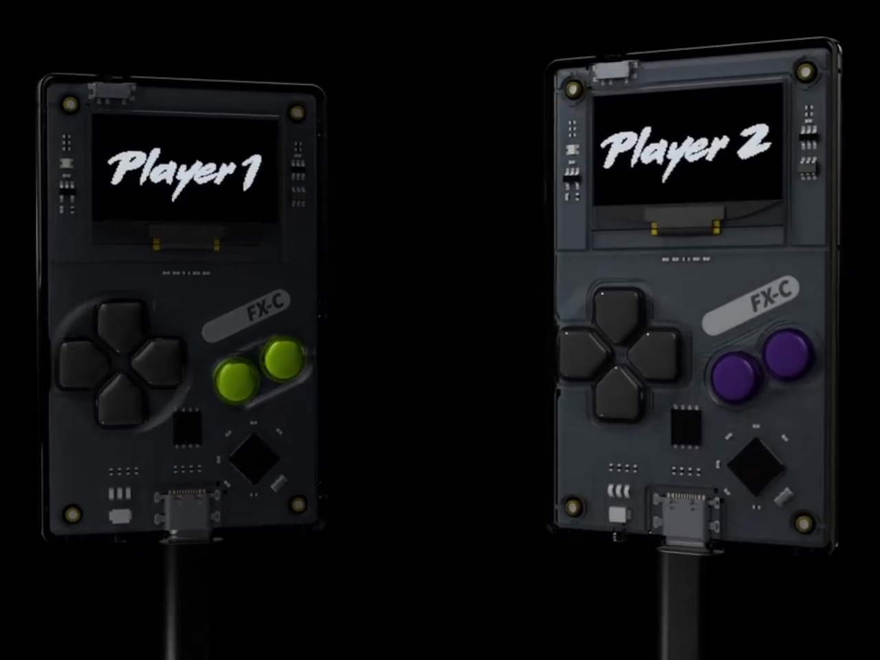
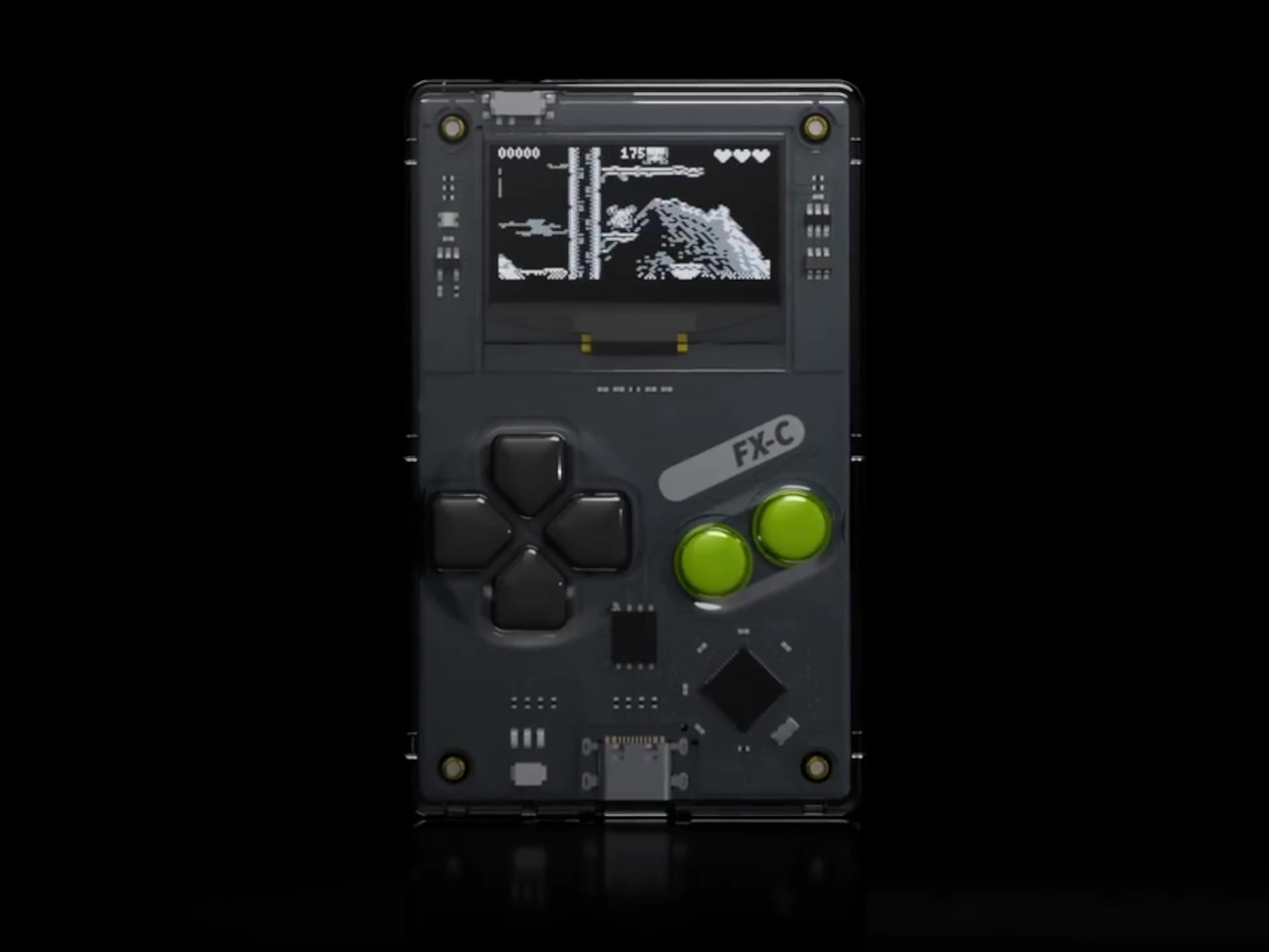
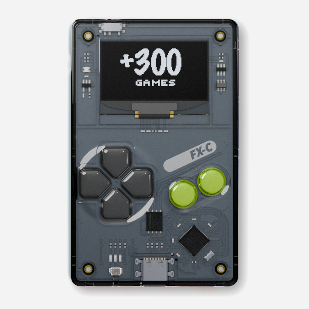
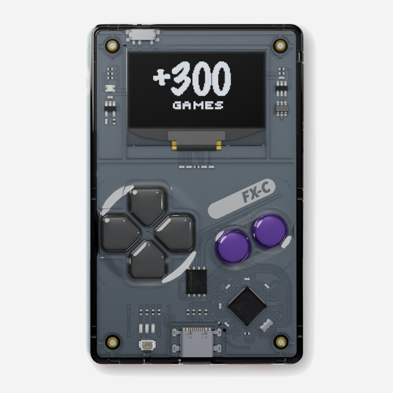
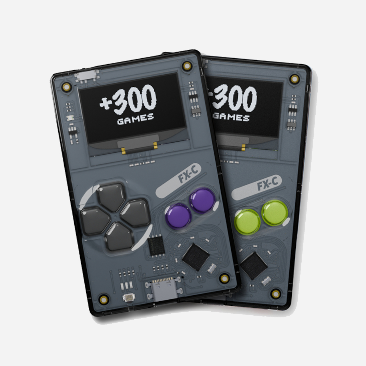
The Arduboy FX-C is a new take on that classic formula with a modern twist for contemporary gamers who appreciate retro aesthetics. It’s slim, open-source, and loaded with over 300 homebrew games, all ready to play on a device that’s barely thicker than a credit card you carry daily in your wallet. With USB-C charging and multiplayer support via link cable, it’s a retro playground for your pocket.
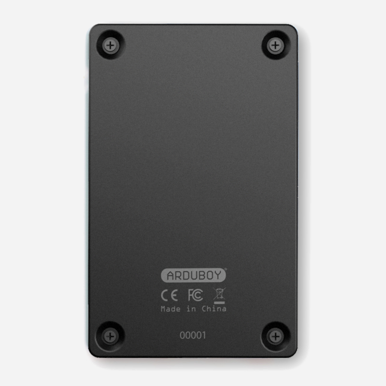
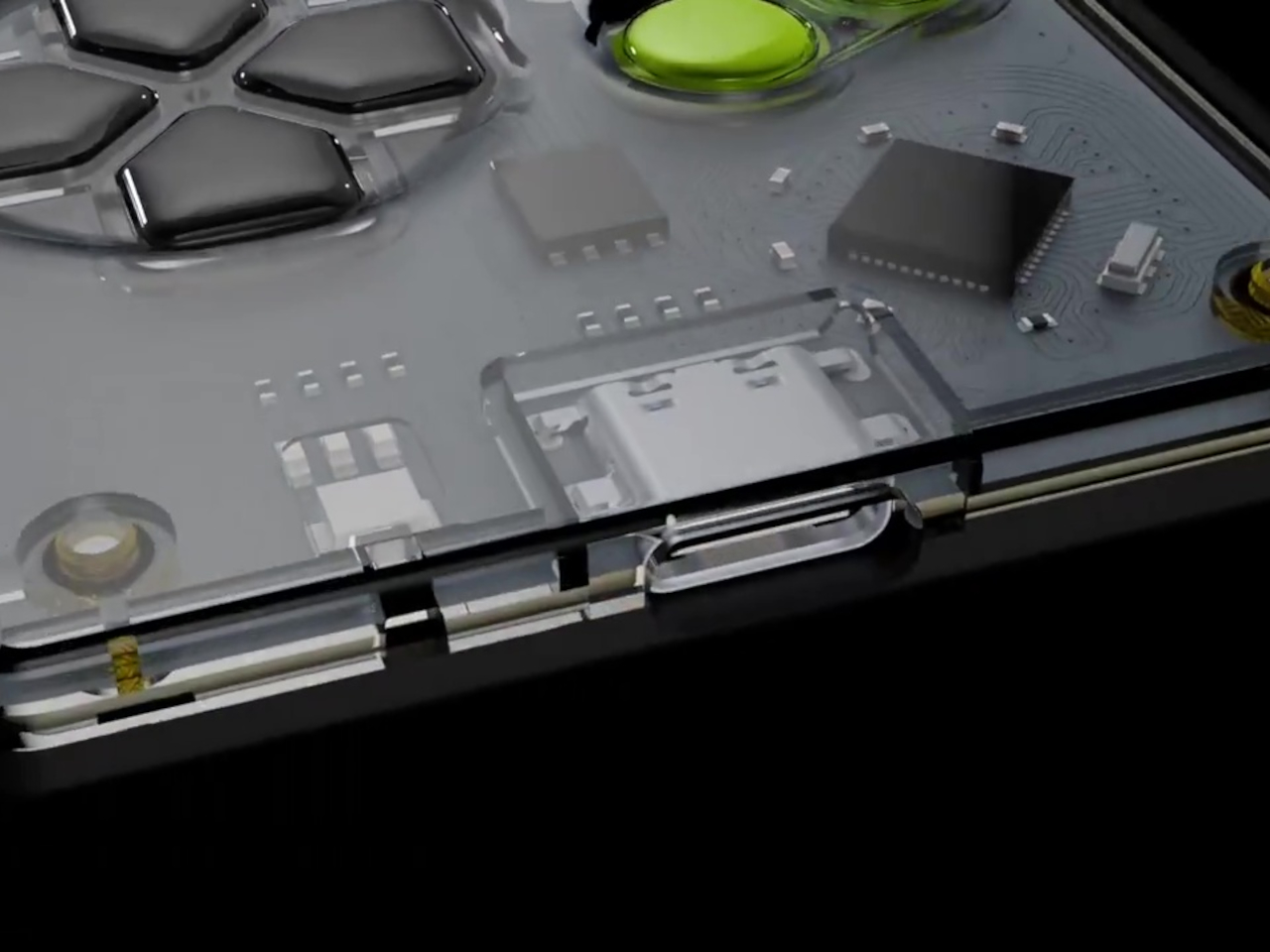
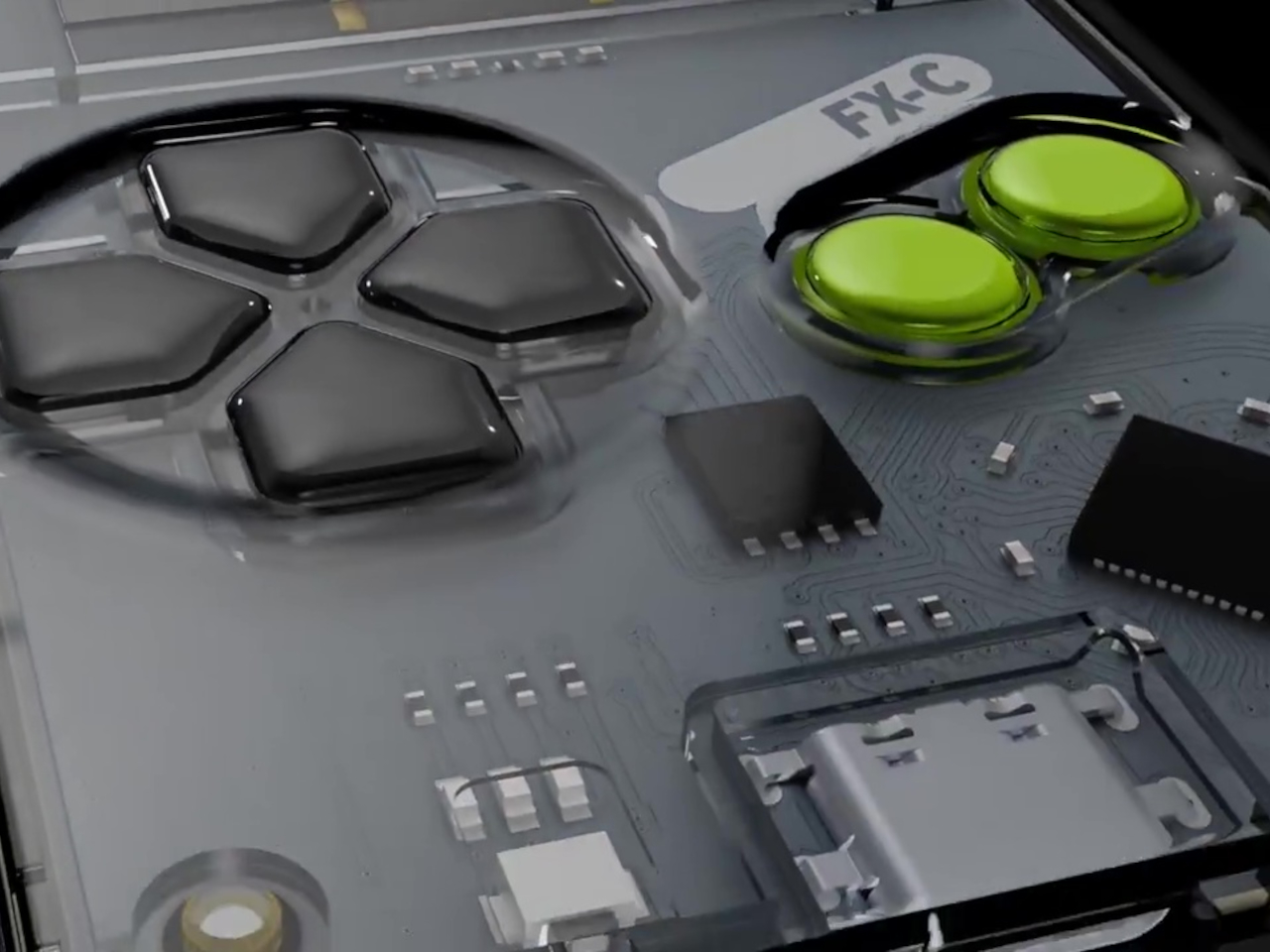
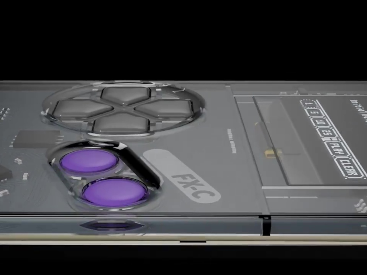
The FX-C is built specifically for portability, with a polycarbonate front, stamped aluminum back, and a transparent shell that shows off the ultra-thin circuit board inside for tech enthusiasts. At just 5mm thick, it slips into your wallet or pocket with room to spare for other essentials like keys and cards. The tactile buttons and crisp black-and-white 128 by 64 OLED screen channel the spirit of classic Game Boy handhelds.
Limited editions add a splash of color and personality to the minimalist design that collectors will appreciate. Purple buttons mark the Founders Edition, while electric green branding distinguishes the Standard Edition produced by Seeed Studio for wider distribution. The robust construction shrugs off daily bumps and scratches without showing wear, while the slim profile means you can carry it everywhere without thinking twice about added bulk.
The big upgrade is USB-C, making charging and programming easier than ever before for users who’ve moved to modern cables. But the real fun starts with the included USB-C link cable that enables local multiplayer battles. Connect two FX-Cs together and you unlock head-to-head multiplayer action, from classic Pong to new homebrew duels created by the passionate community. The same port supports external sensors and future mods for experimenters.
Inside, the ATmega32u4 chip and 16MB flash storage hold over 300 games, with instant switching between titles and no need to reflash the device constantly like earlier models. The 180mAh battery delivers over 8 hours of continuous play on a single charge, and the 4-channel piezo speaker brings retro soundtracks and sound effects to life. The entire system runs on open-source hardware and software that anyone can modify.
The FX-C comes preloaded with a sprawling library of platformers, shooters, puzzles, and more titles spanning every retro genre imaginable, each one crafted by a global community of open-source developers who contribute freely without commercial motivation. If you’ve ever wanted to build your own game or learn to code in a friendly environment, free tutorials and a thriving forum make it easy to get started without prior experience.
Whether you’re commuting on crowded trains, waiting in line at the coffee shop, or just need a break from your phone’s endless notifications and social media, the Arduboy FX-C delivers a burst of retro fun wherever you are throughout the day. For anyone who loves the spirit of classic gaming with a modern twist and open-source freedom, it’s proof that sometimes less really is more.
Your phone tracks your steps. Your smartwatch tracks your heart rate. Your earbuds track your location. At some point, we stopped using technology and started being used by it. Mudita Radiant is a field watch for people who’ve had enough. Built in Switzerland with the same minimalist philosophy that made Mudita’s “dumbphones” award-winners, it’s a mechanical timepiece that promises exceptional legibility, everyday durability, and absolutely zero notifications. Available now on Kickstarter in five nature-inspired colors and three sizes, it’s already raised over $58,000, proof that the anti-smartwatch revolution is just getting started.
If you don’t know Mudita, here’s the quick version: they’re the Polish company founded by Michał Kiciński (yes, the CD Projekt Red guy who helped create The Witcher) that’s been championing digital minimalism through products that harmonize with your life instead of competing for your attention. Their Mudita Kompakt phone features an E Ink® display and an Offline+ switch that cuts all wireless signals at the hardware level. Their previous watch, the Mudita Element, launched on Kickstarter and hit “Fully funded” in 23 minutes. They’ve won awards from the Calm Tech Institute for respecting attention and peace of mind. Now they’re applying that same philosophy to a proper field watch.
What makes the Radiant watch actually interesting is how it fits into Mudita’s broader ecosystem. Their phones use E Ink® displays, hardware-level privacy switches, and custom operating systems designed to minimize distraction. Their alarm clocks use breathing features and calming interfaces. Everything they make pushes back against the attention economy. The Radiant continues that philosophy on your wrist. It’s mechanical, so there’s no battery to charge, no software to update, no notifications to silence. You set it, you wear it. The automatic movement keeps running because you’re moving, which is a level of symbiosis that smartwatches can only simulate with step counters and haptic feedback.
The Radiant runs on a Sellita SW 200 Elaboré movement, the enhanced grade that’s regulated in three positions instead of the standard two. It beats at 28,800 vph, giving you that smooth seconds sweep, with accuracy rated at ±7 to ±20 seconds per day and a 38 to 41 hour power reserve. The movement is protected by an Incabloc shock protection system, which is exactly what you want if this watch is actually going to see daily wear. Everything is manufactured and hand-assembled by Chrono AG, a company that’s been making Swiss Made private-label watches since 1981. Their headquarters sits in a historic building from 1915 that once housed one of Switzerland’s first watchmaking schools, which feels appropriately poetic for a watch that’s trying to return to fundamentals.
The Radiant comes in 32mm, 37mm, and 40mm case diameters, all with a profile between 10 and 10.5mm. Finding a 32mm automatic field watch is nearly impossible in 2025, when most brands seem convinced everyone wants a 42mm wrist anchor. Mudita clearly designed this to actually fit different wrists, which sounds obvious until you realize how few brands bother. The case is brushed 316L surgical-grade stainless steel with different finishing techniques: circular brushing on the case top and crown, linear brushing on the sides. The brushed finish serves a practical purpose beyond aesthetics, it masks the inevitable minor scratches and fingerprints that come with daily wear. There’s also a crown guard, which protects against accidental bumps without making the watch look like it’s trying too hard to be tactical.
Given that dumbphones still have screens but watches don’t, a lot went into channeling Mudita’s minimalist philosophy into the watch’s dial. There’s no logo. None. The only branding is a small lotus carved into the crown, which you’ll feel when you wind the watch but won’t see unless you’re looking for it. The dial uses a custom Mudita typeface with a full 12-hour layout, every number present and accounted for, which makes reading the time genuinely effortless. The hands and hour markers are coated with Swiss Super-LumiNova BGW9, one of the brightest luminescent materials available. Mudita tested this thing in various lighting conditions, from bright sunlight to total darkness, and paired the lume with a sapphire crystal that has triple anti-reflective coating. The sapphire rates 9 on the Mohs hardness scale, second only to diamond, so unless you’re deliberately trying to scratch it, the crystal should stay clear for years.
The dial’s colors tell you everything about Mudita’s design ethos. Natural White like fresh snow, Sand Beige like silent coastlines, Moss Green drawn from forest trails, Baltic Blue mirroring the ocean, and Charcoal Black echoing raw charcoal texture. These aren’t vibrant, look-at-me colors. They’re muted, grounded tones that pair with the six available strap colors, which include all five dial colors plus Pebble Gray. The straps use a quick-release mechanism, so swapping straps takes seconds without tools. This matters more than it sounds because it means the watch adapts to different contexts without requiring you to own multiple watches.
Water resistance sits at 10 ATM, which translates to 100 meters. That’s enough for rain, hand washing, swimming, even a shower if you’re not fiddling with the crown underwater. It’s not a dive watch, but it’s legitimately waterproof for everyday life, which is exactly what a field watch should be. The caseback features a unique engraved number for each watch, making every Radiant technically a limited edition piece. Mudita is transparent about this being a collectible item, but they’re not using artificial scarcity as a marketing gimmick. The numbering is there because they’re making these in controlled batches, not churning out thousands.
Searches for “dumbphones” have risen over 300% in the past year. Feature phone sales in the UK reached 450,000 units in 2024. This isn’t a niche movement anymore – people are genuinely exhausted by devices that demand constant attention, and Mudita is building products for that exhaustion. The Radiant isn’t trying to replace your smartphone or compete with your Apple Watch. It’s trying to be the thing you wear when being punctual is important, nothing else. Not your fitness, not your step count, not your Slack or Teams notifications, and not someone calling you on your phone and having a buzzing sensation on your wrist. In other words, it’s trying to be what watches used to be before technology somehow convinced us it could be everything else.
The Ultra Early Bird tier sits at €479 ($556 USD), saving €220 off the planned retail price of €699 ($810 USD). There’s also a Bundle option at €879 for two watches, which saves a decent chunk off retail if you’re buying pairs. All tiers include a 14-day trial period where you can return the watch for a full refund if it’s undamaged, and all prices include taxes and duties, no surprise tariffs suddenly catching you off guard. Mudita is committing to delivering every single watch by May 31, 2026, although they’re aiming for a moonshot of delivering it just before Christmas this year. They’ve however offered backers a full money refund just in case shipping doesn’t work out pre-Christmas. Either that, or hold on to your pledge and you’ll definitely get the watch before May 31st, 2026.
Frank Lloyd Wright didn’t just design houses. He created living philosophy, spaces where architecture and nature become one seamless experience. These homes represent different chapters in his revolutionary career, each one pushing the boundaries of what residential architecture could achieve.
Designer: Frank Lloyd Wright
Fallingwater: Living with the Waterfall
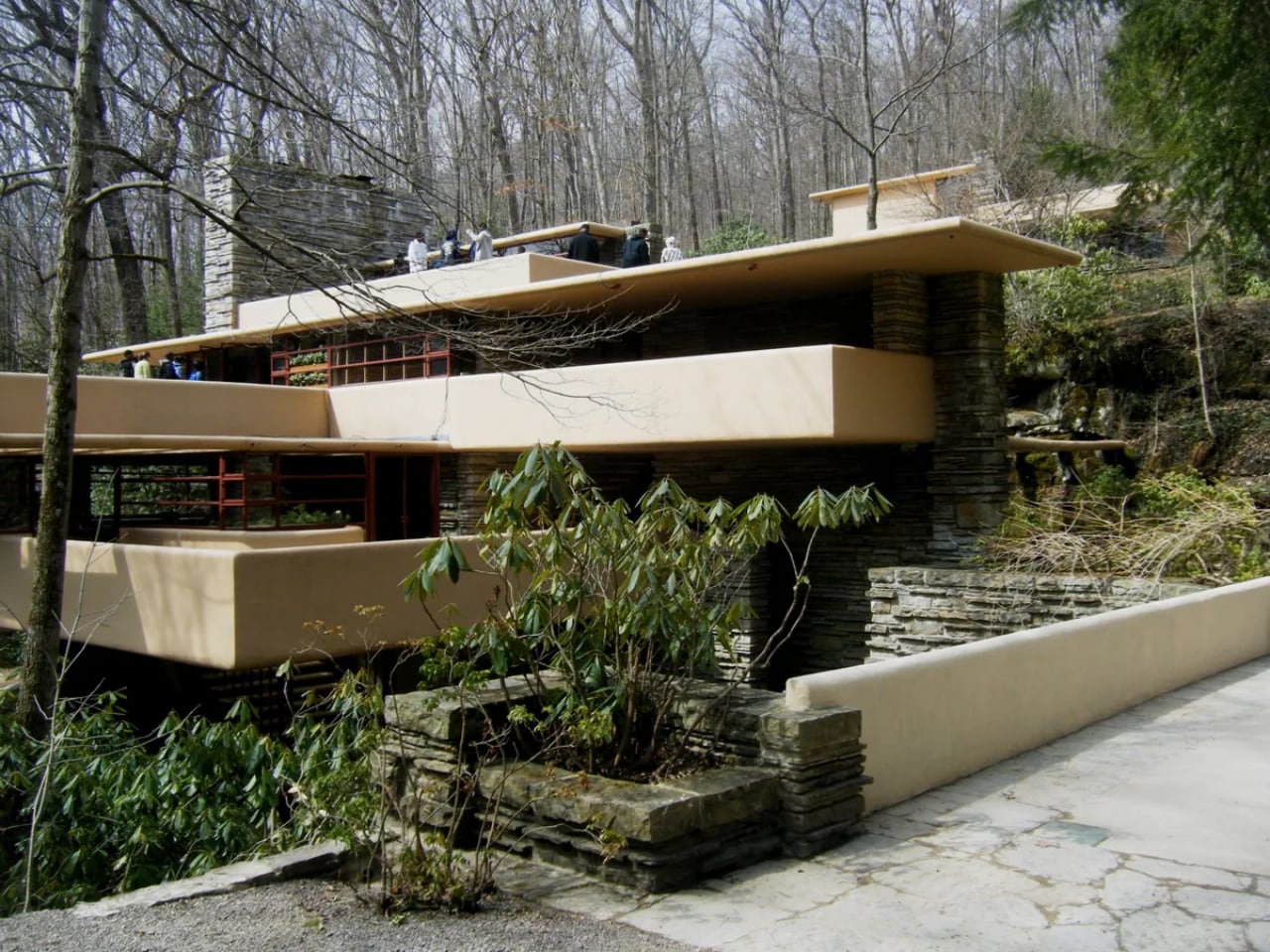
When Edgar and Liliane Kaufmann commissioned Wright to design their Pennsylvania weekend retreat, they expected a house with a view of their favorite waterfall. Wright had other ideas. He placed the entire structure directly above Bear Run’s cascading waters, explaining simply: “I want you to live with the waterfall, not to look at it.”
Concrete terraces cantilever dramatically beyond their supports, mimicking the natural rock ledges of the stream below. Locally quarried Pottsville sandstone anchors the vertical elements to bedrock, while floor-to-ceiling glass in continuous bands eliminates traditional corners entirely.
A suspended staircase descends from the living room directly to the stream, inviting residents to move freely between architecture and nature. Wright even incorporated the original picnic boulder into the design, making it the hearth of the living room fireplace.
The exterior color came from an unexpected source. Wright selected an ocher shade after finding a dried rhododendron leaf on site during construction. Low ceilings create his signature compression effect before releasing into larger spaces, making the modest square footage feel both intimate and expansive.
Taliesin West: The Desert Masterwork
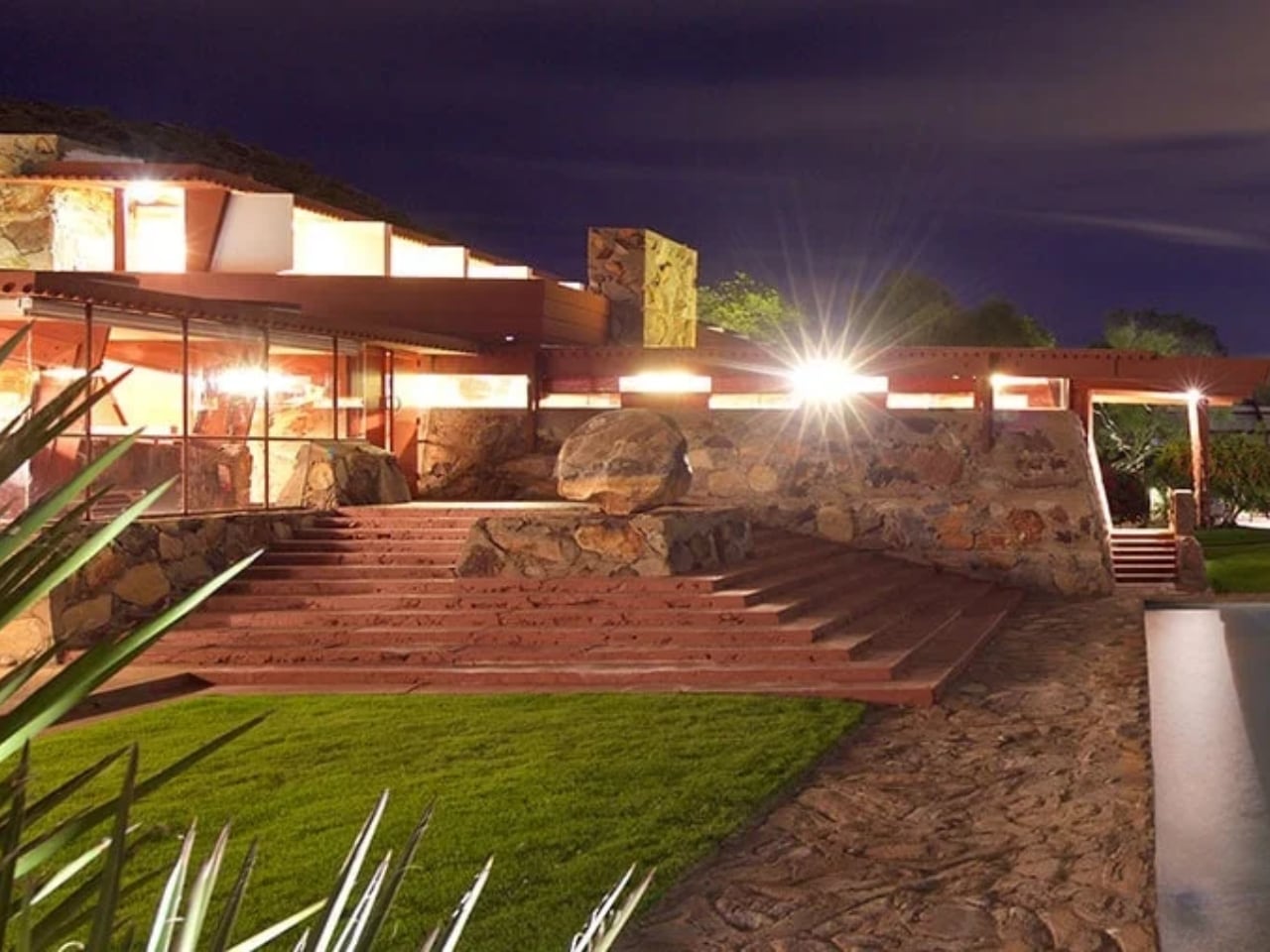
Wright established his winter home and architectural laboratory in the Sonoran Desert, building almost entirely by hand with his apprentice community. They developed a unique desert masonry technique, setting local boulders and sand into concrete forms to create walls that appear to grow from the Arizona landscape itself. The complex became far more than a residence.
Wright’s private quarters feature a distinctive triangular prow, while the sprawling campus includes a drafting studio, board room, music pavilion, and cabaret theater. The cabaret theater is considered one of Wright’s most accomplished interior spaces. Canvas roofs originally filtered desert light into ever-changing patterns throughout the day, though later replaced with more permanent materials. Wright treated Taliesin West as a living experiment, continuously revising and rebuilding sections each winter until his death.
He even stayed here while overseeing construction of the Guggenheim Museum in Manhattan, and the greenhouse still features scalloped glass windows left over from that famous project.
Ennis House: Hollywood’s Mayan Temple
Charles and Mabel Ennis wanted something extraordinary on their Los Angeles hillside, and Wright delivered his largest textile block experiment. Thousands of patterned concrete blocks rise in stepped terraces like a Mayan ziggurat, each one featuring intricate geometric patterns inspired by Puuc architecture from Uxmal, Mexico. Wright’s revolutionary textile block system wove steel reinforcement through cavities between blocks like threads on a loom, creating both structure and ornament simultaneously.
A loggia runs the length of the house with pairs of textile-block columns, while inside, a bronze hood fireplace features Maya motifs and the only surviving gilded glass-tile mosaic Wright created for his residential work. The fortress-like presence and exotic aesthetic made it a Hollywood favorite.
Blade Runner immortalized the dramatic spaces, using them to create a vision of dystopian futures that somehow felt ancient and advanced simultaneously.
Toy Hill: The Circular Experiment
Sol Friedman, a toy maker seeking a home north of Manhattan, became the client for one of Wright’s most playful geometric experiments. Two intersecting polygons form the main structure, with every element (walls, furniture, even the bedrooms) following strict circular discipline. Radial lines divide the floor into precise geometric sections extending from floor to ceiling.
Built-in furniture incorporates this geometry into every detail, creating what Wright called “pizza slice” bed arrangements with trapezoidal sleeping spaces. Stone walls tilt inward rather than standing vertical, requiring custom cabinetry with irregular drawer shapes. A mushroom-shaped carport supported by a single concrete pillar demonstrates Wright’s structural daring.
Despite the modest budget typical of his Usonian housing vision, the home achieves extraordinary character through geometric innovation and locally sourced materials.
Tirranna: The Guggenheim’s Residential Echo
John and Joyce Rayward commissioned one of Wright’s largest residential projects on their Connecticut estate, which they named using an Aboriginal Australian word meaning “running waters.” The horseshoe design mirrors Wright’s famous Fallingwater in both name and philosophy, positioned near the property’s natural waterfall and pond. Wright worked on Tirranna while simultaneously designing the Guggenheim Museum, and the home became a residential expression of that spiral aesthetic.
Photo: UdorPhotography
Philippine mahogany paneling throughout creates warm interiors, while Cherokee red Colorundum concrete floors provide Wright’s signature accent color. The couple later requested an observatory addition above the master bedroom, and the wine cellar occupies what was originally designed as a bomb shelter. Renowned horticulturist Frank Okamura, credited with reviving the bonsai tradition in America through his Brooklyn Botanic Garden work, transformed the grounds into spectacular gardens.
Landscape architect Charles Middeleer also contributed to the expansive estate design.
Circular Sun House: Wright’s Final Vision
The Norman Lykes House carries profound significance as the last residence Wright designed before his death in the late fifties. His devoted apprentice John Rattenbury completed construction years later, then returned decades after that for extensive renovation that transformed the original design into the luxury residence that exists today.
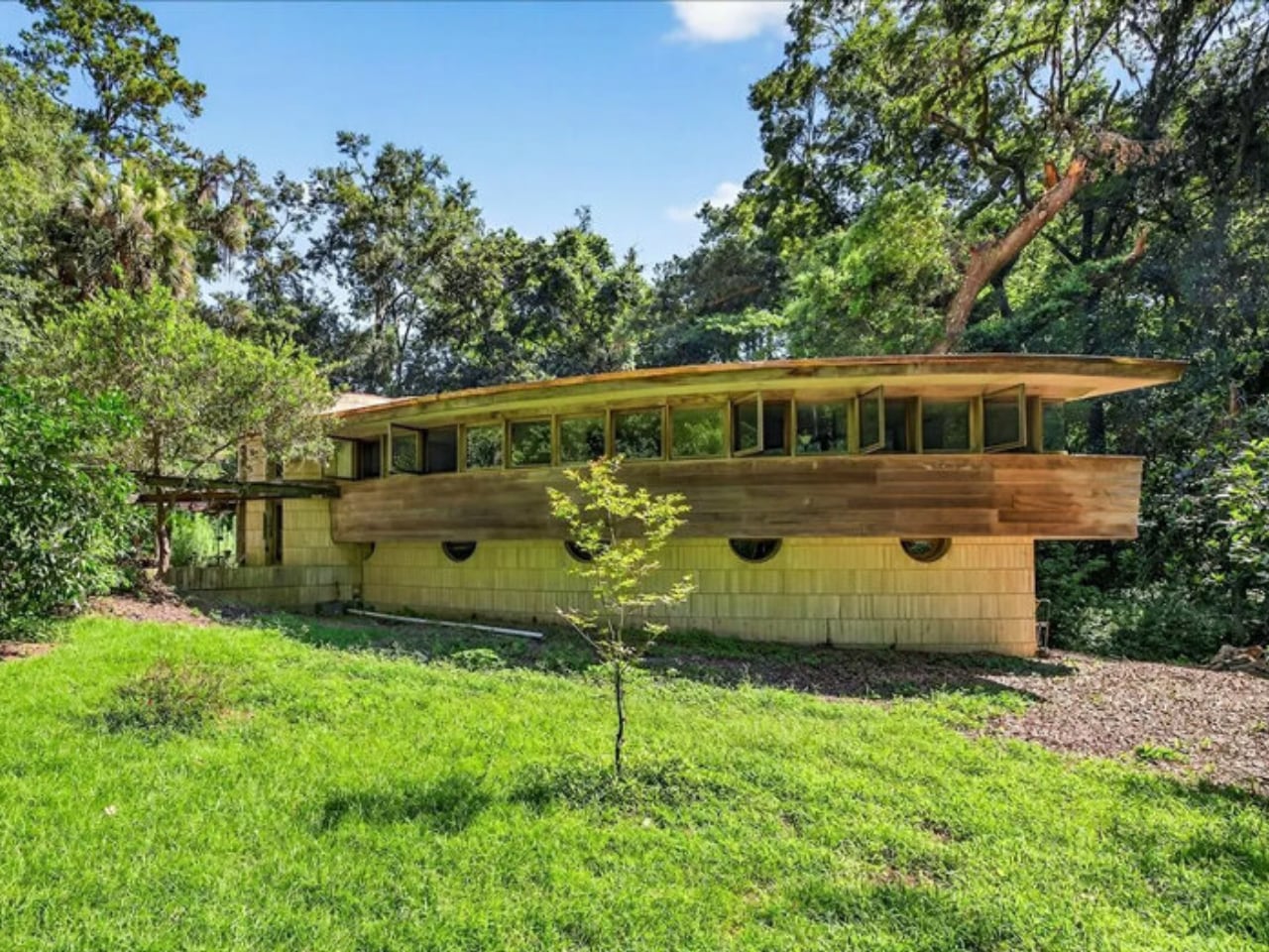
Wright positioned the home on a Phoenix hillside overlooking Palm Canyon, boldly facing downtown Phoenix rather than turning inward like his other desert houses. Overlapping concentric circles create flowing spaces without traditional hallways, while rose-tinted concrete and steel casement windows frame dramatic valley views. The crescent-shaped pool surrounded by mother-of-pearl tile creates an outdoor space as sculptural as the architecture.
Half-moon lunette windows across the facade and circular cutouts in the courtyard parapet reinforce the geometric theme throughout. Italian rose marble adorns the master bathroom, while Philippine mahogany walls and slate floors create interiors that feel simultaneously ancient and futuristic.
Unity Temple: The First Modern Building
After lightning destroyed Oak Park’s original wood-framed Unitarian church, Wright proposed something revolutionary: a house of worship built entirely from poured-in-place reinforced concrete. Wright himself was a lifelong Unitarian whose uncle served as a distinguished minister. The material was unprecedented for religious architecture.
Wright asked, “Why then the steeple of the little white church? Why point to heaven?” Instead, he built what he called “a temple to man, appropriate to his uses as a meeting place.” The inscription above the entrance declares: “For the worship of God and the service of man.”
The perfect square sanctuary embodies unity, with everyone seated close to the pulpit. Amber-tinted leaded glass skylights flood the space with warm, natural light.
Wright’s compression and release sequence takes visitors through low, dark entry passages before ascending into the bright, soaring sanctuary. Many historians consider this spatial experience the birth of modern architecture.
Wright Home and Studio: Where It All Began
Wright’s Oak Park home served as his personal laboratory and the birthplace of Prairie School architecture. The building evolved continuously as his family grew and his practice flourished, with hundreds of projects taking shape in these spaces over two decades. The playroom addition revolutionized thinking about children’s spaces.
A high barrel-vaulted ceiling with skylight, windows positioned at child height, a built-in piano, and an enormous Arabian Nights mural created an environment specifically designed to nurture young imagination. Wright believed spaces profoundly impact child development and designed accordingly. The studio addition marked Wright’s architectural maturation.
An octagonal library provides unique geometry and natural light, while the drafting room features a balcony suspended by chains from above. This creates a dramatic structural statement. Even the entry sequence shows Wright’s emerging genius, with visitors ascending an elevated terrace before passing through a low covered loggia.
The columns appear to be cast iron but are actually painted plaster, demonstrating Wright’s early experiments with material illusion.
Organic Architecture Philosophy
These homes document Wright’s seven-decade evolution from Victorian-influenced beginnings to radical geometric experiments. His organic architecture unified every project through consistent principles: buildings should grow from their landscape using natural materials, spaces should flow freely rather than being compartmentalized, and every detail must integrate into the total design.
Wright pioneered techniques that transformed American residential architecture. These include cantilevered construction, open floor plans, built-in furniture, radiant floor heating, carports, and corner windows.
His influence shaped California Modernism, mid-century modern design, and contemporary sustainable architecture. Millions have toured these homes since they opened as museums and historic sites. Wright’s vision continues teaching new generations that architecture can enhance human life by connecting us more deeply to nature, to beauty, and to each other.
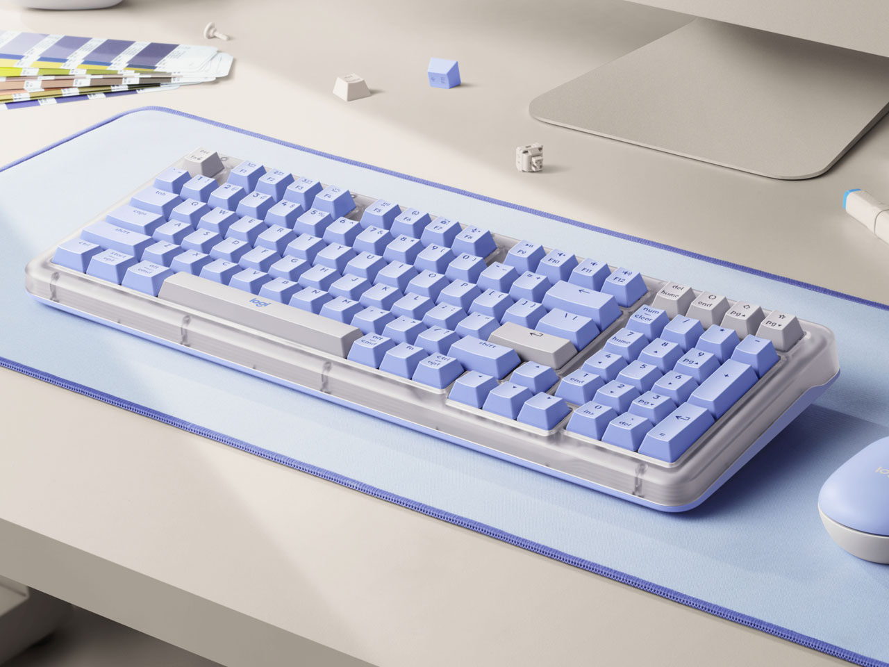
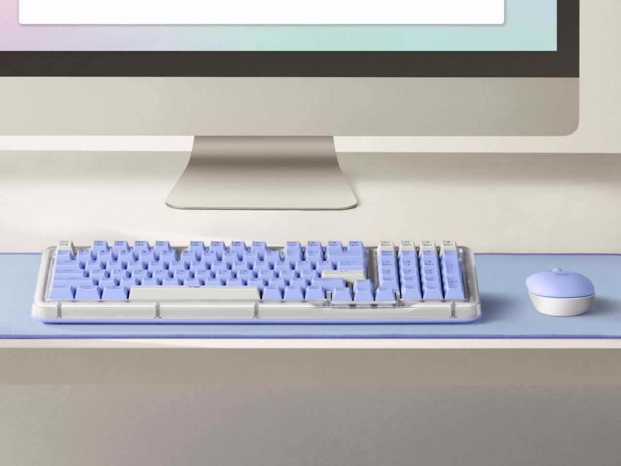
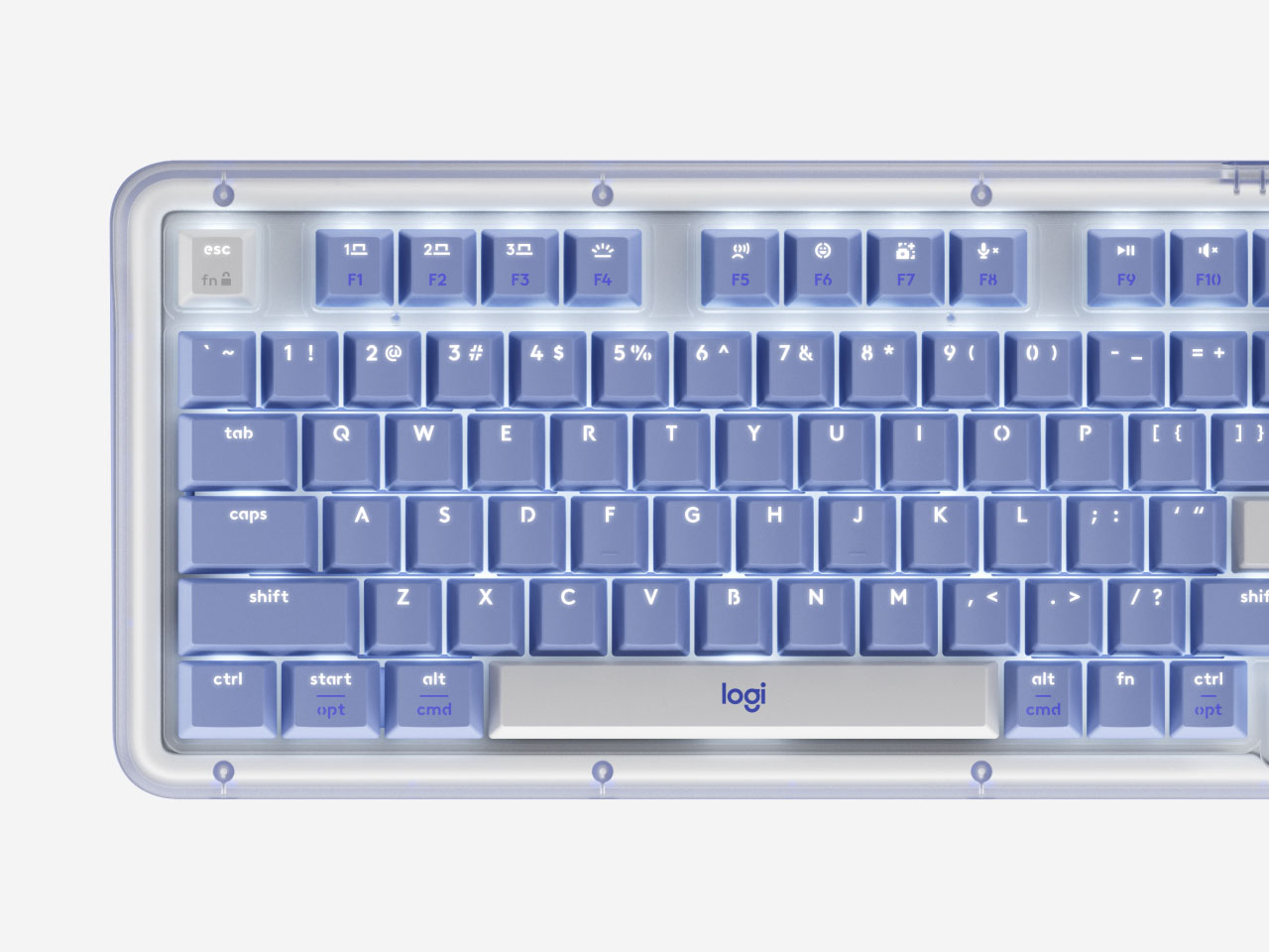
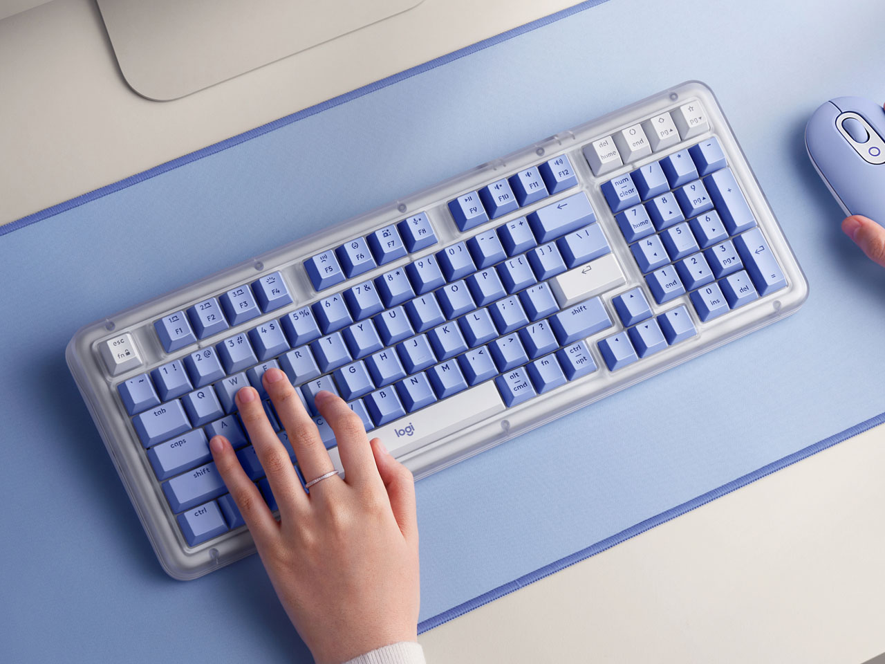
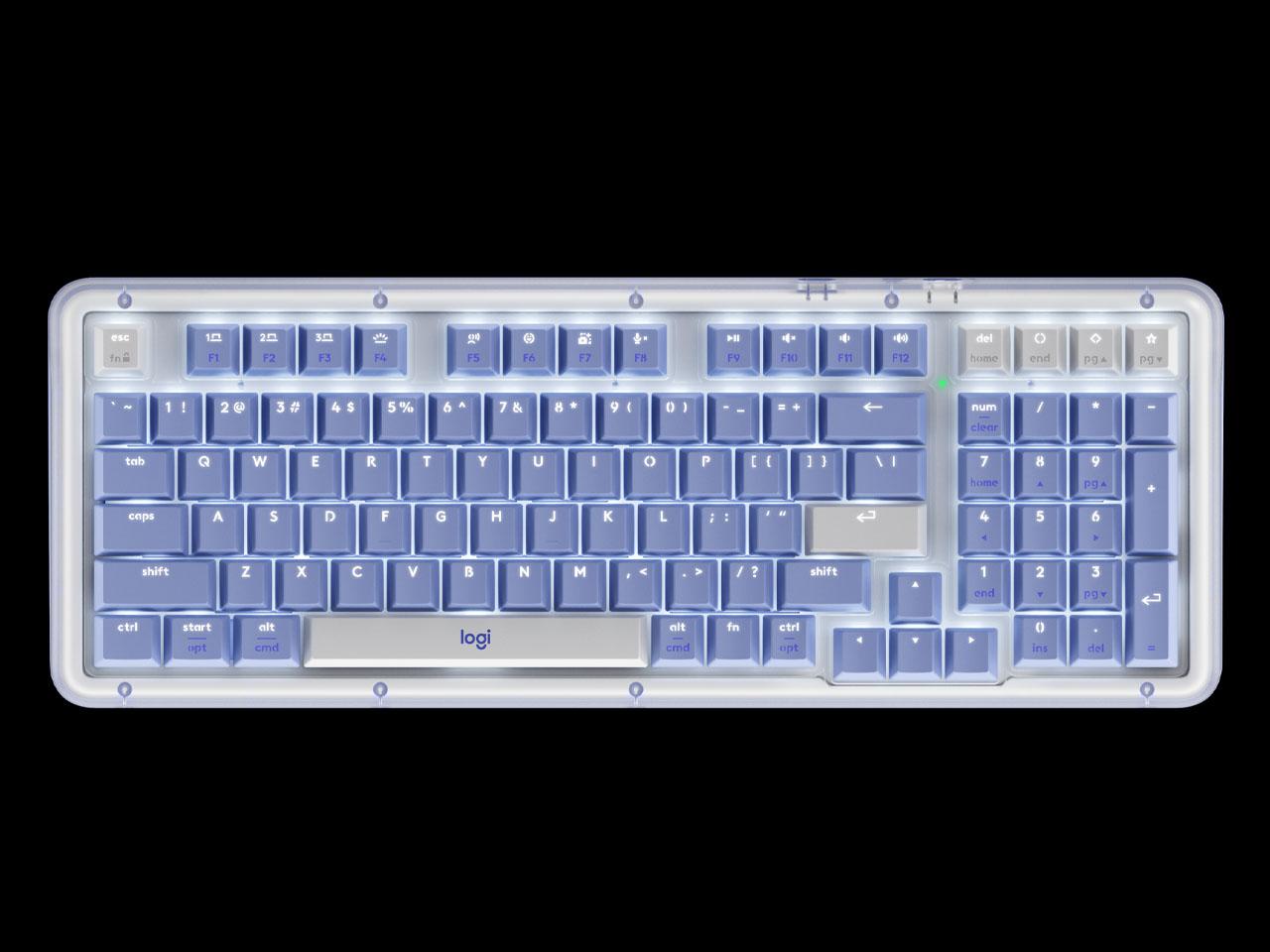
Logitech has long been known for reliable, mainstream peripherals that simply get the job done. With the new Alto Keys K98M, the company steps into enthusiast territory, combining its wireless and ergonomic strengths with features usually reserved for boutique mechanical keyboards. Priced at $119, the Alto Keys K98M strikes a careful balance between functionality and aesthetics. It offers a near-full-size layout, hot-swappable switches, and a transparent top shell that feels distinctly premium.
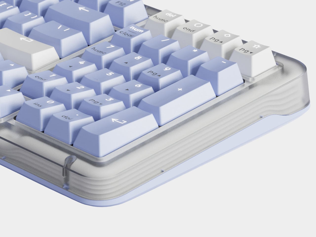
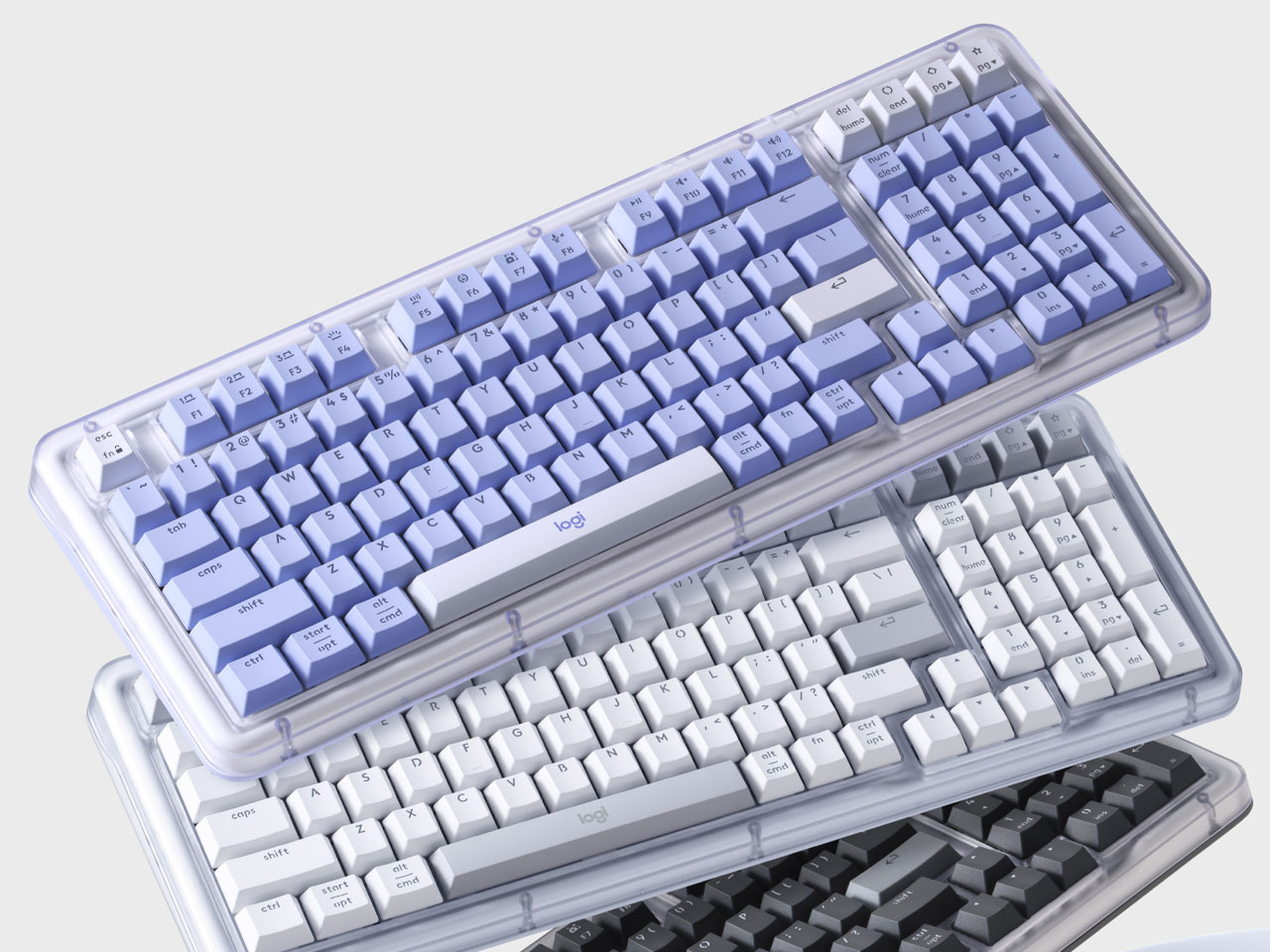
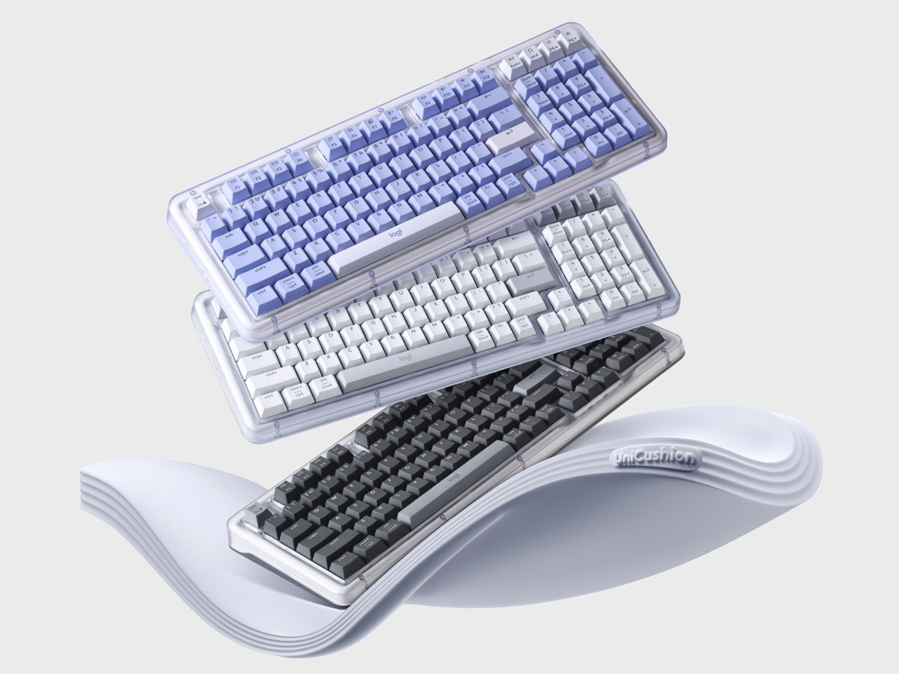
The K98M uses a compact 98-key or “1800-style” layout that retains the number pad and full arrow key cluster while saving desk space compared to standard full-size keyboards. The translucent upper shell paired with a color-matched base, available in graphite, off-white, or lilac
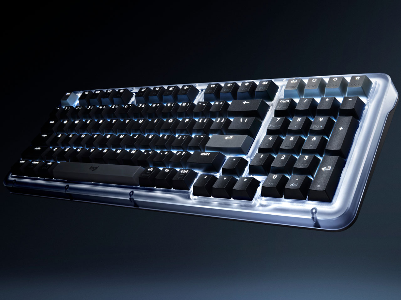
Underneath that sleek casing lies Logitech’s UniCushion gasket-mounted frame, which softens typing impact and reduces vibration for a smoother, more cushioned feel. The board’s PBT keycaps are durable, resistant to shine, and feature translucent legends that let its subtle white backlight pass through elegantly. Measuring roughly 15.8 inches wide, 5.8 inches deep, and weighing about 2.4 pounds, it feels sturdy yet portable enough for hybrid work setups.
At the heart of the K98M experience are Logitech’s new linear “Marble” switches, which can be swapped out easily thanks to its hot-swappable sockets. The keyboard supports Cherry MX-compatible switches, giving users freedom to experiment with different feels and sounds without buying multiple boards. Wireless connectivity is handled through both Bluetooth and Logitech’s Logi Bolt USB receiver, and users can pair up to three devices simultaneously, switching between them seamlessly using dedicated function keys. Despite its mechanical nature, the keyboard boasts an impressive 12-month battery life with the backlight turned off.
Logitech has chosen to keep the lighting simple, opting for a single white backlight rather than RGB, aligning with the keyboard’s clean, minimal aesthetic. Users can customize shortcuts and action keys through Logitech’s Logi Options+ software, though the configuration depth remains more limited compared to enthusiast firmware like QMK or VIA. Still, for most users, the customization on offer is practical and easy to navigate.
Typing on the Alto Keys K98M feels refined and balanced. The UniCushion gasket design introduces a slight bounce, dampening each keystroke and lending the board a satisfying, soft-bottoming sound profile. The included linear switches are light, smooth, and responsive, which makes them ideal for typing or casual gaming. While the chassis is made of reinforced plastic instead of aluminum, the flex it introduces complements the gasket structure rather than feeling cheap. Enthusiasts seeking an all-metal build might find it less premium, but the typing comfort easily compensates.
The Logitech Alto Keys K98M is a well-rounded keyboard that blends Logitech’s trademark reliability with modern mechanical innovation. For writers, coders, creators, or anyone seeking a quiet yet expressive typing companion, it delivers a premium experience in both form and function.
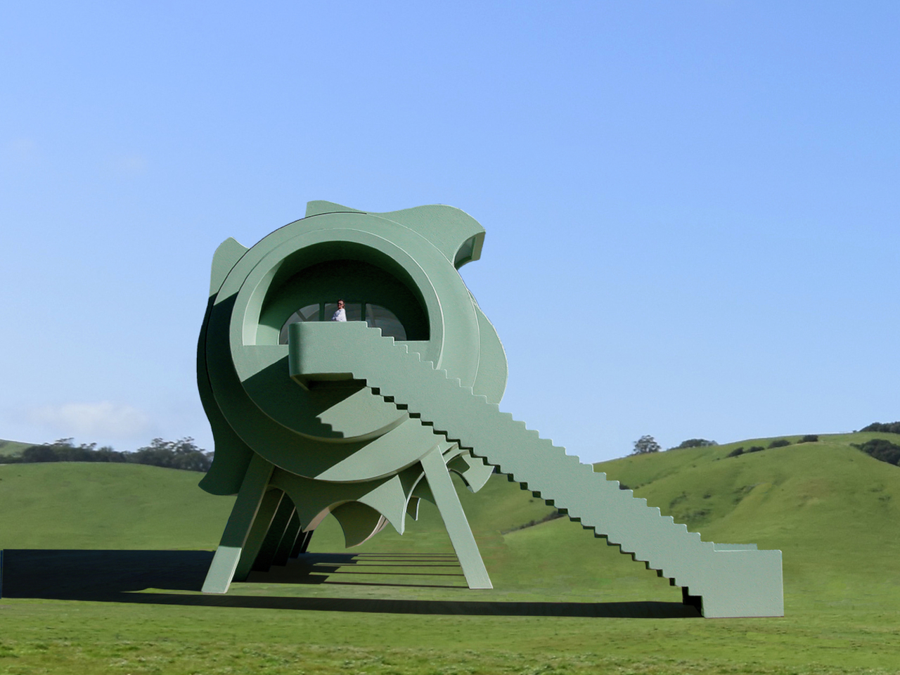
Imagine waking up in a home that changes shape with the sun, rotates to catch the breeze, and adjusts its silhouette at your whim throughout the day and night. The idea of a house that adapts to its environment and to you sounds like science fiction, but it’s at the heart of the Interactive Segmented House of the Future by Michael Jantzen, a concept that reimagines what home can be.
This visionary concept explores what happens when architecture becomes kinetic, modular, and deeply responsive to natural forces and human desires. The house offers a glimpse into a future where homes are as dynamic as the people who live in them, constantly adjusting to weather, light, and personal preference without requiring you to adapt to static architectural decisions. The design challenges every assumption about residential architecture.
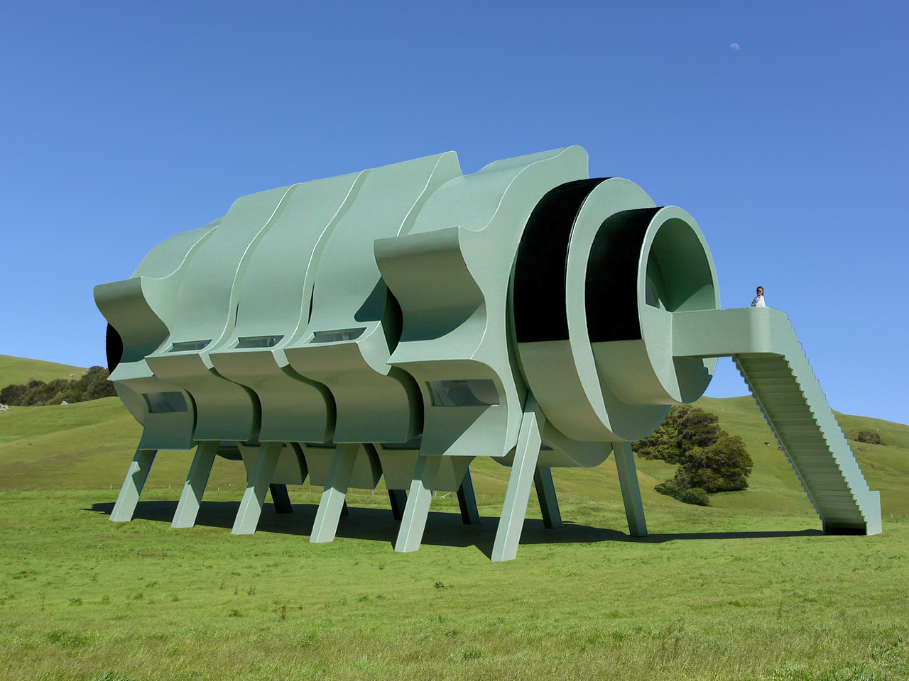
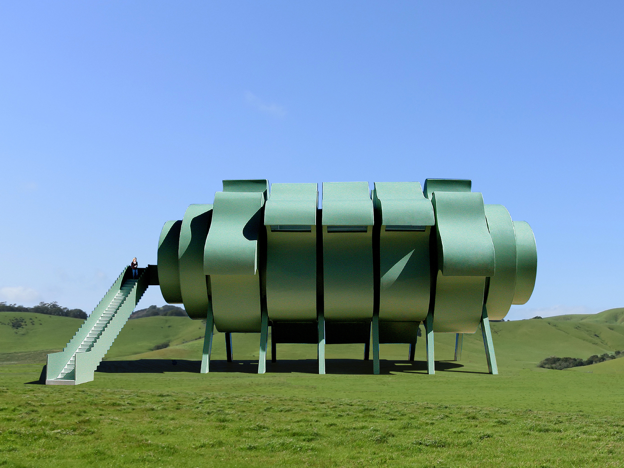
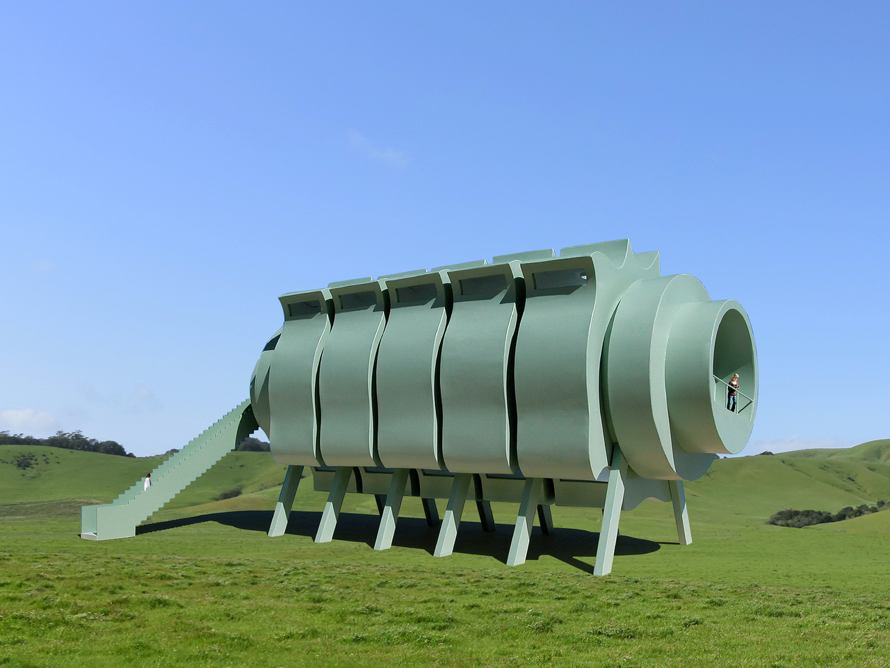
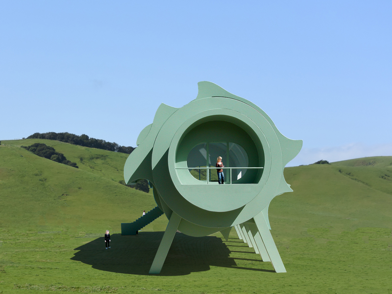
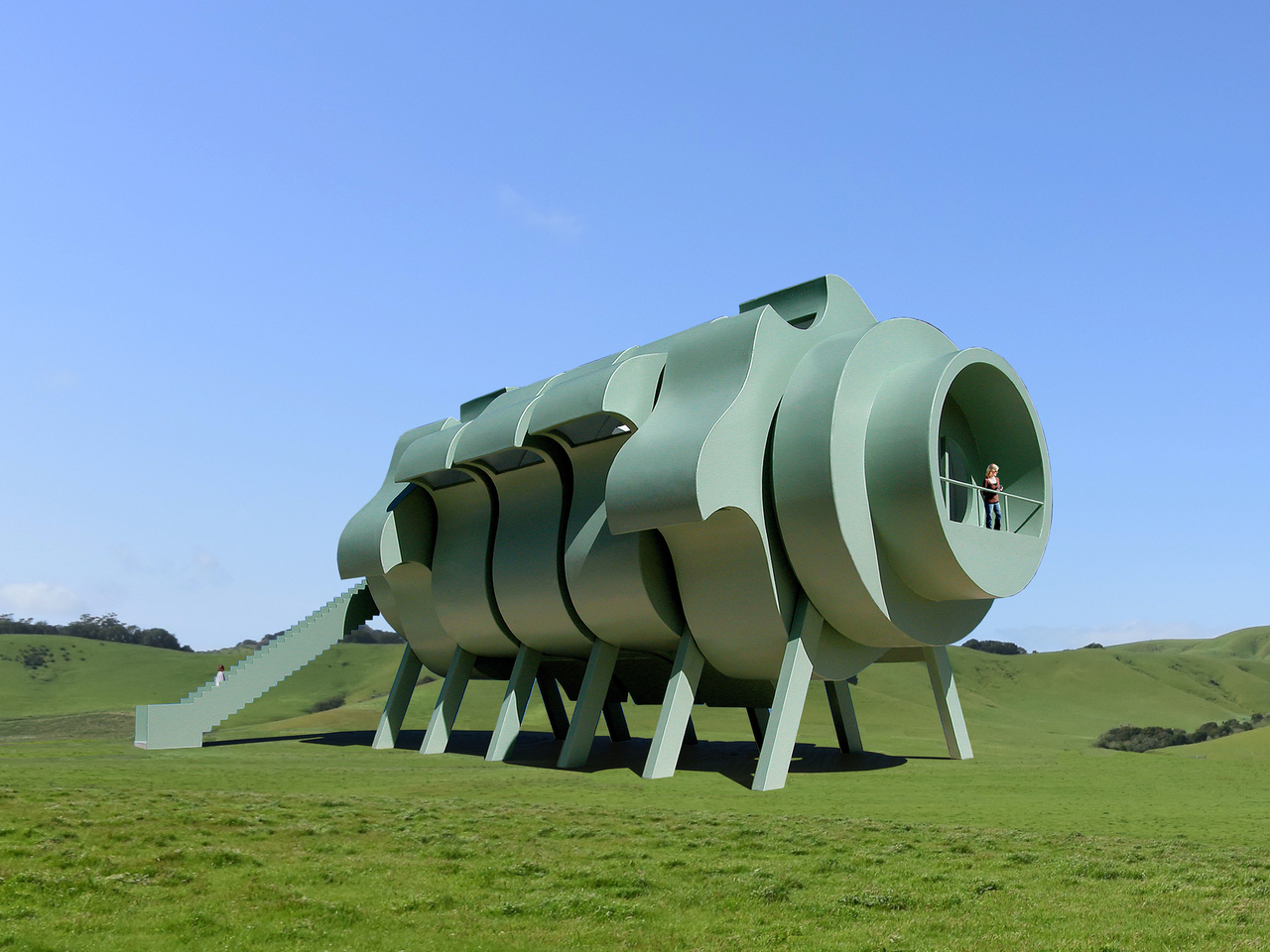
The house is built around five identical, curved steel segments that rotate around a central glass-floored living space like petals around a flower’s center. Each segment can pivot independently or together in coordinated movements, allowing the home to catch sunlight for passive warming, funnel wind for natural cooling, collect rainwater for storage, or frame the best landscape views throughout changing seasons.
Photovoltaic panels on the exterior generate electricity for internal needs, while rain-catching forms and wind scoops make the house self-sustaining and potentially off-grid in remote locations. Each segment is carefully shaped with formations that serve as windows, ventilation scoops, or water collectors. The occupants can fine-tune the building’s environmental response by positioning segments to meet immediate needs or simply experimenting with different visual configurations.
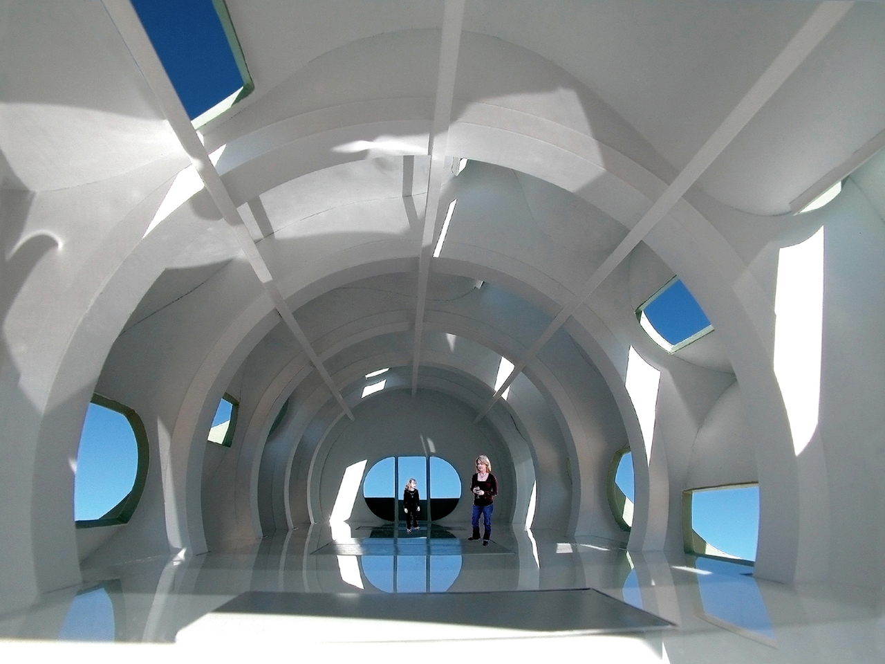
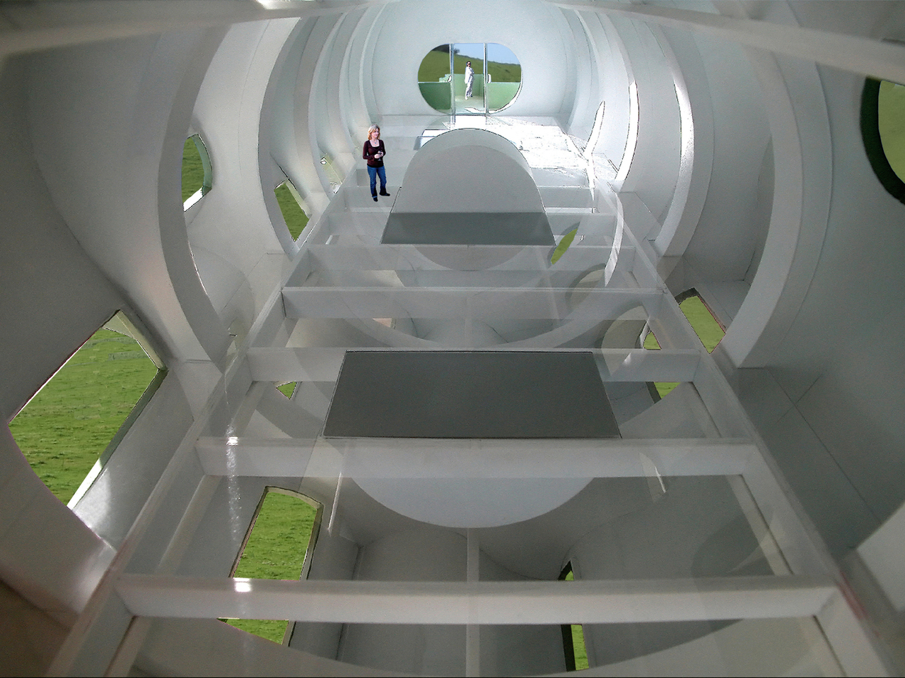
Inside, the glass floor creates a sense of floating in open space, with air and light circulating freely through openings without visual obstruction from opaque surfaces. All essential furniture is hidden in semicircular cabinets beneath the glass floor, rising up and unfolding only when needed for sleeping, eating, or working throughout daily routines. The result is a space that can be left completely open or configured for specific activities.
The absence of fixed partitions and the ability to clear the floor completely make the interior endlessly adaptable, supporting everything from quiet solitude to lively gatherings with friends. The glass floor provides an uninterrupted 360-degree view of the space and the segments rotating around it, enhancing the sensation of living inside a responsive, almost organic structure that breathes with environmental conditions.
While the Interactive Segmented House of the Future is a stunning vision worth celebrating, it faces practical challenges worth acknowledging honestly and thoughtfully. The mechanical complexity of rotating large structural segments, potential maintenance needs for motors and bearings, and the demands of glass flooring and custom fabrication could make real-world construction costly and require ongoing professional care and specialized expertise that may not be readily available.
Living in a house like this would mean waking up to new views daily, adjusting your home to match the weather naturally, and enjoying a space that feels alive and ever-changing. For anyone dreaming of a home that’s as flexible and imaginative as their own life and aspirations, this concept offers a bold proposal that blurs boundaries between architecture and living machine.
Most power banks are either too bulky for a pocket or too slow to keep up with today’s fast-charging phones that demand high wattage for quick top-ups. If you’re tired of carrying bricks that weigh down your bag or waiting ages for a recharge during short coffee breaks, finding a power bank that’s both genuinely slim and powerful enough for modern devices can feel impossible in the current market.
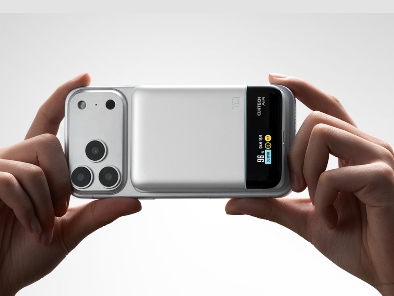
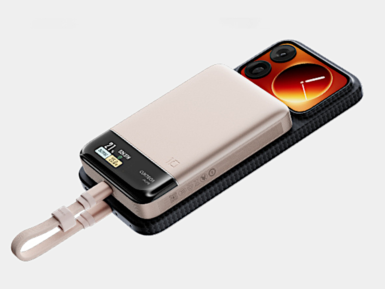
The Cuktech 10 Air offers a fresh take on portable charging for everyday carry without compromise. With a 10,000mAh capacity, 55W wired fast charging, 15W magnetic wireless charging, and a built-in display, it’s designed to slip into your pocket and keep your phone powered up quickly. At just 1.3 centimeters thick and CNY 199 (about $28), it packs premium features into an affordable package.
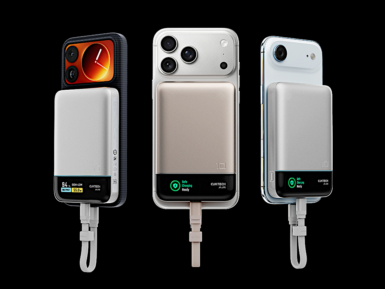
At just 1.3 centimeters thick, the 10 Air is as slim as many modern smartphones, making it easy to stack with your device magnetically or slide into a bag without creating annoying bulk or weight. The magnetic pad attaches securely to MagSafe-compatible phones for cable-free charging on the go, while the smooth, rounded shell comes in silver or gold for a modern, minimalist look that complements any device.
The built-in TFT display is a standout feature that sets the 10 Air apart from generic power banks cluttering the market. It shows real-time battery percentage, charging status, and power mode, so you’re never guessing about your next top-up or wondering if your device is actually charging properly. The transparency is refreshing compared to blind LED indicators that most competing power banks use without context.
Inside, the 10 Air uses two 5,000mAh cells for a total of 10,000mAh, rated at 5,800mAh and 38.5Wh due to voltage conversion losses. Wired charging delivers up to 55W through the USB-C port, enough to get a Xiaomi 17 Pro to 67 percent in just 30 minutes, or an iPhone 17 to nearly 70 percent in the same timeframe without overheating.
Wireless charging offers 15W for MagSafe devices, perfect for quick top-ups without fumbling for cables when your hands are full or you’re on the move. The self-storing USB-C cable measuring 13cm adds convenience by keeping everything together in one package, while support for PPS, PD, and other protocols ensures compatibility with a wide range of devices from different manufacturers worldwide.
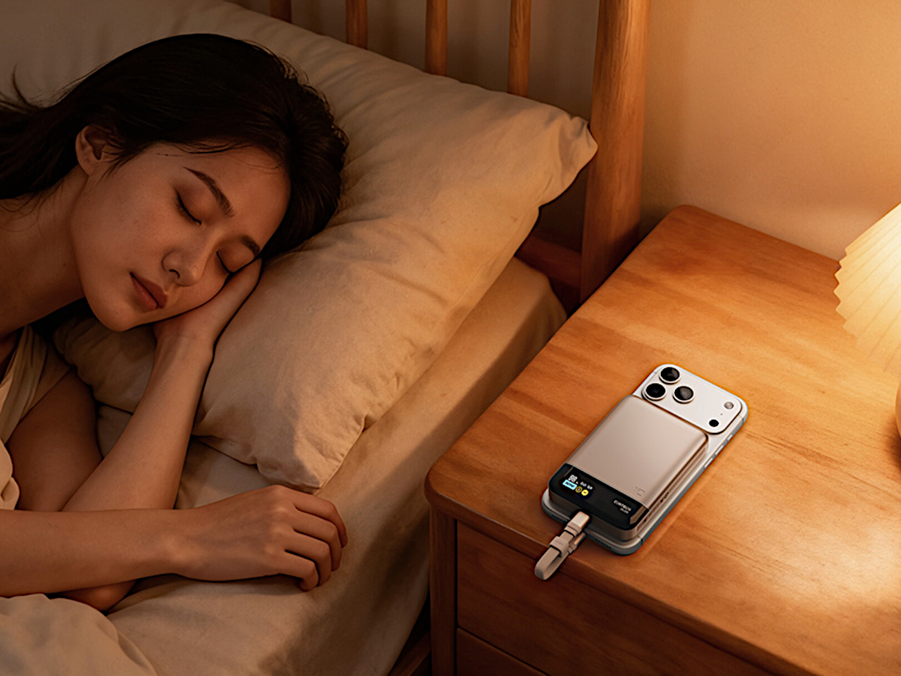
Cuktech’s OPC 2.0 worry-free charging system manages temperature intelligently, automatically stops charging when full, and protects battery health over time through smart algorithms and hardware monitoring. Hardware-level safeguards prevent overcharging, overheating, and short circuits, so you can leave your phone charging overnight without worry or anxiety. The power bank is airline-compliant at 38.5Wh, making it ideal for frequent travelers who cross borders regularly.
Whether you’re commuting, traveling internationally, or just need a slim backup for your phone during long days away from outlets, the Cuktech 10 Air fits naturally into modern life. The combination of genuine slimness, fast dual charging modes, magnetic attachment, and real-time display transparency makes it a compelling choice for anyone tired of bulky, outdated chargers.
Most nightstands are content to be quiet companions, holding books, lamps, and the occasional midnight snack without fanfare or personality throughout their lifetime. But what if your bedside table could surprise you every time you interact with it, moving with a whisper and revealing a hidden compartment at the brush of your phone against its side? What if furniture could feel alive and responsive to your touch?
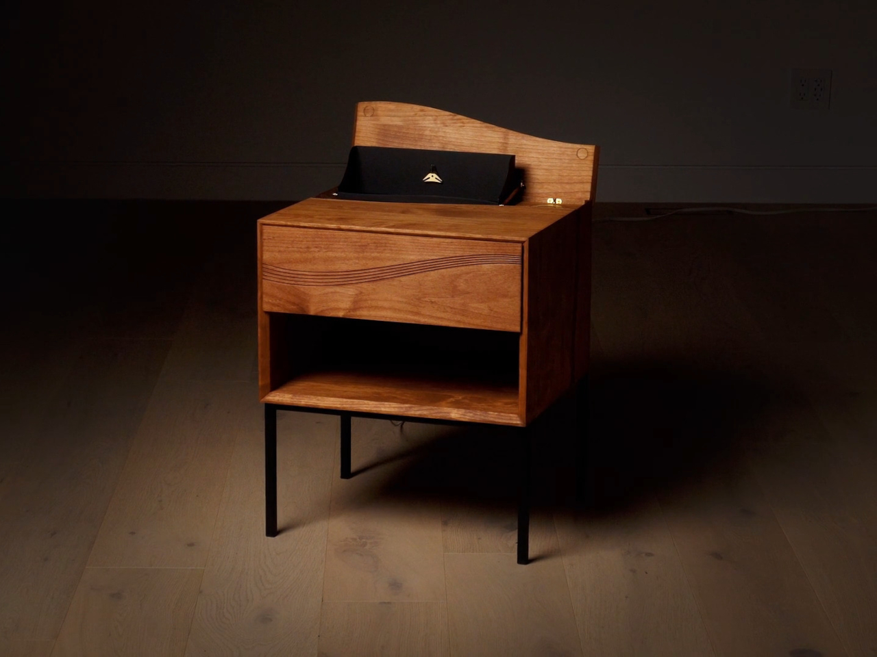
The Morpheus Nightstand goes beyond just being a place to stash your essentials and charge your devices overnight. It’s a kinetic sculpture, a feat of precision brass engineering, and a piece of furniture that turns daily routines into moments of wonder and discovery. On the surface, it looks like a refined, classical nightstand, but beneath the calm exterior lies something far more intriguing and delightful for those who appreciate mechanical marvels.
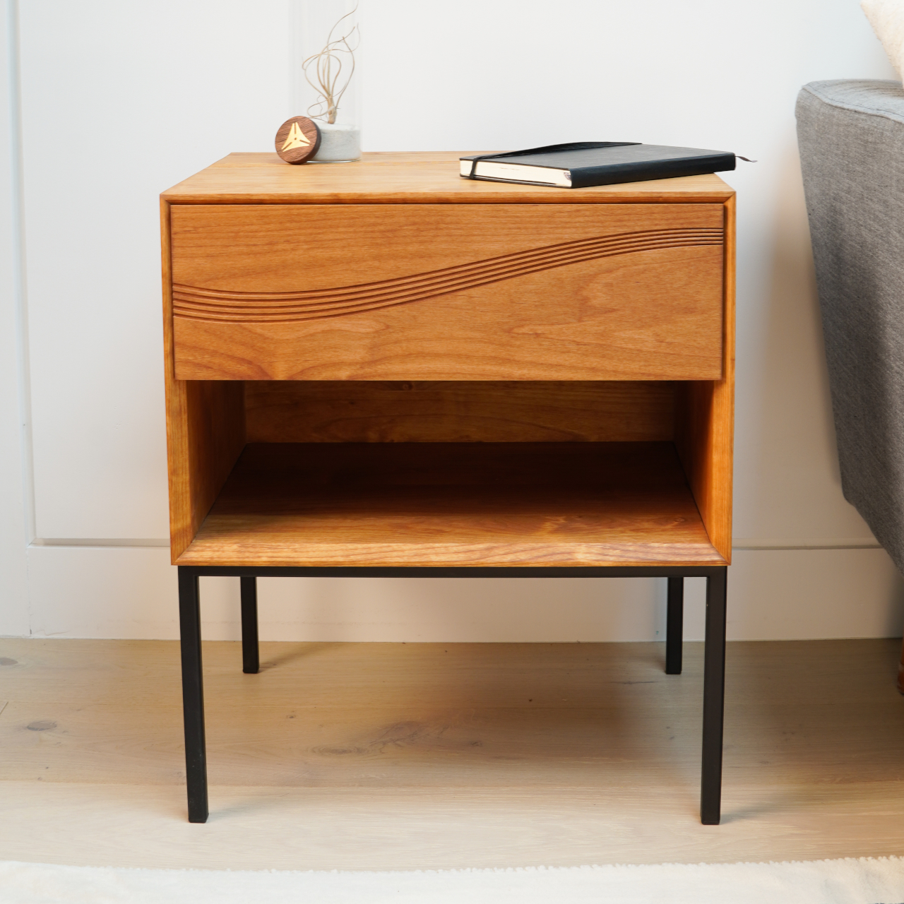
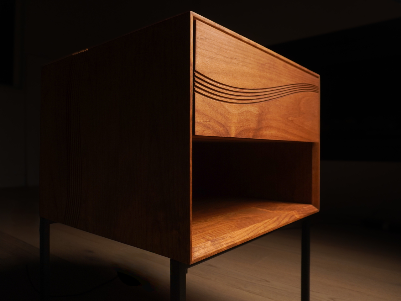
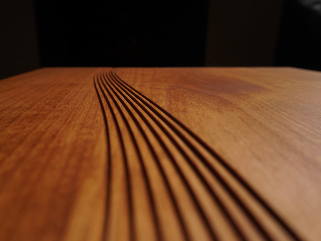
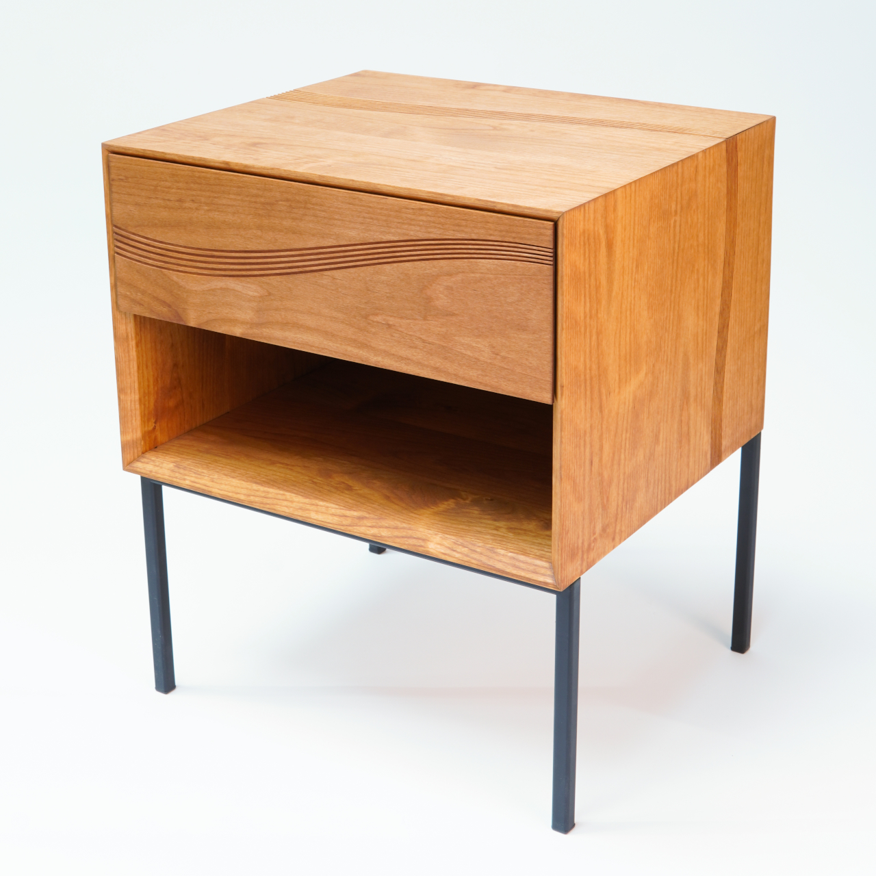
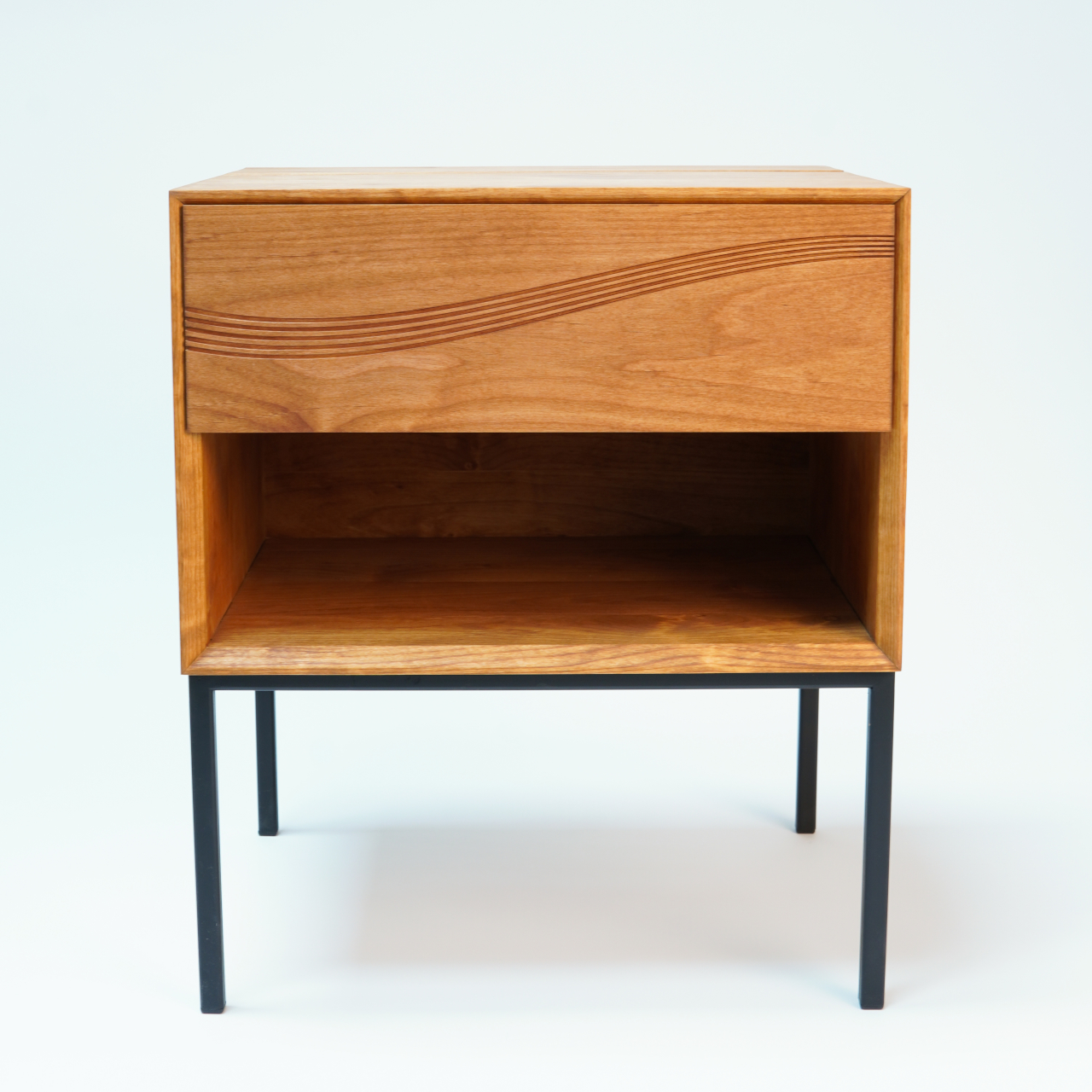
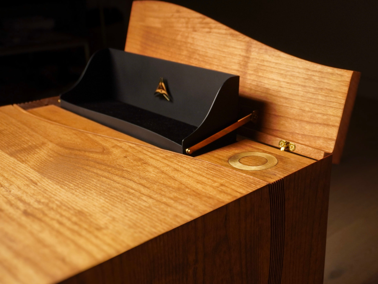
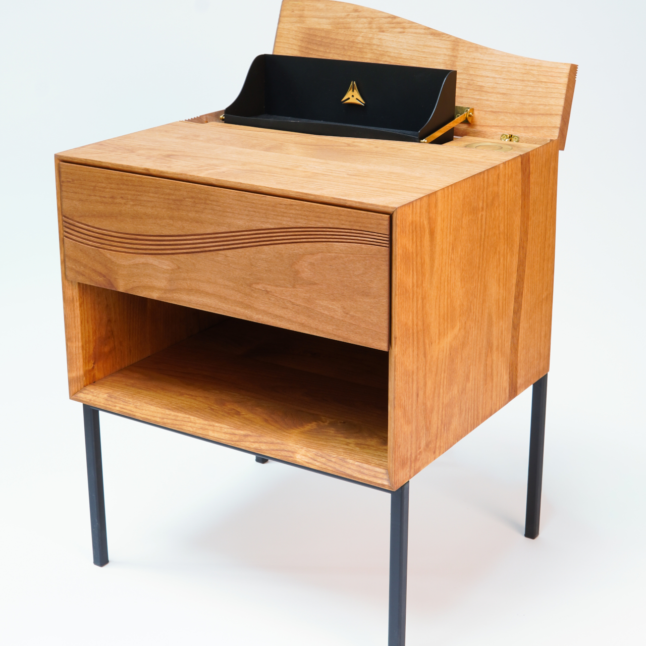
Morpheus appears calm and composed at first glance, with fluted wood surfaces, crisp geometry, and a refined silhouette that fits into any luxury interior seamlessly without demanding attention. The wave motif carved across the drawer front is both decorative and functional, disguising seams so perfectly that they seem to vanish into the surface completely. The craftsmanship is immediately apparent to anyone who appreciates fine furniture and attention to detail.
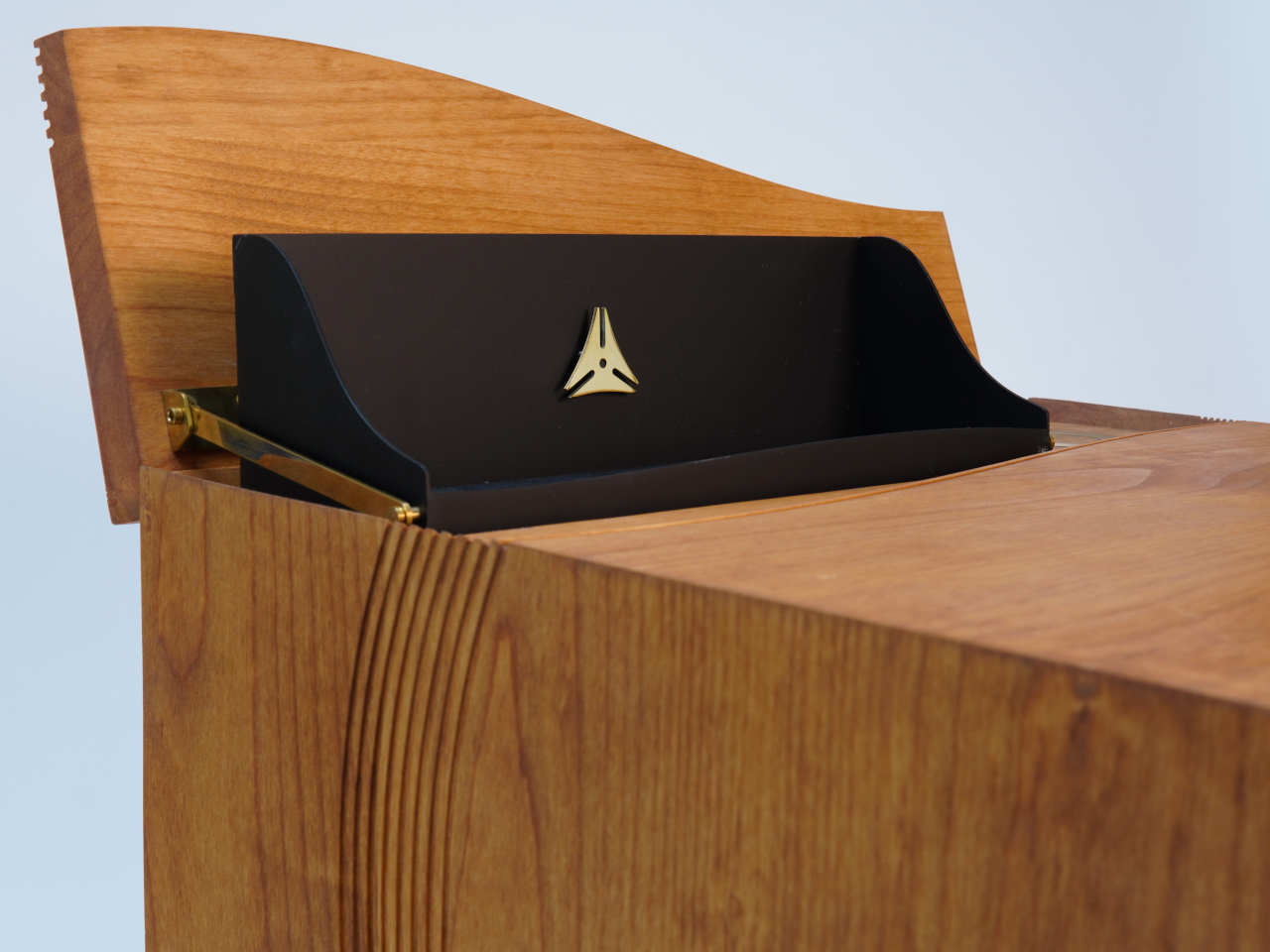
The nightstand is handcrafted from warm hardwood, with slender dark legs and brass accents that hint at the mechanical complexity hidden inside, waiting to be discovered through interaction. Every detail is finished to heirloom standards, blending classic cabinetmaking traditions with contemporary minimalism and modern sensibilities. The piece feels substantial without being heavy, refined without being cold, and modern without abandoning timeless design principles that make furniture last for generations.
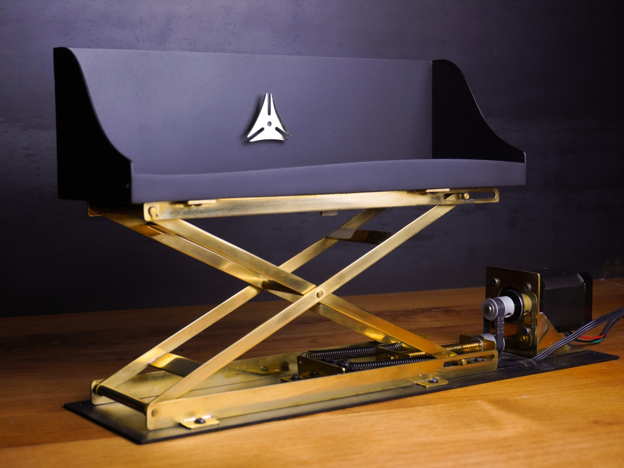
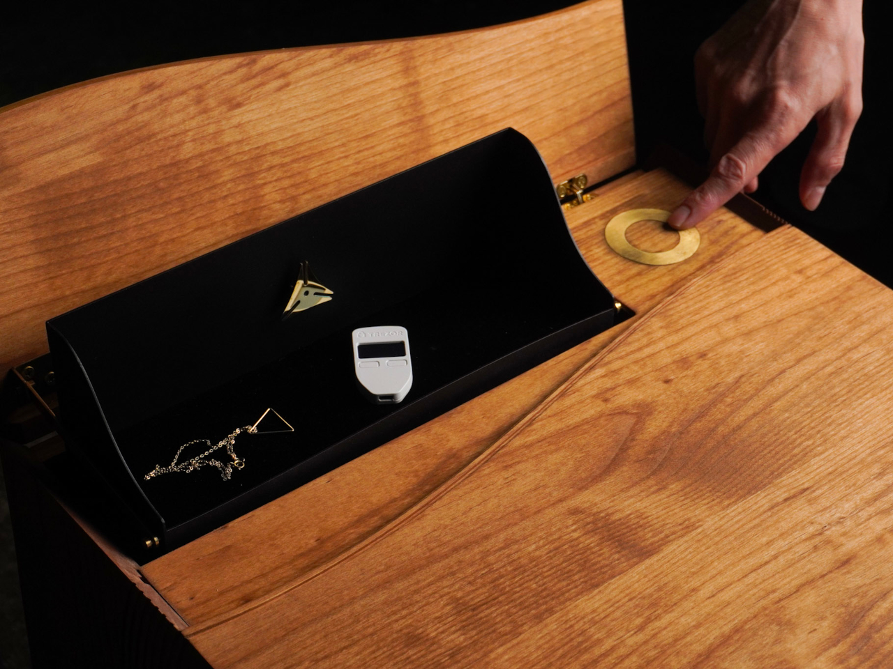
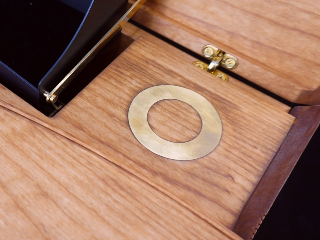
The real magic happens when you interact with Morpheus through its hidden NFC sensor embedded invisibly within the wood. Unlocking the secret compartment requires only a phone swipe on the nightstand’s side, activating integrated technology that feels almost magical. A custom brass scissor lift rises in complete silence, revealing a hidden space for valuables, keepsakes, or whatever you want to tuck away from view during the day when you’re not home.
The mechanism folds into just two centimeters of space when closed, a timepiece-like marvel of precision brass engineering and craftsmanship. The compartment closes with a gentle touch on a brass inlay set into the wood surface, turning storage into a tactile, almost poetic ritual. Watching the mechanism unfold and retract is satisfying in a way that regular drawers simply cannot match, adding genuine delight to everyday function and making bedtime routines special.
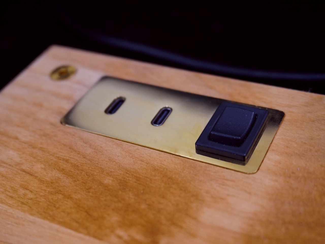
The nightstand isn’t just about secrets and hidden mechanisms that amaze guests. Integrated USB-C charging ports and a physical switch add modern convenience for phones and devices, while the open shelf and spacious drawer provide practical storage for books, reading glasses, or tech accessories. Morpheus is designed to be lived with daily, not just admired from afar like museum pieces locked behind glass cases.
Morpheus continues a centuries-old tradition of mechanical furniture with hidden compartments, but updates it with precision brass engineering and smart electronics for modern living and contemporary lifestyles. For those who believe furniture should do more than sit quietly in the corner without personality or interaction, this nightstand offers a compelling reminder that great design can surprise, delight, and move you both literally and emotionally every single day.
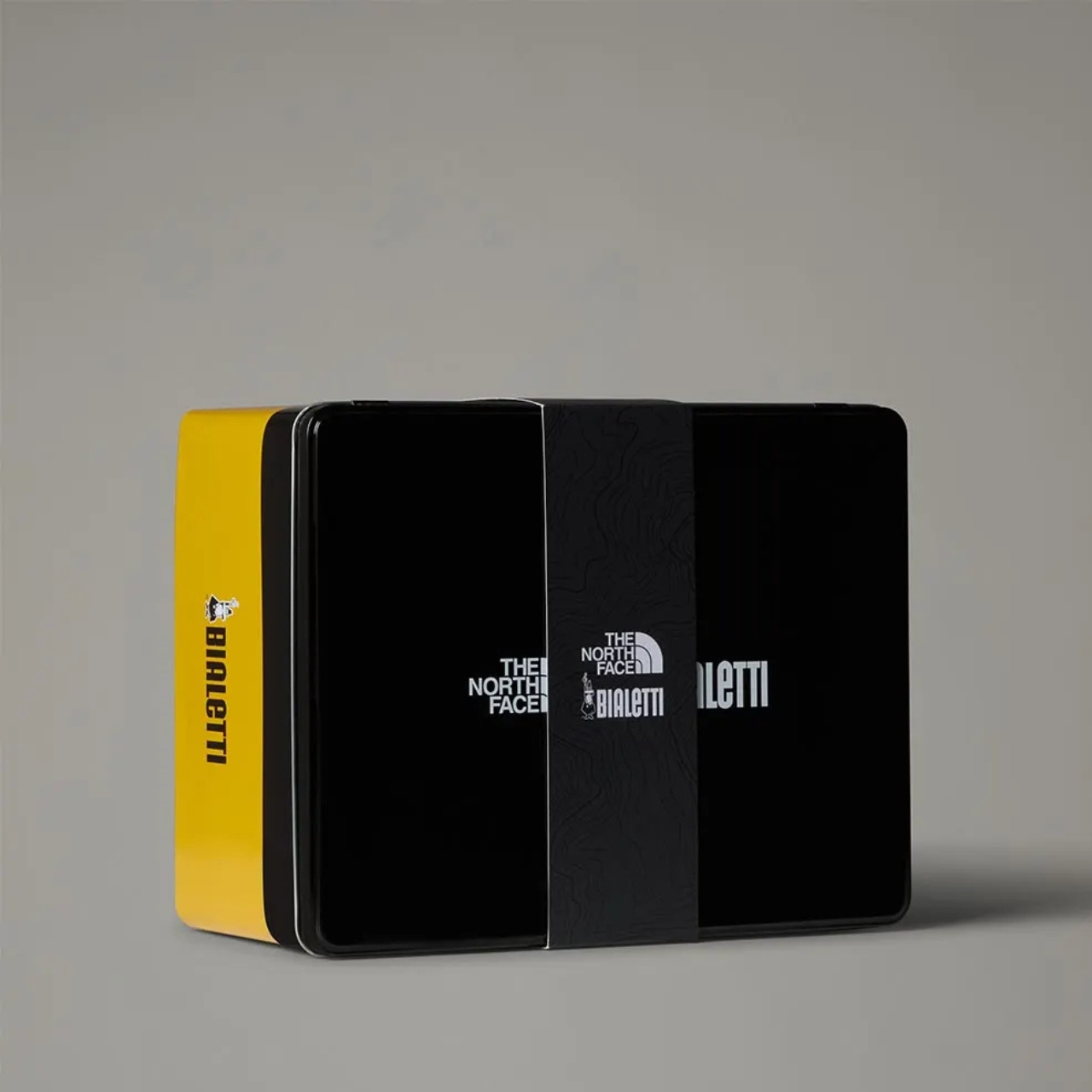
There’s something beautifully absurd about combining outdoor gear with coffee culture, and the new collaboration between The North Face and Bialetti hits that sweet spot perfectly. It’s the kind of partnership that makes you wonder why it didn’t happen sooner, bringing together two iconic brands that have been fueling adventures in their own ways for decades.
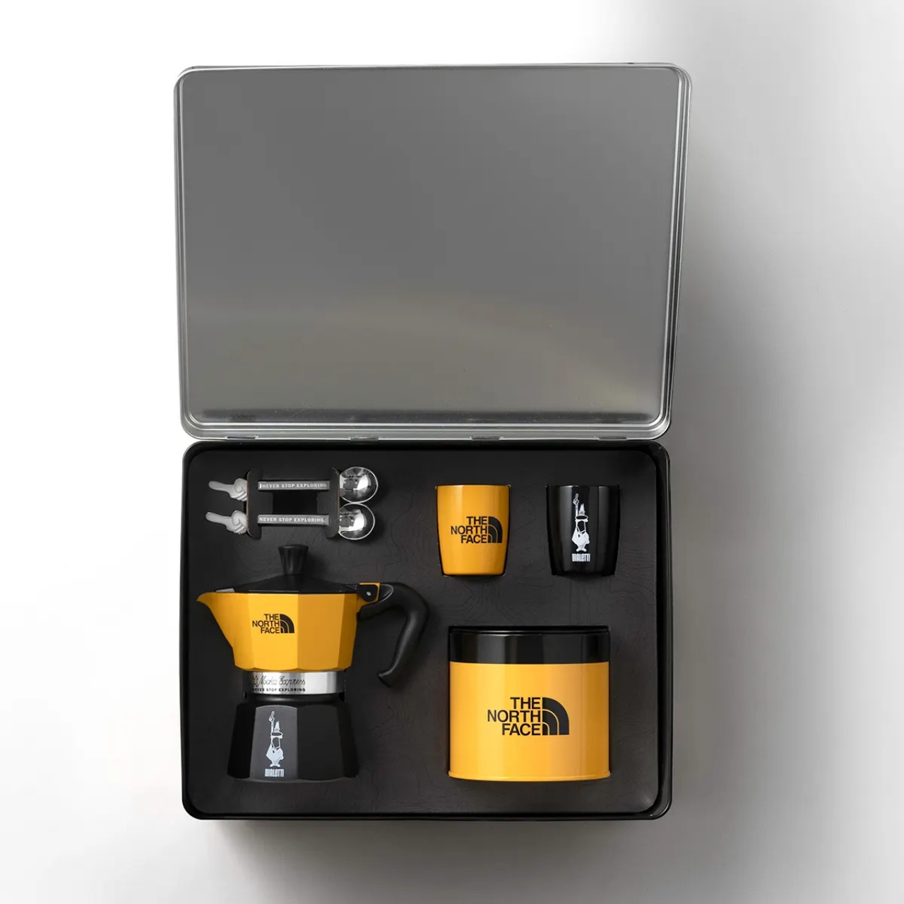
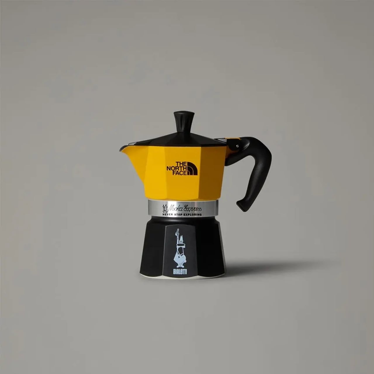
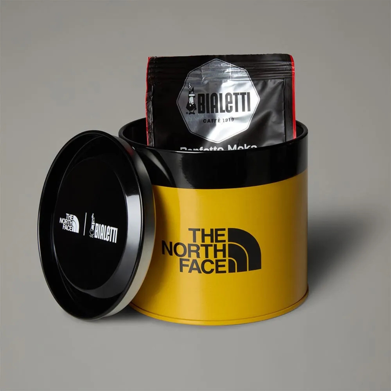
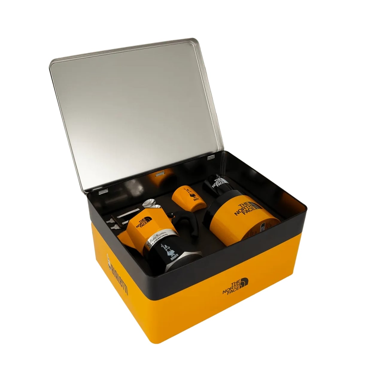
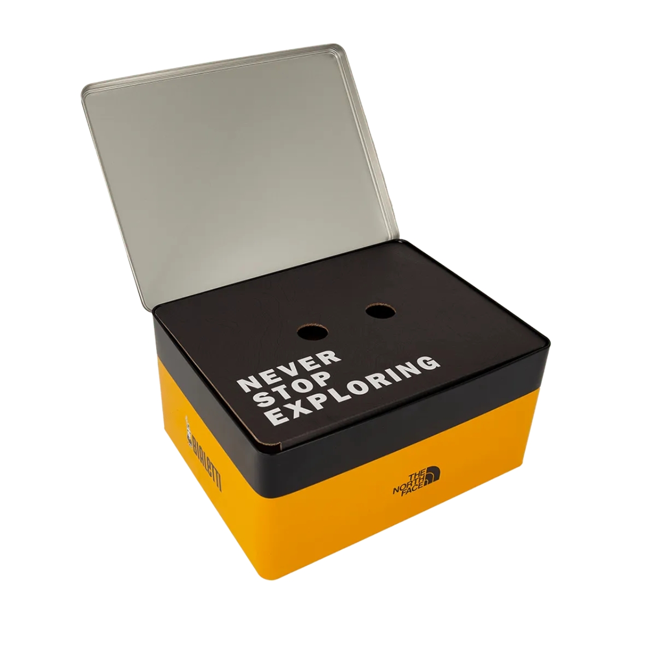
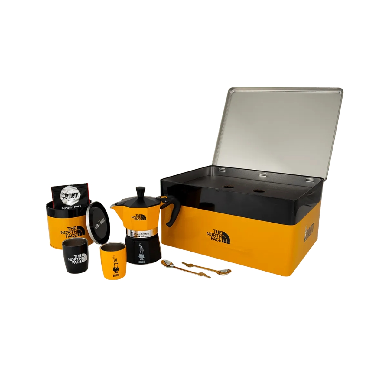
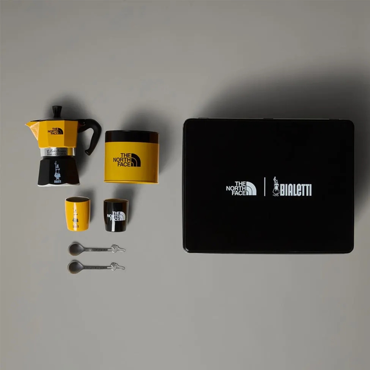
The TNF x Bialetti Moka Set is exactly what it sounds like: a limited-edition coffee kit that packages Italian espresso tradition in North Face’s signature Summit Gold and black colorway. At the heart of the set is a three-cup Moka Express, the classic aluminum stovetop coffee maker that’s been gracing Italian kitchens since 1933. This version comes emblazoned with both brands’ logos and The North Face’s “Never Stop Exploring” slogan, because apparently your morning caffeine ritual is now an expedition.
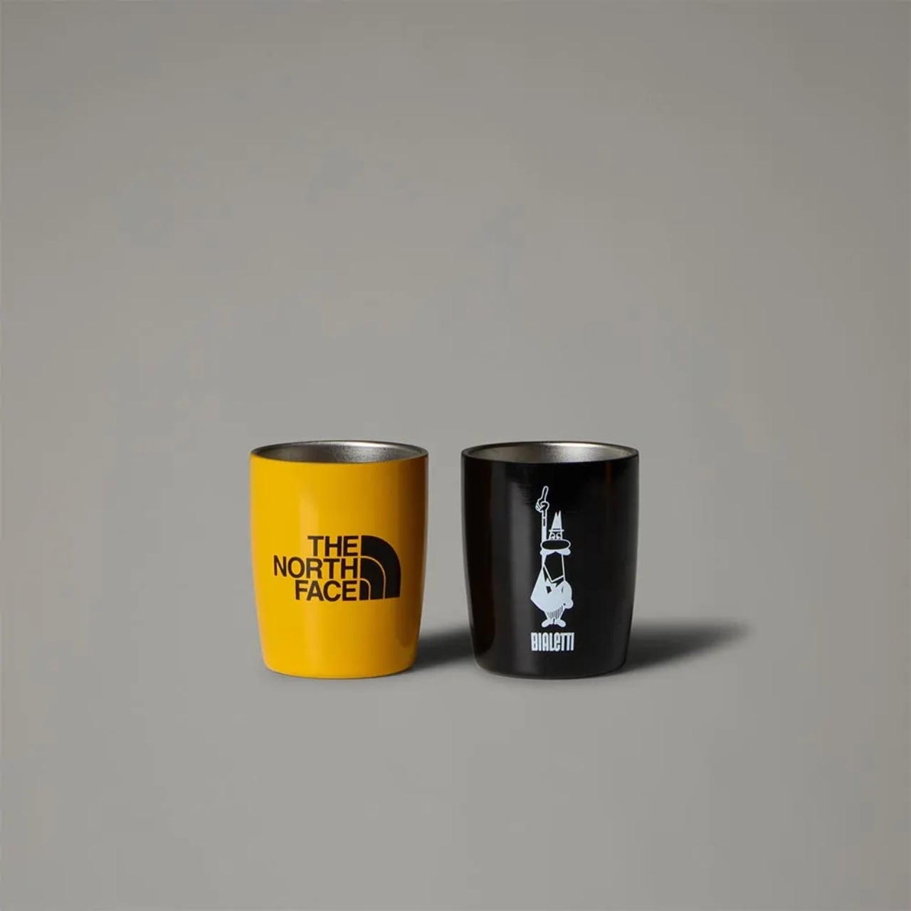
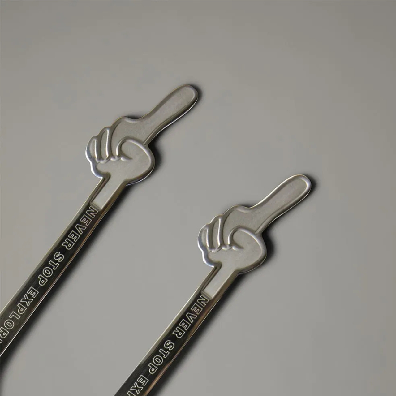
But here’s the thing about this collaboration, it’s not trying to be some ultralight backpacking essential. Despite the marketing suggesting it’s built for explorers and designed to be taken on the road or trail, this is really more about bringing style to your coffee routine than revolutionizing camp cooking. The set comes in a fairly large box and includes two stainless steel cups (one in Summit Gold, one in Bialetti black), matching spoons, and a 100-gram tin of pre-ground Bialetti coffee. It’s comprehensive, coordinated, and honestly quite handsome, even if the portable claims are a bit optimistic.
What makes this collaboration interesting isn’t its practicality for wilderness expeditions. It’s the cultural collision it represents. Bialetti’s Moka Express is a design icon in its own right, as recognizable in Italy as The North Face’s logo is on college campuses worldwide. Both brands carry serious nostalgia and street cred in their respective spheres. Bialetti revolutionized home espresso making with a design so perfect it hasn’t fundamentally changed in nearly a century. The North Face turned technical mountaineering gear into everyday fashion statements. Together, they’ve created something that speaks to coffee nerds, design enthusiasts, and brand collectors equally.
The color scheme is where this collab really shines. That Summit Gold is instantly recognizable if you’ve ever owned or lusted after a vintage North Face jacket, and seeing it on a Moka pot feels both surprising and completely right. The black and gold combination gives the entire set a premium, cohesive look that transcends either brand’s individual aesthetic.
Now let’s address the elephant in the room: the price. At $220, this isn’t exactly an impulse purchase. You can get a standard Moka Express for a fraction of that cost. But you’re not just buying a coffee maker here. You’re buying into a collaboration between two heritage brands, complete with the matching cups, spoons, and that perfectly branded tin. It’s collectible merch that happens to make excellent coffee, or an excellent coffee setup that happens to be collectible merch, depending on how you look at it.
The reality is that this set probably makes more sense sitting on your apartment’s kitchen counter or at your glamping setup than it does in your actual hiking pack. And that’s perfectly okay. Not every outdoor-branded product needs to summit Everest. Sometimes it’s enough to add a little adventure aesthetic to your morning routine, to have that moment of enjoying rich Italian espresso while wearing your Nuptse jacket and dreaming about trails you’ll hike someday.
This collaboration taps into something broader happening in design culture right now: the blurring of boundaries between function and lifestyle, between genuine outdoor gear and urban fashion, between coffee equipment and collectible objects. It’s the same impulse that puts Supreme on Coleman coolers or sees luxury brands creating camping gear. We want our everyday objects to tell stories about who we are or who we want to be.
Whether the TNF x Bialetti Moka Set is worth the investment depends on how much you value that intersection of coffee culture, design heritage, and brand storytelling. If you’re someone who gets excited about limited-edition collaborations and appreciates when iconic designs get reimagined, this might be calling your name. Just don’t expect it to revolutionize your backpacking coffee game.