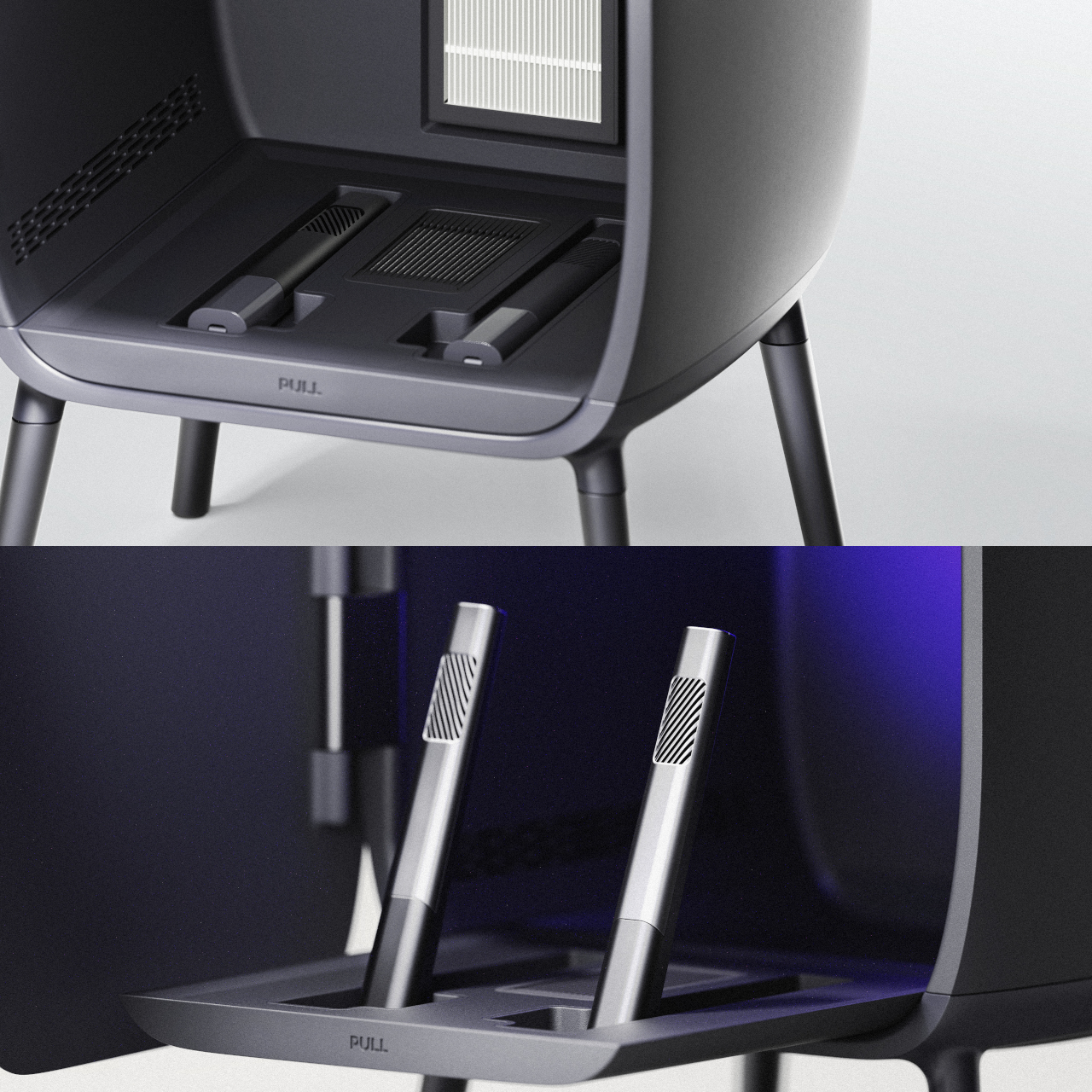
We’ve reached that fascinating point where medical care is starting to look less like a hospital trip and more like a beautifully designed tech accessory you’d actually want sitting on your bathroom counter. Enter Retune, a concept device from designer Yewon Lee that imagines what could happen when wound care meets sophisticated technology.
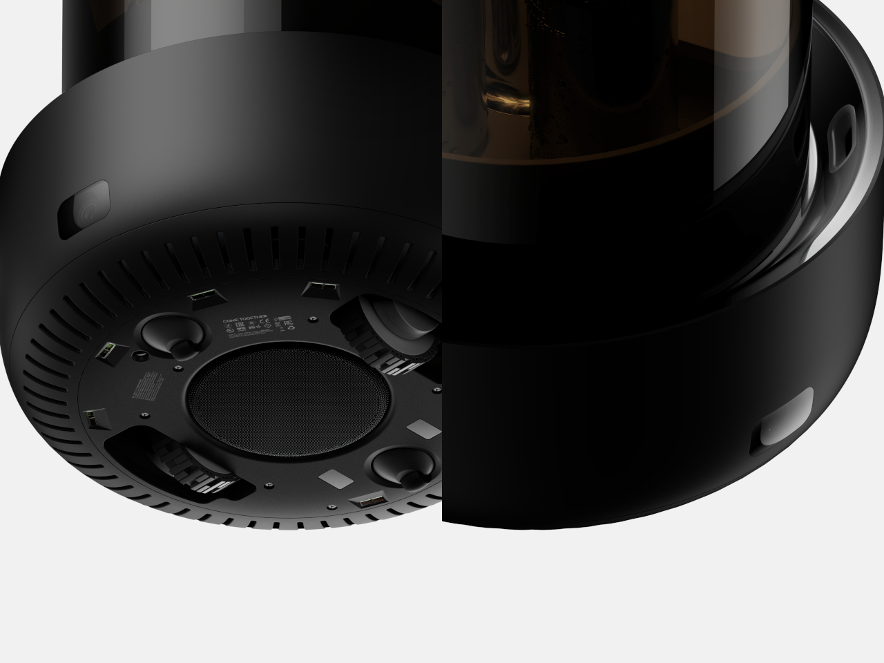
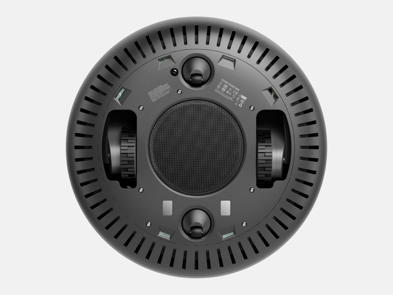
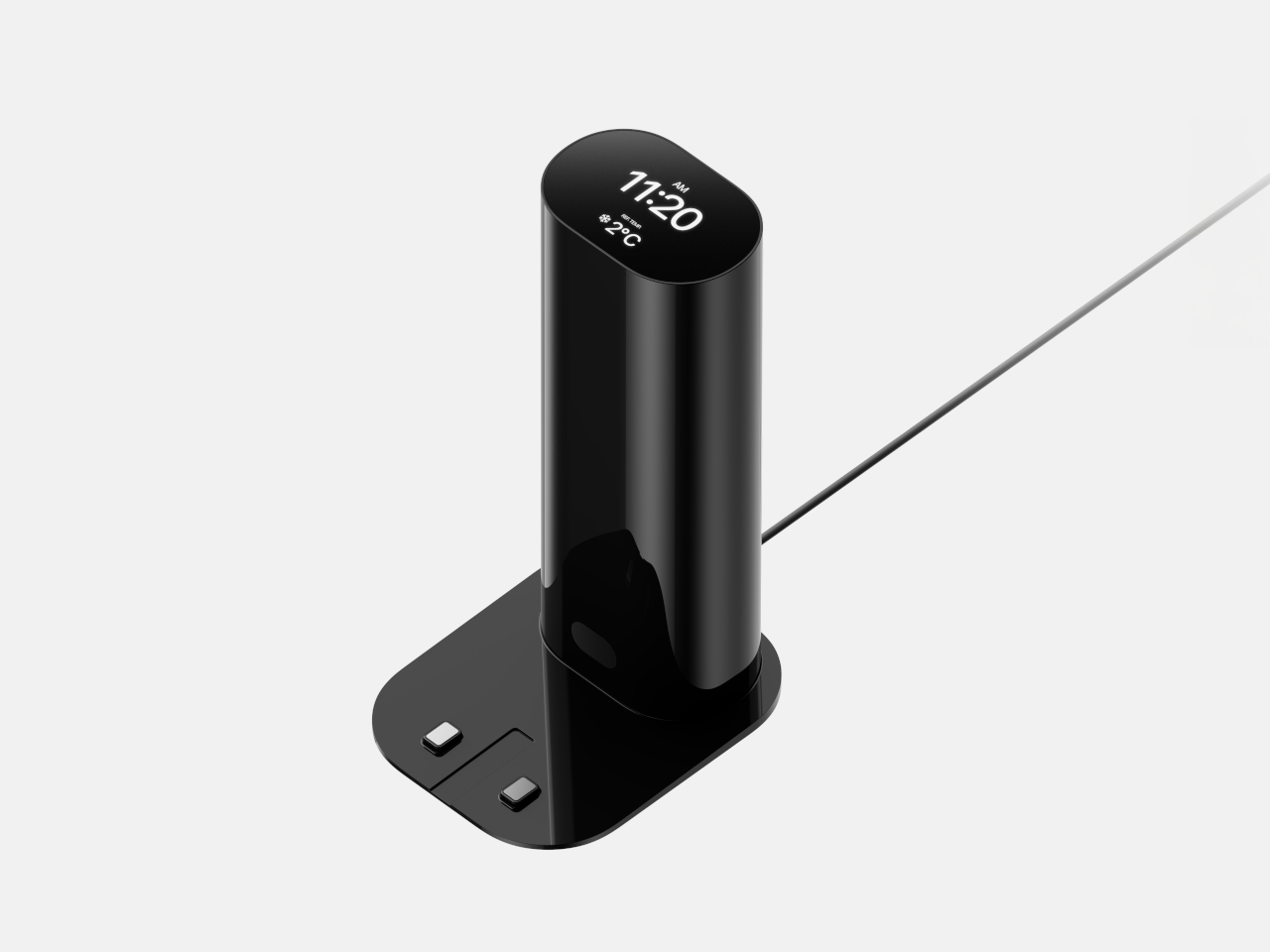
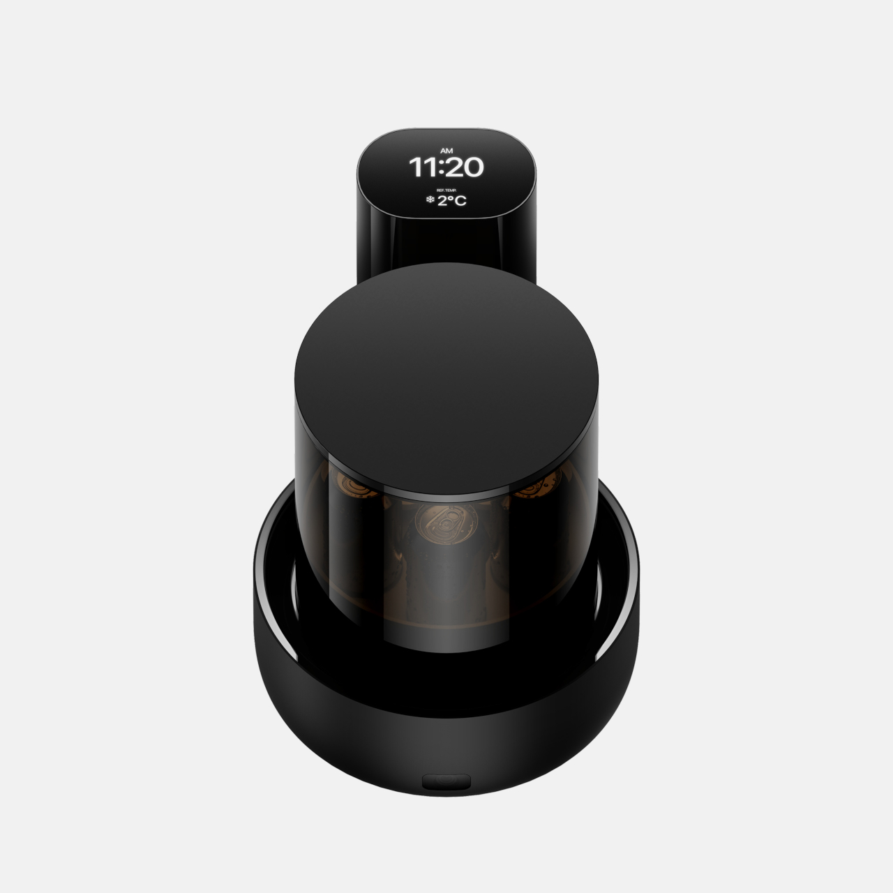
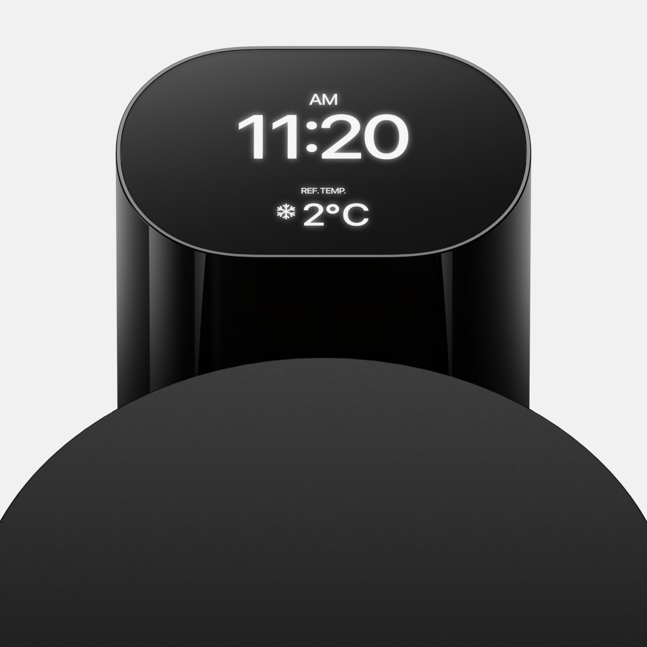
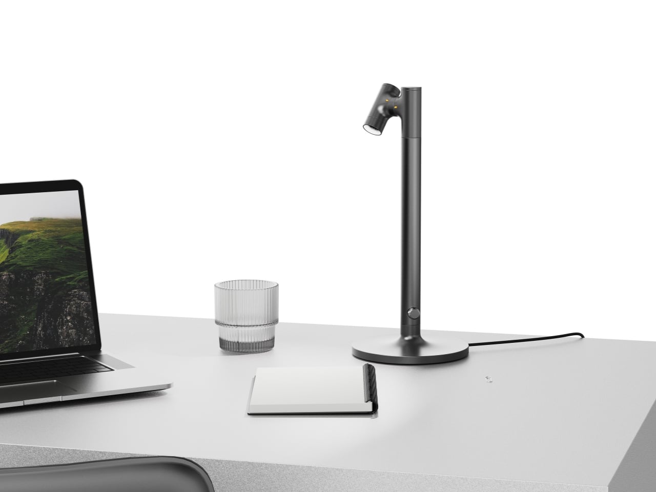
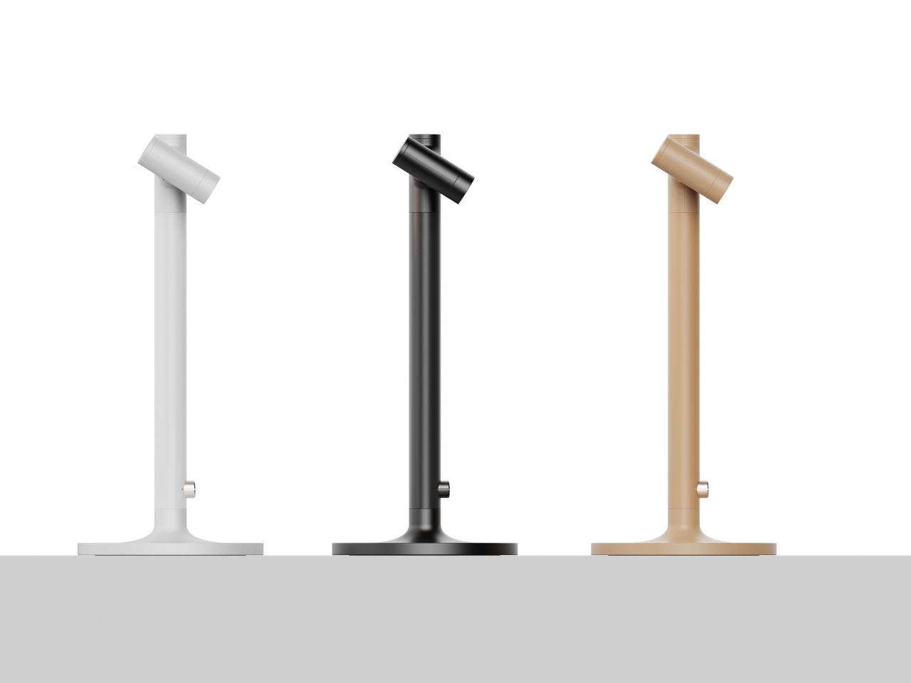
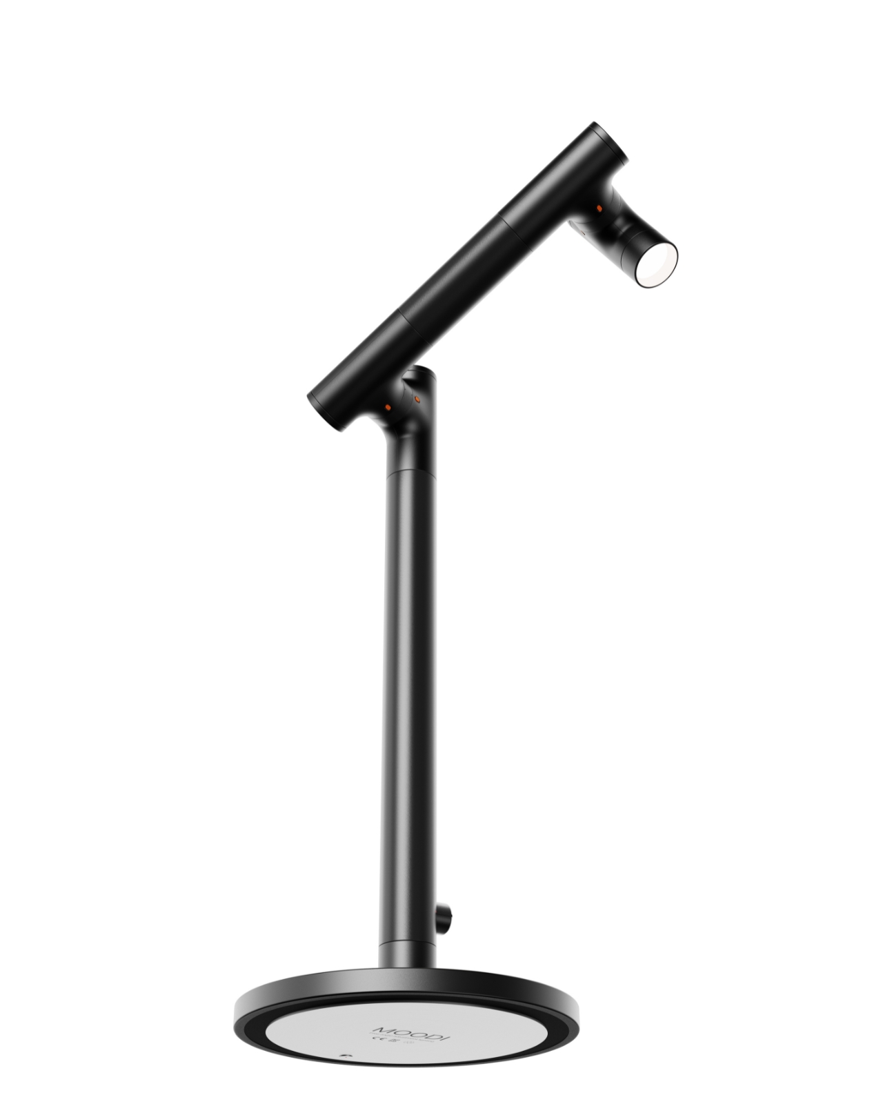
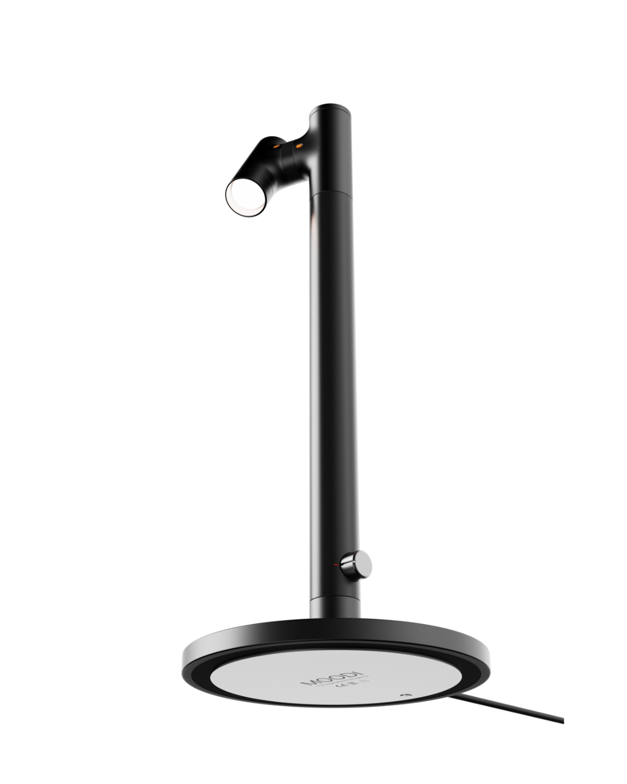
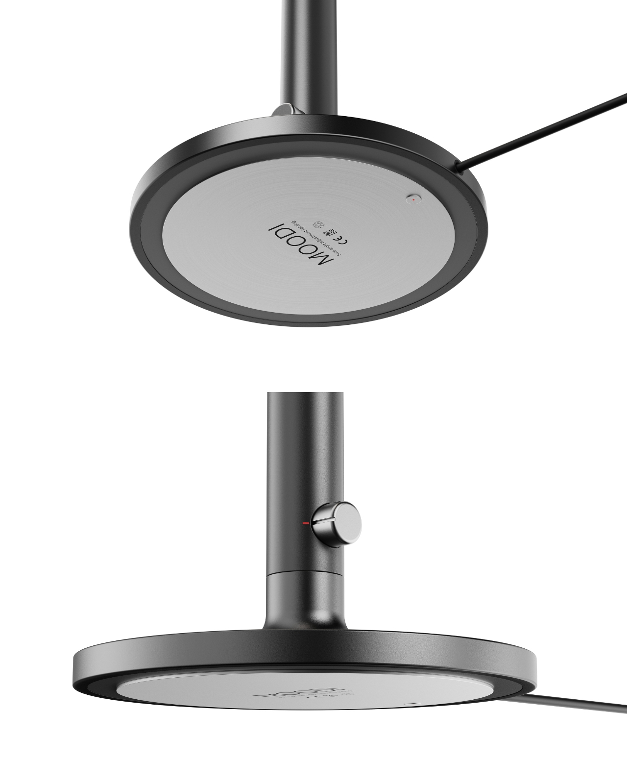
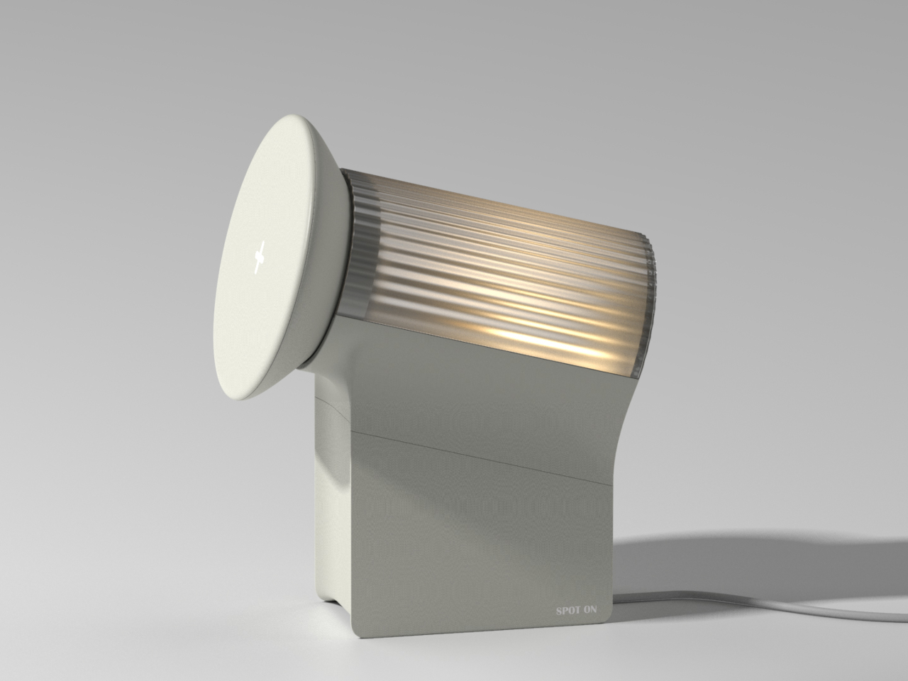
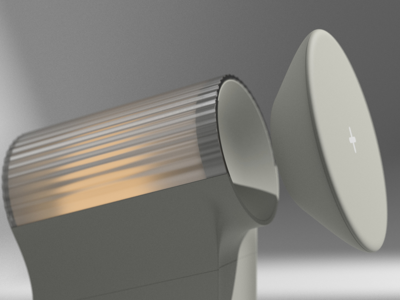
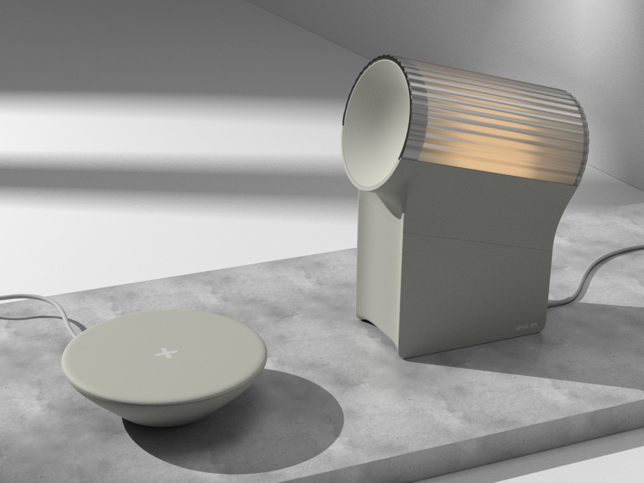
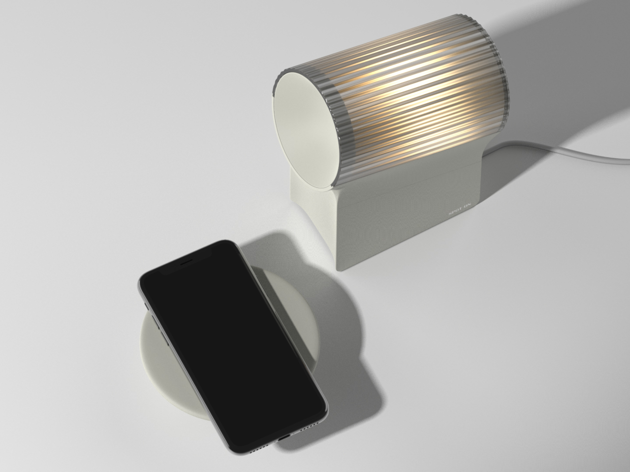
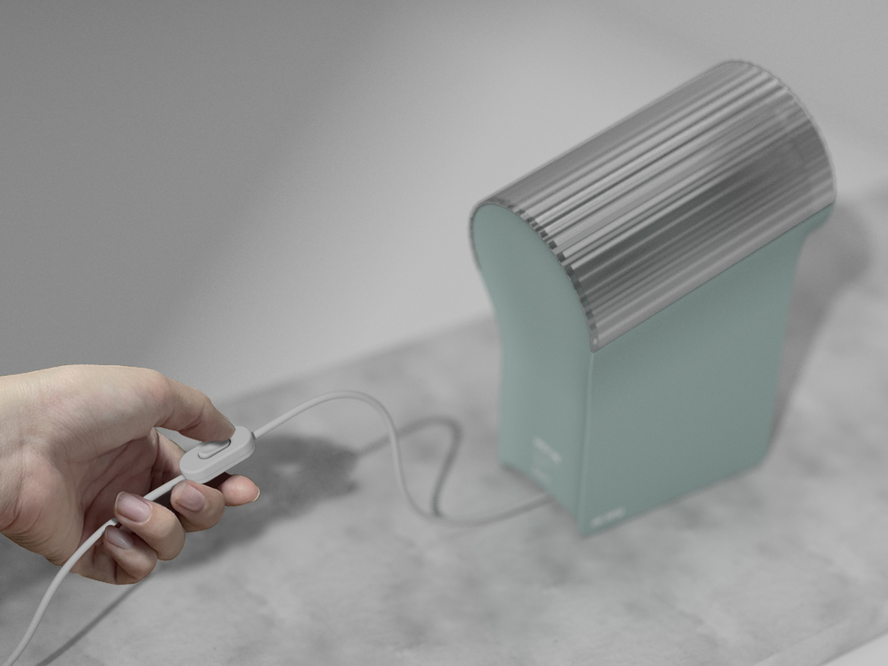
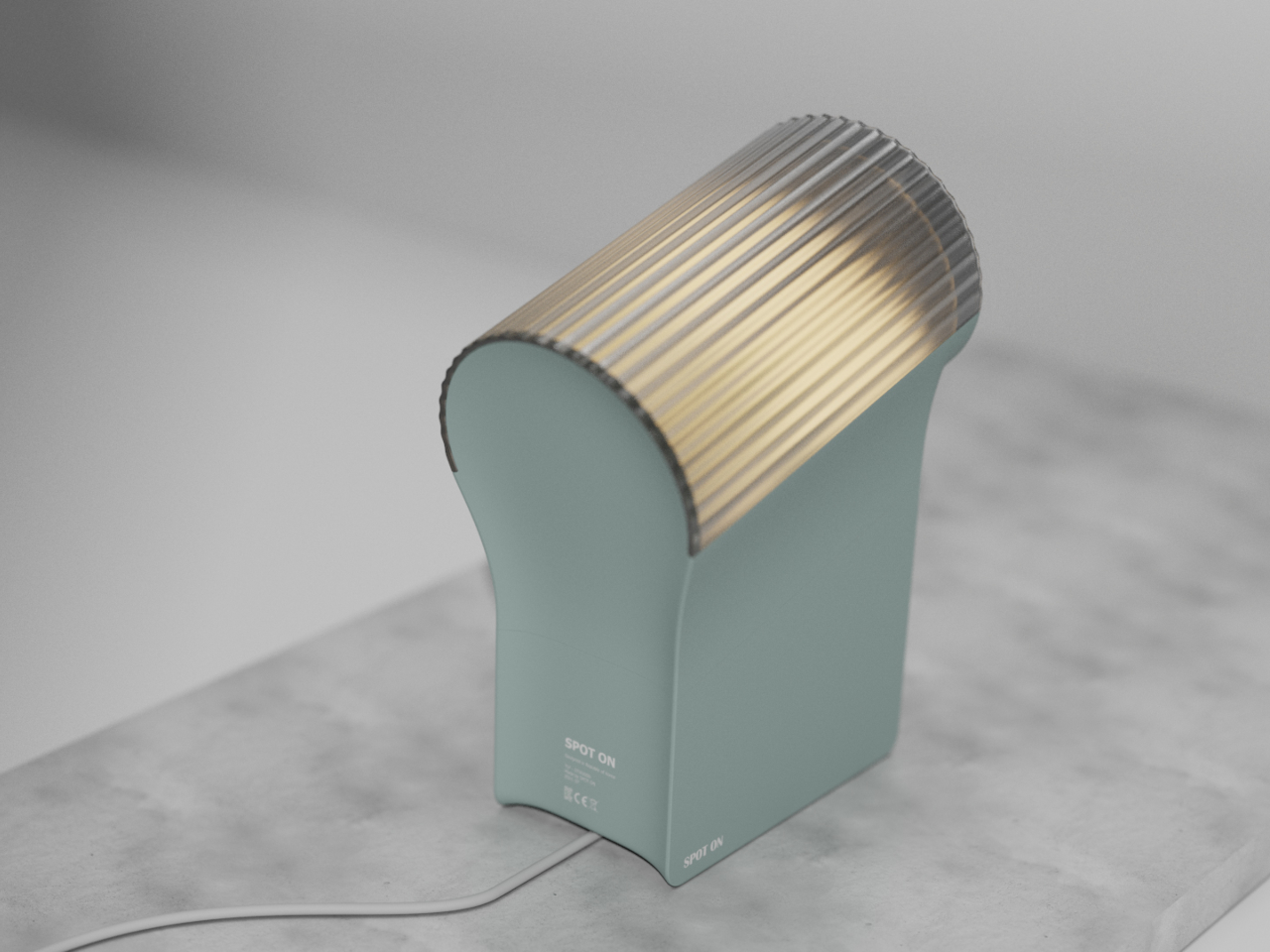
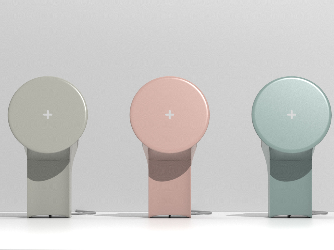
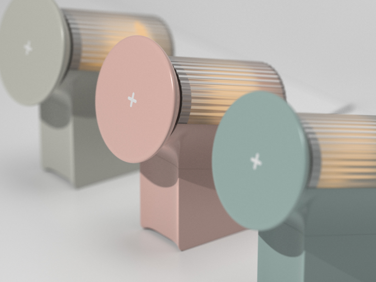
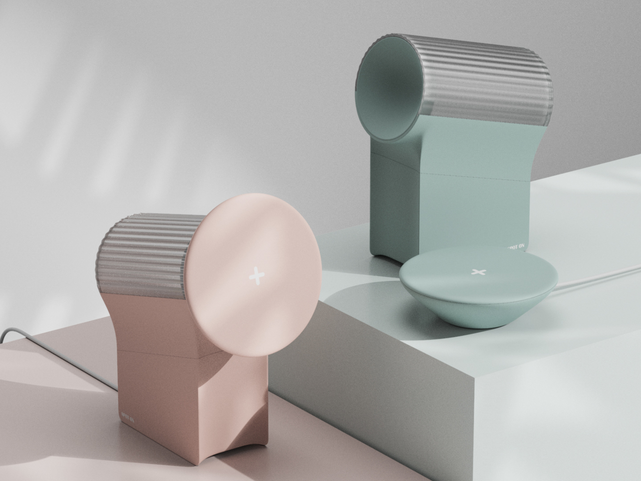
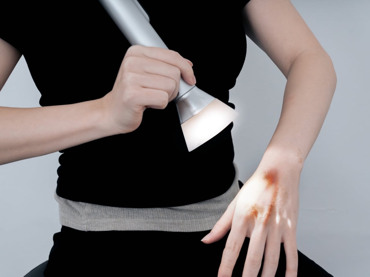
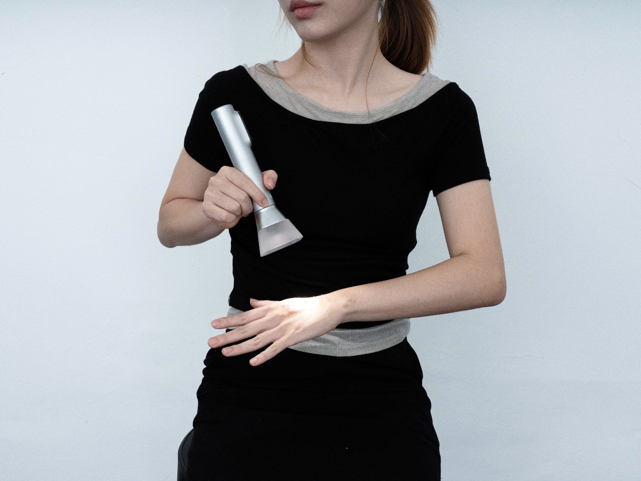
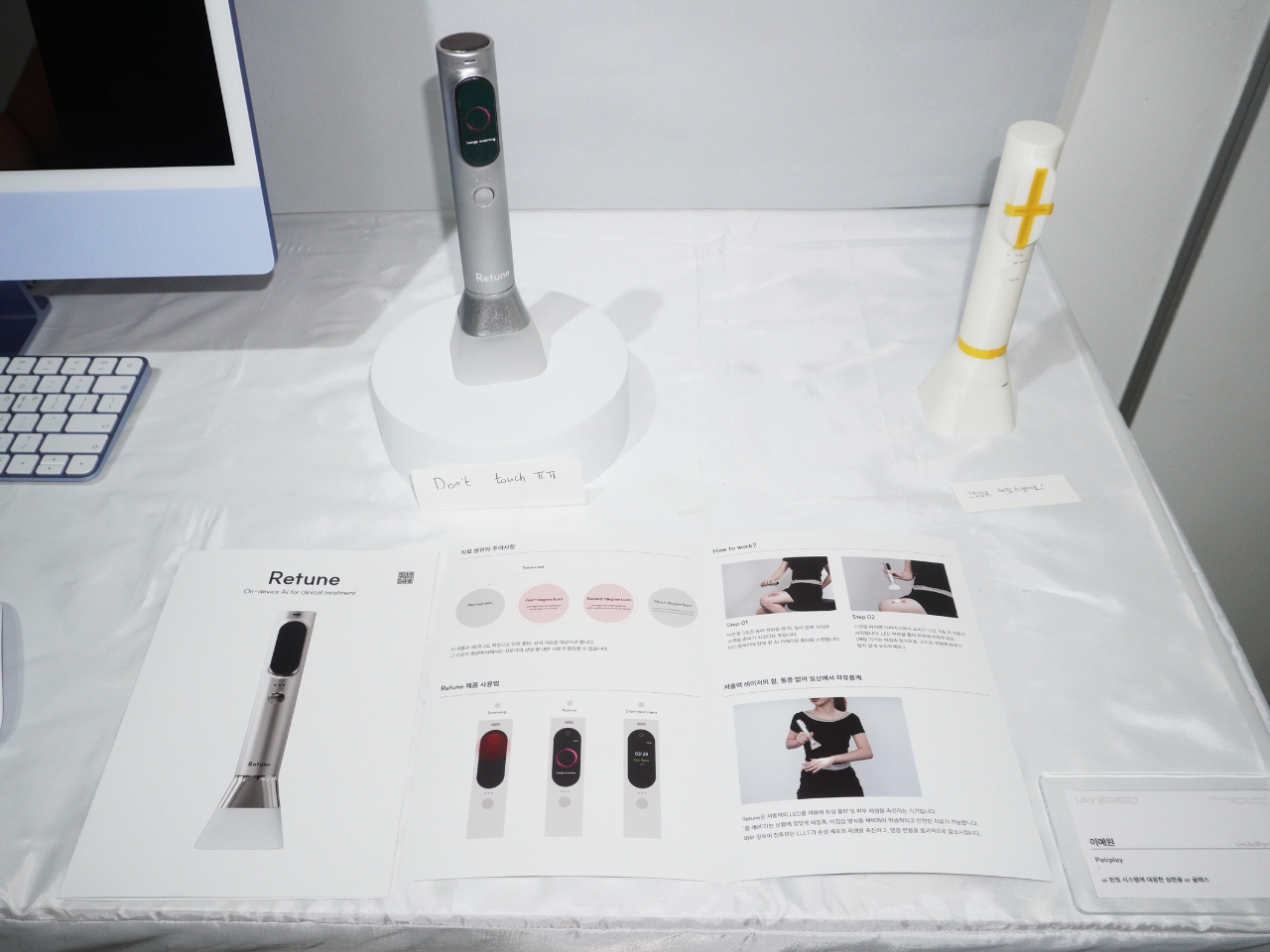
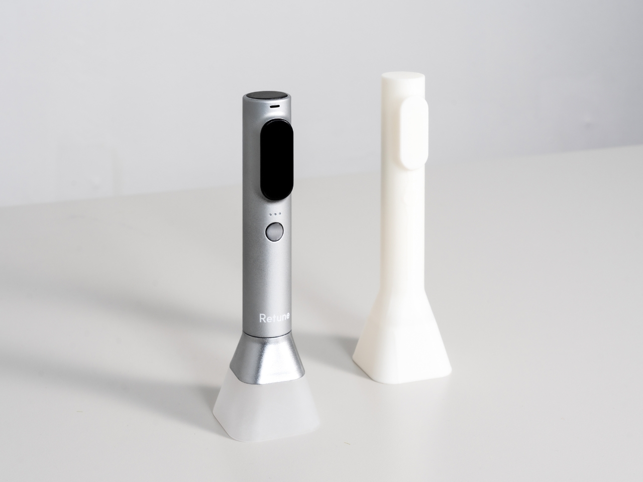
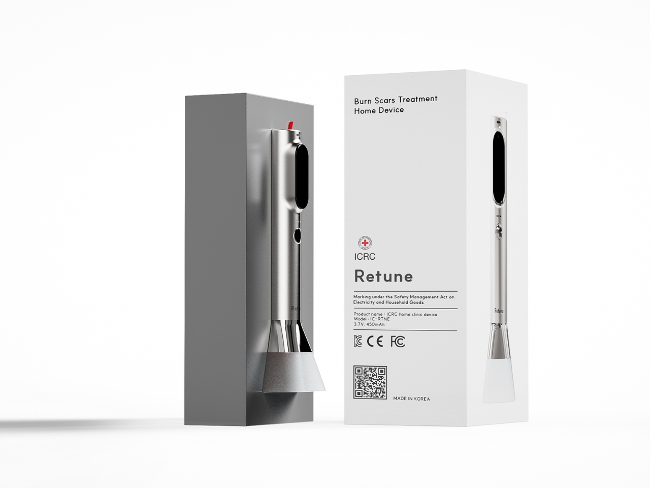
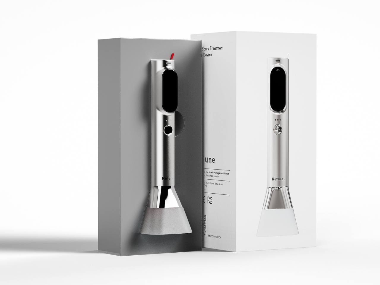
At first glance, Retune looks like it could be a high-end electric toothbrush or maybe one of those fancy skincare tools that influencers rave about. The minimalist silver cylinder sits elegantly on a white charging base, giving off serious Apple Store vibes. But this concept isn’t about vanity. It’s about envisioning how legitimate medical treatment could integrate into your daily routine without the hassle of clinic visits or the anxiety of wondering if you’re doing it right.
Designer: Yewon Lee
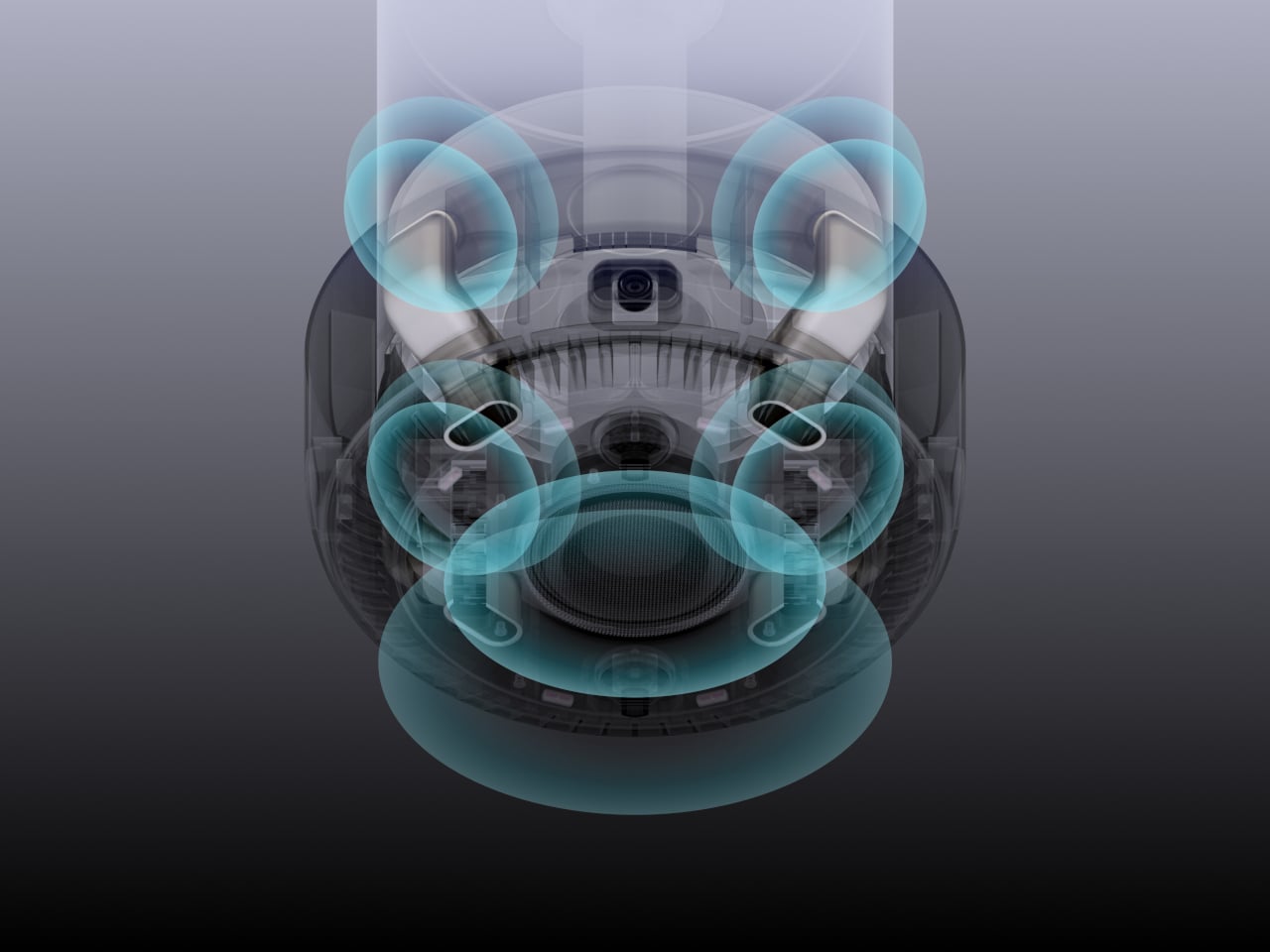
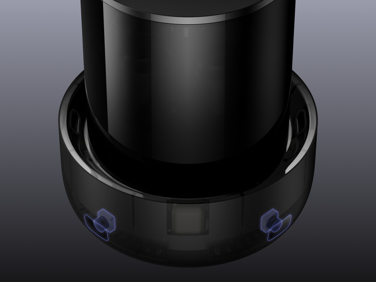
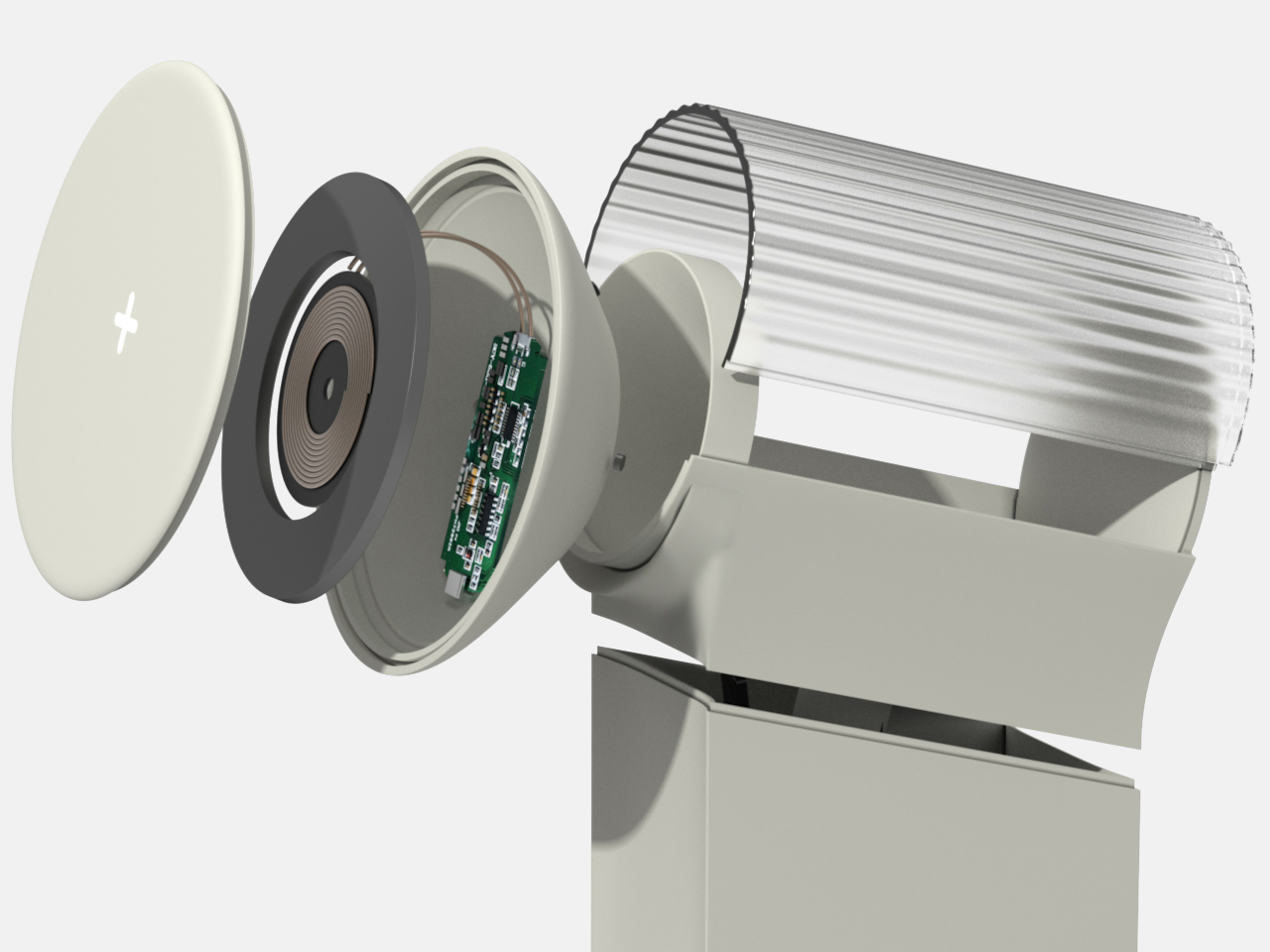
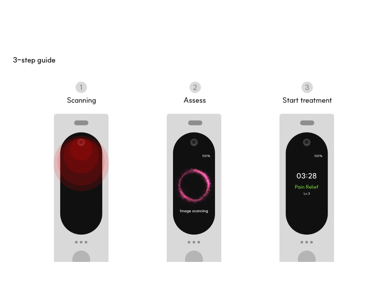
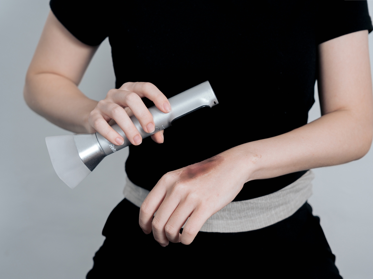
Here’s the thing that makes this concept genuinely interesting. The proposed device would use an AI-powered camera to actually scan your burn or scar, assess what’s going on, and then deliver customized LED light therapy based on what it finds. We’re not talking about guesswork or one-size-fits-all settings. The system would analyze the severity of scarring and inflammation in real time, then adjust the treatment accordingly. It’s like imagining a dermatologist’s diagnostic skills packed into something you can hold in one hand.
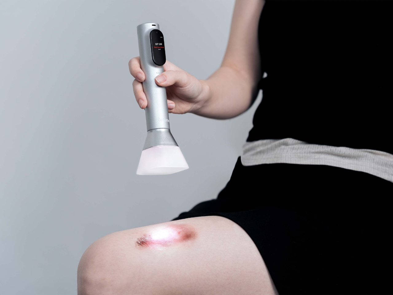
The envisioned process is refreshingly simple. You’d scan the affected area with the AI camera, wait for the device to analyze what it sees, and then it would provide the appropriate treatment. No complicated menus to navigate, no wondering if you’ve selected the right setting. The intelligence would be baked right into the device itself, working without needing constant connectivity or cloud processing. Your wound data stays on the device, which is honestly a relief in an era where everything seems to require an app and an internet connection.
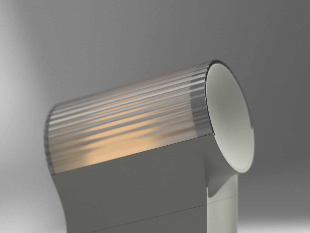
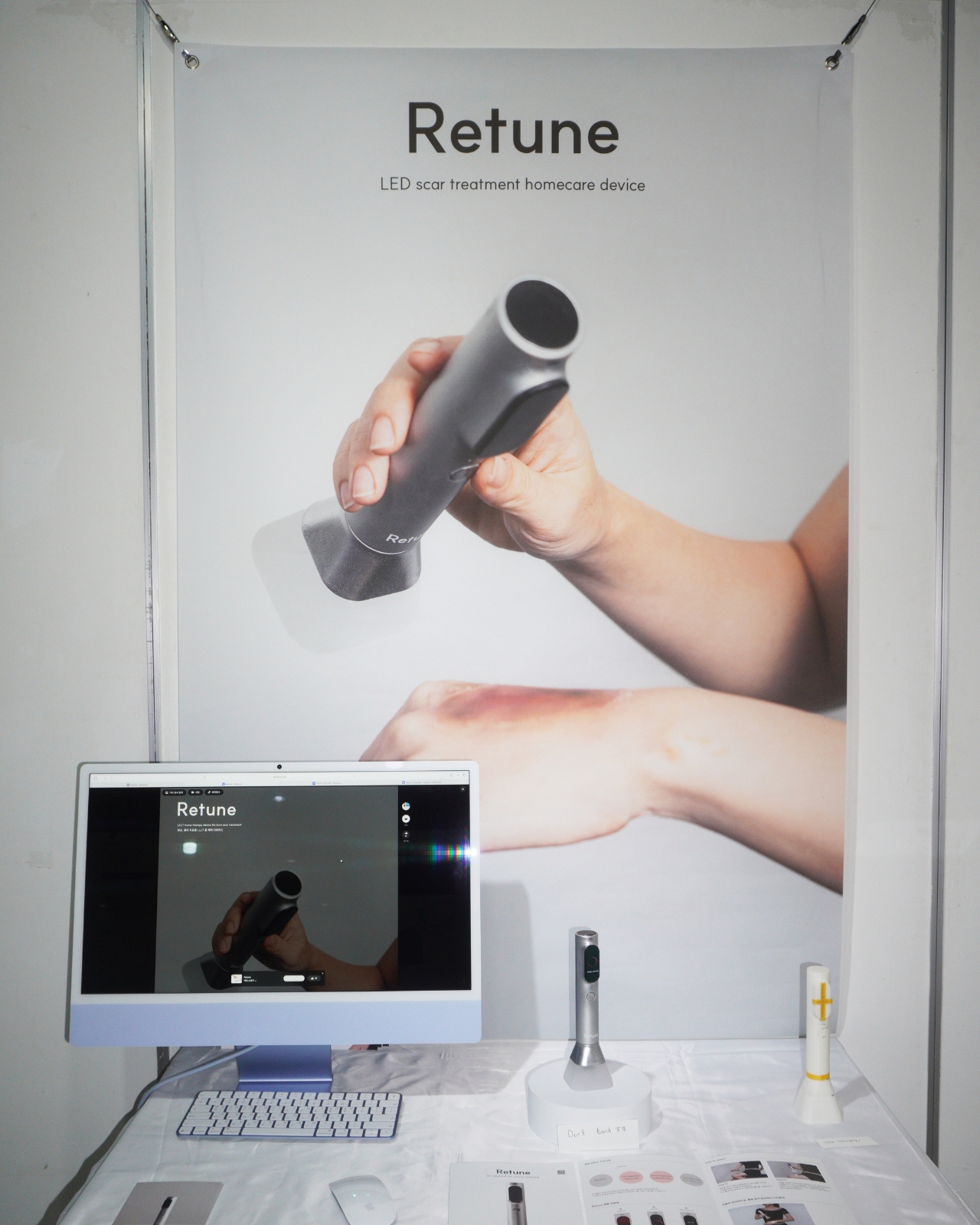
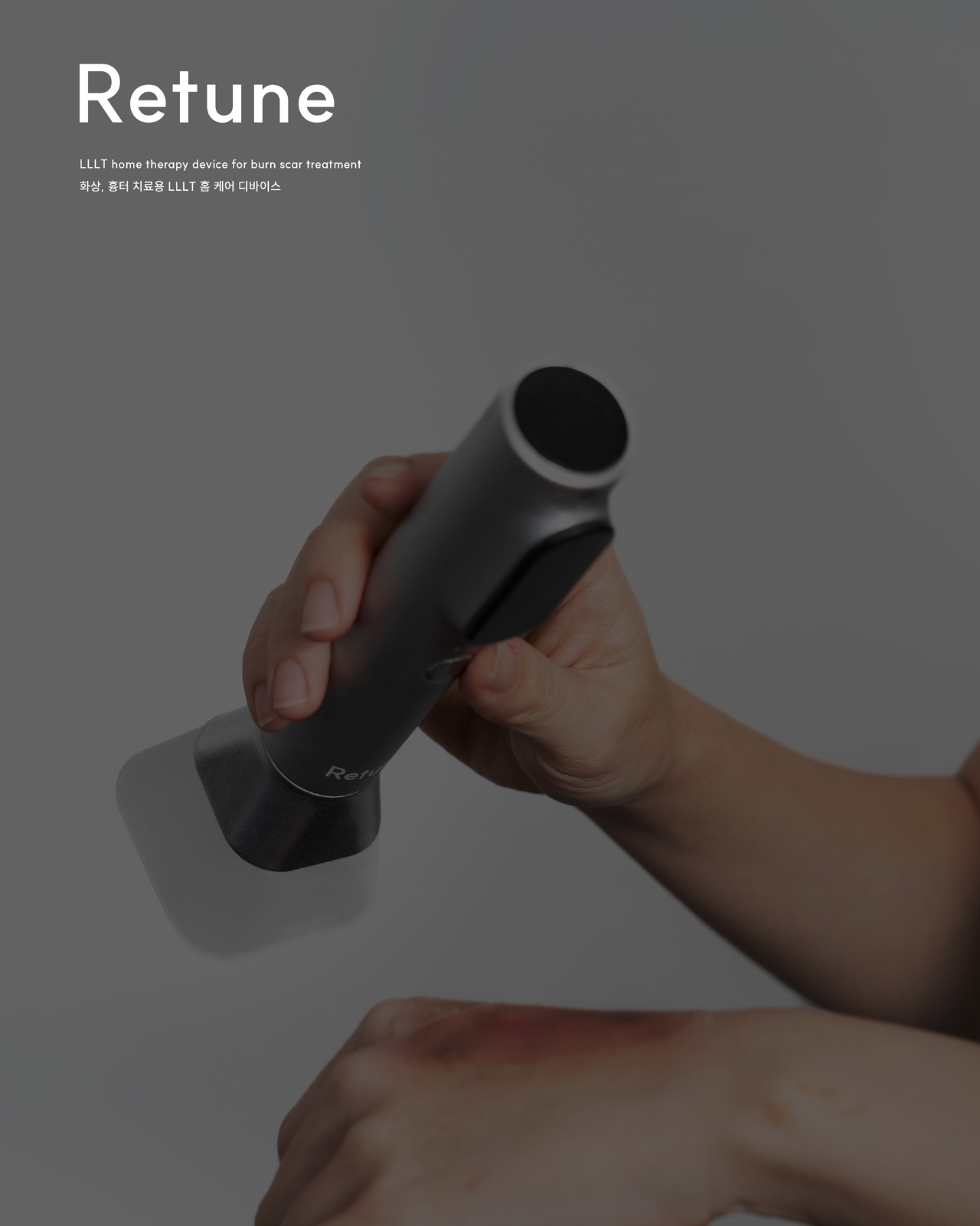
What really sets this concept apart is its non-contact approach. The device would hover above your skin during treatment, never actually touching the wound. This is brilliant design thinking because it eliminates the risk of secondary infection, which is often a major concern with burn care. You’re already dealing with damaged skin. The last thing you need is introducing bacteria or irritating the area further with direct contact. LED light therapy works perfectly for this kind of application because light doesn’t need to touch to be effective.
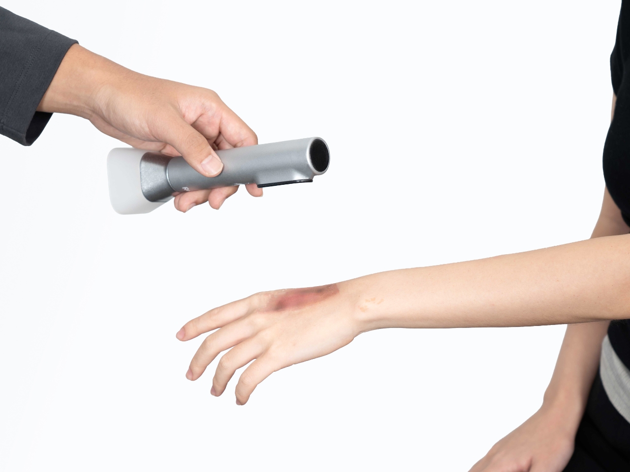
The concept addresses first and second-degree burns, inflammation, and scar treatment. We’re talking about kitchen accidents, sun exposure gone wrong, that curling iron mishap, or those persistent scars you’ve been trying to fade. It’s not meant for severe third-degree burns, which absolutely require professional medical attention. But for the everyday injuries that would normally have you making multiple trips to a clinic for follow-up care, Retune proposes a compelling alternative.
There’s something quietly revolutionary about the idea that regular treatment could happen anywhere, anytime. Maybe you’re dealing with a healing burn and you’re traveling for work. Maybe you have limited mobility and getting to appointments is genuinely difficult. Maybe you just want to treat your scar while watching Netflix instead of sitting in a waiting room flipping through outdated magazines. This concept makes all of that feel possible.
The design language here speaks to a larger trend we’re seeing in how designers envision future healthcare devices. There’s a growing understanding that medical tools don’t have to look clinical and intimidating. They can be objects you’re comfortable having in your living space, devices that feel more like wellness tools than medical equipment. Yewon Lee clearly understands this shift. Retune looks like it belongs in a contemporary home, not a hospital supply closet.
LED therapy itself has been gaining serious traction in both medical and cosmetic applications. Different wavelengths of light can reduce inflammation, promote healing, and improve the appearance of scars. It’s non-invasive, painless, and backed by legitimate research. Pairing this proven technology with AI assessment creates a concept that feels genuinely forward-thinking rather than gimmicky.
As a design concept, Retune points toward an intriguing future where personalized medical care happens increasingly at home, guided by intelligent devices that can actually see what’s happening and respond accordingly. Whether this exact vision becomes reality or not, it’s the kind of thoughtful speculation that makes you rethink what’s possible when design, technology, and healthcare converge. And honestly, that’s exactly what great concept design should do.
The post Smart Healing: A Concept For AI Powered Burn Treatment first appeared on Yanko Design.