The problem with buying tech for someone who follows tech is that he’s usually already seen it. His desk is deliberate. His bag is considered. His tech doesn’t accumulate — it earns a place and stays there. Shopping for him isn’t hard because he’s difficult. It’s hard because he’s usually right, and anything that doesn’t clear his bar comes back with a polite explanation.
The ten things on this list are the ones he hasn’t gotten to yet. Some of them are brand new. A few are still taking shape as concepts or patent filings worth tracking closely. None of them are the safe, obvious choice you grab when you’re not sure. Safe choices are what you give someone you don’t actually know that well, and the guy who has everything will see right through them.
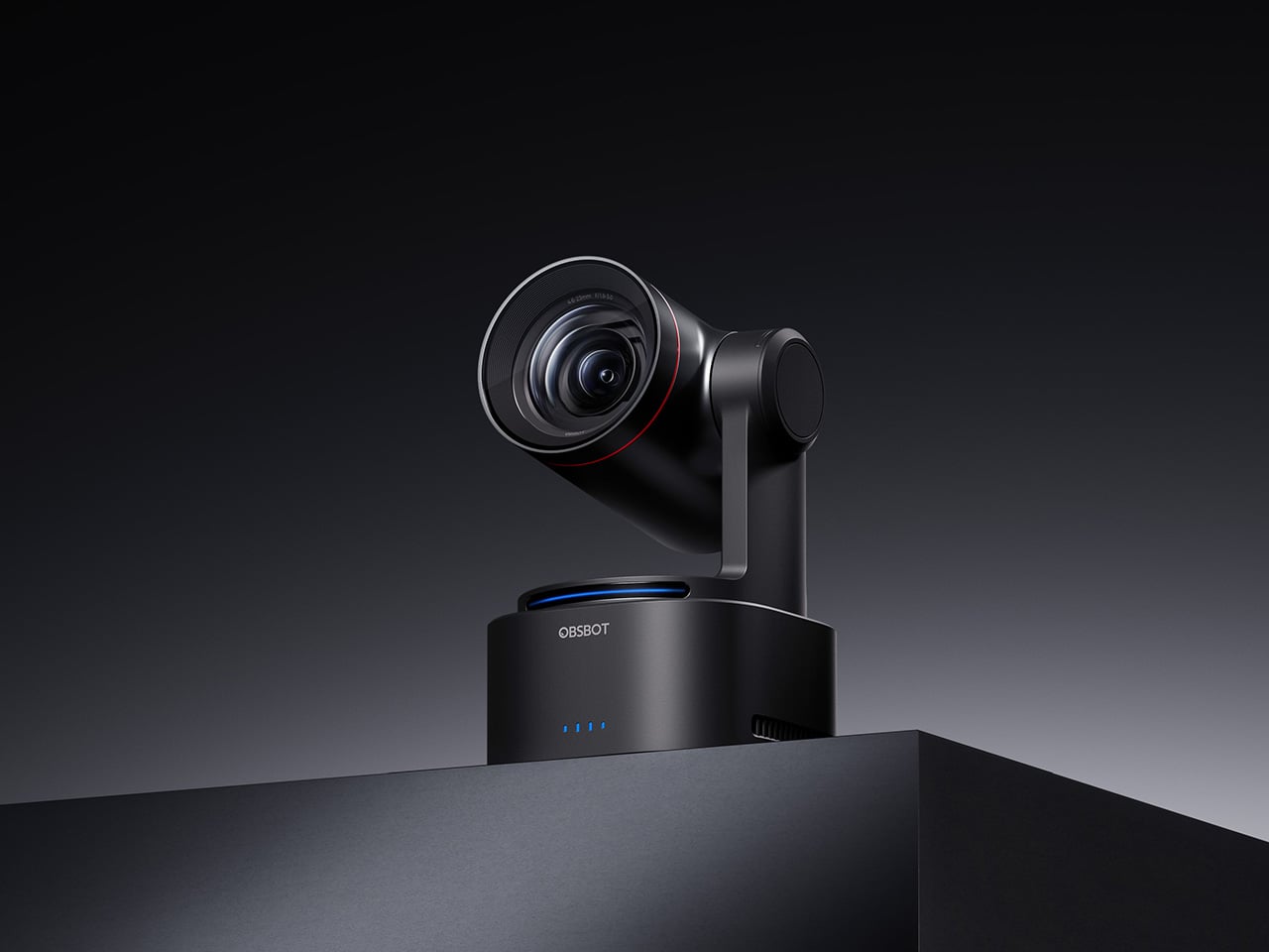
1. Google Home Speaker
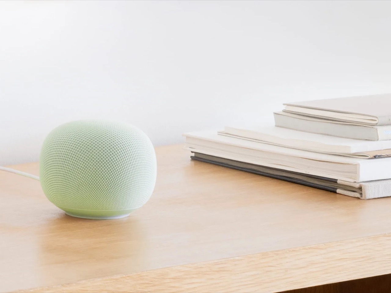
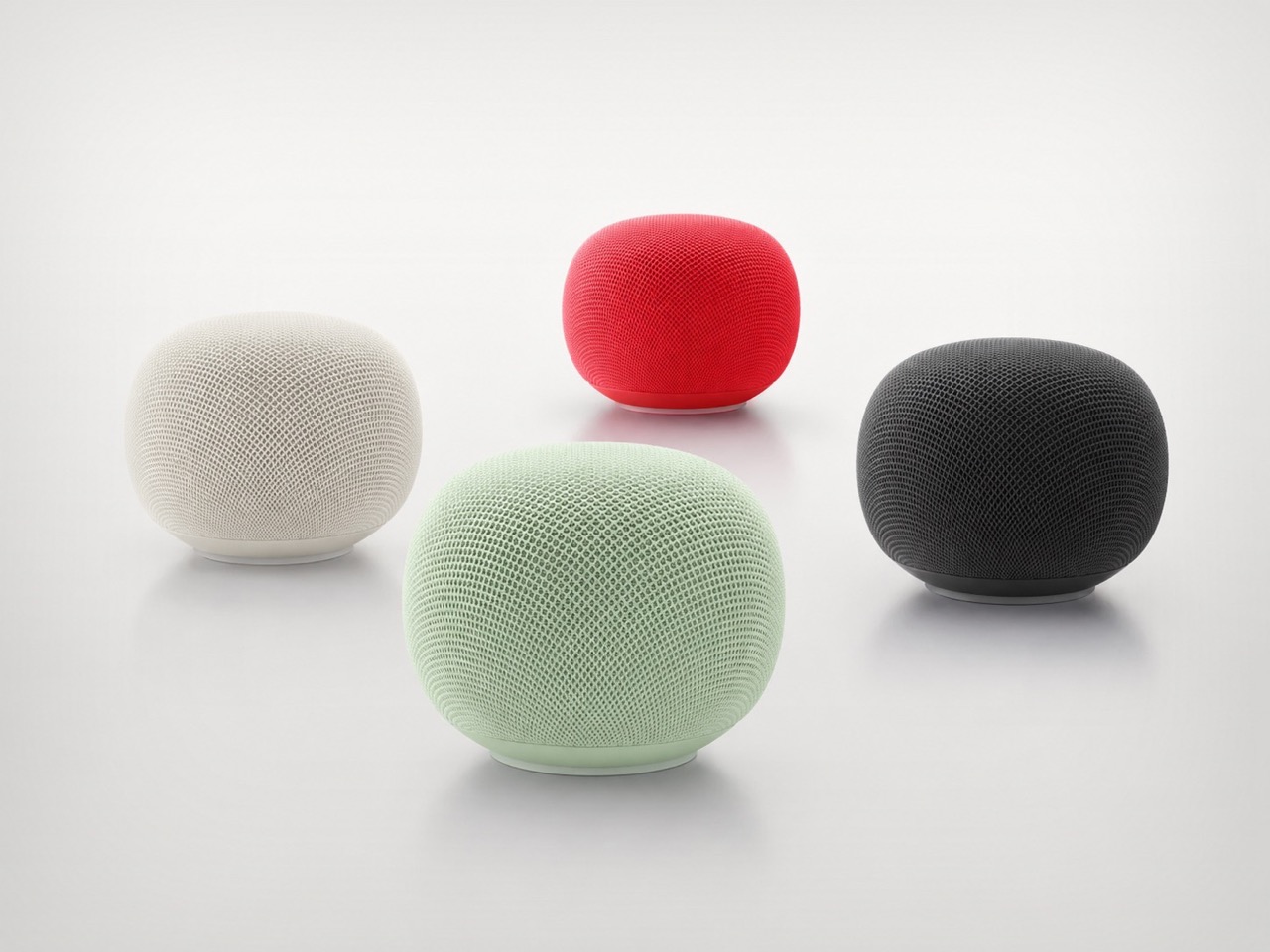
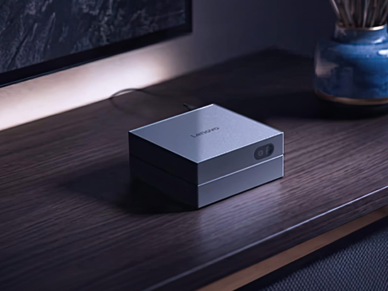
Google’s first new standalone smart speaker in nearly six years arrived in June 2026, and the gap is written into everything about it. The Nest Audio it replaces launched when people were buying anything that made a room feel less empty. The Google Home Speaker is a more considered object: small and rounded, available in colors the hardware team has always gotten right — the kind that make a shelf look slightly more curated without announcing a brand — with 360-degree audio and a light ring that tells you when Gemini is listening, thinking, or ready to respond.
The Gemini integration is the actual reason this speaker exists. Every Google product with enough surface area has been rewired into the AI model since 2025, and the kitchen turned out to be the most underserved room in the portfolio. What that means in practice is a speaker that answers hands-free cooking questions, manages a calendar, controls the broader smart home, and holds a conversation more fluently than any Nest device before it. Whether Google maintains attention on the category this time around is the only question worth watching.
What We Like
- Gemini integration makes ambient AI genuinely useful in a room that needed it most
- Soft, rounded form and considered color options read as a design object rather than tech hardware
What We Dislike
- A six-year product gap makes long-term hardware commitment harder to trust
- Full Gemini functionality requires staying inside the Google ecosystem to get the most out of it
2. OrigamiSwift Folding Mouse


Most travel mice solve the portability problem by building a smaller, worse mouse. The OrigamiSwift, designed by Horace Lam, takes a different approach entirely. It folds completely flat to 0.18 inches thick, slips into a pocket, and unfolds into a full-sized ergonomic form in under half a second. The triangular structure that makes the fold work comes directly from origami geometry, which gives the collapsed state enough rigidity to survive a bag without a case, and the open position enough stability for accurate, comfortable tracking on almost any surface you set it on.
At 40 grams, you stop noticing it in your bag within the first day of carrying it, which is exactly the point. A 4,000 CPI infrared sensor handles tracking, Bluetooth 5.2 keeps the connection fast and reliable, and a single USB-C charge on the built-in lithium polymer battery lasts up to three months. The soft-click buttons are quiet enough for a shared workspace without drawing any attention. For anyone who has carried a full-sized mouse in their bag out of sheer stubbornness about ergonomics, the OrigamiSwift is the design that finally makes the case for stopping.
What We Like
- Opens from flat to full-sized ergonomic form in under 0.5 seconds with no mechanical fuss
- Three months of battery life per USB-C charge removes recharging from the equation entirely
What We Dislike
- The slim profile and 40-gram weight take adjustment for anyone used to heavier, more substantial mice
- Stock is very limited — only a handful of units remain in the shop
3. Volla Plinius
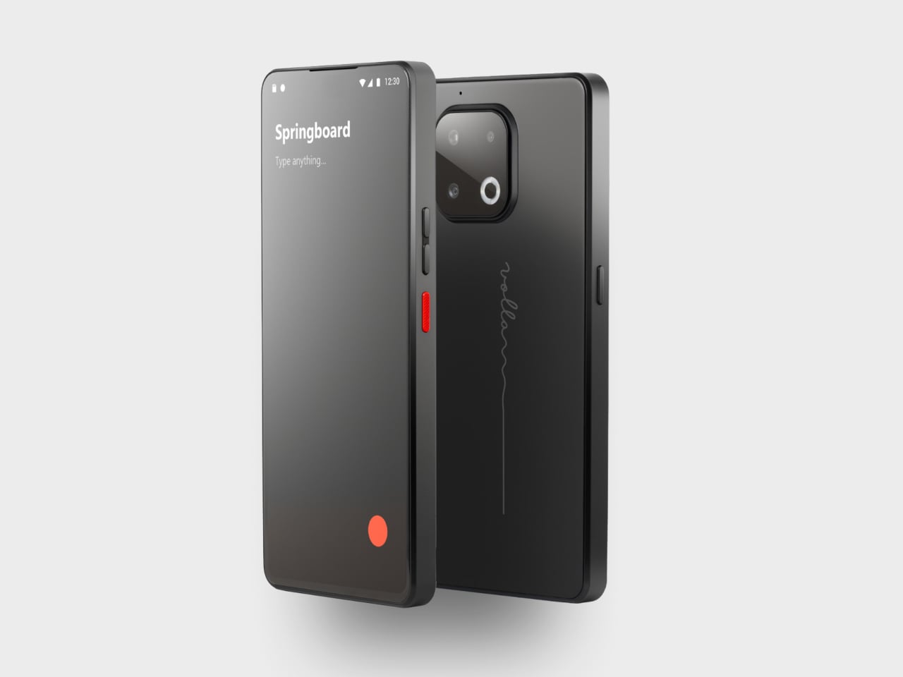
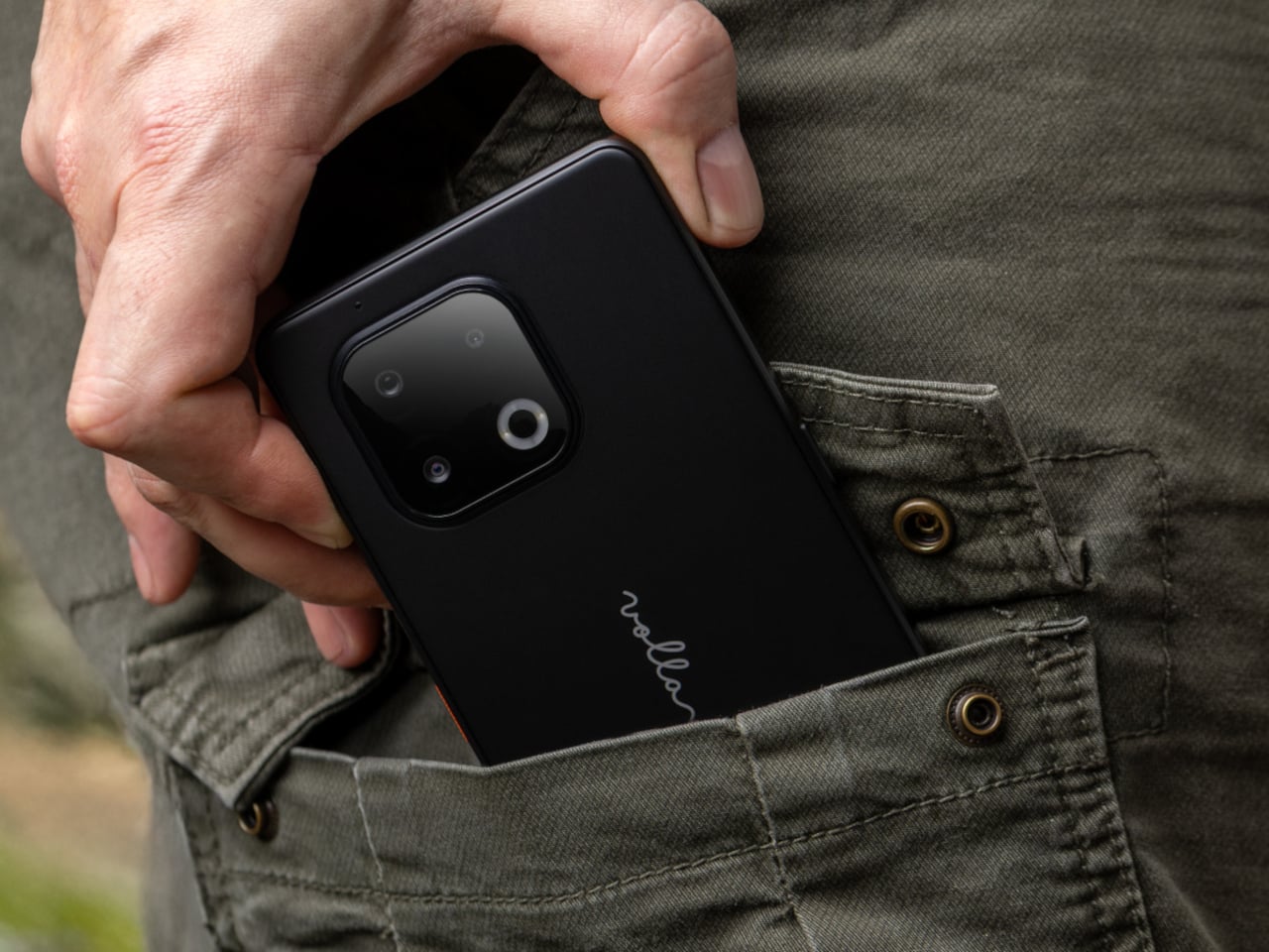
The Volla Plinius is named after Pliny the Elder, which is the kind of product name that tells you something about the people who built it. It’s a Google-free Android phone with an IP68 dust and water rating, a 6.67-inch FHD+ OLED display running at up to 120Hz, a 64MP main camera with phase-detection autofocus, an 8MP ultra-wide, and a 2MP macro, with 5G and a MediaTek Dimensity 7300 processor underneath. Out of the box, it runs Volla OS, a Google-free Android build with a clean, text-based interface and a Security Mode that governs which apps communicate with the outside world.
The detail that separates the Plinius from every other privacy phone is a user-replaceable battery you can swap with a standard screwdriver, even with the IP68 waterproofing intact. The 5,300mAh cell handles a full day comfortably, with 30W fast charging and 15W wireless charging both covered. Ubuntu Touch is available as a fully Linux-based OS from the UBports Foundation that doubles as a desktop environment when connected to a monitor. The standard Plinius starts at €598, with the Plus model adding 12GB of RAM, 256GB of storage, and a Pogo PIN connector for magnetic accessories at €698.
What We Like
- User-replaceable battery with a standard screwdriver is a genuinely rare feature at any price, let alone with IP68 in place
- Dual OS support means you can run Volla OS or full Ubuntu Touch on the same hardware
What We Dislike
- The Pogo PIN modular accessory system is still early in its development
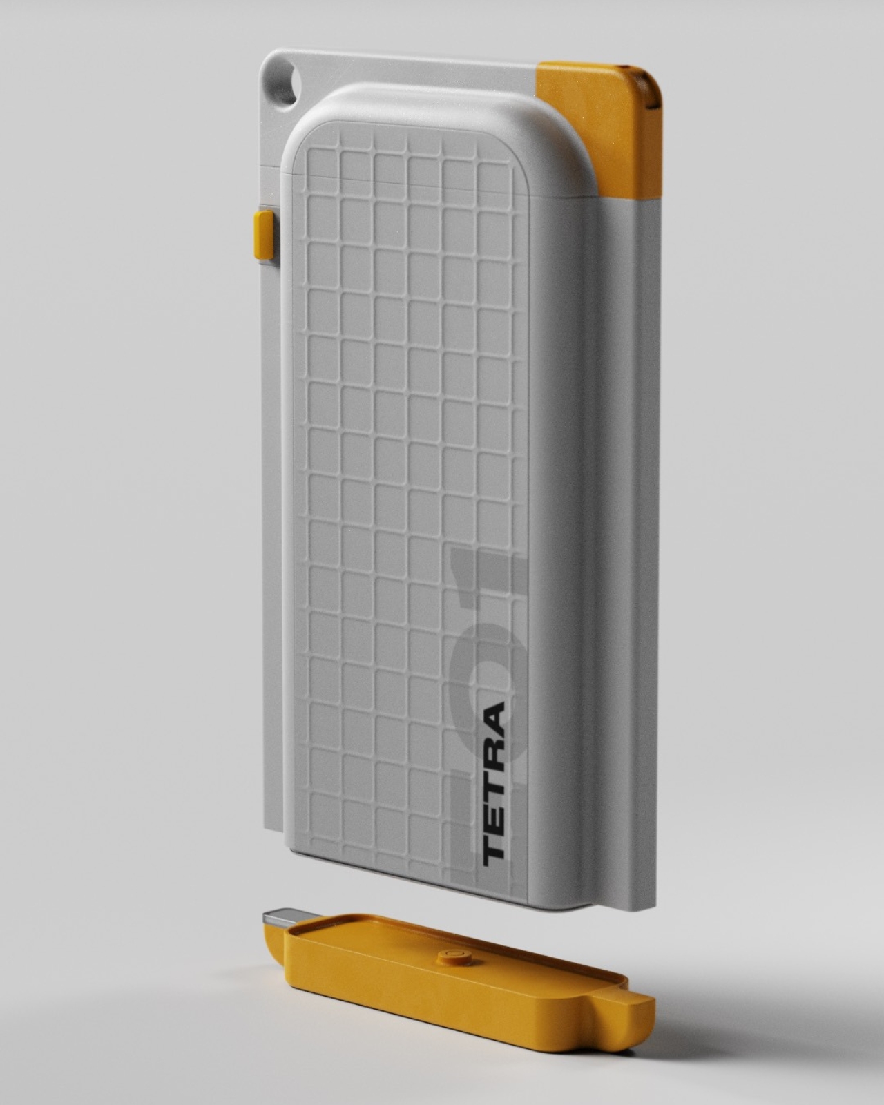
4. piBrick Pocket-CM5
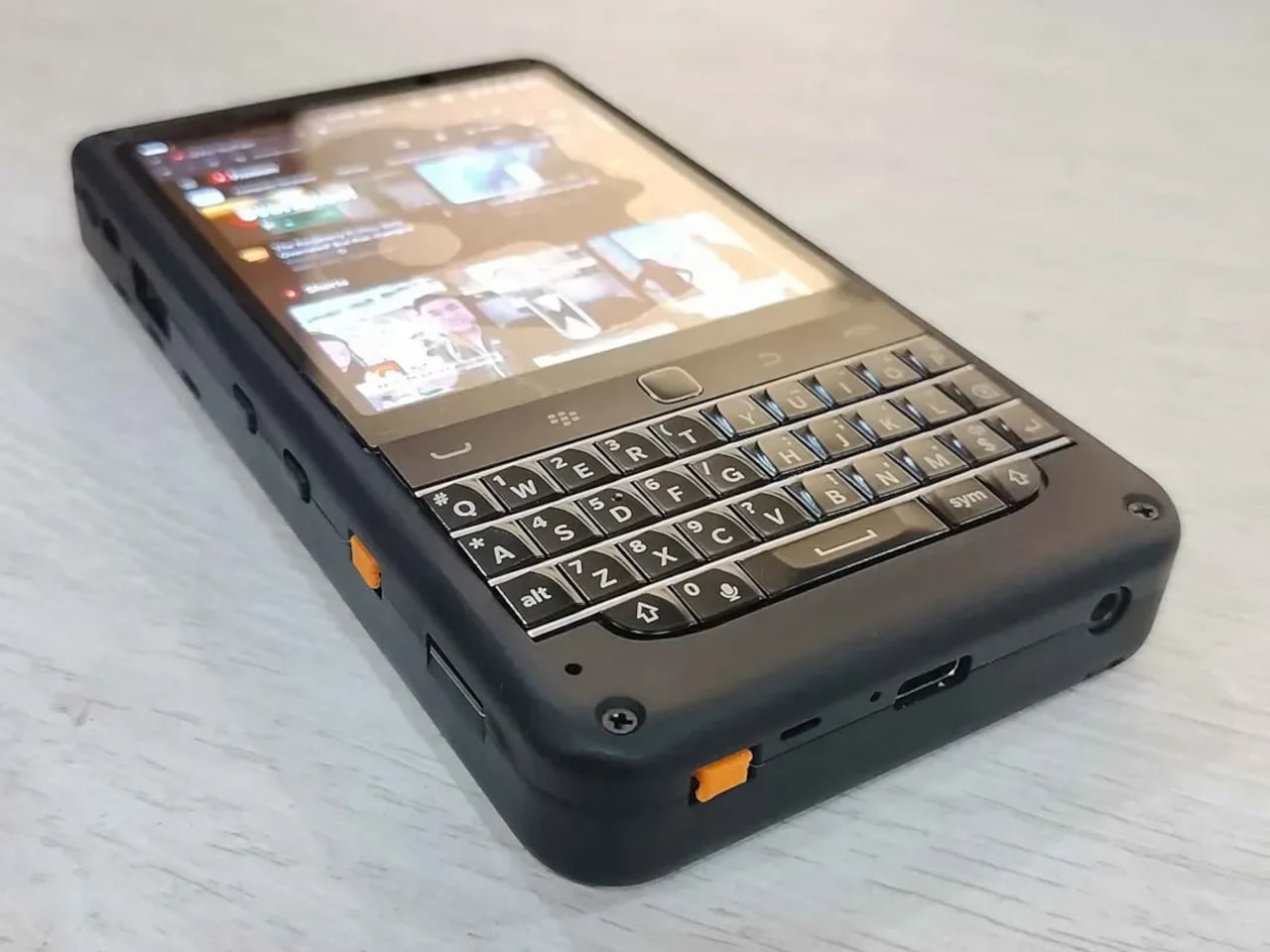
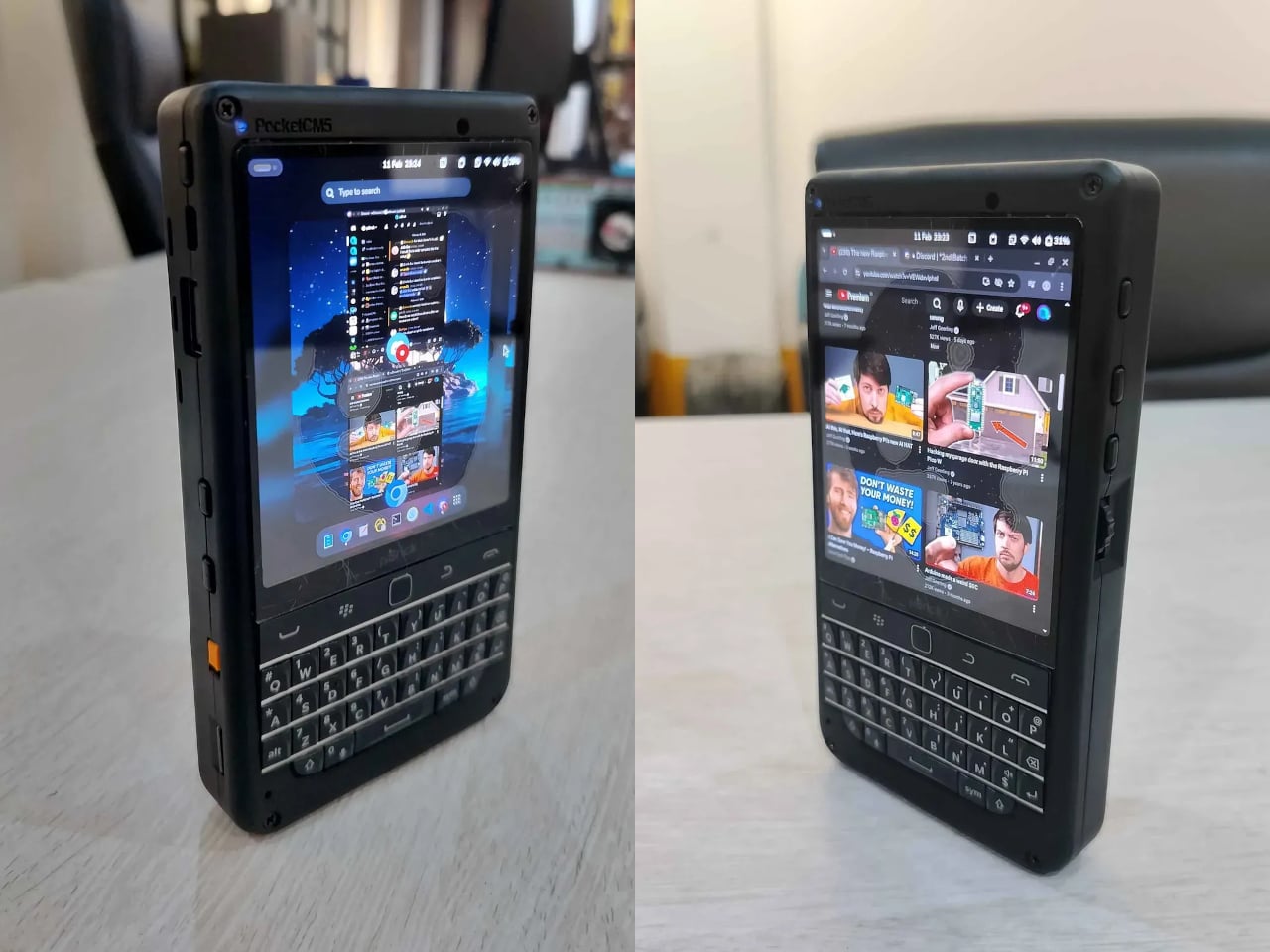
The piBrick Pocket-CM5 is an open-source handheld computer built around the Raspberry Pi Compute Module 5, a custom PCB designed for manufacturing at JLCPCB, and a 3D-printed shell. The whole parts list totals around $172, and what that buys is a device at smartphone proportions — 80mm × 145mm × 19.6mm — with a 3.92-inch AMOLED display at 1080 × 1240 pixels and 90Hz, a 5,000mAh battery, a compact QWERTY keyboard derived from the BlackBerry layout with an integrated trackpad, side rotary encoders, and five user-programmable buttons that give it a tactile depth no touchscreen-only device can replicate.
The feature that elevates the piBrick from impressive project to genuinely useful tool is USB-HID mode. Plug it into any external computer or server, and the keyboard and trackpad operate as a fully functional USB input device, independent of the Raspberry Pi running inside it. A sysadmin arriving at a server rack without a spare keyboard doesn’t need to find one. Full-size and micro-HDMI outputs allow the same device to drive an external display. NVMe SSD support in 2230 or 2242 formats adds storage beyond the SD card. The schematics, PCB files, and build instructions are open-source, making $172 the floor rather than the price.
What We Like
- USB-HID mode turns it into a functioning keyboard and trackpad for any external computer or server
- Full open-source hardware means the design belongs to anyone who wants to build on or modify it
What We Dislike
- Requires hands-on assembly from a parts list rather than arriving as a finished, ready-to-use consumer device
- The 3D-printed shell is functional but lacks the material quality of commercial hardware at this price level
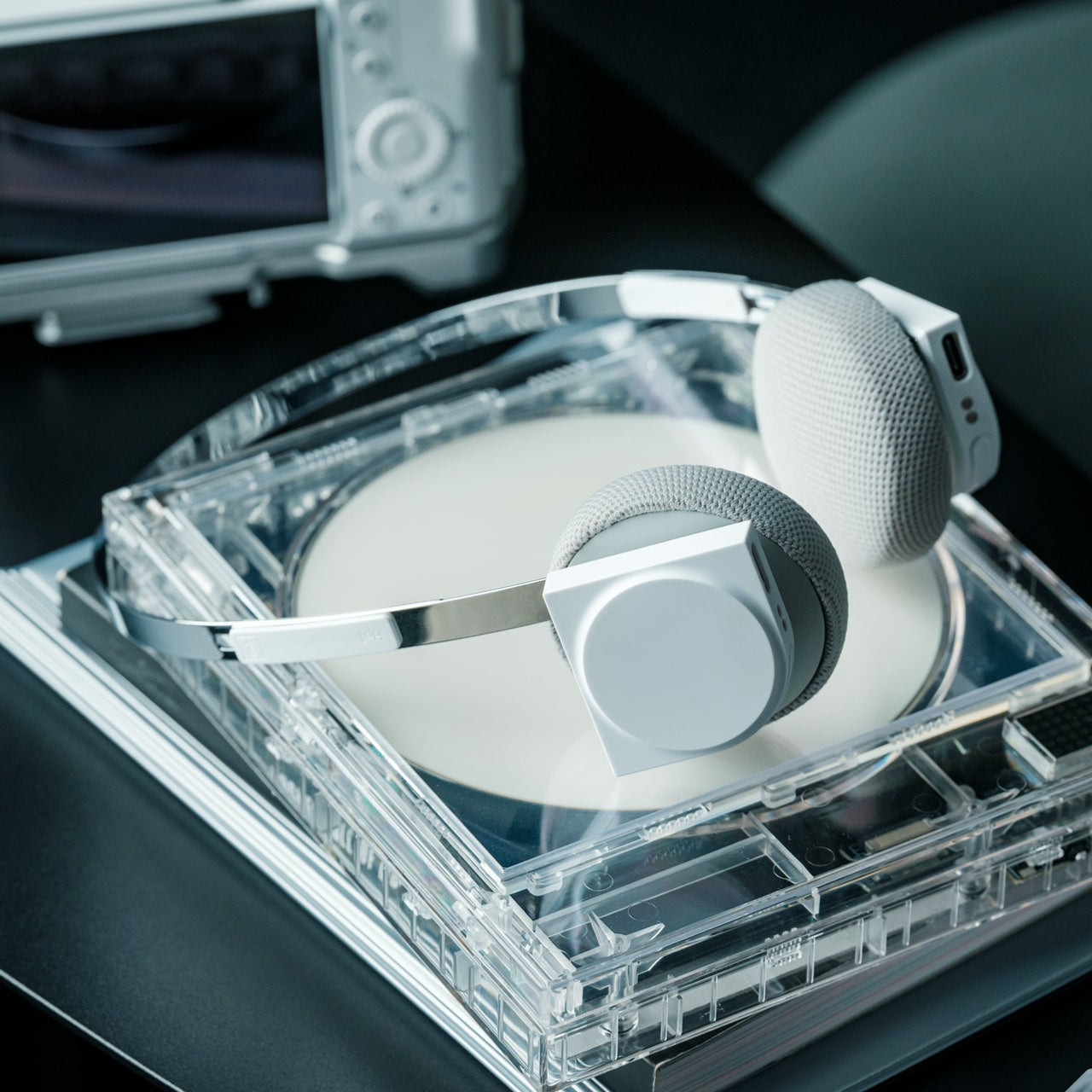
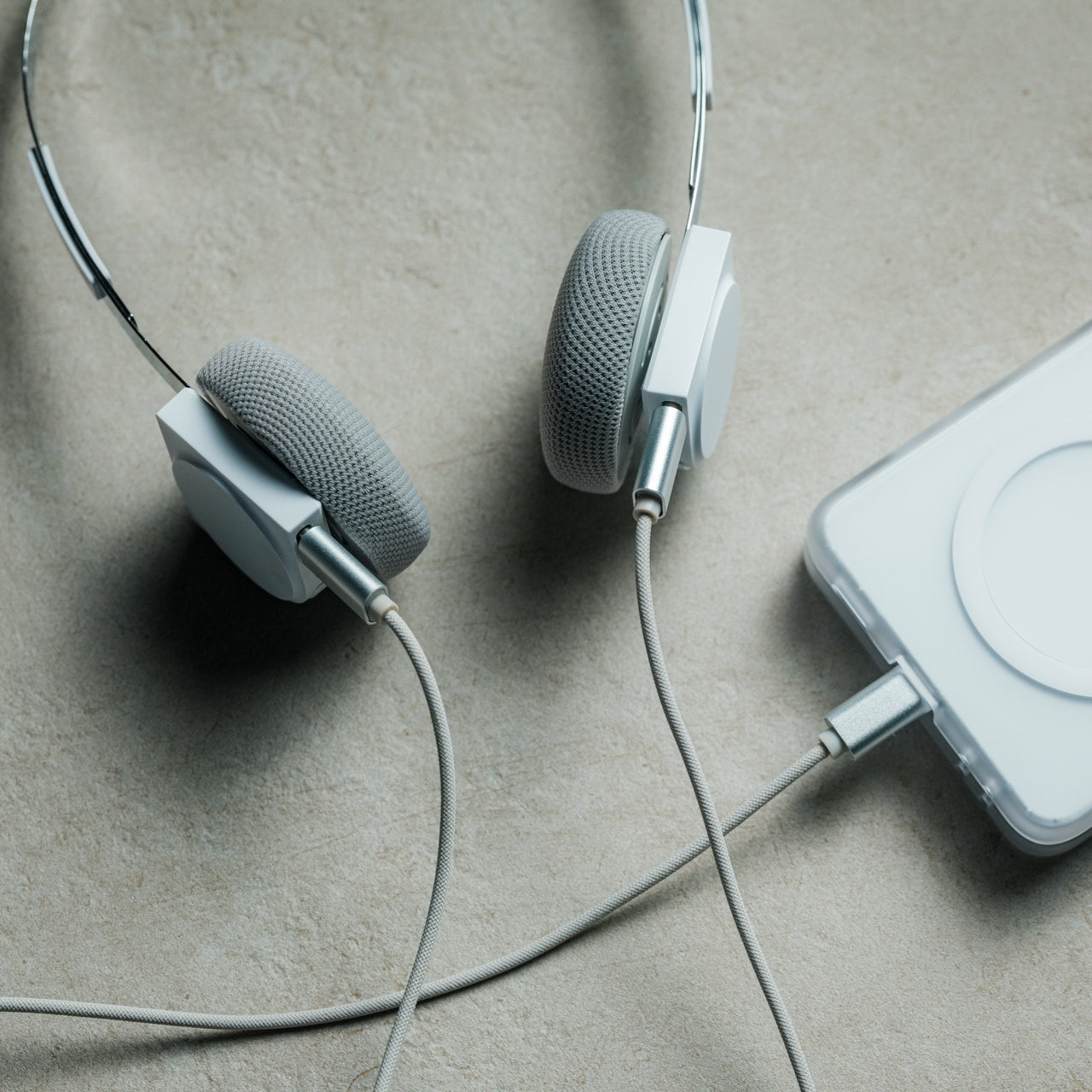
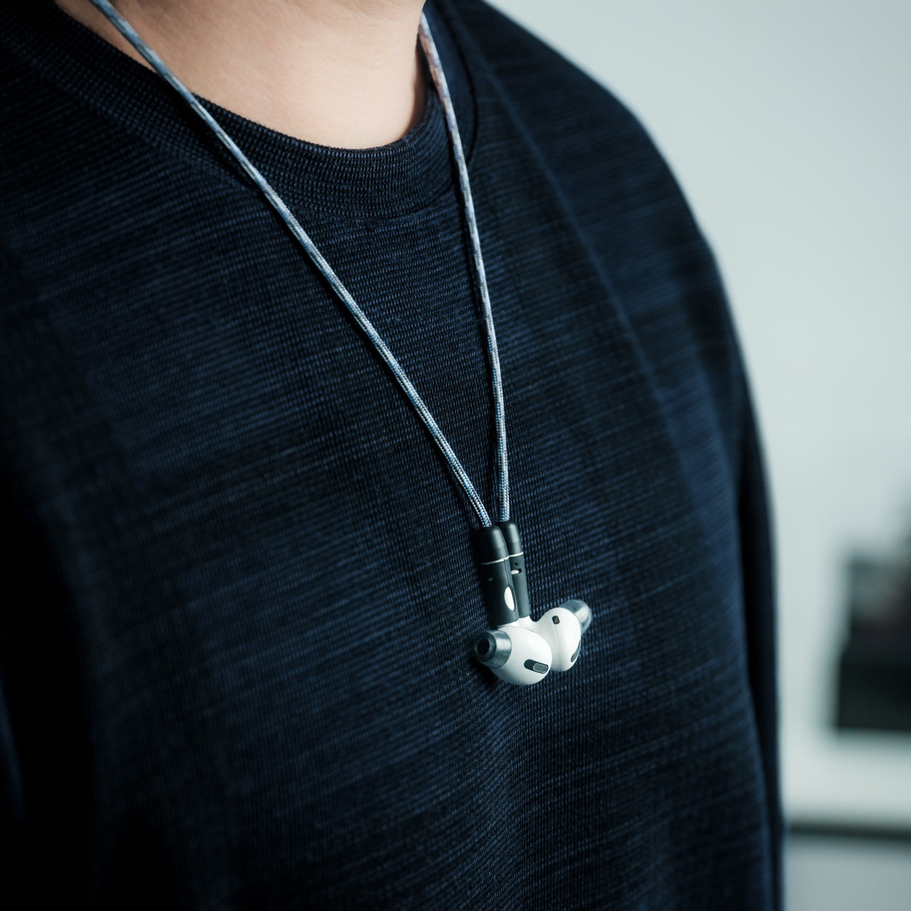
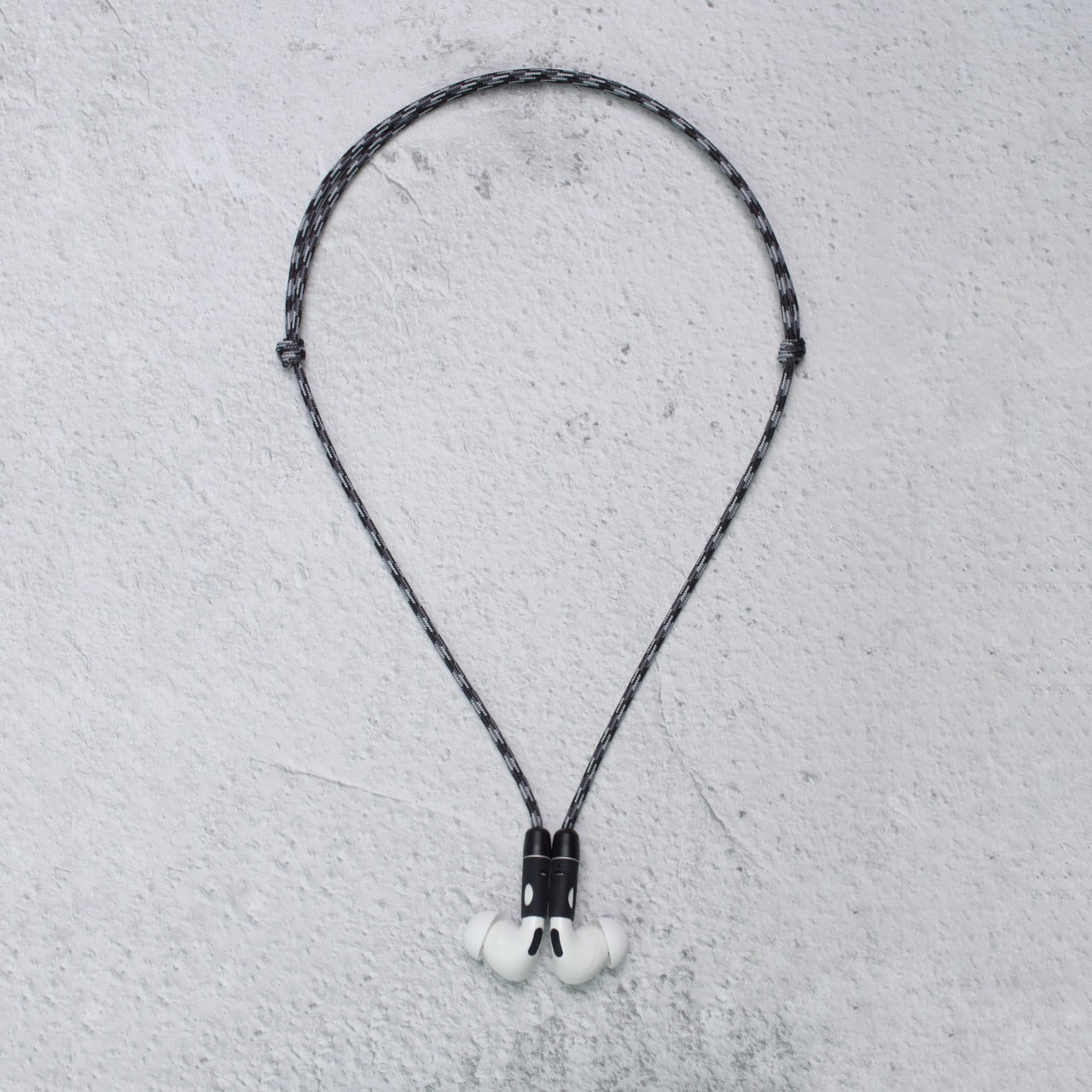
5. StillFrame Headphones
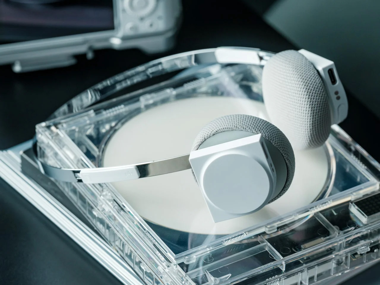

The StillFrame headphones are designed by Tatsufumi Funayama and weigh 103 grams, which is light enough that you genuinely stop noticing them across a full workday. The 40mm drivers produce a wide, open soundstage tuned for music that rewards real listening rather than functioning as background wallpaper. A stainless steel headband holds the structure with the right balance of strength and flex, and the fabric ear cushions attach magnetically, making swaps between the included colorways quick and satisfying in the way that small, well-engineered interactions tend to be. The form takes its reference from the quiet geometry of CD players from the 1980s and 1990s, and the connection is immediate once you see it.
At $245, the StillFrame competes on philosophy as much as on specification. Active noise cancellation and Transparency Mode are both on board, Bluetooth 5.4 handles wireless streaming, and a USB-C cable supports high-resolution wired playback for when the signal matters more than the convenience. Battery life runs to 24 hours. The internal circuit board is deliberately exposed within the housing, treated as part of the visual experience rather than something to hide behind plastic. The White model ships with Light Gray and Turquoise cushions included — two moods for the same object, quietly expressive without trying to be.
Click Here to Buy Now: $245.00
What We Like
- 103g and an open soundstage make these the kind of headphones you wear for hours without wanting to take them off
- The exposed circuit board and magnetic cushion system give the object a physical personality that most headphones flatten out entirely
What We Dislike
- Only 4 units remain in the shop, which makes these effectively a limited run at this point
- The on-ear design sits between over-ear and in-ear, and the level of passive isolation won’t suit everyone
6. Oppo Bubble
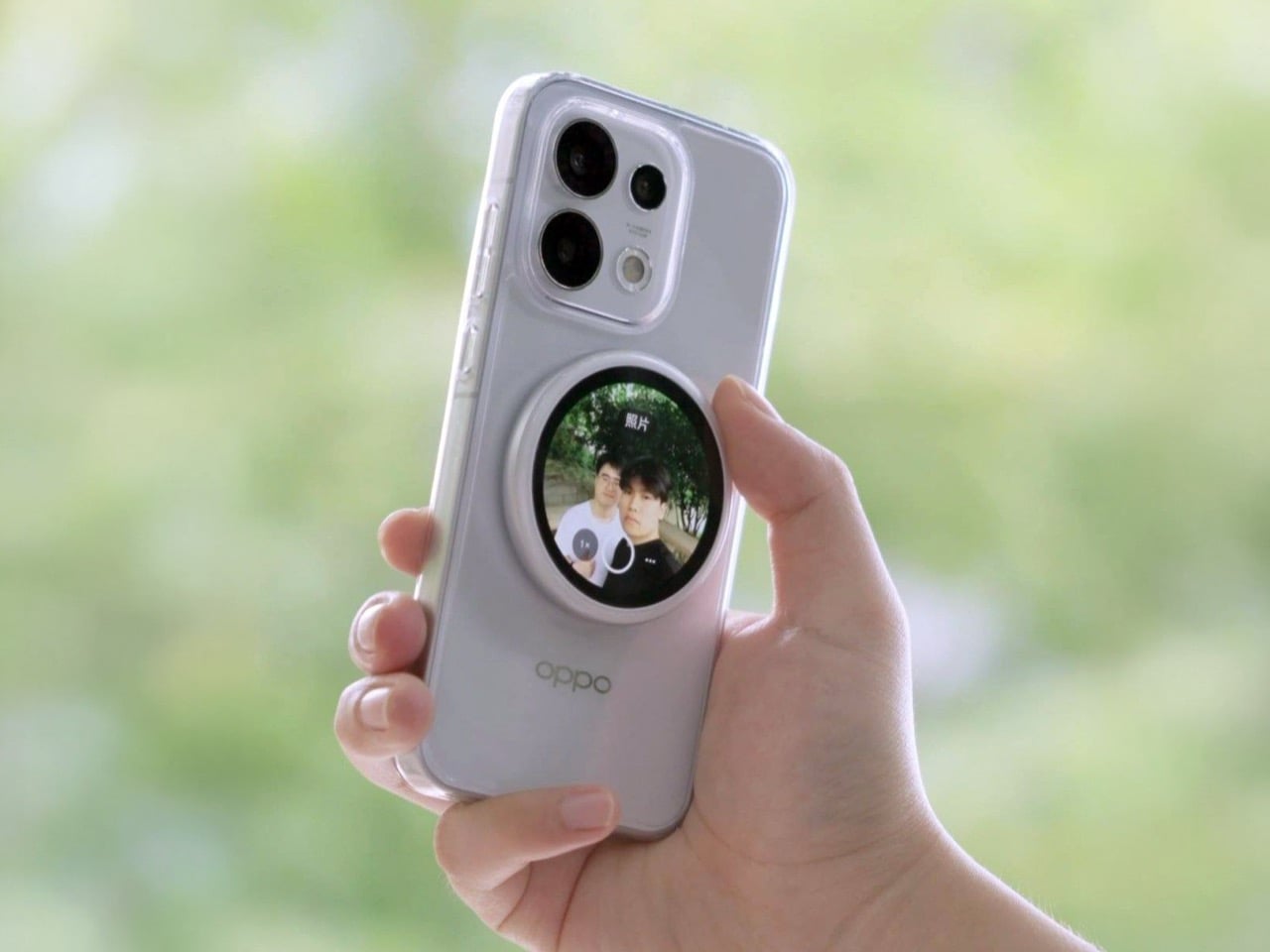

The rear camera has been the better camera for over a decade. Every benchmark, every low-light comparison, every zoom test confirms it, and yet selfie culture built itself entirely around the front-facing lens because there was no practical way to see what the good camera was capturing while it was pointed away from you. The Oppo Bubble is a small circular AMOLED touchscreen that attaches magnetically to the back of a phone and mirrors the rear camera’s live feed wirelessly, up to 10 meters away. It launched in China on May 25, 2026, alongside select Oppo Reno 16 devices, and includes a built-in remote shutter trigger. Apple has had the magnetic infrastructure for something like this since 2020. Oppo just claimed the screen real estate it left empty.
The circular AMOLED display is what makes the Bubble credible rather than merely clever. A low-resolution preview would sink the concept at its most basic job, so Oppo putting a proper screen in here is the detail that earns the price. A 550mAh battery keeps it running independently, and when the camera is off, the Bubble displays custom wallpapers, live photos, videos, and animated themes. Ten meters of wireless range repositions it from selfie mirror to legitimate remote shooting monitor — the kind of tool that used to require a separate Bluetooth trigger and a lot of hoping for the best.
What We Like
- Ten meters of wireless range turns it from a selfie mirror into a proper remote monitor for tripod-mounted shooting
- The circular AMOLED form gives it enough design personality to work as an accessory rather than just a functional attachment
What We Dislike
- Live camera preview only works with select Reno 16 series Oppo devices at launch, which is a real limitation right now
- No confirmed international release outside China as of June 2026
7. Lenovo ThinkTab X11

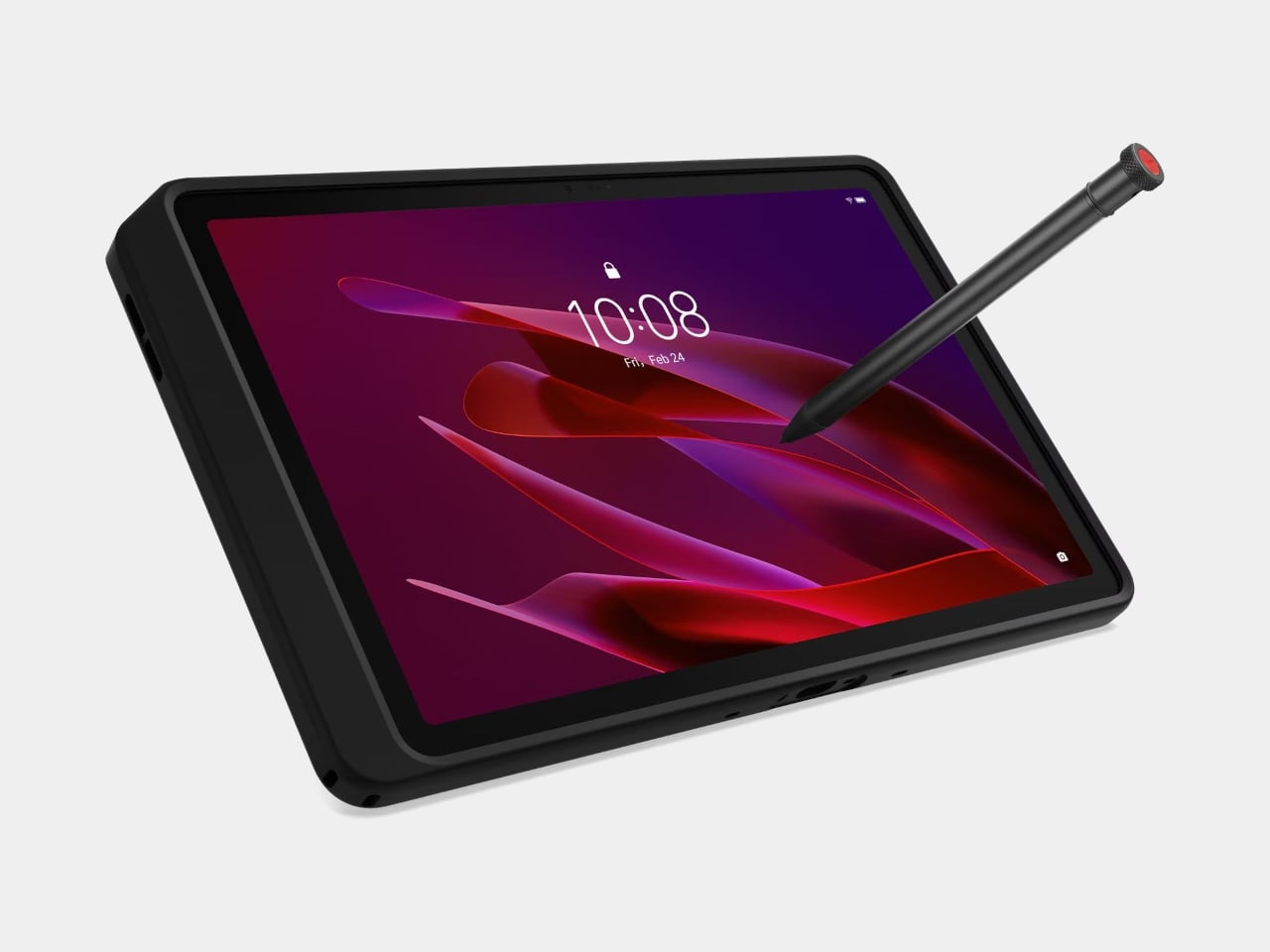
Rugged tablets have almost always meant choosing between enterprise-grade hardware at enterprise-grade prices, or pressing a consumer device into field conditions it was never designed to handle. The Lenovo ThinkTab X11 is an attempt to close that gap at $499, bringing it into reach for the people who actually use tablets in logistics, construction, transportation, manufacturing, and energy. The 10.95-inch display runs at 90Hz, reaches 800 nits under high brightness mode, and handles gloved hands and wet fingers without issue — the Snapdragon 7s Gen 3 runs the processing, with up to 12GB of RAM and 512GB of UFS 3.1 storage configurable depending on the deployment.
The battery design is what makes this genuinely interesting. The 10,200mAh cell removes on a screwless mechanism, so a worker can swap a depleted pack for a fresh one mid-shift without stopping to find a power outlet. In vehicle or fixed workstation deployments, the ThinkTab can run directly from DC power with no battery installed at all, eliminating heat buildup from continuous charging and removing long-term degradation from the equation entirely. The included case carries MIL-STD-810H certification, the device itself carries IP68, and the whole package ships with Android 16 alongside four years of security patches and two guaranteed major OS upgrades.
What We Like
- Screwless hot-swap battery means mid-shift power changes are a practical workflow option, not a maintenance event
- Battery-less DC operating mode for fixed deployments removes heat and degradation entirely from continuous-use scenarios
What We Dislike
- At $499, it sits above consumer tablets doing lighter work, though well below comparable enterprise-only hardware
- The Snapdragon 7s Gen 3 is a capable rather than cutting-edge processor for the price bracket
8. Nothing Book

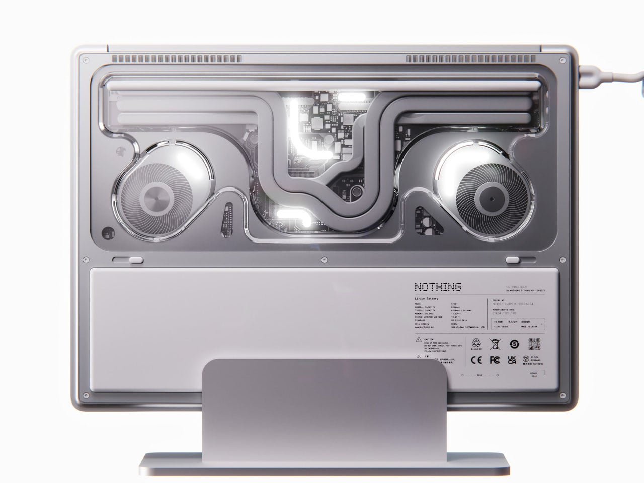
This is a concept, and it’s worth saying that plainly before anything else. The Nothing Book is a design exploration by Nikita Bukoros that takes the brand’s philosophy to its logical conclusion: a performance laptop that treats its internal architecture as the visual statement rather than hiding it. The see-through body layers the cooling system, circuit boards, and internal components into a composition that Bukoros describes as industrial art as much as consumer electronics. The see-through aesthetic Nothing built its identity around, originally inspired by the translucent polycarbonate designs of the late 1990s, reaches its most ambitious expression here.
The secondary screen mounted on the lid is the detail that makes the concept worth following. It is a slim external display that breaks the closed-laptop monotony entirely — you can push messages, symbols, emojis, or anything else in the classic Nothing font to whoever is looking at the back of your machine in a meeting or a cafe. Nikita moves beyond Nothing’s usual monochrome palette and offers the concept in hot red, cool green, subtle pink, and magnetic teal. A purpose-built charging dock triggers a cooling animation on the secondary display when the laptop is docked, which is the kind of considered detail that separates a design worth remembering from one worth scrolling past.
What We Like
- The secondary lid screen is a genuinely original idea that gives the closed laptop a visual identity and purpose
- See-through architecture makes the internal engineering part of the aesthetic rather than something to conceal behind a plain surface
What We Dislike
- This is a concept, not a product — Nothing has confirmed a laptop is in development
- The exposed internals aesthetic would face real structural and thermal engineering challenges in a shipping device
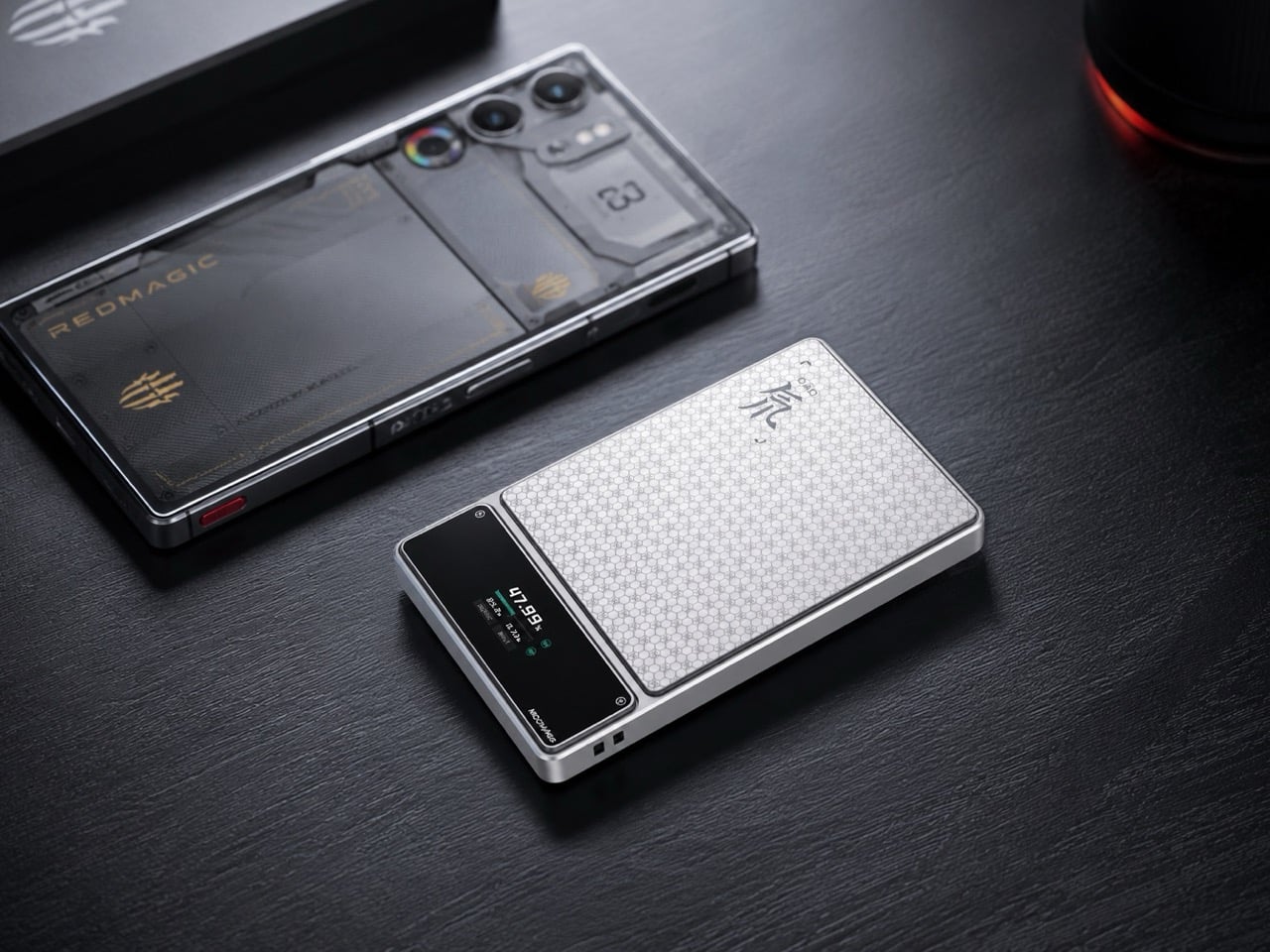
9. Canon Pocket Gimbal Camera
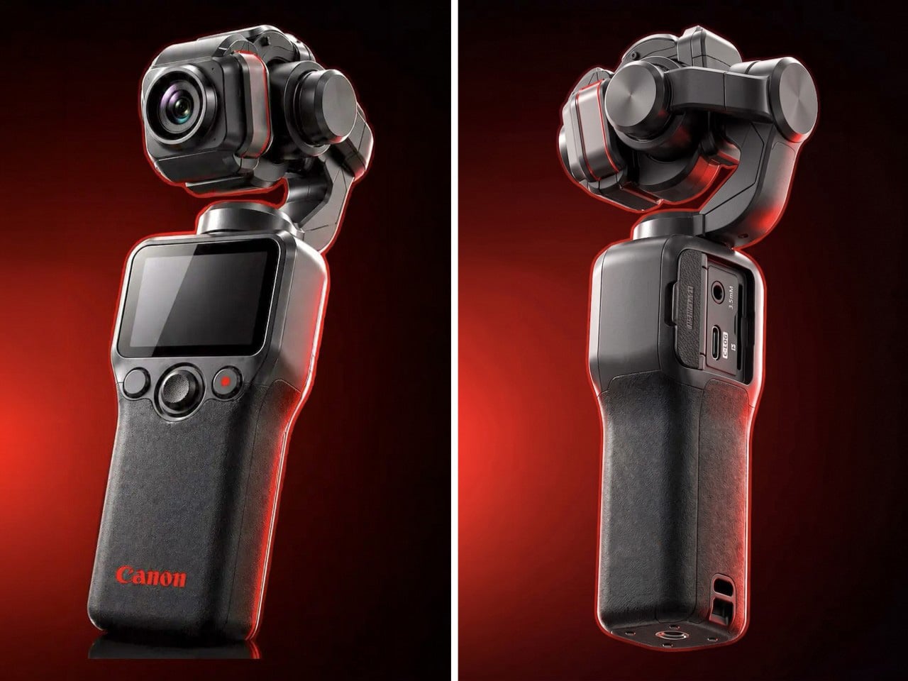
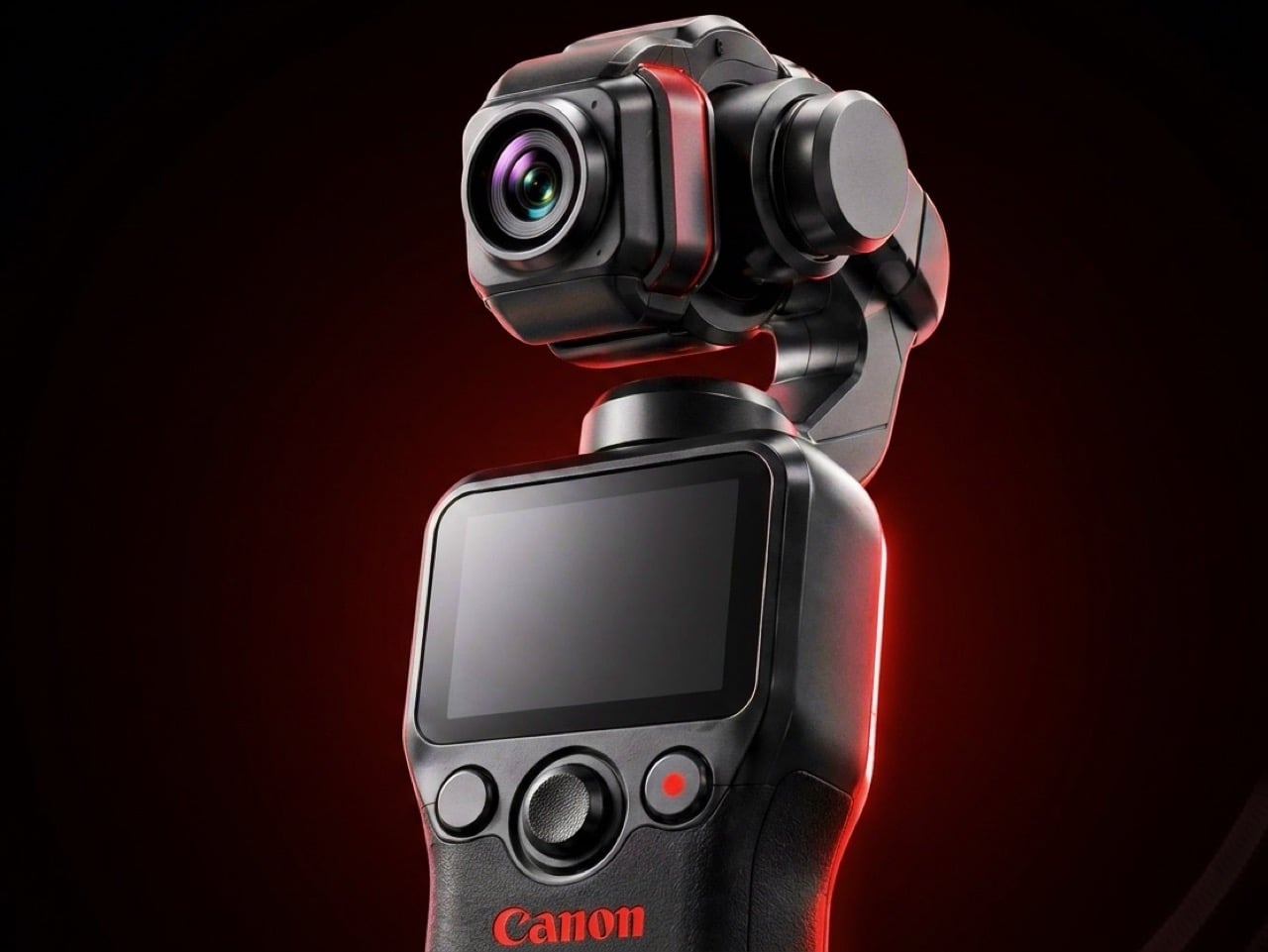
Canon filed a patent in April 2026 for a compact handheld camera with a fully integrated three-axis gimbal, a fixed lens, a grip with a screen, and a folding mechanism that protects the stabilizer head during storage. It is the most refined and product-ready of three gimbal-related patents Canon has filed since 2021, and the one that reads most like a brief handed to an engineering team rather than a thought experiment. The key detail is a smart shutdown sequence that uses magnetic sensors and image analysis to guide the gimbal safely into a folded position before cutting motor power, addressing a mechanical wear issue that has quietly frustrated gimbal camera owners for years.
The competitive timing is pointed. DJI’s drone business has faced regulatory scrutiny in the United States, and Canon has been tracking the pocket gimbal category across three progressive patent filings over five years — moving from cinema-level ambition in 2021, to an auto-flipping mechanism in 2025, to this fixed-lens, behavior-smart design in 2026. Canon’s color rendering, the warm, accurate output that photographers have built careers around, is a form of credibility no spec sheet can manufacture quickly. Whether this patent becomes a product remains unconfirmed, but the arc from moonshot to practical brief is the clearest signal yet that Canon intends to ship something.
What We Like
- Smart shutdown using magnetic sensors and image analysis is a specific, practical engineering improvement, not a theoretical feature
- Three filings over five years show a product being genuinely refined rather than filed and forgotten
What We Dislike
- This is a patent, not an announcement — Canon’s 2021 interchangeable-lens gimbal concept never shipped
- Fixed lens removes the ambition of the earlier patents, which some creators will register as a step back
10. Battery-Free Amplifying iSpeakers
The premise behind the Battery-Free Amplifying iSpeakers is simple enough to say in one sentence: they amplify your iPhone’s audio through acoustic design alone, with no power source, no Bluetooth pairing, and no charging cycle to manage. At $179, they sit on a counter as a sculptural object even when the phone is nowhere near them, which is the standard any speaker worth keeping should meet before it earns a permanent place in the room. The best design objects don’t ask anything of you when they’re not being used. They just sit there, doing the room a favor.
For the guy who has accumulated Bluetooth speakers, wireless earbuds, a smart speaker with a subscription, and a desk speaker that needs a firmware update, a passive amplifier is the unexpected move. There is nothing to configure, nothing to pair, nothing to update, and nothing that goes wrong. You set the phone in, the sound fills the room, and that is the complete interaction.
Click Here to Buy Now: $179.00
What We Like
- Requires no power, no pairing, and no maintenance — the interaction is entirely physical
- Functions as a display object on the counter whether a phone is in it or not
What We Dislike
- Passive amplification has natural limits on output volume compared to any powered speaker
- Works best in quiet rooms rather than competing with ambient noise
The Things He Didn’t Know He Was Missing
The man who already has everything doesn’t need more things. He needs the specific thing he hasn’t encountered yet — the speaker that finally has a brain worth talking to, the mouse that folds flat without a compromise on feel, the phone that keeps its data to itself, the handheld computer that doubles as a keyboard for any machine it’s plugged into. These aren’t impulse picks. Each one is here because it does something the obvious alternatives don’t, and because the guy you’re shopping for will notice the difference within the first ten minutes.
A few of these are still taking shape — a concept waiting on a decision, a patent waiting on a factory floor. That’s worth saying plainly, but it’s not a reason to dismiss them. The guy who has everything is usually the first to know what’s coming, and the first to make up his mind about it. A list that only includes what you can buy today isn’t a list for him. It’s a list for someone else entirely.
The post 10 Best Tech Gadgets for the Guy Who Thinks He Has Everything — He’s Missing All of These first appeared on Yanko Design.