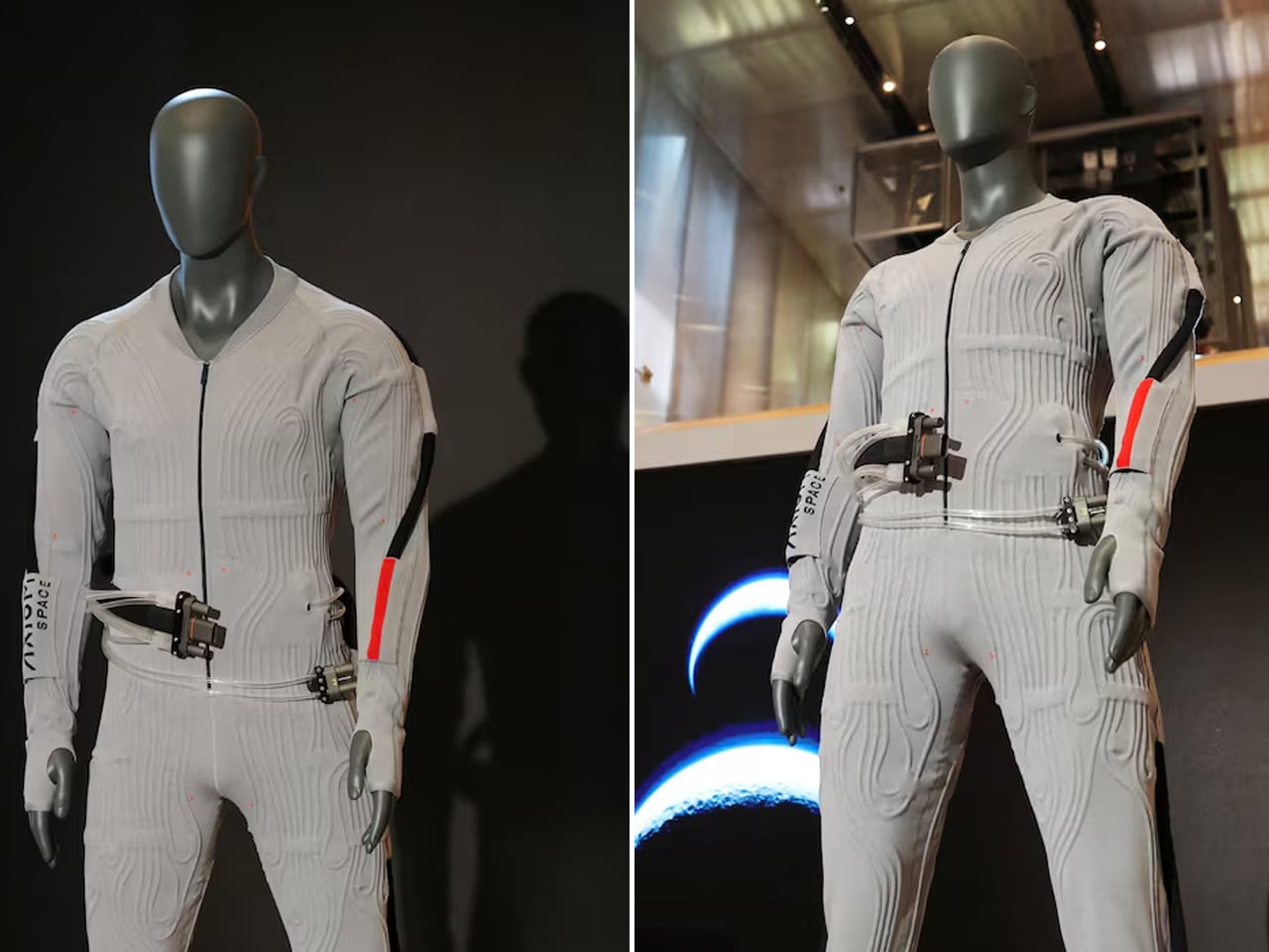
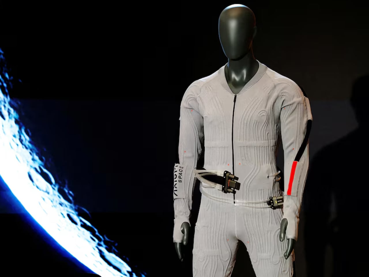
The fashion and home décor industry has, for years, looked toward space for inspiration. Prada is a brand that’s pushing through to be the first luxury fashion house to inspire space travel instead. For its new adventure in space, Prada has designed an inner-layer garment that astronauts aboard the NASA Artemis headed for the Moon will wear underneath their space suits.
For some fashion enthusiasts, this could come as a surprise, but the fact is, Prada has been working for a few years now with Axiom Space. Axiom is a private company that NASA has partnered with to develop spacesuits for its astronauts to wear on the upcoming Artemis missions.
Axiom Space and Prada first unveiled the Axiom Extravehicular Mobility Unit (AxEMU), a next-generation spacesuit, in 2024. “AxEMU is the first major upgrade to NASA’s space suits in more than 20 years,” and it is designed for NASA’s Artemis III mission and beyond. Now, believing the astronauts need a way to keep cool and oxygenated within the bulky space suit when on the lunar surface, Prada has introduced the garment to wear under the space suit, which has been part of the design process.
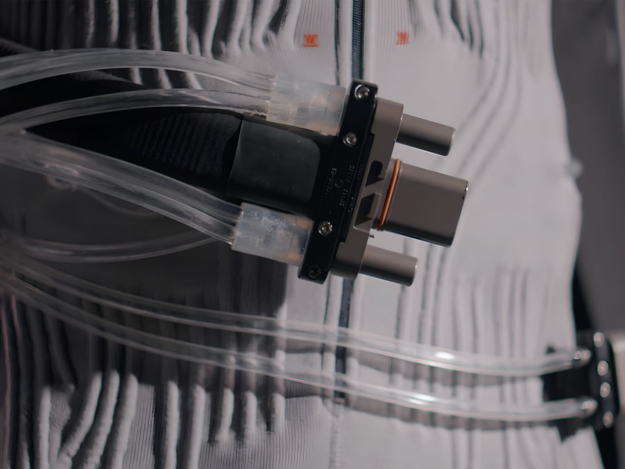
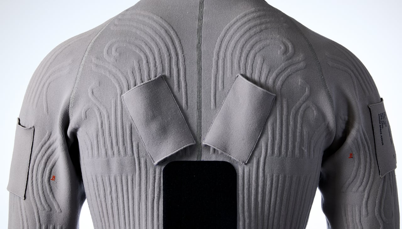
With the company’s signature red stripe on the sleeve, which is apparent on Prada’s activewear collection, the onesie called the Liquid Cooling Ventilation Garment (LCVG) will go under the space suit, as an innerwear (we cannot comment whether astronauts will need another layer of innerwear underneath). The LCVG is provided with tubes running around the back, which are used to circulate cold water around the astronaut’s body. The entire thing is designed in a high fashion sense, so the onesie is sleek and a complete wear in itself.
Designed primarily to keep the astronaut’s body from overheating while they walk on the moon, it is also provided with a ventilation system to deliver oxygen and remove carbon dioxide formed inside the AxEMU. Talking about the convenience and benefits of this finely crafted innerwear, the senior vice president of spacecrafts at Axiom Space informs, “Every minute astronauts spend outside their (lunar) vehicle, the LCVG is working to keep them safe.” Axiom’s CEO and president, Jonathan Cirtain, pointed out that the LCVG “…manages their (astronauts’) thermal environment, supports their breathing, and does it all while they’re pushing their bodies to the limit.”
NASA hopes to carry out the Artemis III mission, a crewed test flight, the second such mission in the Artemis lunar exploration program in 2027. And then eventually make the first crewed landing on the Moon’s south pole in preceding missions by early 2028. The Artemis campaign is NASA’s human spaceflight mission to land American astronauts on the surface of the Moon, establish a sustainable presence on the lunar surface, and form a foundation for future manned missions to the Red Planet.
Payment technology has largely been invisible work. Tap your phone, swipe your card, wave your watch, done. The entire industry spent years making transactions faster and more frictionless, which mostly means less noticeable and decidedly less fun. So when Cash App announces a pearlescent, star-tipped wand that you wave at a payment terminal to buy your morning coffee, the question isn’t whether it’s practical. The question is why nobody thought of this sooner.
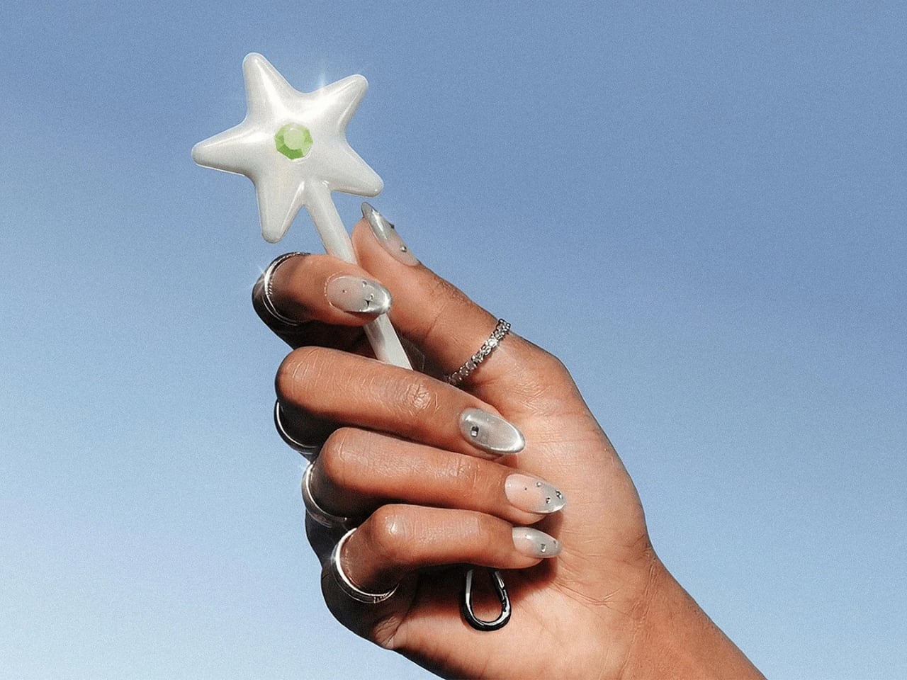
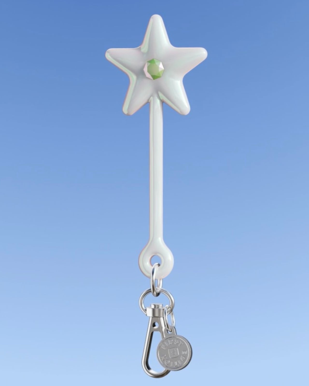
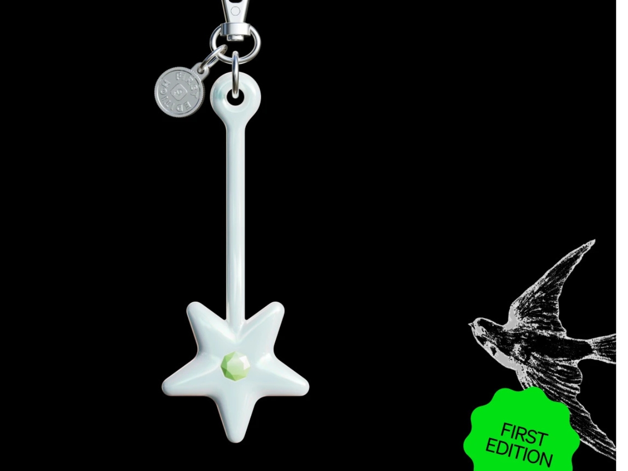
Launched on June 4, 2026, the Cash App Wand is the first in a new line of NFC-enabled payment accessories called Cash App Tags. It links directly to your Cash App Visa Card, works wherever Visa tap-to-pay is accepted, and costs $25. It clips onto a keychain, comes in a shimmery pearlescent finish, and has a light green faux gemstone set into its star-shaped tip. It looks like something you’d find halfway between a tech startup and a fairy godmother’s toolbox, and that combination is entirely the point.
The official pitch targets Gen Z, a generation that, according to a Cash App survey, purchases collectibles, accessories, or limited-edition items at least monthly more than any other generation. It’s a cohort that treats personal style as a form of currency in itself, which makes the Wand feel less like a tech release and more like a fashion drop. The Wand isn’t really trying to replace your wallet. It’s trying to become something you actually want to wear. That shift in thinking, from payment as utility to payment as personal accessory, is genuinely significant and not just a marketing exercise.
I’ll be honest: my first reaction was mild skepticism. A wand feels gimmicky, and a $25 accessory that does exactly what your phone already does doesn’t automatically justify its existence. But the more I sat with it, the more I think that skepticism is beside the point. Technology rarely wins on function alone. The Apple Watch wasn’t the first smartwatch. AirPods weren’t the first wireless earbuds. Neither succeeded purely because they worked. They succeeded because people wanted to own them and be seen with them. The Wand is operating from the same playbook, and it knows it.
There’s also a practical case buried underneath all the whimsy. Venues where phones are restricted, packed music festivals, gym bags without pockets. Situations where digging for a card or unlocking a screen takes just a beat longer than the moment allows. Cash App highlights the Wand as a solution for ordering merch at festivals or grabbing food at phone-free events. A small, lightweight accessory that lives on your keys and taps to pay solves a real friction point, even if the star shape isn’t strictly necessary for solving it. The magic is optional. The convenience is not.
Cash App says the Wand is just the beginning. The hardware lead at Block, Cash App’s parent company, described the form factor possibilities as “nearly limitless,” citing everything from clothing to jewelry as potential future payment vehicles. That’s a bold statement, but not an unreasonable one. The underlying NFC technology is the same tech already living in your phone and card. The design is the only real variable, which means the ceiling here is limited only by imagination and production ambition.
The limited-edition framing is smart, too. By releasing the Wand in small batches to Cash App Card holders before a wider summer rollout, they’ve created a sense of scarcity that turns a payment device into something closer to a drop culture moment. Whether that reads as cynical or clever probably depends on your relationship with limited releases, but it works. People are already talking about it.
What the Wand really represents is a quiet but pointed argument: that the objects we interact with every day, even purely functional ones, deserve more thought about how they look and feel. Fintech has spent so long optimizing for speed that it forgot to optimize for delight. Cash App just remembered. The Wand is available now for $25 through the Cash App, while supplies last, for eligible customers aged 13 and up.
The best pocket tools don’t announce themselves. They earn their place through precision and purpose, things you reach for so naturally they feel like extensions of your hand. For designers and engineers, the bar is higher. Every object in the loadout gets audited for weight, material, and justification. What makes this particular crop of EDC tools stand out in June 2026 is that each one actually clears that bar.
Titanium still dominates the conversation, but material alone isn’t the story anymore. It’s about the problems these tools solve without calling attention to themselves. From passive illumination powered by atomic decay to precision measurement you can clip to a keyring, the designs here represent a shift in what EDC hardware is expected to do. Smaller, sharper, smarter, and in almost every case, worth more than their weight class.
1. Painless Key Ring
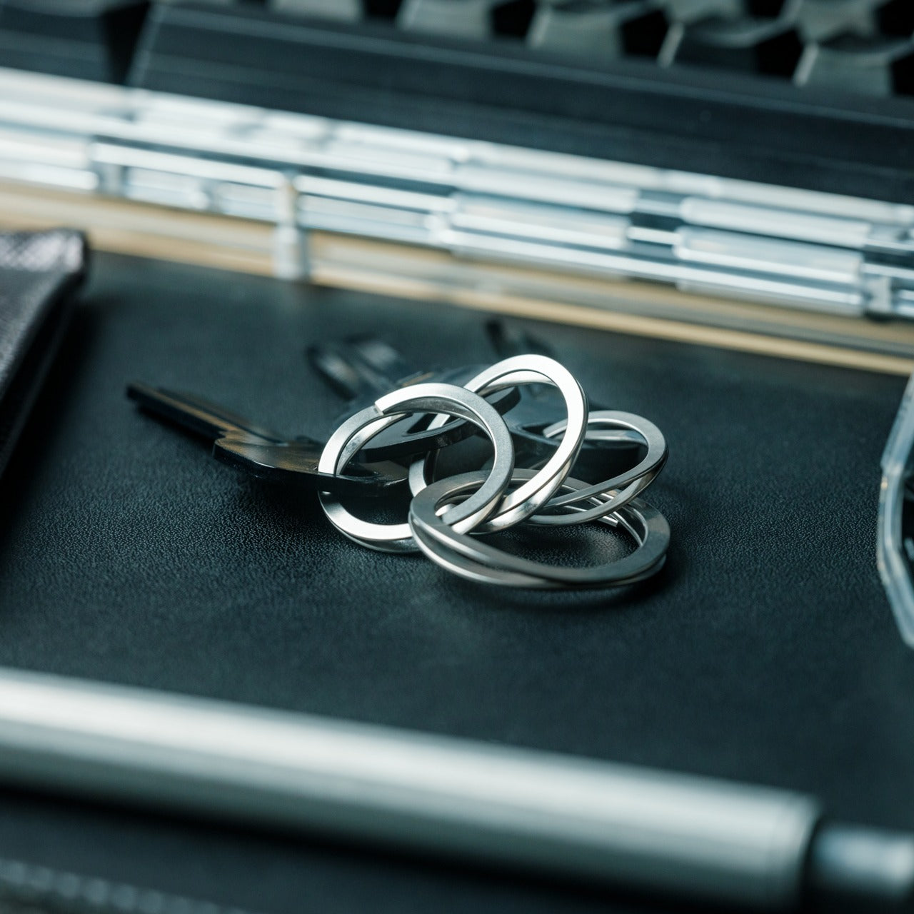
Standard split rings are a small, recurring frustration nobody talks about enough. They warp under thick keys, resist every attempt to add something new, and typically end the interaction with a broken fingernail. The Painless Key Ring addresses all of that with spring-grade SUS304 stainless steel, less than one millimeter thick, formed into a wave-shaped structure inspired by mechanisms used in aerospace equipment. The result delivers twice the strength at half the weight of a conventional ring, with natural gaps built directly into the design.
Made in Japan and sold as a set of one large ring and three small ones, it comes in silver and a dyed black finish that resists wear and scratches more effectively than standard ring coatings. The wave geometry accommodates thicker keys without deforming permanently. It fixes something you’ve been tolerating for years without realizing a better version existed. At $29 per set, it’s the most quietly effective upgrade any designer or engineer can make to what lives in their pocket every single day.
Wave-spring geometry makes adding and removing keys effortless, including thick or awkwardly cut keys
Made-in-Japan precision and a dyed black finish that holds up better than standard ring coatings over time
What we dislike
The ultra-thin profile takes some adjustment for anyone used to the familiar resistance of a conventional split ring
Available only in silver and black, which covers the basics but leaves little room for material variety
2. Titanium Caliper (37.6g)
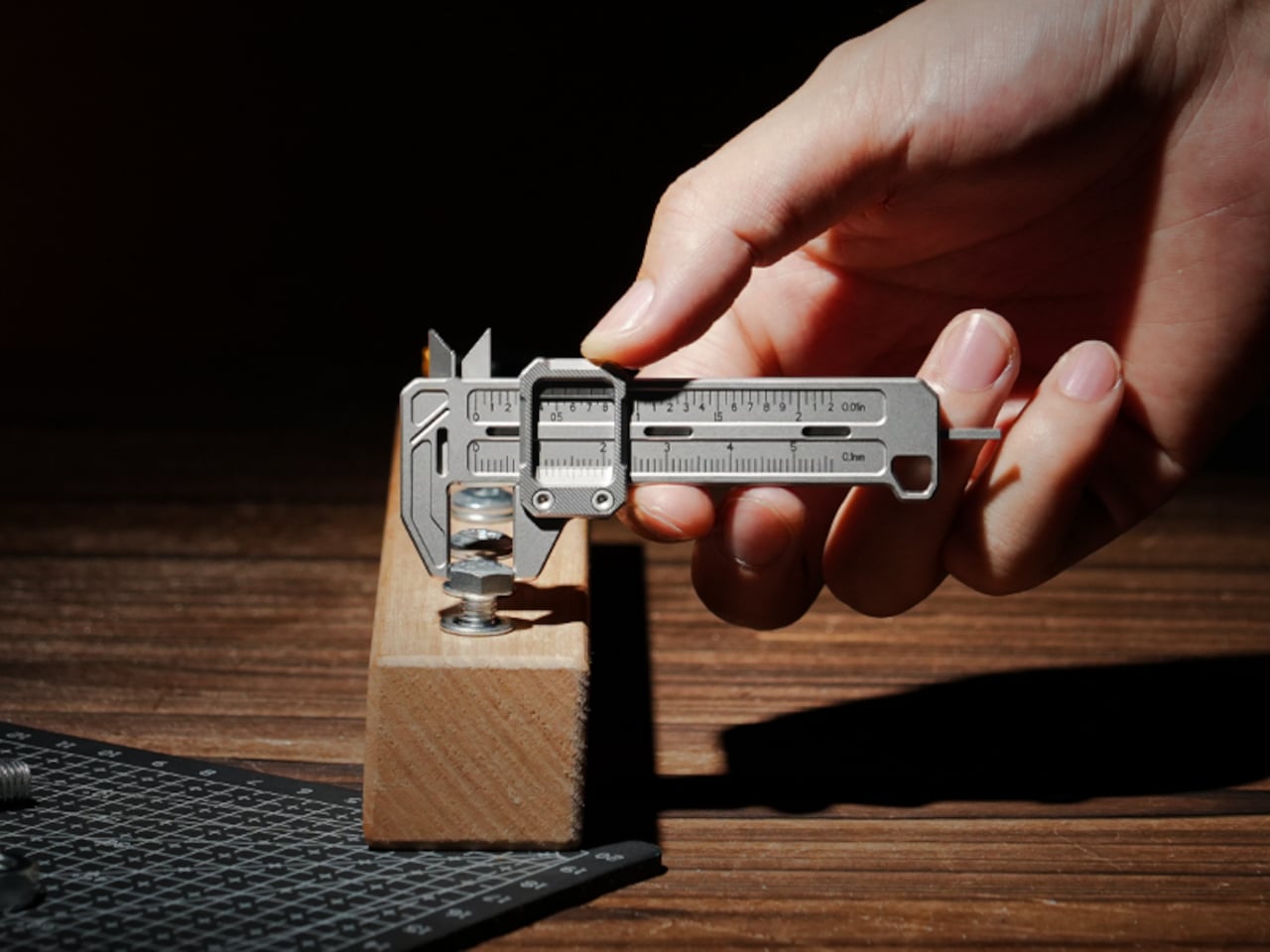
Calipers belong on the bench, at the desk, or clipped to a work apron. What they’ve never managed to do is live in a pocket without adding bulk and drawing the kind of attention a working tool shouldn’t need. This titanium caliper changes that. At 37.6 grams, it’s the kind of precision measurement instrument the EDC community has quietly wanted for years without a viable version actually existing. The machining is clean, the material choice is deliberate, and the weight removes every reasonable objection to daily carry.
For a designer who measures things constantly- fastener sizes, material thickness, gaps in a prototype that are definitely off- having a caliper that travels with you reshapes how you move through the workday. Accurate measurement shouldn’t require a trip back to the bench.
Titanium construction delivers genuine precision at 37.6g, making this the most pocketable caliper in the category
A measurement tool that has been conspicuously absent from EDC loadouts finally exists in the right material class
What we dislike
Precision jaws need some protection from pocket debris and impact, adding a small layer of carrying discipline
The function-specific nature means it earns its space only if accurate measurement is a regular part of your day
3. BlackoutBeam Tactical Flashlight
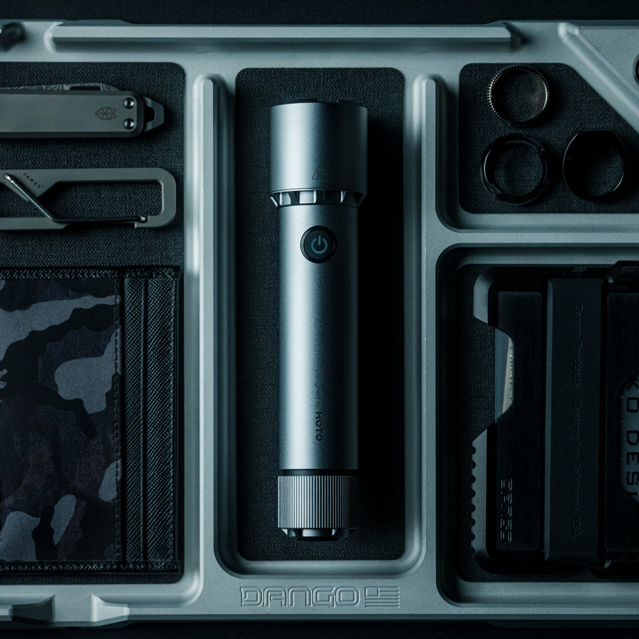
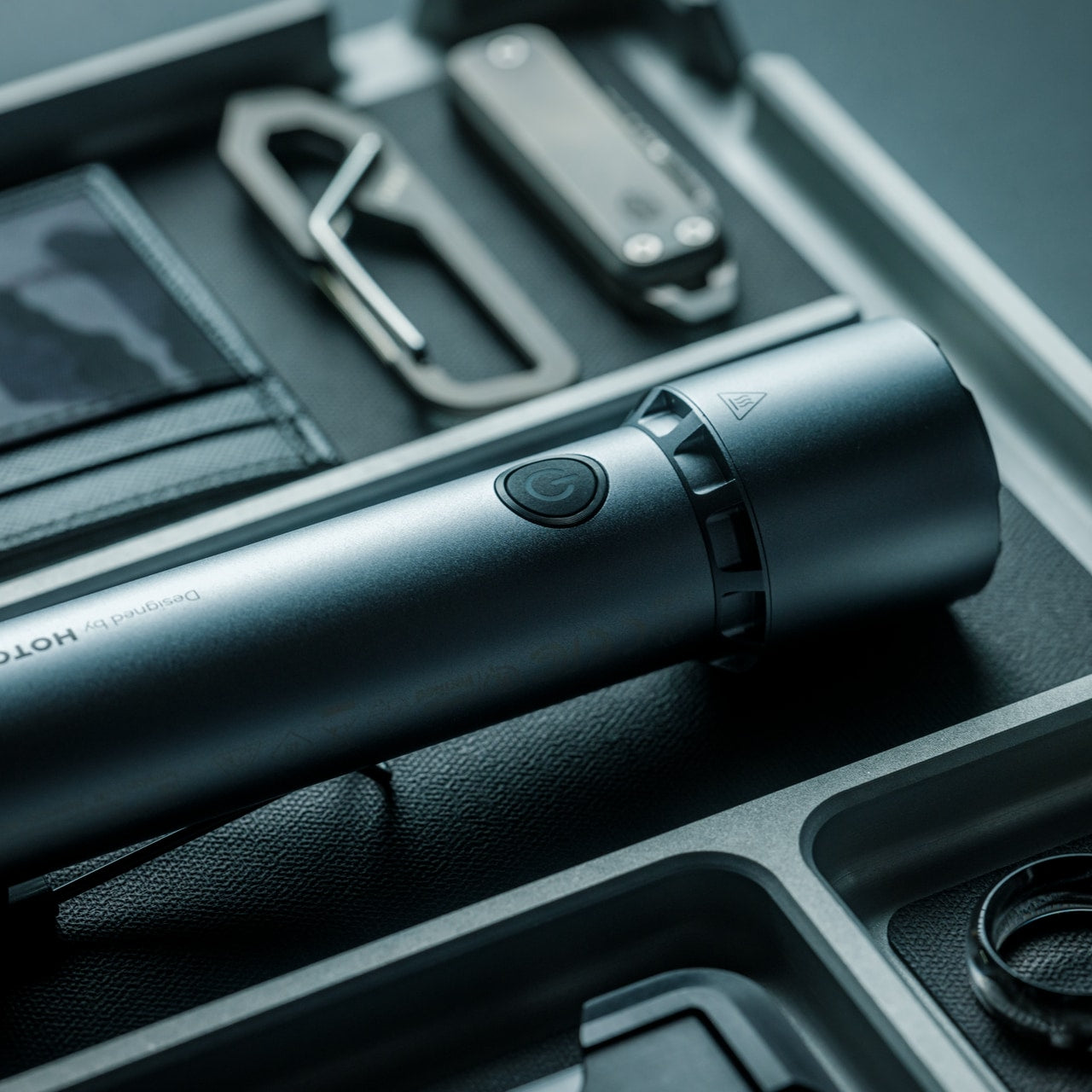
Most flashlights are either underpowered or packed with modes nobody uses. The BlackoutBeam sits squarely between those two failure states. It throws 2,300 lumens across a 300-meter range with a 0.2-second instant-on response time, fast enough to feel reflexive rather than mechanical. Five operational modes, including strobe and pinpoint, handle everything from quiet navigation to emergency signaling. IP68-rated waterproof aluminum construction means rain, impacts, and full submersion are non-issues day or night.
For engineers and designers who work late, move between sites, or spend real time outdoors, the BlackoutBeam functions as both a practical daily carry and a genuine backup tool. A dual power system, USB rechargeable with battery backup, removes the anxiety of running dry when it actually matters. At $89, it’s real money for a flashlight. The output-to-size ratio and the IP68 build quality justify that number without qualification. This is not a novelty purchase. It’s a tool that performs exactly as described.
2,300 lumens with a 300-meter throw, and a 0.2-second response deliver professional-grade output in a pocket-sized body
IP68 waterproof aluminum construction with a dual power system ensures reliability regardless of conditions
What we dislike
Maximum brightness draws battery down faster than lower output modes, requiring more frequent recharging on heavy-use days
The tactical aesthetic, though restrained, skews utilitarian and won’t disappear into a more minimal everyday loadout
4. NoxTi Titanium Keychain
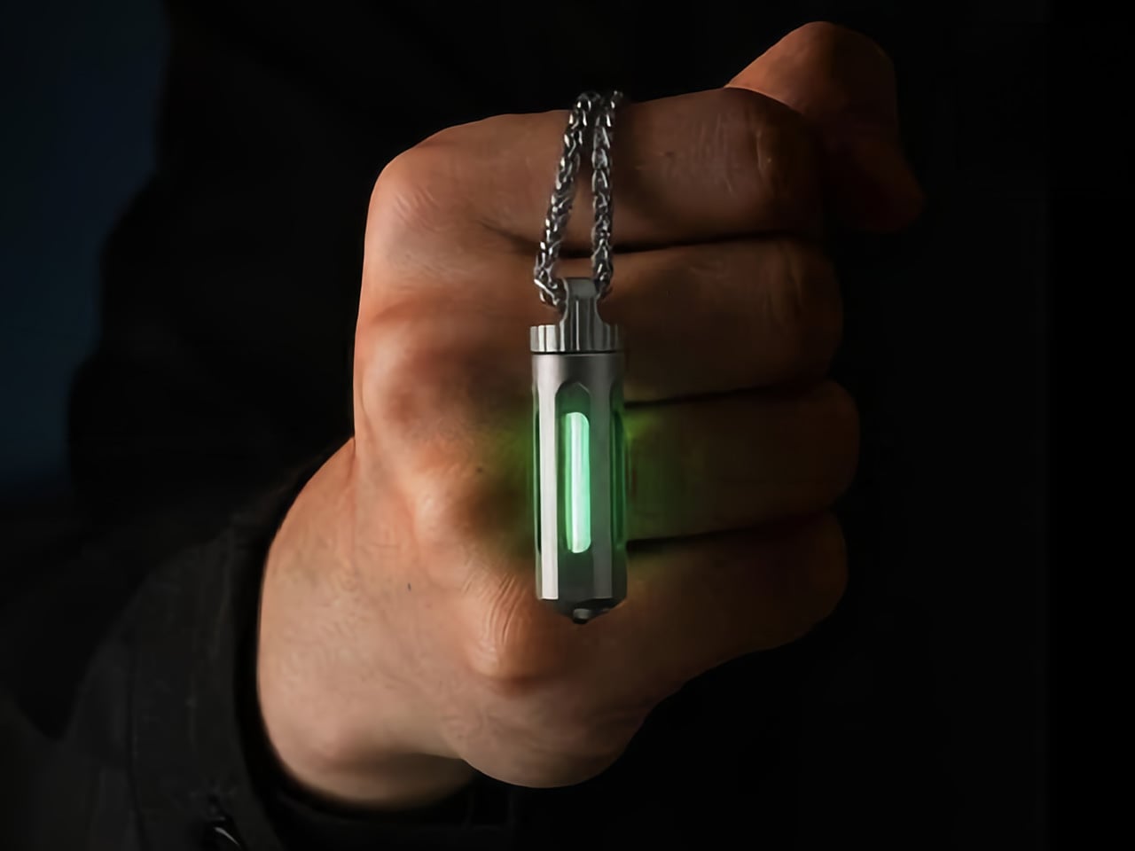
Tritium is a radioactive hydrogen isotope with a 12.3-year half-life. As it decays, beta particles strike a phosphor coating and produce a continuous glow without batteries, a switch, or maintenance of any kind. The NoxTi packages that physics into a Grade 5 titanium cylinder measuring 45mm by 12mm and weighing just 10.7 grams. A precision quartz tube with 92% light transmission holds the vial inside a CNC-machined body, available in six color options across two titanium finishes, designed by Xedge.
For a designer or engineer, the NoxTi earns its place on the keychain because it asks nothing of you. No charging schedule, no dead battery, just a reliable glow every time you reach into a dark bag or a jacket pocket at night. A ceramic glass breaker at one end adds genuine emergency utility that you hope never to use. When the vial dims after two decades, you push it out and slot in a replacement.
What we like
25 years of passive illumination powered entirely by material physics, requiring zero maintenance
A ceramic glass breaker turns an everyday keychain piece into a real emergency tool
What we dislike
The glow is intentionally ambient; it orients you in the dark rather than illuminating a space
Tritium is regulated in certain countries, worth confirming local availability before ordering
5. ScytheBlade
Edgelet took the Grim Reaper’s most recognized silhouette and scaled it down to keychain carry without sacrificing what makes that shape perform. The ScytheBlade’s curved blade profile mimics a tiger claw at 46mm deployed, and that geometry serves a real function. Curved blades concentrate cutting force in ways straight edges can’t match, particularly on pull cuts. The full titanium body brings the total weight to just 8 grams, which is about as close to weightless as a real, functional folding knife gets.
For designers who use knives practically- cutting tape, trimming mock-ups, opening packaging at the workbench- the ScytheBlade earns its place through daily carry that disappears and consistent performance that doesn’t. Titanium’s natural corrosion resistance means it survives contact without demanding attention. You won’t notice it until you reach for it, at which point the curved profile becomes immediately relevant in a way a standard straight-edge pocket knife often isn’t.
What we like
The 46mm scythe-curved blade concentrates cutting force through geometry rather than size
At 8 grams in full titanium, it’s the kind of tool you genuinely forget you’re carrying until the moment you need it
What we dislike
The curved profile takes adjustment if straight-blade EDC knives are what you’re accustomed to reaching for
Intentionally compact at 46mm deployed, it won’t satisfy anyone who needs more blade length for heavier tasks
The Pocket Loadout for June 2026 Doesn’t Need More Tools. It Needs Better Ones
The through-line across all five tools is restraint. None of them overstate their function or ask you to carry something you’ll resent by noon. The best EDC hardware solves a real problem in the smallest footprint possible. When the material is titanium, the manufacturing is Japanese, or the physics are literally radioactive, the argument for carrying it writes itself. These five tools earn that argument across every scenario a designer or engineer moves through in a given day.
The pocket loadout for June 2026 doesn’t need more tools. It needs better ones. A passive glow that requires nothing of you. A caliper light enough to forget you have it. A key ring that finally works the way it should. A blade that concentrates force into 8 grams. A flashlight that throws 300 meters and answers in a fifth of a second. Five tools, no redundancy, and genuine utility in every situation.
Handheld fans have been a summer staple for years, but the basic formula hasn’t changed much. You press a button, blades spin, and air moves. That works fine when it’s mildly warm, but as summers grow hotter and more people spend time outdoors, a fan that simply redistributes hot air starts to feel less like relief and more like a polite gesture against a much bigger problem. And yet for years, that has remained the only option most people know and reach for.
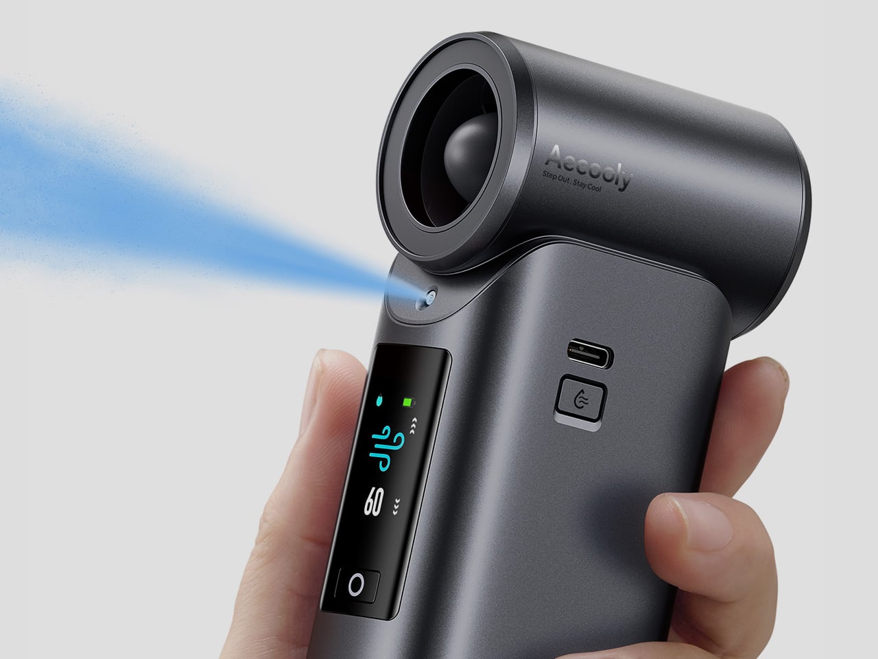
That’s the gap Aecooly is trying to close with the Cold Air Ultra, the brand’s flagship personal cooling device. Rather than simply moving warm air from one side of your face to the other, Aecooly built it around an active cooling system that delivers genuinely cooled airflow, thanks to ultra-fine mist particles that accelerate evaporation to actively draw heat away from the skin. If you’ve ever thought there has to be a fan that actually cools the air, this is that device.
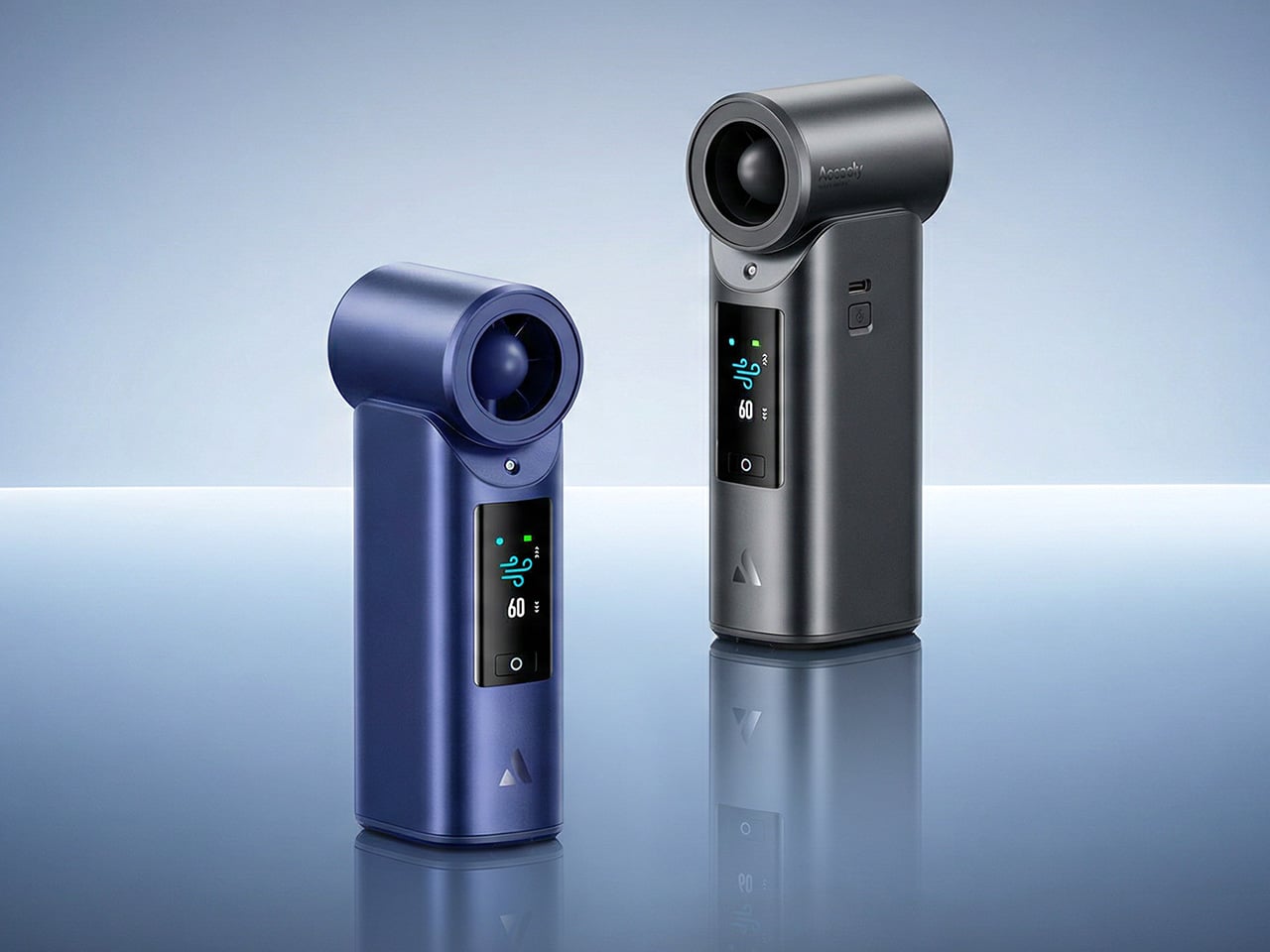
It’s worth noting how the Cold Air Ultra looks, because the design says a lot about what it’s trying to be. The body is compact and upright, with a cylindrical air outlet with a straight, high-pressure duct design, giving it a shape closer to a precision tool than a seasonal gadget and ensuring that the powerful airflow reaches you with zero efficiency loss. Unlike the plastic housing common to most portable fans, the Cold Air Ultra comes in a lightweight body with a premium metallic-inspired finish that’s more resistant to scratches and daily wear, better in hand, and can passively conduct heat away from the motor during extended use.
The cooling technology is where the Cold Air Ultra stands apart. An 70,000 RPM brushless motor drives high-speed air that “breaks through” the sticky sweat layer so the mist can evaporate and pull heat away instantly. It’s this dual action of the wind clearing the path for the mist that makes it possible to reduce skin temperature by up to 18°F (10°C) in just 10 seconds, a noticeably different experience from what you’d get with a standard fan.
What makes the airflow cold rather than simply wet comes down to how the system atomizes water. Rather than using a vibrating membrane to break liquid into droplets, the approach used in most portable evaporative devices, the Cold Air Ultra uses pneumatic atomization: a high-pressure pump forces compressed air through a precision copper nozzle, shearing water into ~20 μm micro-particles at speed. The compression process itself lowers the air temperature before it exits the device, so that what reaches your skin is genuinely cooled airflow, not ambient air with moisture added. The water and air channels are sealed in a patented airtight structure that optimizes flow efficiency and prevents leakage, a design detail that also keeps the electronics fully separated from the water circuit.
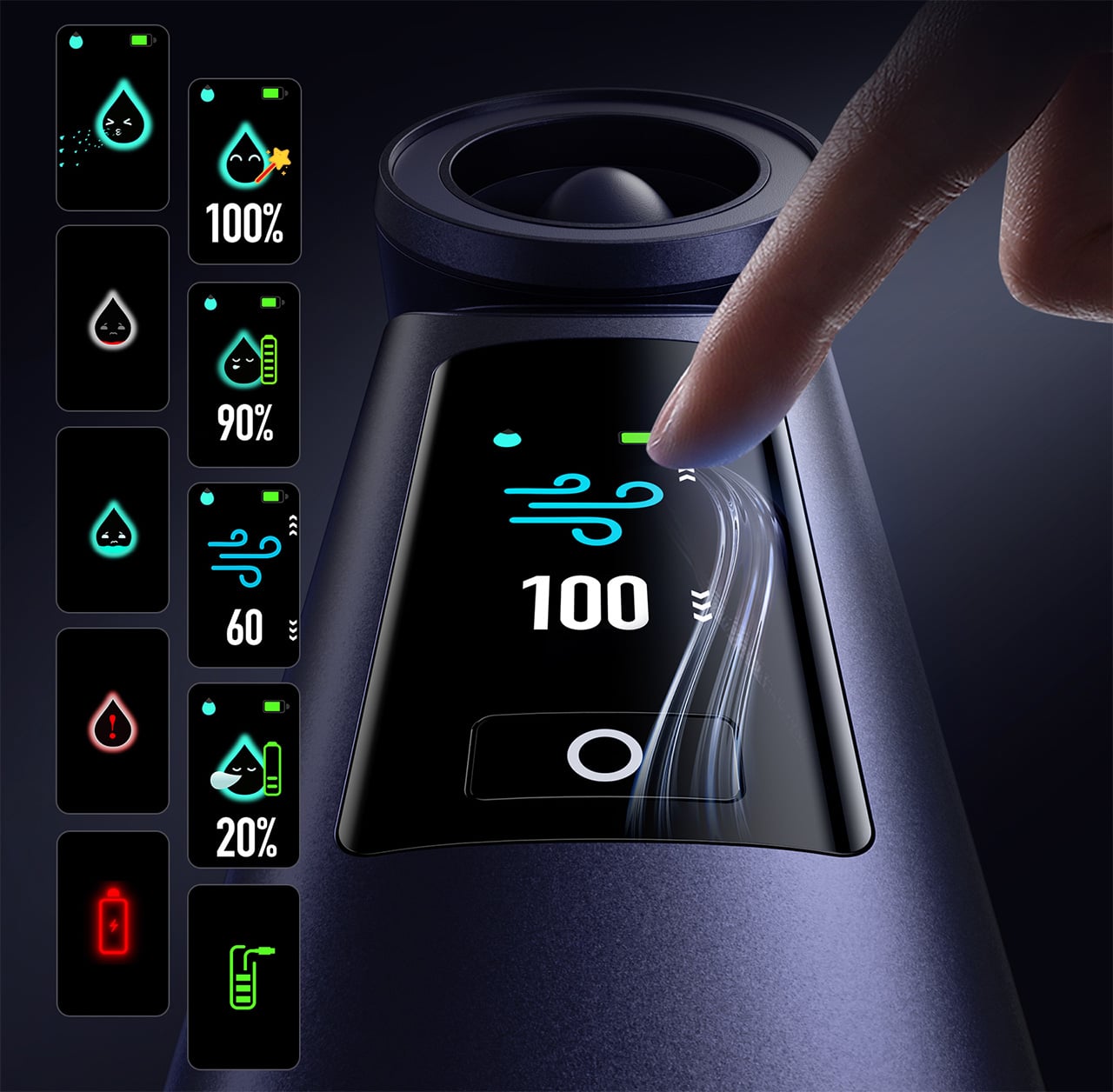
Control is handled through what Aecooly calls the “Little Droplet,” a full-color touchscreen built into the front of the body. This enables fast, intuitive, and precise control, allowing users to swipe through the 100-level settings instantly, which is a much more modern and responsive way to manage airflow compared to traditional fans. And with dynamic icons that display battery level, water level, and mist status in real time, you’re never left guessing what’s left.
Picture stopping mid-hike to cool down, or waiting on a sweltering subway platform with no breeze in sight. A standard fan doesn’t do much in either of those moments beyond moving hot air around. The Cold Air Ultra is built for situations like these, where getting your skin temperature down quickly during a break or a commute actually makes a noticeable difference to how you feel.
Battery life isn’t a compromise here either. The Cold Air Ultra packs a 7,000 mAh cell for up to 10 hours, charges via USB-C in about 2.5 hours, and doubles as a 20W power bank with Quick Charge and Power Delivery support. The magnetic accessory system includes a pointed nozzle and a round nozzle for directing airflow, plus a brush head, each of which can snap on and off without tools. The included lanyard enables hands-free carry, so the device stays accessible during commutes or outdoor use without needing to be held.
Aecooly says the Cold Air system has received the Red Dot Design Award 2026, a recognition that speaks to its functional engineering as much as its considered form. It’s available in a black and a blue finish, and retails for $79.99. For a device that covers personal cooling, emergency power, and outdoor utility in a single package, the price puts it squarely in premium handheld territory.
The standard Aecooly Cold Air at $31.99$39.99 (20% off, use coupon code “YANKO2026”) brings the same active cooling concept in a simpler package, with a 4,500 mAh battery and five speed settings. It’s a solid introduction to the concept, but the Cold Air Ultra’s touchscreen, 7,000 mAh battery, 20W power bank output, and magnetic tool system make $79.99 feel less like a premium and more like the smarter spend.
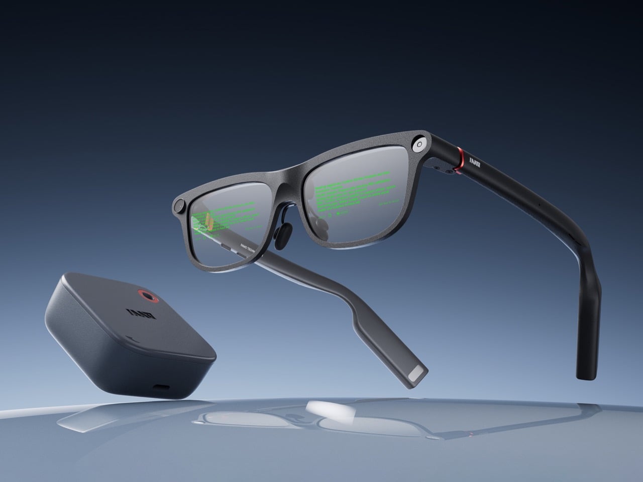
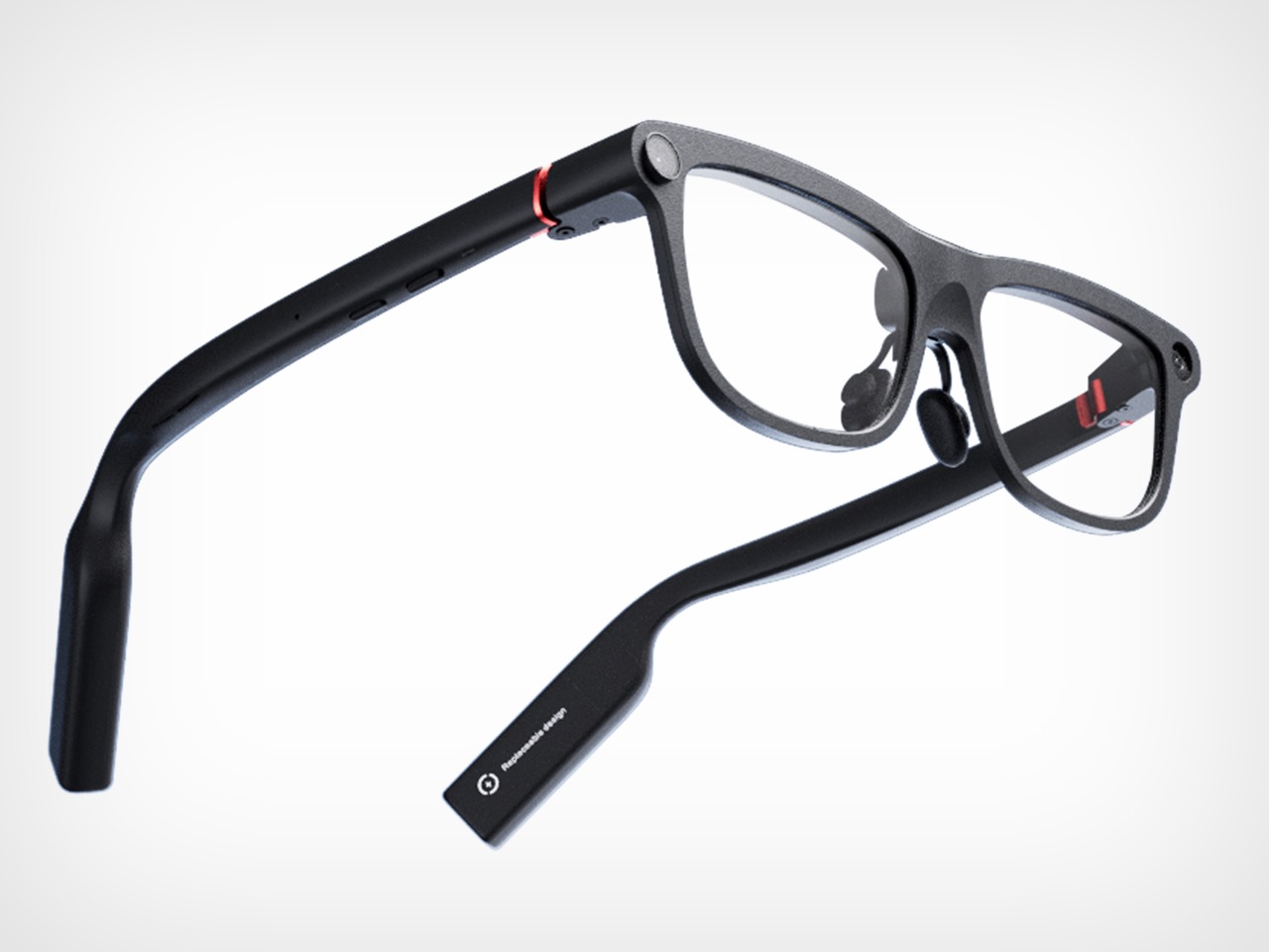
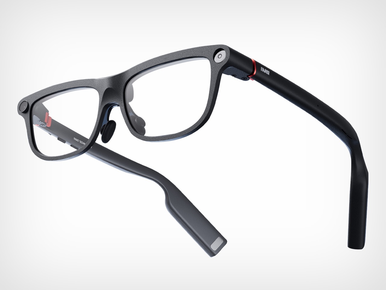
Smart glasses companies love to talk about a grand future, but the strongest case for INMO GO3 arrived in a very ordinary setting: a live presentation. During its appearance at Global Connect in China, an INMO presenter used the glasses’ teleprompter feature while addressing the room, letting the script move with her speaking pace. It was a simple demonstration, slightly funny once the audience noticed the note cards she held as a backup option, and far more memorable than a spec sheet.
That kind of practicality is central to INMO’s broader strategy. The company describes its mission as building glasses people can wear daily, and GO3 reflects that approach with features aimed at frequent, low-friction use. Real-time translation, live transcription, meeting summaries, HERE Maps navigation, and photo translation all point toward the same goal: putting AI and information in front of the eye in a form people might actually keep on their face all day.
Designer: INMO
What makes the GO3 feel more meaningful than many smart glasses pitches right now is the kind of display it chooses to be. The category is increasingly pulled toward a model where glasses become another surface for platforms to mediate your attention, observe your behavior, and layer commerce or data collection into the act of seeing. That vision promises convenience, but it also raises the prospect of a device that quietly turns everyday life into a stream of signals for someone else to measure, sort, and monetize.
INMO’s framing, at least from this demo and conversation, points in another direction. The GO3 display feels useful because it serves the wearer in immediate, legible ways. It helps you follow a script. It helps you catch a conversation through live transcription. It helps you understand another language, navigate a route, or pull information from the world through photo translation. The point is not to create a new theater for algorithmic persuasion. The point is to reduce friction between a person and the task in front of them.
That’s a fairly important distinction because smart glasses will live or die on trust as much as technical ability. People may tolerate a phone screen as a chaotic marketplace of prompts, ads, feeds, and nudges because phones already carry that baggage. Glasses sit closer to the body and closer to perception. They ask for a different kind of acceptance. A product in that position has to prove it deserves to be there, and the most convincing way to do that is by helping with something clear, fast, and human scale.
The GO3 seems to understand that. On paper, its features are varied enough to sound ambitious: standalone real-time translation in 78 languages, AI teleprompting with auto-scroll, meeting summaries, action items, hands-free navigation through HERE Maps, photo translation, prescription support up to 2000 degrees, and a swappable battery system that can be changed in about five seconds. In practice, though, the appeal comes from how these features collapse into ordinary moments. A work presentation. A multilingual conversation. A commute. A quick glance for context instead of a full stop to unlock and consult a phone.
That is why the live teleprompter demo landed so well. It showed the GO3 handling one of the simplest possible tasks, and in doing so, it made a broader case for the category. Smart glasses do not need to begin with spectacle to feel transformative. They can begin with assistance. They can begin with a line of text, quietly placed where you need it, moving at your pace, leaving your hands and attention freer than they were a moment before. Once that works, bigger use cases start to feel plausible.
Some details remain fuzzy, especially around video recording, which was less clearly explained in conversation than photo capture. Any smart glasses company also has to prove that software quality can hold up outside the demo environment, particularly for translation, transcription, and AI-generated summaries. Those are high-value features, but they are also the ones most likely to disappoint if latency, accuracy, or interface design slips. INMO’s been in the business long enough to know that, and to also have a fairly strong grip on a fix.
Even with those caveats, INMO’s pitch feels unusually coherent. Founded in 2020, the company says its goal from day one has been to make glasses people will wear every day, and GO3 is the strongest expression of that idea so far. At 58 grams, with prescription support and a battery system designed for long use, it is clearly being shaped around wearability rather than occasional novelty. That design logic gives the product a sense of discipline that many competitors still lack.
The larger vision behind GO3 is that smart glasses will become the next mobile computing platform, eventually taking over as the primary interface for AI. That is a huge claim, and one the industry repeats often. What gives INMO a better argument than most is that it starts from the simple setting rather than the maximal one. If smart glasses are going to matter, they have to prove themselves in the small moments first. GO3 makes that case persuasively. It suggests the future of wearable computing may arrive not through spectacle, but through usefulness that quietly earns its place.
Note apps are frictionless. That is supposed to be their advantage. You open one in two taps, type something forgettable, close it, and lose it somewhere between screenshots and grocery lists. The problem is that “frictionless” and “memorable” are not the same thing. Japanese stationery designers figured this out long ago, which is why they keep building analog tools that feel more considered than anything a software update has ever produced.
Every product here solves a specific friction point you have probably accepted as normal: a pen that vanishes when you need it, a clipboard that fights back when you add a sheet, a tape dispenser that looks like it escaped from a supply closet. These five finds fix all of that without an app store, a subscription, or a settings menu.
1. Inseparable Notebook Pen
Most pens exist independently of the surface they write on. The Inseparable Notebook Pen rejects that assumption, using a magnetic clip that locks it to your notebook cover every single time. A built-in silencer dampens the attachment so there is no click, no rattle, just a quiet lock into place. The barrel is slim, the gel ink immediate, and the whole system rests on a principle Japan has long understood: the best tools are the ones you eventually stop noticing.
The gap between reaching for a pen and writing is small but real. In a meeting, on a train, mid-thought at a cafe table, that search breaks momentum in a way you feel but rarely name. By attaching itself to the notebook, the Inseparable closes that gap completely. It arrives wherever the notebook goes, leaves when the notebook leaves, and sits almost invisible against the cover. At $19.95, it is a quiet fix for an annoyance most people have long stopped trying to solve.
The magnetic clip holds firm during transit but releases instantly the moment you need it
The built-in silencer makes every attachment feel deliberate rather than mechanical
What we dislike
The slim barrel may feel too narrow for anyone who prefers a wider, more substantial grip
Ink cartridge options are limited, which restricts customization for specific writing preferences
2. Stalogy Editor’s Series 365-Day Notebook (A6)
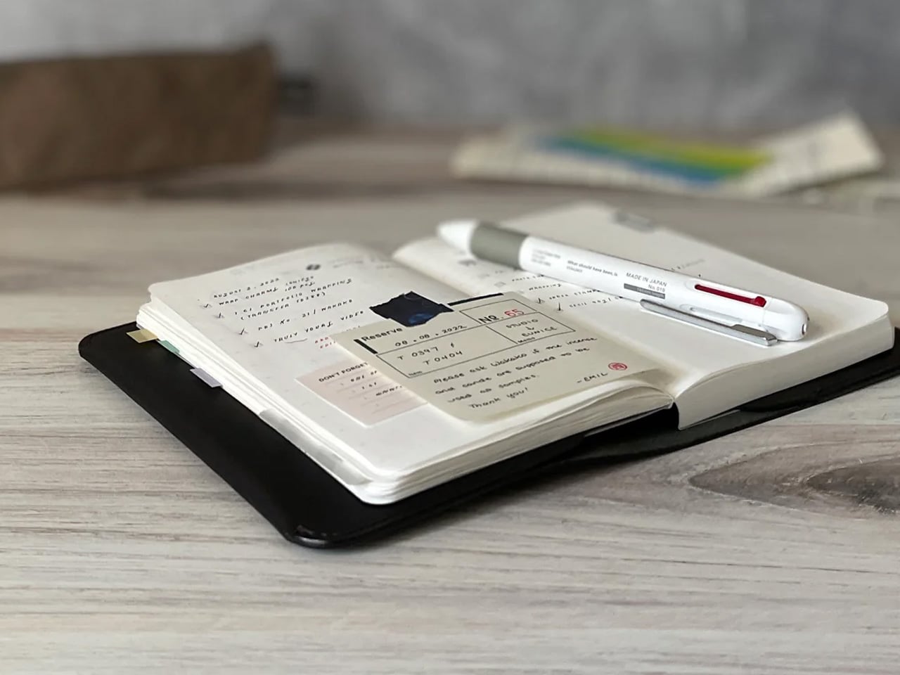
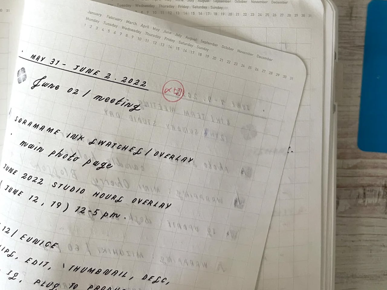
The Stalogy Editor’s Series 365-Day Notebook packs 368 pages into an A6 form factor that still slides into a coat pocket. Each page carries minimal printed detail: faint dates, a light grid, time indicators running along the margin. Use them or ignore them entirely. The paper is ultra-thin but writes with a smooth resistance that makes ink feel like it belongs on the page rather than sitting on top of it. Gel pens, ballpoints, and lighter fountain pen inks all perform cleanly without feathering.
Most planners assume they know how your day should be structured. The Stalogy steps back. The faint markings give you reference points without enforcing a system, which means the same notebook works for bullet journaling, meeting notes, rough sketching, and daily records without ever feeling like you are working against the page. For anyone who has cycled through five different note apps looking for the one that finally fits their brain, this is what that search was actually about.
Thin paper keeps 368 pages from becoming heavy, maintaining genuine pocketability throughout
Minimal page markings suit both rigid planning systems and completely freeform, unstructured use
What we dislike
Heavy fountain pen inks will ghost through the thin paper, limiting compatibility with certain instruments
Date and time markings are printed very small, making them difficult to read comfortably in low light
3. MagBoard Clipboard
Most clipboards run on the same tired mechanism: a spring-loaded lever that crushes paper at the top and leaves the rest of the sheet free to shift around below. The MagBoard replaces all of that with a magnetic and lever system that holds up to 30 sheets securely, without the grip marks. The hardcover backing is stiff enough to write on while standing, and the water-resistant surface means it survives bag life in a way paper-covered clipboards rarely manage.
The real advantage is speed. Adding or removing a sheet from most clipboards requires two hands and patience. The MagBoard lets you slide paper in and out cleanly, which changes how you interact with your notes during a meeting or a site walkthrough. It is the kind of improvement that sounds trivial until the first time you need it in a moment where fumbling costs you. At $45, it earns its place on the desk and equally off it.
The magnetic system holds sheets flat without grip marks or any pressure damage to the paper
The water-resistant hardcover handles bag use and outdoor conditions better than standard clipboards
What we dislike
Bulkier than a standard clipboard, which can be a tight fit inside slimmer bags and sleeves
The magnetic hold may feel less secure with very thick paper stocks or layered sheets of card
4. Classiky Wooden Tape Dispenser
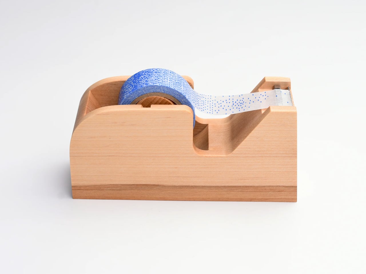
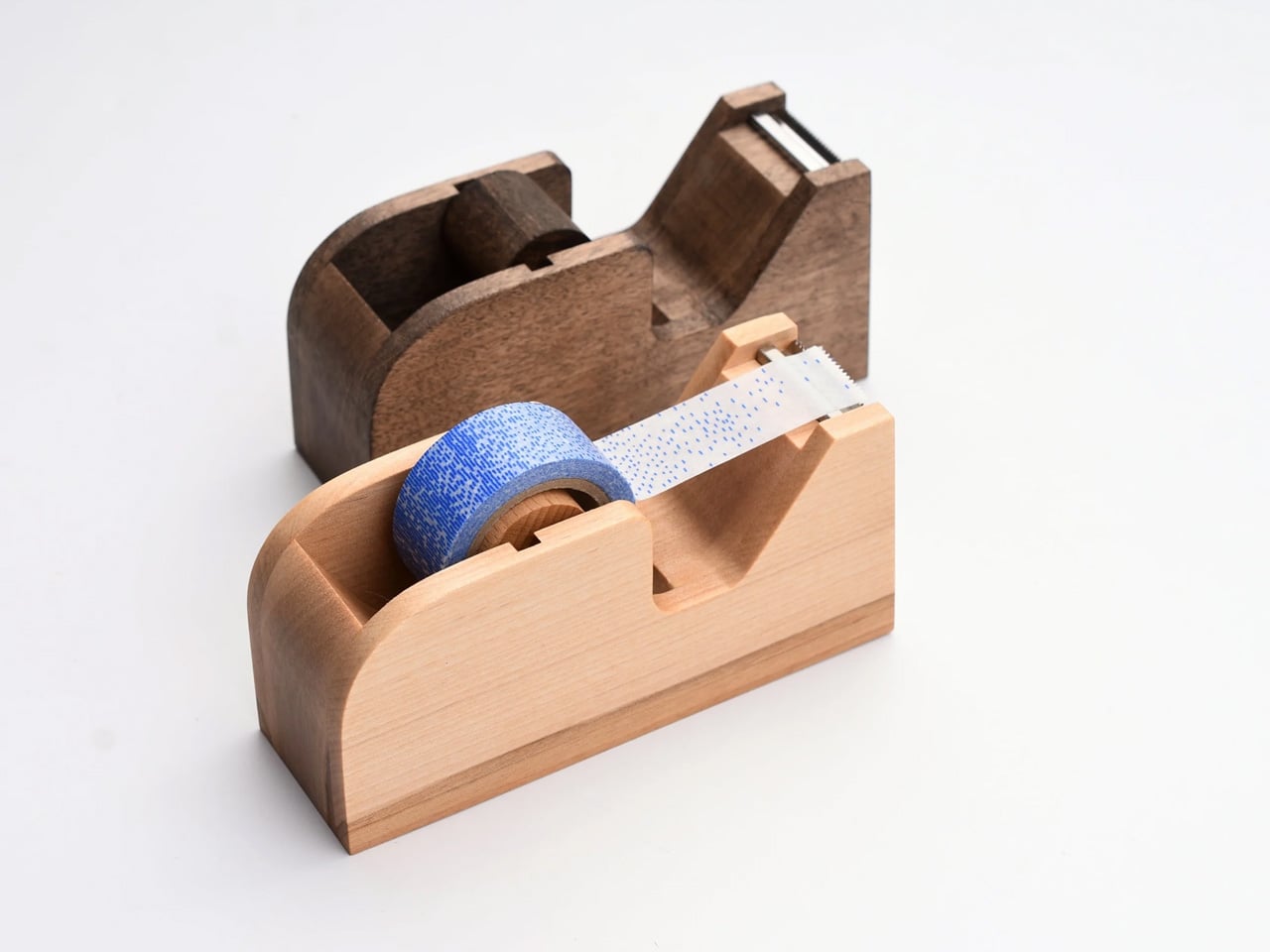
The tape dispenser is the most overlooked object on any desk. It sits in a corner, accumulates dust, and looks like it arrived from a supply closet rather than a considered workspace. Classiky’s version, cut from varnished Japanese wood with rounded, sculpted edges, refuses that role entirely. The grain is warm, the weight satisfying in the hand, and the mechanism precise enough to produce a clean tear every time. It quietly raises the standard for everything else sharing the same surface.
Classiky is a Japanese zakka brand that applies the same material thinking to everyday objects that most designers reserve for furniture. The Wooden Tape Dispenser is that philosophy made literal: a utilitarian desk tool reconsidered from the outside in, built from a material that improves with handling. The varnished wood deepens over time, picking up warmth from the room and the hands that reach for it daily. At $42, it makes every other object on your desk look like it is still waiting to be properly replaced.
The varnished wood looks considered at rest and develops a warmer character with regular handling over time
The mechanism produces a clean, controlled tear that most plastic dispensers never consistently manage
What we dislike
Sized for standard tape rolls, so it will not accommodate wider washi tape or specialty roll sizes
The wood surface will mark with use over time, which reads as earned patina to some and damage to others
5. Sonic Kakusta Portable Pen Stand
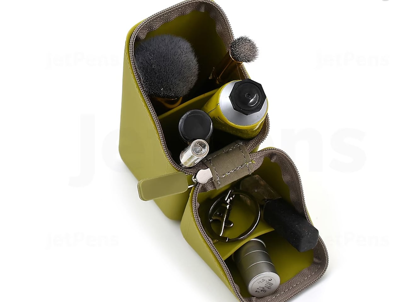
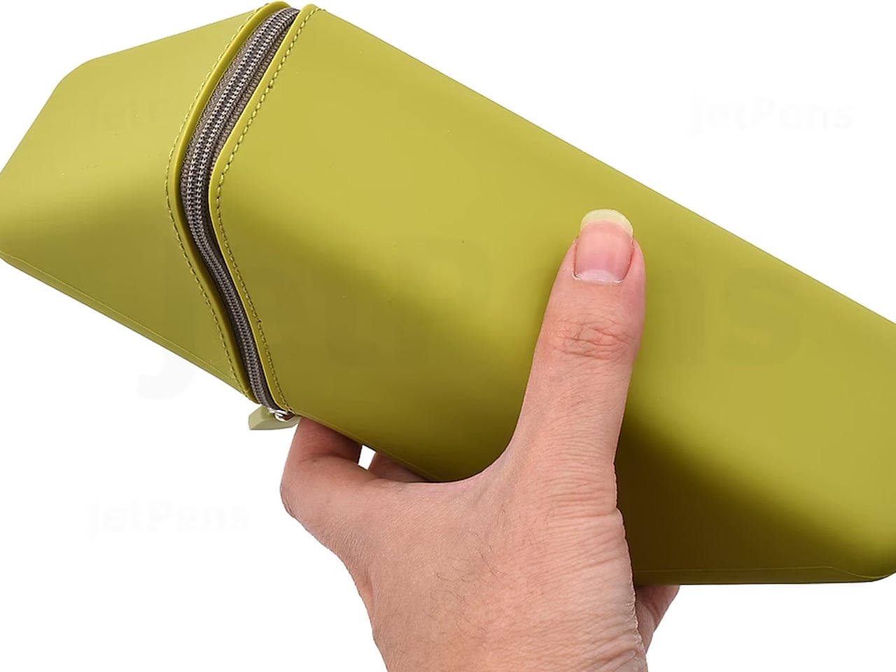
The Sonic Kakusta starts as a flat soft pen case and folds into a triangular desk stand in a single motion. Open, it props pens at a 60-degree angle: steep enough to show pen caps for quick identification, shallow enough that instruments slide out without tipping the whole case over. A built-in divider splits the interior into two sections, and a second divider in the lid creates a small shelf for erasers or sticky notes. Strong magnets hold the stand shape reliably on any flat surface.
For anyone moving between home, office, library, and studio, this is the object that makes carrying stationery feel considered rather than improvised. The case lies flat in a bag without occupying more space than a notebook. On a desk, it becomes a proper display stand, keeping what you need visible rather than buried at the bottom of a pouch. That transition from flat to functional in one fold is precisely the kind of engineering detail that separates Japanese stationery design from everything else in the category.
The magnetic lid holds the stand shape firmly, even on slightly uneven or textured surfaces
The lid divider creates a genuinely usable small shelf, an extra that most pen cases never think to include
What we dislike
The soft material offers limited protection against crushing when a bag is packed tightly around it
The triangular footprint when open takes up noticeably more desk space than a flat case would
The Best Tools Don’t Get Updated. They Get Better.
These five objects share one quality that note apps cannot replicate: they get better the more you use them. The wood deepens. The magnetic mechanism smooths out. Each session leaves a trace in the material that accumulates into something that is unmistakably yours. That is not sentimentality; it is the material logic of objects built to outlast a software cycle. Japanese stationery design at its best does not chase novelty. It makes the ordinary interaction between a person and a tool feel like it was worth designing in the first place.
The note app on your phone is not going anywhere. But after a week with these on your desk, you might find you reach for it less. Not because analog is inherently better, but because the right physical tool makes thinking feel different from typing. Slower, more deliberate, more yours. That is a harder thing to engineer than an app. Japan has been doing it for a long time.
Victorinox and Leatherman did something remarkable beyond building useful tools. They each created a visual identity so strong that it became the default answer to the question of what a portable multitool should look like. The Swiss Army Knife turned the folding pocket knife into a miniature toolkit, with blades and tools layered along a single spine in a form almost anyone on the planet would recognize on sight. Leatherman took the opposite route, putting a plier at the center and folding the handles outward to reveal a dozen more functions. These were genuinely different design philosophies, and both became iconic. Between them, they defined the category for most of a century.
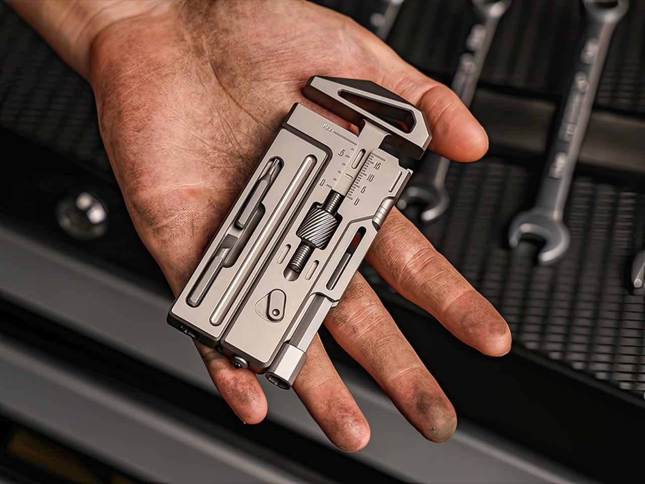
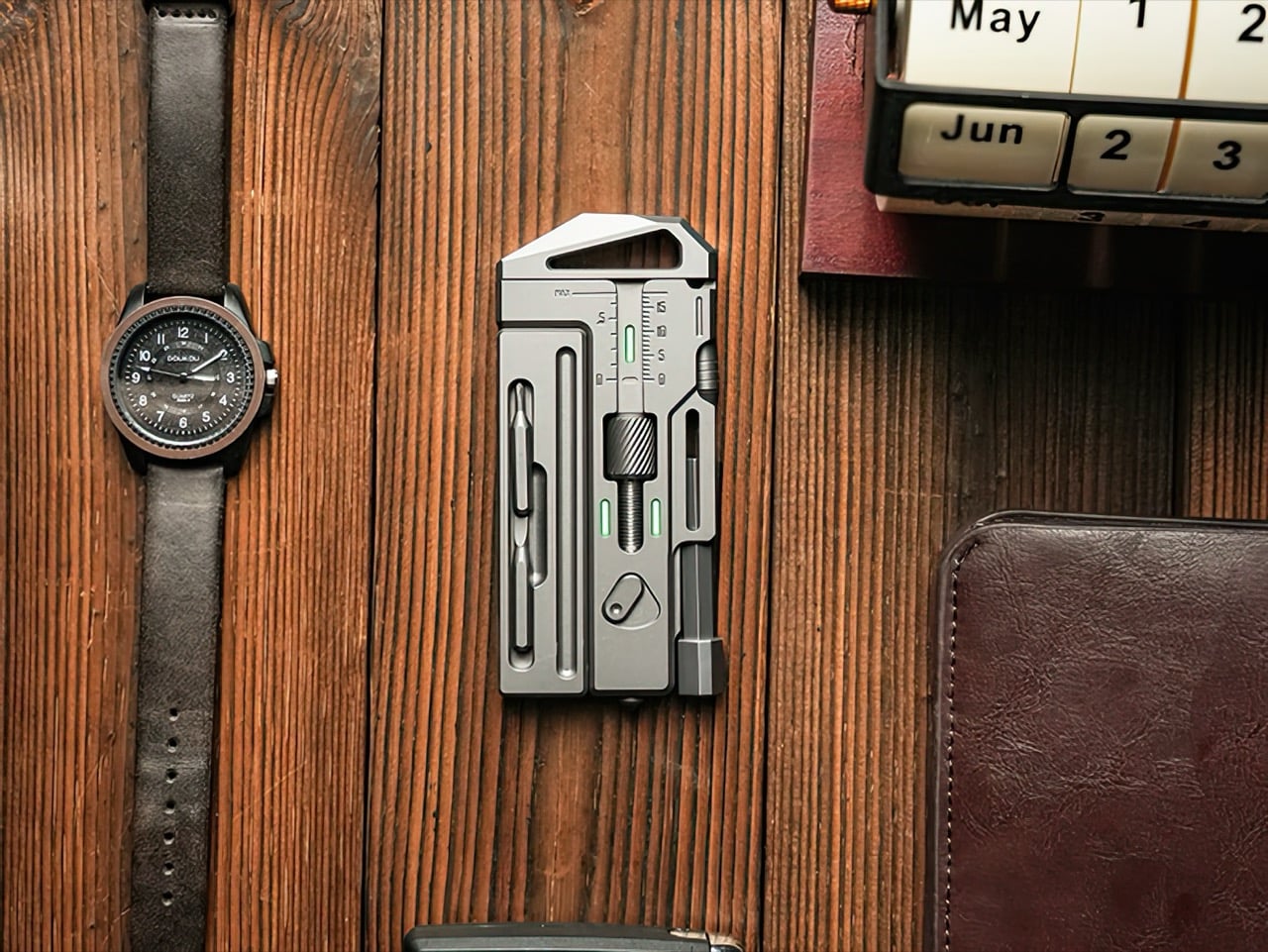
The format nobody seriously explored is the one that fits naturally into the same spaces as a phone, a wallet, or a slim notebook. A flat rectangular slab, sized somewhere between a pocket knife and a small notepad, turns out to be an almost perfect geometry for daily carry, because that is exactly the geometry your pockets, bags, and cases were already designed around. The OmniPro Wrench 3.0 from Los Angeles-based IF is a Grade 5 titanium multitool system that occupies that territory, built around a genuine 0 to 18mm adjustable wrench and packed with fifteen practical tools. It is currently on Kickstarter, where it has raised over $57,000 against a $3,000 goal with two weeks still remaining.
IF built the OmniPro 3.0 around the wrench function first, treating everything else as secondary. The adjustable jaw spans 0 to 18mm, which covers the majority of fasteners you encounter in daily repairs, from furniture assembly to bike maintenance to plumbing fixes. The adjustment mechanism is smooth, with a knurled thumbwheel that grips positively even when your hands are sweaty or oily. The wrench jaws themselves deliver genuine torque, the kind you need when a bolt refuses to budge or when a fitting needs real pressure to seal properly. This feels like an actual wrench that happens to live in a multitool body, rather than a novelty wrench grafted onto a keychain gadget.
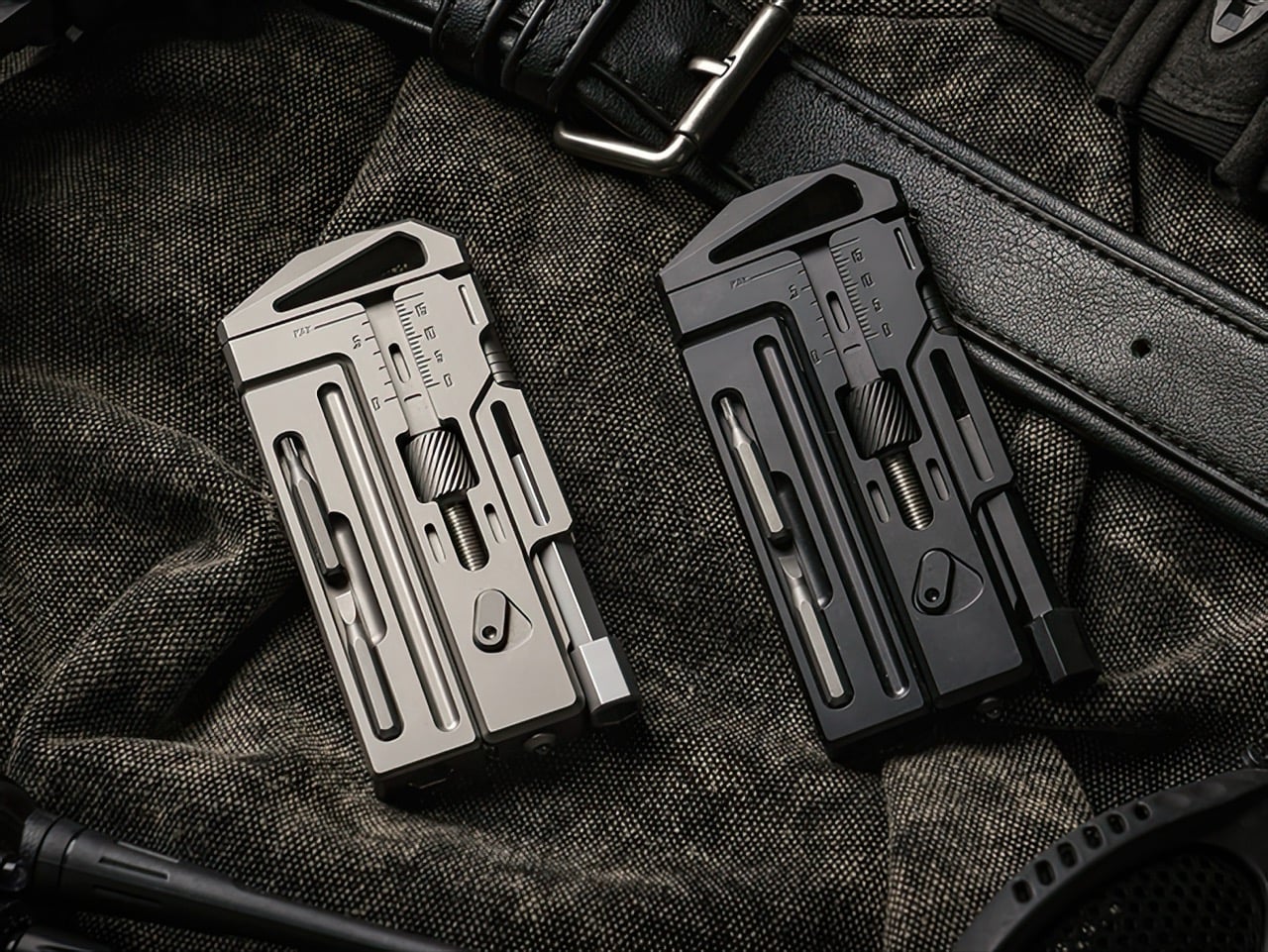
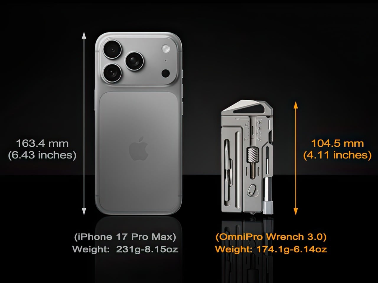
Grade 5 titanium, the same Ti-6Al-4V alloy used in aircraft landing gear, forms the entire body. Each OmniPro 3.0 starts as a solid titanium billet and gets CNC-machined down to final form, then hand-finished with micro chamfers on every edge to eliminate sharp corners. The result weighs 174 grams, lighter than most smartphones but substantial enough in hand to communicate durability. Titanium brings corrosion resistance that steel cannot match at this weight, which means sweat, rain, and salt water leave no trace. The sandblasted finish feels matte and slightly textured, the way raw titanium emerges from machining. A black PVD coating option offers a stealthier aesthetic for those who prefer darker gear.
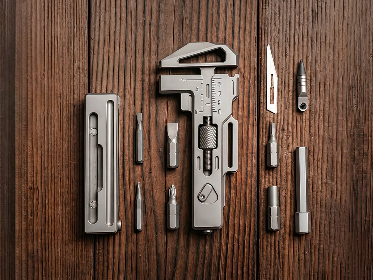
The three-position bit driver system addresses one of the most persistent frustrations with compact screwdrivers, insufficient clearance. Most pocket tools force you into a single driver orientation, which works fine on a workbench but fails spectacularly inside a cramped electronics enclosure or underneath a desk. The OmniPro 3.0 gives you top, side, and bottom bit ports, so you can switch angles to match whatever clearance the space allows. The ratchet mechanism reverses direction with a single flick of an external switch, eliminating the need to remove the ratchet head entirely just to change from tightening to loosening. That small detail saves several seconds per fastener, which compounds into real time savings across a full repair session.
The extension rod was one of the most requested features from earlier OmniPro backers, and the third generation integrates it through a snap-on magnetic latch system. Pull the rod from its slot, snap it onto the bit driver, and you gain several centimeters of reach for recessed screws or deep cavities. The modular bit storage cabin holds three 6mm bits, two 4mm bits, and a 6mm-to-4mm adapter, all retained magnetically so they stay secure during movement but release cleanly when you need them. The storage module itself latches to the main body with the same satisfying snap mechanism as the extension rod, the kind of tactile feedback that makes you open and close it twice just because it feels good.
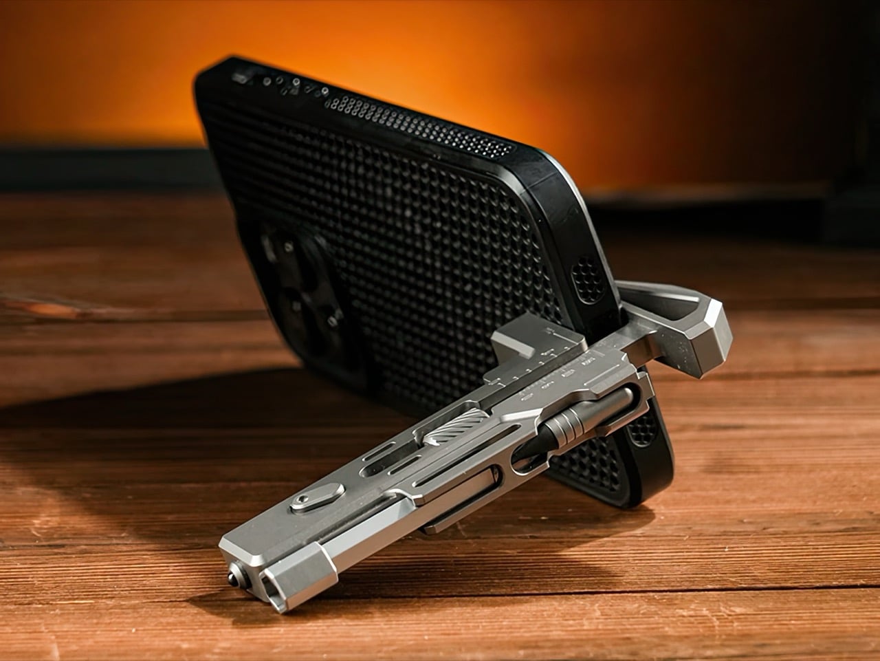
A built-in caliper scale runs along the wrench body, precision-lasered directly into the titanium. Measure bolt diameters, check material thickness, verify part dimensions, all without pulling out a secondary tool or guessing by eye. The magnetic eternal pen uses a graphite tip that writes on nearly any surface without ink, and it pulls from either side of the body through dual access grooves. A side-mounted #11 scalpel blade sits in a protective finger groove for safe cutting. The bottle opener relocates to the rear of the tool, away from the wrench jaws, which improves both grip clarity and caliper accuracy. A phone stand groove props your device up at a hands-free viewing angle. Eight tritium slots glow for 25 years without batteries or charging, making the tool visible in total darkness. A tungsten carbide glass breaker handles emergency escape scenarios with a single sharp strike.
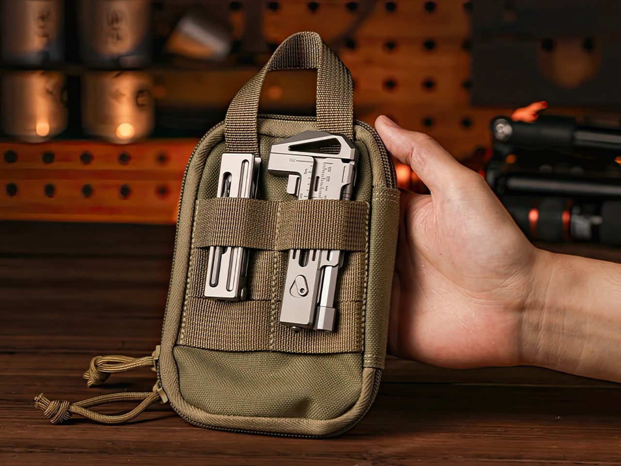
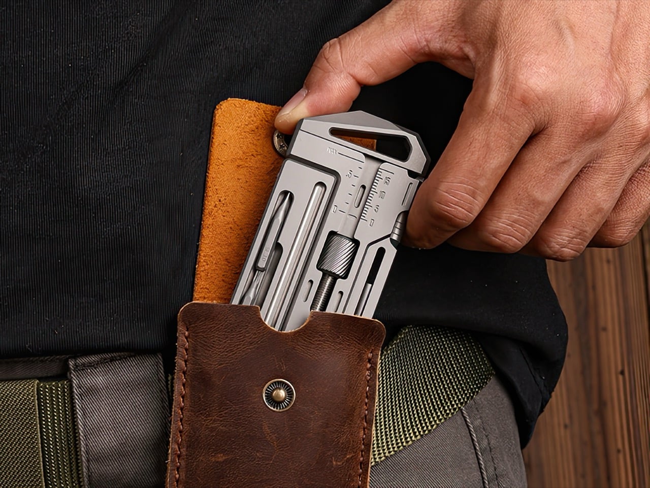
At 104.5mm by 46mm, the OmniPro 3.0 slips into a front pocket alongside a phone or wallet without printing awkwardly. It works equally well in a bag side pocket, a gear pouch, or clipped to a belt loop with the optional leather sheath. The sheath itself is belt-compatible with a hanging hook for fast-access carry. Two finishes, sandblasted titanium and black PVD, offer different aesthetic directions with identical material performance underneath.
The OmniPro Wrench 3.0 is available now on Kickstarter with discounted pricing starting at $169 for a single wrench, which includes a bit converter, two 1/6-inch bits, one 1/4-inch bit, and an everlasting pen, representing a 35% discount off the planned retail price of $259. A two-pack bundle is available at $309. The campaign runs through June 22, 2026, with shipping scheduled to begin in September 2026.
Our obsession with productivity has created a technology landscape that values data over discipline. We are encouraged to believe the path to better work is paved with more features, more integrations, and more automation, leading to tools that are powerful yet overwhelming. These systems promise efficiency by tracking our every move, analyzing habits, and optimizing our schedules. But in doing so, they can strip away our agency, turning the human process of creative work into a set of metrics managed by an algorithm. The result is a strange irony where the tools we build to manage time quietly end up consuming it.
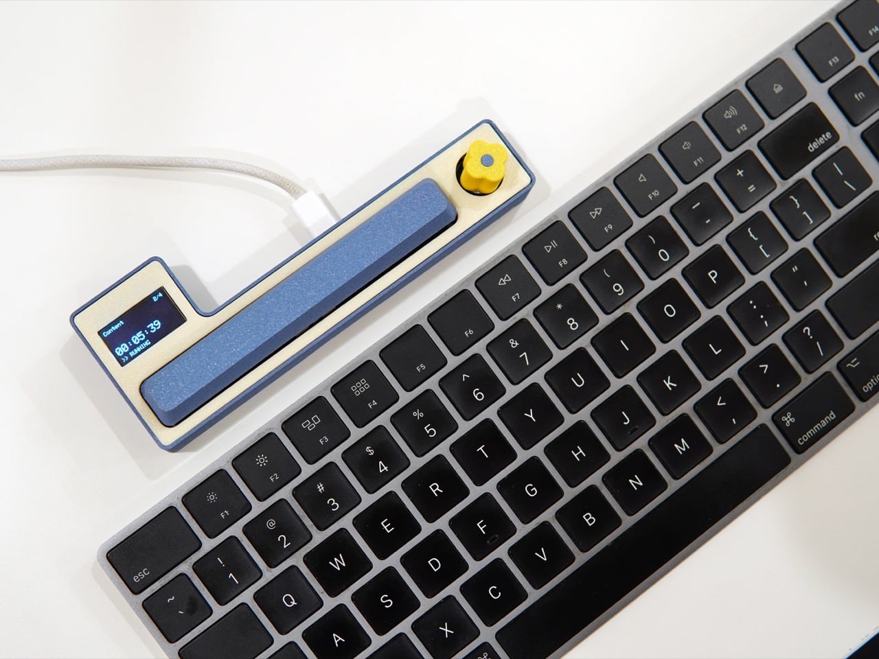
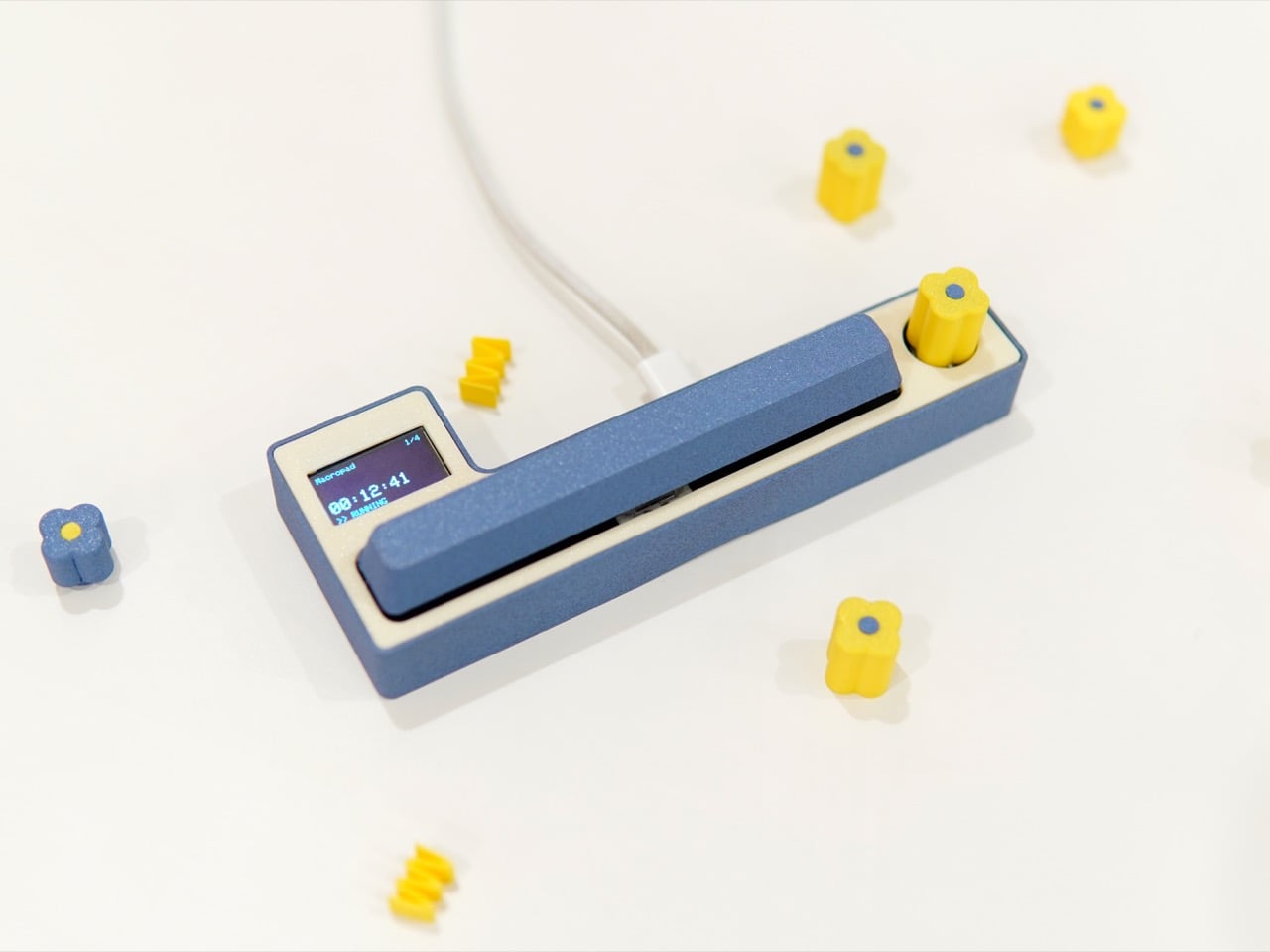
The Freelancer Macropad by Studio Playground is a quiet rebellion born out of the subculture of moonlighting and freelancing. It is a tool built on the belief that awareness is more valuable than automation. Its simple interface, a single knob and a large key, puts the user in complete control, demanding a moment of physical intention to log the passage of time. Creator Shivam Dehinwal could have easily made this a dream device for data enthusiasts by using AI to track time seamlessly in the background. Instead, he made the deliberate choice to build a tool that requires your participation, arguing that the most powerful productivity feature is your own focused attention.
For a salaried employee, time is the employer’s concern. The clock is managed by structure: a calendar of meetings, a fixed start and end to the day, a paycheck that arrives regardless of whether Tuesday was three hours of deep work or three hours of inbox archaeology. Freelancing dismantles that entirely. Every hour sold carries a direct monetary weight, and context switching between a branding project for one client and a deck for another can silently bleed a day into an unaccountable blur. The Macropad’s functionality is distilled for one purpose, to track your allocation of time, and that singular focus is precisely what makes it suited to the freelance condition.
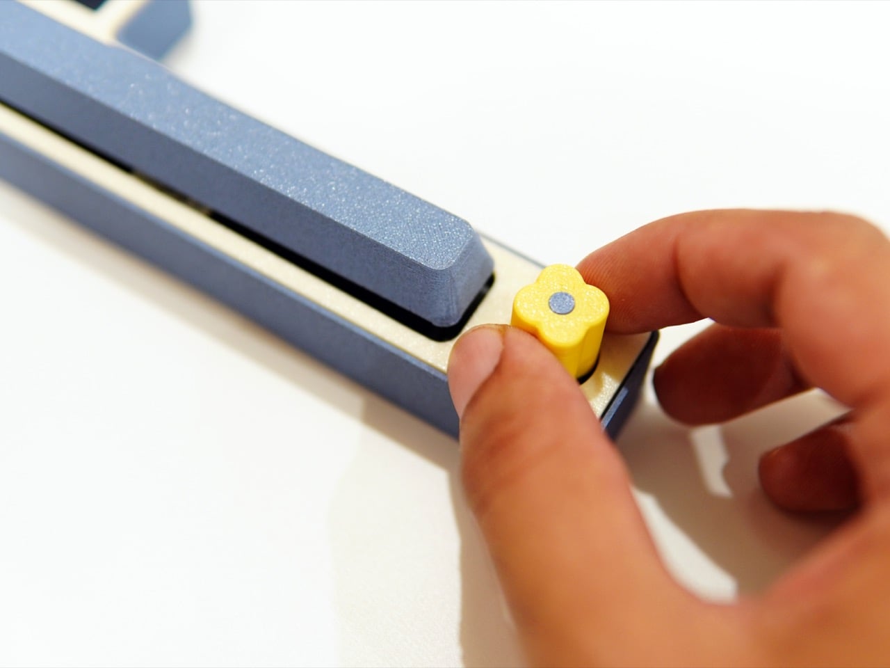
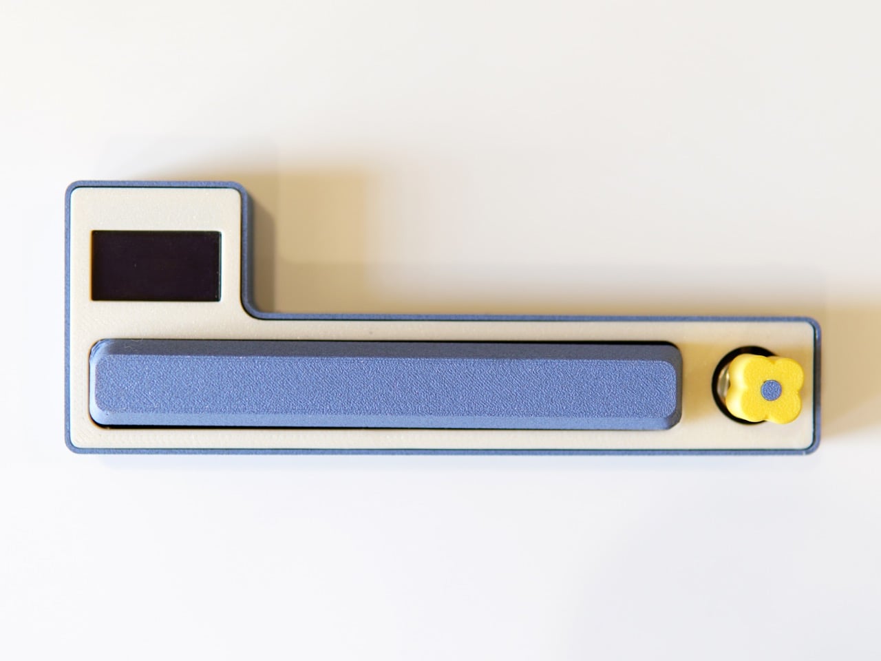
The body sits in a calm, muted blue against a cream-toned chassis, with a yellow flower-shaped rotary knob that reads as playful and precise rather than gimmicky. Using the knob you can switch between projects, and using the spacebar you can pause and play the time counter. A small OLED display to the left surfaces the active project name and elapsed time without tipping into information overload. You only need a computer during setup to add projects, and after that the Macropad runs independently from a phone, power bank, or computer. When you need the log, a long press of the spacebar outputs a time receipt directly into any text editor of your choice, a Google Doc, a Word file, even an email body.
Still in beta, the Macropad has already surfaced different modalities of use, and those insights are actively driving further development of the project. Pricing and broader availability remain open questions, and the product’s trajectory will depend on whether enough people see dedicated physical hardware as a ritual worth investing in. You can follow progress at Shivam’s Instagram, @shivam_playground. I suspect the people who need this most will know it the moment they see it, because what the Macropad quietly hands back is something the app ecosystem has been slowly taking away for years: a real sense of ownership over your own time.
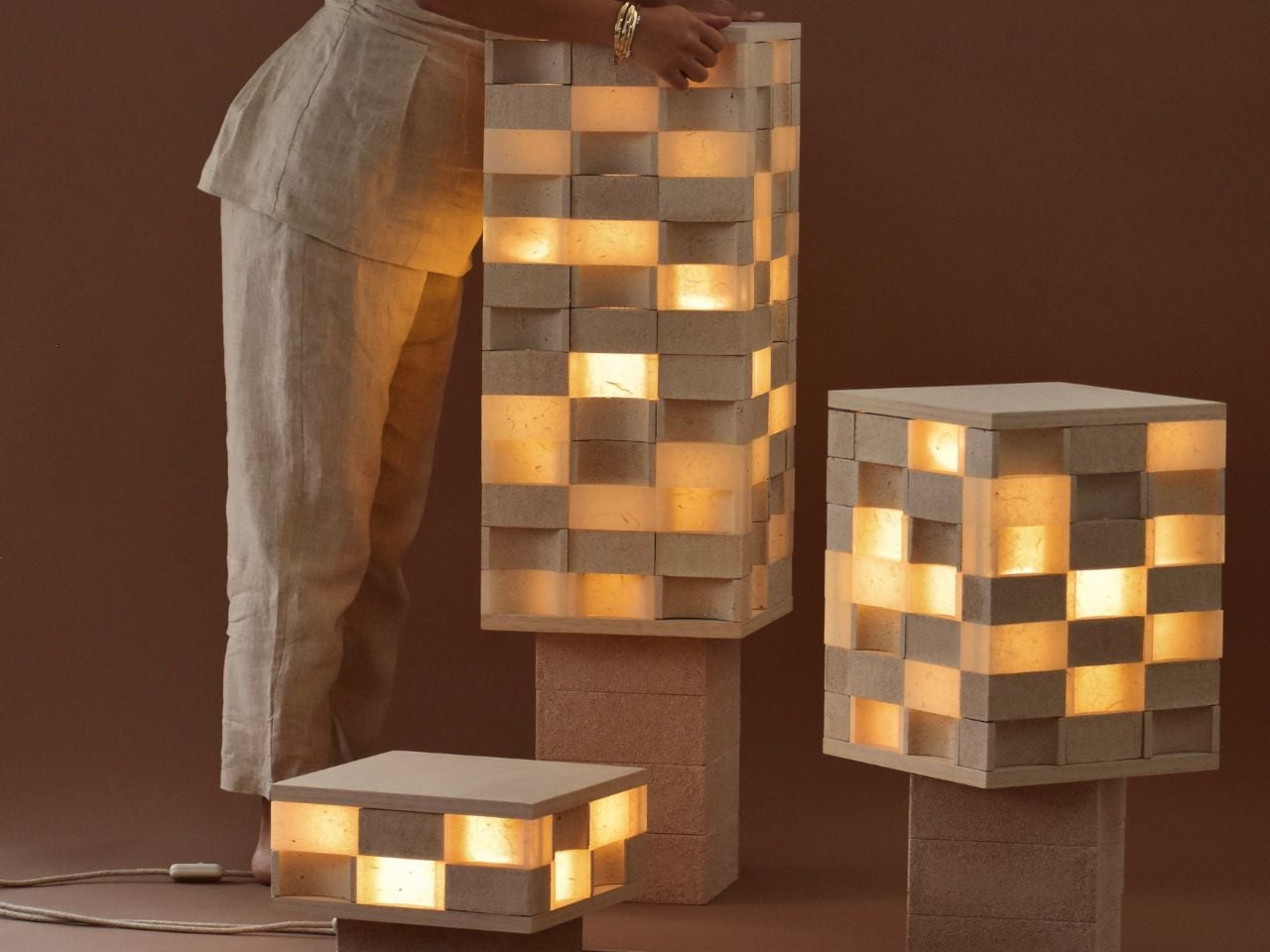
Joanne Odisho’s Mod-u lamp feels like the kind of object you want to touch before you fully understand what it is. Made from modular, Jenga-like blocks, the lamp sits somewhere between lighting, furniture, and sculpture. The surprise is its material. The Melbourne-based designer has created the piece using thousands of discarded eggshells collected from local cafes, turning a fragile everyday waste material into a durable, tactile, award-winning design.
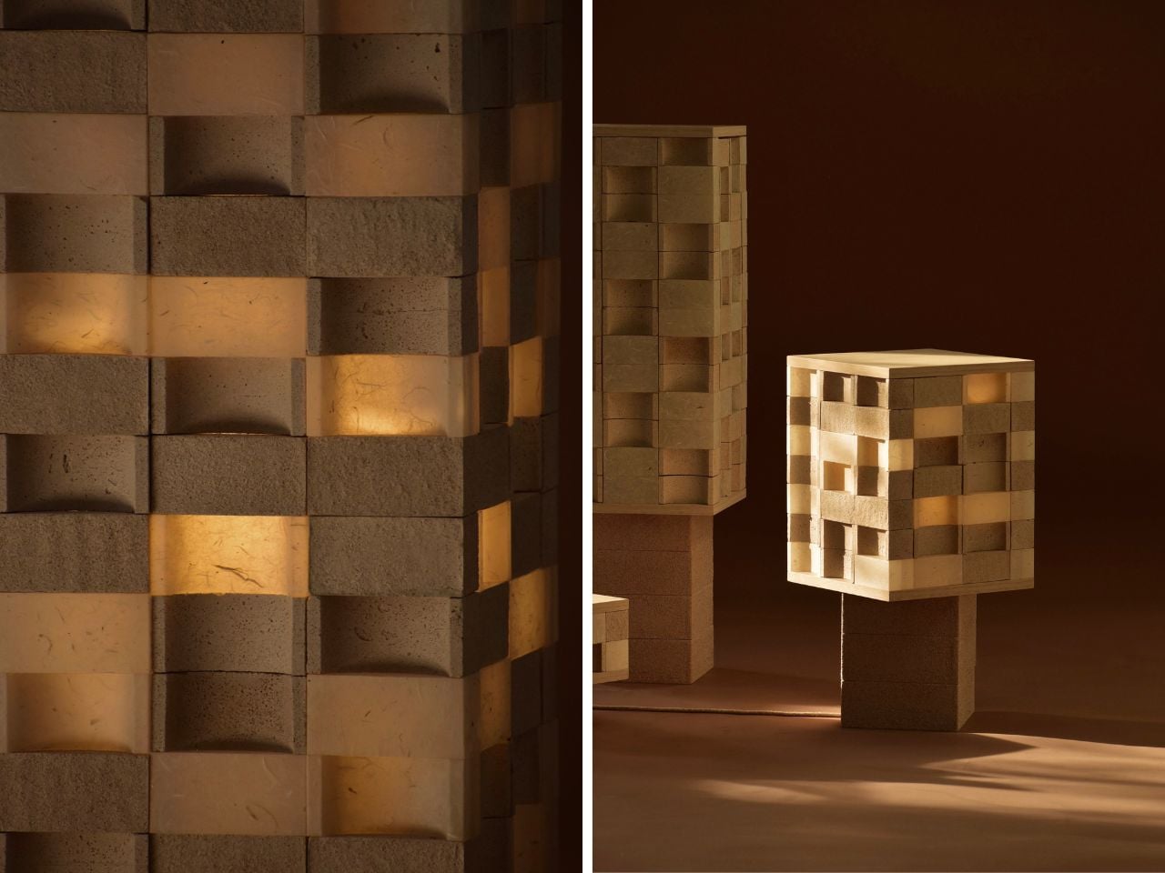
The process starts in a very ordinary place: cafe kitchens. Odisho collects used eggshells, sterilises them, dries them, and crushes them into a fine powder using a Nutribullet. The powdered shells are then mixed with a biodegradable biopolymer to form a wet, sand-like composite. This mixture is poured into moulds and left to dry naturally for about a week. There is no firing process, no synthetic dye, and no complex industrial setup. Once cured, the material becomes hard and rock-like, while still holding onto the soft, natural tones of the eggshells themselves.
The idea began in 2022 while Odisho was studying furniture design at RMIT. For a school assignment, she was asked to create a product using food waste. Her first experiments with coffee grounds did not work because they developed mould. Eggshells, however, offered something more promising. With inspiration from Materiom, an organisation focused on nature-based material innovation, she began testing how this overlooked kitchen scrap could become a strong, compostable design material.
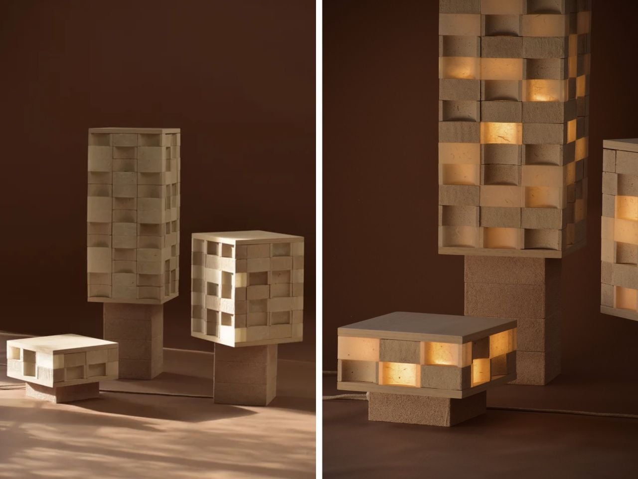
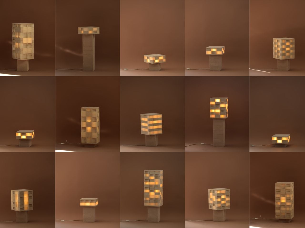
That material eventually became Mod-u, a collection of configurable lighting pieces made from dozens of individual eggshell-composite blocks. Each block can be moved, rotated, stacked, and rearranged, allowing the lamp to shift between a table lamp, a floor lamp, or a sculptural feature piece. This makes the design especially relevant for smaller homes, where objects often need to adapt to different spaces and uses.
The lamp recently won the Australian Furniture Design Award, one of the country’s most respected design prizes. The award, led by Stylecraft and presented with the National Gallery of Victoria during Melbourne Design Week, challenged designers to respond to the theme “living well, living small.” Odisho’s lamp answered that brief with a balance of function, material experimentation, and emotional appeal.
What impressed the judges was not just the use of eggshells, but the way the object invites interaction. Mod-u is not a lamp that simply sits in the corner and performs one fixed role. Its modular structure gives the user control over its form. It can be built up, pulled apart, shifted, and reimagined depending on the room, the mood, or the need. That sense of play gives the piece a rare warmth. It feels practical, but still personal.
There is also something quietly powerful about the way the lamp treats waste. The eggshells are not disguised or hidden under a polished finish. Their natural colour remains visible, giving each piece a soft, earthy palette that feels honest to the material. It makes the object feel less manufactured and more grown, even though it is carefully designed.
For Odisho, the project opens up a much bigger conversation about what sustainable furniture can look and feel like. It does not rely on guilt or overly technical language to make its point. Instead, it offers a simple idea: the materials we throw away every day might still have value, beauty, and strength left in them.
Mod-u succeeds because it feels experimental without being inaccessible. It is clever, but not cold. Sustainable, but not preachy. By turning something as delicate as an eggshell into a strong and adaptable object for the home, Joanne Odisho shows how thoughtful design can begin with the most ordinary leftovers.
Cabin living has a particular quality that city life cannot replicate. The quiet is different. The light moves differently through the trees. Time slows enough that you notice it again. Most gear designed for outdoor living treats comfort as an afterthought and beauty as a luxury. These five products disagree with that assumption. Each one was chosen because it earns its place without compromising what a cabin is supposed to feel like.
None were chosen for their marketing or their price tag. Each one was selected because it solves something a cabin summer actually demands — and because the design is good enough to earn a permanent place in the gear bag rather than get quietly left behind after the first trip. Together they cover everything the experience requires: power, comfort, ritual, warmth, and sound.
1. Retro Wave 7-in-1 Radio
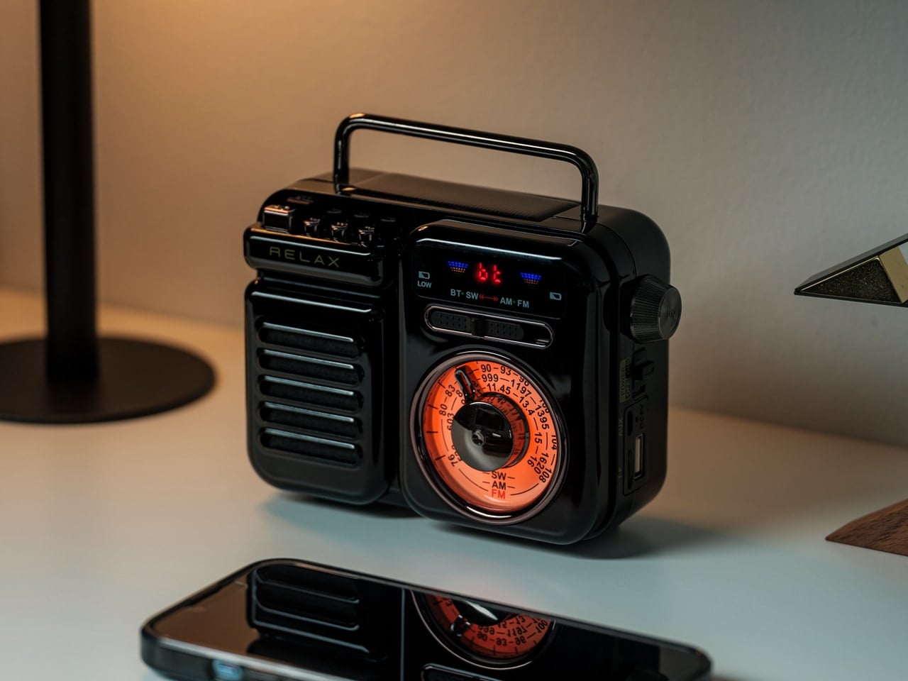
The Retro Wave 7-in-1 Radio solves a problem most outdoor audio products miss entirely: it looks like something worth keeping in the cabin even when it is not in use. The housing draws from mid-20th-century Japanese radio aesthetics, with a tactile tuning dial and two colorways, black and warm gray, that sit naturally next to wood surfaces and ceramic cups. Behind that retro face is a 7-in-1 device handling AM, FM, and shortwave reception, Bluetooth streaming, a built-in flashlight, an SOS alarm, and a power bank function for charging other devices.
The 8W speaker delivers warmth rather than raw volume, which suits a cabin setting far better than any portable speaker with a marketing number in its name. The 2000mAh battery carries a 20-hour radio battery life and recharges via USB, hand-crank, or solar panel. That last detail matters more than it might seem: if the grid goes out, the radio keeps going regardless. It is the kind of contingency that feels less like a spec and more like the whole point of the object.
The 7-in-1 function set collapses a flashlight, emergency radio, portable charger, weather band receiver, and Bluetooth speaker into one object, which meaningfully reduces what needs to be packed for a cabin weekend.
Solar and hand-crank charging options mean the Retro Waves keeps functioning when the power goes out, or the sun disappears, making it as practical in a genuine emergency as it is during a relaxed evening by the fire.
What We Dislike
Bluetooth battery life reaches approximately five hours at 75% volume, meaning a full day of wireless streaming will require a recharge before the evening settles in, particularly on overcast days when the solar option is limited.
The compact body keeps it portable and well-proportioned, but the speaker volume has a ceiling that wide-open outdoor settings can expose once the environment gets loud and conversation picks up around the fire.
2. ARKEEP Halo Portable Power Station
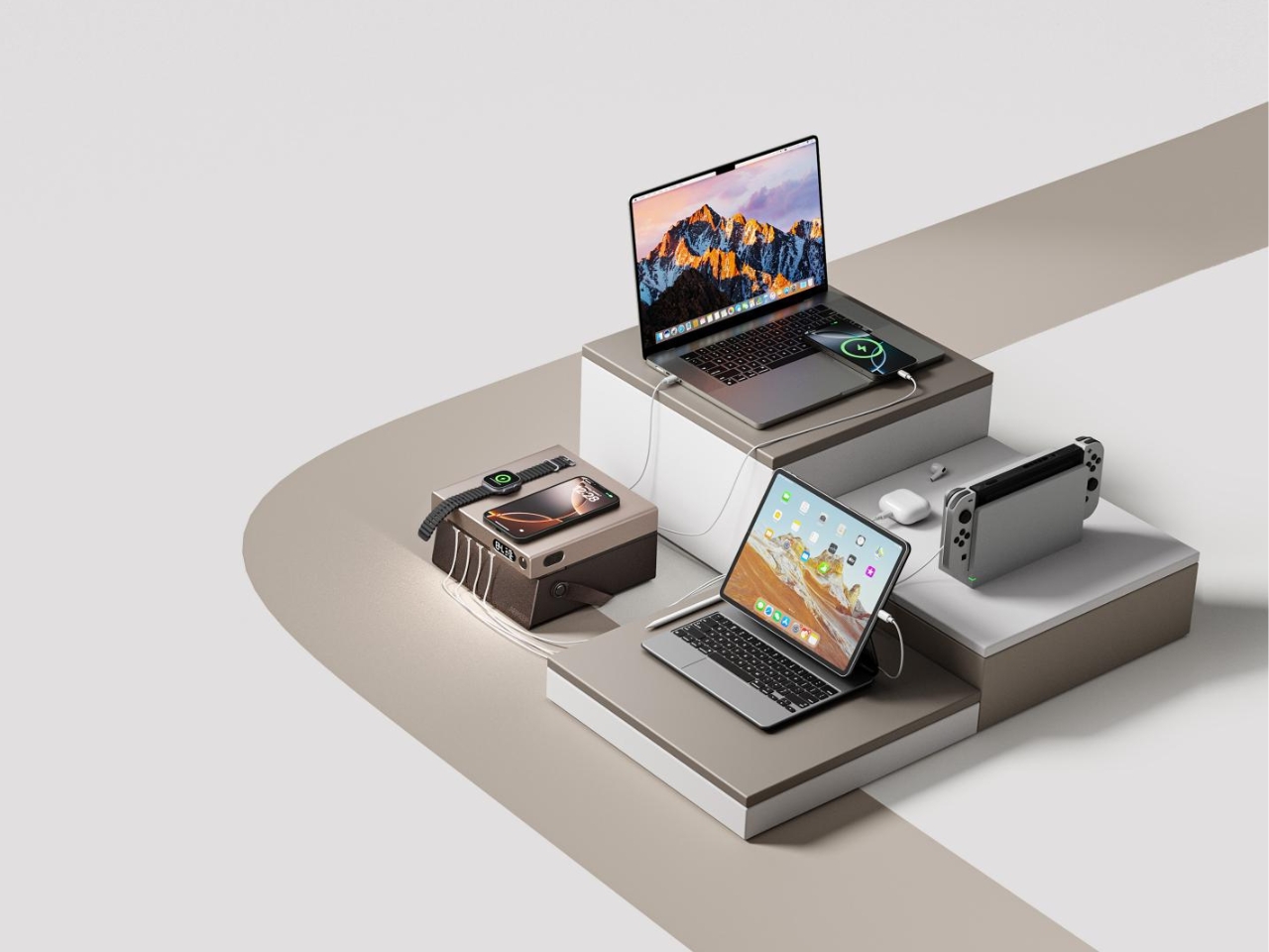
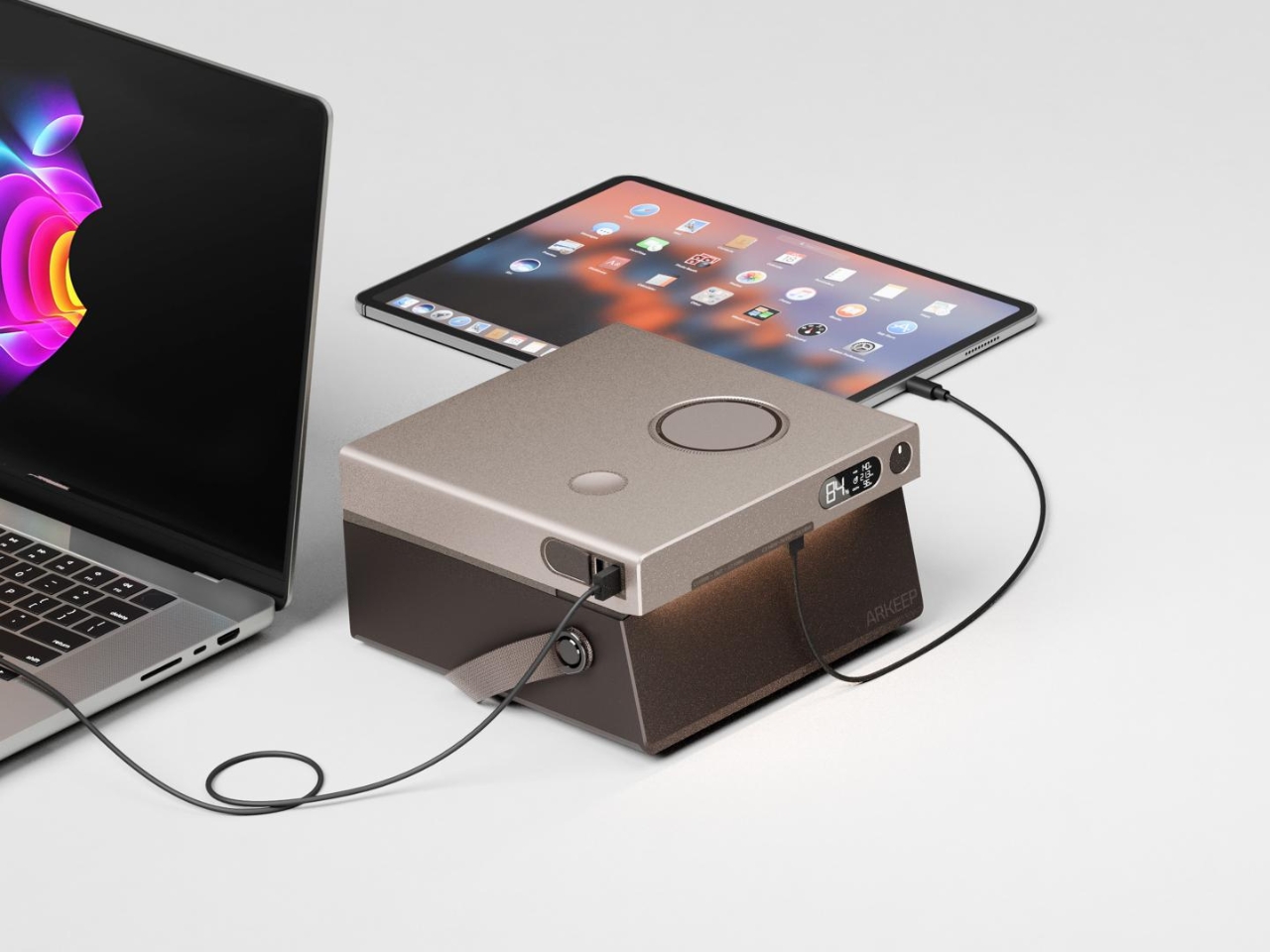
Most portable power stations are designed to disappear. They are tolerated rather than chosen, the kind of object that earns its place only when something fails. The ARKEEP Halo, designed by Union Suppo Battery, takes the opposite approach entirely. It arrives with eight charging ports: dual 140W PD3.1 inputs, dual 100W USB-C ports, two 22.5W USB-A ports, and wireless charging pads at 15W and 5W. Everything a cabin needs to stay powered, wrapped in a form considered enough to sit on the table rather than hide beneath it.
The lighting feature is where the ARKEEP Halo earns its cabin credentials. The 270-degree ambient glow system adjusts color temperature and brightness to simulate natural light rhythms, shifting from functional daytime white to warmer, lower blue light output as the evening settles in. In a cabin where the goal is to feel less connected to your phone and more connected to your surroundings, that distinction matters more than any spec sheet would suggest. It is the rare power station that actually improves the room it sits in.
What We Like
Eight simultaneous charging ports, including dual wireless pads, means an entire group can power up without needing separate charging bricks or arguing over the single outlet by the bed.
The 270-degree ambient lighting system means the Halo replaces both a power station and a mood lamp in one form, reducing the number of objects competing for surface space inside the cabin.
What We Dislike
Runtime figures for the battery capacity are not prominently published, making it harder to calculate how long the Halo will last during an extended off-grid stay without access to a wall source.
The ambient lighting is integrated into the housing rather than detachable, so you cannot use it independently as a standalone lamp if you want to separate the light from the charging station.
3. Houdini x Rumpl Reconnect Puffy Blanket
The Houdini x Rumpl Reconnect Puffy Blanket is built on the idea that a blanket should be able to go wherever the evening takes you. The outer shell is a 2-layer waterproof hardshell rated at 20,000mm H2O with a breathability of 15,000 g/m2/24h, built from Houdini C9 Ripstop. The 200g hollow-fiber insulation handles the warmth underneath. What this means practically is that you can move from the couch to the porch to the tree line without stopping to think about whether the blanket can keep up.
The detail that sets it apart is the Double-snap Cape Clip, which converts the blanket into a hands-free wearable in seconds. Walking to the fire, carrying a drink, collecting firewood — none of those require putting the blanket down. The environmental case is clean too: every blanket is made from 100% post-consumer recycled materials, with each one representing the equivalent of 66 plastic bottles removed from landfills.
What We Like
The 20,000mm waterproof hardshell rating means this blanket functions as genuine weather protection across the full range of conditions a cabin summer delivers, not just a cozy indoor accessory.
The Double-snap Cape Clip gives you complete freedom of movement at the campfire without choosing between warmth and having your hands available for everything else.
What We Dislike
At $200, the Reconnect Puffy Blanket sits at a price point that requires genuine commitment, particularly for anyone who has a habit of leaving blankets behind on outdoor trips.
The hardshell outer material, while properly waterproof, has a stiffer initial feel than a soft fleece, and takes a short while to settle and soften around you compared to more familiar blanket textures.
4. Haori Cup
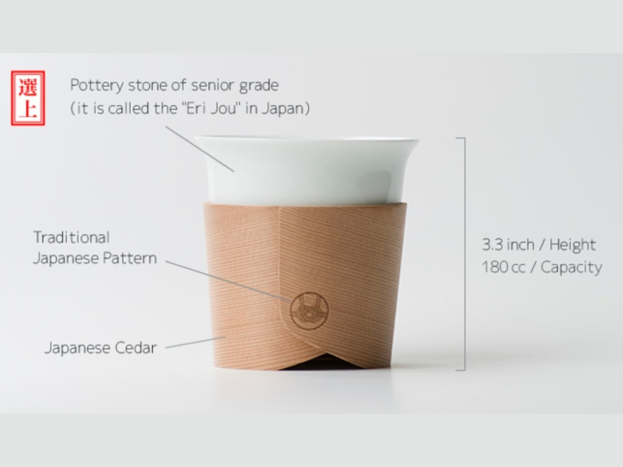
Designer Tomoya Nasuda built the Haori Cup from a single piece of Japanese cedar, reviving the Hakata Magemono craft that has been practiced for over 400 years. The technique involves hand-bending thin cedar strips into curved forms, and the result is a cup where no two grain patterns are the same. Cedar insulates naturally, which means the exterior stays comfortable to hold while the drink inside stays hot. There is no handle required because the material itself solves the problem the handle was invented to address.
In a cabin, the Haori Cup changes what the morning means. Sitting outside with coffee in a vessel hand-bent from Japanese cedar, surrounded by trees not unlike the ones that made it, is the kind of moment that does not require any explanation to anyone who has experienced it. Available in several colorways including a Sakura edition, the cup is light enough to pack without concern and carries a faint, clean forest fragrance that frames whatever you are drinking without competing with it.
What We Like
The 400-year-old Hakata Magemono craft means every Haori Cup is genuinely unique, with grain patterns that belong to that specific piece of cedar, which no mass-produced camping mug can replicate at any price.
Cedar’s natural thermal properties keep the exterior comfortable to hold with a freshly poured drink inside, solving the basic problem of a hot cup without requiring a sleeve, double wall, or separate handle.
What We Dislike
Cedar requires careful hand-washing and thorough drying to maintain the material over time, which is more maintenance than most people expect from a camping cup and adds a small task to the end of a long day outdoors.
As a handcrafted artisan object, the Haori Cup carries a premium that places it in the considered-purchase category, and the risk of dropping it on river rock introduces a quiet anxiety that a $12 tin mug simply does not.
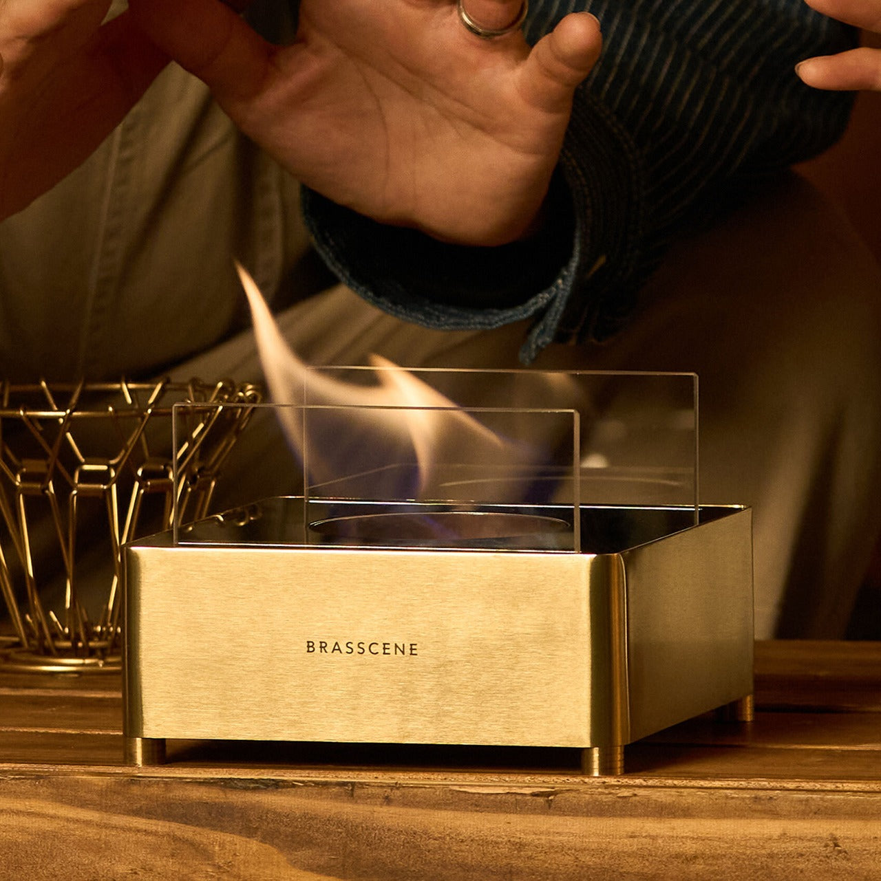
5. Harmony Flame Fireplace
A cabin without a fireplace is a room you tolerate. A cabin with one is a place you want to stay. The Harmony Flame Fireplace was chosen because it understands that distinction entirely — not just as a heat source, but as the object the whole evening organizes itself around. Its presence shifts how a room feels before it even does anything. The design is considered enough to look like it belongs in the space rather than sitting in apology for being there.
What the Harmony Flame does is give a cabin its center of gravity. People sit closer together. Conversations slow down. The specific quality of light that a flame produces, warm and mobile and alive, is something no overhead fitting has ever replicated. Whether you place it against the main wall or at the end of a reading corner, the effect is the same: the room stops being functional and starts being somewhere you choose to be. That shift is the whole point of the trip.
Its presence functions as the room’s organizing principle, creating warmth and atmosphere that transforms an ordinary cabin evening into the reason you made the drive in the first place.
What We Dislike
A fireplace of this quality deserves deliberate placement within the cabin layout to maximize its visual and atmospheric effect — treating it as an afterthought will undercut everything it is capable of delivering to the space.
As the centerpiece product in any room it occupies, the Harmony Flame raises the visual standard for everything around it, which means pairing it with careless gear will make the contrast more visible rather than less.
This Is What a Cabin Summer Is Supposed to Feel Like
None of these five products were chosen because they photograph well or carry a recognizable name. They were chosen because they understand what a cabin summer actually is: a specific arrangement of light, warmth, sound, and stillness that most gear interrupts rather than supports. A power station with a lamp inside. A blanket you can wear. A cup made from a single piece of cedar. A fire that earns its center of the room. A radio that makes switching it on feel like a small occasion.
The best cabin gear does not announce itself. It earns its space quietly, does its job without asking for attention, and disappears into the experience of the trip. These five do exactly that. Pack them, and the cabin stops being a place you stay and starts being a place you go back to. That distinction is the whole point of summer in the first place.