Caviar has built its reputation on a specific kind of excess. An actual Rolex embedded into the back of an iPhone 14 Pro, retailing at $133,000. A custom iPhone 13 Pro cast from aluminum salvaged from a melted Tesla Model 3. A John Wick-themed iPhone 16 Pro so aggressively styled it looked like it belonged in an armory, not a pocket. The Russian luxury house has spent years treating Apple’s hardware the way a coachbuilder treats a car chassis, something to be reimagined rather than accepted off the shelf.
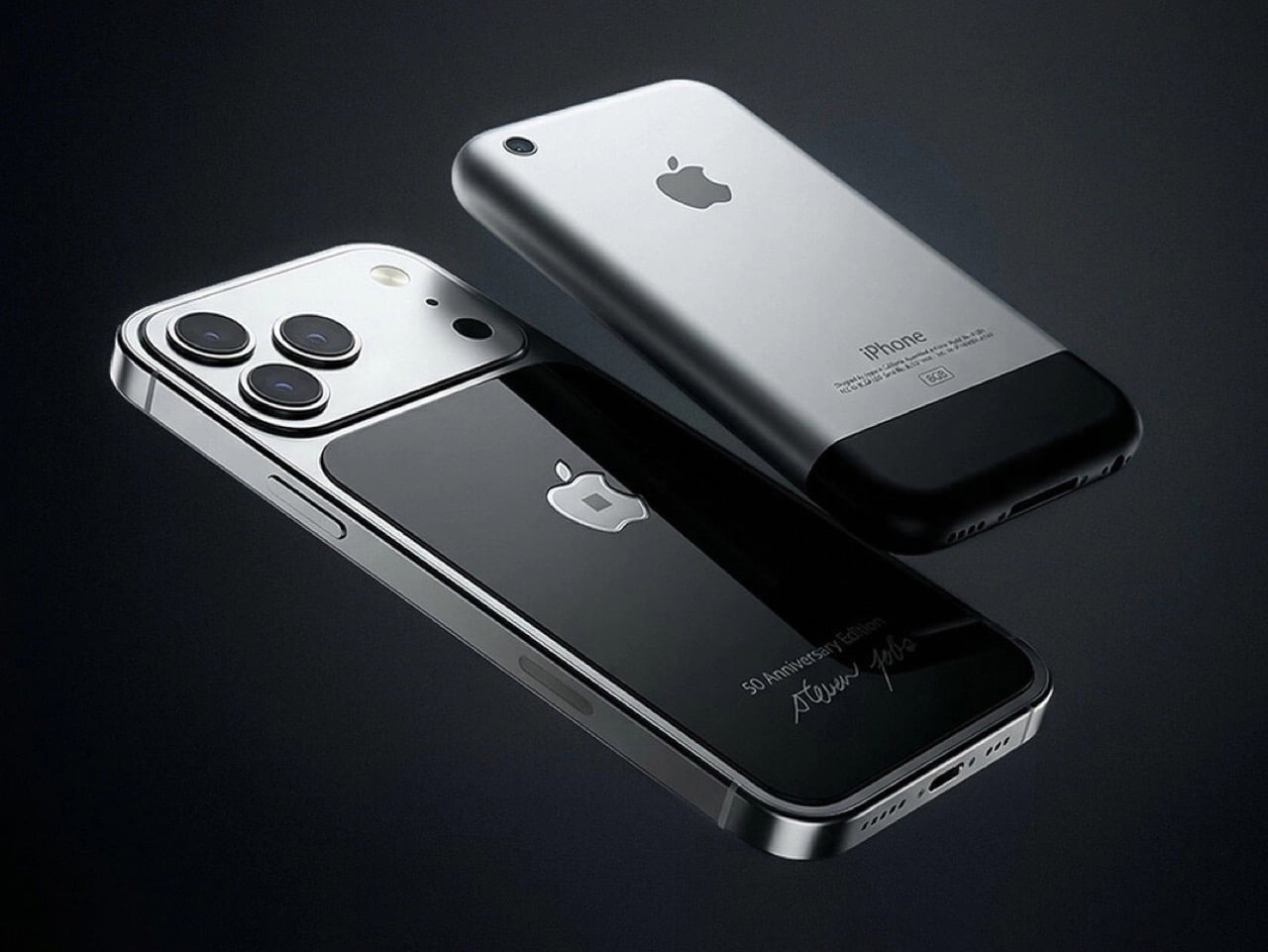
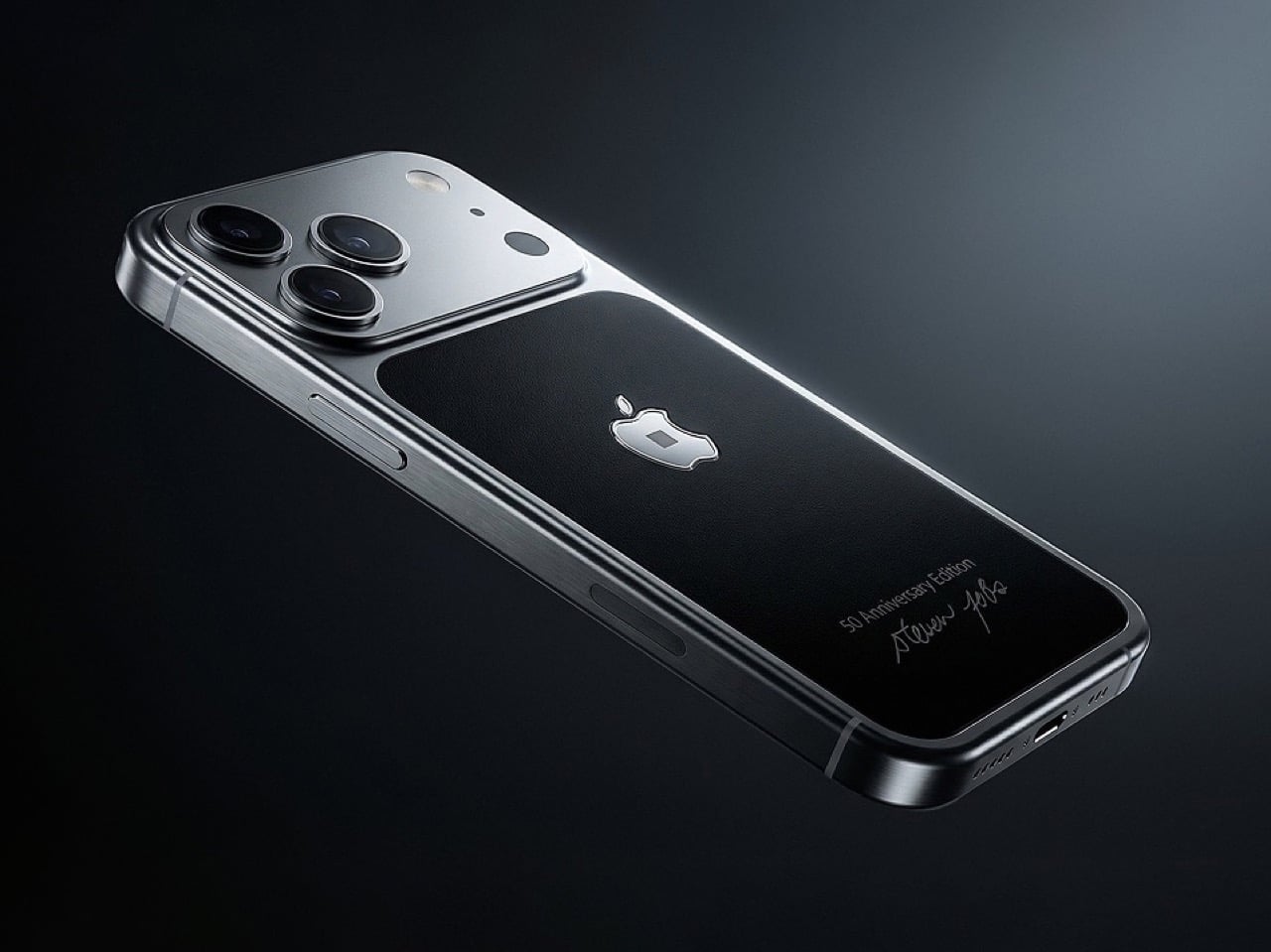
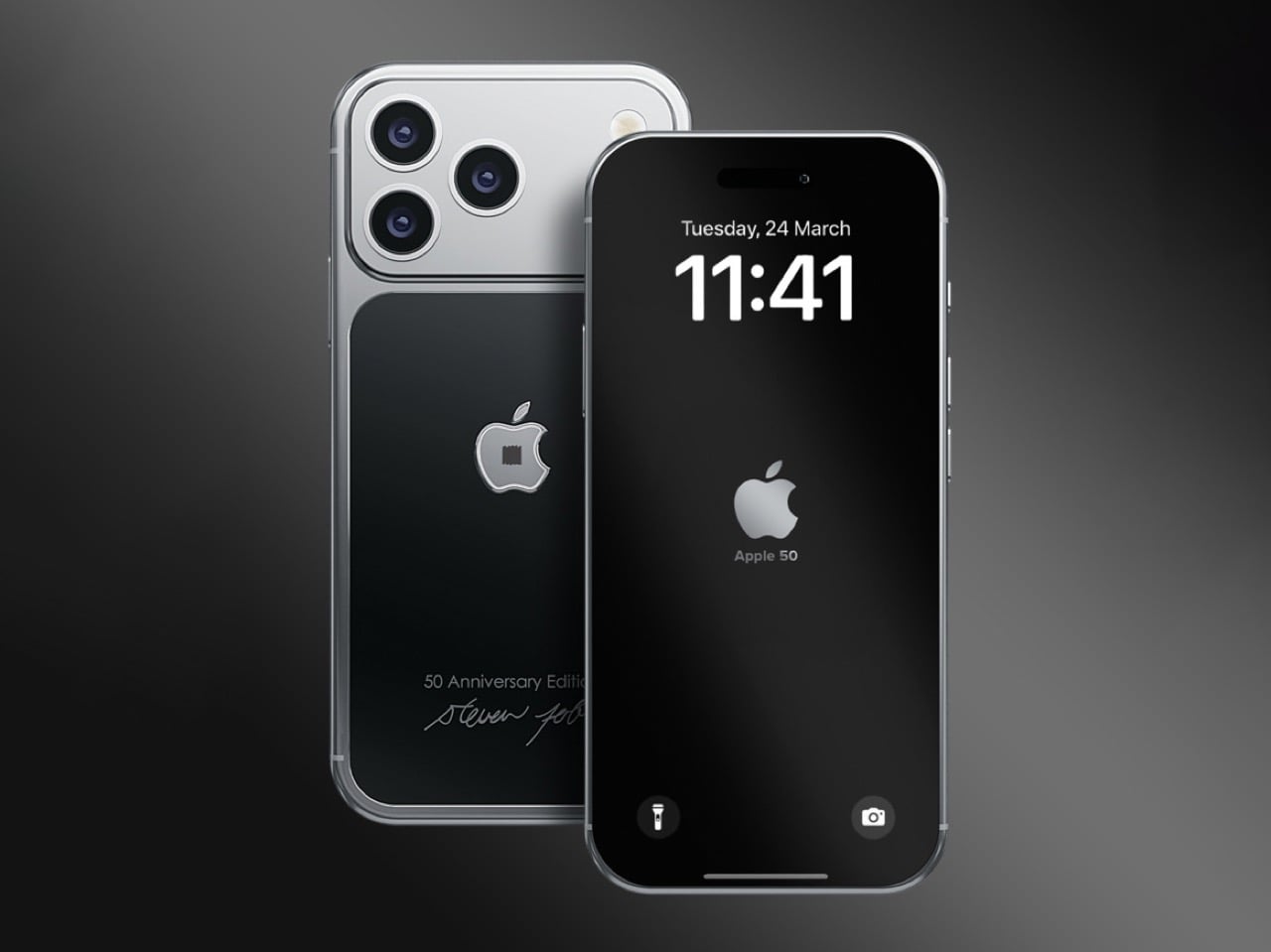
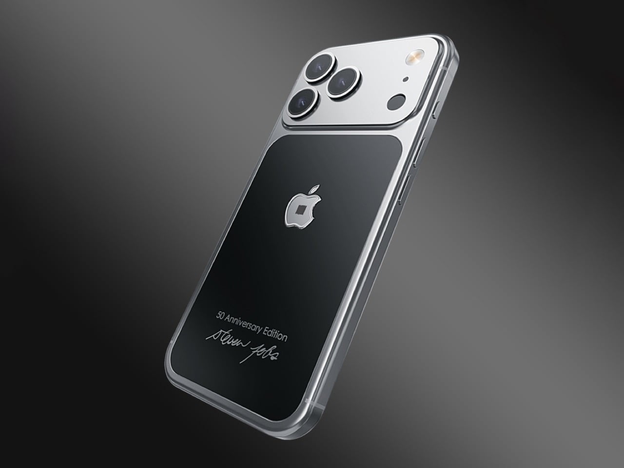
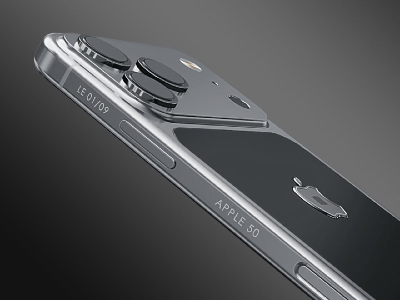
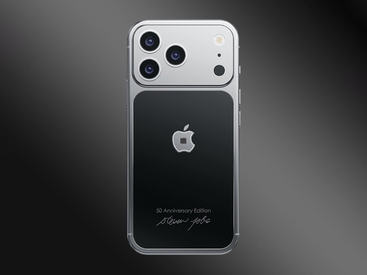
For Apple’s 50th anniversary, Caviar has produced something that sits in different territory altogether. The “Steve Jobs” iPhone 17 Pro contains an authenticated fragment of Jobs’ original black turtleneck, sealed inside the chassis beneath a raised titanium logo, on a body deliberately styled to reference the 2007 iPhone that started everything. Nine units. A certificate of authenticity. A “50 Anniversary Edition” engraving and Jobs’ own signature etched into the frame.
Designer: Caviar
The fabric comes from the same Issey Miyake turtlenecks Jobs wore religiously for decades, the ones he ordered in bulk because he wanted clothing to be one less decision in his day. Caviar has positioned the fragment at the center of the phone’s back panel, directly beneath a raised titanium Apple logo that functions as both a seal and a focal point. The black-and-silver color scheme mirrors the original iPhone’s visual language, right down to the slightly offset logo placement and minimalist engraving style. The overall effect reads less like a luxury phone and more like a museum piece that happens to run iOS.
With only nine units produced worldwide, the Steve Jobs edition enters the same rarefied air as limited-run watches or gallery-edition art prints, objects valued as much for their exclusivity as their craftsmanship. The authentication certificate that ships with each phone attempts to legitimize the provenance, offering buyers proof that the fabric fragment is genuine rather than theatre. Whether embedding a piece of clothing into a smartphone chassis constitutes meaningful homage or expensive novelty depends entirely on how much weight you assign to physical artifacts versus digital legacy. Caviar has clearly made its bet on the former, banking on collectors who want to hold a piece of Apple history rather than simply read about it.
Caviar framed the release with the kind of language luxury brands deploy when they want you to believe you’re buying meaning rather than materials. “We wanted to create a device that would serve as a true time capsule,” representatives stated, “by combining the aesthetics of the very first and the most current iPhone, and adding an authentic fragment of Steve Jobs’ clothing, we offer collectors and devoted fans of the brand a chance to feel a physical connection to the visionary who changed the world.” The phones are available now on Caviar’s official website, authenticated certificates included.
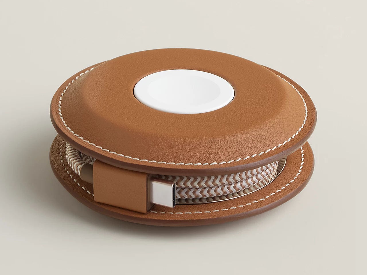
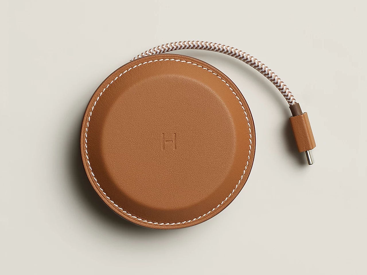
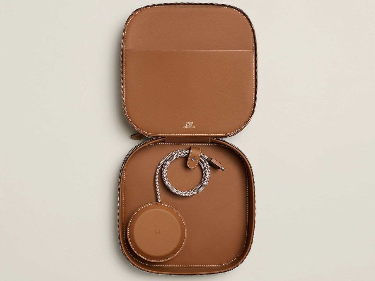
There are MagSafe chargers, and then there is the Hermes Paddock Yoyo Charger. The French luxury brand has crafted a leather charger case for your Apple devices that costs much more than the iPhone 17 Pro Max or the MacBook Air. This accessory comes as a part of the Hermes spring tech collection, which includes the Paddock Solo charger, Grand Paddock Case, and the Paddock Duo Charger.
This new collection of leather-wrapped charging accessories for Apple devices by Hermes is certainly targeted at the rich and famous. Clearly, style and status symbols are at the fore in this line-up, but we got most intrigued by the unique design of the Yoyo Charger and the subtle luxury of the Grand Paddock Case.
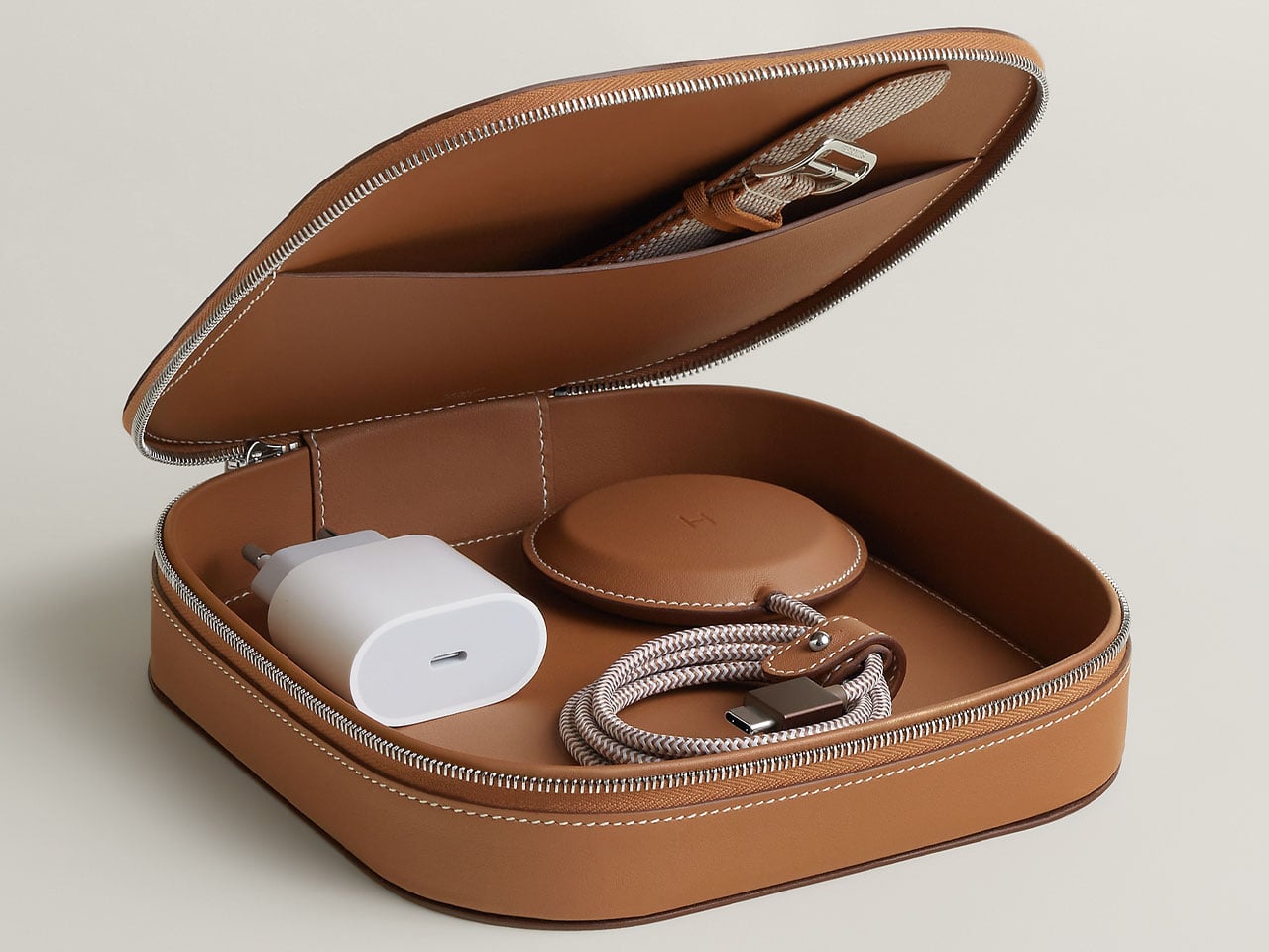
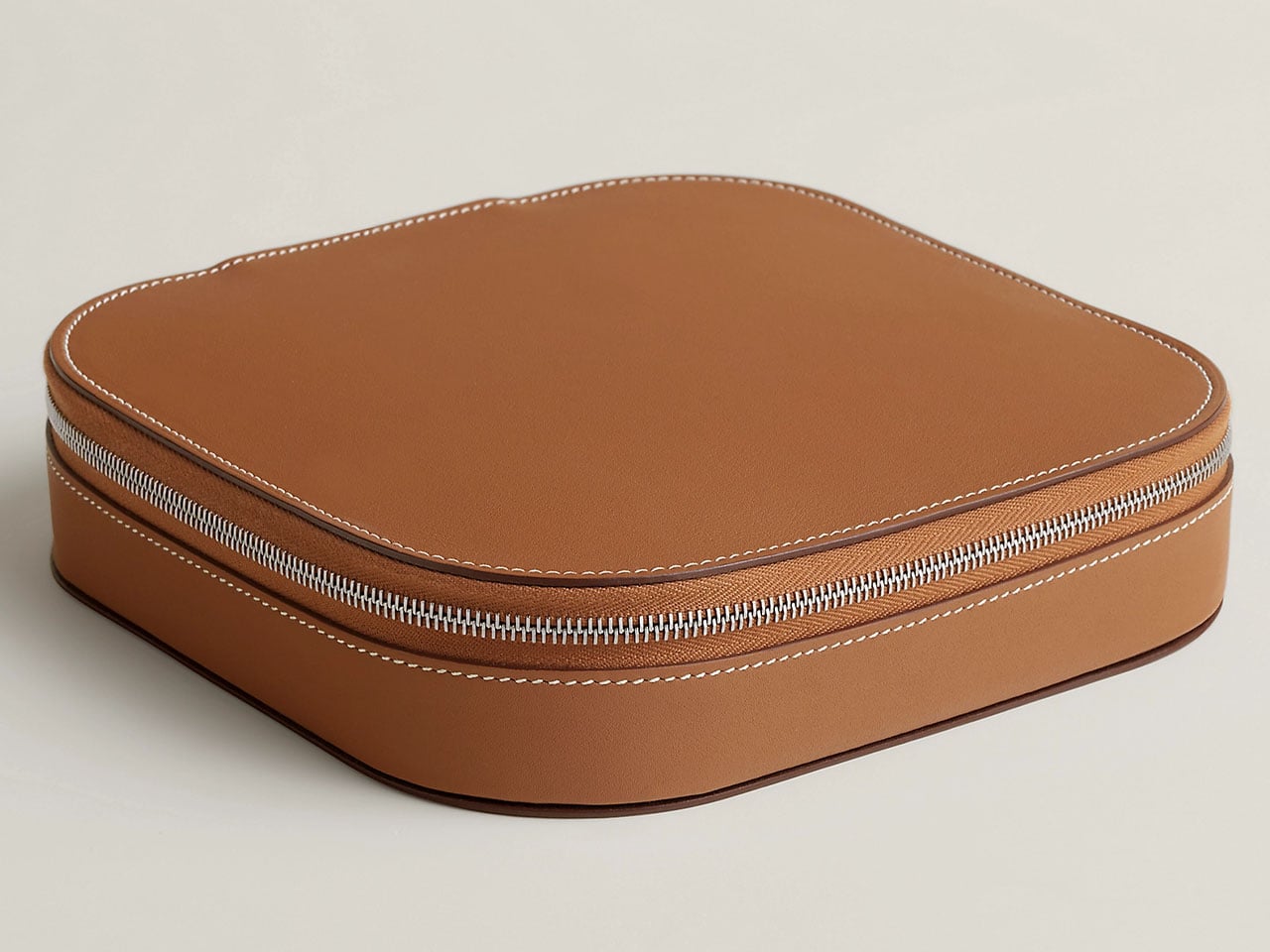
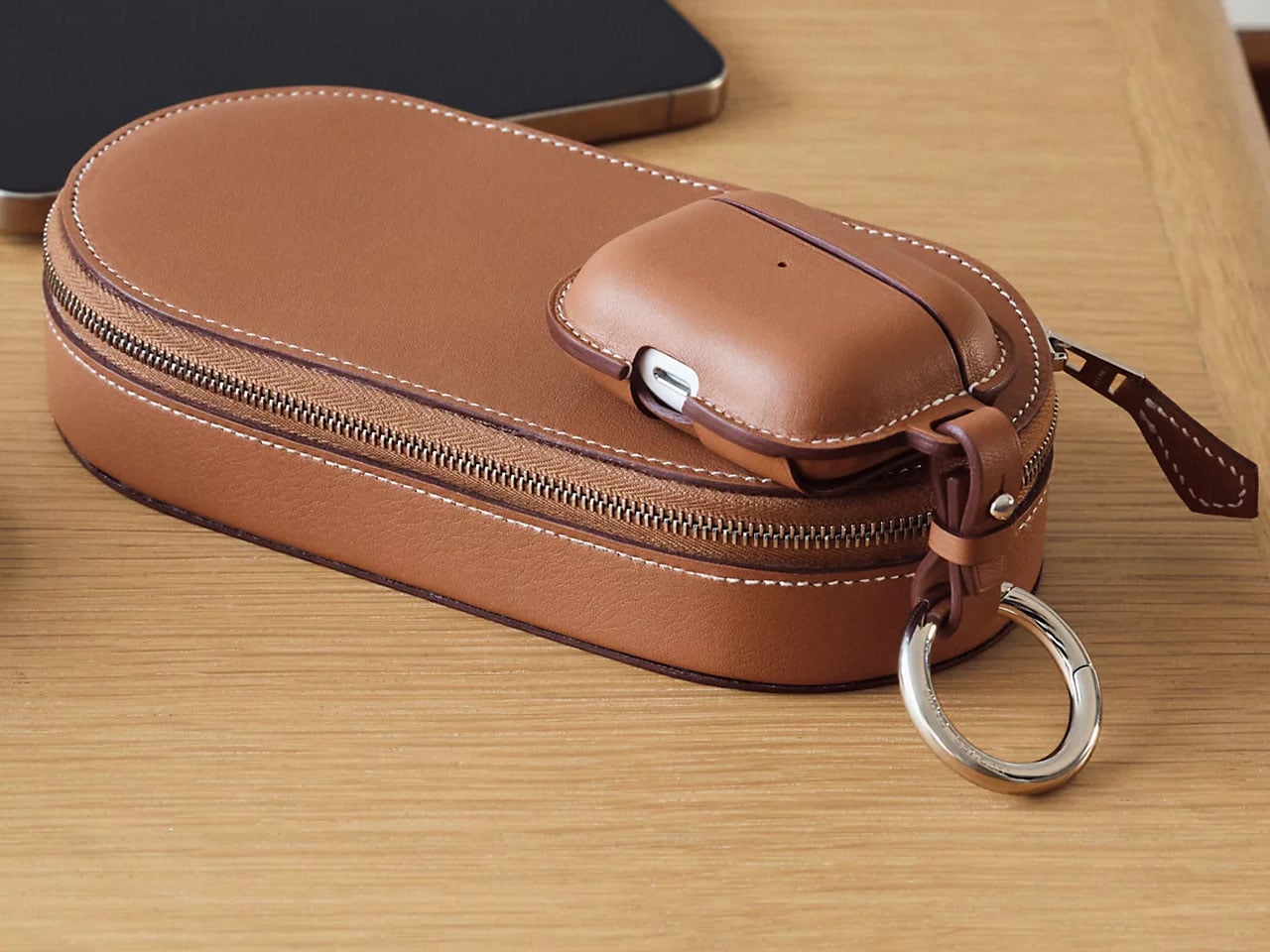
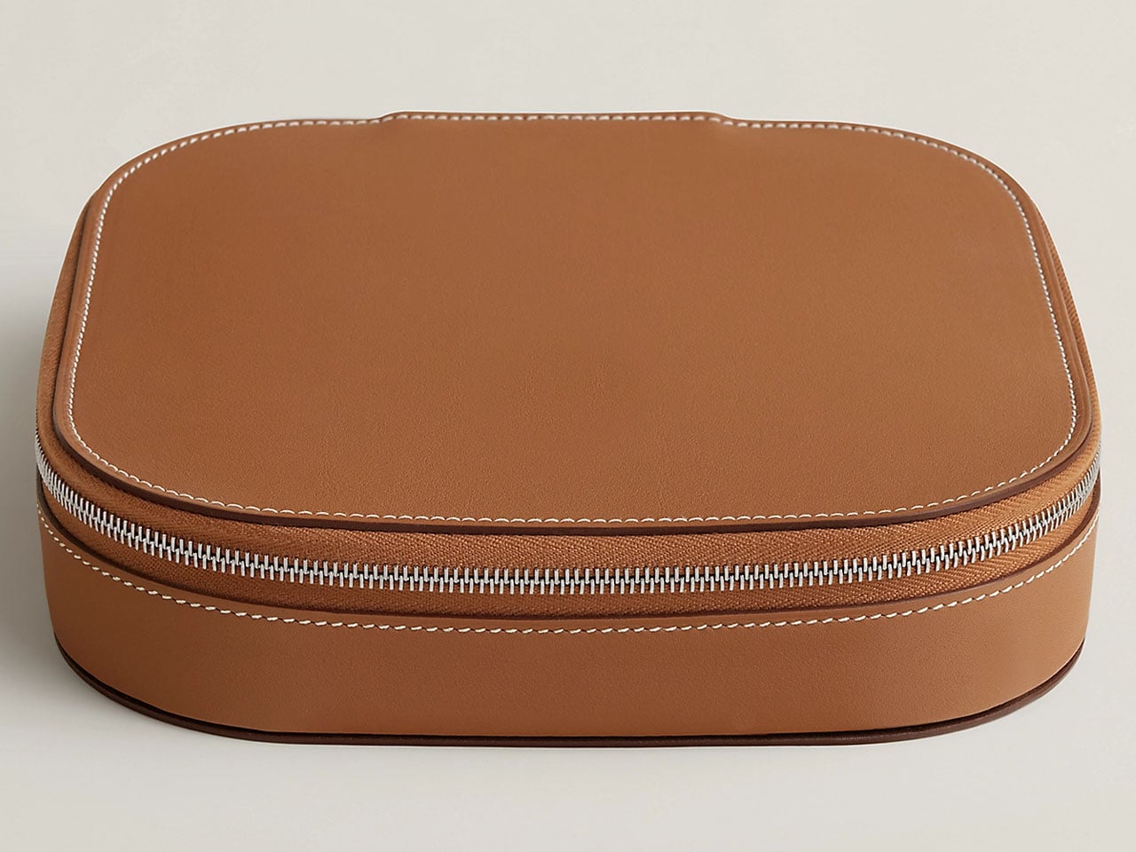
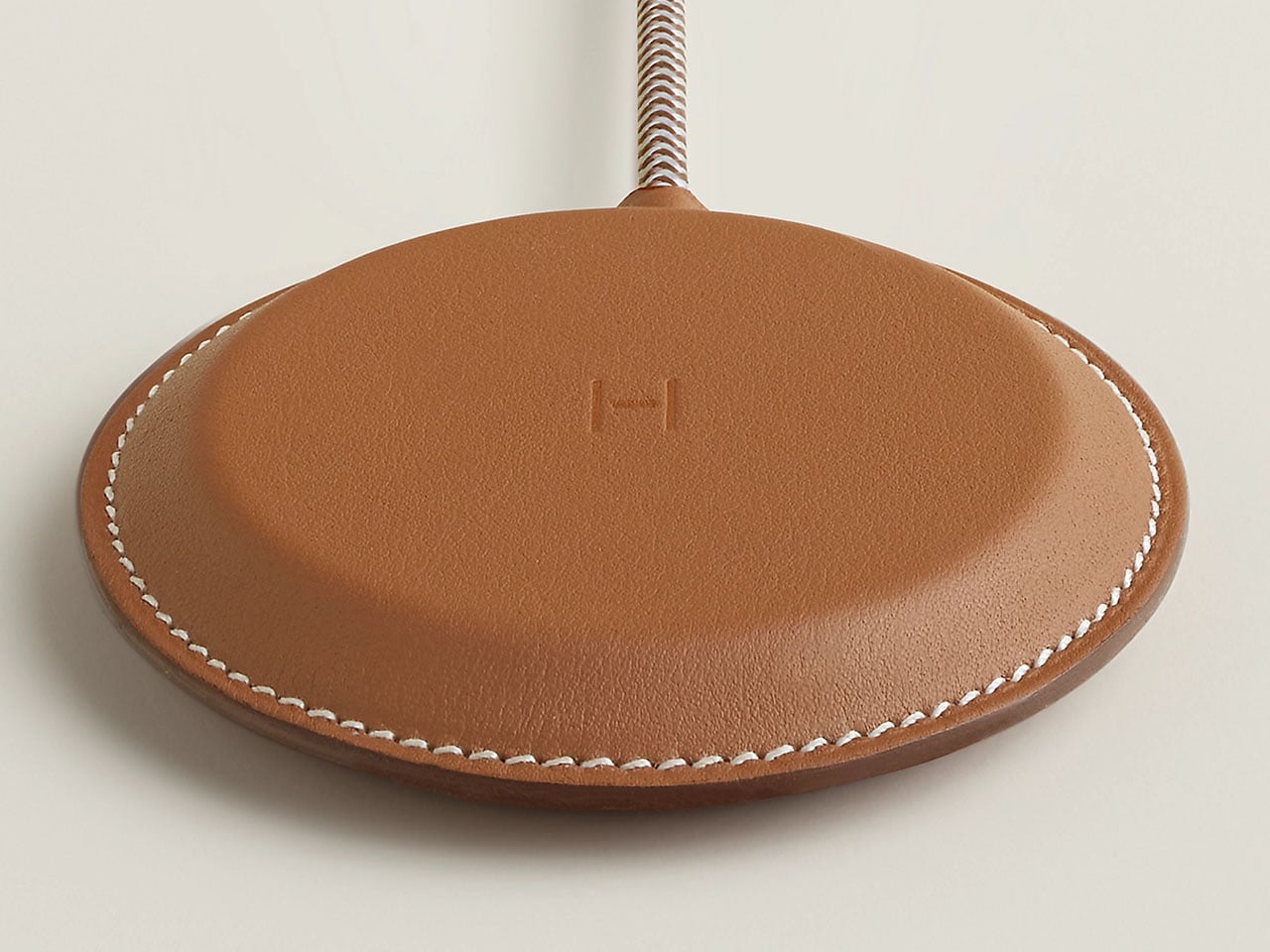
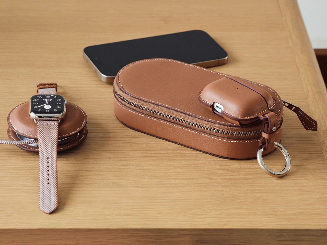
Both the Yoyo Charger and the Grand Paddock Case are crafted in Gold Swift calfskin with artisan-level saddle stitching. The use of premium materials and attention to detail make it opulent to the feel and touch. The Yoyo Charger has two MagSafe charging zones for fast charging of your multiple Apple gadgets like iPhone, AirPods, or Apple Watch. Complementing the yoyo-shaped charger is the travel-ready Grand Paddock Case, which comes with an inner storage pocket and doubles as a protective casing for the Yoyo Charger.
The internal charging system relies on MagSafe and Qi-compatible wireless charging technology, making it compatible with MagSafe-enabled iPhones starting from the iPhone 12 generation, as well as other wireless charging accessories. Power is delivered through a USB-C connection, and the charging system requires a minimum 20W power input to function properly. While a USB-C cable is included with the charger, the package notably does not include a wall power adapter, meaning users must supply their own power brick.
While this might feel unusual given the price point, it aligns with the increasingly common practice among electronics brands to exclude power adapters from accessory packages. Pricing across the Hermès charging collection highlights the brand’s focus on exclusivity rather than affordability. The Paddock Solo charger starts at around $1,250, while the Yoyo and Paddock Duo chargers are priced at approximately $1,750. When paired with the larger leather carrying cases, the price climbs dramatically. The Yoyo Charger bundled with the Grand Paddock Case reaches around $5,150, a price that exceeds many premium laptops and smartphones.
For most users, the functionality of these chargers will be similar to far more affordable wireless charging pads available on the market. However, for collectors of Hermès leather goods or those who appreciate the blend of luxury fashion with everyday technology. The French luxury high-fashion house has collaborated with Apple for years, most notably through luxury Apple Watch bands, and this charging accessory lineup extends that partnership into the broader ecosystem of Apple devices.
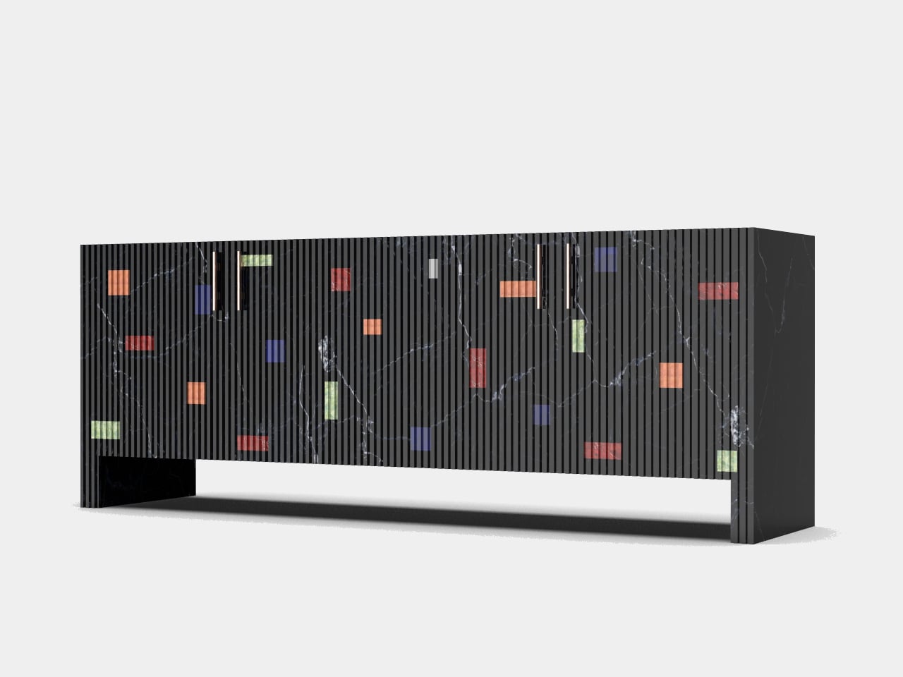
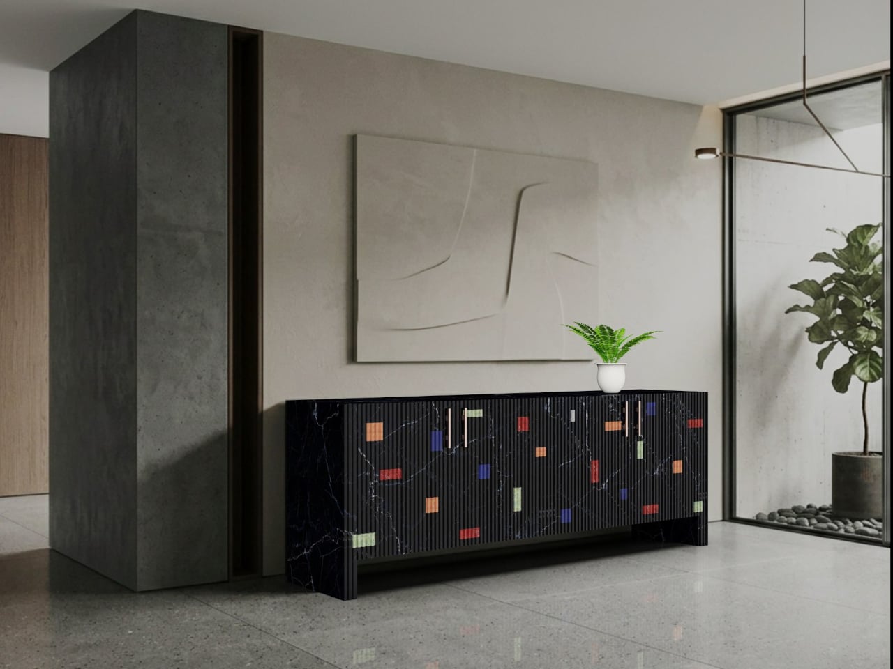
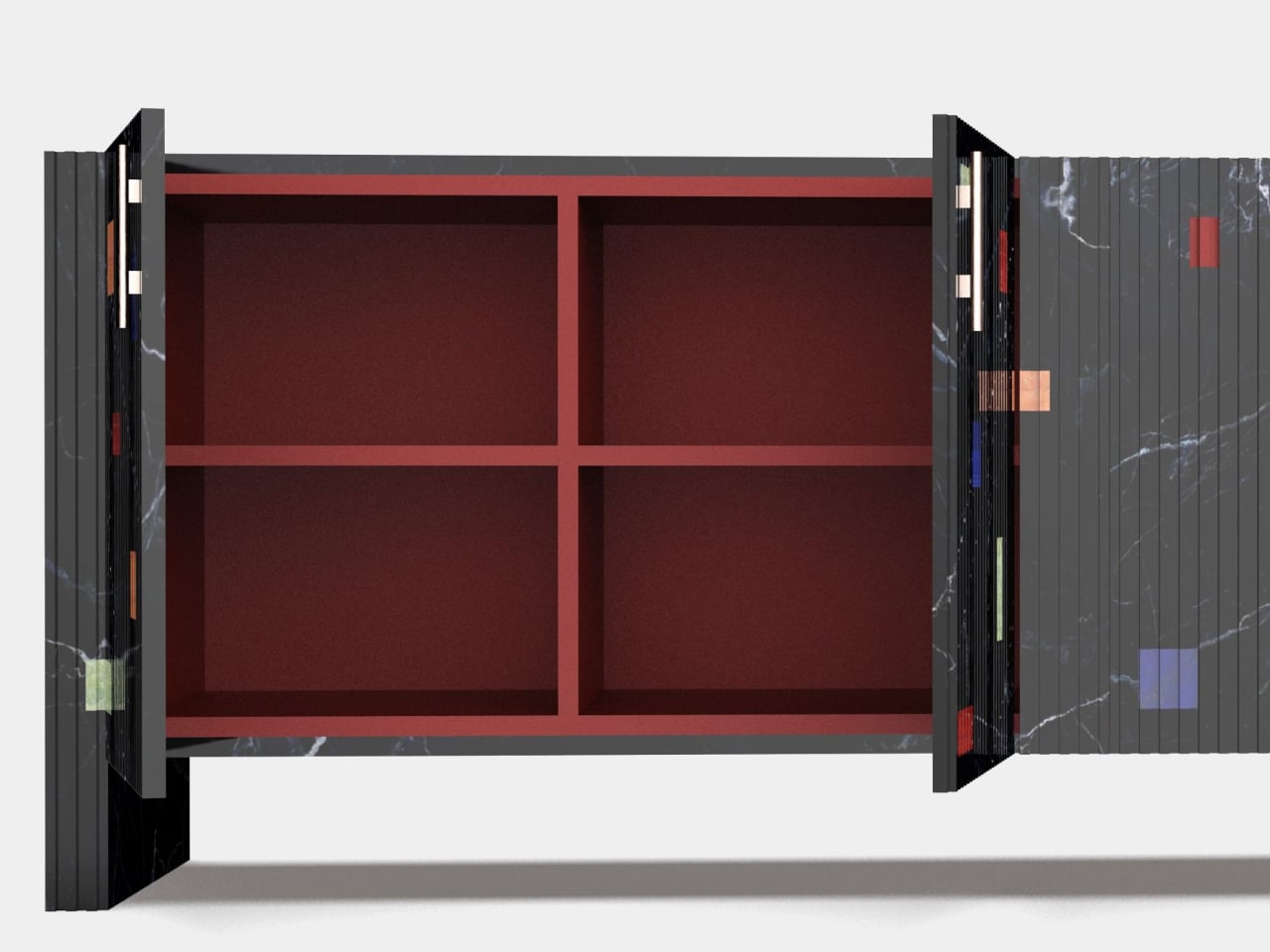
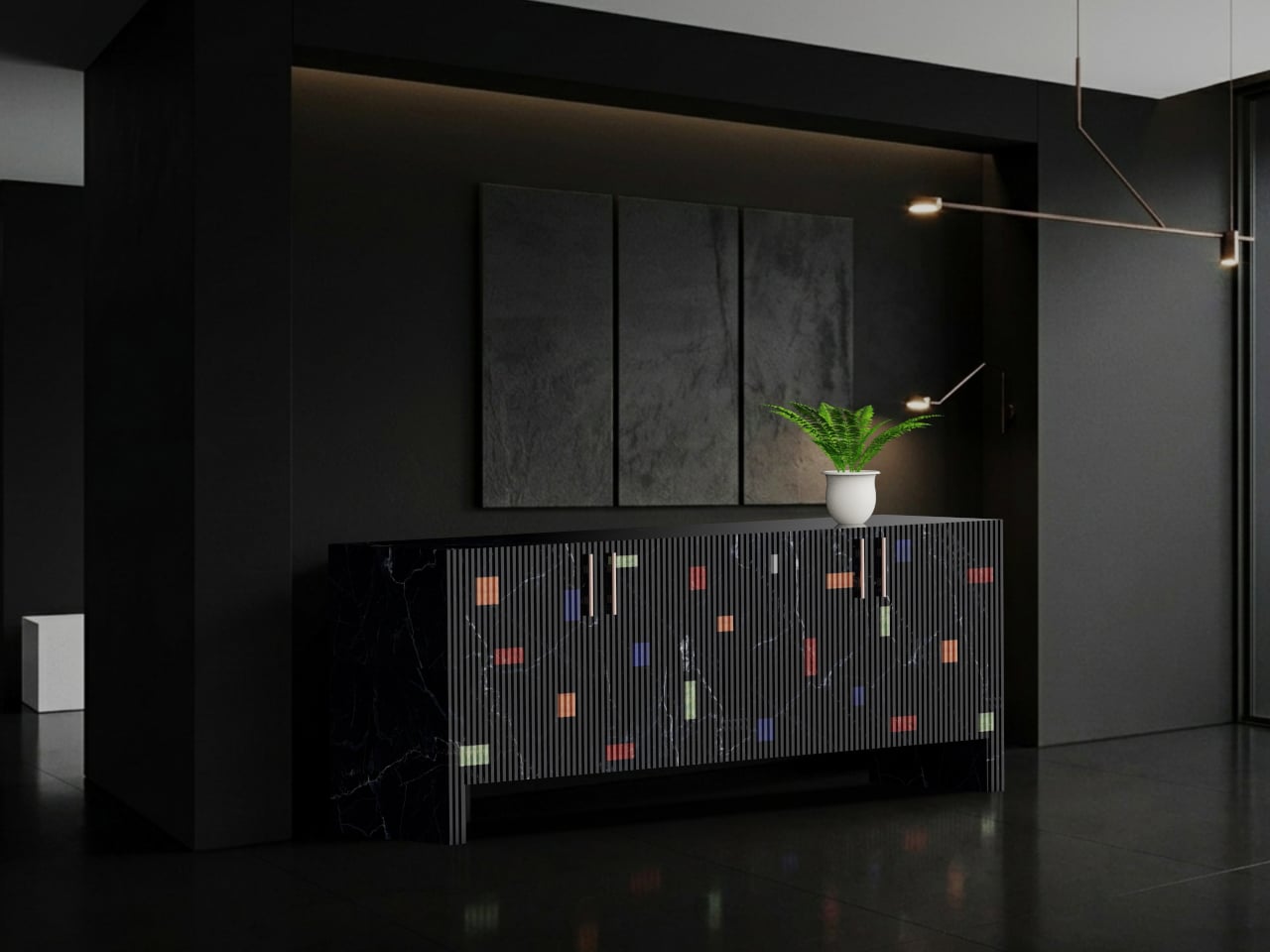
Black Marquina marble tends to command a room before anything else in it does. The material has a particular gravity, that deep, carbonized base cut through with white veining, which makes most furniture around it feel like an afterthought. Designer Himanshu Kumar Gupta leans into that authority completely with the Midnight Inlay Sideboard, then quietly subverts it the moment someone opens a door.
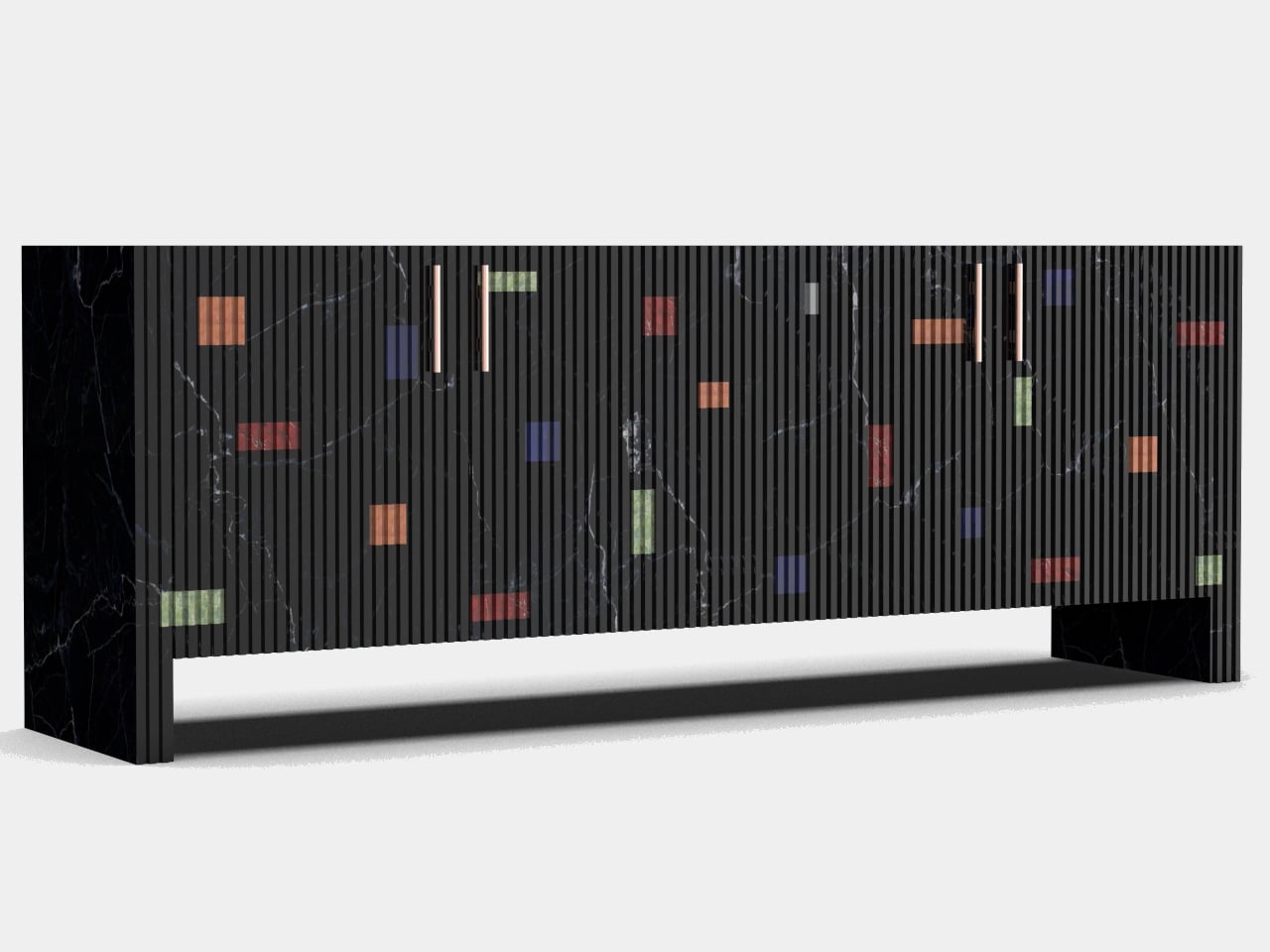
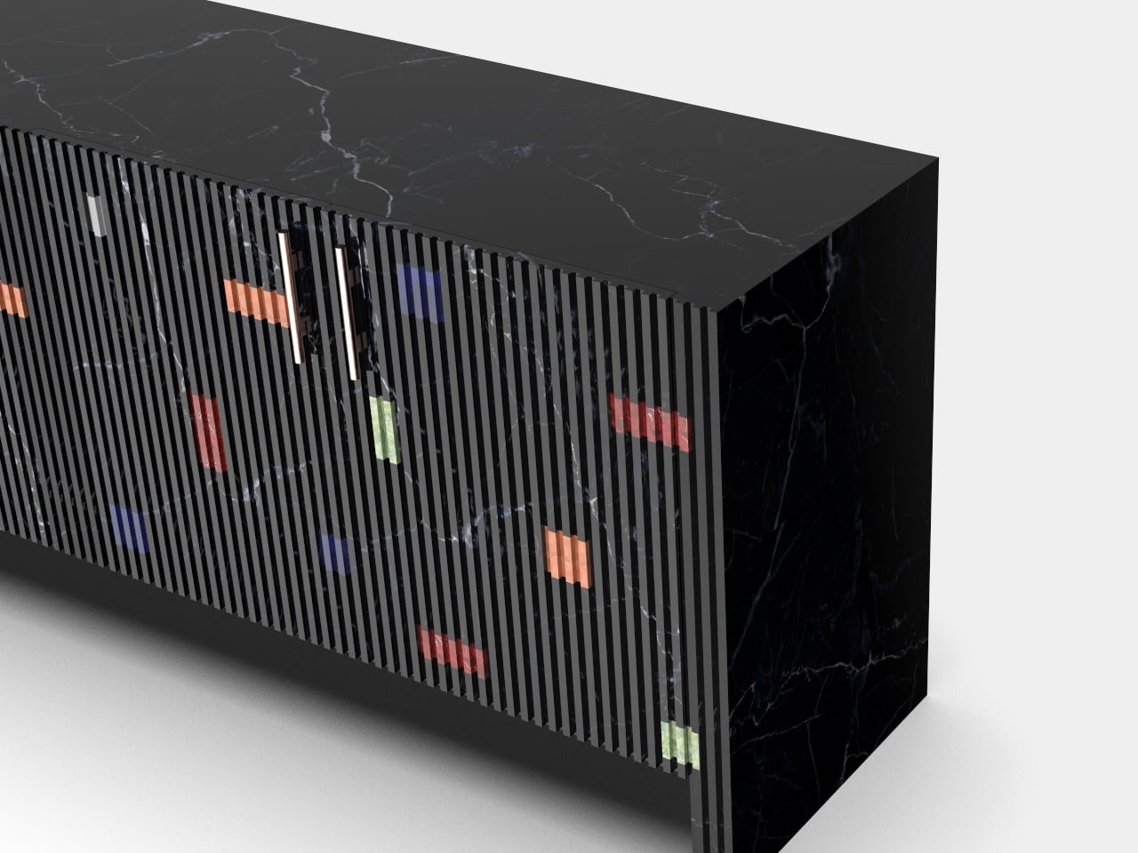
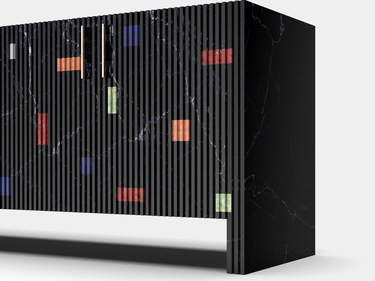
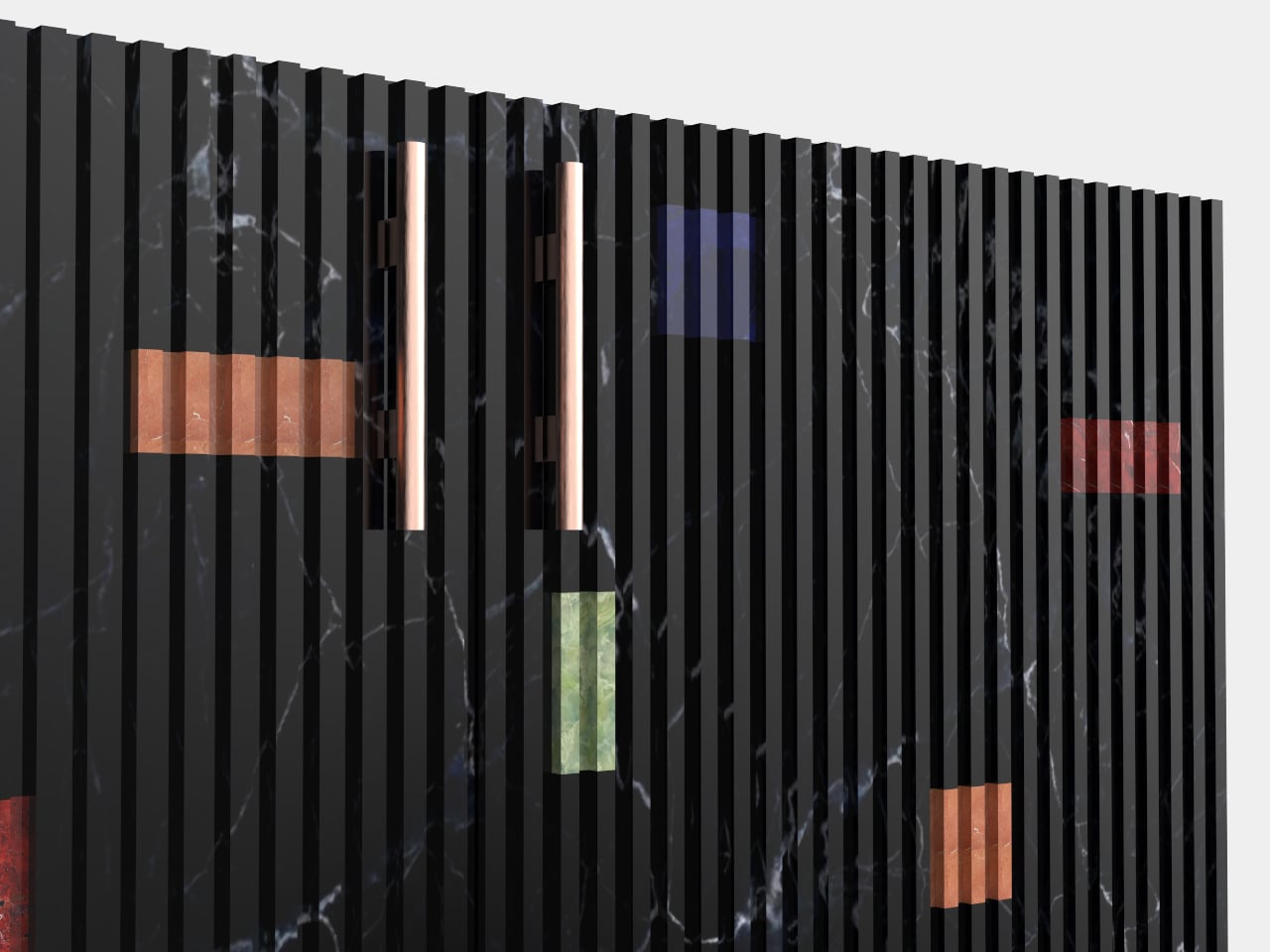
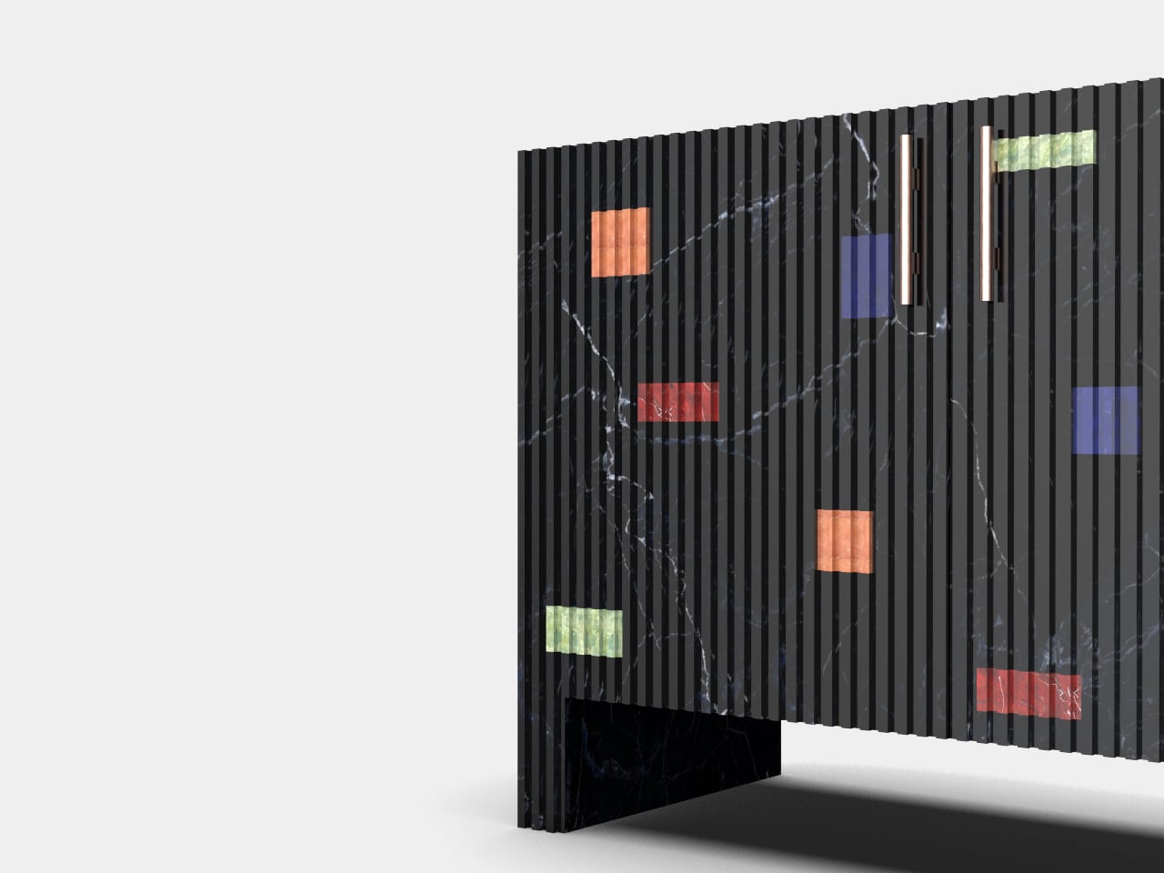
The exterior runs on strict formal logic. Vertical fluting covers the door panels from edge to edge, each ridge precisely cut into the stone so the surface ripples with shadow even under flat ambient light. On plain marble, this treatment would read as architectural severity, which is exactly the point. The fluting establishes a rhythm, almost like a grid, that makes what comes next feel genuinely disruptive.
Scattered across those ridged panels are rectangular inlays in Lapis Lazuli, Red Fire marble, Alikanta, and Green Onyx, appearing at irregular intervals and orientations like signals caught mid-transmission. Each inlay sits flush within the fluting, which means the stone was routed and fitted with zero tolerance for error. A slightly proud or recessed block would break the silhouette entirely. That constraint alone separates this from surface-applied decoration.
The interior is where the piece earns its sharpest contrast. Behind the cool, textured stone exterior is a cavity lined in red velvet over solid wood, a warm, almost theatrical shift in material register. Opening the doors feels less like accessing storage and more like discovering that a severe stone cabinet had a completely different personality waiting inside, the kind of detail that does not photograph well and cannot be fully appreciated without direct interaction.
Cylindrical handles in a warm copper-toned metallic finish sit vertically in the fluting, restrained enough to avoid competing with the inlays. The base is a solid slab, no tapered legs, no gap between cabinet and floor, keeping the profile ground-hugging and monolithic. The overall silhouette is low and horizontal, which helps it read as furniture rather than architecture, even with the stone’s commanding presence working against that reading.
Combining five different natural stones into a single fluted facade is a nontrivial production problem. Stone inlay of this precision typically requires hand-fitting each piece individually, since natural stone does not behave with the consistency of milled engineered material. The designer frames this as a contemporary take on traditional inlay craft, creating a beautiful tension between order and spontaneity, old and new.
There’s a name in Mercedes-Benz history that carries almost mythological weight: Rudolf Uhlenhaut. The engineer and designer behind the legendary 300 SL Gullwing was known to drive the prototype racing versions of the car to work in Stuttgart, casually lapping most professional racing drivers in the process.
The original 300 SL Uhlenhaut Coupe, the racing variant that never made it to public roads, remains one of the most valuable cars ever auctioned, fetching $143 million at a 2022 Sotheby’s sale. So when concept designer Gabriel Naretto decided to name his reimagined Mercedes-AMG shooting brake after the man himself, the pressure to deliver something worthy of that legacy was immense. Remarkably, he pulled it off.
Designer: Gabriel Naretto
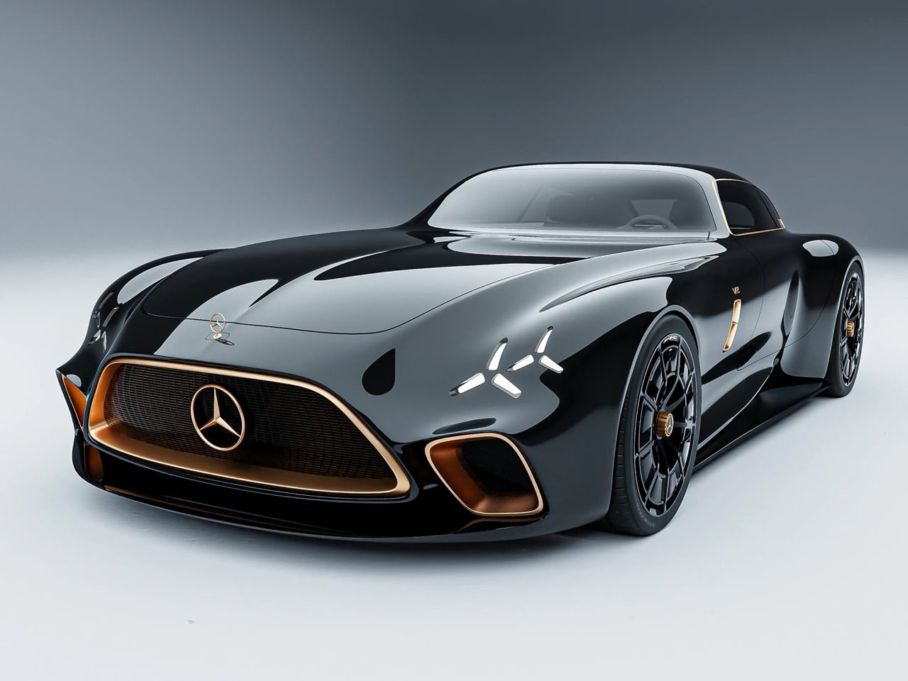
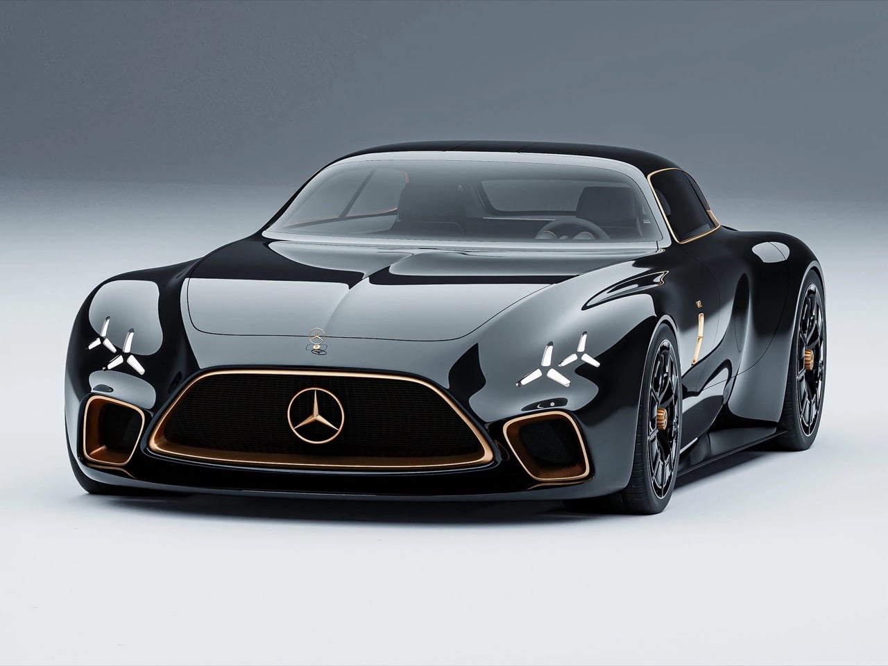
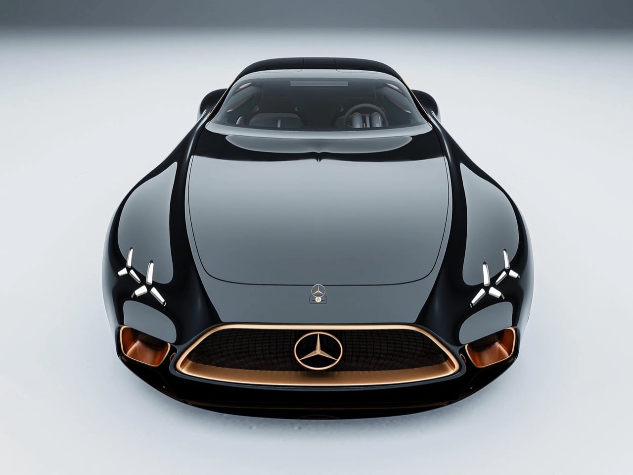
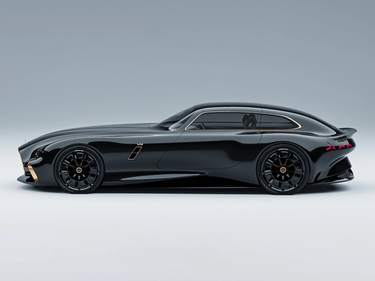
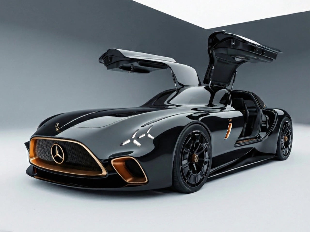
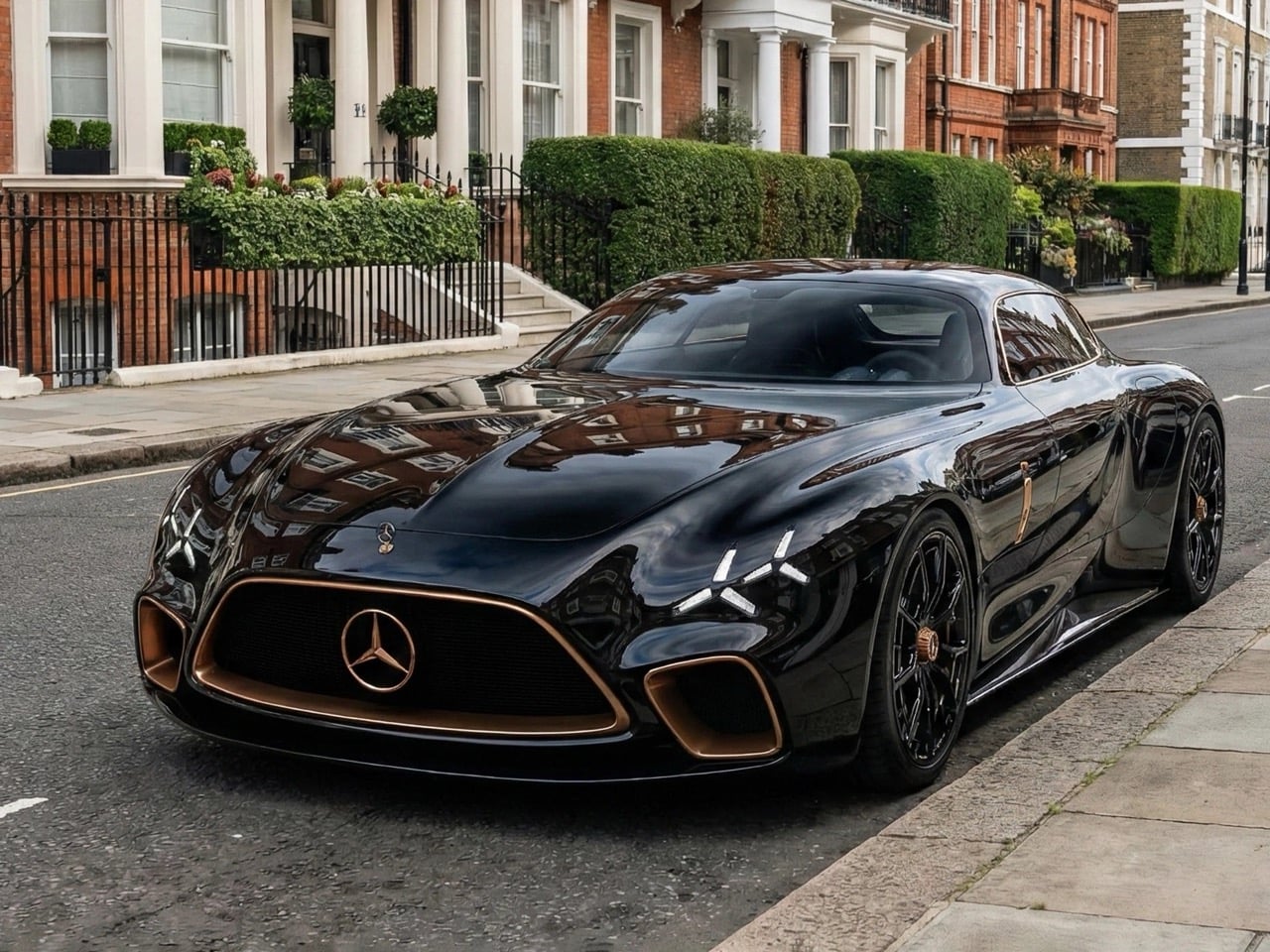
The Mercedes-AMG Uhlenhaut Shooting Brake concept arrives draped in obsidian black, and it hits you in layers. From the front, the DNA of the original 300 SL is unmistakable but filtered through a thoroughly contemporary lens. That iconic central grille with the three-pointed star sits framed in warm copper gold, flanked by large air intakes that mirror the same bronze-kissed treatment. The X-shaped daytime running lights cut through the glossy black bodywork like a precision incision, echoing AMG’s current design vocabulary while feeling completely unique to this car. The hood is long and muscular in the classic front-engine GT tradition, but the surfaces flow with a smoothness that feels almost liquid, like someone poured ink over a clay sculpture and let it set.
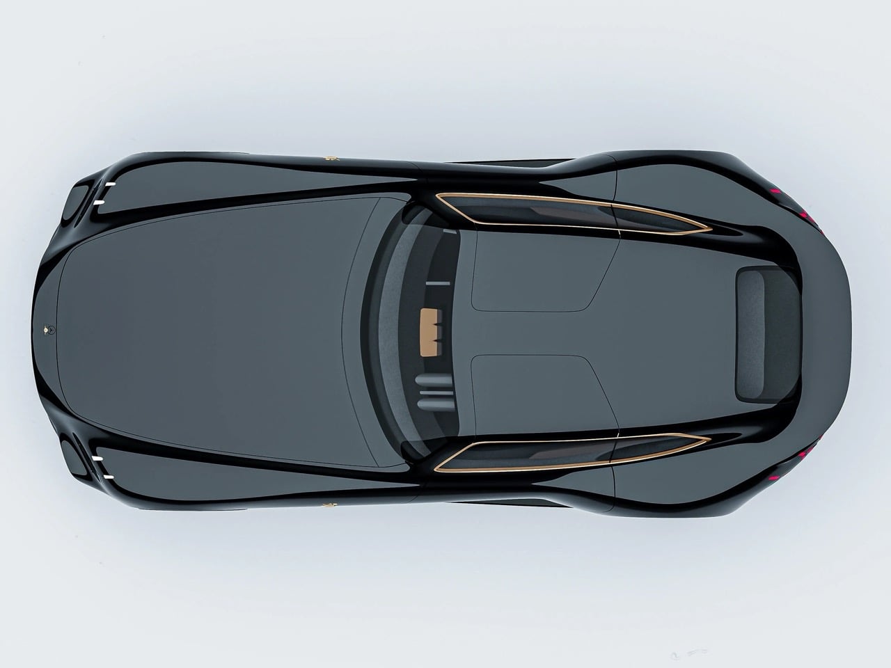
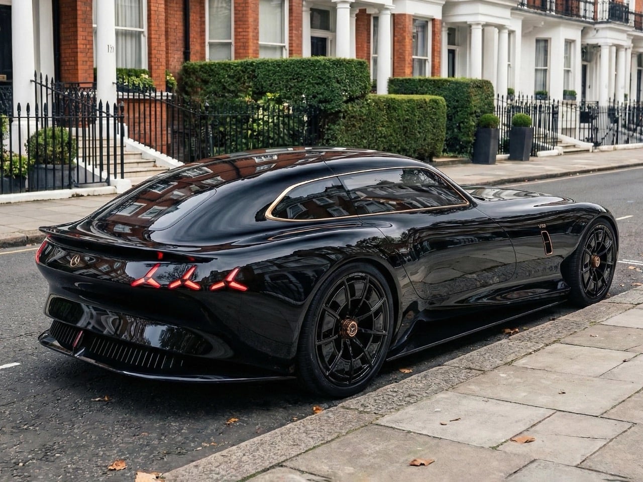
Then you walk around to the side, and the shooting brake proportions hit you all at once. Naretto has given this concept a fastback-style extended roofline that arcs gracefully rearward before dropping into a truncated Kamm-tail rear, and it works brilliantly. The roofline is outlined by a thin copper pinstripe that traces the greenhouse all the way to the tail, a detail so refined it belongs on a Swiss watch rather than an automobile. “V12” badging sits discreetly on the sill, a knowing nod to the kind of naturally aspirated thunder that the original Uhlenhaut Coupe’s racing engine would have produced. The body itself is devoid of unnecessary creases or character lines, relying entirely on curvature and proportion to generate visual drama, which is an incredibly difficult thing to pull off and an even more impressive thing to actually see rendered this well.
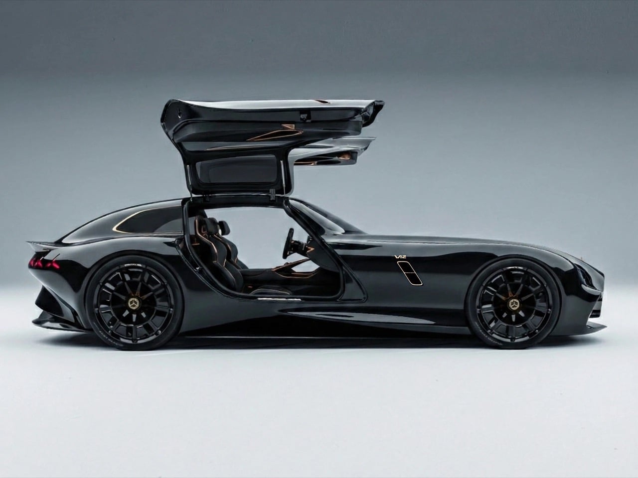
The doors, of course, are gullwing. There was never any other option for a car wearing the Uhlenhaut name. When they swing open, they reveal a cabin wrapped in black leather accented with copper stitching, with deeply bolstered racing seats and a minimal instrument layout that prioritizes the driving experience over digital noise. The steering wheel is small and driver-focused, and while the concept renders don’t offer a full cockpit tour, what’s visible suggests Naretto was thinking about the complete experience rather than just the silhouette.
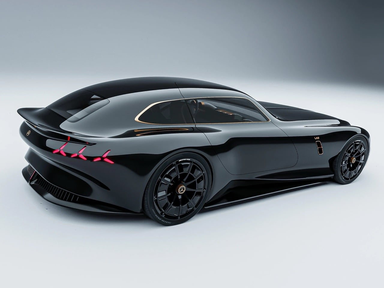
The taillights are styled as three-pointed star clusters rendered in deep red, a sculptural interpretation of the Mercedes badge that functions as a graphic element rather than just a regulatory necessity. A subtle integrated spoiler sits at the trailing edge of the roofline, and the diffuser treatment below the bumper gives the rear end genuine aerodynamic intent. The AMG-badged multi-spoke wheels in gloss black with copper center caps complete the picture, tying the whole visual package together in a way that feels considered and cohesive from every angle.
Naretto’s concept navigates the tension between historical reverence and forward-looking design just beautifully. He preserved the emotional architecture of the Gullwing, the long hood, the coupe greenhouse, the gullwing doors as ceremony, and then reimagined everything else through the filter of a modern AMG performance car. The shooting brake body style was a masterstroke of a choice, because it gives the car a sense of versatility and intelligence that a pure coupe wouldn’t carry, while also referencing Mercedes-Benz’s own history with practical performance vehicles like the CLS Shooting Brake and the AMG GT 4-Door.
Parked against the Georgian townhouses of what appears to be a Kensington street in those lifestyle renders, the Uhlenhaut concept looks like it belongs to a world where automotive design never stopped being an art form. Rudolf Uhlenhaut himself would probably have driven it to work.
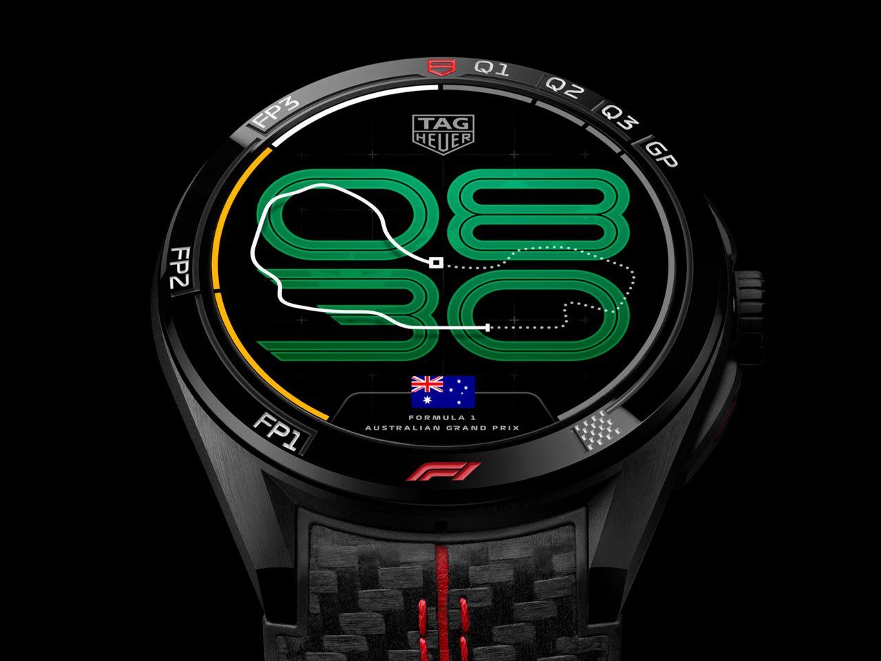
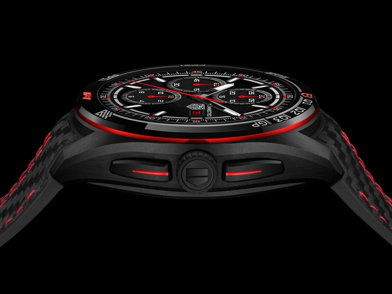
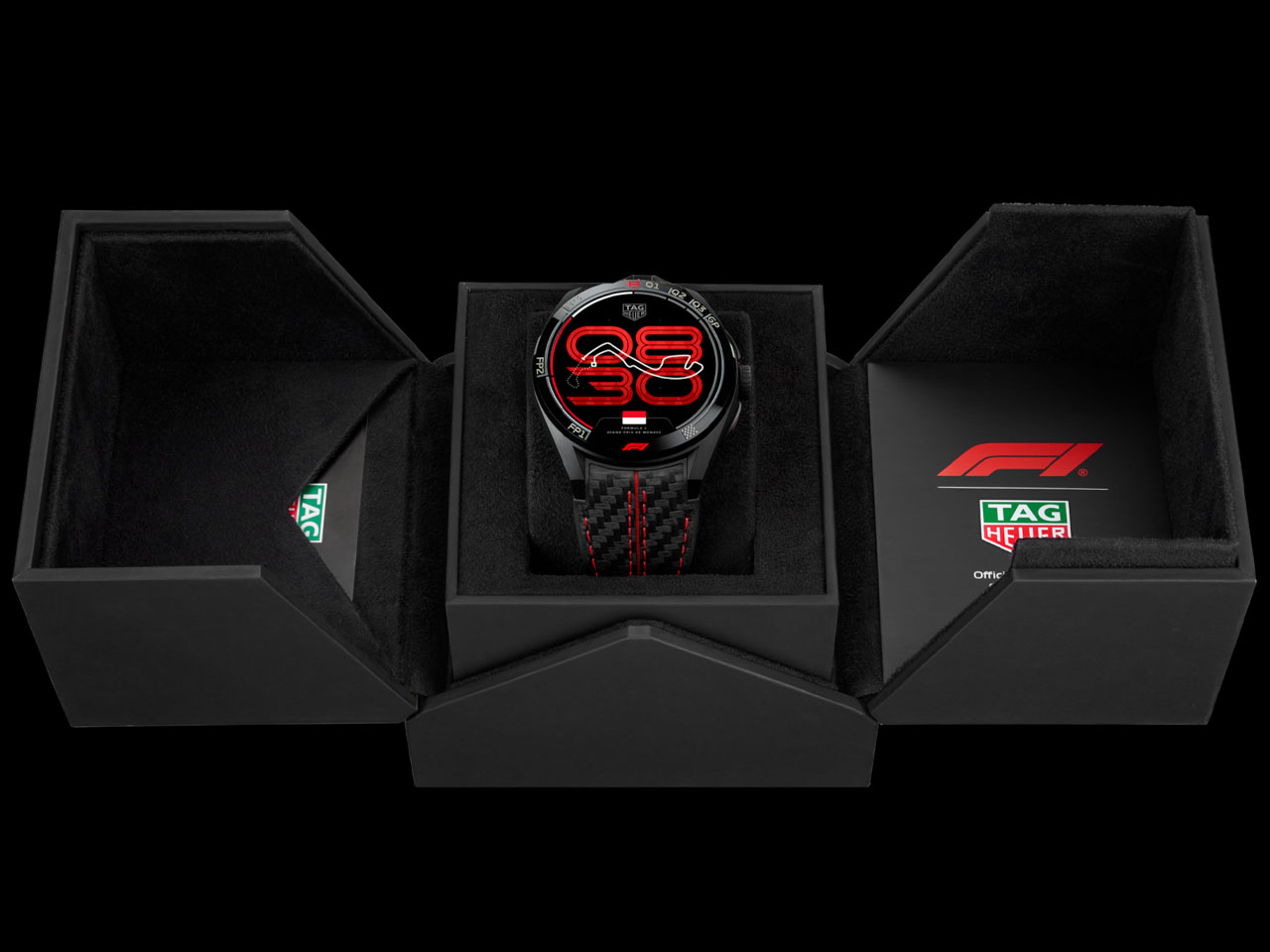
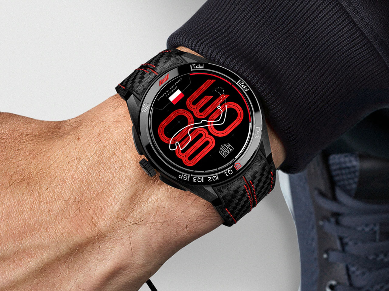
The 2026 Formula 1 season with sweeping technical changes is just a week away, and motorsport fans are counting down to lights out in Melbourne. TAG Heuer marks the moment with the Connected Calibre E5 45MM x Formula 1 Edition, a smartwatch designed to translate the sport’s precision and telemetry-driven intensity into a wearable format. As the official timekeeper of Formula 1, the brand’s latest release feels less like a themed accessory and more like a digital extension of race weekend.
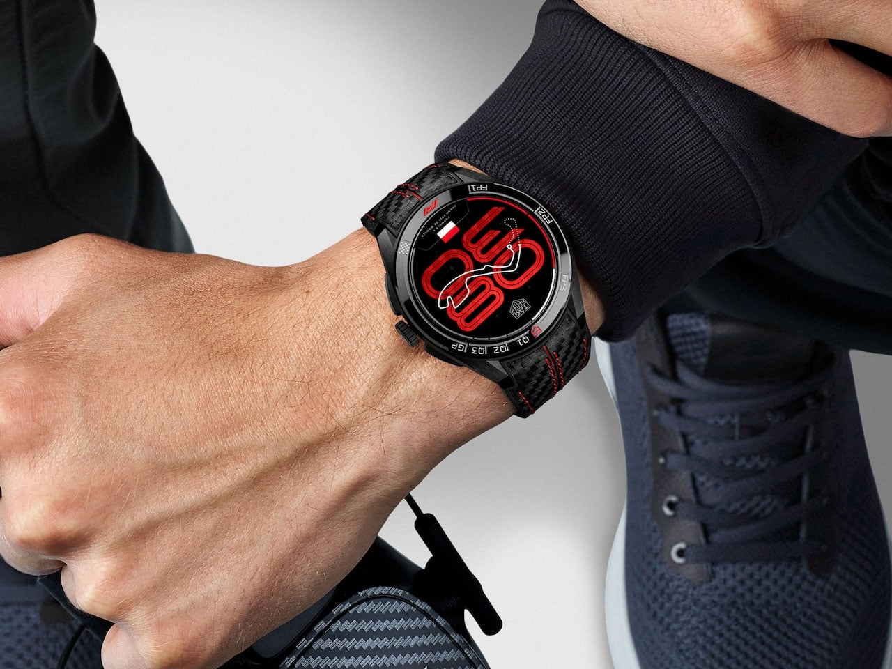
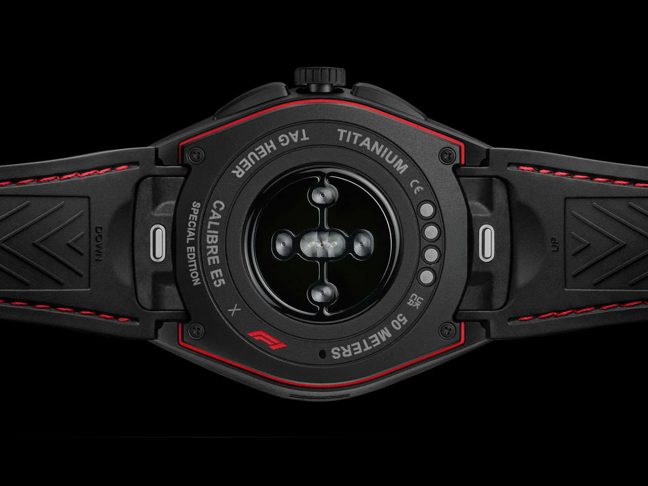
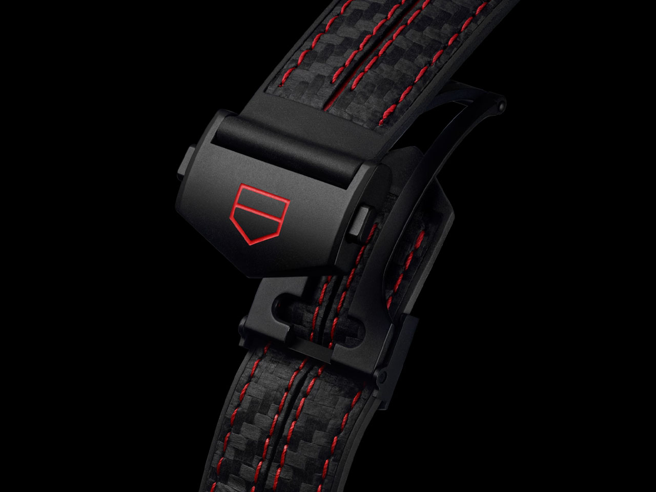
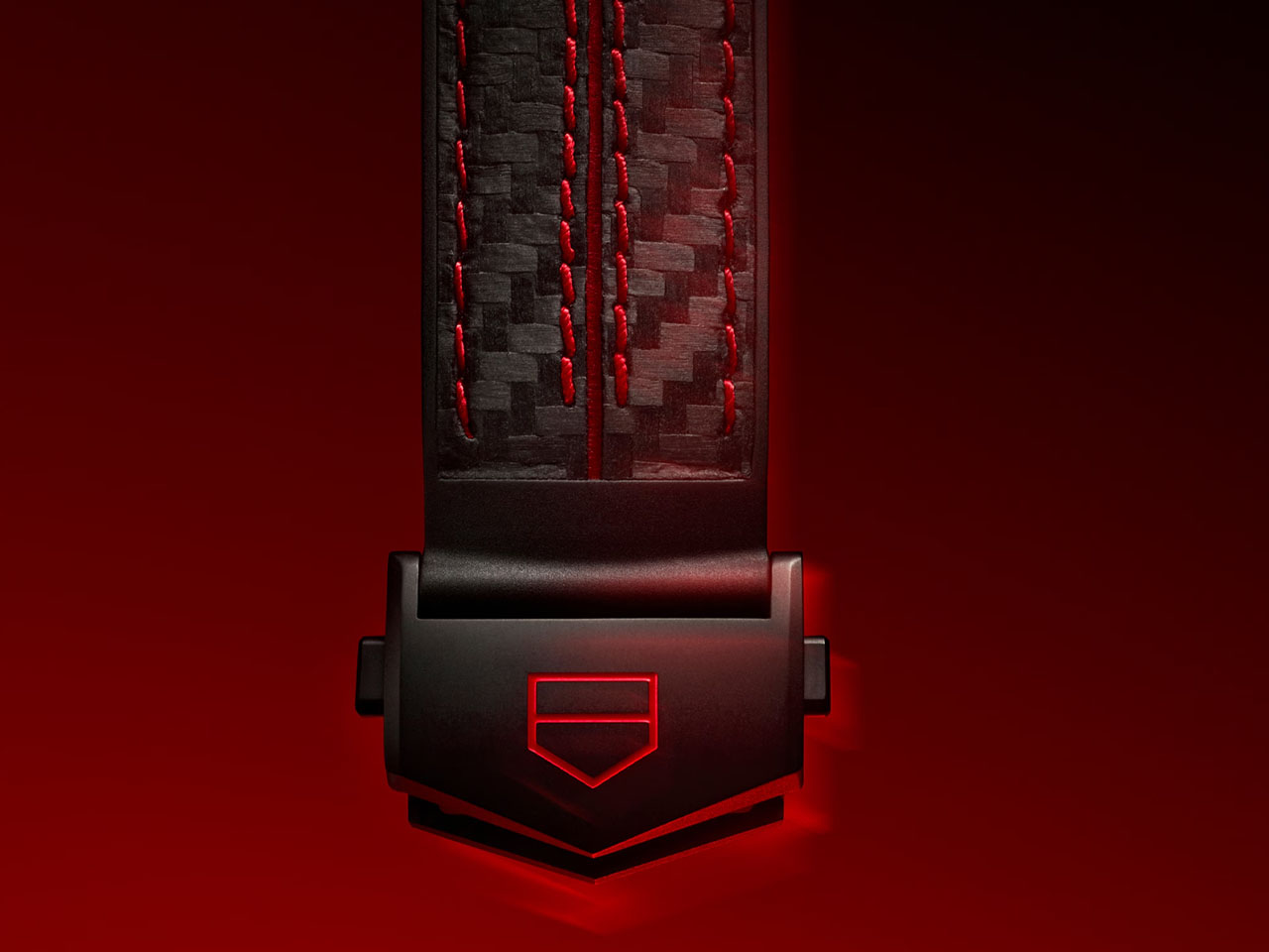
Priced at $3,850 and available from March 3 through the brand’s online channels, the watch builds on the existing Connected Calibre E5 platform while introducing exclusive Formula 1-focused software and design elements. Housed in a 45mm grade 2 titanium case with a black DLC finish, it features a fixed ceramic bezel engraved with a tachymeter scale—a direct reference to classic racing chronographs. The screw-down caseback carries special Formula 1 engraving, while the textured rubber strap reinforces its sporting intent. Water resistance is rated to 165 feet, making it suitable for daily wear beyond the paddock.
The 1.39-inch OLED touchscreen delivers a sharp 454 x 454 resolution, ensuring clarity for both everyday functions and race-specific graphics. Powered by the Snapdragon Wear 4100+ platform and running on Wear OS, the watch supports GPS, heart-rate monitoring, sleep tracking, and a wide range of fitness modes. A 430mAh battery provides up to 24 hours of typical use, including around one hour of sports tracking, and fast charging allows a full recharge in approximately 90 minutes, practical for users who rely on it throughout the day.
The Formula 1 integration is where the watch distinguishes itself. Owners receive real-time updates across practice sessions, qualifying, sprint events, and race day. Notifications include session start alerts, grid formations, and race results, complemented by subtle audio cues inspired by trackside sounds. The experience is designed for professionals who cannot follow every lap live but still want immediate access to key developments.
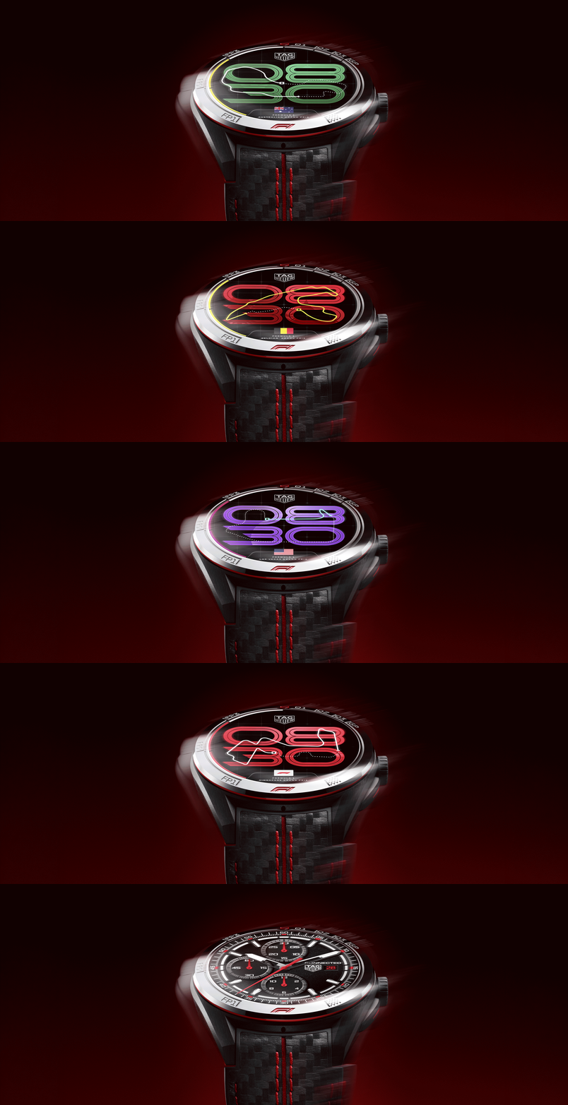
A standout feature is the dynamic Race Track watch face, which adapts to the championship calendar. As each Grand Prix approaches, the display updates with a stylized outline of the upcoming circuit, along with the corresponding national flag. Whether the race is at Silverstone Circuit, Circuit de Monaco, or the Red Bull Ring, the dial evolves to reflect the season’s progression across 24 venues. The companion smartphone app expands on this by offering detailed schedules, team standings, and calendar information, presenting data in a clear, structured format rather than overwhelming the interface.
Importantly, the watch does not sacrifice everyday usability for thematic design. Standard smartwatch features like notifications, contactless payments, music controls, and customizable watch faces remain fully accessible. The motorsport elements feel integrated rather than decorative, aligning with Formula 1’s identity as a technologically advanced championship.
What’s the ultimate declaration of love? Sometimes it’s breakfast in bed, other times it’s a $10,000 splurge on a gold-plated iPhone with inlay work. Each to their own, I guess. Me, I’ll stick to avocado toast and OJ served in bed, along with a poem co-authored by ChatGPT.
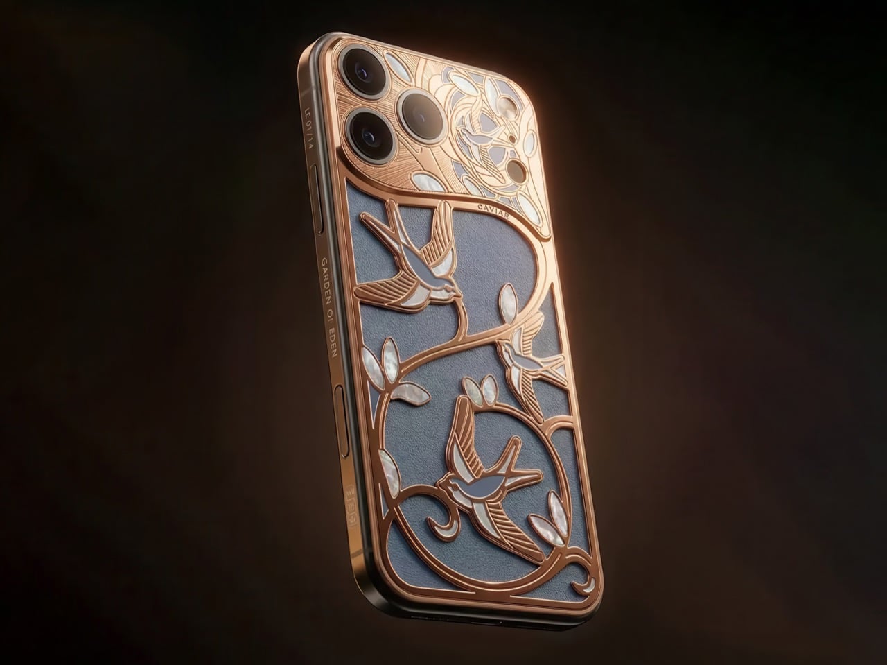
The Dubai-based luxury customization house, famous for slapping Rolex movements and 24K gold onto iPhones and calling it a Tuesday, has just unveiled the Wings of Love, the latest piece from their Garden of Eden collection. The price? Upwards of three Vision Pros. (And that’s just for the base 256GB variant)
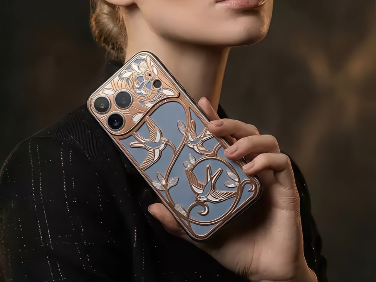
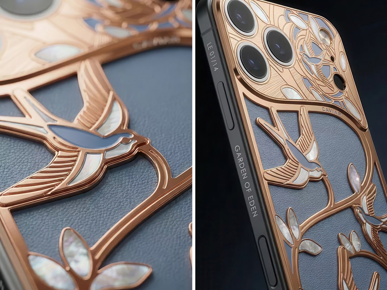
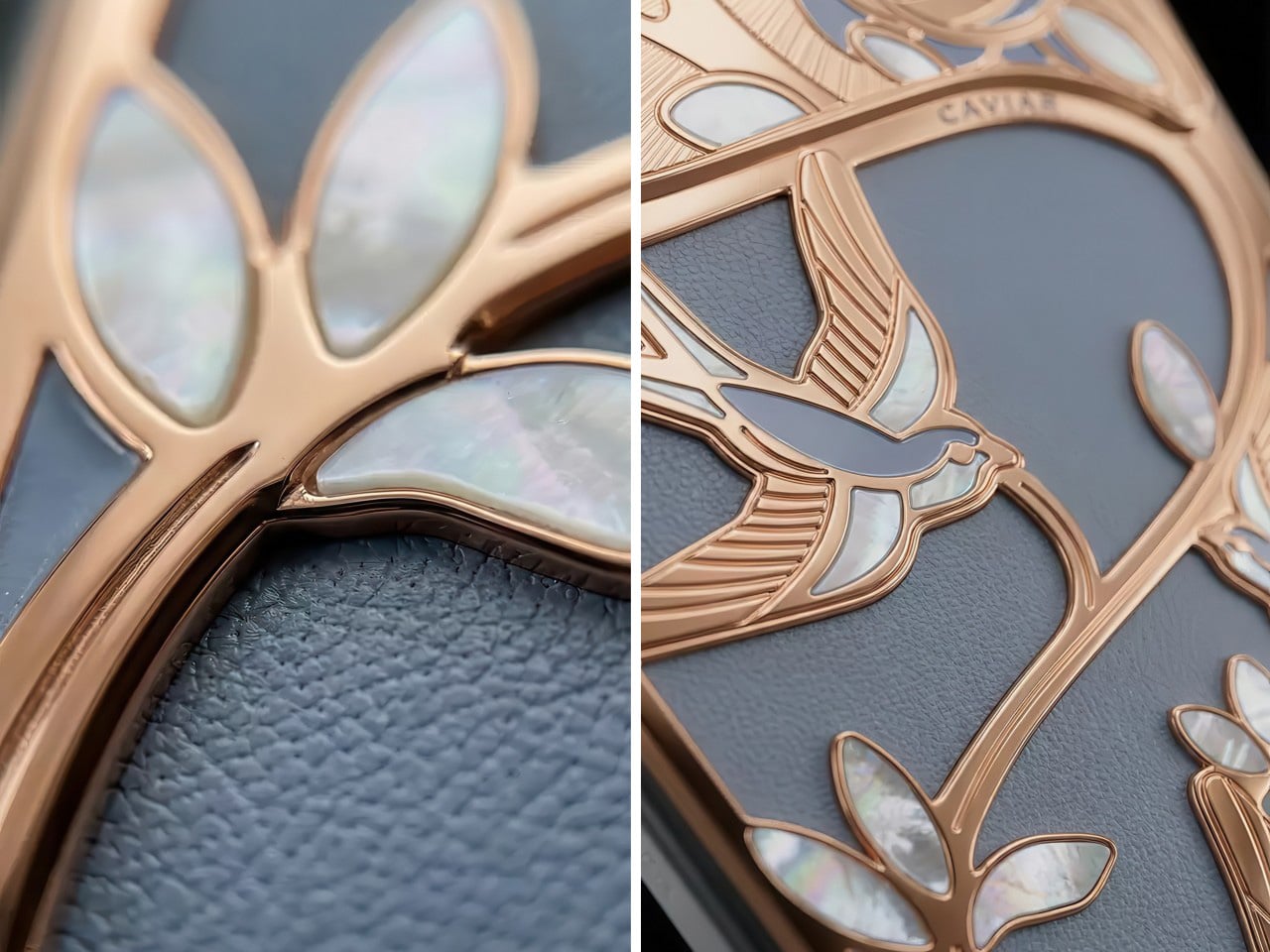
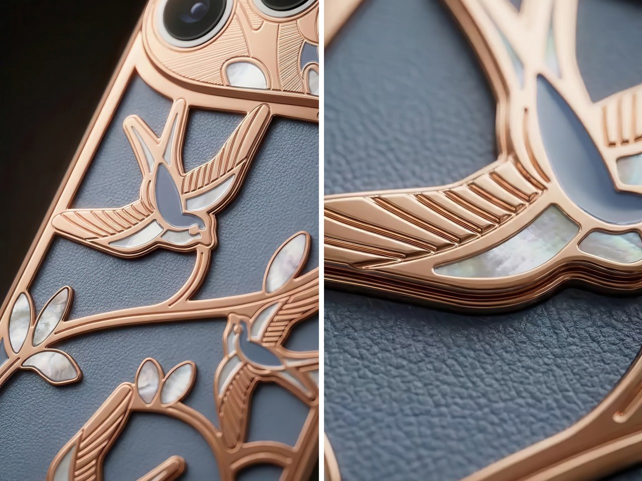
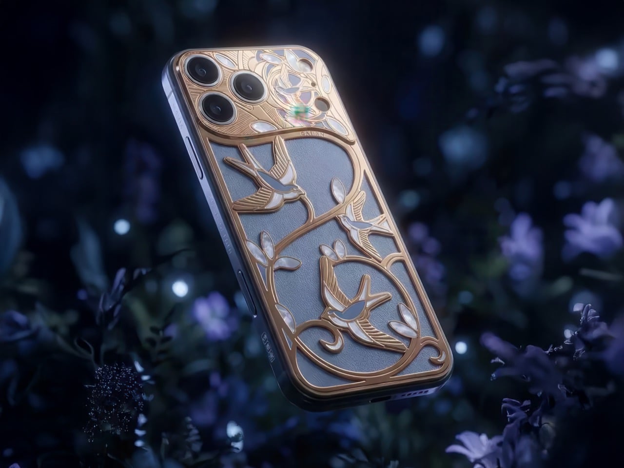
Where most Caviar creations lean into black or stark white as a base, Wings of Love goes with a soft slate blue-grey leather that sits somewhere between storm cloud and morning mist. It’s an unusual, almost painterly choice, and it works brilliantly as a canvas for what’s layered on top: a full scene of swallows in flight, rendered in raised 24K rose gold with mother-of-pearl inlays catching the light at every angle. The birds weave through branching vines and leaves, each leaf tipped with its own iridescent shell inlay. Up close, the craftsmanship looks less like phone customization and more like a miniature Art Nouveau panel that belongs behind museum glass.
The symbolism isn’t arbitrary either. The swallow has carried meaning across cultures for centuries, representing loyalty, return, and love that survives distance. Sailors tattooed them as talismans for safe passage home. In folklore, spotting a swallow was a sign that someone who loved you was thinking of you. Caviar leans into all of that intentionally, positioning Wings of Love as a phone designed specifically for women who, as they put it, treat love as a direction.
The camera plateau, normally the awkward protruding bump that makes every modern iPhone beg for a case, has been fully absorbed and integrated into the decorative overlay. The upper portion of the back is completely redesigned, with the camera module sitting flush within an ornate gold and mother-of-pearl composition featuring a blooming rose motif. The result is a phone that’s slightly thicker overall, yes, but dramatically more coherent as an object. You’re not staring at a camera bump that disrupts the design. The camera IS the design, framed and intentional, like a window in an illuminated manuscript. And because the whole back is already a sculpted, protective structure, you’d be committing a small crime putting a case over it anyway.
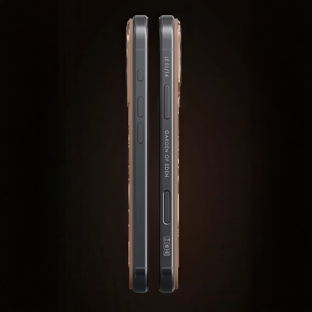
The side profile is engraved with “Garden of Eden” and an individual edition number on each unit, and hallmark stamps on the bottom edge certify the 24K gold content, treating the phone with the same seriousness as fine jewelry. Which is exactly what it is.
The whole thing is built for exactly 14 people on Earth. That’s the edition size, 14 pieces, full stop. Which means this isn’t really a phone. It’s a wearable heirloom that happens to run iOS. Pricing starts at $10,340 for the iPhone 17 Pro in 256GB, climbing up to $12,270 for the Pro Max in 2TB. And yes, you can commission just the customization on a device you already own, which is a small mercy for anyone who doesn’t want to explain to their accountant why they bought two iPhones at once. The packaging, naturally, is interactive and comes with a Caviar key finished in 24K gold. Because when your phone costs ten grand, the box has to keep up.
Is it excessive? Absolutely. Is it for everyone? With 14 units in existence, mathematically, it’s for almost no one. But that’s kind of the point. The Wings of Love isn’t trying to be practical. It’s trying to be meaningful, a declaration that sometimes, love deserves to be made in gold. Oh, while you’re at it, close this tab once you’re done just in case your partner happens to glance over your shoulder and ask you for this phone.
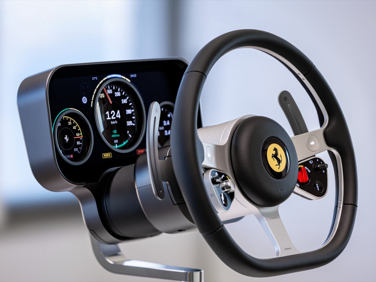
Five years after Jony Ive left Apple, and two years after Apple killed Project Titan, we finally know what the Apple Car’s interior *could* have looked like. It just happens to have a prancing horse on the steering wheel instead of a bitten apple.
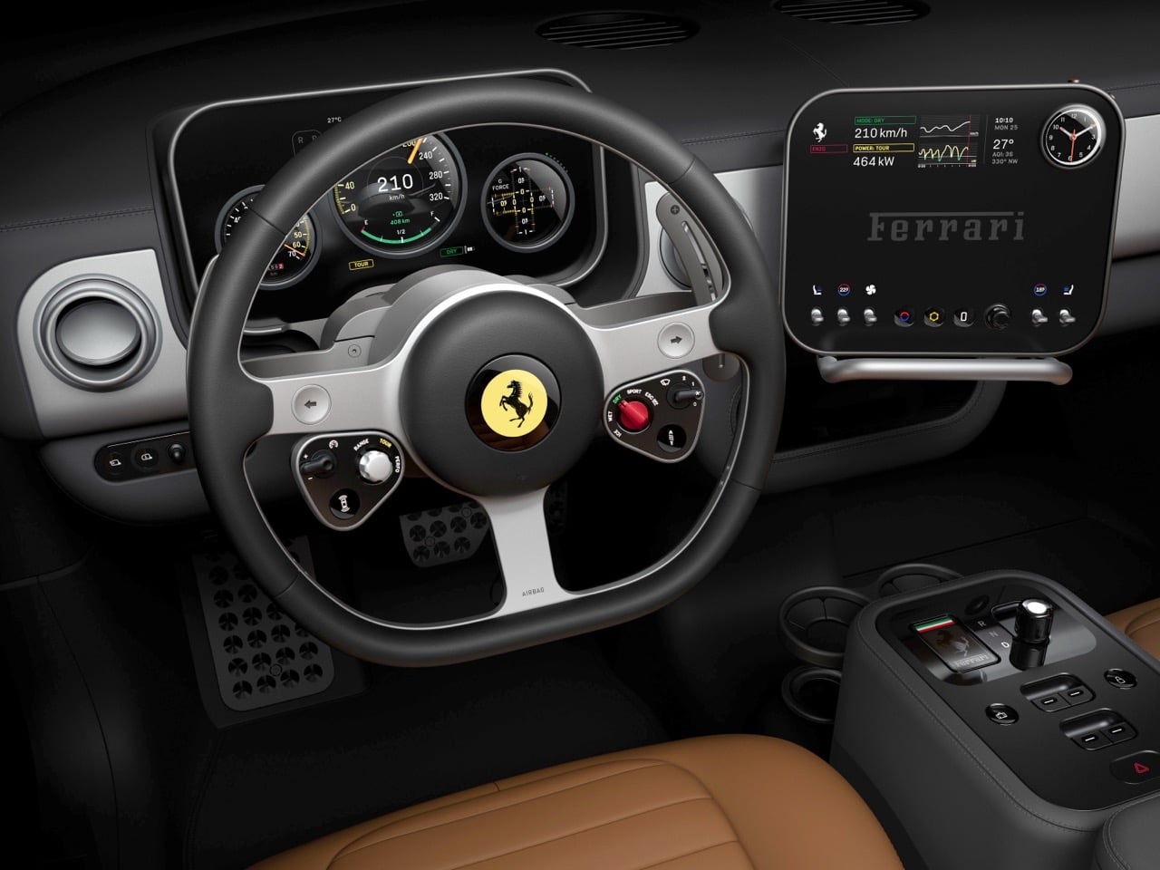
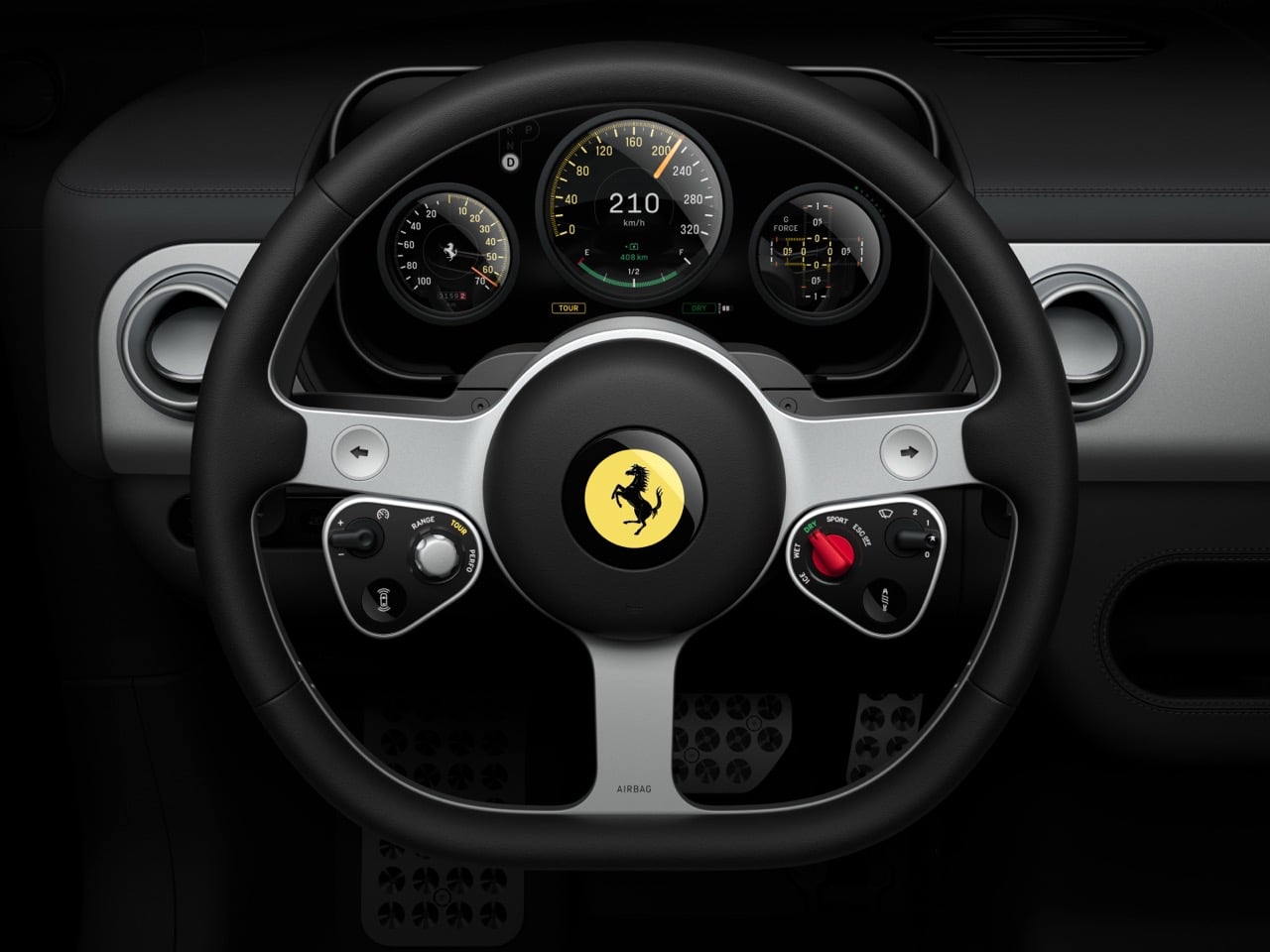
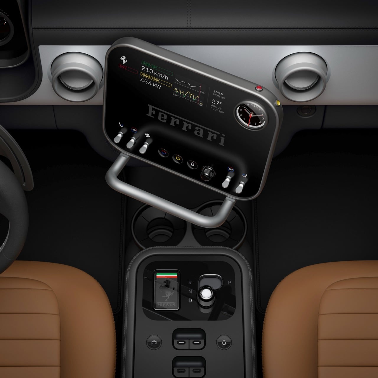
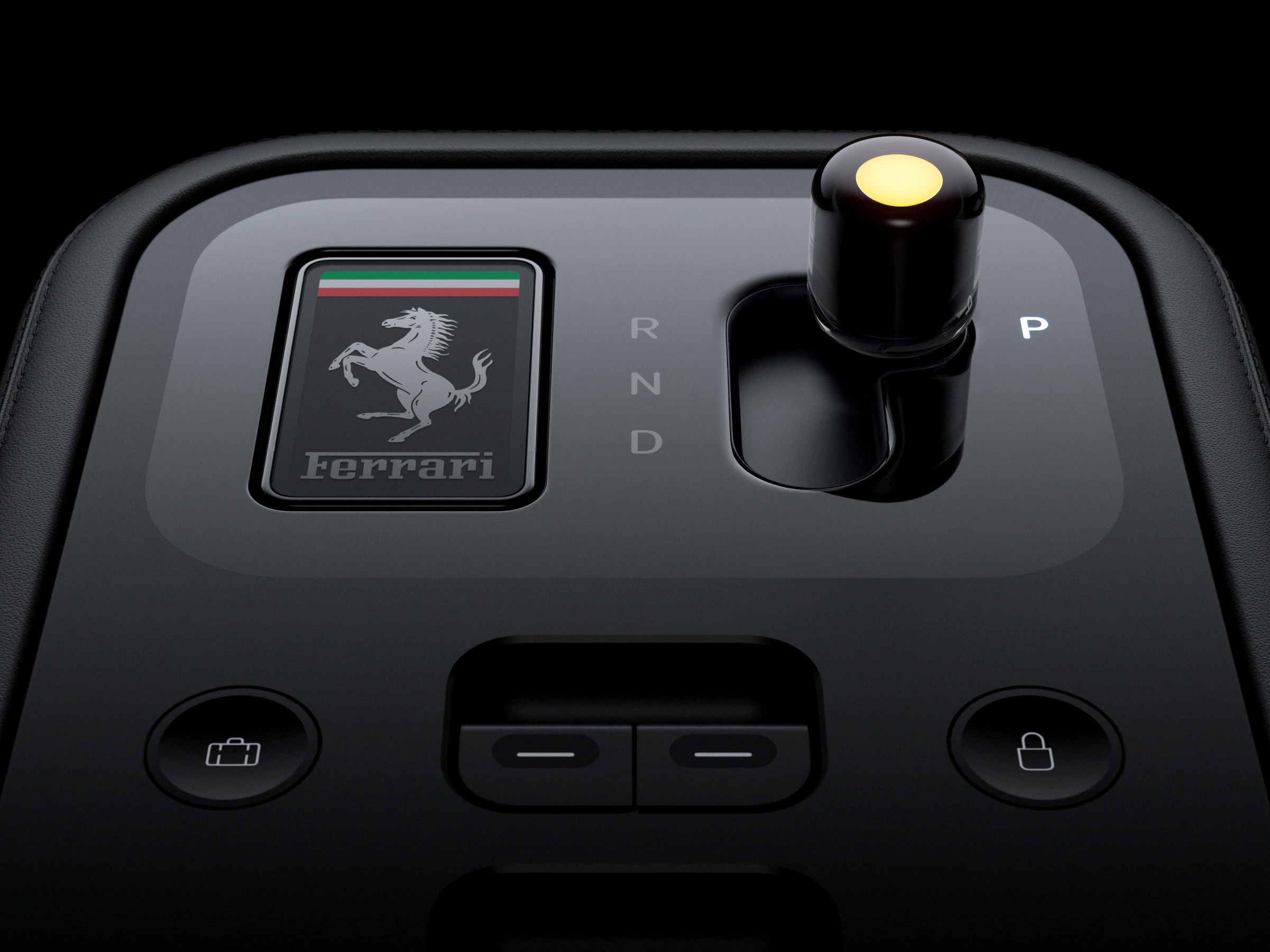
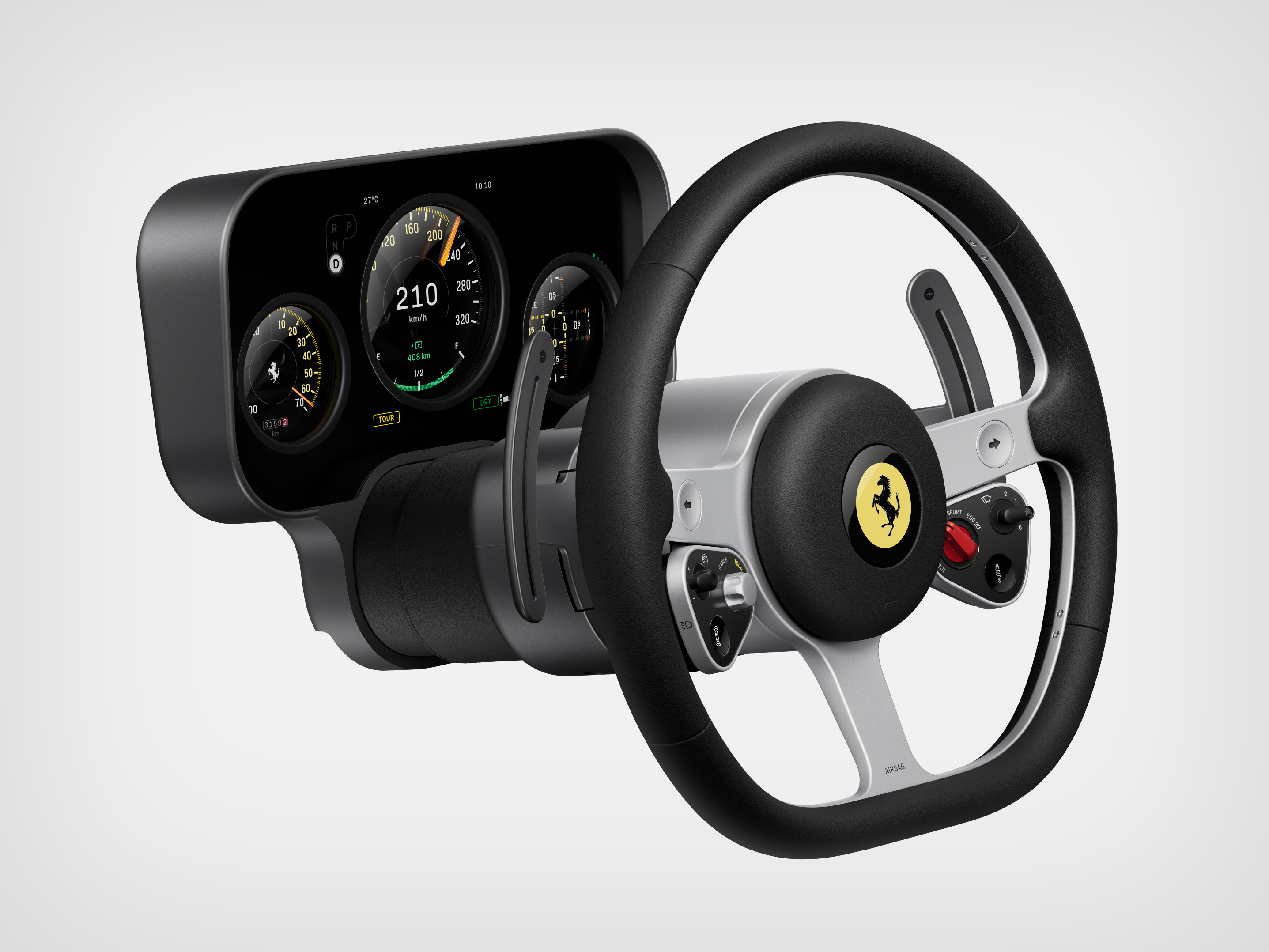
The Ferrari Luce, revealed last week in San Francisco, is a transplant of Apple’s design language into automotive form. Everything about this interior, from the E-ink key fob to the OLED dials to the obsessive material purity, carries the unmistakable signature of Apple’s design peak from 2015 to 2019, when Ive still occupied his Cupertino office and the car project remained alive.
The Apple DNA is Everywhere
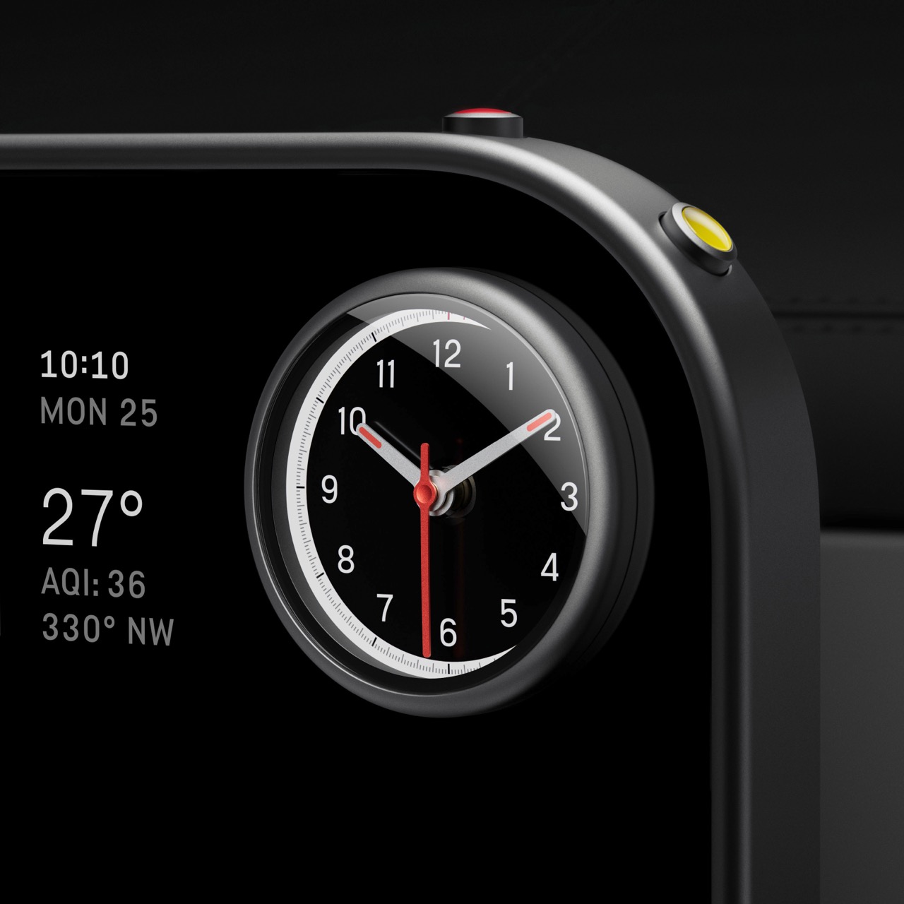
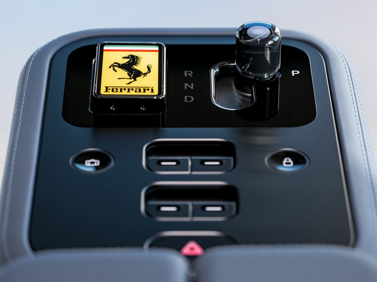
Walk through the components and the Apple DNA becomes impossible to ignore. The key fob magnetically docks into the center console and changes color via E-ink display. This is MagSafe technology meets Apple Watch complications, translated into a car key. The center screen features an analog clock that transforms into a chronograph and compass with the press of two buttons. Pull up any image of Apple Watch faces and the interaction model is identical.
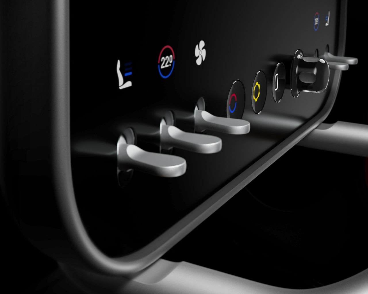
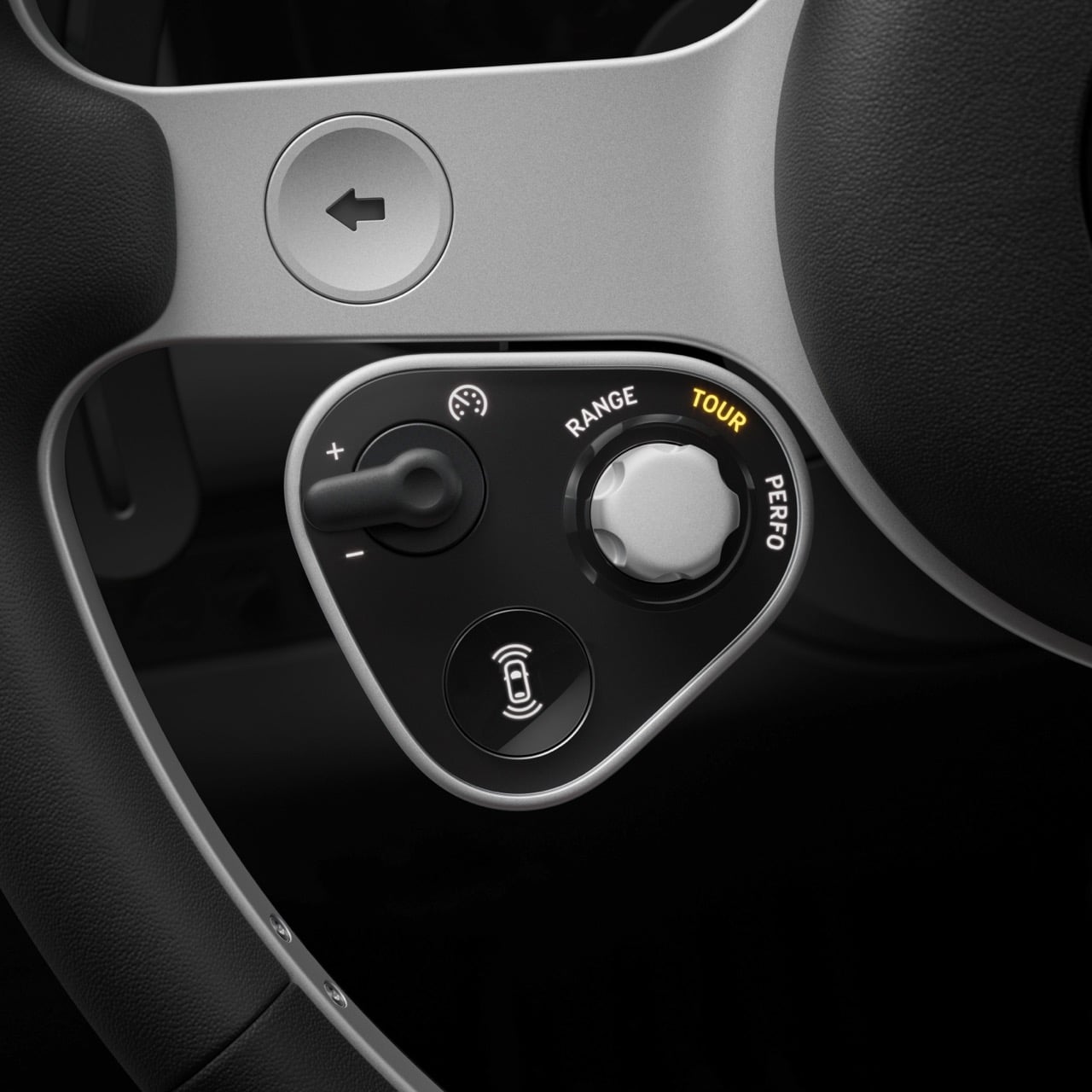
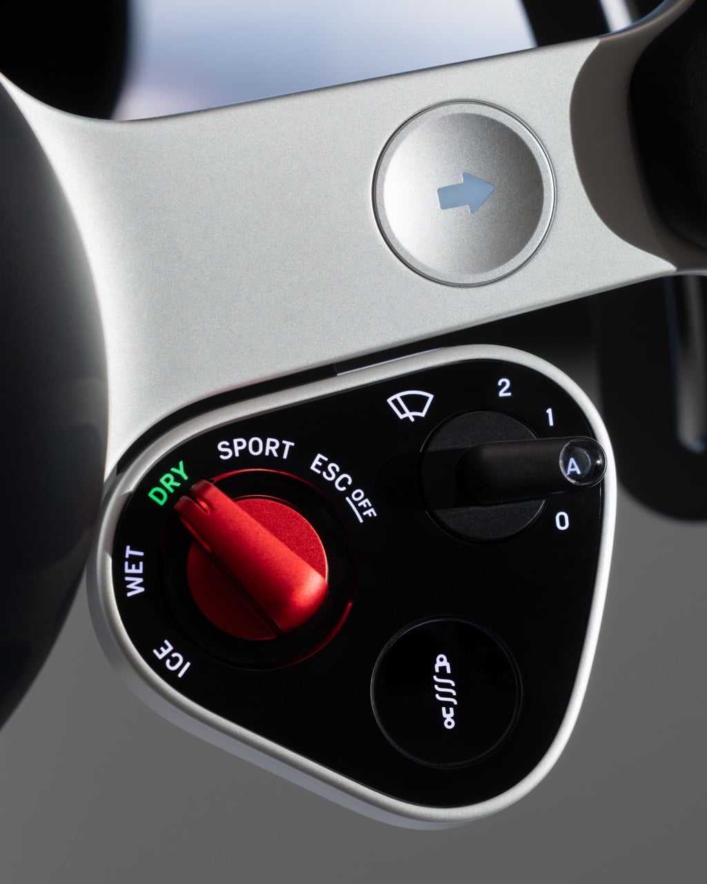
The toggle switches and knobs scattered throughout the cabin represent the physical interface philosophy Ive has been refining since the original iMac. The Digital Crown on the Apple Watch, the mute switch on the iPhone, the volume controls on the HomePod. These are the same careful considerations about how humans interact with objects through touch and rotation. The OLED binnacle behind the steering wheel uses a parallax effect to create depth perception, the same technology that made the iPhone X’s face recognition possible, now applied to gauge clusters.
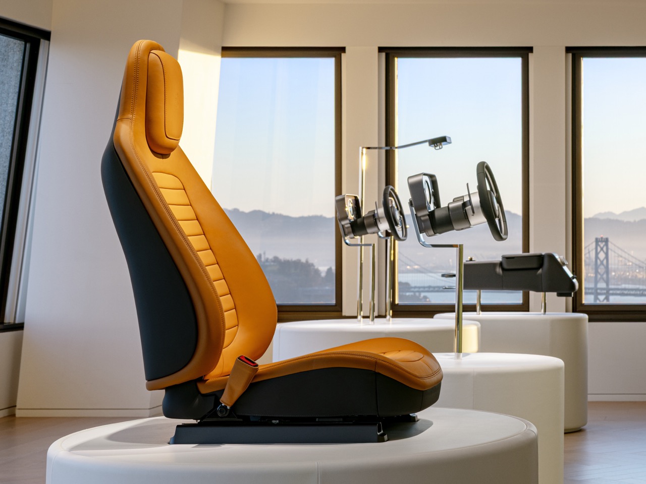
Then there’s the material palette: recycled aluminum with a microscopic anodized texture, Corning glass surfaces, leather in muted tan. This is the 2017 iPhone X material story. This is the unibody MacBook recipe. This is every premium Apple product from the past decade, reassembled into automotive architecture.
Wait, Is This the Same Jony Ive?
Consider what Ive said at the reveal: “It’s bizarre and lazy to assume the interface should be digital if the power source is electric.”
This is the man who killed the headphone jack. Who removed every port from the MacBook. Who spent twenty years eliminating physical buttons, physical connections, physical everything. And now he’s arguing that physical controls matter? That tactility is essential? That you can’t just solve everything with a touchscreen?
Maybe the context really does change everything. A phone lives in your pocket. You can look at it. A car moves at 200 kilometers per hour. Looking away kills people. Or maybe Ive has simply evolved. Perhaps LoveFrom represents a different philosophy than Apple did, one less concerned with relentless minimalism and more interested in appropriate solutions. Or perhaps this is who Ive always was, and Apple’s commercial pressures pushed him toward deletion when his instincts wanted refinement.
The Luce interior suggests that physical interfaces weren’t the enemy. Bad physical interfaces were. Give Ive the freedom to perfect a toggle switch, to make a dial that clicks with precision, to create a button that feels inevitable, and he’ll choose physical every time. The question is whether we’re seeing growth or contradiction.
The Timeline is ‘Interesting’
Apple started Project Titan in 2014. By 2016, Ive had become increasingly involved as the project shifted from full autonomy toward driver-focused experiences. He left Apple in 2019 but reportedly continued consulting on the car. In 2024, Apple abandoned the project entirely. During those years, Bloomberg reported that the Apple Car was supposed to feature premium materials, minimalist interiors, physical controls prioritized over touchscreens, and a “living room on wheels” concept.
Here’s what actually happened: Ive leaves Apple in 2019 and forms LoveFrom. Two years later, in 2021, Ferrari announces the partnership. That means conversations started immediately after his departure, possibly before. Ive spent a decade developing car interior concepts at a company with unlimited resources. Then he got to actually build one at a different company with unlimited resources and, crucially, manufacturing capability that Apple never developed.
My guess is Ferrari didn’t hire LoveFrom for an overhaul. They hired them for battle-tested thinking that never shipped.
Why Ferrari Said Yes
From Ferrari’s perspective, the logic is clear. They’ve never built an electric vehicle. Their customer base is deeply skeptical of electrification. They need to signal that the Luce represents something genuinely different, something beyond an electrified 296 GTB. So they hire the two most famous industrial designers on Earth, who happen to have spent years thinking about this exact problem at a different technology giant.
It’s outsourcing credibility as much as design. When people inevitably say “that doesn’t look like a Ferrari,” Ferrari can point to LoveFrom and say “well, exactly.” They’ve purchased permission to break from tradition by hiring people with no Ferrari tradition to break from. The prancing horse gives LoveFrom legitimacy in automotive circles. LoveFrom gives Ferrari legitimacy in technology circles. It’s a perfect exchange.
But the question remains: did Ferrari want Ive’s vision, or did they want Ive’s brand? Because what they received feels unmistakably like Apple-thinking while wearing a Ferrari cap.
The May Reveal Will Answer Everything
The real test arrives in May when Ferrari reveals the exterior. Right now we’ve only seen the interior, which is LoveFrom’s natural domain: screens, materials, ergonomics, spatial relationships. The exterior is different. It has to work in a Maranello showroom next to a 12Cilindri and an SF90. It has to look fast while standing still. It has to carry seventy-nine years of design language forward into an electric future.
Can Ive do that? Has he ever designed anything with that kind of visual aggression? His career has been defined by approachability, by objects that invite touch, by forms that recede rather than announce themselves. Ferraris don’t recede. They dominate spaces. They demand attention. If the exterior looks like an Apple product in May, then this really could be what the Apple Car might have become. If it looks genuinely Ferrari, then maybe LoveFrom understands they serve the brand rather than the reverse.
What This Tells Us About the Car That Never Was
The Luce interior reveals something bittersweet about the Apple Car that never was. This is the closest we’ll get to seeing what that vision might have looked like. But it also proves why Apple was probably right to kill the project. It took Ferrari, a company with seventy-nine years of automotive manufacturing experience, five years and presumably nine figures to turn Ive’s concepts into reality. And they still don’t know if customers will accept it. Imagine Apple attempting this from scratch, competing with Tesla on price, managing recalls and service networks and dealer relationships.
The Luce interior is stunning. It’s also a monument to why the Apple Car would have most likely been an operational nightmare, given that Apple isn’t an automotive company.
The irony is perfect: Jony Ive finally got to build his car. He just needed Ferrari to do the hard part.
Aluminum dents. That is the trade you accept with most “premium” luggage. The grooves look great in the lounge, then a few trips later you are quietly cataloguing every new crease and corner hit. You can baby it, you can wince every time it goes into an overhead bin, but eventually the shell starts to look tired. Premium luggage, economy behavior.
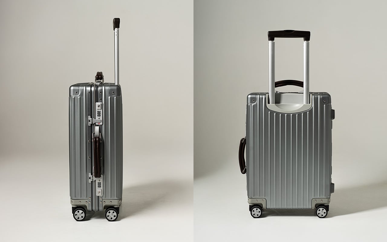
Titanium changes the terms of that deal. AERIONN Forma treats aluminum the way iPhone Pro treats the regular iPhone: same category, different league. Apple moves the Pro models to titanium because it signals intent and performance in one move. Forma does the same. It uses certified Grade 1 titanium for the shell, formed as a single continuous body, so the case flexes under impact and returns to shape instead of locking in dents. It is the “Pro” material choice for people who live in airports and prefer their luggage to age, not degrade.
There’s a specific moment frequent travelers recognize. You’ve got lounge access, priority boarding, a seat that actually reclines, and you’re pulling luggage designed to be replaced in a few years. First class isn’t just a ticket, it’s a standard. AERIONN Forma was designed for travelers who understand that distinction. The Milanese design shows restraint where most luggage shows decoration. Clean architectural lines, a matte brushed titanium surface that resists fingerprints and develops subtle patina over time. The kind of wear that looks earned rather than abused. Leather-wrapped handles add warmth without competing for attention. This case looks like it belongs in the first-class cabin, carried by someone who travels often enough to know visible damage shouldn’t be part of the premium experience.
Apple uses aluminum for the standard iPhone. The Pro models get titanium. Same exact decision tree applies here. Titanium signals intent. It’s a more precious material than aluminum, harder to source, more expensive to work with, and significantly more durable under real-world stress. Grade 1 commercially pure titanium meets ASTM B265-15 certification standards, with tensile strength in the 290 to 310 MPa range, significantly higher than aluminum alloys used in luxury luggage. The shell has undergone thousands of repeated drop tests, bending tests, ultrasonic inspection, and dimensional verification. The testing isn’t about proving indestructibility, it’s about ensuring resilience under conditions where aluminum would show permanent damage. Titanium flexes to absorb impact, and only shows signs of wear and tear with rough use. Aluminum dents easy… and it stays dented.
The single continuous shell construction eliminates seams and structural weak points. Despite using industrial-grade material, the case weighs 4kg with weight distributed evenly across the entire structure. Lift it into an overhead bin and the weight doesn’t fight you. Roll it through a terminal and it tracks cleanly without pull or wobble. That movement comes from the AIRMOVE dual spinner wheels, engineered for low drag and quiet operation. No rattle, no vibration, just smooth motion that keeps pace instead of slowing you down. The multi-stage telescopic handle extends smoothly and locks firmly, with leather-wrapped touchpoints that feel substantial. Good luggage disappears during travel, requiring no conscious effort to manage.
Security is handled without zippers, which remain the most common failure point in luggage. A precision TSA latch system sits flush with the titanium shell, allowing inspections without damage while removing fabric, teeth, and stress points entirely. It’s invisible when closed, dependable when needed. Metal latches integrated into aerospace-grade titanium don’t have the failure modes that plague zipper-based systems. The TSA-approved combination lock integrates directly into the shell. No exposed mechanisms, no added bulk, no interruption to the clean form. This approach to security makes the case look refined while actually being more secure than conventional designs.
The matte brushed titanium surface does something interesting over time. It develops a natural patina that reflects use without looking damaged. Fingerprints don’t show. Minor contact marks blend into the finish rather than standing out. After years of travel, the surface tells a story without looking beaten up. This separates objects you keep from objects you replace. Titanium naturally resists corrosion, so the shell maintains structural integrity without protective coatings or finishes that eventually wear through. Temperature extremes don’t compromise strength. A precision-fit silicone seal keeps water out, protecting belongings from rain and splashes during transit. The case is designed to be used repeatedly and to look better for it.
The interior uses a dual-compartment layout that keeps packing organized from departure to arrival. Compression straps on one side secure clothing and minimize wrinkles. A full divider panel on the other side contains shoes, toiletries, and essentials. Integrated pockets hold smaller items so you’re not digging through layers to find what you need. The durable nylon lining wipes clean easily and holds shape after repeated use. Nothing flashy, nothing wasted. Dimensions are 55 x 36 x 23 cm, fitting standard airline carry-on requirements while offering 38L capacity. The layout supports efficient packing and easy access, which matters when you’re moving through multiple cities in compressed timeframes.
For EDC enthusiasts and design-focused travelers, durability is status. Knowing your carry-on can handle abuse that would destroy conventional luggage is the quiet flex. Soft-shell Samsonite is lighter, cheaper, and never dents because it’s designed for economy class standards. It won’t be noticed from ten feet away and it won’t give you the VIP feeling that comes with carrying something genuinely exceptional. Titanium luggage exists in a different category entirely. It’s luggage meant to last decades, not seasons. The buy-once philosophy changes the economics. A $1,500 aluminum case that needs replacement after five years costs more over time than a $1,799 titanium case that lasts twenty years. Longevity becomes luxury when the alternative is planned obsolescence.
AERIONN Forma is currently available with Super Early Bird pricing at $499, Early Bird at $699, and a two-pack bundle at $975. Standard retail pricing is $1,799. Shipping begins July 2026, with fulfillment handled globally. Aluminum carry-ons from established luxury brands typically range from $1,200 to $1,700 depending on size and features. Titanium luggage rarely appears in this segment, and when it does, pricing usually exceeds $2,000. Early pricing positions aerospace-grade materials as accessible for travelers who recognize that upfront cost matters less than total cost of ownership. This case represents a shift in how premium luggage gets engineered and priced.
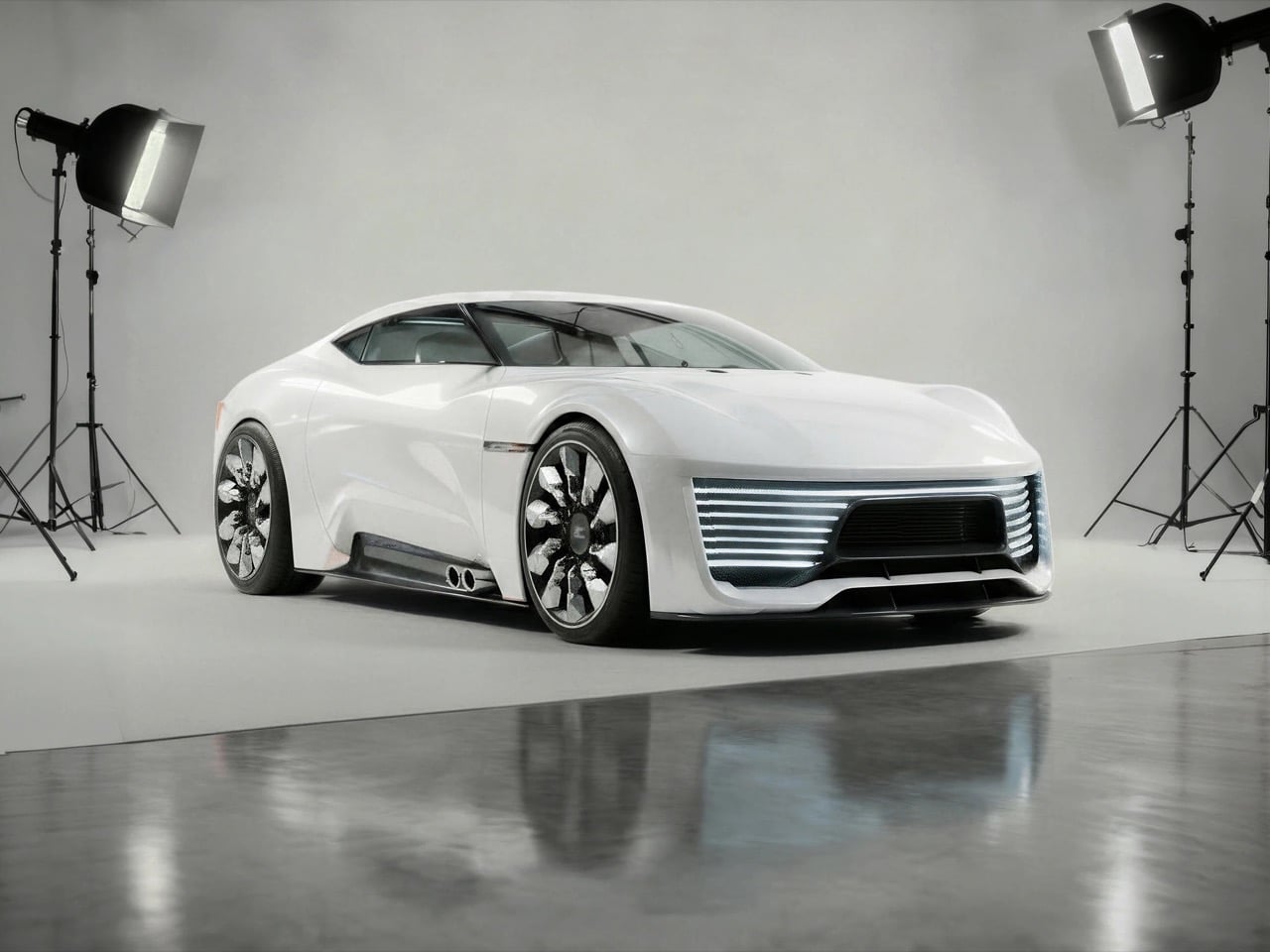
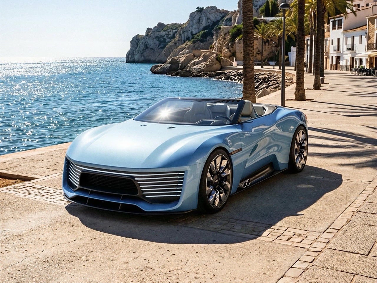
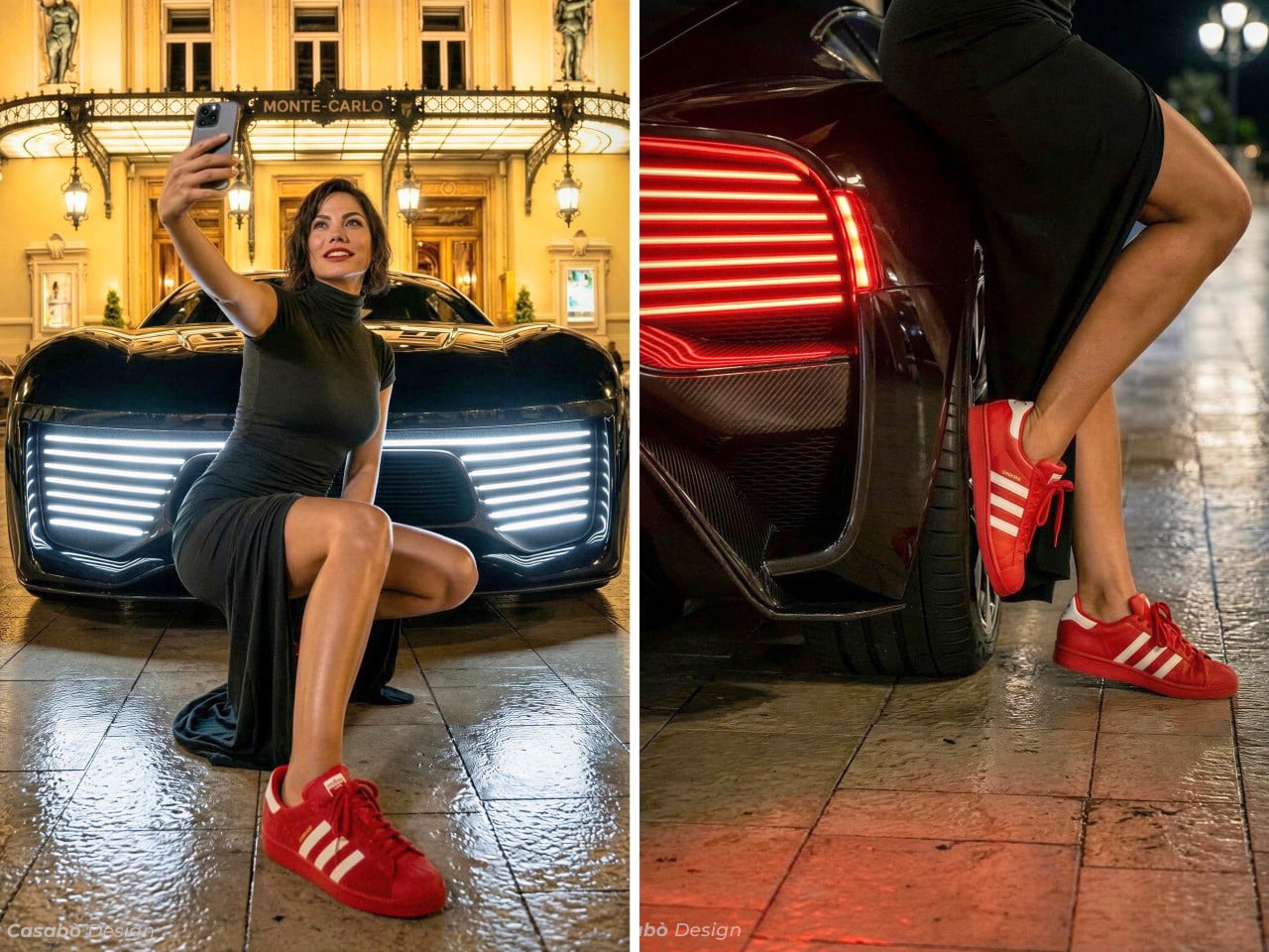
Modern luxury automotive design has developed a visual shorthand. Horizontal LED treatments. Fastback silhouettes. Minimalist interiors dominated by screens and ambient lighting. The AC Luxury GT by Alex Casabo takes this established vocabulary and speaks it fluently, proving that working within constraints doesn’t mean sacrificing identity.
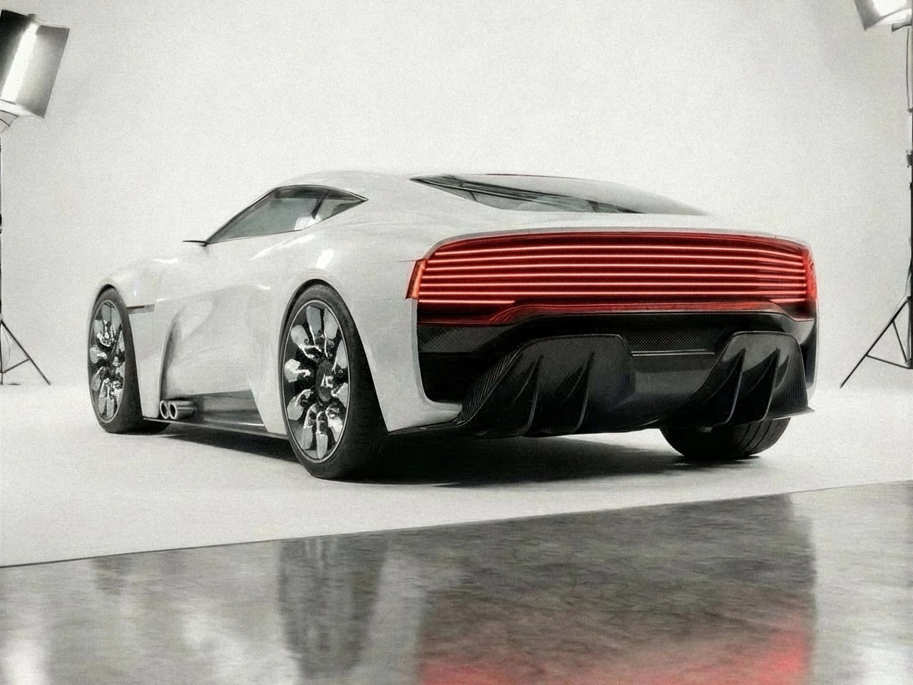
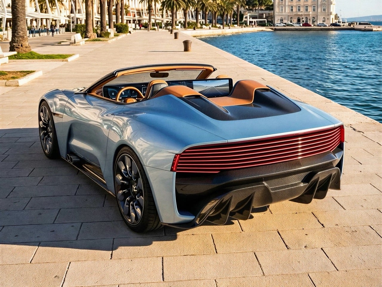
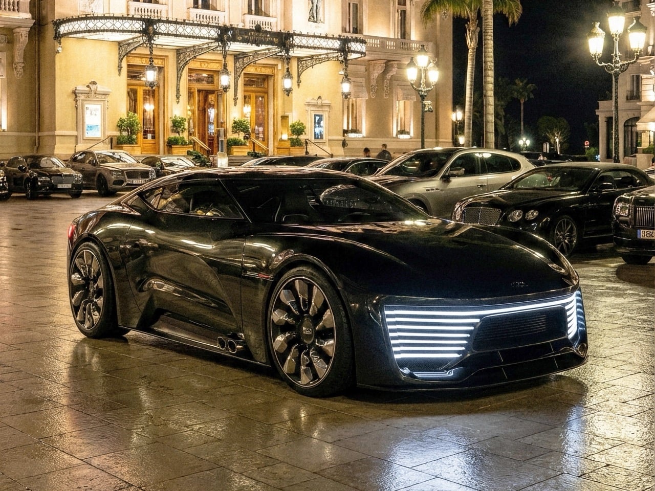
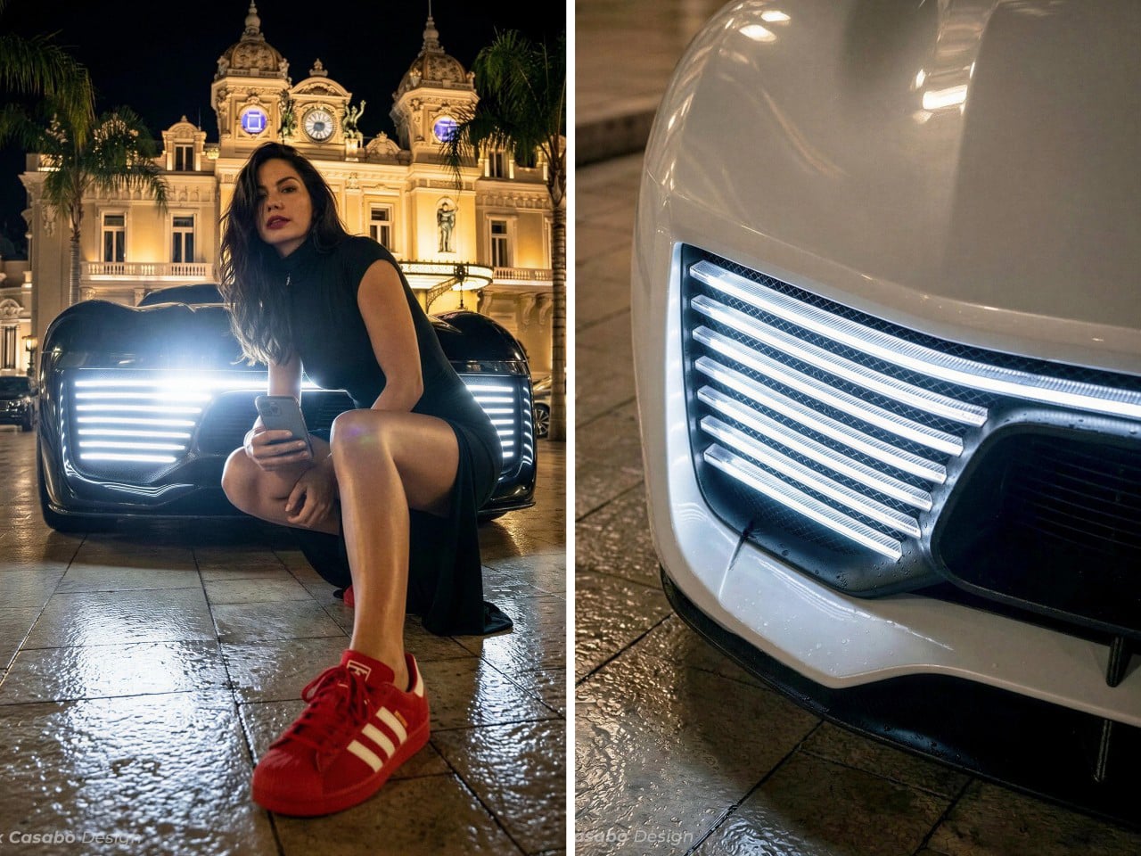
The car presents a masterclass in thematic consistency. Those layered horizontal light bars don’t just appear on the front fascia and disappear. They inform the wheel design, echo in the rear lighting, and establish a rhythmic visual language that unifies the entire form. It’s the kind of disciplined approach that separates thoughtful design from hasty pastiche. Rendered in both sterile studio environments and glamorous European backdrops, the AC Luxury GT maintains its composure. Some concepts need drama to convince you. This one relies on refinement.
Designer: Alex Casabo
The front end borrows heavily from Lincoln’s recent concept work, particularly that Star concept’s grille treatment where horizontal lines create sculptural depth. But where Lincoln went full theatrical with their execution, Casabo dials it back just enough to feel plausible for 2027 production. The striated LED treatment works because it’s geometric without being fussy, creating genuine visual interest through light and shadow play rather than relying on complex surface modeling. Stand this next to a Hyundai Ioniq 5 and you’ll spot the parametric pixel influence immediately, but the AC Luxury GT translates that Korean confidence into something that reads distinctly more Western luxury.
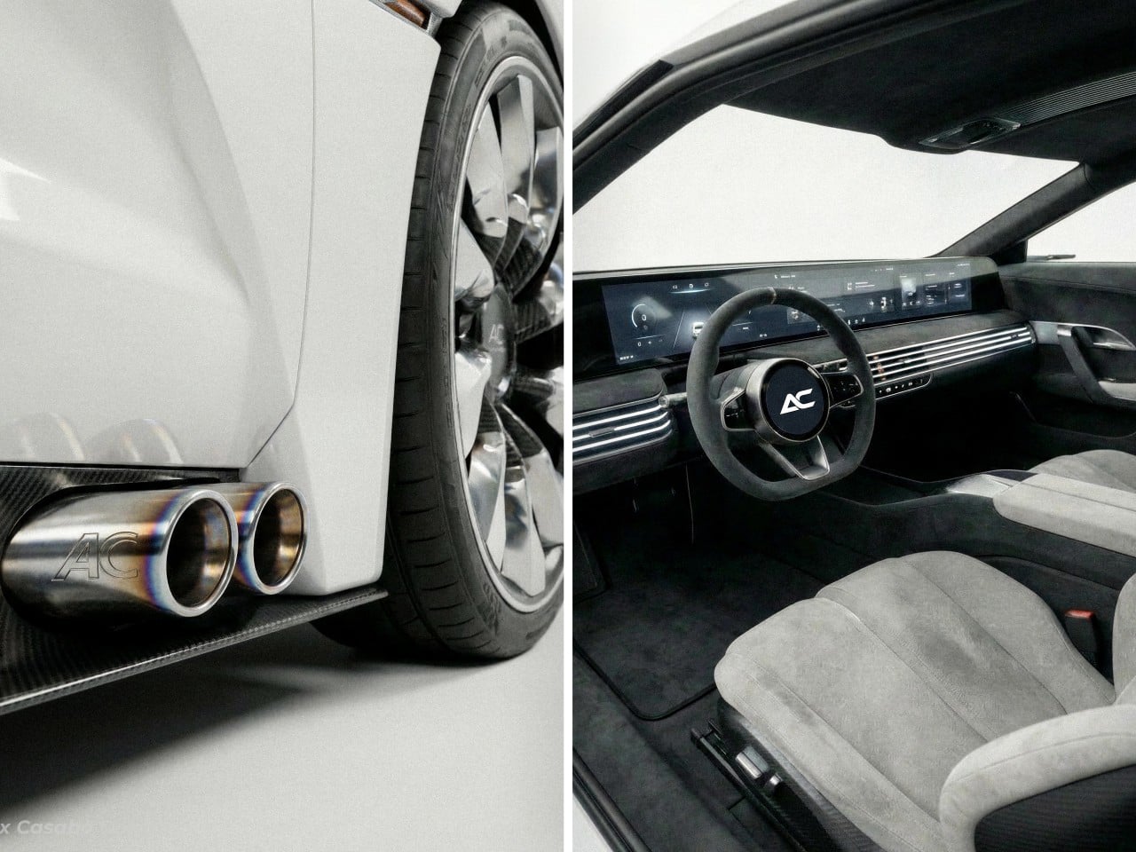
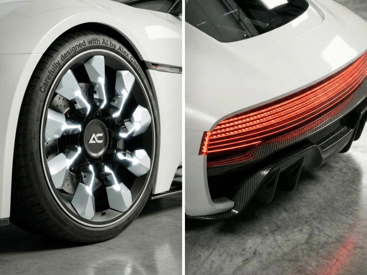
The wheels, however, are pure concept car audacity. Illuminated elements integrated into the spokes, geometric cutouts that would make any aerodynamicist nervous, and proportions that suggest this thing rolls on 22s minimum. They’re completely impractical for production and utterly perfect for their intended purpose. The “AC” logo on the steering wheel appears on the wheel centers too, maintaining brand consistency in a way that feels intentional rather than slapped on. You can almost hear the tire noise those open spoke designs would generate at highway speeds, but that’s tomorrow’s problem.
The fastback roofline creates a silhouette that splits the difference between grand tourer and luxury sedan. There’s cab-forward proportions here that suggest electric skateboard platform packaging, which makes sense given the visual language Casabo is working within. The rear haunches have just enough muscle to suggest performance credentials without veering into Dodge Challenger testosterone territory. Surface transitions are smooth, almost organic, letting the form speak through curvature rather than aggressive character lines. It’s a very 2020s approach to surfacing, this idea that restraint signals confidence.
That rear lighting treatment deserves its own discussion. Full-width taillight bars have become the luxury car equivalent of a required signature, but the horizontal striations here give it actual depth and texture. The way light filters through those layers creates genuine visual complexity, transforming what could have been a generic LED strip into something with presence. Below it, that carbon fiber diffuser and quad exhaust setup (probably fake on an EV, but we’ll suspend disbelief) provides the performance visual cues that the rest of the design deliberately avoids. It’s the mullet principle applied to automotive design: serene luxury up top, track-ready aggression below.
The interior (or whatever we can see of it) follows the playbook established by Lucid and Mercedes with their EQ lineup. Horizontal dashboard architecture, integrated screen real estate that flows into the IP rather than bolting on as an afterthought, light materials that suggest Scandinavian serenity over German precision. The steering wheel is refreshingly simple, avoiding the temptation to festoon it with capacitive buttons and haptic zones. Sometimes a wheel should just be a wheel. What’s interesting is how the exterior’s horizontal theme continues inside through that dashboard treatment, maintaining design language consistency in a way that many concepts forget about entirely.
Casabo created this as an exploration of AI tools in the design workflow, using Midjourney, Vizcom, and Photoshop to iterate rapidly on forms and contexts. It shows. The quality of these renders, the variety of lighting conditions and environments, the speed at which a designer can now visualize ideas across multiple scenarios, that’s the real story here. The AC Luxury GT works as a design exercise precisely because the tools allowed for the kind of rapid refinement that traditionally required weeks of studio time.