The footwear industry runs on glue. Something like 30 billion pairs of shoes get manufactured globally each year, and nearly all of them rely on industrial adhesives to bond uppers to soles. Those adhesives contain solvents that create toxic fumes in factories, complicate recycling at end of life, and introduce a whole class of chemicals that workers and the environment would be better off without. It’s a manufacturing reality so fundamental that most people never think about it, which makes it a perfect target for redesign if you can figure out the engineering.
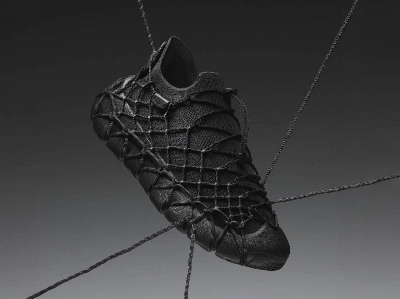
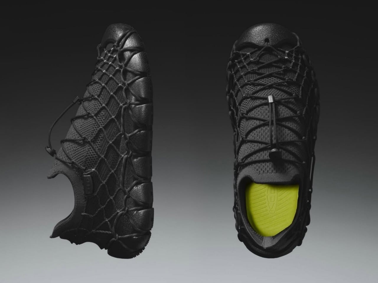
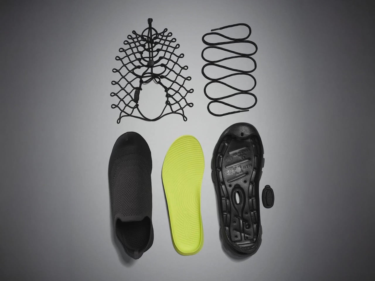
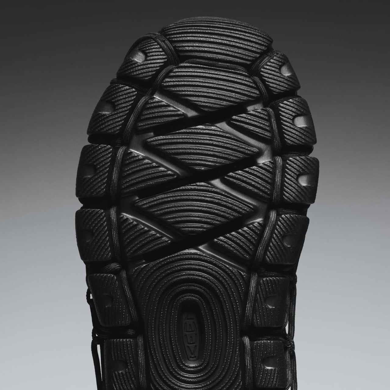
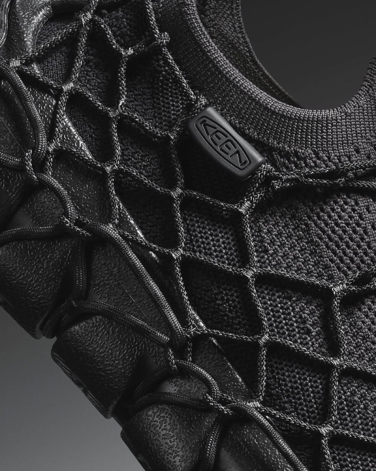
Keen just launched the Uneek 360, and the Portland-based brand is calling it their first solvent-free shoe. The design breaks down into four separate pieces: a knit upper made from recycled plastic bottles, an external cord cage that wraps around the structure, a drop-in footbed, and a hybrid rubber-foam outsole. Nothing is glued. The cords loop through the sole unit and lock with a toggle, creating a mechanical connection where adhesive would normally live. It’s a modular build that extends Keen’s decade-long Detox the Planet initiative from chemistry into construction itself, and it arrives with a $190 price tag and enough design confidence to make you wonder why this approach took so long to reach production.
Designer: Keen Footwear
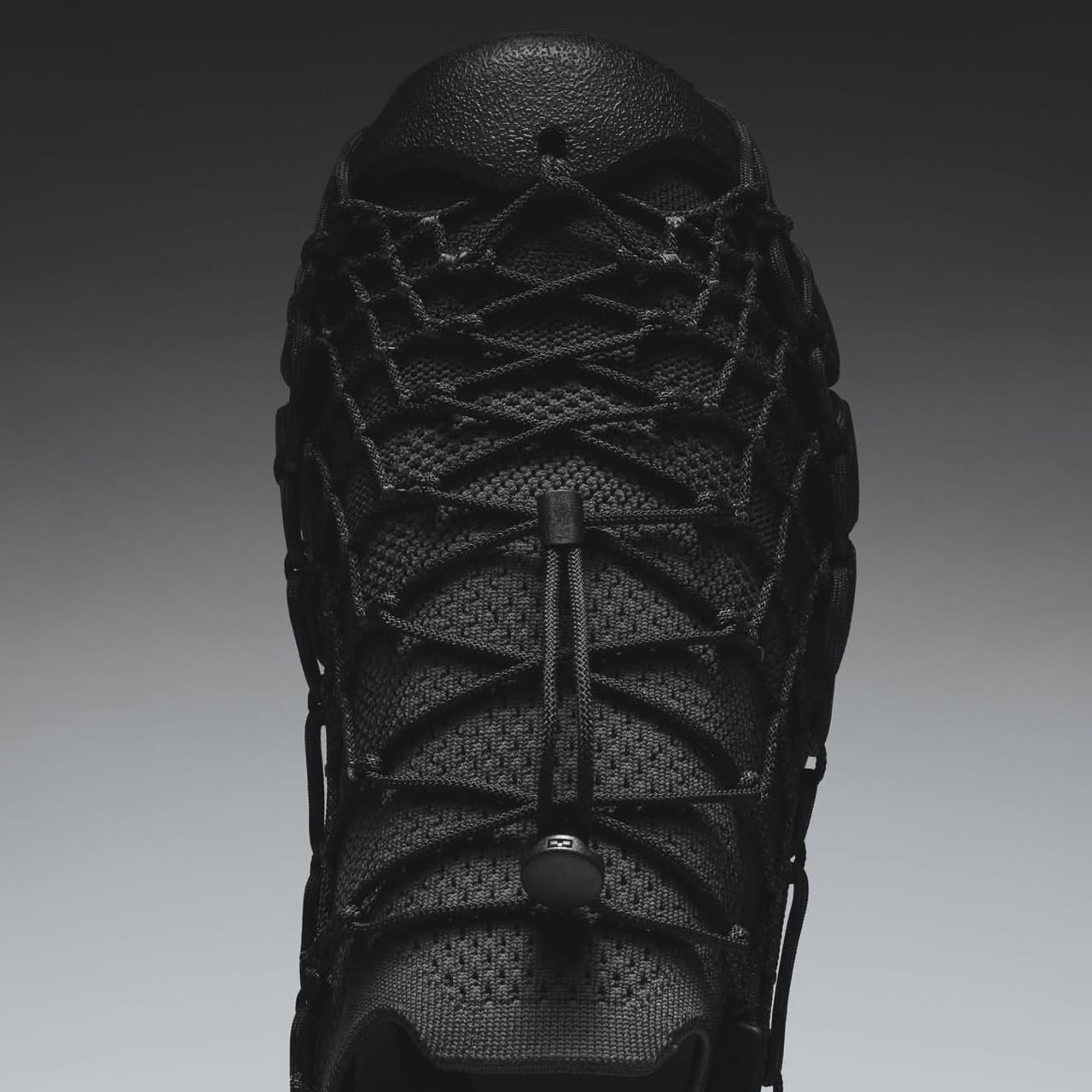
The cord cage is downright clever. Keen has been refining cord-based construction since the original Uneek sandal launched back in 2014, a polarizing design that used two interwoven cords as the entire upper. That silhouette took three years to develop and became a cult favorite despite looking like something between a huarache and a fishing net. The 360 repurposes that cord expertise into structural engineering rather than aesthetics. The articulated cording moves on multiple axes, which means it adapts to foot shape dynamically while maintaining enough tension to hold the four components together under walking loads. Pull the locking toggle and the whole assembly comes apart in seconds, with each material cleanly separated for recycling.
This fits into Keen’s broader chemistry work, which has been unusually transparent for a footwear brand. Since starting their Detox the Planet program in 2014, they’ve invested over 11,000 hours and $1.2 million eliminating toxic chemical classes from their supply chain. They went fully PFAS-free in 2018, removing those forever chemicals from over 100 different shoe components, then open-sourced the process so competitors could follow the same path. Five of six targeted chemical classes are gone. Solvents, the ones embedded in adhesives, are the final holdout. The Uneek 360 represents a different approach to that problem: instead of reformulating the glue, eliminate the need for it entirely.
The modular construction creates some really smart end-of-life options. Most shoes become landfill material because you can’t separate bonded composites without industrial shredding, and even then the mixed materials have limited recycling value. A shoe you can disassemble by hand into distinct material streams (knit fabric, rubber, foam, synthetic cord) actually stands a chance of getting processed properly. Whether that happens depends on infrastructure and consumer behavior, but at least the design removes a fundamental barrier.
Keen launched the Uneek 360 in Black/Magnet and Vapor/Star White colorways, with men’s and women’s sizing available through their site and select retailers. At $190, it sits at the premium end of the casual sneaker market, which reflects both the recycled materials and the engineering required to make cord-based mechanical locking work at production scale. It’s proof that footwear assembly without solvents is manufacturable, not just a concept sketch, which matters if the industry is serious about moving beyond adhesive dependency.
The furniture industry has been slow to reckon with its reliance on plastic. From injection-molded shells to synthetic fabrics, plastic finds its way into even the most design-forward pieces. Recycling has long been positioned as the answer, but the numbers don’t hold up. Only 19% of plastic produced globally actually gets recycled, and incineration, a practice that releases pollutants into the air, has surged 34% recently.
Matthew Whatley came to this problem not as a materials scientist, but as a furniture designer who’d spent a decade with his hands in the work. After years of carpentry and concrete formwork, he studied product design in Vancouver and Melbourne, and a trip through Southeast Asia, where plastic waste is impossible to ignore, pushed him toward a specific question: what if furniture didn’t need plastic?
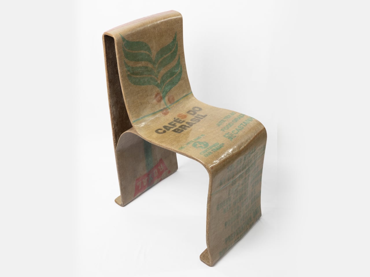
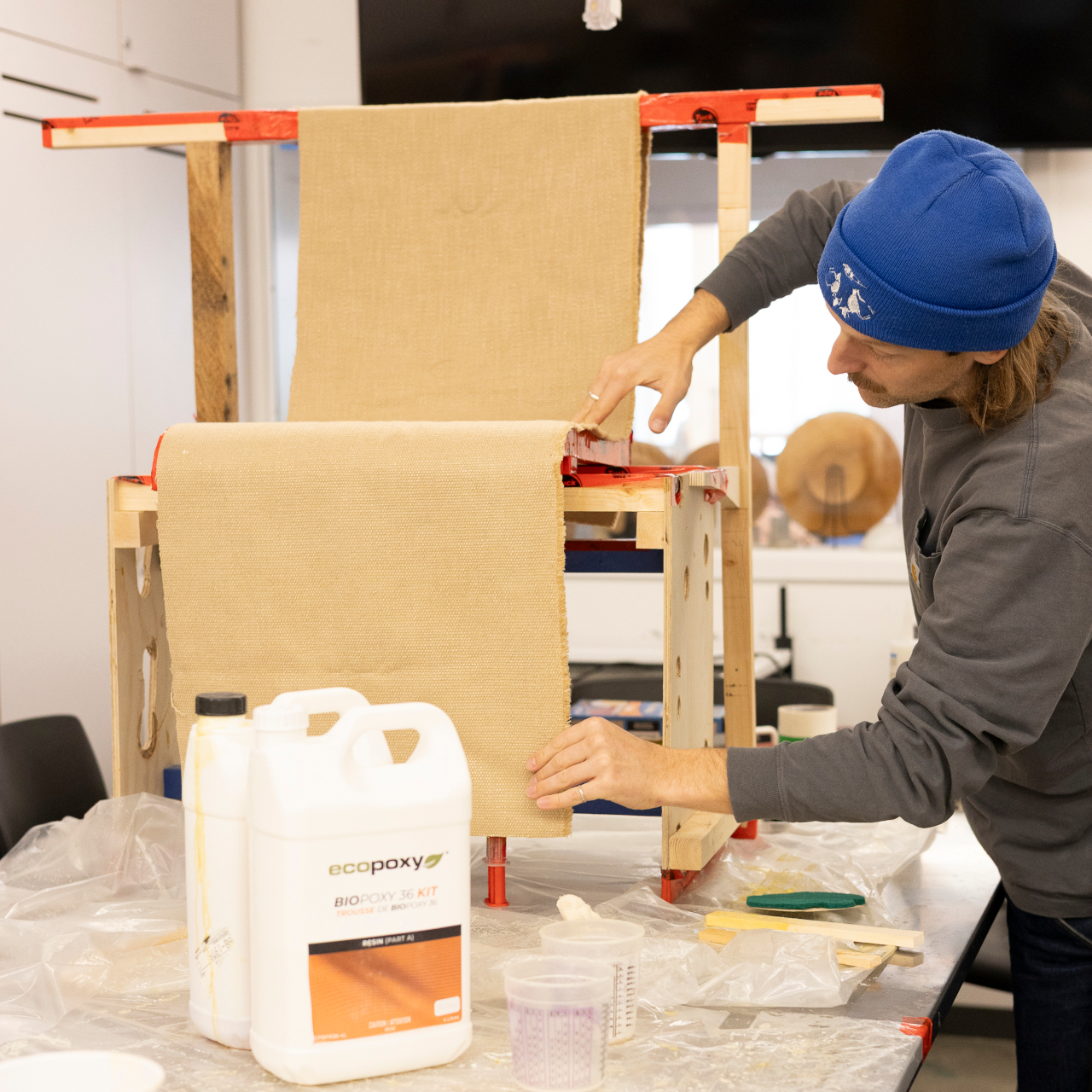
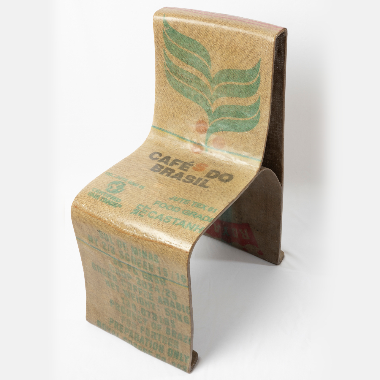
The Novum Chair is his answer, built from a combination of natural woven fiber and bio-based resin. The two materials form a composite: the fiber provides structure and texture, while the resin binds and hardens it into a rigid, load-bearing shell. It’s a relatively simple idea on paper, but getting it to actually hold a person’s weight required significant hands-on material testing.
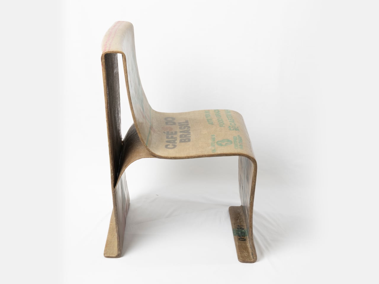
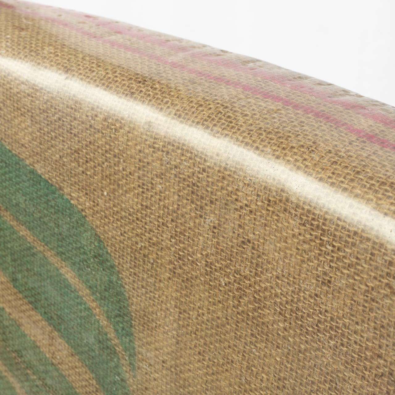
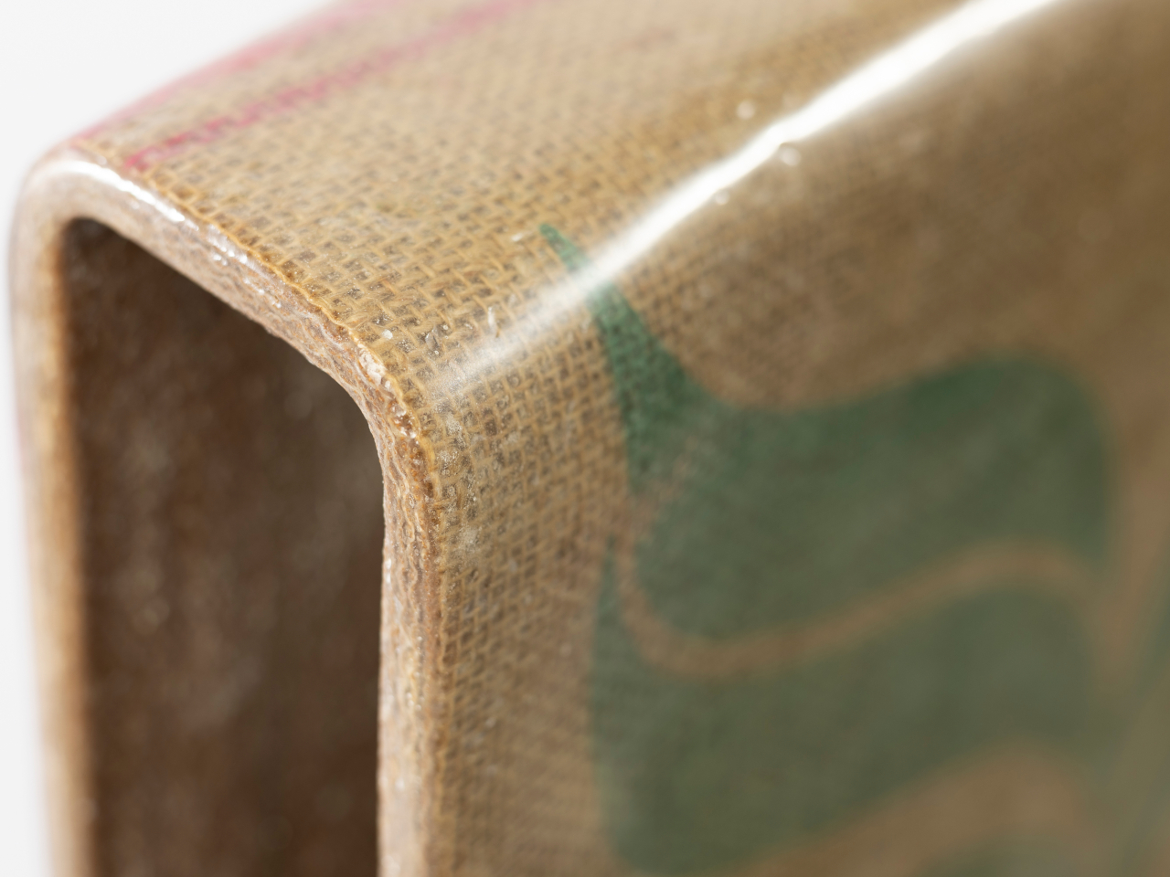
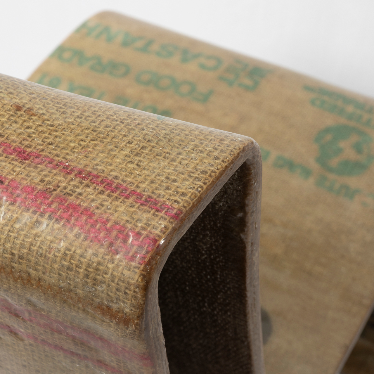
The result is a chair that doesn’t look like it’s making a statement about sustainability; it just looks good. Its form is a single, continuous shell that sweeps from the backrest down through the seat and curls beneath to cradle the sitter. The woven surface is visible through the resin coating, giving it a warm, textile-like quality that reads more like craft than manufacturing.
There’s something refreshing about a chair you could put in a design studio, a cafe, or a considered living space without it demanding attention. The Novum Chair has the kind of understated confidence that lets the material do the talking. The texture and warm amber of the resin-soaked fiber give it a character that shifts with the light, something molded plastic never manages.
Part of what makes this approach worth taking seriously is that it sidesteps one of the more uncomfortable truths about recycled plastics. Re-rendered recycled plastic isn’t the clean solution it’s often portrayed as; it can be roughly 10 times more toxic than the original material. Natural fibers and bio-based resins don’t carry that baggage, which makes this composite a genuinely different starting point.
Whatley is candid about the fact that bio-based resins aren’t perfect yet. They’re relatively expensive, not high enough in bio content, and not yet as accessible as conventional materials. But the Novum Chair isn’t presented as a finished product so much as a proof of concept that structurally sound, beautiful furniture can be built around materials that don’t depend on plastic.
What Whatley has done is take a material problem that feels overwhelming in scale and distill it into something you can sit in. That’s no small thing. The conversation around plastic alternatives tends to stay abstract, caught up in policy and data. A chair that you can actually inhabit, one that looks beautiful, pulls the conversation out of the theoretical and into the everyday.
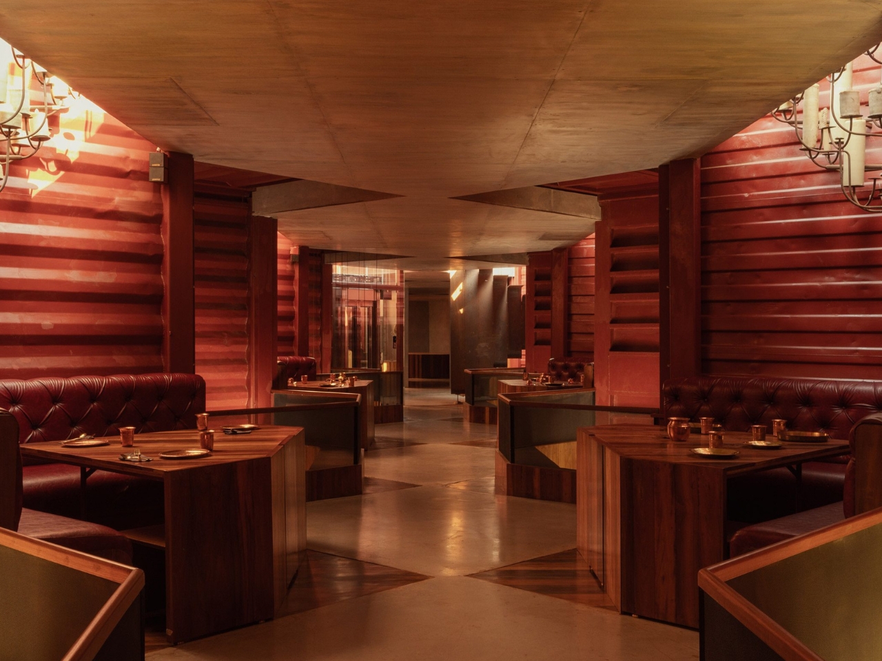
When you hear “shipping container restaurant,” you probably picture a food truck-adjacent setup with exposed steel walls and Edison bulb string lights. Petti, a restaurant in Tuticorin, Tamil Nadu, is nothing like that. Designed by Indian studio Wallmakers, it is one of those rare projects that makes you stop and ask why we haven’t been doing this all along.
Tuticorin is a port city, and like most port cities, it has a very specific kind of visual language. Industrial, gritty, layered with the residue of trade. Discarded shipping containers are a common sight there, stacked along waterfronts and left to rust once their working lives are over. For most people, they’re background noise. For Wallmakers’ founder Vinu Daniel and his co-architect Oshin Mariam Varughese, they were a starting point.
Designer: Wallmakers
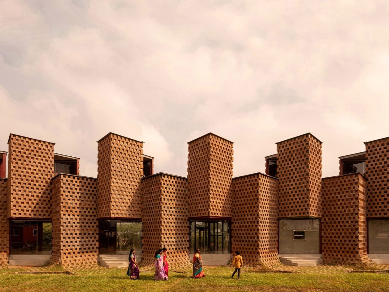
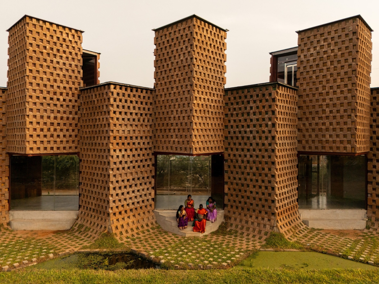
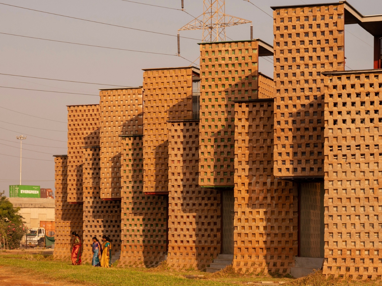
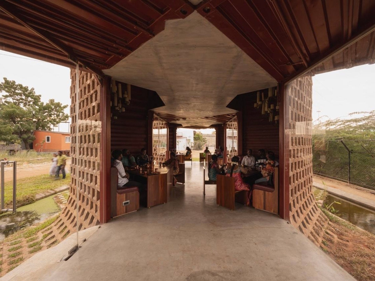
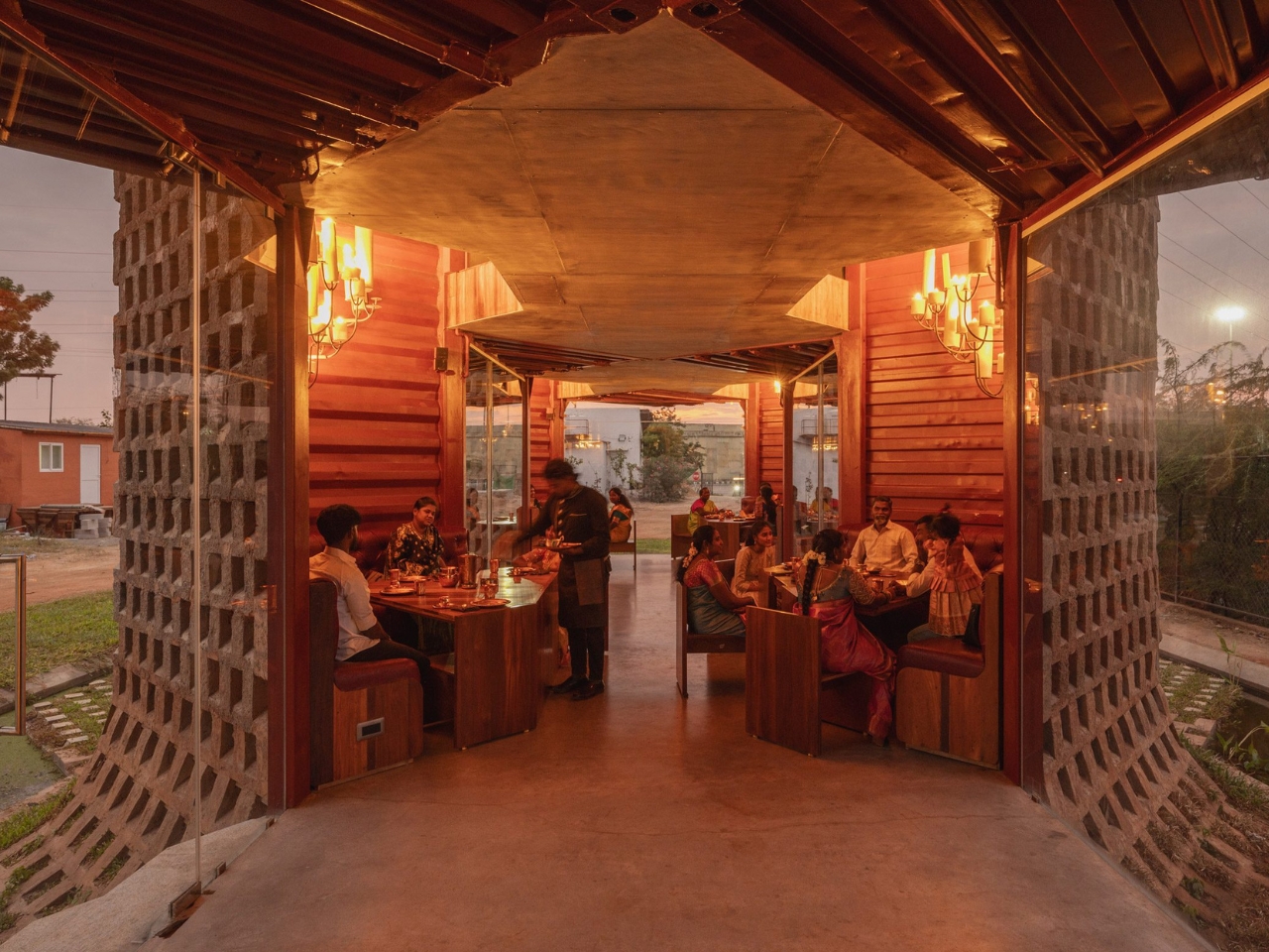
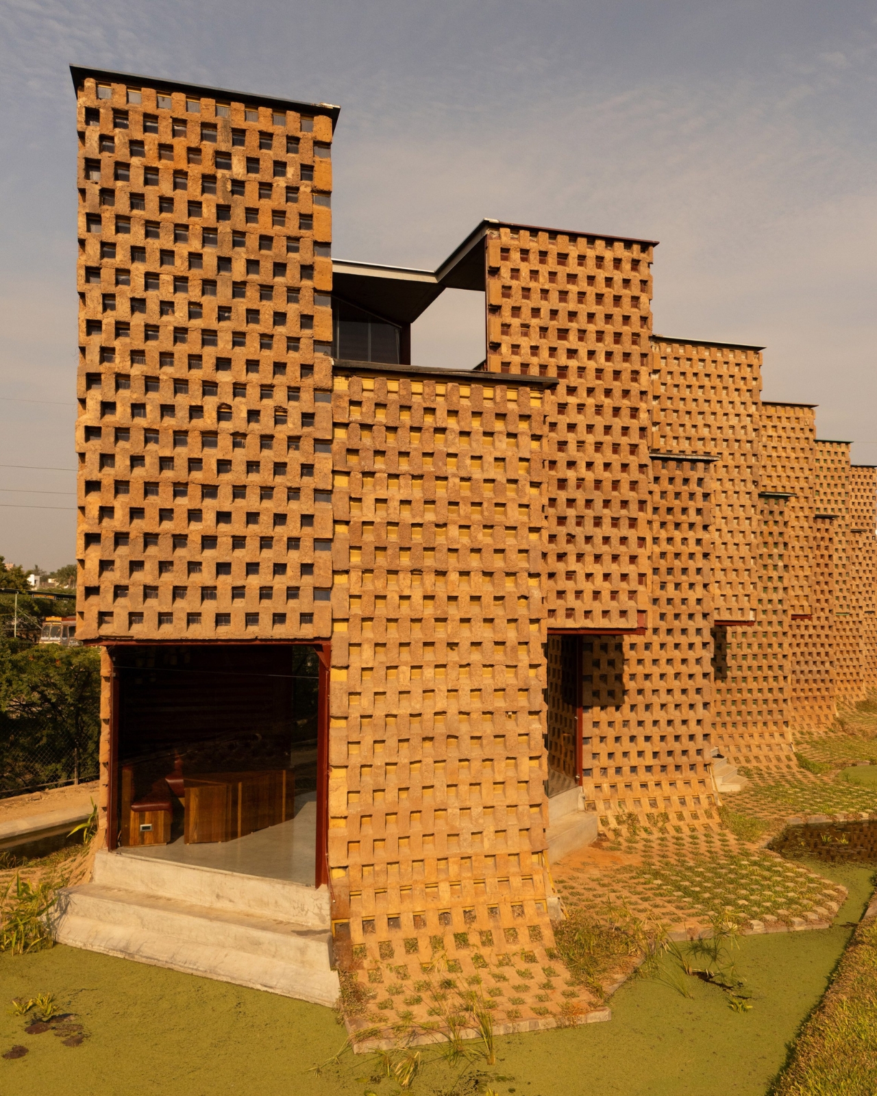
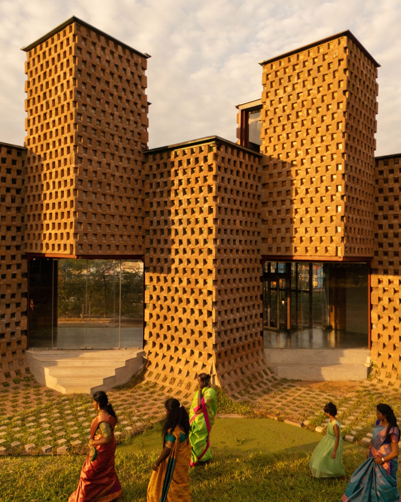
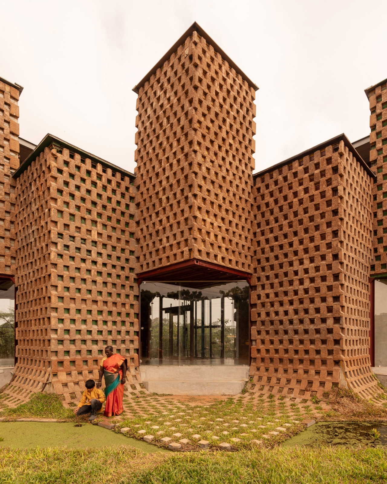
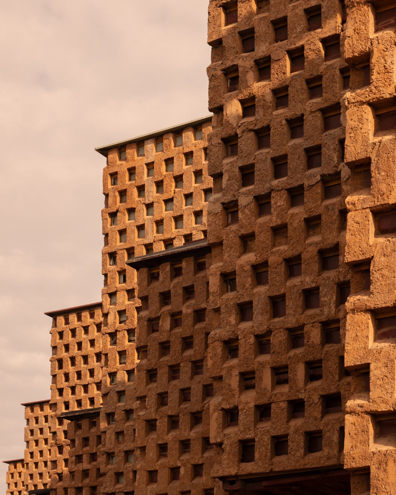
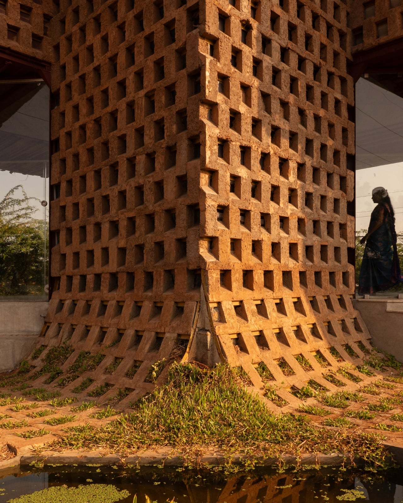
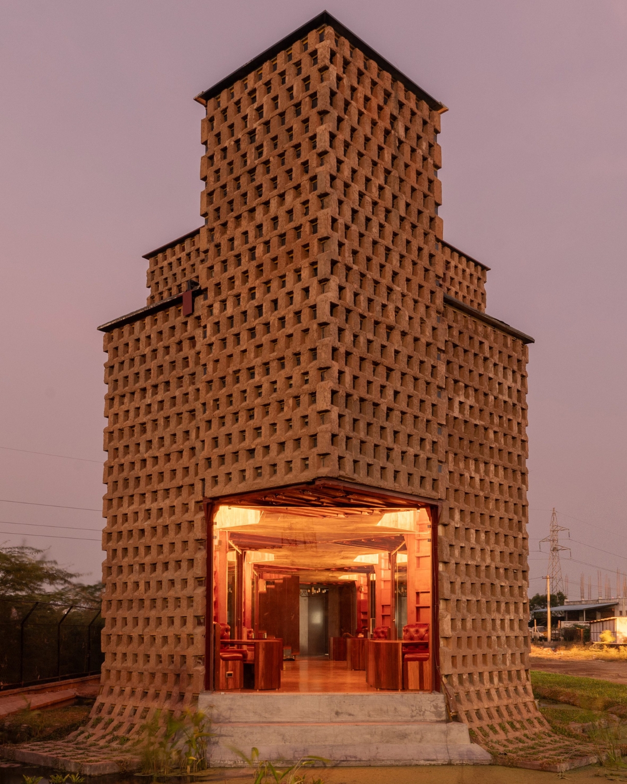
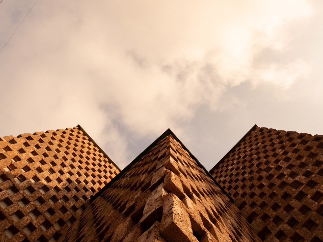
The team took twelve of those containers, cut them in half lengthways, and welded them onto a steel frame. That alone sounds like a fairly standard repurposing story. But here’s where it gets genuinely interesting. Instead of leaving the steel exposed or cladding it in something conventional, they coated the entire exterior in poured earth. Not just a surface treatment for looks, either. The earth layer was designed in an alternating recessed pattern specifically to reduce heat gain and cut the building’s reliance on air conditioning by 38 percent. In tropical Tamil Nadu, where heat is a year-round reality rather than a seasonal inconvenience, that’s a serious design decision with real consequences.
The result is a building that looks like it grew out of the ground. From the outside, Petti reads as a textured, warm-toned structure with a zigzagging profile, the kind of silhouette that makes you stop and puzzle over whether it’s old or new, industrial or handcrafted. The answer is that it’s both, and that tension is exactly the point.
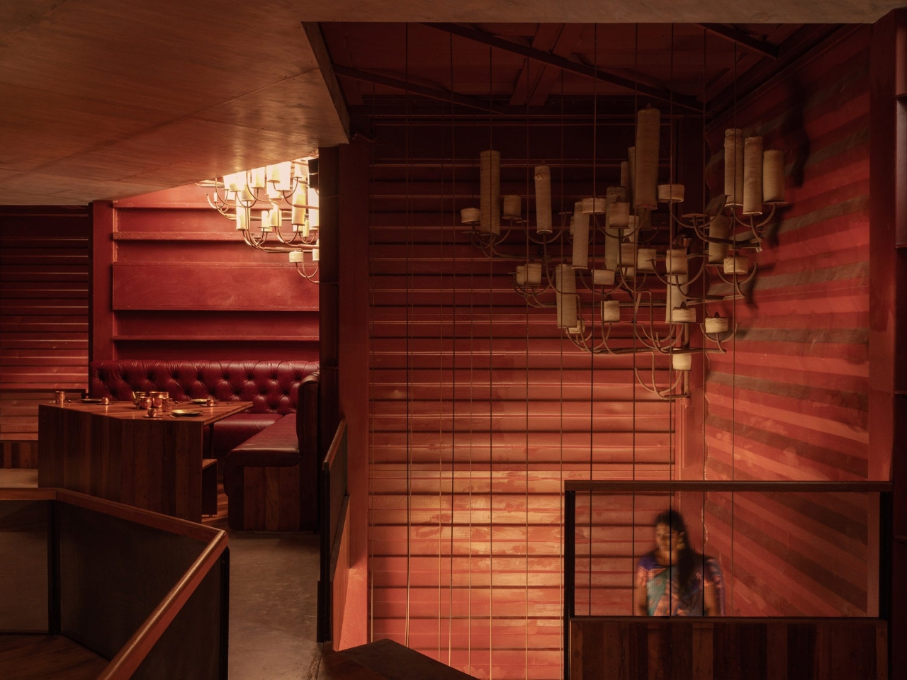
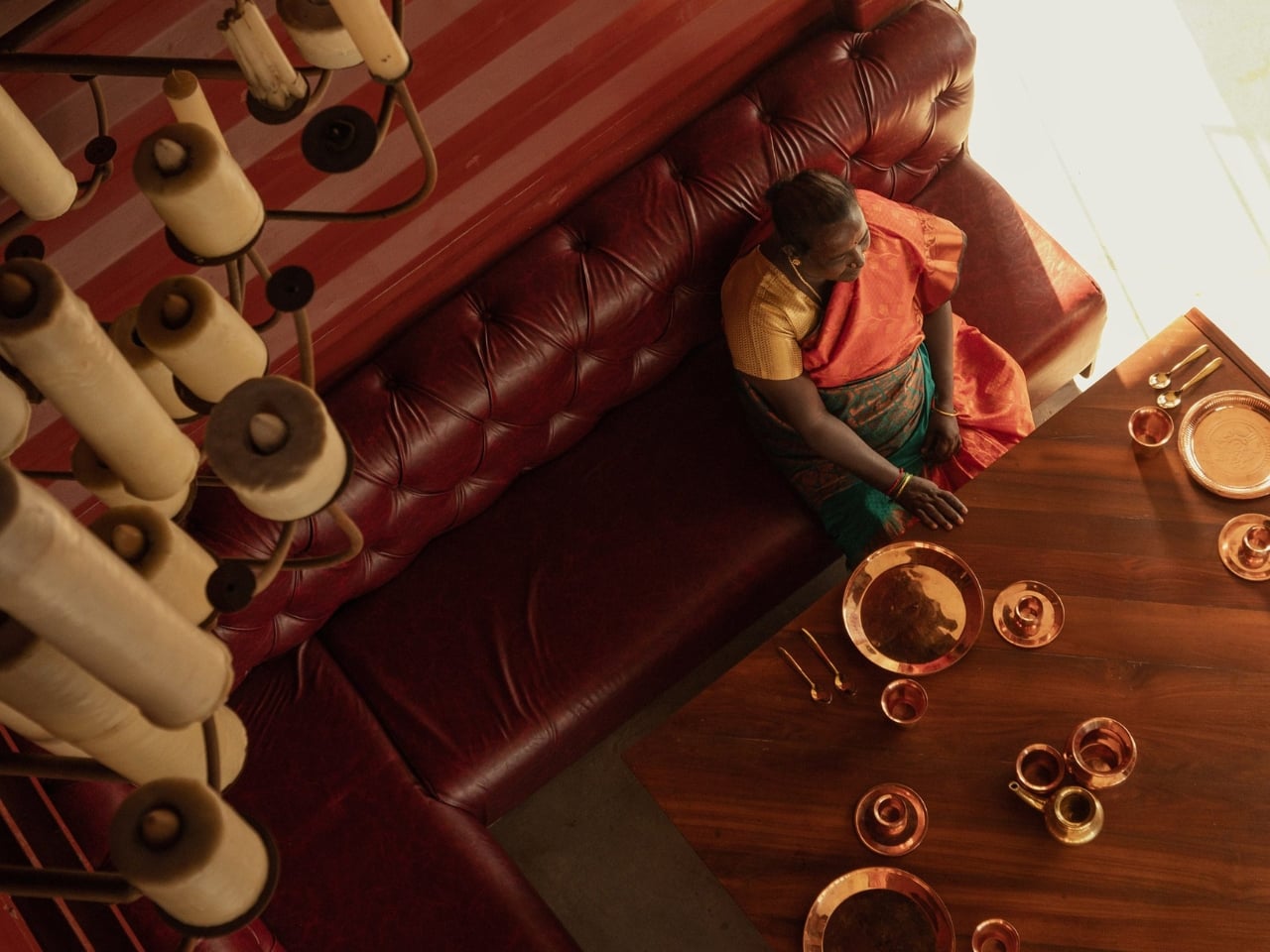
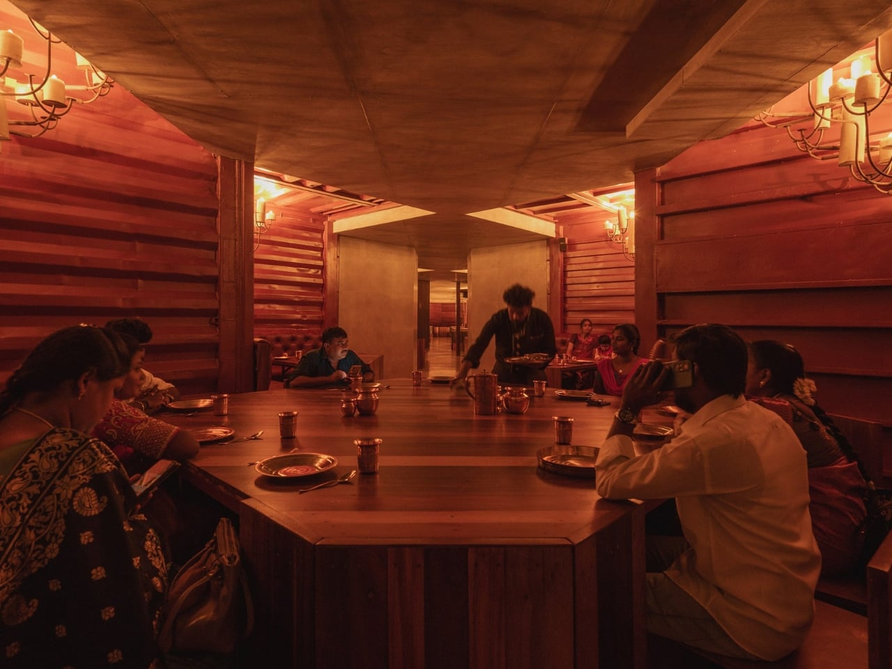
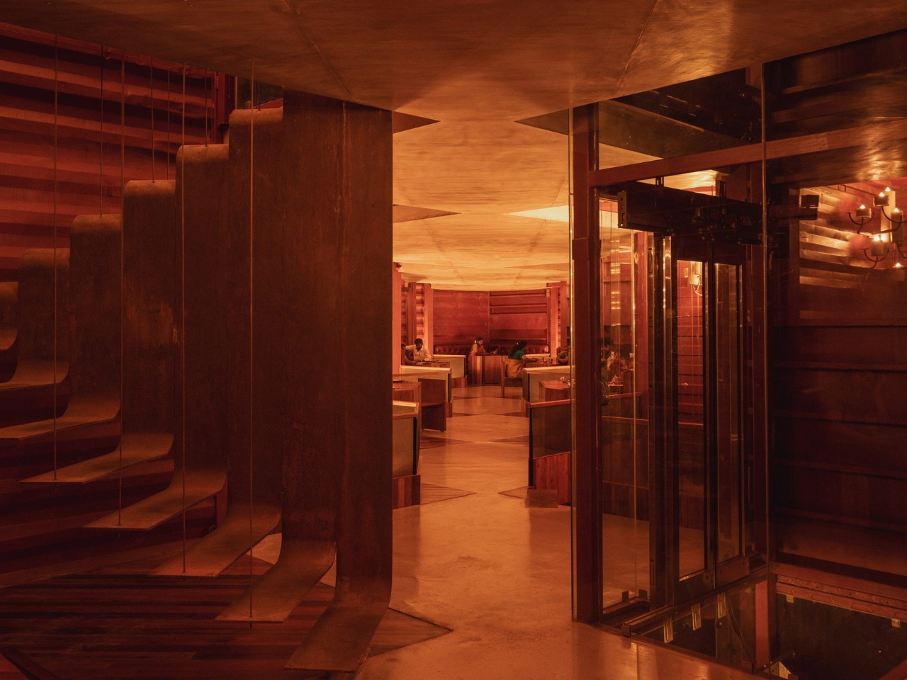
Inside, the layout follows the logic of the containers themselves. Each container half creates a defined niche, so the dining experience becomes surprisingly intimate for a space that seats 200 people. You’re tucked in, not floating in a vast open plan. During the day, natural light filters in through skylights above each seating area. At night, chandeliers made from old wax and pipes take over, filling the space with a glow that’s warm without being precious. The floors are laid with discarded deck wood and oxide. It’s a level of material consistency that tells you the team thought carefully about every surface, not just the ones visible from the street.
Petti doesn’t perform sustainability, and that’s a distinction worth making. A lot of design projects with eco credentials feel like they need you to notice the eco credentials first and the design second. Petti reverses that. The photograph you’re drawn to first is a beautiful one: warm light, earthy texture, layered geometry. The backstory, the fact that you’re looking at marine waste and mud, makes it more compelling, not less beautiful.
There’s a real argument here about how we build in tropical climates. Shipping containers are notoriously poor insulators on their own, which is why so many container architecture projects end up being thermally uncomfortable. Wallmakers addresses this head-on with the poured earth facade, and the 38 percent reduction in cooling load isn’t a marketing figure pulled from thin air. It reflects the kind of climate-specific thinking that a lot of globally distributed architectural trends skip entirely because they were never designed with heat in mind.
Petti also pushes back on a certain aesthetic snobbery in sustainable design, the assumption that salvaged materials and low-carbon building methods produce something that looks compromised or impermanent. This restaurant looks better than most places that cost considerably more to build, and it leaves a much lighter footprint while doing it.
The name itself is worth sitting with. Petti means “box” in Tamil, and the simplicity of that is quietly perfect. A box, rethought, coated in earth, stacked into something you’d travel to see. That’s not a small thing.
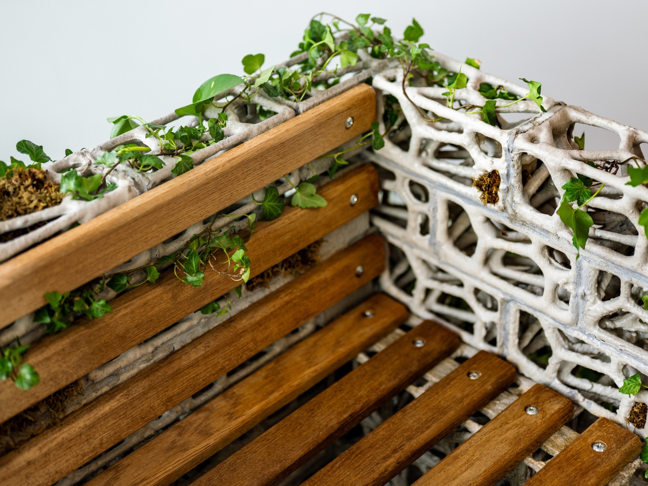
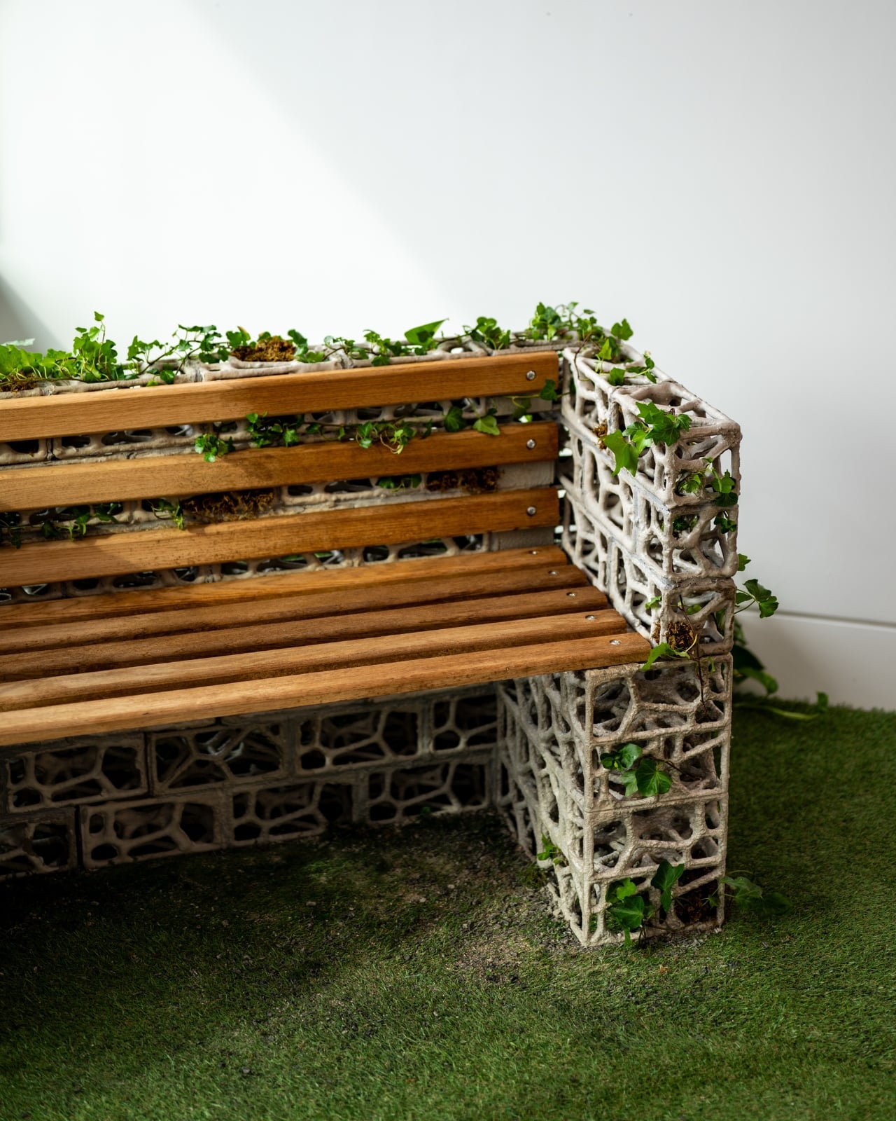
When I first came across the PhytoSymbiosis Seat, it looked like a piece of architecture that had been left in a garden long enough to transform into something else entirely. That’s not an insult. It’s the point. Designed by a student at the Royal College of Art and recently recognized by the NY Product Design Awards, this outdoor bench is one of those rare design concepts that makes you stop and rethink a question you didn’t know you were asking. The question, in this case, is: what if public furniture didn’t just sit in nature, but actually participated in it?
The bench was developed over nine months of community observation in London. The designer spent that time watching how people move through public green spaces and noting the growing disconnection between urban residents and the natural environments around them. To get the material details right, they consulted botanists at Kew Garden and invited residents near Westfield Park to touch and evaluate plant samples firsthand. That kind of patient, place-based research tends to produce something more honest than a concept born entirely at a drafting table, and you can feel it in the outcome.
Designer: Royal College of Art
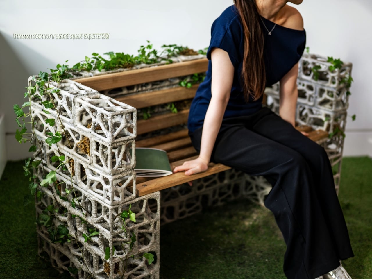
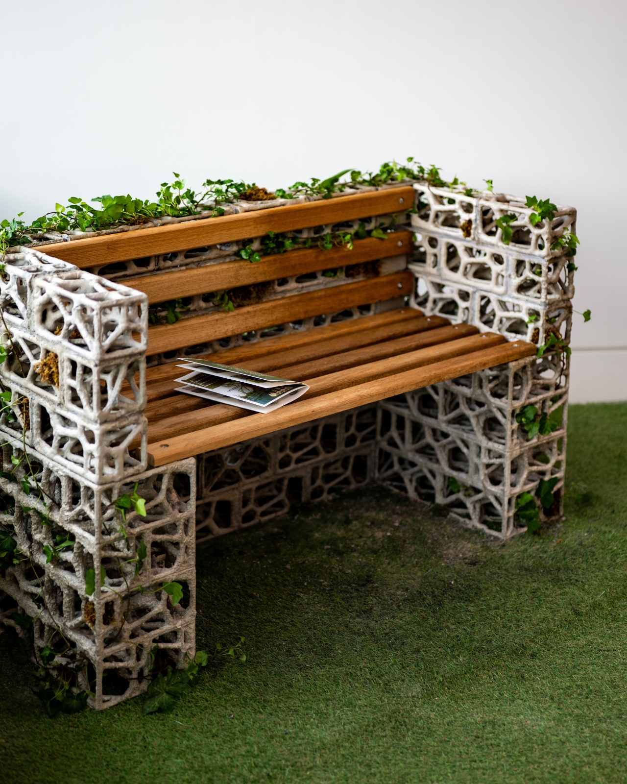
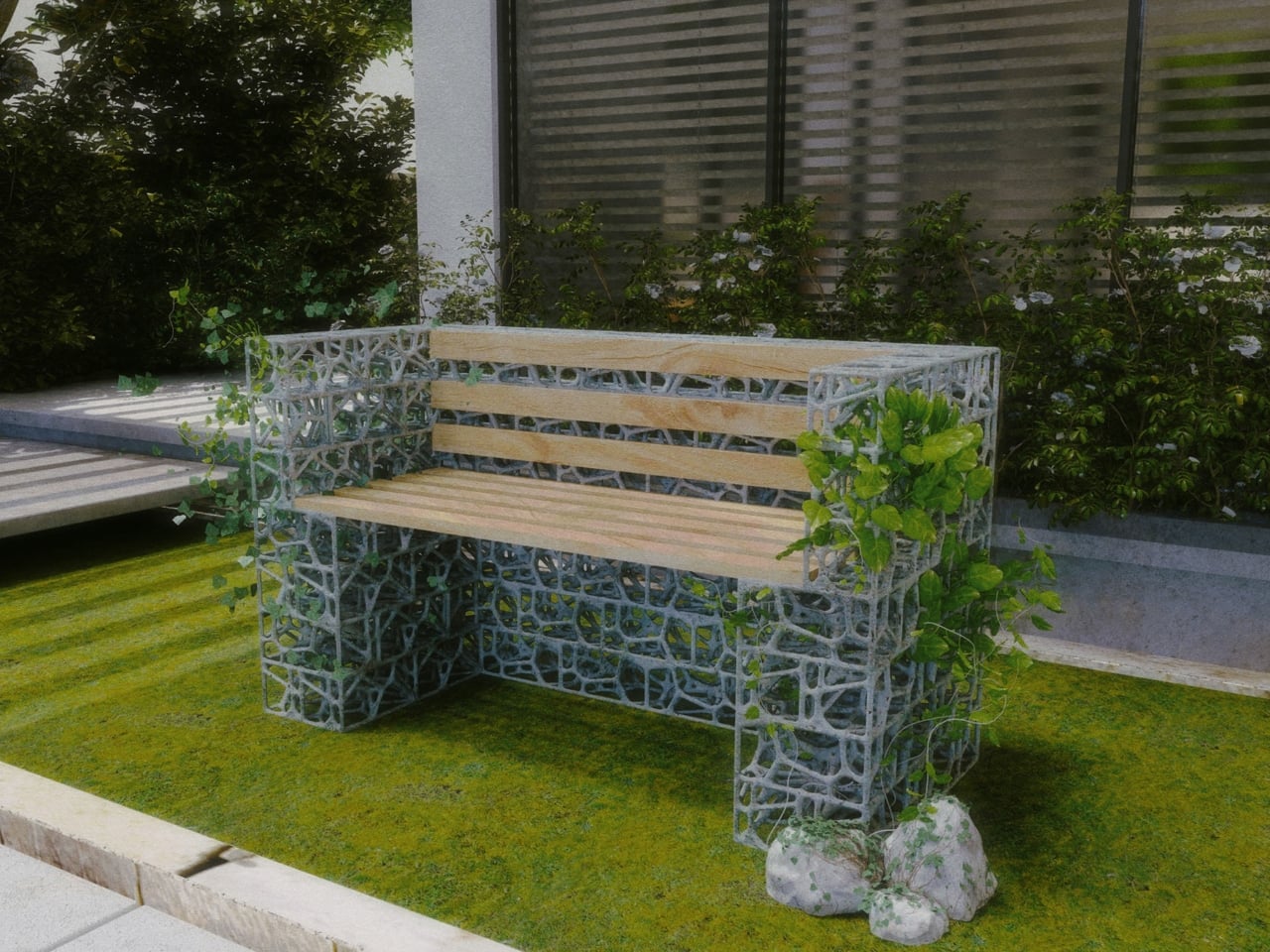
The frame is made from bio-concrete bricks with a porous surface structure. The porosity isn’t decorative. It was specifically engineered through material experiments to give English ivy something to grip. The ivy’s aerial roots, which can reach a density of 30 to 40 roots per 10-centimeter stem section, attach naturally to the rough concrete surface, forming a composite structure that gets stronger over time rather than weaker. That last part is worth sitting with: most public furniture degrades. This bench, in theory, consolidates. The plant’s growth actually reinforces the structure rather than working against it.
The form itself comes from Voronoi geometry, the same spatial patterns that govern how plants distribute resources and compete for space in nature. Those lacy, cellular shapes in the frame are not just aesthetic. They were calculated to accommodate the physical behavior of climbing plants, guiding and supporting ivy as it grows across and through the structure. The parametric modeling was verified with a finite element analysis to ensure the whole thing would hold together structurally. There’s real engineering behind what looks, at first glance, like a beautiful accident of nature.
But the part of this project that keeps pulling me back is the social layer, and I think it’s the most underappreciated dimension of the design. The bench is built to be cared for by the people who use it. Residents are meant to water it, to guide the ivy’s direction of growth, to make small decisions over time that shape what the bench becomes. A water level sensor built into the system even triggers user interaction by signaling when the plant needs attention. This turns an act of sitting into an act of tending, and tending, as anyone who has ever kept a plant alive will tell you, creates a very specific kind of attachment.
The pilot results support this. Volunteer participation in surrounding neighborhoods increased by 40 percent. Carbon emissions were reduced by 62 percent compared to traditional furniture. The plant palette is 100 percent native species, supporting local biodiversity without the risk of invasive growth. Neighbors reportedly gather around the bench, exchanging knowledge about plant care and falling into conversations they might not have had otherwise. These aren’t incidental benefits. They were built into the project’s goals from the start, aligned with the UN’s Sustainable Development Goals and measurable enough to take seriously.
What gets me is how quietly radical this is. Public benches are usually passive objects. We sit on them, we ignore them, we move on. The PhytoSymbiosis Seat makes the bench a responsibility, a neighborhood project, a small stake in the life of a shared space. It asks something of the people who encounter it, and in asking, it gives something back: a reason to notice, to return, and to care. That, more than any material innovation, might be its most lasting design achievement.
The smart home speaker market has settled into a familiar aesthetic. Smooth cylinders, matte finishes, and understated designs meant to disappear into a room are the default for most voice assistants. It’s a reasonable approach, but it also means most of them look exactly the same, and the hardware driving them tends to get replaced every couple of years, whether it actually needs to be or not.
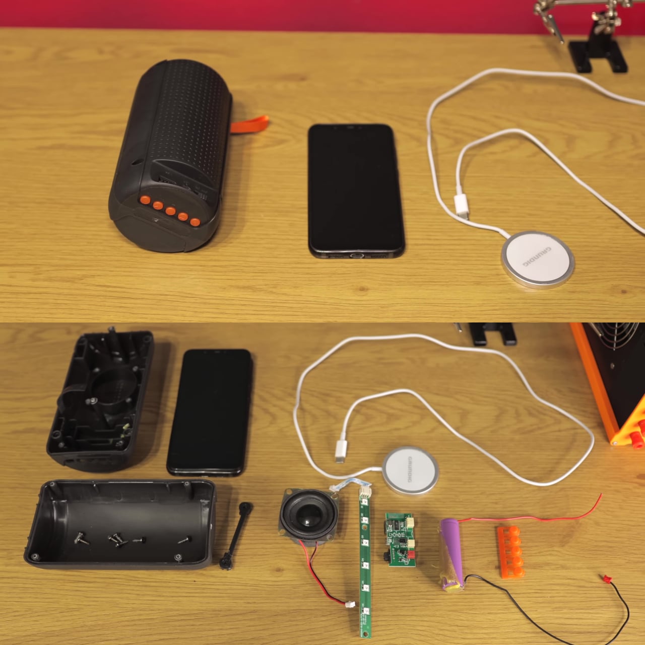
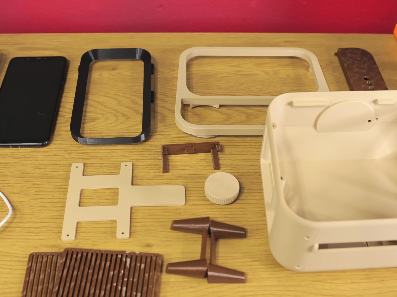
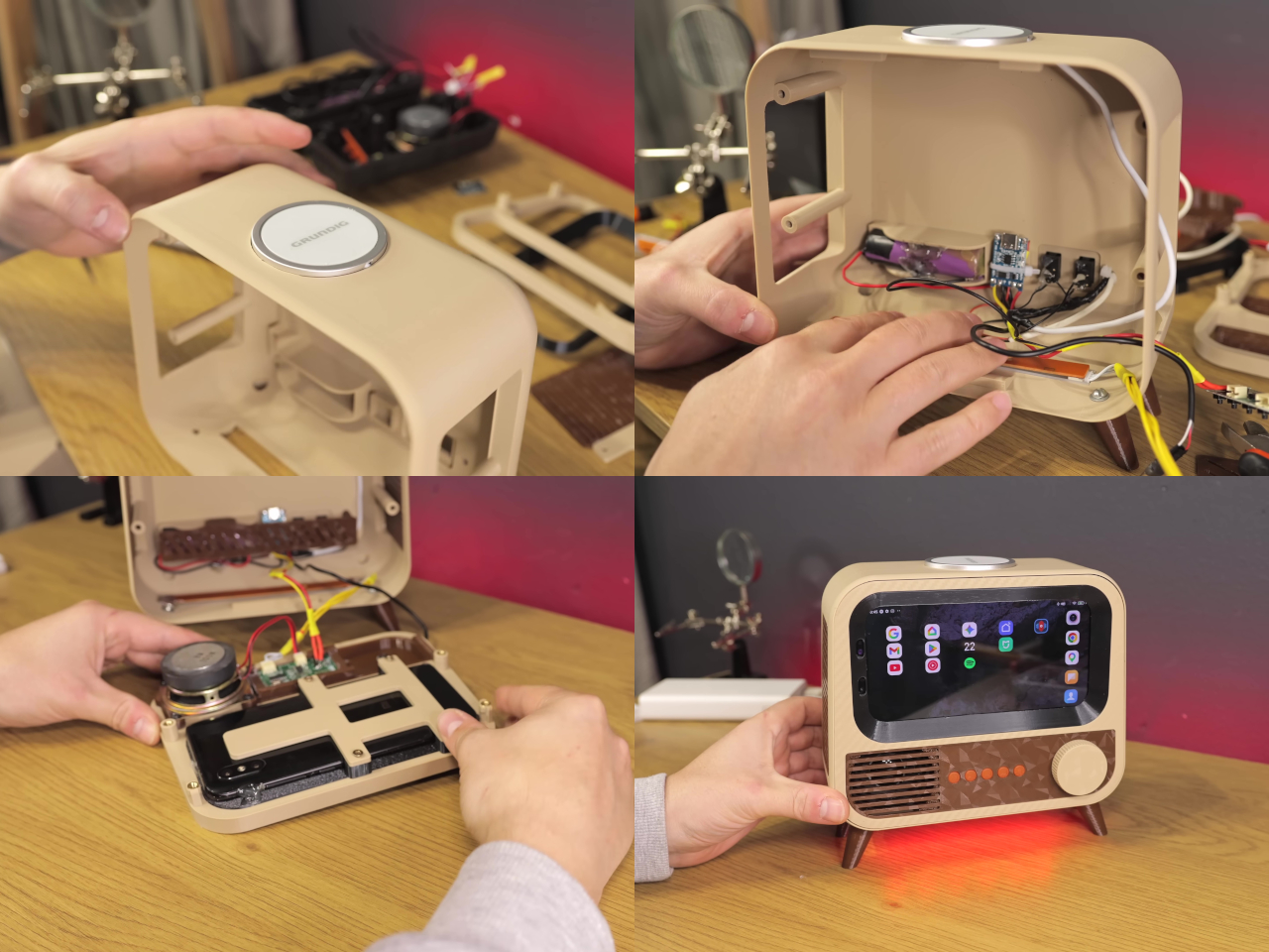
HANDMAX Workshop took a different approach entirely. Rather than buying new hardware, the build starts with a Xiaomi Mi 8 already well past its prime, complete with a burned-in display, degraded speakers, and a failing battery. The processor and software capabilities were still perfectly usable, though, and that turned out to be all this kind of project actually needs.
Designer: HANDMAX Workshop
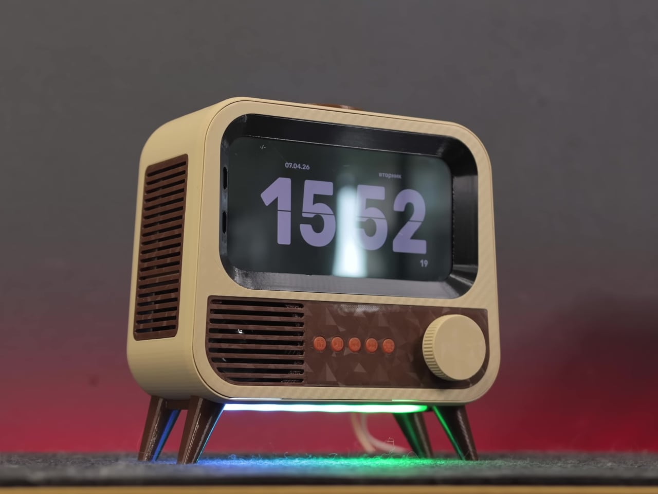
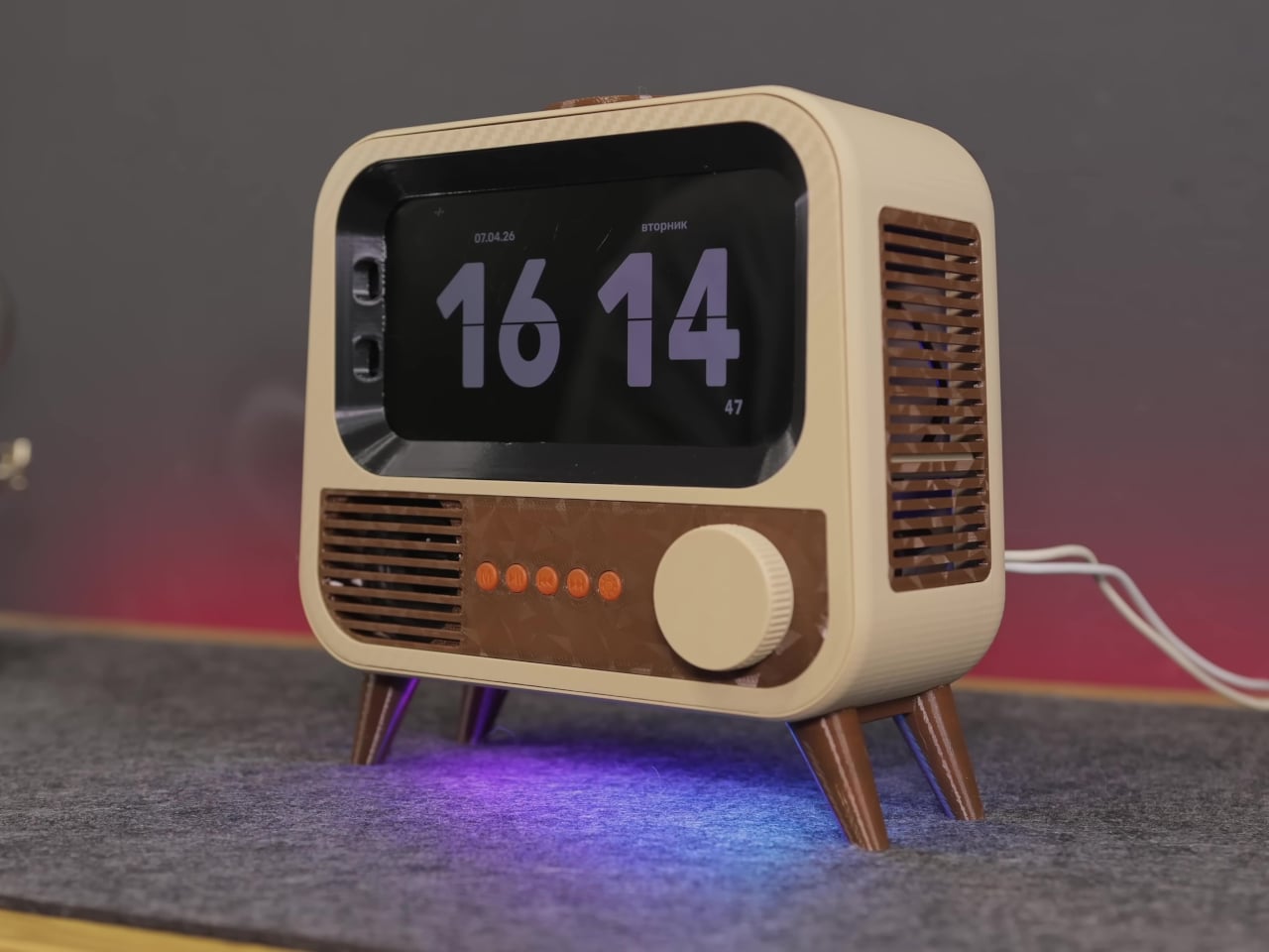
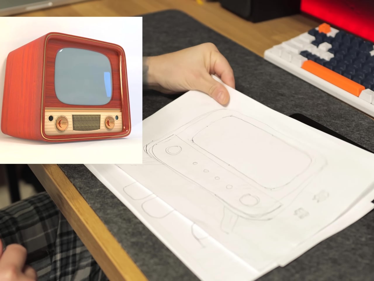
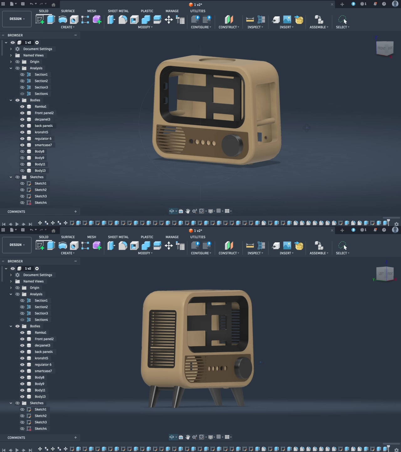
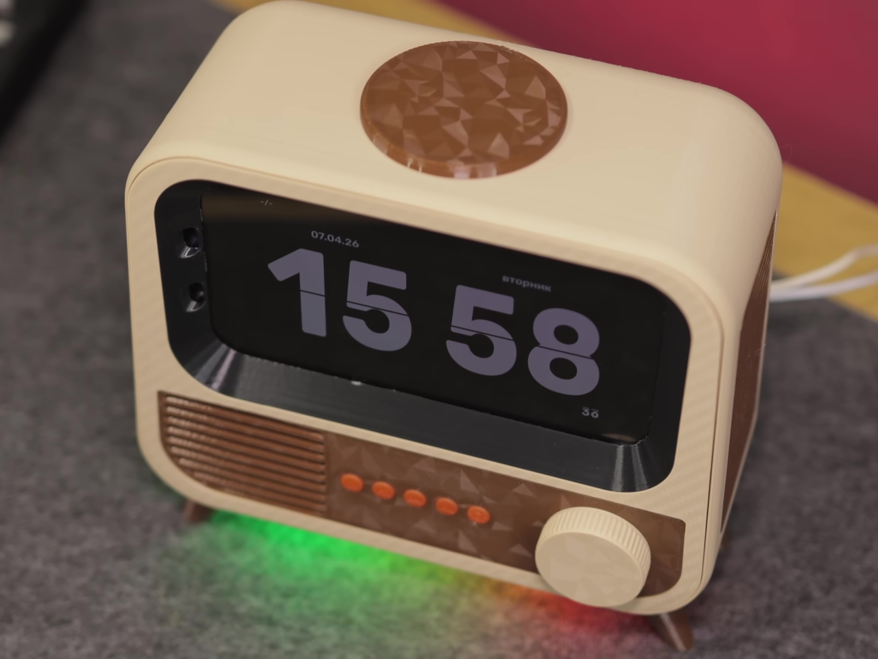
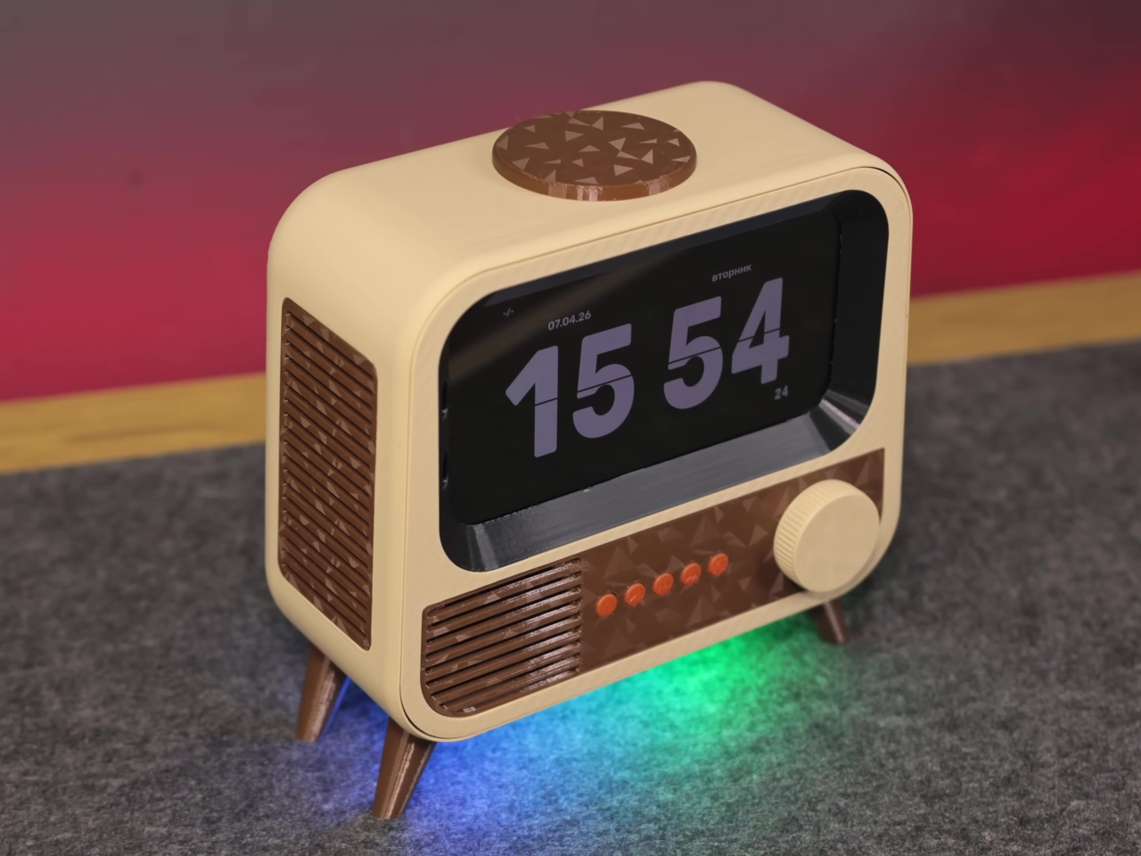
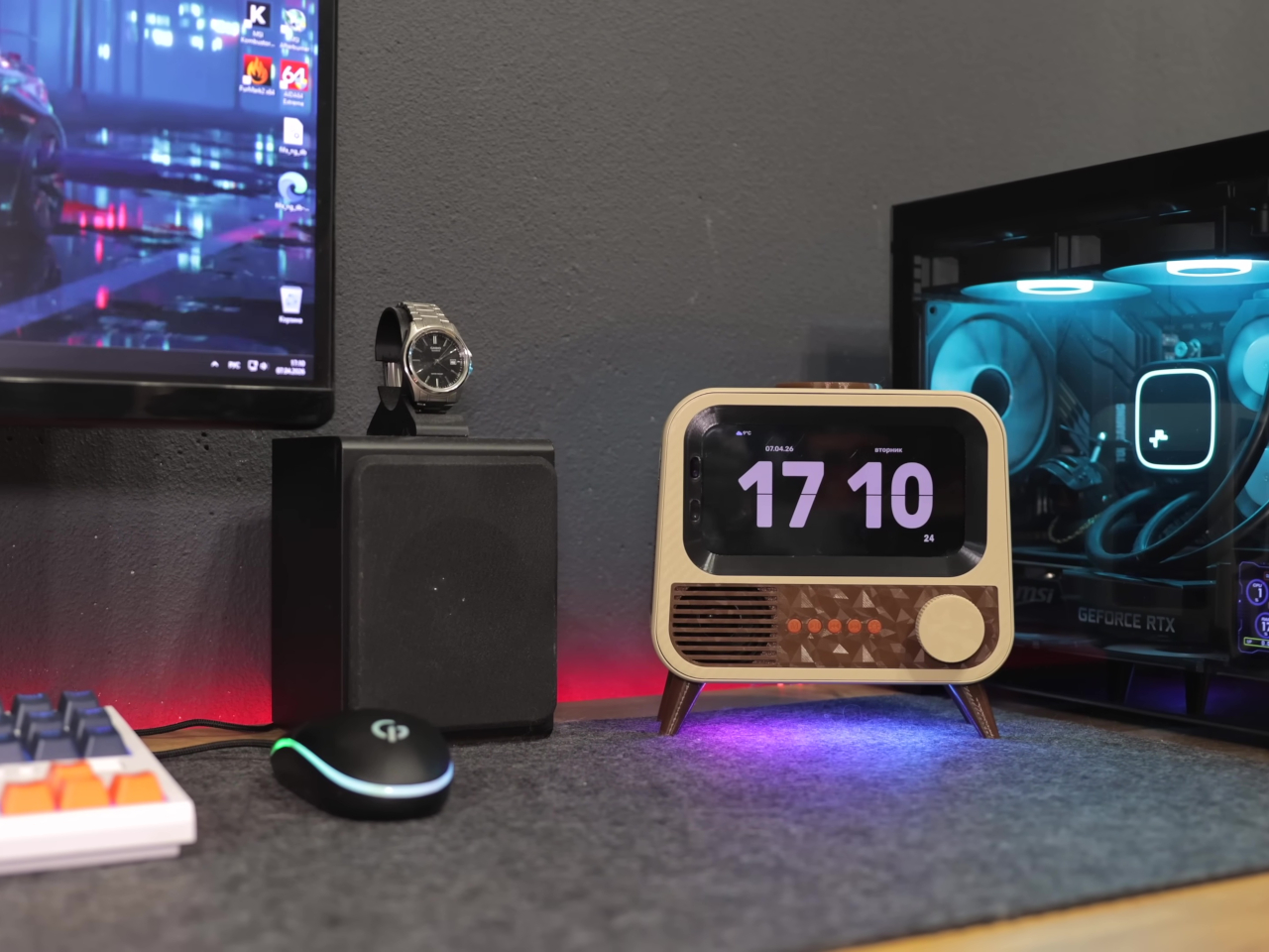
The case is where things get interesting. Instead of a sleek enclosure meant to blend in, the HANDMAX design goes full retro television, with a front grille, physical control buttons, and decorative legs completing the picture. Carefully modeled 3D-printed parts handle the practical side of things, accommodating the phone’s sensors and camera while keeping the vintage illusion intact from every angle you look at it.
Put it on a desk, and you have a smart speaker that looks like something rescued from a garage sale, in the best possible way. Ask it a question, and Google Gemini handles the conversational side, pulling in responses without needing a dedicated microprocessor or a new development board. It’s the same AI model powering higher-end commercial devices, running on hardware that would otherwise be sitting in a drawer.
The smart home integration is what makes it genuinely useful beyond being a conversation piece. Through Google Home, the device can control smart home accessories directly, and custom routines let voice commands trigger specific actions around the house. Turning lights on, adjusting a thermostat, or running a sequence of automations becomes a spoken instruction directed at what looks like a miniature television set.
Getting there wasn’t entirely straightforward. The phone’s Bluetooth module had a habit of shutting itself down after 20 minutes of silence, which would quietly cripple the whole setup. The fix was characteristically clever, though; an inaudible 6 Hz tone runs constantly in the background, imperceptible to human ears but enough to convince the firmware that the system is still in use and shouldn’t shut down.
Beyond voice interaction, the finished device also functions as a wireless charger and a desktop display, which means it earns its counter space even when no one is talking to it. The final hardware list doesn’t include a single new component, just old parts that most people would have discarded without a second thought. That’s the more interesting design challenge of the two.
There’s an argument to be made that the best AI hardware isn’t always the most expensive, and this project makes it quietly. Commercial smart speakers are bought, used for a few years, and eventually replaced. A device built from broken hardware doesn’t follow that lifecycle, and the retro TV case that holds it together makes sure it doesn’t look like it’s trying to.
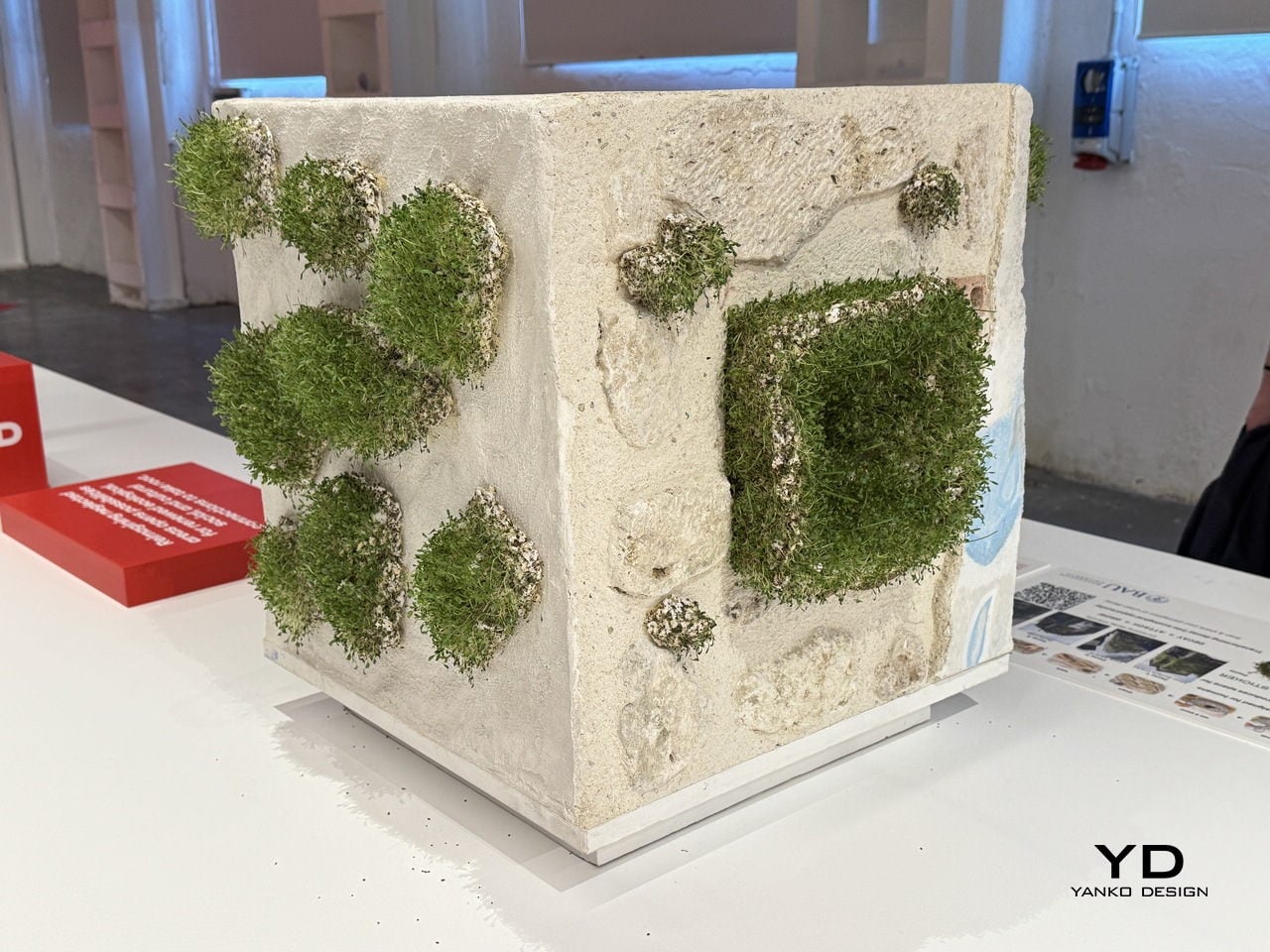
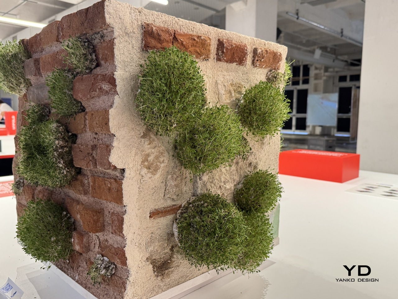
Cities are built almost exclusively for people. Every surface, every wall, every façade is designed, maintained, and repaired with human use in mind. But cities aren’t just inhabited by humans, and the idea that urban decay, those crumbling plaster patches and cracked brick faces, is purely a problem to be fixed ignores the potential it quietly holds for other species.
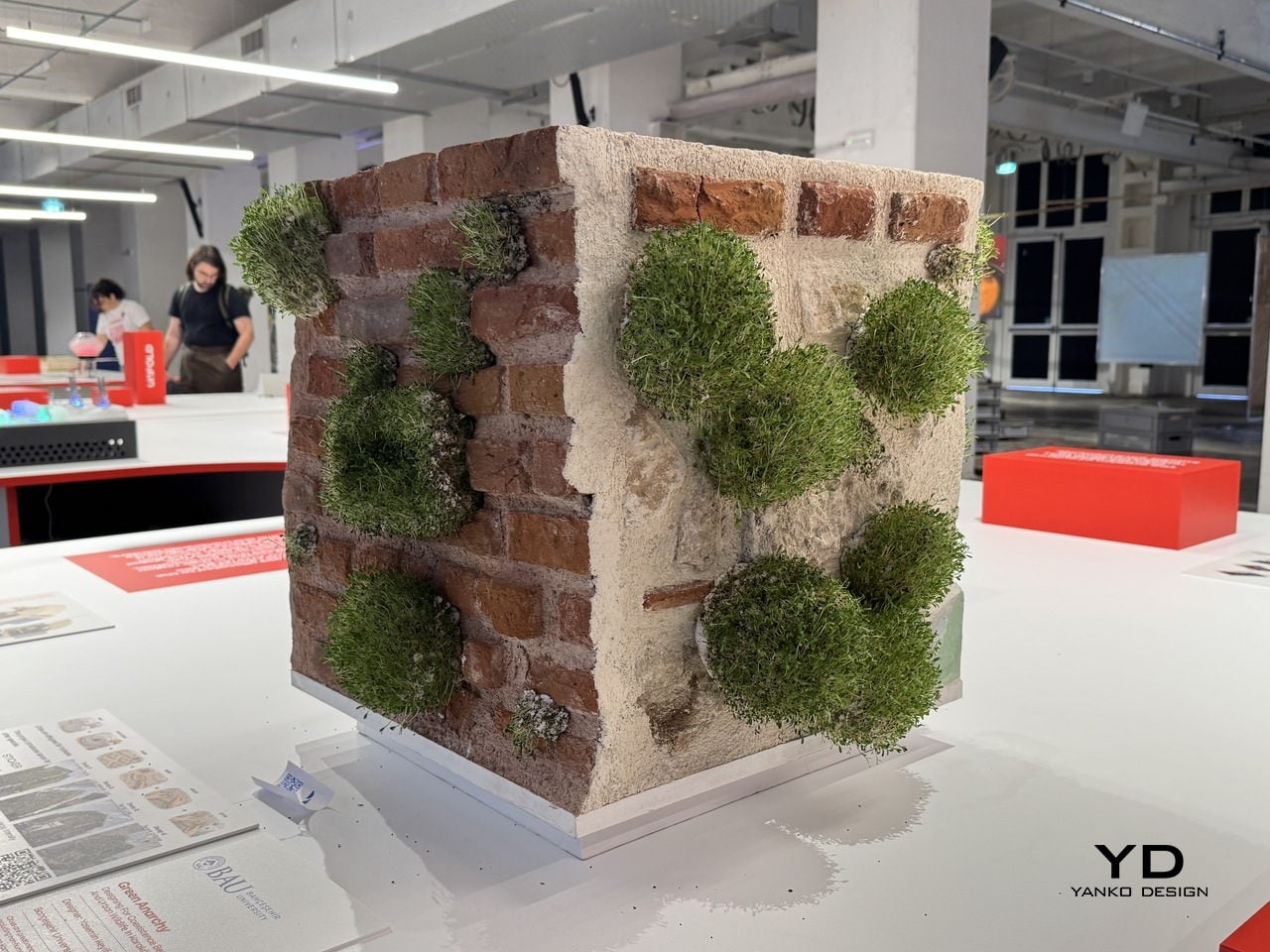
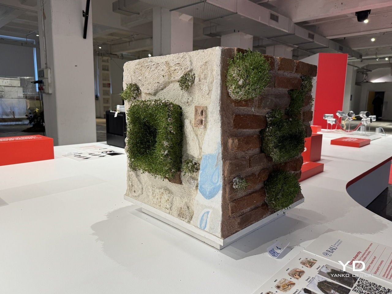
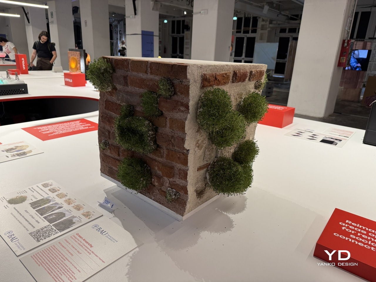
That’s the provocation at the heart of Green Anarchy, a project by Yasemin Keyif of Bahçeşehir University in Istanbul, presented as part of the UNFOLD 2026 exhibition at BASE Milano during Milan Design Week. Rather than treating a cracked or crumbling façade as something to be patched over, Keyif asks what happens when designers choose to work with decay instead of against it.
Designer: Yasemin Keyif (Bahçeşehir University)
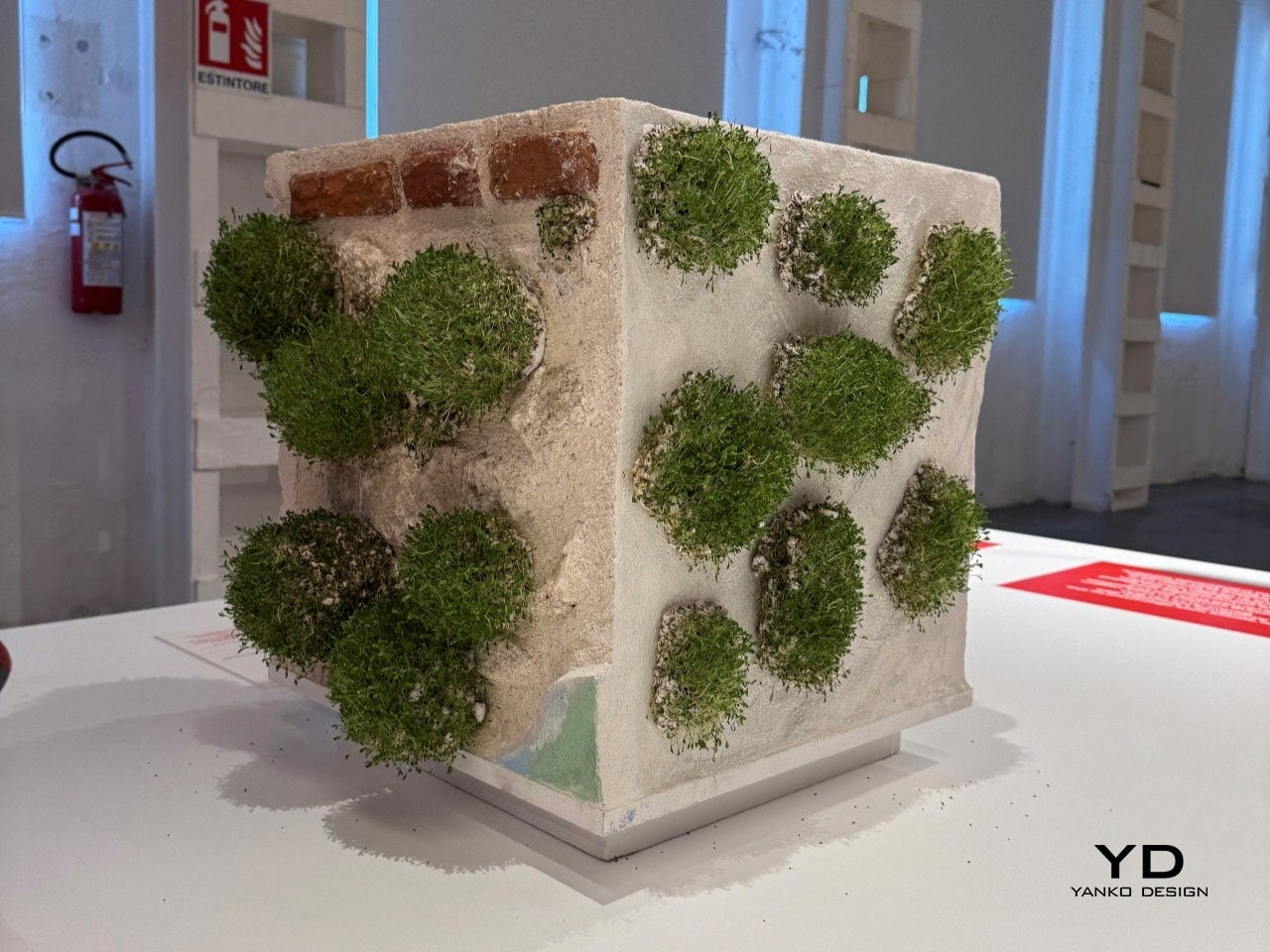
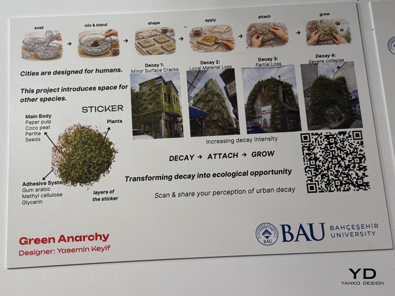
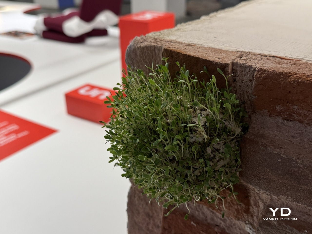
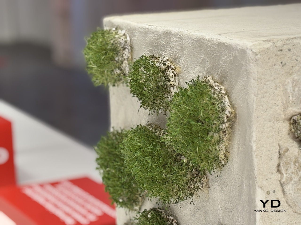
The answer takes the form of a small, biodegradable sticker pressed directly onto damaged building surfaces. Each unit is made from a blend of paper pulp, coco peat, perlite, and seeds in its main body, with an adhesive system of gum arabic, methyl cellulose, and glycerin that lets it bond to roughened or degraded masonry without any synthetic materials.
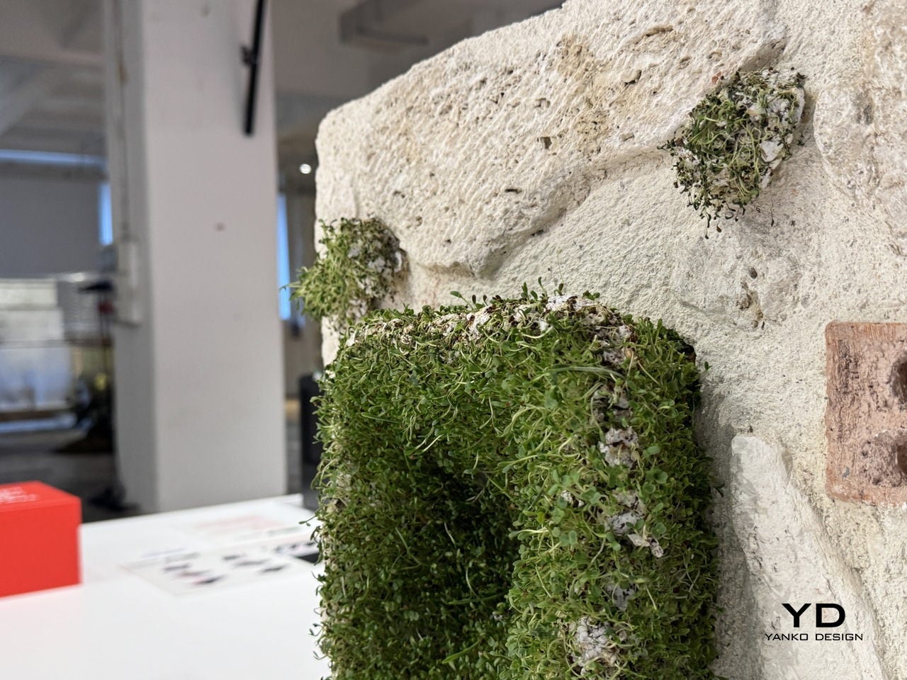
The process is surprisingly simple: the stickers are soaked, mixed, shaped, and applied by hand directly onto the wall. Over time, the seeds embedded in the substrate germinate and take root in the existing cracks and recesses, gradually turning neglected building surfaces into small, self-sustaining ecosystems. The name for this sequence, decay, attach, grow, also doubles as the project’s driving logic.
Keyif developed the concept with Karaköy, a dense historic neighborhood in Istanbul, as the pilot context. The project maps four escalating stages of urban decay, from minor surface cracks to severe structural collapse, and identifies each stage as a viable entry point for the stickers. The greater the damage, the more surface area becomes available for attachment and growth, turning the most deteriorated walls into the most fertile ground.
The deeper idea is a repositioning of architecture itself. Buildings, in this framework, aren’t just infrastructure for human activity but potential interfaces between human and non-human life. Cities already host birds, insects, mosses, and small animals that quietly inhabit the spaces we overlook, and Green Anarchy asks whether design can actively make room for that, rather than continually squeezing it out.
Presented as part of UNFOLD 2026, Domus Academy’s annual international design showcase held under the theme “Engage Friction: Designing Through Conflict,” Green Anarchy fits the brief almost too well. It doesn’t try to resolve the tension between the built city and the natural world so much as give them a way to grow into each other, slowly, without asking anyone’s permission.
The fashion industry has a water problem that most people never see. Dyeing fabric is one of the most chemically intensive steps in garment production, and the wastewater that comes out of that process carries synthetic dyes, heavy metals, and other pollutants that routinely end up in rivers and soil. By the time a sequined dress reaches a store, the environmental cost of making it sparkle is already long gone and mostly forgotten.
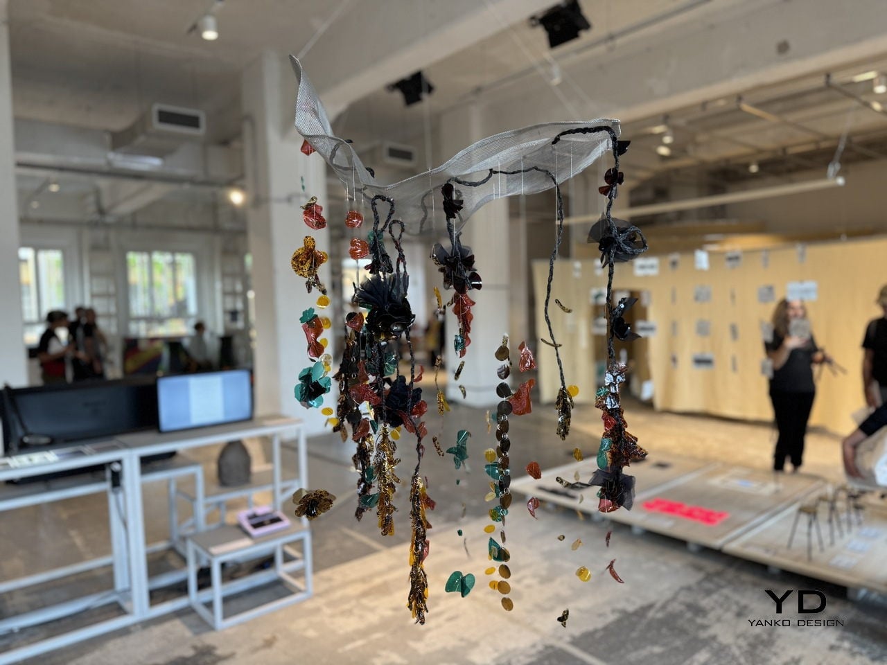
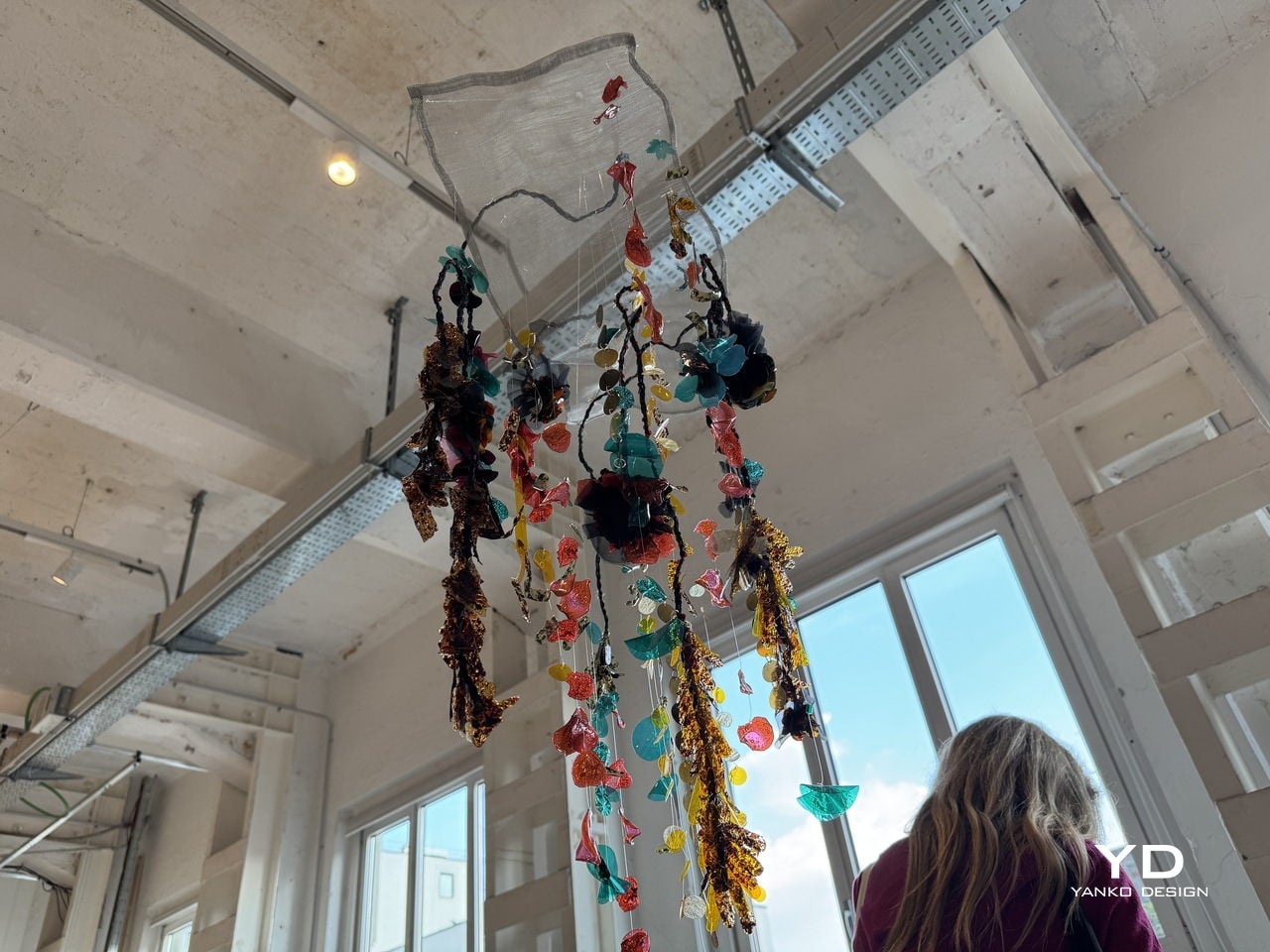
CQ Studio, a London-based regenerative textiles lab, tackled that problem head-on with a material experiment that turns the very wastewater from textile dyeing into the sequins themselves. The result, called Detox Bio-Embellishments, was on show at BASE Milan during Milan Design Week 2026 as part of the studio’s debut exhibition, Transient Gradients.
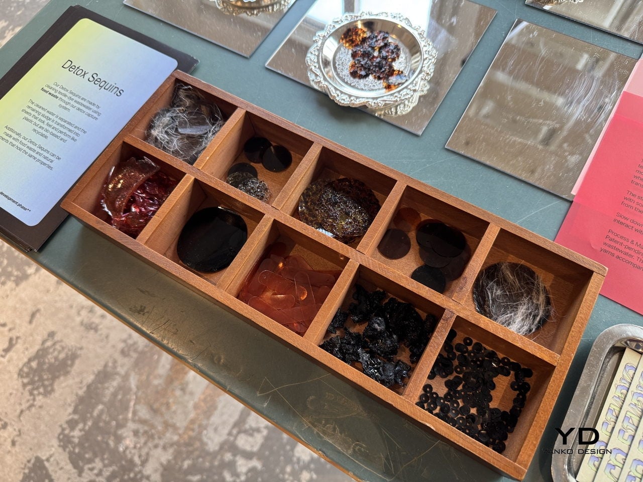
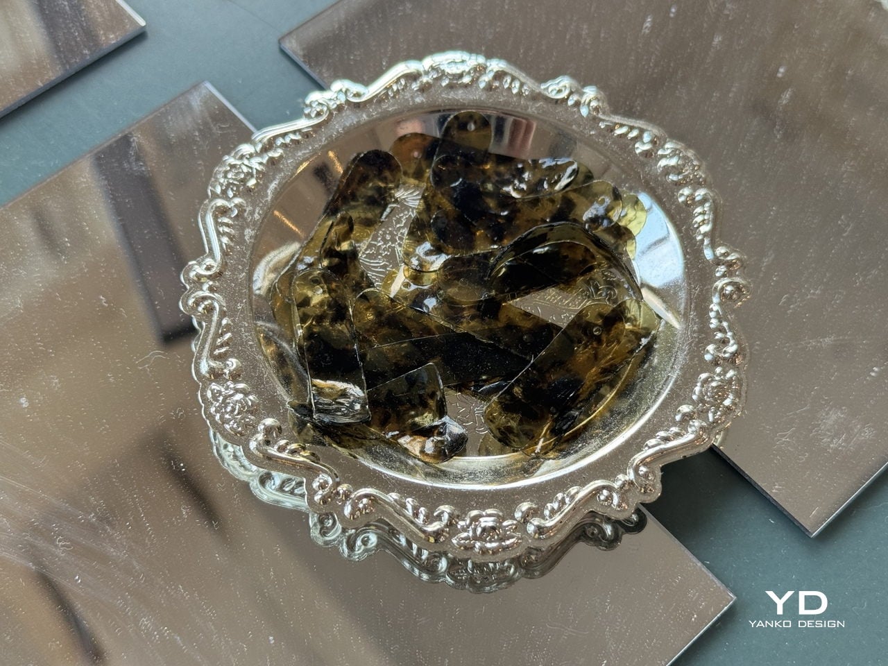
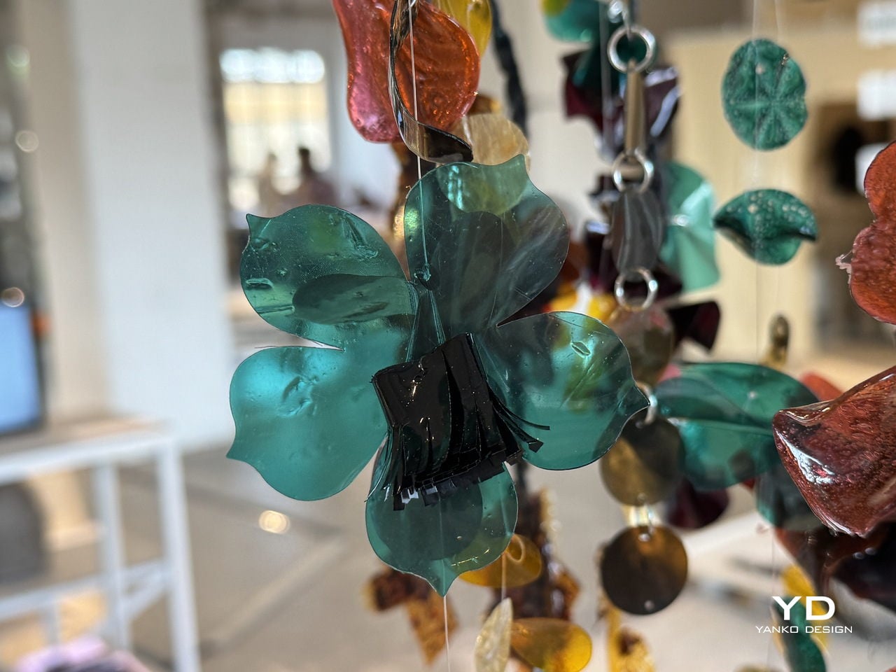
The process starts by running textile-dye wastewater through a detox capture system that uses food waste to pull out the contaminants. Once the water is cleaned and separated, the leftover sludge doesn’t get thrown away. Instead, it’s processed into thin, flexible sheets that look and feel like plastic, but are bio-based, biodegradable, and recyclable. Sequins are then die-cut from those sheets, and whatever scraps remain from the cutting are folded back into the process.
What makes the material particularly clever is how far it extends the concept of nothing wasted. It handles both synthetic-dye and natural-dye wastewater, keeping the synthetic version from ever reaching waterways, while the natural-dye version becomes safe enough to compost into soil. The sheets can also be made using food waste and natural pigments, giving designers a way to produce embellishments in a wide range of colors without any virgin plastic.
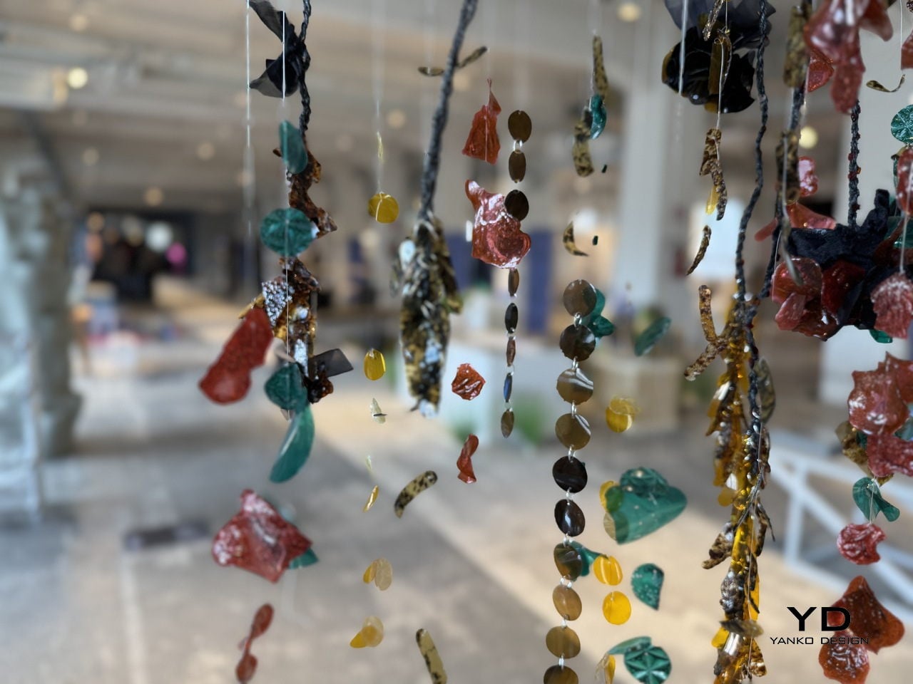
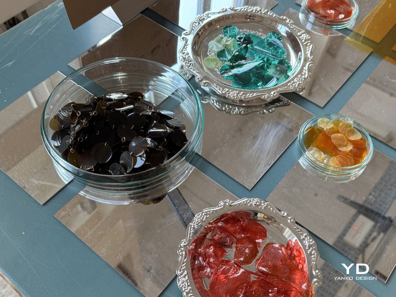
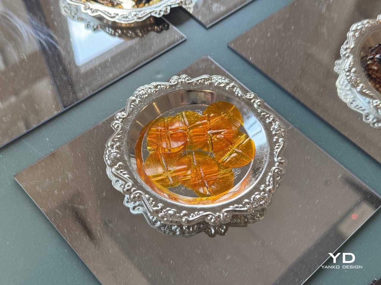
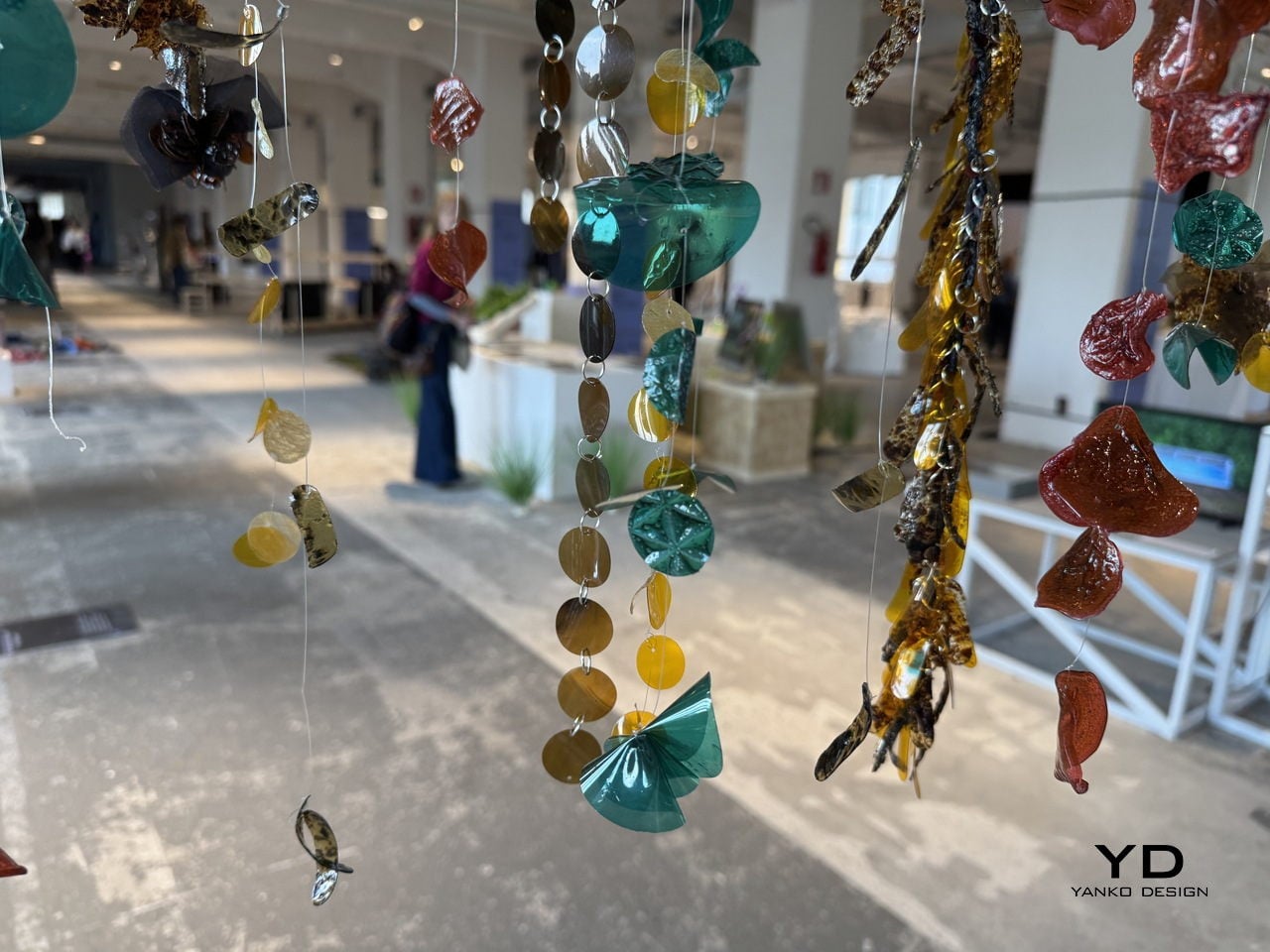
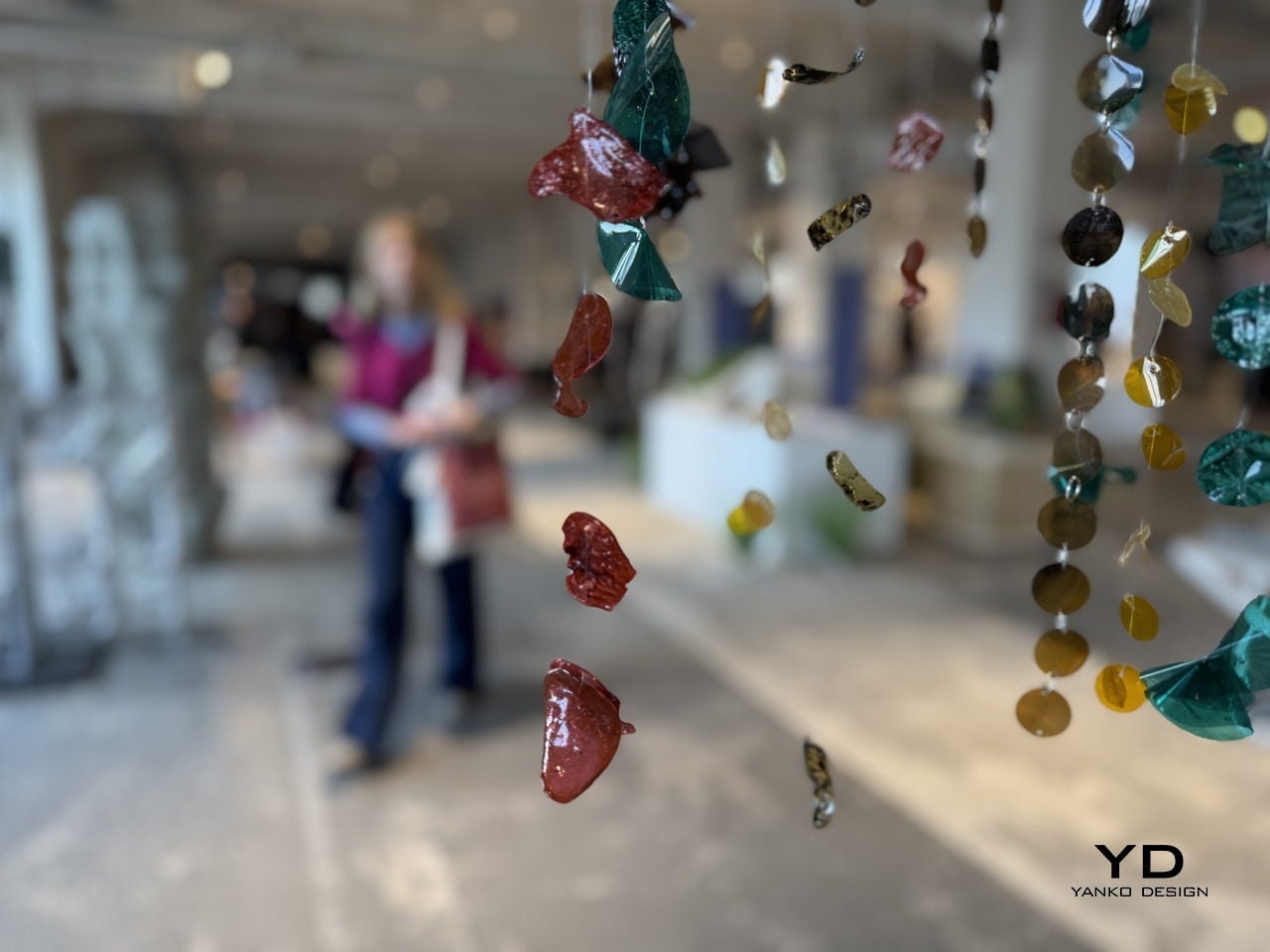
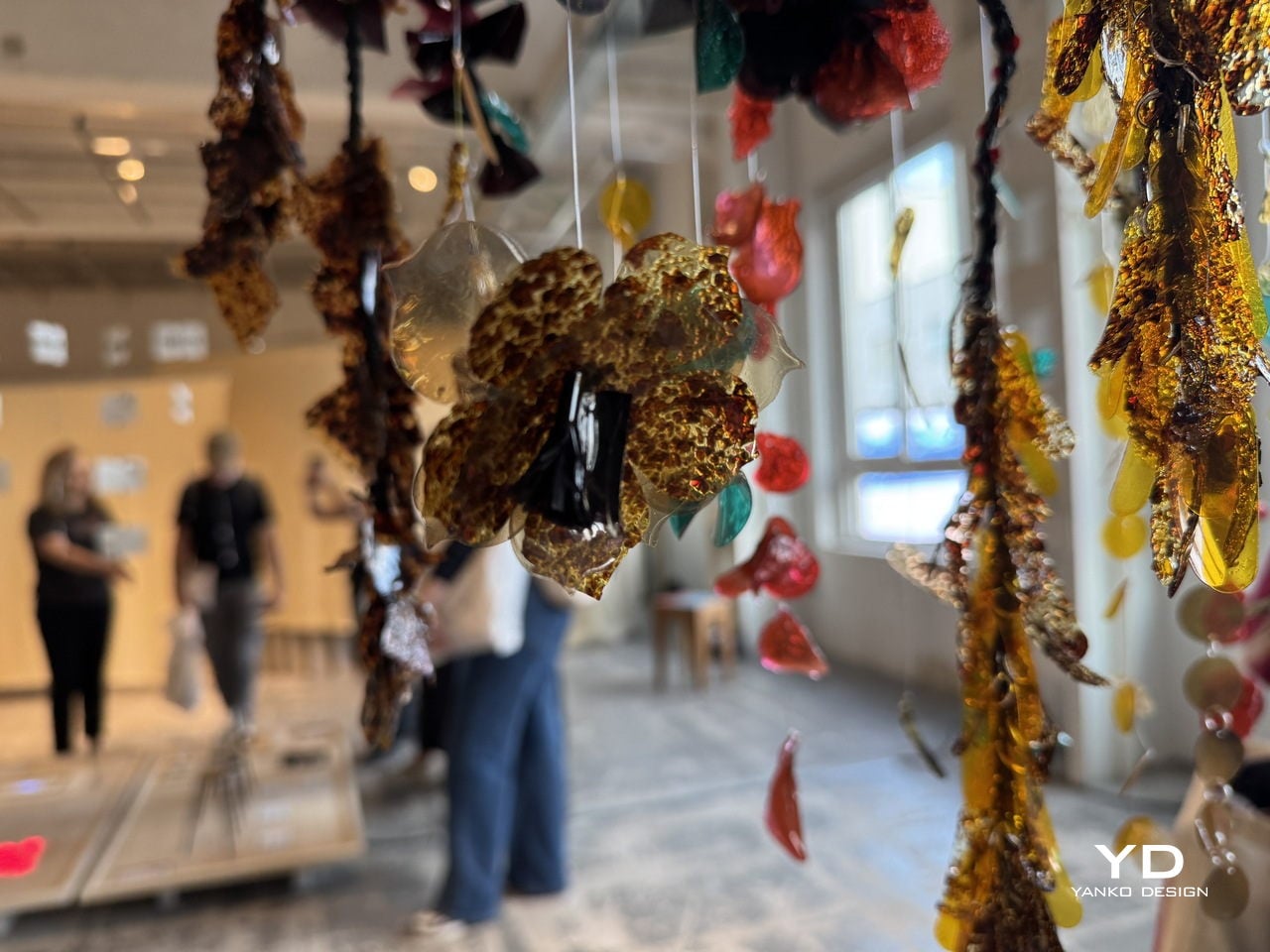
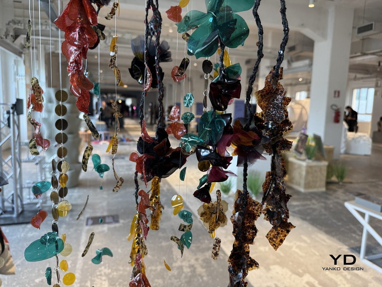
The visual result doesn’t look like a sustainability project at all. The sequins and embellishment pieces come out in deep blacks, jewel-like teals, warm ambers, rich reds, and tortoiseshell-patterned fragments that carry a high-shine finish. Strung onto braided cords and translucent threads for the Milan installation, they hung in dense cascading curtains that looked more like haute couture jewelry than anything born from industrial sludge.
For the fashion industry, where sequins are almost universally made from petroleum-based PET plastic and are notoriously difficult to recycle, having a material that can match the visual appeal of conventional embellishments while being fully bio-based is a genuinely significant step. A garment made with Detox Sequins wouldn’t just sparkle; it would also carry a story worth telling, one that runs from a dyeing vat through a detox system and out the other side as something a designer can actually use.
Framework is known for a league of laptops that other manufacturers dare not. Six years in, and the company is pushing its boundaries, building laptops that are robust, high on performance, yet respect the consumers’ right, allowing them the option to repair, upgrade, and run the software of their choice.
For 2026, the modular computing company returns with Framework Laptop 13 Pro, a new and upgraded version of its current favorite repairable laptop – Laptop 13. “Framework Laptop 13 Pro is a complete ground-up redesign,” the company informs. Before we get into the details, this new laptop and wireless touchpad keyboard coming our way via the Framework [Next Gen] Event 2026 are, according to the company, built based on the direct feedback received from its fans.
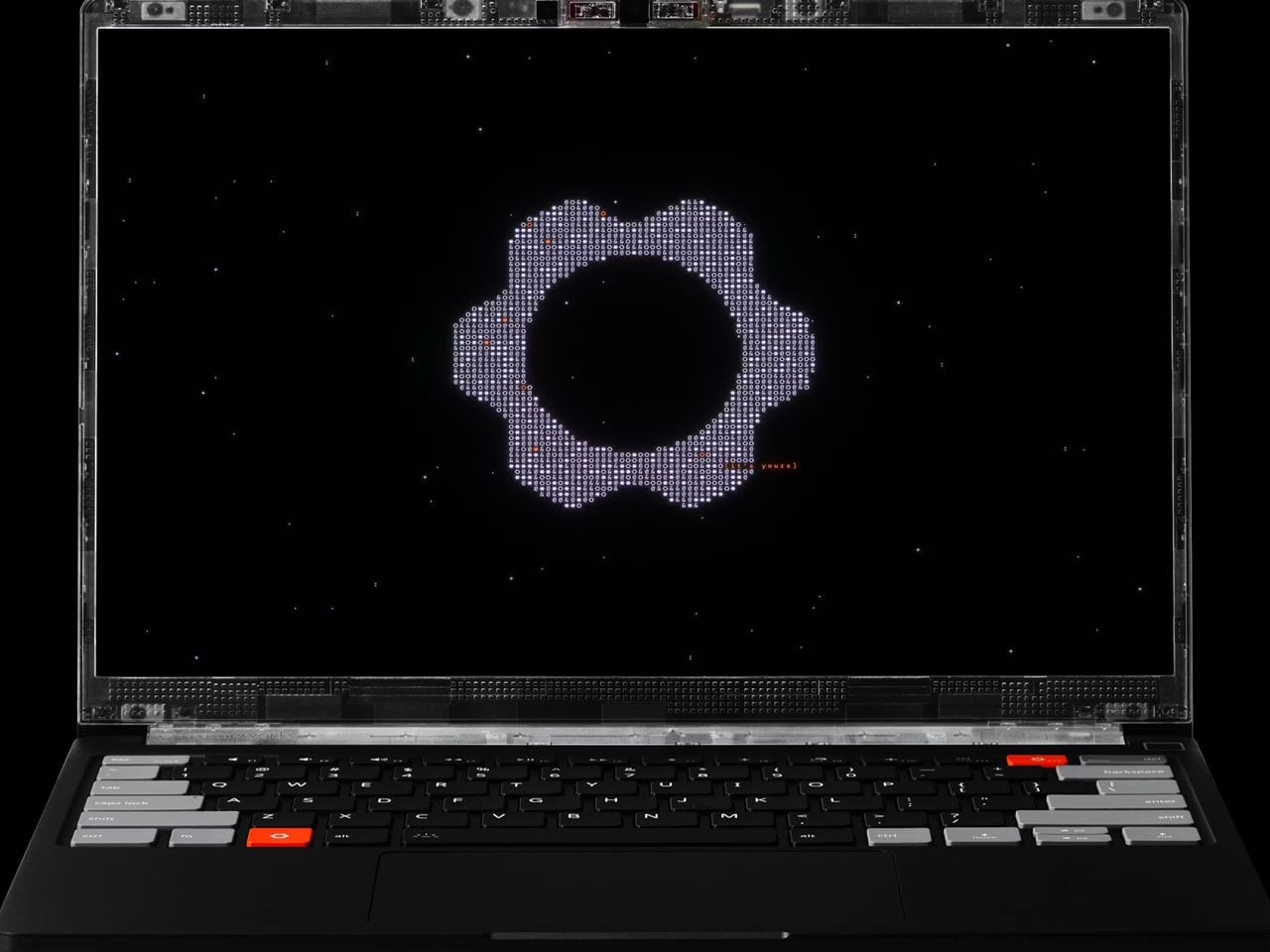
Laptop 13 Pro comes pre-loaded with Ubuntu. Its major highlight is the massive leap in battery life and the new full CNC aluminum chassis, which is first for any Framework laptop. Like the Laptop 13, however, the new model is repairable, upgradable, and fully customizable. It comes with an Intel Core Ultra series processor paired with LPCAMM2 memory, a haptic touchpad, and a purpose-built power-optimized touchscreen display.
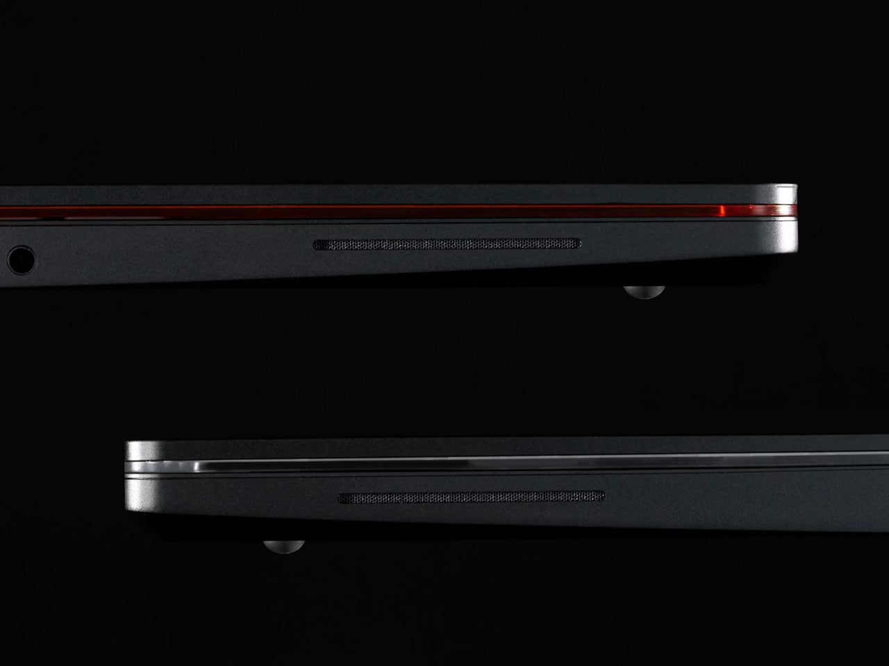
Framework says that the Laptop 13 Pro is its first system featuring a chassis machined from a single block of 6063 aluminum. The construction makes it robust yet ensures its lightweight. The 15.85 mm thick laptop only weighs 1.4 kg. It is currently available for preorder starting at $1,199 for the DIY edition. The pre-built device with complete configuration will set you back $1,499. The shipping is expected to start in June 2026.
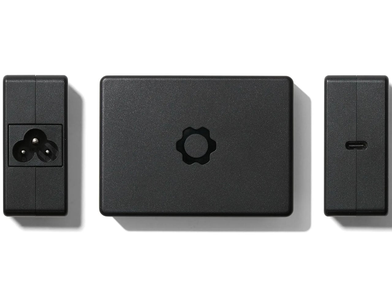
Framework has really worked on the battery life of Laptop 13 Pro, particularly because battery life was the primary concern that came up in the feedback received from fans. The system has an enhanced battery to 74Wh (rated for up to 1000 cycles), which is 22% better than that of the predecessor. Powered by a 100W GaN Power Adapter, the fast-charging battery can last for up to 20 hours while streaming Netflix in 4K, Framework’s test reveals.
A major update here is the inclusion of Intel’s latest Core Ultra Series processors. Laptop 13 Pro is available in Core Ultra 5, Core Ultra X7, and Core Ultra X9 variants, which makes the device “insanely efficient,” with up to 16 cores of processing prowess. This processing power is paired with equally capable LPCAMM2 memory, which is a modular LPDDR5x RAM format that runs at speeds up to 7467 MT/s. Available in 16GB, 32GB, and 64GB capacities, it is replaceable and upgradable. For storage, the laptop features a PCIe Gen5 M.2 2280 slot. It supports up to 2TB Gen5 SSDs or larger Gen4 drives.
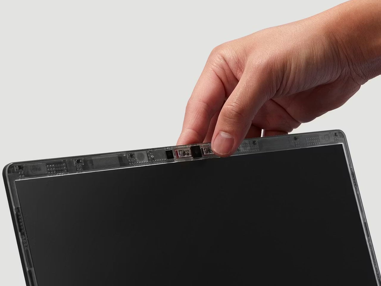
A great leap from the predecessor, the 13.5-inch touchscreen 2880×1920 resolution display of Laptop 13 Pro is also particularly interesting. It now packs within a redesigned bezel, which arrives sans the rounded corners. Provided with a 30-120Hz variable refresh rate, up to 700 nits brightness, and an anti-glare matte polarizer for better visibility in bright light, the display is paired– for the first time in a Framework laptop – with a Dolby Atmos-enabled audio system.
Framework Laptop 13 Pro with a haptic touchpad that uses piezo electric feedback, is backward compatible. Laptop 13 users can replace the innards (or even the chassis) without having to replace the system entirely. For connectivity, the new laptop features Wi-Fi 7 and the BE211 radio. It also has four Thunderbolt 4 ports.
Most sustainable beauty products come with a visual apology. You know the look: matte recycled paper, utilitarian shapes, a general aesthetic that signals good intentions while quietly penalizing you for having taste. Designer Sanya Jain’s unsolicited concept for a Tata Harper foundation system refuses that trade-off entirely, and the result is one of those rare design exercises that feels more polished than half the things sitting on Sephora shelves right now.
Tata Harper, for anyone who hasn’t fallen into that particular rabbit hole, is the brand that built its entire identity on the idea that luxury and purity don’t have to be in conflict. Founded in 2010 and formulated on an organic farm in Vermont, the brand made its name in skincare with 100% natural, high-performance formulas free of synthetic chemicals, toxins, and fillers. It’s a rigorous philosophy, and one that its existing packaging already respects to a degree. But the color cosmetics side of things has always felt like an unfilled gap. Jain spotted that gap independently, and used it as the brief for something worth paying attention to.
Designer: Sanya Jain
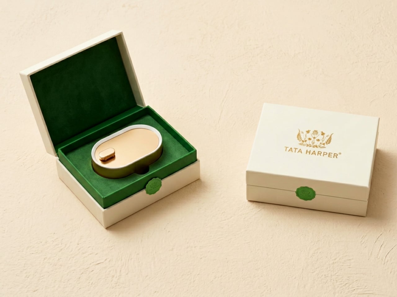
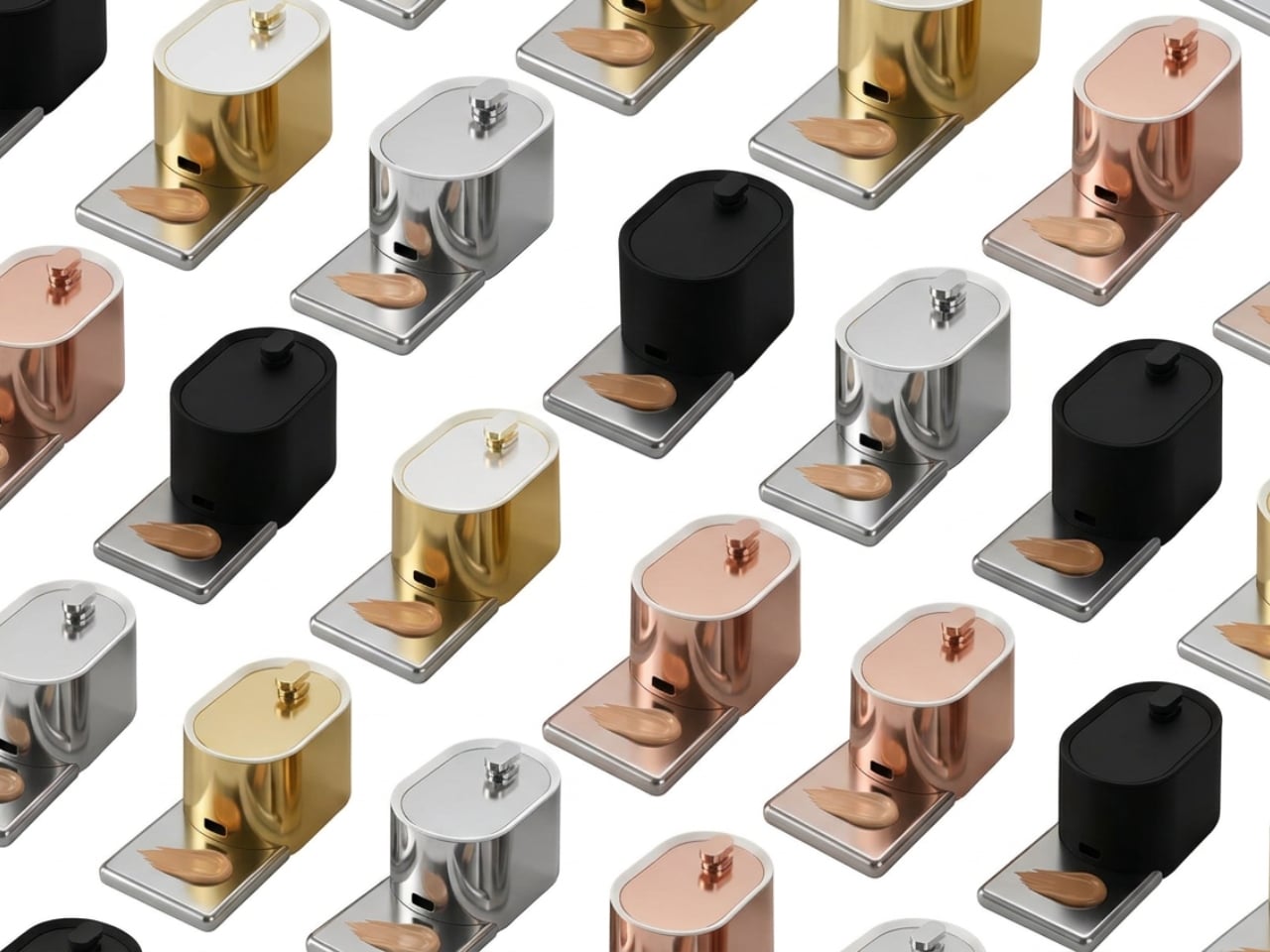
The concept, which she calls PureDose Foundation, centers on a refillable, modular system. The product lives inside a Viomer pod, a material valued for being lightweight, durable, and designed for circular reuse. That pod slots cleanly into a polished, gold-toned dispenser that looks less like something from a drugstore and more like a small piece of modernist sculpture you’d display on purpose. Press the top button once, and the foundation dispenses in a controlled drop directly onto a detachable metal slate positioned at the base. You load your brush from there and go. No squeezing, no guesswork, no wasted product sitting in the cap.
That last part matters more than it sounds. Foundation is one of the more quietly wasteful categories in makeup. Products get dispensed in excess, oxidize before you can blend them, or sit in bottles that are technically not empty but practically impossible to finish. The PureDose concept sidesteps most of that friction by making the application point clean, controlled, and hygienic. The metal slate rinses under the tap. The pod refills. The dispenser stays on your vanity indefinitely. It’s a smarter loop, and the fact that it manages to look this refined while doing it is not accidental.
Jain pulled from biomimicry and clean geometry throughout the design. The rounded, organic silhouettes of both the pod and the dispenser echo the natural world that Tata Harper draws from as a brand, and that kind of visual consistency is harder to achieve than it appears. The colorway options, gold, rose gold, silver, and matte black, give the system range without diluting the identity. And the unboxing experience is worth noting: a velvet-lined jewelry box for the dispenser and a kraft-paper octagonal carton for refill pods. It’s one of the more layered packaging stories I’ve come across in concept work. It understands that luxury is at least partly emotional, and that the ritual of opening something should feel like it belongs to the rest of the experience.
What makes this project compelling beyond the aesthetics is how faithfully it mirrors the brand’s existing values without any official mandate to do so. Tata Harper already commits to FSC-certified paper, transparent ingredient sourcing, and eco-conscious material choices. Jain’s concept simply asks the next question: what would a color cosmetics line look like if it operated with the same level of rigor? The answer is something that sits on your vanity like a design object, performs with precision, and leaves significantly less behind when it’s done.
Concept work in industrial design usually lands in one of two places. It either solves a real problem with no aesthetic investment, or it produces something visually stunning that would fall apart after a week of actual use. This one manages to hold both ends of that tension together, which is the harder achievement. Jain didn’t find a way to make sustainability bearable. She found a way to make it worth wanting. Whether or not Tata Harper ever sees this, the question it raises is one the beauty industry should be sitting with.
The age of disposable green is over, as in 2026, sustainability means permanence. You no longer design for short lifecycles or rapid replacement, as you design to last. True ecological responsibility now aligns with architectural endurance, where reduced carbon impact comes from buildings meant to perform for centuries, not decades. Longevity becomes the most effective form of environmental care.
This approach values material honesty and graceful ageing. You select materials that mature with time rather than degrade. High-performance envelopes and timeless spatial planning deliver stronger aesthetic and functional return on investment. The home becomes a legacy that is biophilic, resilient, and enriched by time, not destined for waste.
1. Consider Materials that Endure
In 2026, true luxury lies in materials that never demand replacement. You move beyond synthetic composites and trend-driven finishes toward material honesty. Natural stone, solid wood, and metal are chosen not for immediate impact, but for their ability to remain relevant across decades. Sustainability here is quiet, embedded, and inseparable from longevity.
This approach delivers long-term return on investment. While solid stone, reclaimed hardwood, and heavy-gauge metals require a higher upfront cost, their lifespan offsets both financial and environmental impact. Unlike surfaces that degrade, natural materials improve with age. Patina becomes value. Time itself turns into an aesthetic layer, enriching the space rather than diminishing it.
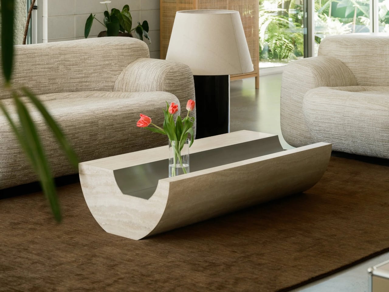
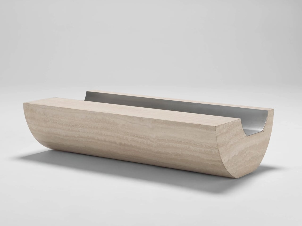
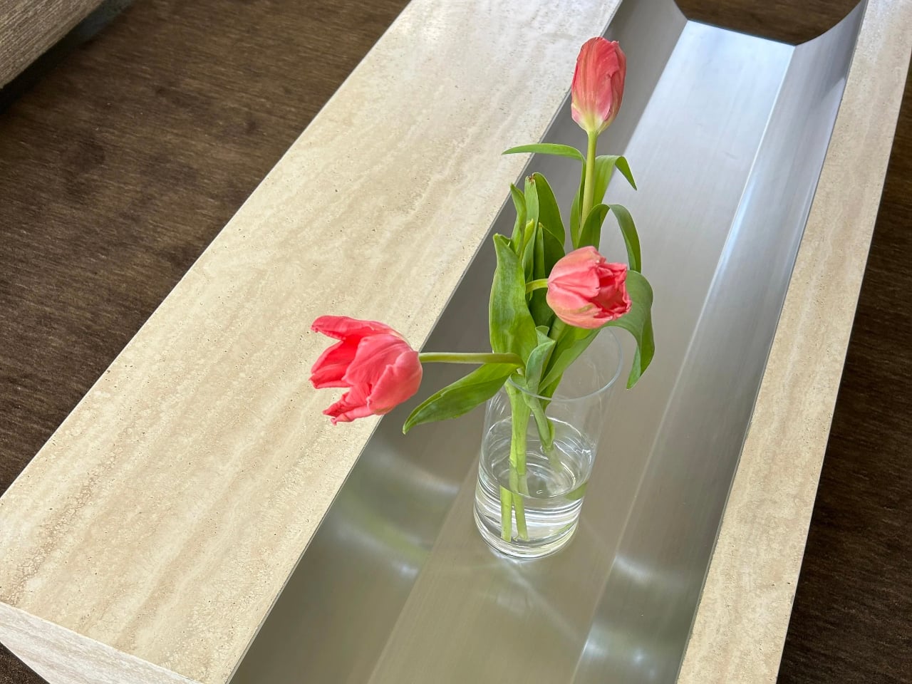
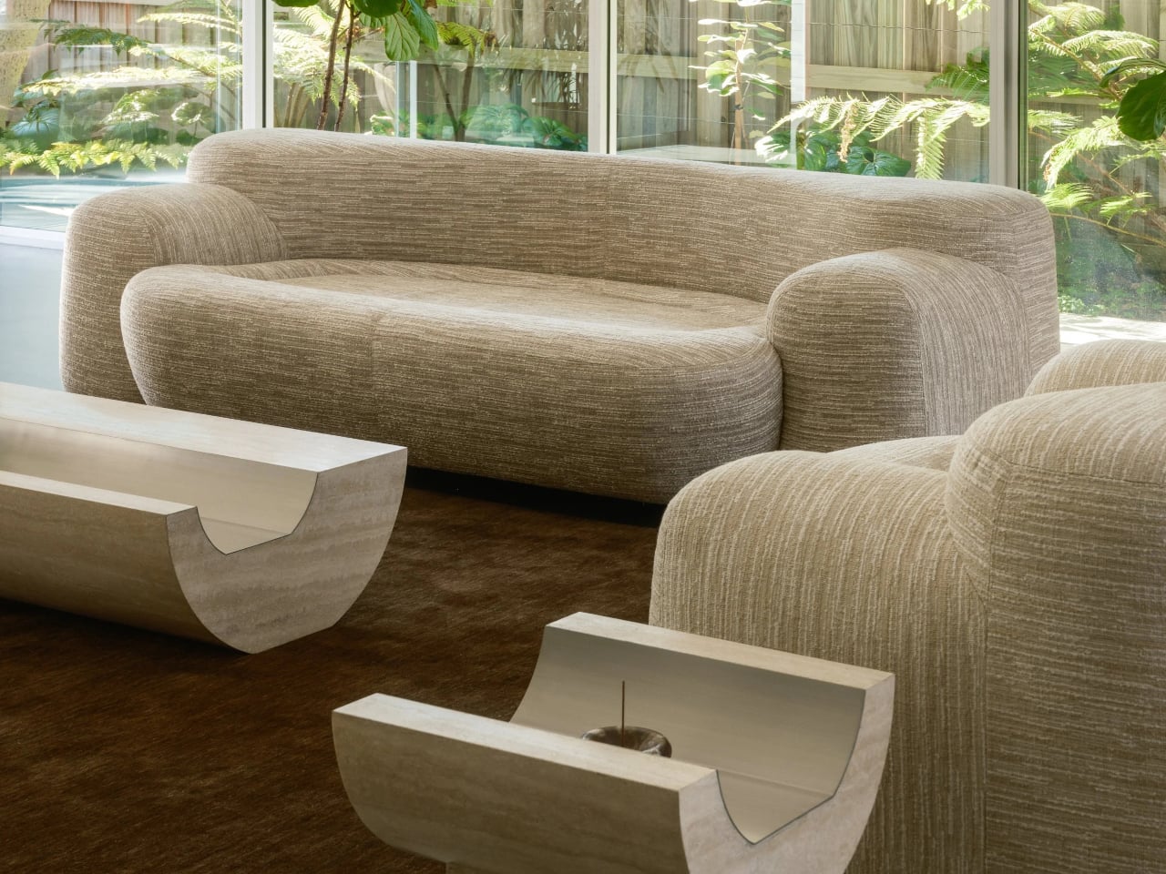
Stone furniture is often associated with visual weight, but its true strength lies in longevity. Coffee Table 01 and Side Table 01 by Tom Black are designed with a sense of permanence firmly in mind, utilizing Italian travertine not as surface decoration but as a structural element. Rather than relying on applied finishes or thin veneers, each piece is carved from solid stone, ensuring durability, stability, and resistance to trends. The curved underside of Coffee Table 01 subtly lifts the form while maintaining a robust footprint, and the metal-lined trough is not ornamental but precisely integrated, reinforcing the table’s architectural integrity.
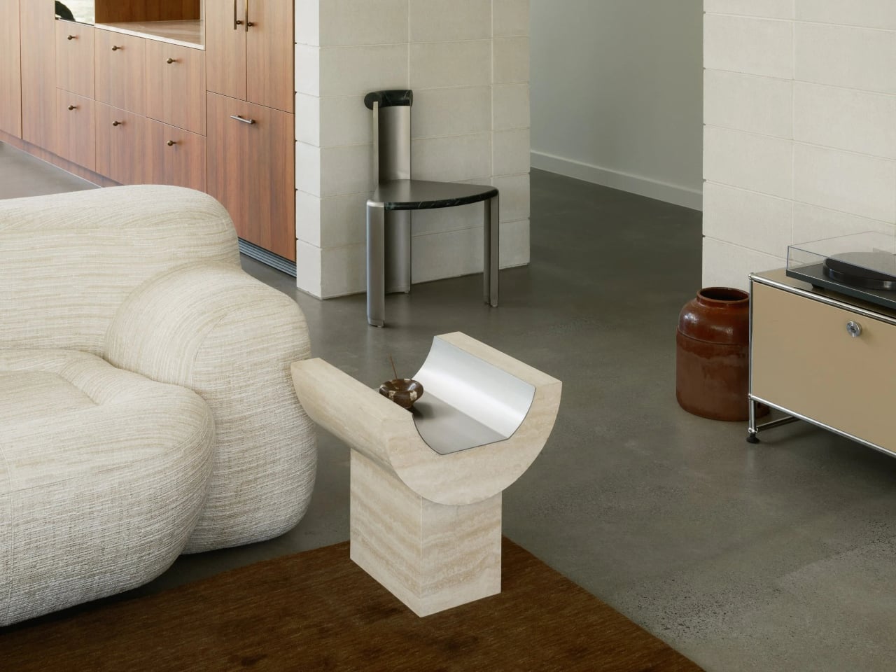
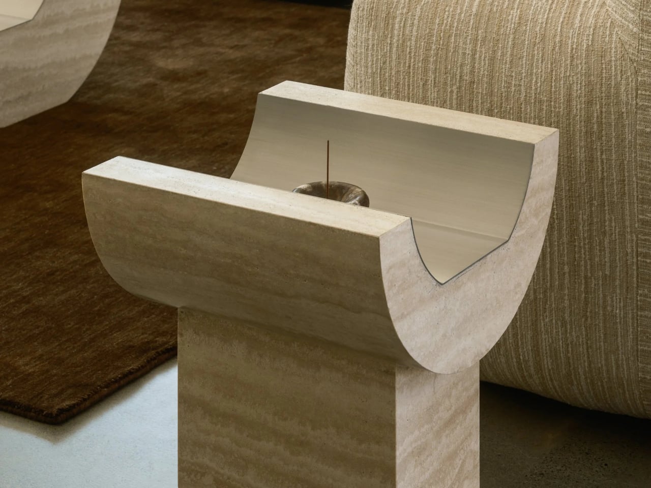
Side Table 01 continues this built-to-last philosophy through a grounded, plinth-based composition. The rectangular base anchors the curved upper element, creating a balanced, load-bearing relationship between parts. Together, the warm veined travertine and brushed metal inlay speak to materials chosen for ageing well, developing character over time rather than wearing out. These tables feel less like temporary furnishings and more like enduring fixtures or objects that are designed to outlive interiors and remain relevant through their material honesty and structural clarity.
2. Focus on Thermal Efficient Envelopes
Longevity extends far beyond surface finishes; it is embedded in the performance of the building envelope. Homes that regulate internal comfort through passive means remain functional and relevant over time. When thermal efficiency is designed into the shell, the building relies less on mechanical systems and adapts more naturally to its environment.
By combining high-thermal-mass materials with advanced insulation, the structure maintains temperature stability while reducing long-term energy demand. Equally critical are the invisible layers or triple-glazed systems and vapor-permeable membranes that protect against moisture, decay, and material fatigue. These hidden investments safeguard structural integrity, ensuring the building performs reliably and endures for generations.
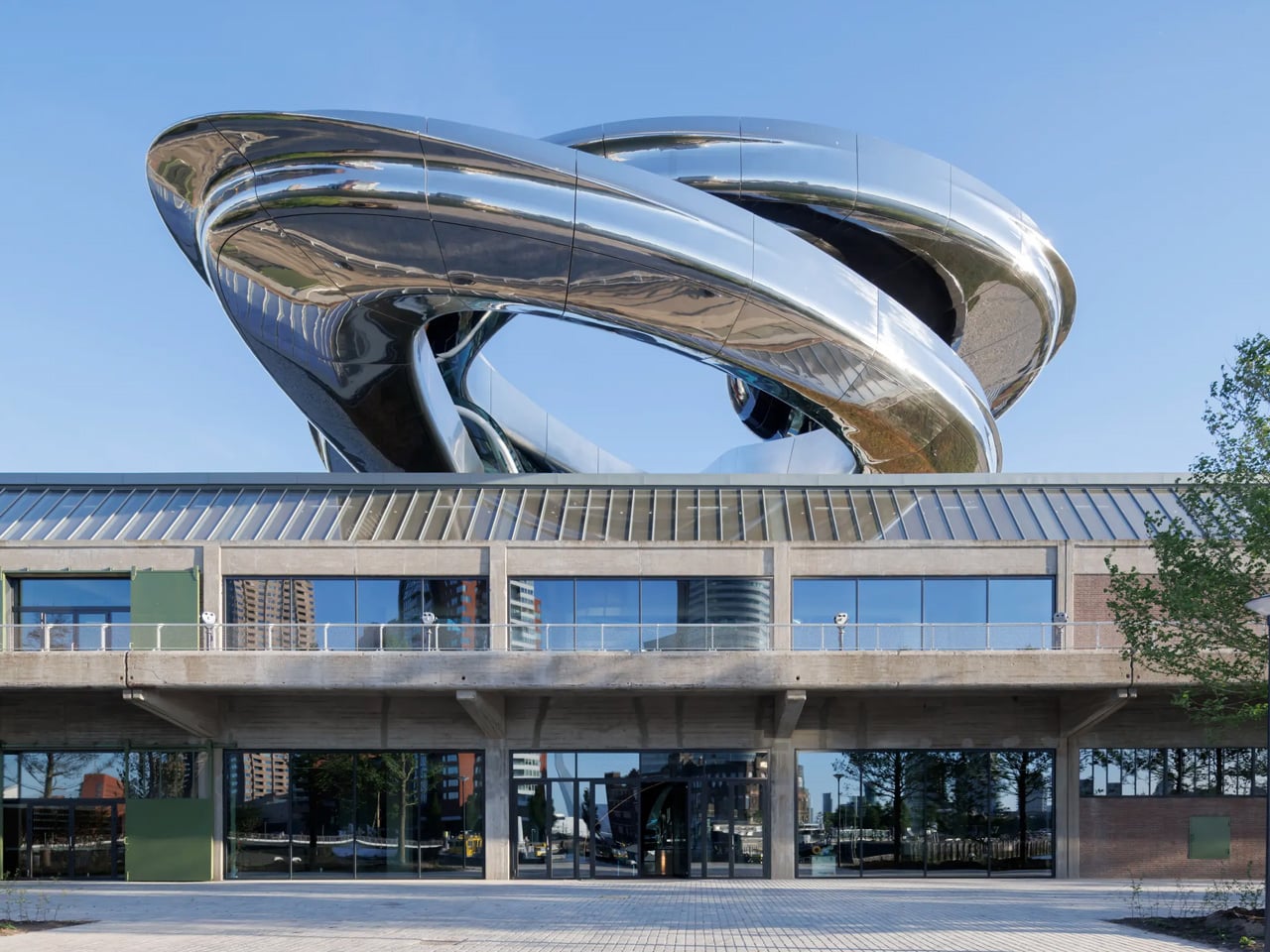
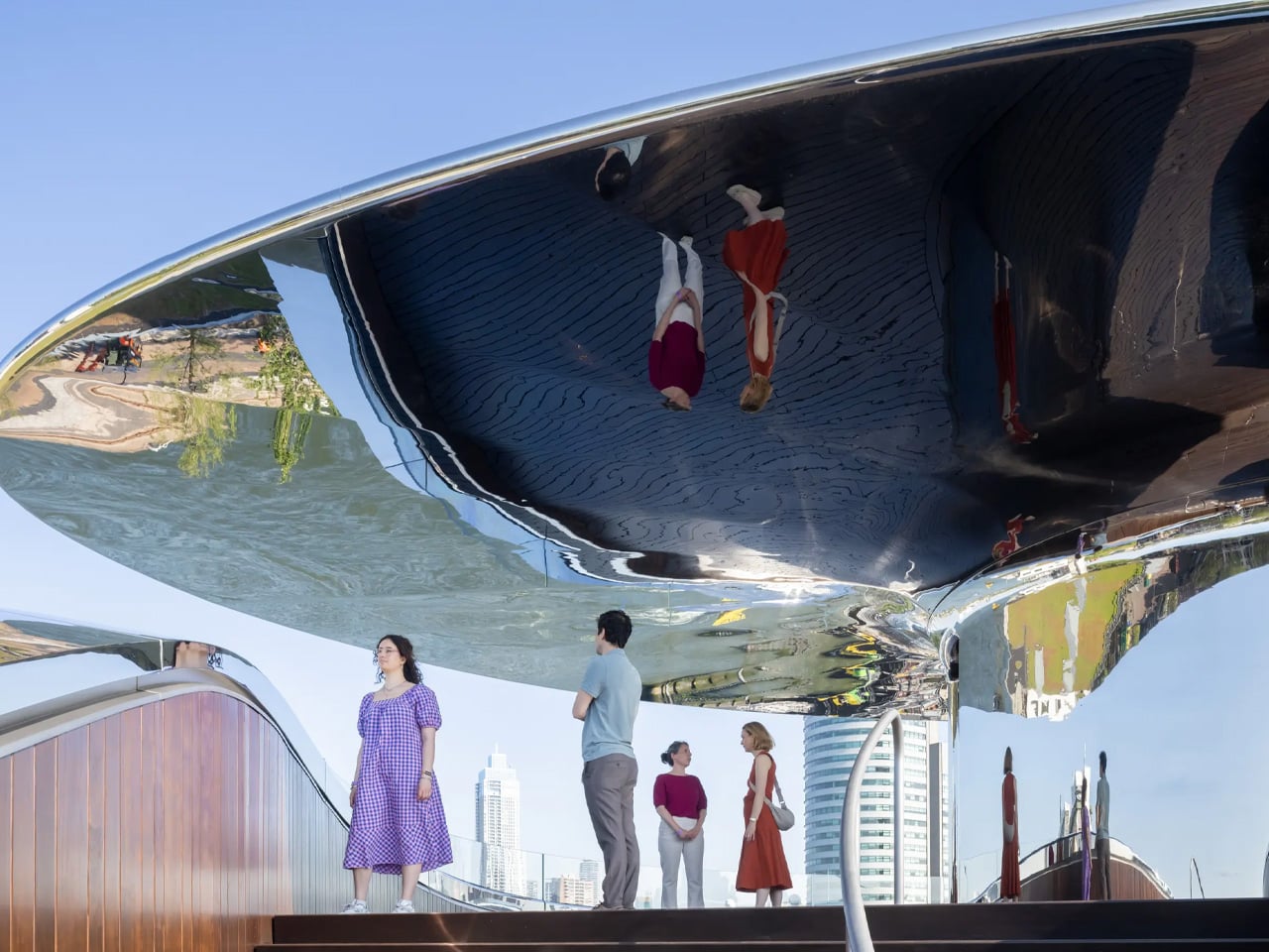
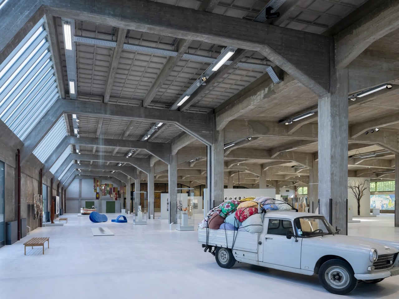
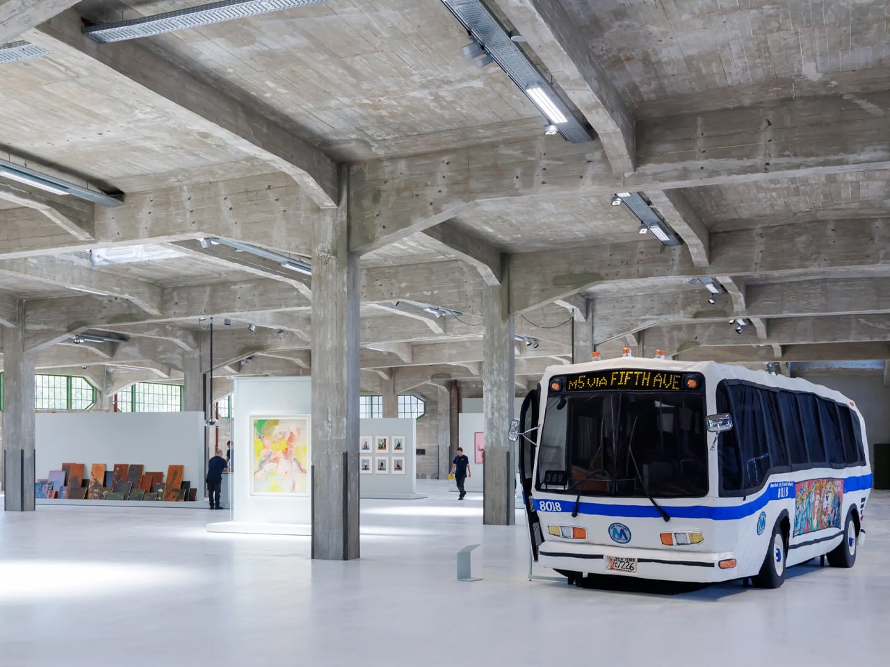
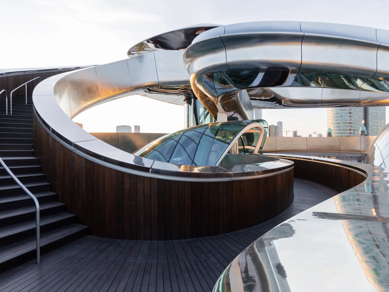
A century-old warehouse on Rotterdam’s Katendrecht peninsula has been transformed into the Fenix Museum of Migration by MAD Architects, with particular emphasis on upgrading the building’s energy performance through its façade. Rather than replacing the historic envelope, the design carefully enhances it, retaining the original industrial shell while improving thermal efficiency. This approach preserves the building’s identity while reducing heat loss, controlling solar gain, and supporting long-term energy performance suited to a contemporary public museum.
The upgraded façade works as a high-performance layer, integrating improved insulation and modern glazing within the existing structure. By strengthening the building envelope instead of rebuilding, it, the project significantly lowers energy demand for heating and cooling. This façade-led strategy demonstrates how adaptive reuse can align heritage preservation with environmental responsibility, proving that historic buildings can meet present-day efficiency standards without compromising their architectural character.
3. Future-Ready Spatial Planning
A building remains relevant when its spaces can adapt, and multipurpose furniture plays a key role in enabling this flexibility. Future-proof planning embraces “loose fit” interiors – open, non-prescriptive layouts that allow furniture, rather than walls, to define function. Generous proportions and strategically placed utility cores create fluid spaces that can be reconfigured as needs change.
Multipurpose furniture supports this adaptive sequencing by allowing rooms to shift use without structural intervention. A living area can become a workspace, or a guest room can transform into a family suite through modular, convertible elements. This approach encourages multi-generational living and ageing in place, offering long-term social value while preserving the emotional continuity of the home.
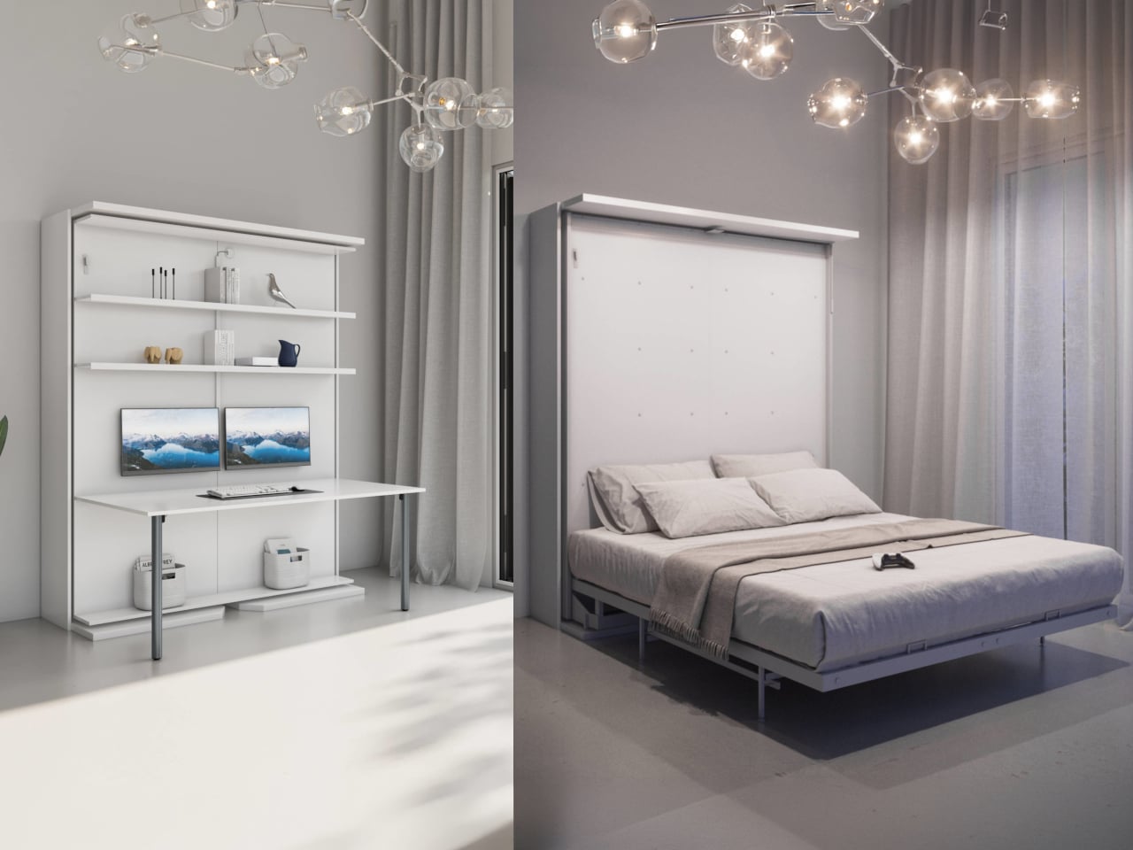
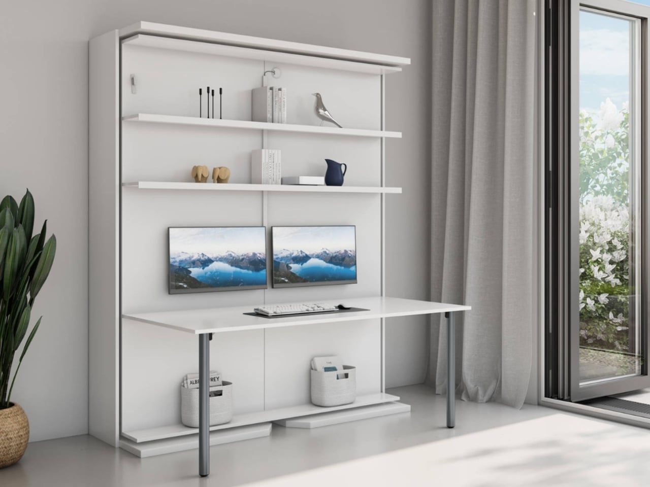
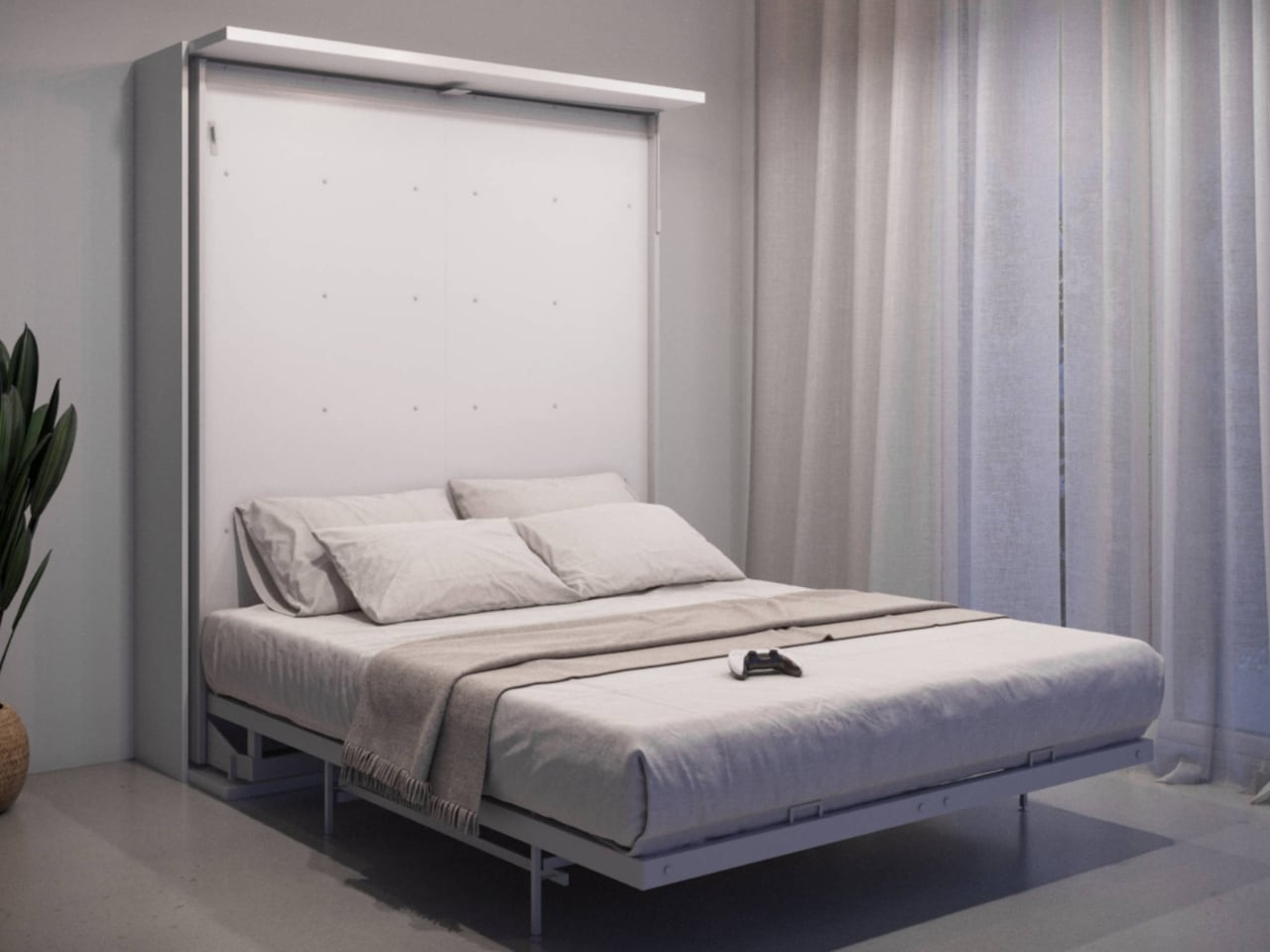
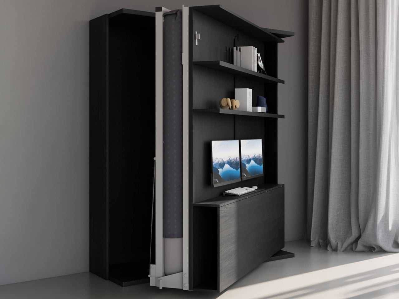
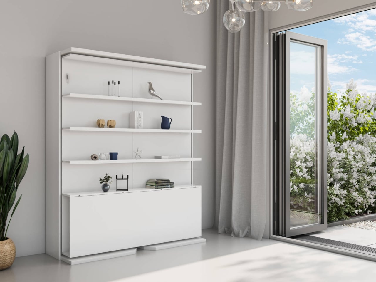
Living in a small space makes multipurpose furniture essential rather than optional, especially when durability and long-term use are priorities. Well-designed modular pieces are built to adapt over time, reducing the need for constant replacement. The Compatto Rotating Office Murphy Bed with Desk reflects this built-to-last approach by combining multiple functions into a single, robust system that responds to evolving lifestyles while maximizing limited floor area.
Designed for repeated daily use, the unit transforms smoothly from bed to workspace through a series of controlled rotations. The wide desk supports monitors, TVs, and all-in-one computers, while integrated storage and cable management ensure long-term functionality without clutter. Though it requires DIY assembly, its solid construction and thoughtful engineering make it a lasting investment. When work ends, the system folds away to reveal a queen-size Italian memory foam Murphy bed, proving that durability and adaptability can coexist in compact living.
4. Precision in Joinery Details
Luxury is expressed through detail, particularly at points where materials meet. Precision detailing and shadow gaps define contemporary craftsmanship, allowing buildings to age gracefully while remaining practical. Thoughtfully resolved junctions support easier maintenance, ensuring that performance and appearance can be preserved over time without invasive interventions.
By avoiding permanently bonded finishes and instead using mechanical fixings and shadow gaps, materials are allowed to move independently. This repair-friendly approach enables individual components to be replaced without disrupting entire surfaces. Beyond function, refined joinery carries aesthetic value, signaling intentional design and craftsmanship. Such care fosters a lasting emotional connection with the space, reducing the impulse for frequent renovation and reinforcing the idea of architecture as a long-term investment.
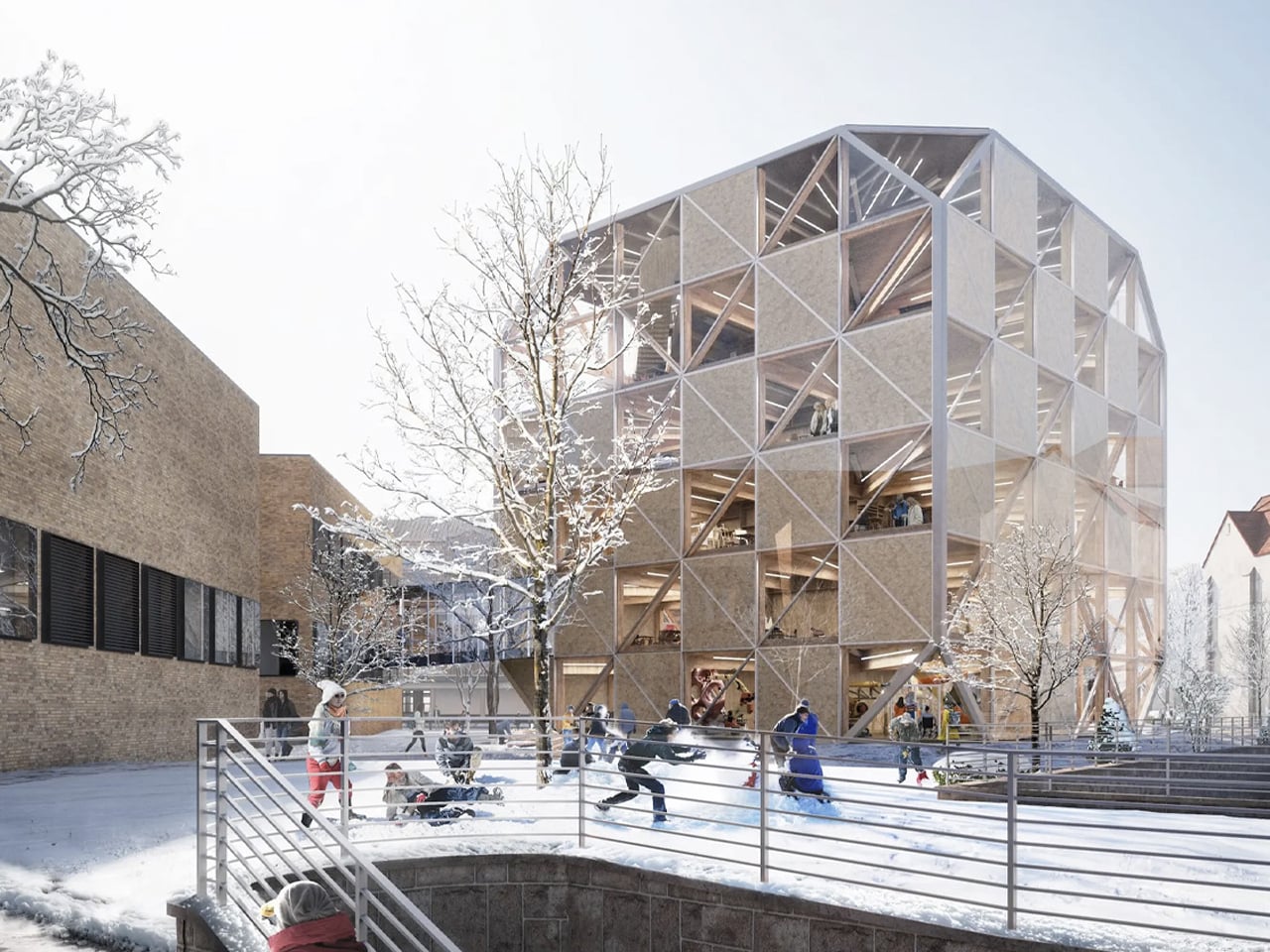
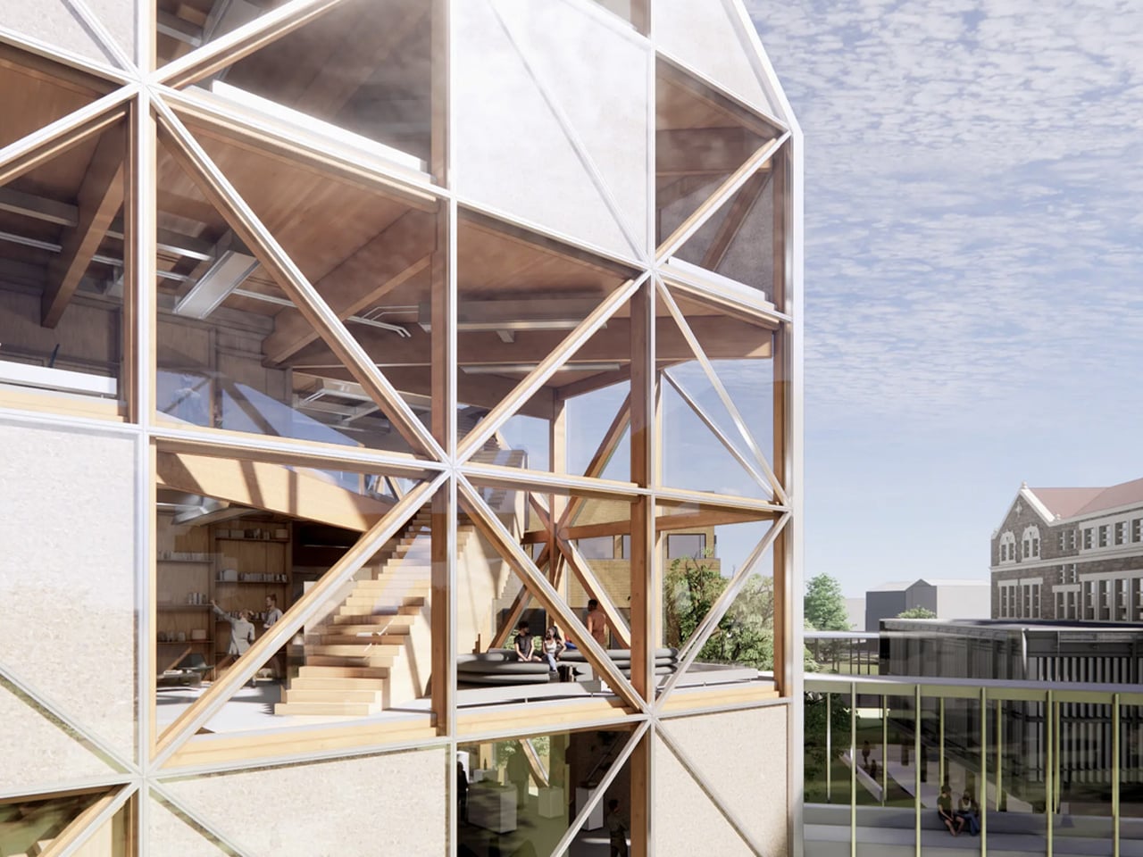
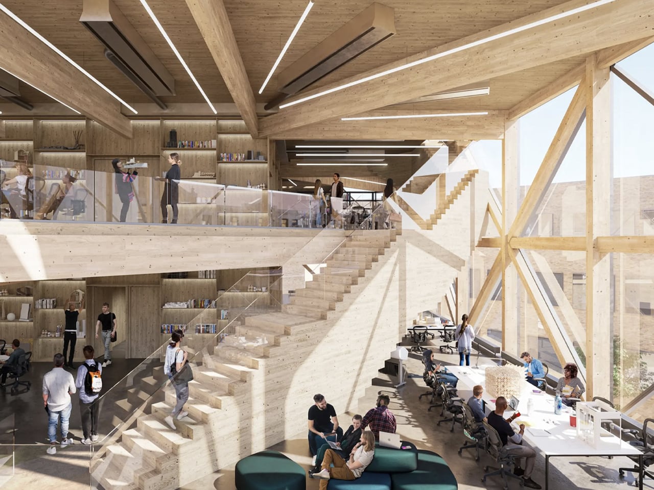
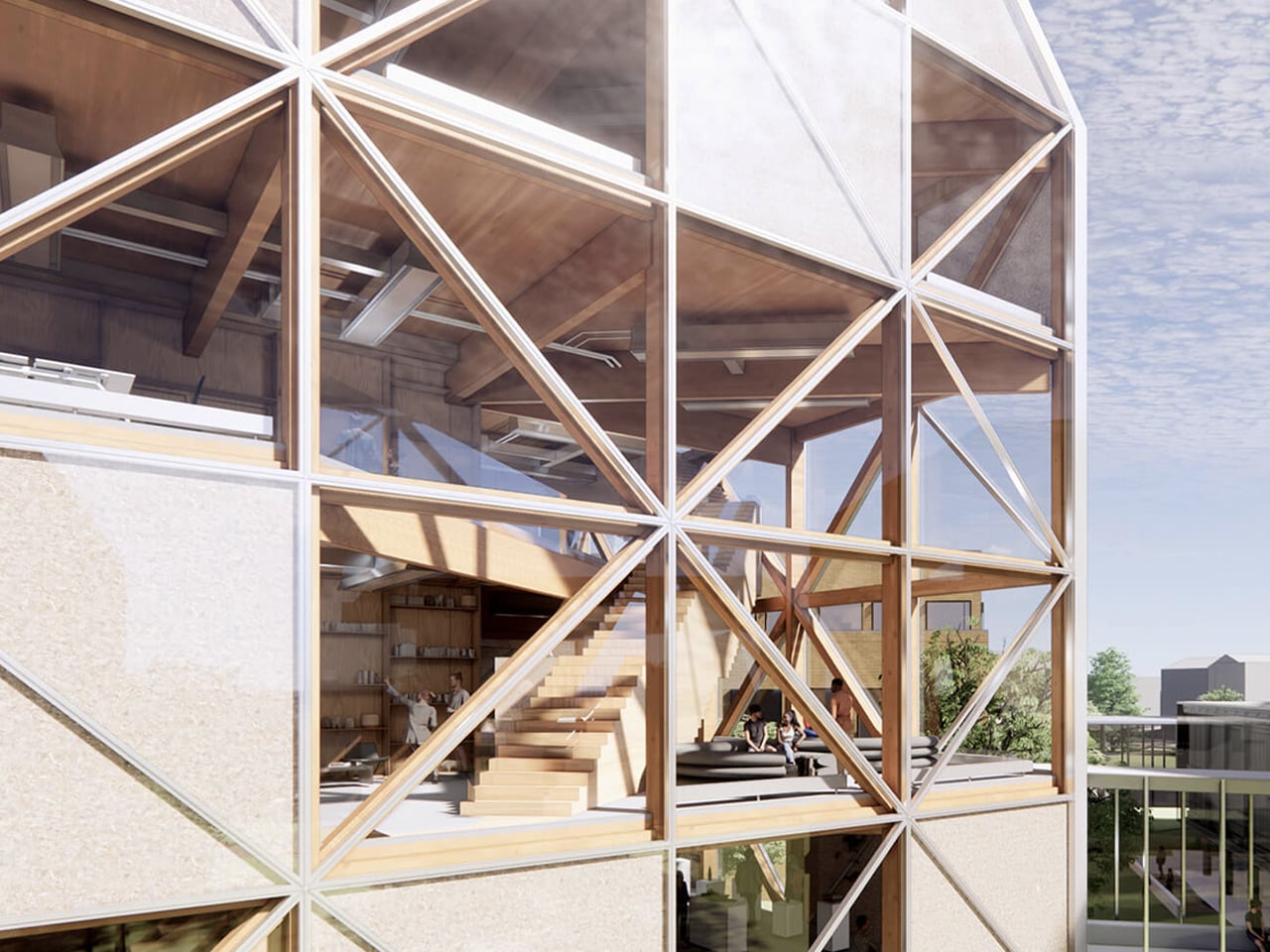
Renowned design studio Bjarke Ingels Group (BIG) has unveiled plans for an innovative timber academic building for the University of Kansas’ School of Architecture and Design. Named the Makers’ KUbe, the project combines advanced engineered wood with principles drawn from traditional Japanese joinery to create a visually striking and environmentally responsible structure. The building features a mass-timber frame insulated with hemp-based material and wrapped in a refined glass envelope, allowing the natural character of the wood to remain visible while enhancing daylight and thermal performance. A deliberately pared-back aesthetic exposes mechanical, electrical, and plumbing systems, reinforcing the building’s educational purpose and material honesty.
Spanning approximately 50,000 square feet, the Makers’ KUbe is organized across six flexible floors with open-plan studios that encourage collaboration. A central staircase links the spaces, while facilities include 3D-printing labs, robotics workshops, and a café. Designed with a timber diagrid structure that minimizes concrete use, the building integrates rooftop solar panels and rainwater harvesting. Engineered timber ensures high fire performance, demonstrating durability alongside sustainability.
5. Explore Cultural Roots in Design
Longevity emerges when architecture is deeply connected to its cultural and geographical context. By integrating regional vernacular traditions and time-tested spatial principles such as Vastu, buildings gain a depth that extends beyond stylistic modernism. This grounding allows architecture to feel inherently aligned with its surroundings rather than imposed upon them.
Orienting spaces according to established principles of flow and balance fosters psychological comfort and a lasting sense of harmony. The use of locally sourced stone and timber further strengthens this connection, reducing environmental impact while visually anchoring the structure to its setting. Together, cultural alignment and contextual materiality create architecture that feels enduring, relevant, and inseparable from its landscape.
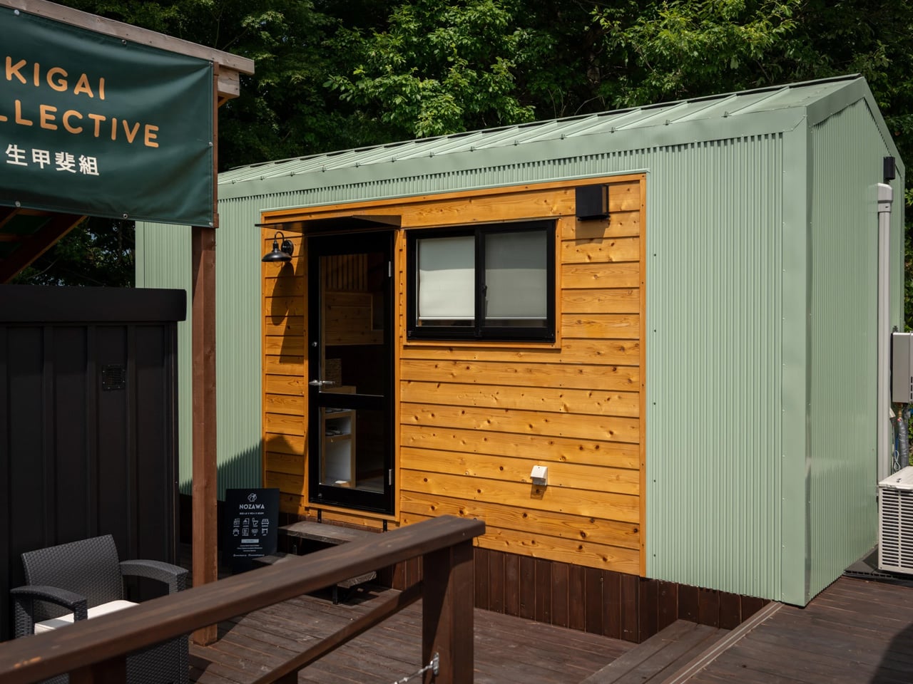
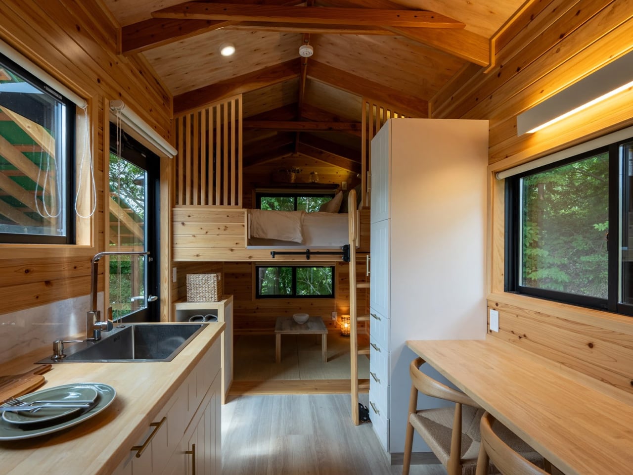
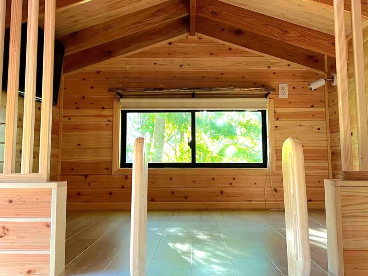
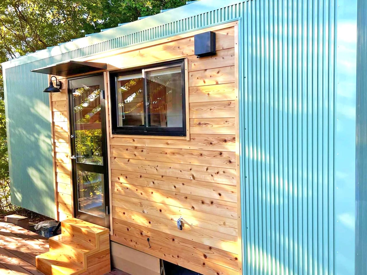
The tiny house movement has found a distinctive expression in Japan through Ikigai Collective, which creates homes that harmonize traditional aesthetics with modern minimalism. The Nozawa exemplifies this approach, reflecting authentic Japanese design rooted in local craftsmanship rather than imitation. Measuring just 20 feet in length, the compact dwelling contrasts with the larger North American tiny homes, proving that thoughtful design can make efficient use of space without sacrificing comfort. Every inch of the home is purposeful, demonstrating how simplicity and attention to detail can transform a modest footprint into a fully livable environment, aligning with European sensibilities that prioritize efficiency and functionality.
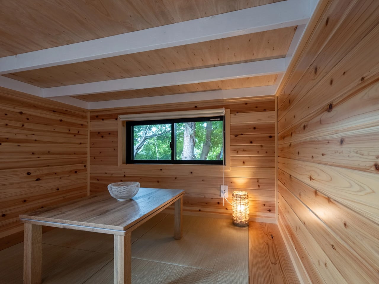
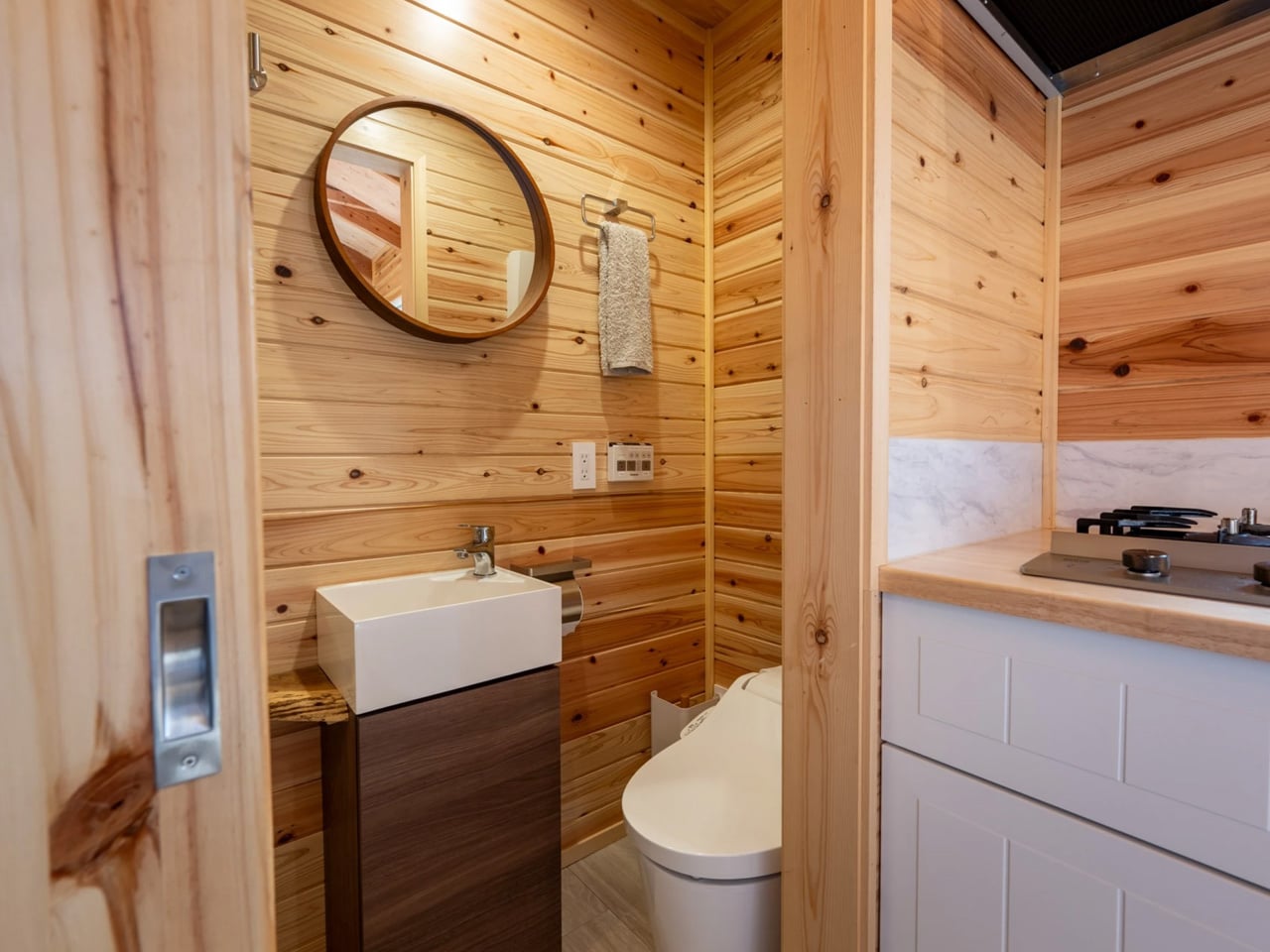
The exterior combines durable steel cladding with wooden accents, while the interior immerses residents in warm timber surfaces, creating a grounded, inviting atmosphere. The two-level layout features a tatami-style living area, a well-equipped kitchen, an efficient bathroom, and a loft bedroom with storage and a double bed. This design balances cultural heritage with contemporary living, offering a complete, intimate home for two that honors Japanese traditions while embracing modern minimalism.
The 2026 design shift emphasizes true longevity, moving beyond superficial eco-labels toward enduring architecture. By prioritizing authentic materials, adaptable spaces, and precise construction, homes are crafted to last and be cherished across generations. True luxury lies in the assurance of a resilient, high-performance sanctuary that contributes meaningfully to the built environment.