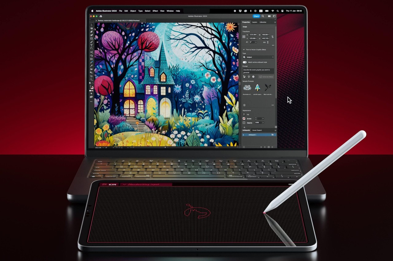
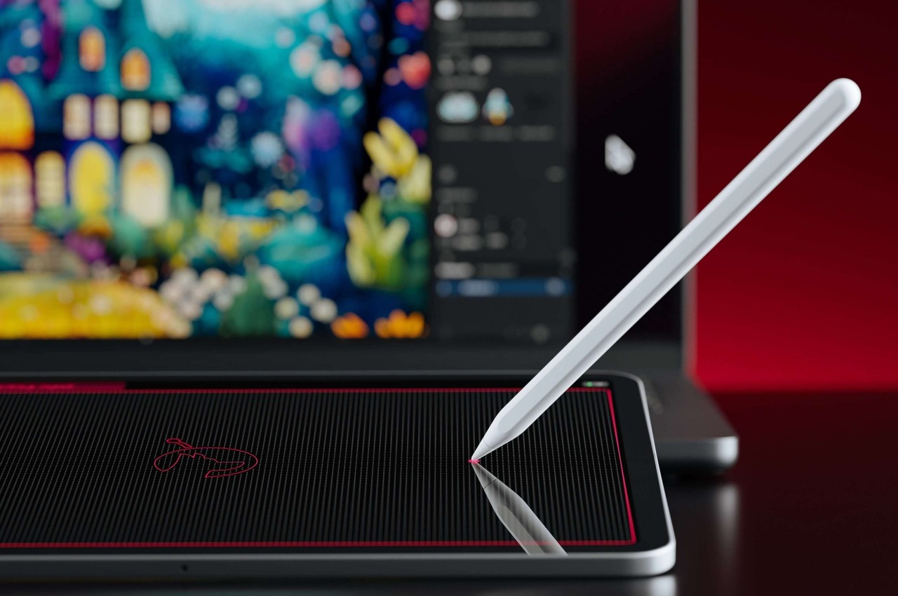
Apple has been pushing the iPads, particularly the iPad Pros, as the next wave of computing, practically replacing laptops for some of the common computing tasks, including content creation. Despite the rich variety of apps for these slates, however, there are still some software and work that can only be done on more powerful computers like Macs and MacBooks. And despite how Apple’s computers have long been loved by designers and artists, the company itself has made no tools to support these use cases, such as drawing tablets or even specialized controllers. That does leave the market wide open for manufacturers like Wacom and its drawing tables, but it also forces people to buy these products when they have a perfectly capable iPad with an Apple Pencil. That’s where Astropad’s latest product comes in, bridging the divide between Macs and iPads once again, but with a curious twist.
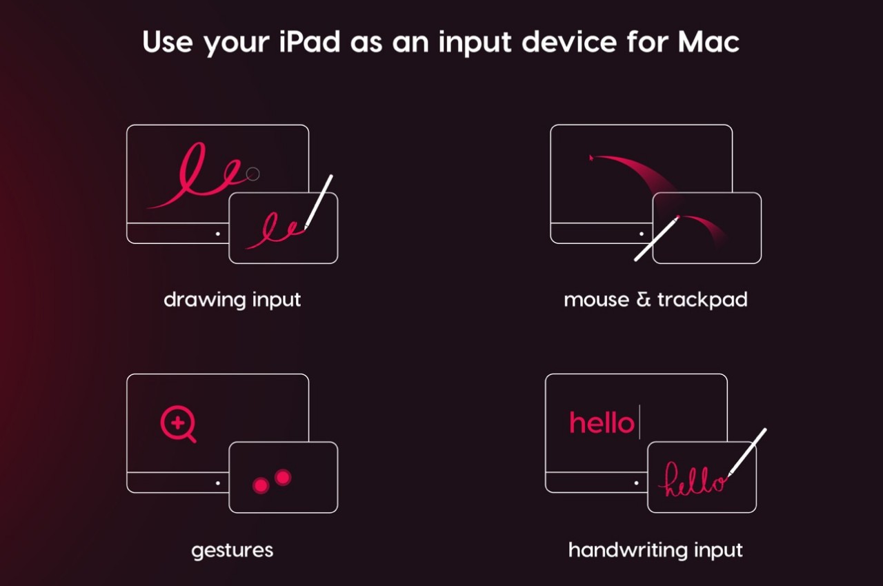
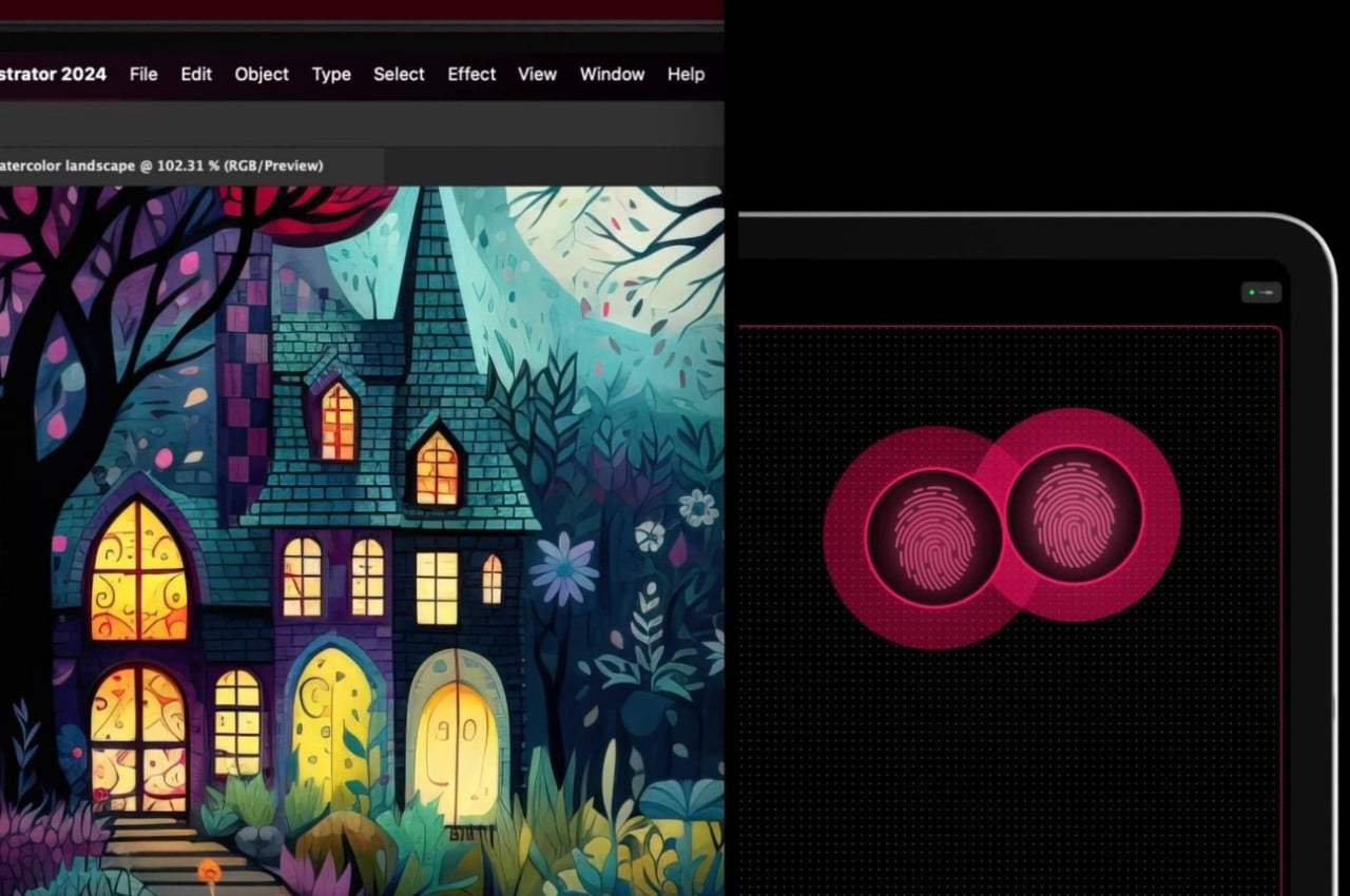
In a nutshell, Astropad Slate is an app that lets you remotely control a Mac using an iPad, Pro or otherwise. You can connect using Wi-Fi, a USB cable, or even Peer-to-Peer networking. Although an Apple Pencil would be nice, it isn’t exactly a requirement. With just your fingers, you can already control the Mac as if you were using a gigantic touchpad. That includes supporting gestures like pinching or two-finger scroll.
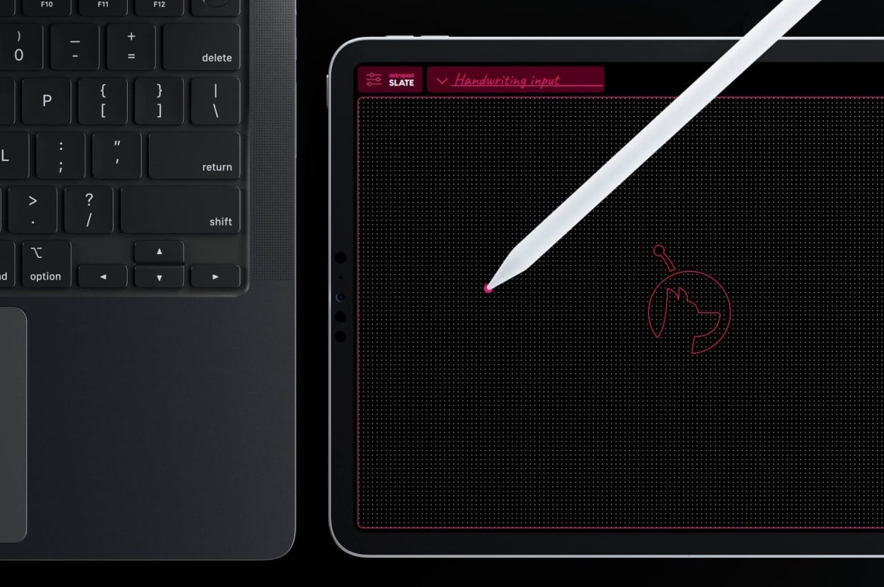
The Slate app really shines, however, when you involve an Apple Pencil, which is supported by most iPads nowadays. With this precise tool, you can not only hover over the user interface on the Mac, you can also turn handwritten scribbles into text, practically replacing the keyboard. Of course, creators, designers, and artists are more likely to utilize the app’s ability to turn the iPad into a drawing tablet, but one without a screen.
This would be similar to the older and cheaper drawing slates that some artists prefer for their distraction-free experience. It does, however, take a bit of getting used to because you won’t be looking at where your hand is going, unlike the analog pen and paper experience. That does help you focus more on what’s happening on screen and, at least for some, offers a more ergonomic position since you won’t be craning your neck downward.
For those that prefer a more “conventional” display tablet experience, Astropad does have its Studio that turns the iPad into something like a Wacom Cintiq and even has compatibility with Windows PCs. For all that power, however, Astropad Studio requires a $79.99 annual subscription, while this simpler Astropad Slate is a one-time $19.99 purchase only.
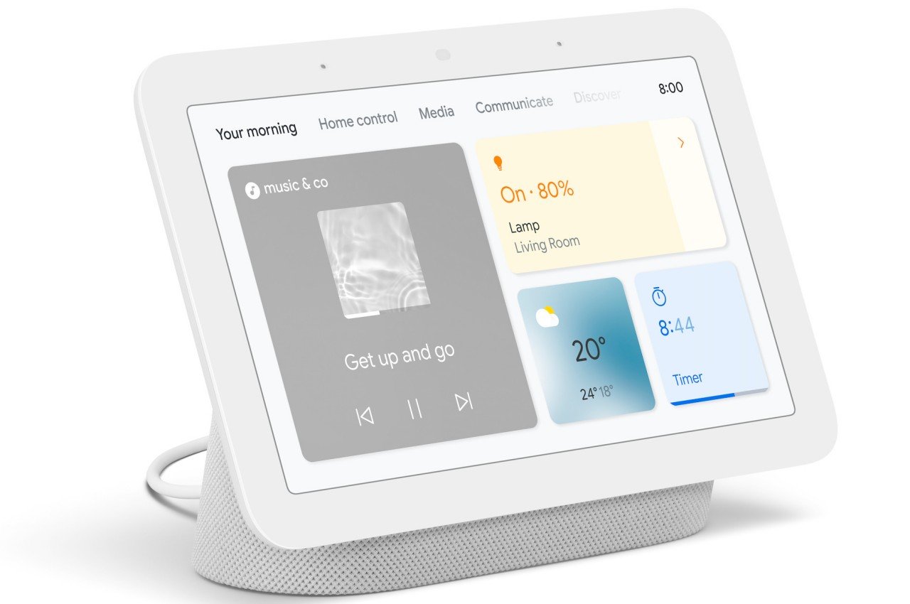
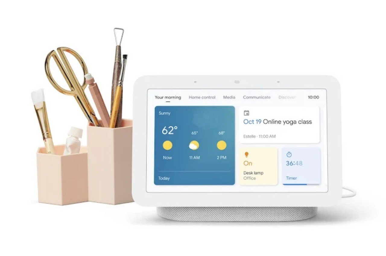
Although they look and seem like they’re made just for playing music, smart speakers are, of course, a lot more capable than simple wireless speakers. In fact, they were born to showcase the power of AI-powered smart assistants like Amazon Alexa, Google Assistant, and Apple Siri, which is also why the speaker quality of the first generation of speakers left much to be desired. While controlling your devices and appliances using your voice felt almost magical, it also became quite tiring quickly, especially when you could do things faster using an app on your phone. That’s the reason why smart speakers with displays, a.k.a. smart displays, were born, and that design might finally be coming to Apple’s ecosystem, potentially bringing life back to stagnant waters.
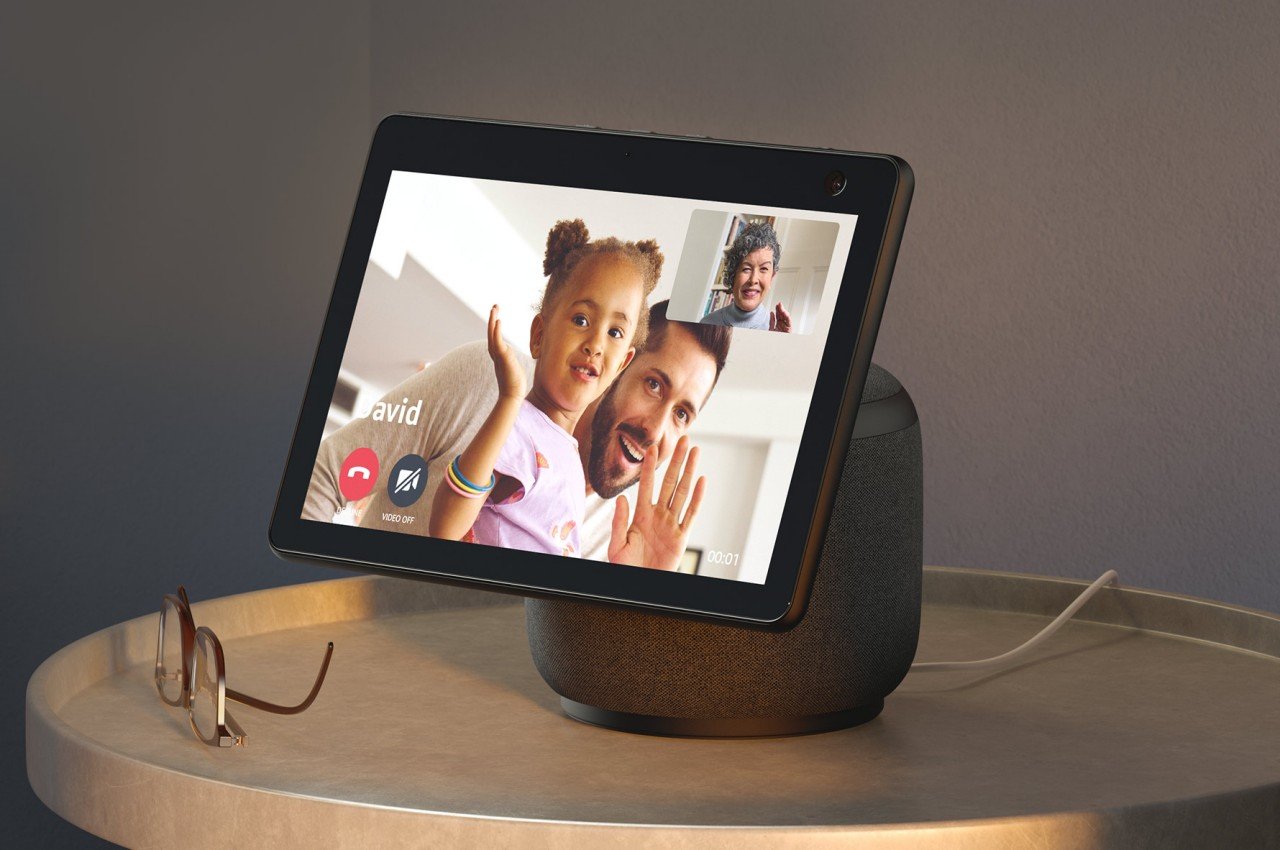
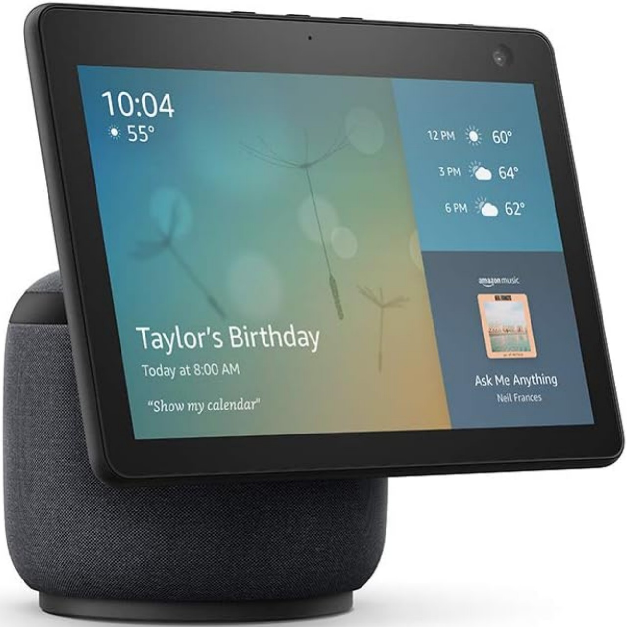
It’s been a while since we’ve seen a new smart display coming from the major brands. The latest Amazon Echo Show last year is actually just an upgraded Echo Show 5. Google launched the 2nd-generation Nest Hub in 2021, though some might argue that the Google Pixel Tablet and its speaker dock actually fall under this category. After all, most of these smart displays do look like smart speakers with a tablet stuck on top of them.
Amazon Echo Show 10
Amazon Echo Show 10
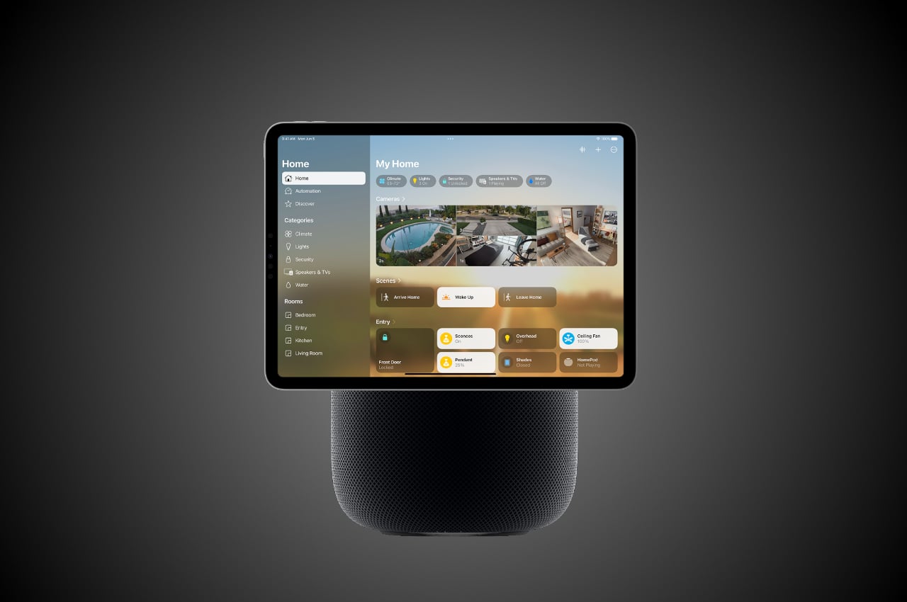
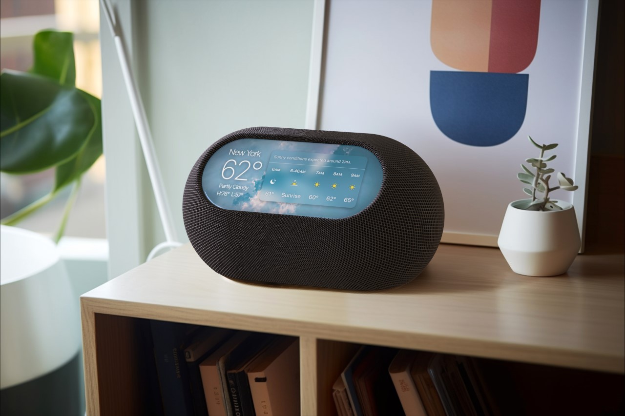
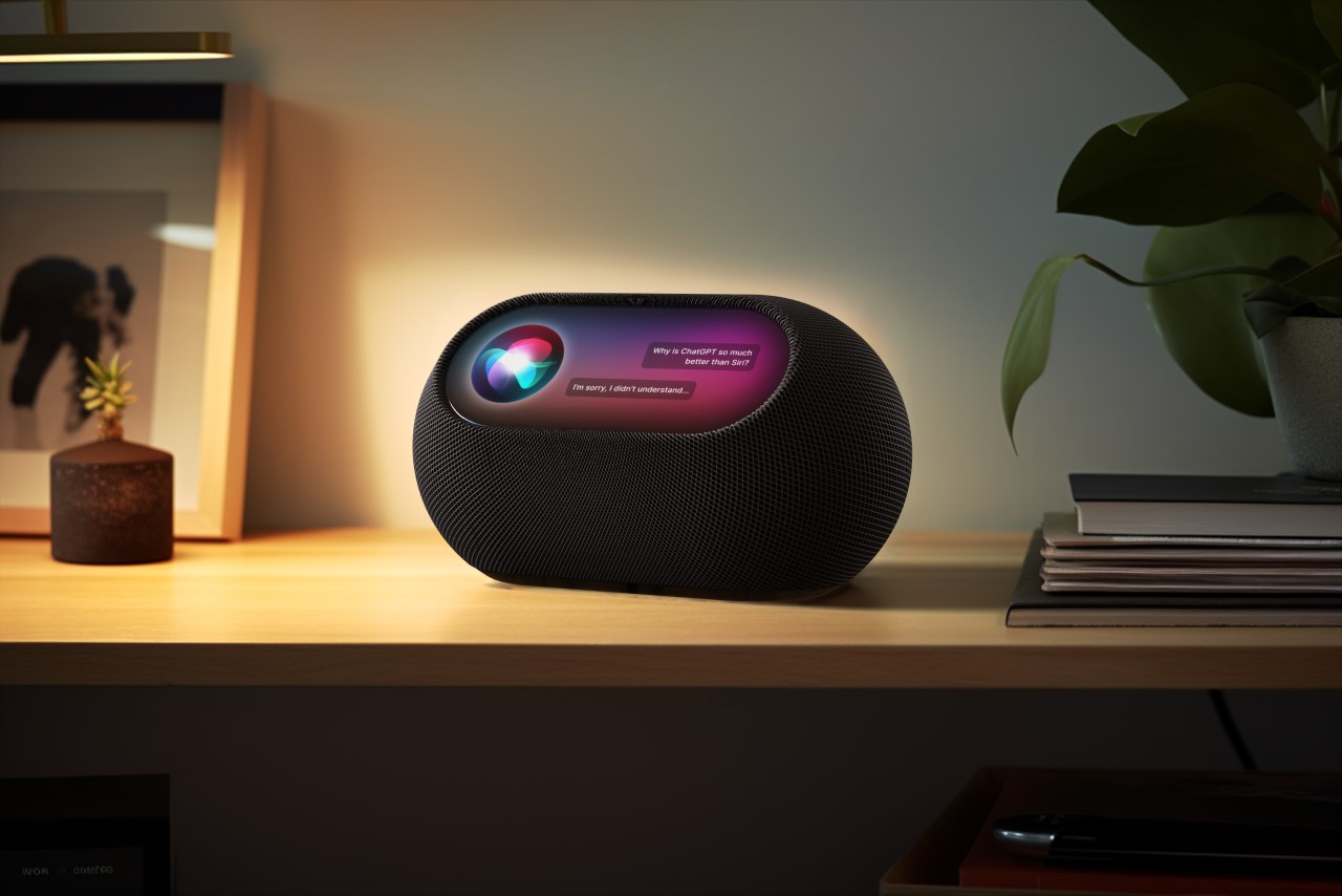
That design might be coming to Apple’s smart home device category, thanks to clues found in the latest beta testing of tvOS 17.4. There is no direct evidence, of course, just a new device codenamed “Z314” that just happens to share some internal hardware with the iPad mini 6. The HomePod was actually discovered to already be running tvOS, which would have been weird if it didn’t eventually get some visual capabilities. Again, much of these are based on speculation, but the hints seem to be building up and pointing toward a spring 2024 reveal.
Google Nest Hub 2
Google Nest Hub 2
A HomePod with a touch screen, even just a 7-inch one as indicated by rumors, will offer a significant upgrade to people’s user experience. Although the HomePod already offers physical controls for quickly controlling music, anything else has to be done either through Siri or through a connected iPhone or iPad. The latter scenario, however, can cause additional battery drain to mobile devices, so a dedicated display will go a long way in making it more convenient to access Apple Home settings, media controls, and more. Of course, sticking a tablet on top of a HomePod isn’t the only possible design option available, as our very own Sarang Sheth explored in a piece that envisioned an aesthetic that matched Apple’s style more closely.
That said, it also isn’t certain how far Apple will go in what features it will provide on that screen. The likes of the Amazon Echo Show and Google Nest Hub offer video capabilities, though that has also been a thorny subject as far as YouTube is concerned. Apple is traditionally even more conservative in what it allows on its devices, so we can probably expect functionality limited to smart home control, FaceTime, and, of course, its own library of tunes and videos.
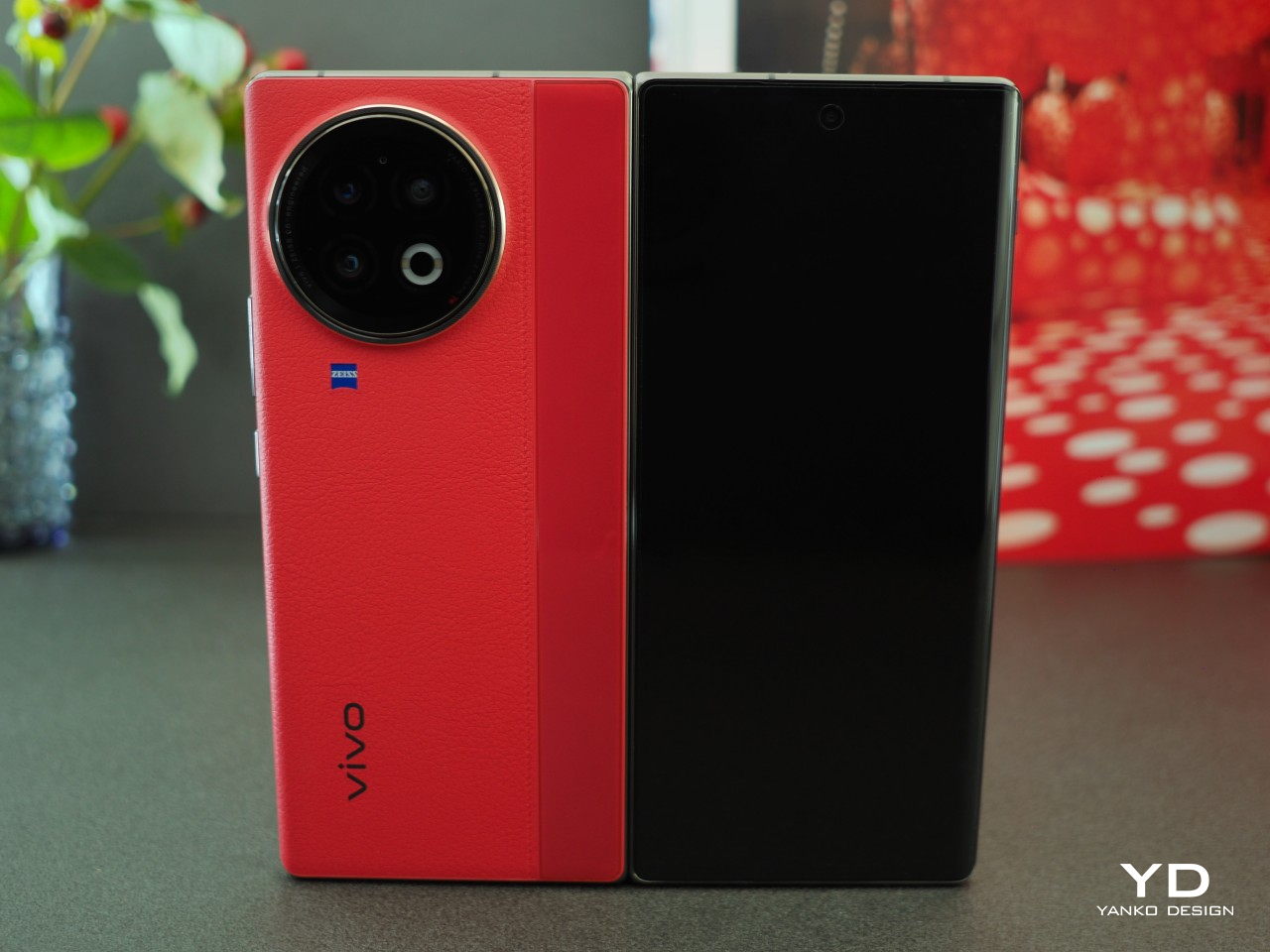
The number of foldable phones launching each year is slowly rising, suggesting that these former novelty items are here to stay. To manufacturers’ credit, the phones are getting more reliable and attractive, even if their prices are still prohibitive for most people. With more players in the market, it’s bound to become a somewhat livelier place, with brands putting their own spins or changing designs to match or challenge their rivals. It now seems, however, that the still niche foldable phone category is about to enter another tumultuous phase with new designs that could shake up the market and some companies throwing in the towel, leaving only a few designs to stick and stagnate.
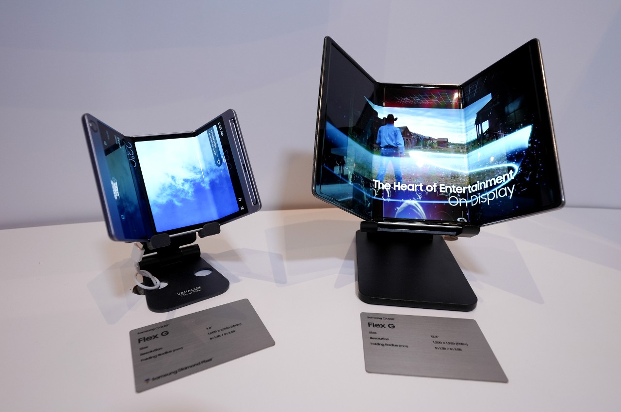
Triple Folding Phones
The biggest and perhaps only reason for a foldable phone would be to provide a device that can be used as a regular phone when wanted but can transform into a tablet when you want more screen real estate. The current crop of foldable phones does meet those requirements, though almost barely. As tablets, they’re painfully tiny even compared to the already small iPad mini and some 7-inch slates. As phones, some designs make them awkward to use because of their narrow and tall external screens.
One possible solution would be to have a large screen that can fold in three parts, turning into a phone-sized slab, albeit probably a bit thicker than even today’s foldable phones. Samsung has, in fact, been working on such a design for years and it finally showed off a prototype two years ago. It turns out that it might even launch its first tri-fold phone slash tablet later this year.
This timeline is reportedly due to one of Samsung’s biggest rivals trying to make a move first. Huawei, who is rebuilding its empire in some markets, is rumored to be launching a foldable phone that transforms into a 10-inch tablet. Just for the title of being the “world’s first,” Samsung could be taking a big risk and making a leap of faith to get that triple foldable phone out the door quickly, even if it means repeating the mistakes of the first Galaxy Fold.
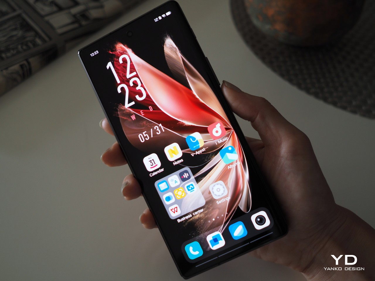
Stylus Support Inside and Out
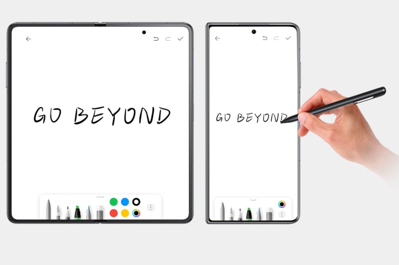
One of the biggest draws of foldable phones is, of course, their big screens. They’re not just perfect for showing more content, but they’re also great for actually creating content. With tablets now being seen as productivity and creativity tools thanks to the iPad Pro, these foldable phones are truly powerful laptops you can fit in your pocket, at least in theory. Ironically, very few of the brands actually support such a use case with the right accessories. Even Samsung forces you to buy the S Pen Fold Edition if you want to scribble and doodle on your foldable phone like a notebook.
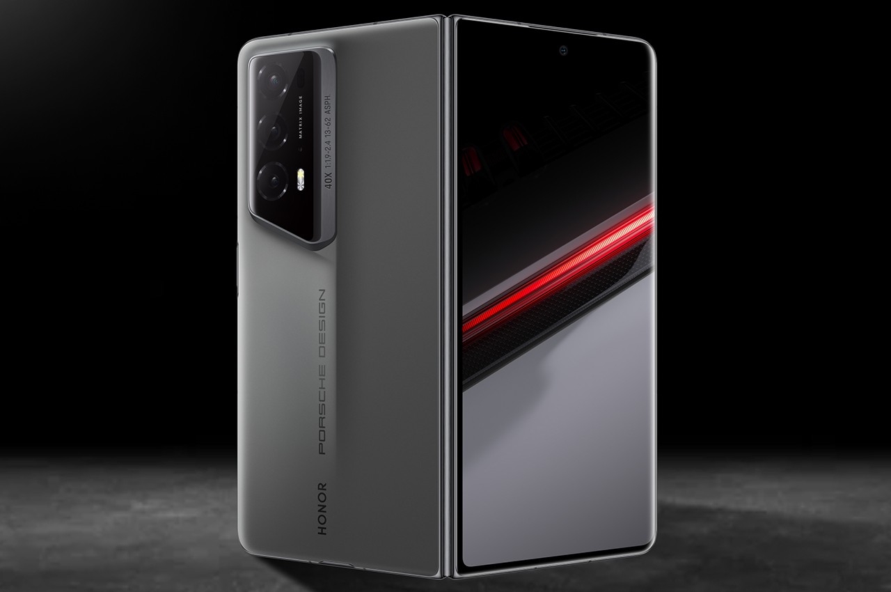
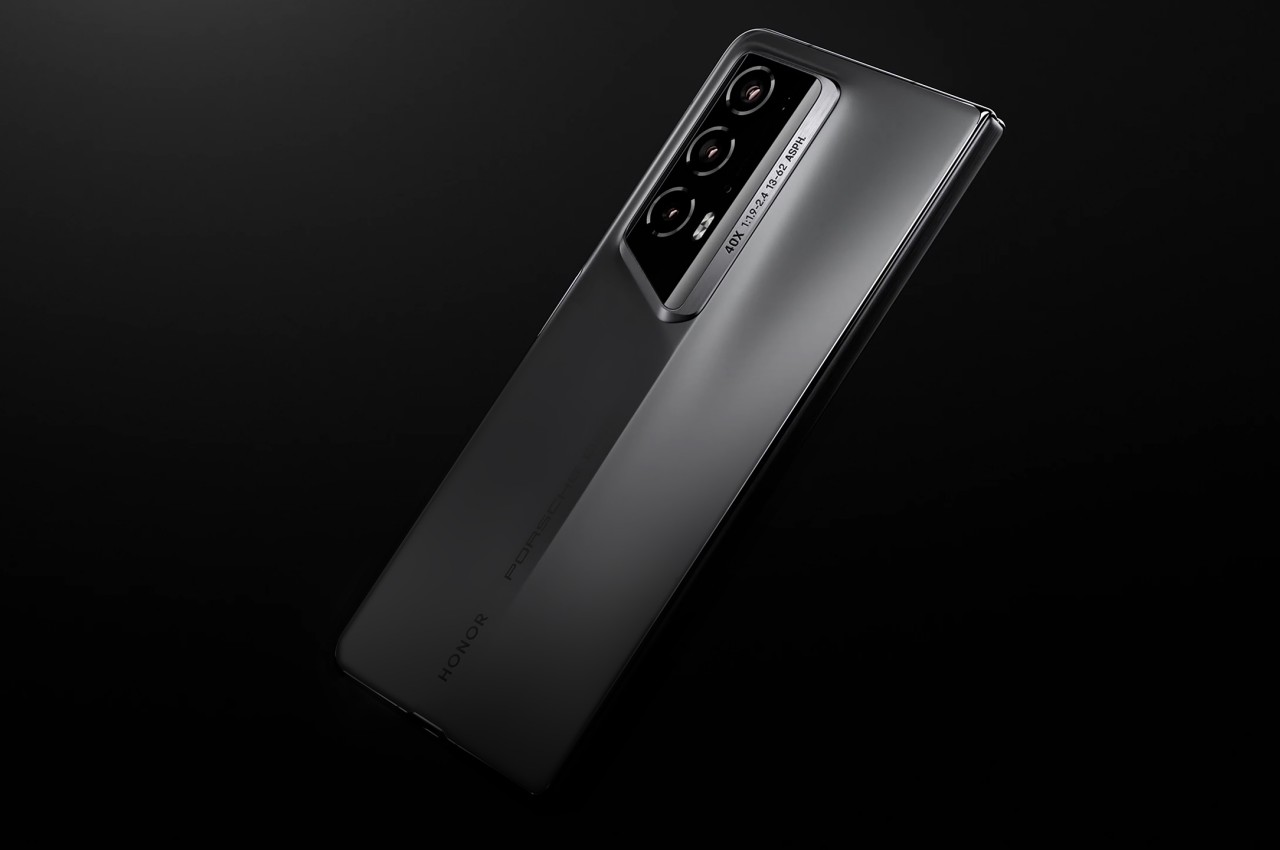
The newly launched mouthful that is the Honor Magic V2 RSR Porsche Design bucks the trend by actually including a stylus inside the box. Granted, the price of this limited edition would make you think it should include such an item, but you’re also paying for other luxuries at the same time. For example, you get two charging bricks instead of one. Some foldable phones other than Samsung don’t even advertise support for a stylus even if they’re capable of supporting one.
More interesting, however, is how the Honor Magic V2 RSR Porsche Design actually supports that active stylus not only on the large internal screen but also on the smaller cover screen. That one-ups even Samsung who is famed for its stylus-enabled Galaxy Note phablets, now sold under the Galaxy S Ultra brand. Honor is showing that such a set of features is possible, and it could lead to a long-overdue trend in the foldable smartphone market, presuming there’s still one in the next few years.
Design Monoculture
One of the reasons why the foldable phone market seems to have stabilized a bit is because of the number of players now in the ring. Of course, you have Samsung and Huawei leading the charge, but now you also have Xiaomi, OPPO, Vivo, Tecno, OnePlus, and Honor in the running. Unfortunately, there are whispers that two of these are bowing out of the race, and their absence could actually have an indirect though significant negative impact on foldable phones as a whole.
Those rumors claim that both OPPO and vivo are calling it quits in the foldable market. The cited reason is not exactly surprising, with both brands suffering significant losses in foldable phone sales last year and they don’t believe they can throw in more resources to recover. It’s unknown at this point whether OnePlus will also be following its cousins, though there’s a real possibility that these manufacturers will pull out sooner rather than later.
While that indeed sounds like a win for Samsung and Huawei (and Honor), it might not actually be good for the entire market in the long run. Competition often breeds innovation, with these brands pushing each other to develop new designs and features at every turn. With only two contenders, each with their own separate kingdoms, there might not be enough incentive to push the boundaries, leading to stagnation and eventual death of the market.
Of course, there’s still no confirmation that OPPO and Vivo are indeed making an exit strategy, but it does paint a picture that isn’t as rosy as these brands try to paint. Even with the popularity of clamshell-style foldables and with new models coming out year after year, actual sales might actually reveal a very different and less encouraging situation. Given the way technology is developing, foldable and rollable displays will eventually be a staple of tomorrow’s devices, but that doesn’t mean the market won’t experience a few flops first along the way.
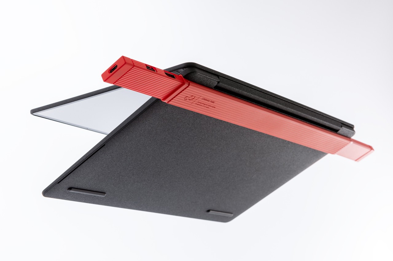
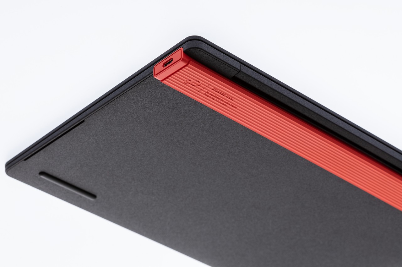
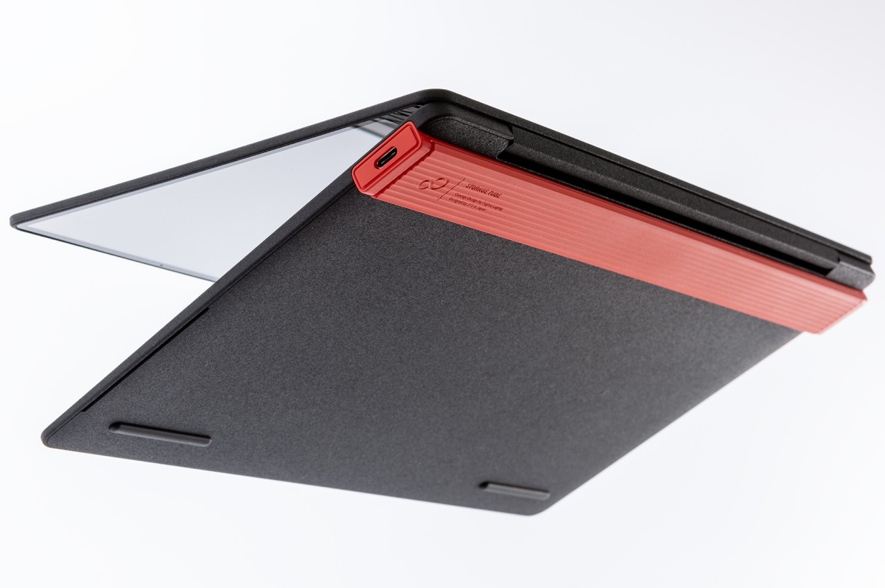
Laptops are becoming powerful beasts that could almost match the computers sitting on top of our desks, but if there’s one thing they still can’t do is offer the same connectivity options as those towering boxes. You can only fit so many ports into a laptop without marring its slim profile, and some manufacturers have even started removing all but the small USB-C ports for the sake of aesthetics and weight. It’s a compromise imposed by current design restrictions, but it’s far from the ideal solution. If those restrictions are lifted, it might be possible to come up with a better design, like this concept for a laptop that still has a plethora of ports but can keep them out of sight when not in use.
A laptop’s purpose is primarily to offer computing power you can carry around with you and use anywhere, at least as long as it has some battery left. For most purposes, a laptop already has everything it needs to get the job done, but with the growing complexities of modern work, you will inevitably find yourself connecting some peripherals, such as an external storage drive at the very least. This is especially true for laptops that are used as “portable desktops” at work where you’d usually plug in a monitor, keyboard, mouse, and other accessories and then pull them all out when it’s time to leave.
Those connectivity ports give laptops their flexibility, but they also mar what would otherwise be a beautiful pristine design. You can minimize their effect with smaller USB-C ports, but you also make users’ lives complicated as Apple learned the hard way. A design that hides those ports while still making them available when needed is almost a pipe dream, at least if you only apply common conventions. This concept, however, thinks outside the box to come up with a solution that actually hits two birds with a single stone.
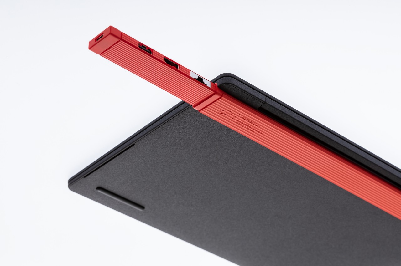
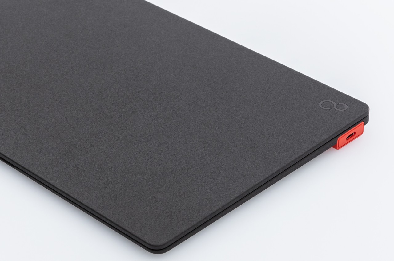
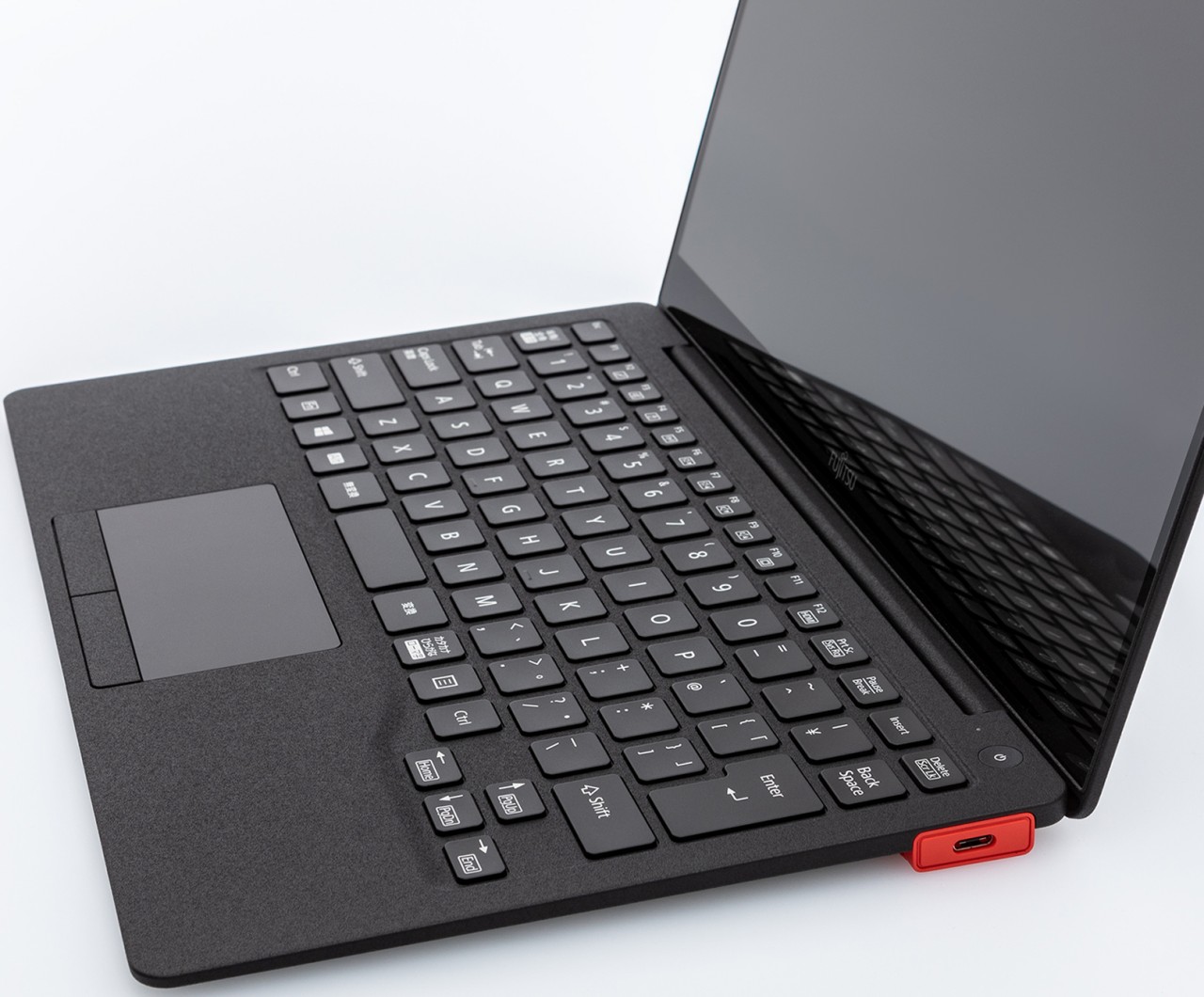
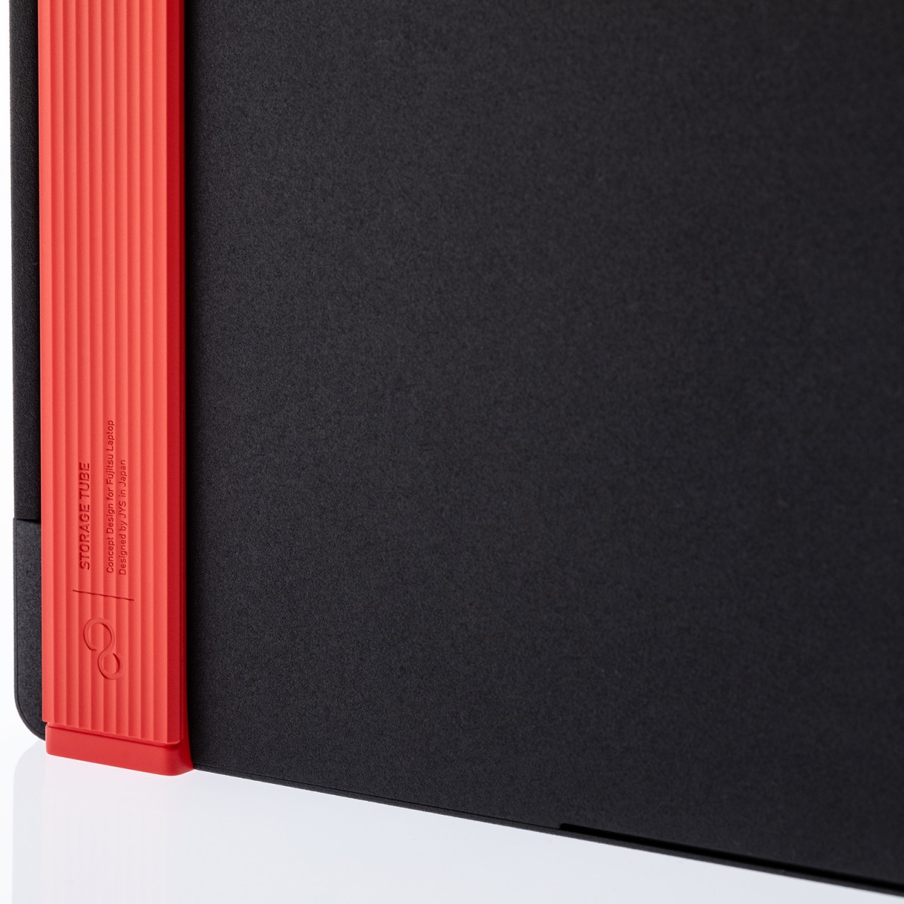
Commissioned by Fujitsu, this laptop concept employs a retracting mechanism to hide and then deploy ports inside a rectangular tube that sits underneath the laptop near its rear. It still has one USB-C port exposed for quick access, but all other connectors are still within easy reach once the inner bar slides out. That tube also functions as a riser to keep the keyboard at a more ergonomic angle.
The concept design uses a black and red motif to match Fujitsu’s official colors, but it’s not hard to imagine other designs being used as well. As interesting as the concept might be, it does also leave a few concerns unaddressed. The first would be the technical implementation of such a retractable design, especially when it comes to durability as well as the arrangement of electronics inside. More importantly, however, it also locks the laptop at a fixed angle determined by the riser tube, and unless it’s detachable, it also adds a somewhat unattractive protrusion to the laptop’s profile.
Although there were plenty of rumors and high expectations, it was still a bit of a miracle that Google came out with a foldable phone. After all, it didn’t exactly hold tablets in high regard, so a phone that transforms into one would have probably been even less within Google’s radars. Of course, that’s now history with the launch of the Pixel Fold, Google’s first and so far only foldable, which turned out to be quite popular, especially with its design. It turns out, there was a slim possibility that the Pixel Fold could have turned out very differently and looked more like Samsung’s design, at least based on a prototype that is now running over the Internet.
Designer: Google (via Mishaal Rahman)
Phone manufacturers go through numerous prototypes before settling on a final design, especially when the device is rather new or unconventional. That’s true for seasoned brands like Samsung, and even truer for the likes of Google, and a device codenamed “jumbojack” was spotted nearly four years ago as Google’s foldable prototype. Now that name has become a real device, at least based on what is allegedly that very same prototype device which happens to be a Samsung Galaxy Z Fold 2.
This “jumbojack” foldable doesn’t look like a custom prototype made by Google but an actual Galaxy Z Fold 2 that has been repurposed to run “stock” Android stripped of Samsung’s branding. It’s pretty much a quick and easy way for Google to test its Pixel user experience on a foldable without having to go through the trouble of assembling a prototype. That said, the final flavor of Pixel is quite different since it was designed to work on a foldable with a distinctly different form factor.
Samsung Galaxy Z Fold 2
Samsung Galaxy Z Fold 2
Samsung Galaxy Z Fold 2
The prototype does raise the question of whether Google actually considered following in Samsung’s footsteps to adopt a design that was already in use for a few years by that time. That meant that it would have used a design that resulted in a narrower external display, a squarish unfolded shape, and possibly a gap at the hinge when folded. Perhaps it was for the best that it went the other way and used a design more similar to the OPPO Find N, which was wider, a little smaller, and also a bit more comfortable to hold.
Then again, the “jumbojack” prototype might have simply been used to test the software without committing to the device’s design. Unfortunately, there are now rumors that Google might actually be heading towards Samsung’s direction for the Pixel Fold 2, along with a camera design that’s sure to cause some controversy. If anything, this alleged prototype only proves that there is still plenty of room for improvement in the foldable phone design space, but recent rumors are already painting a rather bleak future in that regard.
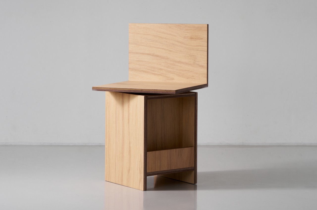
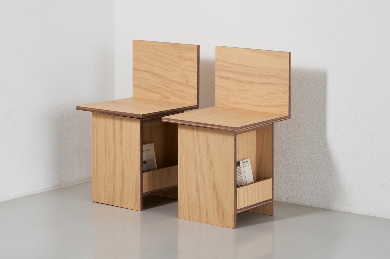
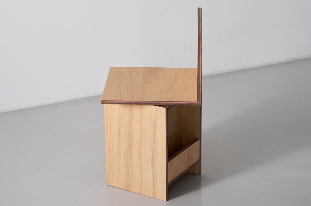
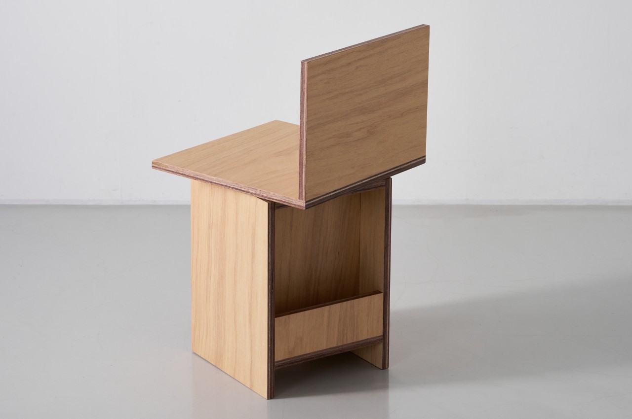
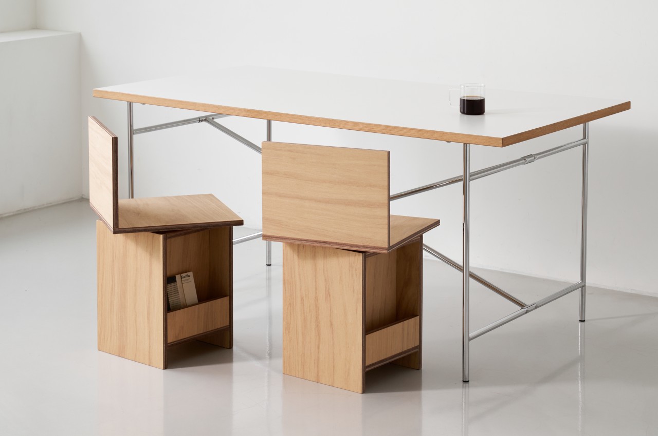
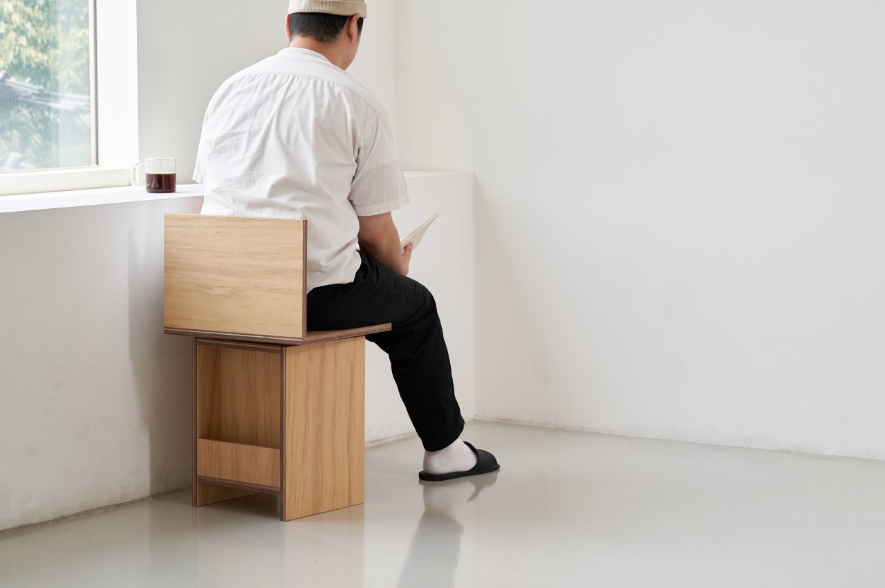
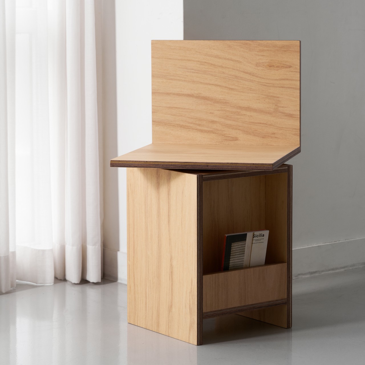
While all furniture needs to be stable, chairs and other seating furniture need to meet two requirements. They have to be stable enough to hold the weight of the person sitting on them, but they also have to be comfortable to encourage or even tempt those people to use them. Then again, there are some seats that seem to actually discourage lounging around, adopting a design that’s purely utilitarian and sufficient for a brief rest of a few minutes. However, there are chairs that were designed with comfort in mind but fall slightly short of that goal. This stool, for example, is undoubtedly quite useful, space-efficient, and probably even sustainable, but it might have slightly missed the mark in one of its core use cases.
The stool looks simple enough at first glance, with a tall box for a base and two plain boards forming the actual seat as well as a backrest. The latter element puts this design somewhere in between a typical stool and a chair, though the narrow area and absence of arms put it more in the category of a stool. Either way, it’s clearly designed for sitting, but it also does more than that.
The base of the stool has a rack for holding reading materials, either magazines or a few books. This small detail makes the design better suited for places where such an activity is conducive, such as a library, a lobby, or a common area in offices or schools. Of course, you can also place it around your home and it won’t even take up too much space because of its tall and narrow structure.
The Chair 025 design concept, however, has one trick up its sleeve. The seat can rotate 360 degrees, allowing you to actually face any direction you prefer without having to move the chair itself. That said, you might not be able to swing around so easily because your legs will hit the corners of the “stall” or base. Instead, you will just be swiveling back and forth, which could be the goal to induce a little blood circulation even while you’re sitting, although that still runs the risk of injuring your legs if you’re not careful.
The design’s low backrest can also be a point of contention, given it doesn’t exactly provide enough support and could even lead to injury or accidents if you forget that it doesn’t completely go all the way up. For a stool that seems to encourage sitting for long periods of time to read, the potential discomfort is a little counterintuitive. The economy of design and potential for using sustainable materials, however, do make the Chair 025 concept a candidate for cramped spaces and budget-constrained owners.
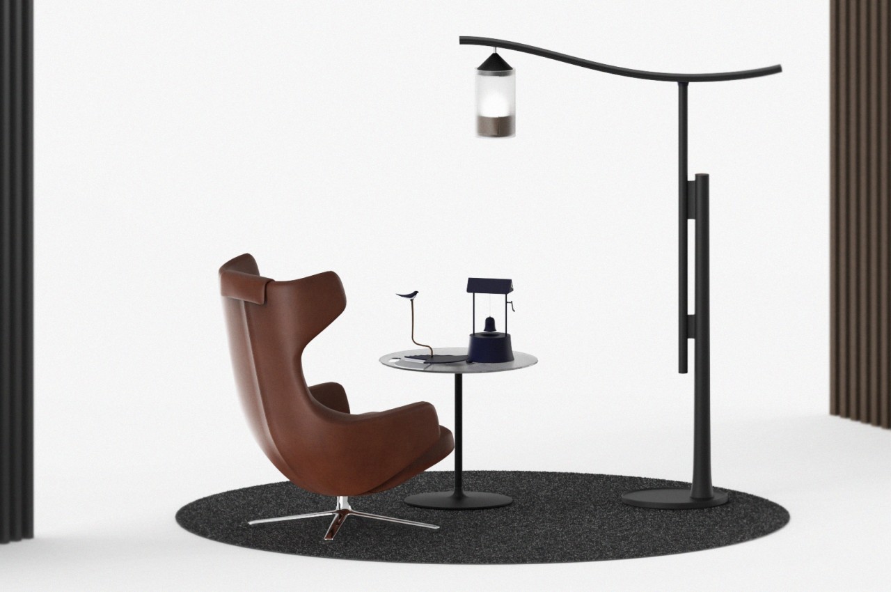
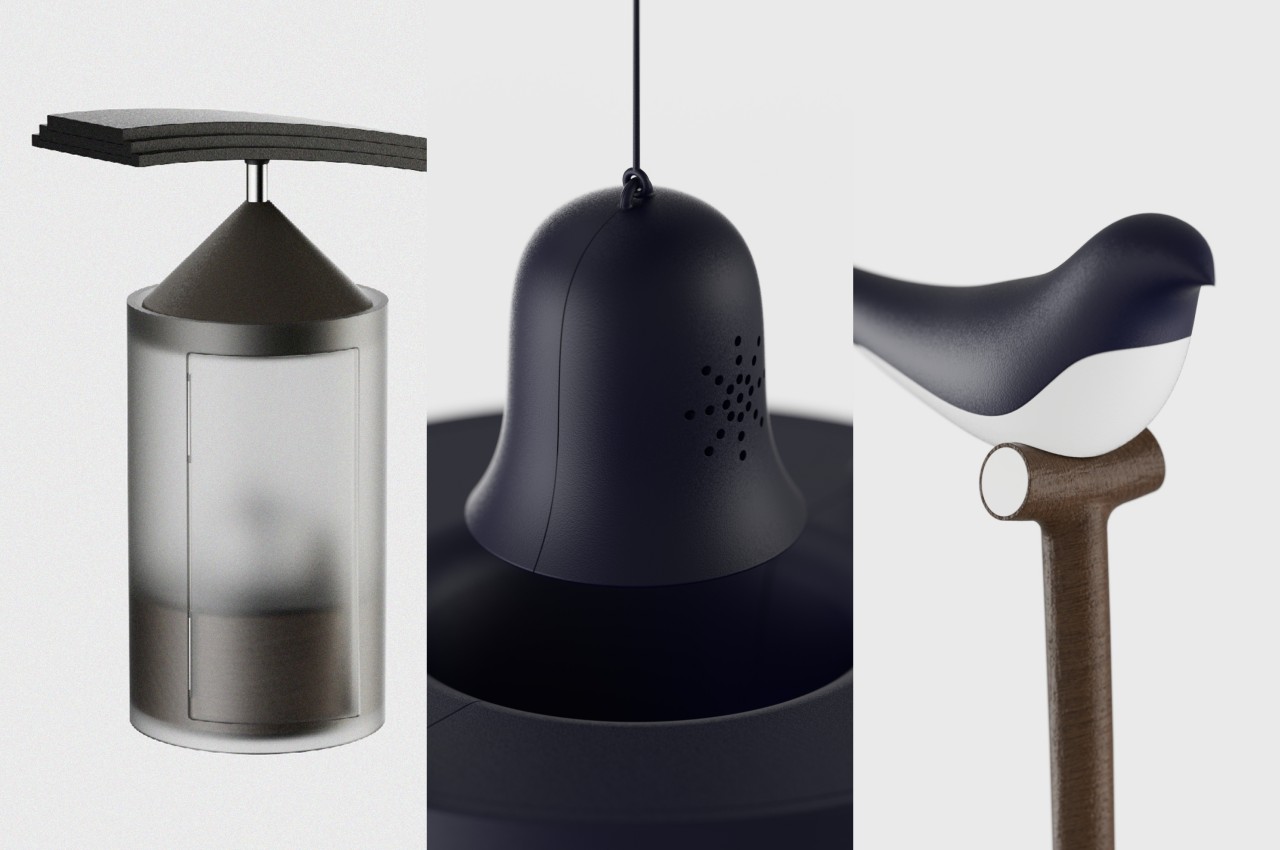
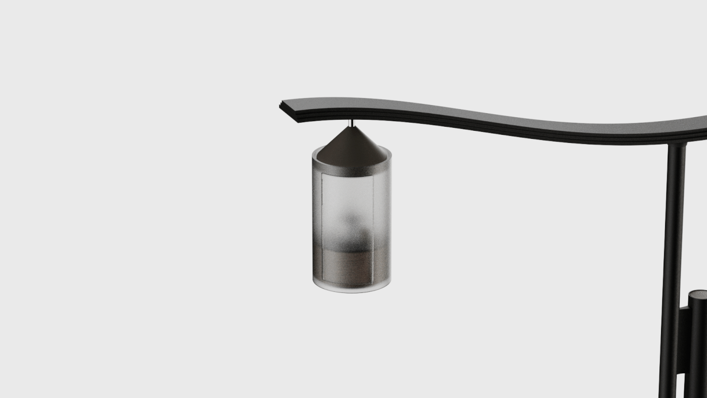
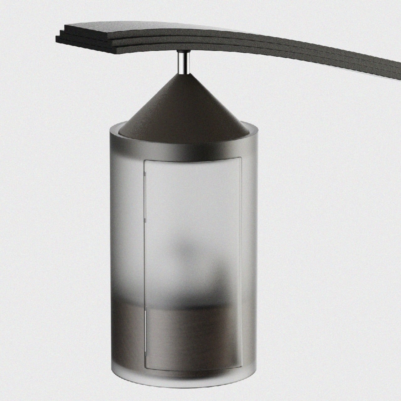
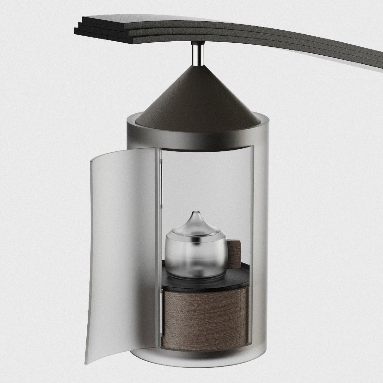
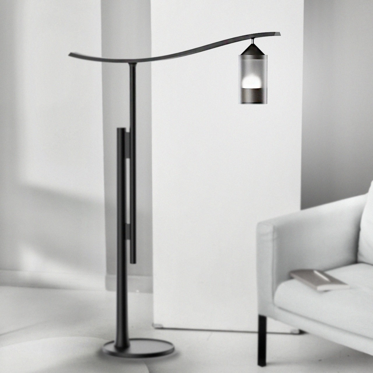
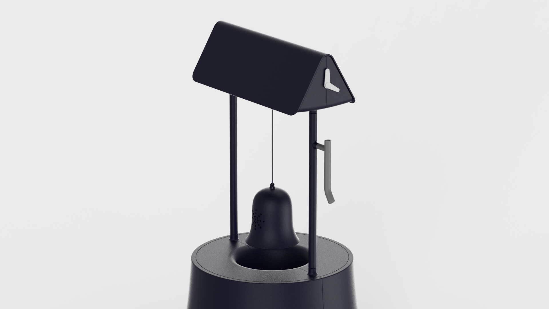
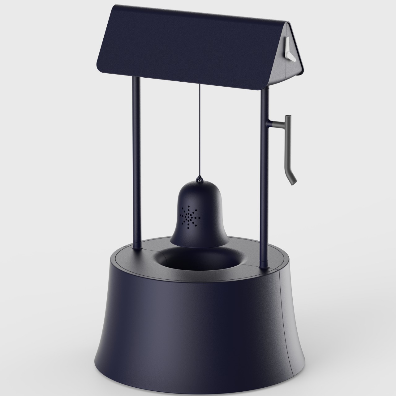
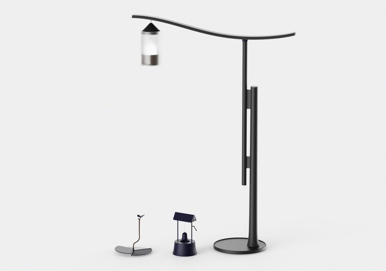
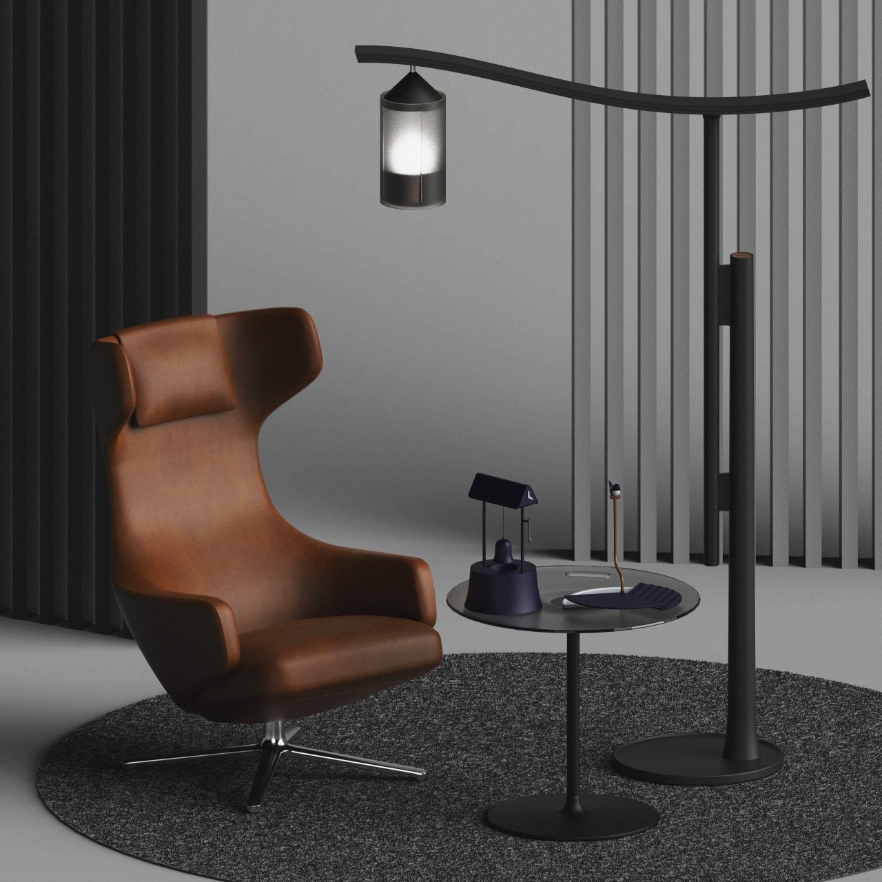
Humanity has produced no small number of tools and objects over the course of history. Some have evolved to become the tools we use today, while others have almost faded into the background, remembered and illustrated only in history books. While these items of the past may no longer serve a practical purpose today, they could still serve as a stepping stone to inspire the designs of tomorrow. This collection of three everyday products, for example, takes a few pages from the form and even the function of these old objects, creating an atmosphere of wonder and curiosity, while also giving a few visual clues that connect us to our distant past.
Designers: Dami Seo, Dohui Kim, Dong Kyun Kim
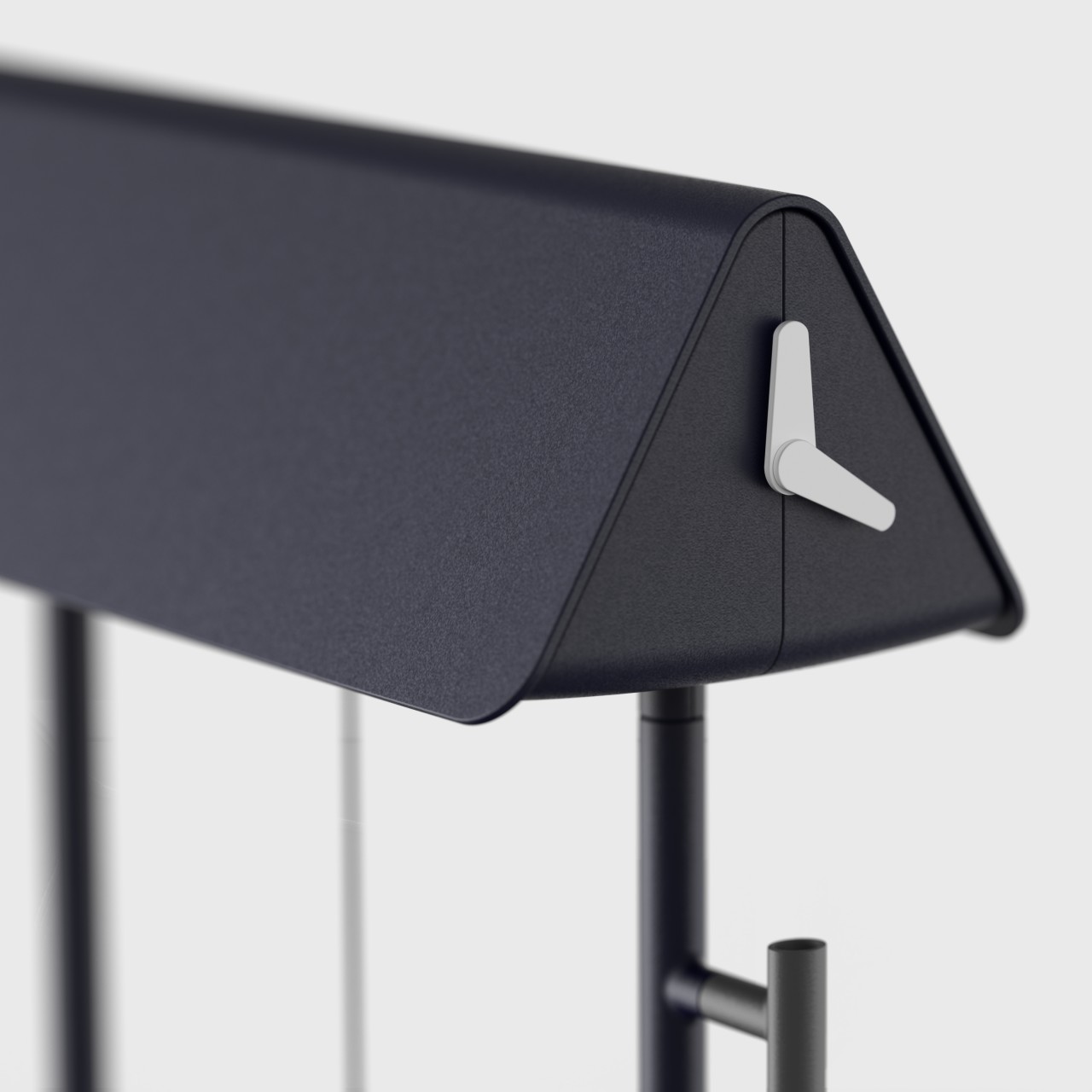
Fire-lit lamps may have once been the only way that people could see in the dark of night, but these are not only impractical today, they’re also fire hazards. That said, there’s a certain romantic charm to the shapes and curves of these kerosene lamps, an emotion that the DIDIM_Stand Light tries to replicate with modern technology. The tall floor lamp imitates the style of a lamp dangling from a metal bar, but here the lamp is a battery-powered LED lamp that you can remove and use independently of the rest of the structure. The lamp’s two-piece stand and the wavy cantilever are meant to resemble a person holding such a lantern in olden times.
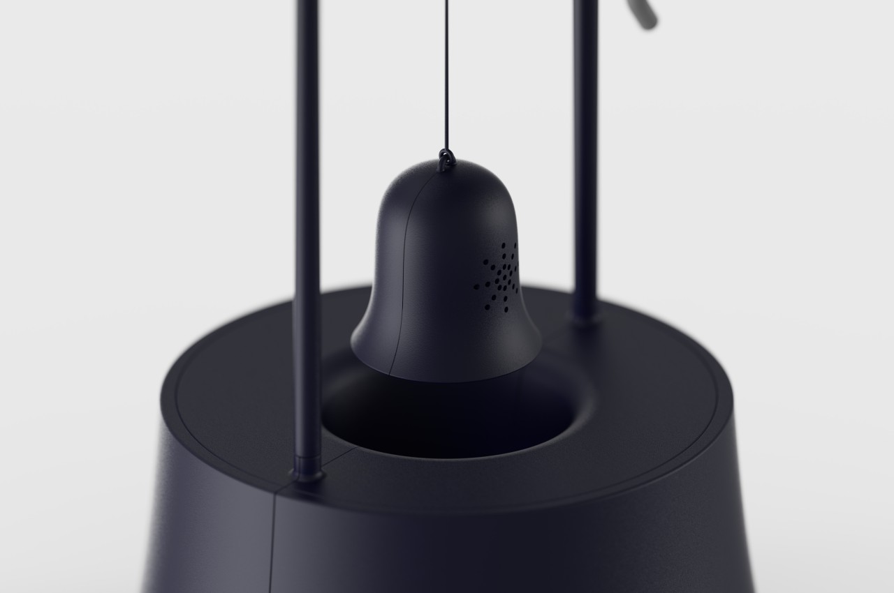
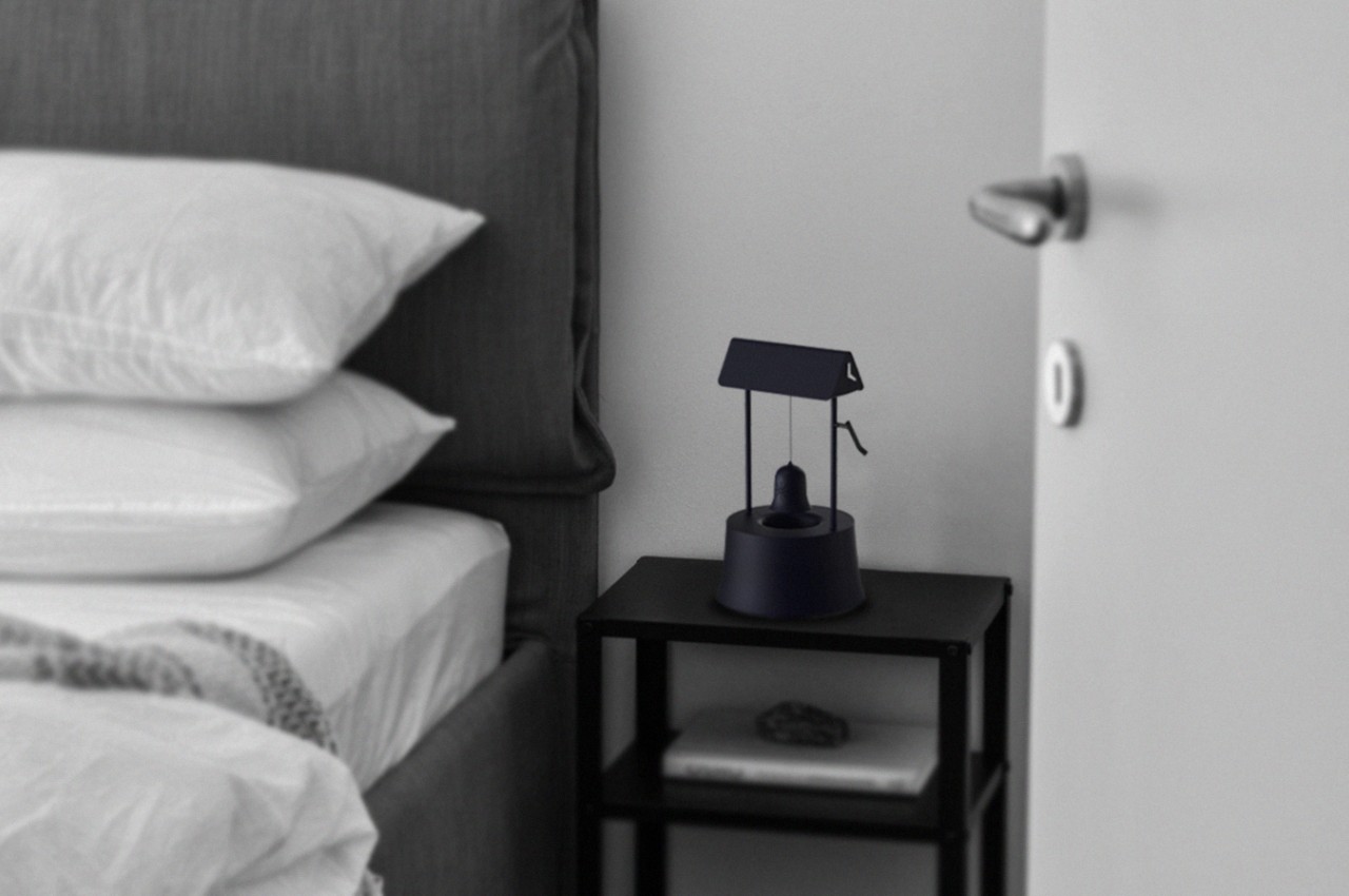
A bucket-drawn well is almost an iconic image in many historical or fictional settings that depict periods before an industrial age, and this old contraption has come to symbolize not only life that comes from water but also the routines of life in those ages. Today, we use clocks to mark those routines, and the DIDIM_Alarm Clock combines these two concepts into a miniature well that will hopefully make you feel less annoyed when it wakes you up in the morning. Instead of a basket, the “well” has a bell that rises from within when it’s time to sound the alarm. It isn’t a real bell, however, and has a speaker inside to do the work. Amusingly, you have to hit the bell in order to silence it.
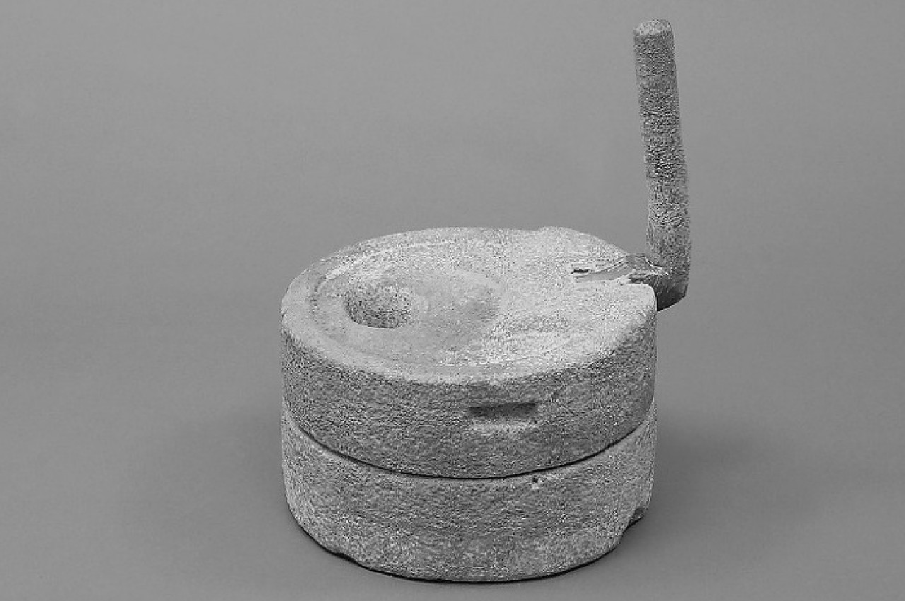
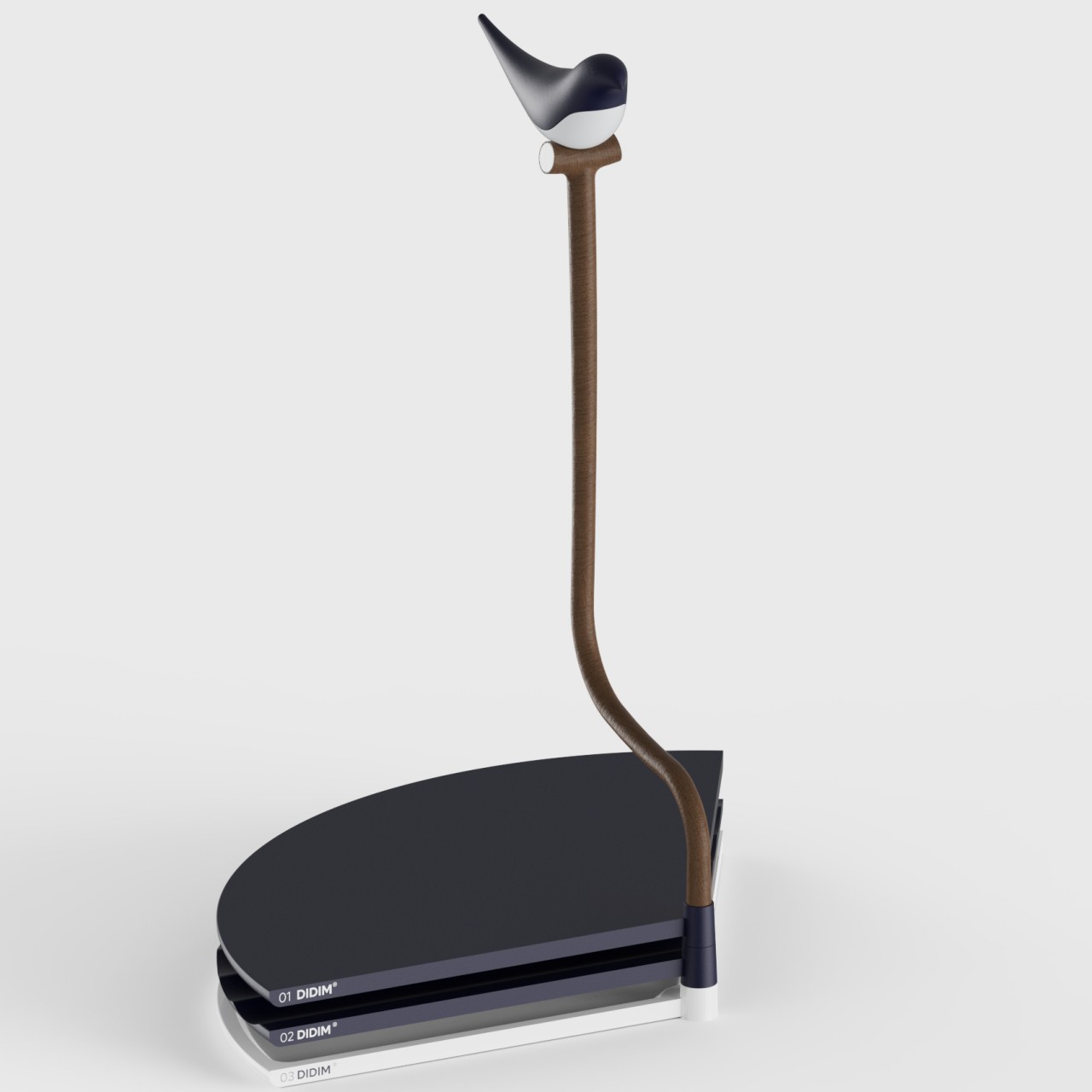
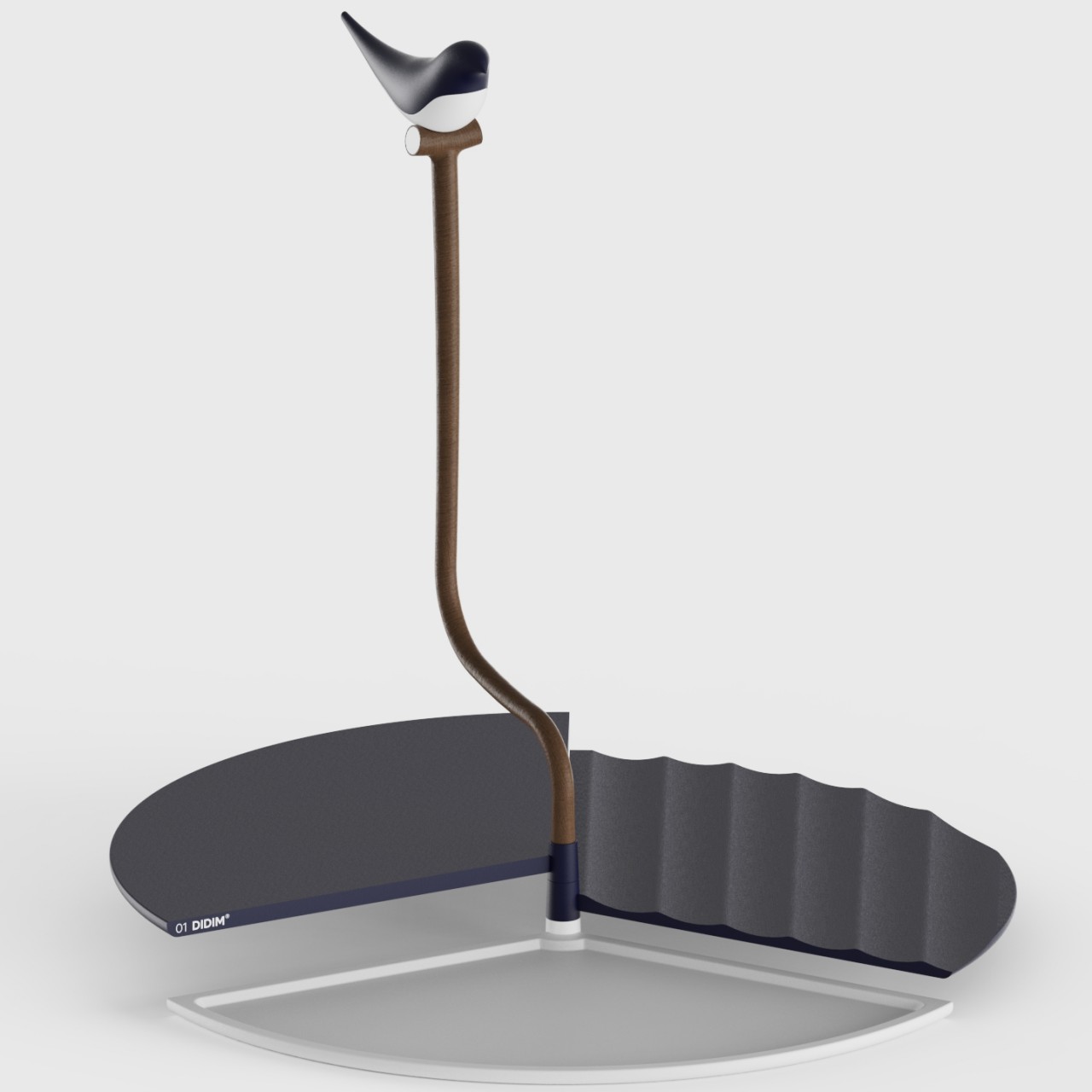
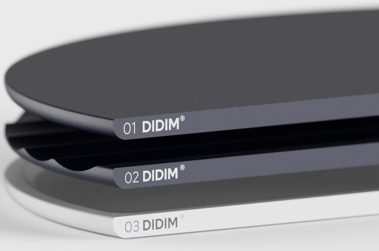
A little bit more obscure is the DIDIM_Tray, inspired by old grinding stones that people used to prepare grains and beans for cooking. Instead of grinding things, however, turning the “pestle” handle deploys the fan-shaped trays that have compartments for your phone, your pens, and your earbuds. When you’re done using it and don’t want the circular tray to take up space, simply turn the handle in the opposite direction to transform it into a decorative for your desk or table.
These might be mundane objects you can find in anyone’s home, but giving them a bit of a flavor not only enhances their appearance but also changes the atmosphere around them. And you don’t even have to think hard of designs that will capture your visitors’ attention. By simply looking at our past and appreciating the designs that have come before us, we can already bring a unique visual and tactile experience to these everyday products, while also helping us make a connection with the past.
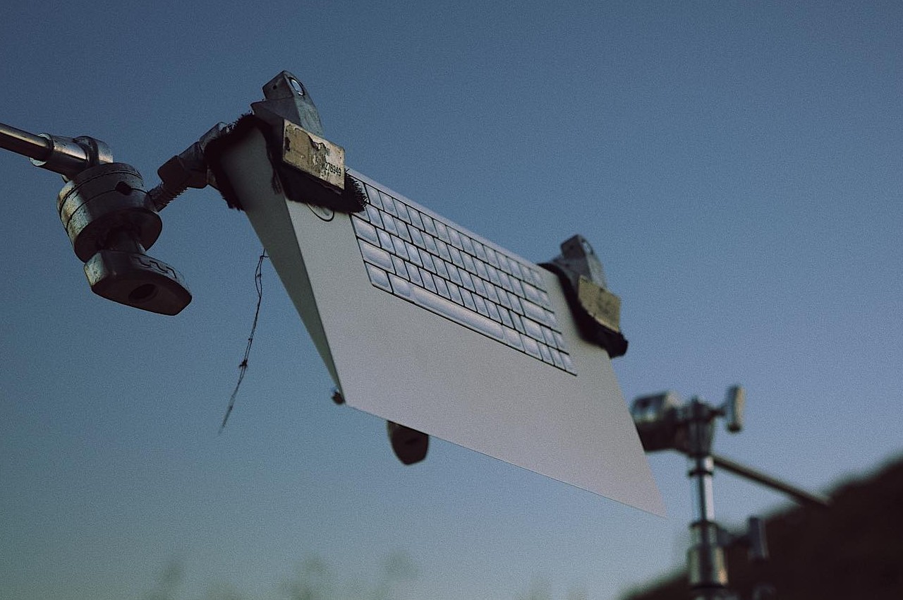
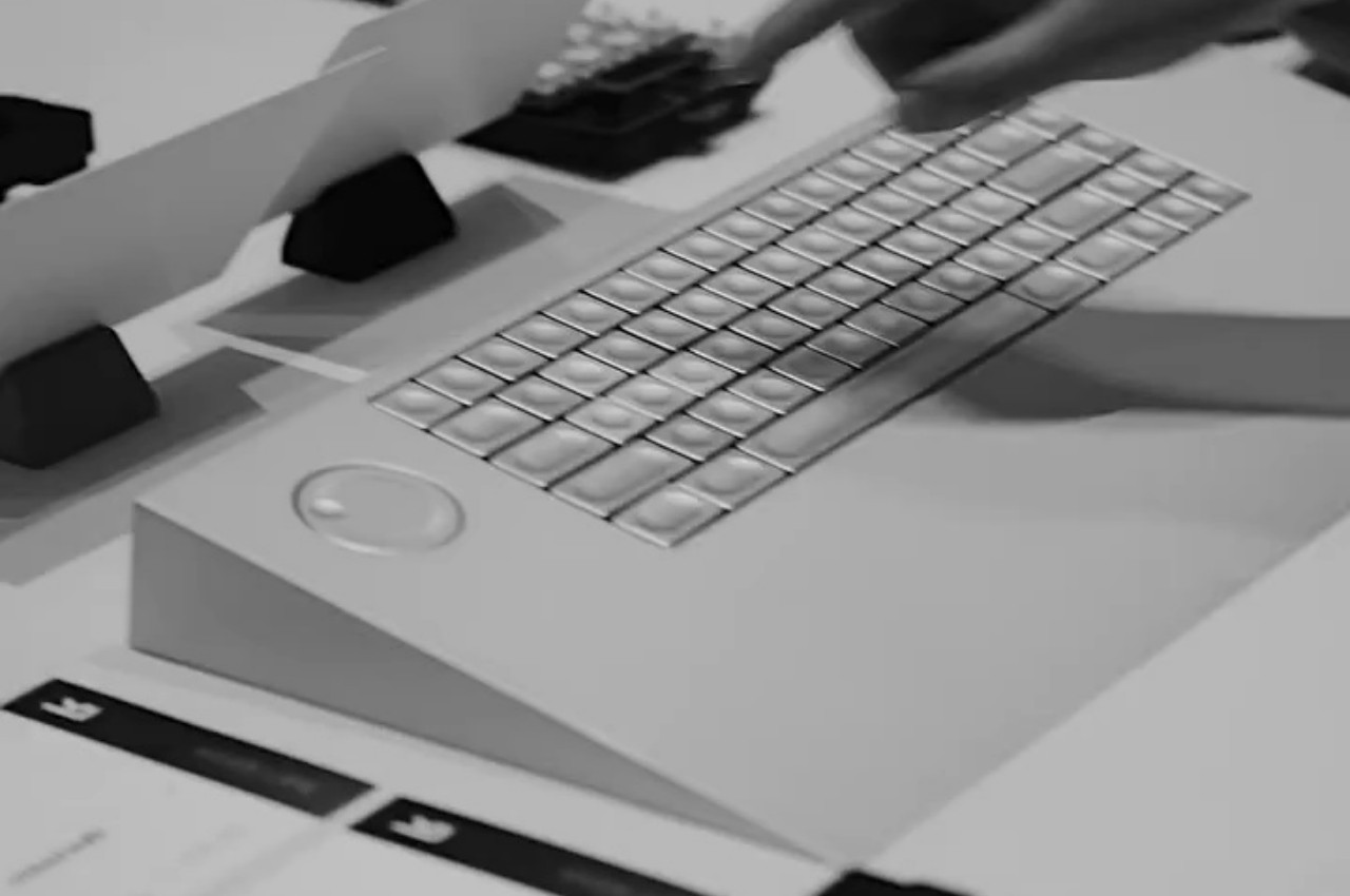
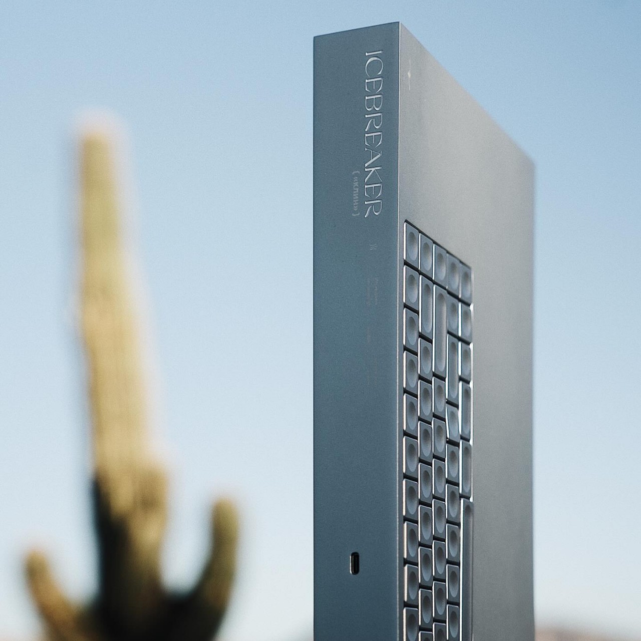
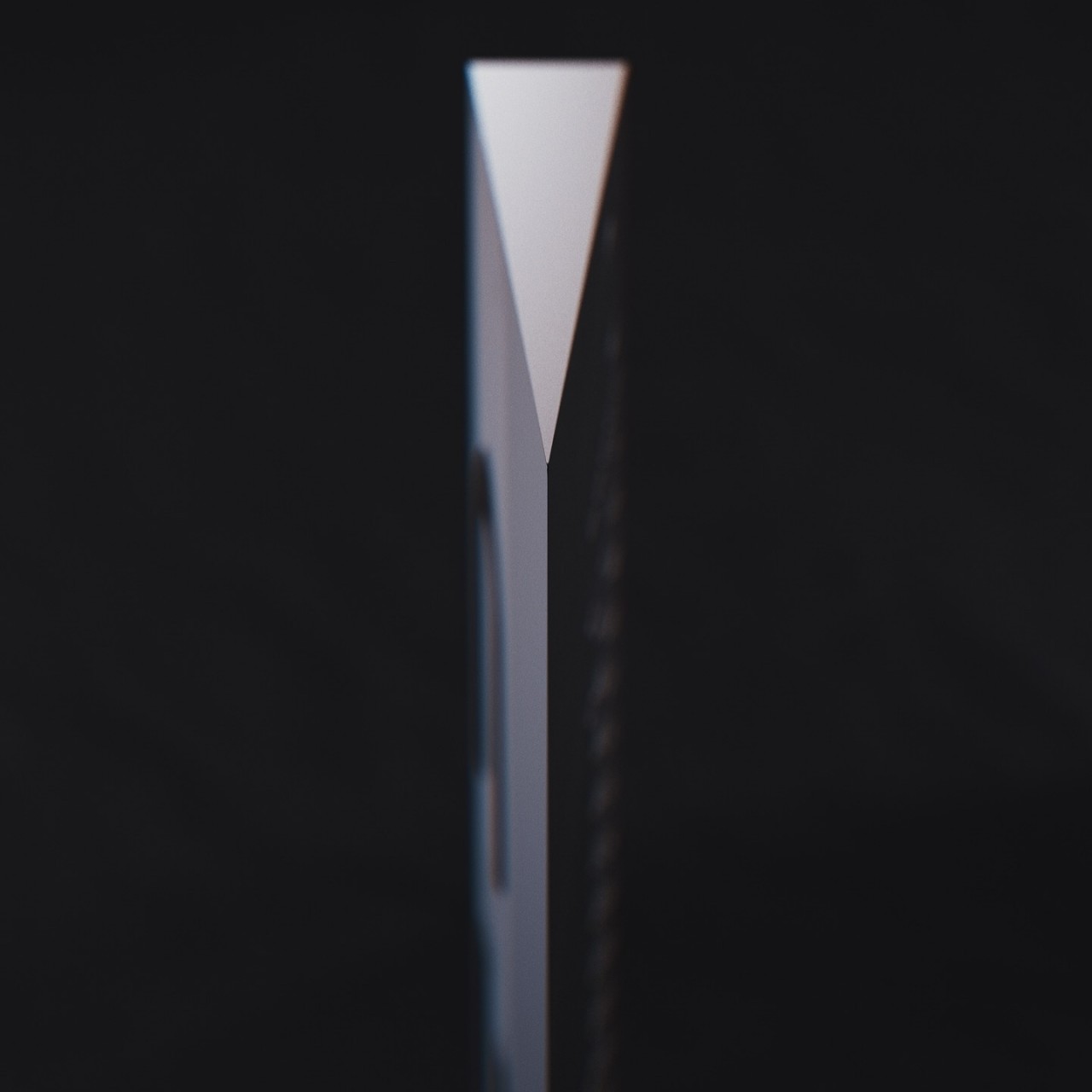
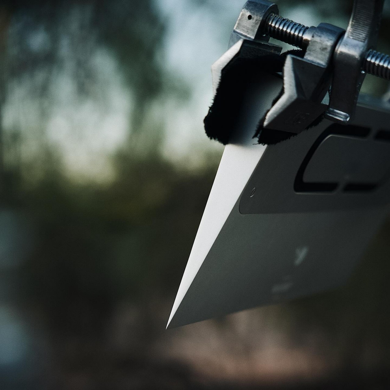
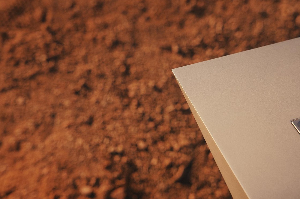
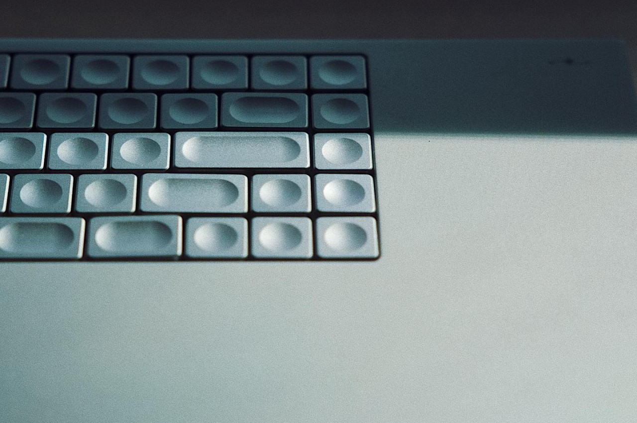
Computer keyboards are designed for utility primarily, with aesthetics often coming in second place if at all. Considering its purpose, that’s not exactly puzzling, but there are thankfully fresh new designs that are giving keyboards more refreshing visuals without changing the standard formula in any way. There are, however, also bolder attempts at carving a completely different character for the humble keyboard, without losing any of its functionality, of course, creating a product that is as much a work of art as it is a piece of engineering. One such piece is this all-metal “Icebreaker” keyboard, presenting a rather radical approach that aims for maximum impact by distilling the design down to its bare essentials, resulting in an almost brutalist form that takes its cues from that iconic steel-framed building in New York City.
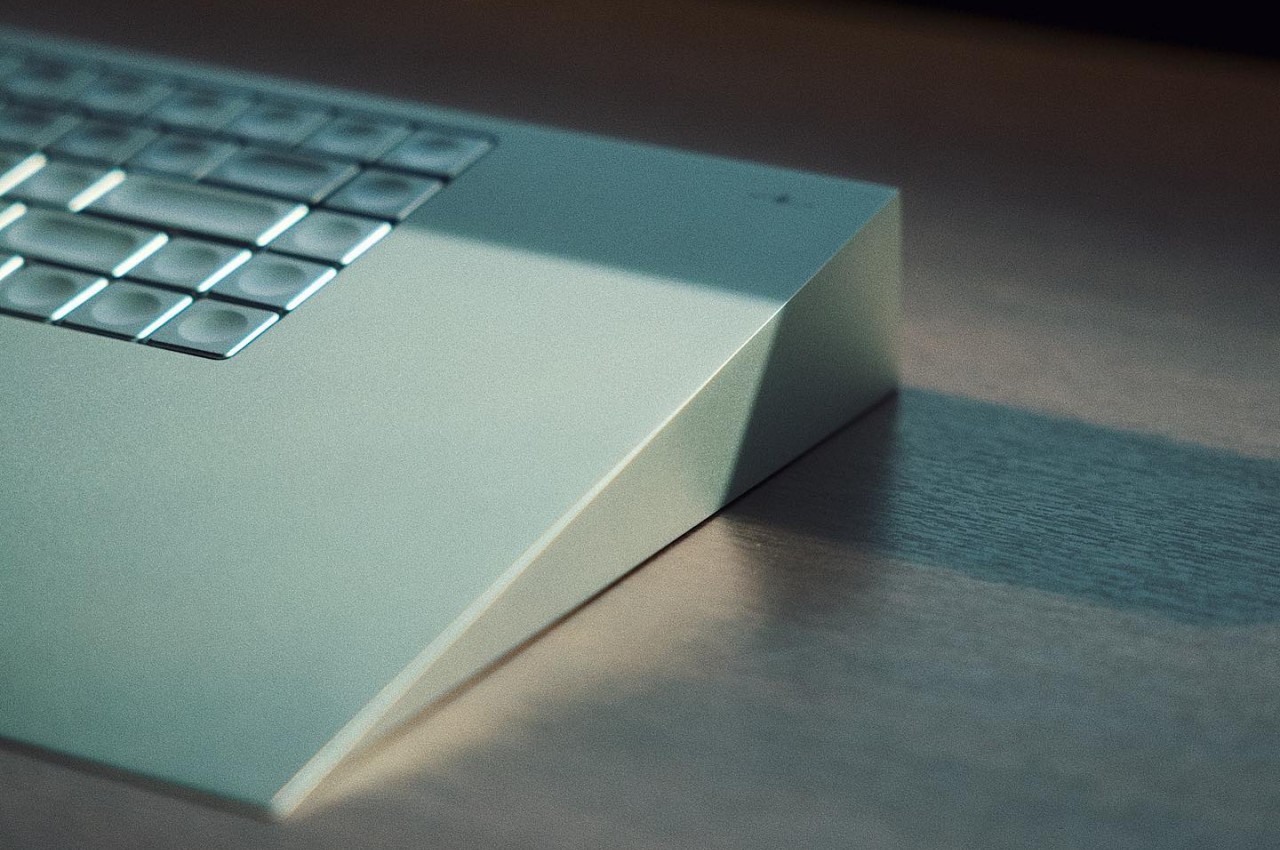
The earliest computer keyboards came with a chunky wedge shape, not for the sake of appearances but almost out of necessity. It offered a naturally inclined plane that was more ergonomic than typing on a flat surface, although the designers of that period may have not been completely cognizant of that. It’s a design convention that today’s keyboards implement using foldable stands in order to accommodate varying user preferences as well as sleeker styles and thinner profiles.
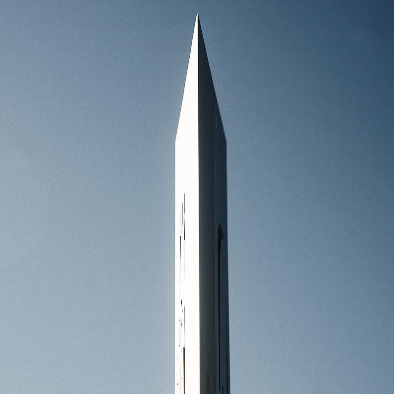
The Icebreaker, in contrast, is unapologetic in embracing that wedge shape and does so in an almost extreme way. It’s actually more of a triangle than a wedge, with the angle facing the user presenting an edge that looks sharp enough to chop wood or even break ice, hence the name. The inclined plane naturally forces your hands to type at a fixed angle, but unlike the first keyboards of old, the design comes with built-in wrist support. When viewed from certain angles, like when the keyboard stands upright on one of its sides, it resembles the Fuller “Flatiron” Building in New York, a piece of architecture that is famed for its unusual shape that represents a cast-iron clothes iron.
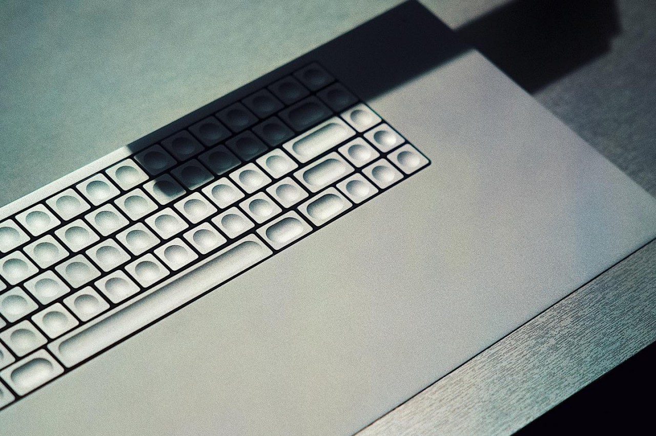
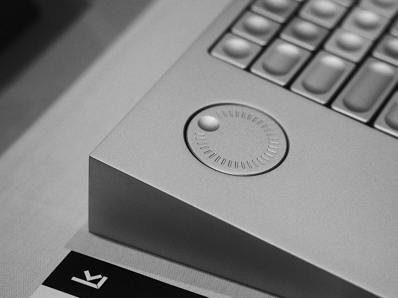
Just like that building, or perhaps even more so, the entire keyboard is machined from aluminum, including the keycaps. Unlike your typical keycaps, these are completely concave circles. Even more interesting, the marks on the keys aren’t in the middle but are off to the corners, created using 300-micron micro-perforations. There are no other markings on the keyboard, no color or even backlighting, giving it an industrial aesthetic that borders on brutalism because of its raw, full metal appearance.
Of course, The Icebreaker isn’t just for show and it actually has one feature not found on most keyboards. There’s a programmable dial off the left of the keyboard, a useful tool for creators who constantly scroll through menus and options. It’s definitely an interesting piece of computer equipment, at least visually. Its actual usability and ergonomics, however, are still to be judged when the product actually becomes available for purchase.
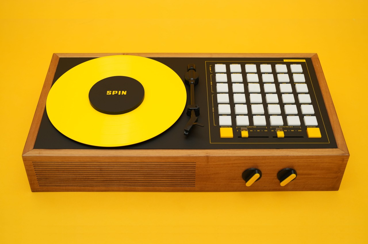
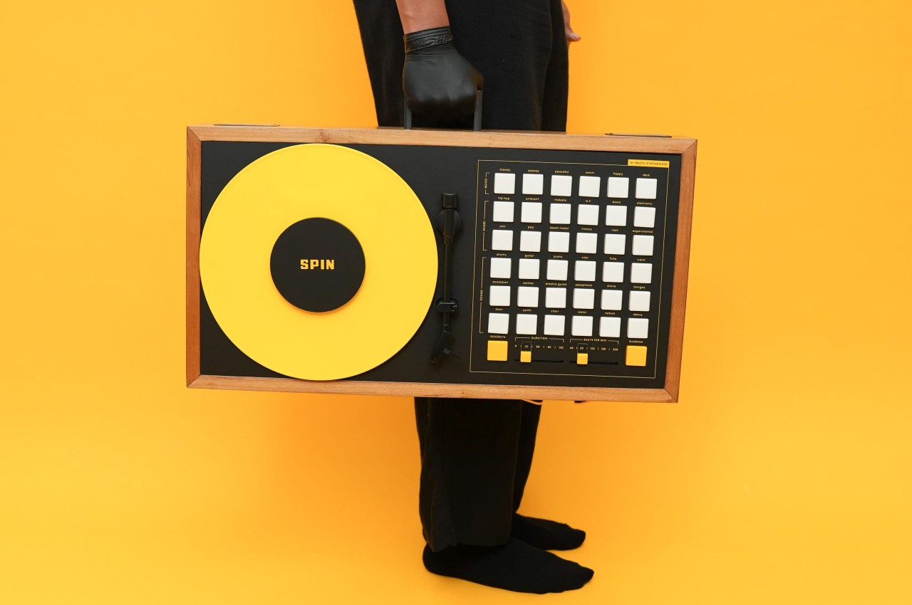
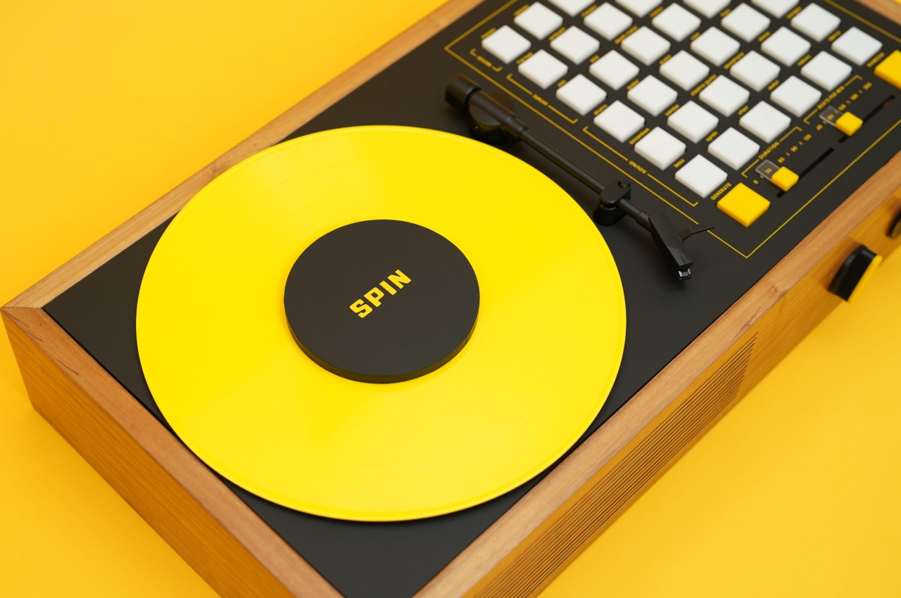
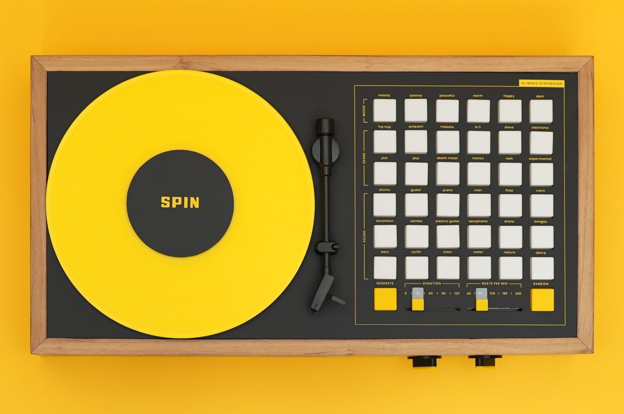
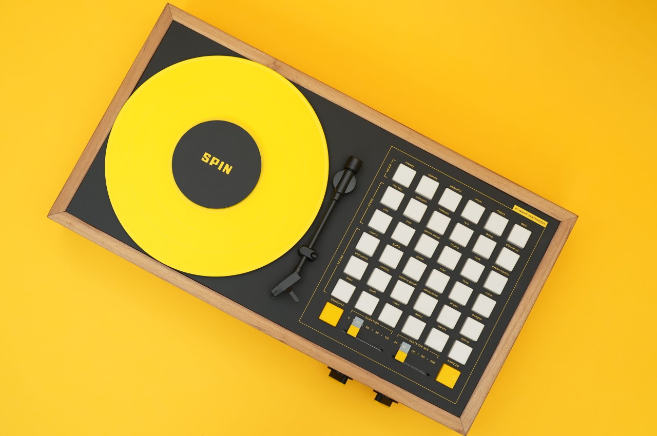
AI has become a powerful and controversial tool that’s being applied to the creation of many things in different industries. The most well-known are, of course, images and text, but these same technologies can also be applied to other fields, even ones that are considered to require more human creativity than others. Music, for example, is believed to be an art that’s hard to master and difficult to quantify in a way that would be of use to AI, but that’s exactly what’s happening here with this “artifact from the future.” That said, the suitcase-sized synthesizer doesn’t completely wrest the act of creation away from your hands but turns it into a creative collaboration between man and machine.
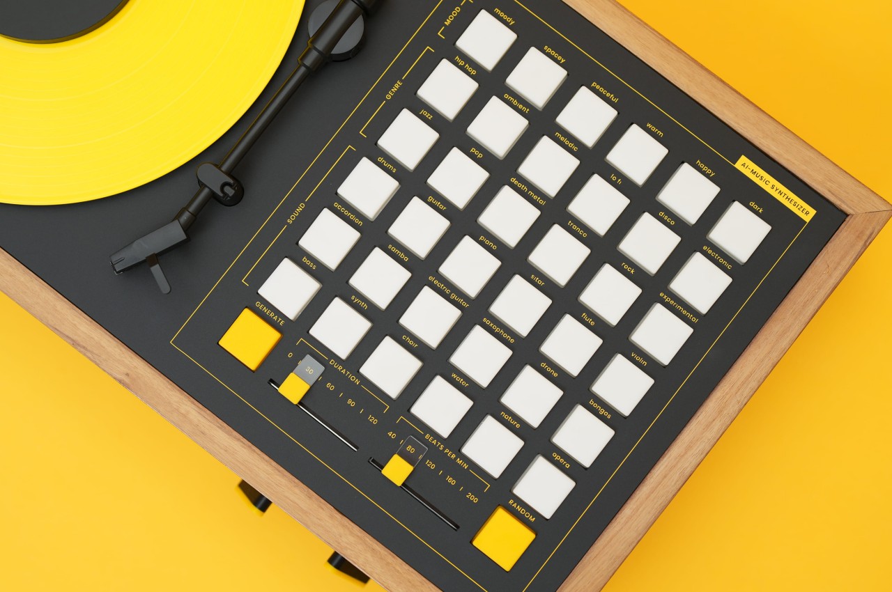
Imagine having to only press a few buttons and you’ll have tunes that are specifically crafted to suit a given mood or genre. Most synthesizers simply give you the raw controls to mix and match to your heart’s content, but you’ll have to draw from your own creativity to actually come up with a pleasing harmony tailored to fit that situation. SPIN, the name for this AI-powered music synthesizer, actually helps you in this creative journey by serving ready-made ingredients to put into your mix without taking anything away from your freedom. It’s like the difference between buying a can of tomato sauce for a recipe versus making your own from scratch.
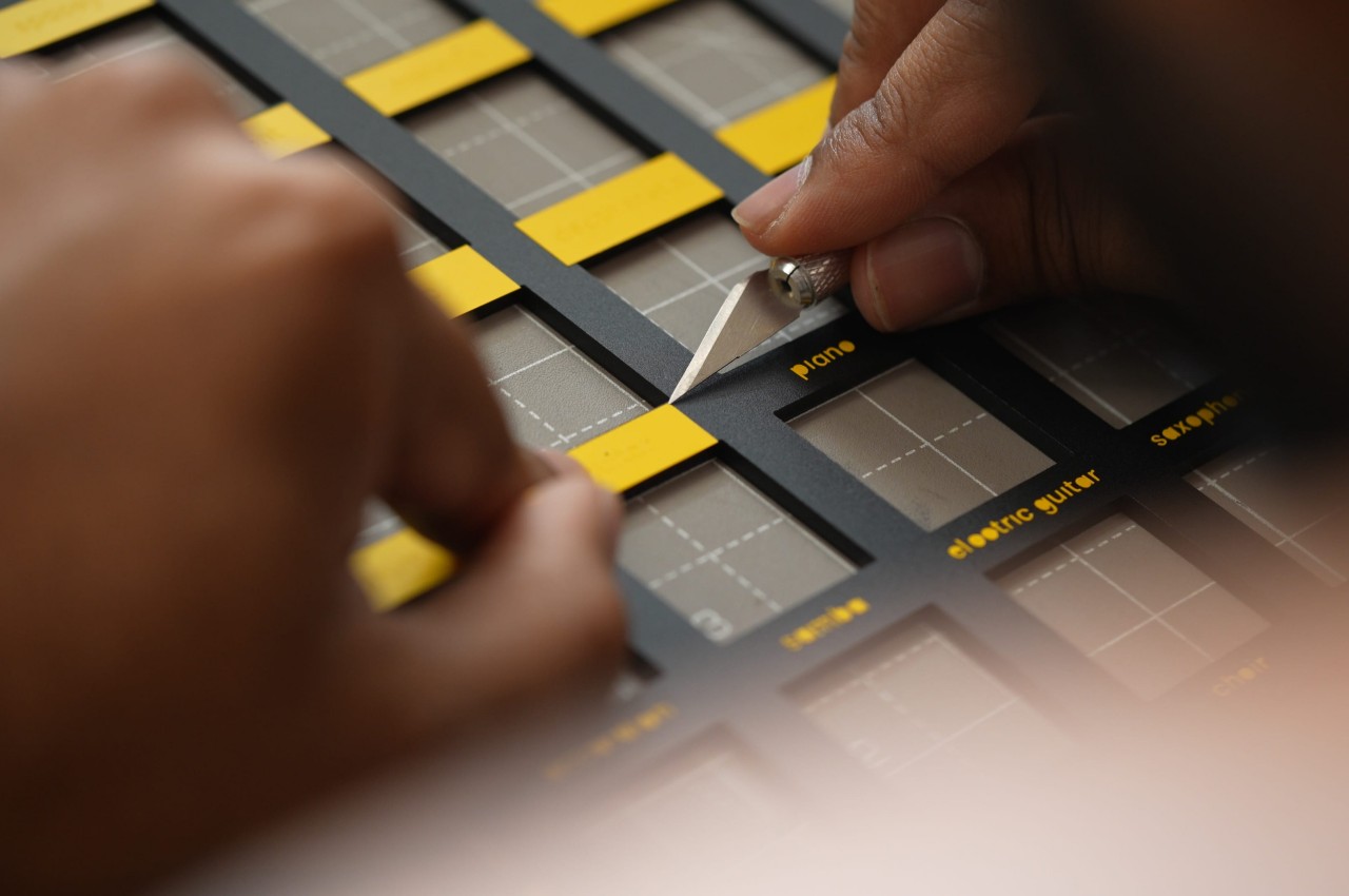
SPIN has buttons for different moods, genres, and sounds that you can mix and match to your heart’s content. How does happy death-metal disco sound? Why not try some dark jazz opera to really turn heads? Not every combination is going to work, of course, so you’ll still have to step in and fine-tune it to your tastes, no pun intended. And with sliders for BPM or duration and a turntable to scratch, you also have the tools to make your own style shine, with or without AI’s help.
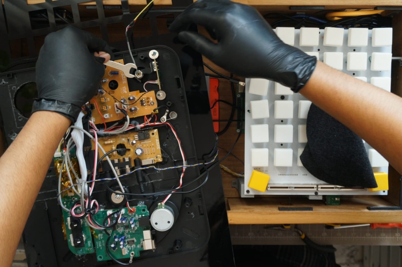
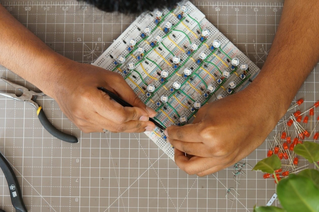
The synth is just as much a work of art as it is a demonstration of the power of AI. A variety of off-the-shelf components are assembled to provide the brains and muscle behind the scenes, almost literally. You won’t see any of these while using SPIN, as all are hidden behind an interface and a design that’s meant to encourage playfulness and experimentation. Even the choice of bright yellow and white colors, unusual for most synth designs, emphasizes that rather jovial character.
Generative AI has been receiving a lot of flak, in no small part thanks to abuse and misuse of the technology rather than anything inherent. SPIN is an attempt to reverse that perception and present AI not only as something approachable but even fun to use. Given how it works, you won’t even have to worry about infringing on anyone’s copyright or intellectual property, leaving you free to explore that harmony between human creativity and machine learning.
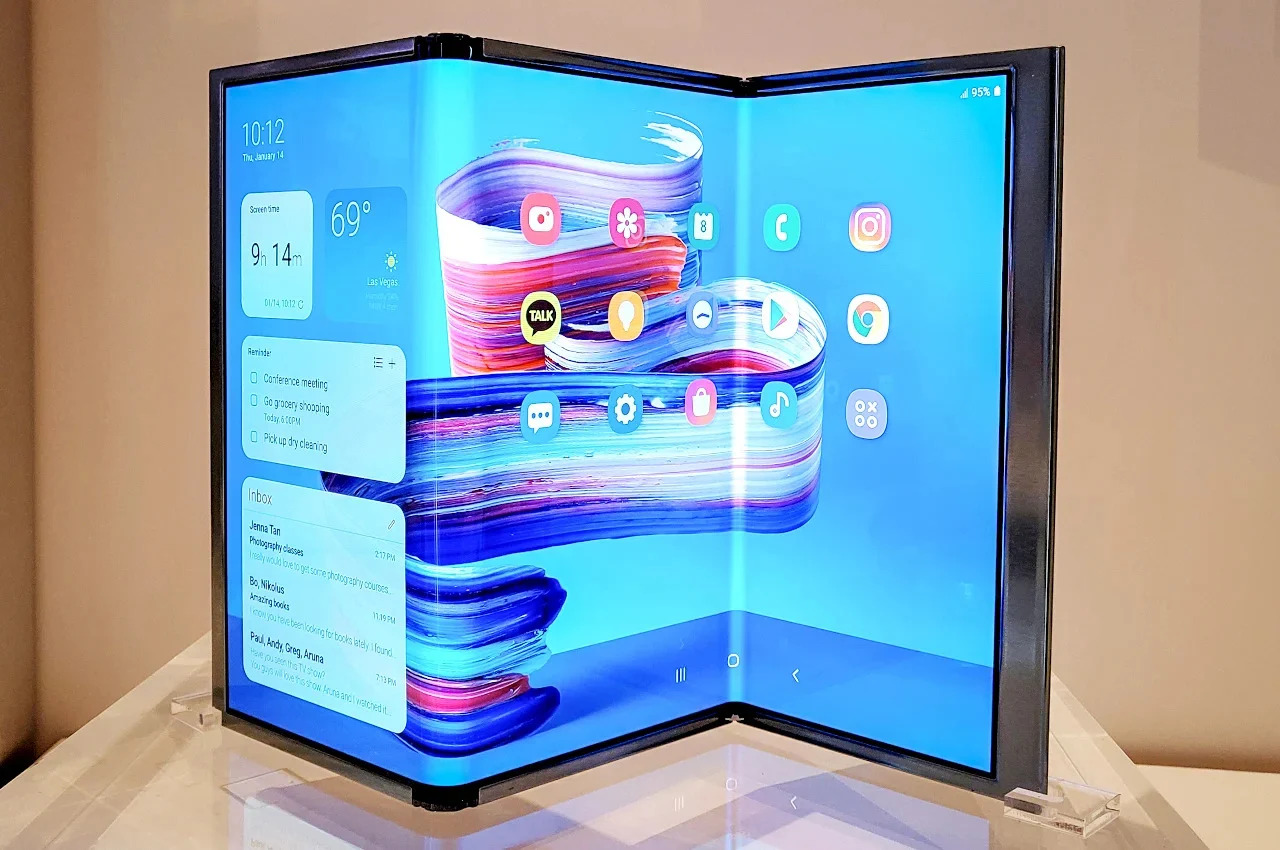
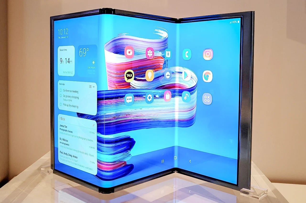
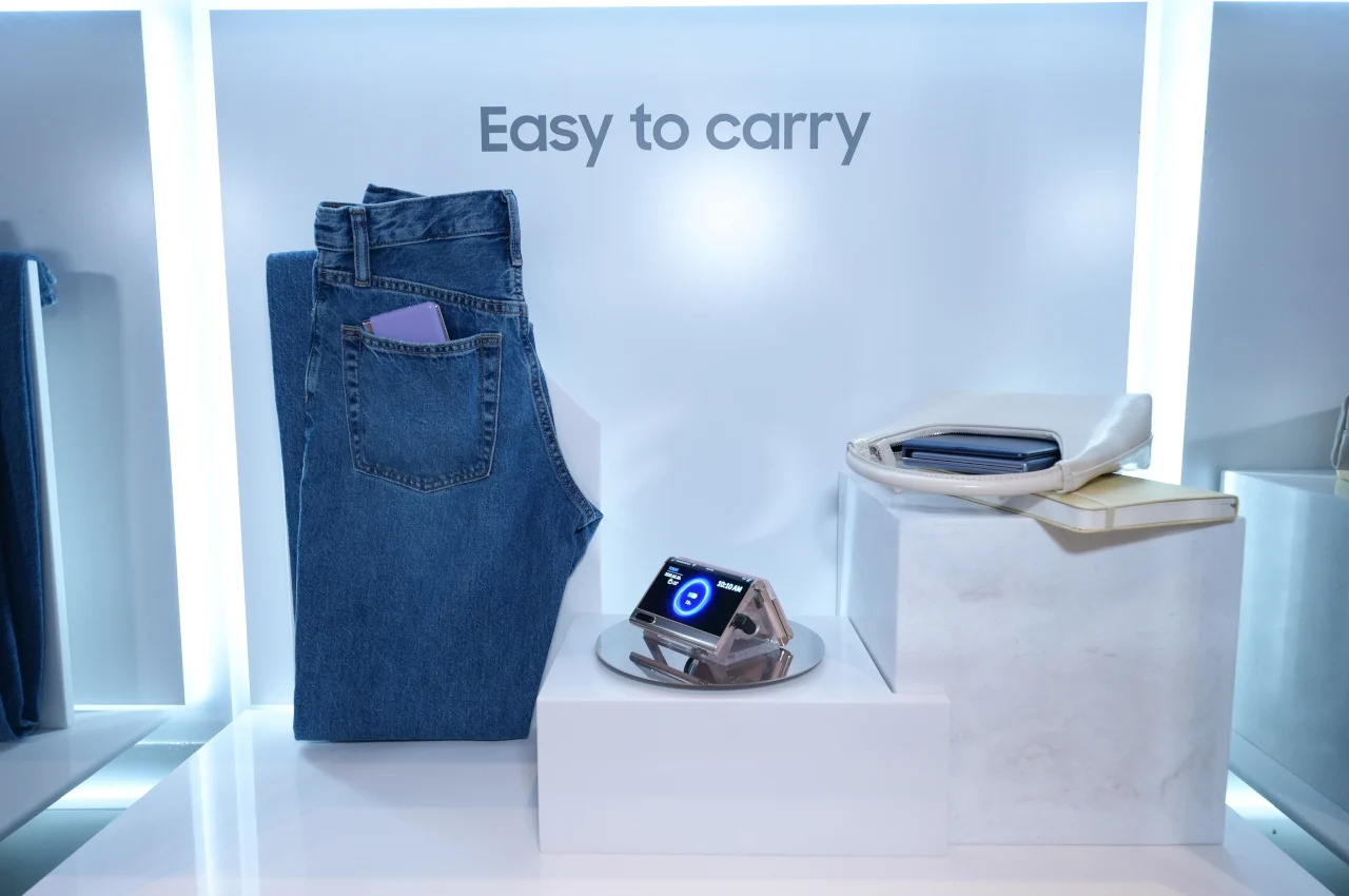
Foldable smartphones are an attempt at solving an old problem with two diametrically opposed goals. On the one hand, people want large screens that give them enough space for their content, from videos to social media to even work. On the other hand, they still want a device they can conveniently carry around, especially inside their pockets. Today’s generation of foldable phones similar to the Samsung Galaxy Z Fold deliver a phone that does transform into a tablet, but the latter is admittedly still a small piece of screen real estate, even smaller than the iPad mini. Having a regular tablet-sized display requires drastically changing the design and construction of a foldable phone, which isn’t exactly easy to pull off, judging by the current state of foldables. That’s not to say that manufacturers haven’t been working on a feasible solution, and Samsung itself might be ready to unveil its answer this year to beat one of its rivals to the punch.
Designer: Samsung (via @Tech_Reve)
The current design of foldable phones has never been the endgame. If you reference Samsung’s concept video back in 2013, you will realize its ambitions go beyond this simple foldable design. A phone that unfolds into a tablet would definitely need more than just one fold, and the company’s display manufacturing arm has been working on such a screen for years now. In fact, it demonstrated in 2022 how close it was to an actually usable form, suggesting that such a device is not only plausible but might even be just around the corner.
A new rumor adds fuel to speculations that Samsung might, in fact, announce this “Flex S” triple foldable phone this year, maybe even alongside the Galaxy Z Fold 6 and Galaxy Z Flip 6. Samsung might be in a rush to push out this revolutionary new device due to rumors that long-time rival Huawei also has a tri-fold phone that it will be launching in the second half of 2024. Unsurprisingly, Samsung wouldn’t want Huawei to claim the title of “first,” even if the Chinese brand has extremely limited market reach these days.
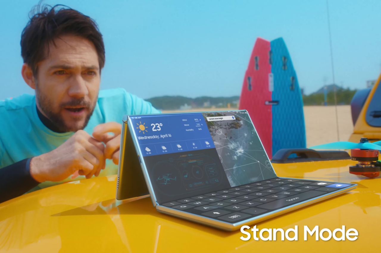
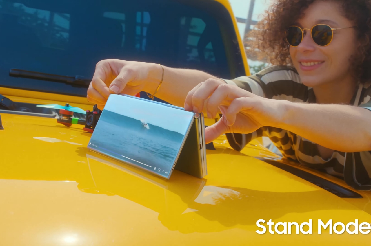
A triple folding phone, under the prototype name of “Flex S,” will drastically change the game when it comes to foldables. Not only will it offer a much larger screen in tablet form, it also allows the collapsed phone form to retain a wider aspect ratio, unlike the Galaxy Z Fold designs so far. At the same time, it also offers new modes of use for the device, from a tent-like stand mode to a unique laptop mode that’s like having a mini dual-screen laptop.
That said, haste always makes waste and Samsung should have already learned its lesson five years ago. Even after years of R&D, the first Samsung Galaxy Fold (no “Z” in the name yet) was plagued with problems, especially when it came to reliability. Given how a new tri-fold design will once again test the durability of flexible screens, there will be even more risks and costs this time around. And with Huawei’s limited presence in global markets, Samsung has no need to be afraid of not being the first, but that has never stopped any company from rushing out a product launch anyway.