Sculptural wall lamps bring an otherworldly aura inspired by sunflowers

A lot of designs these days take their cue from nature, perhaps the greatest designer that ever existed. Some simply use natural forms as their starting point while others imitate them almost completely. Yet there are also others who try to interpret organic shapes in a different way, resulting in a design that is both familiar yet almost alien. This wall lighting, for example, takes inspiration from the tiny disk flowers inside a beautiful sunflower, but the play of light and shadows gives it an almost hypnotic appearance, whether the lamp is actually on or not.

Designer: Rollo Bryant

It’s probably not common knowledge, but the flower that most people “see” when looking at a sunflower is actually a flower head that’s made up of a bunch of tiny flowers called disk florets. It’s a rather unique arrangement that becomes even more enchanting when you learn about it, giving the sunflower an otherworldly character. That’s the kind of character that the Aureole collection of wall-mounted lighting tries to embody, not just in its appearance but also in the material used to create its mesmerizing form.

The lamps use quartz sand for its main body, a material that’s often used for moulds that are then used to create other objects. In Aureole, however, the sand is the final product instead, and its production pushes the envelope of both what the material can be used for as well as the 3D printing technology employed for creating the complex structures of the lamp’s shape.

That shape is almost like a maze of intersecting curves or an array of raised bits swirling around the center, trying to recreate the appearance of those disk florets without being too literal. They only suggest the general shape of the sunflower head but still leave plenty of room for artistic interpretation. Closer inspection reveals a more intricate network of lines and curves, almost like the structures that bees and ants leave behind in their hives and homes. While completely natural in inspiration, it almost gives the lamp an alien-like vibe as well.

Once the light shines from beneath an opaque black disc in the center, the wall-mounting lighting takes on a completely different personality, ethereal and mesmerizing. Thanks to those complex 3D structures, the light casts shadows in unique and intricate ways, creating an eerie atmosphere that seems to lock your eyes in a swirling spiral of yellow and black contrasts. Because the light is coming from behind the disc, there is also an element of mystery to the aesthetic, as if watching a solar eclipse corona burst into a dizzying pattern. Either way, the Aureole wall lamps definitely captivate people’s minds and imagination, a true conversation starter in any setting.

The post Sculptural wall lamps bring an otherworldly aura inspired by sunflowers first appeared on Yanko Design.

Galaxy Z Fold 5, Z Flip 5 joins Samsung self-repair program with a catch

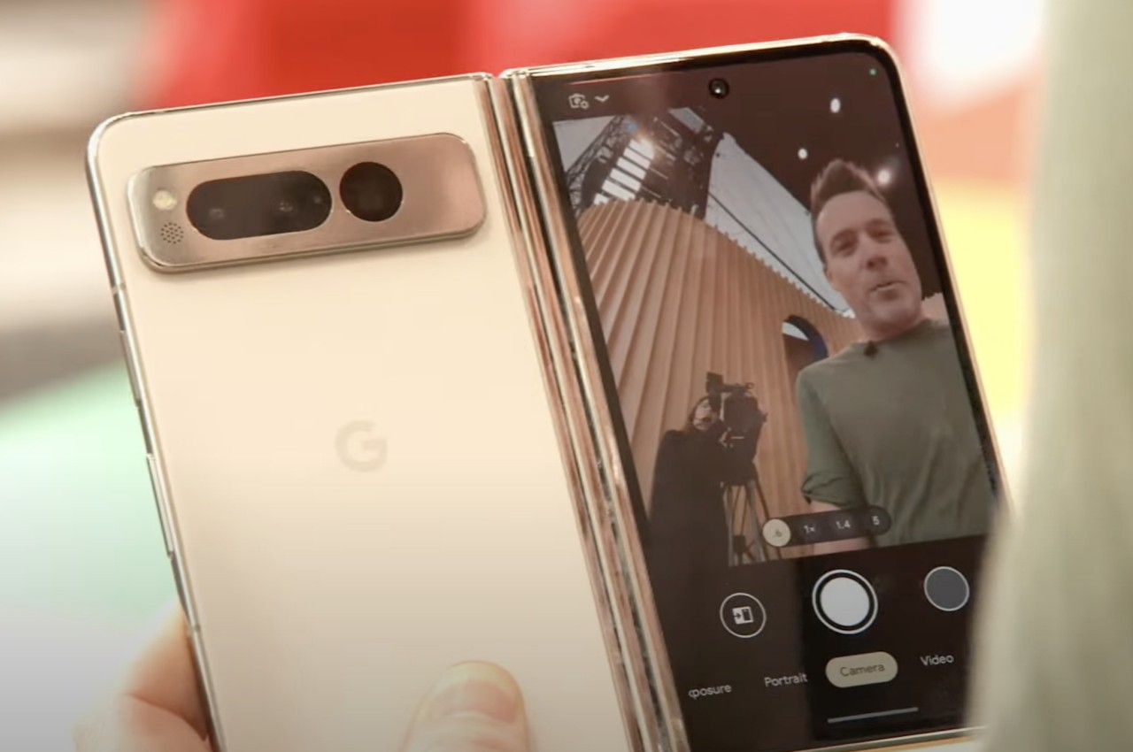
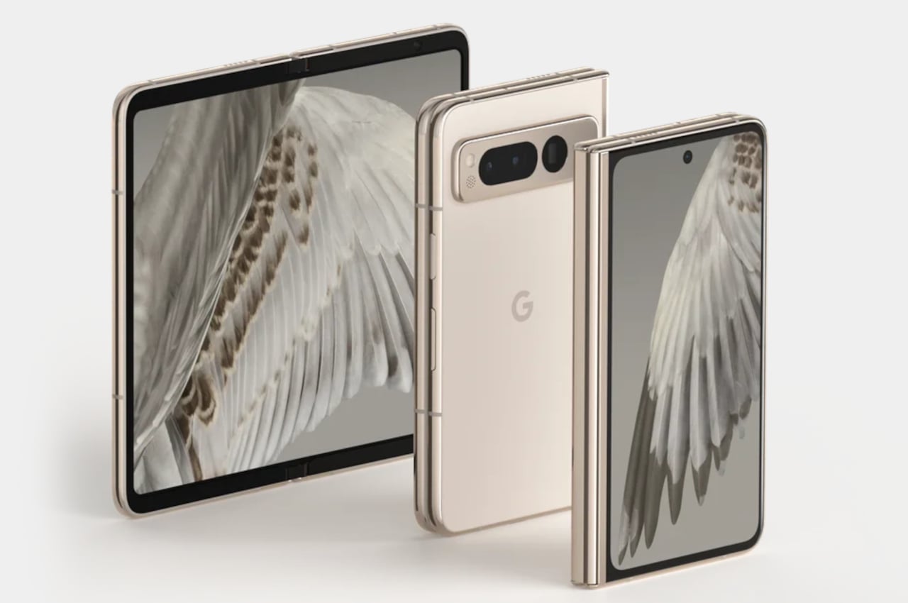
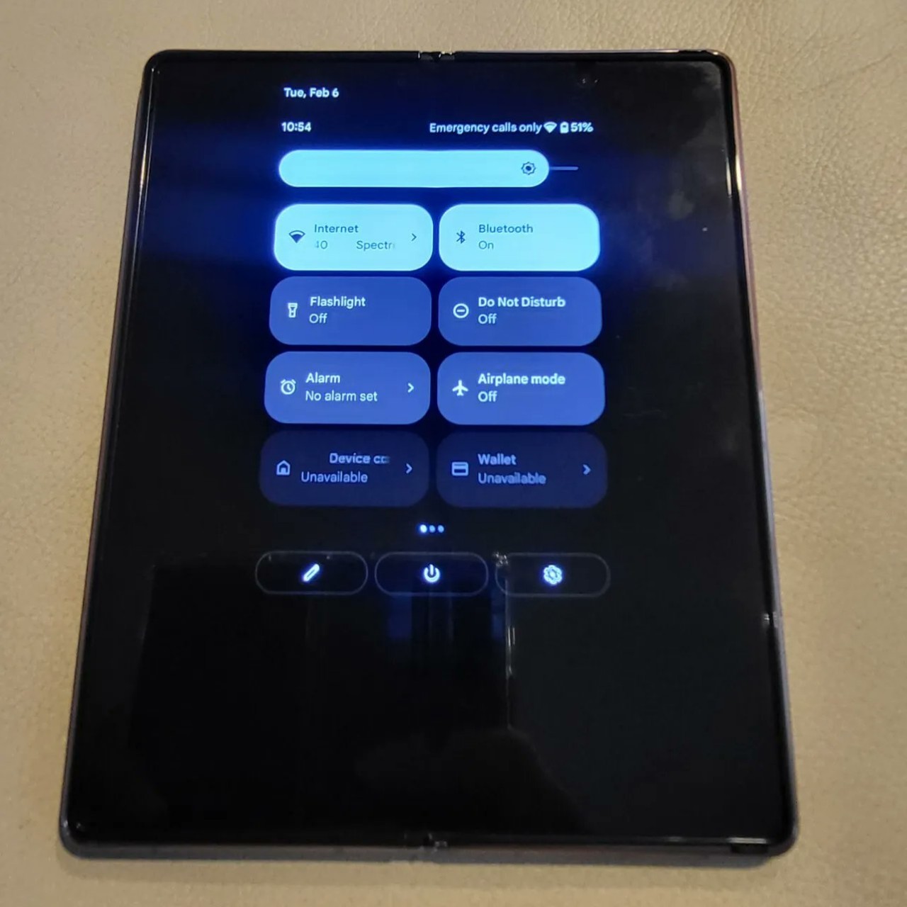
Foldable phones are generally considered to be less durable than their single-form counterparts because of the fragile flexible screen as well as the hinges that give them their titular feature. Considering the complications of this design, repairing foldable phones is relatively more expensive and more difficult to pull off by trained technicians, let alone even the most advanced phone user. It’s, therefore, a bit surprising but nevertheless welcome move that Samsung has announced that you can now legally and officially repair its latest foldable phones on your own. That said, there are still details that are left unknown, making it questionable how meaningful this announcement really is.

Designer: Samsung

It wasn’t too long ago when phone manufacturers vehemently denounced any repair done by anyone other than authorized service providers. Officially, this is meant to protect their intellectual property and product quality, but some see it as a cunning ploy to monopolize the repair service industry and squeeze out more money from customers. Brands such as Apple, Google, and Samsung have reached a sort of compromise where they provide official parts and replacement guides via a third party like iFixit, practically allowing anyone or any shop to repair some phones on their own.

Unsurprisingly, the list of supported devices under these Self-Repair programs is rather short, but Samsung just made a big splash in how it’s expanding that to more devices and more countries. 30 European countries, including Denmark, Greece, Hungary, and Portugal, have been added to the list, bringing the total to over 40 countries across the world. It’s still a small number, admittedly, but a lot better than the total sum of zero from two years ago.

Samsung is also expanding the list of supported devices to include its latest products, not just the Galaxy S23 series but also tablets such as the Galaxy Tab S9 and even the Galaxy Tab A9. More surprising, however, is that the Galaxy Z Fold 5 and Galaxy Z Flip 5 are included in the announcement. In fact, given their reputation, you could almost say that they’re the highlight of that announcement. After all, wouldn’t it be interesting to have a foldable phone that could be repaired by yourself or some third-party service?

While that’s technically true, the major caveat is that the official self-repair program only supports replacing a phone’s battery, rear glass cover, and USB-C charging port. With the design of Samsung’s foldable phones, even those might be more difficult compared to regular phones. Unfortunately, iFixit hasn’t updated its list yet, so we don’t have the full picture of what you can do with this new information, but you can definitely be sure you won’t be replacing that foldable screen on your own any time soon.

The post Galaxy Z Fold 5, Z Flip 5 joins Samsung self-repair program with a catch first appeared on Yanko Design.

Half-folded lamp brings back memories of paper toys and makeshift tents

Who said lamps have to be tall structures or well-formed shapes that spread their light perfectly, either in all directions or in a single trajectory? Of course, more utilitarian lighting does need to follow certain requirements, but those that aim to set the mood have more freedom to express themselves in other, sometimes imperfect ways. This table lamp, for example, isn’t going to help you with your reading or your work, but will probably tickle your imagination or bring up sweet, playful memories thanks to its rather unusual shape that is reminiscent of the folded paper toys that we make in our childhood.

Designer: Jihoon Shim

At first glance, you’d probably not even think of this piece of folded aluminum as a lamp. It looks more like a sheet of metal that was haphazardly folded diagonally to create an incomplete pyramid that could topple over at any minute. Of course, the shape and fold of the design are carefully made to ensure a stable form, but it’s that visual sense of instability and misalignment that gives it a playful and whimsical character.

That becomes even more apparent once you turn on the lamp in a dark room. Most of the light naturally comes out from the large opening in front, but there are also a few rays that slip through the bottom gap produced by the uneven fold of the structure. If the shape of the lamp in the daytime reminds one of clumsily folded paper toys, the light at night might make some remember the makeshift tents they build indoors and the incandescent lights they turn on to read in the dark or scare their friends during those slumber parties.

The material chosen for the lamp also contributes to its unfinished appearance. Instead of hard stainless steel, anodized aluminum was chosen instead, giving it an almost industrial and raw appeal. It also diffuses the light in a unique way, making it bounce off rough surfaces rather than the shiny and almost perfect surface of stainless steel. The Half Lamp is an interesting way to add a special nighttime atmosphere to a room, generating not just light but also a bit of joy while you dream of happy childhood days.

The post Half-folded lamp brings back memories of paper toys and makeshift tents first appeared on Yanko Design.

Modular keyboard concept employs hexagons to switch things up a bit

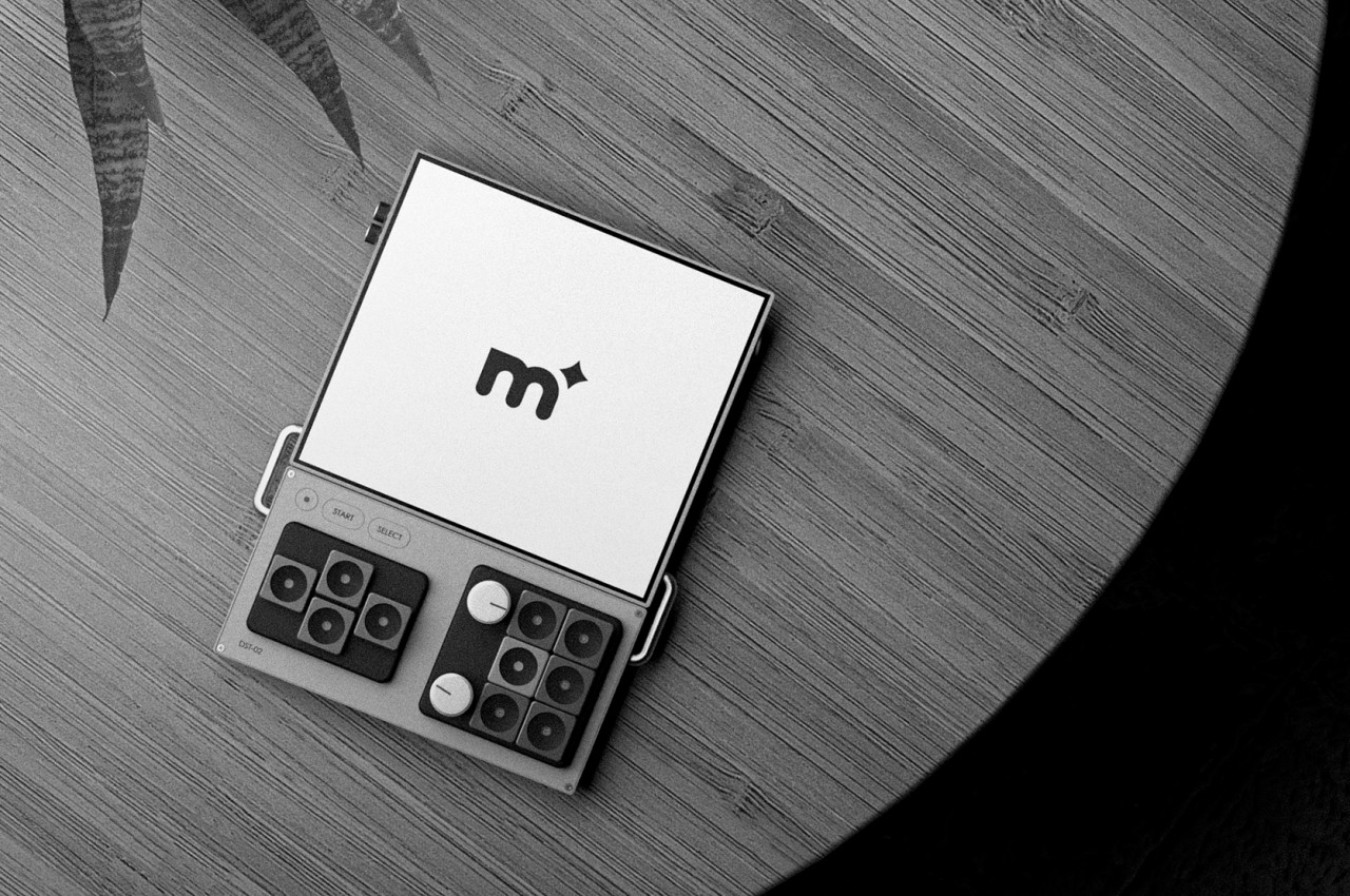
There has been a great deal of effort and attention put on keyboards these past years, whether for actual products or for ideas that embody the hopes and wishes of both users and designers. From split-type ergonomic keyboards to keyboards with all sorts of knobs and touch screens, these designs are all made in an attempt to make people’s lives easier and to cater to their needs. Of course, not everyone’s needs are the same, so features on one keyboard might not work for different audiences. This keyboard design concept is already interesting because of its modularity, but it becomes even more eye-catching thanks to an unusual choice in the shape of its keys and controls.

Designers: Travis Ragsdale, Elijah Vary

The basic design of keyboards is almost set in stone, at least for the combination of letters and numbers that make up the essentials for keyboards of any size. The layouts might differ from region to region or from laptop to laptop, but there are more or less 80 keys even on the smallest configurations. Beyond that is almost fair game, with some preferring a numeric keypad to the side, while others probably wish for a different set of controls.

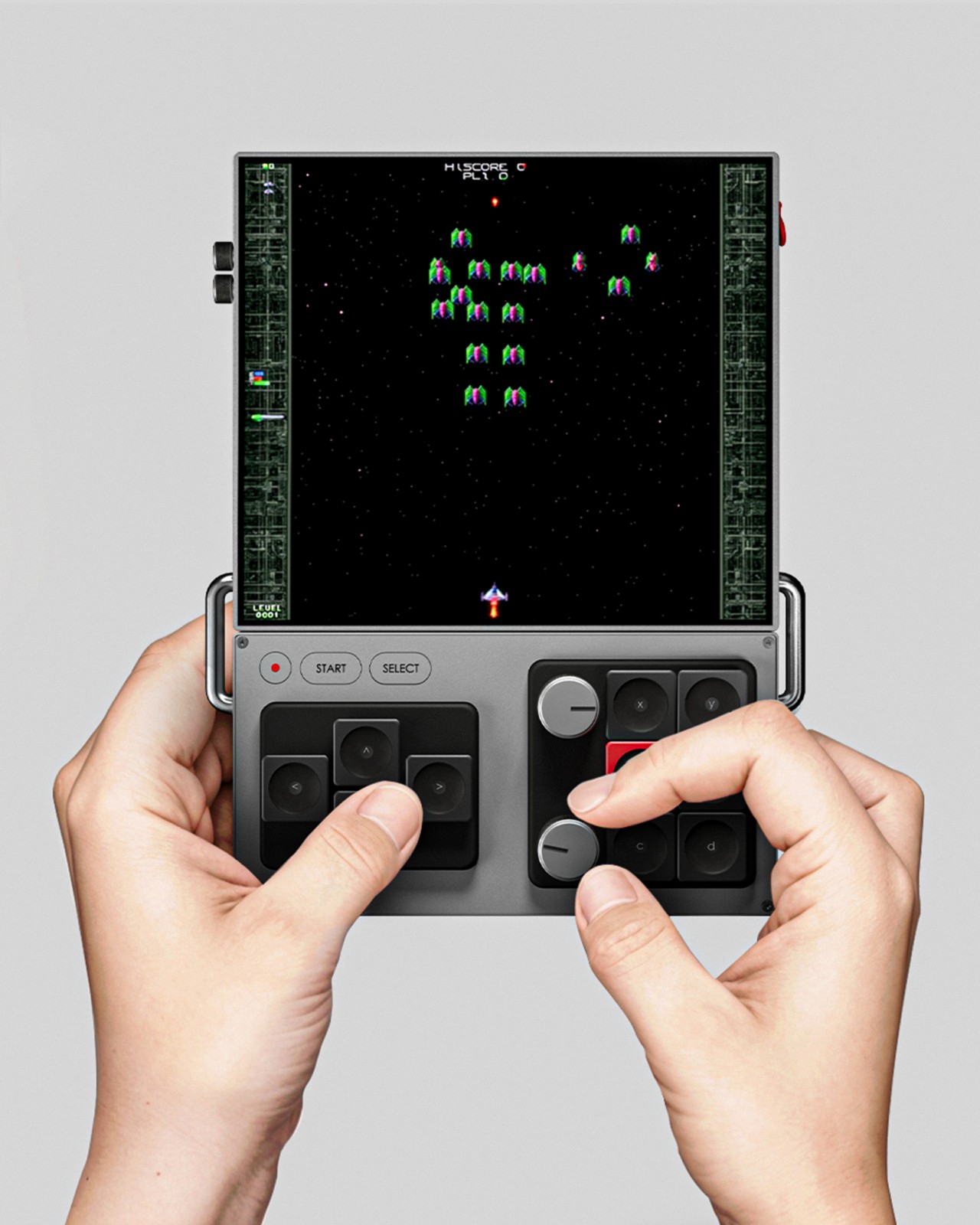
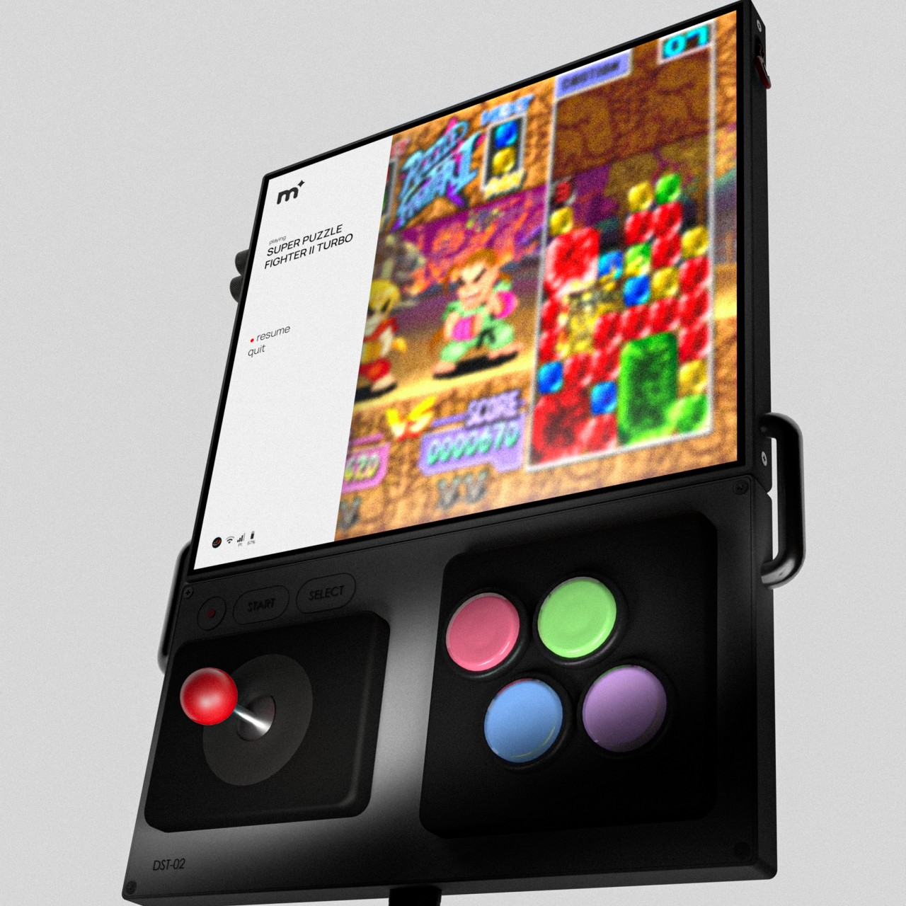
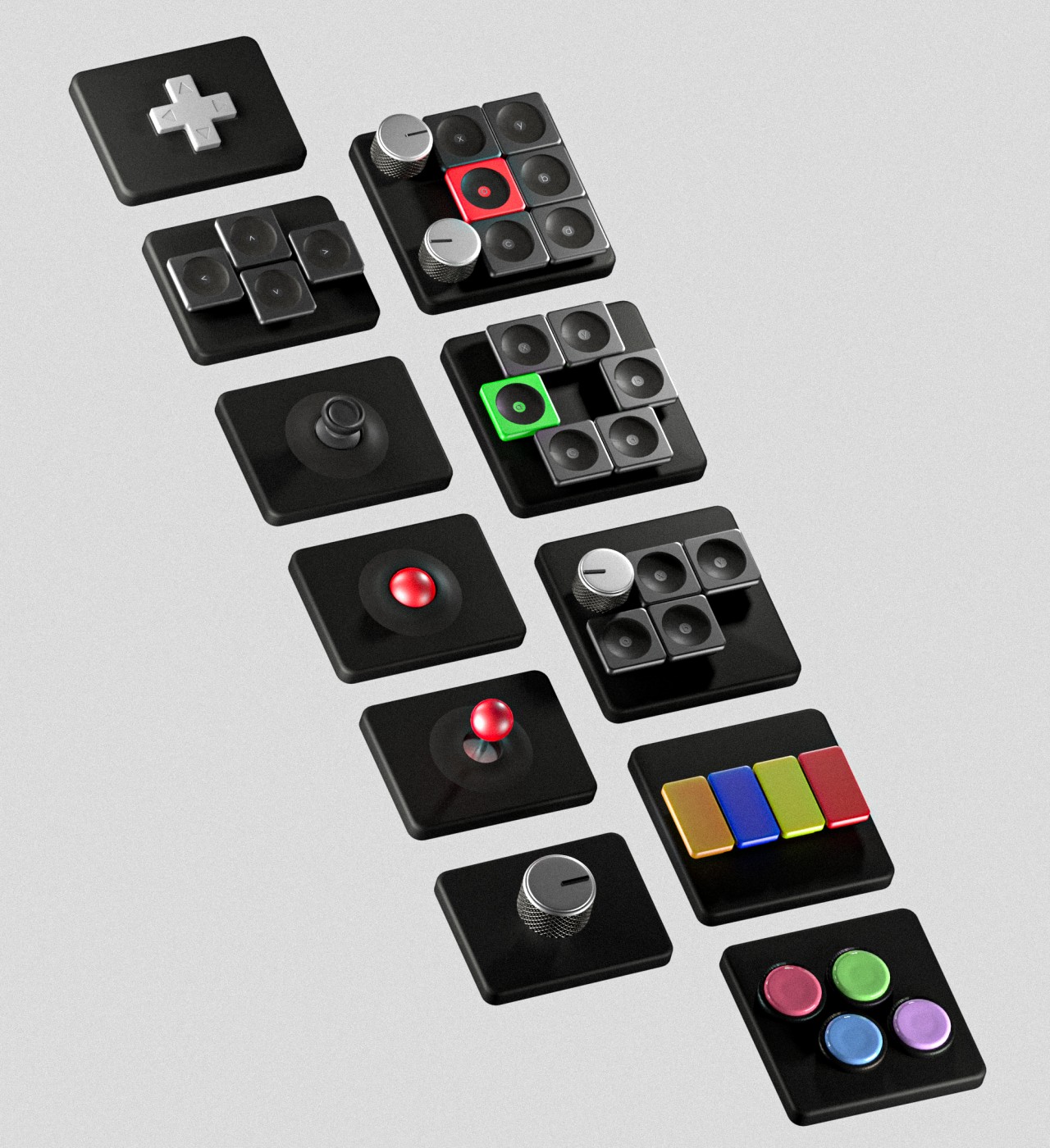
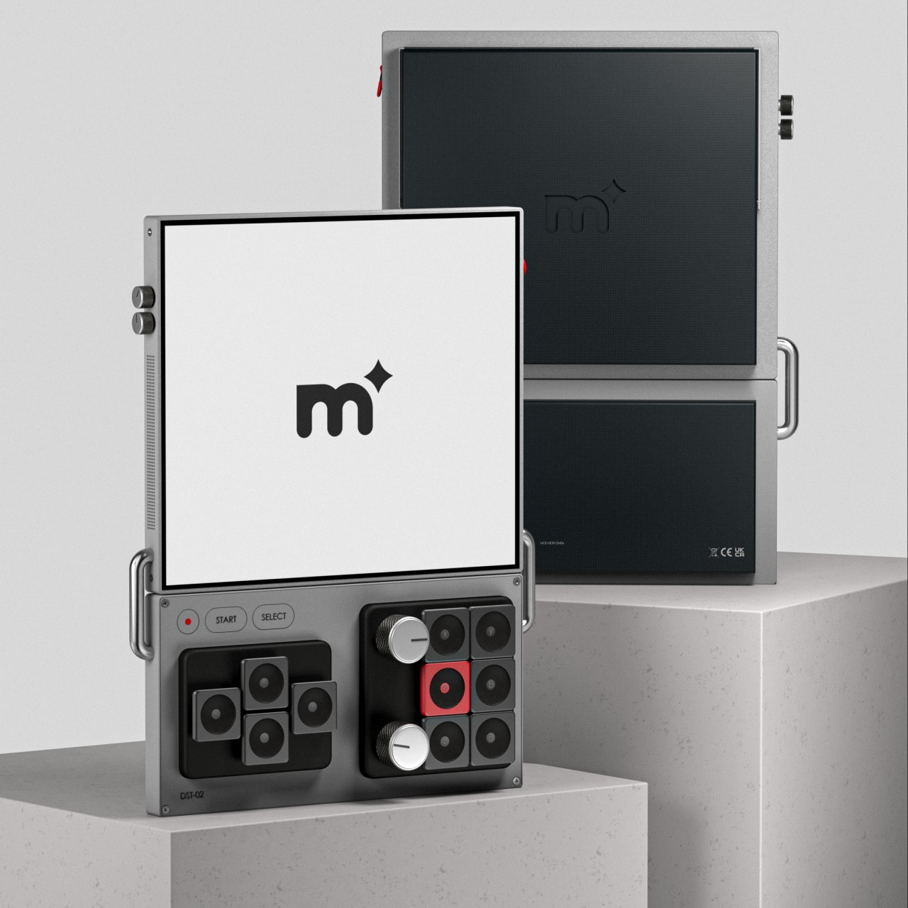
The K-Bird Spec Project is a concept design for a modular keyboard that tries to address that need by providing a different side module for different applications. You can have the typical numpad for fast numeric input or you can have a set of sliders and dials for quickly controlling or editing audio. You can even have a small drawing area with a groove to place a stylus. Or you can have no modules at all and be left with admittedly odd-looking handles protruding from the side.

The base shape of the keyboard theoretically allows for modules to be placed on either side, but the modules themselves would have to be designed to be ambidextrous. The default seems to presume the current convention of placing modules on the right side where the numeric keypad would usually be, and you can’t simply put it on the left because of the handle extending from that side.

What makes this design a little different from other modular keyboard concepts is its use of hexagons as the main shape for all the controls, even the sliders and dials on the modular extensions. The keys themselves are indented, which is already unconventional as far as keyboard designs go. It gives the keyboard a more visually interesting appearance, though it’s not clear whether that will have any negative impact on the ergonomics of typing on such a kind of keycap shape.

The post Modular keyboard concept employs hexagons to switch things up a bit first appeared on Yanko Design.

Duracell Portable Power Stations are like gigantic alkaline batteries

We’ve seen our fair share of portable power stations, and most of them roughly share the same designs. They come in rectangular box shapes and bear rugged materials, which makes it easier to transport them from place to place if needed. There isn’t any rule that says they have to be made that way, though, especially if you’re willing to skimp a little on the battery capacity to add some style and flourish. For example, Duracell, a name long associated with batteries, has had the rather amusing idea to pay homage to its most popular product line, resulting in portable power stations, or extra large power banks, that look like overgrown D-size batteries, with a few tricks up their sleeves that add some flavor to a normally boring piece of tech.

Designer: Duracell

There was a time when consumer electronics revolved around these cylindrical batteries that had to be thrown away once they lost their charges forever. We’ve thankfully mostly moved on from these wasteful energy sources, replacing them with rechargeable and reusable variants, but there’s still a certain fondness attached to the image of these old alkaline batteries that have become icons of their kind, just like floppy disks. Riding on the nostalgia trend these days, Duracell had the clever idea to put that iconic design on a portable power station, almost like a tongue-in-cheek joke on these extra-large batteries.

The Duracell M250 and M150 both look like giant D batteries, complete with a black and bronze color scheme and a smaller disc shape on top that designates the positive end of the cylinder. They’re rather small compared to most portable power stations but also considerably larger than even the largest power bank. The size differences are quite understandable considering these two only have 60,000mAh and 25,000mAh battery capacities for the M250 and M150, respectively, though those are enough to charge most electronic devices, including a laptop via the 100W USB-C port. The larger Duracell M250 even has a 100W AC port for other use cases.

The portable power stations have more than just looks, though. That protruding disc at the top actually functions as a MagSafe-compatible 15W wireless charger, and you can lift that top lid to tilt an iPhone or iPad to the desired angle so you can watch your screen even while charging. Tilting that cover also reveals a small storage compartment for cables and chargers, things you’d want to keep near the power station. To charge the power station itself, you’d have to put it on the included dock, an elegant solution that unfortunately means having to carry a separate part with you on your trips.

Admittedly, this traditional battery form is not the most space-efficient shape for traveling, putting the “portable” part of its name into question. Still, there’s no argument that it’s an interesting design for a portable power station, putting an almost poetic spin on the product category. It will definitely be an eye-catching presence in coffee shops or even on planes, though interest could turn into derision when you start fumbling to put the large can in your bag or luggage.

The post Duracell Portable Power Stations are like gigantic alkaline batteries first appeared on Yanko Design.

SwitchBot K10+ Mini Robot Vacuum cleans narrow, hard-to-reach places with ease

Robot vacuum cleaners are quite the fad these days, offering peace of mind by keeping your floors clean without getting your hands dirty. They come with a wide range of advanced features and a variety of designs, but they all have one thing in common. The majority of robot vacuum cleaners come with very large bodies, often justified by the power they pack inside. Bigger isn’t always better, though, and size can even become a liability rather than an asset when dealing with small, cramped areas or difficult corners. That’s no problem for the world’s smallest robot vacuum cleaner, sneaking into tough corners and narrow paths in order to provide a more efficient cleaning experience in a compact and portable package.

Designer: SwitchBot

Click Here to Buy Now: $399.99 $499.99 (Use coupon code “UP50MRCS” to get $100 off). Hurry, deal ends in 48-hours!

With it’s compact design K10+ can reach smaller spaces to clean better.

The SwitchBot K10+ honestly looks too cute to be true. At only 248mm in diameter and 92mm tall, it’s only half the size of run-of-the-mill robot vacuums and might easily be mistaken for a toy. In fact, you can easily lift it with one hand and carry it upstairs or anywhere, which means you can easily move it to rooms that need cleaning in a snap. Despite that diminutive size, however, the K10+ is no slouch, and it’s exactly thanks to its size that it is able to offer more for less.

K10+ features a design that can blend in with any home, making it even less intrusive.

LiDAR Navigation.
K10+ allows you to achieve AI level precise mapping and quickly plan cleaning range at a speed of 2080 pts/sec.

K10+ returns to its base station for charging when battery is low, and returns to the last place it cleaned to finish up.

With its smaller diameter, the SwitchBot K10+ can easily navigate narrower spaces without breaking a sweat, deftly reaching the floor between the wall and a closet, underneath the couch, or in between the legs of a side table. Because it’s able to clean areas that most robot vacuums steer clear of, it offers 90% more coverage and significantly increases its cleaning efficiency. Of course, it’s not enough to simply be able to roll where no robot vacuum cleaner has gone before, and this little wonder surprisingly packs quite the assortment of cleaning features that puts it on par with its larger rivals.

Use the app to control the K10+

You might be surprised that the smallest robot vac actually boasts a suction power of 2500Pa, which means that even kitty litter and small pieces of food are no match for this wonder of technology. Even with that much action going on, it is able to keep quiet while it does its job, down to 50dB or 50% quieter than the industry average. It can also mop the floors after it has sucked them clean, and the disposable cleaning pads free you from the hassles and risks of dealing with dirty mops after each cleaning session. Best of all, the large 4-liter dustbin can collect dirt for up to 70 days before you need to take out the trash.

The SwitchBot K10+ is also equipped with plenty of smarts, from SLAM (Simultaneous Localization and Mapping) self-navigation to obstacle and no-clean zone detection to scheduling cleaning sessions. It can also integrated with smart home platforms, including Amazon Alexa, Google Home, Apple Siri, and even IFTTT for hands-free voice control. With the SwitchBot K10+, you never have to worry about missing those hidden corners and spots ever again and dedicate more of your time to the more important things in life.

Click Here to Buy Now: $399.99 $499.99 (Use coupon code “UP50MRCS” to get $100 off). Hurry, deal ends in 48-hours!

The post SwitchBot K10+ Mini Robot Vacuum cleans narrow, hard-to-reach places with ease first appeared on Yanko Design.
nubia RedMagic 9 Pro gaming phone arrives with a new design, same tiny fan

The year is almost over, but there’s plenty of time left to unveil new products, including new smartphones that could become gift ideas for people in some markets. We’ve seen quite a few make their way to the market a few days ago, but most of them revolve around “normal” phones for everyday use. Gaming phones, however, still make up a slice of that large pie, and one of the top brands in this market is taking out its big guns early. Former ZTE sub-brand nubia is reaching out to gamers with the latest RedMagic model, bearing a slightly new design that manages to keep key features that fans of the brand have grown fond of, whether they make sense or not.

Designer: nubia

What sets a gaming smartphone apart from regular smartphones, including those expensive ones, isn’t just their over-the-top performance. Most gaming-centric phones carry a certain aesthetic that really marks them for a certain crowd, one that appreciates a lot of RGB lighting, lines and geometric shapes, and other details that make the design look futuristic if not highly technical. The nubia RedMagic 9 Pro continues that tradition this year but makes a few tweaks that streamline the gamer design a little bit better.

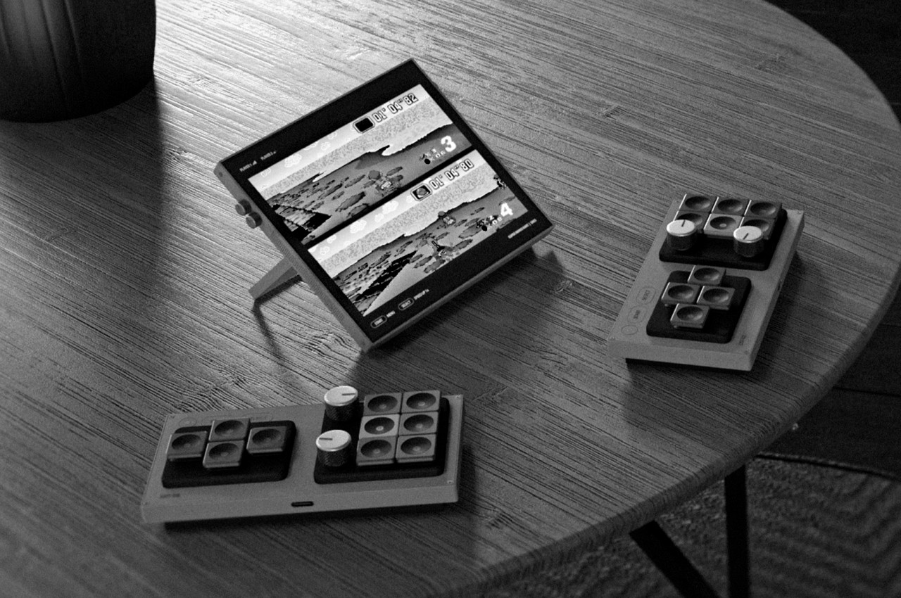
Most notable is the relocation of the cameras from the middle of the phone to the side, something that’s almost a standard across all smartphone designs. The camera bump is also gone, with the lenses sitting flush against the entire back. That does mean that the phone is a little bit thicker than most of its kind, but a hefty and beefy handset is already expected for a device that’s designed to be a heavy-duty gaming machine. The rather odd design change is that only two of the three big circles are actually cameras, with the third deceptively hiding the cooling fan. The third camera is off to the side, though having a 2MP depth sensor makes it almost negligible.

The rest of the RedMagic 9 Pro has a similar vibe to its predecessor, with lines and shapes on the back that give the semblance of panels that cover futuristic machines like ships, robots, and similar. For those who prefer a more subtle appearance, the Sleek model has an aesthetic closer to the typical black smartphones, masking its identity for more discreet uses. The front still has an under-display camera, which means there’s nothing visually breaking the large screen.

There’s also still that miniature cooling fan, one of the brand’s gimmicks to help keep things cool and prevent the phone from throttling its performance. It may be effective to some degree, but the price that is paid is having no dust or water resistance guarantee. With a more efficient Qualcomm Snapdragon 8 Gen 3 processor and a newer “ICE 13 Multi-Dimensional” cooling system, such a fan might no longer be needed and is becoming more of a liability than a selling point in the long run.

The post nubia RedMagic 9 Pro gaming phone arrives with a new design, same tiny fan first appeared on Yanko Design.
Historical Buddhist site master plan looks like a fantasy biodiversity space

Most people probably think of religious sites as churches, temples, or even buildings, but there are plenty of locations regarded as “holy” or even historical places that are sometimes nothing more than a mound and a tree. Buddhism, for example, has one such sacred space that holds relics of its past, an unadorned mount covered by grass and topped by a simple yet distinctive tree. Given both its religious and historical significance, there is a strong interest in preserving such a site while also promoting its spirit in tangible yet subtle ways. One such plan transforms this key piece of Buddhist religion and history into a biodiversity garden that almost looks like a landscape straight out of a fantasy film.

Designer: Stefano Boeri Architetti

Located in western Nepal, the Stupa or “heap” of Ramagrama is one of the most important locations in Buddhism, combining religious, historical, and cultural heritage in a single place. A centuries-old Bodhi tree sits on top of a green hill that has formed over an intact dirt burial mound that contains portions of the relics of Buddha. That landscape has remained unchanged, protected by both nature and man, yet there is no assurance that it will be that way forever. A master plan is needed to help preserve the natural beauty of this site while also encouraging both believers as well as tourists to immerse themselves in the environment in a safe manner.

The solution presented in this beautiful design creates a wide space around the stupa and the Bodhi tree that maintains a respectful distance in order to preserve historical landmarks and objects for future generations. Covered walkways encircle the hill while dozens of pathways draw a beautiful and mesmerizing mandala that can only be seen from the skies. Four portals in each direction break up the area into four quadrants, with large access roads that lead to the central hill.

This open space for contemplation or “Prato della Pace” is surrounded by the Garden of Biodiversity, a slope that is conceived to hold 80,000 plants of 70 different local species selected from the Terai plain considered to be the Buddha’s birthplace. A shaded path covered with trees separates these two circular areas and provides a convenient location to view and appreciate the Ramagrama Stupa from a distance.

The master plan for the Ramagrama Stupa is an ambitious project that combines the many elements that represent Buddhism into a harmonious piece of architectural design and landscaping. The structures and circular paths embrace minimalism and mysticism, allowing visitors to both pray and marvel, whatever the purpose of their visit may be. The high biodiversity pays homage to the Bodhi tree, itself a symbol of biodiversity, and ensures that the botanical legacy of Buddhism will also be preserved for years or even centuries. It’s a design that generates an air of mysticism and wonder, creating a space that is literally rooted to the earth yet looks like it exists on a higher plane.

The post Historical Buddhist site master plan looks like a fantasy biodiversity space first appeared on Yanko Design.
Apple Vision Pro Air Typing experience takes a small step toward usability

It’s truly mind-blowing to see virtual objects floating before our eyes, but the magic and illusion start to break down once we try to manipulate those objects. Input has always been a tricky subject in mixed reality, either because we can’t see our actual hands or we can’t feel what we’re supposed to be touching, which is physically nothing. Until the perfect haptic feedback gloves become a reality, we have to make do with tricks and workarounds to make input less awkward and more convenient. That’s especially true with typing on air, and Apple is apparently using some special techniques to offer a more usable experience on the Vision Pro mixed reality headset.

Designer: Apple (via Brian Tong)

Apple’s first teaser for the Vision Pro headset and visionOS platform didn’t show typing of any sort. It focused, instead, on icons, windows, and menus, virtual 3D objects that are easier to interact with using hand gestures. Of course, sooner or later you will be faced with the need to input text, and the usual method of voice recognition won’t always cut it. visionOS, fortunately, does include a virtual floating keyboard like other VR systems, but the way you use it is quite special and, to some extent, ingenious.

For one, you can interact with the keyboard like you would any part of the Vision Pro’s interface, which is to look at the UI element to focus on it and then use hand gestures. In this case, pinching a letter is the equivalent of selecting it, just like what you’d do for menu items or icons in visionOS. It makes the gesture grammar consistent, but it’s also an awkward way to type.

You can also “peck” at the keys with your fingers, making you feel like you’re typing on air. The difference that the Vision Pro makes, however, is that it tricks your eyes into believing you’re actually pressing down on those keys. Thanks to Apple’s flavor of spatial computing, hovering your real-world finger on a virtual key makes that key glow, and tapping on it results in an animation that looks like the key is actually moving down, just like on a real keyboard. There’s also a haptic sound, similar to the clicking sound effect you’d normally hear on an iOS virtual keyboard, to complete that audiovisual illusion.

Of course, your fingers aren’t actually hitting anything physical, so there’s still a disconnect that will probably confuse your brain. The visual effect, which is really only possible thanks to spatial computing, is still an important step forward in helping our minds believe that there’s a “real” three-dimensional object, in this case, a keyboard, right in front of us. It’s not going to be the most efficient way to input text, but fortunately, you can connect a wireless keyboard to the Vision Pro and you’ll be able to see your actual hands typing away on it.

The post Apple Vision Pro Air Typing experience takes a small step toward usability first appeared on Yanko Design.
Standalone AirPods Pro 2nd-Gen USB-C charging case might not be worth the price

The newest iPhones have finally jumped on the USB-C bandwagon, but there are still a few Apple products that still cling to the older Lightning technology. That includes all iPhone models before the iPhone 15, older iPads, and the majority of charging cases for the AirPods. A few months back, Apple did release a version of the 2nd-gen AirPods Pro with a USB-C charging case, but you’ll have to buy the whole set to enjoy this upgrade, both earbuds and charging case. If you already have a 2nd-gen AirPods Pro that came with a Lightning charging case, however, you can now just buy the USB-C case on its own, but the price tag on this very optional accessory could have you thinking twice why you’d want to buy one in the first place.

Designer: Apple

To be fair, the USB-C charging case does have a few advantages, though the biggest one would be consistency between the most recent Apple devices. You won’t have to carry a separate Lightning cable, presuming you’ve gone all-in on USB-C already. There’s also this convenient reverse charging feature where you can charge the AirPods Pro case from an iPhone 15 using a USB-C to USB-C cable. Handy in an emergency but not exactly a ground-breaking game-changer.

Given the nearly similar features, the $99 price tag on this standalone USB-C charging case for the AirPods Pro 2nd-Gen might seem a little excessive. It also only makes sense if you already have the Lightning version of these AirPods Pro and only want to enjoy the benefits of USB-C mentioned above. Otherwise, it doesn’t offer any charging speed advantages between these two models and both support the same wireless MagSafe capability.

That said, you might want to upgrade from the 2nd generation Lightning AirPod Pro to its USB-C sibling for future-proof durability and features. The USB-C AirPods Pro 2nd-Gen has an IP54 rating, up from last year’s IPX4, which means it’s better protected against dust and small particles, though it’s still only splashproof rather than waterproof. It will, however, support lossless audio when paired with the Apple Vision Pro headset, at least if you can get your hands on one next year.

The USB-C case itself is also IP54 rated, but you won’t get the dust-proofing upgrade for the earbuds just by switching cases. That makes the standalone case less appealing for the majority of AirPods owners. Then again, there will always be someone who wants a complete and consistent set of products or may have had the misfortune of losing their original charging case. Fortunately, now you won’t have to buy a new set just to replace that.

The post Standalone AirPods Pro 2nd-Gen USB-C charging case might not be worth the price first appeared on Yanko Design.