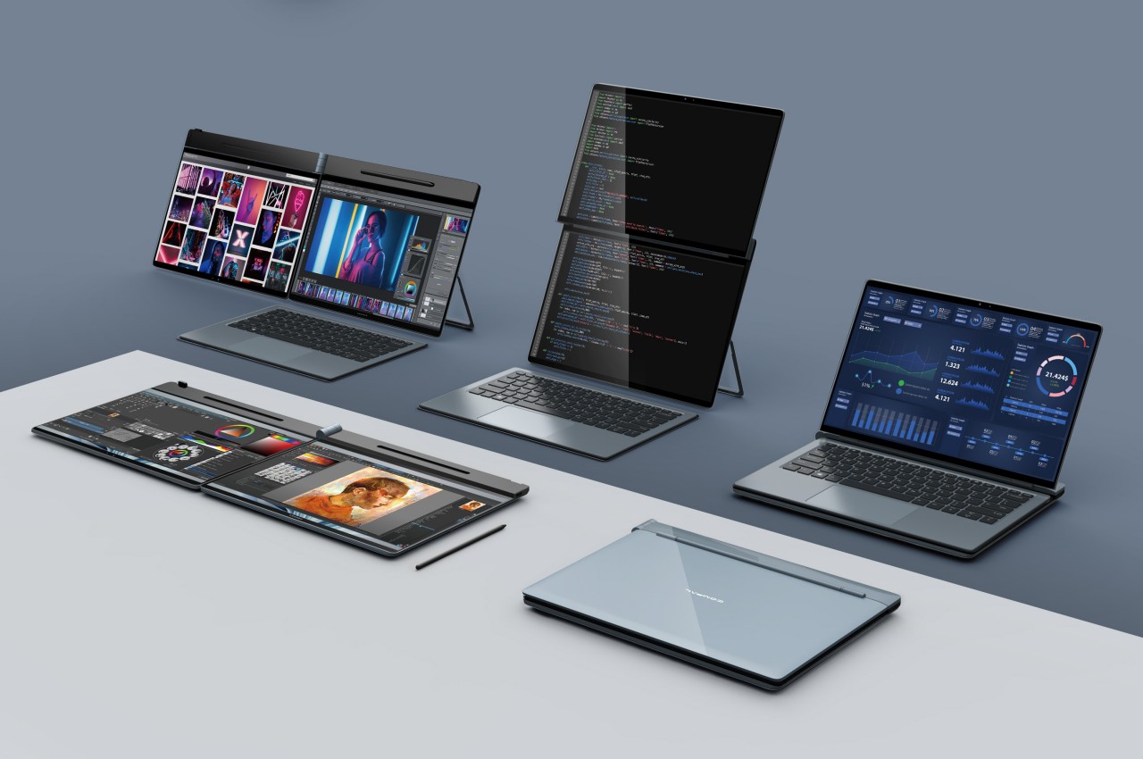
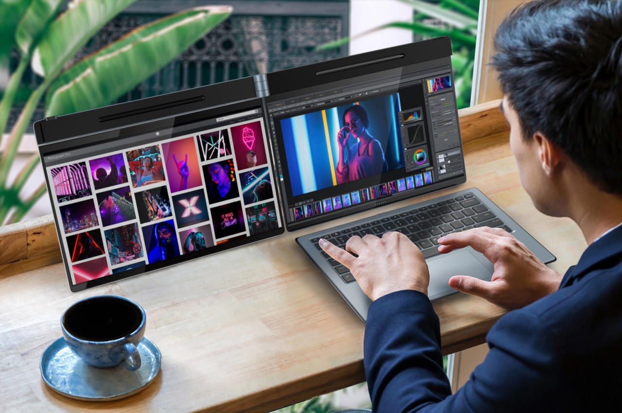
It’s still a very niche design, but it seems that dual-screen laptops are being adopted by major PC makers. Unlike a foldable laptop that mimics a foldable phone, a dual-screen laptop simply offers two separate displays joined by a hinge, sort of like offering a second monitor that’s permanently attached to the laptop. Given this design, however, the only available design was a book-type foldable like the aborted Microsoft Surface Duo, the ASUS ZenBook Pro Duo, and the Lenovo Yoga Book 9i. That, however, only covers about half of the use cases you might have for a dual-screen configuration and lacks the flexibility you’d enjoy with a detached second screen. That’s the kind of design problem that Compal’s concept is trying to solve and it does so in a very intriguing way.
The way dual-screen laptops are designed today is pretty much a product of familiarity rather than innovation. It’s the closest that resembles a regular laptop and is the easiest to implement. Ironically, it’s actually not the way people with two monitors arrange their screens in normal circumstances. Most have two horizontal monitors side by side or one stacked on top of the other. While current dual-screen laptops do support the latter use case, putting the monitors side by side requires having them standing vertically, opened like a book.
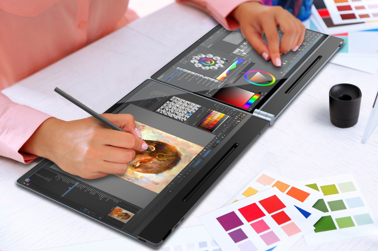
The Compal DualFlip concept flips that design on its head, pardon the pun, by giving the user the freedom to choose the configuration they need or want. They can have it stacked or side-by-side or even in the conventional book style. Or they can have only one screen active with the wireless keyboard sitting on top of the other, turning it into a regular laptop. The key point is that they dictate how they want to use the product rather than the other way around.
This opens the device to even more applications and users who have different needs and working conditions. Those monitoring data will probably appreciate having the monitor on top while those coding and writing might put the screen to the side. The latter is also the configuration that most will use for making digital art. Interestingly, having the screens stacked on top of each other also solves one of the biggest problems with dual-screen laptops and manages to “hide” the hinge and the gap that it creates between the two displays.
The key to this flexible design is the hinge that can fold or flip the screen as needed, hence the name. Of course, it’s still a concept and it’s uncertain if Compal already has working prototypes for this, but it definitely looks doable. If Compal manages to pull it off, it will definitely raise the brand’s profile and put it back on the map. That is unless its bigger rivals figure out another design that also solves that problem and actually puts it into production first.
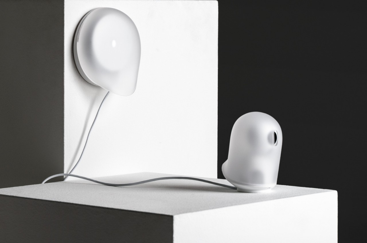
Our homes are starting to get filled with smart gadgets, and not just the usual culprits like smartphones and tablets. From smart lamps to smart refrigerators, a lot of devices in our houses are now connecting to the Internet. While some of these try to blend in with the rest of your decor as much as they can, others just stand out like a sore thumb. Devices like home security cameras and routers still carry the aesthetics of their predecessors, which is impersonal, technical, and at times even disconcerting. While these products might be important in modern smart homes, they don’t need to be seen in order to function, which is why this concept design tries to make them almost literally fade into the background as if they were ghosts.
Designers: Seokhyun Ahn, Yejee Park, Cho Yumi, Yumin Shin, Myeongryun Kim, Dohyun Park, Lee Dahye, Kim Geonhee, Yang Yurim
We easily take for granted how things that look out of place can affect our minds and moods. Whether it’s a messy desk, a less-than-appealing piece of decoration, or clashing designs, the visual discomfort and confusion can actually bleed into your physical and mental state. They say that the best interfaces and designs are the ones that you barely notice, and what is the least noticeable thing if not a ghost?
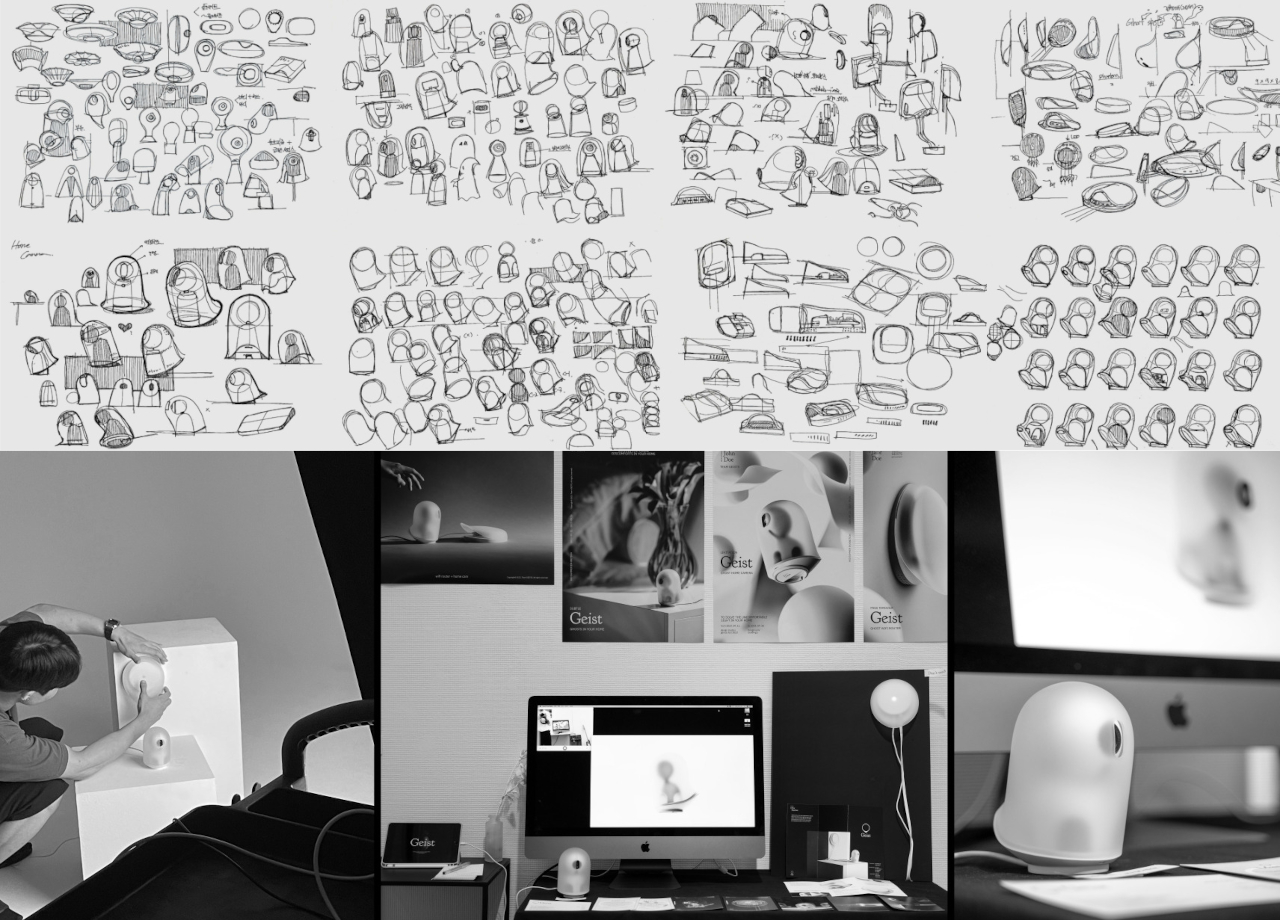
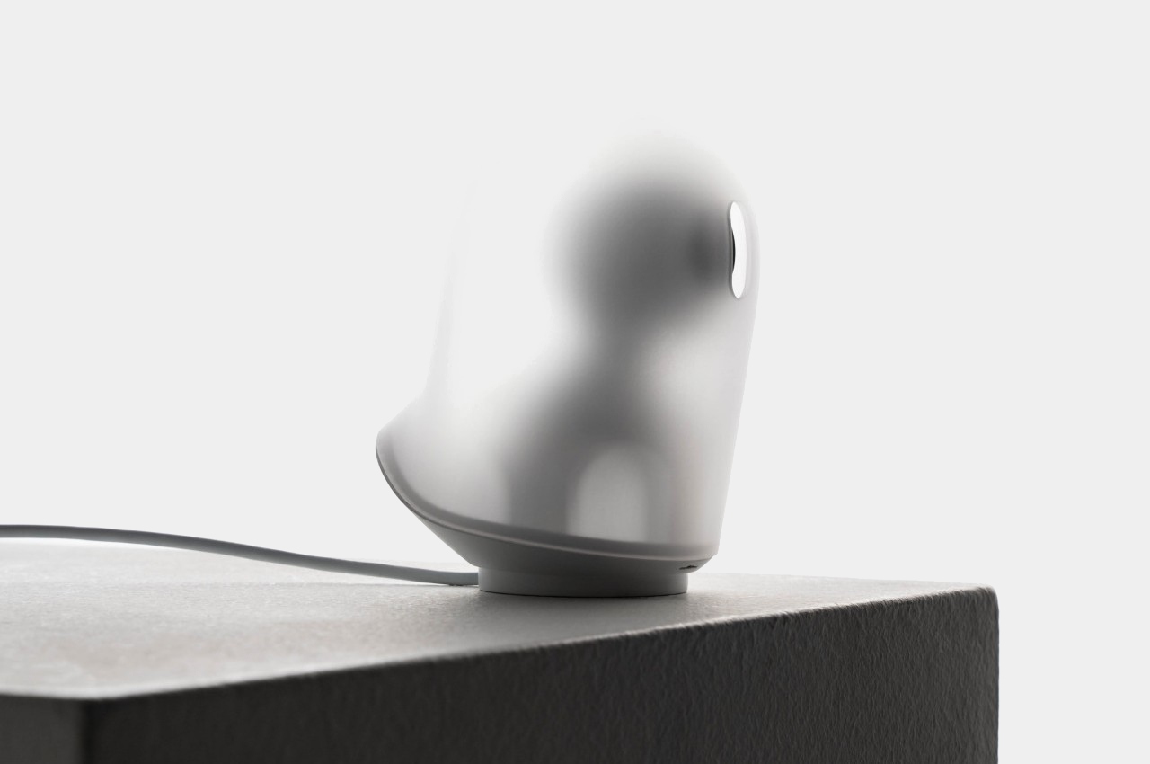
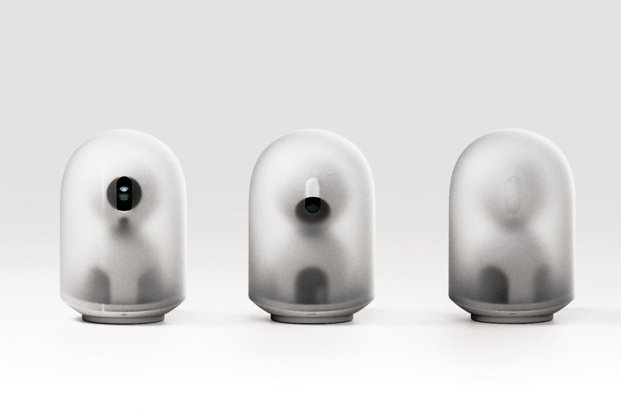
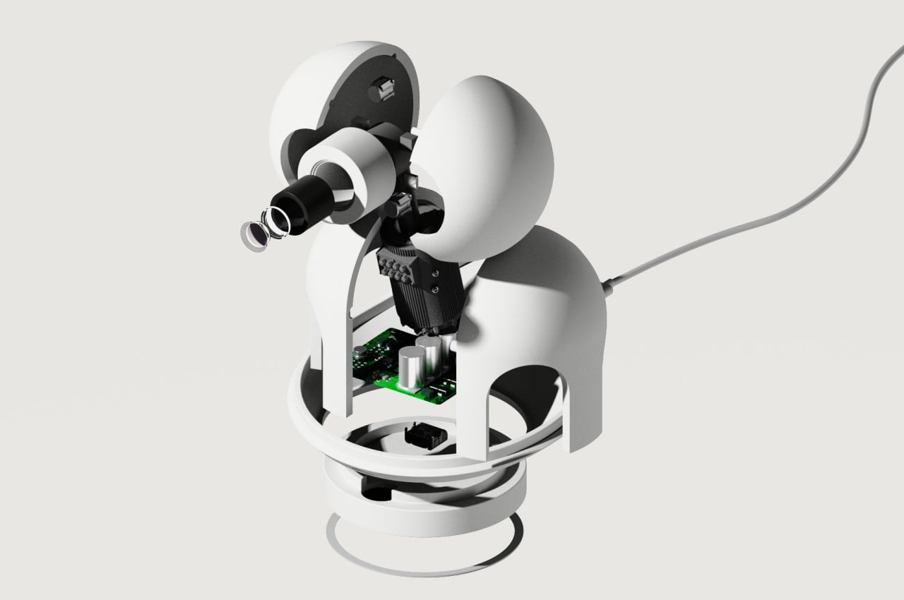
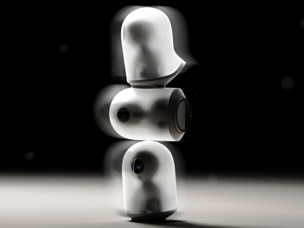
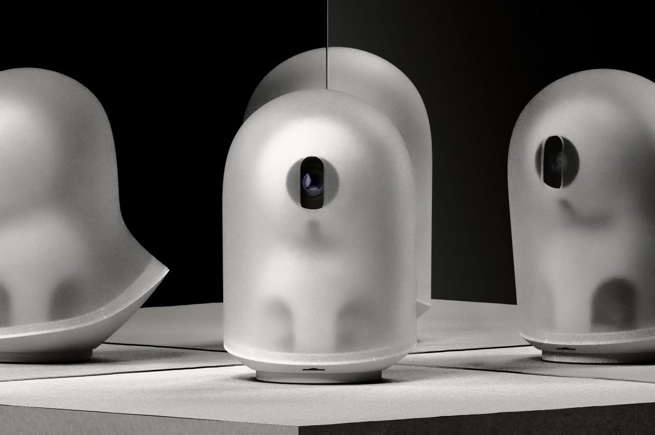
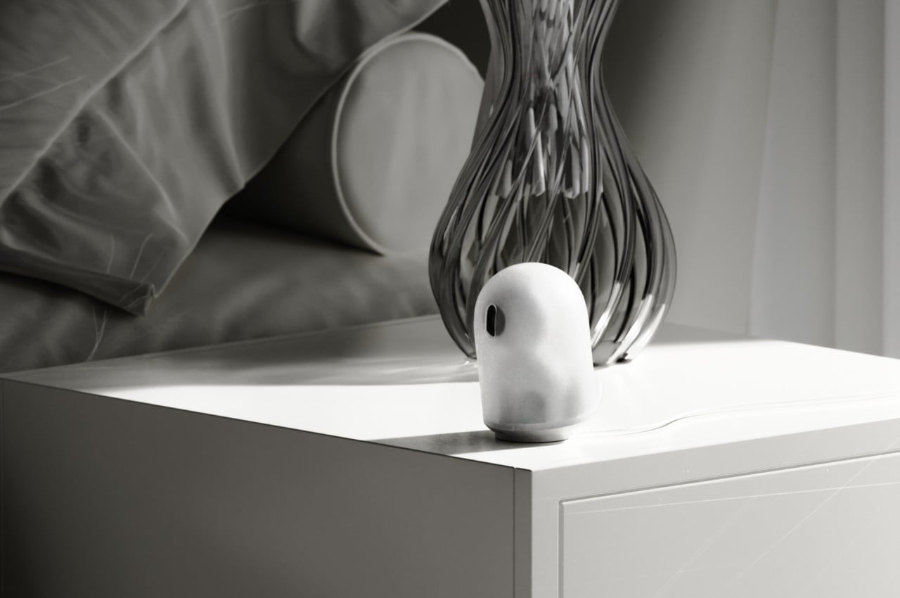
Geist, which literally means “spirit” or “ghost,” is a concept design that tries to make those smart home devices less noticeable. Rather than having a black sphere or rectangle that feels like it’s spying on you, the John Doe ghost camera has a translucent body that almost looks like a piece of cloth flying in the wind, just like your stereotypical ghost from cartoons. It is even slanted at an angle to give the impression that it’s levitating and floating as it moves forward. It does have an “eye” for the camera, but it can turn it down to protect your privacy, indicating that it isn’t recording at the moment.
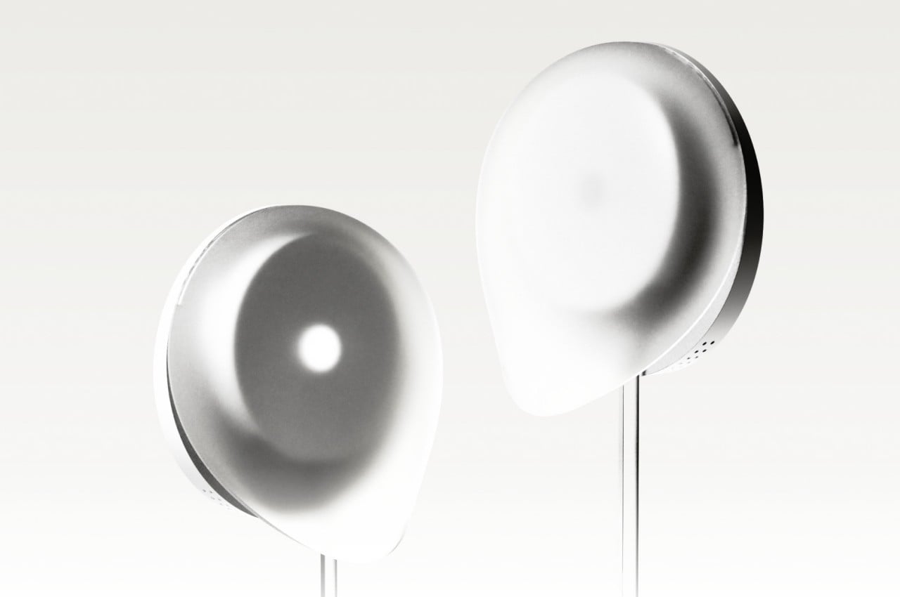
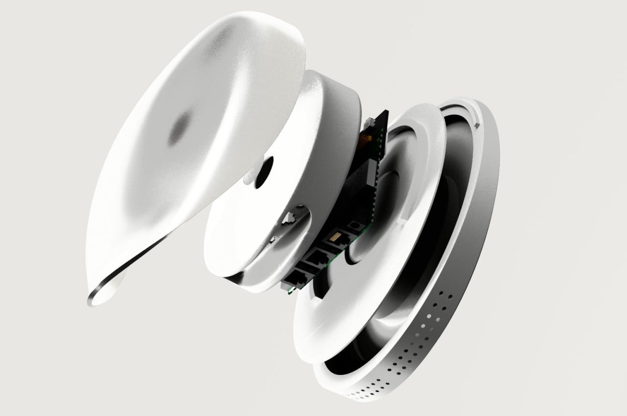
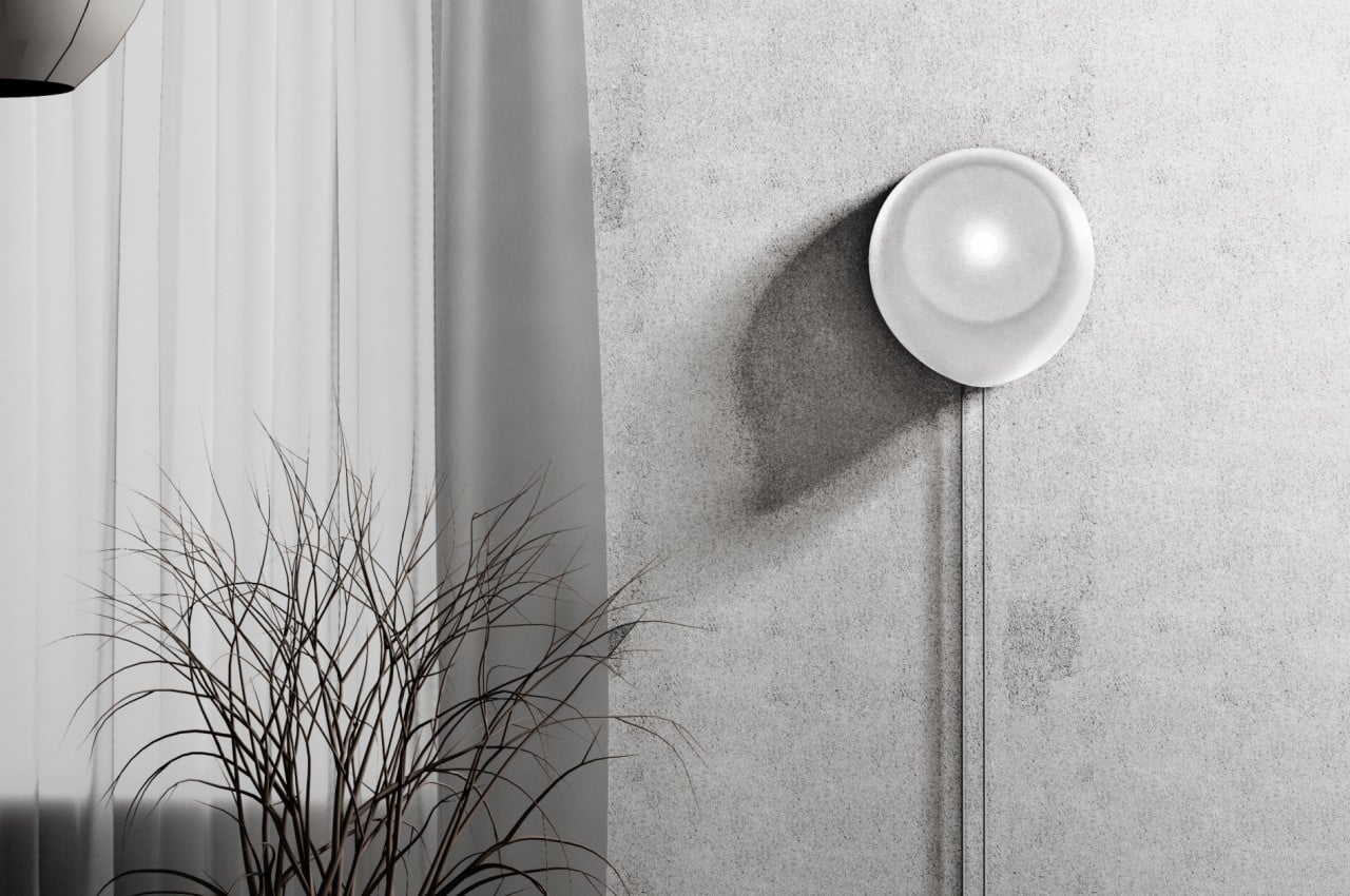
The Wi-Fi router Jane Doe takes on the shape of a gentle wisp of smoke or cloud. With an asymmetrical shape that is mounted vertically on a wall, it almost looks like a ghost passing through a solid surface. It’s impossible to completely hide some of the cables, particularly the power cable, but it at least forces these wires to go in a straight vertical line rather than ending up in a tangled mess.
Although the Geist concept design is actually meant to be less conspicuous and reduce visual discomfort, they can actually also have the opposite effect, depending on the person. Some might not be keen on seeing any representation of the paranormal, so anything that might remind them of ghosts might be even more uncomfortable. That said, the designs are aesthetically pleasing on their own, if you leave out the ghost association, so they still present a more pleasing aesthetic compared to the typical designs of these devices.
Bright and vibrant colors thanks to RGBICW LED technology
Superb color-matching using a future-proof camera system
Incredible value for its price
CONS:
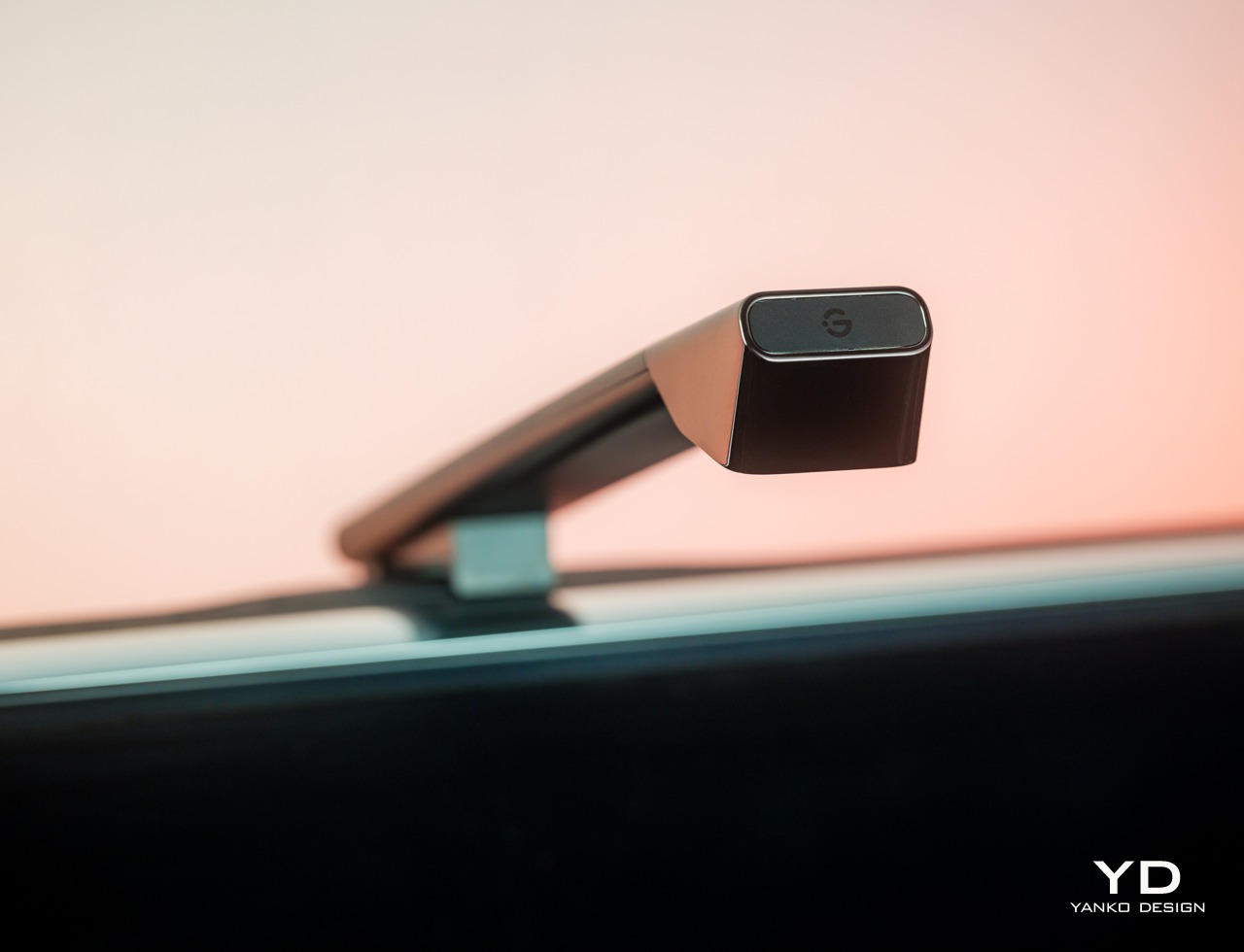
Camera design is a bit awkward and might not fit thicker TVs
Wi-Fi connectivity is compatible with 2.4GHz networks only
RATINGS:
AESTHETICS
ERGONOMICS
PERFORMANCE
SUSTAINABILITY / REPAIRABILITY
VALUE FOR MONEY
EDITOR'S QUOTE:
With rich colors, fast color-matching, and unbeatable price value, the Govee TV Backlight 3 Lite with Dune-themed packaging helps fully immerse viewers in the content they're watching.
TVs today are more than just large boxes that show moving pictures. They have also become pieces of decoration that add to the ambiance of a space, whether they’re turned on or not. The lush and vibrant colors that a TV can display can definitely light up a dark room, but that glow stops at the TV’s frame. Yes, the TV’s light can bounce off nearby walls, depending on where it’s placed, but you have absolutely no control over what happens. TV backlights were made to help better immerse you in the show or movie you’re watching by making sure that the light behind and around your TV reflects the content that’s on screen. Smart lighting expert Govee recently launched its latest contender in that category and even partnered with Warner Bros to tie in with the studio’s latest new science fiction film, Dune: Part Two. It’s the perfect time, then, to take a close look at the Govee TV Backlight 3 Lite, particularly with this Dune-themed packaging, to see what value it adds to your viewing experience and if it’s tempting price tag sounds too good to be true.
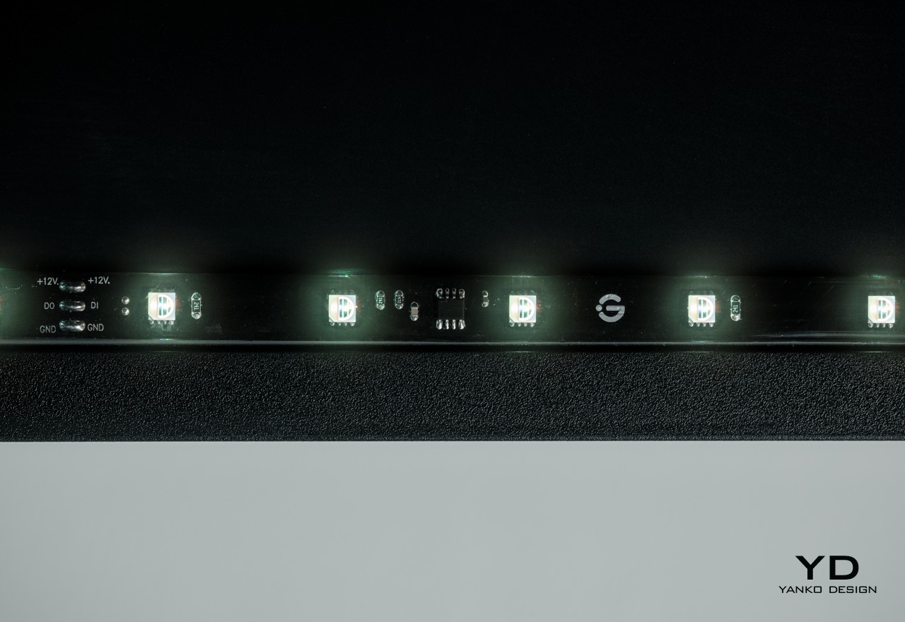
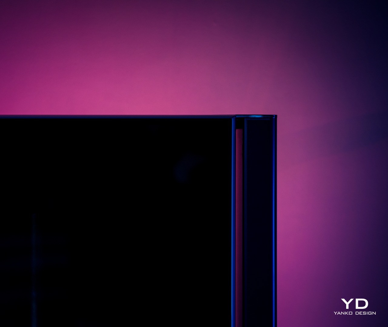
For something you will never see again after you’ve installed it, the Govee TV Backlight 3 Lite has quite an interesting appearance. Of course, it’s just a flat strip of LEDS grouped into four segments that need to go around your large TV, but the transparent material that covers the LEDs and some of the circuitry that controls allows you to see some of the secrets behind the magic. It’s not unlike that trend in consumer electronics where transparent cases showed off the parts that actually made the product work. It’s not as sophisticated as those, but it still adds a bit of flavor to the design.
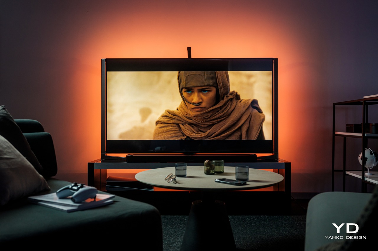
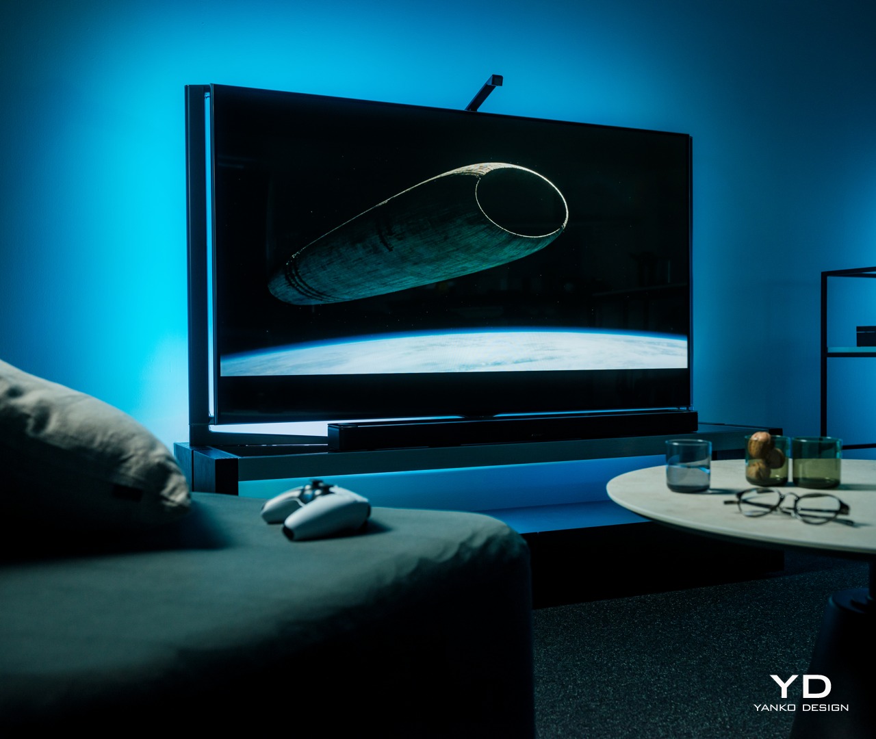
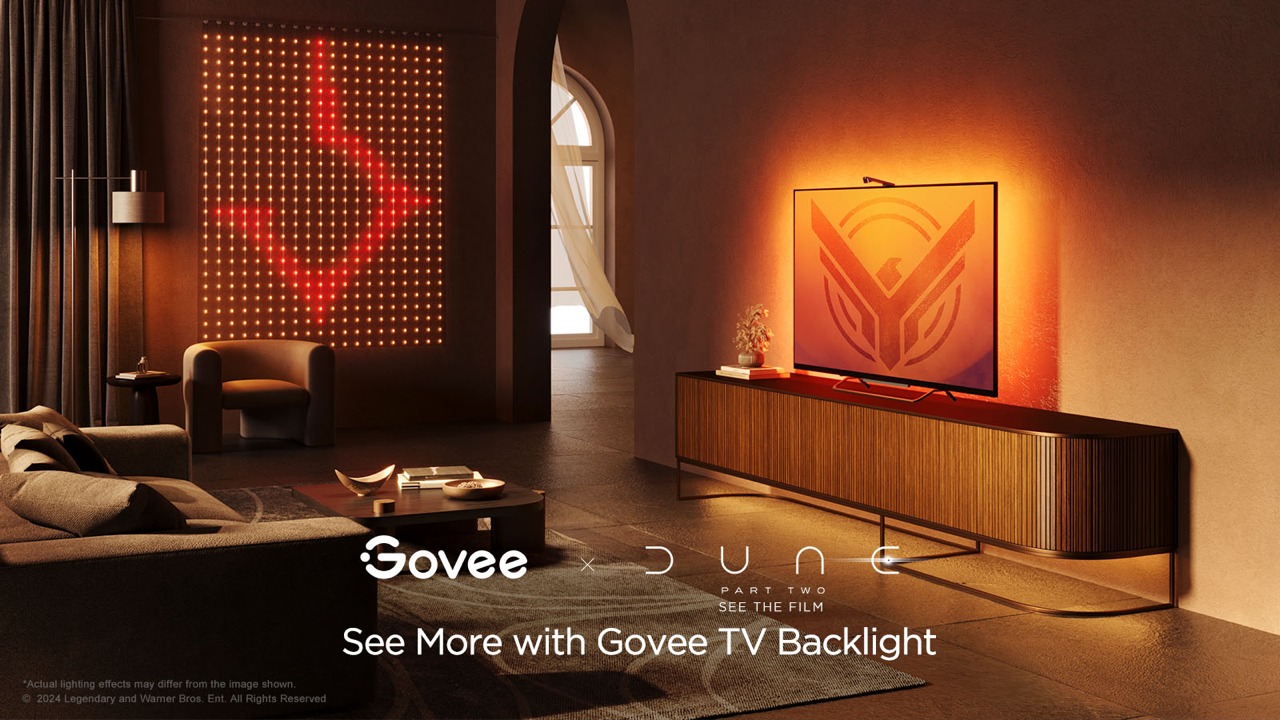
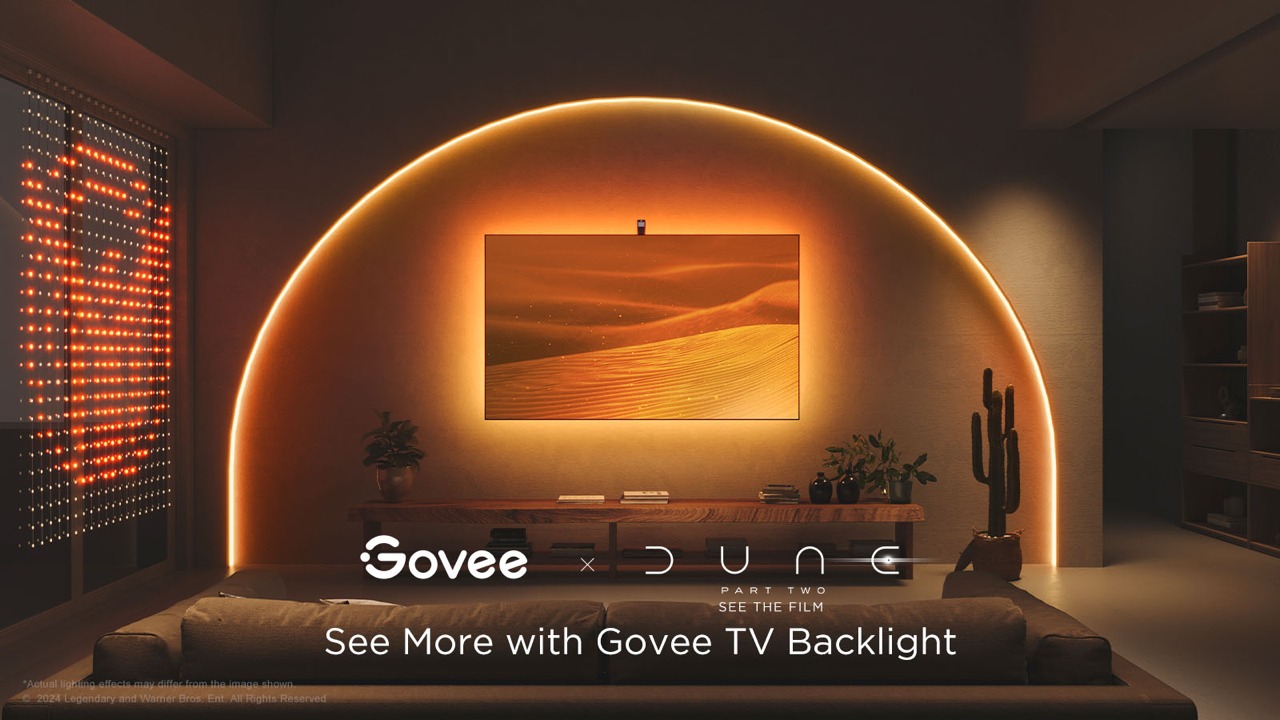
Of course, the Govee TV Backlight 3 Lite’s beauty really shines, literally, it has been installed and enabled, and boy does it shine! The light the strips produce is quite bright, especially in a dim room, and the colors are rich and vibrant. The way those colors shift almost instantly to match what’s on the screen is also magical, making it look like the TV actually goes beyond its frame. We’ll get to the technical details that make that possible in a bit, but suffice it to say, the backlight definitely delivers an enriching experience when watching any kind of content on TV.
While the backlight itself is something you won’t see, there is one part of the system that is actually always visible and, depending on your setup, always in your face. Given how the Govee TV Backlight 3 Lite works, it’s necessary to have that camera hanging from the top of the TV, extending a bit forward from the frame. Depending on the design of the TV itself, this black cantilever-like part may or may not easily stand out, and it will definitely add a little blemish to more artful TV designs. Unfortunately, there is no other way to implement this kind of dynamic color-matching system, so it’s a cost that owners will have to live with. Fortunately, it might actually be the biggest cost after all.
Ergonomics
Since the Govee TV Backlight 3 Lite is not something you’ll be using in your hand every time, its ergonomics mostly apply to the installation process as well as the hands-free control of the lights. In that regard, Govee’s light strip is not really unlike others in this market, which isn’t completely a good thing either. Installing the lights on the TV is a very involved process, which will be even more difficult if your TV is mounted on a wall.
In a nutshell, you attach the four segments of the strip on the four edges of the TV’s back. The exact placement of the strips will depend on the shape of that rear, with curved ones being the trickiest. The strips are attached using 3M adhesive, which will worry some owners about the permanence of the installation and the marks it will leave behind when removed. Special care must also be taken to hide the loose cables at the corners so that they don’t peek out of the frame or cast shadows when the lights are turned on.
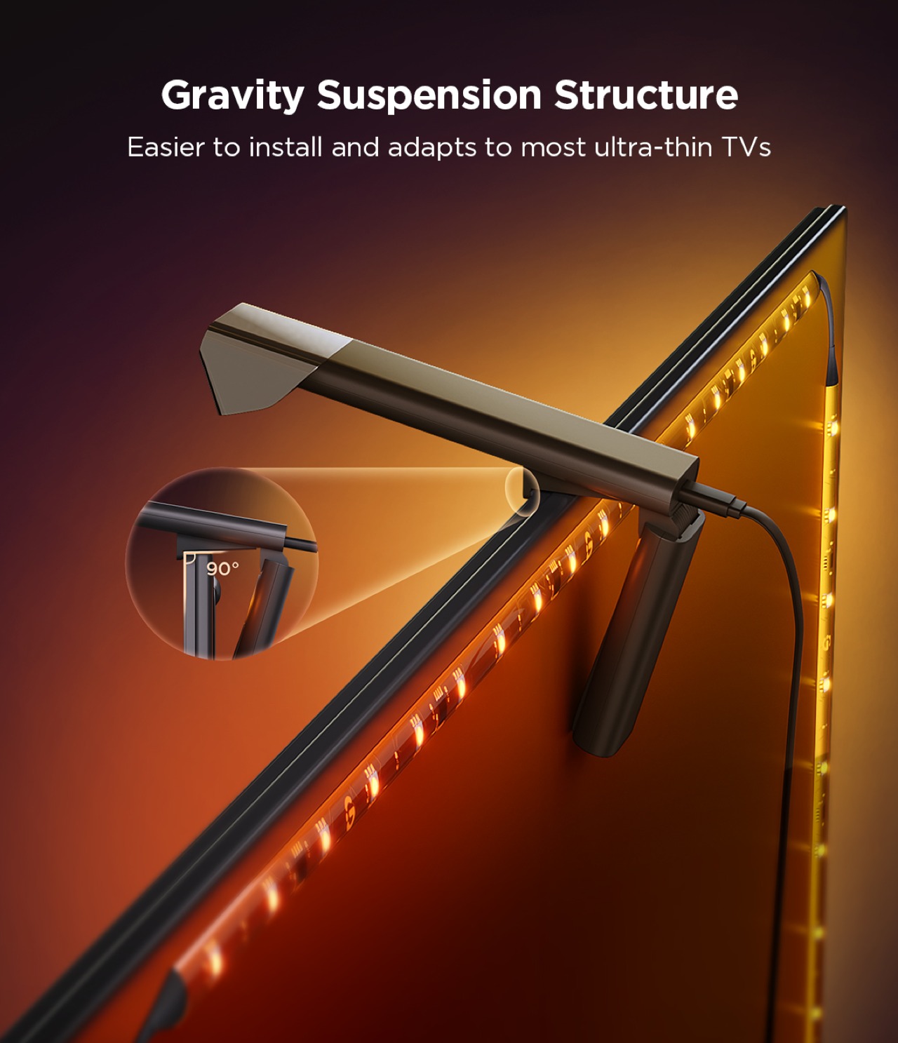
Compared to its previous two TV backlights, Govee changed the design of the camera bracket significantly. It no longer uses an adhesive and instead relies on gravity and the weighted bracket to attach the camera to the top of the TV without sticking it with an adhesive. In theory, it works and won’t wobble too much (unless you’re constantly moving the TV), but some might worry enough to actually use the included adhesive anyway. The bigger problem, however, is that this design also limits the bracket to certain TVs, particularly thinner ones. It’s certainly possible to attach it to other TVs, but not without putting in a lot more effort as well.
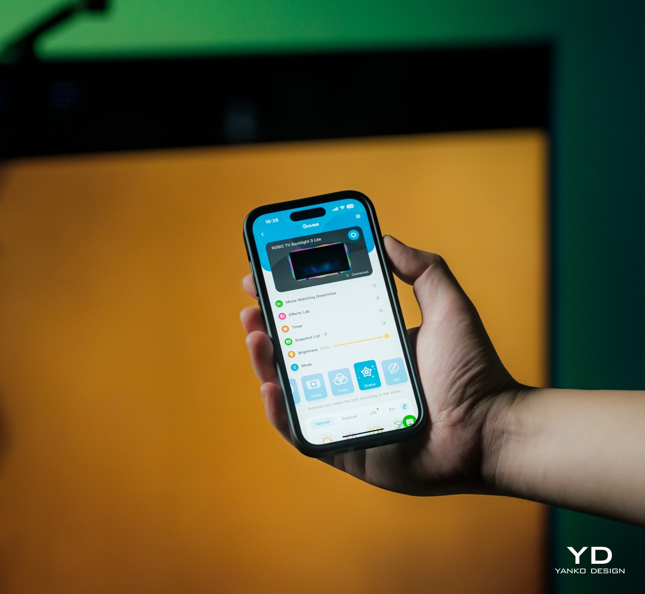
Once that hard work is done, however, the rest of the setup is easy as pie. You only need to turn the control box on, connect it to the Govee app on your phone, and go through the initialization process. That will include calibrating the camera by placing removable orange markers on the front edges of the TV, and that’s pretty much it. The mobile app has tons of settings and modes you can play with, but even leaving it at the default color-matching mode is more than enough to enhance your watching experience. You don’t even need that app if you connect it to your Wi-Fi so that you can control it by voice using smart home platforms, though like any Govee product, it requires 2.4GHz Wi-Fi, so 5GHz-only routers will be incompatible.
Performance
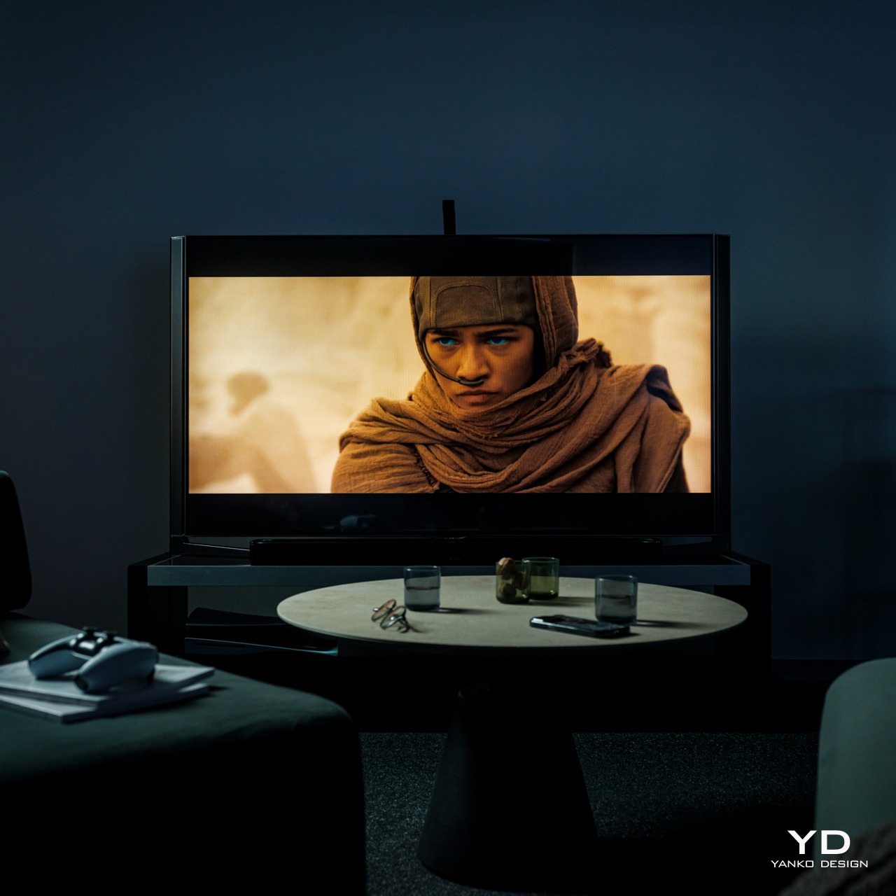
Without the Govee TV Backlight 3 Lite
Although TV backlights are not uncommon, dynamic color-matching ones are still hard to come by, especially at the price point that the Govee TV Backlight 3 Lite with Dune-themed packaging comes with. It’s even harder to find one that works so well, which is why this Govee product is actually impressive and a dream come true for TV owners who want to take their cinematic experience to the next level.
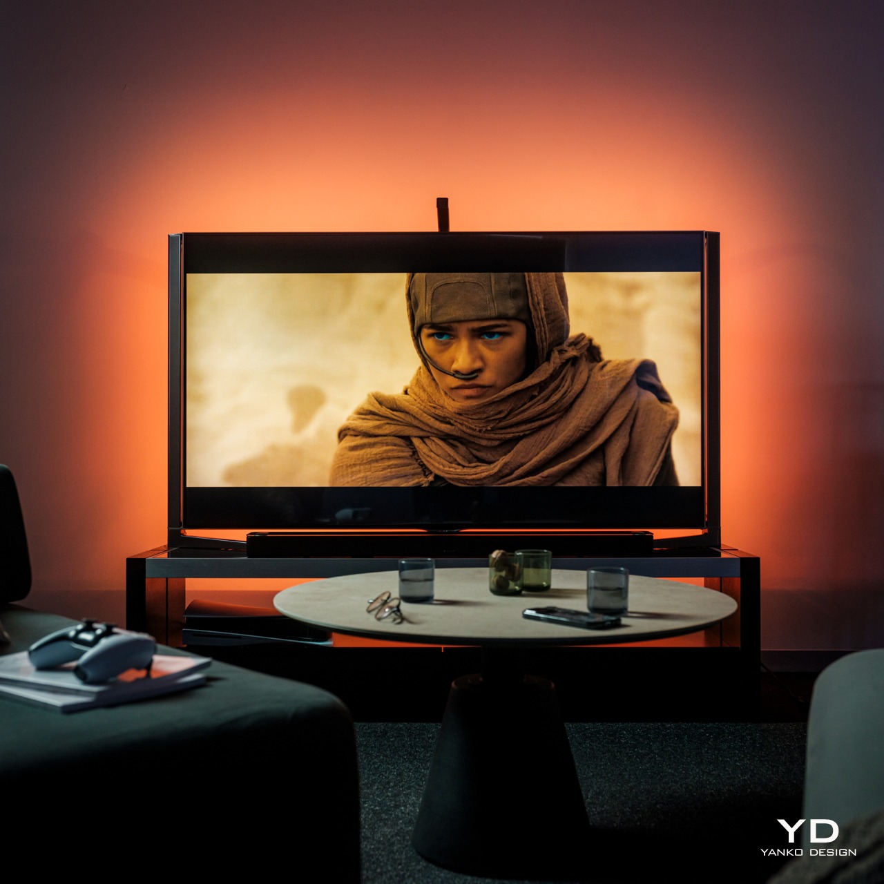
With the Govee TV Backlight 3 Lite
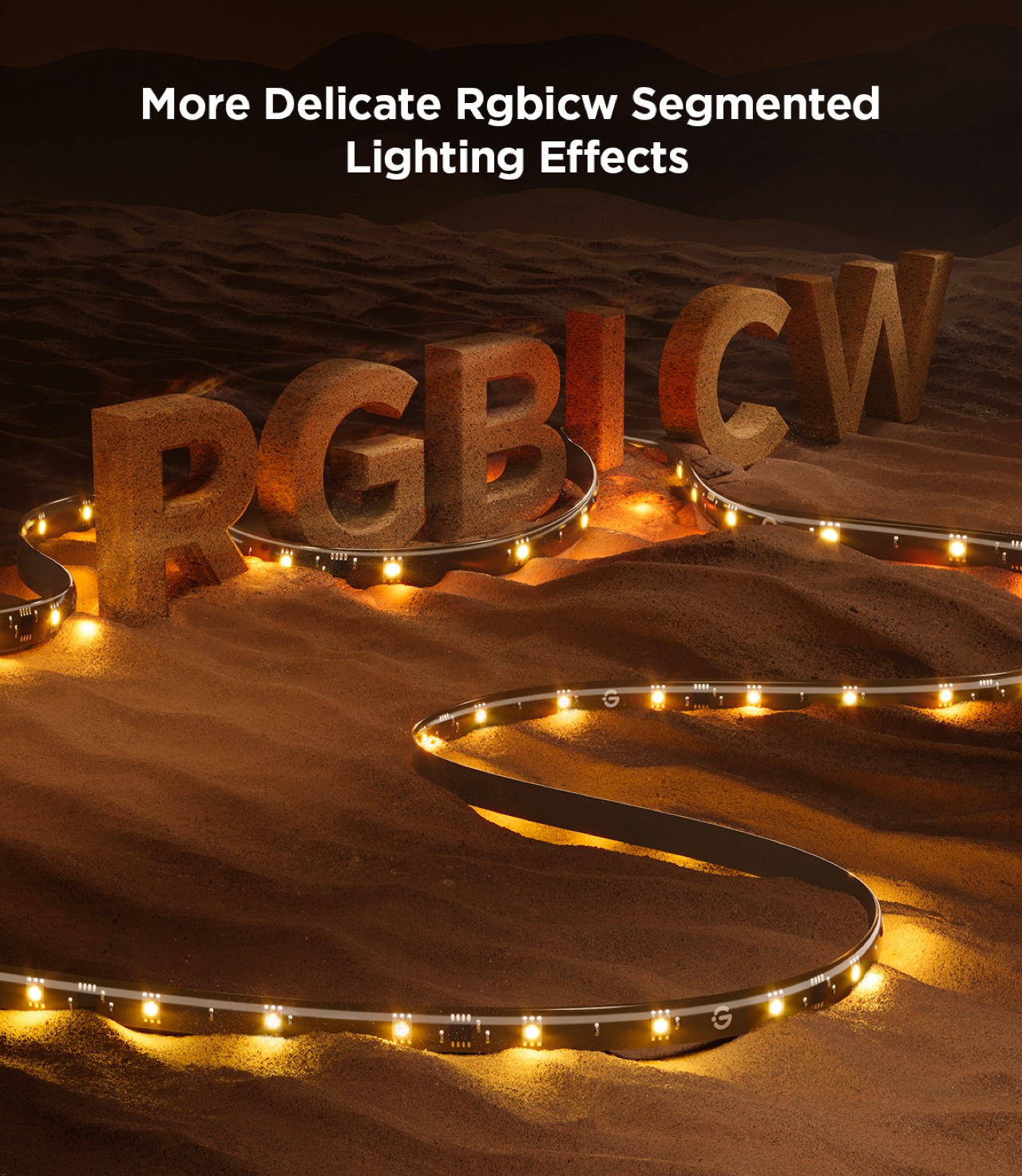
Govee upgrades the backlight from its usual RGBIC LEDs to a new RGBICW tech which adds a fourth color to the combination. With a dedicated white LED, the lights can cover even more colors as well as different white temperatures. The lights become more expressive and more vibrant, able to better match the colors being displayed on the screen in front.
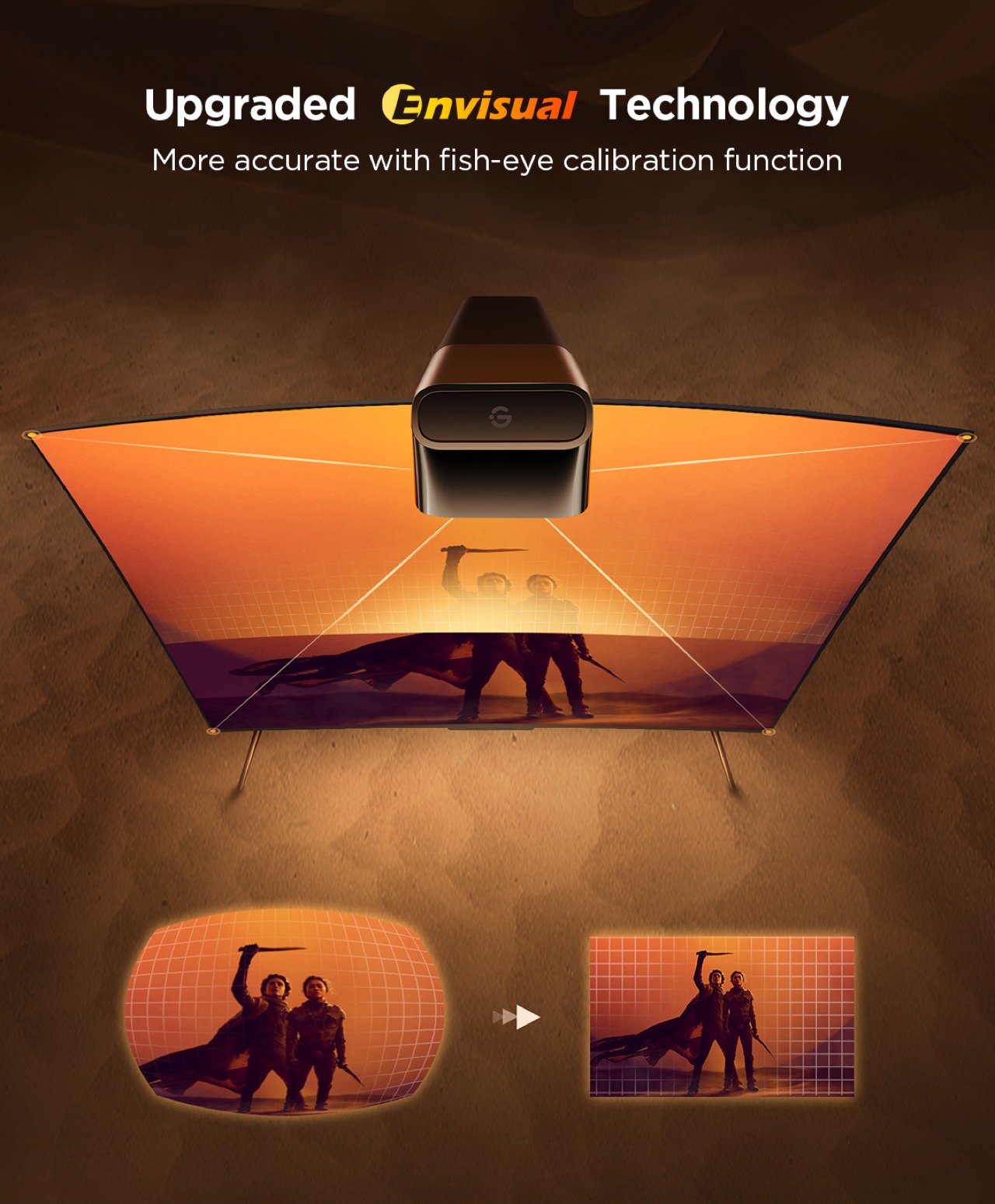
Of course, that color-matching doesn’t happen by magic, which is where that odd protruding comes in. With improved Envisual technology and upgraded processors, the Govee TV Backlight 3 Lite is able to identify colors on the screen faster and adjust the lights accordingly. The new fish-eye correction also makes sure that the 180-degree field of view camera sees the edges correctly as well. Admittedly, there’s still about a split-second delay between what happens on the screen and the backlight changing, but it’s almost negligible, to say the least. An HDMI control box would have made things faster but that would only work for content coming through HDMI sources and might not support future versions of the HDMI standard. This camera-based system is, therefore, more flexible and more future-proof, making that milliseconds delay a small price to pay.
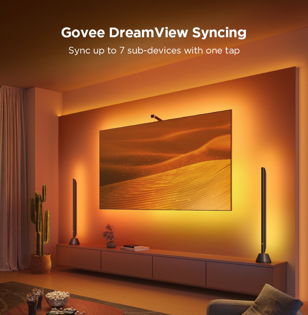
Although the color-matching feature is already incredible, the Govee app still has a lot in store for those who want to customize every detail. That includes different modes for what lights to play, even if that means not matching what goes on screen. This is where the collaboration with Warner Bros. comes in, turning the Govee TV Backlight 3 Lite into a portal into the world of Dune: Part Two. There are two new lighting effects, namely Arrakis and Spice, that will make you feel like you’re actually in that fictional world. Even the app itself gets a Dune theme to match. But if you really want to be transported to Arrakis, Govee’s DreamView technology allows you to sync with other Govee lights in the room, bathing you in the warm orange glow of the planet’s environment.
From its fast responsive color-matching to its bright, vibrant colors, the Govee TV Backlight 3 Lite definitely delivers on its promises. It’s not a perfect solution, of course, at least not yet, but the company seems to be heading in the right direction. And with tons of customizable options, including those from the Dune: Part Two collab, the design definitely has a lot to offer, especially if you have other Govee lights in the room.
Sustainability
Sustainability in lighting can be a difficult goal to chase after. Many of the materials needed to make such electronics work are sadly not sustainable by nature. One can only do so much to offset their negative effects, like using recycled materials for packaging or using more power-efficient lights like LEDs, but those can only go so far. Making matters worse is that the Govee TV Backlight 3 Lite, like any other TV backlight, isn’t exactly repairable by design. Once an LED gets busted or a part of the strip stops working, there’s no recourse possible. The whole thing becomes unusable and you either have to replace it or ship the whole thing for repairs. Either way, that means you have to pull it off the TV’s back, which will be tricky with that much adhesive used, and then go through the installation process again with the new strip.
Value
Compared to other TV backlights, the Govee TV Backlight 3 Lite with Dune-themed packaging is quite a steal at $74.99 for 55-65 inches with this sweet deal for Yanko Design readers, especially when considering all you’re getting for that price. You have bright and vibrant RGBICW LEDs that can display almost any hue and color-matching capabilities that can quickly follow the action on the screen. You also have plenty of customization options for modes and effects, including immersing yourself in the desert world of Arrakis if you want to.
The camera will probably be the most contentious part of its design, but it’s a flexible solution that is guaranteed to work regardless of TV and display technologies of the future. Hopefully, Govee will be able to create a better design for the camera in future iterations, but TV owners will just have to live with something hanging at the top of their TV in exchange for a more cinematic viewing experience.
Verdict
It’s actually astounding how a little change of light can affect the atmosphere in a room, even more so when you have a dazzling burst of color to match a mood. TV backlights are one of those things you never knew you needed until you actually try it out and realize how “dead” even the most colorful TV can be without colorful lights shining behind and around it. Some TVs these days come with their own ambient backlighting system, but those come at added cost and no upgrade path for the future.
The Govee TV Backlight 3 Lite with Dune-themed packaging brings that flood of light and color in a package that almost anyone can afford. Its upgraded Envisual color-matching technology is simply mind-blowing in its ability to keep up with the fast-paced action on the screen, and the gamut of colors provided by new RGBICW LEDs helps make the content pop out even more. The variety of customization options, including Arrakis and Spice lighting effects inspired by the Dune: Part Two makes sure that no viewing experience will be plain and boring ever again.
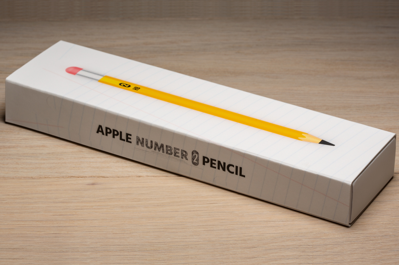
Despite what its founder once said, Apple has wholeheartedly embraced the stylus, at least for its iPads. In fact, you could even say it innovated an accessory that hasn’t seen much change in years, introducing magnetic charging and invisible touch-sensitive buttons to the design. Its minimalist aesthetic and familiar shape have also made it more open to custom designs and skins that allow owners to express themselves beyond a simple white or black stick. Of course, this also presented an opportunity for accessory makers to establish a new market segment made especially just for this Apple stylus. Skin manufacturer Colorware is just the latest to jump on that bandwagon, but its Apple Number 2 Pencil is quite unique in more ways than one.
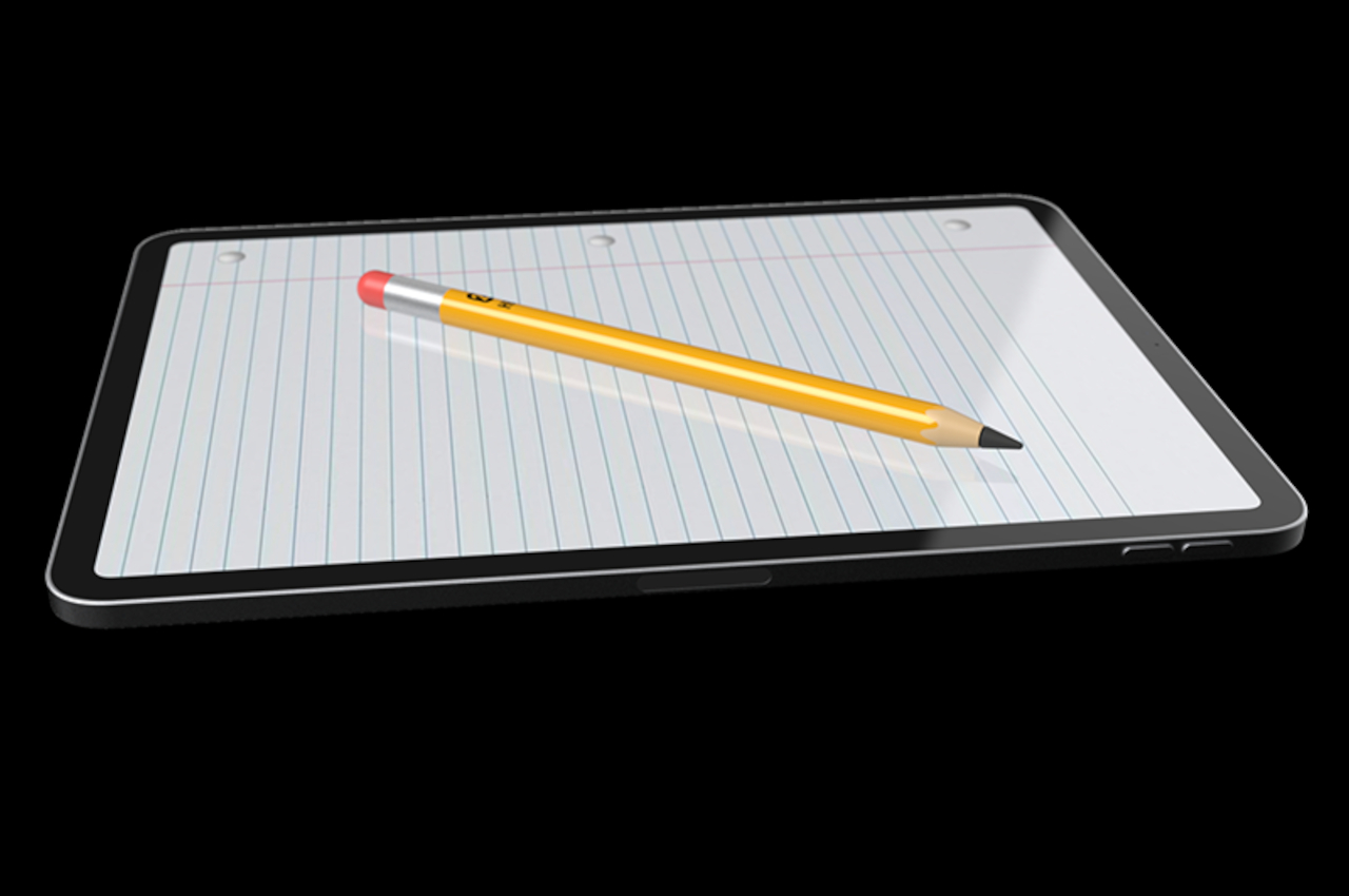
The first Apple Pencil was pretty much a smooth and slippery cylinder that forced some people to put on grips or skins just to be able to securely hold the stylus. The second-gen Pencil improved the design with a somewhat hexagonal body that gave it a better grip but also inspired even more skins to embellish the Apple Pencil’s appearance. After all, with that familiar shape and generic name, it’s almost a dead knocker for the iconic Number 2 pencil known by people of all ages throughout the world.
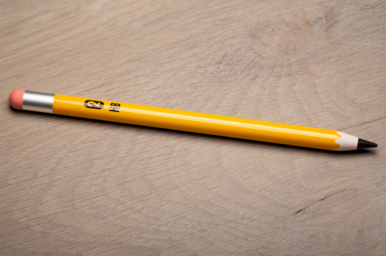
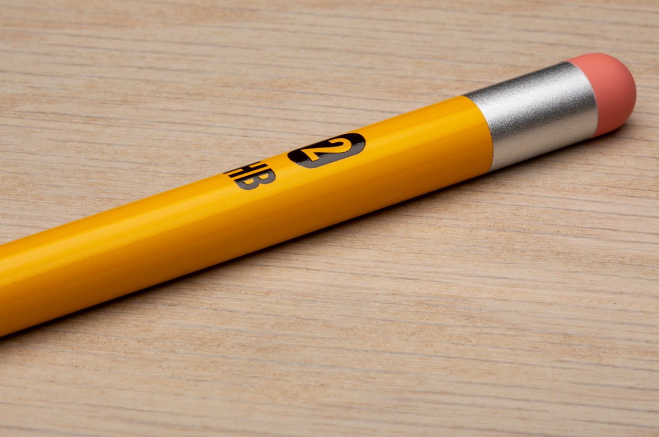
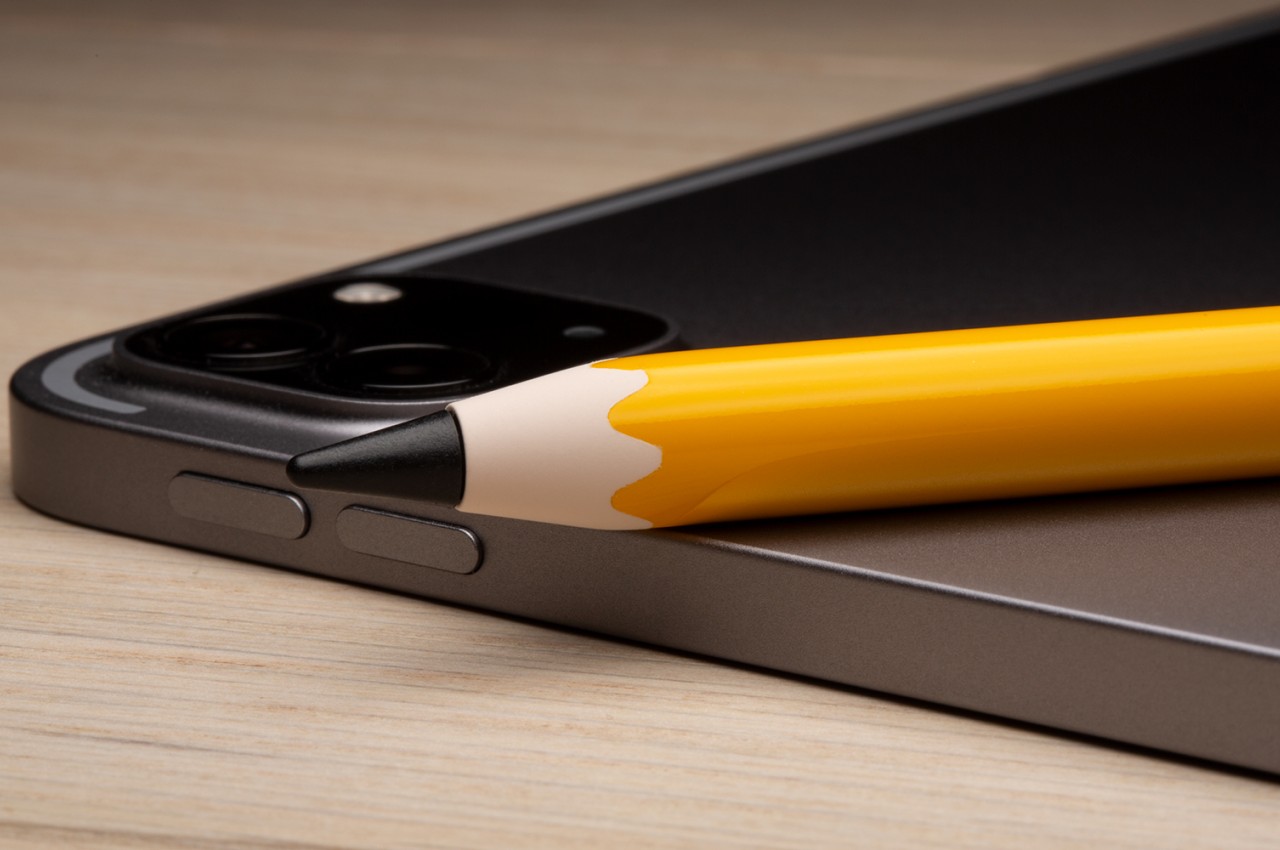
The Colorware Apple Number 2 Pencil is one such makeover for Apple’s current stylus, but it takes the modification to the extreme. It definitely looks like the Number 2 or HB pencil with its glossy yellow body, orange eraser, and silver band that connects these two parts. Colorware, however, takes the homage one step further: even the tip is black, like a typical graphite pencil.
The nib of the Apple Pencil is, of course, white, and almost all skins stop at covering the barrel only. That’s because you can’t really cover the nib and expect its performance to be unaffected. The manufacturer naturally doesn’t divulge what it used to coat the nib, so you’ll have to trust that the Apple Number 2 Pencil will still remain as functional as a regular Apple Pencil.
The catch to this almost faithful recreation of the classic HB pencil is that it costs a whopping $215. Considering the 2nd-gen Apple Pencil retails for $129, that’s not a small cost added on top. A regular skin would only set you back $13 or so, though you’d also have to look for unofficial black nibs if you want to get the complete look. It also doesn’t indicate if that price includes extra nibs, so you might find yourself at a loss when this special black tip needs to be replaced.
It’s not unusual these days to see plenty of retro-themed designs and products, all trying to capitalize on the strong emotions that nostalgia can bring. Most of these simply slap on a facade that mimics the aesthetic from decades past, but some do try to also recreate the experience by using what would be considered vintage technology or components. Of course, it’s not enough to just use old-school technologies, they also need to be properly integrated into today’s features. That’s the kind of balance that Astell&Kern’s latest portable music player tries to deliver, bringing a modern device that not only looks retro on the outside but partly on the inside as well, blending the present and the past in perfect harmony.
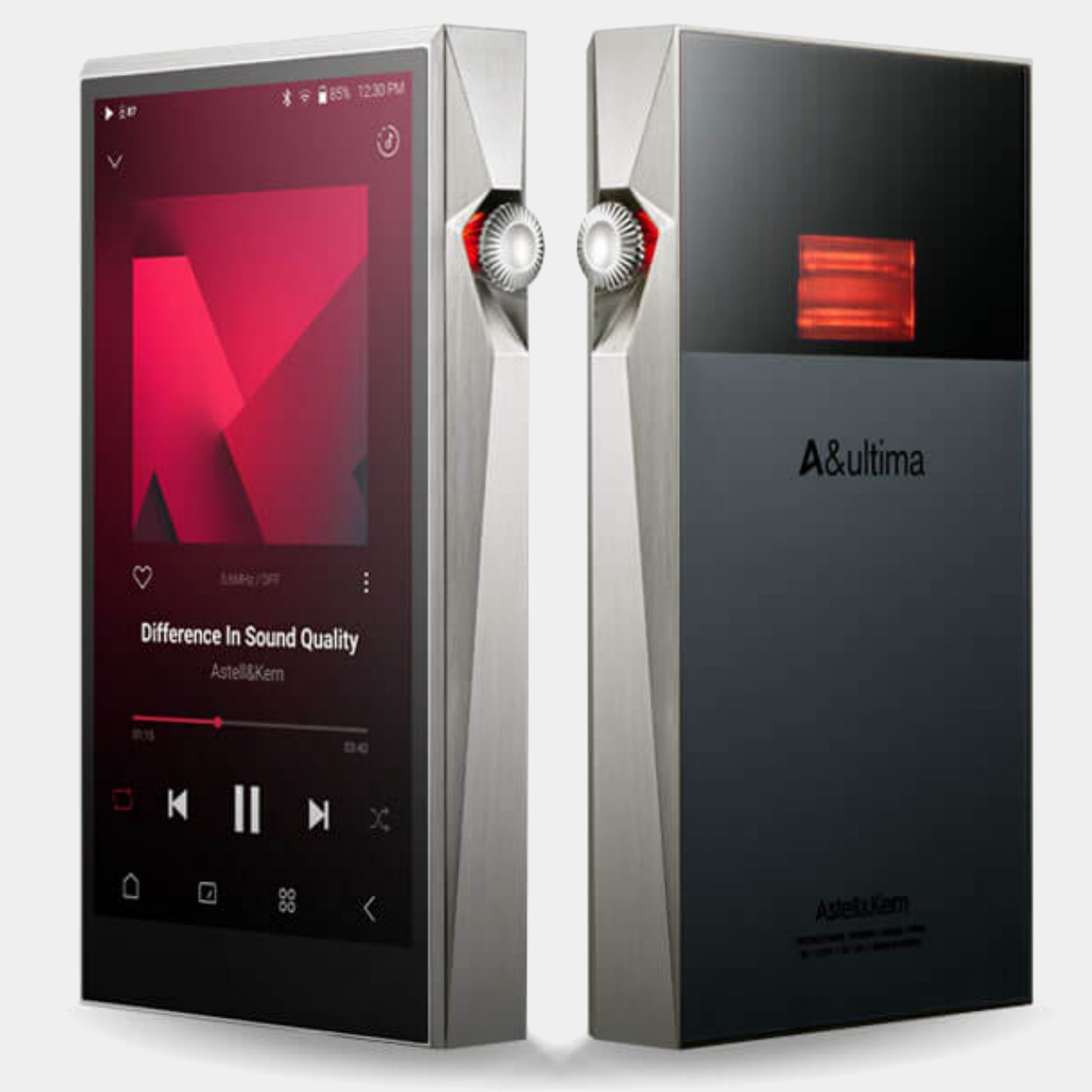
It might come as a surprise in the age of smartphones, but there are still companies producing music-playing devices that do only that. It allows the brand to focus solely on perfecting the listening experience without having to worry about cameras, cellular networks, and apps. As far as those portable music players go, Astell&Kern’s existing SP3000 is already quite distinctive with its hard, faceted, and angular design, giving it an almost industrial aesthetic, especially with its stainless steel body and 99.9% pure silver plating.
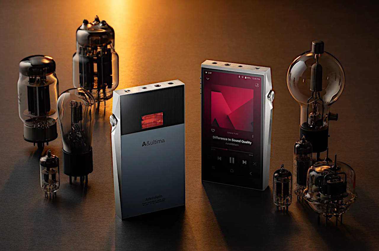
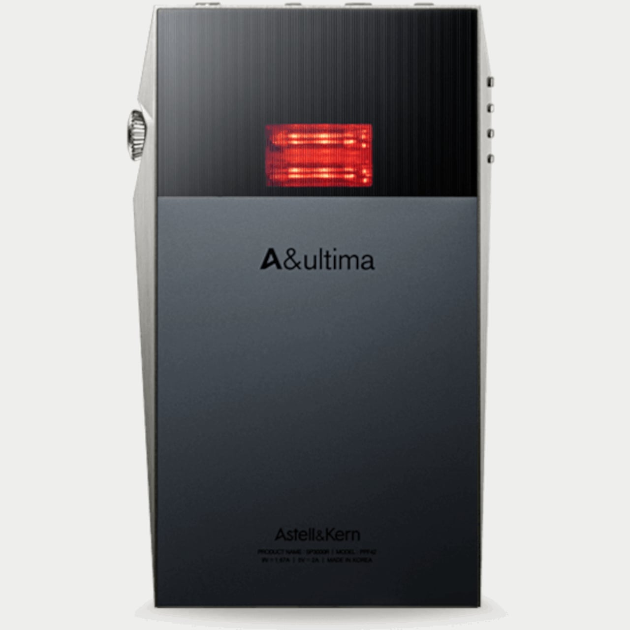
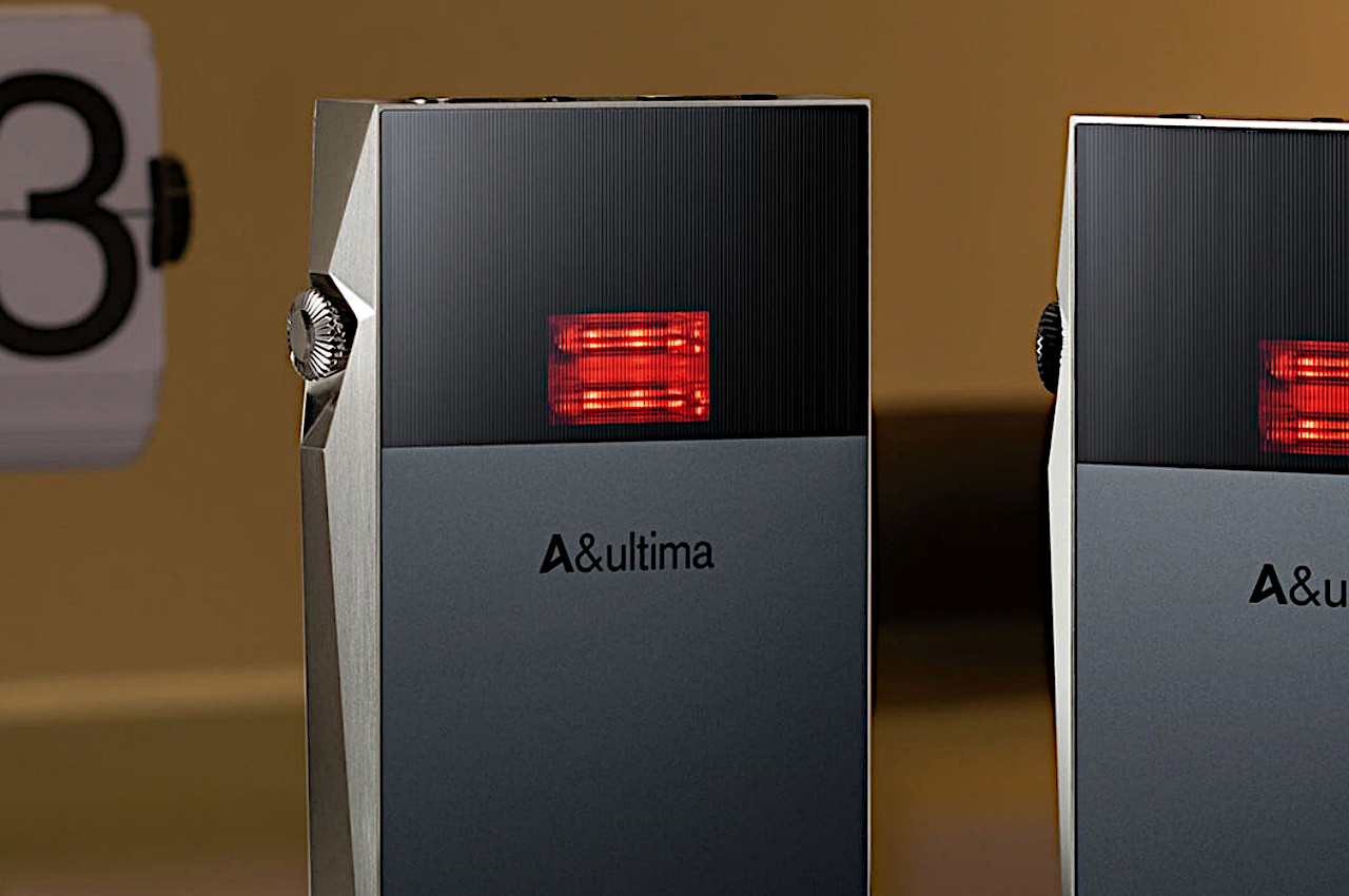
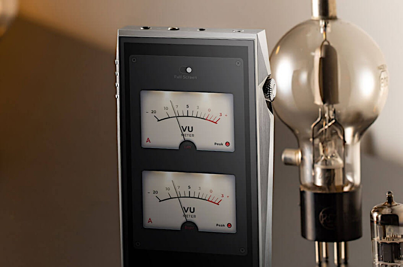
The SP3000T, however, gives that design a retro twist by adding dual vacuum tube amplifiers on the back of the device. These aren’t just for show, though, as they actually function the way the tube amps did in the past, using modern techniques and materials, of course. The tubes bring not just an analog appearance but also an analog sound, delivering a unique audio quality that can be best described as warm and soothing, qualities that are difficult to achieve simply using digital sound.
What’s even more interesting is that listeners won’t have to choose between one or the other. Yes, the SP3000T lets you switch between these analog tube amplifiers and the digital op-amp mode, but there is also a third hybrid option that mixes the two together. What you get is a combination of the precision and high-resolution output of the digital amp mixed with the warm tonal qualities of the analog vacuum tubes.
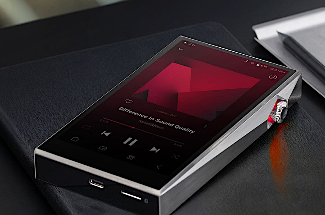
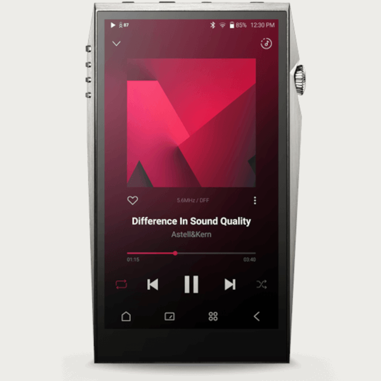
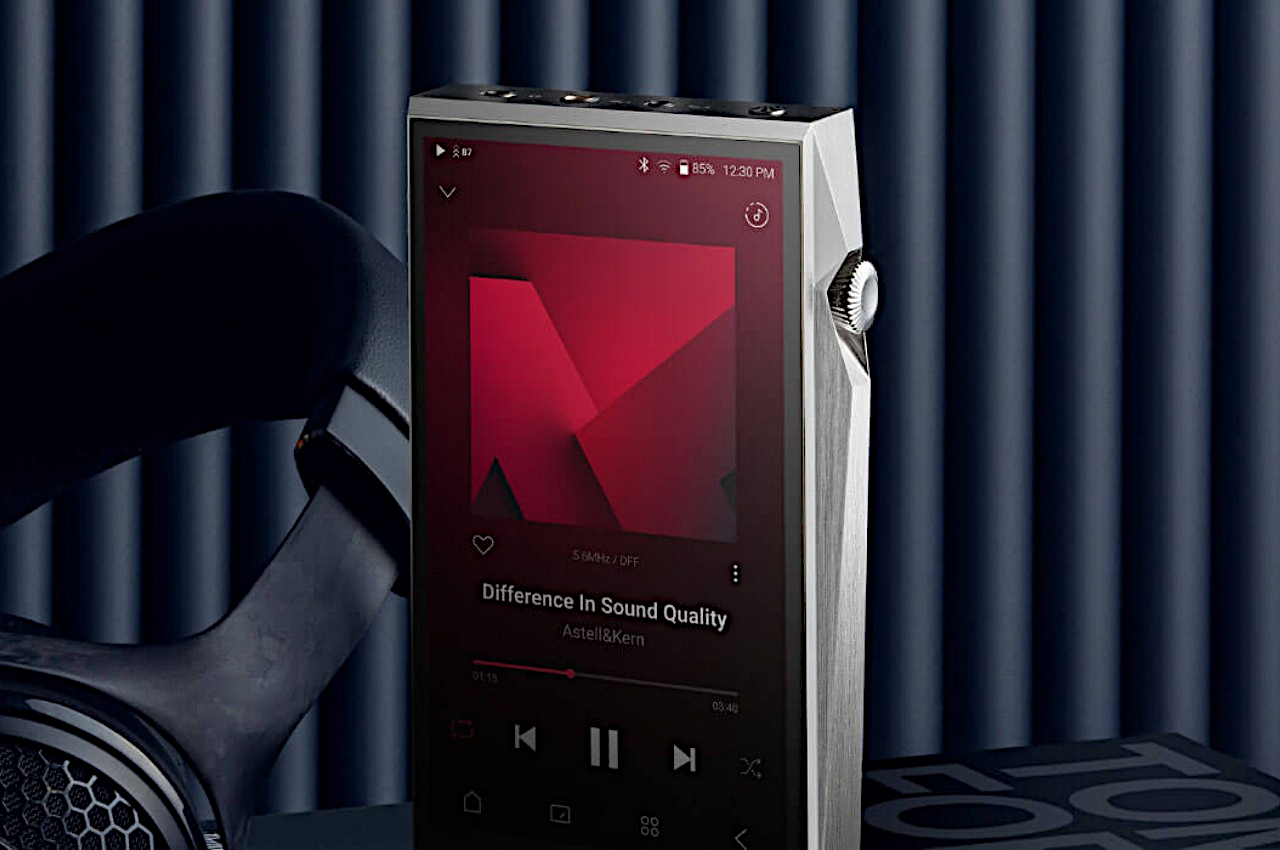
The Astell&Kern SP3000T also carries the brand’s latest audio technologies, including a digital-to-analog converter that promises a complete separation of digital and analog signals for the cleanest sounds. It also has 8GB of memory, boasted to be the highest in digital audio players, for smoother operations. And, yes, it also has a touch display, almost like a smartphone, that lets you enjoy not only album art but also themes, adding a bit of joy to this retro-modern listening experience.
Laptops today have become quite powerful beasts, capable of handling AAA games and even multimedia creation that their predecessors would choke at. But with great power comes great heat generation, the bane of CPU performance and battery life. Keeping a laptop cool has been a very big puzzle for laptop designers, mostly because of the problem of squeezing an efficient cooling system inside an extremely thin chassis. There are many existing solutions available today, ranging from extra large fans to vapor cooling chambers, but this particular concept offers an additional level of thermal management where a portion of the laptop’s rear extends to facilitate better airflow to and from the internals.
Laptop cooling systems might come with different names and gimmicks, but they all function with the same principle. You draw heat away from the processors and battery and blow out the hot air while simultaneously drawing in cooler air. Whether it’s passive cooling with vapor chambers or active cooling with fans, proper airflow is still a critical element in the system. Unfortunately, due to design requirements, laptop air vents are actually small and too few.
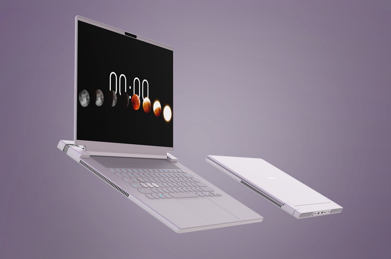
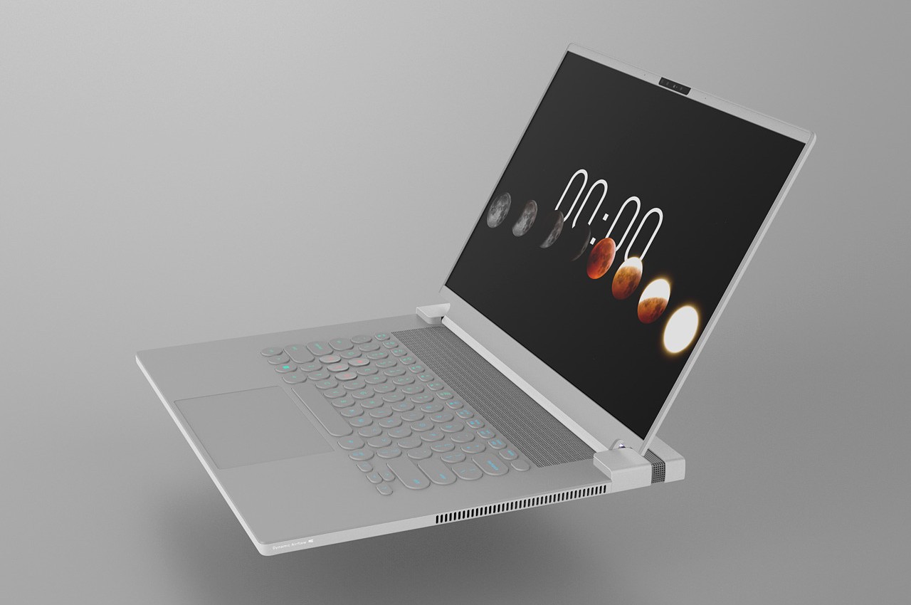
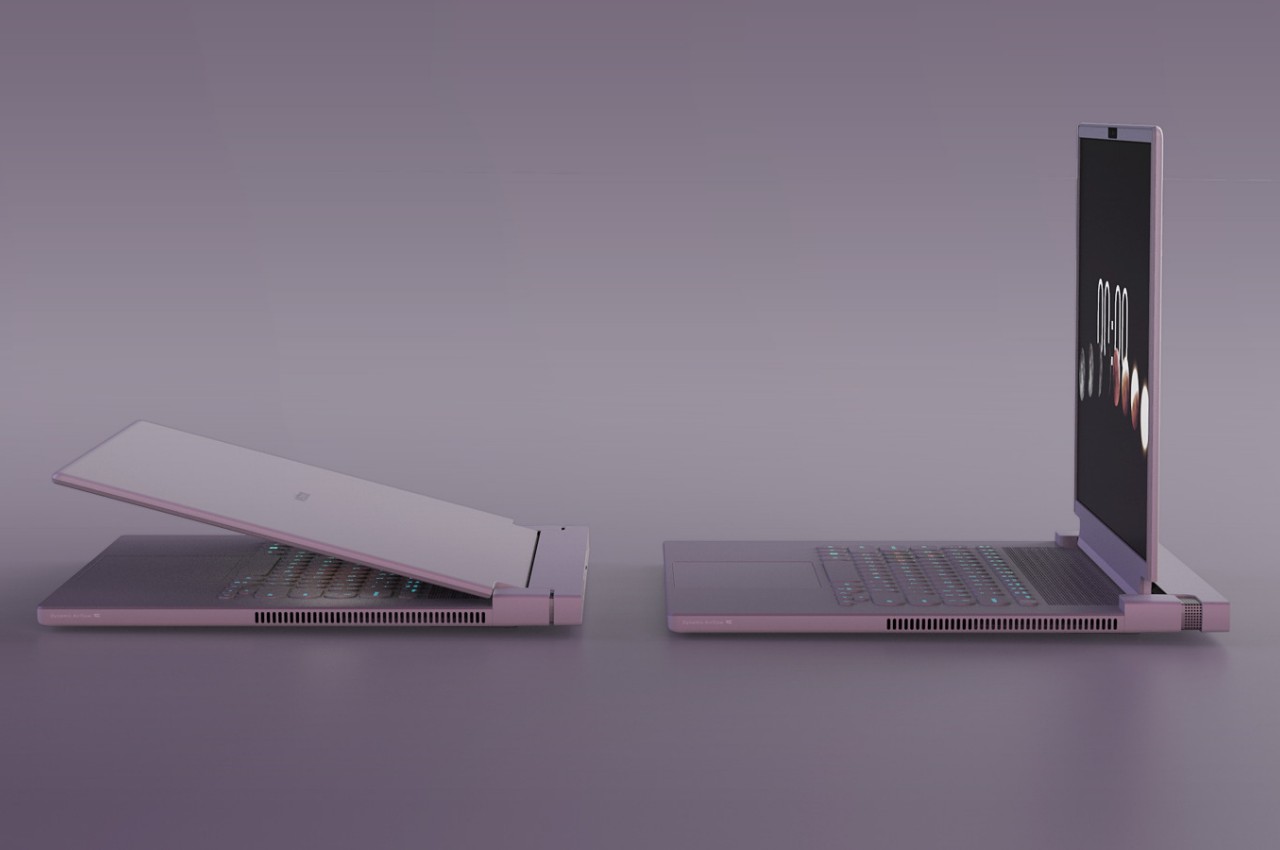
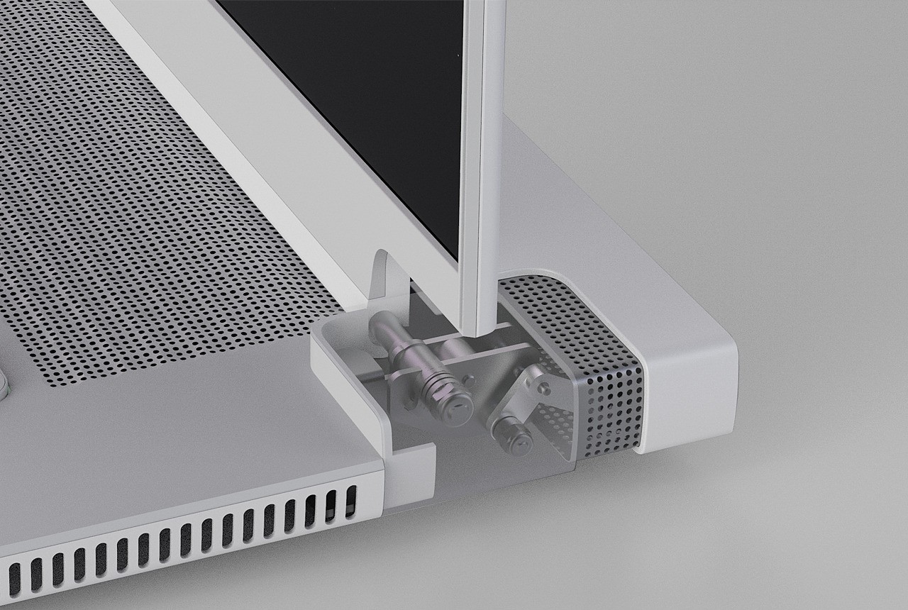
This design concept tries to fix that problem by almost literally opening up a part of the laptop in order to create more and bigger openings for air to pass. Dubbed “dynamic airflow,” the design has one part of the laptop extend and move, exposing more vents for better airflow. In this case, it’s the back of the laptop that moves further back once you open up the lid. Conversely, that rear panel retracts again as you close the lid.
This moving part can house the laptop’s “heat module,” which can be, for example, small fans that move the air around. Normally, thermal cooling systems are placed on top of the laptop’s motherboard, which ironically leaves little room for the air to flow. Separating this thermal component not only frees up more space for airflow, it also makes it theoretically possible to make the laptop even thinner with this arrangement.
Of course, it’s easier said than done, as the design will also have come with its own consequences. For one, it makes the laptop design more complicated with more moving parts and mechanisms to extend and retract that component, which, in turn, could introduce structural compromises and new points of failure. Given the company behind the design, we might actually see this dynamic airflow concept tested in the wild by some major laptop manufacturers, which will then give us a better handle on how effective the solution really is.
The Nothing Phone (2a) distills the smartphone experience to its most important essentials and wraps it in a gorgeous design you will never get tired of.
Smartphones are getting more and more powerful every year, but that power comes at the cost of complexity and cost. While there’s nothing wrong with a super powerful, uber-luxurious, and expensive device, it’s just not for everyone. Unfortunately, those who prefer to stick to the important basics are often left compromising in terms of performance and especially aesthetics. Nothing is a young brand that is trying to shake up the status quo with a heavy focus on thoughtful design, transparent practices, and accessible technology, and it has already been making headlines with its smartphones and accessories. With the Phone (2a), it’s dipping its hands into a different segment of the mobile market, so take it for a spin to see if it has anything substantial to offer or if it’s nothing at all, pun totally intended.
Designer: Nothing
Aesthetics
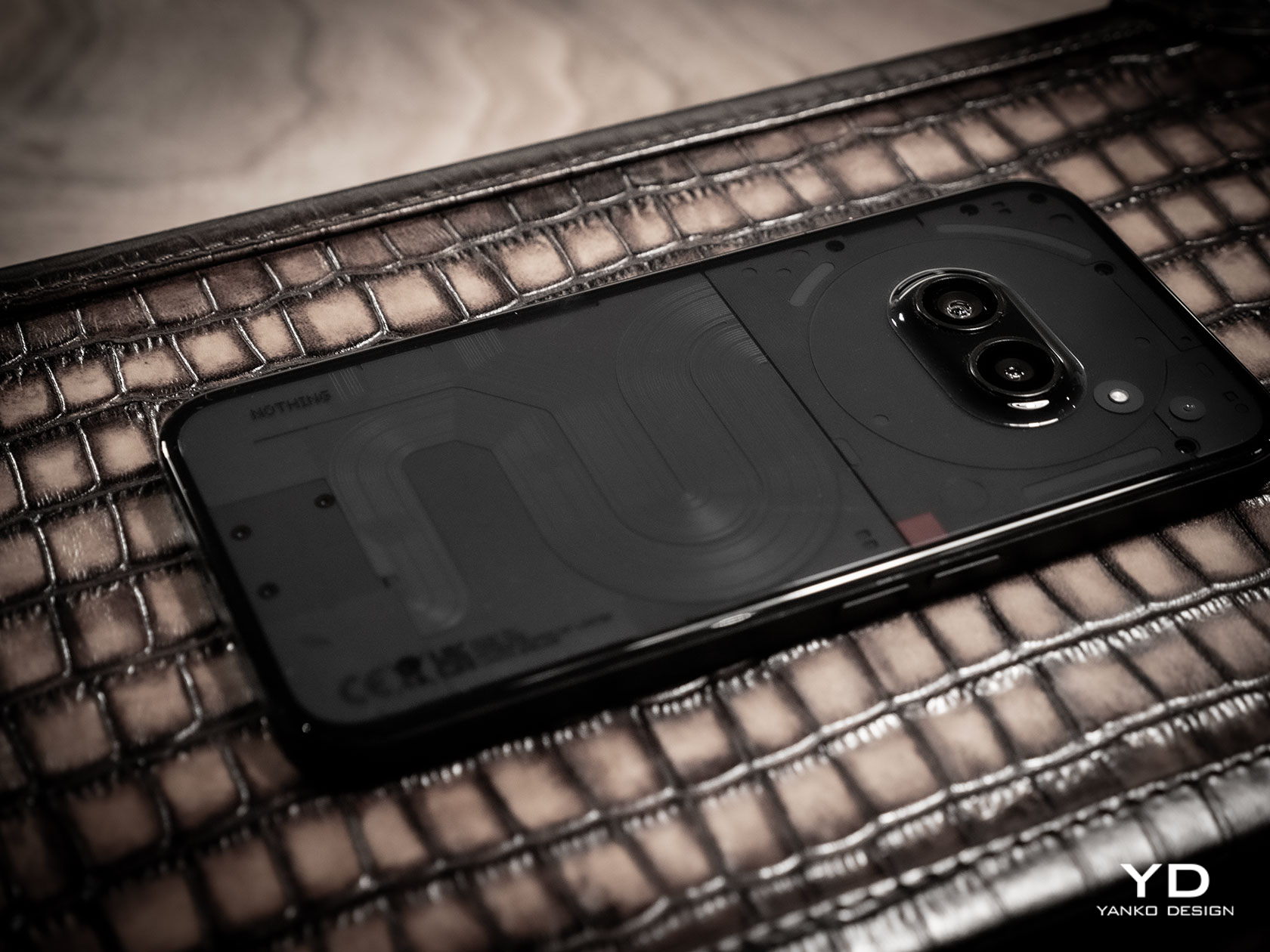
Nothing made a name for itself with the distinctive design of its products, especially its phones. While it was not the full transparency idealized by risky DIY hacks or printed skins, Nothing’s decision to have a semi-transparent design actually made better sense. It gave the phone a cleaner look, without the distracting noise of electronics and labels, but still had enough character to stand out from the crowd quickly.
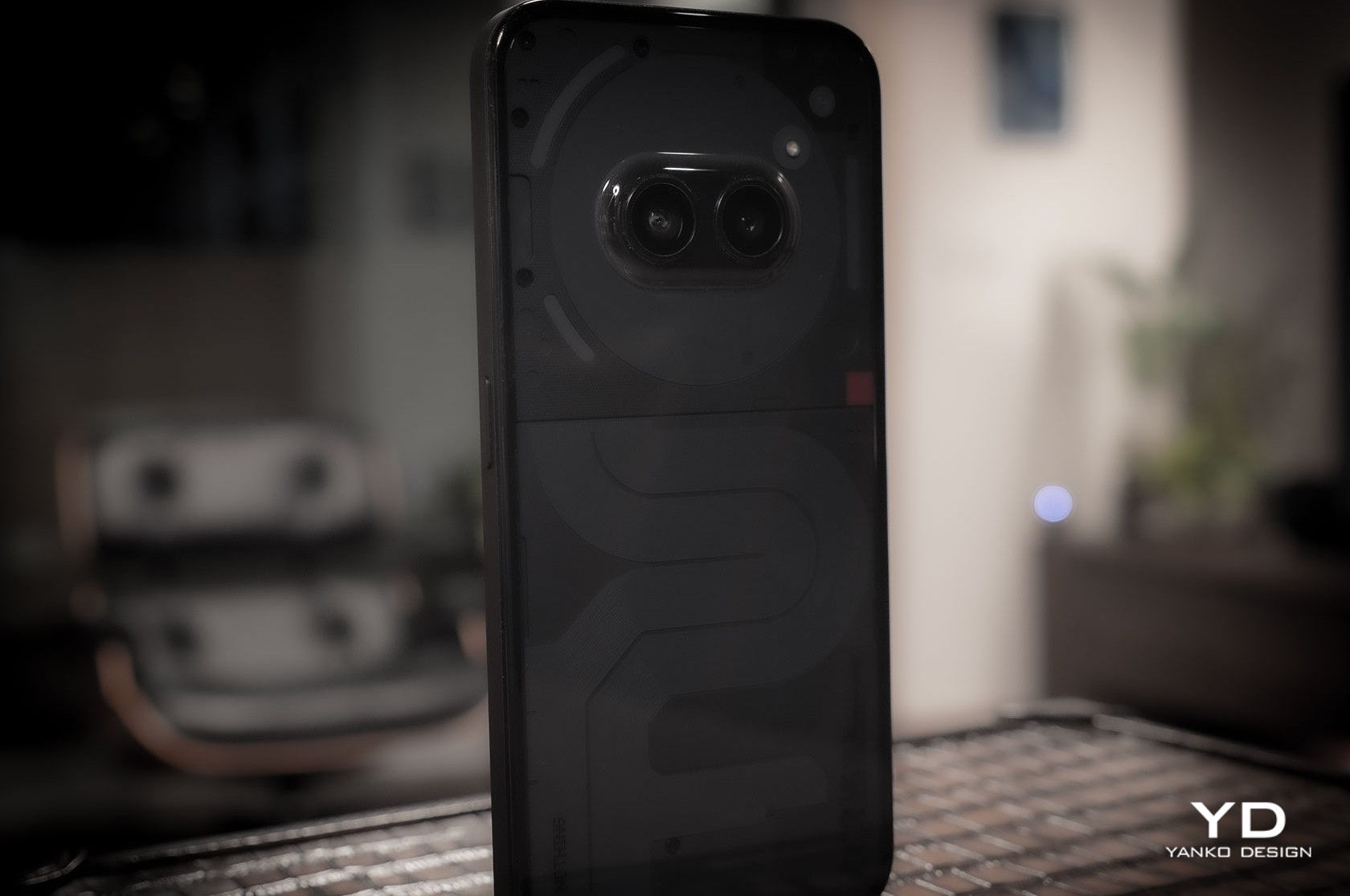
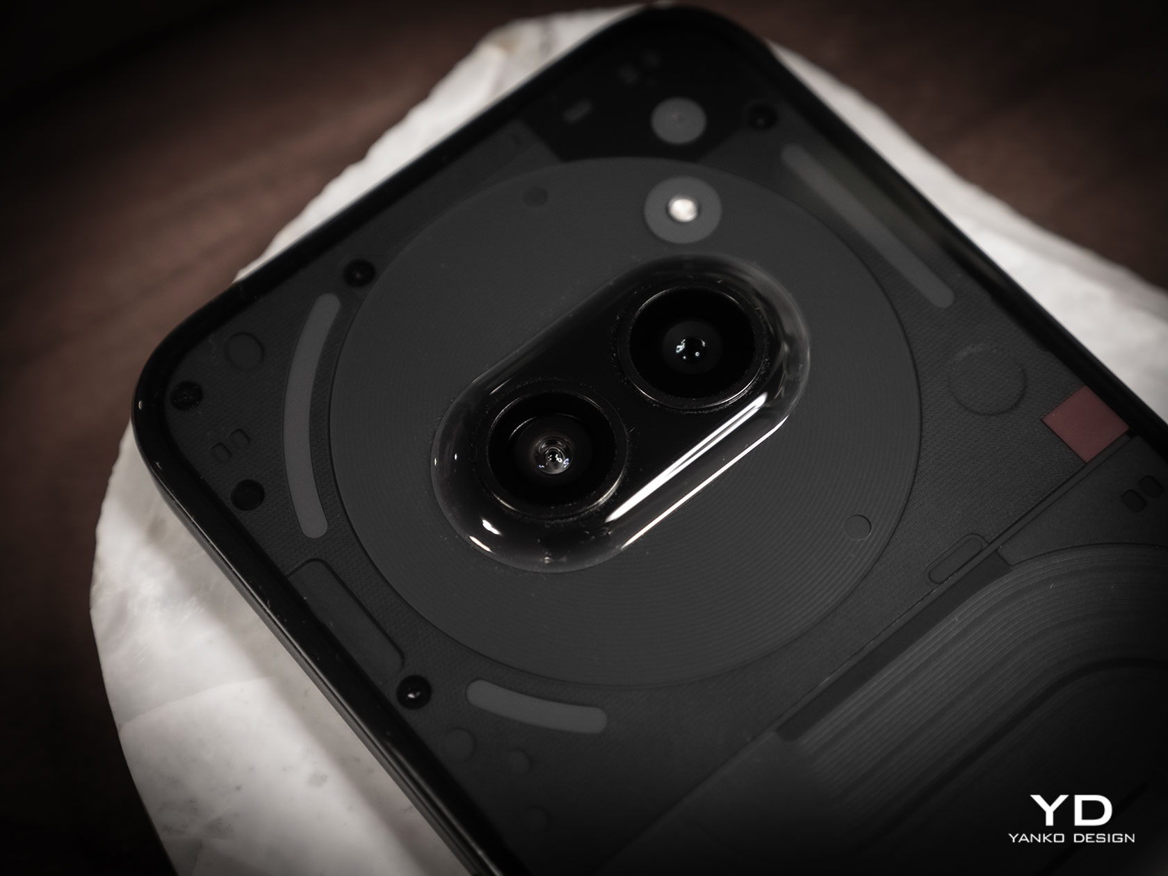
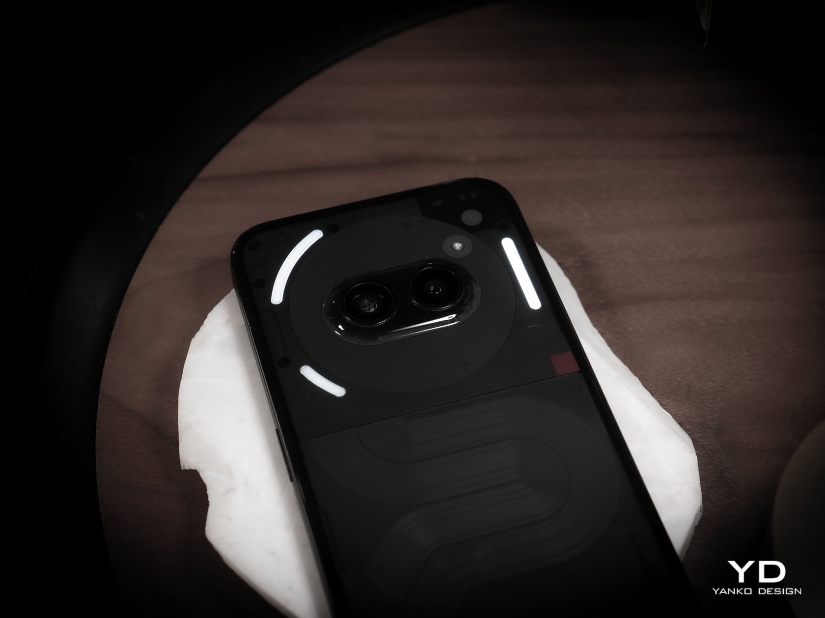
The Nothing Phone (2a) is clearly a member of this family but also differs in significant ways. The arrangement of components is very different, with the camera bump now lying horizontally in the middle, surrounded by a Glyph Interface that’s also completely new and unique to this model. The camera array is enclosed in a circular area from which a covered path snakes down to the bottom, almost like the ribbon connectors between components you’d see inside phones. This distinctive design gives the phone a facsimile of a robotic face, friendly and welcoming like those in cartoons and kids’ shows.
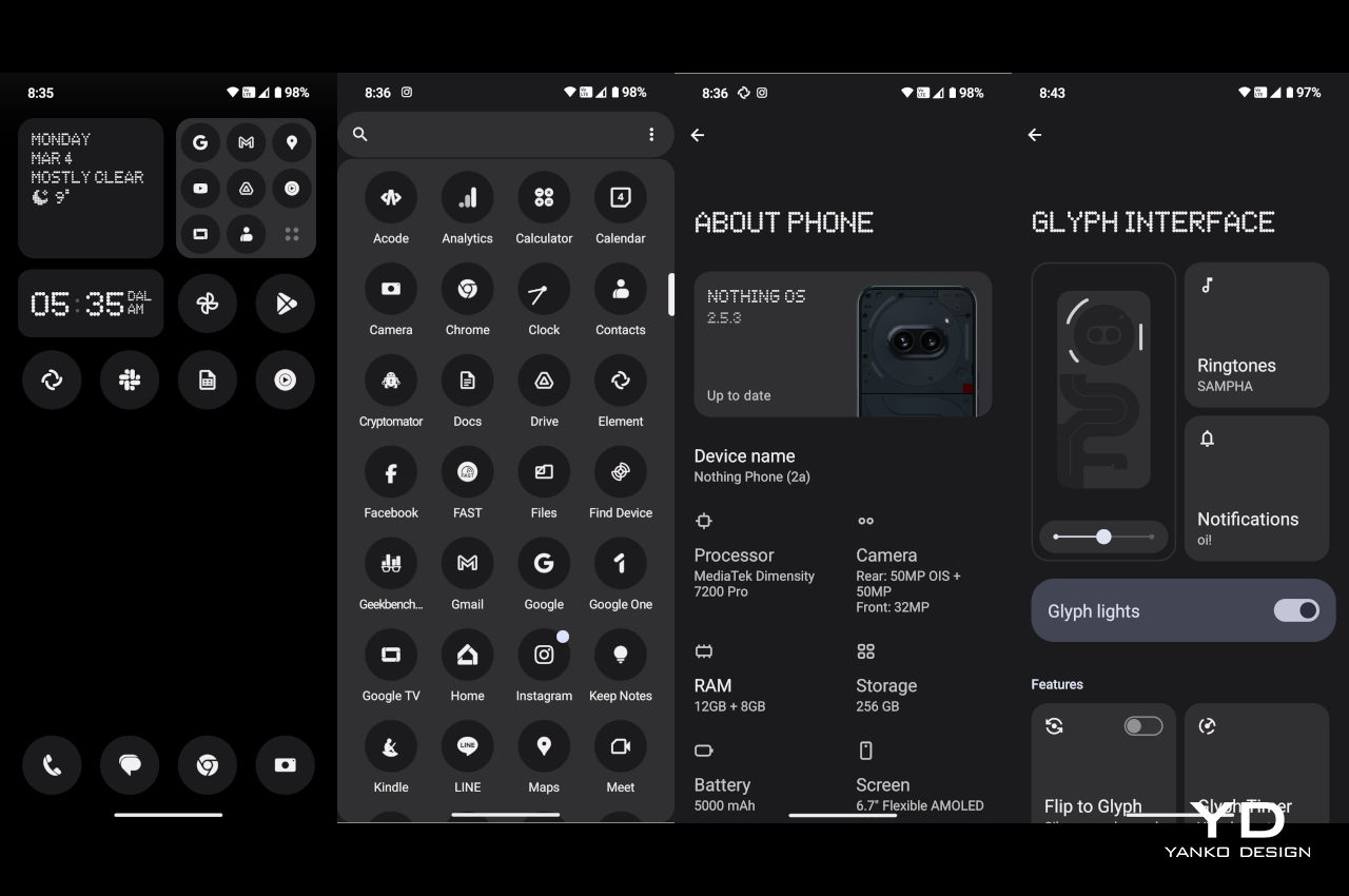
Unlike earlier rumors that worried Nothing fans, the Phone (2a) does indeed have the Glyph Interface, except it’s also simplified like the rest of the phone’s design. There are only three components this time, two asymmetrical arcs on the left of the cameras and a vertical bar on the right, that delivers that same dynamic lighting but with less fanfare. Considering how you’re usually holding your phone, this makes sure that the glyphs will always be visible to everyone in front of you when they light up, rather than having parts of it covered by your hand.
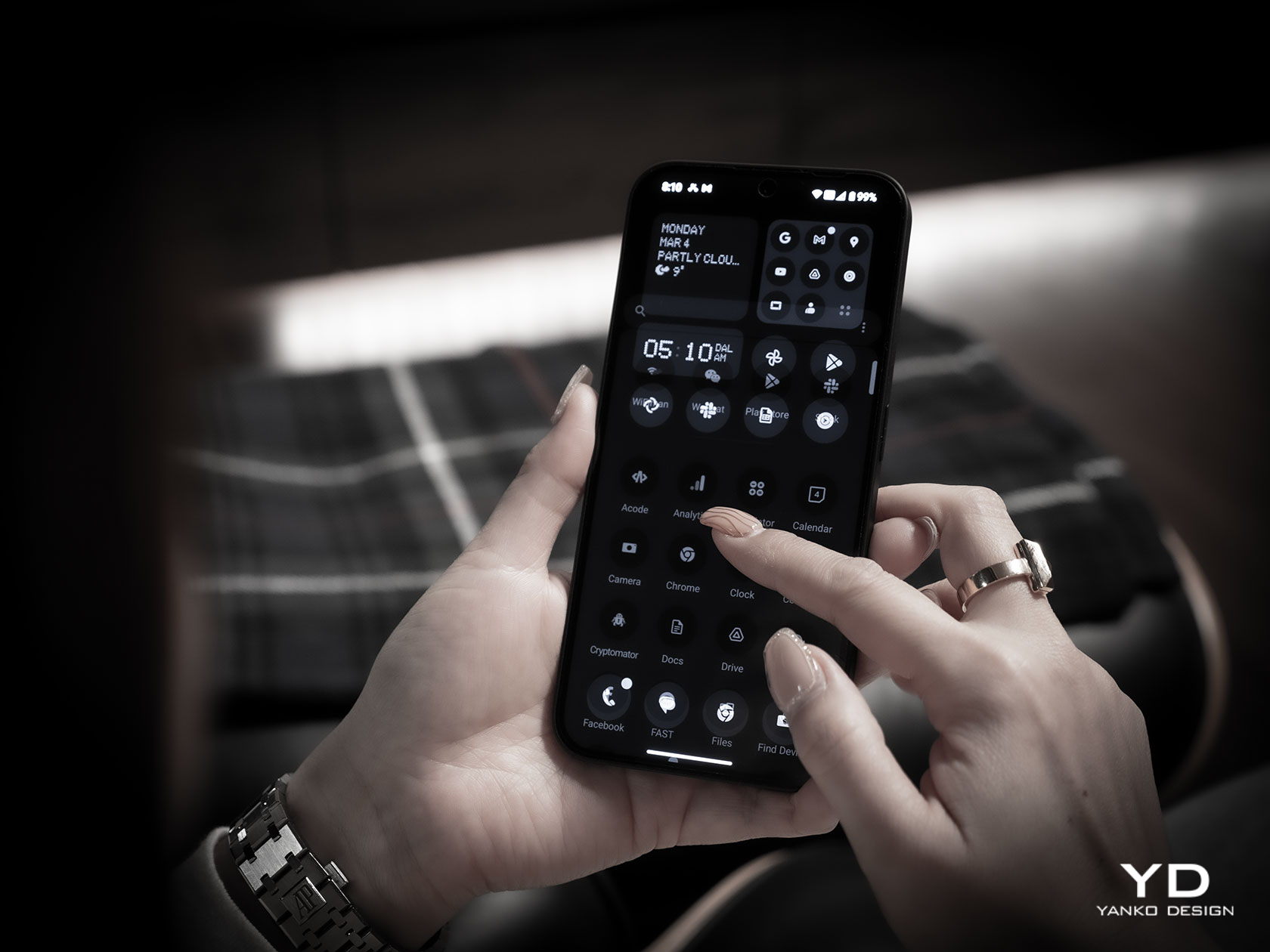
The Nothing Phone (2a)’s aesthetics pretty much reflects the overarching theme of the phone. It delivers the essentials for a pleasing user experience without being showy but still having enough impact to be worth your while. It strives to strike a balance even harder than its older siblings in order to cater to a market that has long been in need of that kind of design that doesn’t compromise too much for the sake of driving down costs.
Ergonomics
The Nothing Phone (2a) is also an anomaly in the sense that it’s actually a large phone that weighs almost like nothing. With a 6.7-inch screen, it’s definitely one of the bigger slabs in the market, yet its 190g weight feels almost nothing in your hand. And that’s despite the large battery it hides inside, which makes the phone a bit of a mystery.
This means that the Phone (2a) is quite comfortable to hold, even for long periods of time. It doesn’t weigh down on your hand that much, though you might also be worried its lightness can become a liability instead. Fortunately, the flat edges of the phone do provide a bit of grip to aid your hand. All in all, it was a pleasurable experience to hold the phone, perfectly matching its pleasing aesthetic.
Performance
There’s no going around the fact that the Nothing Phone (2a) is not your super-powerful high-end premium flagship. Nothing partnered with chipmaker MediaTek for a custom Dimensity 7200 Pro chip, but that is also two tiers from MediaTek’s own top-of-the-line series. Even the GPU technology is from back in 2021, and benchmark scores seem to paint a rather disappointing picture. It’s theoretically better than its peers, the Snapdragon 7s Gen 2 and Snapdragon 782G, but those are mid-range processors as well.
The good news is that it hardly really matters because the Phone (2a) still manages to hold its own with most tasks you throw at it, especially with 12GB of RAM. Gaming is going to be less impressive, of course, so you’ll have to dial down the settings a bit, but it’s still a decent experience. The Nothing Phone (2a) is meant to be an everyday phone for everybody, rather than a hyper-focused tool for gaming or photography, and when it comes to general activities, it thankfully does quite well despite those numbers being stacked against it.
As mentioned earlier, the Nothing Phone (2a) has quite a sizable battery, specifically a 5,000 mAh pack. That’s actually very generous even by premium smartphone standards, and given the rest of the specs, it’s sure to give you more than a day’s worth of use, at least with reasonable measure. Charging is capped at 45W, which isn’t exactly the fastest but still an upgrade over previous technologies. As expected, there is no wireless charging, which is one of the very few compromises this design does make.
In addition to its unique semi-transparent design, the Nothing Phone was characterized by its Glyph Interface, basically a light-based notification system that adds a bit of flavor to the user experience. Some considered it gimmicky at first, but it’s actually a useful tool for minimizing distractions. You can keep your phone face down on your desk and only see the glyphs light up for important events, like a call, an important message, or a timer. You don’t have to glance at your phone’s screen every time something comes in, reducing the risk of you getting distracted when you other notifications as well. And because the glyphs are confined to the upper portion of the Phone (2a), they’re also less invasive and more restrained, focusing on just the essentials of the function rather than the glamour.
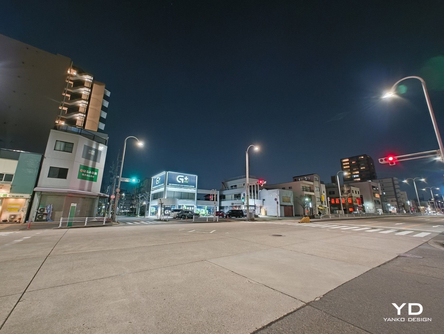
When it comes to the cameras, the Nothing Phone (2a) is a bit of a mixed bag. As you may have noticed, there are only two cameras, but both of them, fortunately, have 50MP sensors. The main Samsung GN9 camera features OIS and autofocus, while the ultra-wide Samsung JN1 has a 114-degree field of view. Both perform rather well, even at night, with clear details and low noise. Unfortunately, there is no dedicated telephoto camera, so you’ll have to settle for the main wide camera’s cropped 2x zoom, which is less impressive than regular shots.
The front-facing camera has an impressive 32MP sensor, and it definitely shows in the quality of selfies you can take. There’s no aggressive beautification like what you’d find in other brands, so what you see is really what you get. That means this camera isn’t just great for social media but, more importantly, for video calls and meetings as well.
Sustainability
Right from the start, Nothing wanted to be different from the way it ran its smartphone business, which also included its commitment to sustainability. From the use of recycled materials to the packaging, Nothing has been ensuring that its products reduce their negative impact on the environment. The Nothing Phone (2a) thankfully follows that practice, and although it’s not yet on the same level as bigger brands, it’s definitely a strong start.
That commitment to sustainable design is helped by the fact that the Nothing Phone (2a) is also made to last longer. With an IP54 dust and water resistance rating, it’s guaranteed to hold up against most accidents. It’s not the highest rating, of course, but just that mark goes a long way in assuring owners that their fun-looking mobile partner isn’t going to abandon them at the slightest incident.
Value
Given all the specs and features, it’s perhaps pretty clear that the Nothing Phone (2a) is the brand’s foray into a segment traditionally considered to be mid-range or mid-tier. In fact, its $349 price tag confirms that classification and that figure is nothing to scoff at. There’s a certain negative connotation to the phrase “you get what you pay for,” but this is a case where you’re actually getting a whole lot more than that price value.
Yes, performance is decent at best, but the Phone (2a) has enough power to get you through the day and more, both in terms of raw power as well as battery life. The cameras are serviceable, though you’ll definitely feel the absence of a proper zoom camera. Best of all, you’re getting all of that in a distinctive and eye-catching design that’s pleasing to the eyes and light in the hand. In other words, you’re getting a beautiful, no-nonsense smartphone that feels worth more than what Nothing is asking for.
Verdict
Nothing has definitely stirred up the waters by challenging the market giants with an ambitious vision and a visionary design. But while the first two Nothing Phones served to put the brand on the map, there was still a segment that was left underserved by these premium products. To bring its design to everyone, Nothing also needs to target different tiers, tiers with different needs and budgets.
The Nothing Phone (2a) was clearly made to address that need, offering an experience that focuses on the essentials without all the bells and whistles that, in the end, could also burden the user. It packages that in a design that is bare-bones yet distinctive and characteristic of Nothing’s design language. It distills the Glyph Interface down to its core purpose, to provide a distraction-free way to get notified of important events. The Nothing Phone (2a) is a laudable example of a design that deftly balances features and costs to craft an experience that is clearly made with the user in mind.
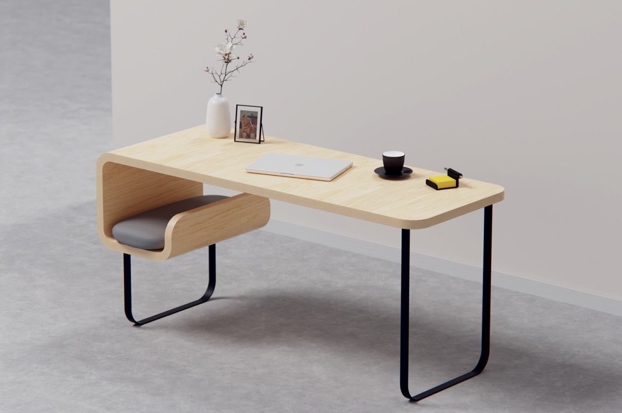
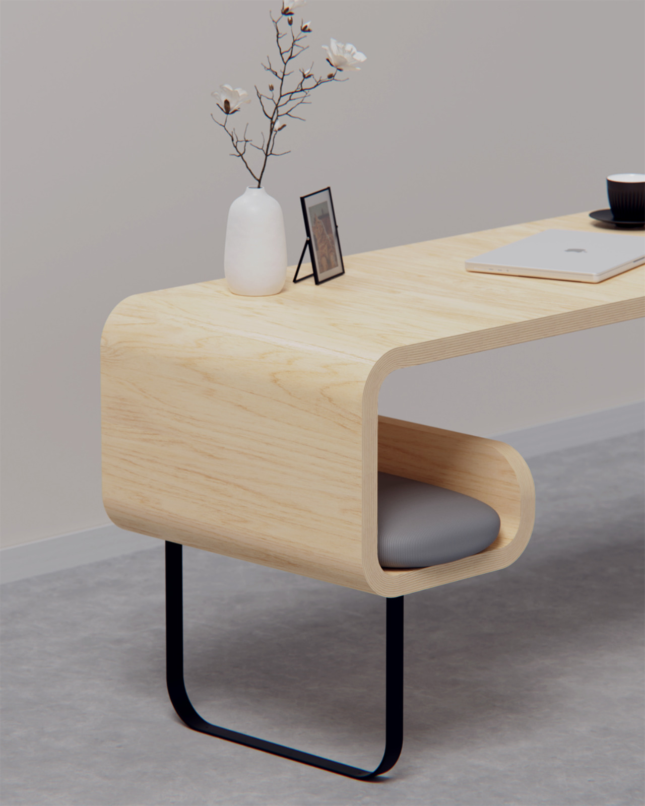
Our parents told us how keeping pets is a huge responsibility, and many of us probably took that advice for granted. Even as adults, we might sometimes have love-hate relationships with the furry members of our family, especially when they get in the way of work. That seems to be especially true for cats, who have a bewildering knack for sleeping on our desks when we need to get things done, even going as far as sleeping on top of keyboards while we’re still typing. Every feline owner knows there’s really no stopping these masters of flexibility when they put their minds to something, but it also helps to give them something more comfortable to lie on than your hands. That’s what this desk concept aims to offer, giving your cat some space to still be near you when you work but also some privacy to keep to itself, like what most cats often to do.
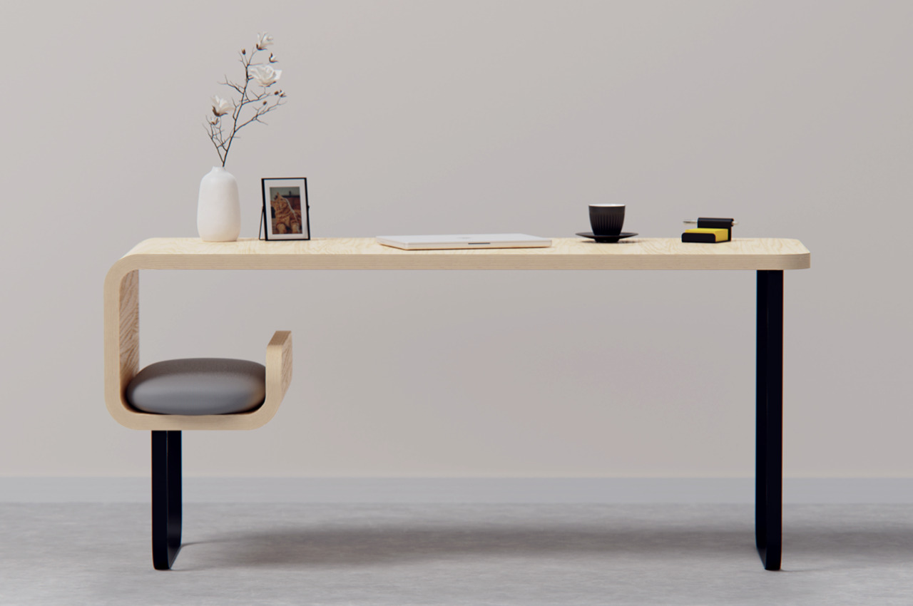
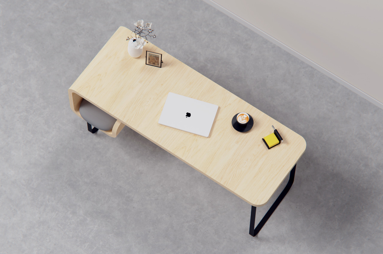
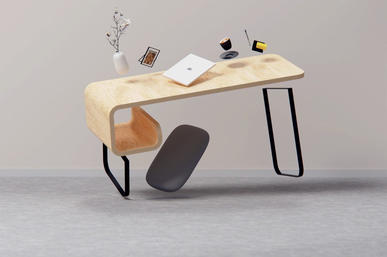
This wooden desk is minimalist almost in the extreme sense. It’s pretty much just a bent plank of wood standing U-shaped bent metal for legs. There are no compartments, hidden or otherwise; just a flat and open surface to put your things on. It forces you to be extra neat, or at least creative in how you decorate and place accessories to hold your work tools. Or perhaps it’s best to actually leave it bare without anything that your cat might topple over.
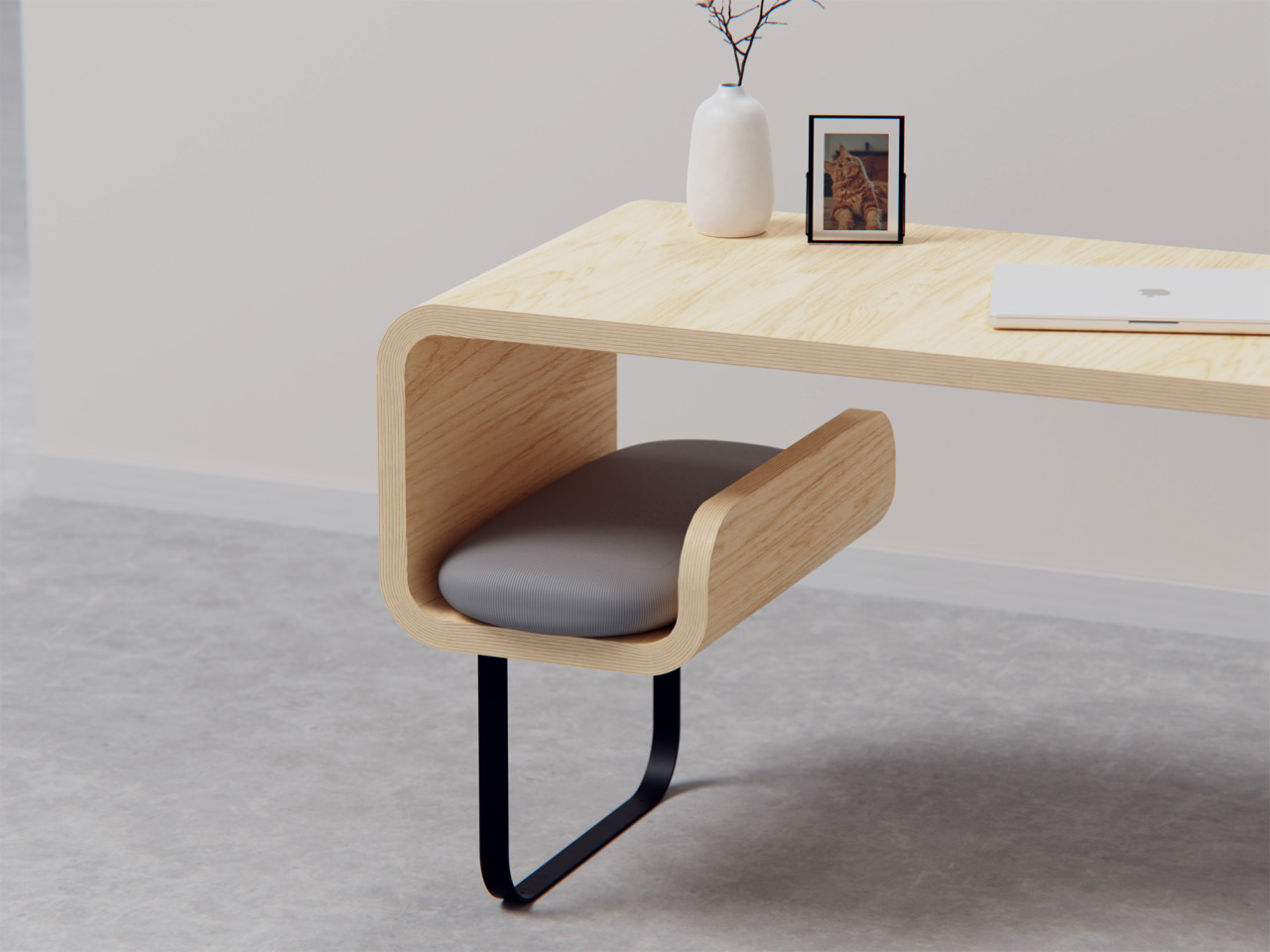
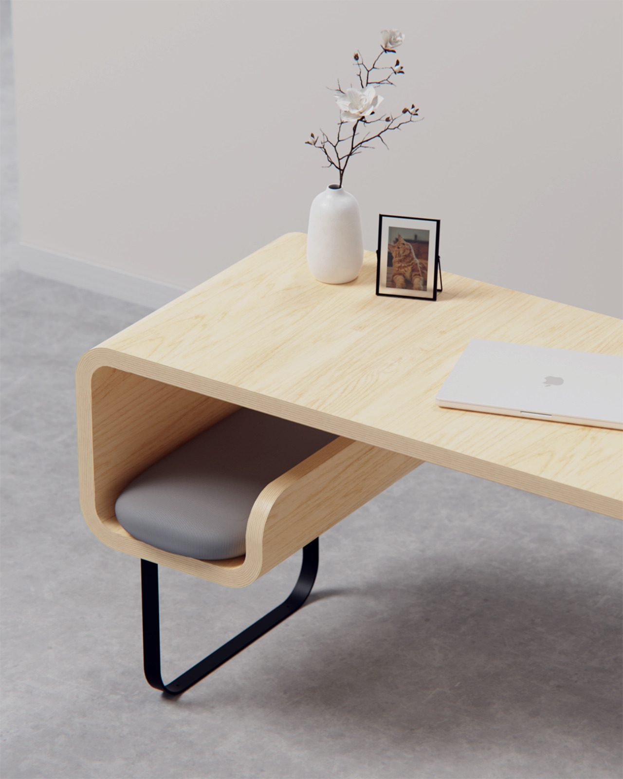
Of course, the signature feature of this concept is the small space or “cubby” designed especially for a cat. One side of the table bends inward to create a hook shape that’s probably just big enough for your average cat. That cubby has a pillow for their comfort, though the material for that cushion might be questionable. After all, cats are known to scratch so that pillow might not last that long.
The Cat Cubby Desk tries to offer a comfy place for your cat to lie on without getting in the way of your work. Or at least that’s the goal. Whether or not your furry feline friend prefers to take that spot or, more likely, still lie on your keyboard will be totally up to your training and its mood. Given cats’ inclination to cram themselves in tight spaces, this does look like a very tempting location for them. And if your pet ends up ignoring it, you can always repurpose the cubby for other things, like as a space for books and folders. Hopefully, your cat won’t suddenly decide to jump in and knock all those off.
Apple is not a big fan of reusing its products for something else, at least something that is still close to the original function of the design. It probably won’t object to completely unrelated applications of those designs, especially when it’s for a creative and artistic purpose. The non-functional parts of an iPhone, for example, could be disassembled and framed to be displayed as a piece of tech history. Or one might simply take the empty shells of old Mac Pro and turn them into a piece of structural art, which is exactly what this rather striking metal bench tries to accomplish in a way that will probably make you wonder how strong those old Apple desktops might have been.
The designs for more recent Mac Pros have been rather controversial, to say the least. The cylindrical 2013 was derided for looking like a trash can, while the boxy 2019 design, though a bit more traditional, is jokingly called a cheese grater. Neither are good foundations for a stable piece of furniture, but the first-ever Mac Pro fortunately fits the bill perfectly. It was a minimalist brushed aluminum box with tapered legs on the front and back to raise it up and equally tapered handles on those same sides for easier lifting.
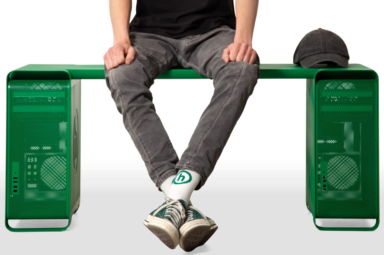
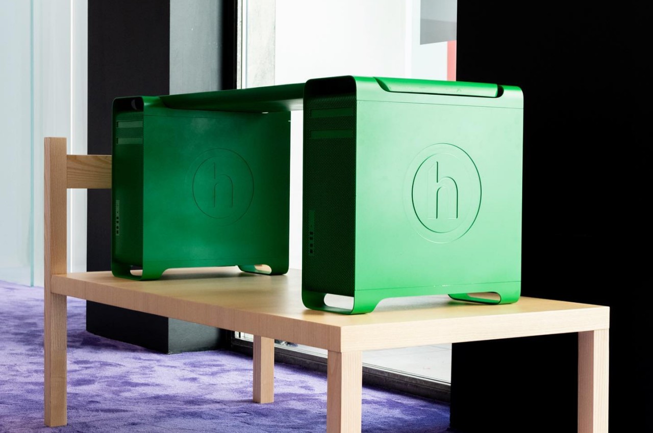
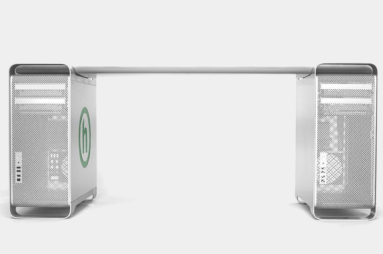
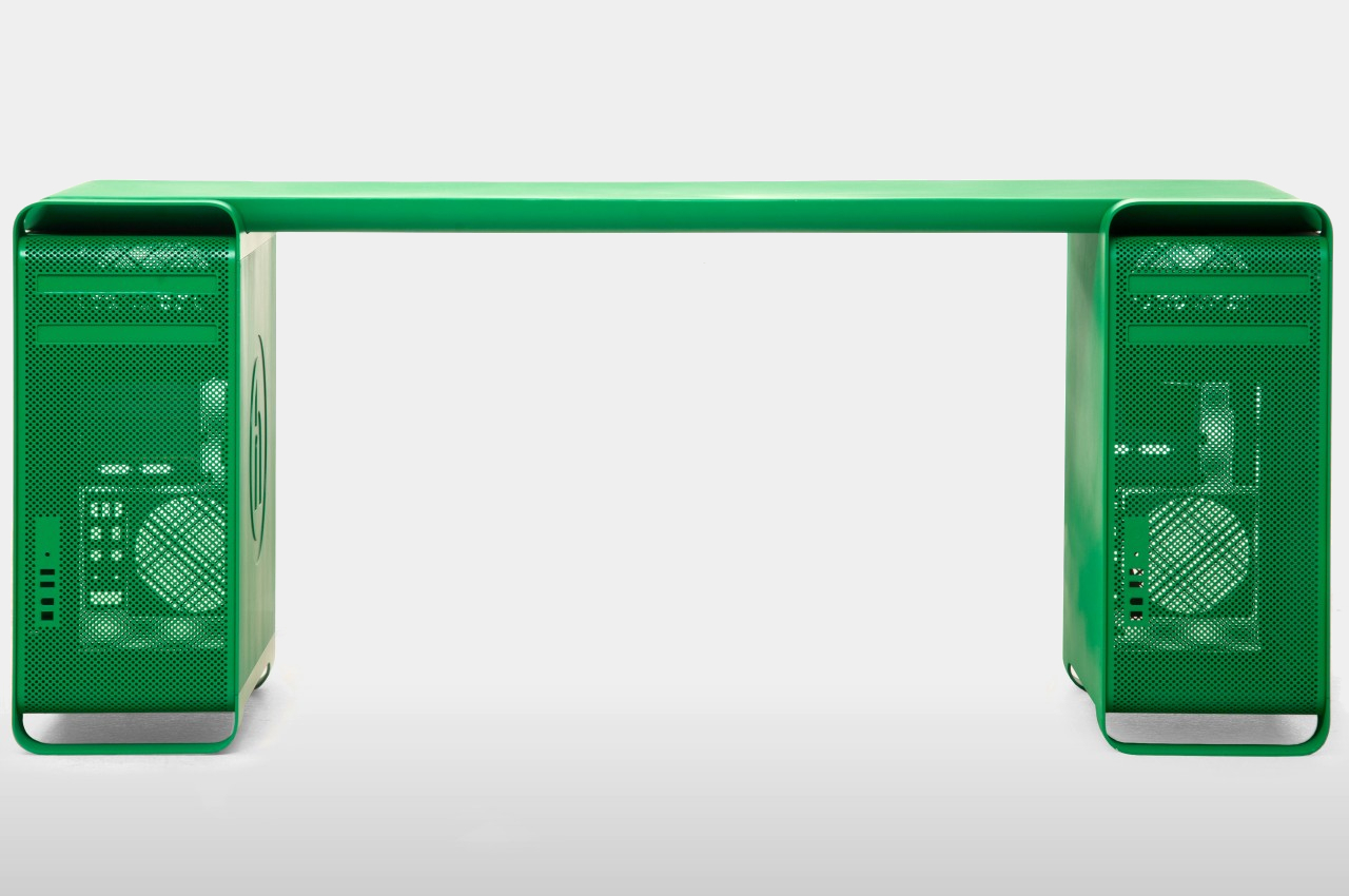
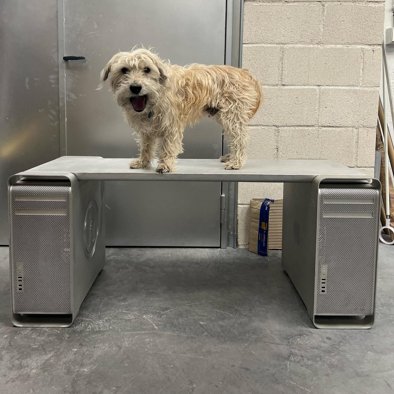
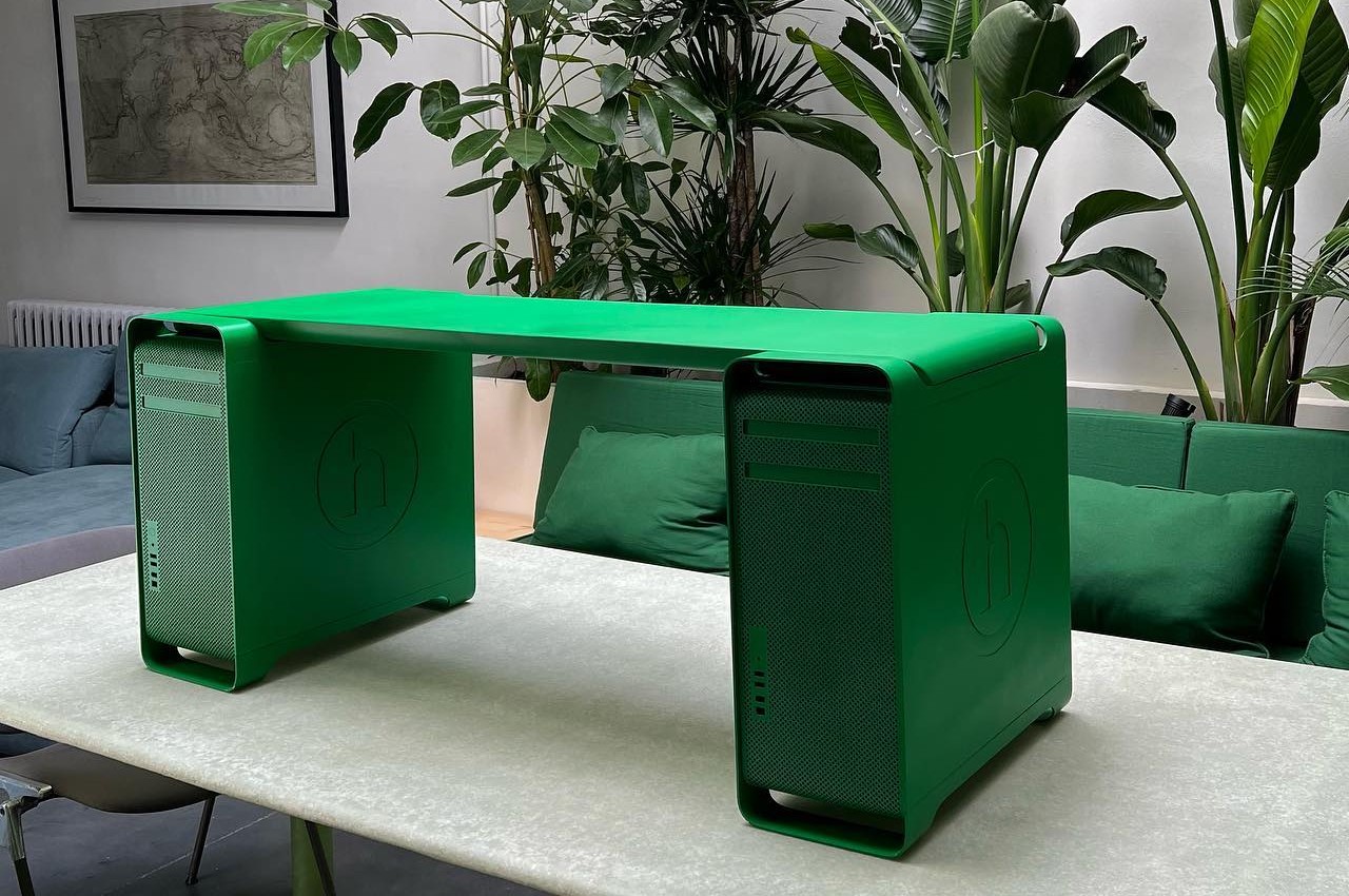
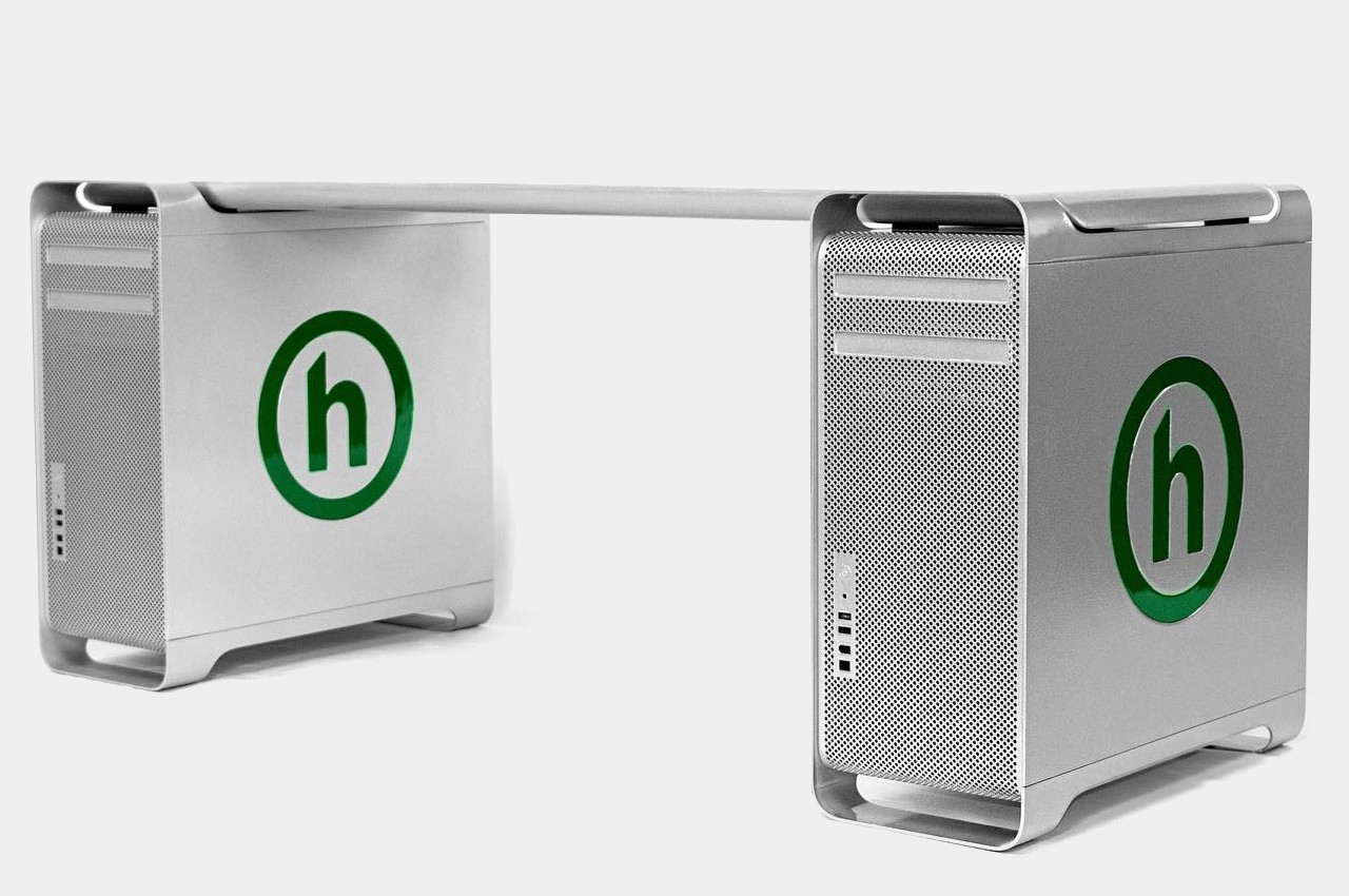
Made for Manhattan clothing brand Hidden as part of store display, the Mac Pro Bench is exactly what it sounds like. It takes two first-gen Mac Pros, totally gutted of any and all electronic components, and has a folded aluminum plank attached on top. The plan has a tapered shape that fits perfectly between the front and back handles, making it feel as if the desktops were made for this very purpose. Two versions of the bench exist, one preserving the brushed aluminum aesthetic of the Mac Pro, and another thoroughly coated in Hidden’s green motif.
It’s not being sold en masse, which will probably keep Apple’s lawyers happy, though there are also ways to make your own. That said, it’s probably not a good idea outside of making it a decorative piece. It’s actually not tested how much weight the Mac Pros will be able to handle, especially with a bench meant to sit more than one person. The hollow legs of the desktop don’t look reassuring either, and it might have been more practical to have sawed those off, even if it meant ruining the original Mac Pro shape.
That said, it’s possible to reinforce the foundations of the Mac Pro Bench to make it a more usable piece of furniture. More importantly, however, the piece of art could also spark the imagination and creativity of others to make similar designs that reuse discarded desktop PCs in a less conventional and more interesting manner.
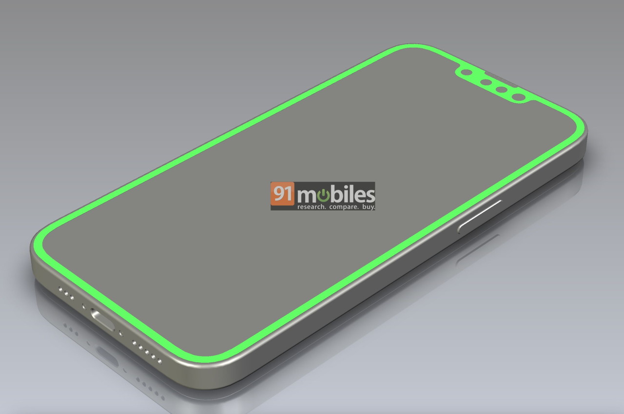
All good things must come to an end, or so they say. Of course, the definition of “good” will always depend on who you ask. Some might be pining for the “good old days” when the iPhone was curvy, small, and didn’t require your face to unlock it. For some, the 3rd-gen iPhone SE from 2022 was their recourse, but could finally be the last of its kind. No, Apple will apparently still launch an ultra-affordable iPhone, but it will no longer be that safe haven for lovers of old technologies and designs. According to this latest visual leak, the iPhone SE 4 expected to launch next year will be taking after the iPhone 14 design, now also considered a “last-gen” design, except for one curious feature that’s both surprising yet makes total sense as well.
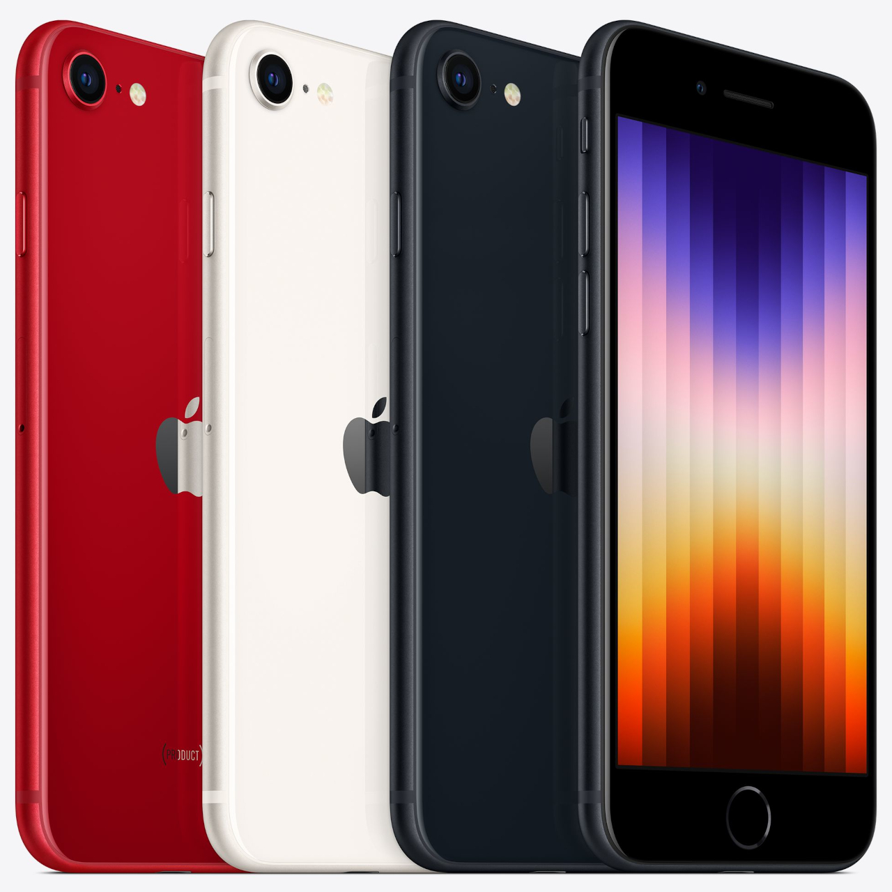
The iPhone SE, which stands for “Special Edition,” has always been an oddity in Apple’s lineup. Although it was regarded to be the cheapest and smallest iPhone from the company’s catalog, those points aren’t always true as each new model is introduced. To some extent, it feels more like the iPhone SE is an ode to technologies and designs that are being put to pasture, whether it’s the small design and headphone jack of the first iPhone SE or the physical home button of the iPhone SE 3.
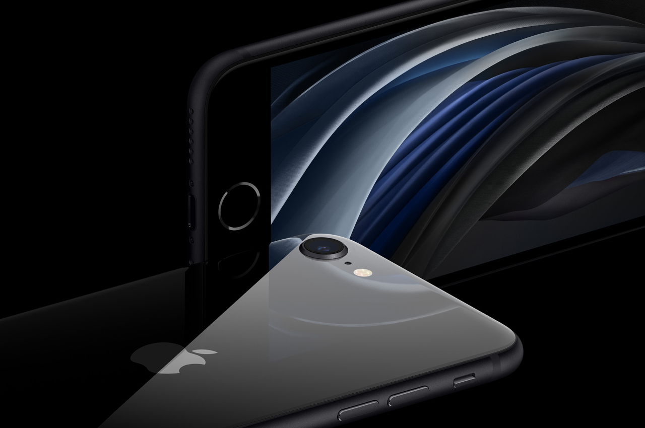
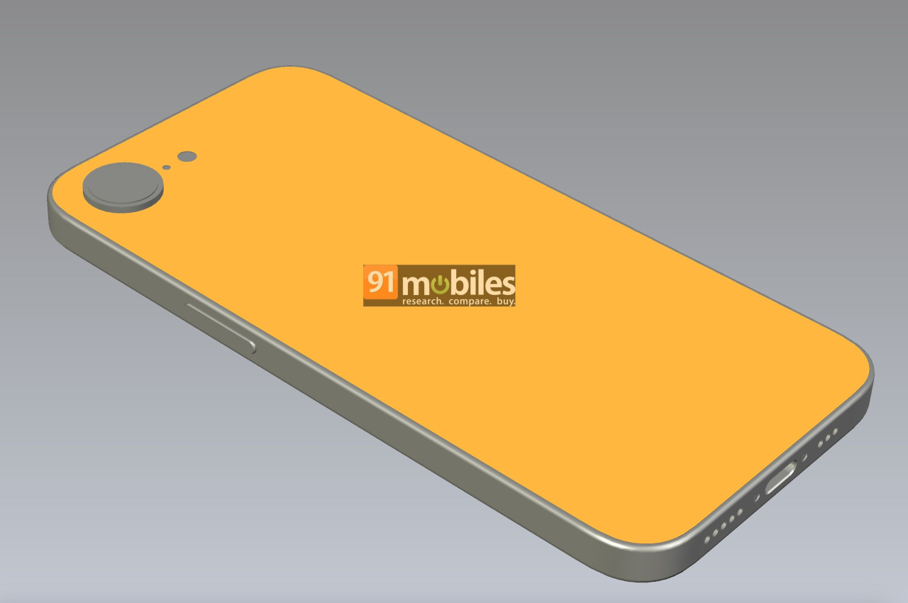
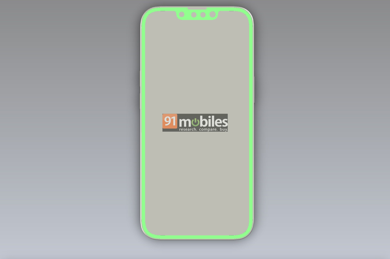
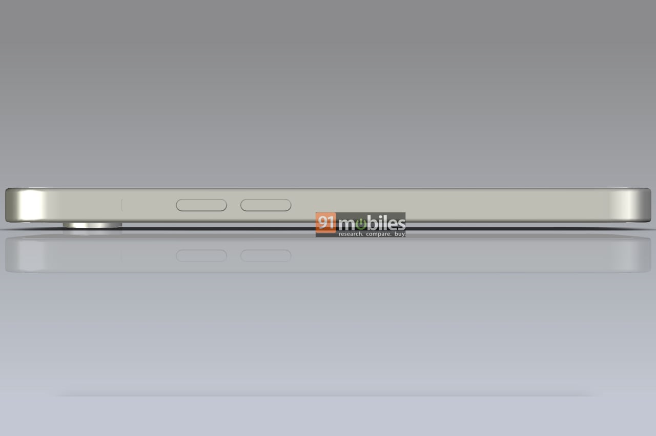
Unofficial CAD renders, uninspiring as they might look, offer some clues to the design changes that Apple intends for the 2025 iPhone SE. For one, it finally bids farewell to the small-sized iPhone with what is allegedly a 6.1-inch screen. Second, it also removes the thick bezels of the past, embracing a screen that has been around since the iPhone X, which also means finally embracing the notch. More importantly, however, this kind of bezel-less display also has no room for Touch ID, so fingerprint authentication will finally be gone for good, at least on iPhones and iPads.
For all intents and purposes, the iPhone SE 4 looks like the iPhone 14 from 2022, which itself sported a design that was significantly unchanged since the iPhone X from 2017. The only major difference, at least from a design perspective, is that the camera on its back retains a single circular bump more reminiscent of the iPhone 8 and earlier eras. Given there might only be a single camera anyway, that’s a better choice than having a square bump with barely anything inside it.
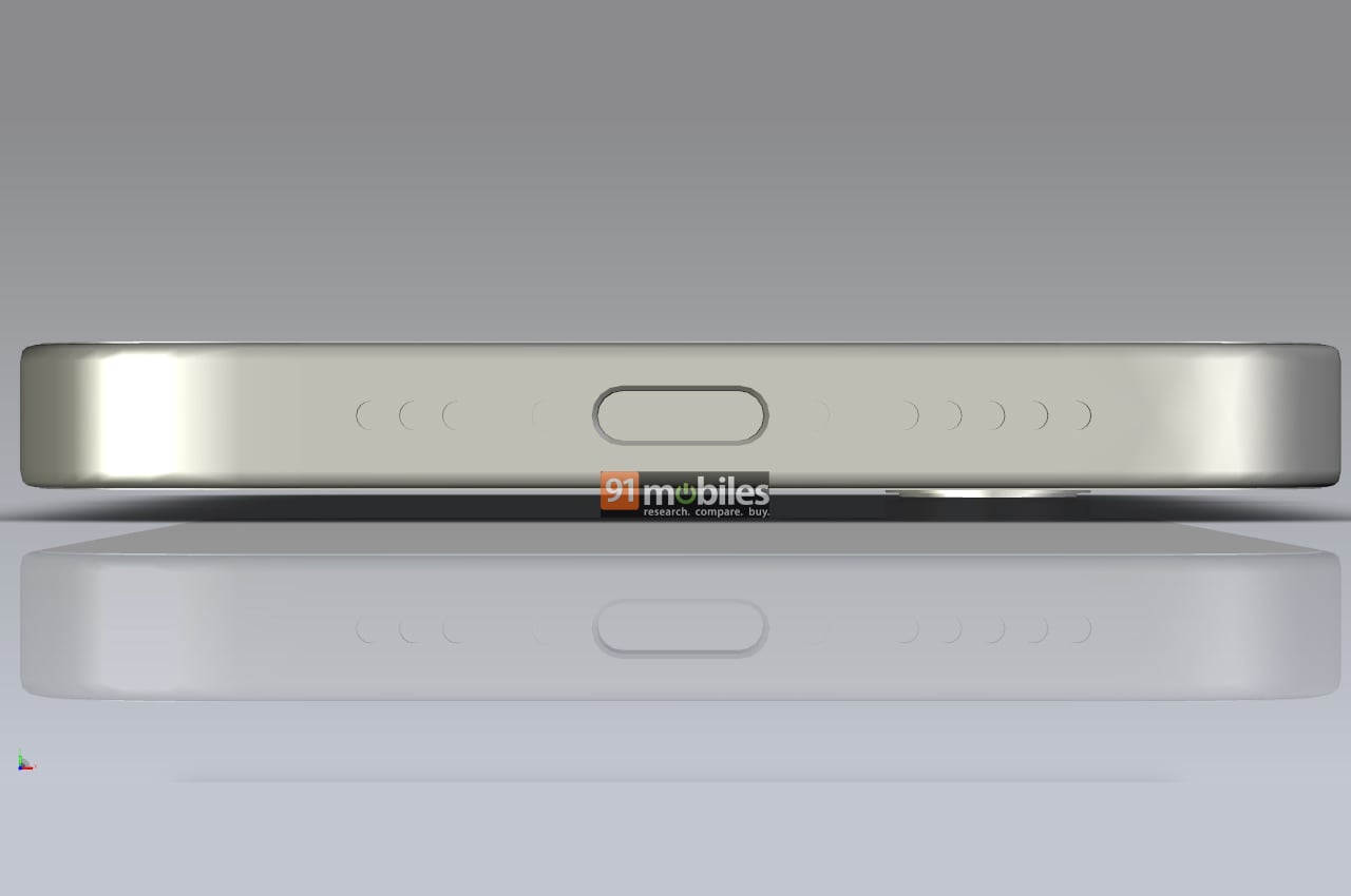
The renders do suggest that the 4th-gen iPhone SE will also adopt a USB-C port, a technology that Apple introduced to iPhones only last year. This is quite a modern feature for an iPhone SE model, but considering the pressure on Apple to adopt a standard charging port, it doesn’t come as a surprise. That said, these are still all unofficial, so details might still change before the new iPhone SE launches, which is expected to happen next year.