Unlock Seamless Connectivity with a Tiny Device That Redefines Device Integration

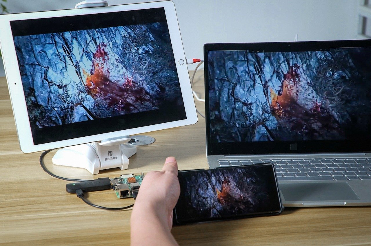
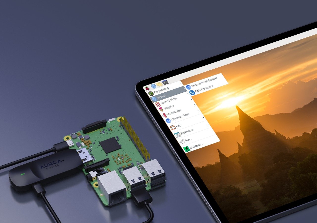
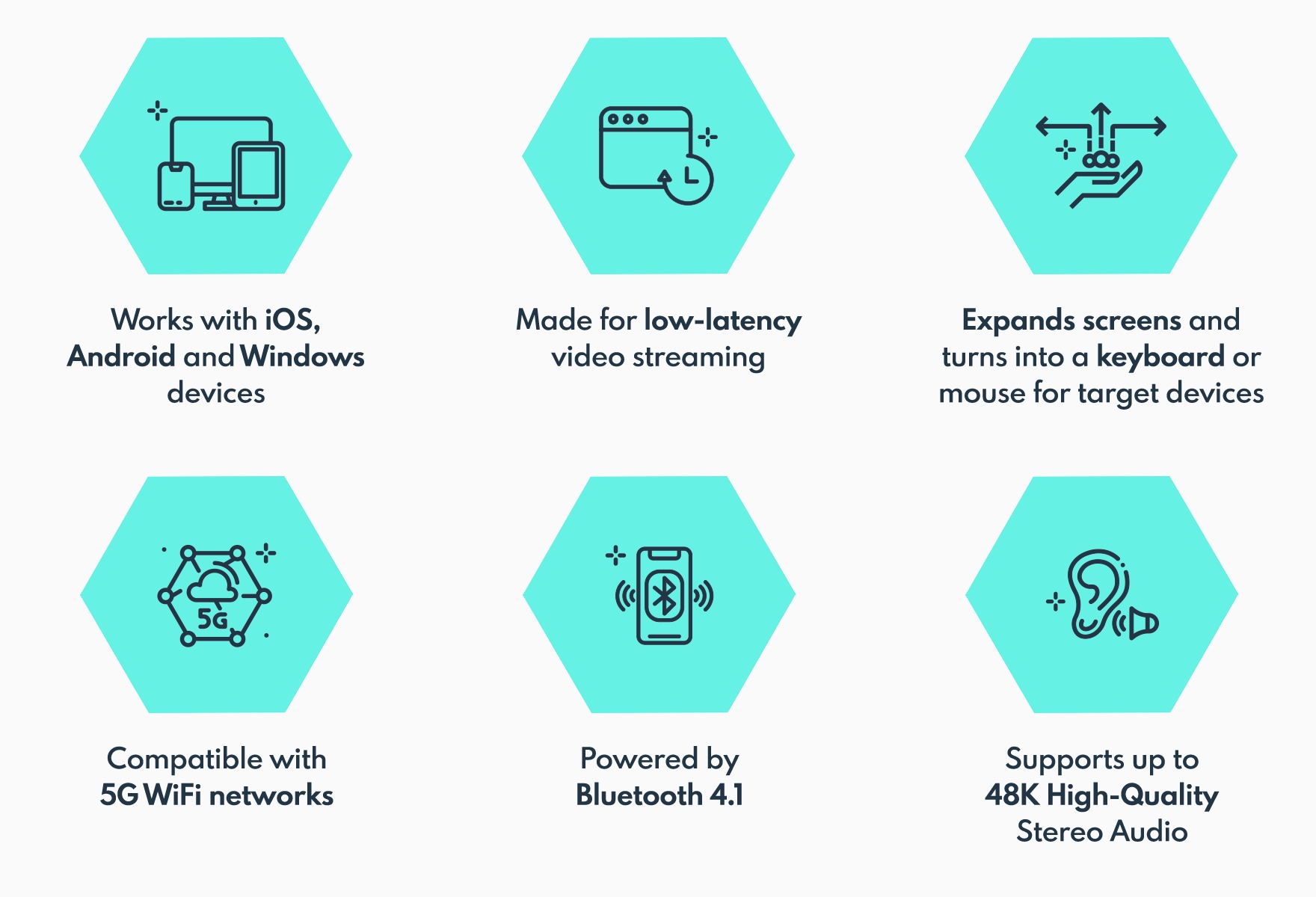
The AURGA Viewer transforms connectivity by serving as a versatile, lightweight wireless HDMI dongle that seamlessly integrates a wide range of devices across various platforms. It combines the functionalities of a wireless video streamer, mouse, keyboard, touchscreen, and digitizer pen, extending the usability of devices far beyond their standard capabilities. This dongle supports high-definition video streaming at 1920x1080p 60Hz alongside 48K audio, ensuring a high-quality viewing and interaction experience.

Designer: AURGA Design

Click Here to Buy Now: $72 $99 (Use coupon code “YANKO” to get an additional $7 off). Hurry, deal ends in 48 hours!

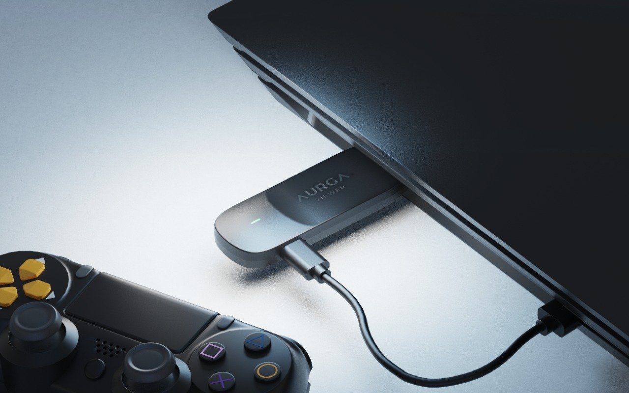
Ideal for diverse applications, the AURGA Viewer can be used with computers, laptops, single-board computers like Raspberry Pi, and gaming consoles such as the PS3, PS4, PS5, Xbox Series, and Nintendo Switch. It also connects seamlessly with mini PCs, cameras, DSLRs, and TV boxes, enhancing its versatility. The device itself is incredibly portable, measuring only 79.4mm by 26mm by 11mm and weighing just 14.5 grams, making it easy to carry and use anywhere.

For Designers – Turn your tablet into a pen display for Windows 10.

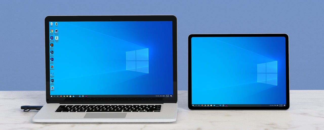
For Professionals – More screen space by seamlessly extending your desktop.

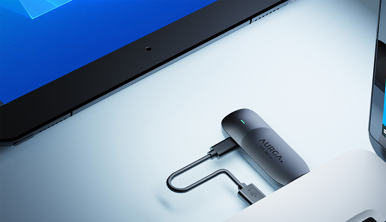
For PC enthusiasts and technicians, the AURGA Viewer offers a particularly valuable solution. Typically, setting up a computer to access BIOS settings or conduct tests requires a complete setup with a monitor, keyboard, and mouse. The AURGA Viewer simplifies this process dramatically by allowing for platform-agnostic remote control with just an HDMI and USB connection—eliminating the need for a monitor or even an operating system installed on the PC. This can be a game-changer for testing PCs, bare motherboards, or any “headless” device, providing both display and control access directly from a mobile device or tablet via the AURGA app.

Amplify your Mini PC – Connect your iPad for greater computing power.

For Photographers & Videographers – A larger monitor screen to make sure your videos are perfect everytime.

A compelling use case also exists for Nintendo Switch users. The Switch operates in different performance modes—handheld and docked. In handheld mode, the display is limited to 720p, reducing visual quality to conserve battery life. However, when connected via the AURGA Viewer, the Switch can output its display to devices like PCs or tablets, allowing users to enjoy the enhanced visual quality of docked mode on a larger, more vibrant screen. This feature is useful when the TV isn’t available or when traveling, ensuring gamers still enjoy high-quality gameplay.

For Developers – Seamless coding experience with extra screen real estate.

For Gamers – Turn your mobile device into a portable gaming console.

Acting as an extension for PCs, the AURGA Viewer serves multiple purposes beyond entertainment, such as allowing a tablet or a second laptop to function as an additional screen. This element is particularly valuable for professionals looking to increase their productivity by expanding their available screen real estate. Additionally, it also allows for interactive control over the primary device using the secondary one, which includes using touch inputs or connecting peripheral devices.. This capability adds significant flexibility and efficiency to any workflow, enabling users to manage tasks and execute commands directly from their secondary screens. Whether for complex professional tasks, creative projects, or general multi-tasking, the AURGA Viewer integrates smoothly into a variety of digital environments, streamlining operations and extending the functionality of connected devices.

The device operates by connecting to devices through HDMI for video output and USB for power and peripheral connectivity. It does not require any software to be installed on the host device, making it a plug-and-play solution that’s easy to set up. The video and control signals are transmitted over a local Wi-Fi network, accessible through the AURGA app available for Windows, macOS, iOS, Android, and even Android TV with some additional setup.

The AURGA Viewer is a versatile tool that broadens the functionality of electronic setups from gaming consoles to professional workstations. As a compact device, it offers robust solutions for enhancing connectivity and streamlining the use of various devices, making it an essential addition for anyone looking to optimize their digital interactions.

Click Here to Buy Now: $72 $99 (Use coupon code “YANKO” to get an additional $7 off). Hurry, deal ends in 48 hours!

The post Unlock Seamless Connectivity with a Tiny Device That Redefines Device Integration first appeared on Yanko Design.

Phone-powered smart speaker concept reads your mood to play the right music for work

Not everyone likes listening to music, but even those will perhaps begrudgingly agree that certain kinds of music can have different effects on one’s mood or mental state. Next to entertainment or the sheer joy of listening to favorite tunes, the most common use of music is to set the right mood, whether it’s to relax, to get pumped, or to be more productive. That said, musical tastes can be quite subjective, and even the kind of harmonies that you like could be affected by your mood at any given time. It can be quite taxing to change playlists or tracks every time, so rather than relying on your fingers and your own mind, why not let your phone do the work for you? This desk speaker concept does exactly that, analyzing your mood and picking the right music to help you finish your work, studies, or any other task you need to get done.

Designer: Junyoung Lee

People who love playing music while they work most likely have a library of tunes selected to help massage their grey matter, especially during slow hours. Unfortunately, the effectiveness of music can be thwarted by moods, emotions, and physical conditions. Sometimes we’re just stuck in a slump and manually picking out a more appropriate playlist only adds to the stress and traps you in a vicious mental cycle.

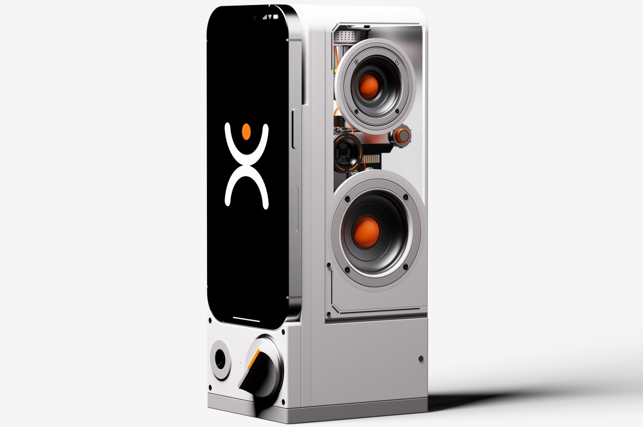
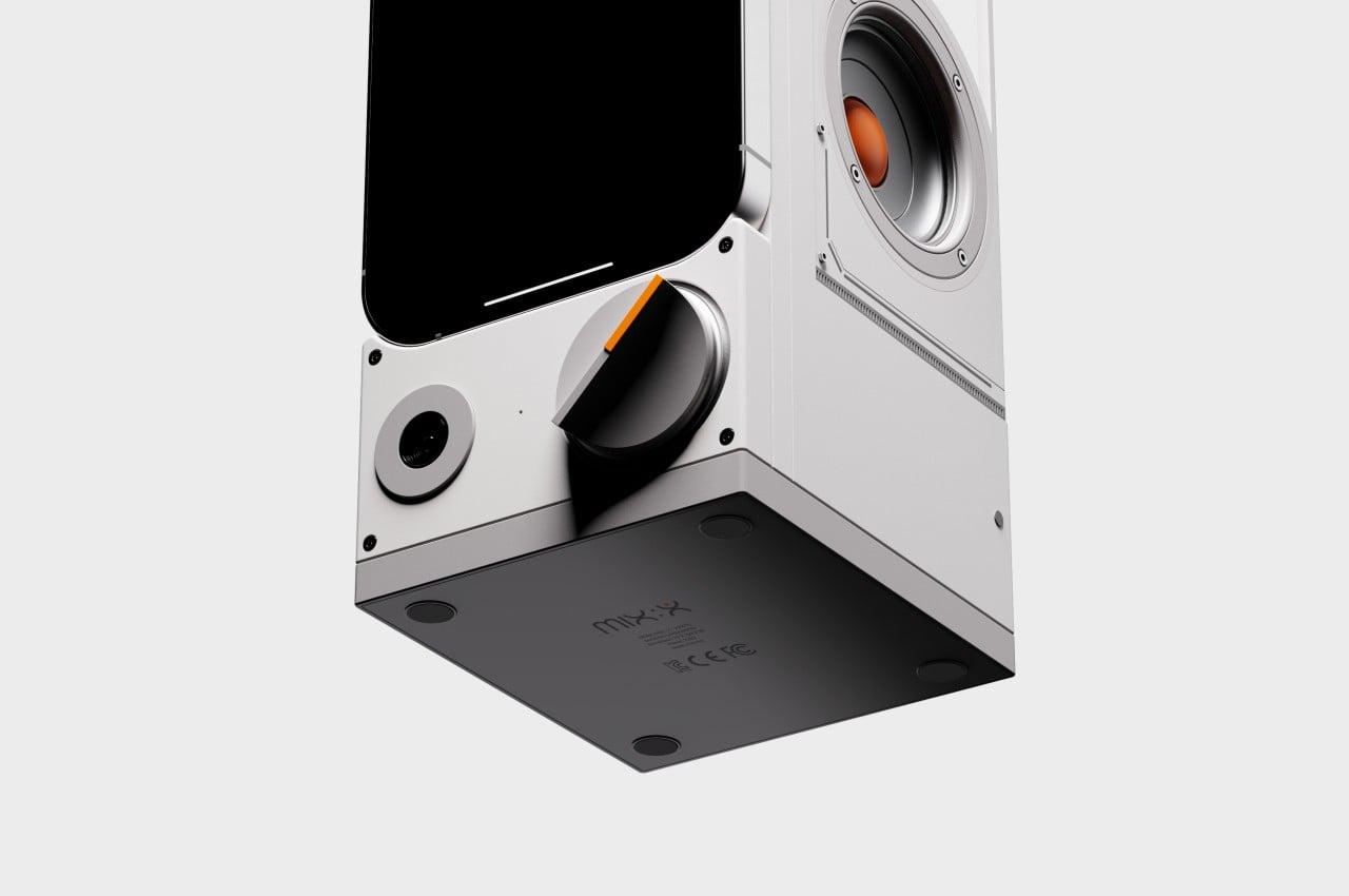
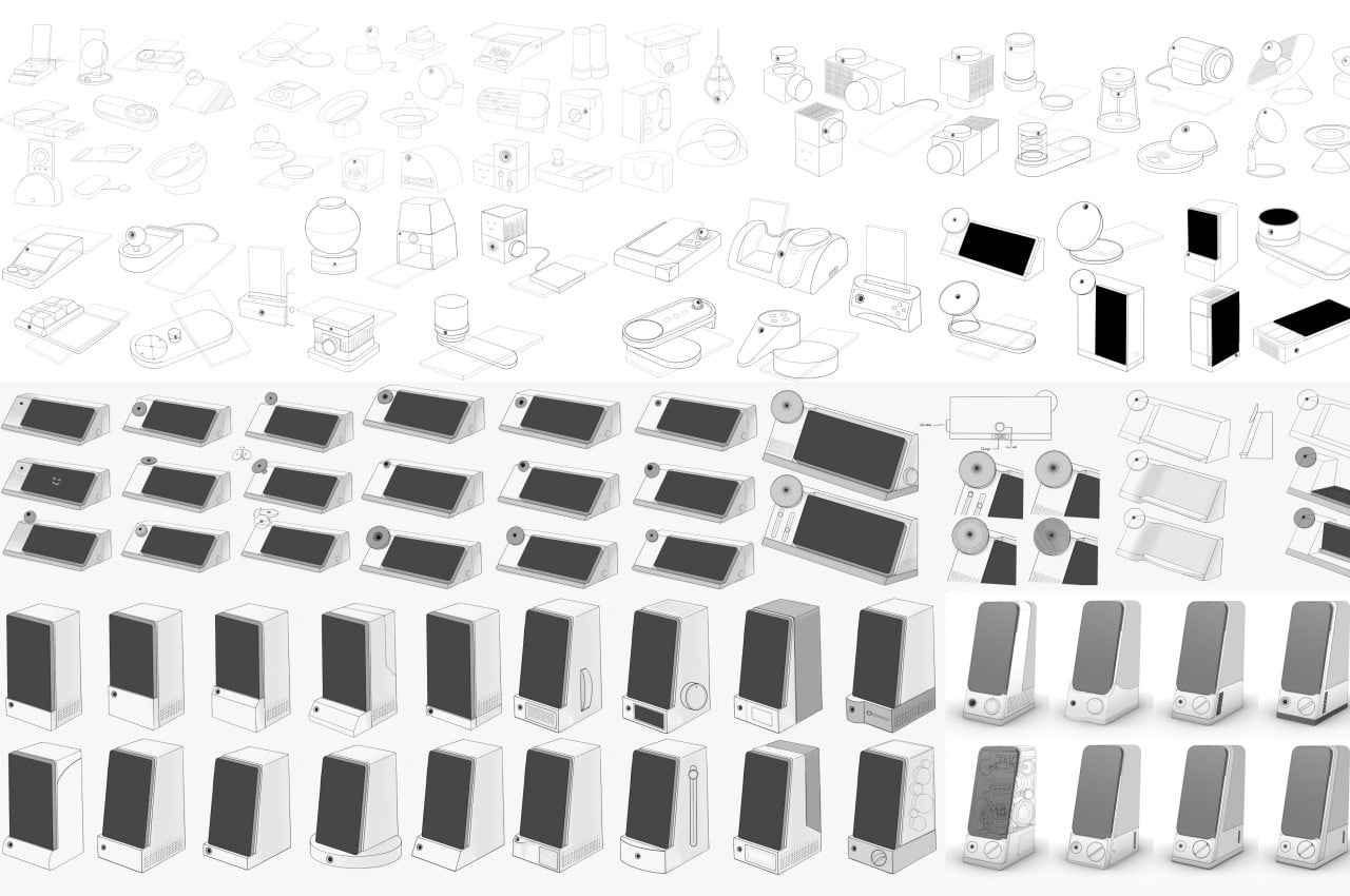
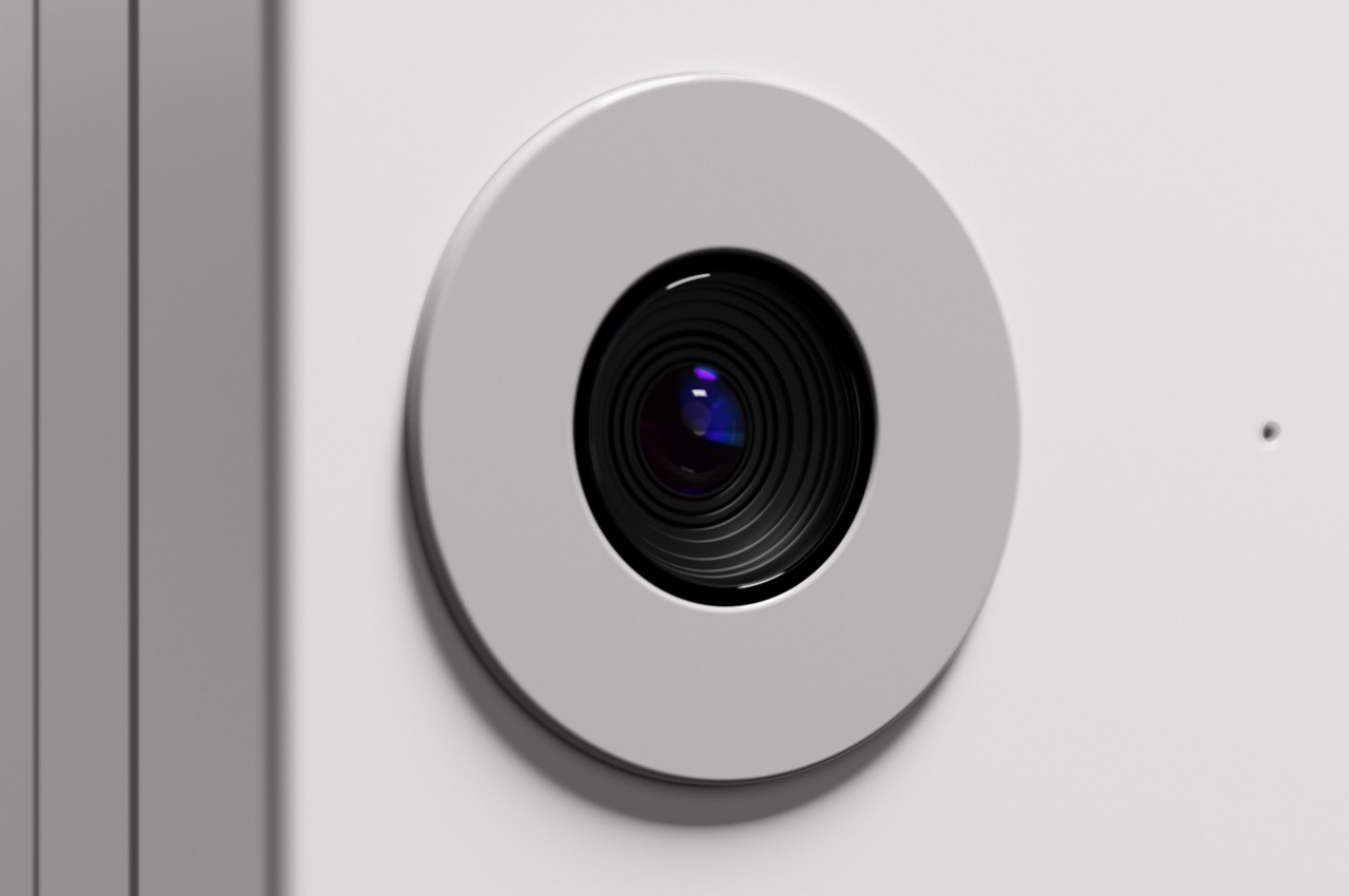
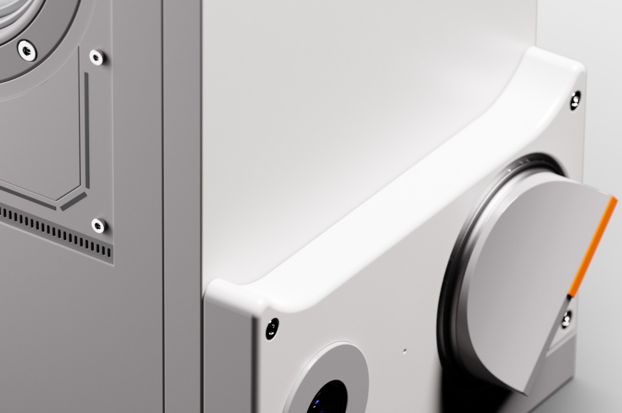
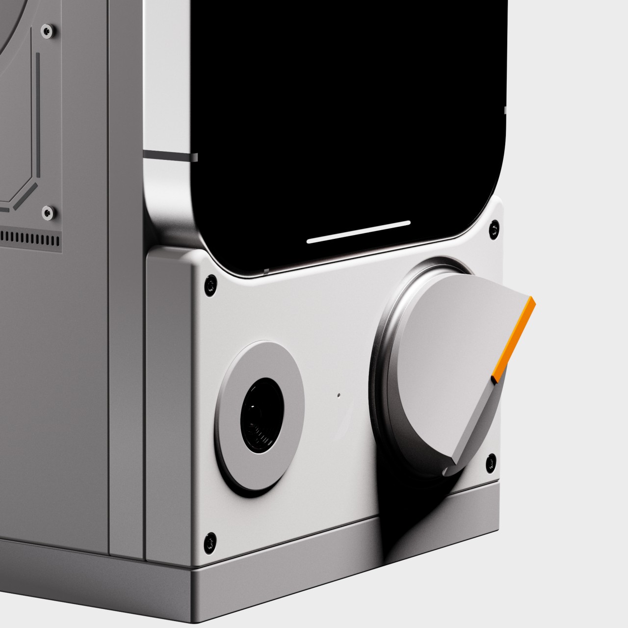
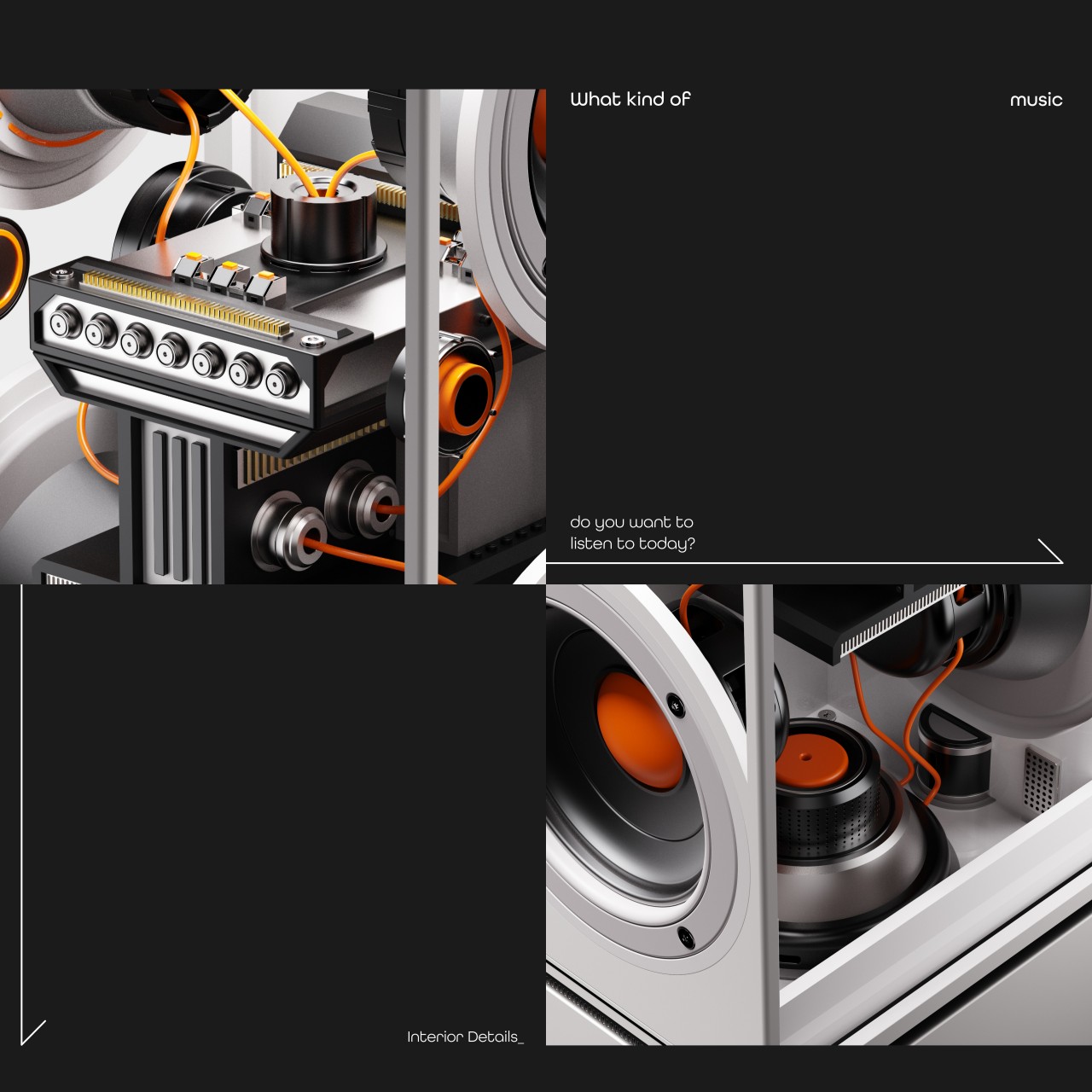
MIX:X is a smart speaker system that uses the power of your smartphone and machine learning to automate that process so you won’t have to lift a finger when your brain or heart is just too tired to care. You simply dock the phone in front of the tall, boxy speaker to start the process. The large camera at the bottom keeps a constant watch on the person’s face in front of it, particularly their facial expressions, and using computer vision, machine learning, and algorithms, it tries to identify the mood that the person is in. Depending on what mood that is, it will switch to a different playlist that will help get you into a more productive working state.

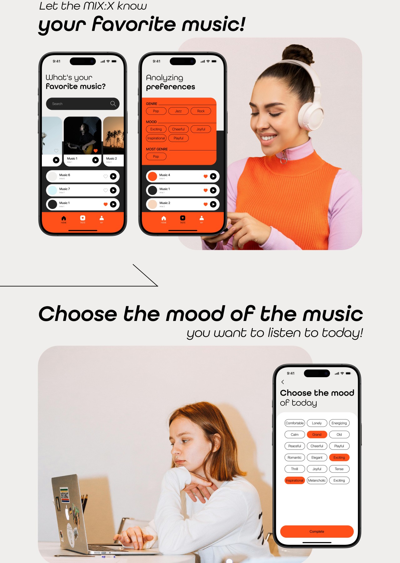
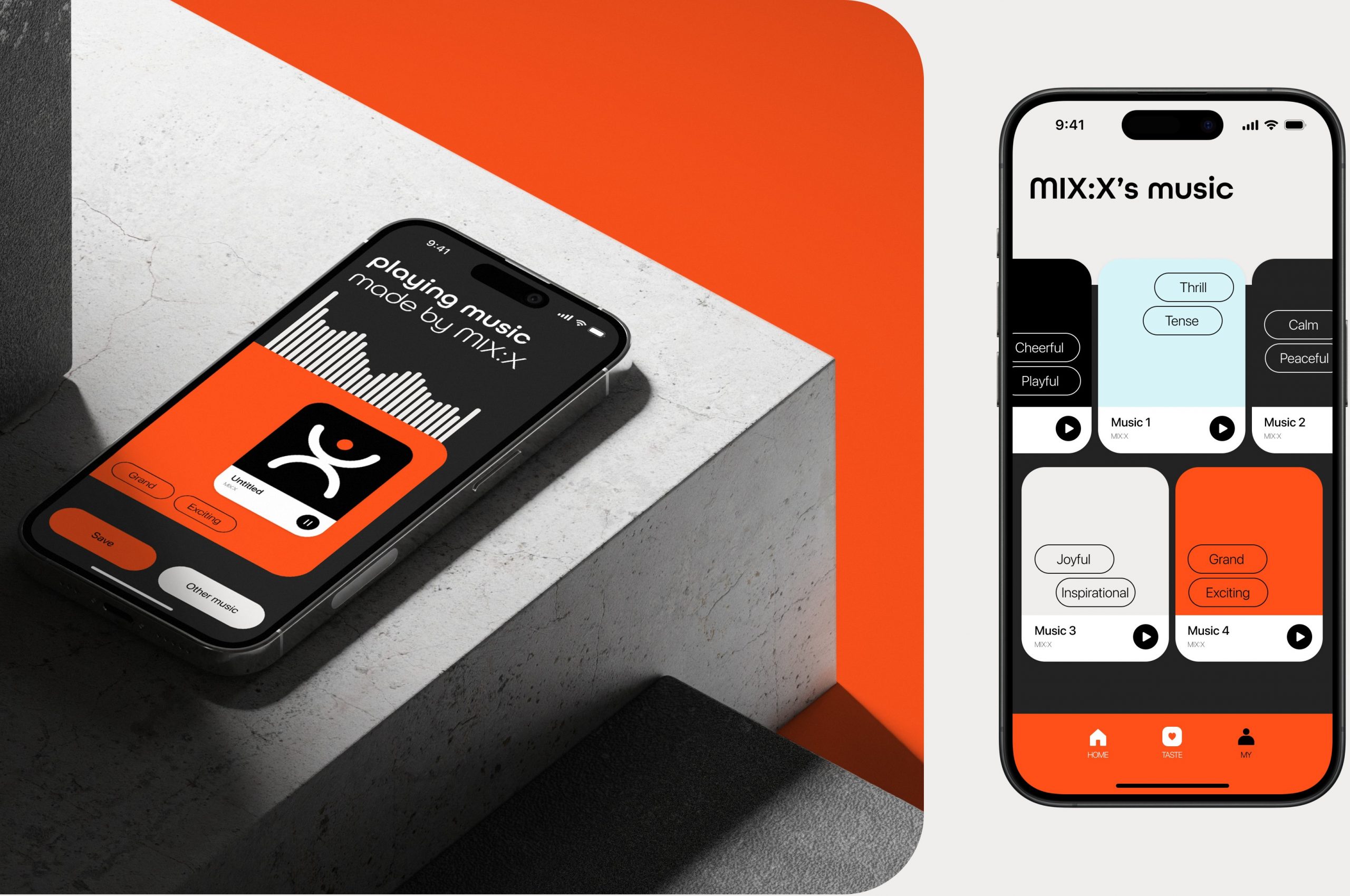
Part of the MIX:X speaker’s solution is actually not the device itself but the app that comes with it. Here you select the songs that you like and associate them with certain moods. The app’s AI analyzes the music selection and uses that as a pool to choose from when your mood shifts one way or another. It doesn’t simply get music out of thin air (or the Internet), giving you some amount of control to limit the choices to your preferences.

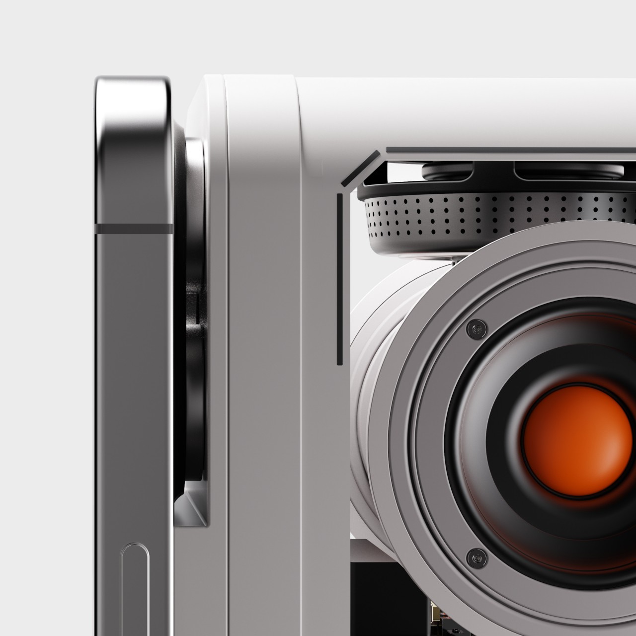
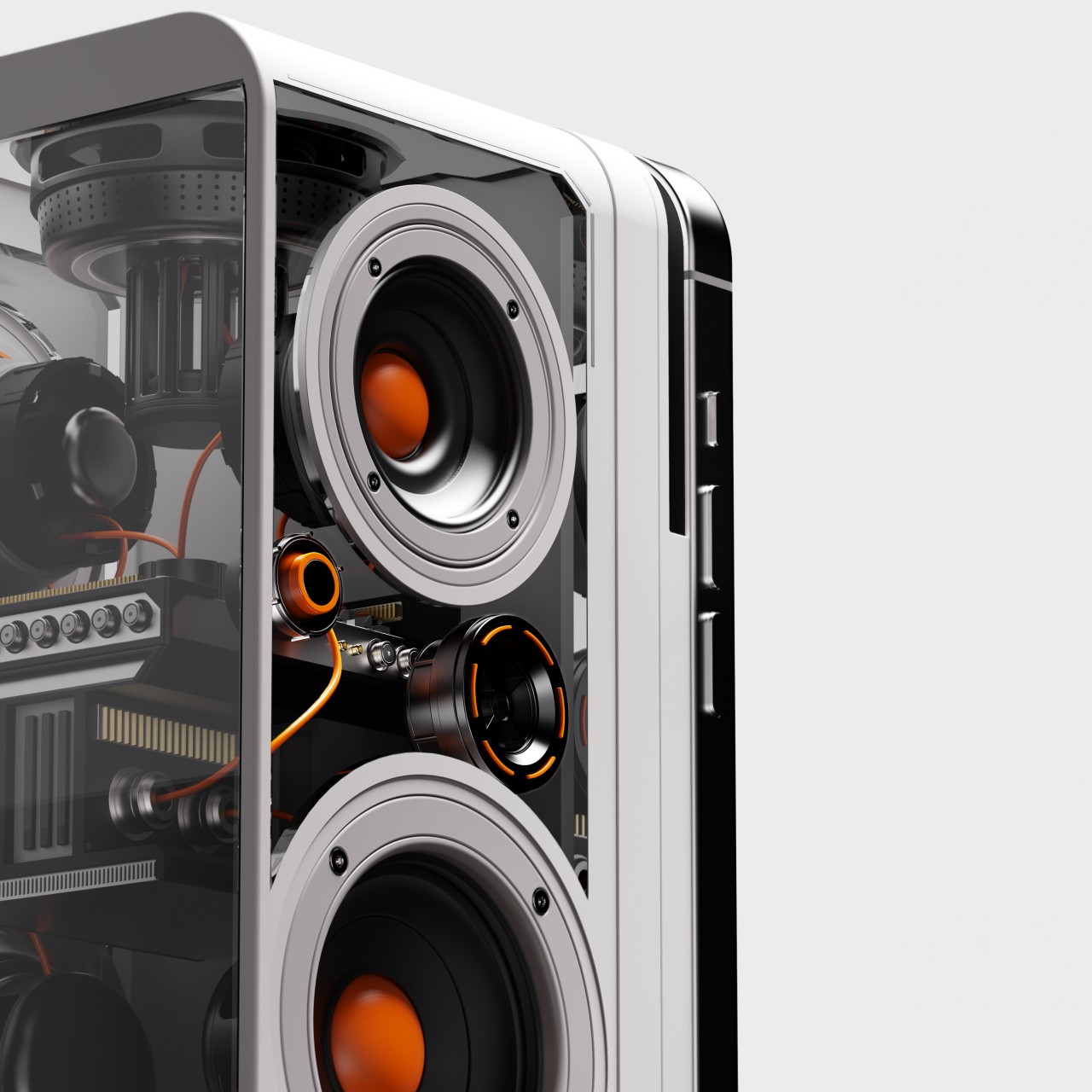
In that sense, the MIX:X speaker is simply a box with speakers facing sideways and a camera, though it definitely has an interesting aesthetic. It has transparent panels for its sides and back, putting the sophisticated electronics inside on display. The rest of the device’s design is pretty minimal, with a single dial for the volume. If there’s one glaring flaw in its design, it’s the fact that it seems to support only a specific model or size of a specific phone, namely an iPhone, which severely limits how much this concept can be used outside of that single device.

The post Phone-powered smart speaker concept reads your mood to play the right music for work first appeared on Yanko Design.

Odd drinking cup was designed to work in zero-gravity space without a straw

Hollywood has romanticized the idea of living in space or on other planets, but our current technologies have yet to catch up to the future painted by science fiction. Never mind the risks of blasting off into space, living on a space station can be extremely challenging, especially in the absence of gravity. Zero-G, as it is often called, can be fun once in a while and in short bursts, but having to constantly live in that environment turns activities we consider normal and mundane into an exercise in patience. The simple act of drinking, for example, requires sipping from a straw all the time, not exactly the most comfortable method for enjoying precious Earth liquids in space. That’s the problem that this space cup solves, but it accomplishes this impressive feat by taking on a shape that is almost literally out of this world.

Designer: Donald Pettit, Mark Weislogel

It’s only logical that liquids wouldn’t stay still inside a cup without the power of gravity, which is why drinks in space are taken from pouches with straws attached to them. It’s a simple and practical solution that makes drinking feel more like a mechanical act of survival than something that is enjoyed and treasured like those on Earth. NASA researcher Mark Weislogel and NASA astronaut Donald Pettit worked together, the former on Earth, the other on the International Space Station, to come up with a design that brings back the comforting experience of drinking normally from a cup.

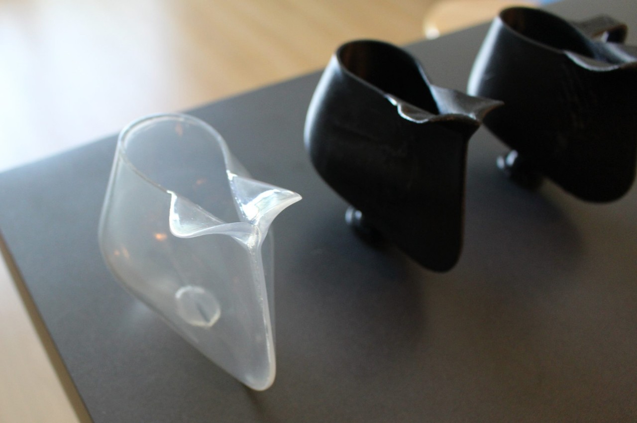
The secret behind this “zero gravity coffee cup” is twofold. One is the special design where the cup has sharp crevices where two edges meet. The other is the way liquid behaves when placed in such a receptacle in zero gravity. The liquid is naturally drawn to those narrow spaces following the principle of capillary channel flow and, as if by magic, actually sticks to those edges without spilling out.

Owning the title of being the first cup that was actually designed in space, this zero-gravity drinkware’s first form was actually just a sheet of Mylar taped together at the edges to form a teardrop-shaped container. Of course, such a design hardly counts as a comfortable cup to drink from, so a more refined 3D printed food-grade plastic cup was made on Earth. Another model, this time made from ceramic, was later developed and became the first patented product invented outside of our planet.

The space cup’s unusual shape has raised a few eyebrows, and while it’s now available for sale on Earth from some sources, it doesn’t have the same magical capabilities demonstrated in zero-gravity space. Its alien design, however, does show how outside-the-box thinking will be necessary to have more “normal” experiences in space, and we have to expect that the first generation of what we consider to be ordinary products will take on sometimes unusual forms just so they can function in the same way.

The post Odd drinking cup was designed to work in zero-gravity space without a straw first appeared on Yanko Design.

Toaster Typewriter puts a humorous and literal spin on how words can burn you

We live in an “instant” civilization where we can get what we want almost instantly. Words appear on the screen as fast as our fingers can fly, cup noodles can be done and ready for consumption in less than five minutes, and bread jumps out of the toaster just a few seconds after simply pressing down on a switch. Can you imagine, then, the frustration of having to slowly type out each letter, or manually turning a loaf of bread every minute to make sure it’s properly toasted without burning to a crisp? Of course, no one will want to go back to those not-so-good old days, at least no one in their right mind. That said, such an unimaginable situation could also be an opportunity for a ridiculous invention, which is what this seemingly antiquated typewriter does, making you slowly type each and every letter to adequately toast a bread loaf.

Designer: Ritika Kedia

The idea of typing on an old-school typewriter to toast bread is beyond absurd. The two have almost nothing in common, except perhaps the starting letter of each word. It’s definitely an exercise in patience and futility, one that could make you lose your appetite even before you get a single word out. But like what happens in real life, some ridiculous and frustrating situations can become comic relief if done right, which is exactly what the Toaster Typewriter represents.

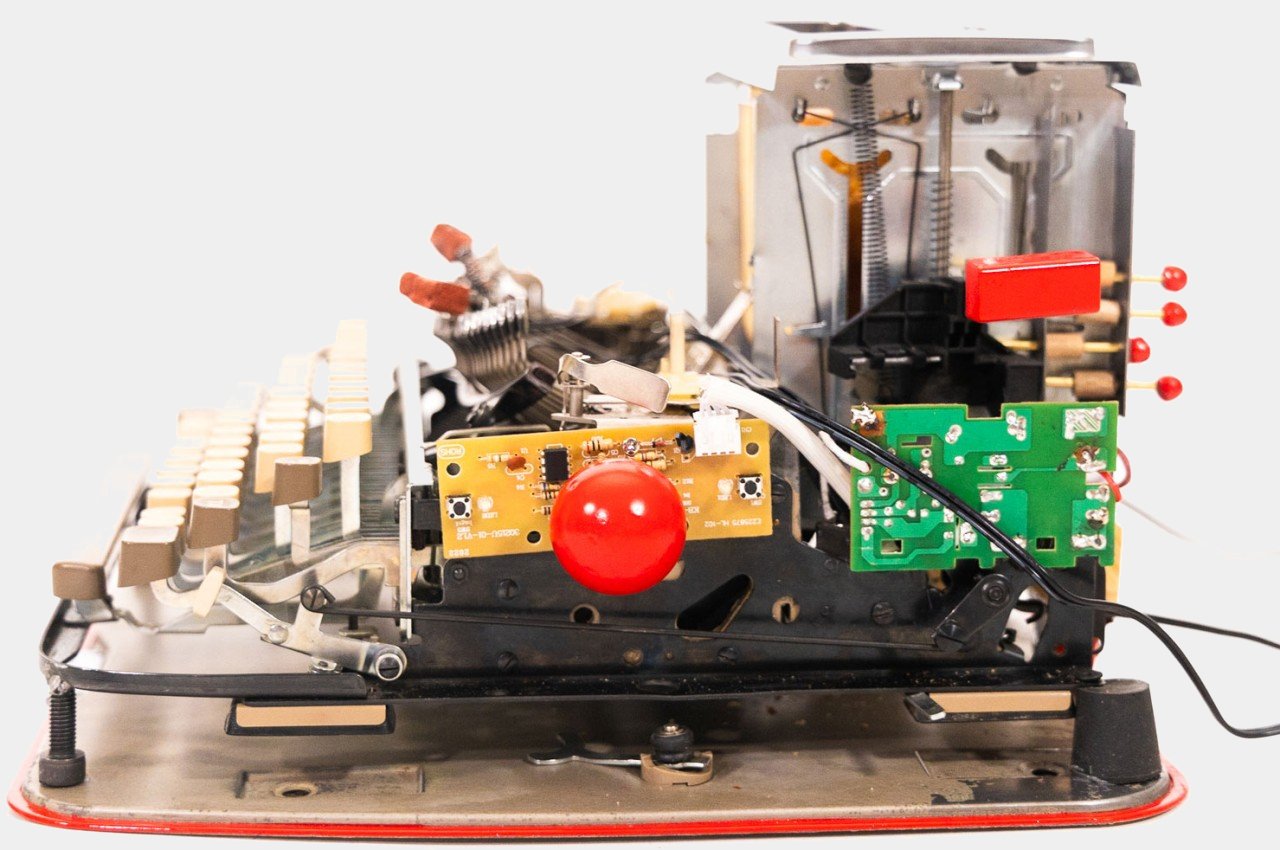
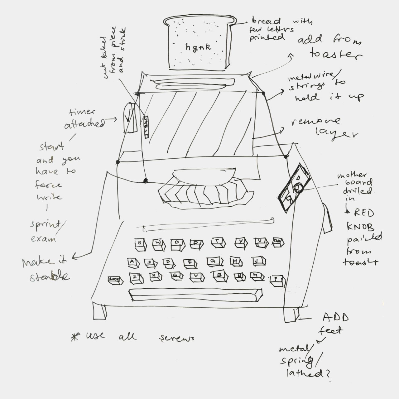
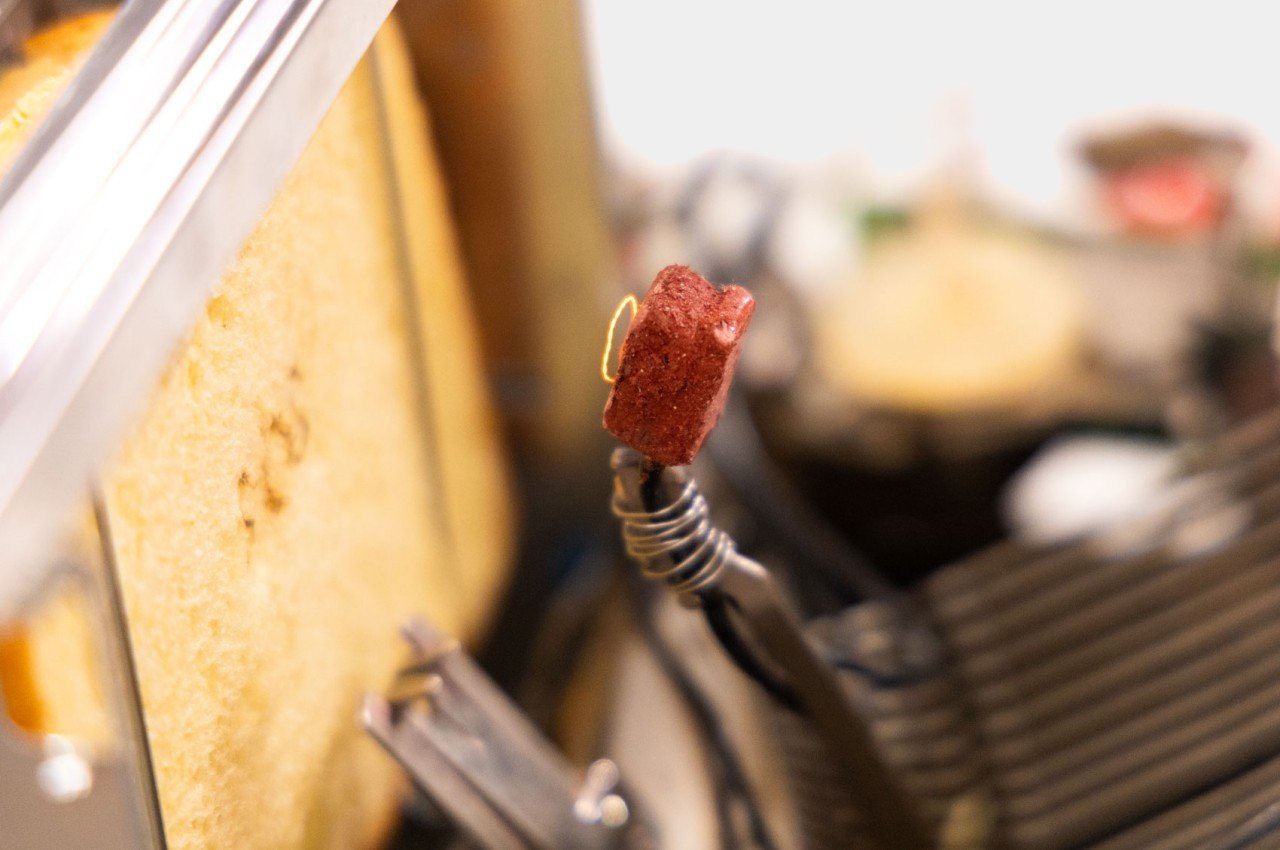
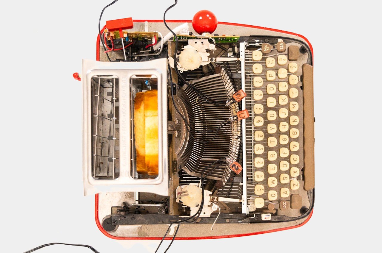
The design is practically a Frankenstein of two very mechanical products, a classical typewriter and a bread toaster with much of its outer shell stripped off. Certain letters on the typebar are covered with food-grade clay and have wires coiled around them. The cobbled machine uses multiple transformers to not only power the toaster but also generate heat for the keys, resulting in a composition that looks more like a prop from a sci-fi flick from the 50s or 60s.

The idea is to simply slide in a loaf of bread like you would on a regular toaster, and then slide the toaster box across the typewriter as if it were a piece of paper. Once the letters are sufficiently hot, you press hard on a key and then wait for that letter to be burned onto the bread’s surface. Rinse and repeat until you finally have your desired toast, unless you lose your sanity first.

As you can probably tell, the Toaster Typewriter technically works but it’s impractical and pretty much useless. That’s exactly the point of the design, however, as a paradigm shift toward more entertaining, even comical, designs. The design space has become too serious for its own good. While product designs definitely need to address certain needs and requirements, there is also room for some more entertaining and humorous designs that bring delight in one way or another. Of course, such designs shouldn’t frustrate people the way this Toaster Typewriter does, but good designs need to be able to include more human elements, including human expressions of joy and laughter.

The post Toaster Typewriter puts a humorous and literal spin on how words can burn you first appeared on Yanko Design.

Handheld gaming console concept offers lifestyle features that go beyond gaming

Thanks to devices like the Steam Deck, ASUS ROG Ally, and Lenovo Legion GO, handheld PCs are becoming more common and more acceptable in the public’s eyes. That horizontal orientation, while more gaming-oriented, isn’t the only possible design, nor is it even the best option. There are other styles, particularly the laptop-like clamshell design, that offer a user experience that is slightly different but also a bit more flexible in its features. Of course, just because it looks like a mini laptop doesn’t mean it has to behave like one, and this particular handheld console concept stretches that design a bit further to transform a gaming device into a lifestyle product.

Designer: Viet Doan Duc

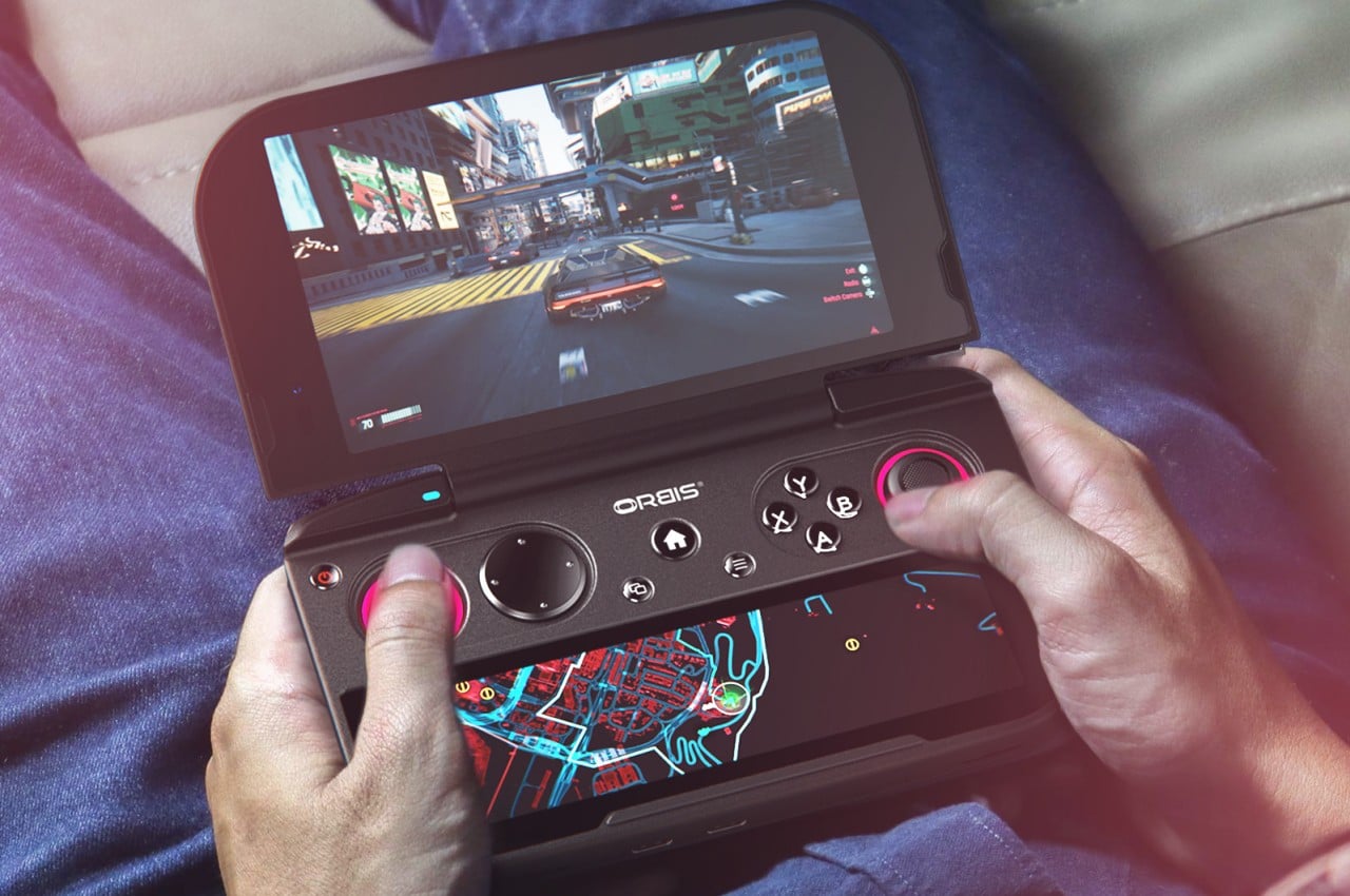
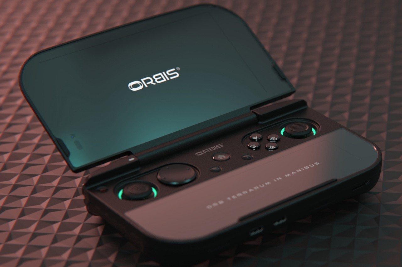
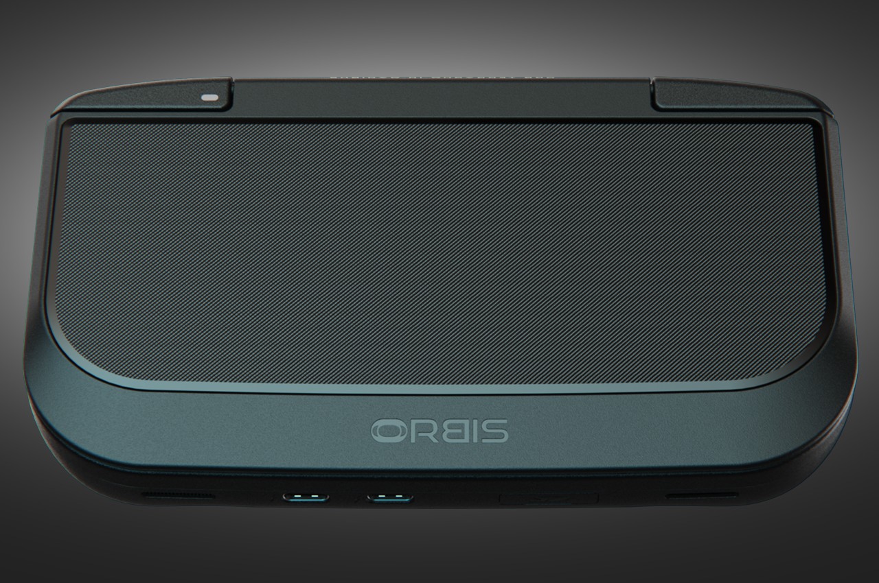
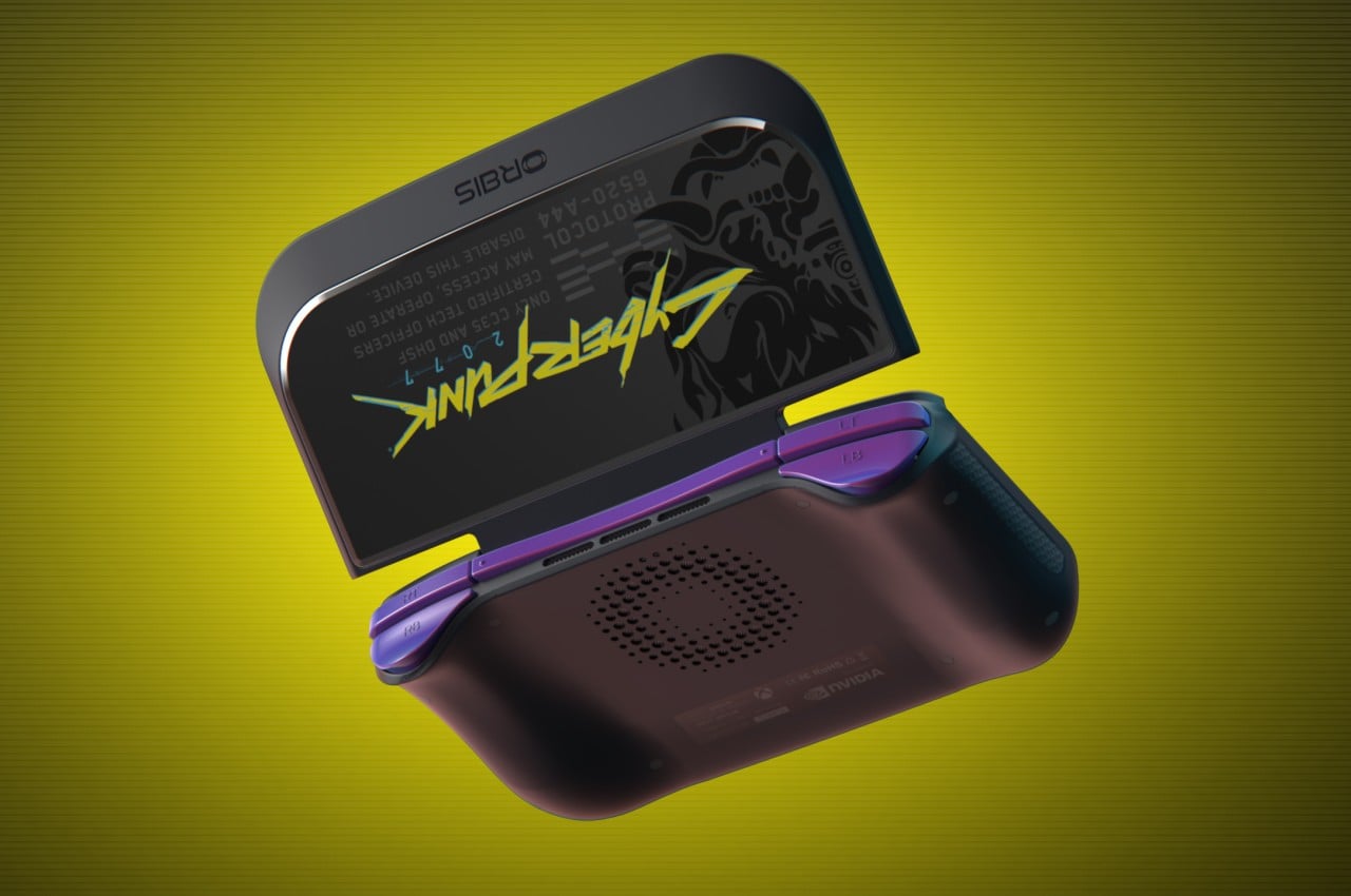
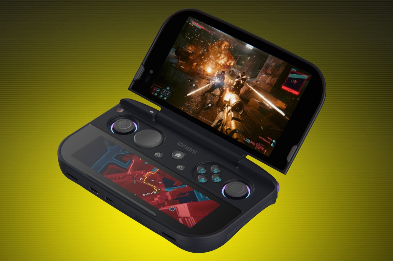
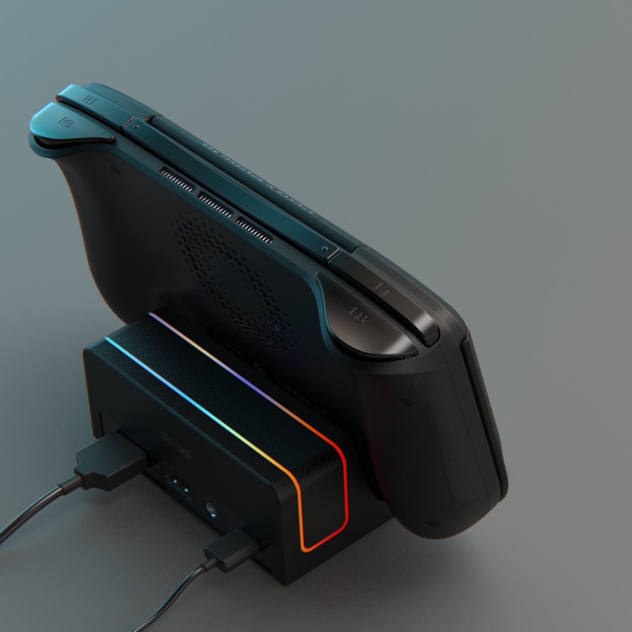
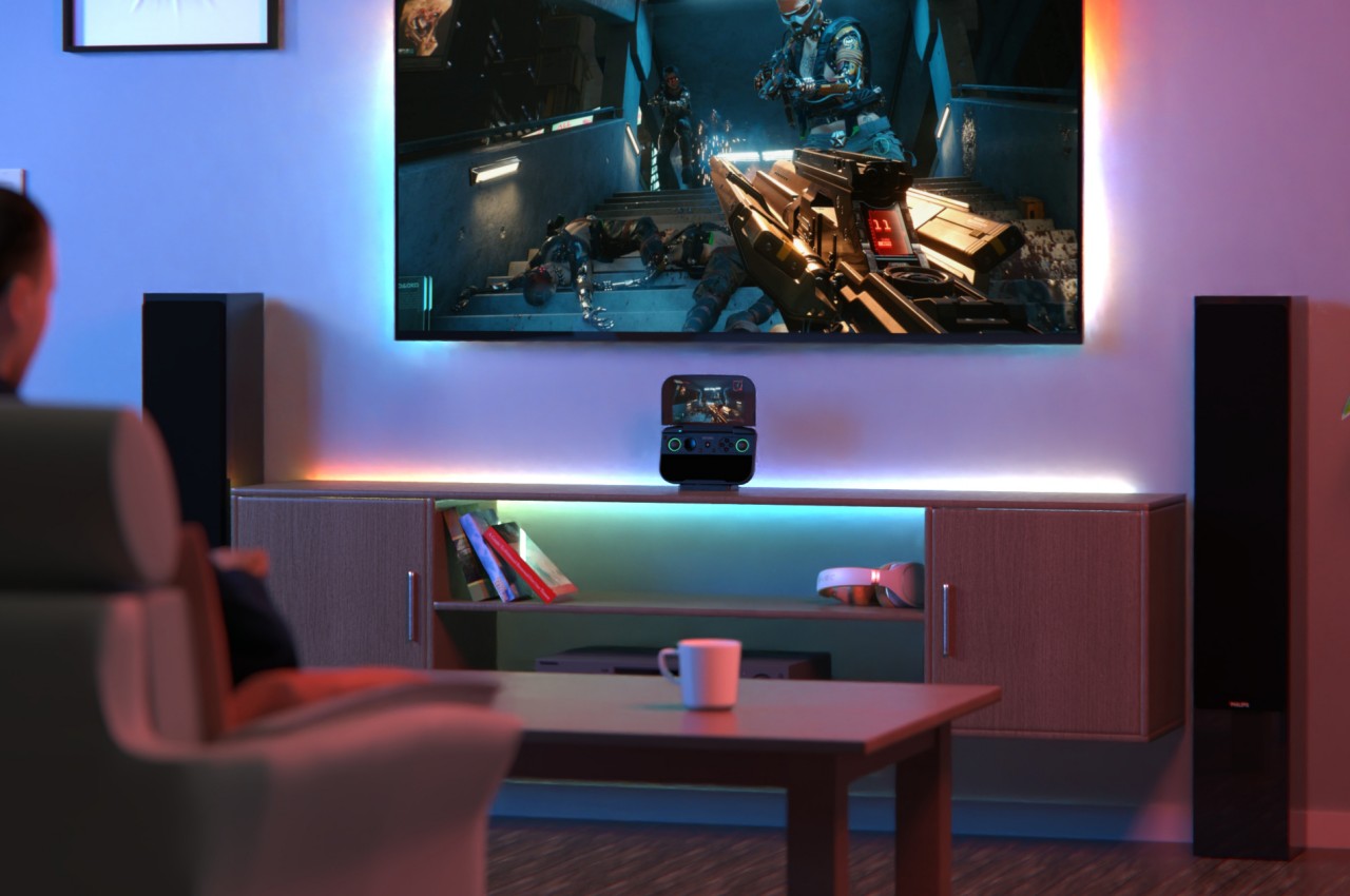
ORBIS, the name for this design concept, wouldn’t be the market’s first clamshell gaming handheld. Chinese brand GPD has been making such devices for years, and recently rival AYANEO even put out two designs for such a portable gaming machine, including one that tries to recreate the experience of the Nintendo DS. What ORBIS does differently, however, is how it gives as much attention on features that let users personalize the device’s appearance as on the specs that drive the use of the gaming computer.

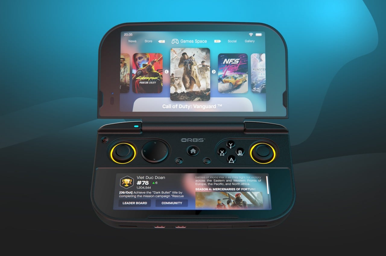
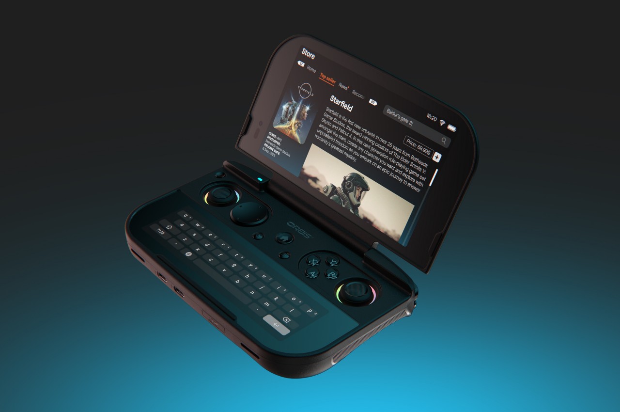
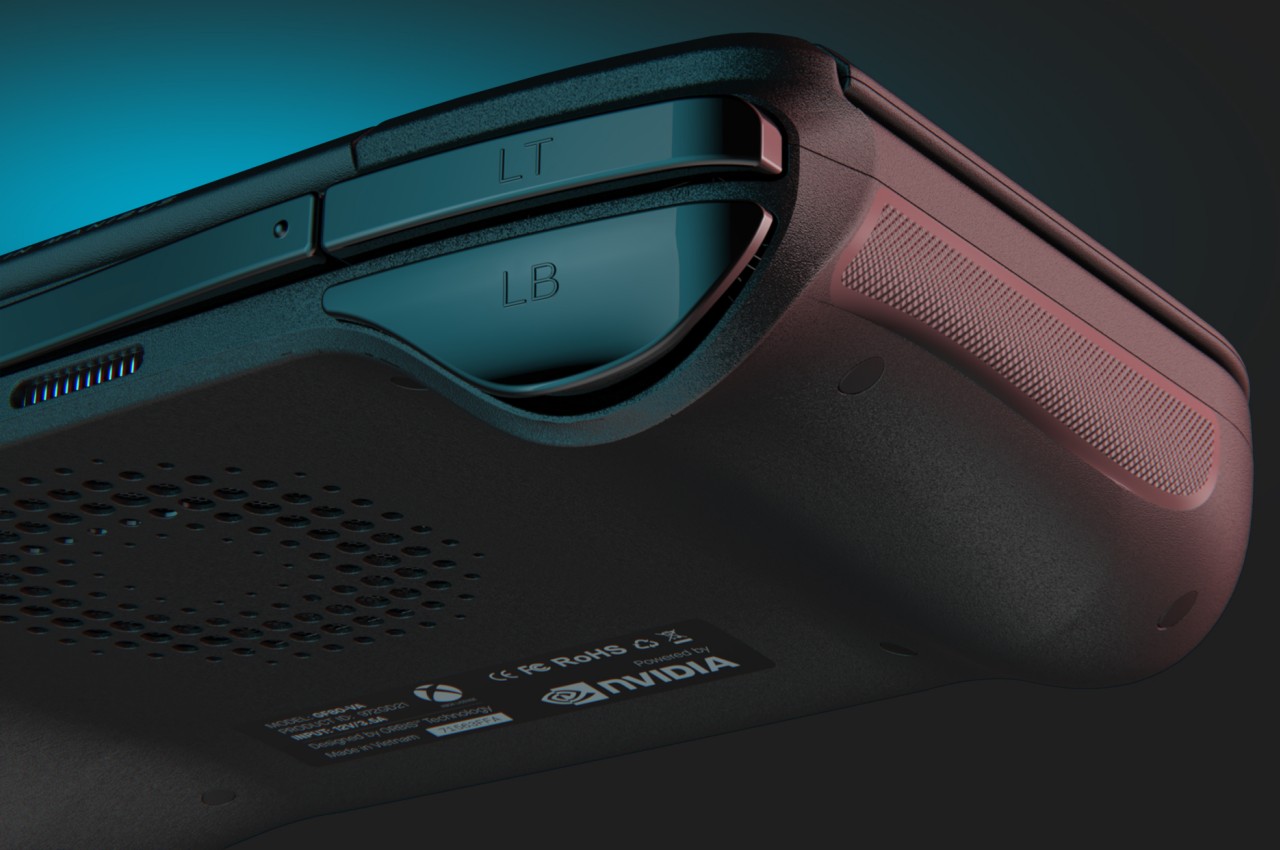
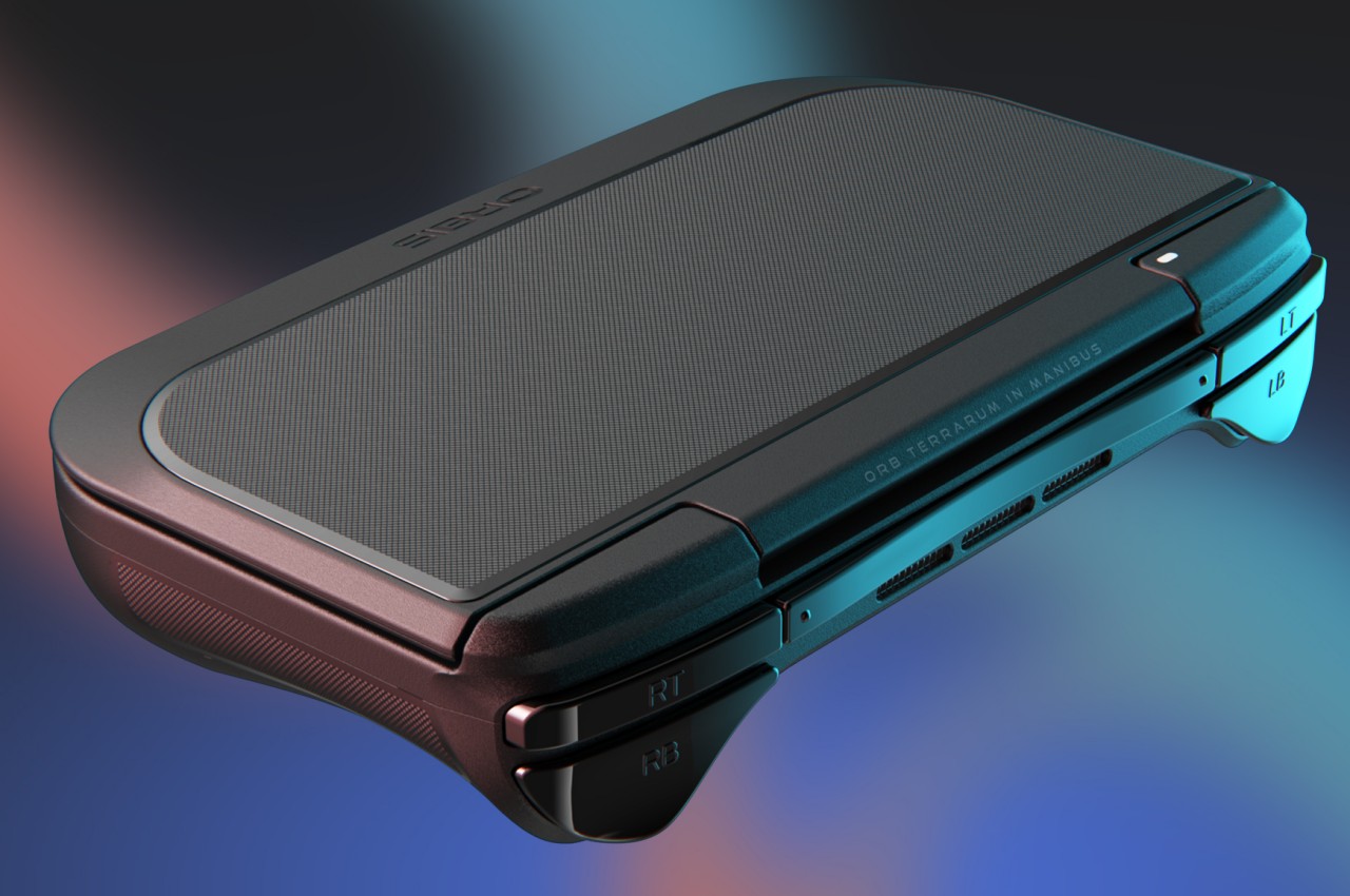
One simple yet significant example is how the removable ABS cover on the lid lets you customize the appearance of the device while also opening the doors to branded accessories. While you can also just slap on stickers like you would on a laptop, this system is more flexible, allowing users to swap out covers depending on their mood or style, just like how you could easily switch cases on smartphones. There is also RGB lighting encircling the analog sticks, delivering not only a gamer aesthetic but also increased visibility in the dark.

The ORBIS handheld takes a bit of inspiration from the Nintendo DS with its second screen right below the gamepad controls, but it also goes beyond what Nintendo’s popular handheld could accomplish. Because it is a gaming PC more than a closed console system, that touch screen can be used for different purposes, including a virtual keyboard. The typing experience will be awkward and difficult, yes, but it’s significantly better than what’s offered on the likes of the Steam Deck and ROG Ally.

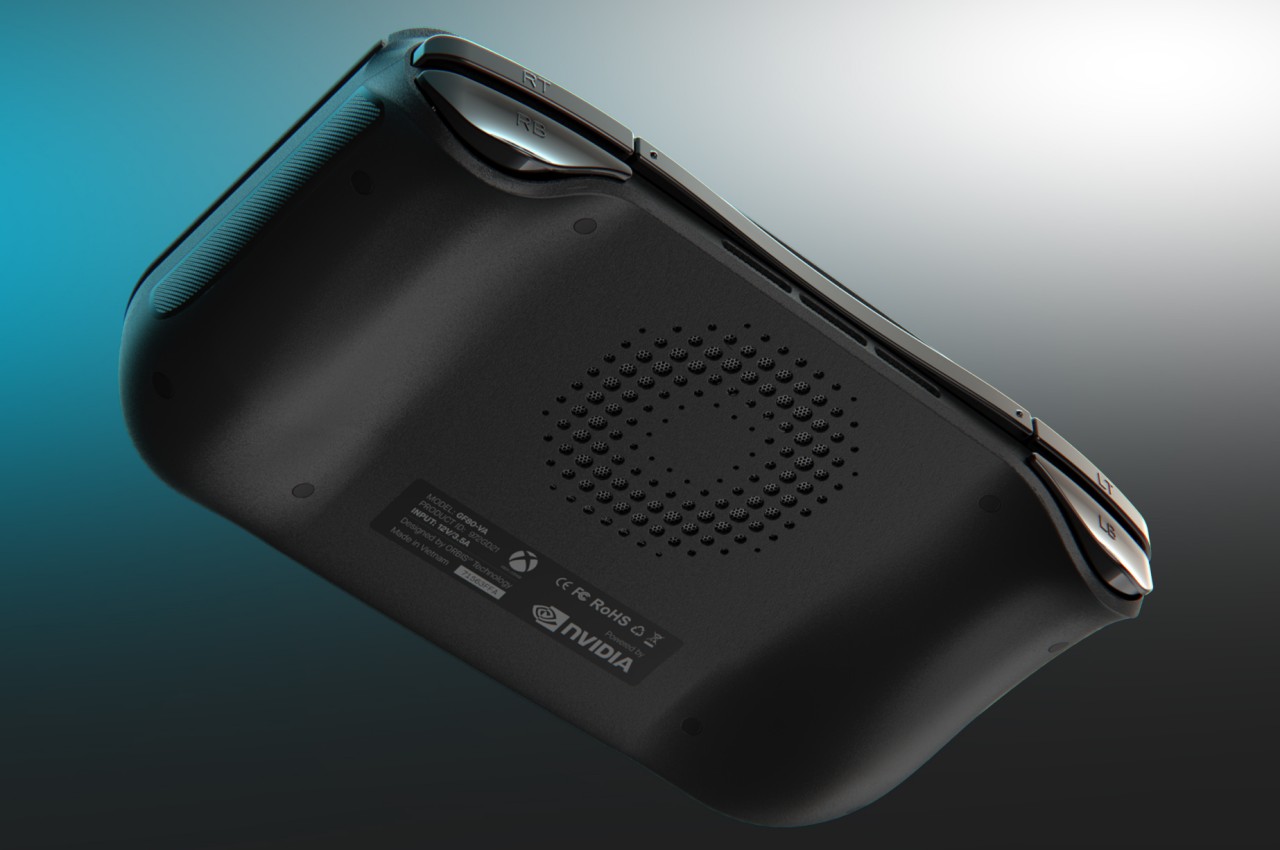
Admittedly, some parts of the ORBIS concept are a bit too idealistic, like the use of an ARM-based CPU (versus Intel or AMD) together with a high-end NVIDIA RTX graphics processor. Having two 5,200mAh batteries inside such a small and compact device is also unrealistic, without even considering things like thermal management and charging speeds. Of course, as a concept, it’s not wrong to sometimes shoot for the sky, and thankfully, some of the ideas here can actually be easily implemented, especially the parts that can significantly improve the user experience by simply allowing owners to customize their device to their hearts’ content.

The post Handheld gaming console concept offers lifestyle features that go beyond gaming first appeared on Yanko Design.

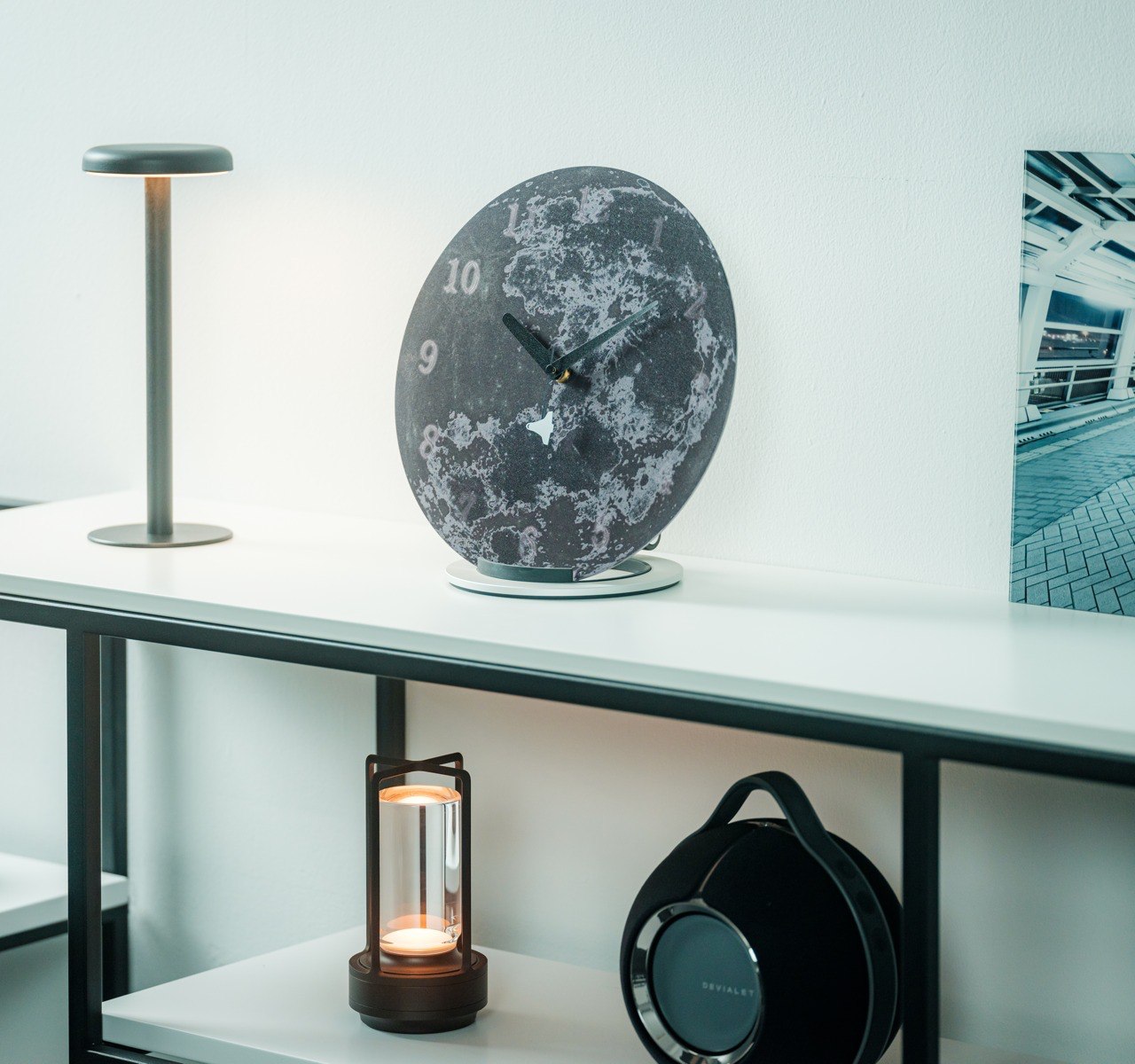
This sleek lunar wall clock adds some adventure to the ultimate space lover’s home

How many times do we look at a clock each day, whether it’s on a wall or on our wrists? Chances are, you don’t let an hour pass without looking at a watch or clock to check the time, even if it’s an ironic waste of time to do so again and again. Given that frequency, it’s essential for clock designs to not only be functional but also visually appealing, evoking a sense of calm and awe to offset the usual stress one carries when fretting over the time. Even better, clocks might even become sources of inspiration, providing not nagging reminders but gentle hints at how to live our lives to the fullest, not shackled by the tyranny of time. That’s the subtle message that this beautiful minimalist lunar-themed clock tries to convey, reminding the observer of man’s aspirations to break free of Earth’s gravity and reach for the moon and beyond.

Designer: Sora no Kakera

Click Here to Buy Now: $275 $325 (15% off at checkout & Free Shipping). Hurry, Earth Day sales end in 48 hours!

The moon has always been a thing of beauty and mystery, its pockmarked face bearing witness to the history of our celestial neighborhood as it gracefully illuminates the night sky. It is also the nearest heavenly object we can reach, and unsurprisingly, the object of many space travel achievements and fantasies. It seems only fitting that it would be the inspiration for a clock that invites you to make a trip to the moon, even if only in your head, at each moment you check the time.

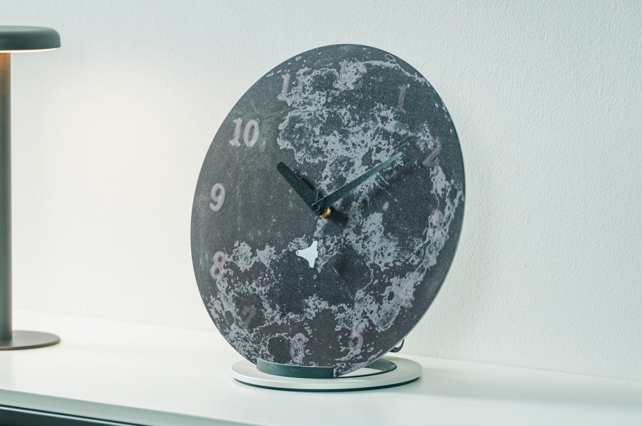
Made from stainless steel finished with a mirror-like polish, this Moon Trip Clock displays the seemingly magical visage of the moon, half bathed in light and the other in darkness. Although the image of the moon is accurate, it isn’t aiming for a scientific illustration that clearly lays out the topography of the moon. Instead, it is trying to bring the otherworldly charm of the moon to your wall and your living space.

The numbers that line the edges of the metal disc look as if they’re floating rather than etched or glued to the surface. At some point, they even seem to disappear, only to reappear again at another location, mimicking the eternal waning and waxing of the moon. This visual effect is possible thanks to a special polishing technique, adding an air of mystery to the already enchanting lunar design.

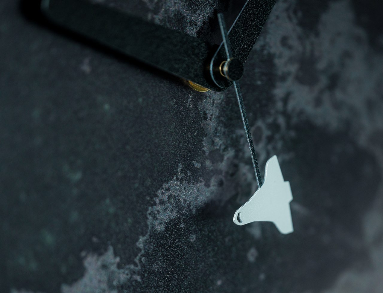
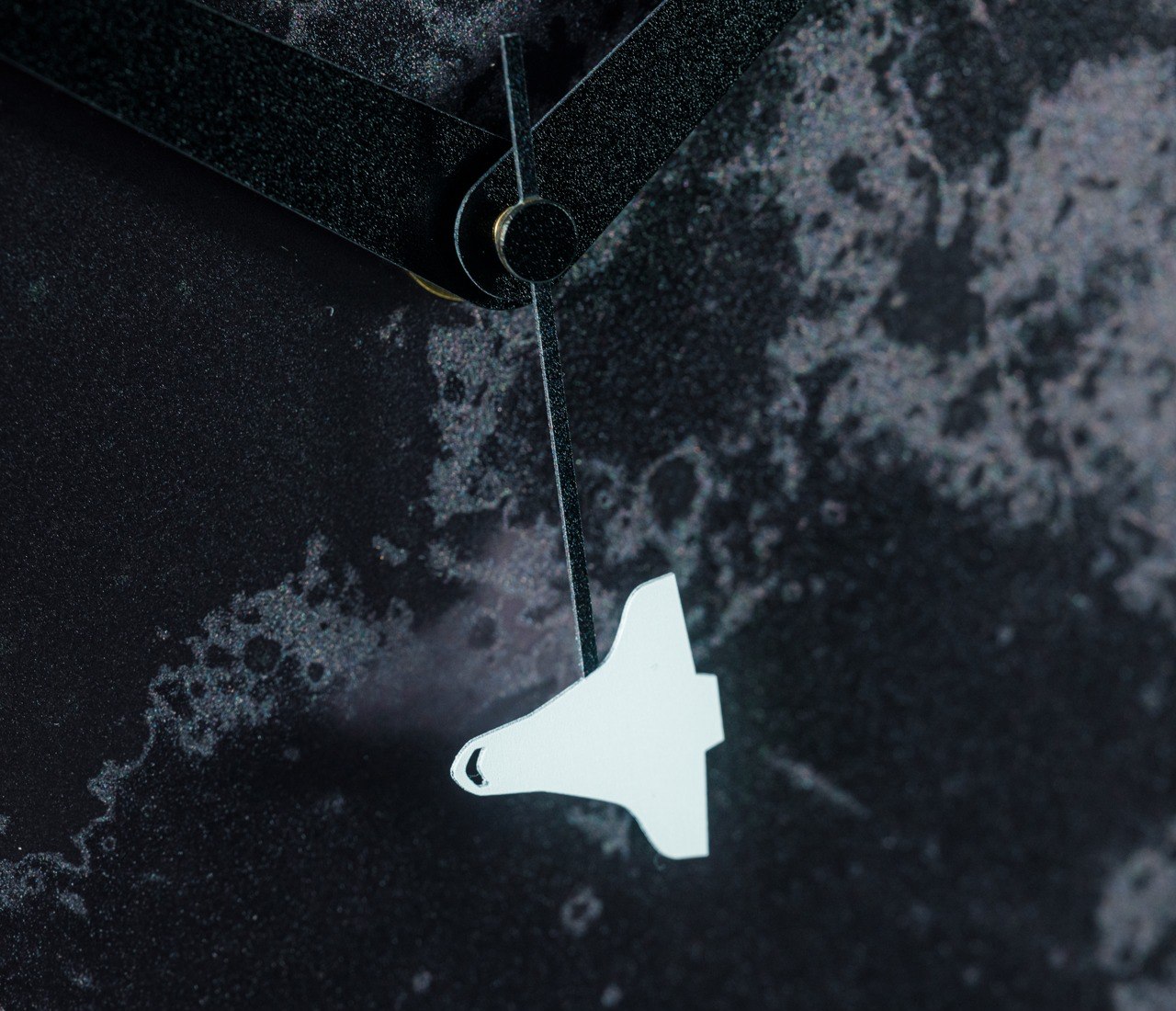
And when you start to really look at the time, you will be greeted by a charming yet meaningful detail that tickles the mind into a more thoughtful state. While the hour and minute hands are simple yet elegant bars, the seconds hand has the shape of a rocket ship at its tip. You’re tempted to watch this spacecraft make its way around the clock at each tick, perhaps making you reminisce of old childhood dreams of conquering the moon and beyond like an adventurous explorer. That may just be a fantasy, but this lovely Lunar Voyage Clock reminds you not to let opportunities pass and to live your life to the fullest, shooting for the stars and making your dreams come true.

Click Here to Buy Now: $275 $325 (15% off at checkout & Free Shipping). Hurry, Earth Day sales end in 48 hours!

The post This sleek lunar wall clock adds some adventure to the ultimate space lover’s home first appeared on Yanko Design.

This sleek lunar wall clock adds some adventure to the ultimate space lover’s home

How many times do we look at a clock each day, whether it’s on a wall or on our wrists? Chances are, you don’t let an hour pass without looking at a watch or clock to check the time, even if it’s an ironic waste of time to do so again and again. Given that frequency, it’s essential for clock designs to not only be functional but also visually appealing, evoking a sense of calm and awe to offset the usual stress one carries when fretting over the time. Even better, clocks might even become sources of inspiration, providing not nagging reminders but gentle hints at how to live our lives to the fullest, not shackled by the tyranny of time. That’s the subtle message that this beautiful minimalist lunar-themed clock tries to convey, reminding the observer of man’s aspirations to break free of Earth’s gravity and reach for the moon and beyond.

Designer: Sora no Kakera

Click Here to Buy Now: $275 $325 (15% off at checkout & Free Shipping). Hurry, Earth Day sales end in 48 hours!

The moon has always been a thing of beauty and mystery, its pockmarked face bearing witness to the history of our celestial neighborhood as it gracefully illuminates the night sky. It is also the nearest heavenly object we can reach, and unsurprisingly, the object of many space travel achievements and fantasies. It seems only fitting that it would be the inspiration for a clock that invites you to make a trip to the moon, even if only in your head, at each moment you check the time.

Made from stainless steel finished with a mirror-like polish, this Moon Trip Clock displays the seemingly magical visage of the moon, half bathed in light and the other in darkness. Although the image of the moon is accurate, it isn’t aiming for a scientific illustration that clearly lays out the topography of the moon. Instead, it is trying to bring the otherworldly charm of the moon to your wall and your living space.

The numbers that line the edges of the metal disc look as if they’re floating rather than etched or glued to the surface. At some point, they even seem to disappear, only to reappear again at another location, mimicking the eternal waning and waxing of the moon. This visual effect is possible thanks to a special polishing technique, adding an air of mystery to the already enchanting lunar design.

And when you start to really look at the time, you will be greeted by a charming yet meaningful detail that tickles the mind into a more thoughtful state. While the hour and minute hands are simple yet elegant bars, the seconds hand has the shape of a rocket ship at its tip. You’re tempted to watch this spacecraft make its way around the clock at each tick, perhaps making you reminisce of old childhood dreams of conquering the moon and beyond like an adventurous explorer. That may just be a fantasy, but this lovely Lunar Voyage Clock reminds you not to let opportunities pass and to live your life to the fullest, shooting for the stars and making your dreams come true.

Click Here to Buy Now: $275 $325 (15% off at checkout & Free Shipping). Hurry, Earth Day sales end in 48 hours!

The post This sleek lunar wall clock adds some adventure to the ultimate space lover’s home first appeared on Yanko Design.

3D vases pop up from this book to add some minimal geometric designs to your home decor

Flowers are things of beauty, whether it’s a single stem or a dozen heads. They have a naturally enchanting appearance that almost makes them feel like they come from a different world, one that’s filled with color, magic, and dreams. Those are the things that fairy tales are made of, so it’s not surprising that flowers often play an important role in these literally fantastic stories, even if just to create that mystical atmosphere. It may just be fiction, but you can bring a bit of that magic to your home with this elegant book that transforms into an enchanting pop-up vase that makes it look like your flowers are magically growing from the book, creating an atmosphere of awe and wonder at every turn of the page.

Designer: Hideaki Miyauchi

Click Here to Buy Now: $39

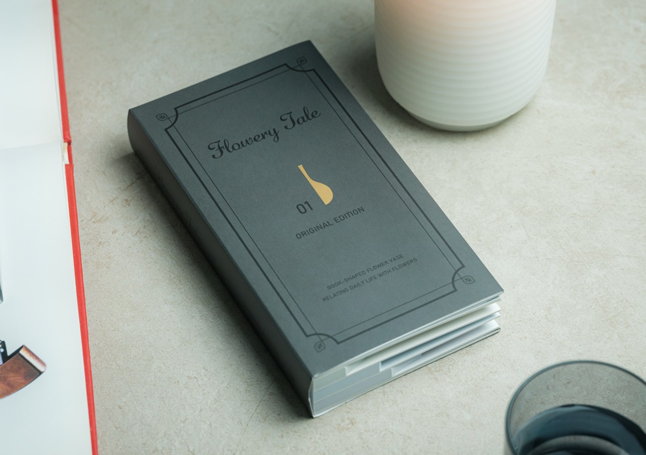
A vase is traditionally made of glass, ceramic, clay, or even plastic, basically any rigid material that creates a stable vessel for flowers to stand in. These are also naturally water-resistant since the plants will need water to survive longer. The last thing you’d expect is for a vase to be made out of paper, let alone one that pops out from a book like one of those kids’ fairy tale books, but that’s exactly the enchanting story that this Flowery Tale vase wants to tell.

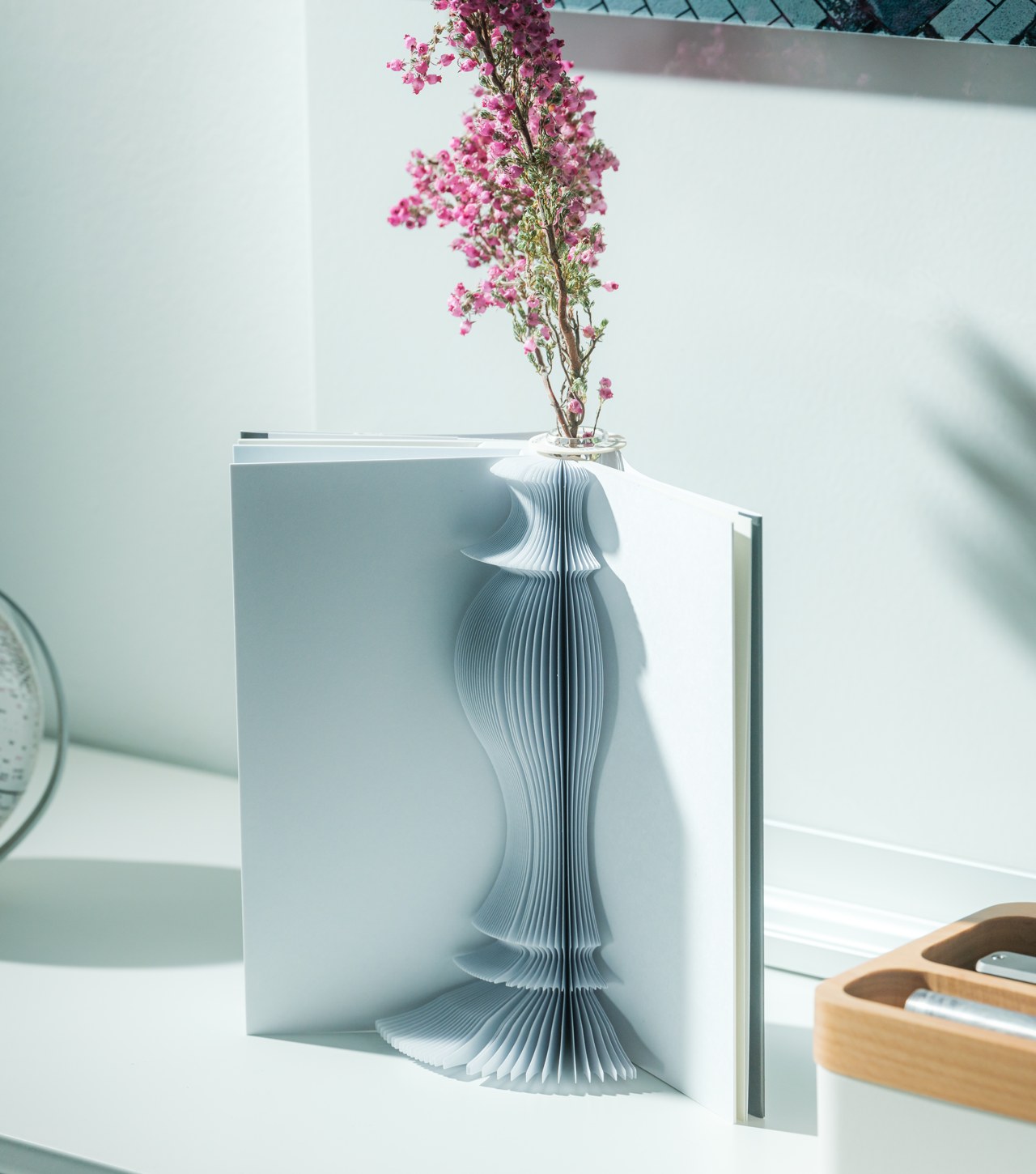
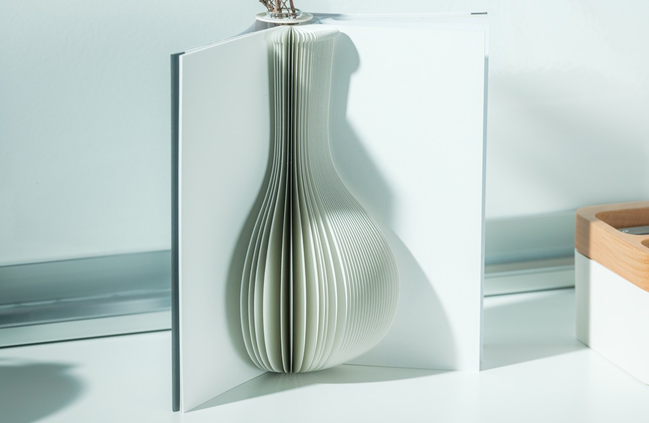
When you turn over the cover, you’re immediately greeted by a 3D silhouette of a vase cut out from the pages of the book. Turn the page and you’ll behold yet another vase design, equally graceful and beautiful as the first. A third design awaits you on another page, giving you the power to choose how you’d like the day’s floral arrangement to be. Even better, you can turn the book upside and it will still work as a proper vase, which means you have six possible variations to choose from.

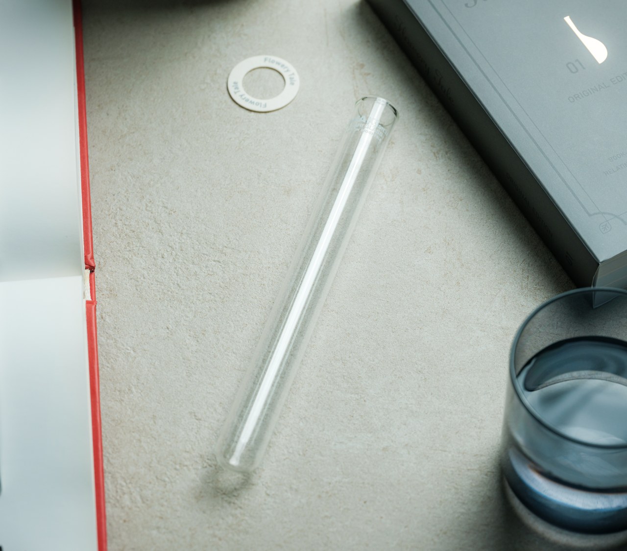
The magic behind it is actually the glass tube that you insert into the spine of the book to hold the flower and the bit of water to keep the plant alive for a few more days. The tube can be inserted right side up or upside down and it will work just fine. All vase designs, however, have a narrow silhouette on the “top” and a larger shape at the “bottom,” so you can choose which side to use depending on the volume of the flowers you intend to place.

The pages of the book are made from 100% natural pulp paper, but you don’t have to fret about accidentally splashing it with water thanks to the “OK Rain Guard” water-resistant coating applied to the material. Whether you want to highlight a single flower or impress with a bouquet, this creative Pop-up Book Vase will set the perfect stage for your design and the epic story that is your life.

Click Here to Buy Now: $39

The post 3D vases pop up from this book to add some minimal geometric designs to your home decor first appeared on Yanko Design.

Samsung Galaxy Z Fold 6: News, Rumors, Price, and Dates

Foldable phones aren’t going anywhere, at least not yet. They might not be generating much hype nowadays, but they still stir up a flurry whenever a new model launches. There’s definitely plenty of room for improvement not just in specs but also in design, and we indeed see some brands playing around with those elements a bit. Although there are now more foldable phones available, Samsung is still the undisputed leader even if by virtue of its industry clout only. Of course, its dominance is being challenged by competitors whose designs are addressing many of the flaws and limitations of the Galaxy Z Fold, which is why all eyes are on how Samsung will respond in kind this year. We might be just three months away from the launch of the Galaxy Z Fold 6, so we’ve gathered in one place all the details we know so far to paint a more complete picture of what to expect from one of the pioneers of this still niche market.

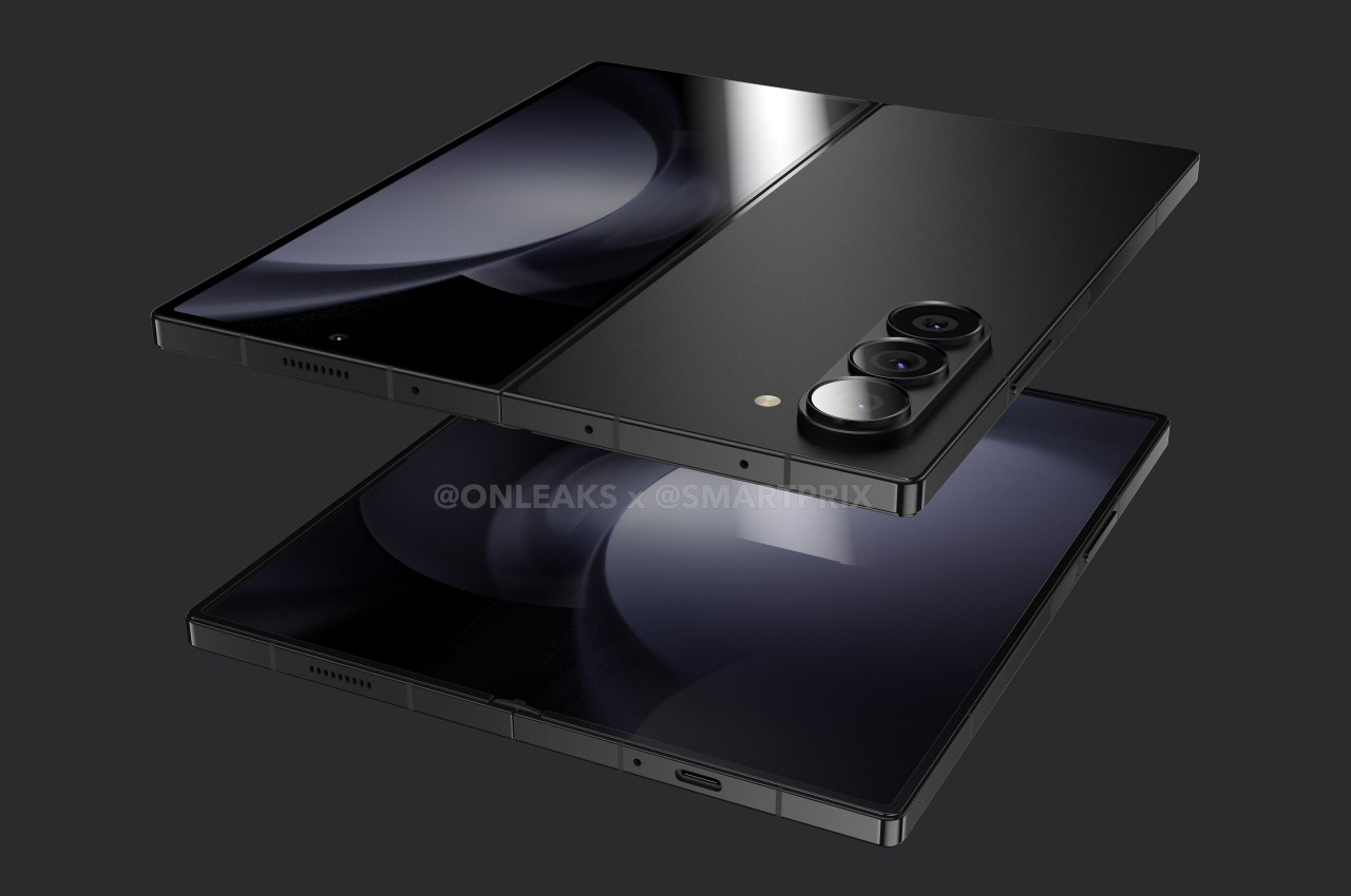
Designer: Samsung (renders courtesy of Smartprix and Steve Hemmerstoffer/@OnLeaks)

Galaxy Z Fold 6: Design

The way a foldable phone works sounds almost so easy, but the reality is that it’s a hellish design to implement given the delicate balancing act that designers and engineers have to make. How do you design a smartphone that can be as big as a small tablet yet still be comfortable to use as a regular phone? To be perfectly blunt, Samsung failed to hit the mark with its first generation of foldables, but it seems to be inching closer to a better solution with each iteration.

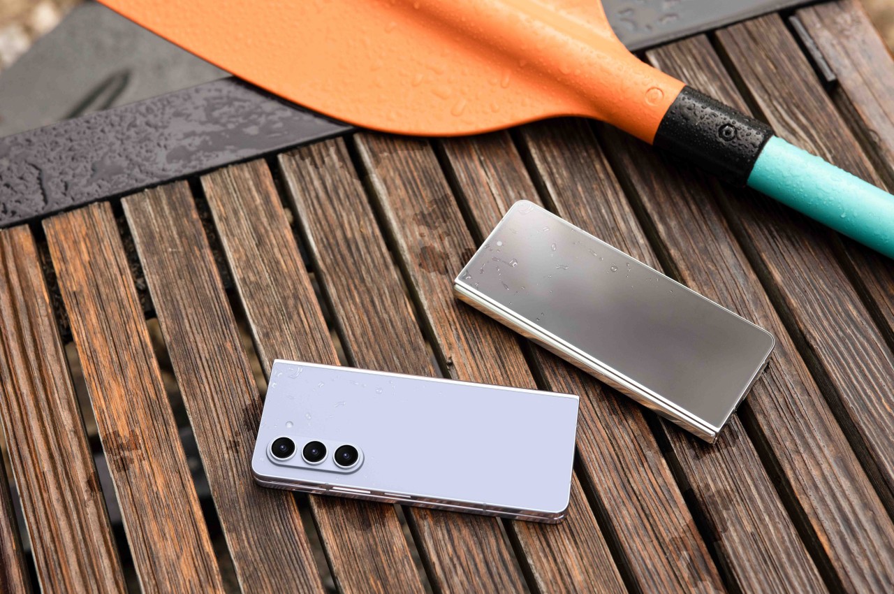
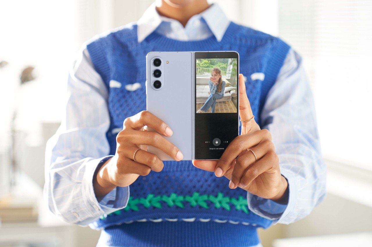
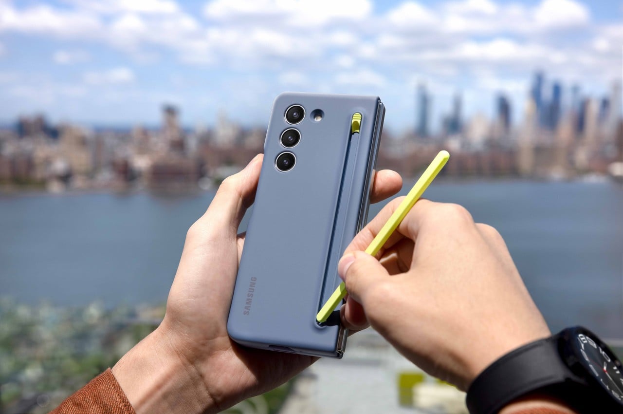
Samsung Galaxy Z Fold 5

Samsung Galaxy Z Fold 5

Designer: Samsung

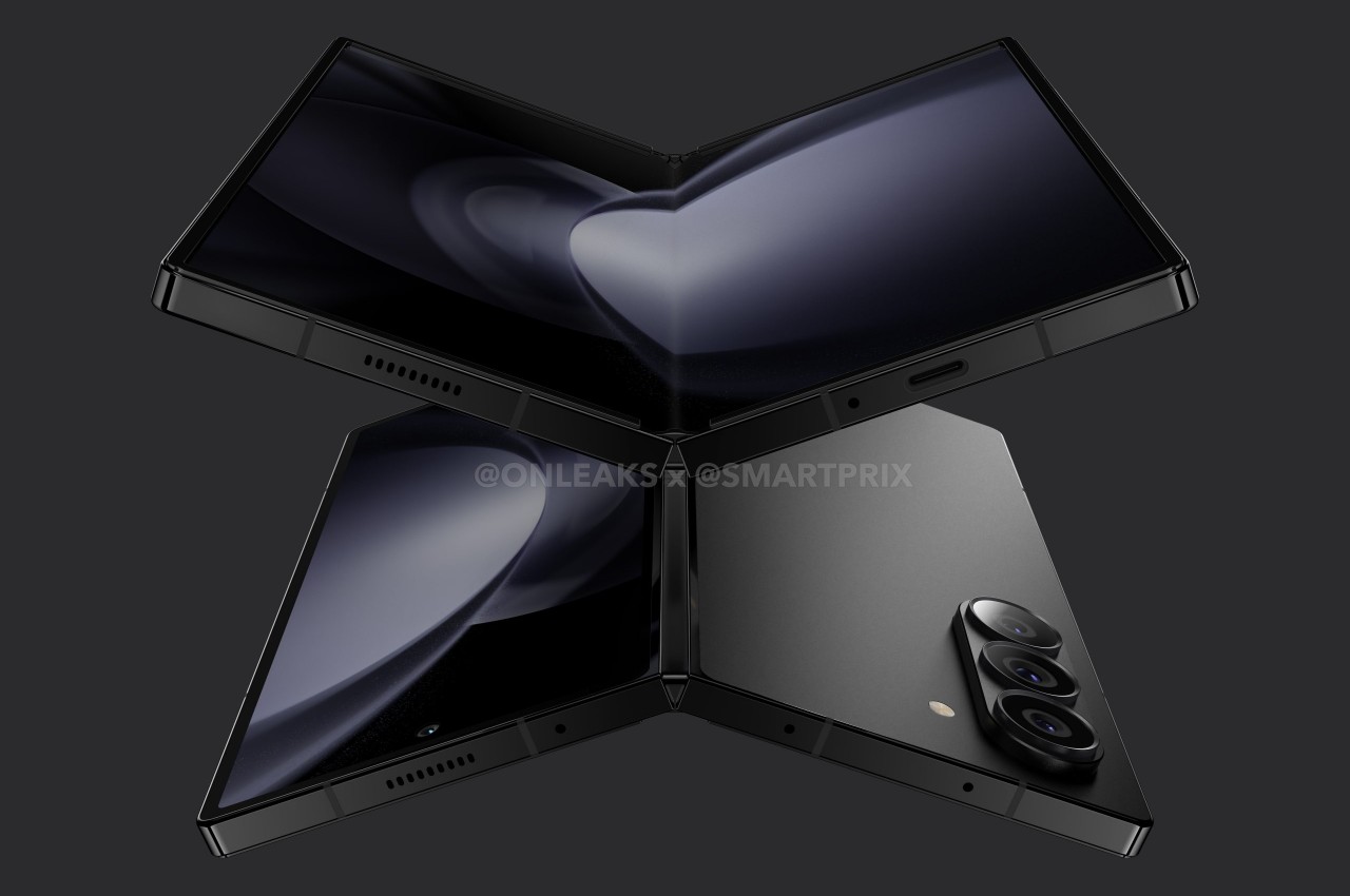
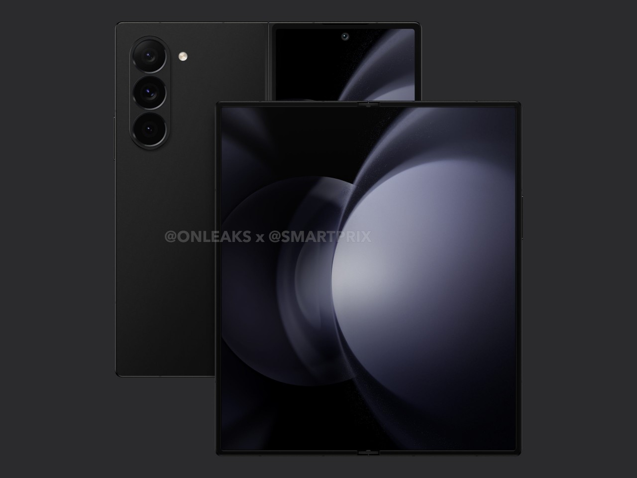
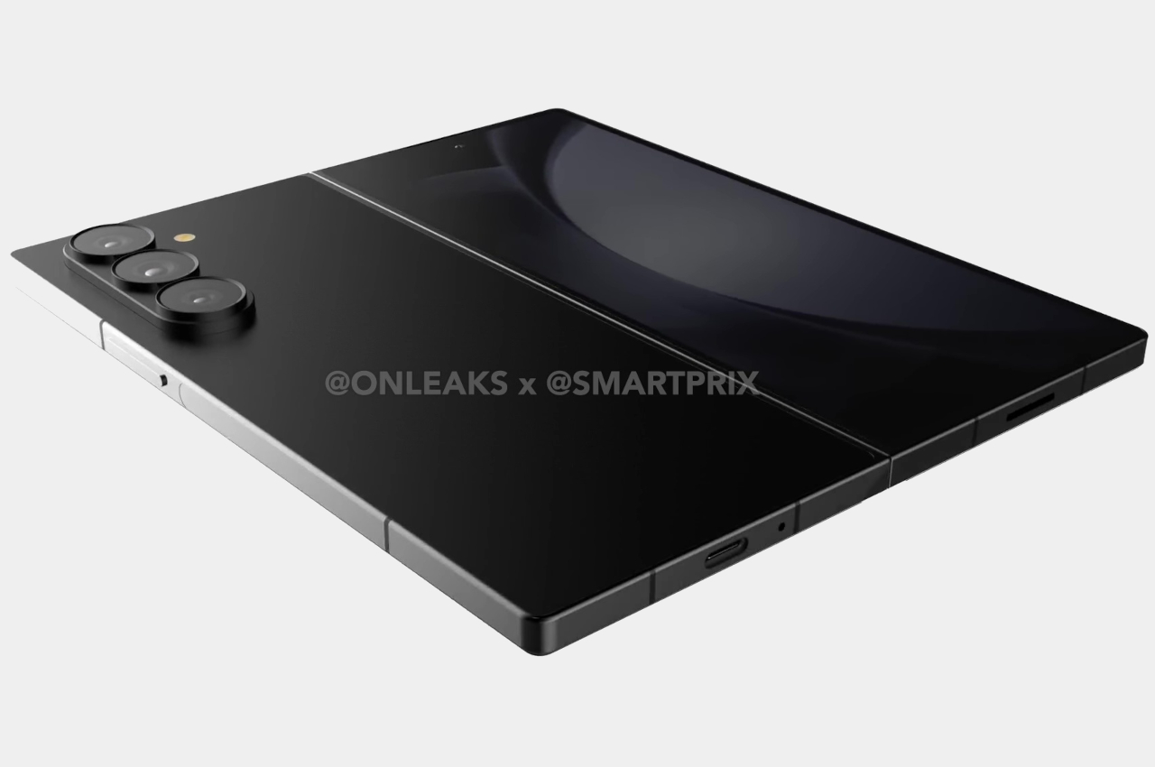
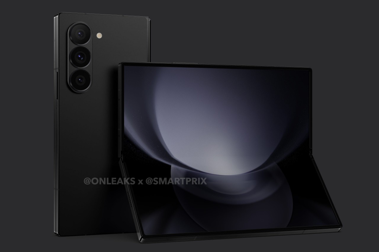
According to the accumulated leaks and rumors, the Galaxy Z Fold 6 will be making some rather small but significant changes to the formula. There are some disagreements on exact figures, but the consensus is that Samsung’s 2024 large foldable will have a wider external Cover Screen, a thinner and lighter frame, flatter edges, and sharper corners. These minuscule changes all add up to make the Galaxy Z Fold 6 resemble its Galaxy S cousin more.

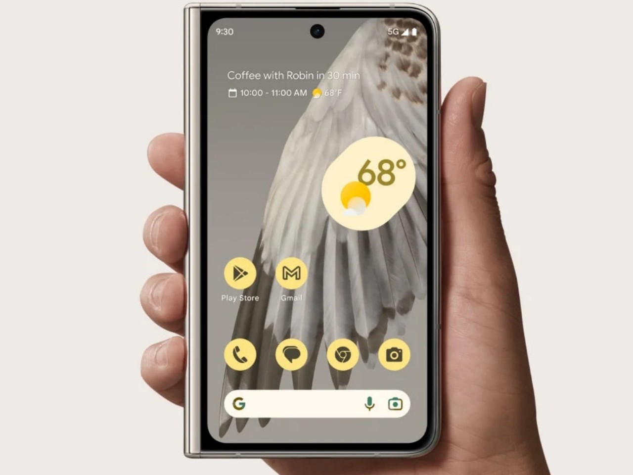
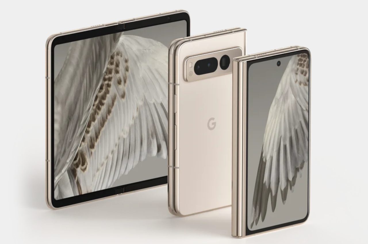
The wider outer display will have a big impact on usability, even if the screen size itself doesn’t change. The new aspect ratio would make the phone less awkward to use as a regular phone when folded, one of the biggest and still present criticisms of Samsung’s foldable design. This does mean that the unfolded shape will be more square this time, resembling the form that other foldable phones have taken. That said, based on some of the leaked measurements, it will still not be as wide as the Google Pixel Fold or OnePlus Open which are considered to have the better design on this aspect.

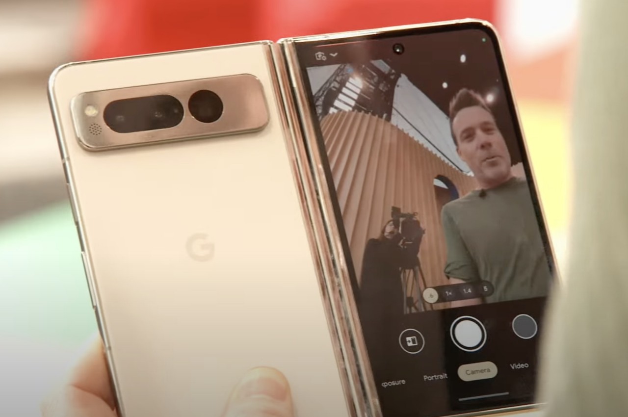
Google Pixel Fold

Google Pixel Fold

Google Pixel Fold

Designer: Google

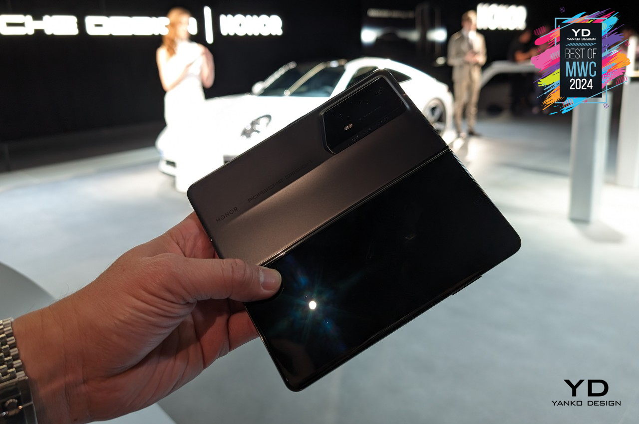
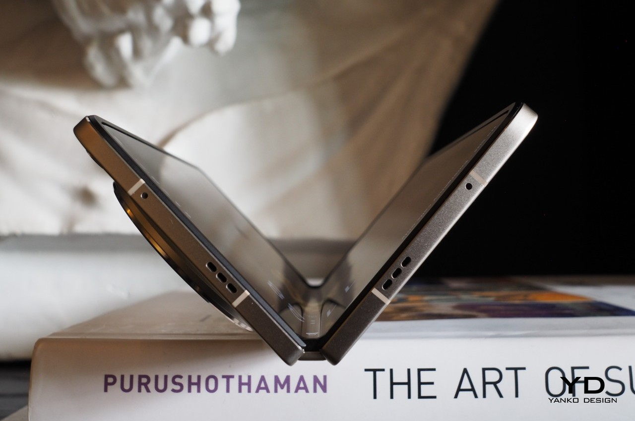
The Galaxy Z Fold 6 is also expected to be thinner (5.6mm folded, 12.1mm unfolded) and lighter (239g) than any of its predecessors. This improvement is, again, based on the design of the Galaxy Z Fold before it (6.1mm folded, 13.4mm unfolded, 253g weight), but not against other brands. The recently launched Honor Magic V2 probably holds the title of thinnest and lightest foldable, but its limited availability makes that pointless for some markets. One side effect of a thinner body, however, is that there will still be no room for an integrated S Pen, something Samsung loyals have been wishing for since the Galaxy Z Fold 3.

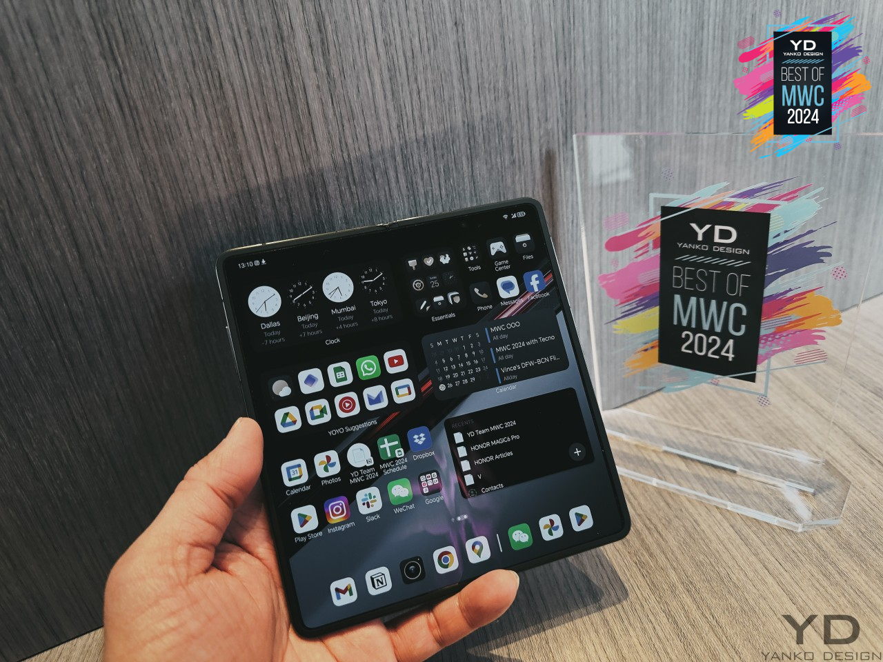
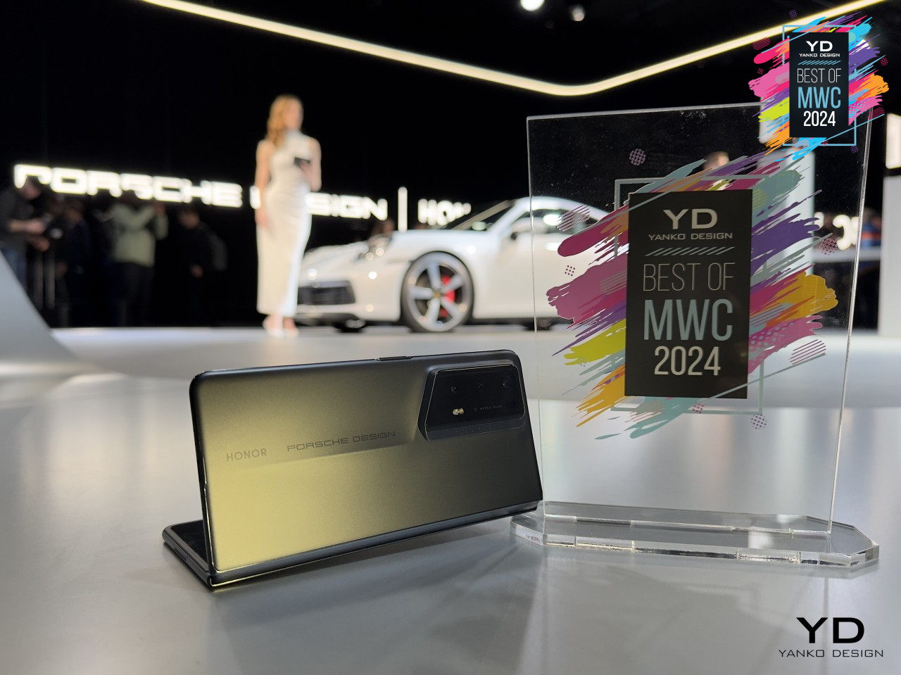
Honor Magic V2 RSR Porsche Design

Honor Magic V2 RSR Porsche Design

Honor Magic V2 RSR Porsche Design

Designer: Honor

There are rumors of an “ultra” model for the Galaxy Z Fold 6 where Samsung will pull out most of the stops. If true, this could be a titanium-clad model, in line with the Galaxy S24 Ultra and the general trend in the industry. Of course, this would also raise prices higher, especially if the so-called Galaxy Z Fold 6 Ultra will include other upgrades as well.

Samsung Galaxy Z Fold 5

Galaxy Z Fold 6: Specs and Software

Samsung always gives its flagship products the best specs available in the market, and the Galaxy Z Fold 6 won’t be any different. The question, however, is whether Samsung’s idea of “best” matches the expectations of buyers. This year, we’ll be looking at another iterative upgrade, and some consumers might not be that amused.

The latest Qualcomm Snapdragon 8 Gen 3 is a no-brainer for a 2024 flagship, and we haven’t heard any whispers of a special version custom-made for Samsung or the foldable. What might not see a big jump, however, is the memory that comes with the phone. RAM will be capped at 12GB yet again, with storage coming in 256GB and 512GB capacities. It’s probably high time that we get a 16GB RAM, 1TB storage Galaxy Z Fold, but that might not be on the table unless those “Ultra” model rumors pan out.

The battery is yet another aspect that is unlikely to see any changes. Although a 4,600mAh battery was earlier rumored, a thinner and lighter design would probably make more sense if Samsung sticks to the same 4,400mAh pack. Unfortunately, charging technologies aren’t expected to change either and new owners will be stuck with the same 25W wired and 15W wireless charging speeds.

Given the expected timing of the launch, the Galaxy Z Fold 6 will be launching with the latest One UI 6.1 version that will still be based on the current Android 14 release. It will mostly be the same user experience on the Galaxy S24, just with some foldable-specific features mixed in. Do expect that Samsung will heavily advertise AI features as well, especially those that it wasn’t able to focus on earlier this year.

Galaxy Z Fold 6: Cameras

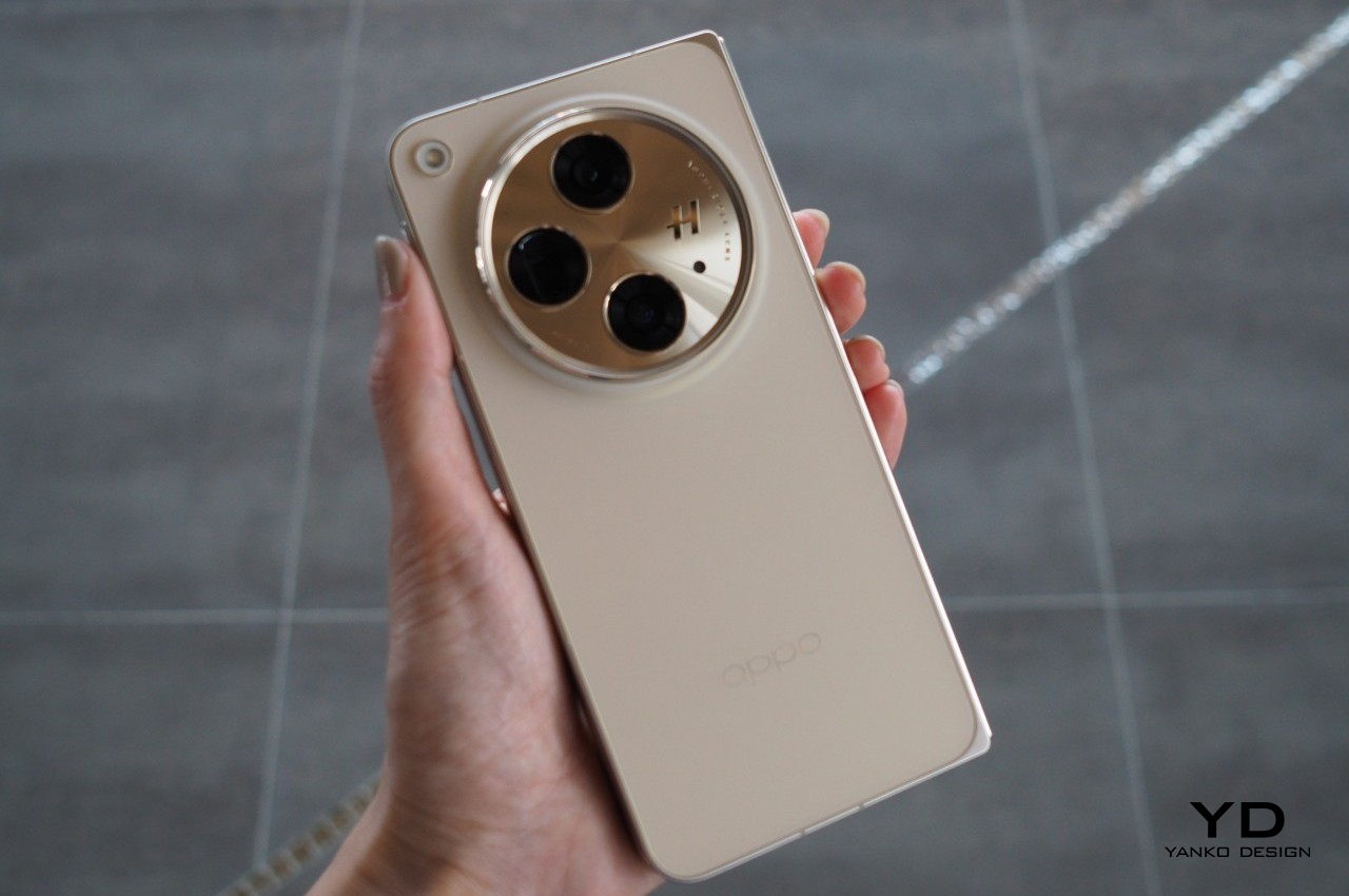
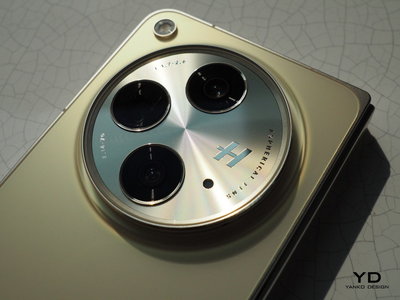
While the incremental upgrades to specs can be forgiven, the biggest Achilles’ heel of this year’s Samsung foldable will be its cameras. Contrary to expectations and wishes, the Galaxy Z Fold 6 is now believed to use the exact same set of cameras that came with the Galaxy Z Fold 5 last year. That means a 50MP main camera, a 10MP 3x zoom telephoto, and a 12MP ultra-wide. The under-display camera under the foldable screen is expected to see performance improvements but still have the same 4MP sensor.

While it’s true that you can squeeze out impressive images from such sensors using software and algorithms, you can only go so far with relatively weaker hardware. The bigger question is why Samsung is unable to use better cameras when almost all its competitors can. Thickness is definitely not an issue and it’s not like Samsung’s foldables are less expensive than other foldables, so one can only wonder about the company’s reasons.

OPPO Find N3

OPPO Find N3

OPPO Find N3

Designer: OPPO

That said, it could be setting the stage for the rumored Galaxy Z Fold 6 Ultra that’s said to resemble the Galaxy S24 Ultra in some ways. In addition to a titanium frame, this Ultra foldable might borrow the 200MP camera of Samsung’s early 2024 flagship. That, however, might mean changing the foldable phone’s dimensions, particularly its thickness, so there’s a very slim chance that will be the case.

Galaxy Z Fold 6: Price and Launch Date

Samsung seems to be holding its second Galaxy Unboxed event earlier each year, especially now that it has retired the Galaxy Note line. The Galaxy Z Fold 5 was announced in late July last year, with the actual shipments starting around August. This year might follow the same pattern with the announcement happening around the second week of July. This earlier date might also be due to Samsung trying to avoid clashing with the 2024 Summer Olympics, where it could be a major sponsor and advertise the Galaxy Z Fold 6 heavily during the event.

We’re not expecting any price changes this year at least, especially since there aren’t any big changes happening. The past few foldable flagships launched at $1,800, and that could still be the same starting price for a 12GB RAM, 256GB storage configuration. That said, if there is an Ultra model, the pricing scheme could shift a bit and be a bit more complicated. The base Galaxy Z Fold 6 could start at $1,700 instead, while the Ultra model with its titanium design and higher specs might hit $2,000.

Galaxy Z Fold 6: Final Thoughts

It looks like Samsung fans will be facing another iterative cycle this year as far as the Galaxy Z Fold 6 is concerned. While there will be marked improvements in terms of performance and design, some of the pain points current owners have remained unaddressed. Hopefully, the wider Cover Screen aspect ratio will indeed improve the phone’s overall usability, the change might be a bit too subtle to matter. Photography is where the Galaxy Z Fold 6 will hurt the most, and Samsung has to prove that it can pull out a rabbit from its hat using these aging camera sensors.

Although Samsung leads the smartphone industry because of its wide reach and prestige, it is risking that advantage by sitting on its laurels for too long in the foldable market. Although some of its competitors aren’t available in major markets where Samsung plays, they do drive home the flaws in Samsung’s design. If these brands can achieve something that a giant like Samsung can’t, then people will start losing confidence in the brand’s products, creating a self-fulfilling prophecy of weaker sales for the Galaxy Z Fold line.

The post Samsung Galaxy Z Fold 6: News, Rumors, Price, and Dates first appeared on Yanko Design.

Nothing Ear and Ear (a) Buds Review: It’s Nothing To Scoff At

PROS:


  • Vibrant and more ergonomic Nothing Ear (a) design

  • Beautiful, eye-catching design with a competitive price tag

  • Quality audio output with plenty of convenient smart features

CONS:


  • Nothing Ear only available in Black or White options

  • Nothing Ear (a) case only has IPX2 water resistance


RATINGS:

AESTHETICS
ERGONOMICS
PERFORMANCE
SUSTAINABILITY / REPAIRABILITY
VALUE FOR MONEY

EDITOR'S QUOTE:

The Nothing Ear and Ear (a) builds on an already successful formula without straying from the brand's design identity.

It’s not unusual to see a company take a different direction after it launches a successful product or two. Improvements have to be made, of course, but there are times when upgrades turn into almost completely different products that seem to stray away from what made those successful designs successful. By renaming its earbuds to a simple “Ear” and dropping the number after it, some might think that Nothing has gone back to the drawing board to rebrand and redesign. Fortunately, there’s nothing to worry about since the new Ear and Ear (a) look almost exactly the same, so we give it a test to see, or rather hear, if its beauty is skin deep or if it’s something you’ll want to listen to.

Designer: Nothing
Aesthetics

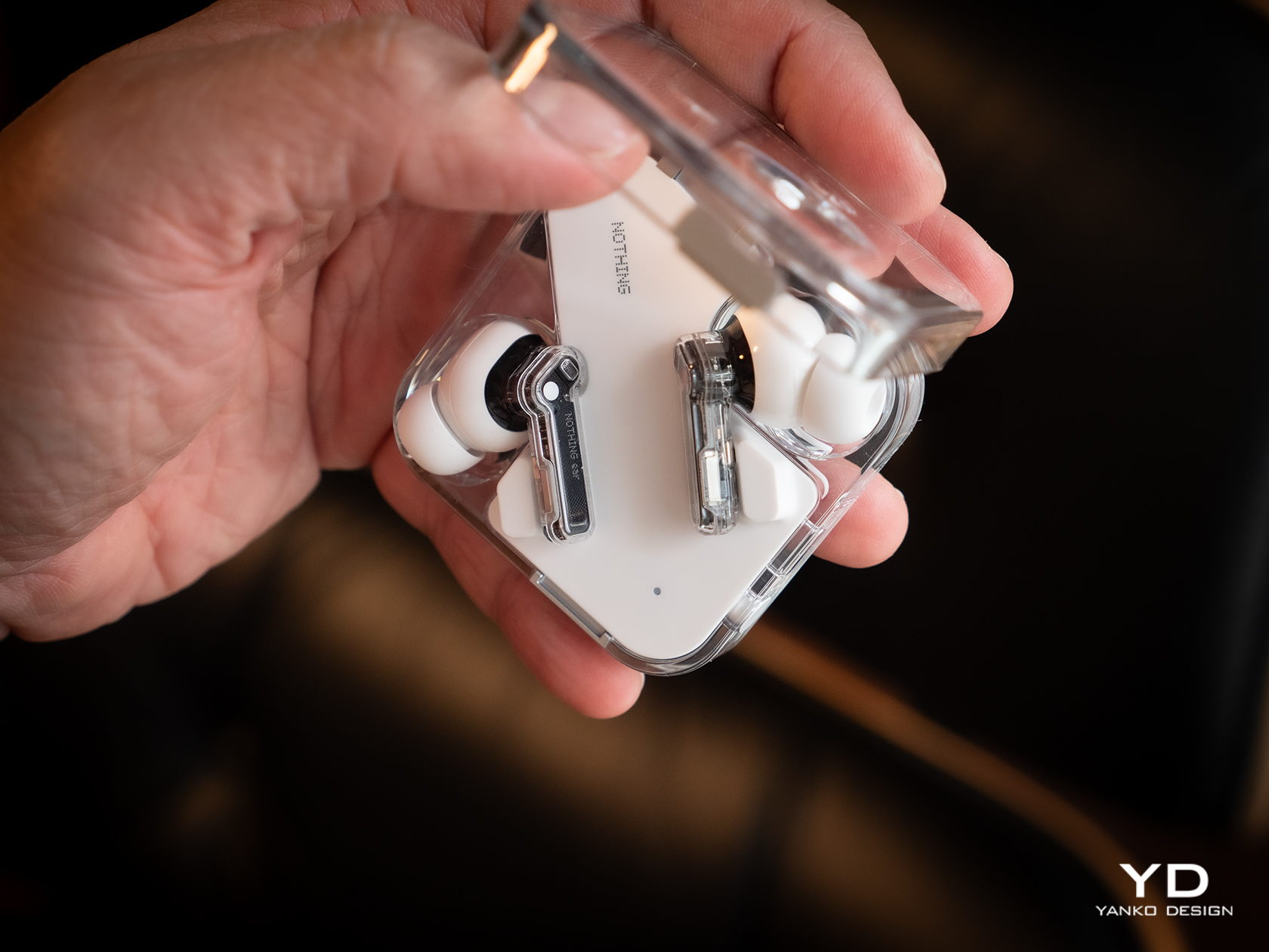
At its birth, Nothing made bold claims and used Apple-like language to describe its design philosophy, and for the most part, it has been able to prove its words. It has established a distinct aesthetic not just with the Nothing Phone at also with all iterations of its Ear wireless buds. Technically the fourth generation after two numbered Ears and one Stick, the new Ear and Ear (a) thankfully retains that transparent stem design paired with opaque buds, staying true to form and keeping what its customers love about its products.
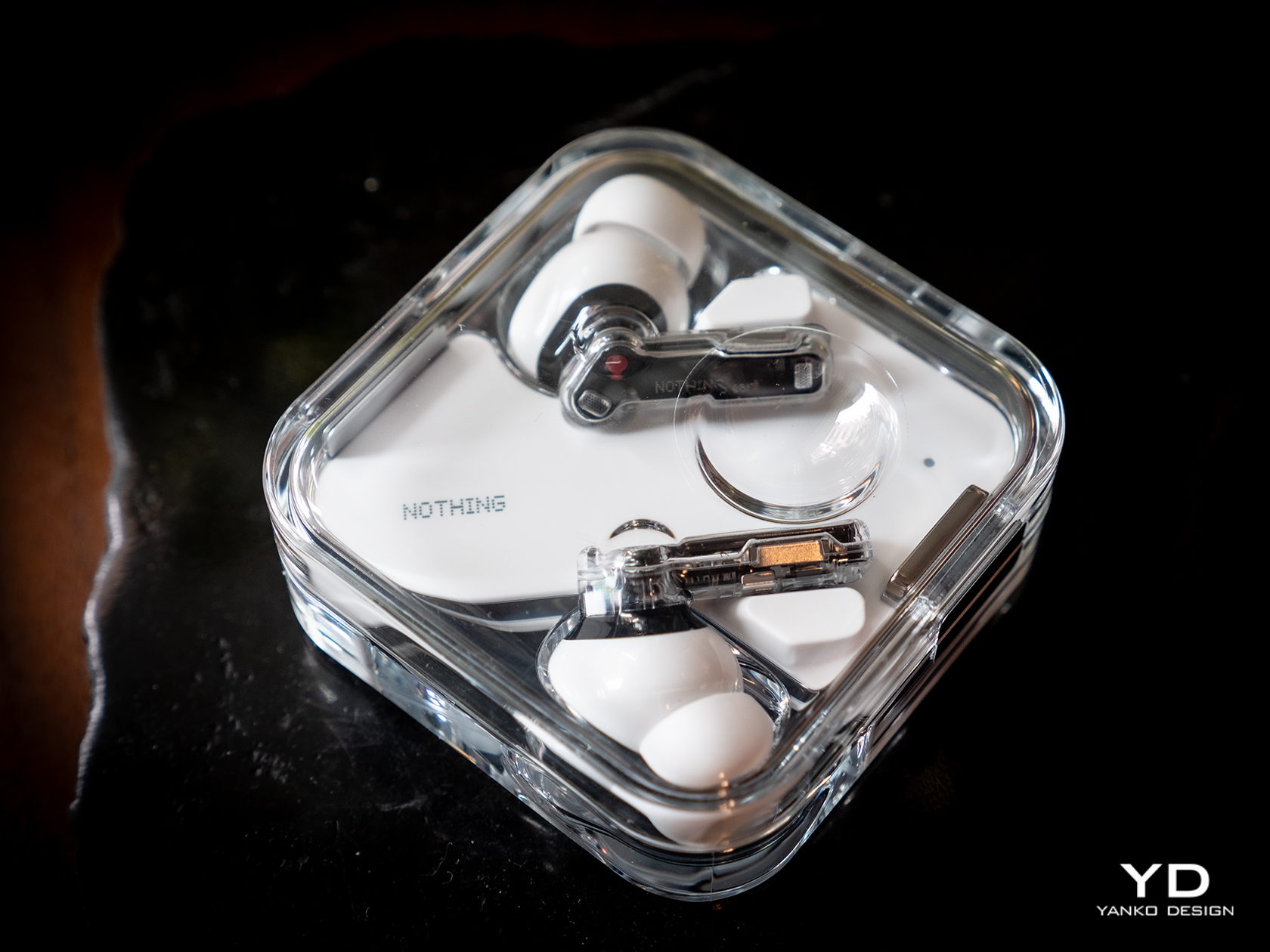
Of course, that does also mean that you won’t be able to distinguish the new Ear from the Ear (2), at least not visually. All of the changes are internal, which you can technically see because of the transparent design but not recognized. You get the upgraded experience and new features without losing the Ear’s eye-catching design, nor do you miss out on the quality materials that give the buds and its case their premium character.

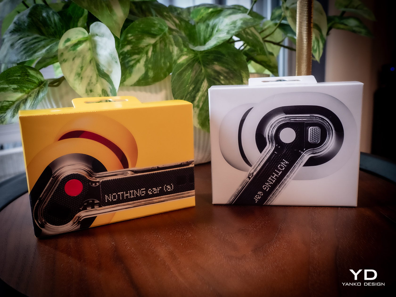
If you want something fresh, you’ll have to look at the Nothing Ear (a) instead. While the buds themselves remain the same, the case transforms into a more rectangular shape that still has a transparent cover like the regular Ear. The new case also has a few important usability improvements, which we’ll get to later. The biggest difference between the Ear and Ear (a), however, is the bright new yellow color available only for the Ear (a) model. The choice of color wasn’t simply based on a whim, as Nothing compares it to its design philosophy of transparency, stripping away unnecessary colors and leaving only the primary hues. Perhaps it’s a hint that future Ears will be available in Cyan and Magenta.

In terms of aesthetics, Nothing has thankfully stayed true to both the spirit and the application of its design philosophy. You have an elegant and minimalist earbud design that embodies transparency literally and figuratively. The Ear (a) takes that a bit further in the direction of joyful play with a bright yellow finish. It would have been great if both Ear and Ear (a) shared the same color selection, but it’s understandable that Nothing wants to target different groups with different designs while still holding true to its core design values.

Ergonomics

One of the benefits of sticking to a tried and tested design is that you don’t have to worry about whether it works or not. In this case, the Nothing Ear’s usability has already been proven since the first generation, so you can be sure that you will be enjoying a tight seal and a comfortable fit like others before it. That said, there will always be exceptions, especially for those with ear shapes that the included tips don’t support. Unfortunately, Nothing has yet to provide a solution to that problem, like with extra tips to fit less common ears.

Since the case of the Nothing Ear hasn’t changed in the slightest, its ergonomics remain the same as the Ear (2). You still have a compact square shape that opens up like a clamshell, complete with that odd dimple that lets you precariously use the case as a fidget toy. It almost means, however, that the new Ear’s case still bears the same shortcomings as well, which the Ear (a)’s case thankfully fixes.

The rounded rectangular case of the Nothing Ear (a) has softer edges that make it more comfortable to hold in the hand. More importantly, however, you can clearly see its orientation so you won’t have to pause for a second to figure out which direction it opens. And unlike the Nothing Ear case, this yellow bubble-like container has markings to make it easy to see which bud goes in which slot. The red dot matches the dot of the same color on the right Ear (a) bud, while white is the color for the left bud. It’s a trivial addition but one that has a significant impact on the product’s usability.

Performance

You’ve undoubtedly come across designs that are so captivating yet fail to impress when it comes to functionality. That is fortunately not the case for the new Nothing Ear and Ear (a), and this is where the earbuds really prove to be worthy upgrades. Suffice it to say, you won’t be disappointed by the sound that you will hear, especially when you consider how much the buds cost.
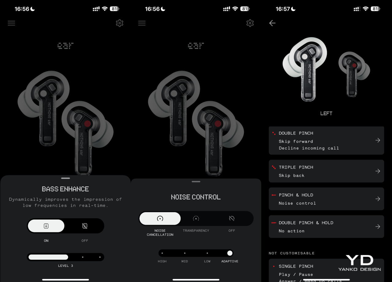
The Nothing Ear and Ear (a) both boast new 11m drivers, though the higher-end model uses a ceramic material for even better audio clarity. In practice, this means that both buds are nearly equal in terms of audio output, producing clear, bold sounds with depth, especially when you turn on the bass enhance setting on the Nothing X app. Admittedly, it’s not going to compete with premium earbuds that cost nearly twice as much, but you won’t find both Ears lacking either. You get a well-balanced audio performance that makes listening to music, especially to classical music, a joy.

You can, of course, tweak the experience with the equalizer available in the mobile app, but the Nothing Ear does one thing more than the Ear (a). You can create a personalized sound profile by going through a series of tests so that you can be assured of the best quality possible given your ear shape and the tips you’re using. It takes the Ear’s performance to the next level, but not all people will be willing to pay the literal price for advanced features they may or may not even notice.
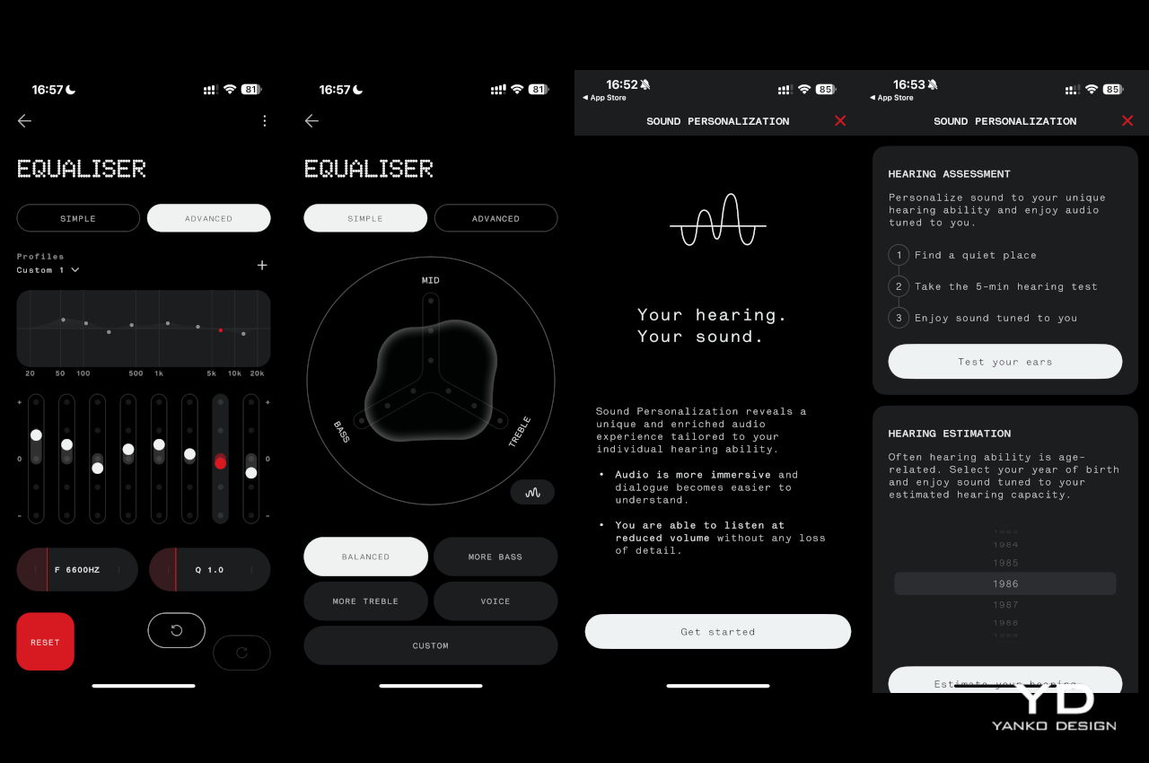
The good news is that, for all intents and purposes, the two new Nothing earbuds have the same feature set and perform quite similarly in that regard. Active Noise Cancellation, which has three levels of sensitivity, is quite effective, though definitely not on the same level as those more expensive brands. You can also set the app to automatically switch between ANC levels depending on the amount of ambient noise, which doesn’t always kick in immediately. There’s also a transparency mode that works in the opposite direction to let external sounds in, useful when you need to talk to someone or be aware of your surroundings.

Another trait the two share in common is dual connectivity, where you can pair the buds to two devices at the same time. They will switch between the two depending on which device is active, so you can take a call on your phone and then resume listening to music from your laptop afterward. In-ear detection is also automatic, and it will pause or resume playback when you remove and put back one or both of the buds in your ear.

Battery life is also one of the key upgrades in this generation of Nothing earbuds. The Ear can last a little over 5 hours with ANC on, while the Ear (a) somewhat ironically lasts longer over 5.5 hours in the same condition. Those figures nearly double if you turn ANC off, and the cases can charge the buds around three more times for extended use.

Sustainability

Nothing has always been a strong proponent of sustainable practices from the get-go, and the Ear and the Ear (a) thankfully don’t diverge from that path. The buds themselves might not be made from recycled materials, aside from the 100% recycled tin solder paste, but everything else about their manufacturing and packaging takes positive steps towards taking care of the environment. In addition to plastic-free packaging and carbon footprint labels, Nothing also uses renewable energy in the final assembly of the earbuds.

Given their size, the tendency to lose at least one of the pair, and their fragile designs, many earbuds have become almost disposable accessories, even if you’d cry over their price tag. The Nothing Ear and Ear (a) are thankfully built to last, though not exactly on equal footing. Both buds are IP54 dust and water-resistant, but only the Ear’s case enjoys an IP55 rating. The Ear (a), unfortunately, can only claim IPX2 water resistance, so you’ll probably be more careful that the yellow box doesn’t meet accidents.

Value

Despite the upgrades, the Nothing Ear doesn’t change its price tag from the $149 of its predecessor. The Nothing Ear (a), on the other hand, introduces a new $99 option in between the Ear and the $79 Ear (stick). Given its impressive performance and eye-catching design, those prices are quite a steal. The bigger question, however, is which of the two you should grab.

Unfortunately, things don’t seem to be in favor of the Nothing Ear. Yes, it has more features like a personal sound profile, a slightly better audio quality, and a more durable case, but not all of these will be deal breakers. In contrast, the Ear (a) offers comparable performance, a slightly longer battery life, a more ergonomic case, and a new yellow color option in addition to the typical white and black, all for a $50 lower price tag. There is a chance that the majority of buyers will prefer the Nothing Ear (a), especially the yellow option, but more discerning audiophiles won’t go wrong with the higher-end Nothing Ear.
Verdict

At first glance, the Nothing Ear seems like a simple rehash of an old design. It does, however, invite us to look deeper to go beyond what the eyes can see, and the product’s transparency is exactly a metaphor for that mindset. It brings together a familiar, stylish design and quality performance without extraneous features that distract you from the essentials. Best of all, it doesn’t even ask for more despite the noticeable improvements in the overall experience.

The Nothing Ear (a) sends a slightly different message with its vibrant color and more playful shape. It still clearly has Nothing’s design DNA but mixes it up with a fun identity that doesn’t skimp on the important bits. It says that you don’t have to go overboard, both in features and in price, to have a good time, and both the Ear and Ear (a) offer a delightful design that not only gets the basics right but goes above and beyond for a truly memorable experience each time you put them on.

The post Nothing Ear and Ear (a) Buds Review: It’s Nothing To Scoff At first appeared on Yanko Design.