Reaching AltiHut on Mount Kazbek means a refuge is no longer just a roof over climbers’ heads, but a statement about standing lightly on a fragile landscape. The original hut was conceived as Georgia’s first sustainable high-altitude destination at 3,014 meters, helicopter-delivered and sun-powered, uniting comfort with responsibility. What it offers is not conquest, but a place to pause and pay attention to where you actually are.
The new AltiHut Cottages are STIPFOLD’s way of making that experience more intimate. Designed for families and small groups, they are small satellites expanding the main hut’s ecosystem without turning the mountain into a resort. Each unit is a compact retreat with a children’s room, central living area, and open mezzanine bedroom facing the horizon, keeping the layout simple enough to disappear into the routine of waking, eating, and sleeping.
Designers: Beka Pkhakadze, George Bendelava, Nini Komurjishvili, Luka Chiteishvili, Nikusha Kharabadze (STIPFOLD)
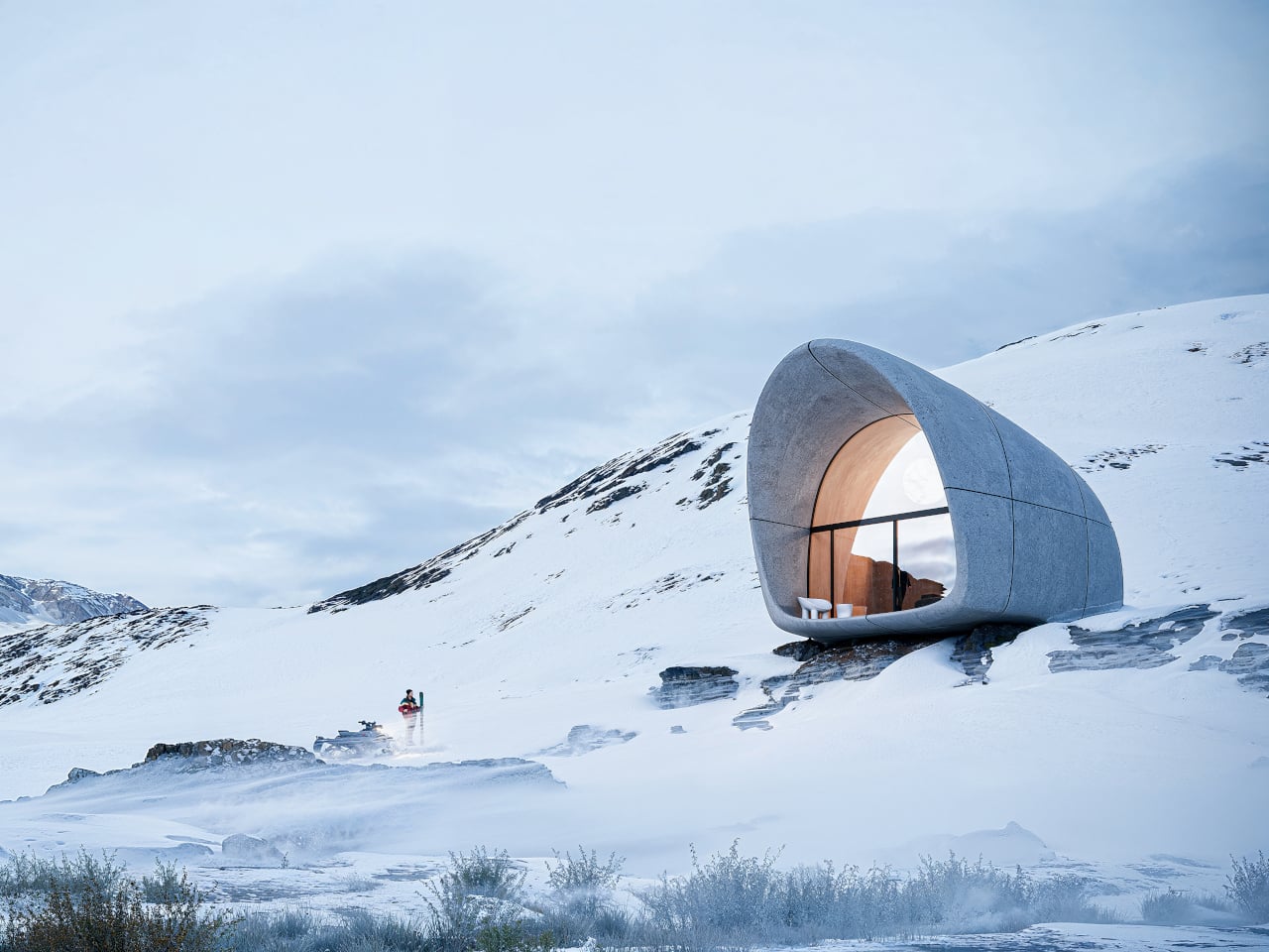
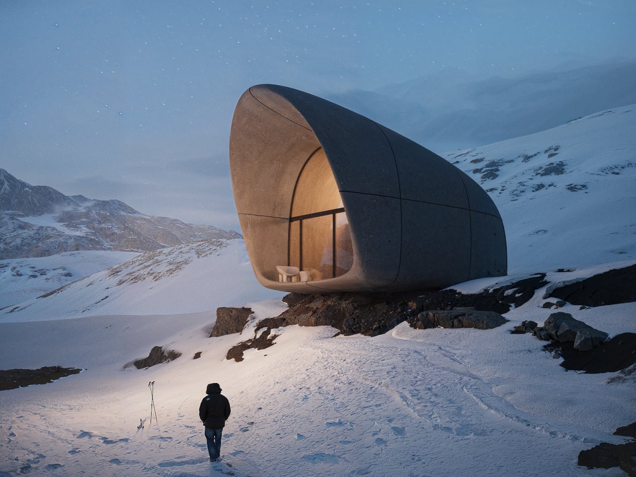
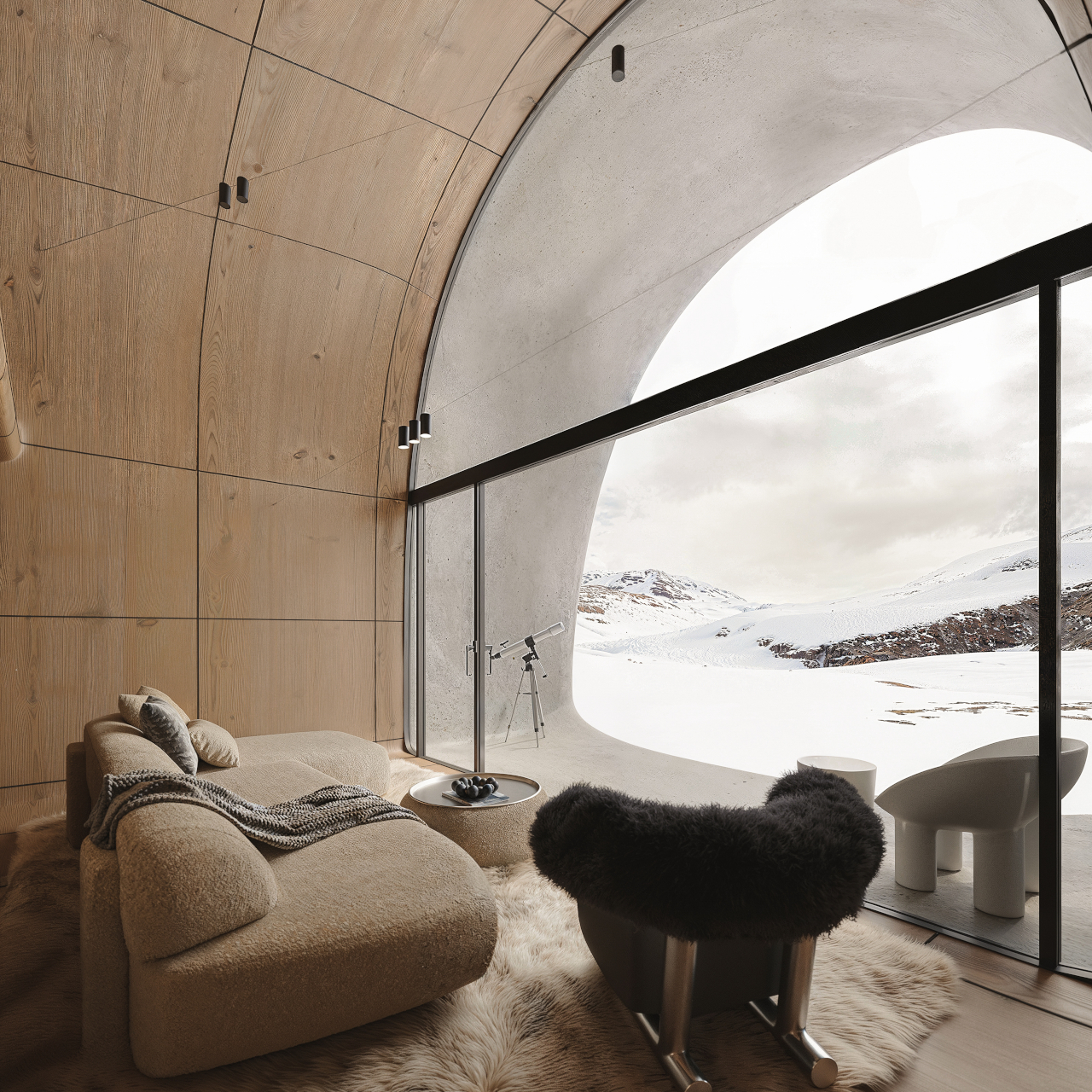
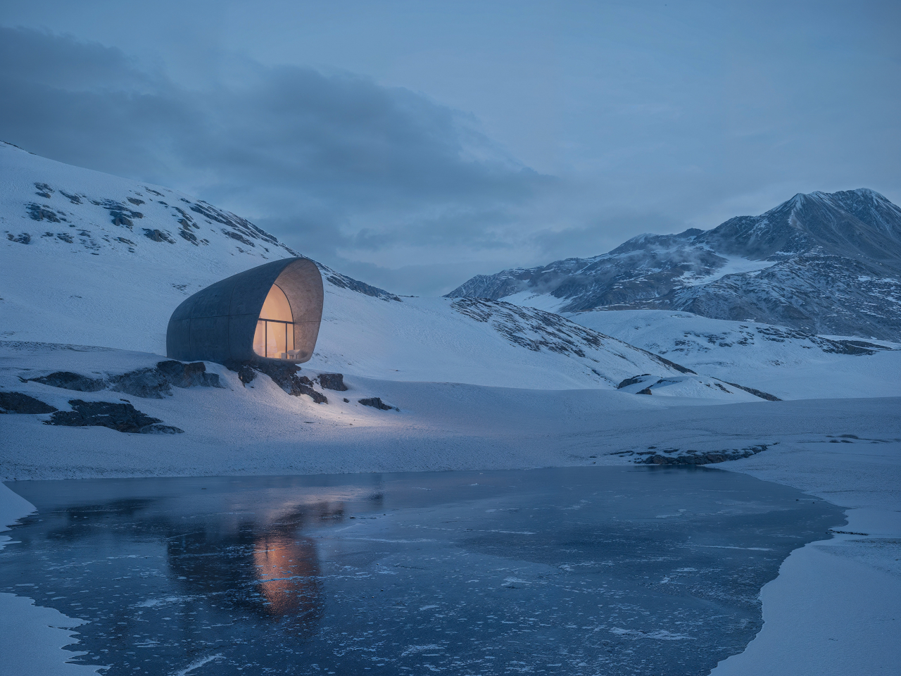
Approaching a cottage across the snow, you see a single opening in a smooth fiber-concrete shell. From outside, it reads less like a house and more like a weathered rock or snow-carved form. Crossing the threshold, you move from wind and glare into a warm wooden interior that still keeps the mountain in full view, so arrival is about balance rather than escape from the cold.
Inside, natural wood wraps walls and ceiling, turning the shell into a continuous, quiet envelope. The central living area becomes the social core, with the children’s room tucked into a protected corner and the mezzanine bedroom hovering above, open to the main space and oriented toward the view. Waking up means looking straight at the horizon, not a wall, which quietly resets what a bedroom is for at altitude.
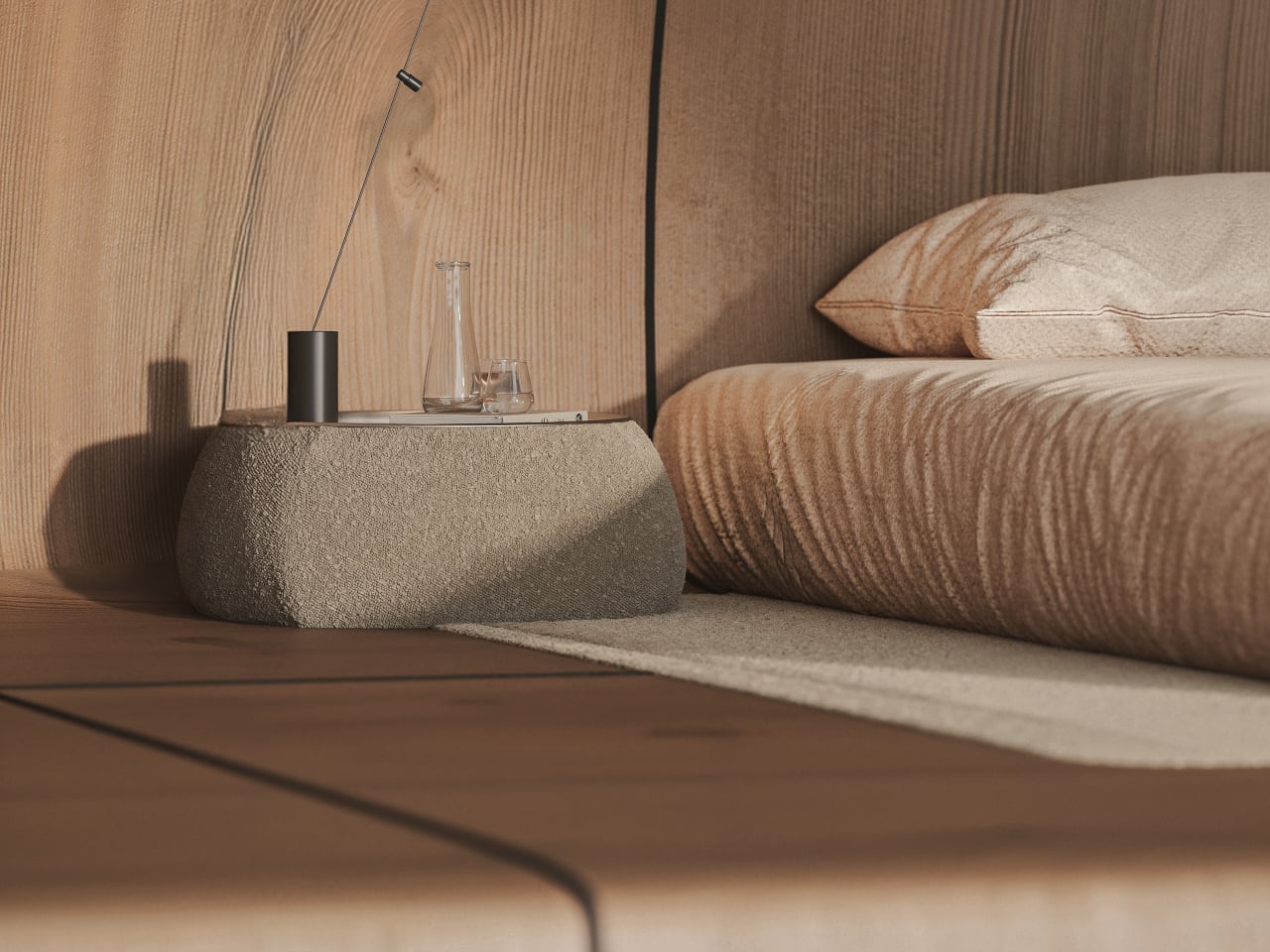
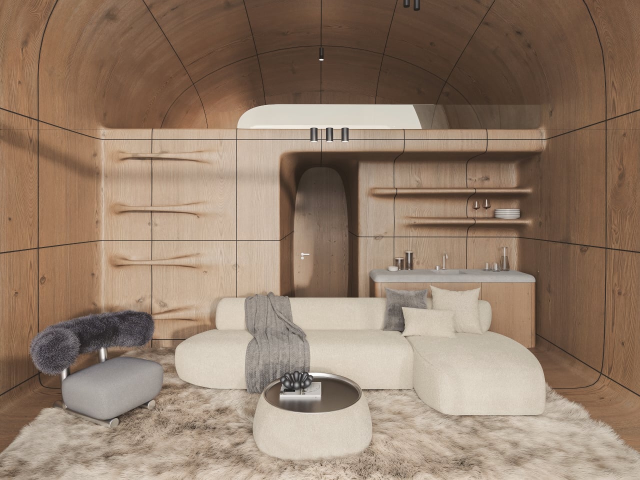
The fiber-concrete exterior is meant to age and merge with the terrain, picking up the same tones and textures as the surrounding rock over time. Inside, the wood stays calm and enduring, balancing warmth with restraint. The large glass opening turns the landscape into the main interior element, so the view itself becomes part of the design rather than something framed through a small window.
The cottage ties back to the original AltiHut discipline, where every component is delivered by helicopter and powered by the sun. The compact layout, continuous shell, and restrained material palette are not just aesthetic choices; they are ways to reduce impact and simplify construction where every kilogram matters. Comfort is treated as compatible with awareness, not as an excuse to ignore the cost of being there.
AltiHut Cottage reframes shelter at altitude as a place where joy and responsibility meet. Each unit is conceived as a continuation of nature rather than an object placed within it, fading into the terrain while holding a pocket of silence inside. The architecture steps back so that what you remember most is not the cottage itself, but the feeling of the mountain it quietly frames.
The post STIPFOLD’s AltiHut Cottages Let the Mountain Stay the Main Character first appeared on Yanko Design.