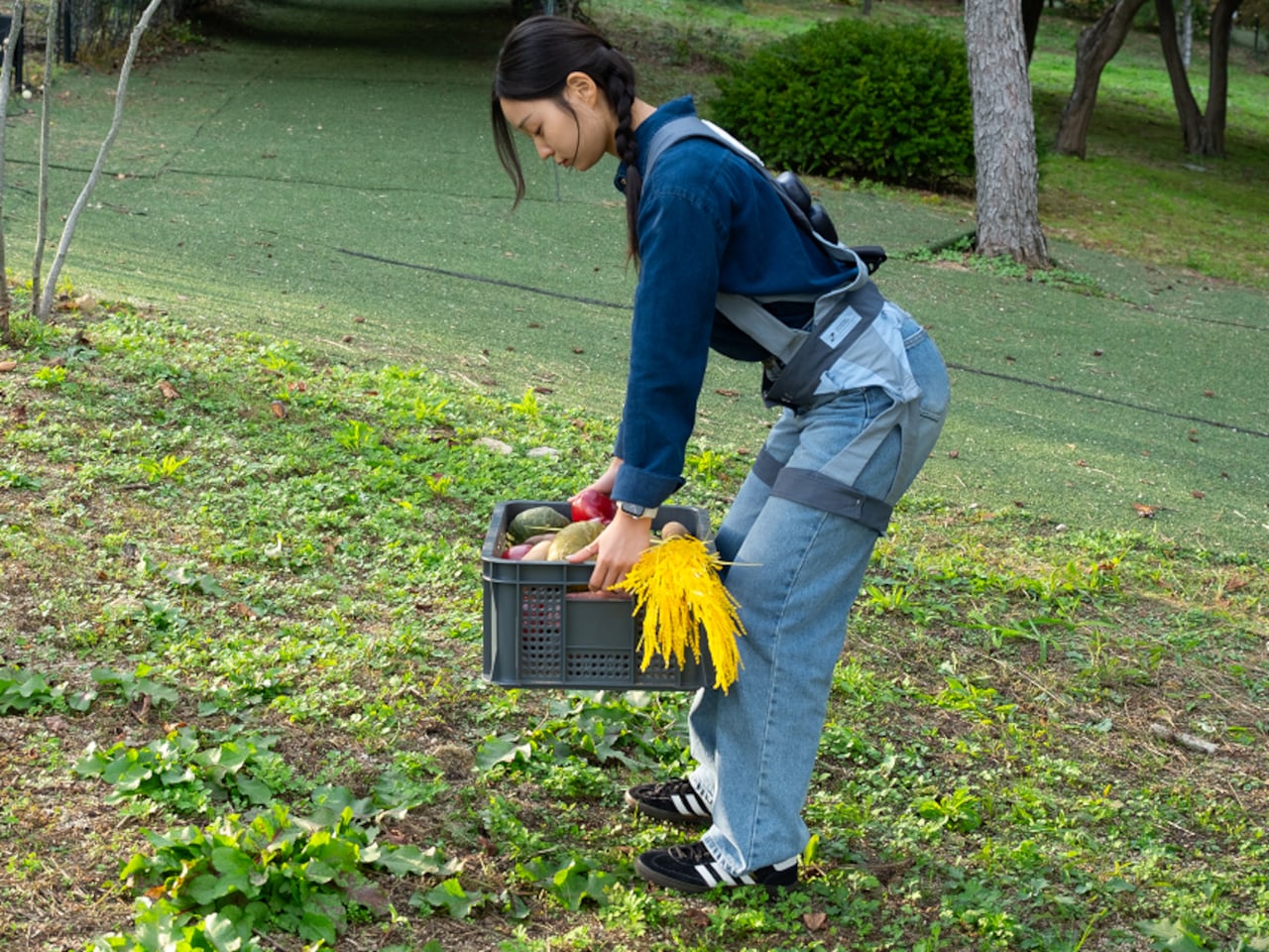
Most posture gadgets target office workers hunched over laptops, buzzing when your shoulders curl forward, or your neck drifts too far from neutral. Meanwhile, people doing physically demanding jobs, like young farmers, quietly rack up back pain and joint strain from long hours of bending, squatting, and lifting in fields. That strain is often treated as just part of the job until it becomes a serious problem threatening long-term health and livelihood.
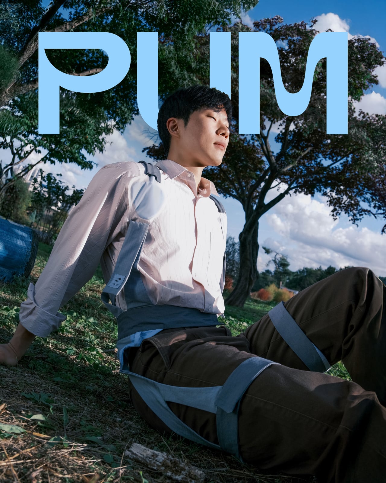
PUM is a graduation project imagining a posture correcting wearable built specifically for young farmers. It is a soft exoskeleton harness with inflatable shoulder airbags, a back module full of sensors and a pump, and an app that tracks posture and guides stretching. It is designed as gear you put on with work clothes, not a medical device you remember after damage is done or when your back hurts badly enough to stop working.
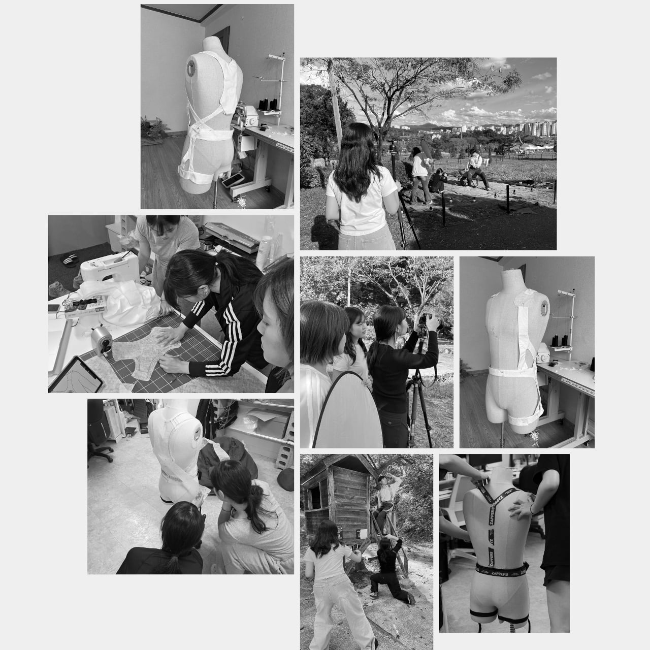
Designers: Seulgi Kim, Gaon Park, Seongmin Kim
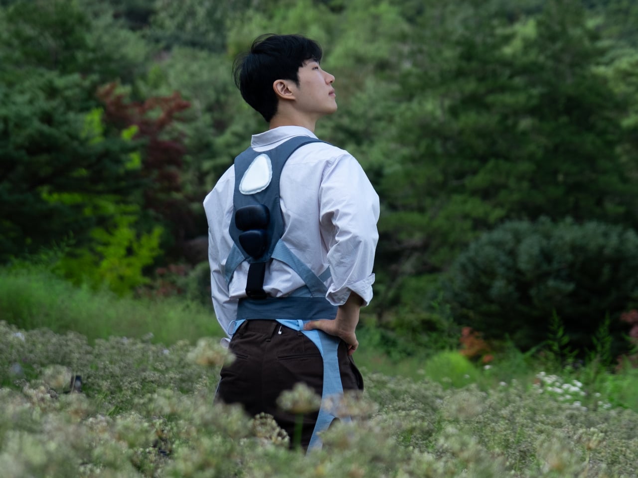
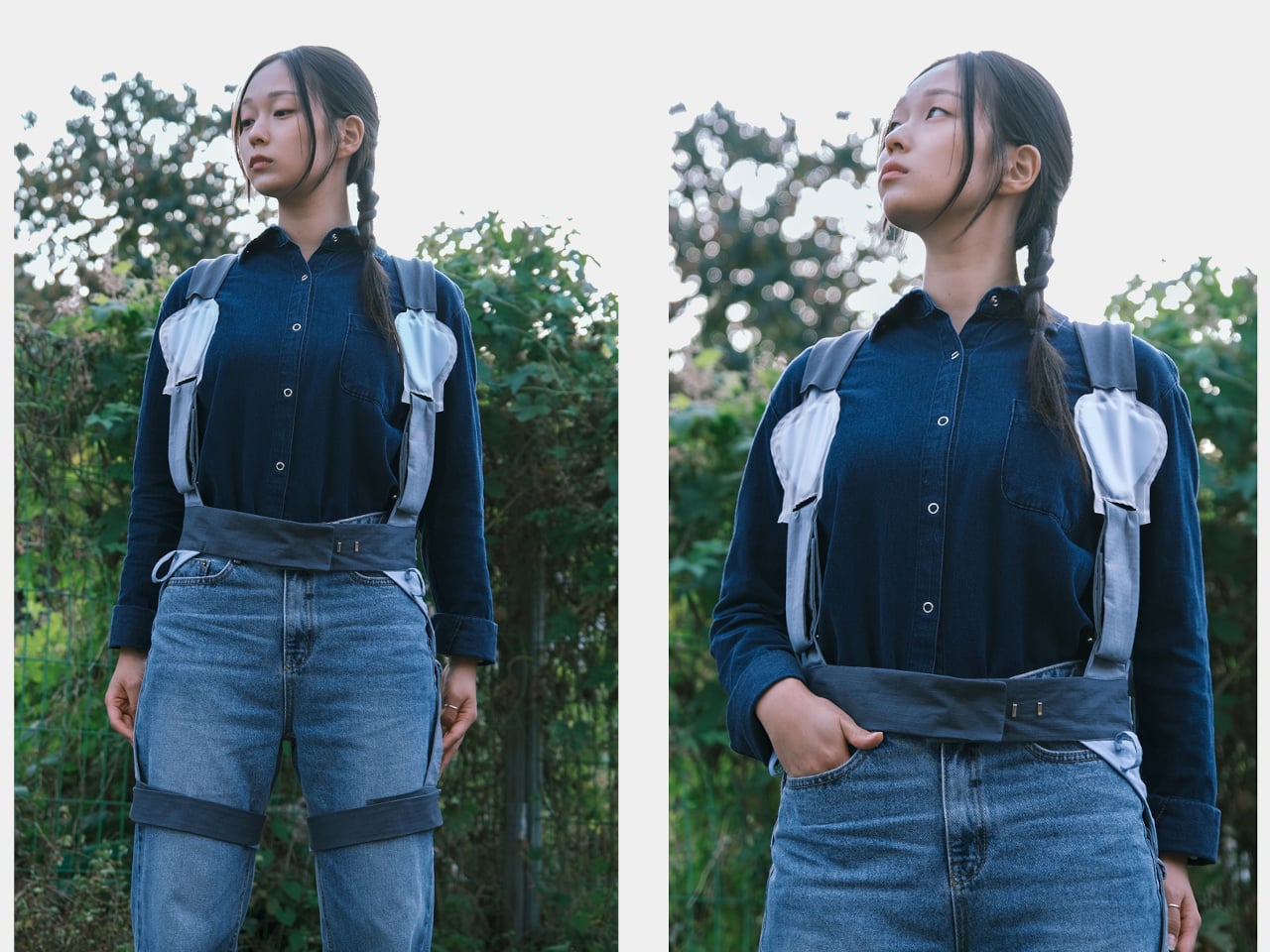
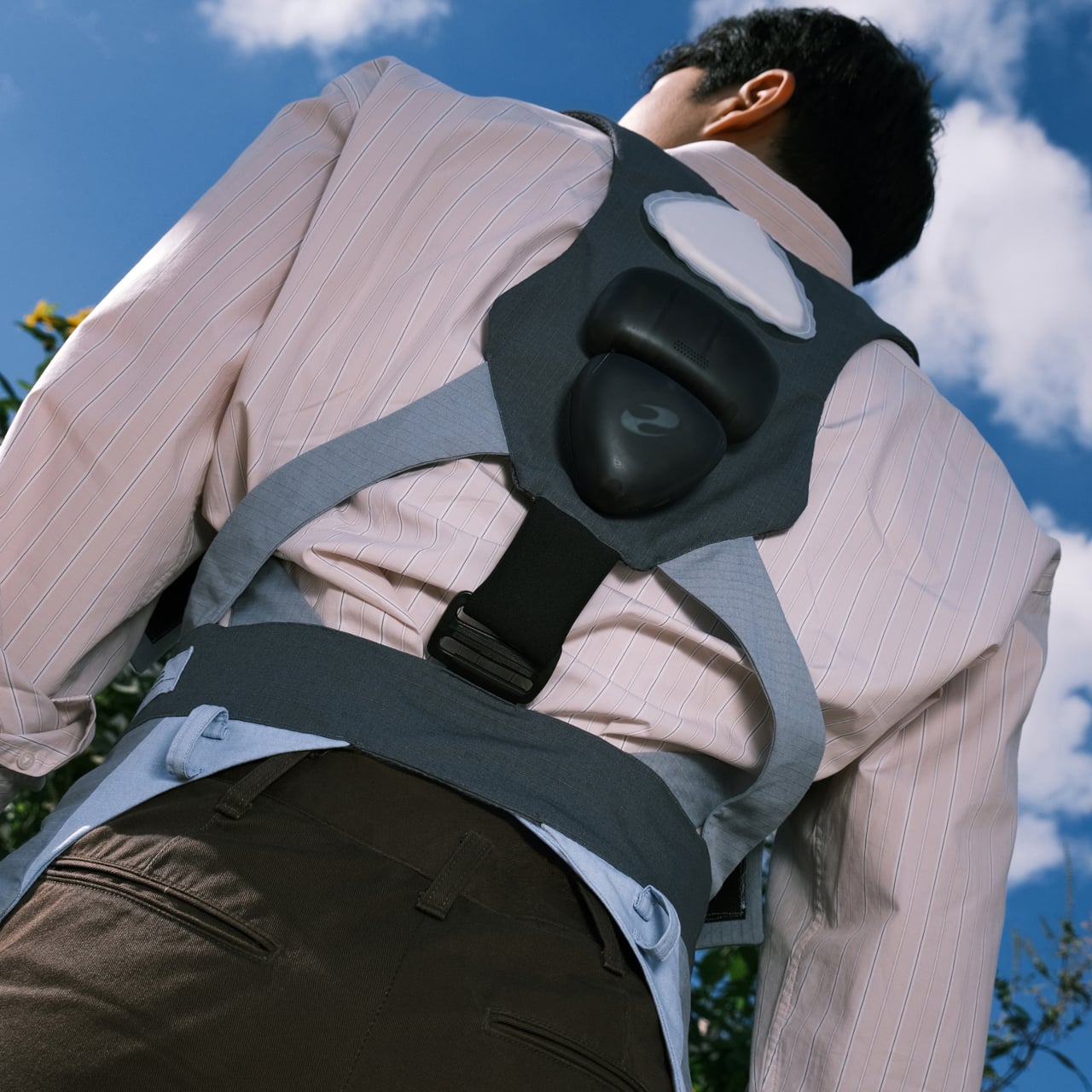
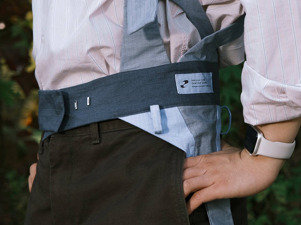
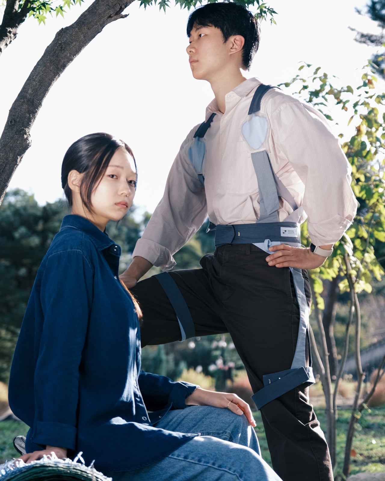
The harness wraps shoulders, torso, and thighs using wide, soft straps in muted blues and grays, with a waist belt anchoring a pebble-shaped module on the back. It aims to feel like a lightweight work vest rather than a rigid exoskeleton, avoiding bulky frames or hard edges. Leg straps and belt also double as attachment points for tools, folding ergonomic support into everyday workflow instead of adding another thing to carry.
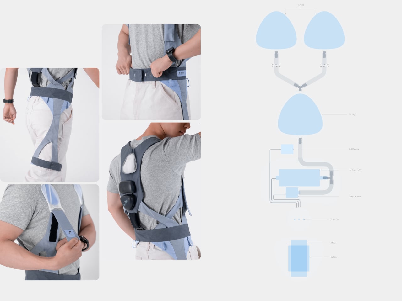
The back module uses motion sensors to watch for deep or prolonged bending, sending data to a smartwatch and phone. When a farmer stays in a harmful posture too long, the system nudges them with an alert and, more interestingly, by slightly inflating the shoulder airbags. That gentle pressure on the upper back acts as a physical reminder to straighten up without constant buzzing or nagging notifications interrupting delicate planting or harvesting work.
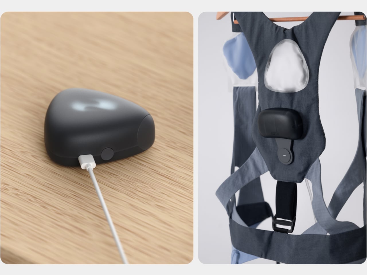
The air system relies on small triangular airbags in shoulder straps connected to a pump and valves in the back module, controlled by a microcontroller and pressure sensor. When posture crosses a threshold, the pump adds air, and when the user corrects, it releases pressure. It is soft robotics used as a tap on the shoulder, a tactile cue instead of another screen telling you what to do or another alarm competing for attention.
The app layer lets farmers see how long they spent bent over, adjust how sensitive PUM is, and, at the end of the day, follow a stretching program tailored to that data. If the system saw lots of forward flexion, it suggests back extension and hamstring stretches. PUM does not clock out when fieldwork ends; it helps with recovery, so tomorrow starts from a better baseline instead of compounding yesterday’s strain into chronic issues.
PUM shifts the usual posture tech story away from offices and into fields, treating young farmers’ bodies as worth designing for. As a concept, it raises questions about durability in dusty, wet environments and whether farmers would wear a full harness every day. But it points toward a future where soft exoskeletons, air-driven feedback, and thoughtful service design quietly protect the people whose work keeps everyone else fed, instead of assuming physical labor is something bodies just endure until they break.
The post PUM Imagines a Soft Exoskeleton Posture Wearable for Young Farmers first appeared on Yanko Design.