5 Best Galaxy S26 Ultra Features That Finally Fix Real Problems

Samsung has a long tradition of cramming its biggest ideas into the biggest phone it makes. The Galaxy S26 Ultra carries the spiritual lineage of the Galaxy Note, a device that once seemed absurd for strapping a stylus to a phone the size of a small tablet. That absurdity became a template, and the Ultra line has inherited both the ambition and the expectation that comes with being Samsung’s flagship of flagships.

Sifting through the usual Unpacked fanfare and no small amount of marketing jargon, five features stood out as genuinely worth paying attention to. Some are brand new. Others are long overdue. And at least one raises more questions than it answers, which is sometimes the most interesting kind of upgrade to talk about.

Designer: Samsung

A screen that knows when to keep secrets

The standout feature of the Galaxy S26 Ultra is something no other phone has attempted at this level: a built-in privacy display. This is not a matte screen protector you peel out of a box or a software filter that dims your screen to a murky grey. Samsung has engineered this at the pixel level of the OLED panel itself, controlling how each pixel disperses light so that the display becomes unreadable from side angles while remaining perfectly clear head-on.

The practical appeal is immediate for anyone who has ever shielded their phone screen on a crowded train or tilted it away from a nosy seatmate at a coffee shop. Samsung gives users granular control over the feature, offering both partial and maximum privacy levels. It can be set to activate only for specific apps, so your banking app gets the full blackout treatment while your weather widget stays visible to everyone around you.

AI that does the boring stuff for you

Samsung is calling the Galaxy S26 an “Agentic AI” phone, which sounds like a term conjured by a committee, but the ideas behind it are surprisingly practical. The most compelling addition is Automated App Actions, where the phone handles multi-step tasks in the background while you do something else entirely. Ask it to book an Uber, and it will navigate through the app, confirm the ride, and notify you when it’s done. Screenshot Analyzer, meanwhile, sorts your chaotic screenshot folder into categories like boarding passes, QR codes, and web pages.

Audio Eraser also received a meaningful expansion, and it now works on third-party apps like YouTube, Netflix, and Instagram in real time. Watching a hockey game on your phone and can barely hear the commentators over the roaring crowd? Audio Eraser can strip away that background noise as the video plays. It is not perfect, and audio artifacts do creep in, but Samsung also upgraded Bixby to handle natural language commands for device settings, which makes it feel less like a forgotten assistant and more like a functional one.

Faster charging, finally (with a few asterisks)

Samsung has historically been cautious with charging speeds, and whether that conservatism stems from engineering prudence or the long shadow of the Galaxy Note 7 battery fiasco is a question only Samsung can answer. The Galaxy S26 Ultra now supports 60W wired charging, a 33 percent jump from the previous 45W ceiling, and it can bring the same 5,000mAh battery from zero to 75 percent in roughly 30 minutes. Samsung even ships a faster 3-amp cable in the box, though you still have to supply your own charger.

Wireless charging also got a substantial bump to 25W through the Qi2 standard, up from a modest 15W on the Galaxy S25 Ultra. There are caveats worth noting here, however. The Galaxy S26 Ultra has no built-in magnets, so reaching that 25W speed requires a magnetic case for proper alignment with Qi2 chargers. Samsung cited thickness concerns, but the phone is only 0.3mm thinner than its predecessor, which makes that reasoning feel a little thin itself. Pun intended.

Better cameras hiding behind the same specs

The camera hardware on the Galaxy S26 Ultra received subtle but targeted upgrades rather than a wholesale overhaul. The 200MP main sensor now has an f/1.4 aperture, widened from f/1.7, letting in 47 percent more light. The 50MP 5x telephoto camera also opened up to f/2.9 from f/3.4 for a 37 percent brightness improvement. These wider apertures directly feed into Samsung’s improved Nightography mode, which uses lens-specific noise reduction to produce cleaner photos and videos in low light.

On the software side, Photo Assist now accepts written prompts in natural language, so you can describe edits like “make this a night scene” or “remove the person on the left” without digging through menus. Samsung also introduced APV, a lossless video codec that supports 8K recording at 30 frames per second for users who need maximum editing flexibility. One odd wrinkle, though: the S26 Ultra has a hidden 24MP shooting mode that sits between 12MP and 50MP for balanced detail and color, but enabling it requires installing a separate Camera Assistant app from the Galaxy Store.

The pen that refuses to die

The S Pen remains one of the features that separates the Galaxy S Ultra line from every other flagship on the market. It still lacks the Bluetooth connectivity that Samsung removed with the Galaxy S25 Ultra, so there is no remote shutter or gesture control from a distance. The external design has changed slightly to match the S26 Ultra’s rounder corners, giving the stylus tip an asymmetric curve. This means you now have to insert it the correct way, or it will stick out awkwardly from the bottom edge.

None of that diminishes the fact that the S Pen earmarks the Galaxy S26 Ultra as more than a consumption device. Just as interest in handwriting, sketching, and analog-style note-taking is quietly resurging, having a built-in stylus with pressure sensitivity and palm rejection feels less like a legacy feature and more like a forward-looking one. Competitors like Huawei, Motorola, and TCL have tried to replicate this kind of stylus integration with varying degrees of success, which suggests the idea still has legs even if Samsung’s execution feels like it is coasting a bit this generation.

The post 5 Best Galaxy S26 Ultra Features That Finally Fix Real Problems first appeared on Yanko Design.

These $40-$299 Cassette Players Just Crushed Spotify’s Algorithm

Somewhere between the algorithmic playlists and the infinite scroll of recommended tracks, music stopped being something you held in your hands. Cassette tapes were declared dead more than two decades ago, buried under the weight of MP3s and then streaming services that promised every song ever recorded for a monthly fee. Search trends tell a different story now, though. Queries for “retro cassette player” have surged over 125% year-over-year, while “retro walkman cassette player” has exploded by more than 1,281% in the same period.

These numbers point to something more than a passing fad or a collector’s whim. Millennials and Gen Z listeners are actively seeking hardware that forces them to slow down, to choose an album rather than shuffle through ten thousand options. The cassette, with its fixed tracklist and physical limitations, turns listening into something deliberate again. Five modern cassette players have emerged to meet that demand, each one approaching the format from a wildly different design philosophy.

FiiO CP13

FiiO built its reputation on portable DACs and audiophile-grade headphone amplifiers, products where signal purity is the entire point. The CP13 carries that obsession into the cassette format with an all-analog signal path, from the magnetic tape head through a JRC5532 op-amp to the 3.5mm output. There is no digital conversion anywhere in the chain, no Bluetooth radio, no built-in speaker. The CP13 uses a motor with a high-voltage 4.2V power supply, paired with an oversized pure copper flywheel measuring 30.4mm in diameter.

Designer: FiiO

That flywheel is the quiet star of the CP13’s engineering. Thicker and heavier than standard components, it reduces wow and flutter to levels most modern cassette players cannot approach, keeping tape speed consistent enough for the analog signal to actually matter. The dual-color aluminum alloy chassis, available in sky blue, white and black, or red and silver, measures just 31.8mm thick. An 1800mAh lithium cobalt oxide battery delivers 13 hours of playback and charges through USB-C, though FiiO’s decision to support all tape types from Type I through Type IV suggests the company expects its buyers to own tapes worth caring about.

What we like

  • Oversized copper flywheel for low wow and flutter
  • Fully analog signal path with no digital conversion
  • Supports all cassette types (I through IV)

What we dislike

  • No Bluetooth output means wired headphones are the only option
  • No recording and auto-reverse functions,

We Are Rewind Edith

Where FiiO chases audio fidelity, the French brand We Are Rewind treats the cassette player as a cultural object first. The Edith, named after Edith Piaf, joins a lineup that already includes models named Kurt, Keith, and Serge, each one a color-coded tribute to a musician. The Edith arrives in a pink and green combination that reads less like consumer electronics and more like a fashion accessory, wrapped in an aluminum case that weighs 404 grams. That heft is deliberate. The brand explicitly references Sony’s original TPS-L2 Walkman as its design benchmark, choosing aluminum over plastic for what it describes as a “cool touch” quality.

Designer: We Are Rewind

Bluetooth 5.1 is the most visible concession to modernity, allowing wireless pairing with headphones and speakers. A built-in lithium-ion battery charges via USB-C and delivers roughly 10 to 12 hours of playback, replacing the disposable AA batteries that defined portable tape listening for decades. The Edith also records in stereo to Type I cassettes through its 3.5mm jack, and ships with a manual tape rewind pencil, a small wink to the analog rituals that streaming services have no equivalent for.

What we like

  • Aluminum case construction gives the player a premium tactile quality, making it feel like an object worth displaying
  • Bluetooth 5.1 and USB-C charging
  • Stereo recording capability through the 3.5mm jack preserves the mixtape tradition

What we dislike

  • The DC motor transport produces more wow and flutter than belt-driven alternatives
  • At 404 grams, the Edith is too heavy and too large for most pockets

NINM Lab IT’S OK TOO

Taiwanese design studio NINM Lab launched the original IT’S OK through Kickstarter in 2019, billing it as the first cassette player with Bluetooth capability. The second generation, IT’S OK TOO, upgrades that foundation with stereo output and a semi-transparent matte body that splits the difference between full transparency and solid color. The casing is ABS plastic and polyethylene, lightweight at approximately 152g. Push-button controls for play, stop, forward, and backward line the front edge, with a classic belt clip on the back.

Designer: NINM Lab

Power comes from two AA batteries or a USB-C supply (not charging the device itself, but powering it directly), with optional USB-C charging if you install rechargeable Ni-MH batteries. The transparent design is the real design statement here, exposing the tape mechanism so the spools become a visible, moving part of the experience. The IT’S OK TOO firmly positions itself as a lifestyle product for a younger demographic that may never have owned a cassette player before.

What we like

  • Transparent body turns the tape mechanism into a visual feature
  • Bluetooth 5.0 stereo output with 3.5mm jack

What we dislike

  • Only supports Type I cassettes
  • AA battery requirement with no built-in rechargeable cell

Victrola Mini Bluetooth Boombox

Victrola has made its name selling affordable turntables to people who want the ritual of vinyl without the investment of a serious hi-fi setup. The Mini Bluetooth Boombox applies that same philosophy to cassettes, packaging a tape player, tape recorder, AM/FM radio tuner, USB port for MP3 playback, and Bluetooth streaming into a hefty yet still portable box. It runs on AC power or batteries, comes in grey and silver colorways, and retails for under $40 at most outlets.

Designer: Victrola

The design is a scaled-down boombox archetype, complete with dual built-in speakers, an analog radio tuning dial, and a cassette door on the front. At this price point, audio fidelity is not the conversation. The Victrola is competing with cheap Bluetooth speakers, not with premium cassette players. Its recording function lets you capture audio directly to cassette through a built-in microphone, and the Bluetooth connectivity means it can serve as a wireless speaker for your phone. What the Victrola lacks in audio refinement, it compensates for in sheer versatility. No other player on this list gives you FM radio, Bluetooth reception, USB playback, and tape recording in one device.

What we like

  • The most versatile player on this list by a wide margin, combining cassette playback and recording, AM/FM radio, Bluetooth, and USB MP3 playback in a single compact unit
  • Sub-$40 pricing makes it the easiest entry point for anyone curious about cassettes but unwilling to commit to a premium device

What we dislike

  • Speaker quality and cassette playback fidelity are both budget-tier
  • Plastic construction and lightweight build feel disposable

Retrospekt Sony Walkman WM-F2015

Every other player on this list is a modern product designed to evoke nostalgia. The Retrospekt Sony Walkman WM-F2015 is the actual artifact, a unit originally manufactured in 1990, disassembled by technicians in Milwaukee, and rebuilt with replaced drive belts, idler tires, and pinch wheels. The playback speed has been recalibrated, the volume potentiometer deoxidized, and the tape head cleaned and demagnetized. Retrospekt sells the WM-F2015 as a “vintage refurbished” product starting at $299.

Designer: Retrospekt

The WM-F2015 is a matte black candybar design with an AM/FM radio tuner, powered by two AA batteries. It ships with orange retro-inspired headphones that look the part, even if they cannot compete with modern over-ears. The appeal here is not specification superiority or modern convenience. There is no Bluetooth, no USB-C, no rechargeable battery, and no recording function. What the Retrospekt Walkman offers is something no reproduction can manufacture: the physical reality of a 35-year-old Sony mechanism, with all its original plastics and original weight, restored to functional condition.

What we like

  • An authentic 1990 Sony Walkman mechanism
  • Retro Sony matte black industrial design and compact form factor

What we dislike

  • A bit pricey at $299
  • Zero modern conveniences: no Bluetooth, no USB-C, no rechargeable battery

The post These $40-$299 Cassette Players Just Crushed Spotify’s Algorithm first appeared on Yanko Design.
This Anxiety Device Hides in Your Fist So Nobody Sees You Using It

Anxiety tools have a strange habit of making things worse. Fidget spinners draw stares across a conference table, breathing apps demand screen time mid-conversation, and wearable buzzers pulse on your wrist where anyone paying attention can spot them. The very act of reaching for help becomes another source of self-consciousness, which is the opposite of what someone in the grip of a social anxiety episode needs. The ideal intervention would be one that nobody else can detect at all.

That is the premise behind LUMA, a concept device that fits entirely inside a closed fist. Shaped like an asymmetric pebble with a two-tone split between a matte dark outer shell and a lighter inner palm surface, LUMA combines tuned haptic vibration with gentle warmth to guide breathing and counter the physical symptoms of acute anxiety. “Designed for Calm” reads the text printed along its curved body, and the device activates with a single push-and-hold action that requires no fumbling, no screen, no second hand.

Designer: Vedant Kulkarni

Early explorations cycled through squares, cylinders, pill shapes, and a water-droplet silhouette before arriving at the final biomorphic curve. Each candidate was filtered through two criteria simultaneously: does it feel natural in a clenching grip, and can it disappear inside a trouser pocket? Thumb indent placement, button positioning, and overall thickness were all iterated with physical models. The result is a device that reads less like a gadget and more like a smooth stone you picked up on a beach, except this one pulses warmth into your palm.

The calming mechanism works in two ways simultaneously. Haptic vibration patterns pace breathing rhythm, guiding the user through inhale-exhale cycles without any visual or audio prompt. Gentle heat addresses the cold-hands response that commonly accompanies anxiety spikes, while also providing a grounding tactile sensation. Picture someone at a networking event, feeling their chest tighten during small talk. They slip a hand into their pocket, squeeze LUMA, and within seconds the device is pacing their breath through their fingertips. Nobody around them notices a thing.

But wait, there’s more! Sitting on a bedside table while charging, LUMA glows softly through its LED light strip and looks like a small decorative object, something between an ambient lamp and a polished stone. It does not look like a medical device or a wellness gadget, and that visual ambiguity is entirely deliberate. Most products in the anxiety-relief space announce their therapeutic purpose through clinical form factors, companion apps, or wearable visibility. LUMA refuses to do any of that.

No handheld object can solve social anxiety. What LUMA proposes instead is that the moment of reaching for help should feel private, physical, and calm rather than clinical or conspicuous. The form factor argument is strong, and the dual heat-and-haptic approach addresses real physiological symptoms rather than just offering distraction.

The post This Anxiety Device Hides in Your Fist So Nobody Sees You Using It first appeared on Yanko Design.
This €289 Add-On Turns Your €49 Billy Bookcase Into a Standing Desk

Over 120 million IKEA Billy bookcases have been sold since 1979, according to the famed brand. One rolls off the line every five seconds, and at least one is probably within arm’s reach of wherever you’re sitting right now. For most of its 46-year existence, the Billy has been a passive piece of furniture, a storage object that holds books, plants, and the occasional decorative object nobody remembers buying.

Berlin-based designer Michael Hilgers, however, looked at that same bookcase and saw a workspace hiding in plain sight. This gave birth to the STECKRETÄR, a folded steel panel that plugs directly into the Billy’s existing shelf pin holes and folds down into a compact standing desk. No tools, no drilling, no hardware. The name is a portmanteau of the German words for “plug in” and “secretary desk,” which sums up the interaction neatly.

Designer: Michael Hilgers

Made from 2mm recyclable steel, the STECKRETÄR arrives powder-coated in a fine-texture finish across colors like reseda green, mustard, nougat, and rust red. These aren’t neutral tones that blend into the Billy’s usual white or birch exterior but deliberate accents, meant to be seen. The work surface measures roughly 750mm x 330mm, enough for a laptop and perhaps a notebook beside it, though a mouse would be pushing the boundaries of the available real estate.

The scenario where this makes the most sense is familiar to anyone living in a compact apartment. You probably already own a Billy because almost everyone owns a Billy. You need a workspace that doesn’t permanently eat into your floor plan. The STECKRETÄR folds flat against the bookcase when not in use and swings down when you need to answer emails, sketch something out, or take a quick video call while standing.

A few practical considerations temper the appeal. The Billy must be wall-anchored before installation, a step many owners skip and one that involves actual drilling. The work surface offers no integrated power outlet or lighting. And standing is the only option here, since the desk height depends on which row of shelf pin holes you choose along the Billy’s tall frame. IKEA itself now sells a pull-out desk add-on for the Billy, but that version is particleboard and a different interaction entirely, one that slides out rather than folding down.

Hilgers frames the product as a reflection on “the blurring of work and private life” and “the creative reinterpretation of the everyday,” which is a lot of conceptual weight for a folding desk. Whether the STECKRETÄR is a functional home office solution or a limited-edition design statement about mass production probably depends on how you feel about paying €289 to transform something you bought for €49. Either way, it might be the first time anyone has looked at a Billy bookcase and seen potential beyond storage.

The post This €289 Add-On Turns Your €49 Billy Bookcase Into a Standing Desk first appeared on Yanko Design.
This 7-Device Charging Station Glows Like a Lamp and Replaces One

If your bedside table looks anything like most people’s, it’s basically a charging graveyard. There’s a phone, a smartwatch, a pair of earbuds, maybe a tablet, and enough cables to qualify as a fire hazard. The whole setup is functional, sure, but it’s also the kind of thing you instinctively hide behind a lamp so guests don’t judge you. Nova, a concept by designer Parth Amlani, thinks there’s a much better way to handle all of this.

The idea behind Nova is simple but surprisingly rare: instead of designing yet another flat, forgettable charging puck, Amlani went for something you’d actually want to display. The result is a wide, trapezoidal charging station with a sculptural, almost pyramidal silhouette, two open horizontal bays running through its body, and a warm copper accent strip along one side. Put it on a nightstand, and it looks more like a decorative object than a piece of tech hardware.

Designer: Parth Amlani

What makes Nova genuinely clever, though, is that its translucent body doubles as a soft ambient light source, glowing warmly from within when the room goes dark. That means it can replace your bedside lamp entirely, or at the very least make a strong case for doing so. It stops being something you plug in and forget about, and starts being something that actually contributes to how a room feels at night.

The charging hardware underneath all that thoughtful design is no slouch, either. Nova can power up to seven devices at once, with four 15W wireless pads for phones, a 5W pad for earbuds, a 3W watch puck, and two retractable USB-C cables rated at 15W each for anything else that needs a wire. Those retractable outputs are a genuinely useful touch, handling the odd peripheral without leaving a permanent cable draped across your table.

It’s also worth noting that Nova is much further along than the average design concept that looks great in renderings and never gets built. Amlani took it through full manufacturing refinement, including injection-moulding-ready geometry, a snap-fit structure, and a removable back panel for servicing.

The biggest open question is whether its ambient glow is bright enough to stand in for an actual bedside lamp or whether it just adds a nice atmospheric accent. That distinction will matter a lot to anyone hoping to clear some clutter from their nightstand. For now, though, it’s one of the more original answers to a problem that most charging products are content to completely ignore.

The post This 7-Device Charging Station Glows Like a Lamp and Replaces One first appeared on Yanko Design.
Colorful Inhaler Case Laser-Engraves Names So Kids Aren’t Embarrassed

Inhalers are one of those everyday objects that millions of people carry around without ever thinking about how they look or feel. They roll around in bags, get shoved into pockets, and come out in public with all the elegance of a used tissue. Nobody designed them to be personal, and it shows. The hale Flow, a colored SLS nylon case made in the UK, wants to change that by treating an inhaler less like a clinical tool and more like something you’d actually want to pull out of your bag.

The person behind it is Matthew Conlon, who built hale from his own experience living with asthma. That starting point matters because the material choice isn’t just cosmetic. The case is made from PA12 nylon through selective laser sintering, a polymer grade found in aerospace and medical implant applications. At just 1mm of wall thickness, it wraps tightly around the Ventolin Evohaler without adding bulk, and the slightly grainy, matte surface gives it a tactile quality that immediately separates it from the cheap silicone sleeves floating around online.

Designer: Matthew Conlon

Two halves snap together through concealed magnets, each only 0.85mm thick, so there are no visible clips or latches breaking up the surface. The mouthpiece cap bonds with a small dot of adhesive, the one permanent step in an otherwise reversible setup. Subtle contours across the grip area help with one-handed use, which is the kind of detail you appreciate when you’re having a mid-asthma episode and fumbling isn’t really an option. Three colorways are available (Lemon, Pink, and Black) at £29, sitting comfortably between throwaway accessories and hale’s own aluminum Classic at £59.

What genuinely sets the Flow apart, though, is laser engraving. You can add a name or even upload a custom image, like a pet illustration, etched permanently into the nylon. For a parent buying one for a child with asthma, that turns a medical necessity into something personal, something a kid might actually feel proud pulling out of a backpack. No other inhaler accessory on the market currently offers that level of personalization at this price, which is surprising given how large the potential audience is.

The honest caveat here is compatibility. The hale Flow works exclusively with the Ventolin Evohaler, and while salbutamol remains one of the most dispensed bronchodilators in the UK, with over 22 million units in 2020 alone, millions of asthma patients rely on entirely different devices. Hale says it is exploring additional models, but for now, the design promise stops at one inhaler.

At £29, manufactured in the UK by a single founder who actually lives with the condition he’s designing for, the hale Flow sits in a category that barely existed before it showed up. Whether it can grow beyond that single compatible inhaler will determine if it remains a thoughtful niche product or turns into something with a much wider reach.

The post Colorful Inhaler Case Laser-Engraves Names So Kids Aren’t Embarrassed first appeared on Yanko Design.
This Portable Power Strip Clamps to Table Edges and Charges 3 Devices

Working from wherever you can find a seat means accepting certain frustrations, and outlet hunting is near the top of the list. Extension boards solve that at home, but they’re designed for rooms rather than bags, and dragging one to a café or shared studio means arriving with a coil of cable that becomes someone else’s problem. Power infrastructure hasn’t caught up with how people actually work.

Xtend is a personal charging extension concept built around one challenge: making power access portable without making it awkward. The guiding claim is “Power access shouldn’t be bulky,” which is fair when most extension boards still feel designed for a fixed office and are never reconsidered. The concept answers with a compact, desk-edge device you carry rather than leave behind.

Designer: Parth Amlani

Rather than a strip on the floor where cables become trip hazards, Xtend clamps to the table edge and creates an elevated power zone right where you’re working. That’s the main behavioral shift, and it matters. It keeps cables off the ground, reduces accidental unplugging when someone shifts their chair, and gives the whole setup a predictable home, whether you’re there for twenty minutes or a few hours.

A manual retractable wire manages the cable when you pack up, addressing tangles at the source rather than relying on cable ties or zip pouches. The table attachment uses a selfie-stick-inspired locking mechanism for adjusting and securing the device to different desk edge profiles. That’s not a small detail, because portability only works if setup and stow are both quick.

Of course, attaching to a desk edge only matters if it handles what you’re actually charging. Xtend is set up for three devices at once, a top-facing outlet for a laptop charger, and USB ports on the side for phones or smaller devices. That mix reflects how people actually charge at a shared desk, one large draw and a couple of smaller ones, rather than forcing everyone to compete for a single wall strip.

Xtend treats power the way people already treat other portable tools, as something that belongs in a bag and works anywhere. Extension boards have been a room infrastructure for decades, but how people work has changed. A small device that attaches to a desk edge, charges three things, and retracts its own cable before you leave suggests that the power strip category is ready for a rethink.

The post This Portable Power Strip Clamps to Table Edges and Charges 3 Devices first appeared on Yanko Design.
This Concrete Lamp Looks Calm and Rounded, not Brutalist

Concrete’s default mode in product design is heavy, rectilinear, and a little confrontational. It shows up in candles, bookends, and lamp bases that lean into the brutalist reference, as if rawness is the whole point. That aesthetic works in the right context, but it rarely feels calm or considered at desk scale, where the goal is usually a surface that helps you focus rather than one that announces itself at every angle.

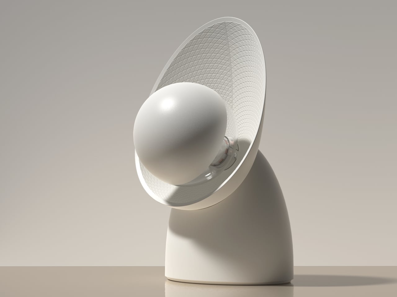
Mikka started as a question: what if cast concrete could feel light? The answer was a desk lamp with softened edges, carefully balanced volumes, and a silhouette that reads as calm rather than rigid. The intent wasn’t to disguise the material or pretend it’s something else, but to present concrete in a way that feels contemporary and approachable without stripping away what makes it honest.

Designer: Leon Bora

The form does most of the work. Surface transitions are controlled and gradual, edges are rounded rather than chamfered, and the overall proportions avoid the solid block feel that makes most concrete objects look like they belong on a construction site. The negative space inside the body carves away visual mass, helping the lamp feel lighter than any concrete object has a right to feel when you know how dense the material actually is.

Manufacturing played a central role in making that geometry possible. The housing was cast using a precisely engineered 3D-printed mold, which enabled tight radii, consistent wall conditions, and a refined surface finish that would be difficult to achieve with conventional mold making. This is a hybrid workflow, additive manufacturing used as tooling for traditional casting, and it’s what allows the lamp to have the controlled, nuanced form language it’s going for rather than the rougher profile that hand-built molds often produce.

The pivot mechanism is where Mikka asks for interaction. Angle the head downward, and the beam grazes across the concrete surface, revealing subtle texture variations and the natural imperfections from the casting process. The lamp becomes almost self-referential in that mode, drawing attention to the material qualities that define it. Angle it outward, and it becomes a practical reading or work light, focused and direct. One gesture shifts the whole character of the object.

That duality is what keeps it interesting on a desk rather than just on a shelf. Late at night, angled inward, it’s a quiet ambient presence. During the day, aimed at a book or screen, it’s functional and unfussy. It doesn’t ask you to commit to one mode, which is a useful quality in a lamp that has to share space with other objects.

Mikka suggests that concrete at product scale doesn’t have to default to weight and aggression. When the form is thoughtful, and the mold is controlled, the material can carry a different kind of presence, one that fits on a desk at home without demanding to be the only thing you notice in the room.

The post This Concrete Lamp Looks Calm and Rounded, not Brutalist first appeared on Yanko Design.
This 1080×1080 Round Touchscreen Saves Designers From Faking Circles

Circular interfaces keep showing up in design. Thermostats, smart speakers, automotive dials, wearable-inspired dashboards, the circle feels friendly and “instrument-like” in a way that rectangles don’t, especially when the goal is a glanceable, ambient piece of hardware rather than something you stare at for hours. The problem is that most prototyping hardware is rectangular, so designers either fake a round interface on a square screen or spend weeks sourcing a custom circular panel.

Waveshare’s 7-inch round touch display tries to remove that bottleneck. It’s a 1080×1080 IPS panel with 10-point capacitive touch, optical bonding, and toughened glass, all in a circular form factor that connects to a host device over HDMI with a separate USB-C cable for touch data. The premise is simple: treat it like a normal monitor and touchscreen, then build whatever circular UI you want on top of it.

Designer: Waveshare

The spec choices that matter for actual design work are mostly about reducing friction. HDMI video input and USB-C touch make the display behave like a standard external monitor to any device that supports it, so you’re not writing drivers or fighting kernel modules before you can see your UI on screen. Waveshare claims driver-free operation on Windows 11 down to Windows 7, plus Raspberry Pi OS with full 10-point touch, and Ubuntu and Kali with single-point, which is more than enough for early-stage prototyping.

Brightness is rated at 800 cd/m², with a 160-degree viewing angle from the IPS panel. For a prototype that’s going on a wall, into a vehicle mock-up, or onto a demo table for a client presentation, that combination means the display stays legible from reasonable distances and off-angle views. The optical bonding also closes the air gap between the glass and the LCD, so it reads more like a laminated consumer screen than a development board display, which makes a quiet difference when you’re showing work to someone who doesn’t build hardware for a living.

The small onboard controller adds a few practical tools: a physical touch rotation button for flipping between portrait and landscape without touching software, and a backlight adjustment that can be controlled via software. There’s also a 3.5mm audio jack and a 4PIN speaker header if you want to add sound to the build. None of these are headline features, but they’re the kind of things that accelerate iteration without requiring extra components or hacks.

Platform support stretches from Raspberry Pi 3 all the way through Pi 5, plus NVIDIA Jetson boards for more compute-intensive builds, and standard Windows PCs for larger installations or kiosk-style demos. That breadth means the same display can serve a lightweight Pi-based smart-home prototype one week and a Jetson-powered vision demo the next.

A circular screen goes beyond novelty into a very different product personality. Having an off-the-shelf option that handles touch, connects over standard cables, and doesn’t require driver work means designers can spend time on the actual interaction and enclosure instead of fighting the hardware stack to get a circle on screen.

The post This 1080×1080 Round Touchscreen Saves Designers From Faking Circles first appeared on Yanko Design.
These Solar Gazebos Have 4 Wind Turbines and Let You Charge Below

University campuses function like small cities. Students move between buildings, find outdoor spots to read or work, and constantly need power for phones and laptops. Sustainability tends to get communicated through plaques, rooftop panels, and annual reports, things you don’t interact with. There’s a gap between “this campus is reducing its carbon footprint” and “here’s a place where you can sit, charge your phone, and actually experience that in some tangible way.”

Michael Jantzen’s Solar Wind Gazebos are public pavilions designed to close that gap. Intended for university campuses, they function as gathering spaces while generating electricity from sun and wind, with the power feeding into the university’s grid. The proposal treats renewable infrastructure as a place to inhabit rather than a system to install, and it makes that infrastructure legible to anyone who walks up to one.

Designer: Michael Jantzen

The roof does most of the communicating. Four commercially available vertical-axis wind turbines sit at the corners, while a large circular solar panel occupies the center. That layout is easy to read at a glance: wind at the perimeter, sun at the core. You don’t need a label to understand what’s happening because the structure’s own geometry explains its energy logic, which is something most utility infrastructure completely fails to do.

The frame is predominantly stainless steel on concrete bases, which is a deliberate choice for outdoor public installations. Campuses need structures that handle weather, seasonal temperature swings, and constant use without requiring frequent maintenance windows. Stainless steel and concrete aren’t glamorous materials, but they’re honest ones for a building type that needs to outlast a decade of students without becoming an eyesore or a liability.

Inside, four cylindrical seating spaces are attached to the support columns, each with a receptacle at the top for plugging in devices. That detail is quiet but important, turning charging into a normal part of sitting down outdoors rather than a task that sends students hunting for an outlet inside a building. A large round central platform offers a shared surface for sitting or lying down, creating a mix of semi-private individual zones and an open communal gathering area.

A circular electric light mounted above the central platform runs off the same solar and wind generation, extending the pavilion’s usefulness into evening hours. The structure essentially powers its own ambience, which gives the whole thing a satisfying sense of completion, generation, use, and light running off the same rooftop.

The gazebos are designed to be reproduced as prefabricated structures in various sizes and installed across different landscapes. The same concept fits public parks, corporate campuses, and any open space where people gather and need shade, seating, and somewhere to plug in. The broader implication is that renewable energy infrastructure doesn’t always have to hide behind fences or sit on rooftops. Sometimes it can be the very thing you sit inside of on a Tuesday afternoon between classes.


The post These Solar Gazebos Have 4 Wind Turbines and Let You Charge Below first appeared on Yanko Design.