5 Best Spring Gadgets That Are Taking Over Every Tech-Savvy Student’s Wishlist

Spring changes the way students think about their tools. The semester finds its stride, the days stretch longer, and the quiet audit of what is actually working versus what has simply been tolerated becomes impossible to defer. For tech-savvy students, this impulse is never casual. It turns into a deliberate reckoning with every device in the bag, every cable on the desk, and every piece of hardware that earns or fails to earn its place in a schedule already running at capacity.

Most gadget guides aim too low. They recycle the same categories, suggest the predictable safe picks, and miss the specific texture of what a tech-savvy student’s day actually looks like in spring. Tools that genuinely serve that day are portable without sacrifice, precisely designed, and specific enough in their purpose to feel built for the exact problem they solve. The wishlists circulating among students who think carefully about design land on exactly that — and every product here was chosen to reflect it.

1. OrigamiSwift Folding Mouse
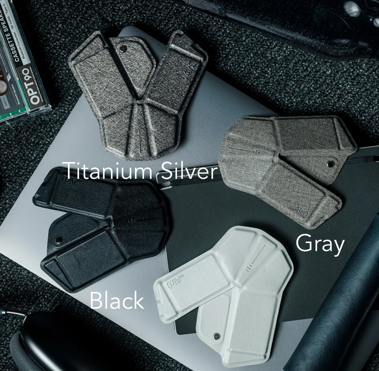
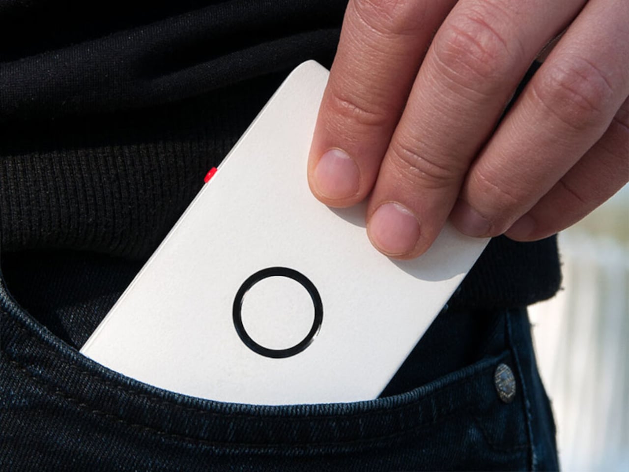
The mouse is the peripheral that students consistently overlook until a trackpad fails them mid-session. The OrigamiSwift changes that calculation. Drawing on origami’s structural logic, this Bluetooth 5.2 mouse collapses flat and springs into a full-sized ergonomic device in under 0.5 seconds. At 40 grams and 0.18 inches thin when folded, it disappears into a jacket pocket without adding noticeable weight. Soft-click buttons suit shared study spaces, and a USB-C battery sustains three months on a single charge.

For students moving between a library desk, a café table, and a campus bench in one afternoon, this is the mouse that travels without being noticed until needed. Compatible across Mac, Windows, Android, and iPadOS, it works equally on a personal laptop and a shared lab machine with no additional setup. The ergonomic form handles extended sessions without fatiguing the wrist, turning a recurring compromise into a peripheral that finally earns its place.

Click Here to Buy Now: $85.00

What We Like:

  • Folds to 0.18 inches and 40 grams, fitting into a jacket pocket without adding meaningful bulk to the daily carry
  • Three-month USB-C battery life removes it entirely from the weekly charging routine, so one less thing to think about

What We Dislike:

  • Bluetooth-only connectivity limits use on older shared desktops or lab machines that lack wireless support
  • The folding mechanism takes a brief adjustment period for students accustomed to the immediate grip of a conventional fixed-body mouse

2. Xiaomi UltraThin Magnetic Power Bank 5000 15W
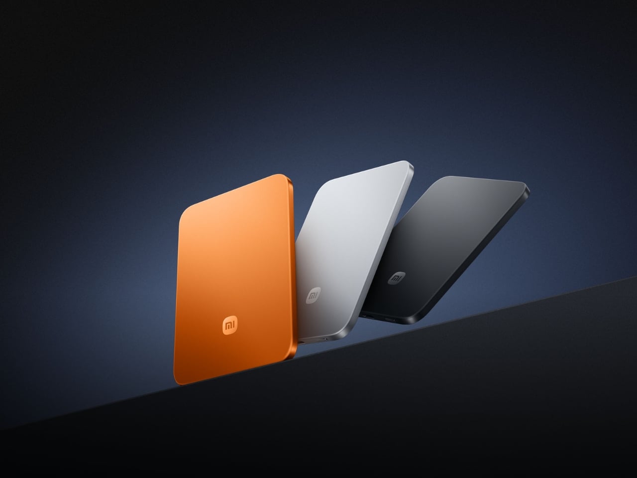
Power banks occupy a strange design dead zone. Most work as promised and are forgotten the moment they enter a bag. The Xiaomi UltraThin Magnetic Power Bank 5000 15W reframes the category. At 6mm thin — slimmer than any current smartphone — it holds 5,000mAh inside an aluminum alloy shell. Silicon-carbon battery chemistry with 16% silicon content enables higher energy density without expanding the footprint, and a fire-resistant fiberglass rear surface manages heat during wireless charging.
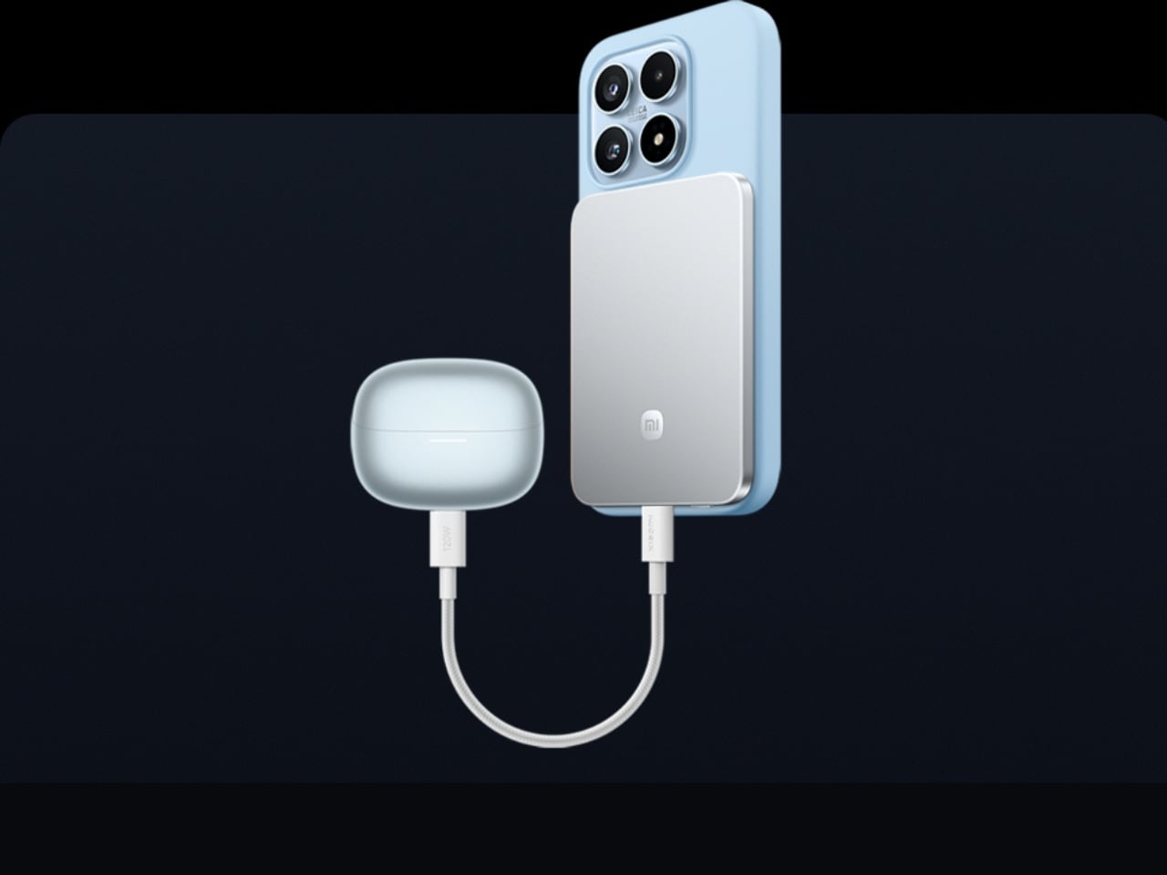
This solves the persistent problem of the charging backup that stays home because it feels too heavy to justify. At 6mm, it sits magnetically against a compatible phone and delivers 15W wirelessly while moving between buildings, sitting through a lecture, or waiting at a transit platform. No cable between bank and phone, no rummaging for the right end. It sits in a pocket as an extension of the device rather than a separate burden to manage throughout the day.

What We Like:

  • Silicon-carbon chemistry achieves 5,000mAh within a 6mm profile, making it the thinnest power bank available at this capacity tier
  • Magnetic cable-free attachment delivers 15W wirelessly while the phone stays pocketed between classes, with zero management required

What We Dislike:

  • 5,000mAh covers roughly one full smartphone charge, which falls short on heavy-use days involving continuous navigation, recording, and streaming
  • Magnetic wireless charging is limited to compatible phone models, restricting the cable-free feature for students outside that ecosystem

3. HubKey Gen2

The average student laptop setup involves a quiet accumulation of compromises: a dongle for the display, a separate hub for ports, a cable for audio, and none of it cohering. The HubKey Gen2 addresses this from a single USB-C connection. An 11-in-1 hub in a compact cube, it adds two HDMI ports, each capable of driving a 4K display at 60Hz, four fully customizable physical shortcut keys, and a central control knob that handles everyday actions without navigating software menus.

Spreading a research document across two 4K panels changes the quality of a work session in ways only understood from the inside. Reference material stays open while the draft stays active. Code and documentation share the same eyeline. The shortcut keys reduce the cognitive overhead of memorizing keyboard combinations, and the central knob delivers volume control with tactile immediacy that no software slider replicates. For students working across design, development, or video, this cube earns its place on day one.

What We Like:

  • Dual 4K HDMI outputs at 60Hz each simultaneously expand a laptop into a proper two-monitor workstation from a single connection
  • Physical shortcut keys and a central control knob bring immediate, tactile control to routine tasks that software menus handle more slowly

What We Dislike:

  • Cube form factor suits a stationary desk, but does not pack into a travel bag as cleanly as a flat or cable-style hub alternative
  • Full 11-in-1 performance depends on the connected laptop’s USB-C port supporting the required power delivery and data bandwidth specifications

4. BraX open_slate
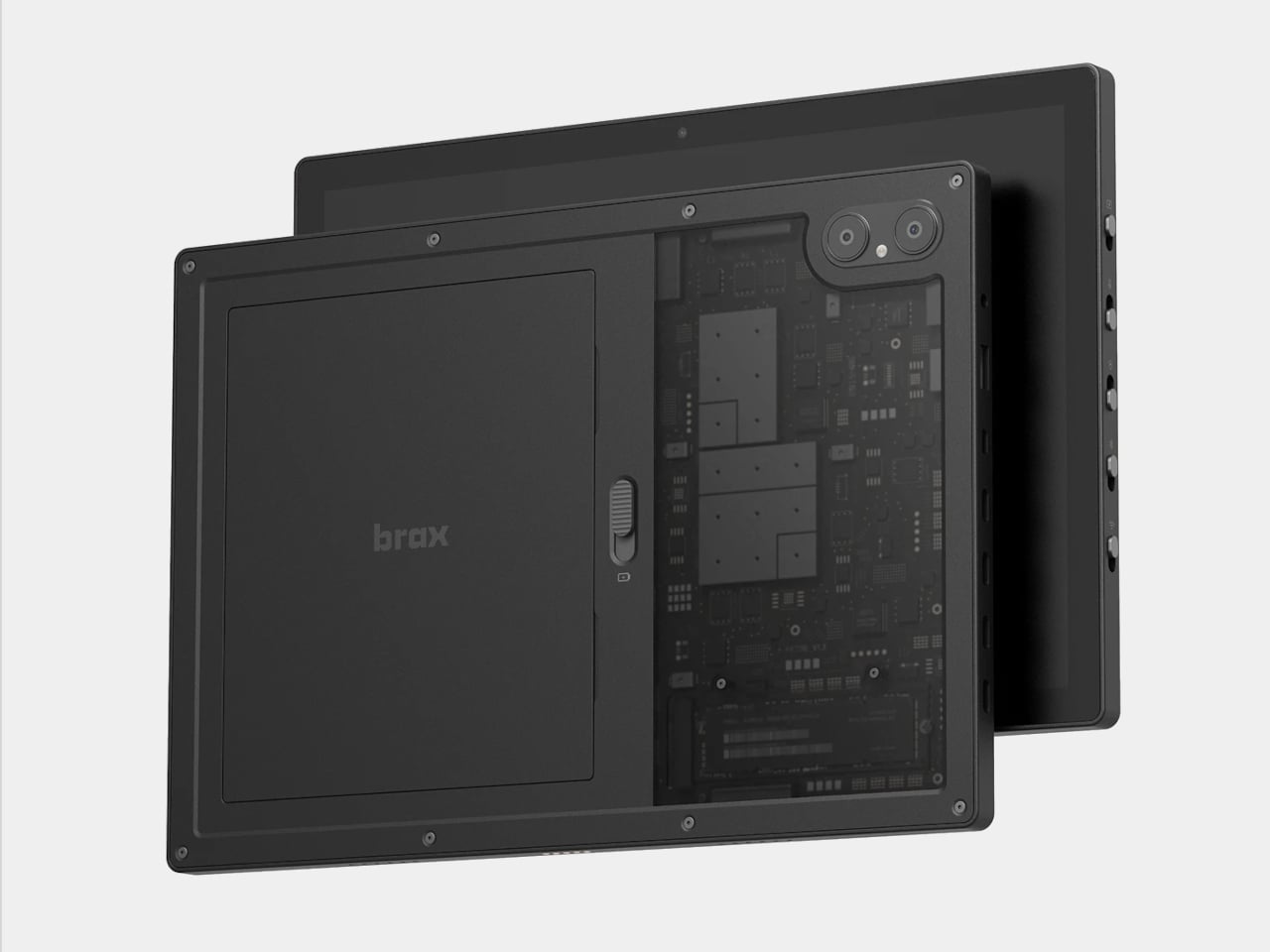
Almost every tablet arrives sealed, with decisions already made inside the chassis: fixed storage, an inaccessible battery, a software support window that closes on the manufacturer’s schedule. The BraX open_slate rejects that model. This 12-inch 2-in-1 includes an M.2 2280 slot for user-swappable storage, a replaceable 8,000mAh battery rated at 20 hours of runtime, and a 120Hz display driven by a MediaTek Genio 720 chip paired with either 8GB or 16GB of RAM.

The open_slate removes the most predictable frustration of the tablet ownership cycle: the moment a device slows enough to become an obstacle, and the only available response is full replacement. Swappable storage means a capacity upgrade takes an afternoon. A user-replaceable battery means two years of student use does not write off the entire device. For students making a deliberate, multi-year investment in one tablet, this is currently the only option making that argument with hardware to back it.

What We Like:

  • User-replaceable M.2 storage and battery extend the device’s usable lifespan well beyond the typical two-to-three year sealed-tablet replacement cycle
  • A 20-hour claimed battery runtime on a 120Hz display covers a full academic day without requiring a charge mid-session

What We Dislike:

  • MediaTek Genio 720 is a capable mid-range chip, but it is not suited for students with intensive video rendering or compute-heavy creative workloads
  • The open modular hardware requires a degree of technical confidence that students coming from fully managed, sealed device ecosystems may need time to build

5. Battery-Free Amplifying iSpeakers
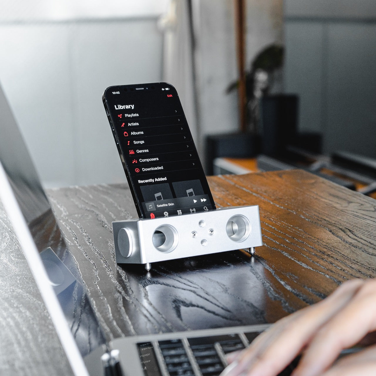
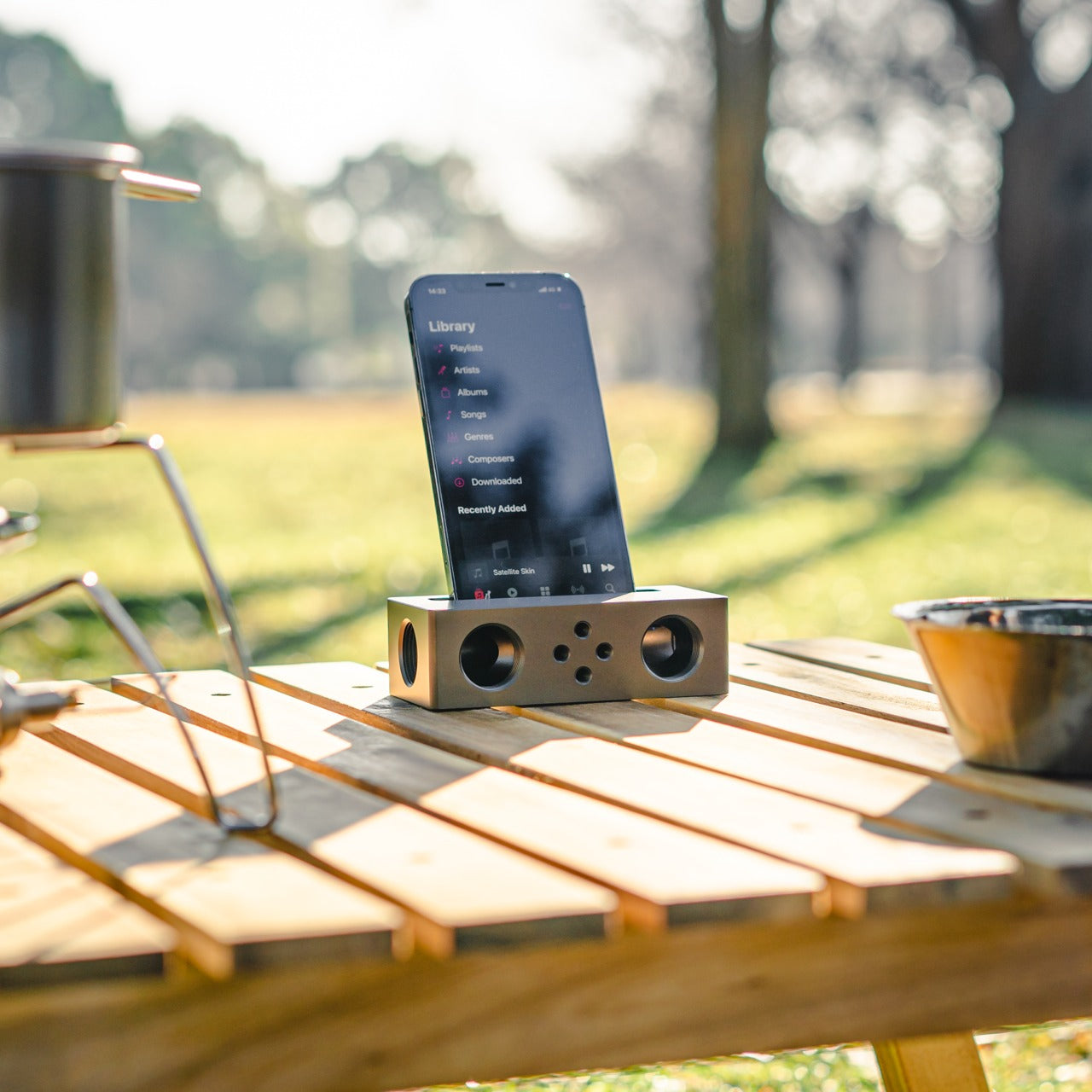
The Battery-Free Amplifying iSpeakers operate on a principle that is easy to underestimate until the sound fills the room. A smartphone sits in the machined Duralumin cradle, and sound waves are directed and amplified through the chamber without any electrical input. The body is the same aluminum alloy used in aircraft construction, chosen for its vibration resistance and acoustic properties. Chamber proportions were developed using the golden ratio, a structural decision that shapes the internal acoustic geometry deliberately.

No charging reminder, no Bluetooth pairing, no firmware update mid-session. A phone in the cradle and the room shifts immediately, audio gaining presence and warmth that a phone speaker lying flat on a desk cannot approach. For study sessions running on focus music, ambient sound, or a lecture replay, the difference registers in seconds. Duralumin handles daily movement without showing wear, and because it operates entirely outside the electrical ecosystem, it performs identically in ten years as it does today.

Click Here to Buy Now: $179.00

What We Like:

  • Zero power requirement means no charging, no battery degradation, and no dependency on any cable or power source at any point
  • Aircraft-grade Duralumin construction delivers acoustic quality and physical durability that holds across years of regular daily use without deterioration

What We Dislike:

  • Passive acoustic amplification improves meaningfully on bare phone speaker output, but cannot match the volume or bass depth of even entry-level powered speakers
  • Cradle sizing is optimized for specific smartphone dimensions, and compatibility may vary with larger phones or thick protective cases

The Setup That Actually Works for You

The five products here do not share a category, price point, or use case. What they share is design precision that addresses real daily friction rather than just performing a feature list. A wishlist built on that standard holds up across the full stretch of any semester. These are tools chosen because someone thought carefully about the problem first, and that clarity comes through every time you reach for one.

Spring is short. It moves quickly from the first warm afternoon to the last exam, and the tools you work with shape how much of that time goes toward actual output. The difference between owning something well-considered and tolerating what came with freshman year becomes obvious around week ten. Choosing now means spending the rest of the semester working with something that performs exactly the way a well-chosen tool should.

The post 5 Best Spring Gadgets That Are Taking Over Every Tech-Savvy Student’s Wishlist first appeared on Yanko Design.
This All-In-One Ryzen MiniPC Packs 12 Ports, 4.5-Inch Display, and 15W Wireless Charging

Your desk has too much stuff on it. A mini PC sits next to a USB hub, which sits next to a wireless charging pad, which sits next to a dock that barely has enough ports anyway. You bought each piece to solve a specific problem, and together they created a new one: a workspace that looks like a Best Buy exploded across your desktop. Cable management becomes a part-time job. Every device needs its own power brick, its own real estate, its own moment of your attention when something inevitably stops working.

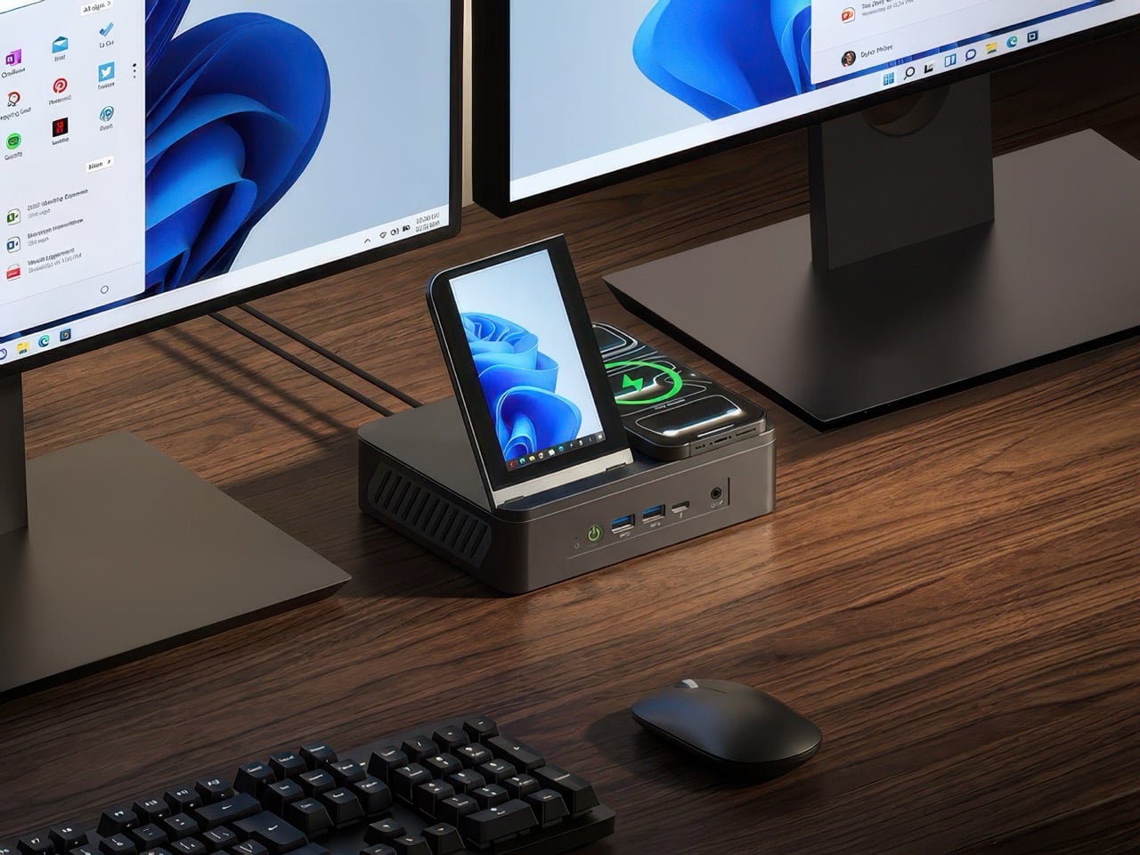
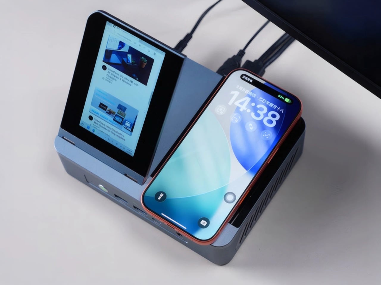
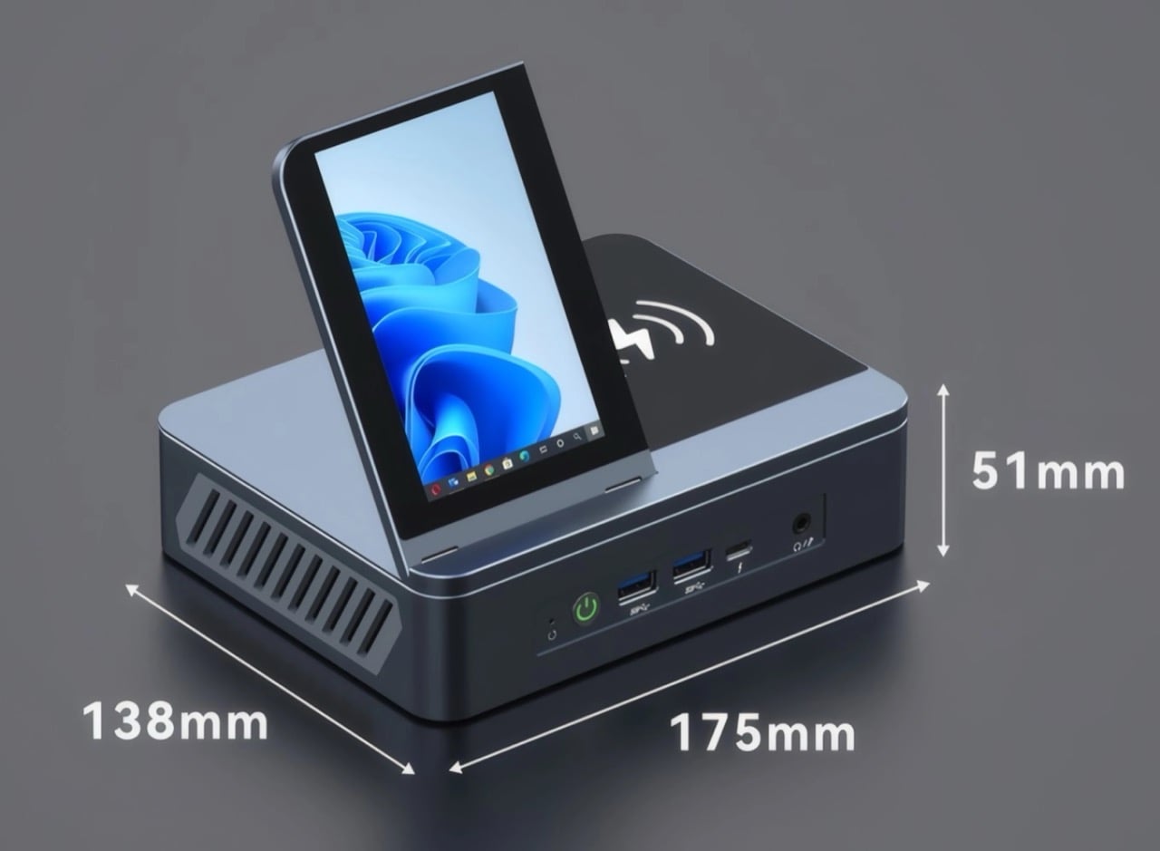
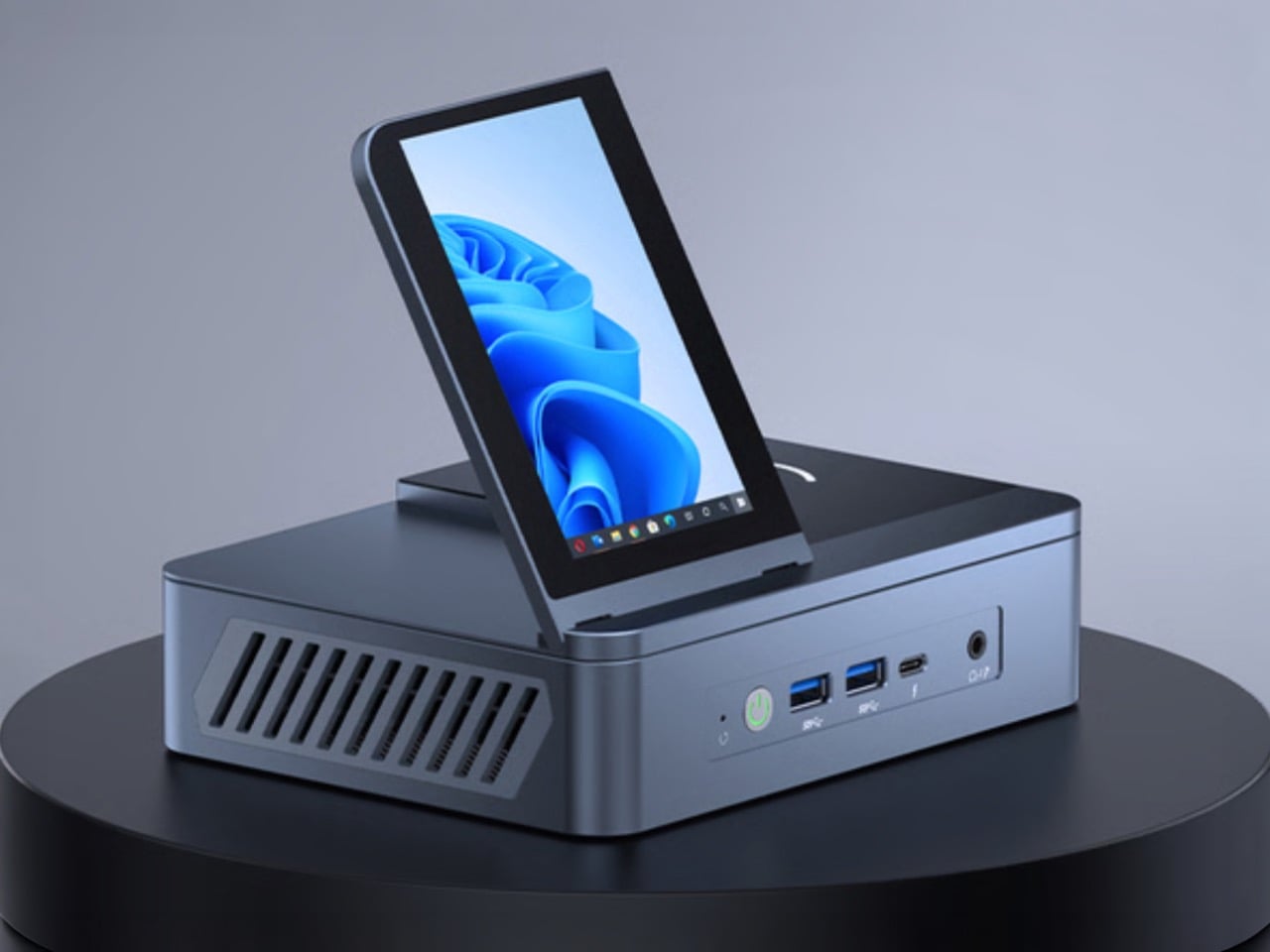
ViewDock Gen2 collapses that entire ecosystem into a single 175mm aluminum block. The Hong Kong-based team designed a vertical mini PC that integrates a 4.5-inch adjustable display, 15W Qi wireless charging, and a full 12-port I/O layout into a form factor that weighs 2.3 pounds and takes up less desk space than a coffee mug. Inside, AMD Ryzen processors from the 6000, 7000, and 8000 series (including options like the 6900HX, 7735H, 7640H, 7840H, 7940H, and 8845H) handle everything from productivity to light gaming, with boost speeds reaching up to 4.9GHz. ViewDock hasn’t published which specific processor ships with each configuration, and performance gaps exist between these chips, so you’ll want to confirm your exact SKU before backing. Dual M.2 slots support up to 4TB of combined storage, and units start at a discounted $639 during the Kickstarter campaign.

Designer: ViewDock

Click Here to Buy Now: $639 $1079 (41% off) Hurry! Only 185 units left.

The hinged 4.5-inch display on top of the chassis deserves its own paragraph because it represents a genuine design fork in how you interact with a desktop computer. Most secondary displays are external accessories you buy separately, mount awkwardly, and power independently. ViewDock built one directly into the machine and made it adjustable through 90 degrees, so you can angle it toward your eyeline or fold it flat when you don’t need it. The panel outputs at 480 x 854 pixels, which sounds low until you remember this is a dashboard, not a workstation monitor. You’re using it for system stats, chat windows, calendars, or media previews while your main displays handle the heavy lifting. The screen powers on and off automatically with the system, syncs without configuration, and eliminates yet another cable from your setup. It’s a small decision that compounds across daily use.

The aluminum alloy chassis does more than look good, though it does look good. Most mini PCs default to plastic because it’s cheap and easy to mold, and most mini PCs run hot because plastic doesn’t dissipate heat well and manufacturers cheap out on cooling. ViewDock went the opposite direction. The precision-machined aluminum body acts as a passive heatsink, pulling warmth away from internal components and spreading it across a larger surface area. Inside, a 4000 RPM fan with a vapor chamber design moves air through optimized vents on all sides, keeping the CPU between 30 and 45 degrees Celsius even under sustained workloads. That thermal engineering is the reason the G2 can pack this much performance into a 51mm-tall enclosure without throttling or sounding like a jet engine. You don’t see it, but you benefit from it every time the system stays quiet during a render or stays stable during an overnight compile.

The I/O layout splits across front and rear panels, and ViewDock clearly thought about which ports you reach for often versus which ones you set and forget. The front gives you two USB-A 3.0 ports, one USB-C, a 3.5mm audio jack, and a power button. The rear houses the 40Gbps USB4 Type-C port, HDMI 2.1, DisplayPort 1.4, two more USB-A ports, dual 2.5G Ethernet jacks, and the DC power input. All video outputs support 4K at 120Hz, and you can drive three external monitors simultaneously while using the built-in display as a fourth screen. That’s a legitimate triple-monitor workstation powered by something you can fit in a backpack. The wireless charging pad on top supports the universal Qi standard at 15W, so any compatible phone or earbuds drops onto the surface and charges without fumbling for a cable.

ViewDock also built the G2 to be user-upgradeable, which is increasingly rare in this product category. The chassis opens to reveal two DDR5 SODIMM slots that accept up to 64GB of RAM at 4800MHz or 5600MHz, and two M.2 2280 slots that support SATA3, PCIe 3.0/4.0, and NVMe protocols. Each SSD slot can take a 2TB drive, giving you 4TB of total storage if you max it out. That kind of expandability extends the useful life of the machine well beyond its initial configuration, which matters when you’re spending $600 to $1,200 on a desktop system. WiFi 6 and Bluetooth 5.2 come standard, and the unit ships with a Windows 10/11 trial pre-installed, though it’s fully Linux-compatible if you’d rather run Ubuntu.

The G2 launched on Kickstarter in March 2026 with four main configurations. The Creative Edition starts at $639 with base specs, while the 16GB RAM with 512GB storage model sits at $889. Step up to 16GB with 1TB storage for $999, or go all the way to 32GB with 1TB for $1,229. Those prices represent 40 to 50 percent discounts off projected retail, which is typical for crowdfunding campaigns. ViewDock plans to ship all units in August 2026, with expected delivery in September. Shipping costs vary by region, starting at $20 for Asia and scaling up to $50 for three-unit orders to the US or Canada. The team successfully delivered their first-generation ViewDock docking station to backers last year, which gives this campaign more credibility than most hardware Kickstarters manage on day one.

Click Here to Buy Now: $639 $1079 (41% off) Hurry! Only 185 units left.

The post This All-In-One Ryzen MiniPC Packs 12 Ports, 4.5-Inch Display, and 15W Wireless Charging first appeared on Yanko Design.
Dhruv Agarwwal’s Blur Coffee Table Turns an Optical Illusion Into Furniture

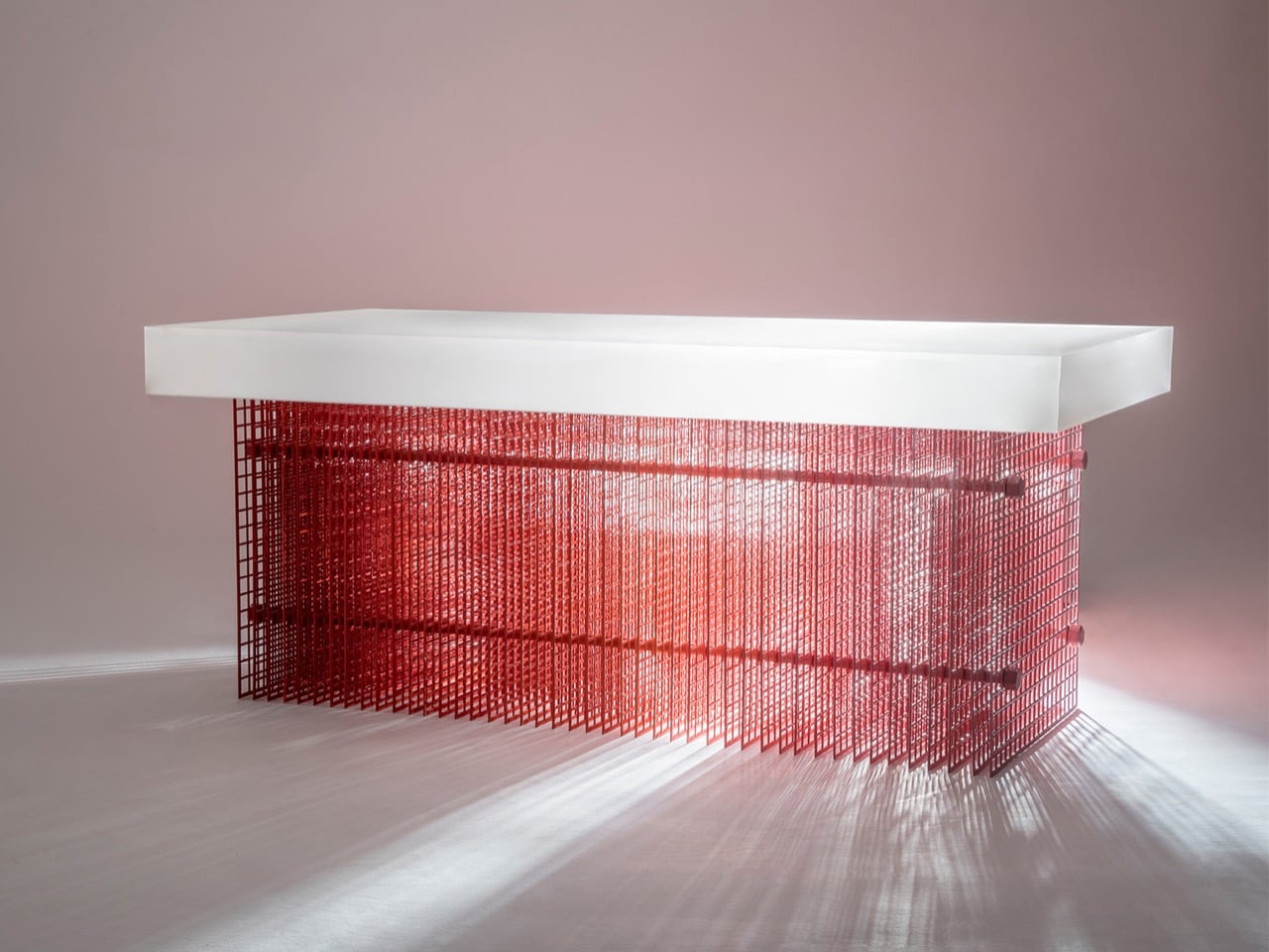
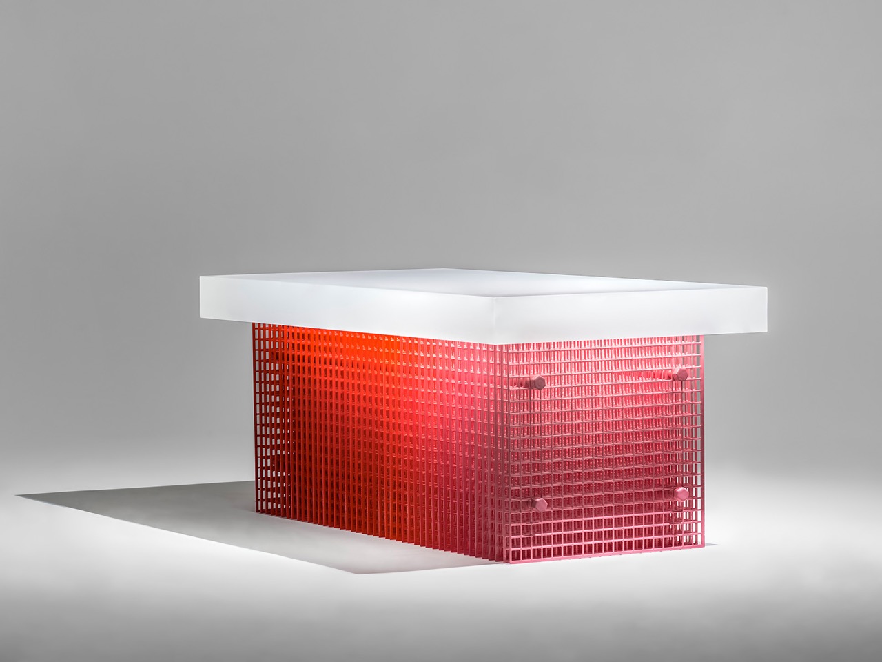
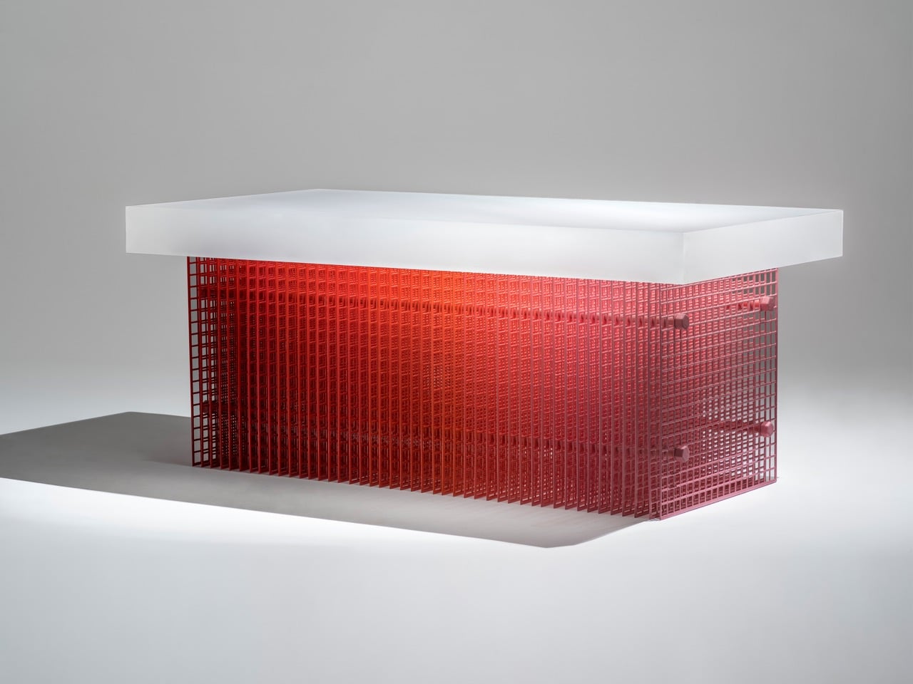
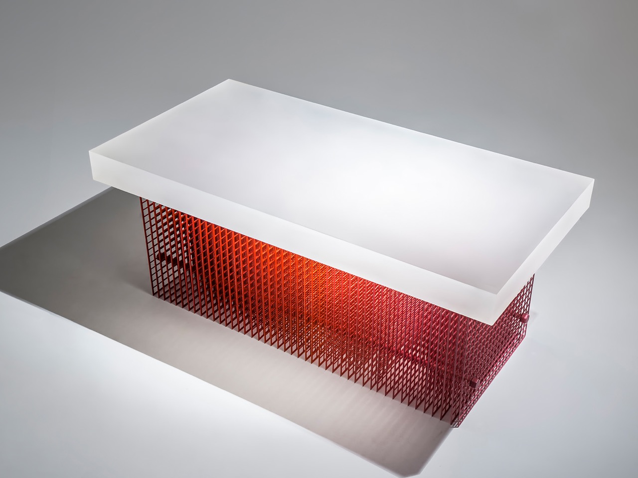
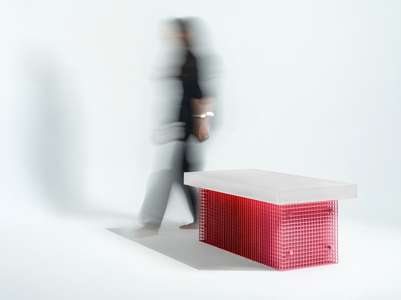
Dhruv Agarwwal’s Blur coffee table is named for what it does to your eyes. The base is a structure of layered steel mesh, each plane sitting close enough to the next that their overlapping grids produce a moire effect across the surface, a shifting, shimmering interference pattern that changes character with every degree of movement from the viewer. The red Meena enamel coating, applied by hand by artisans in Moradabad, intensifies the effect: the slight inconsistencies of hand-application mean the color itself is uneven, denser in some areas, thinner in others, feeding directly into the optical noise.

Above the mesh base floats a frosted acrylic tabletop, thick and rectangular, diffusing rather than reflecting light. The pairing of the two materials produces a coherent visual argument: both surfaces refuse to be fully legible. One shimmers and shifts; the other glows and obscures. Together they make a table that rewards extended looking in a way that polished stone or clear glass simply cannot.

Designer: Dhruv Agarwwal

Meena enamel is a craft with serious heritage. Originating in Rajasthan and practiced extensively across Moradabad, it involves fusing powdered glass onto metal at high temperatures, a process that demands precision and repetition and produces a surface that no two artisans will render identically. Agarwwal worked with local craftspeople to develop a thicker enamel coat than the technique typically yields, which is a meaningful technical decision because thickness changes how the enamel interacts with light, giving it volume and depth rather than lying flat against the wire. On a steel mesh substrate, that depth becomes optical complexity. The wire catches the enamel unevenly, creating micro-variations across thousands of small cells, and those variations are exactly what makes the moire pattern feel alive rather than mechanical.

The Moire effect emerges when two or more repetitive patterns overlap at a slight offset or angle, producing a third, emergent pattern at a much larger scale. It is the same phenomenon that makes a window screen look striped when photographed, or causes two chain-link fences to generate waves when viewed at an angle. In Blur, the layered mesh panels are the mechanism, and the enamel coating is the amplifier. At 112 x 56 x 45 cm, the table is coffee table scale, low and rectangular, which means the base sits in the viewer’s sightline rather than below it. You look across the mesh, not down at it, which is precisely the angle at which moire interference is most pronounced.

What separates Blur from the broad category of studio furniture that deploys traditional craft as surface-level ornamentation is that the Meena enamel technique is load-bearing to the concept, not decorative dressing applied after the fact. The irregularity is the point. A machine-applied coating would produce a uniform surface, and a uniform surface would kill the moire entirely, flattening the mesh into something predictable and inert. Agarwwal needed the hand, the slight inconsistency, the human error baked into a centuries-old process, to make the optical effect function. The craft and the perceptual phenomenon are causally linked, not just thematically paired, and that is a genuinely uncommon design position to arrive at and execute convincingly at furniture scale.

The post Dhruv Agarwwal’s Blur Coffee Table Turns an Optical Illusion Into Furniture first appeared on Yanko Design.
This E Ink Wisephone Has No Camera, No App Store, No Social Media

Smartphones have become something of a paradox. The more capable they get, the less in control we feel. Notifications pull us in every direction, social feeds demand constant attention, and app stores offer thousands of things we never asked for. For all the technology packed into these slim glass rectangles, they’ve stopped being tools we use and started being systems we manage.

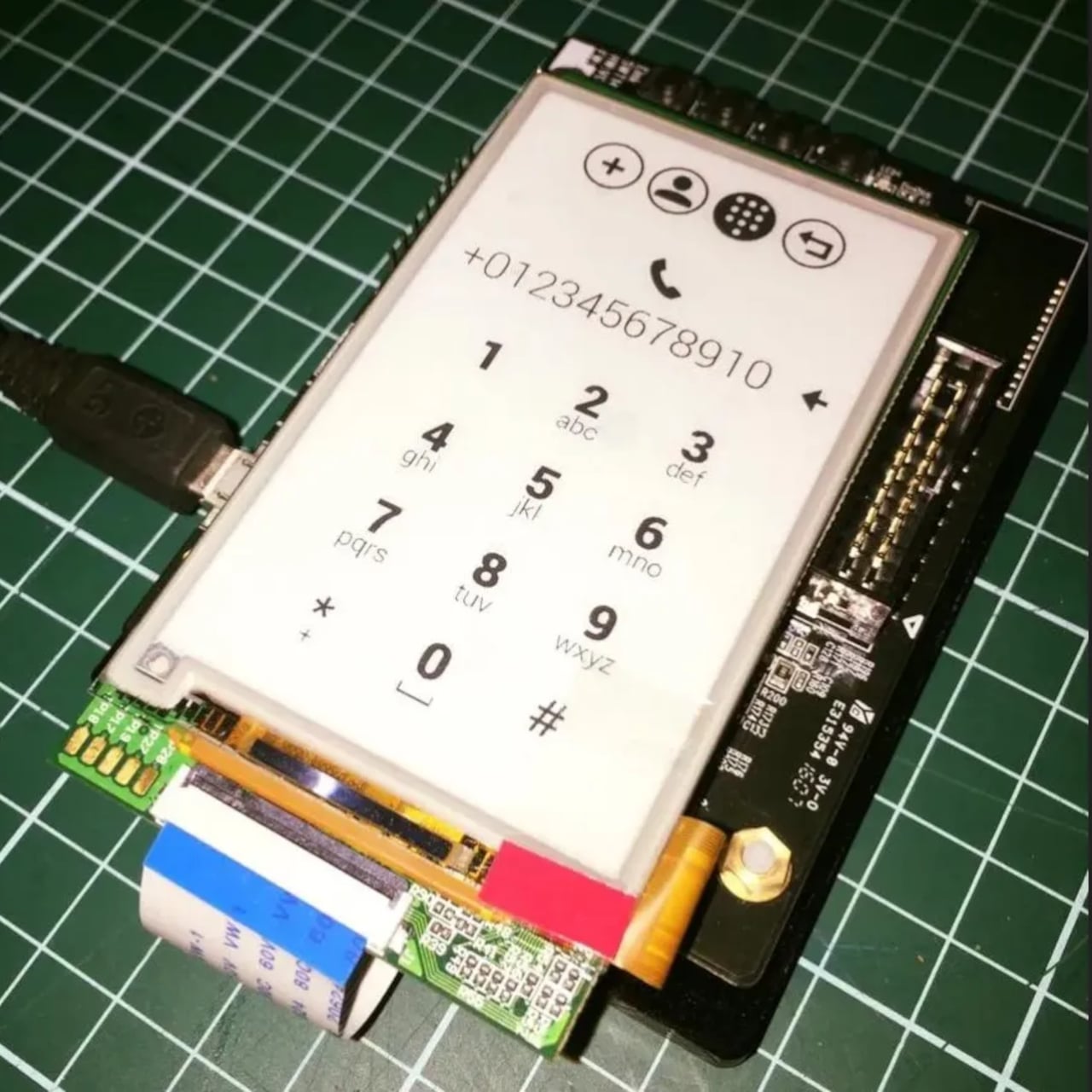
That tension is exactly what Berlin-based architect Marko Lazić sat with one afternoon in 2016, waiting for a friend at a coffee shop with his phone battery nearly dead. He sketched an idea, one that took years to develop but eventually became Offone, a 3D-printed phone with an E Ink display that he calls a “wisephone.” Not a dumbphone, and certainly not a smartphone, but something deliberately in between.

Designer: Marko Lazic

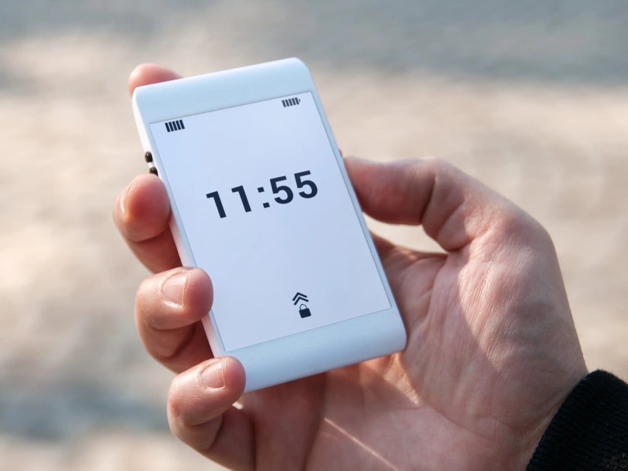
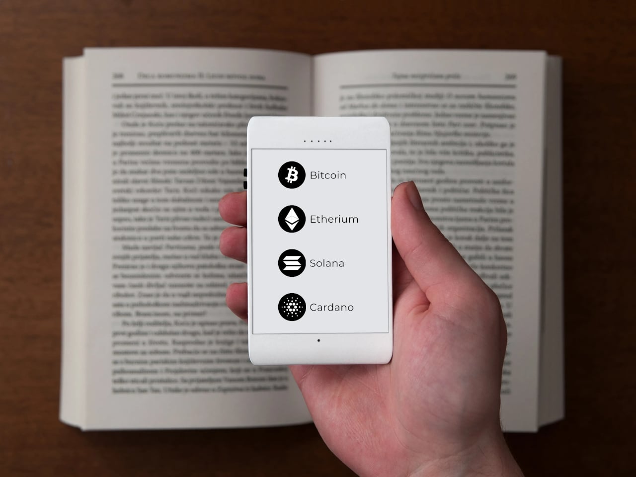
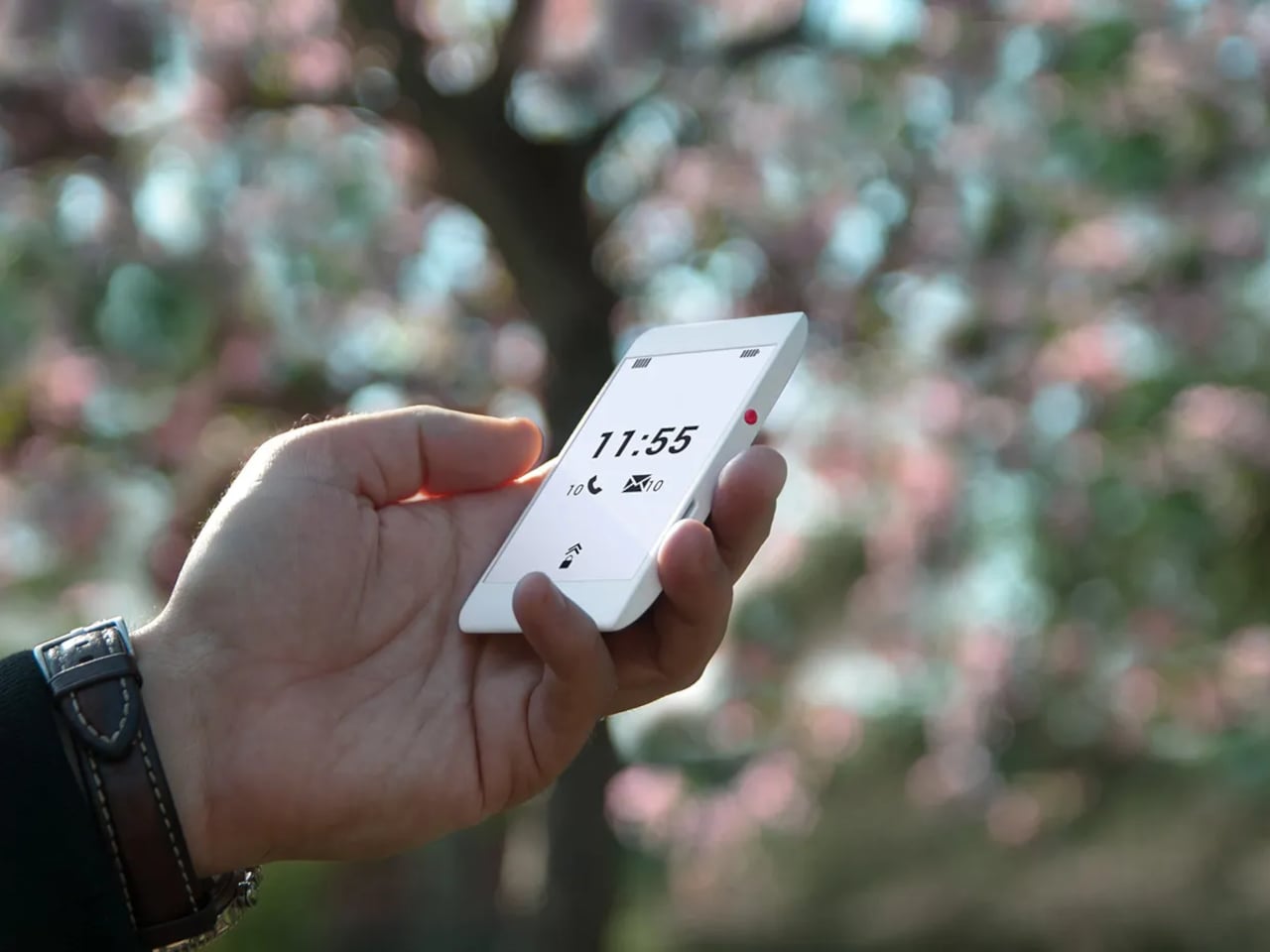
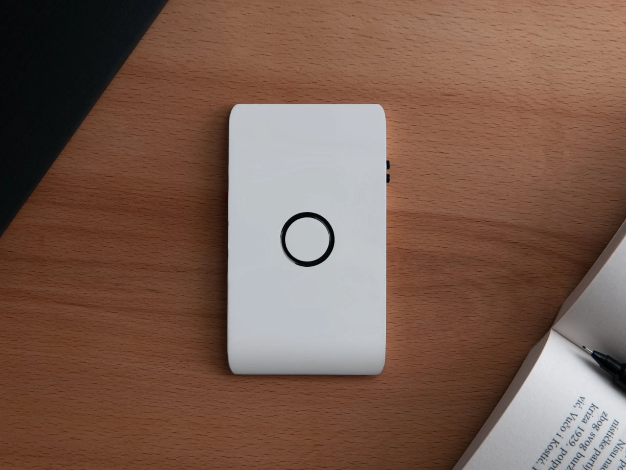
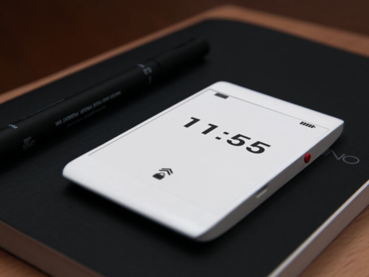
The first thing that catches your attention is how unassuming Offone is. Its 3D-printed body is slim enough to slip into a wallet alongside your cards and fits in the palm without effort. White, monochrome, and clean, the E Ink touchscreen looks more like paper than a display. The side bezels are practically nonexistent, while the top and bottom house the usual earpiece and microphone.

The E Ink display is a practical choice as much as an aesthetic one. It means no screen glare, no blue light, and no eye strain from prolonged use. Reading a text or checking a contact feels like glancing at a printed page. Lazić also considered night use, suggesting optional backlighting so the phone remains usable in the dark without disrupting sleep the way most backlit screens tend to do.

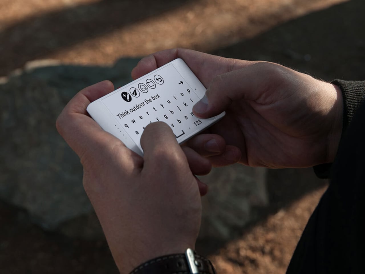
Lazić’s approach to the interface is as intentional as the hardware. Instead of text labels, Offone uses universal symbols to represent its apps, meaning navigating the phone doesn’t require knowing any particular language. It’s a small detail but a telling one, reflecting a philosophy where clarity and accessibility come before convention. The only time you type letters is when writing a message or searching for a contact.

The app selection is just as deliberate. You get calls, SMS, Google Maps, Waze, Uber, and messaging platforms like WhatsApp, but nothing else. No camera, no app store, no social feeds. Imagine getting through a travel day, navigating an unfamiliar city, calling ahead to a hotel, and ordering a ride, all without once falling into the scroll. For frequent travelers and the easily distracted, that’s a meaningful trade-off.

Even the hardware choices are guided by this spirit of restraint. At least one prototype shows no ports at all, meaning charging would be wireless and headphone connectivity handled over Bluetooth. It’s a cleaner device in every sense, free from the usual tangle of cables. The E Ink display also dramatically reduces power consumption, pushing battery life well past what most smartphones manage in a day.

Offone never reached production. Lazić wrote about the startup’s collapse in a 2022 Medium post, pointing to a mix of ambition, poor team choices, and a lack of funding as the reasons it fell apart. Development halted that same year after the team disbanded, leaving it an intriguing concept that was perhaps just a few years ahead of the minimalist phone movement it helped inspire.

The post This E Ink Wisephone Has No Camera, No App Store, No Social Media first appeared on Yanko Design.
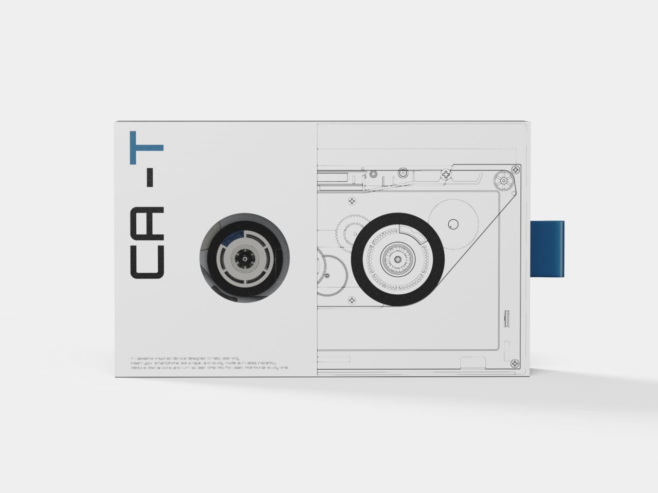
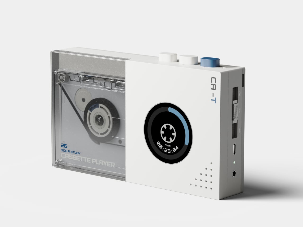
CA-T Traps Your Phone Like a Cassette Tape So You Can Actually Focus

The problem with focus apps isn’t that they don’t work. It’s that the thing running them is also running Instagram, YouTube, and every group chat you’ve ever been in. The phone stays in your hand, the timer ticks, and the notifications stack up at the edge of your vision. CA-T is a concept that treats this as a hardware problem rather than a willpower problem, and the solution it proposes is surprisingly literal.

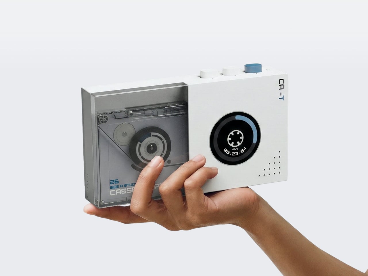
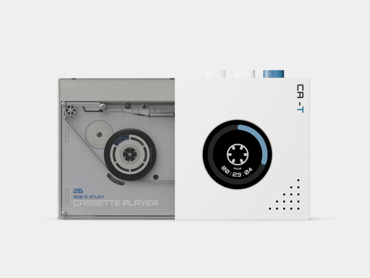
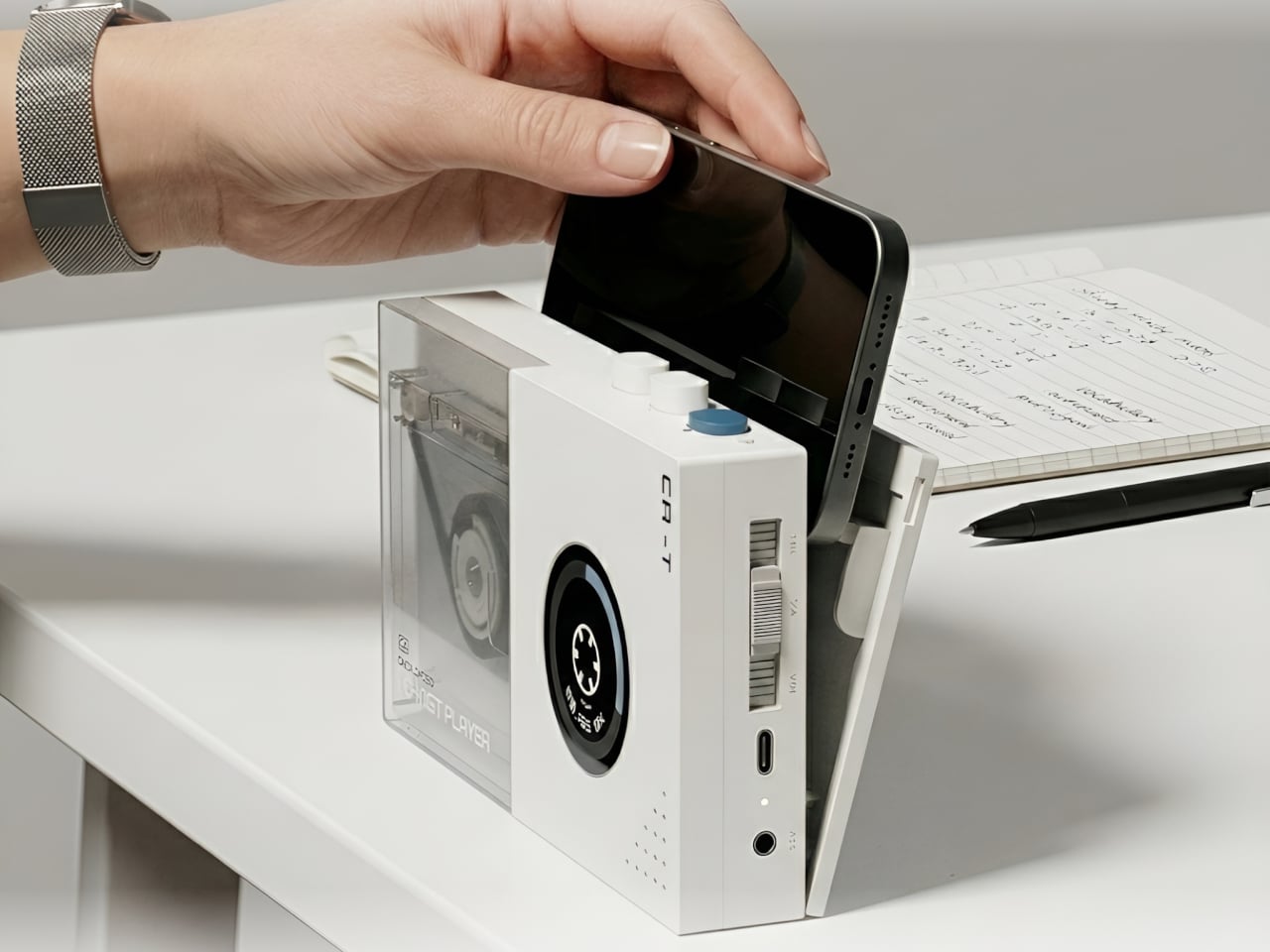
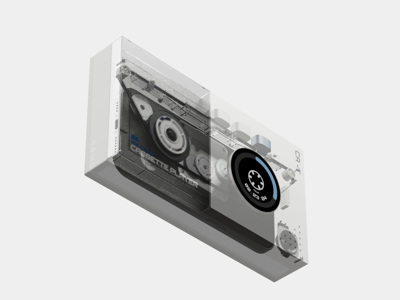
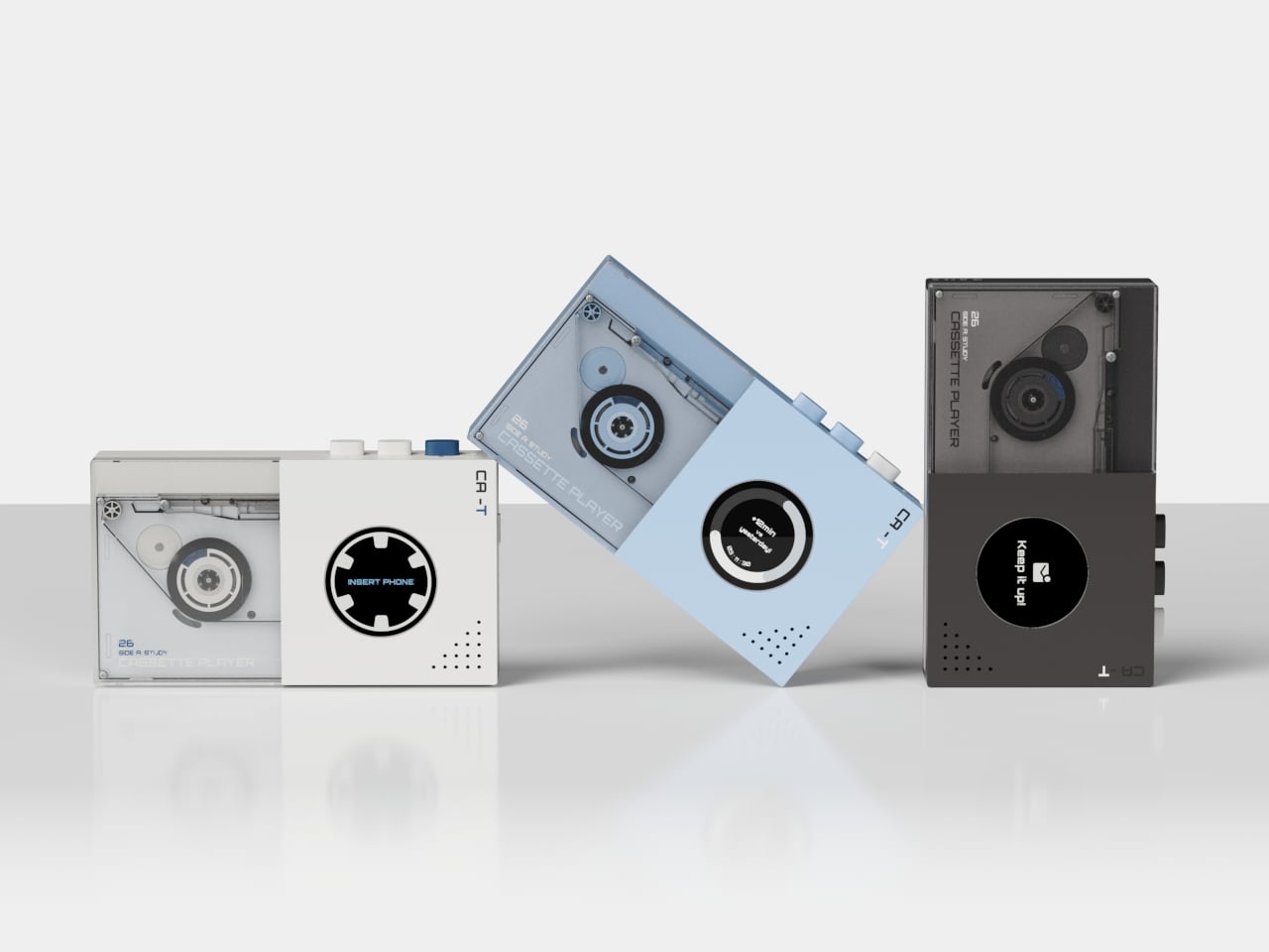
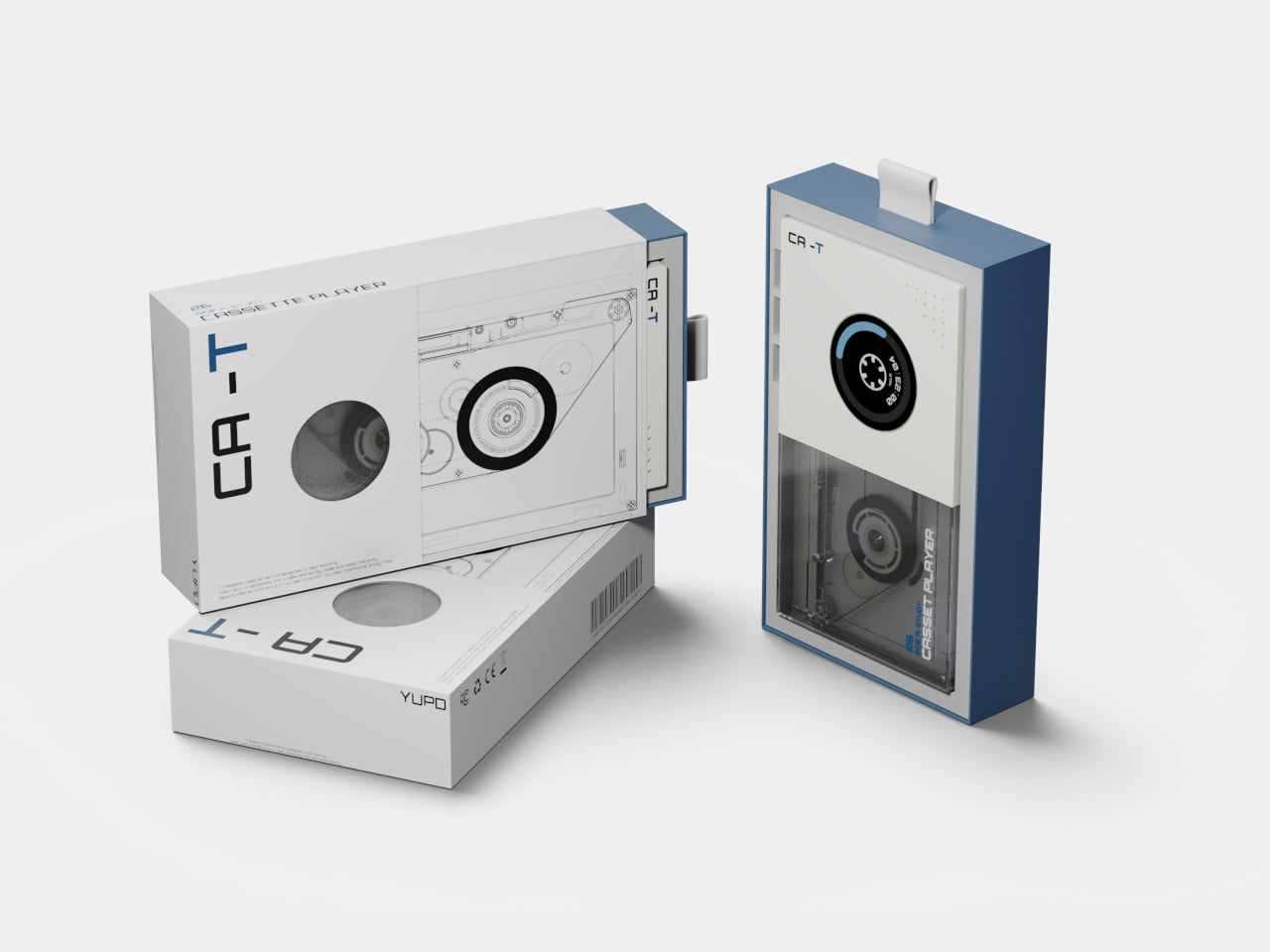
Taking inspiration from an age before smartphones, the CA-T is a compact desktop device shaped like a cassette player. Your smartphone is the tape. Slot it into the bay on top of the device, and the study session starts. The concept’s own framing is direct about this: the mobile phone, once a source of distraction, becomes the condition for activation. The device doesn’t operate at all until the phone is inserted.

Designers: Hyunwoo Jung, Minsu Kang, Yehoon Cho, Yoonchae Kim

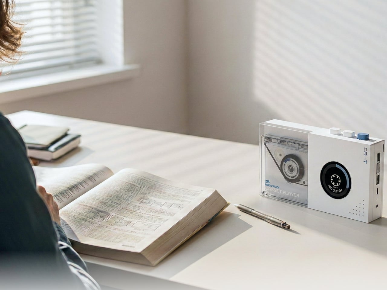
Once docked, the phone charges wirelessly while the session runs. The circular display on the front face of the device shows a timer, but with a specific and deliberate framing: it visualizes the accumulation of focus rather than the countdown of remaining time. The reel graphic rotates as the session progresses, showing how much you’ve built up rather than how much you have left. That’s a small but meaningful reframe of what a study timer is supposed to communicate.

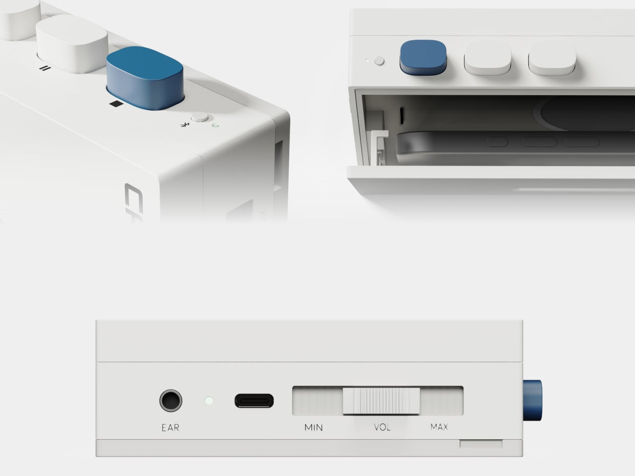
The session moves through four states. Ready prompts the user to insert their phone. Focus runs the timer as the reel turns. Comment delivers brief encouragement during the session, minimal by design, intended not to interrupt but to sustain. Complete shows the accumulated result, offering a record of consistency rather than just a signal that time is up. The physical controls are kept sparse: a prominent blue button on top, two secondary white ones, a volume slider, and a headphone jack along the bottom edge.

The cassette reference earns its place here beyond the obvious nostalgia. A tape only plays when it’s loaded, and loading it is an unambiguous act; there’s no passive way to start. The design applies the same logic to starting a study session, using physical insertion as a commitment mechanism. The design also addresses what it calls “the pressure of having to start,” framing the gesture of inserting the phone as lower-friction than opening an app and navigating past whatever else is waiting on the screen.

CA-T is a concept, with no announced production timeline or pricing. What it puts on the table is a specific question: does the ritual of physically committing your phone to a device change your relationship to the session that follows? The wireless charging detail suggests the designers thought carefully about removing objections. You won’t need your phone back because it’s running out of battery. You’ll need it back because you chose to reach for it.

The post CA-T Traps Your Phone Like a Cassette Tape So You Can Actually Focus first appeared on Yanko Design.
7 Easter Tech Gifts for Him So Good They’ll Sell Out Before April 5


Easter arrives on April 5, giving you ten days to find something that doesn’t feel purchased in panic. The candy basket is covered. What makes the morning memorable is the object that makes him pause because the thing in his hands is worth looking at. These seven picks aren’t pulled from a generic roundup — they’re designed objects built with enough conviction that engineering and aesthetics arrive at the same answer

None of these need an explanation on the card. Some ship immediately; others are in production with lead times worth checking before checkout. Shop products move quickly during gift windows, and objects like this rarely wait for last-minute decisions. Order now, check shipping windows, and show up April 5 with something he didn’t know to ask for — which is the only kind of gift worth giving.

1. GPD Win 5 Gaming Handheld

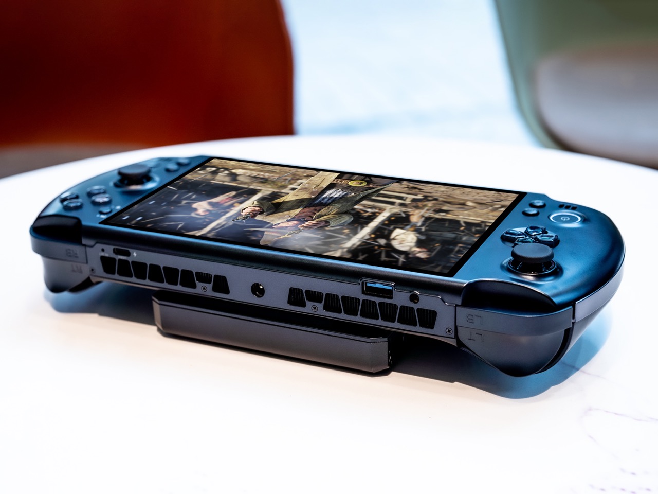
The PSP’s silhouette never really died — it just kept getting more ambitious inside. The GPD Win 5 takes the wide landscape layout we’ve known for twenty years and fills it with an AMD Ryzen AI Max 395 processor and a full terabyte of storage — a desktop-level decision wrapped inside a handheld form. The result is a device that plays any PC game at settings no portable console would dare suggest.

The engineering required to keep it running is written directly onto the chassis. Quad heat pipe cooling, a proprietary Mini SSD slot, hall effect triggers, and a detachable 80Wh battery extend sessions well beyond what the internal cell could manage. The 7-inch 16:9 display sits centered between capacitive joysticks with zero deadzone in a layout that feels immediately familiar. This is not a gaming device that compromises on performance — it refuses to.

What We Like

  • The AMD Ryzen AI Max 395 delivers genuine desktop-class performance from a body that still fits in a bag
  • Hall effect triggers and capacitive joysticks with zero deadzone give it a precision edge over every portable console alternative

What We Dislike

  • The thickness and thermal venting make it visually dense — this is not a subtle object
  • The price positions it well above impulse territory, narrowing its natural audience considerably

2. Side A Cassette Speaker

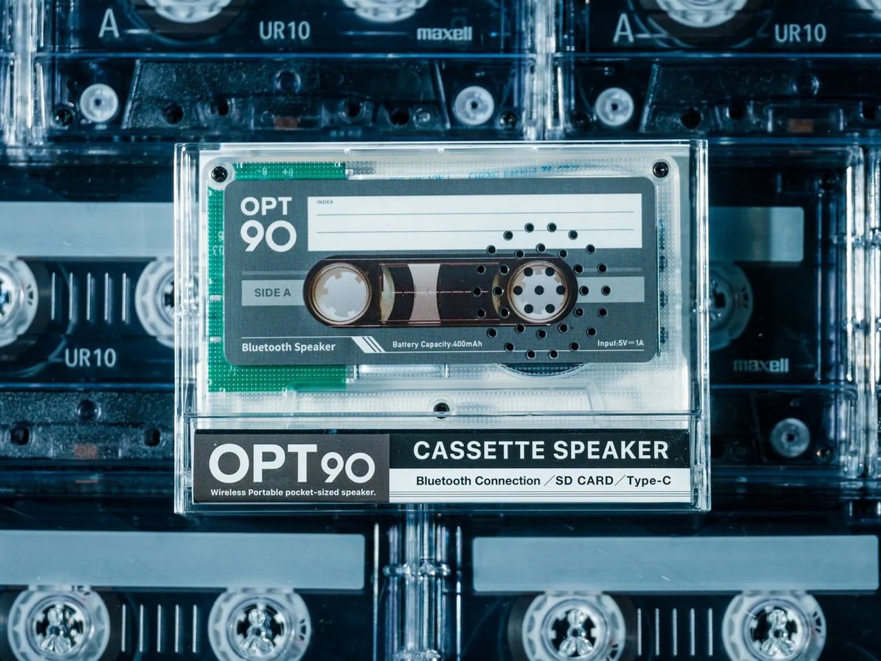
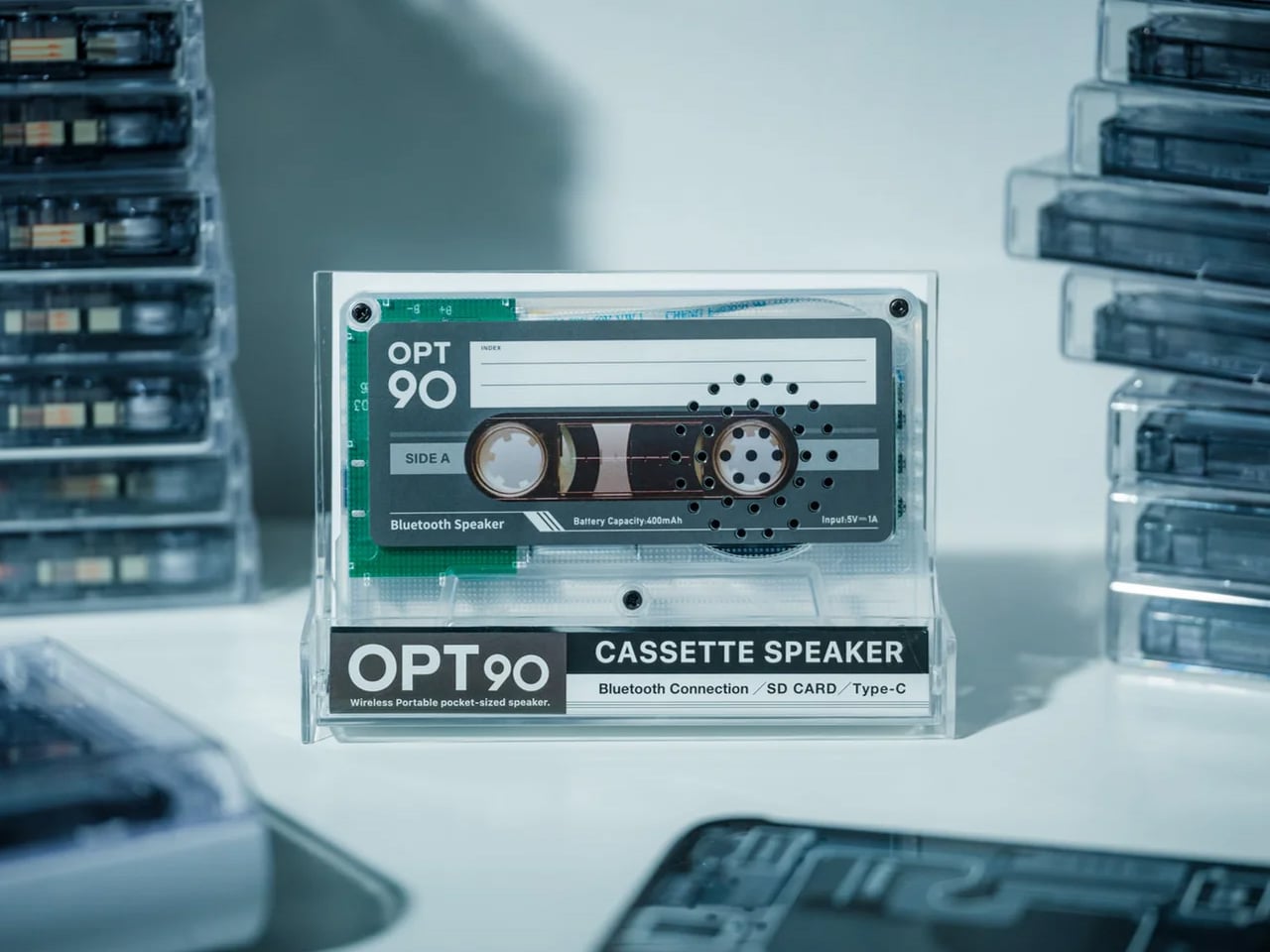
Everything about the Side A Cassette Speaker is designed to make you pick it up. The transparent shell exposes its mechanics the way a skeleton watch exposes its movement — not to perform engineering, but to invite curiosity. The cassette form is faithful enough to earn a double-take and modern enough to pair via Bluetooth 5.3 without cognitive dissonance. It looks like a mixtape from 1997 and sounds like something bought this year.

For under fifty dollars, it streams wirelessly, supports microSD offline playback, and delivers warm-tuned sound that rewards the retro framing rather than undermining it. The clear case doubles as a stand, which means it sits upright on a desk looking intentional rather than abandoned. This is the gift that earns visible placement — the kind of object someone keeps out not because they have to, but because it says something about the shelf it lives on.

Click Here to Buy Now: $49.00

What We Like

  • The transparent cassette shell creates instant visual storytelling before it’s even switched on
  • At under $50, it’s the most accessible pick on the list — approachable price, zero sense of compromise

What We Dislike

  • The smaller cabinet limits low-end response — bass is present, but won’t satisfy anyone comparing it to a full-size speaker
  • Best suited for near-field listening; it won’t carry sound convincingly across a large room

3. RingConn Gen 2 Smart Ring

The RingConn Gen 2 makes the case that wearable health tracking never needed to live on your wrist. It’s a ring — thinner and lighter than its predecessor — that runs 10 to 12 days on a single charge and tracks sleep, heart rate, and respiratory variations through AI analysis, claiming 90.7% accuracy in identifying sleep risk events. No subscription. No display competing for attention. Just a slim band doing quiet overnight work.

The appeal for someone who refuses a smartwatch is genuine. There’s no screen to check, no notification buzzing against the wrist, no social permission for the device to interrupt your day. The AI sleep tracking surfaces insights about breathing patterns and nighttime respiratory variations that standard fitness bands don’t reach with the same depth. It tracks without performing the act of tracking, which is its entire design philosophy. Wear it and forget it is the point.

What We Like

  • A 10 to 12-day battery life removes the nightly charging ritual that makes most wearables feel like obligations
  • AI-powered sleep insights with no subscription fees eliminate both the friction and the ongoing cost

What We Dislike

  • Sizing matters significantly for a ring — gifting one requires knowing the recipient’s ring size in advance
  • The value of the health data depends entirely on the wearer engaging with the insights it surfaces

4. Soundcore Sleep Earbuds

Sleep earbuds have always been a comfort problem disguised as an audio problem. Soundcore’s answer involves 3D ergonomic shaping built around the concha cavity’s actual geometry, an Air Wing hollow structure that distributes contact pressure across a wider surface area, and a stacked charging pin architecture that repositions hardware away from the ear entirely. The result is an earbud designed to be forgotten during use — not because it lacks presence, but because its presence feels like nothing.

Noise blocking keeps external sound out while a soft audio profile handles whatever you use to fall asleep. The Air Wing’s flexibility adapts across different ear shapes rather than demanding the ear adapt to it — the distinction that separates earbuds built for sleeping from earbuds people merely attempt to sleep in. For anyone whose sleep is light or interrupted, this is the category of gift that earns its place by how someone feels the next morning.

What We Like

  • The 3D ergonomic shaping and hollow Air Wing design solve the pressure and slippage problems that have historically made sleep earbuds impractical
  • Stacked charging pin architecture removes the most common comfort complaint in the category without sacrificing charging functionality

What We Dislike

  • Fit is deeply individual — what disappears for one person may still feel present for another, depending on ear geometry
  • Noise blocking effectiveness varies with ear canal shape and the sleep position someone naturally defaults to

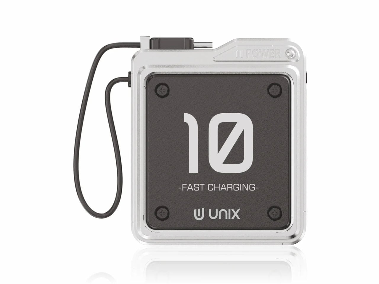
5. Unix UX-1519 NEOM Power Bank

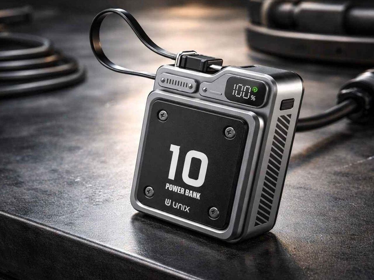
Power banks exist in a visual category that design has largely abandoned — they are rectangles. The Unix UX-1519 NEOM is still a rectangle, but it looks like it was designed at the same meeting as the rest of your gear rather than found in an airport convenience store. The industrial finish, considered proportions, and built-in Type-C carry loop cable elevate it into an object worth keeping visible rather than buried at the bottom of a bag.

Under that exterior sits a 10,000mAh cell delivering 22.5W fast charging, dual output ports for simultaneous device charging, and the S-Power smart chipset managing stable discharge throughout each session. The cable that serves as a carry loop supports 12V output, pulling fast charging performance through the same thing you grip to retrieve it. That level of integration — where every detail earns its presence — is what separates this from the generic category it technically belongs to.

What We Like

  • The built-in Type-C carry loop cable is the kind of small detail that makes the whole object feel more considered than anything at this price point
  • 22.5W fast charging with dual output and smart chipset management handles the functionality without any concessions

What We Dislike

  • At 10,000mAh, larger capacity banks will outlast it across multi-day travel without wall access
  • The industrial aesthetic is confident and specific — some will read it as premium, others as heavy-handed

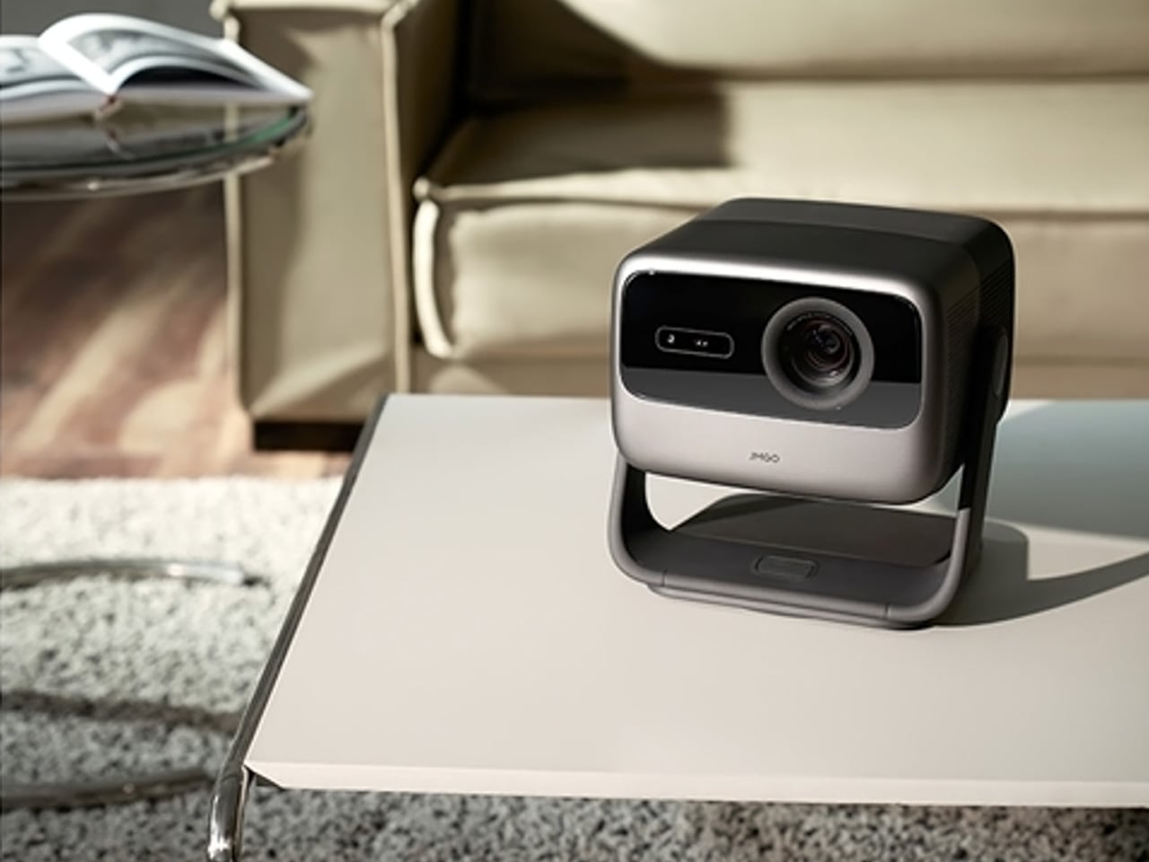
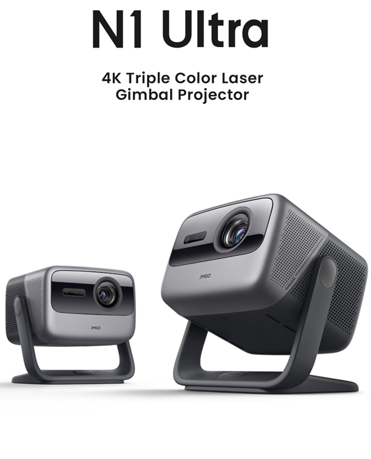
6. JMGO N1 Ultra 4K Laser Projector

The JMGO N1 Ultra solves the problem that has historically made projectors aspirational rather than practical: setup. The gimbal tilts automatically, focus locks without a hand on the lens, keystoning corrects itself, and obstacle detection keeps the image where it belongs. At 2800 ISO lumens from RGB triple-color laser optics, it works in a lit room, which means it lives in a living room without requiring the space to be reorganized before every use.

The color accuracy from tricolor laser projection has a saturation and richness that lamp projectors simply cannot reach. HDMI 2.1 with eARC handles connectivity, and 20W dual speakers with Dolby Digital Plus and 45Hz bass extension fill a room without requiring a separate soundbar. This is a projector for people who want cinema at home without the ceremony of installing one. Point it at a wall, let it calibrate in seconds, and the room becomes something else entirely.

What We Like

  • The smart adaptive system handles focus, keystone correction, and brightness automatically — setup takes seconds, not an evening of calibration
  • RGB triple-color laser at 2800 ISO lumens performs in ambient light, removing any requirement to design a room around it

What We Dislike

  • The price positions it as a considered purchase rather than a spontaneous gift — it requires a genuinely enthusiastic recipient
  • The gimbal and automated systems add complexity that may feel like more setup than expected for buyers anticipating a simple plug-in experience

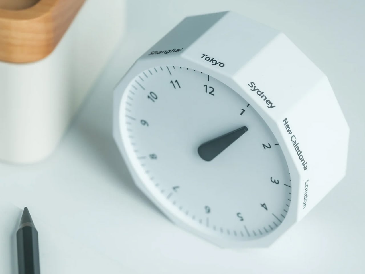
7. Rolling World Clock

Not every great tech gift has a circuit board inside it. The Rolling World Clock is a 12-sided dodecahedron that tells global time through the simplest possible mechanism: roll it to a city face, read the single hand. London, Tokyo, New York, Shanghai, Sydney, and seven more time zones are built into its geometry. For anyone navigating remote work across multiple cities, this solves a daily frustration through pure physical design.

What earns it a place on a tech gift list is exactly that clarity of purpose. Most remote workers live inside four different time zone tabs, a world clock widget, and a mental arithmetic habit they never asked for. The Rolling World Clock replaces all of that with an object you can hold. Roll it to a city face and a single hand tells the time there — no toggling between apps, no unlocking a screen. It sits on the desk between the monitor and the coffee, available in black and white, and asks nothing from you except the decision to pick it up. Sometimes the most considered technology is the kind that gets out of your way entirely.

Click Here to Buy Now: $49.00

What We Like

  • The 12-sided dodecahedron form solves a genuinely common remote work problem — global time tracking — through tactile physical interaction rather than another screen
  • The fully analog mechanism means no charging, no setup, and no interface to learn — it works the moment it lands on a desk

What We Dislike

  • Coverage is limited to 12 major cities — travelers or remote workers operating in less-represented time zones will find gaps
  • The single-hand display reads cleanly, but requires a moment of orientation for anyone unfamiliar with the face layout

The Gift That Earns Its Place Before He Opens It

Seven products, seven completely different problems solved. A gaming handheld that refuses to compromise on desktop performance. A cassette speaker that makes Bluetooth feel like something worth displaying. A smart ring tracking sleep from a finger. Earbuds engineered around the geometry of the ear rather than against it. A power bank that looks like it belongs with the rest of your gear. A projector that sets itself up. A dodecahedron that tells time in twelve cities without asking anything of you.

The best gifts don’t need wrapping to communicate their value — they do it the moment someone picks them up. Each of these objects was built with a specific person in mind, which means the person who receives one will feel that immediately. Check shipping windows before checkout, move quickly on anything with limited stock, and resist the instinct to wait. April 5 has a way of arriving before the decision gets made.

The post 7 Easter Tech Gifts for Him So Good They’ll Sell Out Before April 5 first appeared on Yanko Design.
This Concrete Desk Organizer Snaps Together as Your Workspace Grows

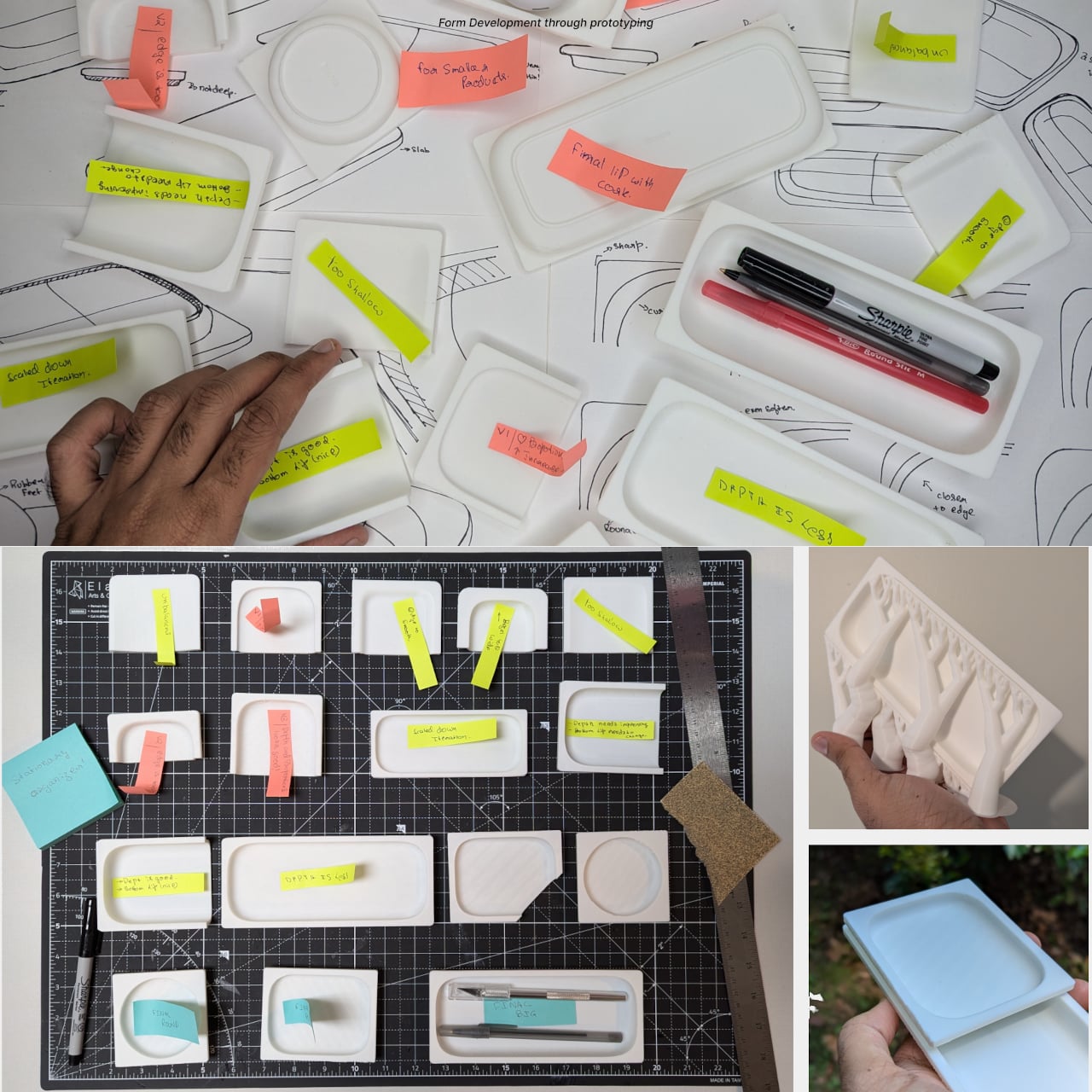
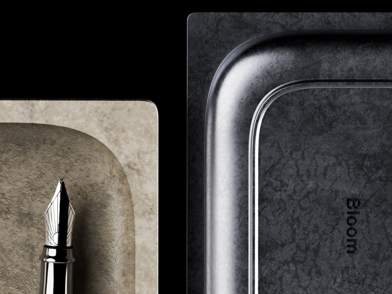
A messy desk is one of those problems that feels minor right up until it isn’t. You reach for a pen, knock over a cup, lose a paperclip into some void between your keyboard and monitor, and suddenly, five minutes are gone. Most organizers solve this with dividers and compartments, which is fine, but they tend to sit on your desk like afterthoughts, plastic trays that slide around and rarely match anything else in the room.

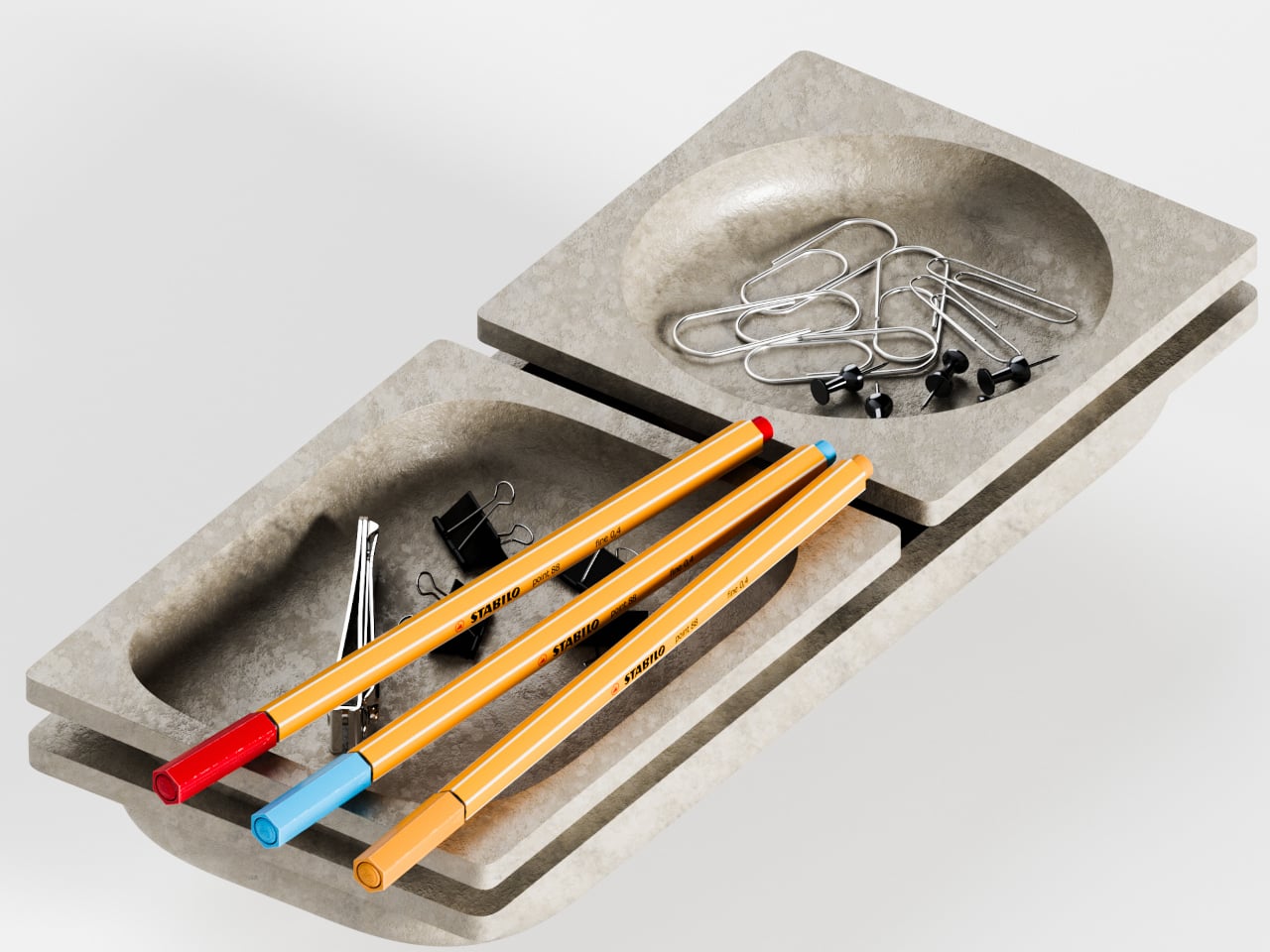
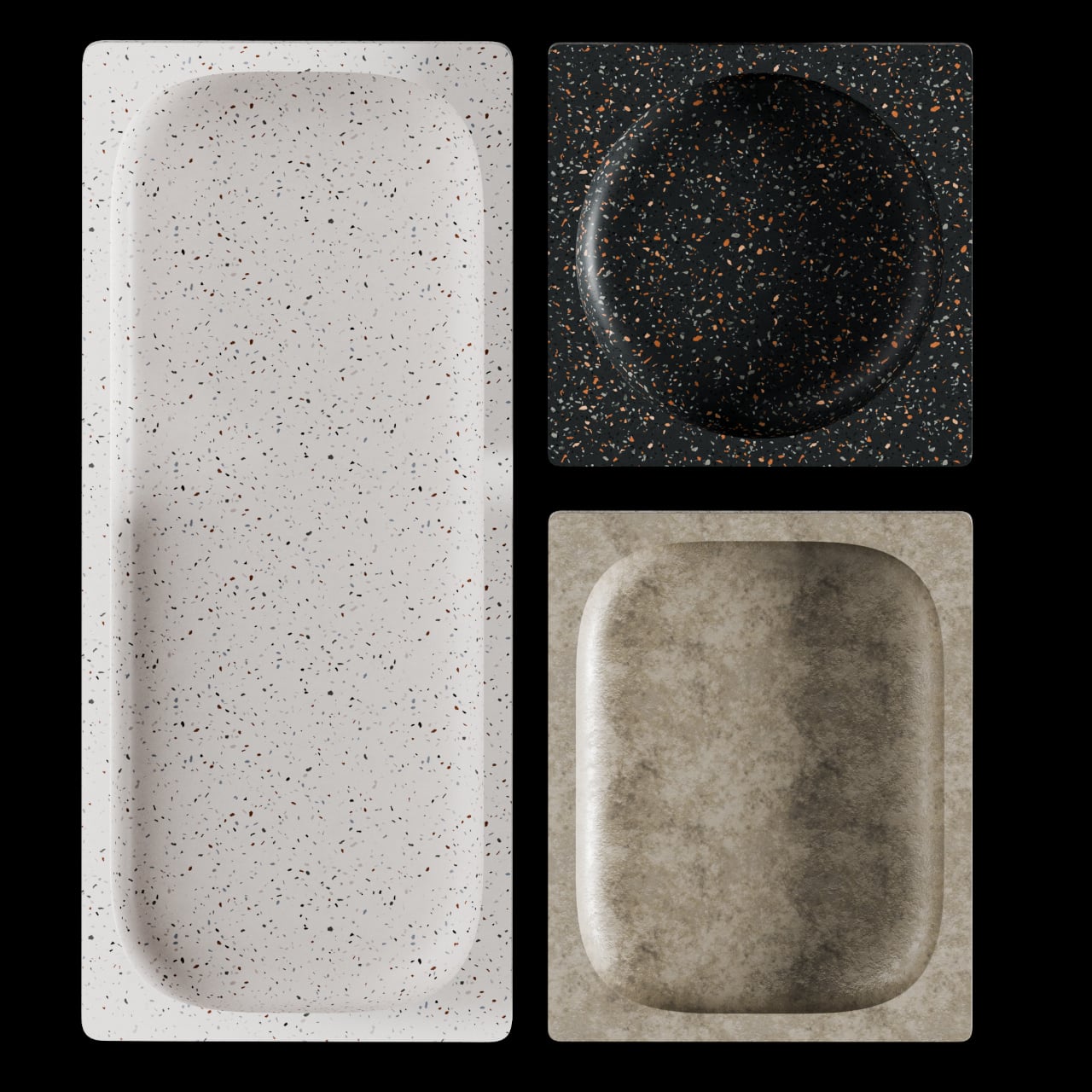
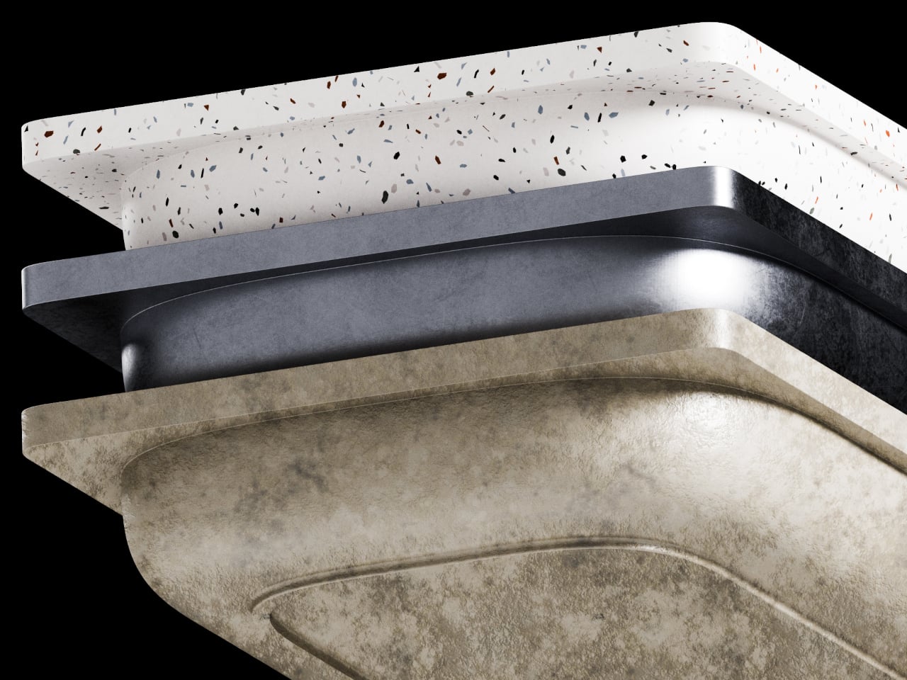
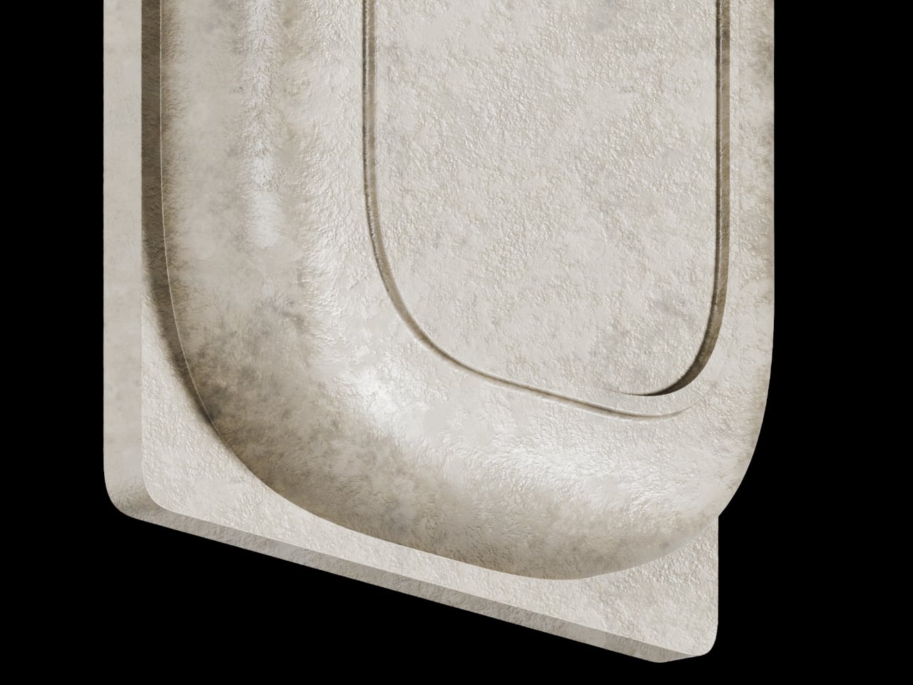
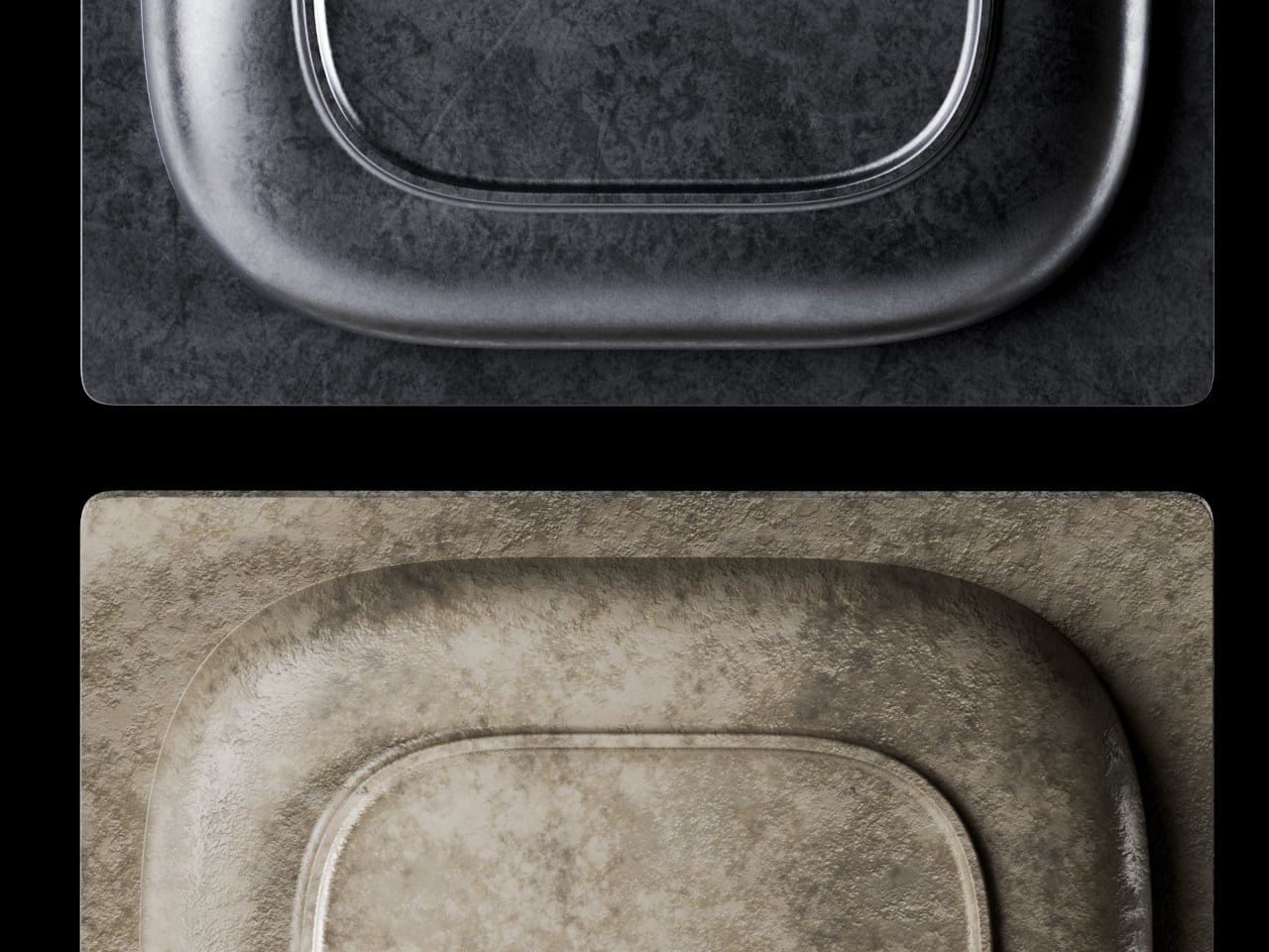
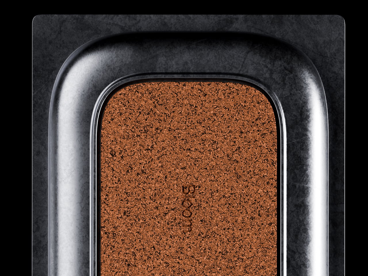
BloomCase approaches the problem from a different angle. Made from concrete, metal, and stone, it is heavy enough to stay put without any grip pads or rubber feet, and that weight is load-bearing in a more literal sense, too. The concrete body gives it a raw, architectural presence that feels deliberate rather than decorative, the kind of object that reads as intentional rather than incidental on a desk that already has some thought behind it.

Designer: Somya Chowdhary

The form itself is where things get interesting. Circular basins sit alongside parallel rectangular bays, each with a specific job. The basins are contoured to cradle small loose items, thumbtacks, paperclips, and the miscellaneous hardware that scatters across every flat surface it touches. The bays run parallel and are angled to hold pens and pencils upright and accessible, so what you reach for most is what you find fastest. There is a satisfying logic to that division, one that needs no instructions to grasp.

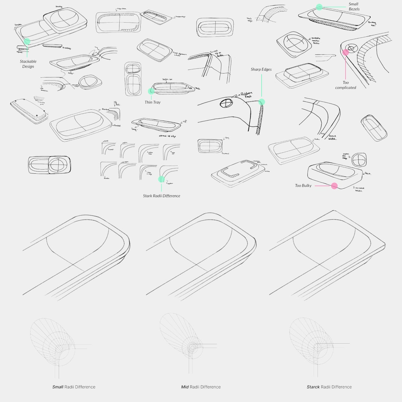
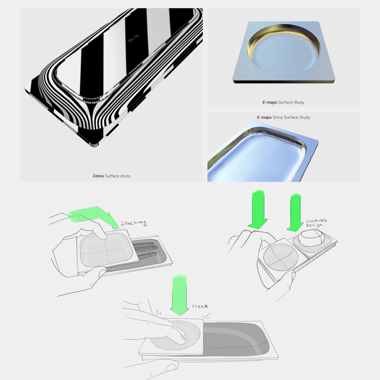
What separates BloomCase from a standard tray is the interlocking system. Two or more units snap together so that separate pieces merge into a single continuous footprint. The connection is designed to feel secure and repositionable, which matters when your desk layout shifts with a project, or when you realize three months in that you needed more pen space all along. The name comes from this behavior, units blooming outward across the workspace as organizational needs grow.

The aesthetic sits at an interesting intersection. Concrete and geometric curves do not usually share a design brief, but the combination here avoids the coldness that brutalist objects can carry in domestic or office settings. The raw material quality of the concrete against the softer basin profiles creates enough contrast to hold visual interest without tipping into decorative territory. It looks like a tool that was designed carefully, which is a harder thing to pull off than it sounds.

The modular logic is a genuinely smart idea, but it only makes practical sense if you actually need more than one unit. A desk covered in connected concrete trays starts to raise honest questions about how much surface you are willing to trade for organization. There is also the matter of audience: heavy raw materials appeal most to designers and architects who already have a taste for that kind of object on their desks, which is a narrower group than the broader market for desk tidiness.

The post This Concrete Desk Organizer Snaps Together as Your Workspace Grows first appeared on Yanko Design.
Eclipse Wall Lamp Casts a Shadow That Appears to Have No Source

Wall lamps tend to fall into one of two camps. They’re either purely functional fixtures you stop noticing the moment you move in, or purely decorative pieces that look good in daylight and do little else after dark. The gap between ambience and ornament is rarely explored, and most wall lighting ends up forcing you to choose between the two.

Slovenian designer Tilen Sepič’s Eclipse wall lamp sits right in that gap. First designed in 2012 and still in production today, it’s a piece that earns its keep in a room during the day just as much as it does at night, functioning as a sculptural object when the sun is up and something far more atmospheric once it goes down. That’s a harder balance to strike than it sounds.

Designer: Tilen Sepič

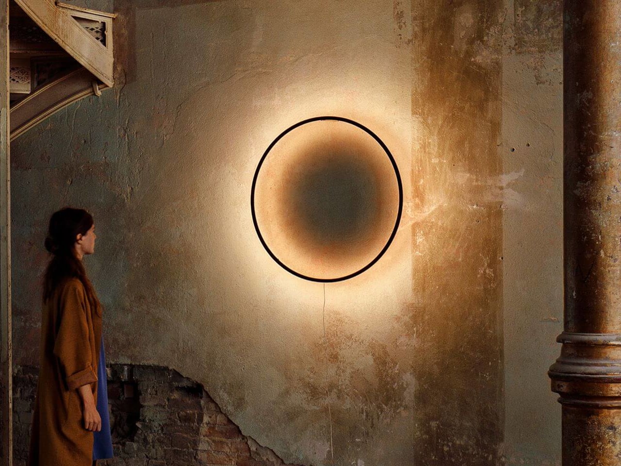
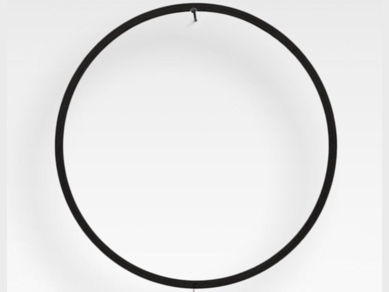
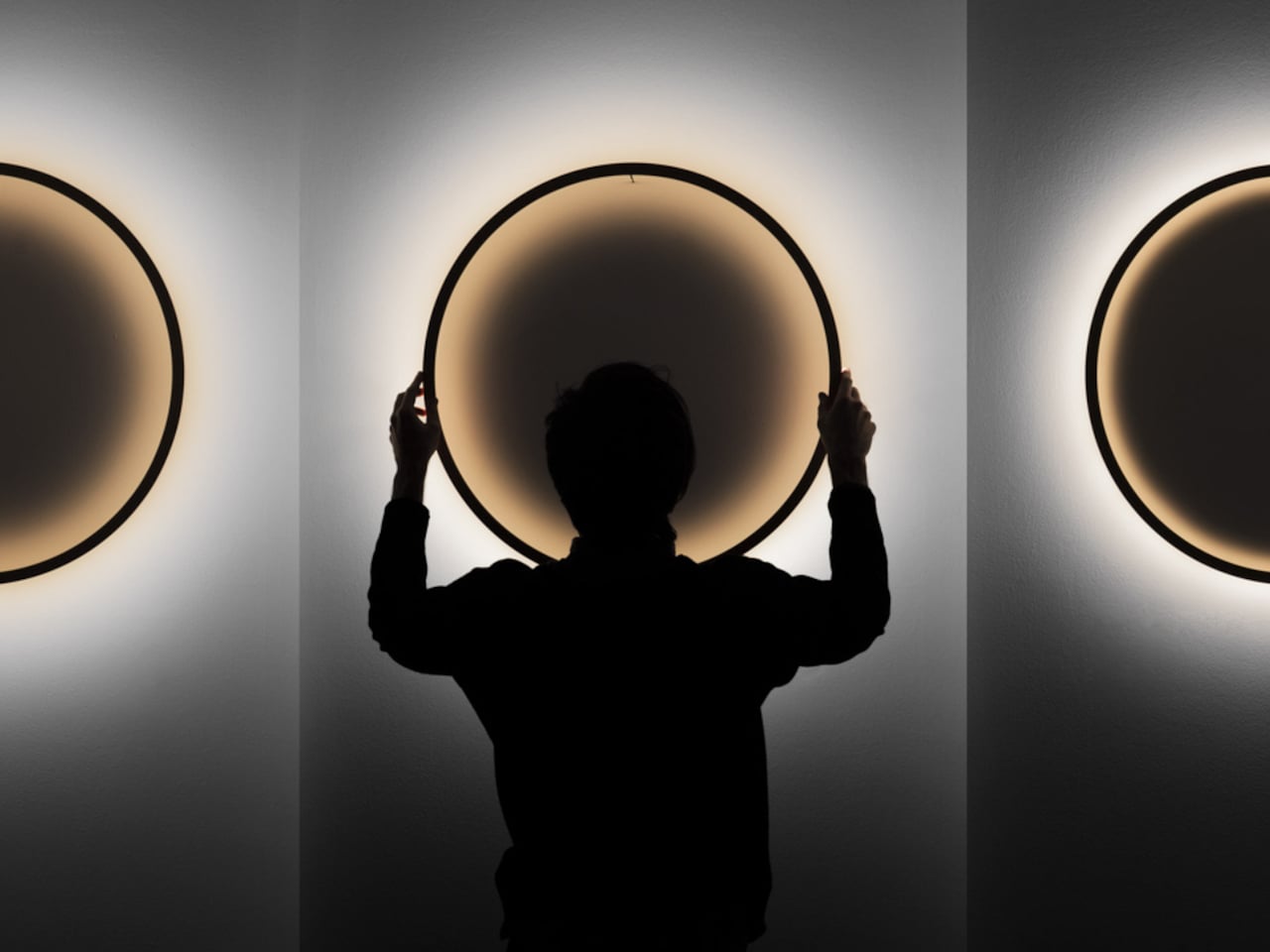
Hang the Eclipse during the day, and it reads as a clean circular ring of bent wood, not a lamp in any conventional sense. Available in natural laminated beech, white, or burnt wood finishes, it carries the kind of restraint that suits most interiors without disappearing entirely. It’s the sort of object that sits somewhere between a decorative piece and a quiet architectural presence.

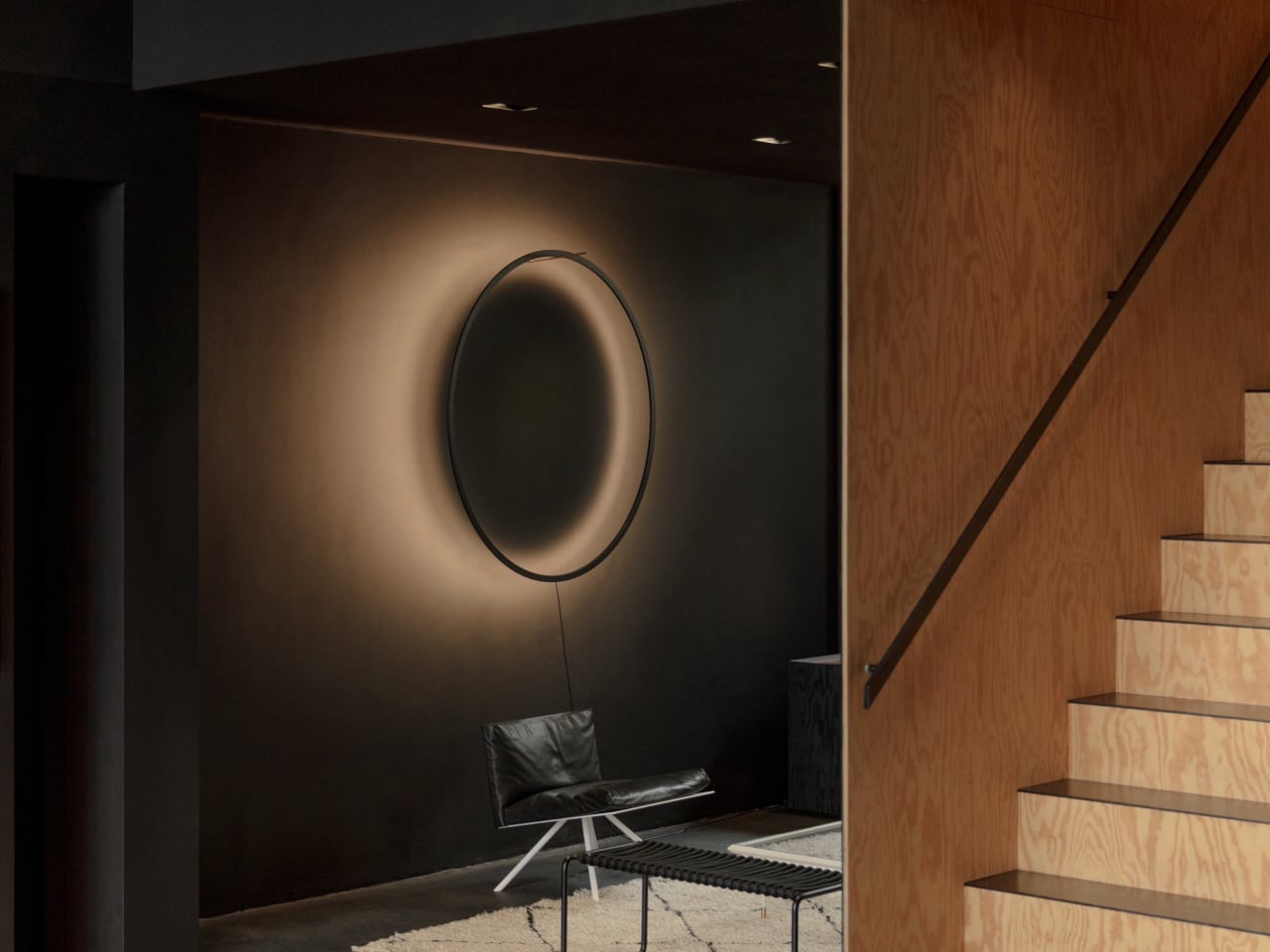
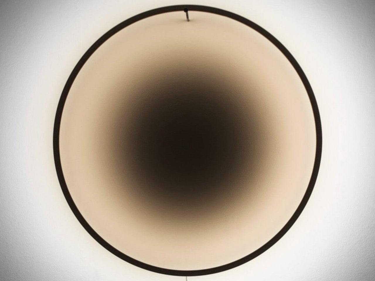
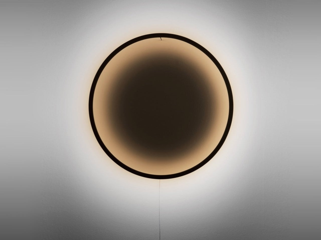
Switch it on, and the lamp’s character shifts entirely. A high-CRI warm-white LED strip runs along the inner edge of the ring, outputting up to 3,000 lm of diffused light that bounces off the wall behind it. At a color temperature of 3,000 to 3,200 K, the warmth sits in the range most people associate with relaxed, residential lighting, enough to settle a room without tipping into amber.

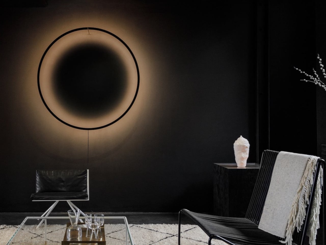
What makes the Eclipse stranger and more interesting than most accent lamps is the shadow it produces alongside the light. The ring casts a deep circular shadow in the center of its glow, one that appears to exist without a clear origin or reference point. A slight gradient in the shadow’s color temperature reportedly mimics the quality of natural afternoon light.

The ring’s distance from the wall isn’t fixed, which is where the Eclipse gets more interesting still. Pulling the frame outward softens and widens the glow; pushing it closer sharpens the effect and deepens the contrast. This single manual adjustment can completely change the mood of a room, and Sepič frames each change as a deliberate act rather than a routine one.

The wooden edition comes in 70 cm and 90 cm sizes, starting from €585 for the 70-cm version, and is a handmade piece by piece in Slovenia with a lead time of three to four weeks. For larger architectural installations, Bazar Noir offers a version in powder-coated aluminium at 120 cm and 150 cm diameters, which pulls the design into more monumental territory. It’s a lamp that genuinely rewards attention, one that gives back a little more the longer it stays on your wall.

The post Eclipse Wall Lamp Casts a Shadow That Appears to Have No Source first appeared on Yanko Design.
70 Mile Range, 110 Nm of Torque, and a One-Click Wheelie. Meet the AOTOS Flux X26

The road to electric adoption has always needed two things, logic and emotion. Logic is easy to find in March 2026, with petrol prices climbing high enough to make every refill feel faintly offensive. Emotion is harder to engineer, yet it matters just as much. People want efficiency, but they also want acceleration, style, and the small thrill of riding something that feels alive beneath them. The products that close the gap between those two instincts are the ones worth paying attention to.

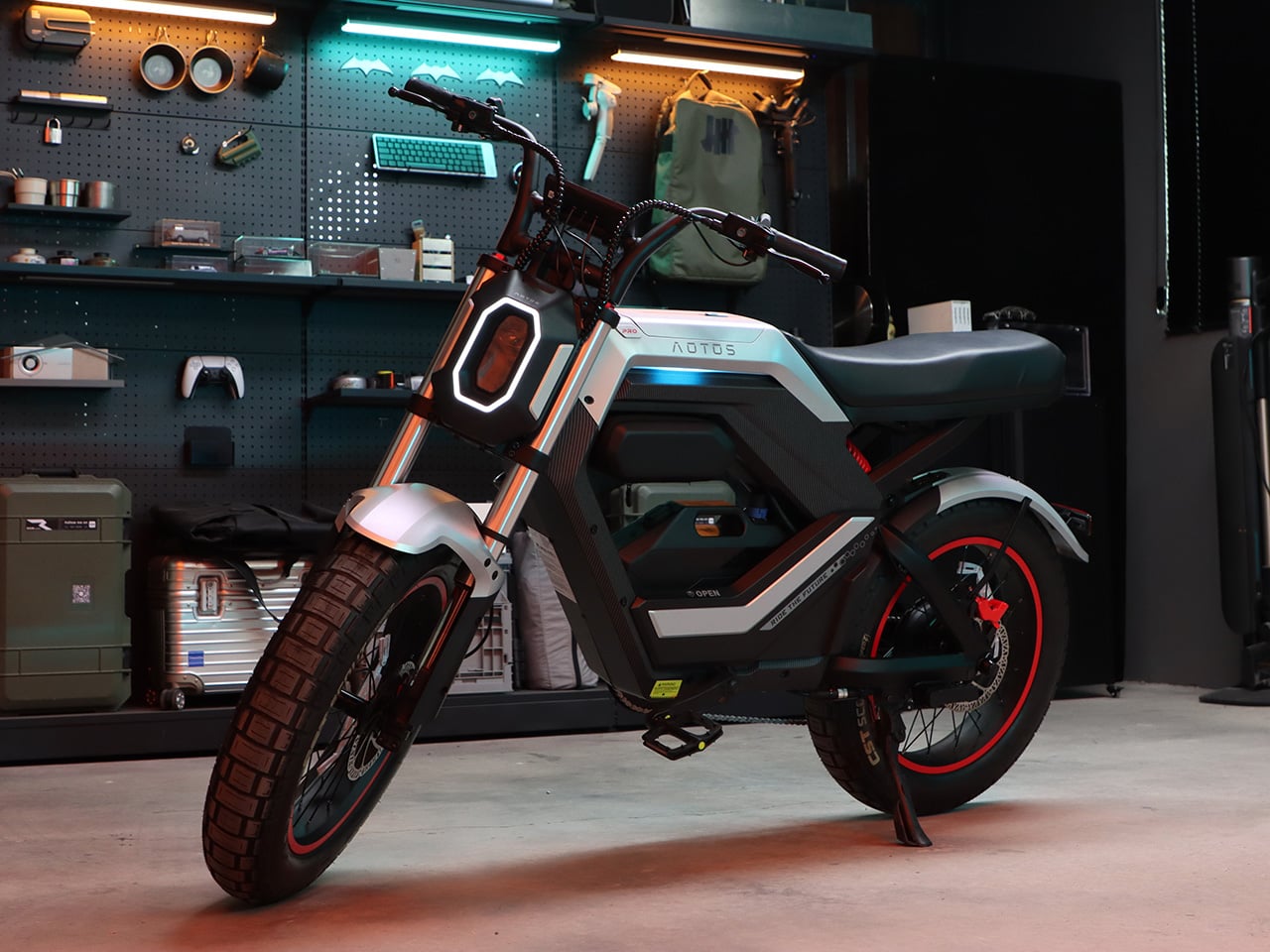
The AOTOS Flux X26 enters that landscape with a compelling mix of utility, performance, and fun. A claimed 70 mile range, from city streets to desert trails, supports daily commuting and longer urban detours. A 0 to 20 mph time of 4.9 seconds gives it a brisk, responsive character. The one click wheelie function adds an unmistakably playful edge, with specialized motion control algorithms allowing riders to safely experience one-wheel maneuvers at the touch of a button. AOTOS launched the Flux X26 on Kickstarter this March, positioning it as the officially recognized world’s first wheelie capable light electric moto.

Designer: AOTOS

Click Here to Buy Now: $1199 $1699 (29% off). Hurry, only 85/100 left! Raised over $498,000.

The frame completely abandons round, retro shapes in favor of a sleek, one-piece aluminum alloy construction with sharp, parametric lines. That futuristic mecha design philosophy extends from the physical vehicle to the retail space, app interface, and packaging. The ambient lighting system adds presence in urban environments at night without reading as decorative afterthought. The overall silhouette sits closer to a motocross bike than a commuter bicycle, which fits well with the fact that the Flux X26’s designed for those impromptu adventure-trips and thrill-chasing weekends, aside from being your reliable weekday in-city commuter.

The Pro variant delivers 2000W of peak power at a 1500W rated output (the regular version offers 1200W of peak power, rated for 750W output), strictly Class 2 compliant for legal road use, paired with 110Nm of instant torque that enables it to climb steep gradients up to 25% with ease. From a standstill, it hits 20 mph in 4.9 seconds, translating to immediately responsive performance in city traffic and on open trails. The one click wheelie function uses proprietary motion control algorithms that cut the physical effort required by roughly 20%, making the maneuver genuinely accessible. The Class 2 rating keeps the X26 street legal across most US states while the peak output covers the off road brief. Both variants share 20×4.0 inch fat tires, dual hydraulic suspension, and hydraulic disc brakes front and rear.

AOTOS built FLUX OS, a proprietary intelligent ecosystem that treats the Flux X26 as a mobile terminal, featuring triple anti theft security through integrated wireless connection and GPS, sensorless unlocking, and a high definition TFT smart screen. Through frequent OTA updates, the Flux X26 functions as a living device that evolves over time, improving after purchase rather than arriving as a fixed product. The 5.5 inch full color TFT display handles speed, ride mode, range, warnings, and GPS positioning, with turn by turn navigation synced from the rider’s phone. The Pro variant adds 4G connectivity alongside Bluetooth, giving the bike a live data link independent of the rider’s phone range. Both tiers benefit from the same software architecture, with the Pro carrying the more robust hardware layer on top.

An oversized battery provides a 70 mile exploration radius, from city streets to desert trails, putting the X26 at the more capable end of its category for the price. Urban riders cover the majority of their weekly riding without a midday recharge, and for weekend exploration the radius reaches distances that feel genuinely adventurous. The battery holds an IPX7 water resistance rating on the Pro variant, with IPX5 covering the rest of the vehicle. AOTOS backs ownership with over 100 after sales service points across the United States, adhering to strict Class 2 and safety certifications. The 330 lb maximum load capacity confirms the X26 as a serious daily use machine.

Super Early Bird Kickstarter pricing opens at $1,199 for the standard Flux X26 and $1,599 for the Pro, against MSRPs of $1,699 and $2,299 respectively. First units are scheduled to ship in May 2026, a window tight enough to signal genuine production readiness. The X26 Pro was shown at CES 2026 in Las Vegas ahead of the campaign, putting the hardware in front of an audience that scrutinizes product claims closely. Founded in 2016, AOTOS has built its core R&D team from engineers specializing in motion control, AI algorithms, and smart systems. At this price, with a design that commits fully to its aesthetic and a fully fledged software that just gets better with time thanks to OTA updates, the Flux X26 is one of the more innovatively gorgeous electric two wheelers on Kickstarter right now.

Click Here to Buy Now: $1199 $1699 (29% off). Hurry, only 85/100 left! Raised over $498,000.

The post 70 Mile Range, 110 Nm of Torque, and a One-Click Wheelie. Meet the AOTOS Flux X26 first appeared on Yanko Design.
Daft Punk’s Get Lucky Gets a 298-Piece LEGO Tribute With That Iconic Gradient Sun

Summer 2013 belonged to Daft Punk. “Get Lucky” was everywhere, an inescapable groove machine that turned the French robots into genuine pop stars after years of underground credibility. The song marked a massive sonic pivot for the duo, trading their signature electro-crunch for live instrumentation, bringing in Nile Rodgers to lay down those disco guitar lines and Pharrell Williams to deliver one of the smoothest vocal performances of the decade. The music video leaned into a specific aesthetic: performers silhouetted against a radiant sunset, all warmth and golden light, capturing the analog soul of Random Access Memories in a single visual.

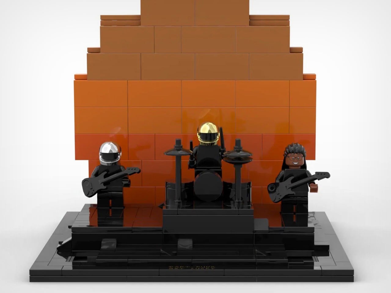
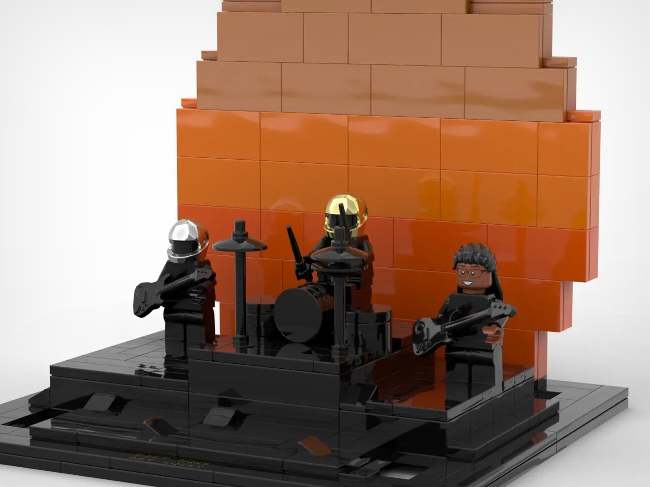
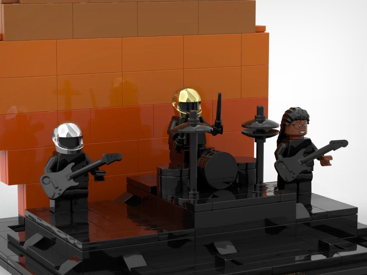
LEGO builder MINECRAFTBUILDHAX has bottled that exact vibe in a 298-piece display model. The build recreates the sunset performance scene with Daft Punk’s iconic helmeted duo front and center, flanked by a guitarist and backed by a stepped gradient sun that transitions from deep orange to warm brown. The stage sits on a sleek framed base with a printed plaque, designed to look right at home on a bookshelf or desk. Pharrell’s missing from the lineup due to licensing realities, but the essence of that moment is fully intact.

Designer: MINECRAFTBUILDHAX

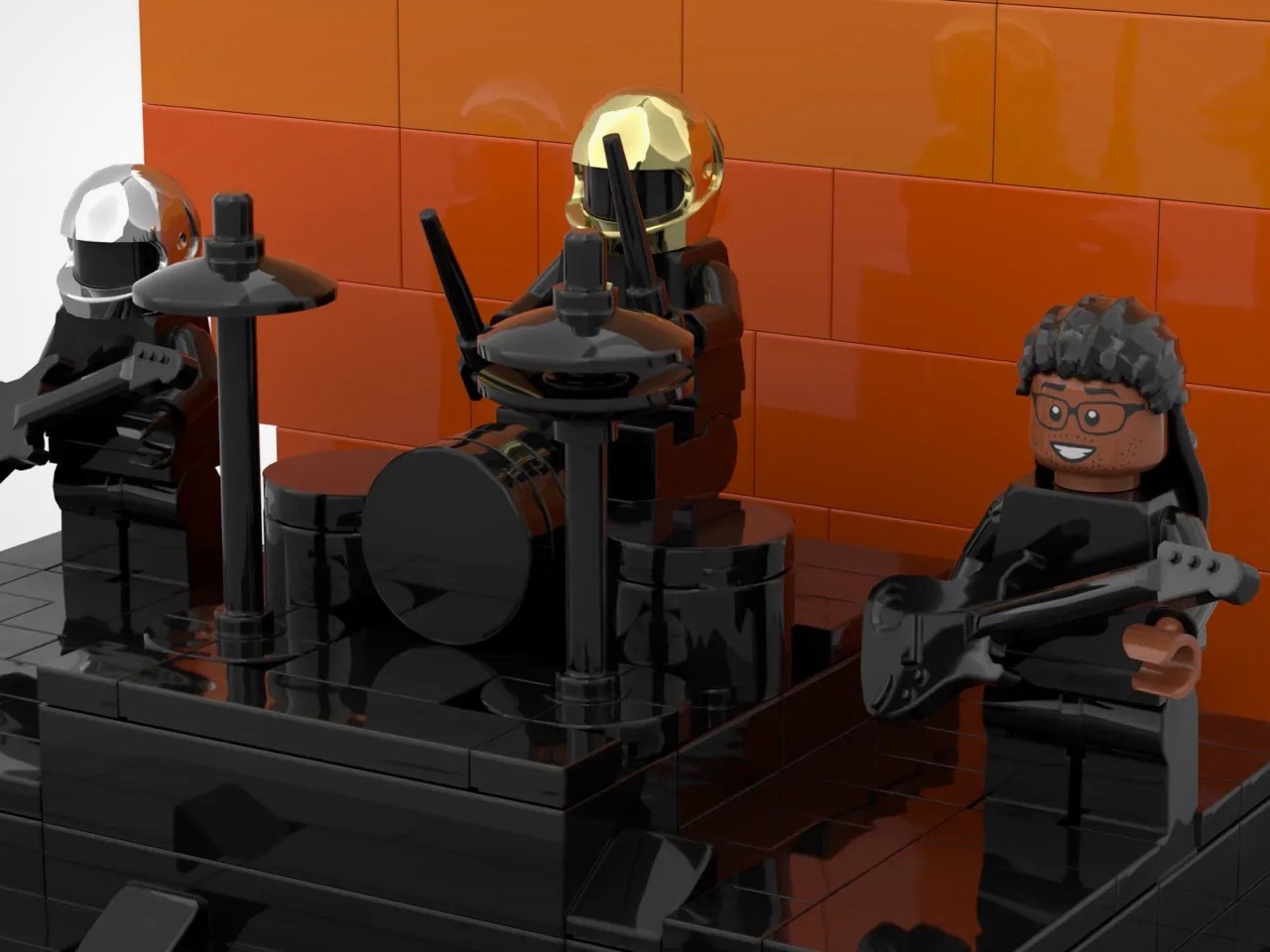
Chrome silver for Thomas Bangalter, metallic gold for Guy-Manuel de Homem-Christo. Getting those faceted helmet surfaces to read correctly at minifigure scale takes thoughtful part selection, and MINECRAFTBUILDHAX nailed it. Both figures stand on a raised black stage platform with their instruments properly positioned, Thomas with his bass guitar on the left, Guy-Manuel seated at a compact drum kit in the center. A guitarist holding an electric guitar fills the right side, channeling Nile Rodgers’ energy even if the man himself couldn’t make the licensing cut.

Behind them, layered warm-toned plates stack in a stepped pyramid formation, creating a gradient that flows from dark brown at the top through medium brown and into bright orange at the horizon line. It mimics the glowing warmth of the “Get Lucky” single cover art perfectly, where the setting sun bathes everything in golden-hour magic. Solid bricks do the work here rather than transparency or lighting elements, keeping things approachable while maintaining visual punch.

Guy-Manuel’s drum kit packs surprising detail for the compact scale. Cymbals, tom drums, and a kick drum all appear in dark grey and black, with enough space on the bass drum to imagine a Daft Punk logo (though the builder kept it clean). Standard LEGO instrument molds handle the guitars, simple but effective, letting those helmets and that massive sun backdrop command attention.

A black platform extends beyond the performance area, creating visual breathing room and giving the whole thing museum-quality presentation. Gold script along the front edge reads “DAFT PUNK / GET LUCKY” in a hand-drawn style, elevating this from diorama to display piece. It signals shelf-next-to-your-vinyl-collection placement, not shoved-in-a-bin-with-other-minifigures treatment.

Just days-old on the LEGO Ideas platform, this MOC (My Own Creation) faces a long climb to the 10,000-vote threshold needed for LEGO’s official review on the Ideas platform. At 298 pieces, it would land in the affordable impulse-buy range if it ever hit retail shelves, perfect for music fans who want a tactile reminder of one of the decade’s biggest songs without committing to a massive build. If you’re still riding the “Get Lucky” high after all these years (and honestly, who isn’t), head over to the LEGO Ideas website and cast your vote. This one deserves to exist on more shelves than just the builder’s.

The post Daft Punk’s Get Lucky Gets a 298-Piece LEGO Tribute With That Iconic Gradient Sun first appeared on Yanko Design.