PROS:
- Unusually sleek, well-finished aluminum design for a board-style server
- Effectively silent passive cooling for always-on use
- 60W adapter (with multiple plug types) provides sufficient 12V/5A power
- Intuitive ZimaOS web interface, easy to set up without Linux experience
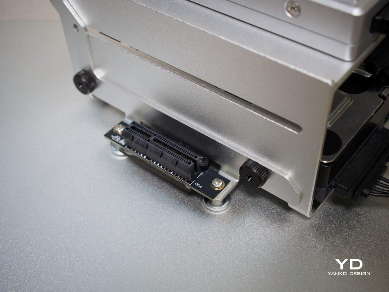
- PCIe 3.0 x4 slot allows meaningful expansion
CONS:
- Not suited for heavy compute or multi-VM workloads
- Onboard eMMC is slow for sustained data storage
- Memory tops out at 16 GB
EDITOR'S QUOTE:
The ZimaBoard 2 offers a compact, always-on server that earns its place on the shelf both functionally and aesthetically.

Home servers and NAS boxes have long had a visibility problem, and not in the marketing sense. Most are bulky, noisy, and purely functional, which means they usually end up tucked behind desks or buried in closets. The compact options that do exist often sacrifice connectivity, storage support, or OS flexibility, making them useful only on paper rather than in the kind of sustained, always-on role they’re meant to fill.
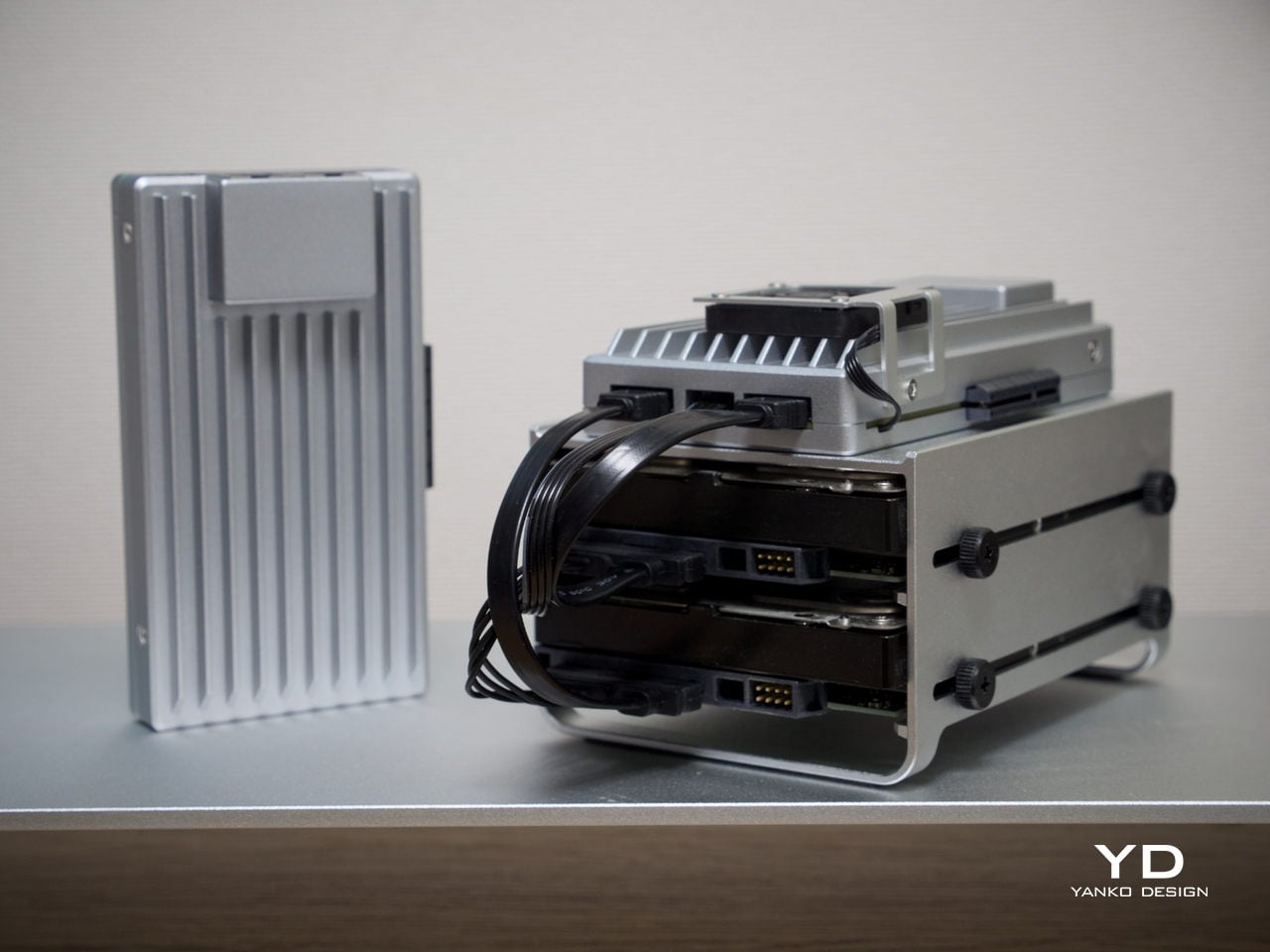
ZimaBoard 2 from IceWhale is trying to change that. It’s a compact x86 home server built around an industrial aluminum chassis, with enough connectivity and software flexibility to serve as a NAS, media server, smart home hub, or private cloud device. Available in two configurations starting from $279, it sits comfortably between a hobbyist board computer and a proper home server, and that positioning is genuinely worth exploring.
Designer: IceWhale
Aesthetics
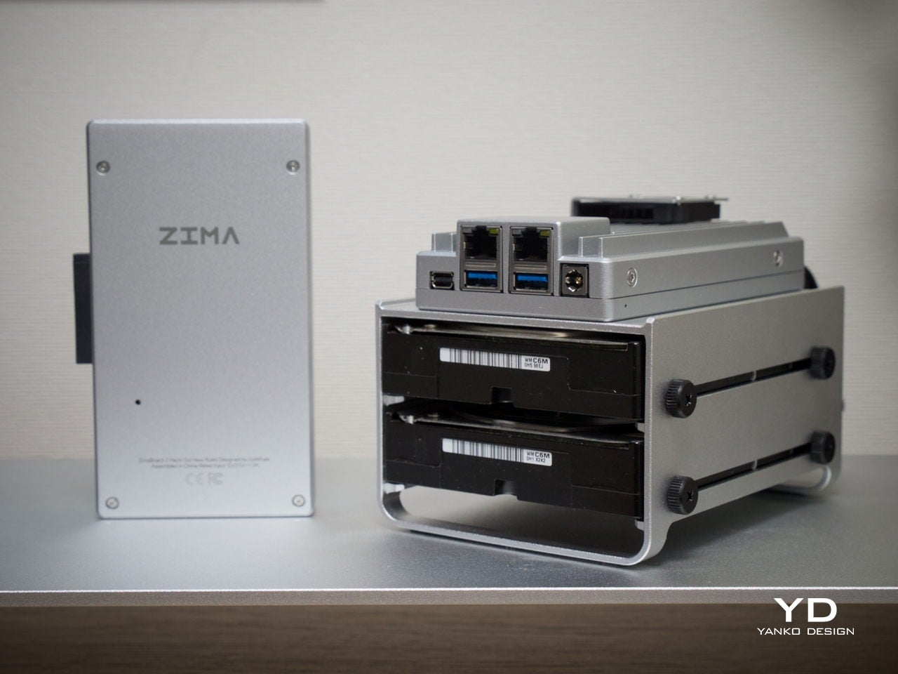
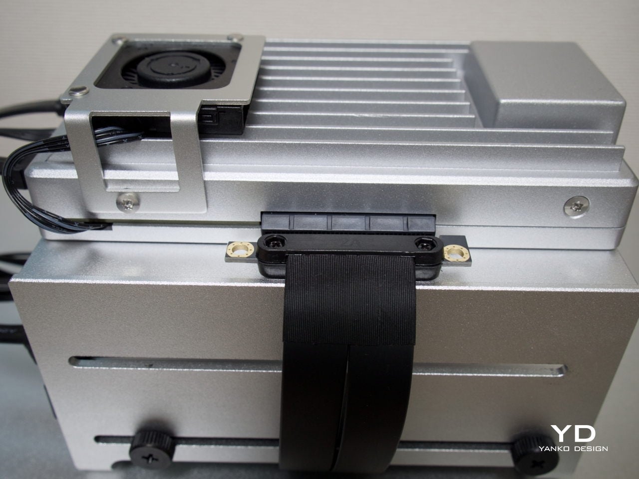
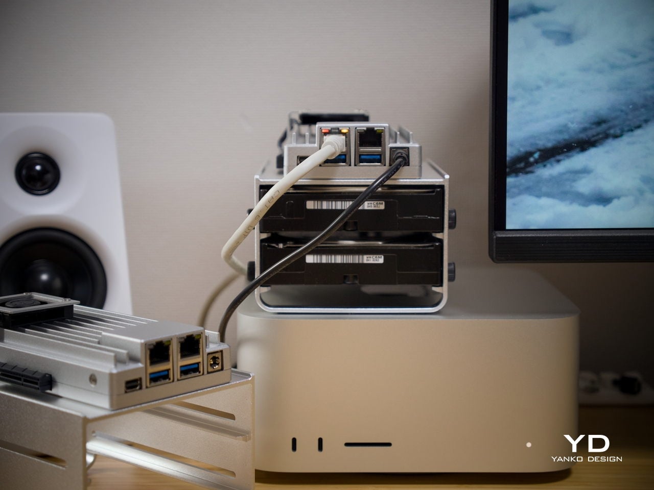
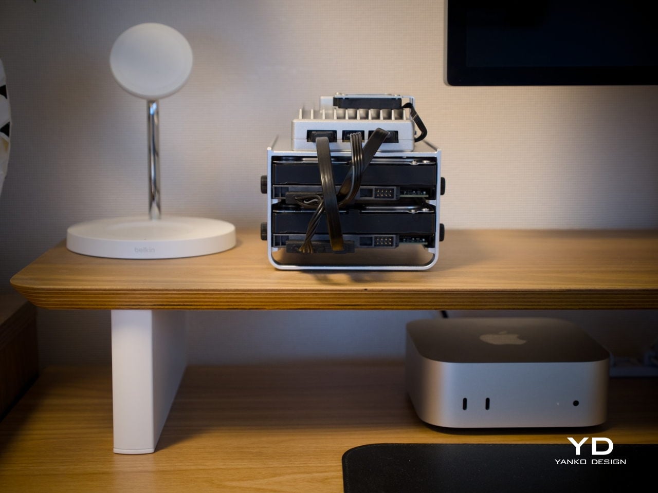
Most board-style computers aren’t particularly elegant things. They’re open PCBs with exposed components and color-coded connectors, designed for function over form. ZimaBoard 2 is a notable exception. It comes housed in an all-aluminum enclosure with a clean silver finish and vertical cooling fins running along its length, giving it an almost architectural character that’s genuinely unusual for hardware in this category.
The ribbed fin pattern isn’t purely decorative. It acts as a passive heatsink, keeping things cool while also giving the device a more resolved visual quality than the typical bare-PCB look. It’s compact enough to hold in one hand, and in a workspace context, it reads less like raw server hardware and more like a deliberate industrial object that wouldn’t look out of place on a well-specced desk.
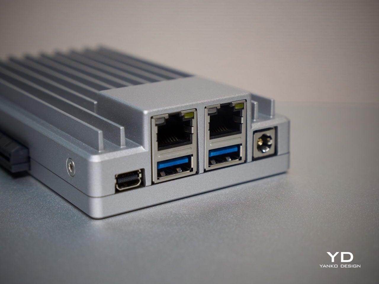
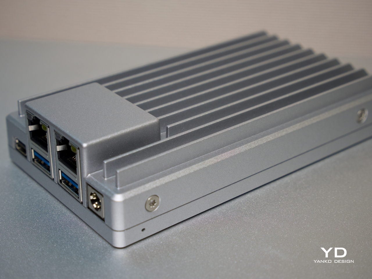
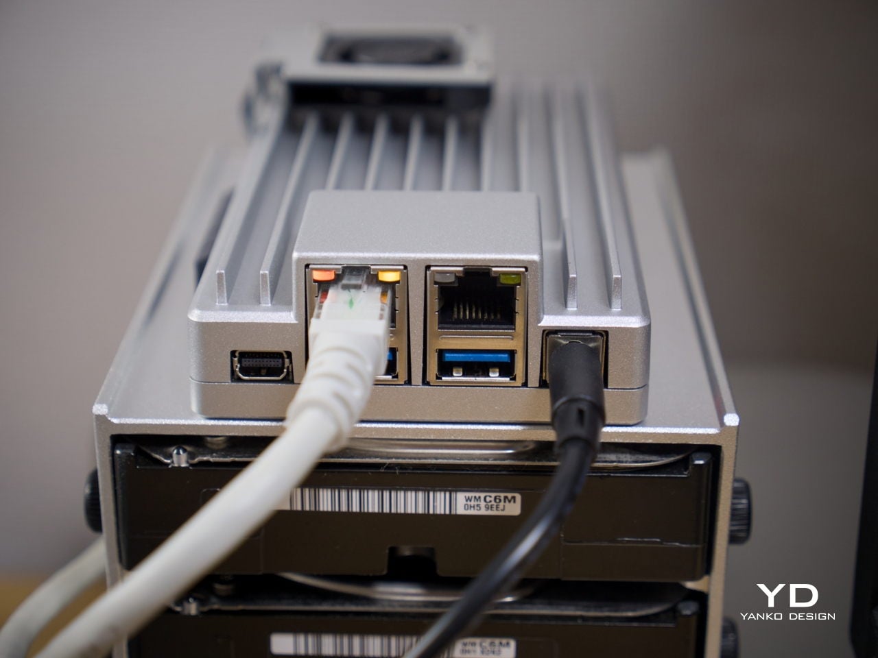
What also sets it apart from other board computers is how the I/O is handled at a design level. The ports are grouped cleanly along one edge, with the dual Ethernet jacks, USB ports, and Mini DisplayPort sitting in a tidy, intentional cluster rather than scattered wherever there was board space. That considered layout keeps the device looking organized even when several cables are plugged in at once.
Ergonomics
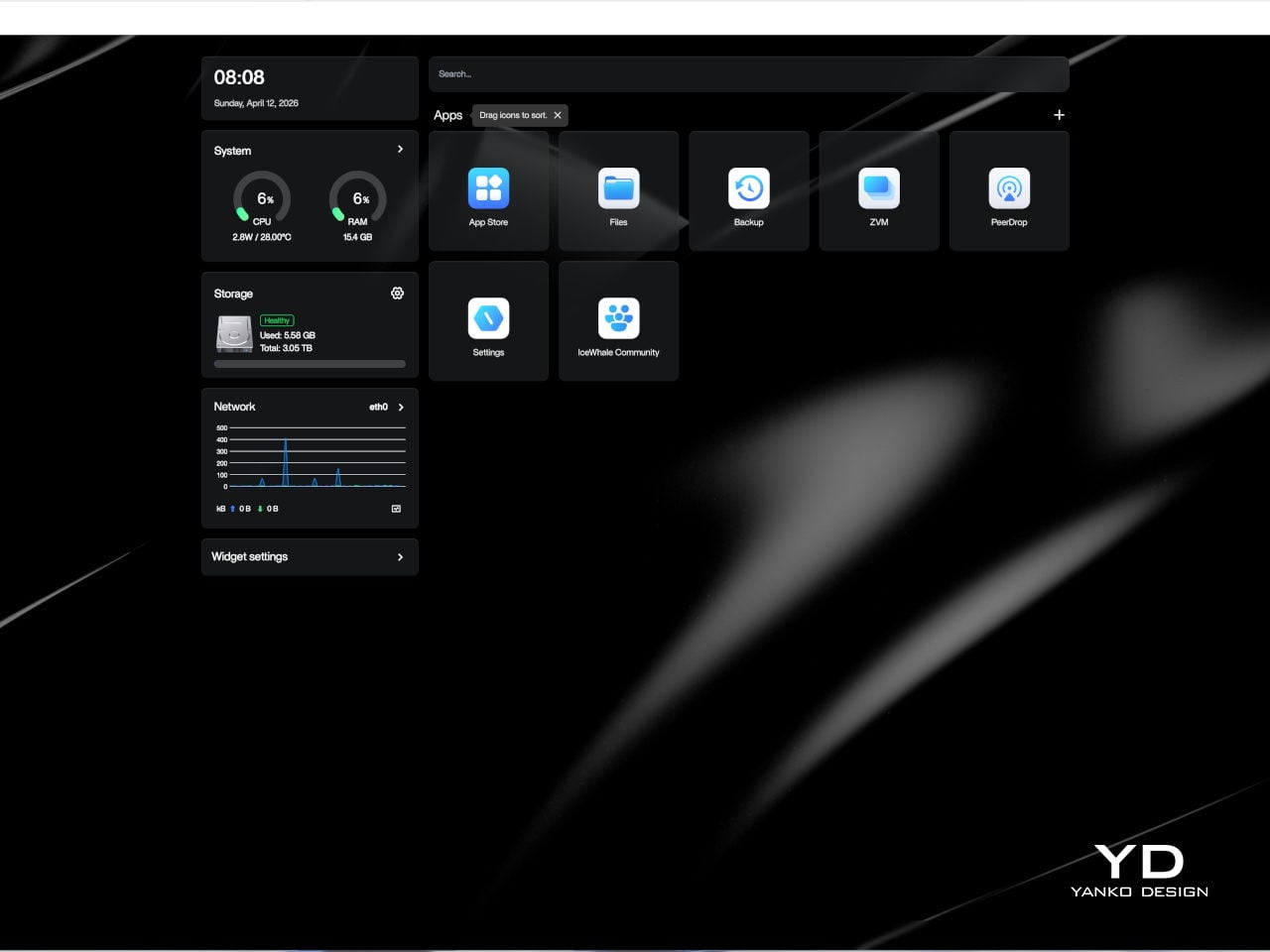
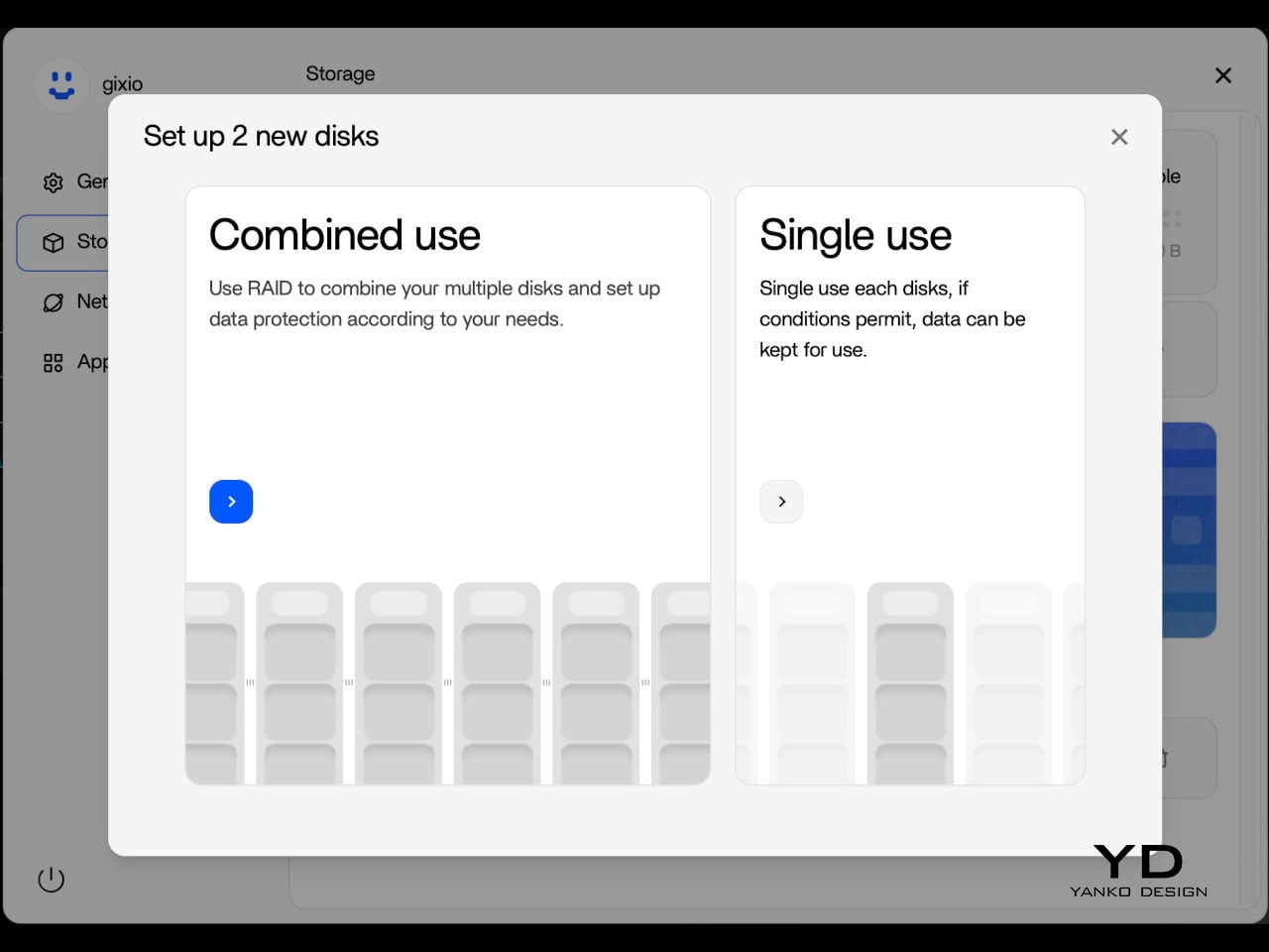
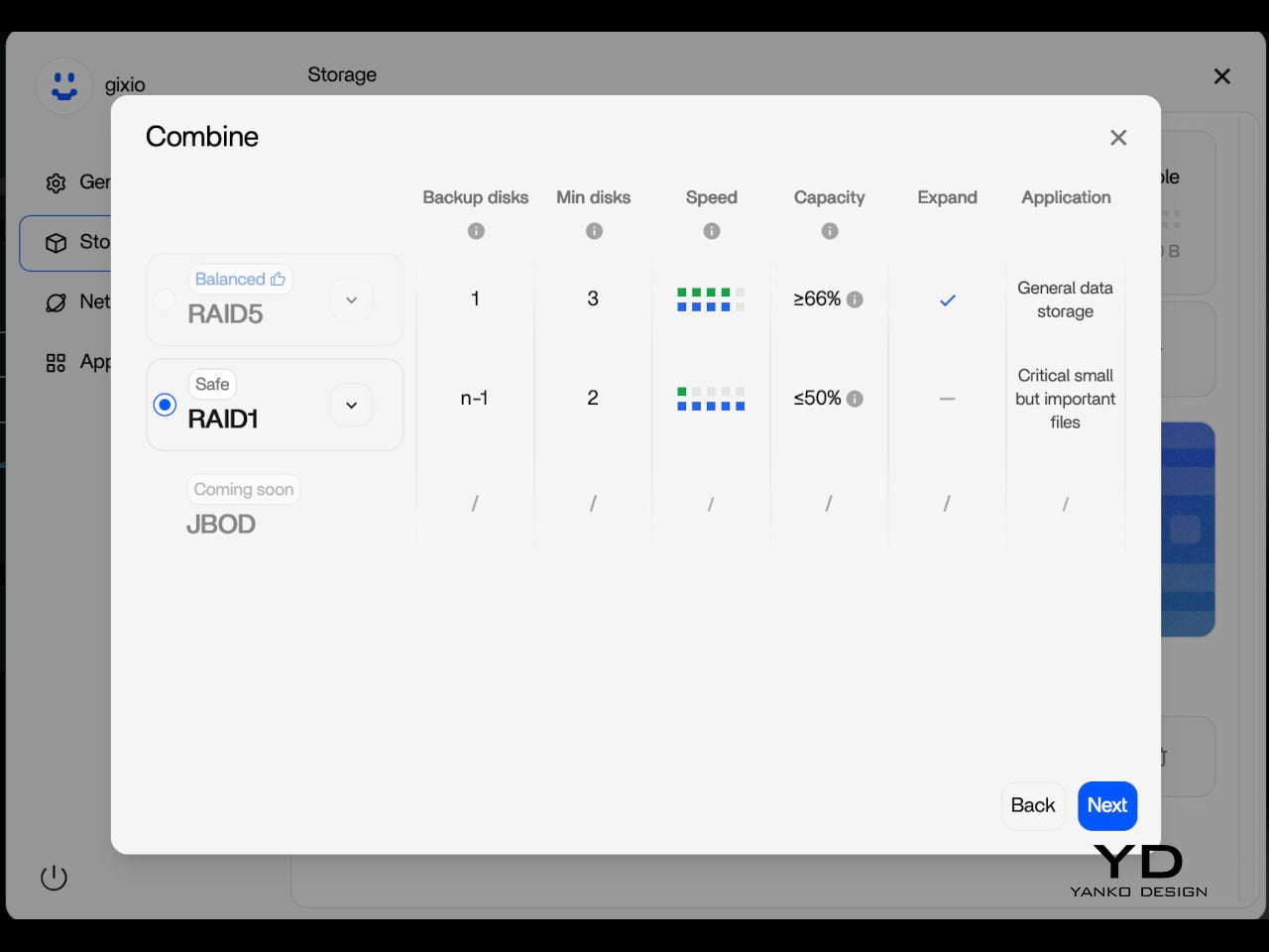
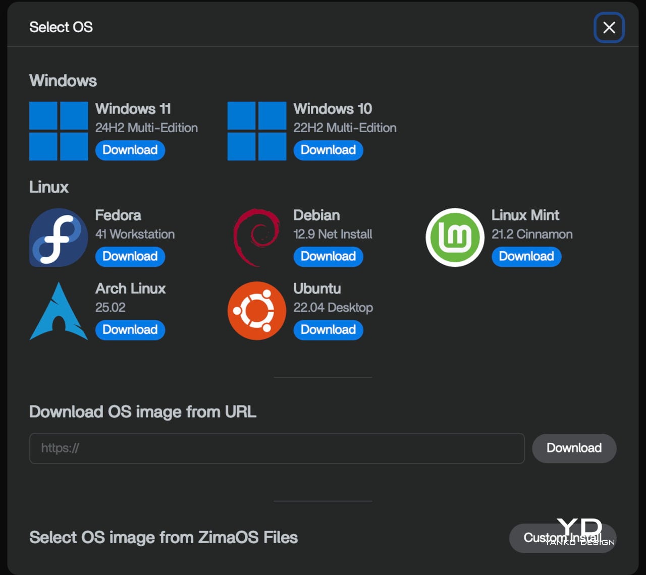
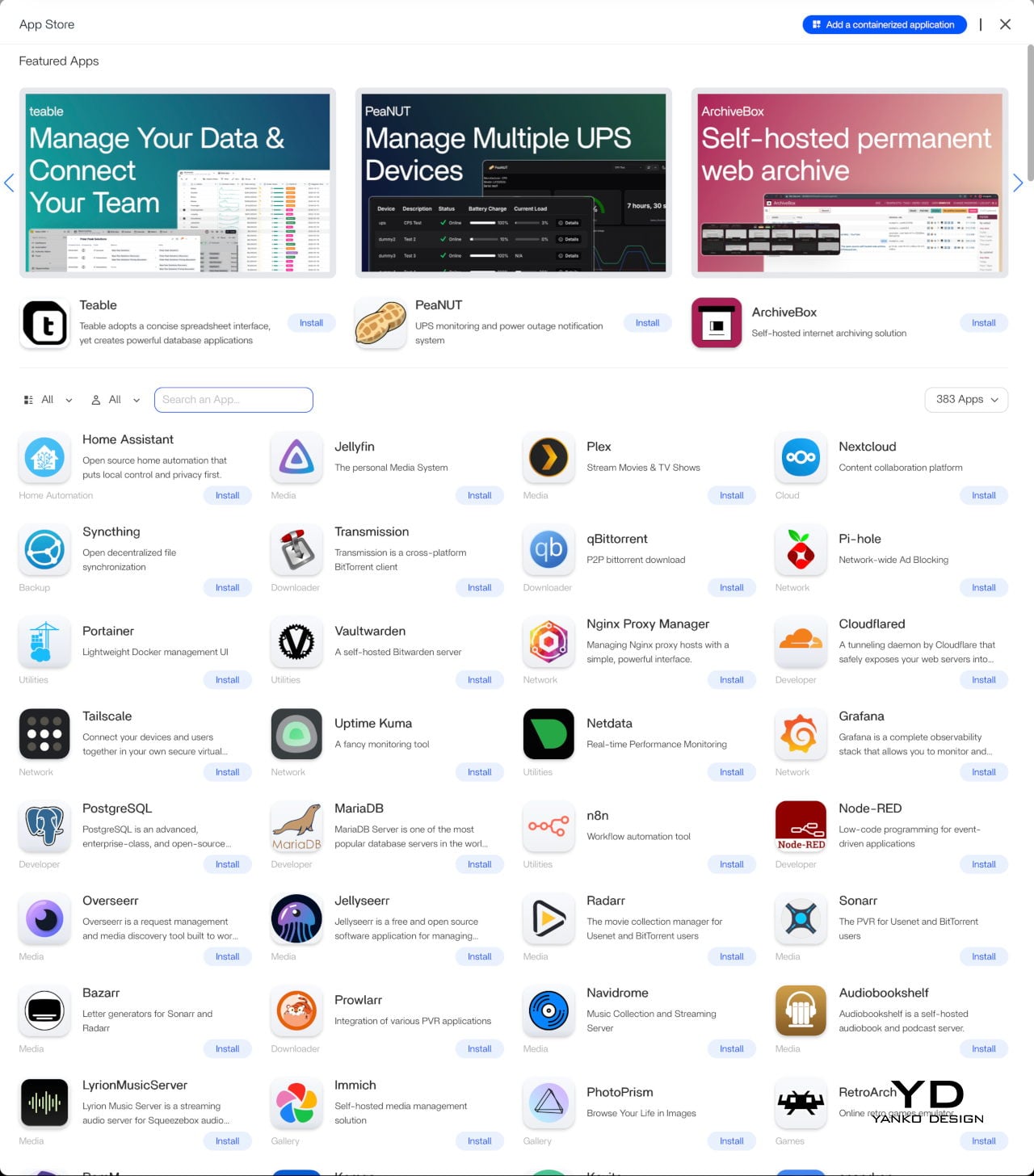
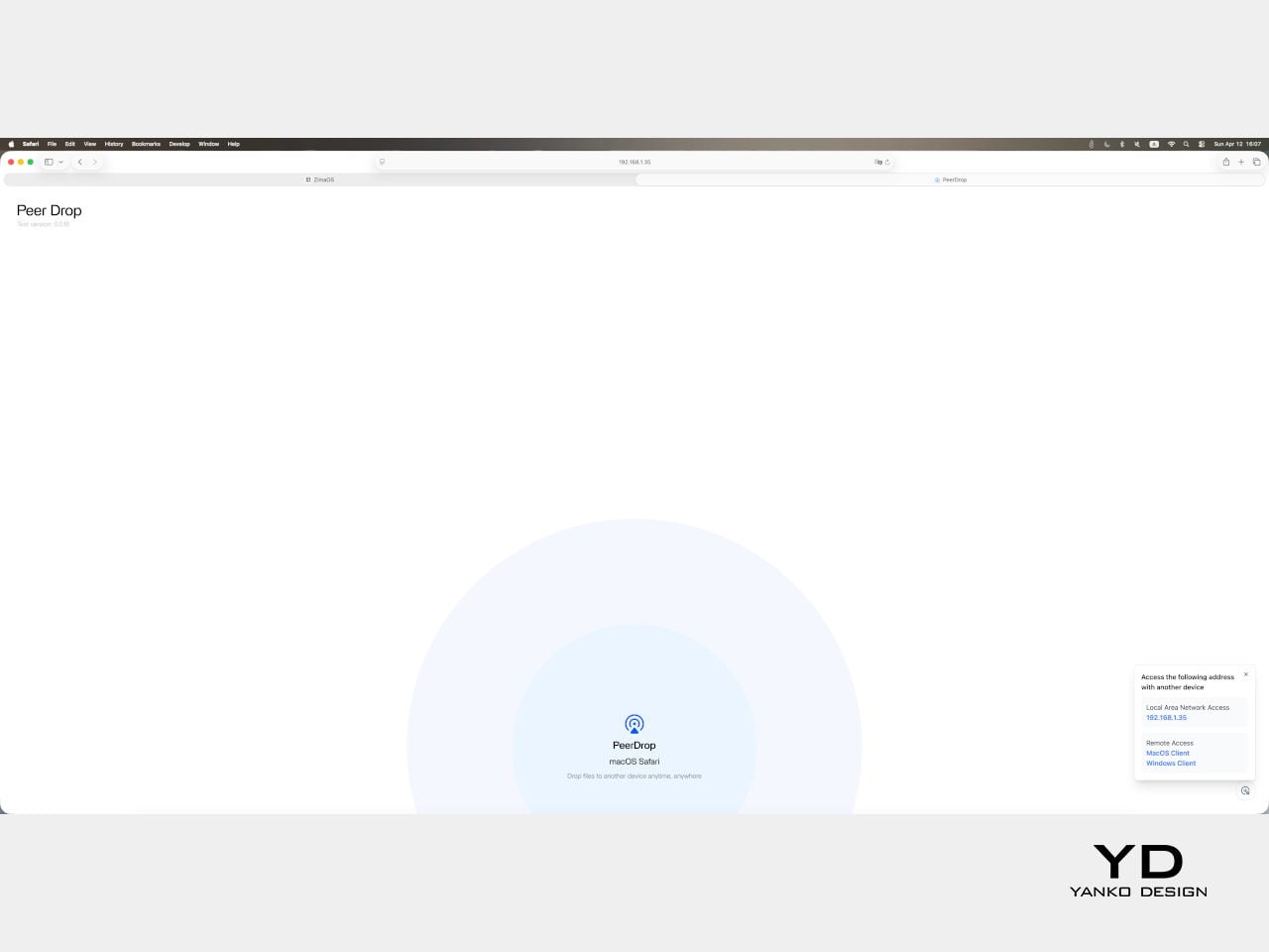
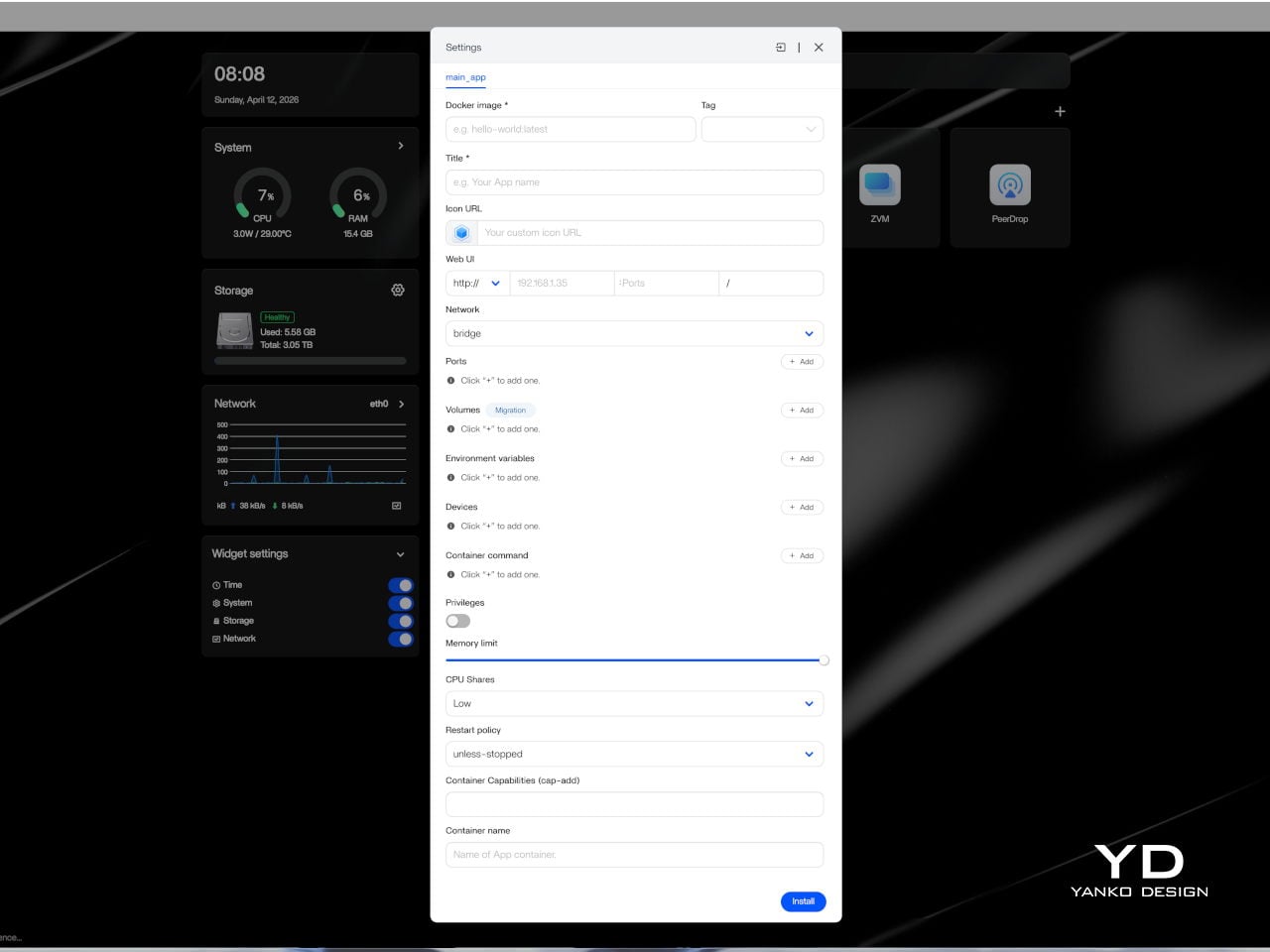
Setting up ZimaBoard 2 is refreshingly straightforward for a device in this category. The web-based interface felt clean, well-organized, and intuitive enough that getting started didn’t require much Linux familiarity. ZimaOS comes pre-installed with a browser-based dashboard that handles storage configuration, app deployment, and network settings through a familiar, point-and-click experience. Getting a NAS or media server up takes minutes, not hours.
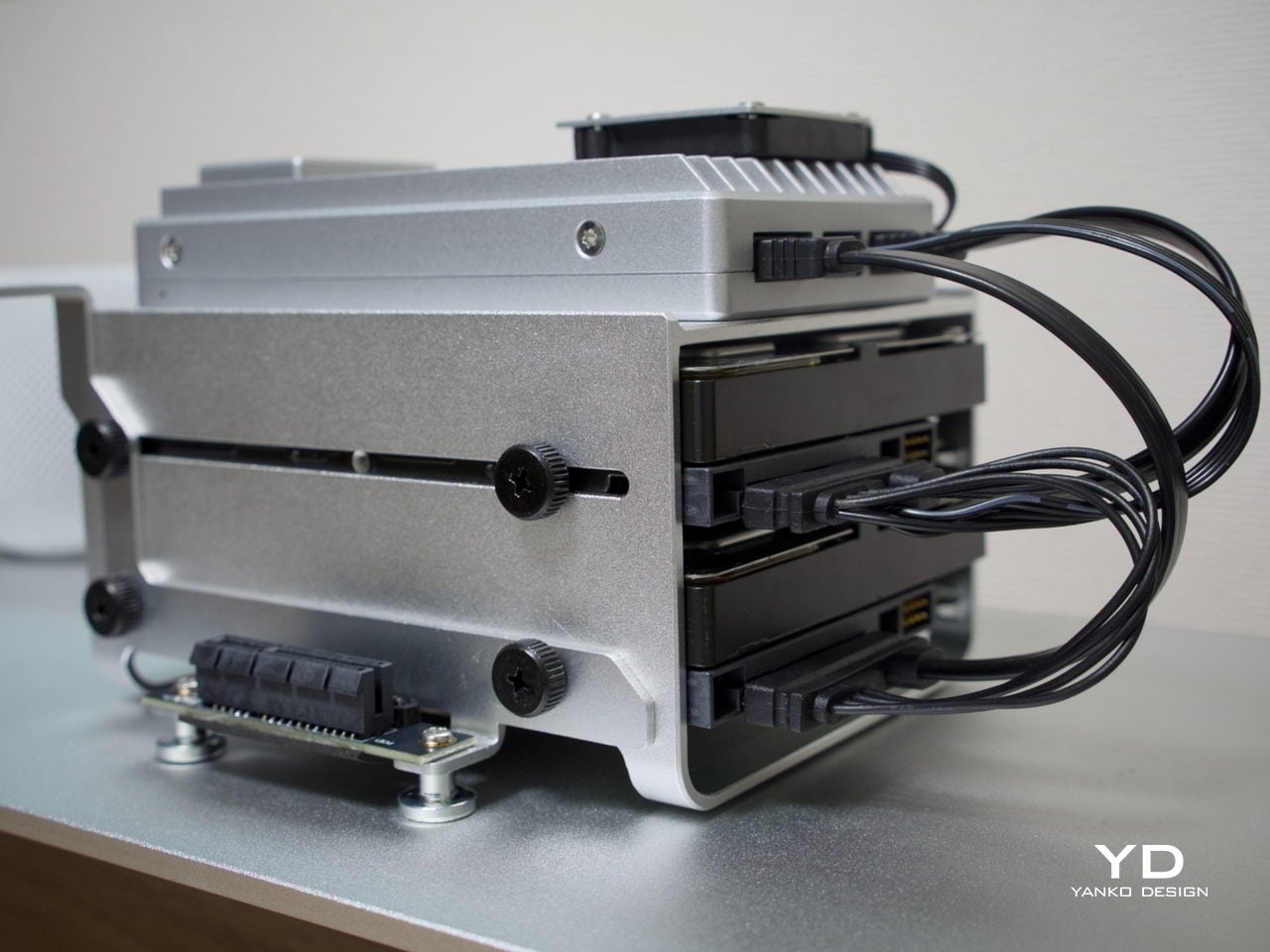
The board is compact and light enough to tuck almost anywhere. It ships with a 60 W power adapter that comes with interchangeable plug adapters, which is a thoughtful detail for anyone working across different countries or regions. ZimaBoard 2 is designed around passive cooling, so in everyday use, it stays effectively silent, even with the optional mini cooling fan, which matters considerably when the device is meant to operate around the clock.
One practical setup step worth noting is that the onboard eMMC storage is best treated as a system layer rather than a long-term data destination. After initial setup, moving files and apps to the SATA-connected drives is the smarter workflow, since attached storage is faster and better suited to the sustained read and write activity a home server handles daily. It’s a minor but worthwhile habit to build in early.
Performance
Under the aluminum shell sits an Intel N150 processor, a quad-core chip running up to 3.6 GHz with a 6 MB cache and a 10 W TDP. It’s not the most powerful chip in this size class, but it’s the right pick for a device designed to run continuously at low power. For home server tasks, including NAS, media streaming, and containerized workloads, it handles things with comfortable ease.
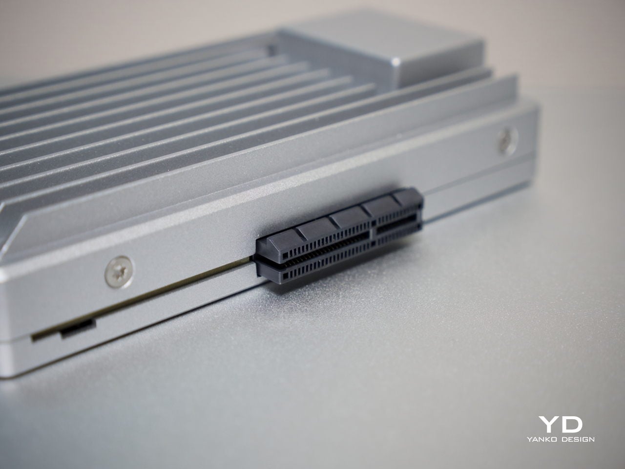
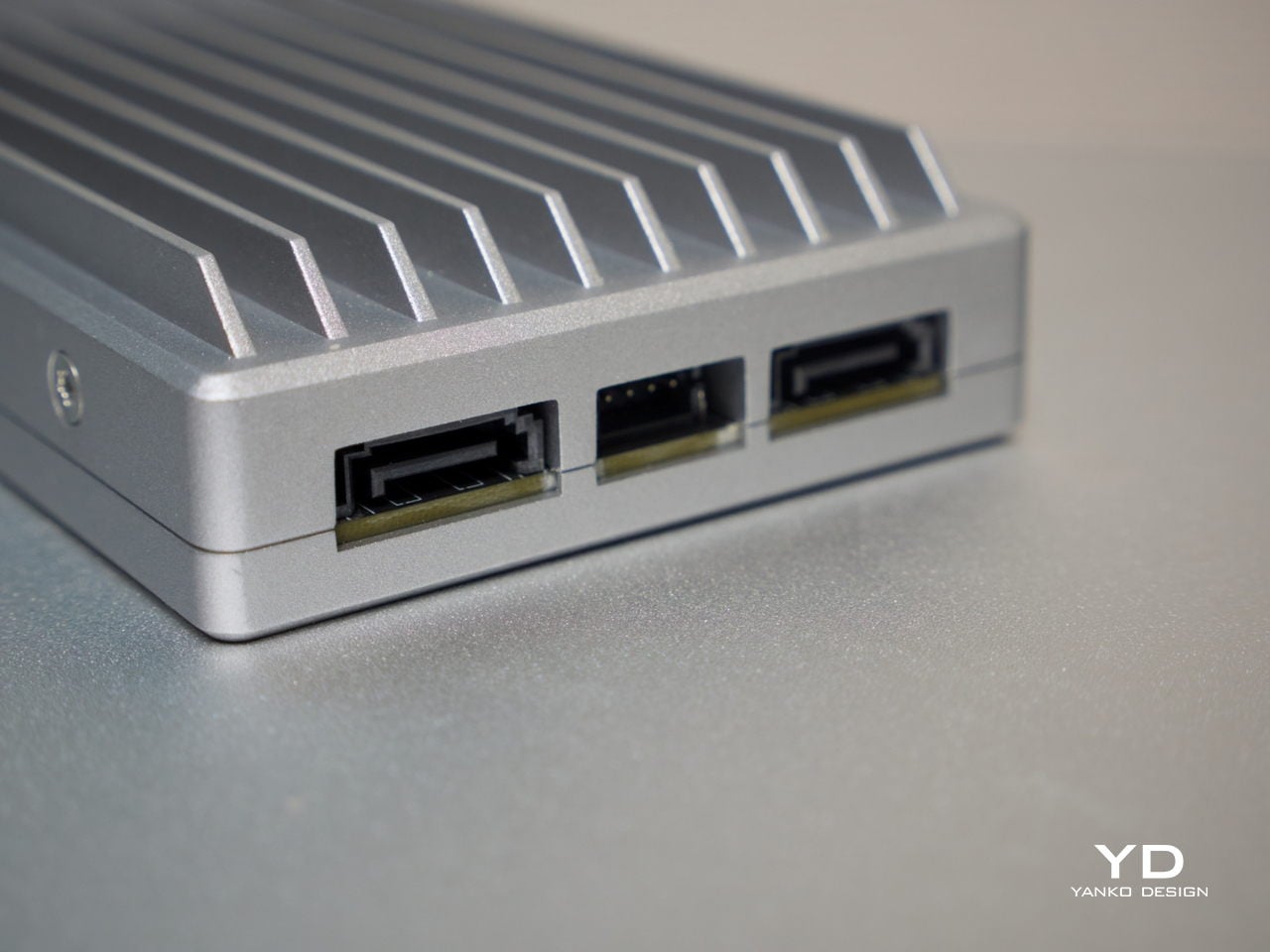
On the storage side, two SATA 3.0 ports come with integrated power support, making it straightforward to connect a pair of full-size NAS drives without extra adapters. Running two 3.5-inch drives caused no issues, and the 12V, 5A supply proved sufficient in testing to handle the board and drives comfortably. That power budget is a meaningful detail, since not every compact server can make the same claim confidently.
Thermals are worth touching on separately. The N150 runs warm under sustained loads, but for NAS-oriented use, there’s a simple tuning option: disabling Turbo Boost in the BIOS noticeably reduces operating temperatures. The trade-off is a clock speed ceiling of around 1 GHz, but for straightforward file serving, that’s more than sufficient, and the lower heat output makes for a much more comfortable long-term operating condition.
Beyond the hardware, ZimaOS adds real depth to the experience. Its app store advertises 800+ one-click apps, including Plex, Jellyfin, Nextcloud, and Home Assistant. The higher 1664 configuration’s 16 GB of LPDDR5 RAM also helps when running virtual machines or heavier container setups. ZimaOS also supports Intel Quick Sync for hardware-accelerated transcoding, which helps reduce CPU load in supported Plex and Jellyfin setups.
Sustainability
The all-aluminum enclosure makes a strong durability argument. Aluminum doesn’t flex, doesn’t yellow, and holds up well over years of continuous operation, which matters a great deal for hardware that never really gets switched off. The thermal design relies primarily on passive conduction through the chassis, keeping internal component complexity low and reducing the number of parts that could wear out over time.
Software longevity is another angle worth considering. Because ZimaBoard 2 runs on x86 architecture, it’s compatible with a wide range of operating systems, meaning the hardware doesn’t become obsolete when a software stack changes or no longer fits your needs. If ZimaOS evolves or you outgrow it, you can simply install something else. That kind of platform openness is a practical form of sustainability that closed appliances rarely offer.
Value
ZimaBoard 2 sits at a price point that demands a bit of context. The base 832 configuration starts at $279, with the 1664 variant at $349. Those figures feel steep when compared to bare-board computers, but the comparison isn’t really fair. What you’re getting is a fully enclosed x86 server module with dual 2.5 GbE networking, dual powered SATA bays, a PCIe 3.0 expansion slot, and ZimaOS pre-installed.
Compact mini PCs at a similar price usually offer stronger raw performance but fewer server-specific ports and no expansion path. Dedicated NAS boxes tend to be locked into proprietary software. ZimaBoard 2 is more flexible than either. Native SATA, dual 2.5 GbE, and a PCIe slot on a single platform is an uncommon combination at this price, and that’s where the value case starts to feel convincing.
The PCIe 3.0 x4 slot adds a dimension of future-proofing that sealed appliances can’t match. You can plug in a 10 GbE network card, an NVMe adapter, a GPU for AI workloads, or an HBA for expanding storage capacity. That expandability means you’re not locked into what the board offers at purchase, which in practical terms allows the device to grow alongside your needs rather than becoming a bottleneck.
It’s fair to say that buyers focused purely on maximum compute per dollar will find stronger options elsewhere. But for those building a quiet, flexible, always-on home server that’s actually pleasant to live with, ZimaBoard 2 feels well-judged. The design, connectivity, software experience, and room to grow all reinforce each other in a way that makes the price feel more grounded the longer you use it.
Verdict
ZimaBoard 2 makes a strong case for what compact home server hardware can look like when design is treated as part of the brief. It’s quiet, well-built, and easier to set up than most things in this category. Running as a NAS, a smart home hub, a media server, or all three at once, it handles each task without calling attention to itself, which is exactly what good infrastructure does.
The platform’s real strength is how many things it can become. Add a pair of NAS drives, and you’ve got a whisper-quiet personal cloud. Plug something into the PCIe slot, and the possibilities multiply further. It isn’t built for users chasing peak benchmarks, but for those who want a compact, always-on server that earns its place on the shelf both functionally and aesthetically, it’s a genuinely well-considered piece of hardware.
The post ZimaBoard 2 Review: The Home Server You Don’t Have to Hide Anymore first appeared on Yanko Design.