If you follow concept design on social media, there’s a good chance you’ve already stumbled across Jane Morelli’s work. She’s the designer behind that Lacoste x Bialetti moka pot that went viral not too long ago, and now she’s back with something that somehow manages to feel even more covetable. For the Year of the Horse, she has created a concept coffee set that imagines what a Hermès x Bialetti collaboration could look like, and the result is genuinely breathtaking.
To be clear, this is not a real product. It’s a speculative design concept, an unofficial creative exploration that Morelli put together entirely on her own. Neither Hermès nor Bialetti has signed off on it, and there’s no indication it will ever hit shelves. But that hasn’t stopped the internet from losing its collective mind over it, and once you see it, you’ll understand why.
Designer: Jane Morelli
The concept draws on two things that already go together better than most people realize. Hermès has deep equestrian roots. The brand was originally founded as a harness and saddle workshop, and the horse has been central to its identity ever since. That iconic logo featuring a horse-drawn Duc carriage pays homage to the brand’s equestrian beginnings and still appears on every box and ribbon the brand produces today. So when a designer decides to celebrate the Year of the Horse, Hermès is a natural fit.
Bialetti, meanwhile, has its own kind of cult status. The Moka Express, invented by Alfonso Bialetti in 1933, completely changed how people made coffee at home. That eight-sided stovetop brewer became one of the most recognizable objects in design history, sitting comfortably in the same conversation as the Eames chair or the Anglepoise lamp. It’s Italian, it’s timeless, and it’s on millions of kitchen counters around the world.
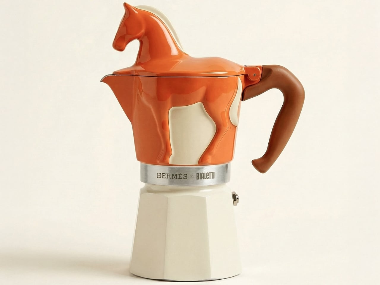
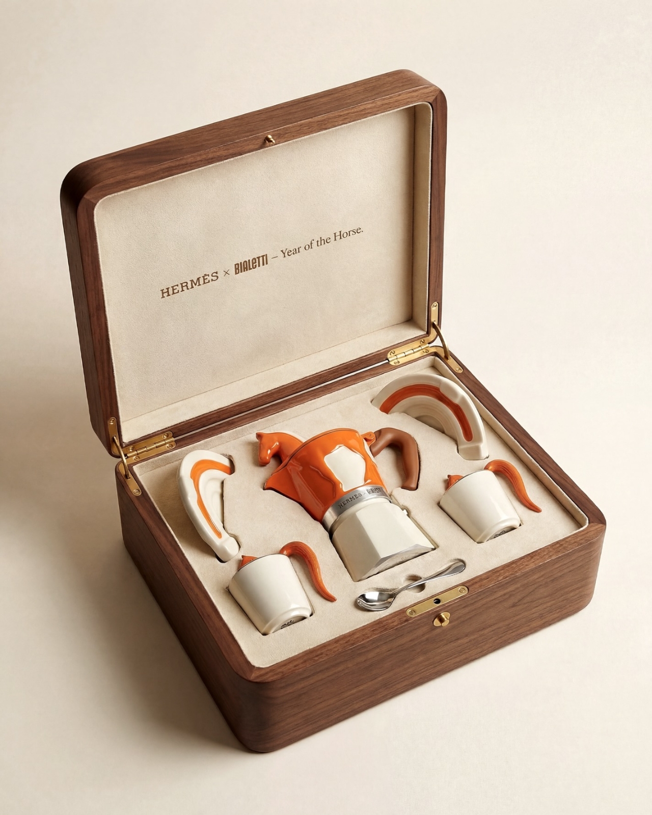
Morelli’s concept merges both worlds with a detail-oriented love for both brands that really shows. The moka pot gets the full Hermès treatment: a rich burnt orange body with a cream horse silhouette painted on its side, and a three-dimensional horse figurine standing on top of the lid in place of the usual knob. It’s playful without being loud, sculptural without being impractical. The color palette, that signature Hermès orange paired with warm cream and a cognac brown handle, feels completely at home on a stovetop.
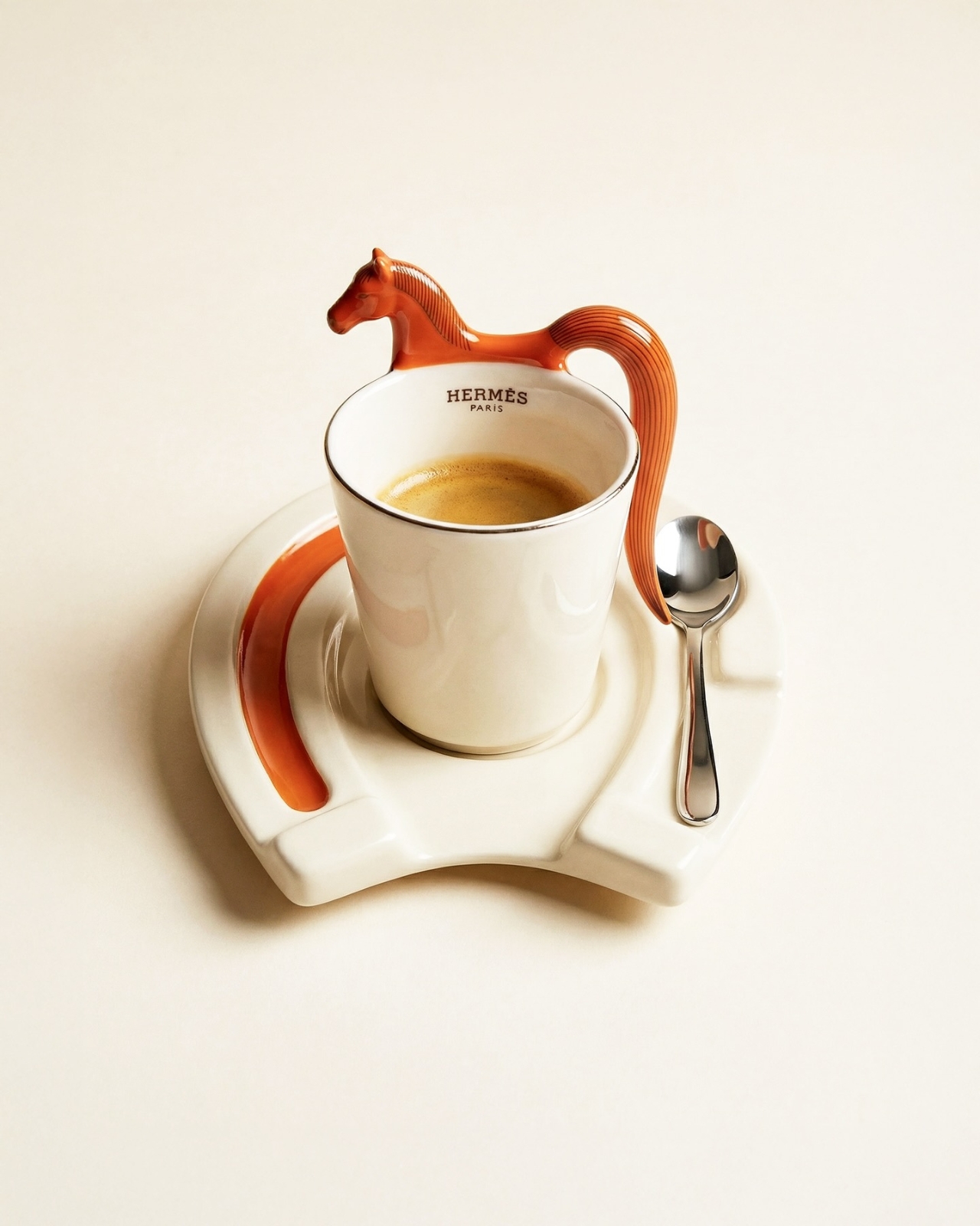
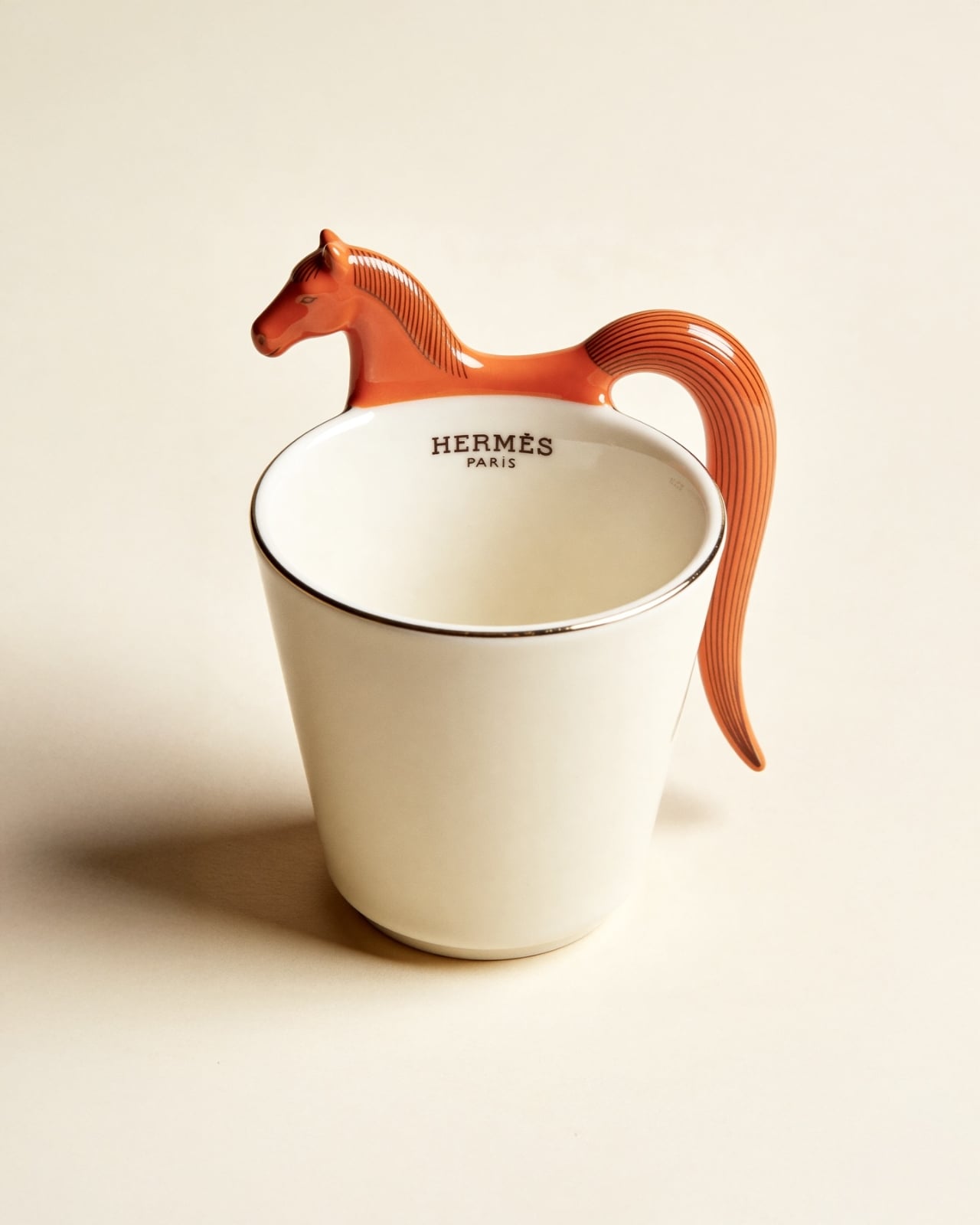
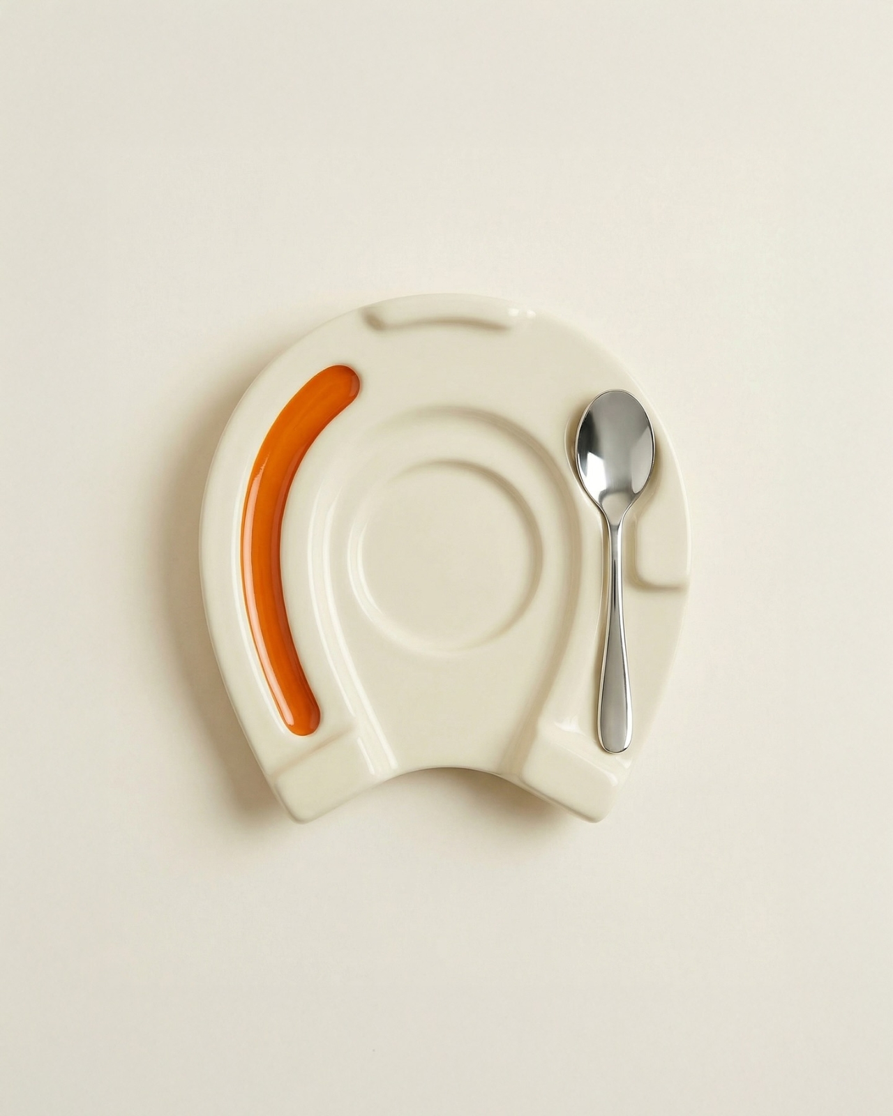
The espresso cup might be the most charming piece of the set. A sculpted horse head forms the top of the handle, with the body flowing down into a ribbed, flowing tail that curves back up to meet the cup. The saucer takes the shape of a horseshoe, with the spoon resting neatly in the groove on one side. Every element has been thought through, which is what sets a great concept apart from a quick render.
The whole set comes presented in a walnut wooden box lined with cream fabric, with “Hermès x Bialetti: Year of the Horse” inscribed on the inside of the lid. Even the packaging looks like something you’d want to display on a shelf rather than throw away. It’s the kind of unboxing experience that luxury brands have mastered, and Morelli has translated that into her concept with impressive accuracy.
What makes this design so compelling is how it sits at the intersection of craft, culture, and storytelling. The Year of the Horse in the Chinese zodiac is associated with energy, freedom, and elegance, all qualities that feel right at home in both the Hermès and Bialetti universes. Morelli didn’t just slap two logos together and call it a day. She built a visual language that feels native to both brands, which is no small feat. It’s a concept, yes. But the best concepts do exactly what this one does: they make you want something that doesn’t exist yet, and they make you wonder why nobody has done it already.
The post This Hermès x Bialetti Moka Pot Concept Has No Business Looking This Good first appeared on Yanko Design.