Carrying more computers than you want is familiar. There is a personal phone, maybe a MacBook, and then a separate Windows laptop “just for work” or a Linux box for coding. Phone-as-PC ideas have been floating around for years, but they usually stop at a half-baked desktop mode that feels more like a demo than something you would actually use for hours at a stretch.
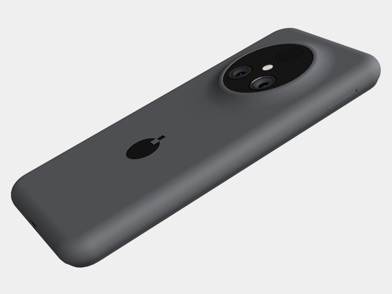
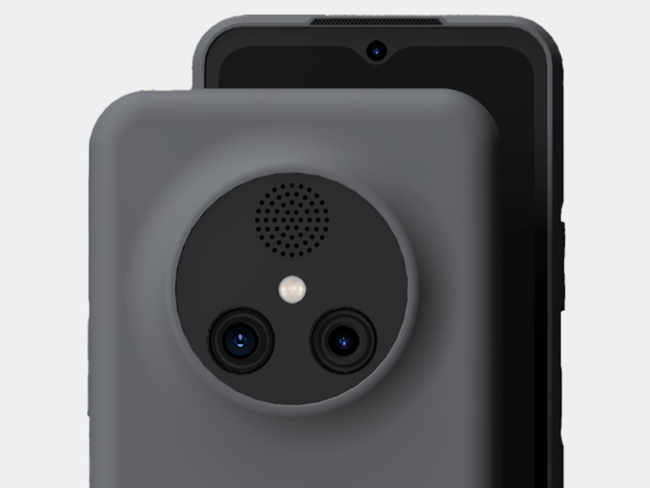
NexPhone is an Android 16 handset built on Qualcomm’s QCM6490, a long-term-support chip Qualcomm says will be backed through 2036. That is rare in phone marketing, but it matters when the device is also your computer. It has 12 GB of RAM, 256 GB of storage with microSD expansion, a 6.58-inch 120 Hz display, a 5,000 mAh battery, dual rear cameras, dual SIM, wireless charging, and MIL-STD-810H plus IP68/IP69K ruggedization.
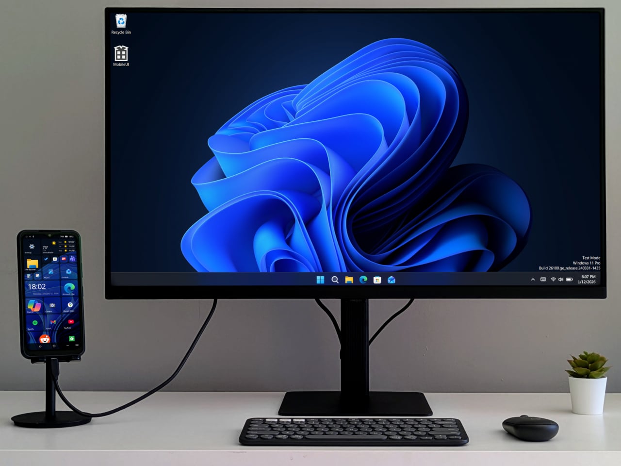
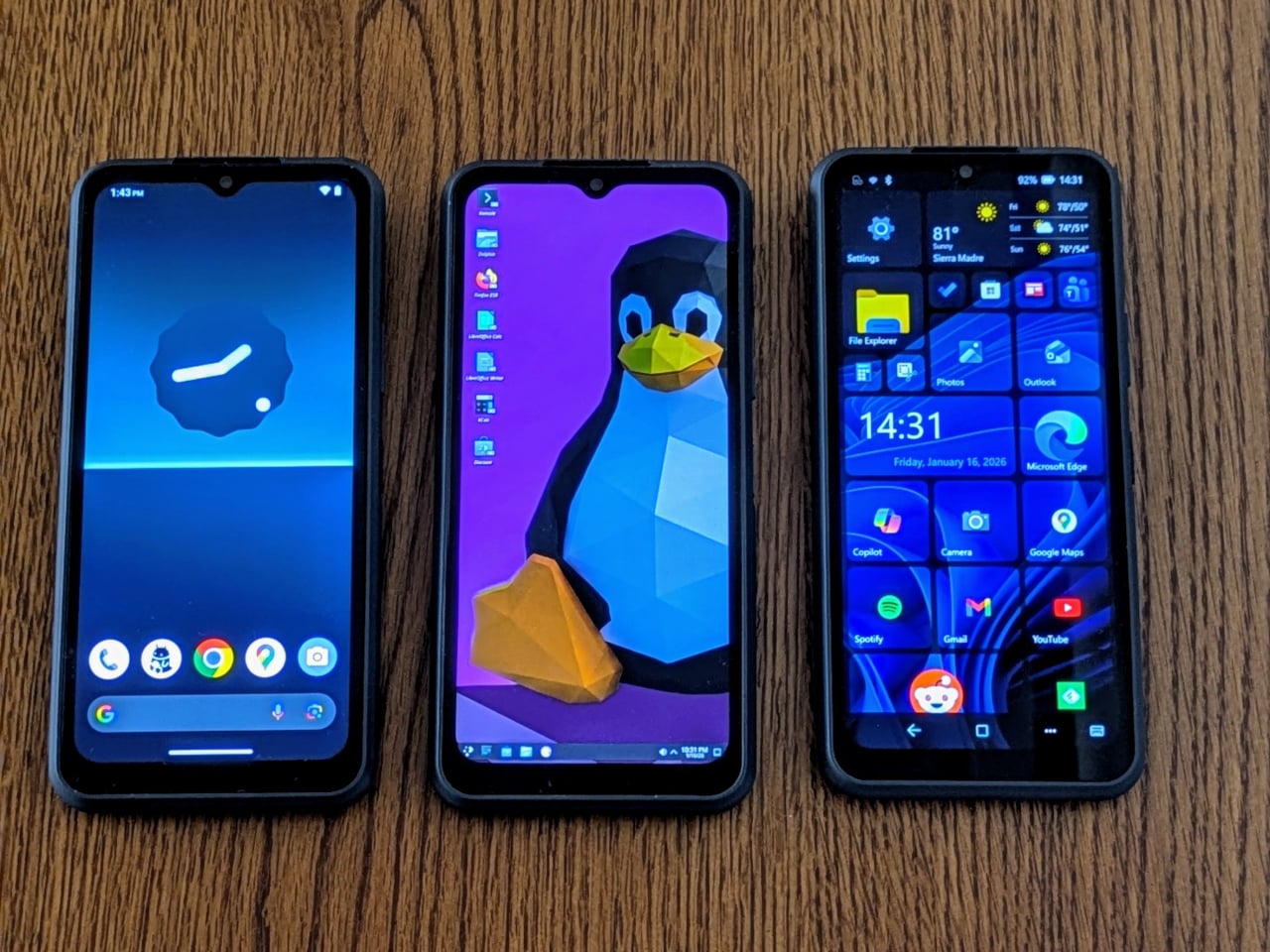
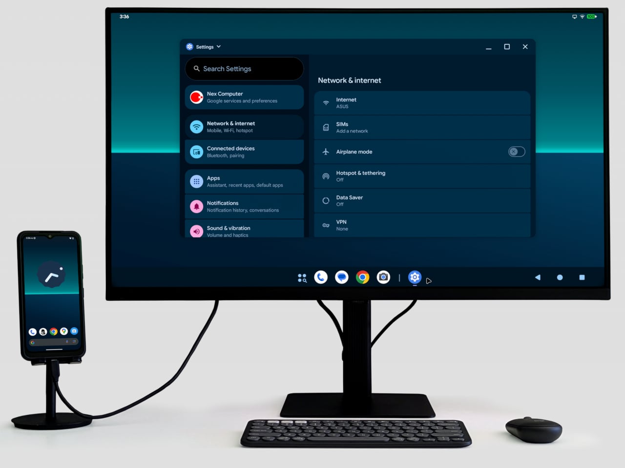
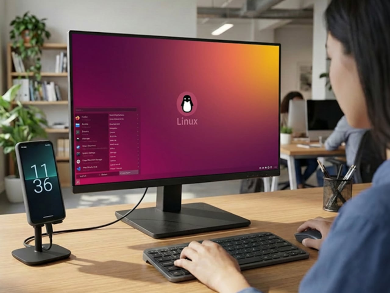
NexOS lets you treat the phone as three machines in one. On its own, it is a clean Android system with no bloatware. Plug it into a monitor, and you can switch into Android desktop mode or full Debian-based Linux with hardware acceleration, sharing folders between them. If you opt in, you can also boot Windows 11 on Arm, turning the phone into a tiny Windows PC when docked.
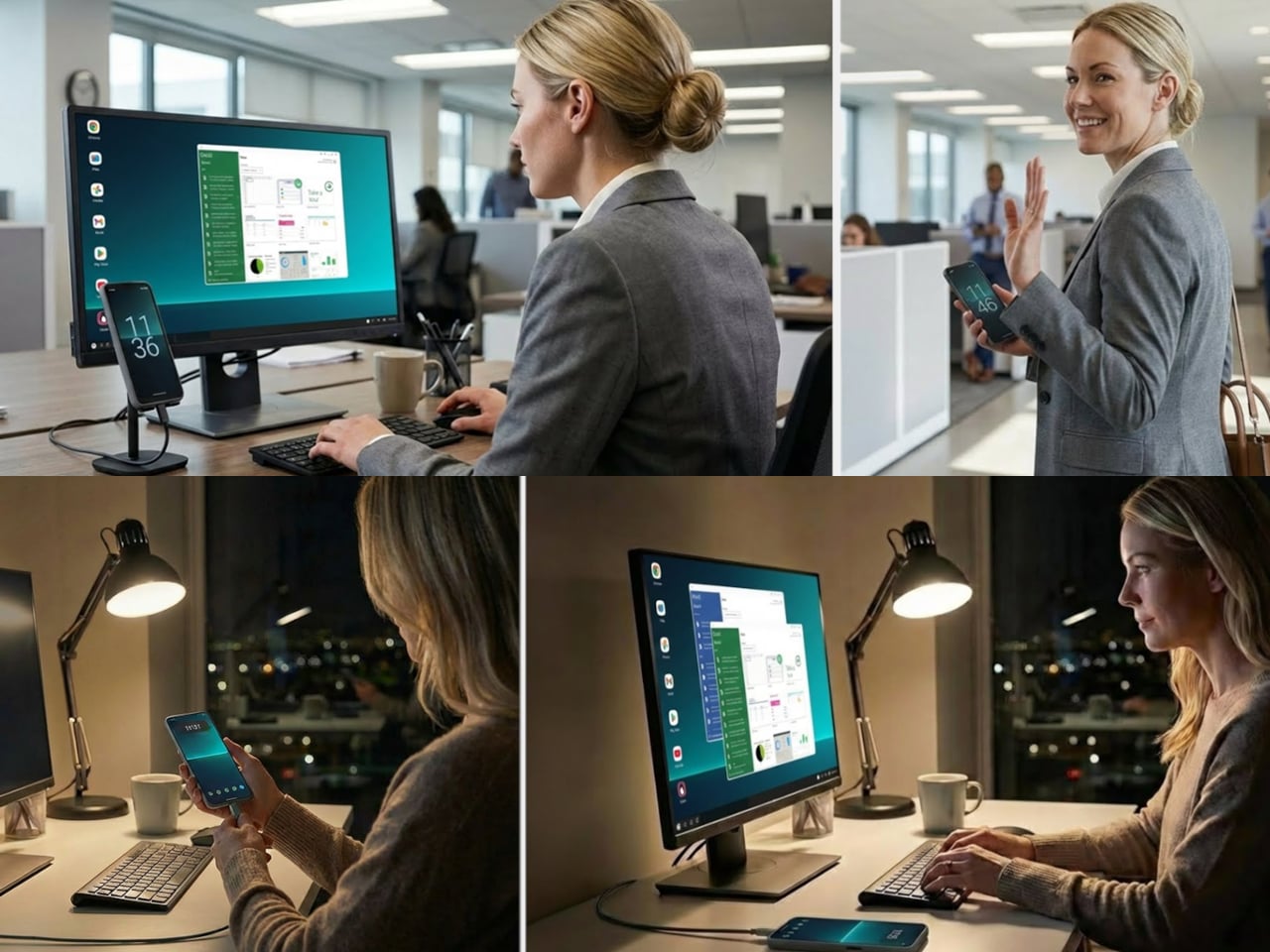
NexPhone builds a custom Windows Mobile UI on top of Windows 11, a grid-style launcher inspired by old Windows Phone tiles to make the OS less painful on a small screen. For desktop use, the phone ships with a five-port USB-C hub that fans out to HDMI, keyboard, mouse, and power. Any desk with a monitor becomes your workstation with a single cable, and you pick up at home where you left off at the office.
Windows 11 on Arm still has app compatibility gaps and relies on emulation for many x86 programs, which can hurt performance and battery life. Multi-booting Android, Linux, and Windows adds complexity that appeals to enthusiasts more than casual users. Putting phone, PC, and laptop brain into one device also means a single point of failure, and the rugged build does not remove the need for backups and a fallback plan.
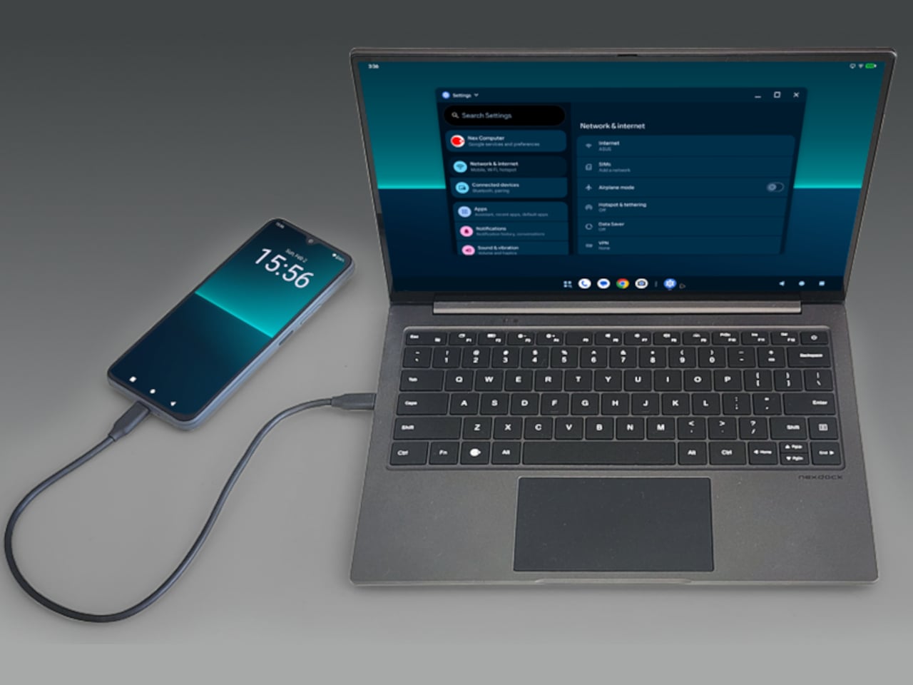
With the optional NexDock laptop shell, you can plug in and get a 14.1-inch display, keyboard, and trackpad in airport lounges or coffee shops without carrying a full laptop. It is designed for people who already juggle multiple OSes and want to consolidate, but not for those hoping to escape complexity. The promise to support the device for a decade is either visionary or risky, depending on how seriously you take startup hardware commitments.
NexPhone is less about convincing everyone to ditch laptops and more about giving the Linux-comfortable, multi-OS crowd a serious shot at carrying one device instead of three. It treats the phone, the OS stack, and the docking experience as one design problem. Whether that holds up depends less on the specs and more on whether the software behaves like three clean experiences instead of one messy compromise.
Projects pile up on the bench with a ruler that stops at 30 cm, a square for right angles, a separate protractor for odd cuts, a level somewhere in a drawer, and a pencil that has wandered off. Those small frictions add up when you are trying to stay in a flow state, and most rulers can measure but do not really help you think through the layout. You end up switching between tools, rechecking marks, and occasionally cursing when parallels drift, or angles end up slightly crooked.
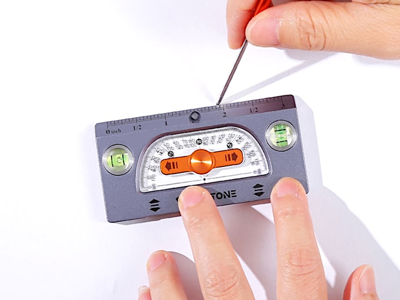
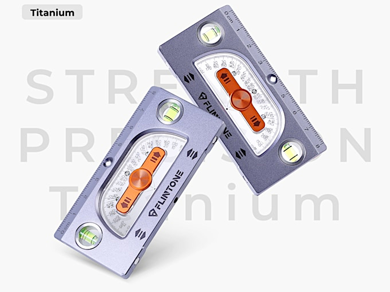
The FLINTONE MegaRuler is a titanium 9-in-1 drawing master that tries to compress a whole layout kit into something smaller than a phone. It is designed for garage tinkerers, designers, woodworkers, model builders, electronics people, and 3D-printing geeks who want strength, accuracy, and versatility in one object. The body is machined from titanium, so it feels like a small instrument rather than a disposable ruler, and it packs infinite extension lines, perfect parallels, angles, levels, magnets, and a built-in pen into a single pocket-sized block.
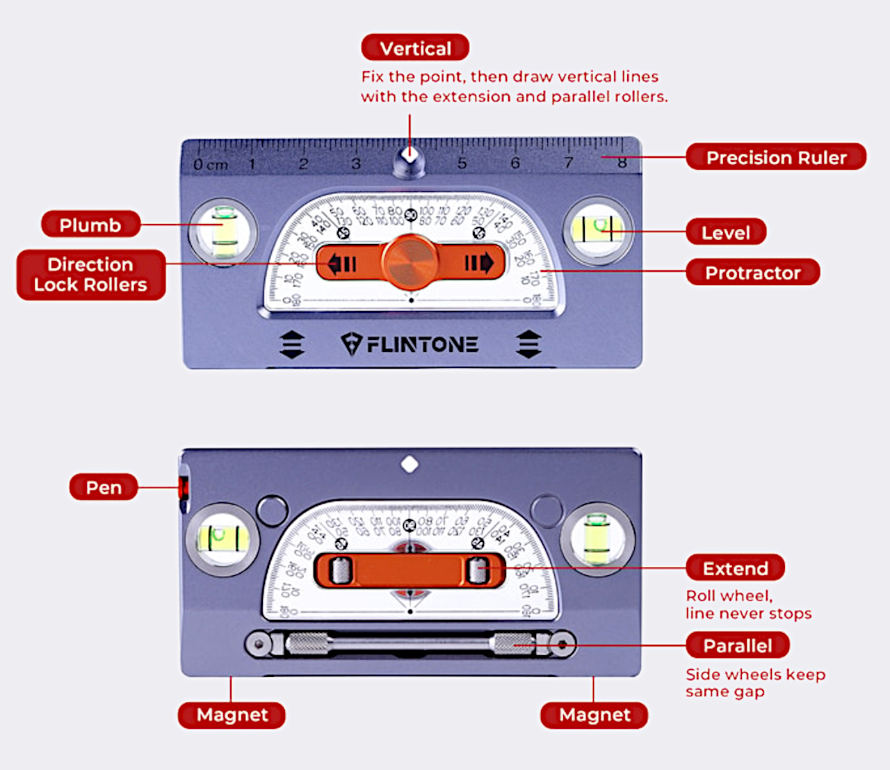
The infinite extension feature uses a central roller that lets you draw a straight line as long as you need by rolling the tool along the surface. You can dock the ruler end-to-end 27 times with less than 0.1mm cumulative error, enough to lay out an 8m straight line without a laser or chalk box. For framing, cabinetry, set building, or large-format graphics, that kind of repeatable accuracy means less rework and fewer compromises when the layout determines everything downstream.
The side wheels hug a reference line, so every new line stays exactly the same distance away. In testing, drawing 50 parallel lines produced a maximum drift of 0.07mm, which is effectively negligible for most jobs. That lets you stop measuring every joist, slat, or tile and simply roll the MegaRuler along, trusting it to keep spacing consistent for grooves, stitch lines, or printed patterns. The result feels less like measuring and more like running a tiny machine that thinks about geometry for you.
MegaRuler handles angles by letting you draw any-angle slanted lines from 1° to 179° in one smooth motion. The integrated protractor is laser-etched with a high-contrast scale that remains readable in bright light, dust, or glare, so you can lean the body to the exact angle you want and draw without switching tools. For miters, chamfers, or odd-angle joints, it becomes the single reference you reach for instead of juggling a ruler and a protractor and hoping the alignment holds while you mark.
Dual bubble vials turn the tool into both a horizontal level and a plumb checker. Standing it up gives true vertical in half a second, laying it flat gives an instant surface check. N52 magnets are flush-mounted in the body, so it sticks to steel beams, machines, or a shop cabinet, allowing hands-free marking and storage. A small marking pen lives inside the ruler itself, sliding out to mark and back in when you are done, so measuring and marking are finally in the same place instead of scattered across the bench or lost in pockets.
MegaRuler might live clipped to a pocket on a jobsite, sitting next to a sketchbook on a designer’s desk, or magnetized to a drill press in a home workshop. Instead of reaching for a different tool every time you need a line, angle, or level check, you grab the same titanium block and let its rollers, vials, magnets, and pen handle the details. It earns its space by doing many jobs well, feeling less like a novelty and more like the ruler you wish you had from the start, compact enough to forget until you need it and precise enough to trust when accuracy actually matters.
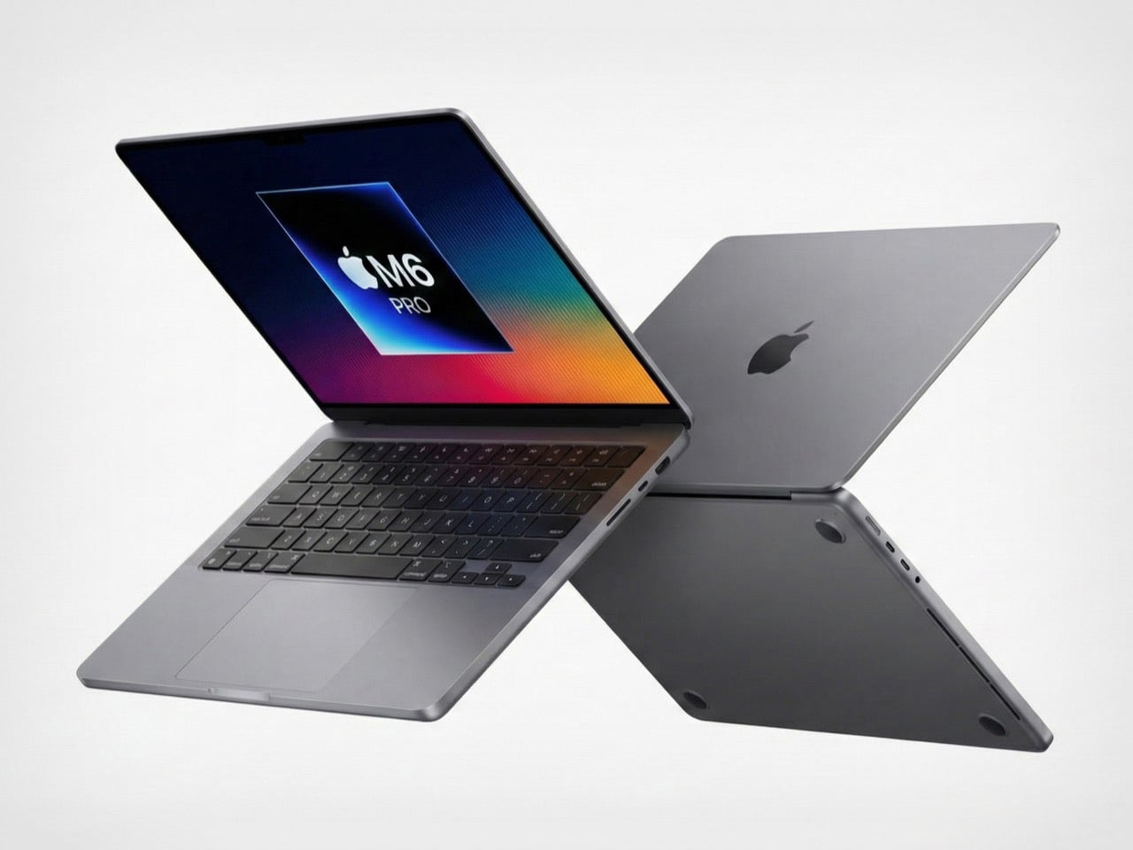
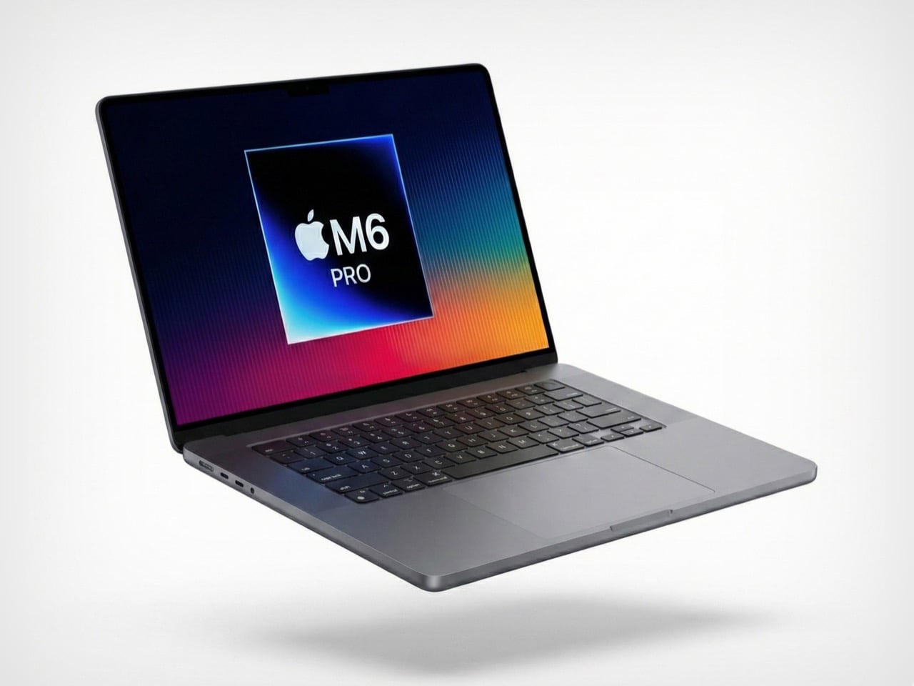
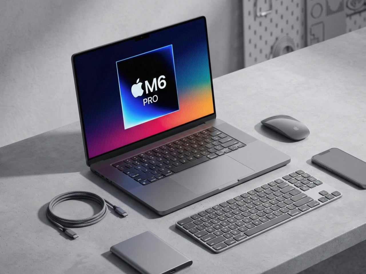
So here’s the timeline we’re apparently living in: Apple will ship a completely redesigned MacBook Pro with OLED displays and touchscreens before Rockstar manages to release GTA 6. Let that sink in for a second. A company that refreshes laptops on a predictable yearly cadence is moving faster than a studio working on a game announced in 2022. Industry sources suggest Apple is accelerating development of its M6-powered models, with launch windows now pointing to late 2026 rather than the previously expected 2027 timeline. The shift signals confidence in advancing multiple breakthrough technologies simultaneously, from next-generation display panels to cutting-edge silicon manufacturing.
The irony is delicious because both Apple and Rockstar operate on their own time. They ship when they’re ready, audiences be damned. Except Apple apparently got ready really fast this time. For professionals who have waited through several years of iterative updates, the M6 models promise substantial reasons to upgrade. The combination of OLED technology borrowed from the iPad Pro, potential touchscreen integration, and the performance leap expected from 2-nanometer chips creates a compelling package. Add to this a thinner chassis, refined thermal management, and possibly even cellular connectivity, and the M6 MacBook Pro begins to look like the generational shift many have been anticipating since the original Apple Silicon transition.
Designer: Apple
Representative Image
The rumor mill had most of us penciling in a 2027 launch for the M6 MacBook Pro, giving Apple time to perfect the OLED transition and work through the inevitable supply chain headaches. But production starting early suggests either the technology matured faster than expected or Apple sees competitive pressure building and wants to strike first. My money is on both. The shift signals confidence in advancing multiple breakthrough technologies simultaneously, and when Samsung starts manufacturing panels months ahead of schedule, it means someone with deep pockets is pushing hard. That someone is Apple, and they clearly want these machines out the door before 2027.
The redesign also alleges a shift to tandem OLEDs, the same technology we saw on the iPad Pros last year (which apple called their Ultra Retina XDR Display). Tandem OLED uses two emissive layers stacked on top of each other, which delivers higher sustained brightness, better power efficiency, and dramatically reduced burn-in risk. The iPad Pro already proved this works beautifully. Blacks that actually look black, colors that pop without looking oversaturated, and HDR content that doesn’t feel like a compromised laptop experience. Moving that to a 14-inch or 16-inch panel with different thermal constraints is complex, but Apple’s display team has pulled off harder tricks. The mini-LED panels in current MacBook Pros are excellent. OLED makes them look outdated.
Representative Image
Then Apple is apparently adding touchscreens, which is wild considering how long they insisted touchscreens on laptops were bad design. They weren’t entirely wrong. Gorilla arm is a real problem. Nobody wants to reach up and poke a vertical screen all day. But the implementation details suggest Apple found a middle ground that actually works. Reinforced hinges keep the display stable when you tap it. A hole-punch camera cutout instead of the notch, possibly with Dynamic Island functionality, points to interface elements designed for quick touch interactions. This isn’t about replacing the trackpad. This is about adding occasional touch input for specific tasks where it makes sense, like scrolling through a timeline or adjusting sliders in creative apps.
The M6 chips built on TSMC’s 2-nanometer process could deliver 15 to 20 percent performance gains over M5 while improving energy efficiency. That translates to faster renders, quicker compile times, and snappier machine learning workflows without sacrificing battery life. The real party trick is how Apple might structure the chips with CPU and GPU in separate blocks, allowing more customization in performance configurations. You get exactly the compute power you need without paying for components you’ll never max out. Smart, efficient, very Apple.
Representative Image
Here’s where the joke stops being funny though. These redesigned models will probably only come in Pro and Max configurations initially, with the base model stuck on the old design for another year. That’s Apple’s way of charging a premium while keeping cheaper options available. The iPad Pro jumped about $200 when it got tandem OLED. Expect similar economics here, putting the entry point for a redesigned 14-inch model somewhere around $2,200 or higher. You’ll be able to buy this laptop and play GTA 6 on it via cloud gaming before you can buy GTA 6 natively. What a time to be alive.
So here’s the timeline we’re apparently living in: Apple will ship a completely redesigned MacBook Pro with OLED displays and touchscreens before Rockstar manages to release GTA 6. Let that sink in for a second. A company that refreshes laptops on a predictable yearly cadence is moving faster than a studio working on a game announced in 2022. Industry sources suggest Apple is accelerating development of its M6-powered models, with launch windows now pointing to late 2026 rather than the previously expected 2027 timeline. The shift signals confidence in advancing multiple breakthrough technologies simultaneously, from next-generation display panels to cutting-edge silicon manufacturing.
The irony is delicious because both Apple and Rockstar operate on their own time. They ship when they’re ready, audiences be damned. Except Apple apparently got ready really fast this time. For professionals who have waited through several years of iterative updates, the M6 models promise substantial reasons to upgrade. The combination of OLED technology borrowed from the iPad Pro, potential touchscreen integration, and the performance leap expected from 2-nanometer chips creates a compelling package. Add to this a thinner chassis, refined thermal management, and possibly even cellular connectivity, and the M6 MacBook Pro begins to look like the generational shift many have been anticipating since the original Apple Silicon transition.
Designer: Apple
Representative Image
The rumor mill had most of us penciling in a 2027 launch for the M6 MacBook Pro, giving Apple time to perfect the OLED transition and work through the inevitable supply chain headaches. But production starting early suggests either the technology matured faster than expected or Apple sees competitive pressure building and wants to strike first. My money is on both. The shift signals confidence in advancing multiple breakthrough technologies simultaneously, and when Samsung starts manufacturing panels months ahead of schedule, it means someone with deep pockets is pushing hard. That someone is Apple, and they clearly want these machines out the door before 2027.
The redesign also alleges a shift to tandem OLEDs, the same technology we saw on the iPad Pros last year (which apple called their Ultra Retina XDR Display). Tandem OLED uses two emissive layers stacked on top of each other, which delivers higher sustained brightness, better power efficiency, and dramatically reduced burn-in risk. The iPad Pro already proved this works beautifully. Blacks that actually look black, colors that pop without looking oversaturated, and HDR content that doesn’t feel like a compromised laptop experience. Moving that to a 14-inch or 16-inch panel with different thermal constraints is complex, but Apple’s display team has pulled off harder tricks. The mini-LED panels in current MacBook Pros are excellent. OLED makes them look outdated.
Representative Image
Then Apple is apparently adding touchscreens, which is wild considering how long they insisted touchscreens on laptops were bad design. They weren’t entirely wrong. Gorilla arm is a real problem. Nobody wants to reach up and poke a vertical screen all day. But the implementation details suggest Apple found a middle ground that actually works. Reinforced hinges keep the display stable when you tap it. A hole-punch camera cutout instead of the notch, possibly with Dynamic Island functionality, points to interface elements designed for quick touch interactions. This isn’t about replacing the trackpad. This is about adding occasional touch input for specific tasks where it makes sense, like scrolling through a timeline or adjusting sliders in creative apps.
The M6 chips built on TSMC’s 2-nanometer process could deliver 15 to 20 percent performance gains over M5 while improving energy efficiency. That translates to faster renders, quicker compile times, and snappier machine learning workflows without sacrificing battery life. The real party trick is how Apple might structure the chips with CPU and GPU in separate blocks, allowing more customization in performance configurations. You get exactly the compute power you need without paying for components you’ll never max out. Smart, efficient, very Apple.
Representative Image
Here’s where the joke stops being funny though. These redesigned models will probably only come in Pro and Max configurations initially, with the base model stuck on the old design for another year. That’s Apple’s way of charging a premium while keeping cheaper options available. The iPad Pro jumped about $200 when it got tandem OLED. Expect similar economics here, putting the entry point for a redesigned 14-inch model somewhere around $2,200 or higher. You’ll be able to buy this laptop and play GTA 6 on it via cloud gaming before you can buy GTA 6 natively. What a time to be alive.
There’s something deeply comforting about a cup of tea, especially when it’s paired with an object that makes you smile before you even take the first sip. CookieTea, a tea infuser designed by Peleg Design, turns a familiar daily ritual into a small, joyful moment. Shaped like a classic sandwich cookie, it brings warmth, humor, and intention to the simple act of brewing tea.
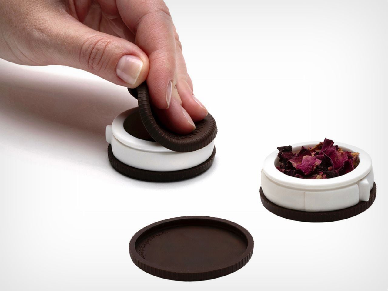
At first glance, CookieTea looks almost edible. The resemblance to a real cookie is so convincing that you might hesitate for a second before dropping it into your cup. That playful confusion is part of its charm. Unlike regular tea bags, which tend to disappear into the mug, this infuser is meant to be seen. When dunked into hot water, it looks deliberate and thoughtfully placed, as if it belongs there by design rather than necessity. The act of steeping suddenly feels visual and expressive, not just functional.
The experience goes beyond appearance. CookieTea is genuinely easy to use, even for someone who does not usually reach for loose-leaf tea. One side of the cookie lifts open effortlessly, creating a small compartment where you can add your preferred tea leaves. Once filled, it seals back securely with a simple press. There is no struggle, no fiddling, and no sense of fragility. The interaction feels natural and intuitive.
The cream layer of the cookie hides one of the smartest details of the design. A peelable strip controls how the tea infuses. When closed, it keeps the interior clean and contained. When opened, tiny perforations allow the flavor and aroma of the tea to mix with the water gently. This thoughtful mechanism ensures that the infuser performs just as well as it looks, balancing cleanliness with proper brewing.
Another small but meaningful detail is the hook-shaped edge built into the peelable strip. This allows CookieTea to rest securely on the rim of the cup, preventing it from sinking to the bottom or floating around while steeping. It also makes removing the infuser effortless once the tea is ready. It solves a common annoyance so quietly that you only realize how useful it is once you experience it.
After brewing, CookieTea continues to add value. Instead of feeling like something to hide away, it fits perfectly on a plate beside your cup. It adds to the overall table setting, enhancing the visual experience rather than disrupting it. Whether used during a quiet afternoon break or while hosting guests, it naturally becomes part of the moment.
CookieTea does not try to redefine tea drinking. It simply makes it more pleasant, more intentional, and more human. It is a reminder that good design lives in the details and that even the smallest everyday rituals deserve objects that spark joy.
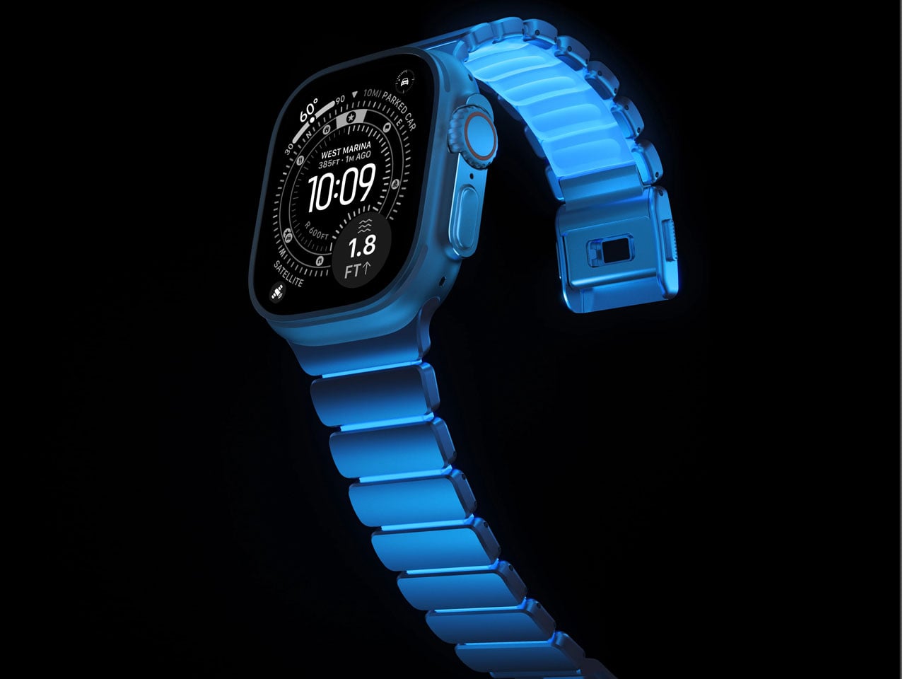
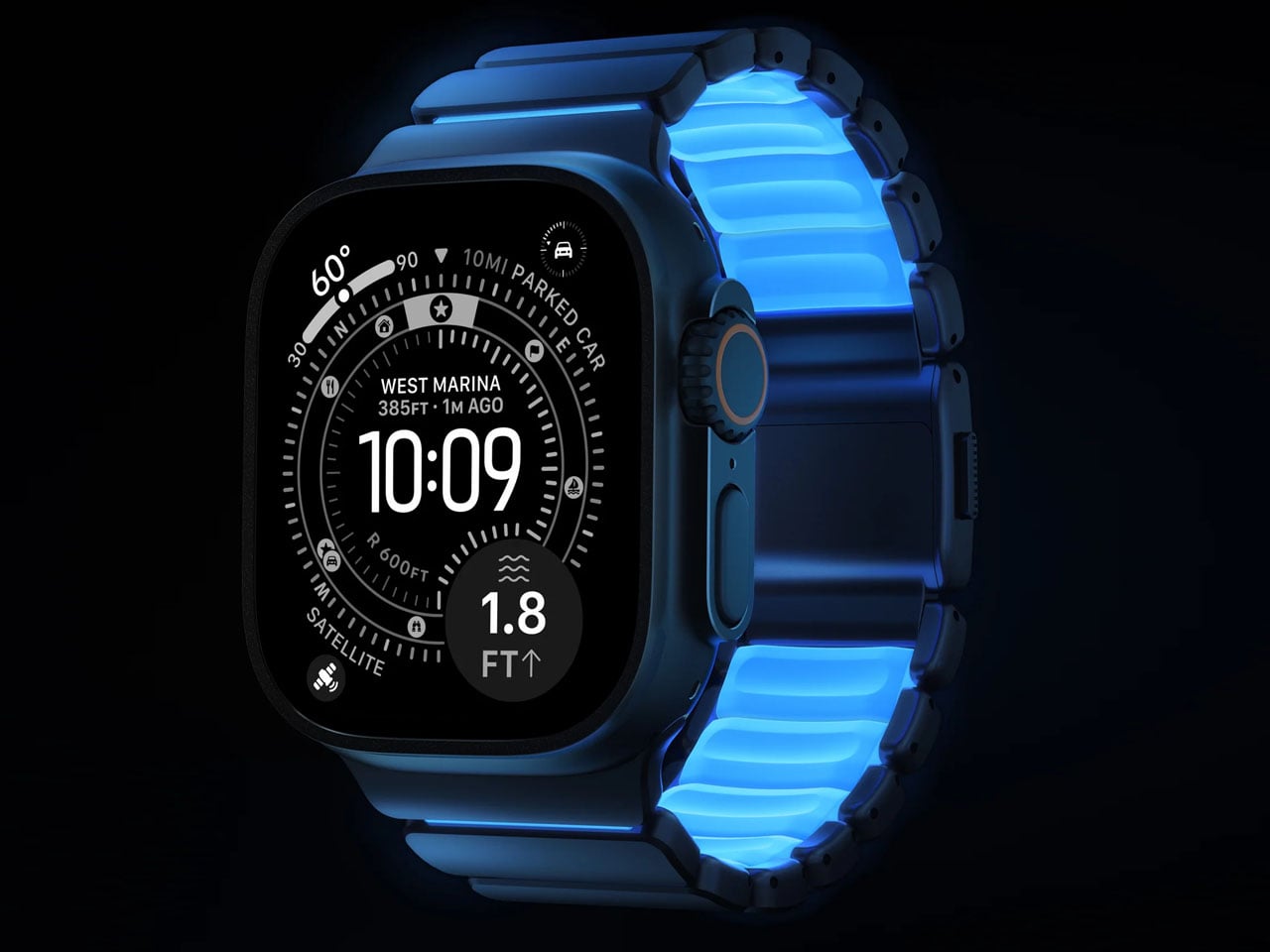
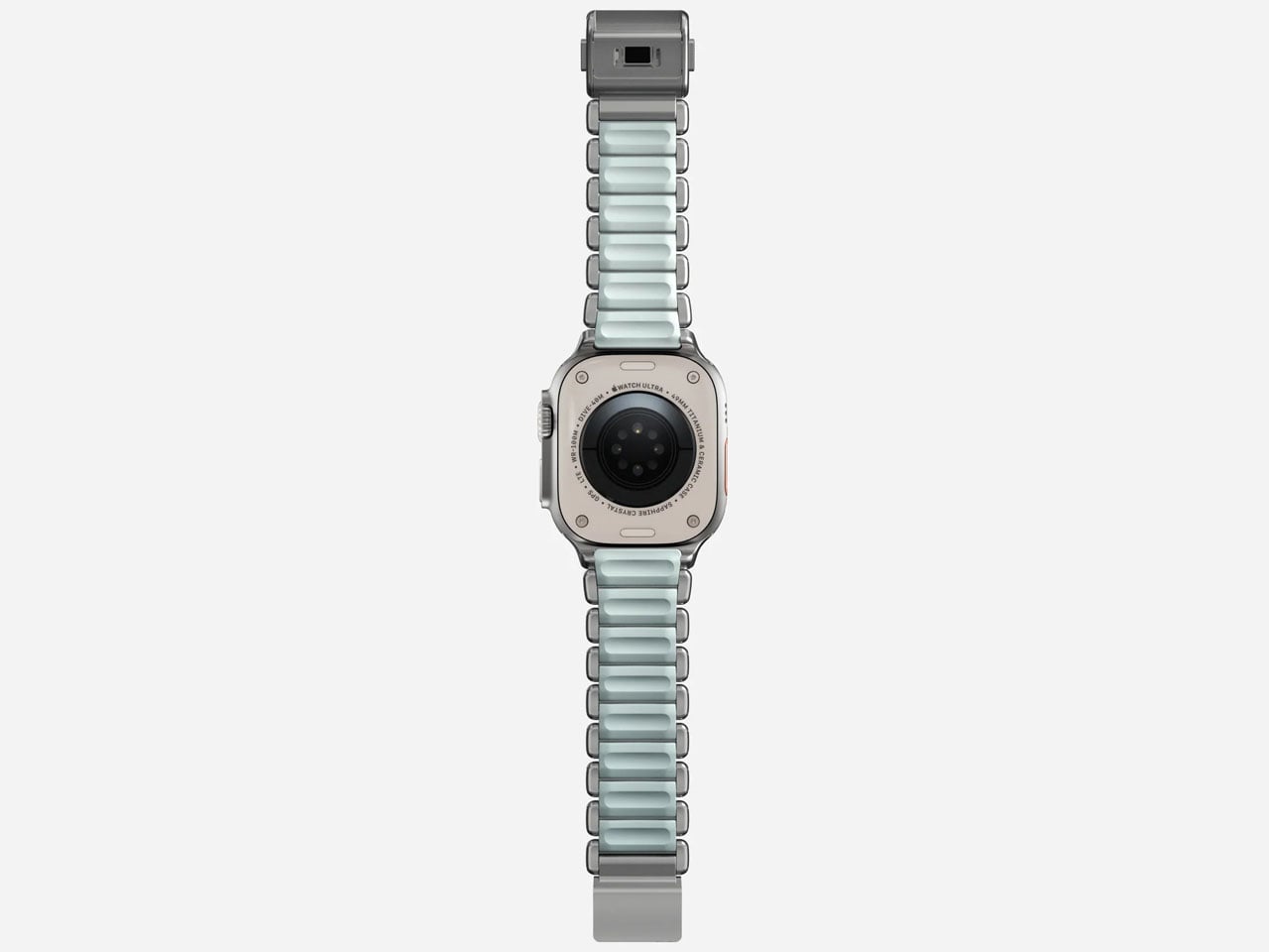
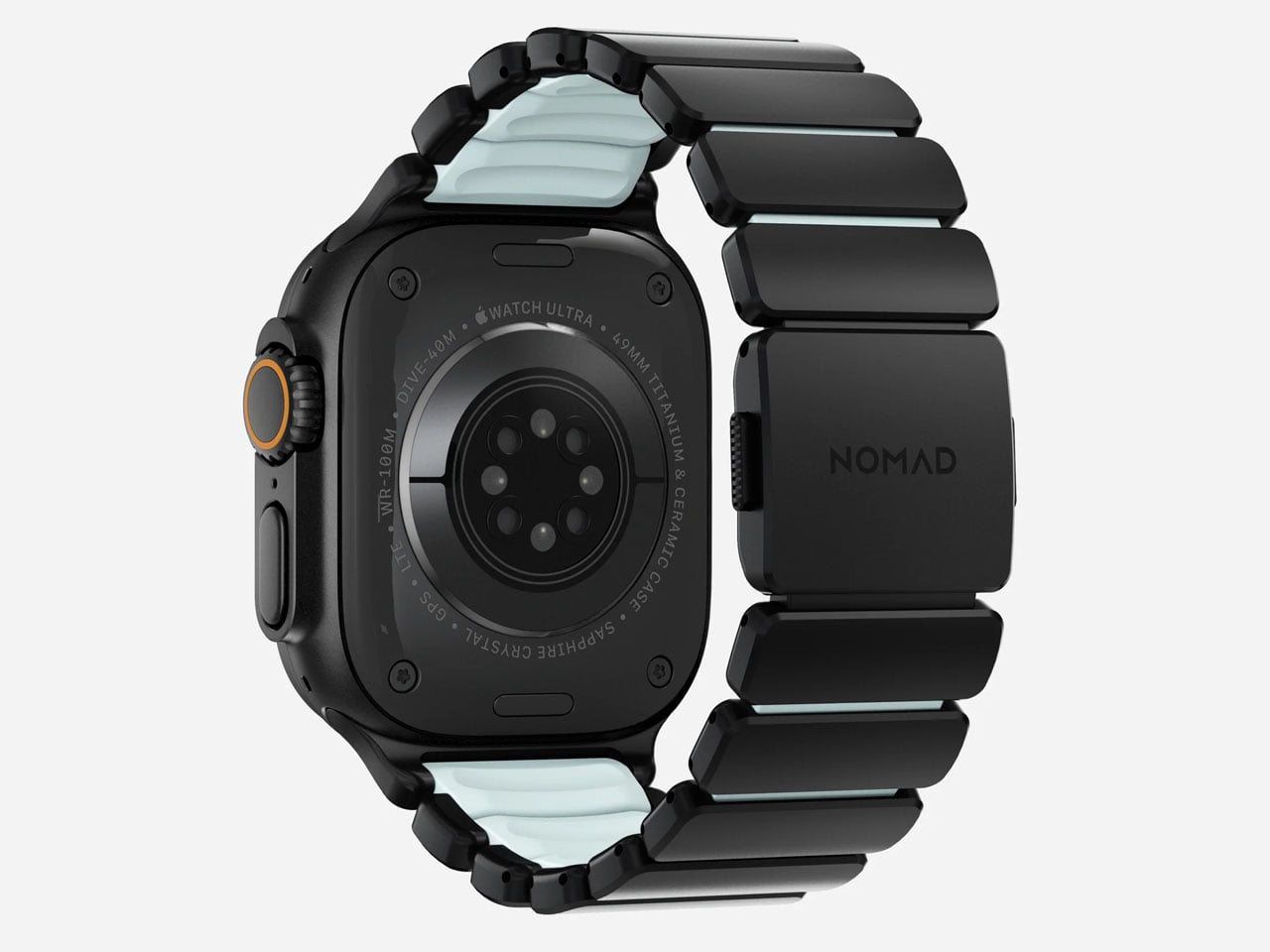
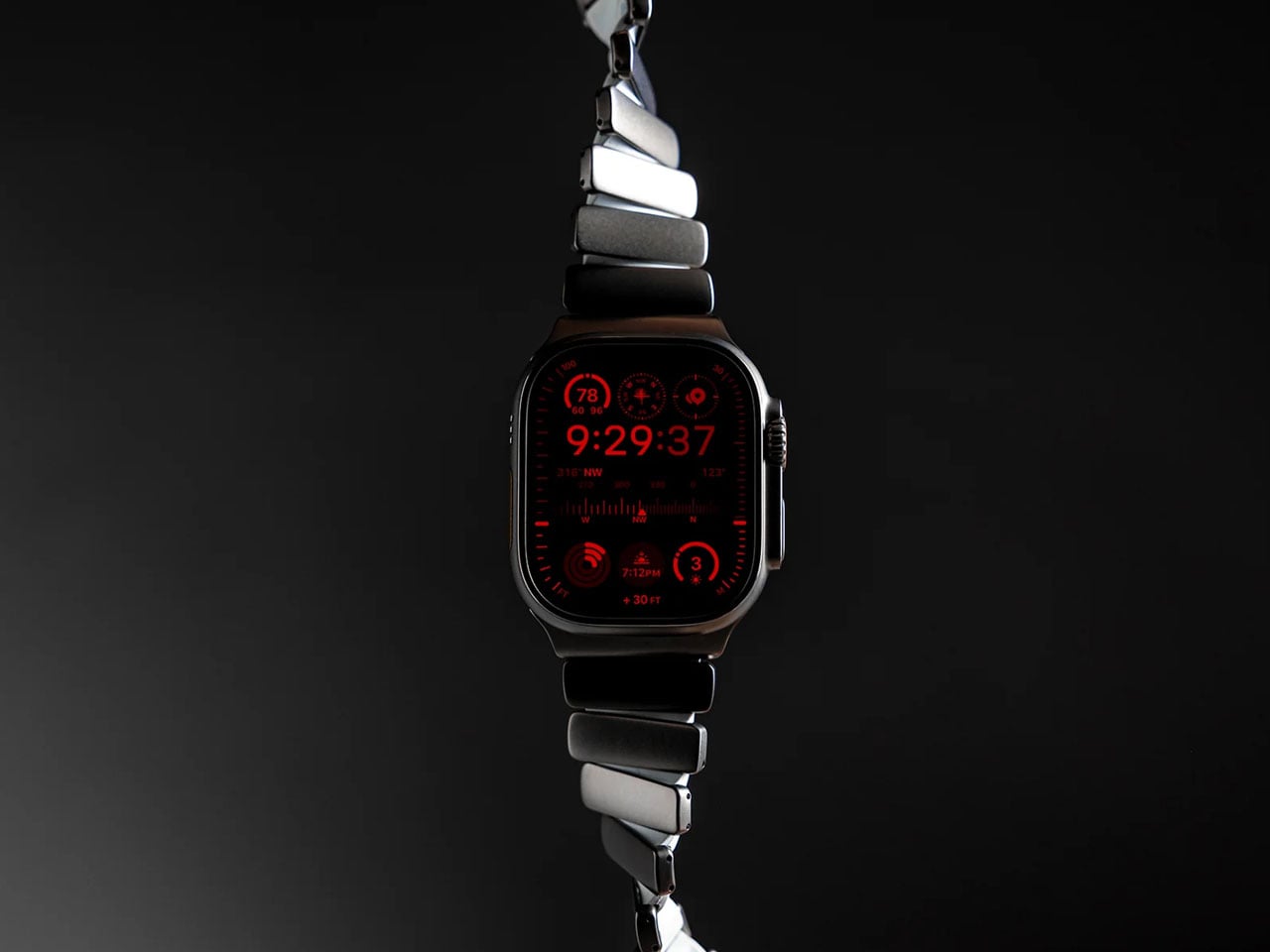
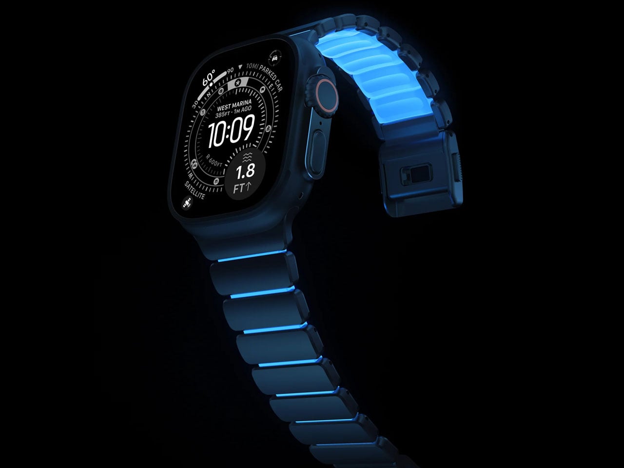
Getting a watch band for your Watch Ultra just got interesting with Nomad’s latest addition to the Stratos Band line-up. After the success with the custom fit band designed for the Ultra in titanium finish and the FKM links, which is more comfortable to wear and touch, this watch band is irresistible. Coming in a fluoroelastomer cast that glows in Tron-like hues, the band demonstrates how “performance and fun can happen at the same time.” Nomad calls it the Icy Blue Glow version, and it’s a limited-run creation that pairs rugged durability with understated style.
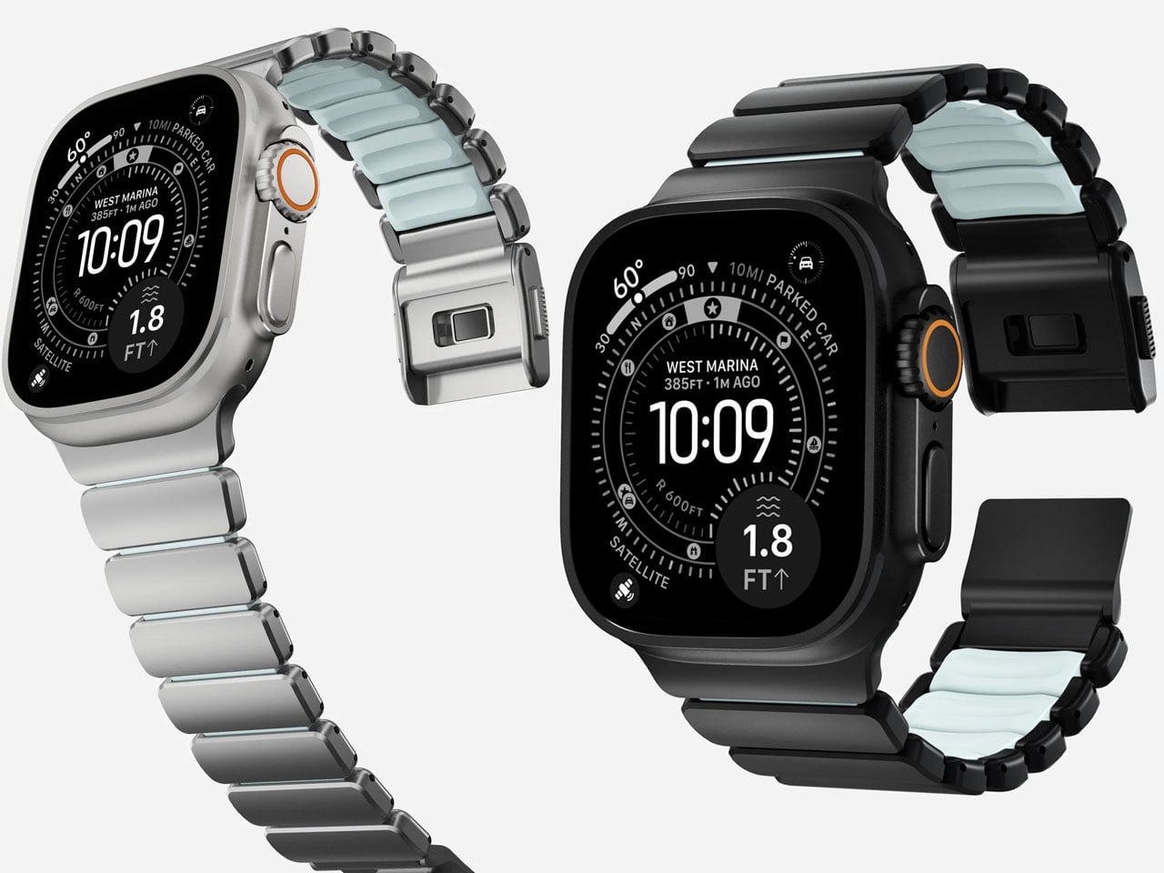
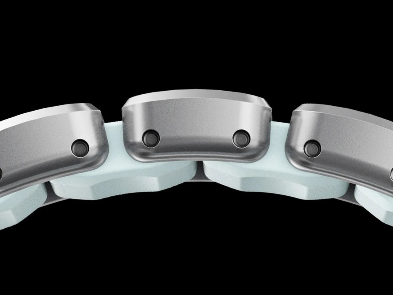
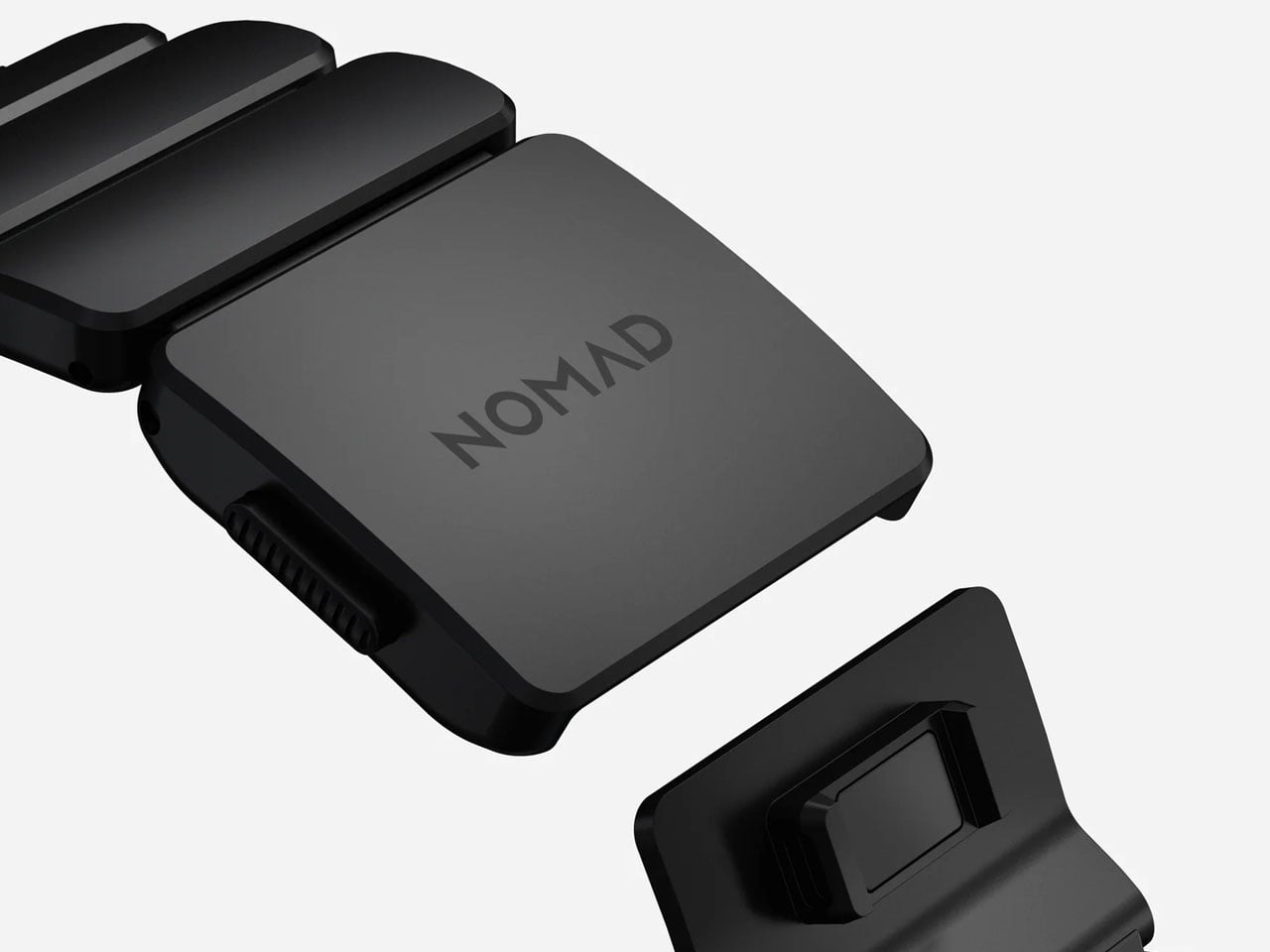
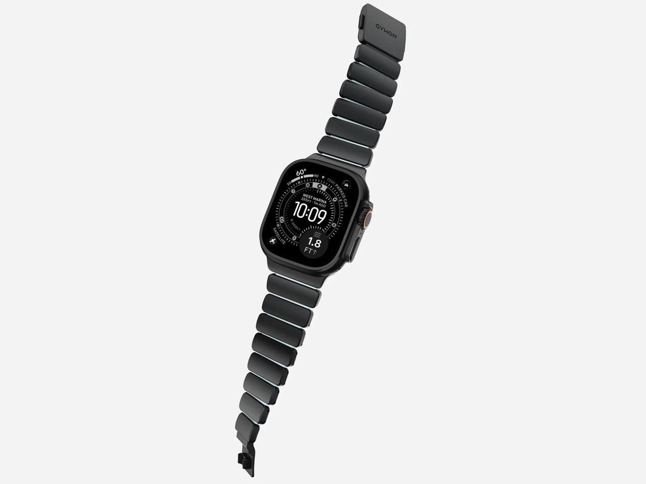
The new Stratos Band blends Grade 4 titanium hardware with compression-molded FKM fluoroelastomer for a hybrid design that balances strength and flexibility. The titanium outer links provide a refined look and robust build, while the FKM interior links contour around the wrist for comfort and movement that traditional metal bands rarely offer. This dual-material approach also introduces subtle ventilation spaces, which help with moisture evaporation and breathability during everyday wear or more intense activity.
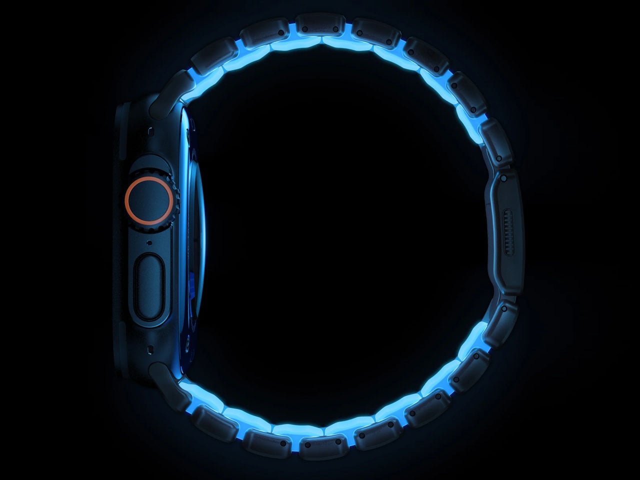
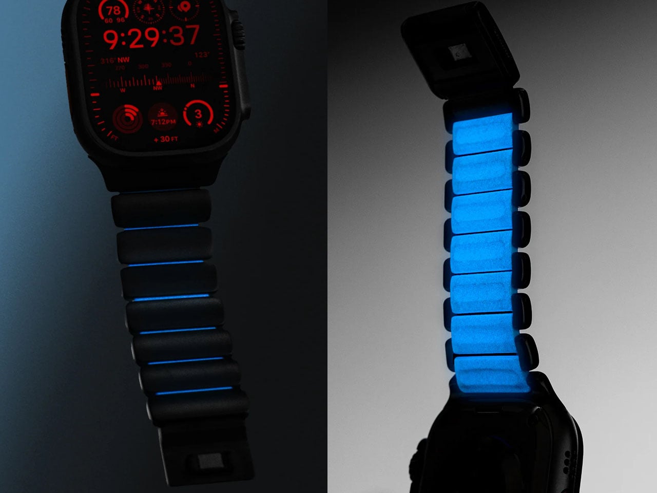
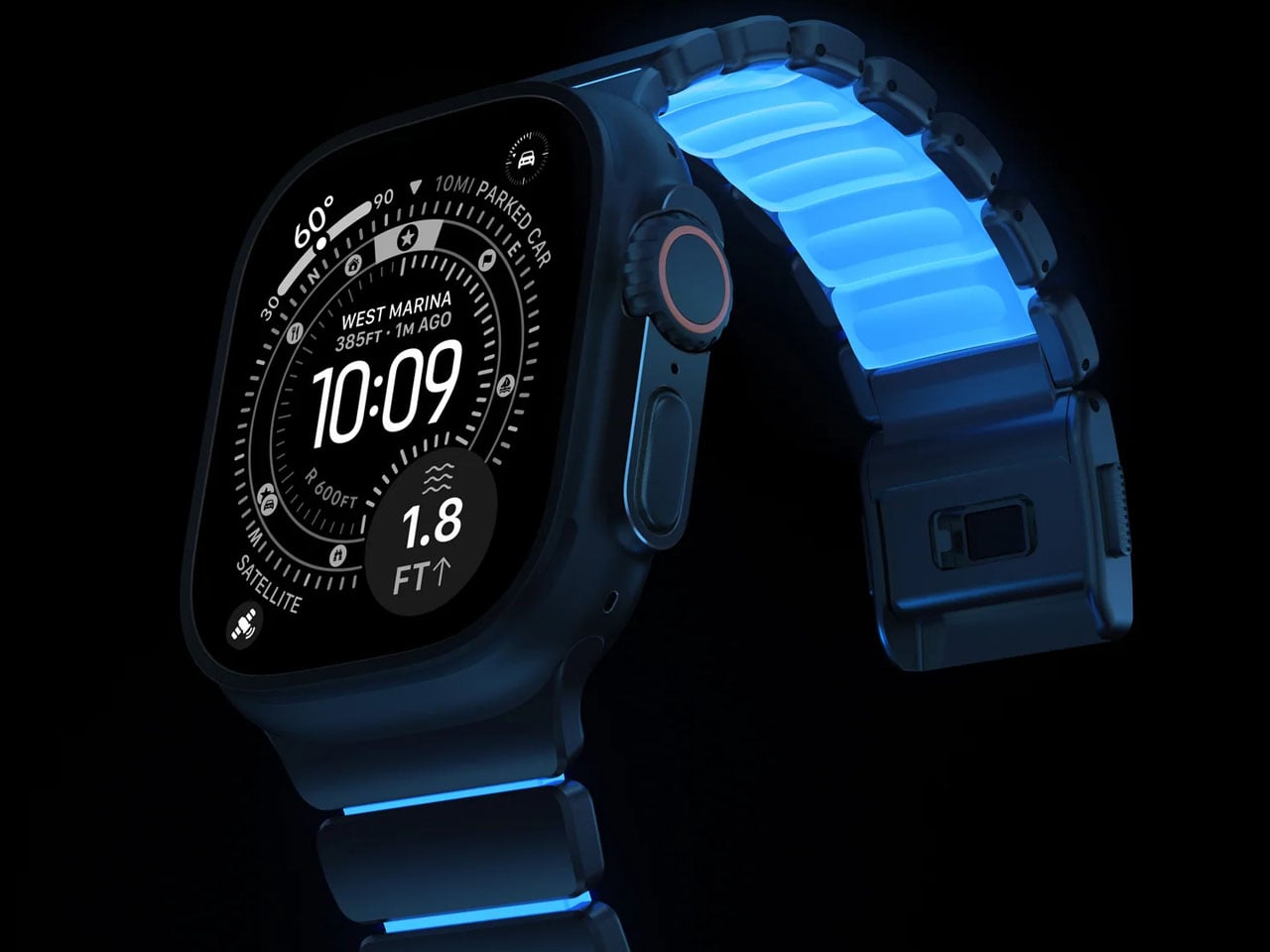
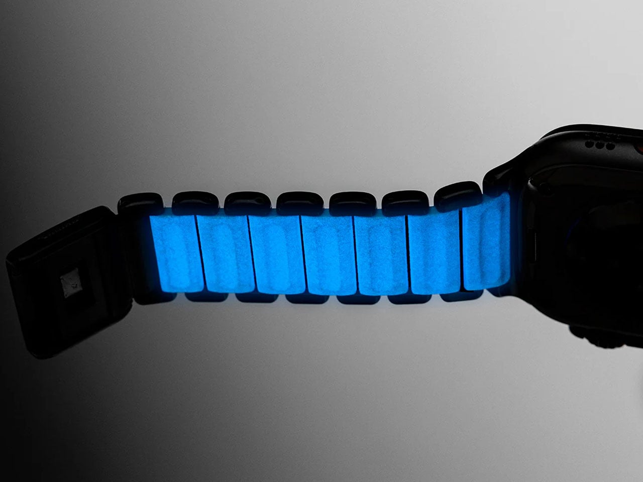
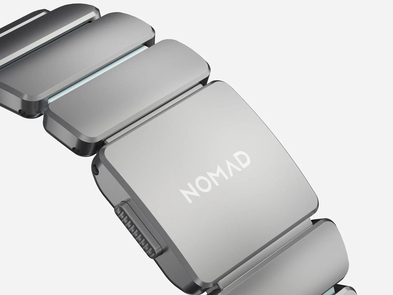
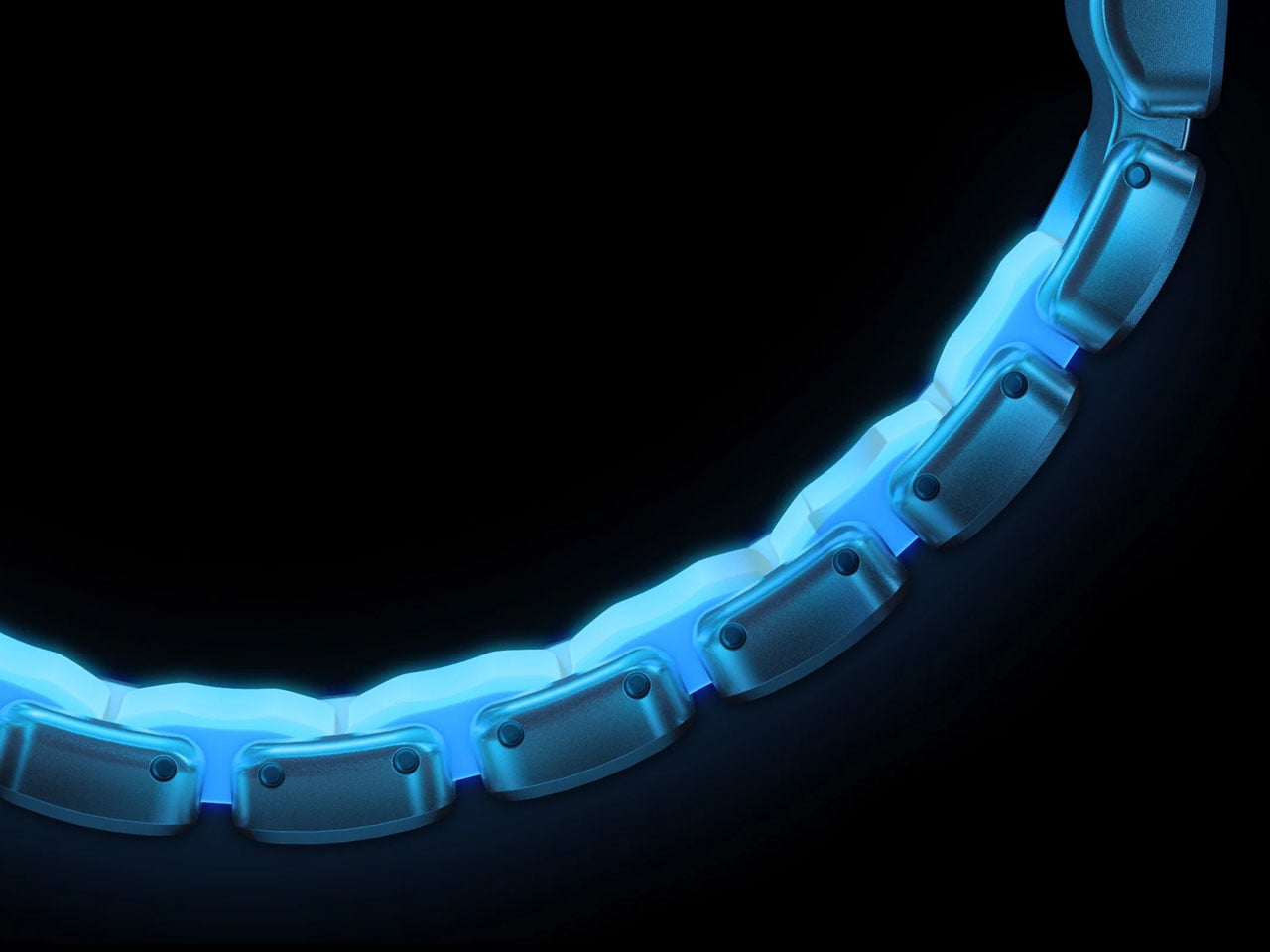
What sets the Icy Blue Glow edition apart is the photoluminescent material infused into the interior FKM links. This compound absorbs light throughout the day and emits a soft blue glow in low-light conditions. The glowing effect is more subdued in typical environments because the material sits beneath the titanium, but it still produces a cool, visual accent in the dark that distinguishes it from more conventional bands. Nomad equips this limited version with a custom magnetic clasp engineered for secure closure and corrosion resistance. The clasp remains fastened through daily movements yet opens easily when the sides of the buckle are squeezed. Users can also fine-tune the band’s fit using the included tool to remove or add links, making customization straightforward.
Though designed from the ground up for Apple Watch Ultra models 1 and higher, the Stratos Band is also compatible with earlier Apple Watch Series 1–11 and SE models, offering versatility across a wide range of devices. The band’s flexible design supports wrist sizes generally between 130 mm and 200 mm, and its construction balances a weight that feels substantial without being cumbersome. The titanium elements are finished with a scratch-resistant DLC coating, adding resilience for adventures and daily use alike.
The fluoroelastomer material itself is antimicrobial and can be cleaned easily with soap and water, supporting hygiene for wear during workouts or outdoor activities. The band’s water-resistant design further reinforces its adaptability to various lifestyles, though it’s recommended to allow the band to dry fully after exposure to moisture. Priced at $189, the Stratos Band Icy Blue Glow edition offers a premium alternative to standard Apple and third-party bands with a playful glow-in-the-dark element.
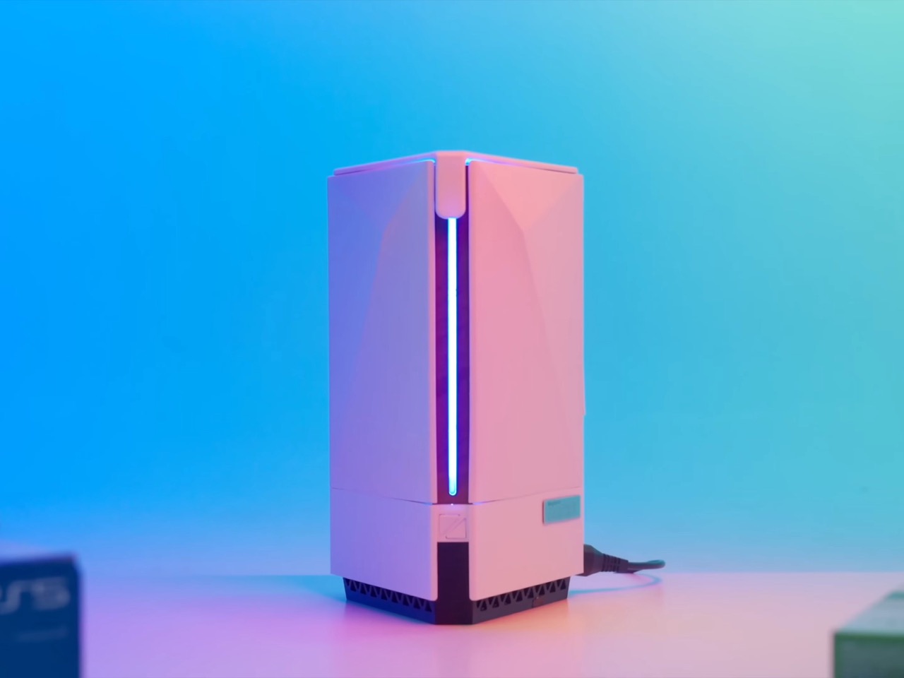
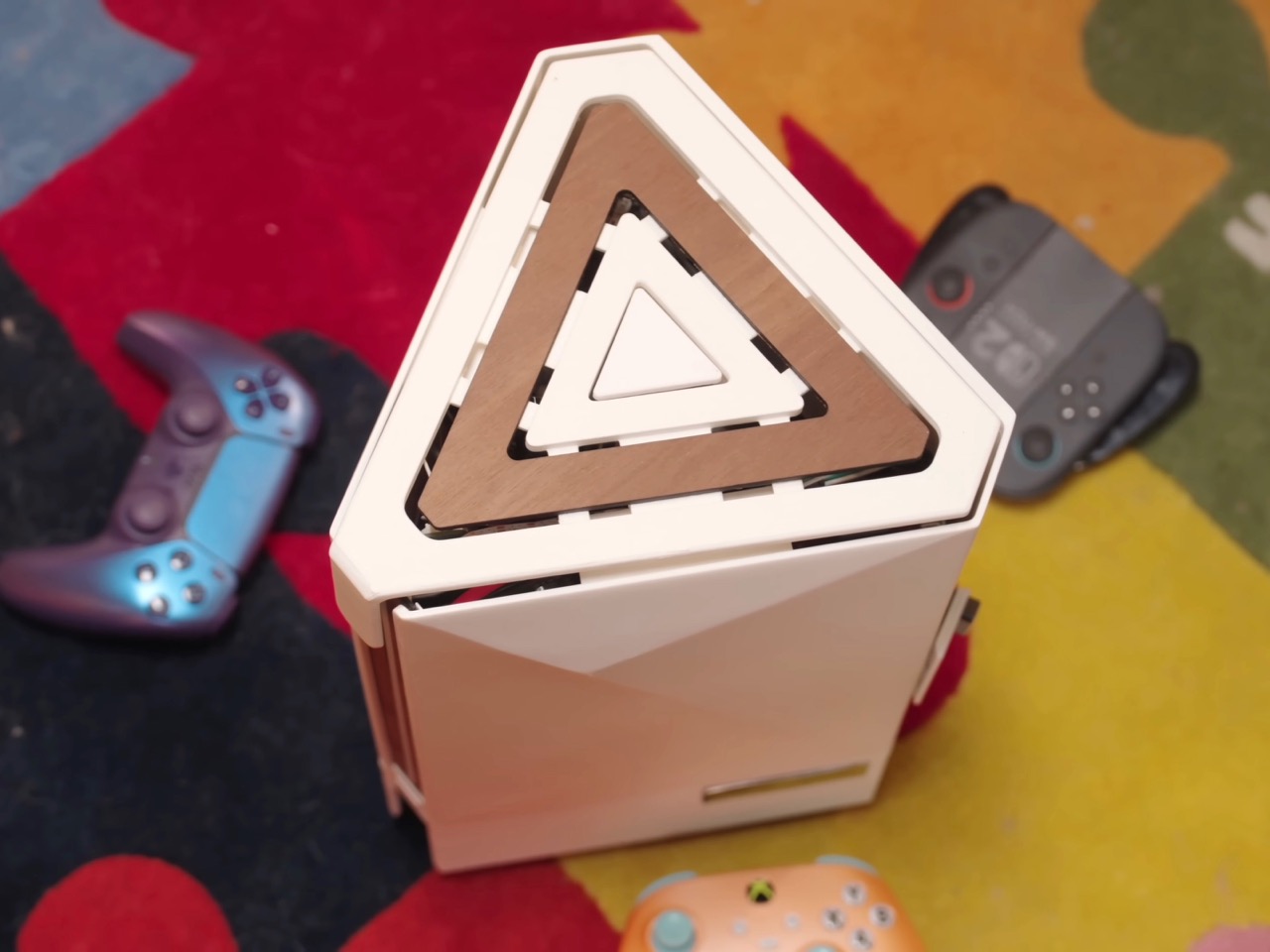
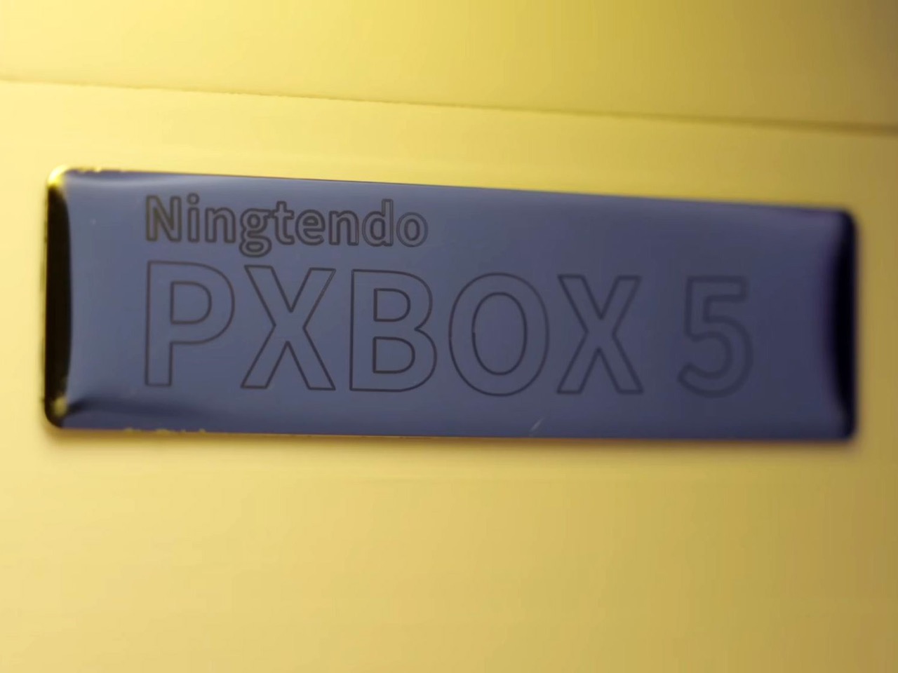
The console wars are dead. And what killed them wasn’t rising RAM prices, GPU scarcity, tariffs, or any sort of monopolistic practices. It was one modder who was tired of the multi-ecosystem approach. Chinese hardware enthusiast 小宁子 XNZ (or XNZ for short) looked at her collection of gaming consoles, realized she was constantly swapping cables and power supplies just to access different game libraries, and decided to do something about it. The result is the Ningtendo PXBOX 5, a custom-built system that combines PlayStation 5, Xbox Series X, and Nintendo Switch 2 hardware into a single triangular chassis that switches between all three platforms with a button press. One console to rule them all…
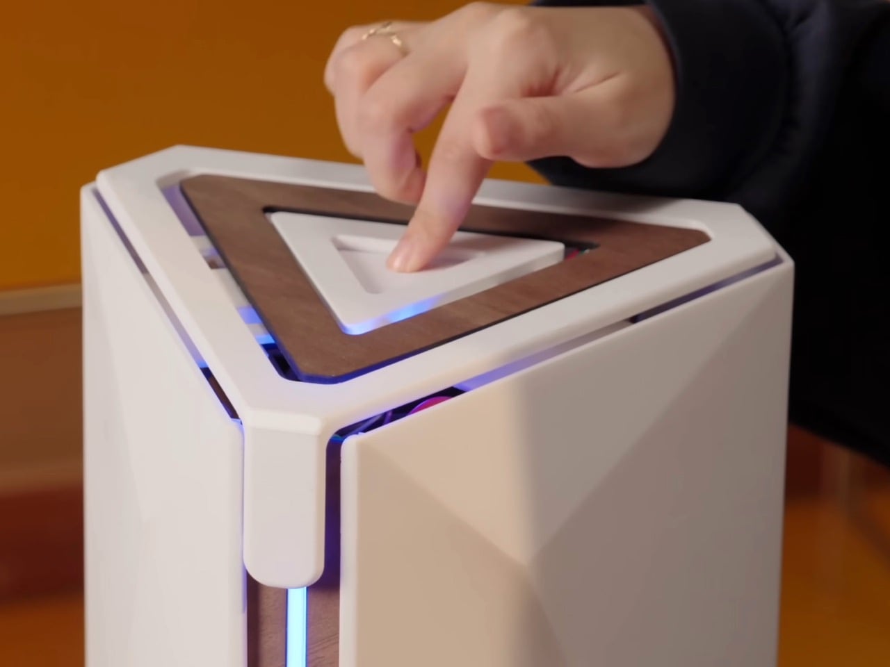
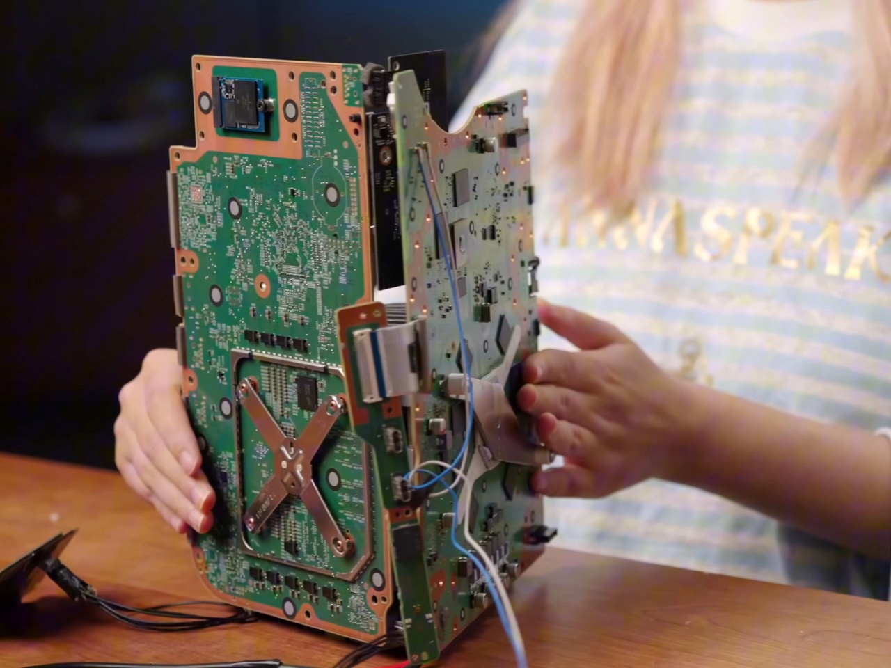
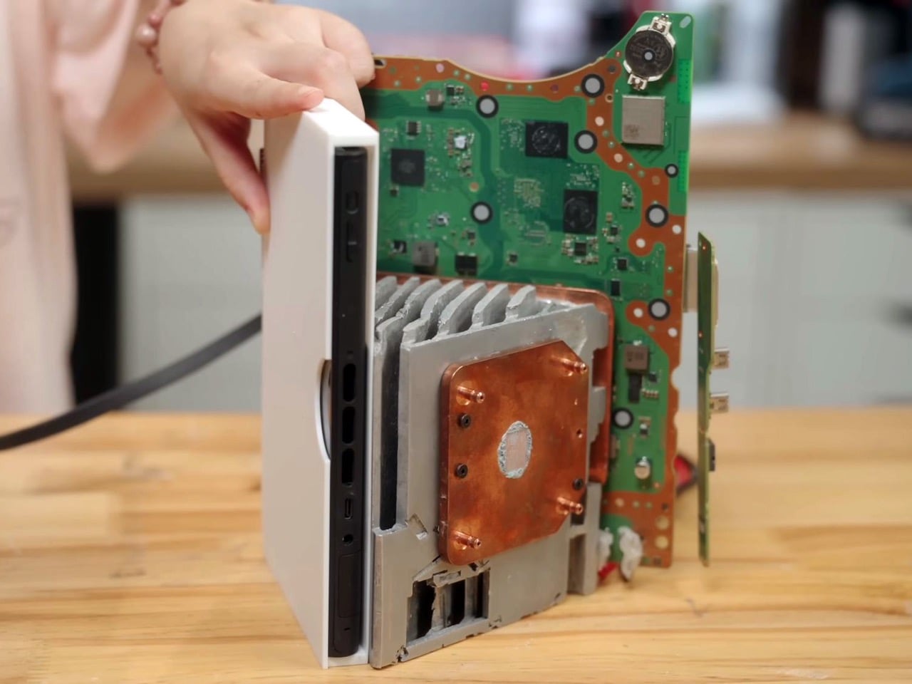
XNZ stripped each console down to its motherboard and mounted them on three sides of a custom aluminum cooling block, inspired by the old trash can Mac Pro design. A single 250-watt power supply feeds everything, while a Phanteks fan at the bottom pushes air through the shared heatsink. Press the button on top and an Arduino board handles the switching logic, cycling through the three systems in about three seconds. A front-mounted LED strip glows blue for PlayStation, green for Xbox, or red for Switch 2, so you always know what’s active. The catch is you need to close your game before switching to avoid overloading the power supply, but that’s a small price to pay for having Sony, Microsoft, and Nintendo living peacefully under one roof. Both the PS5 and Xbox are digital-only versions, so no disc drives made it into the final build.
Designer: 小宁子 XNZ
XNZ pulled inspiration from Apple’s 2013 trash can Mac Pro, which remains one of the most divisive desktop designs Apple ever shipped. That machine had a triangular prism cooling system sitting dead center, with each of its three sides pressed tight against a separate component board. A fan at the top pulled hot air straight up through the whole assembly in one clean thermal column. Apple bet wrong on dual-GPU workstation builds and killed the product line, but the core thermal design was actually brilliant. For this project, it turned out to be the perfect blueprint. Three consoles, three motherboards, three sides of a triangle. The geometry practically solved itself.
Building that triangular heatsink presented a different problem entirely. XNZ needed dense fins capable of dissipating heat from three different APUs, but CNC machining quotes came back at around $700. Metal 3D printing wasn’t much better, and both options involved waiting in manufacturing queues that would kill any chance of rapid iteration. So she went old school. Really old school. We’re talking 1,500 years old.
Lost-wax casting has been around since ancient China, traditionally used for intricate bronze artifacts like the Yunwen Bronze Vessel. The principle is simple: carve a detailed model in wax, coat it in clay, melt out the wax, and pour molten metal into the cavity left behind. XNZ modernized the process by replacing wax with PLA filament from her 3D printer. She designed the heatsink in CAD software, printed it with support structures and cooling channels built right in, then encased the whole thing in high-temperature gypsum. The gypsum can withstand 700 degrees Celsius while PLA starts melting at 100 degrees and burns completely by the time you hit 700. Stick it in an electric kiln, run it through four heating stages over 12 hours, and you’re left with a clean ceramic mold ready for aluminum.
The first casting attempt failed halfway through when the molten aluminum cooled too fast and solidified before filling the entire mold. The fins were also too dense, causing the thin gypsum walls between them to crack. XNZ adjusted the fin thickness, changed their orientation to shorten the flow path, and recalibrated both the mold temperature and the aluminum pour temperature. Second attempt came out perfect. The surface captured fine details from the 3D print, including the layer lines from the support structures on the bottom. After sawing off the pouring gate and polishing the contact surfaces, she had a functional aluminum heatsink that cost maybe 50 bucks in materials instead of several hundred in machining fees.
Copper plates bolt onto two sides of the aluminum block where the PS5 and Xbox motherboards make contact. The third side, reserved for the Switch 2, doesn’t get a copper plate because Nintendo’s handheld apparently doesn’t need active cooling when docked. Thermal paste replaces the PS5’s stock liquid metal since the copper and aluminum combo provides enough thermal mass. During testing, the whole system ran Elden Ring for 30 minutes without overheating warnings, topping out at 60 degrees Celsius measured across the heatsink surface. That’s impressive considering you’ve got three separate APUs sharing one cooling solution and one 12-centimeter fan doing all the work.
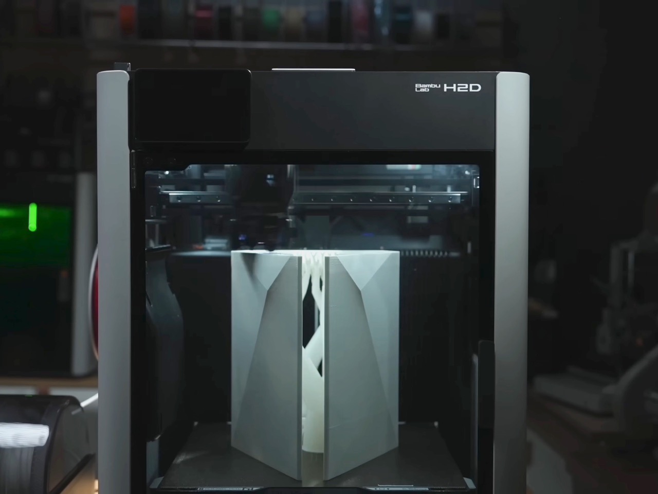
The Switch 2 integration required a custom dock since the handheld needed to remain removable. XNZ gutted Nintendo’s official dock, pulled out the USB-C daughterboard and relevant electronics, and stuffed everything into a 3D-printed housing that attaches to the cooler’s third face. She wanted a spring-loaded ejection mechanism like a toaster, but metal springs couldn’t provide enough force to overcome USB-C port friction. The solution came from Bambu Lab’s MakerWorld, where she found a parametric spring generator that lets you customize dimensions through simple value inputs. She printed the entire dock assembly using dual-extrude printing with PLA for the rigid case and PETG for the flexible spring components. The two materials bond during printing so the spring stays permanently embedded in the structure but remains fully functional right off the print bed.
Power management turned out simpler than expected. The PS5 pulls 225 watts under full gaming load but drops to 4 watts in standby. The Xbox Series X shows similar behavior. A gallium nitride 250-watt power supply handles both consoles running in parallel as long as you’re only actively gaming on one at a time. The Switch 2 gets its juice through a transformer and USB-C PD trigger that converts the main rail voltage. An Arduino board sits inside the case managing power distribution and HDMI switching, triggered by that single button on top. Press it once and the LED bar changes color while the Arduino routes both power and video output to the next console in the sequence. Takes three seconds to complete the switch, which is faster than most people can close their game and navigate back to the home screen anyway.
The whole thing weighs less than having three separate consoles on your shelf and uses one HDMI cable, one power cord, and zero mental energy deciding which box to turn on. Sure, you lose disc drive functionality since both the PlayStation and Xbox are digital editions. And yes, the 250-watt ceiling means no running multiple games simultaneously or the power supply trips. But XNZ built a working proof of concept that platform exclusivity is a solvable engineering problem, not some immutable law of physics. Sony, Microsoft, and Nintendo have spent decades convincing people their ecosystems need to stay separate. One person with a 3D printer, some molten aluminum, and a weekend said otherwise.
Shared calendars scatter across phones, sticky notes live on the fridge, and whiteboards never quite get updated. Most attempts to centralize family logistics involve smart displays that look like tablets or small TVs bolted to the wall, clashing with the rest of the room. A shared calendar deserves to be visible, but not at the cost of turning your kitchen into a control room with glowing screens and exposed cables.
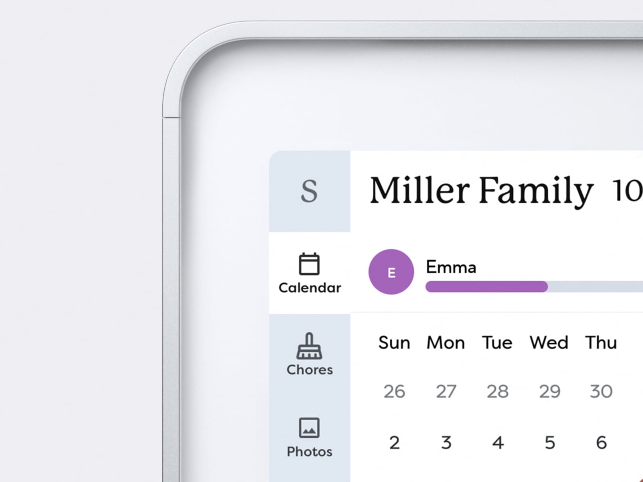
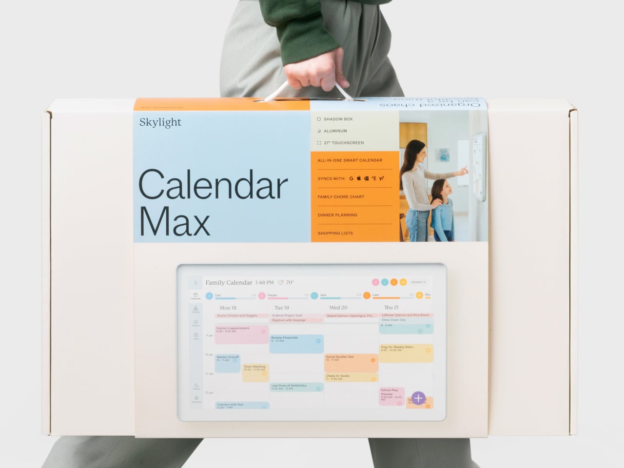
Skylight’s 27-inch Calendar Max is a digital calendar that starts from the wall, not the app. It is a large wall-mounted touchscreen designed to be a central family hub, but the industrial design leans toward a floating frame rather than a black rectangle. The goal is to feel like part of the decor while still being big and clear enough to see from across the room.
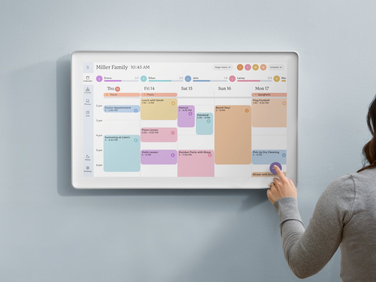
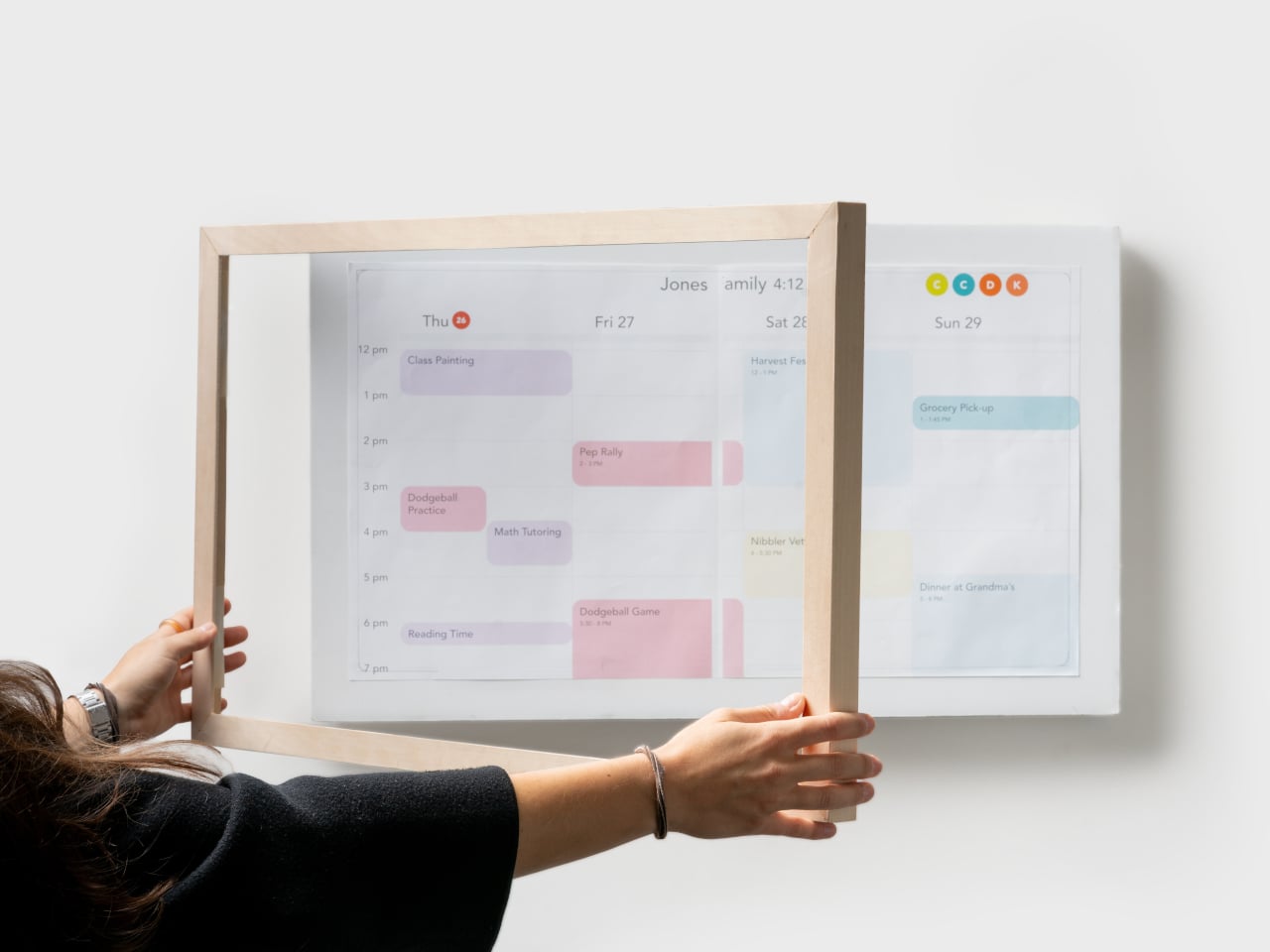
A typical morning means everyone glances at the calendar on the way to coffee. Color-coded events show who is doing what, lists and meal plans sit alongside the schedule, and everything syncs with the digital calendars people already use on their phones. Instead of hunting through apps or checking multiple sources, the day’s plan is just there, big enough that no one can pretend they missed soccer practice.
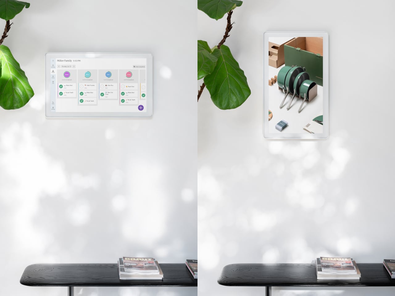
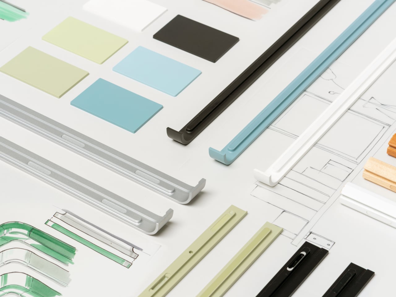
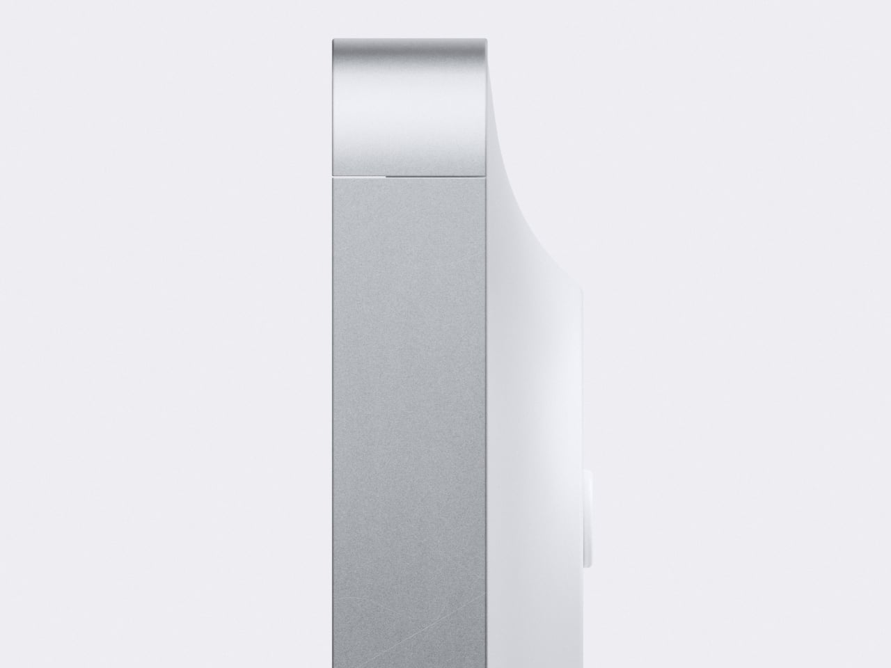
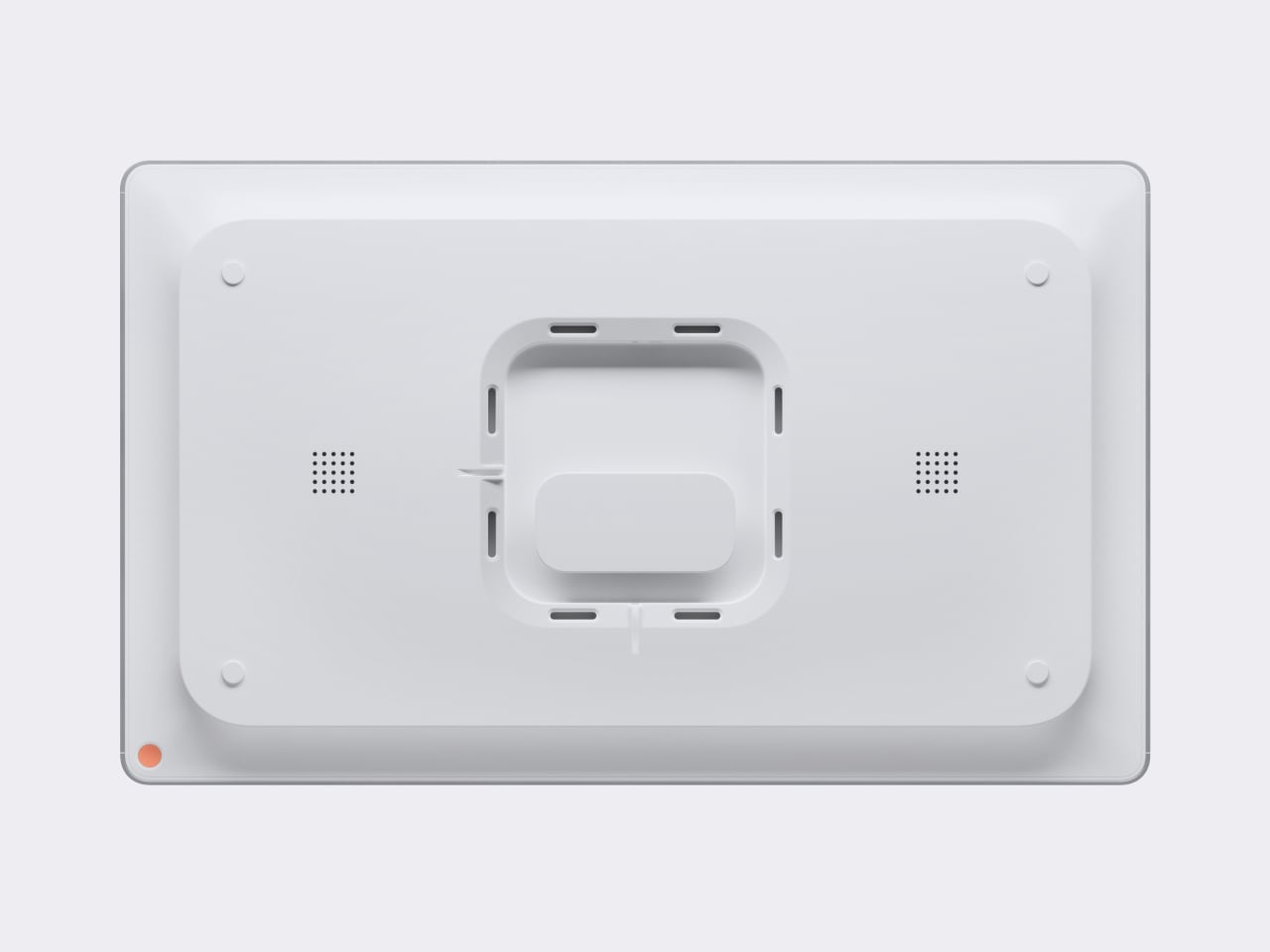
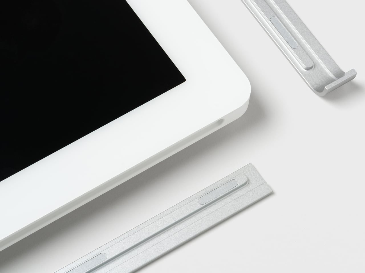
The display sits slightly off the wall, casting a soft shadow that changes with the light, so it reads more like a floating object than a mounted monitor. Magnetically attached frames in aluminum, wood, or plastic let you pick a look that matches your space and swap them later if the room changes, without replacing the hardware. It mostly just means the calendar feels deliberate instead of tacked on.
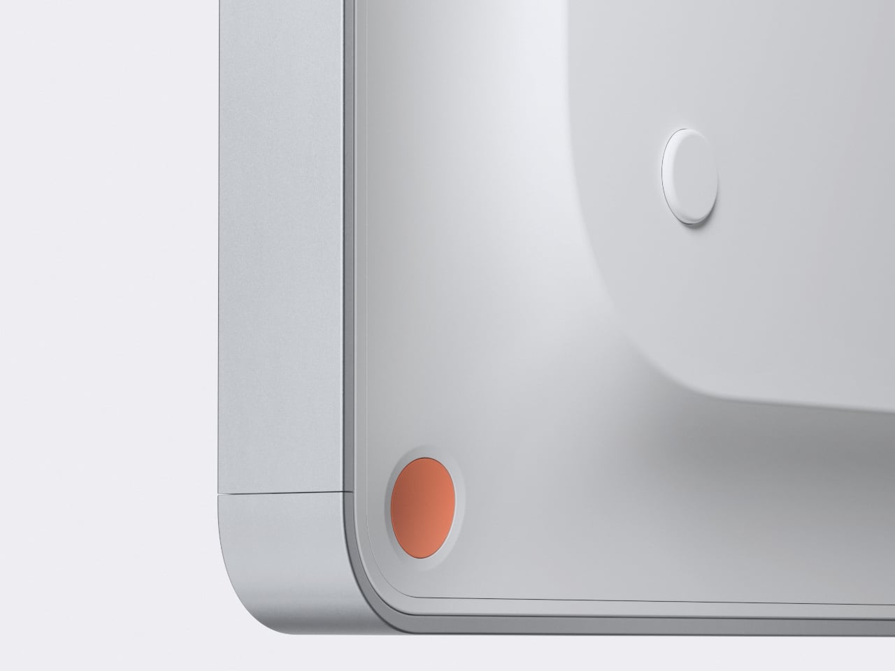
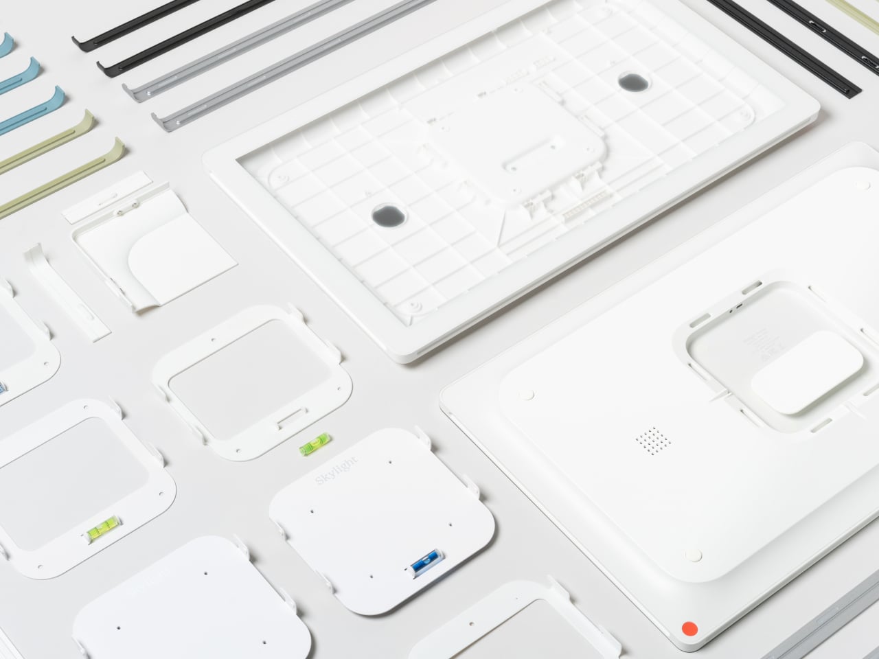
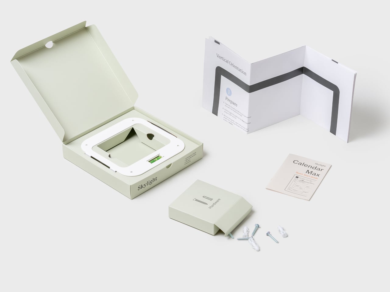
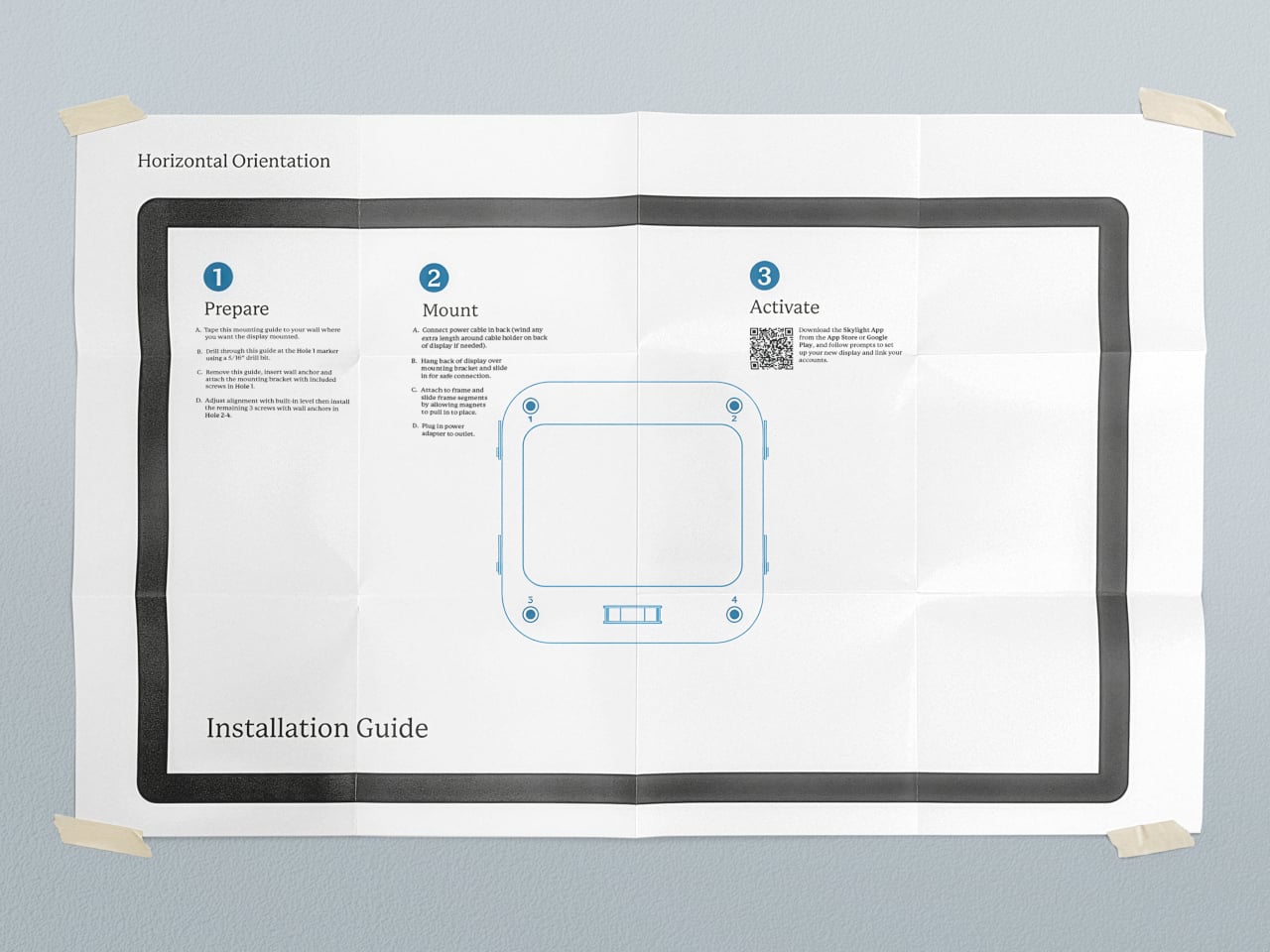
The mounting system uses a dedicated wall plate with cable routing, so once it is up, the calendar sits cleanly with minimal visible wiring. The packaging and installation guide are designed to make the process approachable, more like hanging a large frame than installing AV equipment. That matters when the person putting it up is more interested in family logistics than tech tinkering.
During busy hours, it behaves like a bright, legible planner. When things slow down, it can switch to a photo gallery, turning into a large digital frame that shows family pictures instead of to-dos. That shift helps it feel less like a dashboard that never sleeps and more like a living part of the wall that changes mood with the house.
Calendar Max treats shared schedules, lists, and memories as part of the architecture of daily life, not just data on screens. By paying attention to silhouette, depth, frames, and mounting, it turns a functional object into something you do not mind giving prime wall space. Smart calendars that actually look like they belong in a living room turn out to be surprisingly rare, which makes one that does feel like a meaningful shift.
Shared calendars scatter across phones, sticky notes live on the fridge, and whiteboards never quite get updated. Most attempts to centralize family logistics involve smart displays that look like tablets or small TVs bolted to the wall, clashing with the rest of the room. A shared calendar deserves to be visible, but not at the cost of turning your kitchen into a control room with glowing screens and exposed cables.
Skylight’s 27-inch Calendar Max is a digital calendar that starts from the wall, not the app. It is a large wall-mounted touchscreen designed to be a central family hub, but the industrial design leans toward a floating frame rather than a black rectangle. The goal is to feel like part of the decor while still being big and clear enough to see from across the room.
A typical morning means everyone glances at the calendar on the way to coffee. Color-coded events show who is doing what, lists and meal plans sit alongside the schedule, and everything syncs with the digital calendars people already use on their phones. Instead of hunting through apps or checking multiple sources, the day’s plan is just there, big enough that no one can pretend they missed soccer practice.
The display sits slightly off the wall, casting a soft shadow that changes with the light, so it reads more like a floating object than a mounted monitor. Magnetically attached frames in aluminum, wood, or plastic let you pick a look that matches your space and swap them later if the room changes, without replacing the hardware. It mostly just means the calendar feels deliberate instead of tacked on.
The mounting system uses a dedicated wall plate with cable routing, so once it is up, the calendar sits cleanly with minimal visible wiring. The packaging and installation guide are designed to make the process approachable, more like hanging a large frame than installing AV equipment. That matters when the person putting it up is more interested in family logistics than tech tinkering.
During busy hours, it behaves like a bright, legible planner. When things slow down, it can switch to a photo gallery, turning into a large digital frame that shows family pictures instead of to-dos. That shift helps it feel less like a dashboard that never sleeps and more like a living part of the wall that changes mood with the house.
Calendar Max treats shared schedules, lists, and memories as part of the architecture of daily life, not just data on screens. By paying attention to silhouette, depth, frames, and mounting, it turns a functional object into something you do not mind giving prime wall space. Smart calendars that actually look like they belong in a living room turn out to be surprisingly rare, which makes one that does feel like a meaningful shift.
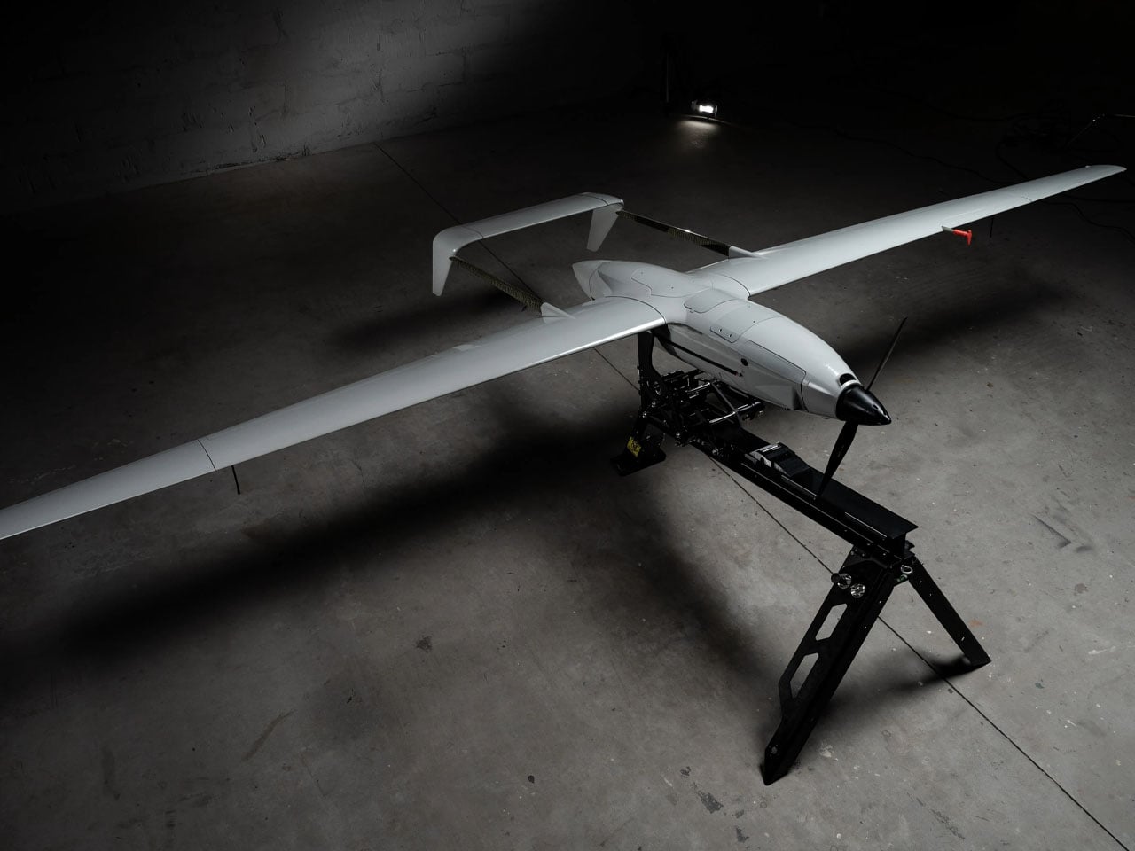
Hydrogen-powered unmanned aerial vehicles are not a new concept. Drones running on hydrogen fuel have been in experimental forms for over a decade, but this is for the first time, a drone has been fully designed and deployed on full-scale combat duty in an active war zone.
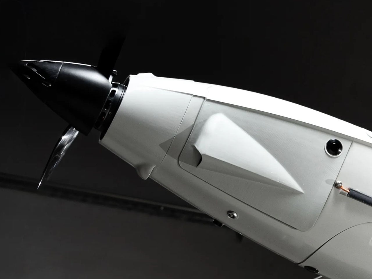
The drone is a hybrid version of the Raybird USA developed by Skyeton and is deployed with the Ukrainian Defense Forces. It is designed for long-endurance and perhaps is, Ukraine’s first attempt at sending a hybrid hydrogen-powered drone into an active battlefield. It has been in the war zone “since December 2025, as part of interagency testing,” Skyeton informs.
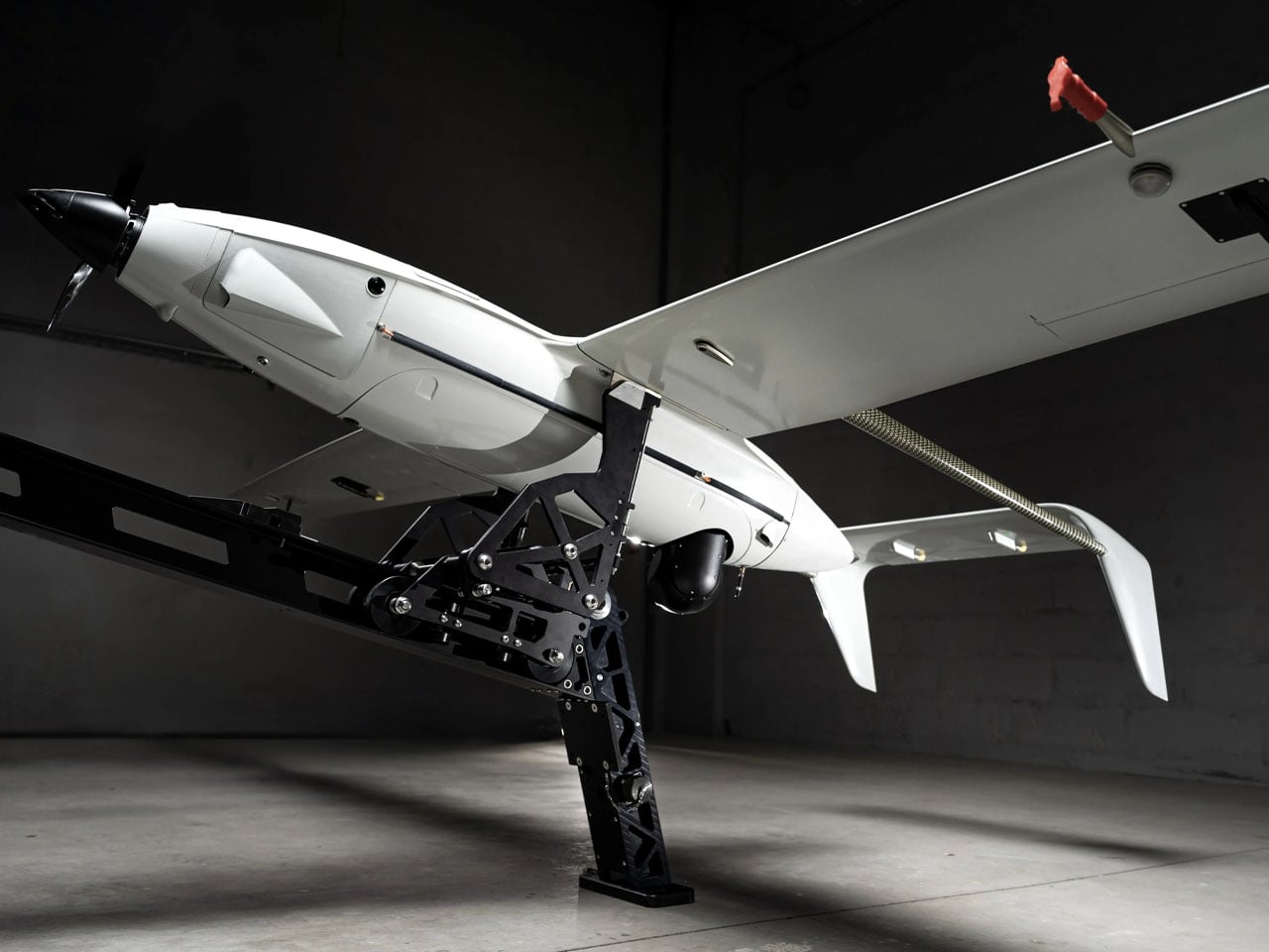
As a hybrid version of the Raybird, the drone is powered by an electric motor running on electricity generated by hydrogen fuel. The UAV has been reengineered to adequately distribute the space and weight of the hydrogen tank system onboard. Being hybrid, the drone is quieter in comparison to other combustion engine options, thus it makes a great surveillance aircraft.
“We have converted two years of laboratory testing into a new aircraft concept: it is the same class and weight, but a completely redesigned concept based on electric propulsion,” Roman Knyazhenko, CEO of Skyeton said. “Hydrogen fuel is a solution that allows us to combine all the advantages of an electric motor… with the long-duration continuous flight that is a hallmark of our UAV, he added.
According to Skyeton, the hydrogen-based Raybird is not armed, it instead has radar and sensors in its payload for its identified long-range reconnaissance missions. The drone is created with a wingspan of up to 15 feet, and it has a total payload capacity of 23 kgs. Being a Raybird, the hybrid drone can cruise at over 110 km/h top speed, and the UAV can function in temperatures ranging between -35°C to +55°C. It has a flight endurance of 12 hours for now, which the Skyeton engineers are determined to increase to 20 hours.
According to the company, the hydrogen-powered Raybird on war duty can fly at an altitude of up to 18,000 feet to carry out its surveillance duties. Of course, for now, the drone running on a hydrogen-electric propulsion is being used for long-range reconnaissance missions by Ukraine, but its operational efficiency and environmental benefits suggest it can be useful in a range of other applications: both civilian and defense.
For its usability in different scenarios, Skyeton says it will provide the hydrogen-powered Raybird in two variants. A drone with pre-filled tanks that can be swapped like cartridges. Or paired with a compact mobile unit capable of generating hydrogen on site as required.