For years, high-end audio meant choosing between performance and aesthetics, often leaving enthusiasts with bulky, utilitarian “black boxes” hidden in corners. Function ruled, and beauty took a backseat, even as the music demanded more from its equipment.
Today, a quiet revolution is reshaping audio, as Statement Speakers redefine both sound and design, turning the speaker into a sculptural presence. By merging electronics with artistry, these creations prove that high-fidelity sound need not remain unseen. Here’s how new-age speakers command attention, inviting the ear and the eye to experience music in perfect harmony.
1. Geometric Shapes in Audio
Modern speakers are increasingly embracing geometric shapes, moving beyond traditional rectangles to bold, sculptural silhouettes. These forms aren’t just aesthetic as they define the speaker’s character, presence, and identity in any space, making each piece a functional statement of design.
The geometry also serves an acoustic purpose. Cones, pyramids, and other angular profiles create natural chambers that distribute sound evenly, producing immersive 360-degree audio. From every viewpoint, the speaker resembles a refined sculpture in glass, metal, or other materials, merging art and technology.
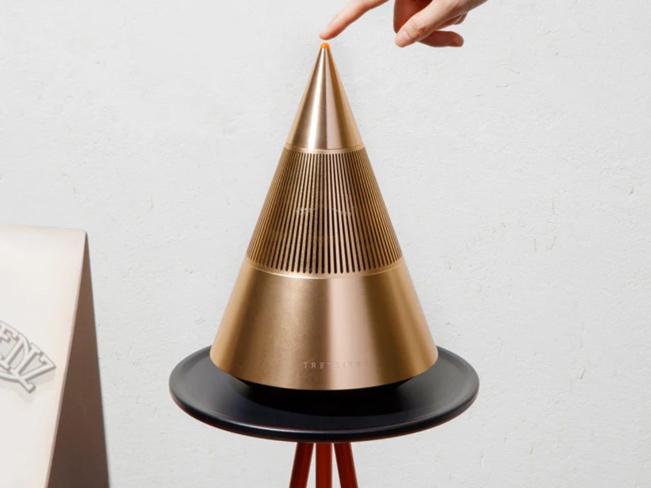
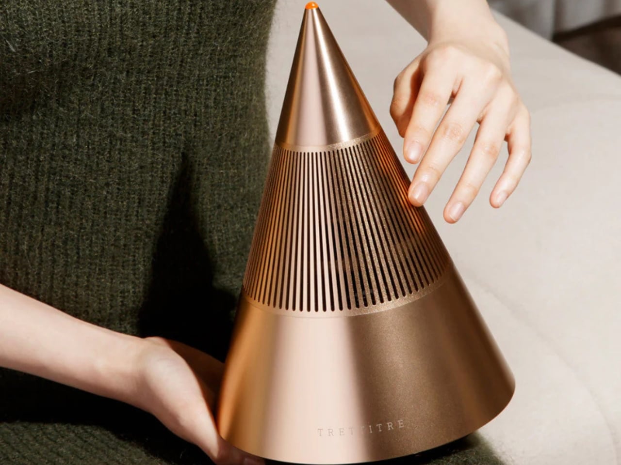
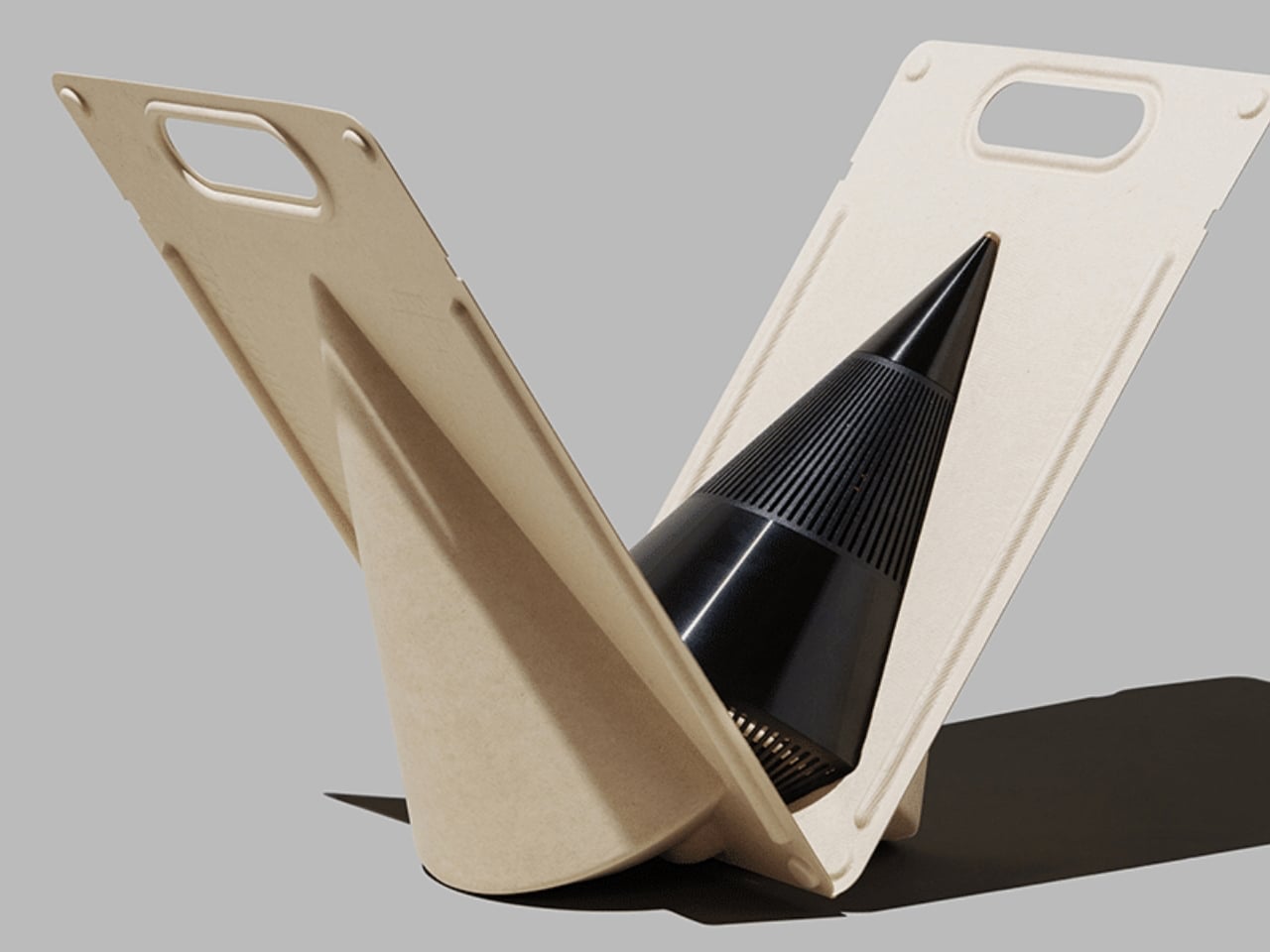
The Tresound Mini is a compact desktop Bluetooth speaker that refuses to be just another black box on your desk. Its cone-shaped silhouette is sleek and architectural, merging minimalist aesthetics with purposeful form. TRETTITRE, the emerging HiFi brand behind it, bridges traditional audio quality with forward-thinking design, making the speaker feel as much like a modern sculpture as it does a high-performance audio device.
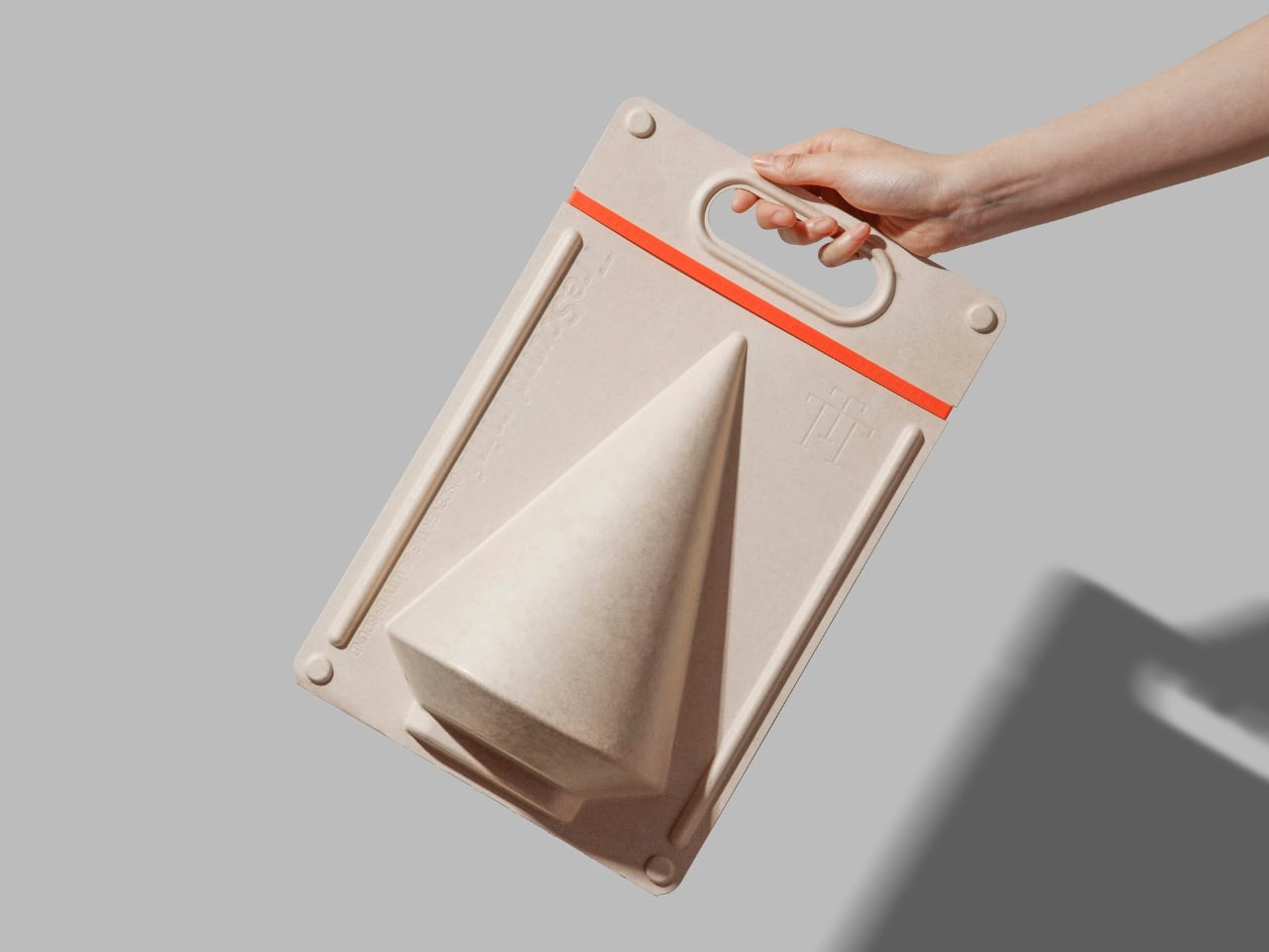
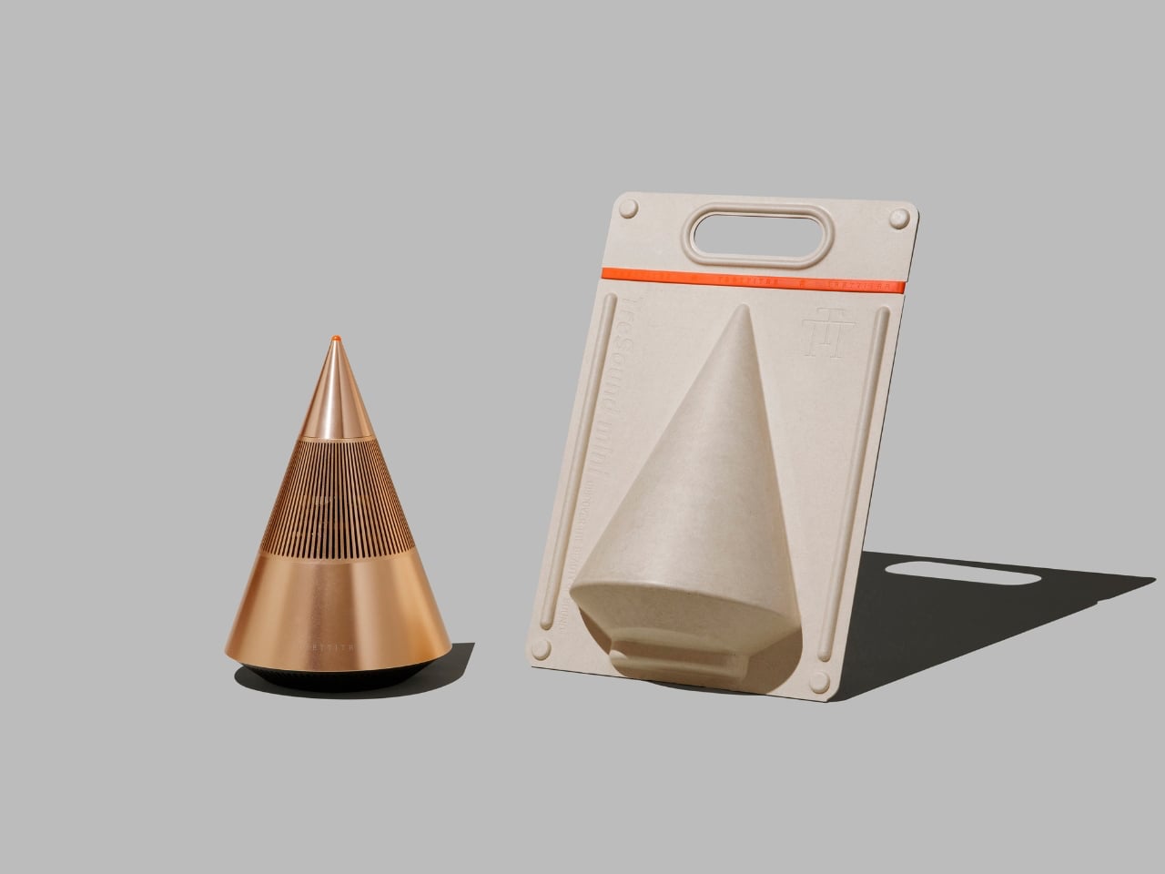
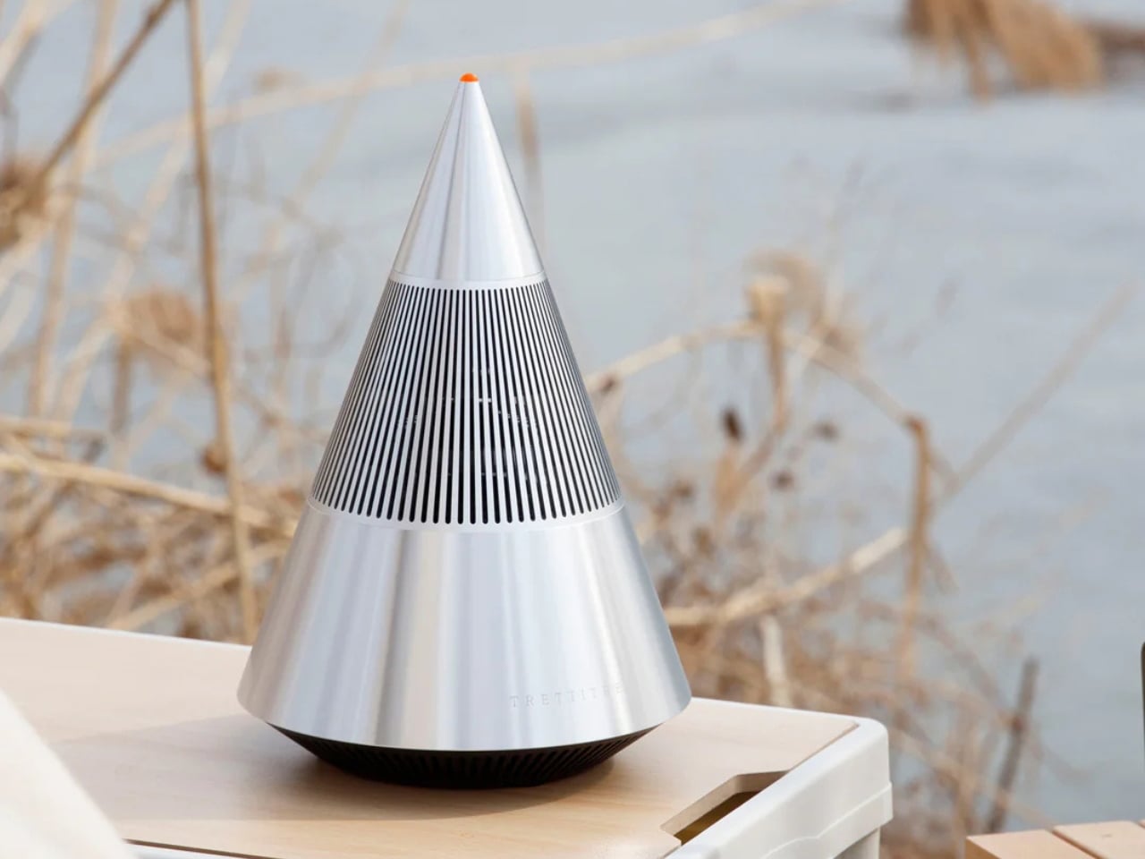
Beyond its striking profile, the Tresound Mini rethinks the desktop experience. A bamboo fiber carrying bag doubles as sustainable, protective packaging, enabling true portability without sacrificing style. Every detail, right from the geometric form to the tactile materials, reflects careful consideration of function and environment.
2. Sound Wave Design
Some of today’s most provocative speaker designs aim to make the invisible visible, transforming sound waves into tangible forms. Fluid, rippling surfaces trace the frequencies of audio, giving physical shape to what is usually only heard. These designs turn the act of listening into a visual experience, inviting the eye to follow the rhythm of music in real time.
By capturing the motion of sound in materials like polished resin or aluminum, these pieces become sculptural embodiments of the music they produce. The result is hardware that’s as lively and expressive as the music, combining art with high-quality sound.
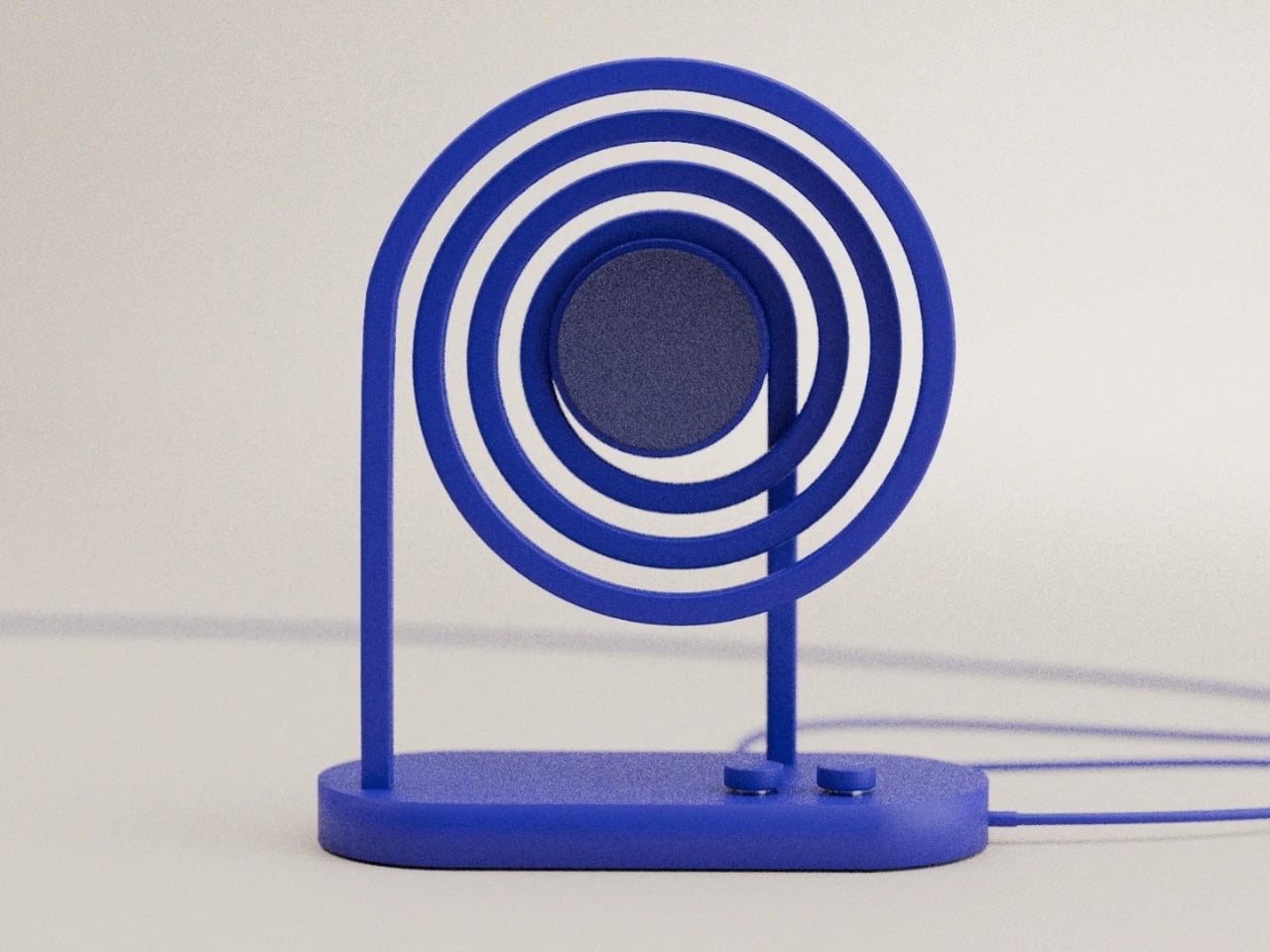
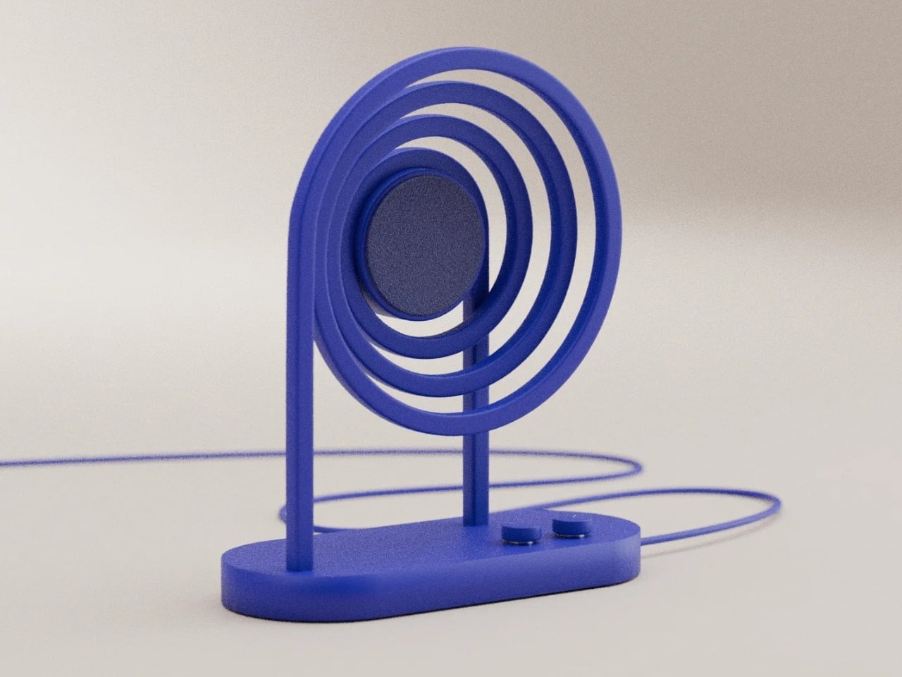
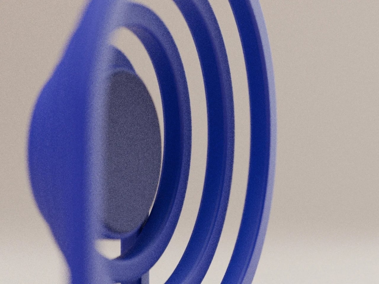
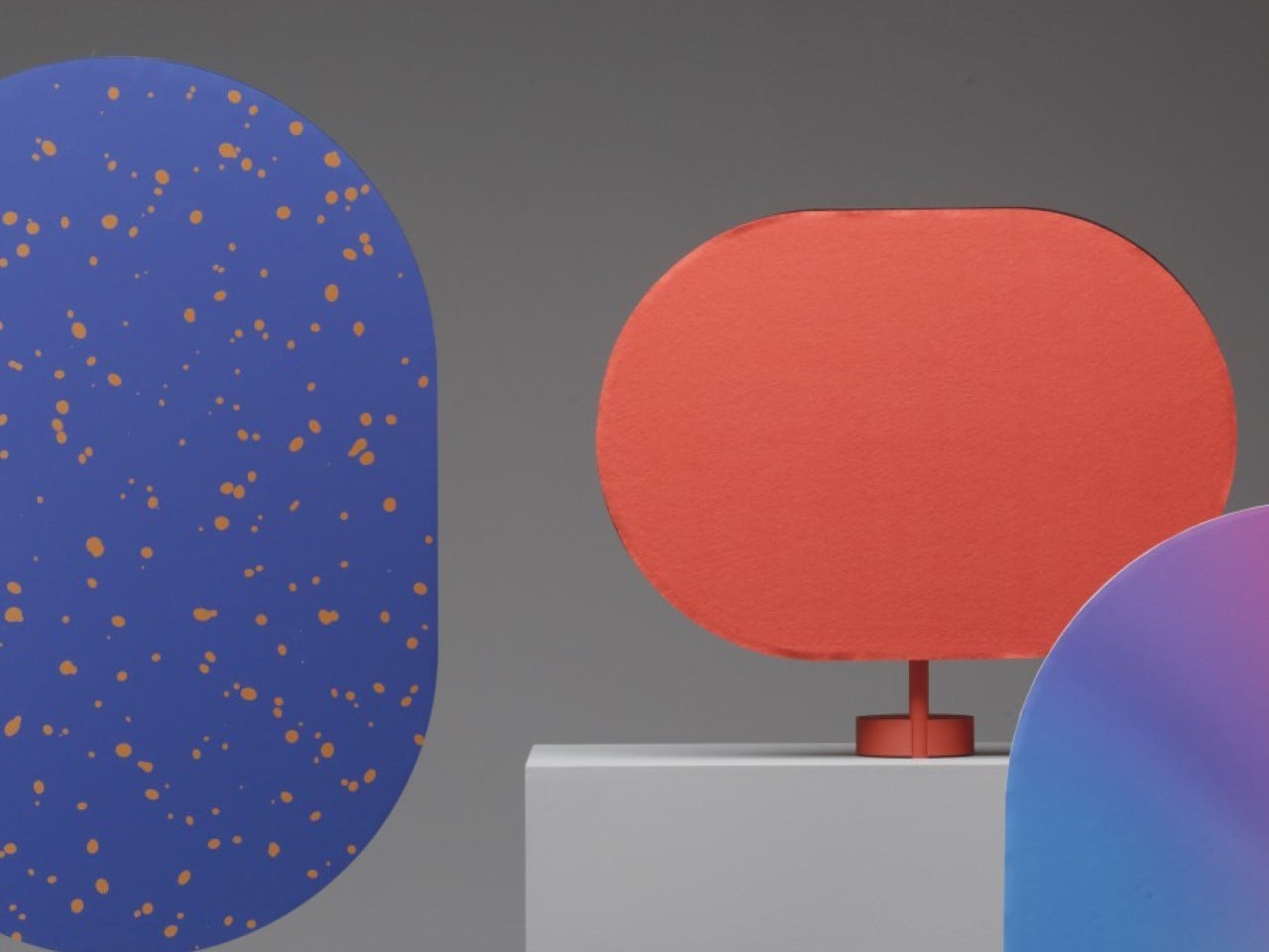
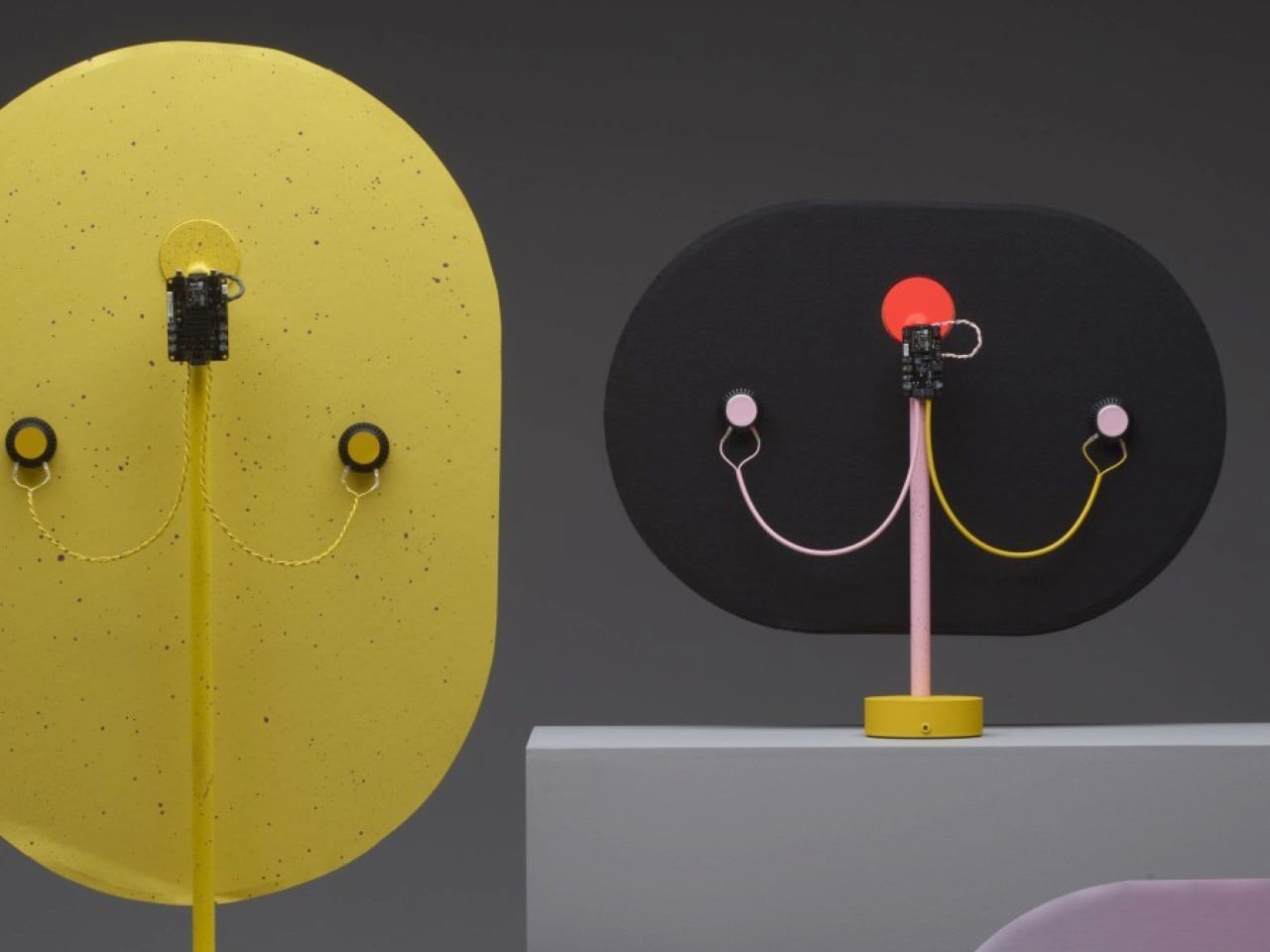
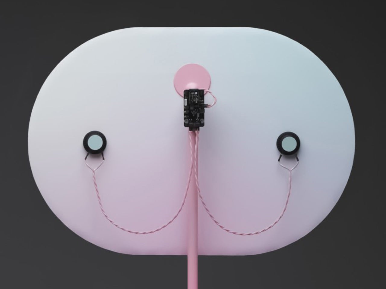
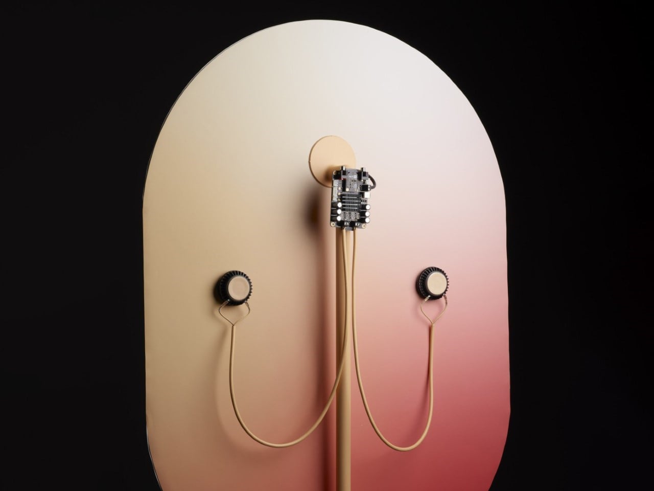
Loopen, a sculptural speaker concept from Design by Joffey, reimagines how sound can look and be experienced. Its bold cobalt-blue form features concentric circular loops radiating from a central speaker driver, creating a visual echo of sound waves in motion. These loops are not merely decorative as they form the structural framework, supporting the speaker while emphasising its sculptural identity. A minimalist oval base and two slim uprights keep the design light, while simple, flush-mounted controls preserve the clean lines. Every element is functional, from the geometric layout to the tactile finish, making the product immediately understandable without explanation.
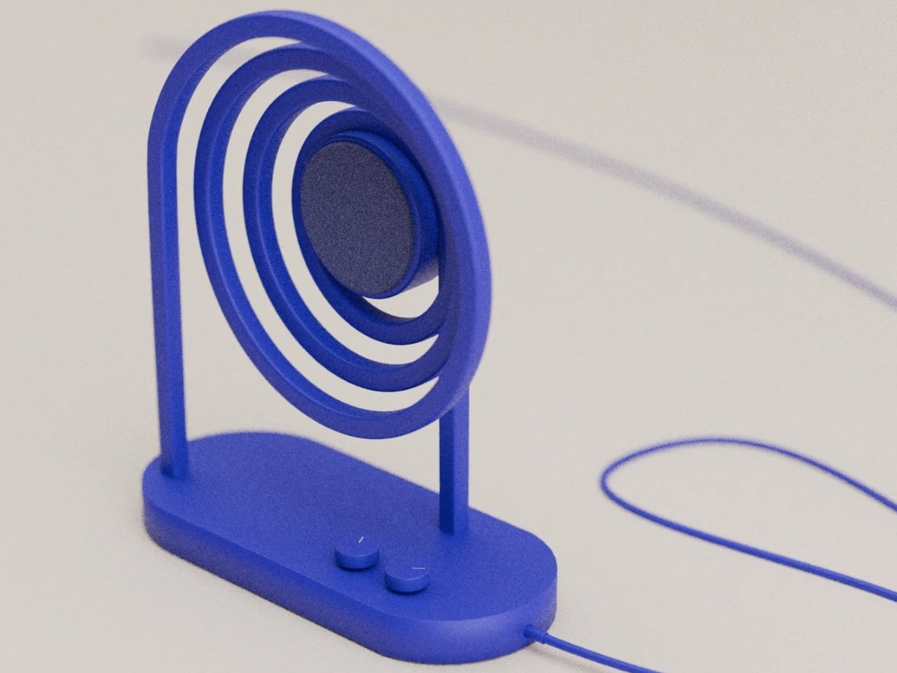

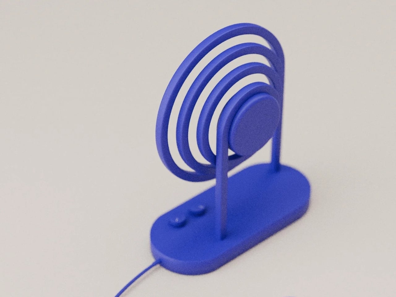
Compact and thoughtfully proportioned, Loopen is designed for personal spaces like desks or bedside tables, offering both visual and acoustic engagement. By turning audio into a tangible form, the speaker bridges technology and design, giving users an object that delivers clear sound, structural integrity, and aesthetic impact.
3. Slim Décor
Ultra-thin speakers are redefining the idea of “hidden” audio. No longer tucked into corners or walls, these sleek panels are designed to be seen as much as heard, blending effortlessly with minimalist interiors. Inspired by modern wall art, they turn speakers into visual statements.
Disguised as slim frames or textured canvases, they use advanced vibration technology to deliver powerful sound from profiles barely an inch thick. Perfect for “less is more” interiors, these speakers combine gallery-worthy aesthetics with exceptional audio performance, showing that elegance and sound quality can coexist seamlessly.
The DIYR speaker includes an ultra-thin, flat-panel design that transforms the entire surface into a vibrating diaphragm, producing immersive sound while appearing more like a decorative panel than a traditional speaker. At first glance, it’s easy to forget it’s even an audio device. This approach allows the speaker to blend seamlessly into interiors, be propped against walls, or act as a space divider, while delivering rich, evenly distributed sound that fills the room rather than projecting from a single point.

Beyond its striking appearance, the DIYR speaker combines intuitive assembly with high-quality engineering. Using exciters on a 4mm cardboard membrane, it creates a diffuse, ethereal sound profile powered by a 40W amplifier, 40Hz–20kHz frequency range, and a 7,200mAh rechargeable battery. Bluetooth 5.1 and aux connectivity add flexibility, while customizable surfaces let it double as functional, stylish décor.
4. Earthy Design
Some of today’s most innovative speakers are crafted from ancient, natural materials. Sand, concrete, and minerals are reimagined to create housing that is sustainable and acoustically precise. The natural density of these materials dampens unwanted vibrations, producing clear, balanced sound that preserves the integrity of the music.
Visually, these earthy, textured designs resemble artifacts from desert landscapes, adding a grounded, tactile quality to modern interiors. By combining advanced audio technology with raw, organic beauty, designers are creating speakers that feel timeless.
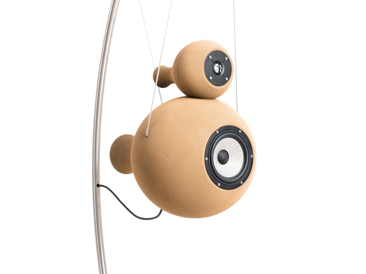
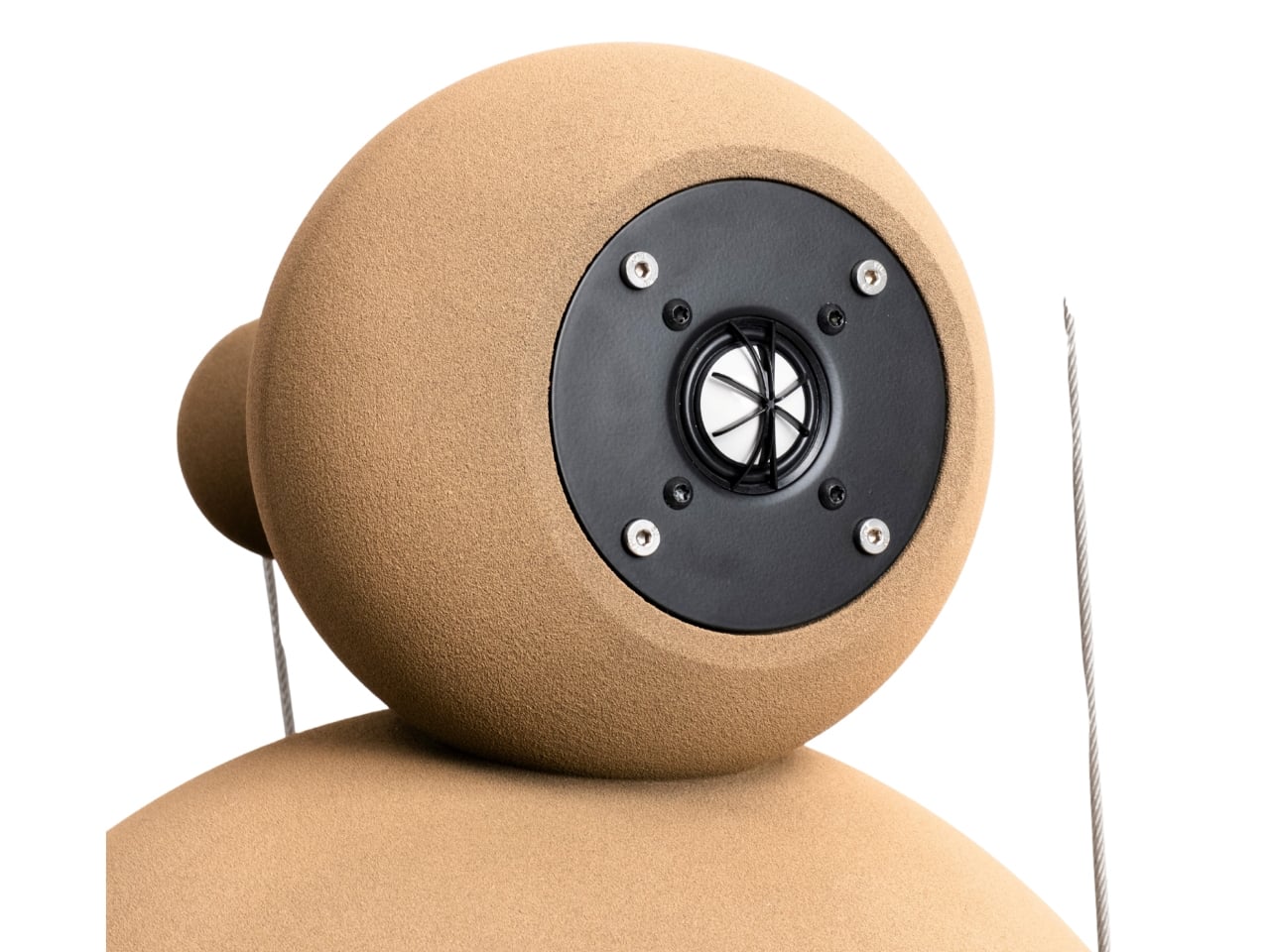
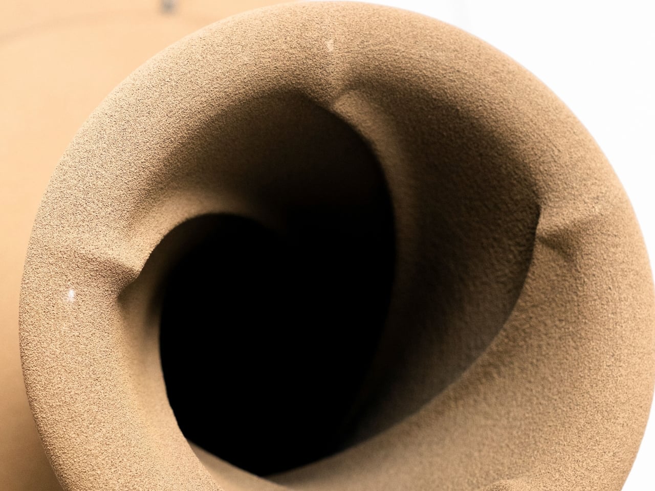
High-end speakers often evoke black boxes, polished wood, or minimalist Scandinavian forms, but the Econik 1851 by Anton Erbenich breaks all those conventions. This active loudspeaker is 3D-printed entirely from quartz sand, resulting in a textured, almost ancient-looking surface that doubles as a functional acoustic solution. The mineral composition dampens micro-vibrations, ensuring cleaner, more accurate sound while giving the piece a sculptural presence. Its stacked, nearly spherical forms reduce standing waves, and subtle side protrusions create an organic, pod-like aesthetic.
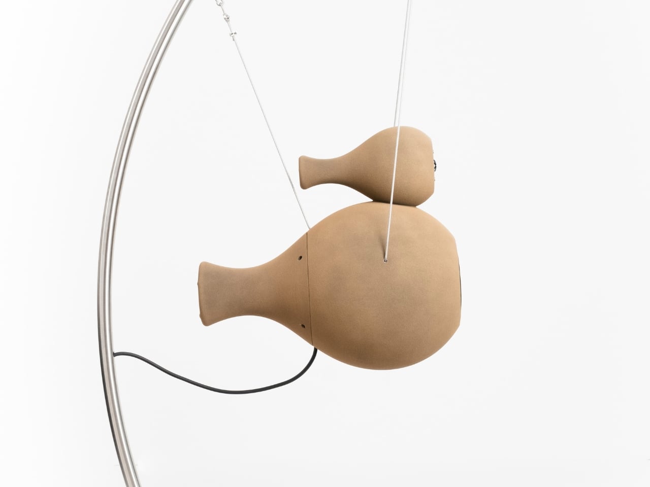
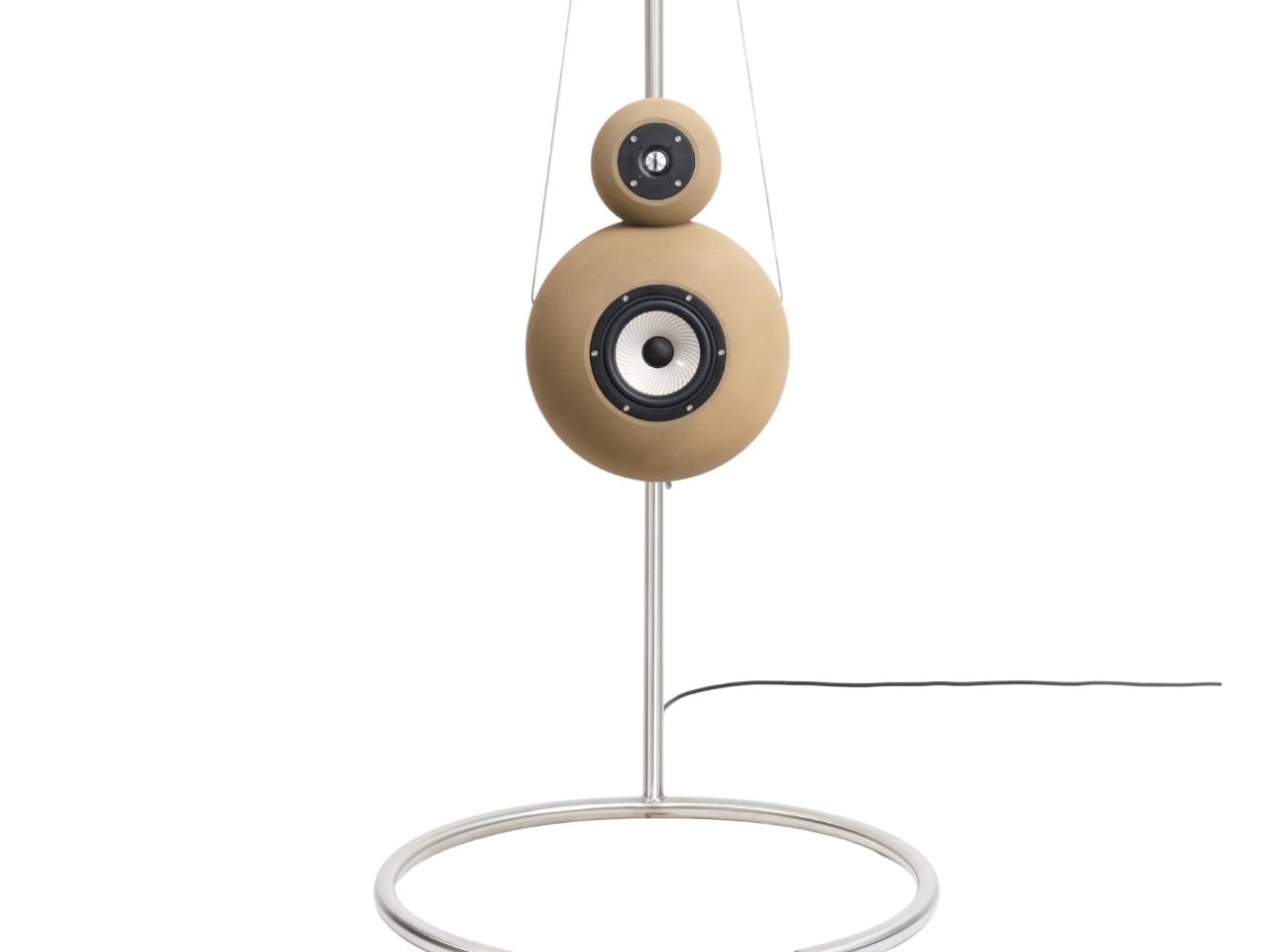

The suspension system is equally deliberate as steel cables hang the speakers from a curved stand, isolating them from surface vibrations and allowing them to float weightlessly in space. With integrated amplification and signal processing, setup is simple. At the same time, the understated sand tones and elegant forms make the Econik 1851 a statement of sophisticated design that is bold and understated.
5. Retro Speaker
For the vinyl-loving audiophile, retro-inspired speakers blend mid-century charm with modern technology. Warm wood grains, tactile brass knobs, and vintage grill cloths recall the elegance of 1970s hi-fi systems, evoking nostalgia without compromising style. These pieces act as functional décor while celebrating the tactile pleasure of classic design.
Beneath their “old-school” exterior, they pack high-resolution Bluetooth connectivity and modern audio performance. This fusion allows listeners to enjoy the sensory satisfaction of vintage hardware with the convenience and clarity of today’s digital sound.
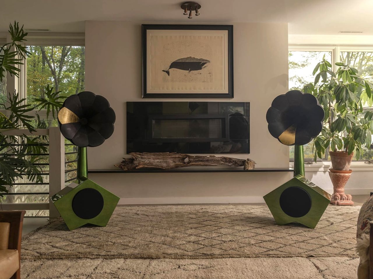
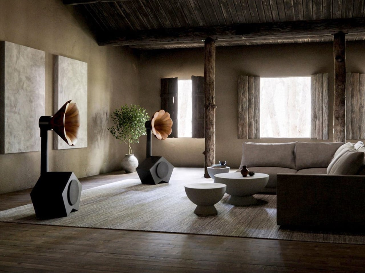
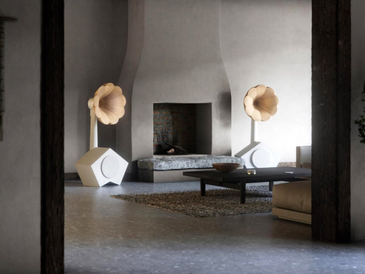
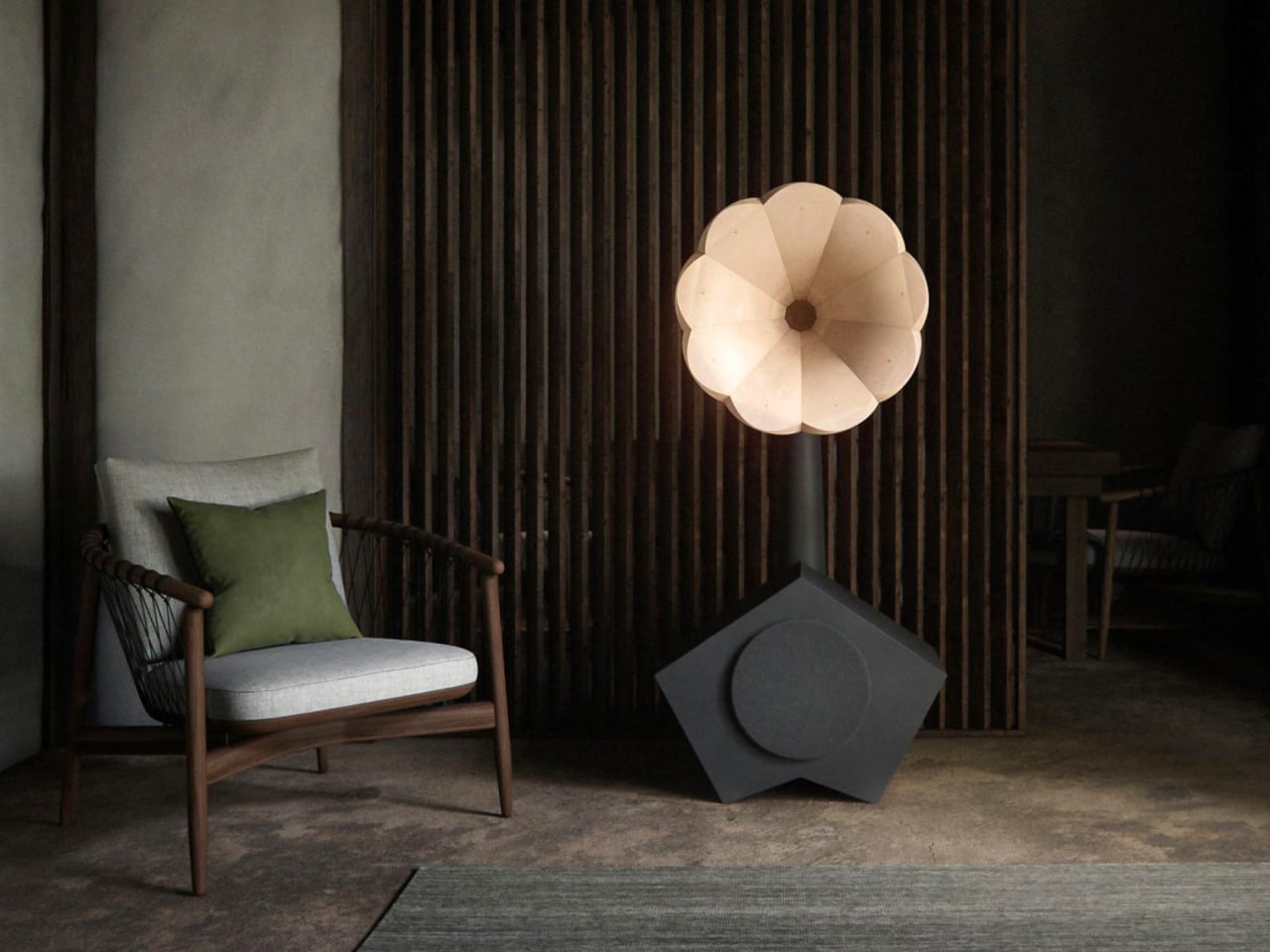
Founded by Etsy co-founder Robert Kalin and NASA engineer William Cowan, A for Ara challenges the conventions of modern smart speakers by bringing ritual and joy back to music listening. Their retro-modern speakers combine eclectic design styles with traditional and contemporary fabrication techniques, creating pieces that feel both timeless and playful. The FS-1 and FS-2 feature two visual components: a base housing the audio drivers and acoustic cabinet, and an upper, phonograph-inspired horn that amplifies sound while evoking the organic shape of a morning glory flower.
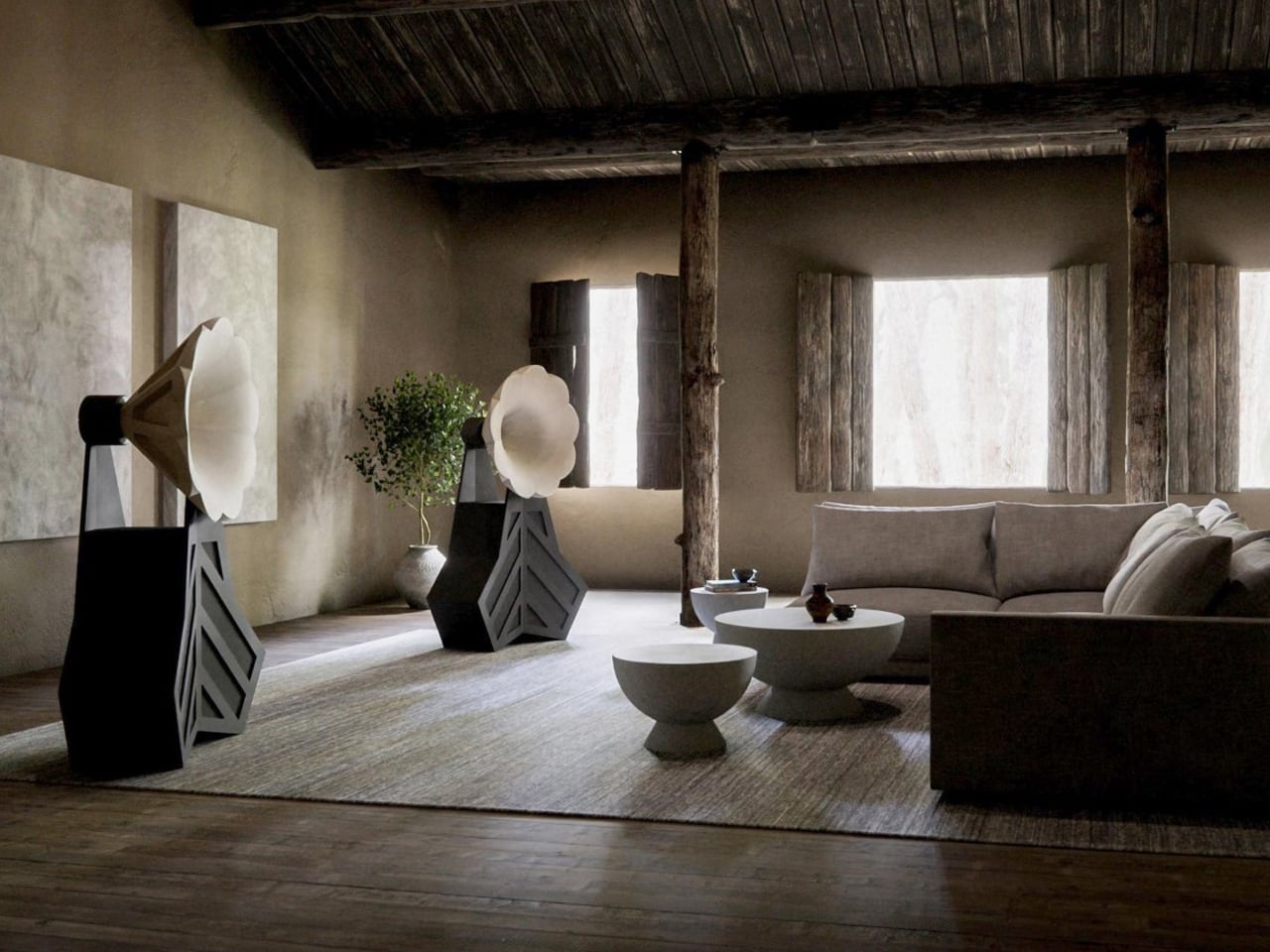
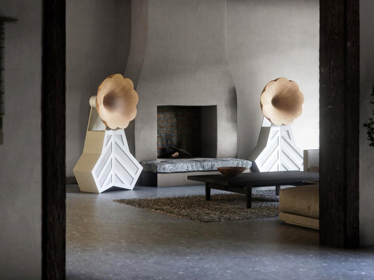
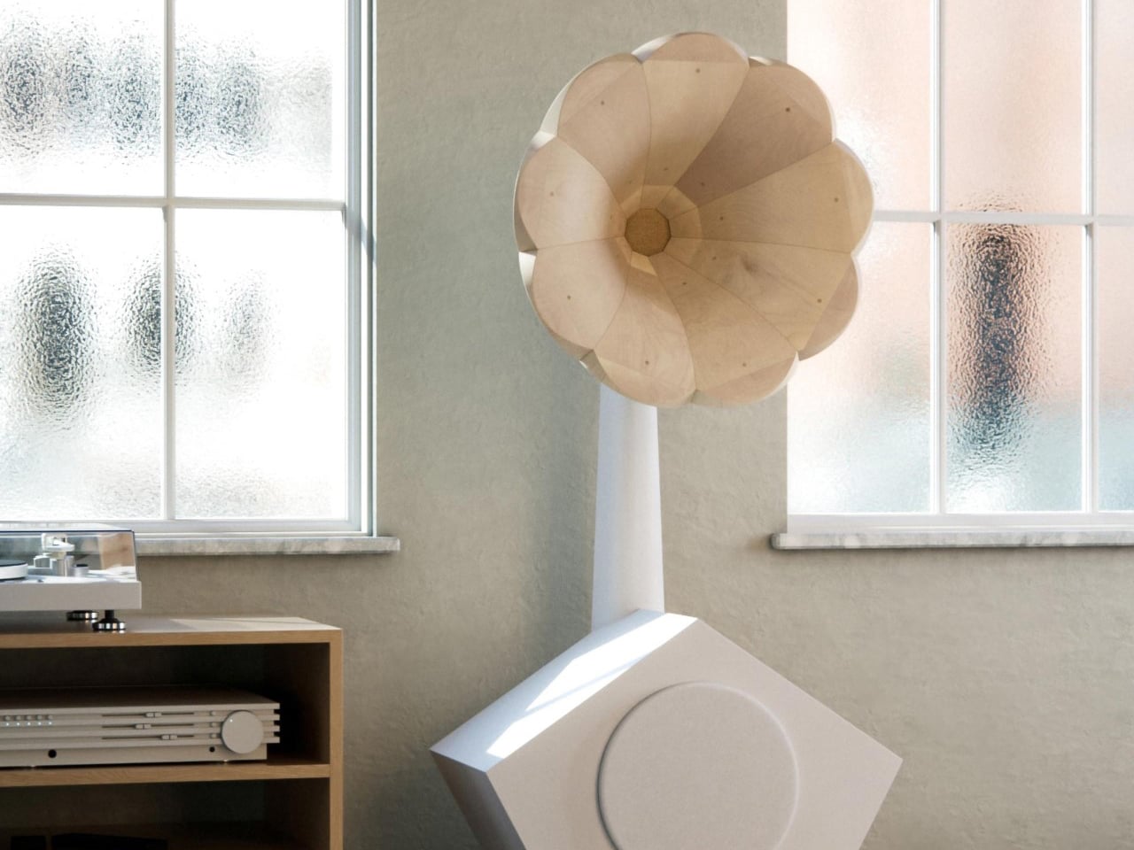
Standing 54 inches tall, the FS-1 pairs a slender horn with a geometric base and a 13” front-firing woofer, while the FS-2 amplifies its whimsical character with a boxy, leaf-patterned cabinet and three long-throw 12” woofers. Both deliver audiophile-grade sound without LEDs or metallic detailing, offering an immersive, joyous listening experience that turns audio equipment into art.
When sound transforms into sculpture, the home becomes a gallery. Modern speakers are no longer hidden appliances but are statement pieces that merge high-fidelity performance with visual artistry.
The post These 5 Speakers Are So Beautiful They Could Hang in a Museum – and They Actually Sound Amazing first appeared on Yanko Design.