This Wicker Collection Looks Like the Forest Came Indoors

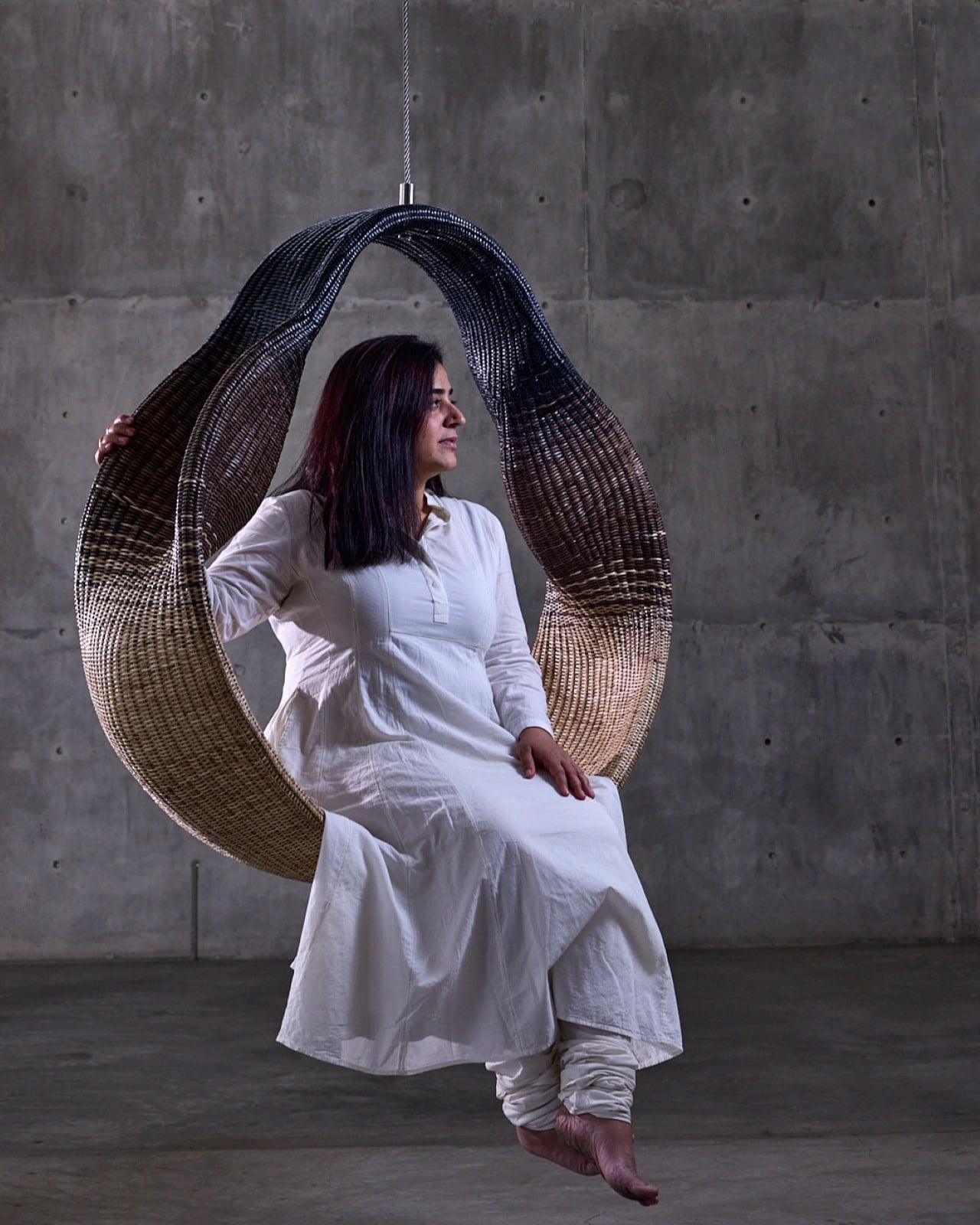
There’s something magical about watching an ancient craft transform into something that feels utterly contemporary. That’s exactly what happens when you encounter Whispers of the Wildwood, a new collection from Hyderabad-based design studio The Wicker Story. Designer Priyanka Narula has taken the humble art of wicker weaving and turned it into something that feels like poetry you can touch.

Wicker has been having a moment lately. You’ve probably noticed it creeping back into the design world, showing up in Instagram-worthy cafes and carefully curated living rooms. But here’s the thing: most wicker pieces still carry that nostalgic grandma’s-porch vibe, charming but predictable. Narula decided to throw that playbook out the window.

Designer: Priyanka Narula for The Wicker Story
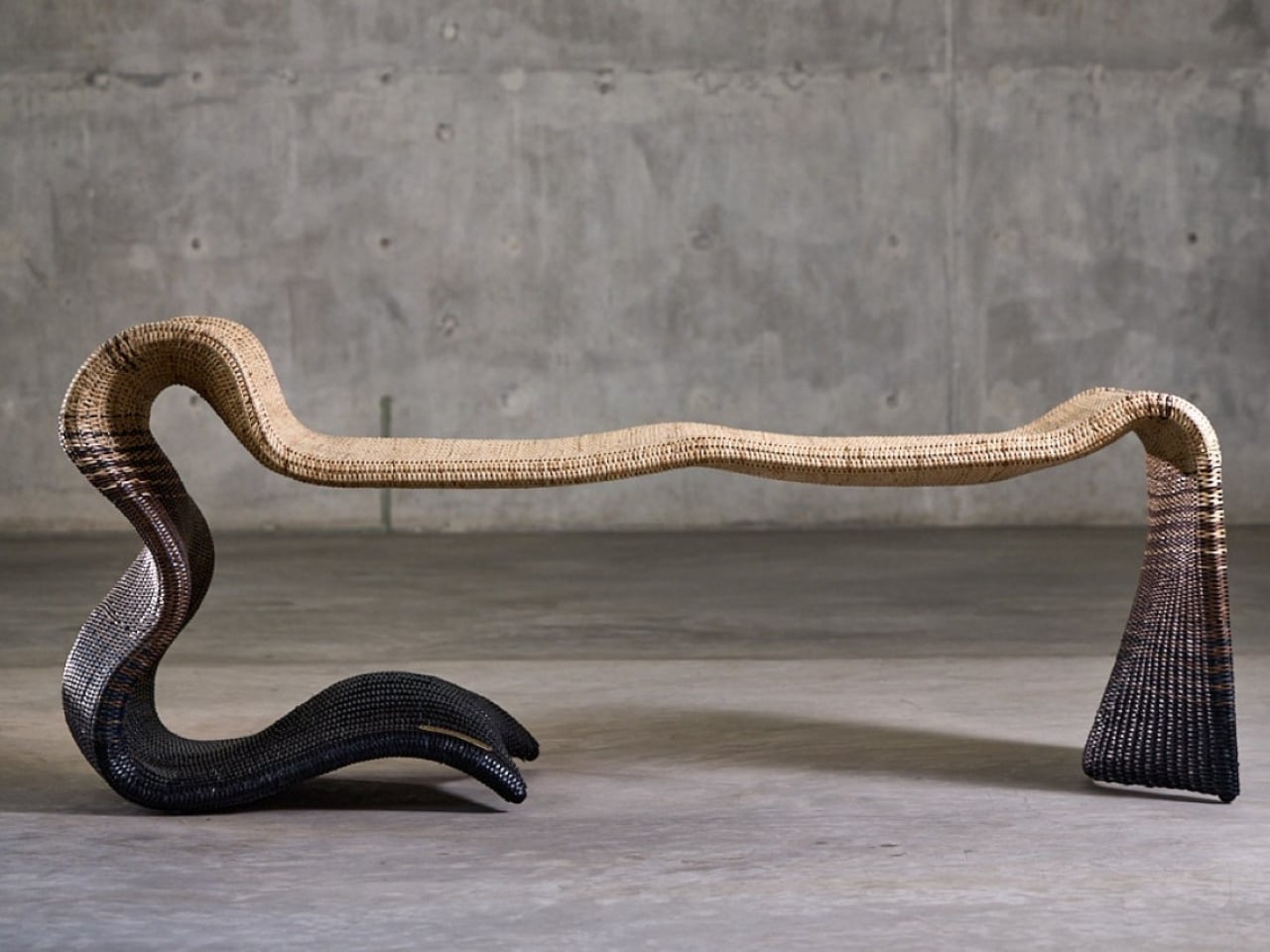
Instead of sticking to traditional furniture forms, she looked to the forest itself for inspiration. The collection draws from the organic chaos of nature, from meandering rivers that never quite go straight to forest canopies that filter light in a thousand different ways. There’s the gentle sway of wild grasses caught in the breeze, the textured warmth of tree bark, the unpredictable curves of branches reaching toward the sun. Each piece in the collection becomes a memory of these natural moments, frozen in woven form.
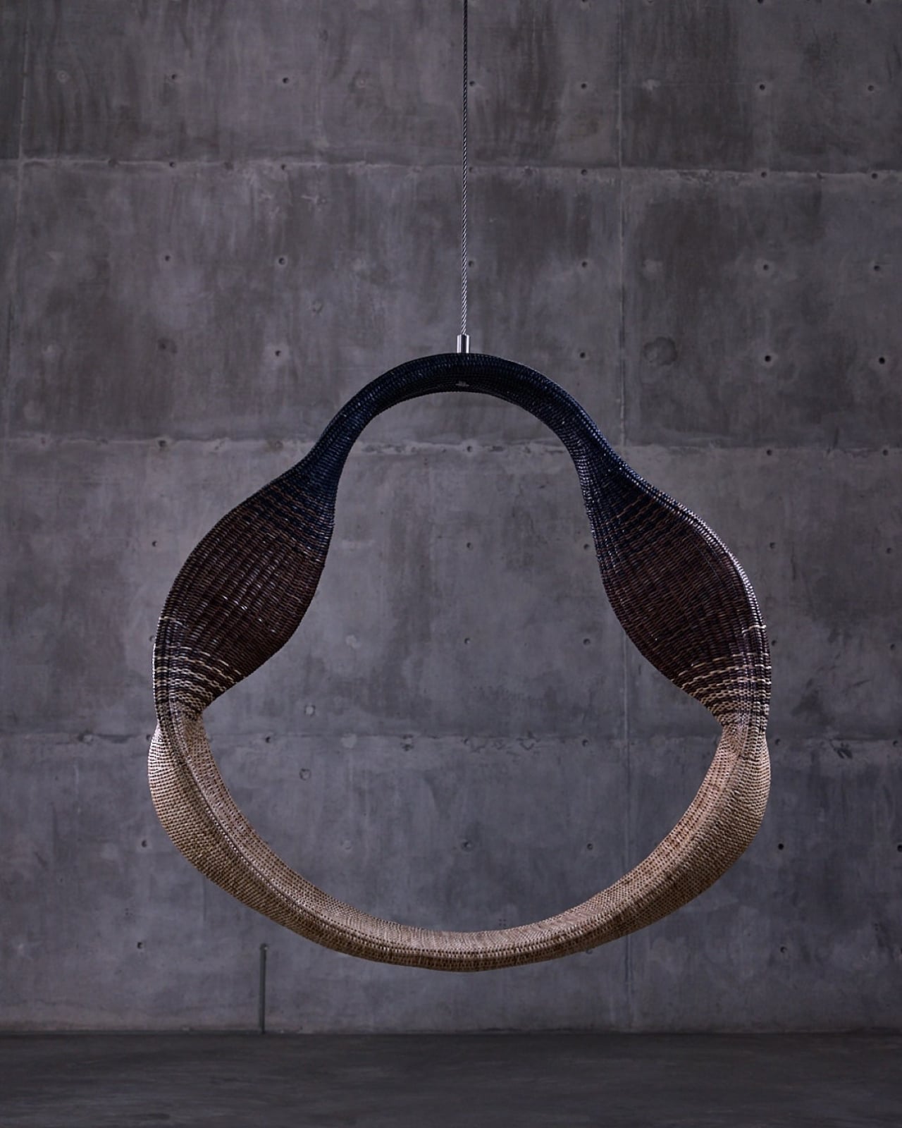
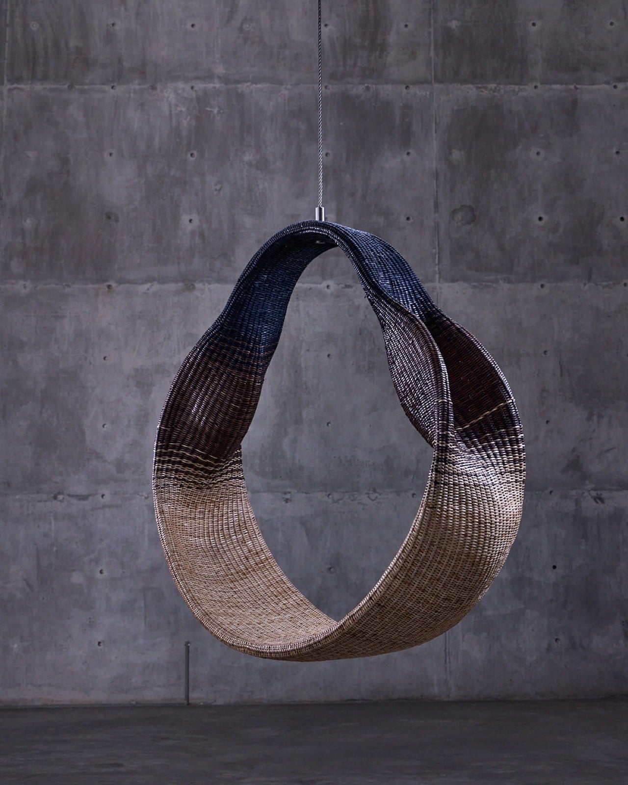
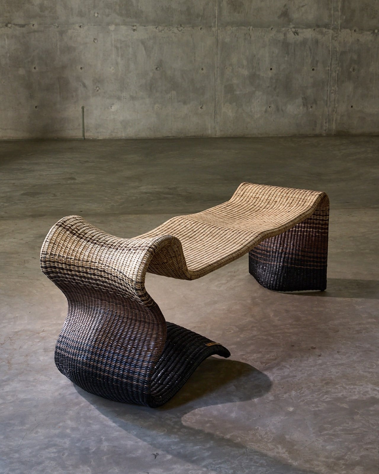
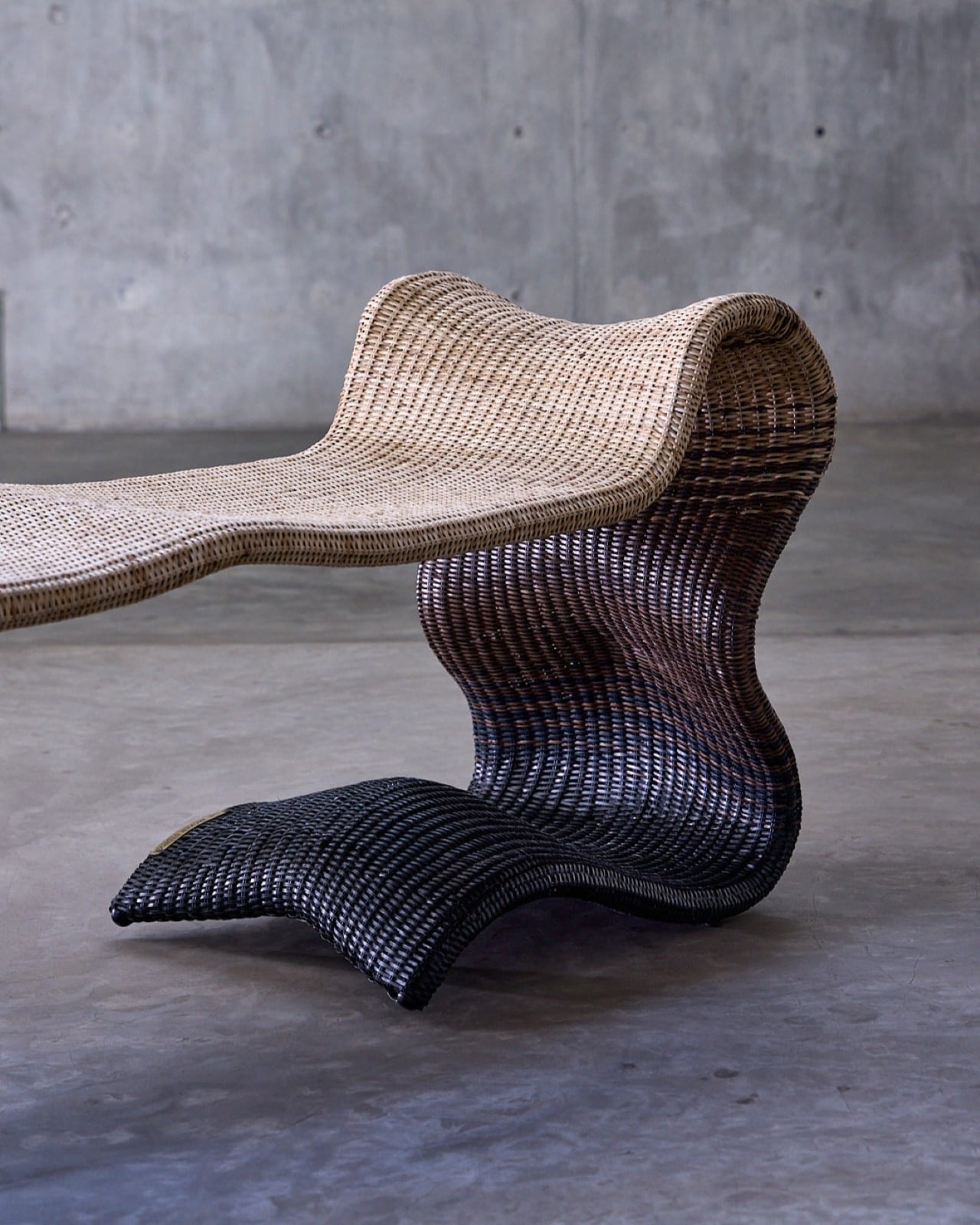
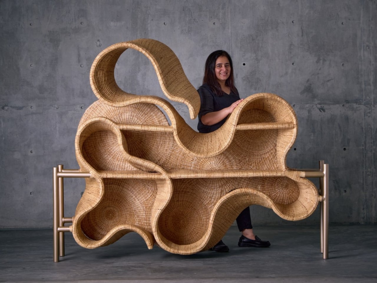
What makes this collection so compelling is how it pushes wicker beyond what we think it can do. These aren’t just chairs and tables with a nature-inspired twist. They’re sculptural pieces that happen to be functional, blurring that increasingly fuzzy line between art and design. The textures are incredibly fine, elevated through contemporary silhouettes and details so subtle you might miss them at first glance.
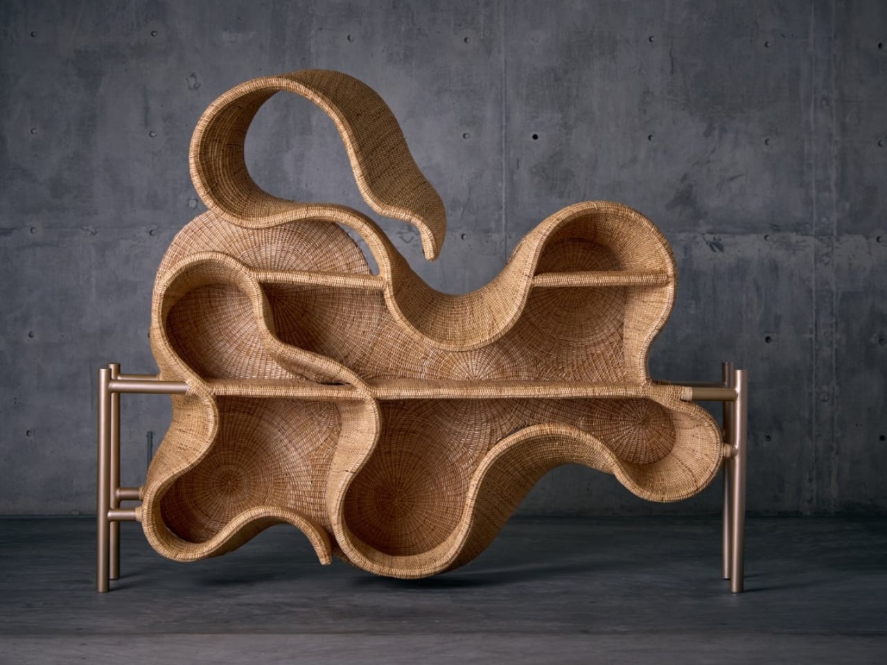
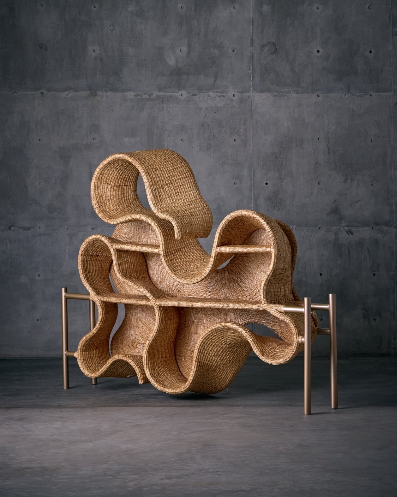
Take the Pagdandi wall unit, for example. The name itself evokes narrow forest paths, those meandering trails worn by countless footsteps over time. The piece captures that same sense of organic movement, of following where nature leads rather than imposing rigid geometry. It’s the kind of design that makes you stop and look twice, wondering how something woven could feel so fluid.
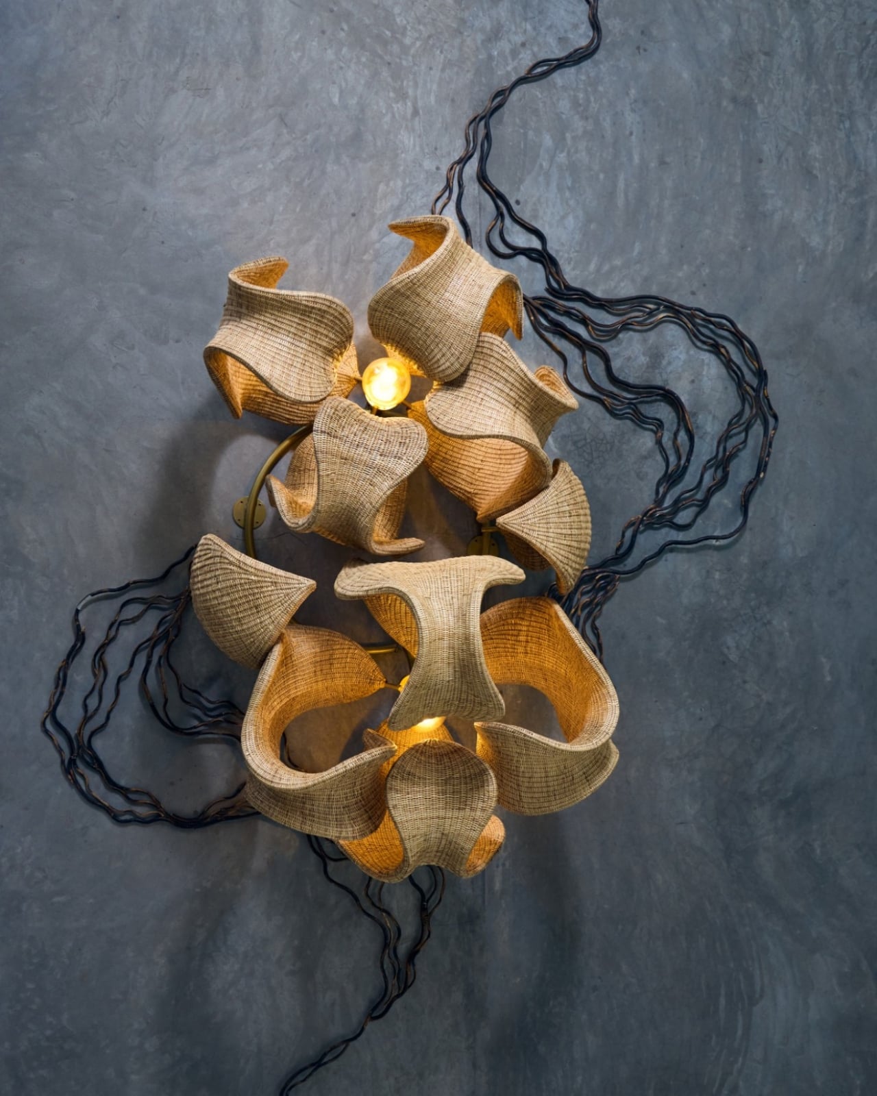
The earthy tones throughout the collection feel deliberate but never forced. Instead of reaching for trendy neutrals, Narula stays true to the materials themselves, letting the natural warmth of wicker shine through. It’s a celebration of what the material can do when you really understand it, when you’ve spent years researching and experimenting with traditional weaving techniques and then finding ways to push them forward.
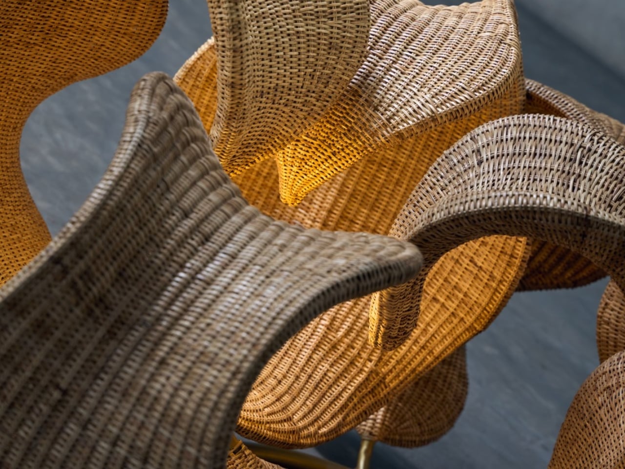
This approach makes sense when you learn more about The Wicker Story itself. Founded by Narula in 2018, the studio has built its reputation on research-driven design that respects Indian weaving craft while refusing to let it remain static. It’s not about preservation for preservation’s sake. It’s about honoring the skill and knowledge of traditional artisans while asking what else is possible, what new forms and expressions might emerge when you give craft room to evolve.
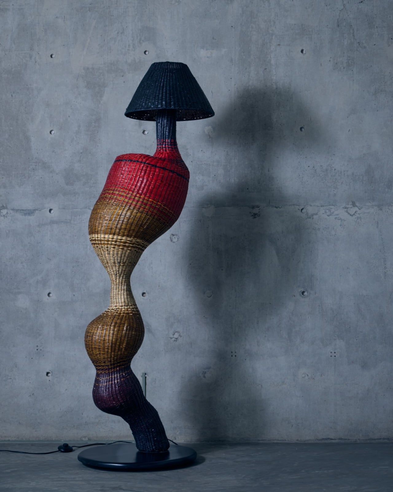
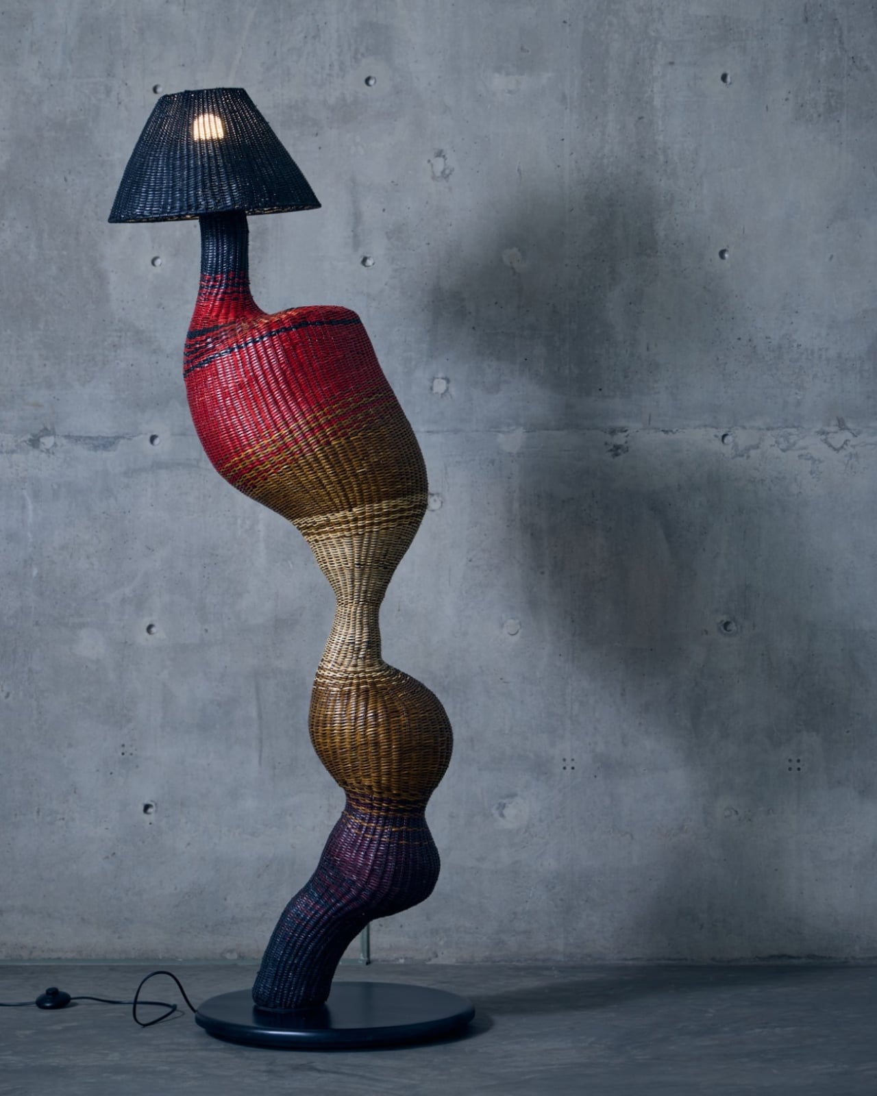
The timing feels right for a collection like this. We’re living in an era where people are craving authenticity and connection to natural materials, but nobody wants their space to feel like a museum or a rustic cabin. We want pieces that acknowledge our contemporary lives while bringing in warmth and texture and that ineffable quality of something made by human hands. Whispers of the Wildwood hits that sweet spot perfectly.
What Narula has created isn’t just furniture. It’s a reminder that the best design often comes from deep observation of the world around us. The forest doesn’t use straight lines or perfect symmetry, yet it creates compositions that feel balanced and beautiful. By channeling those organic rhythms into woven forms, this collection brings a piece of that wildwood serenity into our built environments.

For anyone who loves design that tells a story, that carries meaning beyond pure aesthetics, this collection deserves your attention. It proves that traditional craft can speak to contemporary sensibilities, that wicker can be sculptural and sophisticated, and that sometimes the most innovative design comes from looking not to the future but to the timeless patterns of nature itself.
The post This Wicker Collection Looks Like the Forest Came Indoors first appeared on Yanko Design.
This Wicker Collection Looks Like the Forest Came Indoors

There’s something magical about watching an ancient craft transform into something that feels utterly contemporary. That’s exactly what happens when you encounter Whispers of the Wildwood, a new collection from Hyderabad-based design studio The Wicker Story. Designer Priyanka Narula has taken the humble art of wicker weaving and turned it into something that feels like poetry you can touch.

Wicker has been having a moment lately. You’ve probably noticed it creeping back into the design world, showing up in Instagram-worthy cafes and carefully curated living rooms. But here’s the thing: most wicker pieces still carry that nostalgic grandma’s-porch vibe, charming but predictable. Narula decided to throw that playbook out the window.

Designer: Priyanka Narula for The Wicker Story

Instead of sticking to traditional furniture forms, she looked to the forest itself for inspiration. The collection draws from the organic chaos of nature, from meandering rivers that never quite go straight to forest canopies that filter light in a thousand different ways. There’s the gentle sway of wild grasses caught in the breeze, the textured warmth of tree bark, the unpredictable curves of branches reaching toward the sun. Each piece in the collection becomes a memory of these natural moments, frozen in woven form.

What makes this collection so compelling is how it pushes wicker beyond what we think it can do. These aren’t just chairs and tables with a nature-inspired twist. They’re sculptural pieces that happen to be functional, blurring that increasingly fuzzy line between art and design. The textures are incredibly fine, elevated through contemporary silhouettes and details so subtle you might miss them at first glance.

Take the Pagdandi wall unit, for example. The name itself evokes narrow forest paths, those meandering trails worn by countless footsteps over time. The piece captures that same sense of organic movement, of following where nature leads rather than imposing rigid geometry. It’s the kind of design that makes you stop and look twice, wondering how something woven could feel so fluid.

The earthy tones throughout the collection feel deliberate but never forced. Instead of reaching for trendy neutrals, Narula stays true to the materials themselves, letting the natural warmth of wicker shine through. It’s a celebration of what the material can do when you really understand it, when you’ve spent years researching and experimenting with traditional weaving techniques and then finding ways to push them forward.

This approach makes sense when you learn more about The Wicker Story itself. Founded by Narula in 2018, the studio has built its reputation on research-driven design that respects Indian weaving craft while refusing to let it remain static. It’s not about preservation for preservation’s sake. It’s about honoring the skill and knowledge of traditional artisans while asking what else is possible, what new forms and expressions might emerge when you give craft room to evolve.

The timing feels right for a collection like this. We’re living in an era where people are craving authenticity and connection to natural materials, but nobody wants their space to feel like a museum or a rustic cabin. We want pieces that acknowledge our contemporary lives while bringing in warmth and texture and that ineffable quality of something made by human hands. Whispers of the Wildwood hits that sweet spot perfectly.

What Narula has created isn’t just furniture. It’s a reminder that the best design often comes from deep observation of the world around us. The forest doesn’t use straight lines or perfect symmetry, yet it creates compositions that feel balanced and beautiful. By channeling those organic rhythms into woven forms, this collection brings a piece of that wildwood serenity into our built environments.

For anyone who loves design that tells a story, that carries meaning beyond pure aesthetics, this collection deserves your attention. It proves that traditional craft can speak to contemporary sensibilities, that wicker can be sculptural and sophisticated, and that sometimes the most innovative design comes from looking not to the future but to the timeless patterns of nature itself.

The post This Wicker Collection Looks Like the Forest Came Indoors first appeared on Yanko Design.
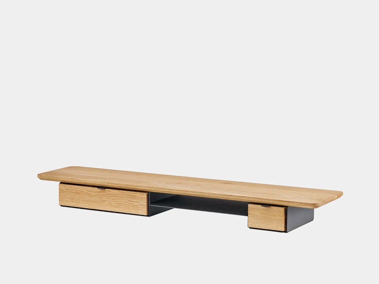
Oakywood Desk Shelf Pro Holds 100kg and Hides Clutter in Wood Drawers

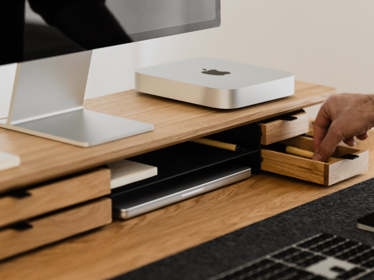
Desks fill up fast. A nice monitor and laptop sit on a surface that slowly accumulates cables, notebooks, charging docks, and random accessories. The usual fixes are cheap monitor risers, plastic drawer units, and cable trays that solve one problem but add visual noise. The Oakywood Desk Shelf Pro tries to handle ergonomics and organization without making the desk look busier, treating the riser as solid-wood furniture instead of an accessory.

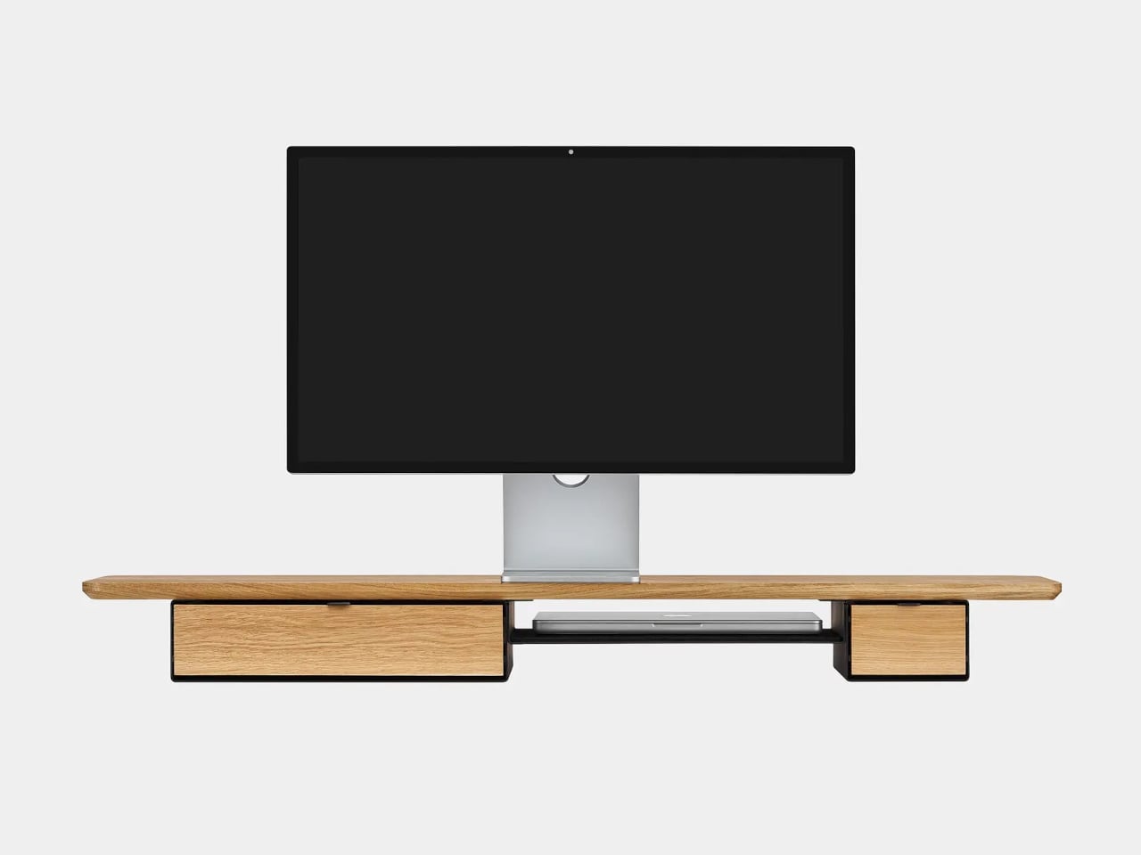
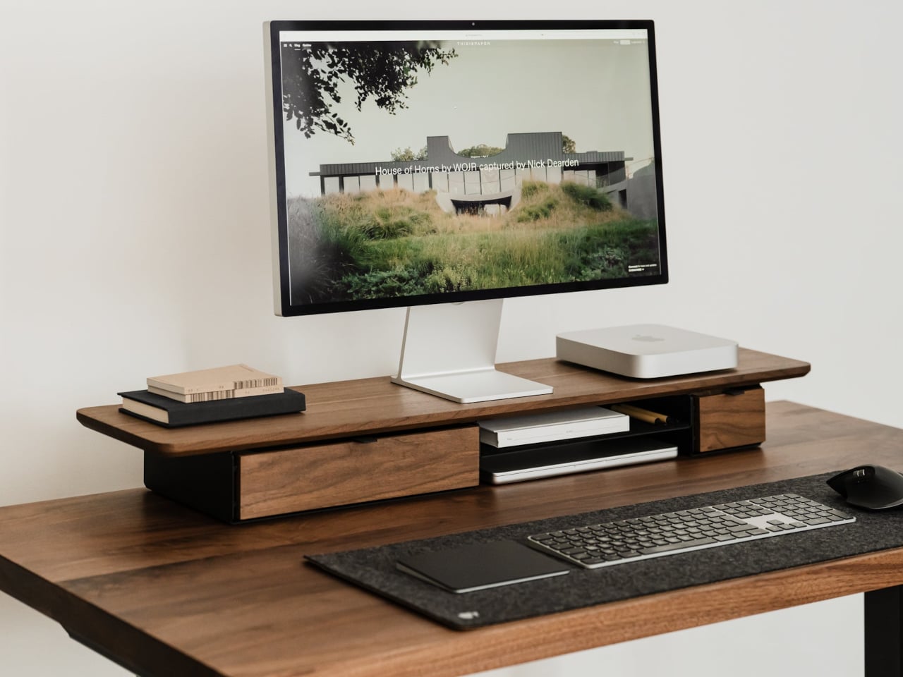
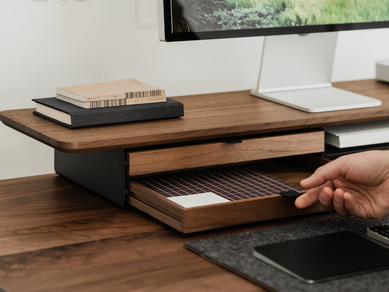
Desk Shelf Pro is an all-in-one desk shelf that lifts your monitor, hides clutter, and adds a second functional level to the workspace. It combines a long, rounded wooden platform with powder-coated steel legs, integrated drawers, and a felt-lined open shelf. It is built from solid oak or walnut, not MDF with a plastic skin, so it feels like part of the desk rather than something perched on top.

Designer: Oakywood

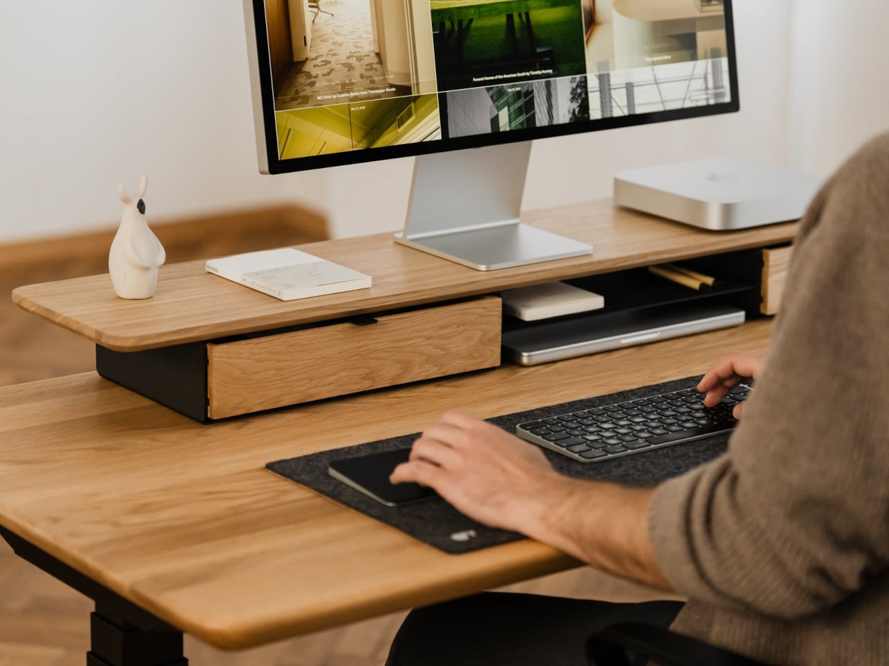
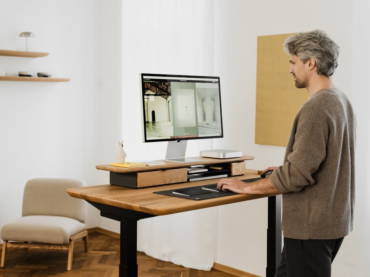
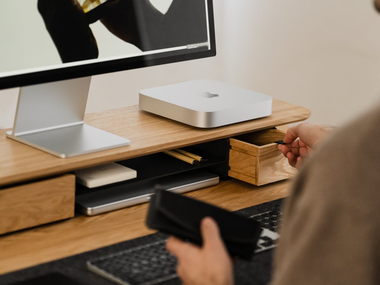
The shelf spans the width of the desk, raising a monitor to a more natural eye level while leaving space underneath for a keyboard or laptop. Steel legs sit at each end, creating a floating effect and a central bay that becomes a home for devices. The shelf holds up to 100 kg, so it can handle large displays, desktop machines, and accessories without flexing, even when you lean on it.

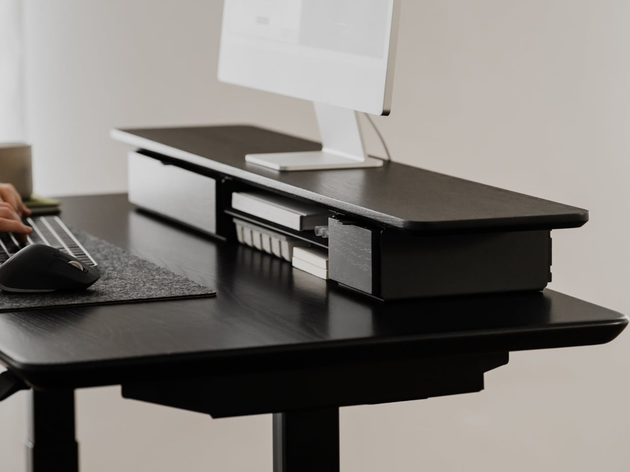
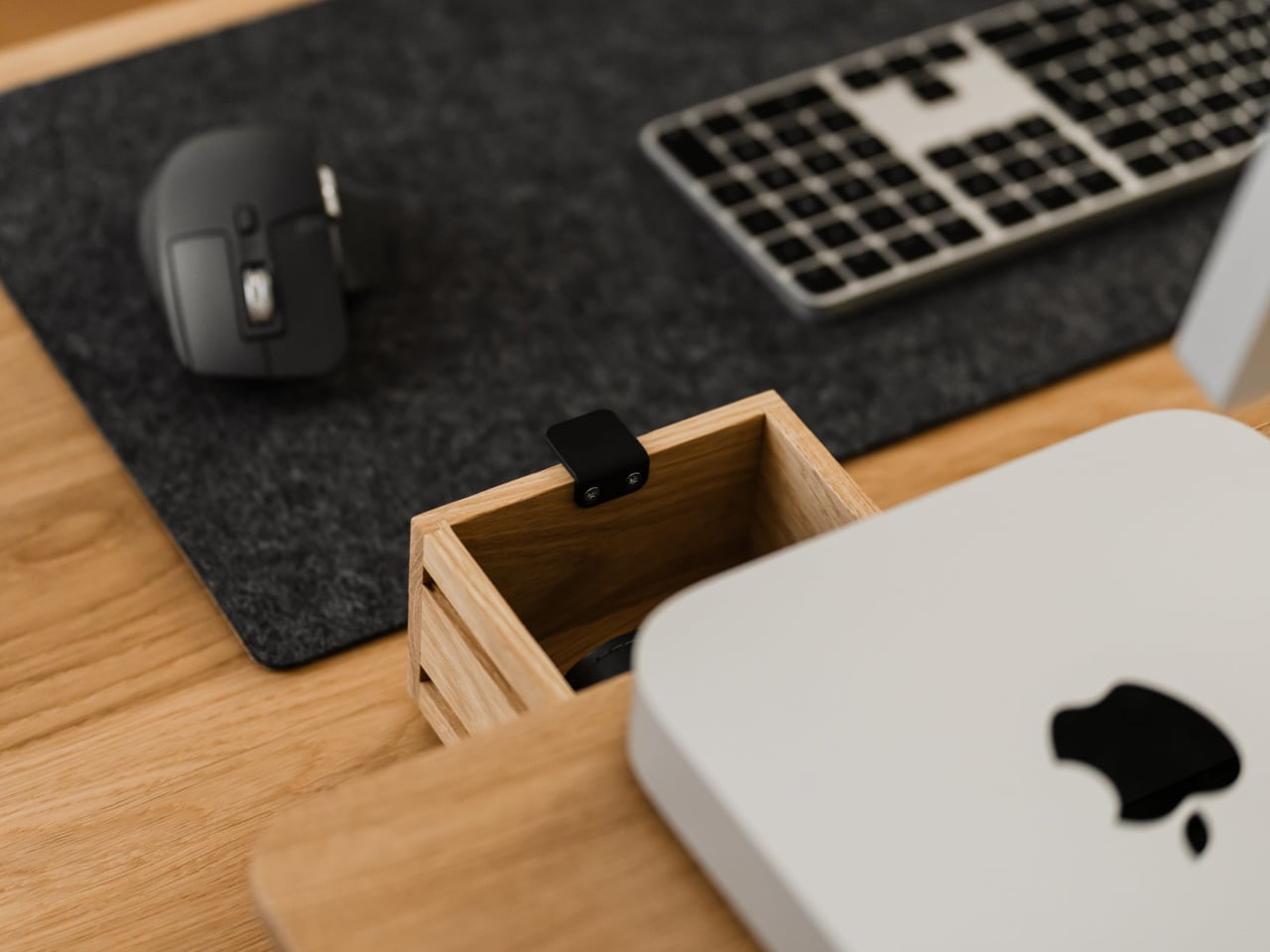
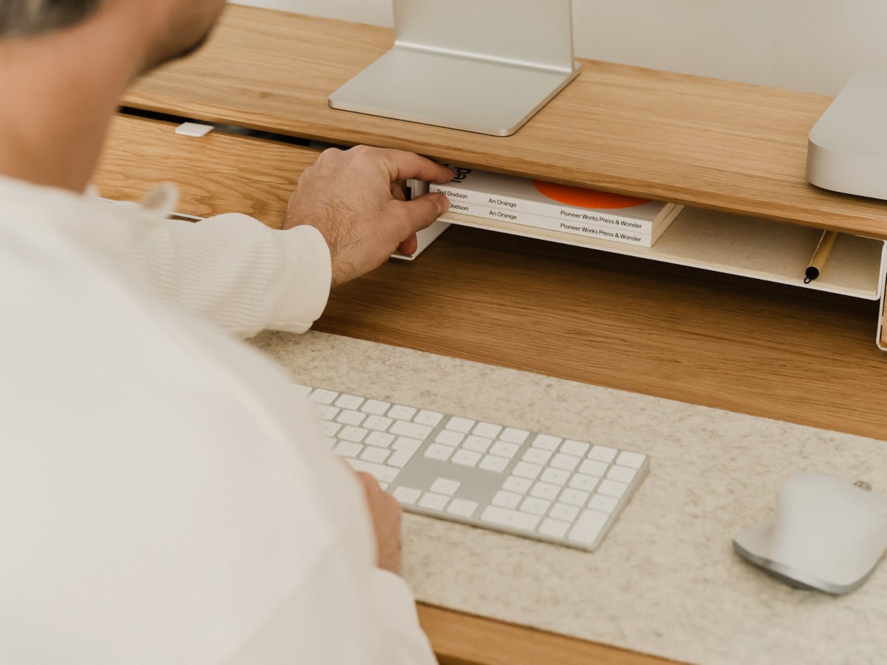
Storage splits between one or two solid-wood drawers built into the leg modules and an open shelf running between them. The drawers swallow stationery, notebooks, and small tech, keeping the desktop clear. The open shelf is lined with merino wool felt, which protects tablets, trackpads, or a closed laptop from scratches and adds a soft, tactile layer that contrasts with the wood and steel.

1

Oakywood contrasts solid wood against plastic laminate, highlighting warm, unique grain versus uniform texture, durability that improves with age versus chipping and peeling, and the ability to refresh the surface with natural oils instead of replacing it. The felt is OEKO-TEX-certified merino wool, and the legs are powder-coated steel, so every major component is designed to last and age gracefully instead of ending up replaced after a few years.

The shelf comes in oak for a lighter Scandinavian look, walnut for a richer studio vibe, or black-stained oak for a more dramatic setup. You can choose single or dual drawers depending on how much you like to hide, and black or white legs to match your hardware. It works equally well on a sit-stand desk or a fixed one, anchoring everything from a minimalist Mac setup to a more eclectic creative workstation.

Desk Shelf Pro changes the feeling of sitting down to work. Instead of a scatter of objects, you get a clear plane of wood with a monitor, a few intentional items, and everything else tucked away but within reach. For people who spend all day at a desk, the combination of solid materials, hidden storage, and quiet ergonomics makes a case for treating a monitor riser as real furniture, something worth keeping for years instead of replacing when the next cheap organizer trend arrives.

The post Oakywood Desk Shelf Pro Holds 100kg and Hides Clutter in Wood Drawers first appeared on Yanko Design.
This Doughnut Chair Has One Bite Missing, and That’s Your Seat

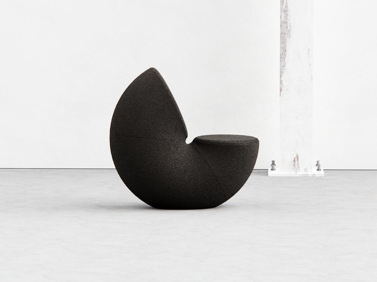
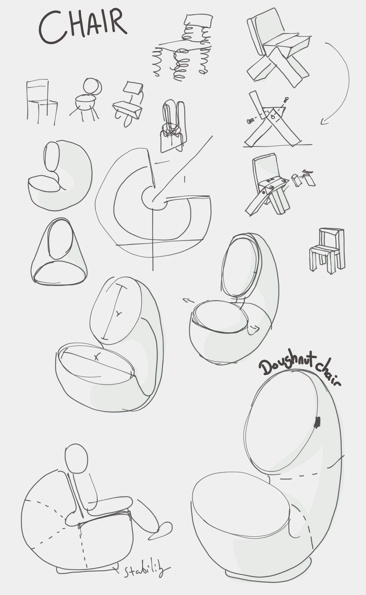
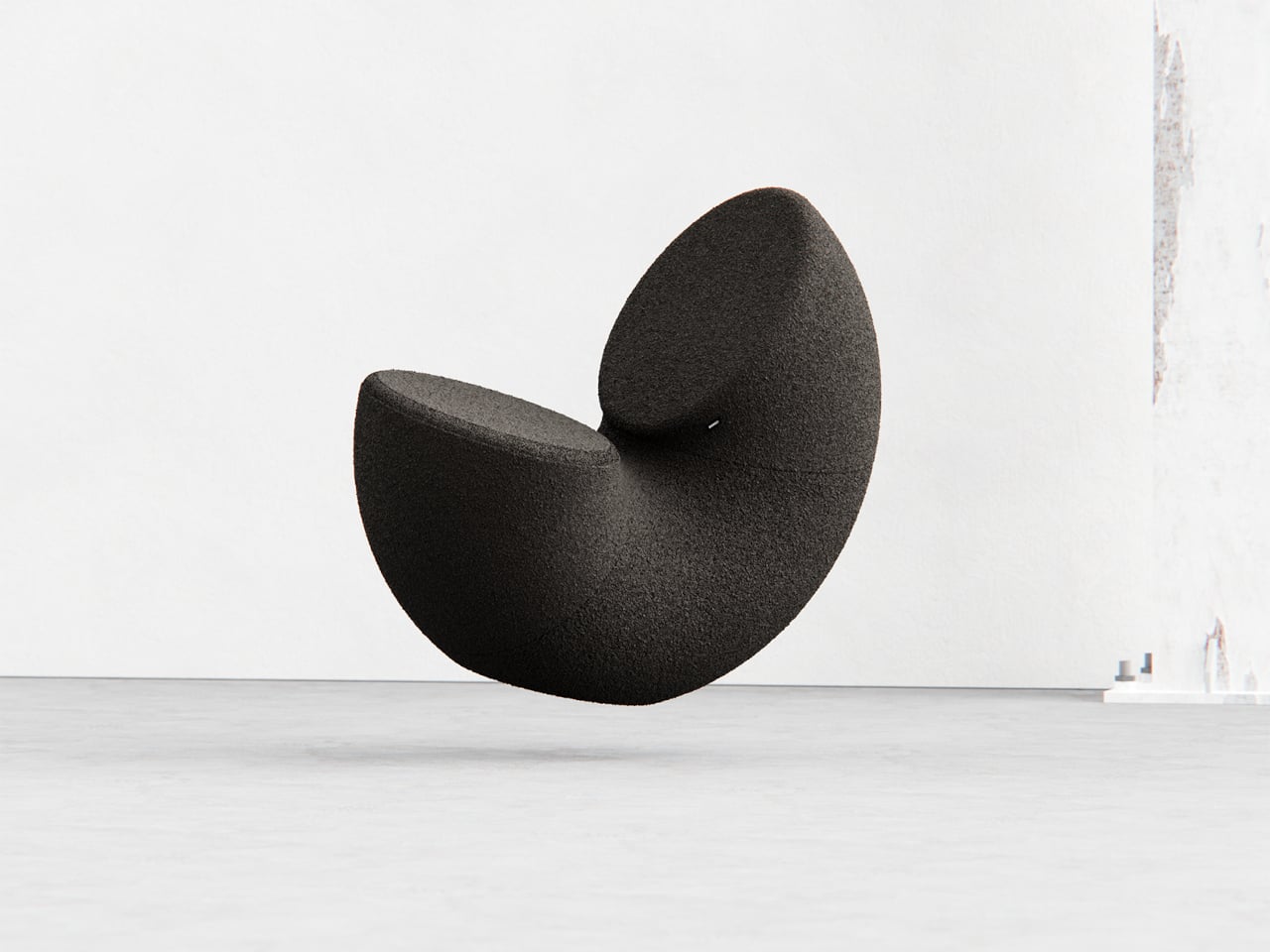
Most chairs are clearly assembled objects, with legs, a seat, and a backrest, all stacked and joined together. Sculptural lounge pieces sometimes flip that script and feel more like a single volume that has been carved or sliced. Chunk is a concept that leans into that second approach, imagining seating as a doughnut with a bite taken out rather than a frame with cushions bolted on, treating furniture as something you edit rather than assemble.

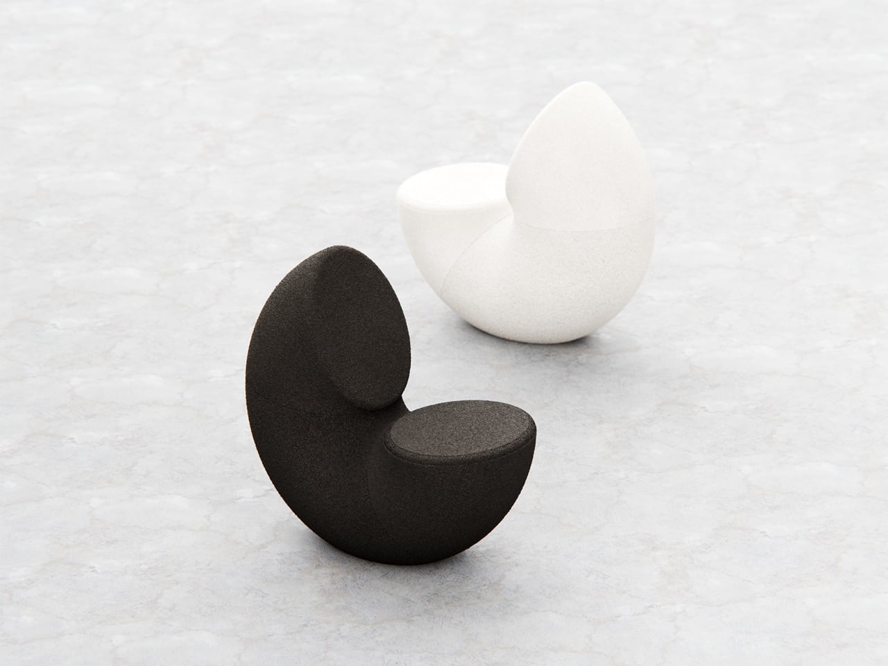
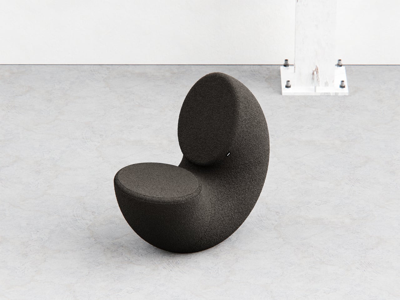
The designer imagined a chair that looks like a doughnut with a chunk removed. The missing piece becomes the seat and the opening for the backrest, while the rest of the ring wraps around in a continuous loop. The concept is less about novelty and more about seeing how far a single looping form can be pushed into something you can actually sit in, where the absence of material defines the place for the body.

Designer: Liam de la Bedoyere

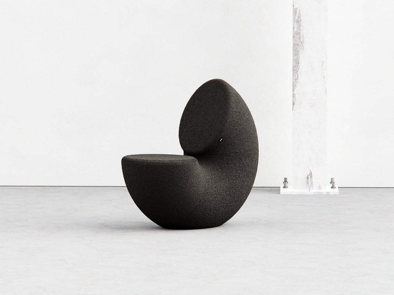
Both the seat and backrest share the same oval cross-section, but as the base curves up to become the backrest, that oval quietly swaps its length and width. It is wide and low where you sit, then gradually becomes tall and narrow as it rises behind you. The section never breaks; it just morphs along the path, which gives the chair a sense of motion even when it is still and empty.

The “bite” creates a bowl-like seat that cradles the hips and thighs, while the rising loop offers a relaxed backrest rather than a rigid upright. The proportions suggest a low, lounge-style posture, closer to a reading chair or a corner piece in a living room than a dining chair. The continuous curve encourages you to lean back and sink in, not perch on the edge ready to stand again.

A near-cylindrical form can look like it might roll away, but the geometry and internal structure are tuned to keep the center of gravity low and slightly behind the seat. The base is subtly flattened, and a denser core at the bottom would keep it from tipping forward when someone leans back. The result is a chair that looks precarious from some angles but behaves like a grounded lounge piece once you sit.

The monolithic upholstery, a textured fabric that wraps the entire volume without obvious breaks, reinforces the idea of a single chunk of material. The form reads differently as you move around it, sometimes like a shell, sometimes like a curled leaf, sometimes like a coiled creature. It is the kind of chair that anchors a corner or gallery-like space, inviting you to walk around it before you decide to sit down and settle in.

Chunk uses subtraction as its main design move, starting from a complete ring and then removing just enough to create a place for the body. For a category that often defaults to adding parts, there is something satisfying about a chair that feels like it has been edited down to a single, looping gesture, with one decisive bite turning an abstract volume into a place to rest, read, or just sink into for a while.

The post This Doughnut Chair Has One Bite Missing, and That’s Your Seat first appeared on Yanko Design.

Tom Black Carves Travertine Tables That Look Like They’re Floating

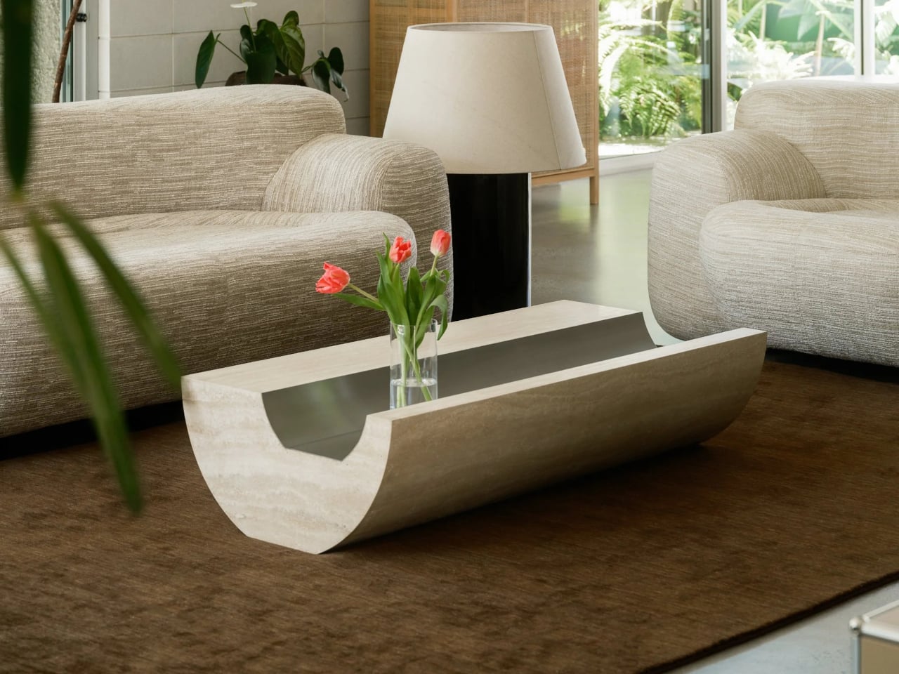
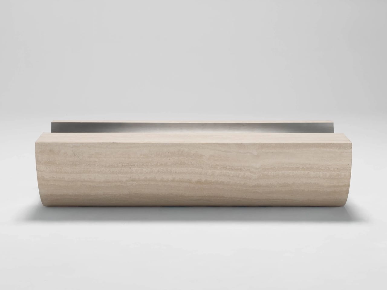
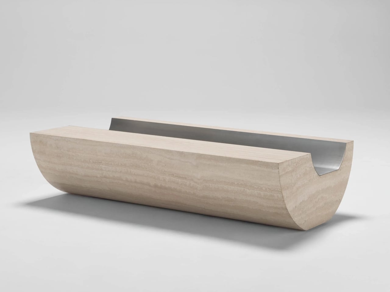
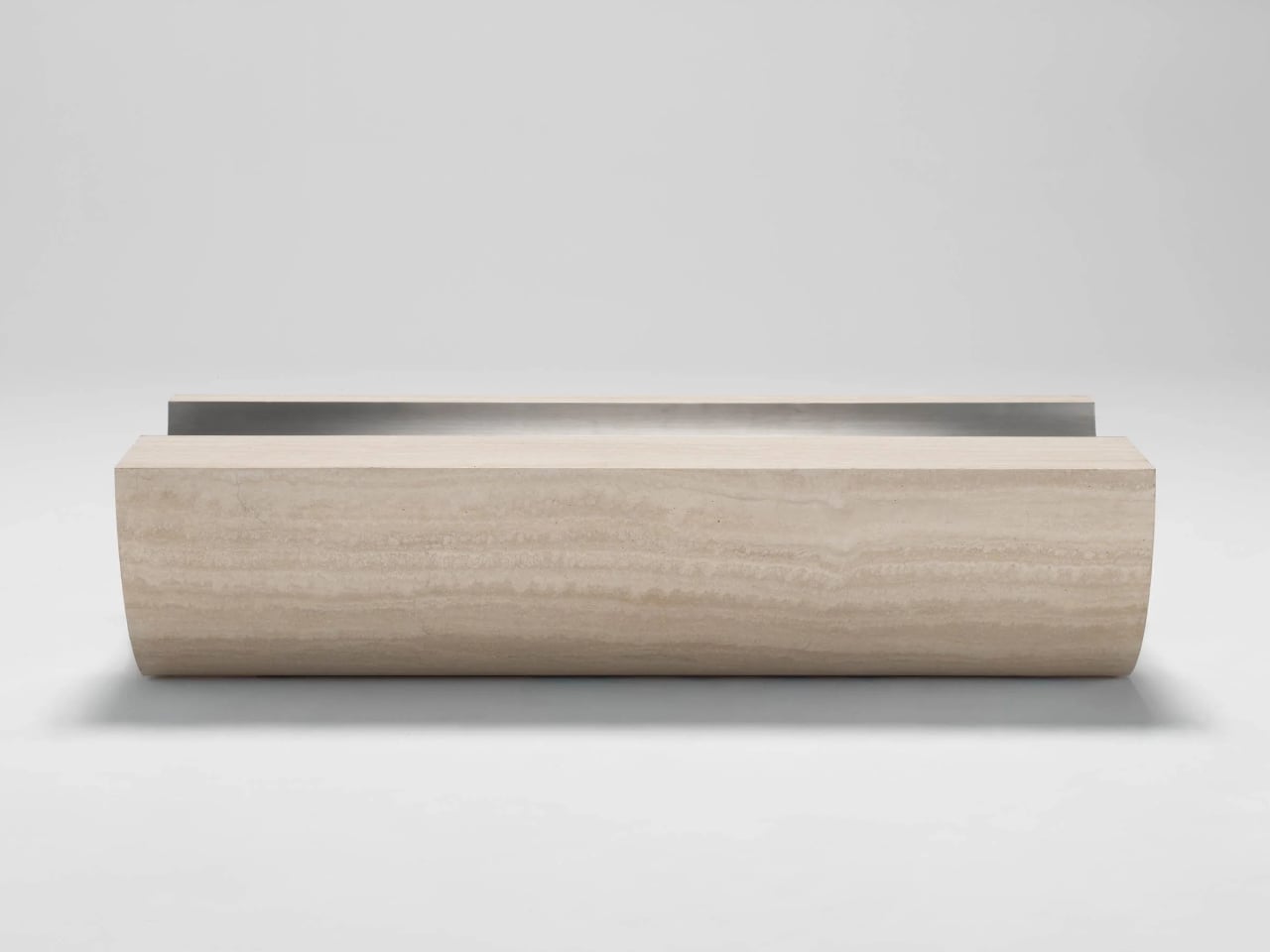
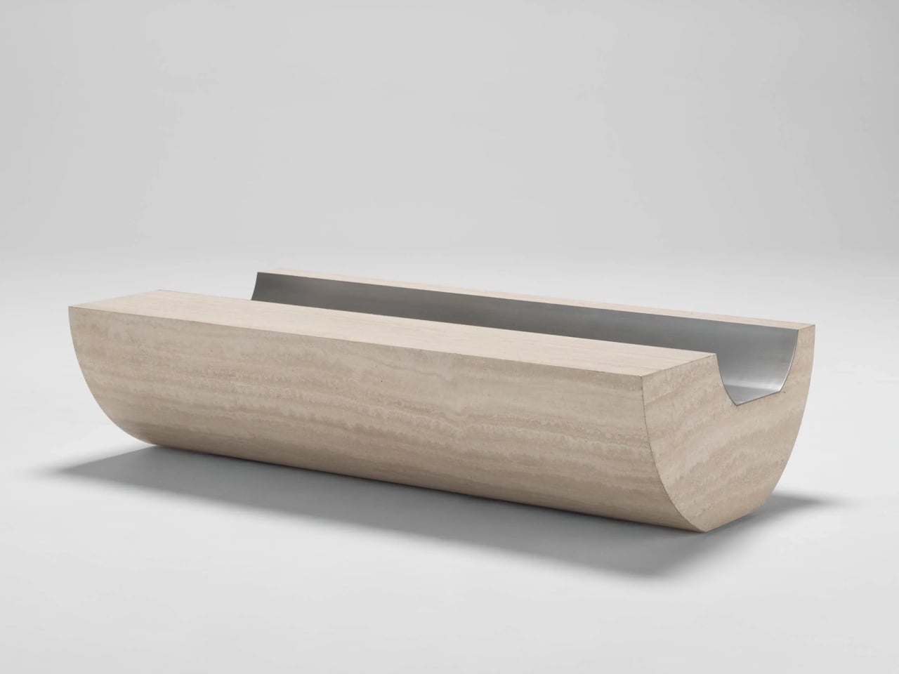
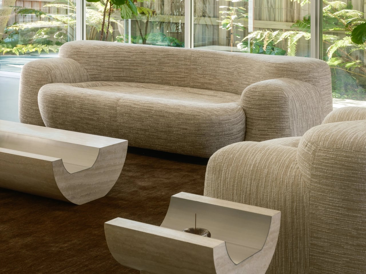
Stone coffee tables often default to simple slabs or blocks, heavy objects that sit on the floor and announce their weight. More interesting pieces treat stone as something to carve and balance, not just to drop into a room. Coffee Table 01 and Side Table 01 by Tom Black lean into that second approach, using one curved gesture to make Italian travertine feel lighter, paired with a contrasting metal inlay that turns solid into void.

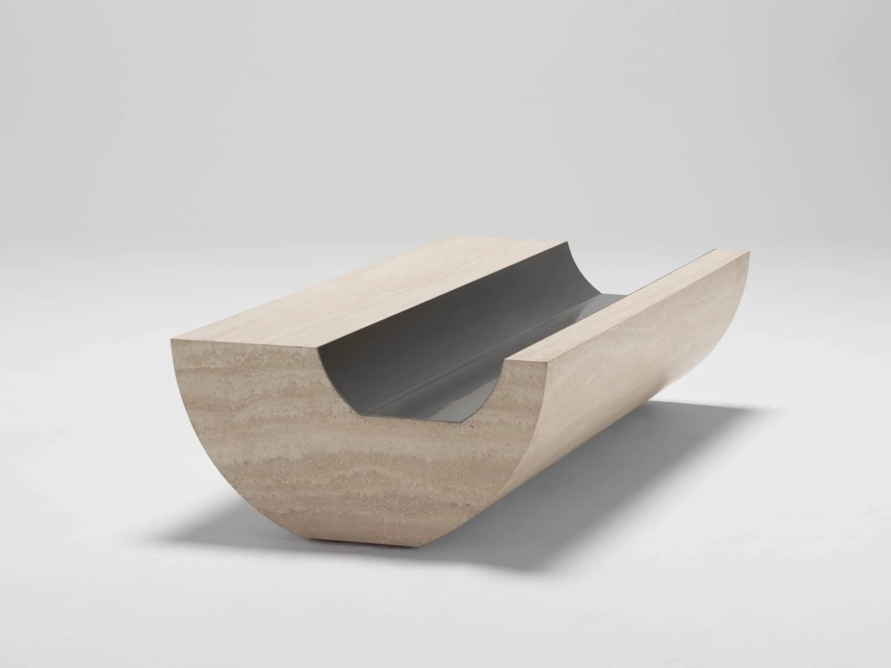
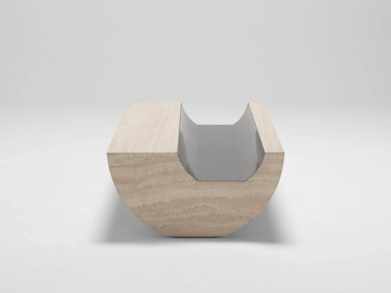
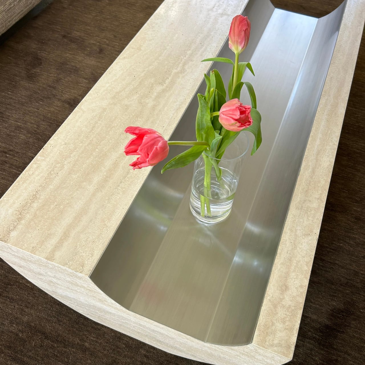
Coffee Table 01 is an exploration of form with a classic Italian materiality, carved from travertine with a soft curvature to the underside that gives a sense of floating and elevation. The top is not a flat slab, but a long trough lined with brushed metal, and this inverse layering of a metal finish into stone sets up a contrast in both finish and form, cool against warm, reflective against matte.

Designer: Tom Black

The underside curve lifts the edges off the floor so the table reads as a solid volume that barely touches the ground. The concave channel on top mirrors that curve, turning the center into a controlled void rather than a flat surface. The metal inlay sharpens that void, catching light differently from the travertine and making the negative space feel as intentional as the stone around it, a second reading of the same carved gesture.

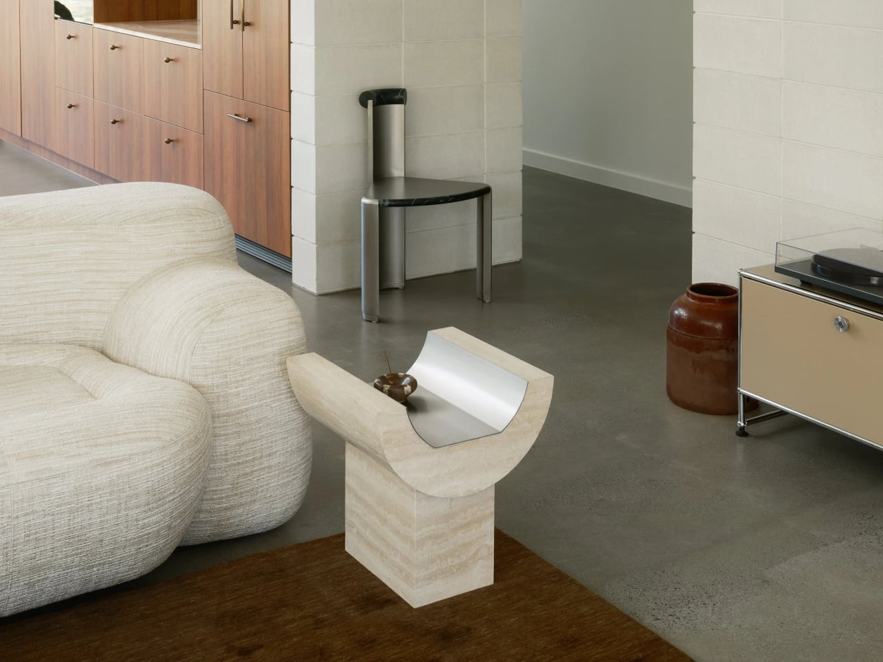
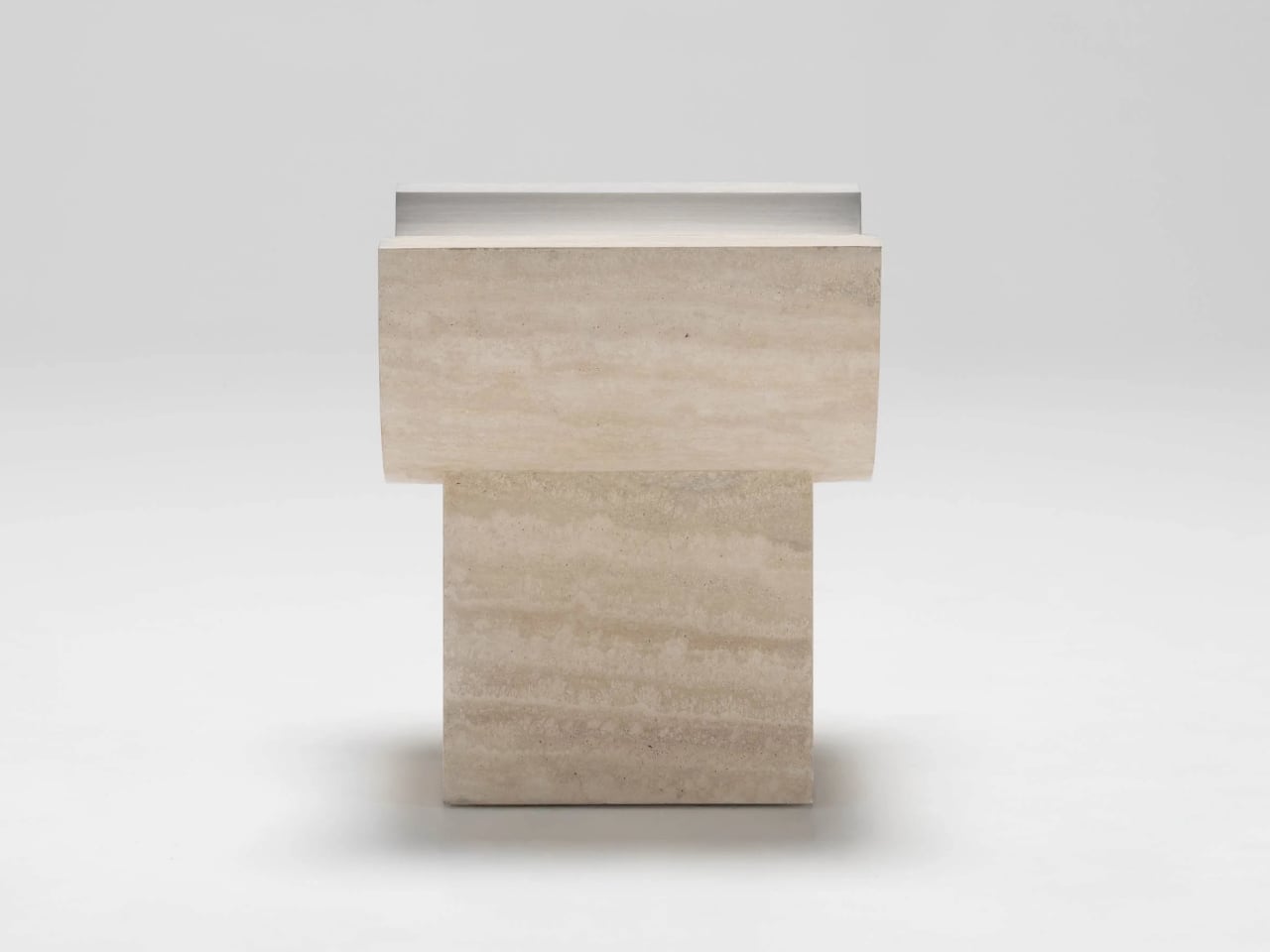
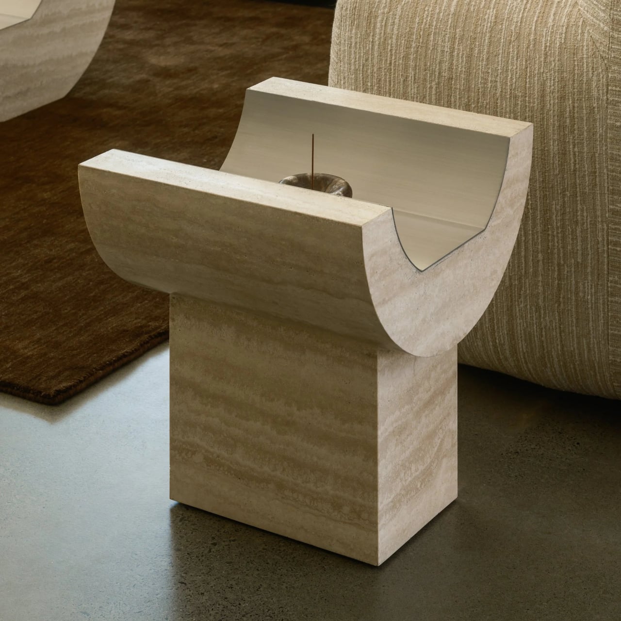
Side Table 01 is designed as the partner to Coffee Table 01 that can also stand alone. It shares the same exploration of form and material but takes a different approach to curvature. Instead of resting directly on the floor, the curved upper element sits on a rectangular base, and that base is what highlights the juxtaposition between curve and block, between the flowing top and the grounded plinth beneath.

The side table effectively rotates the coffee table’s gesture into a more vertical, totem-like object. The travertine trough becomes shorter and more upright, while the rectangular base grounds it. The relationship between the two parts, curved top and rectilinear plinth, makes the piece read as a small monument, echoing the coffee table’s floating mass but with a different emphasis in the room, more punctuation than sprawl.

The choice of Italian travertine brings a sense of permanence and architecture, with its horizontal veining and warm tone playing against the cool, brushed metal inlay. The stone offers classic materiality, while the metal introduces a precise, almost industrial note. Together, they feel less like a decorative veneer and more like a small section cut from a larger, imagined building, where structure and surface are the same thing.

Coffee Table 01 and Side Table 01 operate as a family. The coffee table stretches low and horizontal between seating, the side table stands as a vertical accent beside a sofa or chair, and both share the same carved gesture and material palette. For anyone who likes furniture that behaves like small pieces of architecture, these two feel like a quiet study in how far one curve can go when you pair it with the right material and the right inlay to make the mass feel like it might lift off the floor.

The post Tom Black Carves Travertine Tables That Look Like They’re Floating first appeared on Yanko Design.

Seoul’s ‘Wild Nature’ Just Inspired the Furniture Everyone Wants

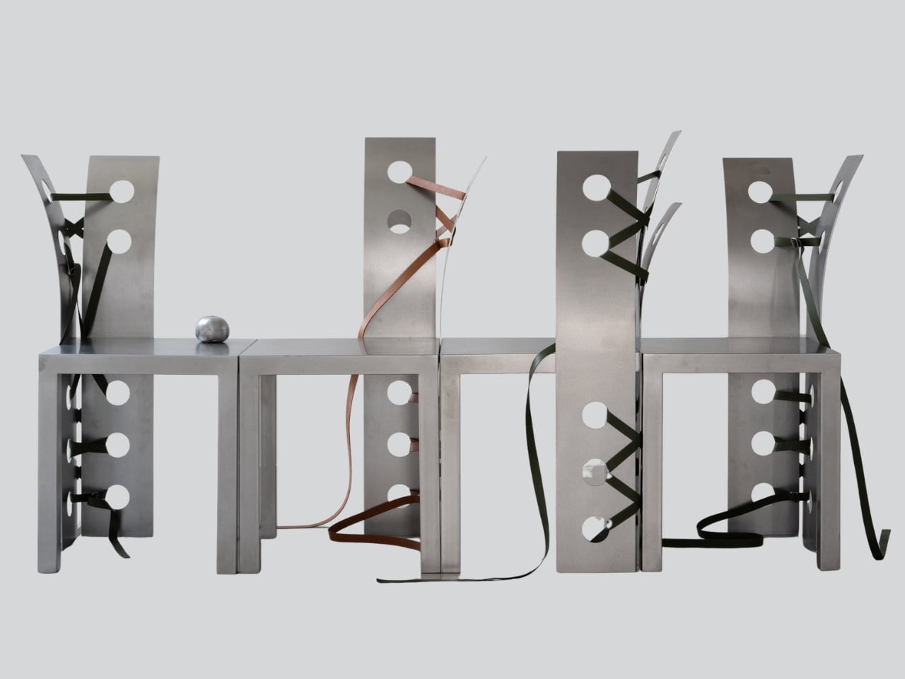
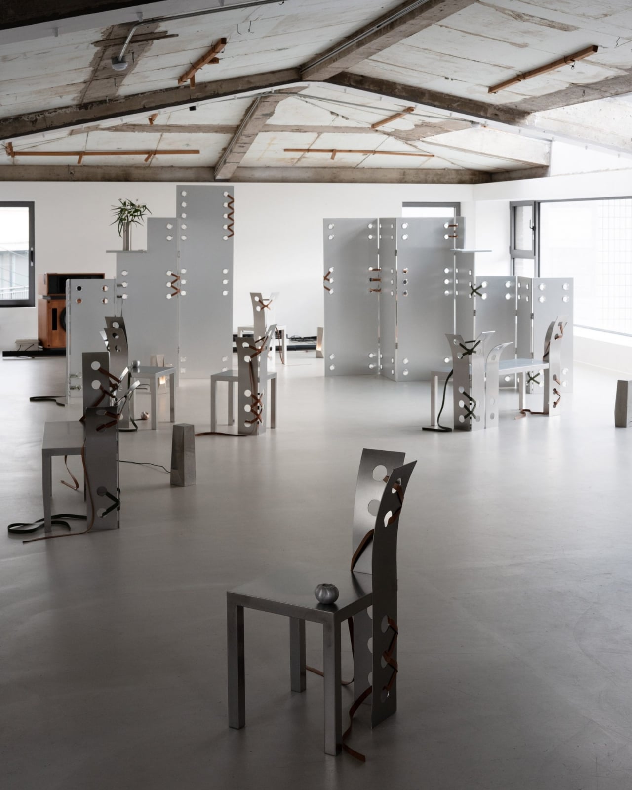
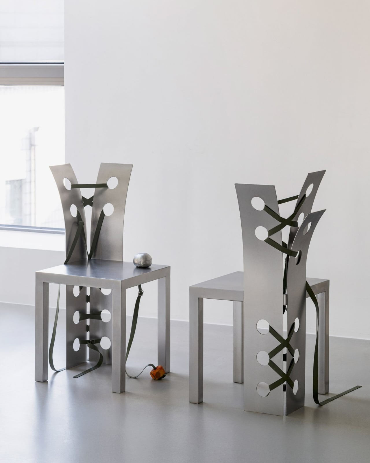
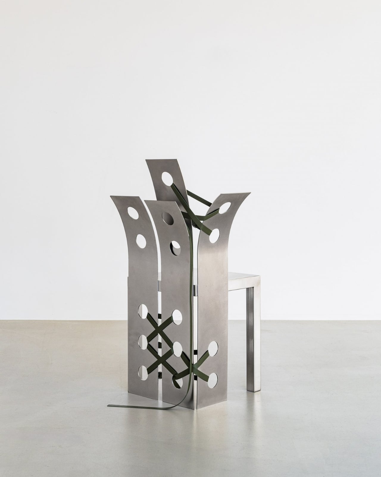
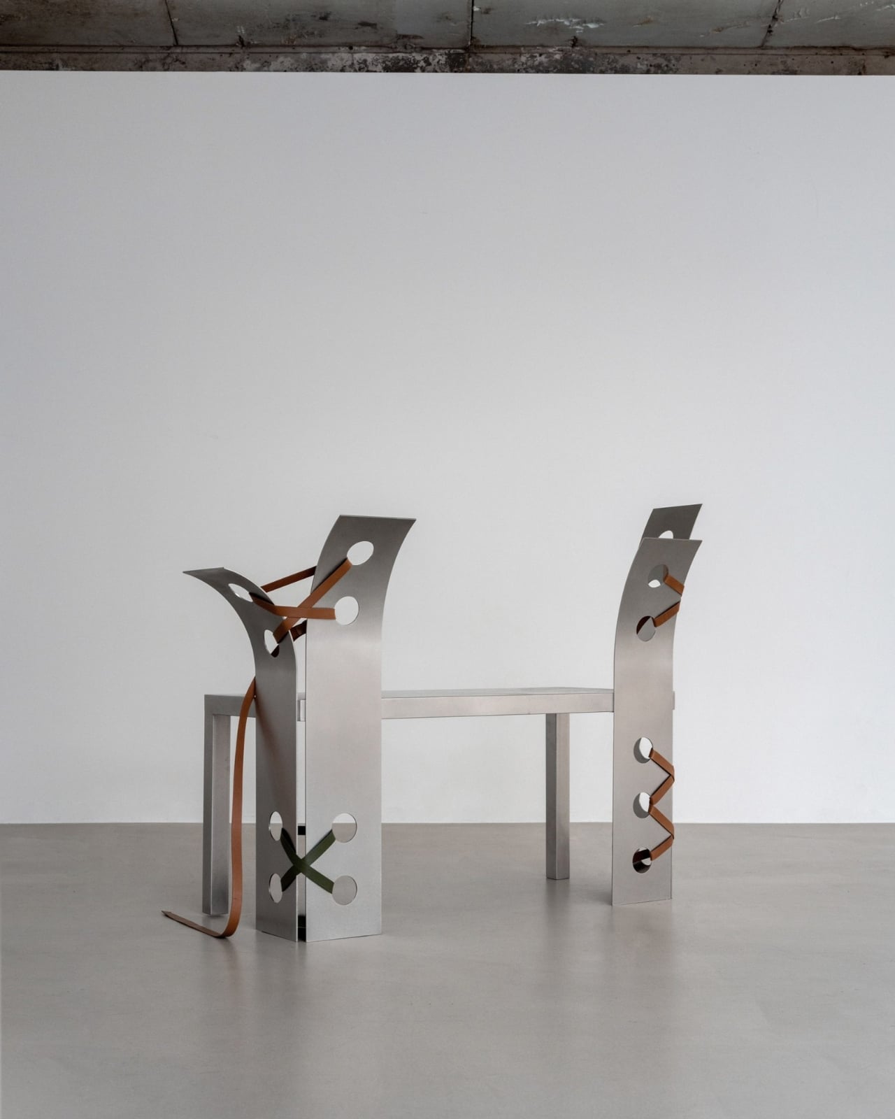
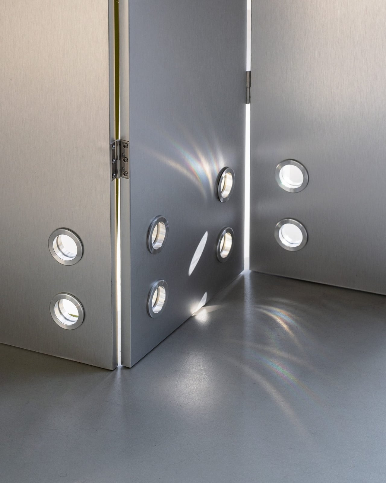
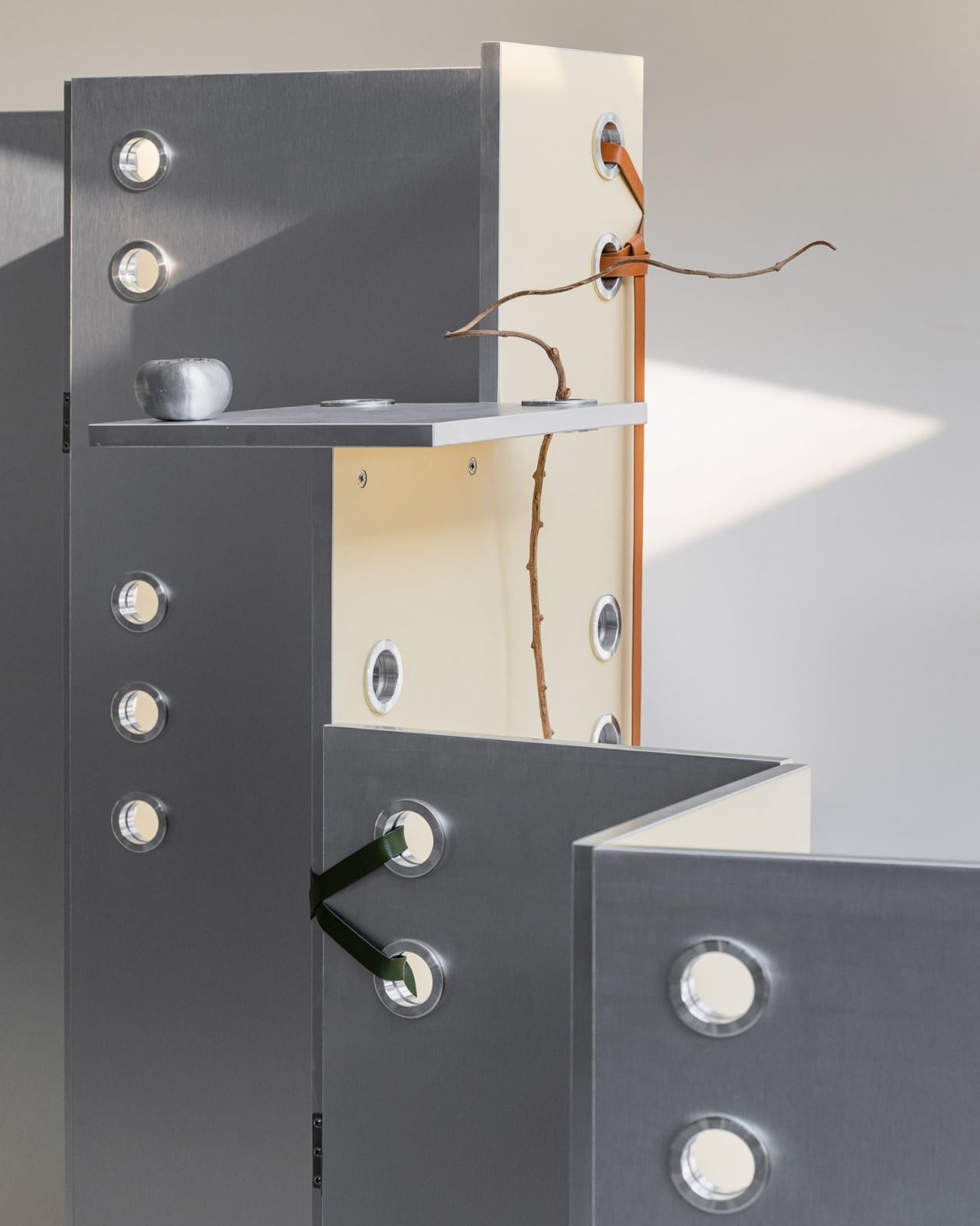
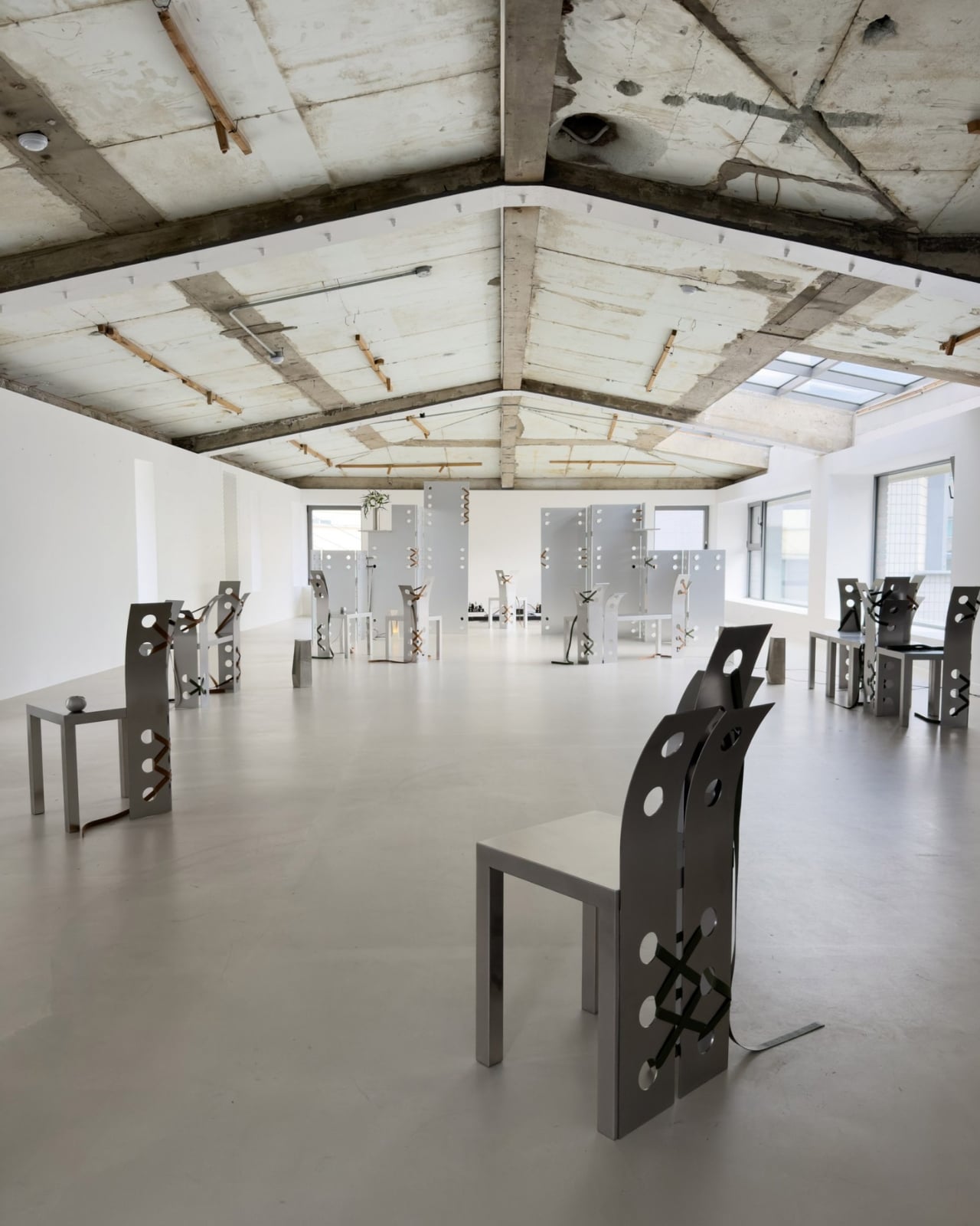
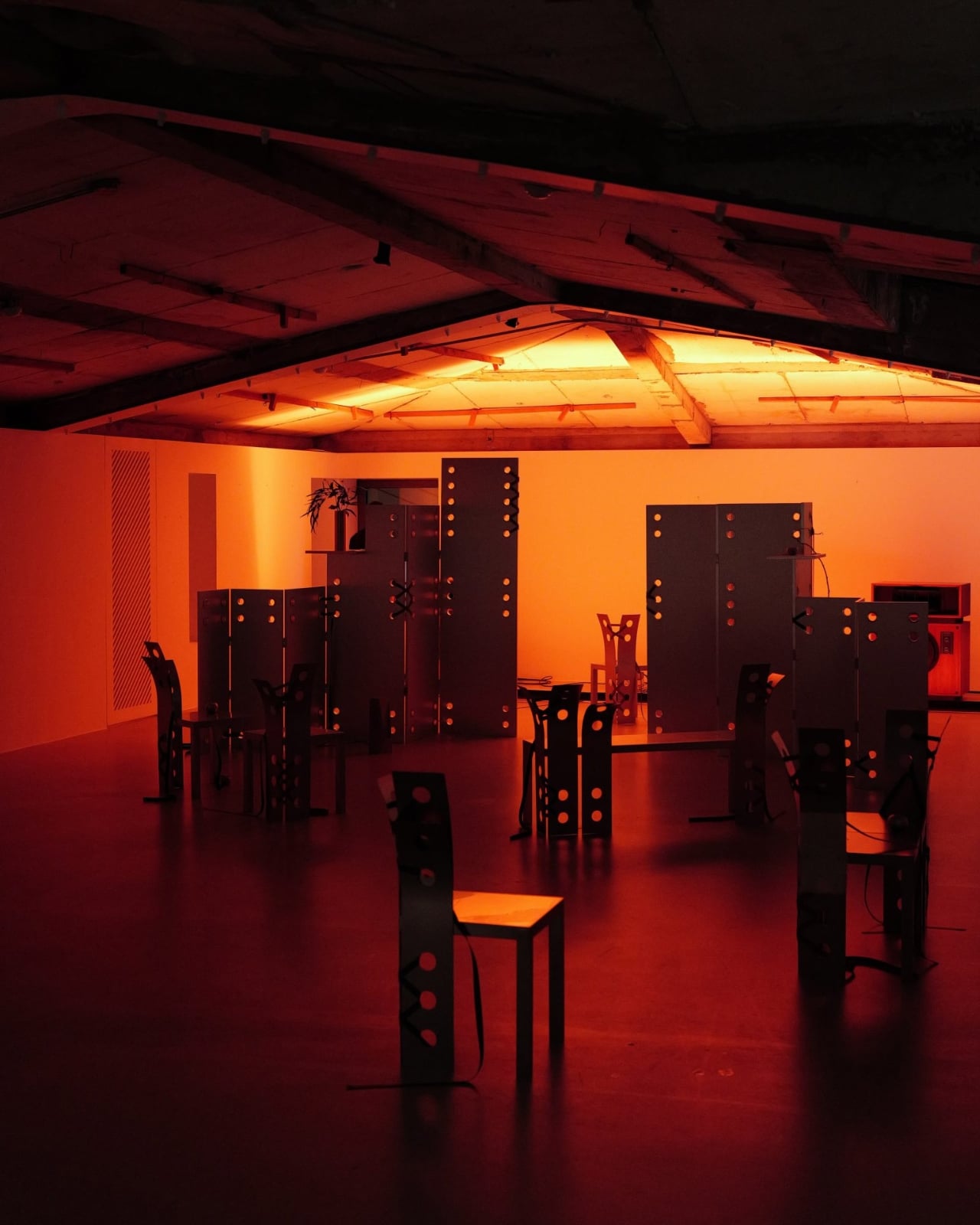
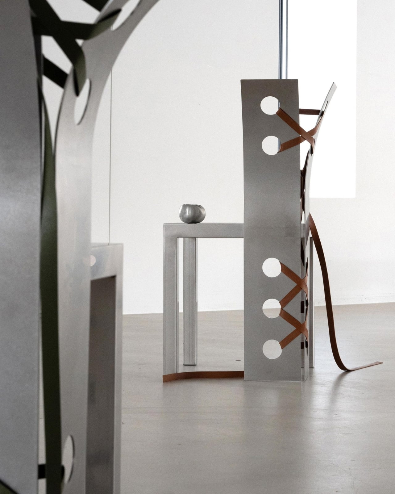
There’s something quietly rebellious about seeing delicate leather straps wrapped around cold, hard steel. It’s unexpected, a bit contradictory, and exactly what makes Nara Lee’s Pul collection so captivating. The Paris-based architect just unveiled this sculptural furniture series at The Sun Room exhibition in Seoul, and it’s turning heads for all the right reasons.

What strikes you first about these pieces isn’t just their minimalist beauty, but the story they tell about urban nature. Lee drew inspiration from what she calls Seoul’s “wild nature,” those moments when the organic world refuses to be contained by concrete and glass. Think weeds breaking through sidewalk cracks, vines climbing up apartment buildings, or wildflowers blooming in forgotten corners. It’s nature being stubborn and beautiful in places it technically shouldn’t exist.

Designer: Nara Lee

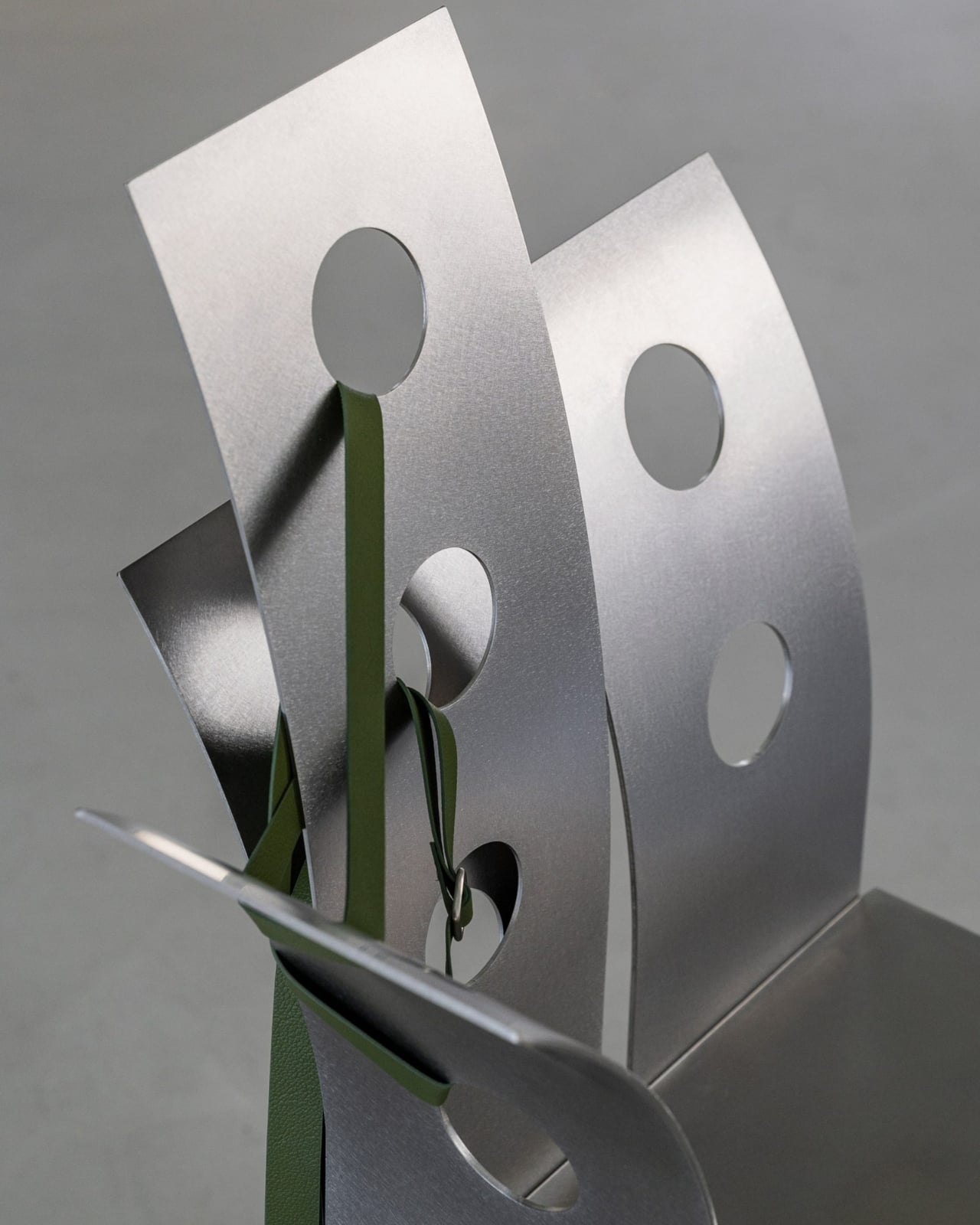
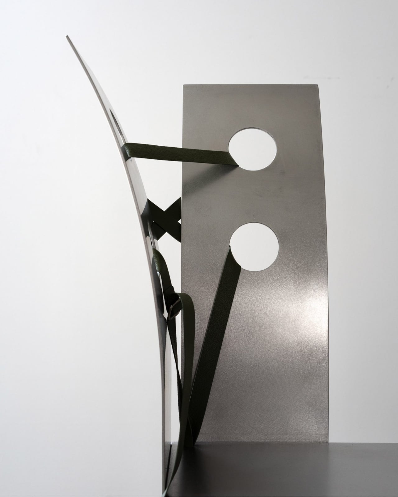
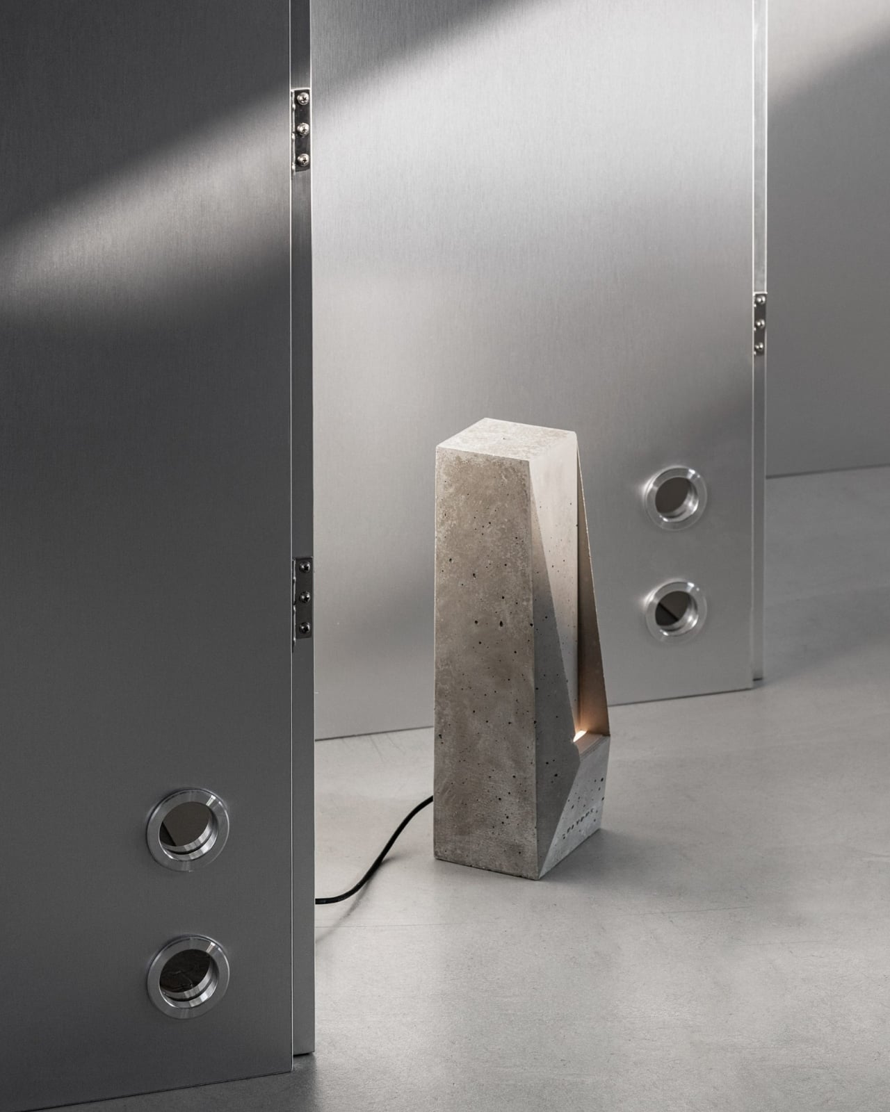
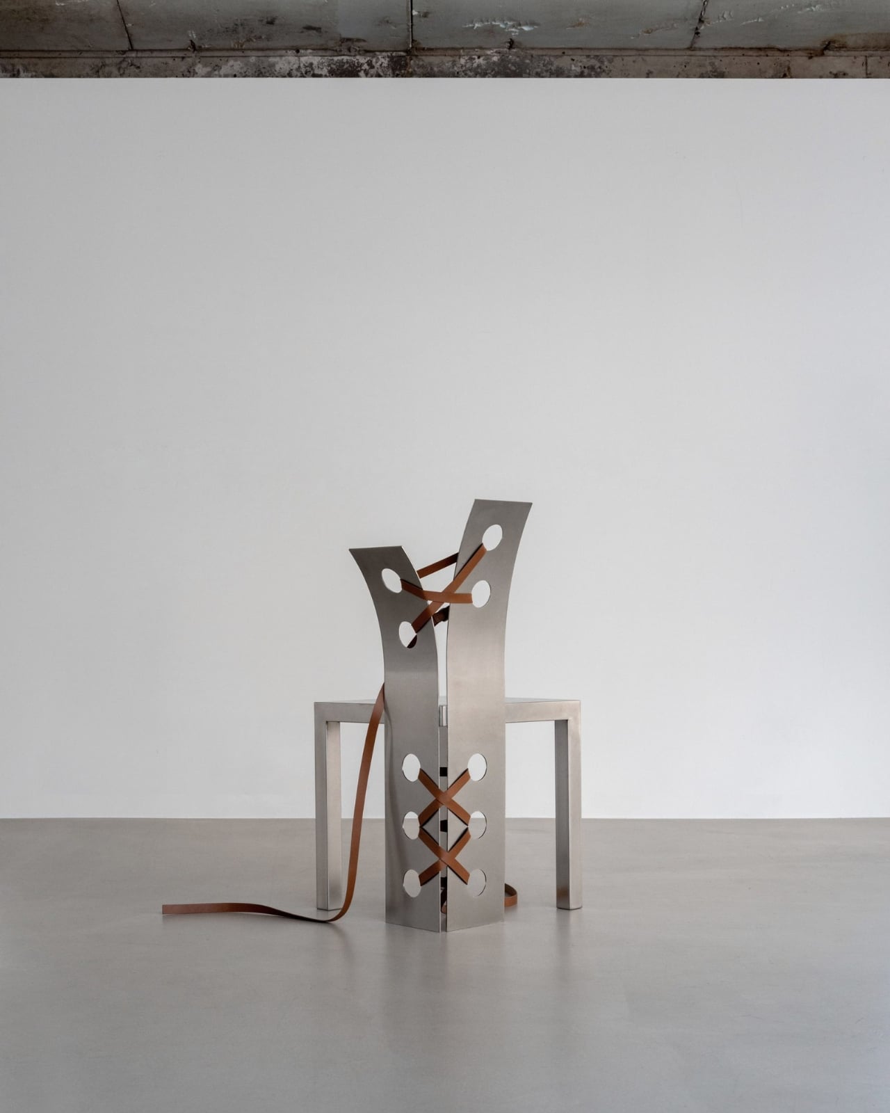
The Pul collection channels this tension between the rigid and the organic through its material choices. Stainless steel provides the structure, all clean geometric lines and industrial precision. But then there are those leather ties that seem to hold everything together, adding warmth and tactility to pieces that could have been austere. The chairs are particularly striking, with backs that bend backwards in ways that feel both sculptural and functional.

What Lee has done here is create furniture that lives in the space between art object and everyday utility. These aren’t pieces that disappear into a room. They command attention, make statements, and start conversations. Yet they’re still fundamentally chairs, tables, and functional objects meant to be used rather than just admired from a distance.

The process behind the collection is just as interesting as the finished products. Lee combines industrial metalworking with traditional hand-crafted techniques, bringing together two worlds that don’t usually share space. The stainless steel gets precision-cut and welded using modern manufacturing methods, while the leather components require old-school craftsmanship and careful hand-stitching. It’s this marriage of high-tech and handmade that gives each piece its unique character.

There’s also something to be said about Lee’s choice to debut this collection in Seoul rather than in Paris, where she’s based. It feels intentional, like coming full circle with inspiration. The city that sparked the concept gets to see its wild nature reflected back through these striking furniture pieces. It’s a love letter to Seoul’s particular brand of urban beauty, where modernity and nature negotiate their coexistence daily.

The sculptural quality of the Pul collection places it firmly in that growing category of design that refuses to pick a lane between art and function. These are pieces that would look equally at home in a contemporary art gallery or a stylishly minimalist living room. That versatility is part of their appeal. They’re conversation starters that also happen to be incredibly practical. What makes this collection feel particularly relevant right now is its exploration of contrast. We’re living in an era obsessed with binaries and either-or thinking, but Lee’s work suggests there’s beauty in bringing opposites together. Hard and soft, industrial and organic, precise and imperfect. The Pul collection doesn’t try to reconcile these differences so much as celebrate them.

For anyone interested in where contemporary design is heading, the Pul collection offers some compelling hints. There’s a growing appetite for pieces that tell stories, that reference their cultural contexts, and that don’t sacrifice artistic vision for mass appeal. Lee’s work checks all those boxes while still maintaining a clean, approachable aesthetic that doesn’t require a degree in design theory to appreciate.

The leather straps aren’t just decorative elements or structural necessities. They’re the collection’s way of softening steel’s edge, of adding human warmth to industrial coolness. They represent the hand-crafted in conversation with the machine-made, the traditional meeting the contemporary. In a world increasingly dominated by algorithmic precision and mass production, there’s something refreshing about furniture that proudly shows the marks of human touch alongside industrial fabrication.

Nara Lee’s Pul collection proves that furniture can be more than just functional objects. It can be commentary, poetry, and practical seating all at once. And sometimes, the most interesting design happens when you let contradictions coexist rather than trying to resolve them.

The post Seoul’s ‘Wild Nature’ Just Inspired the Furniture Everyone Wants first appeared on Yanko Design.
Ottagono Packs a Full Workout into a Luminous Octagonal Column

Home gyms have become unavoidable lately, creeping into corners with smart mirrors bolted to walls, fold‑out benches wedged behind sofas, and dumbbells scattered under coffee tables. Apartments keep shrinking, hotel suites need to multitask, and most fitness gear still looks like fitness gear rather than furniture. Even the sleekest mirror can’t pretend it belongs next to a credenza when a countdown timer starts blinking, and someone begins doing burpees in the reflection.

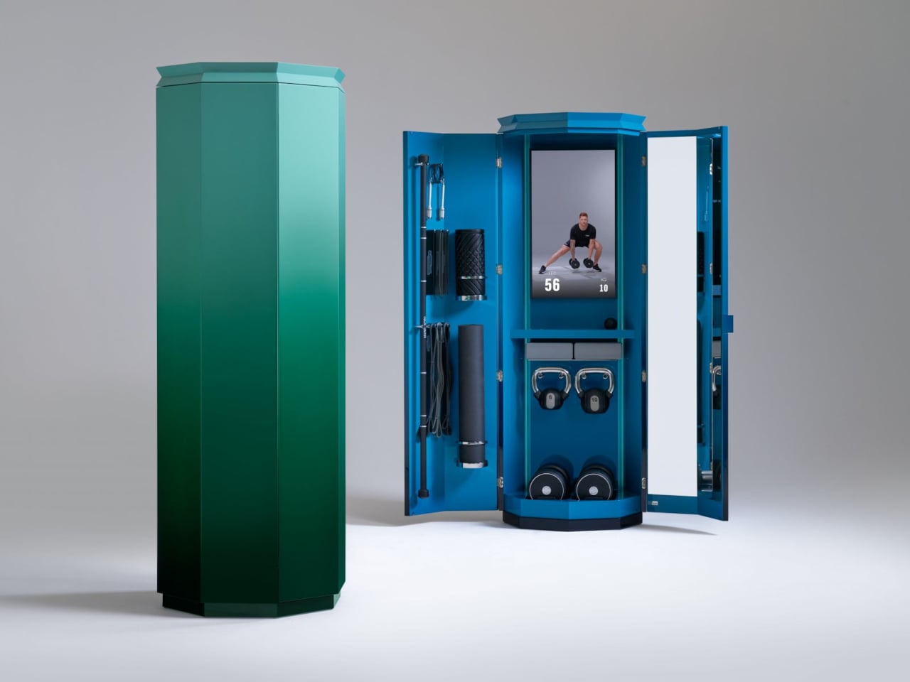
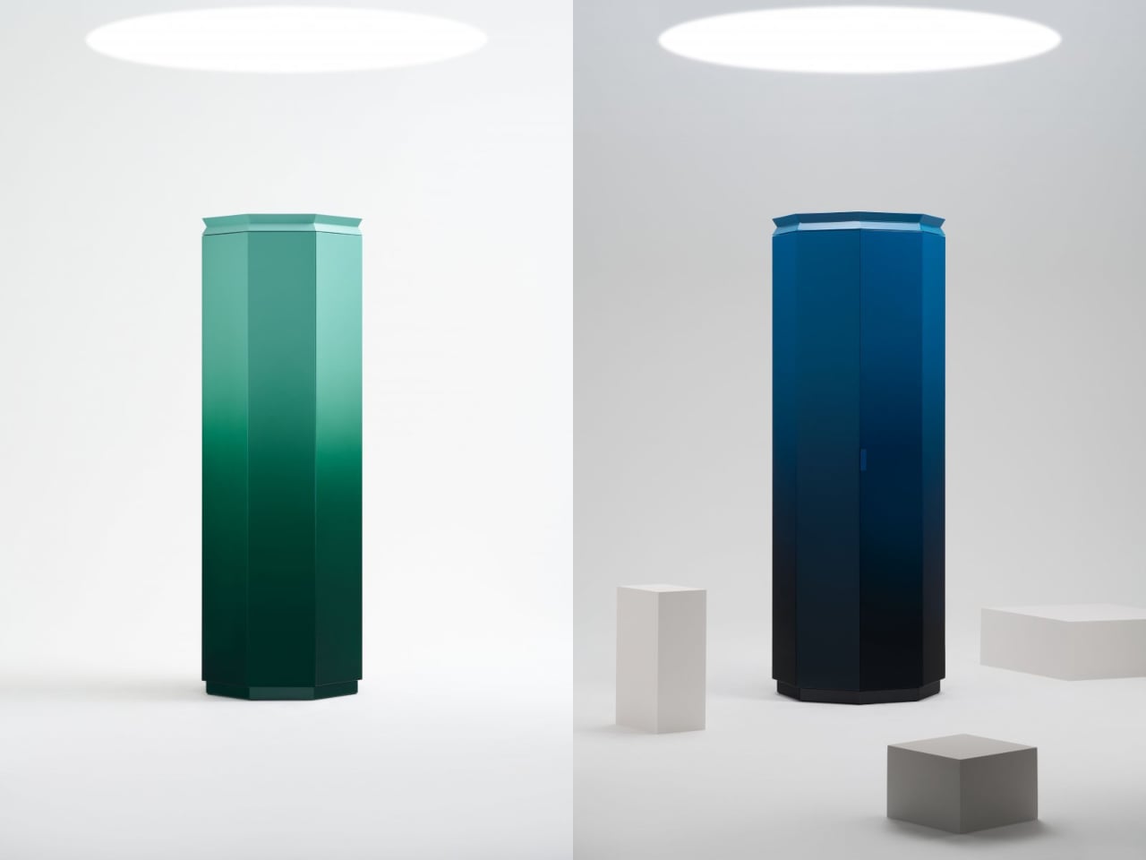
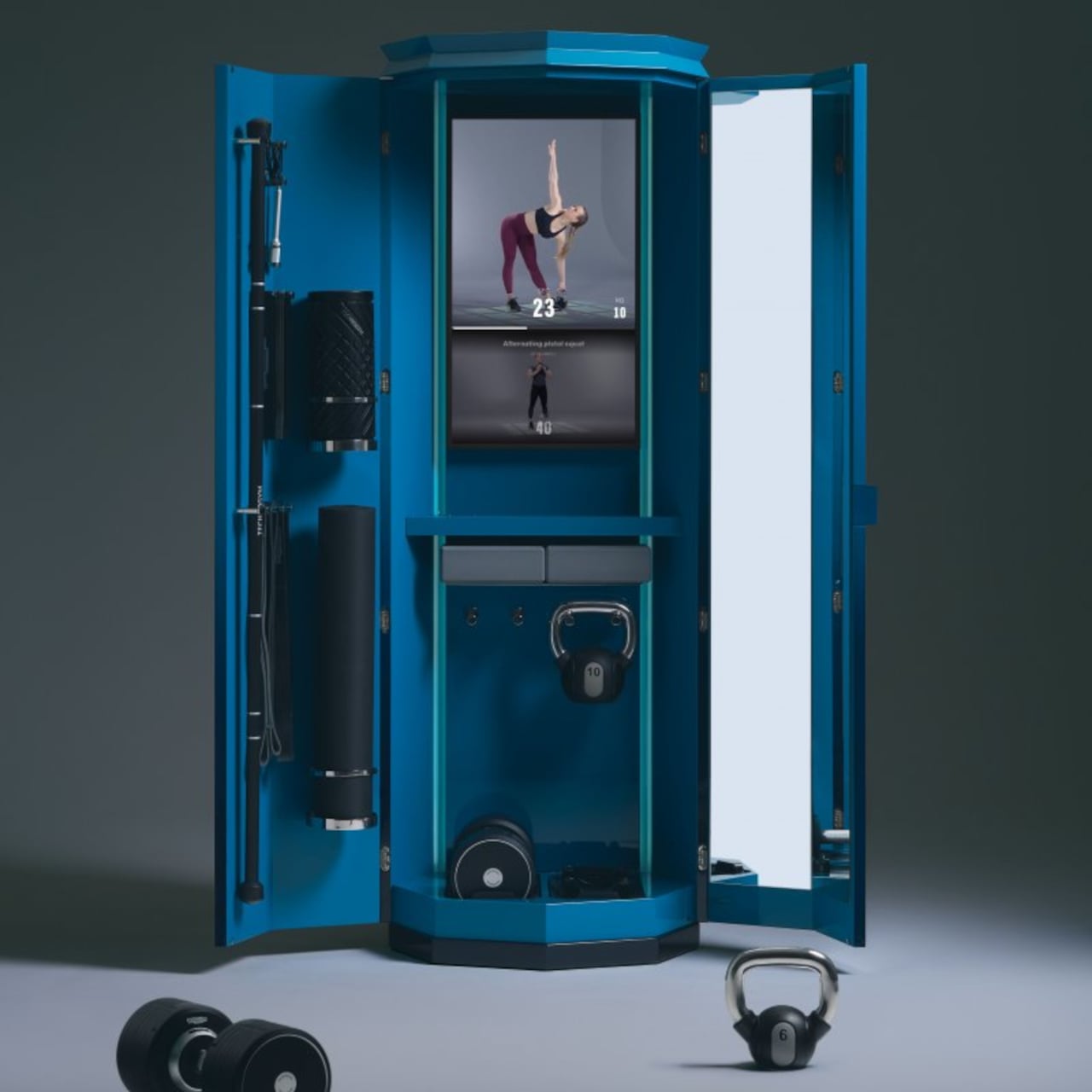
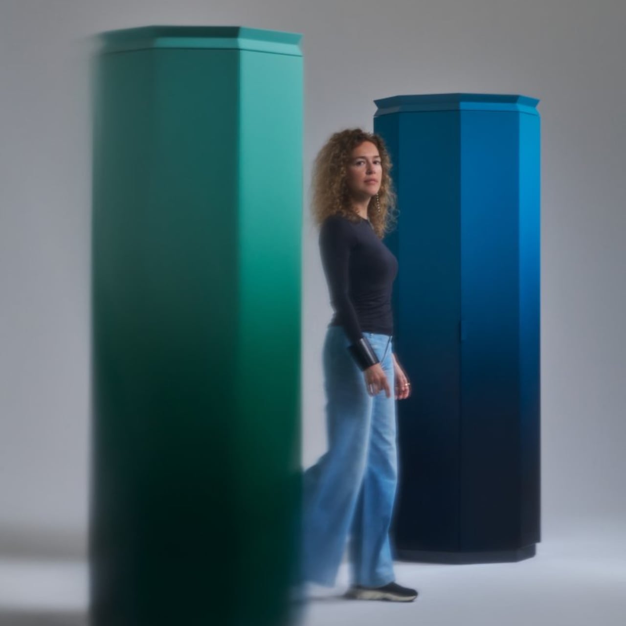
Ottagono by architect Giulia Foscari for Cassina Custom Interiors offers a different answer. It looks like a tall octagonal column, occupies less than one square meter, and hides a complete Technogym-powered workout behind faceted doors. Designed in collaboration with Technogym, it debuted during Milan Design Week and will be installed at Hotel du Cap Eden Roc in Antibes, positioning it squarely in the luxury hospitality world where space costs money and objects need to earn their floor area.

Designer: Giulia Foscari

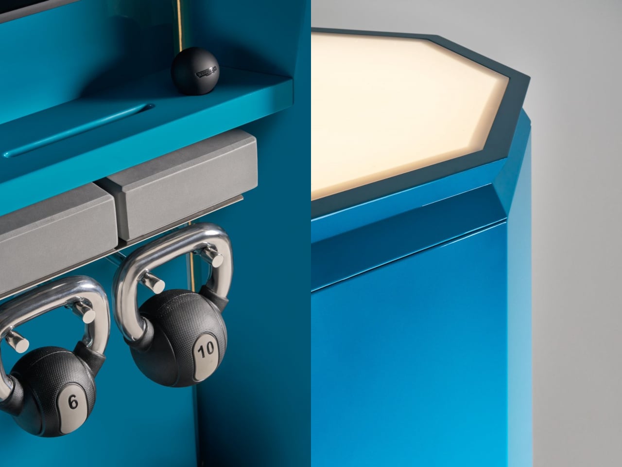
When closed, Ottagono reads like a sculptural floor lamp rather than a cabinet full of kettlebells. The exterior is finished in gradient tones, deep blue fading lighter toward the top or emerald green transitioning upward, with clean facets and minimal seams. At its summit, an integrated uplight washes the ceiling in soft ambient glow. In a living room or suite, it sits quietly under that halo, looking more like art than utility, which seems to be exactly what Foscari and Cassina intended.

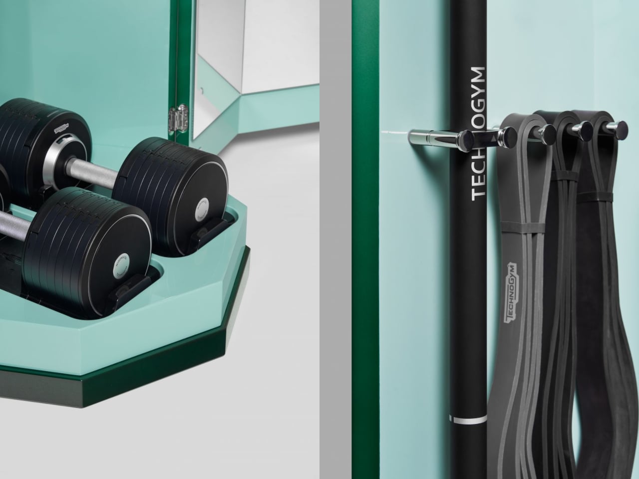
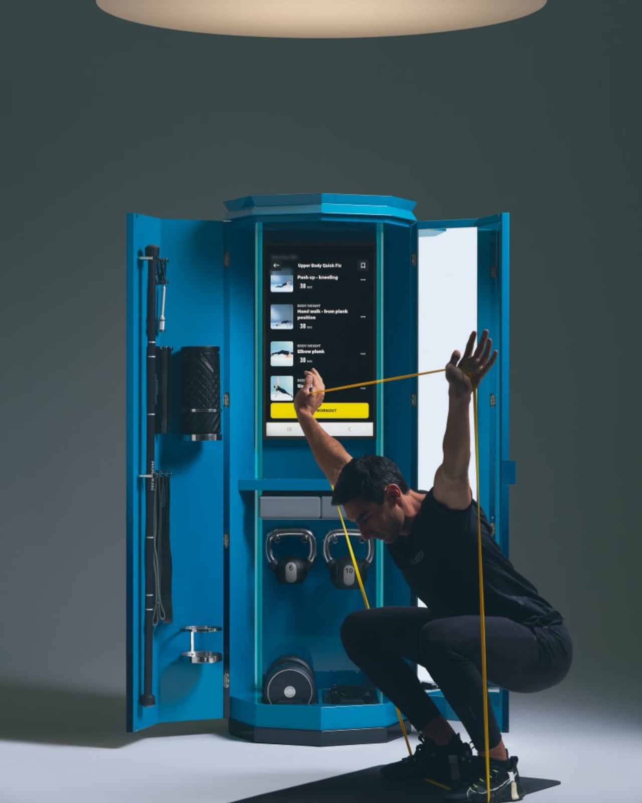
Open the doors, and the mood shifts completely. The interior glows in bright turquoise, with a vertical screen at eye level streaming Technogym workouts and a mirror on one door for checking form. Adjustable dumbbells nestle into octagonal cradles at the base, kettlebells hang on polished hooks, resistance bands drape from pegs, and a foam roller stands vertically alongside mobility balls. Foscari calls it “opening a room within a room,” which feels accurate because the inside genuinely reads like a micro gym carved from a single piece of furniture.

A typical session unfolds quickly. You roll out a mat, face the screen, and follow guided strength or mobility work using whatever equipment the program calls for, all stored within arm’s reach. When finished, everything returns to its slot, the doors swing shut, and the column becomes a lamp again. The entire footprint is smaller than a dining chair, which makes dedicating a spare bedroom to a treadmill and rack feel suddenly excessive when something this compact handles a full training cycle.

Ottagono is designed for contexts where space is scarce and expensive. Hotel du Cap Eden Roc will install it in suites, giving guests a Technogym experience without a visible gym. Cassina Custom Interiors positions itself for private residences, superyachts, and boutique hotels where clients expect wellness amenities but want them hidden until needed. It fits the current trend toward fluid, multifunctional spaces where every object does more than one job and looks presentable while idle.

The broader implication is that Ottagono hints at wellness furniture behaving like micro architecture. It treats the gym as a spatial program that can compress into a vertical volume, and it suggests that as homes and hotels juggle more functions per square meter, we might see more objects that act as rooms in disguise. The column becomes forgettable infrastructure when closed, which might be the most useful thing a piece of fitness equipment can do in a living room that needs to function as six different spaces by Thursday.

The post Ottagono Packs a Full Workout into a Luminous Octagonal Column first appeared on Yanko Design.
This Modular Chair Transforms Into 3 Designs With One Sphere

Remember when you were a kid and every toy was an invitation to build something new? Designers Sihun Lim and Hyeonggyun Han are bringing that same playful spirit to furniture with their PLA modular chair concept, and honestly, it’s the kind of design that makes you wonder why all furniture isn’t this fun.

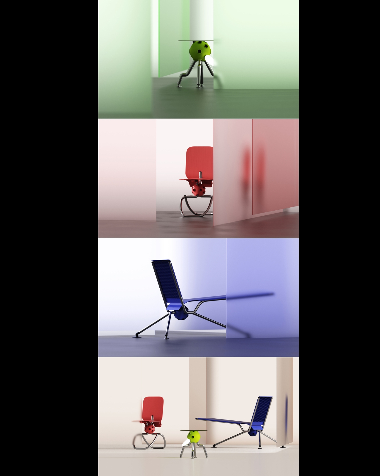
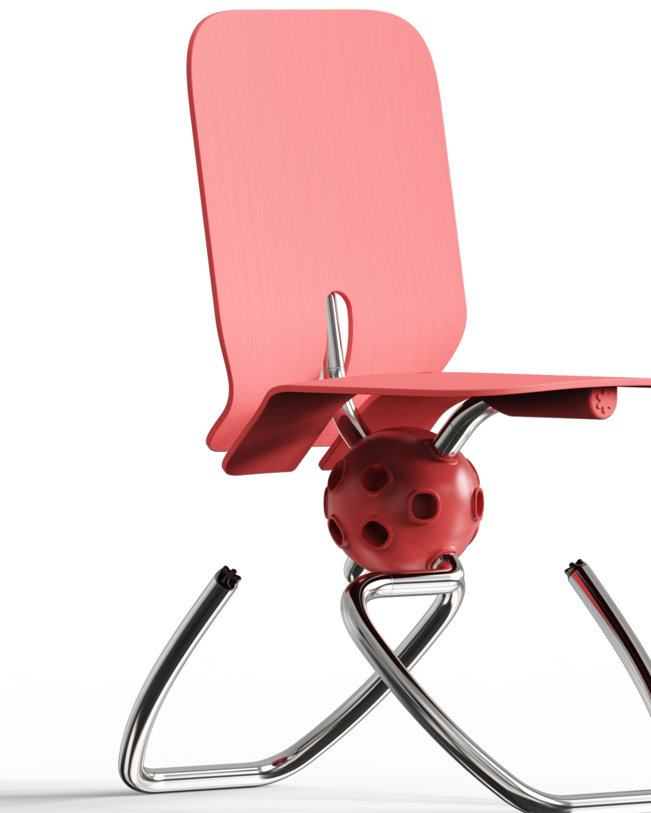
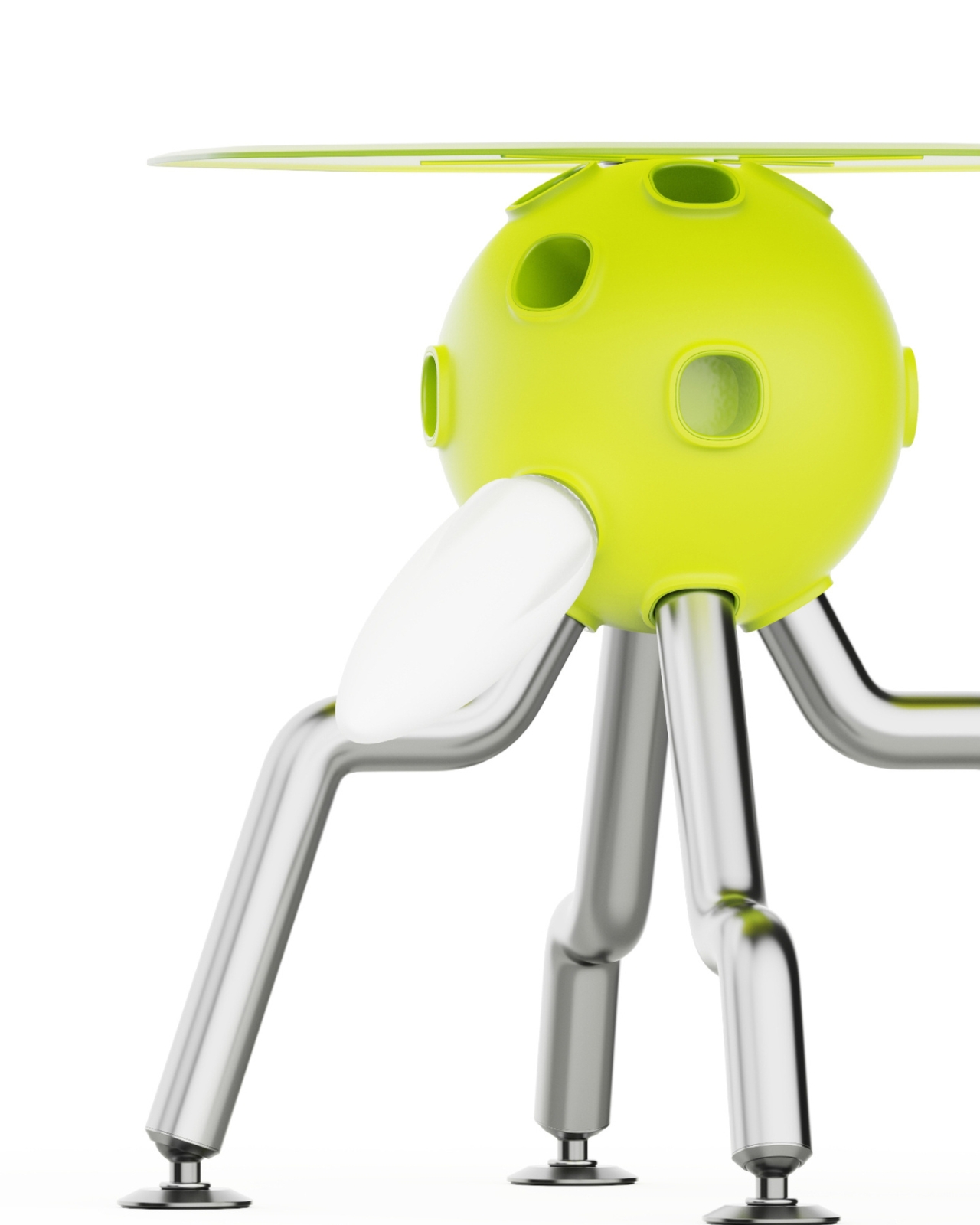
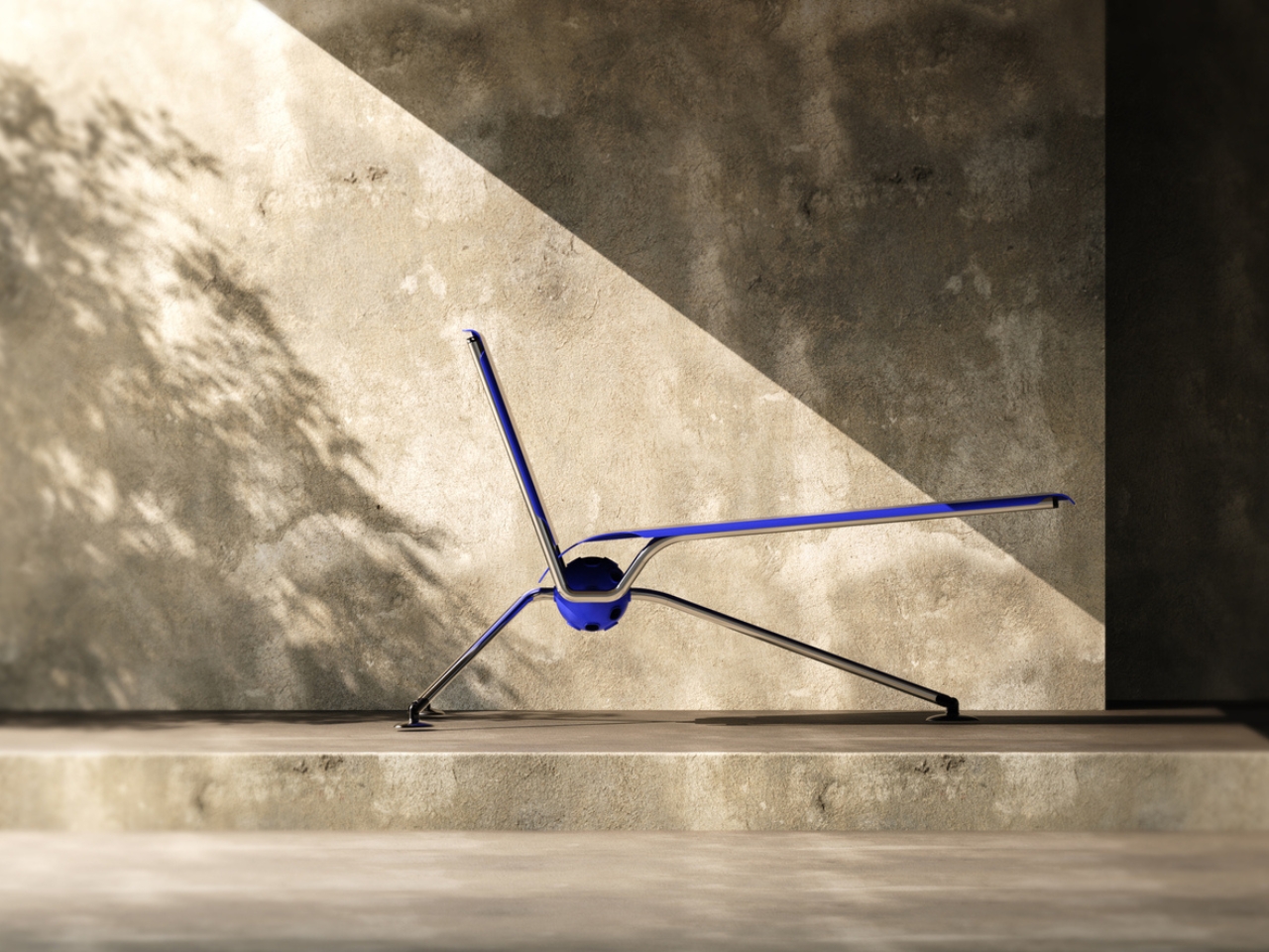
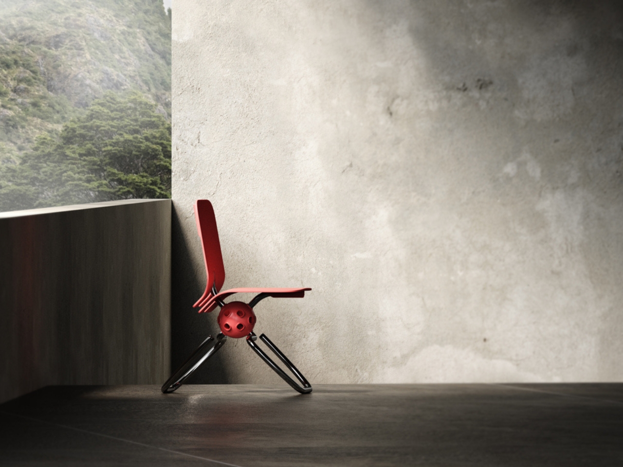
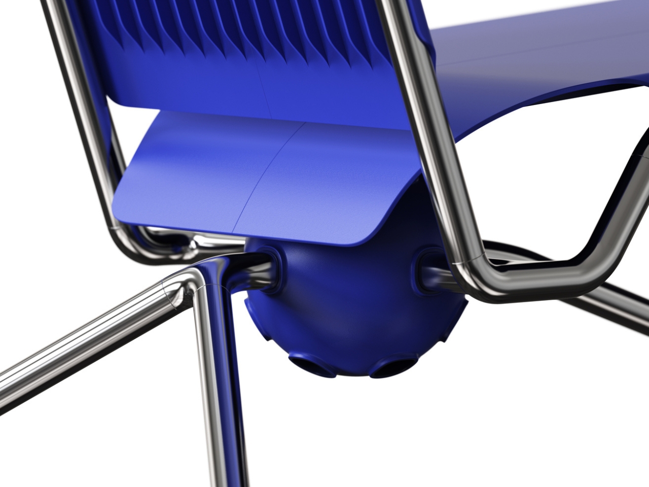
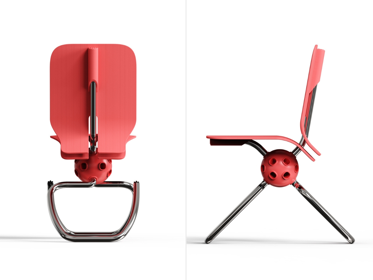
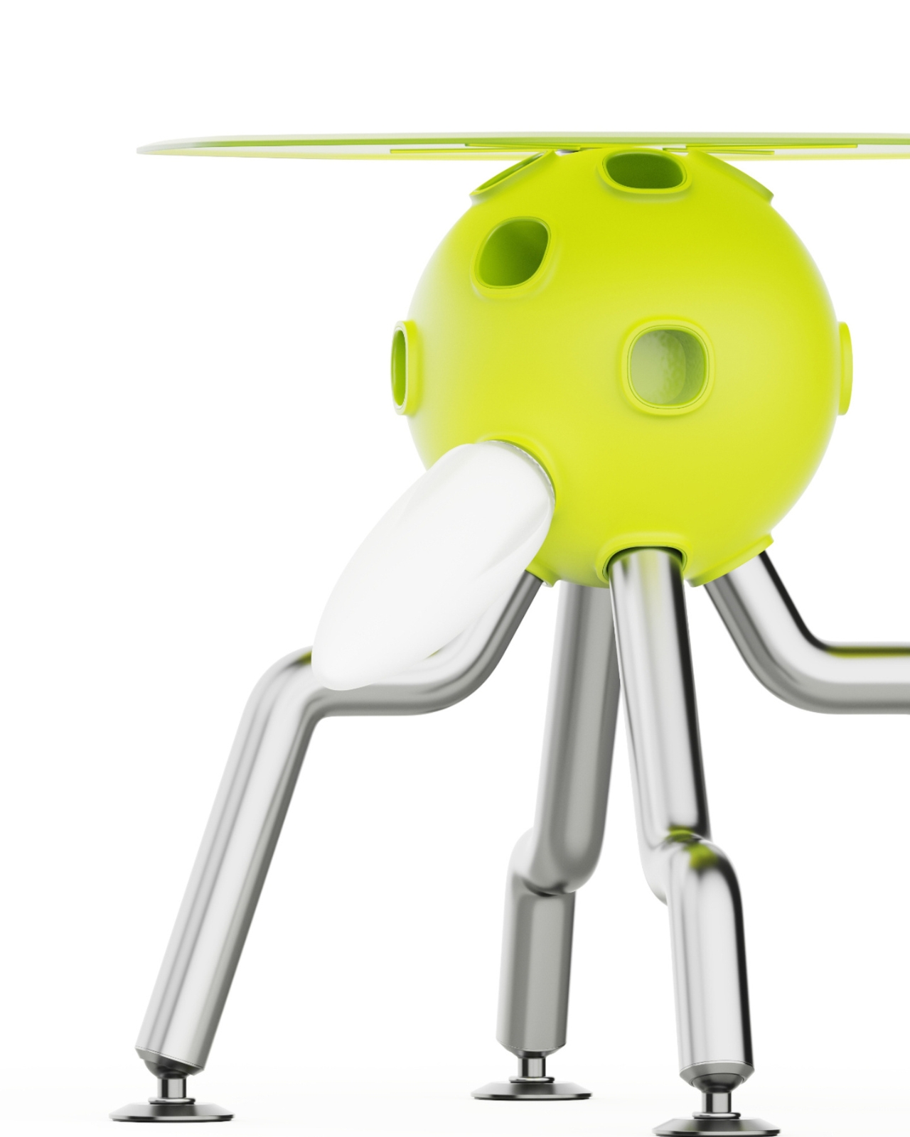
The PLA project is built around a simple but brilliant idea: what if you could customize your chair the same way you’d snap together building blocks? At the heart of each design is a spherical connector module that acts like a universal joint, letting you attach different seat backs, legs, and structural elements to create wildly different chair styles. It’s furniture that refuses to be just one thing, and in our era of tiny apartments and ever-changing aesthetics, that flexibility feels genuinely exciting.

Designers: Sihun Lim, Hyeonggyun Han

Create your own Aesthetic Render: Download KeyShot Studio Right Now!

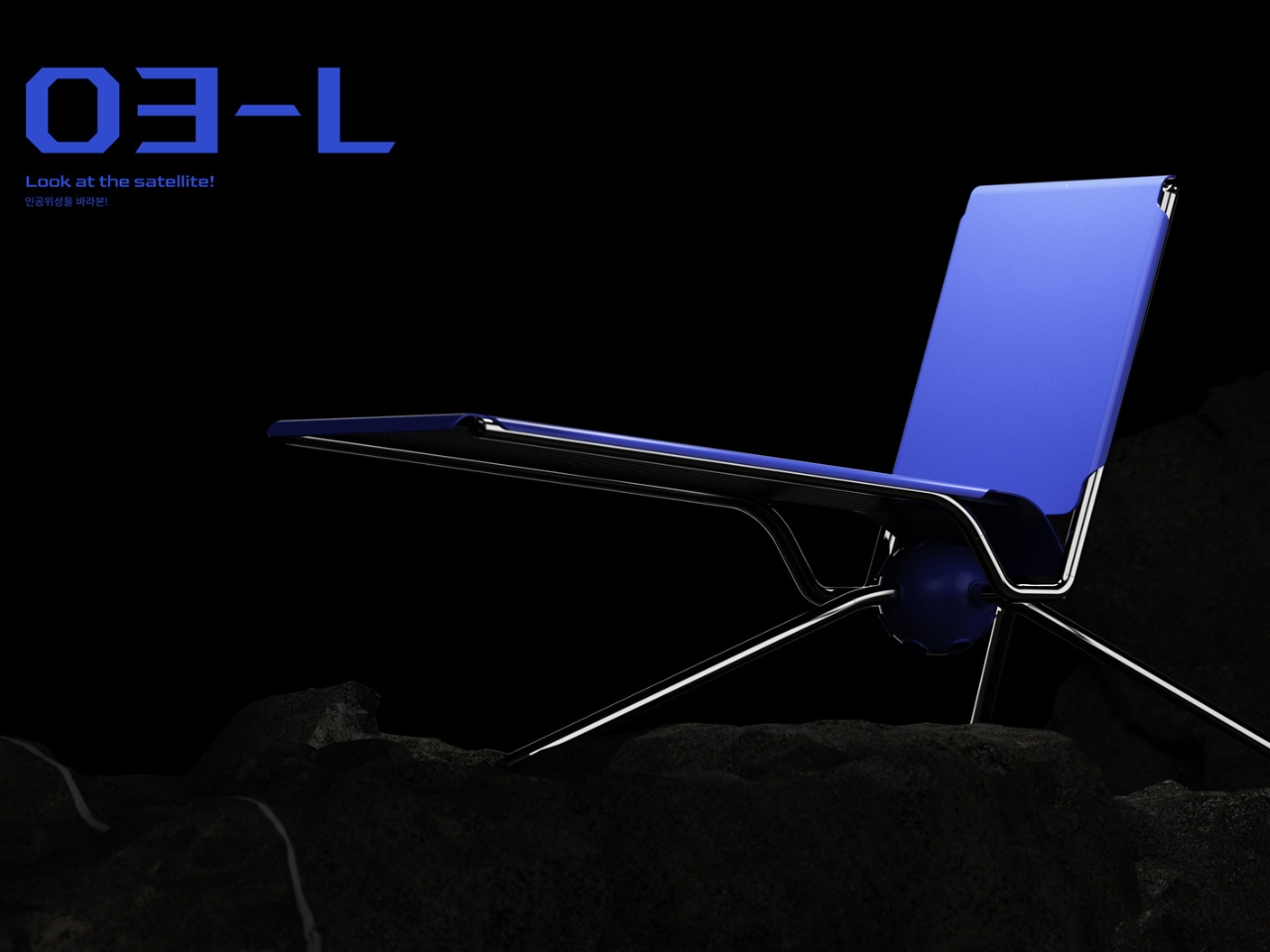
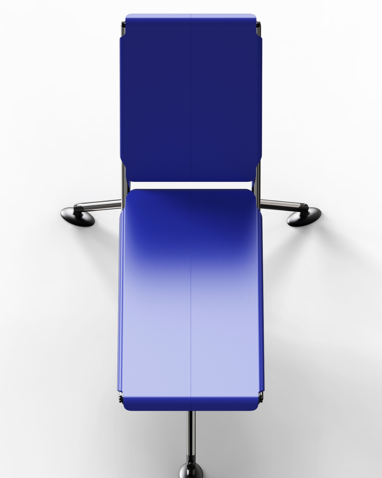
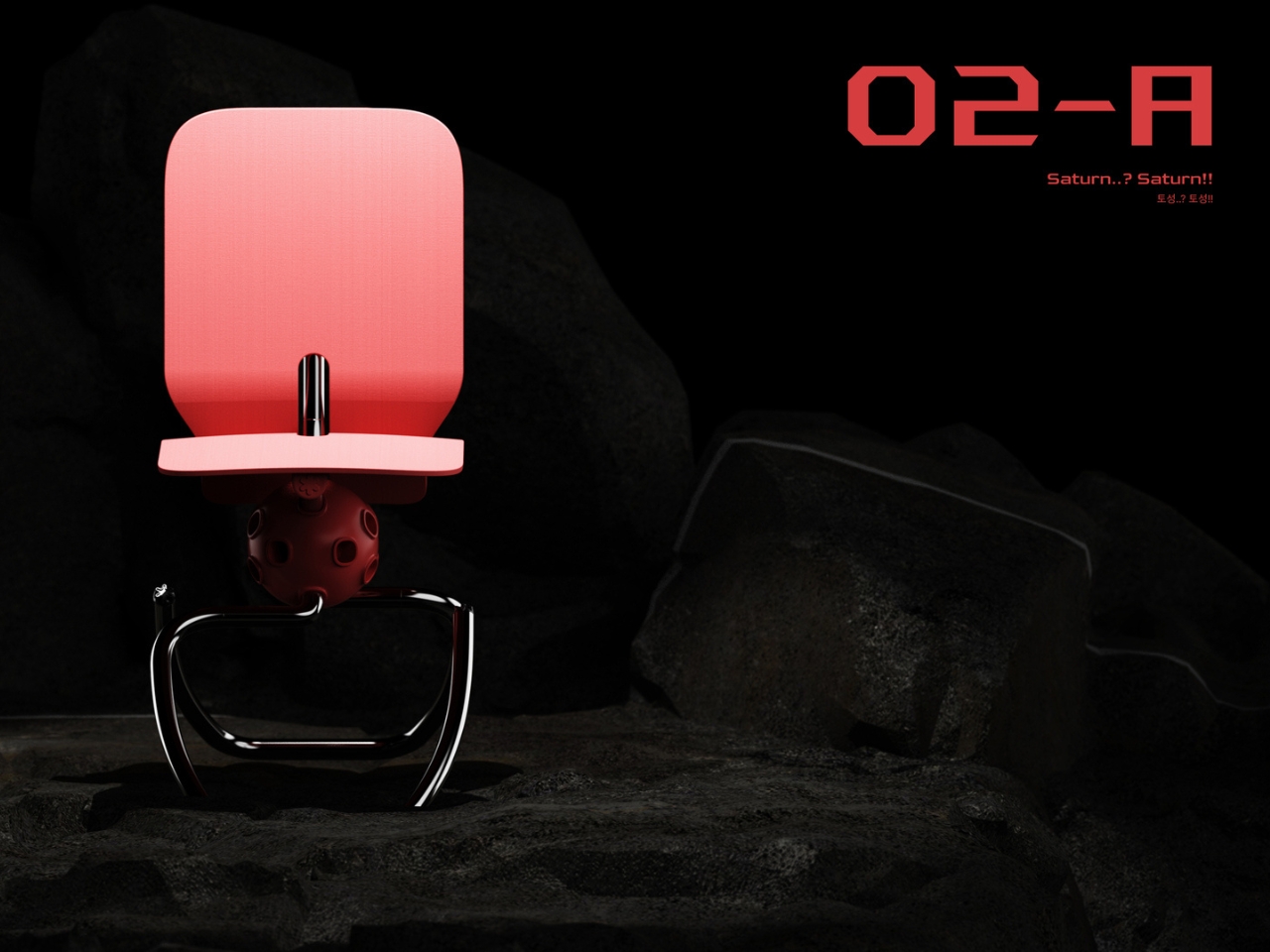
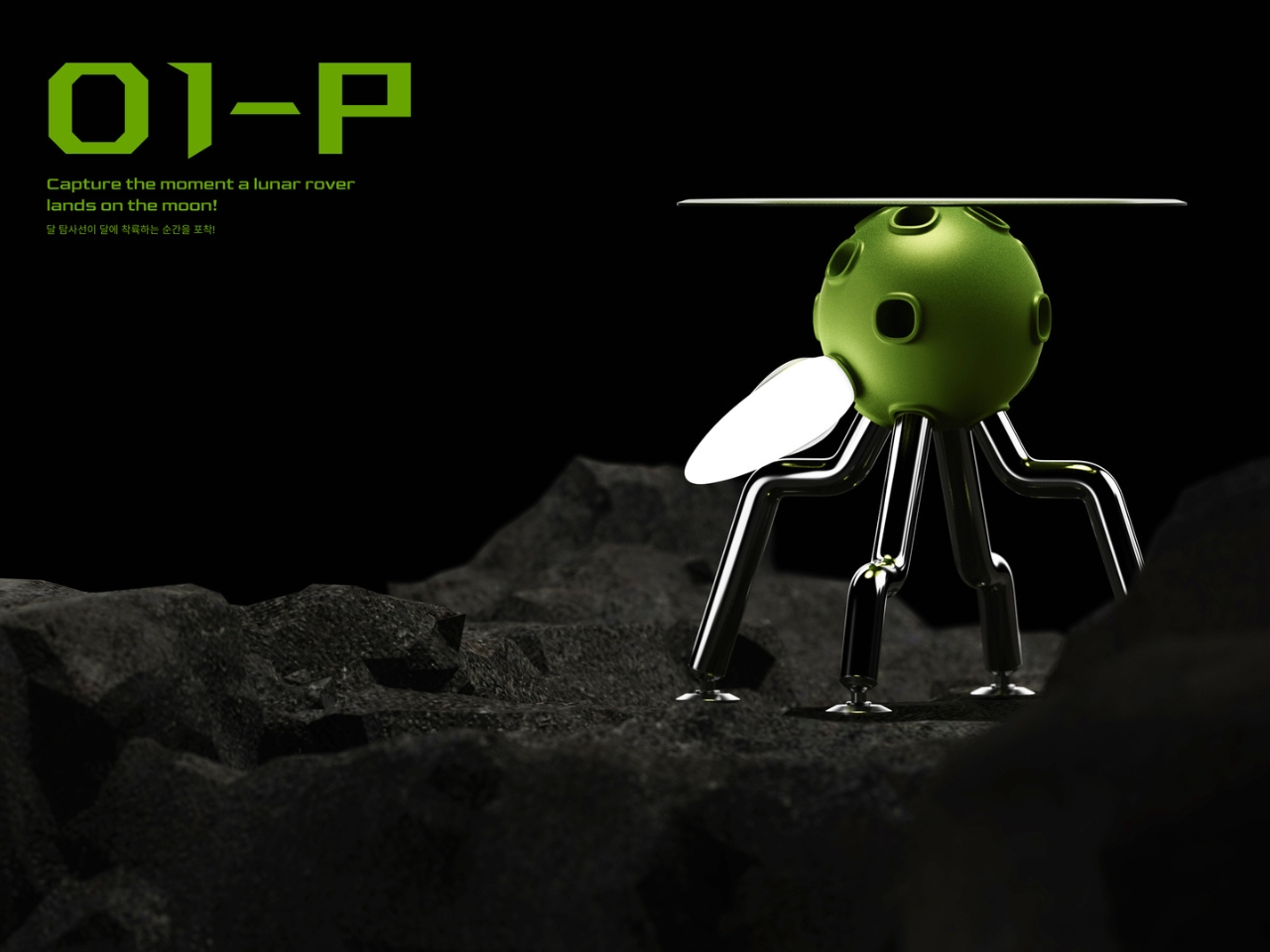
What really sets this concept apart is its unapologetic space theme. Lim and Han didn’t just create modular chairs; they created modular chairs inspired by the cosmos, and that choice transforms what could have been a purely functional exercise into something that sparks imagination. The three main designs (cleverly named O1-P, O2-A, and O3-L) each take inspiration from different space exploration imagery, turning everyday seating into conversation pieces.

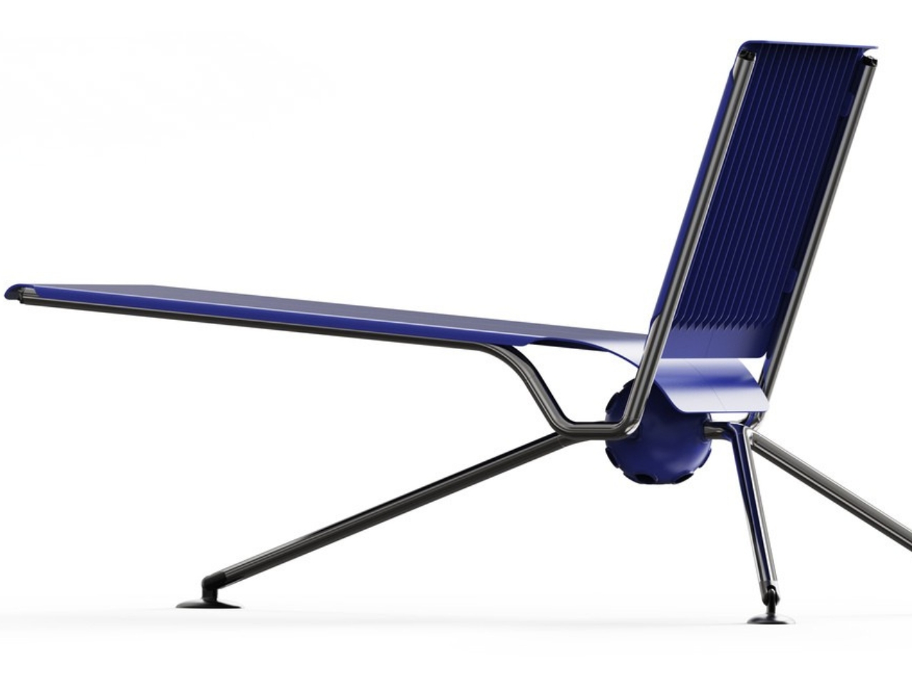
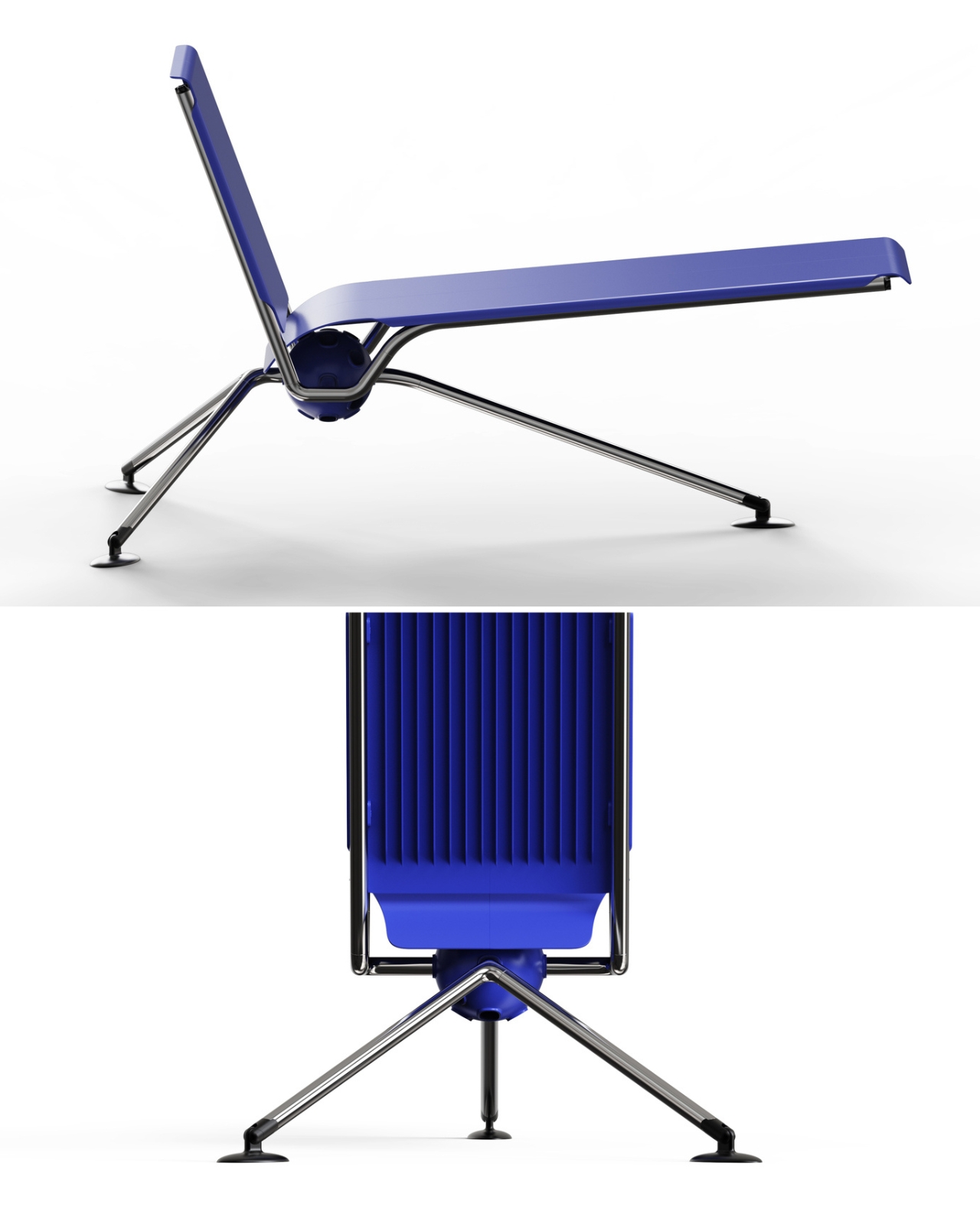
The O3-L sunbed takes inspiration from satellites orbiting in space, complete with distinctive panels that evoke solar arrays. The design has this wonderful industrial edge to it, with metal connecting elements that create visual interest while serving the practical purpose of holding everything together. When viewed from above, it really does resemble a satellite, right down to the way the components radiate from that central spherical hub.

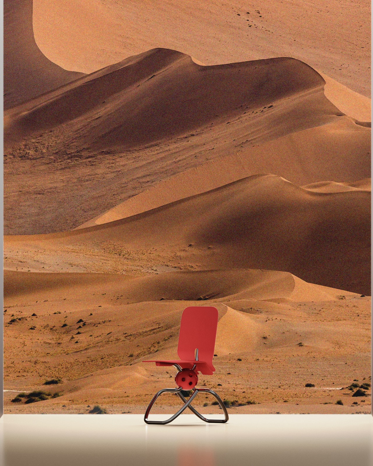
Then there’s the O2-A chair, which draws from Saturn’s iconic silhouette. When you look at it from the side, you can see how the designers translated those distinctive planetary rings into flexible curves that wrap around the central sphere. The result is a chair that feels both organic and architectural, with legs that flow in elegant arcs. It’s the kind of piece that would look equally at home in a sleek office or a retro-futuristic cafe.

The O1-P stool channels the moment a lunar rover touches down on the moon’s surface. The body of the rover becomes the seat, while the landing legs translate into the stool’s four individually configurable legs. It’s that perfect intersection of form following function and function following fantasy. You can practically imagine Neil Armstrong’s voice as you pull up a seat.


The color palette is another smart choice. Instead of playing it safe with neutrals, the designers went bold with electric blues, coral pinks, and eye-popping lime greens. These aren’t colors that fade into the background; they’re colors that announce themselves. Combined with the metallic silver pipes and connector elements, the chairs have this retro-futuristic vibe that feels fresh rather than dated. It’s very “The Jetsons meet contemporary Scandinavian design.”

Beyond the aesthetic appeal, there’s something genuinely progressive about the modular approach. We live in a world drowning in disposable furniture, where a wobbly chair leg often means the whole thing ends up in a landfill. With the PLA system, you could theoretically swap out broken parts, reconfigure your setup as your needs change, or completely transform your chair’s personality with new modules. It’s furniture that grows with you rather than becoming obsolete.

The designers describe PLA as embracing the concept of “Universe,” suggesting infinite possibilities for decorating and shaping according to imagination. That might sound a bit grandiose, but when you look at how the same central sphere can anchor completely different chair personalities, the metaphor tracks. It’s about giving users creative agency over their environment, letting them become co-creators rather than just consumers.

Of course, this is still a concept design, which means we can’t run out and buy one tomorrow. But that’s actually what makes projects like this so valuable. They push the conversation forward about what furniture could be, challenging both manufacturers and consumers to think beyond the static pieces we’ve accepted as normal. Whether or not the PLA system ever makes it to production, it’s already succeeding at its most important job: making us reimagine the everyday objects in our lives as canvases for creativity and play.

The post This Modular Chair Transforms Into 3 Designs With One Sphere first appeared on Yanko Design.
Momcozy Just Made Baby Gear That Doesn’t Look Like Baby Gear

Baby gear used to mean loud colors and chunky plastic that demanded its own corner of the living room. Most swings looked like they belonged in pediatrician waiting rooms, and breast pumps came with tubes and bottles that made discretion impossible. For parents trying to maintain some semblance of style in their homes, it meant choosing between function and aesthetics, rarely getting both in the same product.

Momcozy approaches parenting products differently, with a design philosophy they call Cozy Tech that blends performance with calm, contemporary aesthetics. Loved by over 4.5 million moms globally, the brand starts from the reality of modern parenting: hybrid work schedules, small urban apartments, and the need for tools that integrate into existing routines without demanding wholesale lifestyle adjustments or visual compromises that most baby gear traditionally required.

Designer: Momcozy

Engineering Meets Empathy

The gap Momcozy noticed was straightforward. Traditional baby swings assumed parents had unlimited space and patience for bulky furniture, while breast pumps were designed as if mothers had all day to sit in private rooms. The disconnect was obvious once you looked at it from the parents’ side: why couldn’t products work beautifully and look beautiful at the same time, especially when those products occupy your home for years?

Cozy Tech is the answer that emerged from that question. It is a design language that prioritizes both powerful performance and restraint. Soft forms, neutral tones, and quiet operation let the products blend into design-conscious homes rather than standing out as medical equipment. The hardware still does serious work, but the presence is gentle enough that you do not feel the need to stash things in closets when people visit.

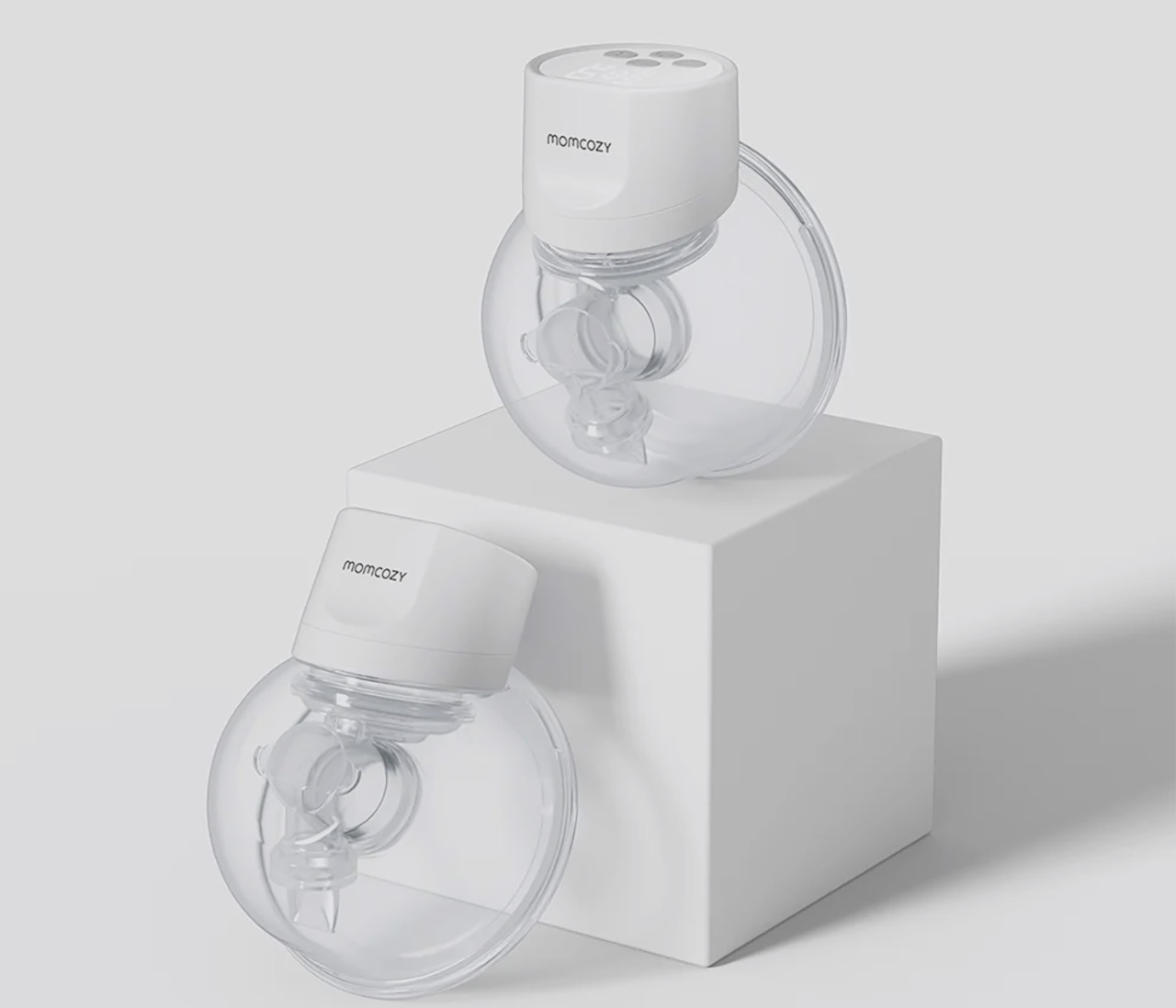
Momcozy S12 Pro Wearable Breast Pump

Picture a mother pumping in a parked car between meetings, or quietly at her desk during a video call. The Momcozy S12 Pro Wearable Breast Pump sits inside a standard nursing bra, disappearing under clothing so there are no tubes or external bottles to manage. From the outside, it looks like any other workday, not a carefully orchestrated routine built around pumping schedules.

The S12 Pro is shaped to mold to the body for comfortable all-day wear, offering multiple modes and adjustable suction to match different stages of expression. The internal battery supports seven to eight sessions on a single charge, reducing the mental load of planning around power outlets. It is the kind of device that quietly acknowledges mothers have careers, meetings, and social commitments, building around that reality instead of ignoring it.

Click Here to Buy Now: $139.99.

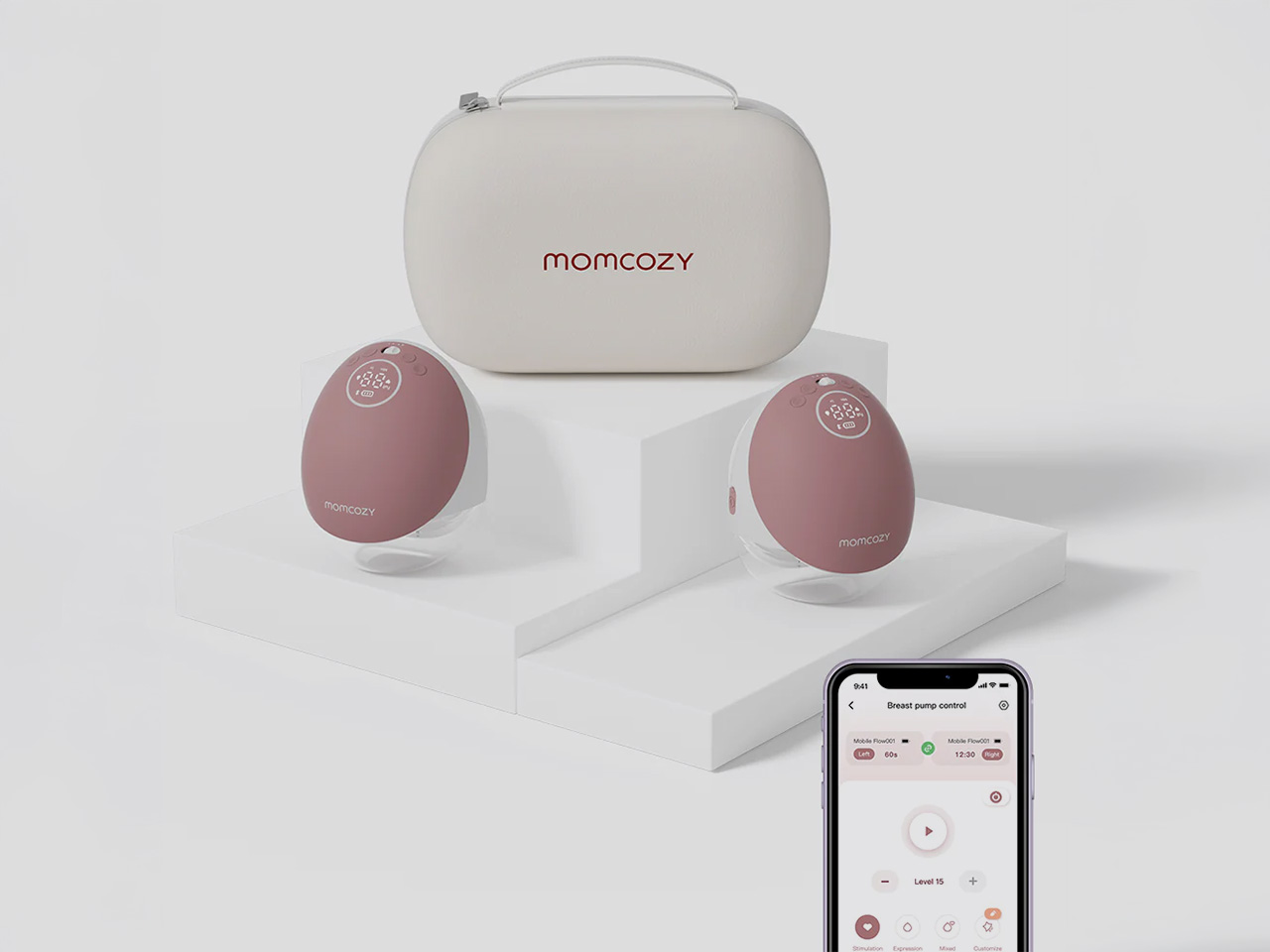
Momcozy M9 Mobile Flow Hands-Free Breast Pump

The M9 Mobile Flow Hands-Free Breast Pump is designed for parents who need flexibility without compromising comfort. Imagine someone folding laundry or prepping dinner while the pump works quietly in the background, tucked inside a bra and barely noticeable. The soft, rounded shape and pink finish make it feel closer to a personal wellness device than clinical equipment, blending into the flow of a busy day.

What sets the M9 apart is the combination of smart control and efficiency. The DoubleFit Flange improves fit and reduces leakage, while the app lets parents choose from three modes and fifteen customizable settings to match their rhythm. The eighteen hundred milliampere-hour battery supports up to six sessions per charge, and the upgraded third-generation motor delivers hospital-grade suction without the noise or bulk of traditional pumps.

Click Here to Buy Now: $269.99.

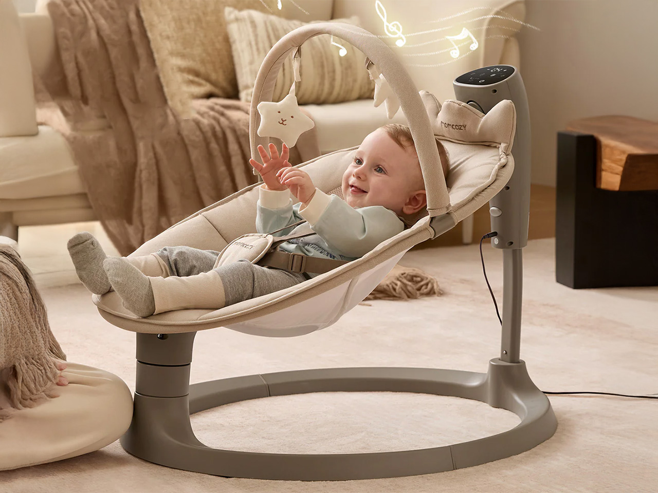
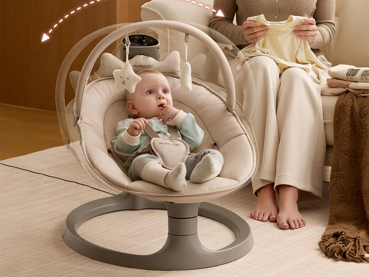
Momcozy 2-in-1 Electric Baby Swing

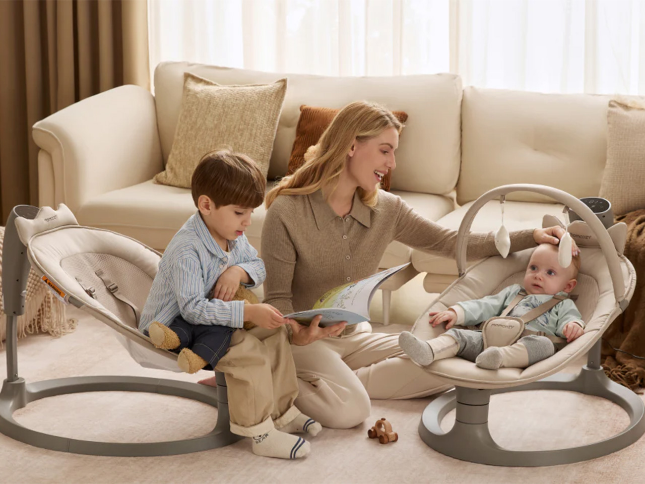
Shift to a different scene: a parent working from home in a small apartment, laptop open at the dining table while the baby rests in the Momcozy 2-in-1 Electric Baby Swing a few feet away. The swing’s neutral tones and clean lines blend into the living room rather than dominating it. Dual arms and a sturdy base keep everything steady, so there is no nervous checking every time the baby shifts position.

The swing mimics the natural soothing motions of a parent’s arms with four swing patterns and four speeds, helping babies stay calm outside of a caregiver’s embrace. The breathable seat adjusts to two recline positions, the cover zips off for machine washing, and when the baby outgrows the swing mode, it converts into a stationary seat that supports kids up to sixty-six pounds, turning it into furniture that lasts years instead of months.

Instead of asking parents to hide the tools that make their days possible, Momcozy designs swings and pumps that can live in the open, both visually and practically. They respect the spaces parents have built for themselves and the complex routines that run through them, showing that parenting gear can be gentle on the eyes while still doing serious work beneath the surface.

Click Here to Buy Now: $159.99.

The post Momcozy Just Made Baby Gear That Doesn’t Look Like Baby Gear first appeared on Yanko Design.
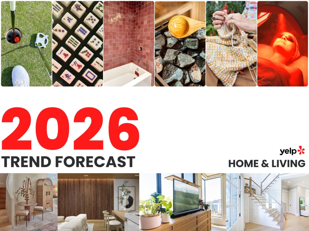
Yelp’s 2026 Design Forecast: The Trends Reshaping How We Live

The numbers tell a story that design magazines have been hinting at for months. Yelp’s latest trend report, analyzing millions of consumer searches between 2023 and 2024, confirms what forward-thinking designers already suspected: the home is becoming a deliberate statement of values, not just a collection of furniture.

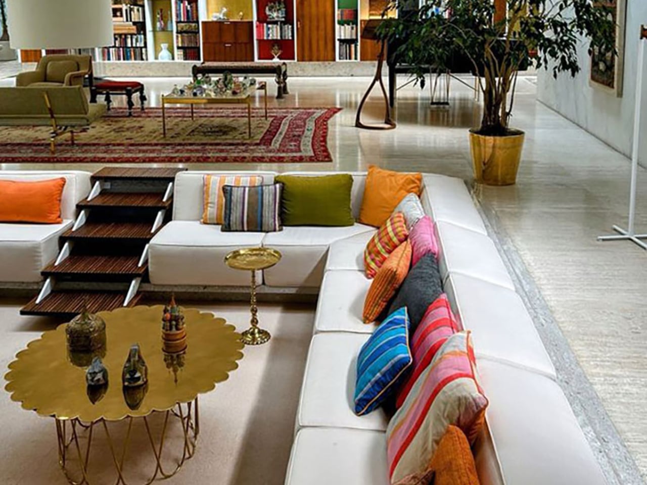
Conversation pits are leading the charge. Searches for these sunken living areas surged 369%, signaling a fundamental rejection of the open-plan uniformity that dominated the 2010s. People want intimacy again. They want spaces that pull them together rather than spreading them across vast, undifferentiated square footage. The mid-century roots of this trend run deep, with searches for mid-century furniture climbing 319% and curved furniture up 124%. These aren’t isolated preferences. They represent a cohesive design philosophy centered on human-scale spaces that encourage actual conversation.
The Texture Revolution

Flat walls are dying. Roman clay finishes saw searches explode by 312%, while lime paint climbed 162%. Fabric wallpaper rose 123%, and wall stencils increased 68%. This collective movement toward tactile surfaces reveals a deeper truth about contemporary design priorities.

People have spent years staring at screens. Their homes responded by becoming increasingly smooth, minimal, and digital-friendly. Now the pendulum swings. Hands want something to touch. Eyes want variation and depth. The Roman clay trend is particularly telling because it demands imperfection. Each application creates unique texture, mottled color, and surfaces that change with light throughout the day. This is the opposite of the perfectly smooth drywall that builders have standardized for decades.

The avocado bathroom deserves attention here too. Searches for ’70s bathrooms jumped 124%, with green countertops following at the same rate. Bathroom remodeling searches increased 84%. But this isn’t nostalgia for nostalgia’s sake. Modern interpretations use nuanced jade and sage tones with contemporary fixtures. The color brings warmth. The execution stays current.

Japandi’s Second Wave

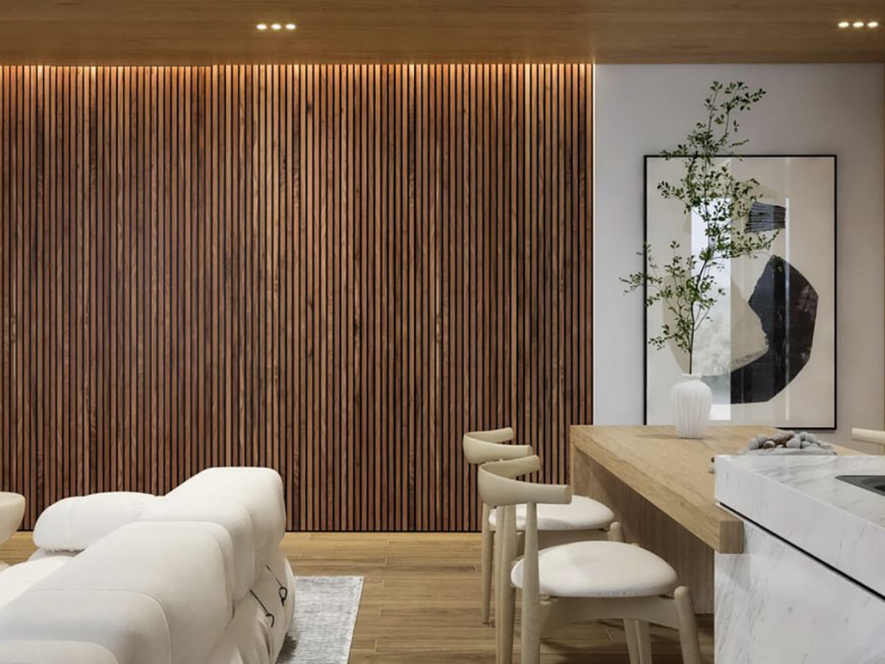
The fusion of Japanese and Scandinavian minimalism refuses to fade. Japandi searches climbed 105%, but the supporting data reveals where this trend is evolving. Fluted panels exploded by 459%. Natural stone rose 51%. Biophilic design increased 124%, alongside woven window shades at the same rate and jute rugs at 60%.

This second wave of Japandi moves beyond the surface aesthetics that defined its first popularity cycle. The emphasis shifts toward materiality and texture rather than mere visual simplicity. Fluted panels create rhythm and shadow play. Natural stone introduces geological time into domestic spaces. Woven materials connect interiors to craft traditions that predate industrial manufacturing. The philosophy remains minimalist, but the execution has matured. Spaces built on these principles feel grounded rather than sparse, considered rather than empty.

Travel plays a role in this evolution. As more people visit Japan and experience its design sensibilities firsthand, they return with refined understanding of how restraint and material quality work together. Tourism shapes taste, and taste shapes the search bar.

The Invisible Technology Thesis

Smart home technology is going underground. Searches for smart windows rose 49%, smart lighting increased 32%, and smart appliances climbed 40%. But the real story lies in the concealment searches. Built-in bookshelves surged 124%. Invisible kitchens with hidden storage jumped 68%.

The design community spent years debating whether technology should be celebrated or hidden. The data suggests resolution: people want capability without visual intrusion. They want lights that respond to voice commands from fixtures that look like ordinary fixtures. They want kitchens that function as high-tech command centers but photograph like serene minimalist spaces. Jennifer Aniston’s illuminated onyx sink basin represents the apex of this thinking. The surface glows. The technology disappears.

This invisible technology trend connects directly to the broader texture movement. When appliances hide and screens retract, walls become the primary visual element. Those walls better be interesting. Roman clay and fluted panels fill the visual space that technology once occupied. The home becomes a gallery of surfaces rather than a showroom of gadgets.

Black as Design Strategy

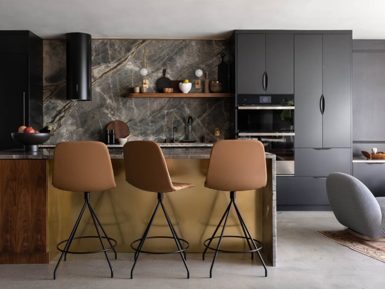
Black countertops rose 123%. Black furniture increased 12%. These numbers underscore a shift toward intentional contrast as a design strategy rather than an afterthought.

Interior design expert Taylor Simon’s “unexpected red theory” has influenced how designers think about strategic color deployment. Black operates on similar principles. A black countertop against light cabinetry creates visual anchor points. Black furniture pieces become sculptural elements that organize surrounding space. The approach requires restraint. Too much black collapses into monotony. Applied surgically, it transforms ordinary rooms into composed environments where the eye knows where to rest.

The contrast philosophy extends beyond color. It manifests in the juxtaposition of textured and smooth, natural and manufactured, vintage and contemporary. Curved mid-century furniture against rectilinear architecture. Woven jute against polished concrete. The design language emerging from this data prioritizes tension and dialogue between elements rather than uniform harmony.

Memory as Material

Shadowbox searches increased 34%. Film lab searches rose 88%. Film developing climbed 54%. Together, these numbers reveal a design trend that treats personal history as raw material.

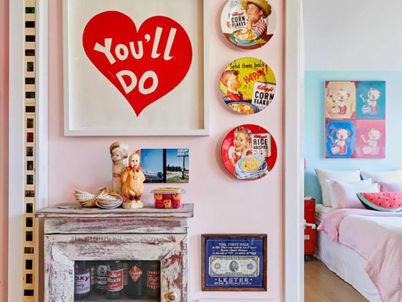
Custom framing services report growing demand for memory displays that transform scrapbook contents into wall art. Travel mementos, film photographs from analog cameras, keepsakes from significant moments. These aren’t arranged in albums anymore. They’re composed into visual statements that hang alongside purchased art.

This trend intersects with the broader rejection of generic decor. Mass-produced wall art serves a function, but it doesn’t tell a story. A framed collection of Polaroids from a specific trip, ticket stubs from meaningful concerts, pressed flowers from important occasions: these objects carry narrative weight that manufactured decor cannot replicate. The home becomes autobiography.

Where This Leaves Us

The throughline connecting these trends points toward a single thesis: design in 2026 will prioritize meaning over minimalism, texture over sleekness, and personal narrative over trend compliance.

The conversation pit revival matters because it privileges human connection over architectural showmanship. The texture movement matters because it restores sensory richness to spaces flattened by digital life. Japandi’s evolution matters because it demonstrates how design philosophies mature beyond their initial aesthetic expressions. Hidden technology matters because it resolves the long tension between capability and beauty. Strategic contrast matters because it treats composition as seriously as color.

None of these trends exist in isolation. They form a coherent vision of domestic space as refuge, as expression, as carefully curated environment that reflects inhabitant values rather than developer defaults. The search data quantifies what designers intuit. People want homes that feel like themselves, not like everyone else’s Pinterest board. The numbers say they’re willing to invest, to research, to seek professional help in achieving that goal.

The 2026 home will have texture you can feel, spaces that pull people together, technology that serves without announcing itself, and walls decorated with personal history. It will reference the past without copying it. It will embrace natural materials while leveraging smart systems. It will be, in short, deliberately designed rather than passively accumulated. The data says so.

The post Yelp’s 2026 Design Forecast: The Trends Reshaping How We Live first appeared on Yanko Design.