Screen time has crept up to the point where most people spend more waking hours staring at a phone than almost anything else. Smartphones aren’t particularly kind about it, with vivid, high-brightness displays that perform well in demos but aren’t gentle over long stretches. Eye fatigue and dryness have become almost expected, yet most people aren’t ready to swap their phones for e-readers just to get some relief.
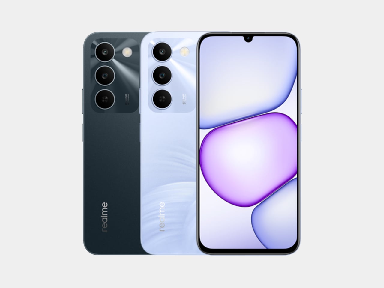
TCL has spent the better part of four years building an answer to that problem through its NXTPAPER line, and the NXTPAPER 70 Pro is the most capable version yet. It’s a full Android smartphone with eye-care features pushed to their highest iteration, now available in the US at $199.99 through T-Mobile and Metro by T-Mobile, and at $299.99 unlocked.
Designer: TCL
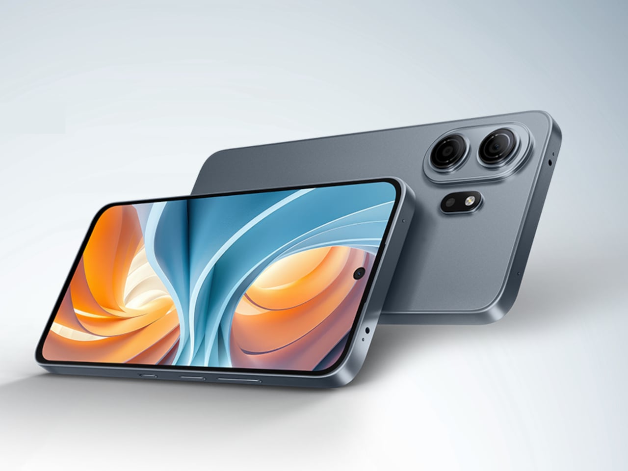
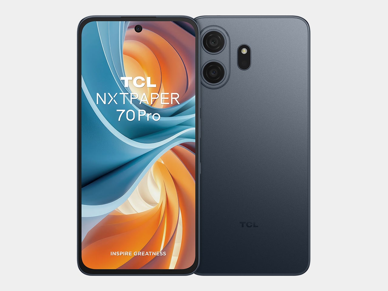
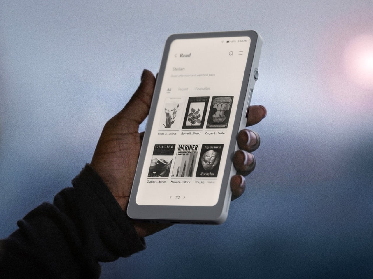
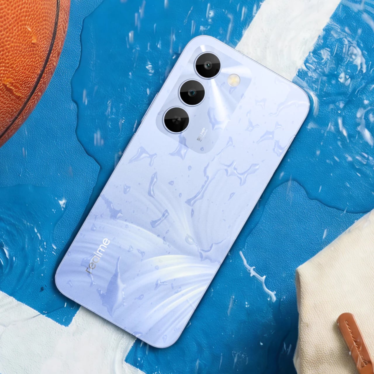
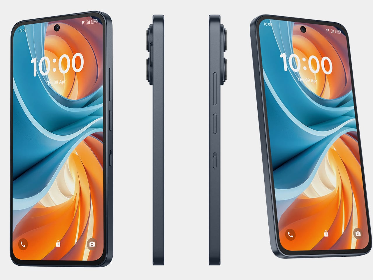
The centerpiece is the 6.9-inch NXTPAPER display, an IPS LCD panel with a matte, anti-glare surface built using nano-matrix lithography. It cuts harmful blue light at the hardware level down to 3.41%, uses DC dimming to eliminate flicker entirely, and applies circular polarized light to simulate diffused daylight that’s easier on the eyes. Independent certification from TÜV and SGS backs those claims up.
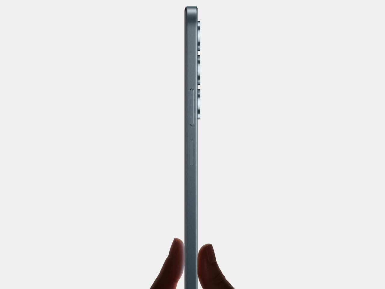
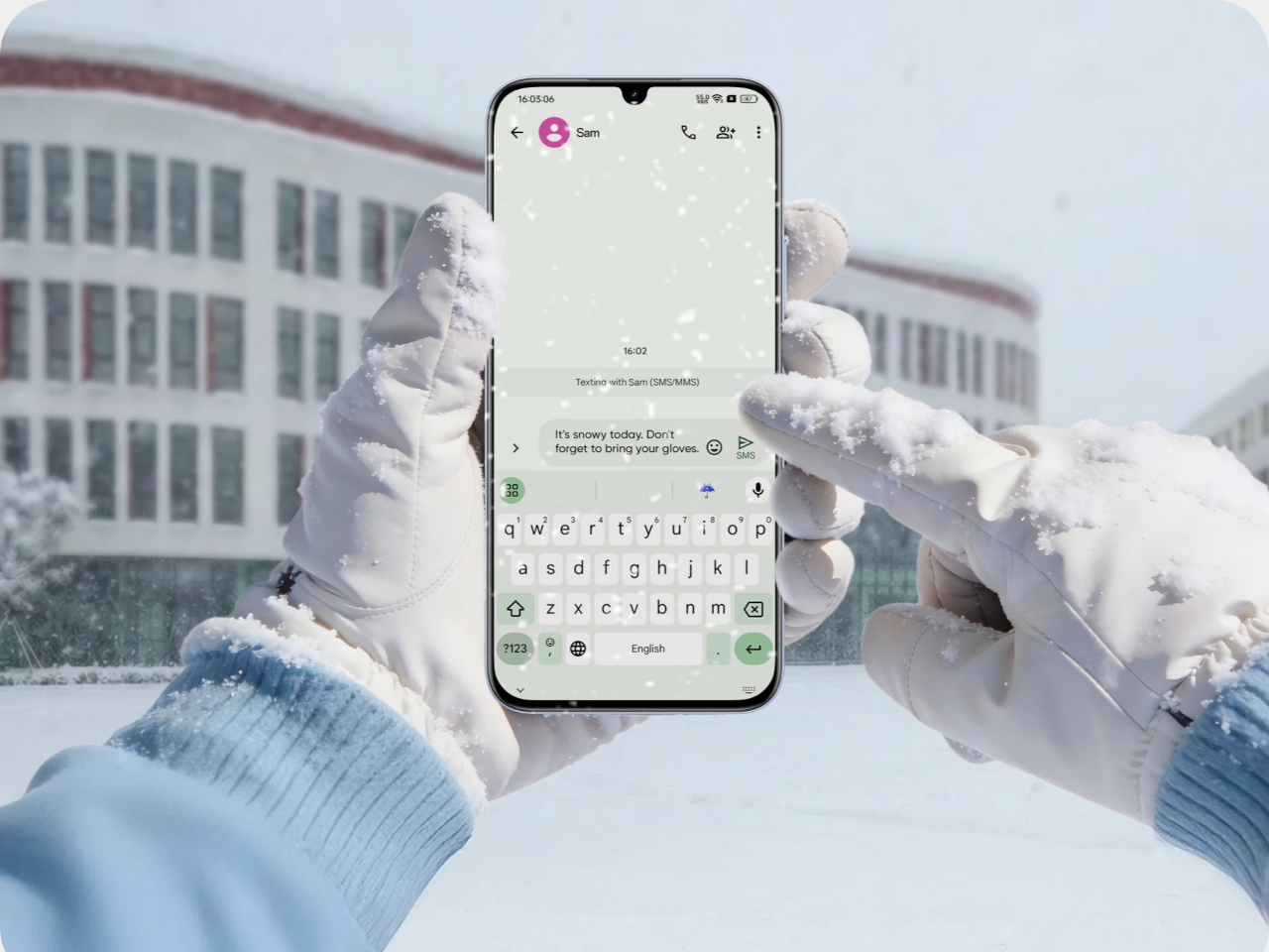
A physical NXTPAPER Key on the side cycles through three viewing modes. Regular keeps full-color smartphone output, Color Paper shifts to a warmer and more subdued tone suited for long reading sessions, and Ink Paper dials the display down to a near-monochrome, paper-like appearance that also conserves battery. Switching between them takes a single press, keeping the feature genuinely useful rather than buried in a settings menu.
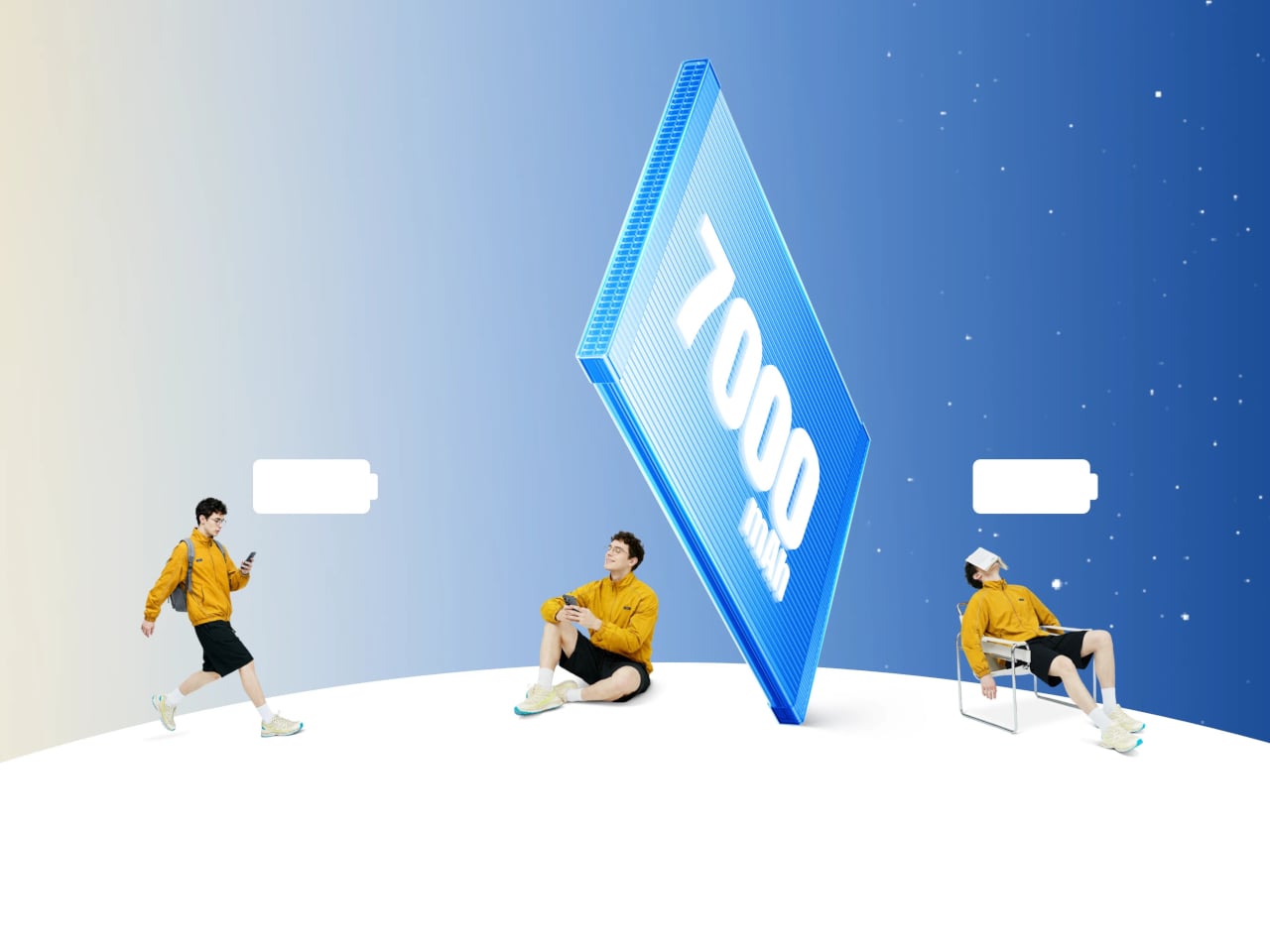
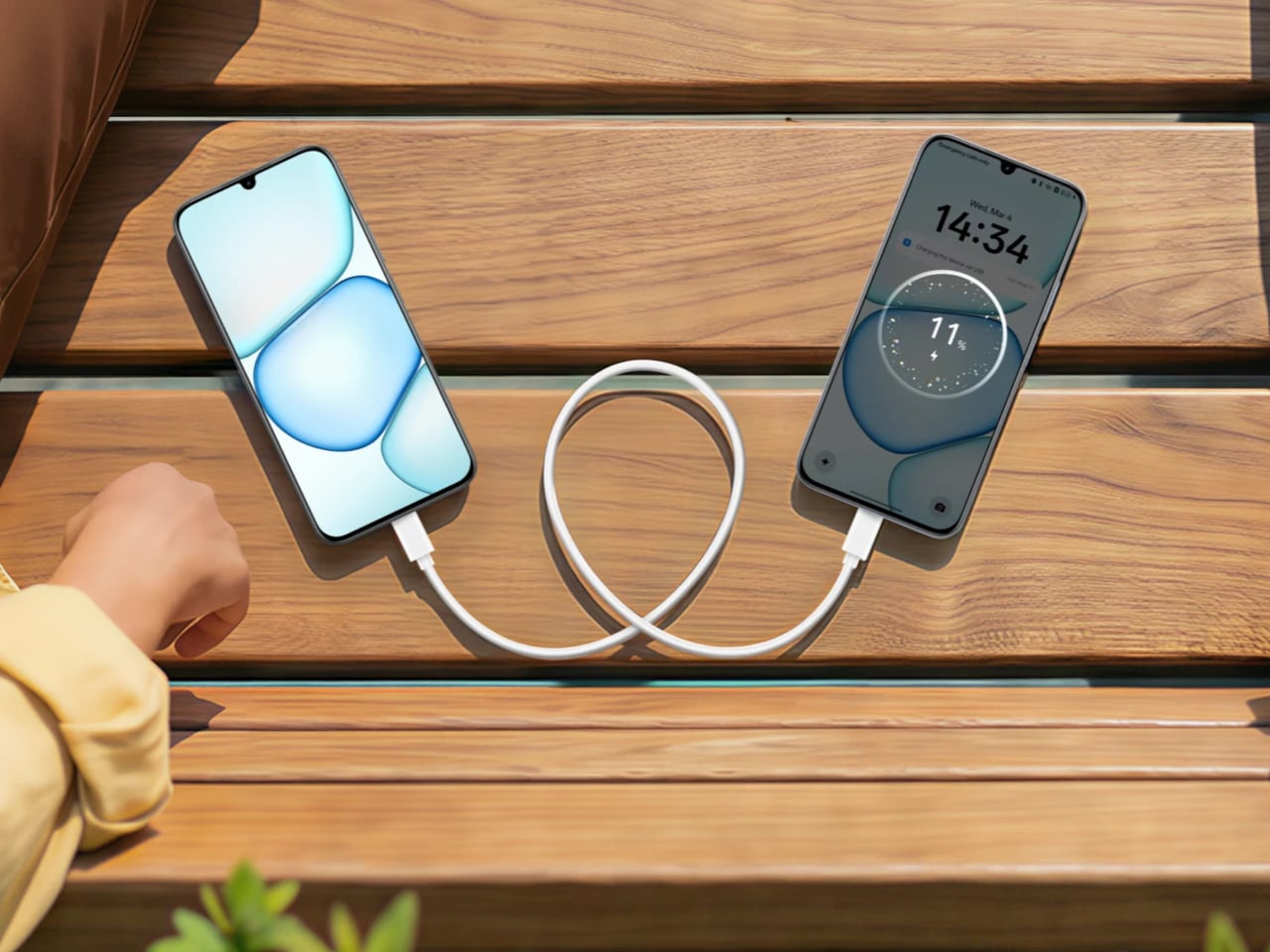
That Ink Paper mode also unlocks the phone’s most impressive feature: battery life, which TCL claims can stretch to seven days when reading. The 5,200 mAh cell with 33W fast charging handles everyday use comfortably and reaches 50% in about 38 minutes, but it’s the combination of a power-efficient display mode and capable hardware that pushes endurance well past what most phones manage.
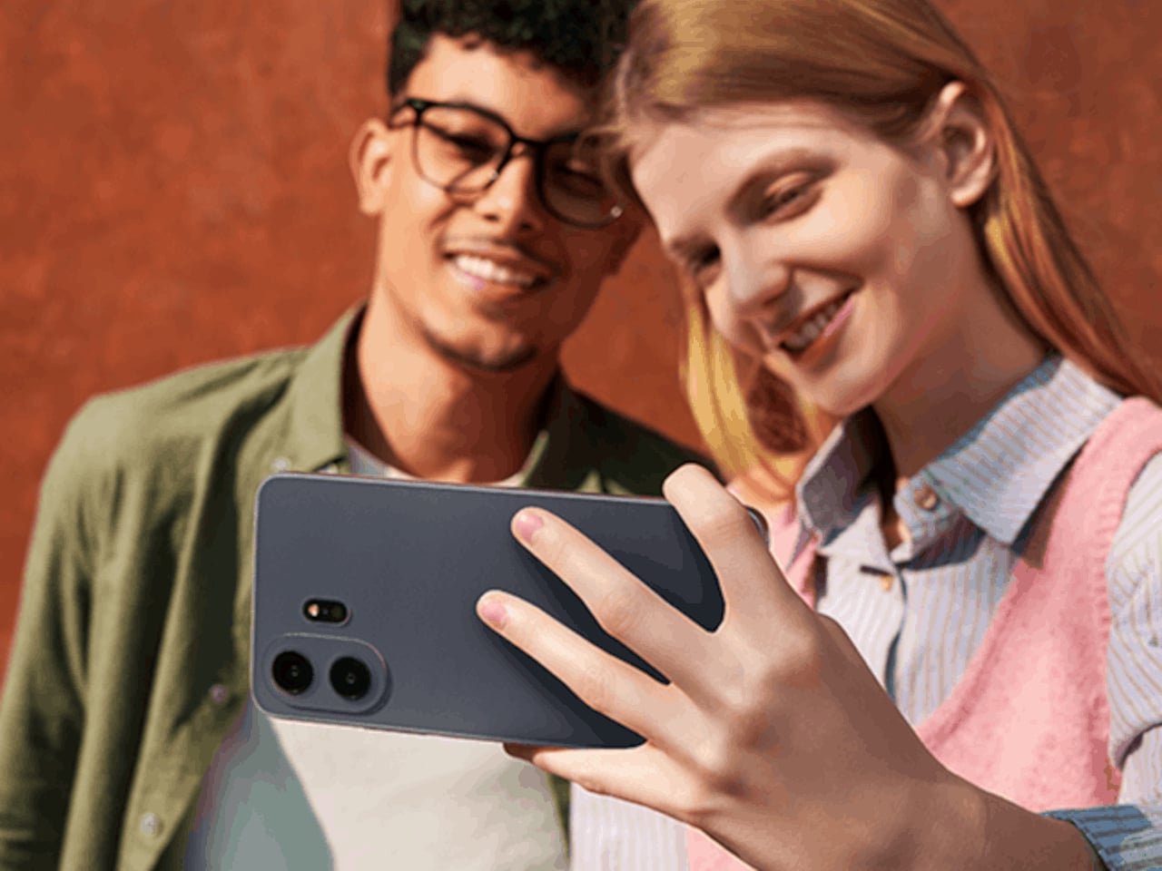
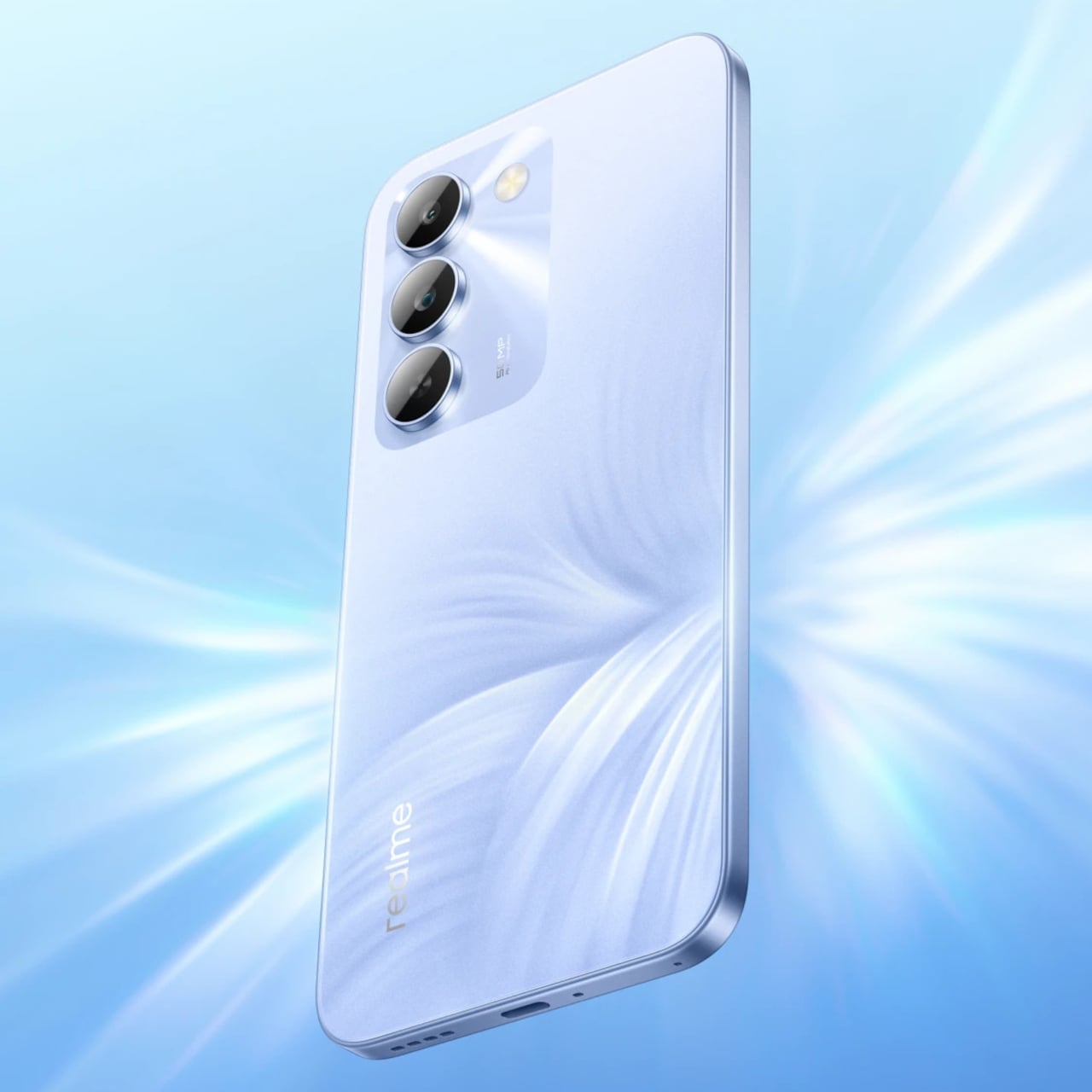
The camera doesn’t feel like an afterthought either. A 50 MP main sensor with optical image stabilization handles everyday shots and difficult lighting well, paired with an 8 MP ultrawide and a 32 MP front camera that covers video calls and social content. Storage starts at 256 GB and expands via microSD to 2 TB, while a MediaTek Dimensity 7300 chip keeps things running on Android 16.
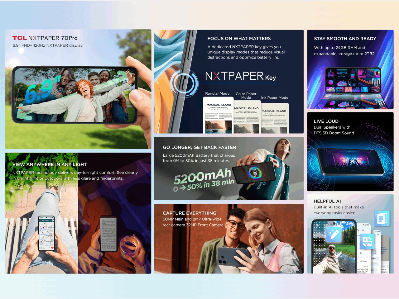
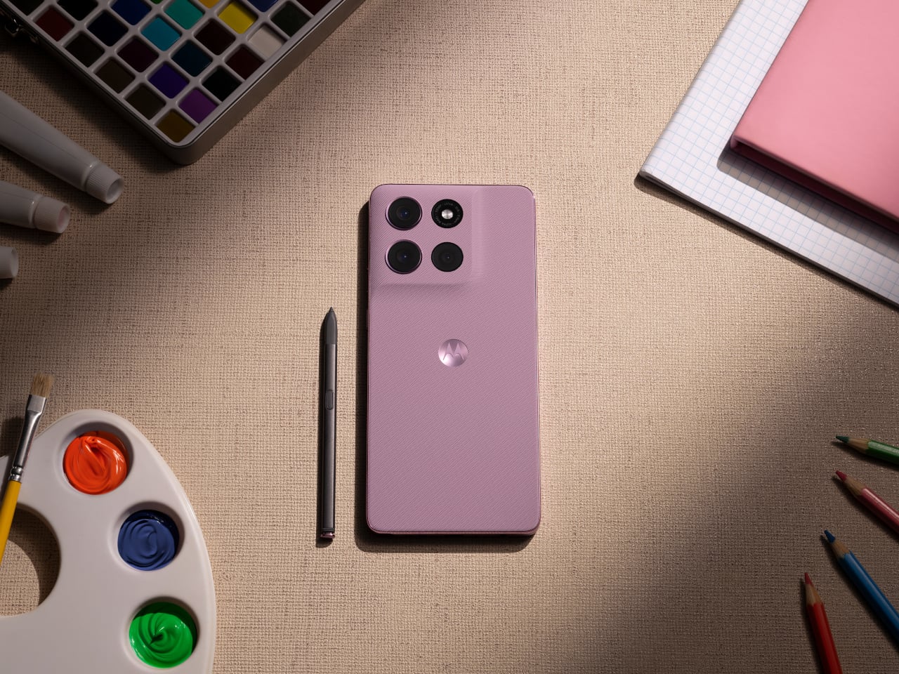
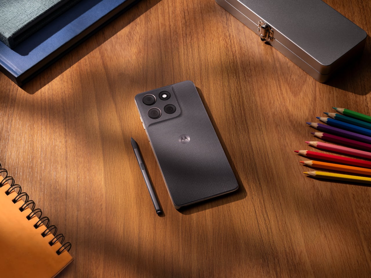
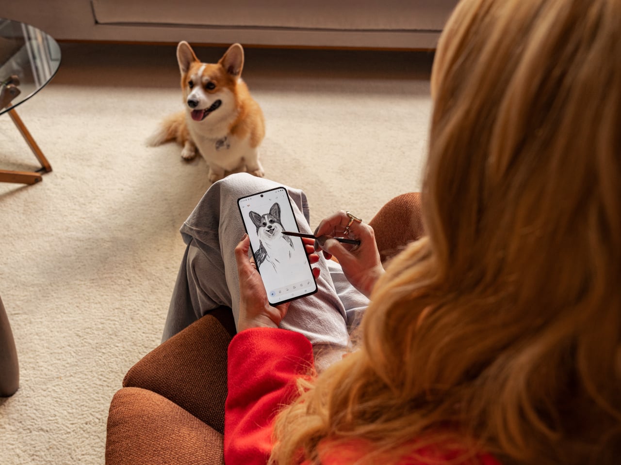
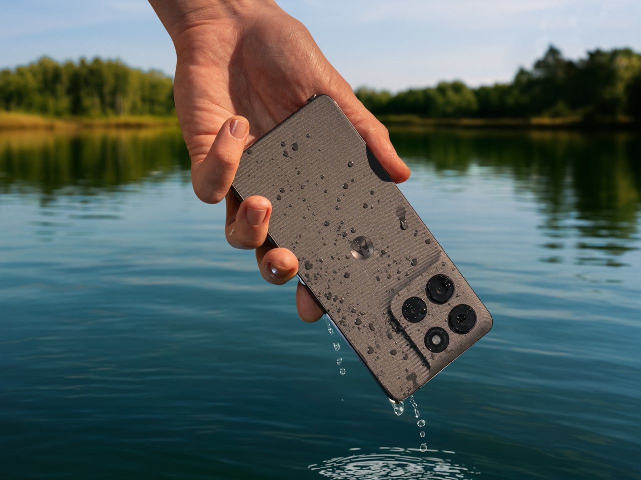
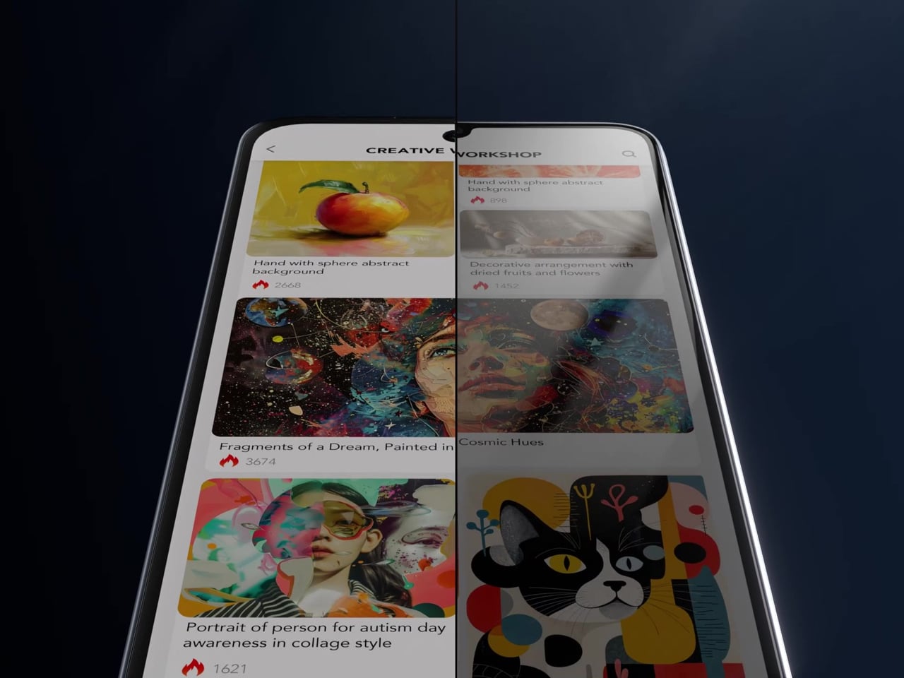
Built-in AI tools can summarize articles, transcribe audio, and help clean up text you’re writing, which fits the device’s clear lean toward readers, students, and anyone who uses their phone for focused work. The IP68 rating handles rain and spills without fuss, and at 207g, the large frame doesn’t feel excessive in hand. Unfortunately, it seems that T-Pen stylus support won’t be making its way to this US variant, a feature that has been revealed for the global version.
What’s notable about the NXTPAPER 70 Pro isn’t any single feature taken alone, but how they all pull toward the same priority. Eye-care display technology has mostly lived on phones that cost well over a thousand dollars, which puts it out of reach for most buyers. At $199.99 on T-Mobile, that changes, and the argument for a phone your eyes might actually thank you for becomes genuinely hard to ignore.
The post TCL’s $200 Phone Fixes Eye Strain That $1,000 Flagships Still Ignore first appeared on Yanko Design.