This Turntable Spins Vinyl Vertically So Records Become Wall Art

Vinyl has come back as much for the ritual and artwork as for the sound, yet most turntables still hide records flat on a plinth, as if they are shy. People lean records against walls or shelves to show them off, while the deck itself sits in a corner doing its work horizontally. The VS-01 is a vertical Bluetooth turntable that treats the spinning disc as a display piece instead of something to tuck away.

The VS-01 Bluetooth Vertical Turntable is a retro-futuristic record player that stands the platter upright behind a low, mid-century-inspired base. The front is all CNC-machined aluminum grille and vegan-leather-wrapped MDF, with a handcrafted carbon fiber tonearm reaching across the record. The design blends cool metal and warm materials, so the whole thing reads like a small hi-fi sculpture that happens to play vinyl and stream Bluetooth audio when you ask it to.

Designer: CoolGeek

Inside sits a 2.1-speaker system with two 2-inch tweeters and a 4-inch 30 W mid-bass driver, driven by a Hi-Fi-grade amplifier. The desktop reflective acoustic structure uses the surface it sits on to reinforce bass, aiming for layered, expansive sound that can handle vocals and low-end without needing separate speakers cluttering the room or demanding extra cables and shelf space.

The turntable side is a belt-drive platter with 33.3 and 45 RPM speeds controlled by a closed-loop system that keeps rotation stable. A zirconia ceramic spindle and high-precision mechanical design reduce friction and wear over time. The tonearm geometry is carefully specced, with low tracking distortion and adjustable tracking force, so the engineering backs up the visual drama and ensures your records are not getting chewed up while spinning vertically.

Bluetooth 5.3 lets the VS-01 act as a wireless speaker for your phone when you are not spinning records. It can also transmit vinyl audio out to Bluetooth headphones or speakers, turning analog grooves into a private listening session without cables. A line-out port and RCA outputs let you feed an external amplifier or active speakers if you want bigger sound or bypass the integrated drivers.

The vertical format changes the everyday experience. Records become a kinetic art installation you can see from across the room, especially with colored vinyl. The footprint on a shelf is shallower than a traditional deck, which helps in tight spaces. Purists may still prefer a classic horizontal setup, but the visual payoff and integrated speakers will outweigh that concern when your living room needs the turntable to double as decor.

The VS-01 treats vinyl as something to see while you hear it, with a vertical platter that makes every record into spinning artwork. The combination of serious belt-drive mechanics, a 2.1-speaker system, and Bluetooth flexibility wrapped in a retro-modern chassis means it can handle the full range from late-night wireless listening to showing off splattered-vinyl art during a party. Records become the centerpiece of the room, doing their work upright instead of lying flat and being forgettable.

The post This Turntable Spins Vinyl Vertically So Records Become Wall Art first appeared on Yanko Design.

Split Is an Umbrella Stand Concept That Opens Into a Hallway Console

Most entryways are chaos zones. Umbrellas lean against walls, keys land on whatever surface is closest, and the stand is usually just a metal tube catching drips in a corner nobody looks at twice. This corner of the home rarely gets the same design attention as the living room or kitchen, even though it is the first thing you see when you walk in and the last thing you touch before leaving.

Split is an umbrella stand concept that behaves like a small, movable console. It is built around a sleek cylindrical form that opens with a pivoting lid, revealing storage for short and long umbrellas. When closed, the lid becomes a tabletop for keys, phones, or a wallet, turning the stand into a compact landing zone for everything you carry through the door, wet or dry.

Designer: Yomna Elborollossy

The cylinder splits into two functional zones. An open lower section holds long umbrellas, keeping handles accessible and letting wet fabric breathe. A closed upper section stores compact umbrellas or other small items, hiding clutter without sealing it in a damp box. The geometry makes it obvious where things go, which is half the battle in keeping an entryway tidy without thinking about it every single time.

The perforated upper shell works like a pegboard and a vent at the same time. The grid of circular holes can accept hooks for hanging small items like dog leashes, lanyards, or lightweight bags, and it also lets air circulate through the closed space so damp umbrellas or gloves can dry. That detail keeps the object from becoming a humid box and gives it a subtle, graphic texture that reads well from across a room.

The pivoting lid turns a simple stand into something interactive. A quick swing of the lid reveals the inner compartment without forcing you to clear off the top first, and when it is closed, the flat surface is ready for keys, a phone, or a small tray. The motion adds a bit of ceremony to arriving home, making the act of putting things away feel deliberate instead of automatic or rushed.

The body is imagined in lightweight aluminum, which keeps it easy to move while resisting rust and corrosion from wet umbrellas. It sits on a heavier stone base that keeps it stable when loaded with multiple umbrellas and everyday items. The concept uses warm, modern colors like terracotta, mustard, and muted blue, so it reads as a small piece of furniture rather than a purely utilitarian object and can live comfortably in a hallway, living room corner, or office lobby.

Split reframes a neglected object. It does not try to reinvent storage, it simply layers a console, a pegboard, and a ventilated umbrella stand into one compact cylinder. It feels like a quiet but meaningful upgrade over the usual metal tube shoved in a corner. People who care about the small transitions in their day will love the idea of an entryway piece that catches umbrellas and everyday carry with a bit of elegance.

The post Split Is an Umbrella Stand Concept That Opens Into a Hallway Console first appeared on Yanko Design.

10 Best Last-Minute Stocking Stuffers That Look High-End (But Won’t Break the Bank)

The final days before the holidays arrive with their own particular pressure. Gift lists grow longer while time grows shorter, and the temptation to settle for whatever’s left on the shelf becomes real. Yet the best stocking stuffers aren’t about expense or elaborate planning. They’re about finding objects that feel intentional, considered, and genuinely useful.

What separates a thoughtful gift from a forgettable one often comes down to design intelligence and material honesty. The items that follow share a common thread: each one transforms an everyday moment into something more refined. They’re compact enough to tuck into a stocking, substantial enough to use for years, and distinctive enough that they’ll never be mistaken for last-minute panic buying.

1. Olight Baton 4 Premium Edition

Finding yourself in the dark without a light source is never fun, which is why the Olight Baton 4 Premium Edition exists as more than just another flashlight. This compact EDC tool delivers an impressive 1,300 lumens from a body small enough to slip into your pocket without a second thought. The real genius lies in its ability to become instantly accessible when emergencies strike. Whether you’re navigating a power outage at home or searching for something under your car seat, this flashlight ensures you’re always prepared. The laser micro-perforated LED indicators let you monitor brightness levels and remaining battery at a glance, eliminating guesswork about whether your light will last through the task ahead.

The 5,000 mAh charging case transforms this already practical tool into something genuinely exceptional for your daily routine. That flip-top design means you can open it single-handed, keeping your other hand free for whatever else demands attention. Most impressively, when used with the Baton 4, you simply flip open the cover and press the side button to activate the flashlight while it remains nestled in the case. This eliminates those fumbling seconds where you’re pulling out the light, using it, then trying to put it back. The charging case itself becomes a 5,000 mAh power bank, capable of recharging the flashlight up to five times or topping up your other devices when needed.

What we like

  • The one-handed operation while the flashlight stays in its charging case saves precious seconds in urgent situations.
  • The 5,000 mAh charging case doubles as a power bank for your other devices.
  • Laser micro-perforated LED indicators provide clear battery and brightness level information.
  • The compact size delivers 1,300 lumens with a 170-meter throw distance without overwhelming your pocket space.

What we dislike

  • The LED emitter has a slightly greenish tint that some users find less appealing than warmer light temperatures.
  • The premium edition comes at a higher price point compared to standard flashlight options.

2. StillFrame Headphones

StillFrame brings a refreshing slowness to how we consume music. The design pulls directly from the physical era of CDs, when albums came with liner notes and artwork worth studying. At just 103 grams, these wireless headphones disappear on your head while the 40mm drivers create a soundstage that gives each instrument room to breathe. The fabric ear cushions attach magnetically, and each set includes both Light Gray and Turquoise options for easy swapping.

The dual-mode functionality adapts to whatever your day demands. Active noise cancellation carves out space for focus during commutes or deep work sessions, while transparency mode keeps you connected to your surroundings when awareness is crucial. With 24 hours of battery life and support for both Bluetooth 5.4 and wired USB-C connections, StillFrame offers equal capability for streaming convenience and high-resolution playback.

Click Here to Buy Now: $245.00

What we like

  • The magnetic ear cushion system makes personalization effortless and satisfying.
  • The 24-hour battery life eliminates mid-day charging anxiety during long workdays or travel.

What we dislike

  • The on-ear design may feel less isolating than over-ear models for some listeners.
  • The styling leans heavily nostalgic, which might not suit every aesthetic preference.

3. FoldLine Pen Roll

FoldLine turns the simple act of preparing to write into a moment of intention. Crafted from a single piece of Minerva Box leather sourced from Italy’s renowned Badalassi Carlo tannery, this pen case unfolds in under two seconds to become a defined workspace tray. The folded leather naturally separates each pen without stitched slots or rattling metal clips, keeping even precious instruments protected through pure structural design.

The vegetable-tanned leather develops a rich patina that reflects your personal use over time, aging gracefully rather than wearing out. Its mirrored, zipperless design opens cleanly from either side, making it genuinely ambidextrous for left and right-handed users. The hollow interior creates storage capacity without external bulk, so it slips into bags and briefcases without adding noticeable weight or thickness to your carry.

Click Here to Buy Now: $135.00

What we like

  • The Italian PRYM snap closure delivers a premium tactile experience with every use.
  • The symmetrical design accommodates both left and right-handed users without compromise.

What we dislike

  • The open storage system works best with a curated pen collection rather than large quantities.
  • Leather requires occasional conditioning to maintain its suppleness over the years of use.

4. Bellroy Card Sleeve

Carrying a bulky wallet stuffed with cards you rarely use makes little sense in today’s minimalist-minded world. The Bellroy Card Sleeve strips away everything unnecessary, leaving you with pure leather and stitching without any bulky layers or linings. This ultra-slim design slides into your front pocket without creating an awkward bulge or discomfort when sitting. Two quick-draw slots on the front and back keep your most-used cards immediately accessible, while the remaining cards stack in the center pocket with pull-tab access. That pull-tab system transforms what could be an awkward fumble into a smooth, confident motion when you need to retrieve something quickly.

The thoughtful construction extends beyond just slim storage, proving particularly valuable in professional settings where first impressions matter. Handing someone a business card becomes an elegant gesture rather than a clumsy search through multiple compartments. The wallet holds up to eight cards comfortably, striking the perfect balance between capacity and minimalism. Bellroy’s attention to craft shows in every stitch, combining traditional leatherworking respect with modern design innovations like that signature pull-tab storage system. The construction quality backs this up with a three-year warranty covering faults in materials and workmanship, giving you confidence that this wallet will age gracefully rather than fall apart.

What we like

  • The pure leather and stitching construction eliminates bulk while maintaining durability.
  • Quick-draw slots provide instant access to your two most frequently used cards.
  • The pull-tab system makes retrieving stacked cards smooth and professional-looking.
  • The slim profile disappears in your front pocket without creating uncomfortable bulk.

What we dislike

  • The eight-card capacity may feel limiting if you need to carry more cards regularly.
  • The minimalist design offers no dedicated cash storage slot for bills.

5. Auger PrecisionEdge Nail File

Kai Corporation brings over a century of Japanese blade-making expertise to this men’s grooming essential. The Auger PrecisionEdge features dual surfaces: a coarse side for shaping nail edges with control, and a fine side for finishing with smooth precision. The precision-etched stainless steel surface glides without snagging or scratching, while the three-dimensional handle structure provides a confident grip even for grooming beginners learning proper technique.

At 127mm long and just 9 grams, this nail file tucks into any Dopp kit or desk drawer without taking up space. The corrosion-resistant stainless steel construction maintains its performance through years of regular use. Auger’s philosophy centers on the belief that men’s grooming deserves the same precision and craftsmanship traditionally reserved for shaving tools, turning an often-overlooked detail into a deliberate act of self-care.

Click Here to Buy Now: $19.00

What we like

  • The dual-surface design handles both shaping and smoothing in one streamlined tool.
  • The 3D ergonomic handle makes precise nail care accessible for beginners.

What we dislike

  • The compact size may feel too small for users with larger hands.
  • The minimalist stainless steel design lacks the warmth of wooden or textured alternatives.

6. Fire Capsule Oil Lamp

The Fire Capsule transforms any space into a calm sanctuary through its clean-burning paraffin oil flame. Designed by Eri Tsunoda of SERVAL, a Kyoto City University of Arts graduate, this lamp draws inspiration from traditional Japanese tea canisters while delivering thoroughly modern functionality. The 80ml capacity provides up to 16 hours of continuous light, making it reliable for extended gatherings or overnight ambiance without constant refilling.

The precision-engineered lid keeps the glass chimney dust-free between uses, maintaining crystal clarity for optimal light diffusion. An included aroma plate lets you infuse spaces with essential oils, layering scent with the visual warmth of flickering flame. The flat-topped cylindrical design stacks efficiently for storage, while the lightweight aluminum and glass construction weighs just 180 grams. Paraffin oil burns cleanly without odor, and when combined with insect-repelling varieties, it creates peaceful outdoor environments on patios or campsites.

Click Here to Buy Now: $89.00

What we like

  • The 16-hour burn time eliminates constant monitoring during long evenings.
  • The stackable design offers space-efficient storage for multiple units.

What we dislike

  • Open flames require more attention than battery-powered alternatives for safety.
  • Paraffin oil refills add an ongoing consumable cost compared to rechargeable lights.

7. Levitating Pen

The Levitating Pen defies gravity through pure magnetic precision, standing vertically balanced without batteries or electronics. Manufactured at the same facility producing Apple products, it’s crafted using high-precision CNC machining with tolerances under 0.1mm. The magnetic pedestal creates an invisible field that keeps the pen elegantly floating, while a gentle twist sets it spinning with hypnotic fluidity that transforms desk breaks into moments of meditative calm.

The Swiss-made ballpoint cartridge ensures smooth, reliable writing performance for professionals, artists, and engineers who demand precision. Cross-brand refill cartridges make long-term use effortless, while the magnetic cap provides quick access when inspiration strikes. Beyond its stunning kinetic presence, this pen serves as functional art that sparks creativity simply through its motion. The soothing rhythm of its spin offers stress relief during demanding workdays, turning an everyday writing tool into an object worth contemplating.

Click Here to Buy Now: $79.00

What we like

  • The sub-0.1mm machining precision creates mesmerizing magnetic balance and spin.
  • The Swiss ballpoint cartridge delivers professional writing quality that matches the premium design.

What we dislike

  • The pedestal base requires dedicated desk space that portable pens don’t need.
  • The magnetic system may interfere with sensitive electronics if placed too close.

8. Leek – USA Flag

Everyday carry knives should balance functionality with personal expression, and the Kershaw Leek USA Flag Edition accomplishes both with American-made craftsmanship. That 3-inch blade, constructed from 14C28N high-performance stainless steel, holds its edge through repeated use while remaining easy to resharpen when needed. The slim profile measures just 4 inches when closed, making it genuinely pocketable without printing through your pants or weighing down your pocket. The assisted opening mechanism with flipper deployment means you can open this knife smoothly with one hand, keeping your other hand free for holding materials or maintaining your grip on whatever you’re working with.

The contoured aluminum handle provides a comfortable grip during extended use, while that custom USA flag finish adds patriotic flair without compromising functionality. Ken Onion’s design vision shines through in the modified wharncliffe blade shape, which excels at precision cutting tasks from opening packages to preparing food. When you’re finished using it, the tip-lock slider secures the blade safely in the closed position, preventing accidental openings in your pocket. The reversible pocket clip allows tip-up or tip-down carry based on your preference, adapting to your specific EDC setup. Being manufactured entirely in the USA means this knife meets higher quality control standards while supporting American manufacturing.

What we like

  • The 14C28N steel blade maintains sharp edges through heavy use and resharpens easily.
  • Assisted opening with flipper deployment enables smooth one-handed operation.
  • The slim 4-inch closed length makes genuine pocket carry comfortable.
  • Made entirely in the USA with American manufacturing quality standards.

What we dislike

  • The patriotic USA flag design may not appeal to those preferring understated EDC gear.
  • The assisted opening mechanism adds slightly more weight at 2.6 ounces compared to manual folders.

9. Serenity Pen Stand

Serenity reduces the pen stand concept to its absolute essence: a minimalist cylinder with a cavity for your pen’s tip. The slight tilt angle provides easier access to your writing instrument while keeping it displayed rather than hidden in a drawer. The dual-tone aluminum and copper construction adds visual interest through contrasting metal finishes, while the heavy copper bottom lowers the center of gravity to prevent tipping despite the stand’s diminutive size.

This tiny desk accessory becomes decoration in its own right when unoccupied, its sculptural simplicity complementing minimalist workspaces without visual clutter. The unobstructed design puts complete focus on your pen rather than the stand itself, turning quality writing instruments into display pieces worth appreciating. Its compact footprint preserves precious desk real estate while giving your favorite pen or pencil the pedestal treatment it deserves.

Click Here to Buy Now: $39.00

What we like

  • The copper-weighted base provides surprising stability despite its minimal size.
  • The tilted angle offers easier pen access than vertical stands.

What we dislike

  • The single-pen capacity limits use for those who frequently switch between writing instruments.
  • The exposed tip position may increase dust accumulation on the pen nib.

10. Aroma Fragrance Pin

These fragrance pins disguise aromatic diffusion as elegant buttons that blend seamlessly with clothing and accessories. Each pin contains a small cotton insert that holds a few drops of your preferred essential oils, releasing a subtle scent throughout your day. The discreet design allows you to carry calming lavender, energizing citrus, or grounding sandalwood wherever you go without bulky diffusers or obvious aromatherapy accessories.

Meticulously carved from single blocks of aluminum by expert craftsmen, each pin receives an alumite dye finish that adds color while creating unique variations between batches. The solid aluminum construction prevents oil leakage while allowing gradual scent diffusion through carefully engineered ventilation. Pin them to shirt collars, jacket lapels, bags, or scarves for personal aromatherapy that stays close without overwhelming nearby people. The refillable cotton system makes scent changes simple, letting you match fragrances to your mood or needs.

Click Here to Buy Now: $49.00

What we like

  • The button styling integrates aromatherapy seamlessly into everyday clothing.
  • The refillable cotton system allows unlimited scent customization and easy changes.

What we dislike

  • The scent diffusion radius stays personal rather than filling entire rooms.
  • Oil-soaked cotton requires regular refreshing to maintain fragrance strength throughout long days.

Why These Gifts Work

Last-minute shopping doesn’t mean settling for compromise. The objects above prove that thoughtful design and quality materials create gifts that feel substantial, regardless of when you discovered them. Each piece solves a real need while elevating everyday moments, from how we listen to music to how we light a room or organize our tools.

The holiday season rewards presence over expense, intention over elaboration. These stocking stuffers deliver quiet luxury through honest materials, intelligent engineering, and designs that respect both maker and user. They’re compact enough to surprise, substantial enough to last, and distinctive enough that nobody will question your timing.

The post 10 Best Last-Minute Stocking Stuffers That Look High-End (But Won’t Break the Bank) first appeared on Yanko Design.

Norm Lamp’s Body and Pods Are Cut From the Same Aluminum Tube

Many contemporary pendant lamps hide a surprising amount of complexity, multiple materials, custom housings, and plastic diffusers layered around a simple LED strip. That often leads to wasteful production and tricky recycling once the fixture breaks or goes out of style. Norm is a response that asks what happens if you commit to a single aluminum profile and let that decision drive both the form and the sustainability story, from manufacturing to the last scrap.

The Norm pendant lamp by Moritz Walter is a fixture whose entire outer body is made from one extruded aluminum profile. The same oval tube becomes the main beam and the housings for the LEDs, which keeps production simple and scrap low. The widespread LED array is tuned for both work and living environments, so it is not just a workshop experiment or a concept that sacrifices performance for purity of idea.

Designer: Moritz Walter

A straight length of the oval tube forms the pendant body, while shorter sections are cut, sliced, and re-attached as small pods along the underside. Those pods frame the LED boards and act as mini reflectors, directing light downward and shielding the diodes from direct view. The repetition of identical pieces creates a calm rhythm without introducing new geometries or extra parts, keeping the material strategy legible in the finished object.

Instead of a single continuous strip, Norm uses a series of small LED boards spaced along the beam, spreading light evenly across a desk or table. The pods help with glare control, making the lamp comfortable over workstations, dining tables, or kitchen islands. The color and intensity can be tuned to suit task lighting or softer ambient settings, so it can move between office and home without feeling out of place or overly industrial.

Using one aluminum profile for all visible parts simplifies tooling, reduces offcuts, and makes recycling straightforward. There is no mix of plastics and metals glued together, just an extruded tube and its derivatives acting as structure, housing, and heat sink. At the end of its life, the body can be disassembled and recycled as aluminum, which is a cleaner story than most multi-material luminaires can tell once they are thrown out.

The raw, brushed aluminum finish and soft rectangular cross-section keep the lamp from feeling too cold or technical. The extrusion lines and subtle tooling marks are left visible, turning the manufacturing process into part of the visual character. The overall effect is a slim, industrial bar of light that can disappear into a white ceiling or stand out over a warm wooden table, depending on how you style the space around it.

Norm shows that sustainability does not always require exotic materials or complex tech. Sometimes it is about committing to a simple constraint, in this case, one aluminum profile, and letting that rule shape everything from the silhouette to the way light is distributed. The idea of a pendant that is honest about how it is made, yet still precise and adaptable, feels quietly refreshing when so many fixtures are over-designed, hard to disassemble, and destined for a landfill within a few years.

The post Norm Lamp’s Body and Pods Are Cut From the Same Aluminum Tube first appeared on Yanko Design.

Gomi Phone Case Is 100% Recycled, and No Two Look Exactly the Same

Phone cases change often. New phone, new case, new colour, and those old cases quietly pile up in drawers or end up in landfill. The accessory industry treats cases as fast fashion, even though the phone inside is already a major environmental hit. Gomi is a small Brighton studio trying to slow that churn down with a different promise, a case that can be repaired forever and remoulded when you upgrade.

The forever phone case is handmade from 100% recycled plastic, backed by a simple guarantee, free repairs for life, and a £20 (around $28) upgrade when you get a new phone. Instead of buying a new case every upgrade cycle, you send the old one back, and they remold the same material into a new form factor, turning the case into something closer to a subscription on the material itself rather than another piece of disposable gear.

Designer:
Gomi

The case is made from recycled plastic that can be reheated and reshaped, so chips and cracks can be repaired, and whole cases can be melted down into new ones. There is no such thing as an end of life in their model; the material either becomes another case or another Gomi product. That circular loop is the core idea, not just the fact that the plastic came from waste in the first place.

Each case is pressed from mixed plastic, creating a marbled pattern that cannot be repeated. No two cases are the same, which makes the randomness part of the appeal rather than a defect. Colourways like Panther or pastel mixes become loose guidelines rather than exact prints, and the result is a one-of-one object that looks like a tiny slab of recycled terrazzo wrapped around your phone, and no one else has the exact pattern.

The practical side covers raised edges for screen and camera protection, a snug fit, and drop testing to what Gomi calls military grade. You can add MagSafe compatibility as an option, which means a ring of magnets inside the case to keep chargers, wallets, and docks aligned. If you do not use MagSafe accessories, you can skip it, but the option keeps the case compatible with modern iPhone habits and workflows.

Every case is handmade in Brighton, UK, by a small independent team, and buying one supports that workshop rather than a faceless factory. The brand leans into that, promising free delivery across the UK, EU, and USA, and a 30-day money-back guarantee. It is a small detail, but it reinforces the idea that this is a long-term relationship, not a one-off impulse buy you forget about when the next design trend arrives.

The forever case quietly asks you to think about your phone differently. The device may still change every few years, but the material wrapped around it does not have to. A case that can be repaired, remoulded, and upgraded for a small fee instead of being replaced entirely is a modest shift, yet in a category built on disposability and seasonal colour drops, it starts to feel like a surprisingly radical one.

The post Gomi Phone Case Is 100% Recycled, and No Two Look Exactly the Same first appeared on Yanko Design.

Your Car Now Has Its Own Fitness-Tracking ‘Smartwatch’, and It Costs Less Than $60

Your smartwatch does not just count steps. It listens to your heart, your sleep, your stress, and builds a holistic picture of how your body is doing. GOOLOO’s DS200 DeepScan treats a car with the same level of curiosity. Tucked into the OBD2 port, it becomes a kind of automotive smartwatch, constantly sampling signals from engine, transmission, ABS, airbags, and more, then turning them into an understandable health profile for the vehicle. It lives in that interesting space where hardware minimalism meets software depth, a trend we see in all the best modern tools.

Instead of a single blinking “check engine” icon, the DS200 surfaces trends, patterns, and causes. It calculates volumetric efficiency the way a smartwatch tracks oxygen uptake, logs fault histories like workout sessions, and wraps gateway unlocks and reset procedures in a guided interface. The hardware is a tiny Bluetooth dongle. The real product is the feeling that your car’s inner life is finally as legible as your own health dashboard. This approach shifts the entire user experience from reactive panic to proactive understanding, which is a significant design leap in a category full of cryptic tools.

Designer: GOOLOO

Click Here to Buy Now: $52.80 $89.99 (41% off, use coupon code “YANKODS”). Hurry, deal ends in 48-hours!

The physical unit itself is almost comically small, weighing just 2.89 ounces and measuring less than three inches long. It is the kind of object you plug in and forget about, a true set-and-forget sensor pod. The connection is handled over Bluetooth 5.0 with a reliable 33-foot range, so you are not tethered to the driver’s seat while you poke around in the app. All the heavy lifting, the real design intelligence, lives in the software on your phone. This is a deliberate choice. It keeps the hardware cost down and allows GOOLOO to push meaningful updates over Wi-Fi, evolving the tool’s brain without requiring new plastic.

That app is where the full-body scan happens, quite like how the smartwatch’s sensors ultimately send all the metrics to a fitness app for data-crunching. The DS200 performs a comprehensive sweep of all the vehicle’s major systems. We are talking about the engine, transmission, airbags, ABS, stability control, TPMS, immobilizer, gateway, steering, radio, and air conditioning. The AutoVIN feature automatically identifies the car, so you are spared the tedious process of manually entering model and year information. It is this depth of coverage that elevates the tool. It provides a complete diagnostic picture, showing how different systems are interacting, much like a health tracker correlating sleep quality with daytime stress levels.

This tool also provides active coaching – a fitness app might tell you to work on your cardio; the DS200 gives you the ability to perform an ABS bleed or force a DPF regeneration on your diesel truck. The software includes eight advanced service functions right out of the box, including resets for the oil light, electronic parking brake, steering angle sensor, and battery management system. This is where the DS200 moves beyond simple monitoring and becomes an active maintenance partner. These are functions that, until recently, were locked away in expensive, workshop-exclusive hardware, and having them in a sub-$100 dongle is frankly a little absurd in the best way possible.

What really gets my attention, though, is the inclusion of secure gateway unlock. If you have ever tried to perform a deep diagnostic on a modern FCA or Renault vehicle, you have certainly hit this wall. The gateway module blocks unauthorized tools from making changes. The DS200 has this authentication built in, with plans to add support for Nissan and Volkswagen in future updates. This single feature is a massive deal for serious DIYers and independent shops. It is the digital key that gets you past the velvet rope, allowing you to perform the resets and tests that other tools in this price bracket simply cannot.

Of course, this level of ongoing intelligence comes with a modern business model. You get the first year of full functionality for free, which is plenty of time to see if it fits your workflow. After that, it shifts to a subscription. The basic package runs $49.99 a year, while an enhanced tier with over 30 advanced special functions is $129.99. For a professional technician, this is a negligible cost of doing business. For a home gamer, it is a decision point. You are not just buying a piece of hardware; you are subscribing to an evolving diagnostic platform.

If you are thinking this might be the right tool for your garage, GOOLOO is running a promotion right now that sweetens the deal. They have tiered discounts, so you get $10 off a $150 spend, $20 off $200, and $50 off when you spend $400. Every order also ships with a free canvas bag. If you happen to cross the $268 threshold, they will throw in a 100W solar panel as well, which is a pretty hefty bonus. It is a good time to jump in if you have been looking for a way to get a clearer picture of your car’s health.

Click Here to Buy Now: $52.80 $89.99 (41% off). Hurry, deal ends in 48-hours!

The post Your Car Now Has Its Own Fitness-Tracking ‘Smartwatch’, and It Costs Less Than $60 first appeared on Yanko Design.

These Pendant Lamps Are Cast From Recycled Lava in 8mm Thin Shells

Foscarini has a habit of pushing lighting beyond glass and metal, experimenting with concrete, fabric, and now molten rock. The brand often treats materials as the starting point rather than the afterthought, asking what unexpected substances can become when wrapped around a light source. The Eolie collection continues that line by looking at the volcanic charisma of the Aeolian Islands and asking what happens when lava waste becomes the main ingredient for a pendant lamp.

Alicudi, Filicudi, and Panarea are three compact suspension lamps designed by Alberto and Francesco Meda, cast from recycled lava and named after islands in the Aeolian archipelago. They are part of the Eolie family, where each name carries a quiet narrative thread that ties the objects back to their geological origin, turning stone-cutting waste into sculptural downlights that sit between industrial production and handcraft.

Designers: Alberto + Francesco Meda

Lava, unlike marble, is gathered from the mountain after eruptions and cut into blocks, a process that generates a large volume of surplus chips. The project, in collaboration with stone specialist Ranieri, rebinds those chips into a patented composite that can be cast into thin shells, around 8 to 10 mm thick, strong enough for lighting while keeping the expressive, porous character of natural lavic stone.

The three silhouettes test different aspects of the material. Alicudi is a near-perfect sphere, Filicudi is a stepped cone with horizontal ridges, and Panarea is a softer, lobed form that curves gently inward. The designers chose these shapes to explore the potential and limits of the composite, from smooth continuous curves to pronounced ribbing, and together they read like a small family of volcanic forms, each one a different take on how lava can be tamed into a lamp.

The variegated, cratered surfaces make each piece unique. The industrial casting is followed by hand-working, which introduces small, irreproducible variations, so no two lamps are exactly alike. The porosity and tiny craters are not hidden but are celebrated as evidence of the material’s origin, giving the lamps a tactile presence that feels closer to rock than to a typical smooth shade or polished ceramic.

All three are compact downlights, with warm light spilling from the underside while the dark exterior stays quietly in the background. Over a table or counter, they create focused pools of light, while by day they read as small volcanic sculptures hanging in space. The combination of rough, dark shells and soft, warm light makes them feel equally at home in domestic and hospitality settings, adaptable without being loud.

Alicudi, Filicudi, and Panarea turn a waste stream from stone cutting into a high-value, expressive material for lighting. The project sits at the intersection of industry and craft, using a patented process to make thin shells and hand finishing to keep each piece individual. In a market full of anonymous metal cylinders, the idea of a pendant lamp that carries the memory of cooled magma feels both grounded and quietly radical, connecting the ceiling to the mountain with 500 million years of geological history compressed into a few millimetres of recycled stone.

The post These Pendant Lamps Are Cast From Recycled Lava in 8mm Thin Shells first appeared on Yanko Design.

8BitDo Partners with Pro Esports Players Vxbao and Zhen for $95 Transparent Purple Arcade Controller

The whole transparent tech thing is funny, isn’t it? It felt like a gimmick that died with the 90s, a design language reserved for our collective memory of Atomic Purple N64 controllers and translucent Game Boy Colors. Yet here we are, watching it cycle back into the enthusiast space with a vengeance. It’s a clever move, really. A transparent shell is a statement of confidence, a way for a company to say there is nothing to hide, that the engineering inside is as much a part of the aesthetic as the plastic containing it. It taps directly into a powerful vein of nostalgia while also appealing to a modern desire for authenticity, for seeing the components that make our gadgets tick. It is a look that feels both retro and surprisingly honest, and it is finding a perfect home in the high-performance peripheral market.

So when 8BitDo announced a new signature edition of its Arcade Controller, the transparent purple shell was the first thing that caught my eye. This is not just some random colorway; it is a direct collaboration with professional fighting game players Vxbao and Zhen, complete with their signatures. It’s called the Arcade Controller Transparent Purple Signature Edition, and it represents a very deliberate push by 8BitDo to add a layer of competitive legitimacy to its hardware. The company has always excelled at making well-built, retro-inspired controllers, but this partnership signals a deeper ambition. They are actively courting the serious fighting game community, tying a specific, desirable aesthetic to the endorsement of players who represent the scene’s highest level of competition.

Designers: Vxbao and Zhen for 8bitdo

Click Here to Buy Now

Underneath that eye-catching shell, the controller is built on the proven foundation of the standard 8BitDo Arcade Controller, which is a good place to start. The most significant hardware change here is the switch to Kailh Purple Glede linear switches for the all-button layout. This is a meaningful upgrade, not just a cosmetic tweak. Linear switches offer a smooth, consistent press from top to bottom without any tactile bump, which is exactly what you want for the rapid, precise inputs required in competitive fighting games. It ensures fast actuation and removes any physical noise that could interfere with muscle memory. The controller also retains its esports-focused features, including essential SOCD cleaning for handling simultaneous opposite directional inputs and a tournament lock function to prevent accidental pauses.

The design itself is more than just a translucent shell. 8BitDo paired the transparent purple body with matching translucent buttons, but smartly grounded the whole thing with a black tempered glass faceplate. This contrast keeps it from looking like a toy and gives it a more premium, serious feel. The signatures of Vxbao and Zhen are integrated into the design, serving as a stamp of approval that makes this a collectible piece right out of the box. Thankfully, it also keeps the excellent quality-of-life features from the original model, like the non-slip silicone mat that keeps it planted during intense matches and the slick magnetic compartment that hides the 2.4 GHz adapter when not in use. It’s a thoughtful package that respects both form and function.

This collaboration is a clear statement of intent. By officially sponsoring Vxbao and Zhen and launching a product bearing their names, 8BitDo is signaling that it wants to be taken seriously in the competitive fighting game arena. For years, the company has been the darling of the retro and indie gaming scenes, but breaking into the FGC requires a different kind of credibility. This partnership is a shortcut to that trust. It tells prospective buyers that this hardware has been vetted and is suitable for high-level play, moving the controller from a cool retro accessory to a viable piece of tournament gear. It’s a classic strategy, but one that only works if the underlying product is solid, and by all accounts, the 8BitDo Arcade Controller platform is exactly that.

Of course, there is always a catch. The good news is the price; at $94.99, it carries only a five-dollar premium over the standard model’s original MSRP, which is incredibly reasonable for a signature edition with upgraded switches. The bad news is availability. For now, this is a US-exclusive release available for order on Amazon, with an estimated shipping date of late January 2026. However, if you’re really determined, maybe you could just 3D print your own translucent shell and mount it to an existing 8BitDo Arcade Controller?

Click Here to Buy Now

The post 8BitDo Partners with Pro Esports Players Vxbao and Zhen for $95 Transparent Purple Arcade Controller first appeared on Yanko Design.

2026 Toyota GR Supra MkV Final Edition Review: A Farewell Written in Carbon Fiber and Camber

PROS:


  • Refined chassis sharpens every driver input

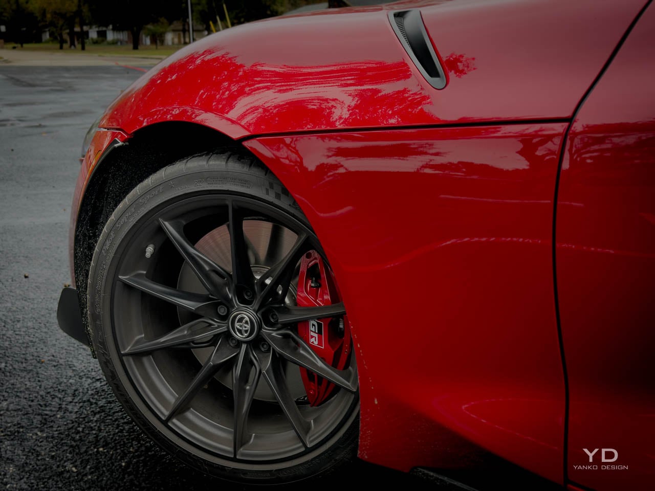
  • Larger Brembo brakes resist fade confidently

  • Distinctive silhouette will age gracefully

  • Manual transmission available for enthusiasts

  • Premium Alcantara and leather interior

CONS:


  • No Android Auto connectivity

  • Limited cargo space and rear visibility

RATINGS:

AESTHETICS
ERGONOMICS
PERFORMANCE
SUSTAINABILITY / REPAIRABILITY
VALUE FOR MONEY

EDITOR'S QUOTE:

The most resolved Supra of this generation, built entirely for feel over flash.

The fifth-generation Toyota Supra has always carried the weight of resurrection, a nameplate revived after two decades of dormancy and built on a platform shared with BMW’s Z4. That partnership invited scrutiny from the beginning, with purists questioning whether the A90 could truly claim the Supra lineage when its heart beat with Bavarian engineering. Toyota’s response, refined across six model years, culminates in the MkV Final Edition: not a reinvention but a declaration that the conversation about authenticity matters less than the conversation about intent. The Final Edition does not chase new power figures or revolutionary technology. It chases feel, that elusive quality that separates cars people admire from cars people remember.

Designer: Toyota

Gazoo Racing’s philosophy has always emphasized the tactile over the theoretical, and this swan song embodies that principle with unusual clarity. Where competitors announce their final editions with horsepower increases and cosmetic packages, Toyota chose to invest in the parts that shape how the car communicates with its driver: bushings, braces, damper calibration, brake sizing. The engineering focus speaks to a different understanding of what makes a sports car meaningful. Numbers translate poorly to memory. The sensation of a chassis rotating precisely at the limit, the confidence of brakes that refuse to fade, the subtle feedback through a steering wheel that actually tells you something: these are the currencies that matter when the production line goes quiet.

The price positions the Final Edition in the upper 60s before destination, typically just over 70k as equipped, placing it firmly in the territory where a Porsche Cayman or BMW M2 becomes a reasonable cross-shop. That positioning is intentional. Toyota is not asking buyers to choose the Supra because it costs less or offers more features per dollar. The ask is simpler and more demanding: choose it because this is the most resolved version of a car that has spent six years learning how to be itself. I spent a week with the Final Edition, and that confidence comes through every time you turn the key.

Exterior Form Language

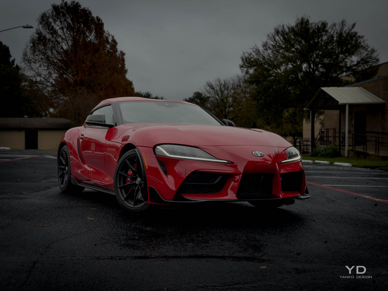
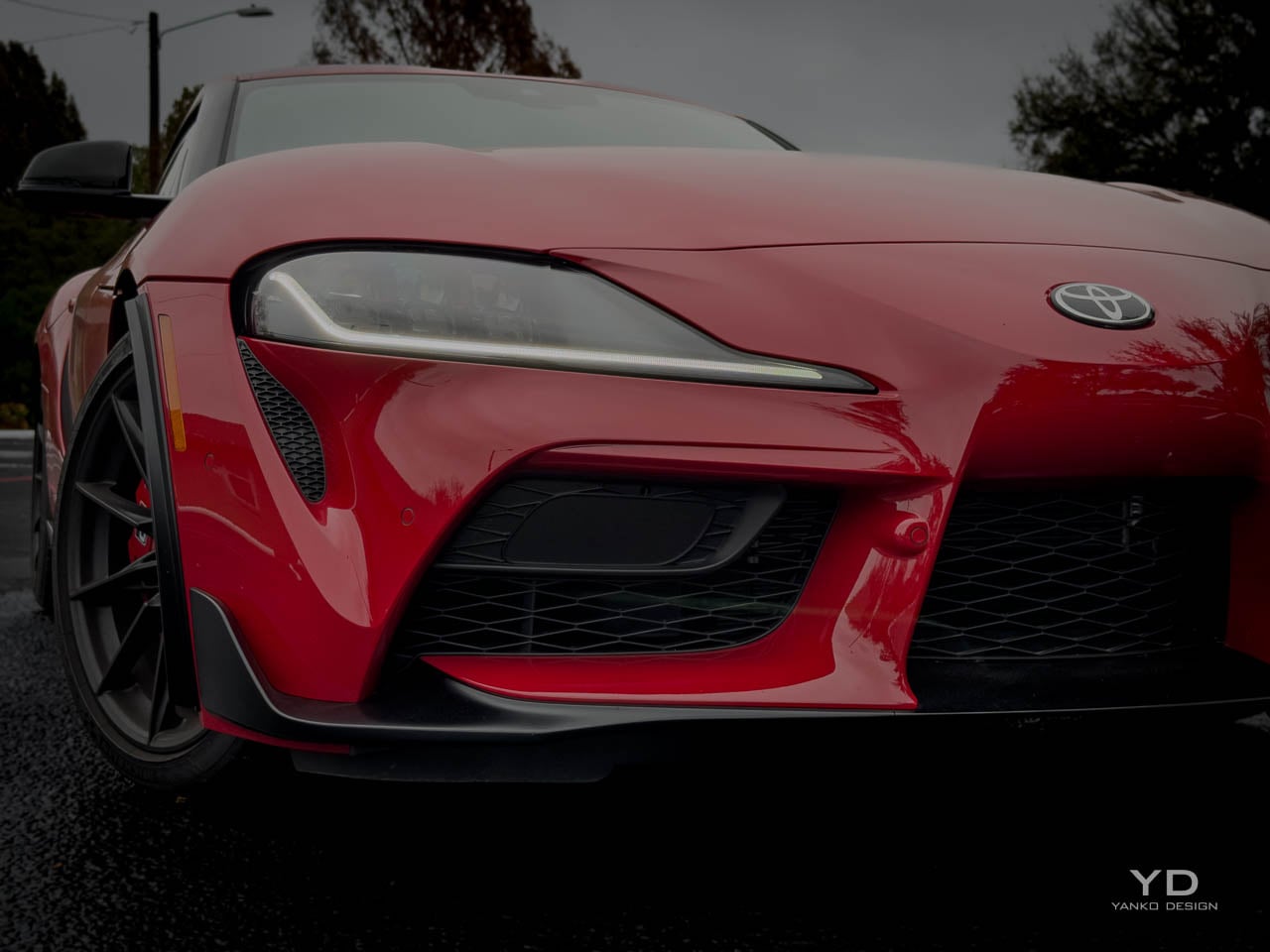
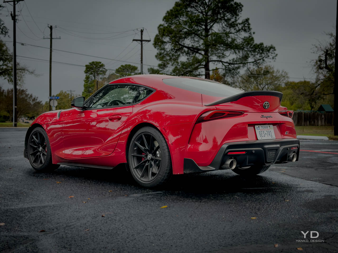
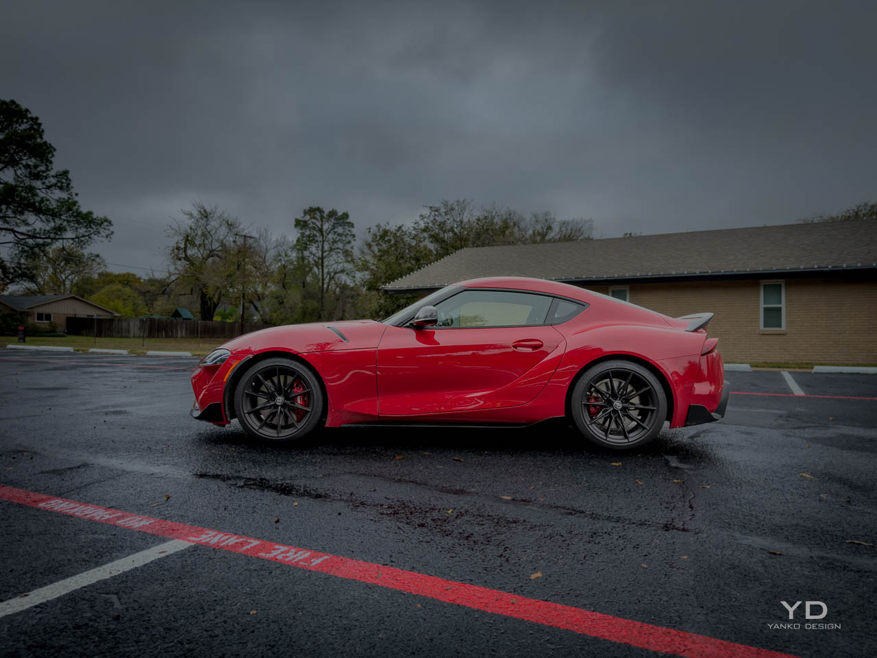
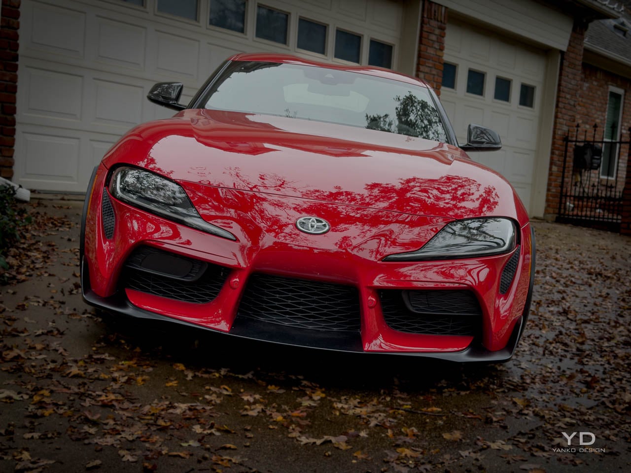
Few sports car silhouettes remain as distinctive as the GR Supra’s, a profile defined by the exaggerated length of its hood relative to the compact cabin and truncated tail. That proportion traces directly to the classic front-engine, rear-drive formula, but the execution here pushes further into sculptural territory than most modern interpretations. A double-bubble roof, functional in its origins as a nod to helmet clearance but now a visual signature, creates a centerline interruption that breaks what could have been a simple coupe arc into something more complex. Light catches the roof differently at every angle, revealing the depth of the sculpting work that photographs rarely capture.

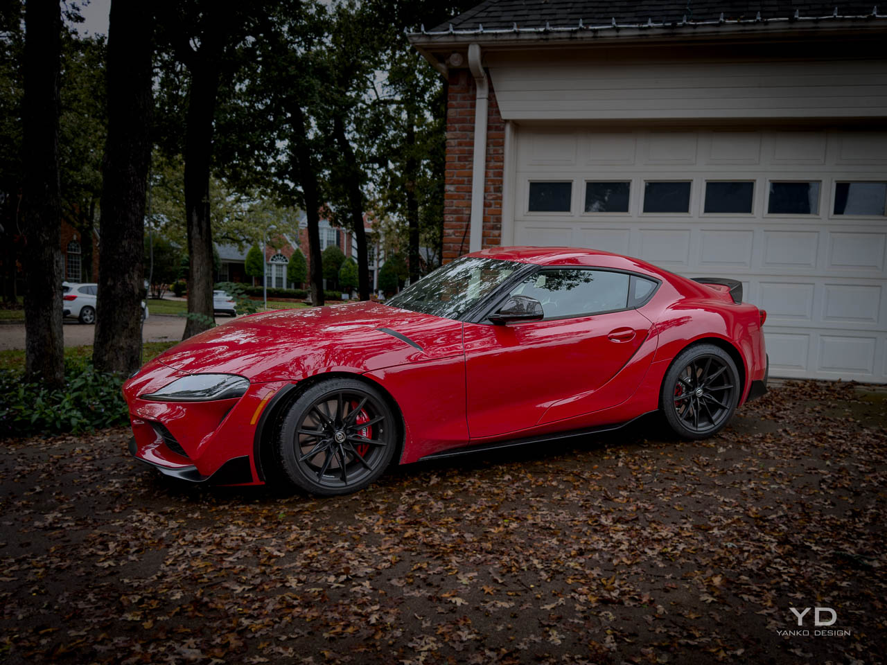
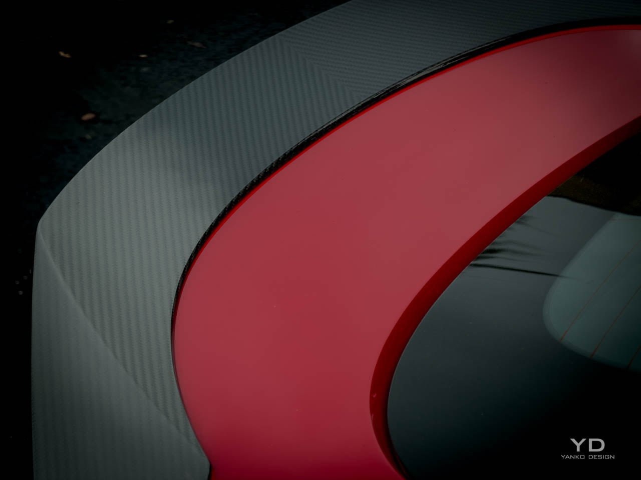
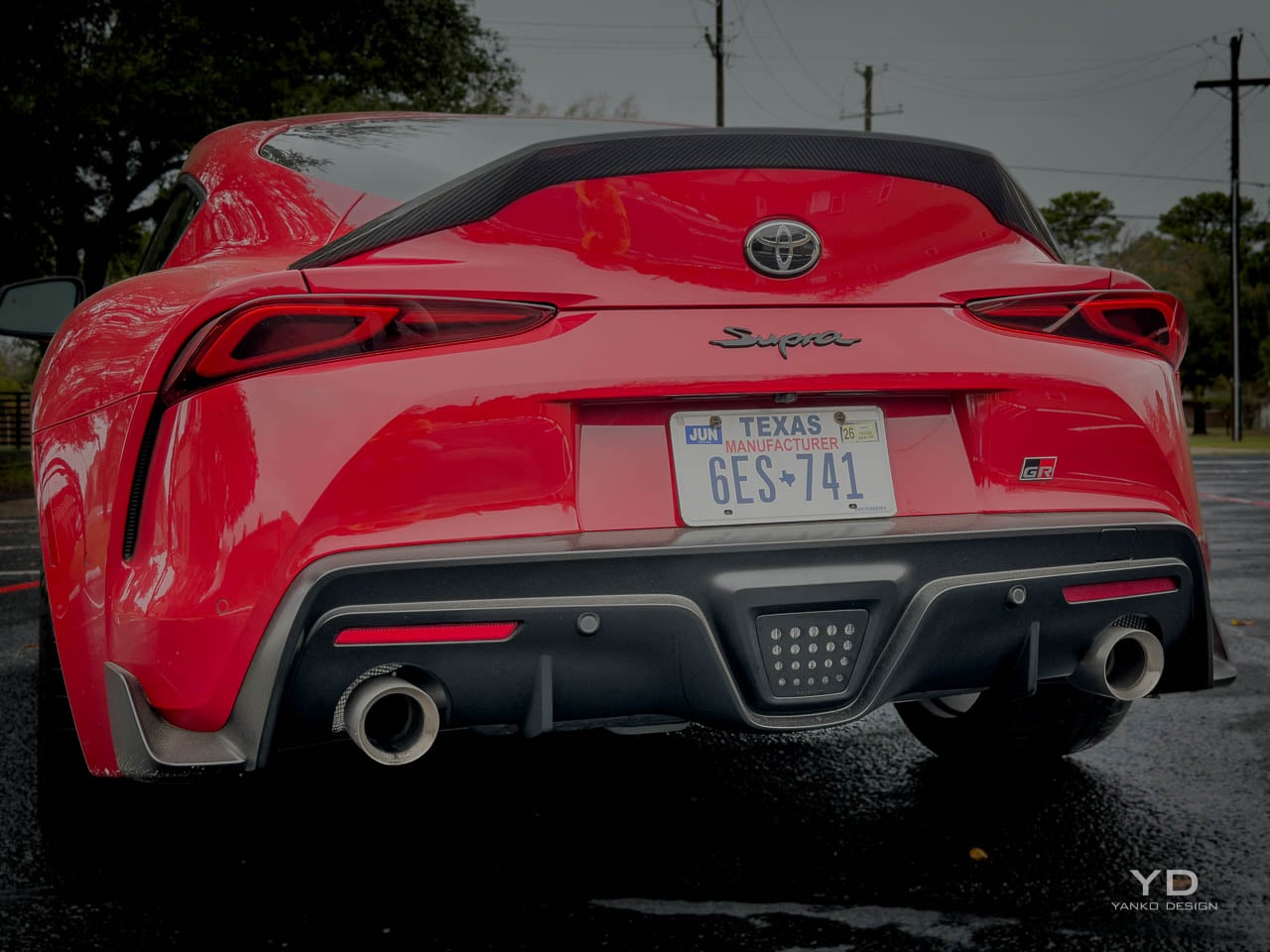
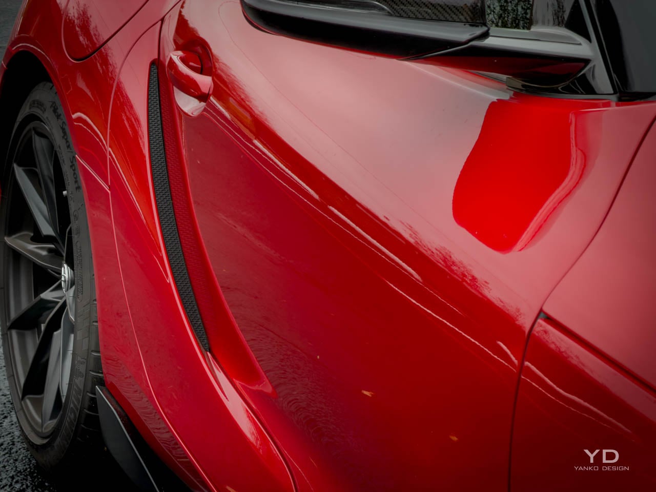
The Final Edition adds visual weight through functional aero components that subtly alter the car’s stance without abandoning the base design’s intent. In person, the carbon ducktail changes the whole rear three-quarter view. A carbon fiber ducktail spoiler extends the rear deck with a lip that follows the body’s natural curvature rather than imposing an aggressive aftermarket aesthetic. Front wheel arch flaps and taller tire spats address airflow management at higher speeds, but their visual effect is equally significant: they emphasize the muscular fender bulges that have always been the Supra’s most overtly athletic element. The matte black 19-inch wheels specific to this trim level darken the car’s overall presence, pulling attention toward the body surfaces rather than the brightwork. That darkening strategy continues with available carbon mirror caps and the optional GT4 appearance package, which introduces matte paint finishes like Burnout and Undercover that transform surface reflections into something closer to fabric than glass. The lighting signature carries forward unchanged from previous model years, with the narrow headlamp clusters and integrated LED running lights that give the Supra its focused, almost predatory forward gaze. Rear lighting uses a full-width bar that connects the tail lamps and creates visual width when viewed from behind. The decision to keep lighting elements consistent with the broader Supra range rather than creating Final Edition-specific graphics reflects Toyota’s restraint. This is a car closing a chapter, not a special edition screaming for attention.

Surfacing across the body panels demonstrates the kind of complexity that requires time to appreciate. The door skins carry compound curves that transition from convex to concave as they approach the rockers, creating shadow lines that change character depending on the sun angle. Fender tops pull upward from the hood line with enough volume to be visible from the driver’s seat, a design choice that deliberately references the original A80 Supra’s visual cues. The hood itself stretches forward with a slight power dome that interrupts what would otherwise be a simple convex surface, adding muscularity without resorting to the aggressive venting common in performance car design.

Where the Supra’s form language succeeds most convincingly is in its refusal to chase visual aggression for its own sake. Many competitors in this price bracket layer on ducts, vents, wings, and diffusers that announce performance intent through visual noise. The GR Supra communicates through proportion and surface, trusting that buyers who appreciate the engineering beneath will also appreciate the design discipline above. I think it is one of the better looking sports cars you can buy right now, and it will age better than most of its rivals.

Interior Architecture

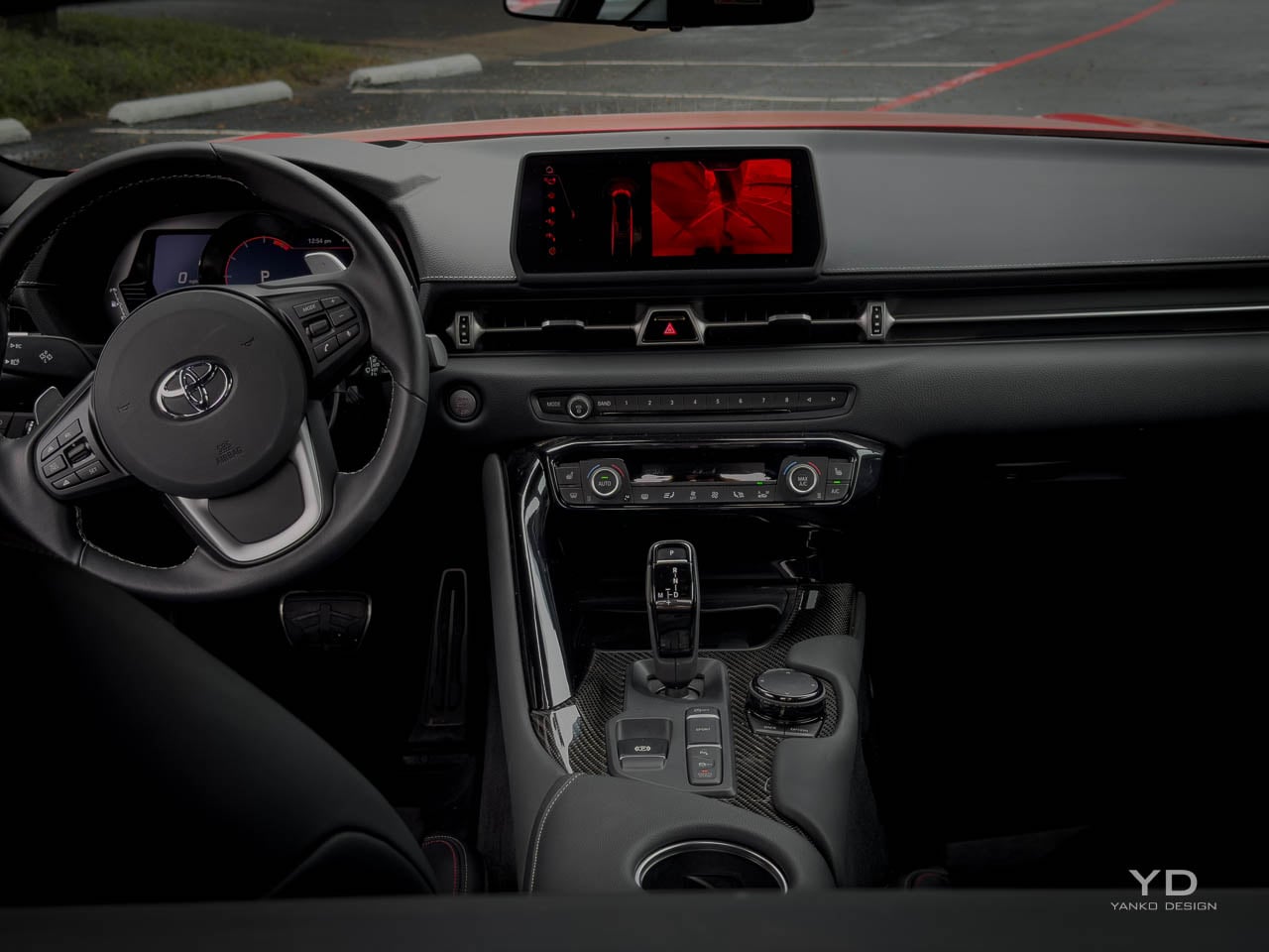
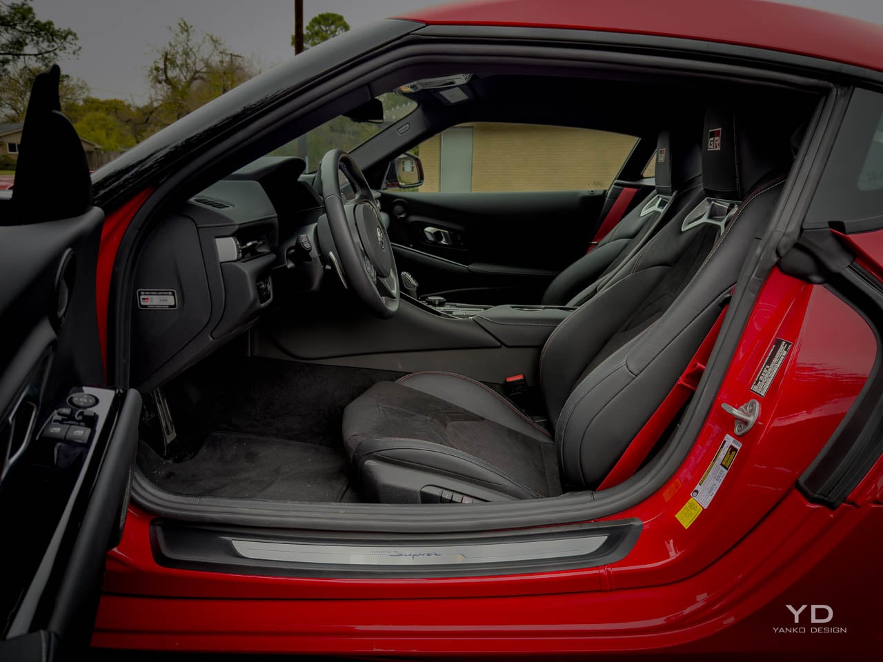
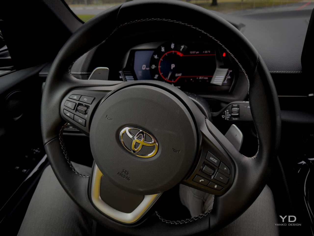
Cabin architecture establishes its priorities the moment the door swings open, presenting a cockpit organized around the driver with almost aggressive single-mindedness. Seat positioning sits low, with the hip point closer to the floor than most modern sports cars permit, creating the sensation of sitting in the car rather than on it. A relatively high door line and the upward sweep of the dashboard combine with that low seating to produce an environment that feels enclosed without claustrophobia, like a well-fitted helmet rather than a restrictive space. The center console rises between driver and passenger, creating both physical and psychological separation that reinforces the driver-focused intent. This is not a car designed for conversation during spirited driving.

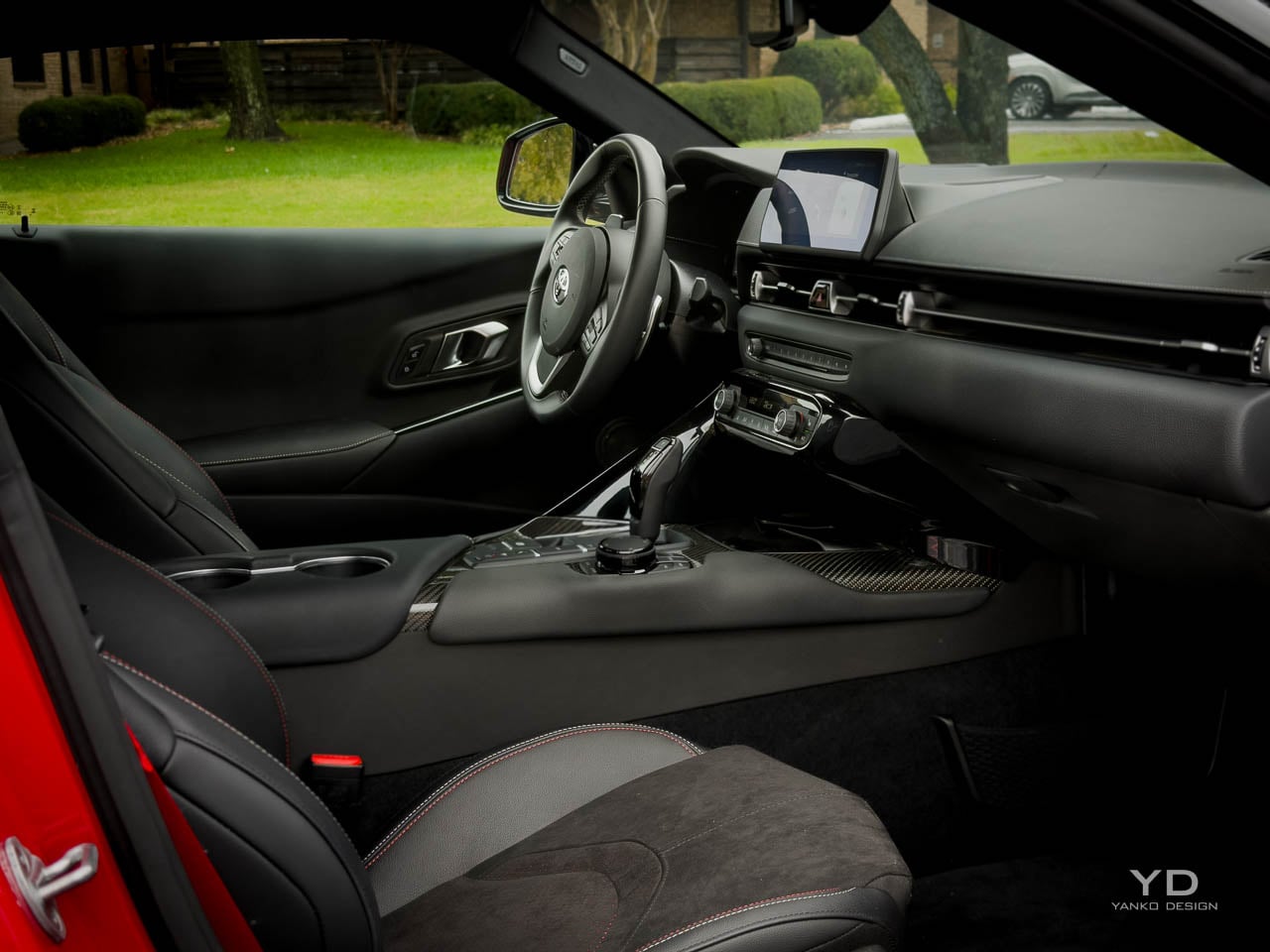
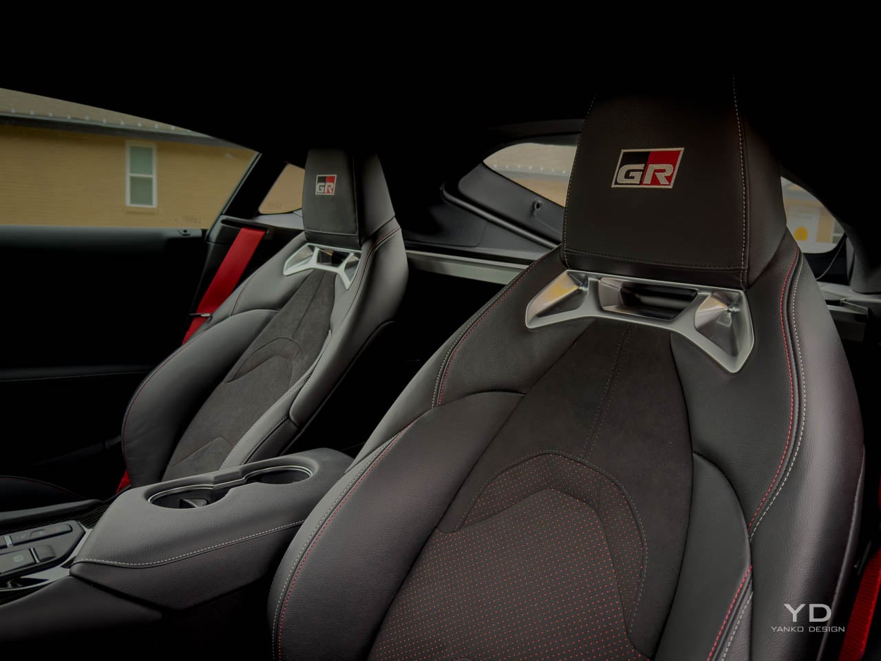
The Final Edition’s interior trim elevates the cabin through Alcantara and leather surfaces with red contrast stitching and GR branding integrated into the headrests and door panels. That red accent strategy walks a careful line: visible enough to communicate the special edition status, restrained enough to avoid the boy-racer look that aggressive color blocking can create. Alcantara appears on high-contact areas where grip matters, and the texture variation it brings is welcome. Leather covers the surfaces where durability and easy cleaning take priority. The combination feels deliberate rather than decorated.

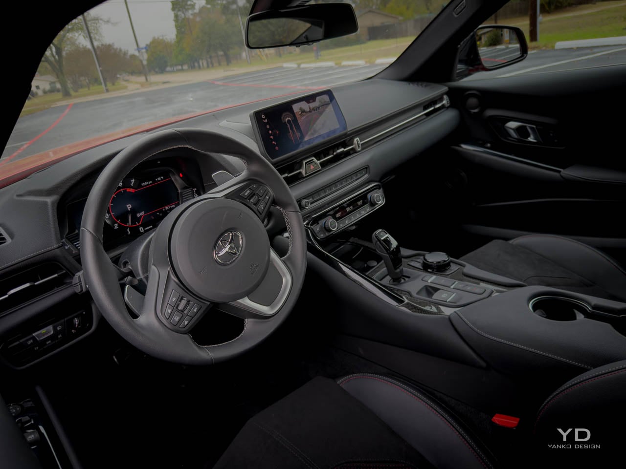
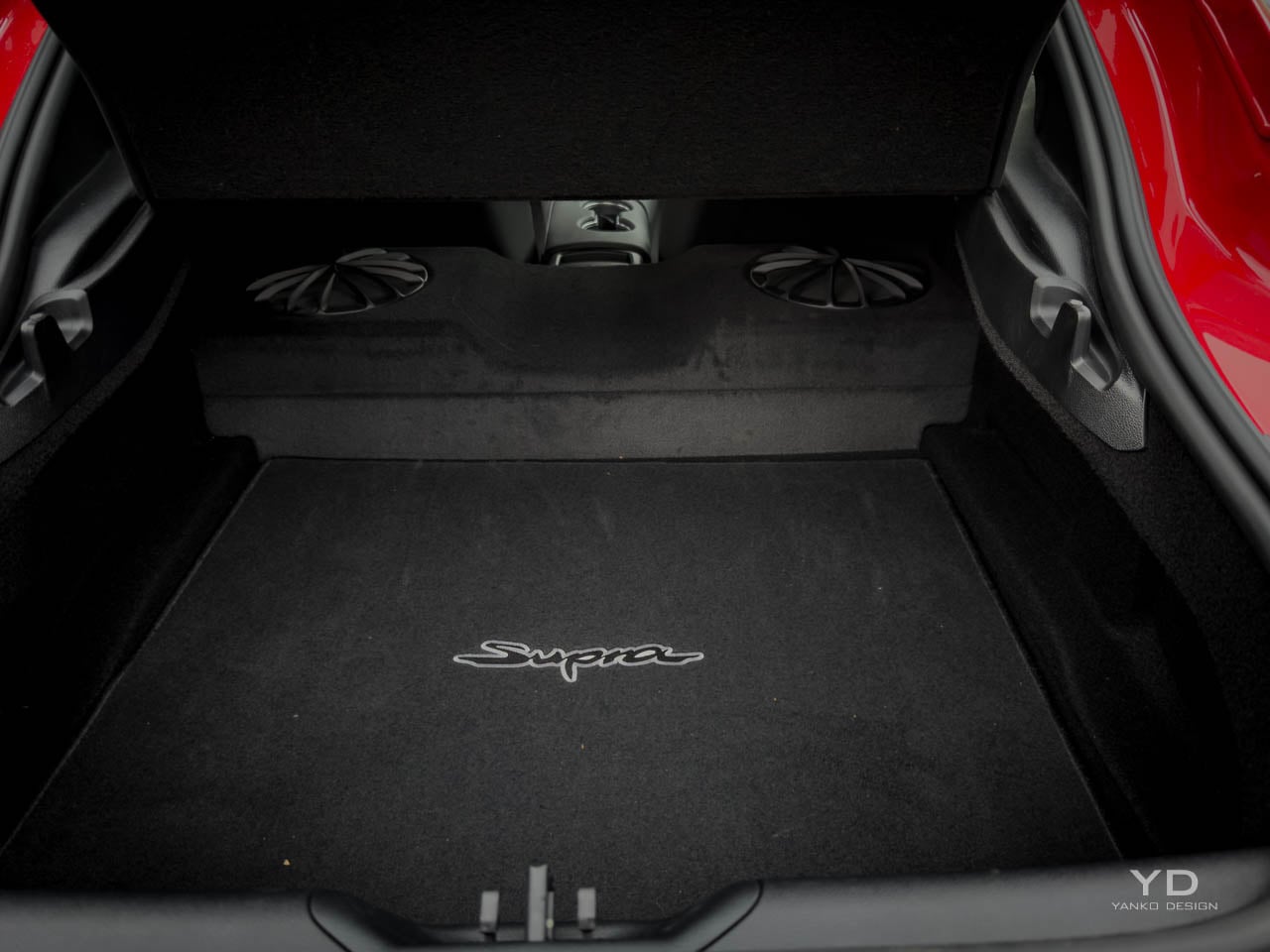
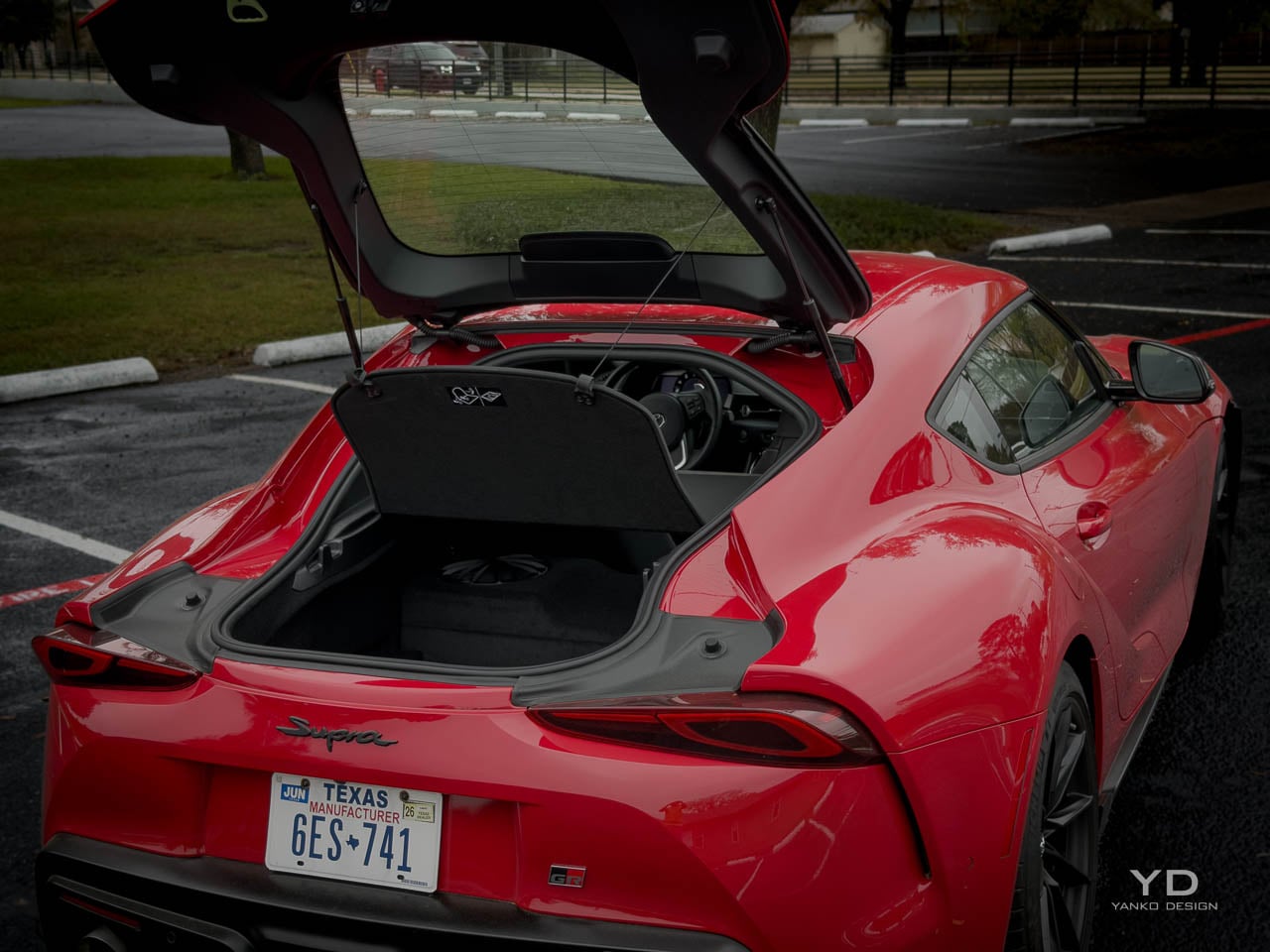
Spatial logic within the cabin follows the classic sports car compromise: adequate space for two adults, minimal accommodation for anything else. The 10.2 cubic feet of cargo behind the seats accepts weekend bags or a set of helmets, but the hatchback opening limits practical access compared with a traditional trunk. I fit a carry-on and a camera bag back there without much fuss. Seat adjustment range accommodates a reasonable spread of body types, though taller drivers may find the roof proximity notable, particularly with the double-bubble sculpting pressing down at the head area. The passenger seat offers less adjustment range, an honest acknowledgment that this space exists primarily to transport someone occasionally rather than to provide equivalent comfort to the driver’s position. The instrument cluster positions directly ahead of the steering wheel in a binnacle that creates visual focus, while the center-mounted infotainment screen angles toward the driver with enough tilt to be visible without requiring a full head turn.

Ambient quality within the Final Edition cabin achieves a level of refinement that earlier A90 models sometimes missed. Panel gaps align with acceptable precision, door closure sounds carry the solid thunk that buyers at this price expect, and the overall assembly feel reflects the maturation that comes with late-production-run refinement. The JBL audio system fills the cabin with competent sound quality that neither embarrasses the car nor elevates it to audiophile territory. Road noise penetration remains higher than in grand touring competitors but lower than in track-focused machines, positioning the Supra appropriately for its dual-purpose character.

Control surface placement follows established conventions without innovation, which in this context reads as confidence rather than laziness. The steering wheel rim thickness and diameter feel appropriate for the car’s performance envelope. Paddle shifters, on automatic-equipped models, position within natural finger reach. Climate controls operate through physical buttons rather than touchscreen menus, a decision that becomes increasingly welcome as more manufacturers abandon tactile interfaces. The overall ergonomic impression suggests a cabin designed by people who drive rather than by people who design interfaces.

Material Composition

Material selection within the Final Edition demonstrates the kind of thoughtful approach that distinguishes serious sports cars from dressed-up economy platforms. The Alcantara carries enough weight to feel genuine rather than synthetic, and the stitching on the leather surfaces maintains consistent spacing throughout. Hard plastics appear in lower visibility areas, but their matte finishes prevent the cheap, shiny look that dates an interior. Carbon fiber trim matches the exterior pieces in weave and clear coat.

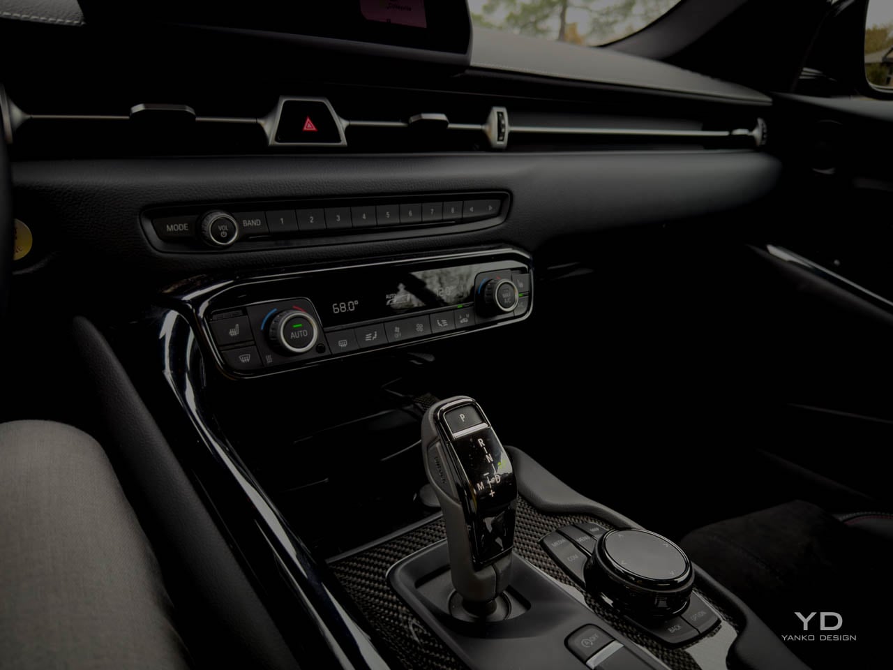
The steering wheel leather provides grip during hard cornering without needing aggressive perforation. The shift lever moves through its gate with the mechanical precision you want from a sports car. Climate control knobs click with appropriate resistance, and even the key fob has the right heft. These details matter more than they should, and the Final Edition gets most of them right.


Sound enters the cabin intentionally. Road surface changes come through the floor clearly enough to tell you about grip conditions. Wind noise picks up above highway speeds, a tradeoff for that slippery shape. The inline-six sounds smooth and present without needing artificial amplification through the speakers. This is a car that wants you engaged, not cocooned.

Technology Integration

The 8.8-inch infotainment display runs older BMW iDrive software that works fine without impressing anyone. Apple CarPlay handles smartphone connectivity, though Android Auto remains unavailable, a gap that stands out as the market has largely standardized around both. The central controller with shortcut buttons takes some learning but becomes efficient with use. Response time is adequate, and the screen resolution reflects the platform’s age without embarrassing the car.

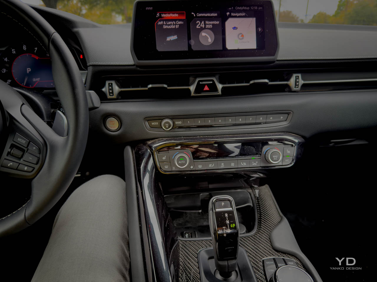
The head-up display projects speed, navigation directions, and basic vehicle info onto the windshield where it belongs. Brightness adjusts automatically, and the information density stays reasonable during spirited driving. Taller drivers may find the projection sitting lower than ideal.

Driver assistance on automatic models includes adaptive cruise, lane departure warning, emergency braking, and blind spot monitoring. These systems work competently without the refined calibration of the best current implementations. The technology overall reflects a transitional moment: physical buttons for climate and common functions, which many buyers will appreciate, but less visual sophistication than competitors increasingly offer. The tech is fine. You are not buying this car for its infotainment.

Powertrain Character

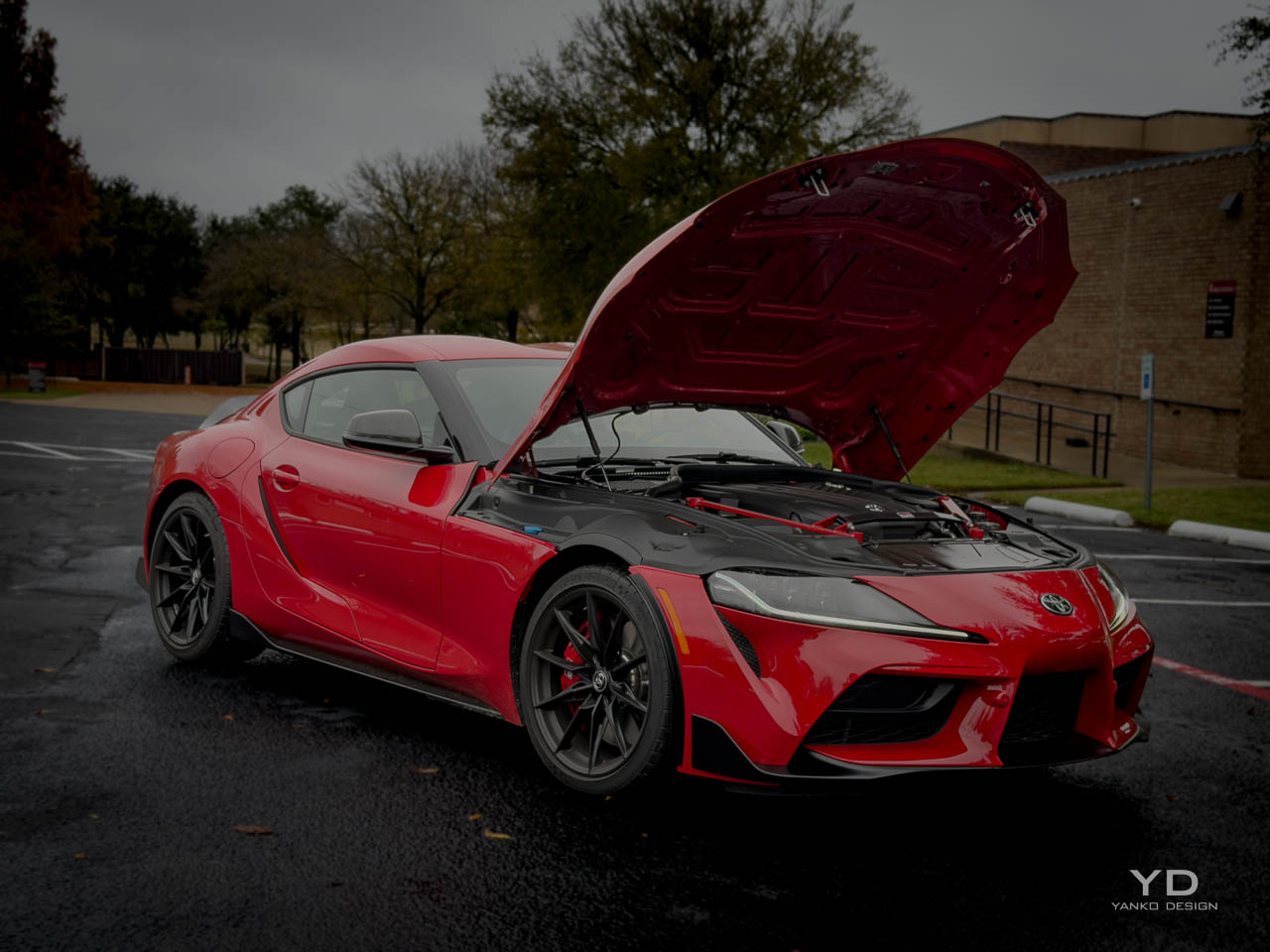
The 3.0-liter turbocharged inline-six produces 382 horsepower and 368 pound-feet of torque through a powerband that emphasizes breadth over peak drama. Torque arrives from 1,800 rpm and maintains presence across the usable range, eliminating the lag and surge that characterized earlier turbo applications and creating a delivery character that rewards varied driving styles. The engine note carries the mechanical smoothness inherent to inline-six architecture, with a refined exhaust sound that announces intent without the aggressive crackle and pop that some competitors employ. Power delivery feels linear and accessible, building predictably with throttle input rather than arriving in sudden bursts that complicate corner exit management.

Transmission choice between the six-speed manual and eight-speed automatic represents a philosophical decision as much as a practical one. The manual offers the engagement and control that enthusiasts prize, with a shift action that has improved across model years to provide shorter throws and more precise gate definition. The automatic matches revs competently during downshifts, executes ratio changes with appropriate speed during spirited driving, and proves unobtrusive during commuting duties. Toyota’s quoted acceleration times favor the automatic slightly, with 0-60 mph arriving in 3.9 seconds versus 4.2 seconds for the manual, though the differences in real-world driving feel less significant than benchmark testing suggests.

The Final Edition’s chassis improvements transform how the powertrain translates through the driving experience. The brake pedal firms up after a few hard stops rather than going soft, which builds confidence when you start pushing. Revised differential control maps improve traction deployment during corner exit, and you feel the rear step just a bit before the diff catches it rather than snapping into oversteer. The stronger front stabilizer bar and recalibrated adaptive dampers maintain body composure under the power application that the turbo six enables. These changes do not alter the powertrain’s fundamental character but refine how that character reaches you through the controls.

Daily Reality

Ownership experience with the GR Supra Final Edition confronts the compromises inherent to sports car design with varying degrees of success. The low seating position that creates driving involvement also complicates entry and exit, particularly in parking spaces where adjacent vehicles limit door swing. Visibility limitations from the small rear window and thick C-pillars require adjustment for drivers accustomed to more expansive glass areas, making parking lot navigation a conscious task rather than a casual one. The firm suspension tuning that provides communication and control on winding roads transmits surface imperfections with corresponding directness, making rough pavement a more present companion than luxury-oriented vehicles would permit.

Fuel economy according to manufacturer estimates reaches 22 mpg in city driving and 29 mpg on the highway, with a combined figure of 25 mpg that reflects the turbocharged six-cylinder’s efficiency when cruising and its appetite when pushed. Real-world numbers will vary with driving style, but the overall efficiency positions the Supra reasonably within its competitive set, neither punishing owners with sports car fuel bills nor pretending toward economy car frugality. Premium fuel requirements add to operating costs in a way that buyers at this price point typically accept as inherent to the category.

Reliability considerations for the Final Edition benefit from six years of production refinement and the BMW powertrain’s established service record in various applications. Early A90 models experienced some software and electronic issues that subsequent years addressed through updates and revisions. The mechanical components, including the engine, transmission, and differential, have demonstrated durability across the ownership community, with major failures remaining relatively uncommon in maintained examples. Service access through Toyota dealers provides convenience advantages over more exotic alternatives, though parts pricing for BMW-derived components can exceed expectations set by Toyota’s mainstream reputation. Warranty coverage follows Toyota’s standard terms, providing the assurance that comes with corporate backing during the initial ownership period.

Storage practicality remains the sports car compromise that no design can fully solve within this package’s constraints. The 10.2 cubic feet behind the seats accepts soft luggage or equipment bags, but the hatchback opening restricts the shapes and sizes that fit easily. The absence of a front trunk, common in mid-engine competitors, eliminates a supplementary storage option that some buyers might expect. Interior storage compartments provide adequate space for phones, wallets, and small items without offering the bins and cubbies that more practical vehicles include. The trunk floor sits high relative to the rear bumper, requiring a lift-over motion that larger or heavier items resist. Owners planning regular cargo duties will find the Final Edition uncooperative.

Competitive Context

Positioning against direct competitors reveals the Final Edition’s distinctive value proposition within a segment rich with alternatives. At approximately $63,000, the Porsche 718 Cayman offers mid-engine balance and the Porsche badge’s aspirational weight, but base models arrive with less power, while equivalently-equipped examples push beyond $80,000. Starting around $64,000, the BMW M2 shares platform architecture with the Supra but wears the M division’s identity, providing comparable performance with a different aesthetic philosophy and higher standard equipment levels. The Nissan Z presents a front-engine, rear-drive alternative at lower price points starting near $50,000, though with less refined chassis dynamics and a less developed interior environment.

Design differentiation within this competitive set reflects each manufacturer’s interpretation of sports car purpose. The Porsche approach emphasizes precision engineering expressed through minimalist design, with restrained surfaces and functional detailing that communicates seriousness without flamboyance. BMW’s M2 adopts a more aggressive stance, with widened bodywork and prominent air intakes that announce performance intent visually. The Nissan Z revives retro styling cues that connect to heritage models, creating emotional resonance through nostalgic reference. The GR Supra occupies a space between these approaches, modern in execution but proportionally classic, dramatic in silhouette but restrained in detailing.

Value assessment for the Final Edition depends heavily on buyer priorities and intended use. Those seeking maximum performance per dollar will find better acceleration numbers elsewhere. Those prioritizing interior luxury or technology features will find more comprehensive offerings at similar prices. Those wanting a daily driver with occasional sport driving will find more practical alternatives with comparable engagement. The Final Edition’s value proposition centers on something less quantifiable: the refinement of a platform that has spent six years developing its character, presented in the form Toyota believes represents its fullest expression. That refinement carries worth for buyers who understand what it represents and holds less meaning for those who prefer specification sheet comparison.

Who Should Buy This

The Final Edition makes the most sense for enthusiasts who already know they want a Supra and want the most sorted version Toyota will ever make. If you track your cars occasionally but mostly drive them on weekends, the chassis improvements and brake upgrade translate directly into confidence. If you care about owning something that will hold its value as a last-of-generation collectible, the limited production run and manual transmission availability help that case. If you need a daily driver that happens to be fun, the standard 3.0 or 3.0 Premium gets you most of the experience for less money. And if you cross-shop heavily on tech features or interior luxury, the Cayman and M2 offer more polish in those areas. The Final Edition is for people who prioritize how a car feels over what it offers on paper.

Design Verdict

The 2026 Toyota GR Supra MkV Final Edition represents a mature conclusion to a generation that arrived with controversy and departs with resolution. Toyota’s decision to invest the Final Edition’s development budget in chassis refinement rather than power increases or cosmetic drama reveals a design philosophy that prioritizes experience over specification. The car that results feels more complete than its predecessors, with the sharpened dynamics and improved braking confidence that track time and engineering iteration produce. Whether those improvements justify the price premium over standard models depends on the buyer’s sensitivity to the differences and the value they place on owning the definitive version of a platform reaching its end. The design choices, from the restrained exterior treatment to the driver-focused interior architecture to the material selections that emphasize quality over flash, communicate intentions clearly enough for interested buyers to evaluate alignment with their own priorities.

Longevity prospects for the Final Edition’s design suggest the kind of aging that rewards restraint. The absence of aggressive trend-chasing elements, the proportion-driven exterior language, the functional rather than decorative interior approach: these qualities tend to preserve relevance as years pass rather than dating the design to a specific moment. The limited production run adds collectability considerations that may influence future values, particularly for manual transmission examples in distinctive color combinations. Whether the GR Supra MkV will achieve the classic status of its A80 predecessor remains for time to determine. What the Final Edition demonstrates conclusively is that Toyota understood what made this generation worth building and chose to close its production run with the clearest expression of that understanding.

The post 2026 Toyota GR Supra MkV Final Edition Review: A Farewell Written in Carbon Fiber and Camber first appeared on Yanko Design.

This Phone Concept Stacks a 3.5-Inch LCD Above a 5.2-Inch E Ink Screen

Modern phones have turned into pocket TVs, huge OLED slabs that are great for video and games but terrible for focus. Most E Ink phones go to the opposite extreme, either dropping color screens entirely or putting an E Ink panel on the back while keeping a full-size color display on the front. This dual-screen concept tries a different take, stacking both screens on the same face, with a small color LCD above a larger monochrome E Ink panel.

The basic layout is a 3.5-inch IPS LCD at the top and a 5.2-inch E Ink panel below, both on the front. The numbers are 1280 × 800 resolution at 120 Hz for the LCD and 1300 × 838 at 300 ppi for the E Ink. The clear back with a single camera and simple branding quietly signals that this phone is not chasing the usual multi-lens, all-screen spec race, instead treating the front as a composition of two very different surfaces.

Designer: Mechanical Pixel

The smaller LCD becomes the “burst of color” zone for time, notifications, music controls, and quick interactions, while the larger E Ink area is reserved for reading, notes, and simple widgets. This creates a hardware-level hierarchy; the calm, monochrome screen is where you spend most of your time, and you consciously move your attention to the smaller, brighter panel when you really need it, which changes the default state of the device from hyperactive to quiet.

The obvious pros are less visual noise, better eye comfort, and potentially much better battery life. E Ink only draws power when it refreshes, so a reading-first layout means the phone can idle for long stretches without burning through charge. For people who mostly message, read, and check calendars, the big E Ink panel could handle most of the day while the LCD stays off or in a low-duty role, extending runtime significantly.

The trade-offs are nothing to scoff at, though. A 3.5-inch LCD, even at 120 Hz, is not ideal for immersive video, complex productivity apps, or touch-heavy games. UI designers would need to rethink layouts for that smaller window, or accept that some tasks are better on a tablet or laptop. The E Ink panel’s slower refresh also limits it to taps and page turns, which is fine for reading but not for fast, gesture-driven interfaces that rely on immediate visual feedback.

This concept uses hardware to enforce a kind of digital minimalism. Instead of relying on focus modes and grayscale filters, it bakes the idea into the front of the phone, a big, calm screen for reading and a small, hyperactive one for everything else. For people who like the idea of a phone that nudges them toward books and away from endless feeds, that stacked layout feels like a surprisingly sharp design argument, where the very shape of the device encourages a different relationship with what lives on it.

The post This Phone Concept Stacks a 3.5-Inch LCD Above a 5.2-Inch E Ink Screen first appeared on Yanko Design.