Cory Doctorow coined the term “enshittification” to describe how internet platforms inevitably decay, prioritizing advertisers and shareholders over users who made them successful in the first place. What begins as a useful service gradually transforms into an advertising delivery system wrapped around minimal functionality. Websites that once loaded instantly now take seconds to render as they auction off your attention to the highest bidder. Social media feeds become algorithmic nightmares designed to maximize engagement with sponsored content rather than connections with actual people. This isn’t accidental degradation but a deliberate business model that treats users as products to be packaged and sold.
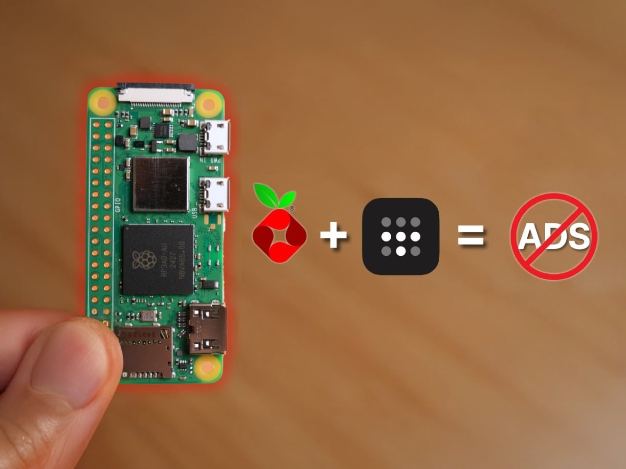
Fighting back against enshittification requires taking control of your own infrastructure rather than hoping platforms will respect your time and privacy. The Raspberry Pi Zero 2W running Pi-hole software represents a practical form of digital self-defense that costs less than $30 and works continuously in the background. This tiny computer sits on your home network and blocks advertising domains before they reach your devices, creating a cleaner internet experience across phones, tablets, computers, and smart TVs simultaneously. Adding Tailscale extends this protection beyond your home, ensuring that your browsing remains uncluttered whether you’re traveling or working remotely. The setup takes an evening and requires no programming expertise, just a willingness to reclaim your digital experience from platforms that have forgotten who they’re supposed to serve.
Designer: Enrique Neyra
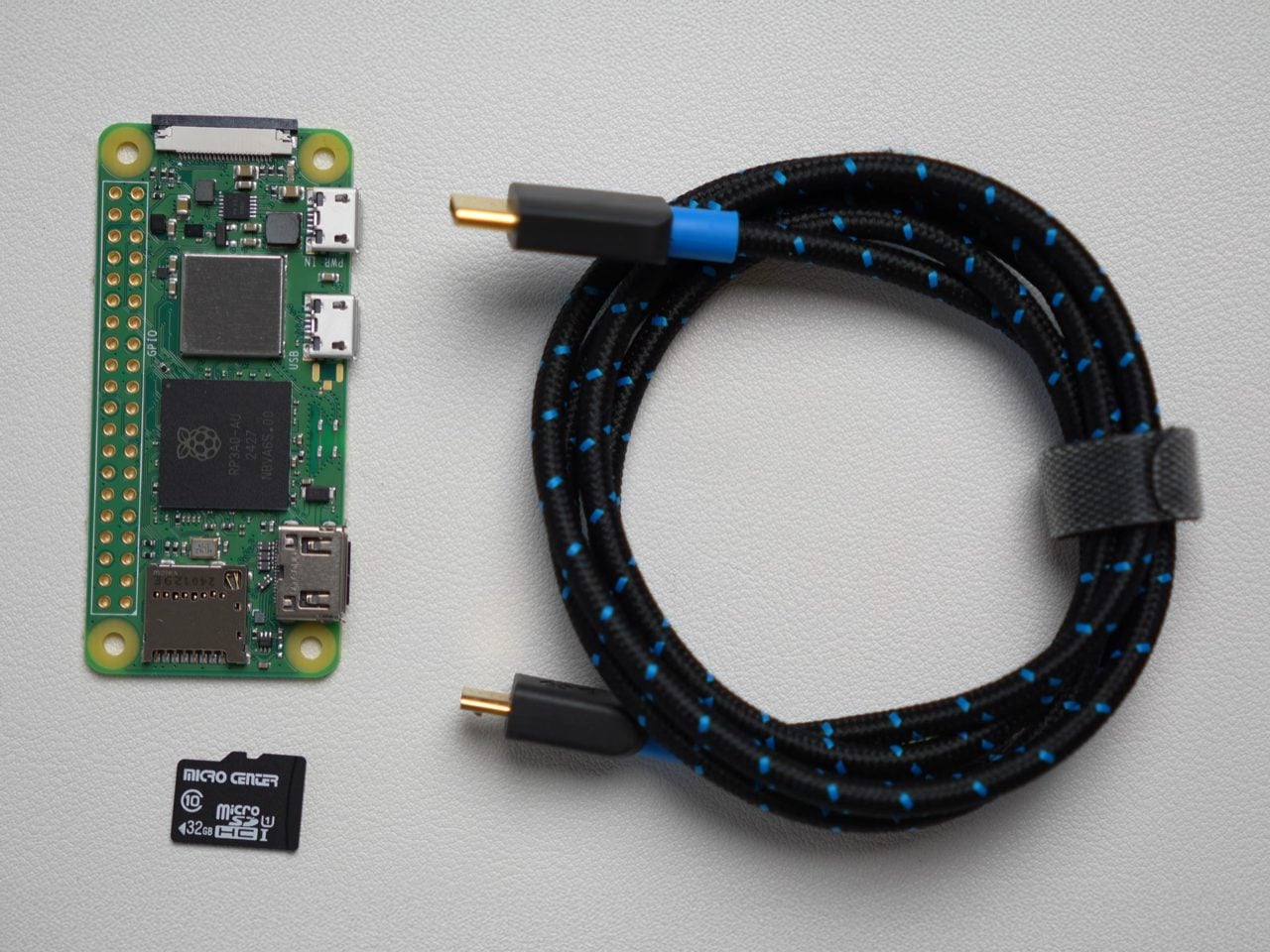
You’d expect an ad-blocker to be substantial on either the hardware or the software front, but this build proves just how small, easy, and cheap everything is. The Raspberry Pi Zero 2W running this entire thing measures 65mm by 30mm, smaller than most people’s wallets, drawing about 2 watts when it’s actually working. You could run this thing 24/7 for a year and spend less on electricity than a single trip to Starbucks. The whole shopping list is stupidly cheap too: the Pi itself runs $15, throw in an 8 dollar micro SD card and whatever USB cable you’ve got rattling around in a drawer. Thirty bucks max, and suddenly you’ve got hardware that can filter ads for every single device in your house.
The Pi runs headless, meaning no monitor, no keyboard, just sitting there quietly doing DNS work in the background. You flash Raspberry Pi OS Light onto the SD card using their imaging tool, which strips out all the desktop environment bloat since you’ll never actually see a screen. During setup you punch in your WiFi credentials, enable SSH so you can talk to it remotely, and give it a hostname. Three minutes later the OS is ready and you’re plugging the card into the Pi. Boot it up, SSH in from your laptop, and you’re looking at a command prompt on a computer the size of a pack of gum.
Pi-hole (an open-source software that blocks ads across the entire network) installs with one command. Literally paste it into the terminal and the script handles everything, walking you through prompts about which DNS provider you want upstream and whether you want query logging enabled. You absolutely want the web admin interface because that’s where you’ll watch the magic happen in real time. The trickier bit is the static IP assignment, which sounds intimidating but really just means logging into your router and clicking a button that says “reserve this IP for this device.” Most modern routers make this dead simple. ISPs like Spectrum have apps where you just scroll through connected devices, find your Pi, and hit reserve. Done.
Once the Pi has its permanent address, you point your router’s DNS settings at it instead of whatever your ISP provides by default. Every device on your network now funnels DNS requests through Pi-hole before connecting to anything. Pi-hole maintains these massive blocklists of known advertising and tracking domains, thousands of entries that get updated regularly. Your phone tries to load an ad from doubleclick.net? Blocked. Facebook wants to ping its analytics server? Blocked. The actual content you’re trying to see loads normally while all the parasitic garbage just vanishes. The Pi-hole dashboard shows you this happening in real time, queries flying in and getting either allowed or blocked based on the lists.
The really clever part is Tailscale, which turns your home setup into something you can use anywhere. Tailscale creates this encrypted mesh network between all your devices using WireGuard under the hood, and it’s shockingly easy to configure. Install it on the Pi with another single command, authenticate through their web console by clicking a link, and boom, your Pi appears in the Tailscale admin panel. Then you tell Tailscale to use your Pi’s IP as the DNS server for everything connected to your account. Now your laptop routes through your home Pi-hole whether you’re at a coffee shop in Brooklyn or an airport in Singapore. The VPN overhead adds maybe 10 milliseconds, completely imperceptible during actual browsing.
What you get is immediate and obvious. News sites that normally assault you with autoplaying video ads and popup overlays suddenly render clean. Mobile apps stop shoving interstitials between every interaction. Your smart TV’s interface becomes less cluttered with sponsored content tiles. Pi-hole typically blocks 20 to 30 percent of all DNS queries, which translates directly into faster page loads because your devices skip downloading megabytes of ad scripts and tracking pixels. Battery life improves on phones and laptops since they’re not constantly rendering and refreshing ad content in the background. The internet feels faster because it actually is faster when you’re not waiting for seventeen different ad networks to respond.
Now, the limitations. DNS blocking works great until it doesn’t, and the main place it fails is when ads come from the same domain as the content you want. YouTube is the classic example because Google serves ads from youtube.com subdomains that the platform needs for actual video playback. Block those domains and you break the whole site. Some news organizations have gotten smarter about this too, serving ads from their own CDNs to sidestep DNS filters. You’re looking at maybe 95 percent effectiveness across the broader web, which is substantial but leaves gaps. For the stubborn stuff you still need browser extensions (or use the Brave browser that even blocks YouTube ads) or just simply accept some ads will slip through. If you’ve reached this far, the latter clearly sounds like it isn’t an option.
The other consideration is dependency. If your home internet goes down and you’re traveling somewhere relying on Tailscale to route back through your Pi-hole, you lose DNS resolution entirely. You can mitigate this by configuring a secondary DNS server like Google’s 8.8.8.8 as a fallback, though that partially defeats the privacy angle. Some people solve this by running Pi-hole in the cloud on something like Google Cloud’s free tier, which gives you better uptime but requires more sophisticated networking to avoid creating an open DNS resolver that attackers can hijack for DDoS amplification. That’s a whole different level of complexity that I’m frankly not equipped to even explain.
The upside, even with this regular build, is massive. For thirty bucks and an evening of tinkering, you get network-wide ad blocking that follows you everywhere and works on every device you own without individual configuration. That’s precisely the practical digital self-defense Doctorow addresses about when he describes taking back control from platforms designed to extract value rather than provide it. The web becomes usable again, and I know that shouldn’t sound like a massive deal… but honestly, after seeing ads in Google, Gmail, Instagram, YouTube, Uber, heck, even ChatGPT, it kinda does feel game-changing.
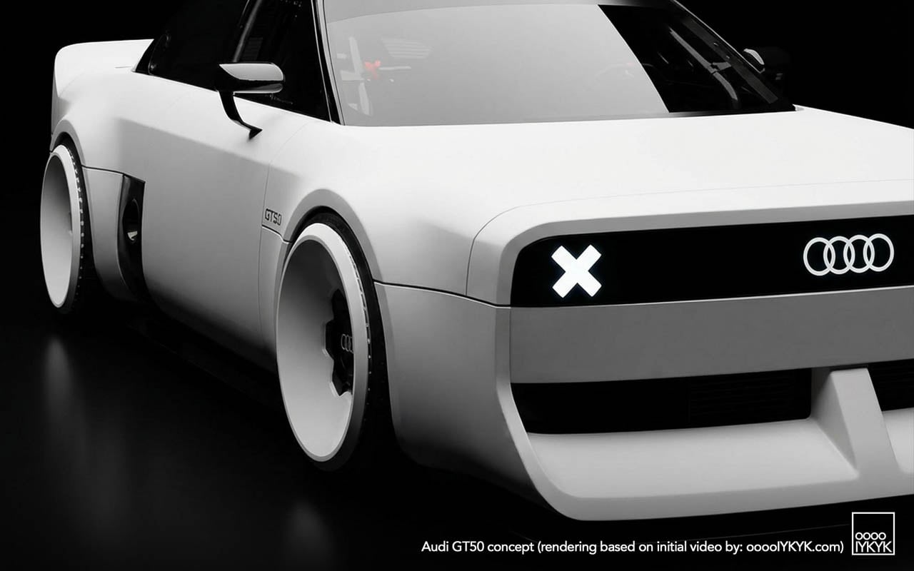
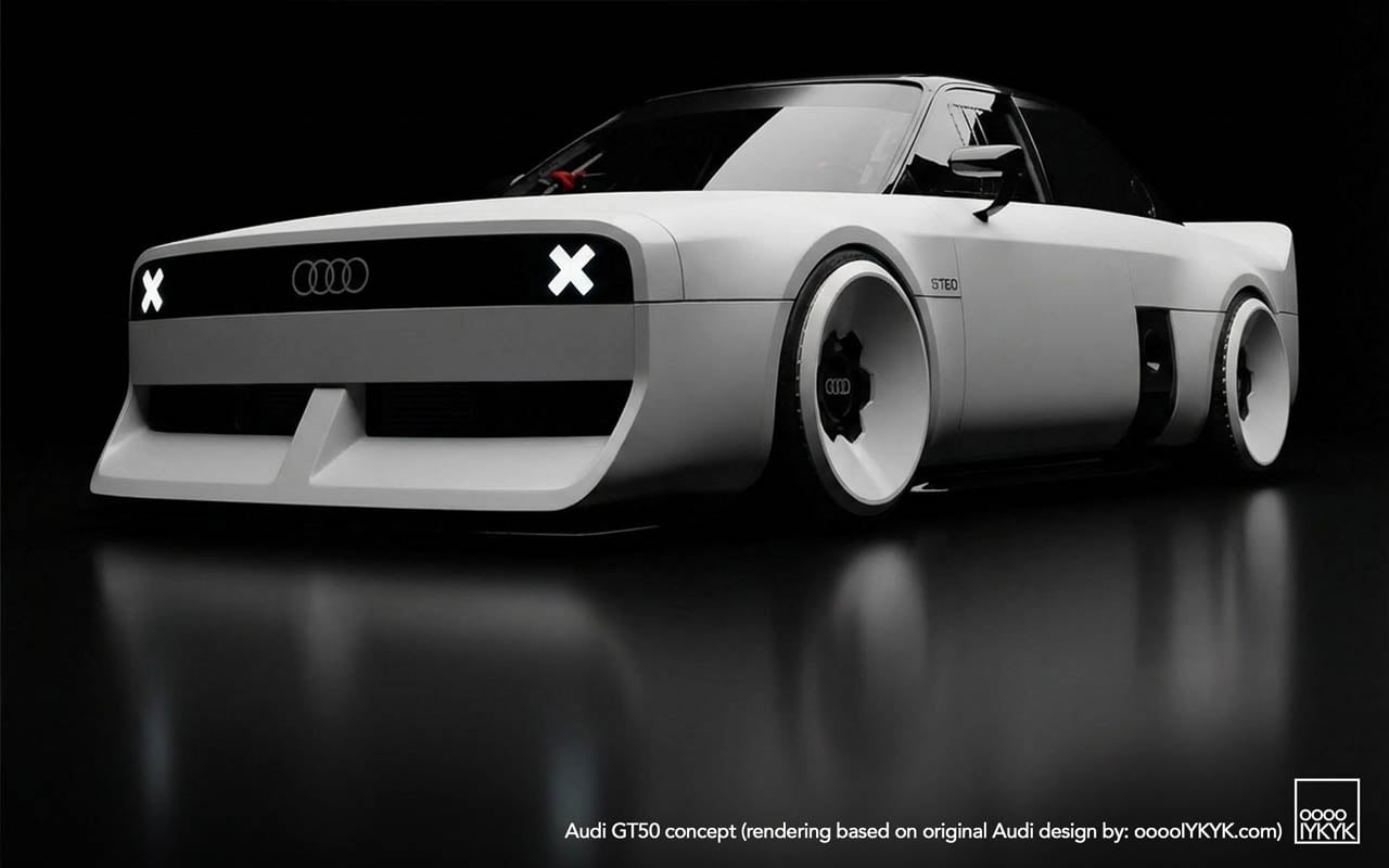
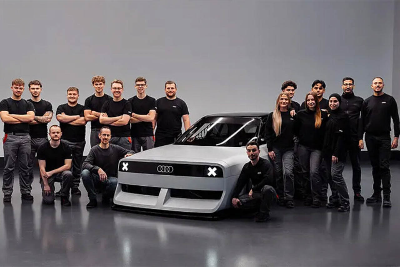
Audi’s electrification messaging has been relentless. Press releases foreground battery density. Concept reveals emphasize range anxiety solutions. The brand’s future, by every official metric, runs on electrons. Then the GT50 surfaces, quietly, through social channels and enthusiast blogs rather than a formal unveiling, and poses a question the corporate roadmap doesn’t answer: what cultural work can a five-cylinder engine still perform when the company building it has publicly committed to moving beyond internal combustion?
Designer: Audi
The concept car itself offers one response. Built by apprentices at Audi’s Neckarsulm training center, the GT50 wraps an unmodified RS3 powertrain in new fiberglass panels that visually lower the car (even if Audi has not detailed any suspension changes) while refusing every styling convention the parent company currently practices. The result reads less as tribute and more as provocation.
Visual Defiance: Reading the Surfaces
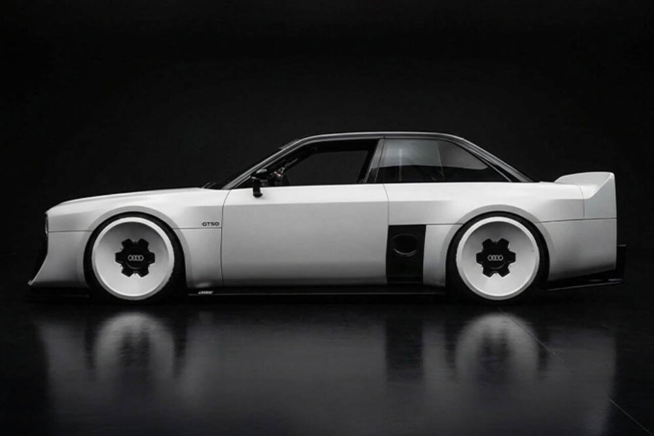
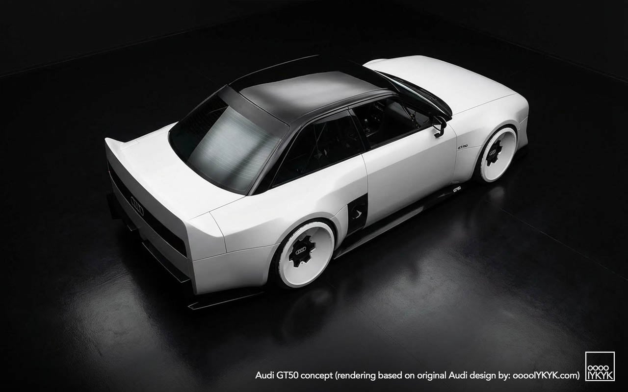
Start with what the photographs show that no press release describes. The C-pillar treatment carves a sharp notch where contemporary Audis would flow into a smooth shoulder line. Light catches the edge and dies. Below the rear glass, the decklid drops away at an angle that creates a shadow pocket, a visual trick borrowed from Group B rally cars, where abrupt surface breaks disrupted airflow less than they announced aggression.
The diffuser tells another story. Where modern RS models tuck their aerodynamic elements into integrated bumper designs, the GT50 exposes a finned undertray that reads like industrial equipment. No attempt to blend. No body-color covers. The functional hardware becomes ornament by being left visible.
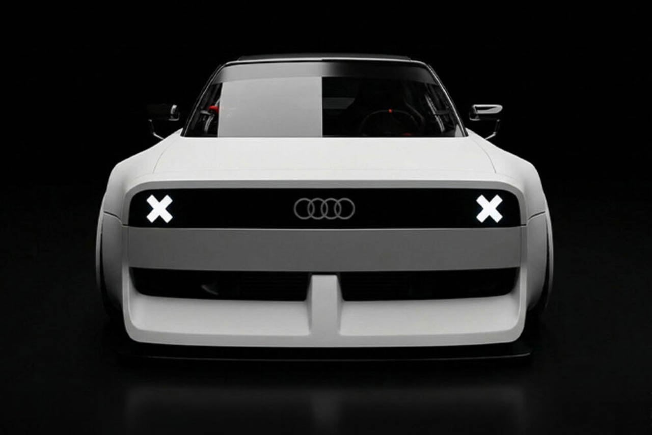
Wheel graphics interact with the body in ways that suggest deliberate coordination. The turbofan blades repeat the horizontal slat motif from the grille, creating a visual echo across the car’s length. Whether this was intentional design language or happy accident, the effect unifies the silhouette: front face and wheel face speak the same vocabulary.
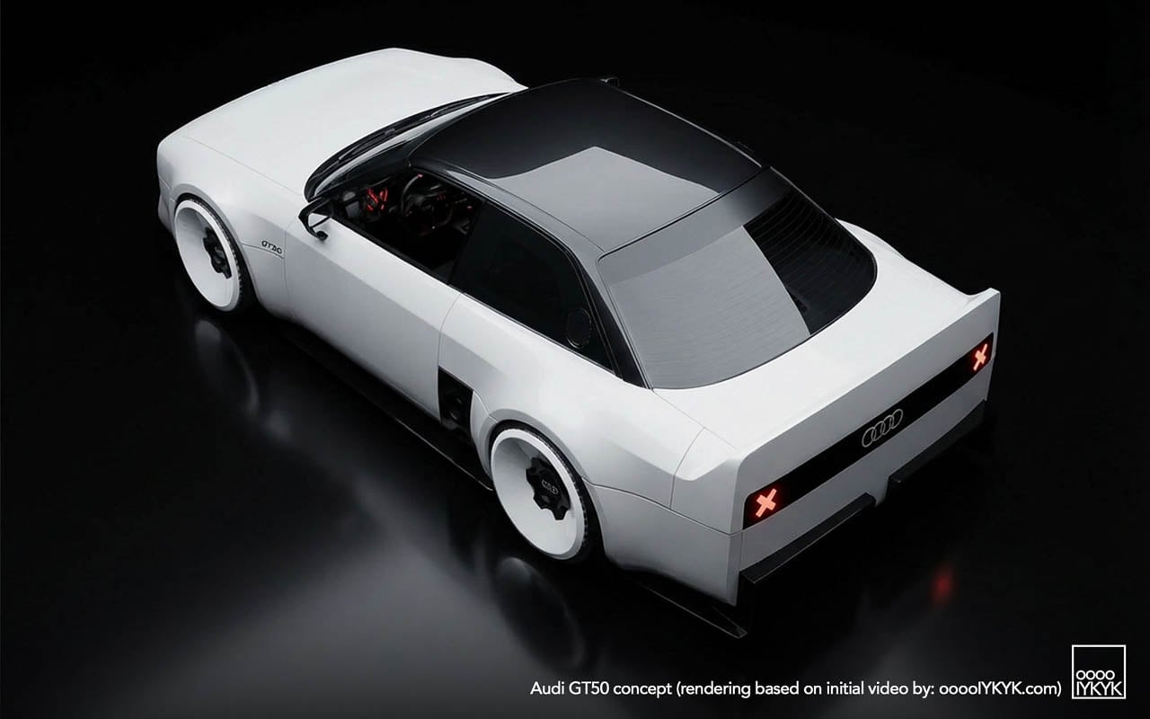
Three-box geometry defines the overall proportion. Flat hood. Upright greenhouse. Hard rear edge. Each volume asserts itself rather than dissolving into the next. This is geometry as argument, a rejection of the flowing sculpture that defines the e-tron GT and its siblings.
The Engine as Artifact
The 2.5-liter turbocharged five-cylinder produces 394 horsepower. The apprentice team changed nothing about it. No additional boost. No revised mapping. No intake modifications. This restraint is the point.
Enthusiasts know the platform. Basic modifications unlock nearly 500 horsepower. The aftermarket has mapped this engine extensively. Choosing to leave it stock reframes the powertrain as something worth preserving rather than improving: a museum piece still capable of performance, displayed in running condition rather than under glass.
The configuration itself has become rare. Volvo abandoned inline-fives years ago. Ford’s brief experiment ended. Fiat moved on. Among major manufacturers, Audi alone continues production, and only in the RS3. Fifty years after the layout debuted in the 1976 Audi 100 as a packaging compromise (five cylinders fit engine bays designed for fours while delivering displacement advantages) the configuration survives as brand signature rather than engineering necessity.
Racing Ghosts: Two Distinct Legacies
The GT50’s visual references split into separate histories that share an engine family but little else.
Rally heritage came first. The original Quattro road car and its competition derivatives established the five-cylinder as Audi’s performance identifier through the early 1980s. Gravel. Snow. Tarmac stages. The configuration proved itself in conditions that punished mechanical weakness.
North American racing followed a different path. The 90 Quattro IMSA GTO and 200 Quattro Trans-Am cars ran on circuits rather than stages, competing against purpose-built machinery from manufacturers with deeper racing budgets. The blocky bodywork, the aggressive aero addenda, the turbofan wheels: these elements came from that asphalt racing context, not from rally.
The GT50 draws primarily from the second lineage. Its proportions quote the IMSA cars directly: the way the fenders box out rather than curve, the stance created by wheels pushed to the body’s corners, the rear wing that spans the full decklid width. Rally Quattros looked different. The concept acknowledges this distinction through specific formal choices rather than generic “heritage” styling.
Apprentice Programs as Design Laboratory
Neckarsulm’s training program has produced boundary-testing work before. The RS6 GTO concept eventually influenced production decisions. That project proved the pipeline exists: ideas developed under apprentice freedom can migrate into showroom reality.
Other builds have pushed further from commercial viability. An electrified A2. A 236-horsepower NSU Prinz running modern EV hardware. These projects test technical integration as much as design direction.
The GT50 fits a different category. It uses a production powertrain unchanged. The bodywork is additive rather than structural. What the project tests is audience response, whether visual commitment to mechanical heritage generates the kind of enthusiasm that justifies development investment in combustion performance when corporate strategy points elsewhere.
Manufacturing Quality as Statement
Execution matters in this context. The released photography shows panel gaps that read as production-grade. Surface alignments hold. The fiberglass work displays none of the waviness or inconsistency that marks student-built specials at other institutions.
This finish level functions as argument. The GT50 is not a sketch in three dimensions. It is a proposal that could, with different business decisions, reach production. The apprentices built something that asks to be taken seriously as a potential product direction rather than dismissed as training exercise.
The Quiet Reveal and Its Implications
No stage. No livestream. No embargo coordination. The GT50 initially surfaced through social and niche outlets rather than the press machinery Audi deploys for products it expects to sell. This distribution choice communicates uncertainty, or perhaps strategic patience.
If reception proves enthusiastic, the soft launch becomes origin story. If response flatters less, the project remains an apprentice exercise, easily distanced from official product planning. The approach hedges corporate exposure while allowing genuine audience testing.
What the GT50 asserts, regardless of its production future, is that the five-cylinder’s cultural position within Audi’s identity has not been resolved by electrification commitments. The engine configuration still generates response. The racing heritage still communicates. Whether that cultural capital translates into business justification for extended combustion development remains the open question the concept was built to help answer.
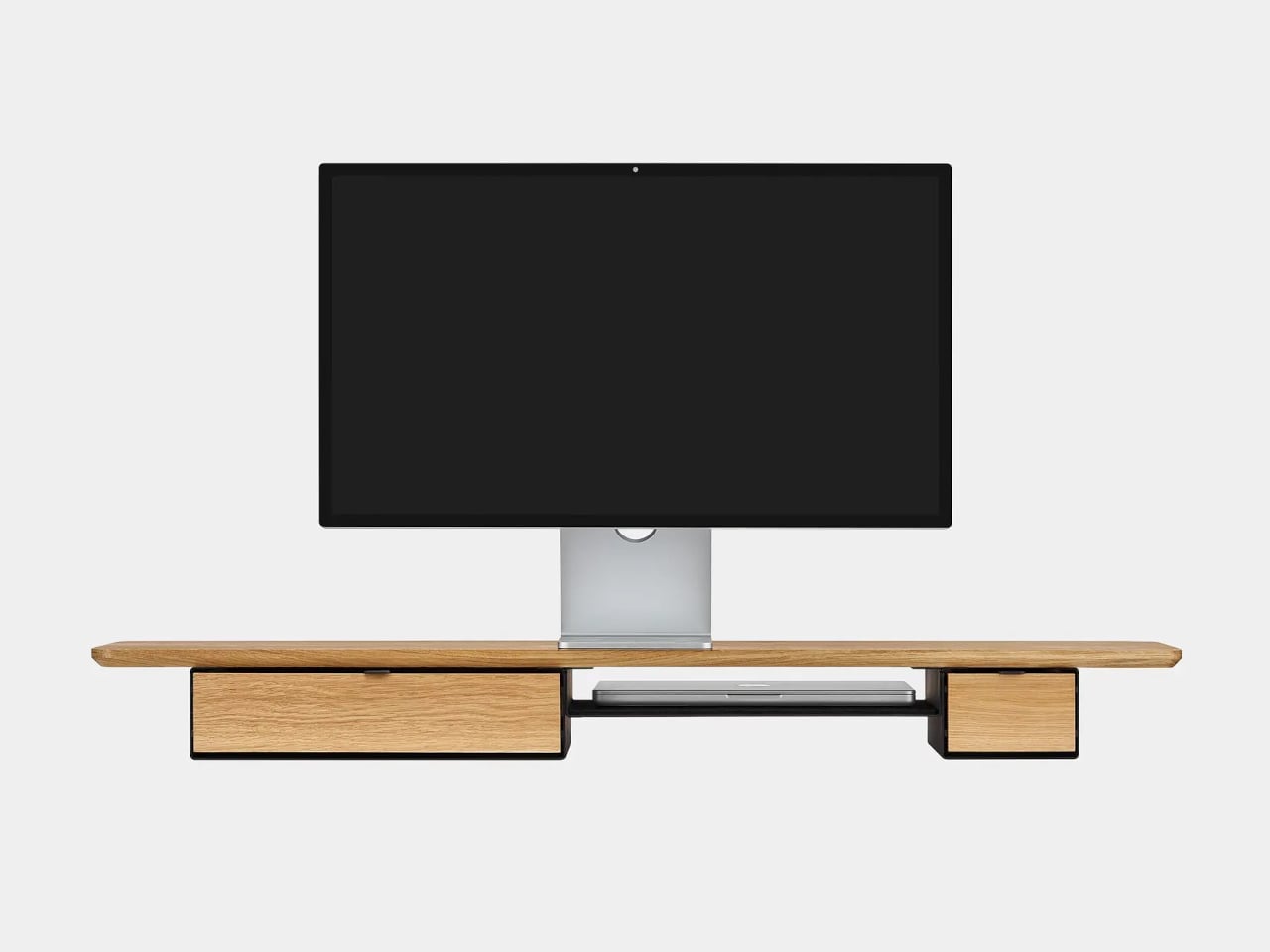
Desks fill up fast. A nice monitor and laptop sit on a surface that slowly accumulates cables, notebooks, charging docks, and random accessories. The usual fixes are cheap monitor risers, plastic drawer units, and cable trays that solve one problem but add visual noise. The Oakywood Desk Shelf Pro tries to handle ergonomics and organization without making the desk look busier, treating the riser as solid-wood furniture instead of an accessory.
Desk Shelf Pro is an all-in-one desk shelf that lifts your monitor, hides clutter, and adds a second functional level to the workspace. It combines a long, rounded wooden platform with powder-coated steel legs, integrated drawers, and a felt-lined open shelf. It is built from solid oak or walnut, not MDF with a plastic skin, so it feels like part of the desk rather than something perched on top.
The shelf spans the width of the desk, raising a monitor to a more natural eye level while leaving space underneath for a keyboard or laptop. Steel legs sit at each end, creating a floating effect and a central bay that becomes a home for devices. The shelf holds up to 100 kg, so it can handle large displays, desktop machines, and accessories without flexing, even when you lean on it.
Storage splits between one or two solid-wood drawers built into the leg modules and an open shelf running between them. The drawers swallow stationery, notebooks, and small tech, keeping the desktop clear. The open shelf is lined with merino wool felt, which protects tablets, trackpads, or a closed laptop from scratches and adds a soft, tactile layer that contrasts with the wood and steel.
Oakywood contrasts solid wood against plastic laminate, highlighting warm, unique grain versus uniform texture, durability that improves with age versus chipping and peeling, and the ability to refresh the surface with natural oils instead of replacing it. The felt is OEKO-TEX-certified merino wool, and the legs are powder-coated steel, so every major component is designed to last and age gracefully instead of ending up replaced after a few years.
The shelf comes in oak for a lighter Scandinavian look, walnut for a richer studio vibe, or black-stained oak for a more dramatic setup. You can choose single or dual drawers depending on how much you like to hide, and black or white legs to match your hardware. It works equally well on a sit-stand desk or a fixed one, anchoring everything from a minimalist Mac setup to a more eclectic creative workstation.
Desk Shelf Pro changes the feeling of sitting down to work. Instead of a scatter of objects, you get a clear plane of wood with a monitor, a few intentional items, and everything else tucked away but within reach. For people who spend all day at a desk, the combination of solid materials, hidden storage, and quiet ergonomics makes a case for treating a monitor riser as real furniture, something worth keeping for years instead of replacing when the next cheap organizer trend arrives.
Glamping has evolved beyond simple luxury camping into a sophisticated lifestyle that demands gear as thoughtful as it is functional. The best outdoor equipment now bridges the gap between wilderness adventure and home comfort, transforming rugged landscapes into spaces where design and durability meet. These innovations aren’t just about surviving the elements—they’re about thriving within them.
The gifts featured here represent a new generation of outdoor gear that refuses to compromise. From self-inflating shelters to zero-emission speakers, each design solves real problems with elegance and ingenuity. Whether you’re shopping for the design-obsessed adventurer or the comfort-seeking nature lover, these pieces prove that beautiful living and outdoor living can be the same.
1. The Cube
Picture this: you arrive at your campsite after hours of driving, the sun dipping low on the horizon. Instead of wrestling with poles and stakes while daylight fades, you press a button and watch your shelter inflate itself in four minutes flat. The Cube transforms a tent setup from an exhausting chore into an effortless ritual, using an air tube frame system powered by a wireless electric pump that eliminates every frustrating aspect of traditional camping shelters.
What makes The Cube genuinely special extends beyond its self-setup wizardry. This tent embraces glamping’s core promise with a stretched, oversized design that prioritizes genuine comfort over bare-bones survival. The spacious interior lets you stand upright and move freely, while the modular configuration adapts whether you’re claiming solo sanctuary or hosting friends. No more hunching, no more gear tetris, just airy living space that feels more boutique hotel than backcountry bivouac.
What we like
The four-minute inflation time eliminates setup stress entirely
The spacious, oversized interior offers actual standing room and breathing space
Modular design adapts seamlessly from solo trips to group adventures
No poles, stakes, or complicated threading required
What we dislike
Relies on battery power for the electric pump
Potential vulnerability if the air tube system gets punctured
Higher price point than traditional pole tents
Requires more storage space when deflated due to the pump equipment
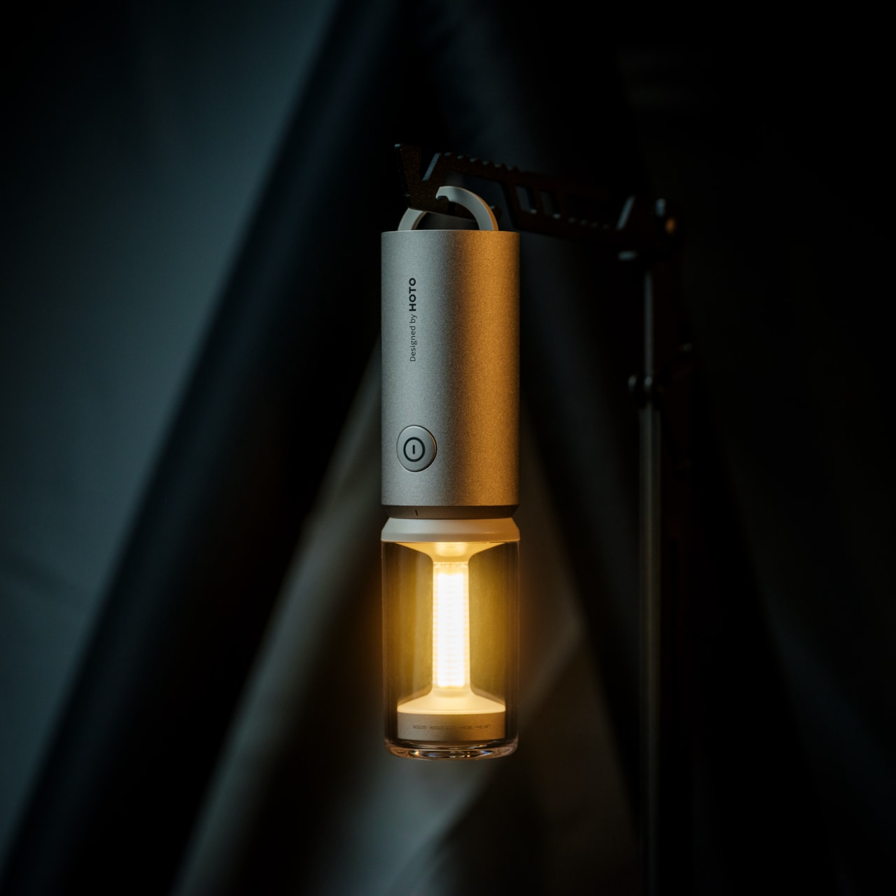
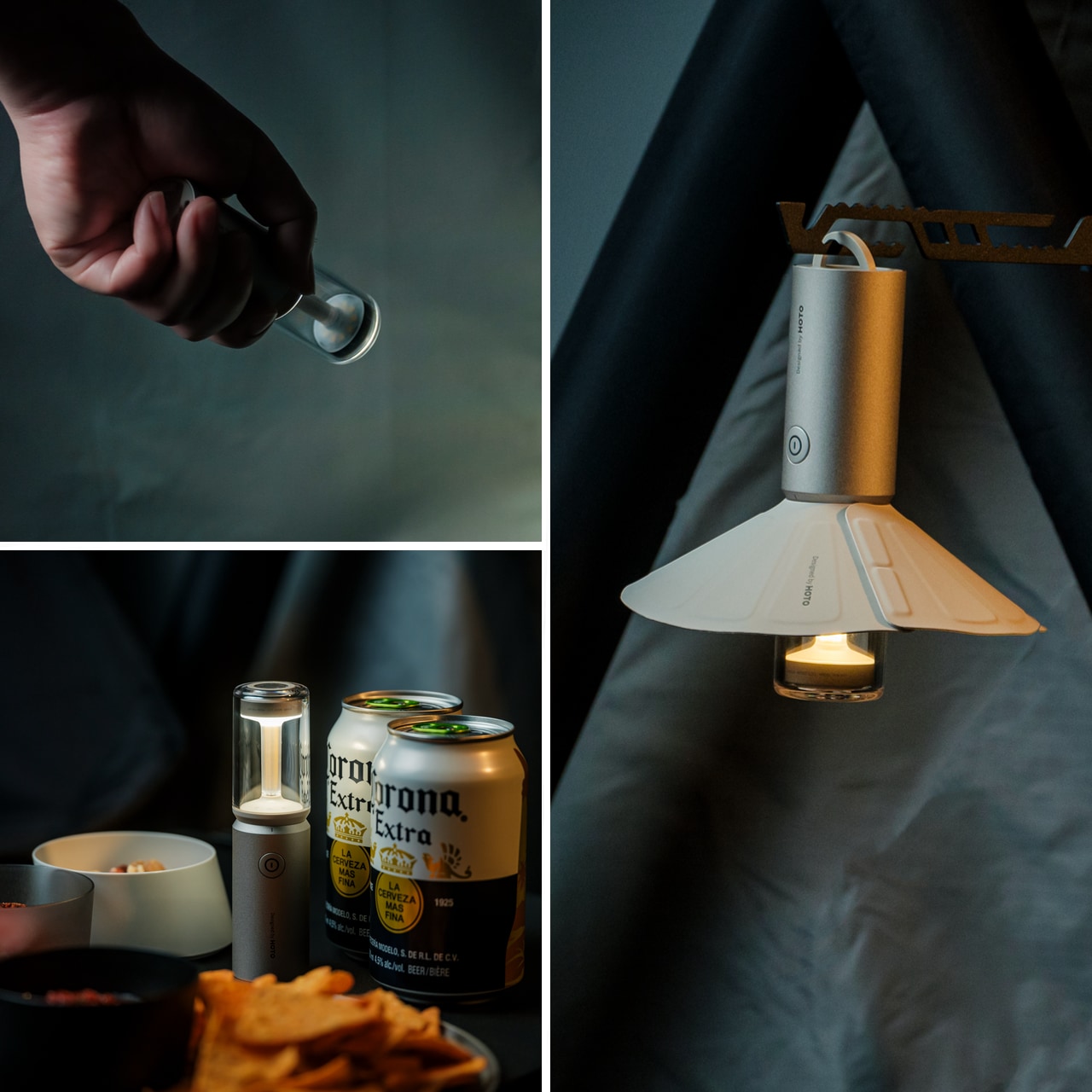
2. TriBeam Camplight
Most camping lights force you to choose between functionality and atmosphere, but the TriBeam Camplight refuses that compromise. This award-winning design delivers three distinct lighting modes—camping, ambient, and flashlight—all controlled by a single intuitive button. The brilliance lies in how it adapts: soft 5-lumen glow for intimate cabin evenings, focused 180-lumen beam for midnight trail navigation, all running up to 50 hours on one charge.
At just 12.8 centimeters tall and 135 grams, this compact powerhouse slips into jacket pockets and disappears into backpacks until the moment you need it. The detachable magnetic lampshade transforms harsh direct light into diffused ambient warmth, while the hidden handle tucks away until you want to hang it from branches, tent loops, or gear bags. It’s portable lighting that thinks like furniture, engineered to become part of your outdoor experience rather than just illuminate it.
Three lighting modes handle every outdoor scenario imaginable
Runs up to 50 hours on a single charge
Weighs only 135 grams and fits in pockets
Magnetic lampshade attachment creates instant ambiance
What we dislike
Single-button control might require cycling through unwanted modes
Magnetic attachment could separate accidentally during transport
Limited brightness compared to heavy-duty expedition lights
Small size makes it easy to misplace in crowded campsites
3. DraftPro Top Can Opener
Award-winning Japanese designer Shu Kanno understood something crucial: the vessel changes the beverage. DraftPro Top Can Opener completely removes the top of any can, transforming it into a smooth-edged, wide-mouth drinking experience that lets you catch every aromatic note and flavor nuance. That first crisp snap becomes an intentional moment, elevating beer, sparkling water, or cocktails from convenient refreshment to sensory experience worth savoring.
The genius extends beyond enhanced tasting. Drop ice cubes directly into your can for instant chilling on sweltering days when the cooler isn’t cutting it. Mix cocktails right in the can without shakers, glassware, or cleanup. The universal fit works with domestic and international cans, while the lightweight, portable design packs easily for any adventure. Used cans become mini planters or organizers thanks to the clean cut, adding sustainable versatility to everyday utility.
Removes the entire top for a draft-style drinking experience
Allows adding ice directly for faster cooling
Enables cocktail mixing without extra glassware
Universal compatibility with various can sizes
What we dislike
Creates sharp edges if not used carefully
Single-purpose tool that only works with cans
Requires proper technique to achieve a smooth cut
Small design means it’s easy to lose in camping gear
4. Airflow 8-Panel Fire Pit
Sanyo Works drew on decades of metal processing expertise to create a fire pit that solves outdoor fires’ most persistent annoyances. The revolutionary 8-panel removable design gives you unprecedented control over fire intensity through adjustable secondary combustion. Strategic holes at each panel’s bottom channel fresh air directly to the base for primary combustion, while heated air rises through double-walled cavities and exits from top holes, creating efficient secondary combustion that dramatically reduces smoke.
Want high-intensity heat for cooking or cold nights? Enclose the fire with all panels to maximize secondary combustion and efficiency. Prefer a gentler, more open flame for ambiance? Remove panels to reduce intensity while maintaining clean burning. The engineered airflow ensures complete wood combustion, eliminating the typical smoky inconvenience that has campers constantly repositioning. This design delivers warmth and mesmerizing flame dance without respiratory irritation or smoke-dodging, letting you focus entirely on the moment.
Adjustable panel system offers complete fire intensity control
Engineered airflow produces minimal smoke
Secondary combustion creates hotter, more efficient burning
Easy cleanup thanks to complete combustion design
What we dislike
Eight removable panels create multiple pieces to track
Heavy metal construction reduces portability
Higher cost than standard fire pits
Requires a learning curve to optimize panel configuration
5. Slim Fold Dish Rack
This patent-pending innovation collapses the eternal camping cleanup struggle into something almost elegant. A brilliant spring mechanism shrinks this 14-inch dish rack down to a mere 1.2 inches in one second flat, with deployment equally instantaneous. The minimalist design ensures sufficient ventilation and space for plates, utensils, and cookware of any size, while the collapsed form becomes so compact it literally fits in pockets.
Whether you’re glamping outdoors or maximizing tight kitchen quarters, this collapsible dish rack ensures tableware and cutlery dry thoroughly and quickly. The durable construction handles camping’s rough-and-tumble reality without sacrificing the sleek aesthetic that makes it equally at home in modern kitchens. Easy to clean and dishwasher-friendly, it eliminates the bulky permanence of traditional dish racks while delivering the same functionality in a package you can take anywhere.
Collapses from 14 inches to 1.2 inches in one second
Patent-pending spring system ensures reliable deployment
Pocket-sized when collapsed for ultimate portability
Dishwasher-safe for easy cleaning
What we dislike
The spring mechanism could potentially wear over time
Limited capacity compared to full-size dish racks
Collapsed form requires careful storage to prevent accidental deployment
Premium price for what’s essentially a drying rack
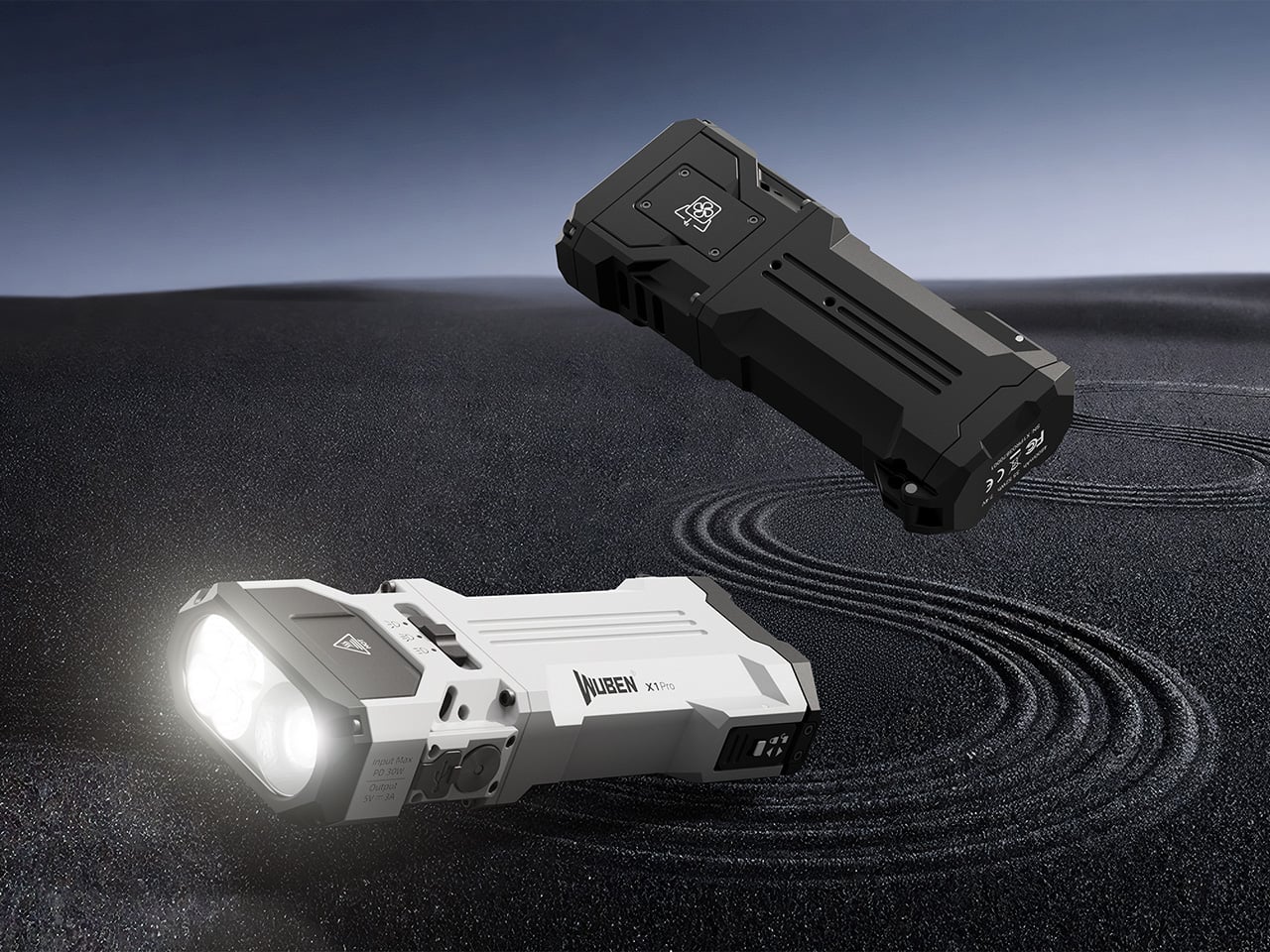
6. WUBEN X1 Pro Flashlight
The WUBEN X1 Pro refuses to be just another flashlight, delivering 13,000 lumens of combined flood and spot light through an angular aluminum alloy body that feels substantial and purposeful in your hand. Smart cooling technology keeps things running smoothly under heavy use, while the sculpted lines and one-handed grip remain easy to hold even with thick gloves during frigid expeditions.
At 383 grams and just under 14 centimeters long, this powerhouse fits in jacket pockets or bike bags without creating annoying bulk. The rugged construction handles whatever the night throws at it, from emergencies to extended exploration. As a bonus, it functions as a power bank to charge your phone when you’re far from outlets, making it an essential gear that serves multiple critical functions without fail.
What we like
13,000 lumens provide exceptional illumination power
Smart cooling prevents overheating during extended use
Doubles as a phone charger for emergencies
Compact size despite serious output capability
What we dislike
High lumen output drains the battery relatively quickly
383-gram weight feels heavy for ultralight backpackers
Premium flashlights require a significant investment
A powerful beam might be overkill for casual camping
7. Battery-Free Amplifying iSpeakers
This ingenious metal smartphone speaker achieves something remarkable: amplified sound without batteries or electricity. Simply place your smartphone inside and let amplified sound waves spread your favorite music throughout the room. Made from vibration-resistant Duralumin—the same material used in aircraft construction—and designed using the golden ratio, this speaker enhances both your phone’s audio and your space’s ambiance.
The portable, no-power design means you can use it literally anywhere without worrying about charging or battery life. The Duralumin construction ensures the speaker itself won’t vibrate sympathetically, maintaining audio clarity while amplifying volume naturally through acoustic design alone. Compatible with optional +Bloom and +Jet mods for directing sound, it offers customization for those who want to fine-tune their listening experience while maintaining the core battery-free philosophy.
Optional mods allow customization for different spaces
What we dislike
Amplification is limited compared to powered speakers
Only works with smartphones, not other devices
Fixed amplification means no volume control
Modern phone sizes might not fit all models
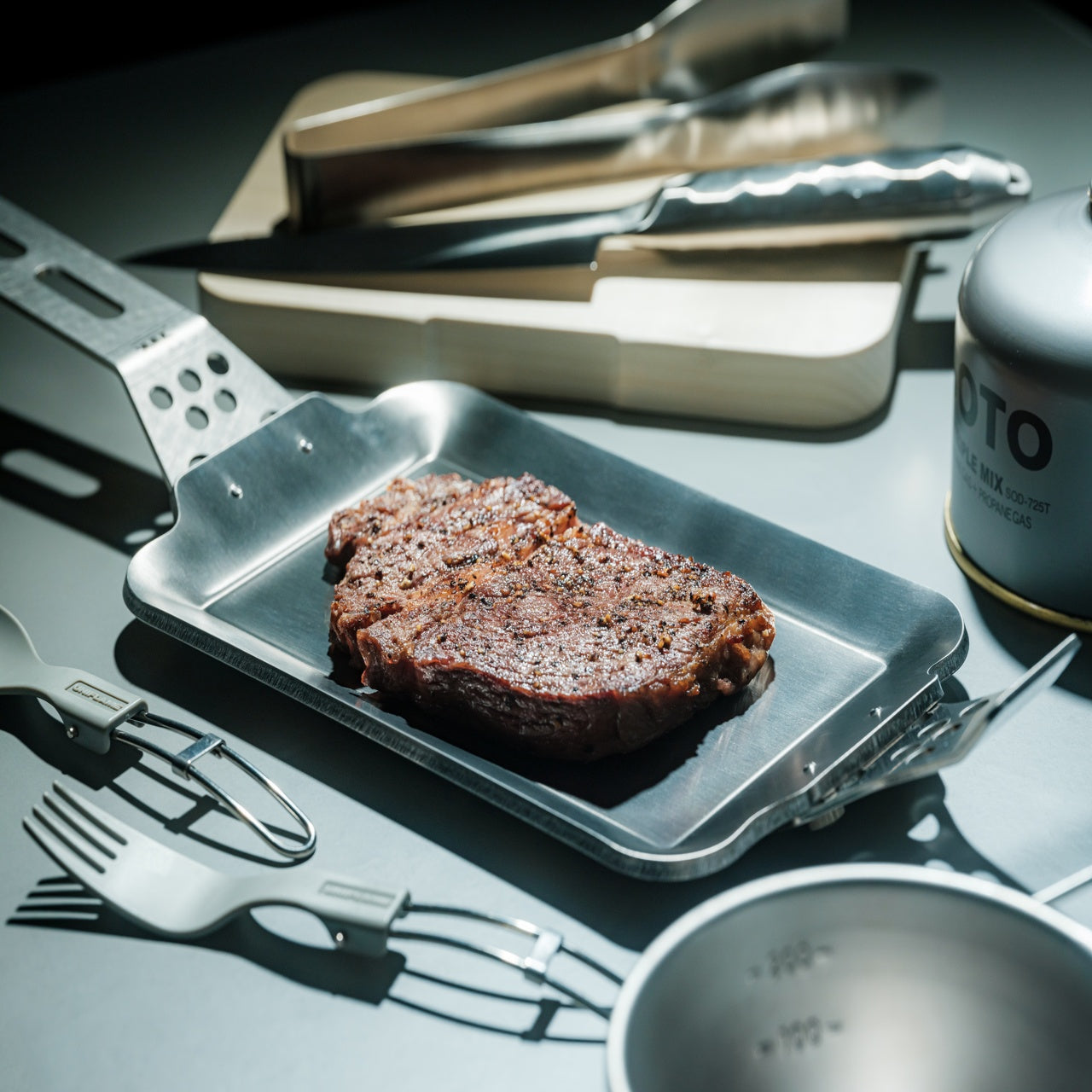
8. Compact Modular Grill Plate
This adaptable metal grill plate transforms outdoor cooking from frustrating guesswork into reliable culinary performance. A brilliant three-layer steel plate design ensures even heat conduction across the entire surface, cooking food uniformly while maintaining juiciness for perfect steaks and dishes. The modular approach lets you swap handles depending on your situation, whether you’re working over unstable bonfires or using induction stoves at basecamp.
What separates this from standard camping cookware is its refusal to compromise. Even heat distribution means food cooks properly without hot spots or raw centers, while the compact form packs down for easy transport. Available in Basic and Special sets, it accommodates different cooking ambitions without unnecessary bulk. Compatible with various heat sources, including campfires, gas burners, and induction stoves, this grill plate adapts to you rather than forcing you to adapt to it.
Three-layer construction delivers superior heat distribution
Interchangeable handles adapt to different cooking situations
Compatible with multiple heat sources, from bonfires to induction
Compact packing size despite cooking surface area
What we dislike
Multi-piece design creates more items to pack
Steel construction adds weight to camping loads
Learning curve to master heat management
Premium sets command higher investment
9. Iron Frying Plate
JIU eliminates the middleman: the frying pan becomes your plate, letting you enjoy meals immediately after cooking them. This rust-resistant, uncoated cookware brings out exceptional flavors and textures through pure iron-to-food contact without chemical coatings interfering. Made from 1.6mm-thick mill scale steel, it arrives ready to use straight from the box, defying cast iron’s typical seasoning requirements.
The wooden handle attaches and detaches with one hand, transforming the cooking vessel into a serving plate in seconds. This beautiful boundary-blurring between cooking and eating creates intimacy with your food while eliminating cleanup steps. Rust-resistant and stick-resistant properties mean the plate maintains its character without constant maintenance, while the handsome design makes serving directly from this cookware feel intentional rather than lazy. It’s culinary efficiency meets aesthetic pleasure, wrapped in durable steel.
Rust-resistant construction eliminates maintenance headaches
What we dislike
The hot plate requires care when transitioning to eating
Single-serving size limits group meal flexibility
Iron construction retains heat, creating a burn risk
An uncoated surface still requires a proper cleaning technique
10. RetroWave 7-in-1 Radio
Behind its retro Japanese design and tactile tuning dial, the RetroWave 7-in-1 Radio packs serious contemporary functionality. This device serves as a speaker, MP3 player, radio, flashlight, clock, power bank, and SOS siren—designed to handle everything from daily listening to emergencies. Stream music over Bluetooth like modern life, tune into AM, FM, or shortwave stations like decades past, or rely on its emergency features when circumstances demand.
The 2000mAh battery recharges via hand-crank or solar panel when outlets disappear, while the built-in flashlight and SOS alarm provide critical safety functions. Stream from your phone, play music from USB or microSD cards, or catch local broadcasts without internet. Lightweight construction belies its capability: up to 20 hours of radio time or 6 hours of emergency lighting on full charge. Whether it’s glowing softly on your kitchen shelf during morning coffee or providing the only working station during a blackout, this radio adapts seamlessly to wherever life takes you.
Multiple charging options, including solar and hand-crank
Emergency features provide genuine safety value
Retro design looks beautiful in any setting
What we dislike
The 2000mAh battery offers limited phone charging capability
Hand-crank charging requires significant effort
Multiple functions create complexity for simple tasks
Retro aesthetic might not suit modern minimalist spaces
Final Thoughts: Where Design Meets the Great Outdoors
These ten gifts represent glamping’s evolution into a sophisticated design category where aesthetics and functionality refuse separation. Each piece solves genuine problems with intelligence and style, proving that outdoor gear can be beautiful, thoughtful, and uncompromising. They transform camping from an endurance test into a curated experience, where every detail enhances rather than distracts from nature’s magnificence.
For the glamping enthusiast in your life, these designs offer something beyond typical outdoor equipment—they provide tools that respect both their love of wilderness and their appreciation for considered design. Whether it’s a self-inflating tent, a zero-battery speaker, or a seven-function emergency radio, each gift here redefines what it means to live well outdoors in 2025.
Bamboo usually shows up in design as a structural element, furniture frames, baskets, or as a surface veneer. It is almost always treated as opaque, even though it has a natural light-passing quality if you thin it enough. Paardarshi is a table lamp concept that takes that translucency seriously and builds the whole project around making bamboo glow from within, treating the material itself as the optical element.
Paardarshi is a translucent bamboo table lamp that celebrates the natural light-passing quality of bamboo. The designer set out to create a hand-crafted lamp with two functions, a soft ambient mode and a brighter reading mode, and the name, meaning transparent in Hindi, hints at the goal: reveal what bamboo can do with light instead of hiding it behind a shade or treating it like just another wooden tube.
The early experiments involved splitting bamboo with nodes intact, hand-scooping the inner surface with a half-round chisel, and dealing with cracking when too much material was removed. The designer then moved to a third approach, carving from the outside in to thin and straighten the tube while controlling wall thickness. The aim was even translucency along the length, turning the bamboo wall into a kind of natural light pipe that could diffuse an LED smoothly.
The lamp’s form is simple, a vertical bamboo tube on a base that can be closed for ambient light or opened and angled for a focused reading beam. The designer labels these as reading mode and ambient mode, and the same piece of bamboo is asked to behave differently depending on orientation. The geometry stays minimal, the behavior changes with how you interact with it and where you point the tube.
Inside the tube, the designer carves space to house the mechanism and notes the challenge of fitting hardware into something asymmetric and distorted. A press-fit component with springy arms is developed to adapt to different bamboo diameters, and permanent gluing is avoided. Threaded parts and a fully removable assembly are used so the light source can be replaced, bringing craft closer to industrial design and keeping the lamp serviceable over time.
All that carving and assembly work shows up in the way the lamp handles light. The thinned bamboo diffuses and refracts the LED into a warm, even glow along the tube, while the opening mechanism lets you concentrate that light where you need it. It is less about a decorative shade and more about treating the bamboo itself as the optical element, tuned by hand until it behaves the way the designer wants.
Paardarshi is a workshop project that still carries lessons for real products. It shows that a humble material like bamboo can be pushed into new roles with enough patience and iteration, and that serviceability and craft do not have to be opposites. For anyone interested in lighting that feels alive and repairable, rather than sealed and anonymous, a translucent bamboo tube that glows from within is a surprisingly compelling starting point.
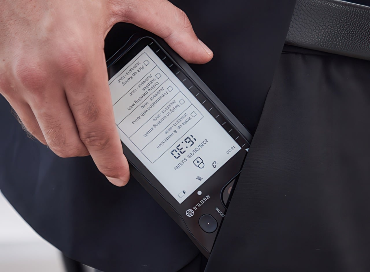
My ideal phone case has always been two different products at once. Part of me wants a permanent E Ink panel for boarding passes, social QR codes, and a to do list that never disappears behind a lock screen. Another part wants an AI notetaker like the Plaud, with its own mic, its own record button, and reliable transcription. Until now, those wants have fought for the same patch of real estate on the back of my phone. Reetle’s SmartInk I feels like someone finally noticed that clash. Instead of asking me to choose, it fuses the two roles into a single shell. The E-Ink side handles the quiet, persistent information, while the hardware in the case listens, records, and hands everything off to the phone for syncing and AI summaries. In practice, that turns the case from decoration into the main interface for how I capture and review my day.
This approach is what makes the SmartInk I compelling. It treats the phone case as active, functional hardware rather than a passive bumper. The core insight is that the back of a phone is wasted space, a blank canvas that could be doing useful work. By integrating an E-Ink screen, Reetle creates a low-power dashboard for glanceable information. The marketing materials show exactly what you would expect: calendars, QR codes, and checklists living on a paper-like display that is always visible in sunlight. This is a familiar concept, but the execution here feels more deliberate. The screen is not just a secondary display; it is the intended output for the case’s other primary function, which is where things get really clever.
Input comes from a dedicated, one-press record button built right into the case’s frame. This is a critical piece of the design, as it removes all the friction of modern recording. There is no need to unlock your phone, hunt for an app, and tap a tiny on-screen icon. You just press the side of the case. That single, simple action captures audio and sends it to the companion app over Bluetooth or Wi-Fi for processing. This is the kind of tactile, immediate functionality that is often lost in software-driven devices. It turns the act of recording from a deliberate, multi-step process into a pure reflex, which is exactly what you want when an important idea strikes.
Once the audio is in the app, the system’s AI gets to work. It transcribes the speech, identifies key points, and can even generate structured to-do lists from a rambling conversation. This is where the workflow comes full circle. Those summaries and tasks can be pushed right back to the E-Ink screen, closing the loop between capture and review. A meeting’s action items can appear on the back of your phone moments after the meeting ends. This creates a powerful, self-contained ecosystem where the case captures the input and the case also displays the output, turning your entire phone into a much smarter notepad.
That E-Ink display is the centerpiece of the whole pitch. It covers nearly the entire back of the phone, acting as a persistent, low-power canvas for whatever information matters most at the moment. The use cases are immediately obvious and practical: a boarding pass that will not disappear when your battery is low, a QR code for your portfolio ready at a moment’s notice, or your daily calendar visible without a single tap. Reetle calls it a “Widget Switching Display,” which suggests a dynamic hub where you can cycle through different views, from a simple to-do list to custom artwork. Crucially, this is also where the AI-generated summaries from your recordings are meant to live, turning a static information panel into an active part of your workflow.
The case has its own power source, offering 10 hours of continuous reading or 10 hours of recording, with a standby time of seven days. That is a respectable battery budget for an accessory, and it recharges via MagSafe passthrough, which seems rather fascinating because it implies that power passes through an E-Ink display into the case – which is fairly game-changing if you ask me. I don’t think I’ve seen any device allow charging right through an existing component sitting between two charging coils. That aside, the Reetle also packs a tempered-glass back and a military-grade protective construction that keeps itself as well as your phone secure from accidental drops.
The entire UX is powered by the Reetle mobile app. This app is the command center, connecting to the case via Bluetooth and managing everything from firmware updates to AI processing. It is where you review your full transcriptions, organize your notes, and customize the widgets that appear on the E Ink display. You can choose which calendar to show, which to-do list to sync, and which images or QR codes to display. The connection uses both Bluetooth and Wi-Fi, which provides flexibility for syncing large audio files quickly when a known network is available. The success of the whole experience rests on this software being intuitive, reliable, and deeply integrated into the phone’s operating system.
What is particularly ambitious is the sheer breadth of compatibility Reetle is promising. The product is not just for the latest iPhone 17 Series. The compatibility list extends back to the iPhone 13 series, and even is compatible with the new iPhone Air (although you’re killing the Air’s appeal by mounting a thick E-Ink case on it>) The plan also includes a massive range of Android flagships from Samsung, Google, Sony, Huawei, Vivo, and others. This indicates a vision for the SmartInk I as a platform-agnostic tool, not just another Apple-centric accessory. Producing perfectly fitted cases for so many different chassis designs is a significant manufacturing challenge, but it shows a commitment to serving a much wider market.
The Reetle SmartInk I is currently on Kickstarter, where it has already flown past its initial funding goal. The early-bird price is set at about $119, with a target shipping date of February 2026. For a product category that has been largely defined by aesthetics and materials, the SmartInk I represents a genuine functional leap. It is a thoughtful synthesis of E-Ink, AI, and hardware design that re-imagines what a phone case can be. It is no longer just a protective shell; it is an active partner in managing your information and capturing your ideas. Heck, it’s probably better than any other AI accessory I’ve seen all year!
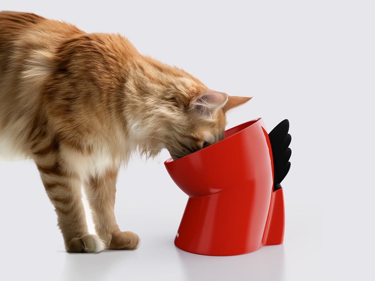
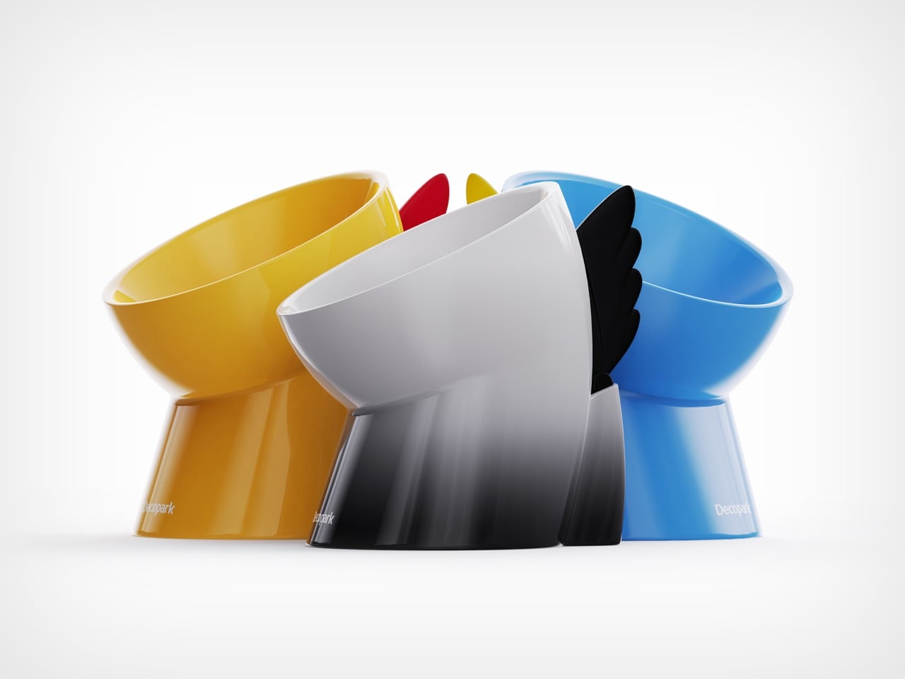
In a market saturated with look-alike pet products, the Decopark Dino Bowl stands out by asking a deceptively simple question: What does feeding actually look like, for both cats and their humans? From that question emerges a ceramic object that blends ergonomics, storytelling, and quiet functional innovation into a single, memorable form.
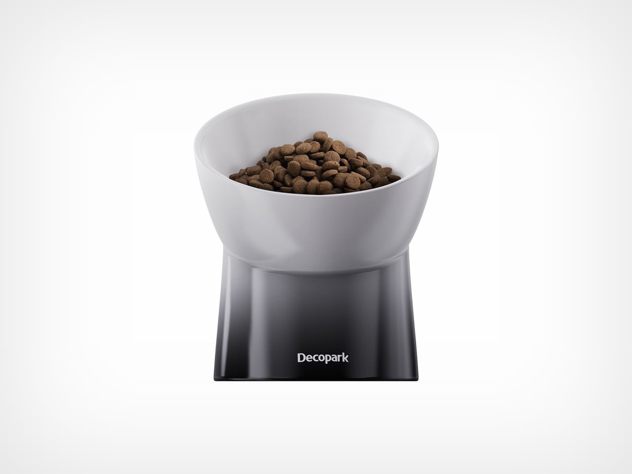
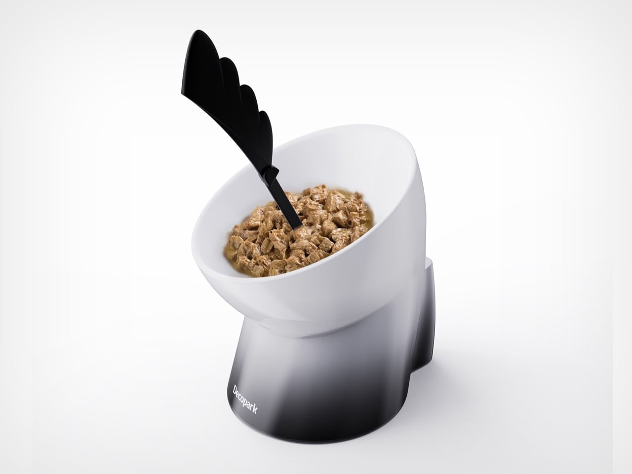
At first glance, the Dino Bowl reads as charming and whimsical. Its silhouette resembles a small dinosaur mid-stride, with its neck arched forward and its spine visible along the back. However, this visual identity is not decorative excess; it is a design serving multiple purposes simultaneously. The bowl’s cylindrical form is bent at the center to create a slanted feeding surface, improving a cat’s eating posture. The “spine” at the back, meanwhile, is not just an aesthetic flourish: it is a fully integrated stir stick, transforming a playful metaphor into a practical tool.
Designer: Xueyong Liang
The designers behind the Dino Bowl began with observation. Research revealed two critical gaps in existing ceramic pet bowls: visual homogeneity and a lack of consideration for real feeding routines. Many cat owners regularly feed canned food, which requires mixing, yet most bowls offer no solution for this step. The result? Extra tools, cluttered countertops, and frequently misplaced stir sticks.
The Dino Bowl addresses this head-on by merging bowl and tool into one cohesive unit. The attached stir stick slots neatly into an insertion hole at the rear of the bowl, always returning to the correct orientation regardless of how it is placed. During feeding, it assists with mixing; afterward, it wipes clean and stores seamlessly back into the form. No extra parts, no visual disruption.
This integration is where the project’s core innovation lies: recognizing that usability is not just about the primary function (holding food), but about the entire micro-ritual surrounding it. Material choice plays a crucial role in translating this idea into a durable object. The bowl itself is made from high-temperature fired ceramic, giving it weight, stability, and a premium tactile quality. At 1kg, the bowl resists sliding during use, another subtle nod to feline behavior. The stir stick, crafted from PP, balances durability with ease of cleaning.
Designing a slanted ceramic rim, however, introduced a technical challenge. During firing, asymmetrical forms are prone to deformation. To counter this, the designers engineered a double-layer rim structure, reinforcing the edge while preserving the intended silhouette. Multiple iterations were required to refine both the curvature of the bowl and the fit between the stir stick and its housing, ensuring harmony not only in appearance but also in manufacturing reliability. The result is a one-piece ceramic form that feels intentional from every angle, cute, yes, but also structurally resolved.
Pet products occupy a unique space in design: they must satisfy animals ergonomically while appealing emotionally to humans. The Dino Bowl leans into this duality. User research indicated that owners are strongly drawn to playful shapes, especially in objects that live openly in the home. By referencing a dinosaur, an instantly recognizable, almost universally beloved figure, the bowl becomes more than a utility item. It becomes a character.
Yet the designers were careful not to let novelty overpower function. Every line, proportion, and junction was calibrated to maintain unity between bowl and stir stick, ensuring the product reads as a single, holistic object rather than an accessory-laden gimmick. With overall dimensions of 168 × 140 × 164 mm and a bowl capacity of 115 ml, the Dino Bowl is compact yet substantial, suited to everyday feeding without overwhelming a space. More importantly, it demonstrates how even the most ordinary household objects can be reimagined through careful attention to behavior, context, and form.
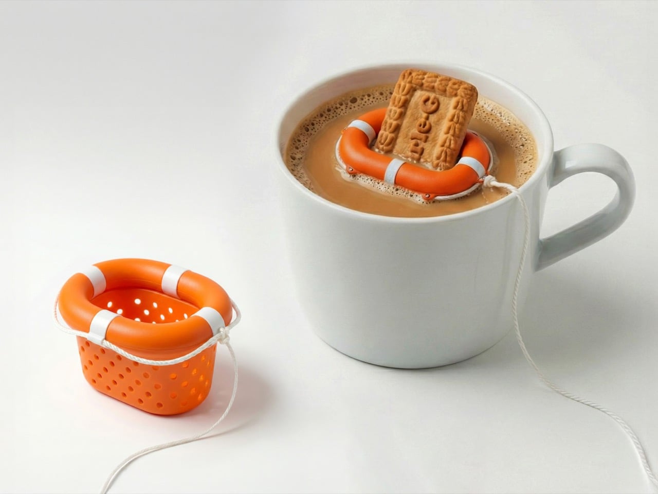
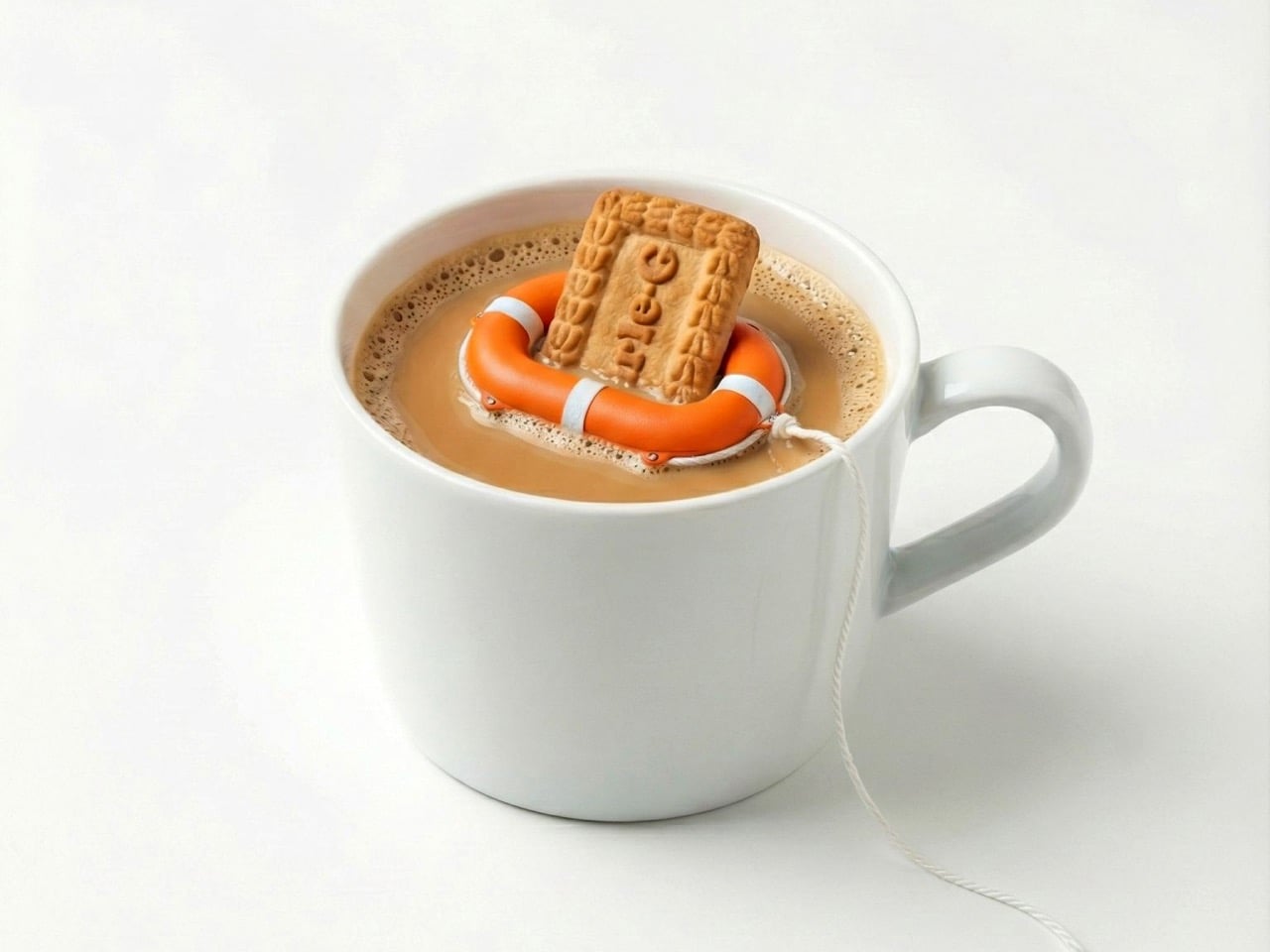
Because there’s nothing more disheartening than a chocochip cookie that prematurely met its end in a mug full of milk. You have no way of knowing how much time you have before the cookie gives in, you also need to ensure the cookie is at the right stage of milk-absorption. Too fast and you have a crispy cookie that’s just milk-coated on the surface, too late and you now have to drink your milk with the last gulp being a sediment of soggy dough and half-melted choco chips.
The Biscuit Saver mitigates that. Like a lifesaver for your beverage-biscuit, this was originally designed to be paired with Parle-G biscuits (the world’s largest selling biscuit) and chai – a perfect combination in India. Chai disintegrates biscuits much faster than milk, given it’s usually served piping hot. The judgement requires some clever calculations, often boiling down to mere milliseconds. With Aditya Singh’s ‘Biscuit Saver’, that calculation becomes a little less existential, because you can always fish the broken biscuits out of your chai without using a spoon, or worse, your fingers.
The design concept (imagined using AI) takes inspiration from lifesaver tubes that are used to save humans at sea. Made out of food-grade plastic, the Biscuit Saver comes with a perforated basket, much like those tea infusers you see, and a tube around the top that keeps it floating on your drink. The design, which works primarily for the rectangular Parle-G biscuits, can be tweaked to work for cookies and Oreos too… and its predominant job is to ensure your baked goods don’t end up at the bottom of your beverage.
However, Singh mentions that the Biscuit Saver does one other crucial function too – it tells you exactly how much to dip your biscuit. Some of us overenthusiastic folks like to test the limits by dipping the biscuit/cookie all the way, a high risk with a low reward. The Biscuit Saver’s design stops your biscuit from being ‘over-dipped’. As soon as your biscuit hits the base, it acts as a tactile indicator for you to stop. You can still push the biscuit down further, but at your own peril.
The unique design works perfectly with Parle-G biscuits as well as Biscoff biscuits. The orange design and the nylon rope perfectly capture the product’s inspiration, and the tapered basket means you can stack multiple Biscuit Savers on top of each other. “A tiny everyday problem. Thoughtfully overdesigned,” says Singh humorously in his LinkedIn post, playfully reminding us all of the times when an overdunked cookie or overdipped biscuit was the most tense moment of our lives!
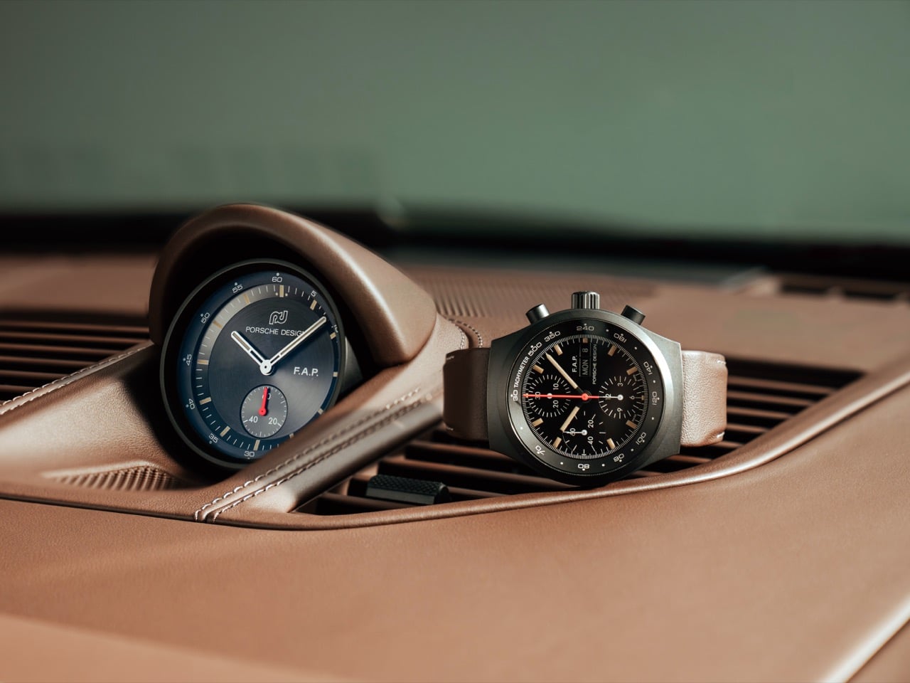
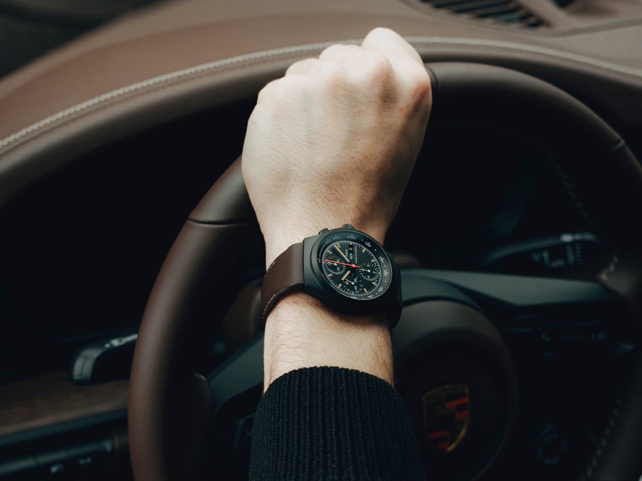
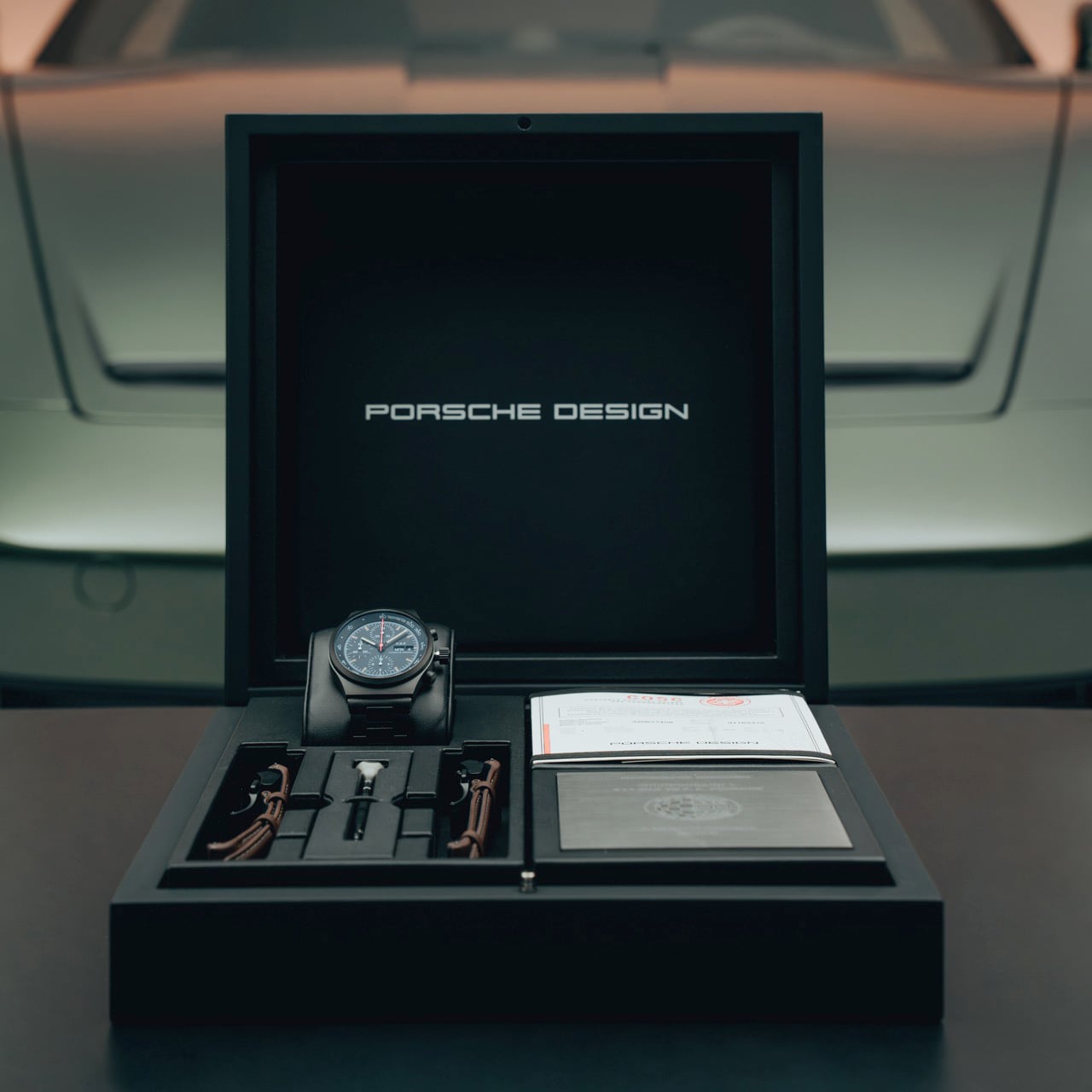
…so the first thing my brain did when I saw “F. A. P.” on the dial was laugh like a 12‑year‑old, and the second thing it did was realize Porsche Design just pulled off one of the most personal anniversary pieces they have ever done. The Chronograph 1 90 Years of F. A. Porsche sits in a weirdly perfect spot in the lineup. It rides on the modern Chronograph 1 architecture that came back in 2022, which itself is a faithful reboot of the 1972 all‑black original, but it quietly pivots the story from “50 years of a product” to “90 years of the guy who thought this way in the first place.” Same matte black instrument face, same integrated bracelet silhouette, same dashboard‑inspired layout, but now the watch talks about the designer more than the brand. That is a subtle shift, and it matters.
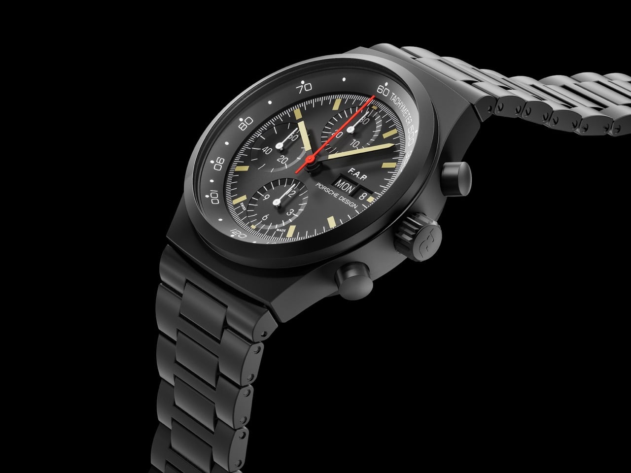
You still get a 40 to 41 millimeter black coated titanium case, COSC certified in house WERK 01 flyback chronograph, 10 bar water resistance, and the usual Porsche Design ergonomics that sit flat on the wrist instead of trying to cosplay a diver. The case is titanium rather than the old steel of the seventies, so you get that weird cognitive dissonance when you pick it up and your hand expects heft and gets a feather. The dial layout stays brutally functional: tri compax registers, bright white printing, red central chrono seconds, and a tachymeter that actually looks usable instead of decorative. You can tell someone in the room still cares about legibility more than sparkle.
Design: Porsche Design
What really hooks me is how they handled the vintage vibe. They went with a patina colored Super‑LumiNova on the hands and indices, but they resisted the temptation to fake scratches or faux tropical weirdness. It looks like a well kept seventies tool watch that has lived under a shirt cuff for decades, not a prop from a nostalgia cosplay shoot. The historic Porsche Design logo on the crown and clasp leans into that same energy. It nods to the early studio era without screaming “heritage” in every direction. The whole thing feels like it was designed by someone who has actually handled original Chronograph I pieces and understands that the charm lives in proportions and restraint, not sepia filters.
The F. A. P. inscription above the day date is where the watch steps over the line from clever to personal. On the standard Chronograph 1, that real estate belongs to the logo. Here, it mirrors the way Ferdinand Alexander had his own initials printed on his personal watch. That is a tiny move, but it shifts the mental image from “product on a shelf” to “object on a designer’s wrist while he is sketching the 911 profile.” It also quietly de‑centers the corporate identity for once. You have “Porsche Design” still sitting under the day date, but visually your eye lands on those initials first, like a signature on a technical drawing. For a brand that usually guards its mythology pretty tightly, that feels surprisingly intimate.
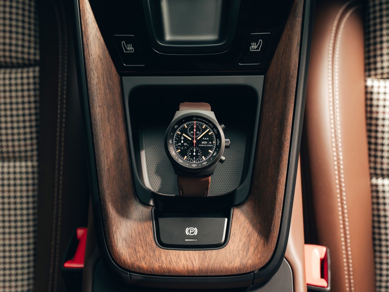
Flip the watch over and the car nerd part of my brain wakes up. The rotor is shaped and colored like the wheel of the 911 GT3 90 F. A. Porsche, the Sonderwunsch special that pairs with this chronograph. Limited to 90 cars, 90 watches, neat and tidy. The rotor design is not subtle at all, which I actually appreciate. If you are going to tie a watch to a specific vehicle, commit. You can see the spokes, the crest in the center, and little flashes of the WERK 01 movement breathing underneath. Around the edge you get the “XX/90” numbering and F. A. Porsche’s signature, which turns the caseback into a kind of mechanical plaque. It reads like a collaboration between the motorsport department and the watch studio rather than a lazy logo slap.
From a pure tech perspective, the movement choice fits the narrative. The WERK 01 family is a proper automatic chronograph caliber with flyback functionality, so you can reset and restart the chrono with a single pusher press while it is running. That is a very motorsport friendly behavior, and it feels right for something tied to a GT3. Frequency sits at the usual 4 hertz, power reserve lands in the 40 to 48 hour neighborhood, and COSC certification locks in the “this actually keeps time” part of the story. None of this is wild horological innovation, but it is solid, coherent engineering, which is honestly what you want under a dial that screams “instrument.”
The titanium bracelet deserves a mention too, because black bracelets can go very wrong. Here it looks like they kept it fully brushed with short, slightly rounded links, which avoids the cheap, shiny PVD look that haunts a lot of black watches. It tapers enough to feel intentional, not like a straight metal strap bolted on after the fact. The quick change system with the additional Truffle Brown leather strap is a nice structural detail rather than lifestyle garnish. The brown with contrast stitching echoes the interior of the GT3 90 F. A. Porsche, so again you get that one to one mapping between car and watch. If you are the sort of person who obsesses over interior spec codes, this will scratch a very specific itch.
What I like most is the sense of continuity. The original 1972 Chronograph I took the visual logic of a 911 instrument cluster and shrank it to wrist size. The 2022 Chronograph 1 reissue proved that the formula still works in a world of OLED dashboards and smartwatches. This 90 Years edition layers a biographical note on top of that, without disturbing the core geometry. If you strip away the anniversary text, you still have a clean, ruthless, daily wear chronograph that does its job. Add the initials, the wheel rotor, the limited number, and suddenly you are wearing a piece of design history that feels strangely unforced. For an object built to honor a man who hated unnecessary ornament, that feels about right.
LEGO has given us plenty of football sets over the years. Mini stadiums, playable pitch builds, even those collectible team helmets. But here’s what they haven’t done: a proper 1:1 scale collection that captures the real size and weight of the sport’s most iconic objects. CreativeDynamicBrick is trying to fill that gap with the NFL Collection, a project that tackles one of the trickiest challenges in brick building: making round things out of square pieces at actual size.The set comes in three parts.
There’s a 969-piece helmet that sits at real helmet scale, with a facemask that actually looks protective, not decorative. There’s a 680-piece football mounted on a stand, built to match the dimensions you’d grip on game day, with lacing made from white T-bars because sometimes the simplest solutions are the best ones. And there’s a 271-piece field diorama where minifigures number 7, 8, and 13 battle it out under yellow goal posts. It’s the kind of display piece that works on an office shelf or a game room wall, and it’s generic enough that nobody has to know you’re secretly a Dolphins fan.
Designer: CreativeDynamicBrick
I honestly can’t stop staring at how the helmet dome curves. Angled Technic linkers form the internal structure, which is the only way you’re getting that shape without making it look like a stepped pyramid. Most builders would slap printed tiles on a vaguely round surface and call it a day. This creator actually solved for the geometry, using those connector pieces to build a framework that lets the exterior panels follow a true curve.
The facemask attaches with proper depth and spacing, which matters when you’re trying to make something look like actual protective equipment. You can see the interior construction through the face opening, all that black scaffolding holding the dome together, and even though fairly technical (and not meant to be worn), you could honestly try slipping this onto your head and its 1:1 sizing means it will actually fit you. Don’t expect it to ward off any concussions… one simple knock and this thing will become a pile of bricks on the floor.
A prolate spheroid is legitimately difficult to build out of rectangular bricks. The football proves it with 680 pieces dedicated to getting that taper right at both ends. Too round and it looks like a rugby ball, too pointy and it’s a lemon. The brown color blocking follows the panel lines of a real football, which is why your brain reads it correctly even though you’re looking at stacked plastic. Those white T-bar pieces forming the laces solve a problem most people wouldn’t even think about until they tried building one themselves. The display stand has an adjustable arm that lets you position the ball at different angles, so you can make it look like it’s mid-spiral if you want your desk to have opinions.
The smart play was avoiding team logos entirely (on the helmet as well as the football, and even that tiny diorama playset). No Cowboys star, no Packers ‘G’, no licensing headaches. Generic football works for professional fans, college enthusiasts, and people who just throw spirals in the backyard. The helmet uses red and blue striping that could belong to anyone or no one. The minifigures wear numbers 7, 8, and 13 in blue and red jerseys that suggest teams without declaring allegiance. Drop this on your shelf and nobody needs to know which franchise you actually care about, which is probably the only way a football set survives the LEGO Ideas gauntlet without getting buried in legal paperwork.
White brackets wedged between green bricks create the yard lines on the field diorama. No printed pieces, no stickers, just brackets doing bracket things in a way that happens to look like field markings. One blue player throws, another runs a route, and the red player looks like he’s about to deliver a highlight reel hit. The curved transparent piece showing the ball in flight adds motion to what would otherwise be three static figures standing on fake grass. It’s 271 pieces total for this section, which sounds small until you remember it includes three fully detailed minifigures with custom prints and enough structure to keep everything stable.
The overall piece count hits exactly 1,920 as a nod to the year the NFL was founded. You either appreciate that kind of numerical easter egg or you think it’s trying too hard, but it does show this builder was thinking about narrative alongside construction. CreativeDynamicBrick spent over 30 hours on this, their first LEGO Ideas submission, which is pretty brave for a first-timer. Most people start with something manageable. Maybe a small building or a vehicle. This person went straight for advanced geometry and custom minifigure design.
Right now it’s sitting at 1,620 supporters with 597 days left to hit the next milestone of 5,000 votes. Whether LEGO actually picks it up for production depends on a dozen factors we’ll never see, but the technical execution holds up. The geometry works, the scale feels right, and the building techniques show someone who understands how to translate real-world curves into brick form. That’s harder than it sounds, and it’s why most football builds end up looking like someone’s first attempt at organic shaping. You can cast your vote for this MOC (My Own Creation) on the LEGO Ideas website here!