This E Ink Wisephone Has No Camera, No App Store, No Social Media

Smartphones have become something of a paradox. The more capable they get, the less in control we feel. Notifications pull us in every direction, social feeds demand constant attention, and app stores offer thousands of things we never asked for. For all the technology packed into these slim glass rectangles, they’ve stopped being tools we use and started being systems we manage.

That tension is exactly what Berlin-based architect Marko Lazić sat with one afternoon in 2016, waiting for a friend at a coffee shop with his phone battery nearly dead. He sketched an idea, one that took years to develop but eventually became Offone, a 3D-printed phone with an E Ink display that he calls a “wisephone.” Not a dumbphone, and certainly not a smartphone, but something deliberately in between.

Designer: Marko Lazic

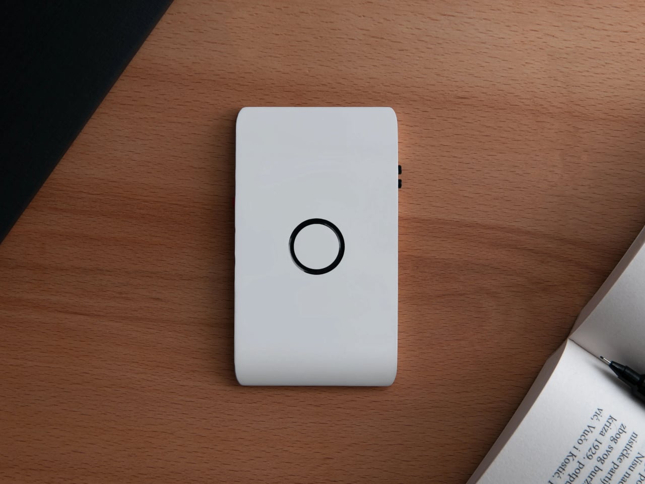
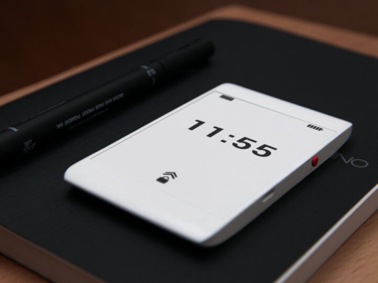
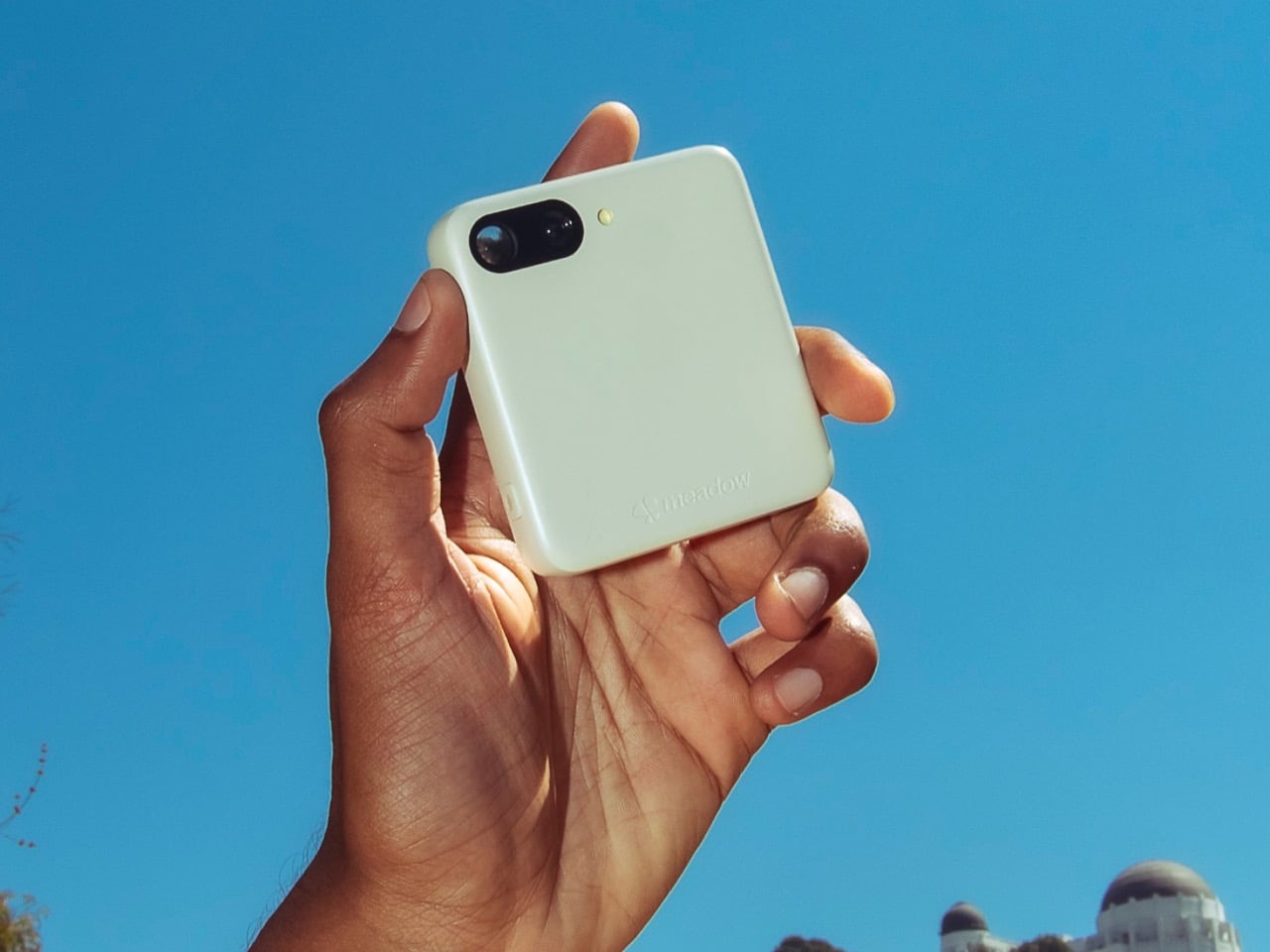
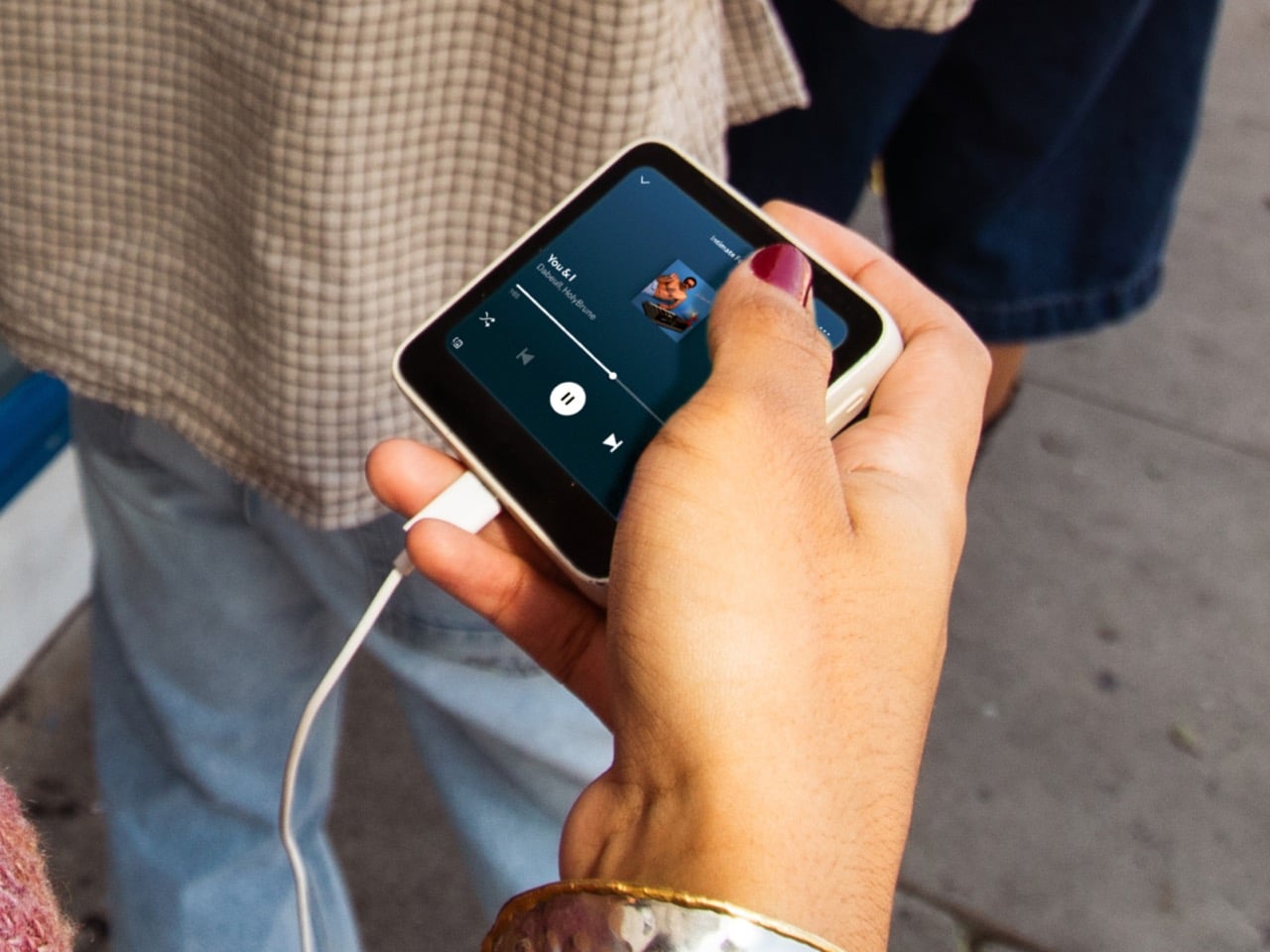
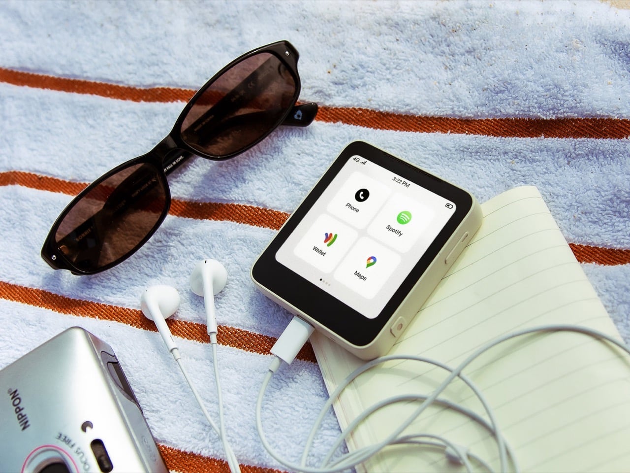
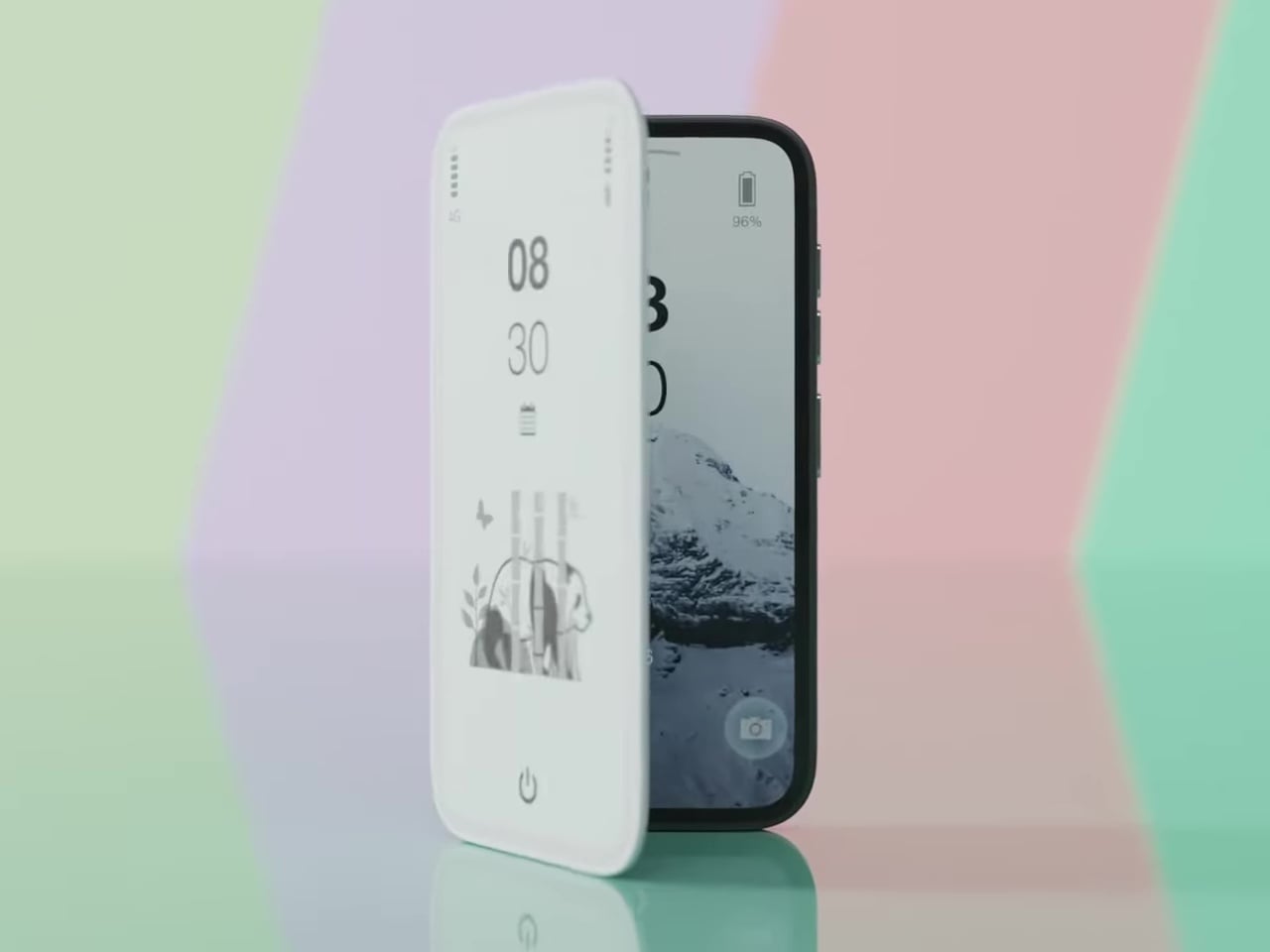
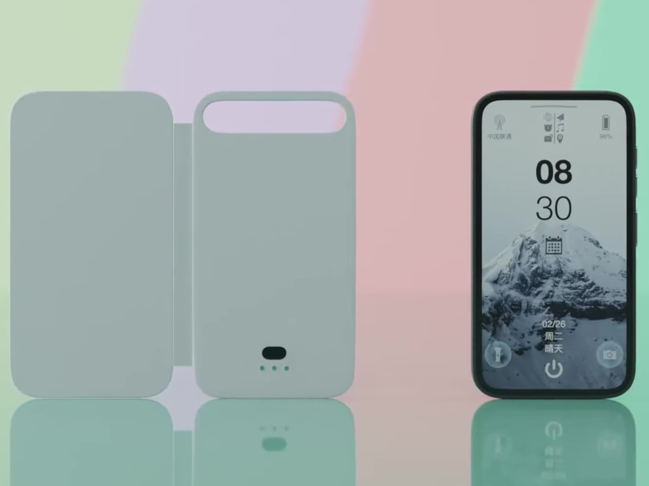
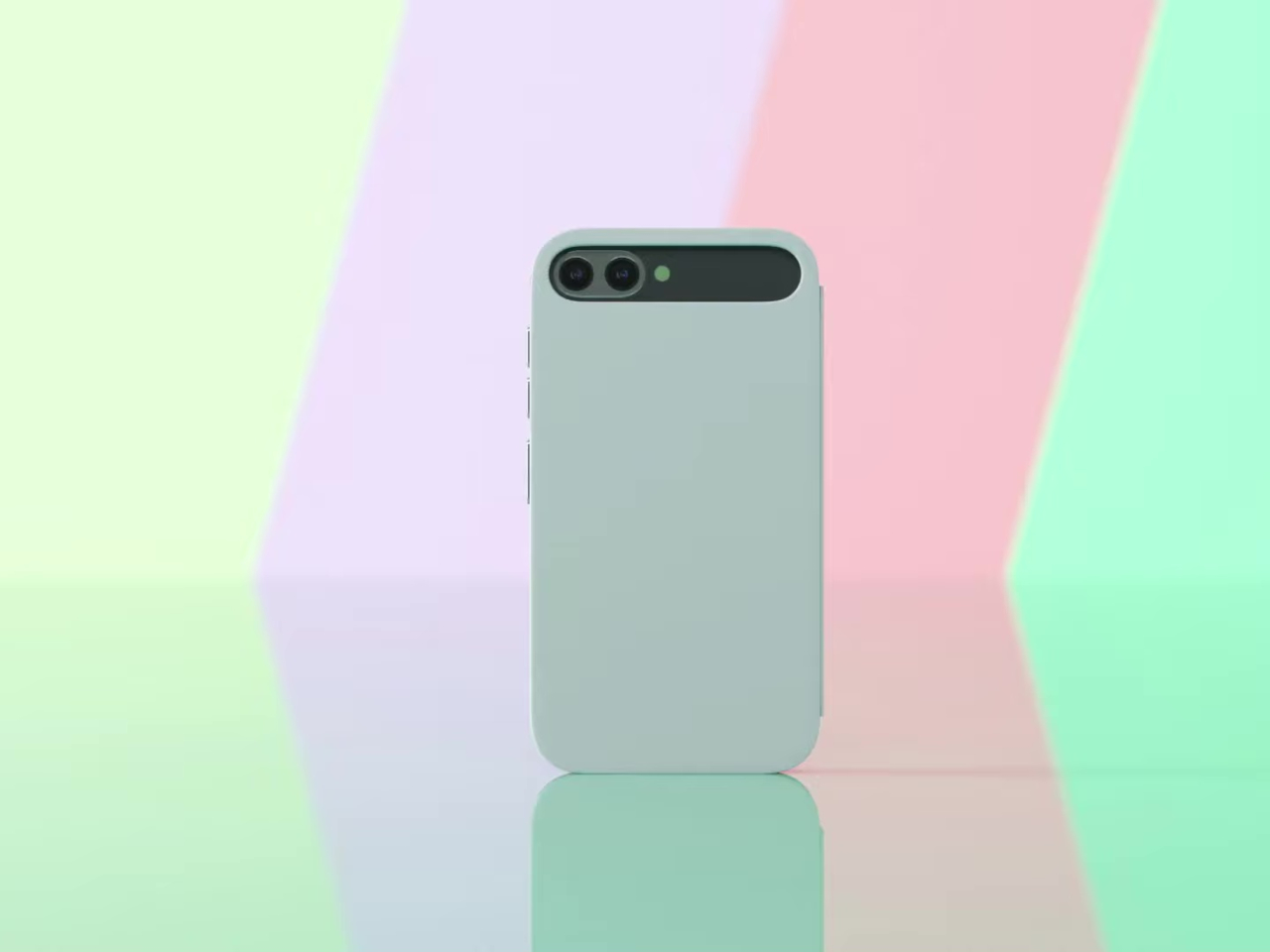
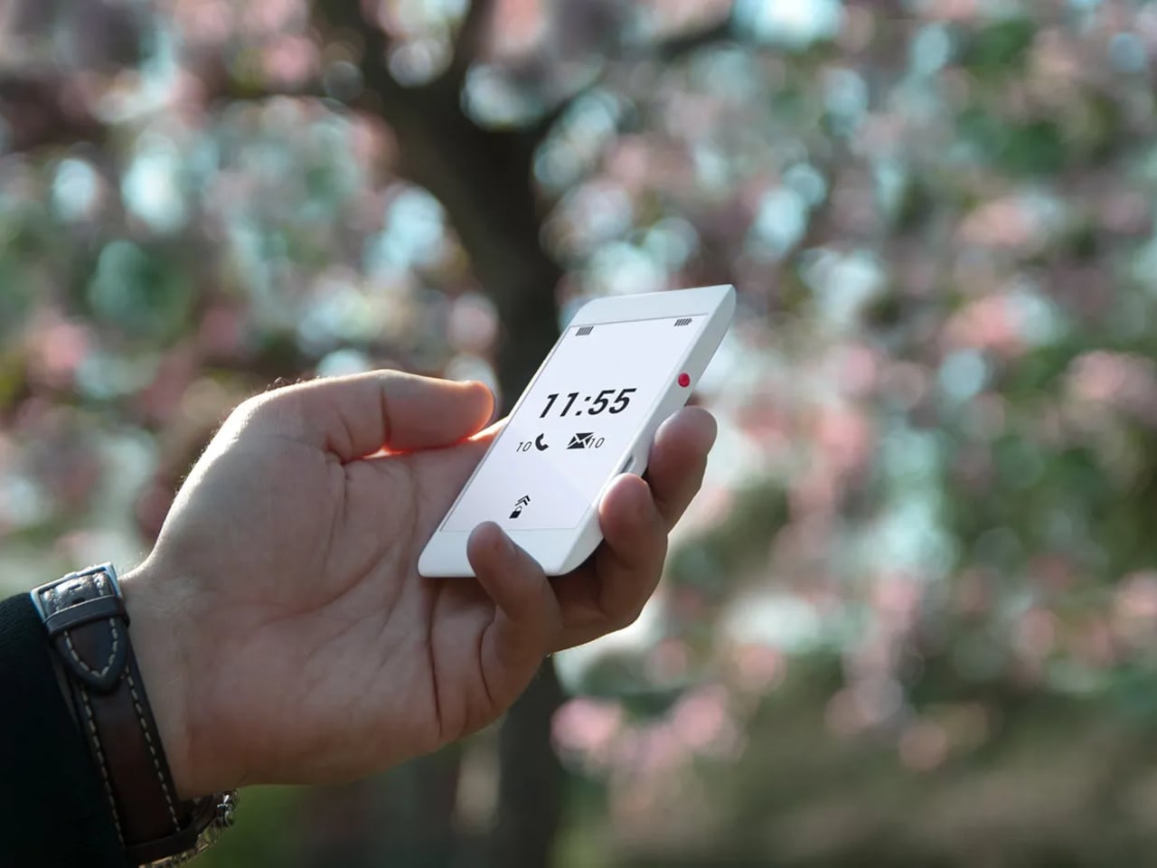
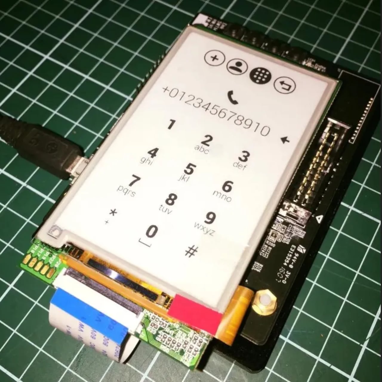
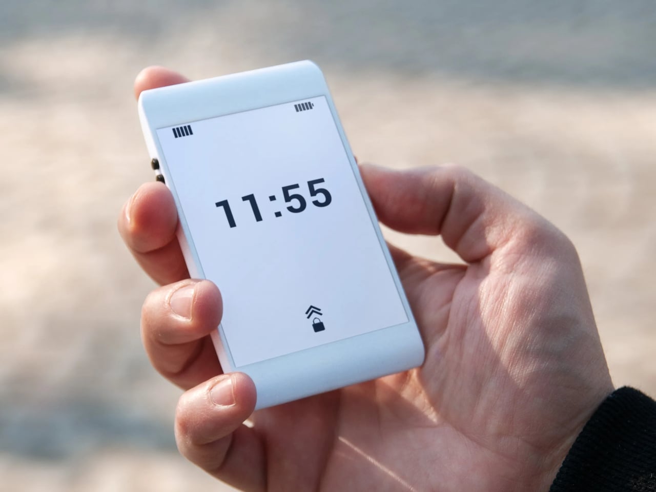
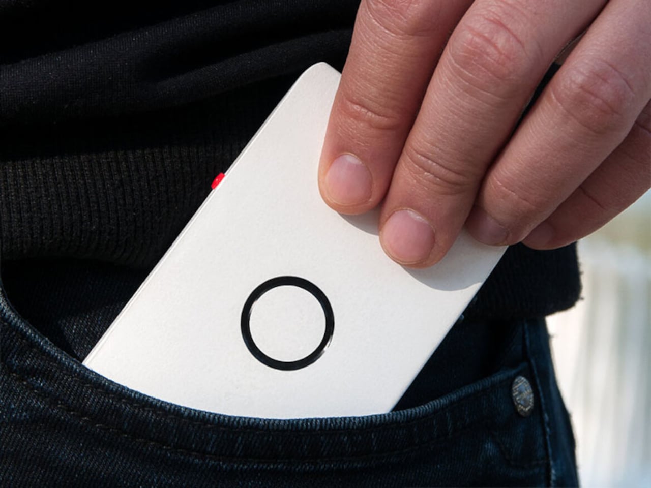
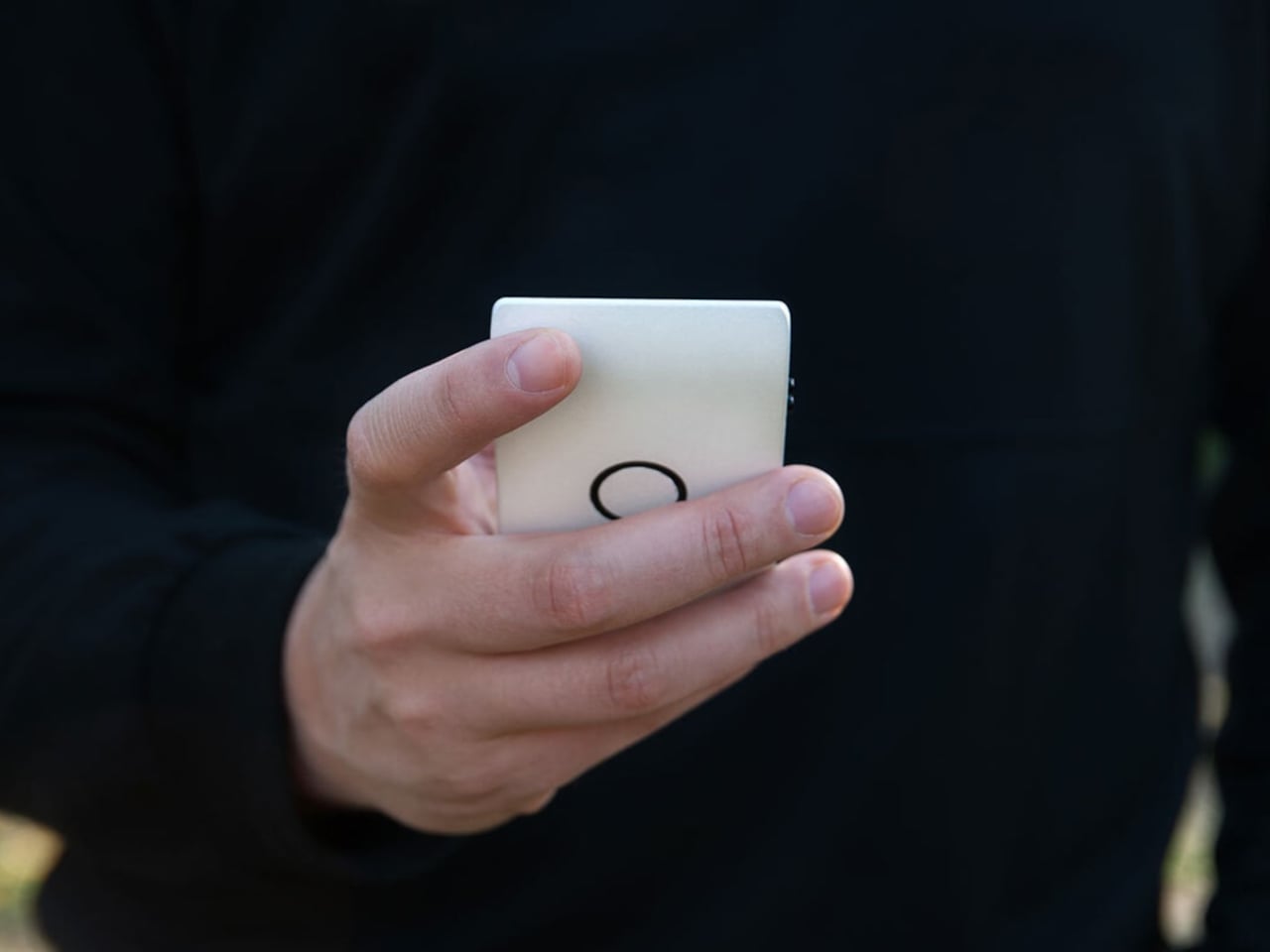
The first thing that catches your attention is how unassuming Offone is. Its 3D-printed body is slim enough to slip into a wallet alongside your cards and fits in the palm without effort. White, monochrome, and clean, the E Ink touchscreen looks more like paper than a display. The side bezels are practically nonexistent, while the top and bottom house the usual earpiece and microphone.

The E Ink display is a practical choice as much as an aesthetic one. It means no screen glare, no blue light, and no eye strain from prolonged use. Reading a text or checking a contact feels like glancing at a printed page. Lazić also considered night use, suggesting optional backlighting so the phone remains usable in the dark without disrupting sleep the way most backlit screens tend to do.

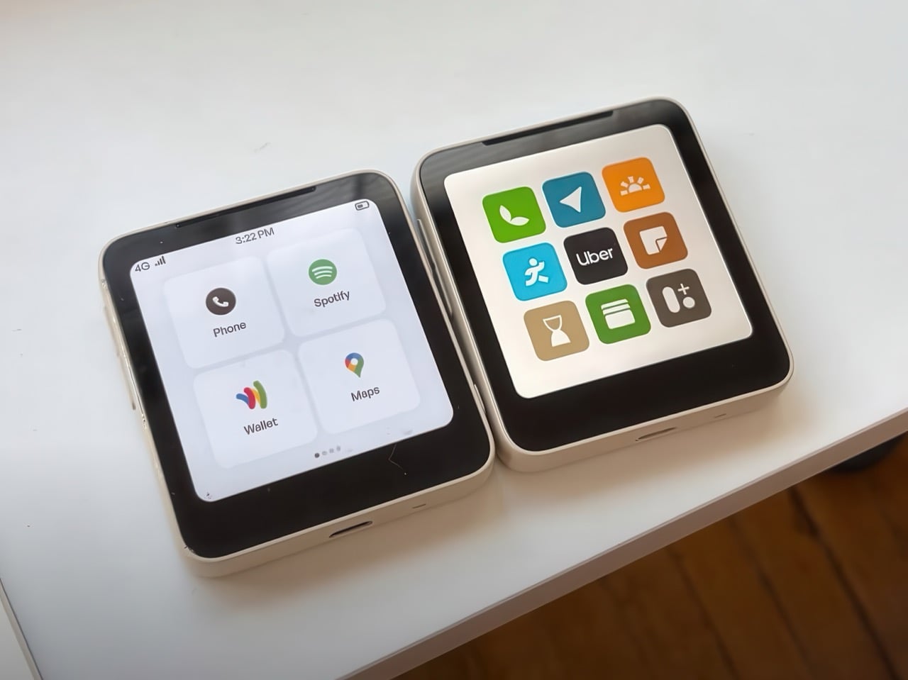
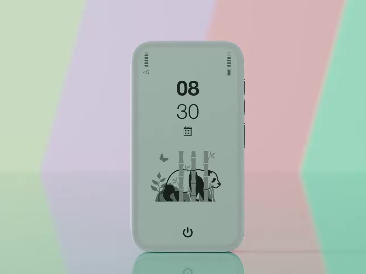
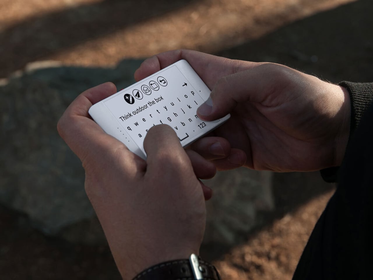
Lazić’s approach to the interface is as intentional as the hardware. Instead of text labels, Offone uses universal symbols to represent its apps, meaning navigating the phone doesn’t require knowing any particular language. It’s a small detail but a telling one, reflecting a philosophy where clarity and accessibility come before convention. The only time you type letters is when writing a message or searching for a contact.

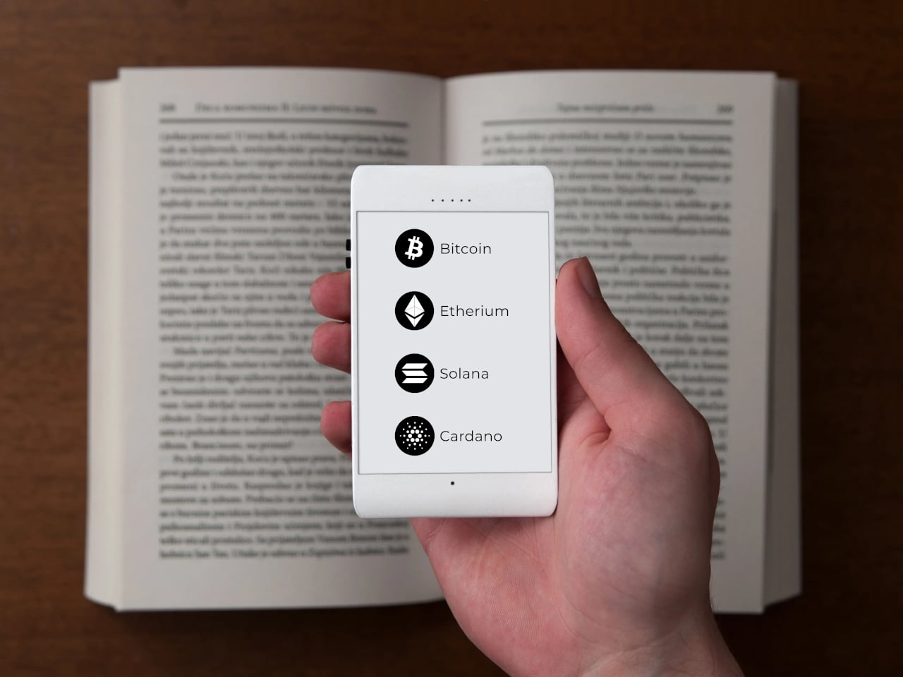
The app selection is just as deliberate. You get calls, SMS, Google Maps, Waze, Uber, and messaging platforms like WhatsApp, but nothing else. No camera, no app store, no social feeds. Imagine getting through a travel day, navigating an unfamiliar city, calling ahead to a hotel, and ordering a ride, all without once falling into the scroll. For frequent travelers and the easily distracted, that’s a meaningful trade-off.

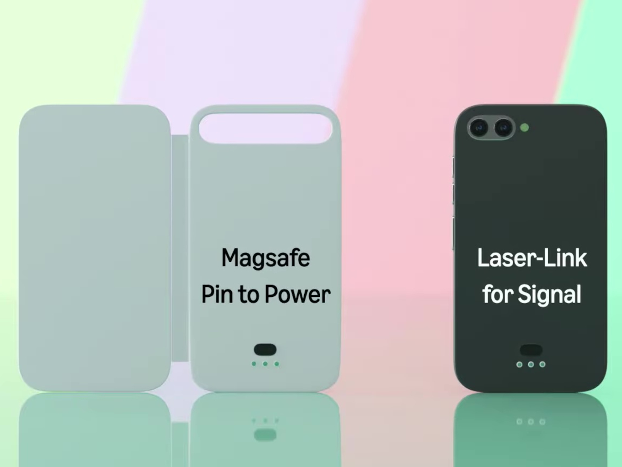
Even the hardware choices are guided by this spirit of restraint. At least one prototype shows no ports at all, meaning charging would be wireless and headphone connectivity handled over Bluetooth. It’s a cleaner device in every sense, free from the usual tangle of cables. The E Ink display also dramatically reduces power consumption, pushing battery life well past what most smartphones manage in a day.

Offone never reached production. Lazić wrote about the startup’s collapse in a 2022 Medium post, pointing to a mix of ambition, poor team choices, and a lack of funding as the reasons it fell apart. Development halted that same year after the team disbanded, leaving it an intriguing concept that was perhaps just a few years ahead of the minimalist phone movement it helped inspire.

The post This E Ink Wisephone Has No Camera, No App Store, No Social Media first appeared on Yanko Design.

CA-T Traps Your Phone Like a Cassette Tape So You Can Actually Focus

The problem with focus apps isn’t that they don’t work. It’s that the thing running them is also running Instagram, YouTube, and every group chat you’ve ever been in. The phone stays in your hand, the timer ticks, and the notifications stack up at the edge of your vision. CA-T is a concept that treats this as a hardware problem rather than a willpower problem, and the solution it proposes is surprisingly literal.

Taking inspiration from an age before smartphones, the CA-T is a compact desktop device shaped like a cassette player. Your smartphone is the tape. Slot it into the bay on top of the device, and the study session starts. The concept’s own framing is direct about this: the mobile phone, once a source of distraction, becomes the condition for activation. The device doesn’t operate at all until the phone is inserted.

Designers: Hyunwoo Jung, Minsu Kang, Yehoon Cho, Yoonchae Kim

Once docked, the phone charges wirelessly while the session runs. The circular display on the front face of the device shows a timer, but with a specific and deliberate framing: it visualizes the accumulation of focus rather than the countdown of remaining time. The reel graphic rotates as the session progresses, showing how much you’ve built up rather than how much you have left. That’s a small but meaningful reframe of what a study timer is supposed to communicate.

The session moves through four states. Ready prompts the user to insert their phone. Focus runs the timer as the reel turns. Comment delivers brief encouragement during the session, minimal by design, intended not to interrupt but to sustain. Complete shows the accumulated result, offering a record of consistency rather than just a signal that time is up. The physical controls are kept sparse: a prominent blue button on top, two secondary white ones, a volume slider, and a headphone jack along the bottom edge.

The cassette reference earns its place here beyond the obvious nostalgia. A tape only plays when it’s loaded, and loading it is an unambiguous act; there’s no passive way to start. The design applies the same logic to starting a study session, using physical insertion as a commitment mechanism. The design also addresses what it calls “the pressure of having to start,” framing the gesture of inserting the phone as lower-friction than opening an app and navigating past whatever else is waiting on the screen.

CA-T is a concept, with no announced production timeline or pricing. What it puts on the table is a specific question: does the ritual of physically committing your phone to a device change your relationship to the session that follows? The wireless charging detail suggests the designers thought carefully about removing objections. You won’t need your phone back because it’s running out of battery. You’ll need it back because you chose to reach for it.

The post CA-T Traps Your Phone Like a Cassette Tape So You Can Actually Focus first appeared on Yanko Design.

Only 9 People in the World Will Own This iPhone 17 Pro With A Piece of Steve Jobs’ Turtleneck On the Back

Caviar has built its reputation on a specific kind of excess. An actual Rolex embedded into the back of an iPhone 14 Pro, retailing at $133,000. A custom iPhone 13 Pro cast from aluminum salvaged from a melted Tesla Model 3. A John Wick-themed iPhone 16 Pro so aggressively styled it looked like it belonged in an armory, not a pocket. The Russian luxury house has spent years treating Apple’s hardware the way a coachbuilder treats a car chassis, something to be reimagined rather than accepted off the shelf.

For Apple’s 50th anniversary, Caviar has produced something that sits in different territory altogether. The “Steve Jobs” iPhone 17 Pro contains an authenticated fragment of Jobs’ original black turtleneck, sealed inside the chassis beneath a raised titanium logo, on a body deliberately styled to reference the 2007 iPhone that started everything. Nine units. A certificate of authenticity. A “50 Anniversary Edition” engraving and Jobs’ own signature etched into the frame.

Designer: Caviar

The fabric comes from the same Issey Miyake turtlenecks Jobs wore religiously for decades, the ones he ordered in bulk because he wanted clothing to be one less decision in his day. Caviar has positioned the fragment at the center of the phone’s back panel, directly beneath a raised titanium Apple logo that functions as both a seal and a focal point. The black-and-silver color scheme mirrors the original iPhone’s visual language, right down to the slightly offset logo placement and minimalist engraving style. The overall effect reads less like a luxury phone and more like a museum piece that happens to run iOS.

With only nine units produced worldwide, the Steve Jobs edition enters the same rarefied air as limited-run watches or gallery-edition art prints, objects valued as much for their exclusivity as their craftsmanship. The authentication certificate that ships with each phone attempts to legitimize the provenance, offering buyers proof that the fabric fragment is genuine rather than theatre. Whether embedding a piece of clothing into a smartphone chassis constitutes meaningful homage or expensive novelty depends entirely on how much weight you assign to physical artifacts versus digital legacy. Caviar has clearly made its bet on the former, banking on collectors who want to hold a piece of Apple history rather than simply read about it.

Caviar framed the release with the kind of language luxury brands deploy when they want you to believe you’re buying meaning rather than materials. “We wanted to create a device that would serve as a true time capsule,” representatives stated, “by combining the aesthetics of the very first and the most current iPhone, and adding an authentic fragment of Steve Jobs’ clothing, we offer collectors and devoted fans of the brand a chance to feel a physical connection to the visionary who changed the world.” The phones are available now on Caviar’s official website, authenticated certificates included.

The post Only 9 People in the World Will Own This iPhone 17 Pro With A Piece of Steve Jobs’ Turtleneck On the Back first appeared on Yanko Design.

Galaxy Z Fold8 Wide Leaks Show a Foldable With iPad-Like Proportions

Book-style foldables have had a proportions problem since the beginning. The tall, narrow inner displays most of them unfold to have always felt more like stretched phones than proper mini-tablets, making tasks like reading or taking notes feel a little off. Years of refinement have addressed crease visibility and hinge durability, but the shape of the inner screen has largely stayed the same.

That might be changing, at least according to leaked CAD-based renders spreading on the Web like wildfire. The renders point to a device called the Galaxy Z Fold8 Wide, a book-style foldable that reportedly trades the Fold lineup’s tall proportions for a shorter, wider form factor. Samsung hasn’t confirmed any of this, and the final design could change.

Designer: Steve Hemmerstoffer/OnLeaks (Renders) via AndroidHeadlines

The leaked dimensions put the Galaxy Z Fold8 Wide at 123.9mm x 161.4mm x 4.9mm when unfolded and 123.9mm x 82.2mm x 9.8mm when folded, with the camera bump reaching 14.6mm at its thickest point. Those numbers describe a device that’s noticeably shorter and wider than the standard Galaxy Z Fold8, which reportedly unfolds to a taller 158.4mm x 143.2mm footprint.

The inner screen is reportedly a 7.6-inch display with a 4:3 aspect ratio, far closer to a classic tablet format than anything in Samsung’s current foldable lineup. Unfold it, and instead of a tall phone stretched sideways, you’d have something that feels at home for reading, video calls, or running two apps side by side. That ratio changes how you’d actually use it.

Google Pixel Fold (2023)

Google explored something similar with the first Pixel Fold in 2023, which had a 7.6-inch inner display with a 6:5 aspect ratio and unfolded to 139.7mm x 158.7mm. The Galaxy Z Fold8 Wide’s rumored 4:3 ratio would push the open screen more into landscape territory, and at a reported 9.8mm when folded, it would still be considerably thinner than the Pixel Fold’s 12.1mm.

The cover display follows the same logic. At 5.4 inches on an 82.2mm-wide body, it would carry a more usable, phone-like aspect ratio than the narrow cover panels on existing Z Fold devices. The trade-off, per the leak, is a dual-camera rear setup rather than the triple-lens arrangement on the standard Galaxy Z Fold8, which is worth noting for photography-focused buyers.

Samsung Galaxy Z Fold7

The timing of these leaks adds context. Samsung is reportedly planning to launch the Galaxy Z Fold8 Wide this summer alongside the standard Fold8 and Flip8, positioning the wider device as a direct answer to Apple’s anticipated iPhone Fold. The rumored internals include a Snapdragon 8 Elite Gen 5 for Galaxy chipset, a 5,000 mAh battery, and 45W wired charging.

Until Samsung makes an official announcement, none of this is confirmed, and CAD-based renders drawn from supply chain data don’t always reflect what ships. What these leaks do suggest, though, is that Samsung is seriously exploring a foldable form factor that puts the open screen first, with proportions that actually match what a device meant to be used open should look like.

The post Galaxy Z Fold8 Wide Leaks Show a Foldable With iPad-Like Proportions first appeared on Yanko Design.

Samsung’s Galaxy A Phones Now Get IP68 and 6-Year Updates From $449

Mid-range smartphones have been getting very good, very quickly. Most now check the boxes for performance, camera quality, and even design, but the compromises tend to show up later. Software support runs out too soon, water resistance gets downgraded to save costs, or the storage fills up faster than expected. It’s a category where the spec sheet looks promising right up until the parts that actually matter start falling short.

Samsung’s Galaxy A57 5G and Galaxy A37 5G tackle those exact issues. Rather than simply refreshing the hardware, these two phones address the pain points that tend to sour long-term ownership, from shorter software cycles to inadequate protection from the elements. Samsung describes both as the most capable Galaxy A devices yet, and for once, that kind of claim holds up when you look at what’s actually new.

Designer: Samsung

The Galaxy A57 5G leads with a noticeably slimmer build, now at just 6.9mm and 179 grams. A 13% larger vapor chamber helps keep the new Exynos 1680 processor running cool through long gaming sessions or extended recordings. The display also gets slimmer bezels and a bright Super AMOLED+ panel with Vision Booster, so the screen stays readable whether you’re inside at your desk or standing in direct sunlight.

Storage is where the A57 5G makes history for the Galaxy A line. It’s the first A-series phone to offer a 512 GB option, a welcome change for anyone managing a large photo library or shooting high-resolution video regularly. The triple-camera setup, led by a 50 MP main sensor with a 12 MP ultrawide and a 5 MP macro, handles everything from wide-angle landscapes to fine close-up detail.

The Galaxy A37 5G takes a different route to earn its upgrade. Its primary camera now uses a larger 50 MP sensor with support for 10-bit HDR video recording, improving low-light performance and color depth over its predecessor. More significantly, the durability rating jumped from IP67 to IP68, and it now ships with Gorilla Glass Victus+ on both the front and back, which is a notable step up at this price.

Both phones run One UI 8.5 with a broader set of Awesome Intelligence (get it? “AI”?) features. The camera uses AI-based subject and scene recognition to balance skin tones and create cleaner background separation automatically. Circle to Search has also been updated with multi-object recognition, so you can search an outfit, its accessories, and the surrounding backdrop all at once, rather than hunting for each element separately or toggling between searches.

What gives both phones long-term value is Samsung’s commitment to six generations of Android OS updates and six years of security support. Add to that 5,000 mAh batteries and IP68-rated protection across both models, and these are phones clearly meant to outlast the typical mid-range upgrade cycle. The Galaxy A57 5G starts at $549.99 and the Galaxy A37 5G at $449.99 in the US, with availability beginning April 9, 2026.

The post Samsung’s Galaxy A Phones Now Get IP68 and 6-Year Updates From $449 first appeared on Yanko Design.

Leaked Honor 600 Pro looks a lot like the iPhone 17 Pro, but with a much bigger battery

I have to hand it to Honor, they are consistent. When I wrote about the Magic8 Pro Air and its striking similarity to the iPhone Air, I thought we had seen the peak of their “inspiration.” It turns out that was just the warm-up act. The main event has arrived in the form of the Honor 600 and 600 Pro, and this time they have perfectly mimicked the iPhone 17 Pro. The new renders, courtesy of WinFuture, show a design that lifts every key element from Apple’s latest flagship. The full-width camera bar, the arrangement of the lenses, the flat metal frame, and even the color options are all present and accounted for. It’s a remarkable feat of reverse-engineering that feels both impressive and completely shameless.

What makes this strategy so fascinating is that Honor isn’t just making a cheaper clone. They are using the familiar, market-tested design as a vessel for a totally different philosophy. The Honor 600 is expected to ship with a 200MP camera and a 9,000mAh battery, specs that are practically alien to Apple’s ecosystem. It’s a phone designed to look like an iPhone from a distance but to function like an endurance-focused Android powerhouse up close. Honor is essentially telling the world that you can have Apple’s style without having to accept Apple’s compromises, and that’s a powerful message.

Designer: HONOR

The horizontal camera bar is not just vaguely similar, it’s dimensionally faithful. Both models feature the same raised rectangular module spanning nearly the full width of the device, with lenses, flash, and sensor cutouts arranged in a configuration that directly mirrors Apple’s layout. The standard Honor 600 goes with a dual rear camera setup, with its LED flash and laser autofocus tucked into a separate pill-shaped island below. The Pro model steps it up with a triple-lens arrangement, going all-in on the vertical stack. Even the colorways follow Apple’s playbook closely, with glossy black, metallic gold, and a bright orange finish that lands somewhere between homage and photocopy. Honor’s team clearly studied the iPhone 17 Pro with the intensity of an art student sketching a masterpiece in a museum.

The hardware rumors add even more intrigue to the picture. A 9,000mAh silicon battery in a flagship-tier device is almost unheard of in 2026, delivering the kind of multi-day endurance that the iPhone 17 Pro can only dream about. Both phones also get a 6.57-inch 120Hz OLED display at 1.5K resolution, wireless charging, a 3D ultrasonic in-display fingerprint sensor, and a Snapdragon 8 series chipset. There’s even a dedicated camera button on the side, which is, yes, another very Apple-like touch. Honor is effectively saying: if you love how the iPhone looks but wish it prioritized endurance and camera specs over thinness, we built that phone for you. Whether that resonates with buyers remains to be seen, but the logic behind it is hard to argue with.

The post Leaked Honor 600 Pro looks a lot like the iPhone 17 Pro, but with a much bigger battery first appeared on Yanko Design.

Galaxy Z Fold 8 Renders: Same Look, Bigger Battery, and S Pen Is Back

Foldable phones have reached a point where the form factor itself is no longer the talking point it once was. The big, dramatic “look how it folds” moment has settled into a quieter rhythm of iterative refinement, with each generation tweaking dimensions and chasing thinner profiles. Most buyers know what a modern book-style foldable looks like, and the language of change has shifted from shape to substance.

That’s the situation shaping the Samsung Galaxy Z Fold 8 conversation right now. Leaked CAD-based renders show a design that’s nearly indistinguishable from the Z Fold 7 pictured above: same flat sides, same sharp corners, same camera layout. The cover screen sits at 6.5 inches and the inner display at 8 inches, both unchanged. If you handed someone these renders without context, they’d probably just guess it was another angle of last year’s model.

Designer: Steve Hemmerstoffer/OnLeaks (Renders) via AndroidHeadlines

There’s one notable external difference, though, and it actually goes in the wrong direction. The leaked dimensions put the Z Fold 8 at 4.5mm thick when open and 9mm folded, compared to the Fold 7’s 4.2mm and 8.9mm. That’s a slight regression for a phone that went to considerable lengths to slim down the year prior. It’s not dramatic, but for a device that made a point of its thinness, it’s worth flagging. That said, the 4.5mm figure includes the protruding bezels around the display; it’s actually just 3.9mm thin.

The likely reason for that extra thickness is one of the better leaks so far: the possible return of S Pen support. Samsung dropped the stylus from the Fold 7, and that’s been a consistent complaint from the people who actually used it for note-taking or sketching on that wide inner canvas. If the S Pen does come back, a fraction of a millimeter is a fair trade for most of those users.

The battery theory, however, is probably more probable. A jump from 4,400 mAh to a rumored 5,000 mAh would mark the first capacity upgrade since the Galaxy Z Fold 3, and pairing that with 45W wired charging, up from 25W, addresses one of the more persistent frustrations with this lineup. Spending less time near an outlet matters more on a device you’re likely using across more tasks throughout the day.

The camera is also in line for a significant upgrade, according to the same leak. The main sensor is rumored to still be 200MP, and the ultrawide jumps from 12MP to 50MP. That ultrawide improvement in particular has been a long time coming. The gap between the Fold’s main and ultrawide cameras has been noticeable enough that it’s affected how people use the phone outdoors.

All of this is still leak territory, of course, pulled from CAD renders and a specs tipster ahead of what’s expected to be a July 2026 Unpacked announcement. Samsung hasn’t confirmed any of it, and final specs frequently shift between early renders and launch day. The Z Fold 8 is shaping up to be a phone that looks familiar and updates what actually needs updating, but none of that is official yet.

Galaxy Z Fold7

The post Galaxy Z Fold 8 Renders: Same Look, Bigger Battery, and S Pen Is Back first appeared on Yanko Design.

The Anti-Distraction Smartphone That Still Lets You Use Uber and Strava

I pulled out my phone at the airport gate to check my boarding time, then spent the next fifteen minutes scrolling TikTok. I nearly missed my flight. The phone wasn’t lying when it said Gate 23, but somewhere between the lock screen and actually standing up, Instagram happened, then Twitter, then one more reel. We’ve all been that person. The issue is architectural: smartphones were built to be everything machines, and everything machines are terrible at being sometimes machines.

Meadow, a San Francisco startup, thinks the solution sits between the extremes. Their $399 phone launching June 2026 runs a curated set of actually useful apps (Spotify, Uber, Maps, a camera) while completely excluding the attention-draining ones (Instagram, TikTok, email, web browsers). You get a private phone number that only your contacts can reach, a 3-inch screen deliberately too small for binge-watching, and 4G connectivity without the infinite scroll tax. It’s a 4-ounce slab of recycled polycarbonate that wants to get you through your day, then get out of your way.

Designer: Meadow SF, Inc.

The 3-inch TFT LCD measures roughly 1.3 x 2 inches in total device footprint, making this closer to an iPod nano than a modern smartphone. The screen is big enough to read a map or control Spotify, but small enough that watching a YouTube video feels like punishment. The 13MP ultrawide camera captures memories without turning you into a content creator. The whole package weighs 4 ounces and fits in a coin pocket, which means you can actually forget you’re carrying it.

The minimalist phone market has been wrestling with this problem for years, and everyone keeps arriving at slightly different conclusions. The Unihertz Titan 2 resurrects the BlackBerry Passport form factor with a physical QWERTY keyboard and a 4.5-inch square screen, betting that tactile typing will make you more productive and less prone to mindless scrolling. It works for some people. The Clicks Communicator takes a similar approach but positions itself explicitly as a secondary device, the thing you carry when your real phone stays home. The iKKO Mind One shrinks everything down to credit card size with a rotating camera, targeting travelers who want maximum portability. Mudita’s Kompakt goes full ascetic with an E-ink screen, no app store, and a hardware kill switch that physically disconnects the microphones and camera.

Meadow splits the difference. You get real apps from real services, the ones that genuinely make modern life easier. Spotify and Apple Music mean you’re not stuck with MP3s loaded via iTunes like it’s 2008. Uber and Maps mean you can actually navigate an unfamiliar city without printing directions. Strava means your runs still sync. The camera means you can capture moments. Notes, weather, clock, fitness tracking, all present. What’s missing is the entire category of apps designed to consume your attention rather than assist your life. No browser means no falling into Wikipedia rabbit holes at 1 AM. No email client means work can’t chase you into the evening unless you’ve specifically decided to check it on another device. No social media means no feeds, no reels, no endless scroll.

When you activate Meadow, you get a number that functions like an allowlist. Only people you’ve added as contacts can call or text you. Everyone else hits a wall. No spam calls about your car’s extended warranty. No texts from political campaigns. No unknown numbers at dinner. Your main phone can be dead or turned off and you still won’t miss calls that matter, because Meadow routes them through your main number. Setup takes five minutes at home, no carrier calls required. The eSIM activation happens through the Meadow app, and you’re off to the races.

The device ships with 128GB of storage, 6GB of memory, and a battery rated for one to two days depending on usage. Fast charging helps. The included accessories (action case, beach pouch, charging cable) suggest Meadow knows exactly who this is for: people who want to go outside and do things without their phone becoming the main character of the experience. Pre-orders are open now at meadow.so for $399, with shipping starting June 2026 and a nine-month free subscription ($10 per month after that for unlimited calls, texts, and photo storage). The first units hit doorsteps in May according to the delivery schedule, which means summer 2026 could be the season a bunch of people finally stop doomscrolling at the beach.

The post The Anti-Distraction Smartphone That Still Lets You Use Uber and Strava first appeared on Yanko Design.

This E Ink Flip Case Shows the Time Without Ever Waking Your Phone

Smartphone cases have become one of the more predictable corners of the mobile accessory market. Most of them do exactly what you’d expect: wrap around the phone, absorb some impact, and stay out of the way. A few go further with card slots or battery packs, but the core idea hasn’t changed much in years. You’re still waking the screen every time you want a quick glance at the time.

Pixel Dynamics’s E Ink Flip Cover concept takes a simpler approach. It’s a flip-style case with an E Ink screen on the outer panel, so even when the cover is shut, and the phone is locked, you can still check the time, date, battery level, and signal without waking the main display. E Ink only draws power when the image changes, making it a natural fit for an always-on panel.

Designer: Pixel Dynamics

There’s more to the display than status data, though. Beyond the time, date, and connectivity readouts, you can set it to show ambient illustrations that make the cover feel more personal, less like a utility panel, and more like something worth looking at. An E Ink screen isn’t going to win awards for visual richness, but for something that stays visible all day without demanding attention, that’s a reasonable ask.

The case attaches to the phone through a MagSafe-style magnetic system, snapping into place without any physical ports. Power is handled through contact pins that draw directly from the phone’s battery, so there’s nothing to charge separately and no second battery bloating the profile. That’s a smart call; one of the quickest ways to kill an otherwise good accessory concept is to make the user manage another charging cable.

Data between the case and the phone travels through what the concept calls Laser-Link, pitched as a higher-efficiency alternative to Bluetooth or NFC. The idea is that replacing radio-based communication with a laser signal gets you faster data transfer with less power overhead and no interference issues. It’s still concept-level technology, of course, so there aren’t any real specs to evaluate, but the thinking behind it is sound.

Put it together, and the pitch is easy to follow. You keep the phone in your pocket or face-down on a desk, and the E Ink panel handles quick glances that don’t need the main screen, saving the battery drain of waking an OLED display dozens of times a day. When you do need the full phone, flipping the cover open gets you there just as fast as any other case.

That said, a few things here are easier to propose than to build. Laser-Link doesn’t have a clear path to production yet, and it raises obvious questions about reliability when the phone and case aren’t perfectly aligned. The E Ink display part is more grounded, since that technology already exists in other accessories.

The phone case hasn’t had a genuine design moment in quite a while, and a concept that starts asking what the outer panel can actively do for you is a reasonable place to start that conversation. It still has a long road before reaching any shelf, but for a category that’s mostly been stuck recycling the same rigid shells, that’s actually not a bad place to be.

The post This E Ink Flip Case Shows the Time Without Ever Waking Your Phone first appeared on Yanko Design.