It’s almost too easy to take for granted what a toilet looks like, especially considering what we use it for. At the same time, that’s the very reason why these fixtures need to not only be well-designed but also aesthetic, providing a sense of comfort and maybe even delight despite and in spite of the context. That is why the majority of toilets are designed with shiny white surfaces and smooth curves in an attempt to provide a visual and tactile contrast to their purpose. That said, that is hardly the only way to design a striking product, and this rather unique toilet design concept uses a different strategy that still manages to capture the eyes and the mind with its brutalist form inspired by the powerful waters that course through it.
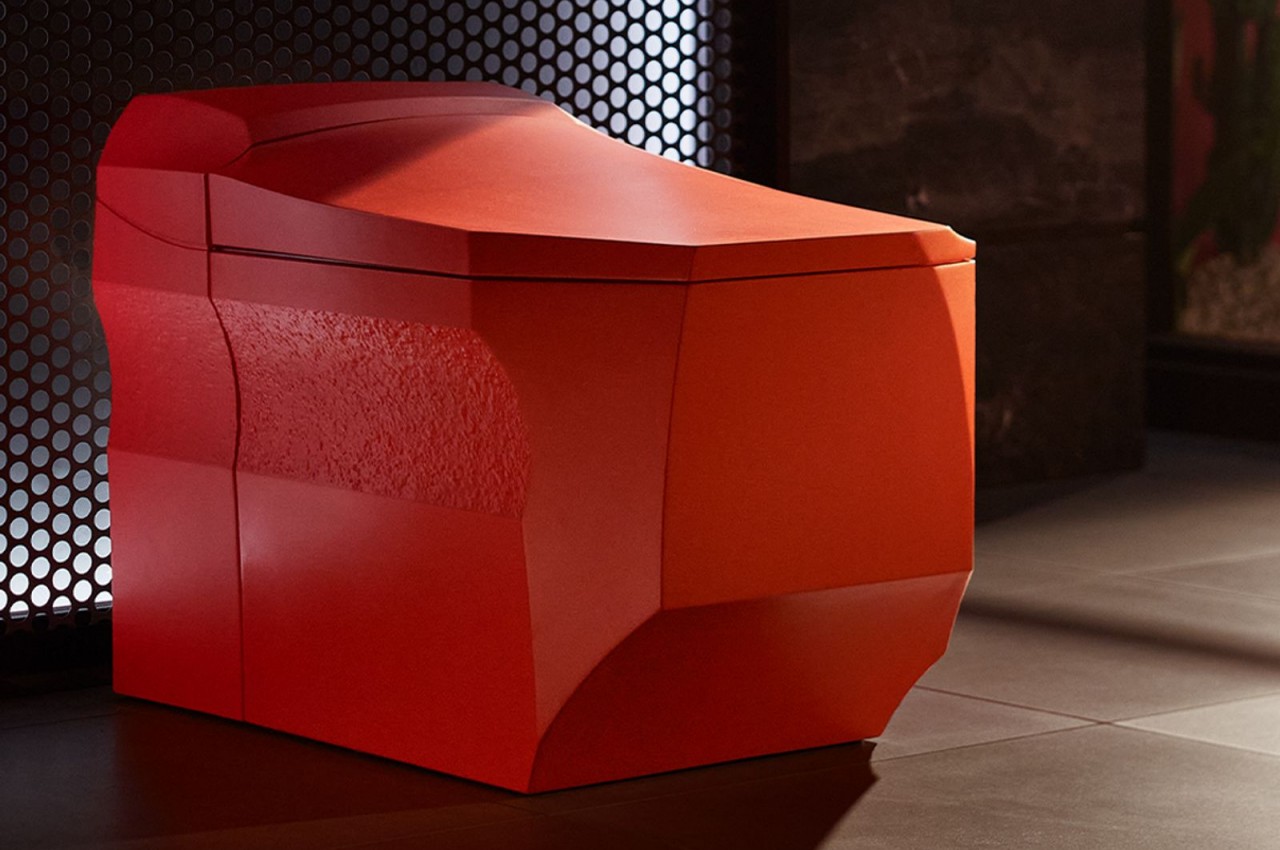
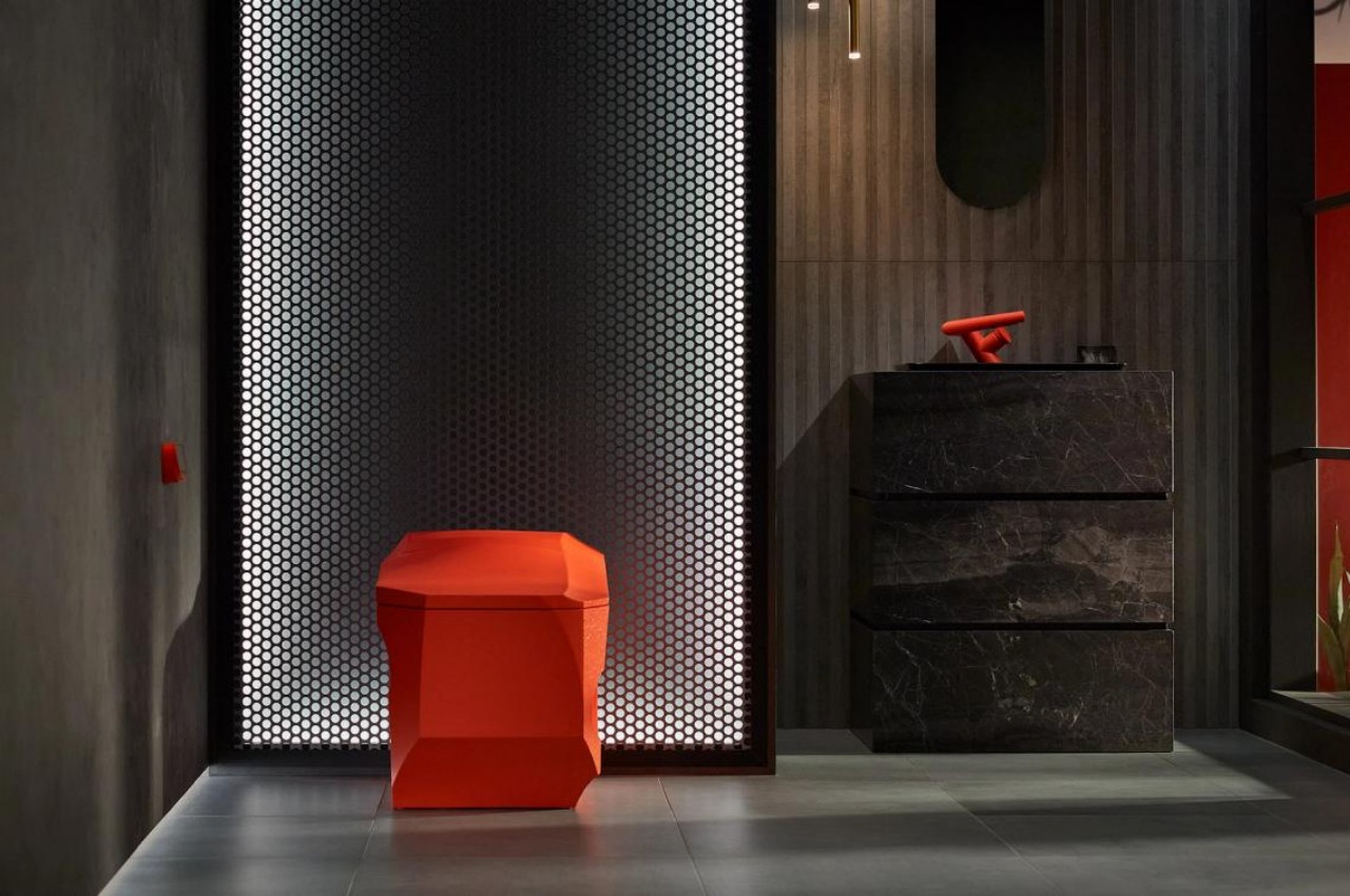
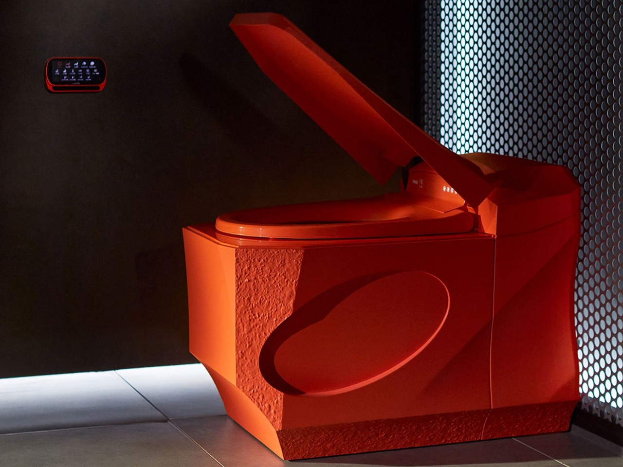
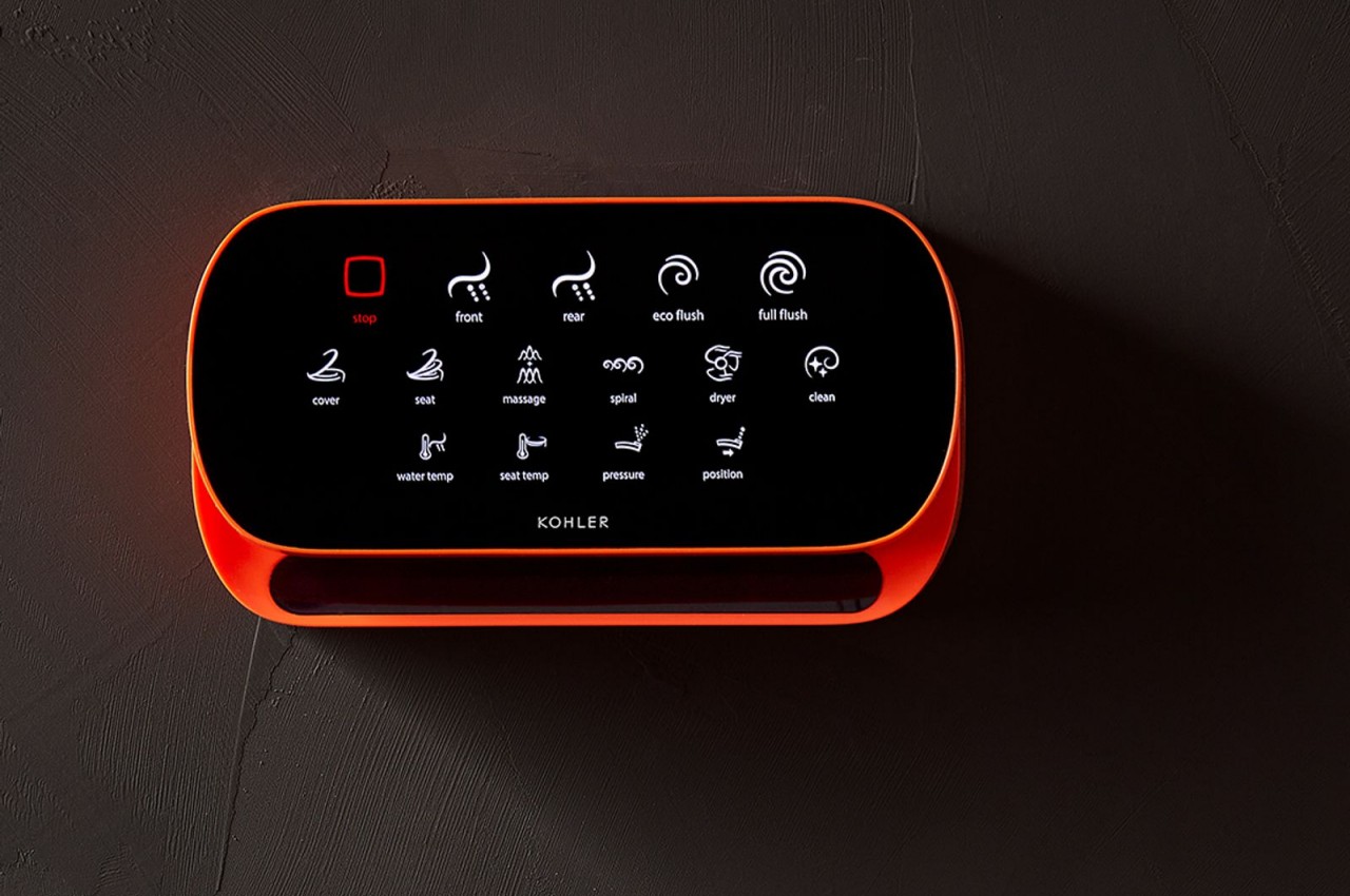
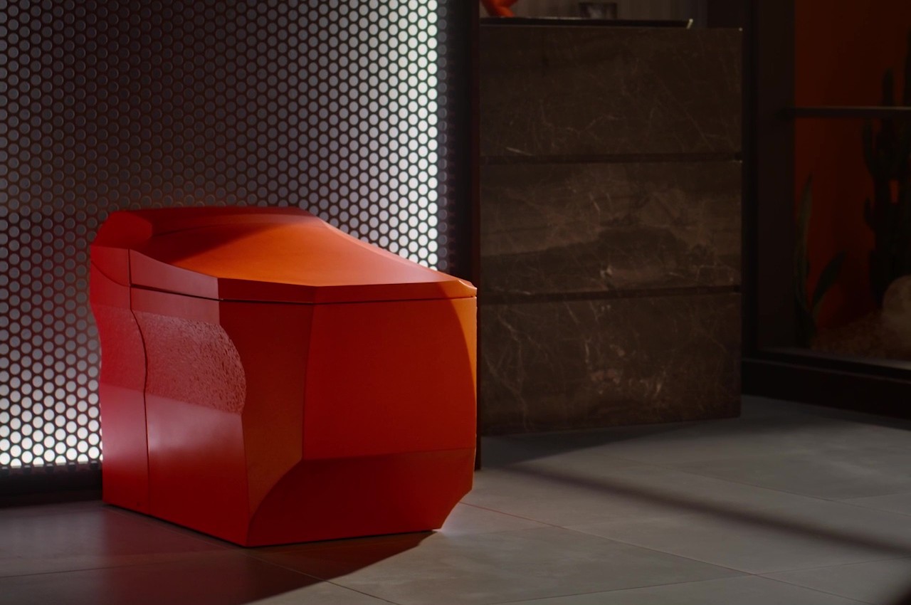
There’s really no hard rule on what a toilet should look like as long as it functions as intended and is more or less comfortable to use. That toilets are often white, smooth, and curvy is simply a matter of convention and convenience. There are, of course, exceptions to these that add a bit of flair to the bathroom, and the Formation 02 is one design that immediately stands out from the crowd both in its shape and its unconventional color.
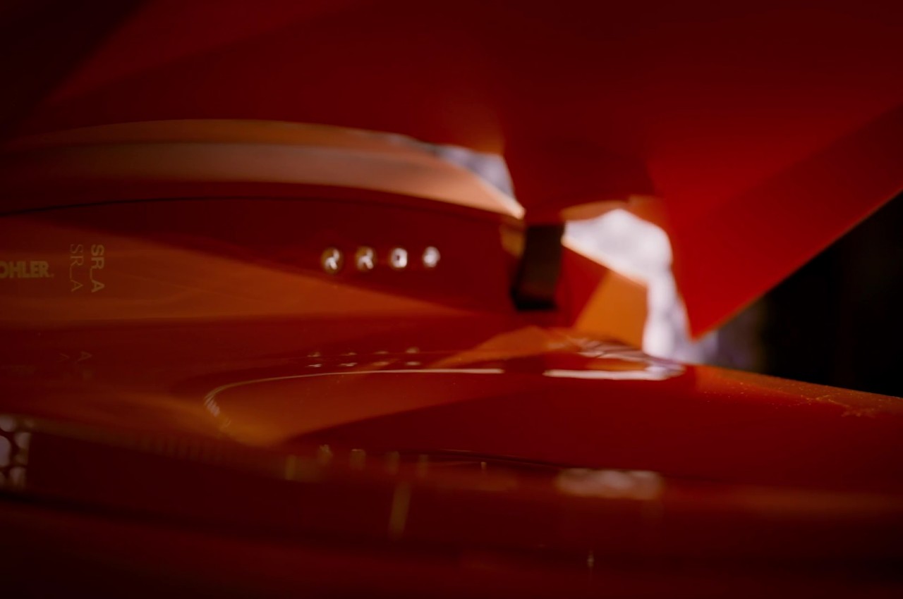
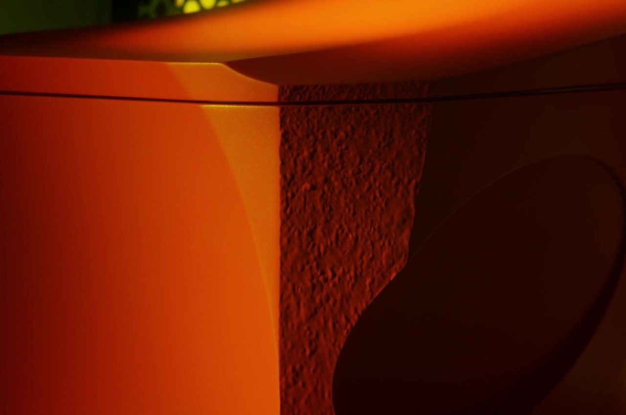
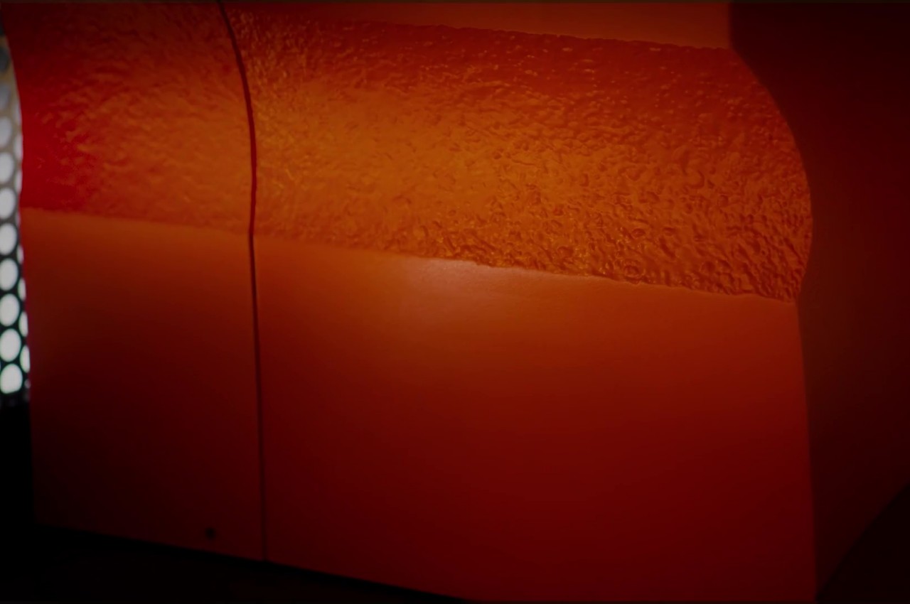
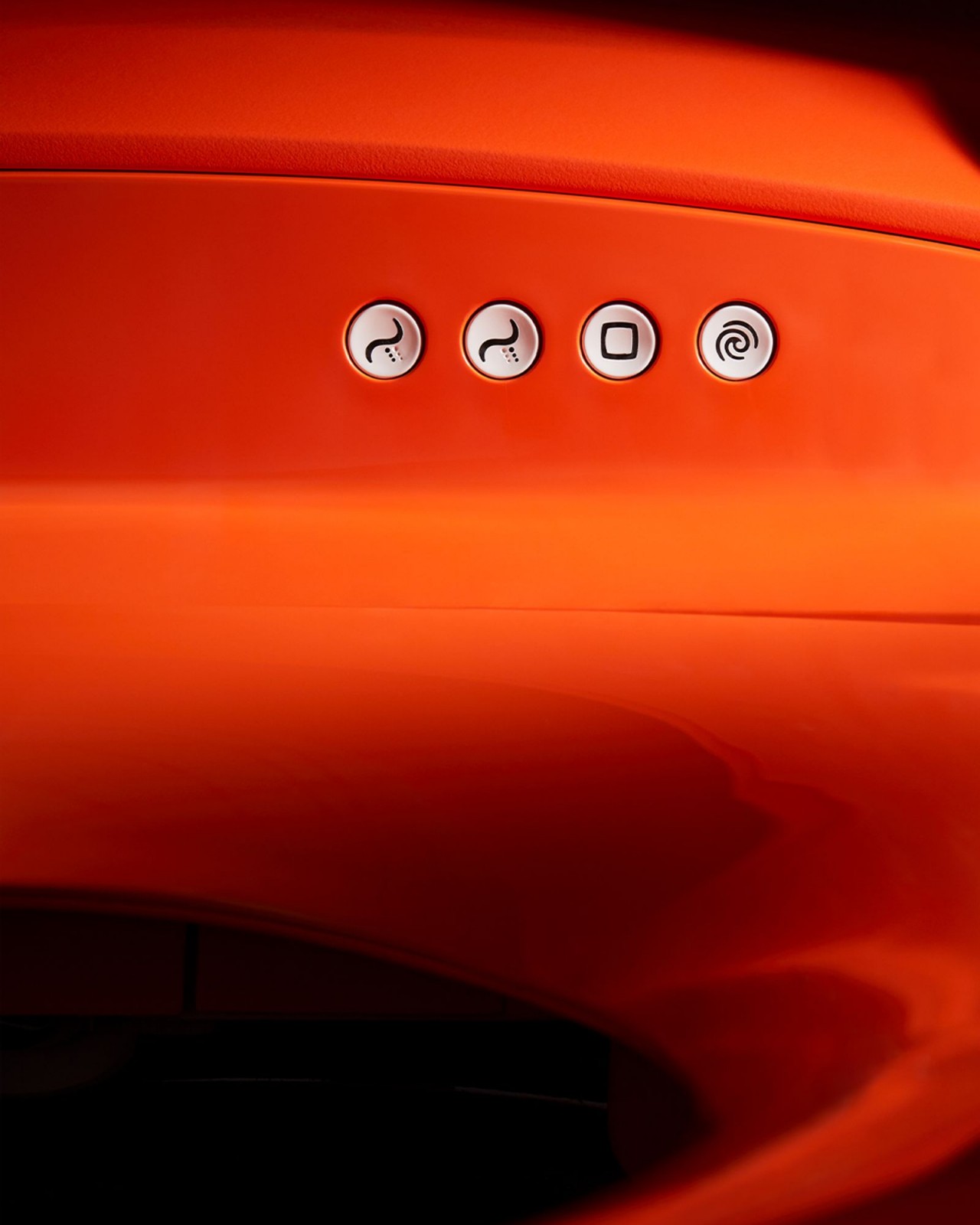
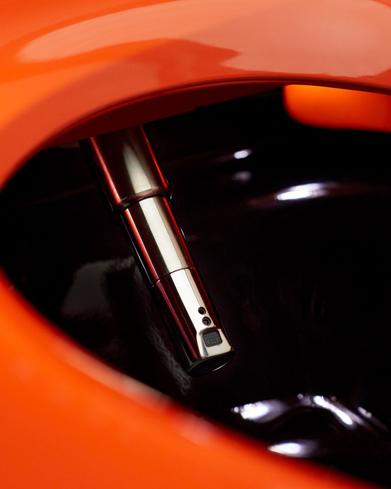
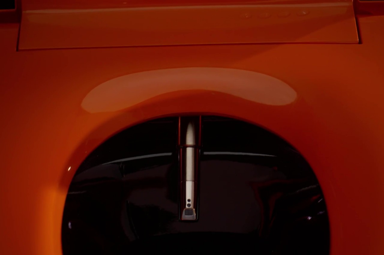
As if its orange paint weren’t enough to get it noticed, the Formation 02’s blocky and faceted form evokes a different imagery from typical toilets. It has a rough sort of character as if the whole body was hewn from stone, giving it a brutalist aesthetic you won’t find in any toilet. It’s a design chosen not merely for the sake of being different but for the message it tries to convey.
In particular, it tries to demonstrate the effects of moving water on its environment, shaping and changing the way things look. Sometimes it can smooth out rocks into pebbles, but sometimes it can also wear them down to rough surfaces. The Formation 02 represents both possibilities, with some sides smooth while others left rough and raw.
While it might indeed look rough on the outside, the Formation 02 is still a functional toilet that brings comfort and convenience once the lid is lifted, which can be done without even touching it. It’s a smart toilet, after all, and it offers a heated seat, customizable bidet cleansing, and more, allowing you to do your thing neatly and cleanly while appreciating the distinctive design of this one-of-a-kind toilet concept.
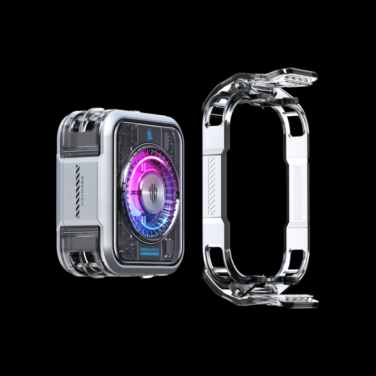
As smartphones become more powerful, the need to keep them from overheating becomes even more critical. Relying on simple heat dissipation is no longer enough, and sometimes even the more advanced passive cooling solutions, like vapor cooling chambers, are unable to compensate as well. This is especially true for phones used to play games, whether they’re formal gaming phones or just high-end models that have enough muscle but not the right cooling systems. RedMagic, nubia’s gaming sub-brand, believes that the answer lies in an external accessory, and it is now sharing that technology with others so that they, too, can benefit from it, even if they don’t have a nubia or RedMagic phone.
Smartphones generate a lot of heat when pushing their capabilities to the limit, and this causes not only discomfort but also degradation in performance, not to mention potential safety hazards due to the volatile battery powering the device. Unlike laptops and especially desktops, you can’t fit a reasonable cooling system inside a very thin phone, especially if it involves fans or more liquid. Delegating that to an external accessory is certainly possible, but the effort to attach and detach that gadget might be too much of a hassle.
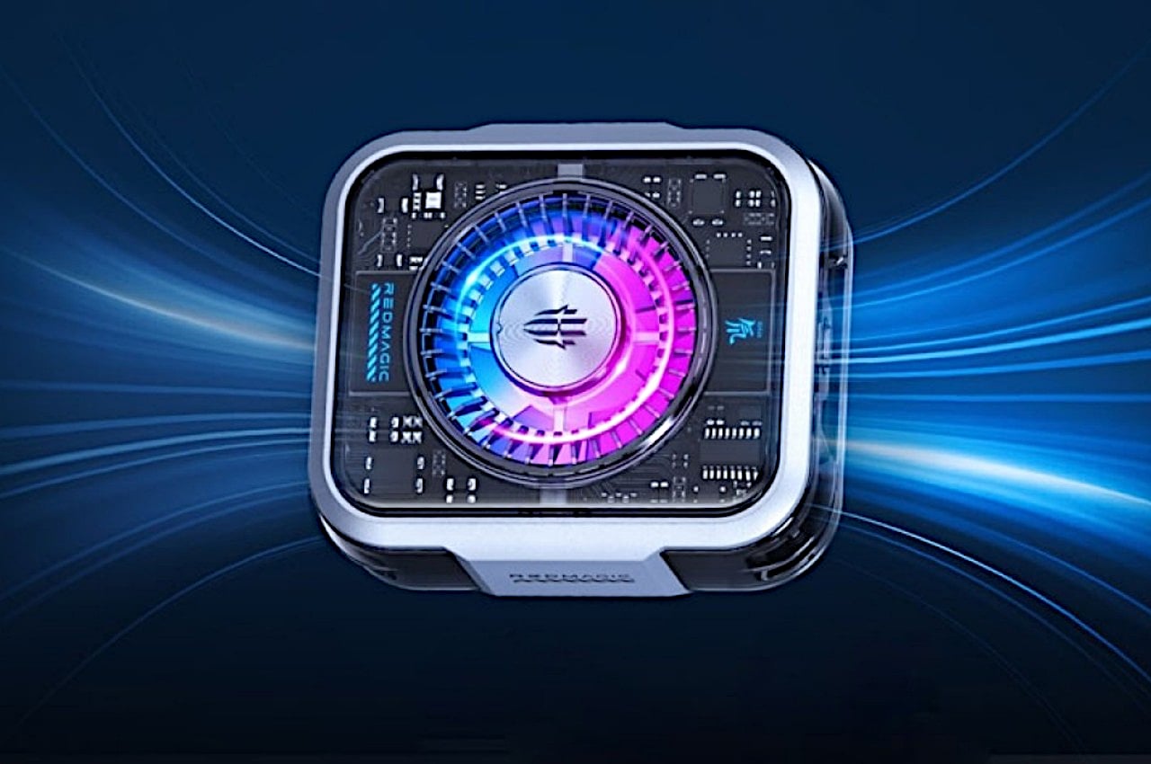
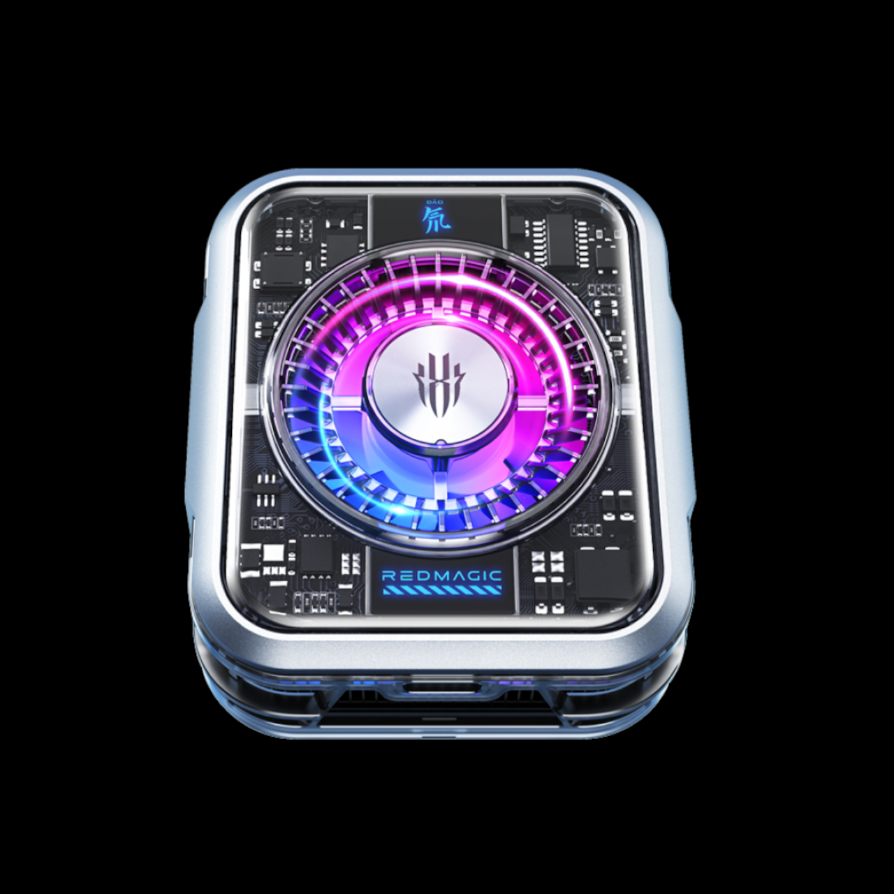
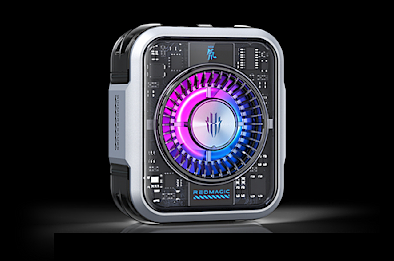
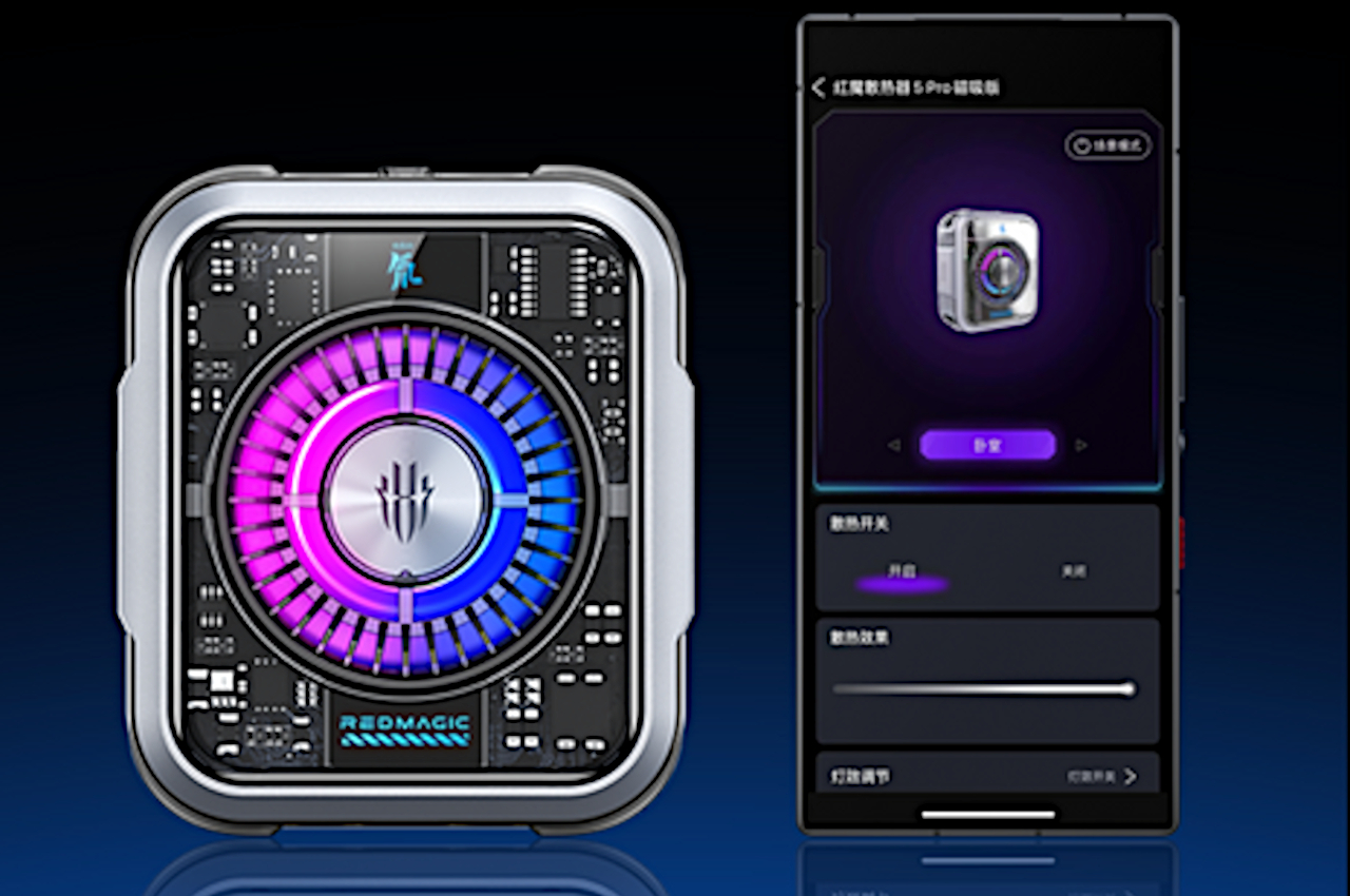
The RedMagic VC Cooler 5 Pro remedies that by utilizing a feature that’s becoming more common among smartphones these days: magnetic wireless charging. This small squarish block can attach to any smartphone that supports this feature, which of course includes Apple’s MagSafe. What’s interesting is that RedMagic isn’t making it exclusive to these phones only, thanks to an optional back clip that can attach to any smartphone, making the VC Cooler 5 Pro almost universally compatible with all models.
But why would you want to stick or clip a small box onto the back of your phone? The RedMagic VC Cooler 5 Pro includes a 7-blade fan 3,060 sq. mm. vapor chamber liquid cooling plate that helps further pull the heat away from the phone and, consequently, away from your fingers. RedMagic claims it can drop the phone’s temperature by as much as 1°C, though your mileage may vary.
Rather than just offering a simple fan and cooling plate, RedMagic is unsurprisingly advertising the use of some AI to automatically adjust the VC Cooler 5 Pro’s speed. This feature, along with the customary RGB lighting controls, is available through RedMagic’s “Goper” app. Unfortunately, this is only available on Android, so while iPhone owners can still use the cooling add-on, they won’t be able to take advantage of AI-powered dynamic settings as well as custom RGB lights. The RedMagic VC Cooler 5 Pro launches on April 15th at 59 EUR ($64) for the magnetic version and 64 EUR ($69) with the optional back clip.
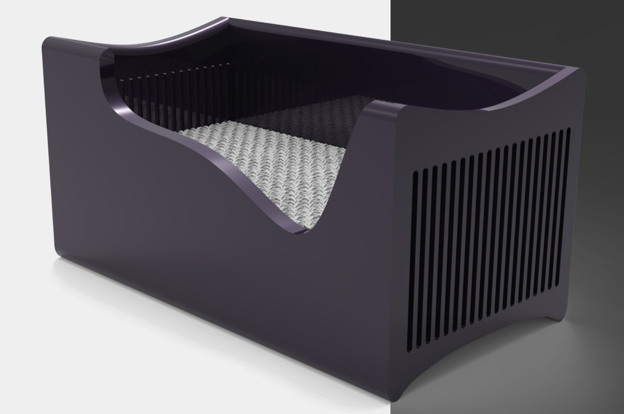
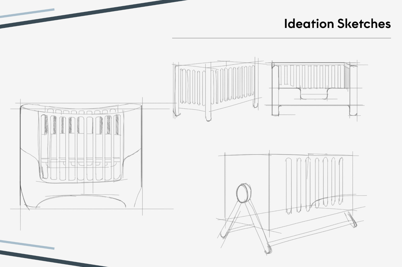
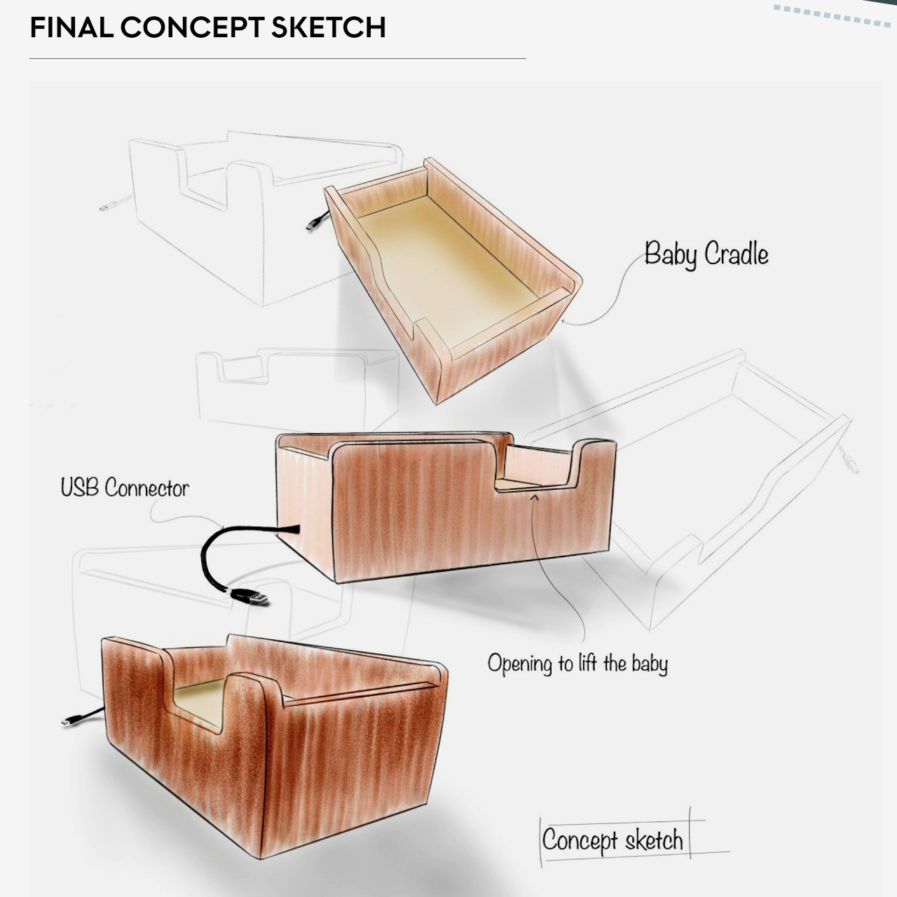
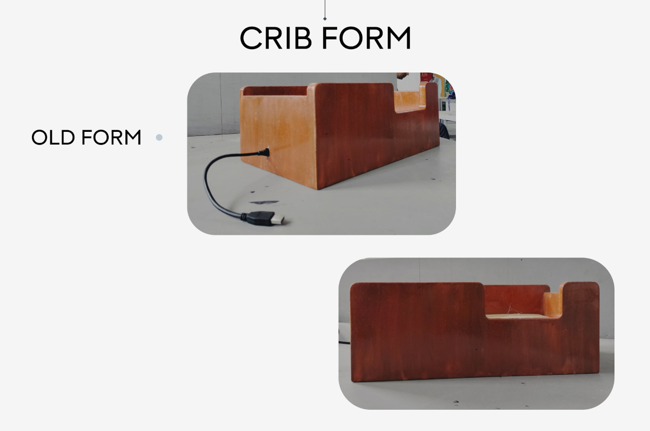
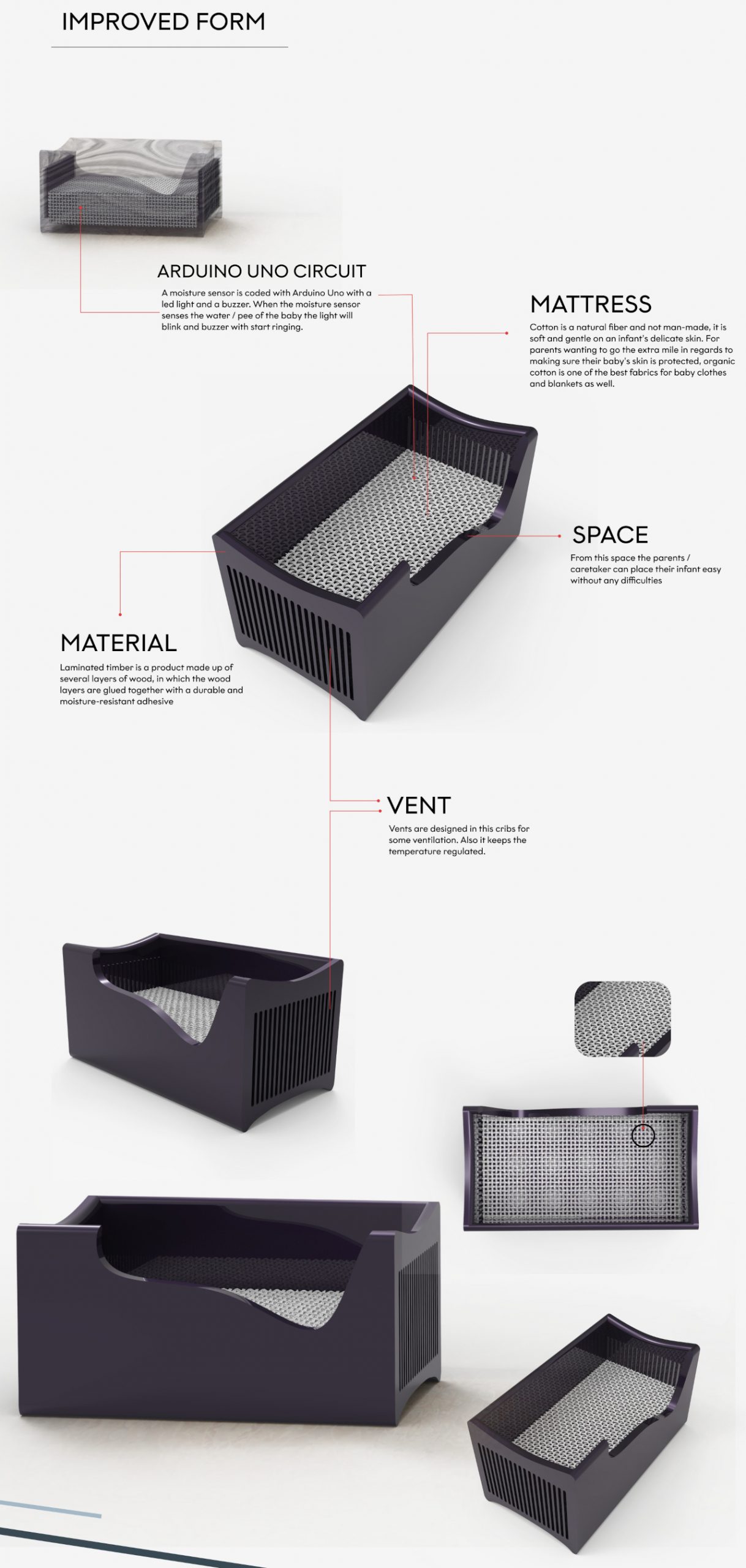
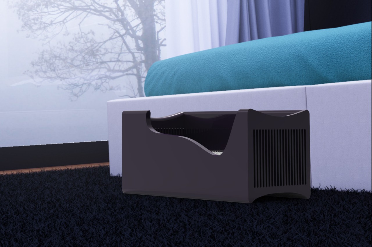
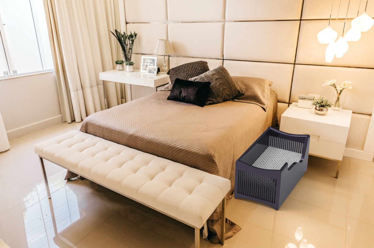
Having a baby can be a very magical moment, but even the best, most patient, and kindest parents will struggle with some of the aspects of raising an infant. They need constant monitoring, even late at night when even adults should be resting. One of the most problematic things to watch out for is when the baby wets the bed, because it can happen any time, day or night, and even when parents are not paying attention. It might already be too late when the infant cries after having spent long minutes wearing or lying on something wet, which then could bring skin complications and other problems. It’s for that reason that this crib concept was designed, offering a more efficient way to monitor the baby by employing the very same technologies used to monitor plants and their soil’s wetness.
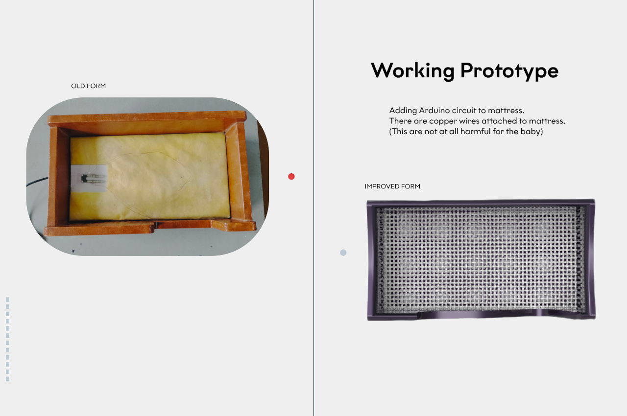
Soil moisture, or the volume of water content in the soil, isn’t exactly the same as determining when a baby wet the bed, but the technology works the same for both cases. The sensor is only able to measure water content indirectly by taking into account other factors like electrical resistance, dielectric constant, and the like. Fortunately, this is enough to also detect if the mattress of a crib is now wet, which is the critical component of the Wee Watch Crib Concept.
In a nutshell, the crib uses copper coils attached to the mattress to implement the moisture detection hardware, since copper is considered to be harmless for the baby in this context. The sensors can sense the wetness of the bed and immediately fire off a notification to parents or caretakers, either audibly or through a phone app. It’s a much more efficient way compared to constantly watching the baby, which is tiring, or waiting for the baby to cry, which could be too late for the infant’s comfort and health.
Of course, the baby crib also has to be comfortable, not just functional, and the Wee Watch design opts to use natural cotton fibers for the mattress as it is gentler on the baby’s skin. The frame is made from laminated timber that’s put together using a moisture-resistant adhesive, and there are tall vents at the bottom to facilitate airflow and regulate temperature. More importantly, the crib is also made to still be useful as the baby grows, about up to two years as long as they still comfortably fit in that space.
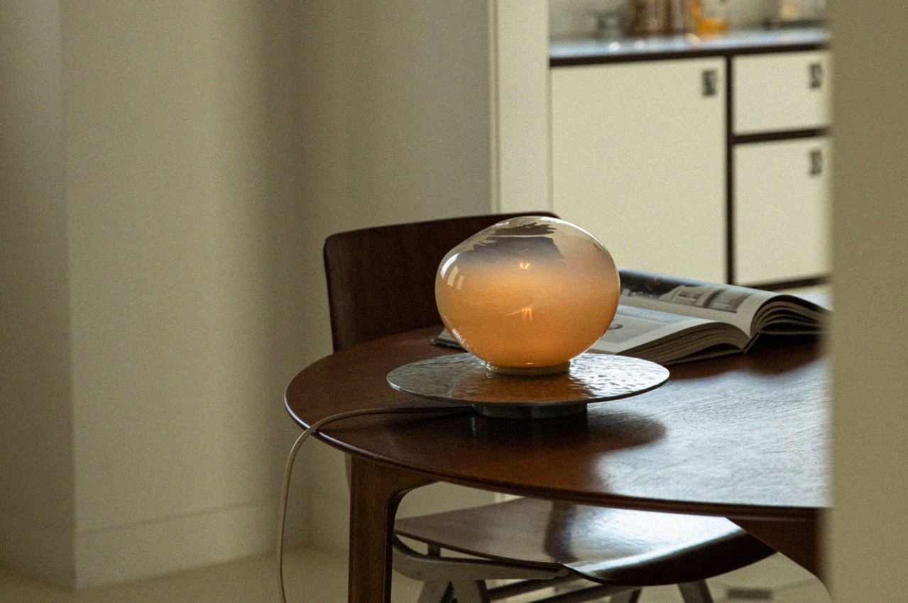
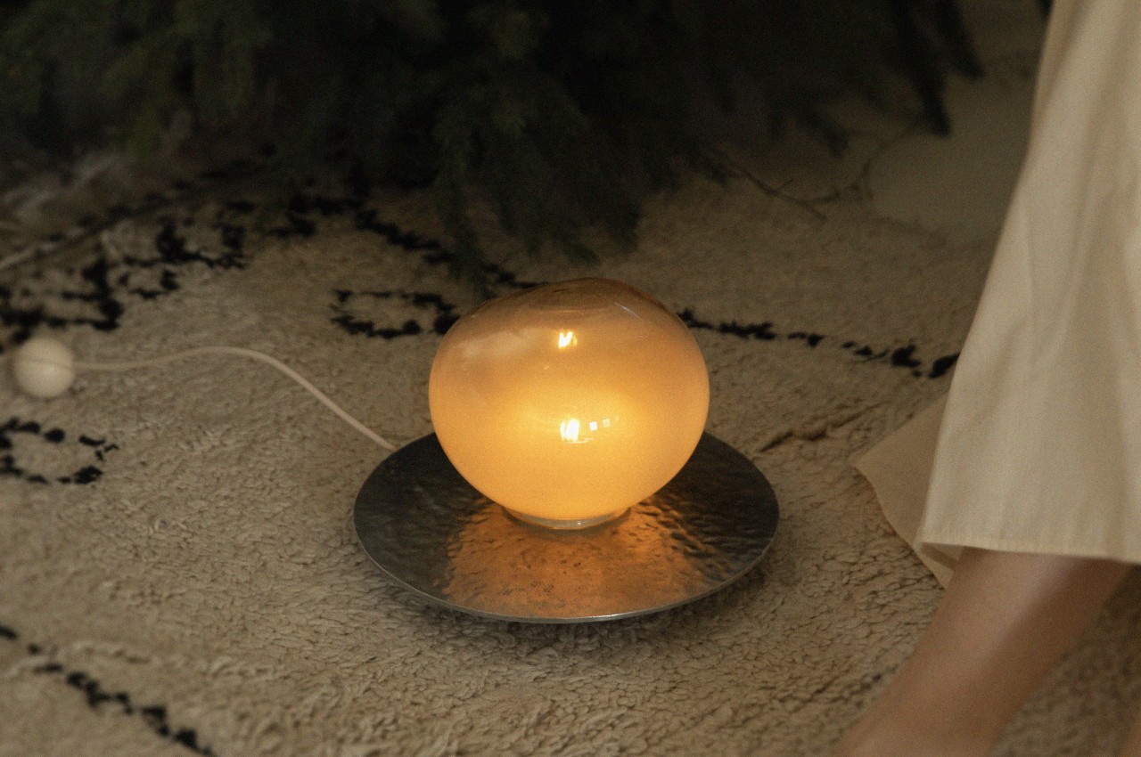
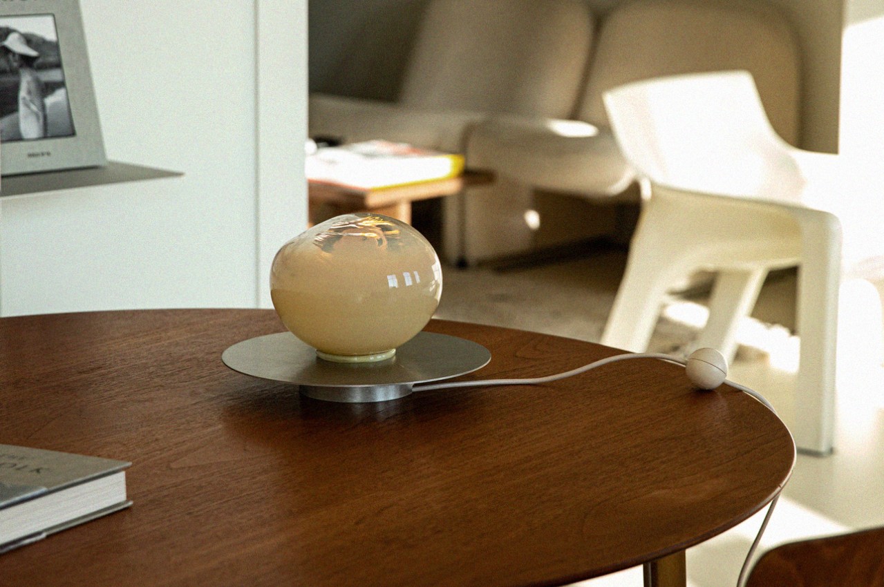
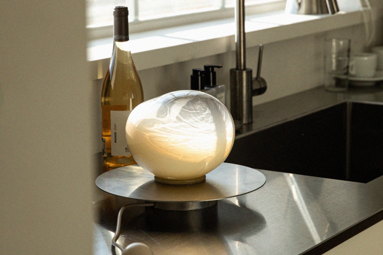
We all need a little magic in our lives, whether it’s a truly life-changing event or a simple scene or object that pulls the corners of our mouths up into a smile. We don’t have to go around looking for magical things, especially when we can more easily just bring them into our homes and into our lives. Of course, we’re talking about furniture, accessories, and designs that add something special to our spaces with their enchanting designs that tickle the mind and spark one’s imagination. This lamp, for example, made of metal and glass, combines two contrasting materials to create a design that evokes feelings of fun, wonder, and playfulness that you get when playing with seemingly magical bubbles.
Designer: Youngeun Seo
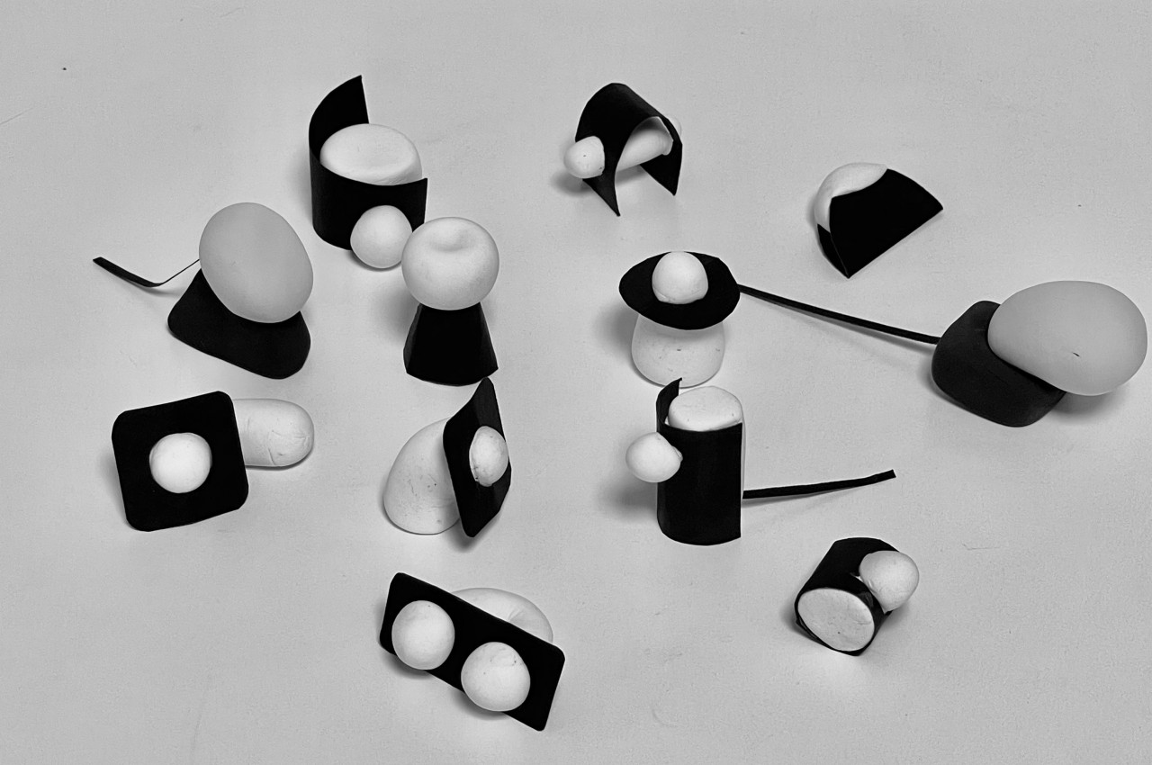
There are very few things in nature that have the innate ability to bring out our inner children, things like snowflakes, butterflies, and bubbles. A common trait among these things is their ephemeral lives, appearing and bringing joy one moment and then disappearing forever the next. It’s like they pop in and out of existence, like a curious little fairy that briefly appears to look around the human world before suddenly vanishing without a trace.
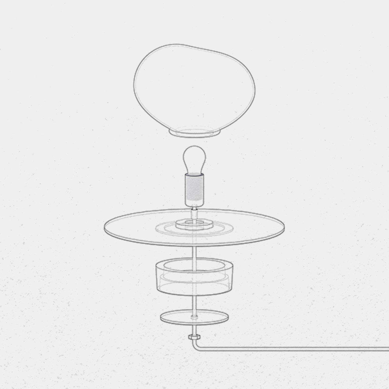
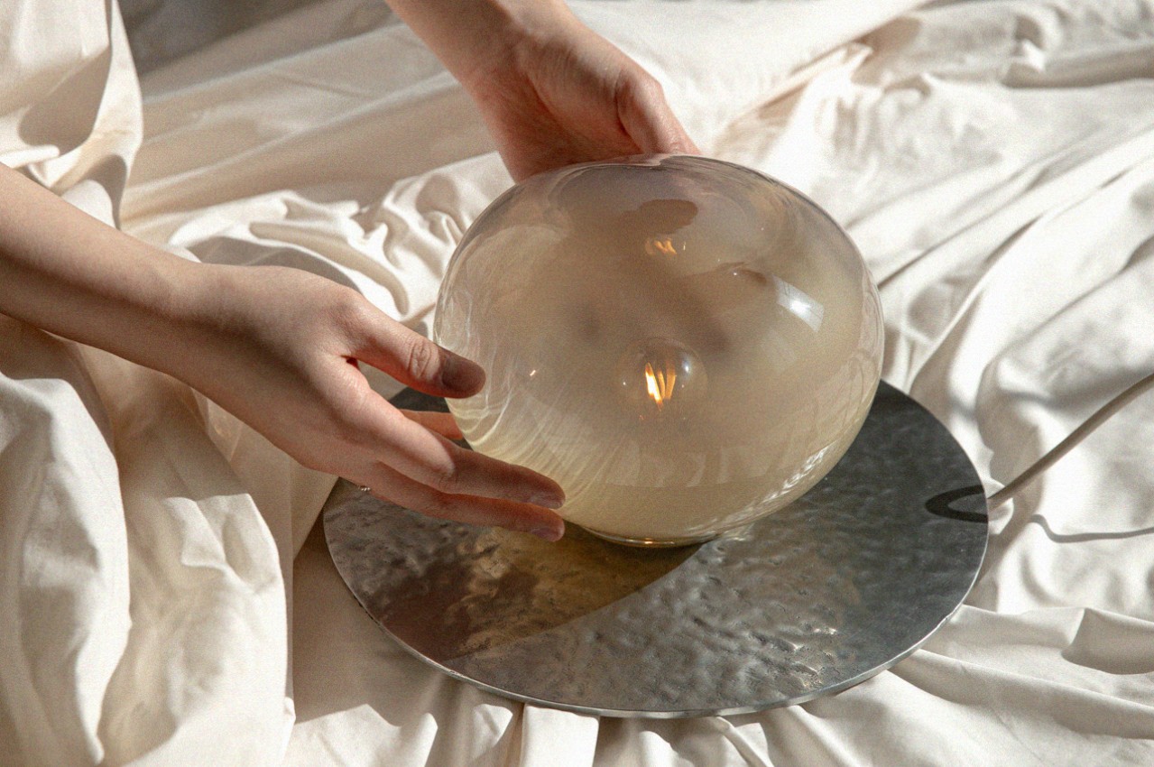
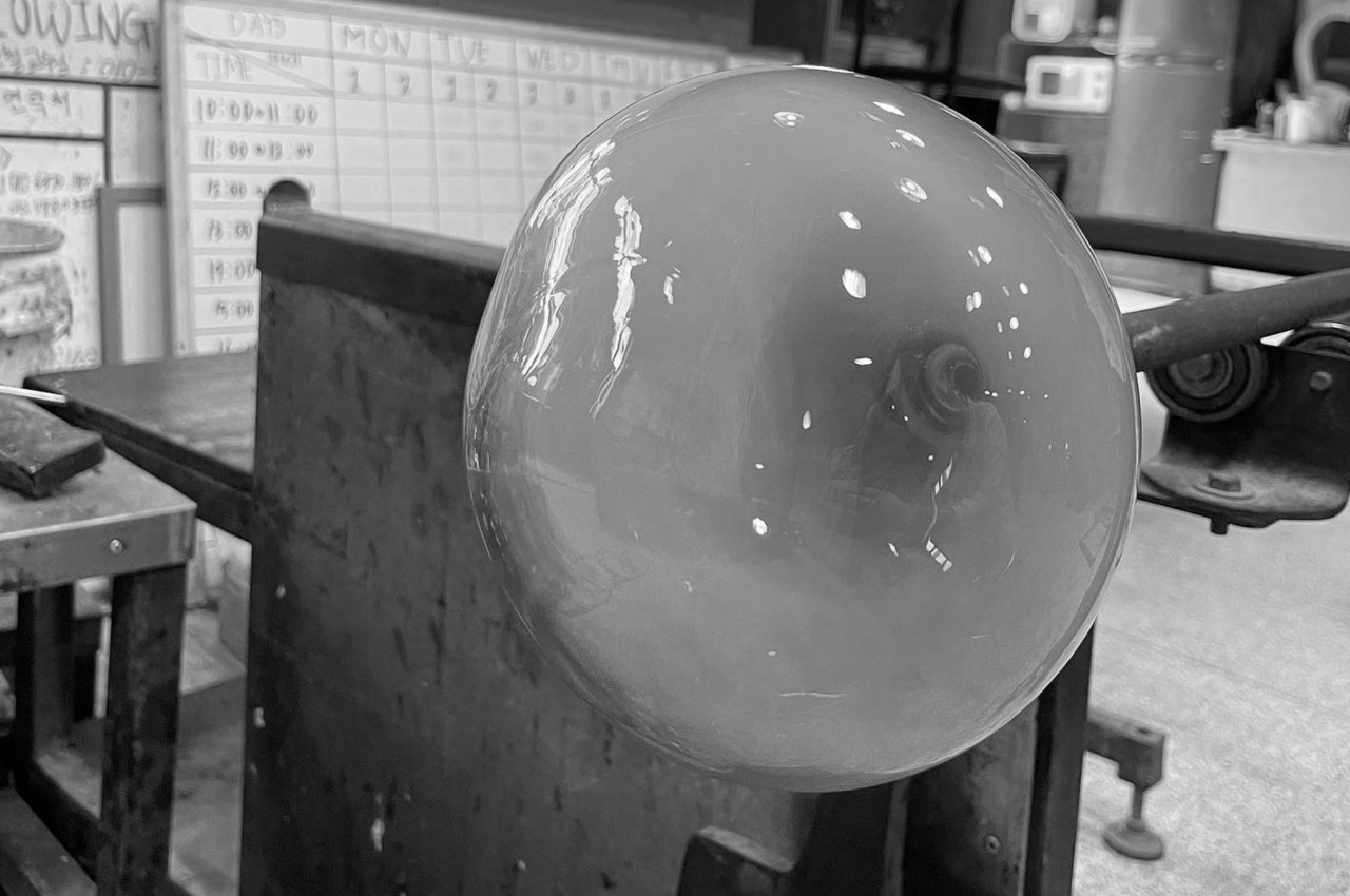
PEEKA is a table lamp that tries to recreate that feeling every time you look at it. Its main structure is an uneven glass sphere that might remind one of a bubble, one that gently floats to the ground and settles for a few seconds before suddenly popping, often causing surprise and a burst of giggles from children. The glass, which transitions from murky bottom to clear top, diffuses the bulb’s light inside while also adding specular reflections that give the bubble a magical appearance.
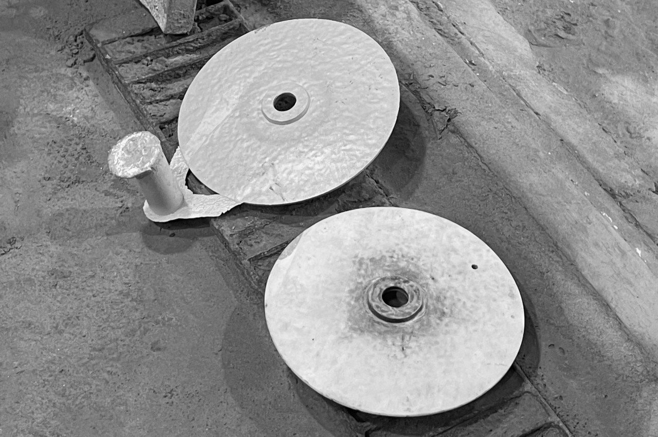
The lamp is set on a cast aluminum base in the shape of a very thin disc. It serves as the “ground” on which the bubble rests, its dark and cold surface contrasting with the warmth of the glass. The composition is also meant to capture the image of a fairy popping its head out of the ground to explore the human world, another playful picture that’s sure to bring a smile to anyone imagining it.
Aside from its unique associations, PEEKA is also a work of art and craftsmanship. The blown glass and cast aluminum are carefully made and polished by hand, resulting in minute imperfections that actually add to the design’s charm. The contrasting glass and metal materials also result in a striking combination that adds beauty and, in a way, magic to any room the lamp stays in.
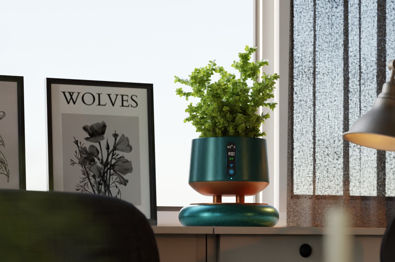
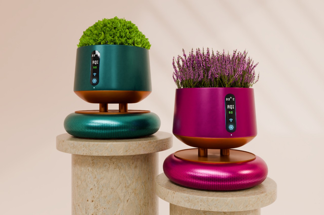
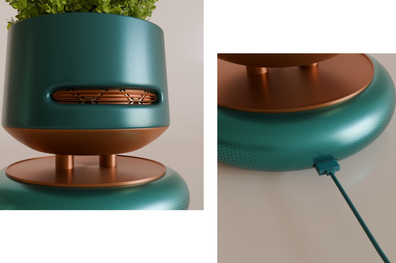
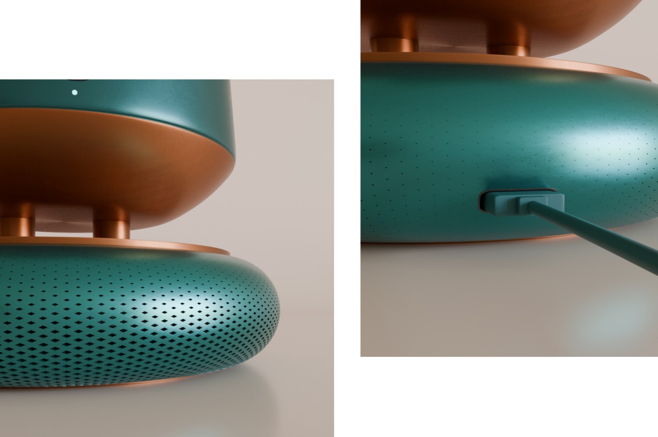
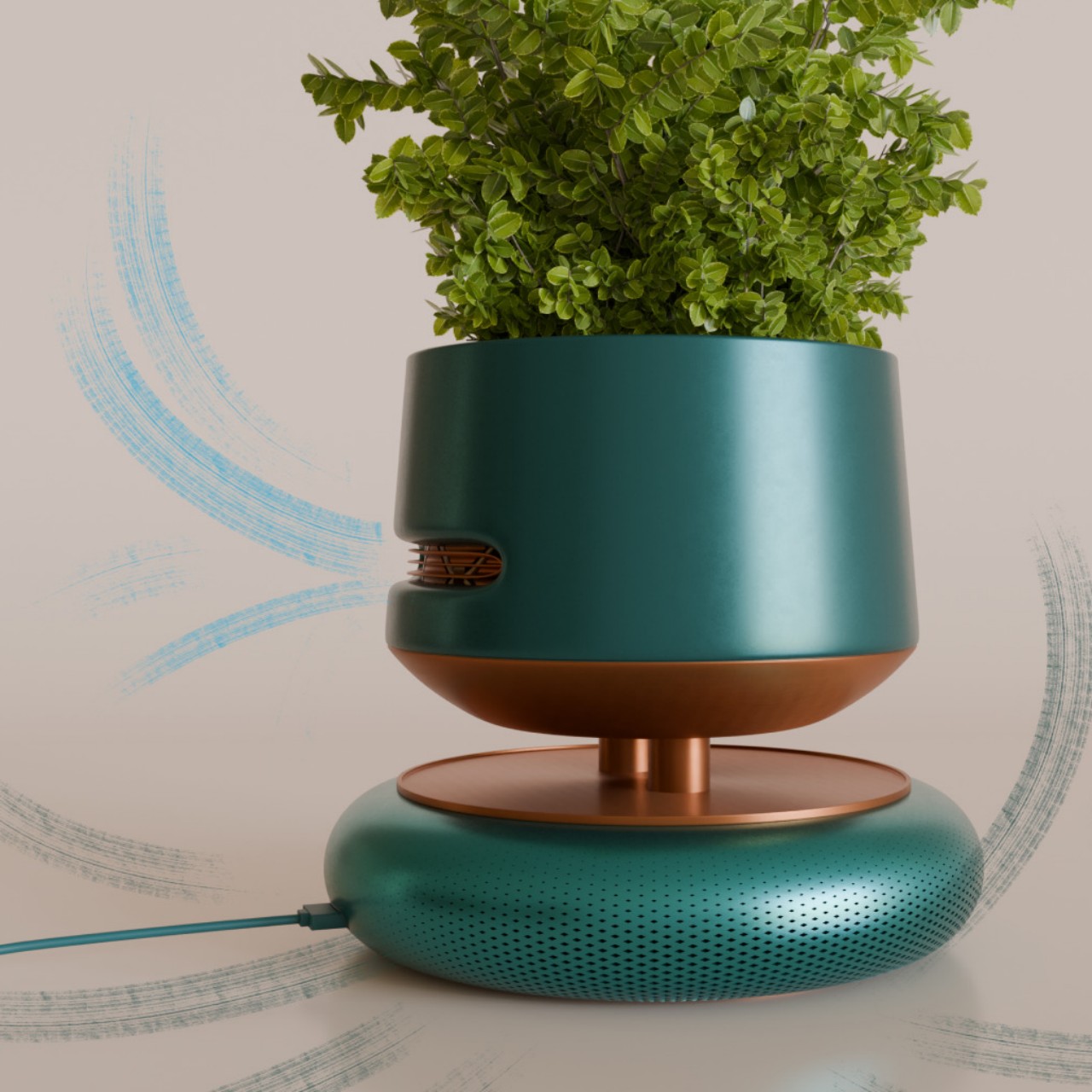
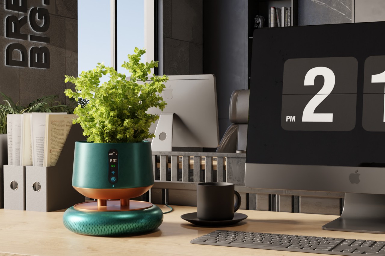
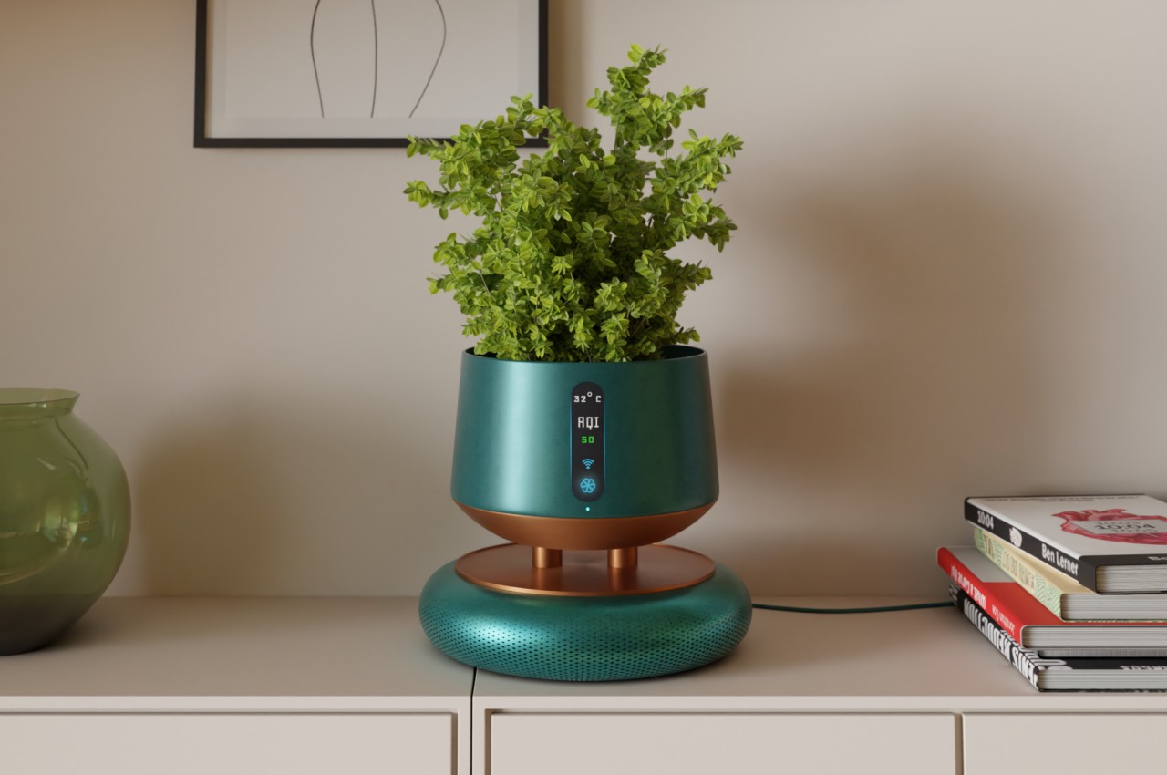
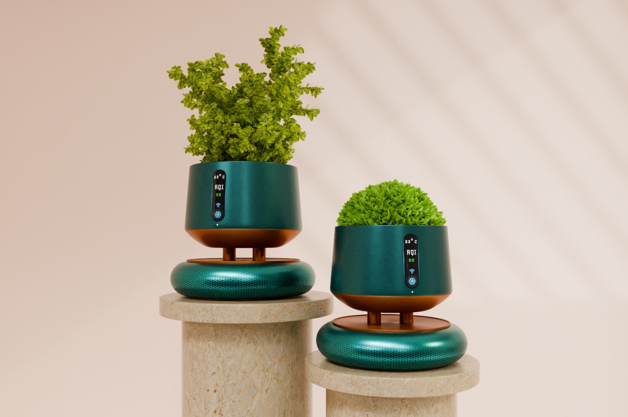
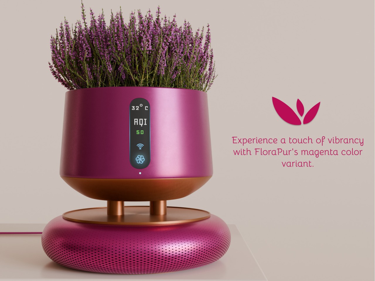
Recent events have made people more concerned about the quality of the air inside their homes, leading to a rise in interest and sales of air purifiers. These appliances, however, haven’t seen much design iteration in the past, which is why many of them look so dated and out of place in modern homes and interiors. Thankfully, that status quo has changed and a new trend is beginning that transforms these cold, impersonal devices into something that looks more at home in your home. Some disguise themselves as pieces of furniture or art objects, while this particular concept functions as a place to grow short plants and flowers, giving a splash of green as it keeps your indoor air green as well.
In order to maximize airflow and performance, most air purifiers are tall, white boxes or cylinders placed in conspicuous locations, often at the center of a room. This often makes them an eyesore and an obstacle to movement, so some homeowners might end up just storing them away, allowing low-quality air to circulate and put themselves and their families at risk. There isn’t really a need to compromise between function and aesthetics, as this concept tries to prove by fusing air purification with botanical elegance.
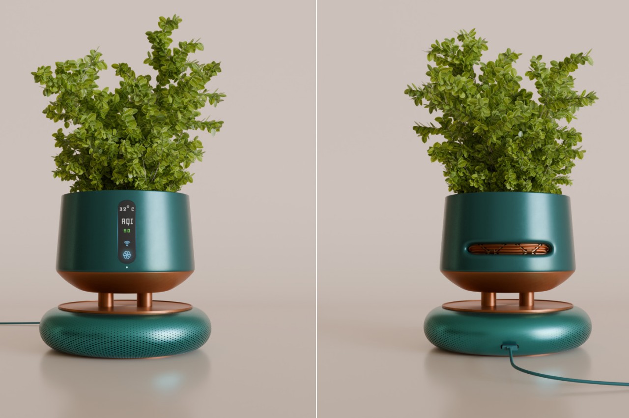
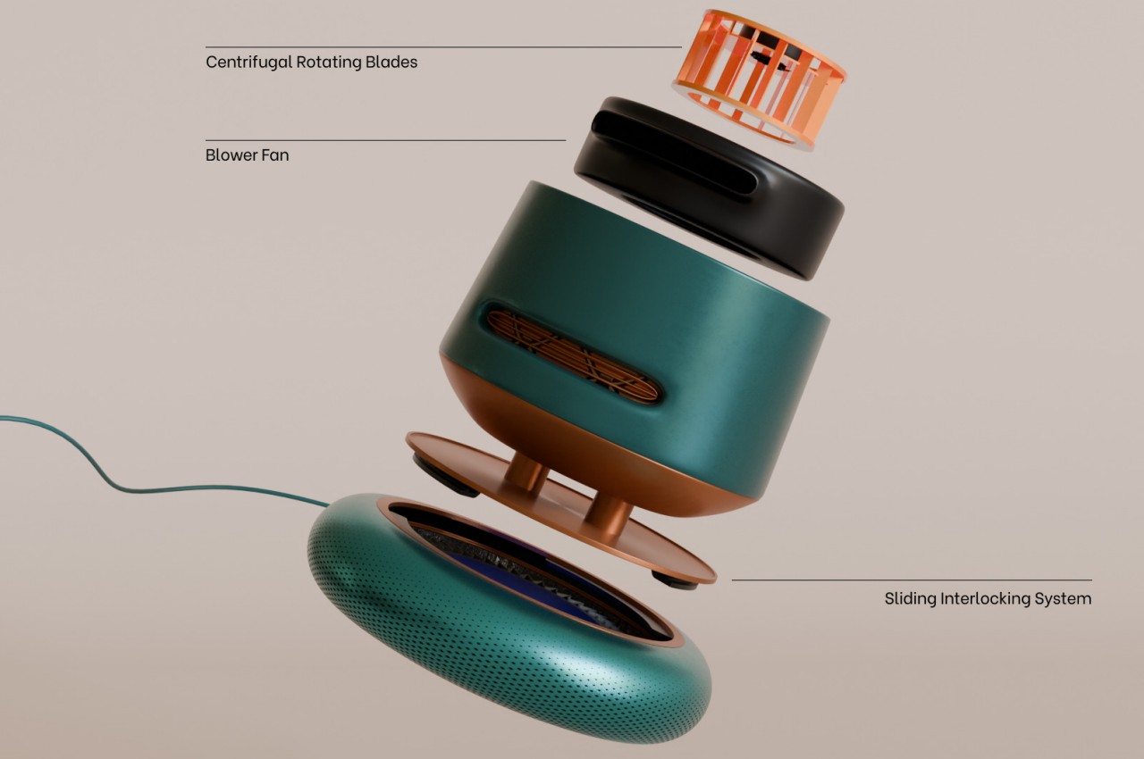
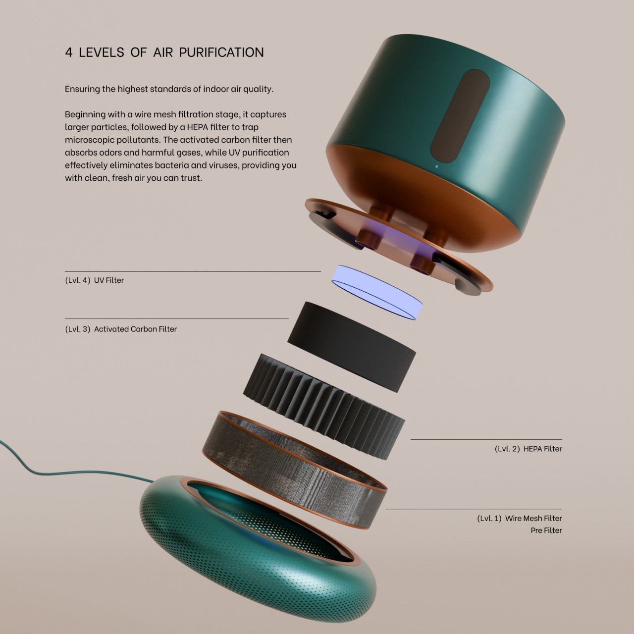
FloraPur is technically two separate products designed as one. It is primarily an air purifier, of course, albeit one that is designed for smaller rooms or at least to work in tandem with other similar units spread across the space. Unclean air is sucked into the circular base where it passes through four purification levels, including HEPA, activated carbon, and UV light, before the clean air is blown out of the top half. Given the size of the device, it won’t be effective in large rooms so placing a few of these in strategic locations would be a better idea.
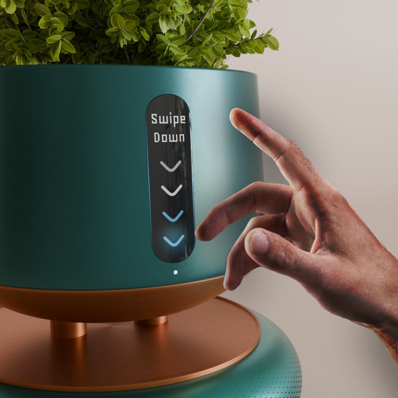
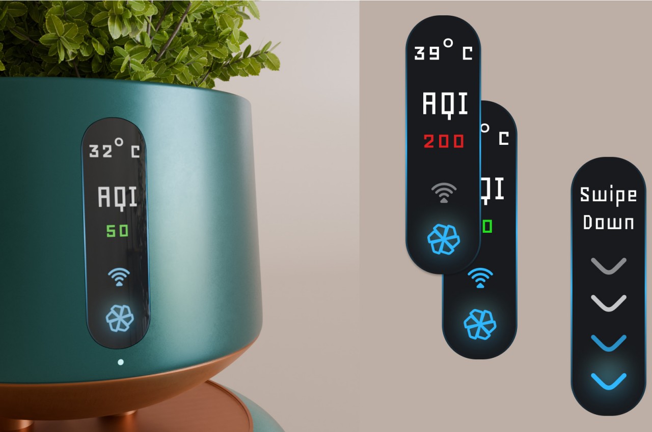
What makes FloraPur different from the majority of air purifiers is its focus on visual appeal without compromising functionality. In addition to this colorful powder-coated metal finish, the container that makes up the bulk of the purifier’s form serves as a convenient pot for growing plants and flowers indoors. The design combines two of the trends that rose during the pandemic, cleaning the air inside while adding natural beauty as well.
Granted, the design also has some shortcomings, not including how it would struggle to cover a very large room on its own. The connection between FloraPur’s two functions is completely superficial, with the plants playing no role in cleaning the air despite being nature’s own air purifiers. And despite having smart features that can monitor air quality around it, the device has no function to monitor the state of the plant growing inside it. The latter shouldn’t be too hard to implement with the right sensors and software algorithms, and a larger air purifier that can house more plants and use those plants to keep the air clean is also possible. All it takes is some creative thinking and ambition to breathe new life and fresh air into an old and tried appliance design.
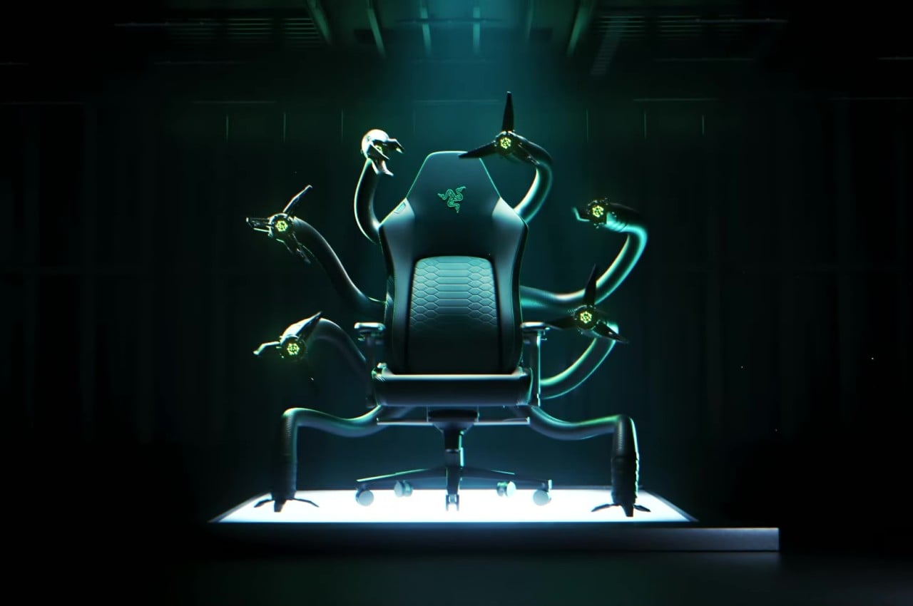
Forget about those invisible and impersonal AIs that are supposed to help you at work by composing e-mails, generating images, or even drafting a whole document for you. What you really need is an AI that will take care of your bodily needs while using the computer, whether it’s for crunch time in the office or, more likely, grinding experience points in games. At least that’s the foundation of Razer’s latest genius gaming accessory, a chair that knows your needs and literally gives you a hand, or a claw rather, so you don’t have to stand up for a bite or a drink or even a shave. Yes, this mythical chair is obviously an April Fool’s joke, but it’s an idea that could very well foreshadow the future that is both exciting and terrifying as its name suggests.
Named after the eldritch god but looking more like a Doctor Octopus arsenal, the Razer Cthulhu is a gaming chair that literally has a mind of its own, in addition to its six flexible tentacle-like arms each with a three-finger claw for the hand. The idea is pretty simple, really, and is exactly what it looks like. Just like the robotic appendages of the comic book villain, these arms act as an extension of the user’s own arms, performing extra work that frees up the person to do what they enjoy and do best: play a game.
What this “work” entails really depends on what the chair’s AI would learn from your habits and needs. It could be as simple as holding your drink or assisting you with eating, or it could be as complicated as giving you a massage or even shaving your facial hair. At some point, it could even start playing your game for you, allowing you to play a second game on a different device, like a phone or handheld console, without missing a beat.
Of course, it’s literally impossible to accomplish all these today even with the most advanced AI, especially actions that require precision and dexterity. You could even say it’s a tongue-in-cheek commentary on how we’re becoming too dependent on AI, putting our eggs, and our livelihood, all in one basket. That’s not to say it’s not a tempting idea for the future, at least within moderation. With human life and work becoming more complex, it’s not surprising that people will start wanting to offload some of the more mundane tasks to robots and AI.
Computer chairs are becoming more sophisticated, offering features that span ergonomics and convenience from different angles. There are even some that are like a whole encapsulated space for gaming and entertainment, so a chair with AI features won’t be that far from reality. We can only hope that designs will be more on the conservative and reasonable side rather than outfitting the chair with everything, including a kitchen sink, that would make use feel less human and more like cogs in a machine instead.
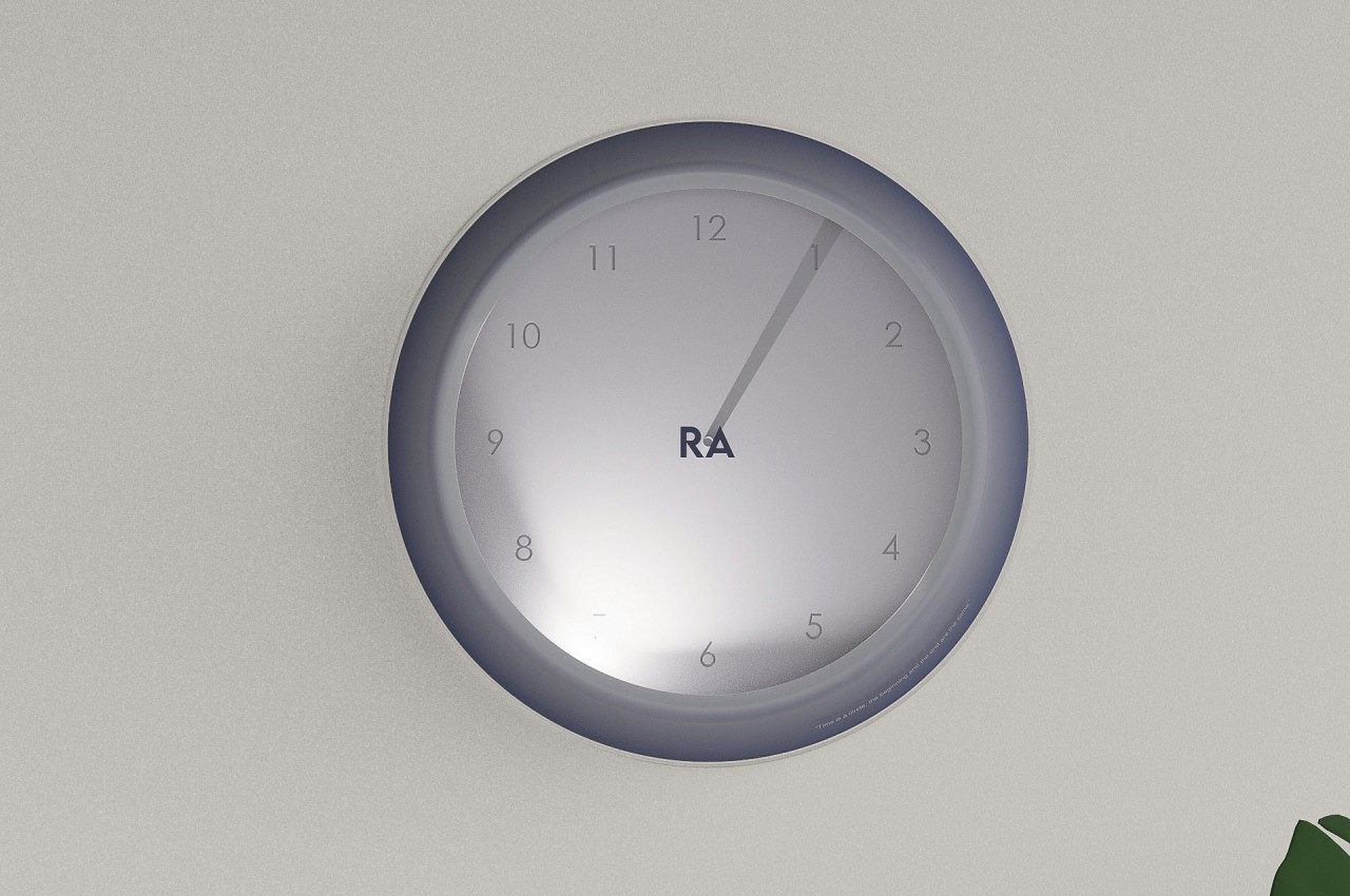
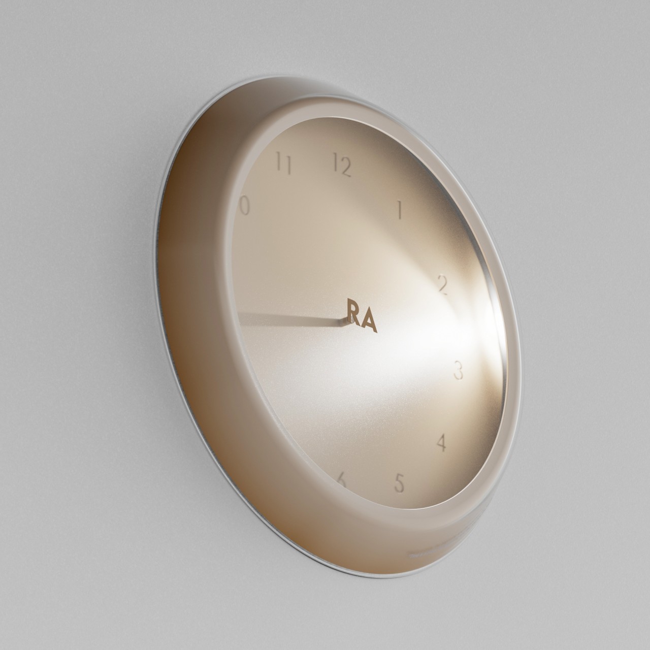
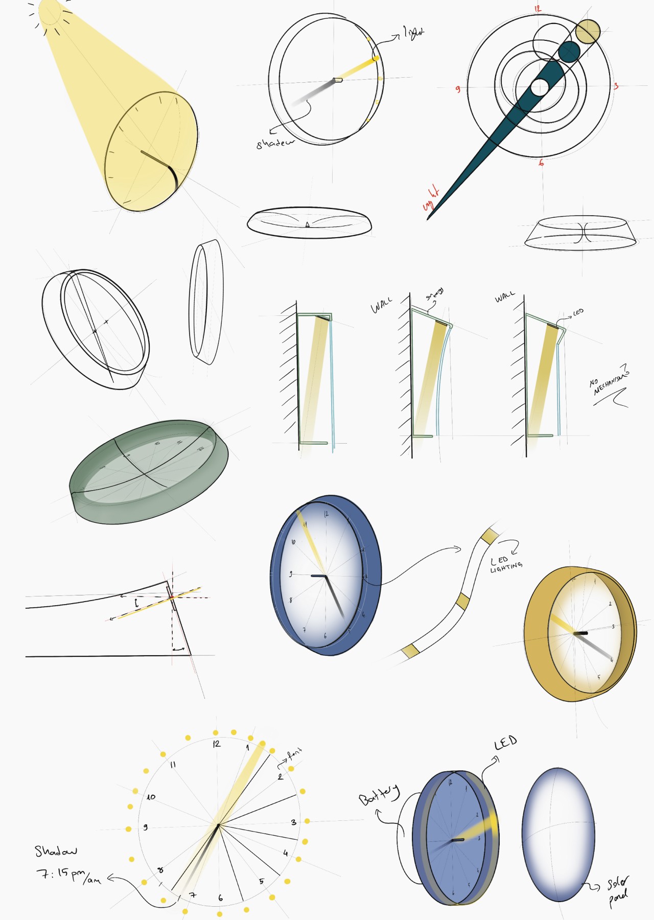
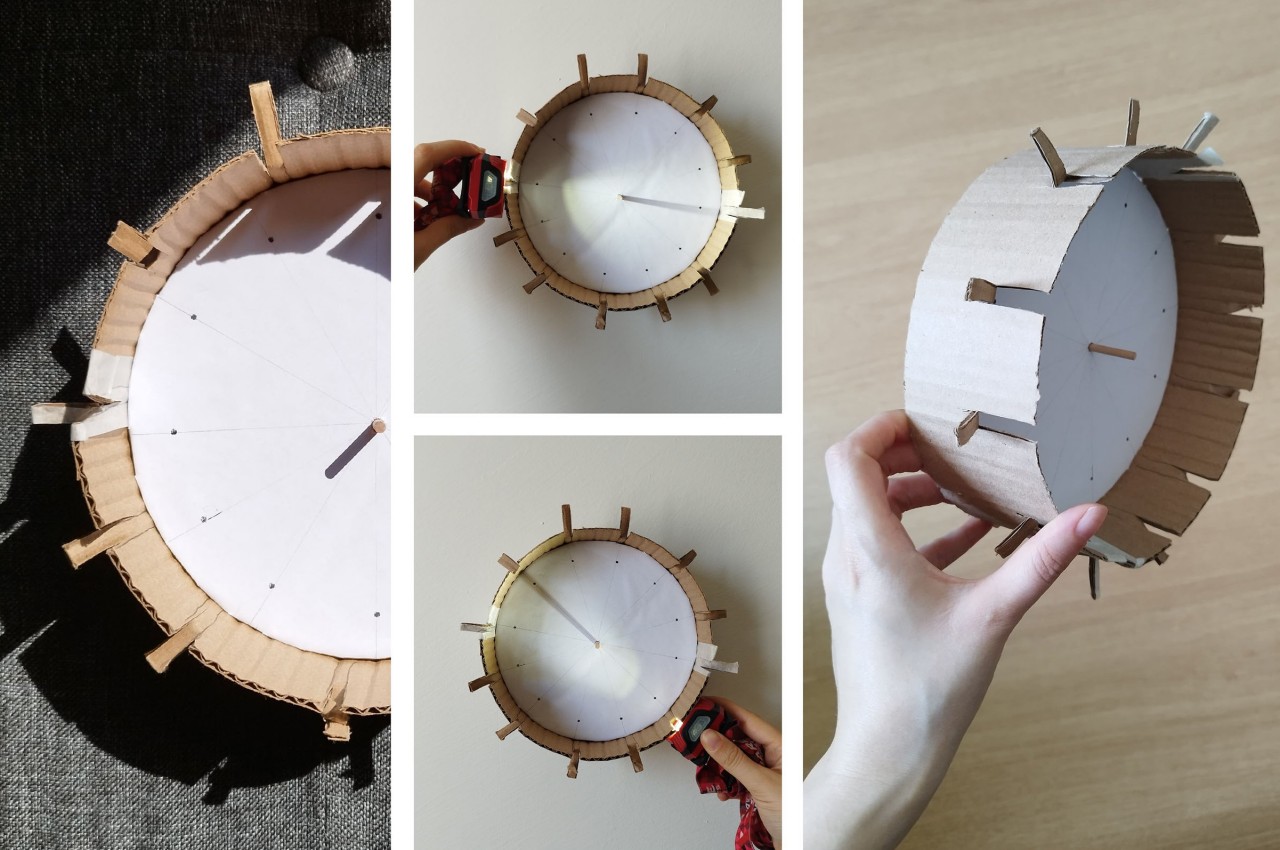
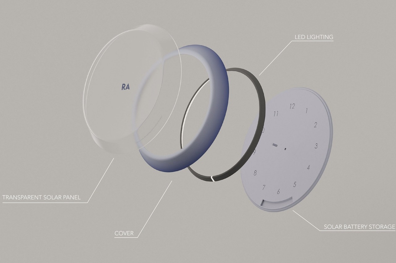
Today’s clocks and watches seem to be split between mechanical analog and electronic digital designs, but there are more than two ways to tell the time. Of course, some of these methods are regarded to be inaccurate, error-prone, and at the mercy of the elements, but there’s a certain charm and magical feeling to the way our ancient ancestors tried to discern the time of day. The sundial is one of the oldest time-keeping tools, one that works on the presumption that the sun travels the same path every day of the year, which isn’t exactly the case. Still, it’s not an entirely incorrect method and it can easily be fixed with modern technology, like this sustainable wall clock concept that is powered by the sun in more ways than one.
A sundial works by simply observing the shadow that a stick or a tall thin object casts on a flat surface, a shadow that moves around and grows or shrinks as the sun makes its way through the sky. The sun doesn’t travel the exact same path all year round, however, and this method definitely doesn’t work at night. Modern technology, however, has a way to shine a light 24/7, and this wall clock uses that to recreate the almost mystical appearance of a sundial while utilizing energy from the very sun that inspired it.
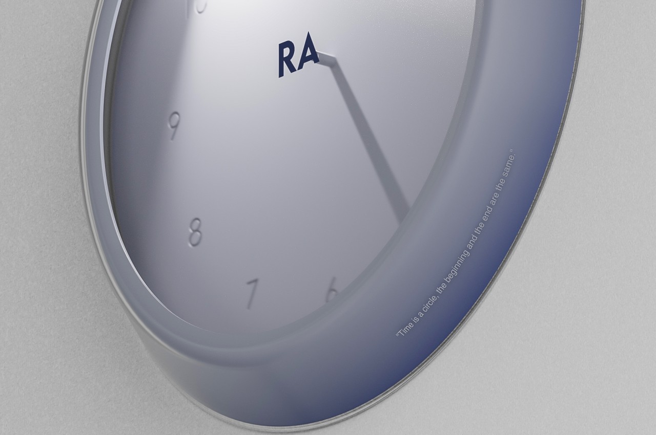
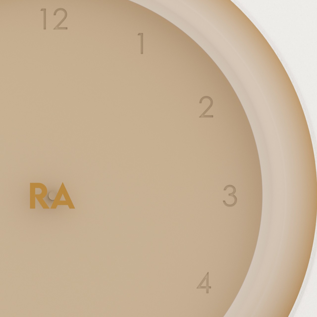
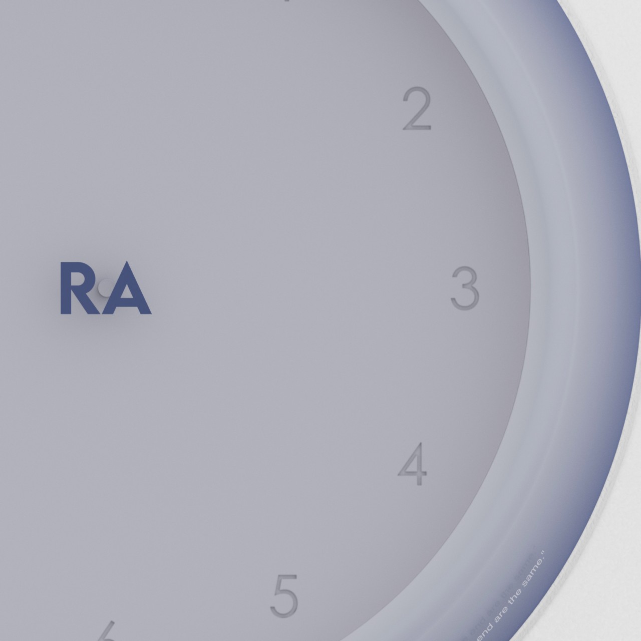
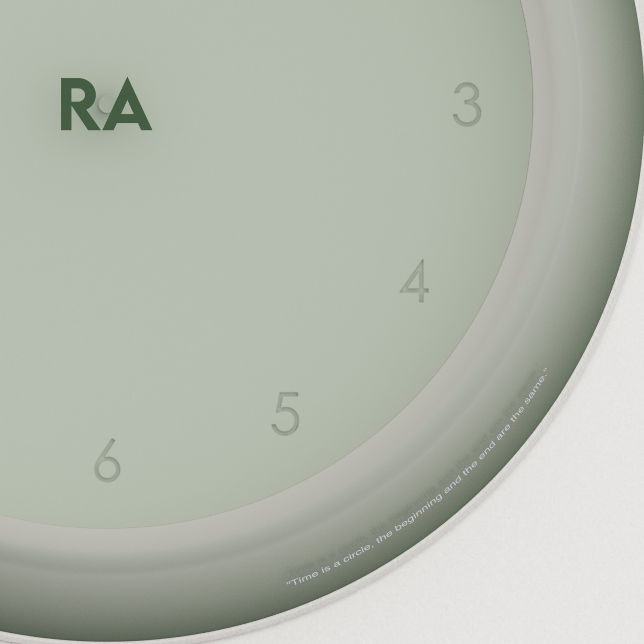
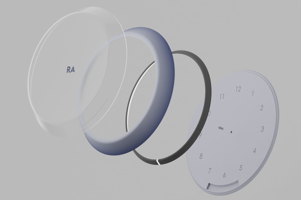
Name after the Egyptian god of the sun, the Ra wall clock utilizes an LED ring light to simulate the sun. But rather than shining from all directions, the light is focused on a single point to recreate the effect of a short stick casting a very long shadow. As time moves, so does the light move around the periphery of the circle, thus mimicking a sundial but with more consistency and accuracy. Plus, it works at night as it does during the day.
While this would have been enough to create a modern sundial clock, the concept takes the association even further by also following how the sundial of old needed only the sun to function. Rather than relying on batteries, Ra uses solar power to make sure the clock is running 24/7 without the need to charge it or change batteries. The transparent solar panel that makes up the wall clock’s front cover actually harnesses any light around it, so the clock doesn’t need to actually be exposed to the sun and can be used indoors or under low-light environments.
This design helps give the sundial wall clock a sustainable potential, even if it does minimally use some electronics as well as LED lighting. Unlike analog clocks, there are now complex mechanisms that are difficult to repair, and unlike digital clocks, there are no screens or displays to show the time. It uses a very simple method that traces its roots back to ancient times, but one that still has benefits to the people of today.
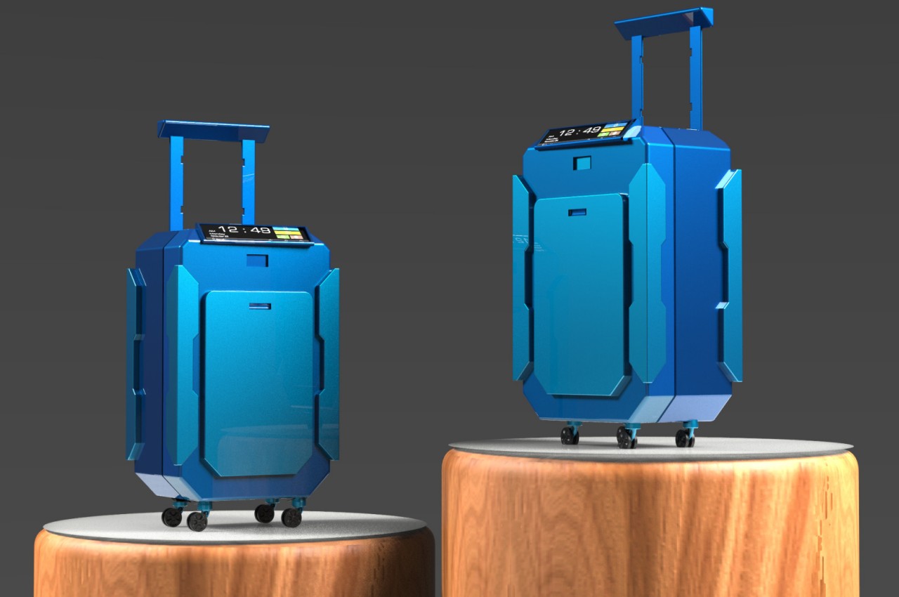
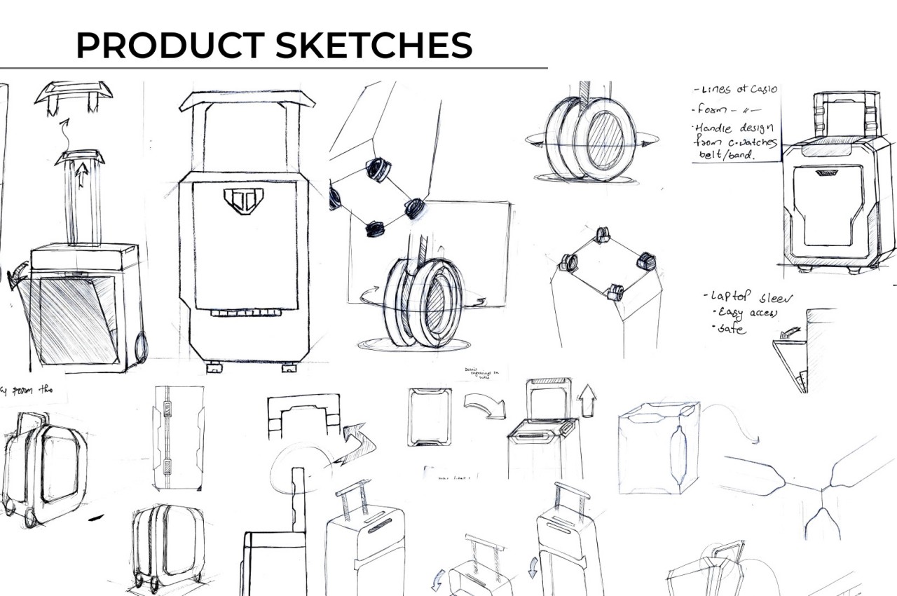
Some people might have fantasies of traveling frequently as part of their job, not realizing how tiring and tedious it can quickly become. Never mind the fatigue that actually comes from traveling, the stress of packing and wrestling with suitcases might be enough to make many people cry out in frustration. There are many ways to ease the pain when traveling regularly, and part of the strategy is having a well-designed and reliable bag or suitcase to store everything you need, especially for a one-day trip. That’s the kind of need that this concept design tries to address, and it’s taking inspiration from one of the most popular makers of watches, calculators, and electronic pianos.
Designer: Harshita Kaur
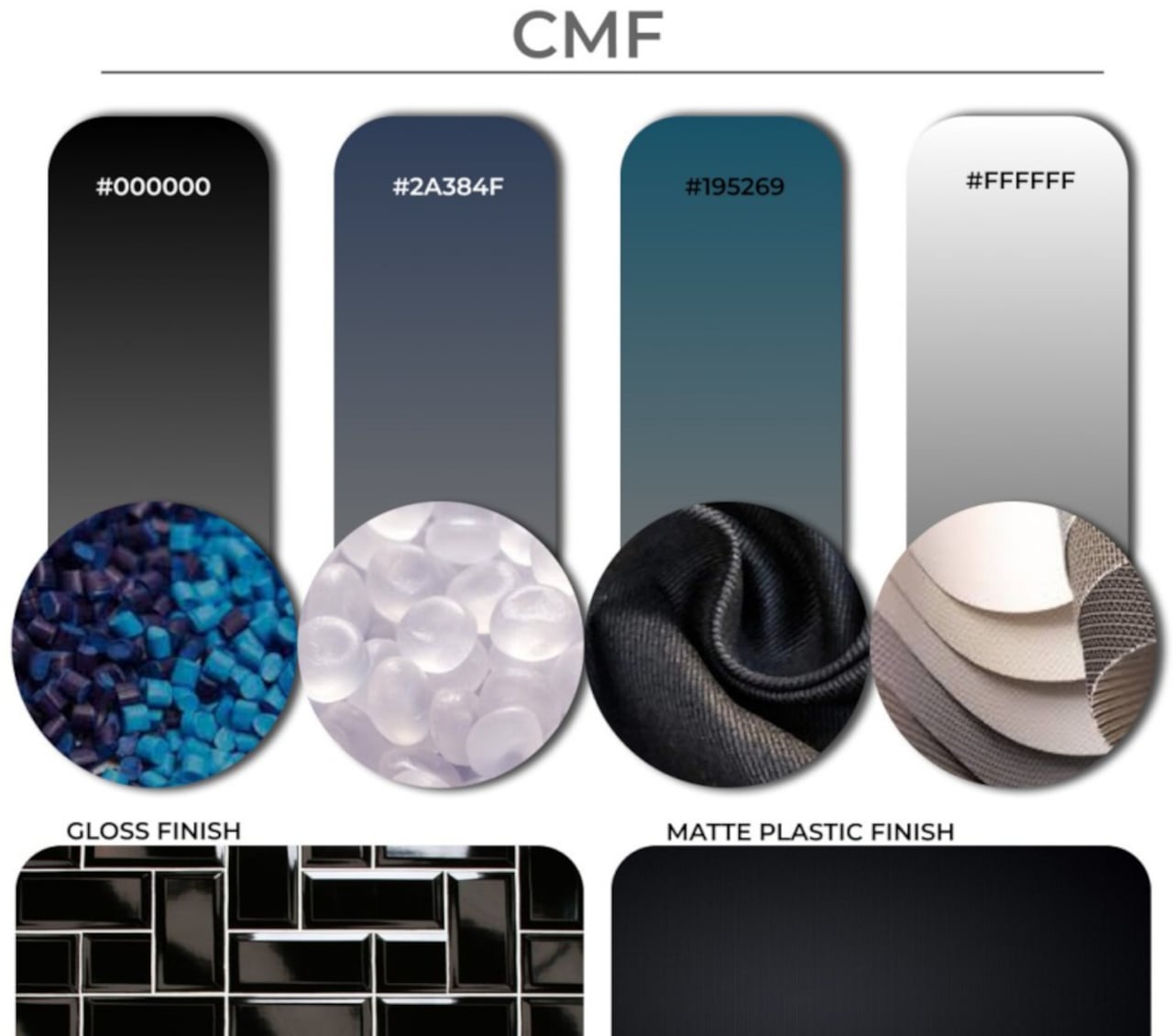
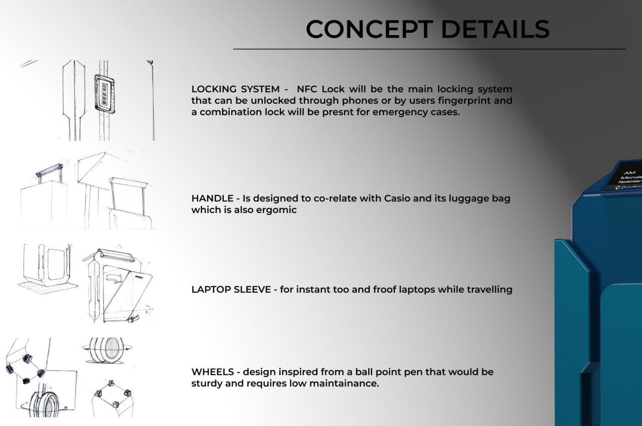
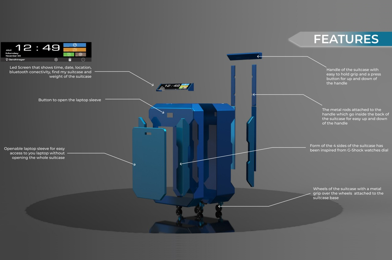
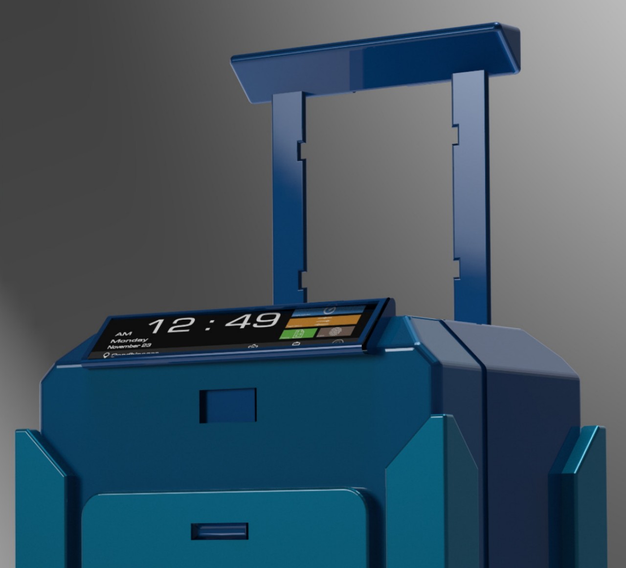
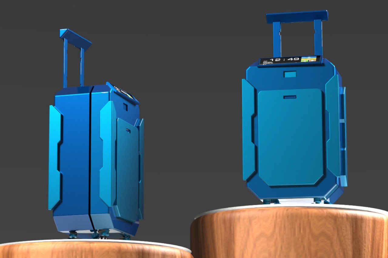
Casio’s brand spans multiple products, including musical instruments, calculators, and both analog and digital watches. The latter category has become iconic of Casio’s design language, particularly with its geometrical forms and overlapping shapes. It’s a language that is applied to this suitcase concept that tries to offer a smarter way for frequent travelers to secure their belongings for one-day business trips.
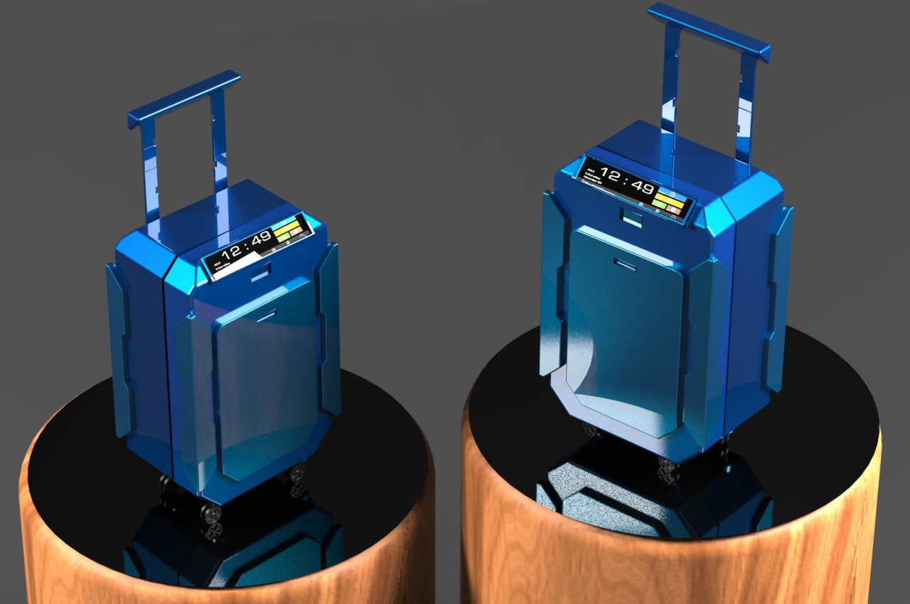
This business-minded purpose is easily seen through many of the tech-savvy features that the AeroEase concept proposes. For example, the front pocket is a laptop sleeve that can be easily accessed with a push of a button. Security is provided by an NFC lock that can be accessed via a smartphone using biometrics like a fingerprint. There’s also a small display panel on top that shows critical travel information at a glance, including the weight of the suitcase.
The very shape of the suitcase itself is also quite eye-catching, eschewing traditional designs where the front half is often a single material piece. Instead, the front pocket looks like a distinct part that protrudes from the body of the suitcase, while the four corners of the suitcase have bumpers that take inspiration from Casio’s iconic G-SHOCK rugged watches.
While the AeroEase’s design is indeed quite distinctive, there might be some aspects that raise concerns, especially about the durability of such a suitcase. That display, for example, could break with impact, which isn’t uncommon in during rough rides. Those bumpers could also easily snag against other items in cabins or overhead storage, which could cause some issues for the owner or other travelers. With some refinement, these concerns could be addressed, hopefully offering a less stressful experience for working men and women who often find themselves on long overnight travels.
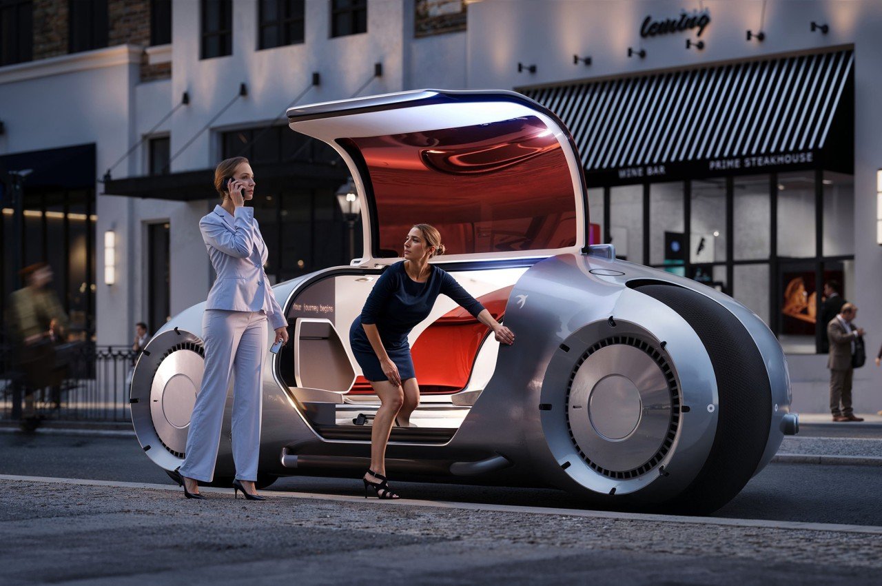
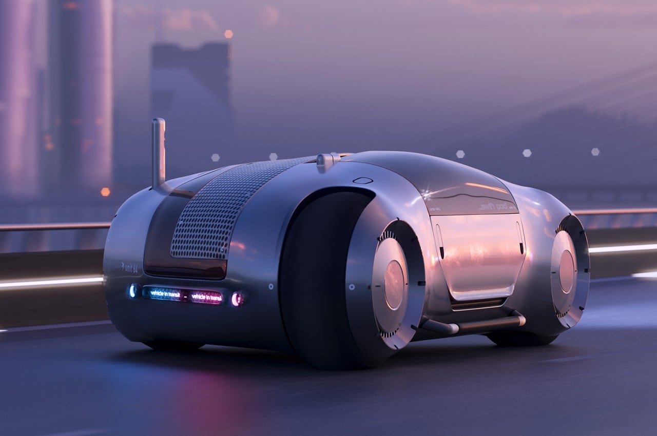
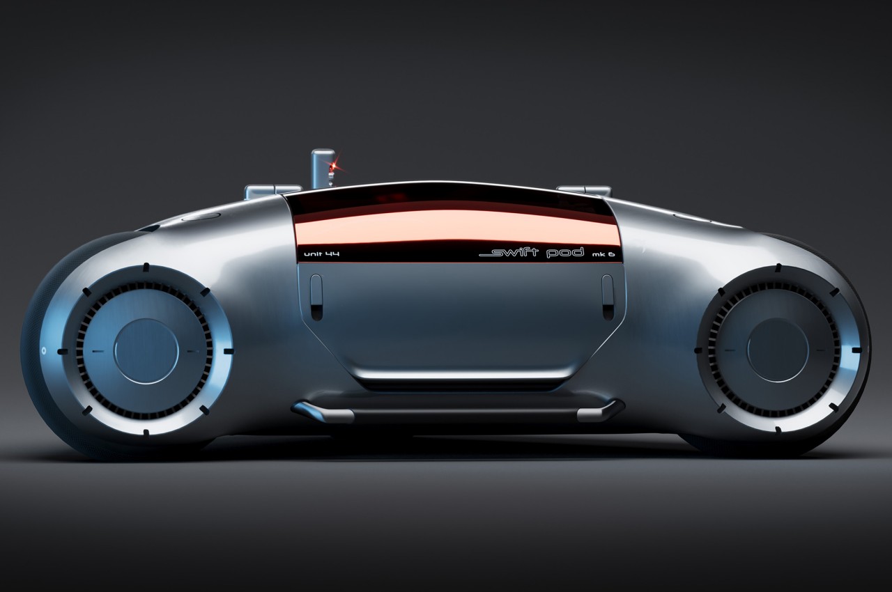
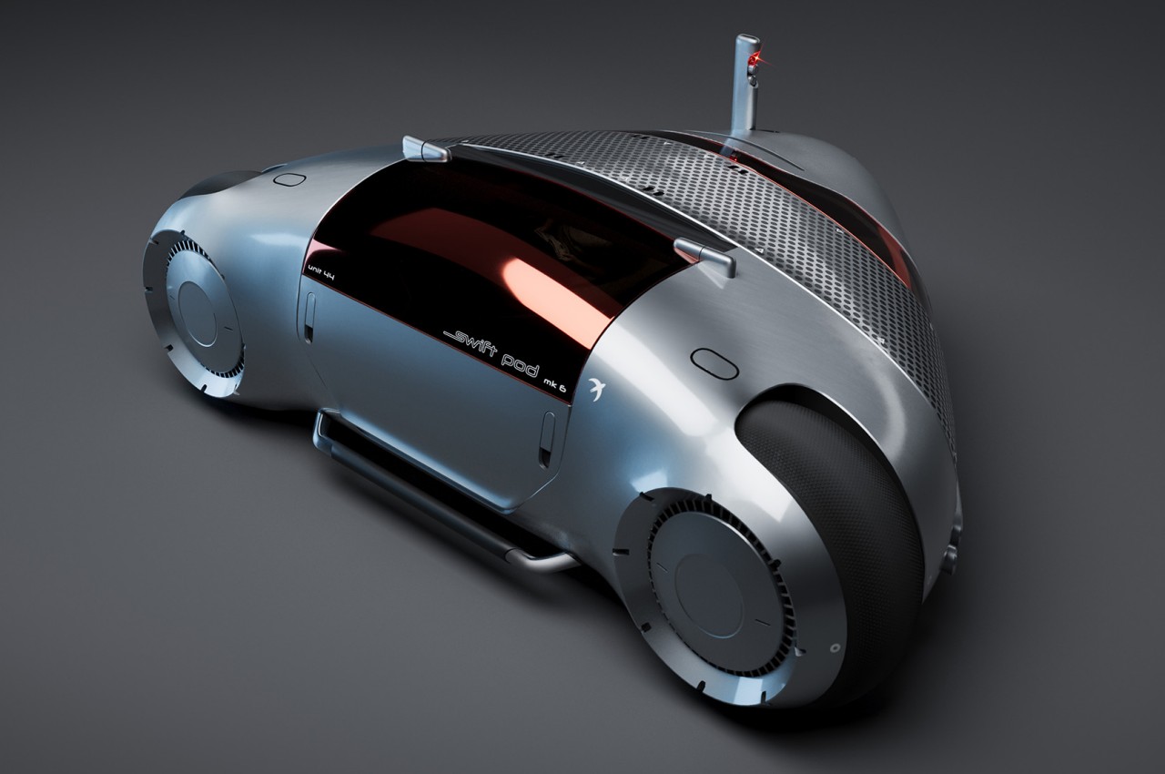
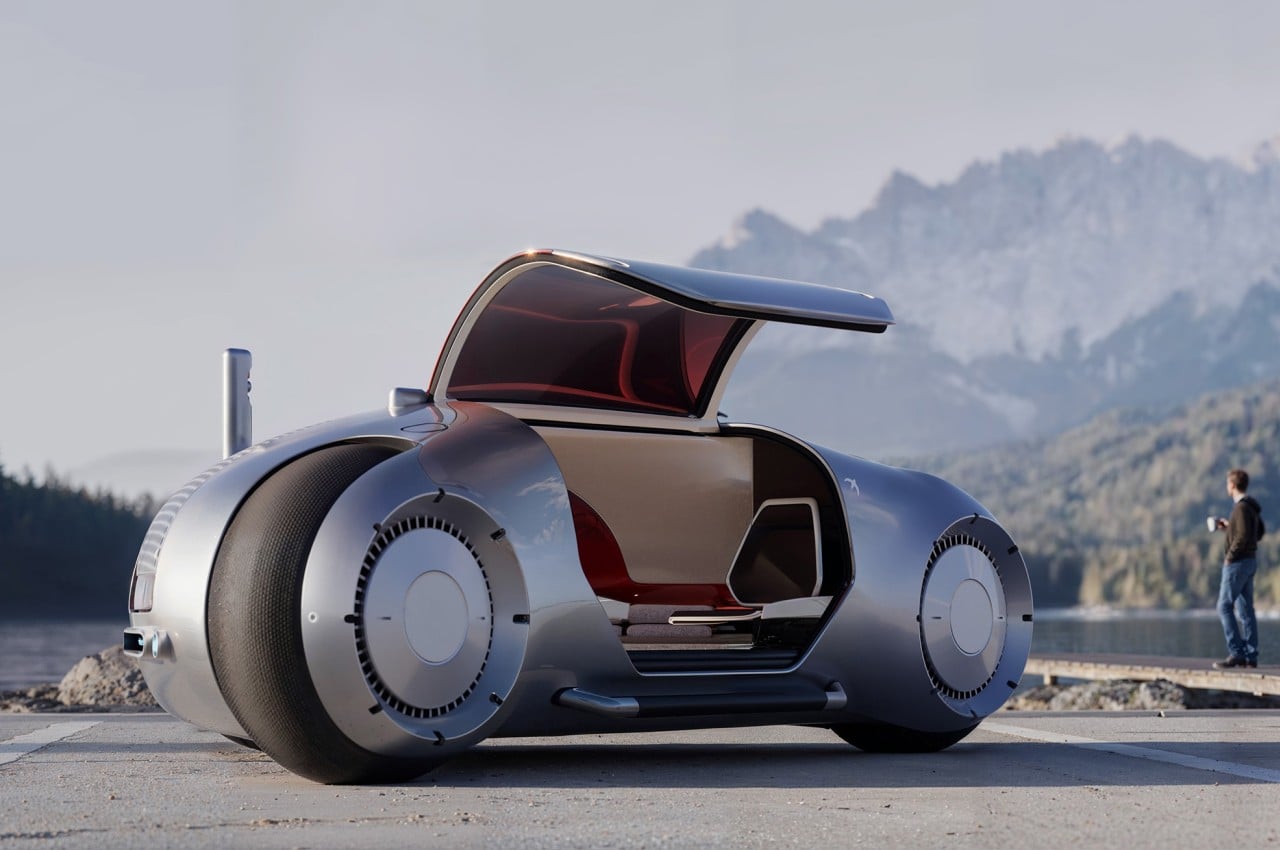
Autonomous vehicles are still a somewhat controversial topic these days, but even detractors and critics will begrudgingly admit that it is the inevitable future. Given a foolproof and safe implementation, it opens up plenty of opportunities for people to do more during their travels, especially over very long distances. They can be more productive with work, spend more quality time with family, or simply get a good night’s sleep in transit. The latter isn’t exactly comfortable to do with today’s car designs, but that’s only if you don’t let go of current conventions and limitations. This design concept for a mobile sleeping pod, in contrast, pulls out all the stops and demonstrates what’s possible with the right technologies, the right design, and especially the right shape.
When viewed from its profile, the Swift Pod looks more like a gigantic motorcycle, a vehicle that stands on two wheels only. It’s definitely not your regular motorbike, even disregarding the significantly larger size, because it looks more like a cross between a bike and a car from the way it has a cabin instead of just a seat. When viewed from the top, however, the vehicle is revealed to actually run on three wheels, forming an odd triangle shape instead of a typical box you’d expect from cars.
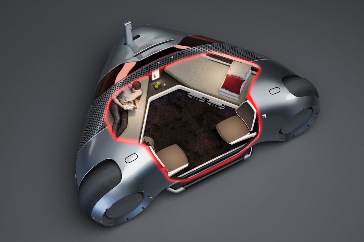
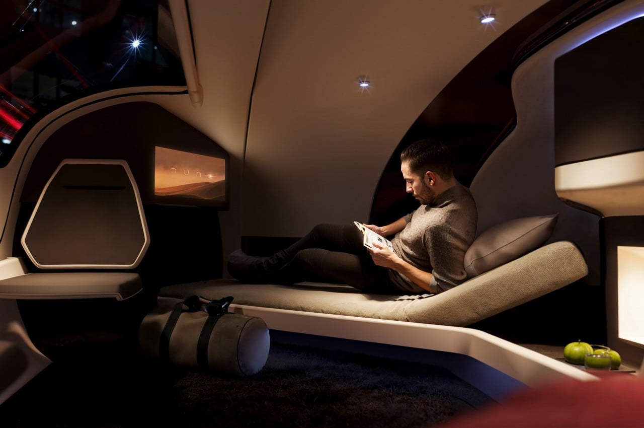
The choice of the shape isn’t for appearance’s sake, though, but was made to maximize available space inside while minimizing the vehicle’s size. After all, the Swift Pod is designed to have two adult-sized beds inside, one on each side of the triangle, in addition to two chairs, amenities, and, of course, the vehicle’s actual hardware and components. The concept, after all, is for a mode of transportation that will let you sleep through your journey, at least if you want to. There’s plenty of space for two people to do anything, including working if necessary.
The concept was inspired by how some people are able to get a decent amount of sleep on trains and planes, and that’s without a comfortable bed or other conveniences. With Swift Pod, you not only have a comfortable place to recline but also an entertainment system, snacks and beverages, and plenty of storage for your belongings. What it doesn’t have room for is a human or physical driver.
The Swift Pod concept only works if autonomous driving has reached a point where one can really entrust their safety to these invisible drivers. The design envisions an extremely smart self-driving vehicle that, after booking a ride like a taxi, would be able to determine the best path toward your destination and navigate the roads safely. While the default is to simply go from point A to point B in one go, the system also has room for stop-over breaks where you can get off, eat some heavier meals, and freshen up before you take the next leg of your journey in the comfort of a bed.
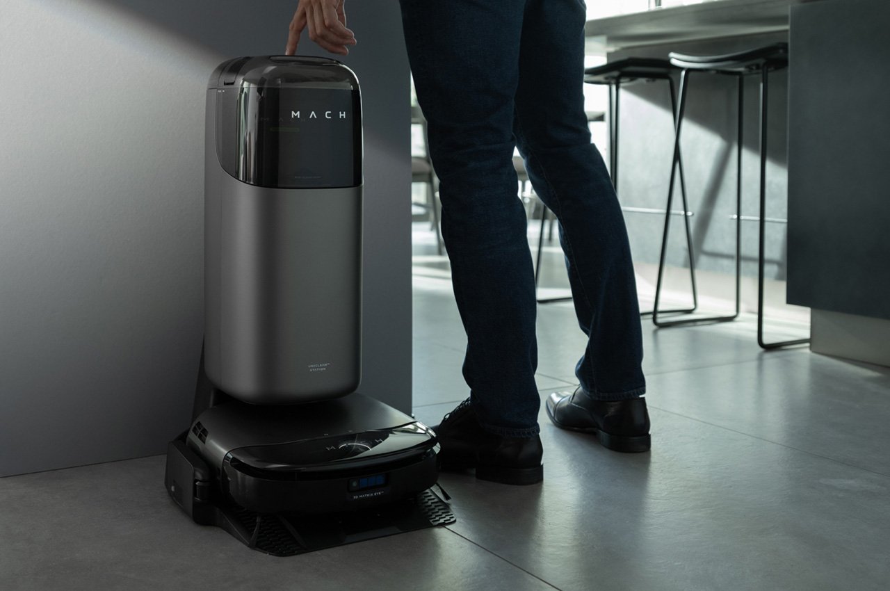
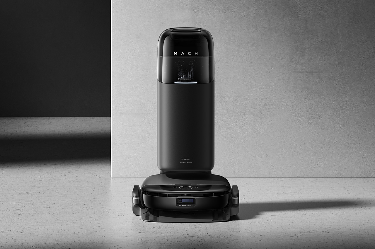
We all know that keeping the floor clean is important but this seemingly simple activity turns out to be tedious and time-consuming. Robot vacuums have been around for quite some time now to ease that pain, but few are able to go beyond just sucking up dust and small particles. And those that can wipe the floor tend to be inefficient, ineffective, or both. A leader in the smart home market, eufy is presenting its latest design that will keep your floor clean without getting your hands dirty, saving you time and energy to spend on the more important things in life.
Designers: Simon Kim (Senior Design Manager, eufy), Jaewan Jeong (Design Director, eufy)
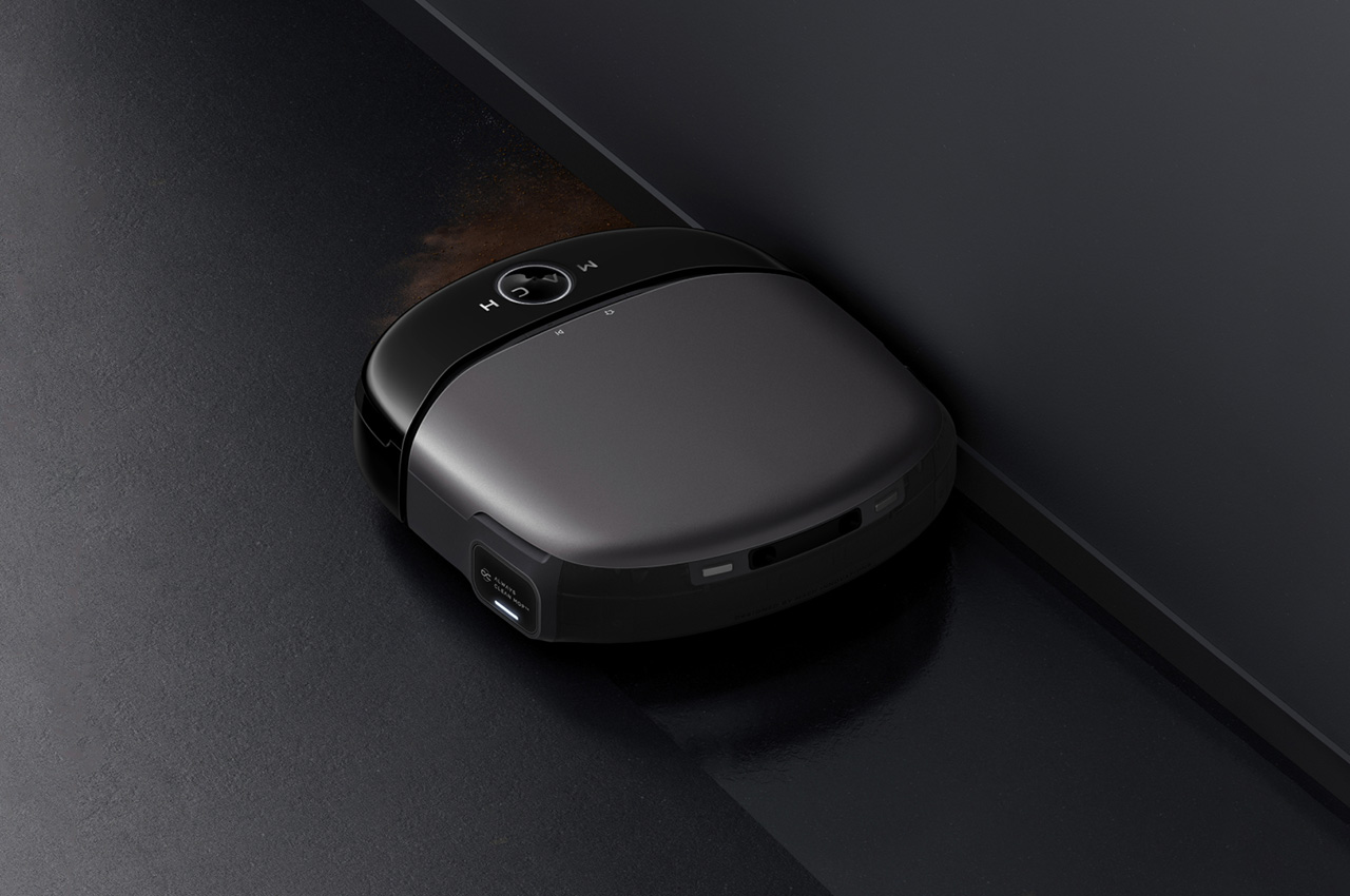
It might have “robot vacuum” in its name, but the eufy Robot Vacuum Omni S1 Pro is definitely more than just that. It’s an all-in-one floor-cleaning machine that makes no room for compromises when it comes to getting the door out of your floor space. Its 8,000 Pa suction power makes short work of dust and solid particles on your floors and carpets, but that’s only the beginning. Its real power comes from its revolutionary floor washing system that ensures no dirt or stain is left to mar the beauty of your floor.
100% Clean Under UV Light See the visibly different cleaning results of S1 Pro compared with a normal robot mop.
Spinning at a rate of 170 RPM and exerting a downward force of 10N, this 290mm TurboWash roller mop mimics how a human would scrub a floor to get those stubborn stains out. Unlike other robot vacuums with the bare minimum mopping function, the eufy Robot Vacuum Omni S1 Pro has two separate water tanks in the device itself, separate clean and wastewater to ensure that the mop itself stays clean and doesn’t drag its own dirt across the floor it’s supposed to be cleaning.
Eco-Clean Ozone Eliminates 99.99% of Germs. Built-in ozone sanitization for the highest standard of cleanliness.
Once the robot is done with its task, it retreats to the innovative All-in-One Station where it not only charges its batteries but also initiates a completely hands-free cleaning process. It automatically empties the dust bin and disposes of wastewater, cleaning the mop and drying it with hot air to prevent the growth of bacteria and odors, and then refills the robot’s tank with clean water for the next session. It even has a built-in ozone generator that sanitizes not just the mop but also your floor with a sterilization rate of up to 99.99%, creating a safe environment for children and pets even during high-risk seasons. All of these happen without human intervention, and you only need to empty the dustbin after 68 or so days!
Automatically detects carpet edges and lifts the mop to protect the material.
While it already sets itself apart with its revolutionary cleaning features, the eufy Robot Vacuum Omni S1 Pro stands out even more with its groundbreaking design and advanced intelligence. Eschewing the traditional circular form that has dominated this market for decades, the eufy Robot Vacuum Omni S1 Pro adopts a unique square body that is compact, sleek, and modern, adapting to the needs and tastes of today’s sophisticated homeowners. Winner of the iF Design Award 2024 and Good Design Award, the eufy Robot Vacuum Omni S1 Pro delivers a fresh and memorable design that doesn’t compromise on functionality. In fact, it’s thanks to that square shape and low 96mm profile that it can reach within 1cm of walls and corners and glide under low furniture with ease.
Even the All-in-One Station itself is a testament to eufy’s commitment to excellent design. Its minimalist aesthetic and narrow body not only saves space but also enhances the visual atmosphere with its elegant appearance. That simplicity, however, belies intelligent features that bring convenience and comfort to users’ lives. An effortless touchscreen allows the user to directly access features without having to fumble with a smartphone. The transparent water not only lets you easily check water levels at a glance, it also gives the design a modern and hi-tech vibe. Finally, the station’s ergonomic golden height means you won’t have to bend over and strain your back just to open the lid or change the water in the tank.
Despite its compact size, the robot actually packs quite an impressive assortment of technologies, like a 3D MatrixEye Depth Perception system that utilizes the same RGB camera with active binocular technology used in self-driving cars for obstacle avoidance. Its TrueCourse Mapping, powered by a dToF LiDAR, the same LiDAR technology used in NASA’s Landing project, ensures precise mapping of your home, while the powerful eufy mobile app gives you the ability to schedule cleaning times, set no-go zones, and manage multi-floor mapping. Whatever the floor cleaning task, the eufy Robot Vacuum Omni S1 Pro promises a stress-free experience that will leave your floor clean and sanitized so that you and your family can live better, safer, and more enjoyable lives.


 Eliminates 99.99% of Germs. Built-in ozone sanitization for the highest standard of cleanliness.