The modern smartphone has set a remarkably high baseline for video quality, and its built-in microphone is surprisingly capable for casual use. But for creators who need their voice to cut through ambient noise, reach across distance, or maintain consistent clarity on the move, phone audio quickly reveals its physical limits. This is the complex mindset of the budget-conscious creator: they won’t spend money on a dedicated camera unless it’s dramatically better than their phone, and they certainly won’t carry a separate microphone unless it delivers a sound that is fundamentally impossible to capture with the device already in their pocket. It has to solve a problem, not just offer a marginal improvement.
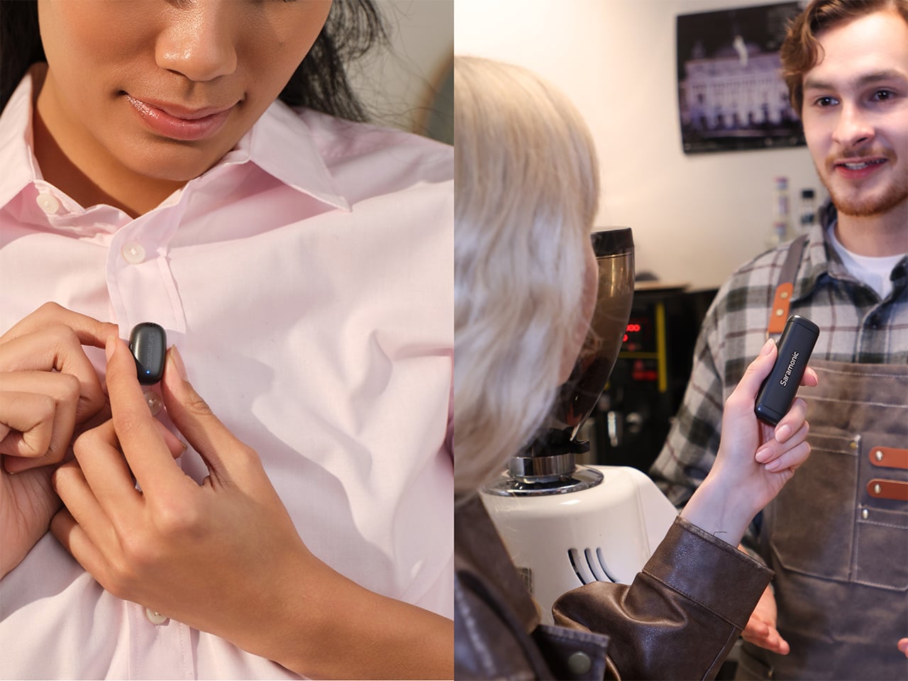
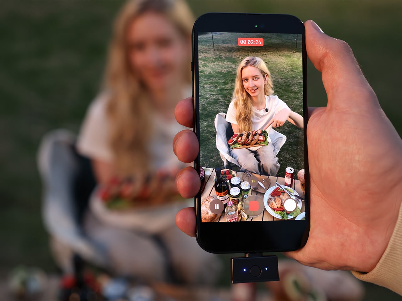
This is the precise challenge the Saramonic Air SE is designed to meet. It justifies its space in a creator’s bag by breaking the physical limitations of a smartphone. Its core function is to get the microphone off the camera and place it exactly where it needs to be: clipped discreetly to a collar, just inches from the speaker’s mouth. Thumb-sized and weighing just 5 grams, the mic wears almost unnoticed on camera. It operates across 200 meters of wireless range, delivering crystal-clear, detailed 48kHz/24-bit audio while an AI engine actively removes up to 40dB of background noise. Snap it back onto the charging bar and it instantly becomes a handheld mic, ready for interviews. At $49 for the USB-C version, it’s positioned squarely as an entry-level system built for mobile-first creators and content teams who need professional capabilities without the professional price tag.
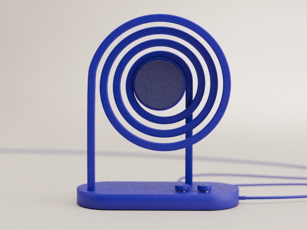
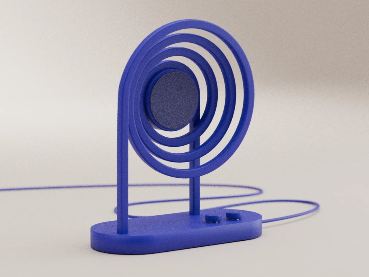
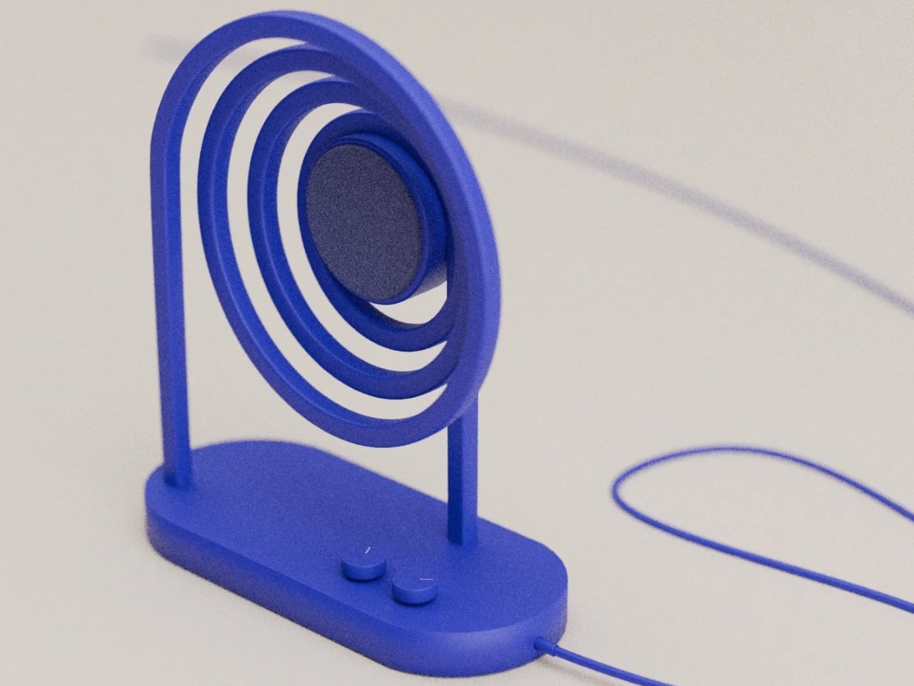
Designer: Saramonic
Click Here to Buy Now: $40 $50 ($10 off, use coupon code “YD20”). Hurry, deal ends in 48-hours!
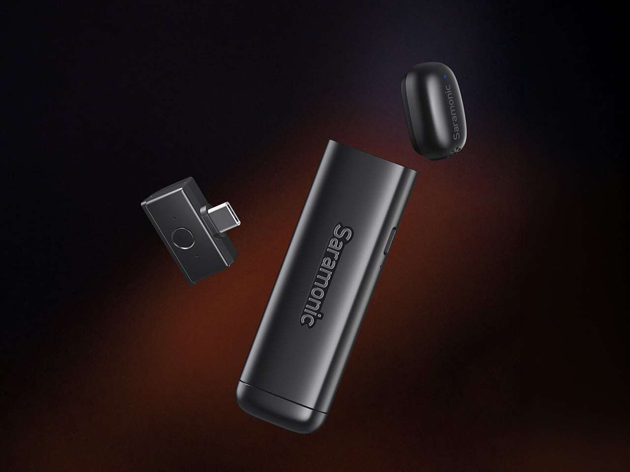
The impossibly compact design makes it a marvel of engineering but also a testimony of how much discreetness matters to Saramonic’s core audience. The transmitter measures 28.5 x 17 x 13.4 millimeters, roughly thumb-sized, and weighs 5 grams. That makes it among the most compact in its class—significantly smaller than most entry-level wireless systems. When clipped to a collar or shirt, it genuinely disappears on camera, solving one of the oldest visual compromises in video production. The modular charging bar is the real design story here, sized like a lighter and engineered to magnetically house two mics and a receiver for easy carry. Everything you need for a two-person recording setup fits in your pocket. Dock a transmitter onto the bar, power it on, and it doubles as a handheld interview mic. Two form factors, one object, no adapters or workflow interruptions. The magnetic connection is strong enough that the bar feels natural to hold, weighted specifically for that second use case. Saramonic calls it “Clip It. Hold It.” and the simplicity of that statement captures exactly what makes this system different.
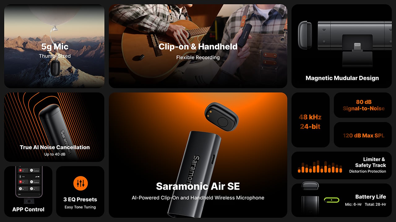
The Air SE’s noise cancellation represents Saramonic’s first-ever true AI system, trained on over 700,000 noise samples across 20,000 hours of audio. Unlike traditional ENC (electronic noise cancellation), which only handles steady ambient sounds like air conditioners or distant traffic, this AI engine identifies and separates voices from complex or sudden noise in real time. It runs in two modes: Weak at -15dB for natural-sounding environments where you still want some atmosphere, and Strong at -40dB for genuinely loud scenes like street shoots or crowded events. A single press on the receiver toggles the feature on and off. The companion app handles three EQ presets (Vocal Boost, High Boost, and Bass Boost) that let you fine-tune your vocal tone effortlessly, plus mono or stereo output selection and gain control. It’s plug-and-play simplicity with easy controls, approachable enough that a beginner can use it without touching settings, and flexible enough that someone with audio experience can dial in exactly what they need.

The technical fundamentals are solid in ways that matter for real-world use. The Air SE captures 48kHz/24-bit high-resolution audio with an 80dB signal-to-noise ratio and 120dB max SPL, preserving details with an ultra-low noise floor. The built-in limiter with -12dB safety track prevents distortion in unpredictable situations, recording a backup channel the whole time. If your main track clips because someone suddenly shouts or laughs too close to the mic, the safety track has you covered. The transmitter runs for about 6 hours on a single charge, and with charge-while-record capability through the modular bar, you get up to 28 hours of total runtime. That’s enough for a full day of street interviews or event coverage. The receiver draws power directly from your phone via USB-C or Lightning, so there’s no separate battery to manage. The plug-and-play design means seamless smartphone use from the moment you connect.
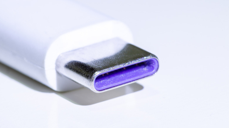
Saramonic is offering two configurations – the Air SE-01 at $49 includes a USB-C receiver and works with modern iPhones, Android devices, computers, and select action cameras like the DJI Osmo Pocket 3 and DJI Action 4. The Air SE-02 at $69 adds a Lightning receiver for older Apple hardware. Both kits include two transmitters, the charging bar, furry windshields, magnetic clips, a carry bag, and a USB-A to USB-C cable. That’s a complete field recording setup in one box, no additional purchases required. Competitors like the DJI Mic 3 and Hollyland Lark systems start around $150, making the Air SE’s price positioning genuinely aggressive for mobile content creators, streamers, and interviewers who need affordable wireless audio with outstanding value.
The Air SE is available now through Saramonic’s official store with free worldwide shipping, a 15-day return window, and a 2-year warranty. For creators who have been making do with phone audio and wondering if a dedicated wireless mic is worth the investment, this is a system designed to answer that question definitively. Pure, natural-sounding voice with powerful noise cancellation, ultra-light portability, and broad compatibility with mainstream smartphones and tablets, all in a package that fits in your pocket and costs less than most creators spend on a single camera accessory.
Click Here to Buy Now: $40 $50 ($10 off, use coupon code “YD20”). Hurry, deal ends in 48-hours!
The post A Wireless Clip-On Mic With AI Noise Cancellation for Under $50 Sounds Ridiculous. Here’s Why It Works. first appeared on Yanko Design.