Terrazzo side table concept seems to tempt fate and defy the laws of physics

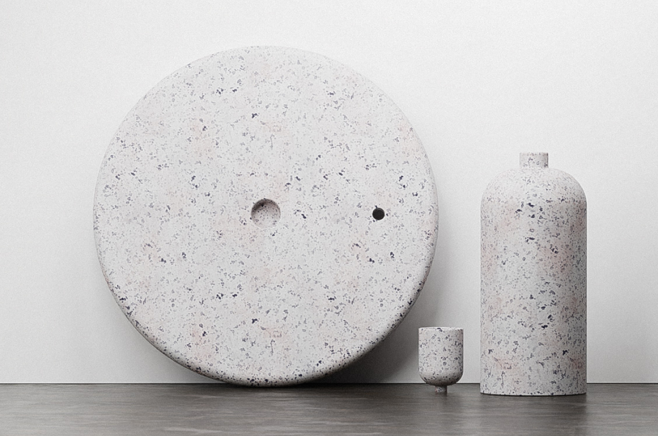
Tables come in all shapes and sizes, but regardless of the design, they all need to have a single critical trait: they have to be stable. No matter how breathtaking a table might be, it is nothing but a piece of art if it comes crashing down under the lightest of weights. Stability can be achieved through many means, but for something like a coffee table or even a side table, that mostly means having a flat surface that doesn’t wobble or, more importantly, doesn’t tip over. That’s the behavior that people have come to expect from even the most beautiful table, which is why this side table concept is striking both for its elegant looks as well as its rather worrying composition that precariously balances the tabletop on a curved surface, or at least it would seem like it.

Designer: Stuart Cole

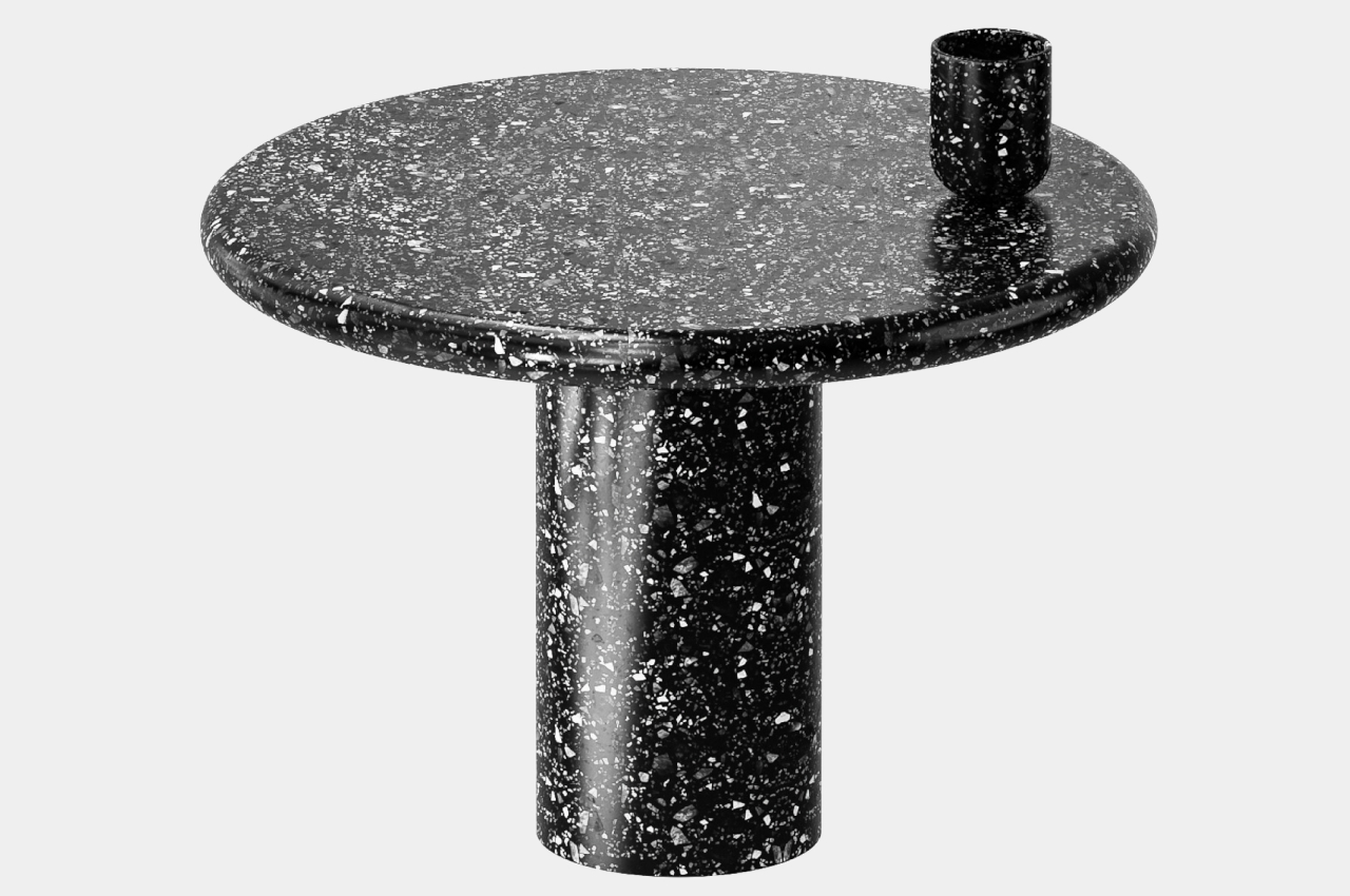
Objects that boggle the mind and seem to defy the laws of physics have always been a fascination for us, which is probably why balancing toys or levitating speakers have always been popular products. That, however, doesn’t apply to furniture, especially ones that we expect to be stable or fixed. Seeing a table that’s about to topple over is enough to give some people a heart attack, but fortunately, that’s not the case for the aptly named “Balance” side table design concept.

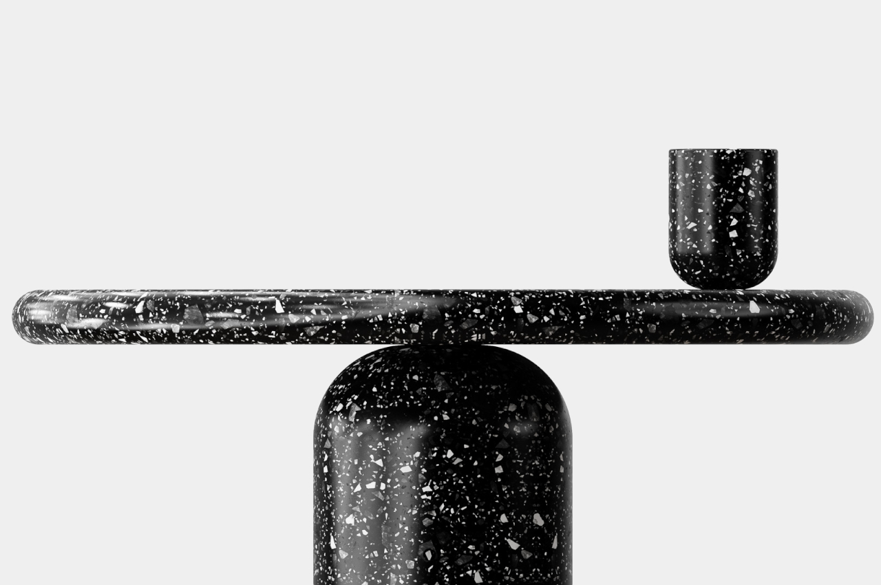
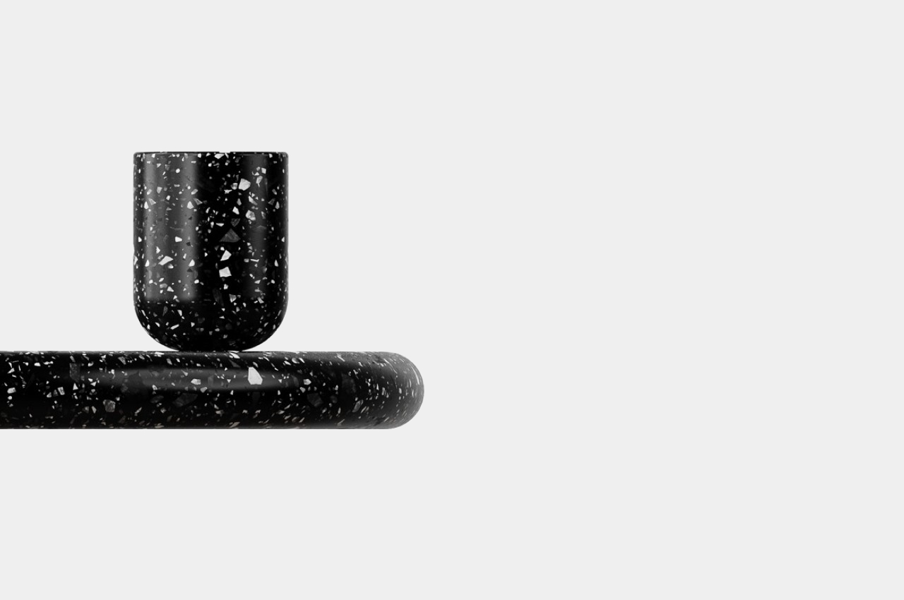
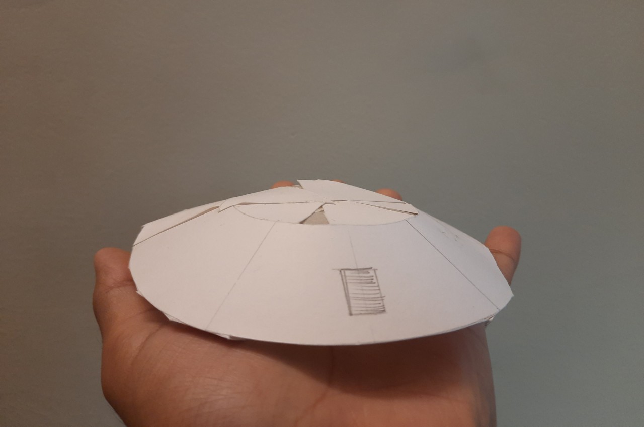
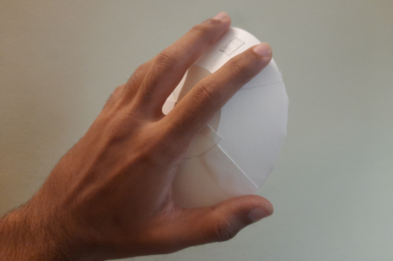
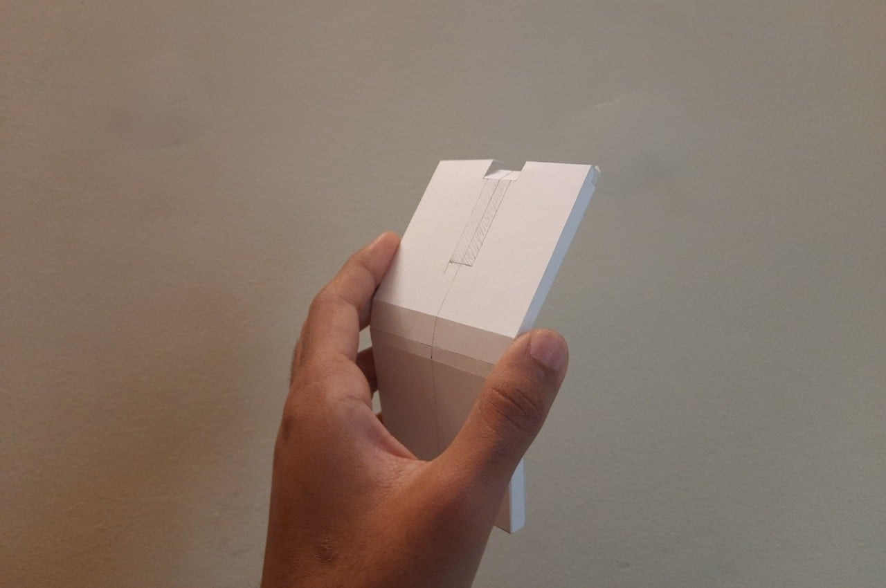
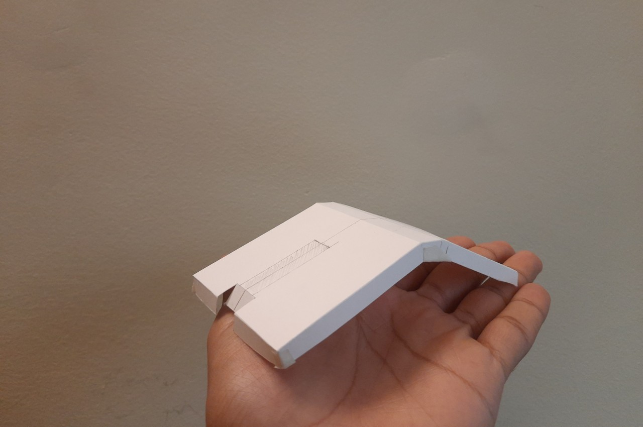
The table’s form is actually pretty simple, utilizing basic geometrical shapes like a disc and cups. It’s the tension between these shapes, however, that gives Balance its dynamic and rather unstable appearance. It’s almost as if the circular tabletop would topple and fall off the upside-down bowl shape of its base, or that the cup would similarly fall over the edge and break. Of course, it’s all just an illusion because all three parts are joined using interlocking mechanisms that prevent them from falling apart, at least not without much effort.

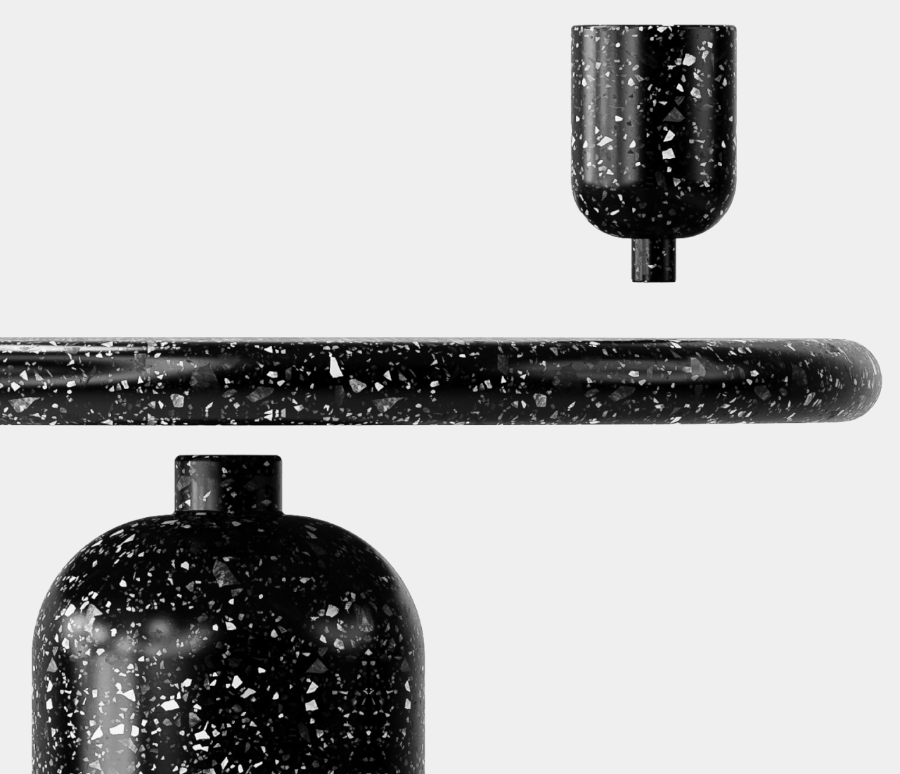
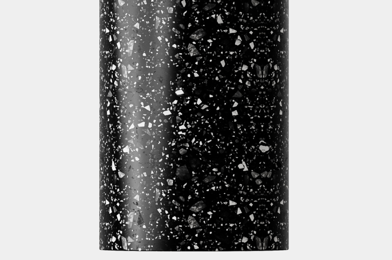
Balance’s appeal doesn’t stop at its eye-catching shape. Its unique appearance is due not only to the use of terrazzo but also from employing recycled materials. This gives the side table not only a distinctive visual character but also a sustainable narrative that will surely be a topic of conversation for envious visitors. You might even be tempted to use it as a coffee or center table, rather than just leaving it off to the side, though that temptation might also be tempered by unfounded worries that the table will eventually become unbalanced and send your cups and books crashing down.

The post Terrazzo side table concept seems to tempt fate and defy the laws of physics first appeared on Yanko Design.

Tactile lamp and timer concept fosters focus and mindfulness in work-from-home arrangements

Although travel and work restrictions have mostly been lifted already, the office world is really no longer the same. It has now been proven that the work your bosses claim can only be done in the office can actually be done at home or even in a coffee shop, and so more flexible remote working conditions have started to take root in many companies. At the same time, however, the pandemic also proved that working from home is far from being the idyllic scenario that many people dreamed of in the past. Maintaining focus and motivation isn’t exactly easy to achieve, but this curious desk lamp helps develop that sense of balance between work and personal life using a very visual and tactile experience.

Designers: Pinar Aydogdu, Naren Yildirim, Nurbanu Kocak

One of the oldest productivity tricks in the book involves focusing on a single task for a certain amount of time and then taking a brief break before repeating the cycle all over again. Ironic as might sound, this technique, most popular by its “Pomodoro technique” moniker, actually helps you focus during those moments you are working. It also elevates rest to its proper place in our hectic lives, presenting it not as wasted time but as an important factor in boosting productivity.

You’d probably never think that a decorative desk lamp would be the tool to encourage that productivity practice, but the Fall concept design is exactly that. At its most basic, it is composed of a conical lamp standing on a circular base that has a rippling surface, almost like the ripples in a pond. The soft diffused light that the lamp gives isn’t going to be enough to illuminate your work, but that’s not the purpose of the lamp anyway. It works in conjunction with eight balls that magnetically attach to the top of the cone, turning this productivity practice into something like a game.

Each ball represents one hour of working time, so their total makes up an entire day’s work. At the start of your work day, you stick those balls at the top, and after an hour has passed, one ball falls down on the base. Because of the undulating surface of the base, the balls won’t roll off, but you can remove each ball as you please. In fact, you remove the ball from the base to signify that you’re taking a break and you put the ball back on the base when you’re back. If you don’t bring back the ball within a set amount of time, usually ten minutes, the lamp’s light will turn red to nudge you back to your work.

Fall is an interesting idea that encourages physical involvement in juggling those work hours, making sure you’re more mindful of your time instead of simply glancing at a clock or swiping an alarm away. The lamp itself gives a rather distinctive aesthetic, one that encourages play and interactivity instead of just looking pretty. Admittedly, it’s just a concept and one that will be rather complicated to implement in a real functioning device.

The post Tactile lamp and timer concept fosters focus and mindfulness in work-from-home arrangements first appeared on Yanko Design.

Ergonomic mouse concept gives left-handed users the comfort they deserve

The vast majority of computer products are designed to favor the biggest groups of users, sometimes to the exclusion of the minority. We’re not speaking about accessibility for persons with physical disabilities, but that is especially true for them as well. Even just the common keyboard and mouse are designed with the presumption that they will be used by right-handed people. And while ambidextrous mice do exist, those tend to sacrifice comfort for the sake of a symmetrical design. That doesn’t have to be the case, as this concept design tries to prove, promising both comfort as well as proficiency, regardless of which hand you hold it with.

Designer: Sameeraj Dronamraju

There has been an increasing awareness and demand for ergonomic mice, sadly due to the equally rising cases of computer-related injuries. But while there are plenty of ergonomic designs now available, most of them only cater to right-handed users. You’d be lucky if the manufacturer produced a left-handed design, but most don’t because of the costs involved in another product with only a few minor differences.

The proper solution would be to mix ergonomics and symmetry to create a mouse that is comfortable to hold for both kinds of people. Vertrous, a portmanteau of “vertical” and “ambidextrous,” takes its cue primarily from the plethora of ergonomic mice now in existence, most of which adopt a vertical design that attempts to reduce the strain placed on the wrist by offering a more natural grip. But rather than have your hand holding it sideways, you almost grip it like a claw, with your index and middle fingers still resting on top.

At the same time, the mouse’s shape is more or less equally balanced on both sides. Great care is taken to ensure that textured areas are found on both sides, so no one hand has the advantage over the other. That said, there are some features that can really be found in only one place, like the power button, but that’s really a minor detail that has no significant impact on the use of the mouse itself.

While Vertrous does present an interesting solution, there are still some considerations left unanswered by the design. For example, gripping the mouse like a claw could actually end up being more uncomfortable and strenuous than a regular mouse. The symmetrical design also leaves out features like extra buttons that would normally be found only on one side, an absence that many power users will feel acutely. These aren’t flaws per se but more like points for further improvement, paving the road for the day that we finally land on a standard ergonomic mouse design that will really leave no one out, whichever hand they prefer to use.

The post Ergonomic mouse concept gives left-handed users the comfort they deserve first appeared on Yanko Design.

Zen-inspired aesthetic coffee maker concept may give you a peaceful morning

One of the best ways to start the day is by enjoying a cup of coffee when you wake up while things haven’t started becoming busy yet. But a lot of times, I wake up late and hurriedly go through my morning routine and sometimes I’m not even able to grab that crucial cup of caffeinated goodness. What if the things that you use for your morning (or evening) coffee routine is something that can bring you an added source of peace and tranquility so your day can actually start (or end) right?

Designer: Suckhand Saren

This is the exact idea behind the concept for a set of coffee makers aptly called Zenbrew. The goal is to achieve a zen-like mood while you’re brewing your coffee and while you’re sipping your cup in peace. Using a combination of minimalist design, elegant aesthetics, and of course much needed functionality. The designer wanted to elevate what is simply the act of brewing coffee into a “sensory experience” but keeping it simple, elegant, and peaceful. The main design inspiration is the hourglass which is not always a symbol of zen but when combined with the minimalist aesthetic, it actually fits the concept.

There seems to be two kinds of coffee makers in the concept. The first one is closer to the usual coffee maker that we see in the market with the carafe with the handle but with a glass dome at the top where the brewing magic happens. The other design seems to be a combination of a pour over device and a bunsen burner. The carafe is a bit smaller and with a straight handle rather than a curved one. Both designs also have a futuristic, space-like feel which may also contribute to the other worldly zen you may experience while brewing and drinking your coffee.

While having coffee makers as aesthetic as this will not guarantee I’ll have a peaceful morning, it might actually help me get up earlier. Having a nice coffee maker, along with delicious coffee beans and other ingredients, are sometimes enough incentive for me to try and have an unhurried morning routine. Wake me up when this concept actually gets made into coffee machines.

The post Zen-inspired aesthetic coffee maker concept may give you a peaceful morning first appeared on Yanko Design.

Smart piggy bank concept brings the Bitcoin feeling to physical coins

Cryptocurrencies like Bitcoin and its cousins were supposed to revolutionize the way the world sees and uses money, but it will take more than just a few revolutionary ideas to change a system that has been in place for centuries, even millennia. That said, the craze did reveal a few advantageous features, particularly the handling of money through digital wallets. Of course, the latter only makes sense for the money you’ve already “digitized” through banks, digital or otherwise, not so much for the money you still have at hand. That’s especially true for coins that are often chucked into containers, presuming they don’t get lost, and are almost forgotten. This concept design for a “smart piggy bank”, however, gives importance to every dime and penny, allowing you to really see where your money is going, even if still exists in physical form.

Designer: Guilherme Ferreira, Pietro Vitelo, Gustavo Billo (Breathe Design & Strategy)

Digital wallets that let you monitor the flow of your money have been around for a long time now, but it wasn’t until the cryptocurrency craze became mainstream that people started to realize the benefits that such a system has to offer. In particular, it gave people more direct control over the money they have in their accounts, especially when it comes to monitoring how much goes in and out of their savings. Real physical coins, however, aren’t as easy to handle and they often get dropped anywhere and lost, money that could have added up to big savings over time.

1

Smart Piggy is a concept that upgrades the iconic pink piggy bank into something fit for the 21st century. In a nutshell, sensors on the slot at the top of the pig-shaped device detect when a coin is inserted and pass this information to a connected smartphone. The mobile app, which is actually the center of the whole experience, is where users get to monitor the comings and goings of their savings, particularly those from the Smart Piggy. It’s a simple feature that has a significant impact on user behavior, encouraging people to actually pay attention to where those coins go.

The concept does leave a few details open to interpretation, like how the system will be able to identify different coin denominations. It also doesn’t mention anything about taking out coins from the piggy bank, so presumably, the coin detection and monitoring is a one-way street. Still, it touches on the possibility of an implementation that can take into account both cash flows, so to speak, giving people not only the tools they need to keep track of those coins but also the motivation to actually pay attention to where they go.

The post Smart piggy bank concept brings the Bitcoin feeling to physical coins first appeared on Yanko Design.

Apple-inspired alarm clock concept helps you snooze a bit longer

People buy and use alarm clocks to wake them up at the right time, but let’s face it, almost everyone ends up extending their sleep by five or ten more minutes or at least want to. With the advent of smartphones, that has become even easier with the built-in snooze functionality in apps. But just as reaching for your phone before bedtime can be bad for your health, doing the same when you just want to snooze your alarm could also end up keeping you from going back to sleep instantly. What you probably need is an alarm clock whose only purpose, ironically, is to get you to sleep longer, which is what this device concept offers in addition to looking like one of Apple’s stylishly minimalist products.

Designer: Antoine Brieux

Useful as they are, our smartphones are notorious for also being sources of distractions. At night, those incessant notifications and the screen’s blue light keep us awake, but our phones also prevent us from snoozing properly again in the morning. Few of us dare to slide the screen blindly for fear of pushing the phone over the edge and breaking it, so we’re forced to open our eyes, get blinded by the screen, and be tempted by the number of unread notifications. There goes your plan to continue that sweet dream!

You know those shows or cartoons where people simply push or smash a button on their bedside clock to silence their alarms, all without even looking at the thing? Well, that’s what this alarm clock concept design also lets you do, except it doesn’t stop the alarm from sounding. The big, though flat, button on top of the small box has one and only one purpose: to snooze the alarm and let you extend your sleep, all without pulling you out of your slumbering state completely. No fumbling over which button to push. You can even hit it with your eyes closed, which is the point entirely.

With such an extremely focused purpose, the design of the device can’t be any more complex than it needs to be. It’s a perfect opportunity to apply some of Apple’s famous minimalist design language, leaving a small cube that’s bereft of any unnecessary feature other than a small LCD screen on the front, a USB-C charging port on the back, and Apple’s iconic logo on top. That said, the design is also so simple that it can actually be easily used by other brands, for example, a LEGO-inspired yellow block.

The alarm clock does have another hidden functionality. It can charge your iPhone, but only if you place it on the iPhone’s back. It makes for an awkward position where the iPhone has to lie face down on a flat surface, which risks scratching its screen. Of course, the bigger question is whether there’s a real need for such a device that does only one thing, especially if that one thing encourages and even rewards sleeping in when you really should be getting up.

The post Apple-inspired alarm clock concept helps you snooze a bit longer first appeared on Yanko Design.

Service robot concept doubles as a chair and a tiny private office

Service robots are becoming more common these days, from cute mobile trays that deliver food to your table to large rolling boxes that carry your luggage for you. These robots definitely serve their purpose, and they’re often designed to look pleasing or even friendly, but lack a certain element of interaction that will help put humans more at ease with these mechanical assistants. Some designs try to put a figurative human face on these robots, without much effect, while others try to focus on usability and functionality instead. This concept design, however, goes back to the drawing board to determine the best form that a service robot could take. It turns out, we’ve been sitting on the answer all this time, literally.

Designer: Yunsoo Choi

For all the drama about how robots will be replacing humans in the future, there are already certain industries where service robots have indeed taken the place of flesh and blood workers, particularly in the hospitality industry. That said, most are only capable of performing very menial and mechanical tasks, far removed from the human-like androids of our imaginations and science fiction. More importantly, these robots feel as distant and as detached from our lives as the bags they carry. They lack the interactivity and personal connection that would make them indispensable parts of our lives.

This concept design for a service robot tries to provide that kind of interaction by turning the robot into something more than just that. It uses the chair as the inspiration for its design, a functional object that also provides comfort as well as a point of human interaction. But the robot does more than offer a comfortable place to sit on; it also creates a small bubble that becomes a tiny personal office space, at least if you’re the type that can do their job on a tablet.

That’s because this tablet is what triggers the transformation between a chair and a robot. It acts like the brain of the machine, though it’s also the robot’s “face” as well as its sole interface. It’s how you can get information, pay for your hotel stay, or order food, basically anything that involves actually requesting service. The tablet magnetically attaches to the robot’s arm and can be positioned at the most comfortable angle or height for use, including while sitting on the robot chair.

Aside from these, the design also includes the common functions of such a service robot, particularly when it comes to delivering items to customers or keeping their possessions. It can even disinfect these objects using UV light inside its body. But while the idea of a service robot that also functions as a chair sounds interesting on paper, it raises the question of comfort and safety, two factors that are critical for a piece of furniture like a chair. It definitely looks a little too high to sit on comfortably and functions more like a stool than a proper chair. The “office space” is also a bit of a stretch since there’s not much space to get anything done. Still, the idea deserves more exploration and refinement and could spark more designs for service robots that become space-efficient personal offices for the mobile workers of the future.

The post Service robot concept doubles as a chair and a tiny private office first appeared on Yanko Design.

Sticky notes holder concept comes with a very tall panel for your notes

Although a lot of the world today revolves around digital documents and files, there are definitely plenty of people who still espouse analog systems, especially when it comes to taking notes and productivity. In fact, there are many productivity systems today that utilize paper notebooks or even sticky notes, better known as Post-its, though the latter are also notorious for creating a mess rather than helping you stay on top of things. Part of the problem is that sticky notes make it too easy to, well, stick these square pieces of paper anywhere, which means potentially losing them or ending up being more disorganized than ever. This Post-it Note Holder design concept tries to solve that by providing a space for all your sticky notes needs, including a place to stick them.

Designer: Liam de la Bedoyere

Sticky notes today come in different sizes and even shapes, but the colored square format remains the most popular because of its ease of use and space efficiency. It forces you to condense what you need to write down to the most essential pieces of information, and they often don’t take up too much space either. That is until you find your desk, your board, or even your computer monitor littered with these sticky squares, at which point they defeat the entire purpose of trying to keep your life in order.

This concept encapsulates a whole system designed around sticky notes so that you don’t have to work hard to keep everything in a single place. Of course, there’s the actual holder for keeping a stack of notes always ready to receive your scribbles, but there’s also a curve at the back to hold a pen, saving you from having to scramble for one just when you really need it. The most prominent part of this note holder, however, is the very tall and narrow board that rises from the holder. This serves as a more limited space for sticking your notes after you’ve written them.

The design is intentionally limited in space, which forces you to only stick the really important notes the same way sticky notes themselves force you to be concise and quick. At the same time, it still leaves plenty of room for flexibility and personal workflows, like arranging your notes in a literal hierarchy of importance. Or you could order the notes according to their urgency or due dates, watching the colored squares slowly march down as you complete your tasks.

The concept also has room for variations in design, like one that could be hung on a wall and has an inclined note holder for easier access to the pad. And for the truly disciplined Post-it user, the “base” configuration of note and pen holder still gives the convenience of having the essentials always ready when inspiration strikes. You just have to be sure you don’t fall back into the habit of sticking your notes everywhere and then forgetting where you put them after just a few hours.

The post Sticky notes holder concept comes with a very tall panel for your notes first appeared on Yanko Design.

MSI Gaming PC Watch is a dragon red themed, full-fledged rig for your wrist

Smartphones and laptops allow us to play games on the move. But that’s not always enough, especially when the world demands you to be ready and operative no matter the time or place. In such a scenario, you need a gaming rig that is an integral part of everyday life, keeping you always ready. Here, MSI Gaming PC Watch offers an instrumental solution.

A gaming rig for your wrist; the Gaming PC Watch takes a full-fledged MSI computer and shrinks it to the size of a wearable so you can strap it to your wrist and be game-ready every time. Designed in MSI dragon red theme, the watch PC does not have specifications to detail, but from what we see in the pictures, the system is complete with the branding and transparent façade.

Designer: Eslam Mhd

The wrist PC does not intend to be a watch, it has very subtle annotations on the right where analog watch hands are visible and the four pushers on the sides to toggle the features. From the word go, it is a wearable computer and the innards – fans, graphics, cooling, motherboard – all visible right through the watch face. The case appears to be made of some metal alloy with MSI logo at 3 o’clock, where you usually find a crown on a typical wristwatch.

Smartwatches have come of age; they are almost wearable smartphones for the wrist. Despite their acceptance and demand, smartwatches haven’t caught on like smartphones did a decade ago. The idea of amazing smartwatch innovation could maybe shift from smartphone ideology to computer periphery, and who knows things may just take off. At least the MSI Gaming PC Watch’s design makes me believe in the concept.

MSI is already a world leader in gaming and Artificial Intelligence of Things (AIoT) solutions. It has some of the fanciest gaming computers and laptops that thrive on powerful hardware, good cooling systems, high-end graphics, and bewildering RGB lighting. It is only fitting for the tech giant to put its mettle behind the idea of a watch PC and see it through. Given MSI’s well-built and durable designs through the years, the wearable gaming rig too will give you the features and ability to access data and exchange information anywhere, anytime.

The post MSI Gaming PC Watch is a dragon red themed, full-fledged rig for your wrist first appeared on Yanko Design.

Sunflower-inspired speaker concept lets sound follow you wherever you go

Smart speakers are becoming a common sight in homes these days, even those that have yet to wander into the smart home category. They come in all shapes and sizes, but most of the designs have one thing in common. Given the design of drivers, they can only project sound in one direction, usually forward. You can have a 360-degree speaker, but that requires having more complicated hardware or a cylindrical design that has to be placed somewhere in the middle of the room to make sure the sound reaches you where you are. This concept design, however, offers a simpler but more interesting solution, taking a cue from one of Mother Nature’s more curious creations. This circular speaker turns to make sure that sound is sent in your direction, following you all the time just like a sunflower follows the sun.

Designer: Joon-Yeol Bae

In general, sound travels in the direction an emitter, such as a speaker, is facing. It can bounce off objects or spread a bit in a cone, but on its own, it will never change its forward direction. Omni-directional speakers solve this by having drivers that face multiple directions to cover all possible directions. While effective and a common practice these days, it also means multiplying the number of components used, raising the build cost. In some cases, it also requires that the speaker be placed in an open and unobstructed area of the room, which limits your interior design options.

Solros, named after “sunflower” in Swedish, is a concept that takes an unconventional approach. Employing the same technologies used by self-driving cars and robot vacuums, it can tell where you are and rotate its disc-shaped head to always face in your direction. It can even detect how near or far you are from the speaker and adjust its volume to compensate for the distance. This has the effect of making the sound feel like it’s always following you, wherever you go inside a space.

The speaker is also designed to blend into the background if you need it or become the center of attraction if you want it. Its minimalist design, which can be made available in beige, black, red, and green colors, makes it a perfect fit for almost any interior. Its graceful movements also minimize distractions while, at the same time, becoming a point of curiosity for visitors. Needless to say, it’s going to be a conversation starter, especially when the music starts to play.

As interesting as this design might be, it does raise the question of how effective it will be when there is more than one person in the room. LIDAR alone won’t be able to give priority to certain individuals, say the homeowner, and the speaker might end up getting confused and frozen in place instead of making sure its sound is sent in the right direction. Solros definitely makes the composition of a speaker a bit simpler, but the logic necessary to avoid a deadlock makes it a bit more complicated than a more straightforward 360-degree speaker.

The post Sunflower-inspired speaker concept lets sound follow you wherever you go first appeared on Yanko Design.