The typical desk lamp is a metal stalk on a base that does nothing but hold it up, plus a switch somewhere along the cord. Most lamps are either on or off, with the base becoming dead weight that competes with notebooks, pens, and devices for space. EMIT is a concept that treats the base and the shade as active parts of how you work and how your desk feels when you are not working, giving the lamp two distinct postures instead of just one static stance.
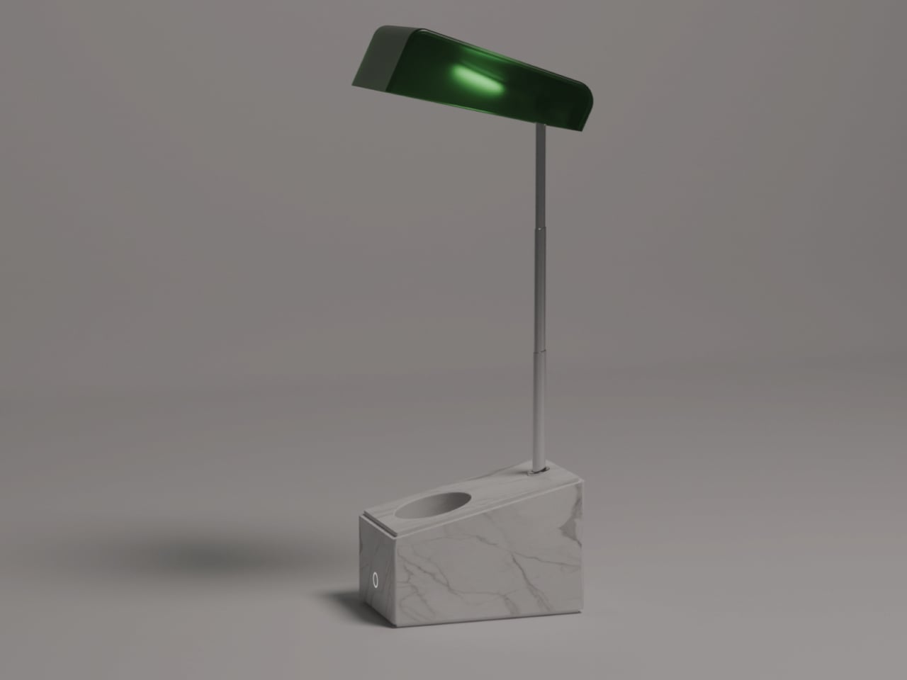
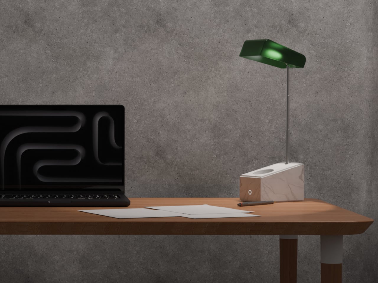
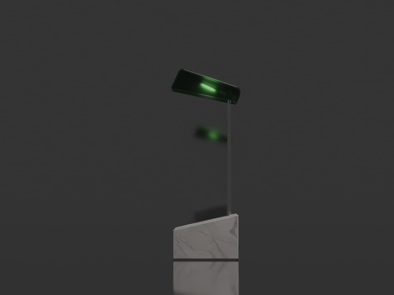
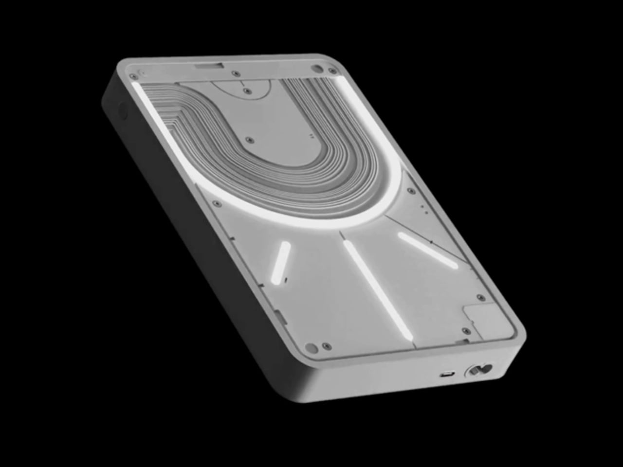
EMIT is a desk lamp concept that pairs a carved block of white Carrara marble with a translucent green shade connected by a telescopic metal stem. The name hints at emission and time, and the design leans into that by giving the lamp two distinct postures, one where it behaves like a focused task light and another where it becomes a quiet, glowing object in the corner of your eye when the work is done.
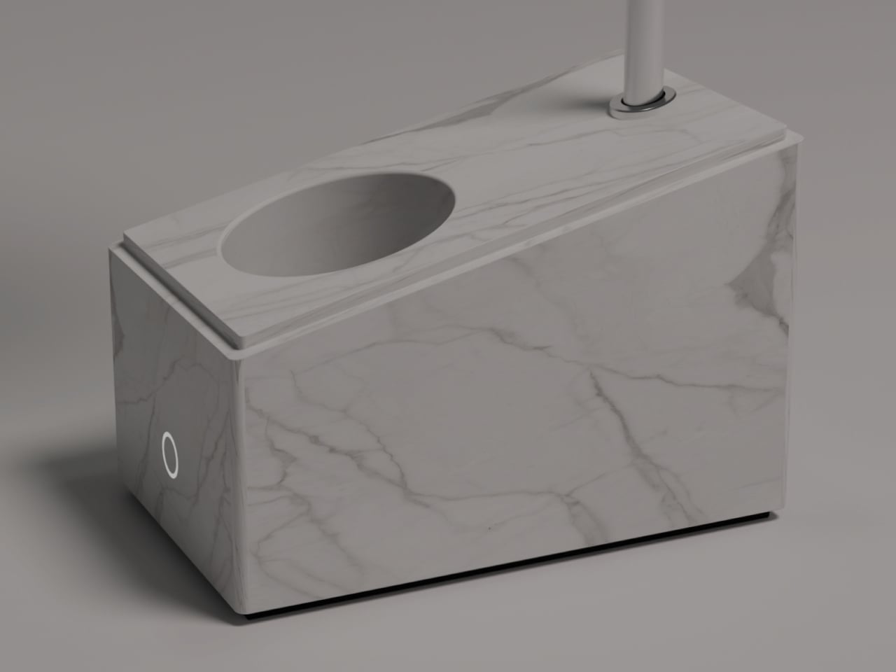
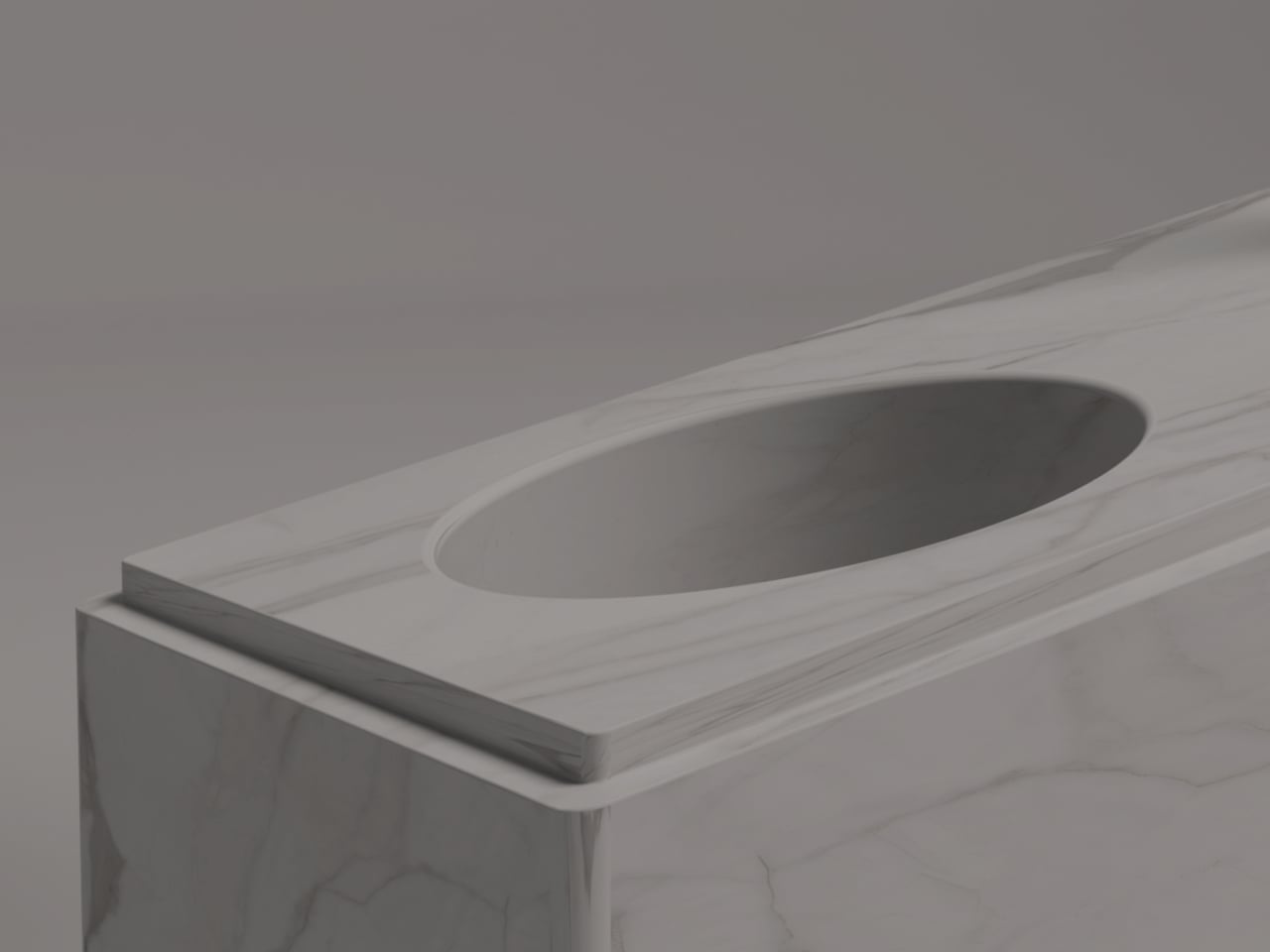
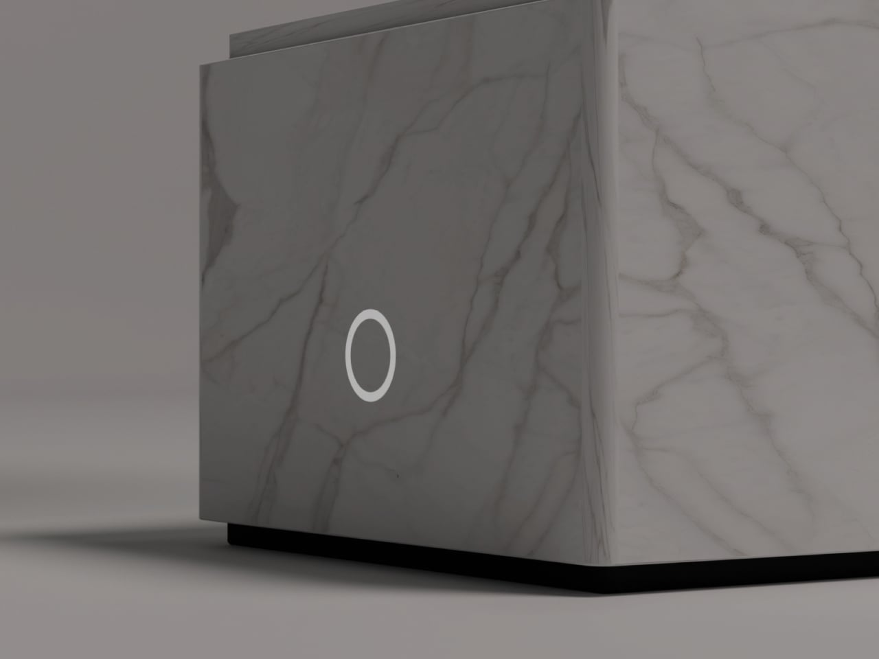
The marble base is more than a plinth. Its geometry is reduced to a simple volume with minimal machining, but a recessed pen holder is carved into the top, turning it into a small organizer. A touch sensor is integrated into the body, so you tap the stone to control the light. The base becomes a calm, heavy anchor that still earns its footprint on a crowded desk by holding pens and offering a gestural interface.
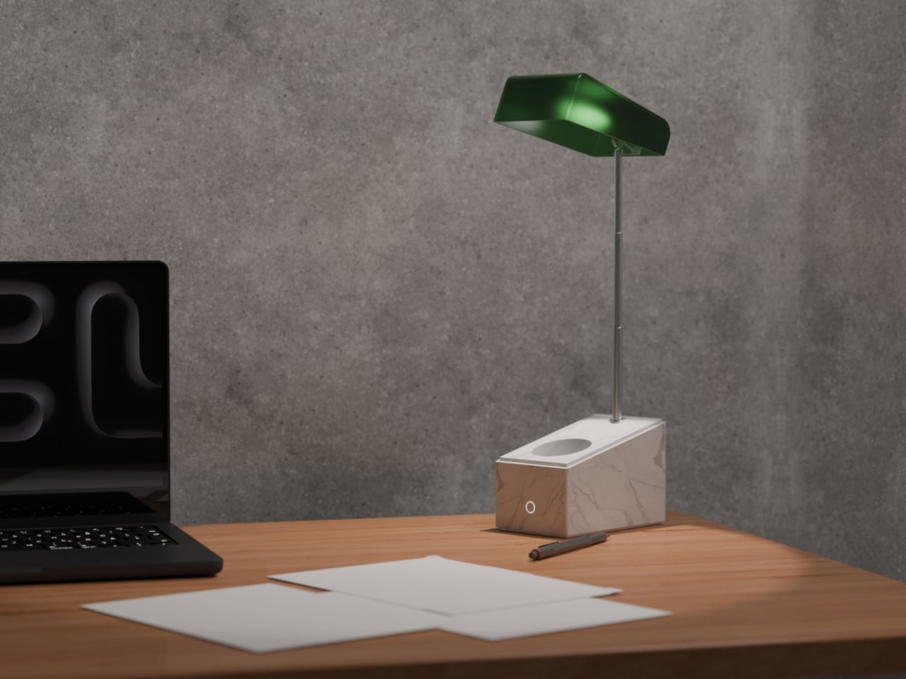
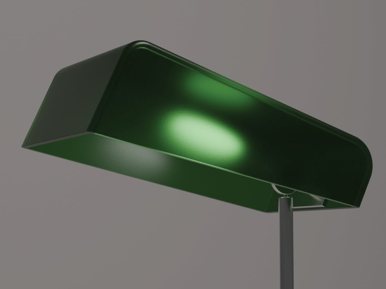
In working mode, the telescopic metal stem rises from the marble and holds the green shade above the surface. The shade references traditional desk lamps in silhouette, but is stripped down to a minimal, monolithic hood. In this posture, light is directed down onto the work area, while some of it diffuses through the translucent material, giving a soft edge to the beam instead of a harsh spotlight that flattens everything under it.
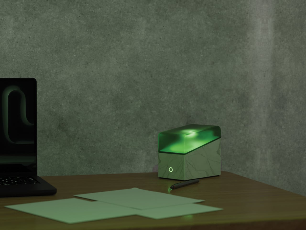
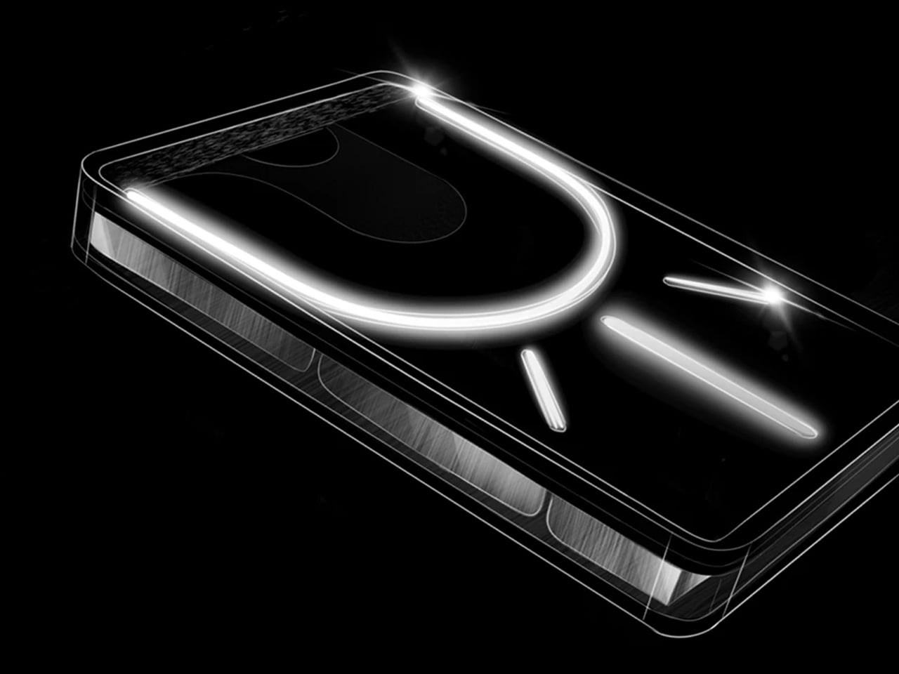
When you are done working, the stem collapses and the shade lowers until it almost meets the marble, forming a compact volume of white and green. In this closed state, EMIT switches to a dedicated mode where the translucent glass emits a soft, diffused glow. The lamp stops acting like a tool and starts behaving like a quiet presence, more sculpture than task light, adding a gentle wash of green to the room without demanding attention.
The deliberate opposition between the cold, veined marble and the soft, glowing green shade frames a small narrative about control and looseness, work and rest. The base reads as natural and solid, the shade as artificial and controlled. Together they explore what it means for a lamp to have a day self and a night self, with the telescopic stem literally mediating between the two modes.
EMIT sits on a contemporary desk next to a laptop and a notebook. During the day, it is a precise, marble-anchored task light with a place for your pen and a tap-to-wake interface. At night, it collapses into a compact green glow that keeps the room from going completely dark without feeling like you left a work light on. It is a small reminder that even a lamp can shift its personality, and that good lighting design can choreograph both focus and calm without needing to look like two different objects.
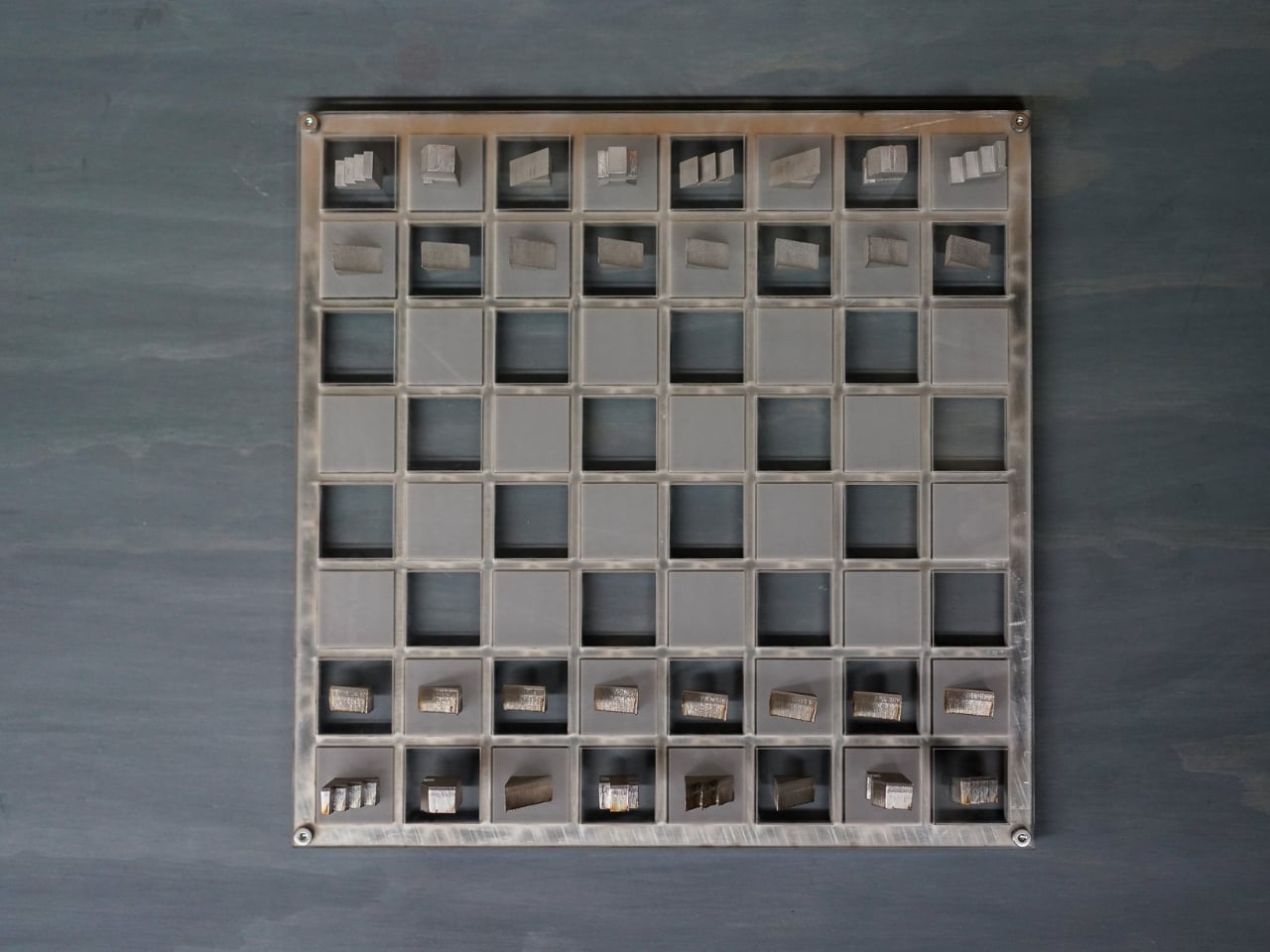
There’s something deeply satisfying about watching a designer solve multiple problems at once. William Young’s Jigsaw Chess Set is one of those rare designs that makes you wonder why nobody thought of it sooner. It’s a chess set, yes, but it’s also a sculptural object, an accessibility tool, and a logistics solution all rolled into one beautifully executed package.
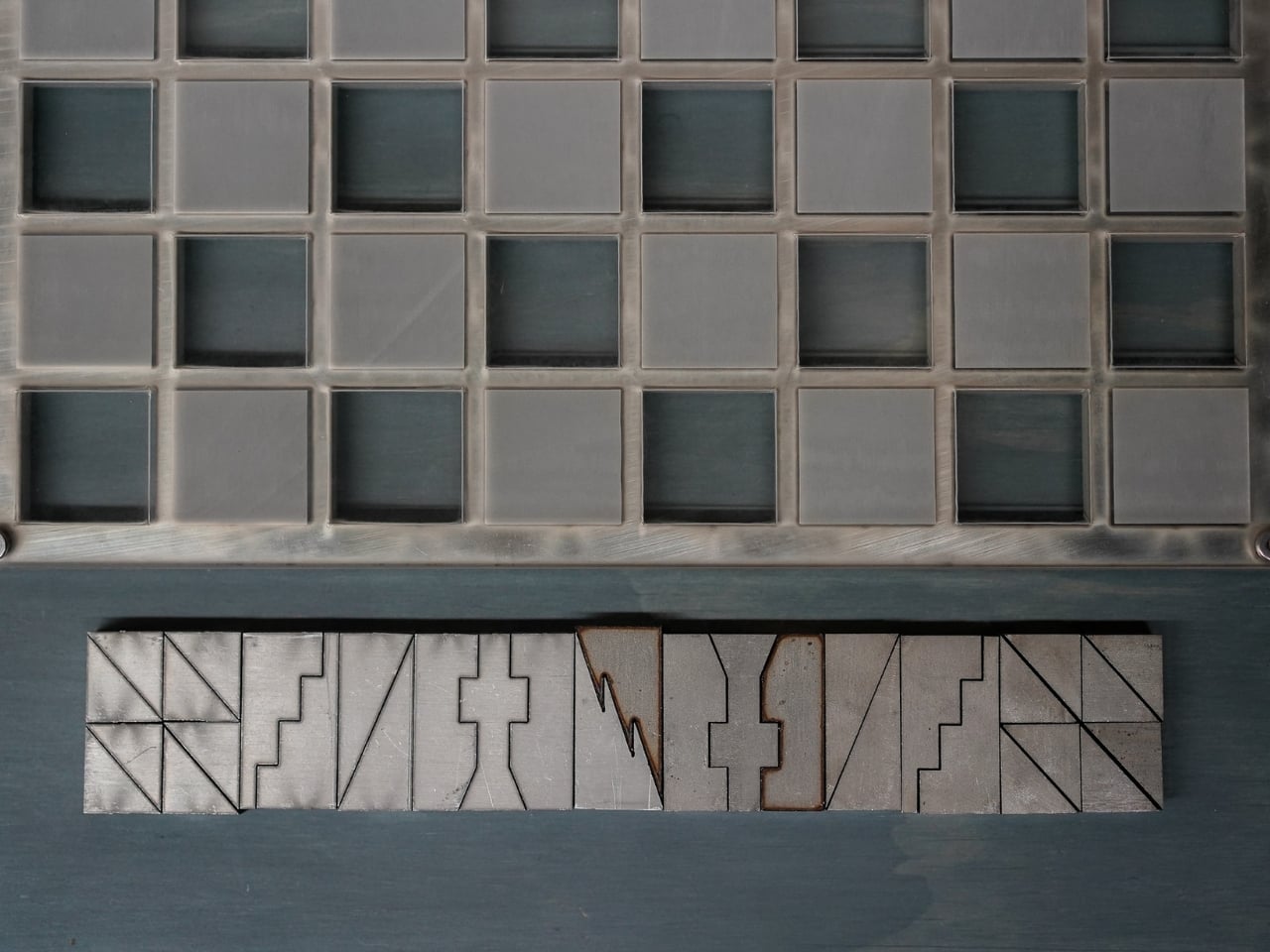
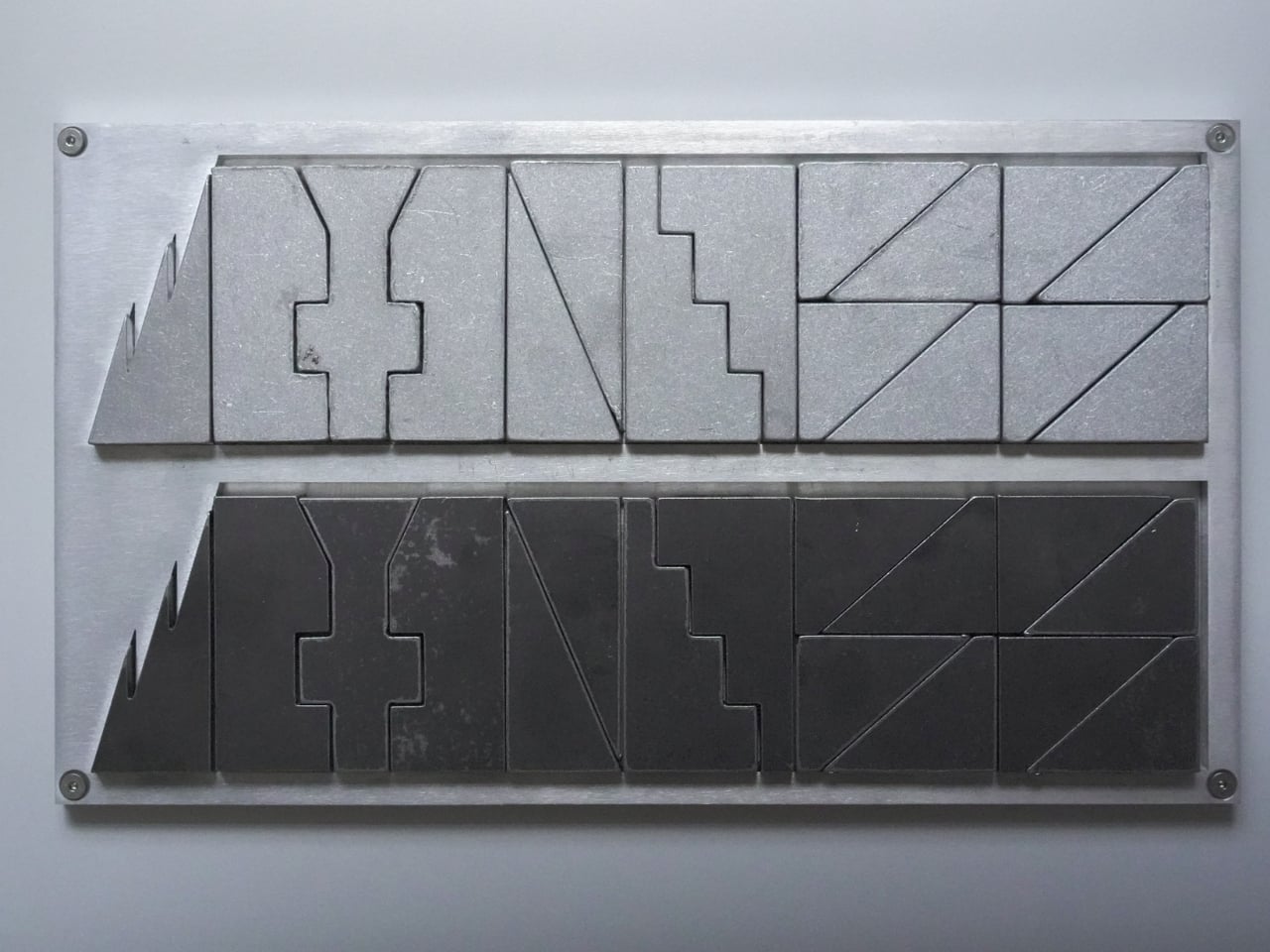
At first glance, the set looks like something you’d find in a modern art museum. The pieces are geometric, almost brutalist in their simplicity, fabricated from contrasting steel and aluminum. One side gets the cool, dark patina of steel, while the opposing army gleams in lighter aluminum. They’re angular, tessellated forms that look more like miniature architectural models than traditional chess pieces. But this isn’t just aesthetic posturing. Every design choice serves a purpose.
Designer: William Young
The most compelling aspect of the Jigsaw Chess Set is how it approaches accessibility. Most chess sets rely entirely on visual distinction. You know a knight from a bishop because you can see the carved horse head or the pointed mitre. But what if you can’t? Young’s design flips the script by making tactile identity the primary means of recognition. Each piece has a distinctive weight and texture that immediately identifies it in your hand. The king feels different from the rook, the pawn from the bishop. You could play this game with your eyes closed and know exactly what you’re moving across the board.
This isn’t a novelty feature. For visually impaired players, most chess sets require specialized modifications or Braille labels that still mark them as “other.” Young’s design makes accessibility intrinsic to the aesthetic, not an afterthought. The result is a set that works beautifully for everyone, regardless of visual ability. It’s inclusive design at its best, where accommodation becomes innovation.
Then there’s the fabrication process, which deserves its own moment of appreciation. The pieces are created using a zero-waste cutting method. Picture a sheet of metal that gets sliced into interlocking forms, like a precision jigsaw puzzle where every cut produces a usable piece. Nothing gets tossed in the scrap bin. In an era where we’re increasingly aware of material waste and manufacturing impact, this approach feels refreshingly thoughtful. Each piece is then hand-finished, giving the set that tactile quality that makes it so satisfying to handle.
But wait, there’s more. (I know, I know, but genuinely, there’s more.) When you’re done playing, the entire set interlocks back into a dense, self-contained block. All 32 pieces fit together like a three-dimensional puzzle, creating a compact square that takes up minimal space. This is where the “jigsaw” name really earns its keep. The design is scalable too, meaning different size versions can be produced while maintaining the same interlocking logic.
From a shipping and storage perspective, this is genius. Traditional chess sets are bulky, awkward to pack, and wasteful in their use of space. Young’s design ships flat (well, flatish), reducing packaging materials and transportation costs. For consumers, it means easier storage when the set isn’t in use. For retailers, it means more efficient inventory management. Again, multiple problems solved with one elegant solution.
What really strikes me about the Jigsaw Chess Set is how it challenges our assumptions about what a chess set should be. The game is over 1,500 years old, and the basic design language of its pieces has remained relatively stable for centuries. Young doesn’t throw that all away, but he does ask: what if we started from scratch with contemporary materials, modern manufacturing techniques, and a genuine commitment to universal design?
The answer is something that feels both familiar and radically new. You can still play chess exactly as you always have, but now you’re doing it with an object that works harder, thinks smarter, and includes more people in the experience. It’s a reminder that even the most traditional games have room for innovation when designers are willing to question the fundamentals. Whether you’re a chess enthusiast, a design collector, or someone who simply appreciates objects that do multiple things exceptionally well, the Jigsaw Chess Set deserves your attention. It’s proof that good design isn’t about adding features. It’s about rethinking everything from the ground up.
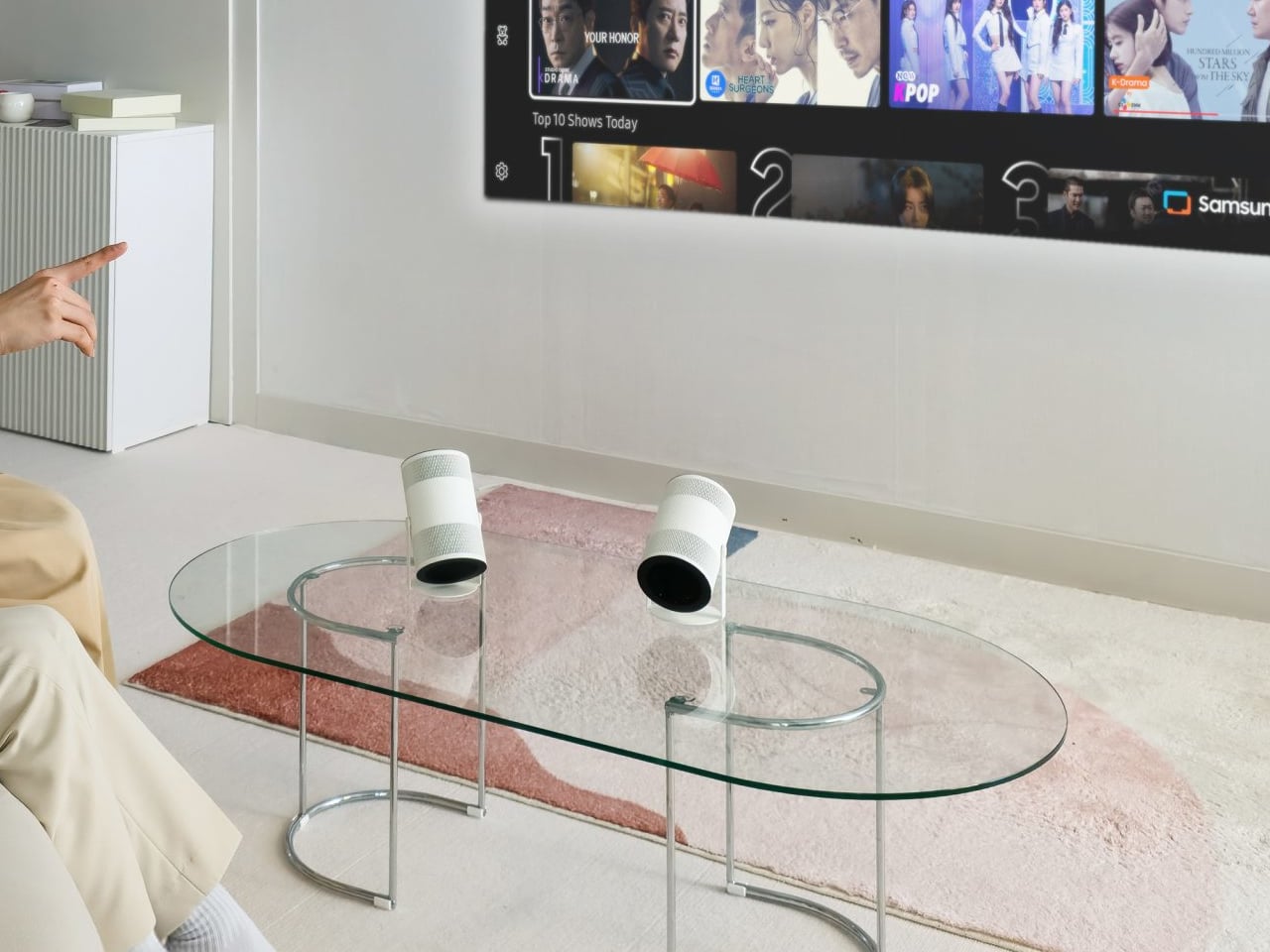
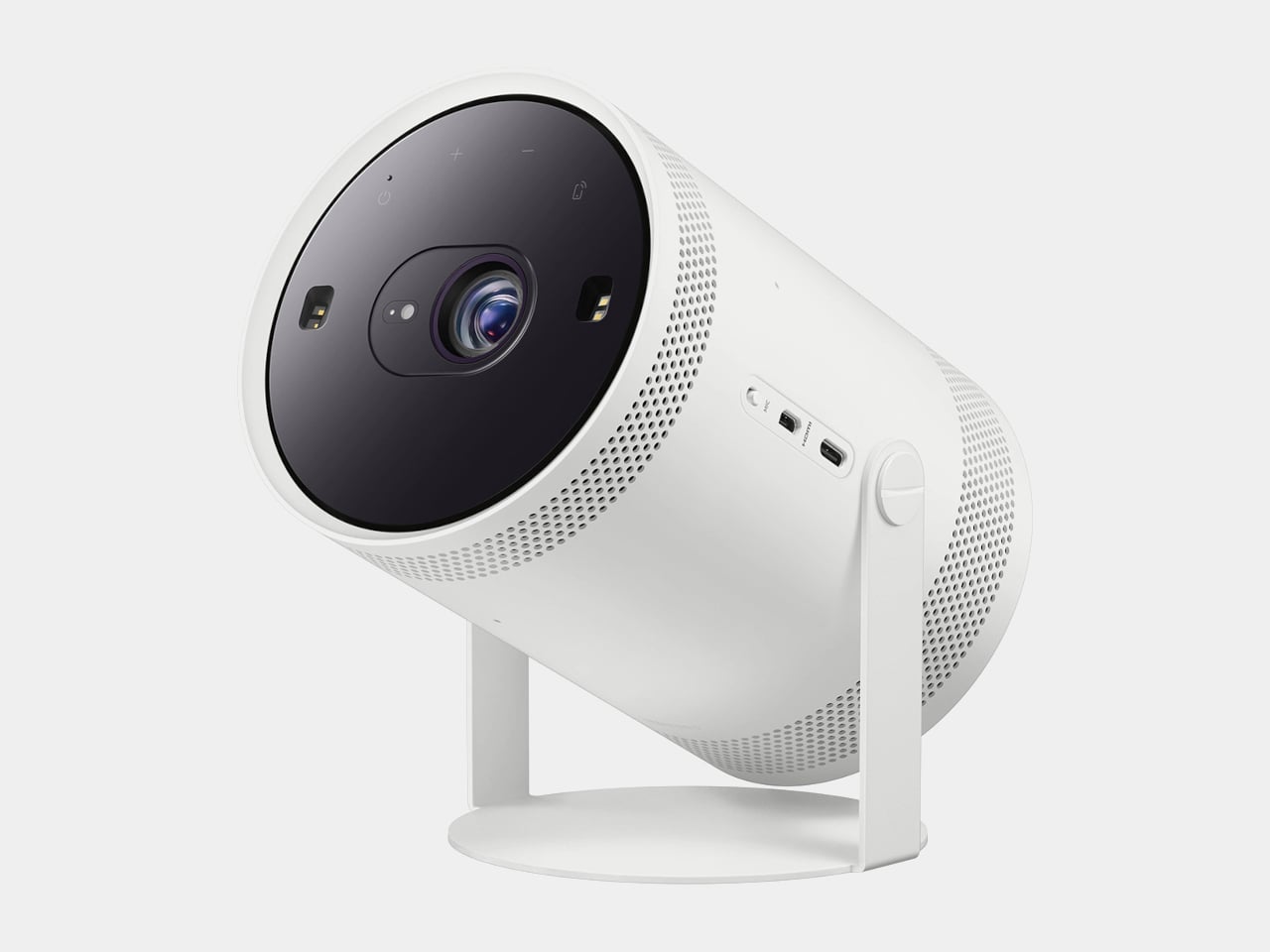
The first Freestyle tried to make projection feel as casual as dropping a speaker on a table, but still needed some fiddling with focus, keystone, and room darkness. Portable projectors are great in theory, but often fall apart on setup friction, tweaking corners, hunting for the right brightness mode, and dealing with off-color walls. Samsung’s Freestyle+ keeps the same friendly cylinder while letting AI quietly handle the annoying parts, betting that most people would rather point and watch than spend 10 minutes adjusting settings.
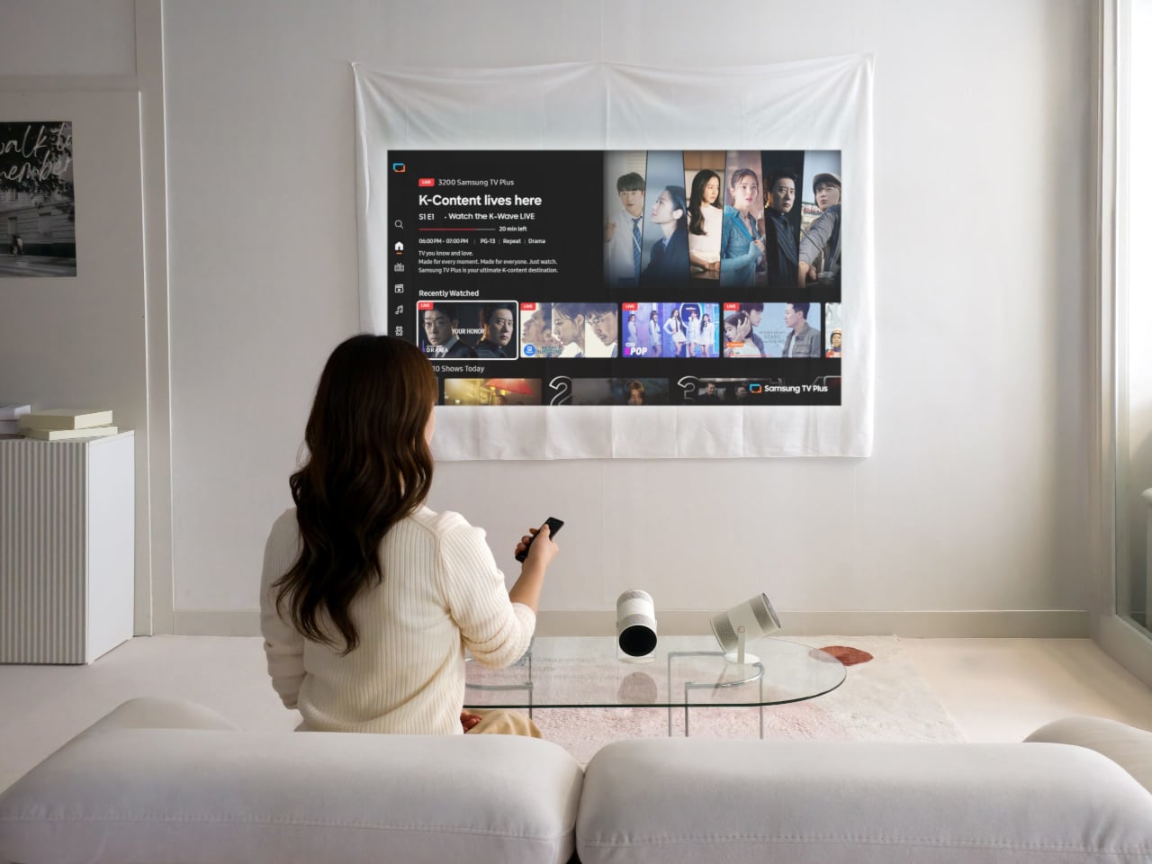
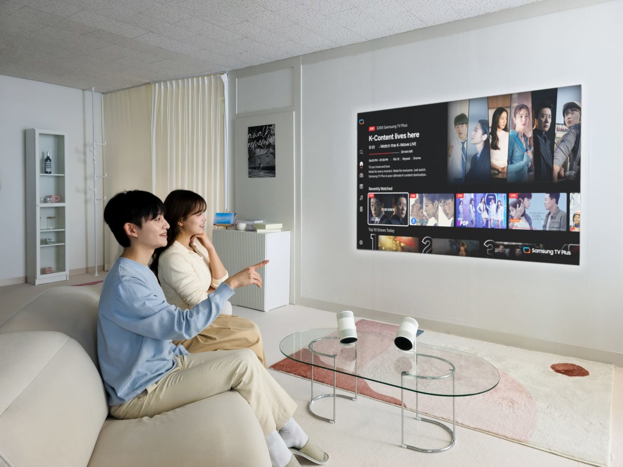
The Samsung Freestyle+ is an AI-powered portable projector that builds on the original’s cylindrical, 180-degree tilting design. The headline change is not a wild new form factor; it is a smarter brain. Freestyle+ is pitched as something you can point at a wall, ceiling, or floor, then trust to optimize the picture for whatever surface you happen to be aiming at, turning “point and play” from a slogan into something closer to reality.
AI OptiScreen is the bundle of features that makes that possible. 3D Auto Keystone straightens the image even on angled or uneven surfaces like curtains or room corners. Real-time Focus keeps things sharp as you nudge or rotate the projector. Screen Fit sizes the picture to a compatible screen if you use one. Finally, Wall Calibration analyzes wall color or patterns to keep content legible instead of tinted or washed out.
Freestyle+ pushes out 430 ISO lumens, nearly twice the previous generation, which matters in real living rooms that are not pitch black. The 180-degree rotating stand still lets you throw an image onto a wall, ceiling, or floor without extra mounts. The idea is that you stop worrying about whether a space is right for projection and just drop the cylinder where it makes sense in the moment, whether that is a coffee table, a kitchen counter, or a nightstand.
Freestyle+ behaves like a mini Samsung TV, with Samsung TV Plus, major streaming apps, and Samsung Gaming Hub built in. You can stream shows, watch live channels, or fire up cloud games directly from the projector without plugging in a stick or console. For small apartments or casual setups, that means one object can handle movie night and a bit of gaming without a permanent media cabinet cluttering the wall.
Audio comes from a built-in 360-degree speaker tuned for room-filling sound in a compact body. For people already in the Samsung ecosystem, Q-Symphony support lets Freestyle+ sync with compatible Samsung soundbars, layering its own speaker with the bar instead of muting one or the other. That gives you a more cohesive soundstage when you want to treat the projector like a main screen rather than a sidekick.
Freestyle+ makes the most sense as a roaming screen that follows you from bedroom to living room to kitchen, rather than a projector that lives in a dedicated theater. By combining a familiar, speaker-like form with AI setup, brighter output, built-in streaming, and decent sound, it nudges projection closer to the casual, everyday screen Samsung keeps hinting at, instead of something you only use on special occasions when the room is dark enough and the mood feels right for a movie night.
Technology moves fast, but 2025 feels like a distinct era. This year brought gadgets that challenged convention rather than followed it. From keyboards that fold into phone cases to power banks that communicate through light, these innovations prove that great design starts with questioning what we’ve accepted as normal. The products ahead represent a shift in thinking about portability, interaction, and what our devices should actually do for us.
What makes these ten gadgets stand out isn’t just their novelty. Each one addresses a real frustration with current tech, offering solutions that feel both refreshingly simple and genuinely innovative. Whether you’re tired of touchscreen typing, craving better smartwatch docks, or looking for portable computing power, these designs rethink familiar categories from the ground up. They remind us that the future of technology lies in thoughtful problem-solving, rather than merely adding more features.
1. Plumage: The Keyboard-Case Hybrid That Actually Makes Sense
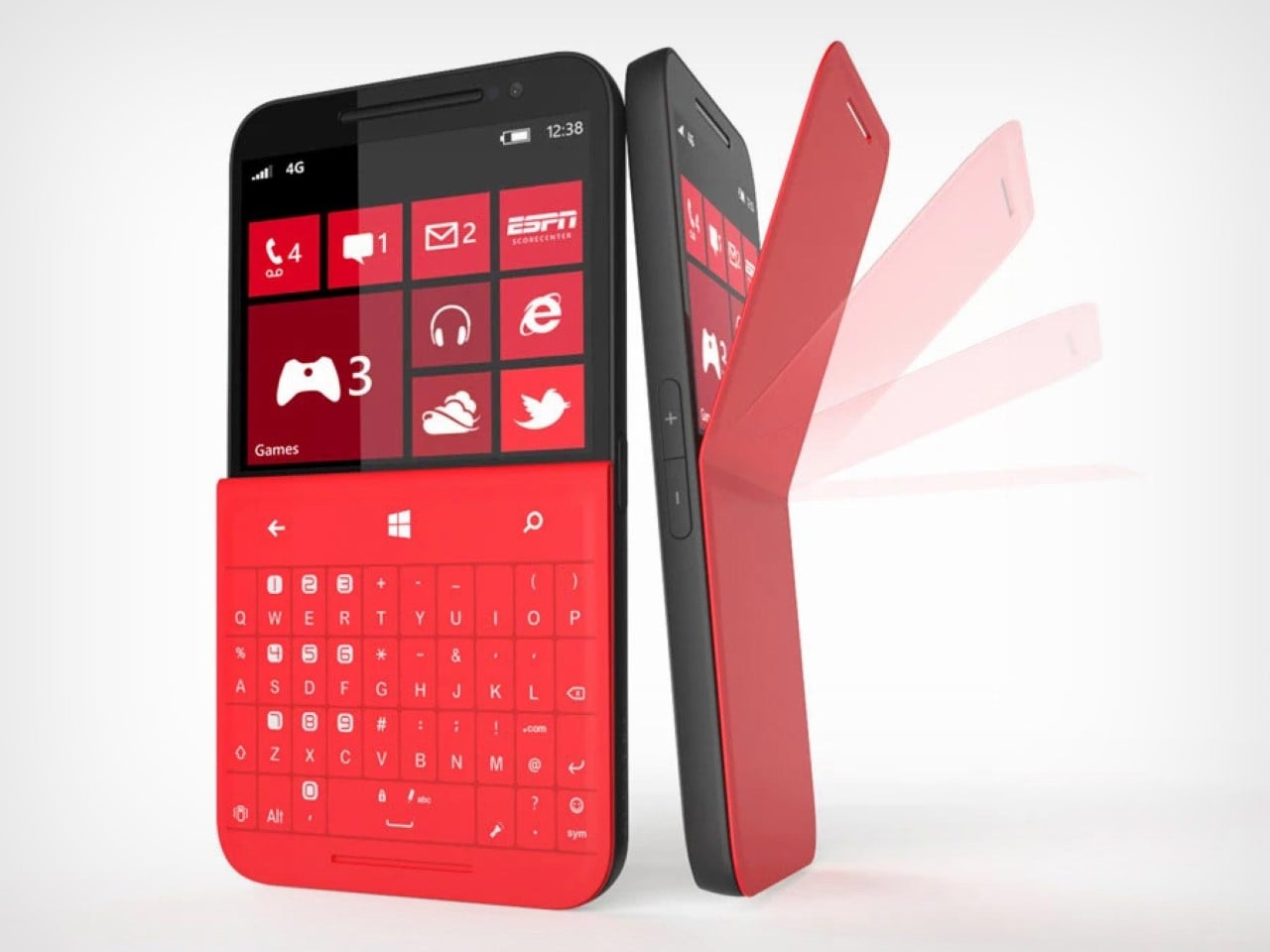
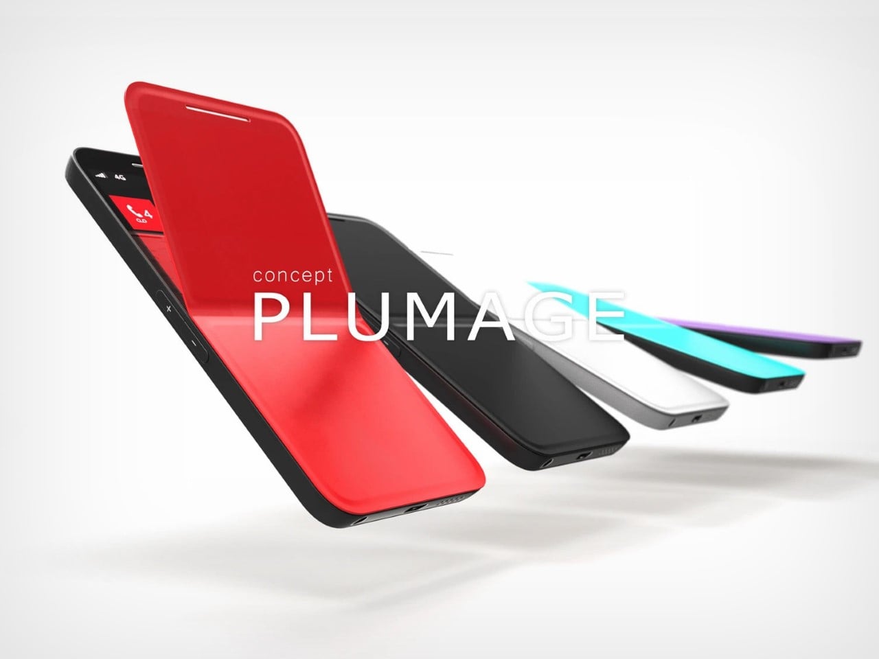
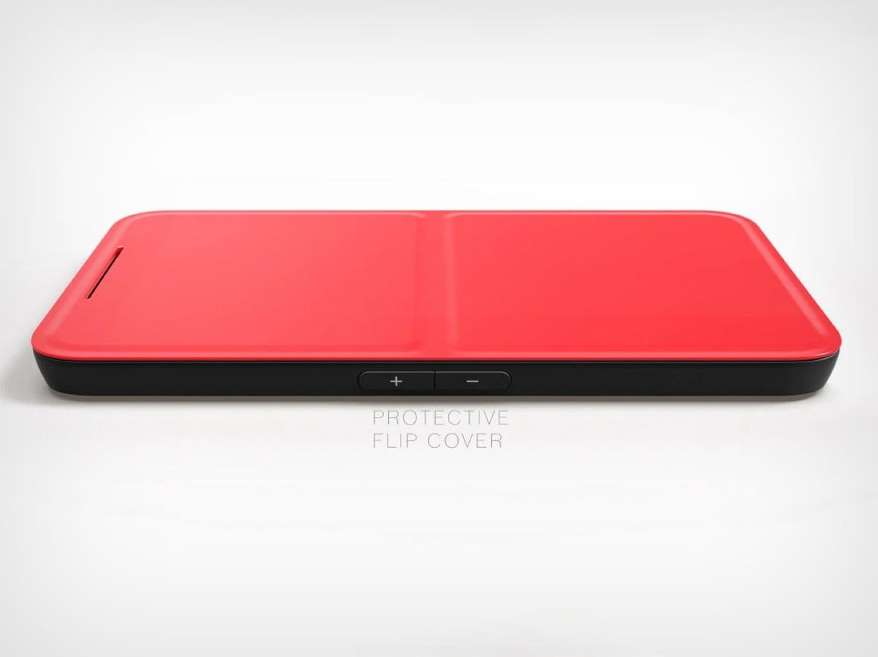
Typing on touchscreens has never felt right, and bolt-on keyboard solutions create phones that resemble small tablets. The Concept Plumage solves both problems by integrating a physical keyboard directly into a phone case without extending the device’s footprint. Originally designed by Jet Weng in 2013, this concept flips open like peeling a banana to reveal a Blackberry-style layout with a screen on top and tactile keys below. The phone stays compact when closed, transforms for serious typing when open.
What makes this design brilliant is its acknowledgment that screens don’t need to cover every inch of our phones. The half-screen approach feels counterintuitive until you realize most typing happens in apps where the keyboard covers half the display anyway. Flip it open for confident typing during emails or messaging, navigate with the touch-sensitive upper screen, then flip it shut for pocket-friendly portability. This concept deserves resurrection because it prioritizes how people actually use their phones over chasing edge-to-edge displays.
What we like
The keyboard integrates without adding bulk to the phone’s footprint
Physical keys enable fast, accurate typing without sacrificing screen real estate when closed
What we dislike
The half-screen design requires adjusting expectations about display size
The flip mechanism could introduce durability concerns with repeated daily use
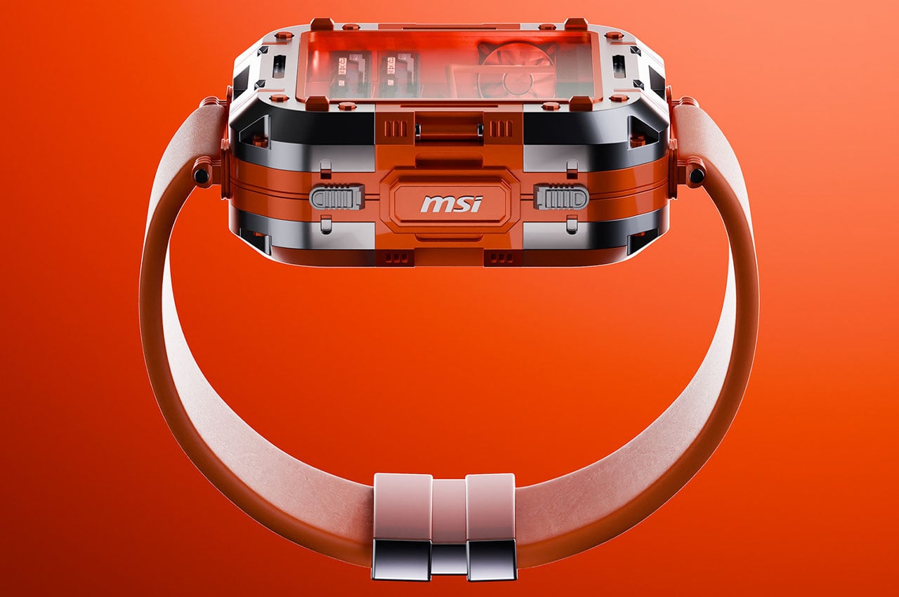
2. MSI Gaming PC Watch: When Wearables Go Full Desktop
Smartwatches pretend to be tiny phones strapped to your wrist, but the MSI Gaming PC Watch takes a radically different approach. This concept treats your wrist as a platform for an actual computer, complete with visible fans, graphics components, cooling systems, and motherboard elements right through the watch face. The design features subtle analog watch hand annotations and four side pushers for navigation. The metal alloy case proudly displays the MSI logo at 3 o’clock, where a traditional crown would sit.
This wearable computer represents a philosophical departure from smartphone-on-your-wrist thinking. By embracing computer periphery ideology rather than mimicking phone interfaces, the Gaming PC Watch suggests an alternative path for wearable innovation. The transparent components aren’t just aesthetic flourishes; they telegraph the device’s identity as genuine computing hardware miniaturized for portability. Whether checking system performance, monitoring temperatures, or simply appreciating the engineering, this watch makes technology itself the main attraction rather than hiding it behind glossy screens.
What we like
The transparent design showcases actual computing components with visual appeal
It reimagines the smartwatch’s purpose beyond smartphone replication
What we dislike
The gaming aesthetic may not suit professional or formal settings
Visible internal components could raise questions about durability and water resistance
3. Nothing Power 1: The Battery Bank That Speaks Through Light
Power banks typically hide their technology behind opaque shells, but the Nothing Power 1 concept revives the glyph interface that made the Nothing Phone famous. This 20,000 mAh battery bank features transparent layers with bold light paths that transform illumination into precise information. Every light on the back panel serves a purpose, indicating battery levels, charging status, and even smartphone notifications when connected. The design language echoes the circuit pathways and physical logic of Nothing’s original phone, maintaining the brand’s commitment to meaningful transparency.
Fast charging at 65W means reaching 50% capacity in under 20 minutes, while the substantial battery capacity delivers at least three phone charges before needing a refill. The glyph interface goes beyond simple battery indication by connecting with your smartphone to display alerts and charging progress through purposeful light patterns. This approach makes waiting for your phone to charge more informative and visually engaging. The design proves that power banks don’t need to be boring rectangular slabs; they can communicate status elegantly while celebrating the technology inside.
What we like
The glyph interface turns light into precise, purposeful information
The 20,000 mAh capacity with 65W fast charging delivers both power and speed
What we dislike
The transparent design may show dirt and fingerprints more readily
The unique aesthetic might not appeal to users who prefer minimal, discreet accessories
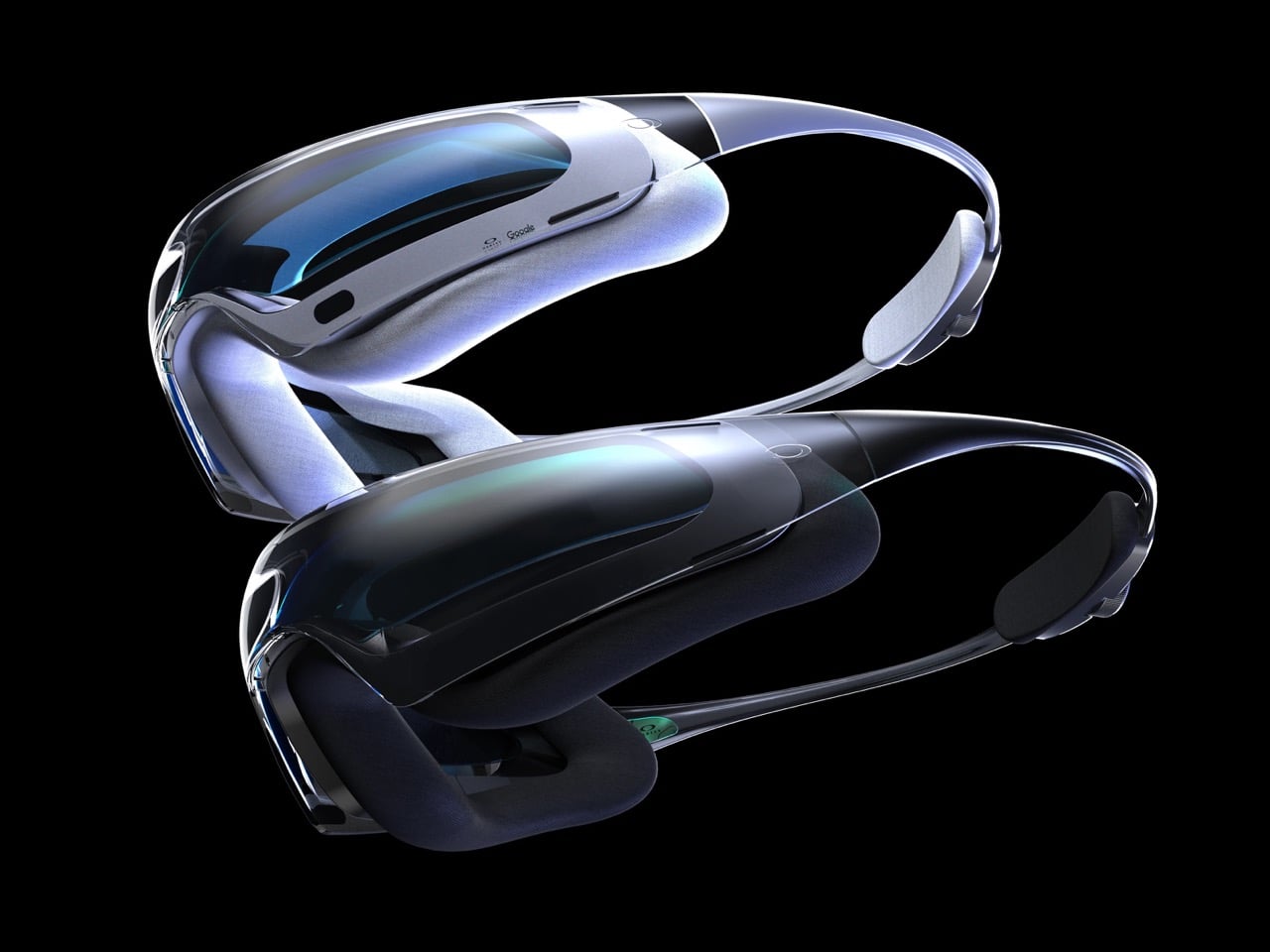
4. Oakley Aether: The AR Glasses Google Should Have Built
Google once led the smart headset space before abandoning it for one-off experiments, but the Oakley Aether concept imagines an alternate timeline where Google remained committed. Modeled after ski goggles, these performance-driven glasses enclose your eyes in a protective bubble with 100% visibility enhanced by Android AR and Gemini AI integration. The design suggests what happens when you combine Oakley’s athletic expertise with Google’s software prowess, creating headsets that reimagine movement, insight, and precision through immersive technology.
The goggle format provides advantages traditional glasses can’t match: full environmental protection, expanded display real estate, and room for cameras, LiDAR, and other sensors essential for convincing AR. Pop them on and view the world through a heads-up display showing contextual information, notifications, and activity recordings for later analysis. Gemini AI integration enables natural conversation with your headset, creating interactions reminiscent of talking to JARVIS in Iron Man. This concept proves that AR glasses don’t need to look like traditional eyewear; embracing the goggle format opens new possibilities for capability and comfort.
What we like
The goggle format allows superior sensor integration and displays real estate
Gemini AI enables natural voice interaction for hands-free control
What we dislike
The ski goggle aesthetic may feel too sporty for everyday urban use
The enclosed design could cause comfort issues during extended wear
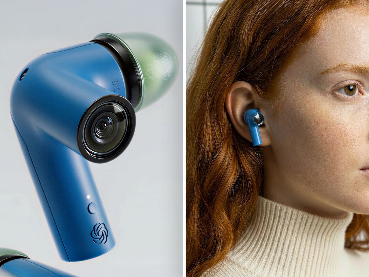
5. TWS ChatGPT Earbuds: AI That Sees What You See
Most wireless earbuds focus exclusively on audio, but this concept adds cameras to each stem, positioned near your natural sight line. Paired with ChatGPT, those lenses become a constant visual feed for an AI assistant living in your ears. The system can read menus, interpret signs, describe scenes, and guide you through unfamiliar cities without requiring you to hold up your phone. The form factor stays familiar while the capabilities feel genuinely new, making AI feel less like a demo and more like a daily habit.
The industrial design resembles a sci-fi inhaler in the best possible way. Each lens sits at the stem’s end like a tiny action camera, surrounded by a ring that doubles as a visual accent. The colored shells and translucent tips keep the aesthetic playful enough to read as audio gear first, camera second. This positioning matters because cameras in your ears feel less invasive than cameras on your face. You maintain eye contact during conversations, avoid the social stigma of face-mounted recording devices, and gain AI vision capabilities that activate only when needed.
What we like
The ear-mounted cameras feel less socially awkward than face-mounted alternatives
ChatGPT integration provides practical AI assistance for navigation and information
What we dislike
Privacy concerns may arise from cameras pointed at people during conversations
Battery life could suffer from powering both audio and visual processing
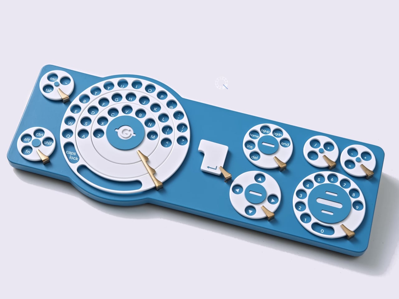
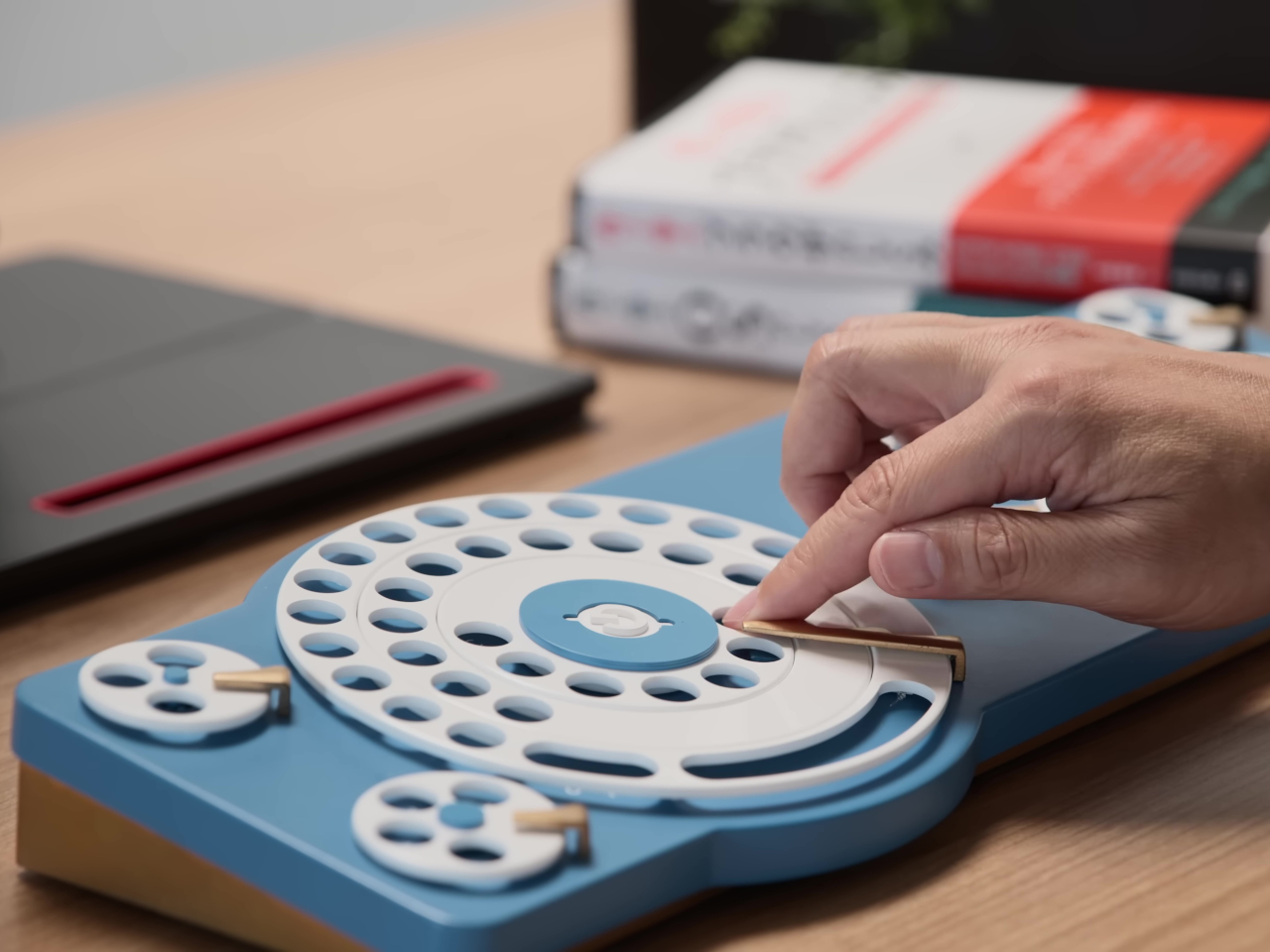
6. Gboard Dial: When Keyboard Design Gets Delightfully Absurd
Google Japan’s annual keyboard concepts embrace playful absurdity, and the Gboard Dial Version spins this tradition in a new direction. Released on October 1st to honor the classic 101-key layout, this 14th entry features a wonderfully over-engineered dial mechanism where users insert fingers into positioned keyholes and rotate to select characters. The three-layer dial structure supposedly delivers three times faster input with parallel operation capability. The nostalgic grinding sound becomes a feature rather than a bug, promoting what the team calls a calmer thinking and input experience.
This satirical concept follows memorable predecessors like the Gboard Teacup, Stick, Hat, and Double-Sided keyboards. While obviously impractical for actual productivity, the Dial Version raises interesting questions about input methods and the assumptions we make about efficiency. The deliberate slowness forces more thoughtful composition, and the physical interaction provides tactile satisfaction missing from touchscreens and flat keyboards. Sometimes the best tech concepts aren’t meant for production; they’re meant to make us reconsider what we’ve accepted as optimal.
What we like
The playful design challenges assumptions about keyboard efficiency and input methods
The tactile interaction provides satisfying physical feedback
What we dislike
The intentionally slow input method makes it impractical for actual work
The three-layer dial mechanism would likely be fragile with regular use
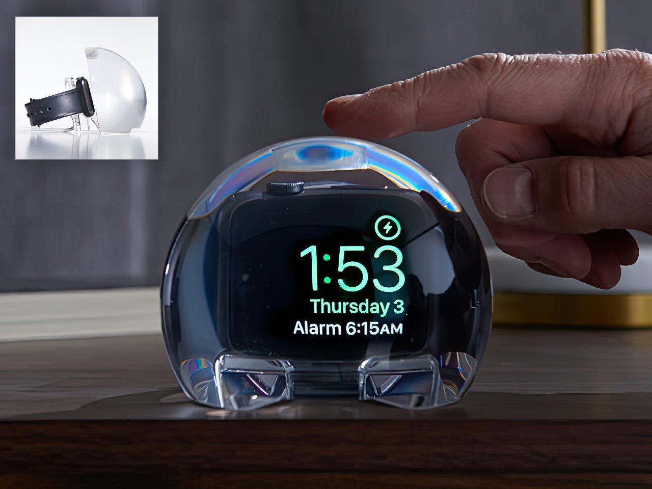
7. NightWatch: The Apple Watch Dock That Does Everything Right
Charging docks for smartwatches typically amount to simple stands with integrated power, but the NightWatch transforms your Apple Watch into a proper bedside alarm clock through clever design. This solid lucite orb magnifies your watch screen, making the time clearly legible from several feet away. Strategic channels under the speaker units amplify sound naturally, similar to cupping your hands around your mouth, ensuring your alarm actually wakes you. The entire transparent sphere is touch-sensitive, allowing a simple tap to wake the watch display.
The brilliance lies in its simplicity. There are no hidden components, no electronic trickery, just thoughtful application of physics and material properties. The lucite magnification works optically, the sound amplification happens through shaped channels, and the touch sensitivity uses the material’s properties. Your Apple Watch docks inside, charges overnight, and becomes infinitely more useful as a bedside timepiece. The transparent design lets you appreciate the watch itself, while the orb form creates an appealing sculptural presence on your nightstand.
What we like
The optical magnification makes the time readable from across the room
Natural sound amplification ensures alarms are actually audible
What we dislike
The large orb form takes up significant nightstand space
The design works exclusively with the Apple Watch, limiting its audience
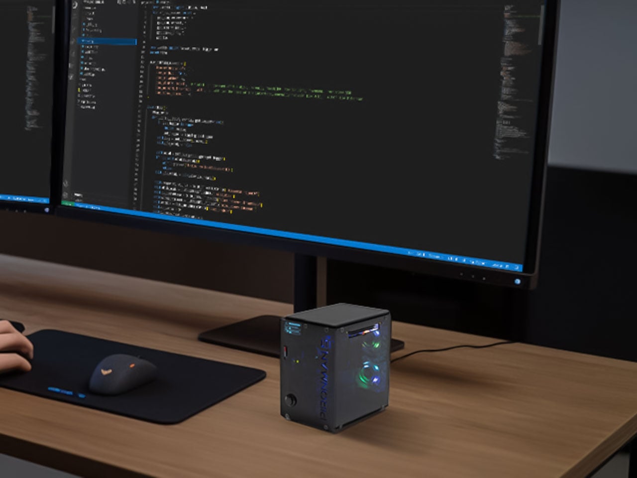
8. Pironman 5-MAX: Turning Raspberry Pi Into a Desktop Powerhouse
The naked Raspberry Pi 5 board looks humble, but the Pironman 5-MAX case transforms it into a legitimate desktop computer packed with serious capabilities. This miniature rig features dual NVMe SSD slots for lightning-fast storage, support for AI accelerators like the Hailo-8L for machine learning workloads, and clever design features that maximize the Pi’s potential. The compact desktop form factor punches well above its weight, proving that mini machines can handle tasks once reserved for full-sized computers.
What makes this case special is how it treats the Raspberry Pi with the seriousness of proper desktop hardware. The dual NVMe support brings storage speeds and capacity that enable media servers, project development, and even AI experimentation within this tiny chassis. Adding AI acceleration capabilities means your Pi 5 can tackle machine learning tasks, opening possibilities that seemed absurd for single-board computers just years ago. This case doesn’t just protect your Pi; it unlocks its full potential as a capable, expandable desktop machine.
What we like
Dual NVMe SSD slots deliver professional-grade storage speed and capacity
Support for AI accelerators enables machine learning on a compact platform
What we dislike
The added hardware increases the overall cost beyond the base Pi 5 investment
The compact form factor may limit cooling efficiency under sustained heavy loads
The Vetra Orbit One concept smartwatch steps away from attention-grabbing screens toward satisfying physical interaction blended with forward-thinking features. Imagine a rotating bezel providing nuanced control, textured surfaces offering rich sensory feedback, and design elements evoking classic timepiece pleasure. This approach integrates the satisfying feel of traditional watchmaking into modern smart technology without simply replicating the past. The minimalist aesthetics reject overwhelming visual noise in favor of clean lines, subtle details, and essential information presentation.
This philosophy prioritizes clarity and elegance, ensuring the watch functions as a sophisticated accessory rather than a distracting wrist billboard. The tactile nostalgia isn’t about rejecting progress; it’s about preserving what made traditional watches satisfying to wear and use. The concept combines physical interaction satisfaction with smart capabilities, creating a device that feels good to touch and operate. When every smartwatch chases more screen space and brighter displays, the Orbit One suggests that sometimes less really is more.
What we like
The tactile interface provides satisfying physical interaction, missing from touchscreen-only devices
Minimalist aesthetics create an elegant, unobtrusive accessory
What we dislike
Limited screen space may restrict app functionality compared to larger smartwatches
The focus on physical controls could slow certain interactions requiring screen input
10. OrigamiSwift: The Folding Mouse That Fits Anywhere
Most portable mice compromise on either size or comfort, but OrigamiSwift solves this dilemma through an origami-inspired folding design. This Bluetooth mouse delivers full-sized comfort and precision when deployed, then folds completely flat to slip into any bag or pocket. The transformation happens in under 0.5 seconds with a simple flip, instantly activating the device for use. At just 40 grams with an ultra-thin profile, it’s barely noticeable until you need it, making it ideal for digital nomads, frequent travelers, and anyone who works from multiple locations.
The triangular origami structure provides surprising durability despite its folding nature, maintaining shape through repeated daily use. Soft-click buttons and smooth gliding work across various surfaces for responsive, discreet operation. The USB-C rechargeable battery lasts up to three months per charge, eliminating disposable battery waste. Designed by Horace Lam, OrigamiSwift reflects the harmony between artistry and practicality, where intricate folds echo timeless elegance while sleek lines embody modern minimalism. This mouse becomes more than a tool; it’s a statement about refined portable tech.
The folding design offers full-sized comfort that collapses to pocket-portable dimensions
Three-month battery life provides long-term reliability between charges
What we dislike
The folding mechanism introduces potential durability concerns with intensive daily use
The origami-inspired form may not suit users who prefer traditional mouse shapes
The Future Feels Different This Year
These ten innovations share a common thread beyond their 2025 release timing. Each one questions assumptions we’ve made about how technology should look, feel, and function. They prove that innovation doesn’t always mean adding more features or making screens larger. Sometimes the most exciting advances come from designers willing to completely rethink categories we thought were settled.
What excites me most about these gadgets is their willingness to be different. They embrace tactile feedback when everyone else chases touchscreens, add cameras to earbuds while others focus solely on audio, and turn power banks into communication devices through light. These products suggest that the next decade of technology will be defined less by raw specifications and more by thoughtful design that genuinely improves daily experience. That’s a future worth getting excited about.
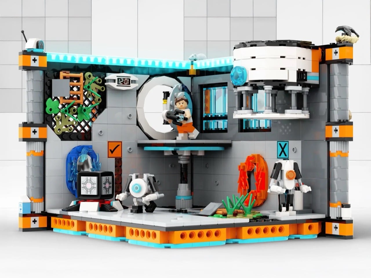
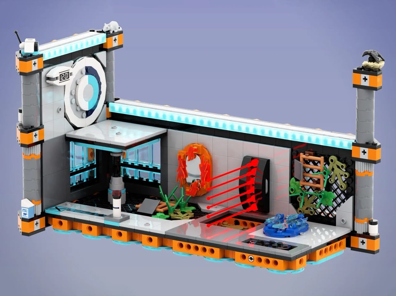
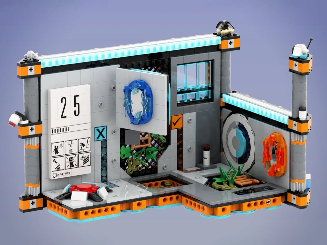
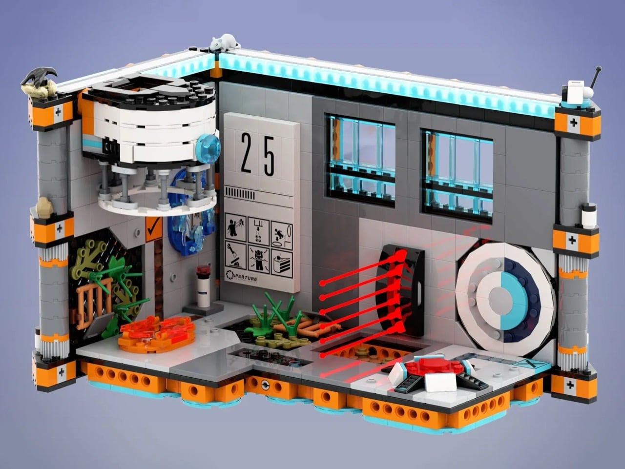
The Portal franchise has earned its place in gaming history through ingenious puzzle design, dark humor, and an aesthetic so iconic that a simple orange and blue color scheme instantly evokes the Aperture Science testing facility. Now, LEGO builder KaijuBuilds has translated that sterile-yet-sinister world into brick form with the Portal 2: Test Chamber Creator, a project currently seeking support on LEGO Ideas.
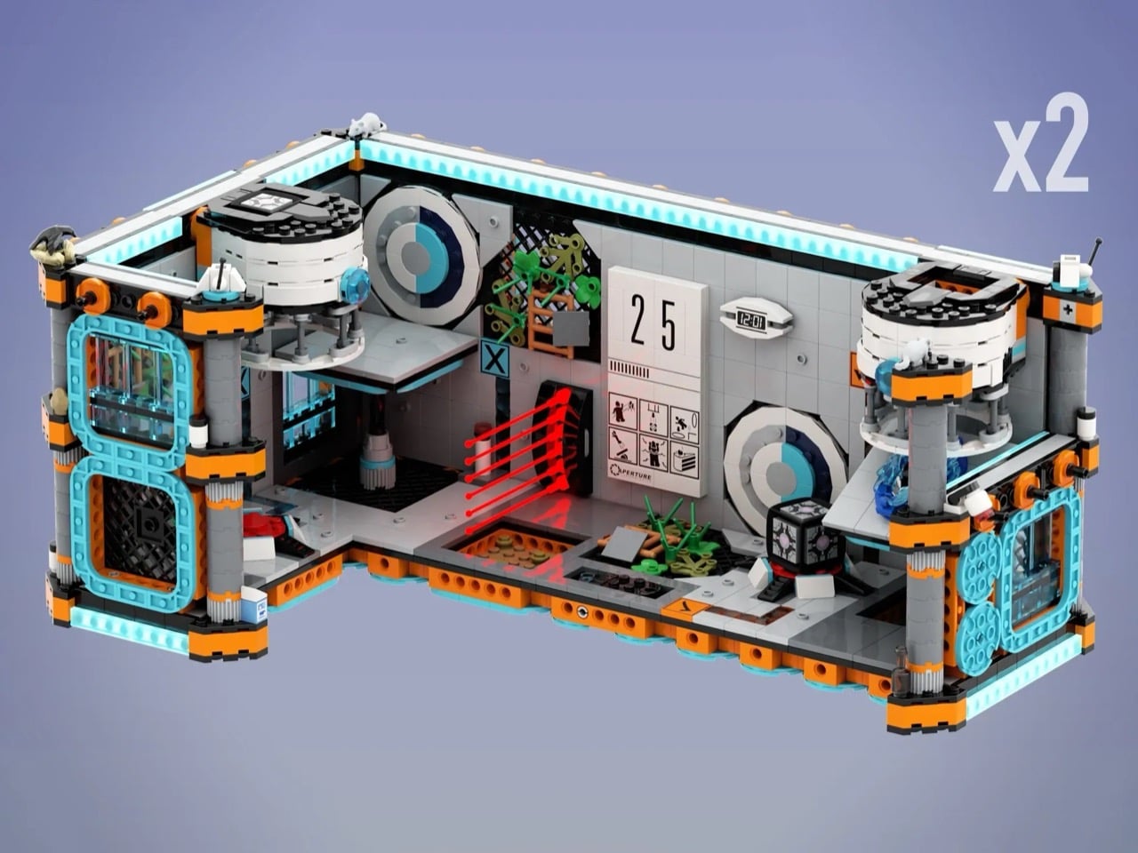
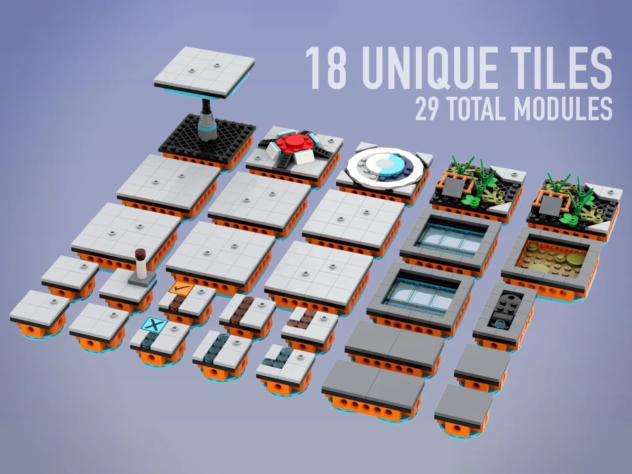
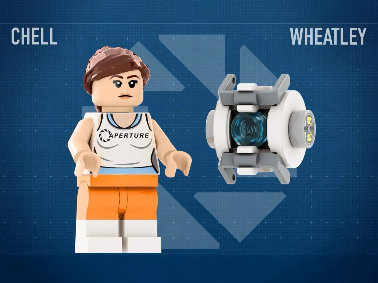
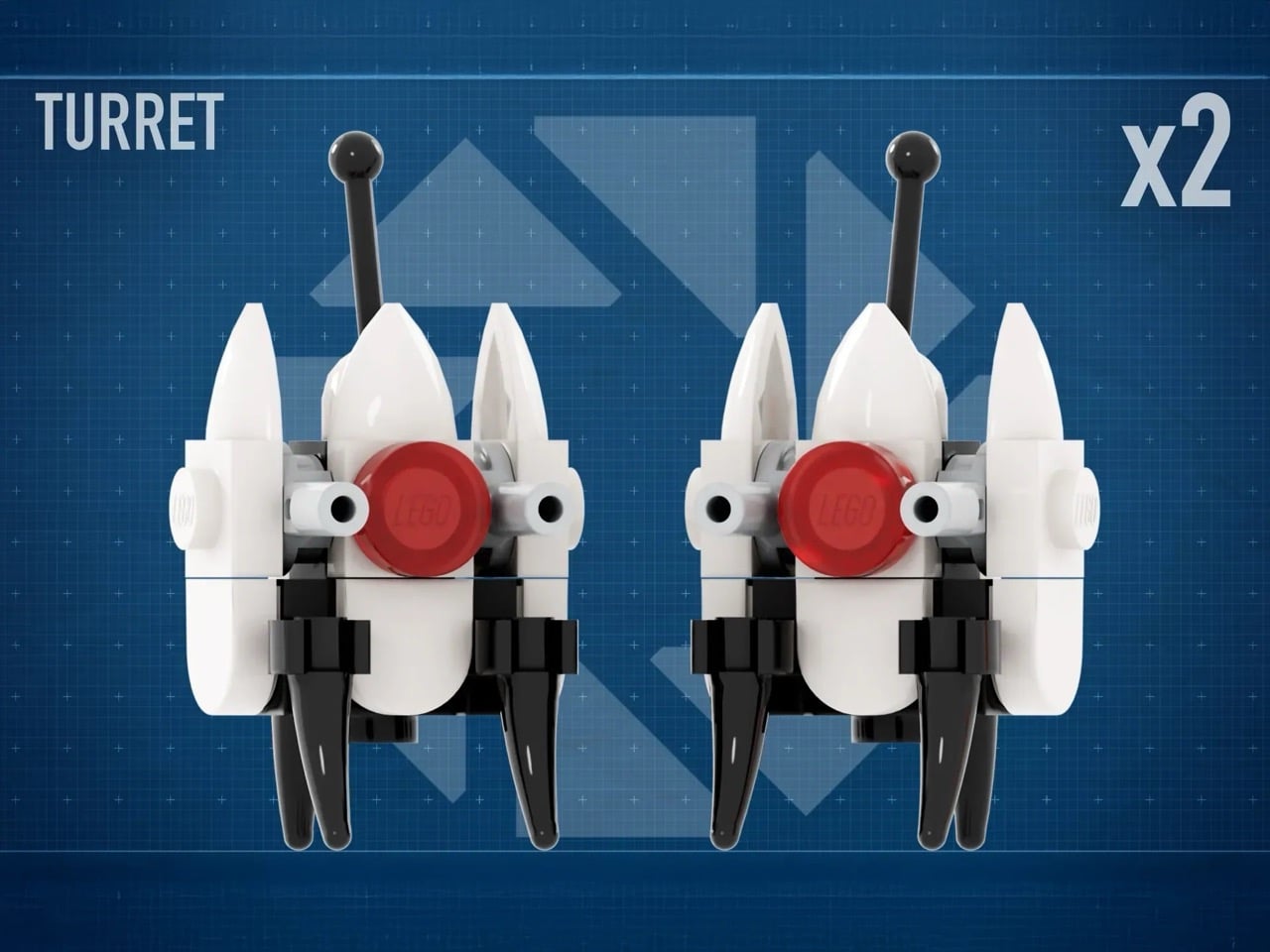
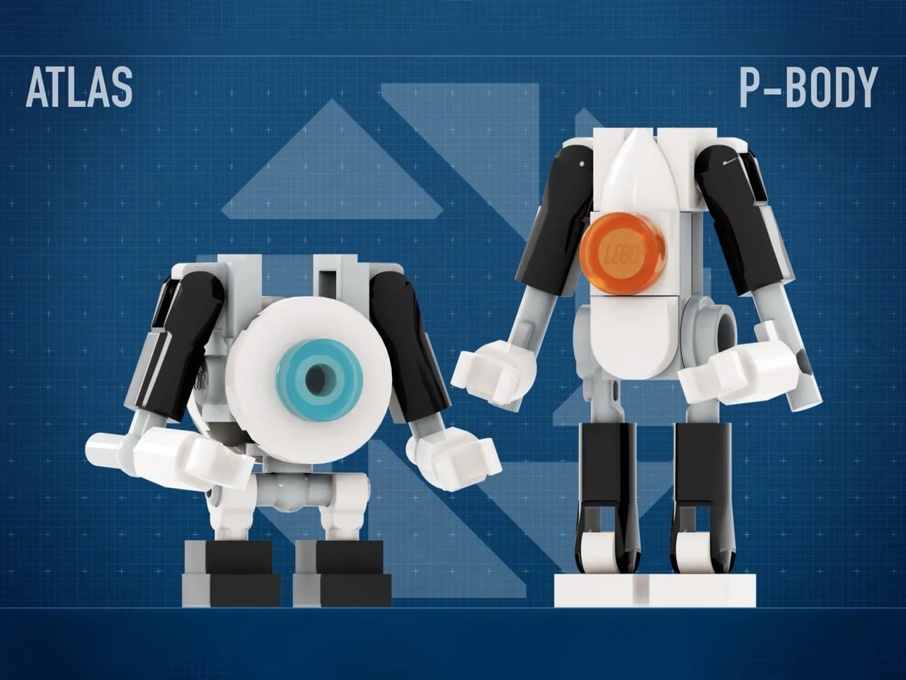
The set features a sophisticated modular tile system with 18 unique configurations across 29 total modules, allowing builders to reconstruct famous test chambers or design entirely new challenges. With around 1,280 pieces, the build includes Chell, Wheatley, Atlas, P-body, turrets, portals, a Companion Cube, and even that infamous cake. The attention to detail extends to overgrown tiles that reference Portal 2’s decayed facility sections, complete with a white rat as a nod to the mysterious Rattman. The modular approach mirrors the in-game test chamber editor, which means you can actually play with spatial configurations rather than building a single frozen scene.
Designer: KaijuBuilds
The Aperture Science facility aesthetic translates surprisingly well to LEGO’s design language because both share a love of modular systems and clean geometric forms. Portal works on minimalist white panels, colored power conduits, and spatial reasoning. This build captures that by making reconfigurability the core feature. Tiles come in different sizes (8×8, 4×4, 4×8) and snap onto an orange base with visible connection points. Some tiles show pristine testing surfaces while others feature vegetation breaking through panels, directly referencing Portal 2’s narrative about a facility decaying over decades. The observation windows sit where GLaDOS would watch test subjects fail, and those structural details do heavy lifting in establishing atmosphere.
The character roster features all the iconic beings and bots and whatnots. Chell appears in her orange jumpsuit with the Aperture Science tank top. Wheatley exists as a buildable personality core with his blue eye. Atlas and P-body (the co-op robots from Portal 2) demonstrate awareness that the franchise extends beyond Chell’s story. The turrets manage to look simultaneously adorable and threatening with their white chassis, red sensors, and antenna stems. Two portal pieces come in translucent orange and blue, likely using curved or printed elements to create those characteristic oval shapes. The portal gun sits in Chell’s hands, completing the loadout any fan would expect.
Those 18 unique tile types across 29 modules provide enough variety to build compact chambers or combine everything into larger, more complex puzzles. Some tiles feature orange and blue power line conduits that connect mechanisms in the actual game. Dark grey tiles break up monotonous white surfaces. Button tiles, overgrown sections, observation windows, and the Heavy Duty Super-Colliding Super Button all serve gameplay purposes Portal fans recognize immediately. The structure uses long and short connectors with technic pins and 2L axles to hold everything together, which should make reconfiguration reasonably straightforward without constant collapse during redesign sessions. The orange base with its studded connection points does the critical work of making the whole modular system functional rather than theoretical.
The functional elements push this past display territory into actual play value. The Companion Cube dropper holds and releases cubes, mimicking those ceiling-mounted dispensers from the game. The aerial faith plate triggers manually to launch minifigures upward. A tilting elevated platform angles in different directions for variable chamber layouts. The door swings open for chamber entrances and exits. These mechanisms aren’t revolutionary in LEGO terms, but they’re deployed strategically to recreate specific Portal gameplay moments. The laser grid uses red transparent pieces across a 3×6 area. It won’t vaporize minifigs, but it provides the visual language of hazards you’d design chambers around. The deadly goo gets two 8×8 tiles in translucent orange, which is the correct color unlike some fan builds that use green acid from generic video game conventions.
There’s even a cake hidden somewhere because at this point it’s mandatory for Portal merchandise. The cultural penetration of “the cake is a lie” has been both blessing and curse for the franchise, but you can’t release Portal LEGO without acknowledging it. The white rat perched on structural pillars references Doug Rattmann, the Aperture scientist who left cryptic murals throughout the facility. That’s a deeper cut than casual fans would catch. The test chamber sign displays “25” along with hazard pictograms, grounding the build in Aperture Science’s obsessive signage culture. The facility loved warning test subjects about dangers they couldn’t avoid. Small crows appear on the pillars too, adding those environmental details that make the difference between a good build and one that captures a world.
Portal maintains relevance fifteen years after its 2007 release through memorable writing, innovative mechanics, and an aesthetic that spawned endless memes. GLaDOS remains one of gaming’s most iconic antagonists. “Still Alive” transcended the game to become a cultural touchstone. The orange and blue portal color scheme is instantly recognizable across demographics. Portal 2 expanded the universe in 2011 with co-op gameplay, more complex puzzles, and deeper lore about Aperture Science’s history. The games influenced puzzle design across the industry and demonstrated that shorter, tightly designed experiences could compete with sprawling open-world titles. That legacy makes Portal a strong candidate for LEGO treatment, especially given LEGO’s existing relationship with video game properties and Valve’s general receptiveness to licensed products.
LEGO Ideas operates as a platform where fans submit designs for potential official sets. Projects reaching 10,000 supporters enter review, where LEGO evaluates production feasibility, licensing complexity, and market viability. The Portal 2: Test Chamber Creator sits at roughly 1,700 supporters with 543 days remaining. Voting requires a free LEGO Ideas account and takes about thirty seconds (you can cast your vote here). Reaching 10,000 votes doesn’t guarantee production since LEGO considers factors beyond popularity (licensing negotiations with Valve, manufacturing costs, retail strategy), but fan support gets projects in front of decision-makers. LEGO has produced gaming sets before, from Minecraft to various Nintendo properties. Portal’s enduring cultural presence and Valve’s track record with merchandise partnerships suggest this build has legitimate production potential if it clears the voting threshold.
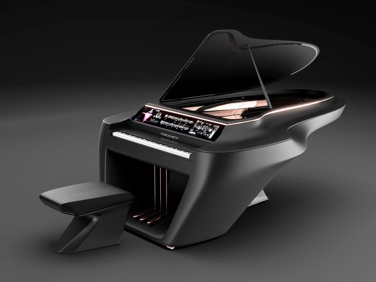
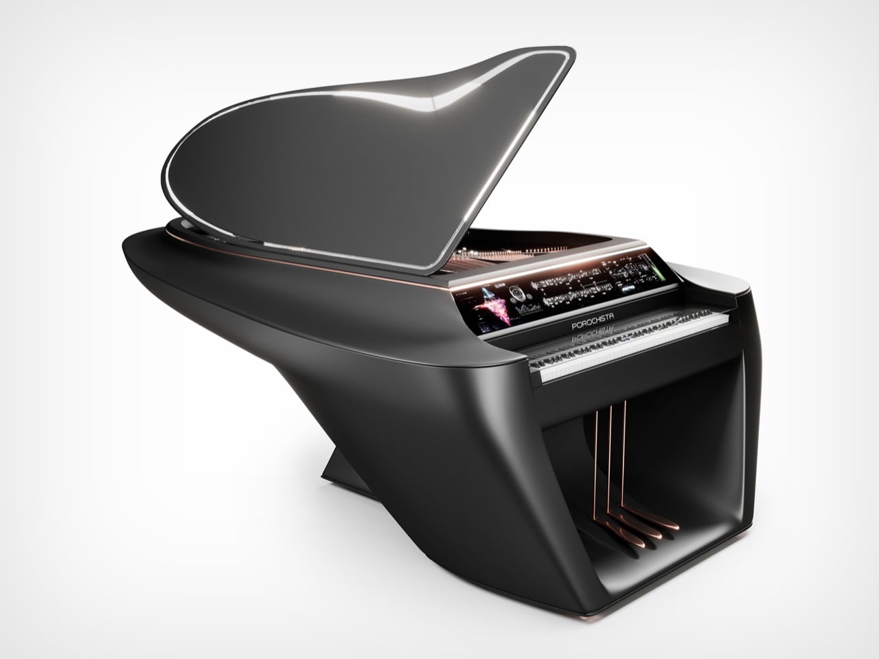
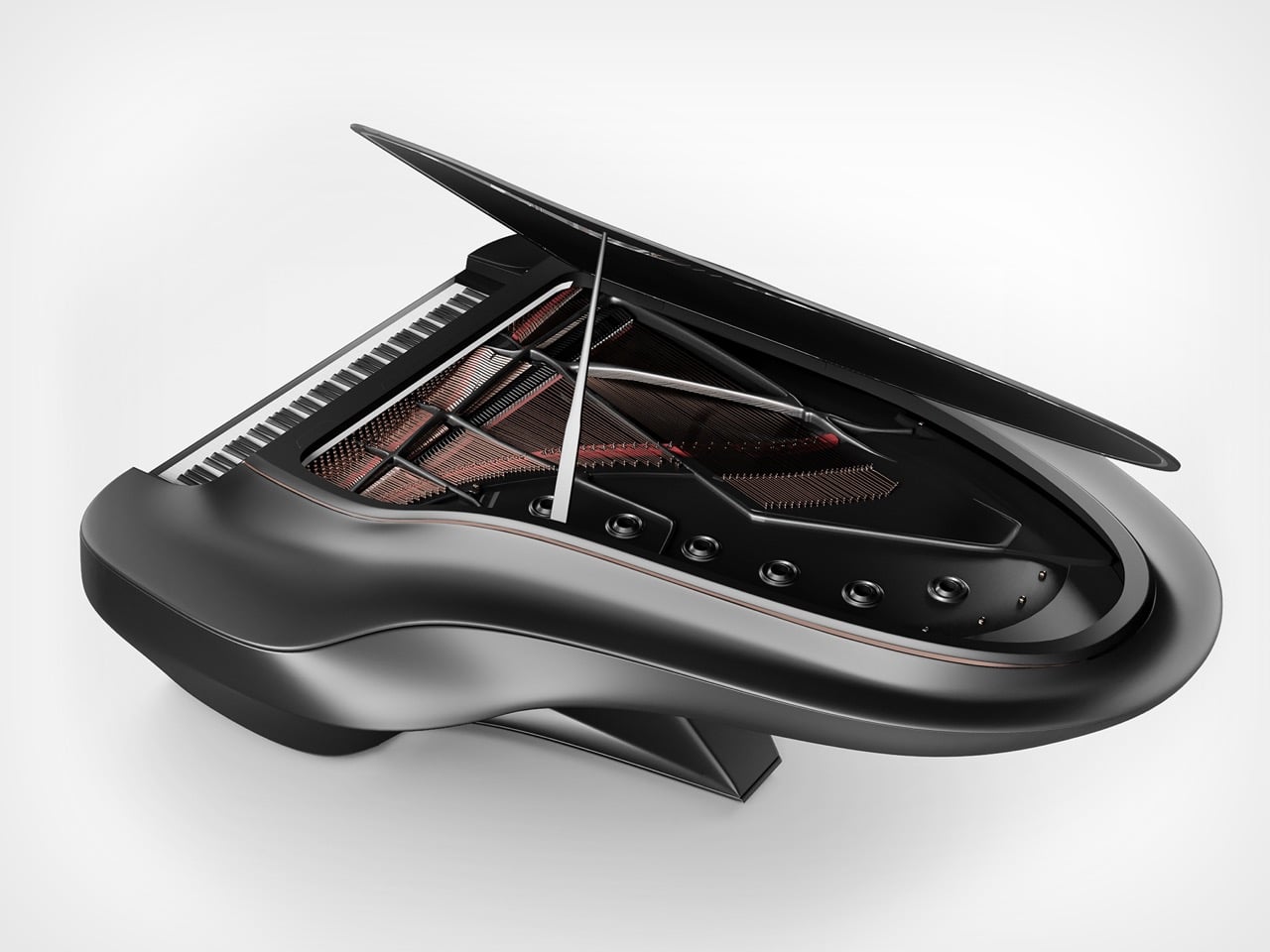
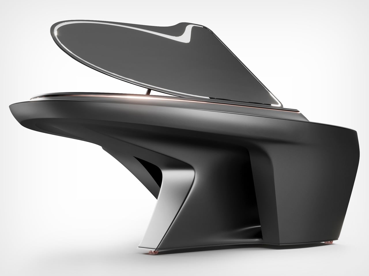
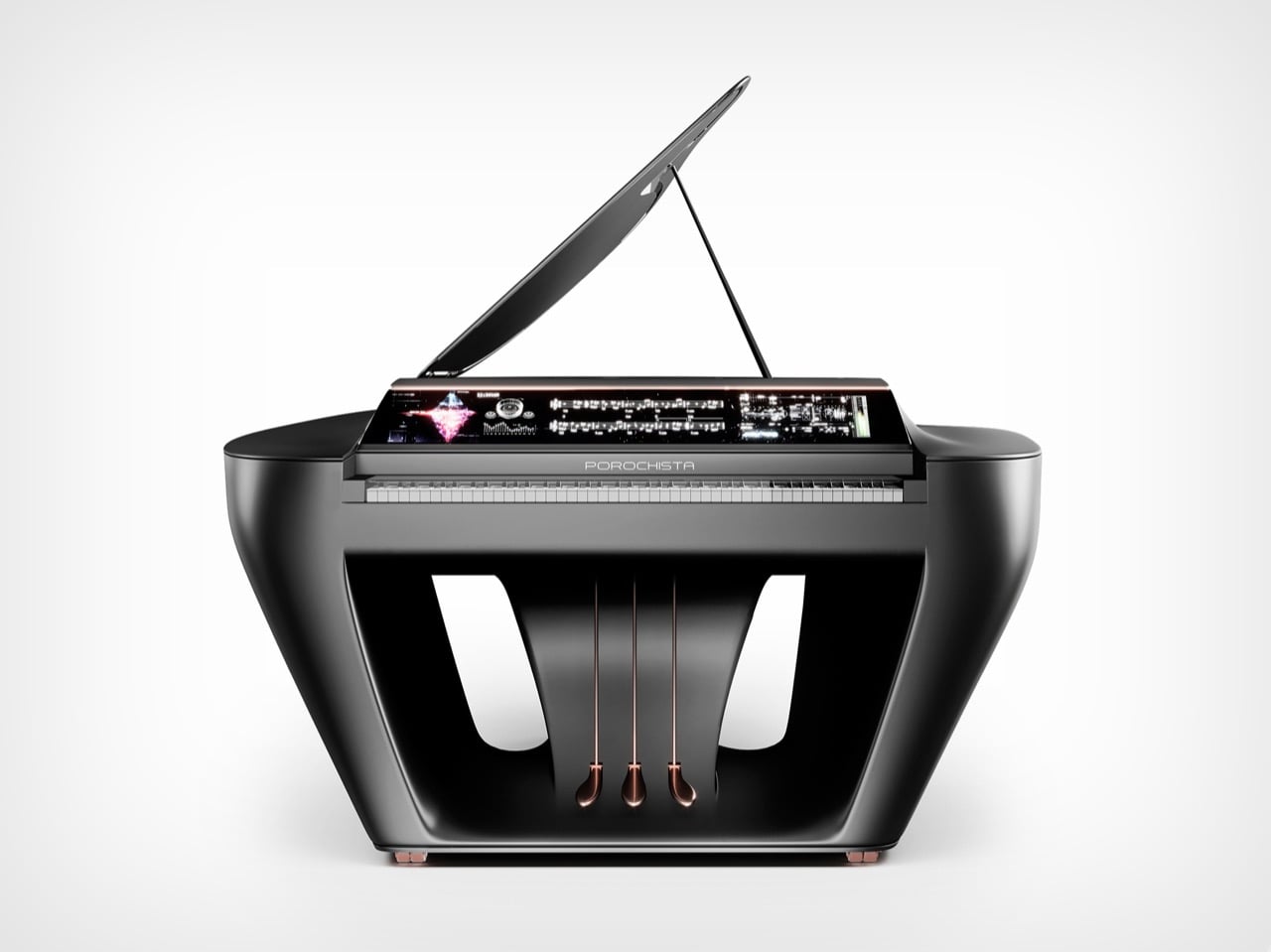
The grand piano has remained visually unchanged for generations, its familiar silhouette a fixture in concert halls and living rooms worldwide. Mohammad Limucci saw this consistency differently. Rather than accepting the traditional form as immutable, he recognized an opportunity to evolve the instrument’s aesthetic while preserving its acoustic soul. His creation, the Porochista Piano, applies automotive design principles to classical craftsmanship.
Measuring 8.7 by 6.2 feet, Porochista combines glass, metal, and matte black composites in flowing organic shapes reminiscent of Luigi Colani’s biomorphic philosophy. The rear section appears to float, creating visual tension between sculptural ambition and structural stability. A large integrated touchscreen offers digital functionality without compromising the acoustic purity professional pianists demand. This fusion of old and new earned recognition at the A’ Design Award, where judges appreciated its ability to attract modern design enthusiasts while respecting the instrument’s heritage. Porochista suggests what tradition might become when filtered through contemporary vision.
Designer: Mohammad Limucci
Designers slap touchscreens onto everything from refrigerators to bathroom mirrors these days, usually with results that make you question basic decision-making processes. A grand piano sporting what looks like a 20-inch display sounds like exactly that kind of misguided thinking. But Limucci clearly studied how supercar manufacturers like Pagani and Koenigsegg integrate function into form, where every curve serves both aerodynamic purpose and visual drama. That swept-back lid with its silver trim could’ve been lifted from a hypercar’s active aero system. The base, with its angular cutouts and geometric voids, solves the eternal design problem of making something massive feel light without actually compromising structural integrity. The solution here involves actual engineering rather than visual tricks.
The Colani influence runs deep, and anyone familiar with the German designer’s work will spot it immediately. Those seamless transitions between surfaces, the way hard edges soften into organic curves, the sense that this object could achieve flight velocity if you just gave it a runway. Colani designed everything from trucks to cameras using the same biomorphic language, always asking why objects should have corners when nature abhors them. Limucci applies that thinking to an instrument that’s been geometrically rigid since the 1700s. Production apparently requires CNC machining and molding techniques borrowed from automotive manufacturing, which makes sense given the compound curves involved. You can’t slap veneer on particleboard and achieve forms like these.
The touchscreen integration could’ve gone full sci-fi nightmare, all glowing edges and pulsing LEDs, but instead it sits flush and purposeful. The digital features (recording, playback, animated notation display) address actual pianist needs rather than adding gimmicks for marketing bullet points. There’s even a hidden compartment up top that slides out to hold sheet music, activated by touching a specific spot. That level of detail suggests someone actually thought about how musicians interact with their instruments over hours of practice, not just how the thing photographs for Instagram. The matte black finish with those copper-toned pedal details visible through the base cutouts gives it presence without screaming for attention, which is harder to achieve than it sounds.
Tehran to Zagreb doesn’t seem like an obvious design pipeline, but apparently that’s where this concept gestated. Whether it ever reaches production remains the question nobody’s answering yet, though the A’ Design Award recognition certainly helps with credibility. The manufacturing complexity alone suggests this won’t be competing with Yamahas at your local music store. Still, seeing someone finally treat piano design with the same innovative energy that automotive and consumer electronics enjoy feels overdue. Professional musicians deserve instruments that fit contemporary spaces without looking like props from period dramas.
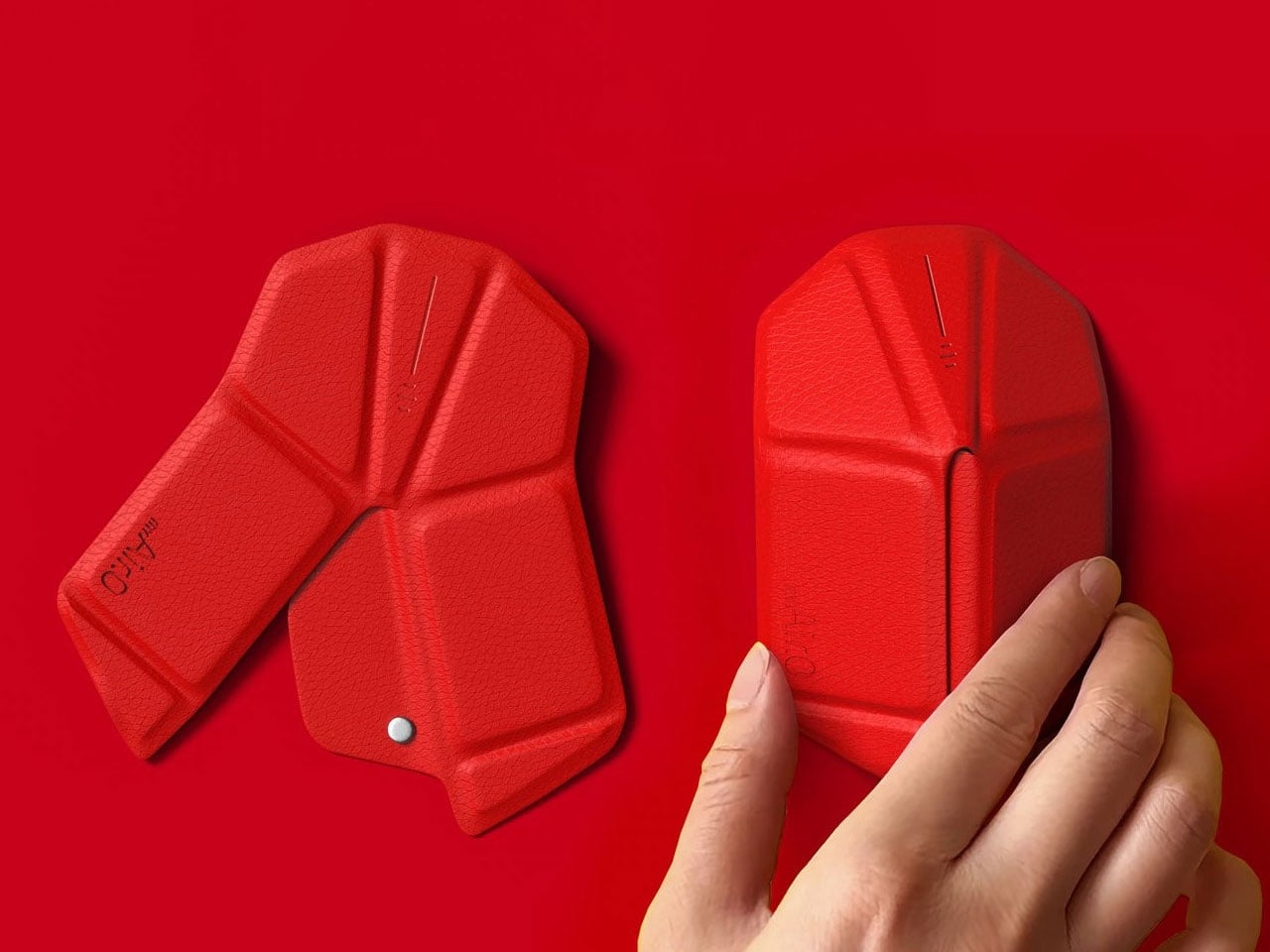
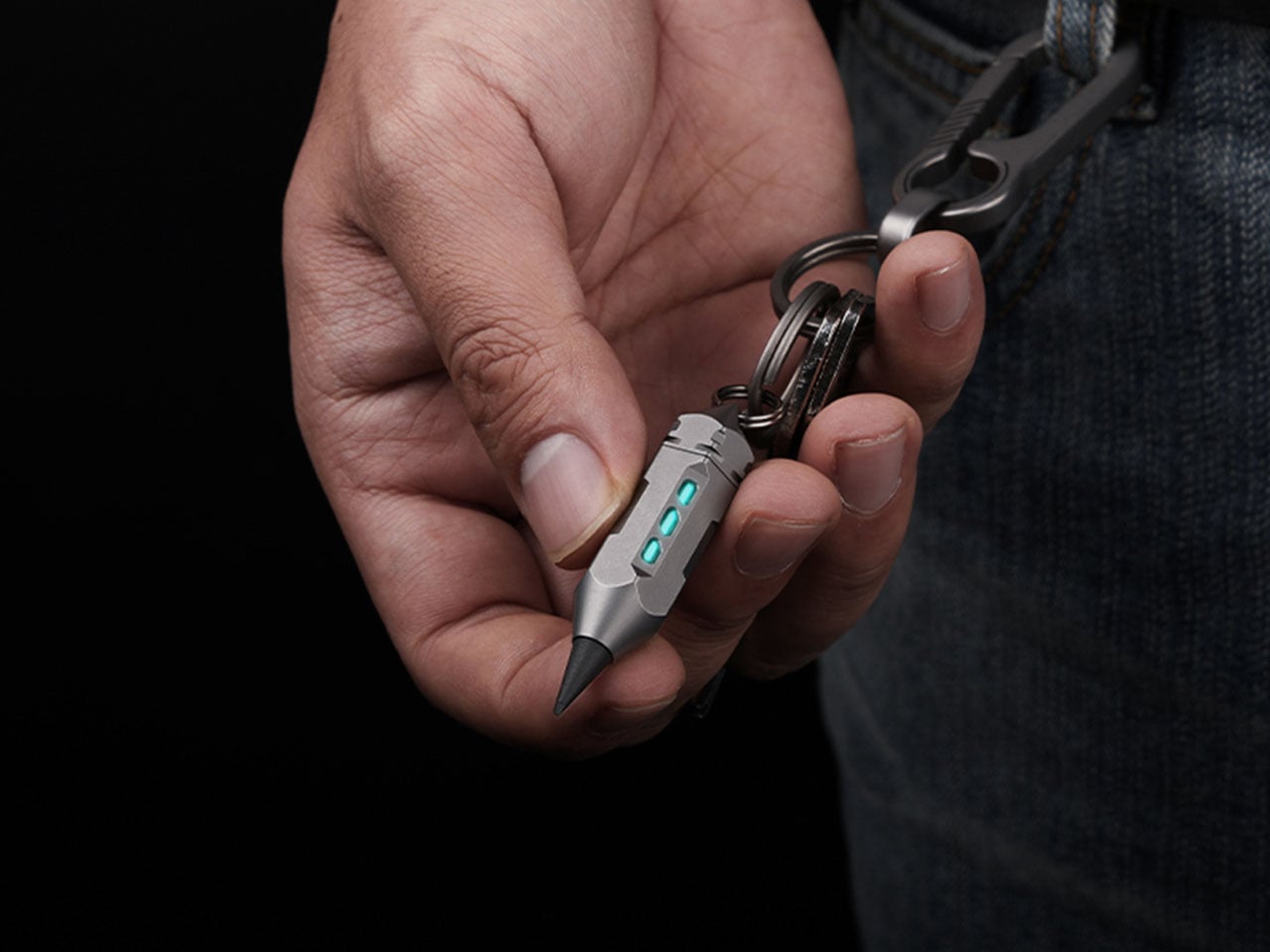
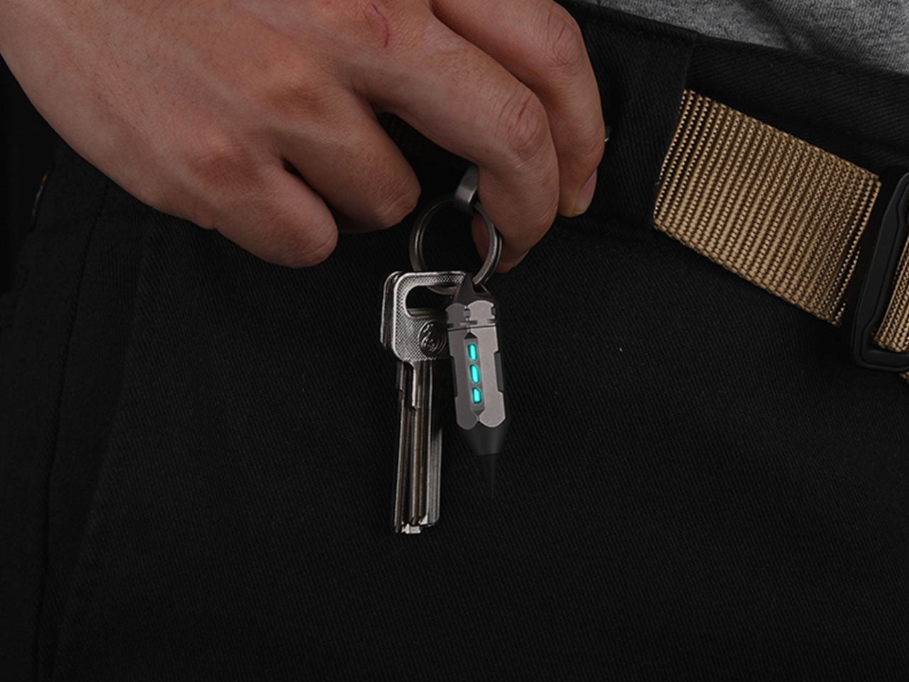
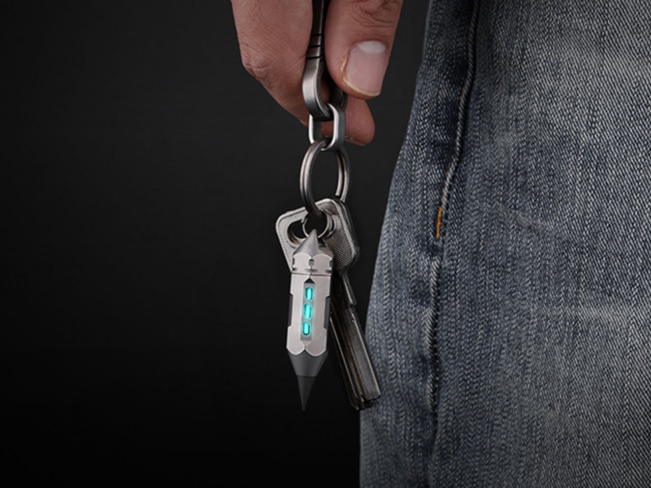
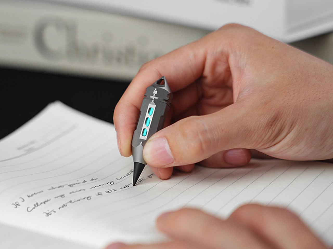
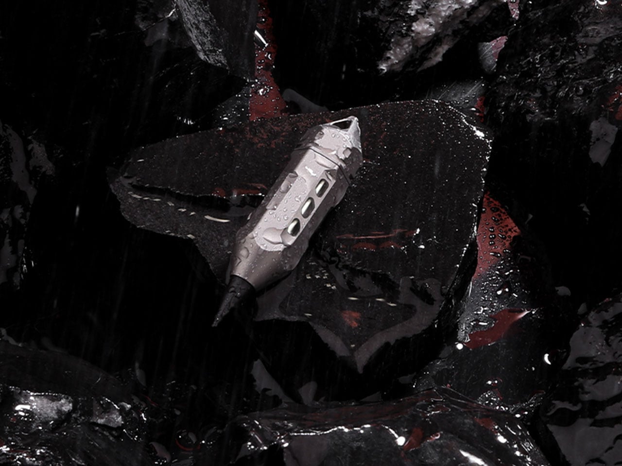
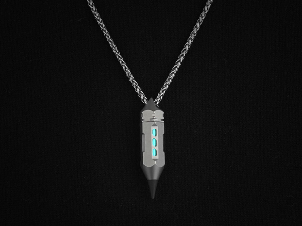
An everyday carry tool, colloquially EDC, is only useful and actually worth its weight in gold when the device is built to be convenient to carry and use. The Dark Fire 2.0 is easily the most apt to the idea. It is a pendent, a key chain, or a clip slightly more than the size of a coin, but versatile enough to put many more detailed, hefty and space-consuming EDCs to shame, which are yet to do half the tasks the Dark Fire’s second version is designed to fulfil.
MeTool, the team of creators behind the multitool, have designed the new pendant EDC based on the predecessor, which was a similar tool but with lesser versatility and a go-getter attitude. The idea of this concealed but useful device stands out primarily for two reasons: the tool remains unnoticed until the exact moment you need it, and when you do, it can transition from a simple pendant into four different tools including a pen, screw driver, prier, and a glow light.
Whether you want to mark out a window in the floor plan, tighten a screw you notice falling off your laptop, or want to flip open a can at the camp; the Dark Fire 2.0 has you covered. At the time of writing, it is not a full-fledged product, but it is seeking crowdfunding support to go out there and make a difference in the lives of those who need a dependable but compact tool for their liking.
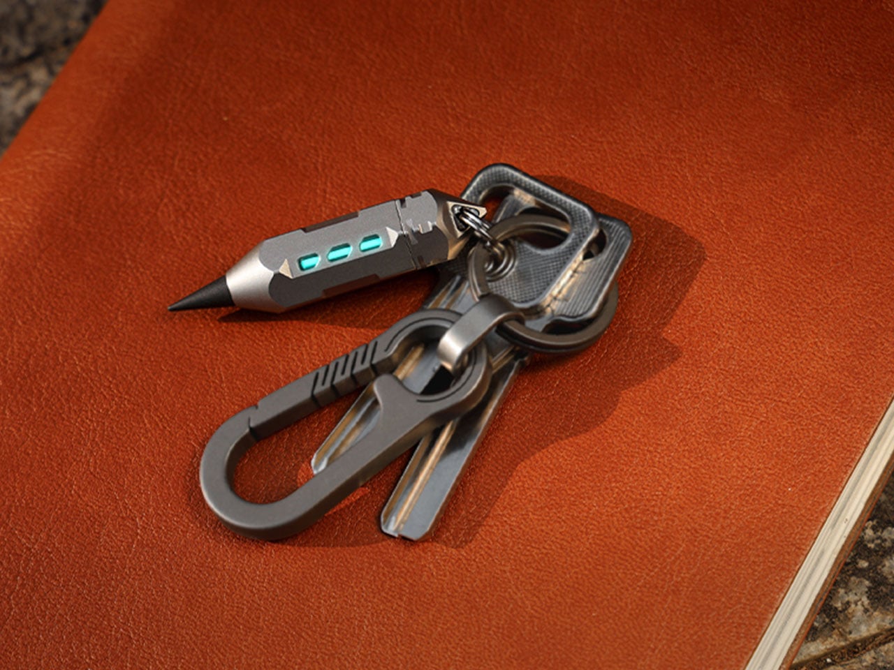
To that accord, MeTool has packed functionality into the pendant-sized EDC. It is made from a solid one-piece of precision-machined titanium and features an interesting rotary quick-release structure with tritium slots. The Dark Fire 2.0 body when twisted, opens up to reveal its true worth which is more than a pendant. Inside its 4 mm bit storage cavity hides a screw driver, a pry bar and a pen tip. And when the quick-release top is twisted, you can install the pen tip or replace it with the screw driver and get the work done instantaneously.
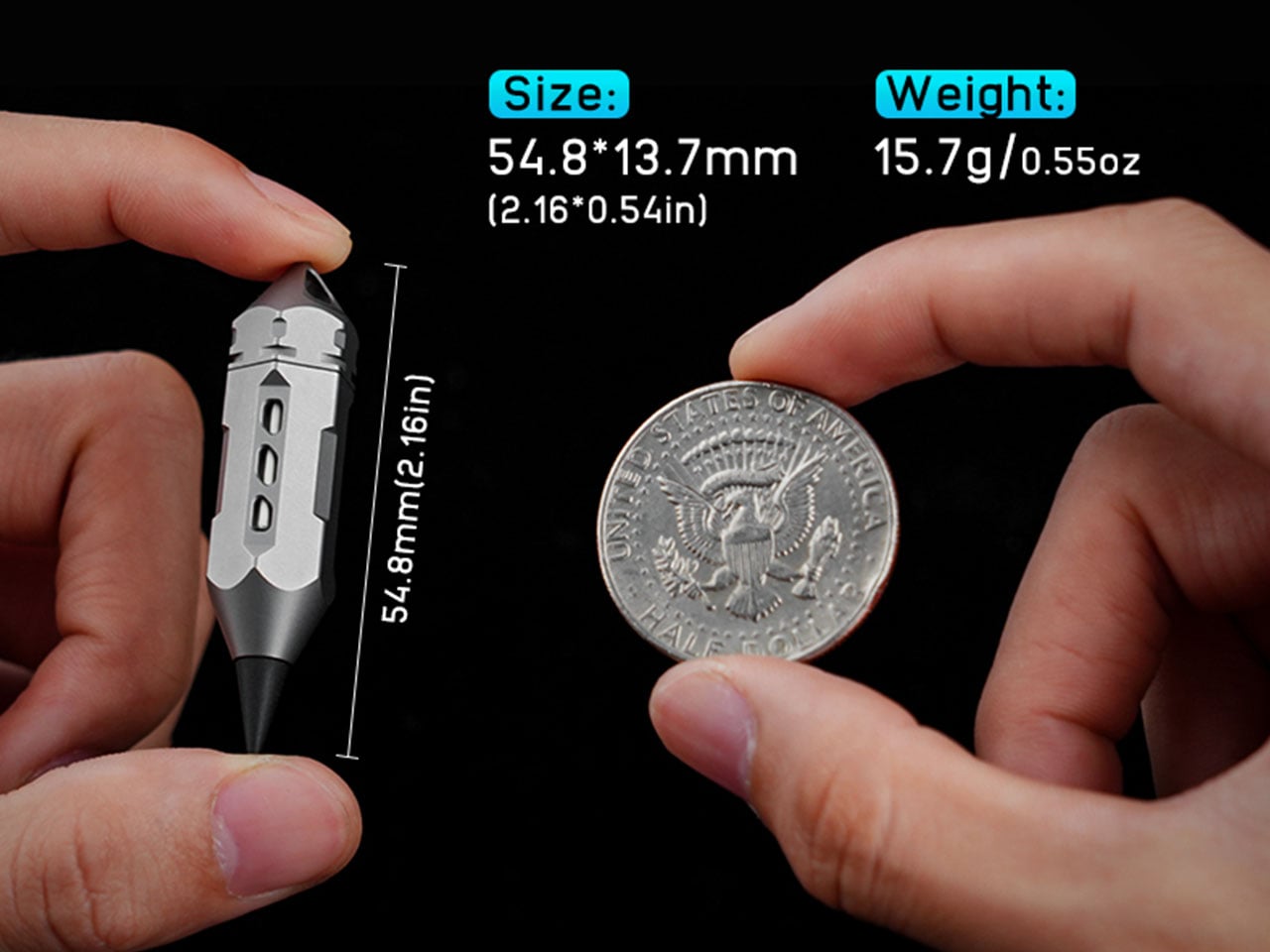
Besides, the EDC is a titanium glow multitool. It measures 2.16 × 0.54-inches, weighs only 0.55 oz, and features a built-in light in the portable pendant design. The light, instead of residing within a glass tube – as in the Dark Fire 1.0 – is packed in a titanium hollow window which shields its against shattering, yet provides a clear sight for soft glow. The tube also features a floating shock-absorbing mount comprising dual rubber end-balls and an internal O-ring for protection against bumps and drops.
What really makes the Dark Fire 2.0 stand out in addition to the compact form factor and versatility, is its pen. It uses solid graphite rather than ink and is designed to never dry out or smudge. What you write with it stays there even through rain and regular wear. You can use the scribble of paper, wood, or leather, and the eco-friendly pen will do the writing without ink or cartridge. If the EDC has you intrigued, you can preorder it now on Kickstarter at a handsome super early bird discount.
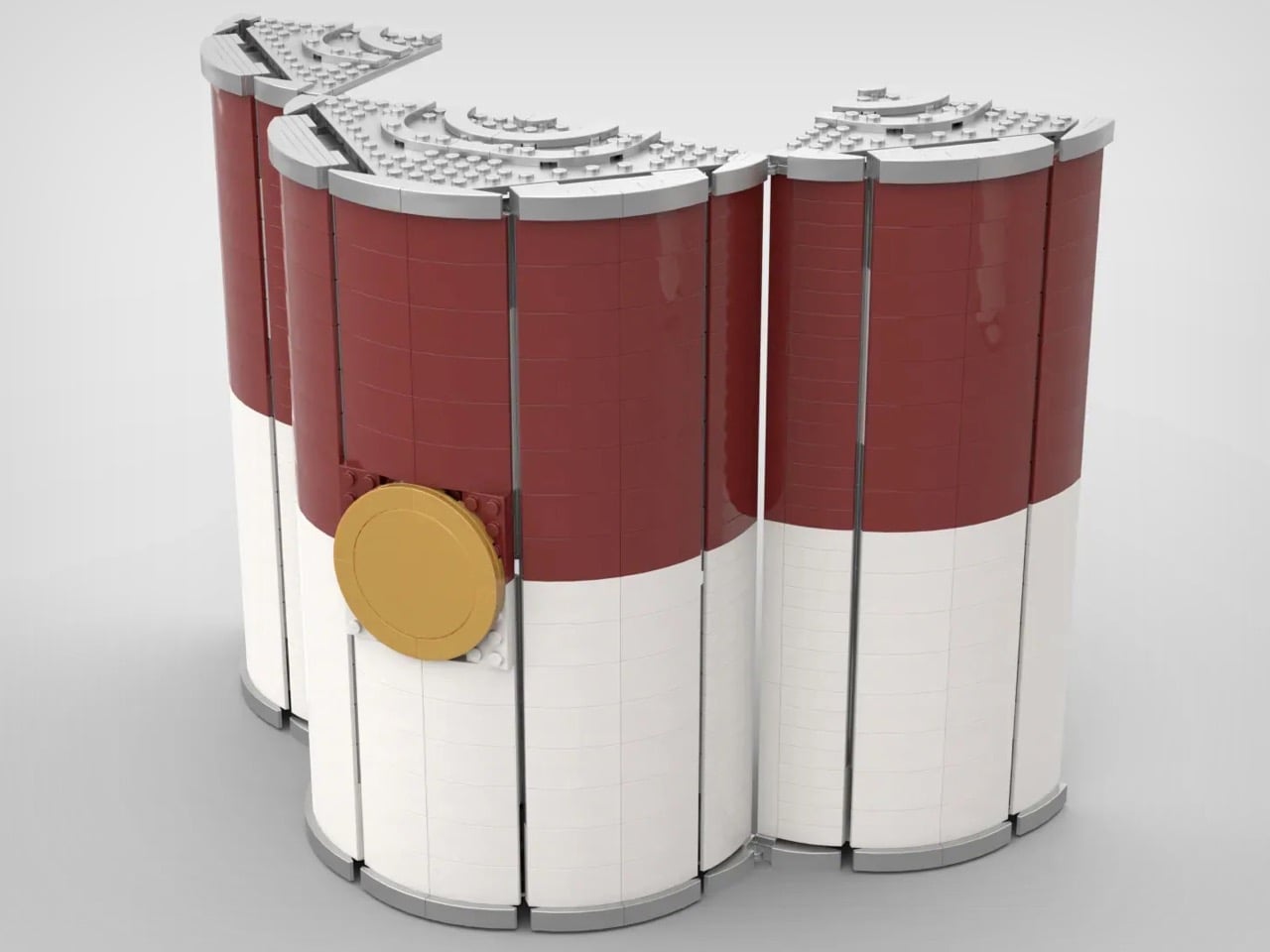
In 1962, Andy Warhol turned a humble soup can into an art world phenomenon. Now, a LEGO Ideas submission is turning that same can into something equally revolutionary: a buildable gateway to understanding the artist himself. This isn’t just about stacking bricks into a cylindrical shape, though the technical achievement of creating such smooth curves at 24 studs diameter deserves recognition. This project represents months of research into Warhol’s working methods, his relationship with popular culture, and the visual language of The Factory that became synonymous with 1960s avant-garde creativity.
Open the can and the transformation is immediate. The metallic interior contrasts sharply with the familiar red and white exterior, creating an Alice-in-Wonderland moment where everyday packaging becomes an art studio. Printed artworks cover the walls and floor, reflecting Warhol’s habit of painting directly on the ground surrounded by his creations. The Andy Warhol minifigure with signature silver wig presides over a space filled with props from his actual studio: the disco ball, the motorcycle, the couch where celebrities and artists mingled. It’s both a display piece for design enthusiasts and an educational tool that makes pop art accessible, proving LEGO sets can be as culturally significant as they are fun to build.
Designer: HonorableImmenseWorriz
The build sits at 1,117 pieces and stretches to 32.6 centimeters tall, which sounds manageable until you realize the entire cylinder uses curved slope elements to achieve those smooth walls. Most builders avoid large-scale curves because getting a 24-stud diameter to look this polished requires serious geometric planning. The three-section hinge system adds another challenge since you need structural integrity while maintaining mechanical function. What separates this from typical pop culture tributes is the commitment to printed elements over stickers, with Campbell’s branding, artwork tiles, and even the gold medal seal all printed directly onto bricks. The Marilyn Monroe quad portrait, Flowers series, purple Cow prints, they’re all there on the metallic silver walls that reference The Factory’s legendary aluminum foil aesthetic.
HonorableImmenseWorriz , the builder, positions it as “a LEGO set for the kitchen,” which completes the conceptual loop Warhol started by elevating everyday consumer goods to fine art status. You build this, place it near your actual soup cans, and your kitchen becomes gallery space. The 32 stickers showing different Campbell’s soup flavors let you customize and swap variations, mirroring Warhol’s seriality philosophy from his original 1962 series that featured 32 different canvases. The father-son collaboration behind it shows in the prop selection too, each item chosen for historical accuracy rather than visual filler. That red couch, the orange motorcycle, the camera on tripod, they’re narrative anchors to The Factory’s actual chaos, not random accessories.
The project’s currently a fan submission on the LEGO Ideas website – an online forum where enthusiasts share their own creations and vote for favorites. MOCs (My Own Creations) that hit the 10,000 vote mark then get sent to LEGO’s team for approval before being turned into a retail box set that anyone can buy. If you fancy yourself a LEGO ode to Warhol (and Campbell), head down to the LEGO Ideas forum and cast your vote for this build! It’s free!
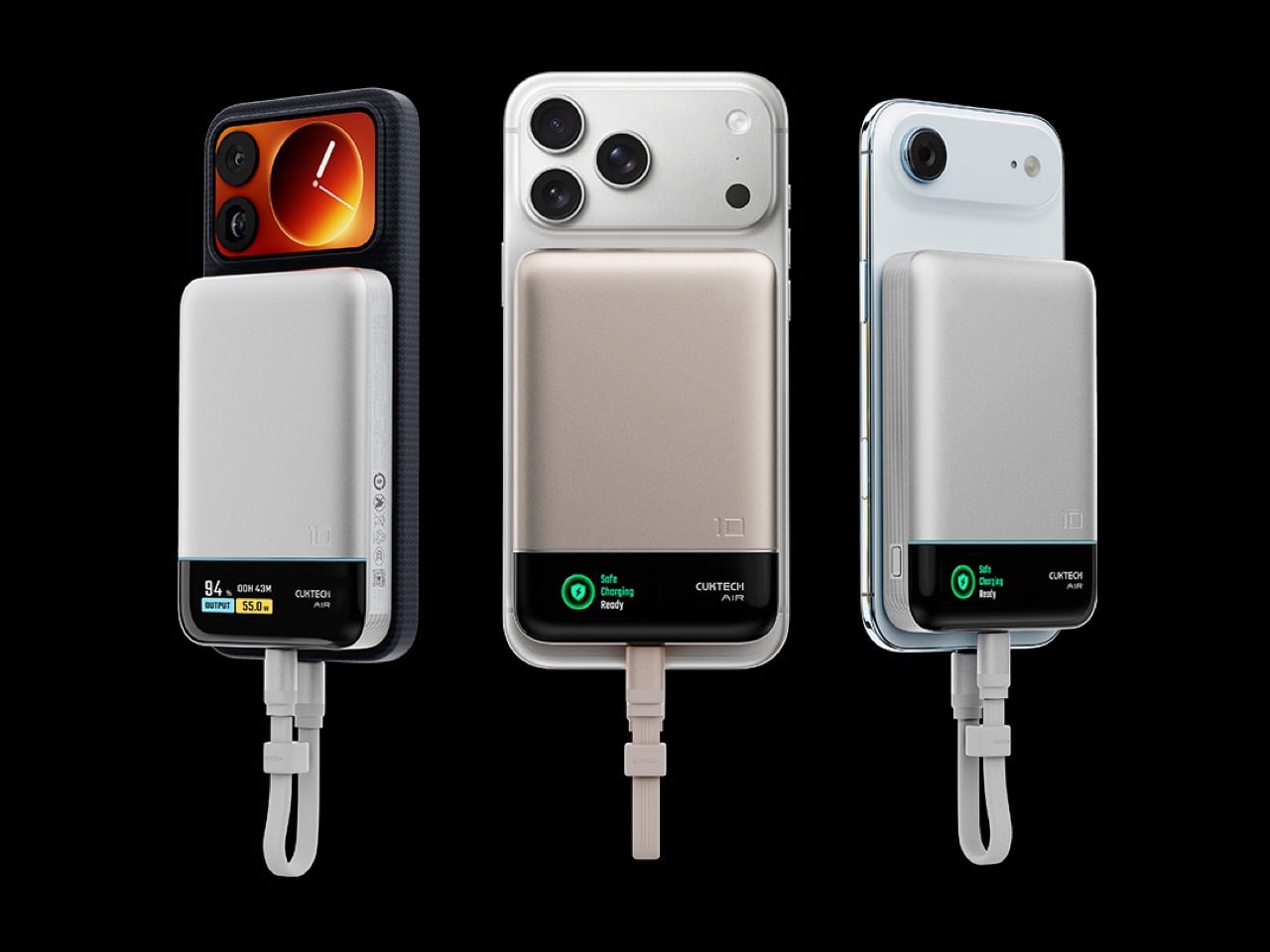
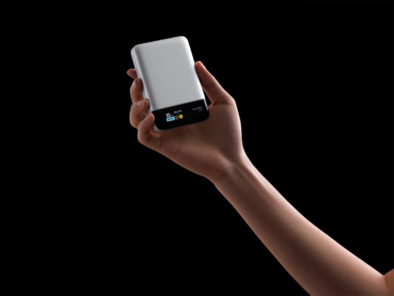
Cuktech just dropped their 10 Air magnetic power bank in China, and honestly, the most interesting thing about it has nothing to do with the specs. Sure, it’s got a 10,000mAh battery with 55W wired fast charging and 15W wireless, and yeah, the CNY 199 price tag (roughly $28) is aggressively reasonable. But look at the damn thing. That silver body with the black magnetic strip running across the bottom? Slap this on the back of your iPhone and you’ve accidentally recreated the iPhone 3G’s iconic two-tone design.
I can’t tell if this is deliberate nostalgia bait or a happy accident, but either way, it’s working. The iPhone 3G had that silver aluminum back with the black plastic bottom for the antennas, and this power bank’s layout mirrors it almost perfectly. It’s like wearing your phone’s ancestral portrait as a backpack. The magnetic strip sits right where that glossy black section used to be, and suddenly your sleek 2025 smartphone is cosplaying as a 2008 legend.
Designer: Cuktech
Beyond the accidental throwback aesthetic, Cuktech packed in a built-in display that shows actual charging data instead of making you interpret cryptic LED blinks like you’re reading Morse code. The brand claims it can take an iPhone 17 from zero to full about 1.8 times, the Galaxy S25 Ultra gets 1.3 cycles, and the Xiaomi 17 Pro manages 1.1. These numbers track for a 10,000mAh capacity when you account for conversion losses, so at least they’re not inflating claims. Most flagships hit 50 percent in around 30 minutes with this thing, which is solid performance for something this affordable. The 55W wired output does the heavy lifting here since the 15W wireless is more about convenience than speed.
The bundled USB-C cable has a self-storing design, which sounds gimmicky until you’ve untangled your charging cable from your keys for the thousandth time. Cuktech also mentions their “OPC worry-free charging” technology for battery health, though I’m skeptical of proprietary acronyms until I see independent testing. What matters is that the fundamentals are sound: decent capacity, legitimate fast charging, and a price that doesn’t require a mortgage. The fact that it accidentally turns your modern phone into a design artifact from the Steve Jobs era is just a bonus. No word on global availability yet, but Cuktech usually brings their products international eventually, and this one deserves the trip.
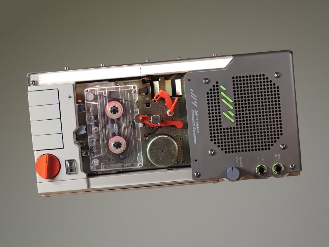
Most audio enthusiasts fall into one of two camps: the ones chasing perfect fidelity with lossless files and the ones who swear their vinyl sounds warmer. Julius decided to build a bridge between these worlds, and it looks like something Q would hand to James Bond if the mission involved a particularly groovy villain.
His cassette streaming device takes Bluetooth audio and runs it through an actual tape loop before playback, physically imprinting that analog character onto digital streams. The engineering journey was brutal. Turns out cassette decks from decades past have some deeply weird ideas about electrical grounding, and getting modern Bluetooth hardware to play nice with positive-rail-referenced vintage electronics required DC isolating voltage regulators and more than a few creative workarounds. The payoff is a device that looks incredible and introduces real tape saturation without any digital fakery.
Designer: Julius Makes
The concept is straightforward. Bluetooth audio arrives digitally, converts to analog, mixes from stereo to mono, records onto cassette tape, travels around the loop, hits a playback head, then reaches the speaker. That physical trip through magnetic tape creates the warmth people obsess over. The compression happens because ferric oxide particles on polyester film genuinely can’t capture digital audio’s full range. These are real physical limitations making the sound different, and somehow our ears prefer it that way. Julius made the tape loop visible on purpose, sitting outside the cassette with orange guide brackets so you watch it move while listening.
Getting everything to work required solving problems that shouldn’t exist anymore. Cassette decks connect their chassis to the positive power rail instead of ground. Julius only learned this after bolting his grounded metal case directly to the deck with screws, nearly shorting everything. The audio input shielding also runs to positive, which makes zero sense if you’re used to modern electronics. His Bluetooth module expected normal ground references, creating a fundamental incompatibility. An isolation transformer from AliExpress failed completely. He tried powering the Bluetooth at 12.5 volts while referencing it to 7.5 volts, but that rail wouldn’t sink current. Three months of debugging until DC isolating voltage regulators finally solved it.
The VU meter uses a fluorescent tube that works backward from what you’d expect. Silence keeps it fully lit, loud beats make it dim. Julius inverts the signal on purpose so the tube glows when the device sits idle, which looks better and extends the tube’s life. The circuit gains the audio signal 500 times, clips it hard to isolate peaks, then runs through a diode detector with a capacitor for smoothing. The power amp inverts everything again and boosts another five times to drive the tube. The lag you see in the meter’s response comes from that smoothing capacitor, which is a feature since nobody wants a seizure-inducing flicker.
He built five separate circuit modules. One auto-starts the Bluetooth by faking a long button press with an RC pulse generator. Another converts stereo to mono for the recorder. The playback preamp amplifies the tape signal and applies EQ compensation, splitting output between the speaker and the meter circuits. Everything lives on custom PCBs he designed in KiCad after a month of learning the software. The stainless steel case handles shielding and heat dissipation from the power amp. A laser-cut acrylic panel makes the front transparent. The big orange knob pushes record volume into distortion territory. The small knob controls speaker output. Input and output jacks mean you can use this as a tape delay or saturation processor for other gear, which honestly might be more useful than Bluetooth streaming through cassette tape. But useful was never really the point.