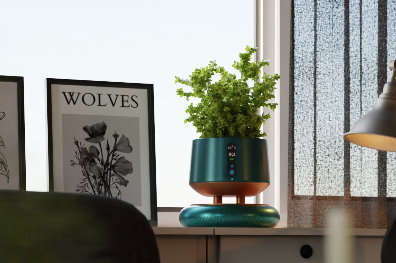
Aesthetic air purifier concept also doubles as a stylish plant pot

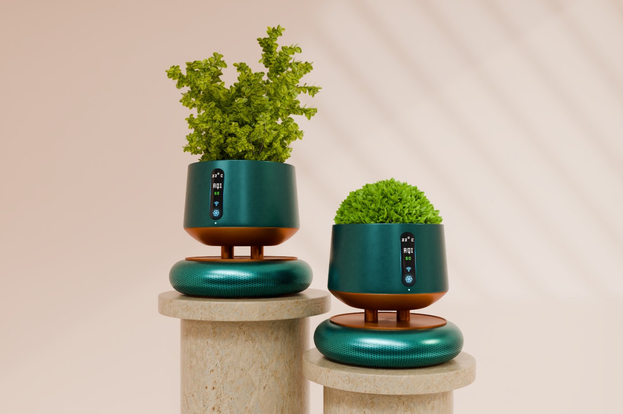
Recent events have made people more concerned about the quality of the air inside their homes, leading to a rise in interest and sales of air purifiers. These appliances, however, haven’t seen much design iteration in the past, which is why many of them look so dated and out of place in modern homes and interiors. Thankfully, that status quo has changed and a new trend is beginning that transforms these cold, impersonal devices into something that looks more at home in your home. Some disguise themselves as pieces of furniture or art objects, while this particular concept functions as a place to grow short plants and flowers, giving a splash of green as it keeps your indoor air green as well.

Designer: Sukchand Saren
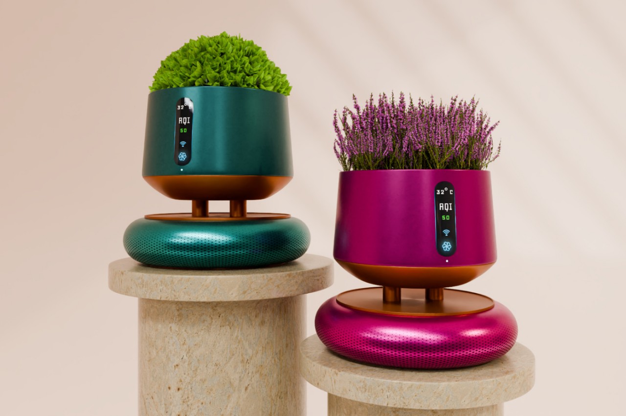
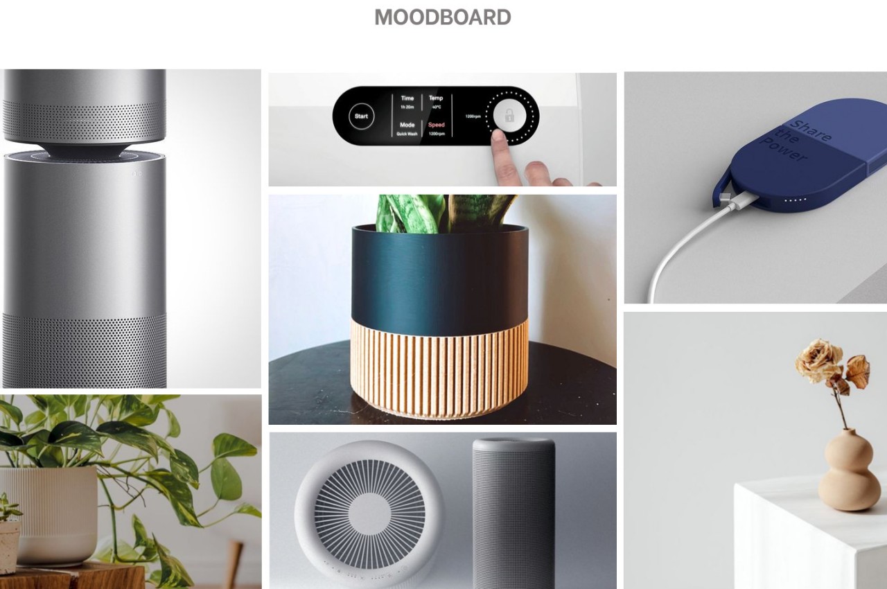
In order to maximize airflow and performance, most air purifiers are tall, white boxes or cylinders placed in conspicuous locations, often at the center of a room. This often makes them an eyesore and an obstacle to movement, so some homeowners might end up just storing them away, allowing low-quality air to circulate and put themselves and their families at risk. There isn’t really a need to compromise between function and aesthetics, as this concept tries to prove by fusing air purification with botanical elegance.
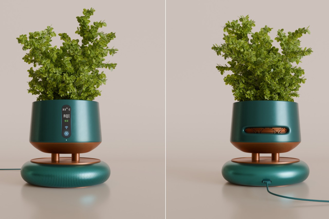
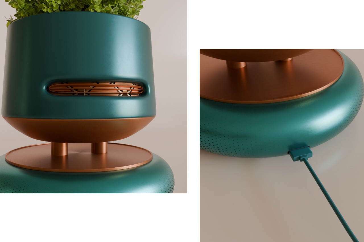
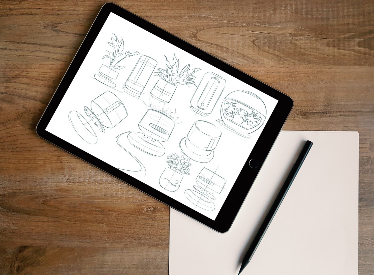
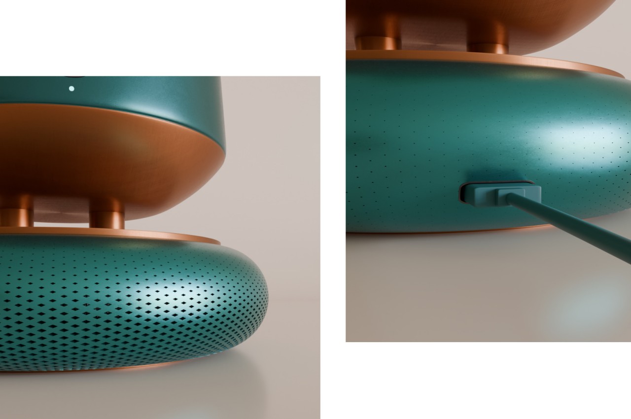
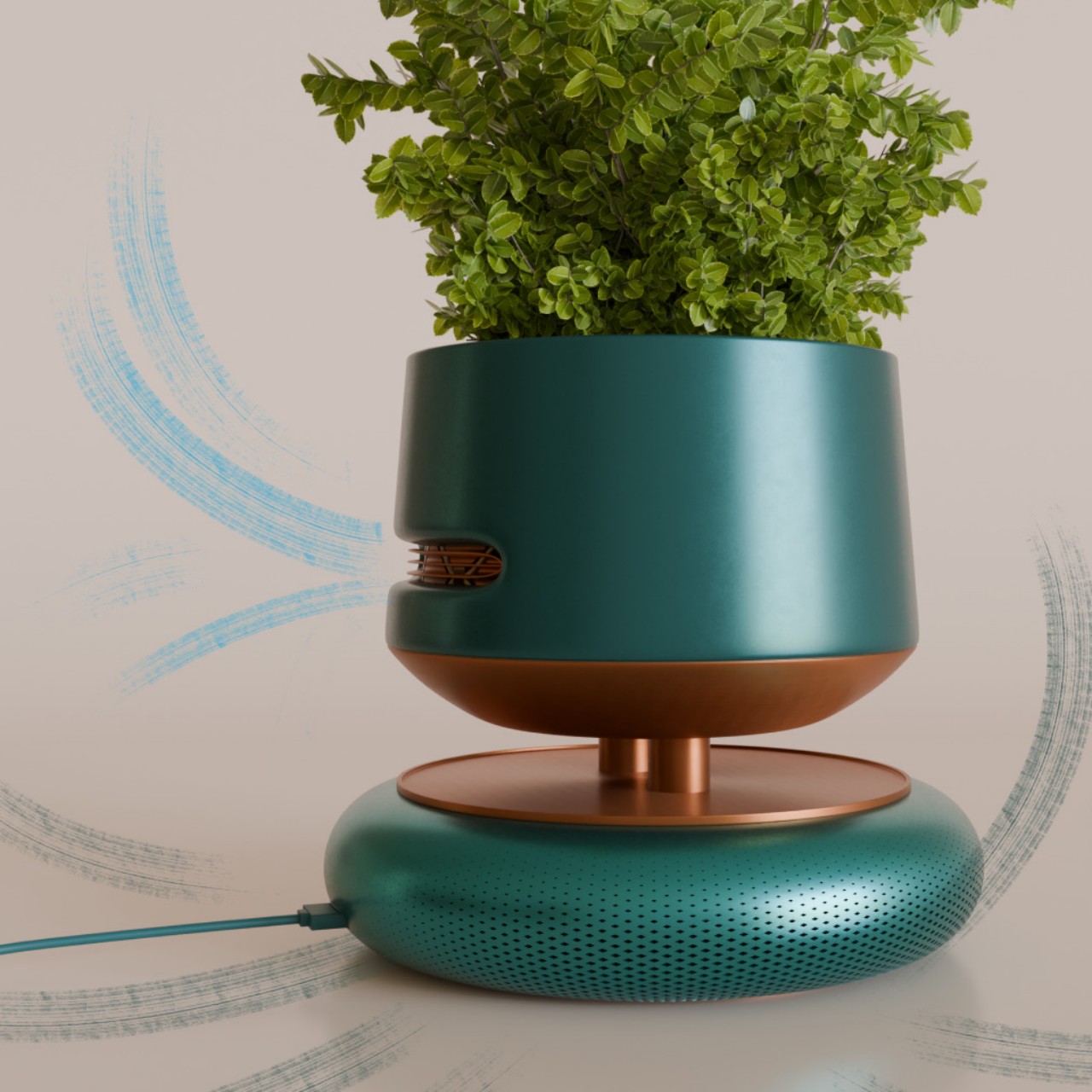
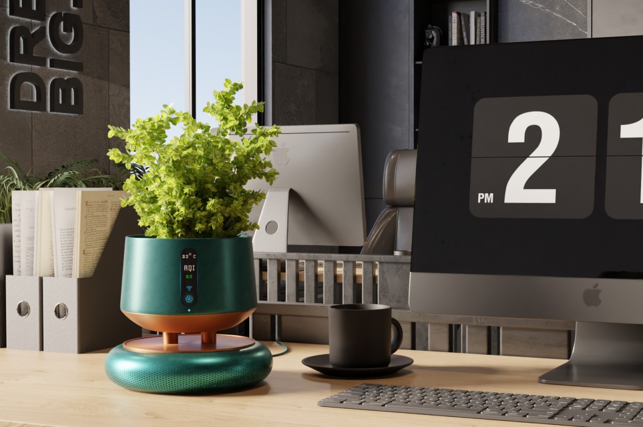
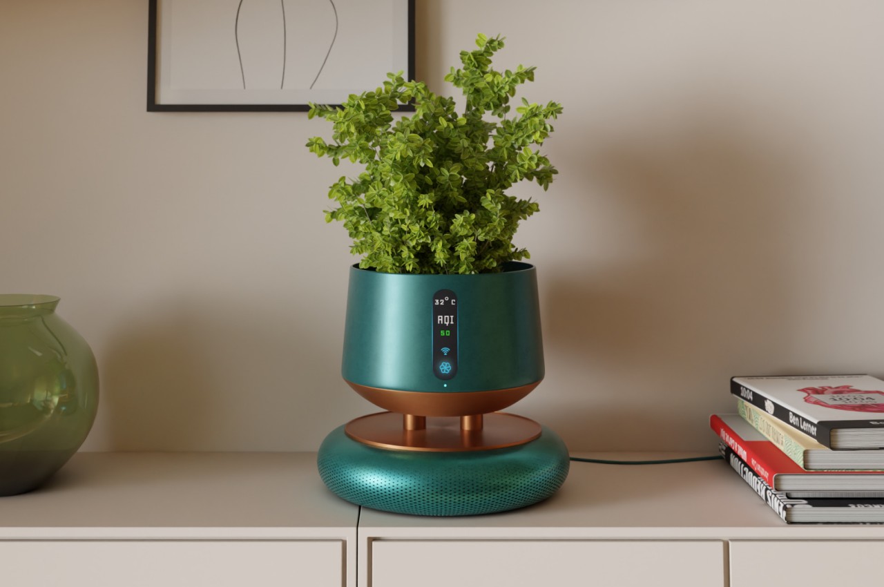
FloraPur is technically two separate products designed as one. It is primarily an air purifier, of course, albeit one that is designed for smaller rooms or at least to work in tandem with other similar units spread across the space. Unclean air is sucked into the circular base where it passes through four purification levels, including HEPA, activated carbon, and UV light, before the clean air is blown out of the top half. Given the size of the device, it won’t be effective in large rooms so placing a few of these in strategic locations would be a better idea.
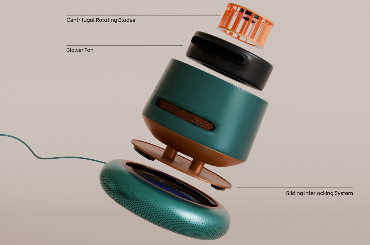
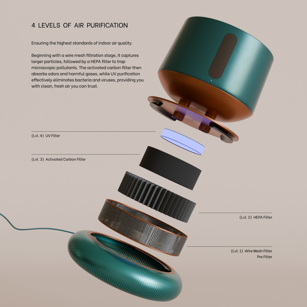
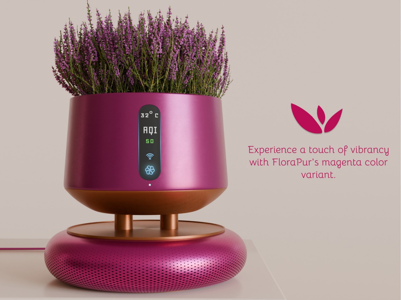
What makes FloraPur different from the majority of air purifiers is its focus on visual appeal without compromising functionality. In addition to this colorful powder-coated metal finish, the container that makes up the bulk of the purifier’s form serves as a convenient pot for growing plants and flowers indoors. The design combines two of the trends that rose during the pandemic, cleaning the air inside while adding natural beauty as well.
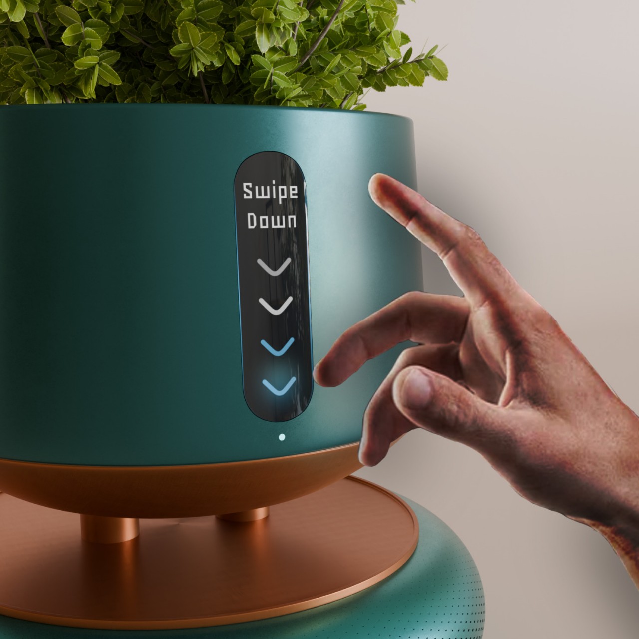
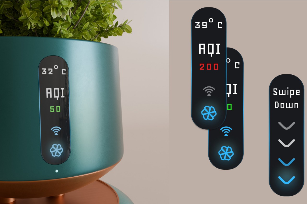
Granted, the design also has some shortcomings, not including how it would struggle to cover a very large room on its own. The connection between FloraPur’s two functions is completely superficial, with the plants playing no role in cleaning the air despite being nature’s own air purifiers. And despite having smart features that can monitor air quality around it, the device has no function to monitor the state of the plant growing inside it. The latter shouldn’t be too hard to implement with the right sensors and software algorithms, and a larger air purifier that can house more plants and use those plants to keep the air clean is also possible. All it takes is some creative thinking and ambition to breathe new life and fresh air into an old and tried appliance design.
The post Aesthetic air purifier concept also doubles as a stylish plant pot first appeared on Yanko Design.
Solar-powered sundial wall clock concept offers a unique way to tell the time

Today’s clocks and watches seem to be split between mechanical analog and electronic digital designs, but there are more than two ways to tell the time. Of course, some of these methods are regarded to be inaccurate, error-prone, and at the mercy of the elements, but there’s a certain charm and magical feeling to the way our ancient ancestors tried to discern the time of day. The sundial is one of the oldest time-keeping tools, one that works on the presumption that the sun travels the same path every day of the year, which isn’t exactly the case. Still, it’s not an entirely incorrect method and it can easily be fixed with modern technology, like this sustainable wall clock concept that is powered by the sun in more ways than one.

Designer: Begüm Kılınç

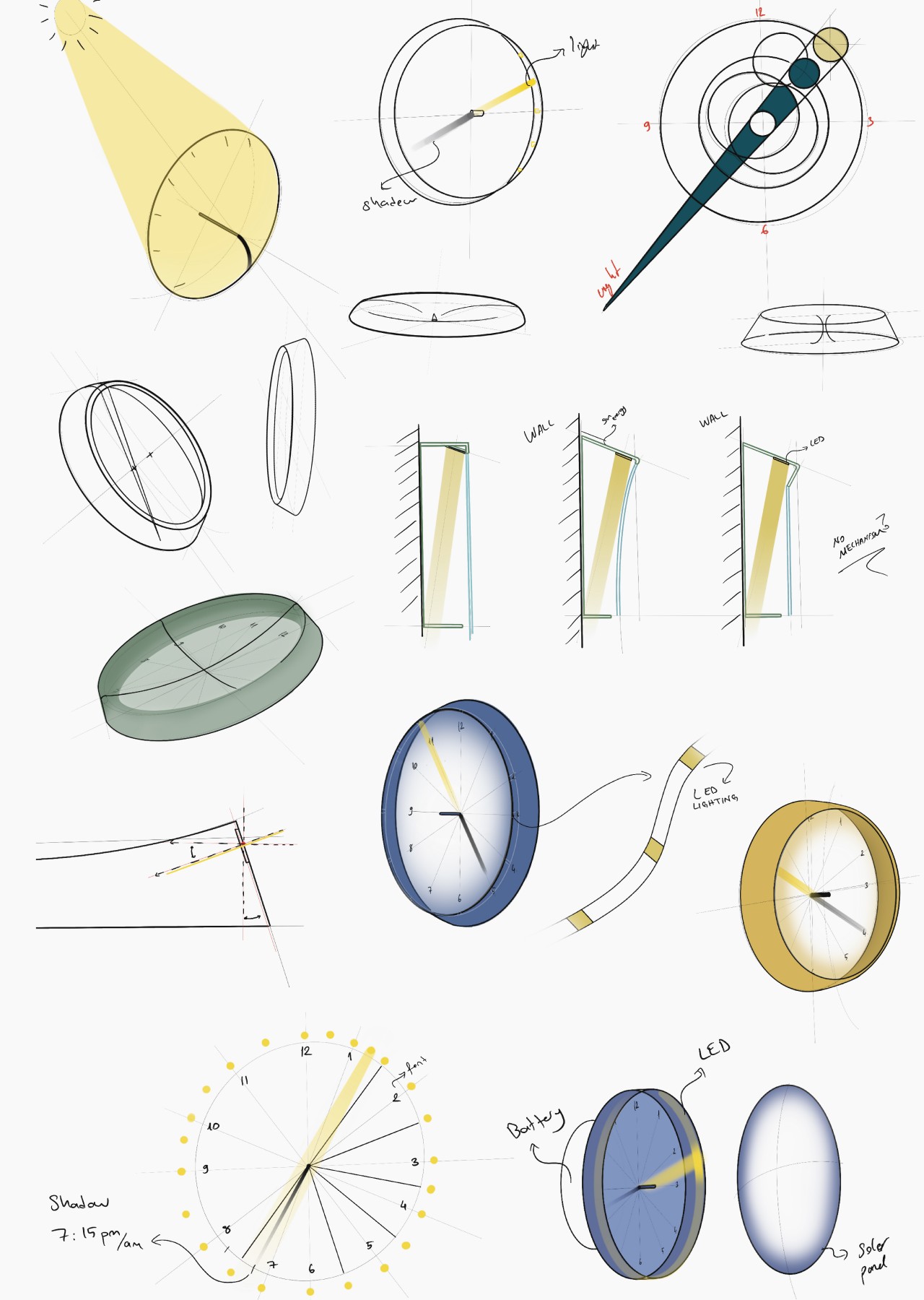
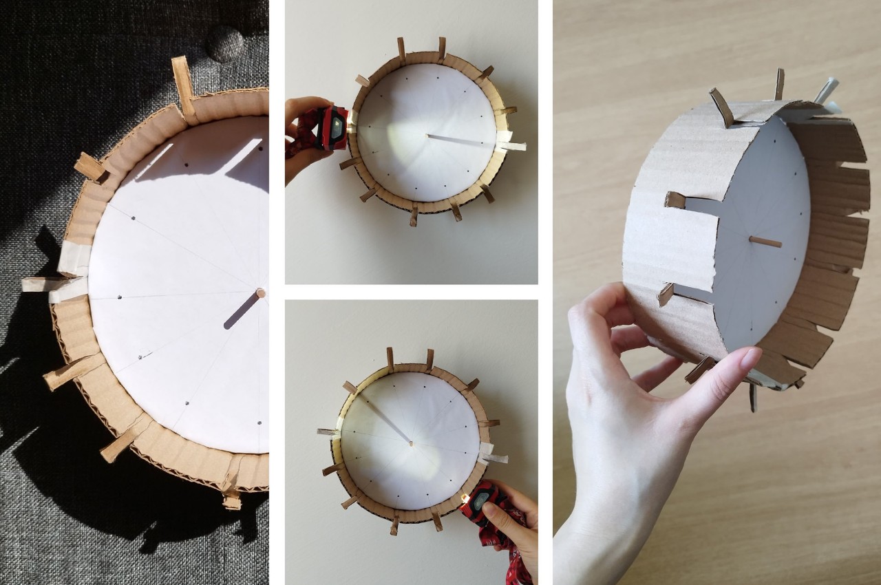
A sundial works by simply observing the shadow that a stick or a tall thin object casts on a flat surface, a shadow that moves around and grows or shrinks as the sun makes its way through the sky. The sun doesn’t travel the exact same path all year round, however, and this method definitely doesn’t work at night. Modern technology, however, has a way to shine a light 24/7, and this wall clock uses that to recreate the almost mystical appearance of a sundial while utilizing energy from the very sun that inspired it.

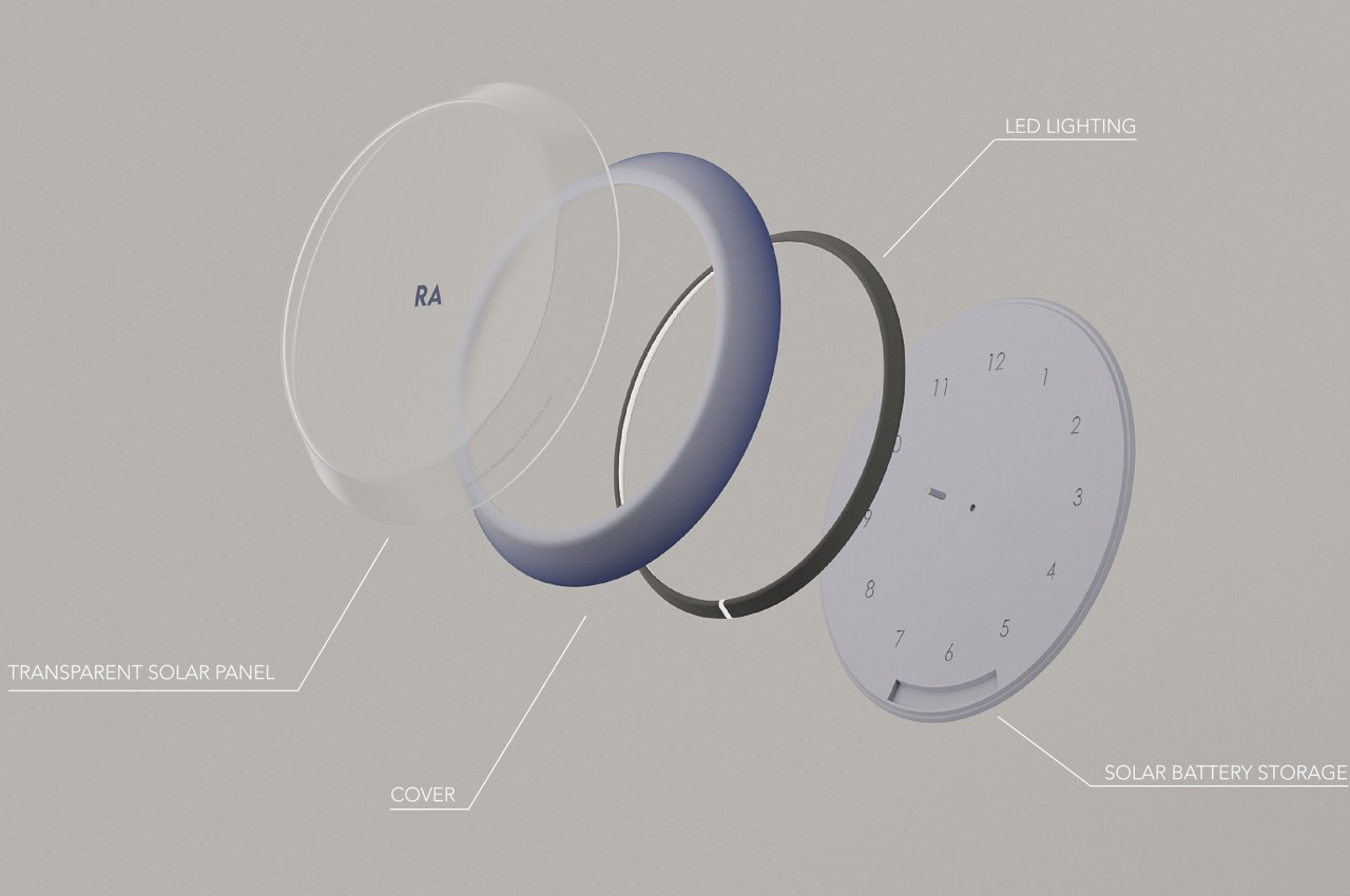
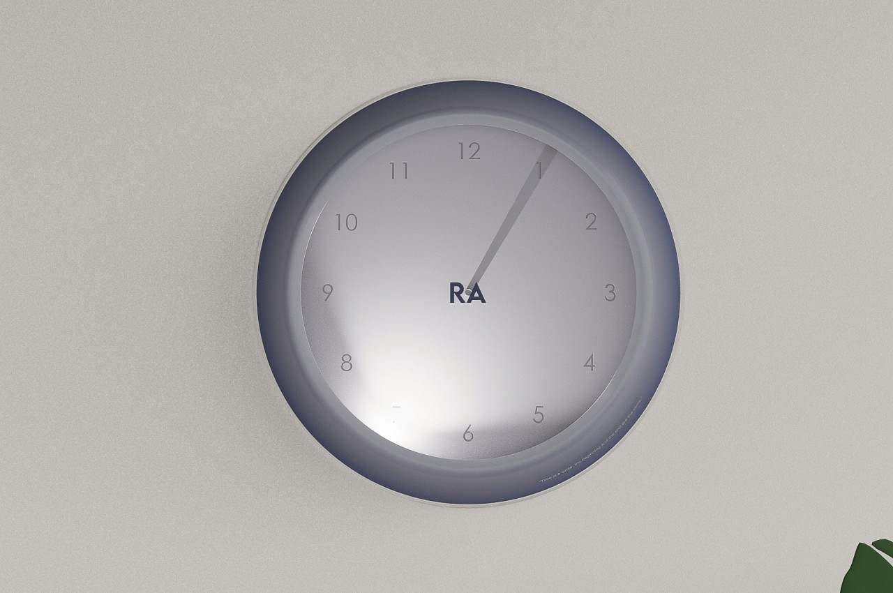
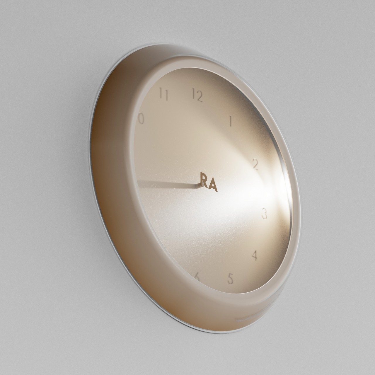
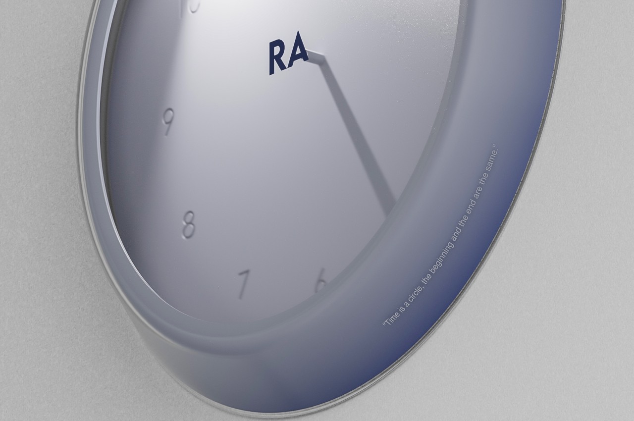
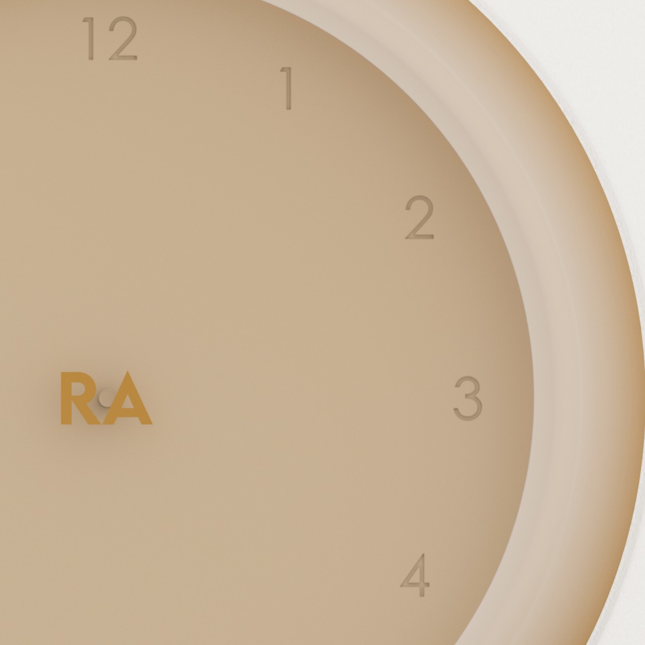
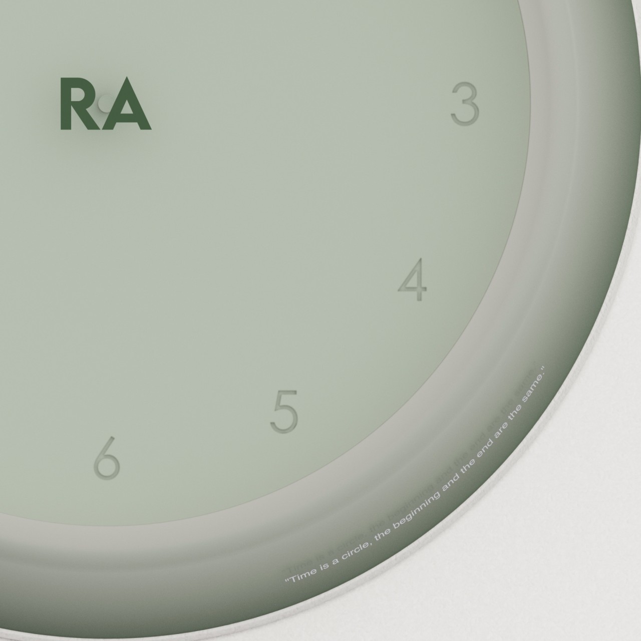
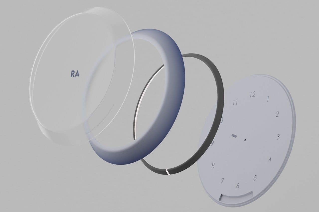
Name after the Egyptian god of the sun, the Ra wall clock utilizes an LED ring light to simulate the sun. But rather than shining from all directions, the light is focused on a single point to recreate the effect of a short stick casting a very long shadow. As time moves, so does the light move around the periphery of the circle, thus mimicking a sundial but with more consistency and accuracy. Plus, it works at night as it does during the day.

While this would have been enough to create a modern sundial clock, the concept takes the association even further by also following how the sundial of old needed only the sun to function. Rather than relying on batteries, Ra uses solar power to make sure the clock is running 24/7 without the need to charge it or change batteries. The transparent solar panel that makes up the wall clock’s front cover actually harnesses any light around it, so the clock doesn’t need to actually be exposed to the sun and can be used indoors or under low-light environments.

This design helps give the sundial wall clock a sustainable potential, even if it does minimally use some electronics as well as LED lighting. Unlike analog clocks, there are now complex mechanisms that are difficult to repair, and unlike digital clocks, there are no screens or displays to show the time. It uses a very simple method that traces its roots back to ancient times, but one that still has benefits to the people of today.

The post Solar-powered sundial wall clock concept offers a unique way to tell the time first appeared on Yanko Design.

Vinyl turntable concept uses industrial materials and design

As much as I love my music streaming services, I’m also a fan of playing analog music. Well, at least in theory. I have several CDs at home already but I don’t have a CD player (still researching about what’s the best one that my wallet can afford). I also want to have a vinyl player soon although that will take more of an investment both for the player itself and the vinyls I’ll buy afterwards. So I am always interested when I see concepts or designs for turntables as it can be references for what I’ll buy in the (hopefully) near future.

Designer: Antoine Brieux / NAK Studio

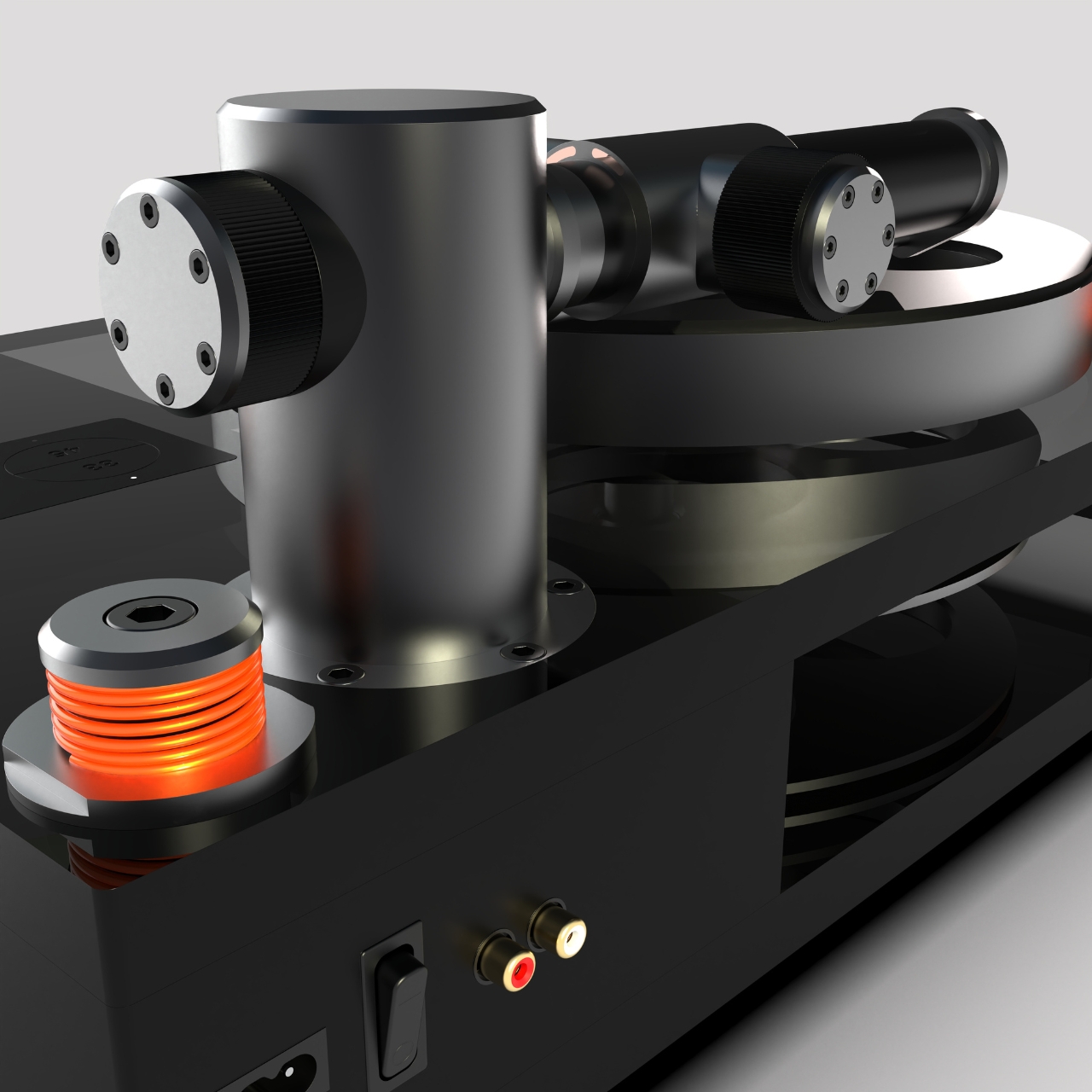
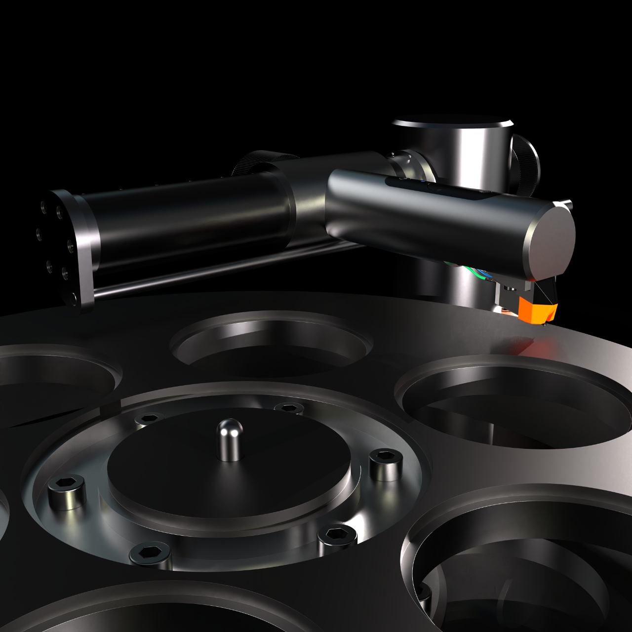
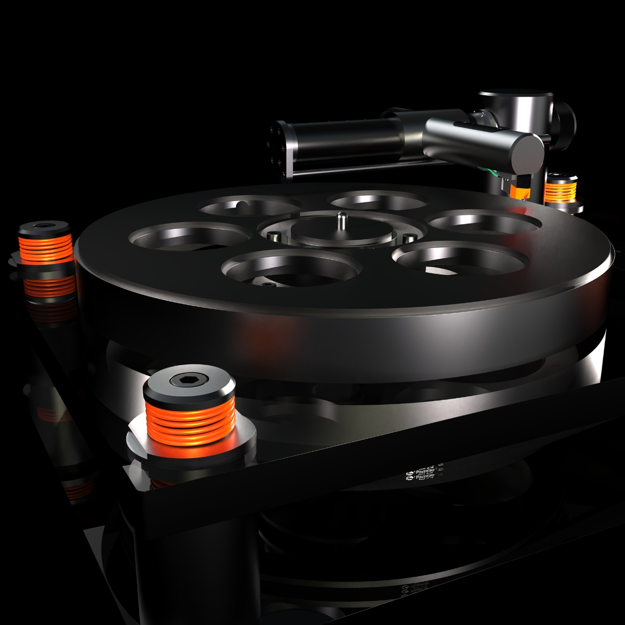
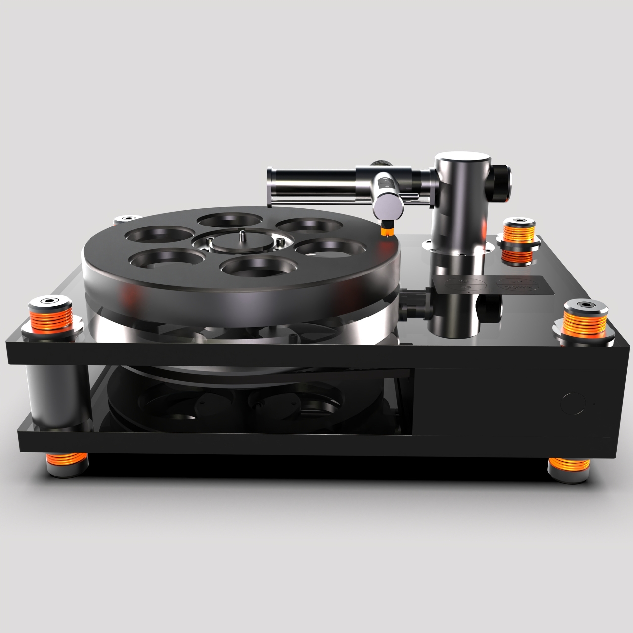
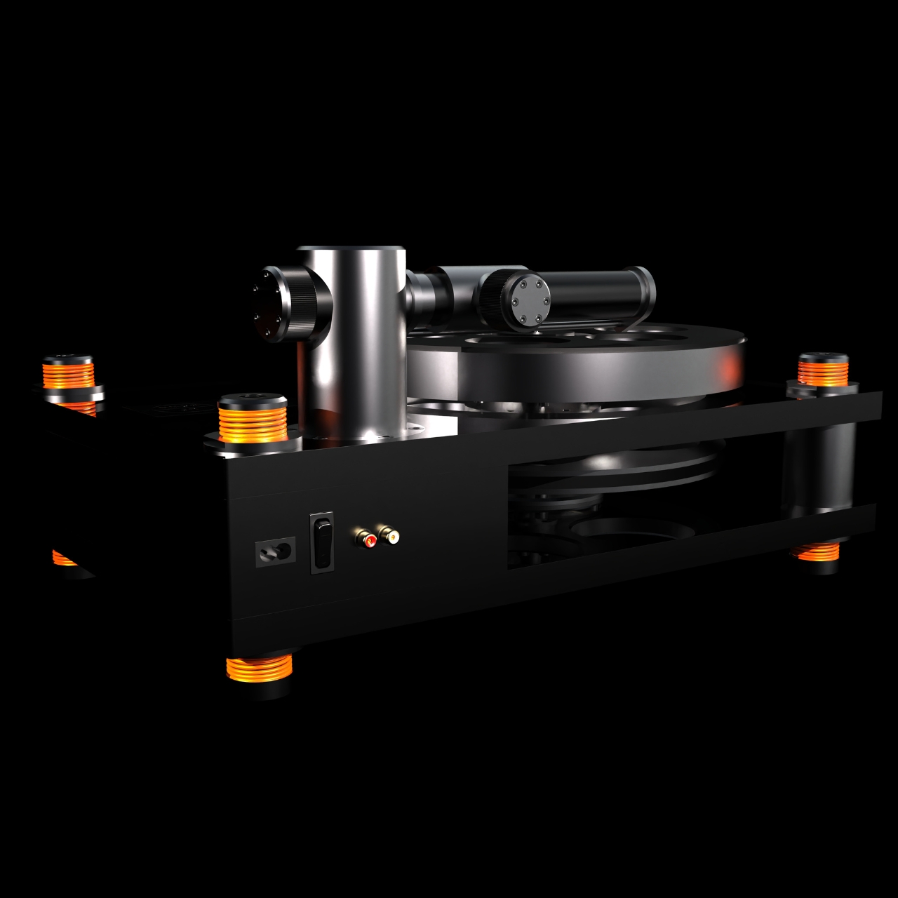
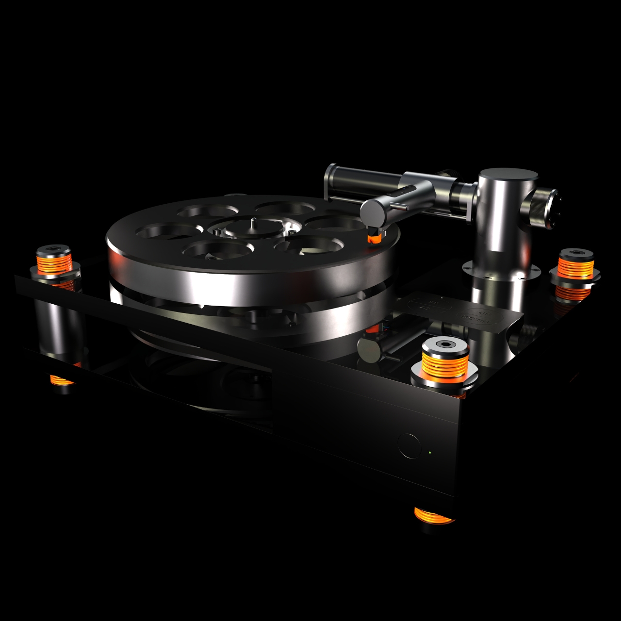
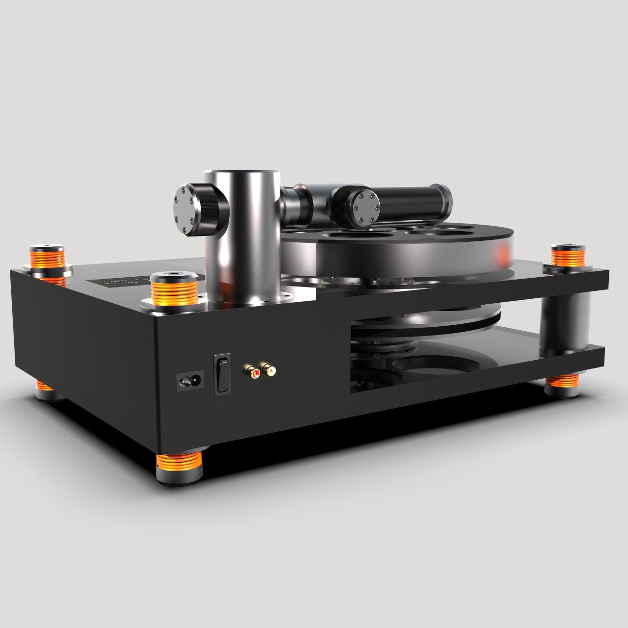
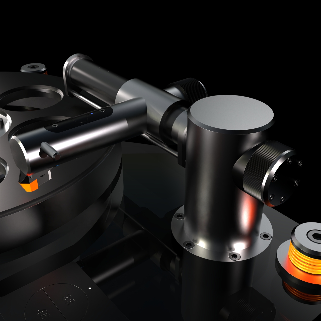
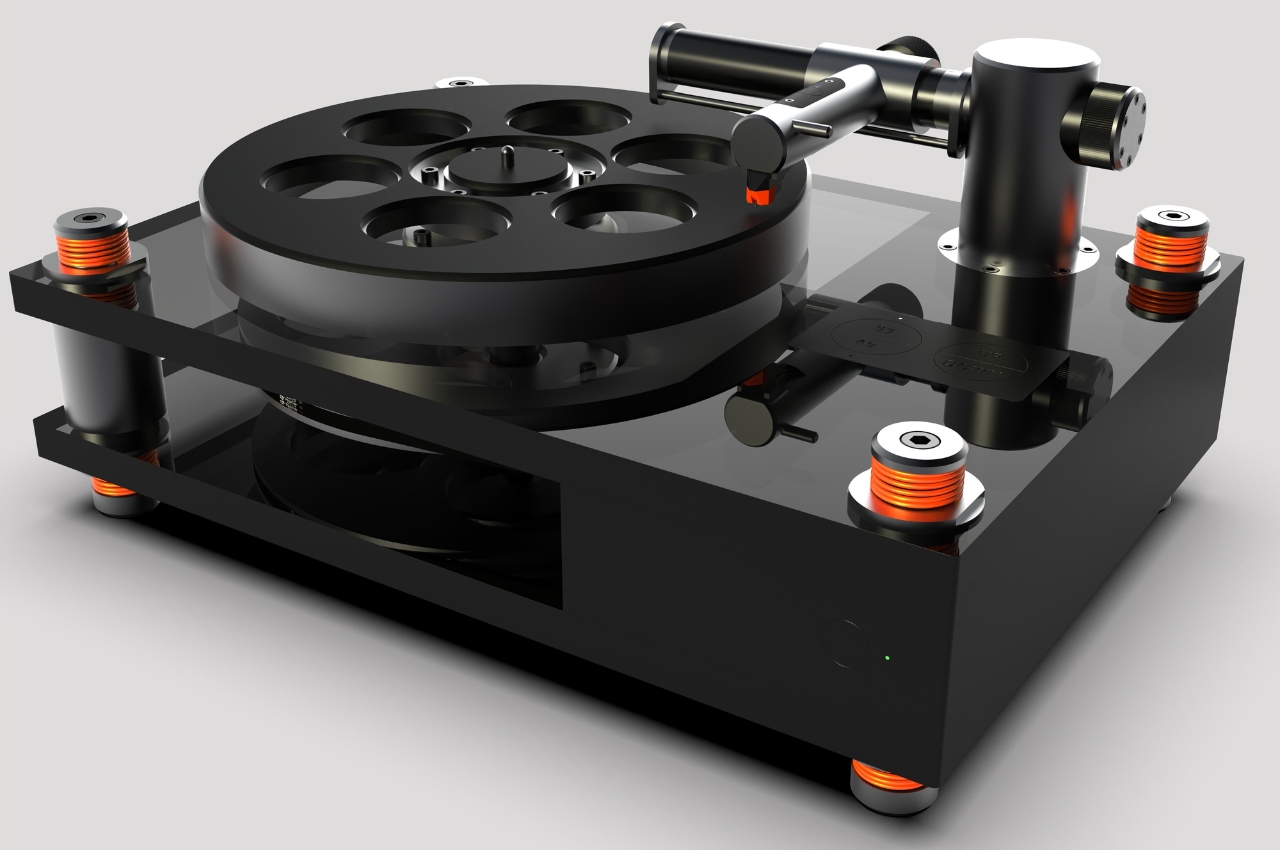
This concept for a high end industrial design linear vinyl turntable will probably not fit into my budget if it ever gets made but it’s still pretty interesting to look at. It will be made up of full machined aluminum and magnesium parts but also uses glass and recycled Acrylonitrile Butadiene Styrene (ABS) so you get an industrial but minimalist look. The platter assembly has conical bearings shaft and actually looks like those old 35mm film projectors but placed horizontally.

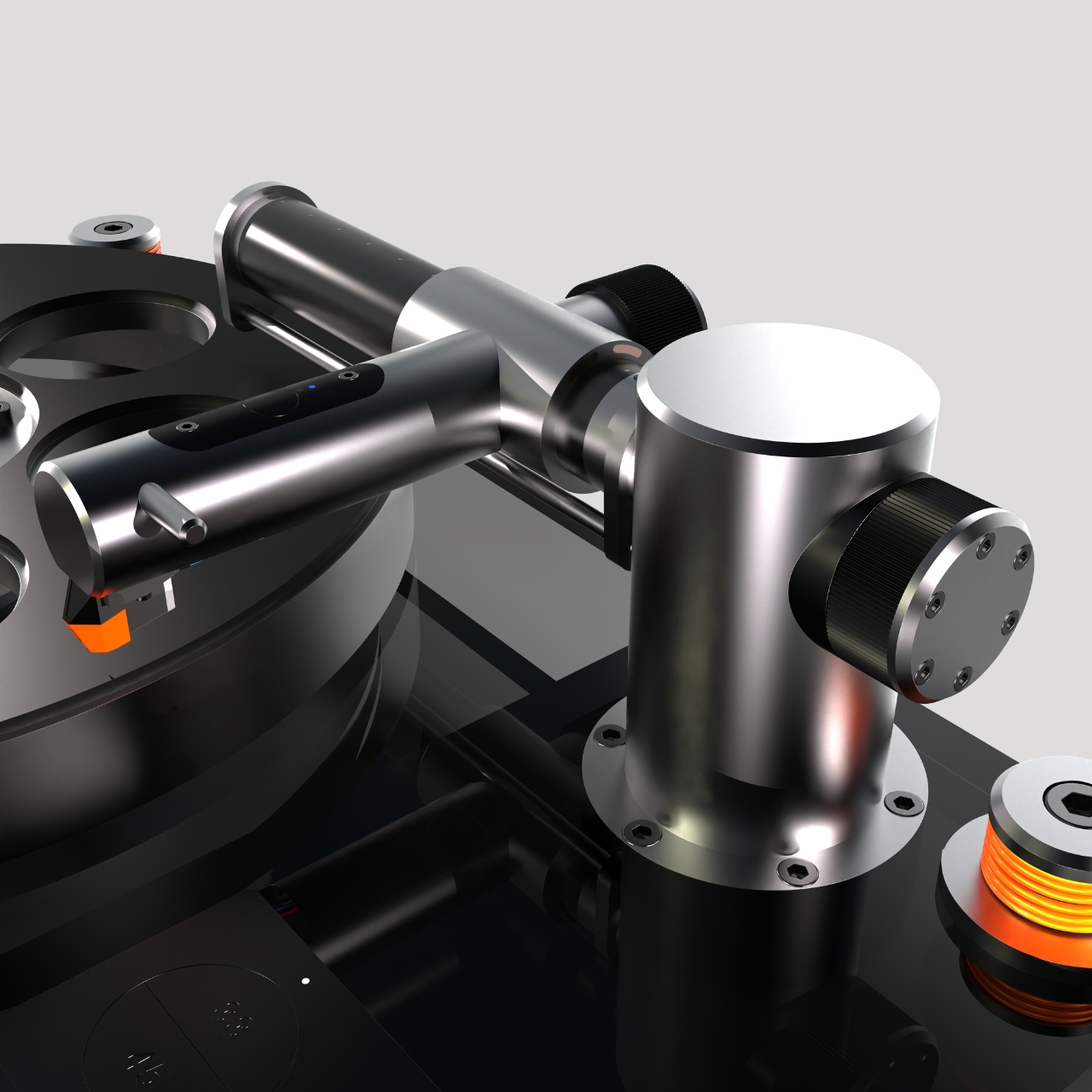
In keeping with its industrial theme, you get an industrial drive belt driving system but with an air cushion linear arm to make it more interesting. The tonearm is Bluetooth embedded so you can connect it to Bluetooth speakers directly but you can also use the regular plug system if you prefer that. It also has a brushless motor and constant drive controller while it uses capacitive sensors to manage the start and end position of the arms which can use either an automatic or manual lift system.

The product render, including a video sample of what it might look like, makes it really look like a high end kind of vinyl player. But it also looks a bit heavy based on the materials that will be used so if you’re looking for something that can be portable or at least easy to move within your space, this might not be it. As for the quality when you actually play your vinyls on it, that remains to be seen.

The post Vinyl turntable concept uses industrial materials and design first appeared on Yanko Design.
Watch-inspired smart suitcase concept is made for frequent travelers

Some people might have fantasies of traveling frequently as part of their job, not realizing how tiring and tedious it can quickly become. Never mind the fatigue that actually comes from traveling, the stress of packing and wrestling with suitcases might be enough to make many people cry out in frustration. There are many ways to ease the pain when traveling regularly, and part of the strategy is having a well-designed and reliable bag or suitcase to store everything you need, especially for a one-day trip. That’s the kind of need that this concept design tries to address, and it’s taking inspiration from one of the most popular makers of watches, calculators, and electronic pianos.

Designer: Harshita Kaur

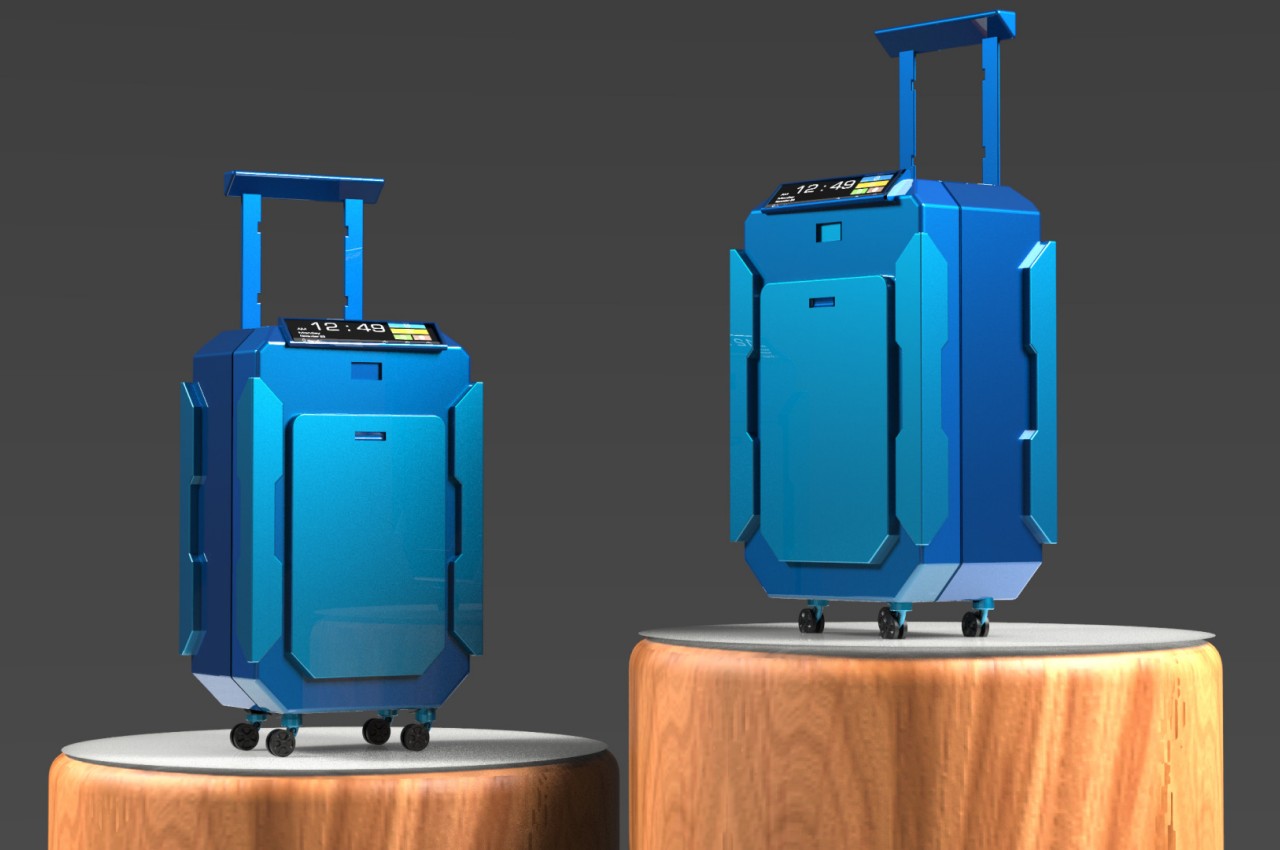
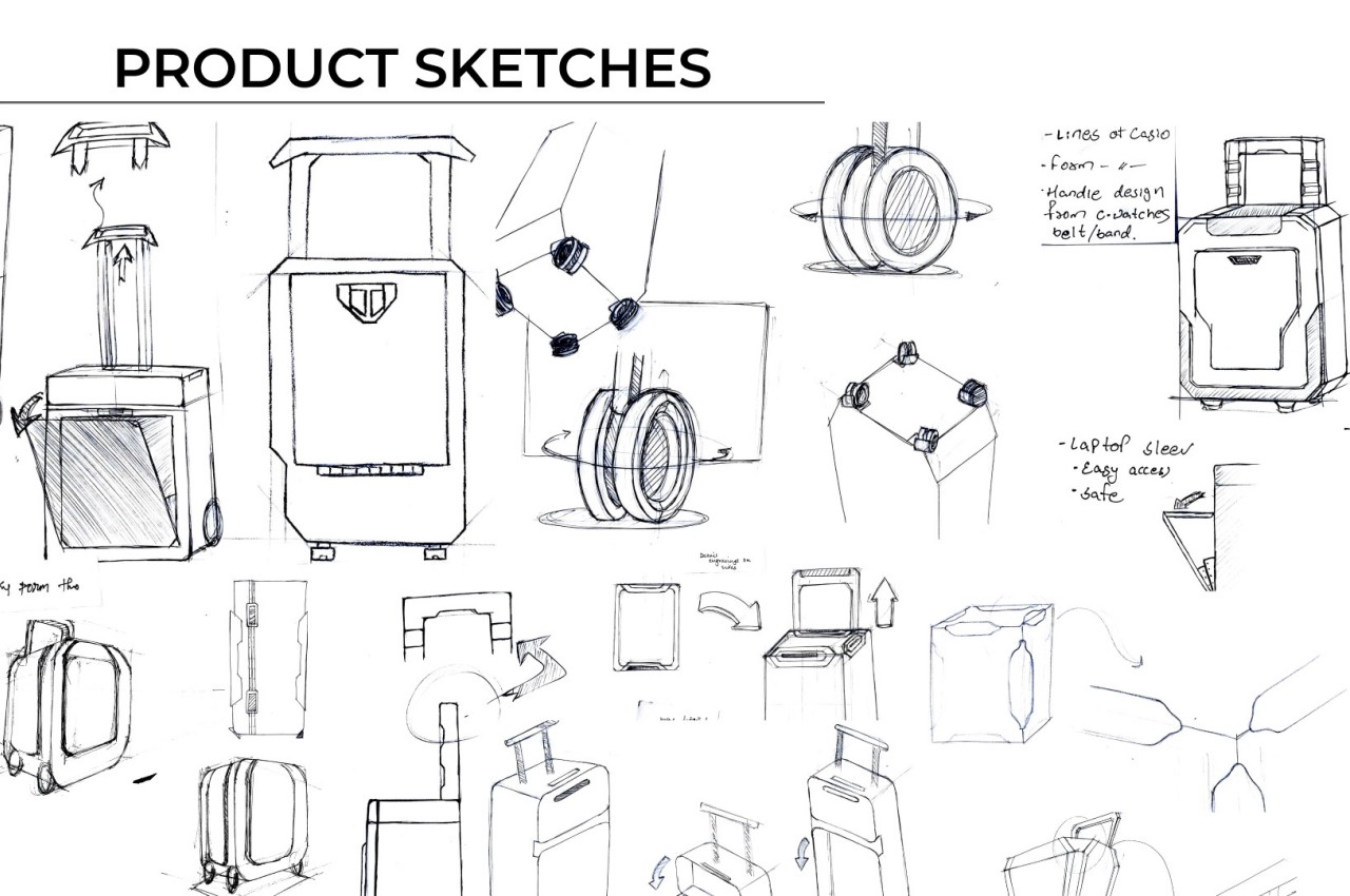
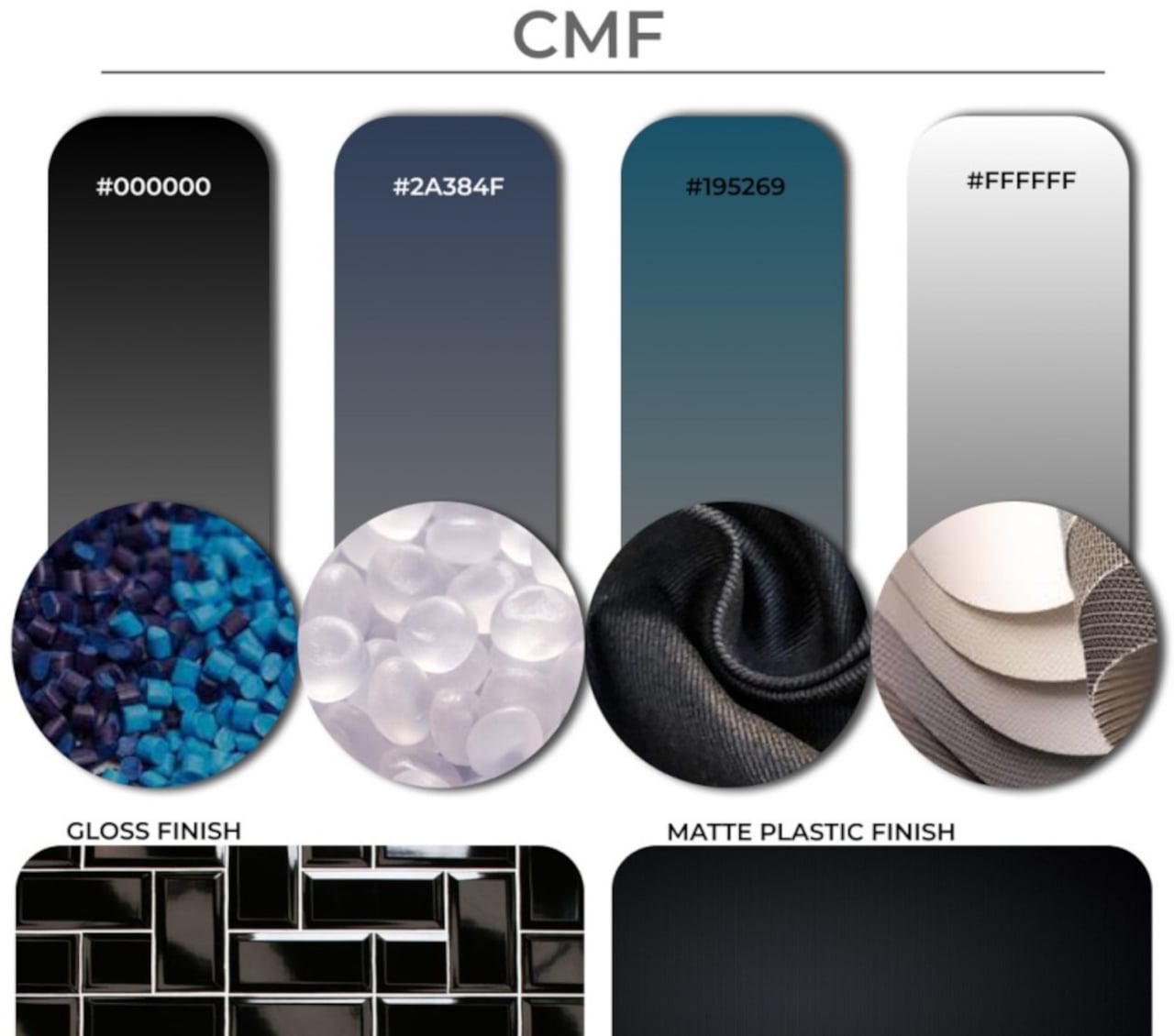
Casio’s brand spans multiple products, including musical instruments, calculators, and both analog and digital watches. The latter category has become iconic of Casio’s design language, particularly with its geometrical forms and overlapping shapes. It’s a language that is applied to this suitcase concept that tries to offer a smarter way for frequent travelers to secure their belongings for one-day business trips.

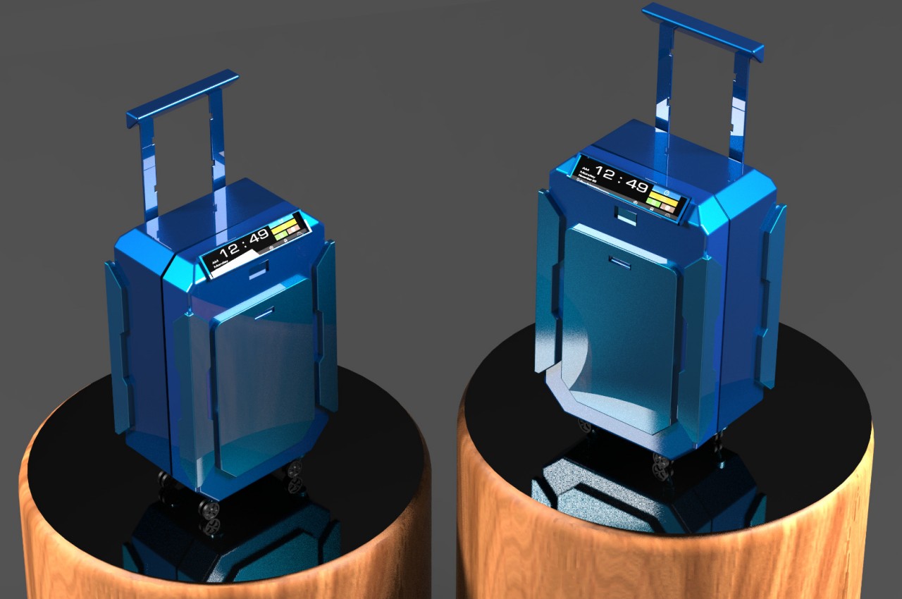
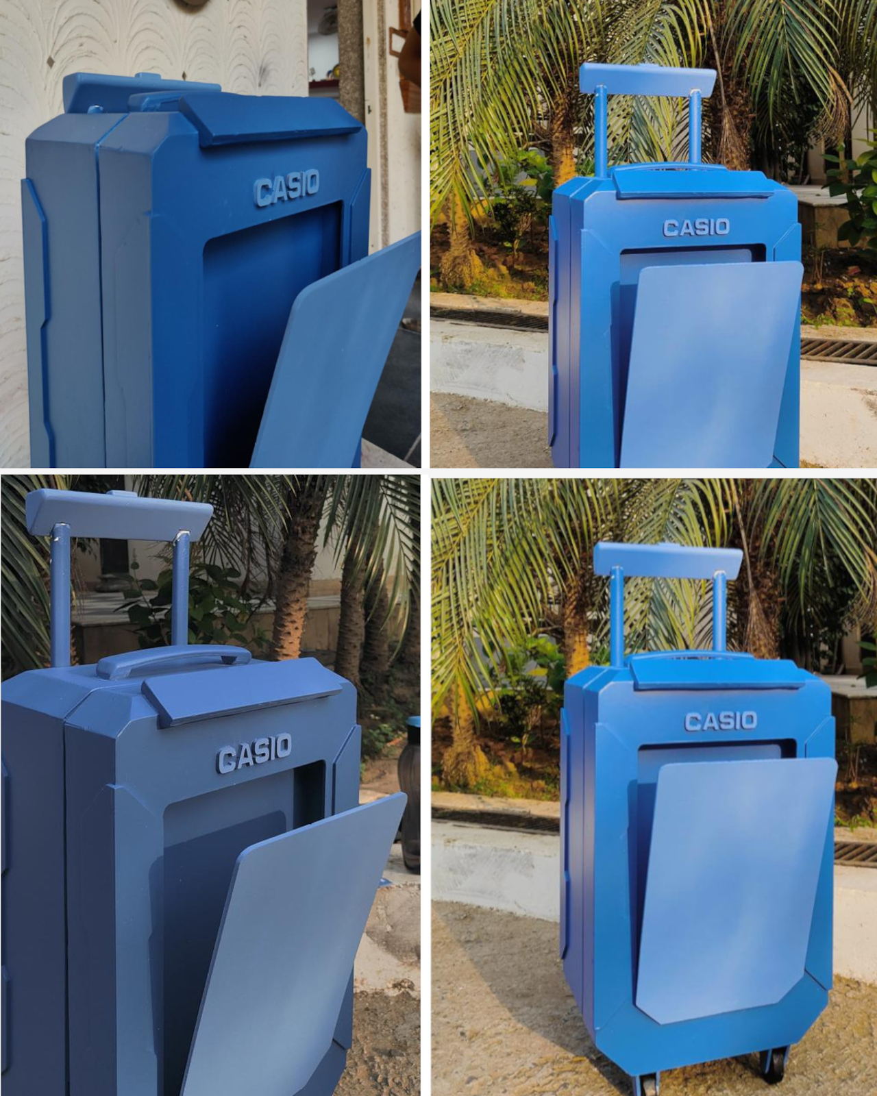
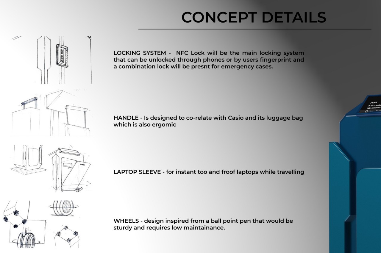
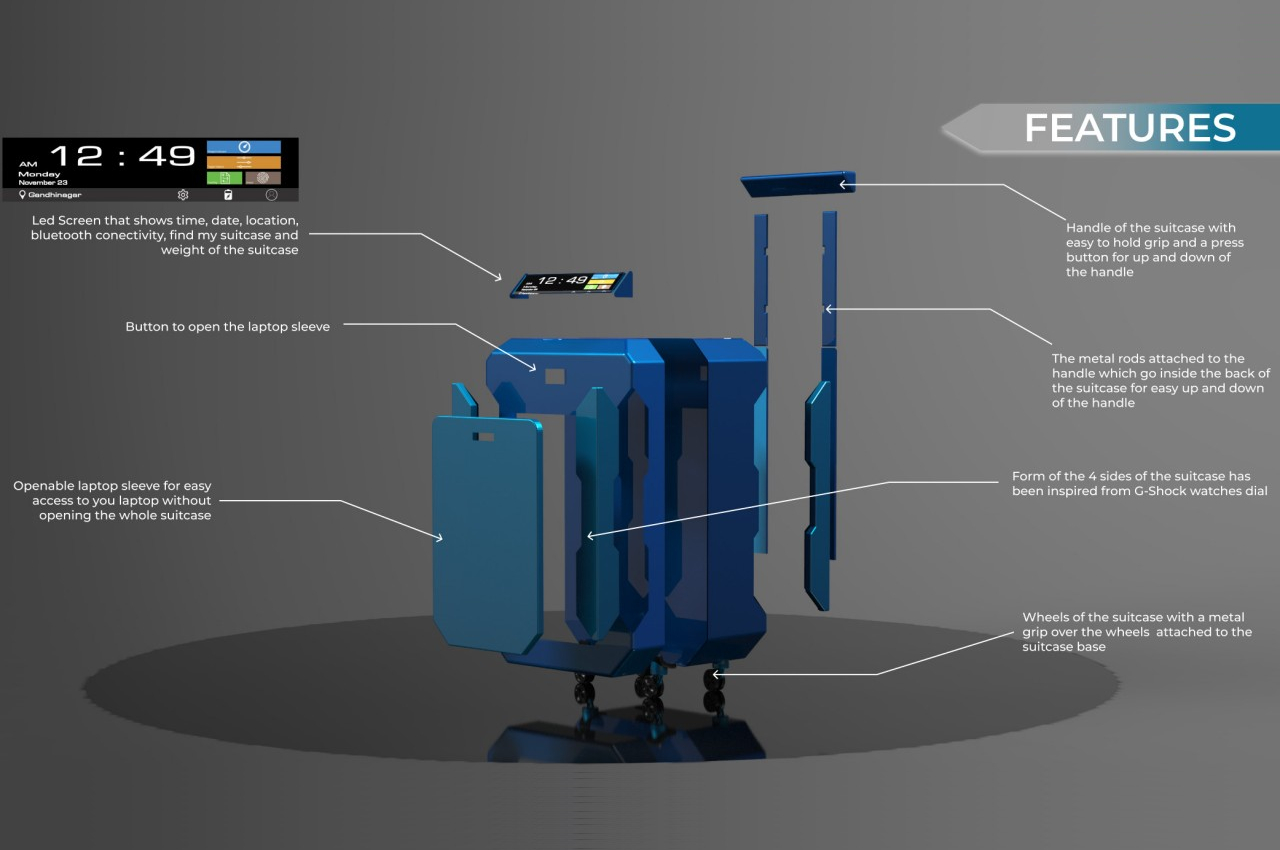
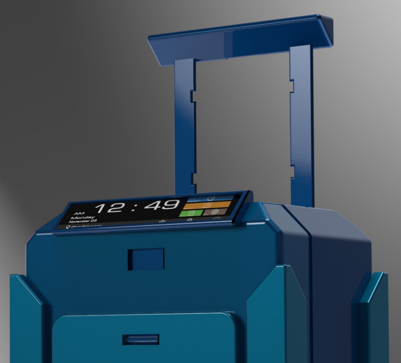
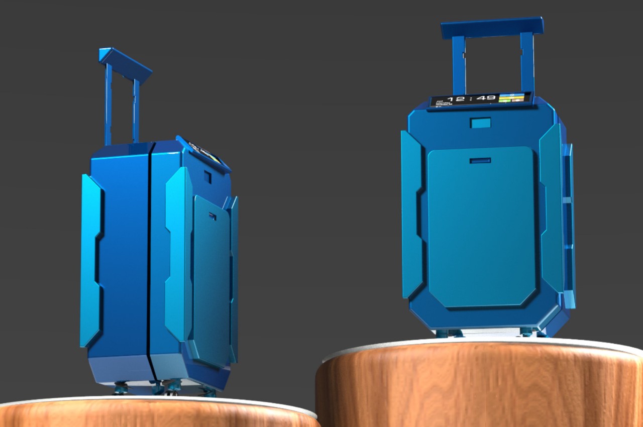
This business-minded purpose is easily seen through many of the tech-savvy features that the AeroEase concept proposes. For example, the front pocket is a laptop sleeve that can be easily accessed with a push of a button. Security is provided by an NFC lock that can be accessed via a smartphone using biometrics like a fingerprint. There’s also a small display panel on top that shows critical travel information at a glance, including the weight of the suitcase.

The very shape of the suitcase itself is also quite eye-catching, eschewing traditional designs where the front half is often a single material piece. Instead, the front pocket looks like a distinct part that protrudes from the body of the suitcase, while the four corners of the suitcase have bumpers that take inspiration from Casio’s iconic G-SHOCK rugged watches.

While the AeroEase’s design is indeed quite distinctive, there might be some aspects that raise concerns, especially about the durability of such a suitcase. That display, for example, could break with impact, which isn’t uncommon in during rough rides. Those bumpers could also easily snag against other items in cabins or overhead storage, which could cause some issues for the owner or other travelers. With some refinement, these concerns could be addressed, hopefully offering a less stressful experience for working men and women who often find themselves on long overnight travels.

The post Watch-inspired smart suitcase concept is made for frequent travelers first appeared on Yanko Design.
Self-driving car concept is a hotel-like sleeping pod on wheels

Autonomous vehicles are still a somewhat controversial topic these days, but even detractors and critics will begrudgingly admit that it is the inevitable future. Given a foolproof and safe implementation, it opens up plenty of opportunities for people to do more during their travels, especially over very long distances. They can be more productive with work, spend more quality time with family, or simply get a good night’s sleep in transit. The latter isn’t exactly comfortable to do with today’s car designs, but that’s only if you don’t let go of current conventions and limitations. This design concept for a mobile sleeping pod, in contrast, pulls out all the stops and demonstrates what’s possible with the right technologies, the right design, and especially the right shape.

Designer: Peter Stulz

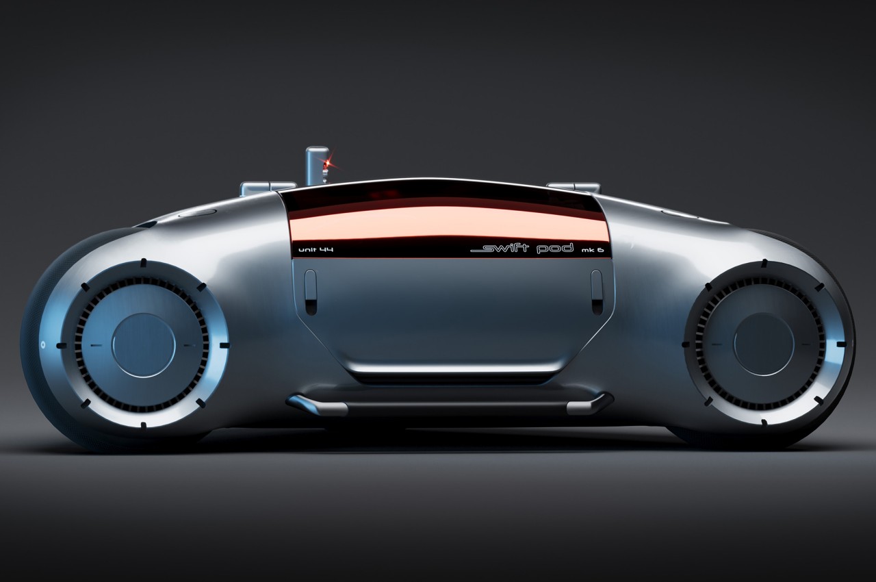
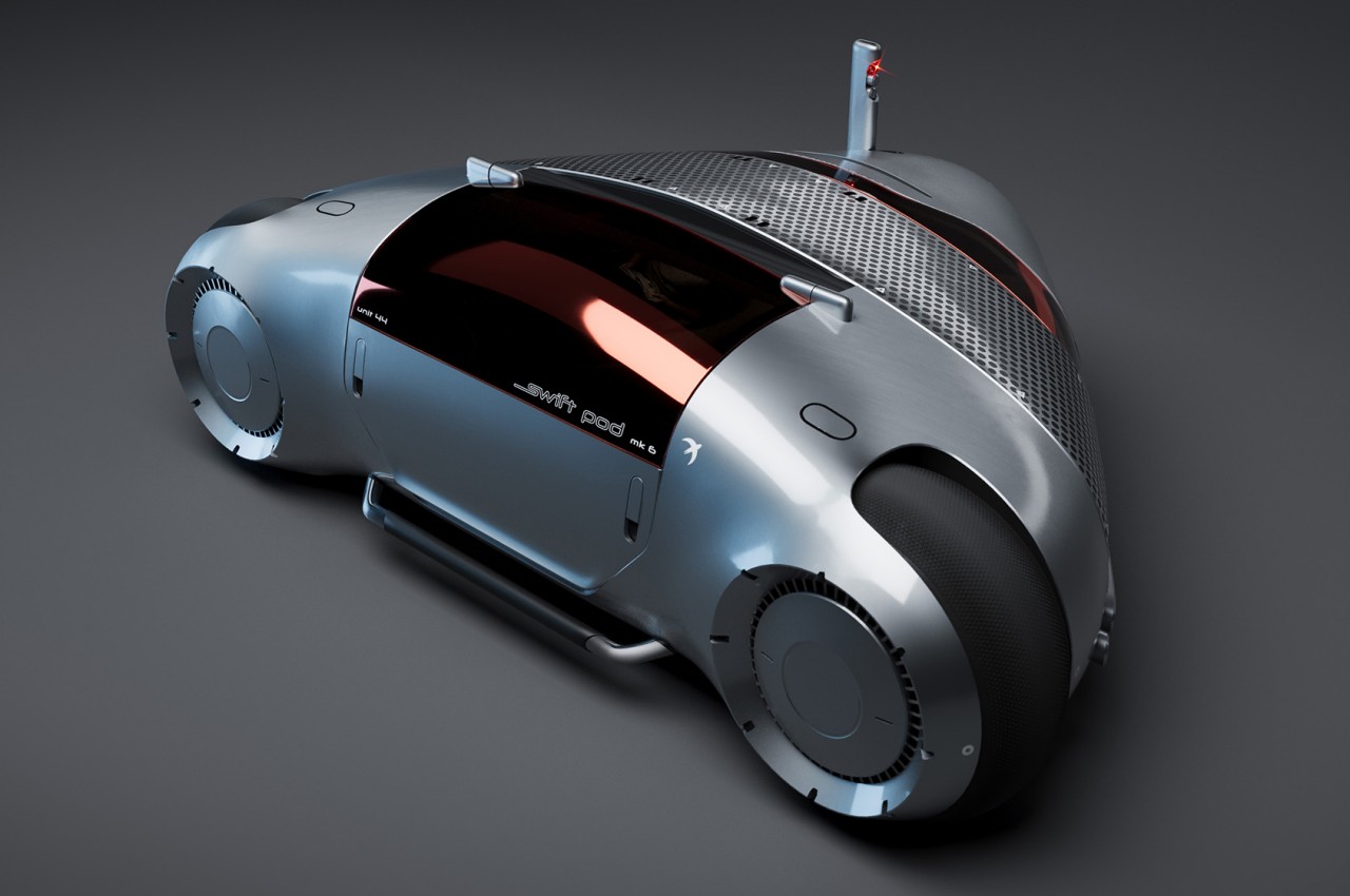
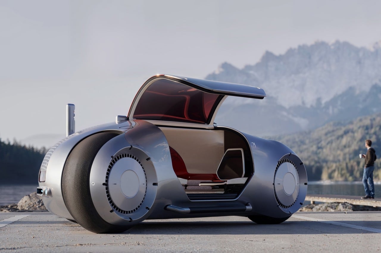
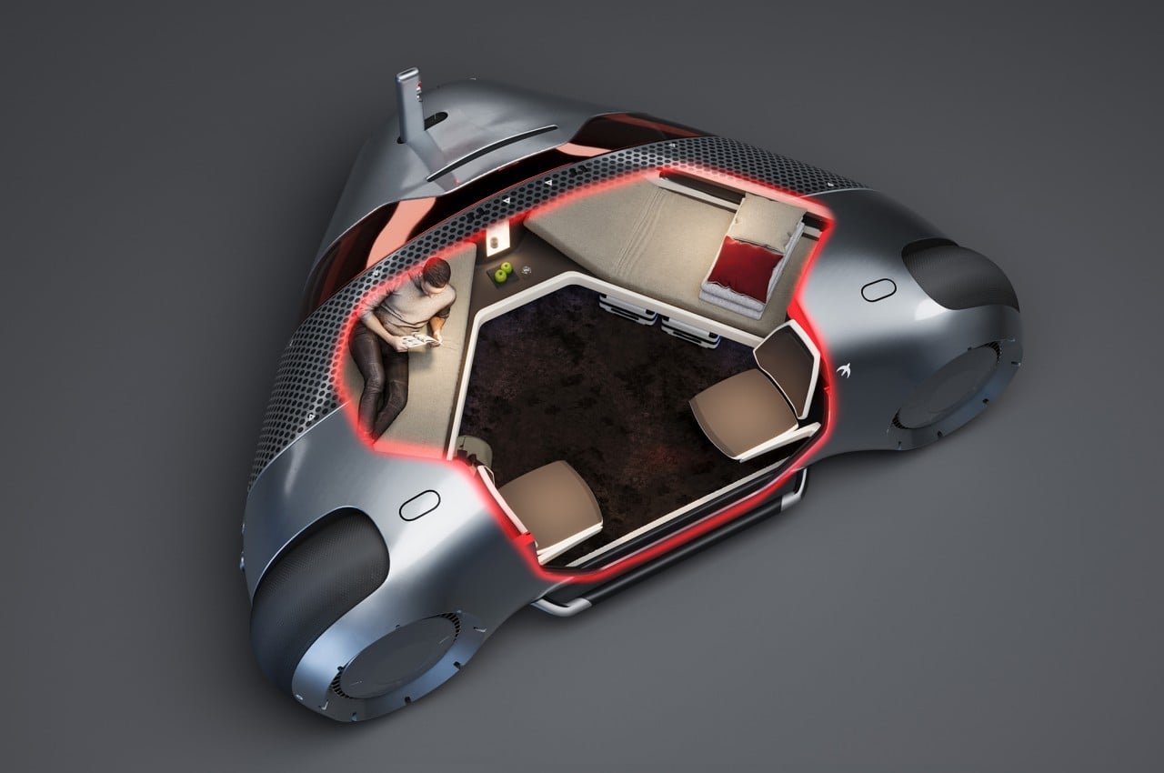
When viewed from its profile, the Swift Pod looks more like a gigantic motorcycle, a vehicle that stands on two wheels only. It’s definitely not your regular motorbike, even disregarding the significantly larger size, because it looks more like a cross between a bike and a car from the way it has a cabin instead of just a seat. When viewed from the top, however, the vehicle is revealed to actually run on three wheels, forming an odd triangle shape instead of a typical box you’d expect from cars.

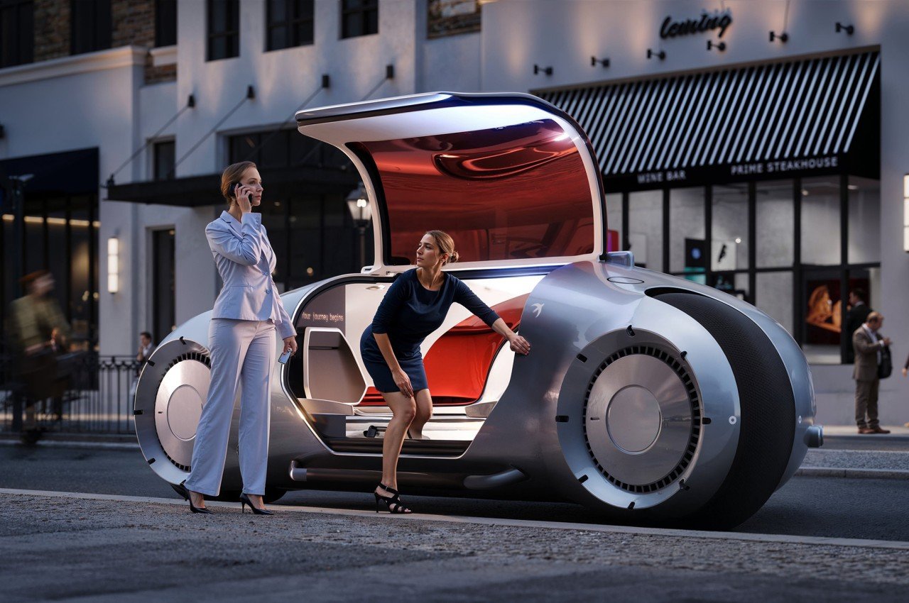
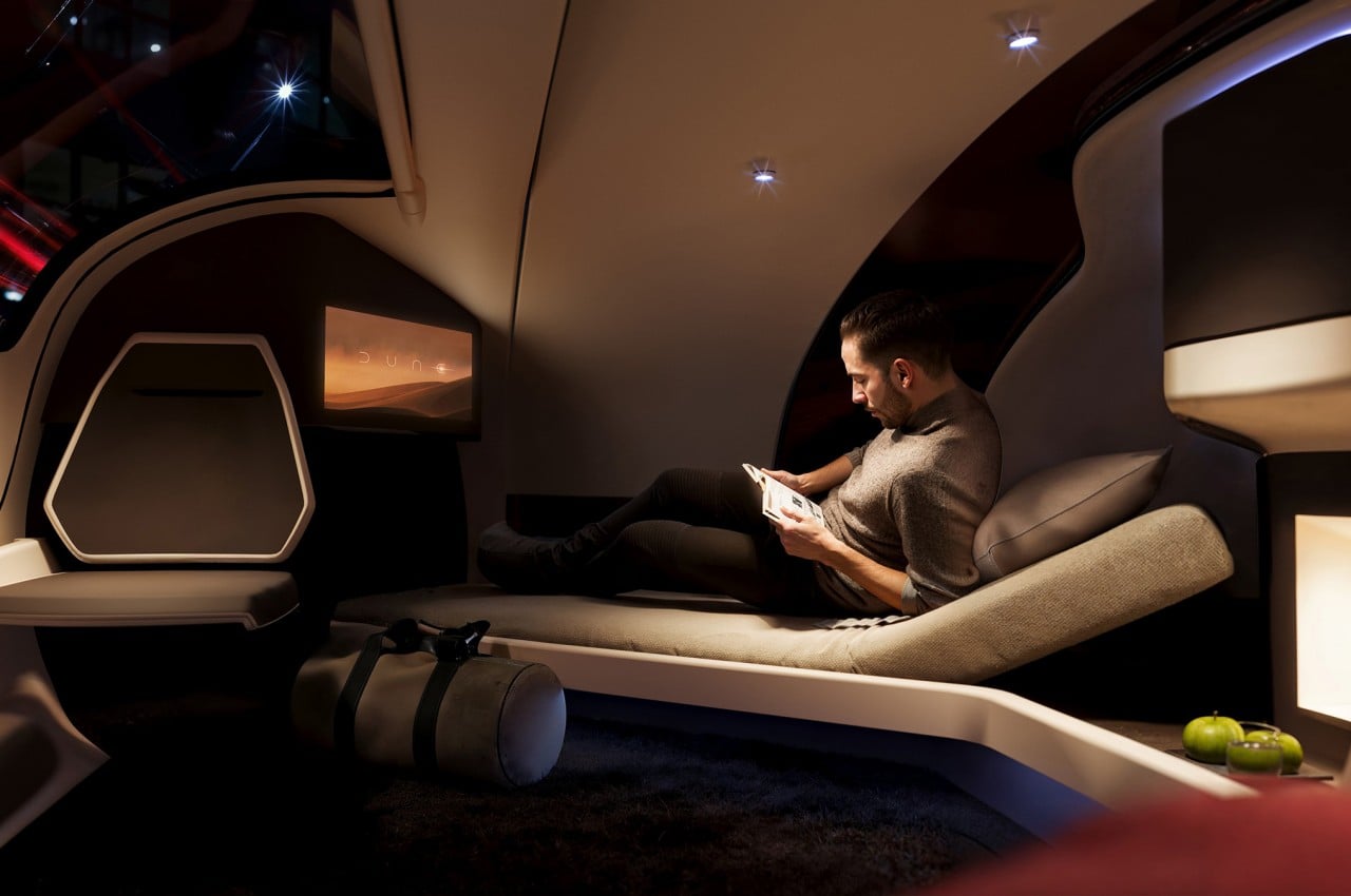
The choice of the shape isn’t for appearance’s sake, though, but was made to maximize available space inside while minimizing the vehicle’s size. After all, the Swift Pod is designed to have two adult-sized beds inside, one on each side of the triangle, in addition to two chairs, amenities, and, of course, the vehicle’s actual hardware and components. The concept, after all, is for a mode of transportation that will let you sleep through your journey, at least if you want to. There’s plenty of space for two people to do anything, including working if necessary.

The concept was inspired by how some people are able to get a decent amount of sleep on trains and planes, and that’s without a comfortable bed or other conveniences. With Swift Pod, you not only have a comfortable place to recline but also an entertainment system, snacks and beverages, and plenty of storage for your belongings. What it doesn’t have room for is a human or physical driver.

The Swift Pod concept only works if autonomous driving has reached a point where one can really entrust their safety to these invisible drivers. The design envisions an extremely smart self-driving vehicle that, after booking a ride like a taxi, would be able to determine the best path toward your destination and navigate the roads safely. While the default is to simply go from point A to point B in one go, the system also has room for stop-over breaks where you can get off, eat some heavier meals, and freshen up before you take the next leg of your journey in the comfort of a bed.

The post Self-driving car concept is a hotel-like sleeping pod on wheels first appeared on Yanko Design.

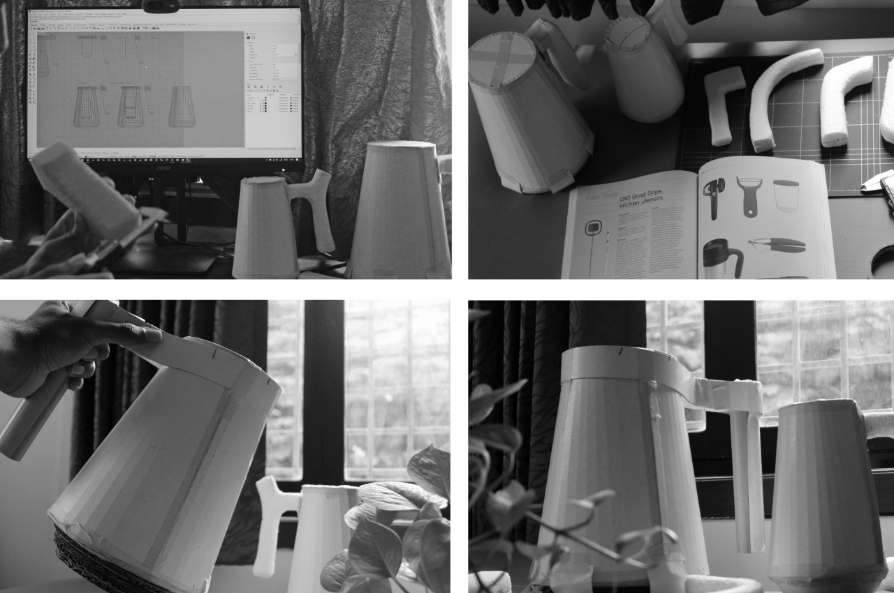
Water filtering pitcher concept wants you to slow down while pouring a drink

When you’re thirsty or you need to drink water, you just go to your ref, bring out the pitcher, or open a water bottle and just drink. You don’t really think about things like slowing down, mindfulness, staying healthy, or resting. You just need to quench your thirst or count the glasses of water that you drink. But actually if you think about it, drinking water can definitely be connected to all of that and can be your chance to take a break from your normal routine and take a few, deep breaths while drinking.

Designers: Krishna Pranav Vaddiparthi & Ria Shah

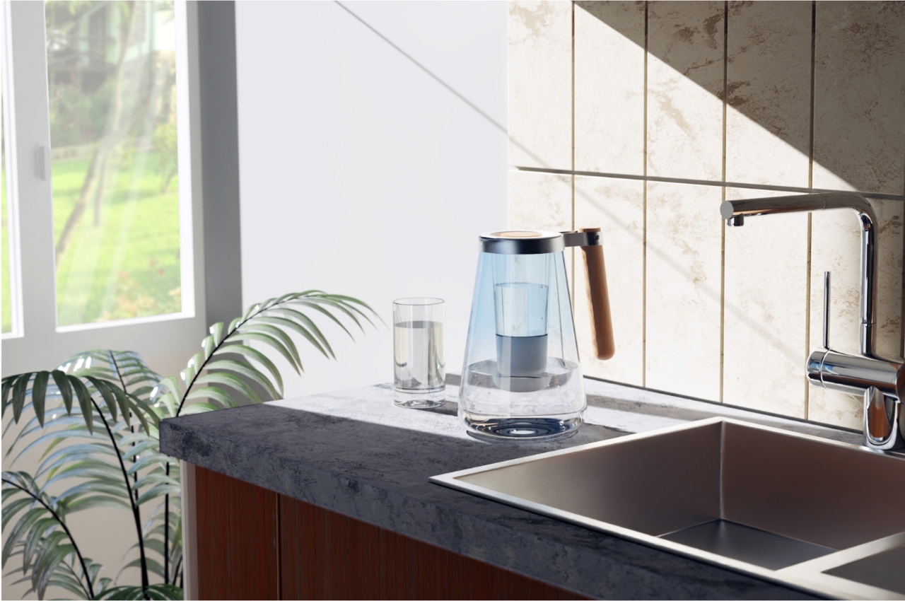
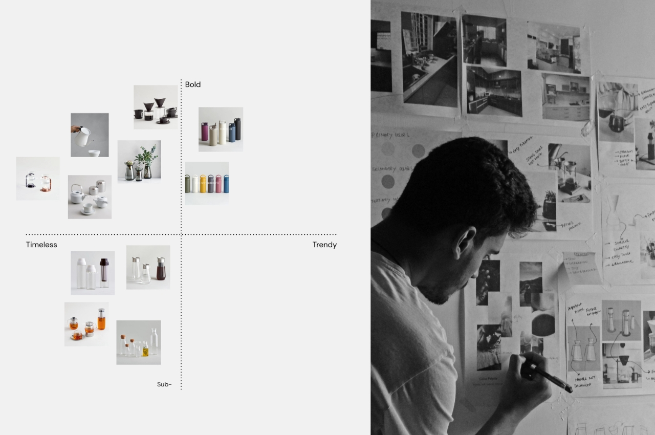
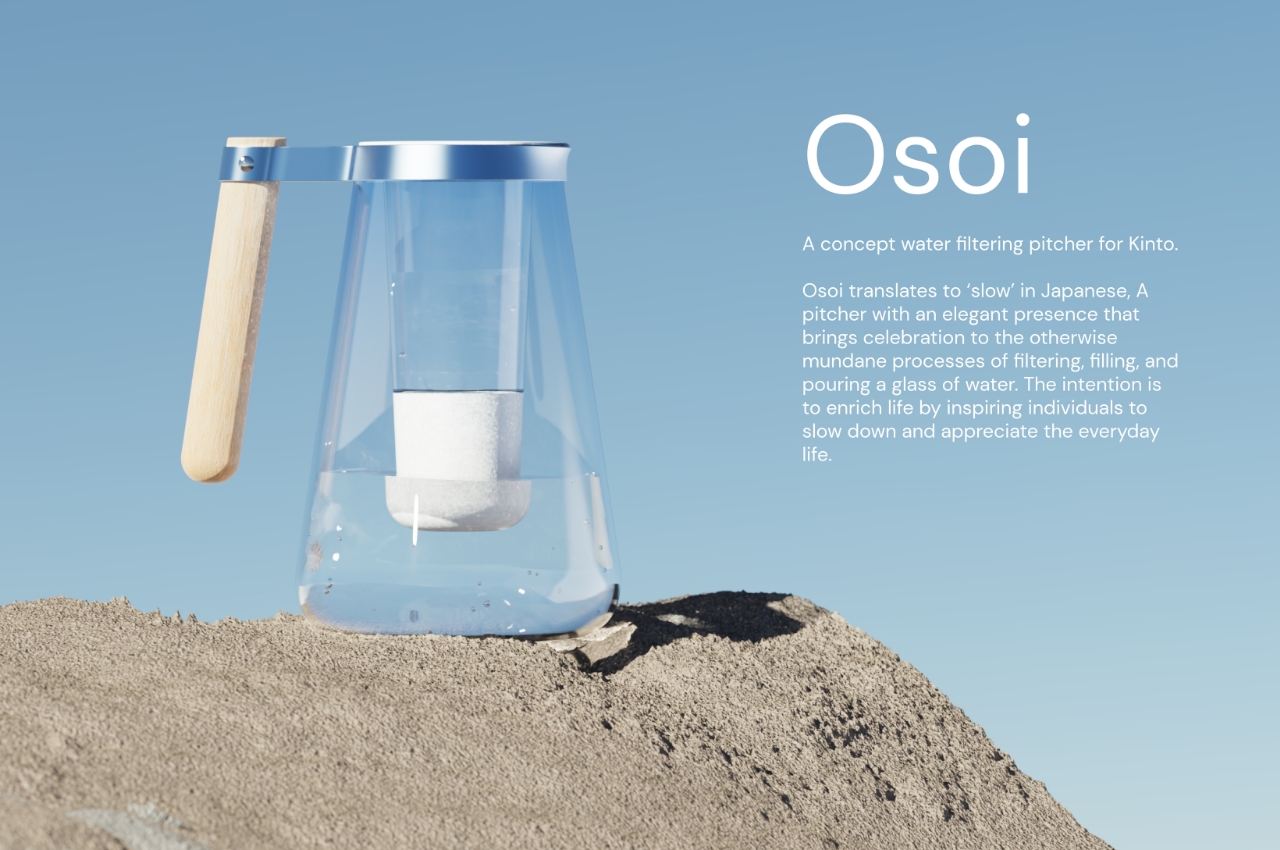
Osoi is a concept for a water filtering pitcher for Japanese tableware and lifestyle brand Kinto. The name of the product is the Japanese word for “slow” and its goal, aside from getting you to drink clean, filtered water, is to slow down while nourishing your body. The brand is the perfect inspiration as they are an advocate of using their products to “connect to life” or just taking a break from your work or studies even as you do something mundane.

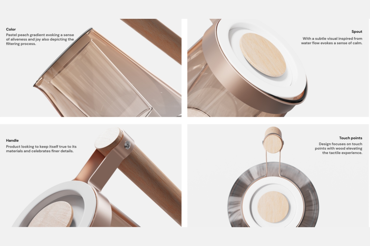
The design of the pitcher itself uses several elements that represent what it means to slow down on a functional and aesthetic level. The pastel peach gradient represents joy but is also part of the water filtering process. Meanwhile, the spout, representing the water flow, lets you pour the water ever so slowly so you’re forced to slow down and have a sense of calm. The wooden handle is supposed to “celebrate the finer details” while the few wooden parts of the pitcher gives you a more tactile experience.

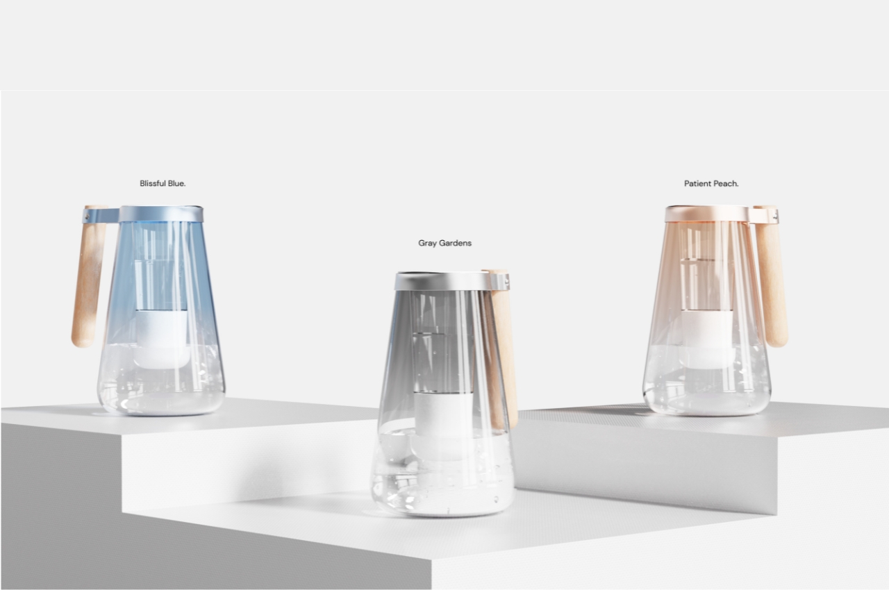
The Osoi pitcher render shows three different color hues: Blissful Blue, Gray Gardens, and Patient Peach. It’s a pretty interesting ideology to put on a mere pitcher but we all need to stop and smell the roses, or at least drink the water, every once in a while.

The post Water filtering pitcher concept wants you to slow down while pouring a drink first appeared on Yanko Design.
Air purifier concept takes a page from SMEG’s retro aesthetics

For those who live in spaces where natural air flow is a “luxury” or in cities where air pollution is a big problem, having an air purifier is a must. Well that is, if you want to breathe in good air and if you’re spending a lot of time there and you don’t want to spend a lot on healthcare expenses. But these kinds of appliances are really more functional and we don’t spend as much time on their design when choosing to buy one. If you can have something that has all the functionalities for an air purifier that you need and it is well designed and can fit in your space’s aesthetics, then that’s a bonus.

Designer: Khaavya Bhosale

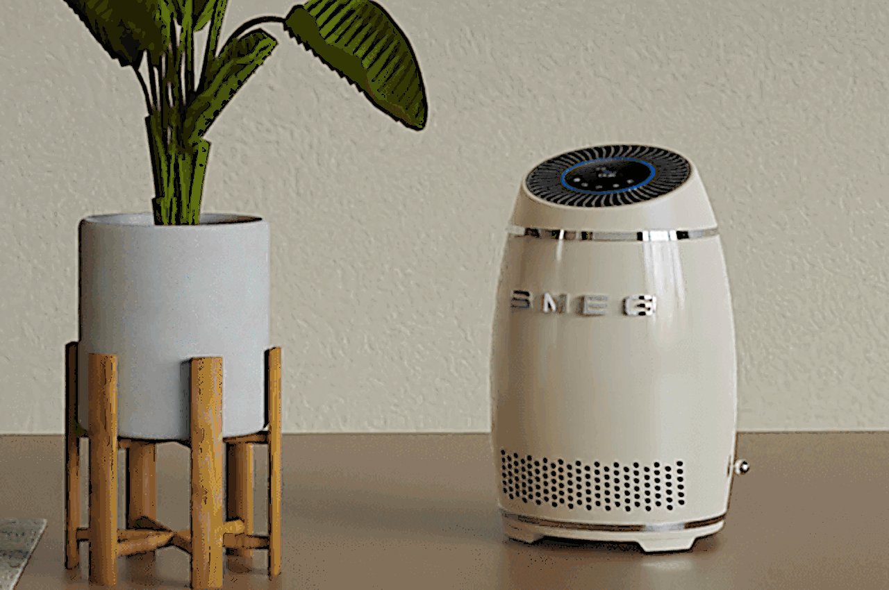
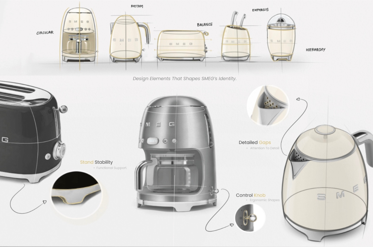
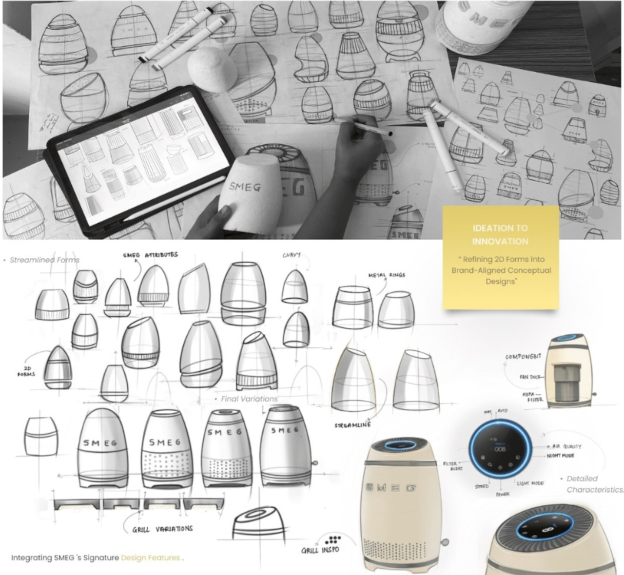
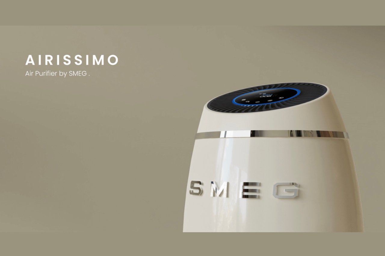
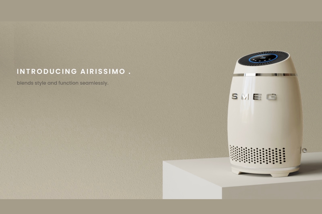
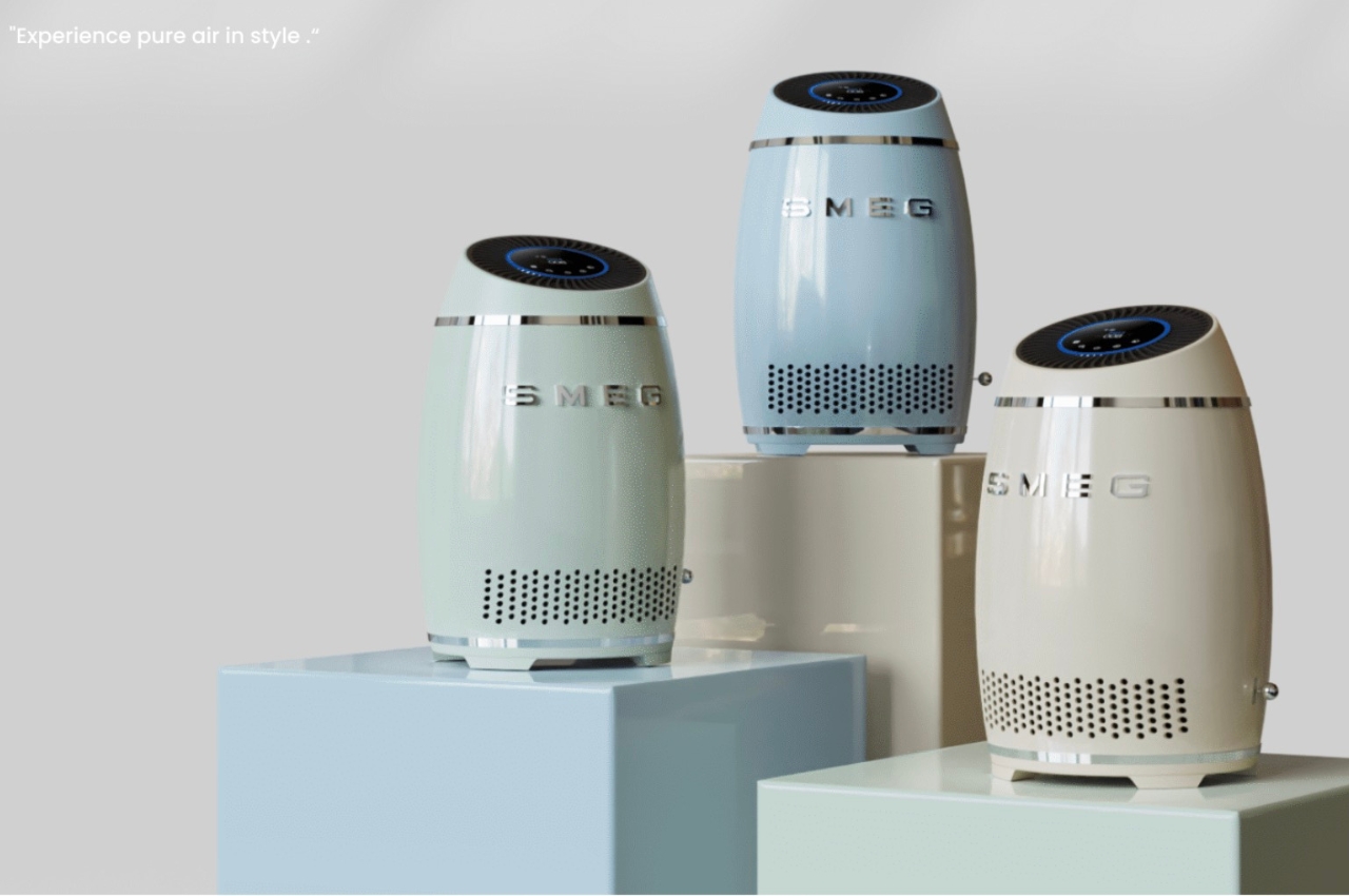
This concept for an air purifier for popular home appliance company Smeg fits in with the brand’s distinct retro style. The Airissimo aims to integrate all the most advanced technology in air purifiers into the classic design that all SMEG products have. This includes the familiar pastel colors, ergonomic control knobs, detailed gaps, and the standard stand that balances their appliances. The final renders of the Airissimo concept will definitely fit in with their current line.

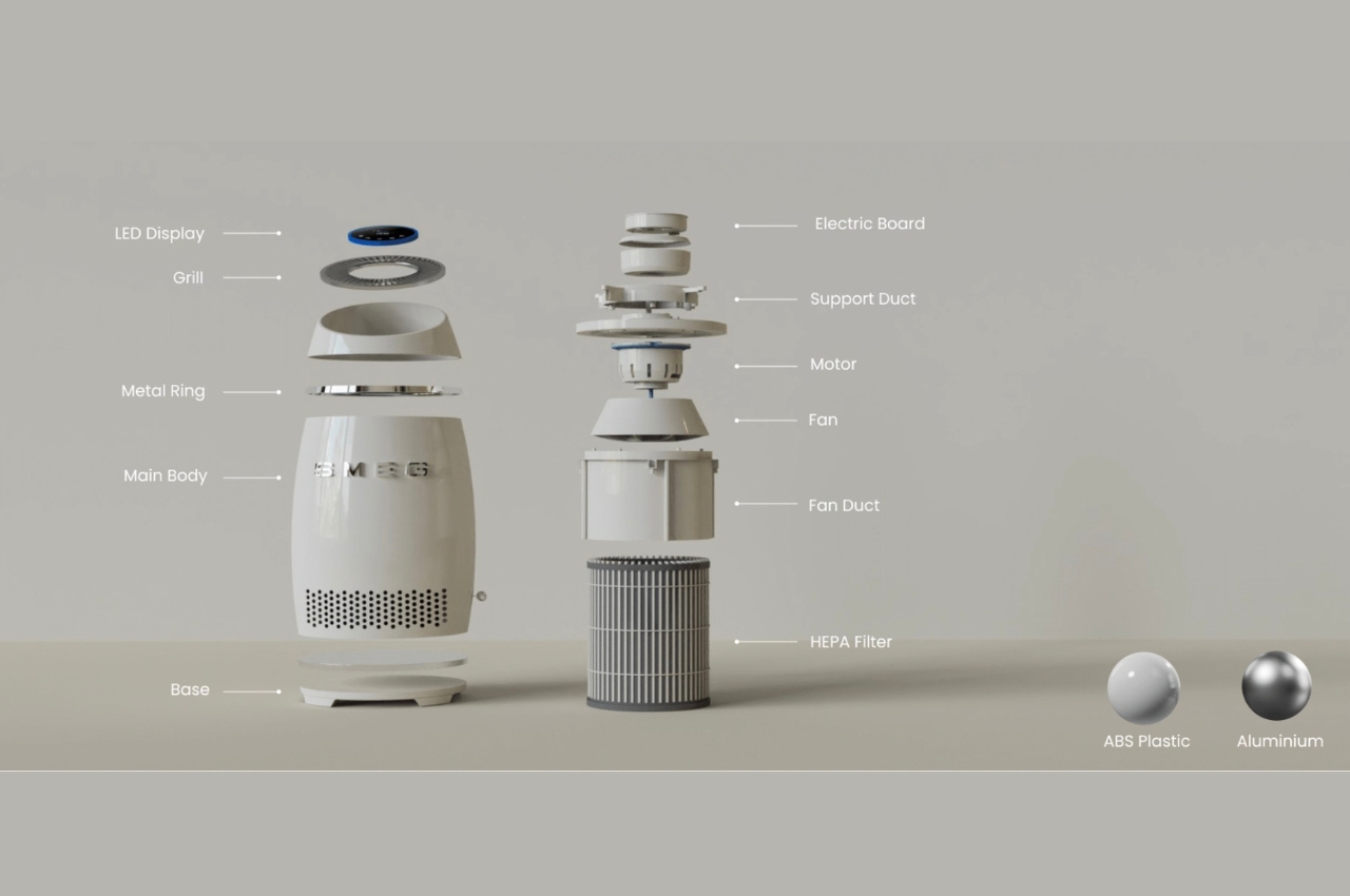
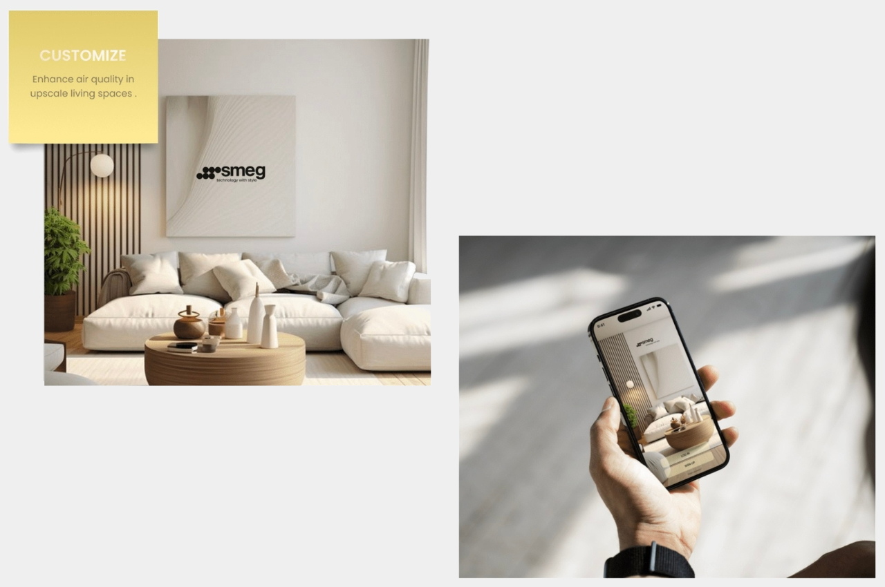
But it’s not just the look that the designer thought of, but all the functionalities and features that you need for an air purifier. It has an LED display that will show you the current air quality in your space. Inside you’ll find the electric board, support duct, motor, fan, fan duct and HEPA filter, all the necessary components for this kind of appliance. It uses ABS plastic and aluminum as its main materials. There is an app that you can connect to it to adjust the controls, to monitor air quality, and to also get reminders when you need to replace your filters.

The Airissimo looks like a huge smart hub that you’ll find in your living space or a sophisticated-looking air cooler. Most air purifiers currently in the market look like your usual air-related appliances (aircon, air cooler, humidifier, dehumidifier) so having something like this if SMEG does decide to eventually branch out into this would be pretty cool.

The post Air purifier concept takes a page from SMEG’s retro aesthetics first appeared on Yanko Design.
Interchangeable emoji camera covers give smartphones more character

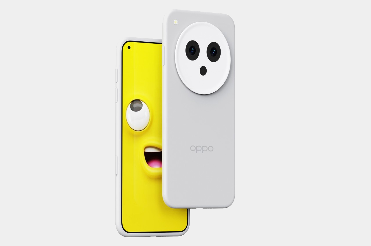
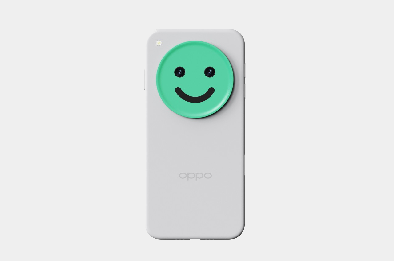
The back of our phones is always visible to the people around us, which makes it the most expressive part of the smartphone. That’s why manufacturers spend a lot of time and resources on the design of the phone’s rear, using a variety of materials for the cover and designs for the camera. Those designs, however, are decided by companies and never change once production starts. They don’t always reflect the owner’s tastes, and definitely not all the time. Being able to change your phone’s “face” to fit your mood offers a lot of freedom of expression, and it all takes is putting a different emoji on top of your camera.

Designer: Yifan Hu

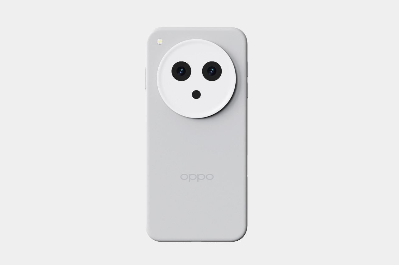
Smartphone cameras are becoming more powerful and with that power comes bigger enclosures. What were once just two eyes looking at you from the back of the phone has become a large circle that adds a face to those eyes. It’s just a metaphor, of course, but one that can actually be used to design a set of accessories that turn your mobile partner into some sidekick character, complete with a face and a personality.

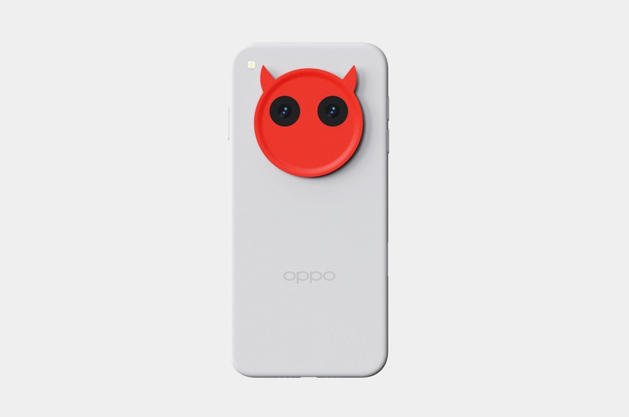
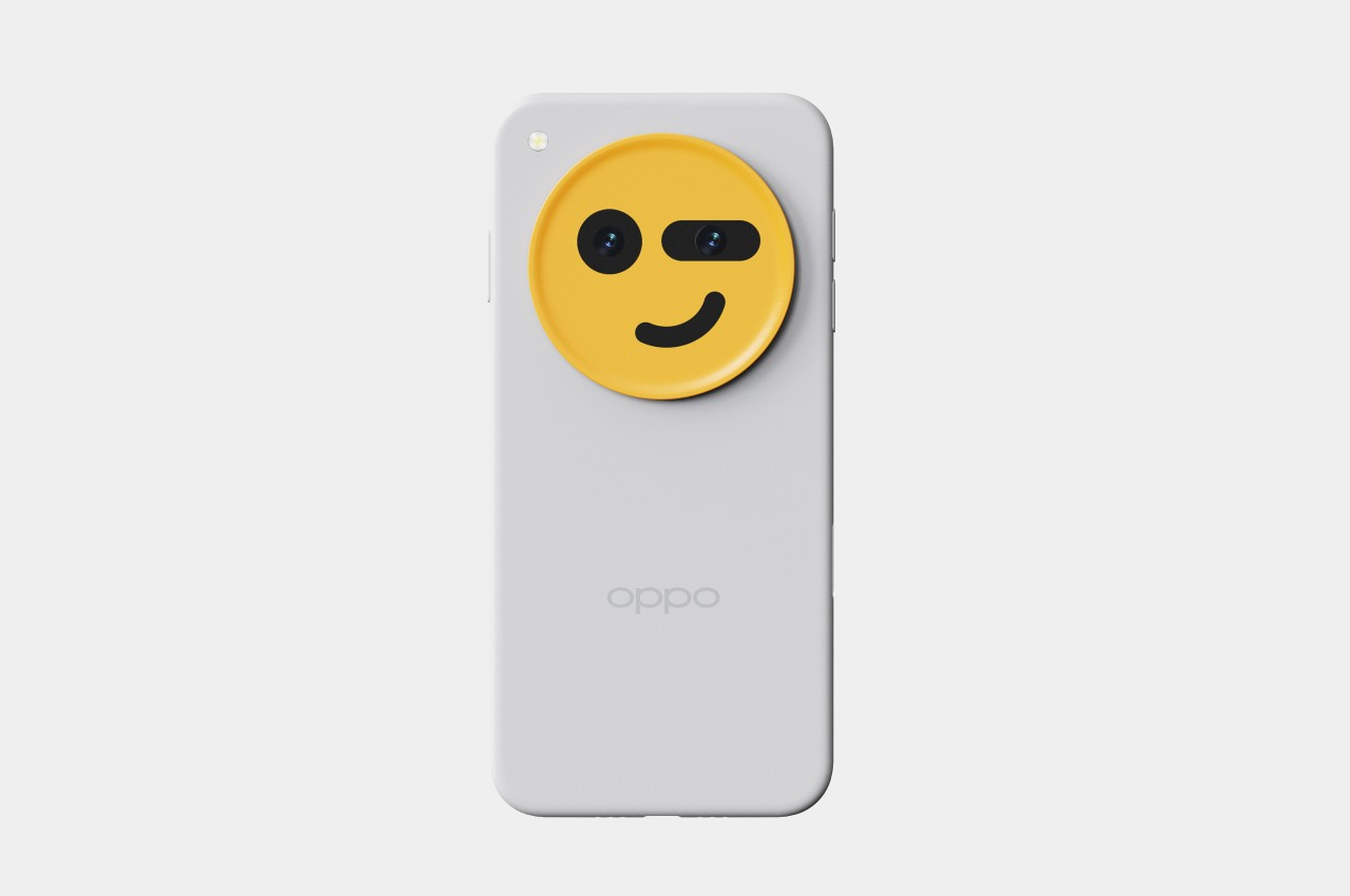
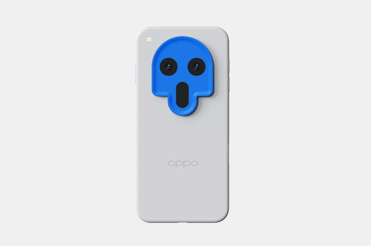
These emoji-inspired accessories simply put a smiley or one of its comical variants on top of the camera circle of a smartphone. It takes advantage of how most of these cameras are designed, with two of the cameras placed side by side and near the top of the circle. It’s a perfect location for eyes and a face, one that perhaps more accurately expresses your own personality or just your mood for that day.

1

Of course, there are obvious limitations to this design, the biggest of which is how not all camera bumps are circular. And those that are circular aren’t always located in the middle of the phone, making it a bit awkward but not entirely unattractive to put an emoji in the corner. That said, this camera design is actually becoming more popular these days as manufacturers try to figure out the best location for the growing number and sizes of cameras on a phone.

There’s also the consideration that a smartphone might have more than just two cameras, and their locations might not perfectly align with a smiley face. That simply needs a bit of creativity to design around those restrictions, like adding mouths to the face or having asymmetrical eyes that convey even more facial expressions than a traditional smiley. It’s really a simple concept that goes a long way in adding fun to the smartphone experience, while still giving you the freedom to go back to a pristine and “normal” look from time to time.

The post Interchangeable emoji camera covers give smartphones more character first appeared on Yanko Design.
Electronic 3D book concept helps visually impaired kids feel the magic of fairy tales

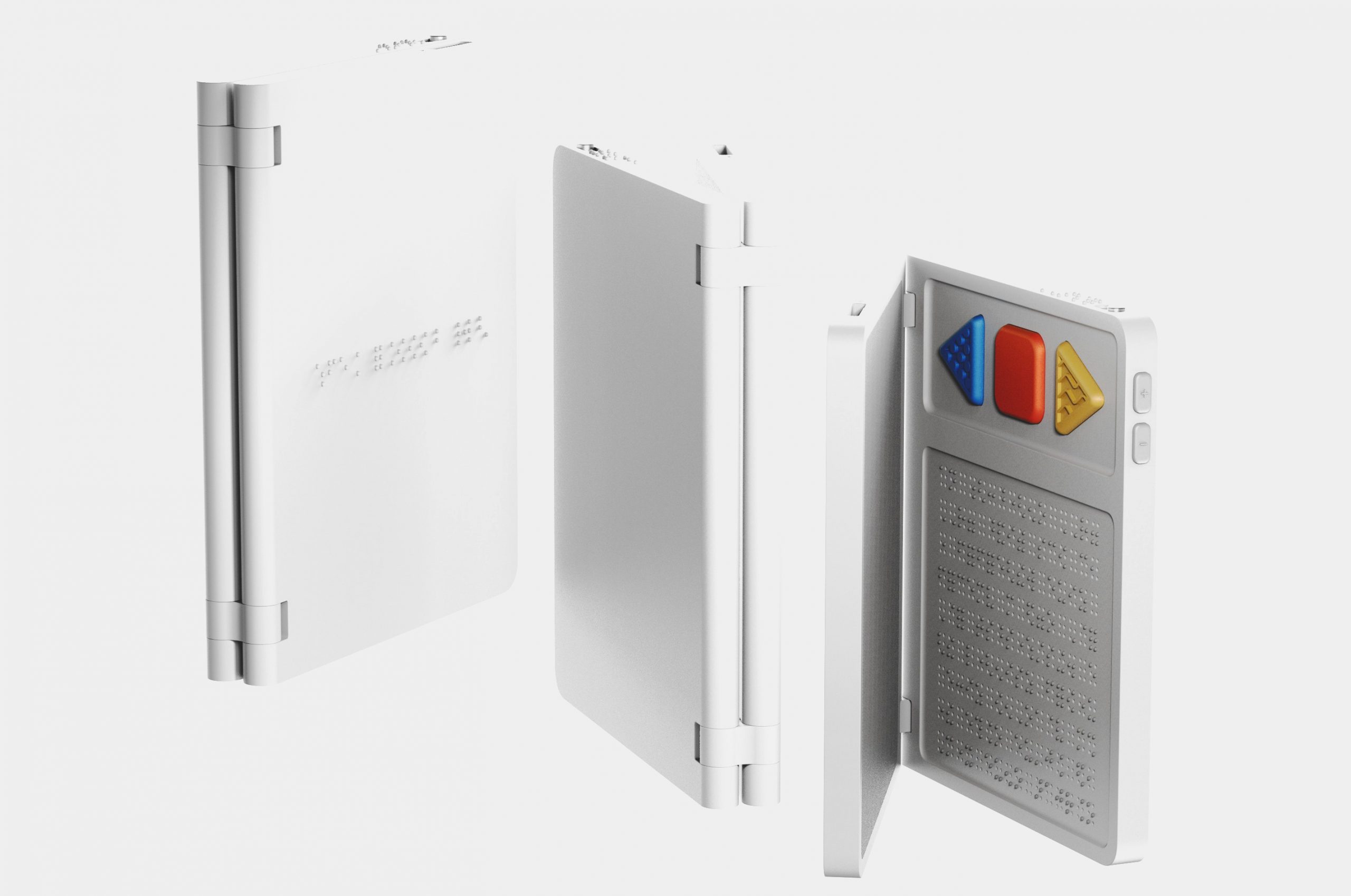
Reading is already a difficult task for people with visual impairments, but it’s especially challenging when it comes to material that involves a lot of visual elements. Adults might have not much of a problem visualizing those words in their minds, but children who are still developing their mental libraries will probably have a harder time. Fairy tales and fictional books with fantasy elements are examples of these highly visual materials, and simply hearing the narration or feeling the words through Braille feels rather insufficient to capture the emotions and magic of the stories. This electronic book concept tries to offer an equally magical experience that makes the objects and scenes pop out from the book, almost literally.

Designers: Subin Kim, Yujeong Shin, Seungyeon Lee

It’s pretty amazing how blind and visually impaired people can read a book while sliding their hands across seemingly random dots, almost like magic. But the text on a page doesn’t exactly show the images associated with the words, relying on your imagination to conjure up those associations mentally. Of course, that comes almost like second nature for those with normal eyesight, but the visually impaired, especially younger ones, need a bigger boost to help match words with shapes and objects.

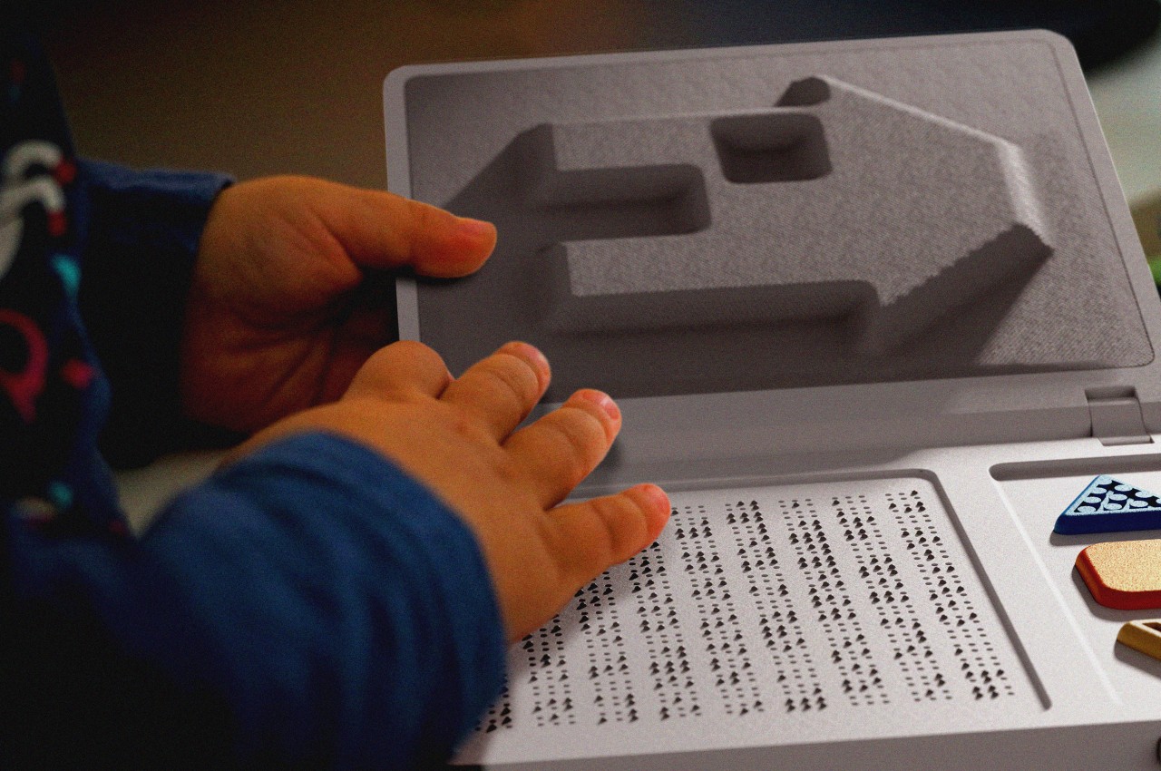
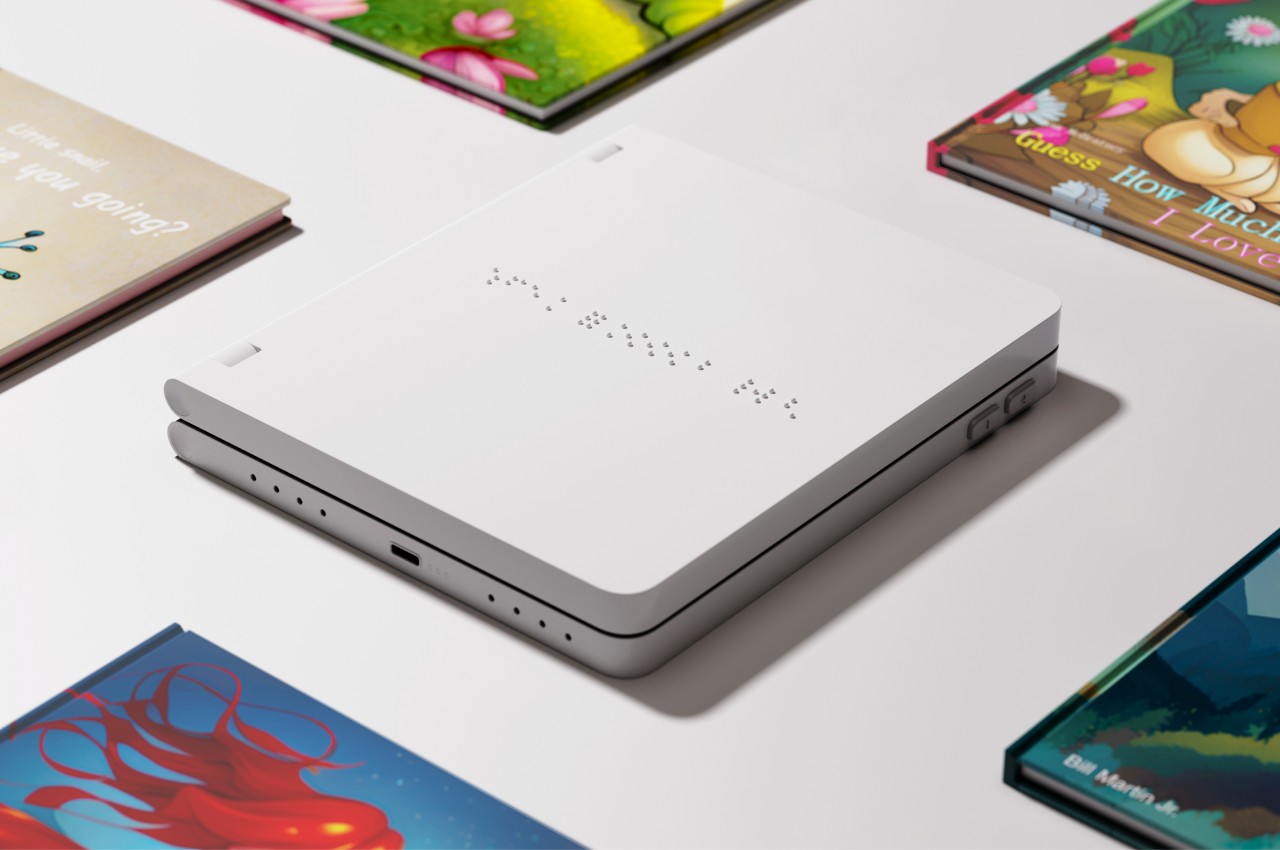
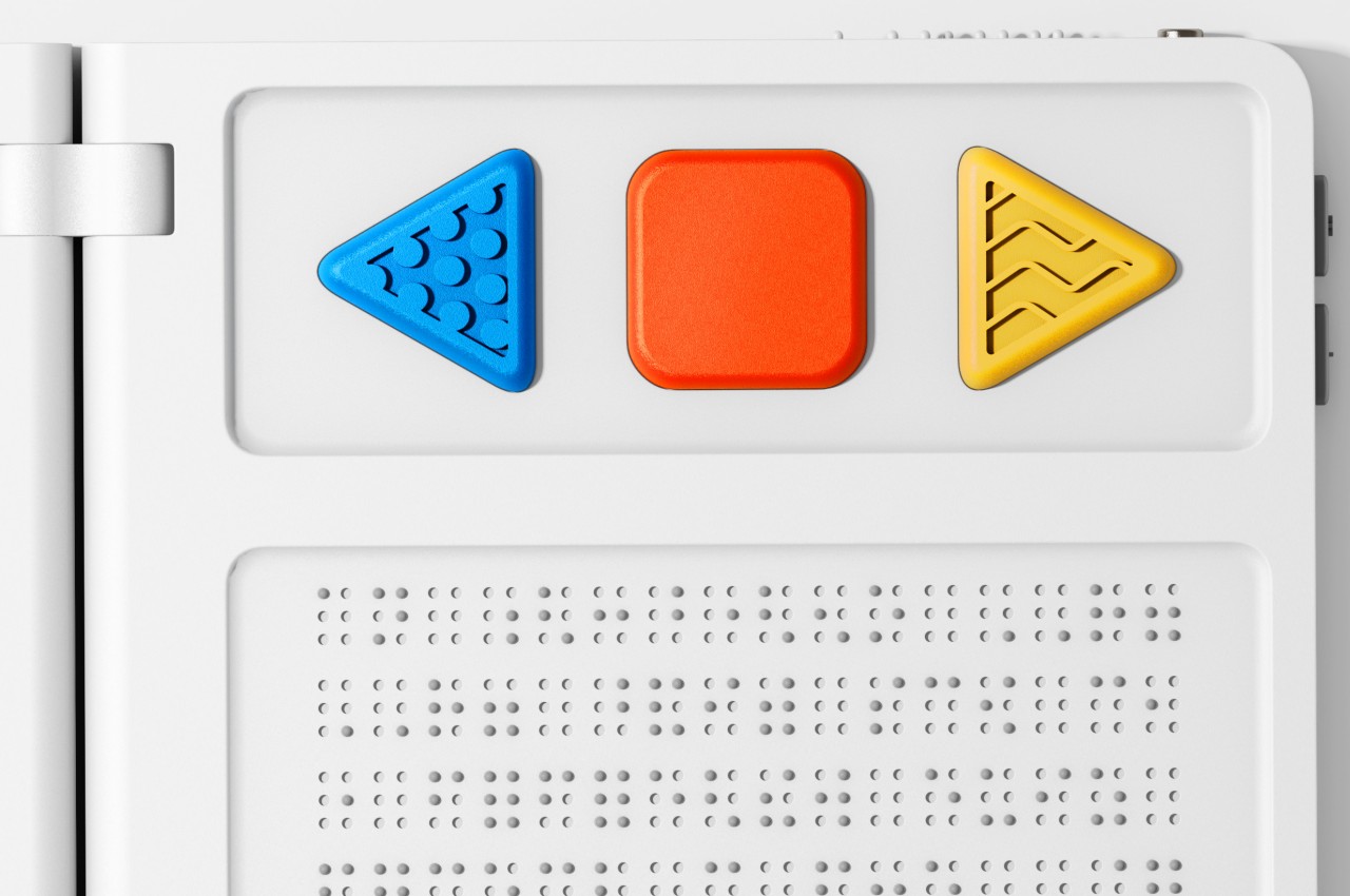
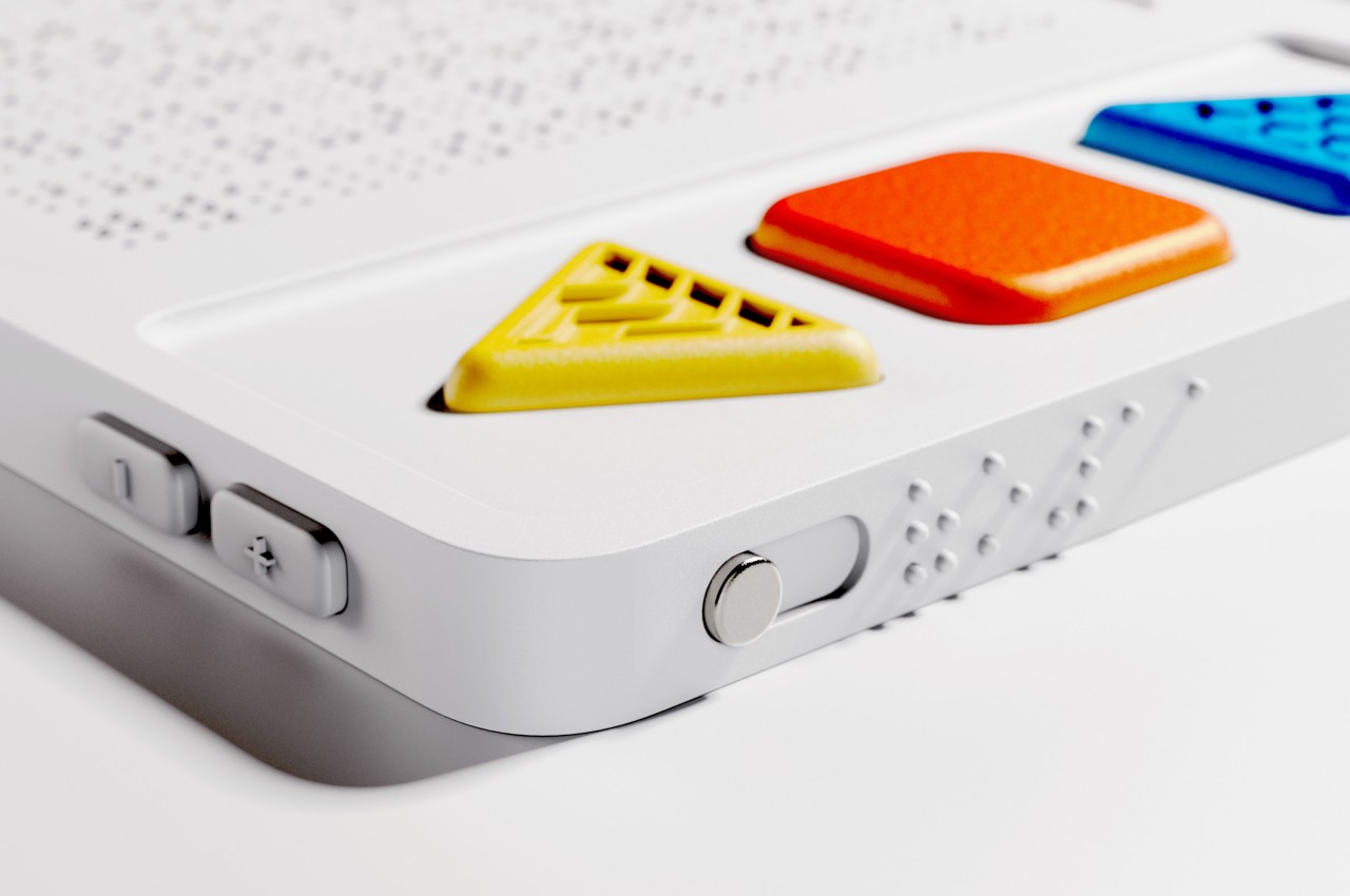
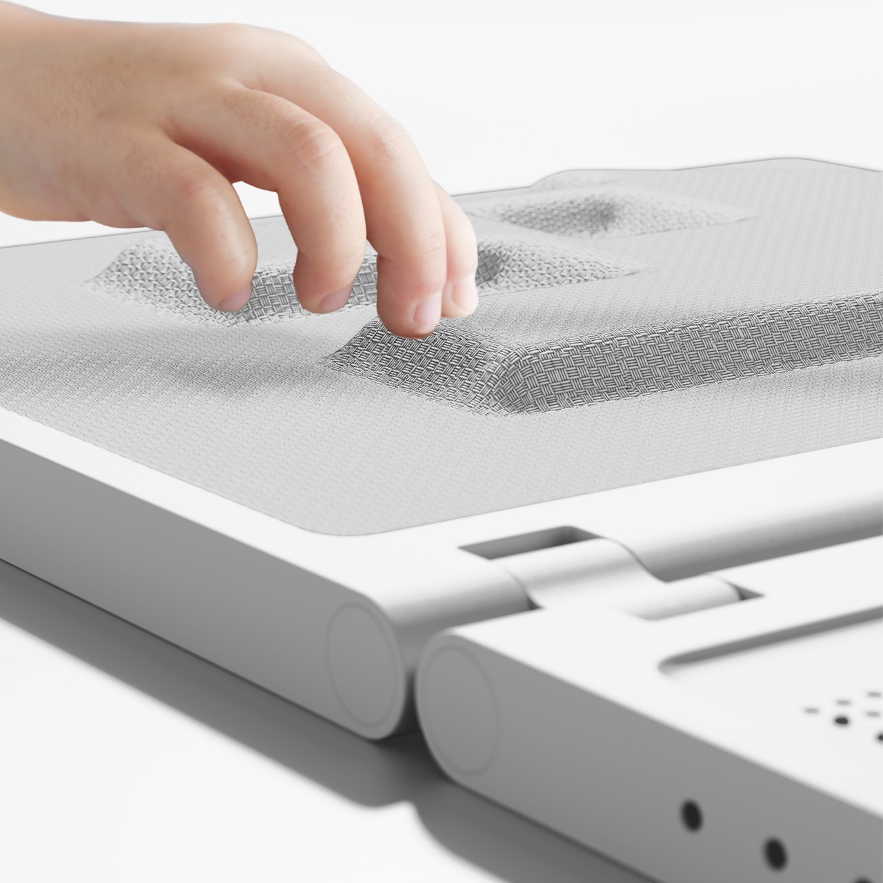
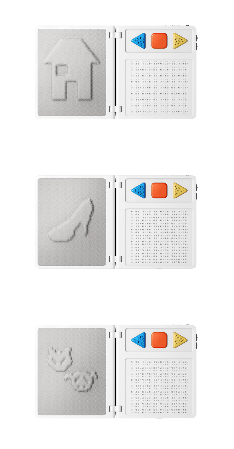
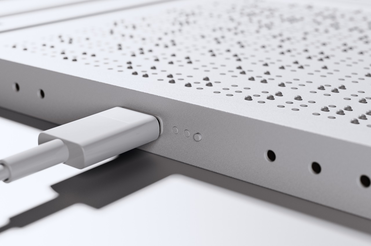
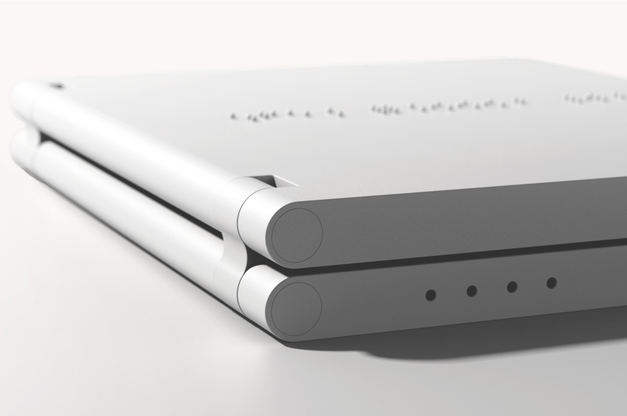
bbook is a concept for an electronic 3D book that provides all the necessary tools for a child with visual impairments to not only make sense of but also enjoy such fantastical books. It has an audio component that reads the book out loud, with large tactile buttons that let the reader skip forward or backward as desired. There’s also a dynamic Braille “page” where dots rise and sink as the words change.

1

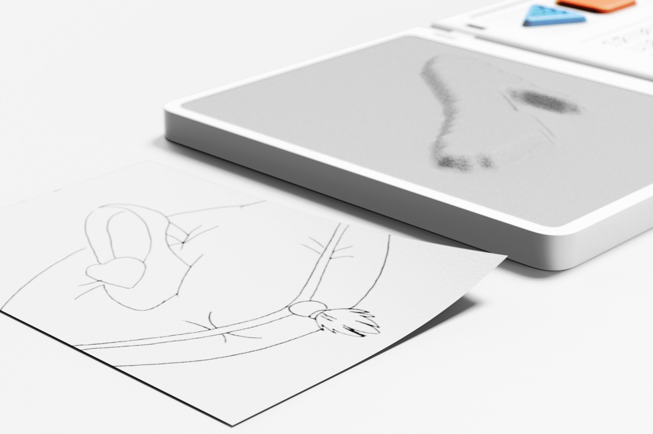
The most interesting part of the book, however, is the fabric-like material on the opposite page. This soft material would also rise to create bumps but not as words in Braille but as actual three-dimensional objects related to the story being told. It could be Snow White’s apple, Cinderella’s glass slipper, or the wolf in Little Red Riding Hood. In addition to the educational value of this feature, it also helps make the story feel even more magical.

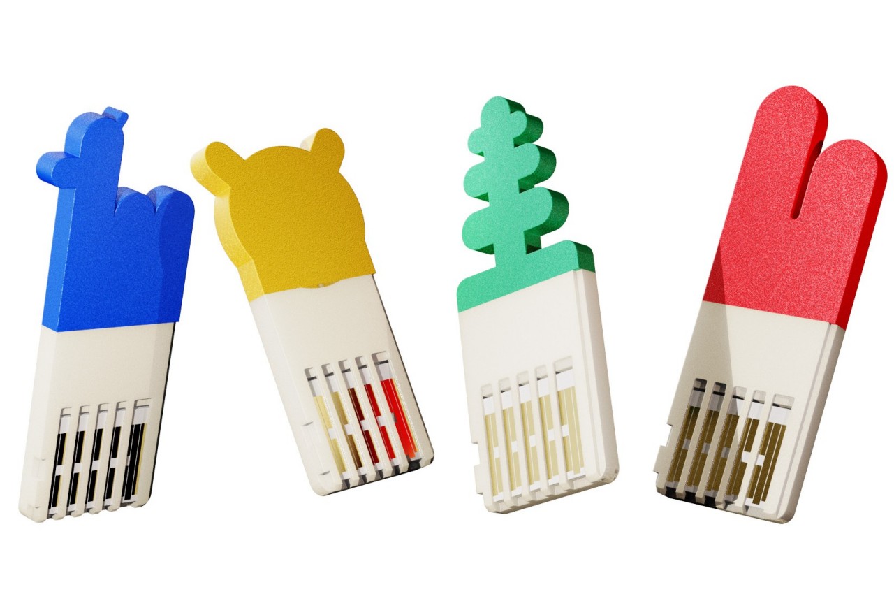
Every part of the 3D book was designed so that a visually impaired individual could use it without assistance. Even the charging indicators are elevating dots rather than LEDs so they can feel how much more time it needs. bbook also has a rather interesting feature where each individual story is inserted into the device like a USB stick, making each tale a memorable and magical experience.

The post Electronic 3D book concept helps visually impaired kids feel the magic of fairy tales first appeared on Yanko Design.
Modular instant camera concept offers a new way to create and share memories

The Polaroid brand has become synonymous with instant cameras that are experiencing a renaissance these days. But while the retro fever has people printing out square format photos again, the designs of these modern instant cameras left some things to be desired. Yes, they recreated the feeling of holding a large and chunky camera, but they might have done it too perfectly to meet the needs and tastes of today’s mobile photographers and creators. Smartphones offer more flexibility and features but at the expense of that authentic instant camera experience. This product concept tries to bring the best of both worlds together through a design that can adjust to your needs rather than the other way around.

Designers: Daphne Hernández, Paola García Higuera, Gonzalo Barba, Ricardo Zerón, Ximena Bravo Barreto, George Gonzalez, Cristian Tovar

The earliest modern instant cameras try to stay faithful to the Polaroid design by eschewing modern conveniences like LCD screens and photo editing prior to printing. On the opposite end of the spectrum, portable photo printers try to provide the same instant printing experience without requiring a separate camera from the one you already have in your pocket. But while smartphones offer a lot of powerful photo editing features, many people find the camera user experience a bit artificial or even forced because of the design of the phone and the connotations that come with it.

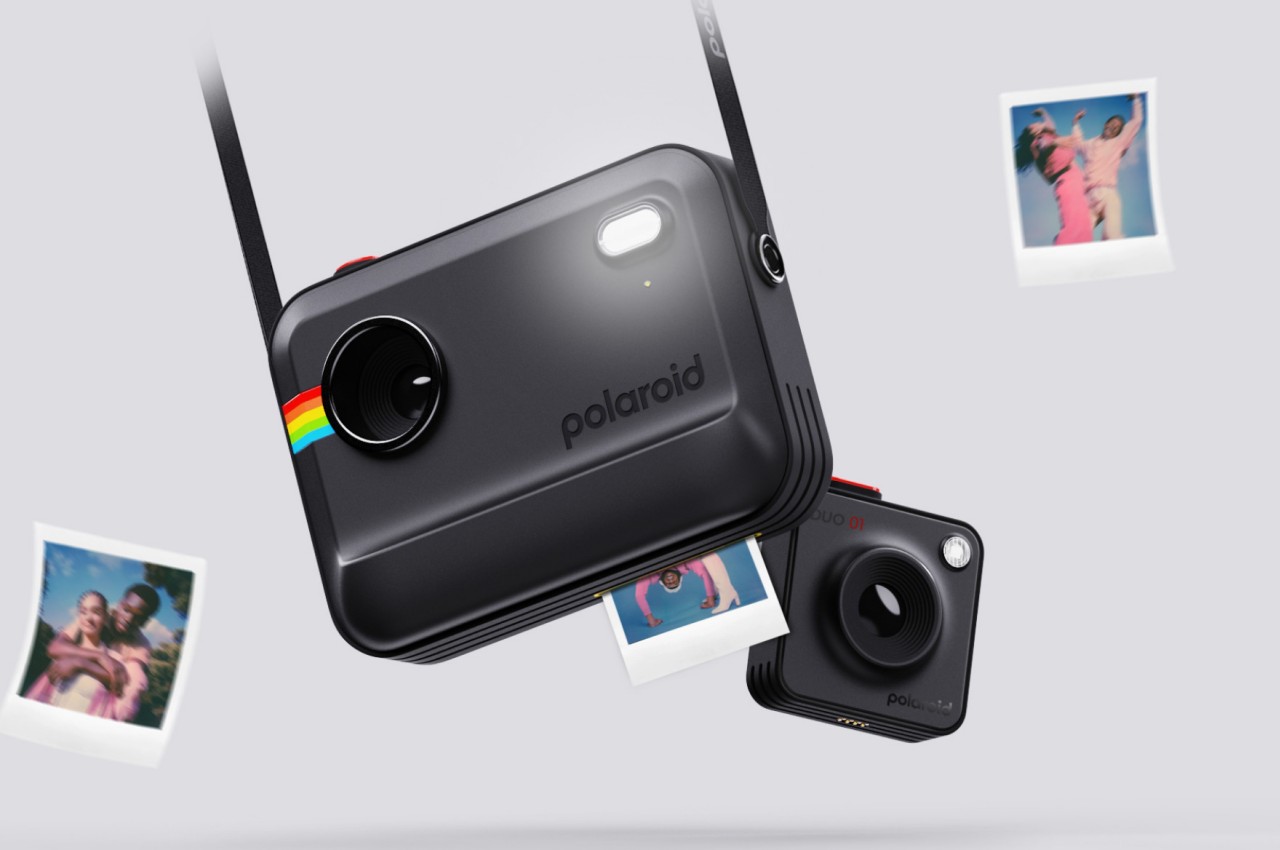
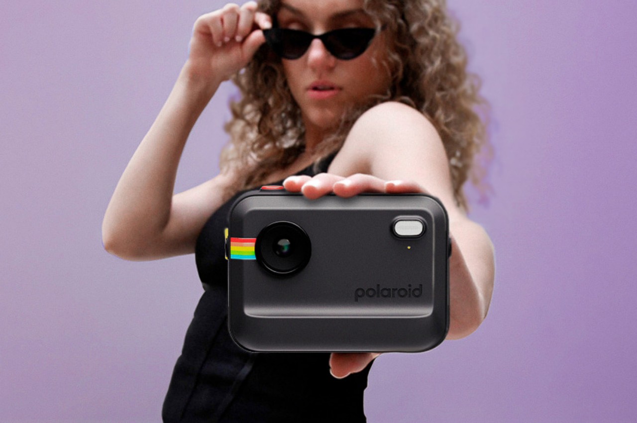
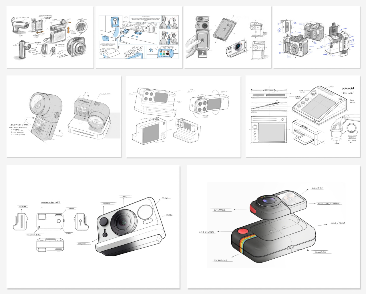
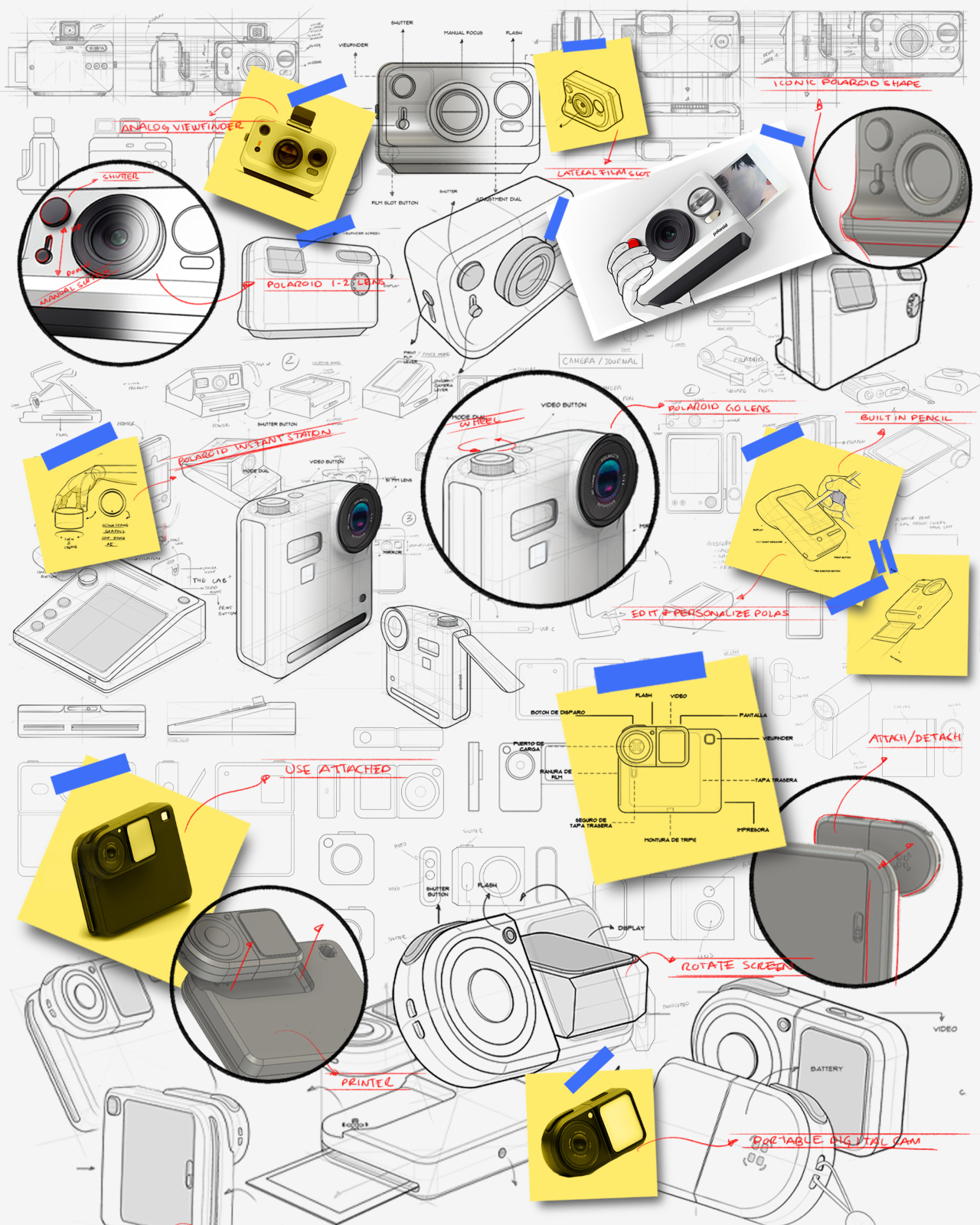
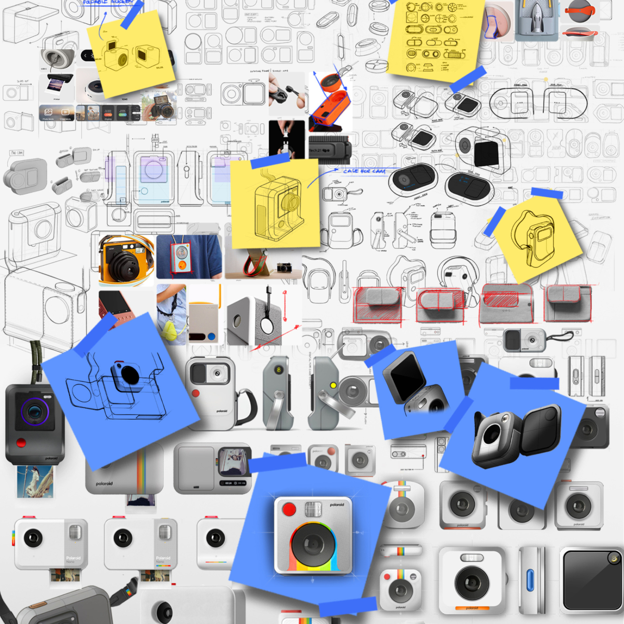
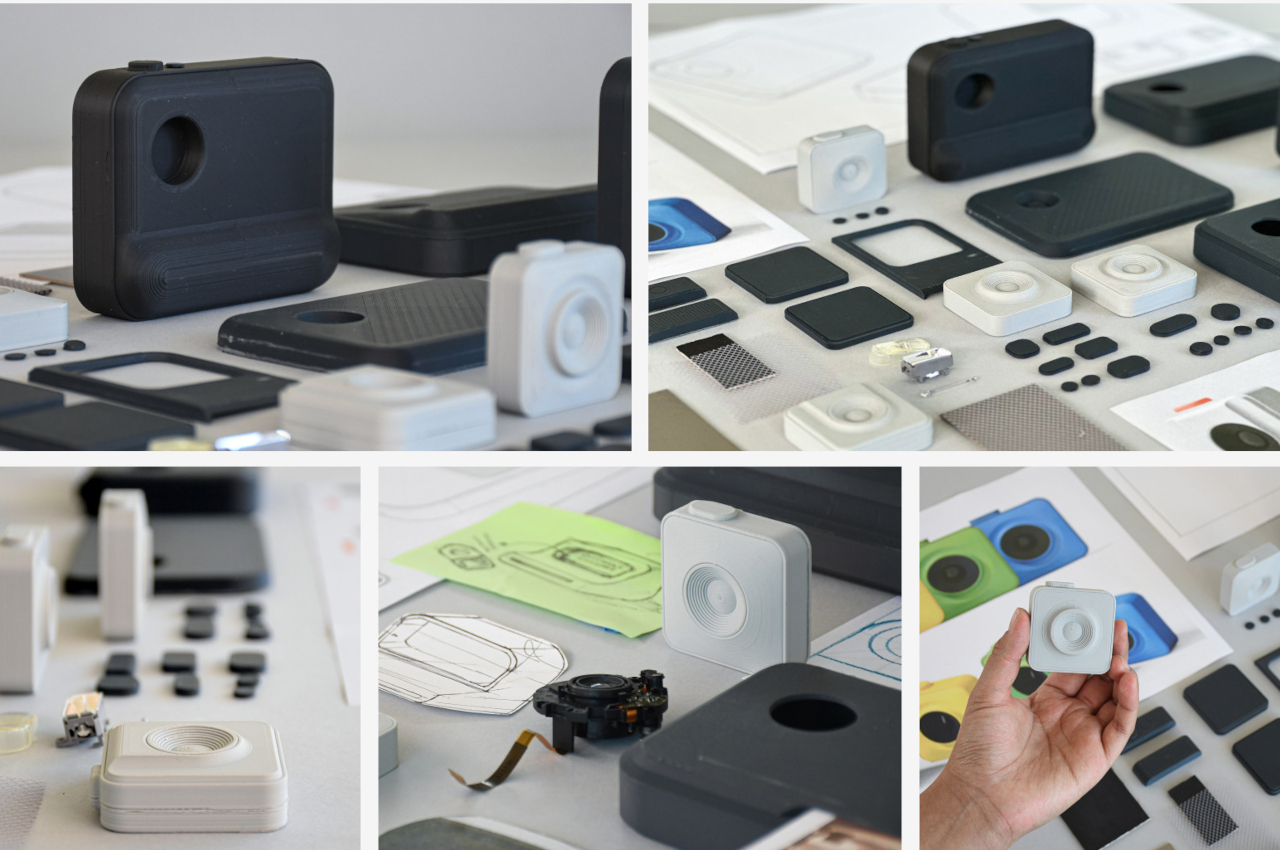
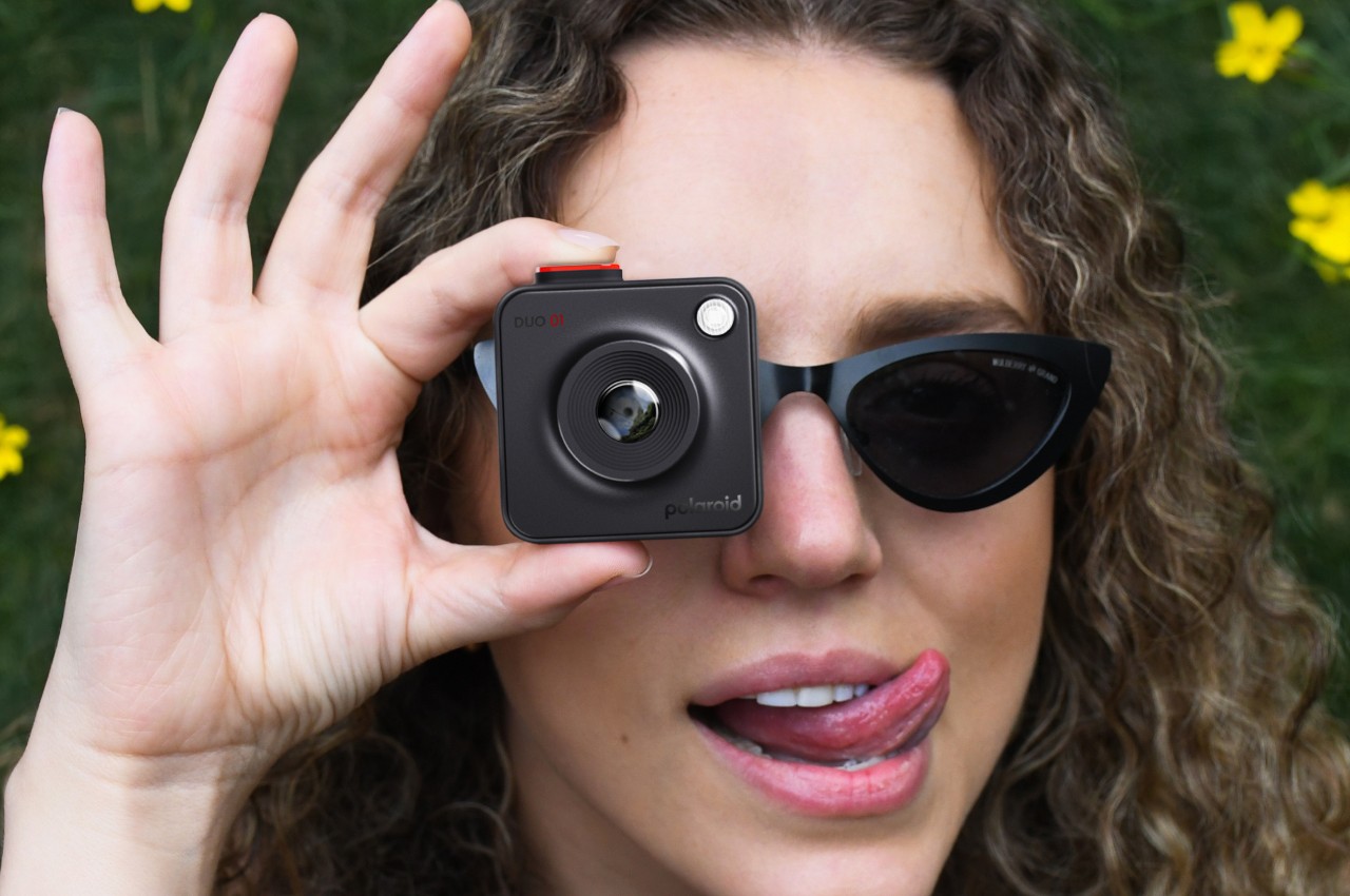
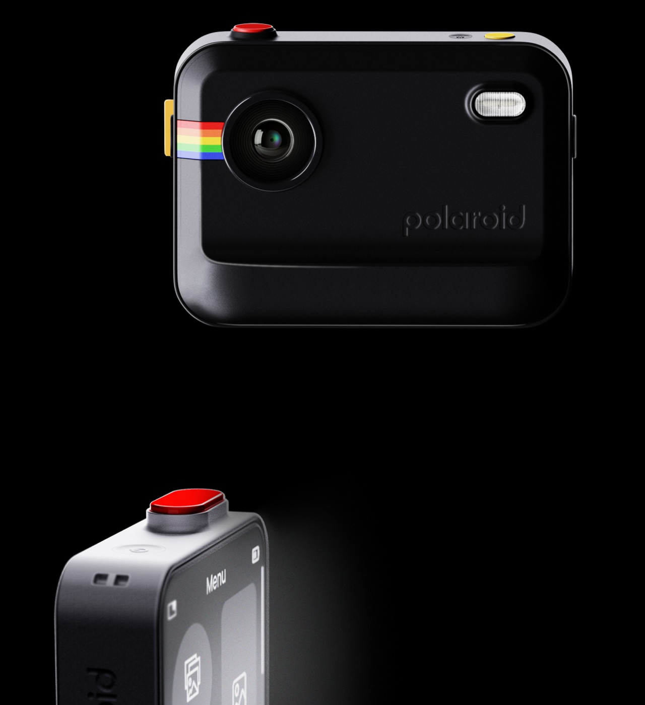
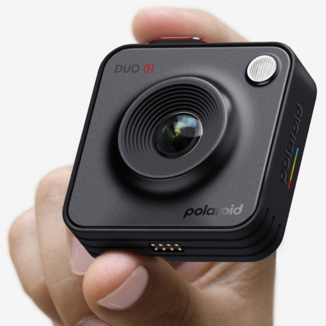
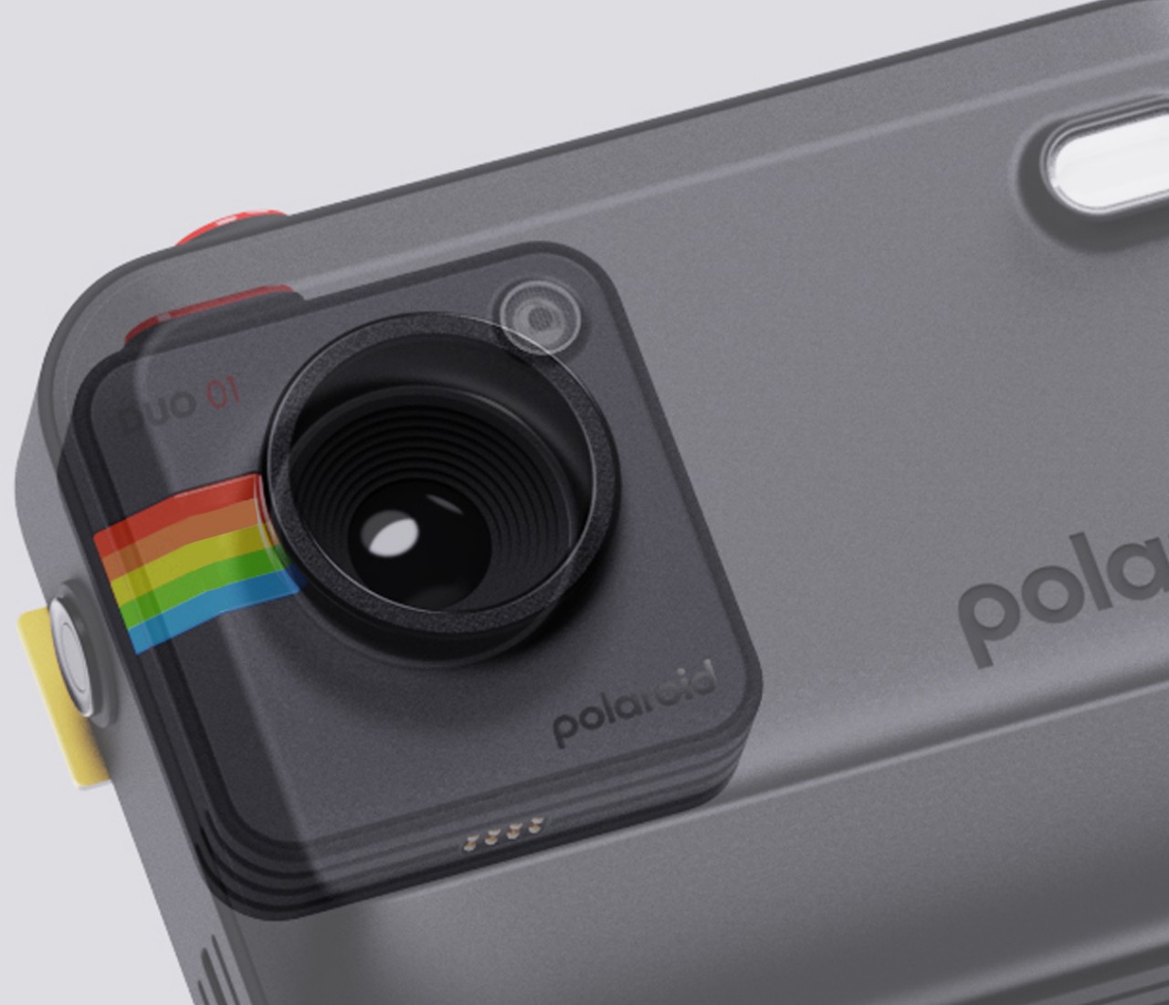
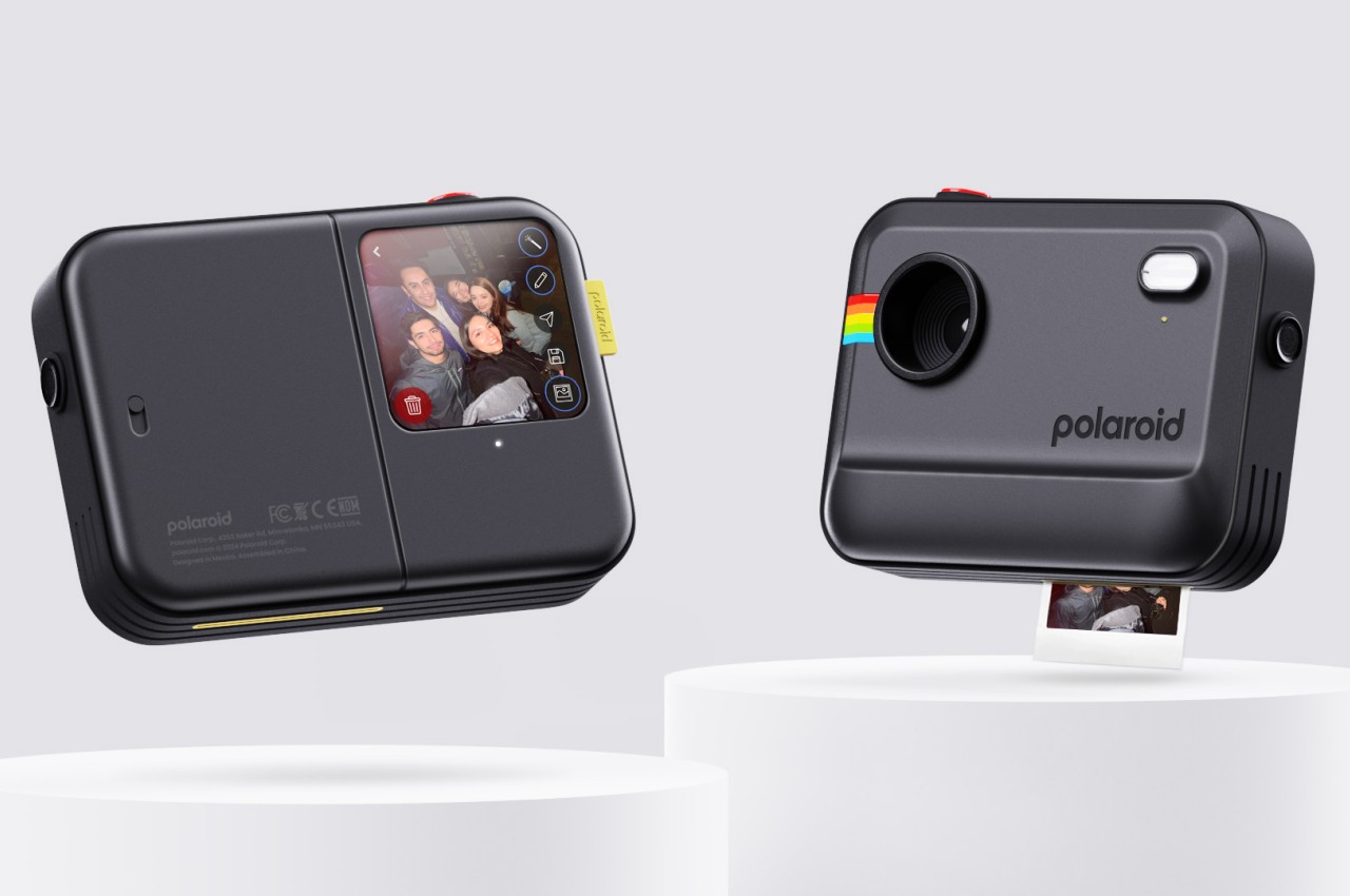
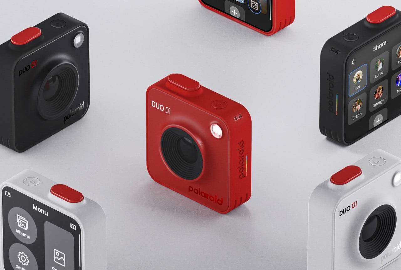
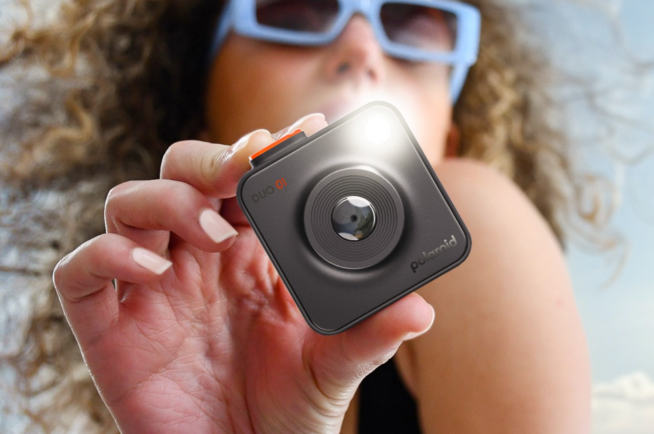
The Polaroid DUO concept solves this duality by ironically embracing it. It splits the instant camera into two distinct parts: the camera module and the printer. The camera is a small, lightweight square reminiscent of action cameras that you can attach or hang anywhere so that you’re ready to take photos or record videos anytime. The compact design, which includes a touch screen on the back to tweak the photos’ properties after the fact, offers a more engaging and fun way to take photos without being too conspicuous or flashy like a smartphone.

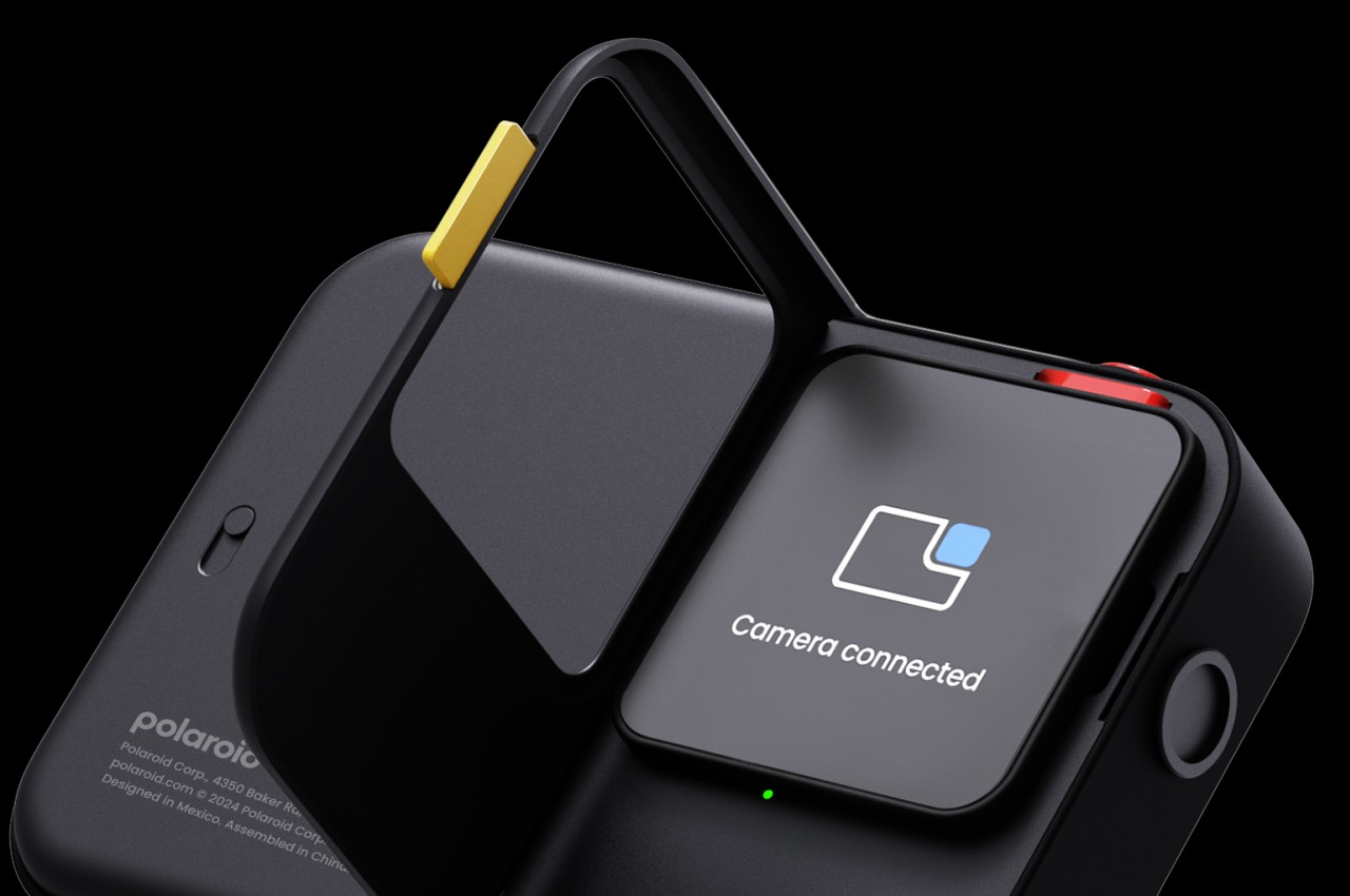
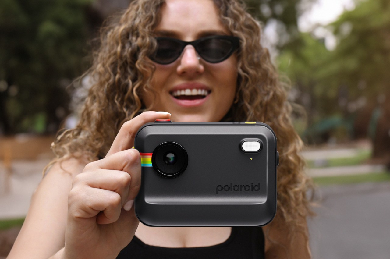
You can use the camera module on its own and print the photo later, or you can slot it into the larger printer module to make it behave exactly like a traditional instant camera. You don’t lose any of the functionality, however, since you can still access that touch screen. What you get, instead, is a unique character and the experience of holding a fun-looking chunky box up whenever you want to capture the moment and print out the memory right then and there.
Polaroid DUO is definitely an intriguing concept, one that makes you wonder why no one has implemented it yet. It combines the powerful functionality of smartphones with the elements of fun from instant cameras in a way that doesn’t sacrifice one for the other. There might be some implementation details that will need to be ironed out, but most of the technologies needed to make this design a reality are ripe for the picking.

The post Modular instant camera concept offers a new way to create and share memories first appeared on Yanko Design.