ZimaBoard 2 Review: The Home Server You Don’t Have to Hide Anymore

PROS:


  • Unusually sleek, well-finished aluminum design for a board-style server

  • Effectively silent passive cooling for always-on use

  • 60W adapter (with multiple plug types) provides sufficient 12V/5A power

  • Intuitive ZimaOS web interface, easy to set up without Linux experience

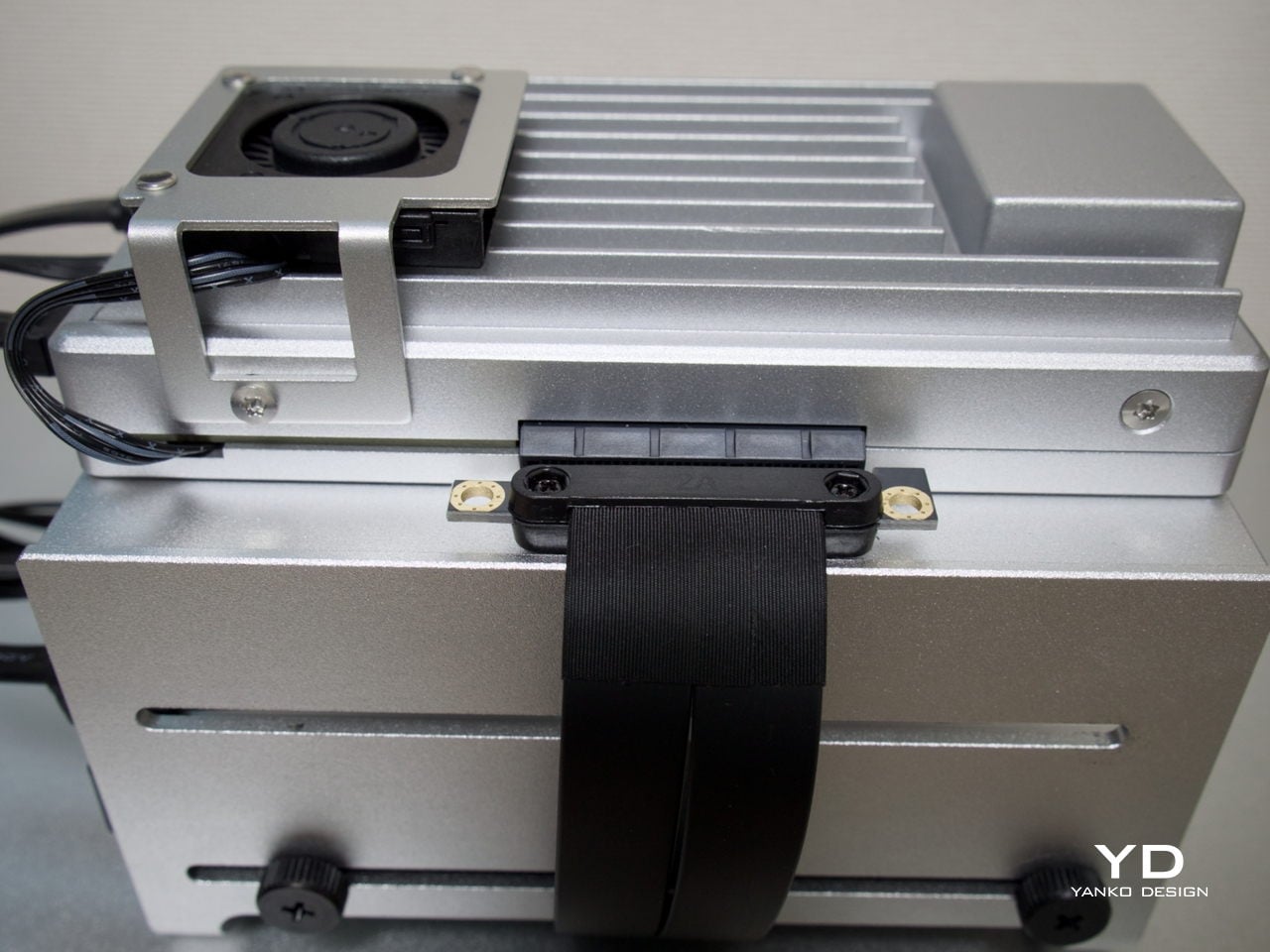
  • PCIe 3.0 x4 slot allows meaningful expansion


CONS:


  • Not suited for heavy compute or multi-VM workloads

  • Onboard eMMC is slow for sustained data storage

  • Memory tops out at 16 GB

RATINGS:

AESTHETICS
ERGONOMICS
PERFORMANCE
SUSTAINABILITY / REPAIRABILITY
VALUE FOR MONEY

EDITOR'S QUOTE:

The ZimaBoard 2 offers a compact, always-on server that earns its place on the shelf both functionally and aesthetically.

award-icon

Home servers and NAS boxes have long had a visibility problem, and not in the marketing sense. Most are bulky, noisy, and purely functional, which means they usually end up tucked behind desks or buried in closets. The compact options that do exist often sacrifice connectivity, storage support, or OS flexibility, making them useful only on paper rather than in the kind of sustained, always-on role they’re meant to fill.

ZimaBoard 2 from IceWhale is trying to change that. It’s a compact x86 home server built around an industrial aluminum chassis, with enough connectivity and software flexibility to serve as a NAS, media server, smart home hub, or private cloud device. Available in two configurations starting from $279, it sits comfortably between a hobbyist board computer and a proper home server, and that positioning is genuinely worth exploring.

Designer: IceWhale

Aesthetics
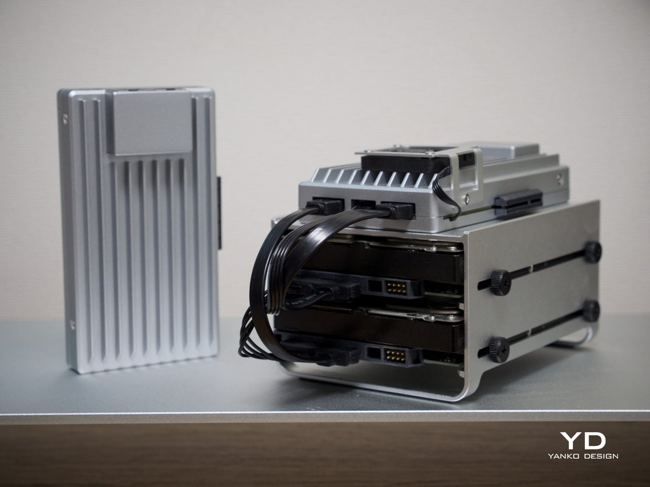
Most board-style computers aren’t particularly elegant things. They’re open PCBs with exposed components and color-coded connectors, designed for function over form. ZimaBoard 2 is a notable exception. It comes housed in an all-aluminum enclosure with a clean silver finish and vertical cooling fins running along its length, giving it an almost architectural character that’s genuinely unusual for hardware in this category.
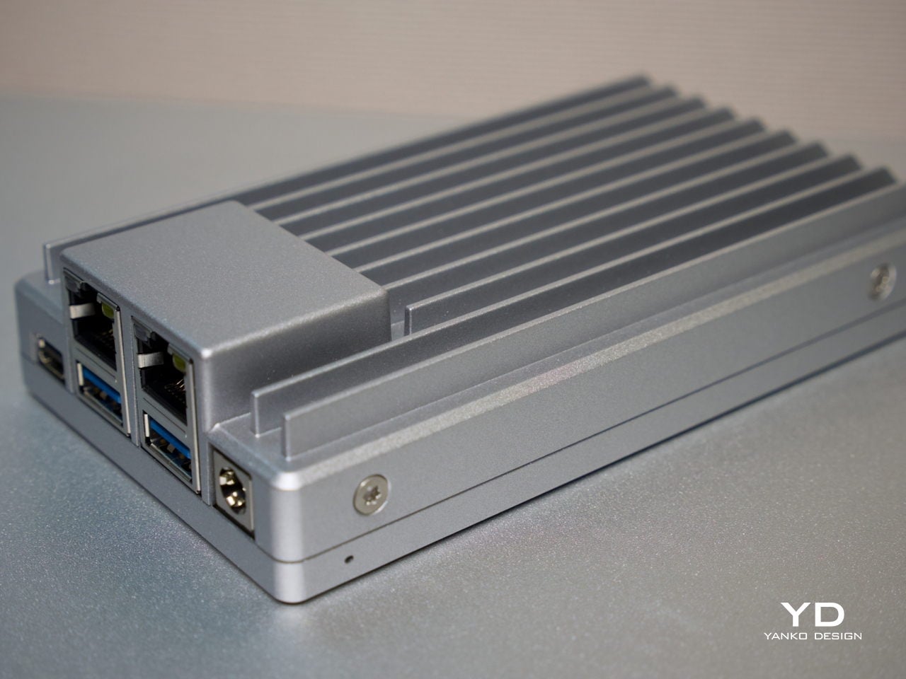
The ribbed fin pattern isn’t purely decorative. It acts as a passive heatsink, keeping things cool while also giving the device a more resolved visual quality than the typical bare-PCB look. It’s compact enough to hold in one hand, and in a workspace context, it reads less like raw server hardware and more like a deliberate industrial object that wouldn’t look out of place on a well-specced desk.
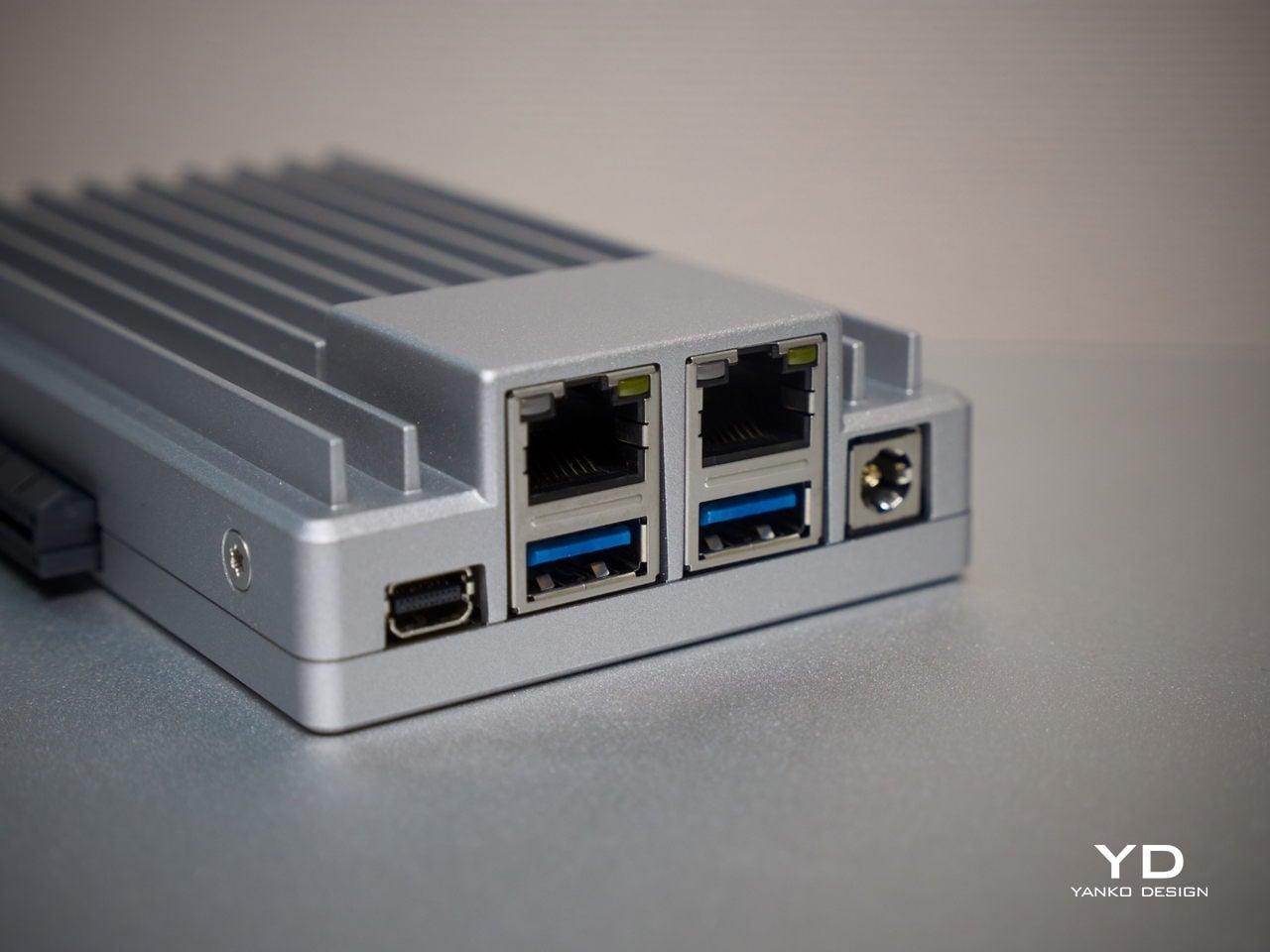
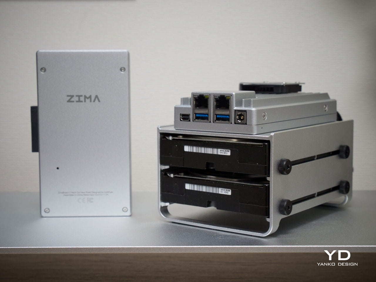
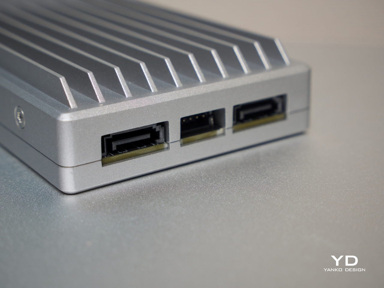
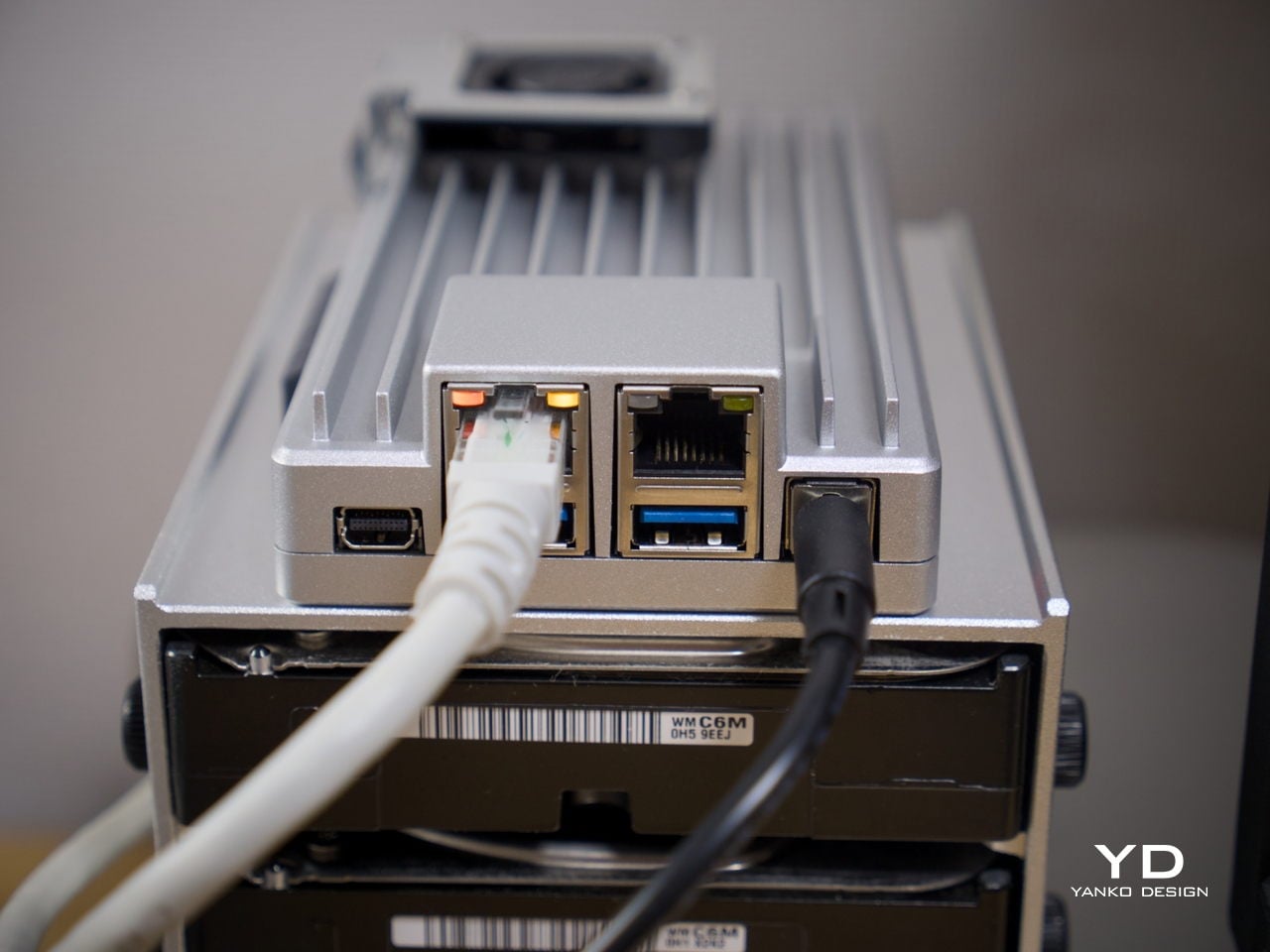
What also sets it apart from other board computers is how the I/O is handled at a design level. The ports are grouped cleanly along one edge, with the dual Ethernet jacks, USB ports, and Mini DisplayPort sitting in a tidy, intentional cluster rather than scattered wherever there was board space. That considered layout keeps the device looking organized even when several cables are plugged in at once.

Ergonomics

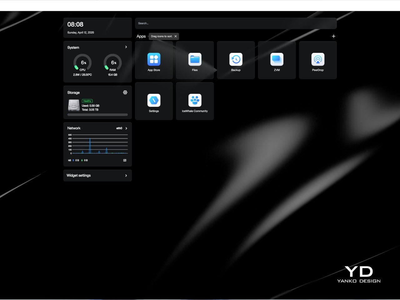
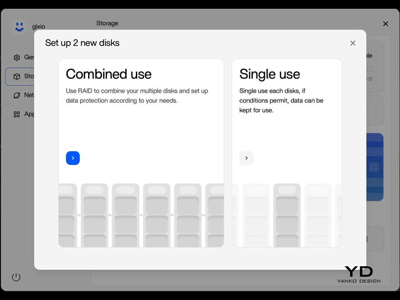
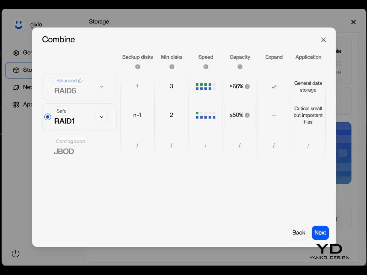
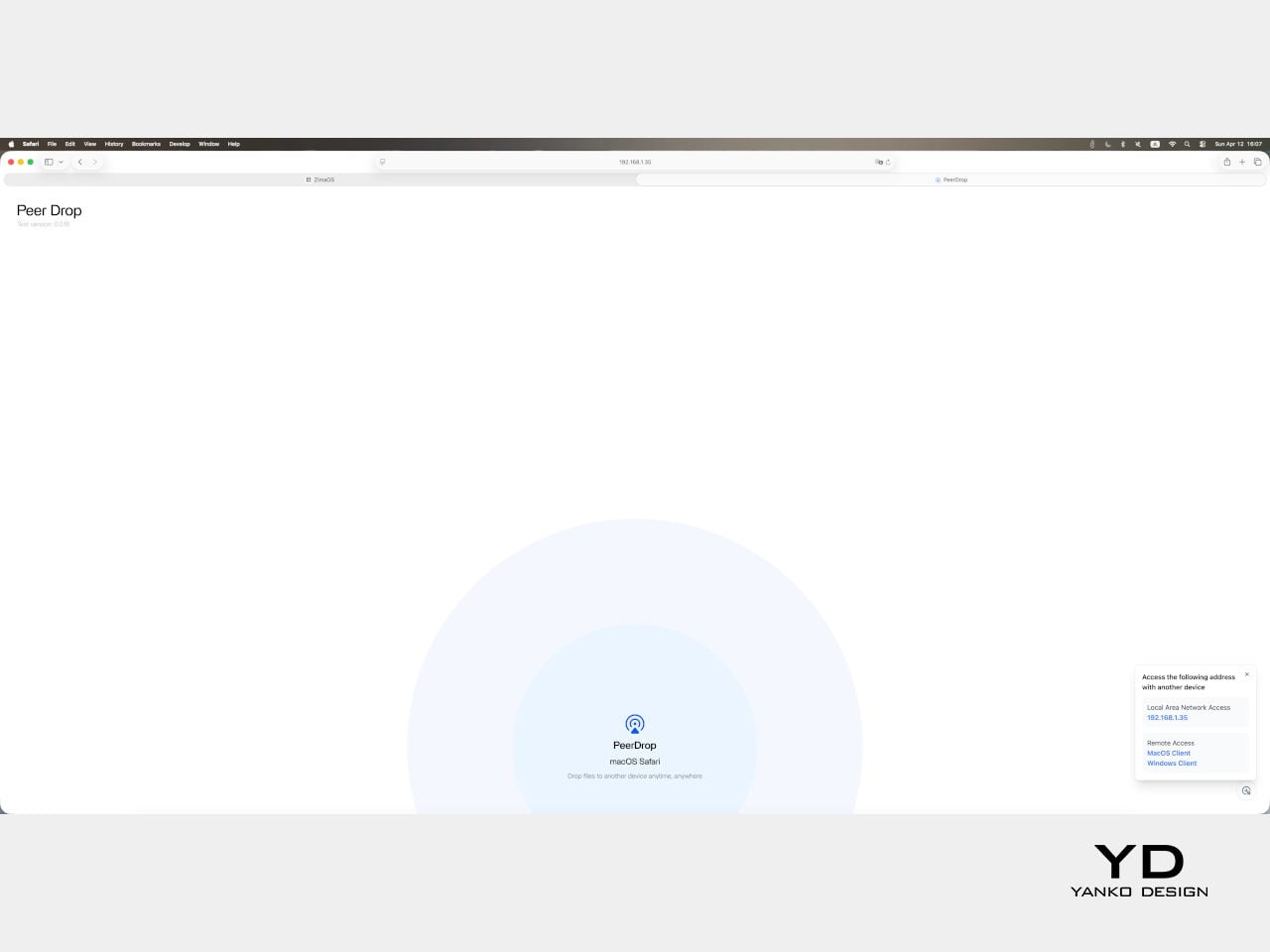
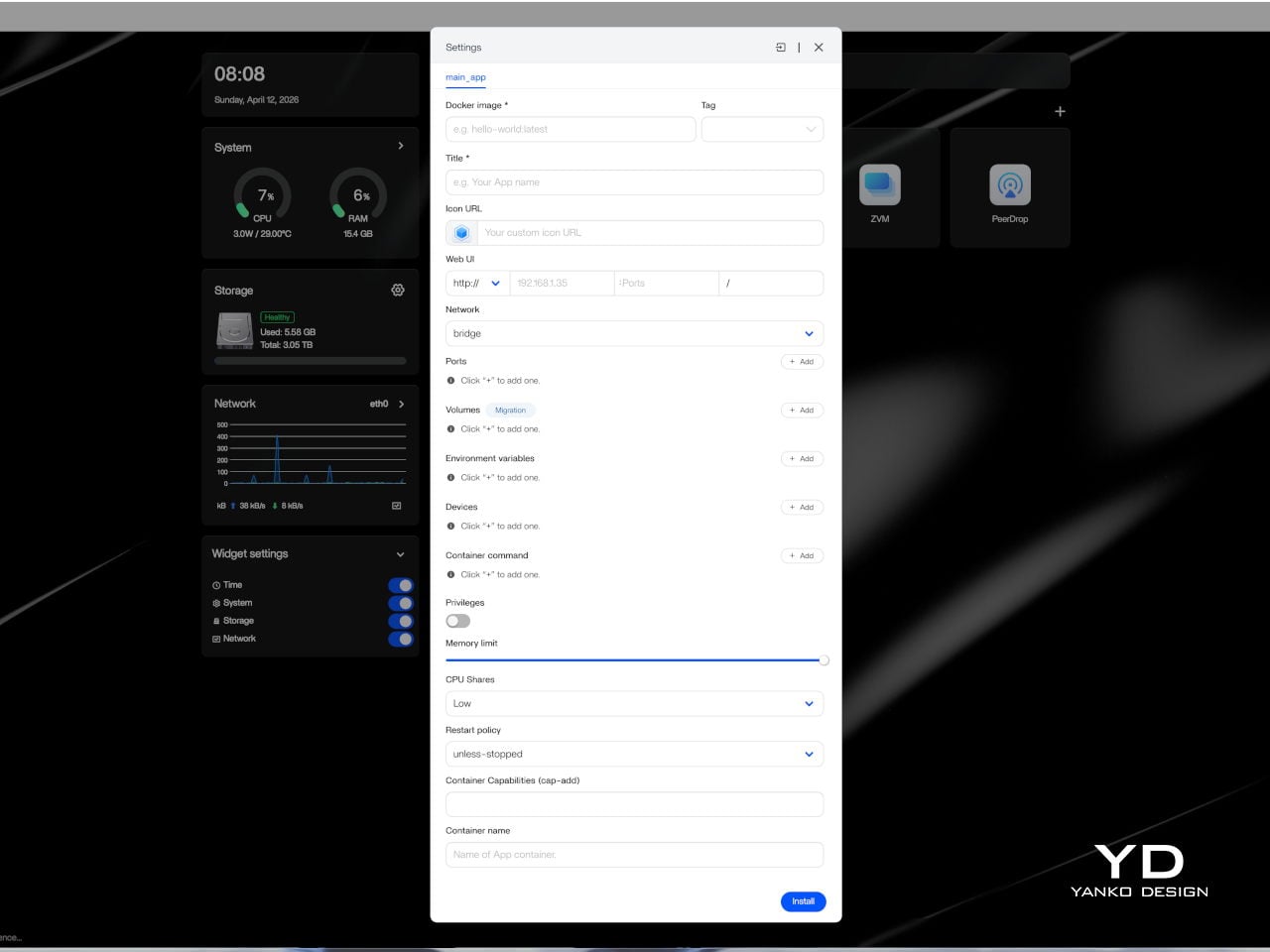
Setting up ZimaBoard 2 is refreshingly straightforward for a device in this category. The web-based interface felt clean, well-organized, and intuitive enough that getting started didn’t require much Linux familiarity. ZimaOS comes pre-installed with a browser-based dashboard that handles storage configuration, app deployment, and network settings through a familiar, point-and-click experience. Getting a NAS or media server up takes minutes, not hours.
The board is compact and light enough to tuck almost anywhere. It ships with a 60 W power adapter that comes with interchangeable plug adapters, which is a thoughtful detail for anyone working across different countries or regions. ZimaBoard 2 is designed around passive cooling, so in everyday use, it stays effectively silent, even with the optional mini cooling fan, which matters considerably when the device is meant to operate around the clock.
One practical setup step worth noting is that the onboard eMMC storage is best treated as a system layer rather than a long-term data destination. After initial setup, moving files and apps to the SATA-connected drives is the smarter workflow, since attached storage is faster and better suited to the sustained read and write activity a home server handles daily. It’s a minor but worthwhile habit to build in early.

Performance

Under the aluminum shell sits an Intel N150 processor, a quad-core chip running up to 3.6 GHz with a 6 MB cache and a 10 W TDP. It’s not the most powerful chip in this size class, but it’s the right pick for a device designed to run continuously at low power. For home server tasks, including NAS, media streaming, and containerized workloads, it handles things with comfortable ease.
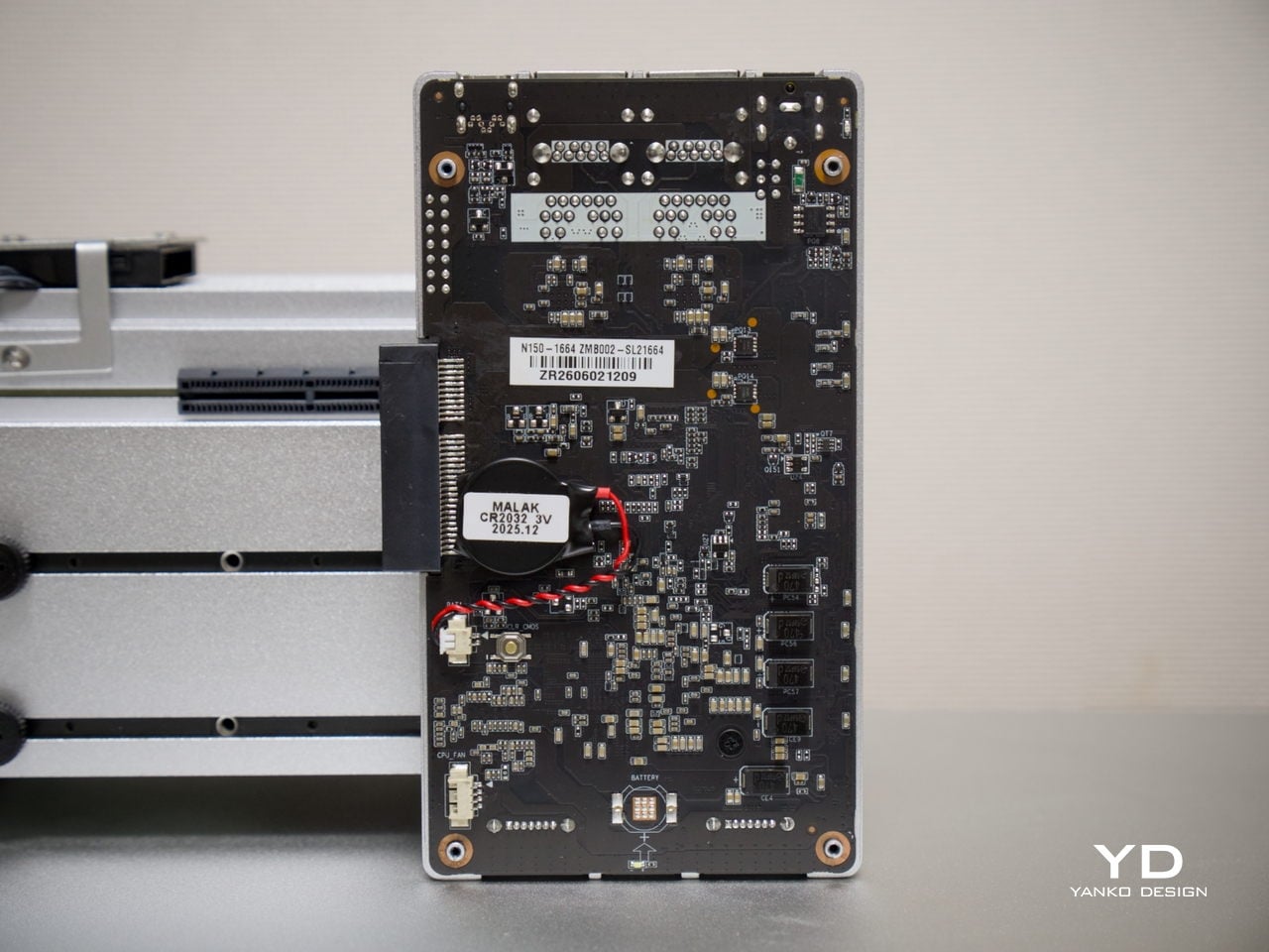
On the storage side, two SATA 3.0 ports come with integrated power support, making it straightforward to connect a pair of full-size NAS drives without extra adapters. Running two 3.5-inch drives caused no issues, and the 12V, 5A supply proved sufficient in testing to handle the board and drives comfortably. That power budget is a meaningful detail, since not every compact server can make the same claim confidently.
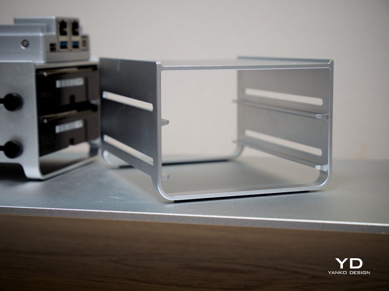
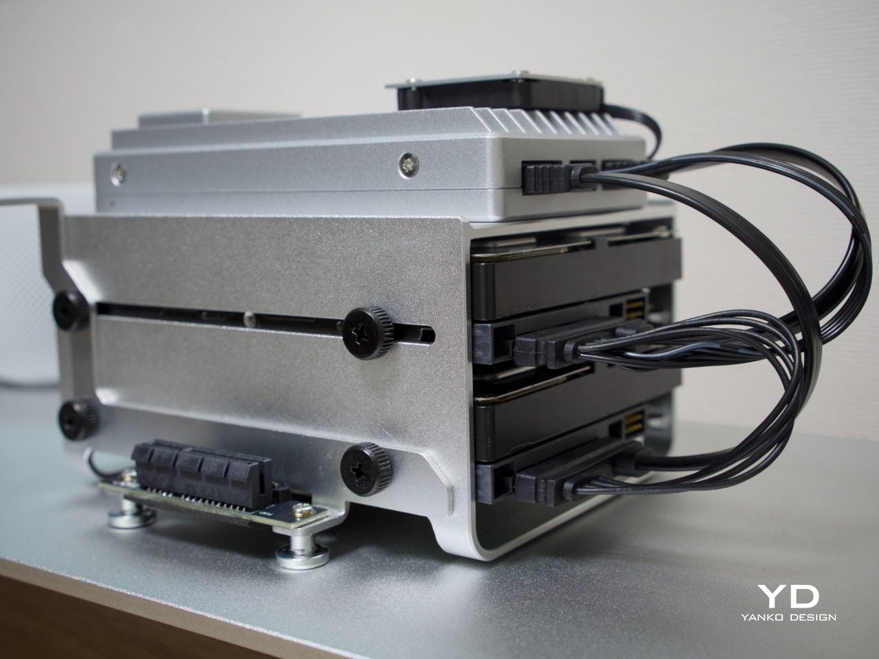
Thermals are worth touching on separately. The N150 runs warm under sustained loads, but for NAS-oriented use, there’s a simple tuning option: disabling Turbo Boost in the BIOS noticeably reduces operating temperatures. The trade-off is a clock speed ceiling of around 1 GHz, but for straightforward file serving, that’s more than sufficient, and the lower heat output makes for a much more comfortable long-term operating condition.
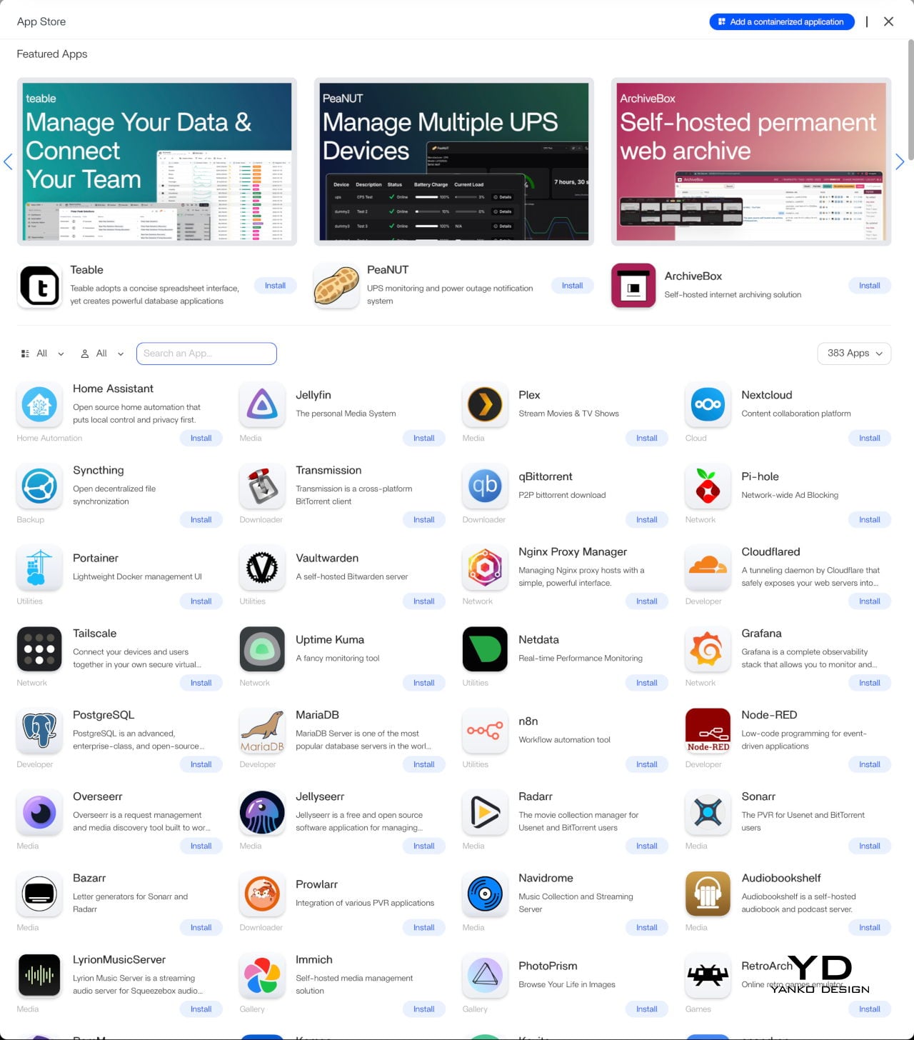
Beyond the hardware, ZimaOS adds real depth to the experience. Its app store advertises 800+ one-click apps, including Plex, Jellyfin, Nextcloud, and Home Assistant. The higher 1664 configuration’s 16 GB of LPDDR5 RAM also helps when running virtual machines or heavier container setups. ZimaOS also supports Intel Quick Sync for hardware-accelerated transcoding, which helps reduce CPU load in supported Plex and Jellyfin setups.
Sustainability

The all-aluminum enclosure makes a strong durability argument. Aluminum doesn’t flex, doesn’t yellow, and holds up well over years of continuous operation, which matters a great deal for hardware that never really gets switched off. The thermal design relies primarily on passive conduction through the chassis, keeping internal component complexity low and reducing the number of parts that could wear out over time.
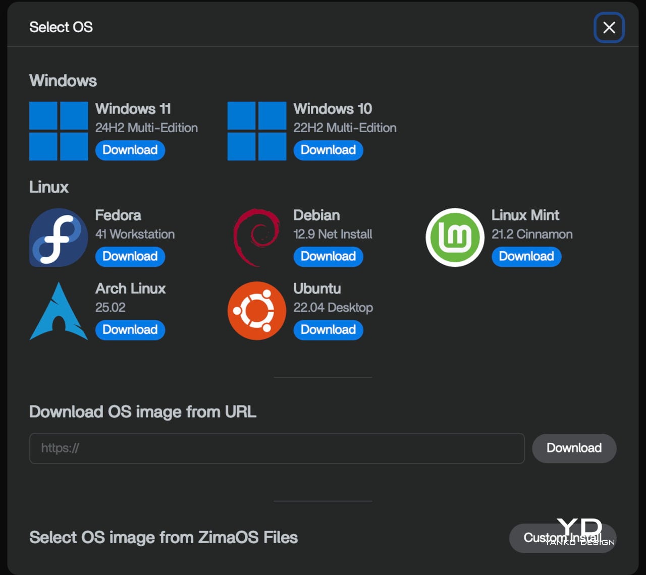
Software longevity is another angle worth considering. Because ZimaBoard 2 runs on x86 architecture, it’s compatible with a wide range of operating systems, meaning the hardware doesn’t become obsolete when a software stack changes or no longer fits your needs. If ZimaOS evolves or you outgrow it, you can simply install something else. That kind of platform openness is a practical form of sustainability that closed appliances rarely offer.

Value

ZimaBoard 2 sits at a price point that demands a bit of context. The base 832 configuration starts at $279, with the 1664 variant at $349. Those figures feel steep when compared to bare-board computers, but the comparison isn’t really fair. What you’re getting is a fully enclosed x86 server module with dual 2.5 GbE networking, dual powered SATA bays, a PCIe 3.0 expansion slot, and ZimaOS pre-installed.
Compact mini PCs at a similar price usually offer stronger raw performance but fewer server-specific ports and no expansion path. Dedicated NAS boxes tend to be locked into proprietary software. ZimaBoard 2 is more flexible than either. Native SATA, dual 2.5 GbE, and a PCIe slot on a single platform is an uncommon combination at this price, and that’s where the value case starts to feel convincing.
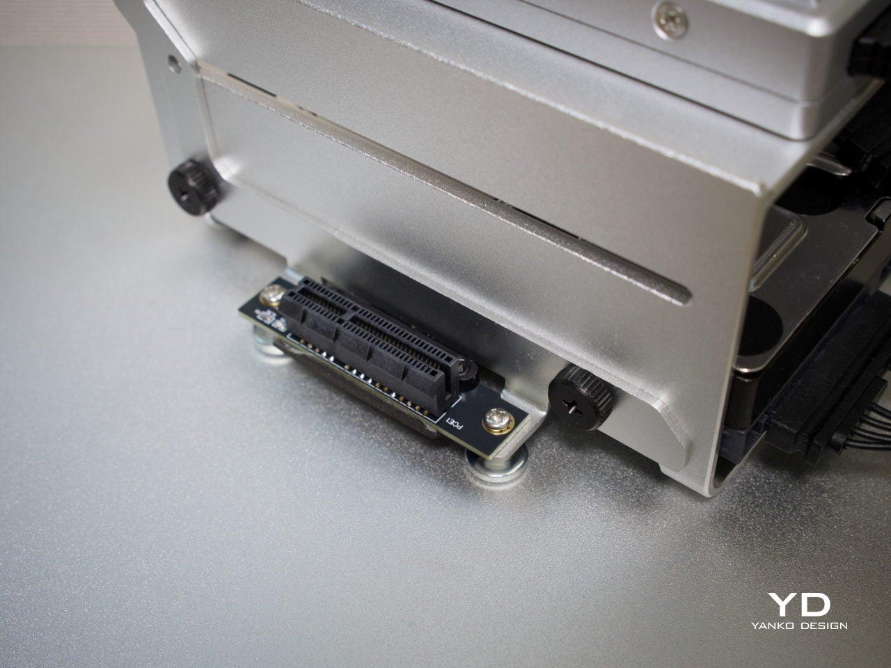
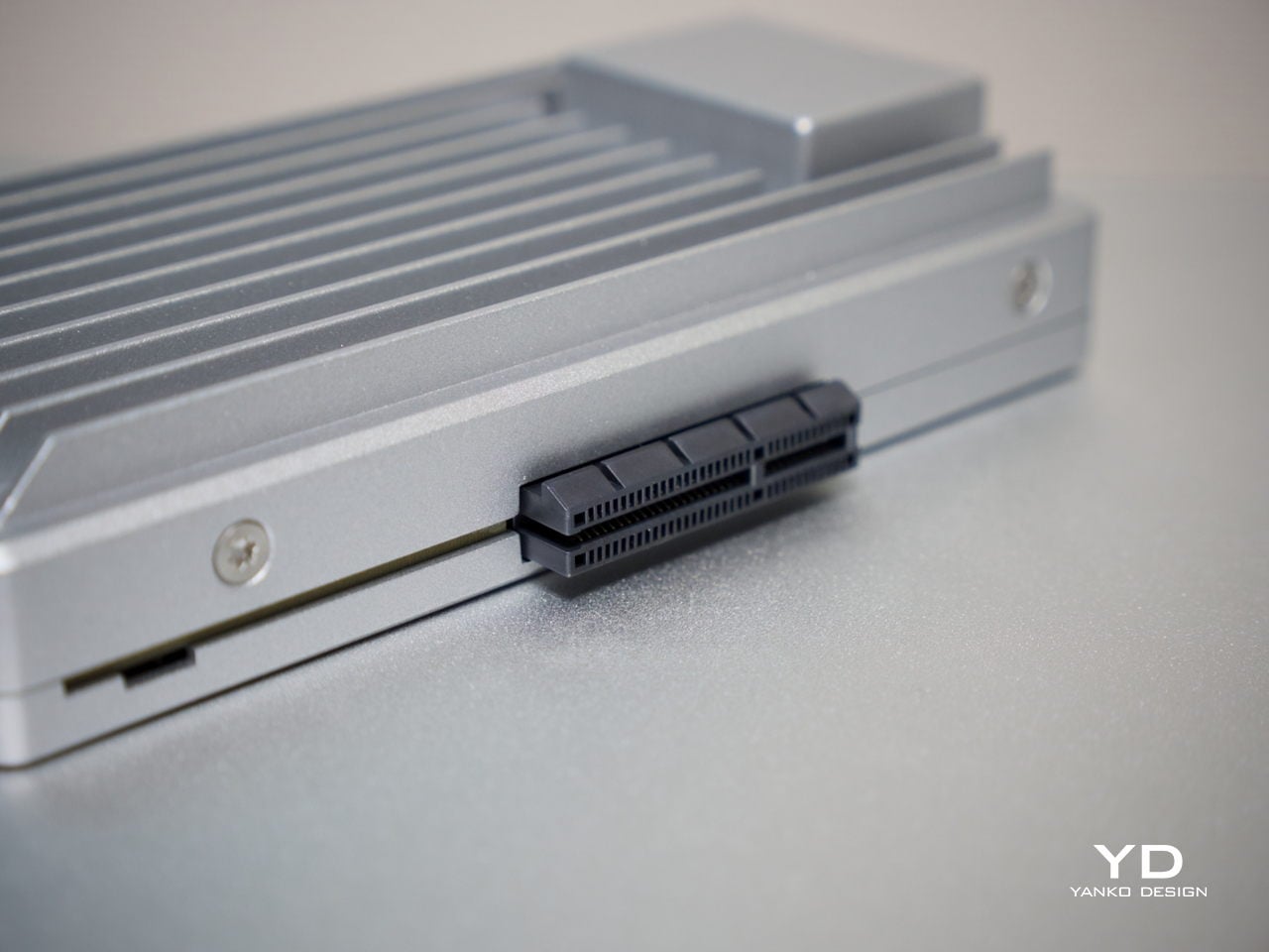
The PCIe 3.0 x4 slot adds a dimension of future-proofing that sealed appliances can’t match. You can plug in a 10 GbE network card, an NVMe adapter, a GPU for AI workloads, or an HBA for expanding storage capacity. That expandability means you’re not locked into what the board offers at purchase, which in practical terms allows the device to grow alongside your needs rather than becoming a bottleneck.
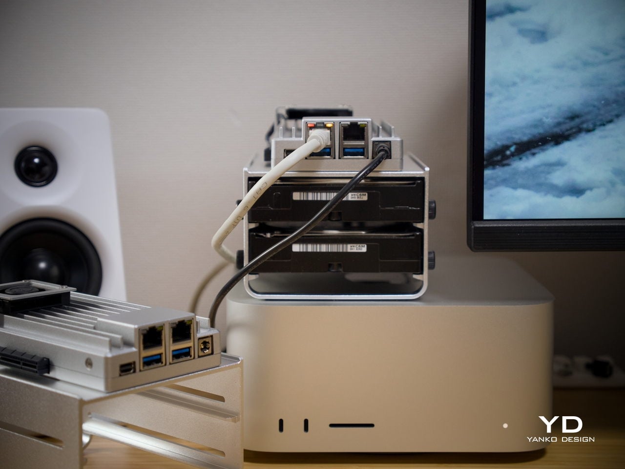
It’s fair to say that buyers focused purely on maximum compute per dollar will find stronger options elsewhere. But for those building a quiet, flexible, always-on home server that’s actually pleasant to live with, ZimaBoard 2 feels well-judged. The design, connectivity, software experience, and room to grow all reinforce each other in a way that makes the price feel more grounded the longer you use it.

Verdict

ZimaBoard 2 makes a strong case for what compact home server hardware can look like when design is treated as part of the brief. It’s quiet, well-built, and easier to set up than most things in this category. Running as a NAS, a smart home hub, a media server, or all three at once, it handles each task without calling attention to itself, which is exactly what good infrastructure does.
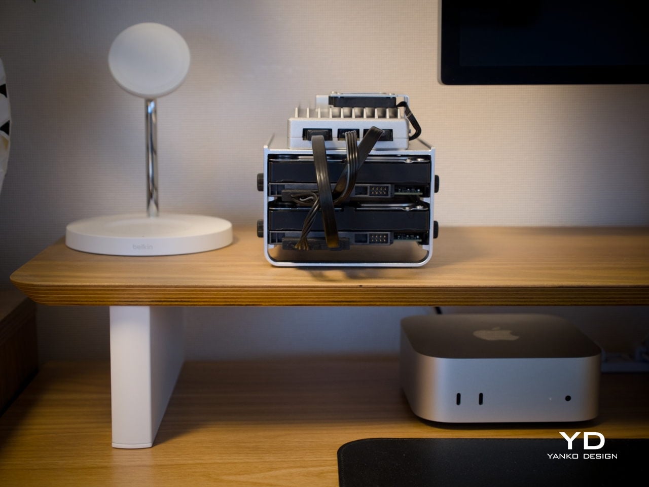
The platform’s real strength is how many things it can become. Add a pair of NAS drives, and you’ve got a whisper-quiet personal cloud. Plug something into the PCIe slot, and the possibilities multiply further. It isn’t built for users chasing peak benchmarks, but for those who want a compact, always-on server that earns its place on the shelf both functionally and aesthetically, it’s a genuinely well-considered piece of hardware.

The post ZimaBoard 2 Review: The Home Server You Don’t Have to Hide Anymore first appeared on Yanko Design.


AQUA HUMAN Is a Dive Suit Concept Built Around the Body, Not the Tank

The way divers go underwater hasn’t fundamentally changed much in decades. You strap tanks to your back, manage hoses, regulate breathing, and navigate a system of equipment that always feels bolted on rather than built in. The gear works, of course, but it keeps reminding you it’s there. Improvements have mostly been incremental, focused on making the existing system lighter, safer, or easier to manage, not rethinking it from scratch.

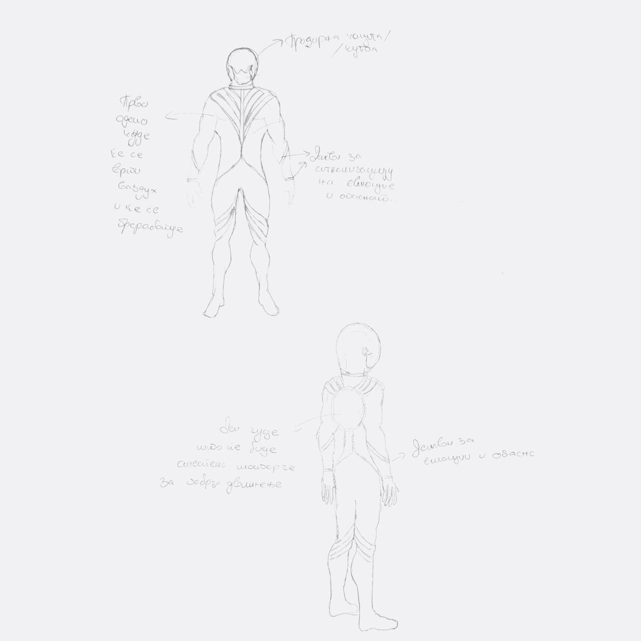
That’s the gap designer Ivana Nedeljkovska set out to explore with AQUA HUMAN, a conceptual underwater atmospheric diving suit that starts from a different question. Not how to make existing equipment better, but what happens when you stop treating the suit as equipment altogether. The concept pushes for diving gear that functions as a unified system, one that works with the body rather than being strapped onto it.

Designer: Ivana Nedeljkovska

The design process reflects that shift in thinking. Nedeljkovska didn’t begin with sketches of a suit; she started by studying how breathing works, how the body reacts to pressure, and where conventional gear creates friction between the diver and the water. Form followed only after function was understood, which is why the result looks less like upgraded scuba equipment and more like something the body might have grown into naturally.

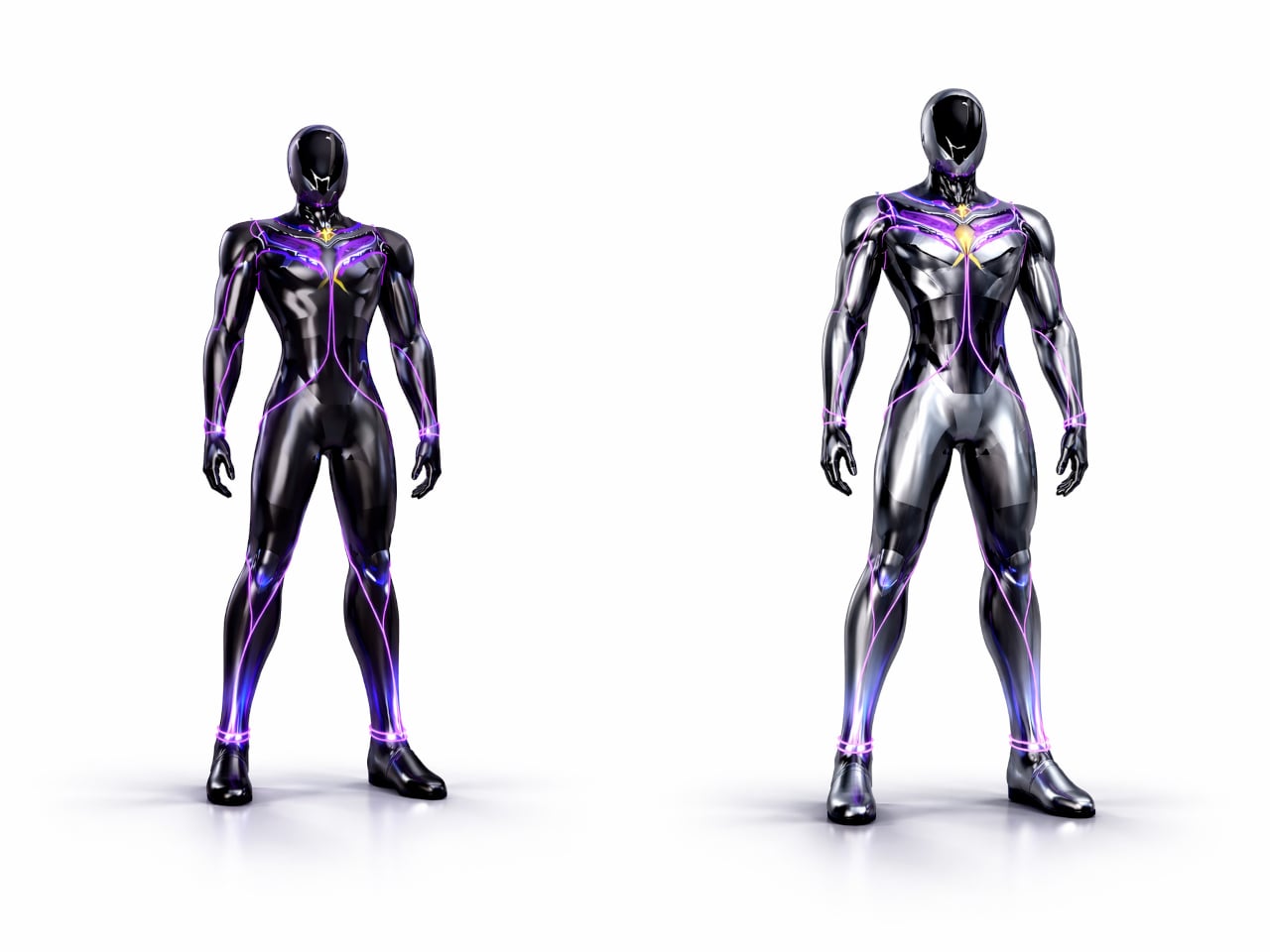
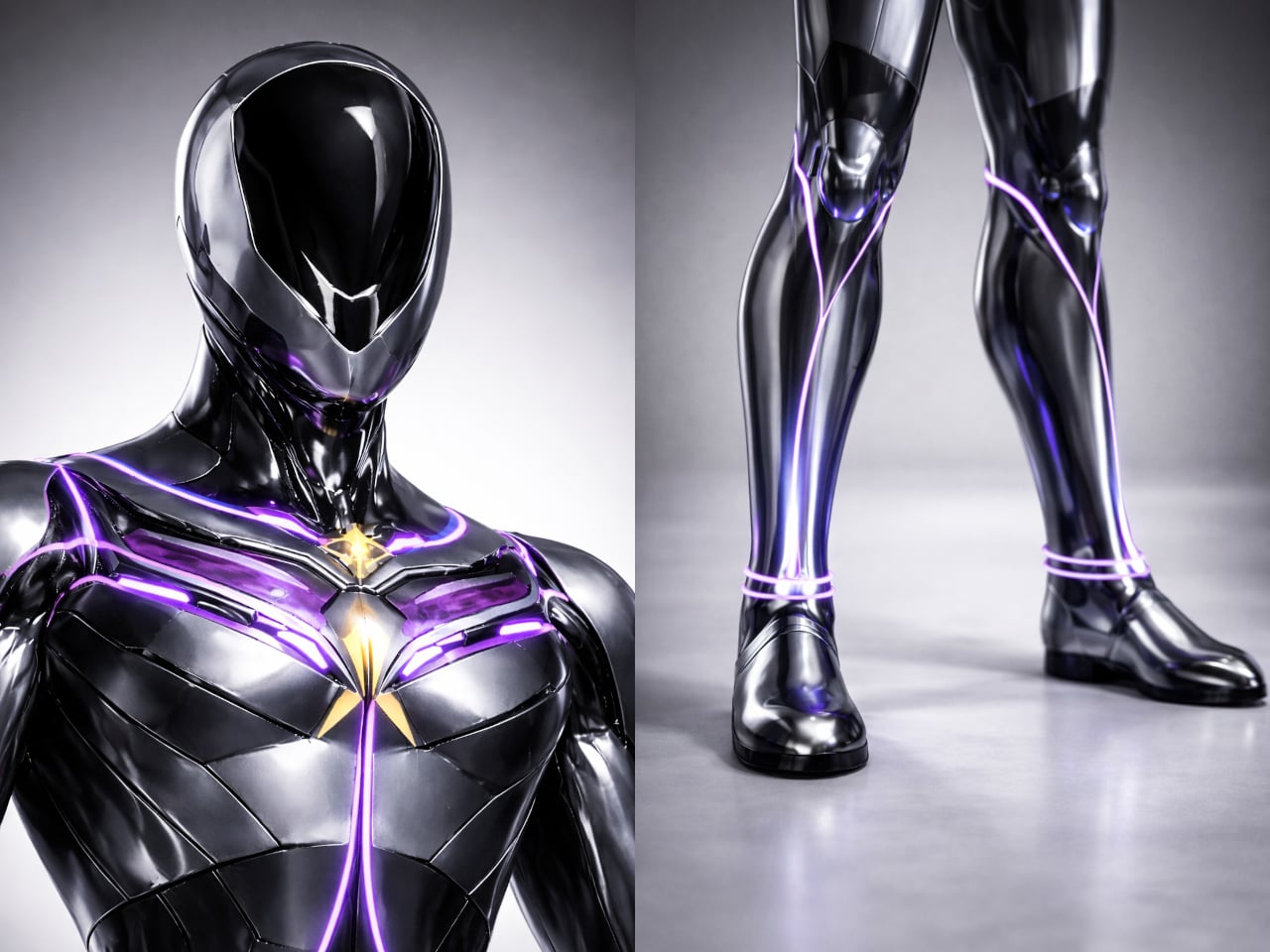
The central idea is integration rather than addition. AQUA HUMAN ditches the external tanks and brings breathing, temperature regulation, and mobility into the suit’s structure itself, functioning as a single synchronized system. The suit’s multi-layered material construction handles durability, water resistance, and flexibility simultaneously, so a deep-sea researcher or rescue diver can move without the suit fighting back. There’s no cluster of components to manage, just one continuous form.

On top of that, built-in motors reduce water resistance, making movement through the ocean feel less like fighting a current and more like navigating it. An integrated AI system runs alongside all of this, continuously reading the diver’s condition and the surrounding environment. It’s a real-time feedback loop designed to catch problems before they become emergencies, which matters considerably more at depth than it does on land.

Then there’s the light strip system, which might sound like an aesthetic choice but isn’t only that. The strips running across the suit serve as a visual language, changing to signal potential danger or communicate the wearer’s condition to others nearby. Underwater, where verbal communication isn’t possible and hand signals have limits, having a suit that actively broadcasts information in real time is genuinely useful, not decorative.

Diving suits have been layered with improvements for decades without anyone seriously questioning the core architecture. AQUA HUMAN isn’t trying to sell you something new; it’s asking why we’re still building on a foundation that hasn’t changed since the tank became standard. That kind of questioning is where genuinely different solutions tend to start, even if they take a while to arrive.

The post AQUA HUMAN Is a Dive Suit Concept Built Around the Body, Not the Tank first appeared on Yanko Design.
Mililab Made a Dining Table, Got Distracted, and Made a Better Stool

Modern furniture design has been quietly shifting priorities. Smaller homes and more deliberate interiors have created real demand for pieces that do more without taking up more space or sacrificing how they look. Stools and side tables are easy targets for this kind of dual-purpose thinking, but most of them still feel like a workaround, a compromise dressed up as a solution, rather than a genuinely well-considered object.

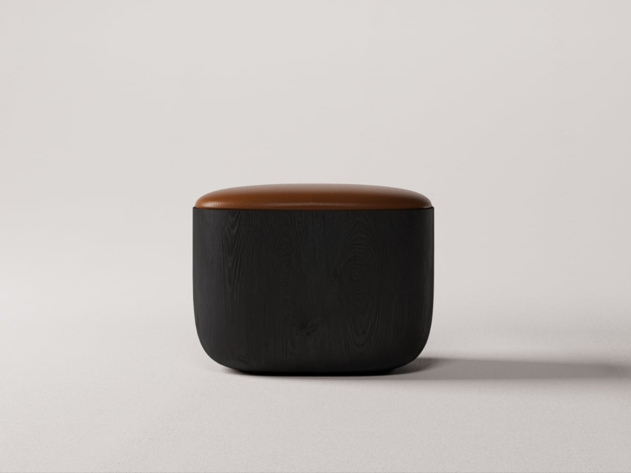
The Ishi stool from Japanese studio Mililab isn’t that kind of compromise. It came out of a separate project entirely, one that had nothing to do with stools, and it ended up as something that’s equal parts furniture object and quiet design statement. That accidental origin is actually central to understanding why it looks the way it does, and why it works as well as it does.

Designer: Mililab

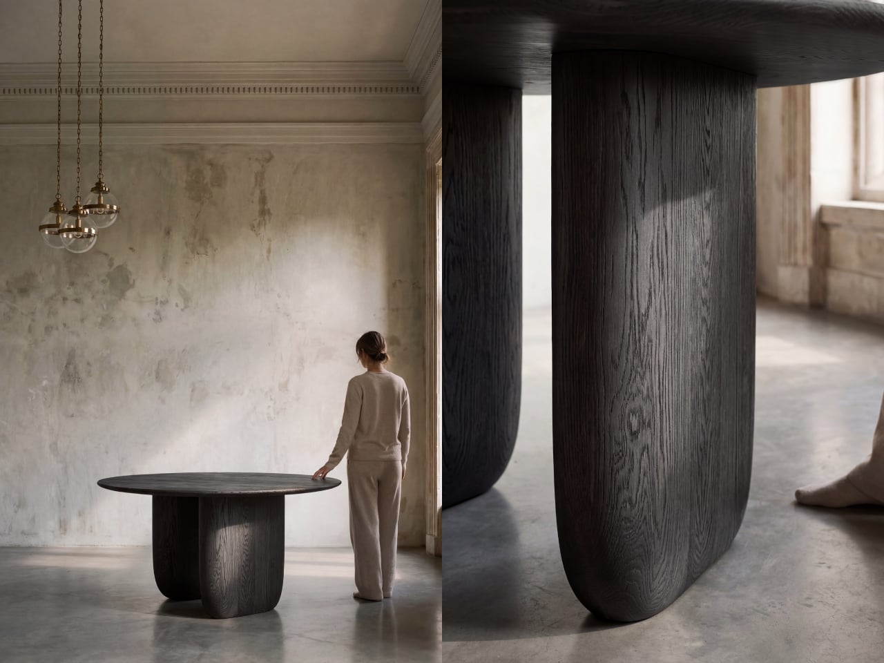
The story starts with the studio’s own Maru dining table. While developing it, founders Livert Lim and Mengfei Wu kept drifting back to the legs, almost despite themselves. Those legs tapered inward along one unbroken curve, giving them a presence that had little to do with the tabletop above. As Mililab described it: “A shape that didn’t need the table above it.” So they separated it and let it stand alone.

Working with collaborator Djordje Cebic, they developed Ishi into a form that’s both monolithic and unexpectedly soft, something like a river-worn pebble given volume. From across the room, it appears impossibly thin; up close and under your hand, it’s substantial. That tension between visual lightness and physical solidity isn’t accidental. It’s the result of curves computed in Tokyo and then realized by hand in the workshop.

The material process behind that solidity gets genuinely obsessive. The stool is made from North American white oak, selected for grain consistency, kiln-dried, hand-shaped, then kiln-dried again, because the glue introduced during assembly brings moisture back into the wood. Most workshops skip that second drying. Mililab doesn’t. It’s sealed immediately after, locking in a 10% moisture content, the exact point at which white oak is most dimensionally stable.

The cushion on top, available in Kvadrat Savanna, Dedar fabric, or Italian leather, looks fully integrated with the oak base. It isn’t, of course, which is the point. Pull it off, flip it over, and the flat underside becomes a surface, turning the stool into a side table. It works just as well beside a sofa at home as it does in a hotel lobby or a studio apartment. At 430mm, the height was chosen deliberately. It’s low enough to pair with a lounge chair, yet also tall enough to sit beside a dining table or vanity desk.

There’s something refreshing about a piece of furniture that arrived this way, not from a brief or a market gap, but from genuine distraction. Lim and Wu were supposed to be designing a dining table and kept staring at the legs instead. It’s not a narrative most furniture studios would lead with, but it does explain why the Ishi stool feels like something they simply couldn’t help making.

The post Mililab Made a Dining Table, Got Distracted, and Made a Better Stool first appeared on Yanko Design.
5 Reasons the Galaxy Z Fold 8 Wide Could Win and 1 Reason It Might Not

Foldable phones have been around long enough that the novelty has worn off. Samsung pioneered the book-style fold, and the hardware has genuinely matured. Foldables today are thinner, lighter, and far more durable than the early prototypes that worried everyone. But one nagging issue hasn’t gone away after seven years of refinement. The proportions still feel like a compromise, and most buyers can still sense it.

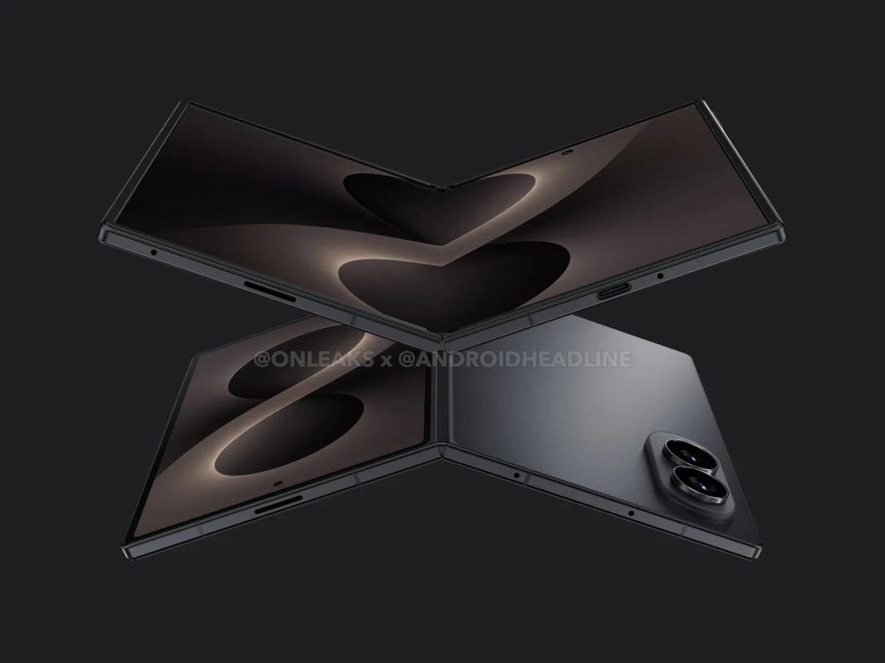
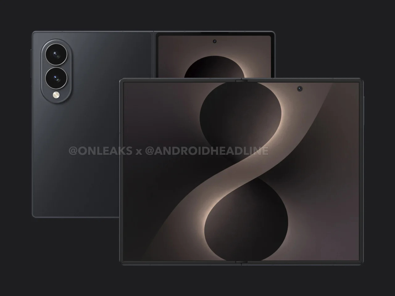
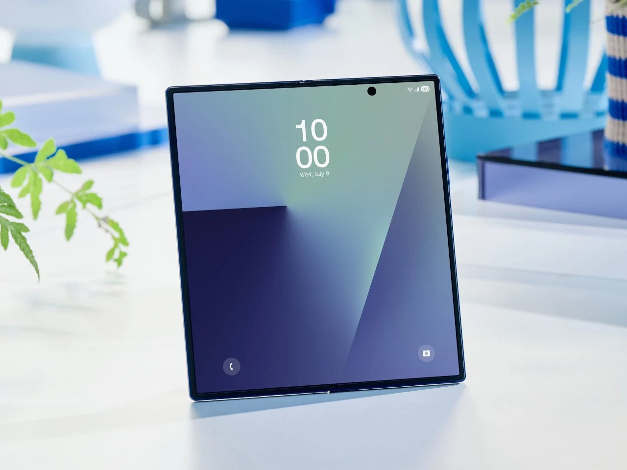
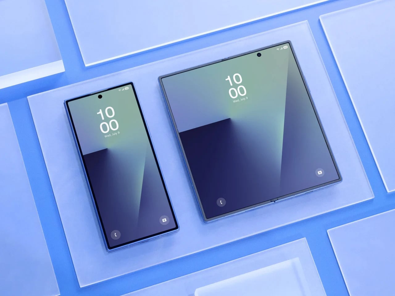
That’s exactly what the Galaxy Z Fold 8 Wide seems designed to address. Rather than continuing the tall, narrow approach that has defined the Fold lineup since the beginning, the Wide version reportedly takes a shorter, broader form factor, with the inner display pushing toward a 4:3 aspect ratio. It’s a subtle-sounding change, but one that could shift how the device feels in every single moment you actually use it.

Designer: Samsung (renders by Steve Hemmerstoffer/OnLeaks via AndroidHeadlines)

It Could Make the Closed Phone Feel Normal Again

Anyone who has used a Galaxy Z Fold for a while knows the friction of the cover screen. It’s tall, narrow, and requires more thumb effort than you’d expect from a daily driver. Reaching the notification shade with one hand usually means repositioning your grip, and typing on that narrow layout takes some getting used to. It works, but it always feels like a device asking you to meet it halfway.

Galaxy Z Fold7

The Galaxy Z Fold 8 Wide reportedly carries a 5.4-inch cover display that is wider and shorter than what the Fold 7 offered. That brings it closer to the feel of an ordinary compact phone, one that sits comfortably in your hand without requiring thumb acrobatics. It sounds like a small win, but if you’ve ever owned a phone from before screens started growing taller every year, you know exactly how much that sense of balance matters.

It Gives Media Room to Breathe

There’s a quiet awkwardness to watching a video on current book-style foldables. The cover screen’s narrow shape forces letterboxing on most content, and even the inner display’s near-square proportions aren’t ideal for widescreen formats. Games feel slightly cramped, and browsing feeds in landscape doesn’t quite deliver the comfortable experience you’d expect from a screen that size. For a device this premium, that’s a surprisingly persistent design limitation.

A 4:3 inner display changes that dynamic considerably. The Galaxy Z Fold 8 Wide’s 7.6-inch screen reportedly lands in proportions that suit media consumption far better, making landscape video less of a letterboxed compromise and gaming more spatially generous. Rotating to portrait for reading or scrolling also starts to feel intentional, like the device was built to handle those orientations rather than merely tolerating them. That’s a meaningful difference in day-to-day comfort.

It Finally Starts Acting Like a Real Tablet

Foldables have always carried a bit of an identity crisis. They’re marketed as phone-tablet hybrids, but the tablet side of that pitch has always been shakier than the phone side. Apps designed for tablet layouts don’t always know what to do with a nearly square display, and the result is often stretched content, oversized sidebars, or awkward layouts that remind you this device is still figuring out what it wants to be.

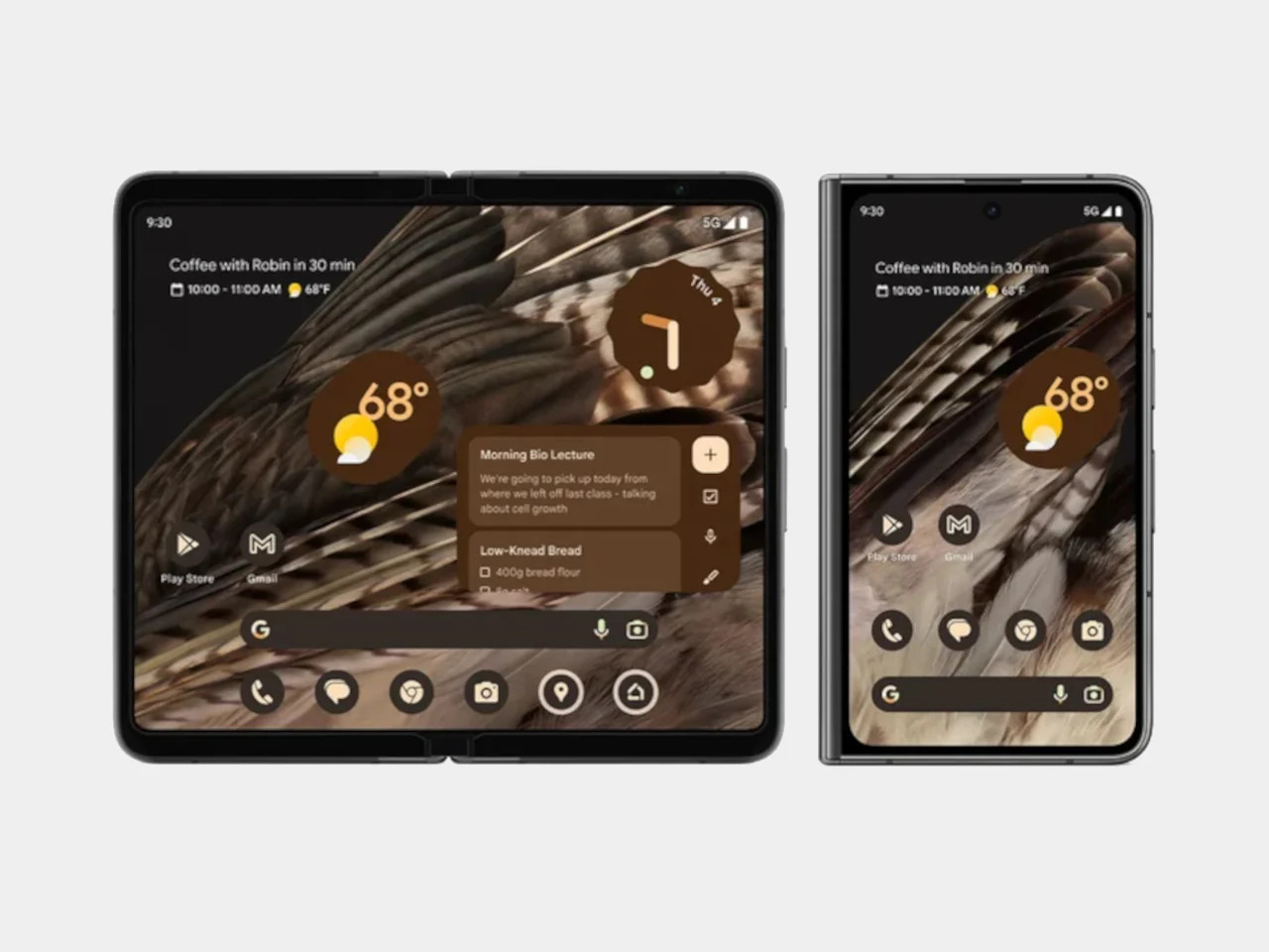
Google Pixel Fold (2023)

The 4:3 ratio is a well-understood canvas. It’s the same one the iPad has used for years, and developers have been designing for it far longer than they’ve been designing for foldable proportions. Not every app on the Galaxy Z Fold 8 Wide will look perfect, but the number that feel genuinely at home on that inner screen stands to increase considerably. It’s a format the software world already knows how to fill.

It Could Become the Notebook You Actually Carry

There’s a certain appeal to a device that opens up to something resembling a pocket notebook. Not a productivity gimmick, but an actual blank-page-sized surface where you can think out loud. The Galaxy Z Fold 8 Wide, when unfolded, reportedly sits at dimensions close to a small memo book’s proportions. That makes it a surprisingly natural surface for quick thoughts, rough sketches, and anything else worth capturing before it slips away.

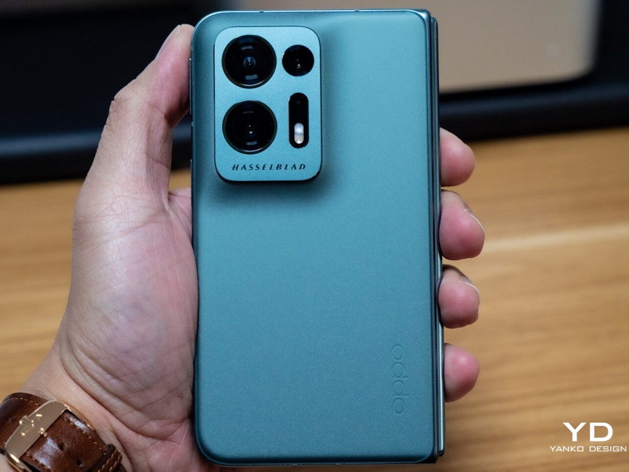
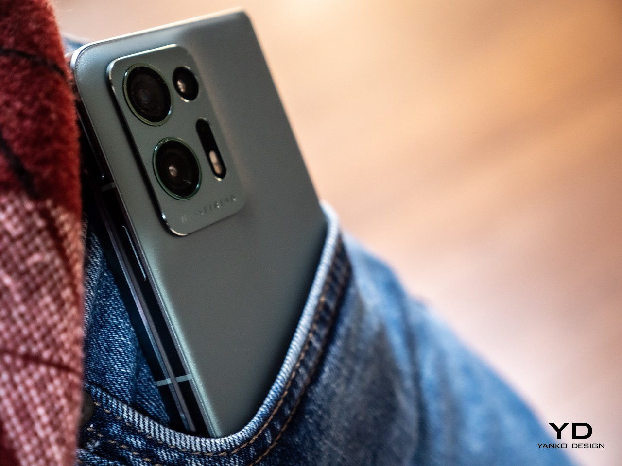
OPPO Find N2

The device is also reportedly thicker than the standard Fold 7, measuring around 9.8mm when folded, which gives Samsung more internal room to work with. It’s hard not to wonder whether some of that space is being reserved for S Pen support, which Samsung hasn’t confirmed yet. A stylus-compatible screen at these proportions would make the Galaxy Z Fold 8 Wide feel genuinely notebook-like, less like a big phone you write on and more like something actually worth reaching for.

Apple’s Shadow Could Actually Help It

Foldables still carry a reputational burden. The people who haven’t bought one yet aren’t always hesitating because of price or specs. Often, it’s the lingering sense that this is still experimental hardware, a category that hasn’t quite committed to a definitive form. Even Samsung’s most polished efforts can feel like stepping into an ongoing experiment, and that feeling keeps a large group of potential buyers watching from a distance.

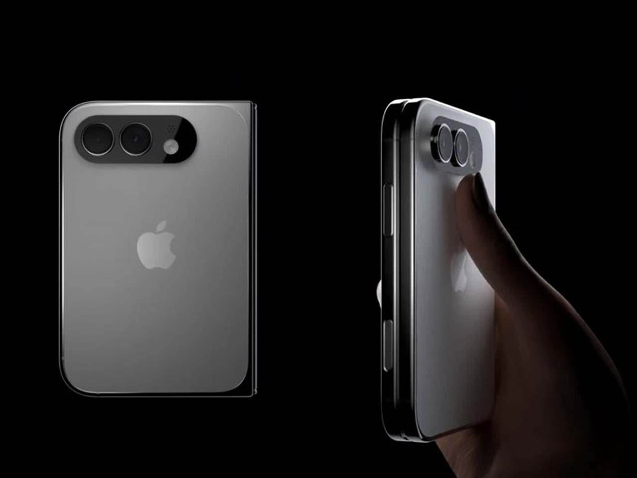
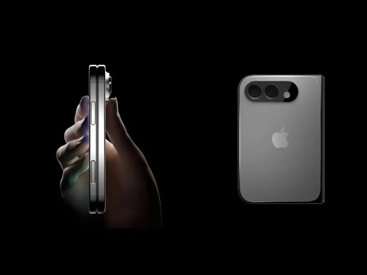
iPhone Fold (Renders)

Apple’s rumored foldable iPhone is expected to sport dimensions strikingly similar to the Galaxy Z Fold 8 Wide, with a wider, shorter profile that closely mirrors what Samsung is building. When Apple commits to a hardware direction, cautious buyers tend to pay attention. It doesn’t guarantee anyone will rush out to buy a Samsung instead, but Apple’s presence in the same design space lends the wider foldable format a credibility that Samsung alone hasn’t quite managed to manufacture on its own.

But Samsung Has a Commitment Problem

Here’s the part that’s harder to shake. Samsung has a demonstrated pattern of building genuinely interesting experimental devices and then quietly stepping back when the numbers don’t perform. The Galaxy Z TriFold is the most recent example, a compelling piece of hardware whose long-term future already feels uncertain. Buying into the Galaxy Z Fold 8 Wide means betting that Samsung will stay committed long enough to make the second and third generations worth waiting for.

That concern is more meaningful here than it is for a standard phone. Accessories take time to mature. Software optimization accumulates across generations. And the design refinements that make a device feel truly polished rarely arrive on the first attempt. The Galaxy Z Fold 8 Wide might be a genuinely thoughtful piece of hardware, but Samsung’s track record with experimental form factors hasn’t yet inspired the long-term trust that a device like this quietly depends on.

The post 5 Reasons the Galaxy Z Fold 8 Wide Could Win and 1 Reason It Might Not first appeared on Yanko Design.
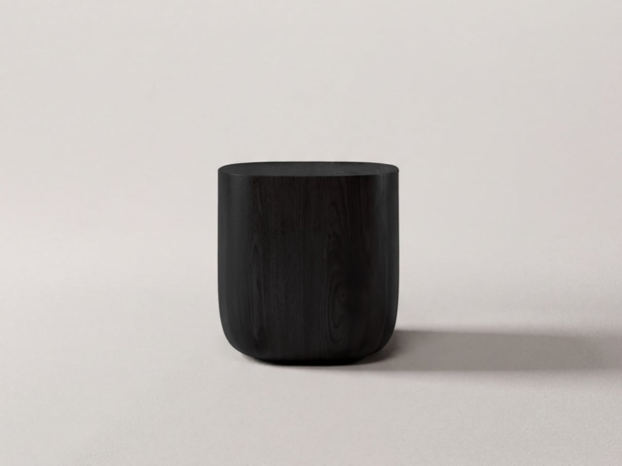
A Maker Built a $200 Writing-Only Device Because He Couldn’t Sleep

Writing on a laptop or phone is convenient, but it rarely stays that way. Notifications, browser tabs, and social media feeds have turned the most basic tasks into exercises in self-discipline. Writers, journalists, and anyone who just needs to put thoughts to paper have been searching for a better solution, and a growing community around dedicated, distraction-free writing devices called writerdecks has quietly been gaining momentum.

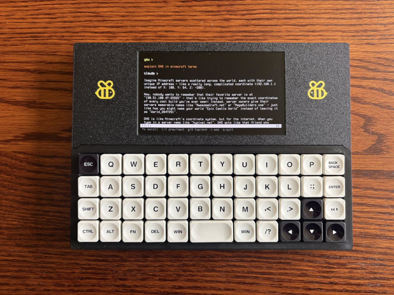
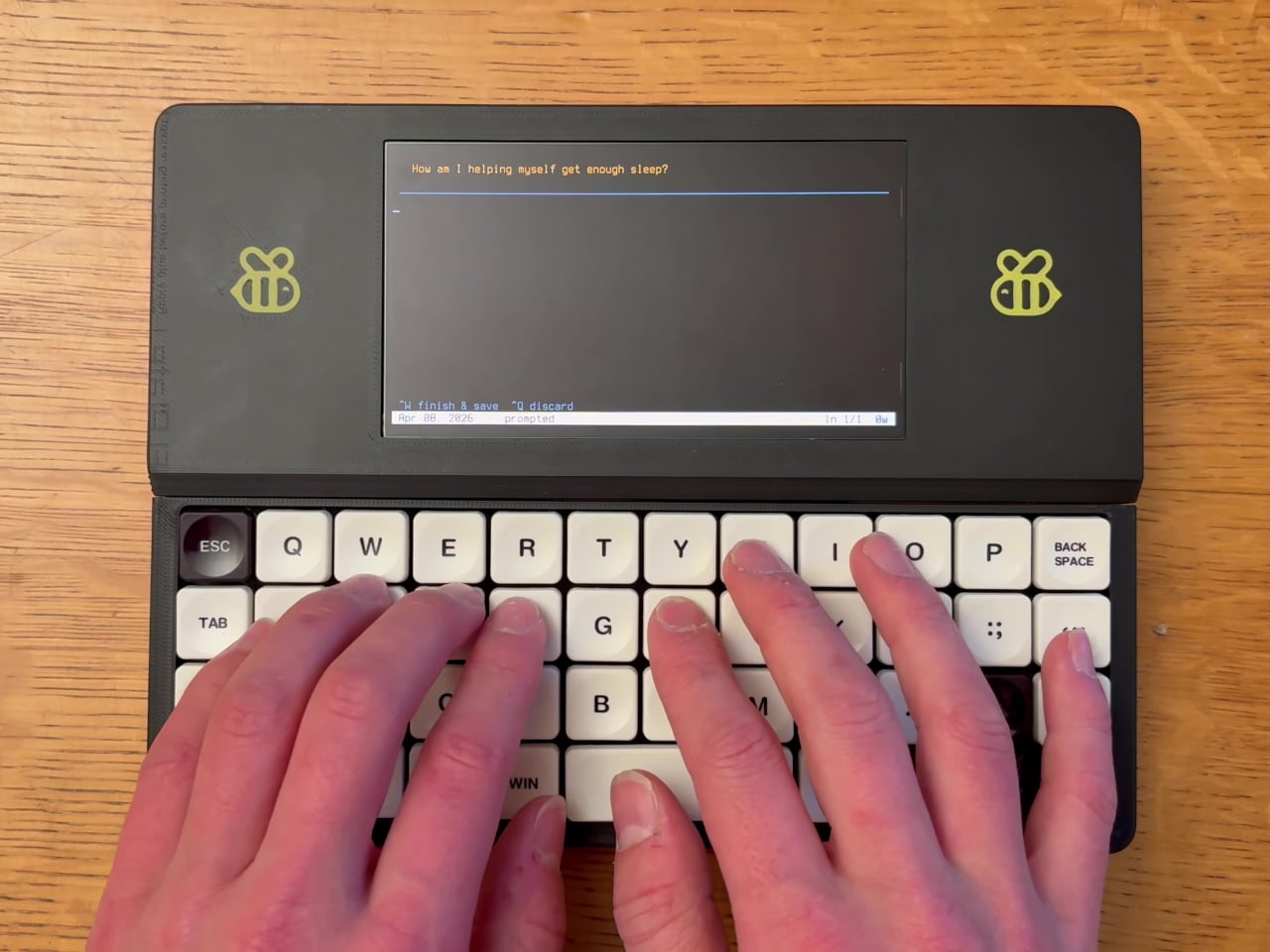
The Bee Write Back is one of the more charming entries in that space. Built by a maker named “shmimel”, the device grew out of a deeply personal need: he was having trouble sleeping and found that journaling helped, but couldn’t quite commit to a handwritten journal. So he did what any tinkerer would do and built his own dedicated writing machine from scratch.

Designer: Simon Shimel

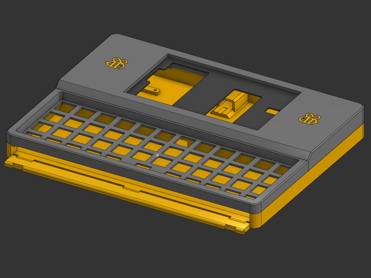
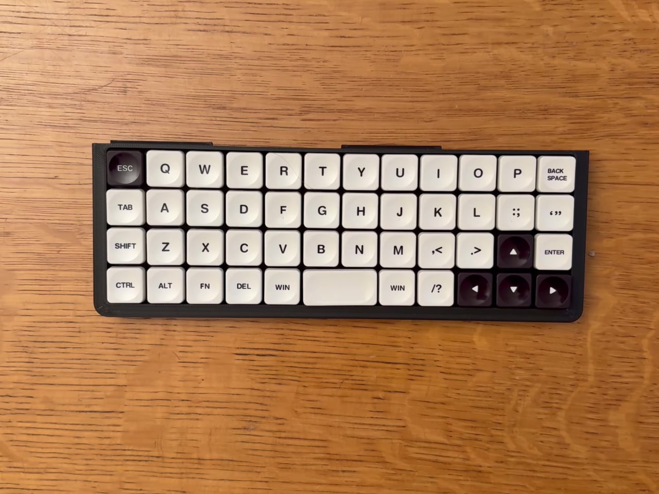
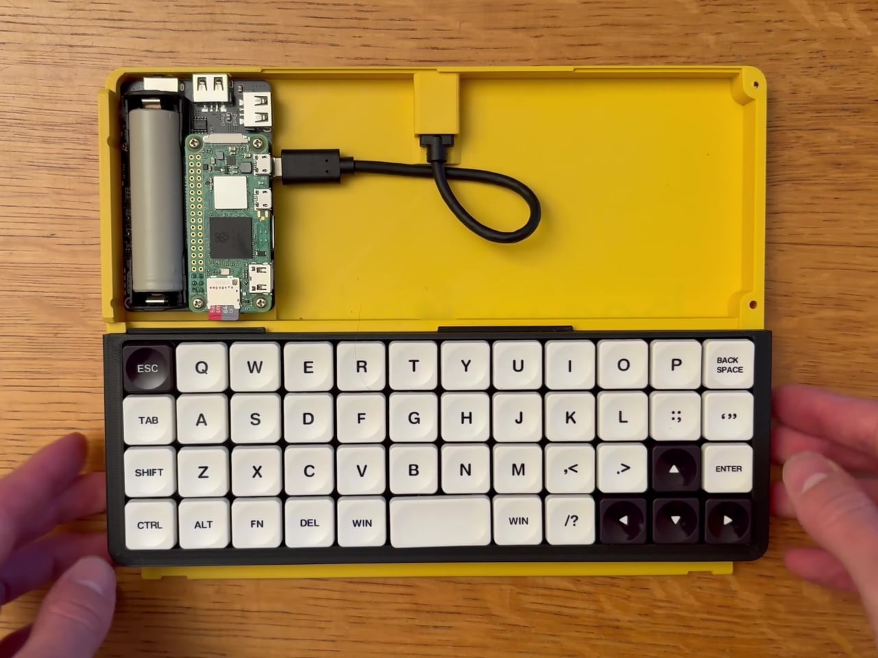
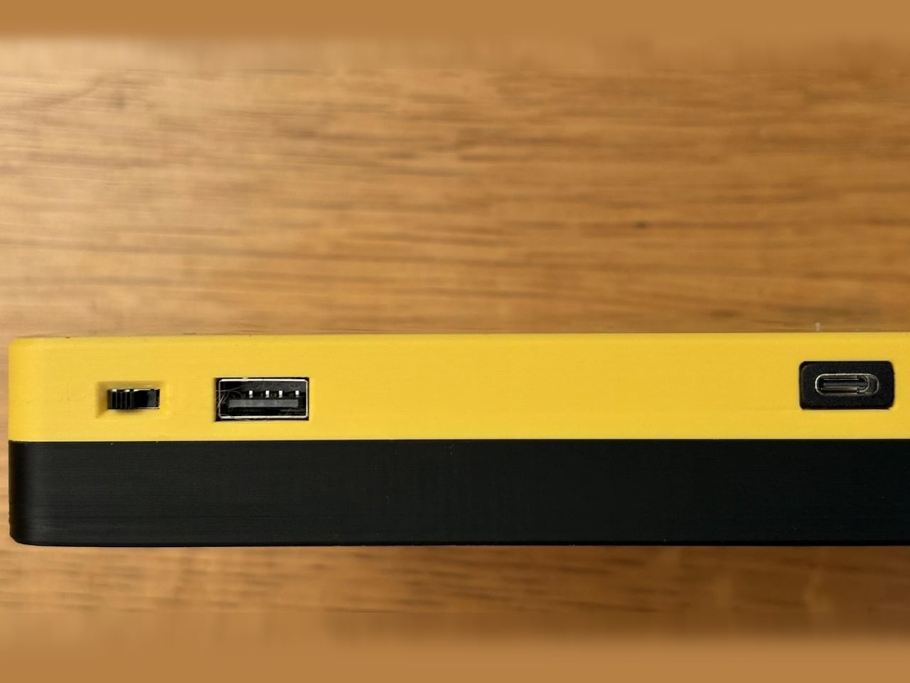
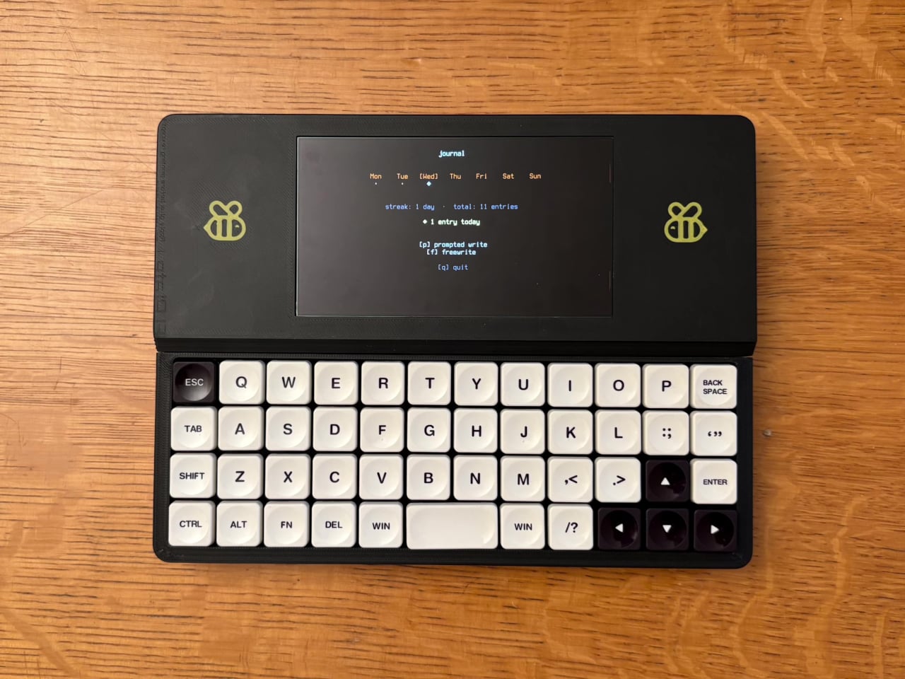
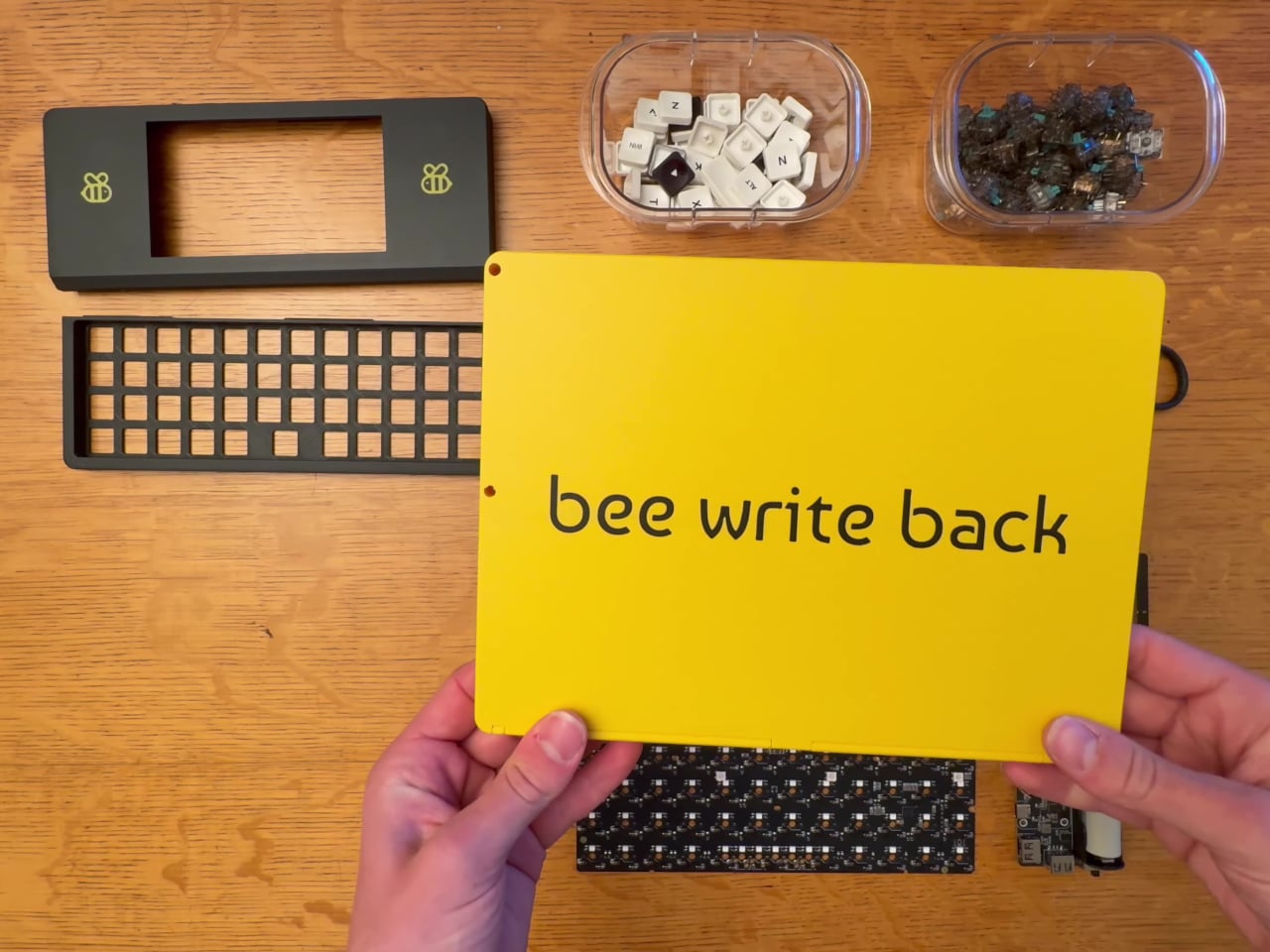
The result is compact and immediately recognizable. Its 3D-printed enclosure comes in two tones: a bright yellow base that houses the electronics, and a matte black screen cover adorned with bee emblems. The whole thing has a hand-built charm that no mass-produced gadget can replicate, and it’s the kind of device that tends to make people stop and ask, “wait, what is that?”

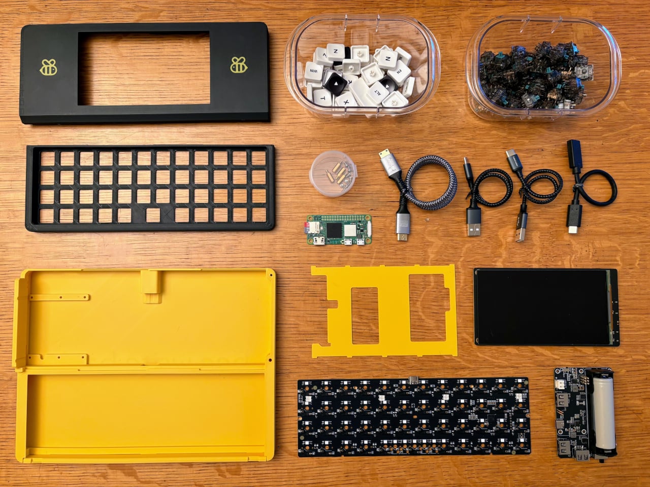
At the heart of the typing experience is a YMDK Air40 keyboard PCB loaded with 47 hot-swappable mechanical switches and matching keycaps. For anyone who’s spent years on laptop chiclet keys or membrane keyboards, the tactile feedback of a proper mechanical switch changes everything. The satisfying click or thump of each keystroke becomes almost meditative, which is exactly what you want when words need to keep flowing.

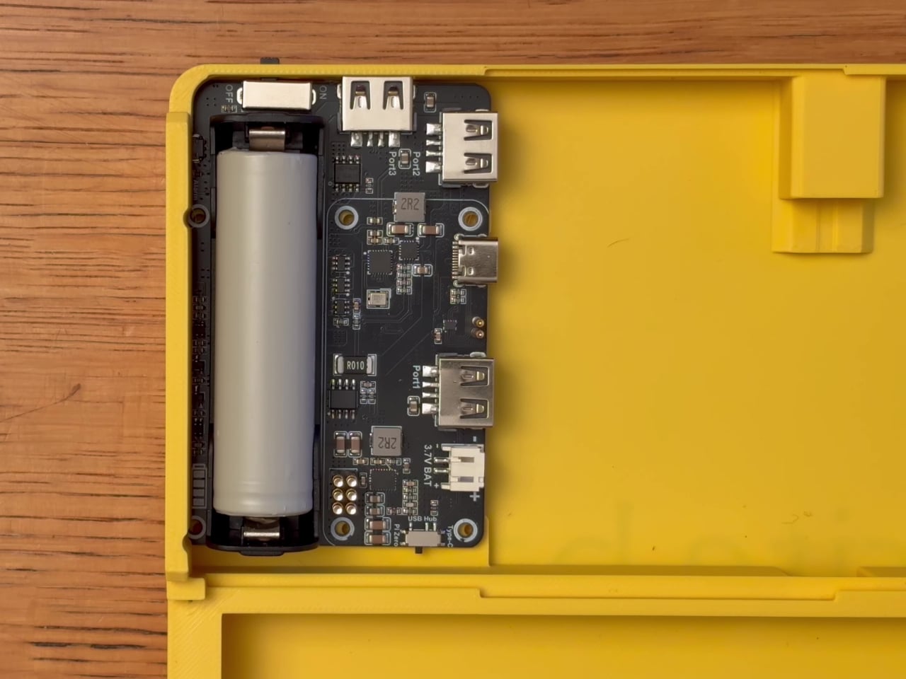
The display is a 5.5-inch AMOLED panel at 1280 x 720 resolution, vivid enough for comfortable reading without the eye strain of a typical laptop screen. Powering it all is a Raspberry Pi Zero 2 W, with a quad-core Cortex-A53 chip, 512 MB of RAM, and built-in Wi-Fi. A Seengreat UPS Hat with an 18650 battery keeps everything running away from any wall outlet.

Boot it up, and you’re in Raspberry Pi OS Lite, a stripped-down Linux environment that loads fast and stays focused. There are no app stores, no notification bubbles, and no algorithms fighting for your attention. It’s the kind of thing you pull out before bed to journal, bring to a coffee shop to draft, or pack on a trip when you need a writing-only companion.

The creator made the entire project open source, with build files and a detailed assembly guide available on GitHub. The total material cost comes to roughly $200, excluding 3D printing costs. That puts it roughly in line with some off-the-shelf writing gadgets, but with the added satisfaction of building it yourself and the freedom to swap out parts, tweak the layout, or change the enclosure color entirely.

What makes the Bee Write Back worth paying attention to is less about its specs and more about what it deliberately leaves out. Most devices pack in as many features as possible, but shmimel’s creation goes the other direction: pare things down until only the writing remains. For anyone looking to reclaim the quiet, focused experience of putting words down without fighting their tools, that restraint speaks for itself.

The post A Maker Built a $200 Writing-Only Device Because He Couldn’t Sleep first appeared on Yanko Design.
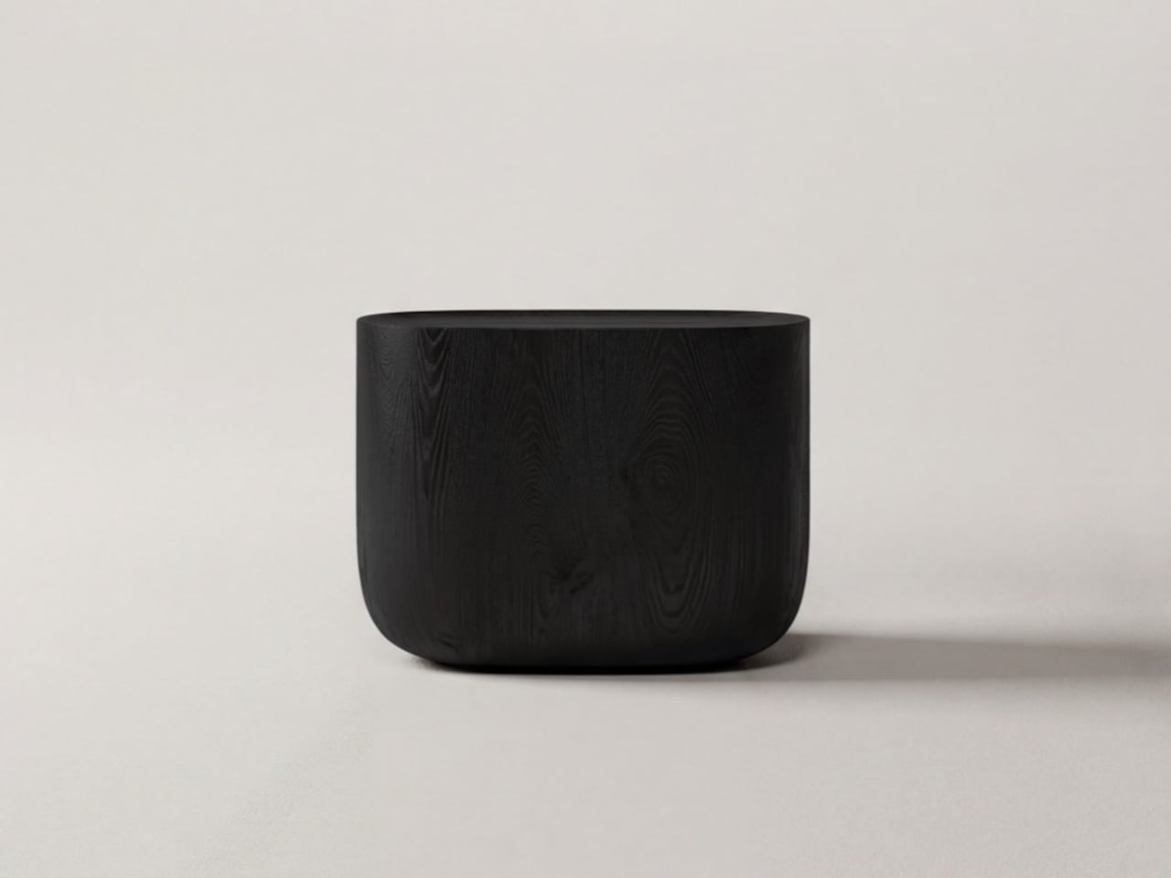
POCO X8 Pro Iron Man Review: Hero-Level Performance for only $399

PROS:


  • Tasteful and elegant Iron Man-themed design

  • Surprisingly powerful for its class and price tier

  • Large 6,500mAh battery with 100W HyperCharge

  • Bright and vivid 6.59-inch 1.5K 120Hz AMOLED display

CONS:


  • Inconsistent thermal management

  • Basic 8MP ultra-wide and no telephoto camera

  • No wireless charging

RATINGS:

AESTHETICS
ERGONOMICS
PERFORMANCE
SUSTAINABILITY / REPAIRABILITY
VALUE FOR MONEY

EDITOR'S QUOTE:

Just like Tony Stark, the POCO X8 Pro Iron Man Edition is classy, powerful, and pushes the boundaries of what you can achieve with less.

Interests and fandoms number in the hundreds, and when you take into account the number of smartphone brands and models, it’s statistically impossible for manufacturers to cater to everyone’s tastes. That’s why when smartphone makers come out with devices especially designed to appeal to fans of certain characters or brands, there’s no small amount of excitement over a collab that finally feels like rewarding their brand loyalty. After all, you won’t need to dress your phone up in a thick case just to show off your style.

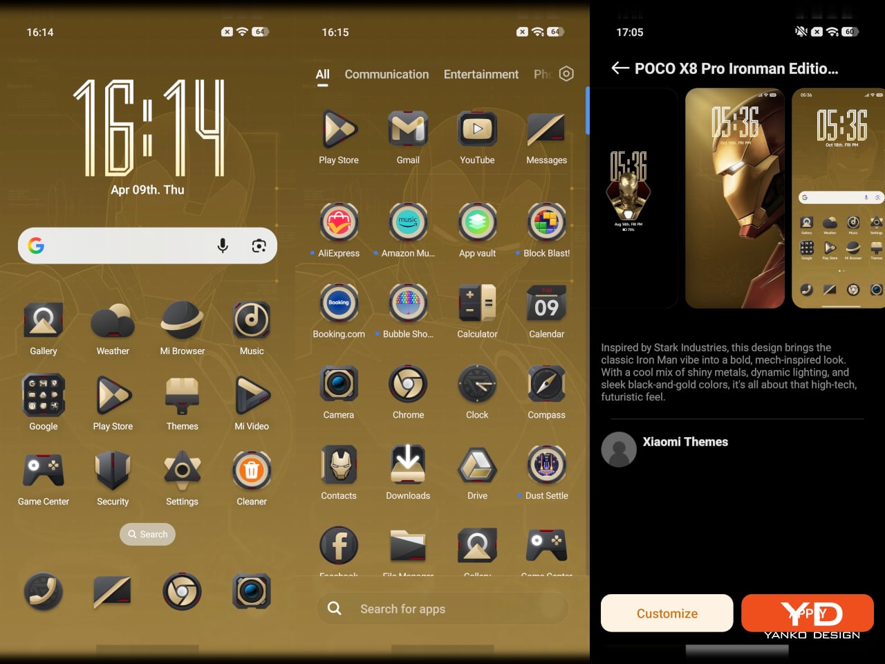
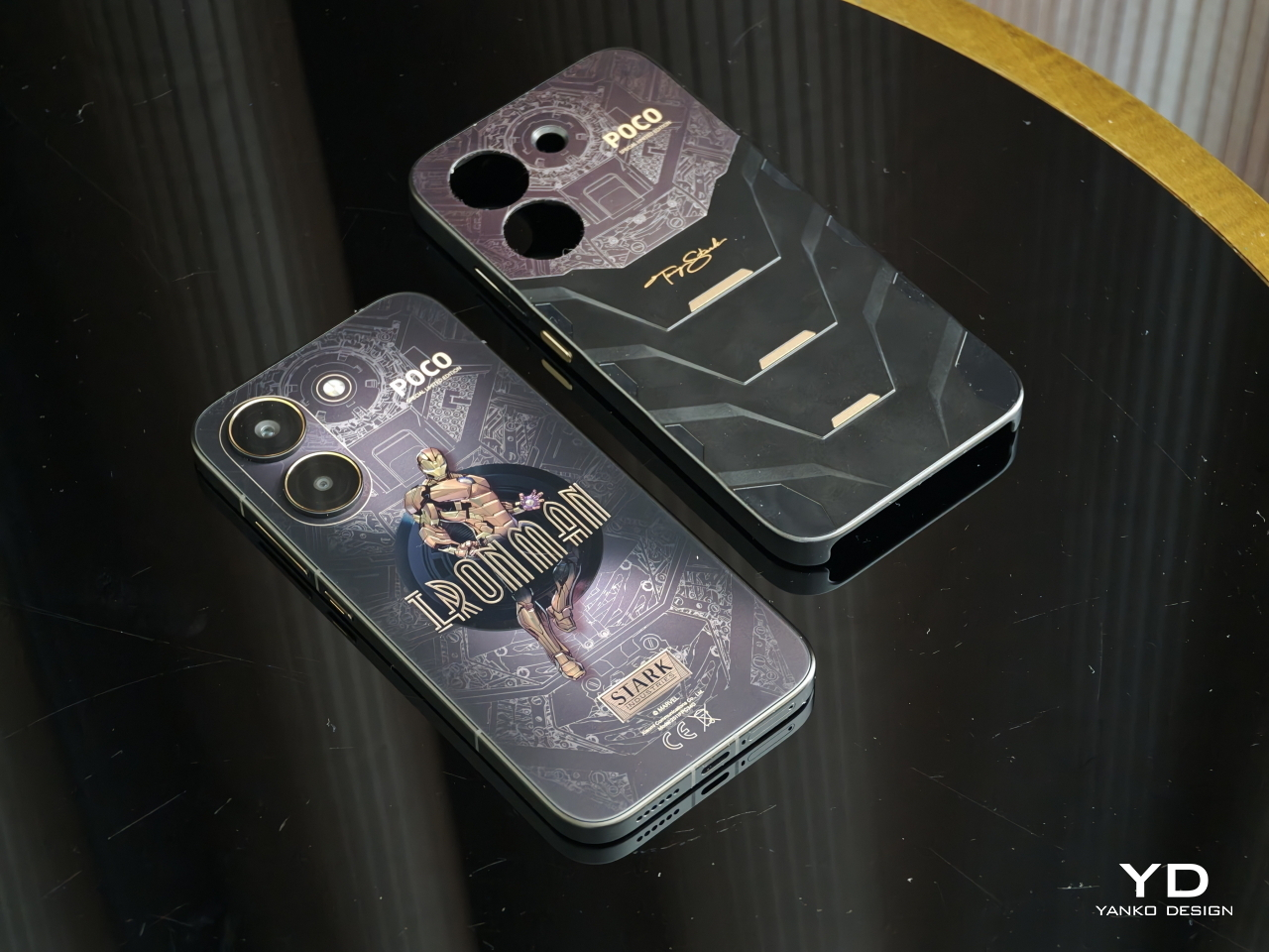
For the second time, POCO is releasing an Iron Man-themed version of one of its flagships, the POCO X8 Pro. While last year’s POCO X7 Pro Iron Man edition brought the flashy, head-turning red and gold motif that has become synonymous with the superhero, the latest iteration brings maturity and elegance while still maintaining that hi-tech character. Best of all, it’s still a device that Tony Stark himself would probably give his seal of approval. Read on to find out why.

Designer: POCO

Aesthetics

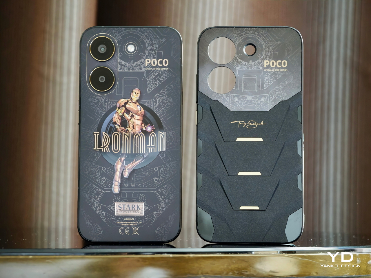
Tony Stark is more than just Iron Man, symbolized by the heroic and explosive colors of red and gold. As the famous movie quote goes, he’s also a genius, billionaire, and philanthropist (let’s ignore that other part of that phrase for now). The POCO X8 Pro Iron Man Edition seems to represent that other side of the coin, displaying an often-forgotten aspect of Tony Stark’s identity, without losing what makes Iron Man Iron Man: the fearless and relentless drive to push boundaries.

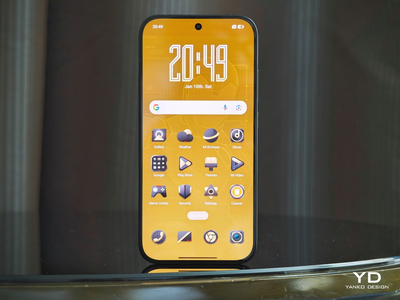
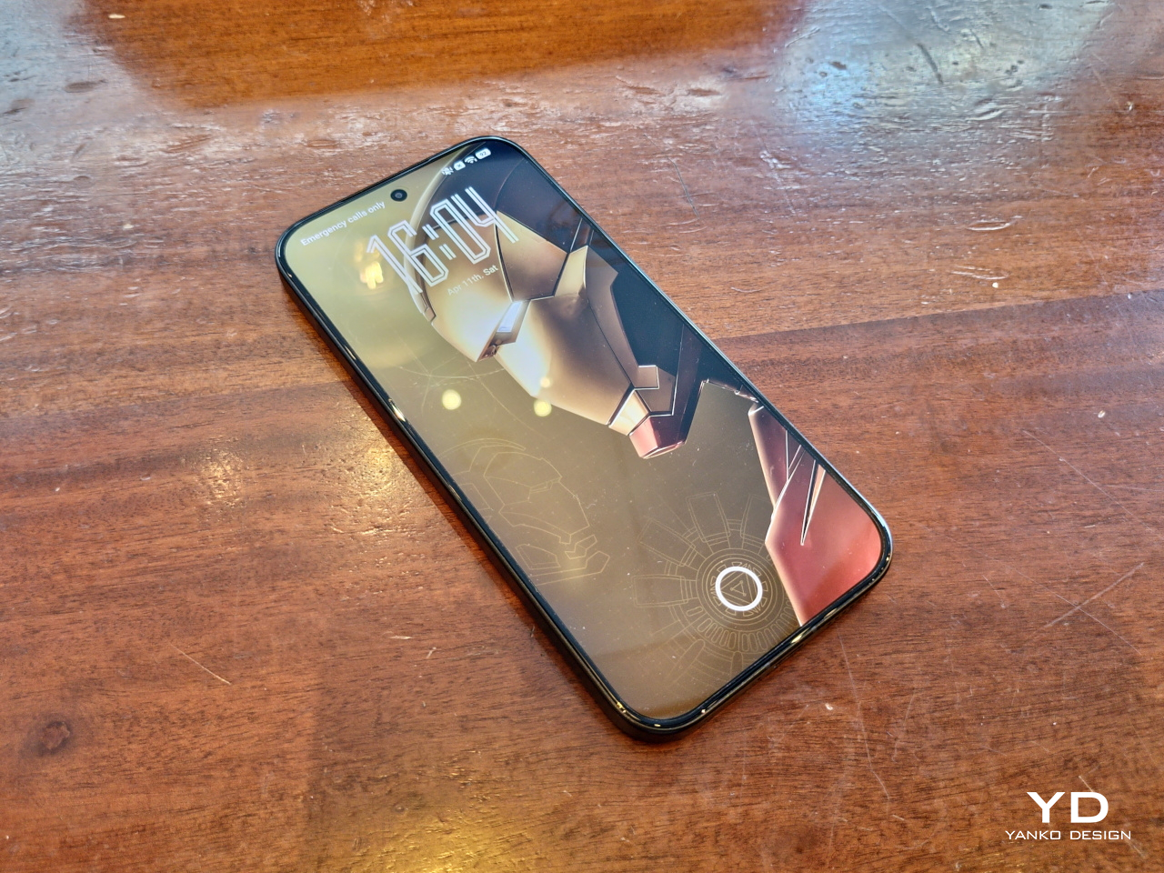
This year’s color scheme revolves around a black and gold combination, which rarely makes an appearance in both comics and film, that carries a sense of class and style befitting one of the richest people in the Marvel universe. The phone itself embraces the modern design language of sides sandwiched by a flat screen and a flat back panel. There’s almost an Art Deco vibe to the aesthetic, a design language that is immediately associated with opulence and luxury.

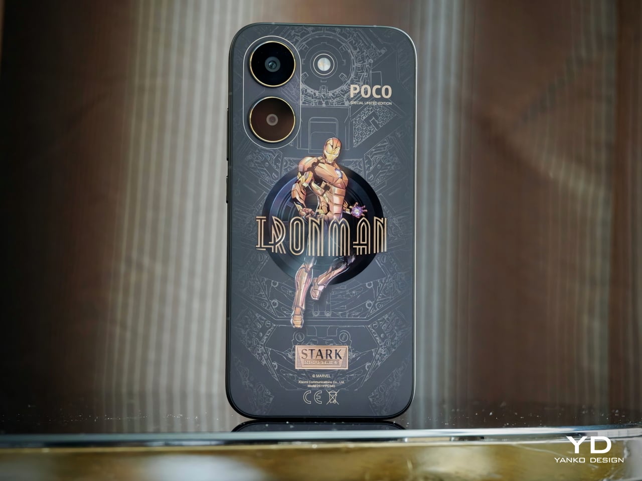
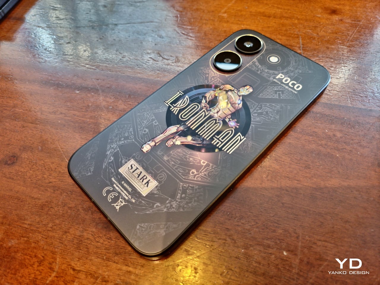
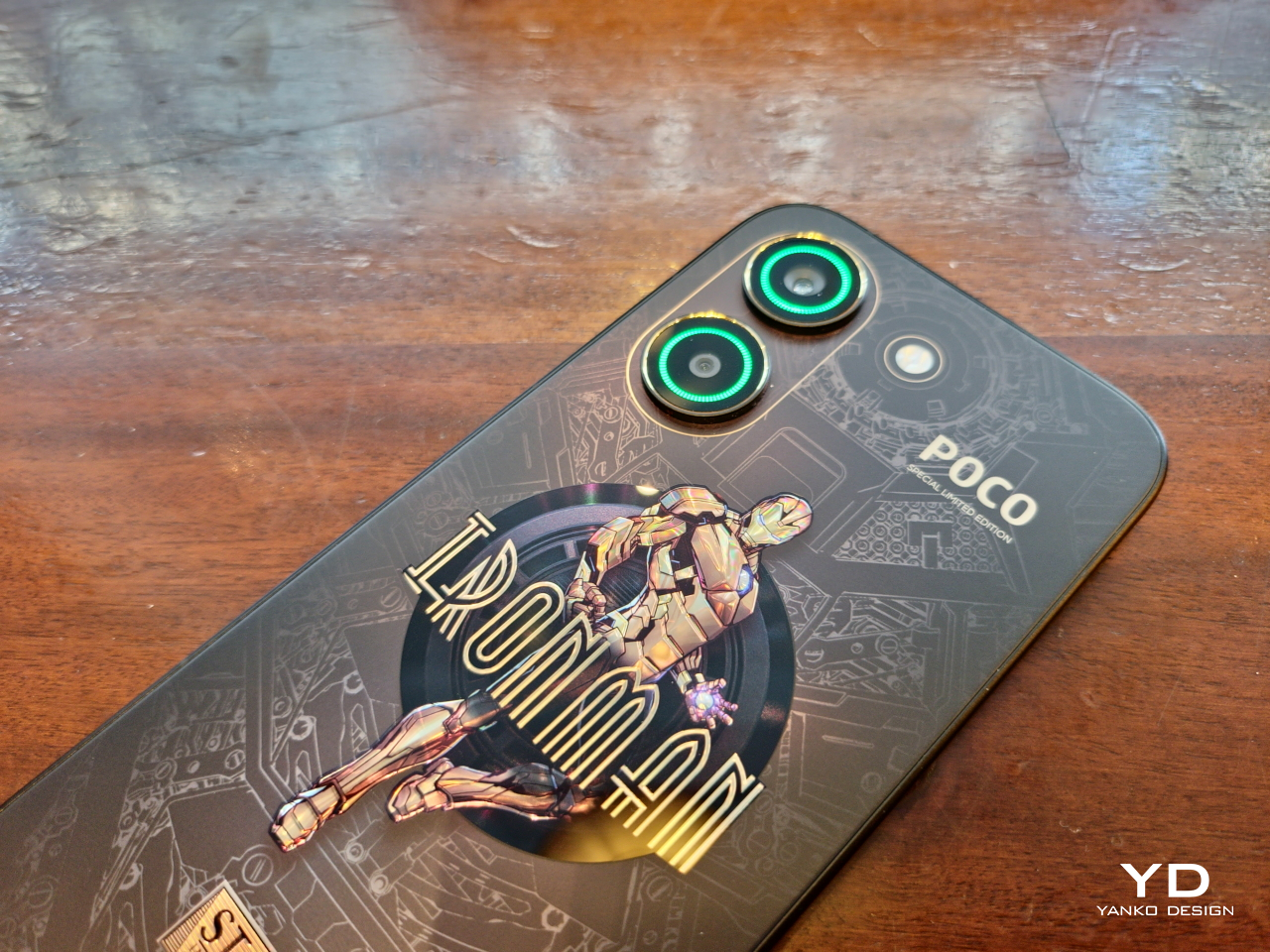
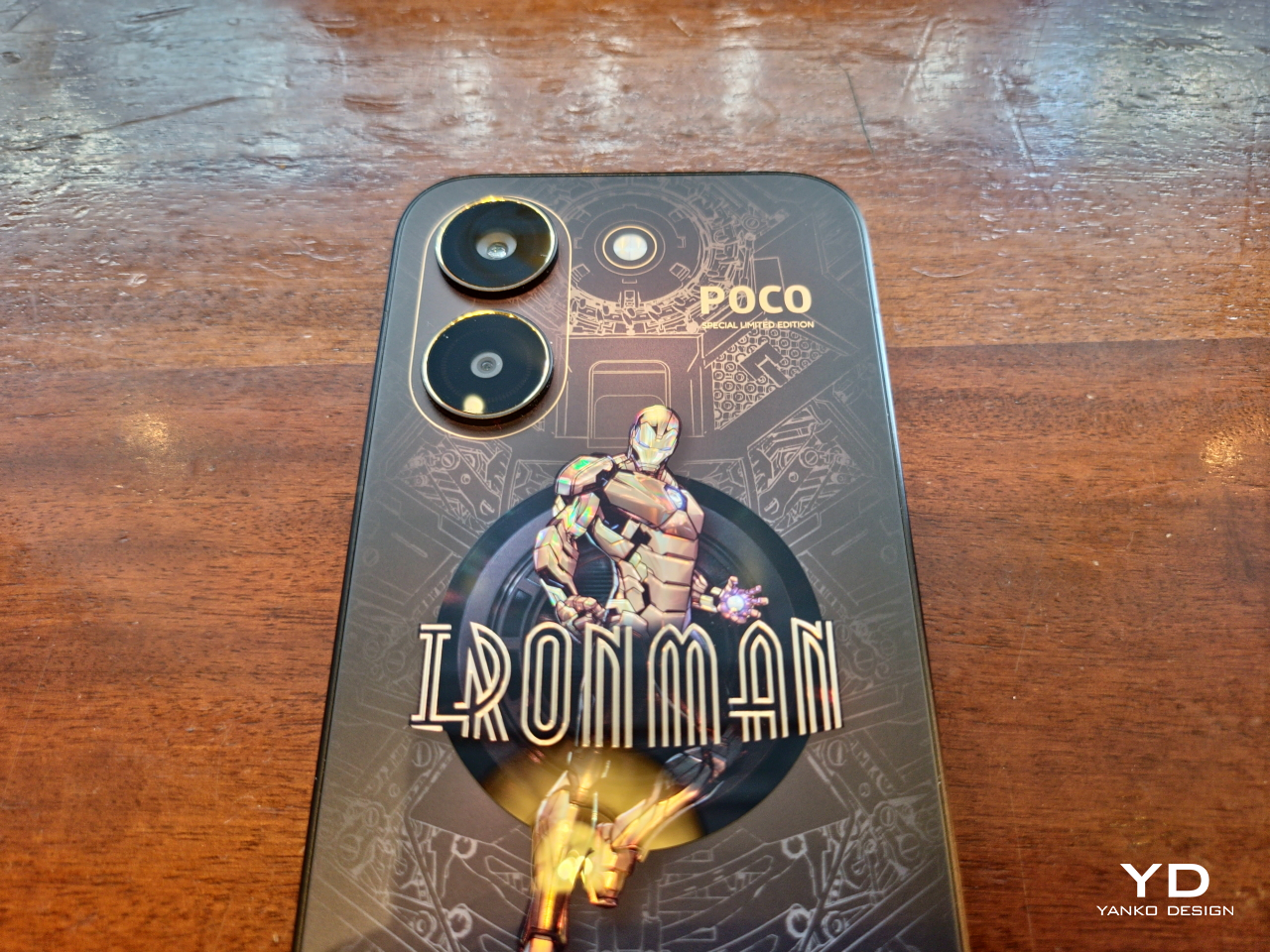
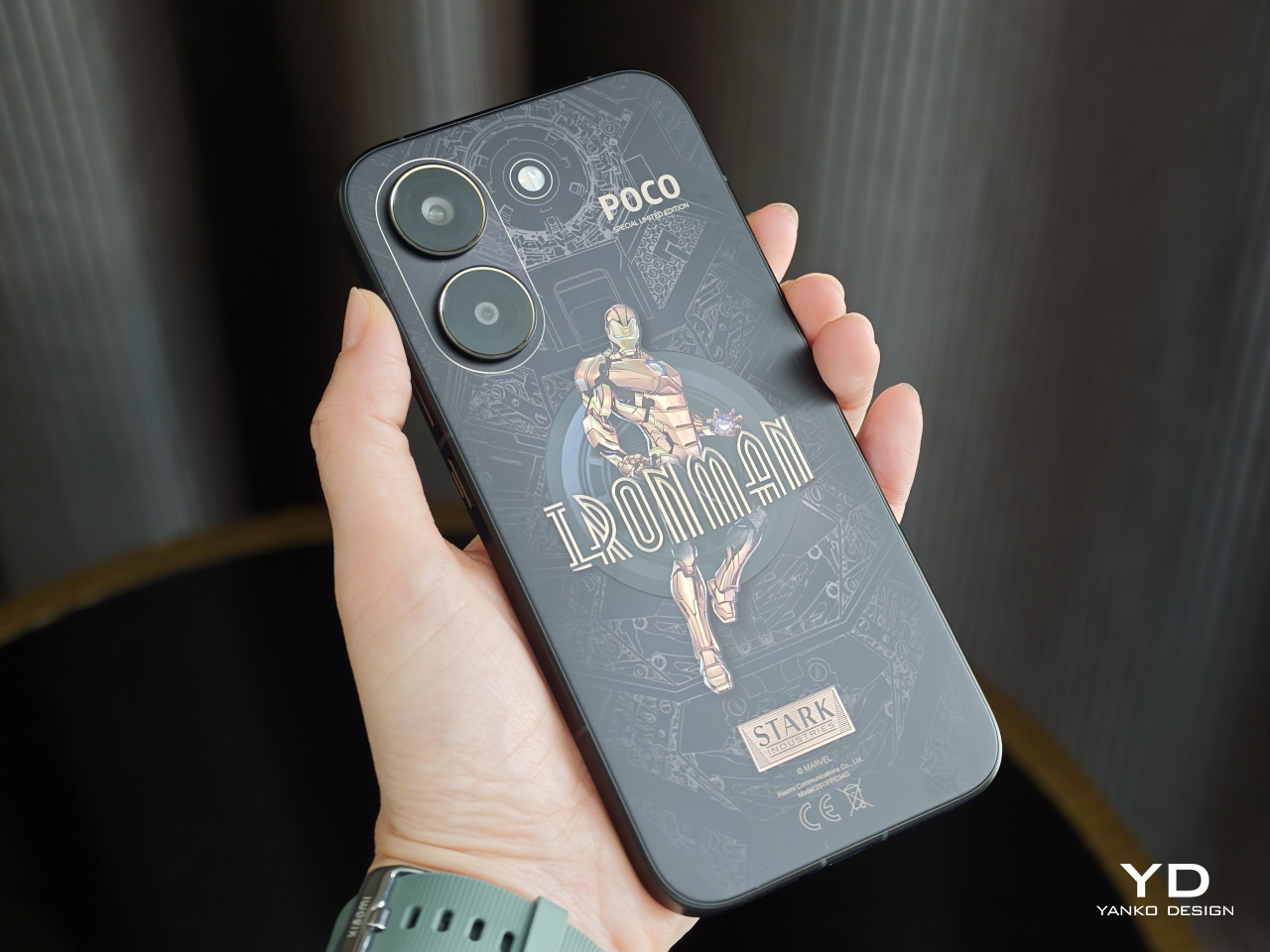
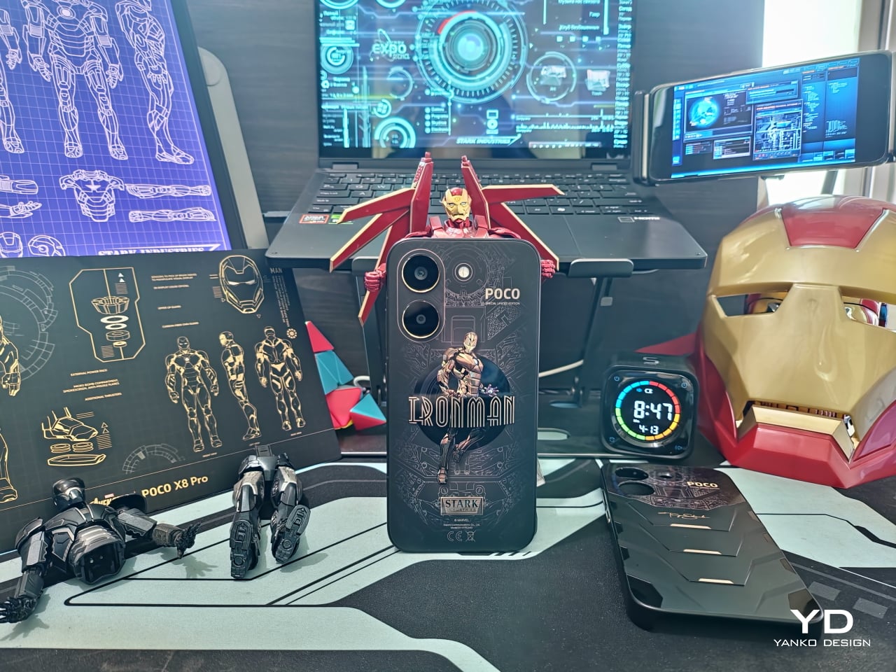
Of course, the most attention-grabbing part of the POCO X8 Pro Iron Man Edition’s design is its rear. The back panel has a matte black surface with holographic gold accents detailing a circuit diagram of Iron Man’s armor. Smack in the middle is a full-body armor decal of the titular superhero, complete with his name in case you couldn’t identify him from appearance alone. The decal has a glossy material that contrasts with the smooth matte texture of the rest of the phone’s back.

Unlike other smartphones of this era, the POCO X8 Pro’s two cameras stand on their own, with the lenses also accented with a gold ring. These cameras have a special power, displaying different RGB colors depending on the situation and enhancing that sci-fi aesthetic. The LED flash stands beside them, positioned in such a way that it is reminiscent of the Arc Reactor in the center of Iron Man’s chest. In reality, the flash is actually off-center, though the design easily fools the eye into believing that’s not the case.

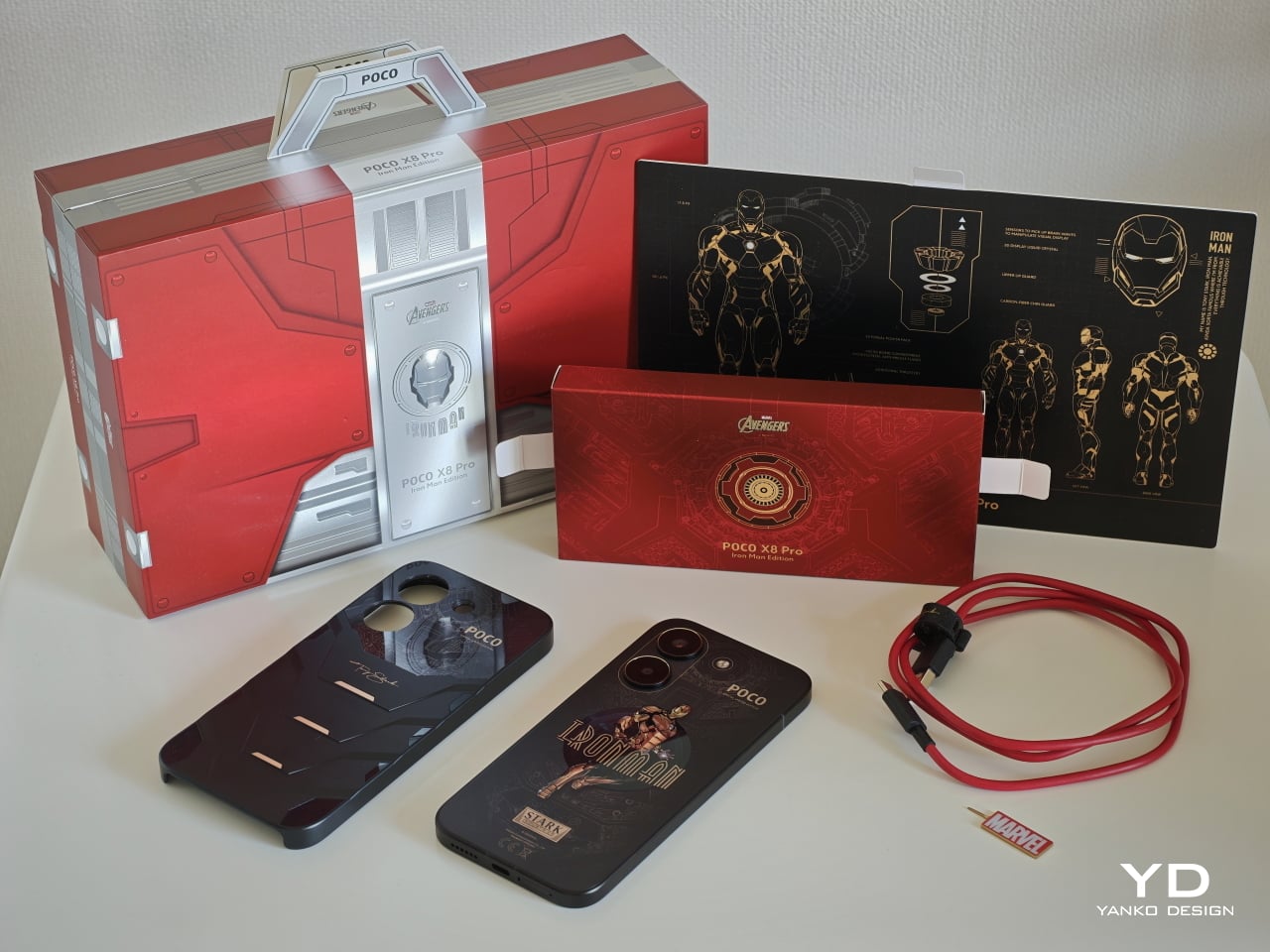
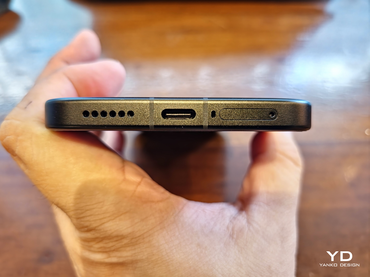
Special mention needs to be made to the packaging for this year’s Iron Man edition. Though not as elaborate as the realme 15 Pro Game of Thrones Edition, the POCO X8 Pro Iron Man edition comes in a box that instantly identifies the theme of its contents. Specifically, it emulates Iron Man’s armor in the form of a briefcase, yet another nod to the comics, and comes with a MARVEL-branded SIM ejector pin and a red charging cable with Tony Stark’s signature on it.

Ergonomics

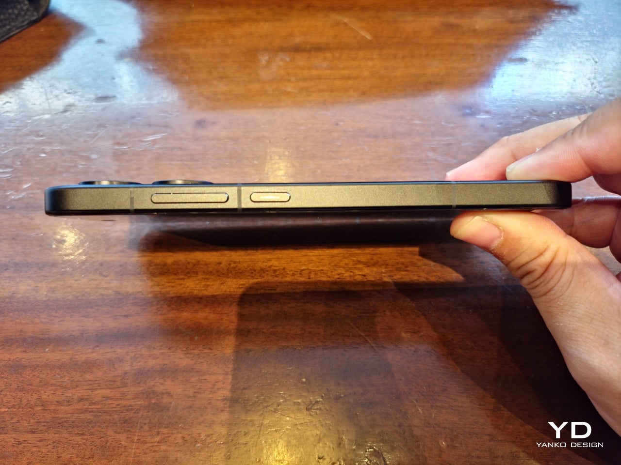
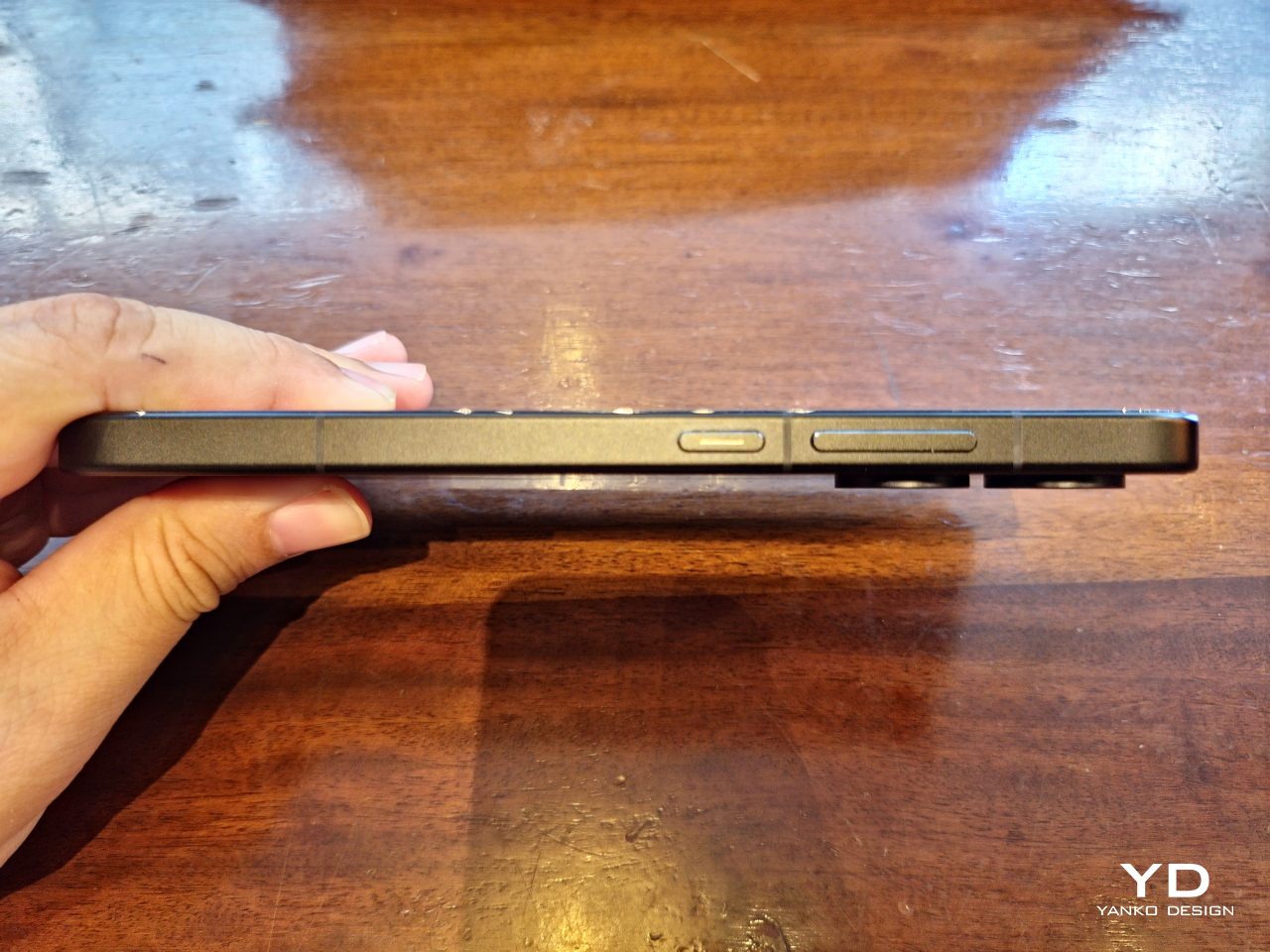
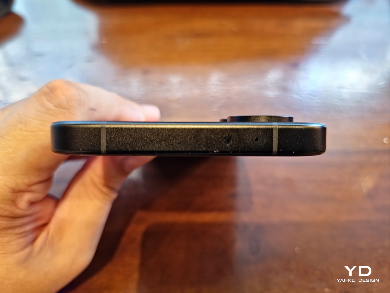
At only 201.47g and with a 6.59-inch screen, the POCO X8 Pro Iron Man Edition is surprisingly light and comfortable to hold in the hand, despite the large 6,500mAh battery sitting inside. The 8.38mm chamfered edges add to the grip without biting into your skin, which would normally result in a confident and secure hold, if not for the rather slippery matte surface of both the aluminum frame and most of the phone’s back.

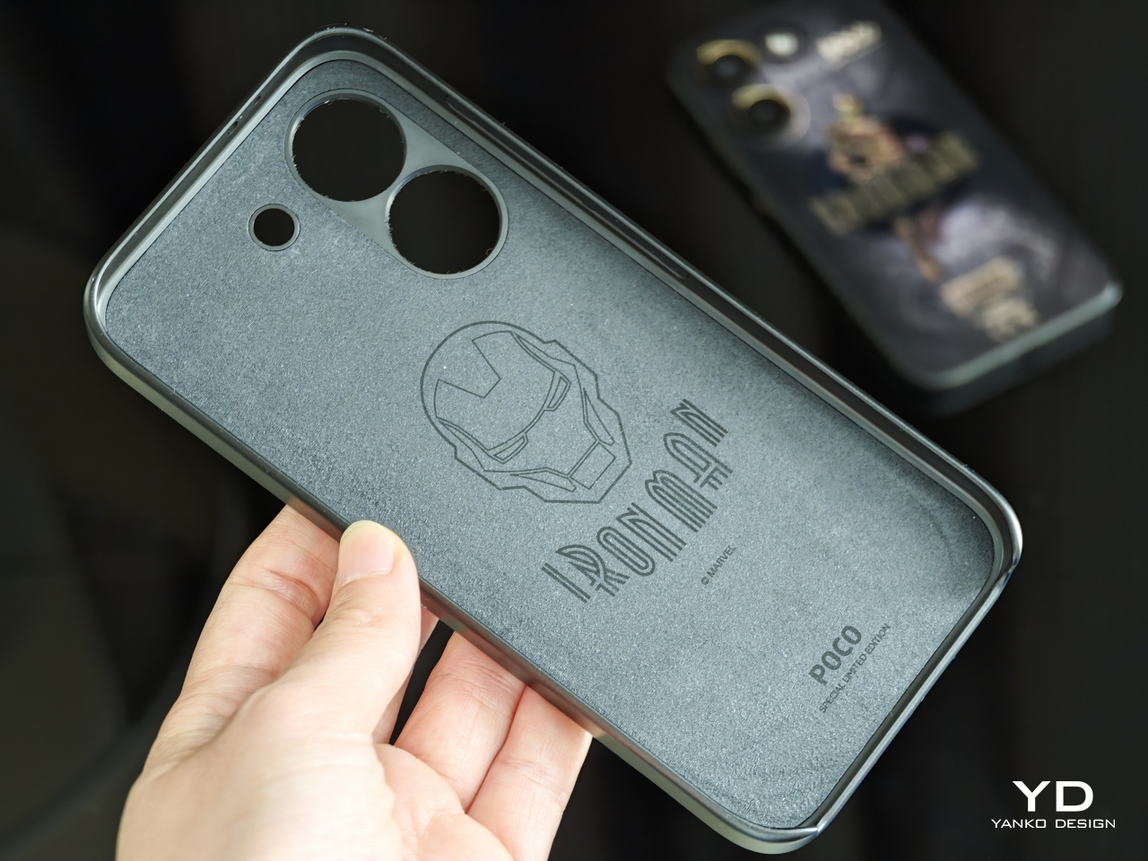
Almost ironically, the glossy Iron Man decal in the middle adds a bit of stickiness to prevent slipping. Thankfully, it isn’t much of a smudge magnet, so you can rest your fingers on it without much worry. If you’re still unsure, however, the POCO X8 Pro Iron Man Edition comes with a matching protective case that doesn’t add much bulk or heft to the phone. Given how the case is designed like Iron Man’s torso, it’s almost like literally putting armor on your phone.

Sadly, there is no such relief for the under-screen fingerprint sensor, which is positioned quite close to the lower edge of the phone. This might require shifting your hand down a bit to unlock the phone with one hand, which carries the risk of the phone slipping from your grasp. Fortunately, the sensor is accurate enough to allow you to partially place your thumb above the ring indicator to successfully unlock it.

Performance

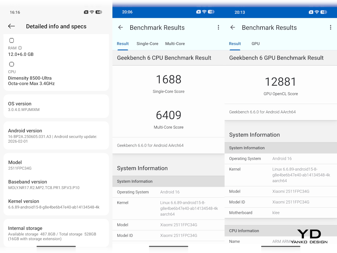
An Iron Man-themed smartphone that only looks good on the outside but falls flat on its face in actual use would be a terrible insult to the tech genius that is Tony Stark. Thankfully, that isn’t the case, and the POCO X8 Pro performs as you would expect from a superhero-branded piece of technology. Running on a MediaTek Dimensity 8500 Ultra with 12GB of RAM and 512GB of storage, the POCO X8 Pro has enough muscle to help you triumph over life’s daily battles.

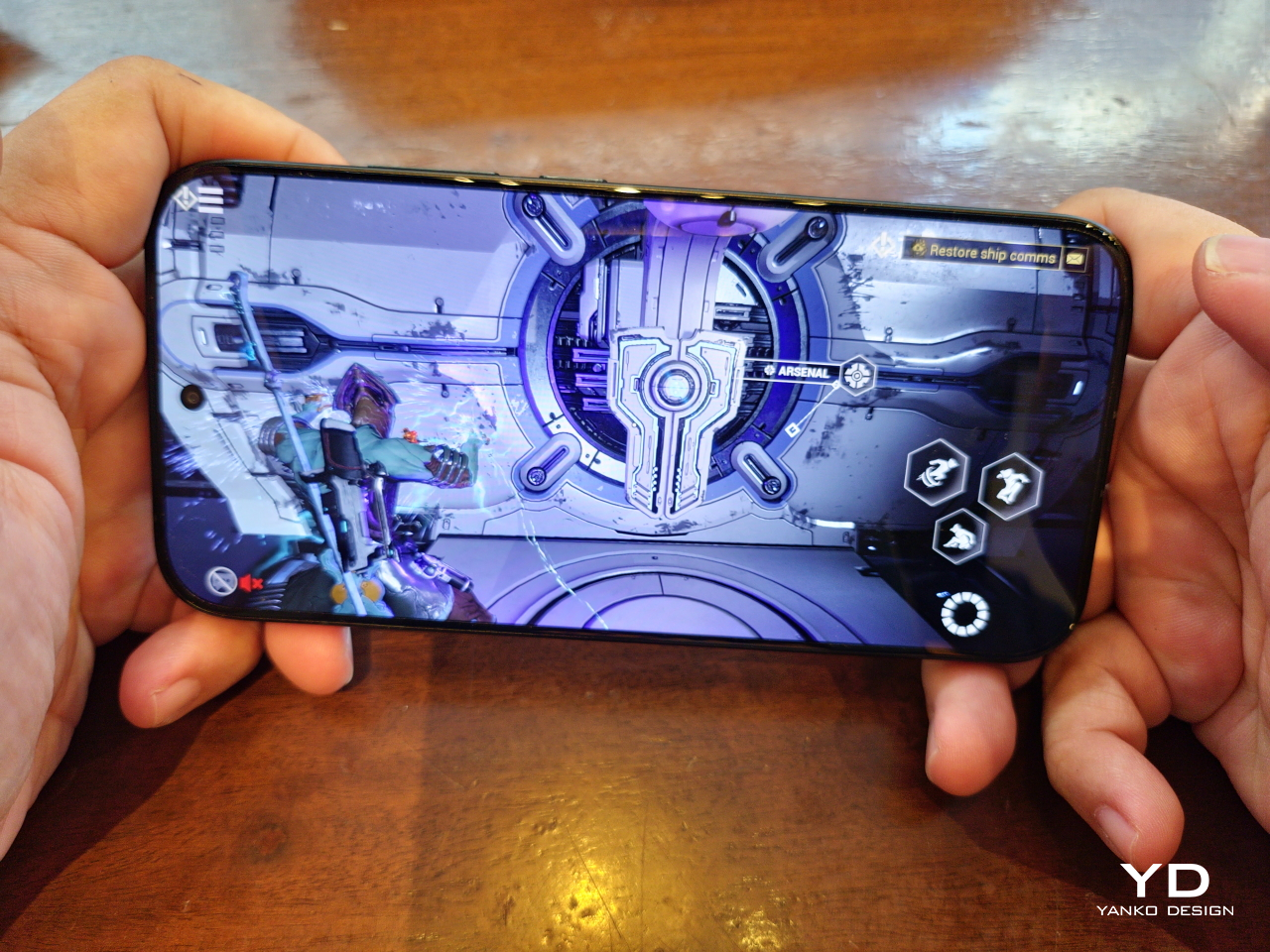
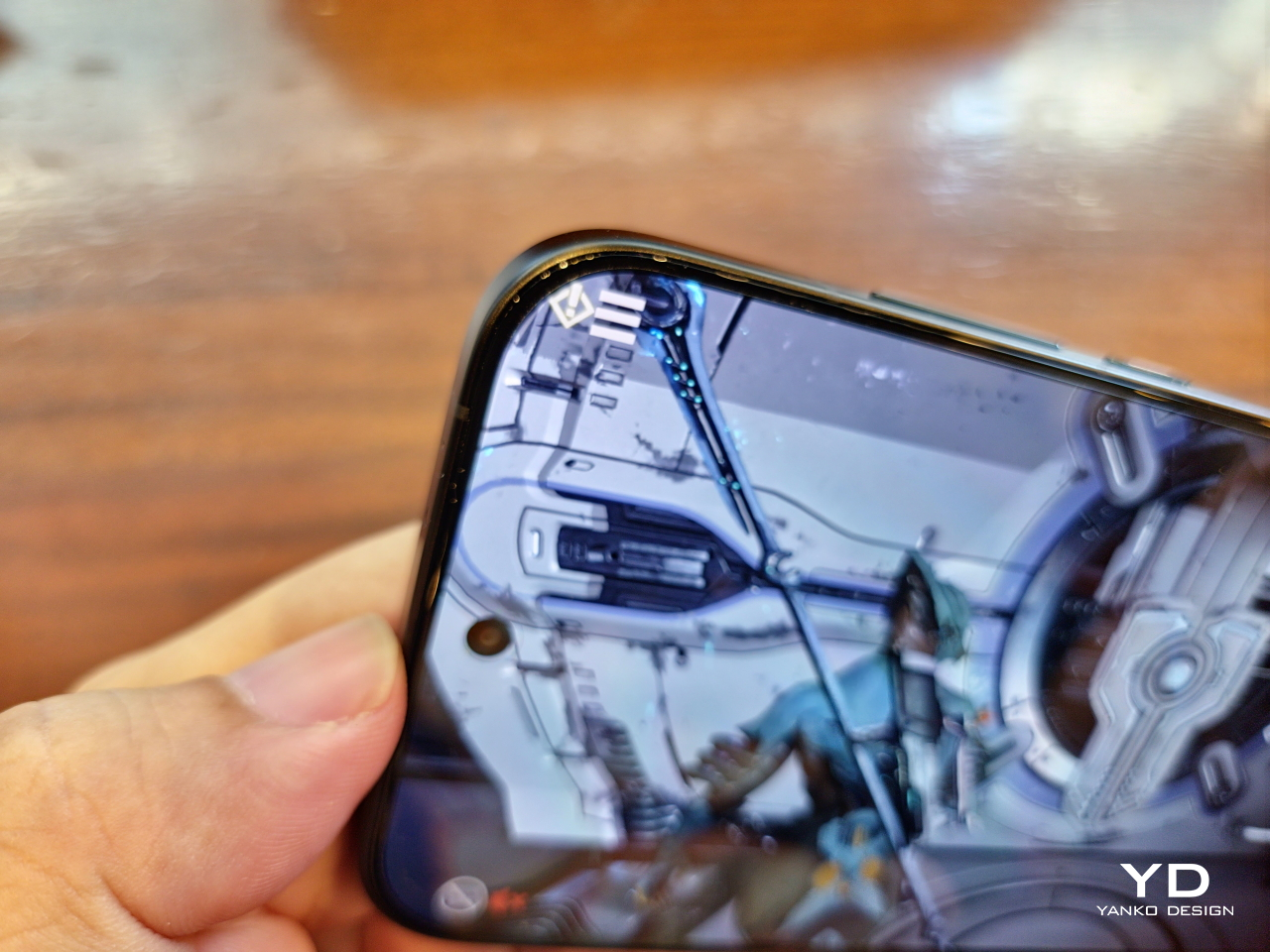
The user interface is fluid and responsive, and there are no issues with multitasking and switching between running apps. Gaming is also no problem, though with some caveats. This is definitely no Pro Max, but the POCO X8 Pro can definitely handle titles like Genshin Impact or Warframe, even at high settings. It does get warm quickly, and it doesn’t cool down as fast, but it never gets unbearably hot. You’ll have to play around to find the sweet spot between performance and comfort, especially with POCO WildBoost Optimization and Game Turbo feature at play. Pun totally intended.

The POCO X8 Pro Iron Man Edition’s bright and vivid 6.59-inch screen perfectly complements the phone’s power. With a 1.5K resolution of 2756×1268 pixels and a 120Hz refresh rate, the screen delivers sharp and crisp visuals whether you’re gaming or binging videos. One detail worth noting, however, is the curved corners of the screen, which could make some parts of a game’s interface difficult to access with a simple tap.

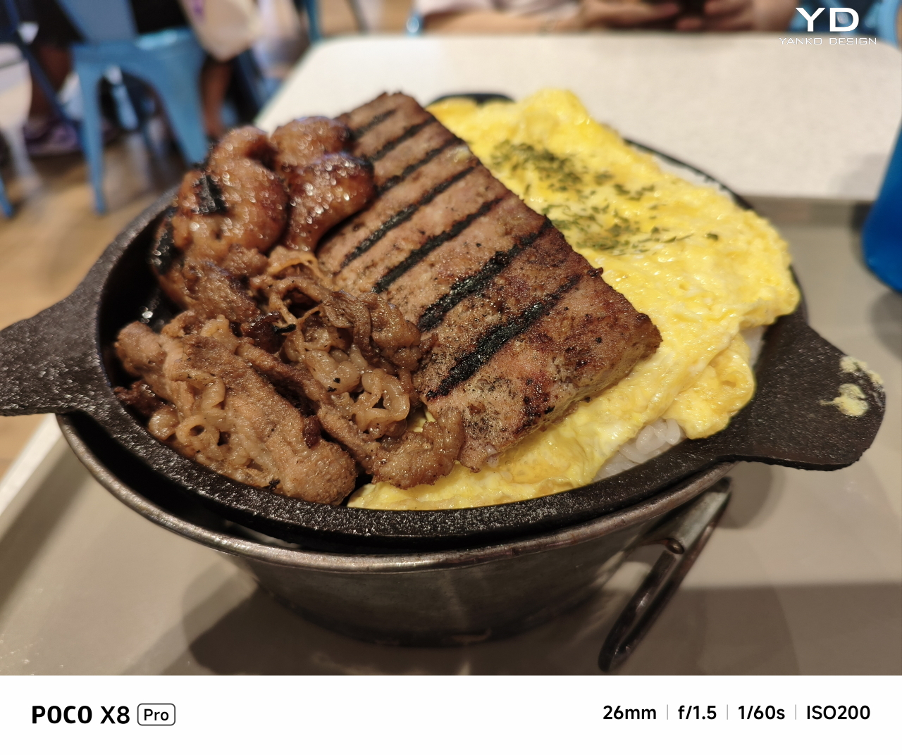
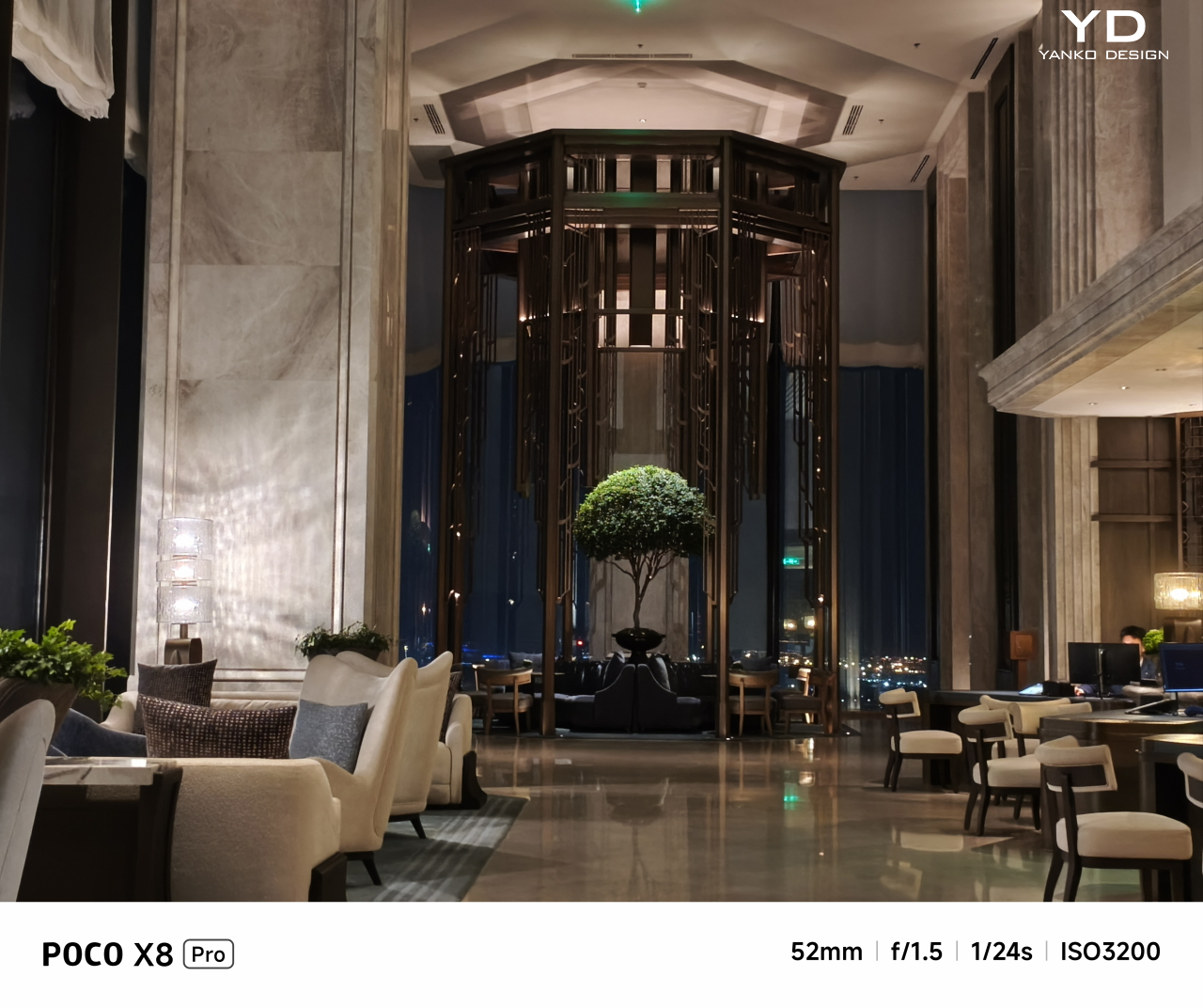
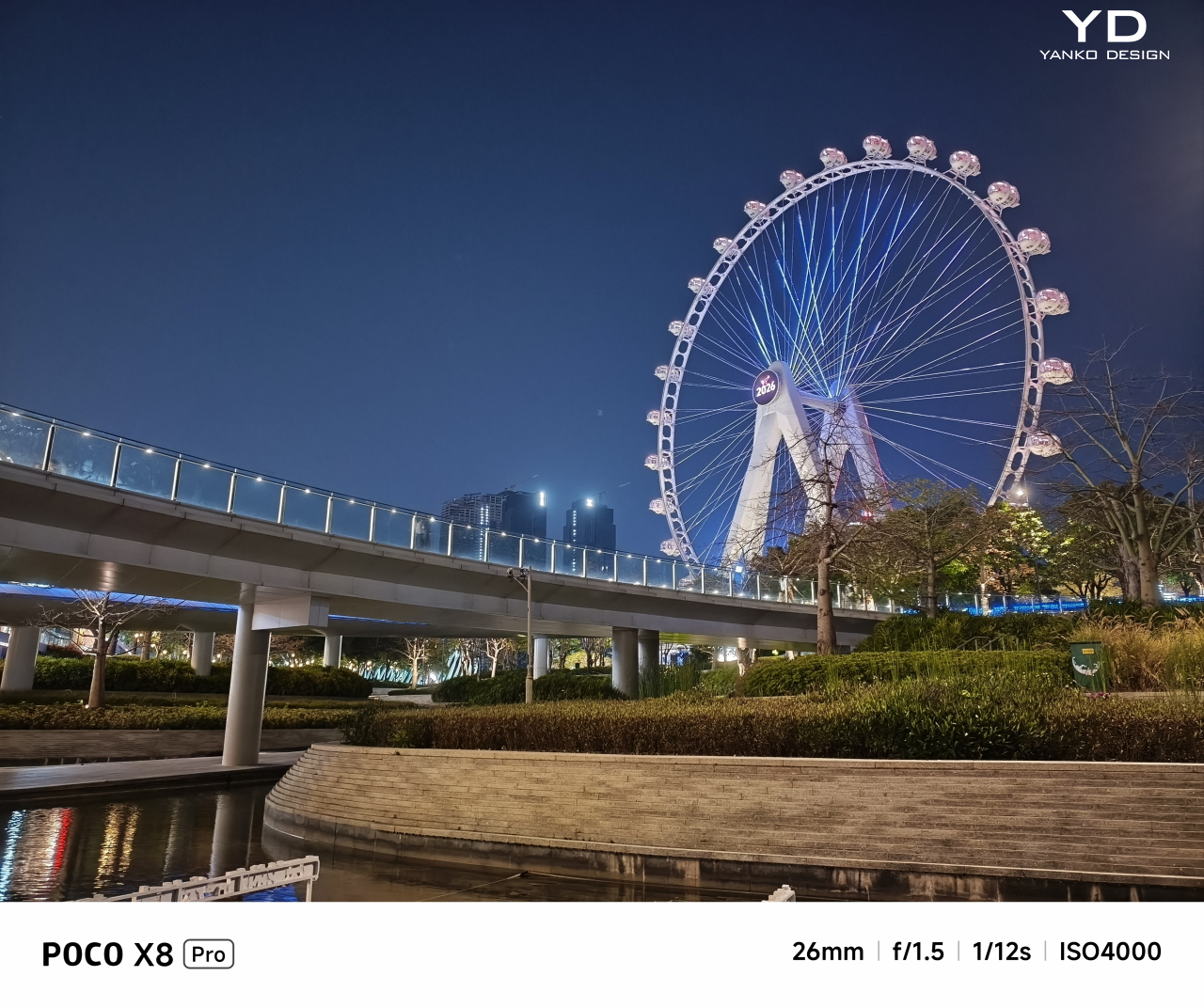
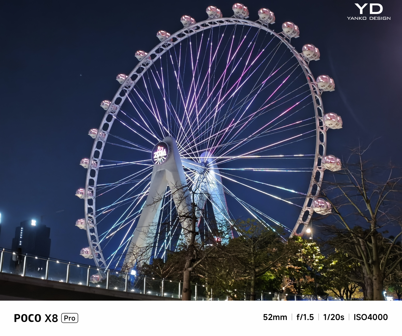
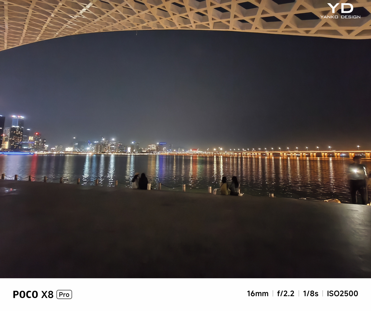
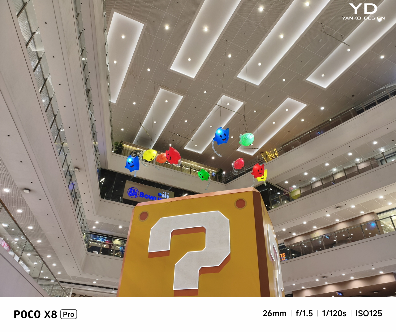
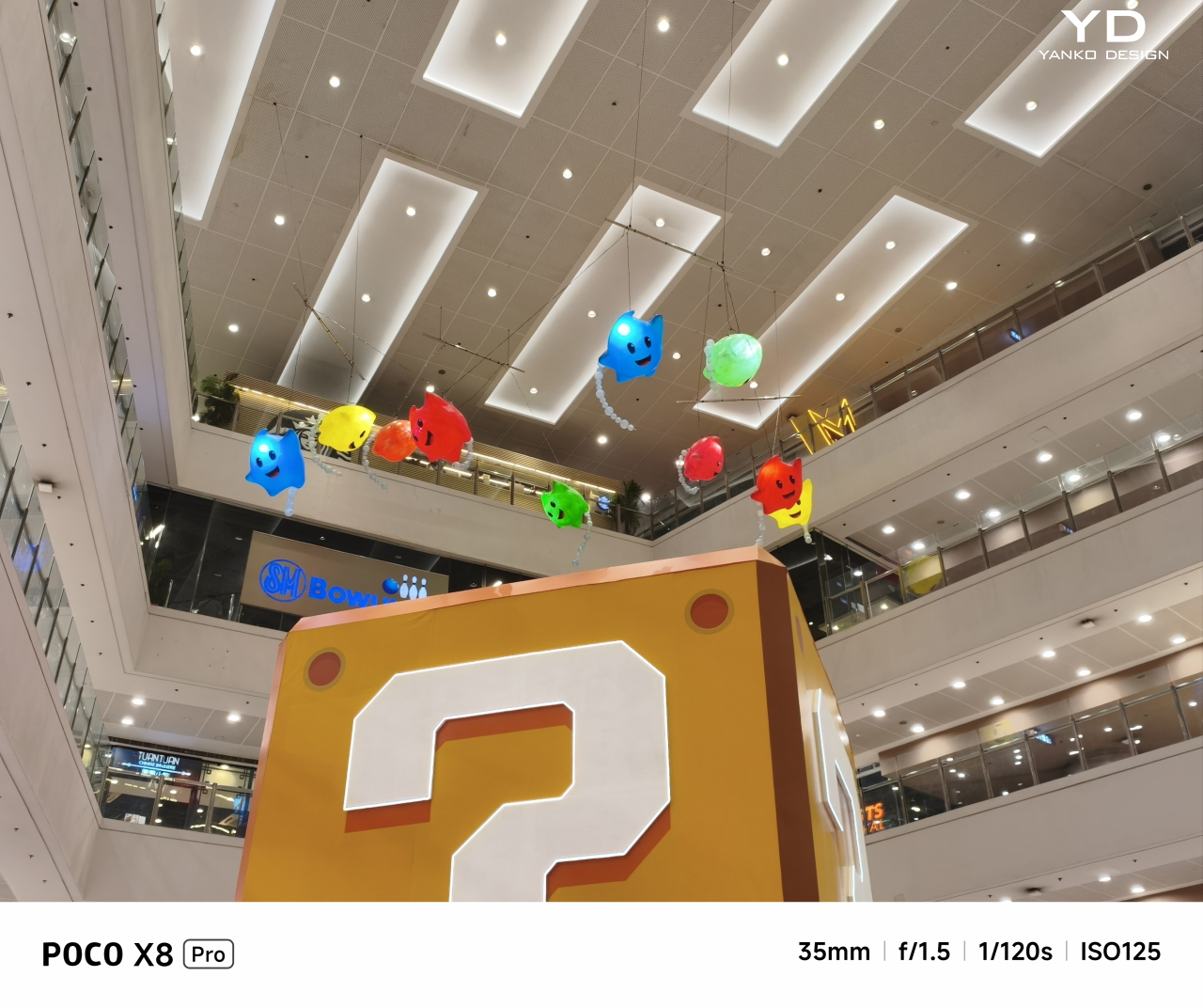
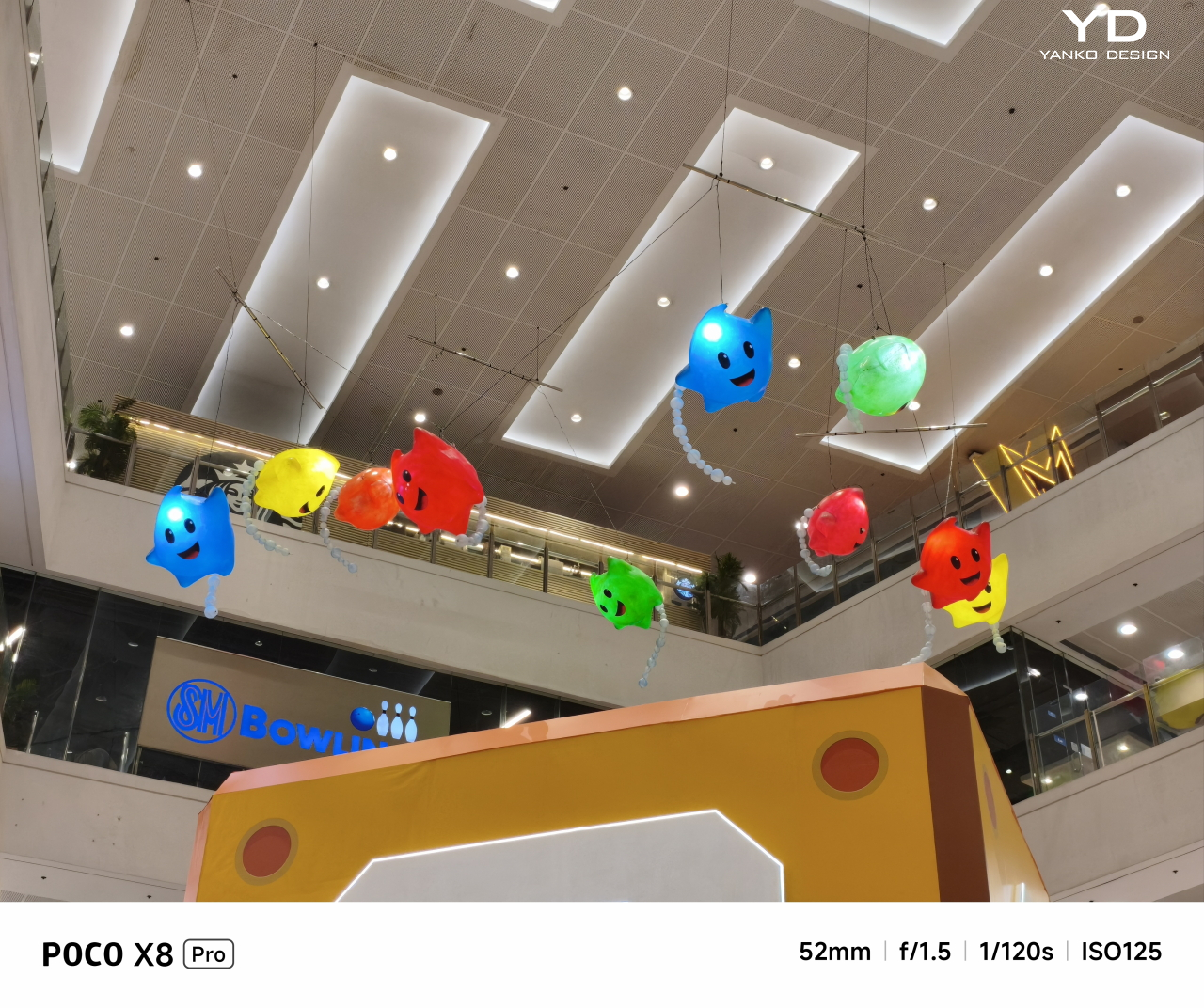
While the POCO X8 Pro checks a lot of boxes in terms of performance, its photography game leaves a bit to be desired. Make no mistake, the 50MP Sony IMX882 main camera takes great photos, especially with its 6P f/1.5 lens. Colors are rich, and details are accurate, whether in perfect lighting conditions, overcast skies, or at night. The camera app lets you pick between 26mm or everyone’s favorite 35mm as the default focal distance, as well as offering pro controls that will delight more seasoned shutterbugs.

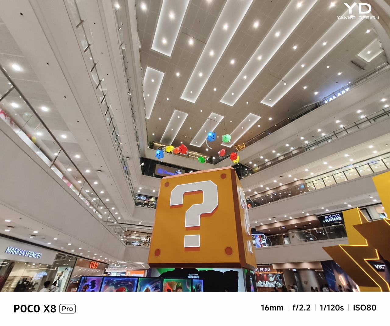
The 8MP f/2.2 ultra-wide camera, however, is a bit of a let-down in this day and age. It’s serviceable, yes, but nothing to write home about if you’re trying to survey the site for a new Avengers tower. There is no telephoto camera either, which truly earmarks the phone for the mid-tier segment. The front 20MP camera maxes out at 1080p 60fps, so your superhero conferences will be pretty basic.

The large 6,500mAh battery provides enough juice for the Poco X8 Pro Iron Man Edition to last the whole day with still plenty to spare before you need to plug it in. With 100W HyperCharge technology, it takes less than 50 minutes to get it from empty to fully charged for battle. The catch is that, like any other proprietary charging technology, you’ll need the official POCO/Xiaomi charger and cables to pull off this feat.

Sustainability

POCO doesn’t say a lot about the materials it uses for its phone, especially special editions like this Iron Man-themed POCO X8 Pro. The focus, instead, is on reliability, durability, and longevity. With IP68 dust and water-resistance, the phone can survive more than a few mishaps. Corning Gorilla Glass 7i protects the screen, the most critical part of the phone that’s always exposed to danger, from scratches and cracks, at least under normal circumstances.

Beyond the physical device itself, the POCO X8 Pro is also being promised six years of security updates, though major Android updates are limited to four years. Given how it’s running HyperOS 3 based on Android 16 out of the box, this theoretically guarantees it will remain fresh until Android 20. This is a major improvement to Xiaomi’s product family, which includes Redmi and POCO, though it remains to be seen how well it will be able to keep its promises.

Value

Overall, the POCO X8 Pro Iron Man Edition is a beautiful smartphone, inside and out. It is surprisingly powerful and capable for what is labeled as a mid-tier phone, especially when you consider the $399 price tag. And if you’re an Iron Man or Marvel fan, this combination of impressive performance and elegant fan service is definitely a tempting option for an everyday partner.

It is by no means perfect, as can be seen in its camera selection or inconsistent thermals, but it gets the job done without much fuss. Even the vanilla POCO X8 Pro makes for an excellent choice, especially as the Pro Max offers only a few advantages, like processor and battery size, but with a $130 premium. The lines between smartphone tiers continue to blur, and the Poco X8 Pro Iron Man Edition is testament to that.

Verdict

Iron Man stands out among superheroes because, like Batman, his strength lies not in any supernatural power or even his exorbitant wealth (though that definitely helps). His power is in pushing himself, his mind, and his technology beyond the limits to achieve victory. That’s the association that POCO is trying to push with the X8 Pro Iron Man Edition, and it works!

More than just the tasteful and elegant design, the POCO X8 Pro Iron Man Edition also embodies one of Tony Stark’s less-cited traits: his practicality. He doesn’t always aim for the most advanced and most expensive technologies but uses what’s available and pushes them to the limit to achieve amazing feats without too much cost. Just like the POCO X8 Pro Iron Man Edition, a mid-range phone that punches above its weight.

The post POCO X8 Pro Iron Man Review: Hero-Level Performance for only $399 first appeared on Yanko Design.
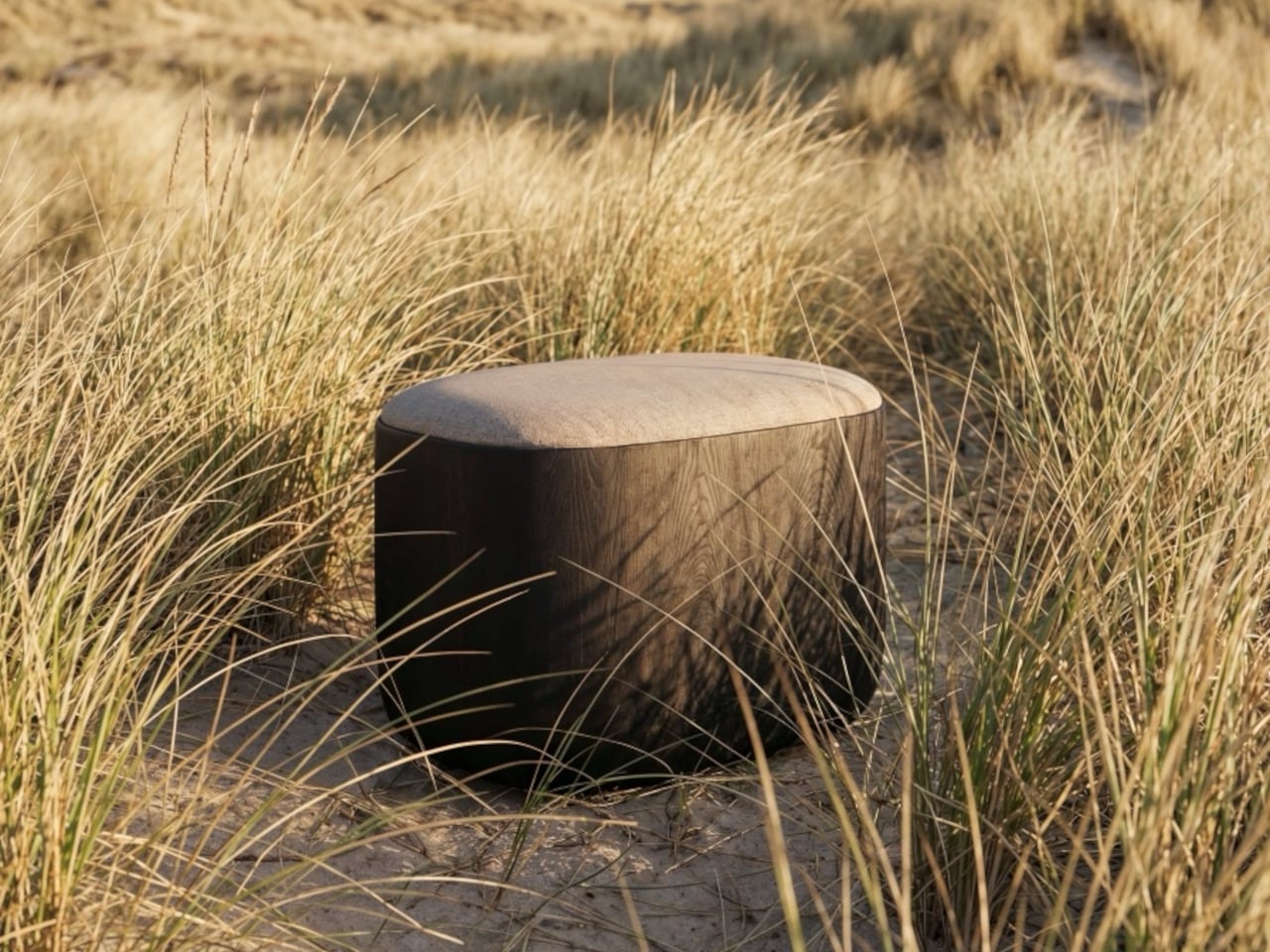
Waveshare Built a $149 Handheld That Runs Full Linux Without the Laptop

The handheld computer has always been a compelling idea that rarely lives up to its promise. Smartphones are too locked down for real development work, and tablets occupy an awkward middle ground between a phone and a laptop. Pocket PCs, mini notebooks, and DIY computer builds have all tried to fill the gap, but each one compromised too heavily on usability or demanded too much assembly.

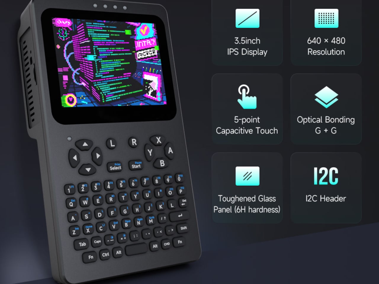
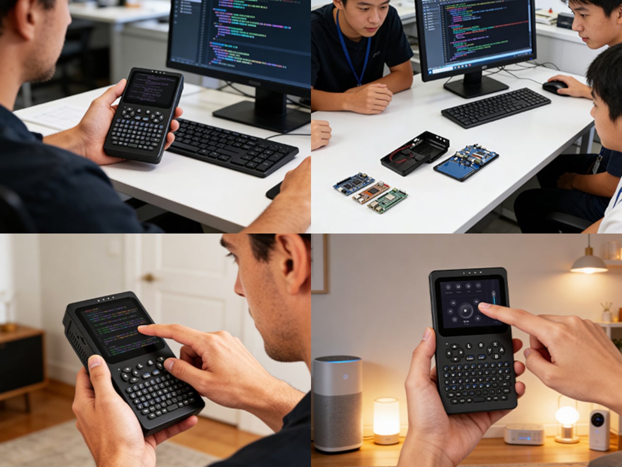
Waveshare’s PocketTerm35 takes a more deliberate approach, landing somewhere between a purpose-built tool and a proper portable computer. Compatible with the Raspberry Pi 4B and Pi 5, it wraps a complete Linux terminal experience into a handheld unit that’s ready to use right out of the box. Everything from the display and keyboard to the battery and connectivity is already integrated, so there’s nothing left to hunt down or assemble.

Designer: Waveshare

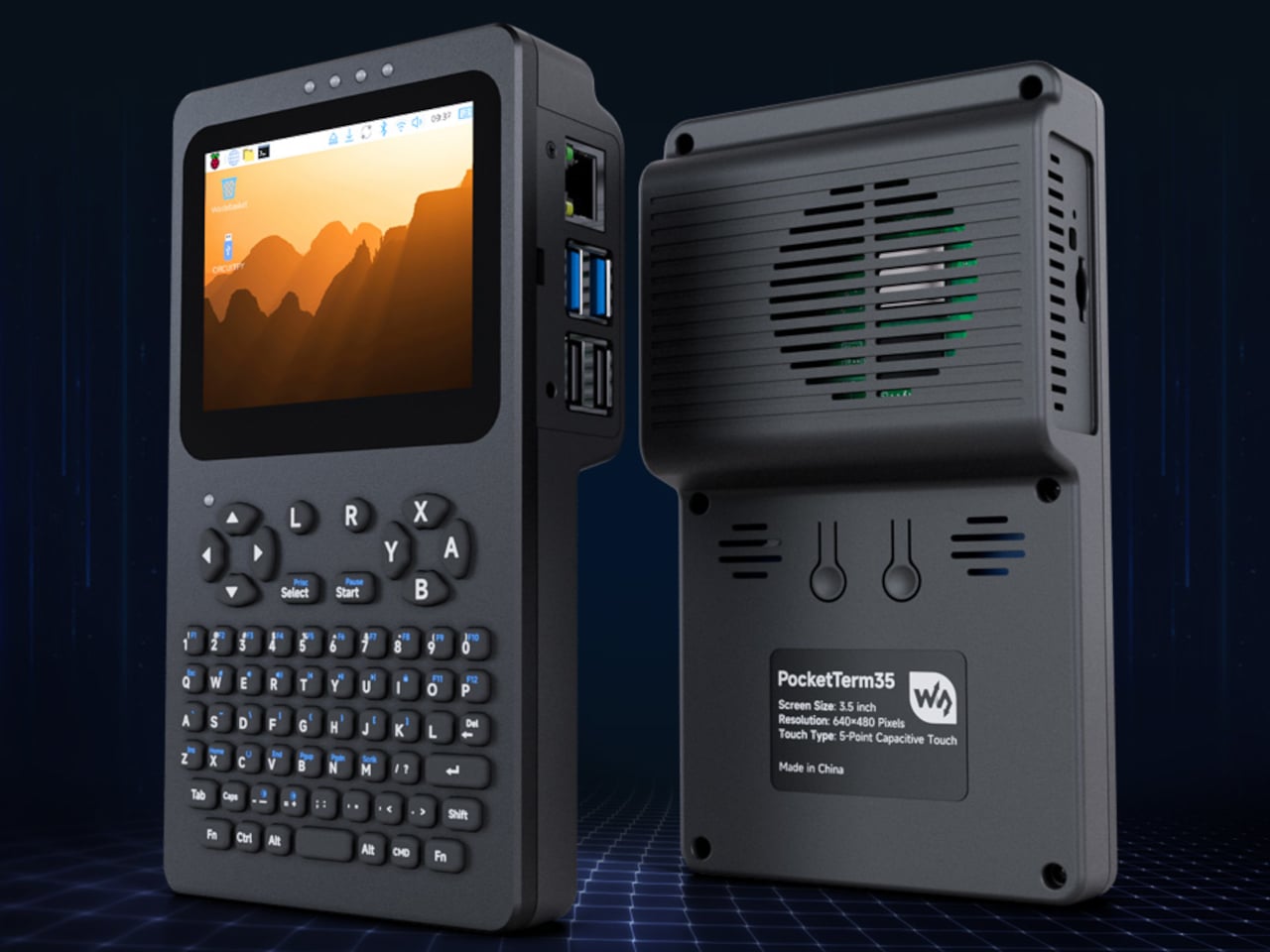
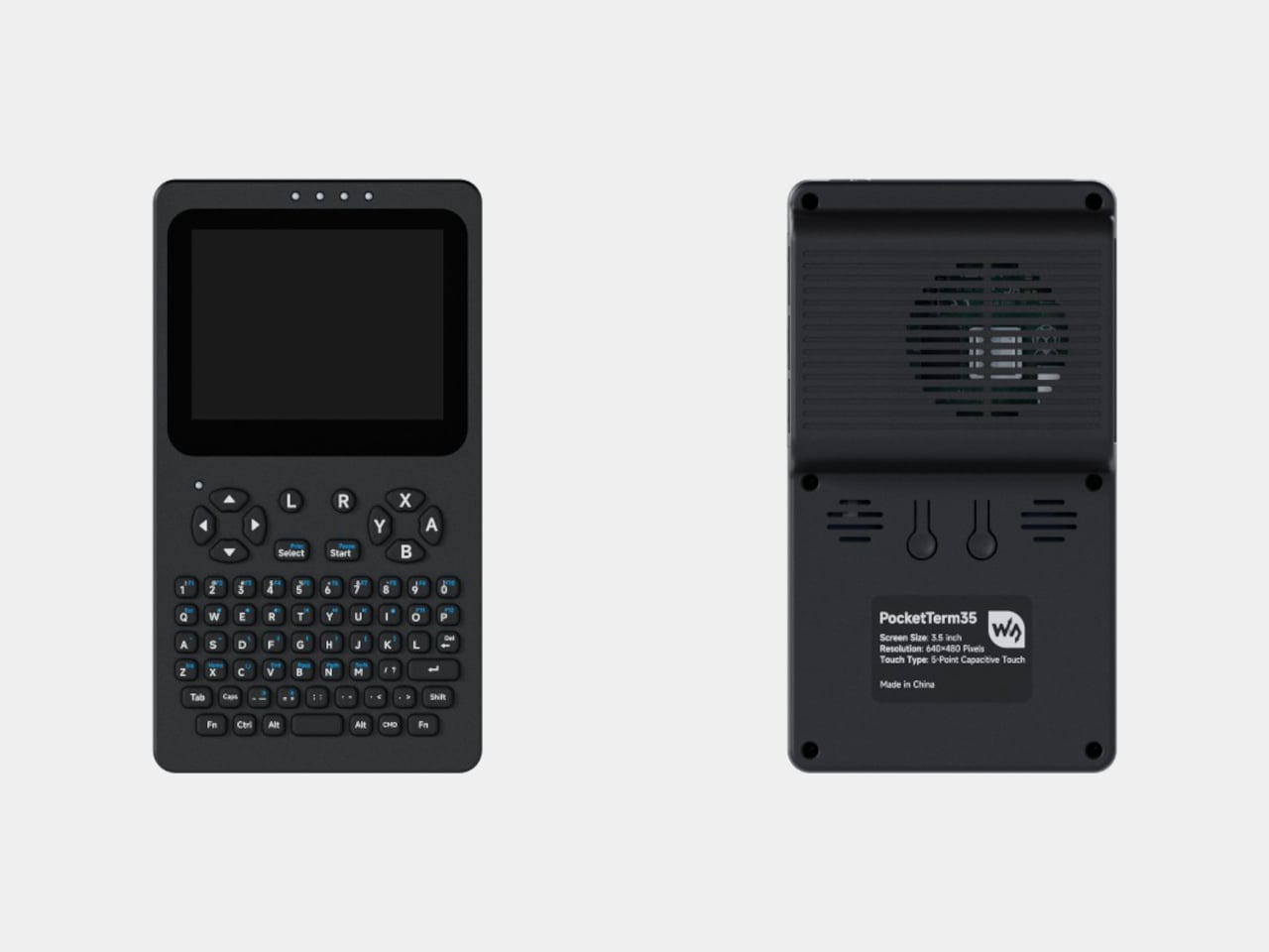
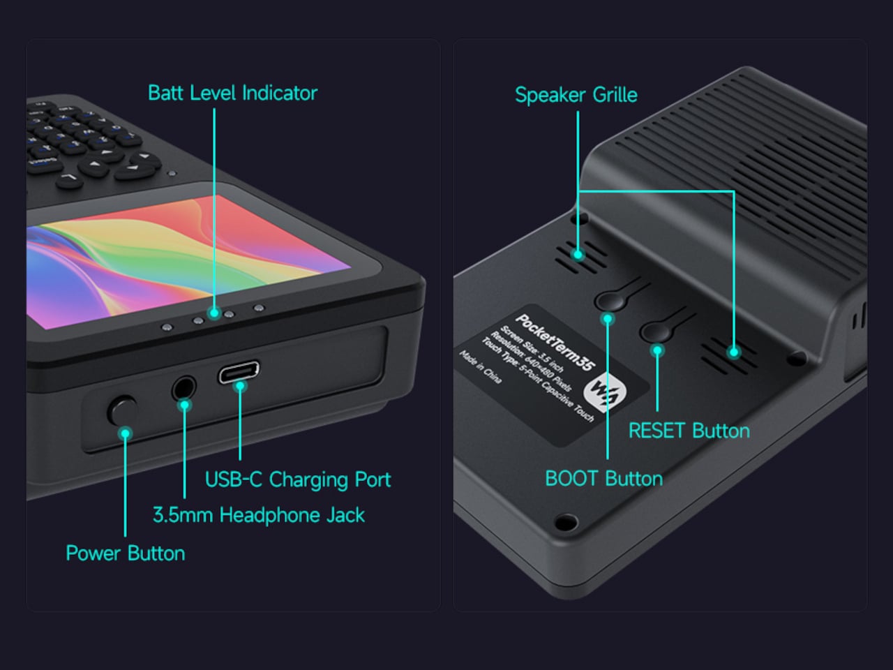
At 93.5mm x 168.5mm x 37mm, the PocketTerm35 fits comfortably in one hand, though it has enough weight to feel substantial rather than cheap. The front panel is CNC-machined aluminum, giving the face a solid, slightly industrial character. The rear is plastic, which helps keep the overall weight manageable. Status LEDs sit above the display, and dedicated boot and reset buttons are tucked on the back.

The 3.5-inch IPS touchscreen sits at a 640 × 480 resolution, which is modest by modern standards but appropriate for a terminal environment where text clarity matters more than pixel density. Optical bonding seals the glass to the panel, reducing reflections and making the screen usable outside without squinting. The 5-point capacitive touch surface sits under toughened glass with 6H hardness, which should hold up well against daily wear.

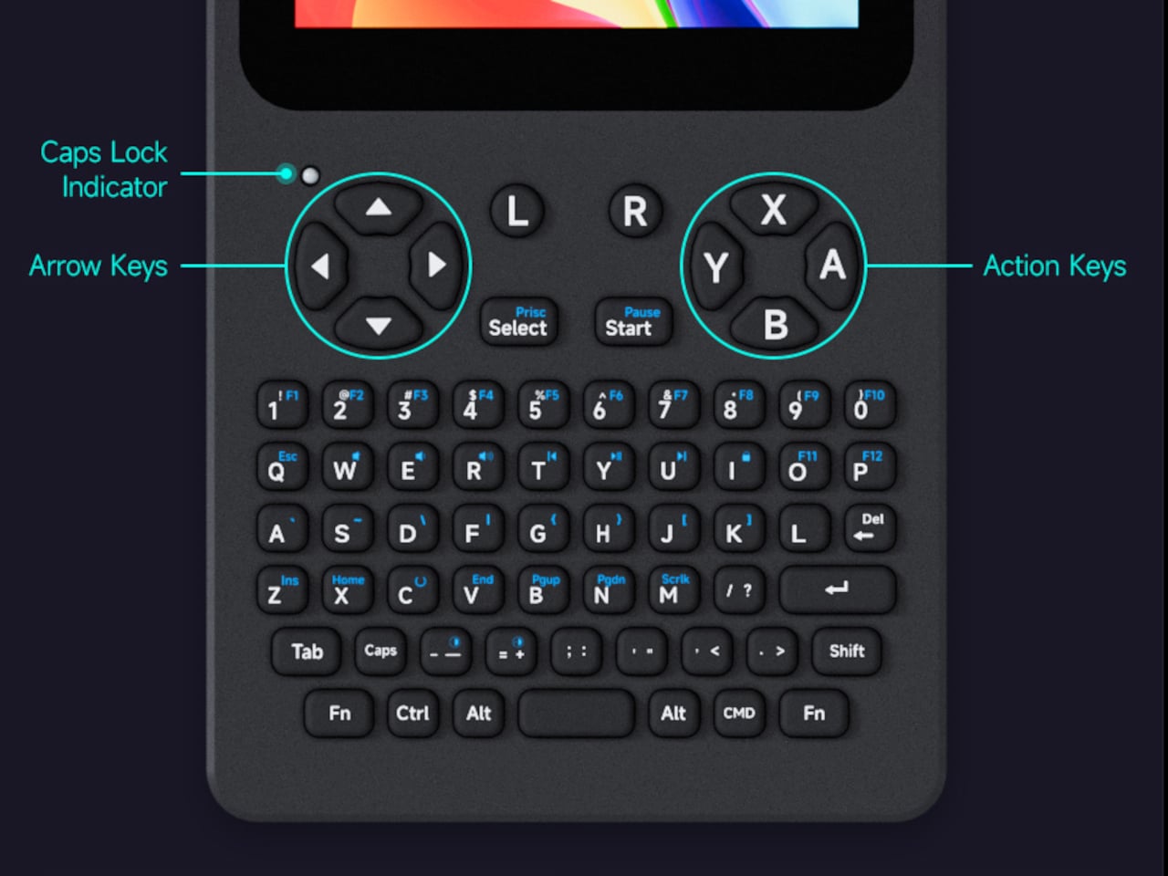
Below the screen is a 67-key QWERTY silicone keyboard laid out in a standard layout for typing commands, editing code, or navigating menus. A dedicated RP2040 microcontroller manages keyboard input, screen brightness, and volume, offloading those control tasks from the Raspberry Pi itself. The arrangement keeps the main processor free for heavier work, which is the kind of practical engineering detail that makes the difference in a device like this.

Power comes from a 5,000mAh lithium battery with a built-in UPS system that supports seamless switching between battery and external power without losing your session. You can run it plugged in at your desk, then pull the cable and walk away without any disruption to whatever’s running. It’s the kind of reliability that makes a handheld device genuinely trustworthy to use rather than just technically portable on paper.

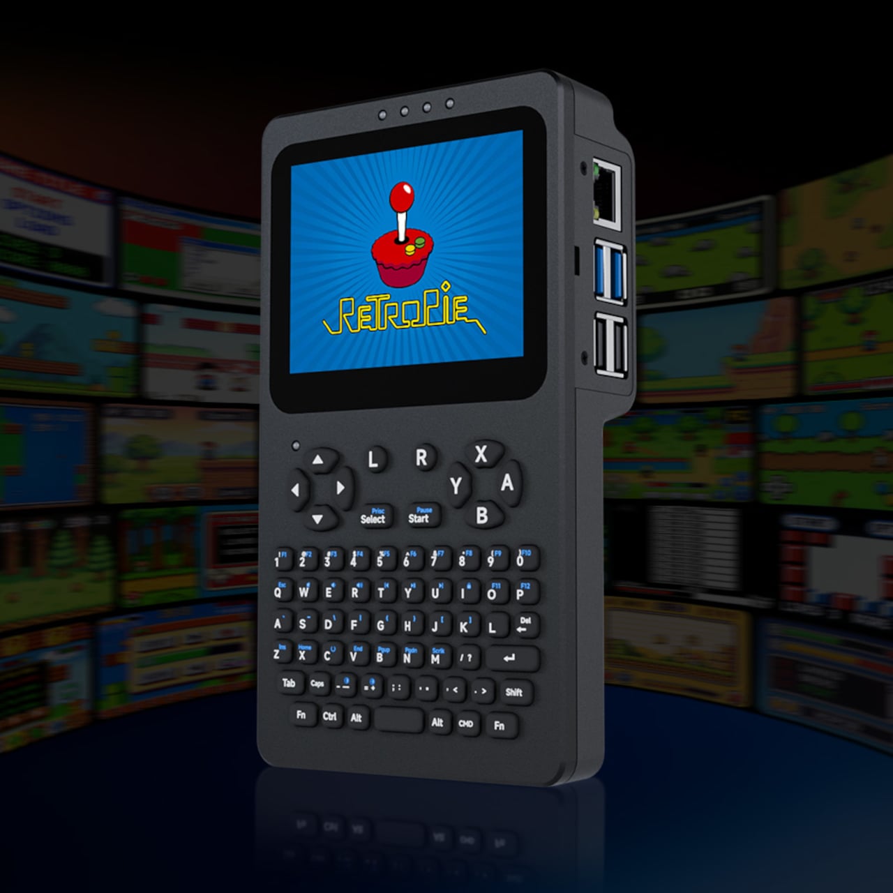
Connectivity is where the PocketTerm35 avoids the usual compromises. Four USB-A ports and an RJ45 Ethernet jack handle wired needs, alongside a 3.5mm audio jack and a 2W built-in speaker. An I2C expansion header opens things up for custom hardware add-ons. It also supports RetroPie, so the same machine that handles a terminal session during a work trip can become a retro gaming console once the day is done, especially considering it has ABXY buttons.

The PocketTerm35 ships in a few configurations. The Pi5 variant includes a 1GB Raspberry Pi 5, a 64GB microSD card with the system preloaded, and the 5,000mAh battery, all for $148.99. A Pi 4B version is available for $179.99. Developers who’ve been carrying a laptop just to have a real terminal within reach might find the PocketTerm35 a far more sensible answer to that specific problem.

The post Waveshare Built a $149 Handheld That Runs Full Linux Without the Laptop first appeared on Yanko Design.
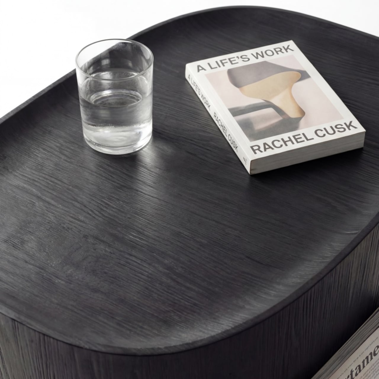
Your Dusty Film Camera Can Shoot 26MP Digital: No Modifications Needed

Film cameras have had a strange little comeback, and not in the way anyone expected. It’s not that people find waiting days for developed photos convenient. It’s that pulling a mechanical viewfinder to your eye still feels more deliberate, more personal, than tapping a glass screen. Vintage bodies from the 1970s and ’80s have become far more desirable again than they were a decade ago.

The obvious problem is the film itself. Processing costs have climbed, lab turnaround times can stretch into weeks, and there’s always that faint dread of discovering a whole roll came out underexposed. I’m Back Roll tries to address that without asking you to give up the camera you actually love. The idea is to keep the body intact and quietly swap out what goes inside.

Designer: Samuel Mello Medeiros

Click Here to Buy Now: $449 $699 ($250 off). Hurry, only 1/435 left! Raised over $525,000.

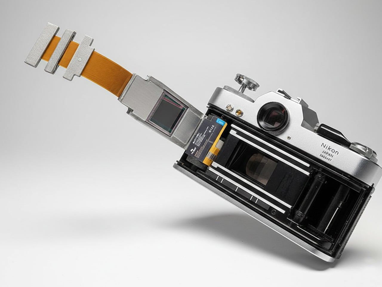
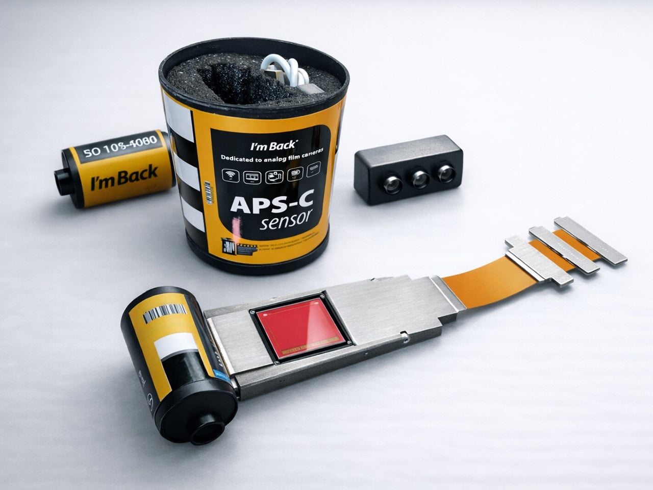
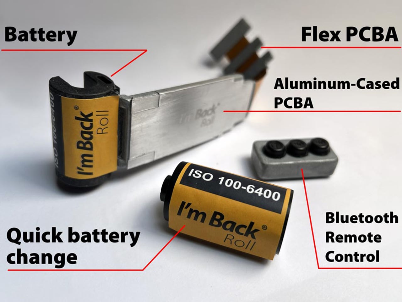
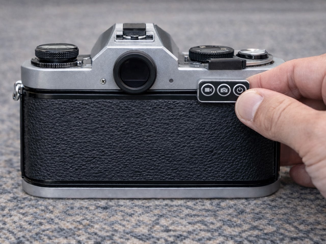
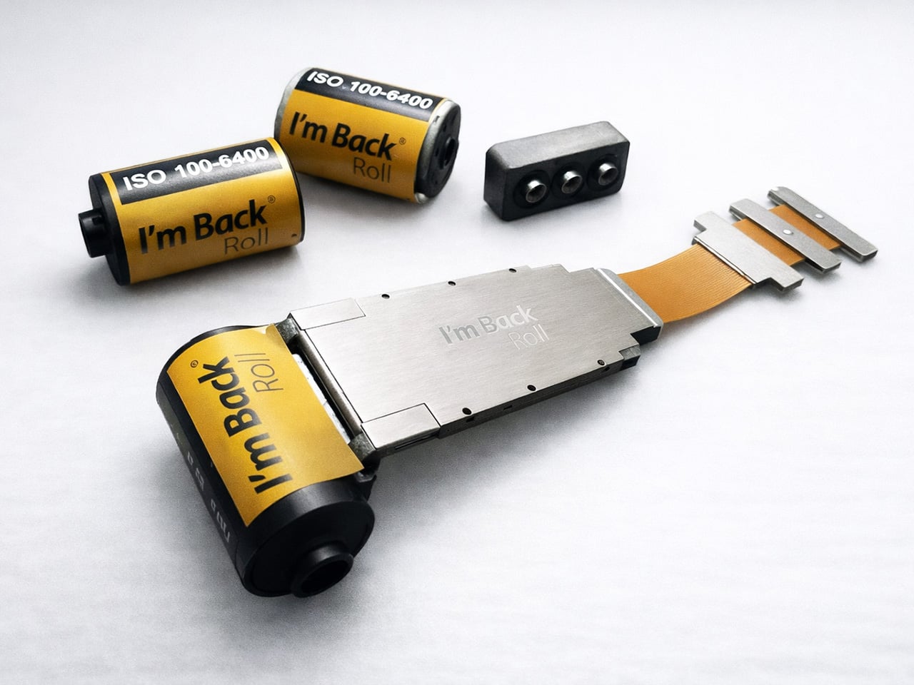
What goes inside is a digital roll the size of a standard film cartridge, housing an APS-C sensor positioned in the film gate. Close the camera back, and almost nothing looks different from outside. No rear screen, no clunky attachment bolted to the body. The only visible concession to the digital world is a small Bluetooth remote that clips near the winding lever.

That remote is how you synchronize the digital sensor with the mechanical shutter, pressing it just before you fire. It sounds fiddly at first, but it also reinforces the whole point. There’s no live view to second-guess yourself with, no image to review immediately after. You shoot, move on, and download everything wirelessly later. That’s closer to how film photography actually felt than most digital cameras manage.

At the heart of the roll is Sony’s 26.1 MP APS-C IMX571 sensor, the same sensor family also used in astronomy cameras, where low-noise performance matters. It sits inside a CNC-machined aluminum body designed for heat dissipation, with up to 256GB of internal solid-state storage and both Wi-Fi and Bluetooth for transferring images once you’re done shooting.

The battery follows the same logic as a film roll, sitting in the film chamber where a cartridge would normally live. It’s interchangeable, so you can swap in a fresh one mid-session the same way you’d load a new roll. That’s a small but genuinely clever bit of design thinking, because it doesn’t ask the camera to pretend it’s something it was never built to be.

An old Nikon F3 or a Contax G2 becomes a genuinely different camera with the I’m Back Roll inside, without actually looking any different on the outside. From that point, it shoots RAW and JPEG files across an ISO range of 100 to 6400, with presets inspired by classic film stocks and brands, including Fujifilm and Ilford, for anyone who wants some of that analog character in the output.

There’s something appealing about the idea of pulling a camera out of a drawer and actually using it again. The roll works with most 35mm bodies from major brands, including Nikon, Canon, Pentax, and Leica, though cameras where the back opens from bottom to top may need a custom rear panel. Many classic 35mm bodies can accommodate it, though some may need the pressure plate removed or a custom rear panel.

Of course, the two-step shooting process, activating the sensor before triggering the shutter within a second or two, is going to feel less natural to some. Someone who relies on live view or reviews every frame would need to adjust expectations considerably. The rhythm here is slower and more committed, which is either the whole point or the main reason to look elsewhere.

What I’m Back Roll is really arguing is that cameras collecting dust on shelves aren’t finished. The lenses are still sharp, the mechanics are still smooth, and the experience of using them is still genuinely different from anything modern. Slipping a digital core inside doesn’t change any of that. It just means those cameras might actually get used again, which feels like the better outcome.

Click Here to Buy Now: $449 $699 ($250 off). Hurry, only 1/435 left! Raised over $525,000.

The post Your Dusty Film Camera Can Shoot 26MP Digital: No Modifications Needed first appeared on Yanko Design.
This Bike Cargo System Gives Your Bike a Face With 12 Color Zones

Bike cargo gear has always been the part of cycling that nobody really gets excited about. Racks, panniers, and baskets exist to haul things, and most of them look exactly like what they are, brackets and platforms bolted on as an afterthought. Cyclists who care about aesthetics often treat this hardware as a necessary compromise, something you’d tolerate rather than actually want.

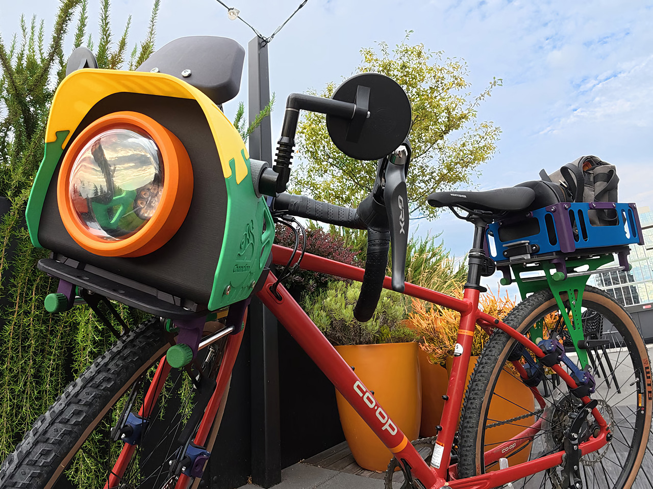
Chamelion begins with the idea that bikes deserve the same sense of character other vehicles already have. That inspiration drives a modular, color-customizable cargo platform from Seattle that includes front and rear racks, pannier rails, aluminum baskets, and a front assembly the designers call the “bike face,” treating cargo gear as part of your bike’s actual identity.

Designer: Yu-Chu Chen

Click Here to Buy Now: $986. Hurry, only a few left!

The bike face is the most interesting part of the system, and it does more than look distinctive. It consolidates everything that typically clutters the handlebars into one organized front unit. Your phone’s got a dedicated mount with a sunshade, rear mirrors attach at the sides with wide spacing for better sightlines, and your headlight sits front and center behind a transparent shell.

The racks do serious work. The front has been tested to hold up to 20 kg (44 lbs), and the rear handles up to 27 kg (60 lbs), which is enough for a full grocery haul or a heavily loaded bikepacking setup. The aluminum baskets drop in when you need proper containment, or you can skip them and just strap a bag directly to the platform.

One of the quieter design details is how the racks handle rough terrain. Rather than transmitting every bump directly into your load, the material has enough flex to absorb vibration, so things ride more smoothly on uneven surfaces. Add the pannier rails when you need side-hanging capacity, and the same bike that’s carrying your lunch on a weekday is hauling camping gear on a trail by Saturday.

Installing the system takes some effort upfront, but once that’s done, removing and remounting the racks requires no tools at all. The front rack’s handlebar connectors rotate to fit different bar types and the fork clamps have bearings inside that move with your suspension. The rear rack adjusts between 110mm and 180mm between the clamps, wide enough to accommodate most bikes, including full-suspension mountain bikes.

Of course, the color customization goes well beyond picking a finish. Every component has its own configurable color zone, from the rack platform and frame connectors down to the pannier cap and handlebar connector buckle. The bike face alone has more than 12 individually configurable areas. It sounds excessive until you realize that kind of specificity is exactly what makes the system feel genuinely personal.

What makes that level of customization possible is the manufacturing behind it. The plastic components are produced using powder bed fusion 3D printing in PA12 or PA11 nylon, with coloring handled by Dyemansion. That process gives the parts rich, durable color without relying on conventional painted finishes, and it allows for small-batch production without injection mold tooling, which is what makes individual configurations feasible.

Assembly is guided by interactive 3D step-by-step instructions that let you zoom in, rotate, and inspect every connection from multiple angles before putting it all together. It’s the kind of manual that actually makes you want to read it, which is more than can be said for most flat-pack furniture and certainly more than anyone expects from a bike cargo system.

The broader idea here isn’t a one-off accessory set, but a system that can keep expanding over time, with new modules and accessories already being developed. The 3D-printed version stays the lightest and most configurable option, and the design accommodates future additions as the lineup expands. For a category that’s spent decades being mostly forgettable, this one at least gives your bike the kind of personality it probably should have had all along.

Click Here to Buy Now: $986. Hurry, only a few left!

The post This Bike Cargo System Gives Your Bike a Face With 12 Color Zones first appeared on Yanko Design.

Ripple Shelf’s Wavy Wooden Sides Are Actually a Tool-Free Height System

Most adjustable shelving systems make a quiet trade-off. To offer flexibility, they rely on rail channels, pin holes, or brackets that work well enough but bring a decidedly utilitarian look to any room. The result is a shelf that adapts to your needs but rarely looks like it was designed with much intention beyond storage. Hiding the hardware means losing flexibility; keeping it means living with it.
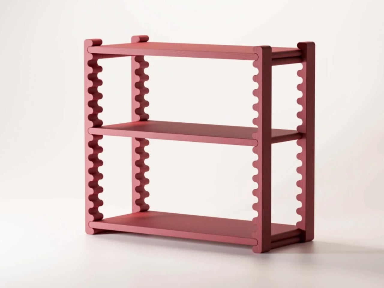
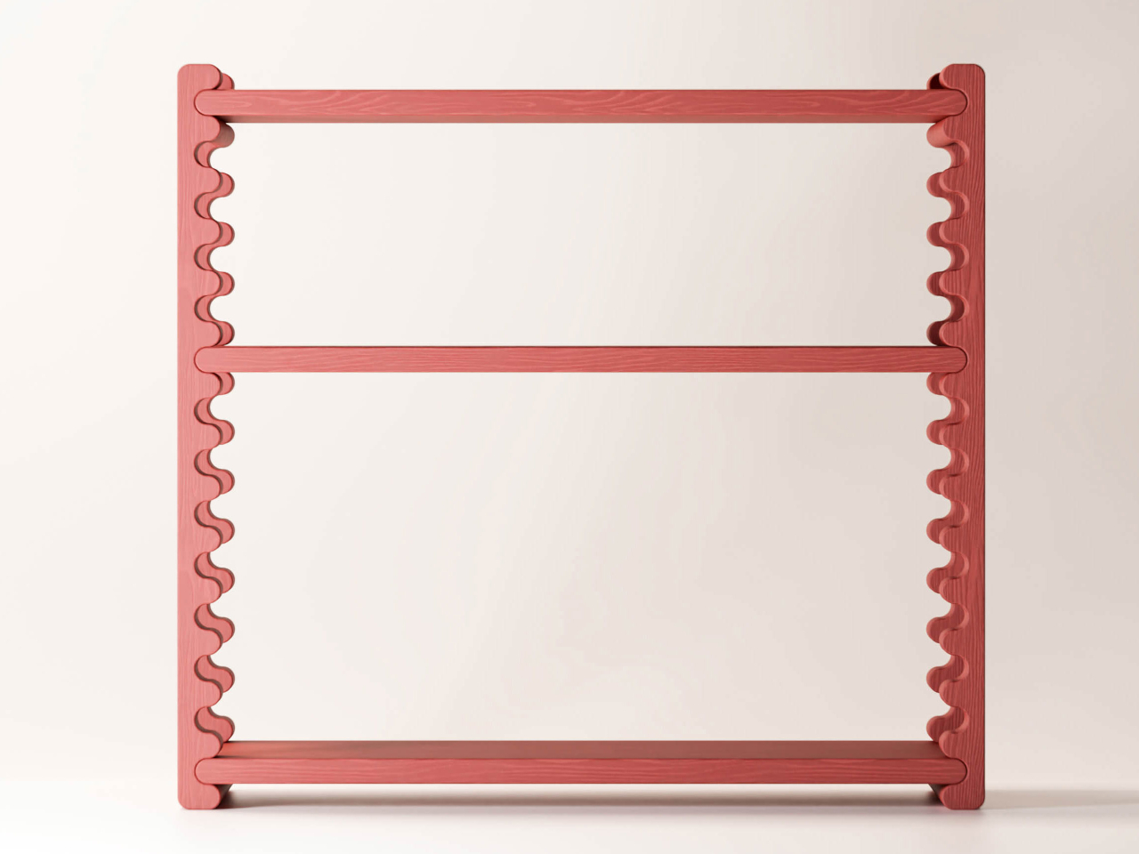
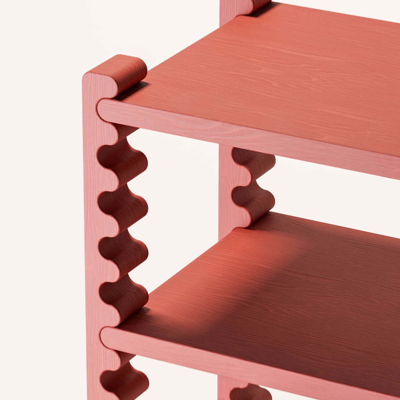
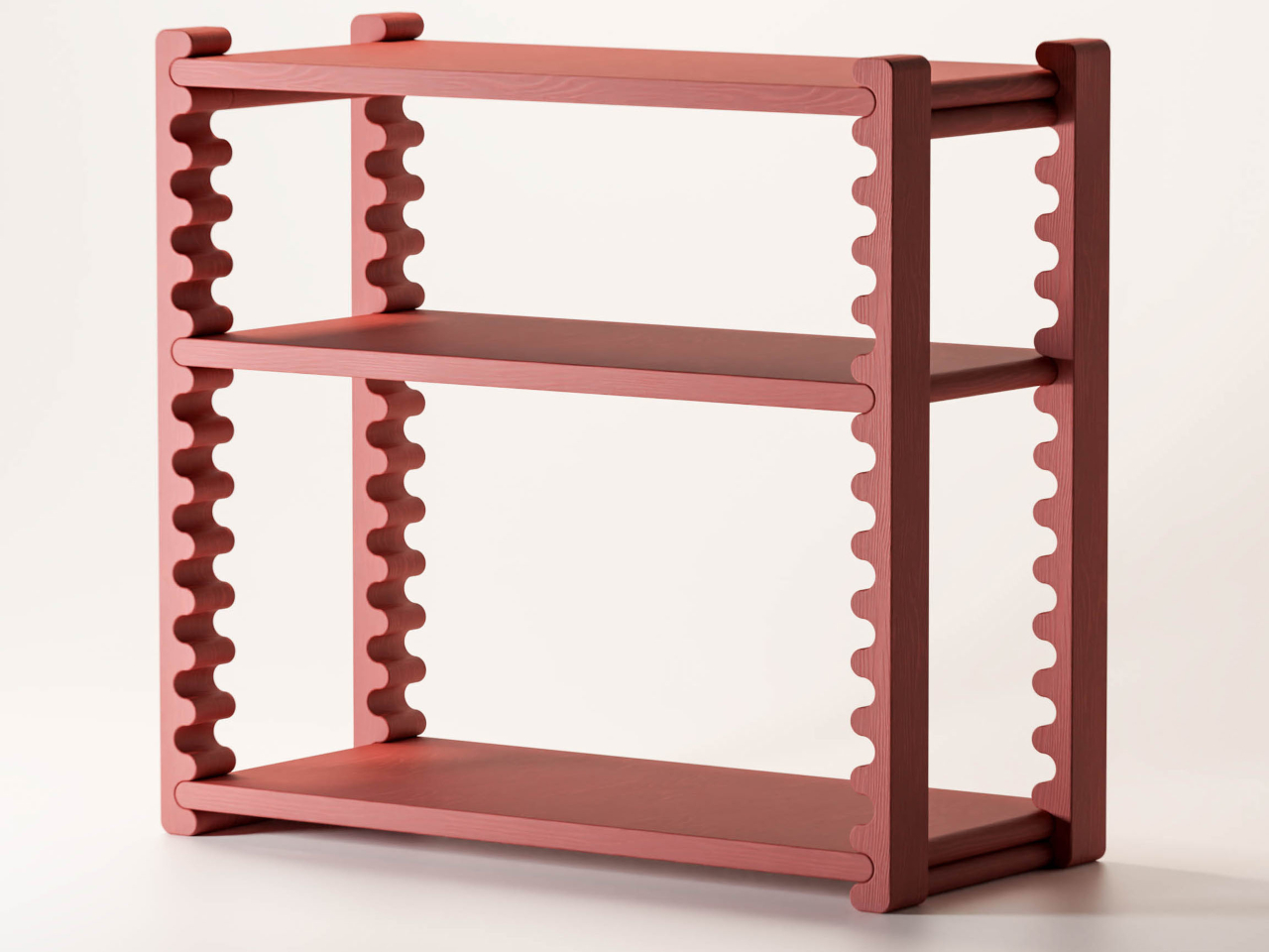
The Ripple Shelf from Sarajevo-based Dilema Studio takes a different approach, one where the shelf’s most visually distinctive element is also its adjustment mechanism. The vertical supports on each side run the full height of the frame in an undulating rippled profile. Those waves aren’t decorative flourishes; they’re guides. The middle shelves slot into them and can be repositioned to different heights without any tools or additional hardware.

Designer: Ermin Alić (Studio Dilema)

The logic here is pretty satisfying. Instead of adding a separate tracking or pinning system, Dilema embedded the mechanism directly into the form. The rippled surface of each support creates natural stopping points along the length of the frame, so positioning a shelf is as intuitive as sliding it into place. There’s nothing to install, nothing to adjust, and nothing to lose at the back of a drawer.

That practicality matters more than it might seem. Someone styling a home office one season and reorganizing it as their book collection doubles doesn’t need to buy a new shelf; they just move the existing ones. A family using the same unit to hold kids’ toys and, later, a collection of records and plants has one piece that grows with the space. The shelf changes; the shelf unit doesn’t.

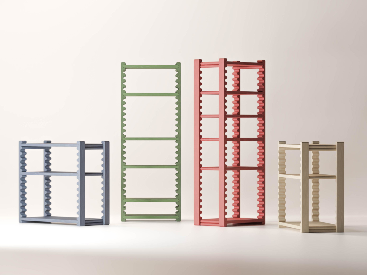
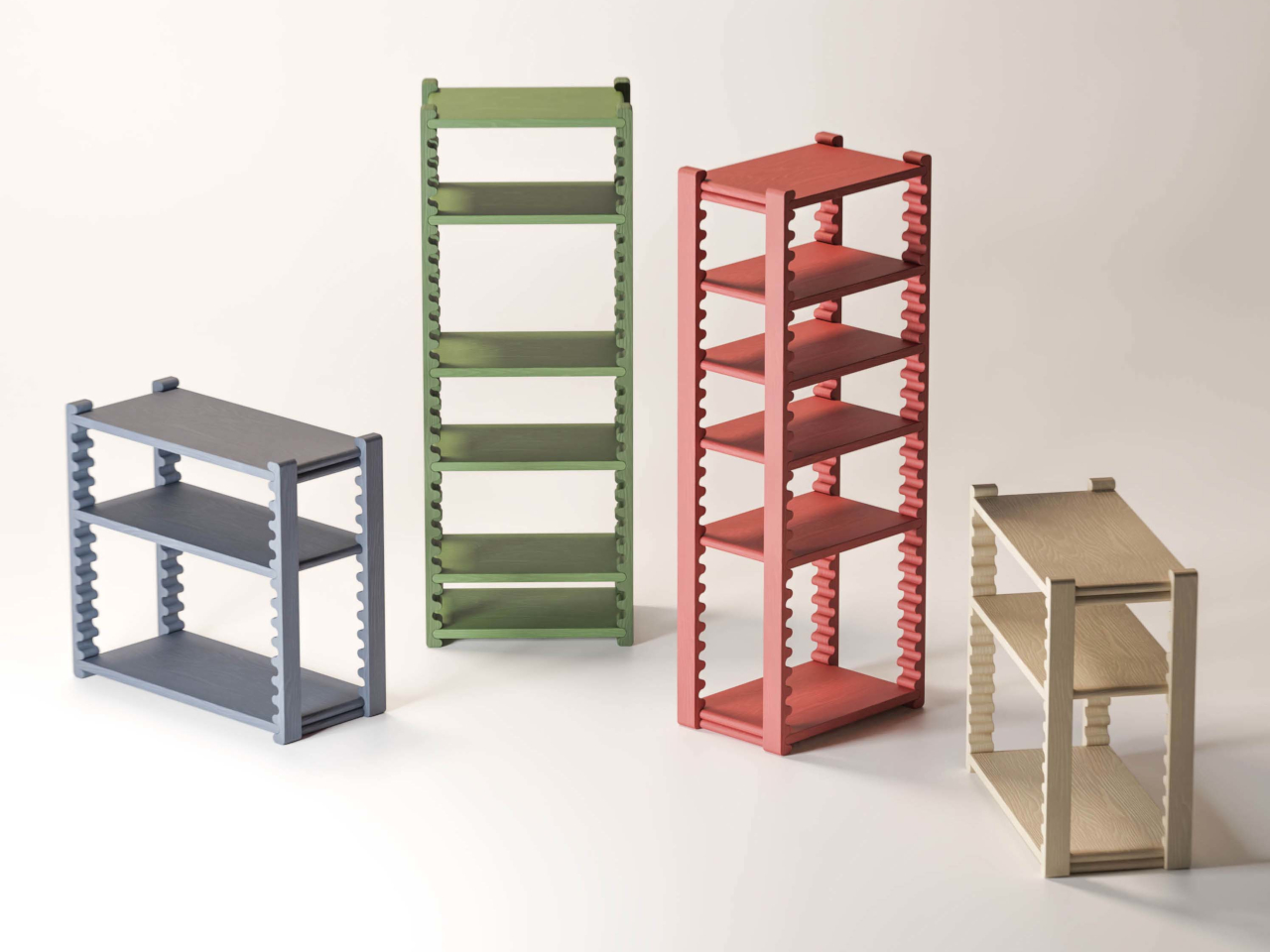
The frame’s fixed top and bottom shelves keep everything stable while the interior remains open to change. Made from beech wood and measuring 750 × 350 × 800 mm, it comes in several color options, including terracotta, sage green, slate blue, and a natural off-white, each with a solid stain that lets the grain show through. The compact footprint makes it workable in tighter rooms without sacrificing capacity.

The system shows up in multiple size configurations, from compact low units to taller multi-shelf towers, giving it range across different rooms and storage needs. That versatility suits living rooms particularly well, where displaying and organizing things often need to share the same piece of furniture. A shelf for ceramics, a lower one for books, a bottom slot for a basket; the spacing adjusts to whatever the situation asks for.

What keeps the Ripple Shelf from being just another clever-but-impractical furniture concept is that it’s genuinely usable. The ripple mechanism doesn’t require any special technique or learning curve; you move a shelf, and it sits where you put it. It’s the kind of furniture that gets better over time, not because it wears in any particular way, but because it stays genuinely useful as what you put on it changes.

The post Ripple Shelf’s Wavy Wooden Sides Are Actually a Tool-Free Height System first appeared on Yanko Design.