This $146 Raspberry Pi 5 Case Has a Touchscreen and Runs AI Locally

The Raspberry Pi has always been a tinkerer’s dream, a tiny board that can become almost anything with enough creativity. Over the years, its growing capabilities have attracted developers, home automation enthusiasts, and even edge AI experimenters who want real processing power in a compact, low-cost package. The persistent challenge has been housing all of that potential in something that looks and works like a proper desktop.

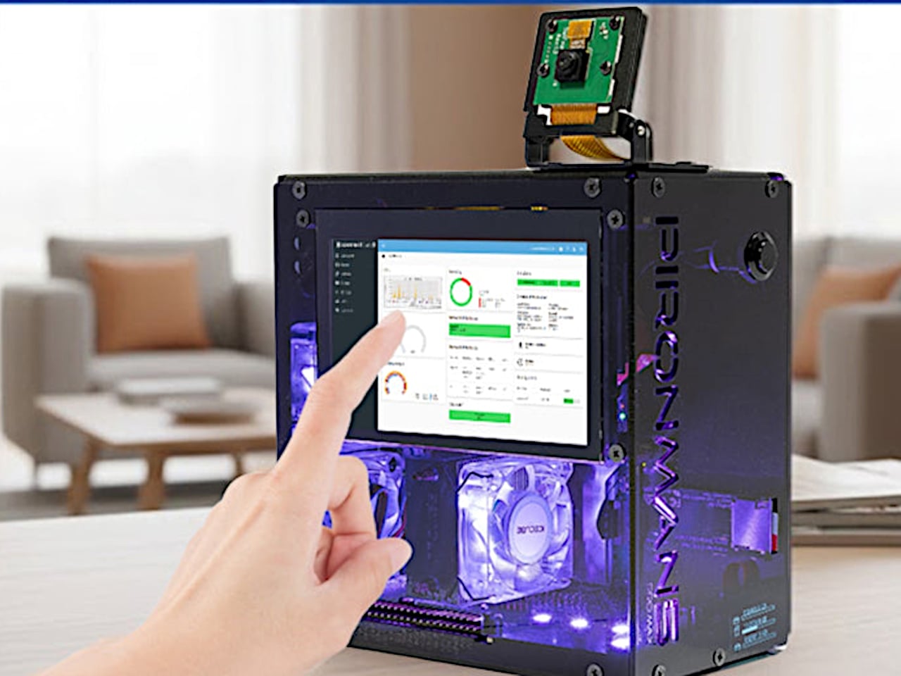
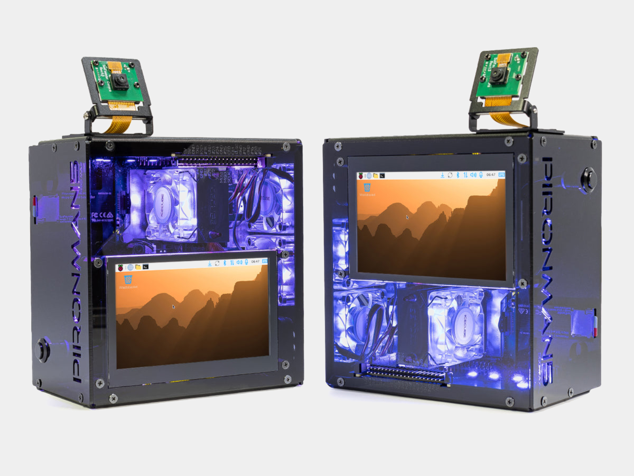
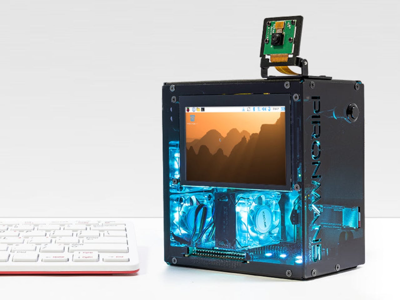
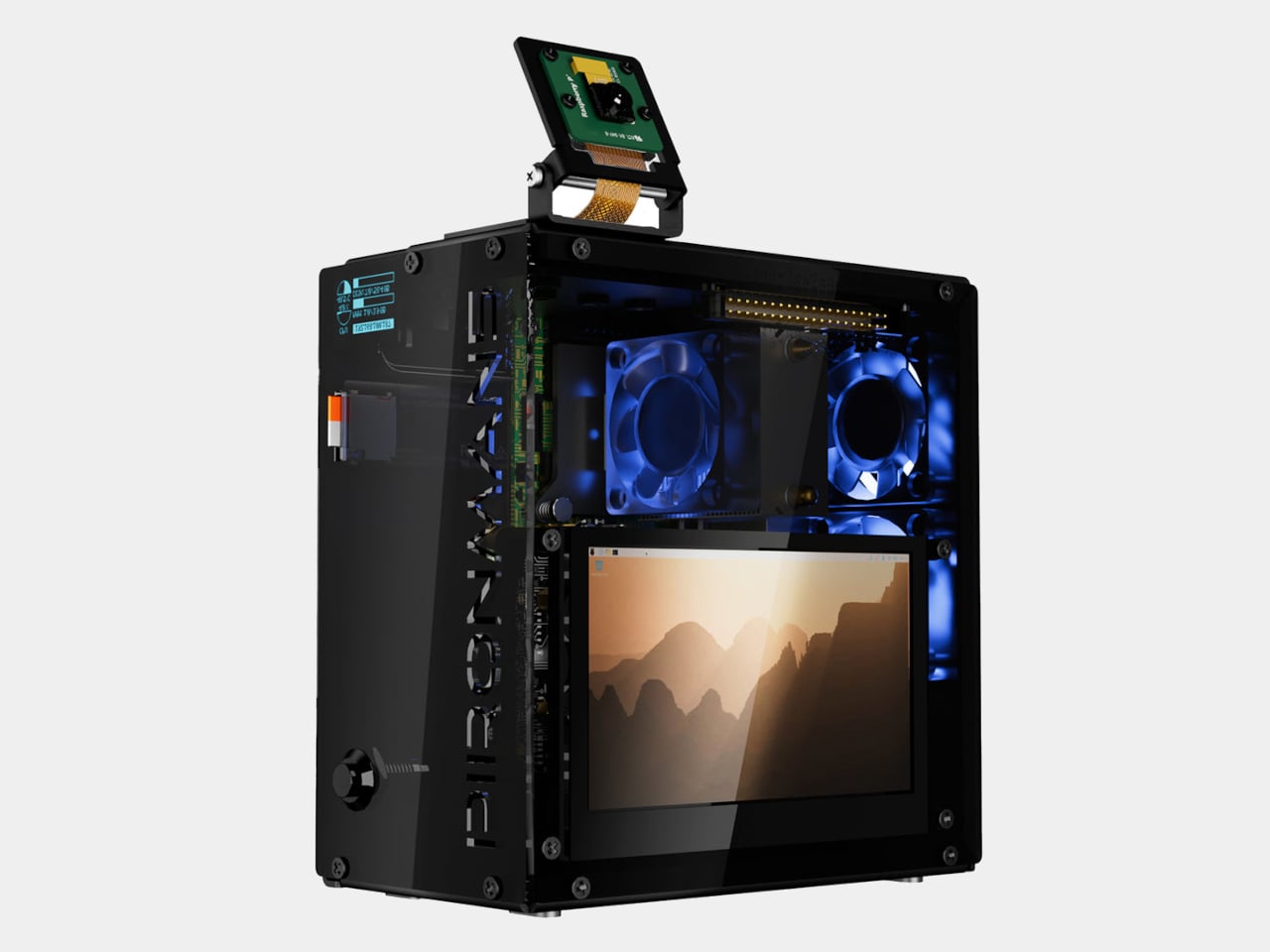
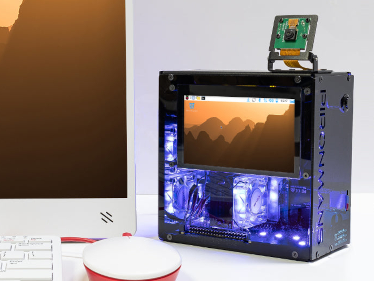
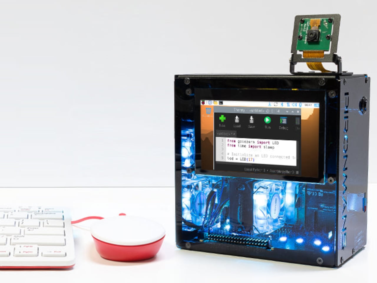
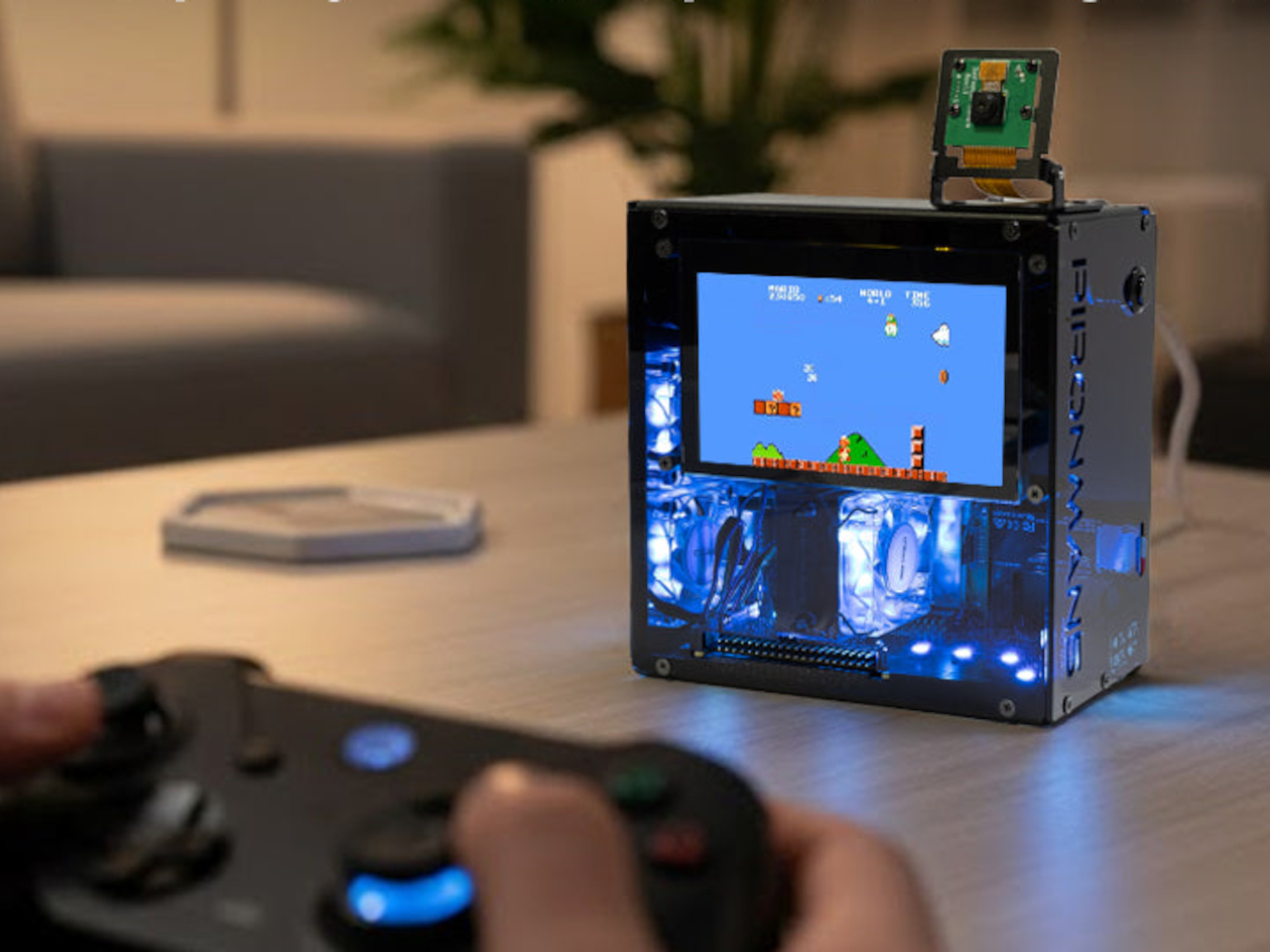
SunFounder’s Pironman 5 Pro Max takes a direct swing at that problem. It’s a dark anodized aluminum tower case designed exclusively for the Raspberry Pi 5, surrounding it with enough hardware to make it a genuinely capable desktop machine. The case and all its bundled accessories start at $145.99 without the Pi itself, which is a lot of kit for something technically sold as a bare enclosure.

Designer: SunFounder

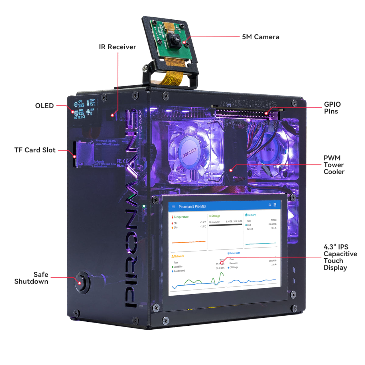
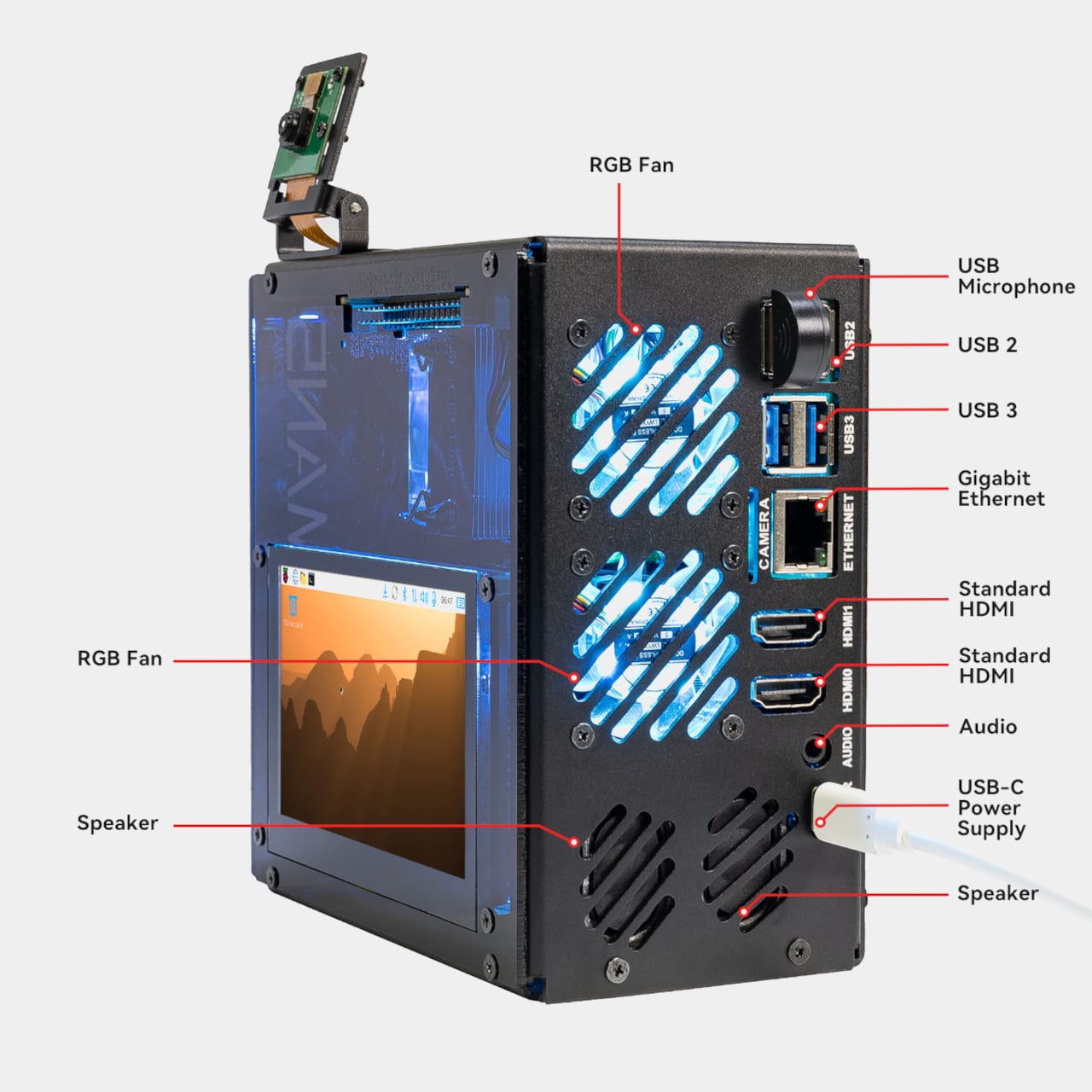
The most visible feature is the 4.3-inch capacitive touchscreen on the front (or side, depending on your point of reference), giving direct, tactile access to whatever you’re running. Alongside it are a 5MP adjustable camera module, stereo speakers, a USB microphone, and a 3.5mm audio jack, all included in the box. Together, they open the door to voice interfaces, video recording, and interactive displays without requiring a single extra module or dangling cable.

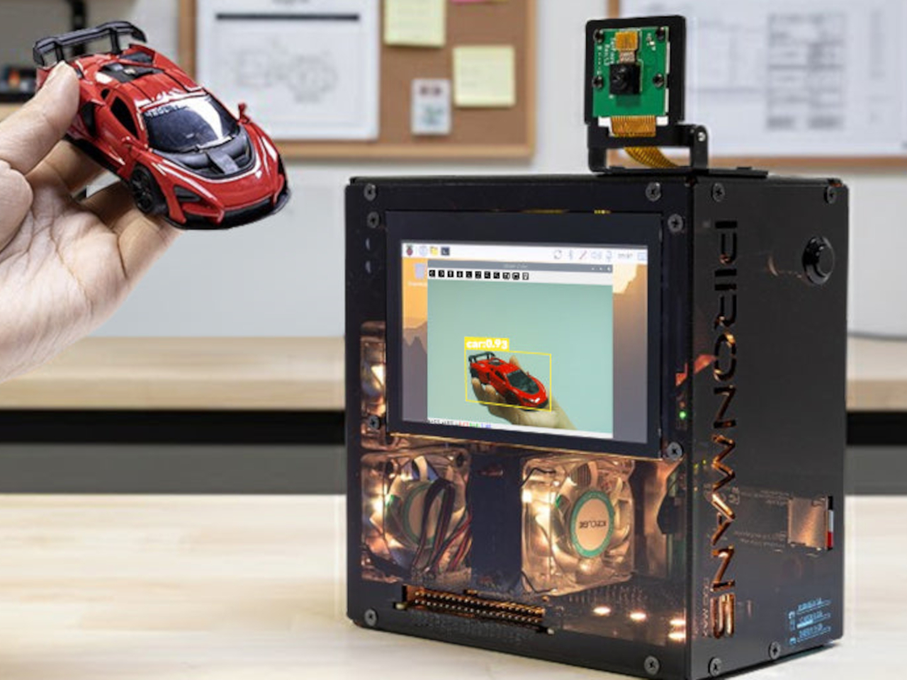
Storage and AI expansion come from dual NVMe M.2 slots driven by a PCIe Gen 2 switch. They support RAID 0 for speed or RAID 1 for redundancy, making the Pironman a surprisingly capable home NAS. The same slots are also compatible with Hailo-8 and Hailo-8L AI accelerators for running local language models like DeepSeek or Ollama without a cloud connection.

SunFounder’s OpenClaw platform ties a lot of that together, letting you build a personal AI agent directly on the hardware. You can connect it to cloud-based services like ChatGPT and Gemini, or keep everything local with Grok, Ollama, and DeepSeek. It’s a bold pitch for a single-board computer, but one the Raspberry Pi 5’s improved architecture was quietly building toward.

Cooling is managed by a PWM tower cooler with dual RGB fans, keeping the Pi 5, NVMe drives, and any attached Hailo accelerator stable under sustained load. A front-facing OLED display shows real-time CPU usage, RAM, temperature, and IP address, while a metal power button handles safe shutdowns and an RTC battery holder supports projects that can’t afford unexpected downtime.

The chassis measures 140.9mm x 77.0mm x 138.7 mm and includes a GPIO extender, a spring-loaded microSD slot, rear USB 2.0 ports, and a 27W USB-C power input. It runs on Raspberry Pi OS, Ubuntu, Kali, and Homebridge OS, giving it the range to serve as a media center, development workstation, or smart home hub without needing to swap hardware between projects.

For $145.99, the Pironman 5 Pro Max is selling the hardware to build a finished computer around a board that already fits in your pocket. That gap between bare single-board computer and fully equipped desktop has always been the Raspberry Pi community’s favorite problem to tackle, and few cases have gone after it with quite this much ambition.

The post This $146 Raspberry Pi 5 Case Has a Touchscreen and Runs AI Locally first appeared on Yanko Design.

This Levitating Orb Lamp Drifts Toward You in the Dark Before You Ask

Artificial lighting has come a long way, but most of it still operates on the same basic logic. You plug something in, it stays where you put it, and you arrange your life around it. The growing understanding that light quality directly affects mood, sleep, and well-being has pushed designers to rethink what a lamp should do, but rarely where it should go.

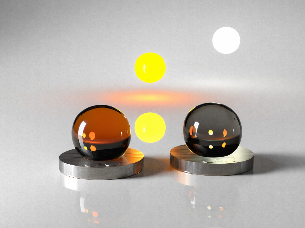
Ivana Nedeljkovska’s Flying Moon & Sun takes a different position on that. Her conceptual design doesn’t ask you to move toward the light; it imagines the light moving toward you. Drawn from the natural rhythms of the sun and moon, it proposes a mobile, levitating lamp that follows you through your home and adapts to whoever it’s meant to illuminate.

Designer: Ivana Nedeljkovska

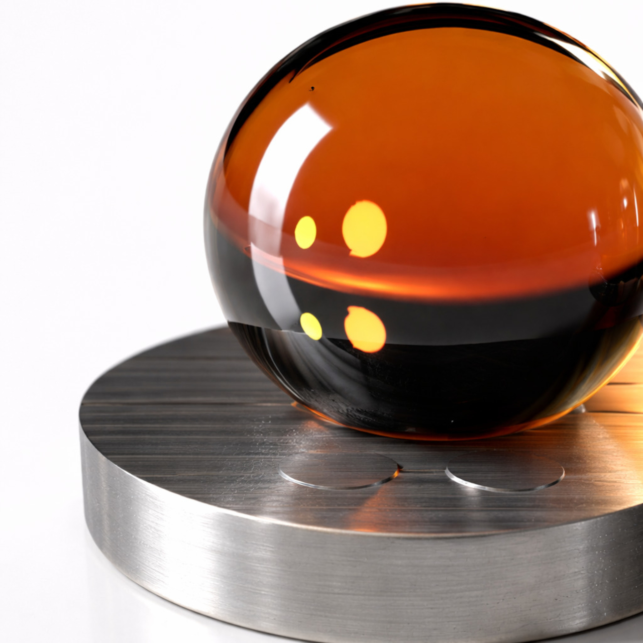
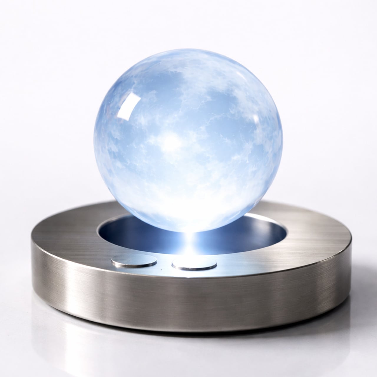
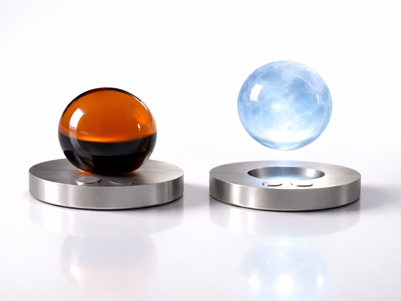
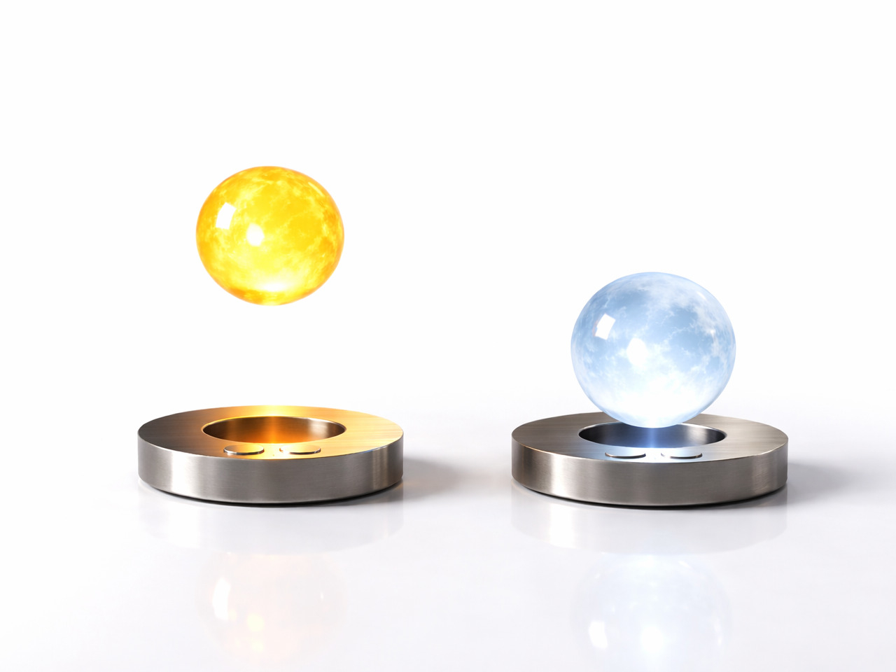
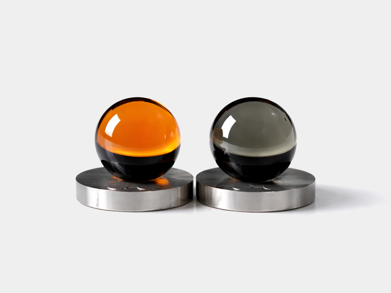
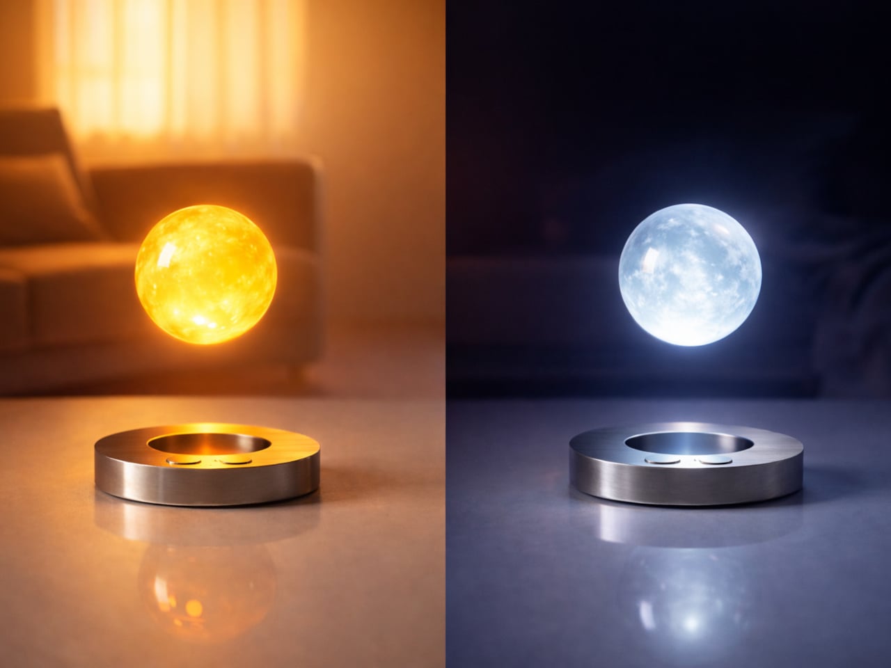
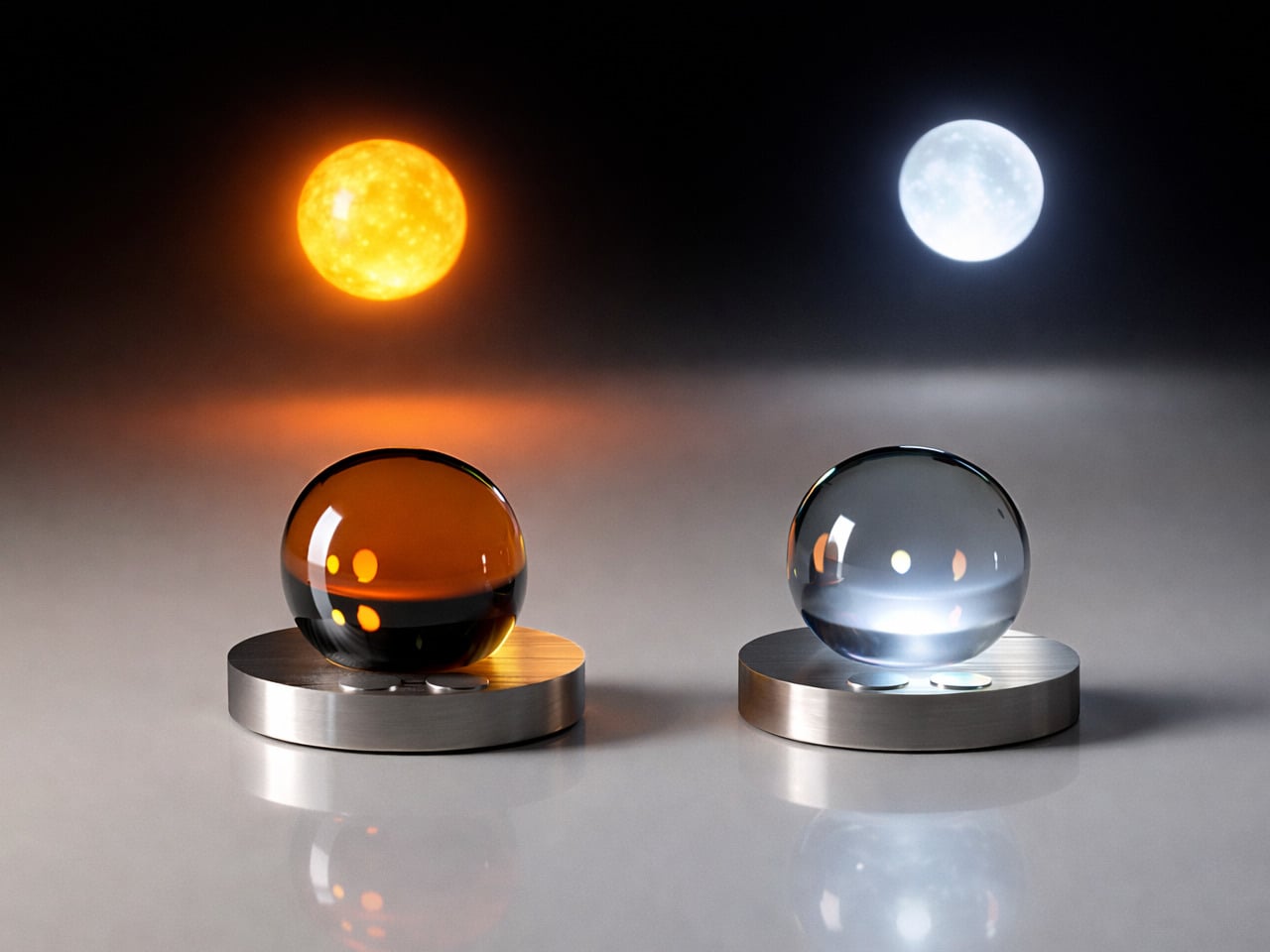
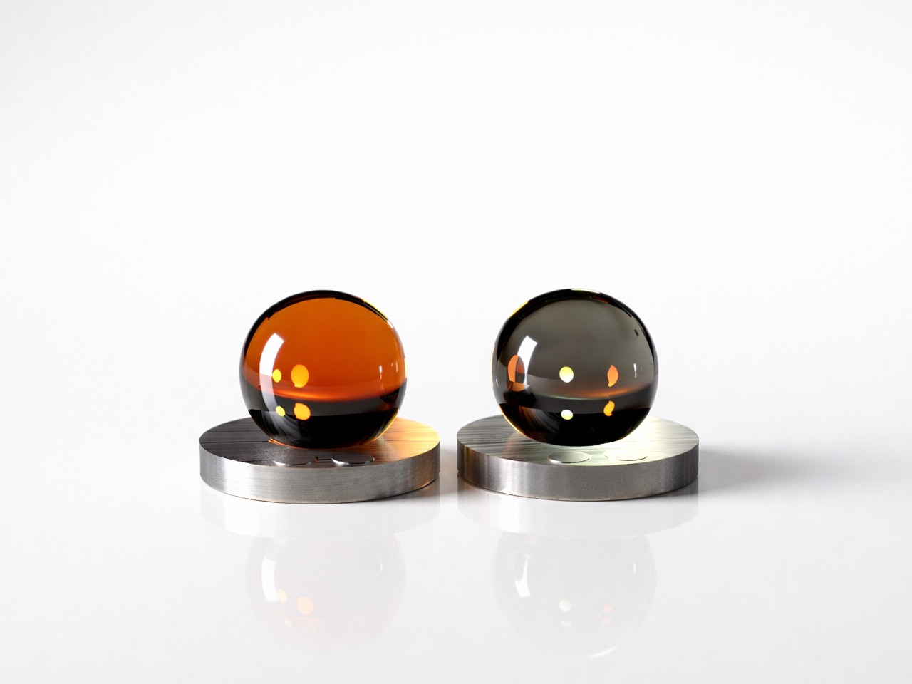
The concept takes shape as two glass orbs, one in warm amber that channels the sun’s energy, and one in cool frosted blue that mirrors the moon’s quieter character. Each rests on a brushed circular metal base, capable of levitating above it through magnetic force. That floating quality physically expresses the central idea, that this is a light that doesn’t feel tied to any single spot.

The two orbs aren’t just stylistically distinct; each serves a purpose tied to the body’s natural cycles. The warm, sun-toned orb supports alertness and activity, while its cool lunar counterpart eases the body into rest. By mapping its light to the gradual arc from sunrise to sunset, the design draws on circadian science, offering something that most smart bulbs attempt through apps but rarely manage to make feel genuinely natural.

Nedeljkovska was thinking about people who don’t always have the option of adjusting their environment easily. For someone with visual or sensory challenges, a light that moves toward them rather than waiting to be repositioned carries real value. The concept doesn’t frame this as a special accommodation; it simply makes intuitive, responsive behavior the default, which is what good inclusive design tends to do.

That mobility is perhaps the most striking aspect of the idea. Imagine waking at night and finding a glowing orb already near a doorway, having drifted to where you’ll likely need it next. For older users, or anyone navigating in the dark, that kind of preemptive illumination offers a quiet, practical benefit that no ceiling fixture or bedside lamp can really replicate.

The form reinforces the emotional ambition. There are no buttons, no menus, no settings to configure. The smooth glass surfaces and soft inner glow make the orbs feel more like objects found in nature than anything in a typical lighting store. That’s a deliberate choice, one that tries to make a lamp feel comforting rather than functional, which is a harder design problem than it sounds.

Flying Moon & Sun is still a concept, but the questions it raises are genuine. How much of our discomfort with artificial light comes from having to work around it, rather than having it work around us? A lamp that floats, follows, and shifts with the hour is ambitious, but the premise that light should serve the person rather than the room is hard to argue with.

The post This Levitating Orb Lamp Drifts Toward You in the Dark Before You Ask first appeared on Yanko Design.

5 Best LEGO Builds of April 2026 We Wish Were Already Official Sets (One Takes 90 Trillion Years to Work)

LEGO has always occupied a peculiar space between toy and medium. For most of us, the bricks are nostalgic — associated with childhood bedrooms, pieces stepped on in the dark, and the specific satisfaction of snapping something into place after searching the floor for ten minutes. For a different kind of builder, LEGO is something closer to a precision instrument: a material that responds to spatial thinking with the same seriousness that marble responds to a sculptor’s chisel. April 2026 made a compelling case for the latter.

This month produced five builds that sit comfortably outside any toy aisle — a gear-driven monument to exponential mathematics disguised as abstract art, a 1,106-brick variant of my favorite dessert ever, a retro desk piece hiding a fully functional modern computer, a sharp recreation of the most universally procrastinated game in office history, and a kinetic brick portrait of the greatest basketball player who ever played the game.

1. LEGO Eternal Mosaic — The Gear Train That Outlasts the Universe
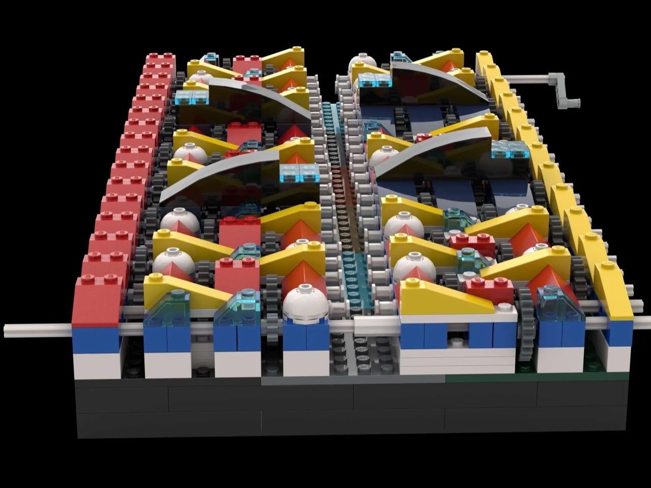
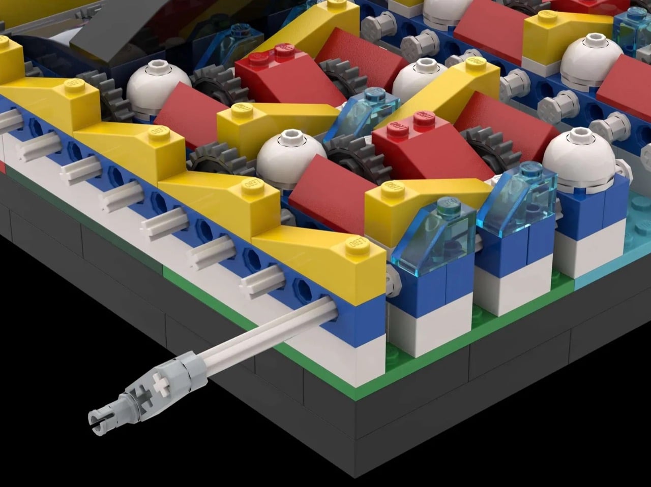
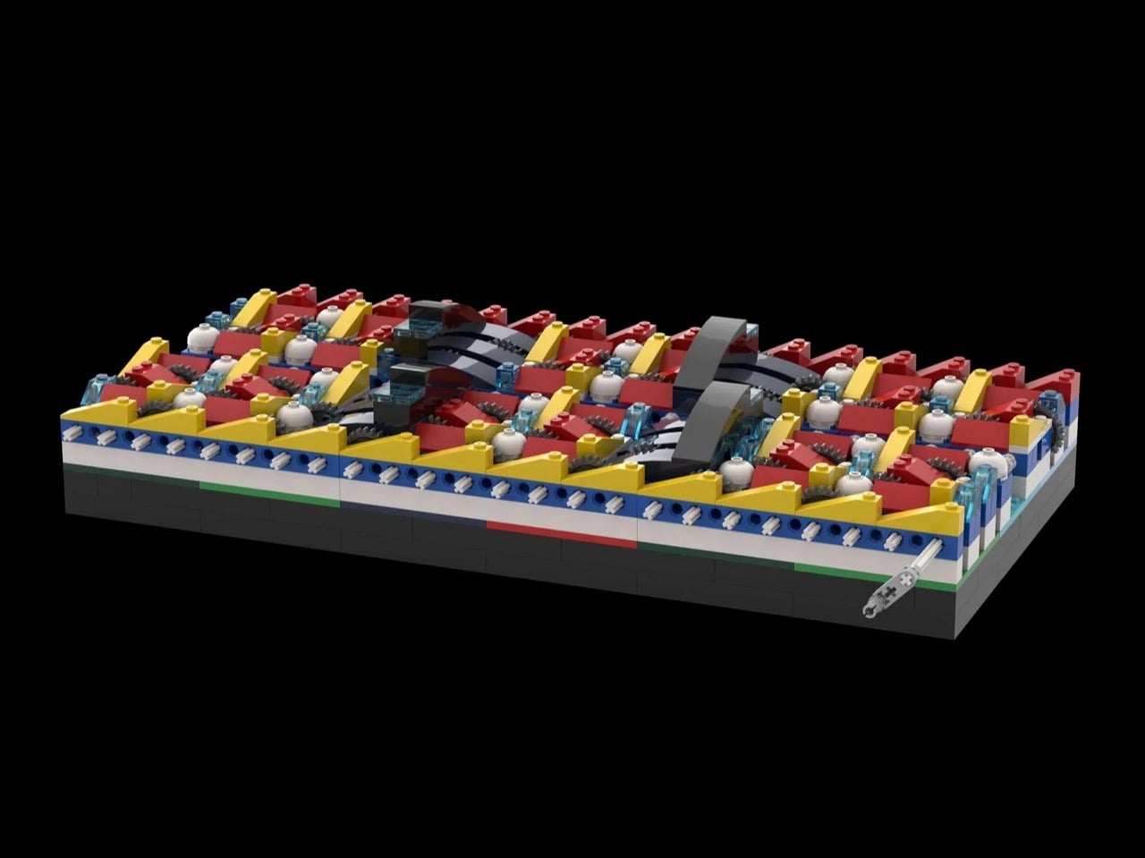
The Eternal Mosaic is a 655-piece LEGO Ideas concept that bridges the visual language of Mondrian’s De Stijl compositions with the mechanical logic of compound gear reduction. The build contains 46 stages of gear reduction using 24-tooth to 8-tooth ratios at every step. Compound that across all 46 stages and you arrive at a total gear reduction of approximately 9 billion trillion to one — a number that stops making intuitive sense almost immediately and doesn’t start again.

At 100 RPM, the first gear completes a rotation every 0.6 seconds. The final gear, embedded in the Mondrian-inspired color panel, will complete its first full rotation in approximately 90 trillion years — the universe is 13.8 billion years old by comparison. The Mondrian connection isn’t cosmetic. The rigid geometry of De Stijl shares an underlying grammar with compound gear logic: both systems operate by fixed, uncompromising rules and produce results that appear arbitrary until the governing principle becomes visible.

2. LEGO Tiramisu — The Food MOC That Makes You Question What You’re Actually Looking At

Tiramisu crossed out of northeastern Italy in the late 1960s and spent the next few decades becoming the world’s most universally loved no-bake dessert. LEGO Ideas creator Micdud has now built one from 1,106 bricks at nearly 1:1 scale — a corner slice served on a decorative round plate, complete with chocolate drizzle, cream dollops, and a fork mid-bite suspended in the air on a transparent support. The result makes you do a genuine double-take.

The cocoa topping is a masterclass in using disparate brown elements to simulate an organic, dusty texture — the kind of surface detail that food MOCs either nail or miss entirely. Micdud hid a raspberry made from a red clown hairpiece and blueberries built from purple astronaut helmets beneath the garnish, which is exactly the lateral thinking that makes a build memorable. Food MOCs live and die by their surface detail, and this one gets every layer right.

3. Michael Jordan LEGO Relief Poster — Air, Rendered in Brick
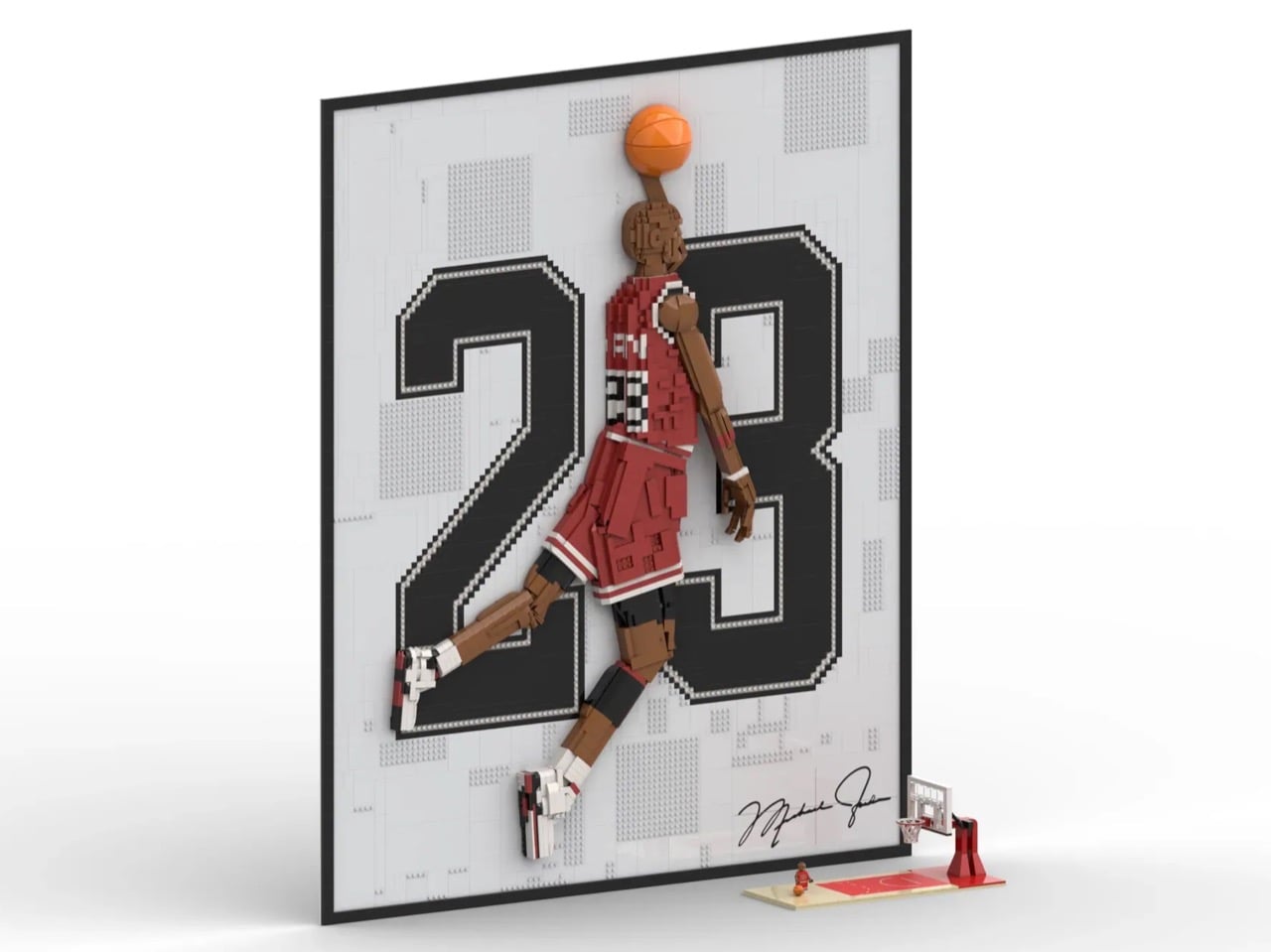
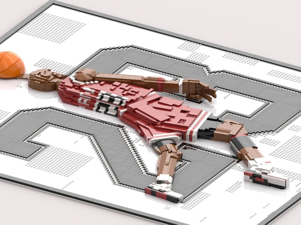
Most LEGO art stays flat. Builder LAFS85 made the harder choice with this 3,424-brick Michael Jordan portrait — a relief sculpture where Jordan’s figure physically protrudes from the background plane through layered brickwork, so the silhouette genuinely leaps toward you. In the front-facing renders, Jordan is mid-flight, ball raised, and the bold pixelated “23” filling the dark grey background amplifies the drama in the way confident typography always does when it knows exactly what it’s doing.

The technical decisions here reward close attention. LAFS85 used SNOT — Studs Not On Top — techniques throughout the figure to capture the flow of jersey fabric and the muscular geometry of Jordan’s legs. Flat tile surfaces read as smooth fabric. Angled plates suggest tension in the limbs. The red and white of the Chicago Bulls uniform pops hard against the dark grey background, and the brick-built recreation of Jordan’s signature in the lower corner is a genuinely considered finishing touch.

4. LEGO Minesweeper — A Functional Tribute to the World’s Most Productive Distraction
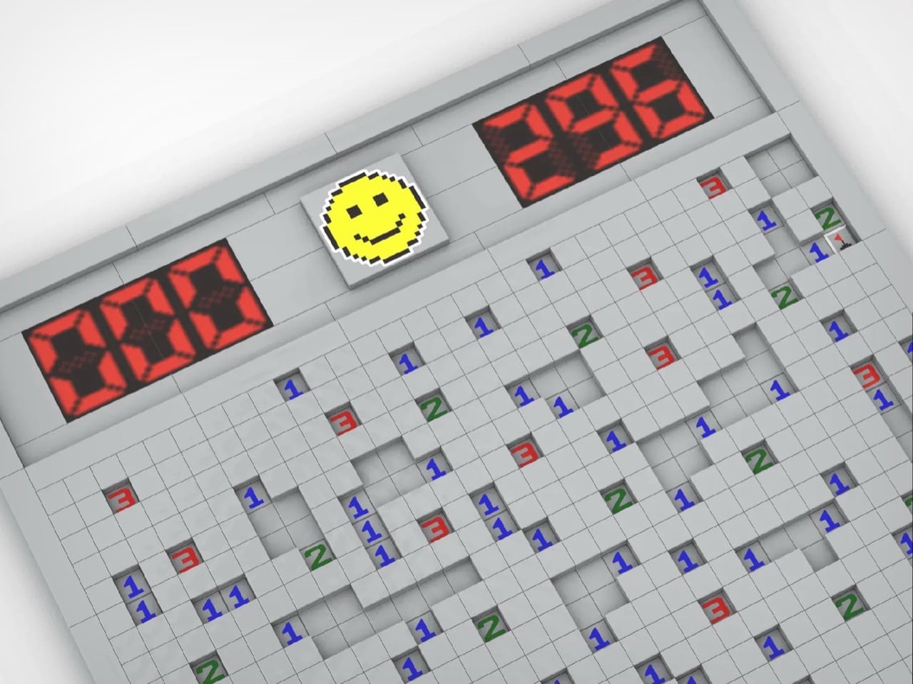
Before social media had the chance to dismantle workplace productivity, Minesweeper was already doing it quietly and for free. Created by Robert Donner and Curt Johnson for Microsoft in 1990, it shipped with every copy of Windows from 1992 onwards and spread through offices with the calm efficiency of something nobody wanted to admit spending time on. Conservative commentators were calling it a genuine threat to American business productivity. The alt-tab reflex became a survival skill.

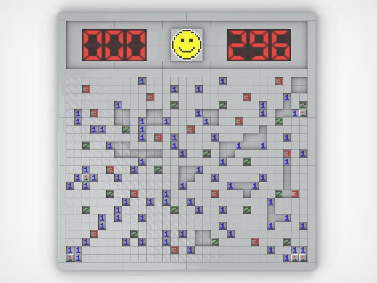
LEGO builder carlos_silva94 rebuilt that gray grid in brick with more deliberateness than the concept strictly required. The build replicates the Windows 95 interface with real accuracy — raised tile surfaces recreating the three-dimensional texture of unpressed buttons, working seven-segment displays tracking mine counts and elapsed time, and the iconic yellow smiley face watching from above. The textured tiles are the detail that lifts this from casual tribute to considered design object, giving the build physical weight and tactile presence.

5. LEGO M2x2 Workstation — The 1979 LEGO Brick That Actually Runs macOS
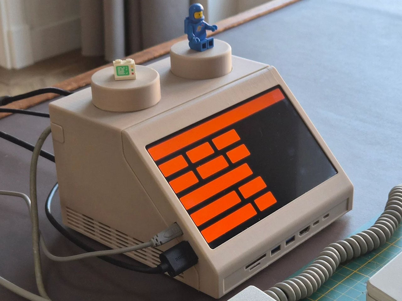
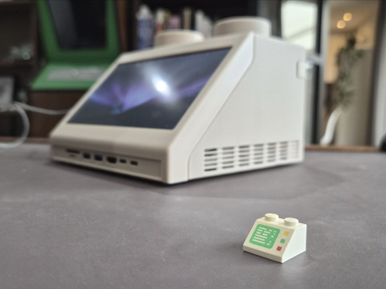
Dutch designer Paul Staal took the iconic LEGO Slope 45 2×2 brick — a wedge-shaped piece introduced in 1979 that appeared in classic space-themed sets as a visual shorthand for spacecraft computer terminals — and scaled it up to roughly ten times its original size. The result is a fully operational desktop computer housing that looks like it was pulled from a vintage LEGO Space playset and placed directly onto a modern desk.

Inside that oversized brick sits an Apple Mac mini equipped with Apple’s M4 chip, transforming a retro toy aesthetic into a capable, fully functional desktop system. What elevates this beyond novelty is the design intelligence underneath. Staal honored the Slope 45’s cultural memory while operating at a completely different scale and purpose. The M2x2 earns the term “conversation piece” without sacrificing utility — quietly asking why computing hardware defaults to featureless black rectangles when it could look like this.

The Month LEGO Stopped Playing Around

April 2026 demonstrated something the LEGO community has always known but rarely gets to show all at once: the brick is not a limitation, it’s a vocabulary. These five builds span engineering, portraiture, product design, retro computing, and food sculpture, and each one executes its concept with a precision that makes the medium feel like the only logical choice. Whether 655 pieces or 1,106, the ambition is entirely consistent.

What ties all five together is the specificity of vision behind them. The Eternal Mosaic is conceptually staggering in a way no other medium could reproduce. The Tiramisu challenges your eyes to accept that plastic bricks can convincingly look edible. The Jordan portrait rewards inspection at every level. The Minesweeper build lands immediately for anyone who worked in an office before 2000. And the M2x2 makes you rethink what computing hardware could look like. That is a strong month by any standard, in any medium.

The post 5 Best LEGO Builds of April 2026 We Wish Were Already Official Sets (One Takes 90 Trillion Years to Work) first appeared on Yanko Design.
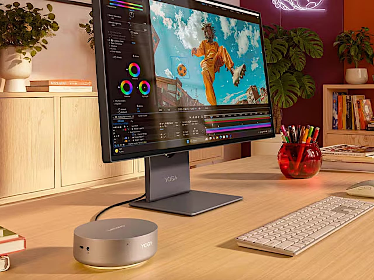
Lenovo’s $799 Puck-Shaped PC Weighs 600g and Drives 4 Displays

The traditional desktop PC has been losing ground for years, not to laptops or tablets, but to a growing class of machines that ask a surprisingly simple question: why does a powerful computer have to be big? Mini PCs have carved out a real niche, attracting everyone from home office workers to creative professionals who’d rather not surrender half their desk to a tower.

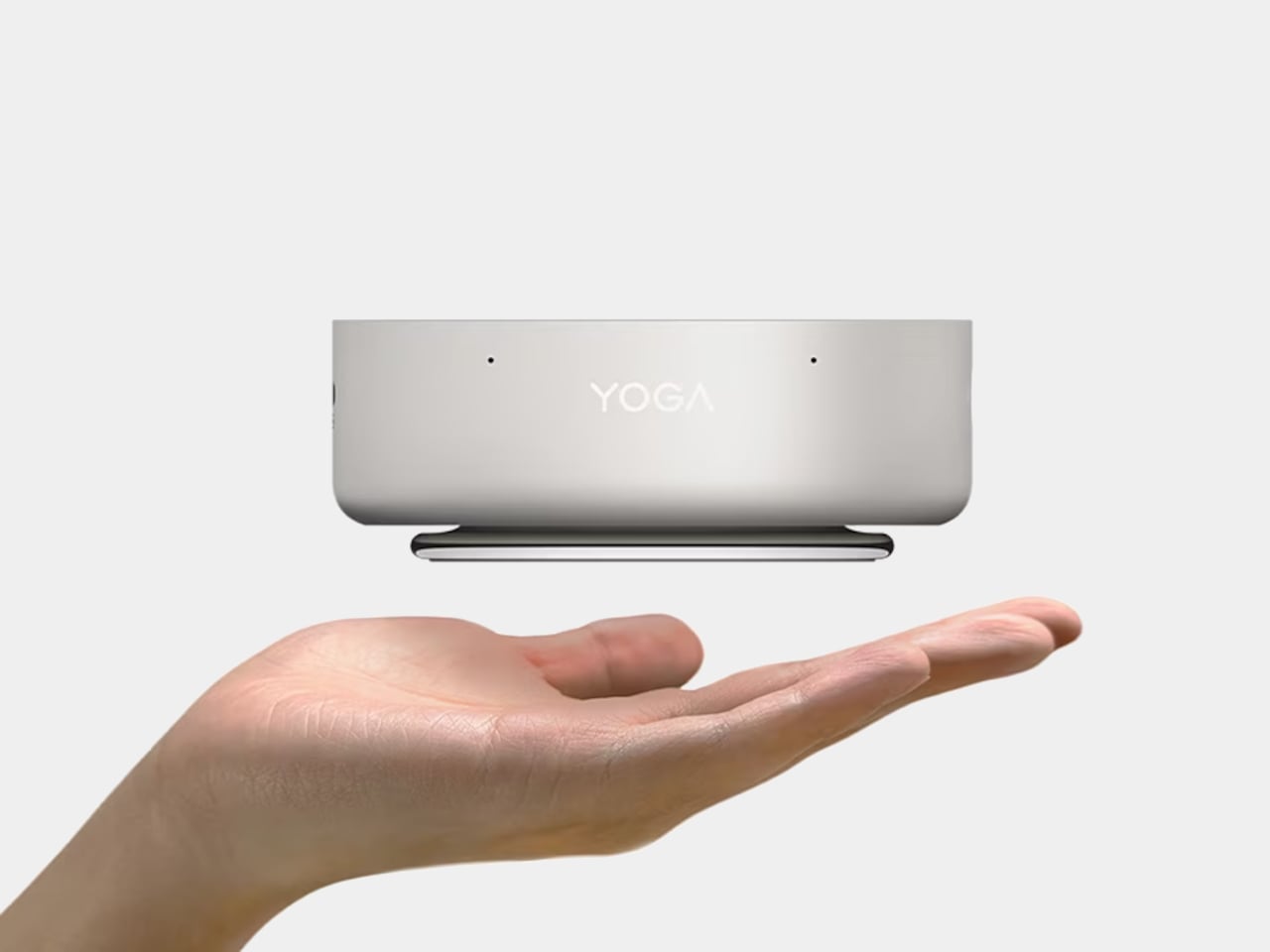
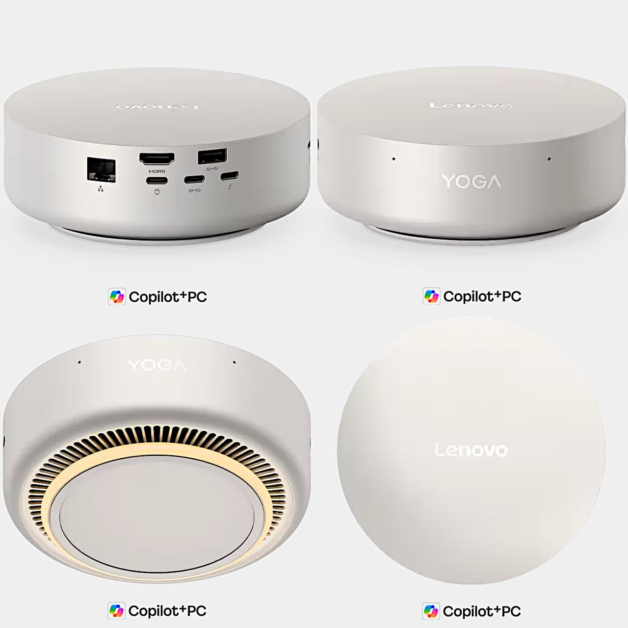
Most mini PCs, however, don’t quite look like they belong in the spaces they’re meant to save. They’re functional, sure, but rarely memorable. Lenovo’s Yoga Mini i Gen 11 tries to do something about that. First shown at CES 2026 and now moving toward a global release, it arrives as a circular, aluminum-clad machine with a polished Seashell finish, designed to feel as considered as it is compact.

Designer: Lenovo

The chassis weighs just 600 grams and occupies only 0.65 liters of space, small enough to perch on a desk corner, mount behind a monitor, or move between rooms without a second thought. Lenovo describes the circular form as a deliberate design choice, meant to create a cleaner, more efficient footprint both physically and visually, rather than simply shrinking a conventional rectangular box.

Under the hood, the Yoga Mini i Gen 11 runs on Intel’s Panther Lake platform, one of the first consumer chips built on the company’s 18A manufacturing process. The top-tier configuration uses the Core Ultra X7 358H, a 16-core processor that boosts up to 4.8 GHz with 18 MB of smart cache. Both the X7 and the base Core Ultra 5 325 chip include an onboard NPU for AI-accelerated tasks.

The NPU on the X7 model delivers up to 50 TOPS, enough to keep AI tasks running without taxing the main processor. Supporting it are up to 32 GB of LPDDR5X memory and up to 2 TB of NVMe storage, paired with Intel Arc B390 graphics. That combination makes it capable of handling light creative work, video editing, and multi-application workflows without breaking a sweat.

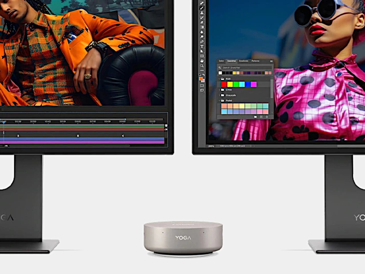
Connectivity is where the Yoga Mini i Gen 11 gets genuinely impressive for a machine this size. It supports up to four simultaneous displays through dual Thunderbolt 4 ports, multiple USB-C ports with DisplayPort, and HDMI 2.1 at 4K and 60 Hz. USB-A, 2.5 GbE Ethernet, Wi-Fi 7, and Bluetooth 6.0 round out a connectivity lineup that punches well above its weight.

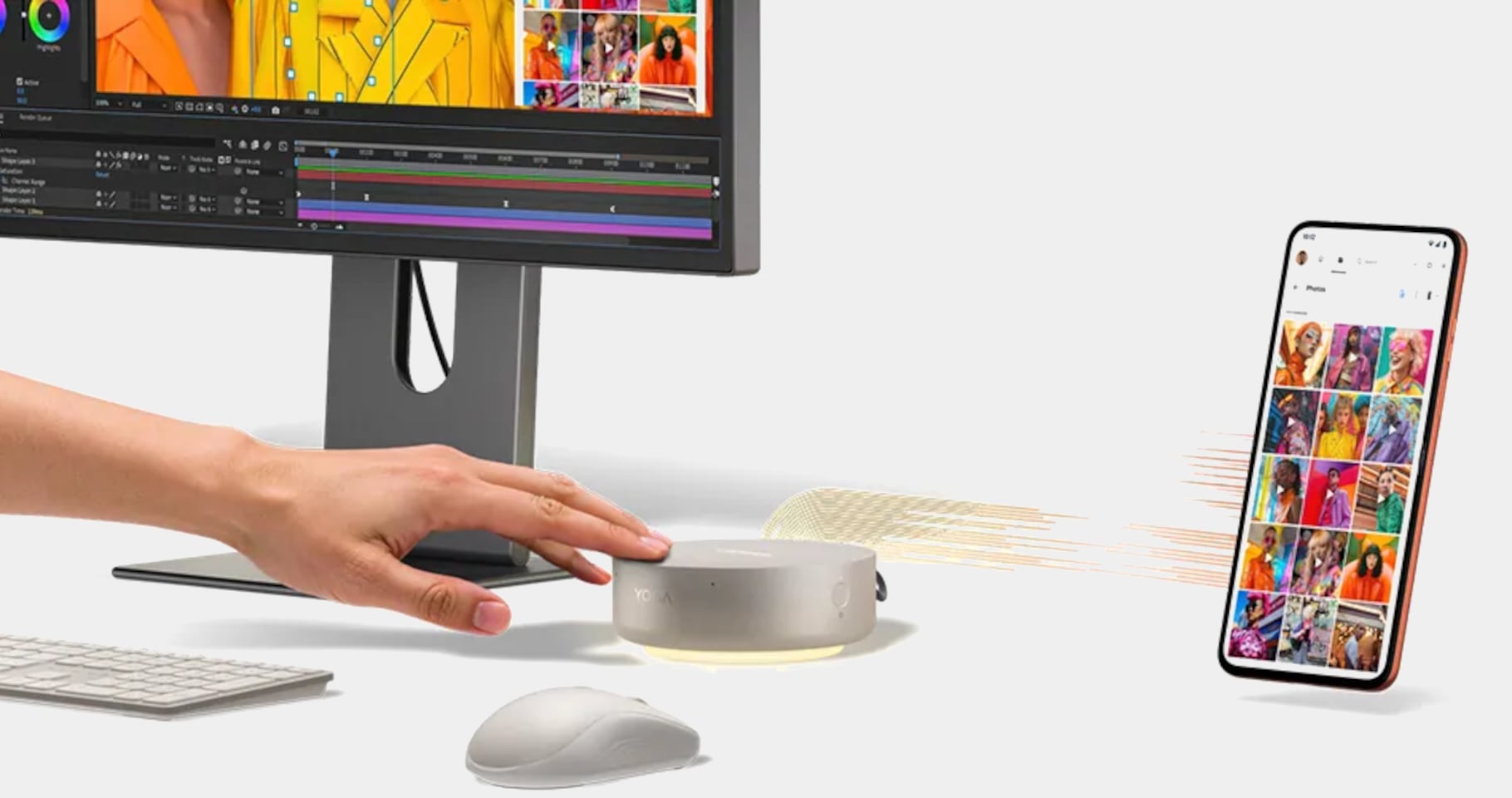
A few smart touches add a layer of intelligence to the everyday experience. Wi-Fi Sensing detects nearby presence to wake or lock the machine automatically. Adaptive Lighting adjusts to surrounding sound and activity, while touch controls and an onboard accelerometer enable gesture-based inputs. A fingerprint reader in the power button, Microsoft Pluton, and Secured-core PC certification handle security for users with more sensitive data requirements.

Lenovo has already launched the Yoga Mini i Gen 11 in China ahead of its originally planned July 2026 global release window, with an entry-level model priced at CNY 5,499, roughly $799. Broader availability across other regions is expected before mid-year. It also carries ENERGY STAR, FSC, and carbon-neutral certifications, which add a sustainability angle to its otherwise performance-driven pitch.

The post Lenovo’s $799 Puck-Shaped PC Weighs 600g and Drives 4 Displays first appeared on Yanko Design.
These Solid Copper & Brass Mechanical Pencils Were Designed to Outlast Their Owners By Centuries

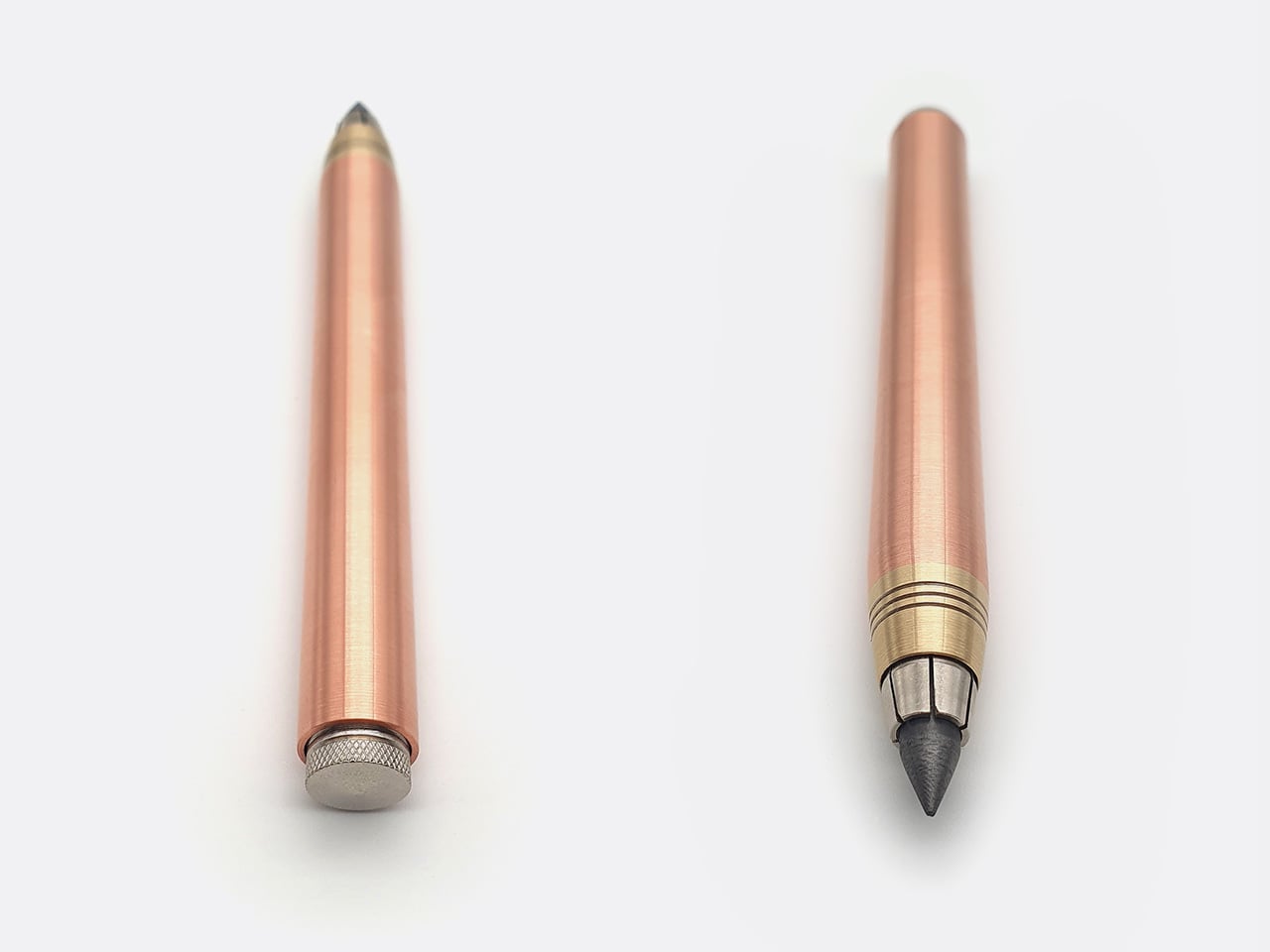
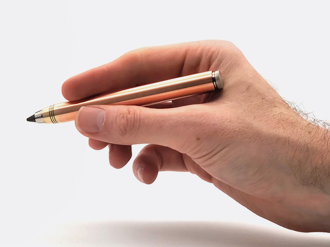
Copper weighs 8.96 grams per cubic centimeter. Brass comes in at around 8.5. Those densities mean something when you’re holding a pencil for hours at a time, and Nicholas Hemingway has built an entire design philosophy around that fact. His clutch pencils are machined from solid metal bar stock rather than hollowed-out tubes or plastic barrels wrapped in metallic finishes. The result is a tool that sits differently in your hand, one that uses its own mass to reduce the pressure you need to apply to the page. Hemingway calls it a “gravity-feed” approach, where the weight of the copper body does the work, allowing for longer, more comfortable creative sessions without the hand fatigue that comes from gripping too hard or pressing too firmly.

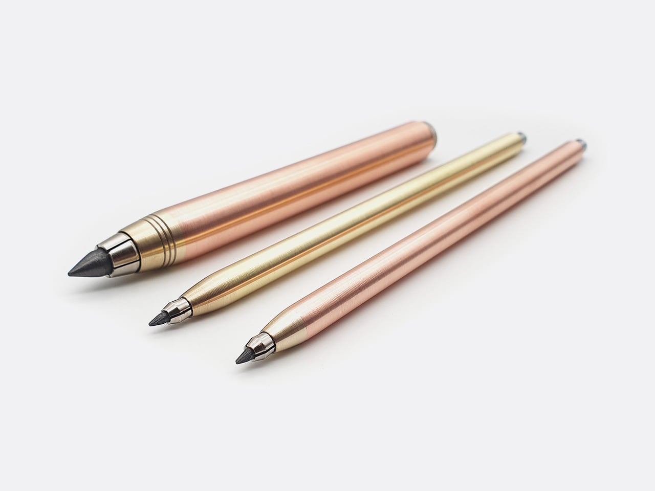
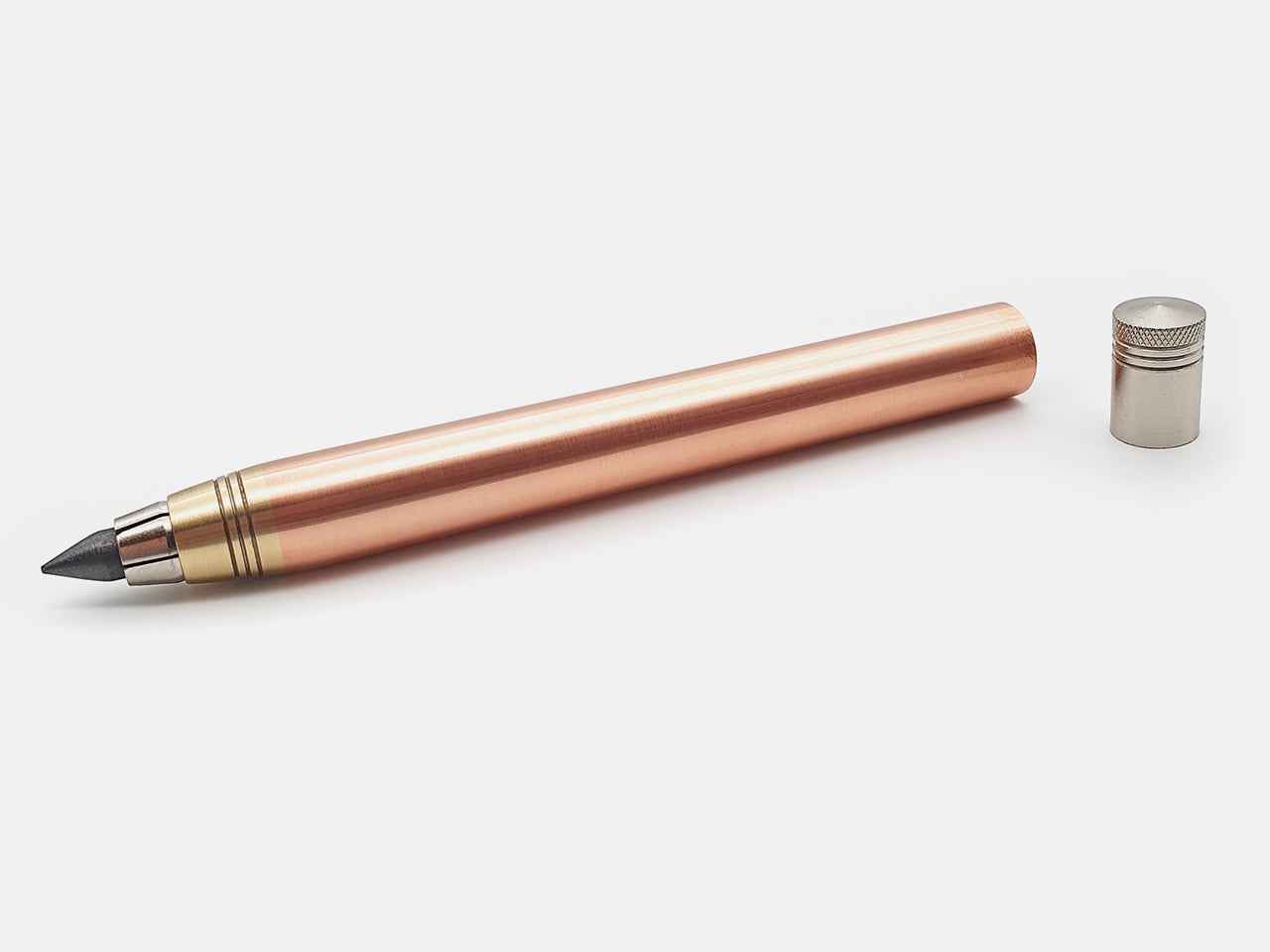
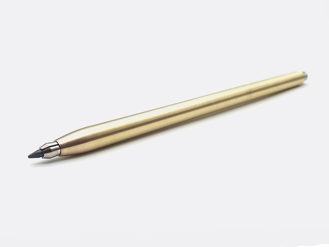
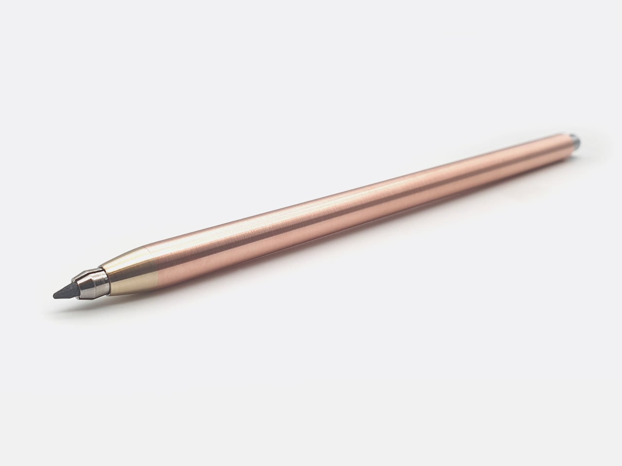
The 10th anniversary collection includes three pencils, each one a celebration of a decade spent refining manual lathe craftsmanship. The 5.6mm Copper and Brass Hybrid is the heaviest at 58 grams, designed for shading and life drawing, with a built-in lead sharpener in the push button. The 2mm Precision series comes in brass or copper, each weighing around 30 grams, and is aimed at technical drafting and fine-line illustration. Hemingway ships the brass version with an HB lead and the copper version with a 2B lead (the 5.6mm version gets the darkest 5B lead), a pairing he uses in his own studio to avoid having to swap leads mid-workflow. Both are standard clutch formats, fully compatible with any lead brand you prefer.

Designer: Nicholas Hemingway

Click Here to Buy Now: $79 $115 (31% off). Hurry, only 15/50 left!

The clutch mechanism is simple, proven, and deliberately old-fashioned. Press the top button to release the jaws, advance or retract the lead, then release the button to lock it in place. There are no springs to fatigue, no ratcheting internals to gum up with graphite dust, and no plastic components to crack under pressure. The 5.6mm version includes a sharpening chamber machined directly into the push button, a detail that keeps the pencil self-sufficient without requiring a separate pocket sharpener. The mechanism works identically whether you’re using the factory-supplied HB or a softer 6B lead you’ve swapped in yourself. Hemingway designed these pencils to accept any standard 2mm or 5.6mm lead on the market, which means you can dial in exactly the hardness and texture you prefer without being locked into proprietary refills.

The 5.6mm Copper & Brass Clutch

The material choice drives the entire experience and stands as a direct antidote to disposable culture. C101 copper is a high-conductivity grade typically used in electrical applications, chosen here for its density, workability, and willingness to develop a rich patina over time. The 360 brass, a free-machining alloy, delivers a brighter, more clinical aesthetic and holds its finish longer before tarnishing. Hemingway leaves both materials raw, with no lacquer, no powder coating, and no protective sealant. The copper will darken and mottle as it reacts to the oils in your skin and the humidity of your studio. The brass will develop a warmer, more subdued tone, though it resists the transformation longer than copper does. This is slow design in practice, where the aging process becomes part of the design language, carrying the visible marks of its owner’s journey rather than something to prevent or hide.

The 2mm Brass

The 2mm Copper & Brass

Dimensionally, the 5.6mm Copper and Brass Hybrid measures 115mm in length with a 12mm diameter barrel, while the 2mm Precision series comes in at 140mm long with a 7mm diameter. The 2mm pencils are slimmer and longer, built for precision linework and extended drafting sessions where fine motor control matters. The 5.6mm version is shorter and thicker, designed to sit further back in your hand for broader, more gestural strokes. At 58 grams, the 5.6mm Hybrid has real heft, the kind of weight that anchors your hand to the page and makes you slow down, think about each mark, and commit to your lines. The balance has been engineered around the nib, shifting the center of gravity forward so the pencil glides across the paper rather than requiring constant pressure from your wrist.

Hemingway machines every pencil in-house at his London workshop on a manual lathe, hand-finishing each piece and inspecting it personally before it ships. The production model is bespoke and made-to-order, which eliminates the supply chain drama that plagues most crowdfunded EDC launches. If 100 people order a pencil, Hemingway machines 100 pencils. There are no minimum order quantities with overseas factories, no shipping containers stuck in customs, and no quality control surprises three months into fulfillment. Every tool is built to the same standard Hemingway uses for his own work, and the track record backs that up. This is his 17th Kickstarter campaign, and all 16 previous projects delivered on time. These are engineered to be the last drawing tools a creative will ever need to buy, true heirlooms designed for a lifetime of use and capable of being passed down.

Whether you opt for the copper or brass variant, or even the 5.6mm or 2mm model, Hemingway’s set the pricing at £59 ($79 USD), discounted off its £85 MSRP. Each pencil comes with its own lead, along with a hand-written note in a wonderful gift box. International shipping starts July 2026, and Hemingway packages everything in recycled cardboard with zero single-use plastics. All waste metal from the workshop gets collected and sent back to be melted down and reused, keeping the production cycle as tight and sustainable as the pencils themselves.

Click Here to Buy Now: $79 $115 (31% off). Hurry, only 15/50 left!

The post These Solid Copper & Brass Mechanical Pencils Were Designed to Outlast Their Owners By Centuries first appeared on Yanko Design.
The PlayStation Portable Gets an Incredibly Detailed LEGO Remake Complete with Working Disc Tray

Before smartphones killed the dedicated handheld, before the Switch made portability synonymous with Nintendo again, there was a brief window where Sony owned mobile gaming’s premium tier. The PSP launched in 2004 as a technical powerhouse wrapped in sleek industrial design, a device that felt expensive in your hands and looked like it belonged in a gadget enthusiast’s bag. It ran PlayStation 2-era games, played movies, supported WiFi multiplayer, and became the go-to modding platform for tinkerers who wanted every emulator ever made on one device. The PSP’s legacy is complicated, but its design has aged remarkably well.

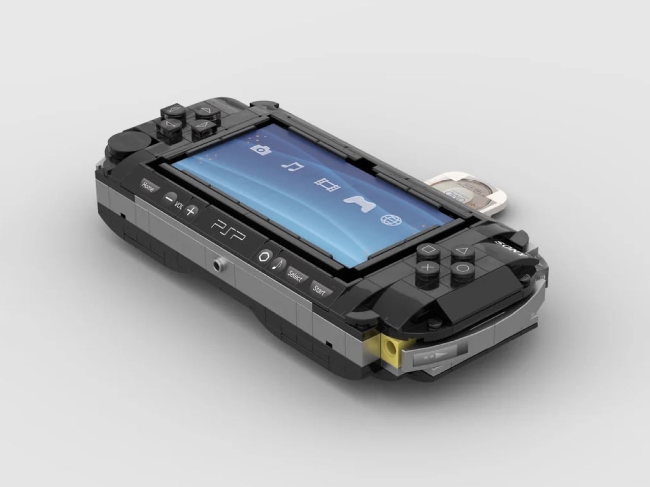
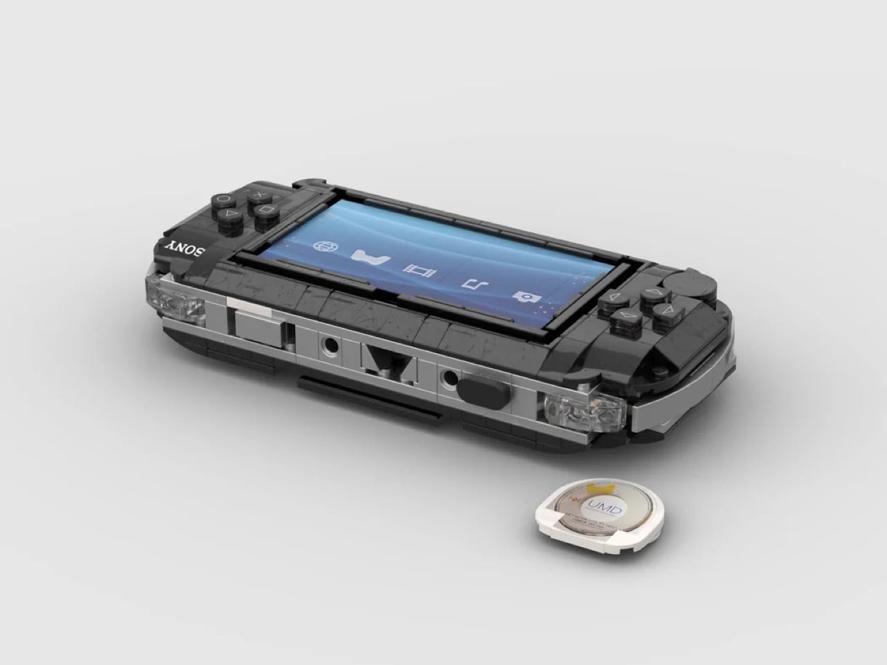
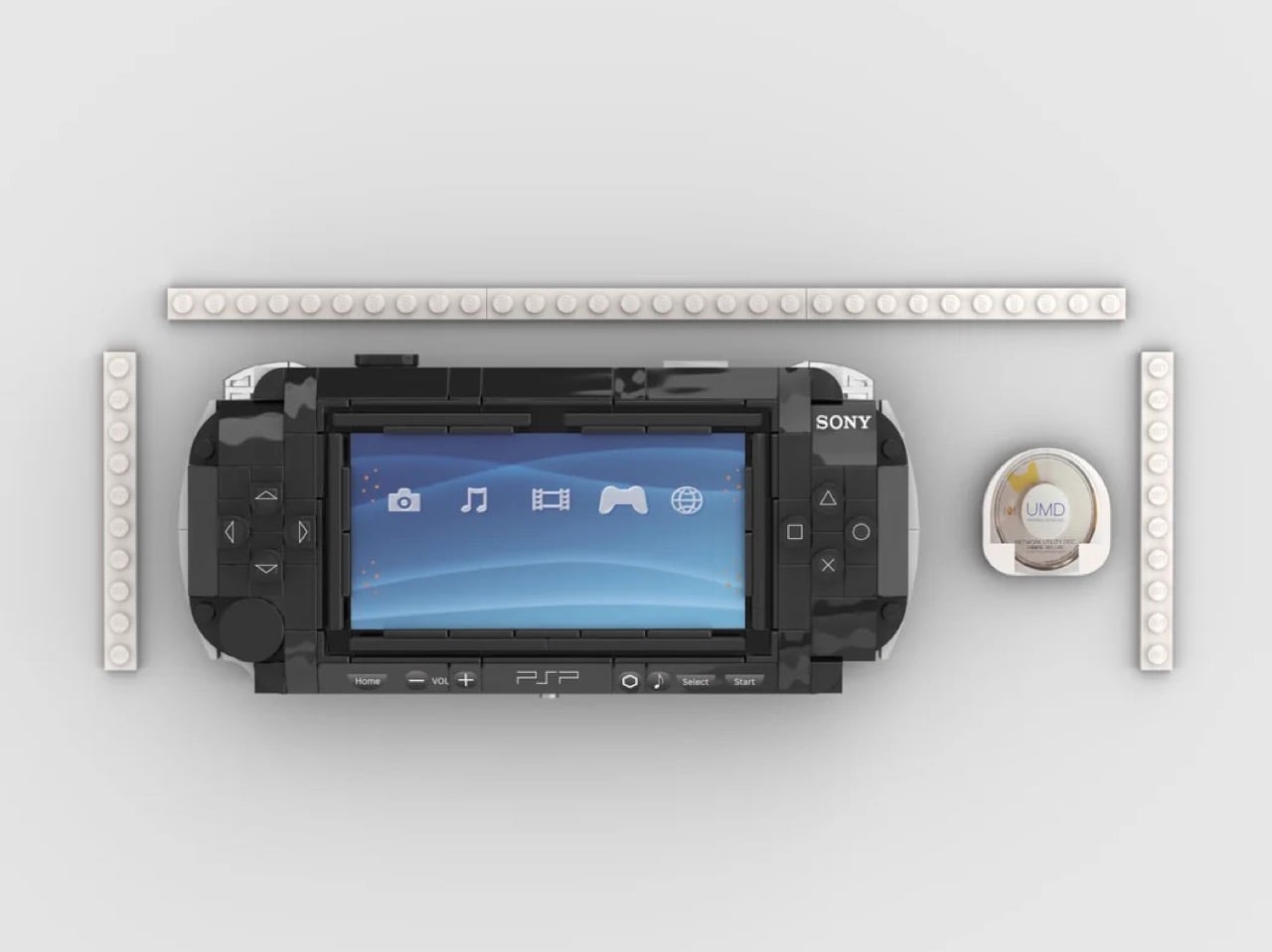
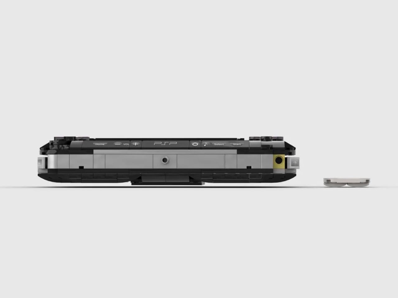
This LEGO interpretation, shared on Reddit, proves that good hardware design translates across mediums. Reddit user Embarrassed_Map1072 has captured the PSP’s essential character using bricks: the wide landscape format, the glossy black shell, the satisfying asymmetry of controls flanking a dominant screen. The printed XMB interface behind transparent elements brings the build to life, while the removable UMD disc adds a playful interactivity that feels right for a gaming device. Small touches like the curved edges, the recessed shoulder buttons, and the memory stick door’s yellow tab demonstrate real attention to the source material. This thing looks like it could slide into a PSP case and nobody would notice until they tried to boot up Lumines.

Designer: Embarrassed_Map1072

The build’s proportions are spot-on, capturing that distinctive wide-bodied stance that made the PSP feel substantial without being bulky. The face buttons render Sony’s iconic shapes (circle, cross, square, triangle) in rounded LEGO elements, while the D-pad on the left maintains its classic cruciform layout. The analog nub sits where your thumb expects it, a small circular detail that any PSP veteran will immediately recognize. Up top, smooth tiles create the volume controls and power switch, with printed detailing that suggests the original’s labeling. The headphone jack makes an appearance at the bottom edge, because what’s a portable gaming device without a way to plug in your earbuds during a commute?

My favorite detail is the UMD disc itself. The builder recreated the distinctive white-and-gold casing that held your games, complete with the circular window that let you glimpse the tiny disc inside. It slides into the back of the unit just like the real thing, a mechanical function that elevates this from display model to something tactile and engaging. The memory stick slot retains that pop of yellow that broke up the PSP’s otherwise monochrome palette, a small design flourish that Sony used to signal where your saves lived. This is LEGO building that understands its subject, translating not just shapes but the experience of holding and using the actual hardware.

The post The PlayStation Portable Gets an Incredibly Detailed LEGO Remake Complete with Working Disc Tray first appeared on Yanko Design.
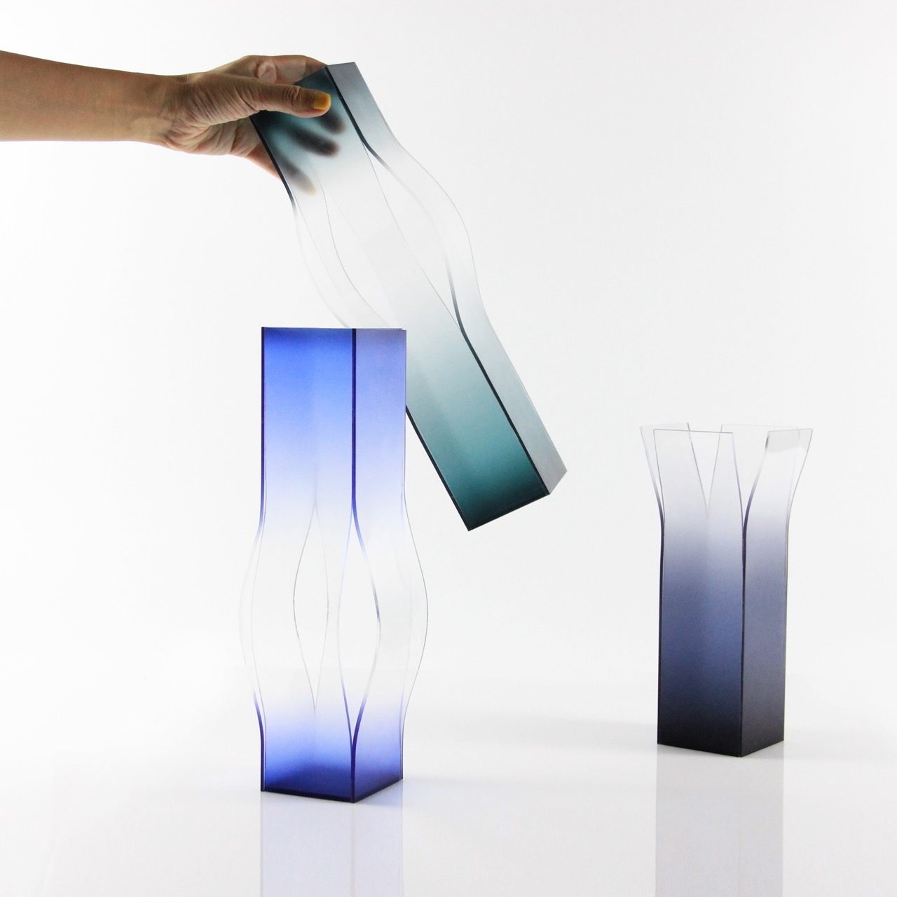
Vases That Stretch Color Until Form Disappears and Perception Takes Over

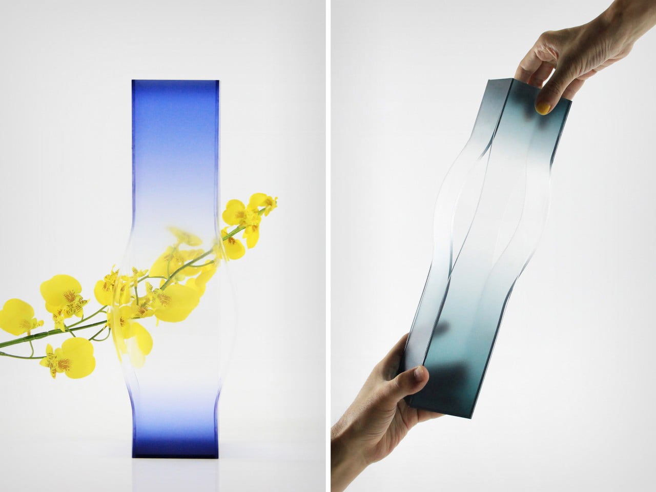
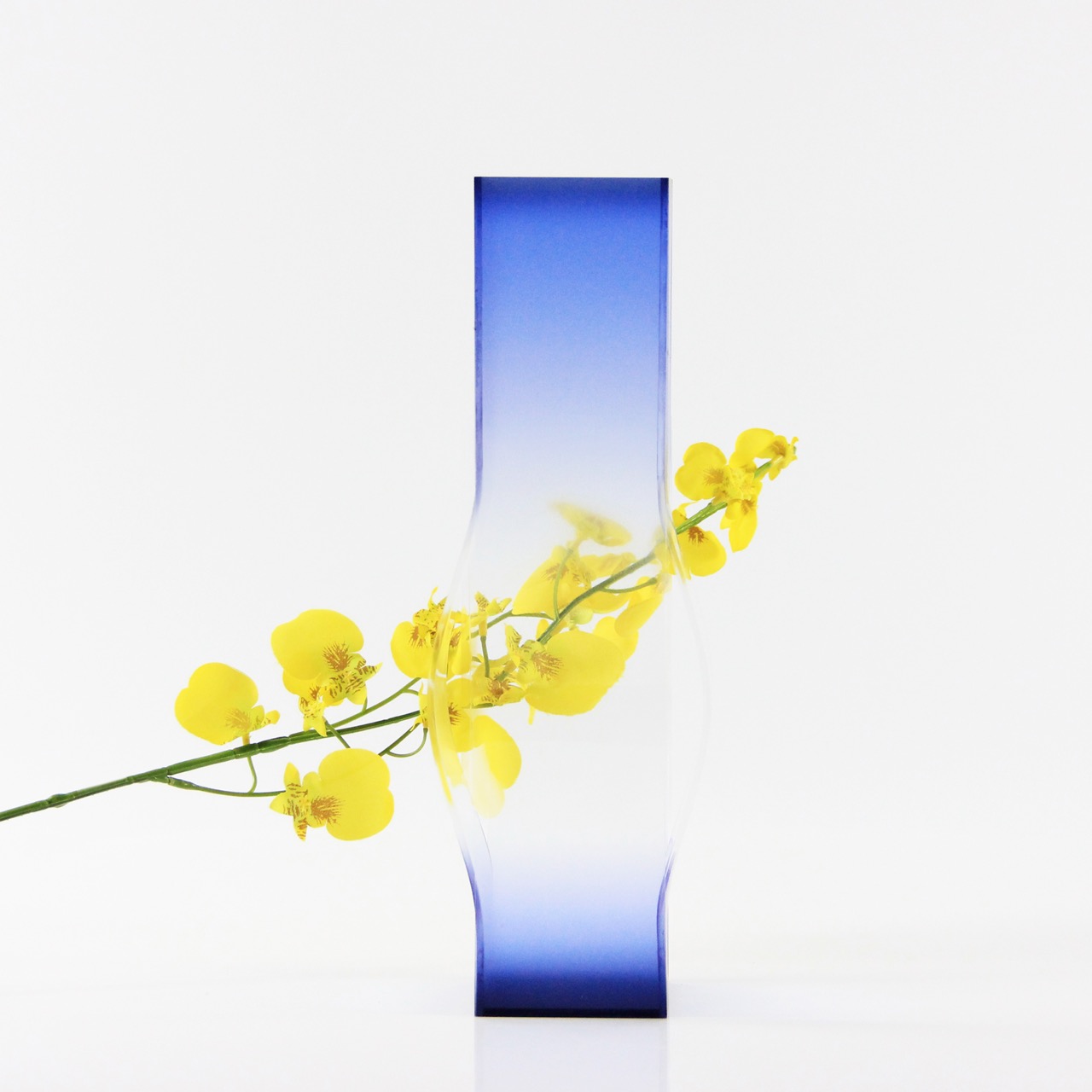
In a design landscape increasingly obsessed with clarity, function, and hyper legibility, Stretch Color resists the urge to explain itself. Instead, it lingers in ambiguity, somewhere between object and illusion, material and mirage. What at first glance appears to be a series of vases slowly reveals itself as something far more elusive: a study of perception itself.

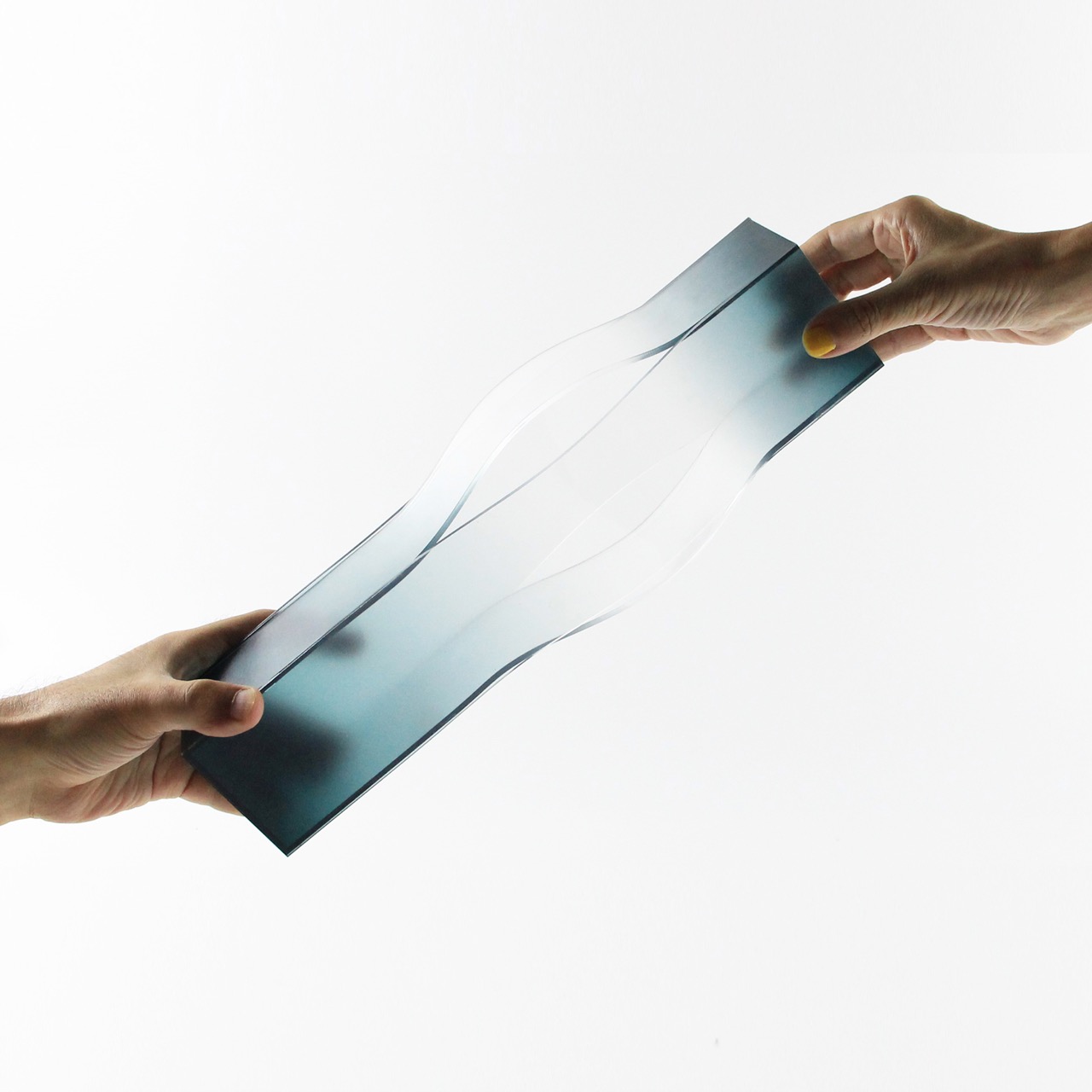
The collection operates in a delicate tension between two dimensions and three-dimensional form. From certain angles, the pieces flatten into what feels like a planar artwork, almost painterly, like gradients suspended on an invisible canvas. Shift your position slightly, however, and the illusion collapses into volume. The vases re-emerge as sculptural objects, reclaiming their presence in space. This oscillation is not accidental; it is the core language of the work.

Designer: Bo Zhang

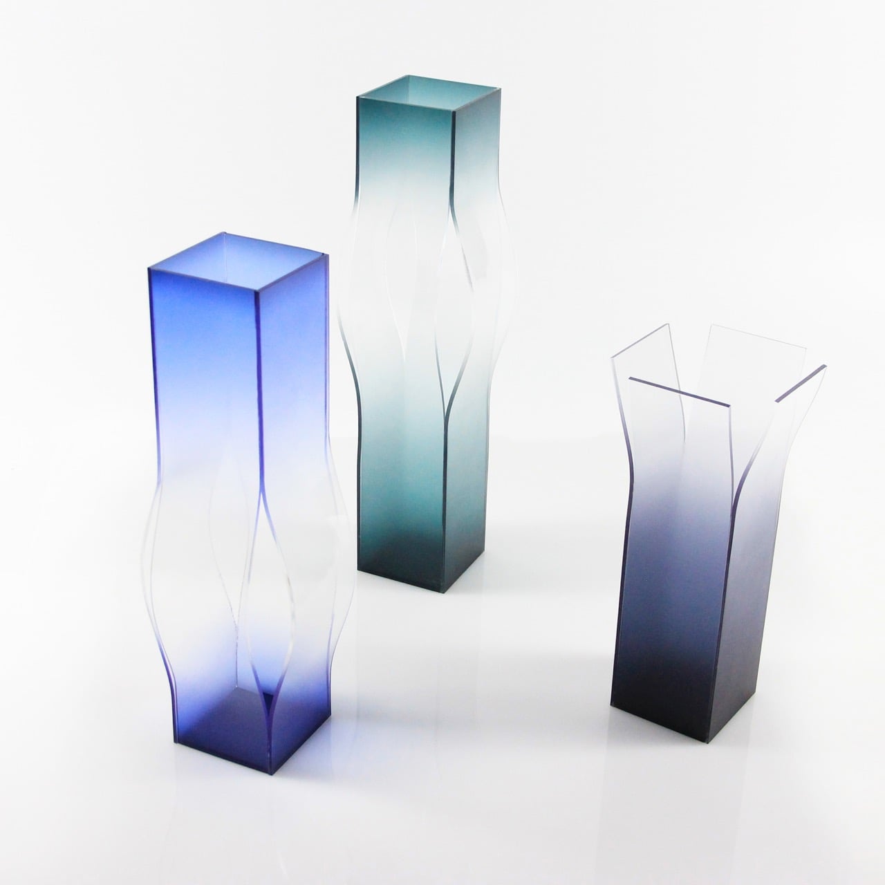
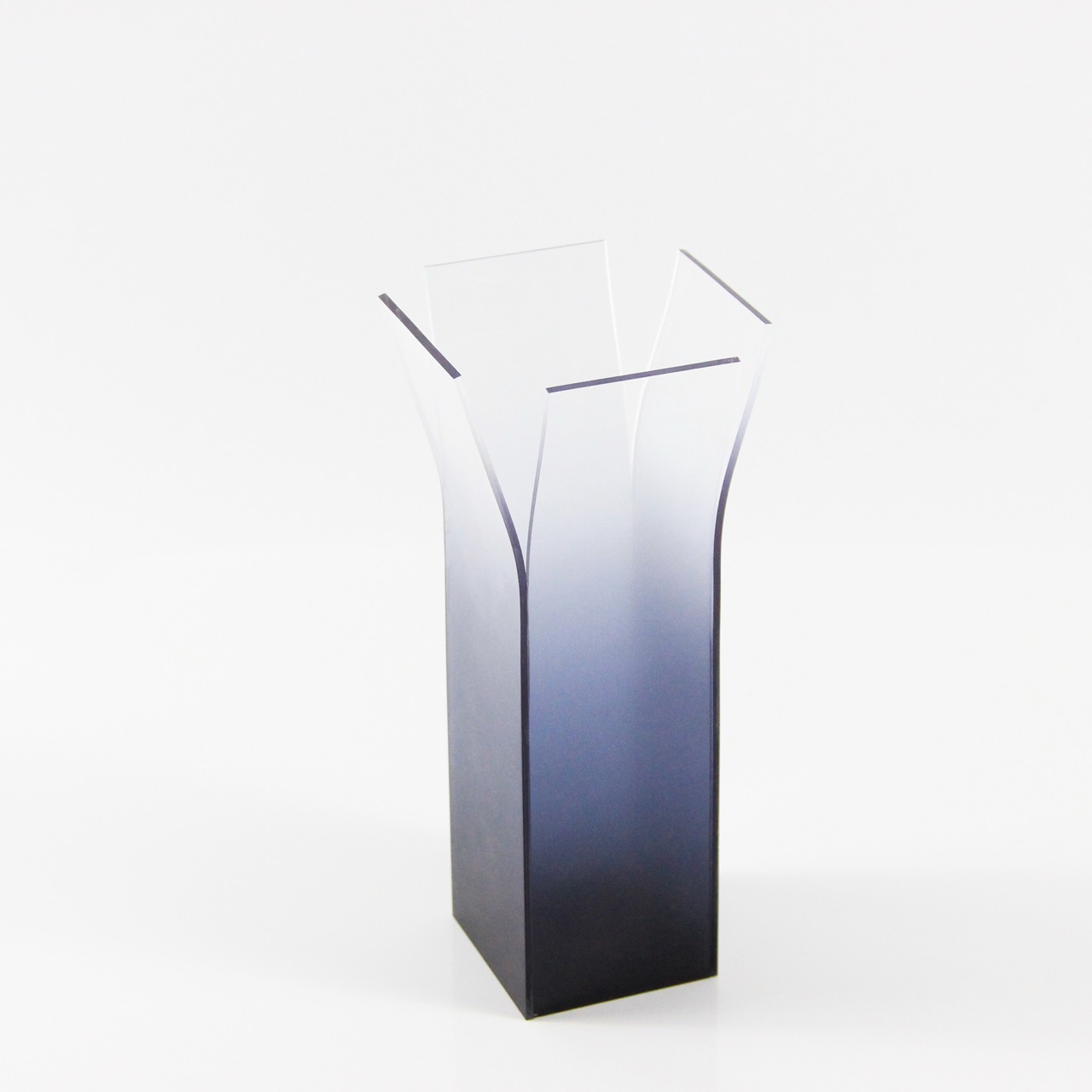
Crafted through a combination of acrylic layering and spray coloration, each vase carries a gradient that transitions from dense pigment to complete transparency. But this gradient is not merely decorative; it performs. Color appears to stretch, almost as if pulled across the object’s surface and into the surrounding space. The deeper hues anchor the form, while the fading edges dissolve it, creating a visual tension between presence and absence.

This local disappearance is perhaps the most compelling aspect of the collection. Portions of the vase seem to vanish, not through physical subtraction, but through optical diffusion. The structure is still there, yet it evades the eye. What remains is a ghost of form, an outline that flickers between visibility and invisibility. In doing so, the vases challenge one of the most fundamental expectations of objects, that they should be fully knowable.

The three varying sizes in the series amplify this effect. Rather than simply scaling the object, each size interprets the idea of stretch differently. Smaller forms feel more concentrated, their gradients tighter and more immediate, while larger pieces allow the color to breathe, elongating the visual pull across space. Together, they create a rhythm, a sequence of expansions and dissolutions that feel almost cinematic.

What makes Stretch Color particularly resonant today is its subtle commentary on how we experience objects in an increasingly mediated world. Much like digital interfaces that flatten depth or augmented realities that overlay perception, these vases blur the boundary between what is physically present and what is visually perceived. They invite the viewer to move, to question, and to reorient themselves in relation to the object.

There is also a quiet emotional undercurrent to the work. The fading gradients and disappearing forms evoke a sense of ephemerality, of things slipping just beyond grasp. Yet, this is not a loss; it is a transformation. The vases do not vanish entirely; they redistribute themselves into space, into light, into perception.

Stretch Color moves away from the idea of the vase as a static container and leans into it as a shifting experience, something that unfolds only when the viewer participates. The object does not simply sit in space; it negotiates with it, stretching color, dissolving edges, and quietly asking the viewer to look again, and then look differently.

The post Vases That Stretch Color Until Form Disappears and Perception Takes Over first appeared on Yanko Design.
This all-in-one PC concept reimagines how the monitor looks and functions

It’s not easy to create a workstation that reflects your personality, and it’s even harder to keep one organized. While the former is entirely a personal choice involving handpicked equipment, the latter depends on readily available solutions that make decluttering possible. Kakao, an all-in-one PC that utilizes the space behind the monitor for storage, presents itself as a godsend for achieving just that.

At the rendering stage at the time of writing, Kakao has a long way to go, if ever, to see the light of day. But from how it appears in pictures shared on the internet, this is a desk setup of the future, which draws some inspiration from the past when monitors or all-in-one PCs were more than slim panels we own these days.

Designer: Design Burger

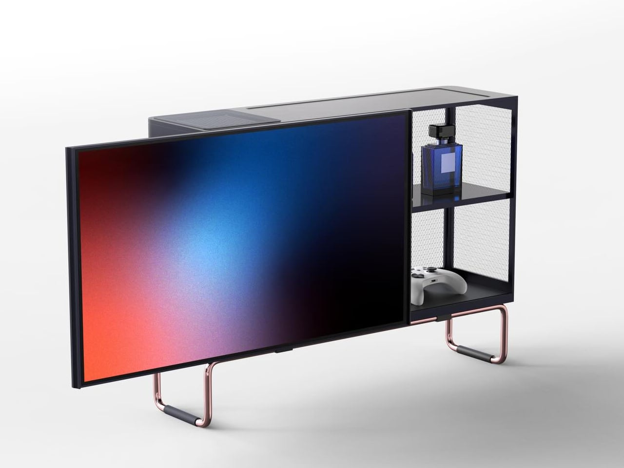
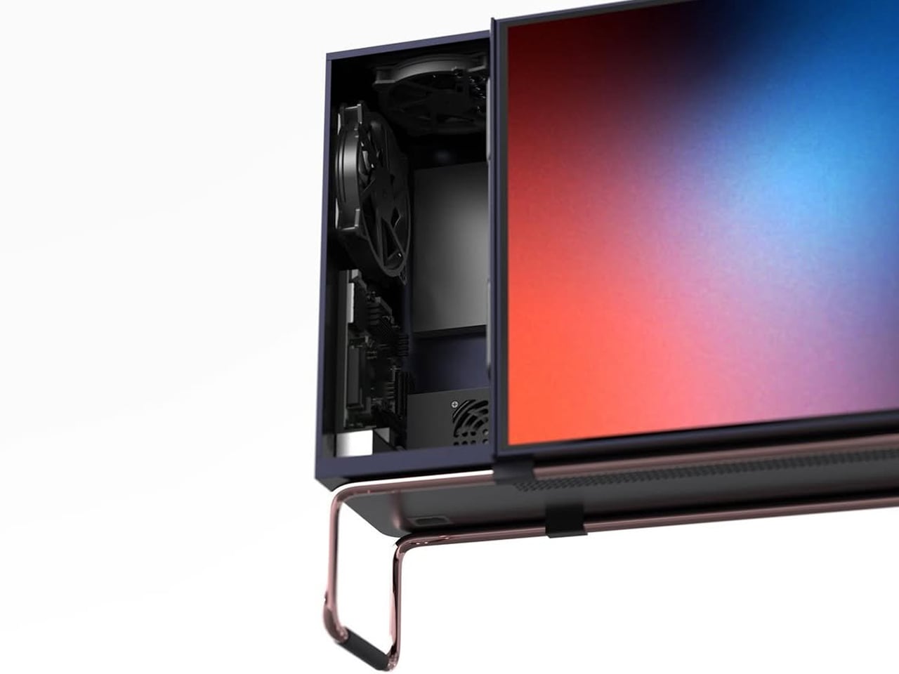
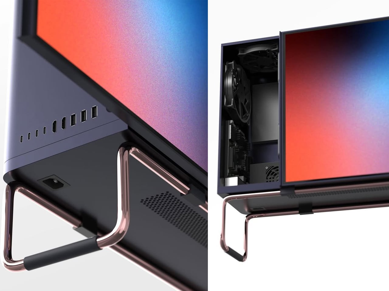
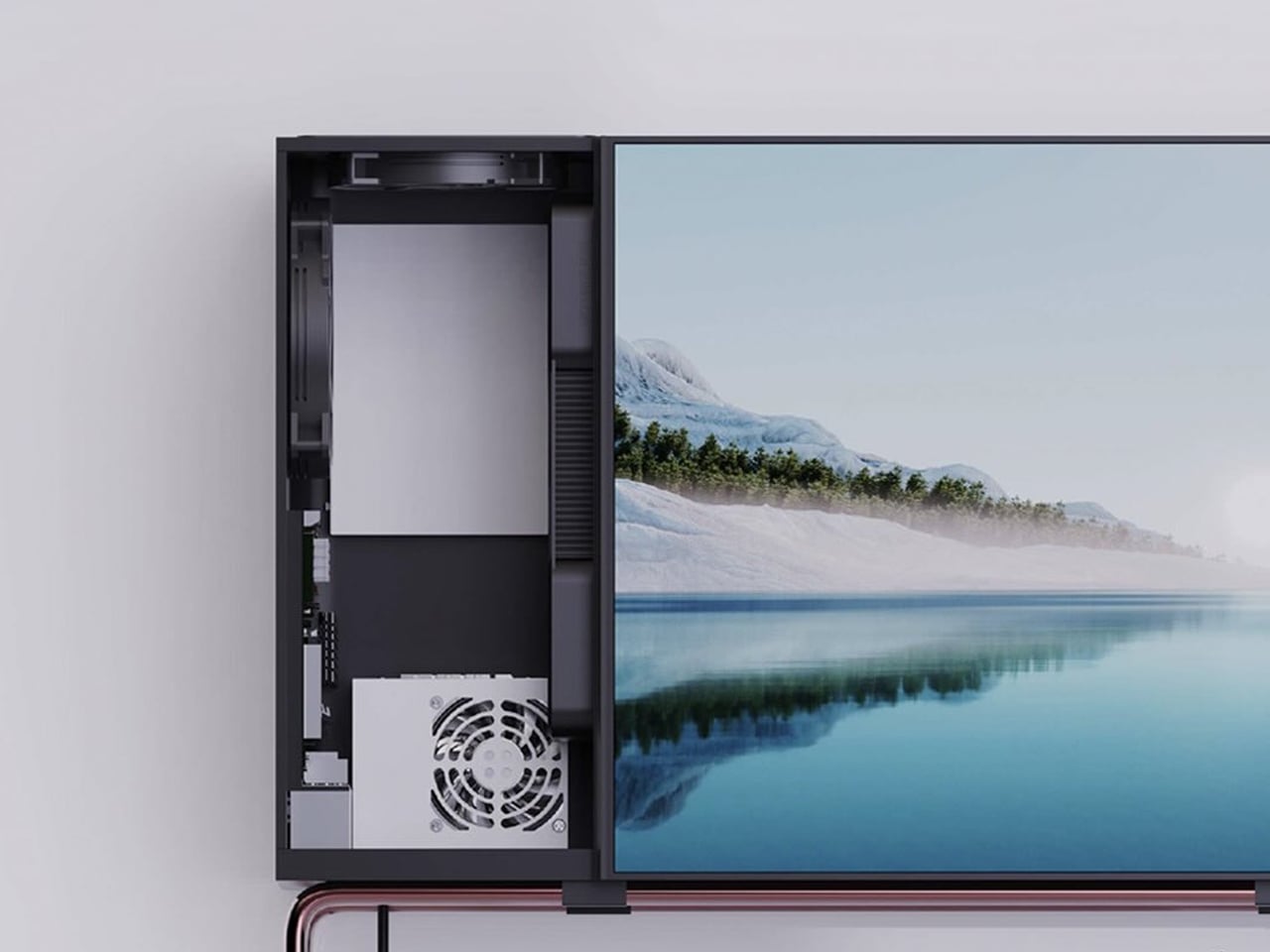
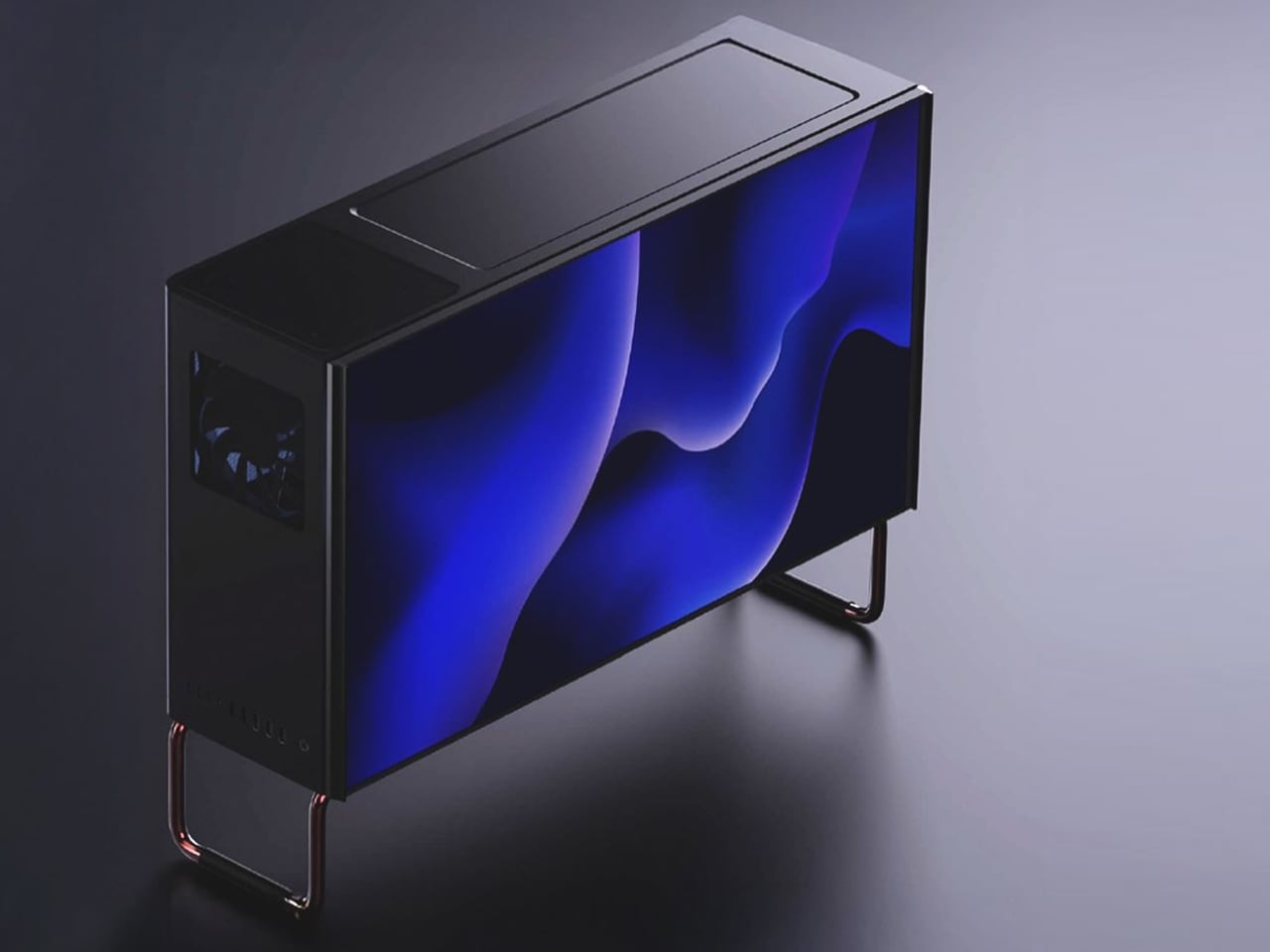
Conceived on two metal stands, this all-in-one PC appears in a boxy form with storage and computer innards tucked behind the monitor. If you are someone who is often bothered by the awkward space behind the monitor, which has no purpose because it’s either too shallow to store something or too cluttered with wires, and you don’t want to add to the visual displeasure, then the Kakao is what you should be looking at with interest.

It turns the often-ignored space behind the monitor into a useful space with its design that is a combination of a PC and a storage cabinet. The furniture integrated all-in-one PC reimagines how the monitor looks and functions: instead of leaving the space vacant, Kakao extends the screen into a horizontal enclosure that houses computer parts along with storage for everyday things.

I am not definite about how we are supposed to use the Kakao on the desk with all that bulk, but once it is there, there is definitely going to be less clutter. I can already see my Bluetooth speaker, power strip, gaming controller, pen stand, and other stationery disappearing from my desk into the cabinet.

I’m not sure about the monitor’s screen size or the computing components we are getting with it. However, that the PC has a mirror-polished stainless steel frame with PVD finish. The horizontal cabinet is completely closed on the side where the computer innards sit, while the other half has a mesh panel that ensures the heat can flow out and there’s no hindrance in using the computer.

On the front, the monitor slides sideways to reveal or conceal the storage shelves inside. The Kakao speakers and power slot are placed on the bottom panel, while the connectivity ports are seen on the side. The latter I believe, is a terrible idea. Ports on the side of the storage cabinet will end up allowing cables to clutter outside the all-in-one PC, defying its actual purpose. I think overall it is a decent idea, and the designer will think about getting the ports on the inside with cable cutouts to ensure decluttering.

The post This all-in-one PC concept reimagines how the monitor looks and functions first appeared on Yanko Design.
We Saw the AtomForm Palette 300 at CES, Now It Looks Even More Interesting

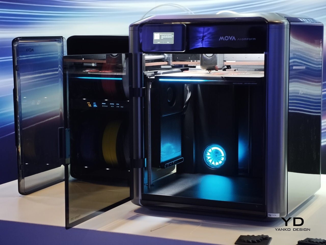
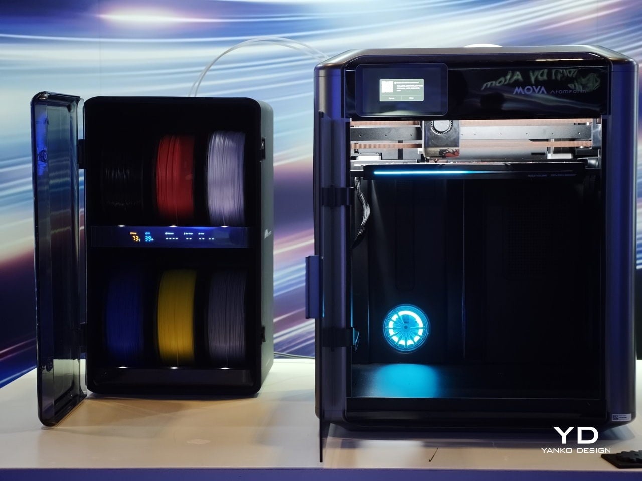
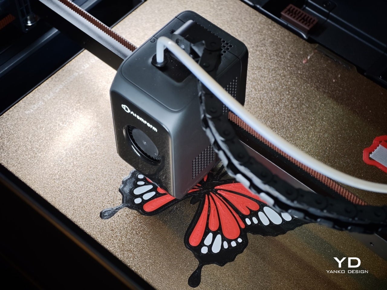
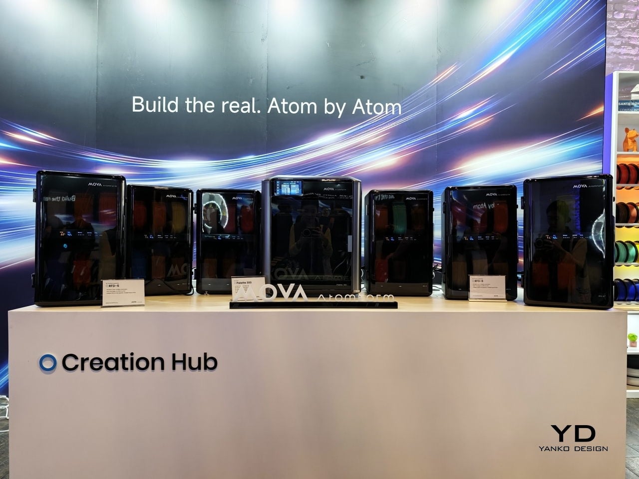
We first saw the Mova AtomForm Palette 300 at CES earlier this year, where its unusual approach to multicolor 3D printing immediately stood out. Seeing it again at AtomForm’s San Jose demo event left an even stronger impression, especially in a category where most launches tend to focus on speed, build volume, or software polish rather than rethinking the workflow itself.

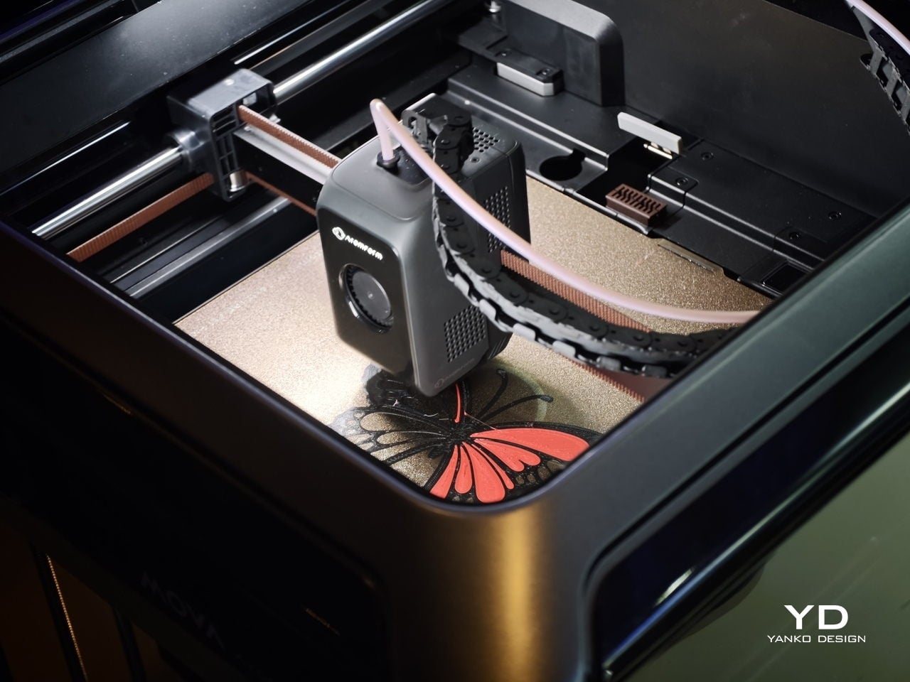
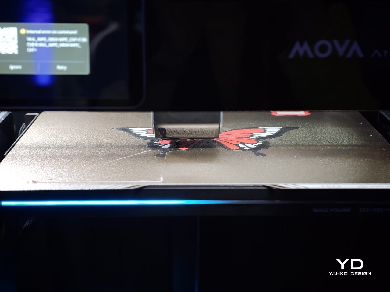
That is what makes the Palette 300 so interesting. Instead of treating multicolor printing as a feature layered onto a conventional FDM machine, Mova seems to have built this printer around one of the biggest frustrations in the category. For anyone who has spent time with multicolor 3D printers, that pain point will feel very familiar.

Designer: MOVA

Switching between colors or materials usually means purging filament over and over again before printing can continue. It is messy, wasteful, and often slow, with purge towers piling up next to the final print. The end result can still look impressive, but the process behind it rarely feels elegant.

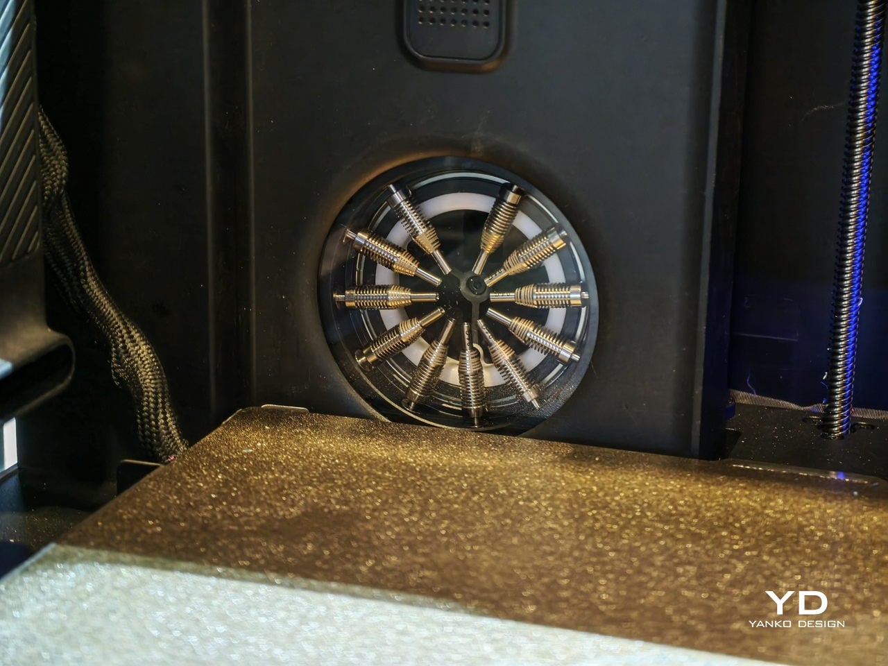
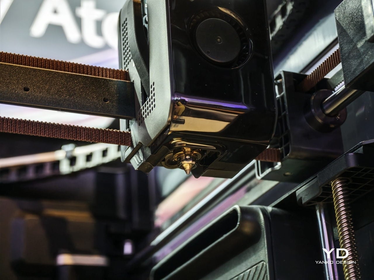
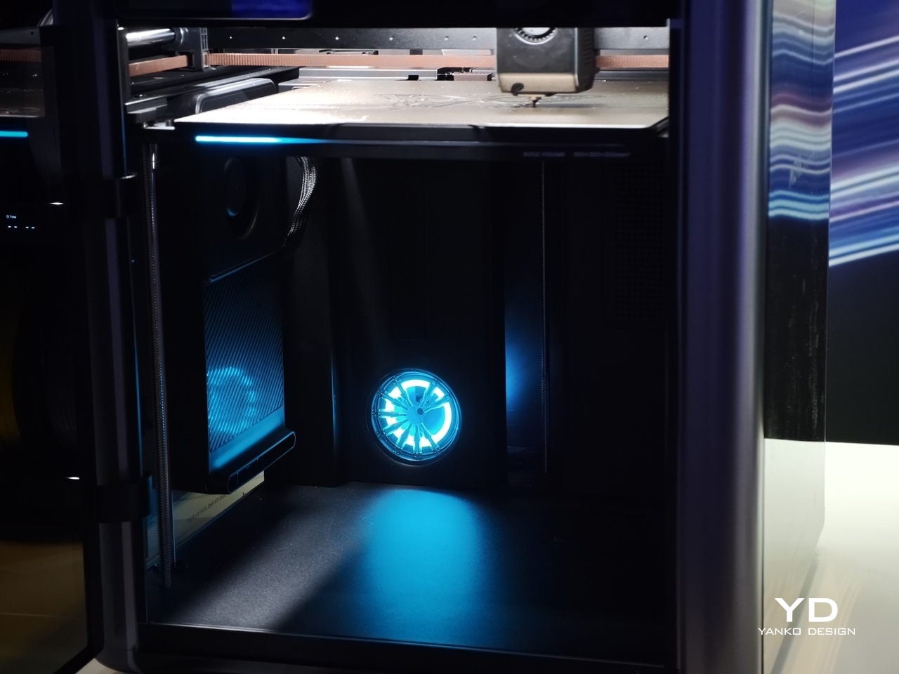
The Palette 300 is designed to tackle that problem in a more inventive way. Its headline feature is what Mova describes as the world’s first automatic 12-nozzle swapping system. Rather than constantly purging filament every time a color or material change is needed, the printer swaps to another nozzle that is already loaded. In theory, that means cleaner transitions, less wasted material, and a much smoother path to complex multicolor prints.

At the San Jose demo, that concept felt like the real story behind the machine. Plenty of 3D printers promise better quality or faster output, but the Palette 300 seems more focused on improving the actual experience of multicolor printing. That gives it a different kind of appeal. It is not just trying to be faster or bigger. It is trying to make a frustrating process feel smarter.

The rest of the hardware helps support that pitch. AtomForm says the system can support up to 12 materials and up to 36 colors in one print setup, which is far beyond what most consumer-level multicolor machines currently offer. The company also says nozzle swaps can be up to 50 percent faster and filament waste can be reduced by up to 90 percent compared with traditional purge-based systems. If those claims hold up in broader real-world use, the Palette 300 could become a very compelling option for makers, designers, and small creative studios that want more ambitious color work without the usual trade-offs.

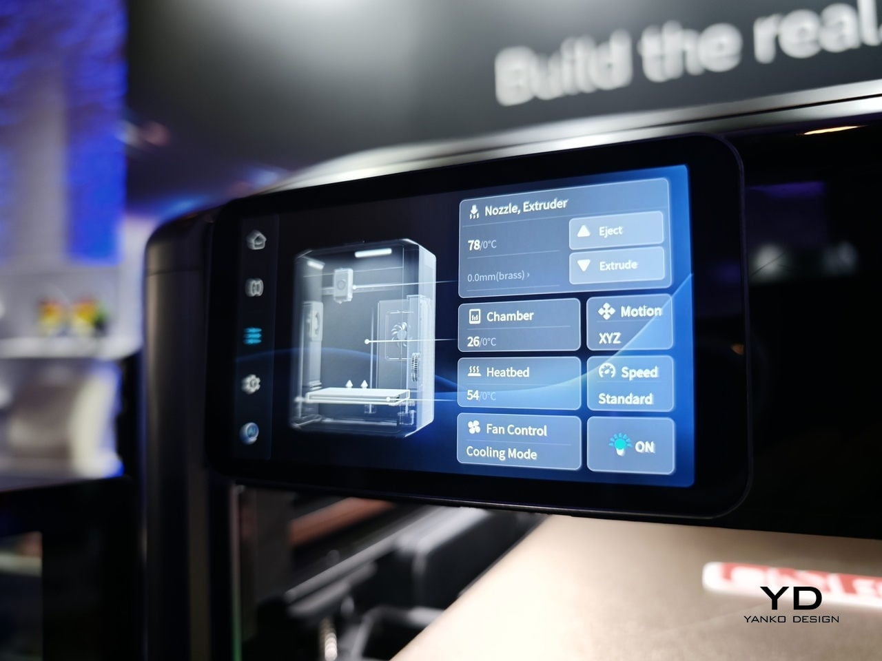
There is also a serious performance story here. The Palette 300 is equipped with FOC step-servo motors and is rated for speeds up to 800 mm/s, with acceleration up to 25,000 mm/s². That puts it firmly in the high-speed conversation, but the machine is not just about raw pace. AtomForm is also emphasizing precision, thanks to a smart positioning system that identifies nozzle attributes and compensates for microscopic alignment variations in milliseconds. On paper, that should help maintain consistency even in more demanding prints.

Another detail that stands out is the RFD-6 filament management system, which combines drying, storage, and feeding in one setup. Its dual-zone design allows one section to dry filament while another feeds material into the printer. That may sound like a smaller feature compared with the nozzle-swapping system, but it speaks to the broader thinking behind the machine. The goal seems to be reducing friction across the entire printing workflow, not just solving one isolated issue.

So, is this the best multicolor 3D printer? Right now, it is probably more accurate to say it is one of the most intriguing. The Palette 300 brings a genuinely fresh idea to a space that can often feel iterative, and that alone makes it worth paying attention to. Its approach to nozzle swapping could prove to be a meaningful step forward for multicolor FDM printing, especially if it delivers on waste reduction and speed in everyday use.

After seeing it first at CES and then again in San Jose, my takeaway is that the MOVA AtomForm Palette 300 has the potential to be a standout machine for anyone who cares about multicolor printing. It is ambitious, technically interesting, and clearly designed around a real user pain point. Whether it becomes the best multicolor 3D printer will depend on long-term testing, software reliability, and how well the full system performs outside the demo environment. Even so, it already feels like one of the most promising new entries in the category.

The post We Saw the AtomForm Palette 300 at CES, Now It Looks Even More Interesting first appeared on Yanko Design.
Samsung’s $400 Tab Keyboard Costs More Than Apple’s: Worth It?

The tablet-as-laptop pitch has been a hard sell for years, and a lot of the blame lands on the accessories. Keyboard covers for Android tablets have historically been thin on features and even thinner on build quality, which makes the whole productivity argument feel shakier than it should. Samsung’s $1,200 Galaxy Tab S11 Ultra is serious hardware, and for a while, its keyboard options weren’t keeping up.
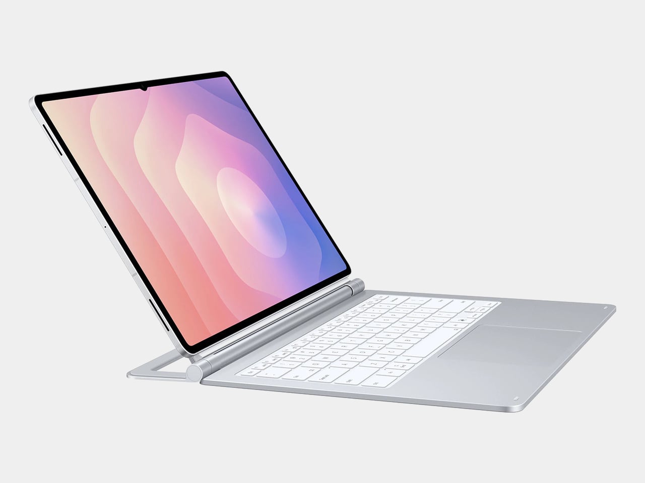
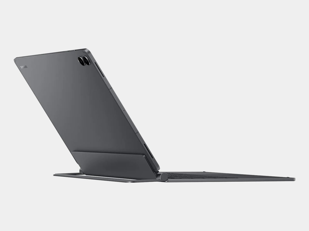
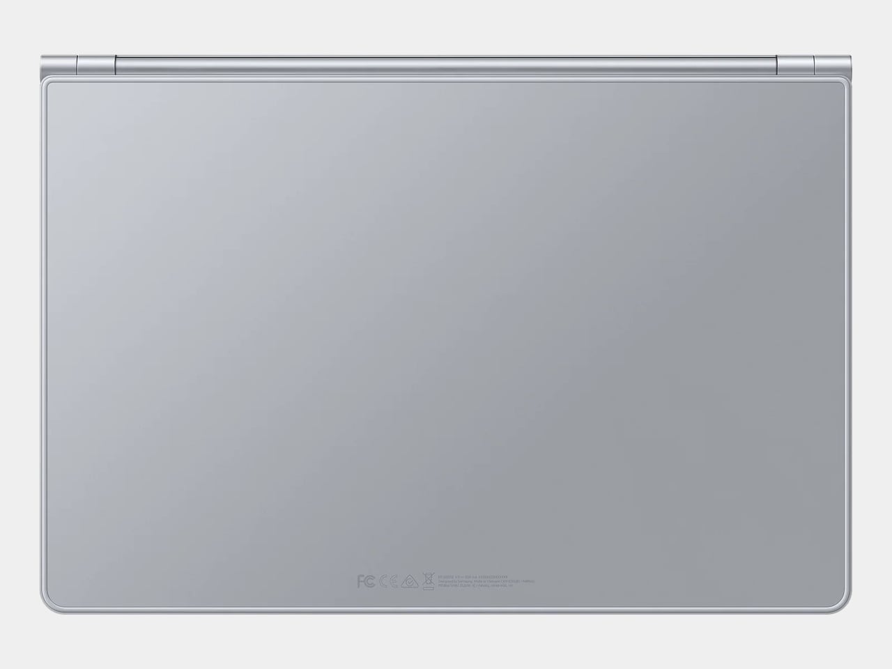
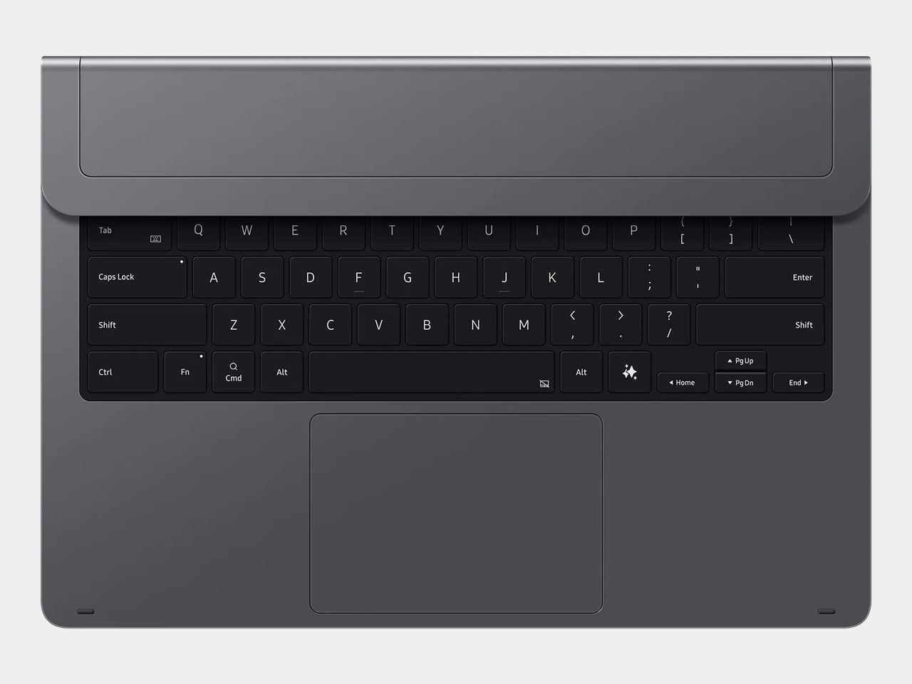
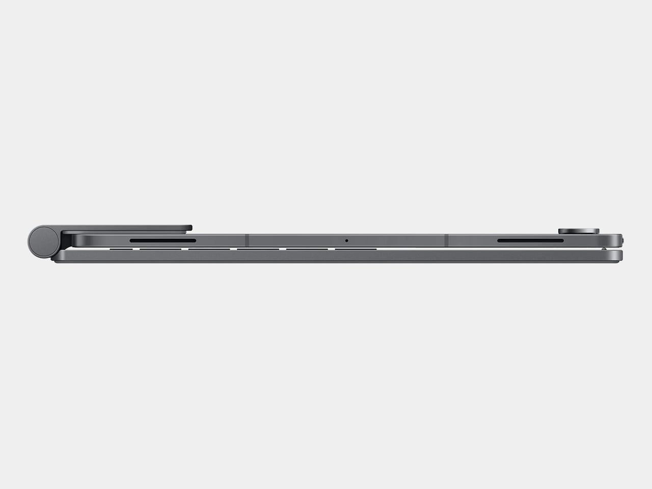
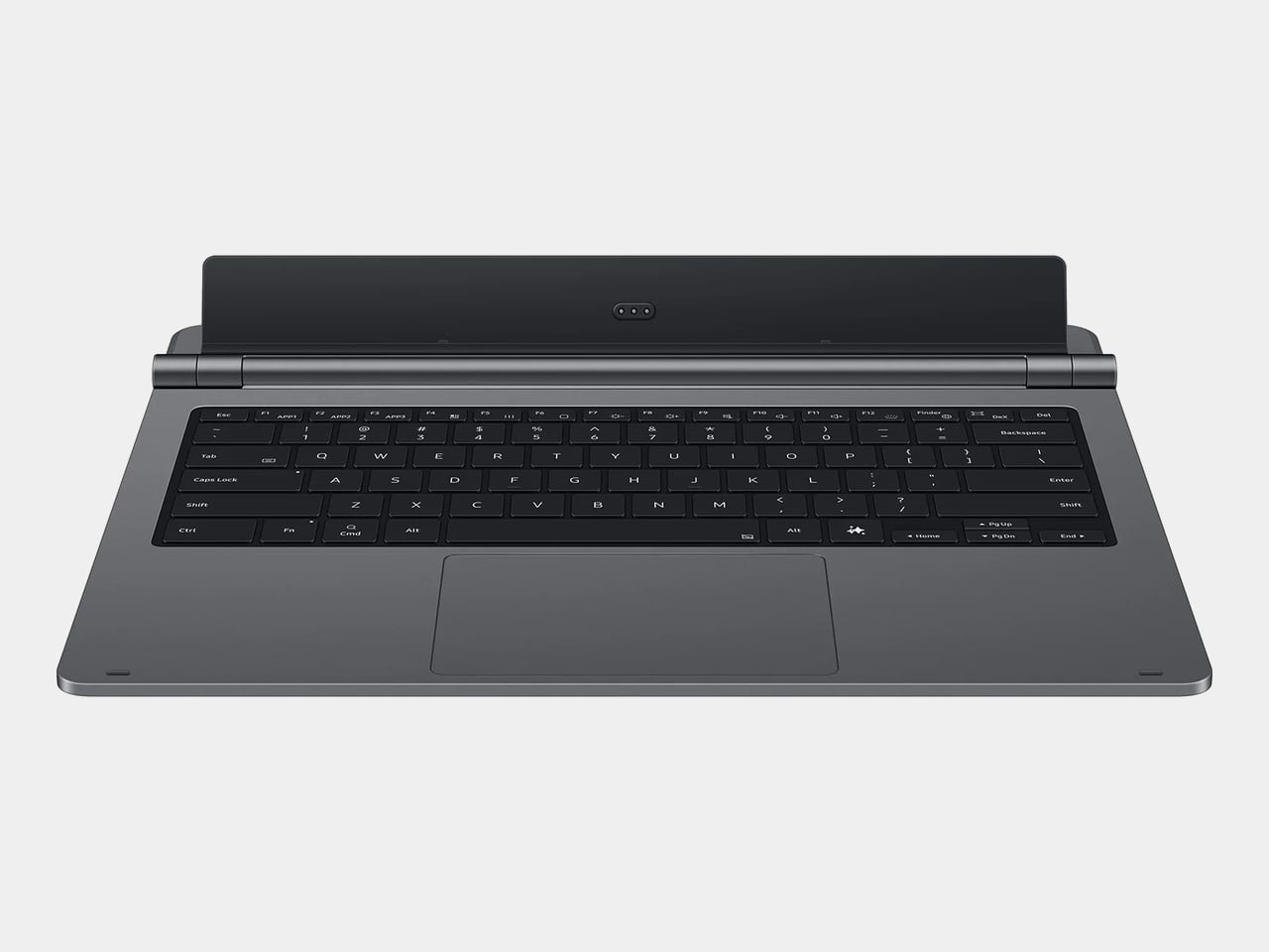
The Galaxy Tab S11 Ultra Pro Keyboard is Samsung’s answer to that. Available in Gray and Silver for $399.99, it connects via pogo pins at the rear of the tablet, with no Bluetooth pairing or cables required. Opening the lid wakes the device, and closing it puts everything to sleep, so the whole thing behaves less like an accessory and more like a laptop right from the start.

Designer: Samsung

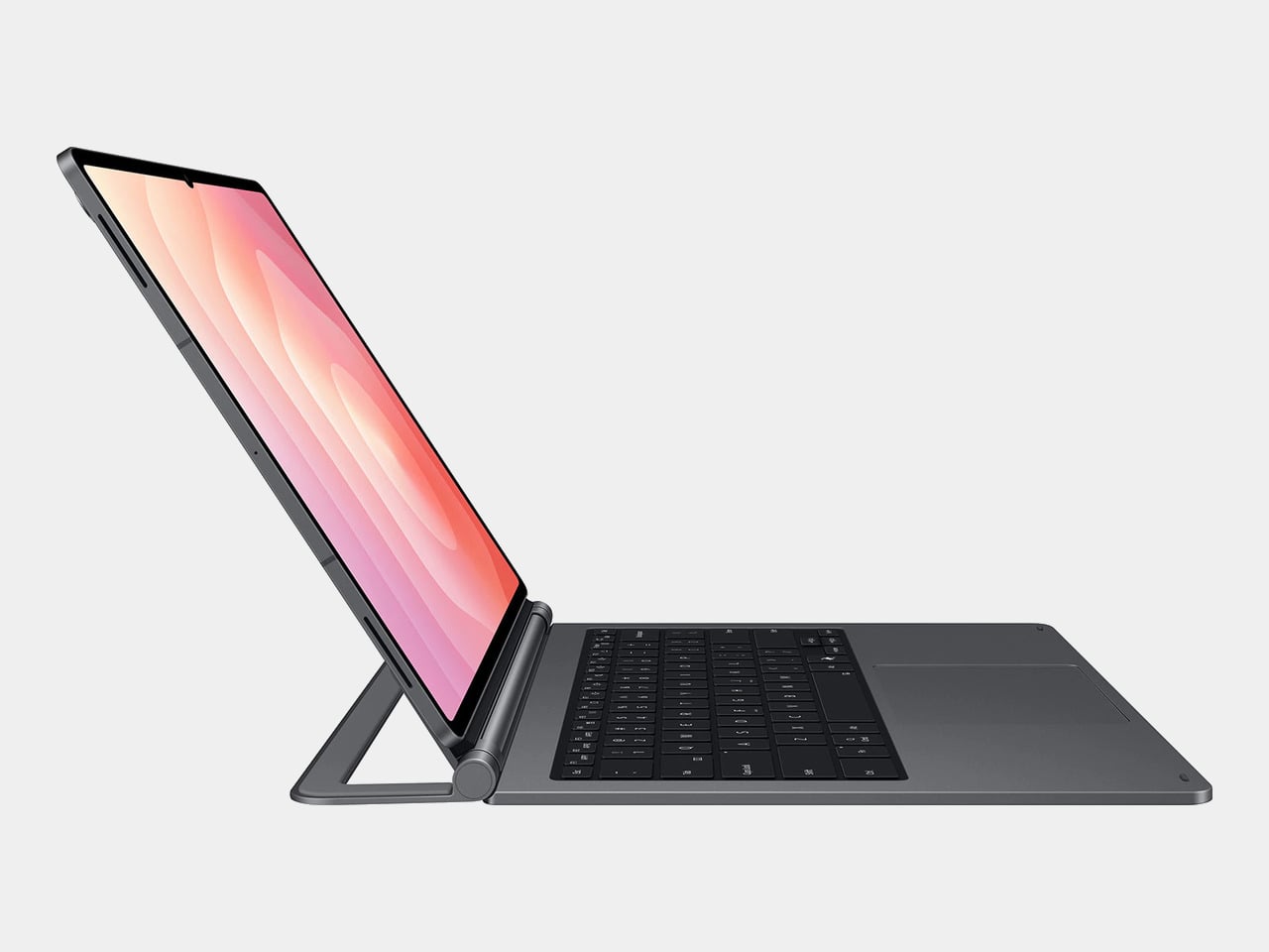
The build quality reflects the price in most of the right ways. The body is aluminum alloy, the hinge is reinforced metal, and a secondary kickstand at the rear props the whole assembly into a stable, laptop-like posture at whatever angle you prefer. The result looks noticeably more considered than Samsung’s Book Cover Keyboard Slim, which never really felt like it belonged on a $1,200 device.

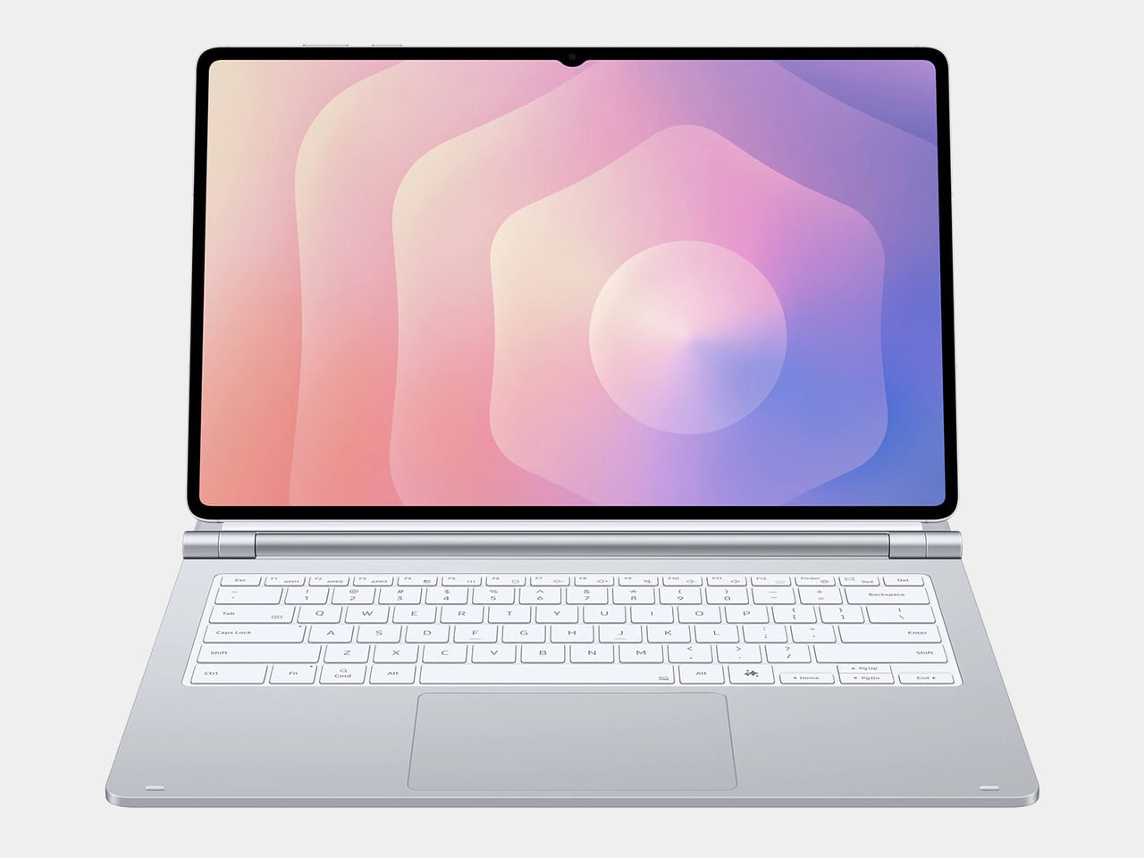
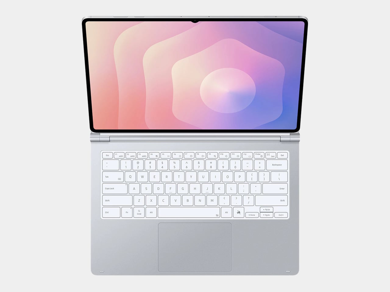
The 80-key layout goes beyond a standard QWERTY arrangement. A dedicated DeX key switches the Tab S11 Ultra into Samsung’s desktop mode, where apps run in freely movable windows, closer in feel to Windows than Android. A Galaxy AI key gives you one-press access to AI tools without switching apps, and three customizable function keys can each be mapped to open whatever you need most.

For long stretches of writing or working across multiple documents, those shortcuts matter more than they might look on a spec sheet. The pogo pin connection also eliminates the Bluetooth pairing and dropout issues that plague most wireless keyboard accessories. And since the Pro Keyboard draws power directly from the tablet, there’s no separate battery to charge, and nothing to run out at an inconvenient moment.

The trackpad is 14.6% larger than the one on Samsung’s previous keyboard accessory, a small percentage that translates to real estate you’ll actually notice in DeX mode. The extra surface area gives you more room for precise gestures and window management, and that significantly reduces the number of times you’re forced to reach up and touch the screen during long work sessions.

At $399.99, the Pro Keyboard is nearly twice the price of Samsung’s own Book Cover Keyboard Slim and $50 more than Apple’s Magic Keyboard for the 13-inch iPad Pro. Adding it to the Galaxy Tab S11 Ultra’s $1,200 starting price puts the total at around $1,600, which puts you in comfortable MacBook Air territory, minus the dedicated operating system and the convenience of a unified device.

There are also some obvious gaps at this price. The Pro Keyboard has no backlighting, a noticeable oversight for anyone who regularly works late or in dim spaces. It also doesn’t protect the back of the tablet, which is a curious omission for a $400 accessory. And since it’s designed exclusively for the Galaxy Tab S11 Ultra, there’s no using it with anything else in Samsung’s lineup.

The post Samsung’s $400 Tab Keyboard Costs More Than Apple’s: Worth It? first appeared on Yanko Design.