Smart Pilates At Home: Why This Foldable Reformer Might Replace Your Expensive Studio Membership

Reformer Pilates studios charge $35 to $60 per class. If you go twice a week, you’re spending roughly $300 to $500 every month. Three months of that schedule costs more than Pavo’s $899 price tag. Six months in, you’ve paid double what the machine costs. And you’re still driving across town to work out on someone else’s schedule. Pavo is a foldable reformer designed to fit under beds or sofas, weighing 66 pounds and measuring just 51 by 26 inches when folded. It sets up in about five seconds by lifting one end with your foot. The aluminum frame supports users up to 220 pounds and includes four adjustable foot bar heights plus six resistance cords across three tension levels.

Pavo’s smart sensors separate it from the budget foldable reformers on Amazon. The system tracks your movements during workouts and syncs data to an app with guided classes sorted by skill level and length. It flags form problems as they happen and charts your progress over time. The reformer handles over 100 exercises and comes with ten permanent free courses. For anyone practicing Pilates multiple times weekly, the math makes sense: the machine pays for itself in saved studio fees while putting workouts entirely on your terms.

Designer: Pavofitness

Click Here to Buy Now: $898 $1499 ($600 off). Hurry, only 19/150 left! Raised over $513,000.
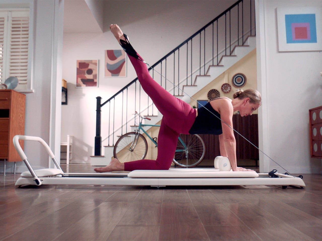
While you’ll find flimsy-yet-portable reformer pilates machines for $150-ish bucks online, they don’t have the sensor array that Pavo does. Internal monitors measure carriage velocity, detect platform instability, and identify muscle fatigue through trembling patterns. That last bit is pretty crucial because trembling usually means you’re either pushing too hard or your form collapsed. The system catches it in real time and adjusts the coaching prompts accordingly. Pavo’s sensors analyze movement quality, which is the entire point of Pilates in the first place. You’re not counting how many times the carriage moved, you’re getting feedback on whether you moved it correctly. Think Peloton, but entirely for Pilates.

The aluminum construction uses three different alloys: 3003-H24, 6061-T3, and 6063-T5. Those are aircraft-grade materials chosen for specific properties. 6061-T3 handles structural stress without deforming. 3003-H24 resists corrosion. 6063-T5 keeps weight down while maintaining rigidity. The frame went through over 100,000 stress test cycles on the resistance springs and cables across all tension levels. The rollers use a design that keeps noise below 30 decibels during use, which is quieter than a whisper if you’re being technical about it. The PU leather upholstery resists scratches and wipes clean, which matters when you’re storing this thing under furniture and dragging it out multiple times a week.

Pavo measures 95.2 by 26.4 by 9.9 inches when unfolded, which is nearly eight feet long. That’s full-size reformer territory. When you fold it, the footprint drops to roughly the size of a standing yoga mat. The shoulder rests detach for even tighter storage. You’re fitting genuine reformer dimensions into a package that slides under a standard bed frame. The five-second setup works by lifting one end with your foot so the mechanism glides into position. No screws, no assembly, no wrestling with parts. Most foldable reformers compromise stability to achieve portability. Pavo uses that three-alloy frame and locking carriage to maintain rigidity even at 66 pounds total weight.

Ten permanent courses come free, organized by difficulty and workout length. Additional content sits behind a subscription, which is standard for connected fitness gear at this point. The guided workouts sync with the sensor data, so the instructor prompts adjust based on your actual performance. If you’re lagging behind the pace, the app knows. If your form breaks down mid-exercise, you get corrected before you build bad habits. The progression tracking shows improvement over weeks and months, which turns out to be surprisingly motivating when you can see measurable gains in resistance levels or movement consistency. The gamified workout mode adds challenges that make sessions feel less like obligatory exercise.

Six resistance cords across three tension levels give you enough range to start as a complete beginner and scale up as you get stronger. The adjustable foot bar has four height settings to accommodate different exercises and body proportions. That’s the same functionality you’d find on studio equipment, just packed into a frame that weighs 66 pounds instead of 200-plus. The weight capacity tops out at 220 pounds, and the height limit sits at 6’3″. Those are real constraints worth knowing before you buy. If you’re taller or heavier than those specs, maybe a more substantial home gym might be on your watchlist. However, for the vast majority of people who practice Pilates, Pavo is a perfect investment that pays itself back in no time, and occupies barely any space, whether you’ve got a tiny home or a villament.

The frame comes in white, black, or pink. The PU leather matches the frame color. There’s no branding screaming at you from every angle. It looks closer to furniture than gym equipment, which matters when you’re storing it in a living space instead of a dedicated workout room. The attention to materials and finish quality shows up in the details: rounded edges, clean welds, smooth transitions where the folding mechanism meets the frame. This is industrial design that considered how the object exists in a home, eliminating ugly weld lines, sharp edges that your pinky toe almost always finds, and parts jutting out from the frame that peek out from under your bed or sofa.
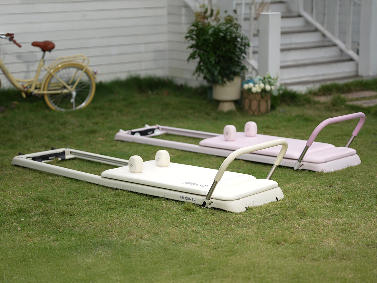
Pavo starts at $899 for the Super Early Bird package, which includes the reformer, straps, shoulder rests, springs, a USB charging cable, and a user guide. The Early Bird Professional Pack adds a sitting box for $950. There are also multi-unit packages for couples or studios buying in quantity. Shipping is estimated for June 2026, with delivery guaranteed according to the campaign terms. The machine comes with a one-year warranty and 10 free starter courses through the companion app.

Click Here to Buy Now: $898 $1499 ($600 off). Hurry, only 19/150 left! Raised over $513,000.

The post Smart Pilates At Home: Why This Foldable Reformer Might Replace Your Expensive Studio Membership first appeared on Yanko Design.
Someone Built a Working Mini Printing Press Out of LEGO and You Can Operate It

Before Gutenberg changed the world with movable type, knowledge traveled slowly, copied by hand from monastery to monastery. The printing press democratized information and sparked revolutions in science, religion, and politics. Now, a LEGO creator known as PrintNerd has brought that revolutionary technology into the hands of modern builders with a project that does more than sit on a shelf.

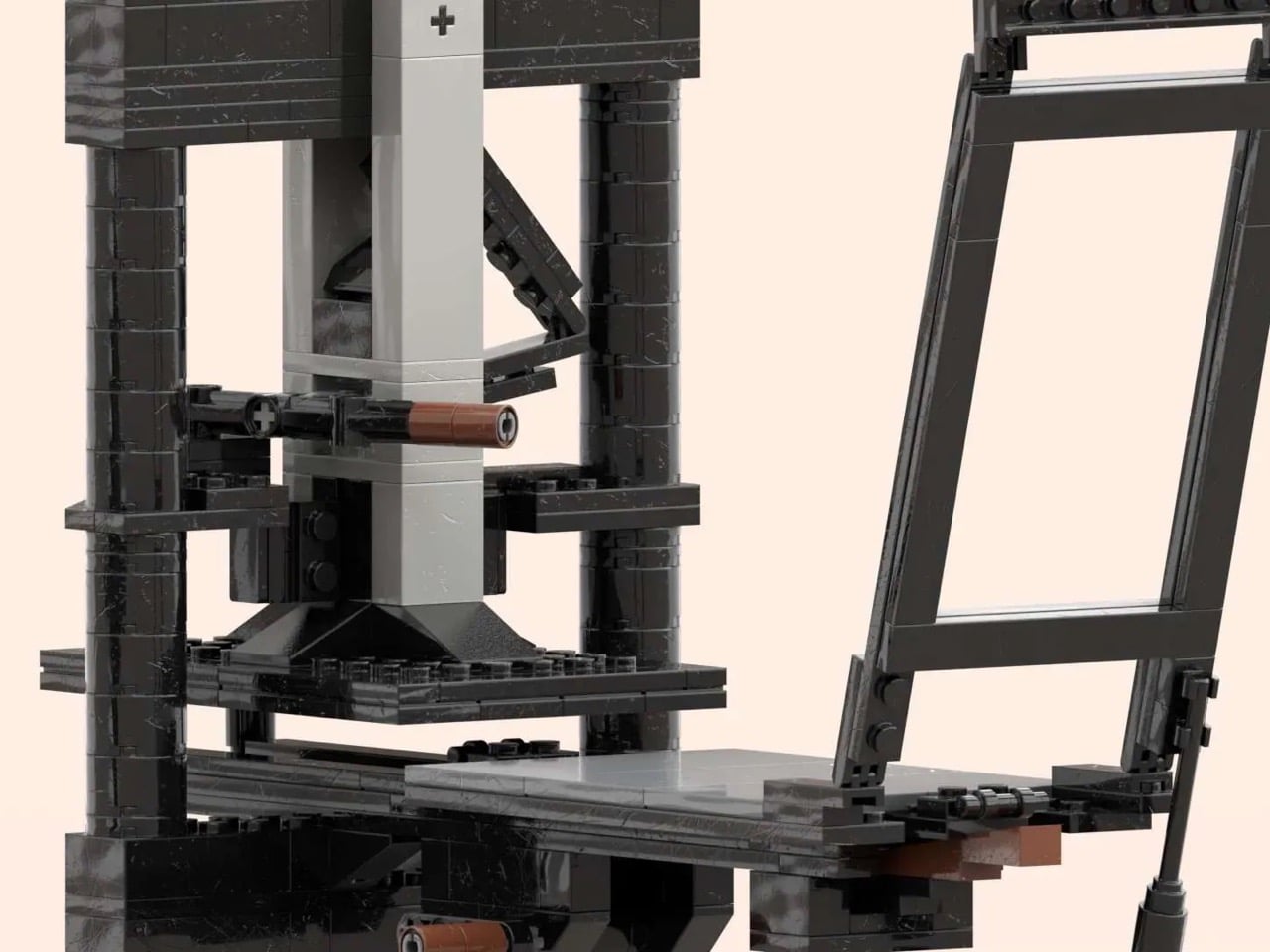
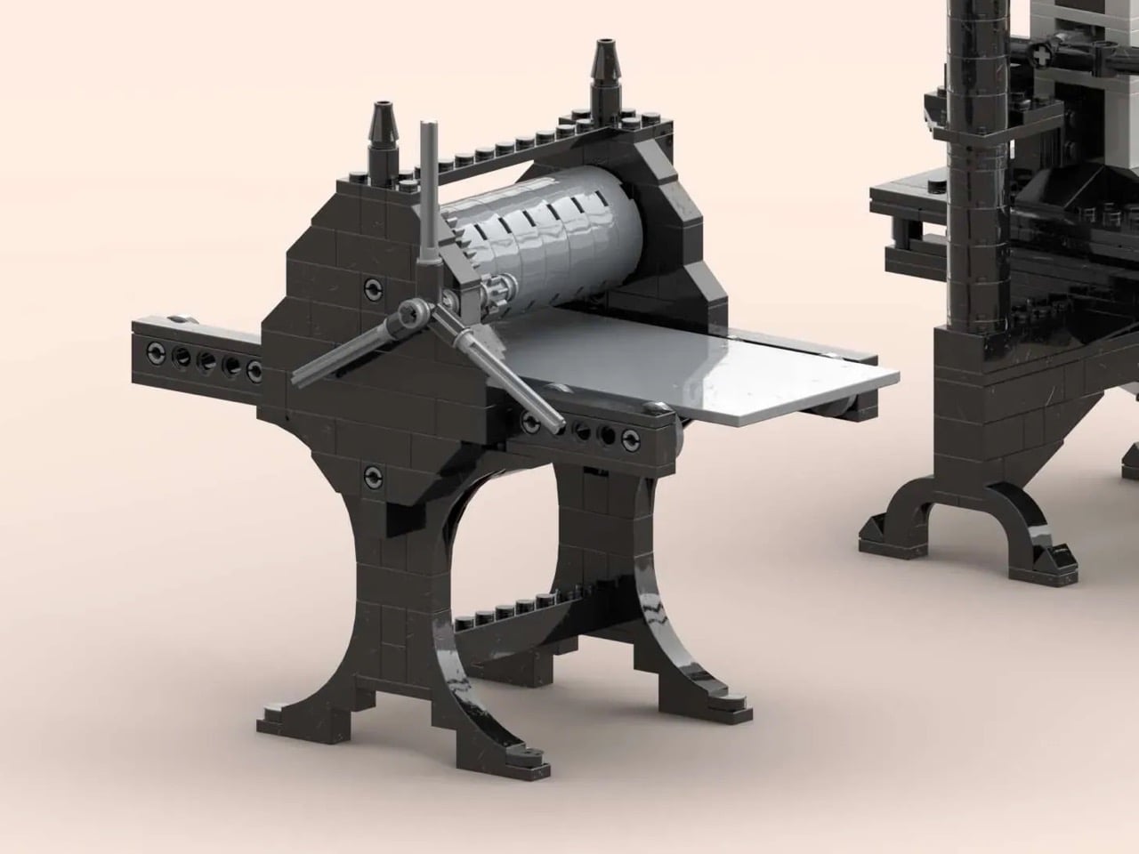
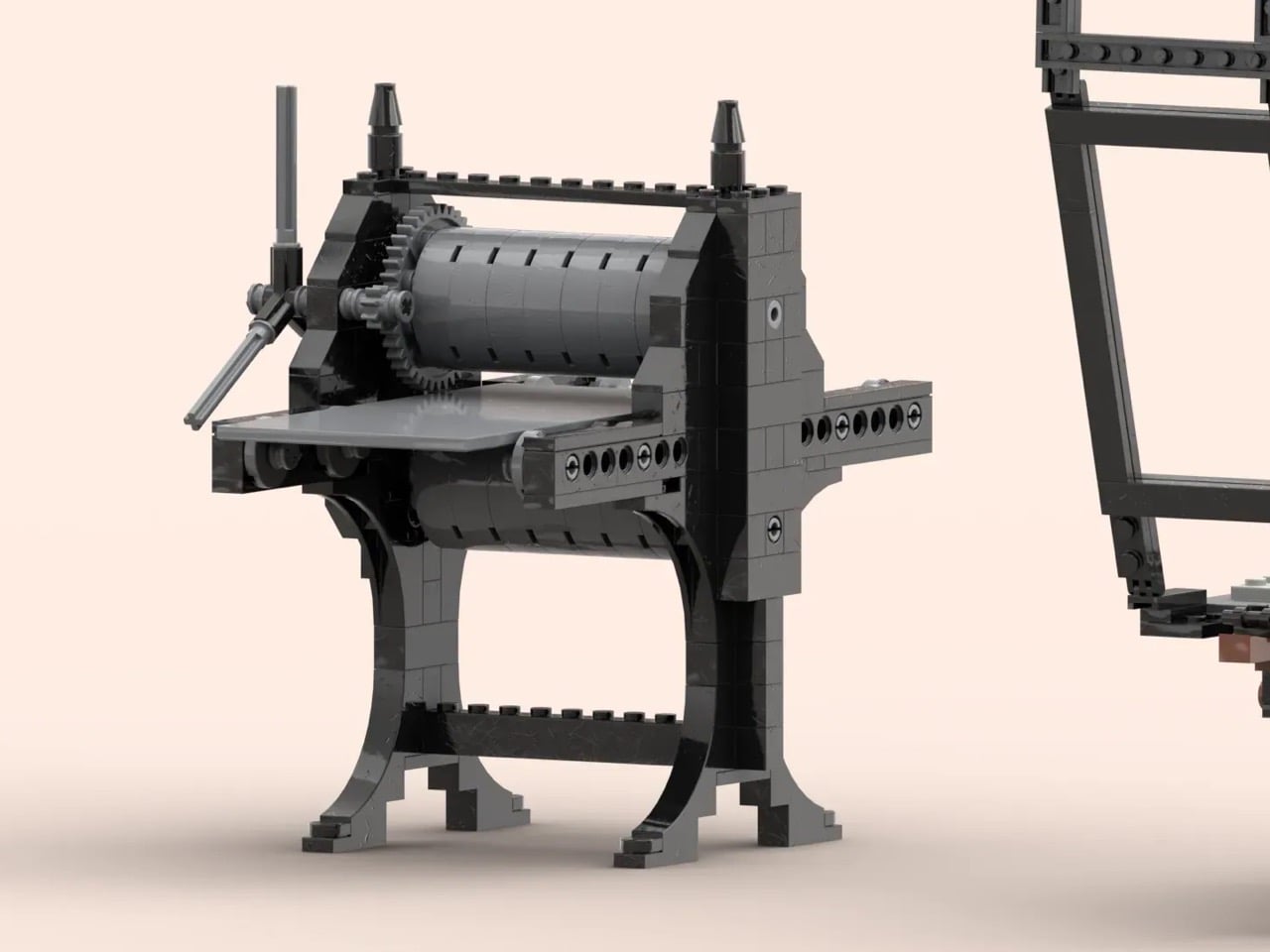
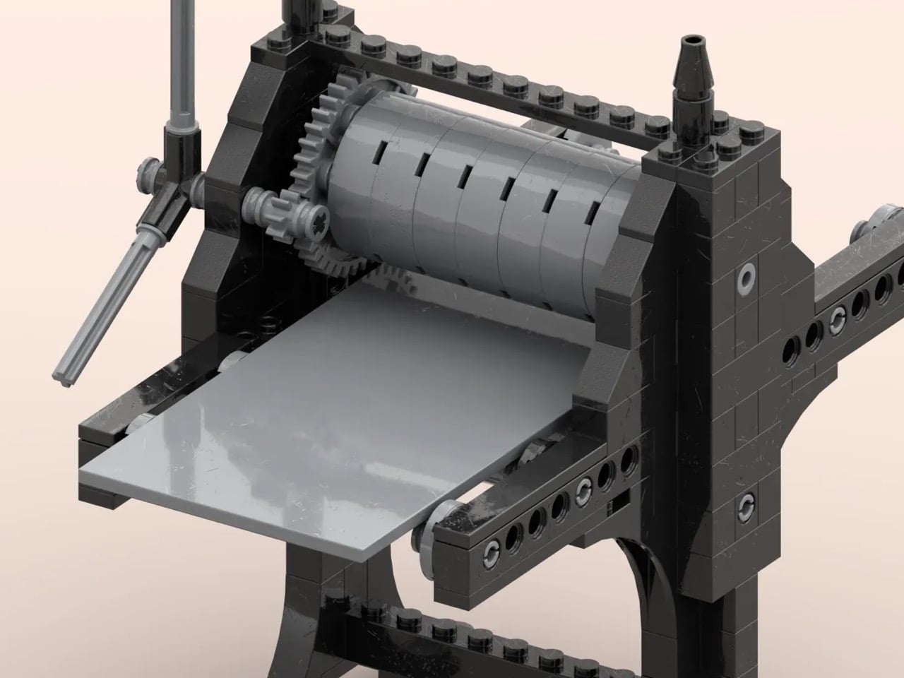
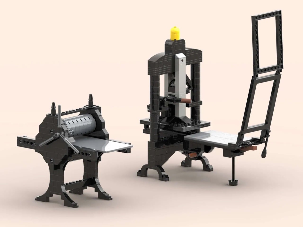
This LEGO Ideas submission features two fully functional printing presses built entirely from standard LEGO pieces. The lever-operated platen press and the roller-based press don’t just look the part. They actually work. Turn the handles, pull the lever, and watch centuries of engineering history play out in black, gray, and brown bricks. It’s a build that asks you to understand by doing, which is perhaps the most LEGO idea there is.

Designer: PrintNerd

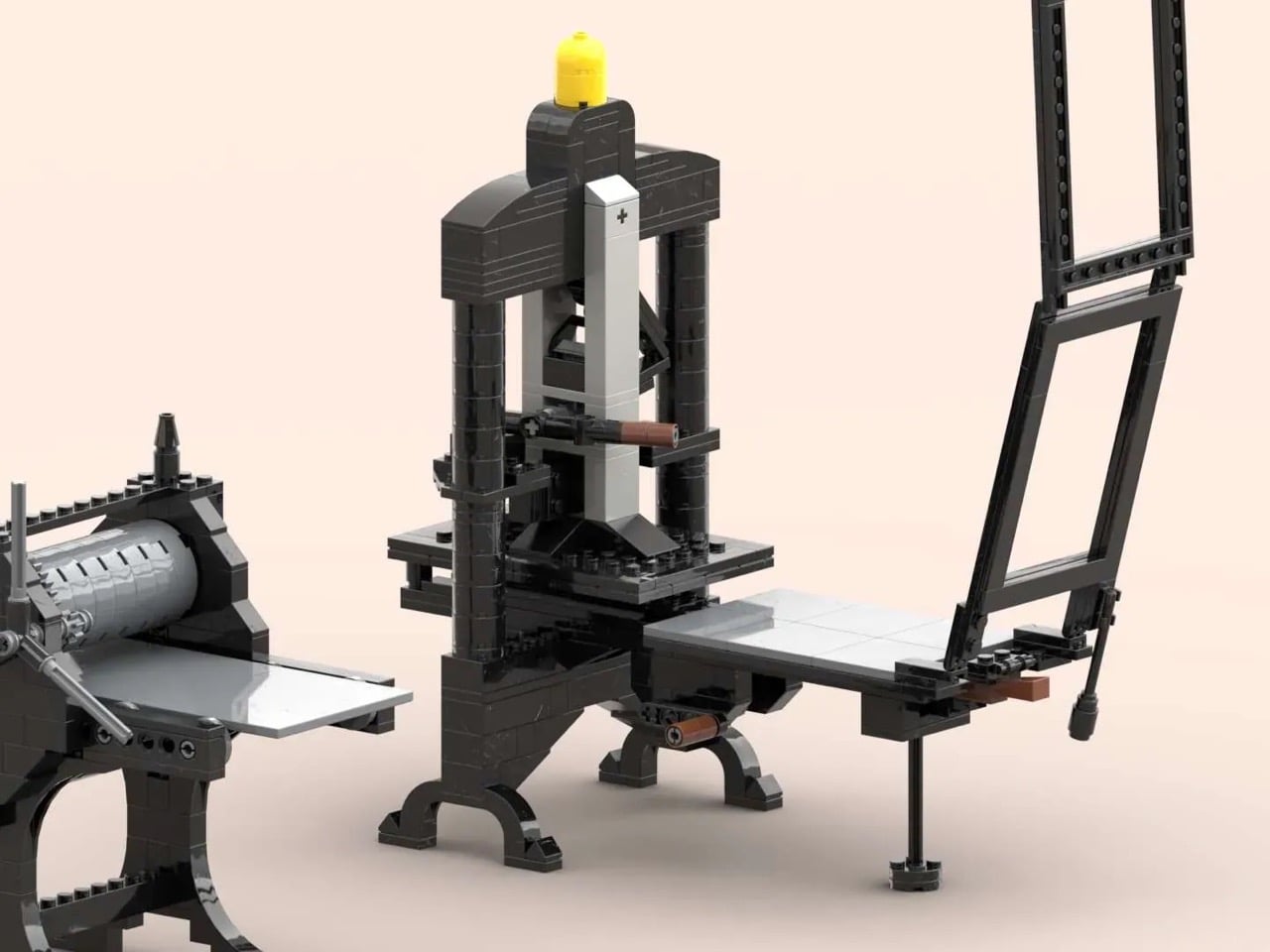
The larger of the two models is a 312-piece platen press inspired by the Albion Press, which was the workhorse of letterpress printing for over a century. You operate it by rotating a handle that moves the printing bed into position, then pulling down a lever to bring the platen into contact with the paper. The mechanism is completely exposed, which means you can actually see how the force transfers through the system. There’s a yellow minifigure head perched on top that serves no functional purpose whatsoever, but somehow makes the whole thing feel more approachable, less museum piece and more desktop companion.

The roller press comes in at 163 pieces and takes a completely different approach to the same problem. Instead of applying pressure from above, it feeds the printing bed horizontally through a set of compression rollers. The cylindrical roller is the visual centerpiece here, flanked by gear mechanisms that let you crank the bed through manually. Both presses use that industrial black and gray color scheme that makes them look like miniature antiques, which is fitting since they’re based on machines that are still in active use by printmakers today.

PrintNerd built these for a community that already exists but has been working with a gap in their toolkit. There are LEGO enthusiasts who’ve been building relief plates from standard bricks for years, arranging studs and tiles into printable patterns, then taking them to external presses to make actual prints. The LEGO system has been perfectly capable of creating the artwork but incapable of providing the pressure. This project closes that loop. You can now build your plate, build your press, and complete the entire process without leaving the ecosystem. Color me impressed.

The project currently sits at 844 supporters with 376 days left to hit the 10,000 threshold needed for LEGO’s official review. It’s already earned Staff Pick status, which gives it better visibility on the platform but doesn’t guarantee production. LEGO Ideas has a notoriously unpredictable approval process. Plenty of worthy builds with strong support never make it to retail shelves. But this one has something going for it that most submissions don’t, which is genuine utility beyond novelty. You’re not just displaying it. You’re using it to understand how mechanical advantage works, how gears transfer motion, how centuries-old engineering principles still hold up. If you think that’s enough to make this MOC (My Own Creation) worthy of existing, go ahead and cast your vote for the build on the LEGO Ideas website!

The post Someone Built a Working Mini Printing Press Out of LEGO and You Can Operate It first appeared on Yanko Design.
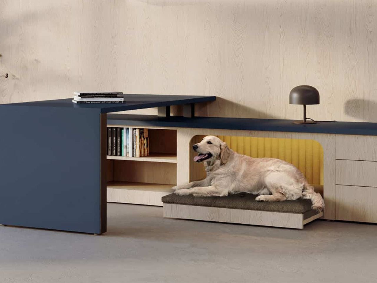
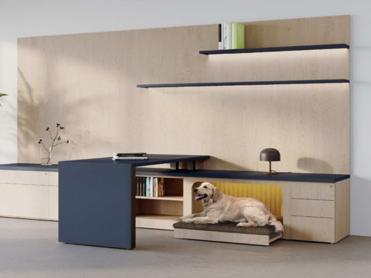
This Fold-Out Office Desk Acknowledges the Furry Friend Under Your Feet

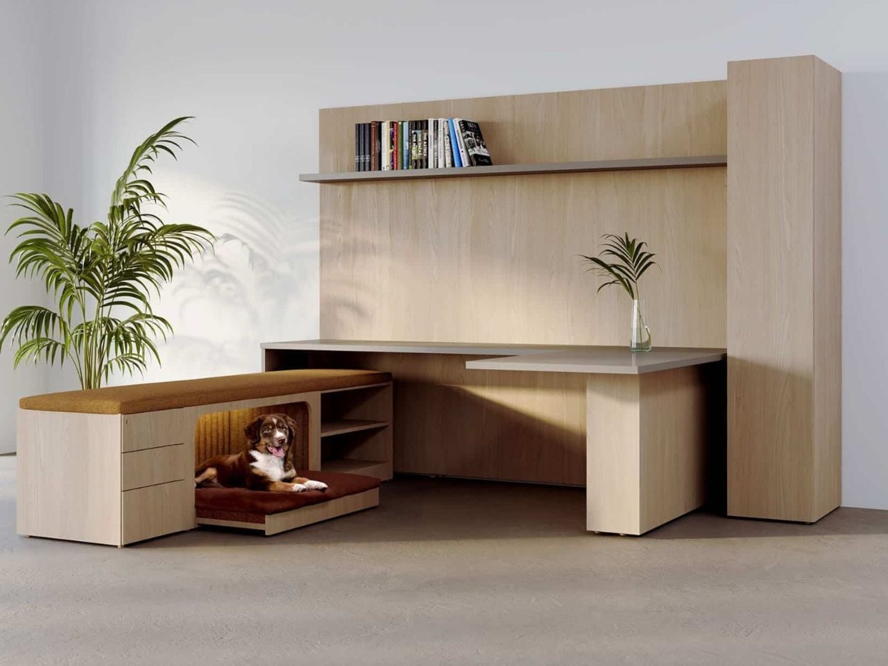
Office design has long focused on the visible: posture, productivity, aesthetics, and efficiency at eye level. But Central Bark, a desk designed by Chrissy Fehan for DARRAN, asks a quieter and more unusual question: what happens in the space beneath the desk?

At its surface, Central Bark looks exactly like what you would expect from a contemporary workplace system. The lines are clean, the proportions restrained, the materials warm yet professional. It belongs comfortably in a modern office without trying to announce itself. And that is precisely the point. The design does not rely on spectacle. Its intelligence lives in the details.

Designer: Chrissy Fehan

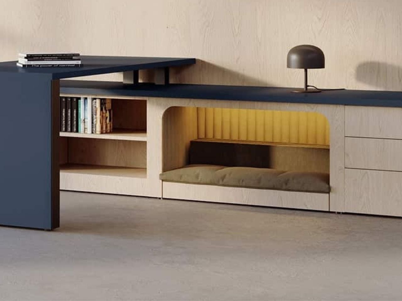
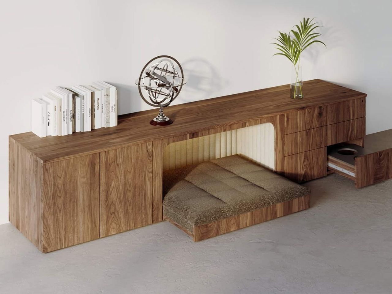
Integrated seamlessly into the desk is a built-in pet nook, a sheltered and intentional space designed for a dog to rest while their human works. Importantly, this is not an accessory or a playful add-on. There is no novelty bed clipped on at the last moment, no awkward cushion pushed beneath a workstation. The pet space is conceived as part of the desk from the very beginning and treated with the same seriousness as legroom, surface depth, or cable management.

The thinking behind Central Bark reflects a broader shift in how we understand work environments today. As offices become more flexible and as the line between home and workplace continues to blur, dogs are increasingly present. In creative studios, startups, and hybrid offices, they are already there, curled up under desks, navigating chair legs, occupying borrowed corners. Central Bark does not invent this reality. It is simply designed for it.

What makes the solution compelling is its restraint. There is no attempt to over-engineer the experience or turn pet-friendly design into a visual statement. Instead, the desk quietly absorbs this need into its form, maintaining a professional aesthetic while acknowledging that workspaces are lived-in and shared environments.

There is also a deeper layer of inclusivity embedded in the design. By accommodating dogs in a natural and integrated way, Central Bark supports people who rely on service animals, offering a workspace that adapts without drawing attention. It removes the need for special adjustments or explanations, allowing both human and canine to coexist comfortably within the same footprint.

One of the most thoughtful aspects of the design is the flexibility of the pet nook itself. The bed is not fixed in place. It can slide forward to give a dog more room to stretch or shift during the day, then tuck neatly back into alignment with the desk edge when not needed. This small gesture keeps the workspace visually tidy and spatially efficient, preserving the desk’s clean silhouette while offering adaptability where it matters.

Rather than proposing a radical reimagining of office furniture, Central Bark offers something subtler and arguably more impactful. It reframes good design as responsive design, attentive to how people actually live, work, and bring their whole lives into shared spaces. It is a reminder that inclusivity does not always require bold statements or complex systems. Sometimes, it is as simple as designing for the quiet presence under the desk, the one that is already there, waiting to be acknowledged.

In that sense, Central Bark is not just a desk for people with dogs. It is a case study in empathetic design, showing how small and thoughtful decisions can make workplaces feel more humane, grounded, and real.

The post This Fold-Out Office Desk Acknowledges the Furry Friend Under Your Feet first appeared on Yanko Design.
IRIS 4.0 is a Fabric-Covered Smart Speaker Orb That Watches from Above

Smart speakers usually sit on kitchen counters, bookshelves, or bedside tables, plastic cylinders and pucks buried behind plants and picture frames. Their microphones and speakers are often half-blocked, and they still feel like gadgets you add to a room rather than part of the room itself. Nobody seems to know where these devices actually belong, so they end up scattered across every flat surface, fighting for space and power outlets.

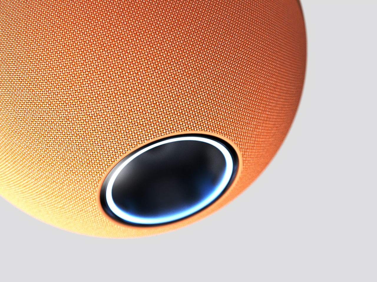
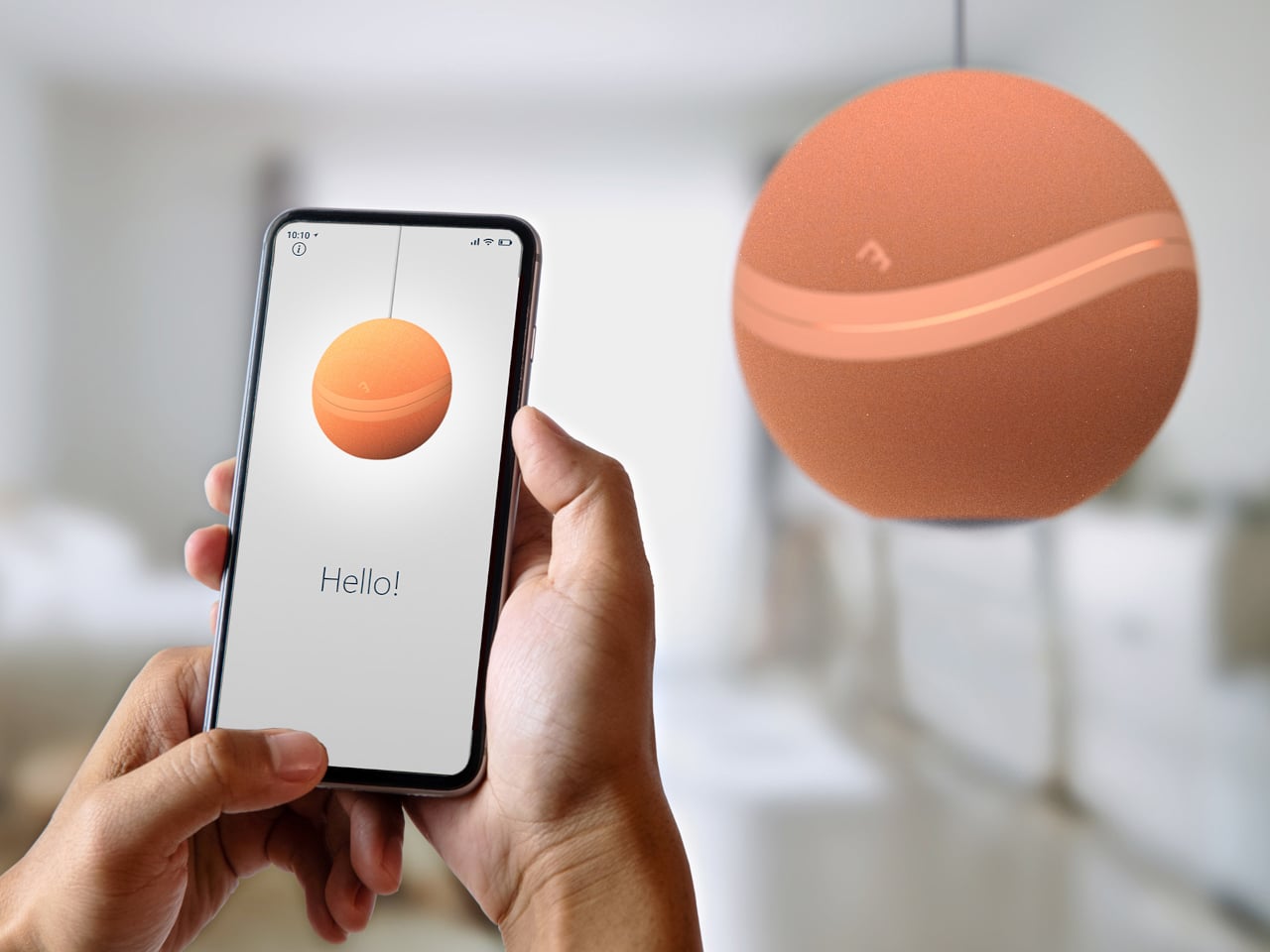
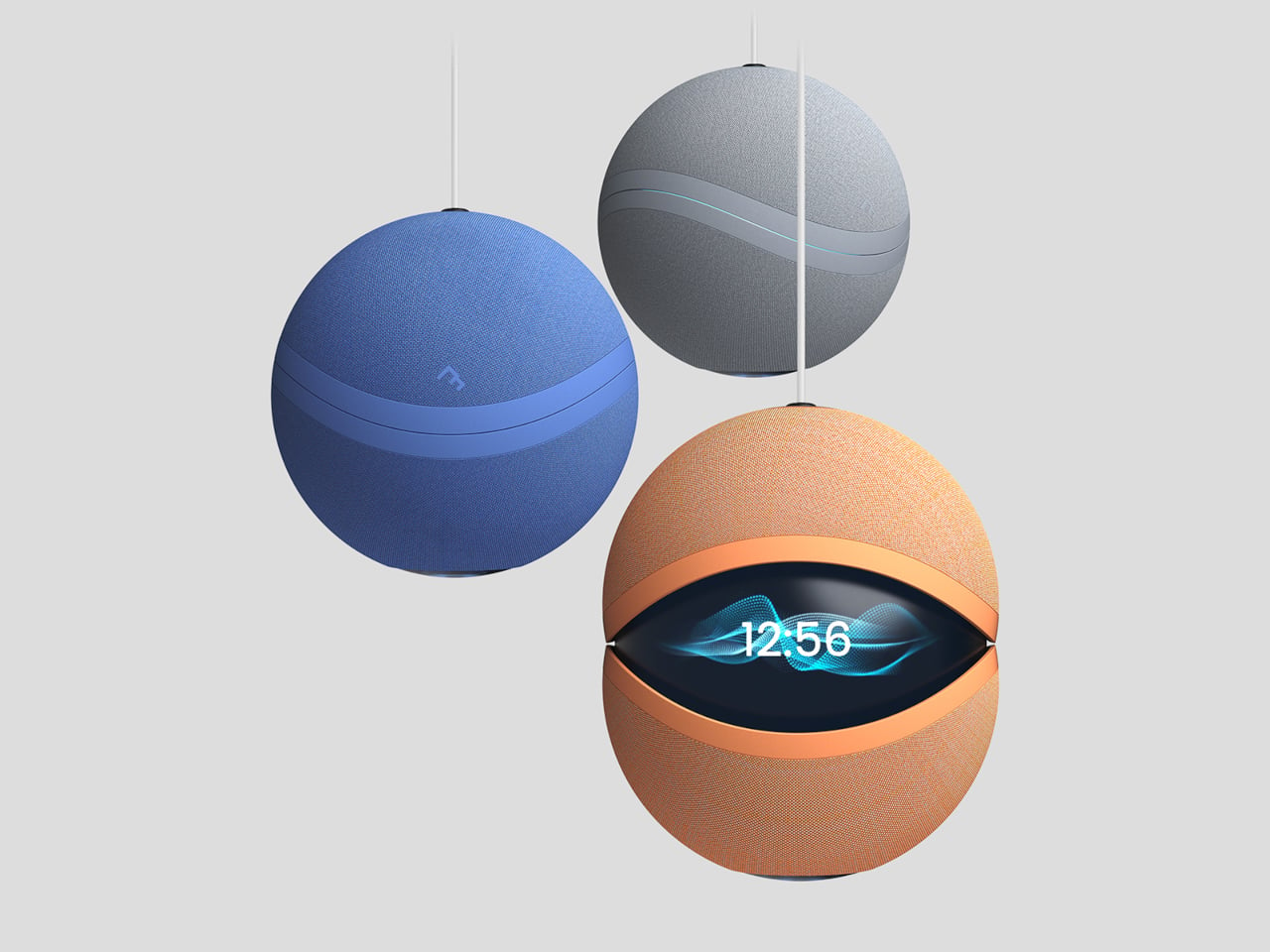
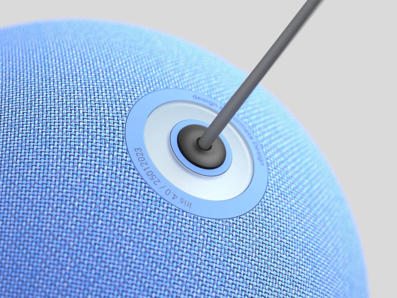
Formeta’s IRIS 4.0 is a fabric-covered sphere that hangs from the ceiling like a light fixture instead of sitting on a shelf. The AI assistant concept is designed for Industry 4.0, meant to integrate into modern living spaces by becoming infrastructure rather than décor. Its central, elevated position keeps it unobstructed while handling security monitoring, sound control, and lighting, turning the assistant into something closer to ambient architecture than a countertop gadget.

Designer: Formeta

The studio frames it as “a ceiling-mounted smart assistant that vanishes into the environment while expanding control, sound, and presence.” Removing devices from surfaces frees up space and makes tech feel less like an object and more like a part of the building. You could walk into a room where there is no visible speaker or hub, yet sound, light, and automation quietly respond when you speak.

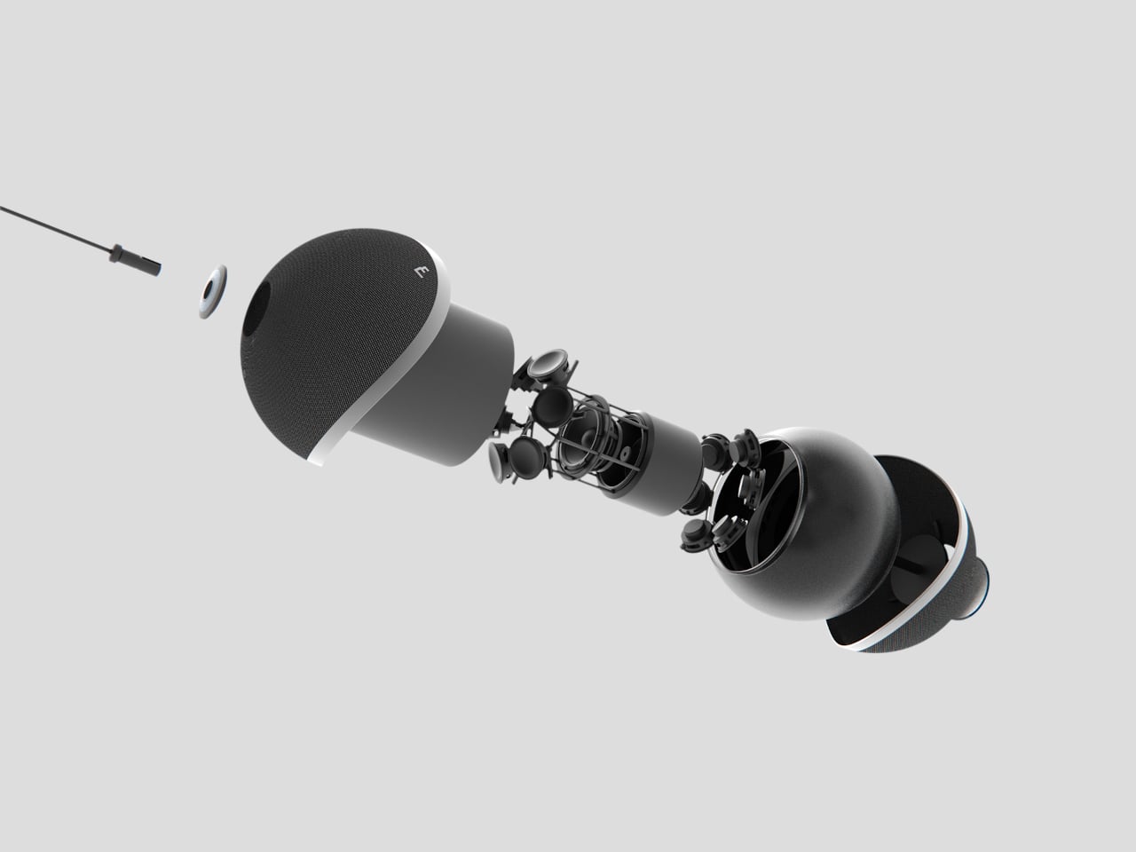
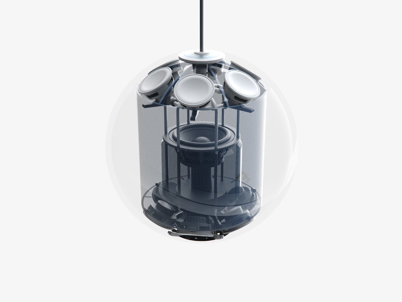
The audio side relies on a 6×6+1 sound system that emits sample sound waves to read the room and optimize audio distribution. Being in the ceiling means it is not blocked by books or walls, and multiple drivers throw sound evenly in all directions. The result, at least in theory, is better room acoustics and more consistent voice pickup than a single forward-firing speaker sitting on a counter behind clutter.

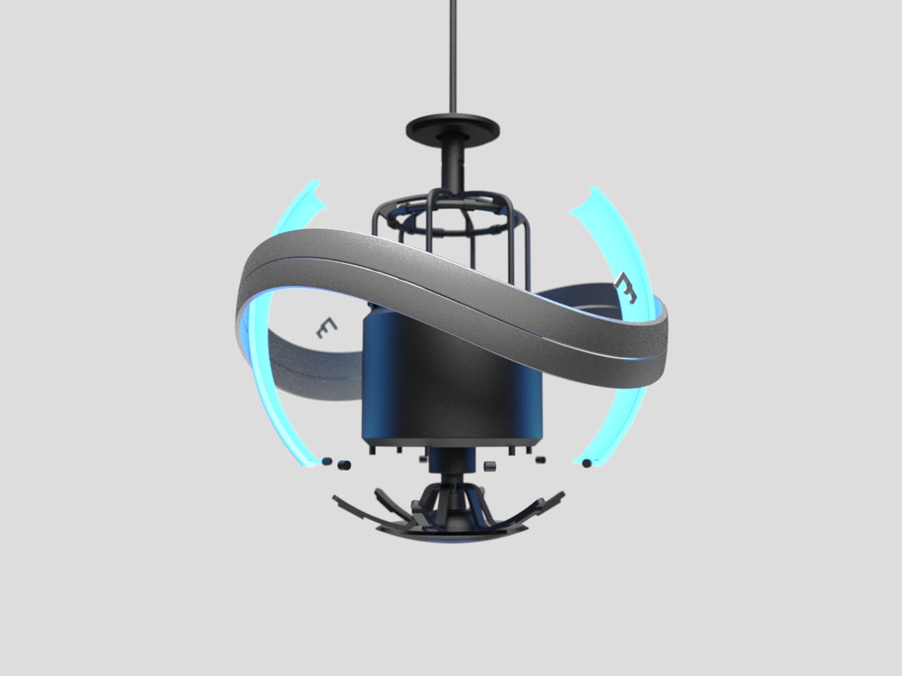
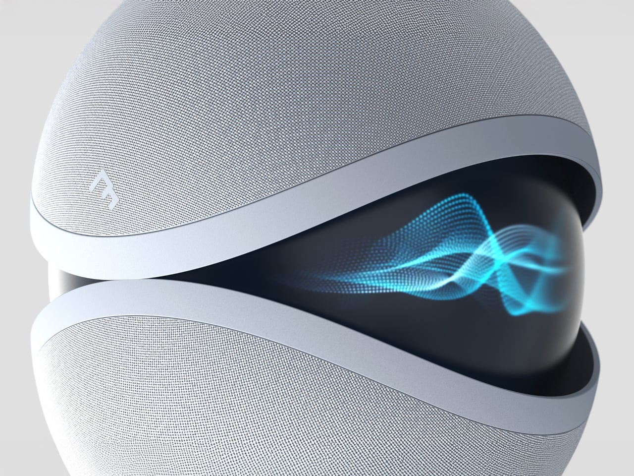
IRIS 4.0 also lets you customize ambient lighting, serving as a mood light and smart assistant in one. That sounds nice until you see the design in its “active” state, when the band around the sphere parts and a glowing inner core appears, like a mechanical iris opening. It is a clear signal that the assistant is awake, but it also leans into the feeling of something above you watching and listening.

Of course, the fabric-covered surface and soft geometry are meant to counter that unease, making the device feel more like a textile object than a cold camera dome. The muted colors and lack of aggressive branding help it blend into ceilings and feel less gadget-y. In a category where people already worry about surveillance, tactility, and visual softness go beyond aesthetic choices. They are trust signals that may or may not work depending on who is looking up.

IRIS 4.0 treats AI assistants as something you wire into the ceiling plan, like lights or smoke detectors, rather than something you plug in and move around. That shift raises questions about privacy and control, but it also hints at a future where smart systems are less about scattered gadgets and more about calm, ambient layers in the architecture itself, even if that architecture occasionally looks back down at you with a glowing eye.

The post IRIS 4.0 is a Fabric-Covered Smart Speaker Orb That Watches from Above first appeared on Yanko Design.
5 Best Tech Gadgets of February 2026

February finds us in that strange liminal space where the hype of CES has barely settled and the actual products are just starting to trickle into reality. This year brought us plenty of vaporware wrapped in ambitious promises, but these five gadgets represent something different. They solve real problems with clever engineering and genuinely fresh thinking.

Walking the show floor in Vegas last month revealed a clear shift away from novelty toward utility. The best announcements were the ones that respected your workflow, your attention, and the physical space you live in. These five designs emerge from that ethos. They are tools that bend technology to fit your life rather than demanding you rearrange yourself around yet another screen or charging cable.

1. Keychron Nape Pro

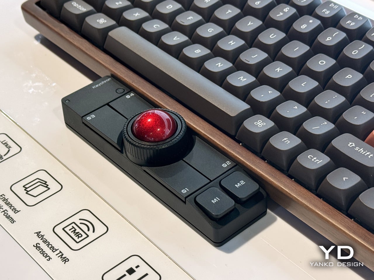
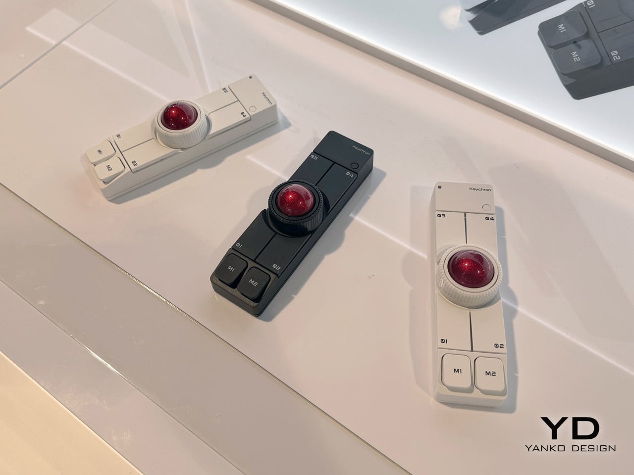
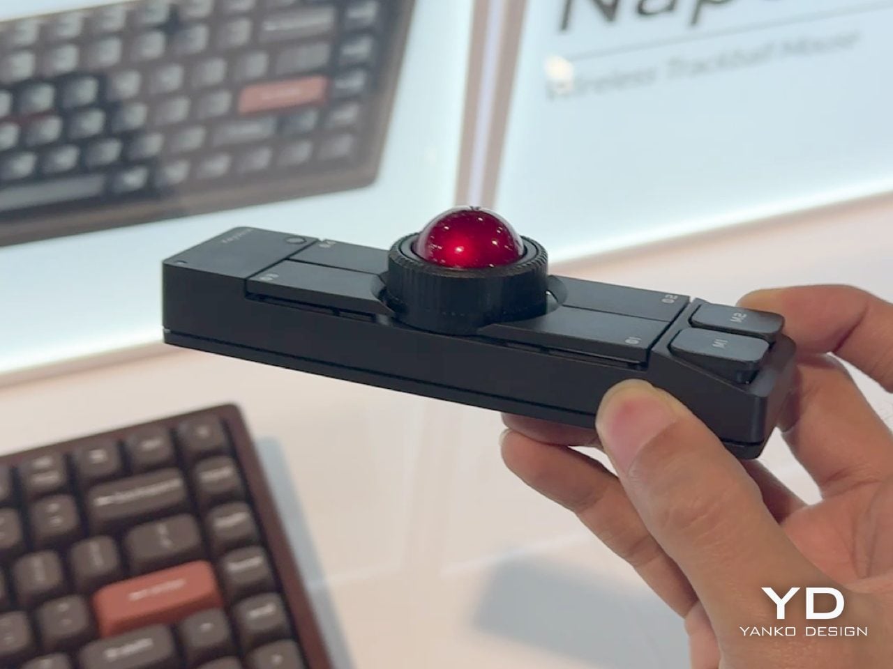
Keychron carved out a reputation for building mechanical keyboards that do not compromise on quality while remaining accessible. The Nape Pro takes that same philosophy and applies it to the awkward gap between your hands and your cursor. What results is a modular trackball that sits under your keyboard and turns typing sessions into something smoother and less physically punishing.

The design prioritizes economy of motion. Thumb operation means your hands stay planted on the home row. No more stretching for a distant mouse or breaking your typing flow for minor navigation tasks. The 25 mm trackball is noticeably smaller than desktop monsters like the Kensington Expert, but that size feels intentional. It is responsive without demanding the kind of hand repositioning that defeats the whole purpose. The unit occupies just 135.2 mm in length and 34.7 mm in width, so it tucks neatly within a tenkeyless footprint. Quiet Huano micro switches across six buttons ensure you are not broadcasting every click to anyone within earshot. ZMK customization means layers, shortcuts, and macros live right where your thumb rests. It is a genuinely modular control surface disguised as a pointing device, and the wireless connectivity means you can slide it around without cable anxiety.

What We Like

• The compact footprint means it works on cramped desks without territorial disputes with your keyboard.

• Thumb operation keeps your fingers on home row and drastically reduces reaching.

• ZMK-powered layers bring macro pad functionality without needing a separate device.

• Quiet switches make sense for something living directly under your palms during work calls.

What We Dislike

• The 25 mm ball is smaller than dedicated trackball users might prefer for precision tasks.

• Wireless means yet another thing competing for battery attention in your peripherals drawer.

2. TWS Earbuds with Built-in Cameras

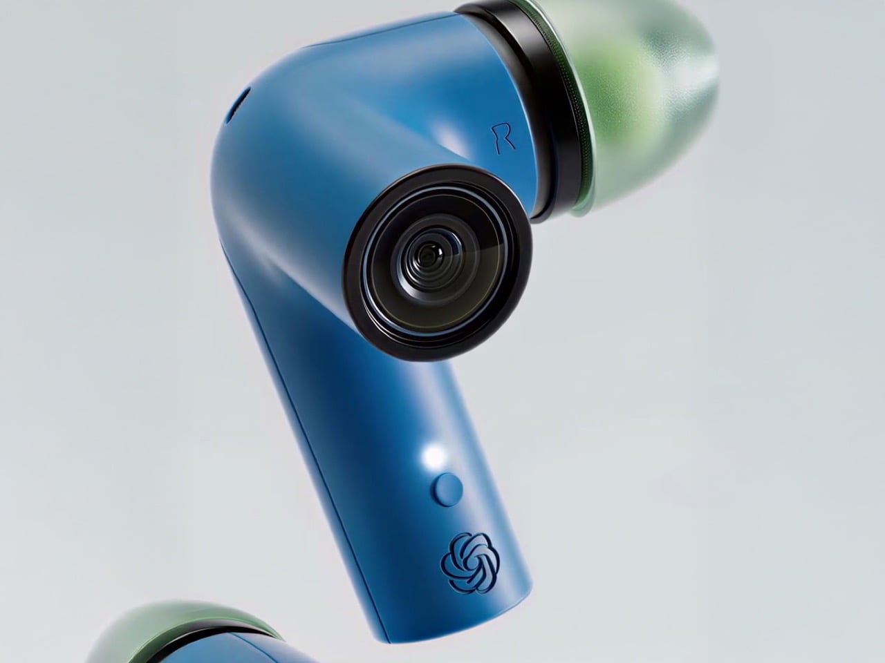
The race to build wearable AI took a weird turn with pins, pendants, and smart glasses that scream, “I am wearing a camera.” This concept flips the script by hiding the whole thing in earbuds. Each stem carries a camera positioned near your natural line of sight. Paired with ChatGPT, those lenses feed a constant visual stream to an assistant that lives in your ears without broadcasting your tech evangelist status to everyone you meet.

The brilliance is in the form factor. TWS earbuds are already socially normalized. People wear them everywhere without raising eyebrows. Adding cameras to the stems turns a familiar object into something functionally new without the social friction of face-mounted glass. The setup can read menus, interpret signs, describe scenes, and guide navigation through unfamiliar cities without demanding you pull out your phone. Voice interaction keeps your hands free. The AI processes visual information in real time and responds through audio, creating a genuinely assistive loop that does not require staring at a screen. It is the kind of product that could make AI feel less like a gimmick and more like a utility you actually use daily. OpenAI has been hunting for a hardware play that sticks. This might be the one that finally makes sense beyond early adopters and conference demos.

What We Like

• Form factor avoids the social awkwardness of wearing cameras on your face in public spaces.

• Voice and audio interaction keep your hands free and your phone in your pocket.

• Real-time visual processing paired with ChatGPT turns navigation and scene interpretation into something genuinely useful.

• Familiar earbud design means minimal learning curve for adoption.

What We Dislike

• Battery life will be a concern with cameras and AI processing running on tiny earbud cells.

• Privacy questions around always-on cameras in social settings will be unavoidable.

3. Focus Desktop Board

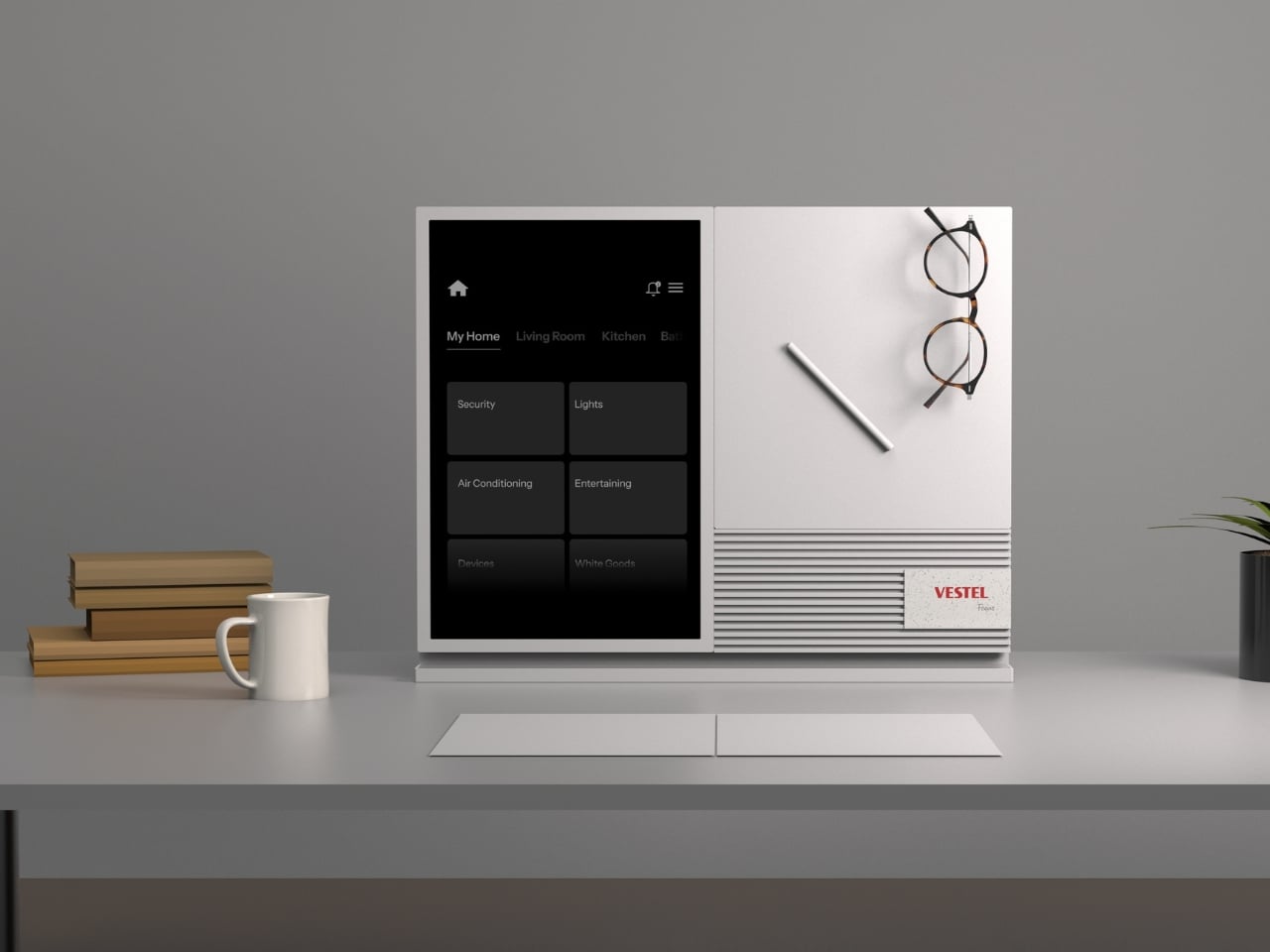
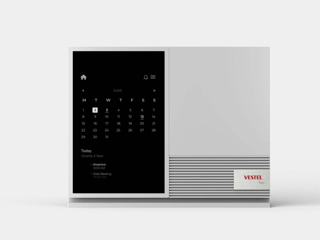
Phones created a problem that app makers spent years optimizing to exploit. Notifications turned into weapons-grade attention traps designed to pull you back into the feed. Focus tackles this with an E Ink panel that syncs with your phone but forces you to choose what actually deserves your eyes. It is a multifunctional hub that doubles as a magnetic tool board with a built-in speaker, but the real value is in the filtering.

E Ink delivers that paper-like quality familiar to anyone who has used a Kindle. It is easy on the eyes and legible in any lighting condition, which makes it a natural fit for something meant to sit on your desk all day. Focus displays tasks, calendar events, and selected notifications, but the keyword is selected. You decide what makes it through. Your cousin’s takes and algorithm-fed suggestions stay trapped on your phone where they belong. The magnetic surface lets you attach tools, notes, or whatever analog objects you need within arm’s reach. The built-in speaker handles calls or audio reminders without needing yet another Bluetooth device cluttering your setup. The whole thing is designed to look like minimalist desk art, which is probably the smartest move they could have made. It sits in your peripheral vision without screaming for attention, offering information when you glance over rather than demanding you stop what you are doing.

What We Like

• E Ink panel is easy on the eyes during long work sessions and readable in any light.

• Selective notification filtering gives you control over what interrupts your focus.

• Magnetic tool board integrates analog and digital workflows without forcing you to choose one.

• Minimalist design looks intentional on a desk rather than like forgotten tech clutter.

What We Dislike

• E Ink refresh rates mean it is not suited for real-time updates or dynamic content.

• Another device to sync and charge adds friction to an already crowded digital ecosystem.

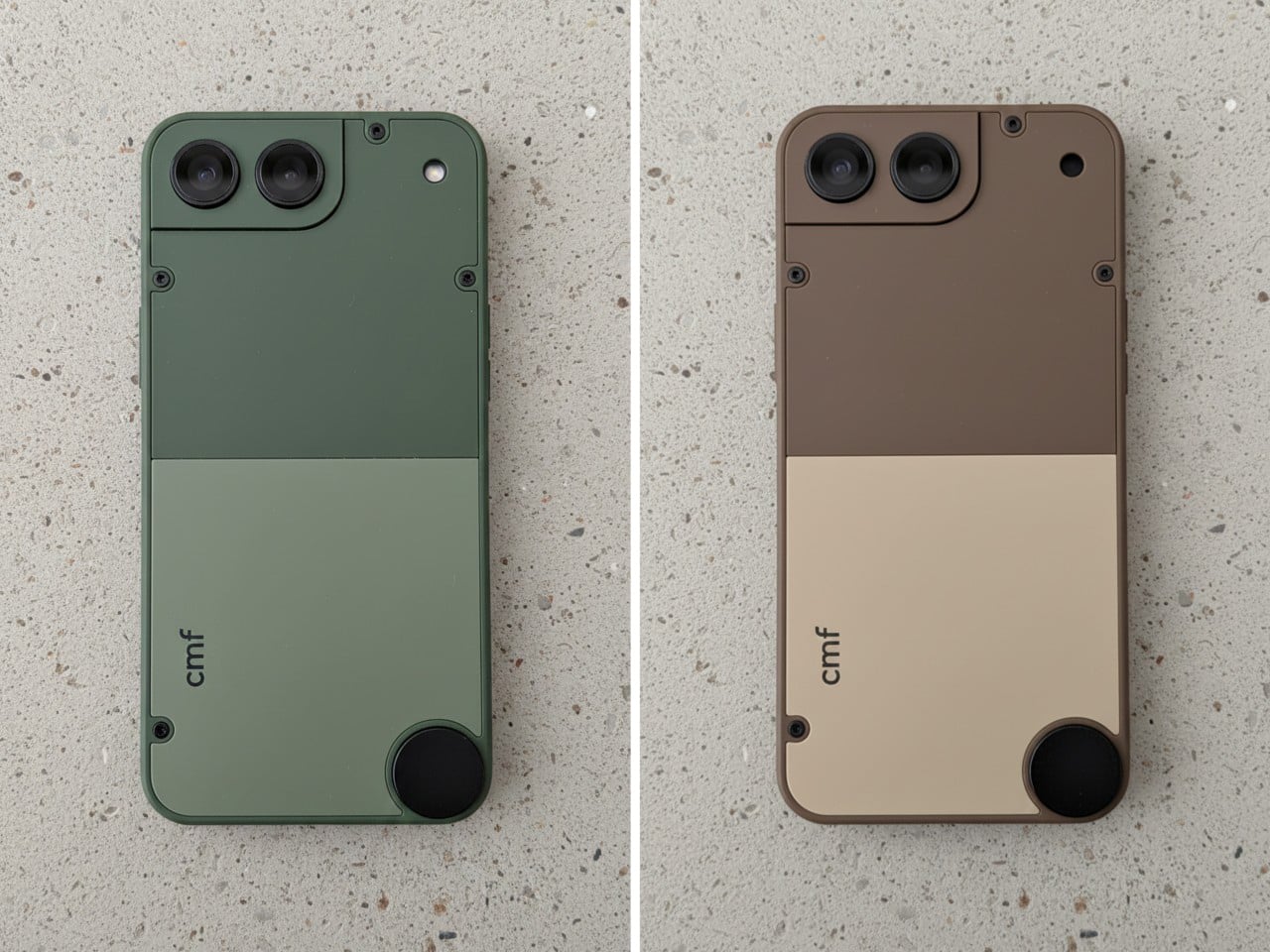
4. CMF Phone Mini Concept

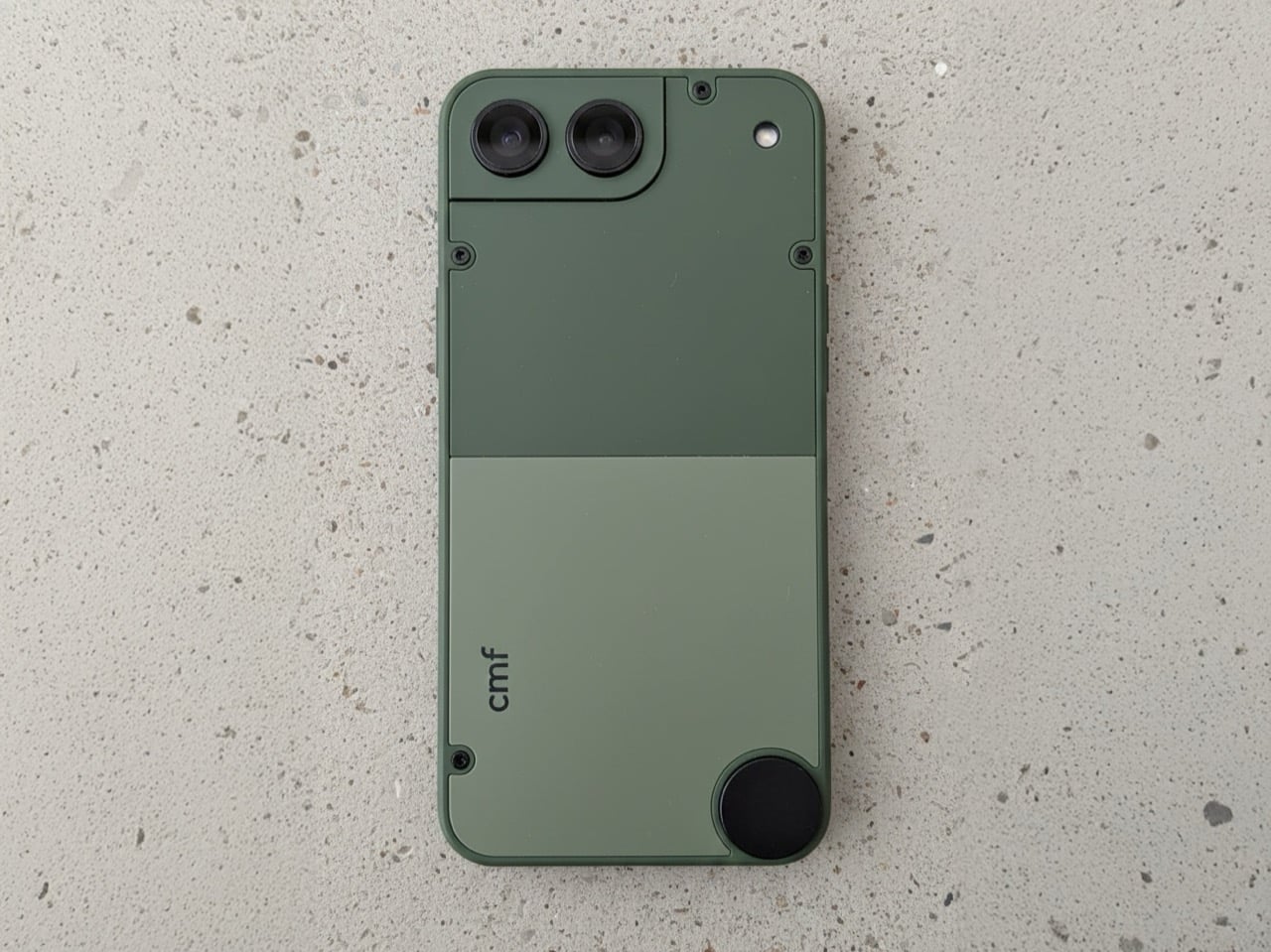
The compact smartphone market died not because people stopped wanting small phones, but because manufacturers decided the margins were not worth the engineering. The iPhone 13 mini was the last credible option, and its discontinuation left a genuine void. Designer Preet Ajmeri’s CMF Phone Mini concept, posted on the Nothing Community forum, suggests a smarter path forward built around accessibility and modularity rather than flagship specs.

What makes this concept compelling is its complete lack of flagship pretension. The design feels like a tool, with an aesthetic closer to a Braun appliance than a fragile glass sandwich. Two-tone back panels secured by exposed screws nod directly to the modularity of the CMF Phone 1 and 2 Pro. The circular element in the lower corner practically begs for a lanyard or magnetic accessory, turning portability into something tangible rather than a spec-sheet claim. The camera housing integrates into a stepped corner plate, making it feel like a distinct functional component rather than a generic bump. It is an honest object designed to be held and used without demanding reverence. The concept suggests that small phones do not need flagship processors or camera arrays to justify their existence. They need a thoughtful design that respects the reality of one-handed use and pockets that are not cargo pants. If Nothing or CMF actually builds this, it would fill a market gap that has been ignored for years.

What We Like

• Modularity through exposed screws and swappable back panels extends device lifespan and personalization.

• Tool-like aesthetic prioritizes function and durability over fragile premium materials.

• Compact size addresses the genuine demand for one-handed usability that flagship lines abandoned.

• Circular lanyard element turns portability into a practical feature rather than marketing speak.

What We Dislike

• Concept status means there is no guarantee this will ever reach production.

• Smaller size likely means compromises on battery capacity that could limit all-day use.

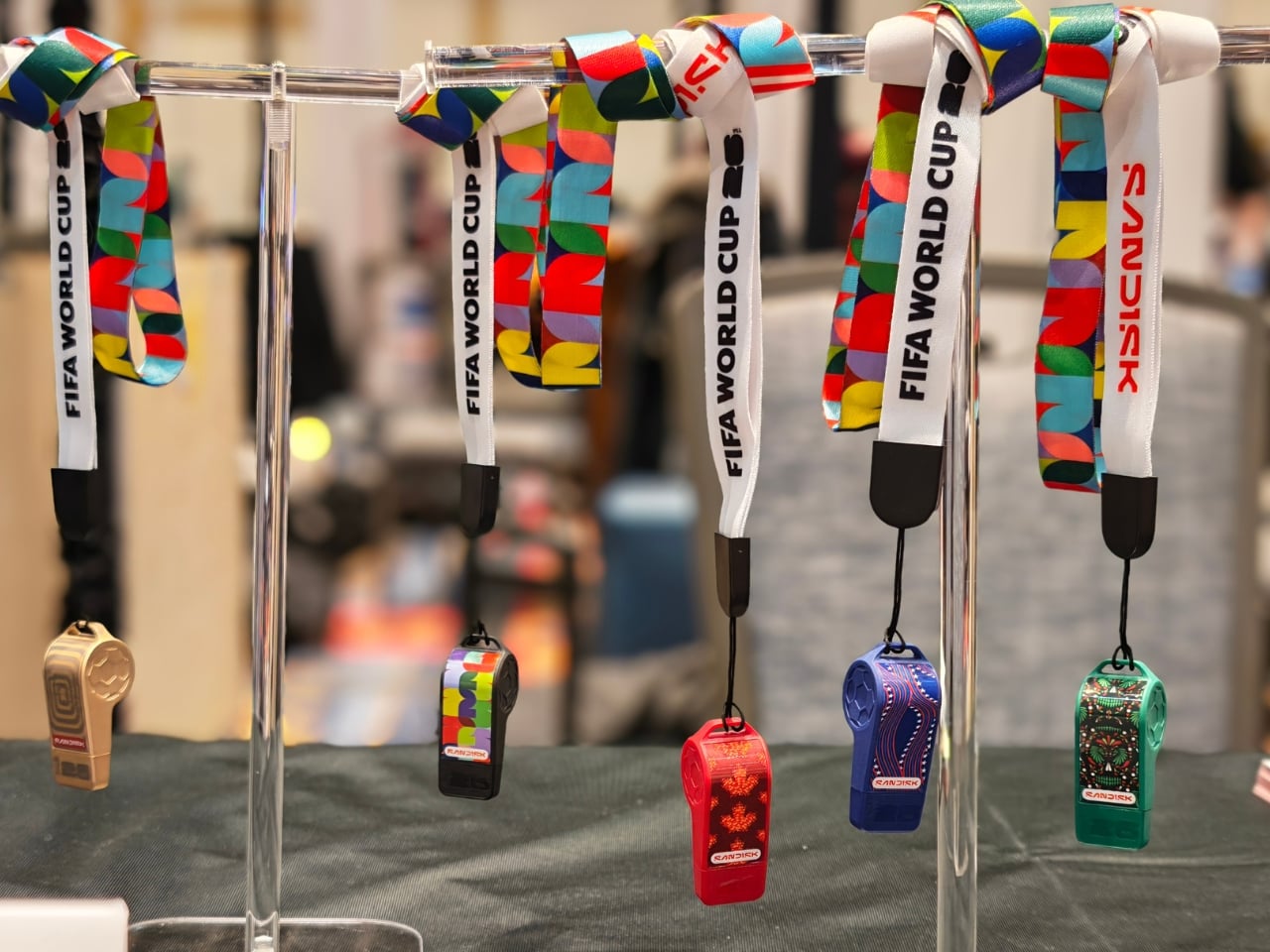
5. SanDisk FIFA World Cup 2026 USB-C Flash Drive

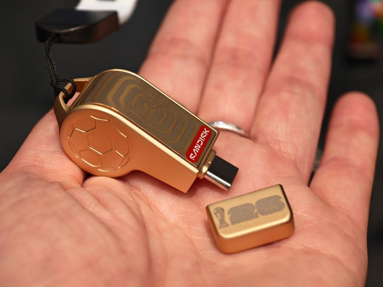
SanDisk made a USB-C flash drive shaped like a referee’s whistle, and it somehow manages to be both completely ridiculous and genuinely clever. The FIFA World Cup 2026 collection turns storage into collectible objects that celebrate the tournament across the three host countries. The whistle drive packs up to 128GB of storage with speeds hitting 300MB/s, so it is not just a novelty item you shove in a drawer after the unboxing photo.

The collection includes editions for the USA, Canada, Mexico, plus a Global Edition and a premium Gold Edition. Each design draws from the culture of its respective host country, turning these drives into objects that feel like memorabilia rather than disposable tech. The whistle shape is practical in a weird way. It is distinctive enough that you would not lose it in a cable drawer, and the loop means you can attach it to a keychain or lanyard. Storage is increasingly cloud-based, but physical drives still matter for quick transfers, backups, and situations where you do not want to trust your files to someone else’s servers. Turning that utility into something fun is rare in a category dominated by boring rectangles. The design asks a question more tech companies should be asking: Why are we making everything so serious? The World Cup collection proves that functional objects can carry personality without sacrificing performance. It is the kind of thing that makes you wonder why more companies are not having this much fun with products people actually use.

What We Like

• Up to 128GB storage with 300MB/s speeds means it is genuinely useful beyond novelty status.

• Distinctive whistle shape makes it hard to lose in a drawer full of generic cables and drives.

• Collectible editions tied to World Cup host countries turn storage into cultural memorabilia.

• USB-C compatibility ensures it works with modern devices without adapter hassles.

What We Dislike

• Novelty design might feel dated once the World Cup hype cycle ends.

• Physical drives are increasingly niche as cloud storage dominates mainstream workflows.

Where February Leaves Us

These five gadgets represent a shift in how companies are thinking about technology’s role in daily life. The focus has moved away from adding more screens and notifications toward tools that integrate without demanding constant attention. They solve specific problems with thoughtful design rather than throwing features at spec sheets.

February is always that strange month where CES announcements start transitioning from vaporware to actual products you can touch and buy. These five stand out because they respect your time, your space, and your sanity. They bend technology to fit your workflow rather than demanding you rearrange your life around yet another device. That feels like progress worth celebrating.

The post 5 Best Tech Gadgets of February 2026 first appeared on Yanko Design.
This $100 Stand Fixes Why Wireless Charging Gets Hot and Useless

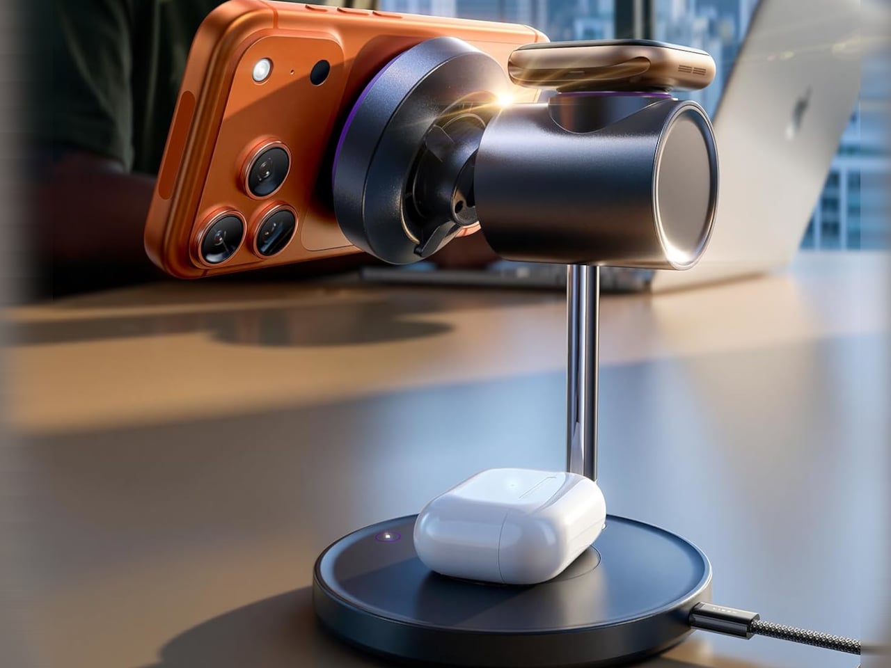
Most wireless charging setups involve a flat pad on the nightstand, a couple of extra cables for watch and earbuds, and a phone that gets warm and slides out of alignment if you nudge it. Most 3-in-1 MagSafe docks solve the cable mess but still feel like static sculptures, not stands you actually use while you work or watch something, and they rarely address the heat that builds up when pushing 15W or more through magnetic coils.

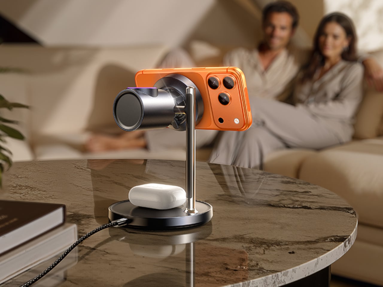
LISEN’s MagSafe Charger Stand puts everything on a vertical stem with a chunky barrel at the top. Inside that barrel is a Qi2.2-certified 25 W magnetic charger and a cooling fan, with Apple Watch charging on top and AirPods on the base. It looks unconventional compared to the usual flat arches, but that shape does more than just stand out in listings.

Designer: LISEN

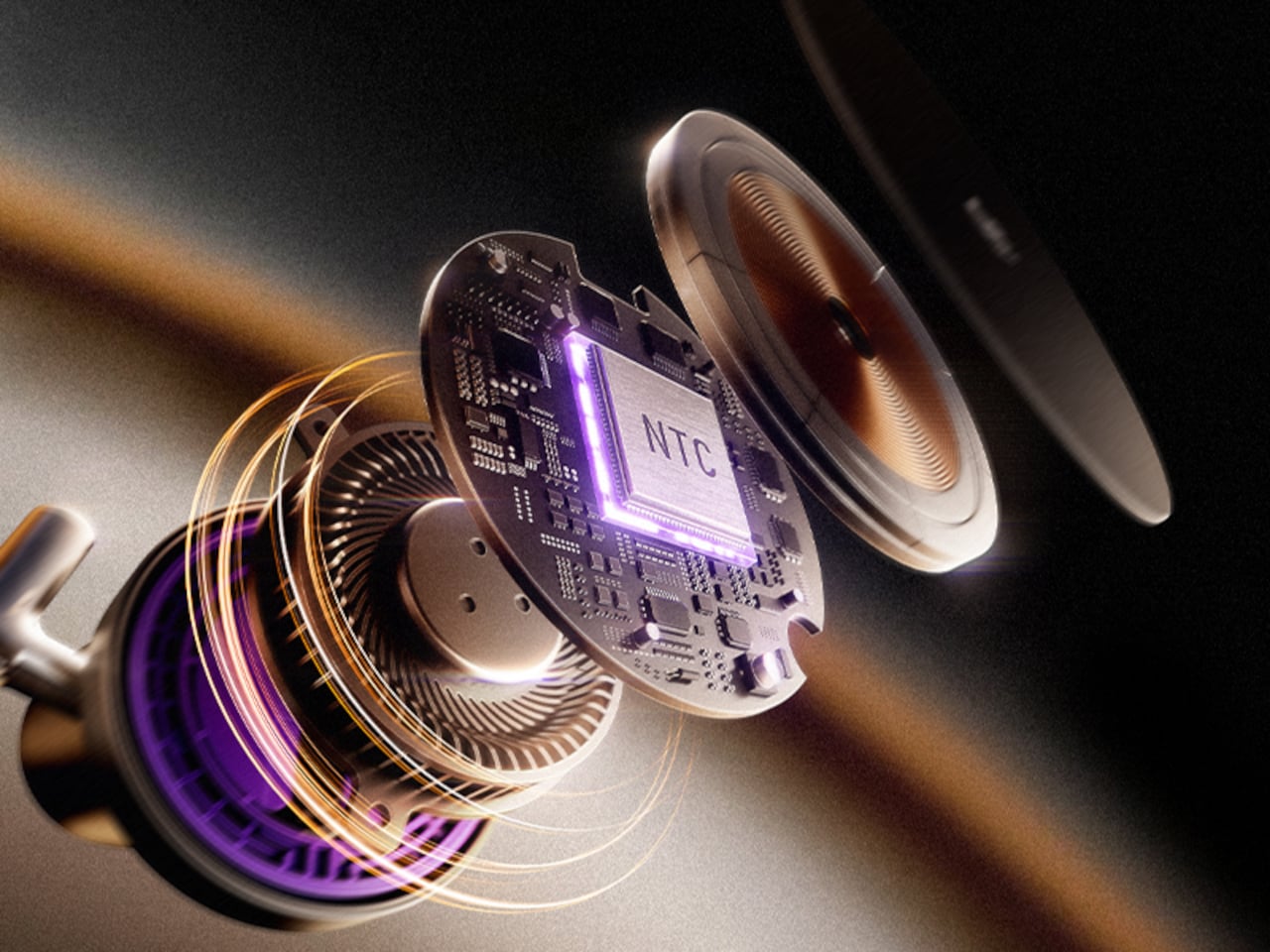
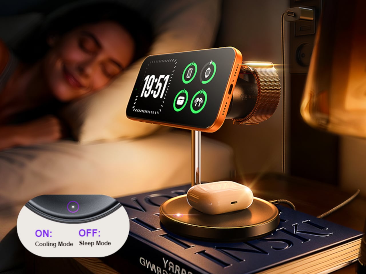
The Qi2.2 spec lets the stand push up to 25W to an iPhone 17 Pro, roughly six times faster than old 5W pads, which usually means heat and throttling. Here, a built-in fan and temperature-control chip keep things under control in Cool Mode, so you can stream, video call, or scroll while charging without the phone turning into a hand warmer or dropping to slower speeds halfway through.

The day and night modes matter more than expected. During the day, Cool Mode keeps the fan running quietly while your phone jumps from low battery to usable in a short break. At night, you tap the touch-sensitive button on the base to switch to Sleep Mode, turning the fan off so the stand becomes a silent overnight charger. Charging continues safely, just slightly slower, but the room stays quiet enough to actually sleep.

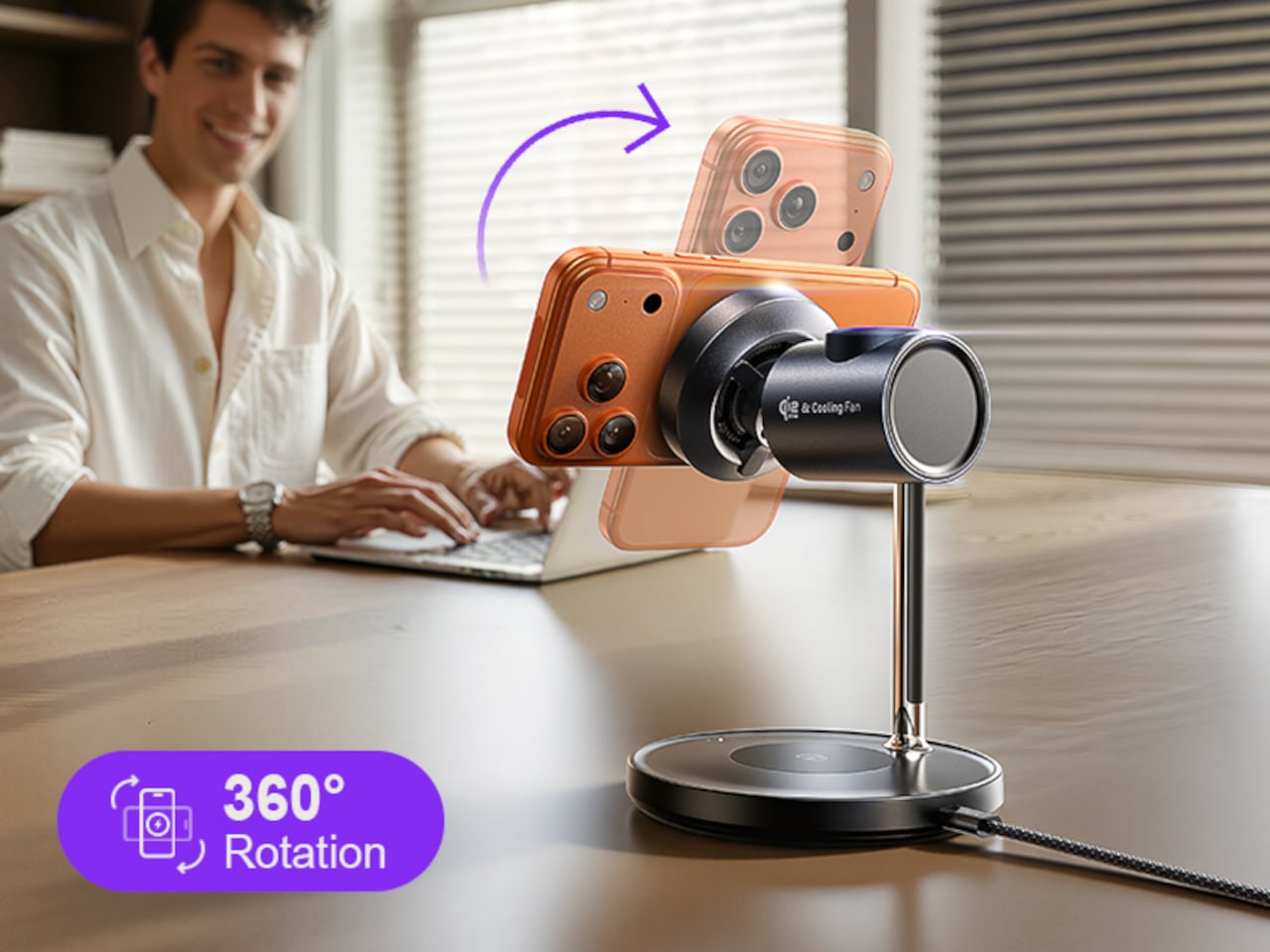
The rotating barrel and adjustable angle turn the stand into a proper phone holder. You can flip between portrait and landscape for video calls, recipes, or watching something with someone on the sofa, all while the phone stays magnetically locked and charging. The phone is visible and usable instead of lying flat and forgotten on a pad somewhere under a stack of papers.

Of course, the base charges AirPods and the side puck handles Apple Watch, so one cable and the included 45W adapter replace three separate chargers fighting for outlets. The weighted chrome-plated base and matte finish keep the stand from tipping or looking cheap, and the whole thing reads more like a small piece of desk hardware than a pile of plastic and tangled cables.

LISEN’s stand looks a bit strange compared to usual flat pads and minimalist arches, but the cylinder, fan, and rotation all serve a purpose. It is built for people who actually use their phone while it charges, want Qi2-level speed without cooking their battery, and would rather have one odd little totem on the desk than three separate chargers that look boring and get warm anyway.

The post This $100 Stand Fixes Why Wireless Charging Gets Hot and Useless first appeared on Yanko Design.
Stop Ruining Your Chisels: This Sharpening Kit Locks Angles Every Time

Sharpening often feels like a mini exam you did not study for. Freehand on a stone, trying to hold a perfect angle while your wrists and elbows quietly betray you. Narrow rollers wobble, short blades tip, and edges never quite feel right. The hard part is not abrasion but keeping geometry consistent over dozens of passes, which is why chisels and planes end up less sharp than you want and why knives get retired prematurely.

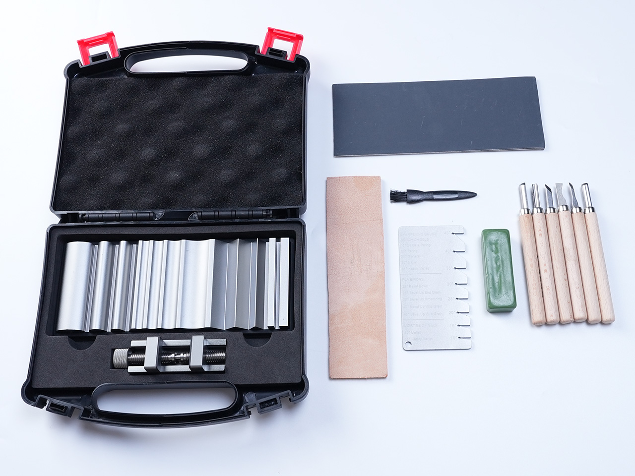
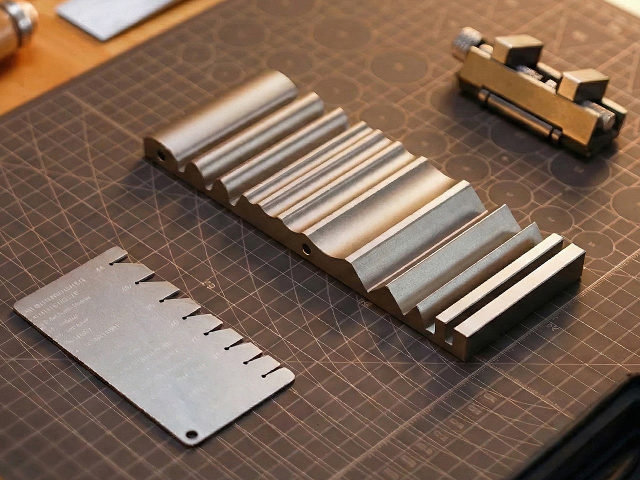
EdgeForm is a portable precision honing guide that tries to solve the problem at its core by mechanically locking your sharpening angle and stabilizing your stroke. Instead of a one-size-fits-all gadget, it is a modular system built around an all-metal sharpening plate, a wide roller, an angle-measuring plate, and a clamp that holds blades firmly. The goal is to turn sharpening into a repeatable workflow rather than a hand-eye performance that depends on feel and experience.

Designer: EdgeForm

Click Here to Buy Now: $85 $160 ($75 off). Hurry, only 48/200 left!

The main plate has a grooved face for sandpaper strips and a large flat back for full sheets, letting you choose grits for everything from coarse shaping to fine polishing. You cut sandpaper to size, stick it down flat, and get a fresh, predictable surface every time. That means you are not locked into proprietary stones, and you can move through grits quickly without changing machines, just swapping paper and continuing the same motion.

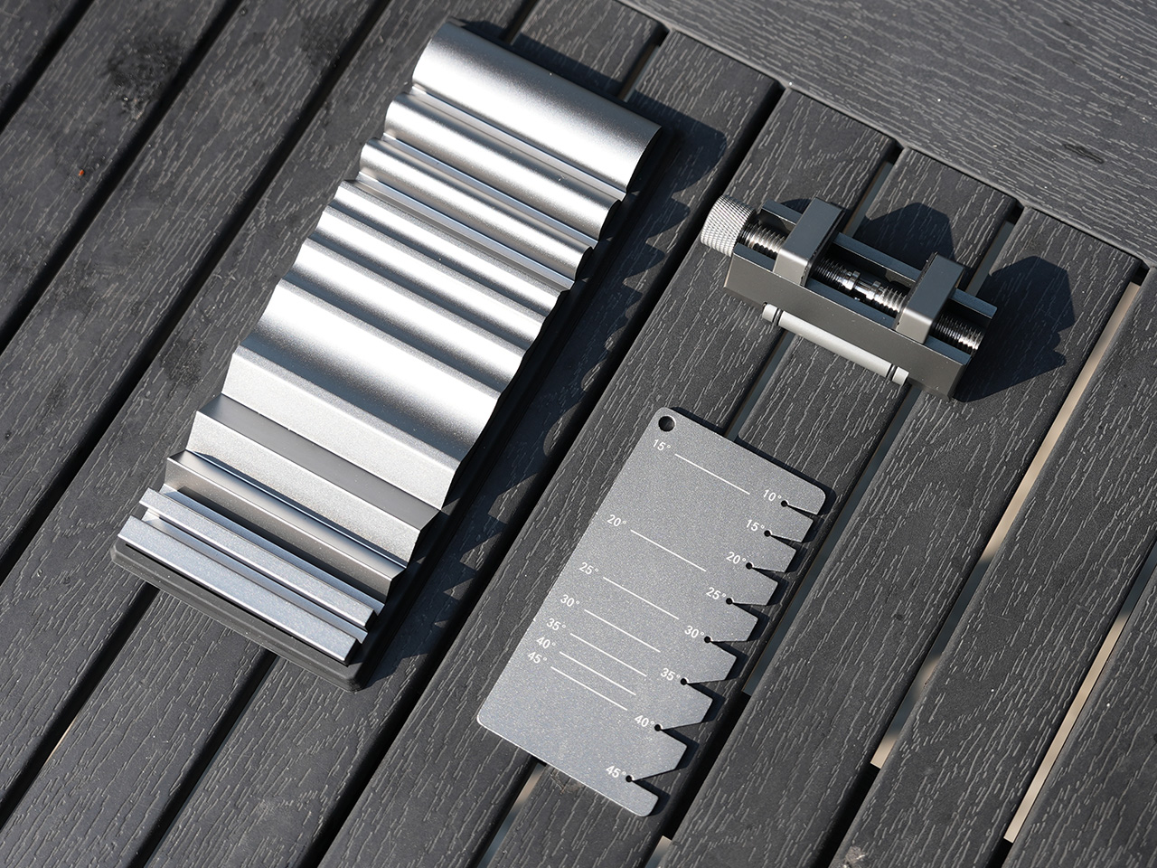
The woodworking workflow uses a precision angle-measuring plate with engraved markings to help you find the right bevel angle for chisels and plane irons. You align the blade with the desired line, attach the clamp, and tighten it to lock the angle. Once clamped, the wide roller rides on the sandpapered plate, keeping the edge at that exact angle as you push and pull, so every pass reinforces the same geometry instead of drifting over time.

EdgeForm includes specialized sharpening boards for small carving tools, allowing both sides of a tiny blade to be sharpened simultaneously while maintaining consistent angles. For other cutting tools, including kitchen knives, you choose the right grit, apply sandpaper to the plate, and sharpen with controlled strokes. A leather strop finishes the process, removing burrs and refining the edge so it feels smooth rather than scratchy in wood, leather, or food.

The extra-wide roller gives a larger contact surface with the stone or plate, preventing side-to-side tipping and unwanted angle drift, especially on short planer blades and narrow chisels where traditional guides often fail. The body is machined from aluminum alloy, with wear- and corrosion-resistant materials and a rigid clamping mechanism that resists slipping and rotation. No electronics, no planned obsolescence, just a mechanical tool built to hold tolerances over years.

EdgeForm is compact and portable, with all components fitting into a small case. It works well on a full shop bench or a kitchen counter in a small apartment. Woodworkers, DIY makers, furniture builders, and hand-tool enthusiasts can use the same system for chisels, planes, carving gouges, and knives, without needing separate jigs or setups for each category, which makes it a realistic daily-carry sharpening kit rather than something that only comes out for special projects.

Instead of dreading a freehand session or accepting edges that never feel quite right, you clamp, set the angle with the measuring plate, roll, and know that the edge you get today will match the one you liked last month. EdgeForm treats sharpening as a workflow problem solved with mechanical precision, not just grit. By making the angles lockable and the process repeatable, it gives you one less thing to worry about and one more reason to keep your edges where they belong.

Click Here to Buy Now: $85 $160 ($75 off). Hurry, only 48/200 left!

The post Stop Ruining Your Chisels: This Sharpening Kit Locks Angles Every Time first appeared on Yanko Design.
PERLA Freezes a Breaking Wave into a Sculpted Hillside Home

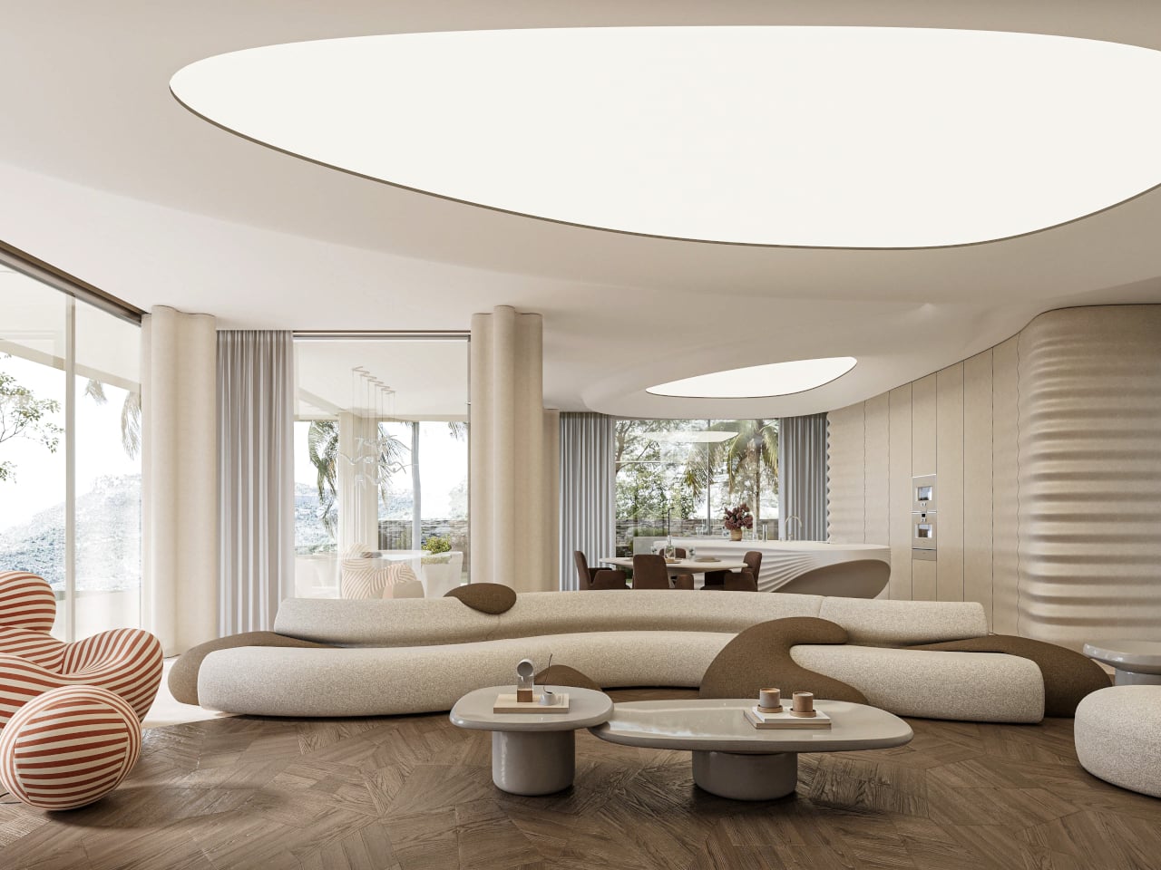
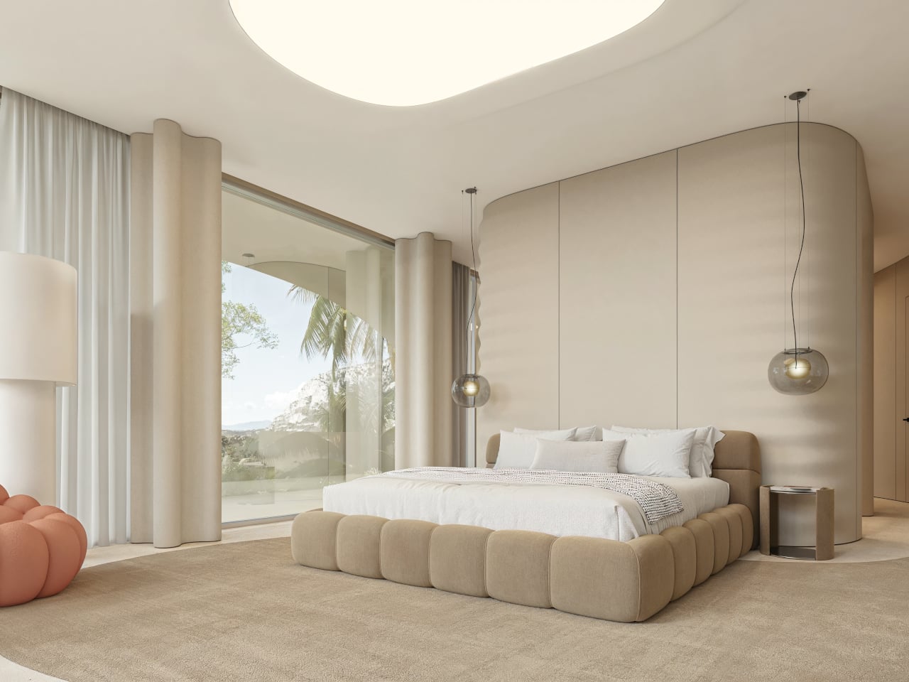
White villas step down the hills above Marbella, all glass balustrades and flat roofs, watching the Mediterranean below. The view is usually the star while the houses blur together, polite boxes that stay out of the way. PERLA flips that script slightly, treating the house itself as a single breaking wave pulled out of the water and pinned to the slope, a sculptural gesture that refuses to stay neutral or disappear into the hillside.

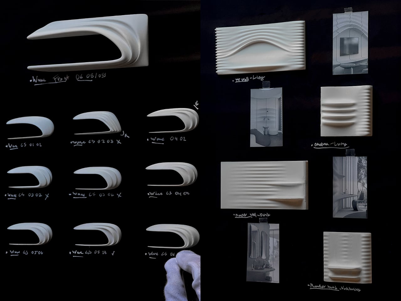
The client bought an existing project already under submission, which meant STIPFOLD could not redraw the whole building from scratch. Instead, the transformation became conceptual rather than structural, which the studio calls “an act of sculpting energy into stillness.” PERLA reinterprets the existing volumes as a frozen moment of a breaking wave, using a new fiber concrete shell and natural stone base to recast the house without rebuilding it.

Designer: STIPFOLD

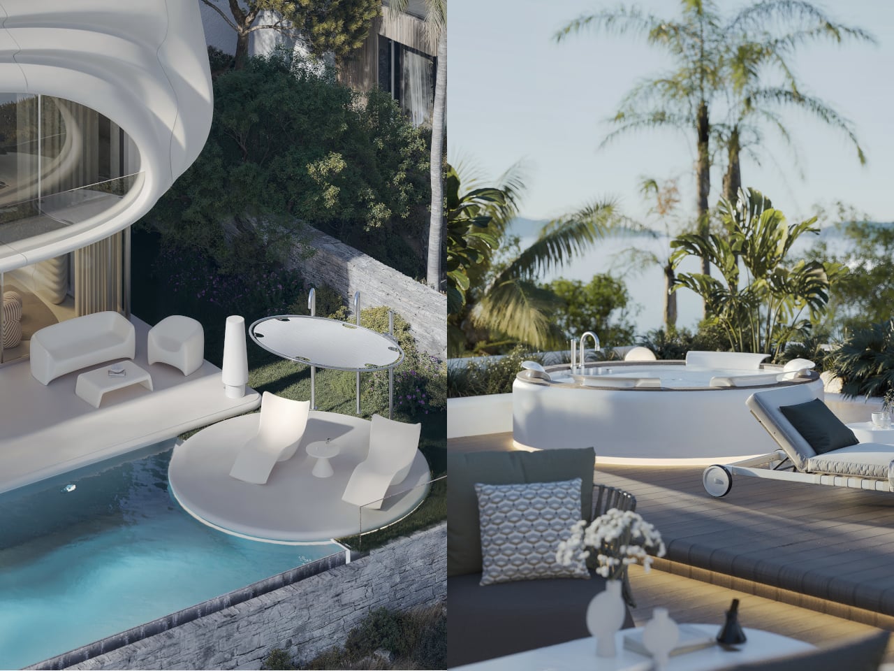
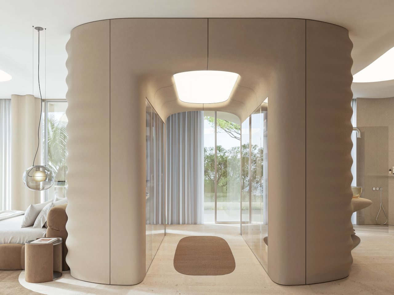
Arriving from below, you see the upper floor curl forward like surf over rock, creating a deep overhang that shades the terrace and glass façade. The white fiber concrete shell reads as a suspended ripple, while the natural stone plinth grounds it in the hillside. The house feels less like a box placed on a plot and more like a fragment of the sea that decided to stop moving halfway through a crash.

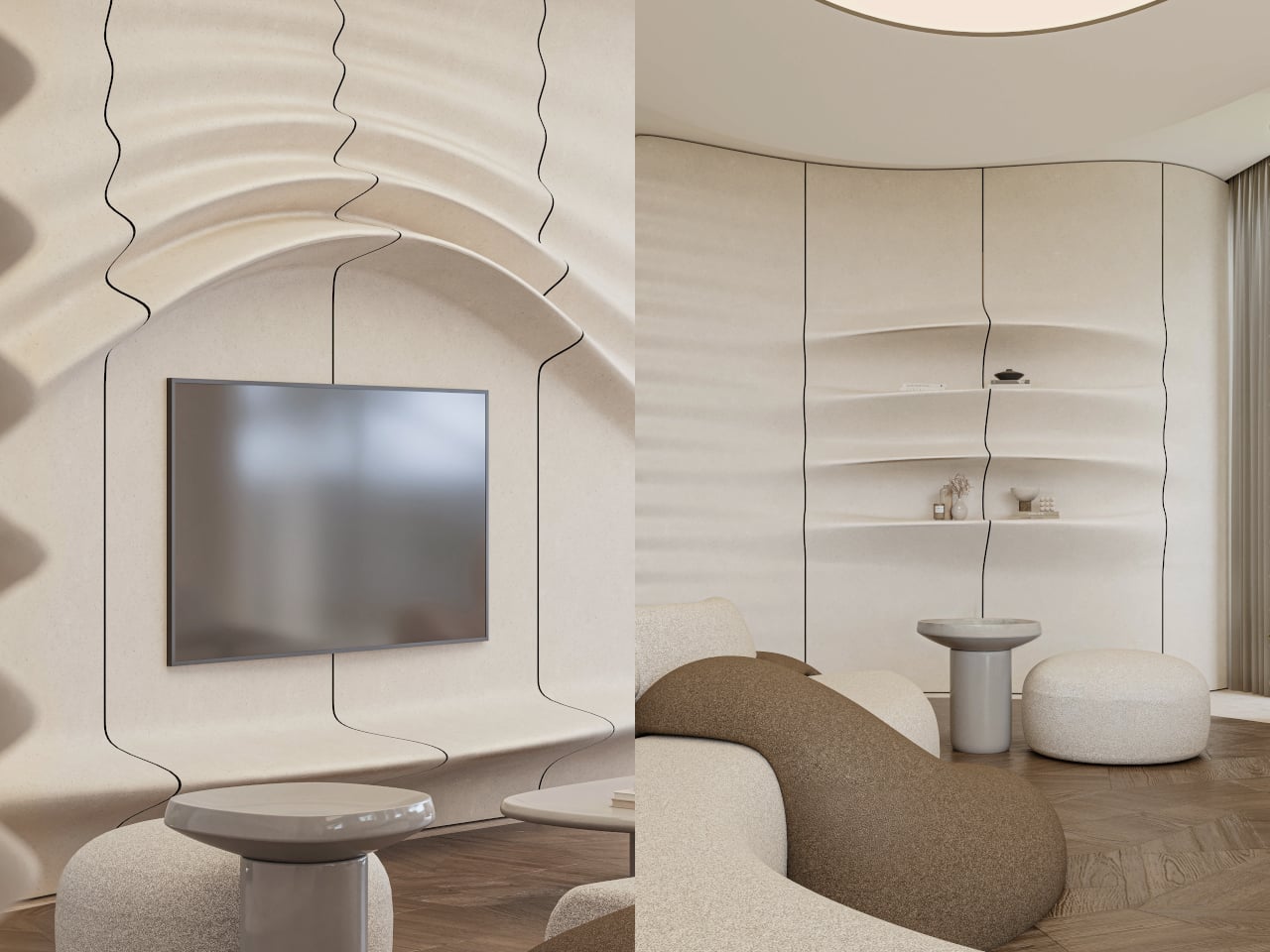
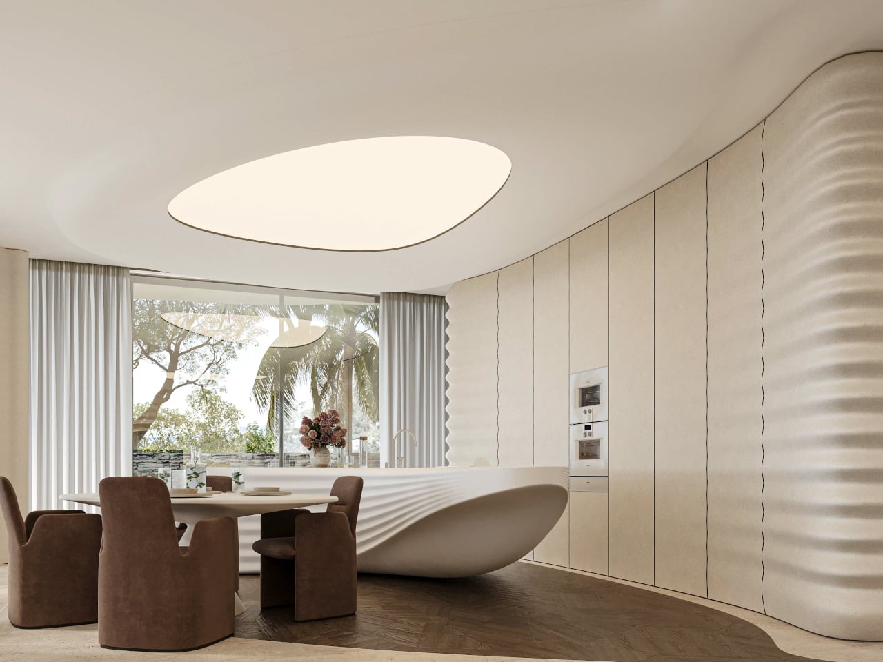
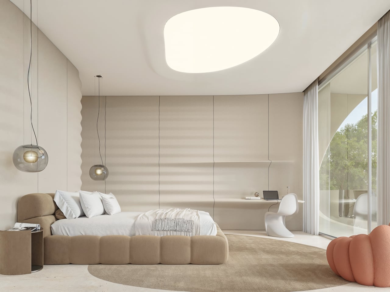
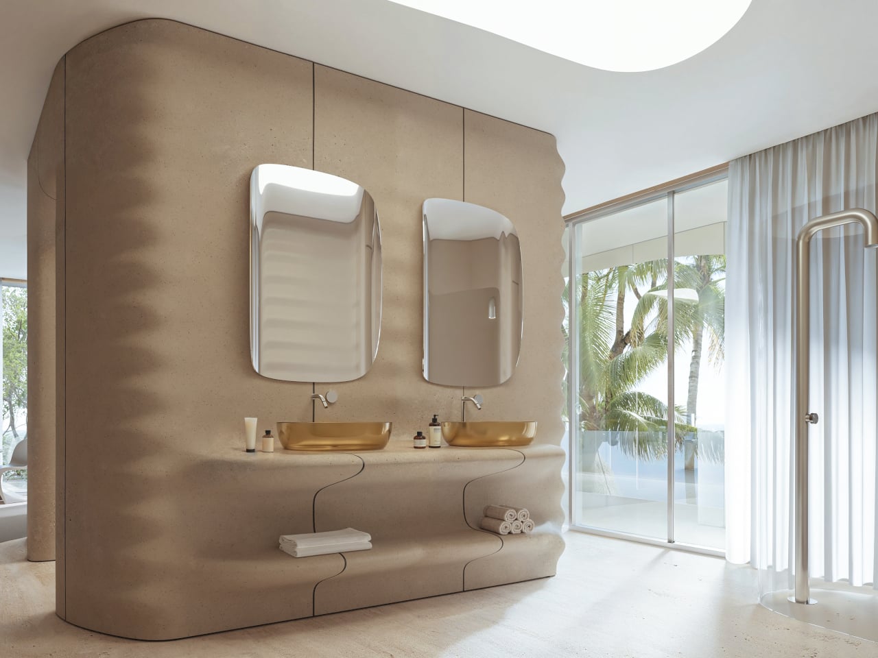
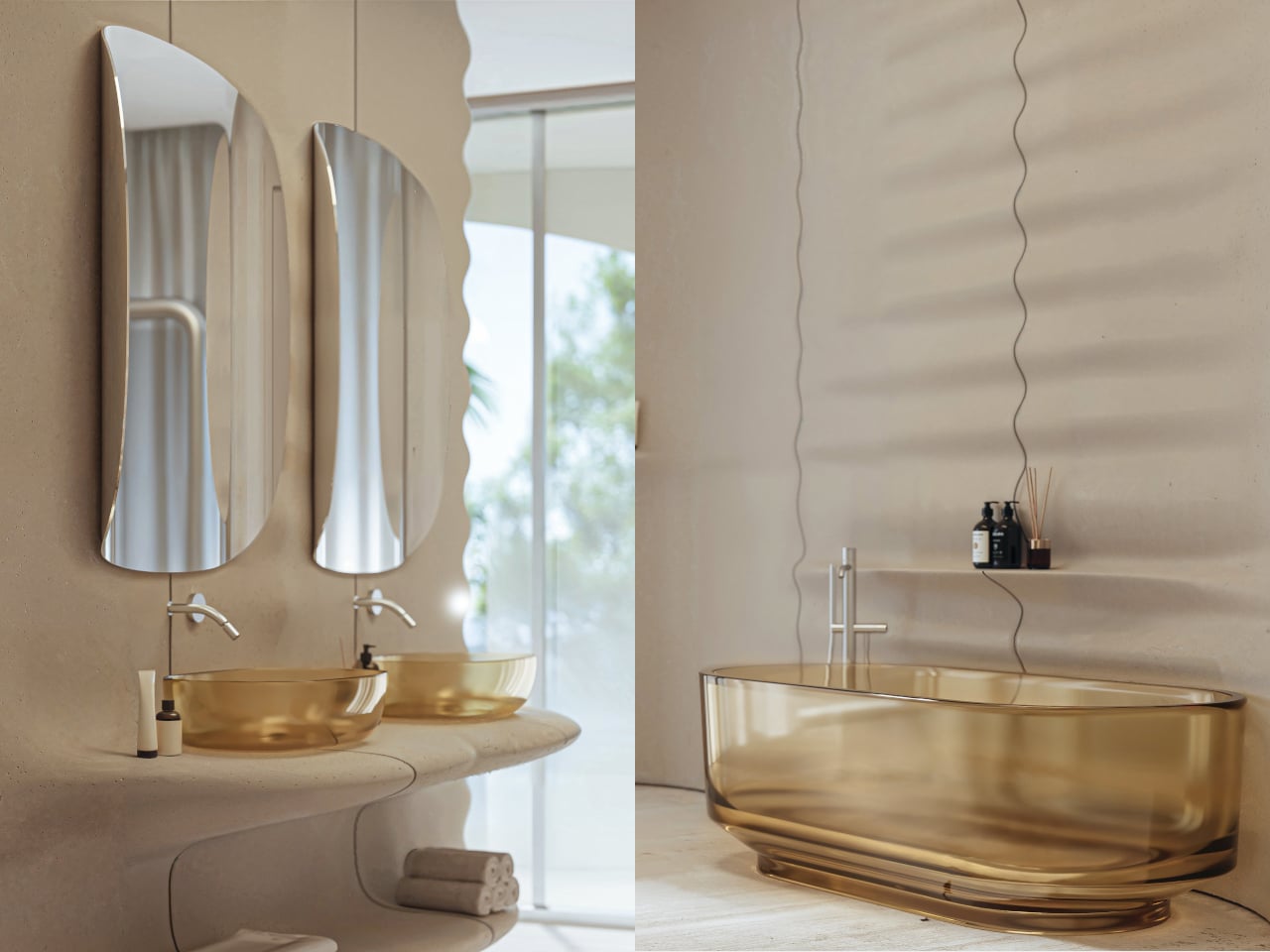
Inside, beige fiber concrete walls pick up the wave metaphor in a quieter way. Flowing parametric lines ripple across surfaces, echoing the exterior geometry without shouting about it. A restrained palette of white, sand, and pale wood keeps visual noise low, letting natural light slide along the curves. Rooms feel connected by a continuous rhythm, more like a tide moving through space than a series of separate boxes.

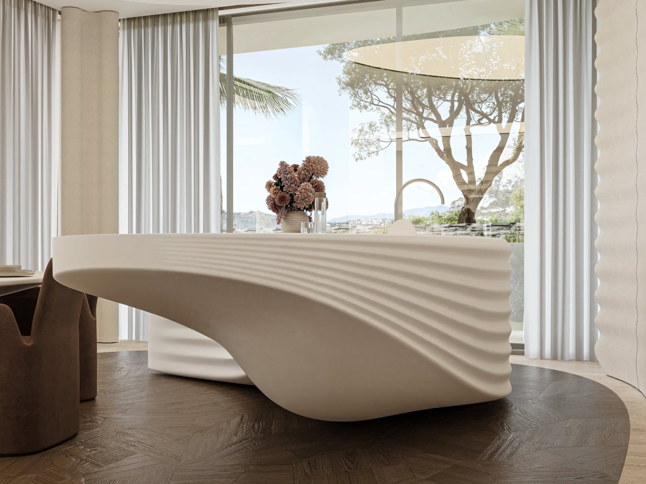
Custom elements, from the sculpted kitchen island to soft, rounded seating and a large ovoid ceiling recess, all follow the same language. Walking from the living area to the dining space, you feel the ceiling dip and rise, the walls tighten and relax, as if the house is breathing slowly. Function stays straightforward, but the form insists on being felt with every step you take through the 400 m² interior.

STIPFOLD describes PERLA as a reflection of its identity “beyond borders,” introducing its sculptural minimalism to the Mediterranean. This is not a neutral white box trying to disappear. It is architecture that “resists neutrality” and aims to evoke emotion through precision. The studio says it is not designed to please everyone, but to make everyone feel something, even if that something is not always comfortable or easy to pin down.

Living inside a frozen wave means the main structural moves were inherited, but the surfaces and spaces have been tuned to a single metaphor. PERLA suggests that even within tight planning constraints, you can still carve out a strong narrative and tactile experience. Perched on a hillside full of polite villas watching the sea, a house that feels like the sea watching back probably stands out more than the architects originally intended.

The post PERLA Freezes a Breaking Wave into a Sculpted Hillside Home first appeared on Yanko Design.
This Wooden House Toy Fights Loneliness in Nursing Homes with Play

Long-term care facilities have a particular kind of quiet in the afternoons. Residents sit in common rooms, some dozing, some staring at televisions tuned to channels nobody asked for. Rapid population aging has left many older adults dealing with cognitive decline and shrinking social circles, and while activity programs exist, they rarely create the kind of genuine cooperation that turns small tasks into shared moments worth remembering.

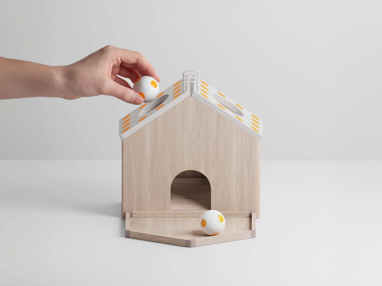
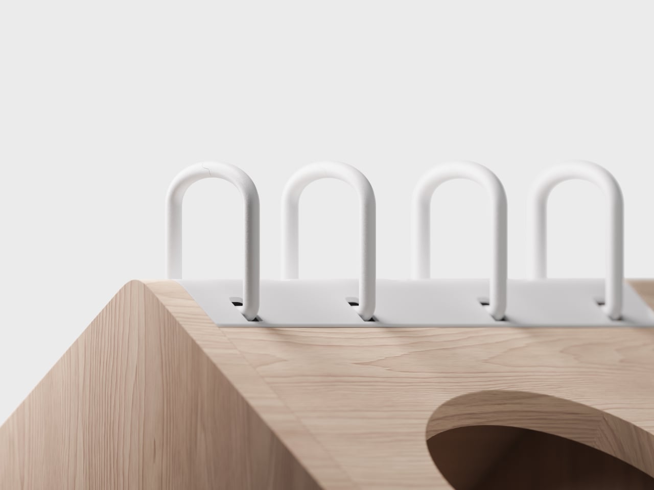
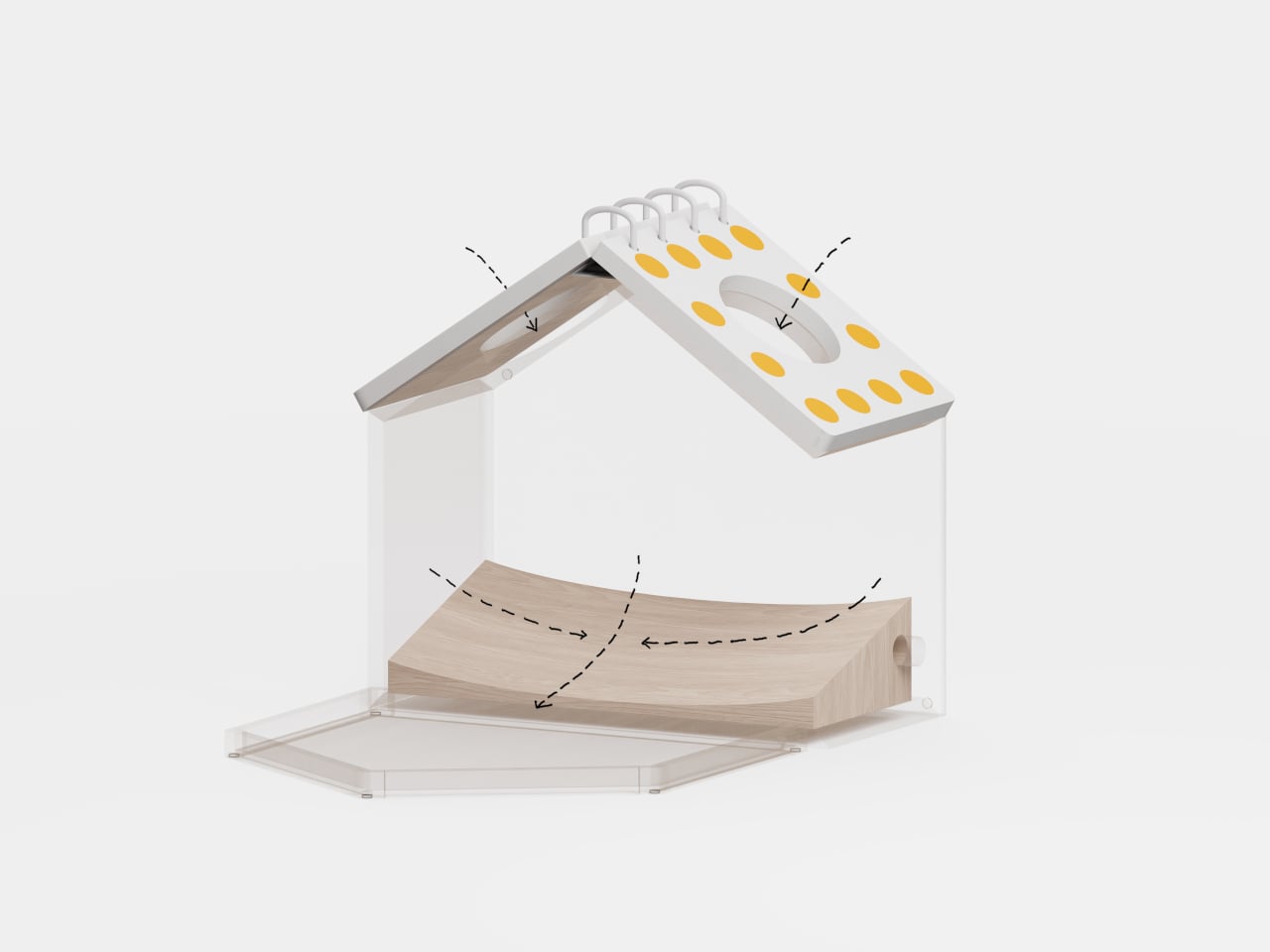
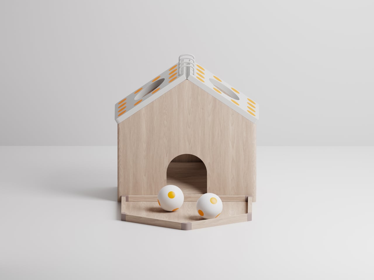
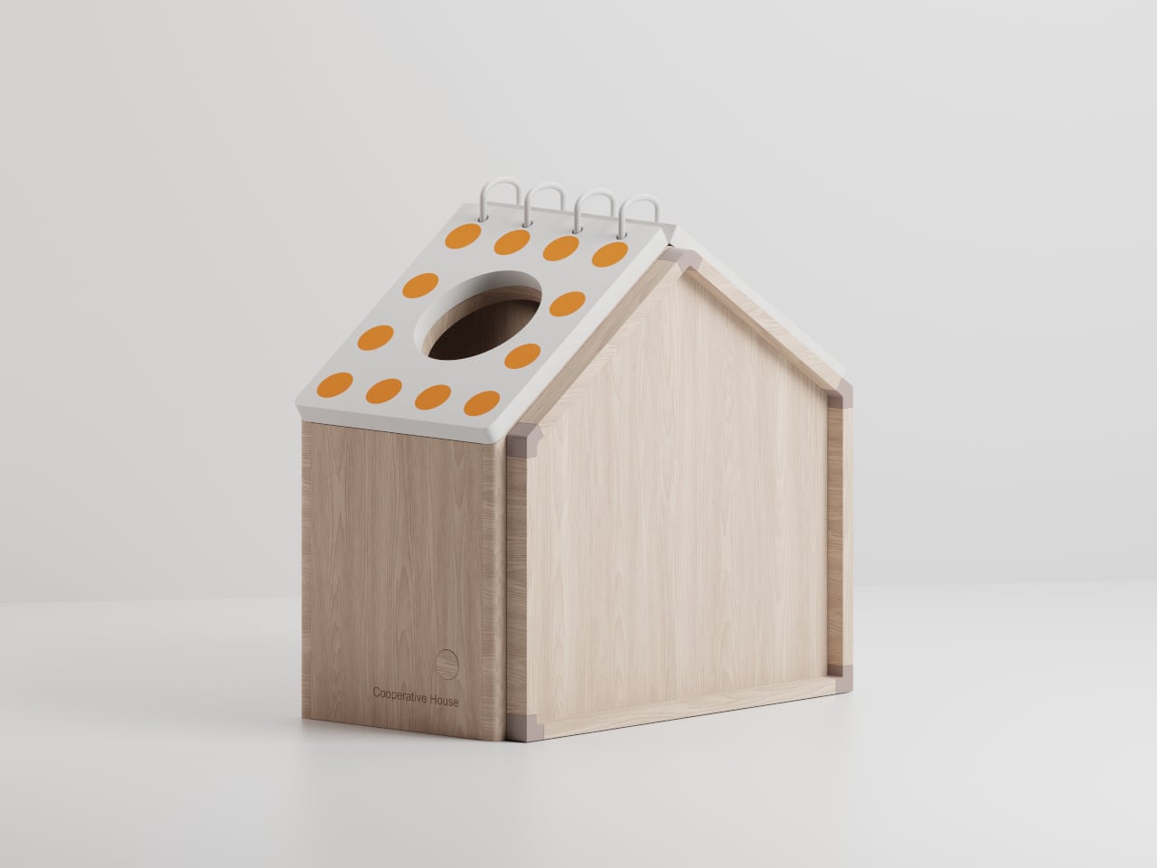
Cooperative House is a small, house-shaped toy that tries to change that script. Designed for two players and a caregiver, it uses patterned balls and pages to create challenges that require people to talk, decide, and act together. The interactive toy relies on analog play instead of screens, treating cooperation and conversation as the real work rather than just nice side effects of keeping hands busy.

Designer: Hyunbin Kim

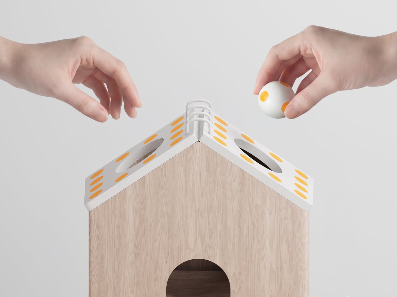
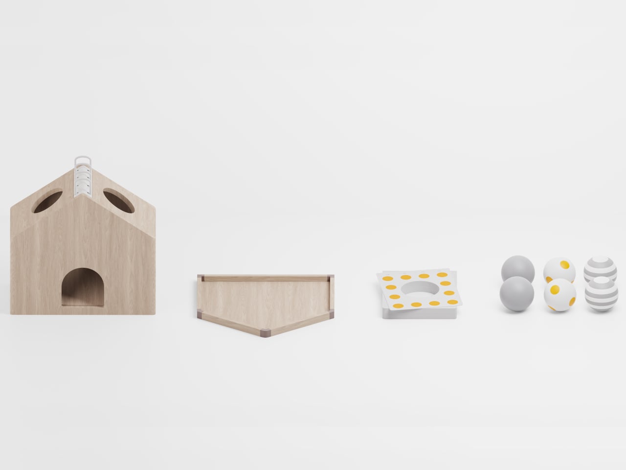
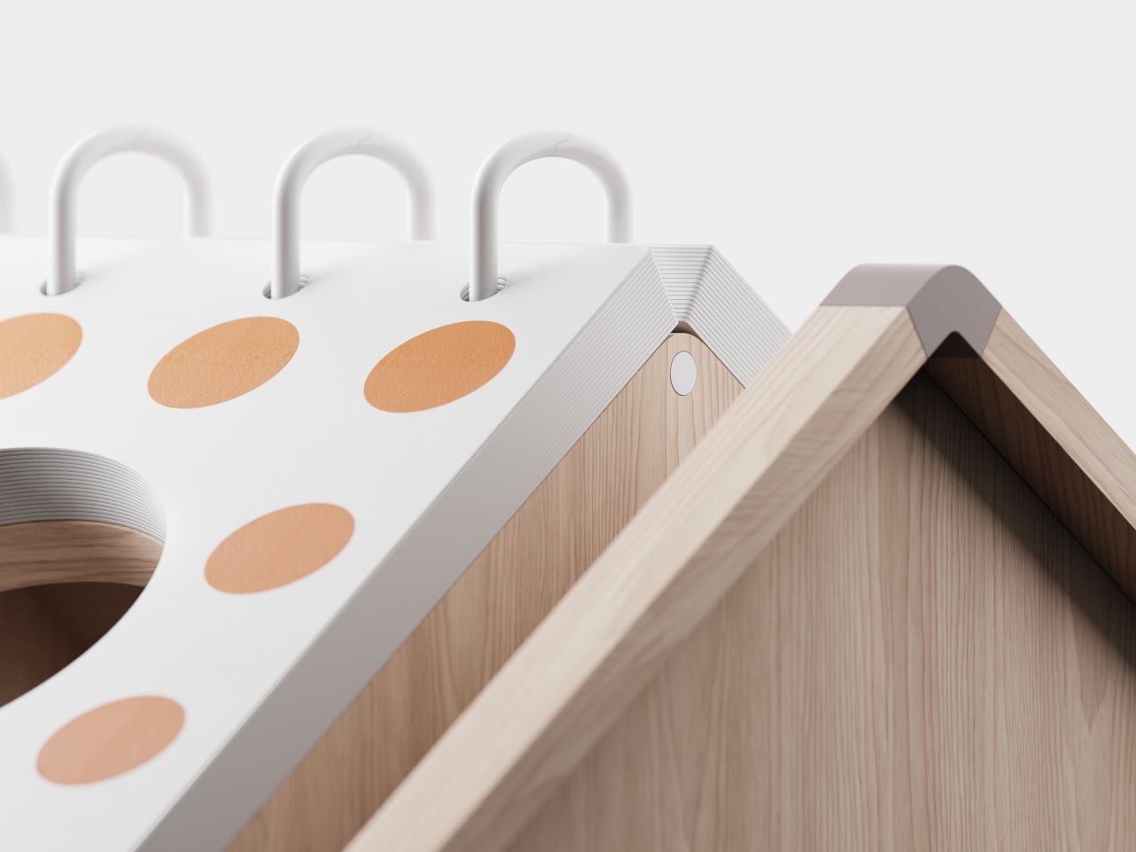
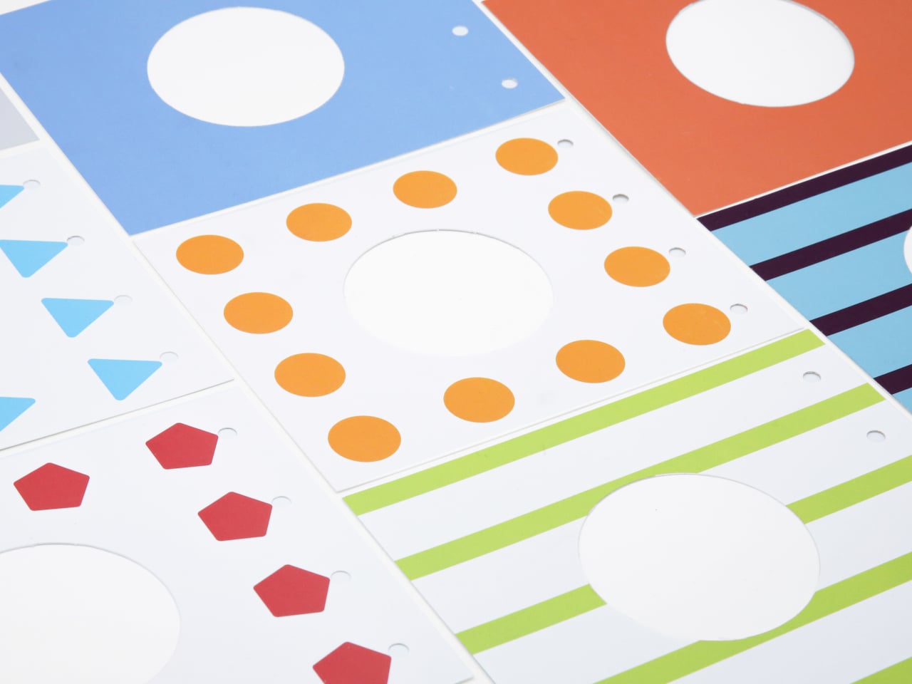
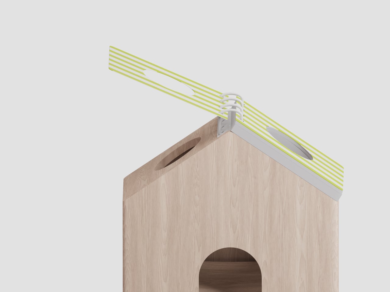
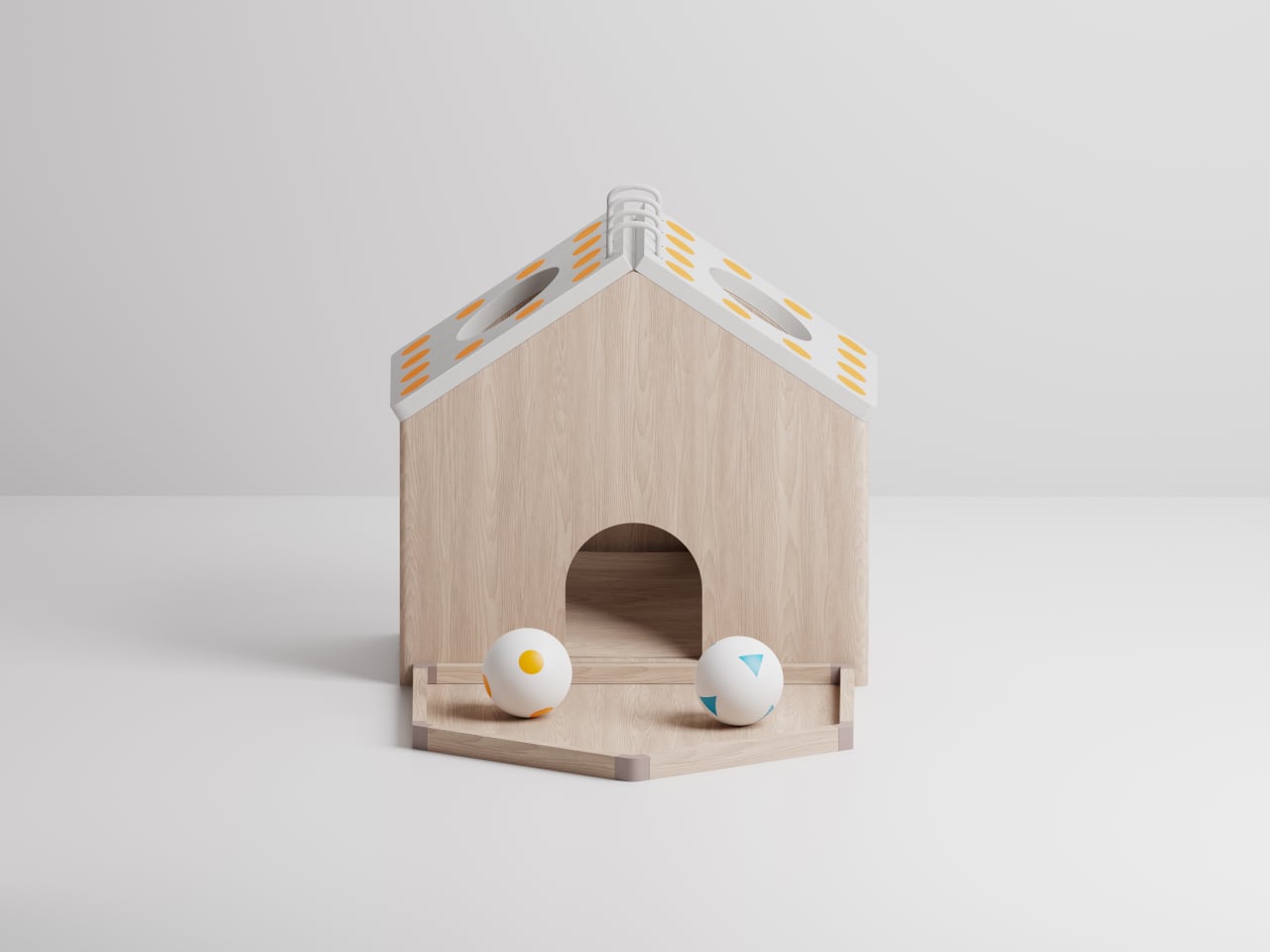
The basic loop unfolds simply. Two residents sit with the wooden house between them while a caregiver flips a pattern page on the roof. The page shows colors and dots, and the pair chooses the right patterned balls to drop into the opening. When they get it right, the balls roll down an internal slope and emerge from the bottom, and everyone smiles before moving on to the next pattern.

When the wrong ball goes in, the toy gives immediate feedback and gentle hints so participants can try again without feeling scolded. That process encourages them to re-explore the problem together, strengthening attention and problem-solving while keeping the mood light. The toy becomes a shared puzzle supporting continuous small wins instead of a test someone can fail, which matters when confidence is already fragile.

The pattern pages come in three tiers. The first focuses on simple color recognition, just matching orange to orange. The second combines shapes and patterns, requiring players to consider both color and arrangement. The third moves into contextual reasoning, where patterns carry more abstract meaning. Caregivers can tailor challenges to each person’s cognitive level and gradually increase complexity, keeping the activity engaging without overwhelming anyone.

Of course, the physical design supports that intuition. The internal slope guides balls toward the bottom door automatically, providing instant visual feedback. The magnetic ball tray attaches to the back for easy storage and transport. The familiar house form and tactile wooden body make the object feel approachable, especially for people wary of digital devices or anything that looks like medical equipment.

Cooperative House turns a simple act, dropping balls into a toy, into a small ritual of cooperation. It does not promise to cure anything, but it offers a way to chip away at loneliness and cognitive decline by giving people a reason to sit together, talk through options, and think side by side. A kind of shared play can be its own gentle medicine that’s perfect for the slow rhythm of care homes.

The post This Wooden House Toy Fights Loneliness in Nursing Homes with Play first appeared on Yanko Design.
Sony WF-1000XM6 earbuds leak reveals pill-shaped design and angular case

Wireless earbuds are the new normal, branching into bold categories like the Clip-Ons and going strong with traditional ANC options. Flagship TWS earbuds are constantly improving with hardware upgrades every couple of years (depending on the brand) and firmware updates that bring new features and options to explore the tech inside.

Sony has long been a major player in the TWS earbuds market, taking on the likes of Bose, Apple, Samsung, Sennheiser, Jabra, Technics, Nothing, and OnePlus. The WF-1000XM5, released in 2023, is their tough competitor, but the two-year release cycle has made them lag behind a bit in the feature list. Their next flagship earbuds are just around the corner, and their design has leaked to give us critics something to hanker about.

Designer: Sony

Looking to take forward the solid legacy of the 1000XM5s, Sony needs to innovate to reclaim the market share that’s being steadily eaten up by the likes of Technics AZ-100, Bose QuietComfort Ultra Earbuds (2nd Gen), Beats Powerbeats Pro 2, AirPods Pro 3, Samsung Galaxy Buds 3 Pro, and Sennheiser Momentum True Wireless 4. Even though Sony still has solid products, the WF-1000XM6 should bring incremental upgrades that retain the Japanese brand’s supremacy in the market.

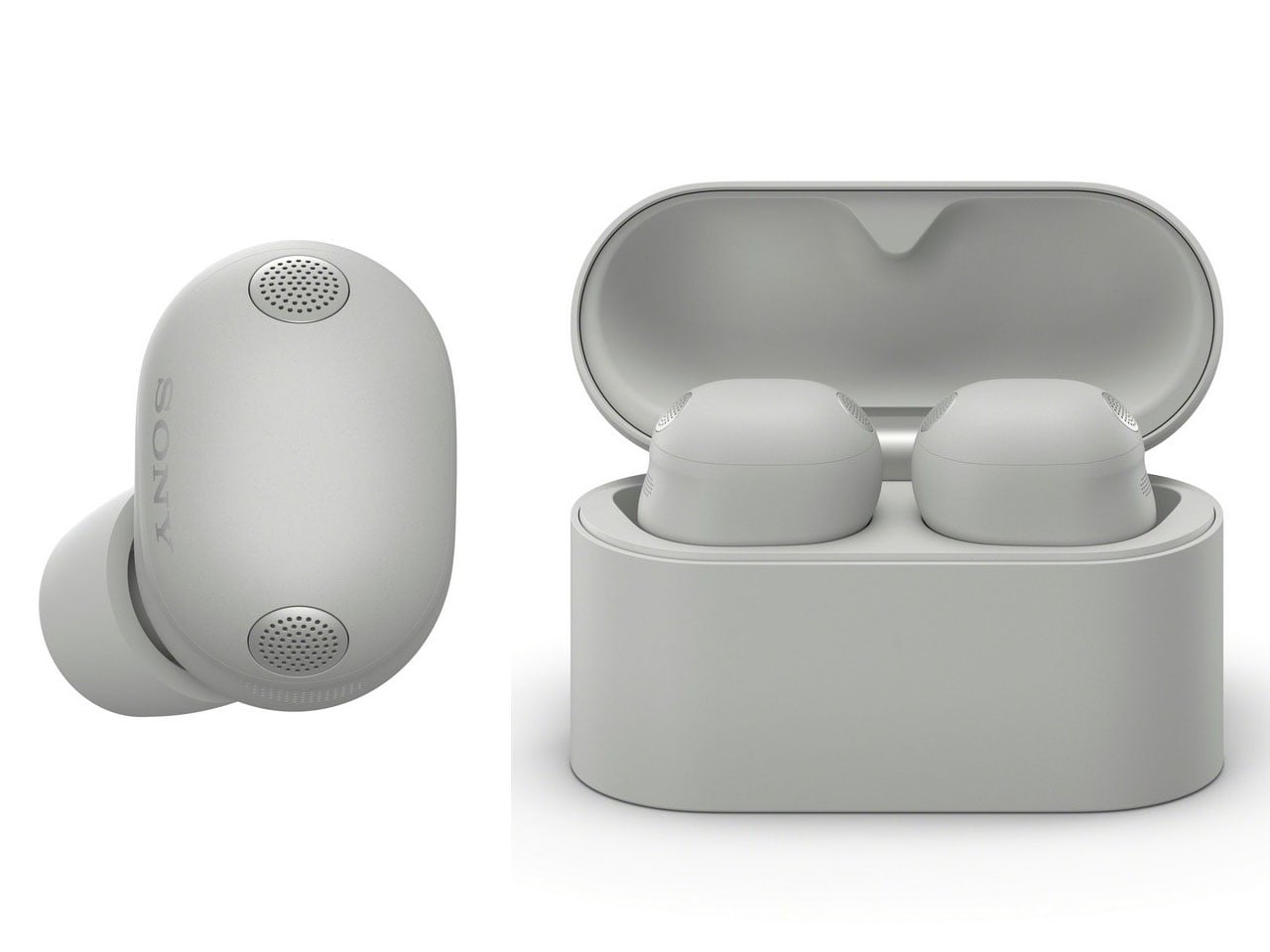
The leaked Sony earbuds were listed on Power Buy, a retail website, for a while, but were eventually taken down. However, The Walkman Blog managed to extract all the leaked images and a trail of information that got the internet buzzing. No specifications were mentioned in the listing, so we are still in the dark about the internal hardware of the upcoming flagship earbuds by Sony.
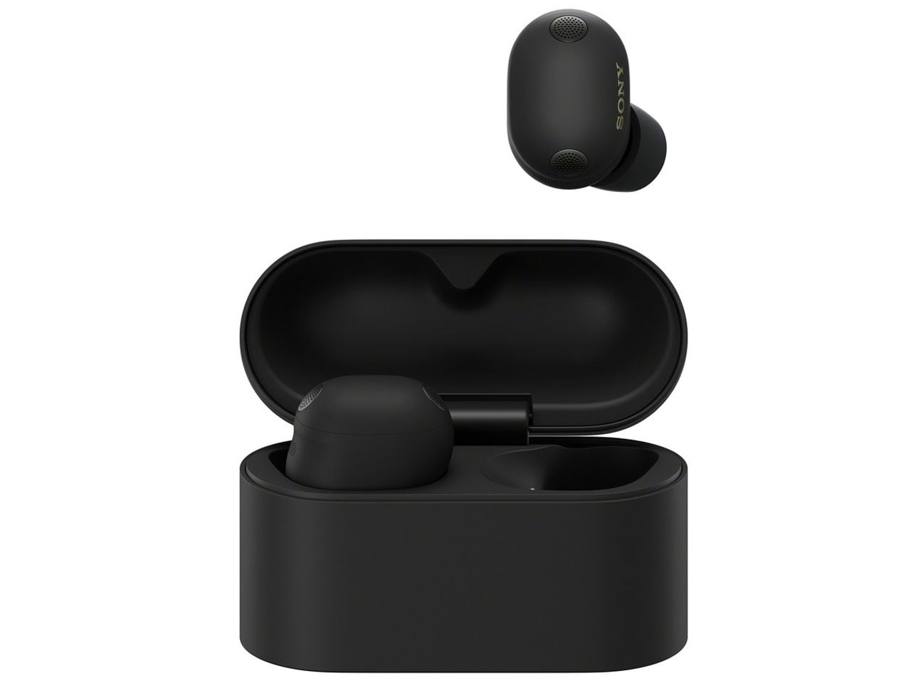
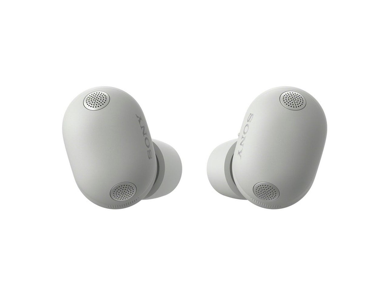
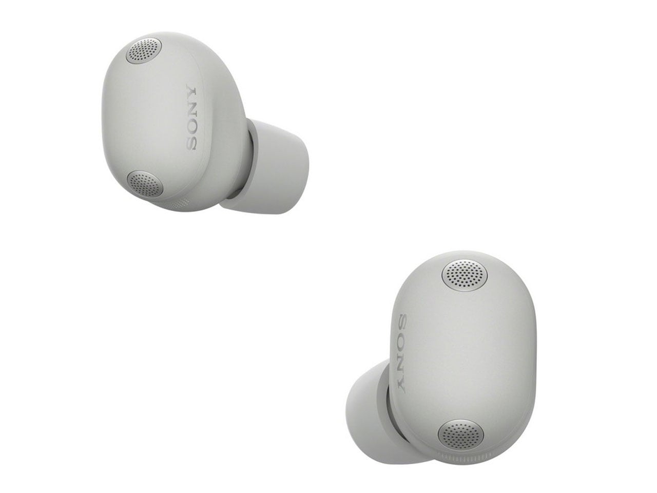
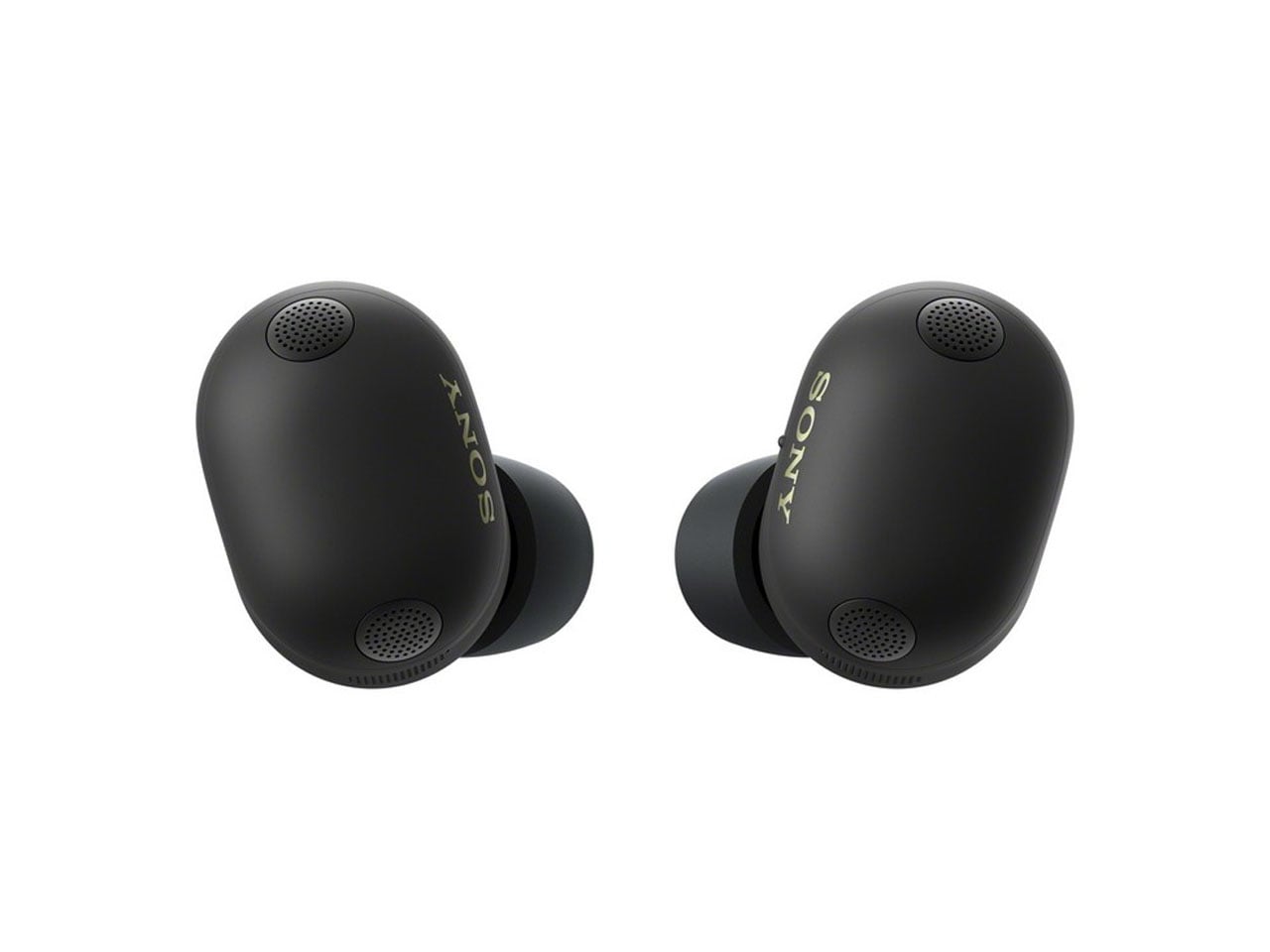
Compared to the contoured XM5, the successors have an elongated oval shape that makes them look bigger, but we’re sure they’re not. The listing mentioned the buds to have an IPX4 rating, which should be good to take them on a rainy day or listen to music by the poolside. Other than that, the earbuds will have ANC and transparency modes, which is predictable and nothing new in current times. From the very clear images, it is apparent that the glossy finish is gone (thank god) and the matte texture looks good with the aesthetics.

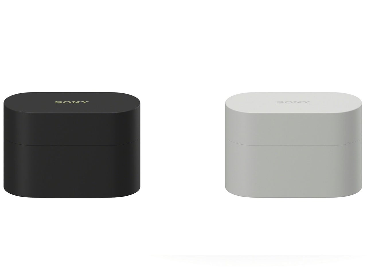
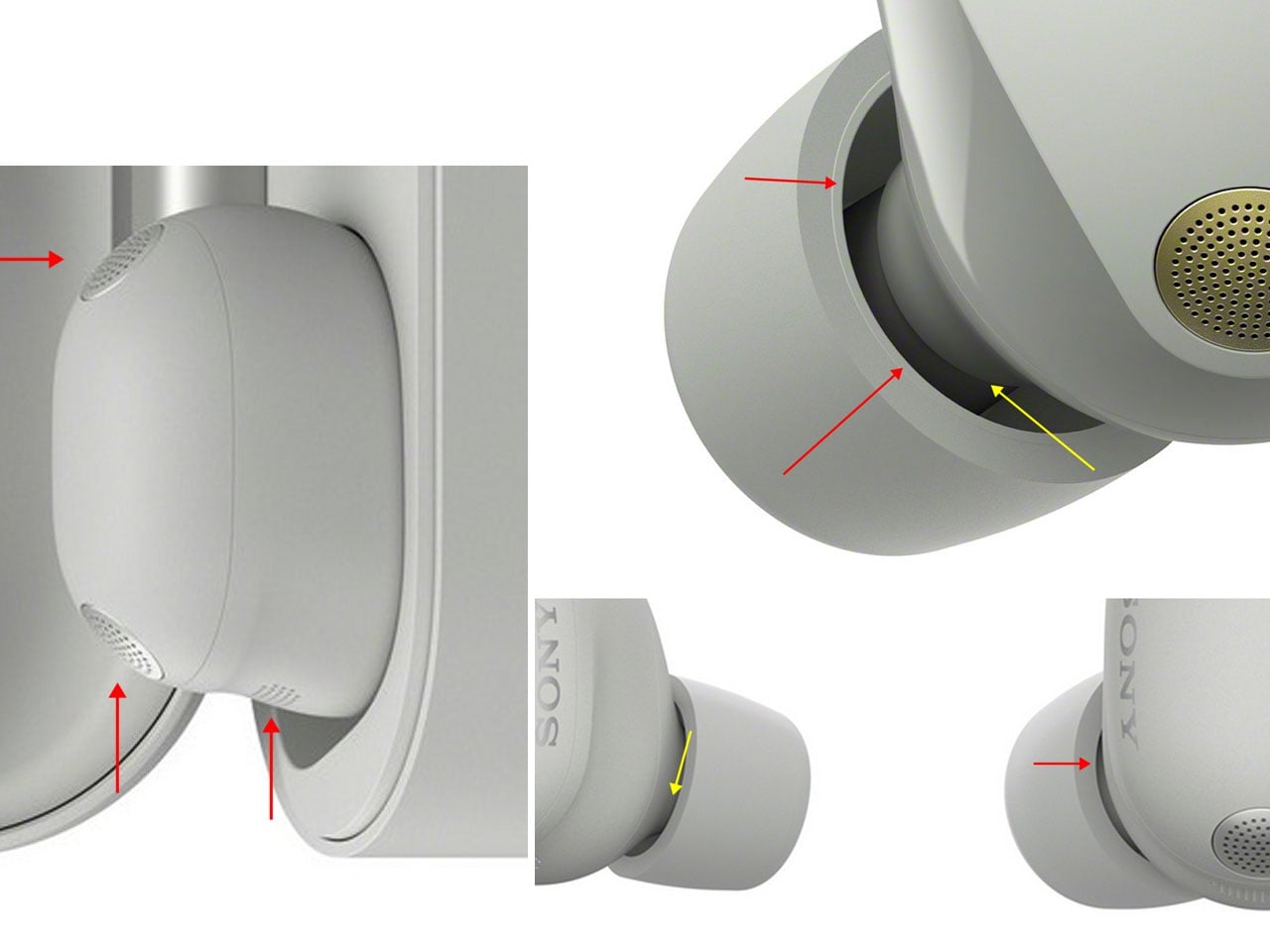
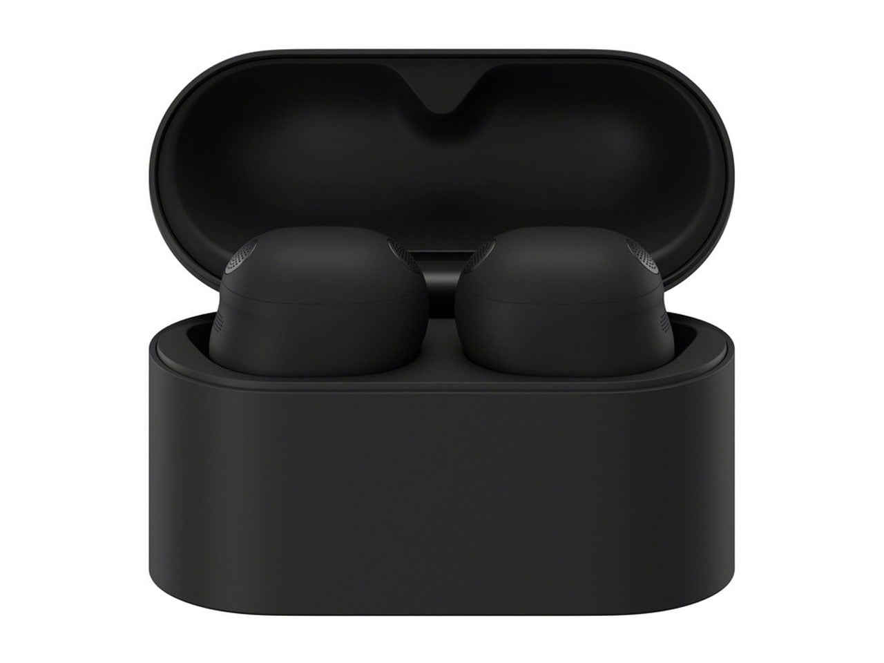
On closer look, one can clearly see three microphones on each earbud (two on top and one on the side), indicating better call audio quality and ANC performance. The charging case has also taken the upgrade route with a more geometric shape compared to the outgoing model. It sure looks bulkier than the older one, but we’ll have to see them side by side to make any conclusions. There are stock eartips on the buds, and we expect to see some good hybrid and silicone tips in the accessories package. If there’s one thing we didn’t love about the XM5s, it’s the eartips, which are fatiguing.

The pill-shaped earbuds will come in two color options: Black and Silver, but we’re sure there are a couple of more colors lurking in the space. Sony has this strategy of revealing more colors after the initial release, so it won’t be surprising if they’ve reserved the peppier options for later.

The post Sony WF-1000XM6 earbuds leak reveals pill-shaped design and angular case first appeared on Yanko Design.