LEGO’s first-ever Pokémon sets transform Pikachu, Eevee, and Kanto legends into collectible icons

Pokémon franchise is turning 30 next month, and LEGO Group wants to celebrate the occasion with LEGO Pokémon sets. Following leaks and speculations, the official reveal has been made, with two sets of the three already up for pre-order. The three main sets will be shipped next month, coinciding with the 30th anniversary of the franchise on February 27. These will revolve around the star mascots Pikachu and Eevee, while the final evolutions of the original starter Pokémon Charizard, Blastoise, and Venusaur will add excitement for younger fans.

Pikachu and Eevee will make up for the two sets, having their standalone releases in the lineup. The biggest of them all will be the third, Starter Evolution set that’ll let you pose the three Kanto starters’ based on the theme choosen. It can be anything from the ush junglescape for Venusaur, a crashing wave for Blastoise, and a lava-dripping spire for Charizard to fly over.

Designer: LEGO Group

Eevee Set

The first set in this iconic collection centers on Eevee, the evolution-ready fan favorite. As the most accessible option, this 587-piece build is priced at $59.99 and stands just over 7.5 inches tall once assembled. Its design embraces Eevee’s signature charm with a brick-built face that gives the figure an expressive, almost lifelike presence.

Articulation in the head, ears, limbs, and tail allows subtle posing, while hidden nods to Eevee’s many evolutionary forms add a playful layer of detail for longtime Pokémon Trainers. The compact size and approachable price point make this an appealing choice for both seasoned LEGO builders and newcomers intrigued by the mash-up of brick construction and Pokémon nostalgia.

Pikachu and Poké Ball Set

Stepping up in scale and ambition, the Pikachu and Poké Ball set takes center stage with a 2,050-piece count and a $199.99 retail price. This model revisits one of the franchise’s most iconic moments: Pikachu bursting from its Poké Ball, ready for action. The brick-built Pikachu captures that dynamic energy with fully posable ears and limbs, enabling display configurations ranging from a relaxed stance to an aggressive battle pose.

Its display stand features a stylized lightning motif that evokes the Electric-type’s signature power, and LEGO designers have subtly incorporated Pikachu’s Pokédex number, “25,” into the base, a detail that resonates with franchise history. Whether perched atop the Poké Ball or displayed mid-leap, this iteration of Pokémon’s mascot offers a dramatic and nostalgic showcase piece.

Venusaur, Charizard and Blastoise Diorama

At the top of the inaugural range is the Venusaur, Charizard and Blastoise diorama, a monumental build that celebrates the original Kanto starter Pokémon in their final evolutionary forms. With 6,838 pieces and a $649.99 price tag, this set is designed squarely for adult collectors and hardcore fans. Each Pokémon figure stands individually with its own articulation, allowing builders to pose Venusaur’s vines, Charizard’s wings, and Blastoise’s water cannons in varied stances.

The figures are proportioned to stand roughly 7 to 9 inches tall, and they sit upon a richly detailed multi-biome base that reflects their elemental identities. These include a leafy jungle for Venusaur, volcanic embers for Charizard, and aquatic textures for Blastoise. Scattered throughout the build are Easter eggs and environmental cues that reward close inspection, making this set a centerpiece worthy of display in any fan’s collection.

To sweeten the launch, LEGO is also offering limited extras tied to these sets. Buyers of the starter trio set during the first week of release can receive a Kanto Region Badge Collection as a gift with purchase, while LEGO Insiders will have access to a mini Pokémon Center build through reward redemption.

The post LEGO’s first-ever Pokémon sets transform Pikachu, Eevee, and Kanto legends into collectible icons first appeared on Yanko Design.

Honor Magic8 Lite: The Lightweight Phone That Lasts Three Days

PROS:


  • Excellent multi-day battery life with a huge 7500 mAh cell

  • Lightweight feel for its size

  • Strong durability story with IP69K, IP68, IP66 ratings

CONS:


  • Snapdragon 6 Gen 4 performance is only mid-tier

  • Unimpressive camera performance

RATINGS:

AESTHETICS
ERGONOMICS
PERFORMANCE
SUSTAINABILITY / REPAIRABILITY
VALUE FOR MONEY

EDITOR'S QUOTE:

Honor’s Magic8 Lite trades raw speed for stamina and toughness, and in doing so becomes one of the few phones you can trust to stay light in your pocket and alive for days at a time

There are phones that chase benchmarks and spec sheets. Then there are phones that quietly decide to solve a very boring and very real problem, which is running out of battery at the worst possible time. The Honor Magic8 Lite belongs firmly in that second group, and that is exactly what makes it interesting.

From the moment you pick it up, the Magic8 Lite feels almost contradictory. It carries a huge 7500 mAh battery, yet it settles into your hand with the easy lightness of a much smaller phone. That contrast sets the tone for the whole experience and gives the phone a very specific kind of charm.

Designer: Honor

This is a device that wants to disappear into your day rather than dominate it. It is not trying to shout about performance or AI tricks, and it does not weigh you down in your pocket or your bag. Instead, it leans into battery endurance, a bright OLED display, and a surprisingly tough body that is happy to live without a case if you are brave enough to try.

This is not a flagship, and it does not pretend to be one. If you are chasing the fastest processor or the most experimental camera system, you will not find that here. What you do get is a phone that feels designed for regular people who want something light, long-lasting, and resilient, a phone that survives a few accidents and still looks good on the table at the end of the day.

Aesthetics
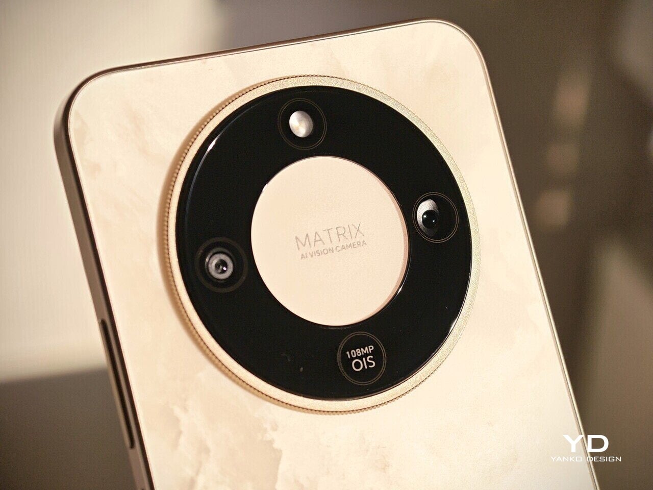
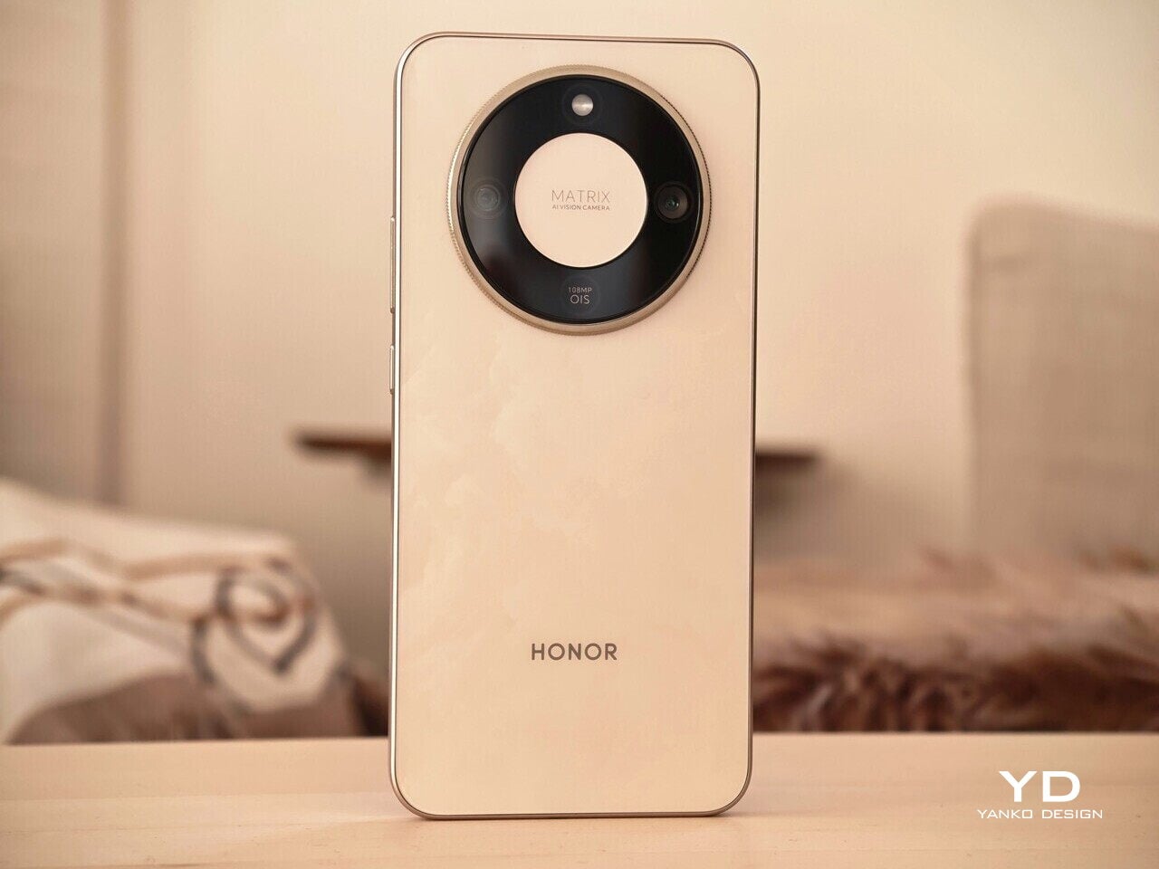
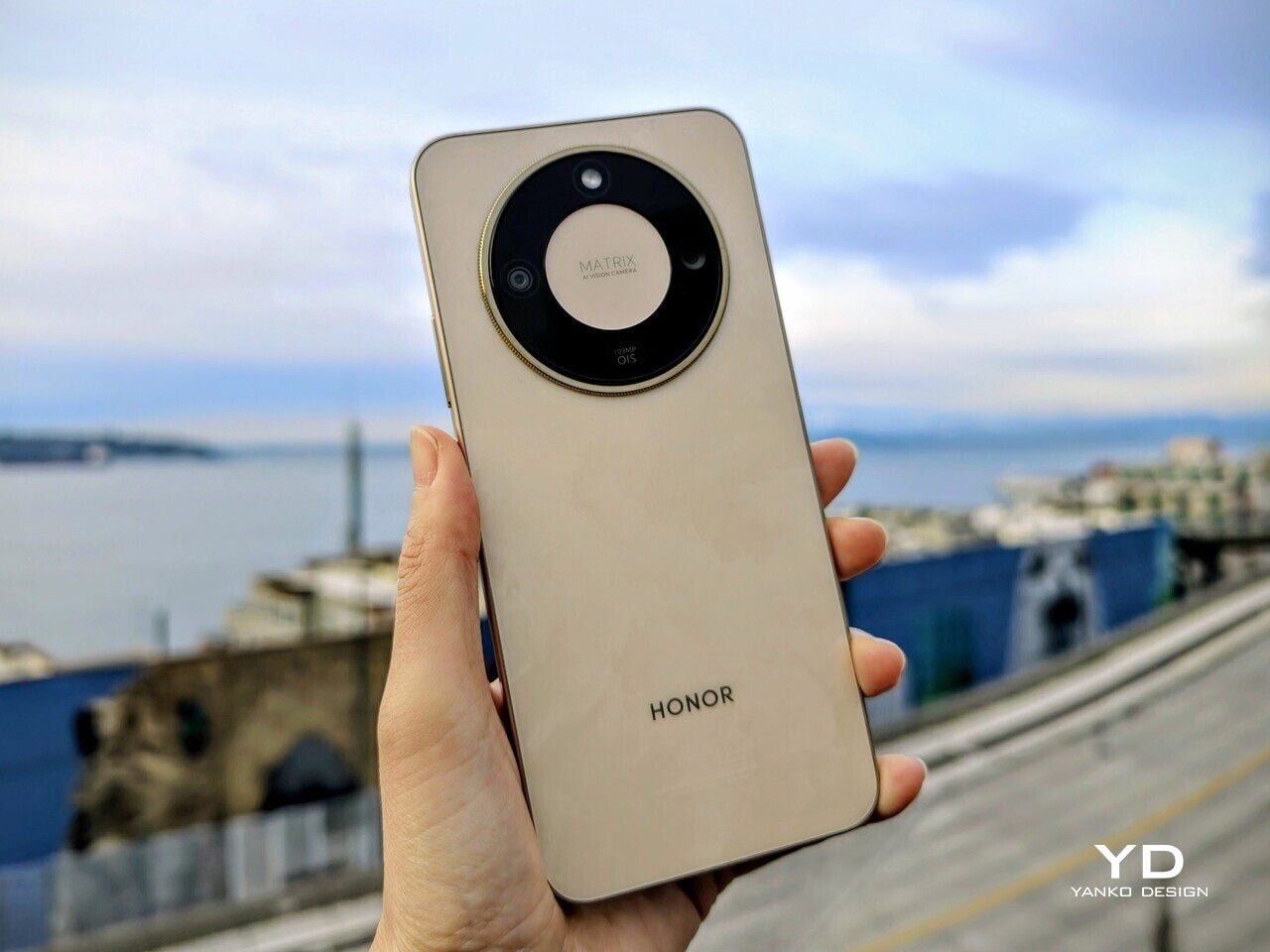
The Honor Magic8 Lite is a reminder that “Lite” does not have to look cheap. Honor uses a plastic frame and plastic rear panel, which helps keep weight in check despite the oversized battery and keeps the phone feeling approachable in the hand. The camera island design has been updated. You get a large circular module that sits high on the rear panel, almost like a watch face sitting on the spine of a book, which continues the design language from its predecessor.

Instead of a single black disc, Honor has adopted a ring-based layout for the Magic8 Lite camera island. The black outer circle houses two cameras and the LED flash, while the inner circle carries the “Matrix AI Vision Camera” text as a graphic centerpiece. The circle is bold enough that your eye goes straight to it, which instantly gives the phone a recognizable appearance from almost any angle. It feels more like a deliberate design motif than a simple camera bump, and that makes the back visually memorable.

The Honor Magic8 Lite is available in Forest Green, Midnight Black, Reddish Brown, and Sunrise Gold in some markets, each one giving the camera ring a slightly different personality. The Reddish Brown version features a vegan leather finish that adds warmth and tactility, while the others use a matte surface that keeps fingerprints under control. The Sunrise Gold option adds a subtle, waterpaint-like pattern that shimmers as you tilt it, giving the phone a more premium character than the materials list would suggest.
Ergonomics

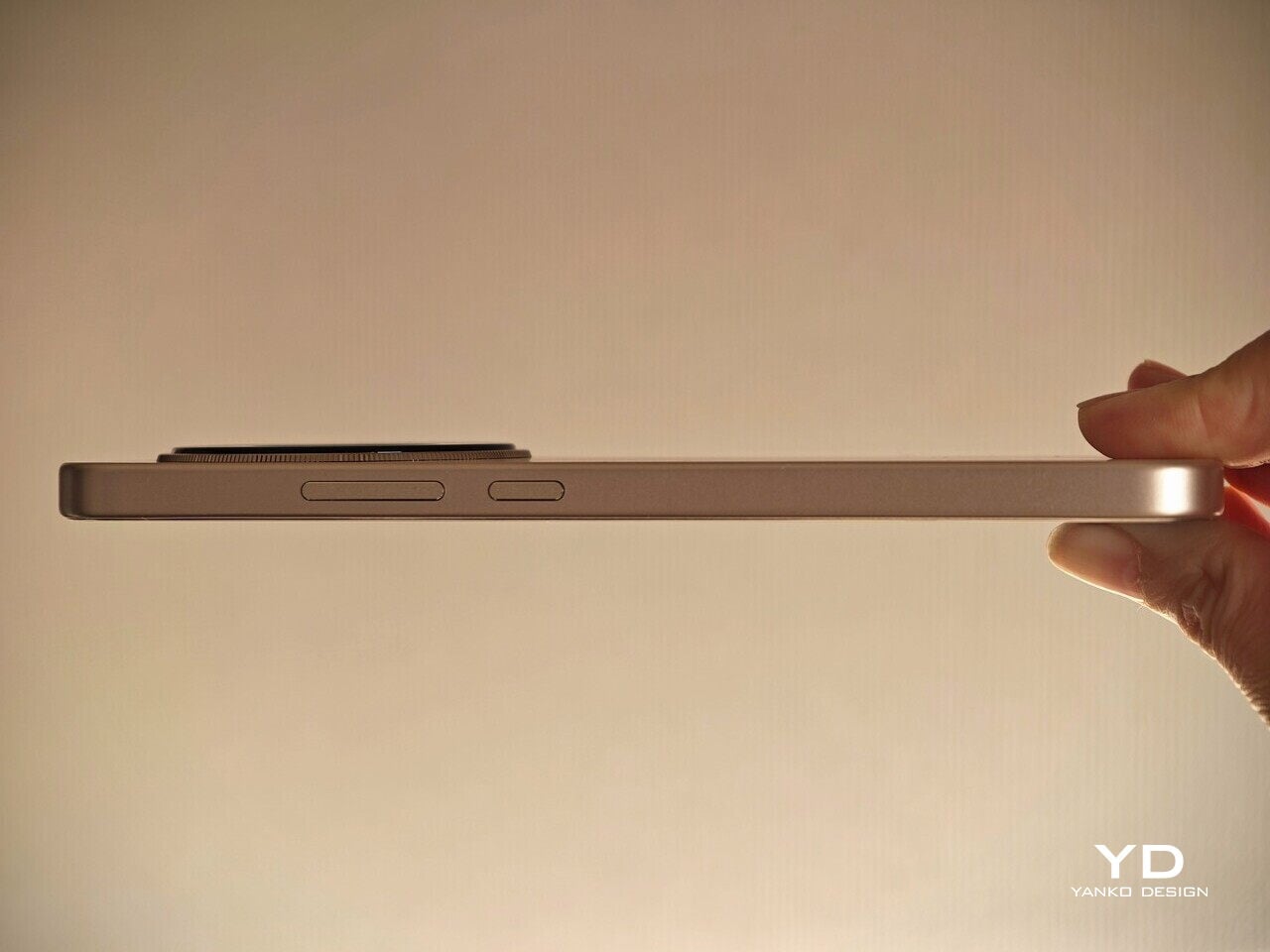
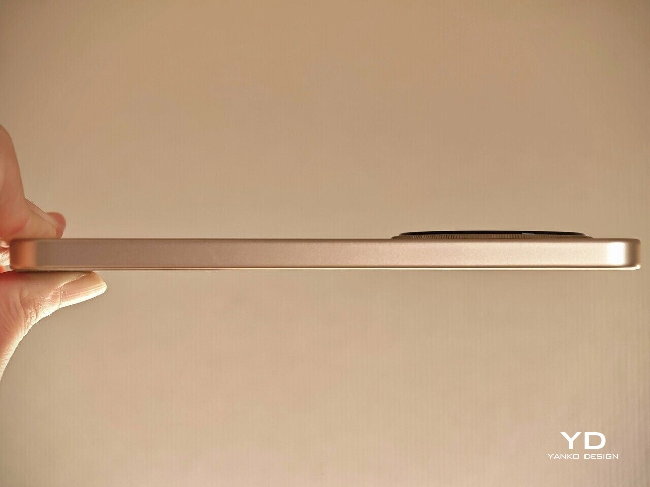
On paper, a 6.79-inch phone with a 7500 mAh battery sounds like a brick waiting to happen. In the hand, the Magic8 Lite is more balanced than you might expect. At 189 grams and roughly 7.8 millimeters thick, it is not featherlight, yet it avoids the dense, top-heavy feel that big battery phones often suffer from.

The matte back panel and brushed metal-like frame both do a good job of resisting fingerprints and smudges. You can use the phone without a case, and it still looks clean at the end of the day, which fits the whole low-maintenance character of the device. The surfaces feel practical rather than precious, so you are less worried about babying it in everyday use.
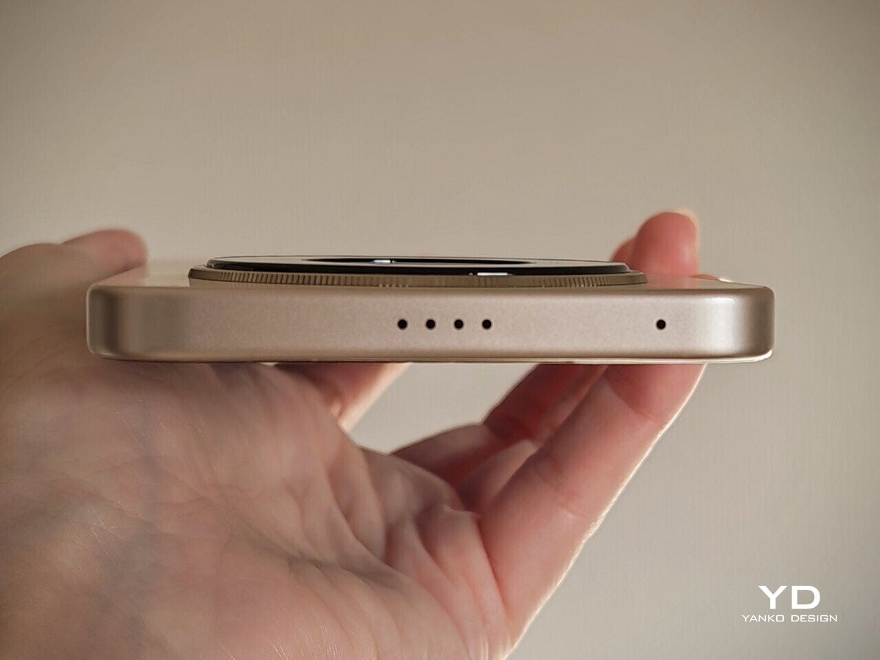
The flat sides help with grip, while the curved edges at the back soften the transition into your palm. Since the phone leans toward the wider side, you will still want two hands for extended typing or navigation, especially if you have smaller hands. The weight distribution feels centered, so the phone does not constantly try to tip forward when you reach for the top of the screen.

There is one ergonomic misstep. The fingerprint scanner on the side is positioned very close to the bottom edge, which makes the movement from holding position to unlocking feel less natural. Your thumb has to dip down in a way that breaks the otherwise smooth hand position, and it takes a little getting used to if you are coming from a phone with a higher side sensor.

Performance

Inside, the Magic8 Lite runs on Qualcomm’s Snapdragon 6 Gen 4 with 8 GB of RAM and either 256 or 512 GB of storage. This combination sits firmly in the capable but not aggressive category. For messaging, social media, web browsing, and casual apps, the phone feels smooth enough, especially with the 120 Hz refresh rate helping animations and scrolling feel more fluid. You do start to feel the limits in heavier multitasking and demanding games.
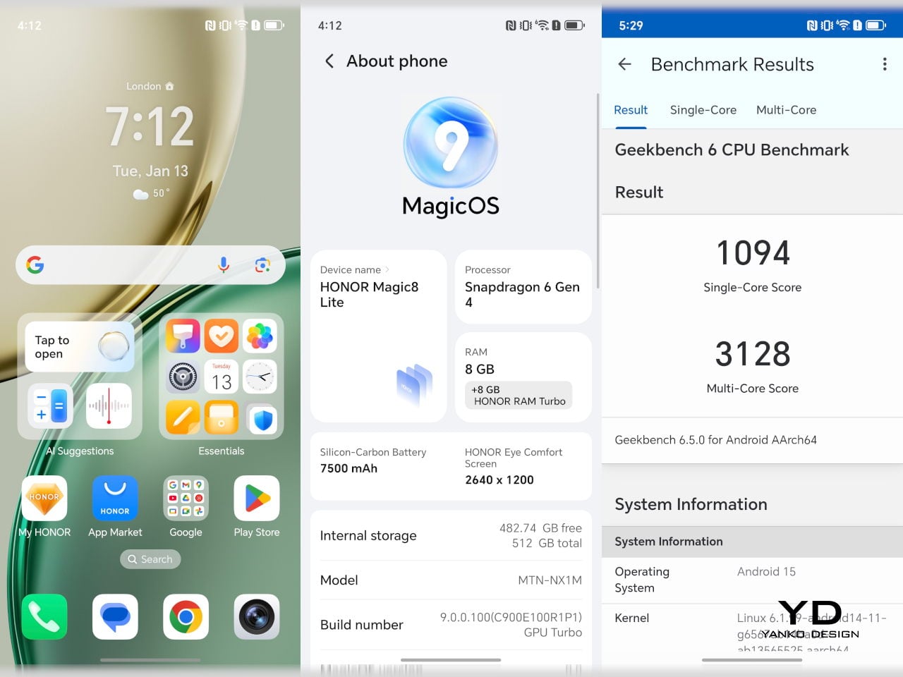
Running MagicOS 9 on top of Android 15, the Magic8 Lite offers Google Gemini out of the box along with a suite of AI features, including AI photo editing tools and AI Translate. These extras sit quietly in the background until you need them, which suits the phone’s everyday focus.
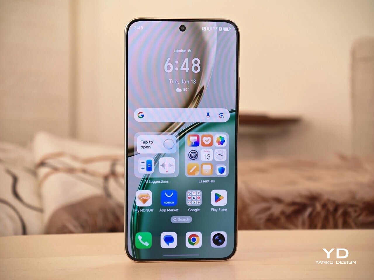
The display is one of the Magic8 Lite’s strongest visual arguments. You get a 6.79-inch OLED panel with a resolution of 2640 x 1200 and a 120 Hz refresh rate. Honor quotes a theoretical peak around 6000 nits, and while you will not hit that number in regular use, outdoor visibility is excellent. The 3480 Hz PWM dimming also aims to make the display more comfortable for sensitive eyes during longer sessions.
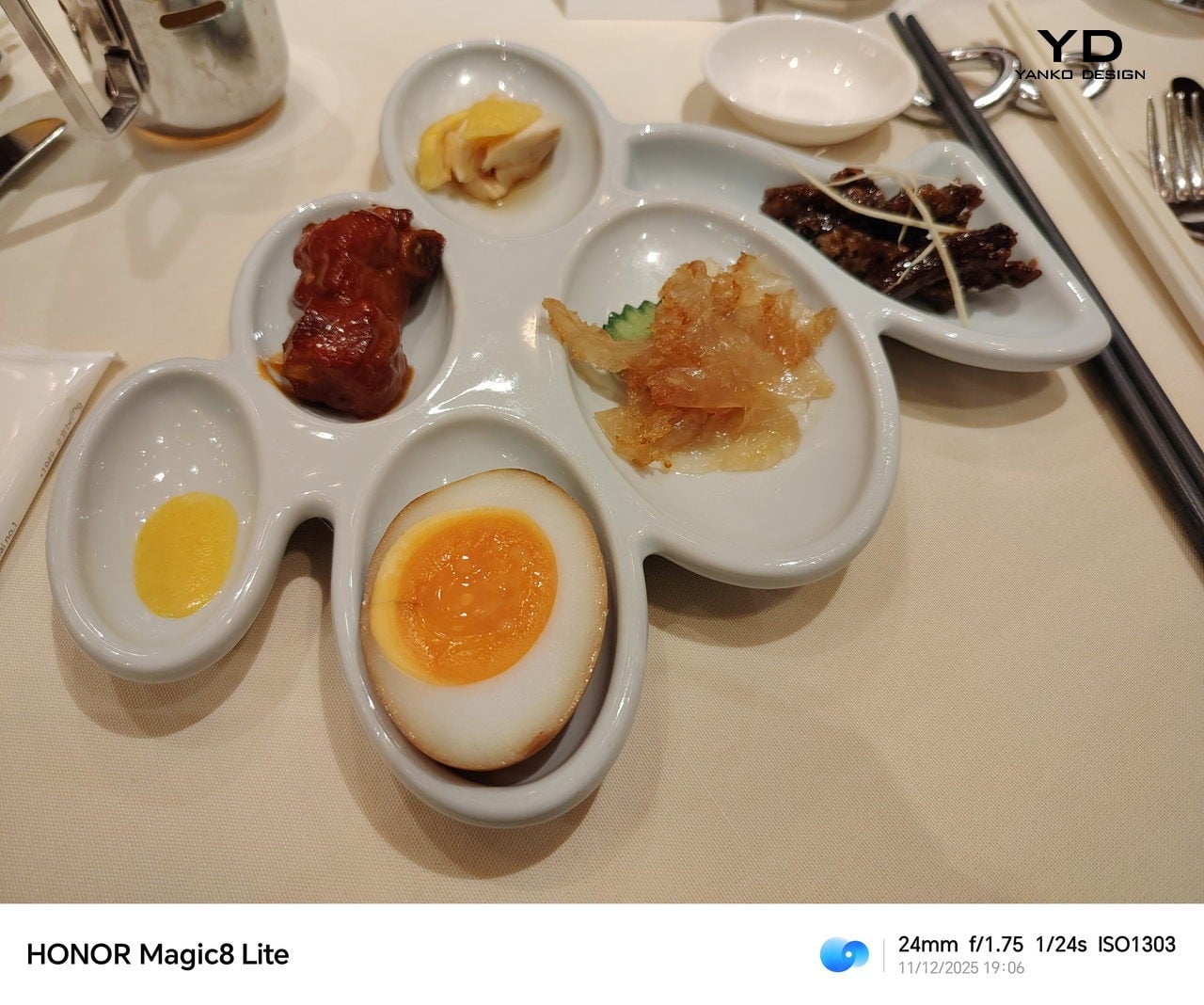

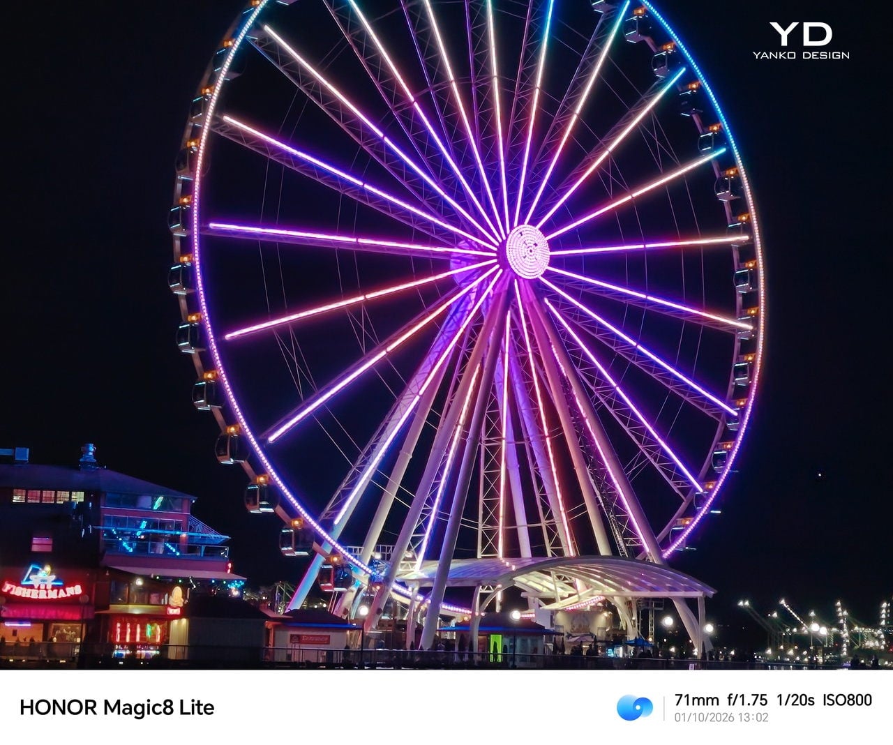
Honor gives the Magic8 Lite a 108 MP main camera with a 1/1.67 inch sensor, optical image stabilization, and phase detect autofocus, paired with an ultrawide camera and a 16 MP selfie shooter. The main camera does a relatively good job in most everyday scenarios, delivering detailed images in good light. You can zoom up to 10x, but image quality drops off quickly, and the camera struggles to freeze motion, even in daytime, so it is best treated as a 1x to 2x camera for reliable results. The main camera can record video up to 4K at 30 FPS, and the results are good for the price range.
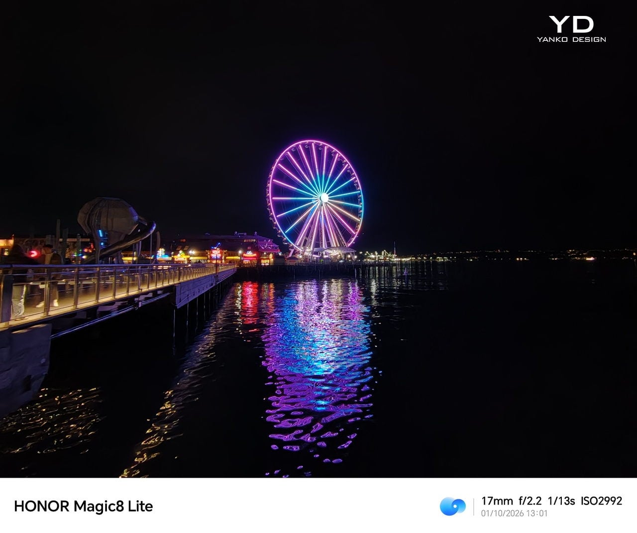
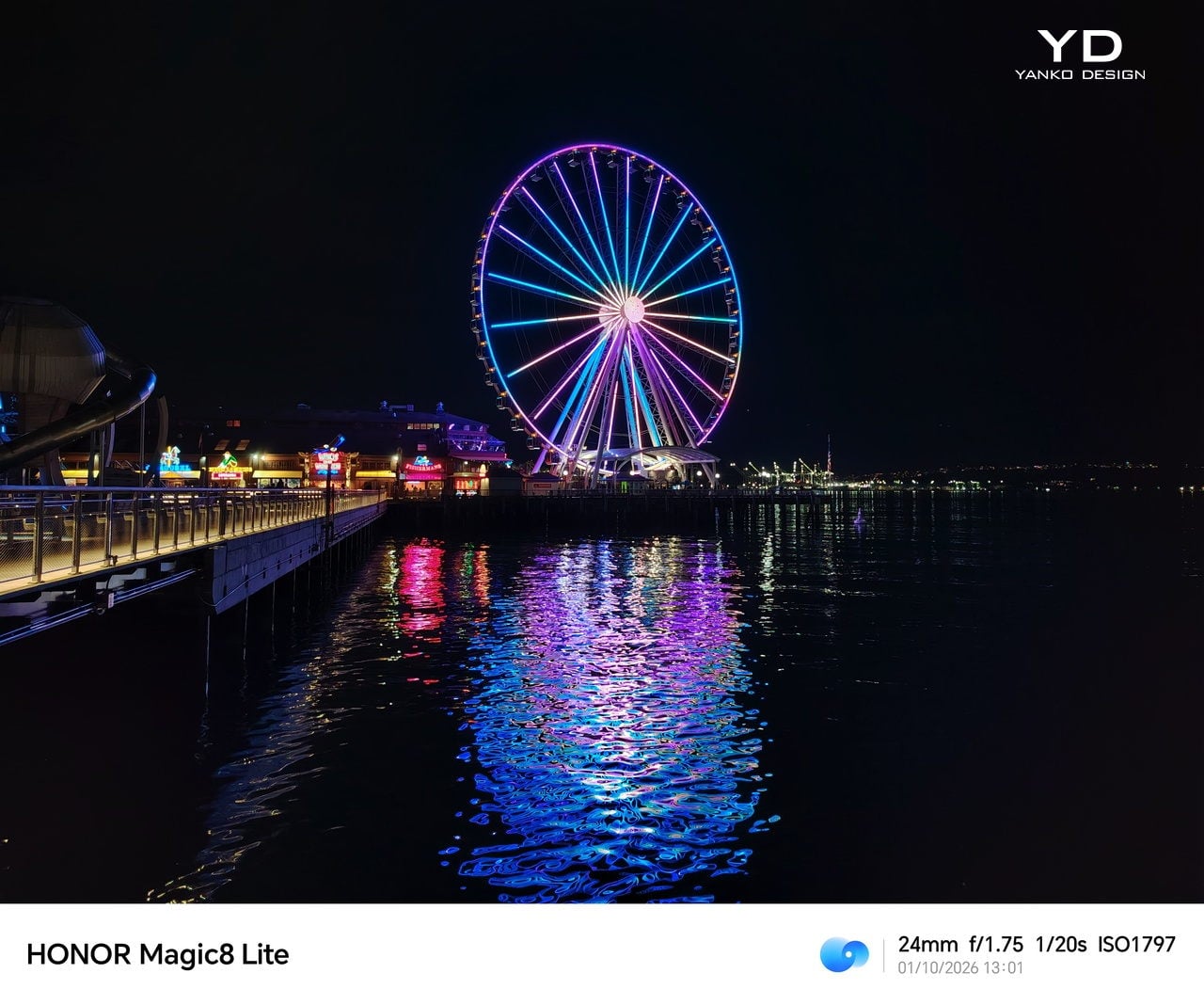
The ultra-wide camera performs as expected for this class. It is useful for landscapes and group shots, but detail and dynamic range are a step down from the main sensor, so you use it when you need the extra width rather than for pure image quality. The front-facing camera does a decent job, giving natural-looking skin tones and texture. For video recording, both ultra-wide and front cameras are capped at 1080p at 30FPS.


Battery life is the headline act, and the Magic8 Lite fully leans into it. The 7500 mAh silicon carbon battery is significantly larger than the 5000 mAh units that have become standard in many phones. Combined with the efficient Snapdragon 6 Gen 4, this translates into genuinely impressive endurance that reshapes how often you think about charging.


Portrait Mode

In mixed everyday use, you are looking at three full days with comfort, and four days or more if you are a lighter user. Long sessions of streaming, navigation, or social scrolling barely make a dent compared to what you might be used to. This phone simply does not provoke range anxiety, which makes it a very easy recommendation for anyone who hates watching the battery percentage.
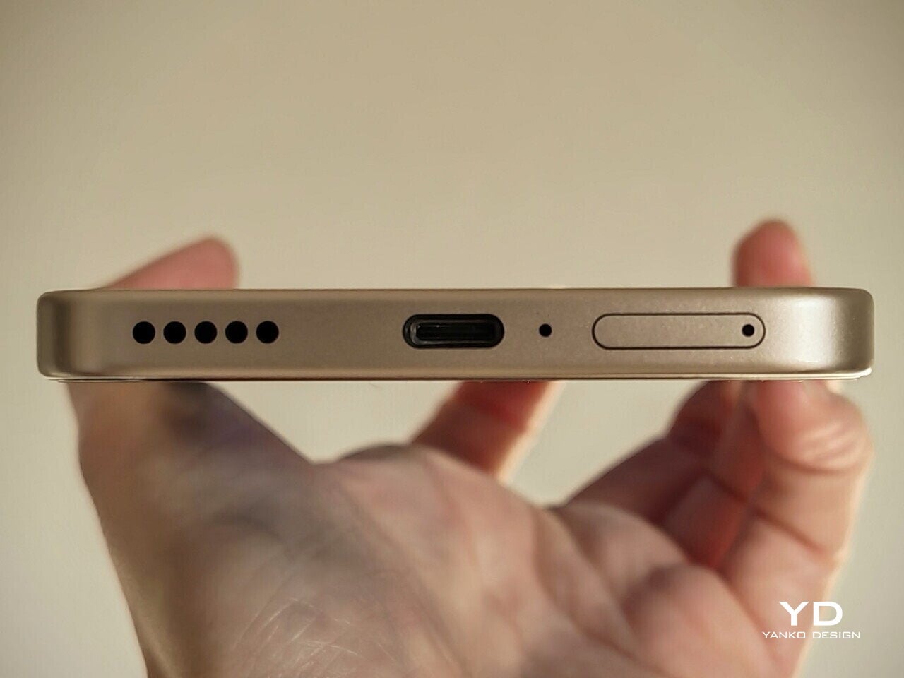
Charging is handled by 66W wired fast charging, provided you use Honor’s SuperCharge standard. Some regions include the charger in the box, and others do not, so you may need to factor that into the overall cost. Once plugged in, the phone refuels quickly enough that even a short top-up before you leave the house can add several hours of real use, which fits perfectly with the “charge less, worry less” personality of the Magic8 Lite.

Sustainability

The Magic8 Lite approaches sustainability from a practical angle. The device carries IP69K, IP68, and IP66 certifications, which are unusually comprehensive for this class. That combination means full dust protection, resistance to high-pressure water jets, and safety during water immersion. In daily use, it translates into a phone that can handle heavy rain, spills, and rough handling while still functioning as normal.

Honor claims the Magic8 Lite boosts resilience with its industry-first Ultra Bounce Anti-Drop Technology. This system pairs ultra-tough tempered glass with a reinforced internal structure to better absorb everyday impacts. The idea is simple: keep the phone alive longer by surviving the kind of accidents that usually send devices to repair shops or landfills.
Value

The Honor Magic8 Lite is priced at £399.99, which works out to roughly $510 at current exchange rates. At that level, it sits in the crowded upper mid-range, where you can find phones with faster processors or more ambitious camera systems. What most of those rivals cannot match is the combination of huge battery, lightweight feel, and serious durability that the Magic8 Lite offers as a package.

If your priorities lean toward performance or advanced photography, you may find better raw specs for similar money. You are paying here for peace of mind, long gaps between charges, and a design that does not feel fragile in everyday use. For regular users who value stamina and resilience over benchmark scores, the overall value proposition is quietly compelling.
Verdict

The Honor Magic8 Lite is not the phone for spec chasers, and that is exactly its appeal. It is built for people who care more about getting through a long weekend on one charge than hitting the highest frame rates in the latest game. If you can live with “good enough” performance and the main cameras that are solid but not flagship level, you get a phone that feels light in the hand, tough in daily use, and genuinely low maintenance to own.

Where the Magic8 Lite really wins is in how all those choices line up around a single idea. The oversized battery, the bright and efficient OLED, the comprehensive water and drop protection, and the fingerprint-resistant finishes all work together to reduce friction in everyday life. It is the phone you grab when you are not sure where the next outlet is, or when you know it might get caught in the rain, and you do it without a second thought.

The post Honor Magic8 Lite: The Lightweight Phone That Lasts Three Days first appeared on Yanko Design.


NAK Studio Imagines a Hi-Fi Stack You Would Actually Want on Display

Most Hi-Fi gear still looks like anonymous black rectangles, even in carefully designed living rooms. Serious listeners often hide their amps and speakers in cabinets because the hardware rarely matches the rest of the furniture, even when the sound is great. The default assumption is that audio equipment belongs out of sight, tolerated for its performance but not celebrated for its presence.

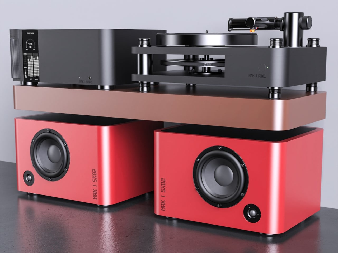
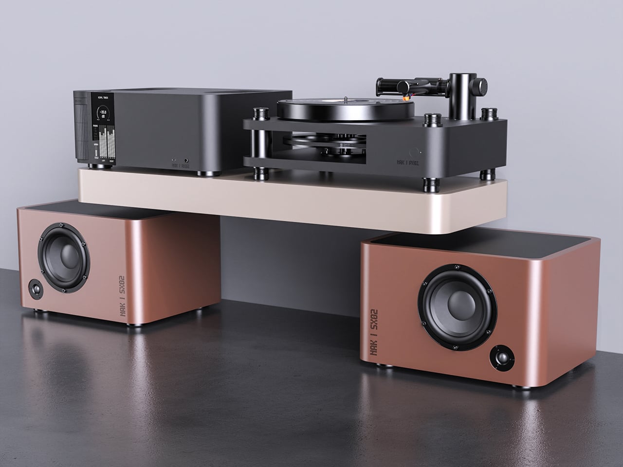
Antoine Brieux of NAK Studio designed a complete stack he would personally want at home, treating it as a thought experiment about what happens when an integrated amplifier, speakers, and turntable are drawn as one family from the start. Color, tactility, and proportions are treated as seriously as the signal path, so the system could earn a spot in the open rather than behind doors or under furniture.

Designer: Antoine Brieux (NAK Studio)

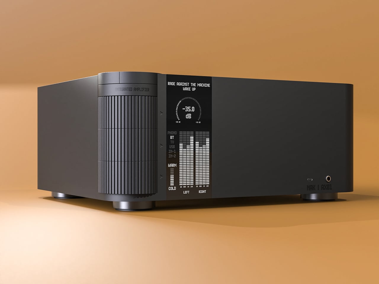
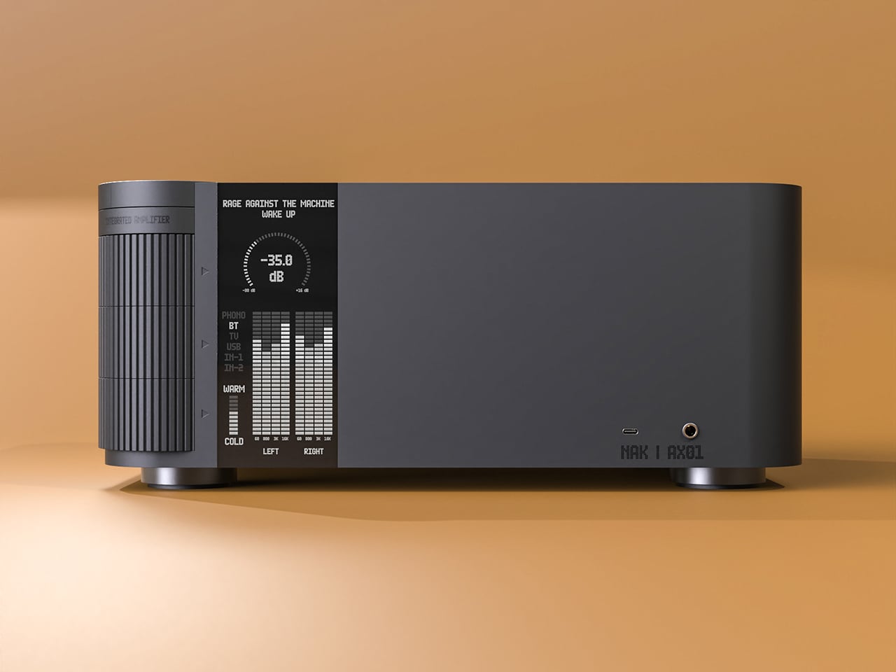
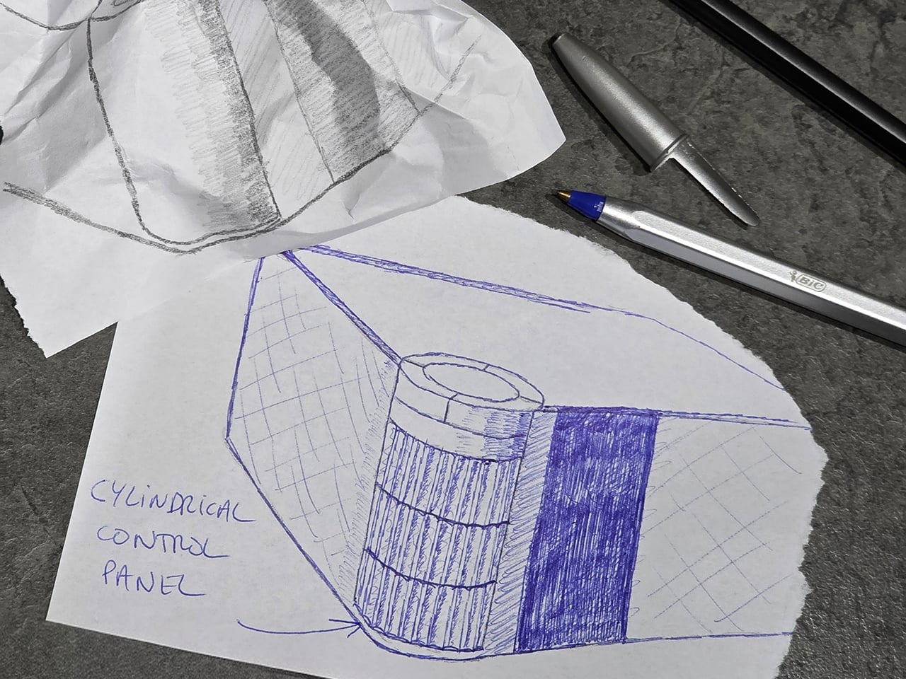
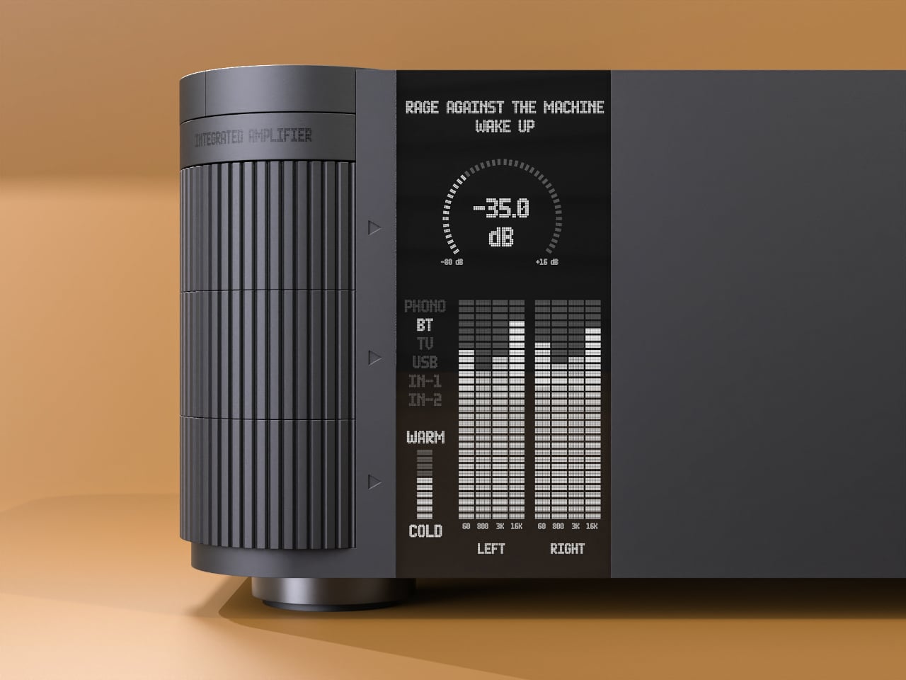
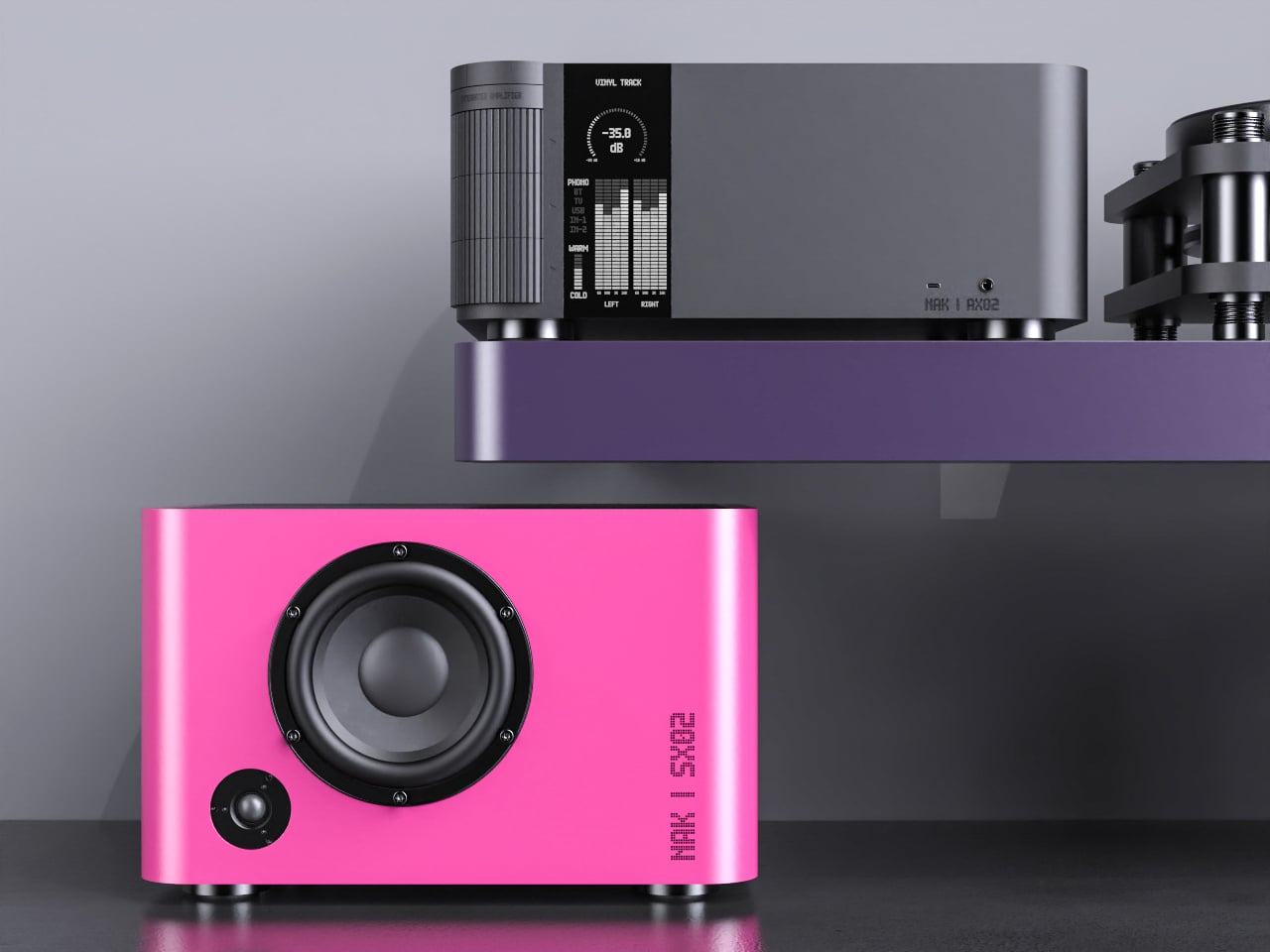
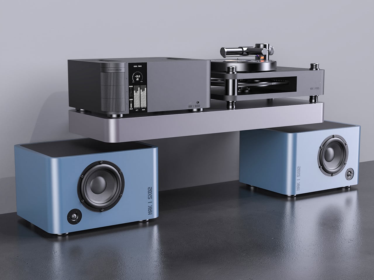
The integrated amplifier is a low, solid block with a ribbed cylinder grafted onto one corner, turning the usual volume knob into a full control column. That cylinder suggests precise, satisfying adjustments for volume, inputs, and tone, giving your hand a clear place to land instead of hunting for tiny knobs or touch buttons scattered across a cluttered front panel.

The tall monochrome display beside the cylinder shows track info, a big dB scale, and twin bar-graph meters dancing with the music. The list of inputs covers phono and TV to Bluetooth and USB, and a warm-to-cold tonal slider sits below, so the front of the amp feels like a calm, legible dashboard rather than a technical interface that demands constant attention or an instruction manual.

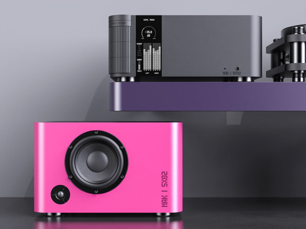
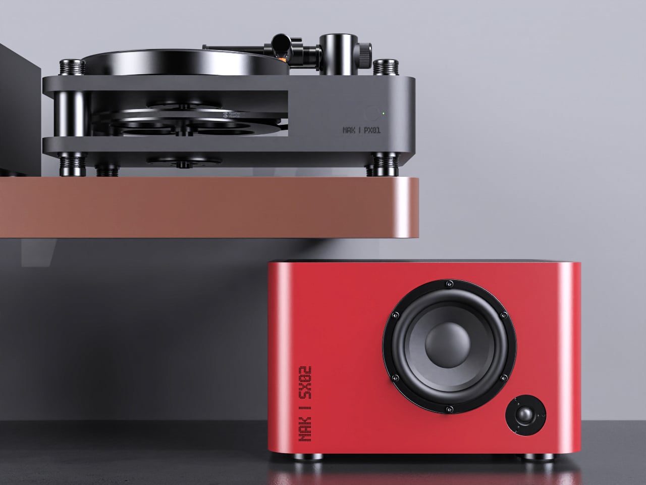
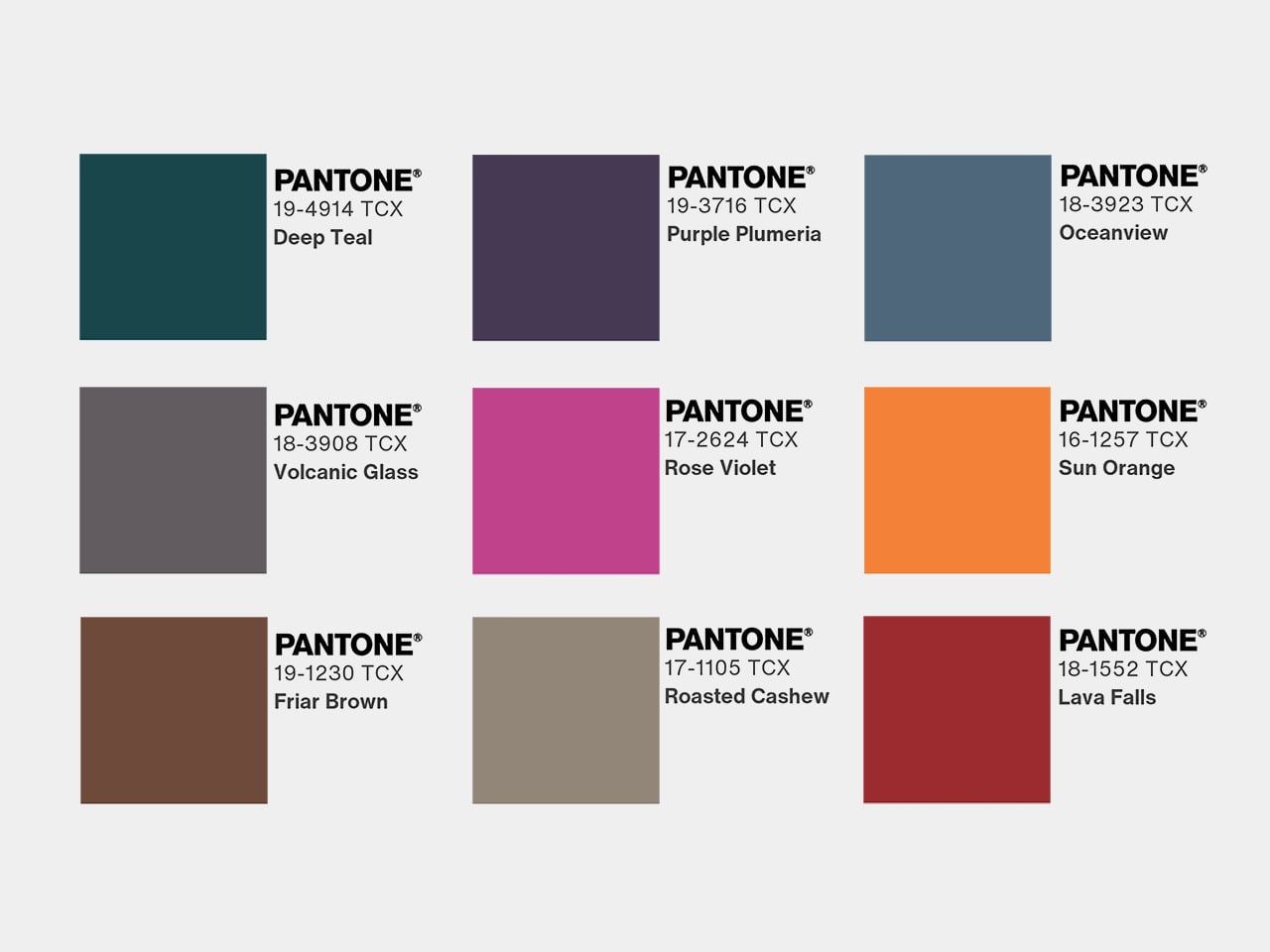
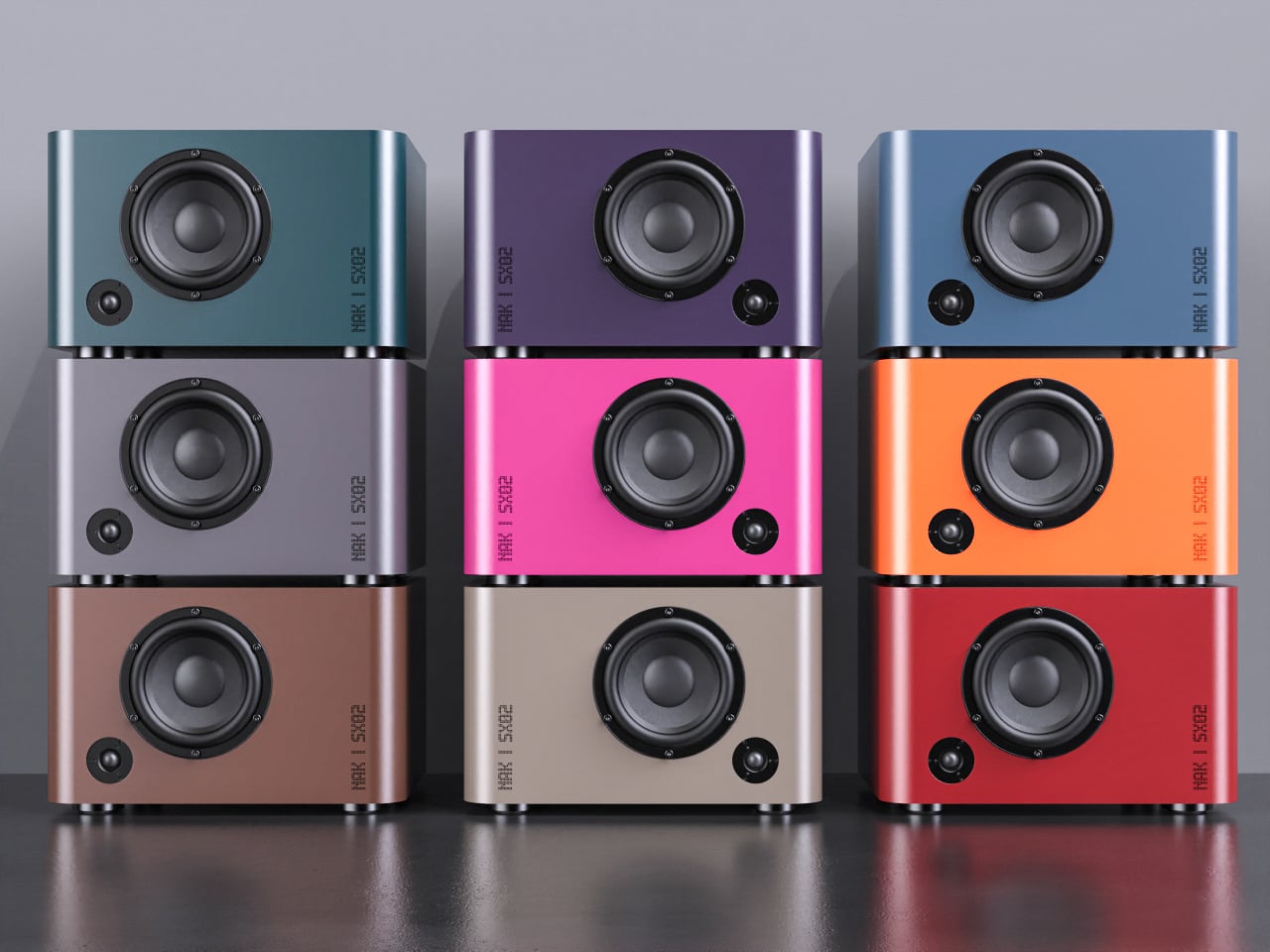
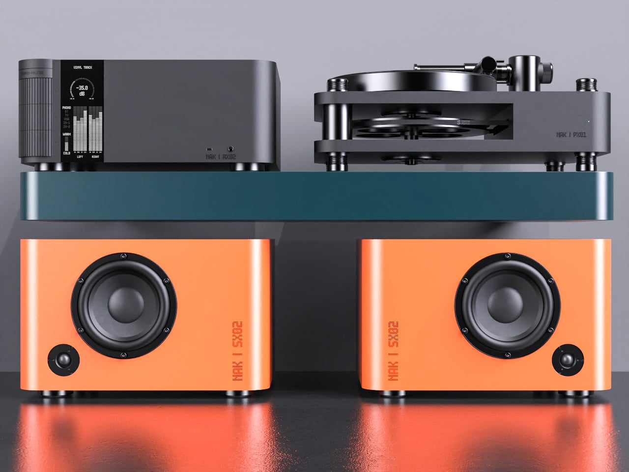
The compact speakers are each a rounded rectangle with a single driver and tweeter, but finished in mixable Pantone colors, letting you treat them as color accents in a room. You could pair teal with orange, or match a pair to a shelf or wall, so they become part of the space’s palette instead of something you try to hide or apologize for when guests visit.

The matching turntable sits on the same footprint as the amp, with exposed suspension pillars and a straight arm that echoes the cylinder theme. The three components stack visually into a tidy tower, making the whole listening setup feel intentional, almost like a piece of modular furniture for records and streaming alike, cohesive enough to anchor a sideboard or desk.

NAK Studio’s concept is not about chasing specs, but about imagining a Hi-Fi system that earns its place in the open. The controls invite touch, the colors play with the room, and the stack looks as considered as the music it is built to play. It starts to feel less like a fantasy and more like how audio gear should have evolved all along.

The post NAK Studio Imagines a Hi-Fi Stack You Would Actually Want on Display first appeared on Yanko Design.

NAK Studio Imagines a Hi-Fi Stack You Would Actually Want on Display

Most Hi-Fi gear still looks like anonymous black rectangles, even in carefully designed living rooms. Serious listeners often hide their amps and speakers in cabinets because the hardware rarely matches the rest of the furniture, even when the sound is great. The default assumption is that audio equipment belongs out of sight, tolerated for its performance but not celebrated for its presence.

Antoine Brieux of NAK Studio designed a complete stack he would personally want at home, treating it as a thought experiment about what happens when an integrated amplifier, speakers, and turntable are drawn as one family from the start. Color, tactility, and proportions are treated as seriously as the signal path, so the system could earn a spot in the open rather than behind doors or under furniture.

Designer: Antoine Brieux (NAK Studio)

The integrated amplifier is a low, solid block with a ribbed cylinder grafted onto one corner, turning the usual volume knob into a full control column. That cylinder suggests precise, satisfying adjustments for volume, inputs, and tone, giving your hand a clear place to land instead of hunting for tiny knobs or touch buttons scattered across a cluttered front panel.

The tall monochrome display beside the cylinder shows track info, a big dB scale, and twin bar-graph meters dancing with the music. The list of inputs covers phono and TV to Bluetooth and USB, and a warm-to-cold tonal slider sits below, so the front of the amp feels like a calm, legible dashboard rather than a technical interface that demands constant attention or an instruction manual.

The compact speakers are each a rounded rectangle with a single driver and tweeter, but finished in mixable Pantone colors, letting you treat them as color accents in a room. You could pair teal with orange, or match a pair to a shelf or wall, so they become part of the space’s palette instead of something you try to hide or apologize for when guests visit.

The matching turntable sits on the same footprint as the amp, with exposed suspension pillars and a straight arm that echoes the cylinder theme. The three components stack visually into a tidy tower, making the whole listening setup feel intentional, almost like a piece of modular furniture for records and streaming alike, cohesive enough to anchor a sideboard or desk.

NAK Studio’s concept is not about chasing specs, but about imagining a Hi-Fi system that earns its place in the open. The controls invite touch, the colors play with the room, and the stack looks as considered as the music it is built to play. It starts to feel less like a fantasy and more like how audio gear should have evolved all along.

The post NAK Studio Imagines a Hi-Fi Stack You Would Actually Want on Display first appeared on Yanko Design.

ILO Lamp Lets Soft Light Wander Between Rooms

Evenings drift from kitchen to dining table to balcony and back, while the nicest lamp stays tethered to a single socket. The small but persistent annoyance of cords, extension leads, and the feeling that lighting never quite follows where people actually end up sitting becomes background noise. Beautiful lamps are static, and that friction quietly shapes how and where you use light, even when it should not.

Arieto Studio’s ILO Lamp is a response to that pattern. The designers started by watching their own routines, noticing how often they moved while the light did not. ILO is an attempt to let light move as naturally as people do, without turning into a tech gadget or a camping lantern, treating the portable lamp as a piece of furniture that happens to be untethered when you need it.

Designer: Hanna Billqvist (Arieto Studio)

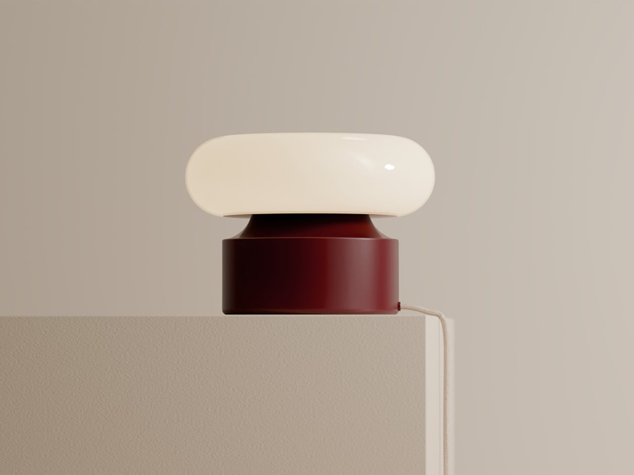
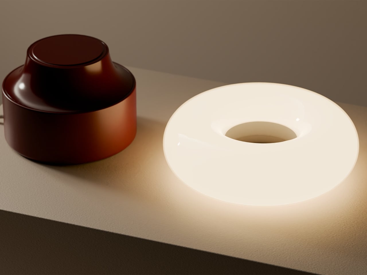
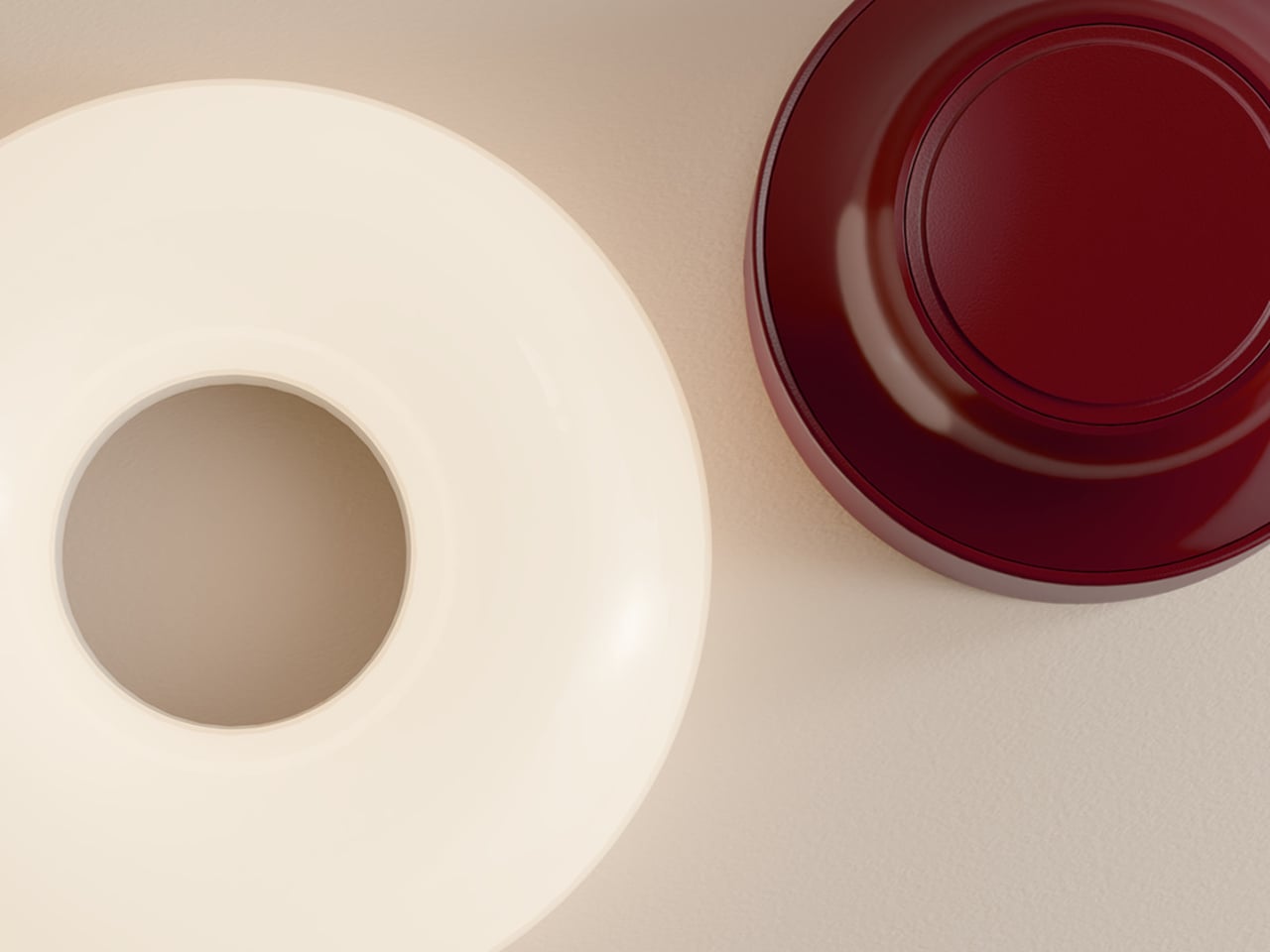
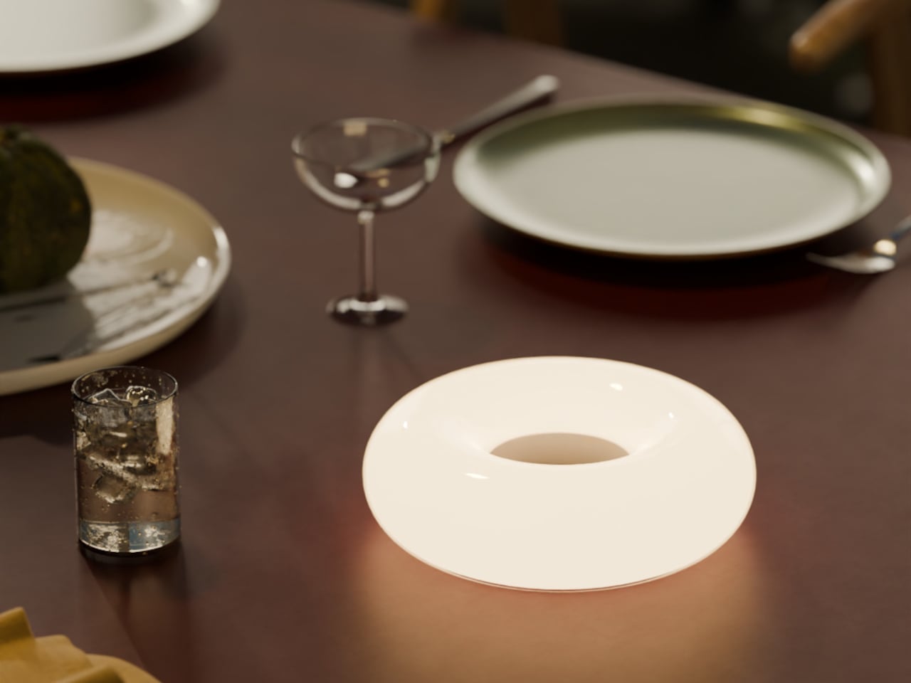
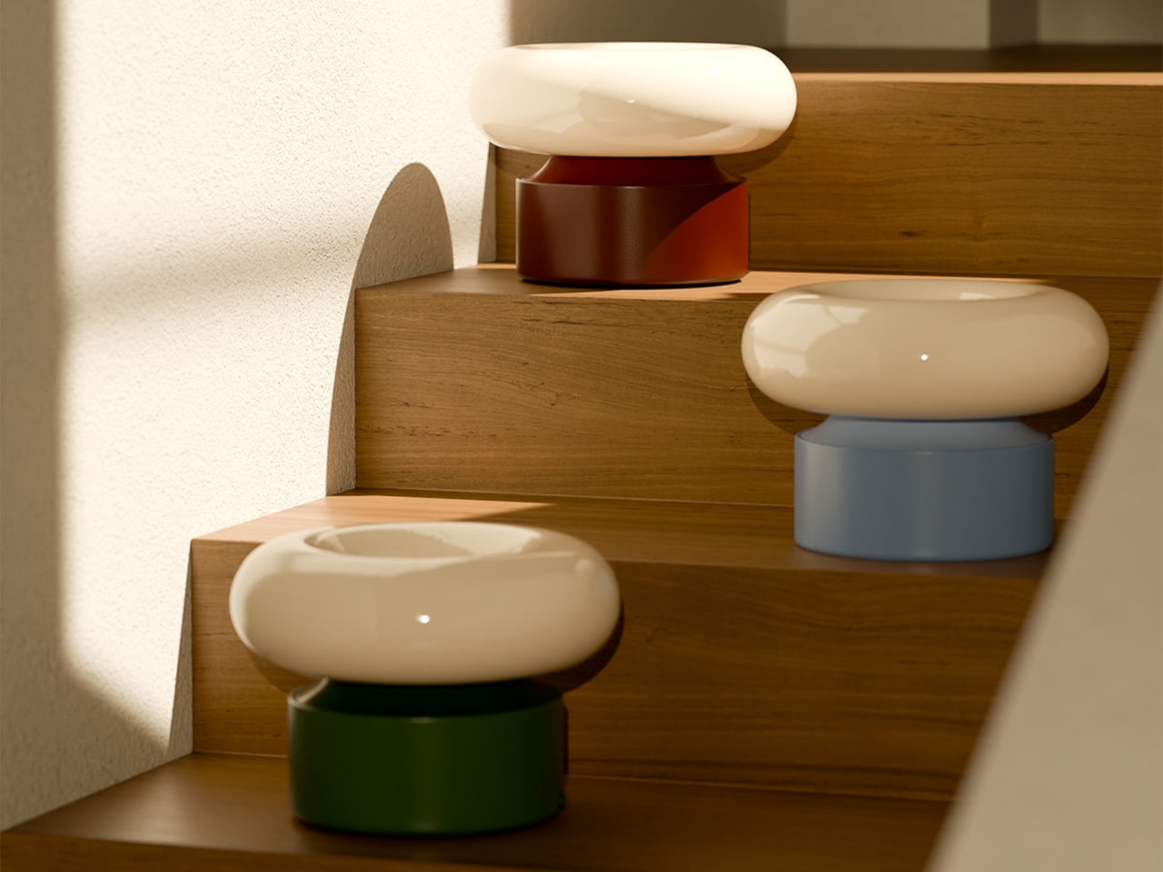
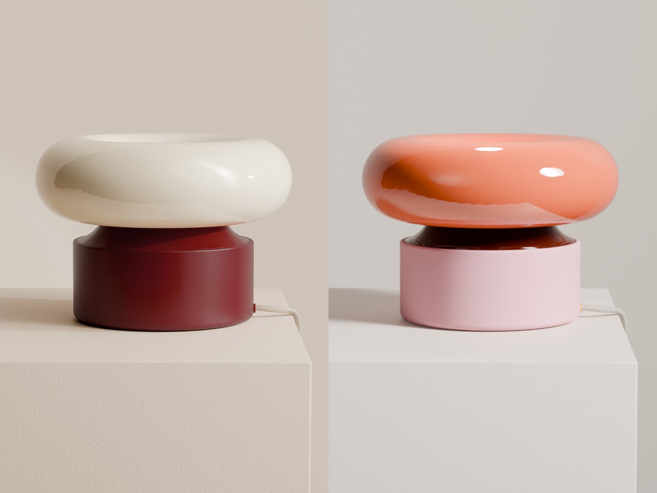
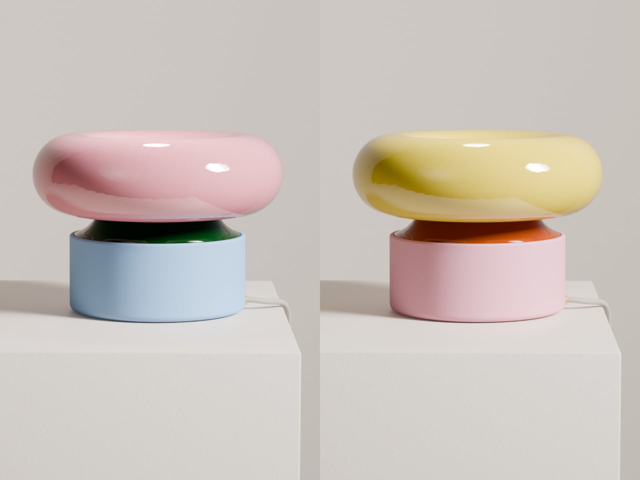
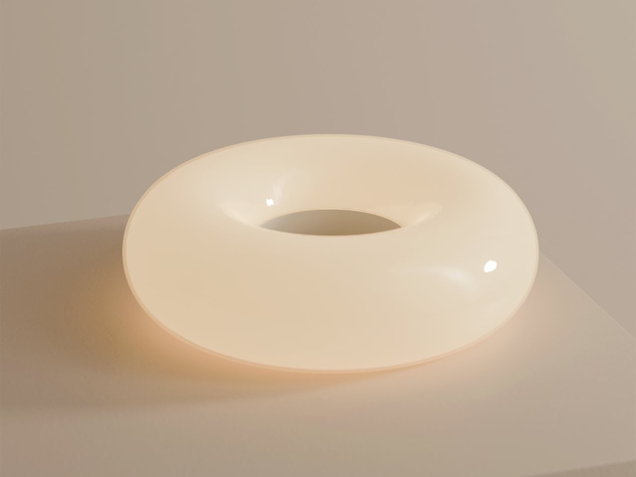
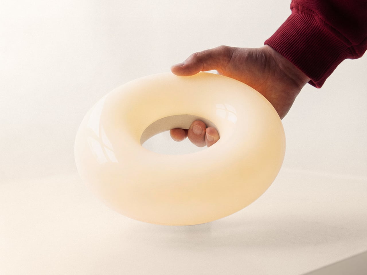
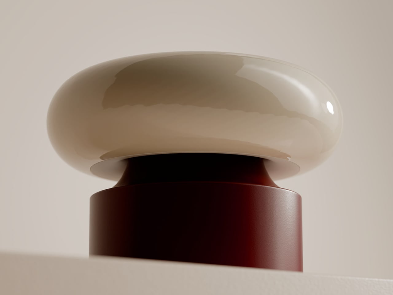
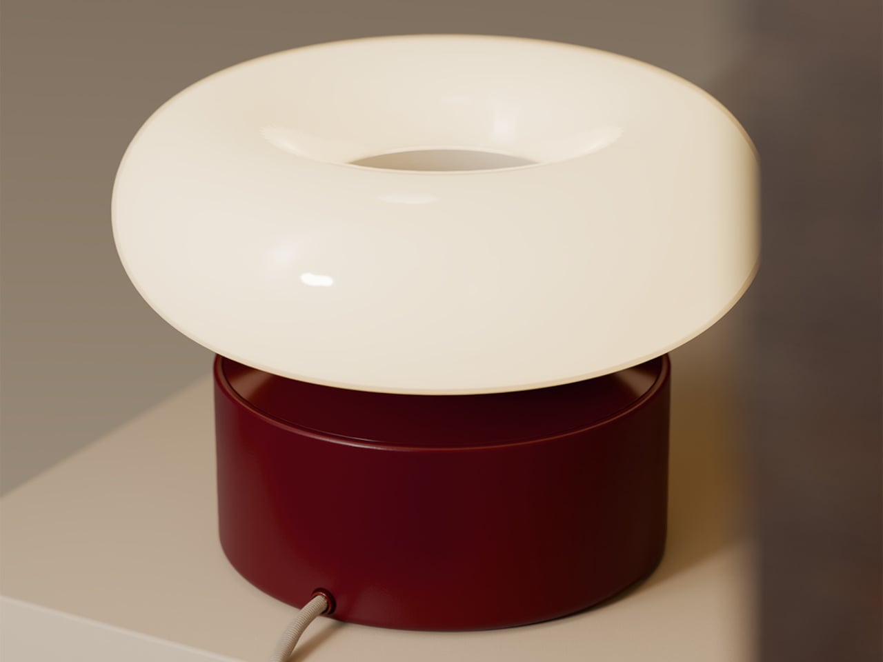
The lamp is two elements that live together, a luminous donut that holds the light and a weighted base that stays plugged in. When the donut rests on the base, it behaves like a sculptural table lamp. When lifted, it becomes a compact, cordless light that can travel to the terrace, coffee table, or hallway without trailing cables behind it or requiring a new outlet.

The base is both a stand and an induction charger. When the donut is dropped back onto it, charging starts automatically, no ports or cables to find in the dark. This turns recharging into a background ritual, the same motion you would make when tidying a table at the end of the night, and the lamp is ready again by morning without thinking about it.

The soft, diffused glow from the ring throws gentle light across a table rather than a harsh spotlight. It is meant for calm, ambient illumination, the kind that makes late conversations feel unhurried and lets food or books sit in a pool of warm light without glare. The donut radiates evenly in all directions, so it never casts hard shadows or creates bright spots.

The donut on a balcony rail during a late drink, on a low shelf beside a sofa, or in a hallway where there is no convenient outlet shows how the same object moves between roles without looking like camping gear. It stays firmly in the language of interior objects, simple forms, rich colors, and a glow that feels like it belongs rather than borrowed from a utility drawer.

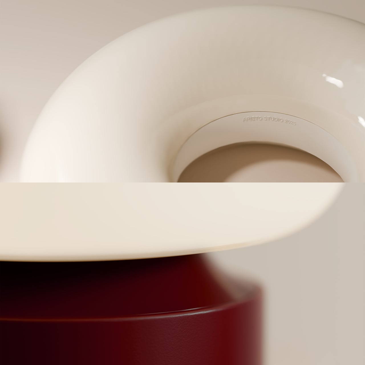
The contrast between the glossy, cream-colored ring and the solid, colored base makes the lamp read almost like a small sculpture when assembled. The base comes in several tones, burgundy, green, and blue, so it can either disappear into furniture or act as a quiet accent in a neutral room. The proportions are calm and grounded, not trying to impress with complexity.

ILO is less about showing off wireless charging and more about removing the tiny compromises that come with static lamps. It treats light as something that can follow dinners, conversations, and quiet moments, while still looking like a considered object when it comes home to its base. For people who move through their homes rather than settling in one spot all evening, a lamp that can keep up without cables or outlets starts to feel less like a luxury and more like how lighting should have worked all along.

The post ILO Lamp Lets Soft Light Wander Between Rooms first appeared on Yanko Design.

Unihertz Titan 2 Elite fuels the physical QWERTY smartphone revival

The release of the iPhone in 2007 marked the beginning of the end of the BlackBerry era. The prospect of on-screen keys was undeniable, and the trend of having a pocket PC left everyone dazed over the years as smartphones evolved into their best version, year after year, for decades. However, things then go full circle, and we are plateauing with what bezelless smartphones can offer.

That tactile feel of typing with the physical buttons is reviving for good reason, and Unihertz brought back nostalgic memories of the Passport for good. The full QWERTY keyboard of the phone with a 1:1 aspect ratio was a refreshing introduction to the stale smartphone market dominated by phones that more or less look and feel the same, with few incremental hardware updates that one can hardly drool over.

Designer: Unihertz

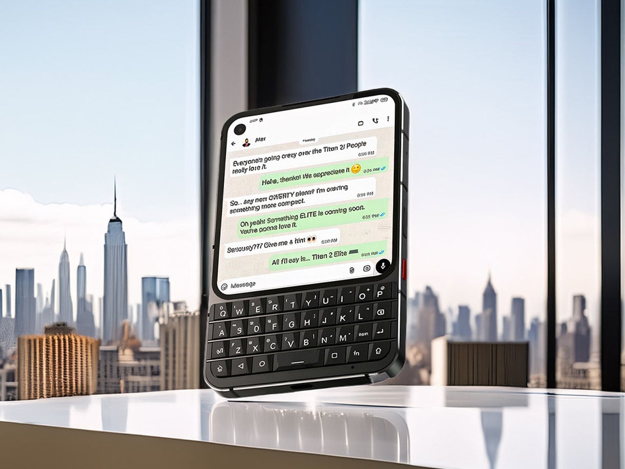
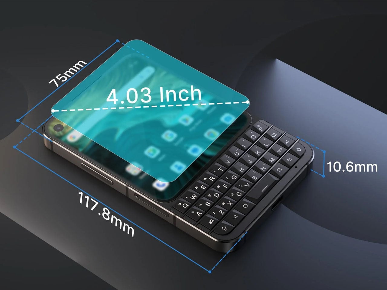
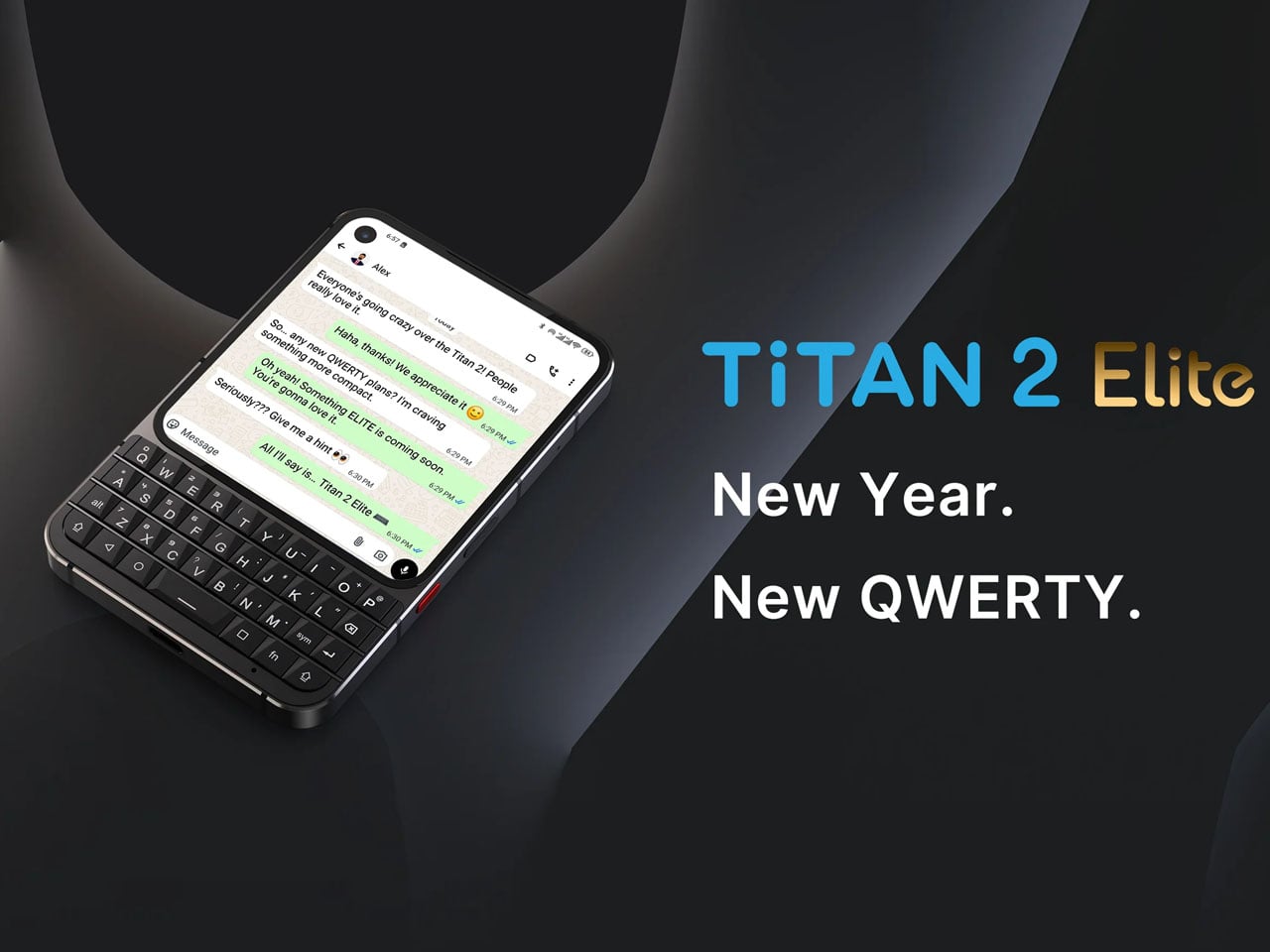
Riding on the momentum of the Titan 2 released in the summer last year, the Shanghai-based brand has revealed the Titan 2 Elite. Unlike the Clicks QWERTY case or the Ikko MindOne Snap-In Case, which are extensions of the phone itself, the Titan line of devices is the real deal. Productivity and ease of use are the focal points with the Unihertz phones, and that element remains constant with the new release. Titan Elite 2 is an improvement over the predecessor with the thin bezel curved display having a punch-hole front camera in one corner. The function keys on the new version take the same layout, while the navigation keys are now placed alongside the spacebar. This results in a decrease in overall size while retaining the same function.

The phone will come powered by the MediaTek Dimensity 7300 processor, have 12GB of RAM, and 512GB of internal storage. There is no word on the display or the battery, but going by the previous release, it should be an AMOLED screen, and the battery should be 5,000mAh. Neither is there any word about the release timeline, pricing, or other features of the device right now. The sole official render of the phone suggests a sleeker-looking body, erringly similar to the Clicks Communicator. The only differentiator is the more squared form of the Titan 2 Elite vs the portrait-dominated aesthetic of the Communicator case.

It’ll be interesting to see what Elite elements the device brings for the users, to consider the niche device over other options. One thing is clear, though the tactile keyboard era is reviving in a big way, and we’re excited to see what will be on offer in the future as more manufacturers find the segment lucrative.

The post Unihertz Titan 2 Elite fuels the physical QWERTY smartphone revival first appeared on Yanko Design.

7 Best Japanese Stationery Items To Keep You Organized

Japanese design philosophy has long celebrated the marriage of form and function, transforming everyday objects into tools that spark joy while serving practical purposes. This ethos shines brightest in stationery design, where minimalism meets innovation to create products that streamline workflows and declutter both physical and mental spaces. The items on this list represent a modern evolution of this tradition, offering solutions that fit seamlessly into contemporary life.

Organization isn’t just about having the right storage solutions; it’s about surrounding yourself with tools that inspire consistent use and thoughtful habits. These seven Japanese-inspired stationery essentials combine intelligent engineering with aesthetic restraint, ensuring that staying organized feels less like a chore and more like a natural extension of your creative process. Each piece has been selected for its ability to eliminate friction from daily tasks while adding visual harmony to your workspace.

1. OrigamiSwift Folding Mouse

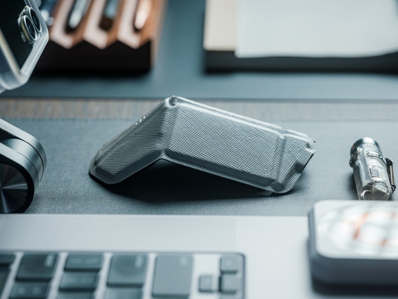
Staying organized in a mobile work environment means carrying the right tools without the bulk. The OrigamiSwift reimagines the traditional computer mouse through the lens of Japanese paper-folding artistry, creating a device that collapses to pocket size yet delivers full desktop functionality. This ingenious design features a triangular skeletal structure that folds completely flat when not in use, allowing digital nomads and hybrid workers to maintain their preferred setup regardless of location.

The transformation happens in less than half a second with a simple flick of the wrist, instantly morphing from a slim card into a responsive input device. Weighing just 40 grams, this featherweight mouse disappears into bags and pockets until the moment productivity calls. The aluminum construction ensures durability despite the mechanical complexity, while the ergonomic contours cradle your hand during marathon editing sessions or detailed design work. For anyone juggling multiple workspaces throughout their day, this folding marvel eliminates the compromise between portability and performance.

Click Here to Buy Now: $79.00

What We Like

  • Deploys in under 0.5 seconds for instant workflow activation.
  • Origami-inspired triangular structure provides surprising rigidity and stability when deployed.
  • Ultra-lightweight 40-gram design makes it virtually unnoticeable in bags.
  • Fits in pockets and tight spaces without compromising on full-sized mouse functionality.

What We Dislike

  • Ultra-slim profile requires an adjustment period for users accustomed to bulkier mice.
  • Mechanical hinges need occasional maintenance to preserve smooth folding action.

2. Everlasting All-Metal Pencil

Few things disrupt creative flow like a broken pencil lead or the constant need to sharpen. The Everlasting All-Metal Pencil eliminates these frustrations through material innovation rather than mechanical complexity. Crafted from a specialized alloy core encased in aluminum, this writing instrument leaves graphite-like marks on paper without wearing down at the accelerated rate of traditional pencils. The result is a tool that writes for years rather than weeks, producing consistent lines that erase cleanly with standard erasers.

The tactile experience mirrors conventional pencils closely enough that your hand won’t notice the switch, yet the absence of sharpening fundamentally changes how you interact with the tool. You can sketch freely without monitoring lead length or calculating whether you have enough left for a particular project. The weight distribution feels substantial without being cumbersome, lending a sense of permanence that disposable writing tools simply cannot match. This pencil becomes a reliable companion rather than a consumable supply, encouraging deeper attachment and more intentional use.

Click Here to Buy Now: $19.95 

What We Like

  • Never needs sharpening, creating a completely uninterrupted workflow.
  • Alloy construction lasts for decades, eliminating constant supply replenishment.
  • Marks erase cleanly with standard erasers just like traditional pencils.
  • Reduces waste and mental load of managing consumable supplies.

What We Dislike

  • Fixed line weight offers less variation than traditional graphite pencils with different grades.
  • Higher initial cost compared to conventional pencils.

3. MagBoard Clipboard

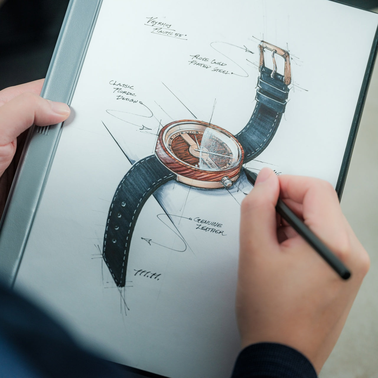
Traditional notebooks impose structure that sometimes stifles rather than supports organization. The MagBoard Clipboard embraces flexibility through its magnetic lever mechanism, securing up to 30 loose sheets while allowing instant reordering, removal, or addition. This hardcover design functions equally well on a desk or held against your torso while standing, transforming any environment into a viable workspace. The rigid backing provides writing stability without the permanence of bound pages.

The magnetic closure system offers satisfying tactile feedback while maintaining security during transport. Water-resistant materials ensure your notes survive coffee spills and sudden weather changes, protecting work that might otherwise be lost to environmental hazards. The ability to shuffle pages means your organizational system can evolve with your projects, accommodating non-linear thinking patterns that don’t fit neatly into numbered sequences. You might start a meeting with prepared sheets, add new observations throughout, then reorganize everything based on priority before leaving. This adaptive format respects how actual work happens rather than imposing artificial constraints.

Click Here to Buy Now: $45.00

What We Like

  • Instant page reorganization without tearing or rewriting saves significant time.
  • Hardcover design allows comfortable note-taking while standing or moving.
  • Water-resistant materials protect notes from spills and weather damage.
  • The magnetic lever mechanism secures up to 30 sheets during transport.

What We Dislike

  • 30-sheet capacity may feel limiting for extensive multi-page projects.
  • Magnetic mechanism adds noticeable weight during extended holding periods.

4. Inseparable Notebook Pen

Misplaced pens represent one of the organization’s most persistent frustrations. The Inseparable Notebook Pen solves this through integration rather than attachment, creating a writing instrument designed specifically to remain with your notebook. The minimalist profile slides easily alongside pages without creating bulk, while the smooth ink flow ensures thoughts transfer to paper without skipping or pressure adjustments. This isn’t just a pen that happens to fit your notebook; the entire form factor was conceived around coexistence.

The grip diameter and length strike a balance between portability and comfort, allowing extended writing sessions without cramping. The understated aesthetic avoids competing for attention, letting your content remain the focus rather than the tool itself. By designing the pen and notebook as a unified system, this approach eliminates the common scenario of finding a notebook but lacking something to write with. The relationship between tool and substrate becomes seamless, reducing decision fatigue and creating muscle memory around a consistent setup. When reaching for your notebook, it always means having a reliable pen immediately available, and capturing fleeting ideas becomes automatic rather than conditional.

Click Here to Buy Now: $19.95

What We Like

  • Integrated design creates consistent habits around a single unified system.
  • Slim profile maintains notebook portability without adding noticeable bulk.
  • Smooth ink flow ensures reliable writing without skipping or pressure issues.
  • Eliminates the common frustration of finding notebooks without pens.

What We Dislike

  • Specialized design may not fit other notebooks in your collection.
  • Requires replacing the specific design rather than using generic pen replacements.

5. Scissors with Magnetic Base

Office scissors typically live in drawers or cups, creating search friction when you need them urgently. These Scissors with Magnetic Base stand perpetually upright on your desk, always visible and immediately accessible. The weighted aluminum base uses magnetic attraction to hold the Japanese stainless steel blades in an elegant vertical position, transforming a utilitarian tool into a sculptural desk element. The Teflon coating on the blades ensures smooth cutting through various materials while preventing adhesive buildup from tape or labels.

The substantial weight of the all-metal construction provides satisfying heft during use, allowing the scissors’ sharpness to do the work rather than requiring excessive hand pressure. One finger ring incorporates a hidden box cutter blade, adding functionality without compromising the clean aesthetic. The upright storage position protects blade edges from the dulling contact that occurs when scissors roll around in drawers. By giving these scissors a permanent home that celebrates rather than hides them, you’re more likely to use the right tool for cutting tasks instead of making do with whatever’s closest. The magnetic base also prevents the gradual migration that causes tools to disappear into desk clutter.

Click Here to Buy Now: $49.00

What We Like

  • Always-vertical positioning eliminates search time and tool misplacement.
  • Japanese stainless steel with Teflon coating maintains sharp cutting performance.
  • One finger ring doubles as a box cutter for added functionality.
  • Magnetic base transforms a utilitarian tool into a sculptural desk element.

What We Dislike

  • A dedicated base makes scissors less practical for mobile use or multiple workstations.
  • A prominent vertical display requires a dedicated desk surface area.

6. Paperweight and Pen Holder

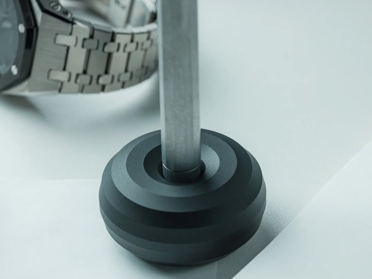
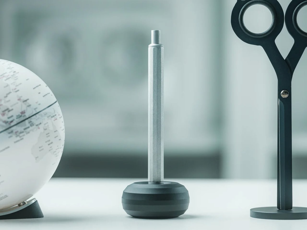
Desktop organization often suffers from single-purpose items that crowd surfaces without earning their real estate. The HMM Paperweight serves dual functions through its donut shape, holding papers securely while offering a stable pen rest when writing tools aren’t in use. The milled aluminum construction features twelve beveled faces that create visual interest through their geometric precision, catching light differently throughout the day. Weighing 101 grams across a 50mm diameter, the compact form factor delivers substantial anchoring power without dominating your workspace.

The central cavity accommodates standard pen diameters, creating a natural resting place that keeps writing instruments from rolling away or getting buried under papers. The tactile quality of the machined surfaces invites idle handling during thinking moments, providing subtle sensory engagement that can aid focus. This piece exemplifies multi-functionality done thoughtfully, where each purpose enhances rather than compromises the other. The paperweight function works best with reference documents you need visible but secure, while the pen holder keeps your preferred writing tool elevated and ready. Together, these capabilities reduce desktop chaos by giving key items defined homes that look intentional rather than cluttered.

Click Here to Buy Now: $35.00

What We Like

  • Dual functionality maximizes usefulness while minimizing desk footprint.
  • Twelve beveled aluminum faces create a premium aesthetic appeal.
  • Compact 50mm diameter delivers substantial anchoring without dominating the workspace.
  • Tactile machined surfaces provide satisfying sensory engagement.

What We Dislike

  • The central hole only accommodates vertically positioned pens.
  • The 101-gram weight may struggle with larger document stacks.

7. Serenity Pen Stand

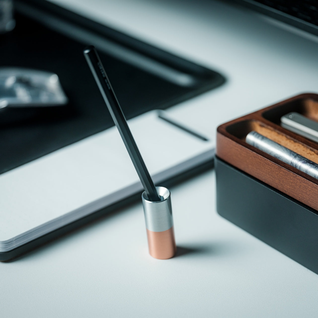
Most pen stands distract from the writing instrument they’re meant to showcase. The Serenity Pen Stand takes the opposite approach, reducing itself to near invisibility through radical simplicity. This minimalist cylinder features a cavity for pen tips and tilts slightly off-vertical for easier retrieval, creating an elegant pedestal that directs attention upward. The combination of aluminum body and copper base creates a subtle two-tone contrast while lowering the center of gravity for surprising stability despite the petite footprint.

The modest dimensions mean this stand occupies minimal desk space, fitting comfortably even on crowded surfaces. The weight distribution prevents tipping even with heavier pens, while the angled presentation makes grabbing your writing tool feel natural rather than requiring careful extraction. This design philosophy celebrates the pen as the protagonist, with the stand serving as supporting architecture rather than a competing feature. The copper bottom develops a natural patina over time, creating an evolving aesthetic that reflects your workspace’s history. For anyone who appreciates their writing instruments as prized tools rather than disposable supplies, this stand offers a reverent display option that respects both the pen and your desktop harmony.

Click Here to Buy Now: $39.00

What We Like

  • Near-invisible design keeps visual focus on the pen itself.
  • Copper bottom provides excellent stability despite a tiny footprint.
  • Slight tilt makes pen retrieval feel natural and effortless.
  • Develops natural patina over time for evolving aesthetic character.

What We Dislike

  • Single-pen capacity requires multiple stands for instrument rotation.
  • A minimalist cavity may not accommodate unusual tip shapes or oversized barrels.

Organizing with Intention

The items featured here share a common thread beyond their Japanese design heritage. Each piece respects your attention by solving specific organizational challenges without introducing new complexity. Rather than adding systems that require maintenance and memory, these tools simply work better than their conventional alternatives. The result is an organization that happens naturally through superior design rather than forced discipline.

When your workspace contains tools that are genuinely pleasant to use and look at, maintaining order becomes effortless. These seven essentials prove that staying organized doesn’t require sacrifice or compromise. By choosing items that combine beauty, durability, and thoughtful functionality, you create an environment where productivity and tranquility coexist. The Japanese design philosophy embedded in each piece offers a masterclass in maximizing efficiency, transforming everyday objects into trusted companions.

The post 7 Best Japanese Stationery Items To Keep You Organized first appeared on Yanko Design.

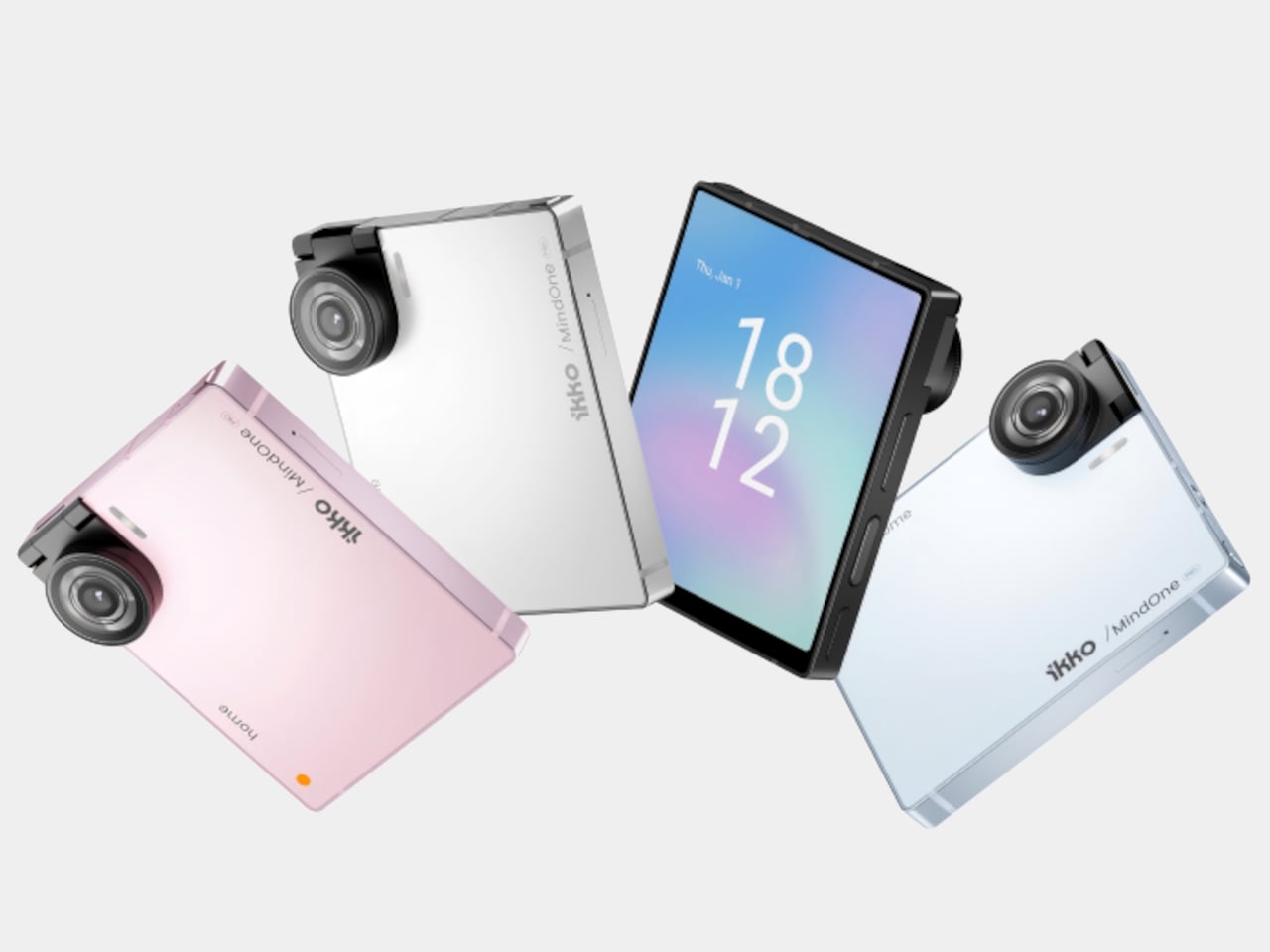
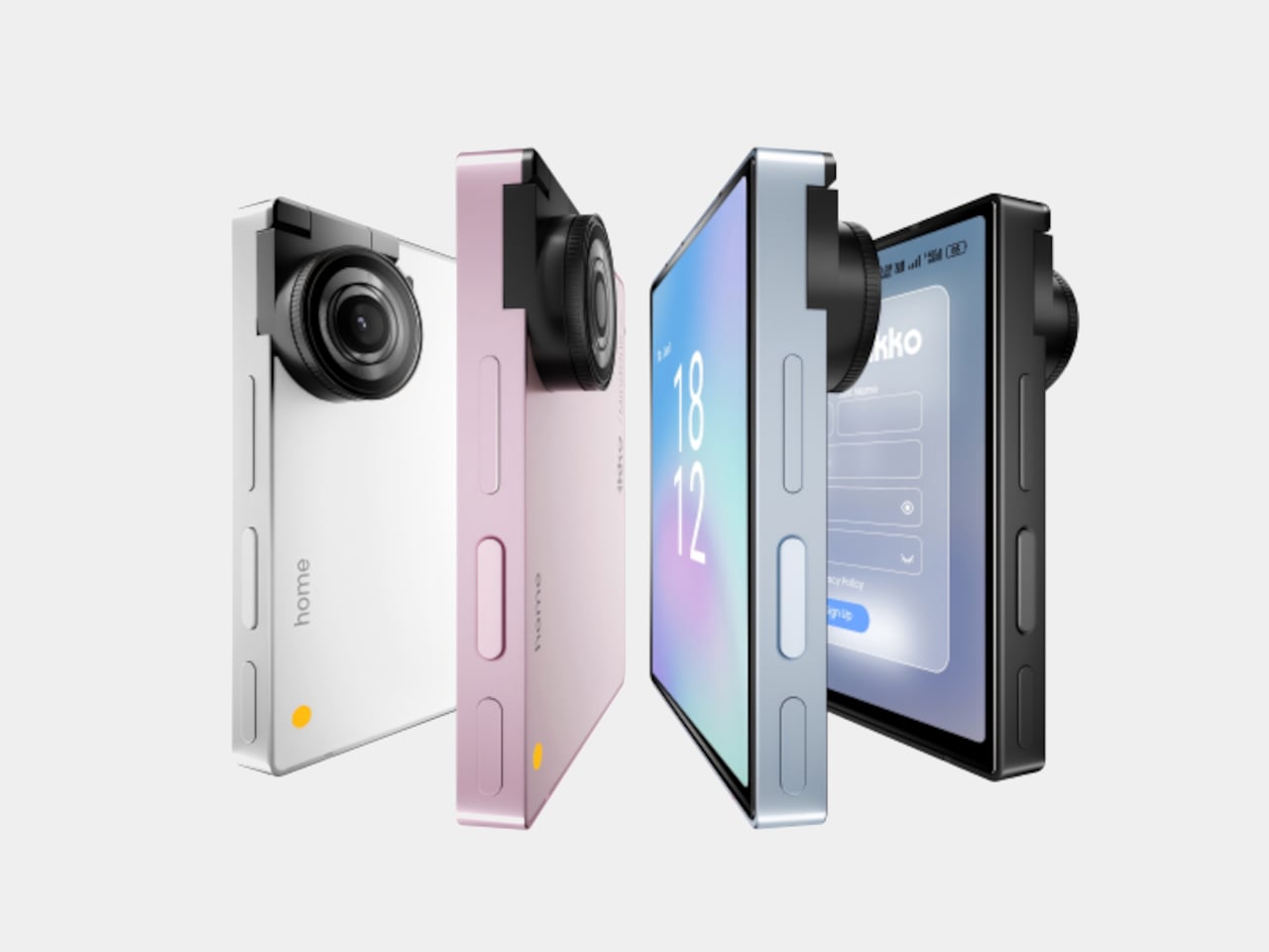
iKKO MindOne Snap-In Case Turns a Card-Sized Phone into a Pocket Writer

Typing long messages on glass feels clumsy, juggling Bluetooth earbuds means pairing headaches and dead batteries, and using wired headphones now requires a tiny USB-C dongle you will lose three times before accepting defeat. Phones have become powerful but strangely less tactile, and that clashes with people who write a lot, listen a lot, and still like the certainty of a cable and the click of a real key under their thumb.

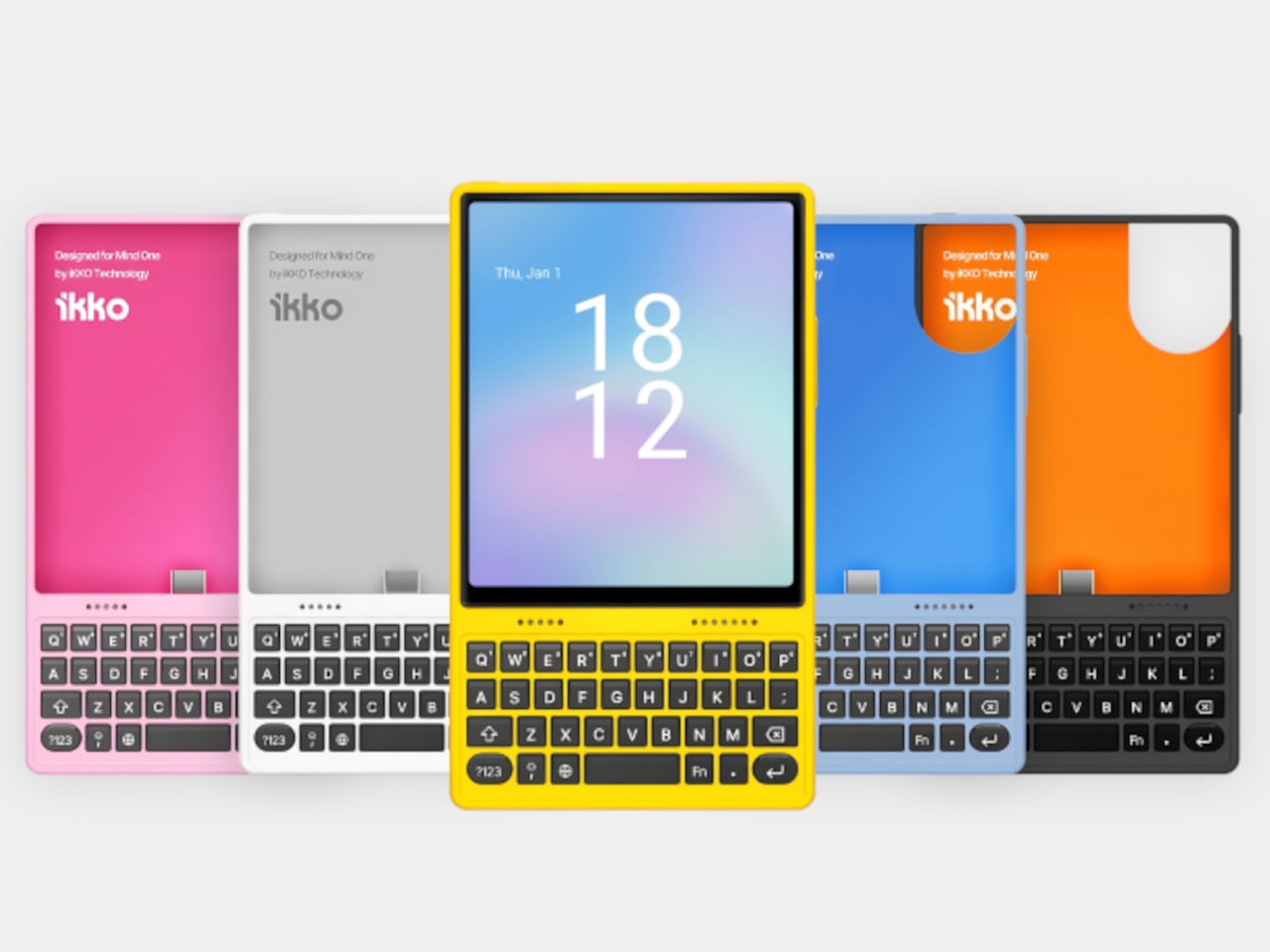
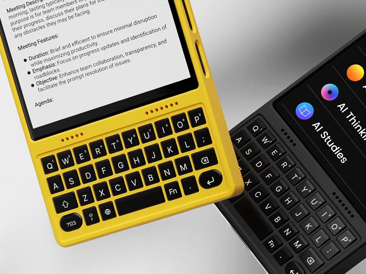
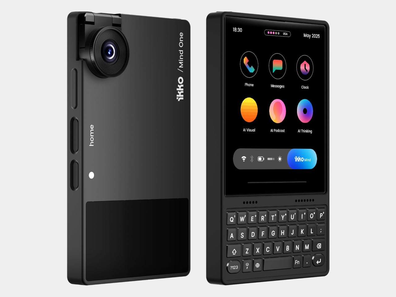
The card-sized iKKO is a small AI-centric smartphone built for always-on connectivity and lightweight productivity. The MindOne Snap-In Case is where it changes character, a snap-on expansion shell that adds a physical QWERTY keyboard, a proper 3.5 mm headphone jack, a dedicated DAC, and a small backup battery in one compact piece, turning the minimal phone into a tiny writing and listening machine.

Designer: iKKo

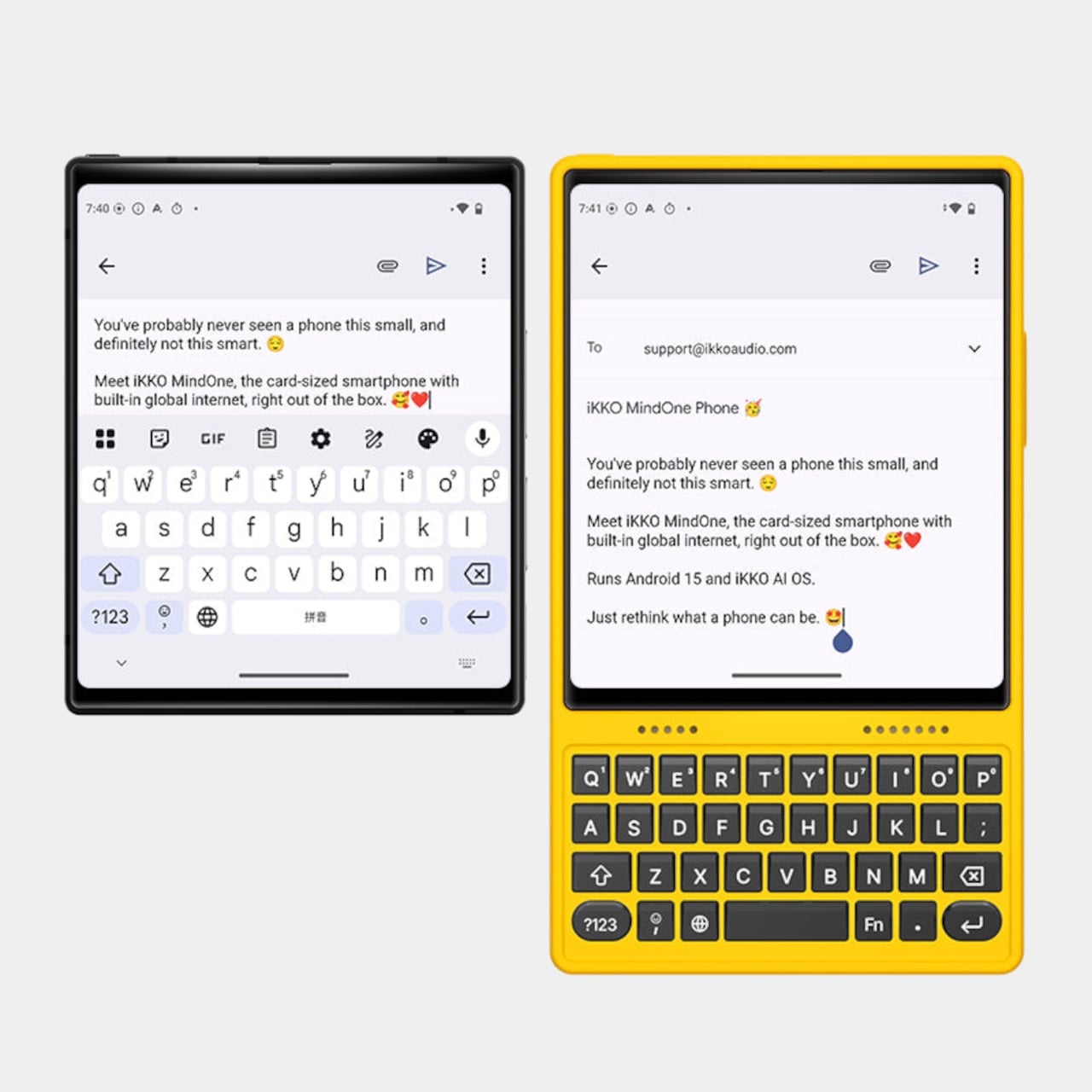
The QWERTY keyboard changes the way MindOne is used. Raised, separated keys and a slightly sloped surface make thumb typing feel more deliberate than tapping on glass. It is something you reach for when drafting emails, capturing ideas, or editing text while AI handles summarizing and organizing in the background, treating the phone as a tool for active writing rather than just passive messaging and scrolling through feeds.

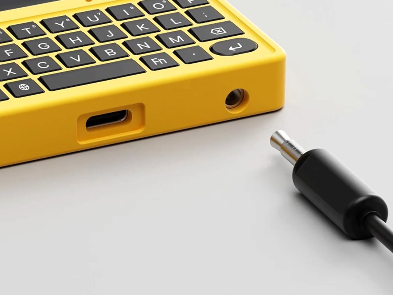
The case adds a 3.5 mm headphone jack backed by a Cirrus Logic CS43198 DAC, the kind of chip usually found in dedicated portable players. It supports Hi-Res audio with 32-bit/384 kHz PCM and DSD256, low-noise playback, and enough dynamic range to make lossless playlists and long podcasts feel crisp and detailed without worrying about pairing or battery levels in wireless earbuds that will die halfway through the flight.

The built-in 500 mAh battery is a quiet safety net rather than a second fuel tank. It tops up MindOne during long typing or listening sessions and helps offset the extra draw from the DAC and keyboard, extending comfortable use without turning the phone into a brick of battery cells. The point is not doubling battery life, but making intensive sessions feel smoother and less anxious.

MindOne stays slim and card-like on its own, then becomes a different kind of device when it snaps into the case. You might carry the phone bare for quick AI tasks and navigation, then drop it into the case on a flight, in a café, or at a desk when you know you will be writing and listening for a while, using the same object in two distinctly different modes.

Customizable keycap stickers and a range of colors that match or complement the phone are not just fashion accessories; they are small ways to make a very compact device feel personal. The case is tuned to MindOne’s proportions and personality, not a generic keyboard sled trying to fit every phone, which makes the combo feel considered rather than cobbled together from unrelated parts.

The iKKO MindOne Snap-In Case is less about nostalgia and more about choice, letting a tiny AI phone become a pocketable notebook and Hi-Fi player when needed. Most phones today are sealed slabs, which makes this case feel like a quiet reminder that hardware can still click, plug in, and feel like something you work and listen with, rather than just stare at until the next notification arrives.

The post iKKO MindOne Snap-In Case Turns a Card-Sized Phone into a Pocket Writer first appeared on Yanko Design.

Pyramid-Shaped Sleep Aid Needs No App, Just Sound, Light, and Pattern

Sleepless nights do not all look the same. Sometimes it is a racing mind, sometimes it is waking at 3 a.m. and staring at the ceiling, sometimes it is jet lag or a room that never gets fully dark or quiet. The market has responded with a pile of separate gadgets, white-noise machines, sunrise lamps, breathing apps, meditation videos, each adding another thing to manage, charge, or remember to open before bed.

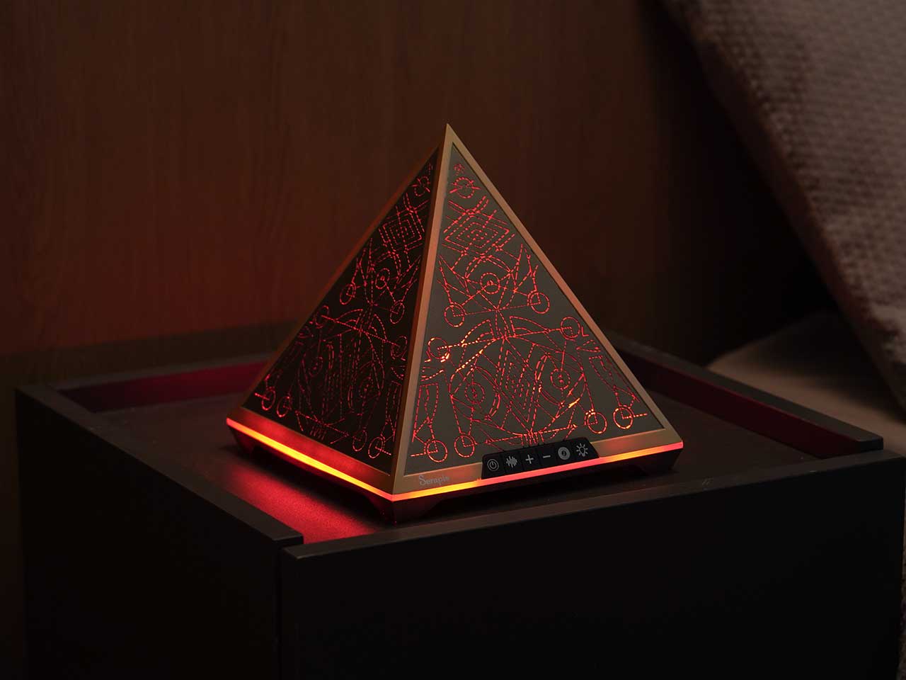
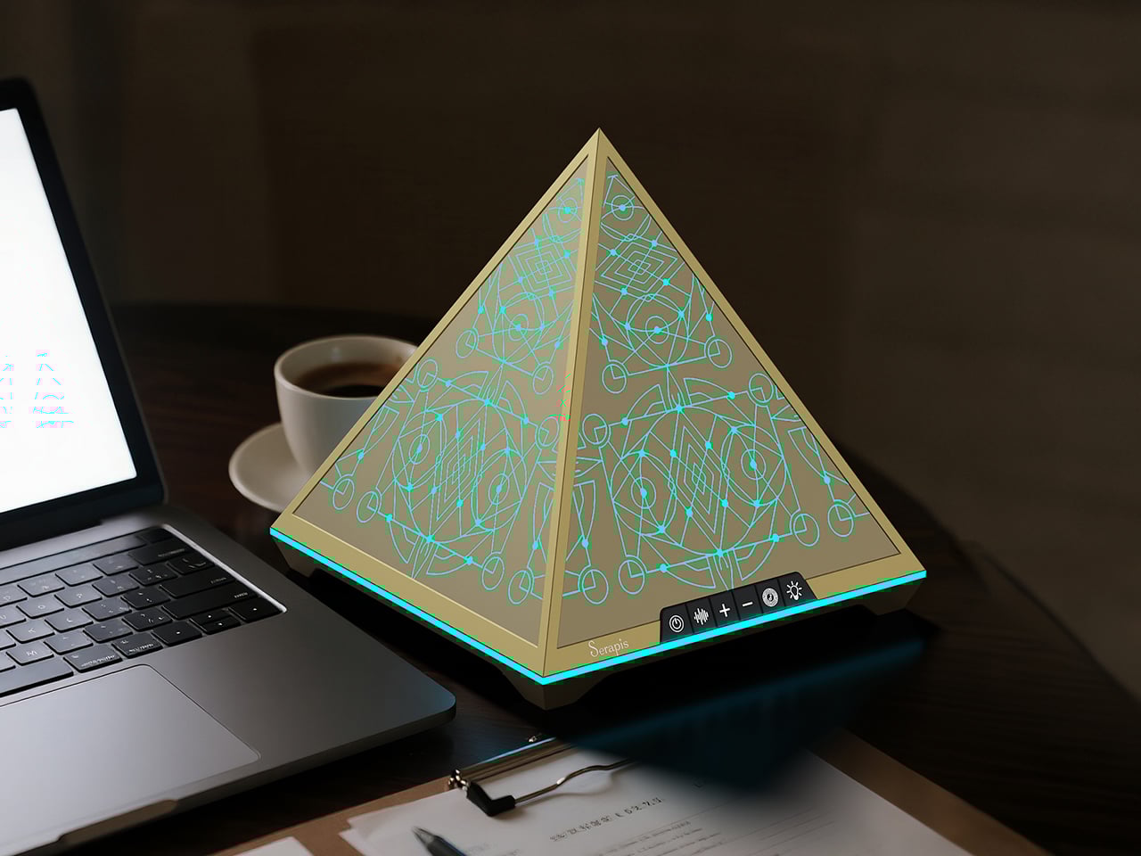
Serapis is an all-in-one sleep-aid system built into a pyramid-shaped bedside object. It combines layered white noise, breathing light, Somnofractal visuals, Schumann Resonance, and calming geometry into one device that sits by the bed and works without an app. The idea is to help the brain settle using sound, light, rhythm, and pattern, working quietly together instead of juggling multiple tools or staring at another glowing screen right before trying to sleep.

Designer: Zhang Wenjie

Click Here to Buy Now: $144 $239 (40% off). Hurry, only 189/300 left! Raised over $52,000.

Gif 1

Not all sleepless nights have the same root, so Serapis uses a short, 2-minute sleep-type test to map people to patterns like overthinking, jet lag, sensitivity to noise or light, physical discomfort, emotional heaviness, or trouble falling asleep. The device offers modes tuned to those patterns, so an overthinker might get more visual guidance and gentle noise, while a light-sensitive sleeper leans more on sound and subtle breathing light that does not brighten the room.

Gif 3

The five-part tech stack works in sync. Schumann Resonance at 7.83Hz runs as a low-frequency backbone that quietly syncs with alpha waves. Layered white noise blends deep delta tones with soft pink noise to mask distractions. Breathing light pulses in 8 to 12 second cycles and seven color temperatures to nudge your own breathing slower. Somnofractal visuals give your eyes a predictable pattern to follow for a minute or two, and the pyramid geometry diffuses sound while acting as a visual anchor.

Gif 6

Gif 5

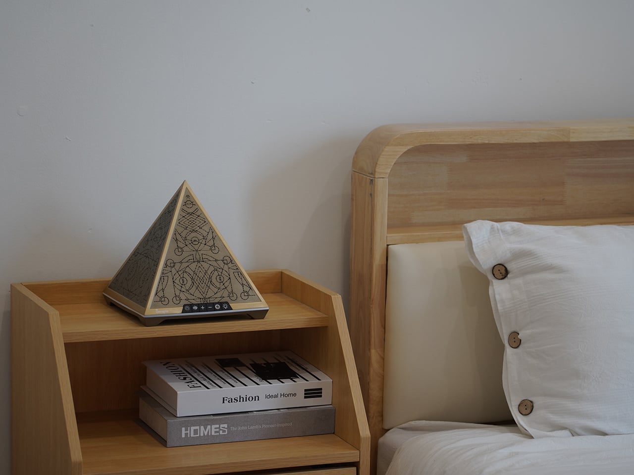
The nightly ritual is simple. You place Serapis on a bedside table, press a touch control to power on, choose between a preset duration of 30 or 60 minutes, and let the combination of sound, light, and pattern run while you lie down. There is no need to unlock a phone, open an app, or stare at a bright screen. The device is meant to be a quiet, science-inspired presence rather than another source of stimulation.

Gif 4

Serapis measures roughly 200 × 200 × 205 mm and has a net weight of around 1.2kg, giving it enough heft to feel like a real object. The pyramid form, etched with Somnofractal patterns, is designed to look intentional on a nightstand, and the internal hardware, speakers, and light modules are housed in metal and plastic with a 12 V input. The emphasis is on a minimalist, all-in-one experience that feels like part of the room instead of another gadget.

gif 2

Serapis suggests a shift away from managing sleep problems piecemeal and toward letting a single object handle the transition from busy mind to rest. Instead of piecing together white noise from one place, breathing exercises from another, and a visualization from a third, you press a button and let a coordinated system of sound, light, rhythm, and pattern do its work. For people who want their bedroom to feel calmer rather than more connected, that kind of integrated, screen-free ritual is where a device like this quietly makes sense.

Click Here to Buy Now: $144 $239 (40% off). Hurry, only 189/300 left! Raised over $52,000.

The post Pyramid-Shaped Sleep Aid Needs No App, Just Sound, Light, and Pattern first appeared on Yanko Design.

This dual mode bike turns into a snowmobile for practical all-terrain mobility

The concept world is strange and amusing at the same time. Some motorcycle concepts are outright genius designs that catch the eyeballs of established manufacturers who love the fresh approach of creative designers, while others lie in the pure bizarre domain that cannot see the light of day for their impractical design.
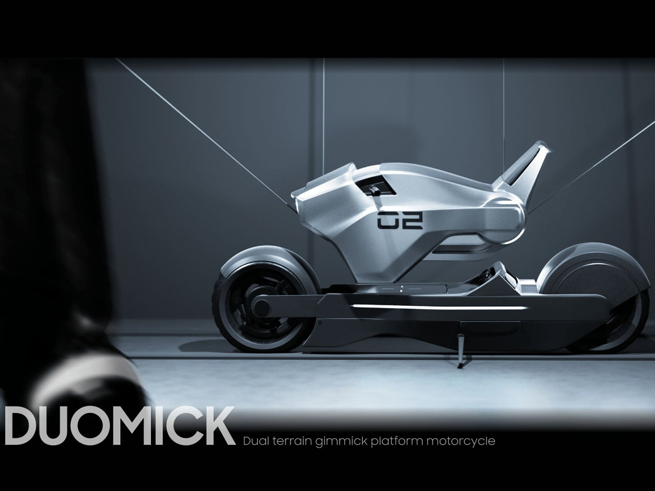
We tend to lean more towards the former category of concept bikes, so that a vision of future automotive trends could be gauged. The DUOMICK dual platform motorcycle is the latest one that impressed us. Based on a modular design inspiration, the bike is good both on solid land and on snowy terrain.
Designer: HakHyeon Lee

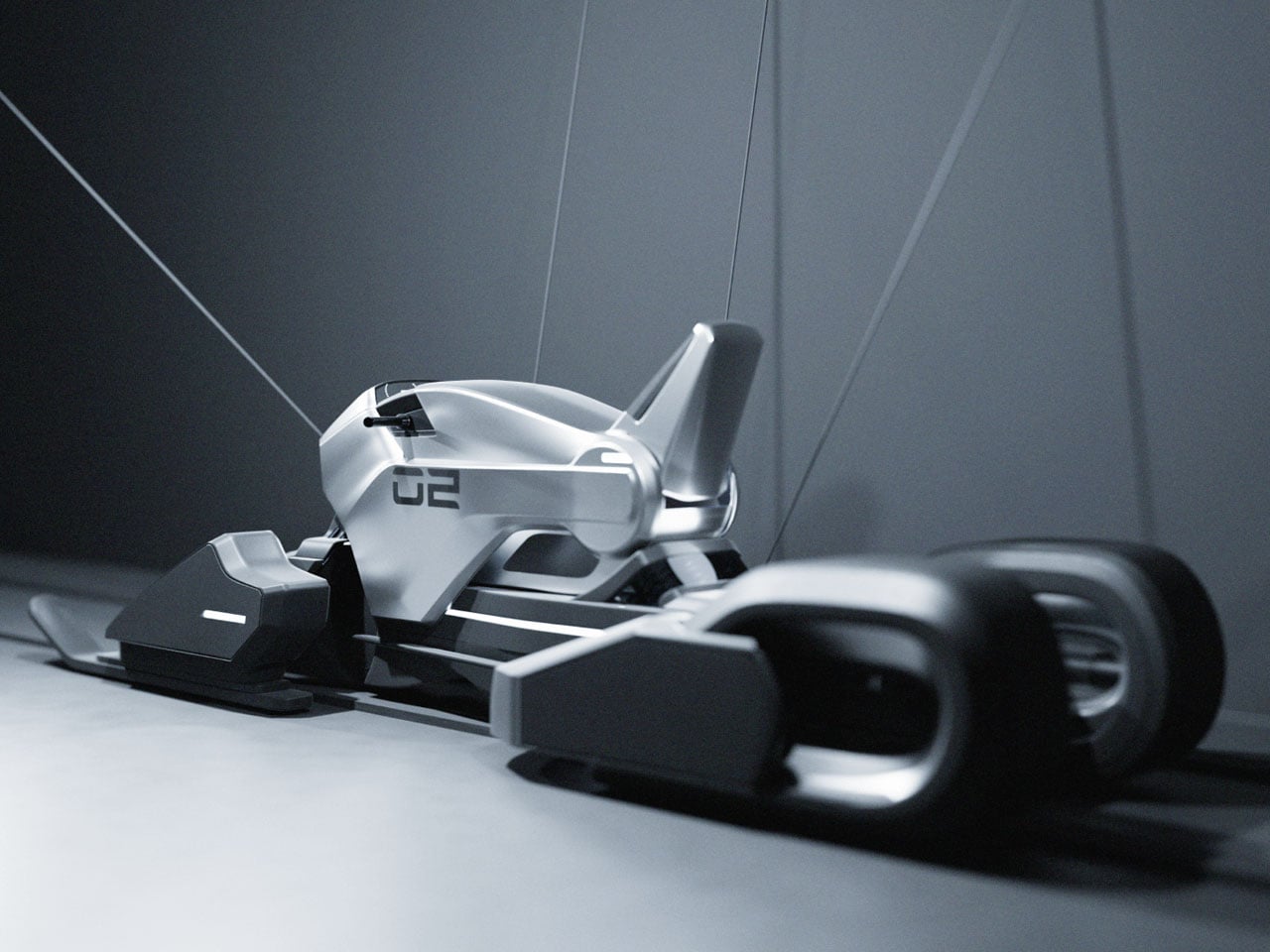
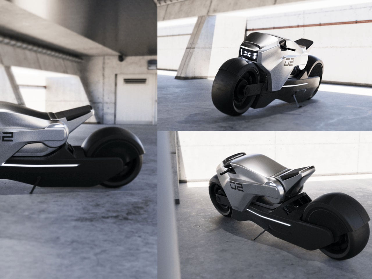
In the bike mode, the café racer-inspired two-wheeler gets a set of wheels for city rides, while the snowmobile mode has the snow track, skid, and skis. The transition is made by lifting the body frame and resting it on the respective drivetrains that presumably sit parked in the garage. Made out of unibody material, the main frame is universal and valid enough for both modes. The wishbone suspension system is of superior materials to withstand the tortures of rough terrain and the strains put on the bike while riding at high speeds.
The saddle of the DUOMICK bike can be rotated depending on the seating position, based on the mode selected. In the bike mode, the sitting position is more low-slung, while the snowmobile mode has a more upright sitting position. Road presence of this concept is more towards a muscular appeal with chunky tires and a futuristic headlight gracing the silver-gray body. When it turns into a snowmobile, the aggressive stance is morphed into a classy form that’s fit for a Bond movie plot.

The idea of this concept is interesting, and in a real-world situation, making the shift from bike mode to snowmobile mode should require precision placement and care of the chassis. It’s just like fitting a steering wheel on the modern supercar (Aston Martin Valkyrie or Lamborghini Egoista), Motorsports racer, or Formula-1 beast.

The post This dual mode bike turns into a snowmobile for practical all-terrain mobility first appeared on Yanko Design.