Hosting a watch party usually means thinking through every sensory detail in the house. The menu has to hit the right balance of easy and memorable, the drinks need to stay cold, the room temperature has to feel right once the crowd settles in, and even the air gets attention, whether that means opening windows early or giving the couch and curtains a quick pass with Febreze before people arrive. A lot of effort goes into creating a space that feels clean, welcoming, and put together without looking like it took effort at all.
Water can undo that illusion fast. Guests might forgive a late pizza delivery or a bowl of chips running empty, but a glass of bad-tasting water has a different effect. It lingers. It cuts through the mood and makes people notice the one part of the hosting experience that feels neglected. That is why home water filtration belongs in the same conversation as food, comfort, and atmosphere, especially around Prime Day when Waterdrop’s offering a practical upgrade that slides neatly into the rest of your summer hosting plans.
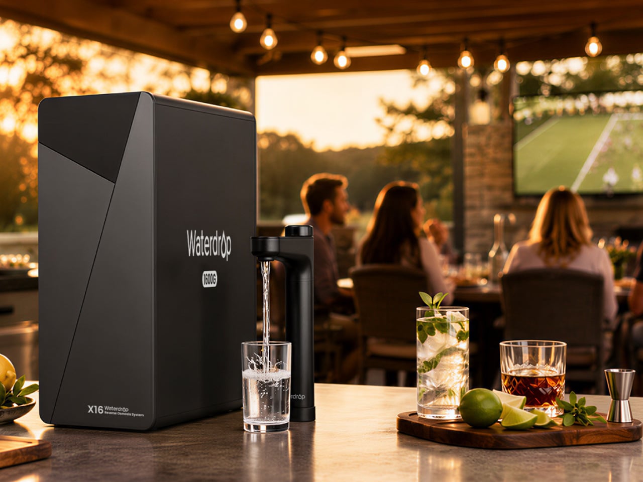
Waterdrop X16 Alkaline Mineral Reverse Osmosis System: The Flagship Pick for Big Game-Day Households
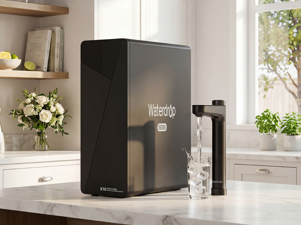
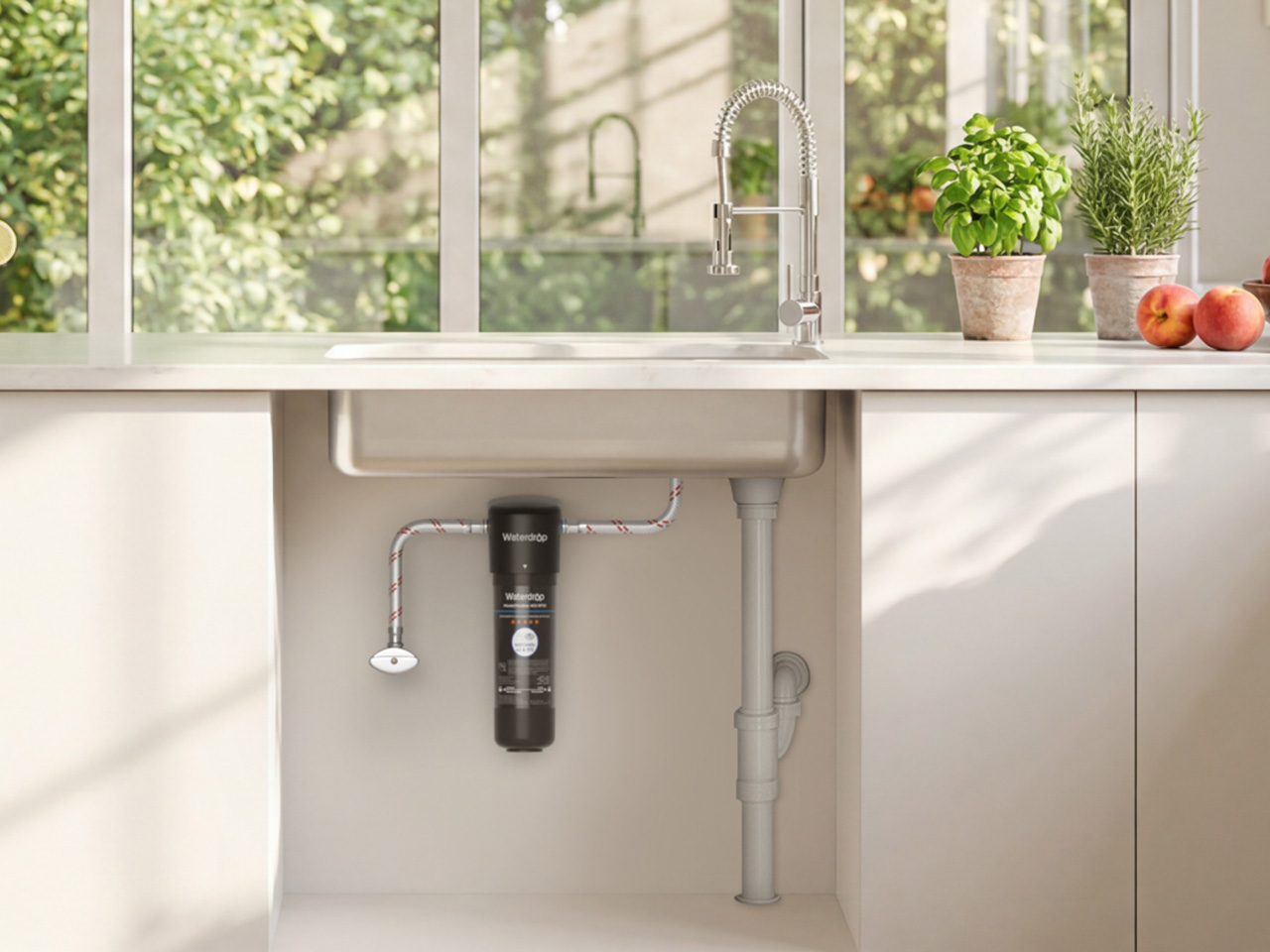
For the household that treats hosting as a serious craft, the Waterdrop X16 is the flagship upgrade that anchors the entire kitchen. This is a system designed for large families and frequent entertainers, people who need a high-volume, high-performance solution that never becomes a bottleneck, even when the house is full. Its tankless design is the first thing that stands out, saving a significant amount of under-sink cabinet space compared to older RO systems. Aesthetically, it is clean and minimal, with a smart faucet that feels like a proper piece of modern kitchen hardware, displaying water quality and filter life at a glance.
The performance backs up the premium design. The X16 pushes out water at a rate of 1600 gallons per day, a spec that translates to filling a cup in about three seconds, so there is no waiting around when multiple people need a drink. Its 11-stage filtration system removes the usual contaminants while adding back alkaline minerals like Ca and Mg, balancing pH to 7.5± , which improves the taste for everyday drinking, coffee, and cooking. The 3:1 pure-to-drain ratio is also remarkably efficient, making it a responsible long-term investment for a home that wants the best water possible without the waste. It is a true kitchen centerpiece for game-day essentials.
Click Here to Buy Now: $1234.05 $1999 ($764.95% off, use coupon code “YANKOPD26”). Hurry, Prime Day deal ends soon!
Waterdrop G3P800 Reverse Osmosis System: The Family Kitchen Upgrade That Balances Speed and Trust
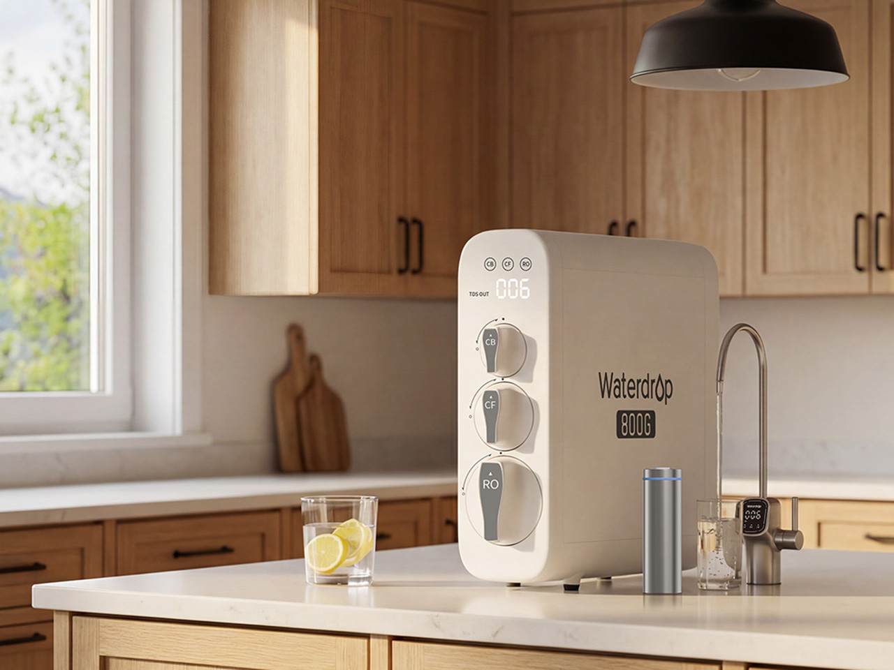
If the X16 represents the top tier of home filtration, the Waterdrop G3P800 is the trusted, family-ready workhorse that brings many of the same benefits to a broader audience. It has become a best-seller on Amazon for a reason, it hits the sweet spot between powerful reverse osmosis filtration and practical everyday convenience for a family of four or five. Like its bigger sibling, the G3P800 uses a tankless design that keeps the under-sink area tidy and accessible, a thoughtful touch for anyone who has dealt with bulky, tank-based systems in the past.
With an 800 GPD flow rate, the system is more than capable of handling daily routines and smaller gatherings without any frustrating lag at the faucet. It provides a steady stream of clean water for cooking, filling water bottles before school, or serving guests during a weekend get-together. For safety-conscious households, the G3P800 is certified against NSF/ANSI standards 42, 53, 58, and 372, offering documented proof of its ability to reduce a wide range of contaminants including chlorine, lead, and TDS. The smart faucet adds a layer of confidence, displaying real-time water quality so you always know the system is working as it should.
Click Here to Buy Now: $664.05 $999 ($334.95 off, use coupon code “YANKOPD26”). Hurry, Prime Day deal ends soon!
Waterdrop M6H Instant Hot Countertop Reverse Osmosis System: The Flexible Choice for Renters and Small Spaces
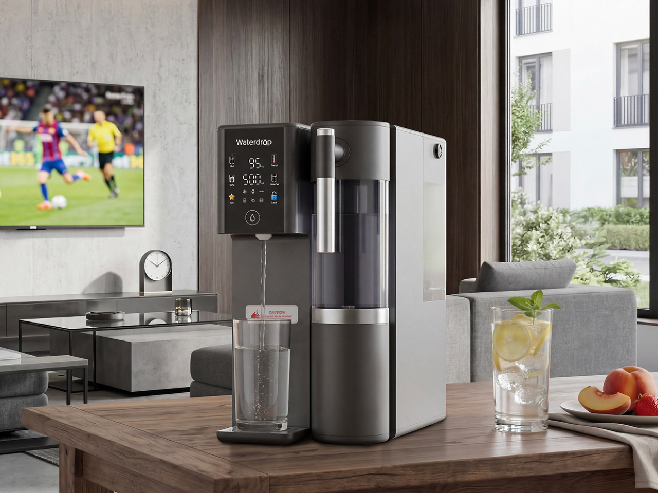
For a huge number of people, including renters, apartment residents, and office workers, a permanent under-sink installation is simply not an option. The Waterdrop M6H is engineered for exactly this scenario. This countertop RO water filter delivers high-quality purified water without requiring any plumbing or drilling, you just plug it in and fill the tank. It is a self-contained unit that brings the power of reverse osmosis to kitchens, dorm rooms, home offices, and even RVs, making it one of the most versatile home hydration essentials available.
The M6H distinguishes itself further with its instant hot water capabilities. It offers multiple temperature settings, perfect for making baby formula, brewing tea at the right temperature, or getting a quick start on oatmeal or coffee during busy mornings. This feature also makes it a fantastic beverage station for gatherings, allowing guests to make their own drinks without hovering around the stove. The system includes a detachable glass pitcher that can move from the countertop to the dining table or into the fridge, blending the convenience of a portable server with the power of a stationary RO system.
Click Here to Buy Now: $284.05 $429 ($144.95 off, use coupon code “YANKOPD26”). Hurry, Prime Day deal ends soon!
Waterdrop 10UA Under Sink Water Filter: The Easy Entry Point for Better Everyday Water
Sometimes the goal is a simple, effective upgrade, a straightforward improvement over tap water without the complexity or cost of a full reverse osmosis system. The Waterdrop 10UA is that practical first step. It is an under-sink filter designed for budget-conscious households and first-time filter users who want an affordable, low-effort way to get cleaner, better-tasting water for drinking and cooking. The installation is quick and easy, making it a great weekend project that delivers immediate benefits.
While it is a simpler system than the RO models, the 10UA still provides robust filtration that significantly reduces chlorine, taste, odor, sediment, and other common impurities. Its long filter life makes it a low-maintenance choice for busy families who want to set it and forget it. For daily use, it provides a reliable supply of filtered water directly from the existing kitchen faucet, making it useful for everything from filling a pot for pasta to washing vegetables. It is an accessible entry point to better summer hydration for anyone who wants to improve their tap water quality without a major investment.
Click Here to Buy Now: $36.09 $45.99 ($9.90 off, use coupon code “YANKOPD26”). Hurry, Prime Day deal ends soon!
Waterdrop Glass Water Filter Pitcher: The Fridge-Ready Option for Casual Hosting and Daily Use
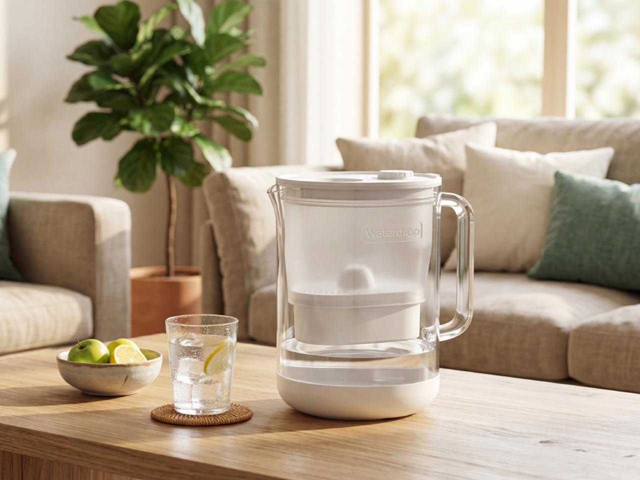
Finally, there is the solution that fits every space and any occasion, the Waterdrop Glass Water Filter Pitcher. This is the most flexible option in the lineup, designed for families, apartment users, and anyone who wants a simple, portable way to get filtered water. It is perfect for shared moments, easily moving from the kitchen counter to the dining table for a family meal or out to the patio for a backyard gathering. The pitcher’s high-quality glass construction offers a more elevated look for hosting compared to typical plastic pitchers.
The design is both stylish and sustainable, helping to reduce reliance on single-use bottled water. Its 5-stage filtration system works quickly to serve cleaner, better-tasting water with less waiting, which is a noticeable improvement during busy moments. The exceptionally fast flow-rate fills an 8oz cup in under 60 seconds, 10x faster than standard pitchers. That means healthier water in seconds instead of minutes.
Click Here to Buy Now: $42.74 $49.99 ($7.25 off, use coupon code “YANKOPD26”). Hurry, Prime Day deal ends soon!
The post Don’t Let Bad-Tasting Tap Water Ruin Your Dinner Party – Save Up to $700 This Prime Day With Waterdrop Filter first appeared on Yanko Design.