As much as I love my music streaming services, I’m also a fan of playing analog music. Well, at least in theory. I have several CDs at home already but I don’t have a CD player (still researching about what’s the best one that my wallet can afford). I also want to have a vinyl player soon although that will take more of an investment both for the player itself and the vinyls I’ll buy afterwards. So I am always interested when I see concepts or designs for turntables as it can be references for what I’ll buy in the (hopefully) near future.
Designer: Antoine Brieux / NAK Studio
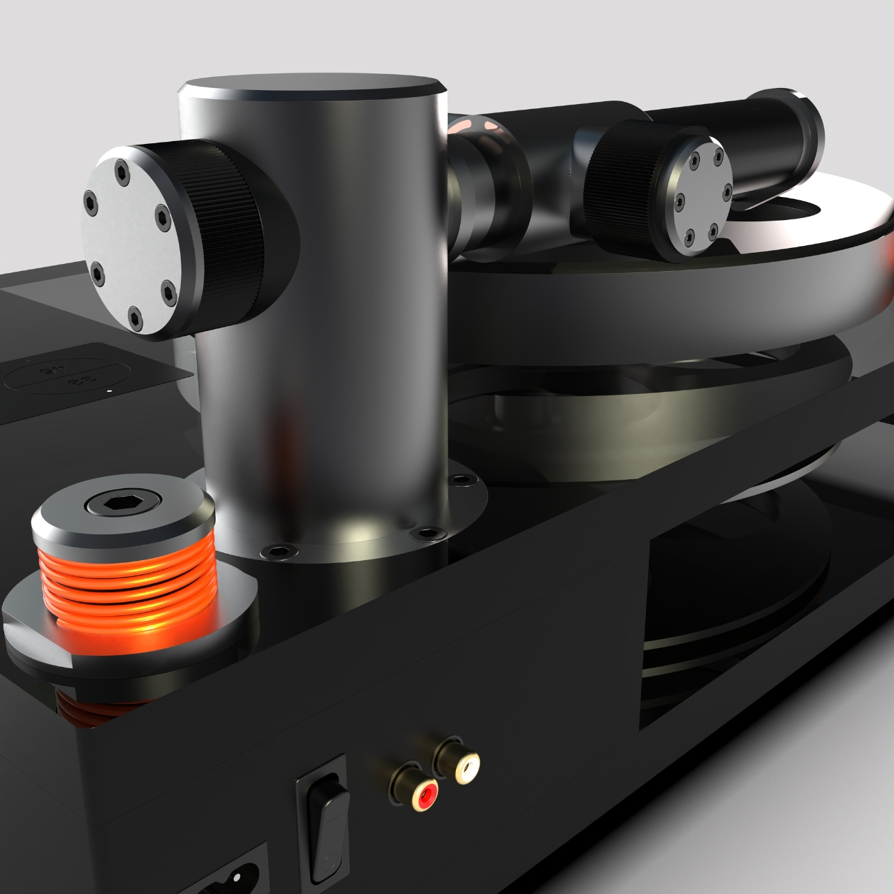
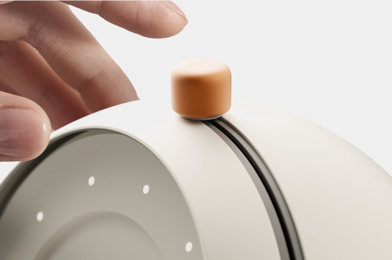
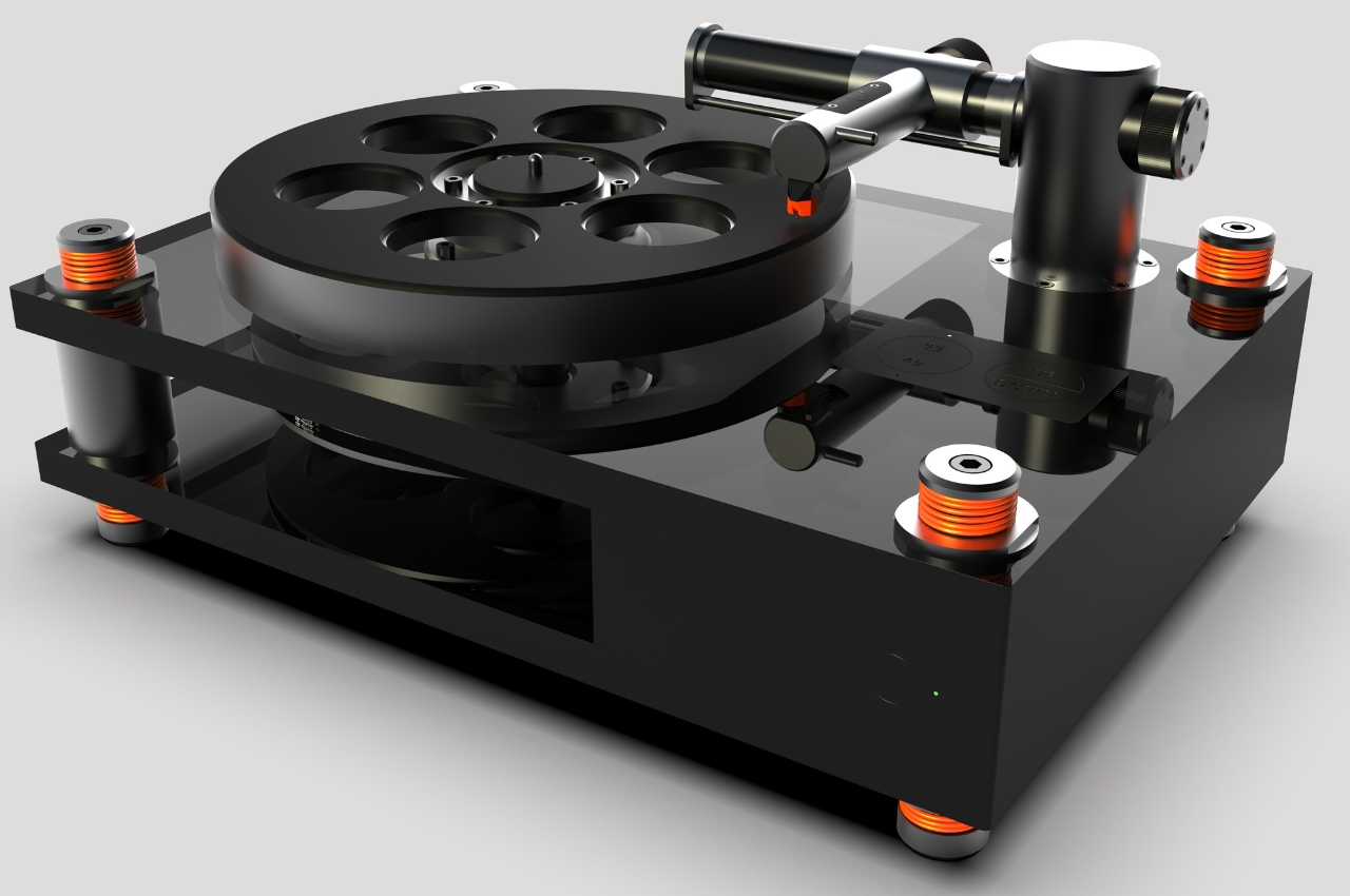
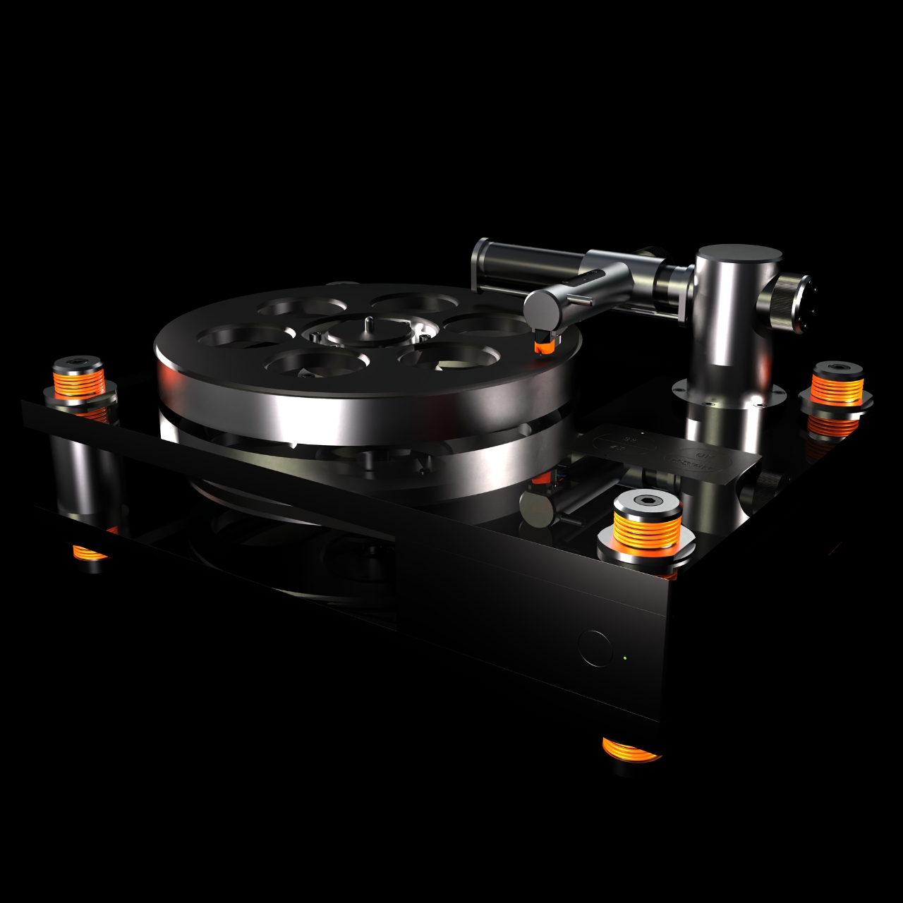
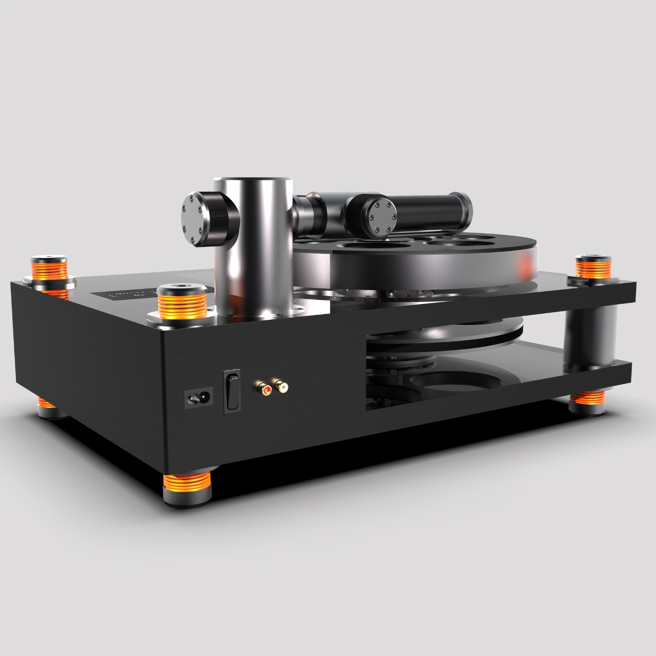
This concept for a high end industrial design linear vinyl turntable will probably not fit into my budget if it ever gets made but it’s still pretty interesting to look at. It will be made up of full machined aluminum and magnesium parts but also uses glass and recycled Acrylonitrile Butadiene Styrene (ABS) so you get an industrial but minimalist look. The platter assembly has conical bearings shaft and actually looks like those old 35mm film projectors but placed horizontally.
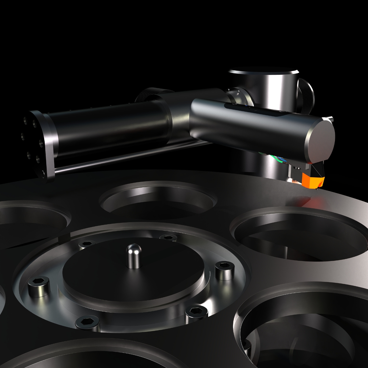
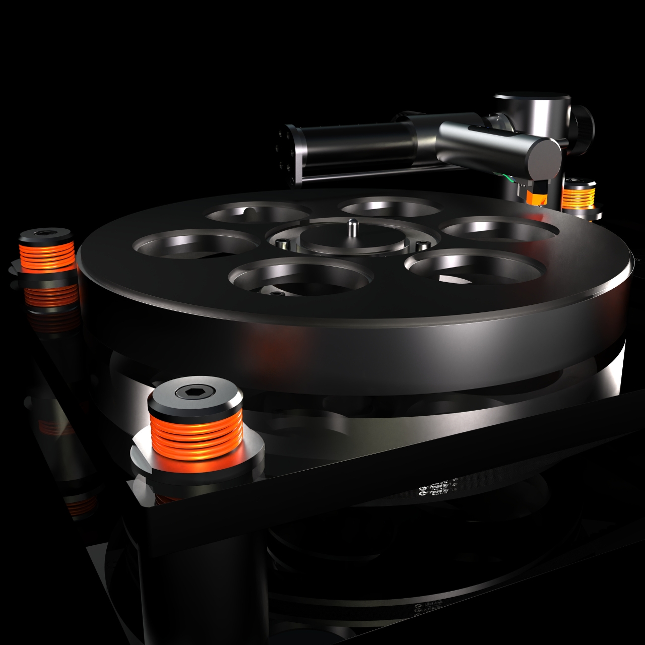
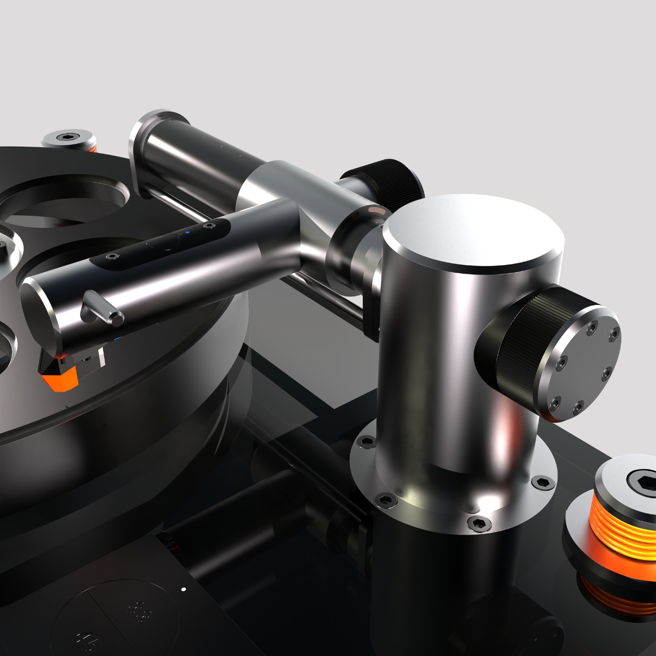
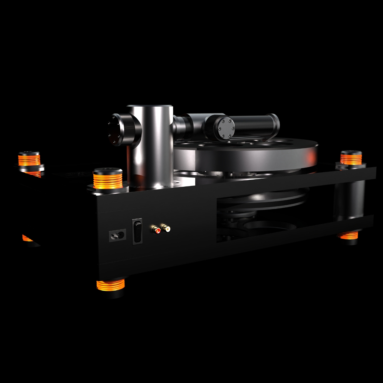
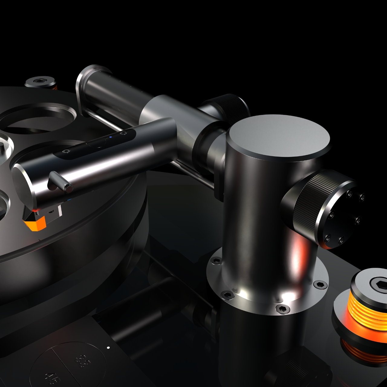
In keeping with its industrial theme, you get an industrial drive belt driving system but with an air cushion linear arm to make it more interesting. The tonearm is Bluetooth embedded so you can connect it to Bluetooth speakers directly but you can also use the regular plug system if you prefer that. It also has a brushless motor and constant drive controller while it uses capacitive sensors to manage the start and end position of the arms which can use either an automatic or manual lift system.
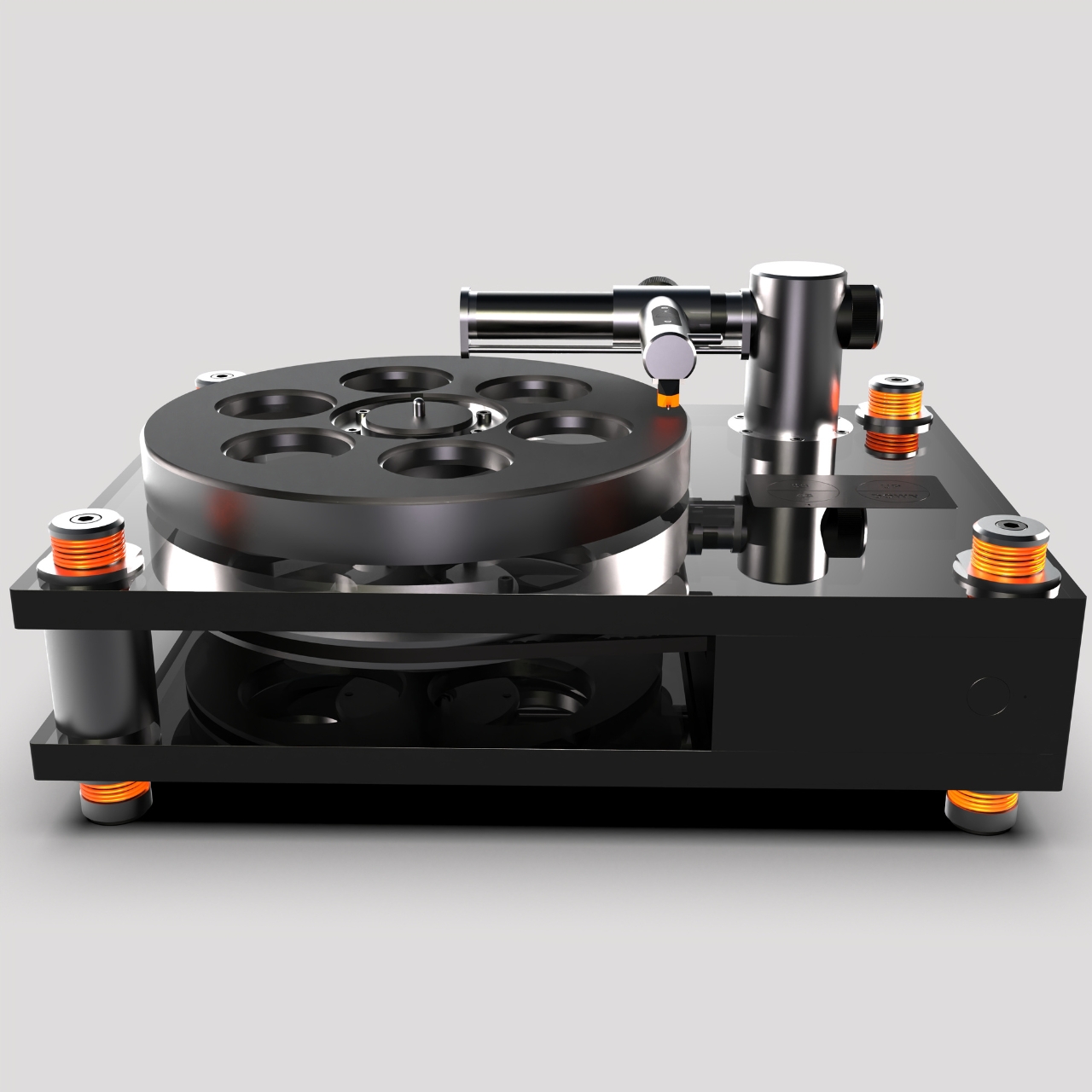
The product render, including a video sample of what it might look like, makes it really look like a high end kind of vinyl player. But it also looks a bit heavy based on the materials that will be used so if you’re looking for something that can be portable or at least easy to move within your space, this might not be it. As for the quality when you actually play your vinyls on it, that remains to be seen.
The post Vinyl turntable concept uses industrial materials and design first appeared on Yanko Design.