Shoehorns have been around for centuries, and their design has barely moved. Most are anonymous strips of plastic or metal that live behind closet doors and rarely see daylight unless someone’s wrestling with a stiff new pair of shoes. They do one job, they do it acceptably, and then they disappear. It’s a category where function was solved long ago, and form has been cheerfully overlooked ever since.
That neglect is the starting point for DROP, a concept prototype that treats the shoehorn as both a sculptural object and an emotional one. The goal isn’t to make it work better but to make it something you’d actually want to live with. That’s a harder problem, and it leads somewhere more interesting than a redesigned grip or a slightly longer handle.
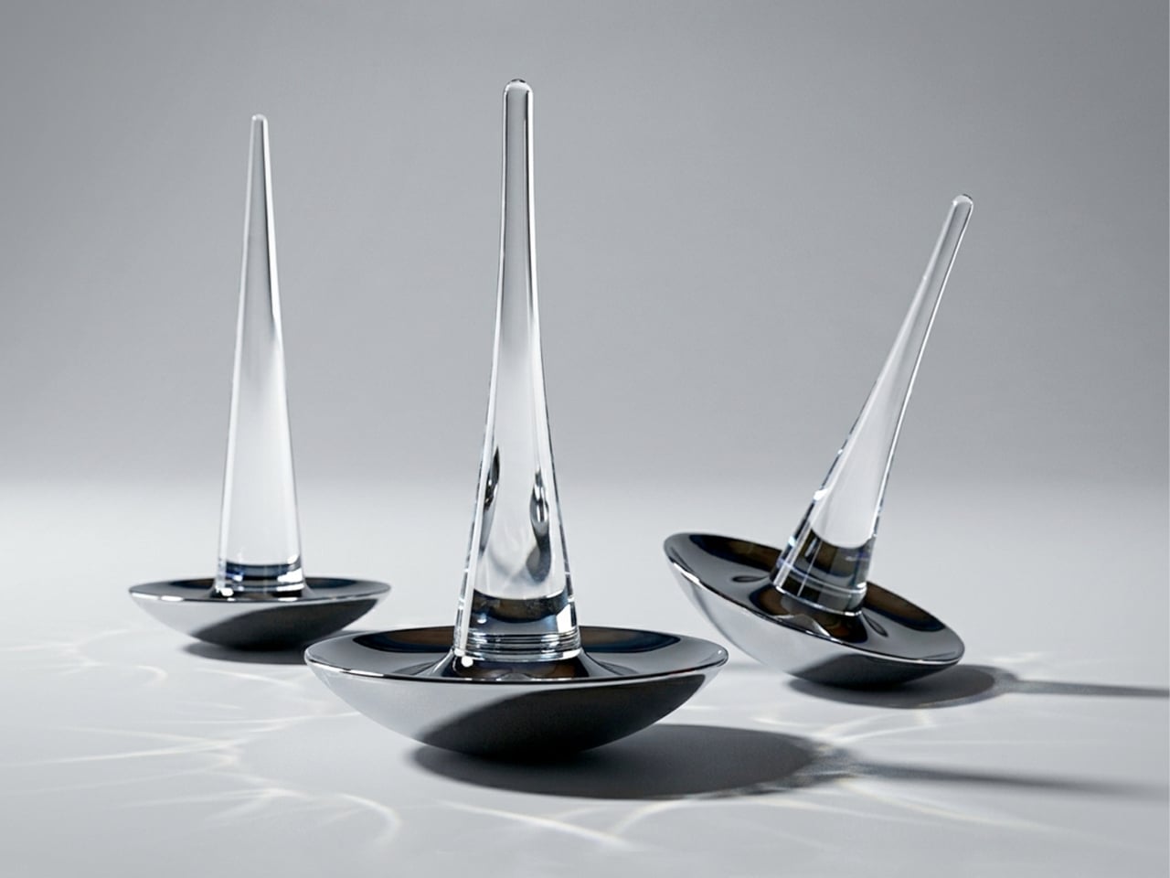
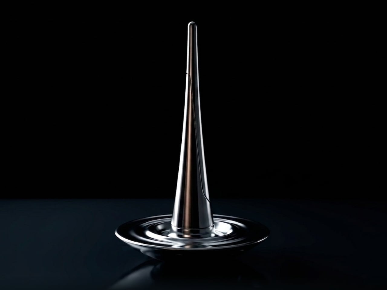
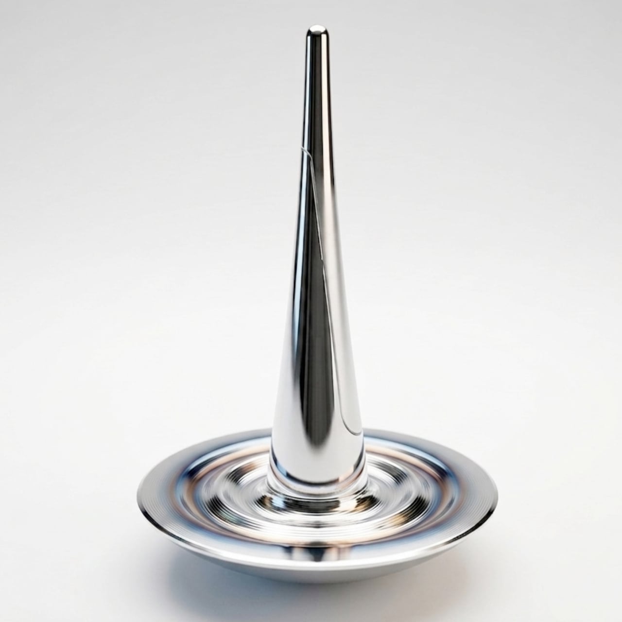
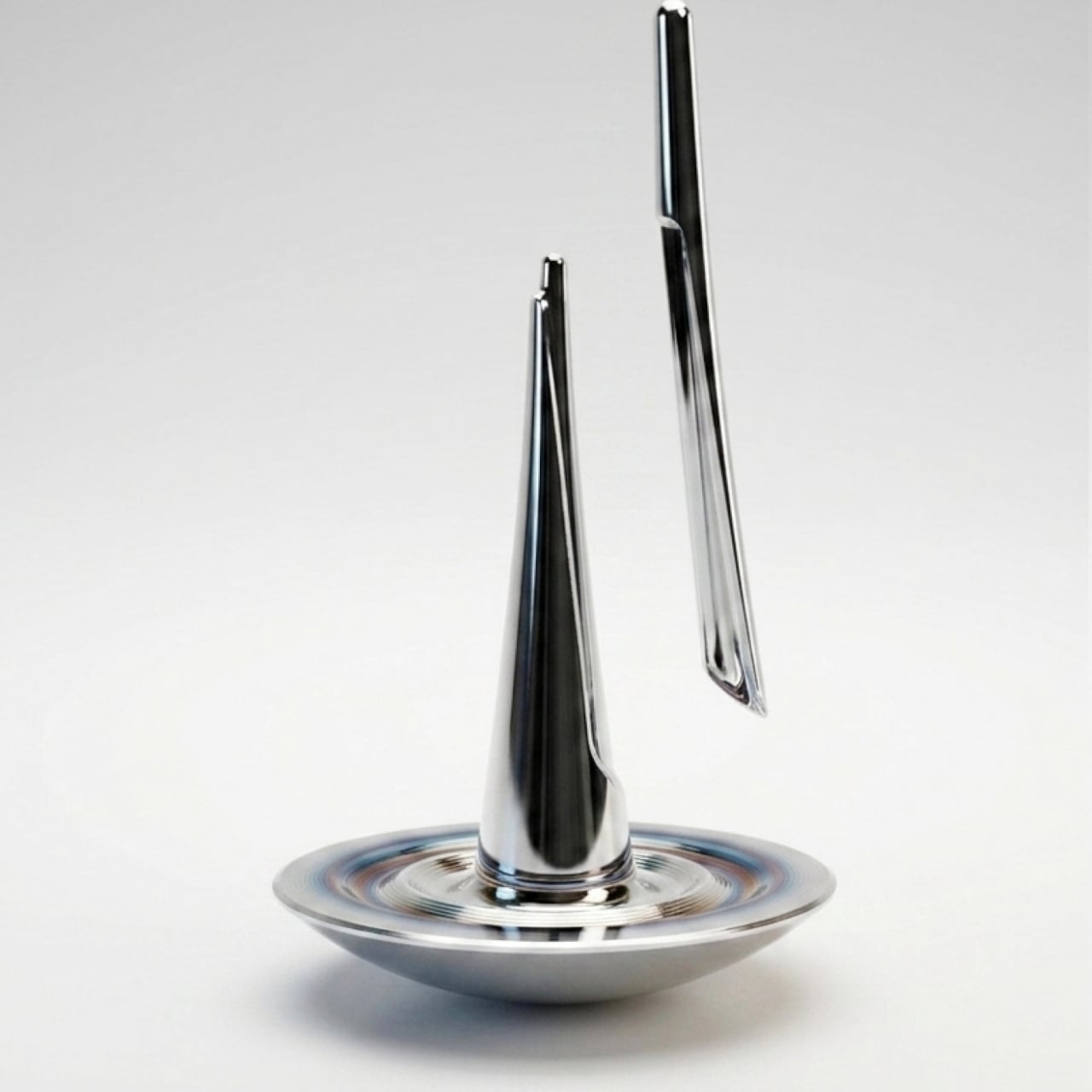
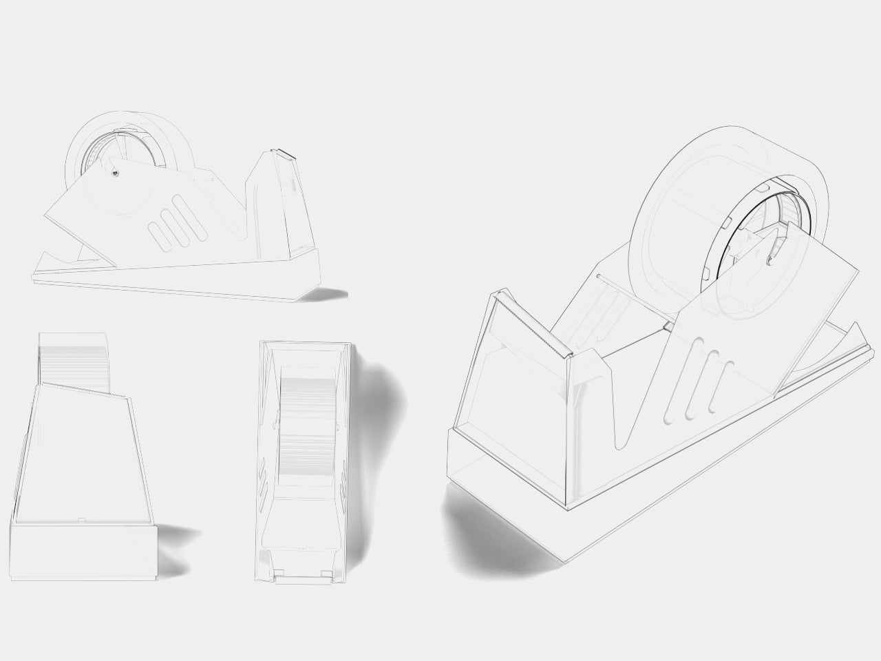
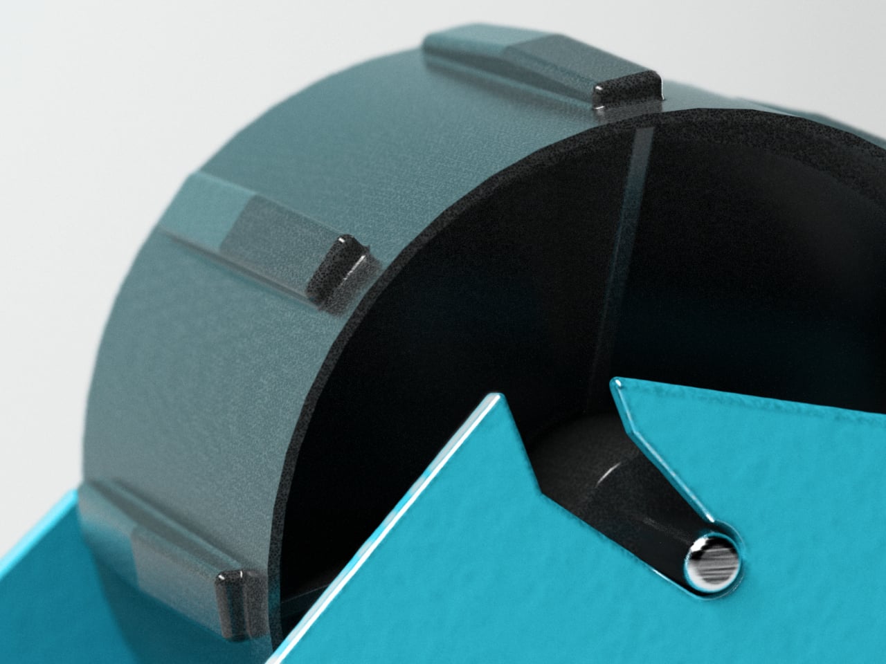
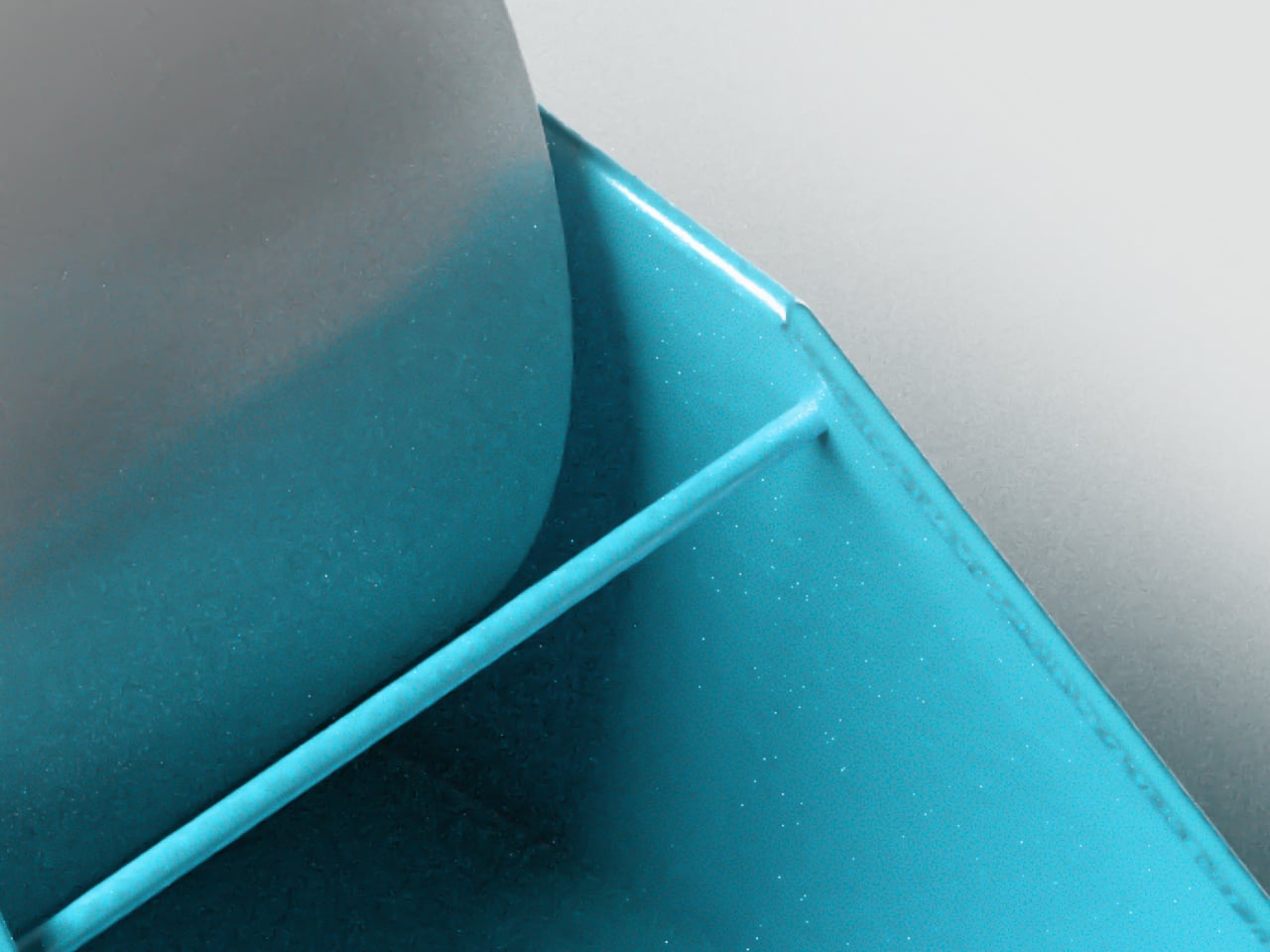
The concept draws from a very specific moment in nature: the instant a water droplet meets a surface. That brief, almost elusive state between motion and stillness became a static form. The tall conical body represents the droplet at the moment of impact, and the shallow curved base beneath traces the ripples spreading outward. It’s a frozen movement given a permanent material shape.
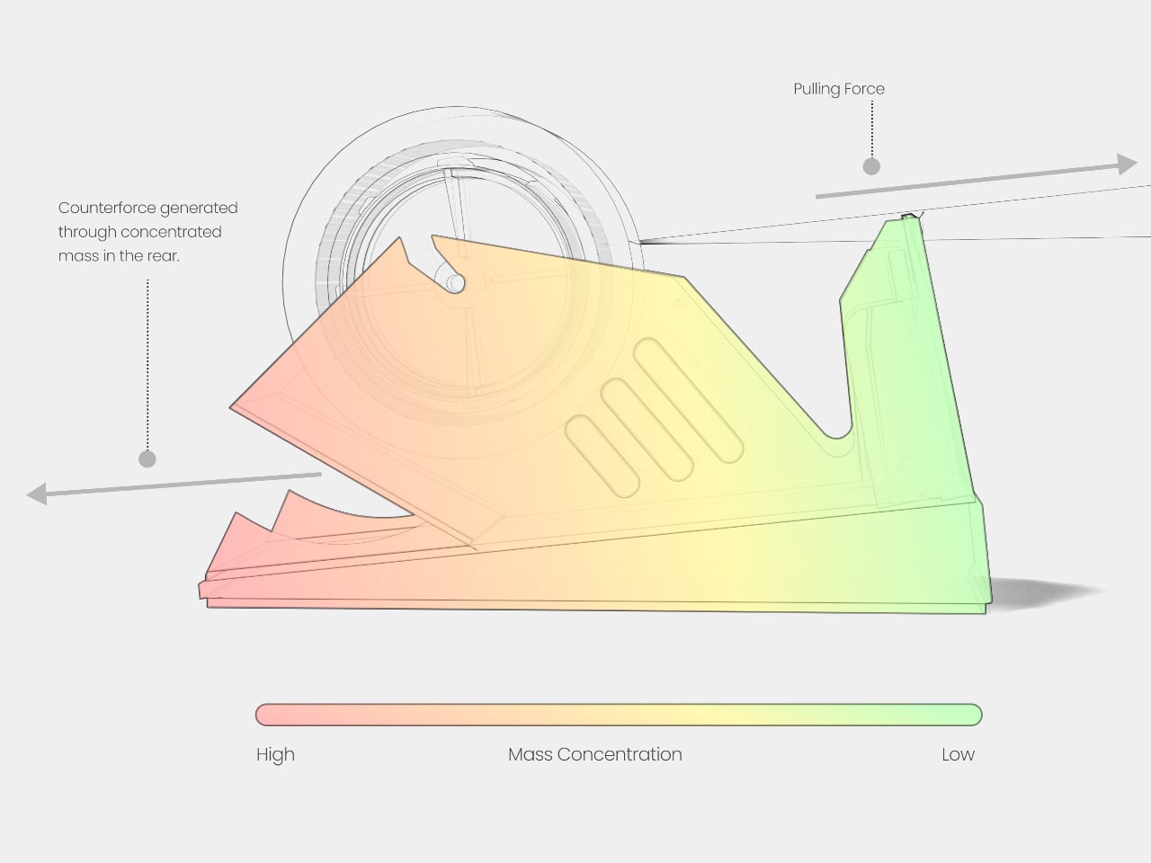
The lead-weighted internal base concentrates mass low enough that DROP behaves like a roly-poly toy: tilt it, push it, set it at an angle, and it returns upright on its own. That self-righting character turns each use into a quiet interaction. The shoehorn responds to each nudge, rocks gently, then steadies itself. For something usually treated as a passive object, that responsiveness is unexpectedly engaging.
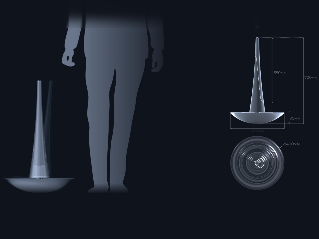
The curved shoehorn blade extends from the conical body, ready when needed. The design stands between 550mm and 700mm tall, firmly in long-handled territory. That height means you can ease your heel into a shoe without bending, which matters in a narrow entryway, for older users, or for anyone whose back has had enough by the time they’re heading out.
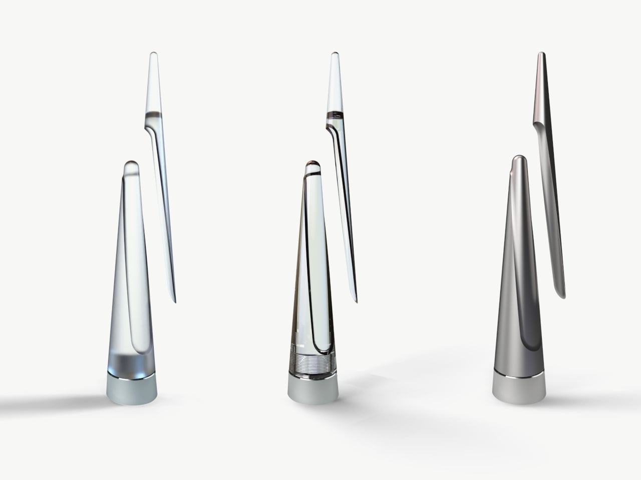
The designer envisions two production tiers. The premium version uses an aluminum alloy body with a lead-weighted internal base, produced through casting or milling. A mass-market version uses composites or polymers to bring the form to a lower price point. Three finish options appear in the concept: a clear glass-like version, a dark smoked variation, and a matte brushed metal option.
A shoehorn that stands on its own without a hook or bracket is already more practical than most. DROP’s broad curved base and low center of gravity mean it doesn’t need to be stored. It can stay out near the door, part of the entry space, rather than an object to stash and inevitably forget about. The ripple-shaped base takes care of that stability by itself.
DROP treats a forgotten tool as a worthy subject for genuine craft and material thinking. Most entryways could use an object that earns its spot on the floor rather than hiding behind a door. The roly-poly mechanism, the water-inspired form, and the weighted base all quietly serve that same goal.
The tape dispenser has been sitting on desks for decades without anyone seriously reconsidering it. It slips when you pull, it tips unless you hold it down, and it leaves tape edges ragged enough that finding the end again becomes a small recurring ritual. For something used constantly in homes, classrooms, and offices worldwide, it carries a surprisingly stubborn set of unresolved frustrations.
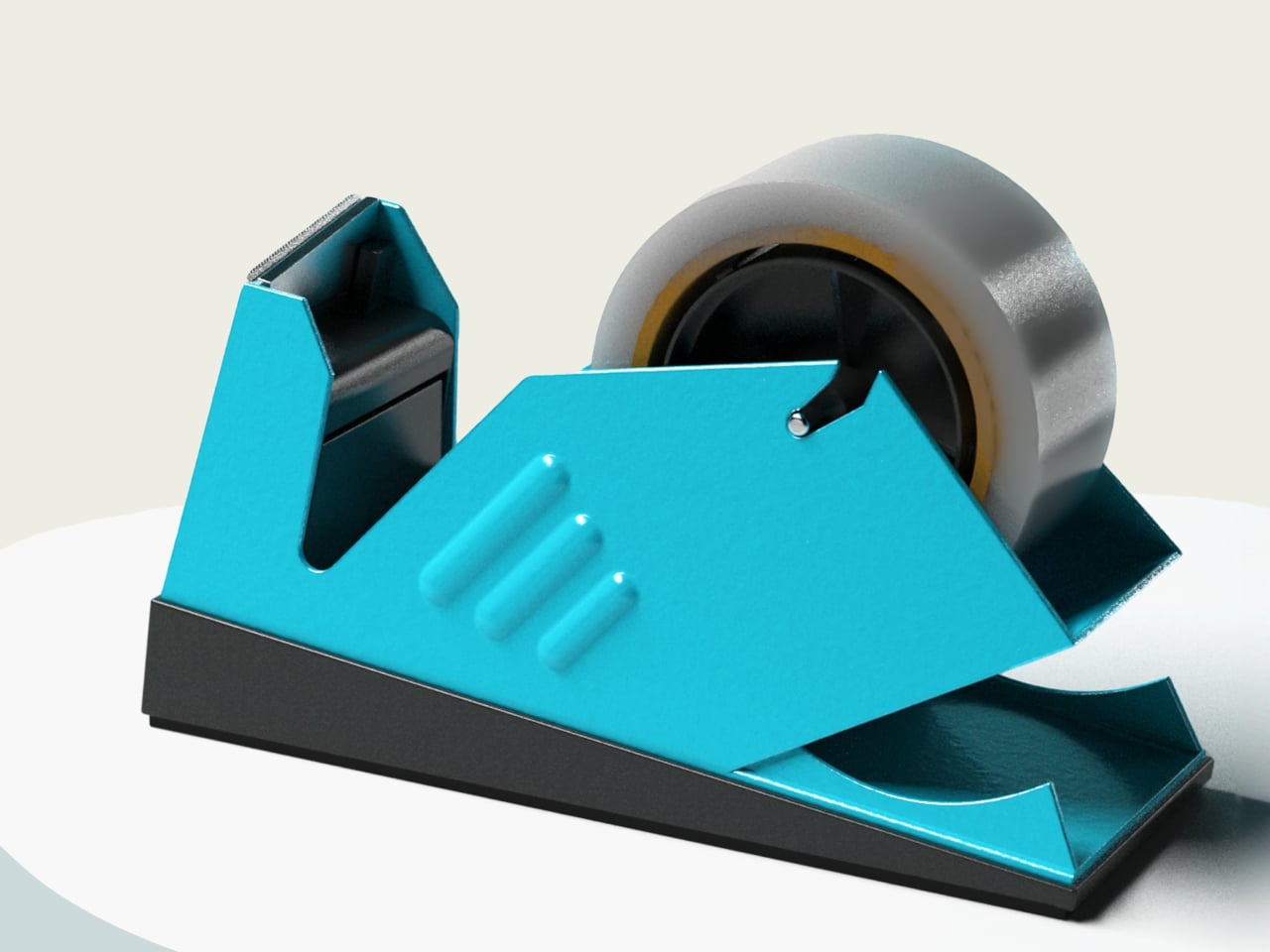
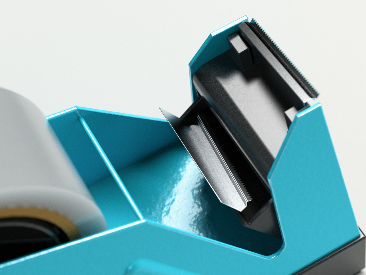
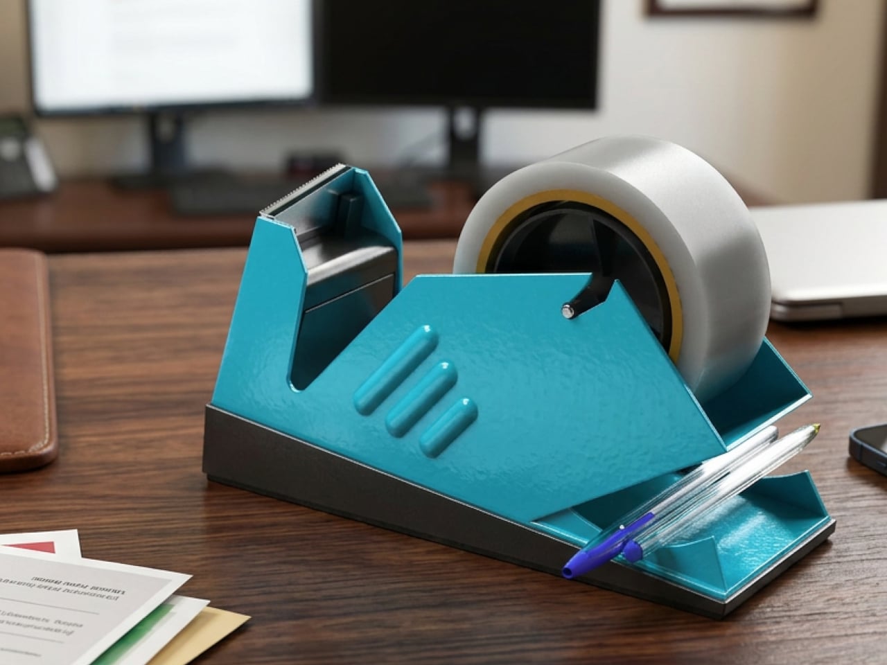
One designer decided to document those frustrations rather than assume them. He observed 49 people all performing the same simple task and cataloged five recurring problems with standard dispensers. The result is Fin, a concept built around solving each one through deliberate engineering. There’s nothing here for decoration. Every choice traces back to something that was genuinely broken and worth fixing properly.
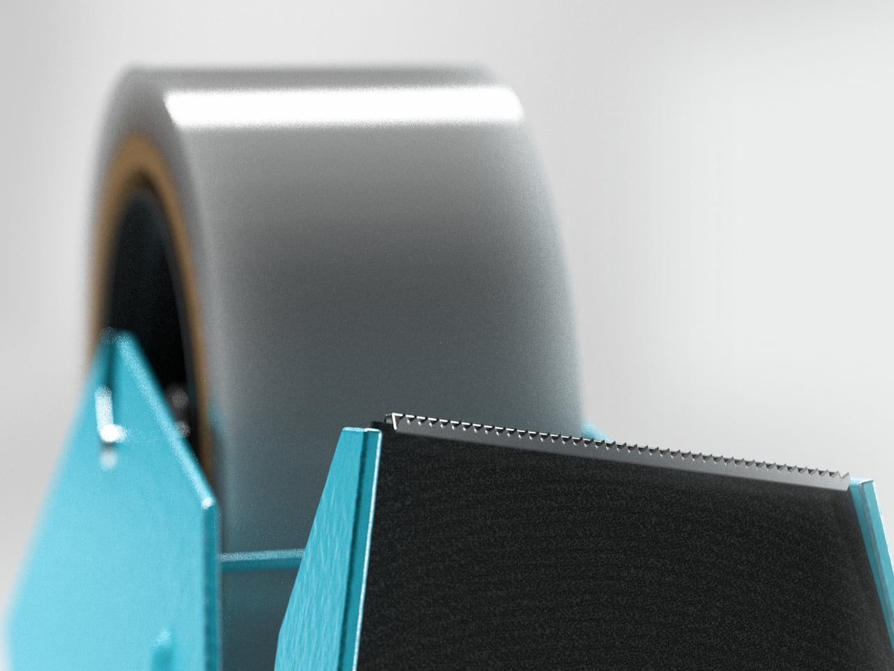
The most immediate change is at the cutting blade. Rather than lying flat, Fin’s blade tilts at 10 degrees. That angle concentrates pressure to a single point, so even when tape is pulled straight down, the cut starts cleanly, and the break travels through without resistance. The ragged edge that forces you to stop and peel back the tape before using it simply stops happening.
Slipping is addressed without adding bulk. Fin concentrates ballast at the rear through uneven weight distribution, creating a pivot point that resists horizontal movement when you pull tape. The front stays light, so repositioning is still easy when needed. Stability is selective, which turns out to be a more elegant answer than just making the whole dispenser heavier and harder to move.
Two more irritants disappear just as quietly. Angled supports inside the tape cradle automatically stabilize narrow rolls so they don’t wobble regardless of tape width. A retention bar holds the tape edge after every cut, so the next time you reach for it, the end is right where you left it. That small predictability adds up across a day of repeated use.
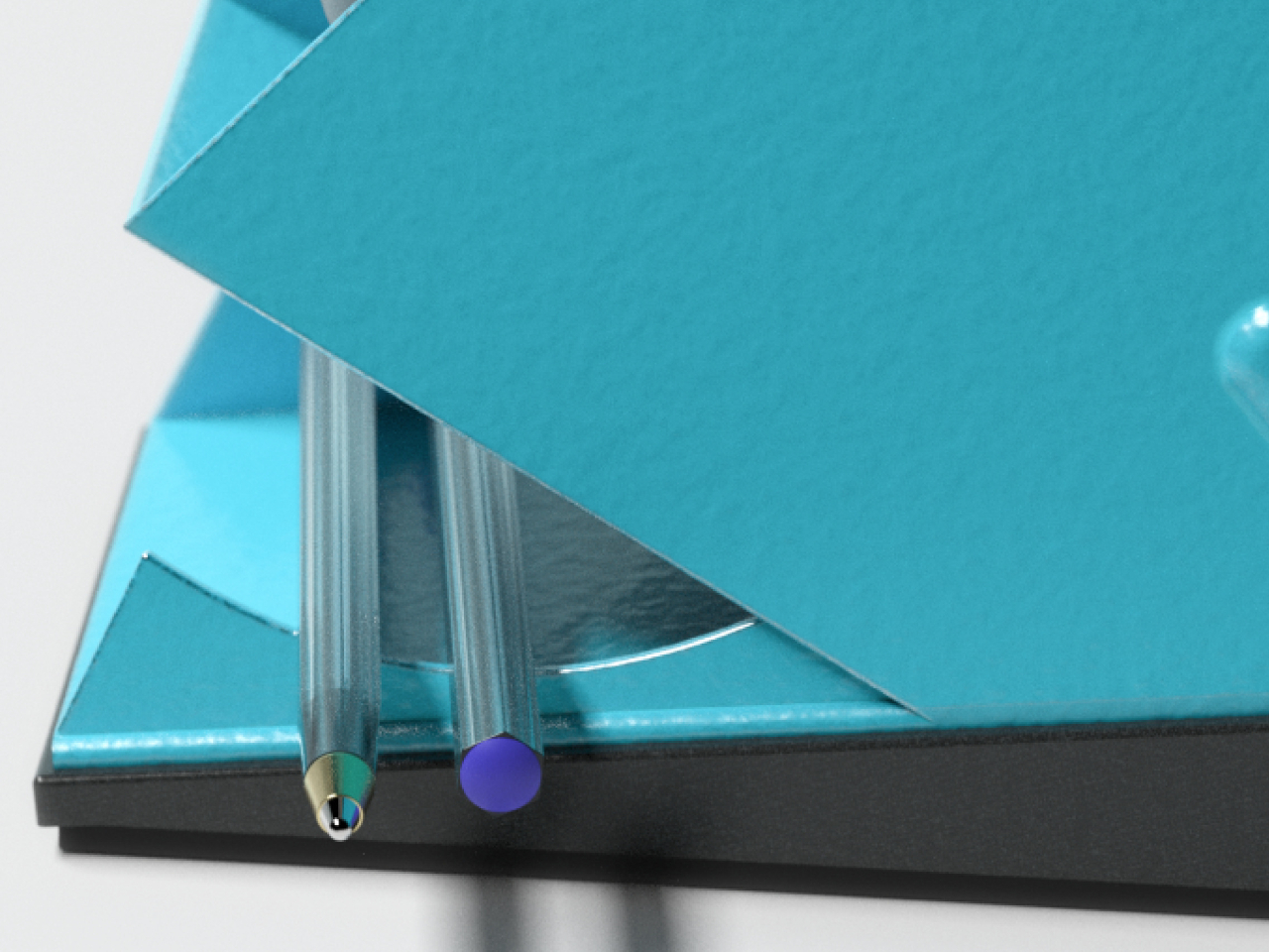
The research also revealed that tape is rarely used alone. Scissors come out, pens get grabbed, and clips end up nearby. Sharma designed a storage compartment into the base, turning the dispenser into a compact workspace hub rather than a standalone tool. Replacement blades sit inside the cutting mechanism itself, where they’ll be found when inevitably needed rather than lost somewhere in a desk drawer.
The tapered form that gives Fin its name isn’t incidental. Narrowing toward the front reduces grip surfaces and gently nudges users toward one-handed operation, discouraging the two-handed approach that keeps standard dispensers tipping. The shape wasn’t decided until every functional requirement had already settled it. What you’re left with is an object that looks like a design statement but is really just engineering made visible.
Fin is still a concept, not a product you can put on your desk yet. As a design exercise, it makes a solid argument for what happens when someone watches a problem carefully before trying to solve it. Tape dispensers have gone largely unexamined for a very long time, and this concept makes it genuinely difficult to use the one on your desk the same way.
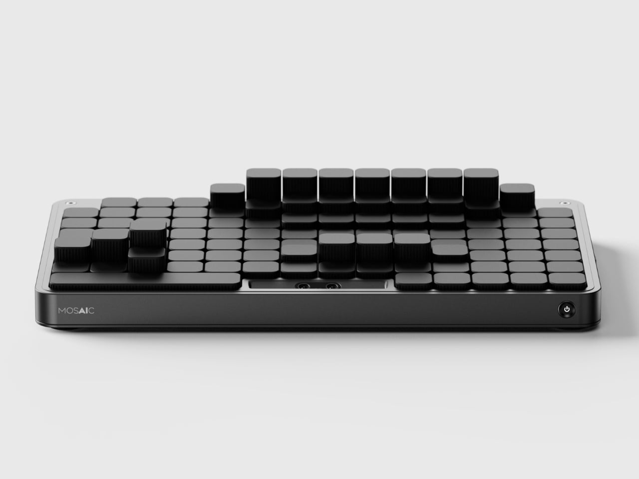
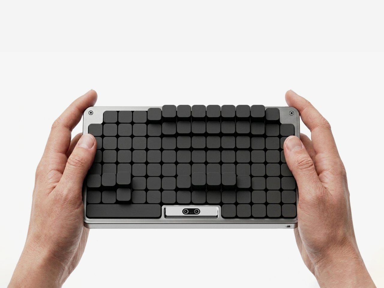
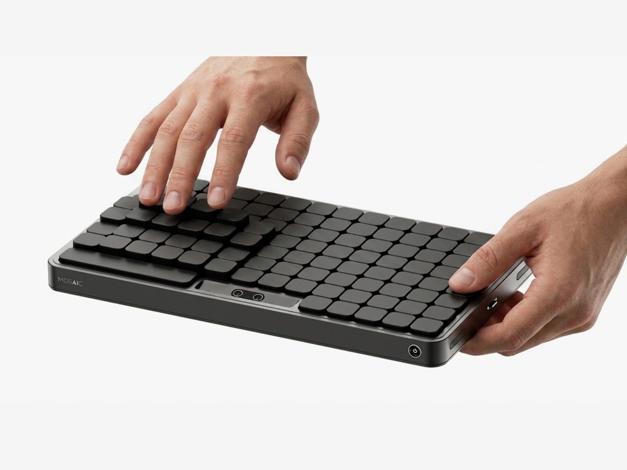
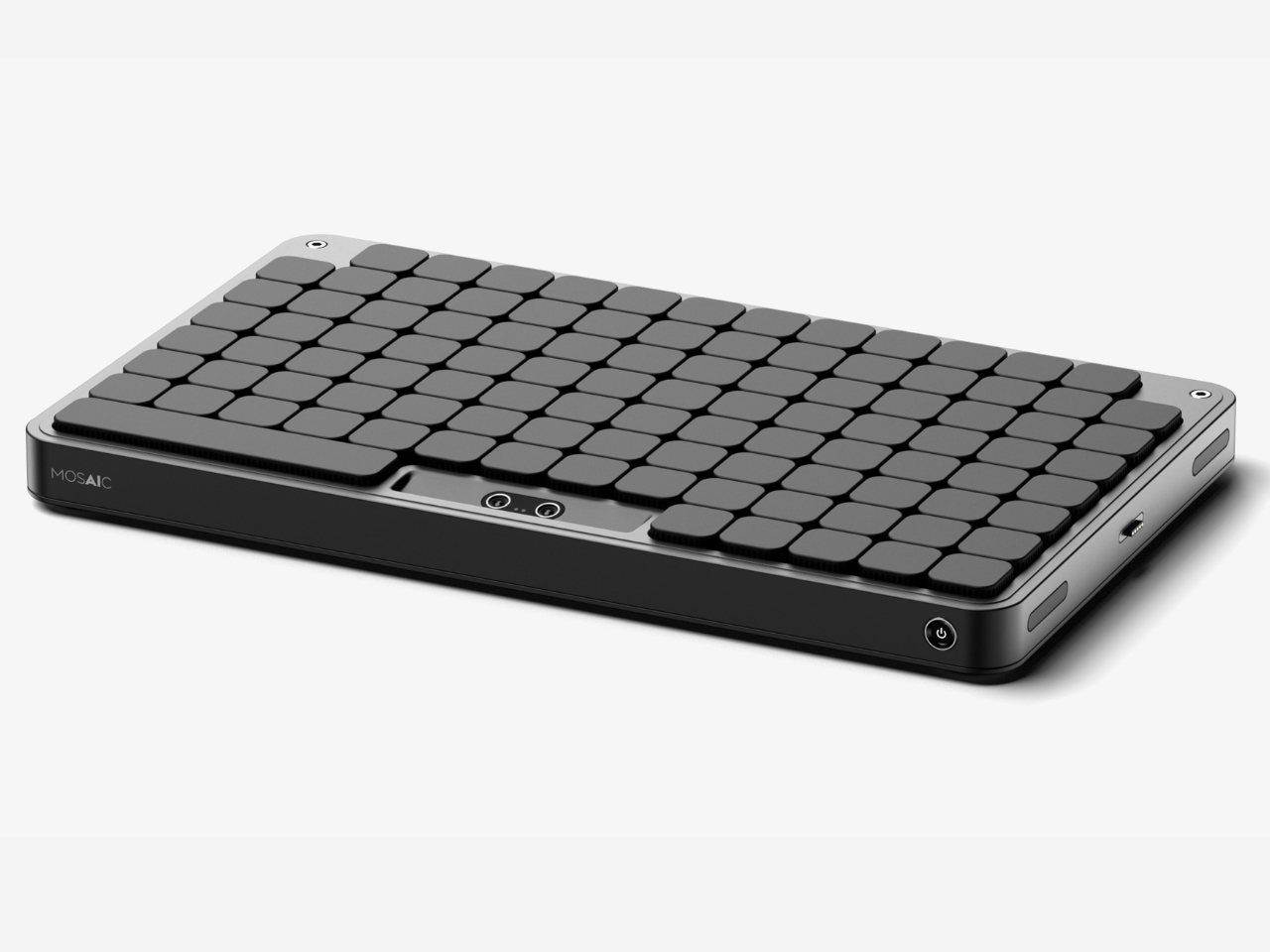
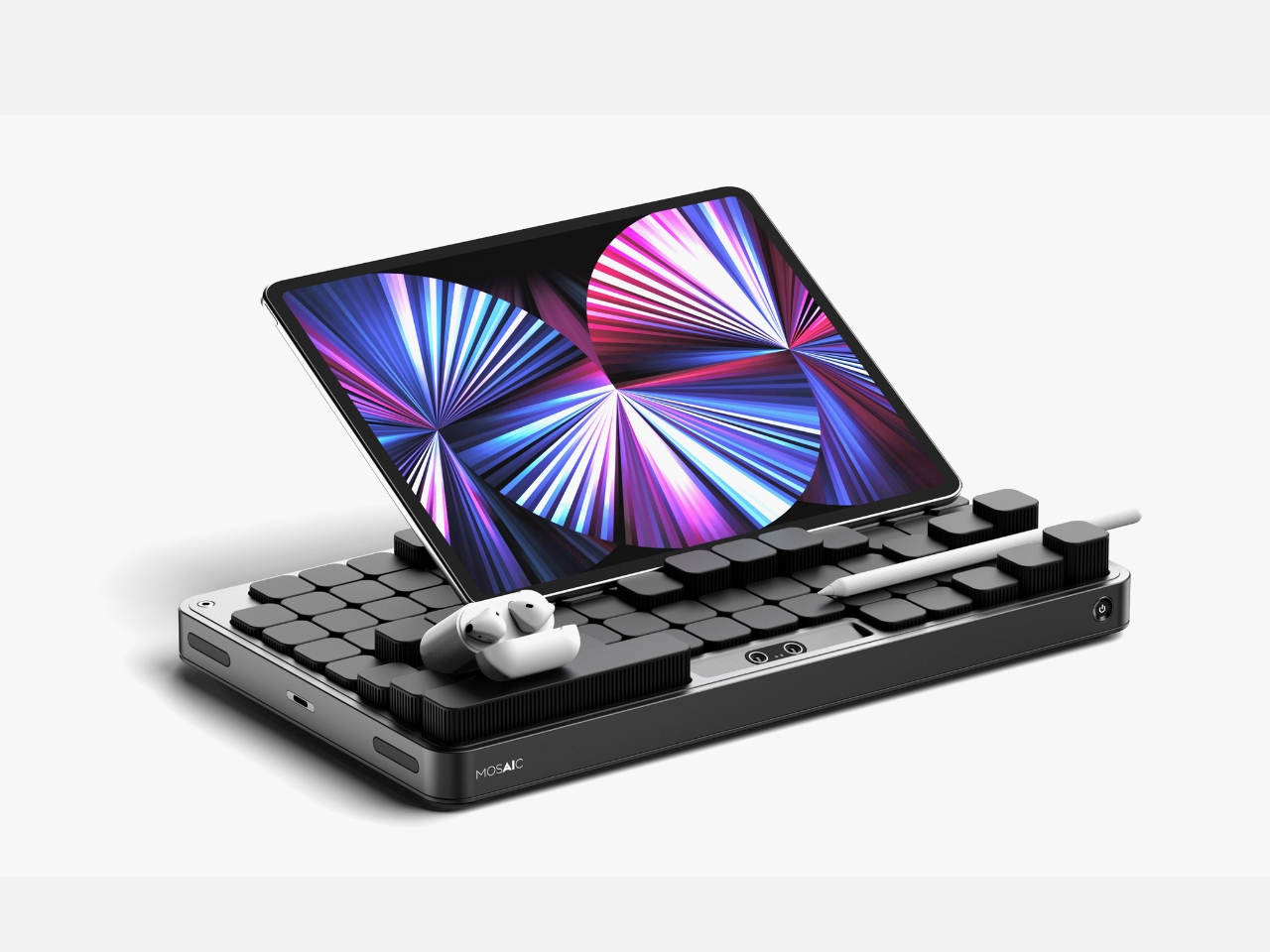
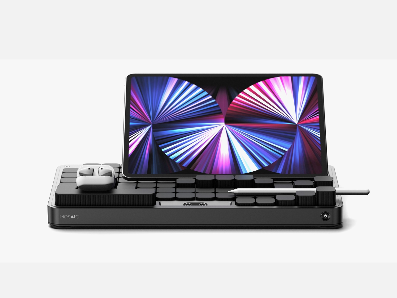
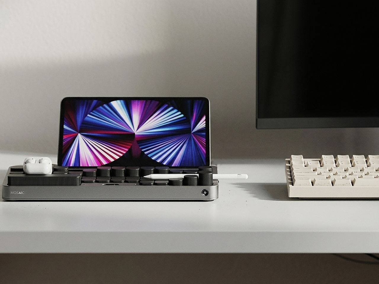
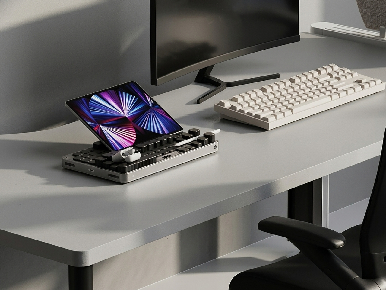
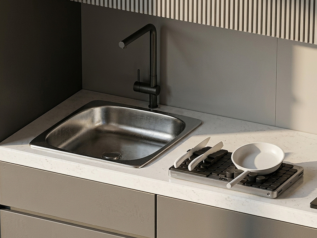
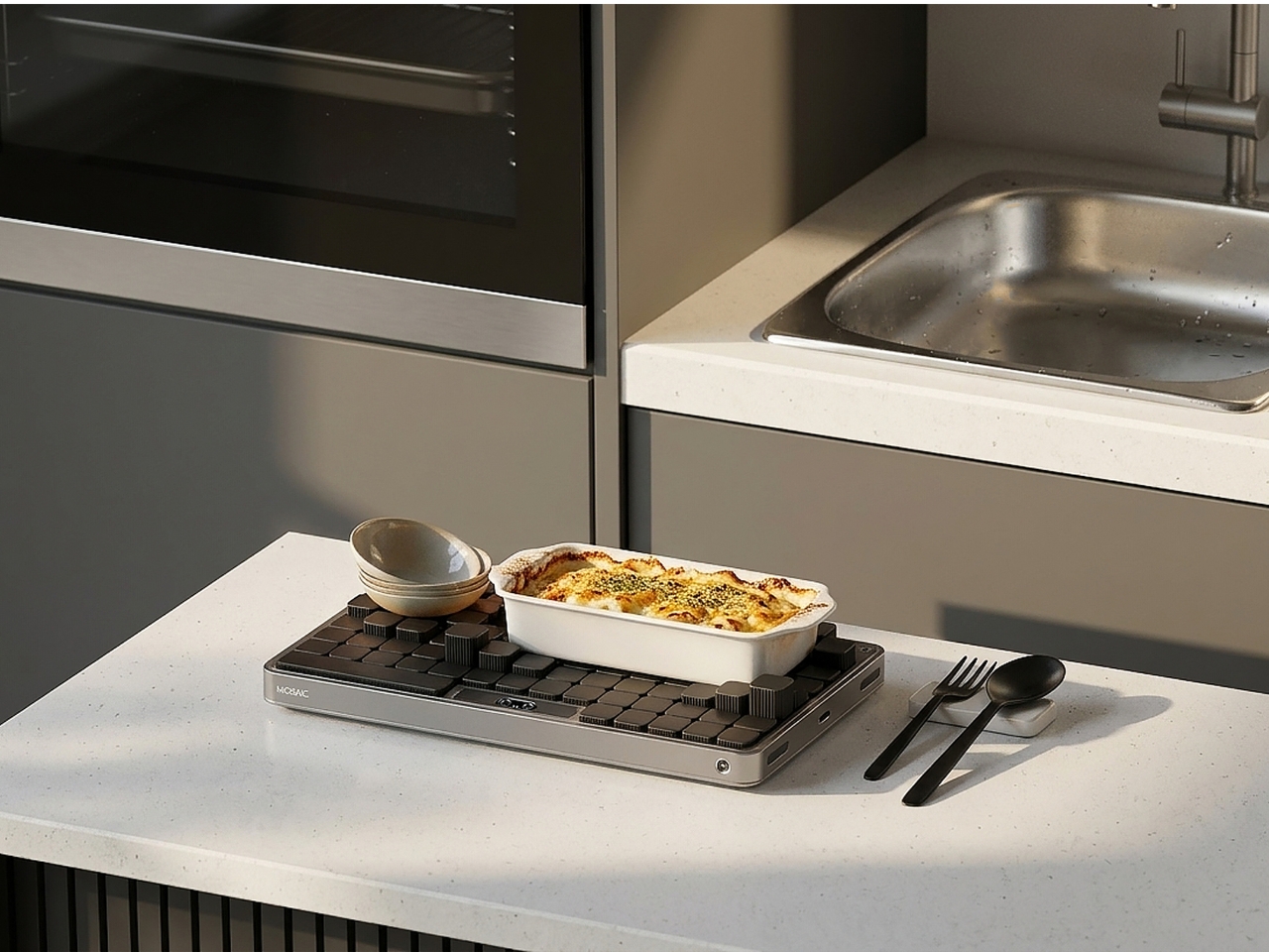
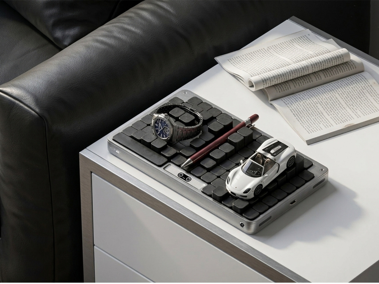
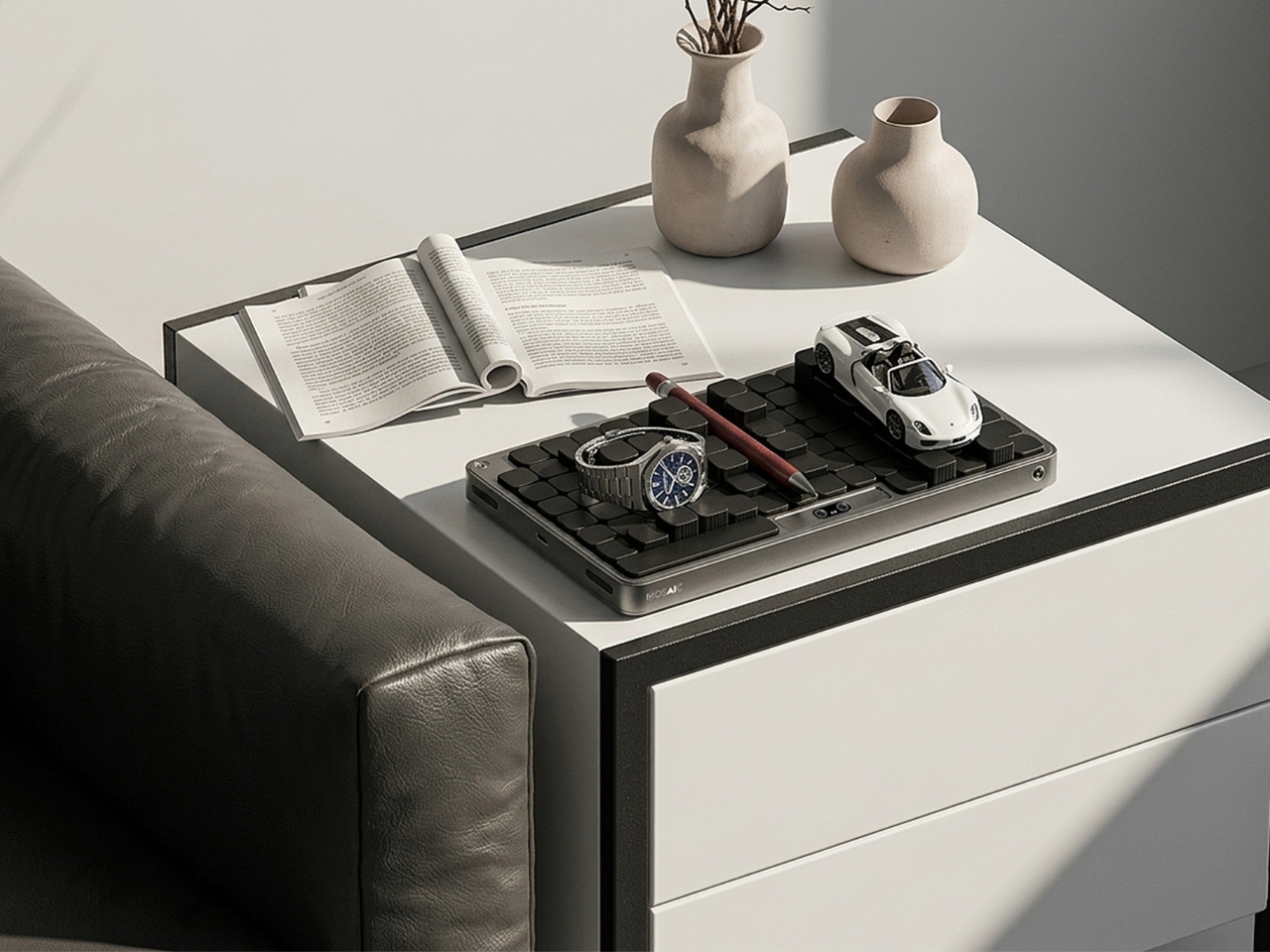
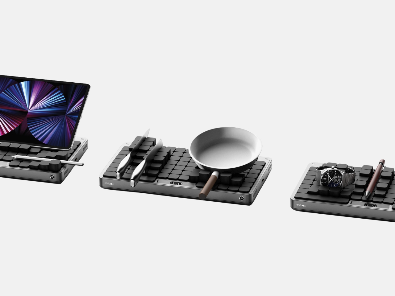
Most desk organizers ask you to adapt to them. You get a tray with fixed compartments, you shove your stuff in, and either it fits or it doesn’t. Then you give up, and everything ends up in a pile again. Seoul-based industrial designer Youngbin Kwon decided that the tray should be the one doing the adapting, and the result is Mosaic, a concept that’s quietly one of the more genuinely smart ideas to come out of the AI-meets-product-design conversation this year.
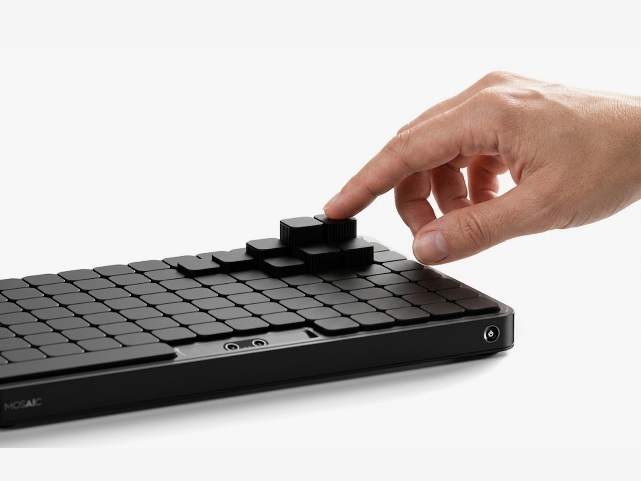
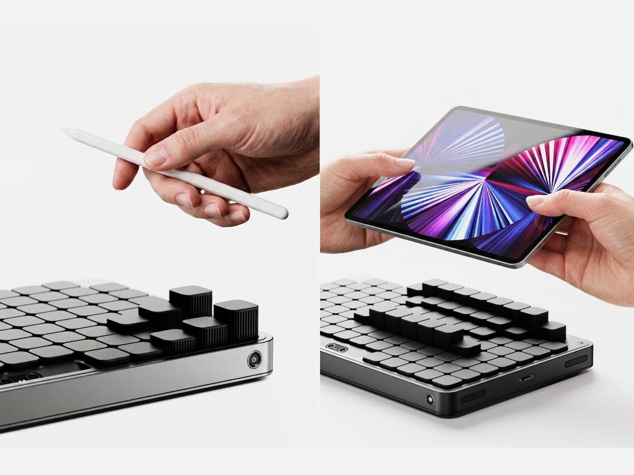
Mosaic is an AI tray that transforms its shape depending on what you place on it. The idea, at its simplest: put your things down, and the tray reconfigures around them. The modular structure shifts and reorganizes to accommodate whatever you’re dropping in: your phone, your keys, a charging cable, a stray lip balm. It reads the objects and makes room for them. What the concept proposes is essentially the end of the one-size-fits-all desk organizer, and I think that’s a very good thing.
The design is the work of Kwon, an industrial design student from Chung-Ang University in Seoul, published this May on Behance, where it’s been pulling in appreciations at a rate that suggests the design community noticed. Built in Rhinoceros and rendered in Keyshot, the concept is visually clean and grounded, with a restraint that keeps the focus on the idea rather than the spectacle. This isn’t speculative design that lives only in dreamland. It feels like something that could exist with the right engineering team behind it.
But the part of the concept that deserves more attention than the mechanics is the philosophy behind it. Kwon describes the act of placing objects with AI assistance as being “as if playing,” and the idea is that this playfulness is exactly what leads people to actually develop organizational habits over time. Not guilt. Not a beautiful, aspirational flat-lay that makes you feel bad about your desk. Just play. That distinction is easy to underestimate.
That reframing matters more than it might seem at first. The market for organization products is enormous, and so is the gap between things people buy to get organized and how long they actually stay organized. That gap usually comes down to friction. The system is too rigid, or too much effort to maintain. Mosaic proposes that if the system flexes with you instead of demanding you flex with it, you’re far more likely to stick with it. Gamification applied to the most mundane domestic task. It’s clever.
I’ll admit that the name Mosaic might be the most elegant thing about it. A mosaic is a picture made of small, individually unremarkable pieces that together create something intentional and whole. That’s exactly what the tray does. The modular components rearrange into a layout that looks curated, even when you’ve just dropped everything in at the end of a long day. The name does real conceptual work, and that’s rarer than you’d expect from a student project.
There are real questions left unanswered, as there always are at the concept stage. How exactly the AI identifies objects, whether it uses cameras, weight sensors, or something else, isn’t detailed in the project. The durability of moving parts in a daily-use context is worth thinking about. Whether the transformation happens visibly and slowly, like something mechanical, or snaps quickly into place, would change the entire experience of using it. These are the things that turn a concept into a product, and Kwon’s Mosaic is still very much a concept.
But good concepts don’t need to be finished products to be worth paying attention to. What Mosaic does well is identify a real and relatable failure mode, the organizational system that doesn’t survive contact with actual human behavior, and propose a solution that works with people rather than against them. The tray that meets you where you are. That’s not a small idea dressed up in a sleek render. That’s a fundamental rethink of what we expect everyday objects to do, and it’s worth watching where it goes.
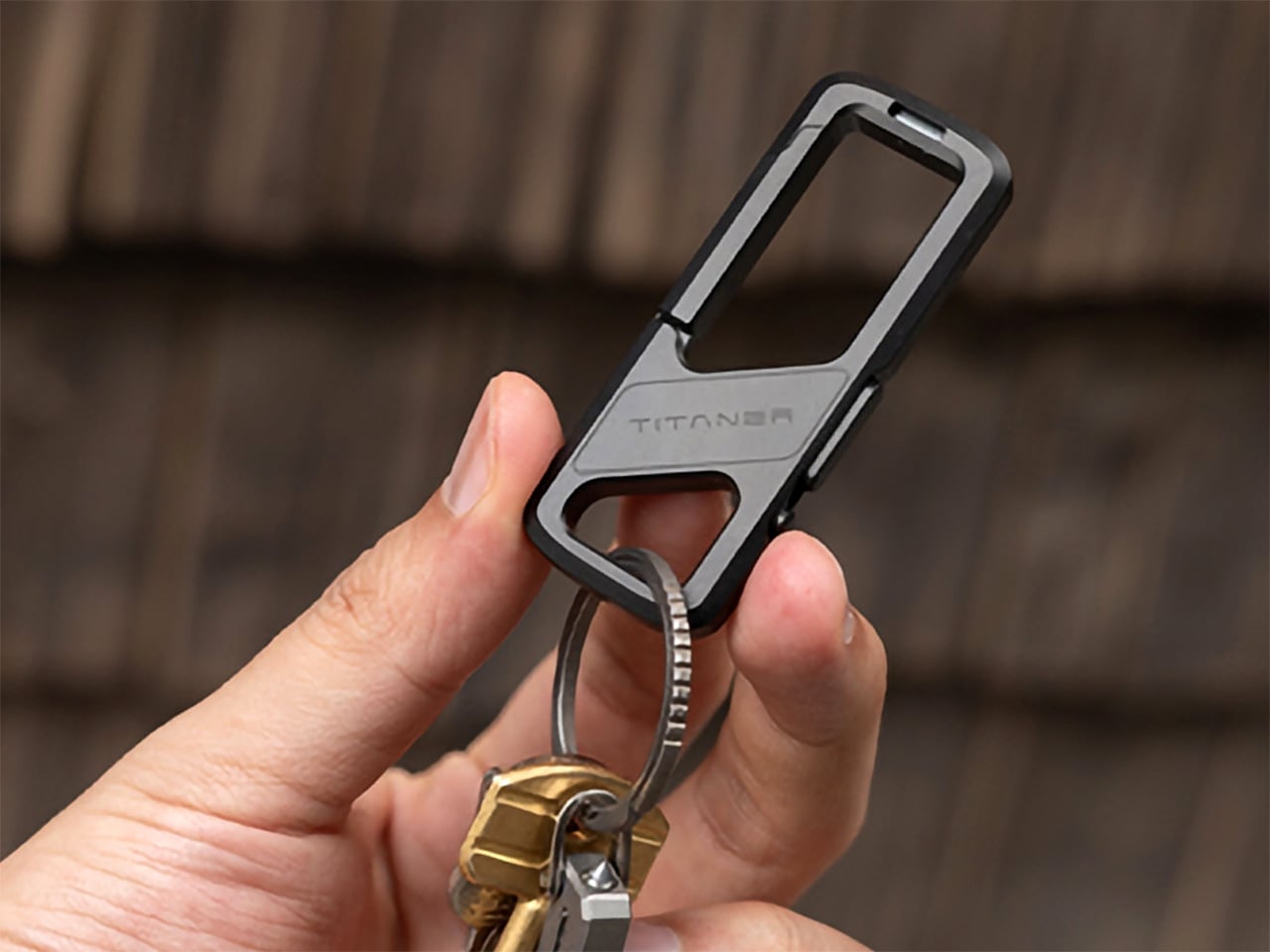
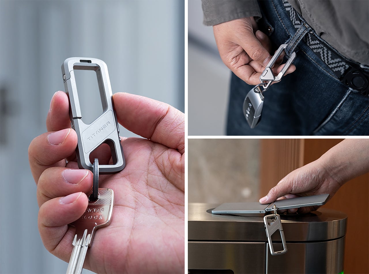
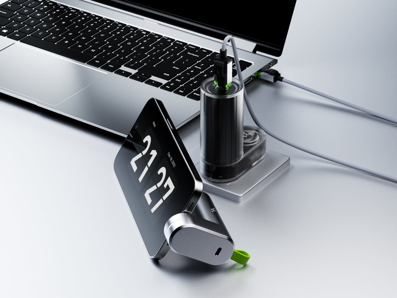
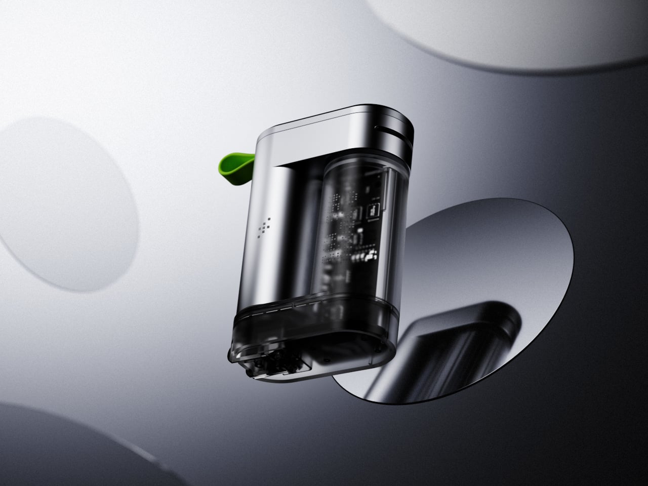
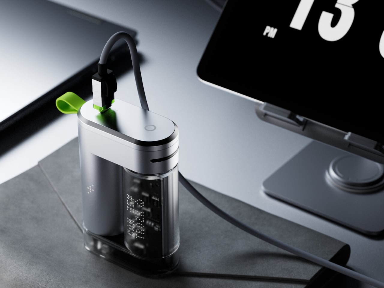
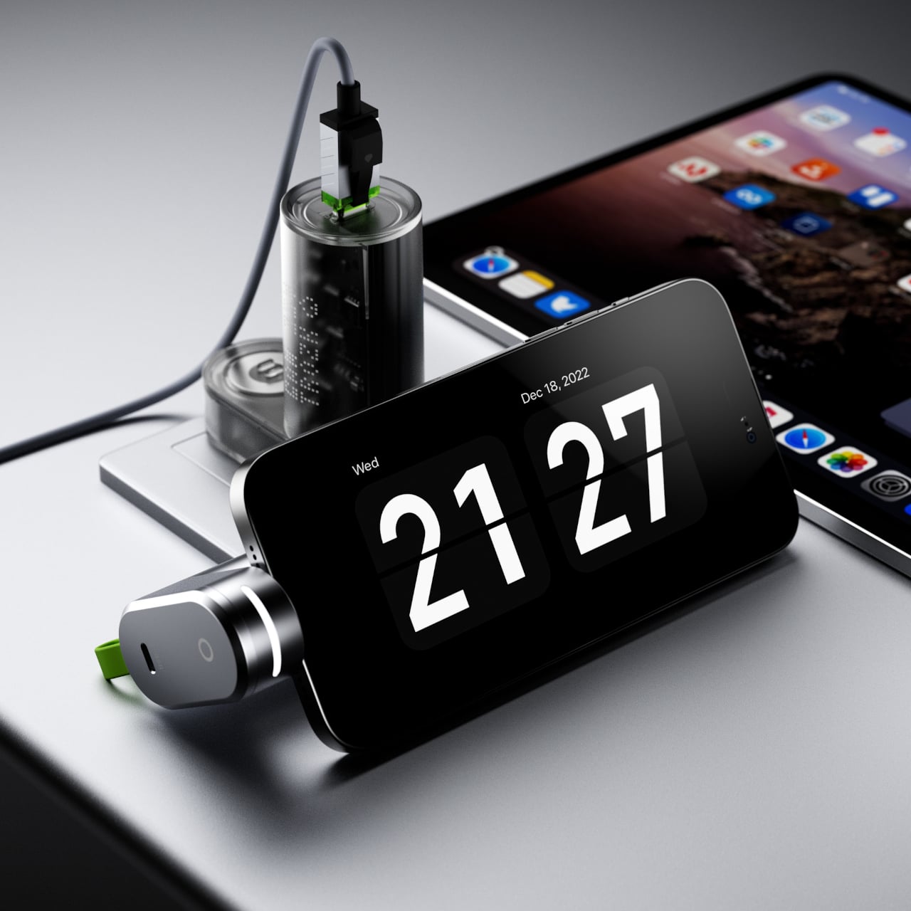
The spring inside a conventional keychain carabiner is arguably the least-considered component in everyday carry, a tiny coiled wire doing the same job it has done for decades, prone to fatigue, deformation, and eventual failure at the exact moment reliability matters most. Titaner has rebuilt it from physics up. The Matrix replaces that metal spring entirely with precision-aligned neodymium magnets operating in controlled repulsion, generating gate-return force that doesn’t degrade with use. The brand rates the system at one million presses with zero rebound loss, a number that makes the lifespan of any conventional spring look fairly modest by comparison.
That magnetic spring delivers an incredibly smooth linear damping feel, a soft yet decisive rebound that Titaner describes as strangely addictive. It serves as the foundation for a more ambitious system: a three-level locking architecture where the number of active mechanical defenses is something the user controls. Six models span the lineup, ranging from a single-level autolock all the way to Constant Locking configurations with a physically deadlocked release button and the XYZ Tri-Axial Lock restricting gate movement across all three spatial axes simultaneously.
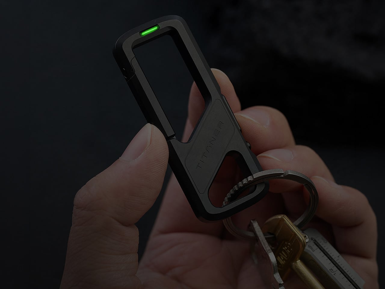
The magnetic spring structure is the invisible upgrade that takes the carabiner to an entirely new level. Where a coiled metal spring cycles between tension and compression thousands of times until molecular fatigue sets in, neodymium magnets generate repulsion force without any physical wear. The spring action remains consistent across the entire lifespan, which means the 500th press feels identical to the 500,000th. Titaner machines precision cavities into the titanium body to house the magnets, aligning their poles to create controlled repulsion that mimics the spring behavior but with a smoother damping curve. The tactile feedback on every gate release has a fidget-toy quality to it, a satisfying snap that makes you want to open and close the thing for no reason at all.
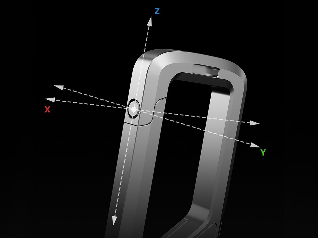
When the gate closes, the XYZ Tri-Axial Lock engages across all three spatial axes simultaneously. Traditional carabiner clips allow some degree of lateral wiggle or vertical play once the gate latches, a small but perceptible looseness that undermines the sense of security. Titaner’s lock structure eliminates that movement entirely by restricting the gate along the X, Y, and Z axes the instant it seats into the closed position. The entire assembly goes rigid, transforming from a hinged mechanism into what feels like a single monolithic piece of titanium. The lock structure is passive, meaning it happens automatically without user input, but the result is immediately noticeable the first time you handle a closed Matrix unit.
The three-level security system builds on that foundation by adding optional layers of defense. Level 1 is the magnetic spring autolock alone, best suited for quick daily access where speed matters and the risk of accidental release is minimal. Level 2 introduces a toggle switch positioned over the release mechanism, adding an active physical barrier that prevents accidental actuation. You slide the toggle to expose the release, press to open the gate, and let the toggle return to its locked position. Level 3 takes it further by physically deadlocking the release button itself. The mechanism retains the first two defense lines while introducing a third barrier that requires deliberate mechanical input before the release will respond at all. Even with Level 3 engaged, the sequence to open the gate takes under one second once you internalize the logic, which means maximum security without a meaningful sacrifice in access time.
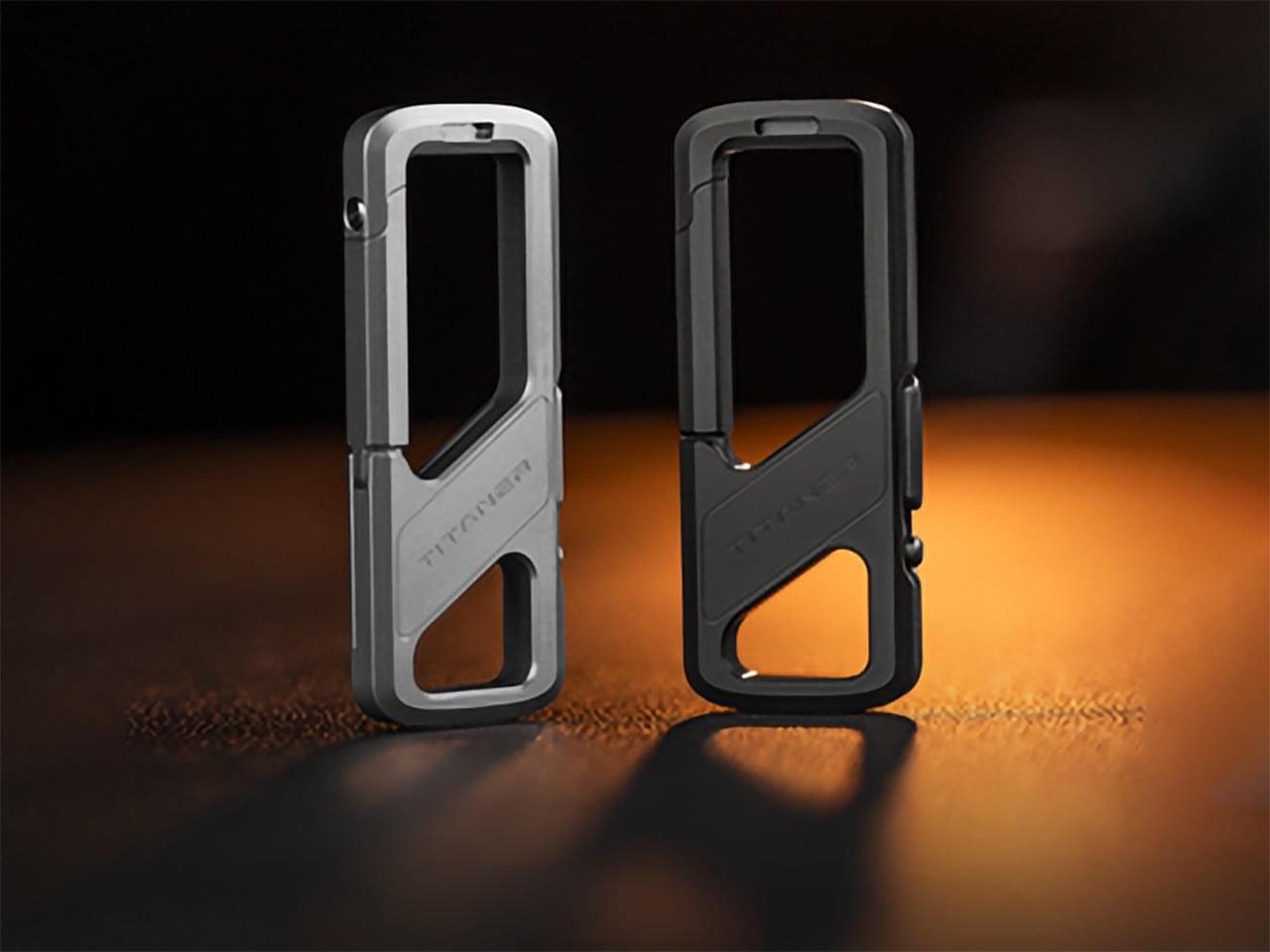
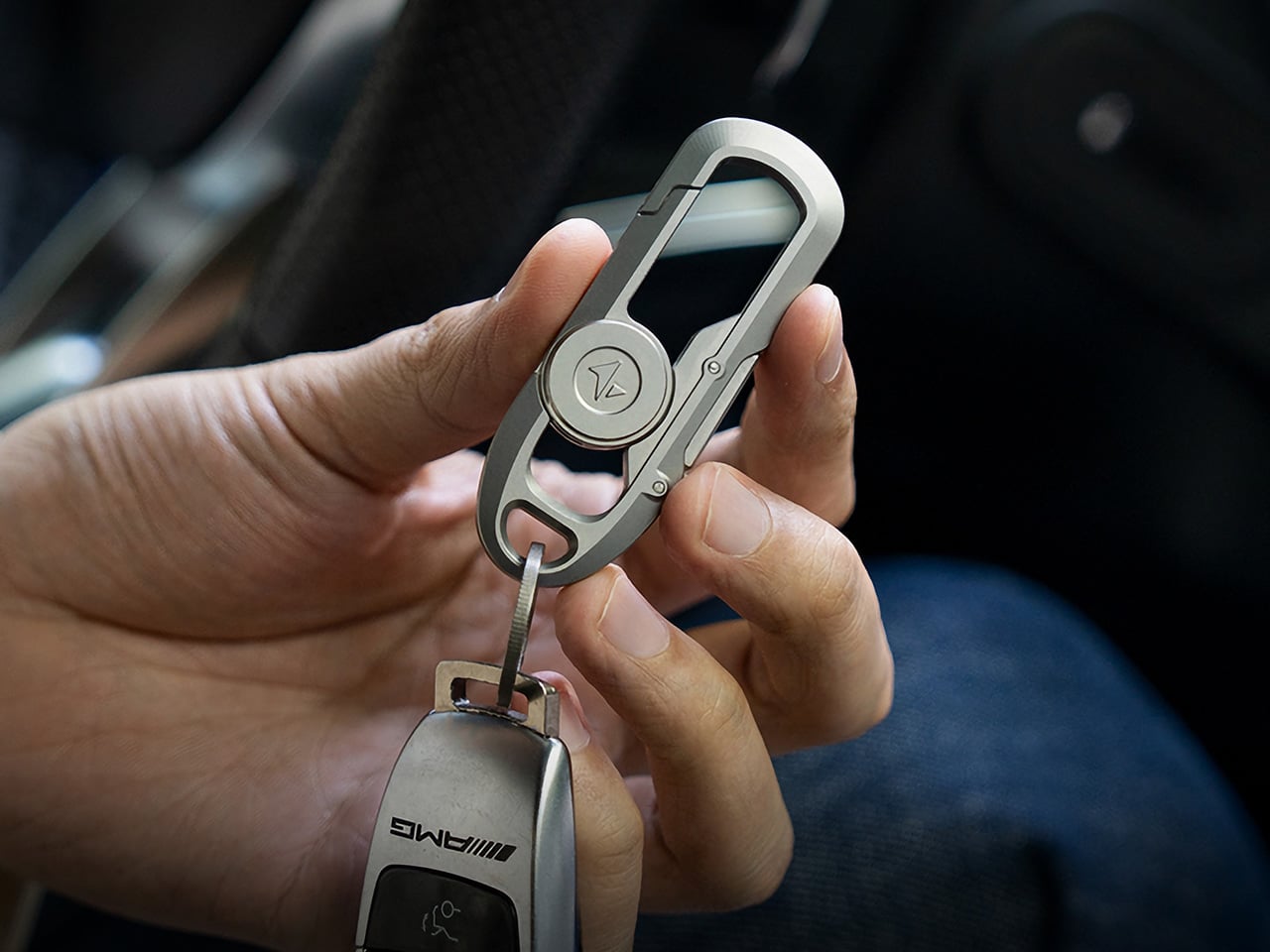
Six models distribute across four series, each with a different mechanical philosophy and form factor. The S-Series is the most compact, designed for minimalist carry with a slim profile and a rotating release mechanism. The G-Series adopts a more geometric stance, with hard angles and a question-mark form factor that deviates from the traditional D-shaped carabiner. The N-Series carries the Tritium slot, a dedicated cavity machined into the body to hold a self-illuminating tritium vial that glows for over 25 years in complete darkness without batteries or charging. The L-Series is the entry point and the only model of the spring system that ingeniously achieves locking by utilizing the elasticity of metals and structural design.
Every piece starts as a solid block of GR5 titanium, the aerospace-grade alloy that delivers comparable strength to steel at roughly half the weight. Titaner machines each component on high-end CNC equipment, chamfering every edge to eliminate the sharp surfaces that shred pocket linings or catch on fabric. The finished pieces range from 12.3 grams for the L1 up to 26 grams for the G3, putting even the most feature-loaded variant comfortably within daily carry territory. GR5 titanium resists corrosion, rust, and bacterial growth, which means sweat, rain, and salty air have no meaningful effect on the material over time. The alloy is also hypoallergenic and non-toxic, qualities that matter less for a keychain than for something worn against skin but add to the overall sense of considered engineering.
Two surface finishes are available. The Micro-Blasted finish is a raw industrial matte that shows the machined titanium in its natural state, with superior fingerprint resistance and a soft tactile feel. The DLC Black finish applies a Diamond-Like Carbon coating over the titanium, adding extreme scratch resistance and an anti-reflective tactical aesthetic that photographs darker and more aggressive. Both finishes hold up to years of daily pocket carry without meaningful wear, though the DLC coating provides an additional layer of surface hardness for users who prioritize durability above all else.
Every Matrix keychain ships with a 32mm stainless steel quick-install key ring. The ring can be pried open by hand to slide a key directly onto the coil without the usual fingernail-destroying process of threading keys around a traditional split ring. Once the key is seated, the ring snaps closed and holds with enough tension to secure the key indefinitely.
The Matrix lineup is available now, with pricing spanning from $29 for the L1-2026 (the entry-level model with a traditional spring) up to $129 for the G3-2026 in DLC Black. The campaign includes optional add-ons such as Tritium vials, titanium toothpicks, and upgraded DLC finishes. Shipping is estimated to start in September 2026.
Orbitkey’s design story has always revolved around everyday friction, the loose keys in a pocket, the tangled cable in a bag, the small desktop essentials that somehow scatter across every available surface. Its early key organizers turned a familiar pocket annoyance into a cleaner, quieter carry experience, while the Orbitkey Nest translated that same philosophy into a lidded tray for modern EDC, complete with customizable dividers and a top surface made for quick access. Products like the Desk Mat pushed further into the workspace, showing how Orbitkey likes to treat organization as part utility, part atmosphere.
The Grid Desk Organizer brings that philosophy into a broader desktop format, creating a modular home for the loose objects that gather around work and living spaces. Its perforated tray base works with snap-in dividers that can be adjusted any number of ways to suit different layouts, whether the setup leans toward tech accessories, stationery, EDC, bedside essentials, or any items required close at hand. Stackable construction allows the system to grow over time, while soft-touch lining, quiet feet, and a lid that doubles as a phone stand sharpen the day-to-day experience. Offered in Black, Stone, and Terracotta, and available in both standard and mini versions, the Grid starts at $42 with shipping expected in September 2026.
The Nest earning both an iF Design Award and a Red Dot Award in 2021 said something specific about what Orbitkey prioritizes: functional performance through material restraint rather than formal complexity. Forms across the lineup stay compact and geometric, surfaces carry a soft tactile quality, and color palettes lean deliberately toward the understated. These choices reflect a brand that understands organization products share space with other carefully chosen objects, and that the best-designed ones tend to recede rather than announce themselves. The Grid carries that same sensibility, favoring clean geometry and muted tones over anything decorative or loud. It is built to improve a space rather than compete with what is already in it.
The patent-pending snap-on divider design is the mechanical core of the Grid, a perforated tray floor that accepts snap-in dividers at any position along its grid, like a pegboard, but horizontal. Long dividers run the full depth of the tray while shorter ones slot in crosswise, and the entire arrangement can be lifted out and reconfigured whenever the contents are changed. Most desk organizers impose a fixed spatial logic, demanding objects conform to pre-cut compartments regardless of whether they actually fit. This inverts that relationship entirely, letting each divider position respond to the specific objects beside it rather than the other way around. The practical difference between those two approaches is significant enough that once you experience the latter, returning to the former feels immediately wrong.
While the main tray forms the operational base, a translucent accessories tray nested inside manages the smaller objects that vanish at the bottom of any open container. Above that, the lid serves as a valet surface for quick-drop essentials, with its handle engineered to double as a portrait phone stand when set upright. Accessing a lower layer takes only a forward slide of the top tray, fast enough to register as a gesture rather than an interruption. The structure maps to how a desk gets used through a day: high-frequency items on the surface, everything else one movement away. Each layer feels less like an added feature and more like part of a cohesive system shaped around everyday use.
The interior is lined with a soft-touch rubberized coating that protects items from scratching and gives the tray a tactile quality that cheaper desk accessories rarely bother with. Silicone feet on the base keep it from migrating across hard surfaces and cut out the sharp click that plagues most rigid desk objects when bumped or brushed. Exterior walls carry a clean matte finish that holds up well against fingerprints and reads easily alongside wood, concrete, or painted surfaces. Corners are gently curved and proportions sit deliberately low and wide, qualities that let the Grid disappear into a desk setup rather than dominating it. The three colorways, warm Terracotta, muted Stone, and near-universal Black, cover the major interior design directions without forcing a choice between personality and practicality.
Units stack both horizontally and vertically, so the Mini can sit beside or beneath the standard tray depending on the surface available. Future accessory inserts are planned as the system develops, echoing how the best modular product lines grow: incrementally, in response to real use patterns rather than speculative feature lists. For anyone already running a Nest for travel, the Grid functions as its natural stationary counterpart, the surface the Nest gets unpacked onto. Orbitkey has consistently built products as long-term investments rather than seasonal releases, and the Grid’s emphasis on future compatibility carries that same commitment.
The standard Grid Desk Organizer ships with one lid, one standard tray, one accessories tray, three long dividers, and four short dividers, priced at $42. The Mini, which includes a lid, mini tray, one long divider, and three short dividers, is available as a $26 add-on or bundled with the standard for $64. An Ultimate Bundle covering two standard units and two minis comes in at $110. All three colorways are available across both sizes, with color selection finalized at the close of the campaign. Shipping is expected in September 2026, and the Grid Desk Organizer is live now on Kickstarter.
The minimalist desk setup has become one of the most documented trends in home office design, particularly as hybrid work continues pushing people to invest more seriously in the spaces where they spend their days. Most products marketed toward that crowd lean hard on the visual side, neutral finishes, restrained forms, nothing that draws attention to itself. What they’re less reliable at is spatial logic.
The ten accessories on this list were chosen with that in mind. Each one has to pass a practical test, not just look calm on a desk, but actually justify the space it occupies. That means hiding clutter, combining functions, freeing surface area, or removing a small friction before it turns into a habit.
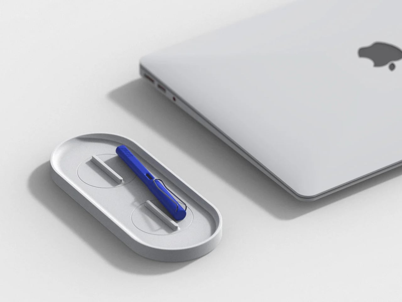
KNOB. Pen Tray
Most pen trays solve a narrow version of the problem. They give you a fixed layout, usually a rectangle divided into two or three compartments, and expect you to work around it forever. That’s fine until your tools change, and they always do. Changho Lee’s KNOB. Pen Tray takes a different approach by making the interior of the tray something you can actually reconfigure.
The dividers are controlled by knobs that take their cues from gas burner controls, a design reference that also gives the tray its name. Turn them and the internal layout shifts, letting you organize pens alongside rulers, adapters, or whatever else needs a place. One tray handles what might otherwise require three, which makes a convincing case for its footprint. The mechanism can feel fiddly if you reorganize often.
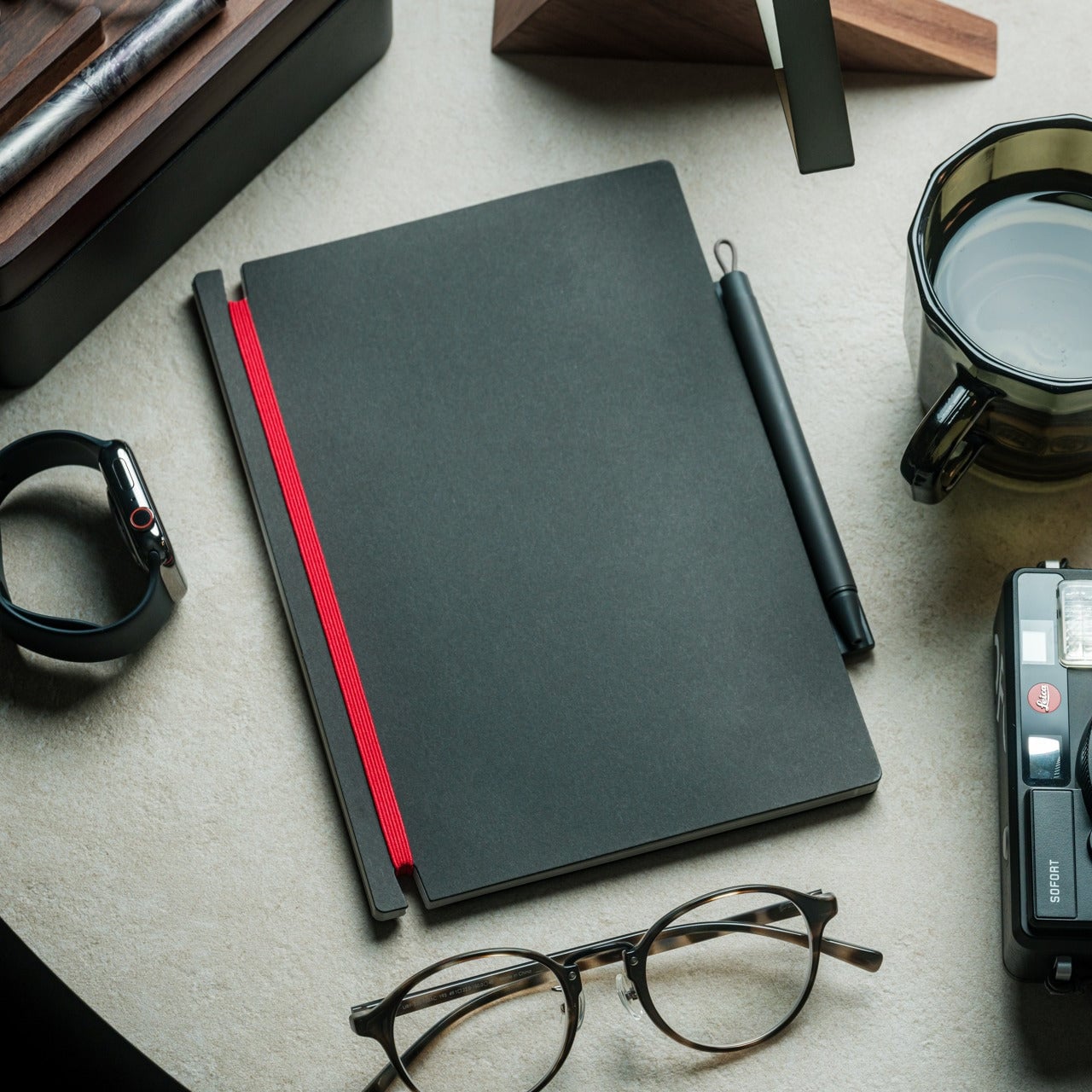
Inseparable Notebook Pen
There’s a particular kind of frustration that comes with reaching for a pen and finding it’s no longer where you left it. It’s small enough to ignore once, but it happens often enough to become a genuine irritant. The Inseparable Notebook Pen doesn’t try to solve desk organization broadly. It solves this one specific problem by keeping the pen attached to the notebook it belongs with.
A magnetic clip secures the pen directly to the notebook cover, so the two travel as a unit and stay that way on the desk. There’s also a built-in silencer that softens the attach-and-release motion, which sounds like a small detail until you use it daily. The pen works best when paired with its intended notebook, so it’s less convincing as a standalone writing instrument.
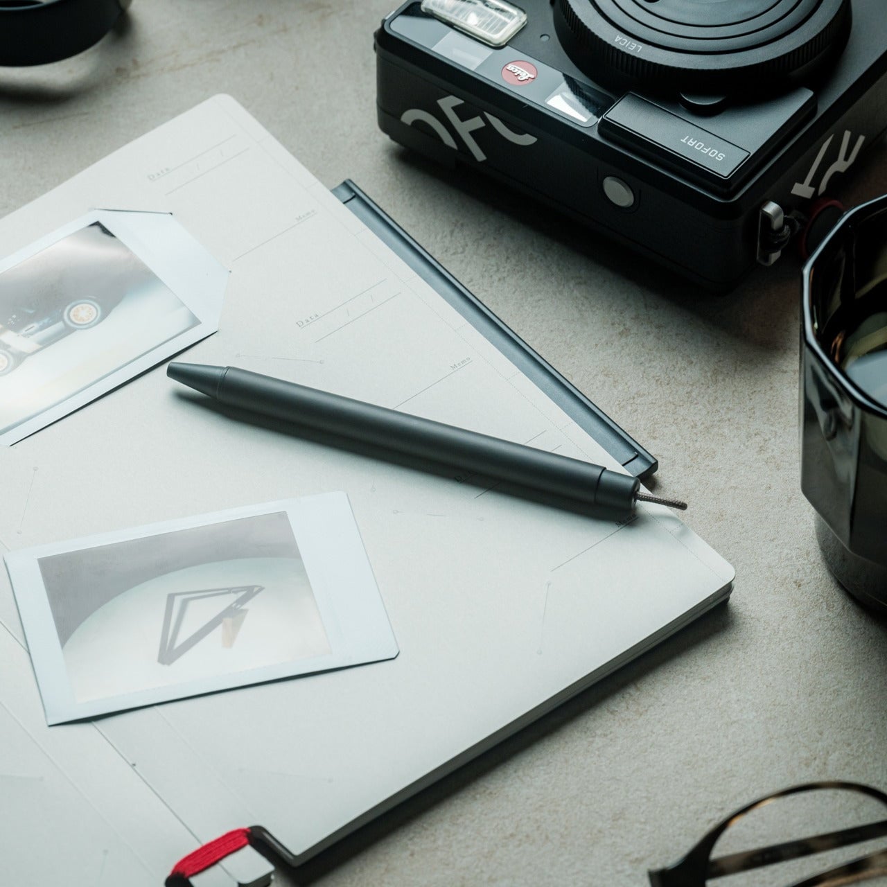
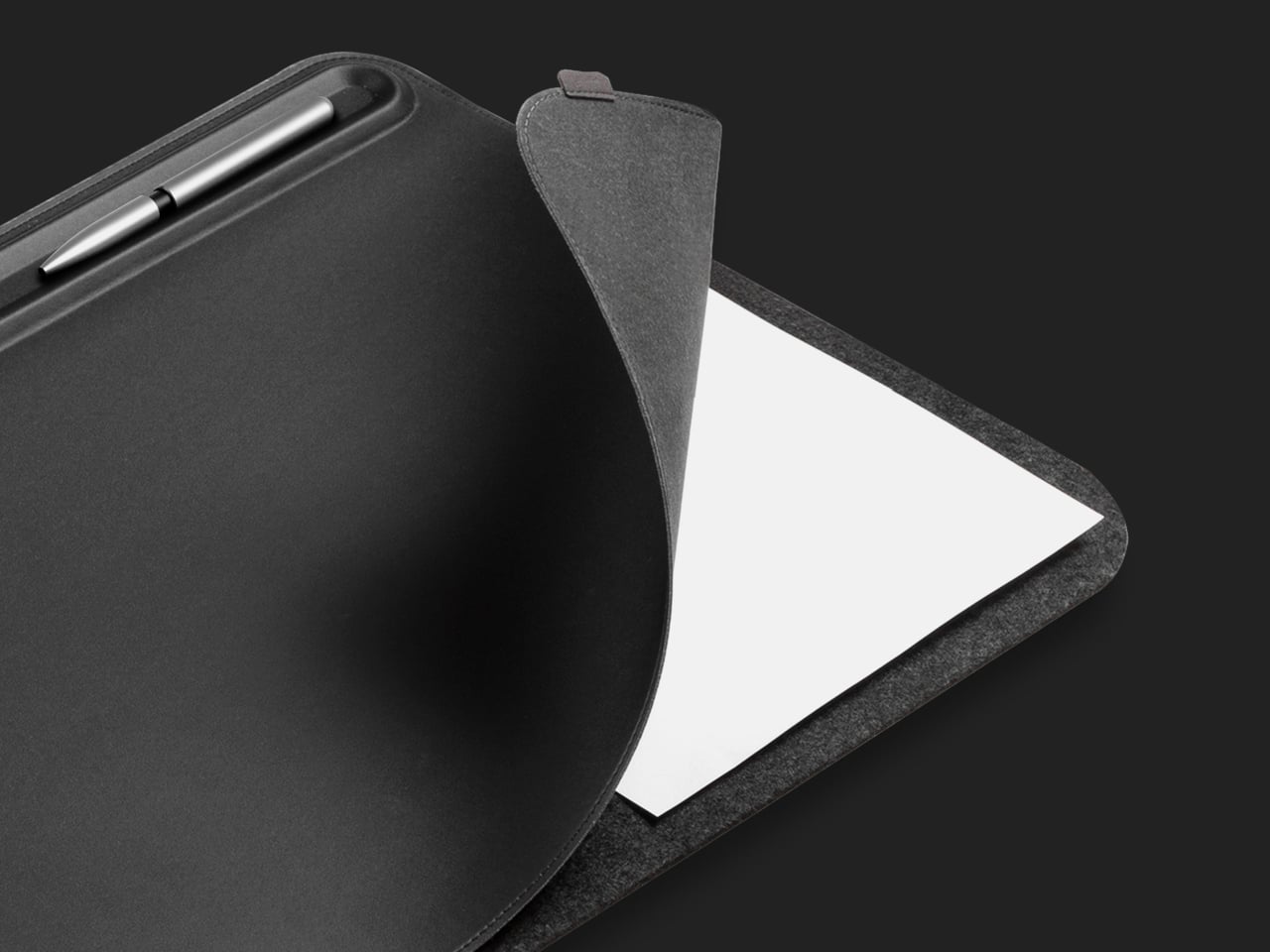
Orbitkey Desk Mat
Desk mats often get treated as the last layer of a setup, something you add once everything else is in place to make the whole thing look polished. The Orbitkey Desk Mat earns more than that role. It addresses one of the quieter problems on any active desk, the gradual spread of loose papers, sticky notes, and reference sheets that slowly take over the surface.
A document hideaway built beneath the top layer lets you slip papers out of view without throwing anything away. They stay flat and within reach, invisible until you need them. A toolbar along one edge keeps stationery and smaller tools from drifting. Available in Black and Stone across two sizes, the mat works whether you’re running a compact home setup or a larger studio table.
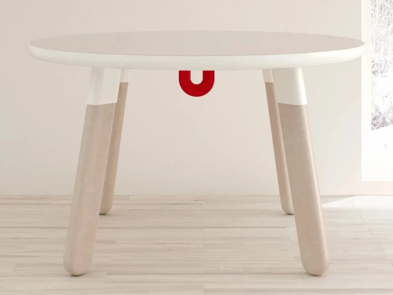
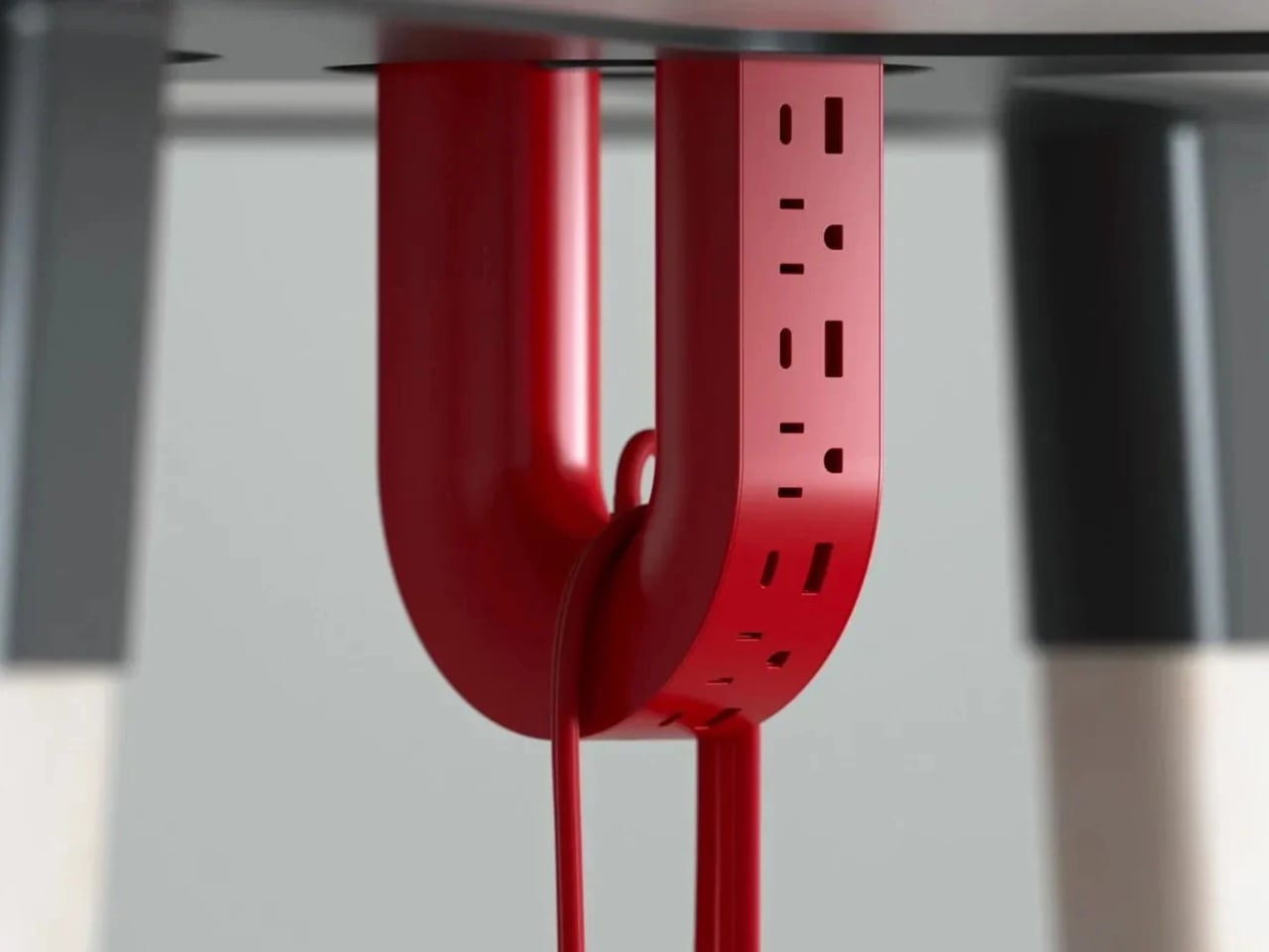
ME-1 U-shaped Power Strip Concept
Cable management is one of those desk problems that most solutions only partially solve. You gather the cords, clip them together, maybe run them through a box, and the result is still visible, still part of the desk’s noise. Michael Kritzer’s ME-1 power strip concept takes a different position, arguing that the power strip itself should hang below the work surface rather than claim space on top of it.
Curved into a U-shape, it can hang under a table or stick to metallic surfaces, while its two legs give you somewhere to wrap cables so they don’t trail freely. There’s also enough spacing between the alternating three-prong sockets and USB ports to fit bulky chargers without blocking each other. It’s still a concept, and questions about how far it protrudes remain, but the logic behind it is sound.
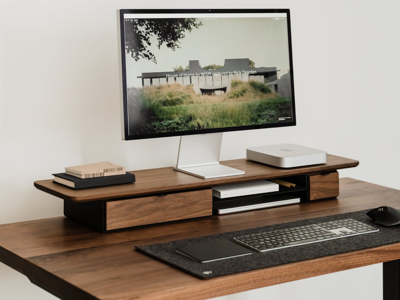
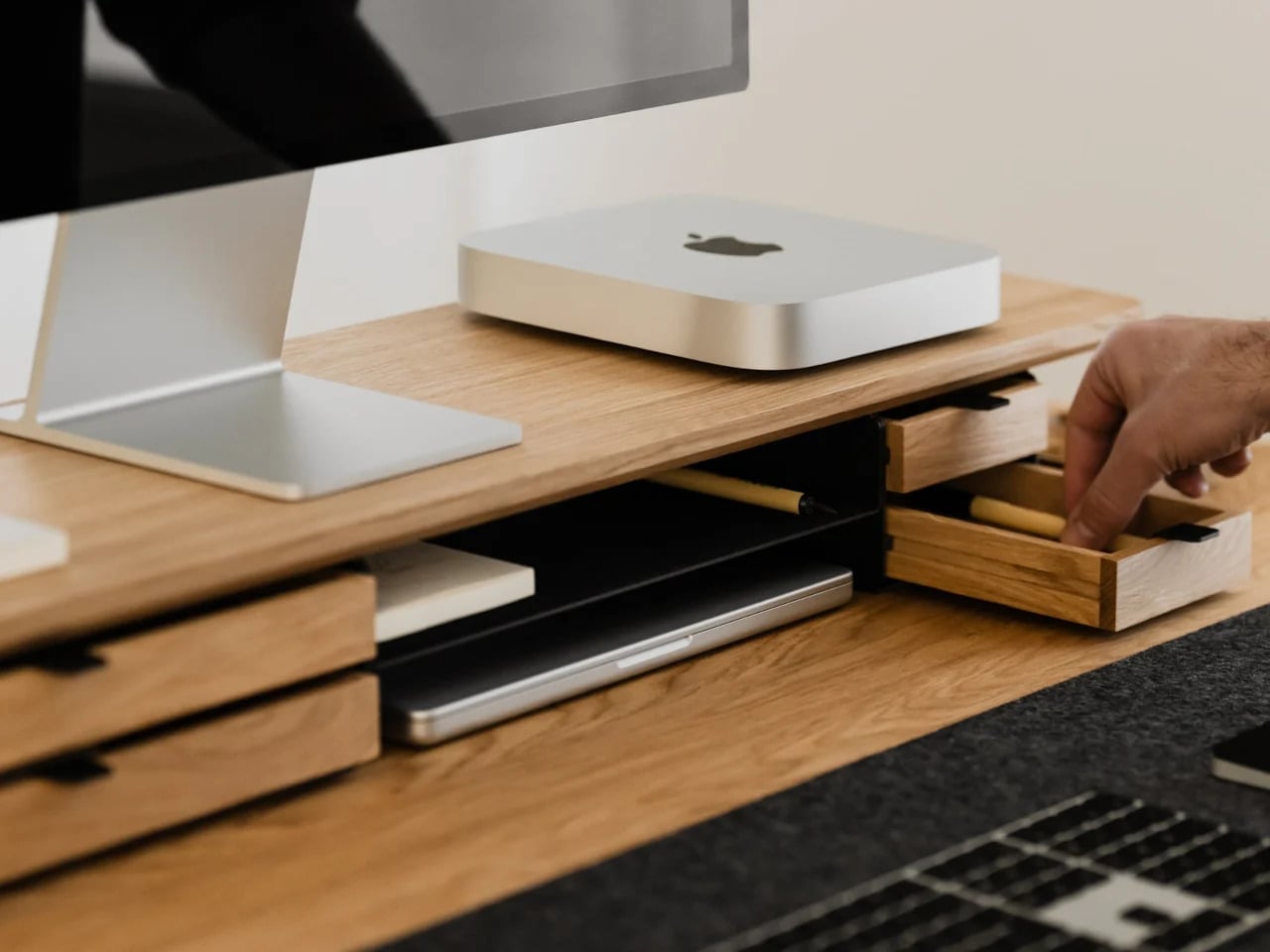
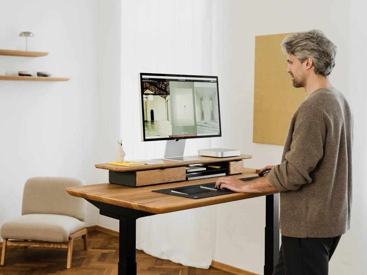
Oakywood Desk Shelf Pro
Monitor risers are supposed to help, and usually they do, but only as far as ergonomics go. The desk surface often ends up just as crowded as before, just with a platform sitting in the middle of it. The Oakywood Desk Shelf Pro approaches the problem differently, treating the riser not as an accessory but as furniture that earns its size by doing more than one job.
The shelf spans desk width, lifting the monitor to eye level while clearing space underneath for a keyboard or laptop, with steel legs at each end creating a floating effect. Built-in drawers tuck away stationery and small tech, and a felt-lined open shelf handles tablets or a closed laptop. It’s built from solid oak or walnut, not MDF with a plastic skin, and can hold up to 100 kg without flexing.
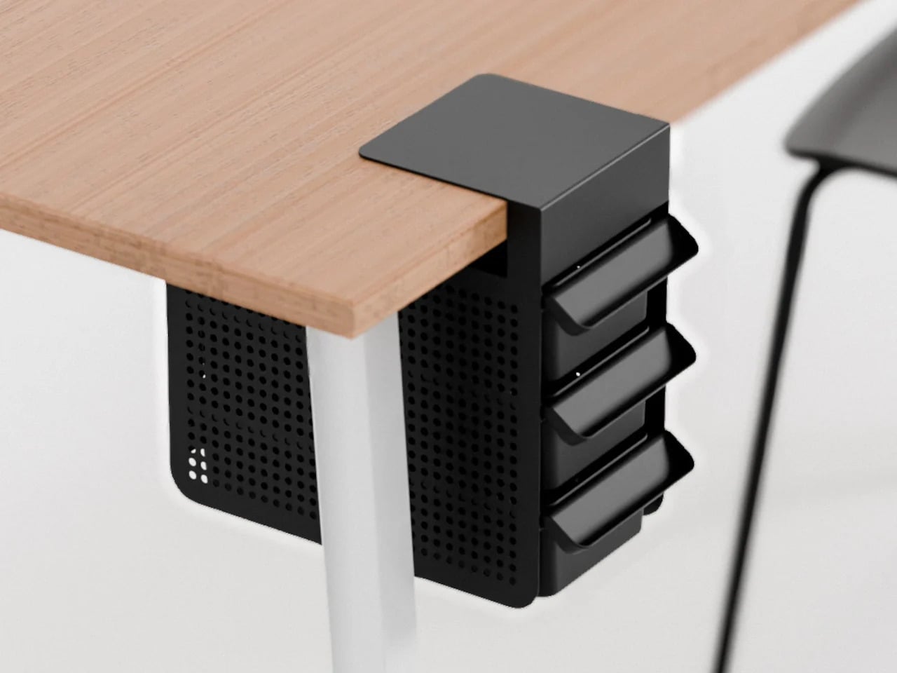
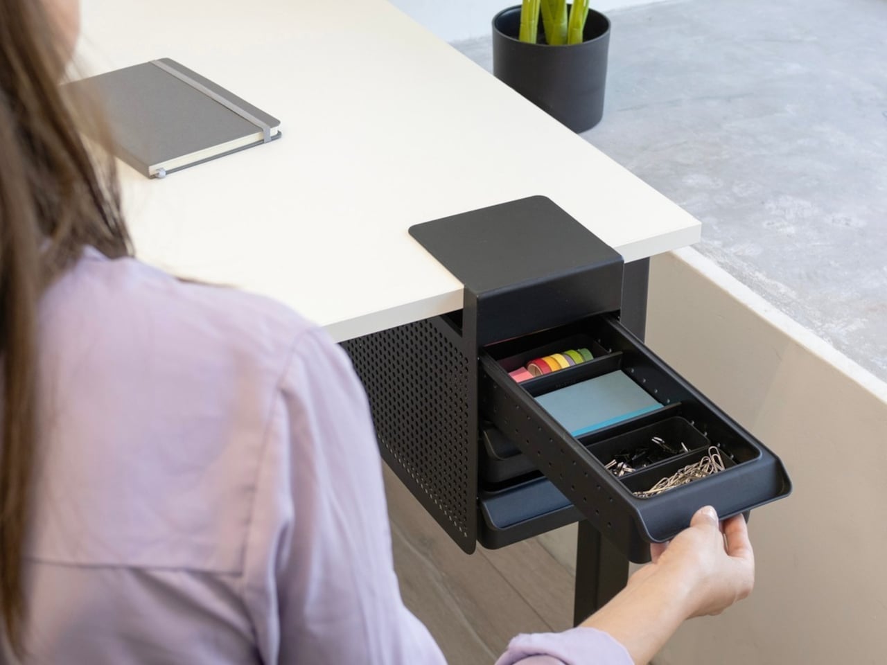
Practiko Otis Hanger 3.0
Minimalist desks look clean partly because many of them don’t come with built-in drawers. That’s a reasonable design choice until the pens, sticky notes, charging cables, and paper clips have nowhere to go and start accumulating on the surface instead. The Practiko Otis Hanger 3.0 adds that missing storage back without a single screw or permanent alteration.
The system clips onto the desk edge and hangs beneath the work surface, giving you three trays and the full top plane back. The 3.0 version features more perforation points for finer divider adjustments, and three nested mini trays handle smaller items like paper clips, thumbtacks, or earbuds. Larger handles on each tray let you pull them out smoothly without looking down, which makes more of a difference in daily use than it sounds.
Nuka Eternal Stationery
There’s a version of minimalism that’s about owning as little as possible. There’s also one that’s about how much the things you do own keep asking of you. Nuka’s Eternal Stationery belongs to the second kind. Built around permanence rather than disposability, it’s a notebook-and-writing-tool system designed to stop demanding replenishment, which is its own quiet argument for staying on a well-edited desk.
The notebook is waterproof and tear-proof, and pairs with a metal alloy tip that writes with the consistency of a traditional pencil but requires no sharpening and never breaks. Pages clear completely with the Nuka Magic Eraser, ready to be written on again. For anyone who writes regularly, the appeal is straightforward, though writers accustomed to ink on paper may need some adjustment time with the metal alloy tip.
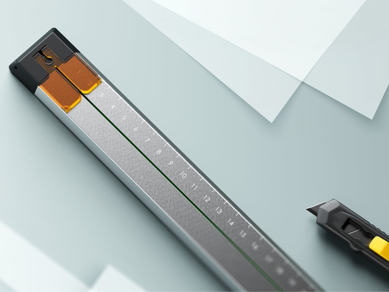
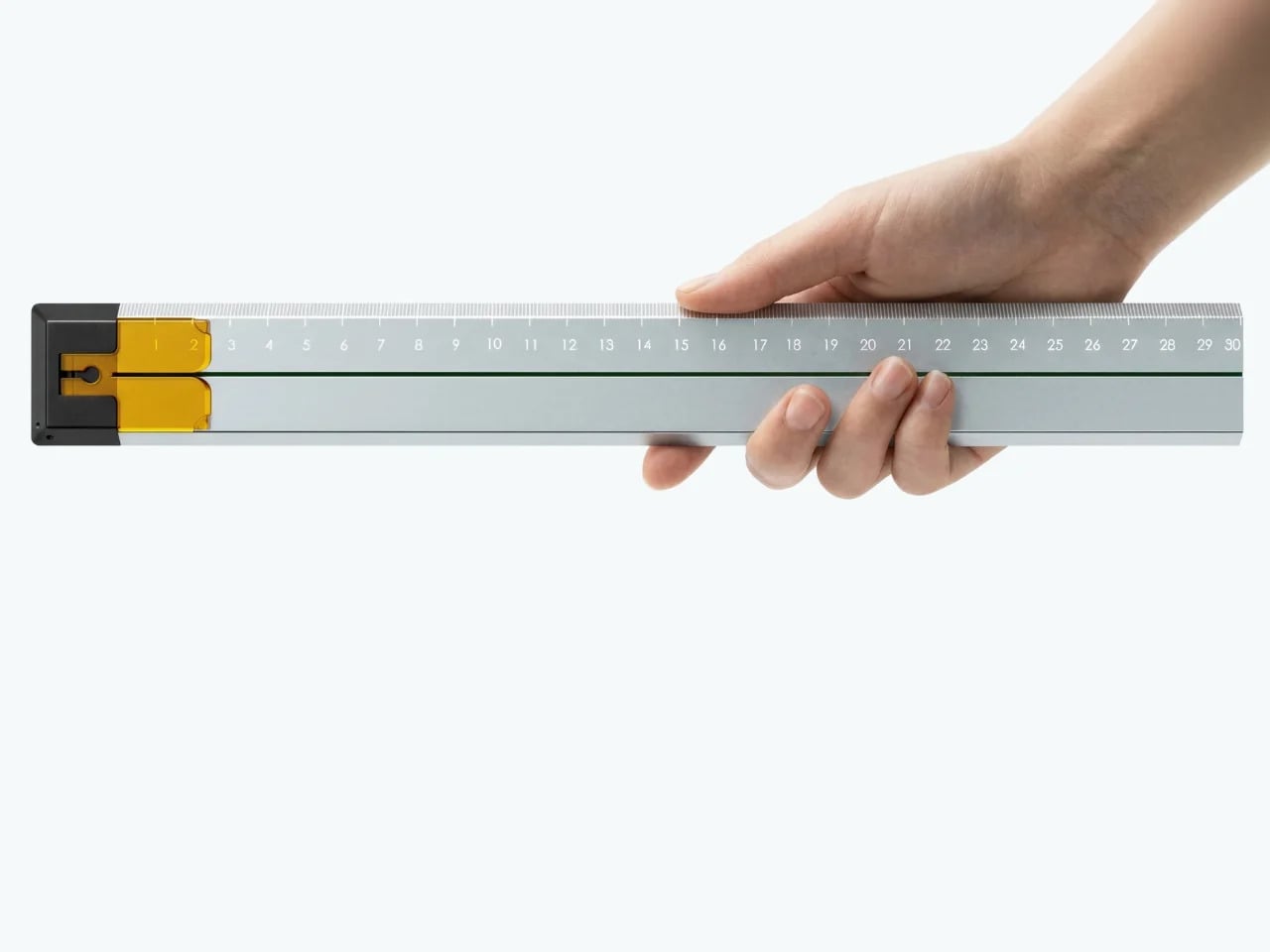
Quiver Ruler
A ruler is one of the few tools that earns a place in a minimalist setup by compressing several small tasks into a single flat form. Tunir Maity’s Quiver does that more thoroughly than most. It’s an anodized aluminum ruler designed primarily for people who actually cut with one, not just measure. It treats shaky hands and imprecise cuts as design problems worth solving, not limitations the user is expected to compensate for.
A clip mechanism holds paper in place, a blade slit guides the cut in a straight line, and the weight distribution favors the cutting end, so you don’t have to press down as hard. It also includes a carabiner attachment for clipping to a bag. Quiver is currently a concept, so availability hasn’t been confirmed, and it’s more specialized than what a casual desk user would reach for day to day.
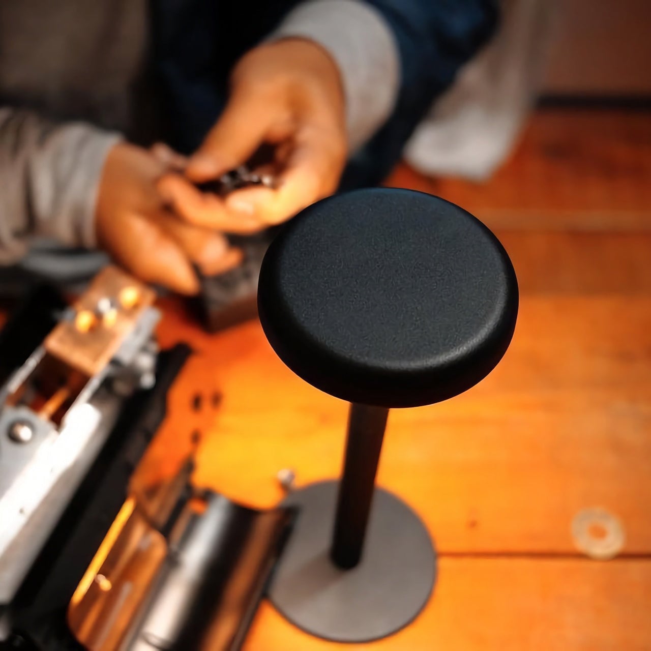
Ichi Portable Lamp
Desk lamps rarely fail in the obvious ways. Most give off enough light and last long enough. What they tend to get wrong is the base, which on wider models claims an entire desk corner, and the cord, which invariably ends up somewhere visible. The Ichi Portable Lamp, born from the collaboration between Fujita Kinzoku and TENT Design, keeps the form slim and goes cordless, addressing both without turning the lamp into a statement piece.
Powered by four standard AA batteries, it runs cordless without the limitations of proprietary chargers. Its warm, high-color-rendering CRI 95 LED creates a soft, radiant glow suitable for task work or winding down. The modular design disassembles into three parts and packs down to a slim 20mm thickness. It’s more portable than a permanent desk fixture, which is worth knowing if you need sustained, high-output lighting for long stretches.
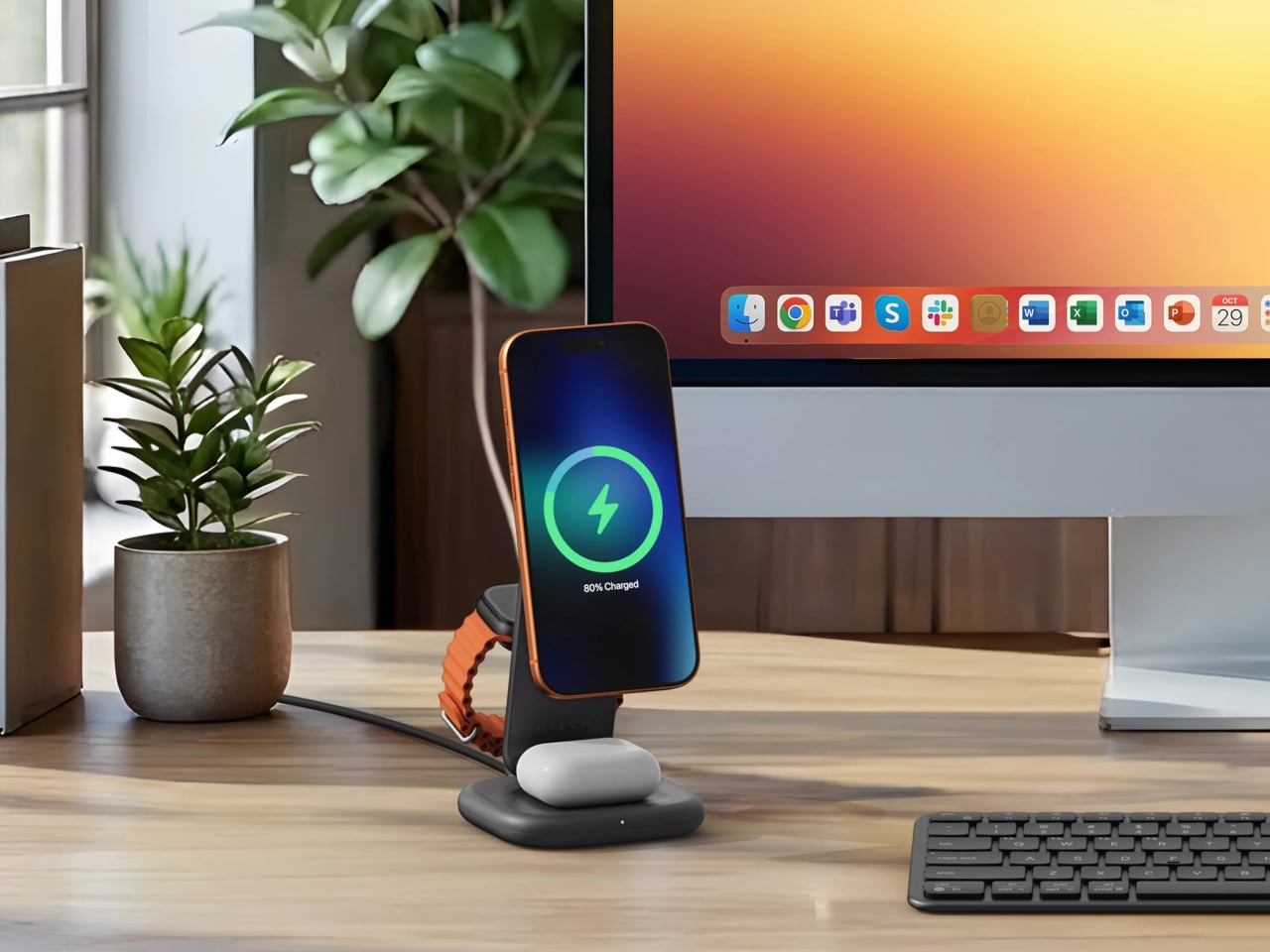
Satechi 3-in-1 Foldable Wireless Charging Stand
Getting a phone stand onto a minimalist desk requires a stronger argument than just holding the phone upright. The Satechi 3-in-1 Foldable Wireless Charging Stand with Qi2 25W makes that argument by doing three jobs at once, replacing the tangle of separate charging pads that Apple users typically accumulate. Wireless charging was supposed to simplify things, but most setups end up with a different kind of mess instead.
Set the iPhone down, and Qi2 snaps it into position, the Apple Watch gets its own fast-charge arm, and the AirPods rest on a pad below, all drawing from a single cable to the wall. The stand folds flat for travel and fits easily in a carry-on. A 45W USB-C adapter with US, EU, and UK plugs ships in the box. It’s most compelling for people already working within the Apple ecosystem.
Building a cleaner desk comes down to the same question applied to every object on it: what is it giving back for the space it takes? Color and material can make things look minimal, but they don’t make them earn their place. That’s a footprint budget, and it’s a much better framework for deciding what stays than any mood board, setup guide, or neutral palette.
Most people check the date by glancing at a phone, a laptop corner, or a watch. There’s no shortage of ways to know what day it is, yet somehow that information rarely feels anchored to anything. It arrives in a notification, floats on a lock screen, and disappears the moment you look away. The calendar has become the most forgettable object in modern life.
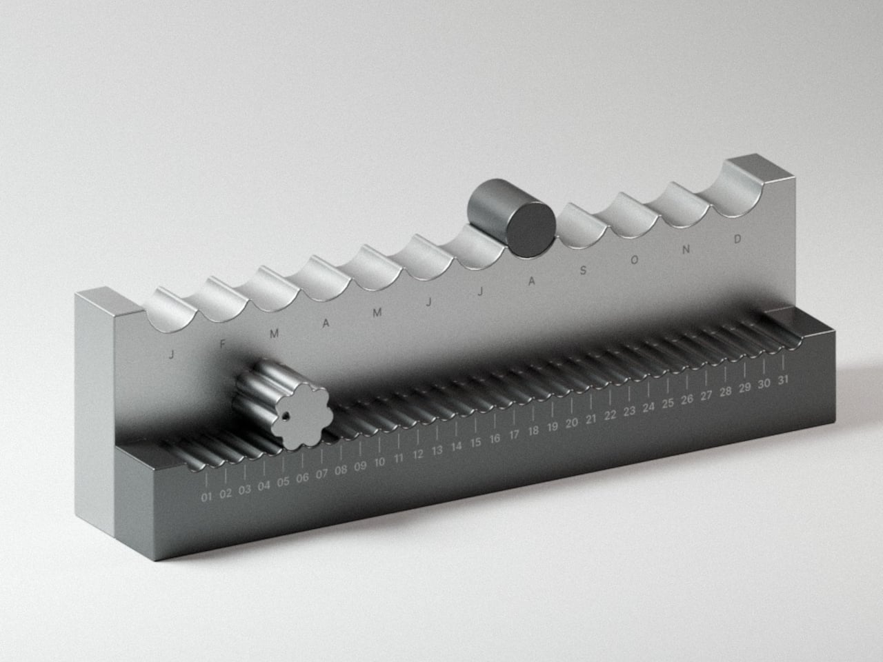
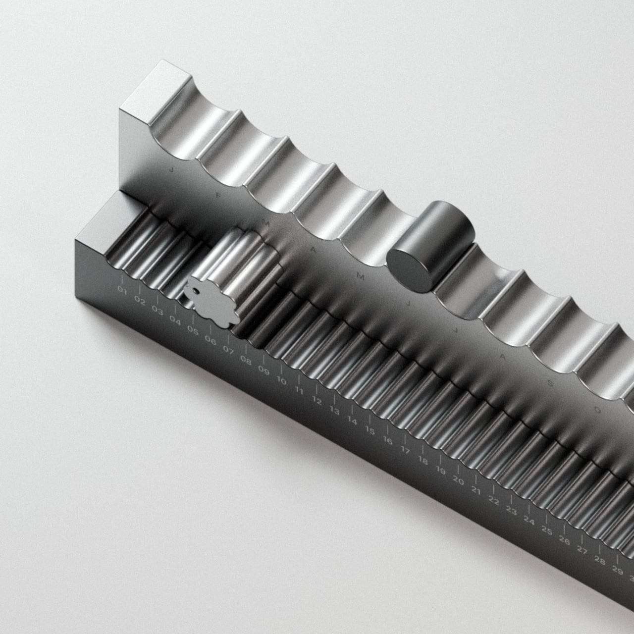
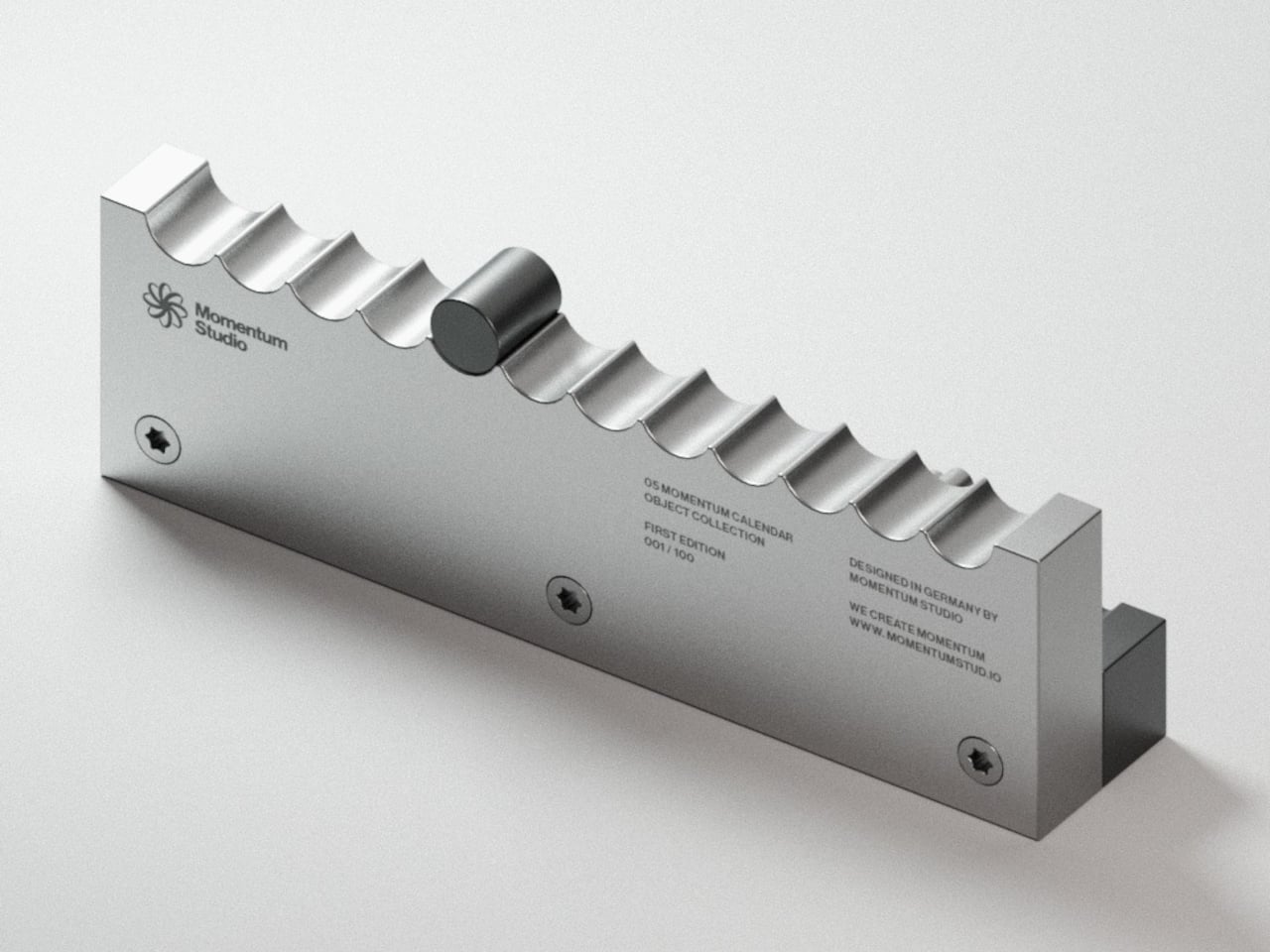
Momentum Studio, a German design firm, is treating that problem with a very physical antidote. The Momentum Calendar is the fifth object in the studio’s Object Collection, approaching timekeeping as a deliberate act rather than a passive glance. It’s a perpetual calendar machined from solid aerospace aluminum that requires you to move a marker by hand each morning, turning date-checking into something closer to a ritual.
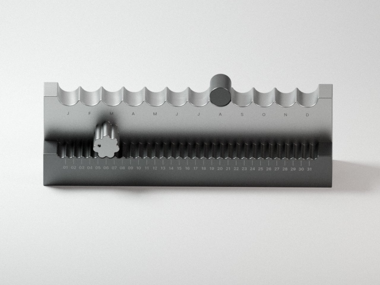
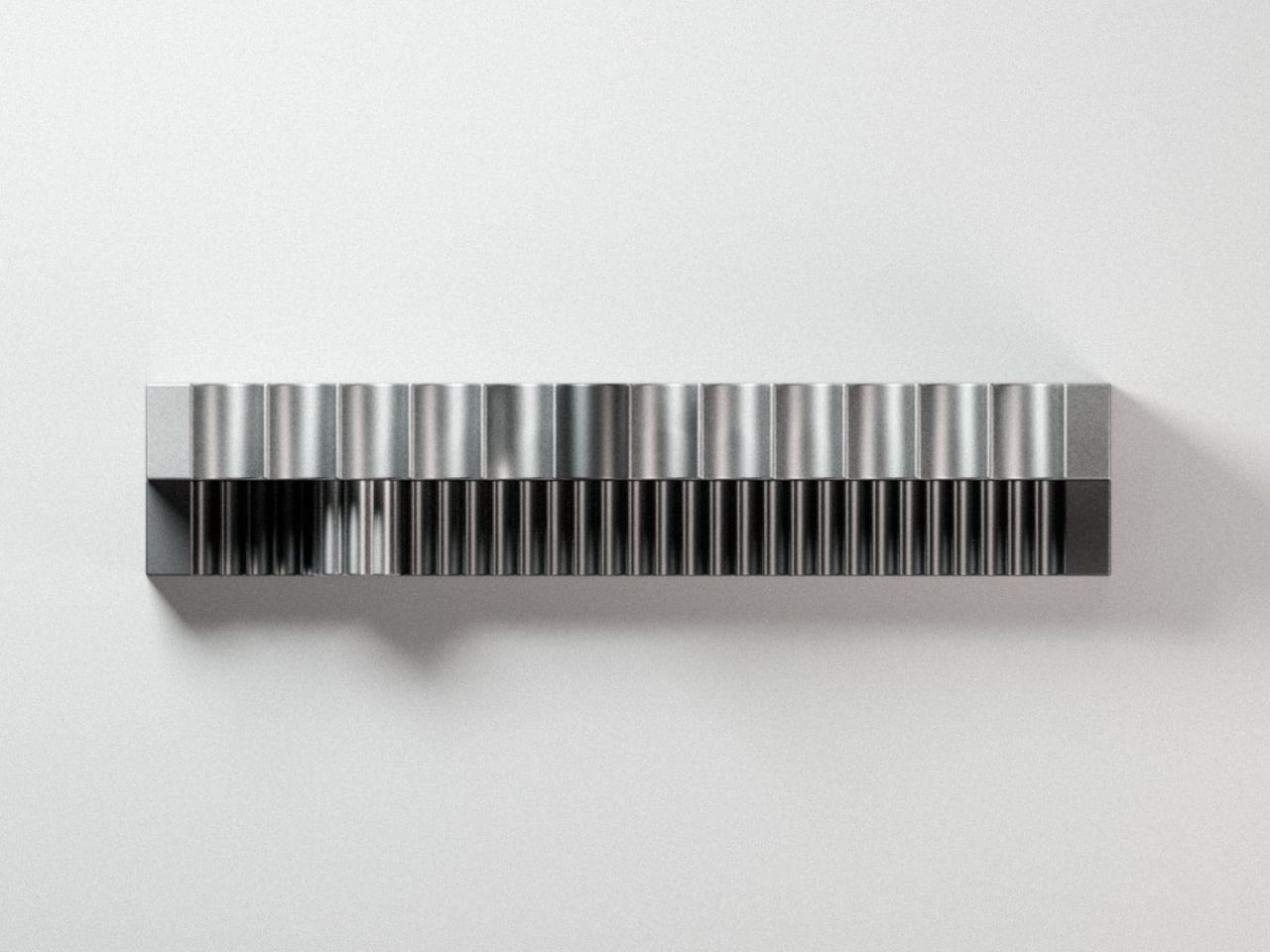
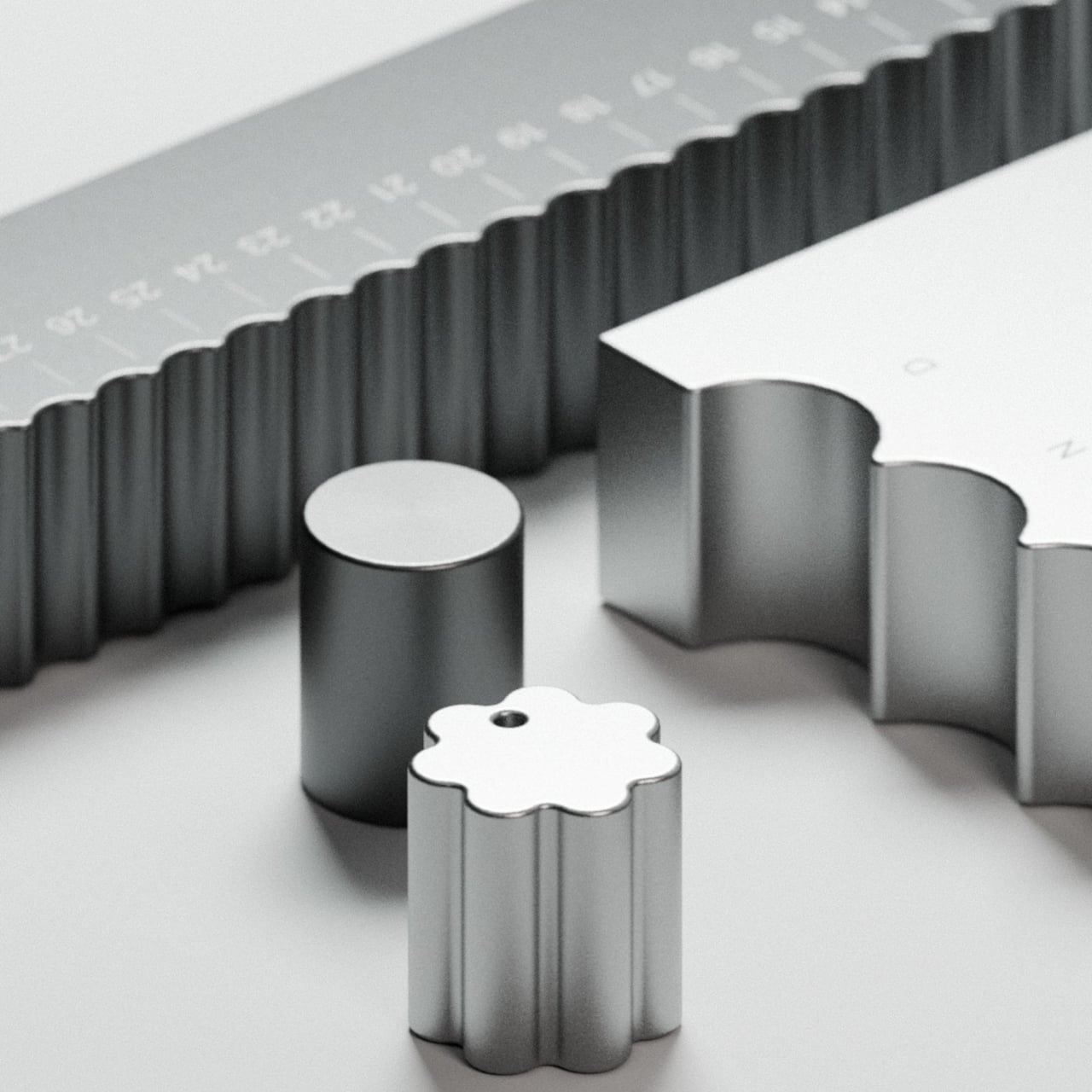
The calendar sits as a stepped aluminum block, angled so both tracks face you at once. The top holds 12 scalloped arches, one for each month, where a smooth cylindrical marker rests in a gentle depression. The front runs 31 ribbed channels numbered across the days, where a flower-shaped marker with corrugated edges clicks into each position like a gear finding its tooth.
That’s where the haptic element matters, and it’s more meaningful than it sounds. There’s something grounding about reaching over each morning to nudge a metal marker one slot further, feeling the resistance as it settles into place. It takes two seconds, but those two seconds make the date something you’ve done rather than something you’ve simply glanced at from across the room.
The studio calls it “a physical manifestation of time,” which might read as a lofty claim until you consider how little physical presence calendars have anymore. The Momentum Calendar doesn’t tell you the date so much as invite you to acknowledge it. On a desk or a shelf, it works as both a functional object and a sculptural piece, without pretending to be anything else.
The aluminum body reinforces that sense of permanence. Momentum Studio describes all objects in the collection as milled from solid blocks of aerospace aluminum, and the Momentum Calendar carries that weight literally. It’s the kind of material that makes something feel like it belongs on a shelf for good, rather than something you’d swap out seasonally. The ridged texture adds depth without veering into decoration.
The First Edition is limited to 100 numbered pieces, with each unit’s position in the run engraved onto the back. What’s interesting is that the calendar’s entire premise depends on you showing up for it every single day. A phone calendar stays current because a server keeps it that way. This one is only accurate because you chose to make it so, which might be the most honest thing any calendar has attempted.
Travel chargers have always been a bit of a negotiation. You pack a power bank for the long haul, then stuff a wall adapter in separately because the power bank only helps when there’s no outlet. End up with two items taking up bag space, two cables to hunt for, and the occasional moment of realizing you forgot one of them on the nightstand back at the hotel.
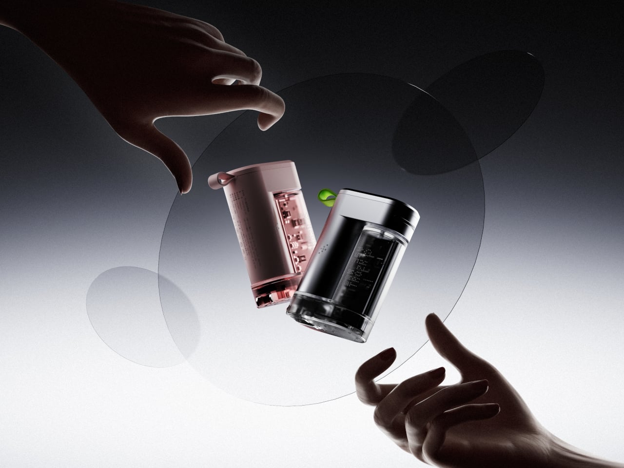
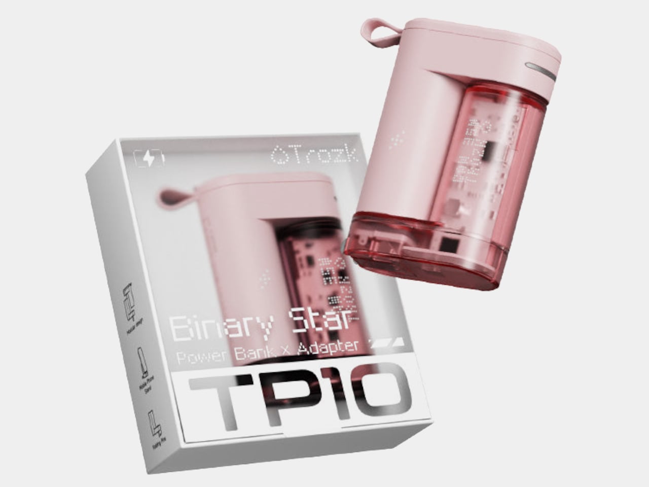
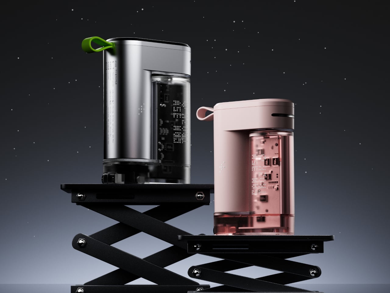
Trozk’s Binary Star tries to settle that negotiation for good. It’s a 3-in-1 device that pairs a 6,800mAh power bank with a 35W GaN wall adapter and throws in a phone stand for good measure. The two units clip together into a single compact form, which is where the “binary star” metaphor earns its keep, two objects perpetually orbiting each other, feeding the same energy cycle.
The design is the reason most people will notice the Binary Star before they read a single spec. The charging unit has a transparent body that puts the internal circuitry on full display, giving the whole thing a cyberpunk sensibility. A small green or pink loop at the top adds a pop of color against silver or pink housing, respectively, and doubles as a carry loop for clipping onto a bag.
The adapter side handles up to 35W through third-generation gallium nitride technology, which runs cooler and more efficiently than traditional silicon-based chargers. The power bank can push up to 22.5W, and all three ports across both units support fast charging. That means a phone, a pair of earbuds, and a tablet can all be drawing power at the same time without any of them getting shortchanged.
Inside the power bank are 26650 lithium cells, a step up from the more common 18650 format, contributing to longer battery life and better thermal stability. A pulsing star track light on the body keeps tabs on the remaining charge at a glance, so there’s no need to press a button or fire up an app to figure out how much runway you have left.
The phone stand feature is easy to overlook, but it’s probably the most welcome surprise for a desk setup. Rather than propping a phone against a keyboard while the Binary Star charges it, the design accommodates a phone at a comfortable viewing angle. It’s a small touch, but it’s the kind of detail that makes a charging device feel more considered than the average palm-sized brick in its price range.
At $49.99, the Binary Star sits comfortably below what you’d spend buying a quality GaN charger and a separate power bank of comparable capacity. That price covers both units, the green carry loop, and three fast-charging ports that all deliver real speed. For anyone who’s grown tired of managing a collection of charging accessories every time they leave the house, it’s a clean and credible solution.
Travel chargers have always been a bit of a negotiation. You pack a power bank for the long haul, then stuff a wall adapter in separately because the power bank only helps when there’s no outlet. End up with two items taking up bag space, two cables to hunt for, and the occasional moment of realizing you forgot one of them on the nightstand back at the hotel.
Trozk’s Binary Star tries to settle that negotiation for good. It’s a 3-in-1 device that pairs a 6,800mAh power bank with a 35W GaN wall adapter and throws in a phone stand for good measure. The two units clip together into a single compact form, which is where the “binary star” metaphor earns its keep, two objects perpetually orbiting each other, feeding the same energy cycle.
The design is the reason most people will notice the Binary Star before they read a single spec. The charging unit has a transparent body that puts the internal circuitry on full display, giving the whole thing a cyberpunk sensibility. A small green or pink loop at the top adds a pop of color against silver or pink housing, respectively, and doubles as a carry loop for clipping onto a bag.
The adapter side handles up to 35W through third-generation gallium nitride technology, which runs cooler and more efficiently than traditional silicon-based chargers. The power bank can push up to 22.5W, and all three ports across both units support fast charging. That means a phone, a pair of earbuds, and a tablet can all be drawing power at the same time without any of them getting shortchanged.
Inside the power bank are 26650 lithium cells, a step up from the more common 18650 format, contributing to longer battery life and better thermal stability. A pulsing star track light on the body keeps tabs on the remaining charge at a glance, so there’s no need to press a button or fire up an app to figure out how much runway you have left.
The phone stand feature is easy to overlook, but it’s probably the most welcome surprise for a desk setup. Rather than propping a phone against a keyboard while the Binary Star charges it, the design accommodates a phone at a comfortable viewing angle. It’s a small touch, but it’s the kind of detail that makes a charging device feel more considered than the average palm-sized brick in its price range.
At $49.99, the Binary Star sits comfortably below what you’d spend buying a quality GaN charger and a separate power bank of comparable capacity. That price covers both units, the green carry loop, and three fast-charging ports that all deliver real speed. For anyone who’s grown tired of managing a collection of charging accessories every time they leave the house, it’s a clean and credible solution.
Most entryway surfaces tell a familiar story, and it’s rarely a flattering one. Keys get tossed wherever there’s space, coins scatter to the edges, and a watch ends up next to a forgotten receipt by morning. The valet tray was supposed to solve this, but most of them look clinical, forgettable, or like they belong in a hotel room rather than a thoughtfully arranged home.
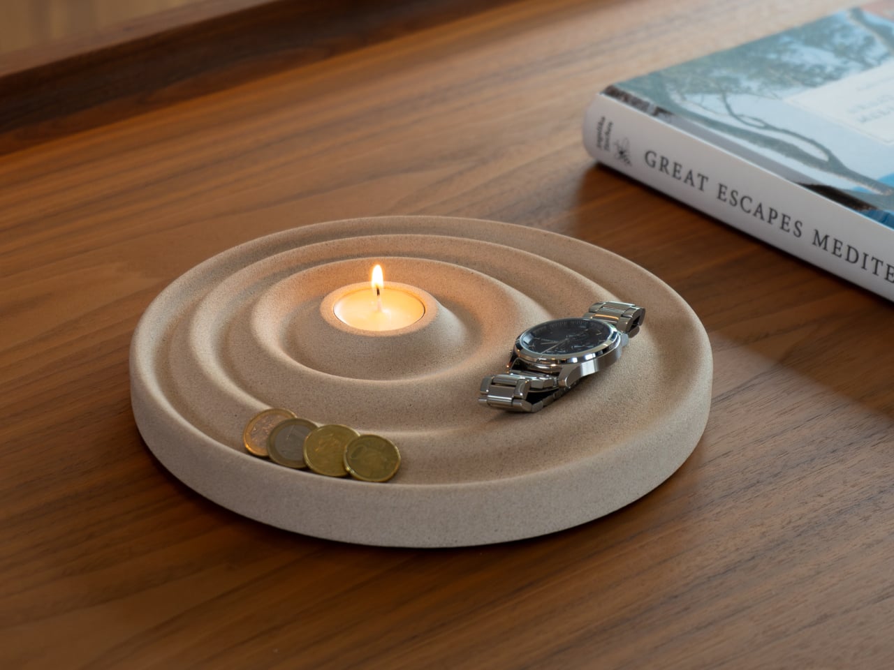
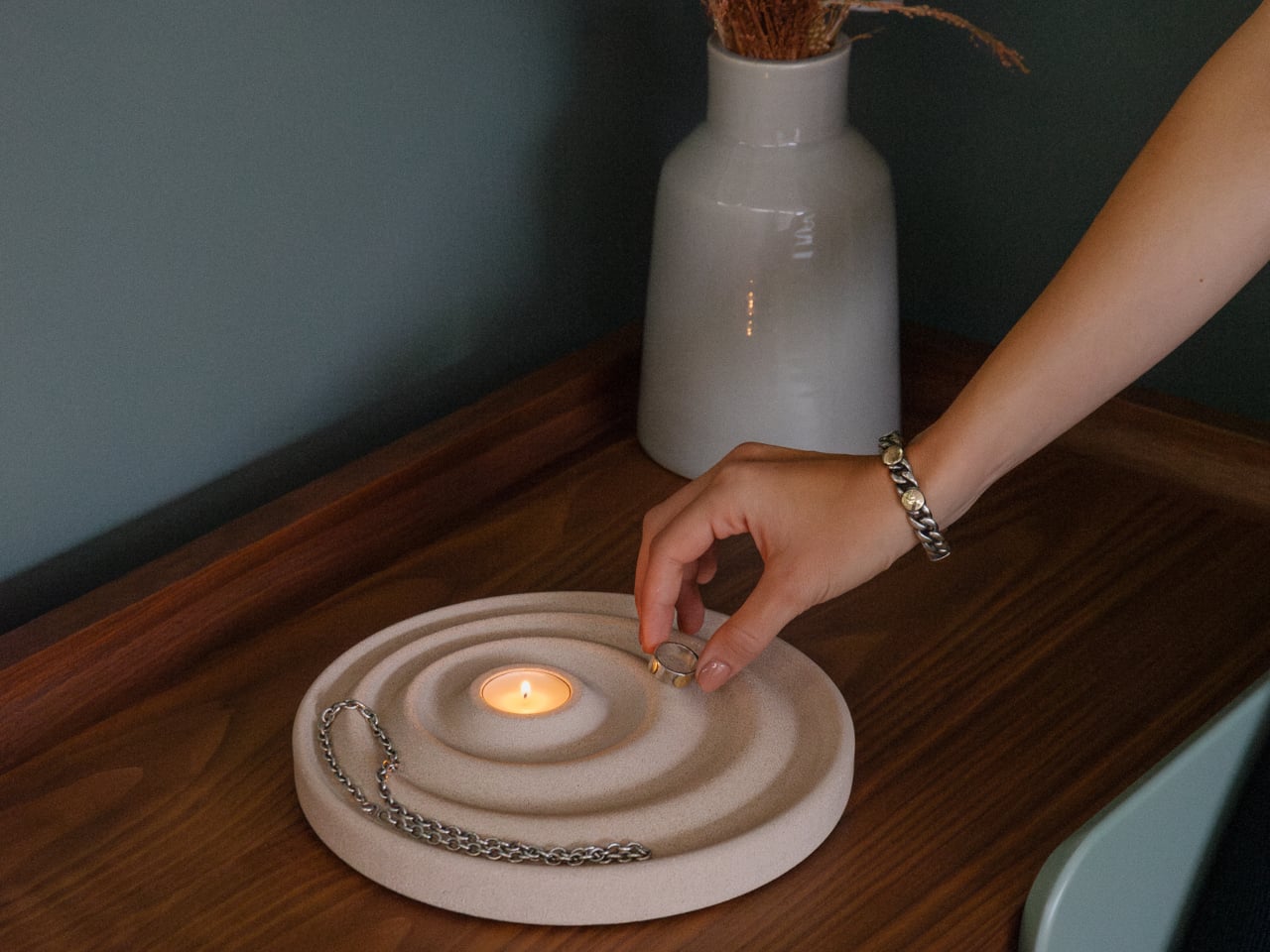
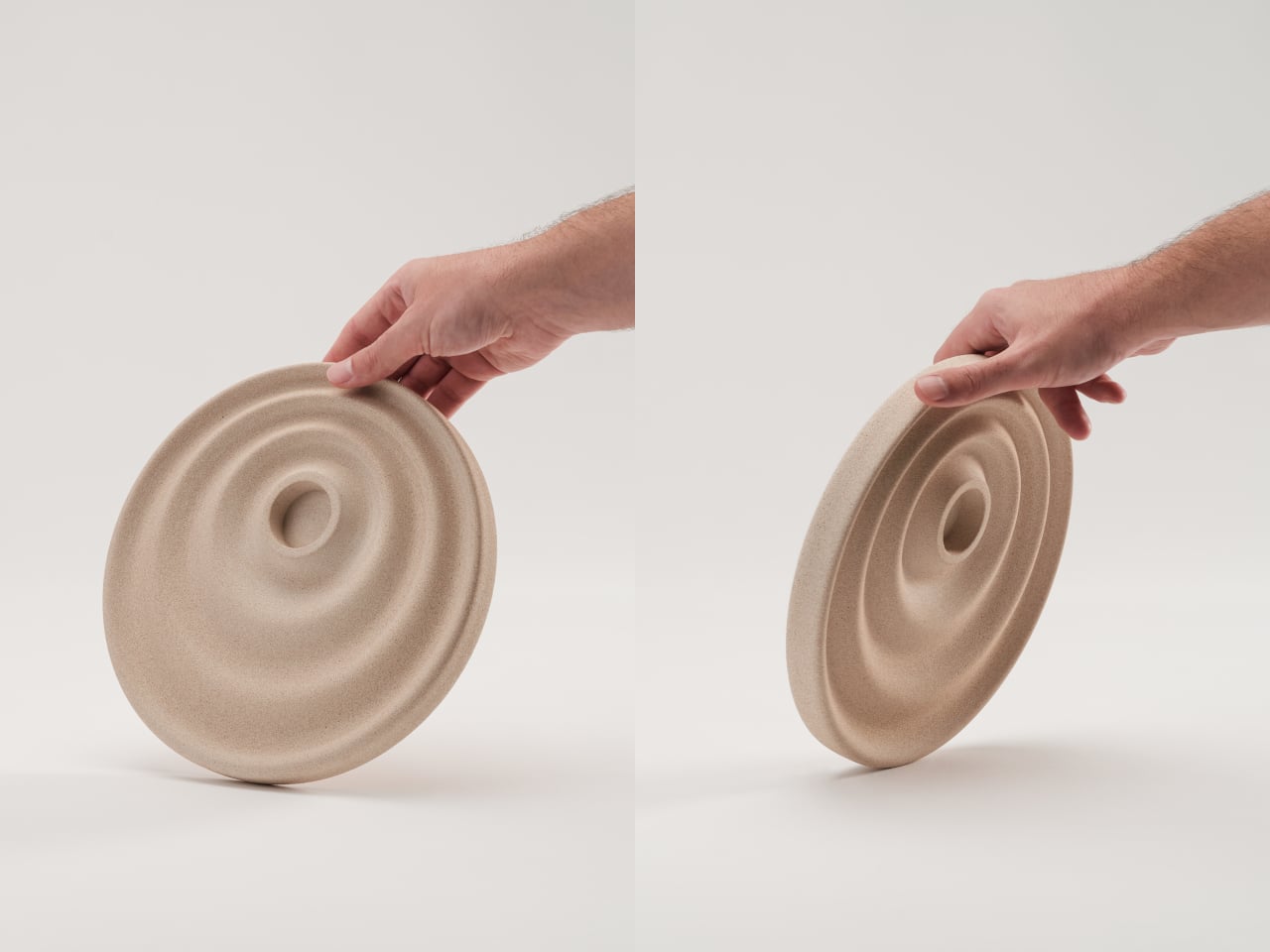
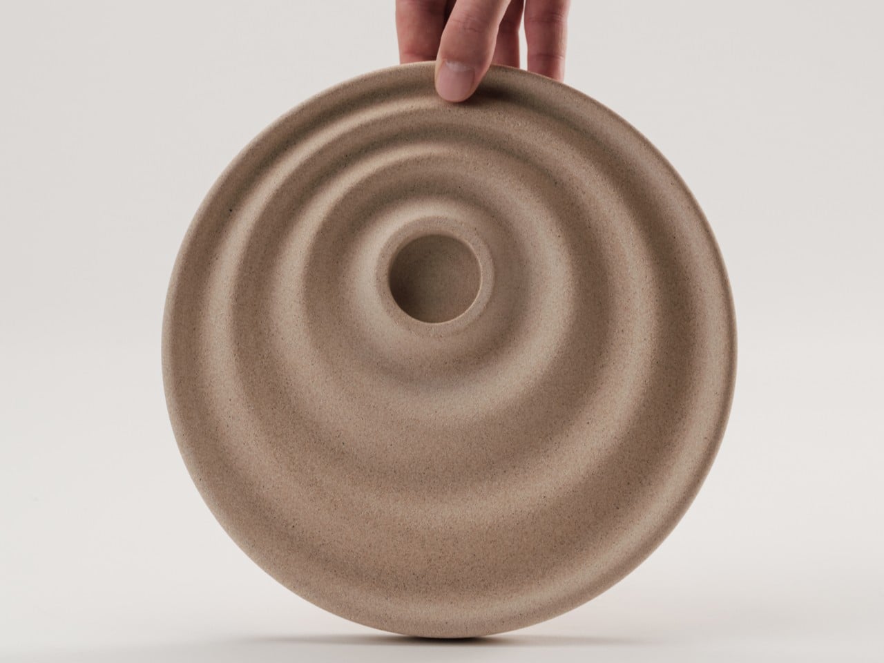
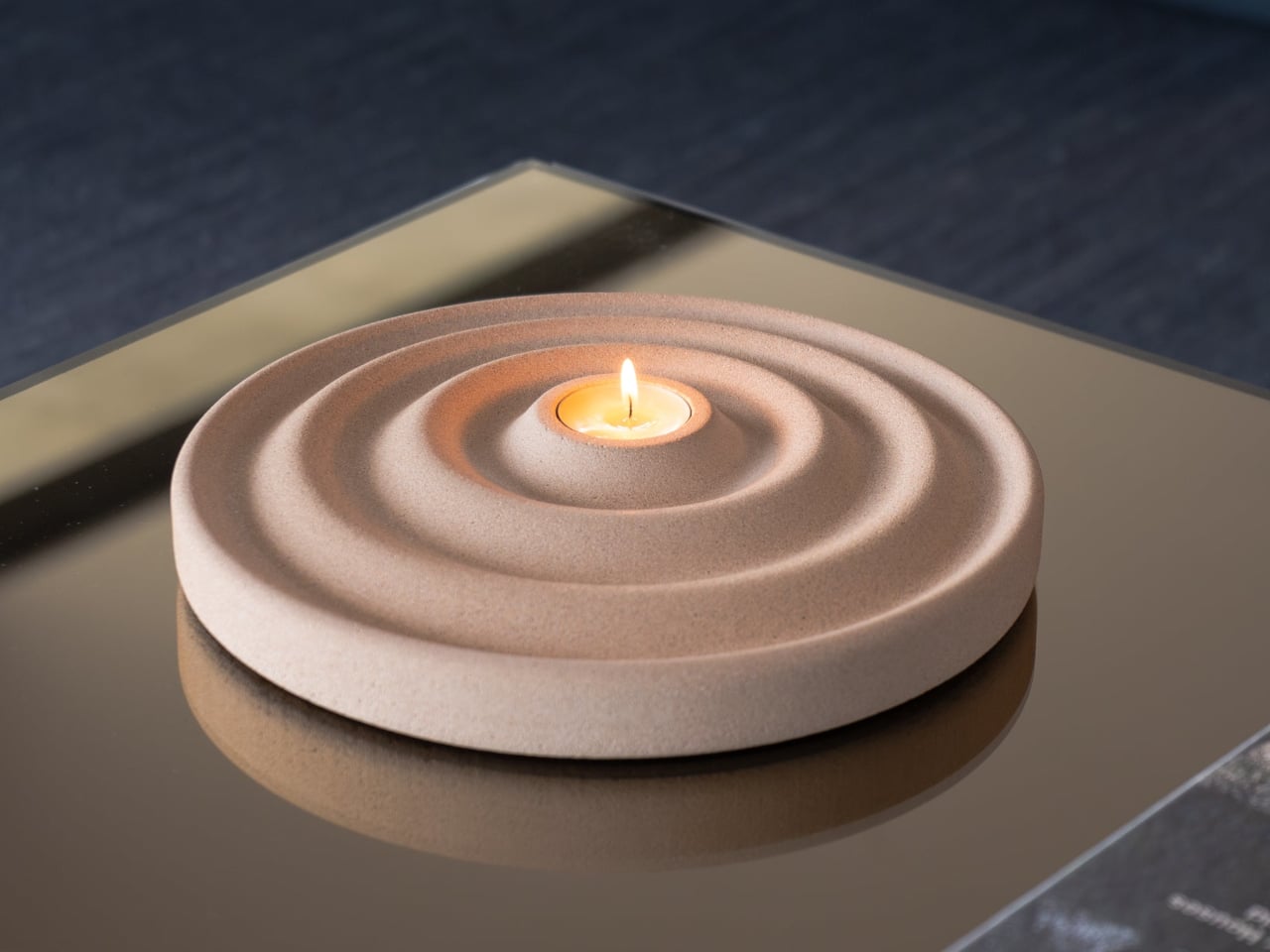
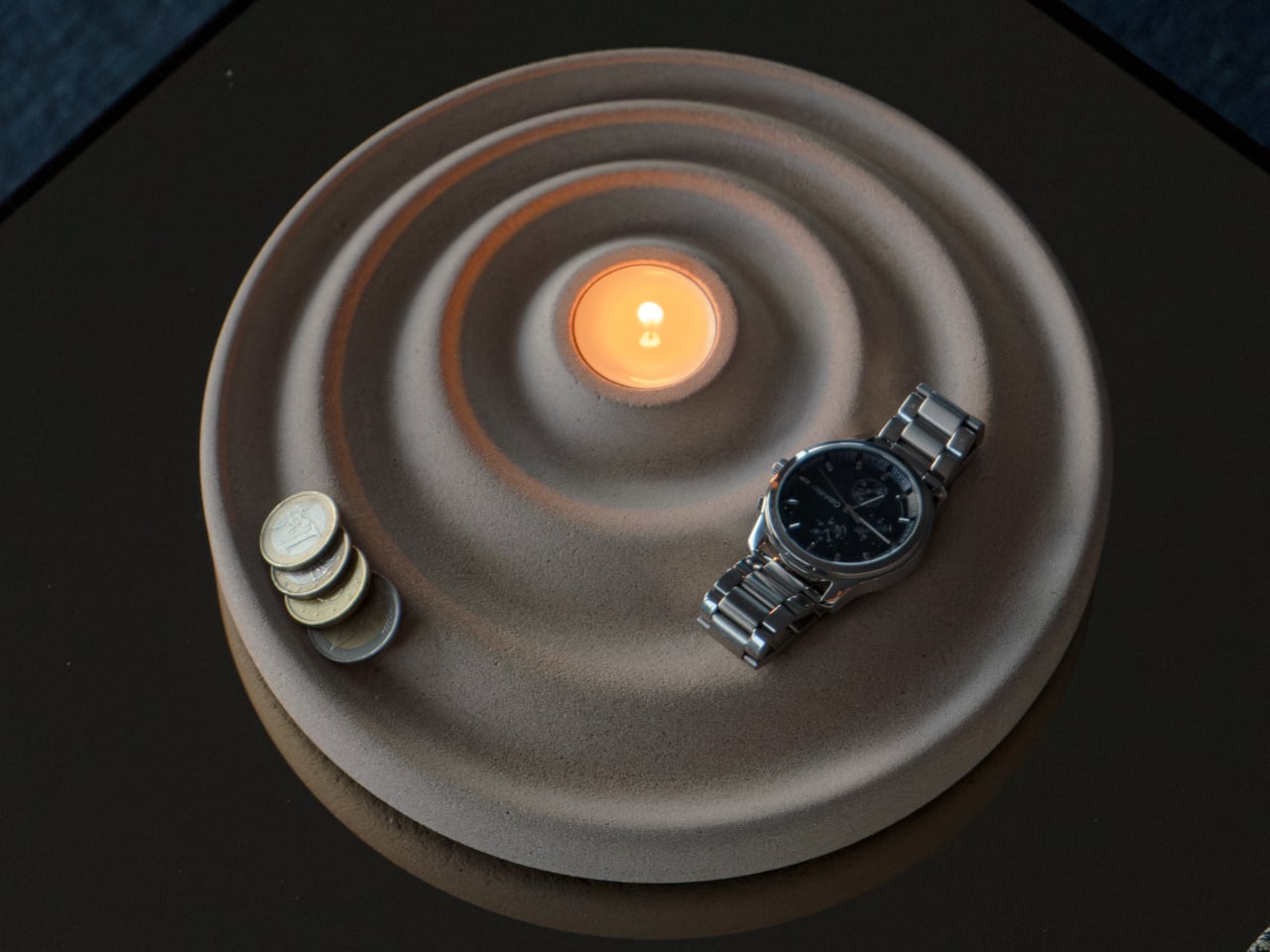
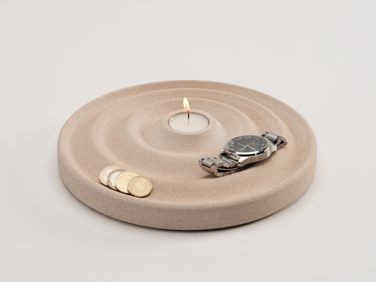
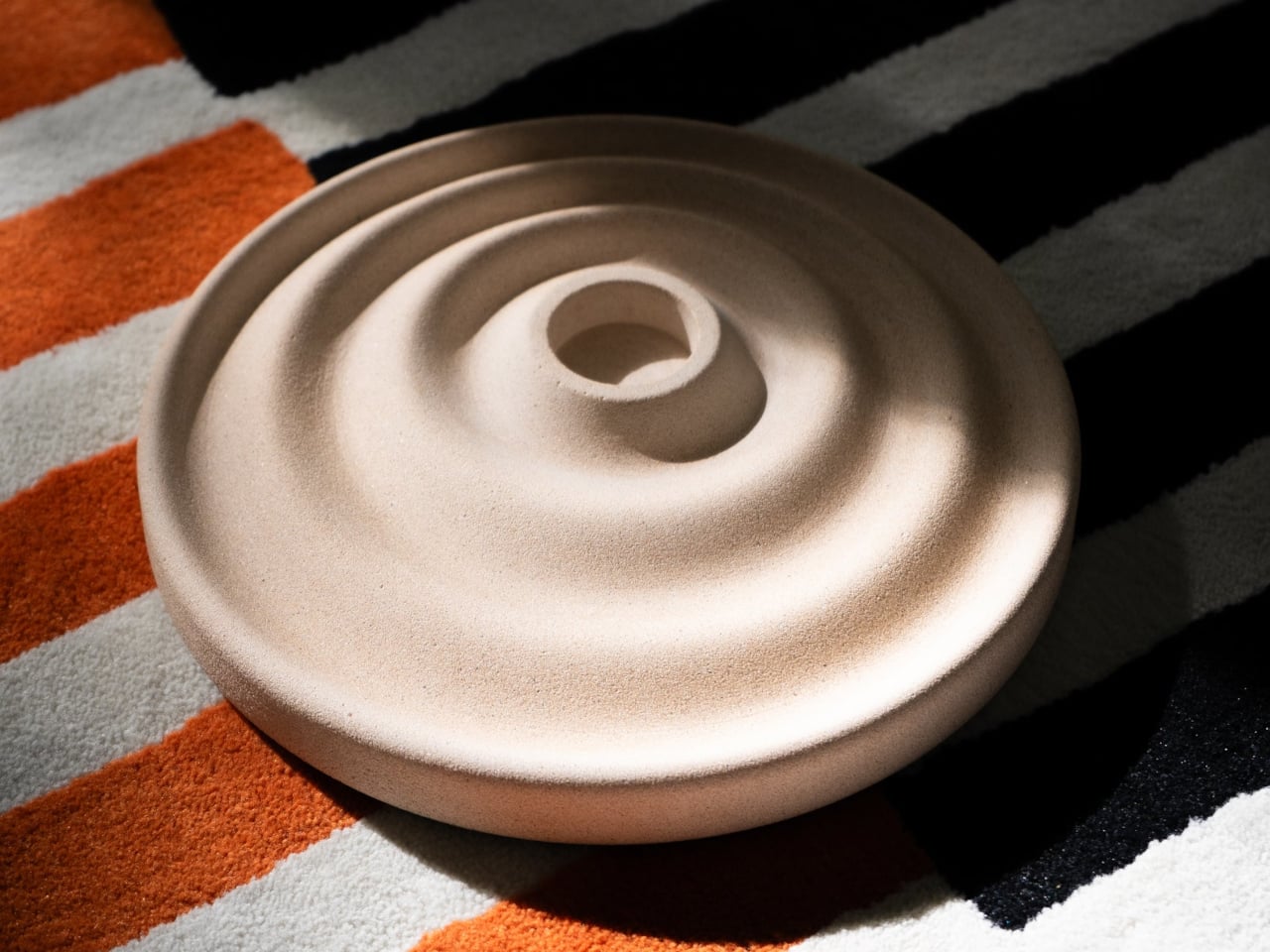
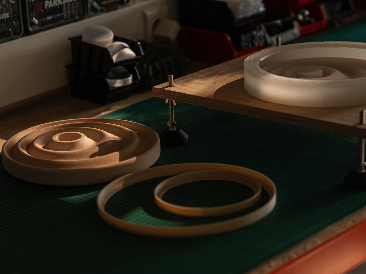
The Delicato Tray takes a different approach, and the solution comes from a direction you might not expect: ripples. Sold through Oftwise, it merges a valet tray and a candle holder into a single disc-shaped object cast from Jesmonite AC730, a sustainable stone composite. The result reads less like a utilitarian catchall and more like something a sculptor quietly left on your nightstand.
The ripple pattern isn’t purely decorative. The concentric waves are asymmetrical, with the outer rings wider at the front for bulkier items like keys or glasses, and the inner curves sitting closer toward the back for smaller things like rings or coins. It’s a hierarchy built into the shape itself, making organization almost unconscious rather than something you have to think about.
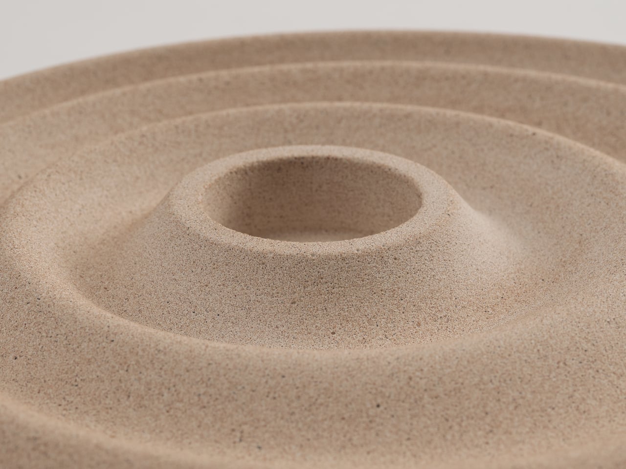
At the center of those ripples sits a recessed pocket sized for a tealight candle, turning the tray into a mood-setter as much as a catchall. Lighting a candle while dropping your watch and keys into the right grooves transforms a mundane habit into something closer to a ritual. It’s a lot to ask of a disc of stone, but Delicato manages it without breaking a sweat.
The material is what makes that balance possible. Jesmonite AC730 is a water-based, VOC-free stone composite that reproduces the look and texture of natural stone without concrete’s weight. It’s independently fire-rated and impact-resistant, which matters for something that routinely sits next to an open flame. A matte acrylic sealer and a cork anti-slip pad on the base round out the practical details.
Because the tray is hand-cast, no two are identical. Small air bubbles, subtle texture variations, and minor color shifts are natural byproducts of the process, and Oftwise is upfront about that. The available color, Bath Stone, is a warm sandy beige neutral enough for almost any interior. At 2kg, it has a quiet weight that makes a surface look deliberately arranged.
The Delicato Tray measures 24.5cm x 24.5cm with a height of just 2.8cm, low enough to sit under a bedside lamp without stealing vertical space. The candle pocket measures 3.9cm across and 1.5cm deep, a snug fit for a standard tealight. It retails for €235 on Oftwise, which places it firmly in the premium tier for an object of this category.
What Delicato gets right is something many design objects miss: it doesn’t try too hard to be either thing. It’s not decorative at the expense of being useful, and it’s not useful at the expense of looking good. A tray that doubles as a candle holder and a sculptural object sounds like a confused brief, but the ripple form settles all of that quietly.