Certain people are genuinely difficult to shop for. Not because they are indifferent to objects, but because they are already particular about them. They own the good knife, the good pen, the right carry for every situation they have encountered. They know what they like and have most of it. The only gifts that land are the ones they never knew existed or never thought to justify buying for themselves.
This list is for that person. Eight products chosen because each one does something specific better than anything else at its price. Some live on a desk. Some live in a pocket. One glows for twenty-five years without a battery. Another tracks your health without ever asking for a subscription. All of them are the kind of gift that makes the person receiving it quietly wonder why they hadn’t already found it.
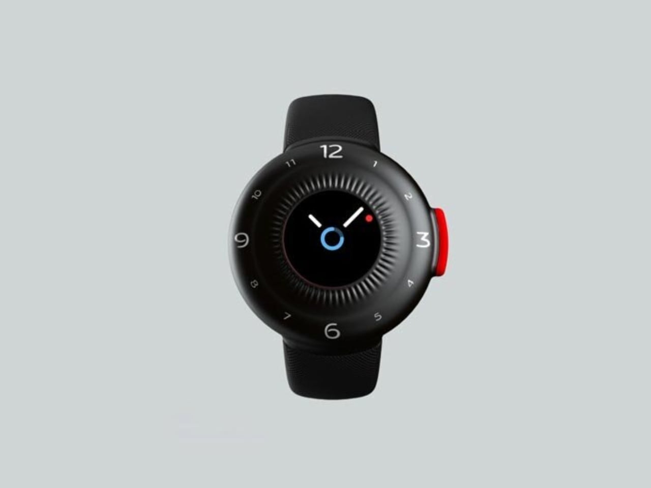
1. Futurewave O-Boy Satellite Watch
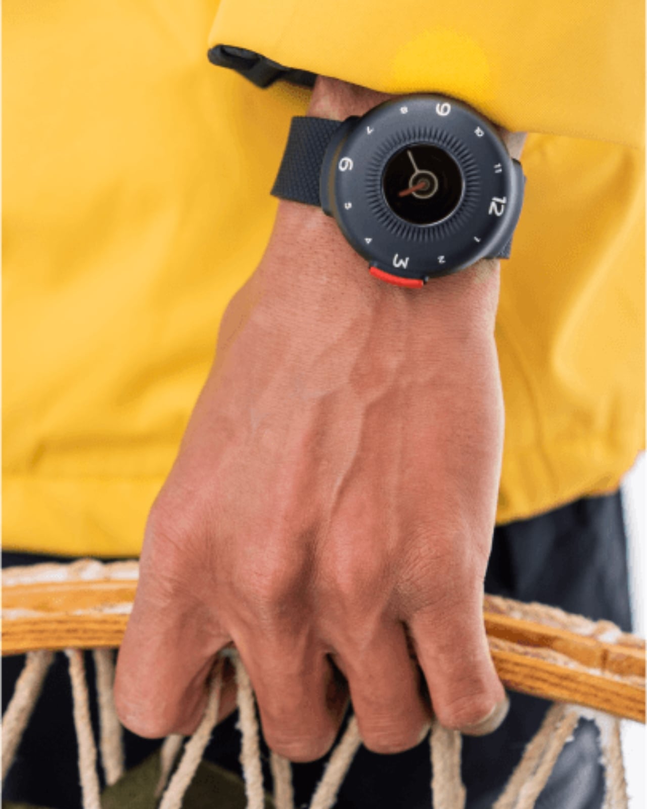
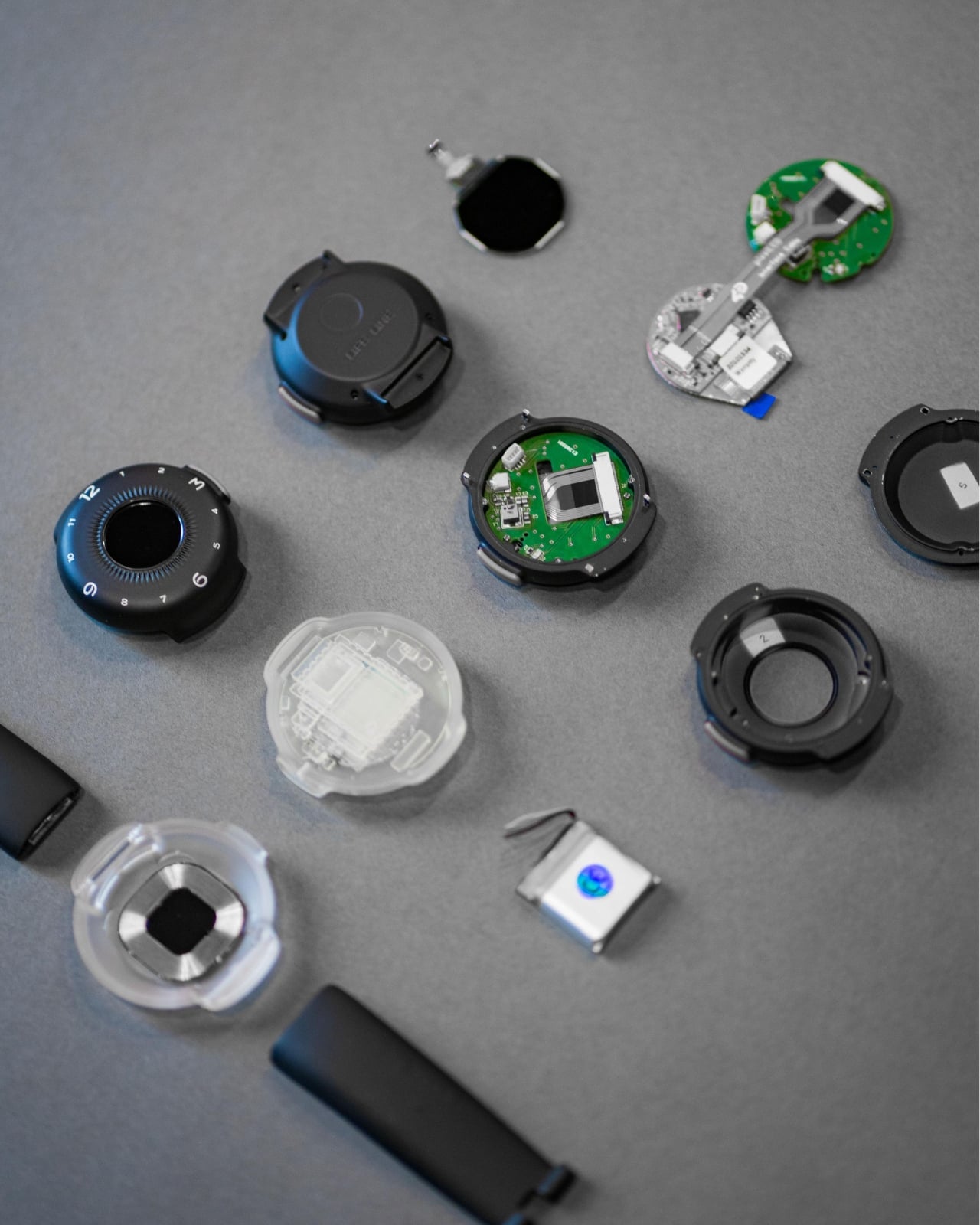
There is a version of off-grid preparedness that stops at downloading an offline map. The O-Boy is the version that actually works when everything else gives up. Developed by Brussels-based studio Futurewave, it is a satellite-connected emergency smartwatch that transmits distress alerts without a mobile network, covering mountains, open ocean, and remote worksites where the nearest cell tower is genuinely theoretical. The black and red colorway is borrowed from safety and emergency signaling equipment, a reference that earns itself without explanation.
At $399, the O-Boy positions itself as the first multiple-use satellite rescue watch, designed to be worn daily rather than stored until it is needed. Developed alongside electronics engineers and antenna specialists, it was pressure-tested, waterproofed, and shock-tested before the design was finalized. The rounded form exists partly for wrist comfort and partly to accommodate the antenna hardware inside, a constraint Futurewave turned into a clean aesthetic. For the man who goes where signals do not reach, this is the watch that keeps pace with him.
What we like
- Satellite connectivity works entirely without a mobile network, covering remote environments where every other device on this list stops functioning
- Designed as a daily wearable rather than single-use distress gear, earning its wrist space on ordinary days as much as critical ones
What we dislike
- Emergency-first design means the lifestyle and fitness tracking features found in conventional smartwatches are not the focus here
- Satellite communication services may carry ongoing subscription costs depending on region, adding to the total cost of ownership beyond the watch itself
2. Levitating Pen 3.0
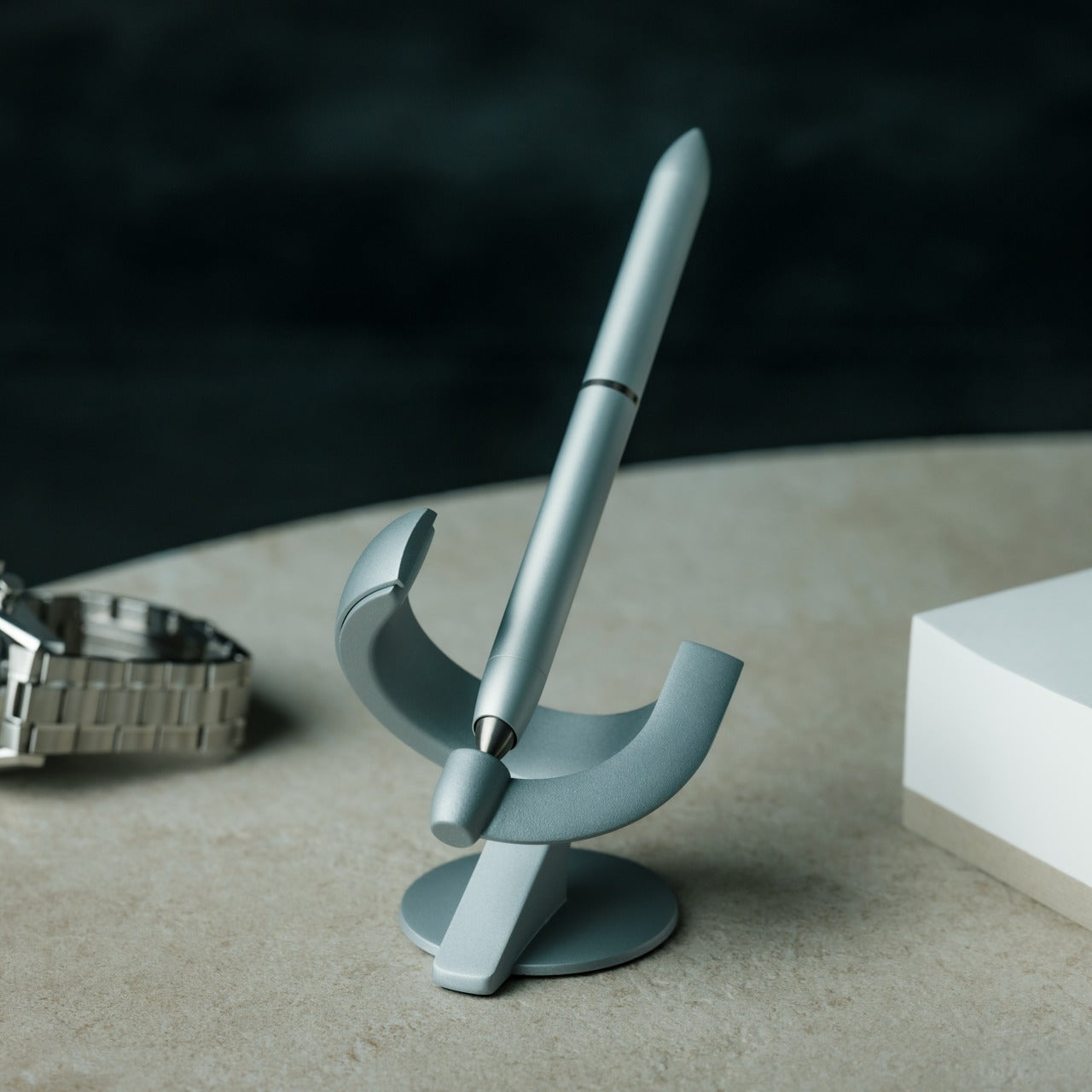
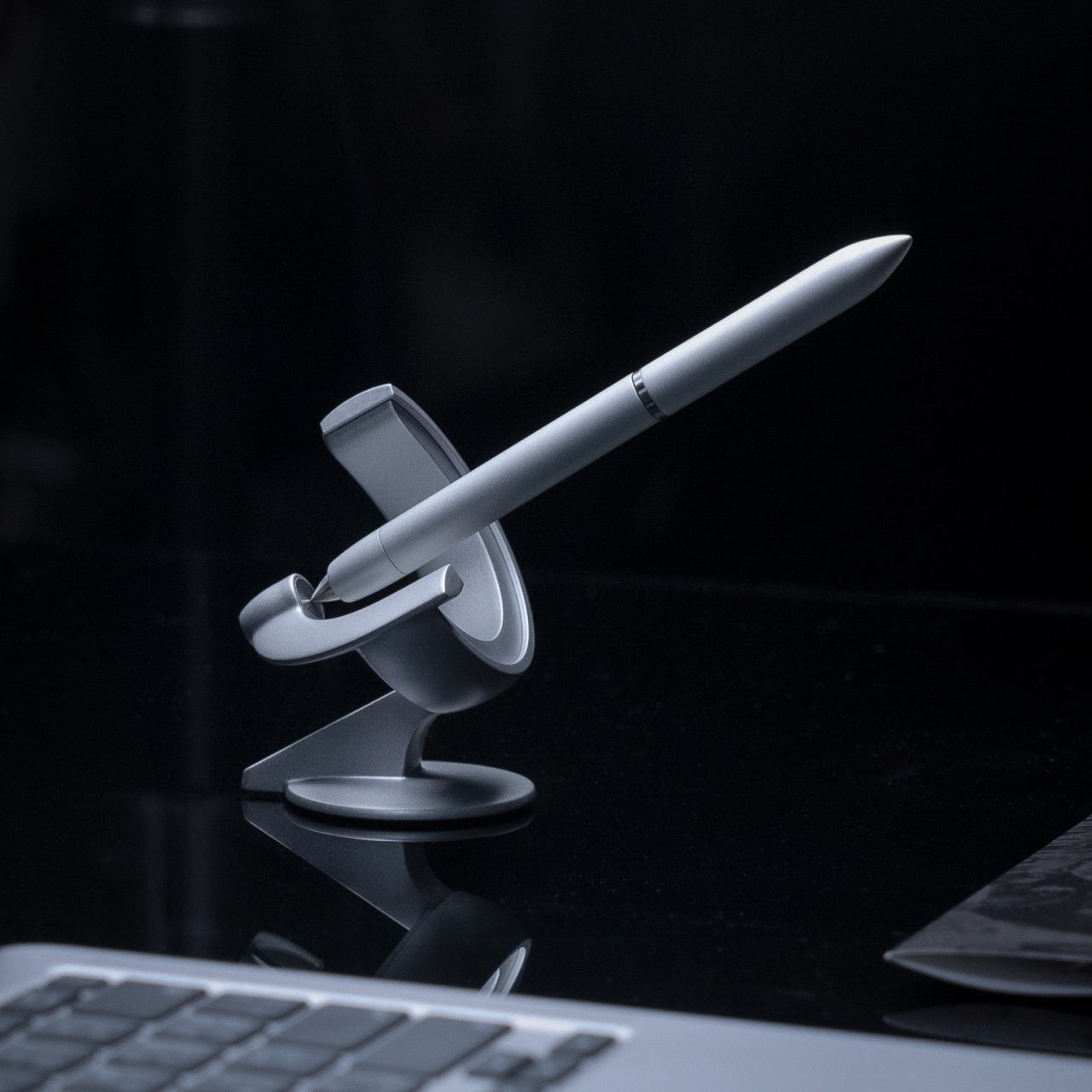
Most desk objects earn their place through utility. The Levitating Pen 3.0 earns its place through presence. Balanced on a pinpoint at a 60-degree angle, it hovers an inch above its base in a way that makes visitors stop mid-sentence to ask what they are looking at. The all-metal body is built from aerospace-grade aluminum and titanium, and a quick twist sends the pen spinning for up to 30 seconds, turning a writing tool into something worth watching between sessions.
It also writes, which matters more than it sounds. A German-engineered Schmidt rollerball cartridge, the same supplier behind Montblanc’s nibs, delivers a finish that makes note-taking feel slightly more deliberate than usual. The modular body lets you switch between rollerball and fountain pen setups depending on preference, and the zinc alloy magnetic base is precisely angled for smooth retrieval. Available in silver and anodized black, this is the rare desk piece that earns its footprint through daily use rather than sitting as decoration between sessions.
Click Here to Buy Now: $129.00
What we like
- The 60-degree levitation and 30-second spin make it the most arresting object on any desk, requiring no setup beyond placing it on the base
- Schmidt-cartridge compatibility ensures long-term refills are easy to source, and the pen writes as well as it looks
What we dislike
- The magnetic base requires a flat, stable surface, making this a desk piece rather than something that travels with you
- The levitation effect is tied to the base, which adds footprint you need to account for in a tighter workspace
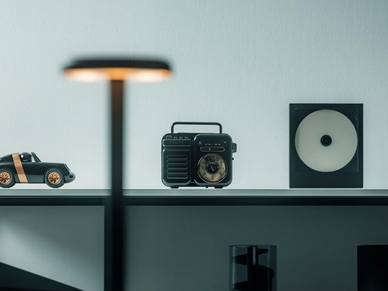
3. Portable CD Cover Player
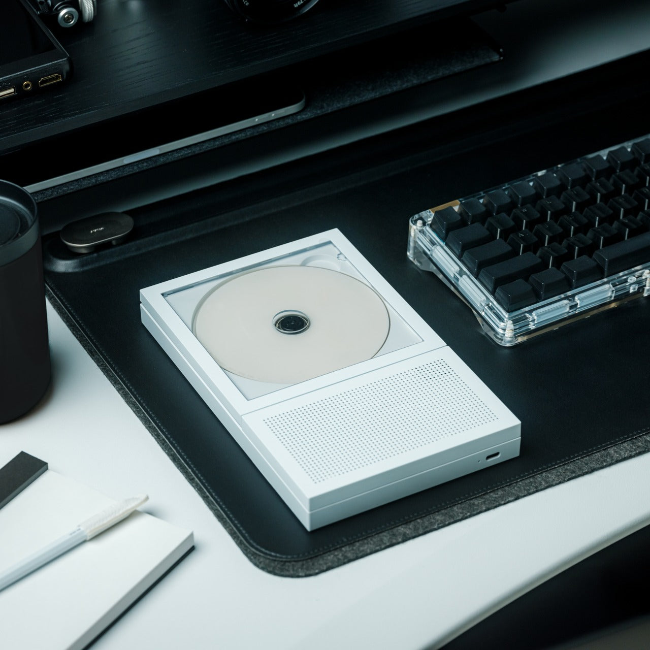

Nobody announced the CD comeback. It arrived quietly, then all at once, with artists slipping physical albums into merch drops and listeners buying records they could have streamed in seconds. What the Portable CD Cover Player understands is that the appeal has nothing to do with audio format. The disc loads and the album art stays facing outward while it plays, present and visible, the way music used to feel before playlists made it invisible and made albums forgettable.
The player is compact enough to move between desk, shelf, and bedside table without demanding much attention. It connects via Bluetooth or 3.5mm, charges over USB-C, and plays standard audio CDs. None of that is radical. What is considered is the single decision to build the entire object around what happens to the artwork while the music runs. At $199, it is for anyone who still thinks in full albums, or wants to start thinking that way again.
Click Here to Buy Now: $199.00
What we like
- Album-forward design keeps the cover art visible throughout playback, turning a disc into a display object rather than a source file you scroll past
- Bluetooth and 3.5mm output alongside USB-C charging makes it practical across every listening setup without compromise
What we dislike
- Playing standard audio CDs means no streaming and no playlists, which is the point, but requires genuine commitment to a physical listening habit
- Building or rebuilding a CD collection takes time and shelf space on top of the price of the player itself
4. Olight Baton 4 Premium Edition
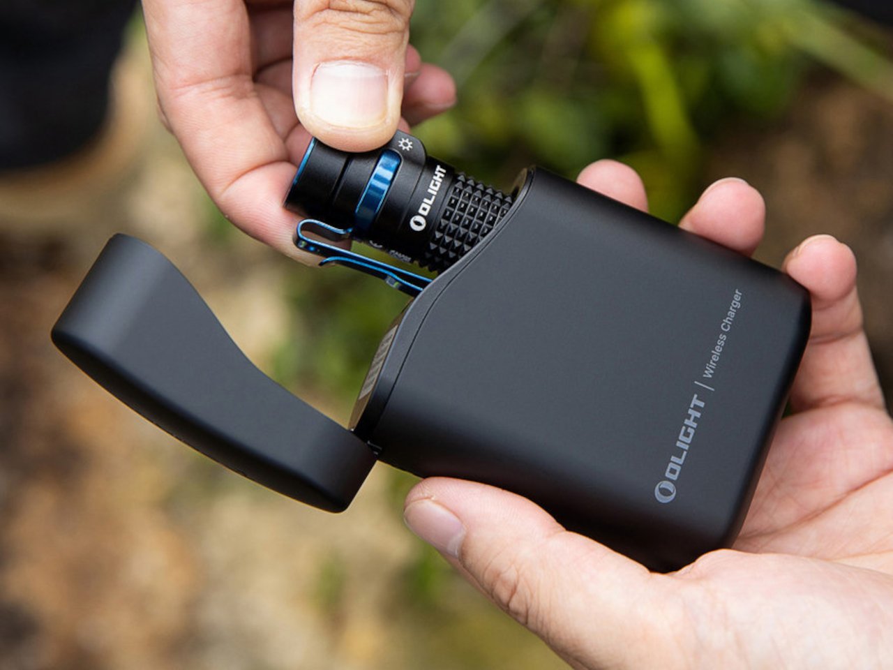
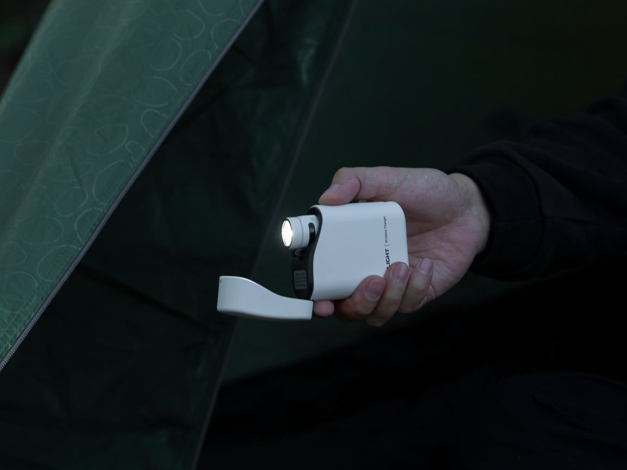
Most flashlights solve for brightness and stop there. The Baton 4 Premium Edition solves for the bigger problem, which is that a flashlight with a dead battery is dead weight precisely when it matters most. The Premium Edition pairs the Baton 4 cylinder with a 5,000mAh flip-top charging case, applying the same logic as wireless earbuds to a tool with much higher stakes. Drop the flashlight in after every use, and it tops up automatically without a second thought.
The flashlight delivers 1,300 lumens across a 170-meter throw from a body compact enough to disappear into a jacket pocket. A magnetic tail cap mounts it to any metal surface hands-free, and multiple brightness modes cover everything from close work to long-distance signaling. The 5,000mAh case also charges a phone over USB when the power goes out, turning a pocket tool into a two-function emergency kit. For the man whose current flashlight lives in a drawer with no charge, this is the upgrade that changes the habit entirely.
What we like
- The 5,000mAh charging case keeps the flashlight perpetually ready, applying the same habit logic as wireless earbuds to a tool that matters
What we dislike
- The Premium Edition costs considerably more than the Baton 4 alone, and the value is almost entirely in the case — buyers who skip the charging habit won’t fully justify the premium
- The compact form prioritizes portability over maximum output; dedicated tactical lights push further, but at a bulk trade-off this one deliberately refuses to make
5. AirTag Carabiner
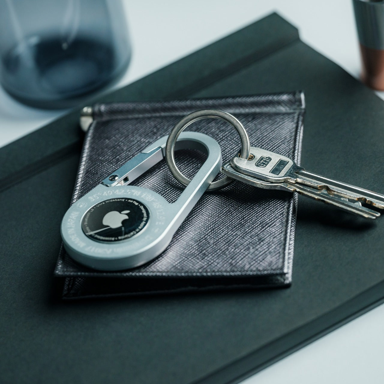
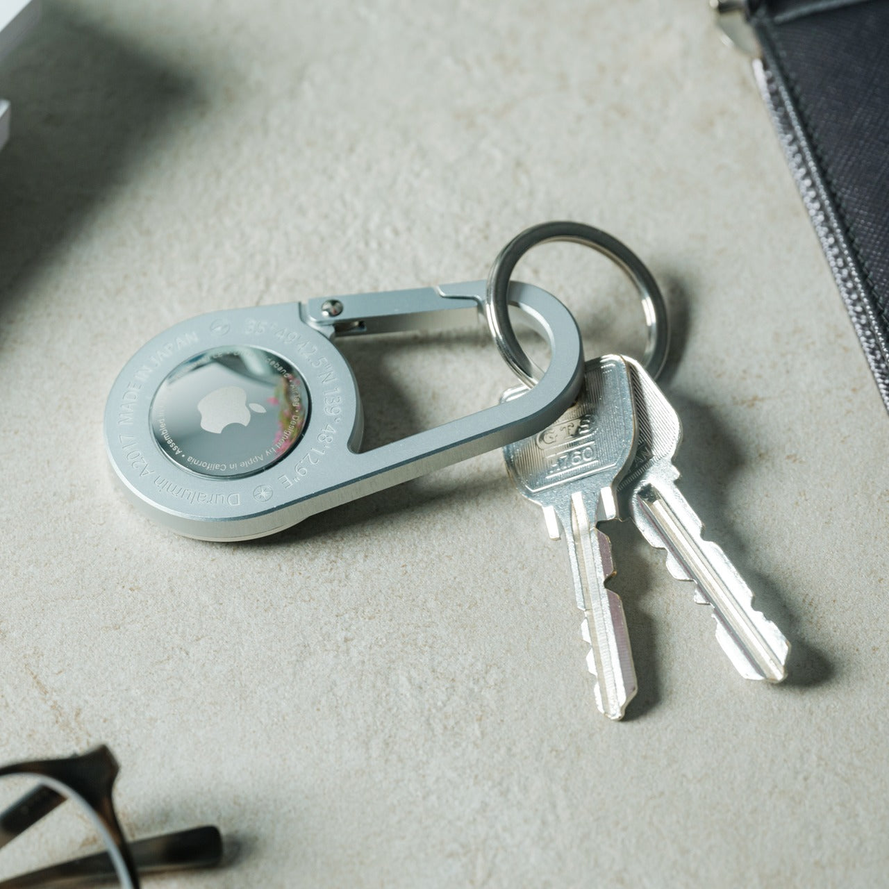
There is a version of the AirTag holder that is plastic, clips on, and looks like an afterthought. Then there is this one. Made from Duralumin composite alloy, the same material used in aircraft and marine vessels, and individually handcrafted, it has the weight and finish of something designed to outlast the tracker living inside it. It clips to bags, bikes, luggage, and keys, and Apple’s Find My network handles everything from there.
Available in untreated brass and stainless steel finishes, the carabiner develops character over time — brass in particular acquires a patina that mass-produced holders never manage. The design is restrained to the point of near-invisibility, which is precisely the point. For anyone deep in the Apple ecosystem who tags everything worth finding, this is the quiet upgrade that improves the entire experience without ever calling attention to itself. It is the difference between something you use and something you are genuinely glad to carry.
Click Here to Buy Now: $149.00
What we like
- Duralumin construction delivers aerospace-grade strength at a weight that adds nothing perceptible to whatever it attaches to, from luggage handles to key rings
- Untreated brass and stainless steel finishes develop genuine patina through use, turning a functional accessory into something personal over time
What we dislike
- The AirTag itself is not included, meaning the full setup cost is the carabiner price on top of a separate tracker purchase
- The deliberately understated design language means this one will not impress anyone who wants their accessories to make a visible statement
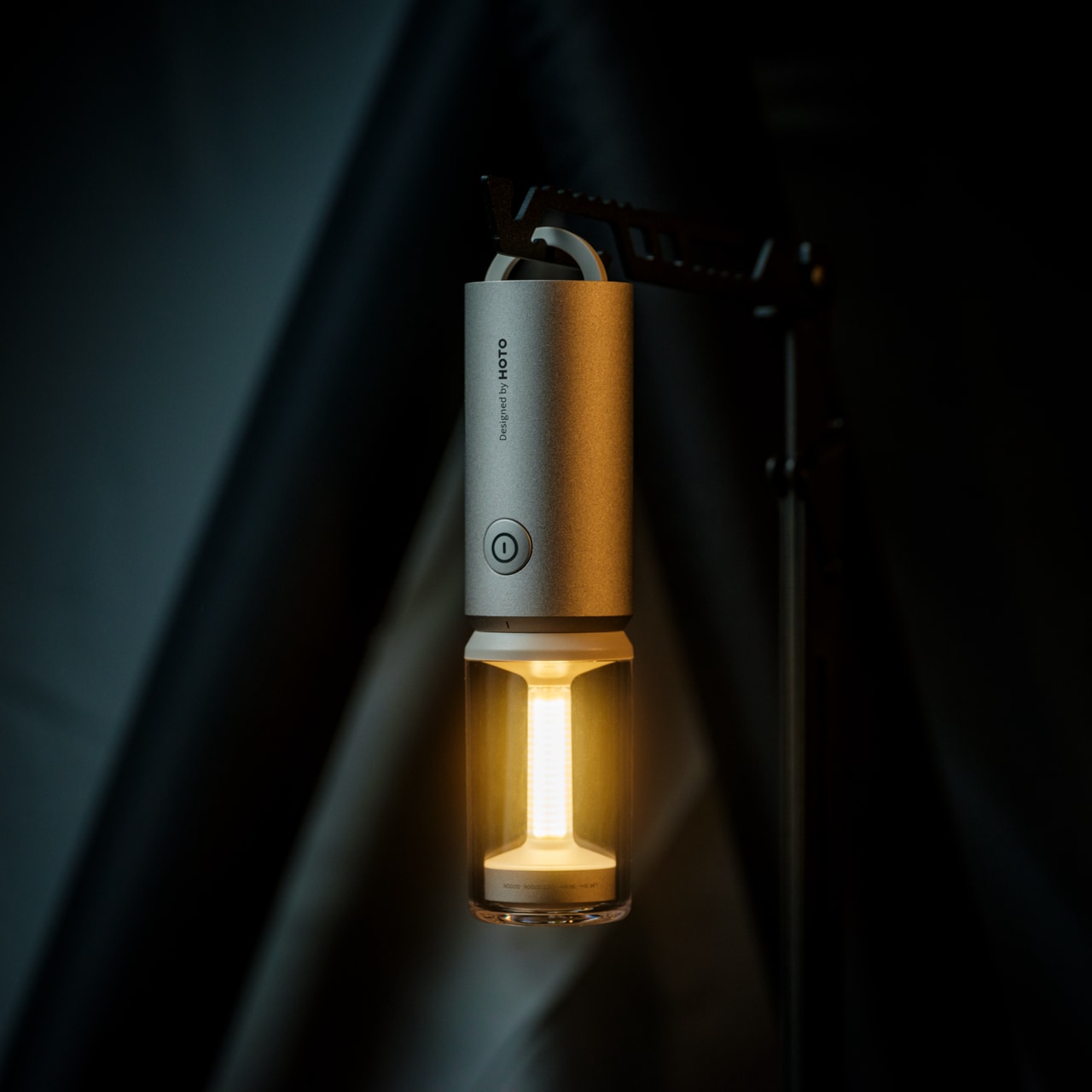
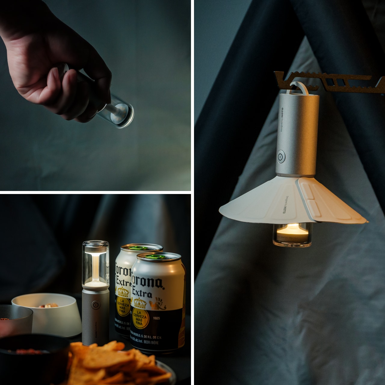
6. NoxTi Titanium Keychain
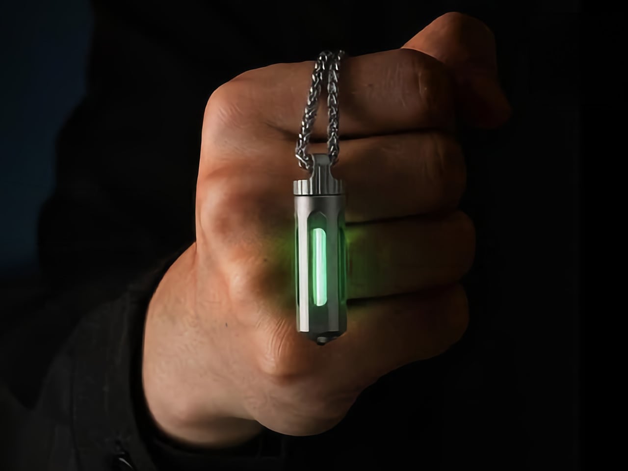
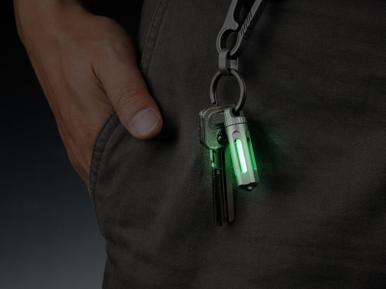
The NoxTi is not a gadget. It is closer to physics made portable. A tritium vial, sealed inside a precision quartz tube with 92 percent light transmission, produces a continuous passive glow through radioactive decay alone. No switch, no battery, no charging schedule, no maintenance of any kind. The Grade 5 titanium cylinder measures 45mm by 12mm and weighs 10.7 grams. Designed by Xedge and available in six color options across two titanium finishes, it asks absolutely nothing of the person carrying it.
Tritium’s half-life is 12.3 years, which means reliable passive illumination for roughly 25 years before the vial needs replacing. When it eventually dims, you push it out and slot in a new one. A ceramic glass breaker integrated at one end adds genuine emergency utility without altering the minimal proportions by a millimeter. For anyone running a considered EDC loadout who wants something that earns its keychain space entirely through what it is rather than what it promises, the NoxTi is the rarest kind of carry piece — one that never needs anything from you.
What we like
- Twenty-five years of passive glow powered entirely by atomic decay, requiring zero charging, zero maintenance, and zero battery anxiety
- The ceramic glass breaker adds real emergency function without changing the 45mm profile or the clean titanium aesthetic in any way
What we dislike
- The ambient glow orients you in darkness rather than illuminating a space, so it works alongside a flashlight rather than replacing one
- Tritium is regulated in certain countries, making local availability and import rules worth confirming before ordering
7. ScytheBlade
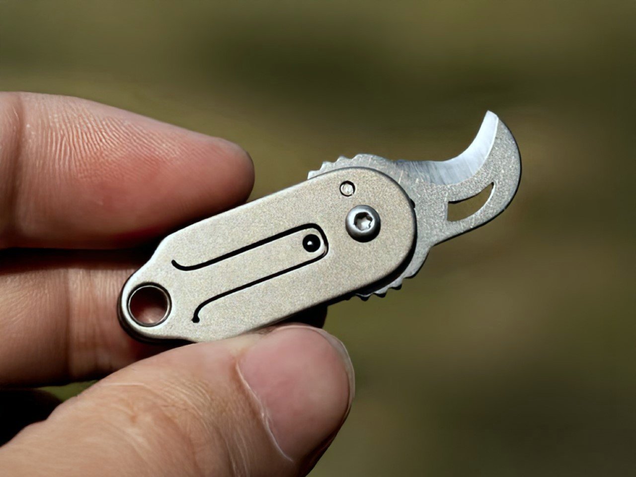
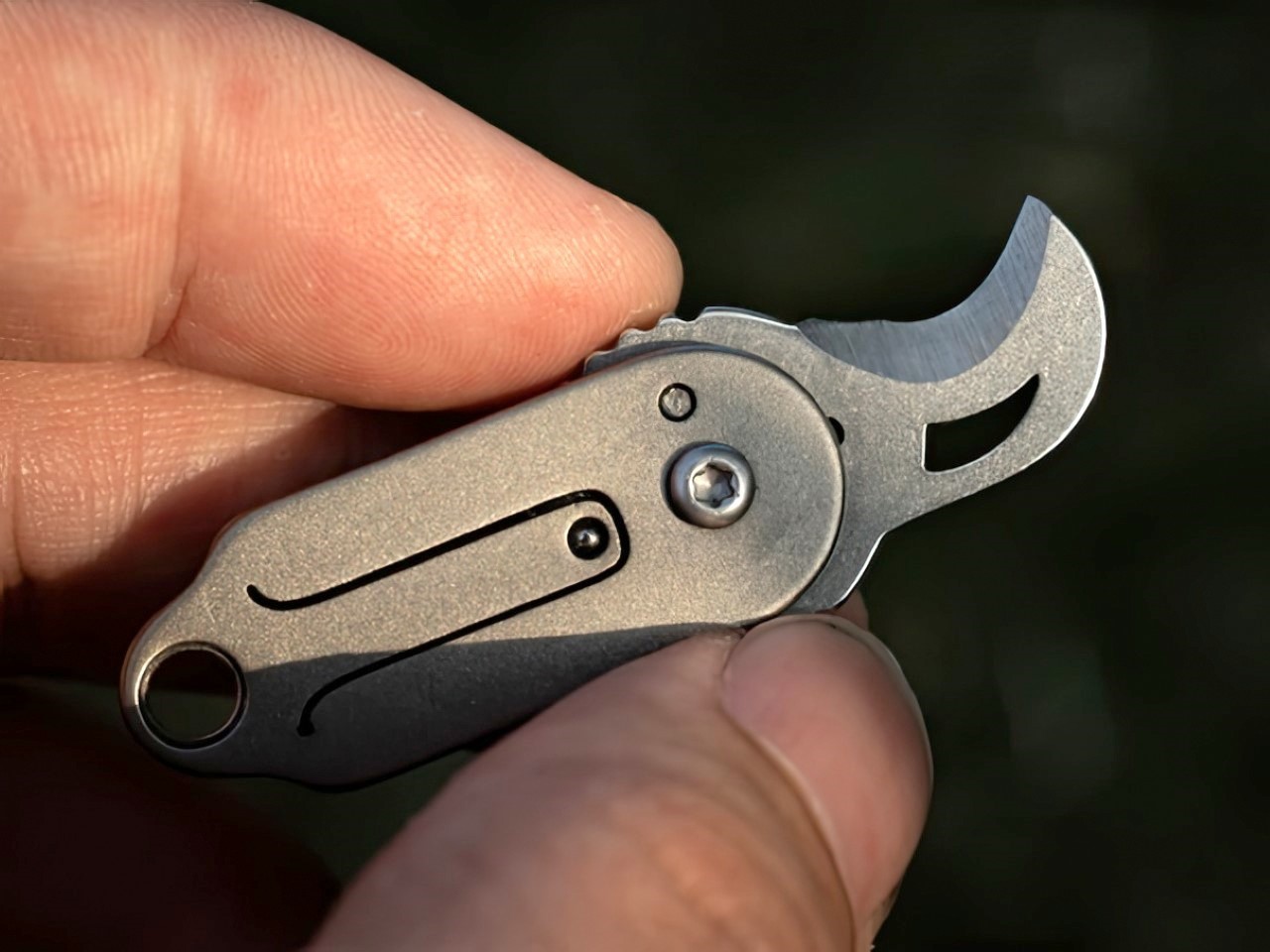
The ScytheBlade takes one of the most recognizable silhouettes in history and scales it to 8 grams. The curved blade profile mimics a tiger claw at 46mm deployed, and that geometry is not decorative. Curved blades concentrate cutting force on pull cuts in ways straight edges cannot match, which makes the ScytheBlade more capable than its keychain dimensions suggest. The full titanium body brings natural corrosion resistance without adding weight, and the result is a folding knife you genuinely forget you are carrying until the moment you reach for it.
For anyone whose daily carry involves cutting tape, opening packaging, trimming materials, or simply wanting a blade available without thinking about it, the ScytheBlade earns its place through consistent, quiet performance. Titanium survives contact with tools, chemicals, and outdoor conditions without demanding attention or care. The curved profile takes a day or two to adjust to if straight-edge knives are what you are used to. After that adjustment, the geometry stops being interesting and simply becomes useful.
What we like
- The 46mm scythe-curved blade concentrates cutting force through geometry rather than size, making it more capable than its profile suggests
- Full titanium at 8 grams is the kind of mass-to-material ratio that makes every other pocket knife feel slightly less thought through by comparison
What we dislike
- The curved blade profile requires adjustment from anyone used to straight-edge carry, with the learning curve noticeable in the first few days of use
- At 46mm deployed, heavier cutting tasks fall outside its range — it works alongside a full-size blade for more demanding work rather than replacing one
8. RingConn Gen 2 Smart Ring


The RingConn Gen 2 is made from titanium alloy, measures 6.8mm wide and 2mm thick, and sits on a finger for 10 to 12 days before it needs charging. A smart charging case extends total runtime beyond 150 days. It tracks heart rate, HRV, blood oxygen, skin temperature, sleep quality, stress, and sleep apnea — the latter developed in collaboration with universities and hospitals, and among the first of its kind available in a ring-form wearable. It is waterproof to 100 meters.
What separates the Gen 2 from most of its category is the no-subscription model. Most health platforms charge a monthly fee to access data the wearer generated themselves. RingConn does not. For the man who already tracks his health but resents the overhead, or the one who has been told he should but hasn’t started, this is the wearable that disappears on a finger and does its job without asking anything in return. At $209, it competes on depth of insight while undercutting most of the category on both price and profile.
What we like
- No subscription required to access your own health data — a model that is increasingly rare in this category and worth choosing on its own terms
- A 10-to-12-day battery paired with a smart charging case extending total runtime past 150 days removes low-battery anxiety from the equation entirely
What we dislike
- Enabling sleep apnea monitoring increases power draw, which affects battery life on smaller ring sizes and may require more frequent charging
- No built-in GPS means outdoor fitness tracking requires a paired phone nearby, limiting standalone utility during runs or hikes off-network
These Are the Gifts That Don’t Need Explaining
The thread connecting all eight of these is not category or price point. Each one was built by a designer who asked a narrower question than most products bother with and then answered it without hedging. A watch that works where no signal reaches. A keychain that glows for a quarter century through nothing but physics. A ring that tracks sleep apnea without charging you a monthly fee to read your own data. A CD player that finally figured out what to do with the album art.
Whether you pick the one that floats, the one that satellites, or the one that sits silently on a finger, the choice communicates something. These are not last-minute purchases or safe bets. They are objects that reward curiosity and repay daily use, which is the quietest compliment you can pay anyone on your list.
The post 8 Best Gifts for Men Who Have Everything in 2026 first appeared on Yanko Design.