The accessory market for phones and computers is a wide and varied one, with designs that are all over the place and cover almost the entire range of the spectrum. Some try to offer everything, almost including the kitchen sink, resulting in a cornucopia of features and attachments, while others aim for the bare basics to keep things simple yet elegant. Minimalism continues to dominate the design world, and it has also started to grip the tech industry, particularly when it comes to gadgets and accessories. Minimalist design, though sometimes plain-looking, doesn’t exactly mean “boring,” especially when they take inspiration from some of mankind’s creative achievements to give these products an interesting visual and functional spin.
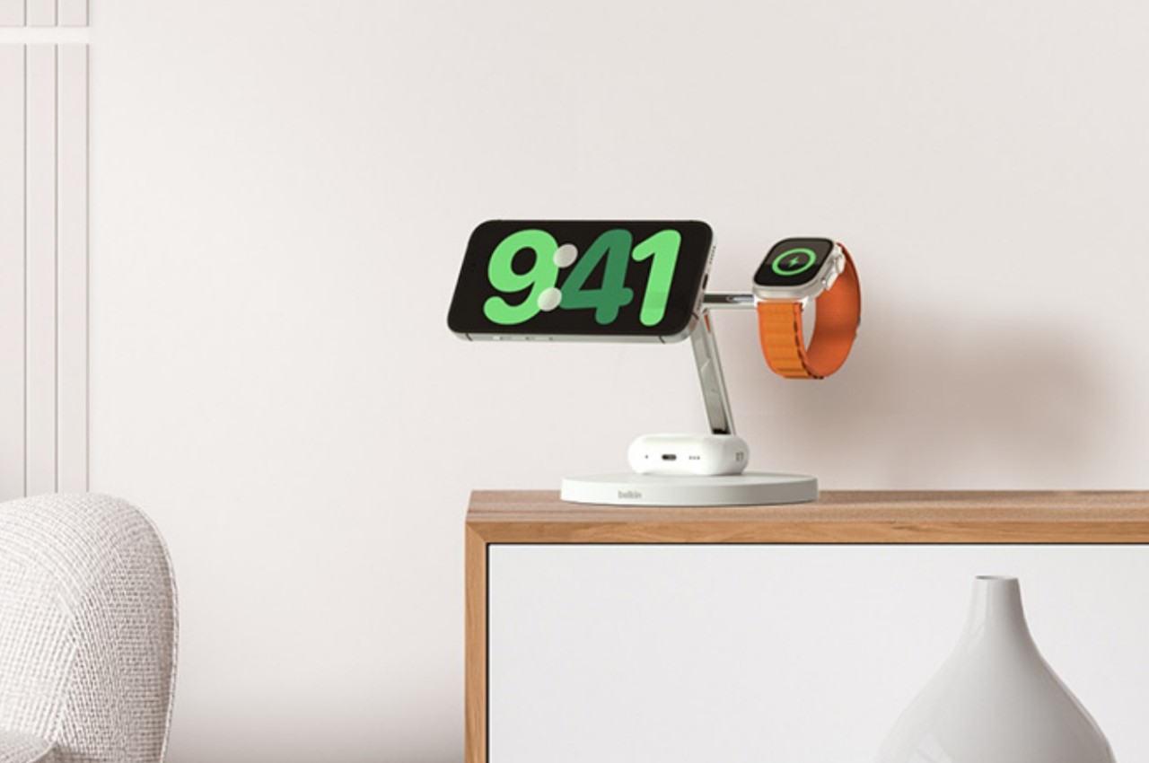
Belkin BoostCharge Pro 3-in-1 Wireless Charging Stand
Some say good things come in threes, and iPhone owners tend to own an Apple Watch and AirPods to complete a functional set. Keeping all three charged has become somewhat of a logistics problem, though thankfully it’s less of a mess now that none of them require charging cables all the time. Apple’s MagSafe technology has opened up a new world of designs, free from the tangles of wires, and it has given birth to a variety of charging docks and stations, including some pretty minimalist ones.
The Belkin BoostCharge Pro really takes minimalism almost to an extreme, being nothing more than a metal post that branches in two, standing on a plain round disc. While there are quite a number of 3-in-1 MagSafe chargers that support a similar combination, Belkin’s design emphasizes keeping a tidy appearance, whether there are devices charging on it or not. The base holds the AirPods case, keeping your desk or shelf clean, while both the iPhone and Apple Watch are held up high for easier visibility.
The charger’s clean and minimalist appearance takes its cue from modern architecture, with well-defined lines and shapes and a simple yet functional design. It distills the whole structure down to its essentials, providing support and a place for your gadgets to call home, without overpowering Apple’s already elegant and stylish aesthetic.
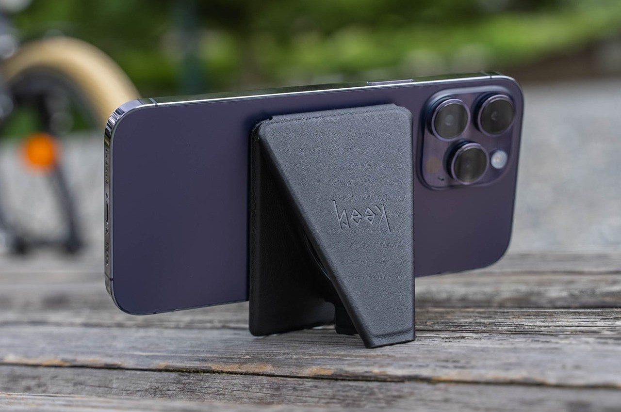
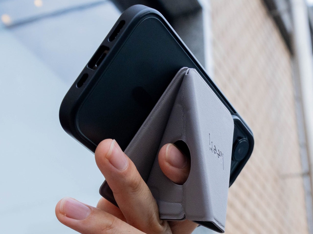
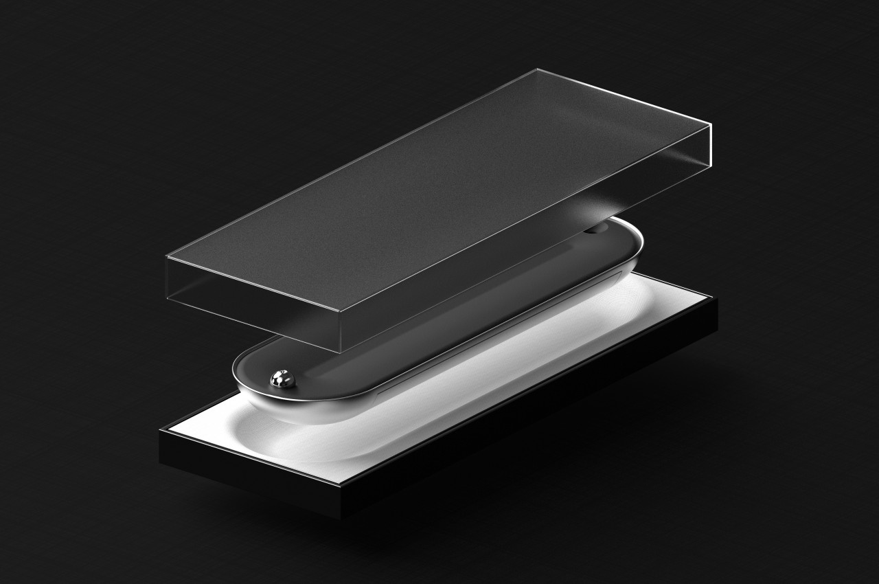
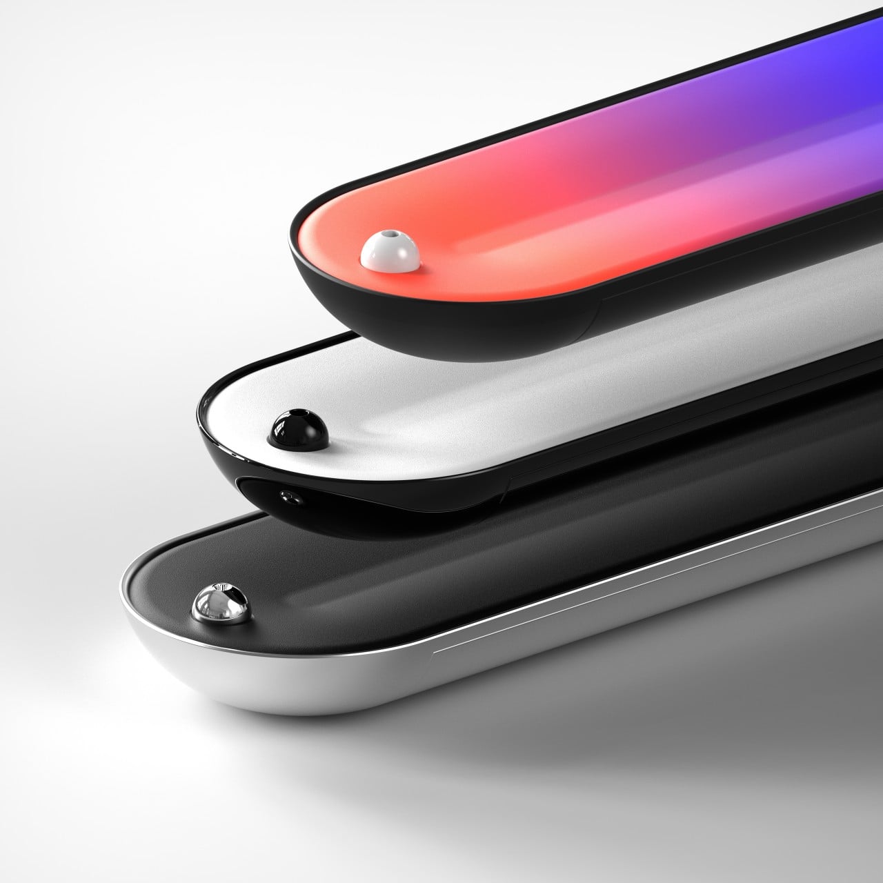
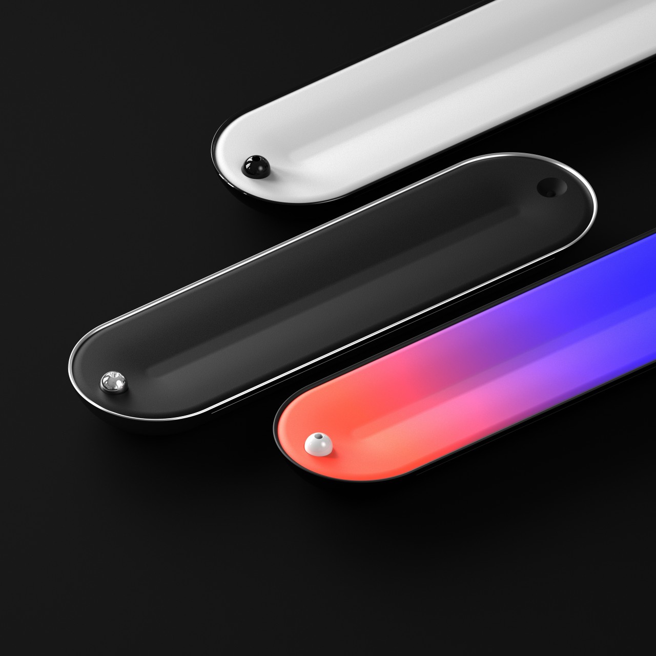
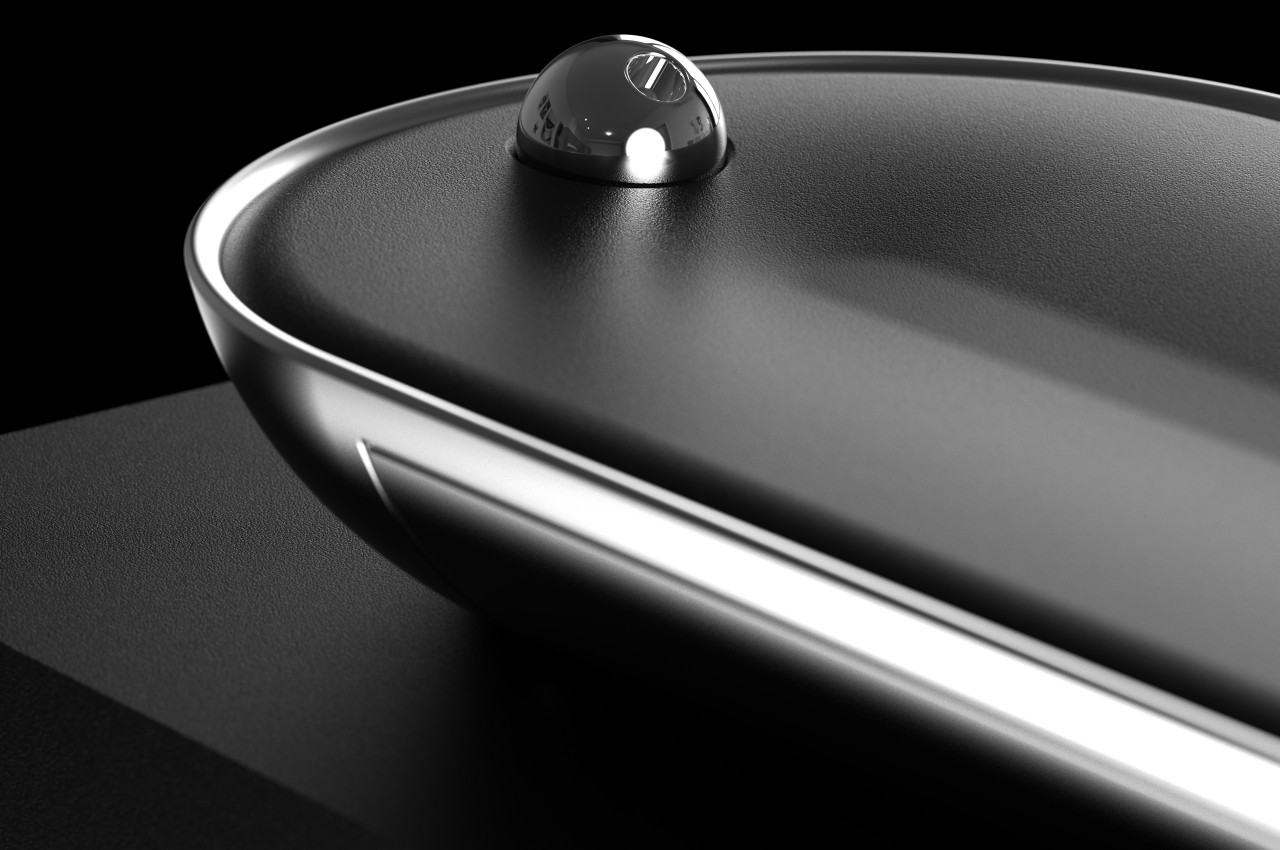
MagSafe Origami Grip Stand
The ancient Japanese art of paper folding has inspired many designs across history, from simple children’s toys to mind-blowing structures even to complex robots. The main pull of origami has always been its ability to change shape from a flat sheet of material like paper to something three-dimensional any moving parts or without removing or adding any part at all. Because of that, something that takes up space can be made to collapse down to almost nothing, like this grip and stand that adds almost no thickness to your iPhone.
Thanks to its creative origami-inspired design, the MagSafe attachment transforms from a flat pad into a triangular shape that can do more than just prop up your phone on a table. It gives your fingers something stable to latch onto, making it perfect for taking selfies with confidence. It can even stick to metal posts, walls, and surfaces thanks to that strong magnetic power.
The best thing about its design is that it doesn’t get in the way when you don’t need it. It simply collapses back down to a flat shape that’s no thicker than the iPhone’s own camera bump. Nothing to snag when you slip it into your pocket and nothing to make it wiggle when placed on a table. It’s beautiful, functional, and as simple as it needs to be, nothing more.
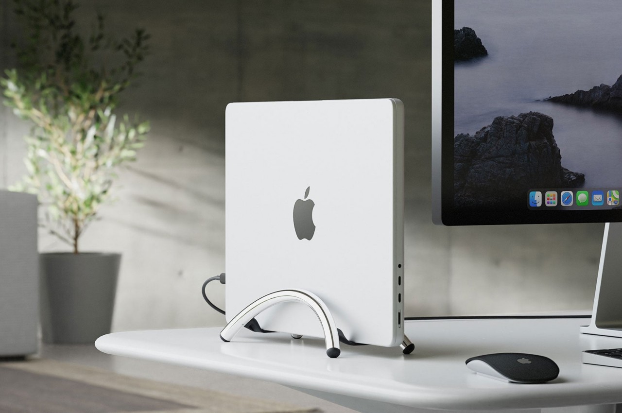
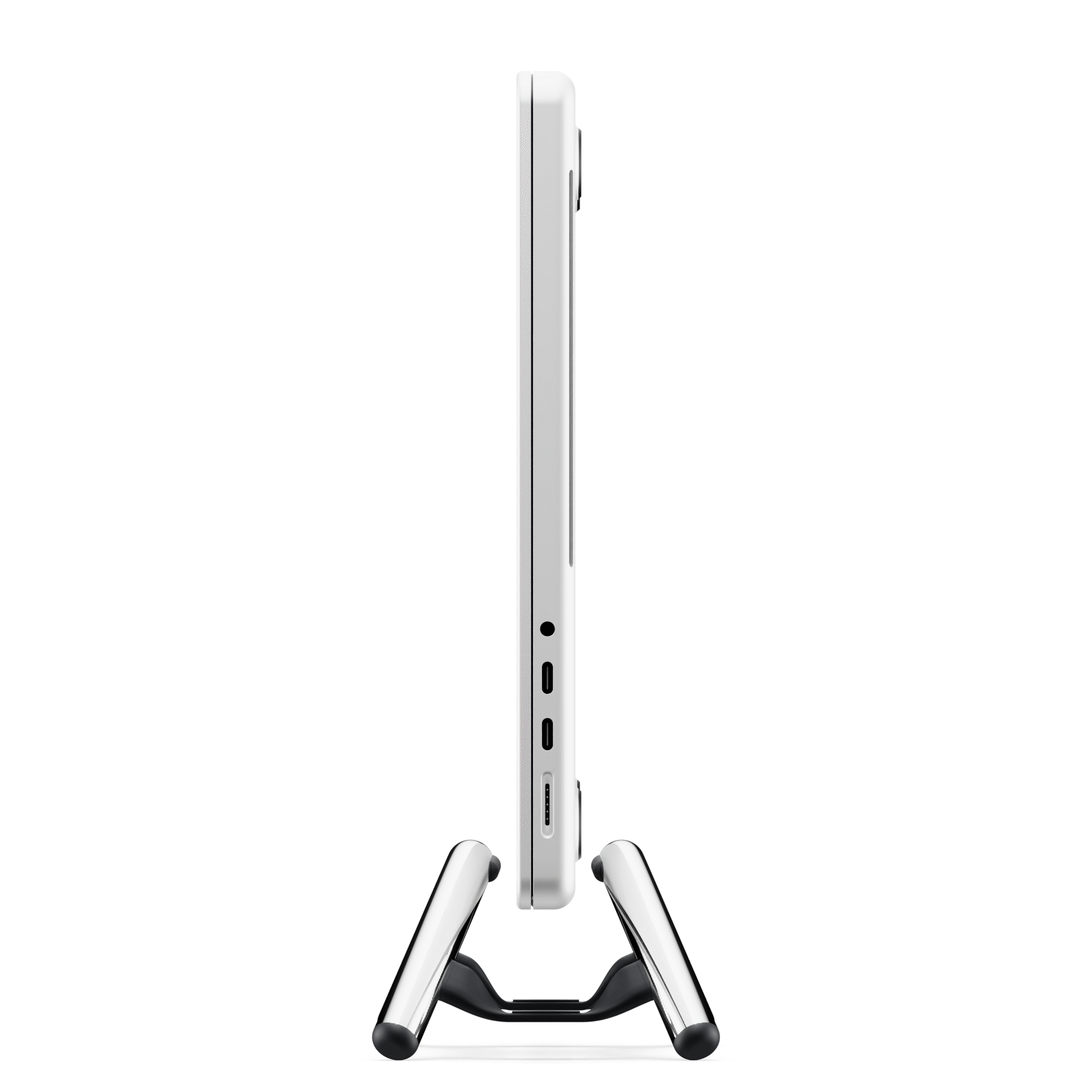
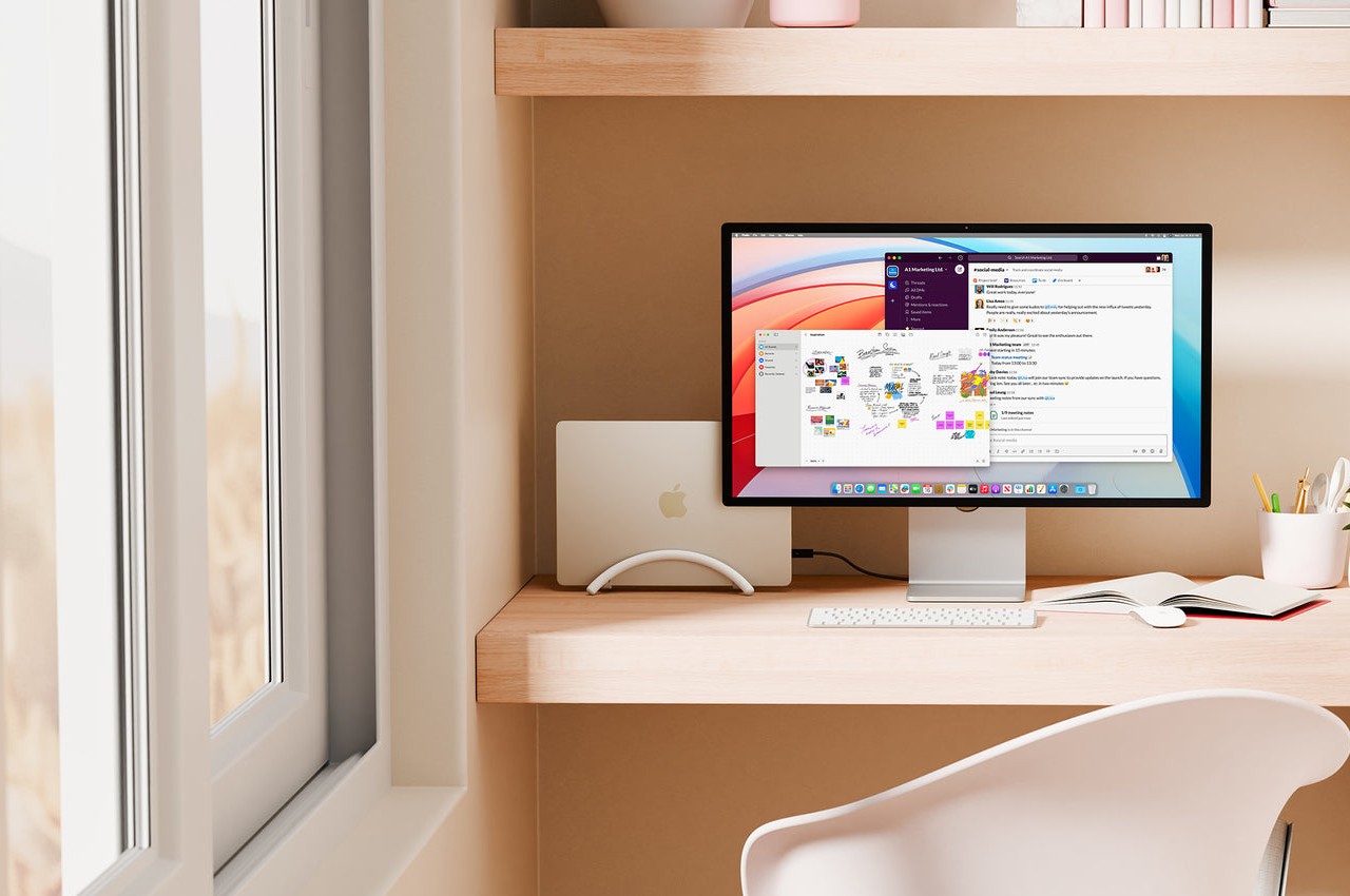
Twelve South BookArc Flex Vertical MacBook Stand
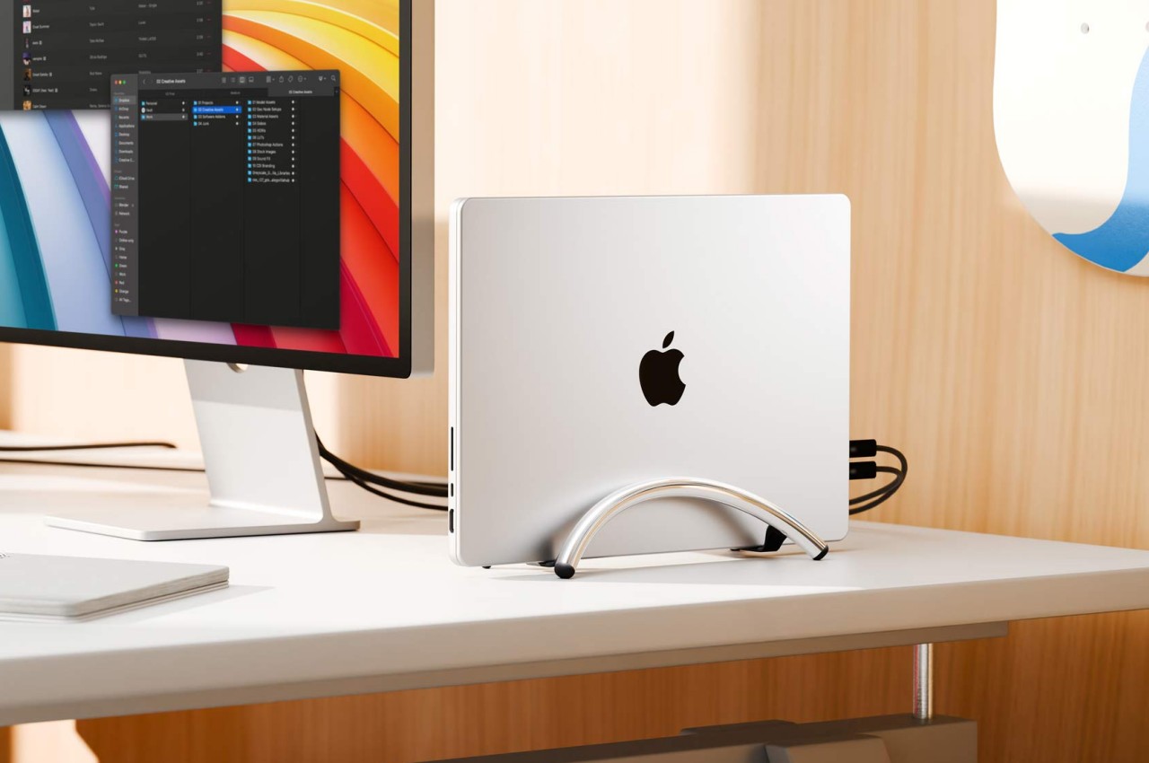
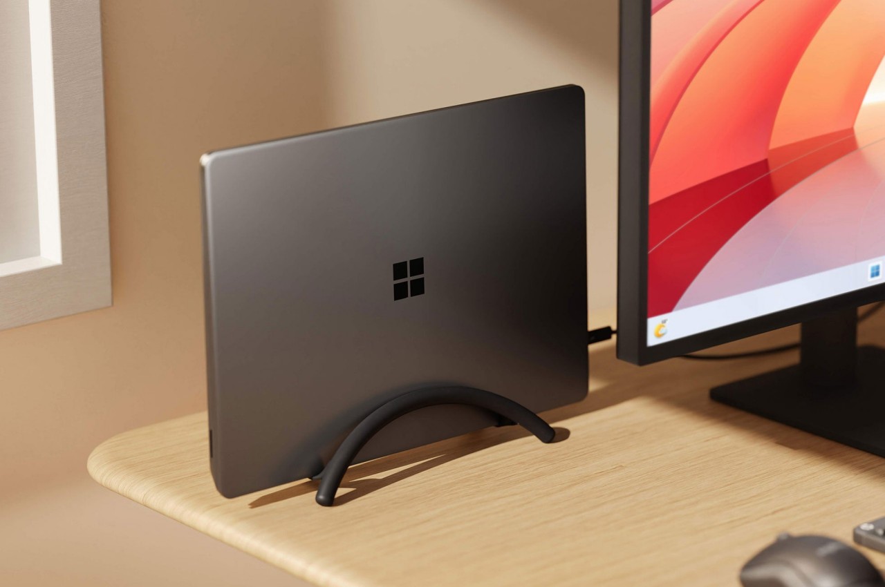
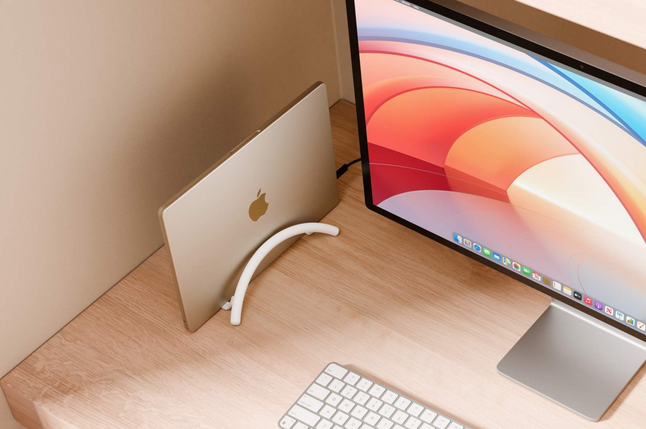
A laptop stand is, more often than not, a horizontal plane meant to hold your laptop while it lies down. Of course, that’s the most common way to use a laptop, but it’s definitely not the only way, especially when you’re using it as a makeshift desktop computer. With the lid always closed and the laptop simply connected to a monitor and other peripherals, having a laptop lying flat or even on a horizontal stand is already a poor use of precious desk space. That’s where a vertical laptop stand comes in hand, and Twelve South just launched what is probably the most minimalist design in that category.
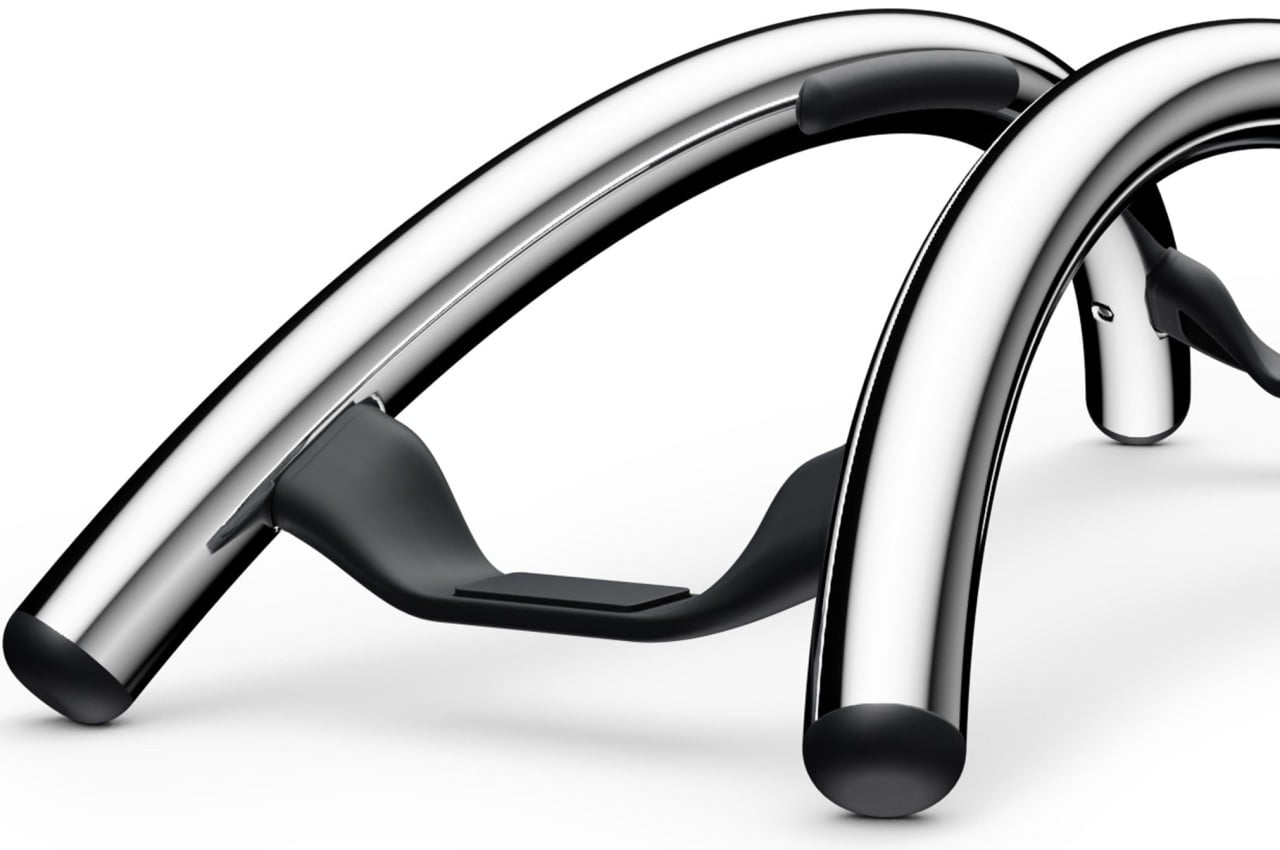
It might look like two simple metal arcs, but that ultra-minimalist design is what makes the BookArc Flex a work of genius. Designed to hold your closed MacBook vertically, it can save you precious desk space when all you really want to do is connect the MacBook to an external screen and some peripherals while it’s running. It keeps all the mess away without sacrificing any functionality, and you can still easily plug in other USB devices because the MacBook is still within reach.
The design is both simple yet elegant, perfectly complementing Apple’s design language with its bent all-metal rods in matte black, matte white, or premium chrome finishes. It is inspired by modern architecture, particularly the Noisette Creek Pedestrian Bridge in Charleston, South Carolina, in more ways than one. While it does owe its form to that bridge, it also takes a few lessons from a bridge’s structure and use of physics, particularly in how the stand uses the MacBook’s own weight to pull in the arcs and secure the laptop. That means that this simple design is also future-proof, supporting any MacBook or even any laptop that’s only an inch thick, making it a beautiful example of how good, simple design can be universal and timeless as well.
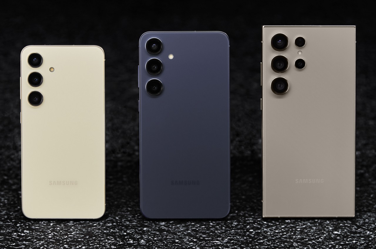
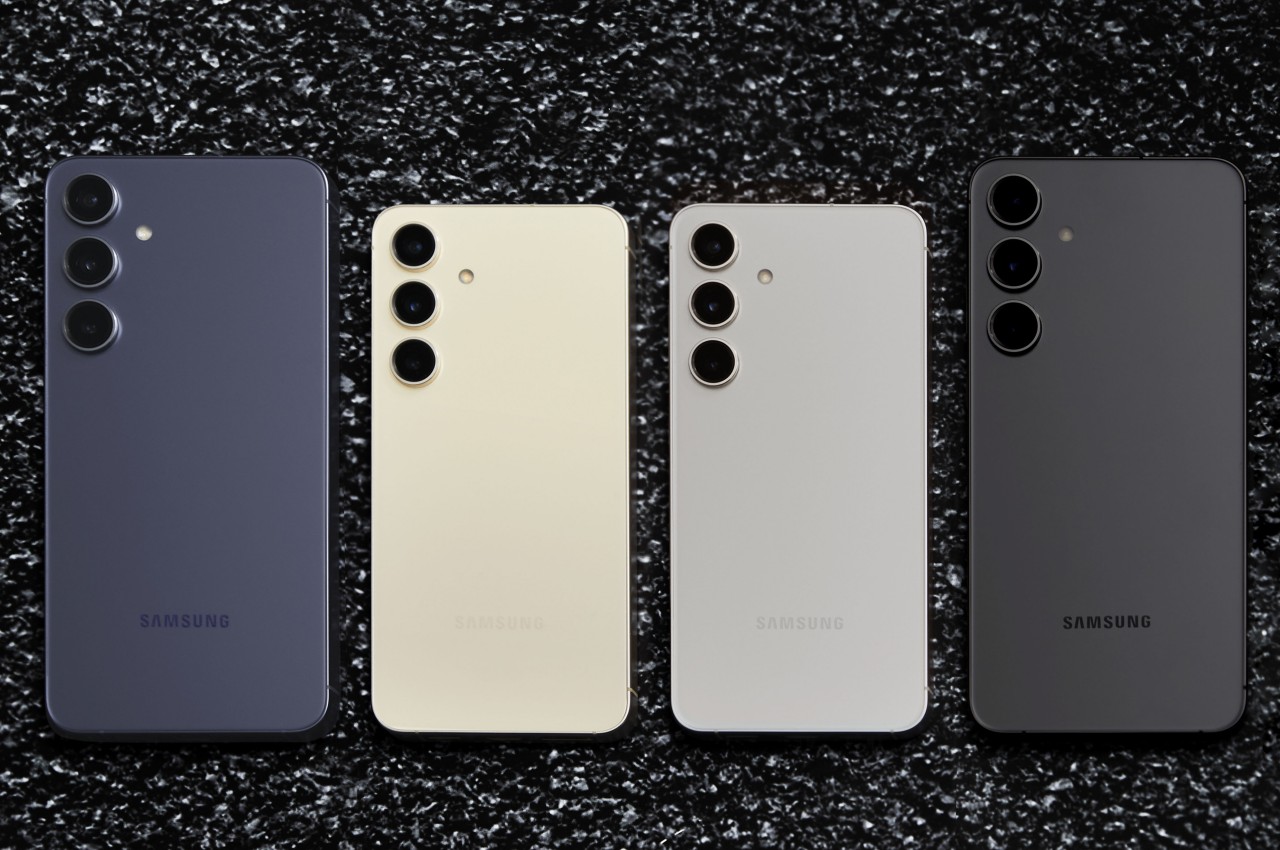
Although it didn’t do so at the recently concluded CES 2024 in Las Vegas, Samsung is still starting the year with a bang with its own Unpacked event. To no one’s surprise, the stars of the show are, of course, the new Galaxy S24 trio, though the much-rumored Galaxy Ring also made a very brief appearance as an unambiguous teaser. Samsung’s early 2024 flagships are bringing the expected upgrades in terms of hardware, but they’re also riding on the AI train in their own, unique way. But with every new Samsung phone also comes the question of whether its price is worth its weight in gold. We take a cursory look at what the Galaxy S24, S24+, and S24 Ultra have to offer to bring you that answer.
Of course, there are the customary hardware upgrades you’ll see every year, but there are a few surprise twists here and there. All three, for example, are powered by a new Snapdragon 8 Gen 3 “for Galaxy” chipset that’s marketed as a special flavor designed just for Samsung’s newest darlings. It’s presented as being optimized for hard AI work that we’ll get to later, but the exact performance differences between this and a vanilla Snapdragon 8 Gen 3 are probably going to be subtle.
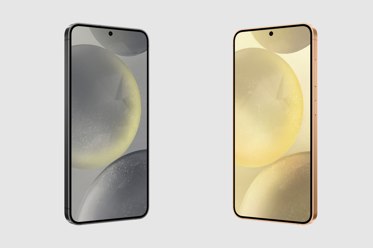
Also subtle are the slightly larger displays on this year’s generation of Galaxy phones, at least for the Galaxy S24 and Galaxy S24+, and only by 0.1 inches. The Galaxy S24 Ultra’s screen remains the same large 6.8 inches, but the design change is actually greater in some other areas, as we’ll soon see. All three get brighter panels, though, so reading under the sun shouldn’t be a problem if it was before.
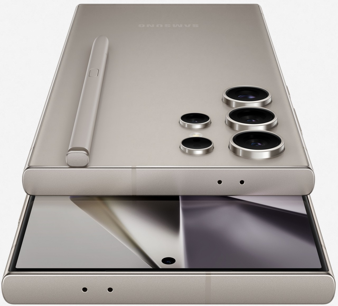
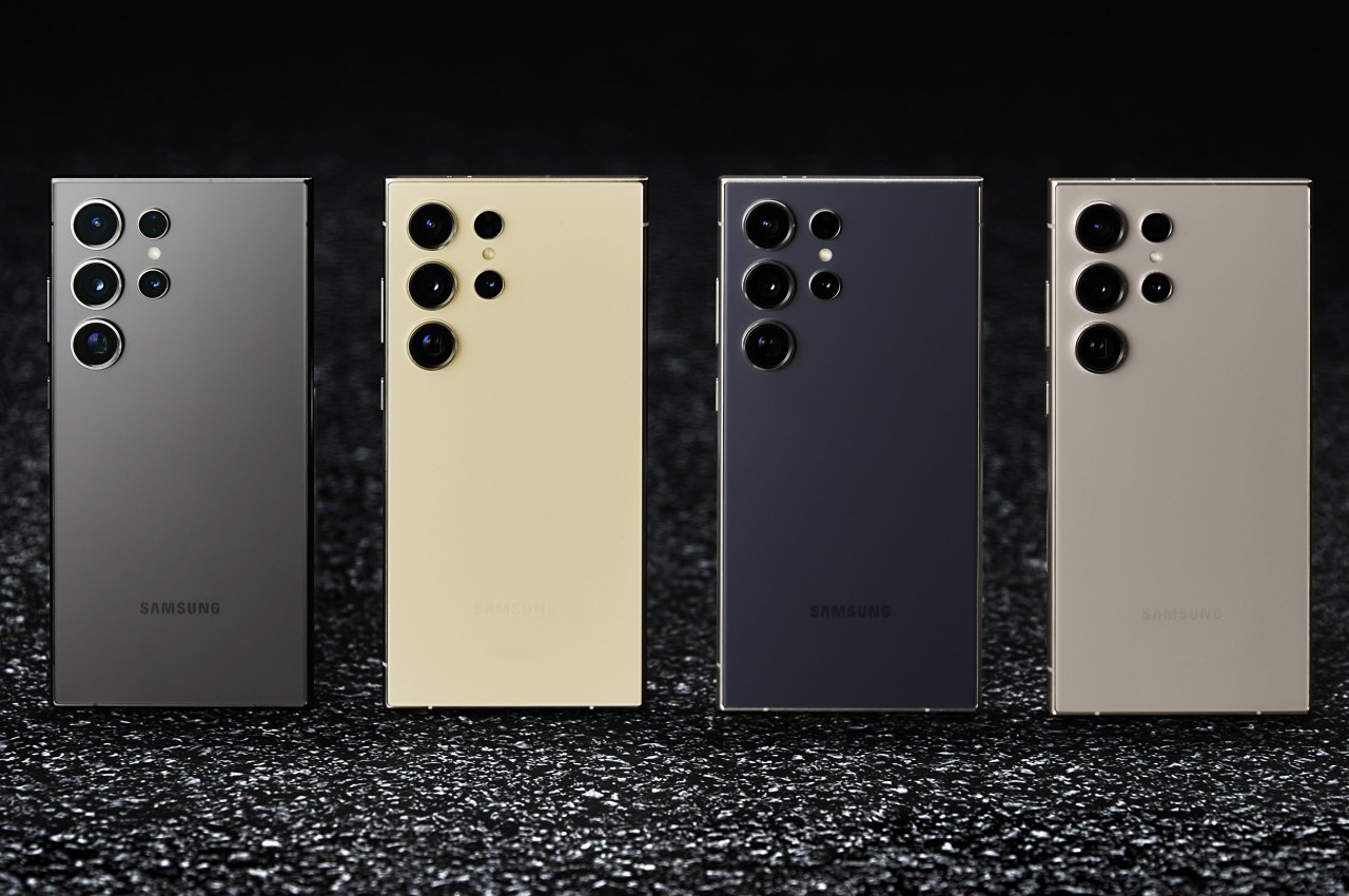
While most of the features are similar across the three models, differing mostly in screen size, things take a very different turn when it comes to the cameras. Suffice it to say, the Galaxy S24 and S24+ do not get any meaningful upgrade in terms of camera hardware, while the Galaxy S24 Ultra seems to take one step forward and one step back with at least one of four cameras. One of the two telephoto cameras gets a denser 50MP sensor but halves the optical zoom from 10x to 5x. Samsung assures, however, that the quality of a 10x “hybrid” zoom from that new sensor will just be as good, thanks to some AI tricks, of course.
Bold Direction towards Flat Design
The Galaxy S24 series looks nearly identical to its predecessor at first glance, but once you take a closer look, you will notice some subtle yet important differences. The Galaxy S24 and S24+ now adopt a completely flat design on its front, back, and sides, except for the rounded corners that help it avoid a completely boxy appearance. This refinement, though small, does put it in the same boat as many notable premium smartphones these days, particularly the latest iPhones.
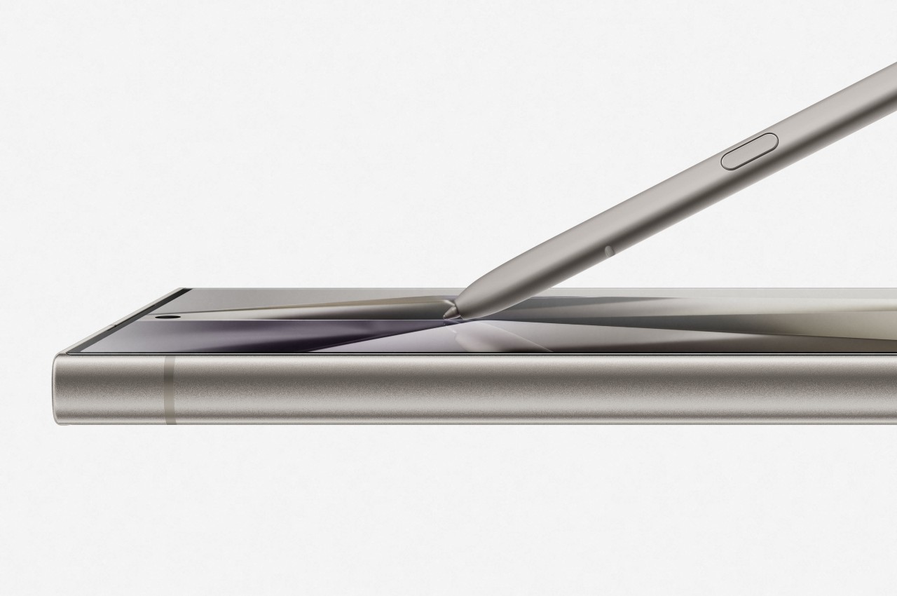
The Galaxy S24 Ultra only changes its screen design, but that actually has the biggest repercussion in this generation. Gone are the curved edges that used to mark high-end flagships, with a screen that’s completely flat across the surface. It gives it a more modern look, at least as far as current design trends go, but the more important consequence is that owners now have full access to the entire screen using the included S Pen. No more avoiding or accidentally sliding off the edges because you can now utilize every single inch and pixel on that large screen.
AI for a Price
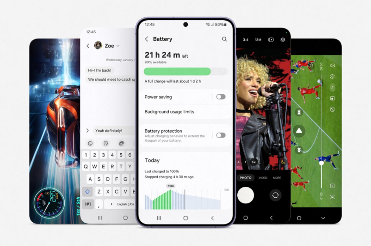
With AI still reigning as the buzzword in consumer electronics, it was really only a matter of time before Samsung joined the bandwagon in this industry as well. There are plenty of AI-powered features being advertised on the Galaxy S24 and, to Samsung’s credit, they really do show what the technology can do and how we can harness it for our benefit.
Real-time translations are one of the best examples of this artificial intelligence, and both two-way Live Translate and split-screen Interpreter help break down language barriers when communicating with people around the globe. Samsung Notes also gets an AI-assisted Notes Assist for summaries and template creation, while Voice Recorder gets Transcript Assist for transcribing audio recordings. And, of course, there are also tons of AI-powered image editing features in the Camera and Gallery apps.
There is one particular application of AI that also demonstrates the continued cooperation between Samsung and Google, former frenemies on the Android platform. As the name clearly states, Circle to Search lets you simply draw a circle around an image or even a block of text on your screen to initiate a Google Search.
As useful as these may sound, it seems that Samsung will be taking a rather controversial approach to providing AI features on its gallery phones. Samsung’s suite of Galaxy AI features will apparently be available for free on these devices only until 2025, after which it could charge a subscription fee for using them. It doesn’t exactly state how much that will be or which features will be covered by this limitation, though Google’s Circle to Search and other third-party AI features are most likely going to be exempt. Nothing’s set in stone yet, but this will surely lessen the appeal of relying on these features heavily.
Should you buy it or upgrade?
And now for the most critical part of the decision-making process: the price tags. The Galaxy S24 starts at $799.99 for 8GB of RAM and 128GB of storage, while the Galaxy S24+ will go for $999.99 for 12GB RAM and either 256GB or 512GB of storage. These are pretty much the same launch prices as the Galaxy S23 and S23+, which isn’t surprising considering very little has changed.
The Galaxy S24 Ultra, however, is a chunky $100 higher than last year’s model, now starting at $1,299.99 for 12GB of RAM and 256GB of storage. It’s a considerable price jump, especially when you consider you might be asked to pay for those trendy Galaxy AI features in two years. That new telephoto camera might be partly to blame, among other things.
If you’re looking to jump into the Samsung ecosystem for the first time, then it’s really only a choice between the smaller and more affordable Galaxy S24 and the larger, fully-featured Galaxy S24 Ultra. The Galaxy S24+ might sound like it has the best of both worlds, but it’s actually the opposite. Its only winning grace is the larger screen and battery, both of which will set you back $100 more than the Galaxy S24 but still won’t have the better cameras of the Galaxy S24 Ultra at the very least.
Considering all these, it’s going to be tough to recommend upgrading to any of the three models if you still have a perfectly fine Galaxy 23 or even a Galaxy 22. Even the Galaxy S24 Ultra, with a creator-friendlier flat display, is going to be a hard sell considering it’s also more expensive. The jury is still out on the camera improvements, though it’s probably not going to be too mind-blowing compared to the already decent quartet on the Galaxy S23 Ultra. Of course, if you have a Galaxy S21 series or older, then there’s almost no more doubt about making the jump or not.
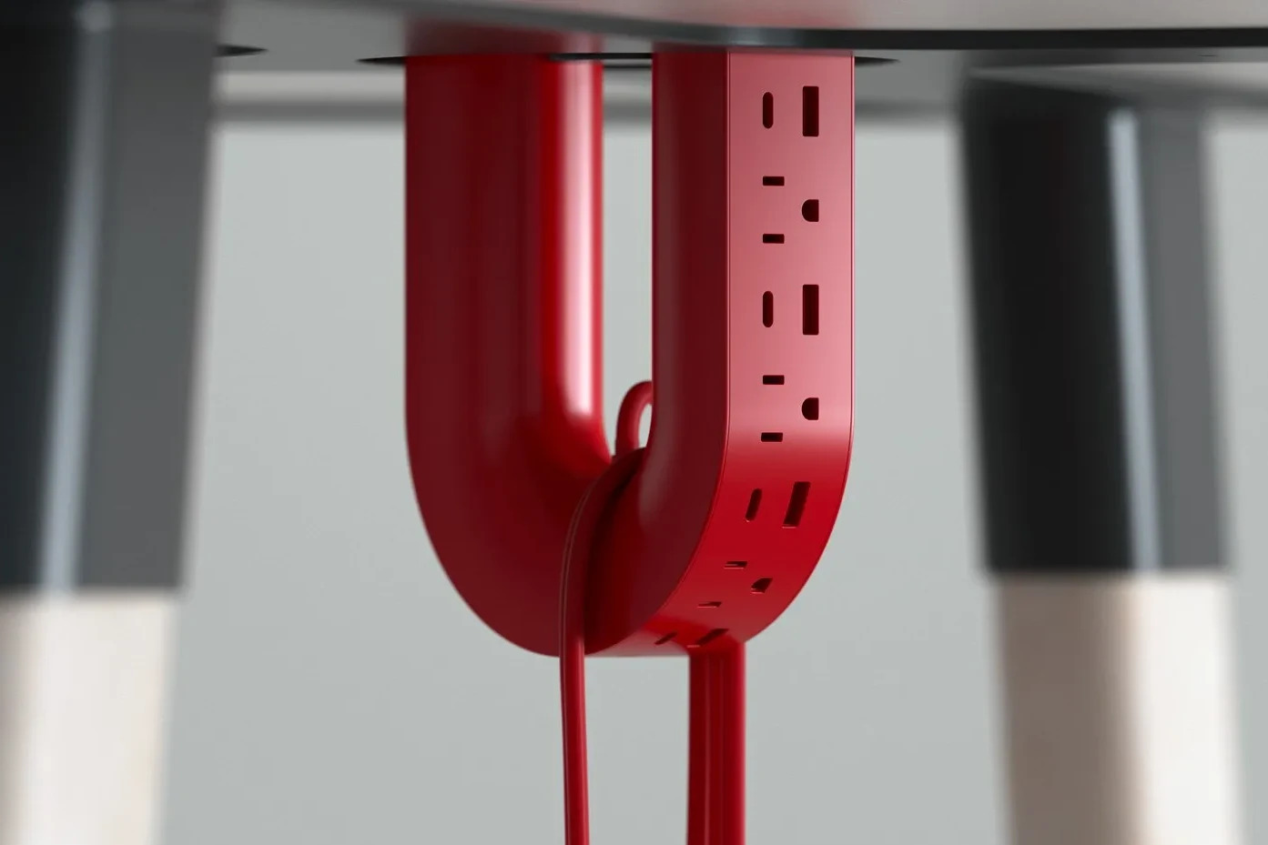
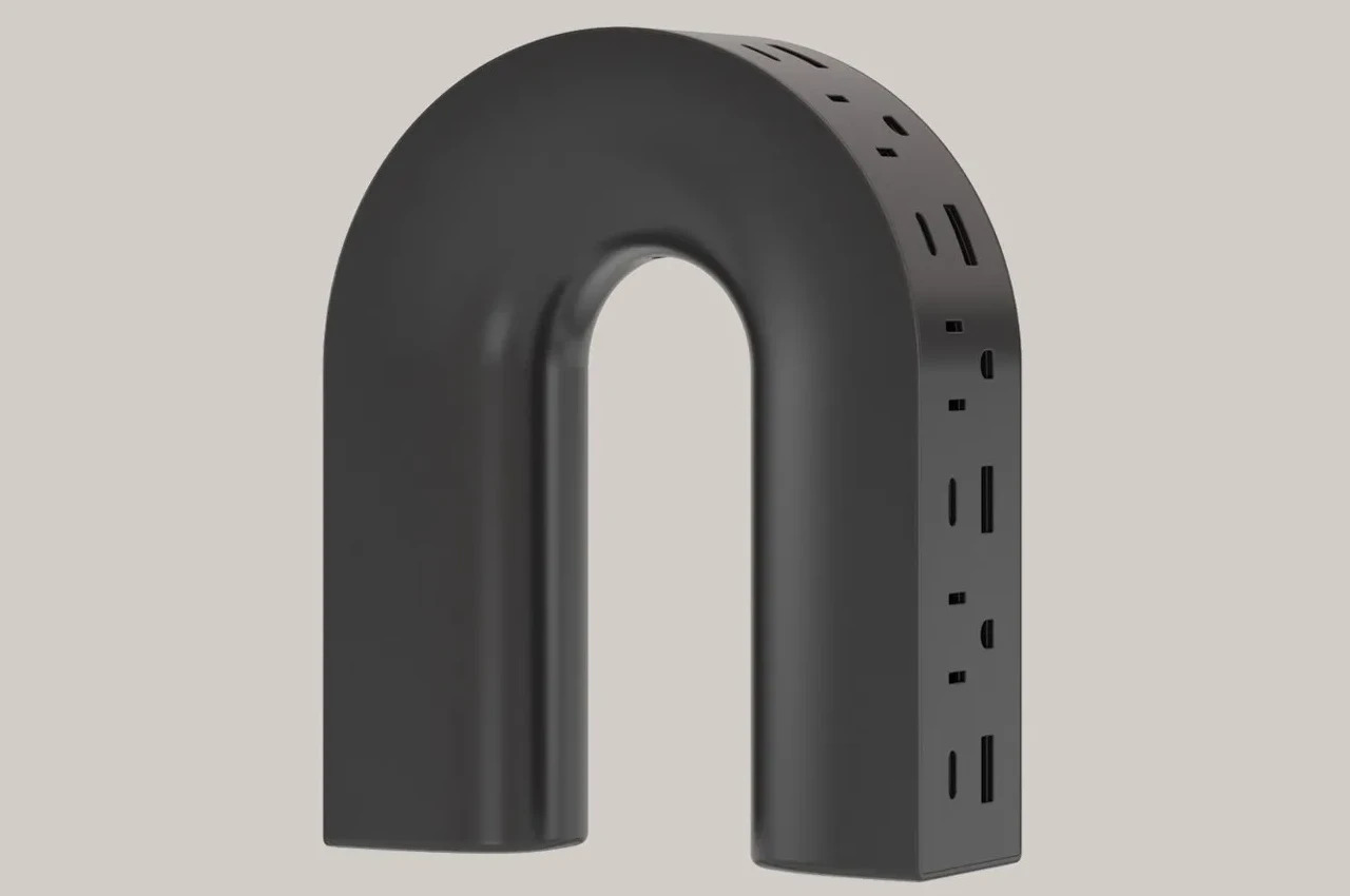
As ubiquitous as power banks might be, there will always come a time when you need the full power of a socket. Those are the times when you’ll discover to your dismay that most wall outlets are woefully ill-equipped to meet the demands of many people with multiple devices. Power strips with their multiple sockets exist for that very purpose, but they’re more like band-aid solutions, inelegant and often ineffective. Thankfully, there are quite a few bold new designs trying to rethink this mostly utilitarian tool, like this curious take on the power strip that literally bends convention into something a little more interesting and more convenient to use.
Designer: Michael Kritzer
“U” is for “unusual,” and that definitely describes the design of the ME-1 power strip concept. While most of its kind adopt a linear shape to reach more people across a table, this one is curved into a shape similar to that of a U-magnet. That association isn’t accidental either, because this power strip can actually stick to metallic surfaces as well, either hanging under tables or sticking off walls.
The change in form isn’t simply for novelty’s sake, though. For one, it saves up space compared to a typical rectangular or linear power strip, it is also visually more pleasant to look at, even with all cables coming out of it. There is also enough spacing between the alternating three-prong plugs and USB ports so there won’t be a problem with bulky plugs and chargers.
As for those cables, the U shape also gives owners a way to keep them in check by wrapping them around either of the “legs.” In fact, the strip’s own cable, which sticks out from the inner curve of the shape’s arc, can be looped around it to avoid ensnaring people’s feet or other objects around it.
While the ME-1 power strip concept does present a more captivating design compared to typical power strips, there are also some questions regarding its practicality. It saves up on horizontal space but it does stick out too much. This iteration also seems to cover only one side of the U shape, leaving the other half underutilized and wasted. Still, it’s an admittedly daring approach to re-imagining something we’ve mostly taken for granted to have a fixed design, and hopefully, the market will soon be filled with more interesting power strips, at least ones that don’t sacrifice utility for appearance’s sake.
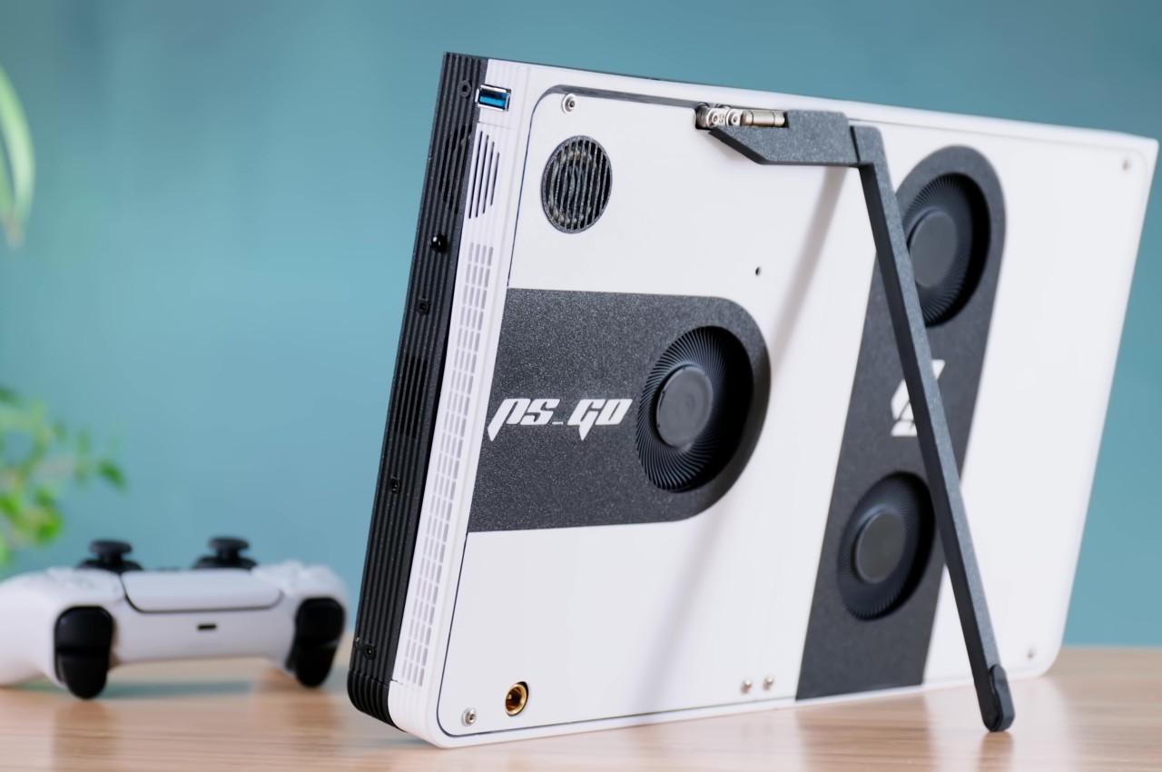
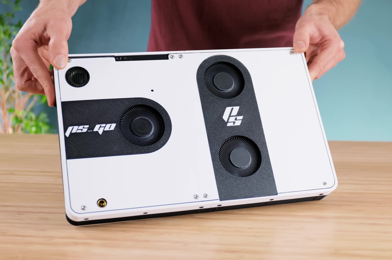
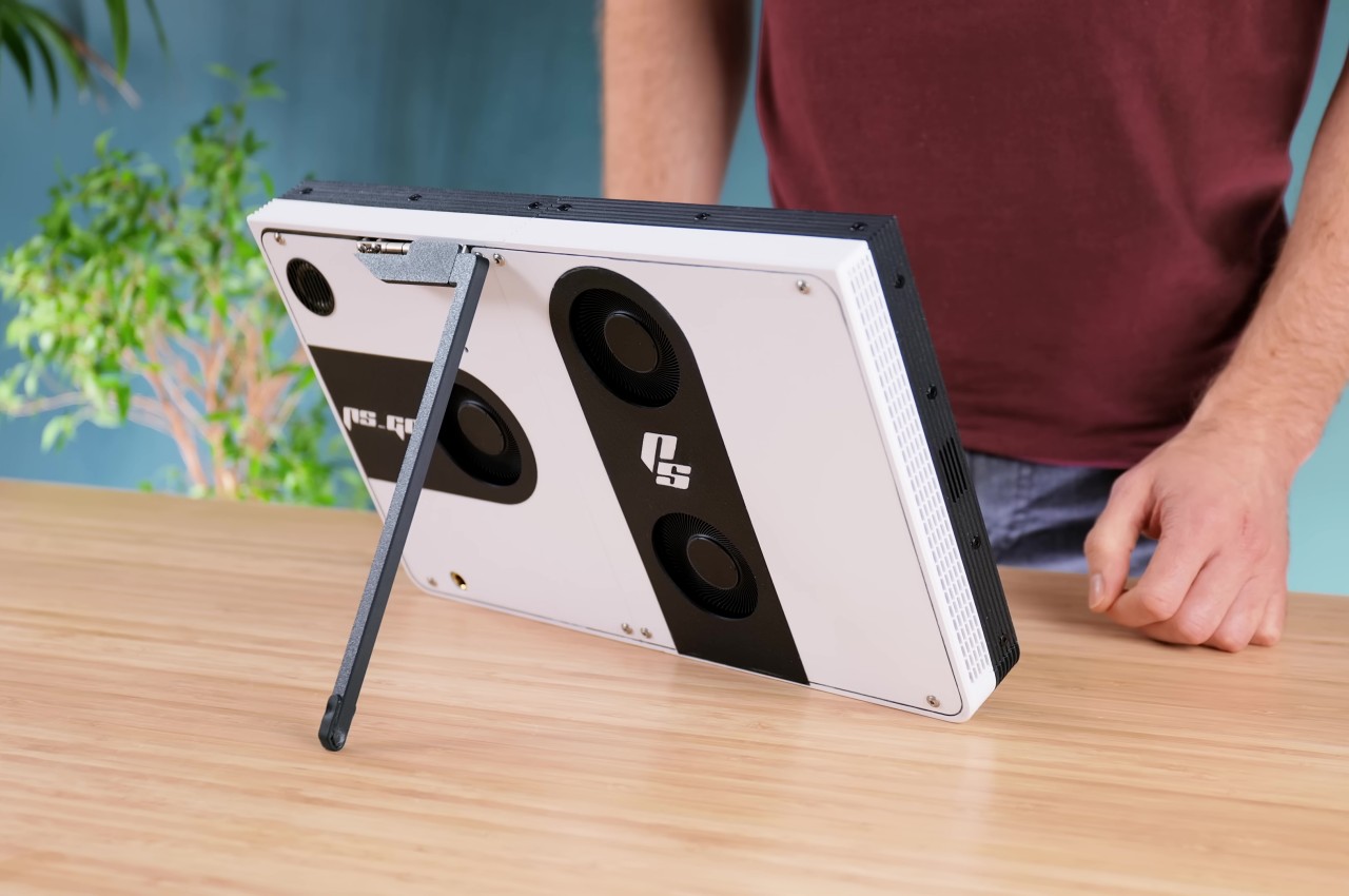
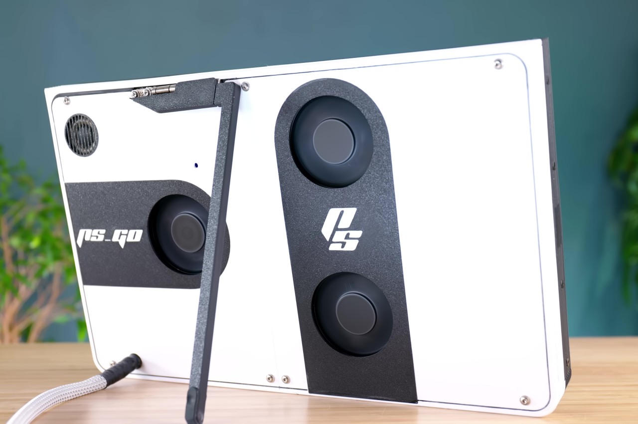
Although the handheld gaming trend has been going strong recently, especially with the likes of the Nintendo Switch and the Steam Deck leading the market, major console makers haven’t taken the plunge completely yet. Granted, Xbox isn’t too concerned because every Windows gaming handheld PC can theoretically run some of its titles, but Sony introduced a rather odd and quite unsatisfying version of this idea. The PlayStation Portal isn’t being “portable” for a reason, since it basically just streams games from the PS5 sitting somewhere in your house. Take it to more enterprising creators to bring the PlayStation 5 Portable dream to life, like this rather impressive gigantic PlayStation 5 “Tablet Edition” that is very much worth all the hard work involved.
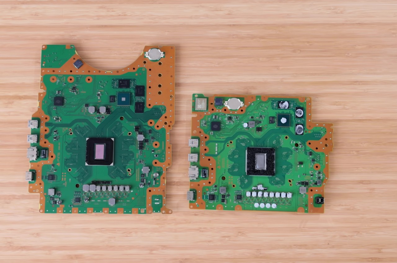
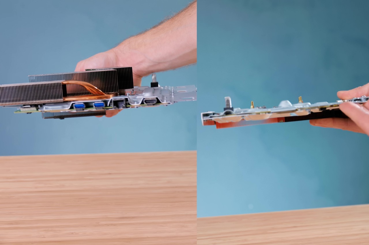
The PlayStation 5 diverges from generations of console design with a sleek, futuristic, yet also alien aesthetic that some have compared to a trophy. But it’s especially thanks to that new design, especially the improvement Sony quietly made after launching the console, that makes this creative endeavor even possible. In a nutshell, Sony trimmed the PS5 motherboard down to a smaller size that could be made to fit inside a thick and hefty 14-inch tablet. That, however, was the least of the project’s problems, considering the things inside that actually make the bulk of the PS5’s, well, bulk.
The PlayStation 5 generates around 200W of heat at full power, so the majority of the console’s internals are actually devoted to thermal management. These include bulky fans and a strange-looking heatsink that would never fit any portable design. That’s why the majority of the effort around this PS5 tablet was spent on figuring out an equally efficient thermal management system that didn’t take up too much vertical space. Thanks to some creative thinking and a lot of research, that problem was eventually solved to much satisfaction.
With the biggest engineering hurdle out of the way, putting the rest of the giant tablet was relatively easier. A 3D-printed shell had to be made that matched the black-and-white aesthetic of the PS5. The screen of choice for this project was a 14-inch OLED salvaged from a broken laptop, allowing game graphics to really shine. Finally, an external power source had to be designed since the original PS5 power supply was just too large and too weird to use as is.
After much work, the PS5 Tablet Edition, a.k.a. PS GO, was ready to be put to the test, and the end result is truly impressive, both from the thermal aspect and especially in performance and visual quality. It’s a truly portable system that can fit inside a backpack, though you’ll have to plug it somewhere to actually use it. Then again, the idea was to create a more social console that you can take to your friend’s or relative’s house so that you can enjoy the experience together, rather than sitting in a corner, alone in the dark, mashing the buttons on your handheld PC.
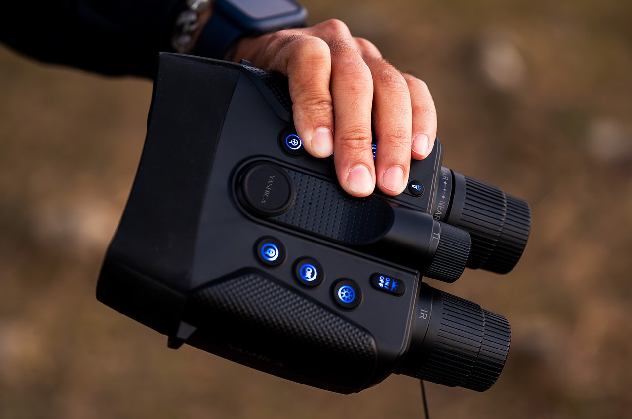
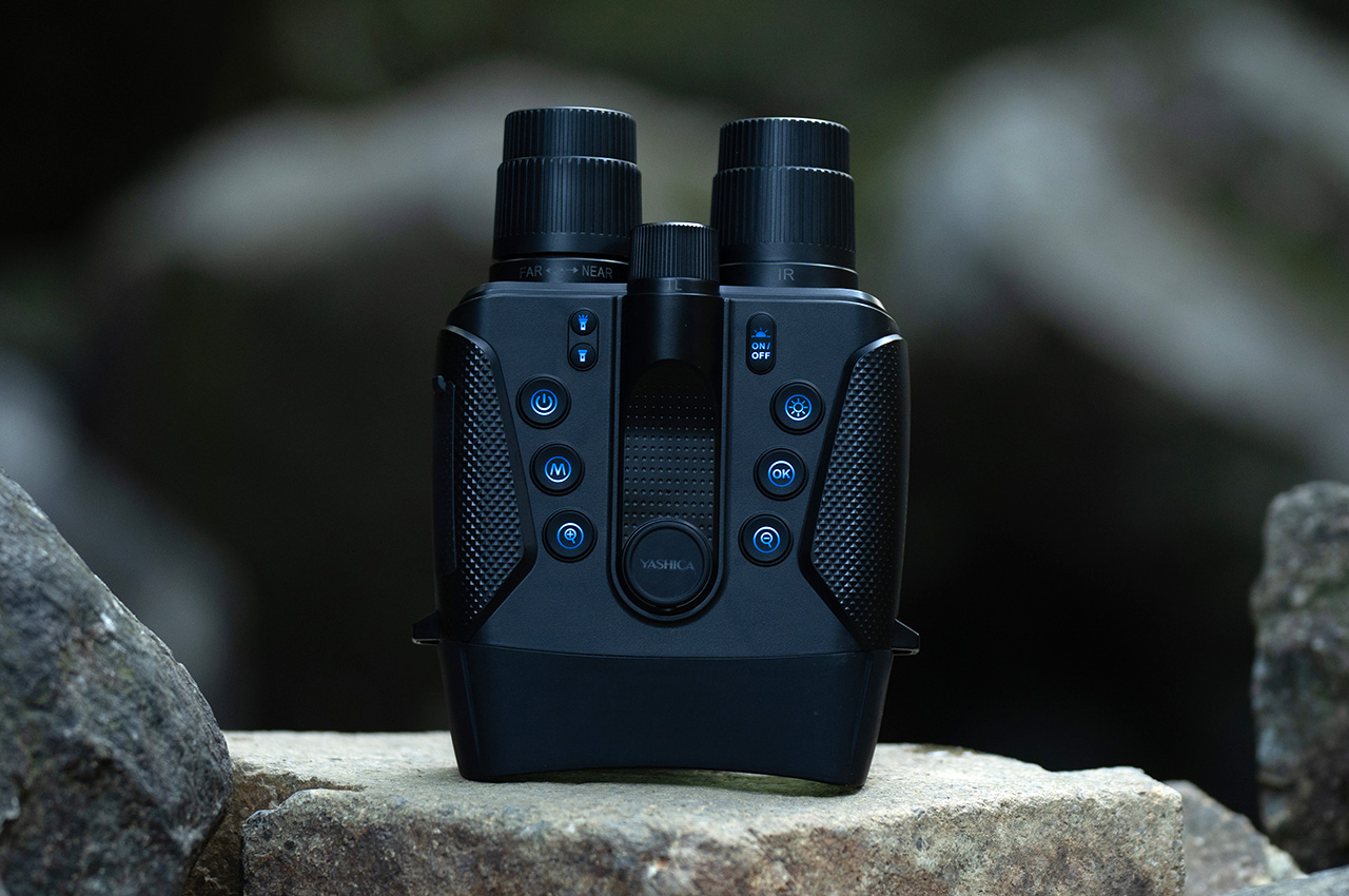
Unlike the daytime, people are split on what they think of the night. Some find solace in the rest that it offers, while others are wary of the dangers that lurk in the corners. The latter is mostly due to the uncertainty that the unknown brings to our minds, which is often associated with the dark of night. But nighttime as well as dark places are just as filled with treasures to discover, adventures to be experienced, and discoveries to be made, as long as you’re not stumbling in the dark, literally. Being able to see at night is often painted as a superpower, but you can actually gain that ability quite easily with today’s technologies. Harnessing decades of experience in optics and photography, YASHICA is opening the doors to new and exciting experiences with a pair of binoculars that brings the night to life in full color and stunning 4K quality.
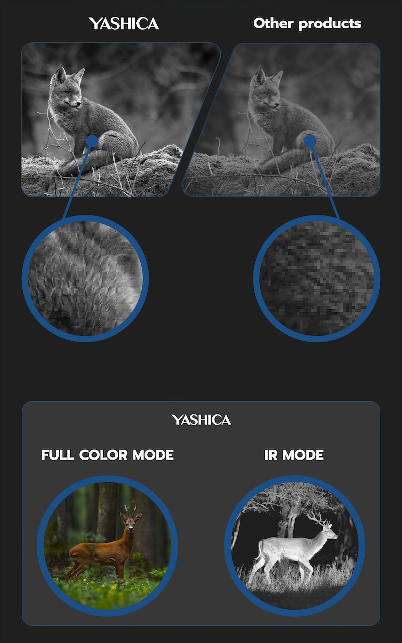
There have been cameras that can see in the dark of night for years now, but most of them fail to impress or captivate budding explorers. The majority can only see in green or monochrome hues, not to mention lack enough detail to really make you appreciate the wonderful world that the night holds. The YASHICA Vision easily sets itself apart from the crowd by breaking down these barriers to deliver a photography experience that’s truly out of this world, letting you see at night as if it were day.
YASHICA Vision reveals a radiant spectrum of colors, even under the most challenging lighting conditions.
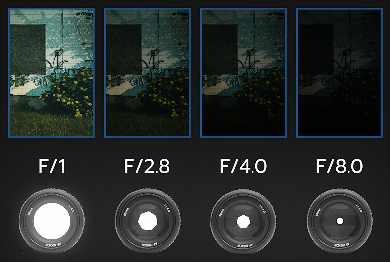
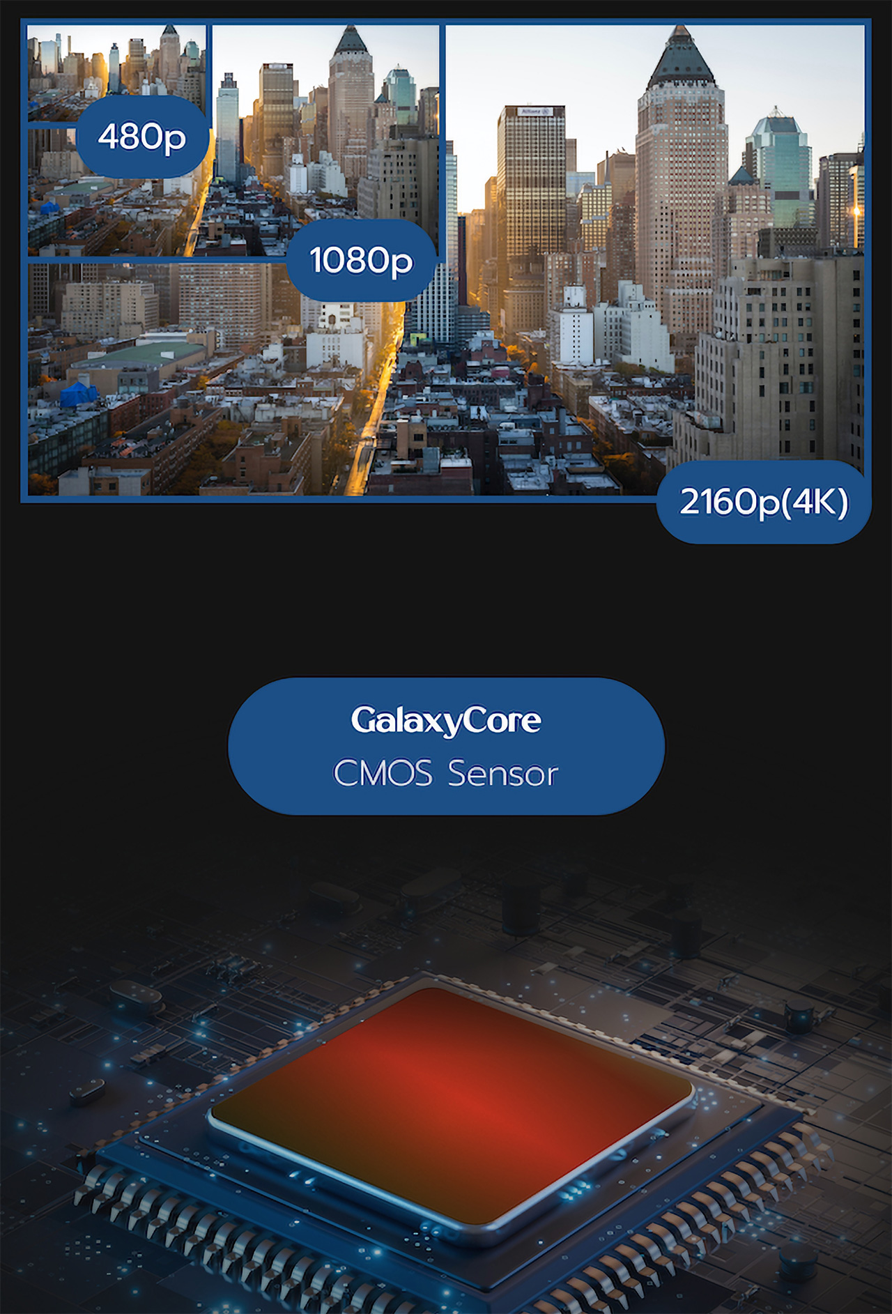
With an impressive 0.0037lux sensitivity and F/1 wide lens aperture, the YASHICA Vision binoculars can take in as much light as they need to capture detailed, sharp, and high-resolution visuals. And thanks to advanced optics and a powerful CMOS sensor, these images won’t be stuck with a dozen shades of green or gray, painting the night in full color and creating a picture that you wouldn’t otherwise see with your naked eye. Best of all, you can record that picture or video in stunning 4K quality, leaving no detail unturned.
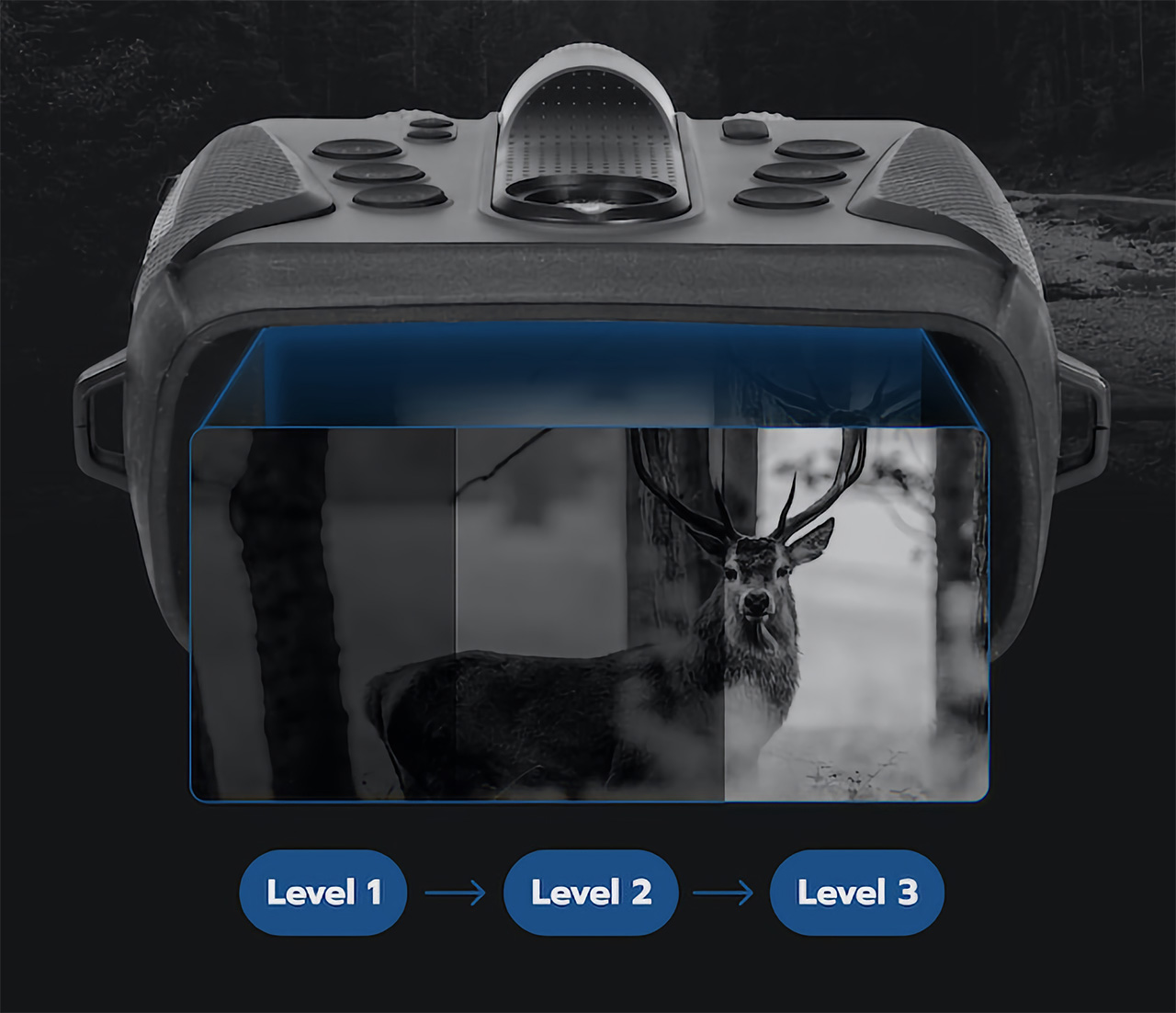
Clarity in complete darkness.
The YASHICA Vision further redefines night-time exploration with its remarkable aperture size of F/1. This feature is crucial as it allows for a higher light intake, especially under low-light conditions.
These qualities are more than enough for urban exploration, delving into creepy basements, or watching the coast in the dark of night, but the YASHICA Vision still has more to offer, especially for those who want to get close to nature in the dark. With the ability to see objects 600 meters away even in pitch darkness and a 3x optical zoom and 5x optical zoom, wildlife photography at night becomes not only possible but also safe and enjoyable. What’s even more impressive is that YASHICA Vision’s ability to see in full color is also made possible with the use of AI analyzing and understanding a vast amount of data to automatically improve the image by reducing noise, enhancing contrast, and compensating for light. This results in images with natural color reproduction and a higher dynamic range, even under low light and at low lux levels. There is almost literally nothing you can’t see in the dark, and the night becomes your playground rather than a source of fear and anxiety.
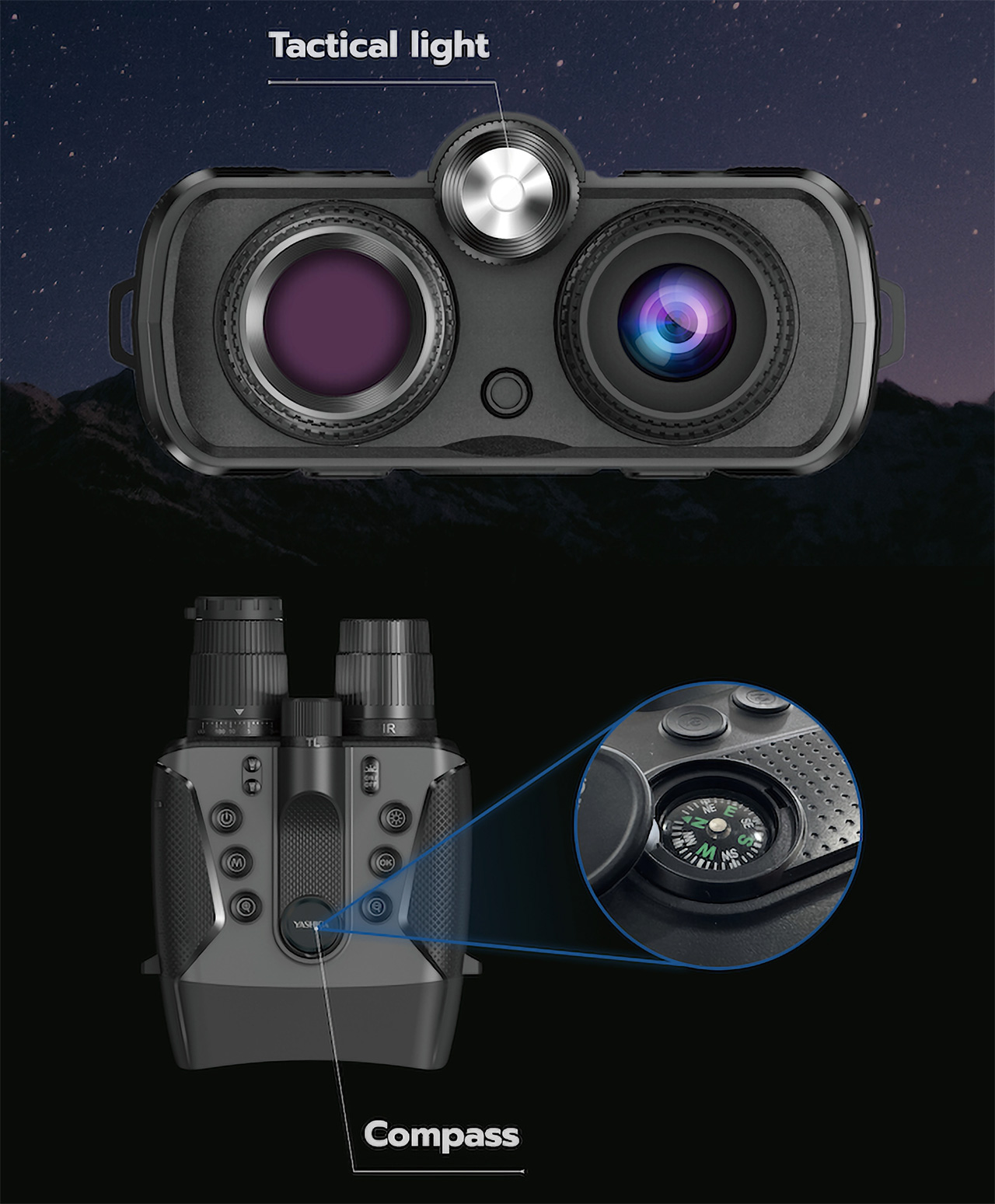
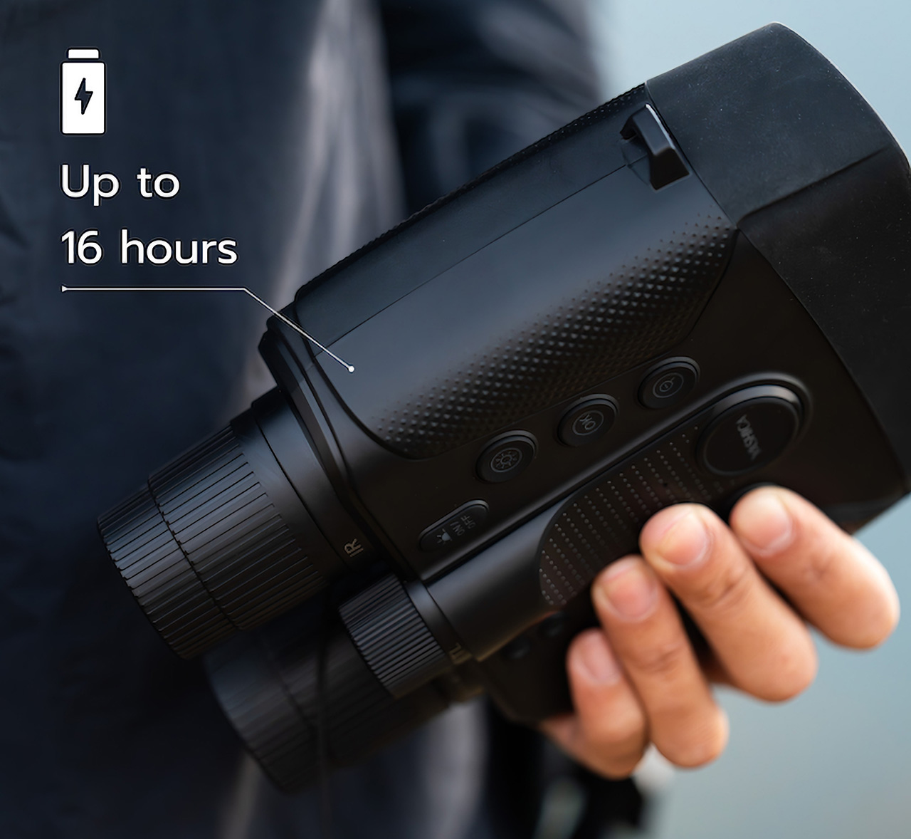
It might look like a pair of bulky binoculars, but the YASHICA Vision is a truly innovative photography device designed to accompany you on your nocturnal adventures. A 16-hour battery life and support for up to 512GB microSD cards promise very few downtimes as you go about your way in the dark. An intuitive and convenient binocular design allows users to have a comfortable and enjoyable time focusing on seeing instead of fumbling around the controls. Finally, a robust construction, an IP65 dust and water resistance rating, a built-in compass, and SOS guiding lights all mark the device as a reliable companion for your most daring exploits at night.
Whether you’re trying to discover what nature has to offer once the sun has set, trying to debunk urban legends and mysteries, or simply trying to enjoy the world after dark, the YASHICA Vision offers a ground-breaking tool that breaks wide open the doors to a whole new world filled with life, color, and wonders even in the dark of night.
Magnetic attachments allow more freedom where to use the transmitters
Eye-catching touch screens allow for showing brand logos in addition to recording information
Supports both real-time streaming and on-board recording
CONS:
Extra strong magnets can easily pinch the skin if not careful
RATINGS:
AESTHETICS
ERGONOMICS
PERFORMANCE
SUSTAINABILITY / REPAIRABILITY
VALUE FOR MONEY
EDITOR'S QUOTE:
Magnetic attachments and customizable touch screens add incredible value to an already excellent wireless microphone.
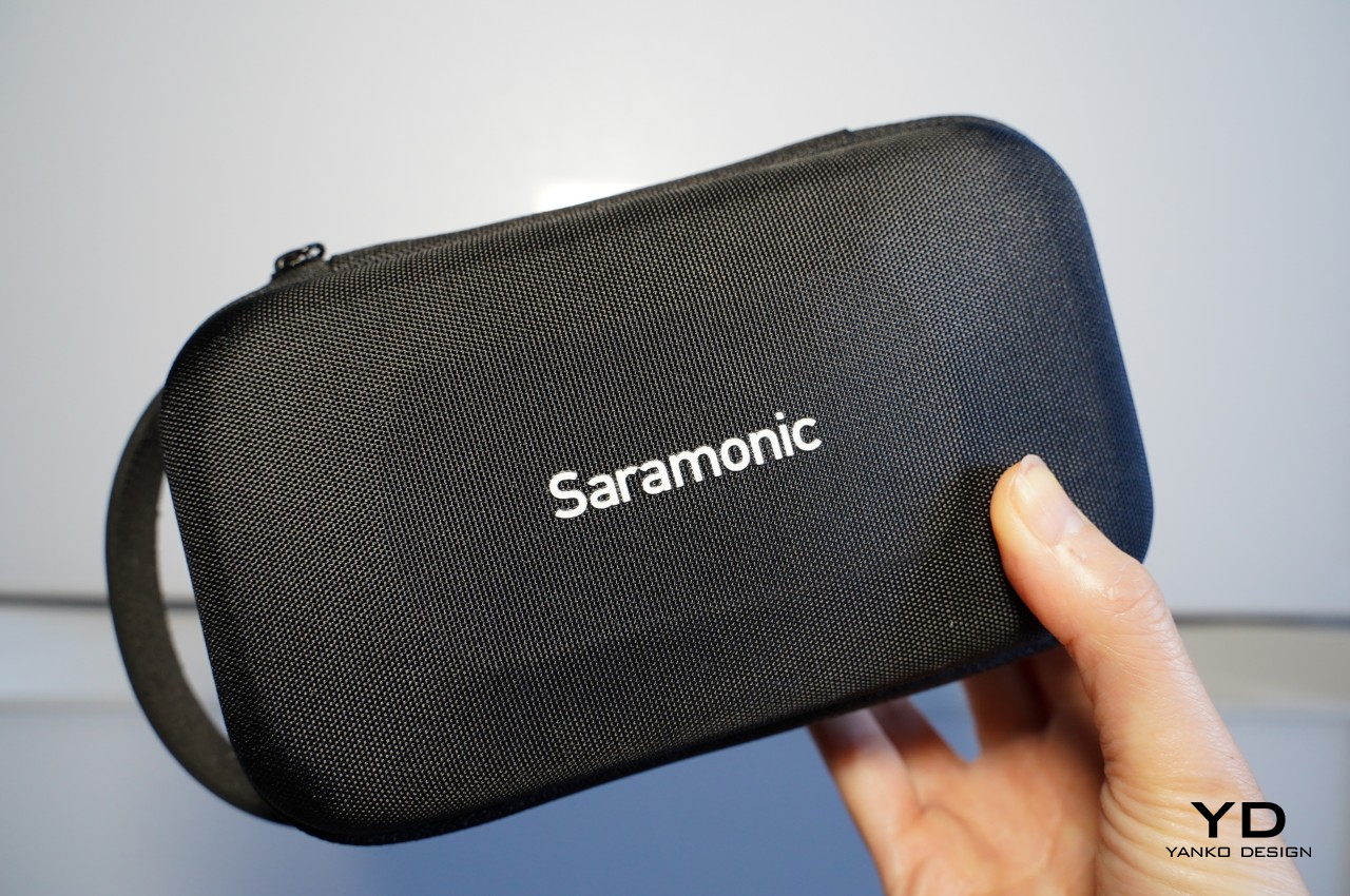
With plenty of focus being lavished on cameras, optics, and image sensors, you’d almost think that all we have on our heads are eyes. While the visual quality of content is definitely important, it’s also easy to demonstrate how poor or even no audio can completely ruin an experience. Audio recording equipment, particularly microphones, sometimes comes as an afterthought, a decision that filmmakers and creators often immediately regret. Finding the right mic can be a daunting experience, especially when you’re forced to choose between small lavaliers with discrete designs but barely passable recording and large mics with studio quality but distracting sizes. The Saramonic BlinkMe B2 promises to save you from that dilemma with the promise of a small yet distinctive design and unbeatable audio recording, so we naturally had to put it through the test to see how it measures up to real-world use.
Designer: Saramonic
Aesthetics
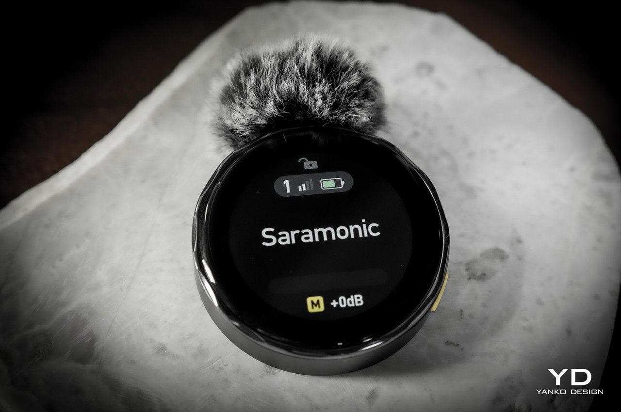
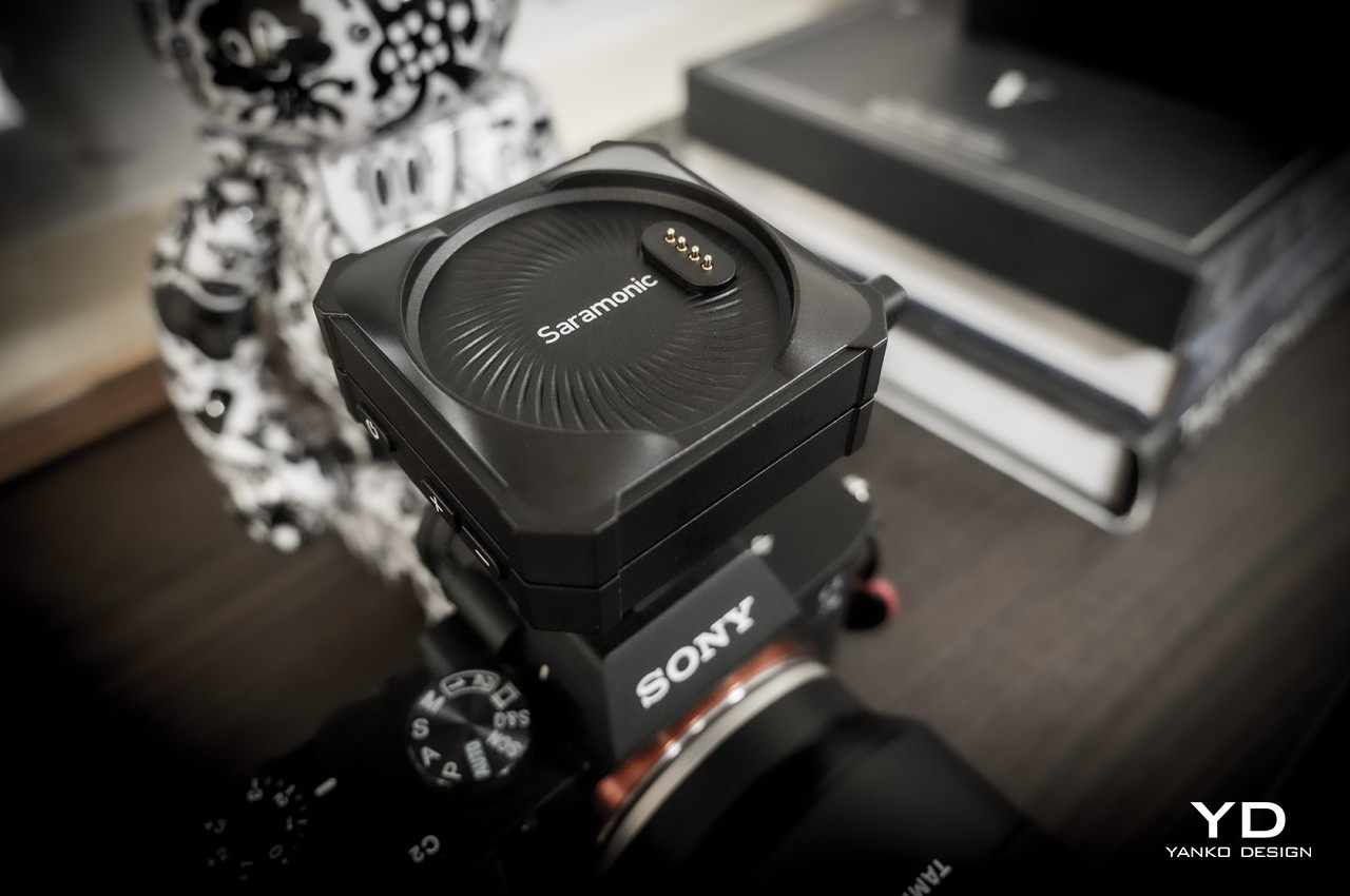
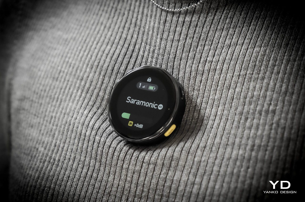
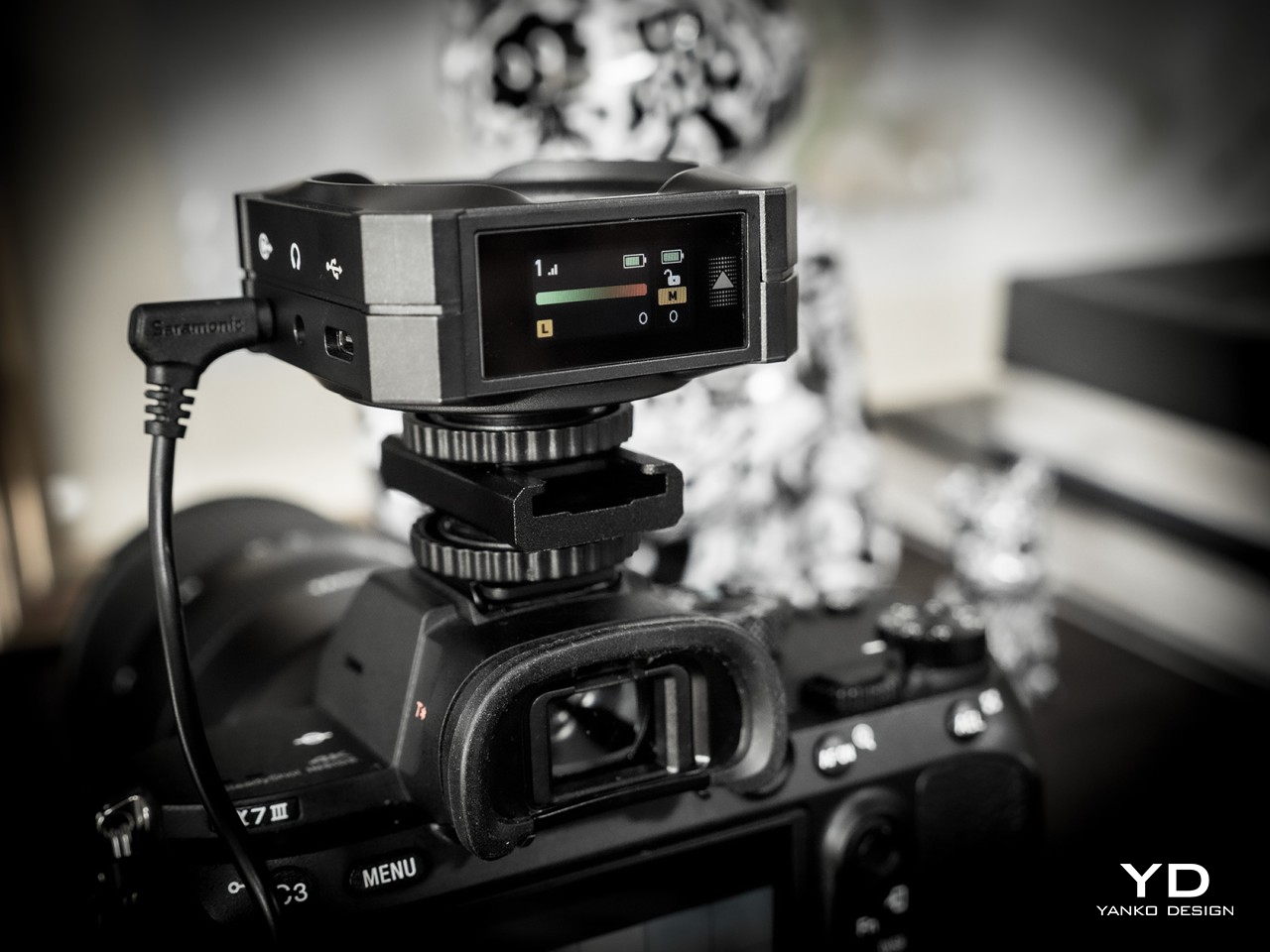
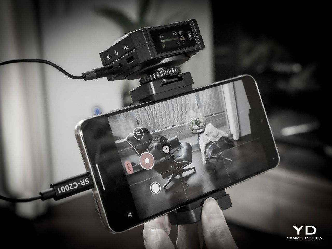
If you were expecting a small clip or some small rectangular box, you’ll be pleasantly surprised that it isn’t the case at all. The entire Saramonic BlinkMe B2 system comes in a rather unique package that is closer to some hi-tech gadget than what you’d normally see in wireless microphones. When joined together, the three parts look like a short square box with two smaller discs at the top and the bottom. You’ll probably be too focused on production to actually appreciate how distinctive the BlinkMe B2 looks, but it definitely puts the product a level higher than its peers.
The wireless mic’s personality, however, really shines the moment you use it, particularly when you separate these three pieces. You’ll immediately discover that they aren’t held down by flimsy locking mechanisms that get in the way but only by the sheer power of very strong magnets. These make it easy to remove the transmitters from the receiver base while still holding them securely when not in use or when charging. Once you pull off the transmitters, however, you immediately see the most visible feature that makes the BlinkMe B2 extra special.
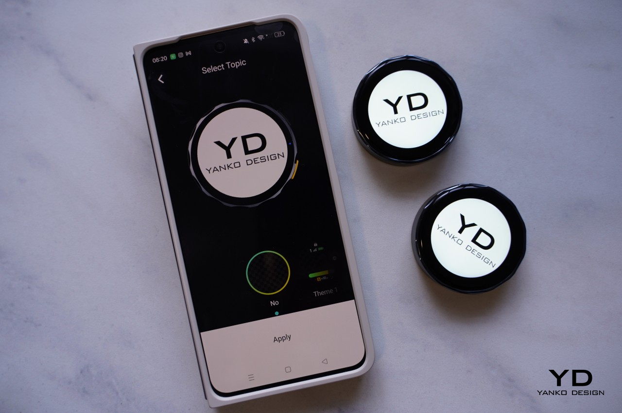
Both transmitters have circular touch screens covering their faces, making them look like smartwatches without straps. In fact, you operate them exactly like smartwatches, swiping and tapping through controls and options. There are, of course, also physical buttons on the side that, unsurprisingly, might also remind you of smartwatch buttons. This is more than just an embellishment, though. While it’s definitely dandy to see the mic’s gain levels from a distance as you record an interview, its real value shines when you realize that you can actually customize what’s shown on the screen.
In essence, you can upload your studio’s logo or any other graphic (that fits a circle area) from the Saramonic mobile app to the transmitters and have it always on display while shooting. Considering how conspicuous this disc-shaped mic will be on your chest, it’s a great opportunity to do some subtle advertising. Conversely, that also means that the BlinkMe B2 transmitter will always be visible, though not everyone will actually realize that it’s a mic and presume it’s just some sort of fancy LCD badge.
Ergonomics
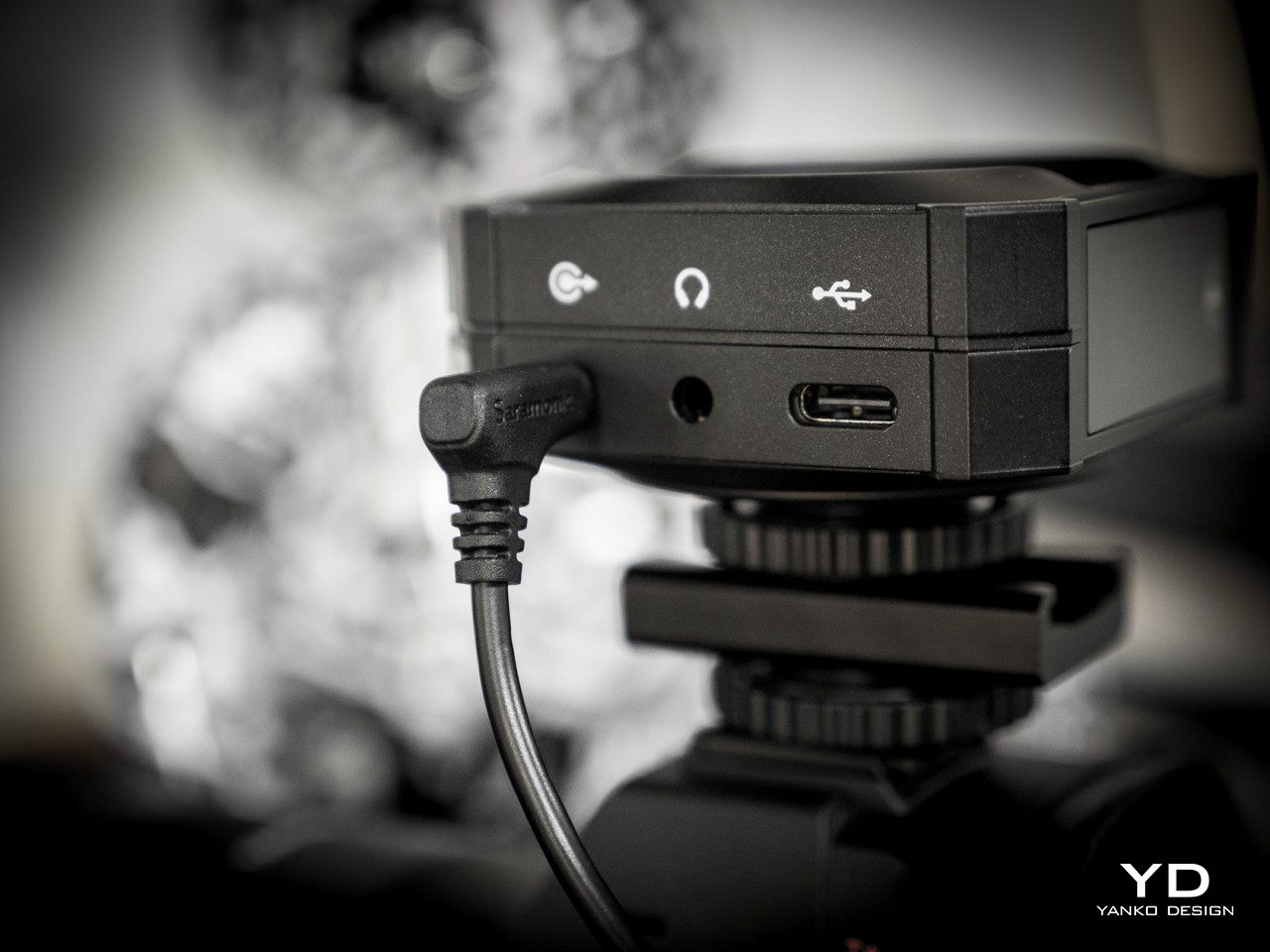
Saramonic’s use of magnets and touch screens isn’t just for show. They actually make the BlinkMe B2 one of the easiest wireless microphones to use. Need to start recording almost immediately? Simply pop off the transmitters. Need to charge one of the little pucks? Just have them snap back onto the top of the receiver. And since the transmitters can record audio on their own, you don’t even have to worry if you accidentally left the cables that would connect the receiver to a camera. It’s as simple as that.
Operating the three pieces themselves is a piece of cake thanks to the touch screens, though there are also physical buttons for the most important actions you need to have quick access to. What actions would those be? Actually, you get to decide that since you can customize what each button does through the Saramonic mobile app. The distinctive yellow button on the transmitters, however, has a single function, and that’s to toggle Noise Reduction on or off. That color might seem garish, but you won’t miss it even in a dark environment.
The magnets on the transmitters aren’t just a one-trick pony. Thanks to this design, you can easily stick the transmitters anywhere on a shirt, not just the edges. The package comes with four magnetic attachments that let you sandwich clothing between these two discs, though there’s also a magnetic clip in case you do need to go old school. You can even stick it to doors, posts, and any other metallic surface if you want to keep it out of the way. One word of caution, though. The magnets are so strong that you risk pinching the skin of your finger or, worse, certain body parts if you’re not careful how you connect two pieces together.
For all its ease of use, this magnet-based design does have one drawback. To charge the transmitters, you have to attach them to the receiver, which functions as the charging station. You can’t charge them independently using some accessory, so you’ll probably want to keep tabs on their battery levels. Given how the receiver is usually mounted on top of a camera, it also means you can charge only one transmitter at a time. Then again, if you do need to charge both, you’ve probably stopped recording anyway.
Performance
If we stopped at the BlinkMe B2’s unique aesthetic, people would simply pass it off as a pretty face. Fortunately, that is definitely not the case, because Saramonic’s smartest wireless definitely punches above its weight. You get clear and usable audio recordings even when there’s some busy activity around you, as we ourselves experienced on the hectic CES 2024 floor.
Even more impressive is that neither the signal nor the quality actually drops from a distance, even with some obstacle between the transmitter and the receiver, making it an excellent tool for sports or action footage. With the transmitter’s built-in recording functionality and 8GB of storage each, you don’t even have to worry when the stream does get cut off. As a bonus, the transmitter also has a “Safety Track” that’s recording at -6dB that’s meant to buffer against clipping and distortion, ensuring you will always have usable audio no matter the condition.
With wireless mics, battery life becomes just as important as audio quality, and fortunately, the BlinkMe B2 doesn’t skimp in that area either. Of course, Saramonic’s advertised 24 hours for the receiver and 8 hours for the transmitter are a tad too generous, but even hitting 22 hours and 6 hours, respectively is already quite an accomplishment. They charge fast, too, so you can be up and running for an additional hour with just a few minutes charge.
As mentioned earlier, controlling all the pieces of the BlinkMe B2 system is as easy as pie thanks to the sensitive touch screen. The transmitters, in particular, operate almost like smartwatches, with a swipe from the top revealing quick toggles and a swipe from the bottom going back to the main screen. The only slight complication is the smaller screen on the receiver, which is better used for displaying information rather than controlling the device. All in all, the BlinkMe B2 offers an unbeatable experience, not just in the quality of audio it produces but especially in the unique features it offers.
Sustainability
Saramonic introduced many features in the BlinkMe B2 that you won’t find in other wireless microphone systems, and thankfully, they’re all useful and essential to delivering an excellent audio recording experience. Unfortunately, that also makes the design of the device a little bit more complicated, which also means that repairs are going to require more specialized skills and components.
Although a wireless mic such as this is expected to be able to weather different environments, the presence of screens actually puts their durability at more risk. And the use of plastics and less eco-friendly materials are present all around, though not surprising considering it’s still the status quo in consumer electronics. Hopefully, the day will come when Saramonic puts sustainability as a major bullet point on its marketing material, allowing creators to make great content while also feeling good about their positive impact on the planet’s future.
Value
The Saramonic BlinkMe B2 is hardly a cheap kit, setting you back at about $249. There are definitely more accessible streaming mics in the market right now, with some of the popular ones just under $200. That said, those also have plenty of flaws of their own, like taking the form of a traditional mic that you need to place on a table. If you need something that can go the distance, literally, there are few that can outdo the BlinkMe B2.
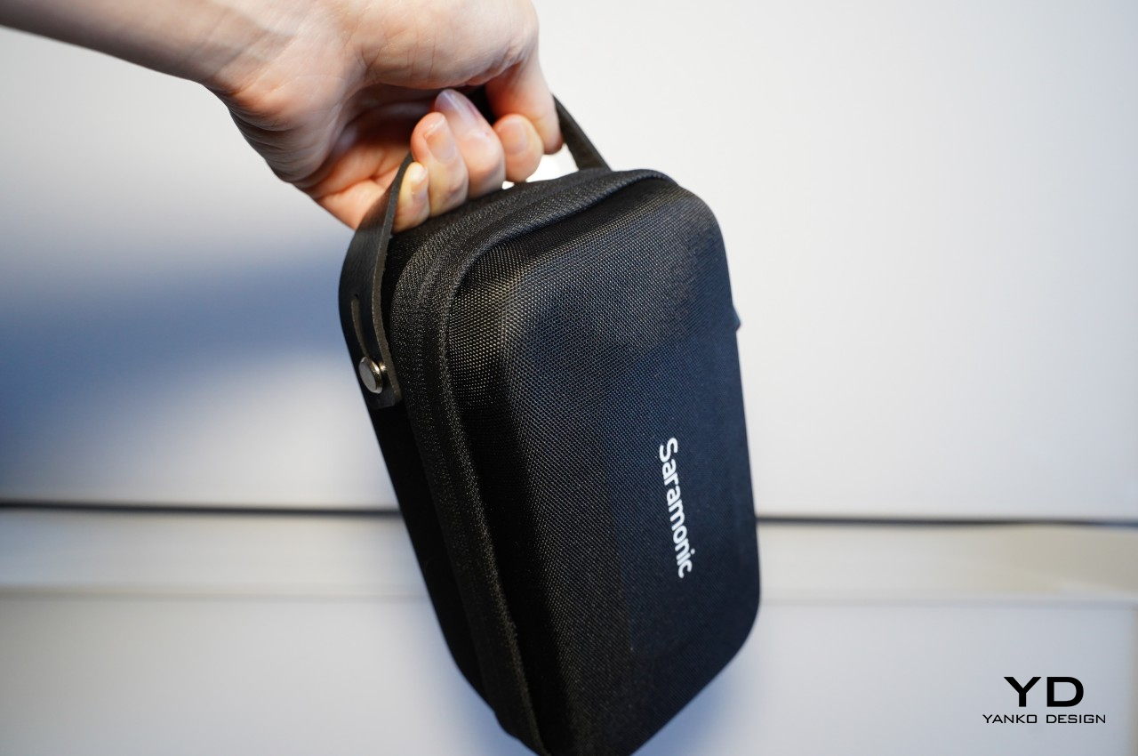
The audio clarity and volume are just impressive, especially considering how crazy it always is at CES in Las Vegas. The fact that it can deliver more than just decent recordings at great distances is a huge boon for those who want to record more dramatic footage from a safe distance. Magnets make using and placing the transmitter easier and more hassle-free, and the ability to turn these recording devices into advertisements is definitely a great help for creators and studios. Even better, that price includes an entire kit, from four magnetic attachments to two magnetic clips to even a handy carrying case that lets you bring your precious equipment with security and convenience.
Verdict
It’s almost too easy to take the importance of quality audio for granted until that dreaded moment when you realize you barely recorded anything intelligible. Reliable audio that you can use is even more critical for those moments that will never come to pass again, including interviews you might not be able to retake. It’s in those moments that you’ll wish you had an audio recorder you could also rely on, just like your camera or smartphone.
The Saramonic BlinkMe B2 smart wireless microphone system is definitely ready to step up to the challenge. It breaks away from mic design conventions to deliver a product that has just enough tech to deliver convenience and a unique aesthetic without overburdening the user with inessential details and options. It’s powerful, a little bit quirky, and, most importantly, reliable, delivering quality audio recordings even in the most trying conditions. Yes, it’s also a bit pricey, but it’s an investment that will pay for itself throughout the coming years of creating high-quality audiovisual content.
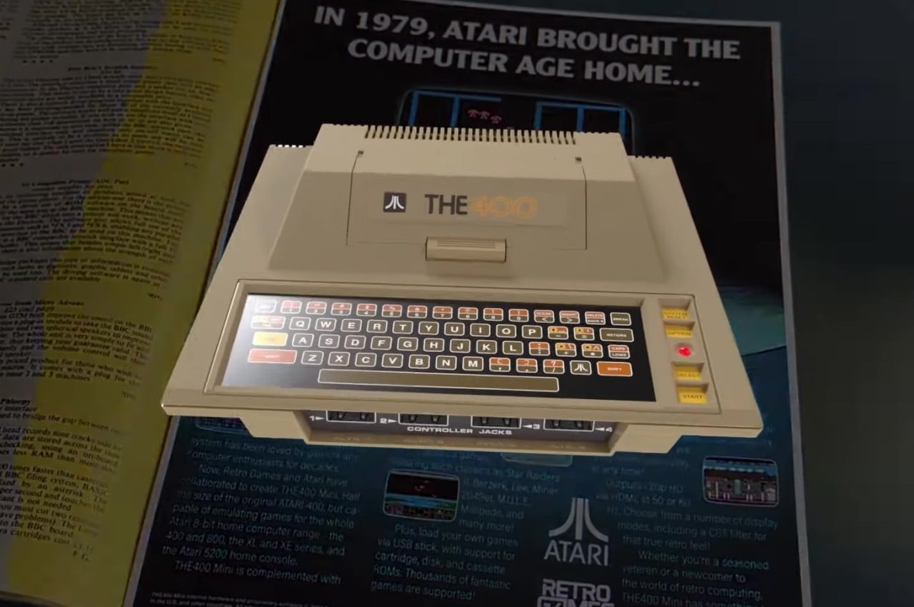
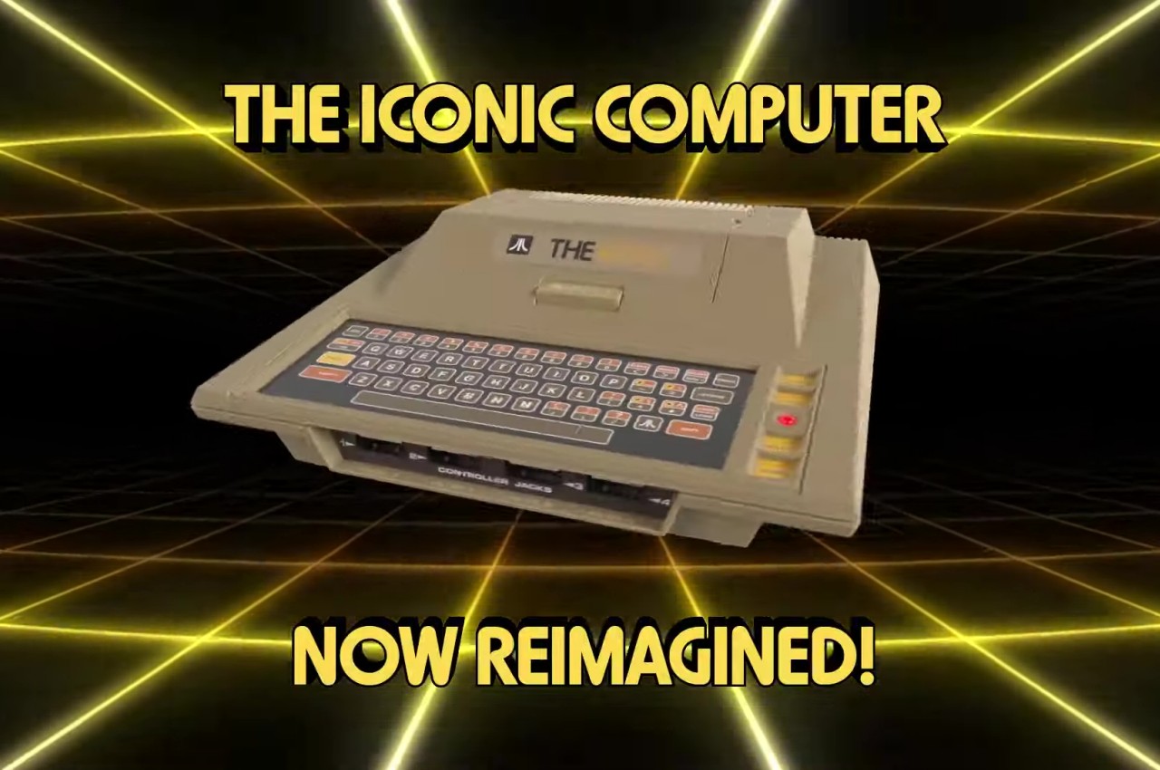
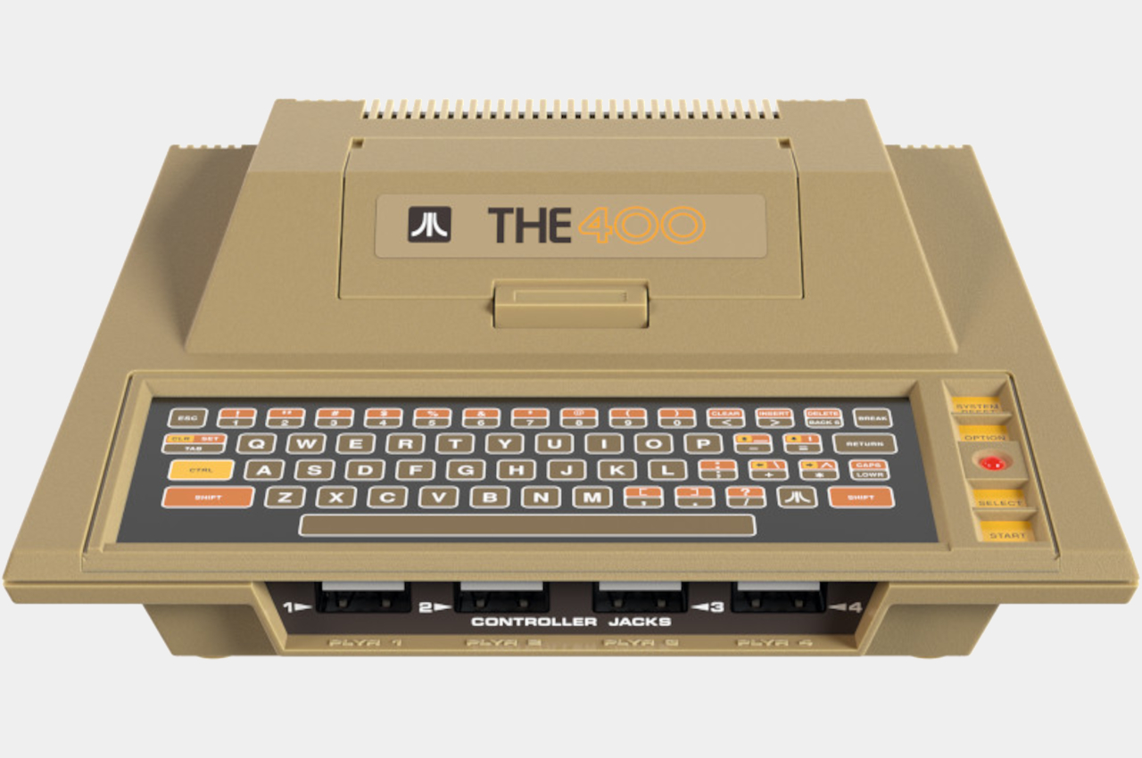
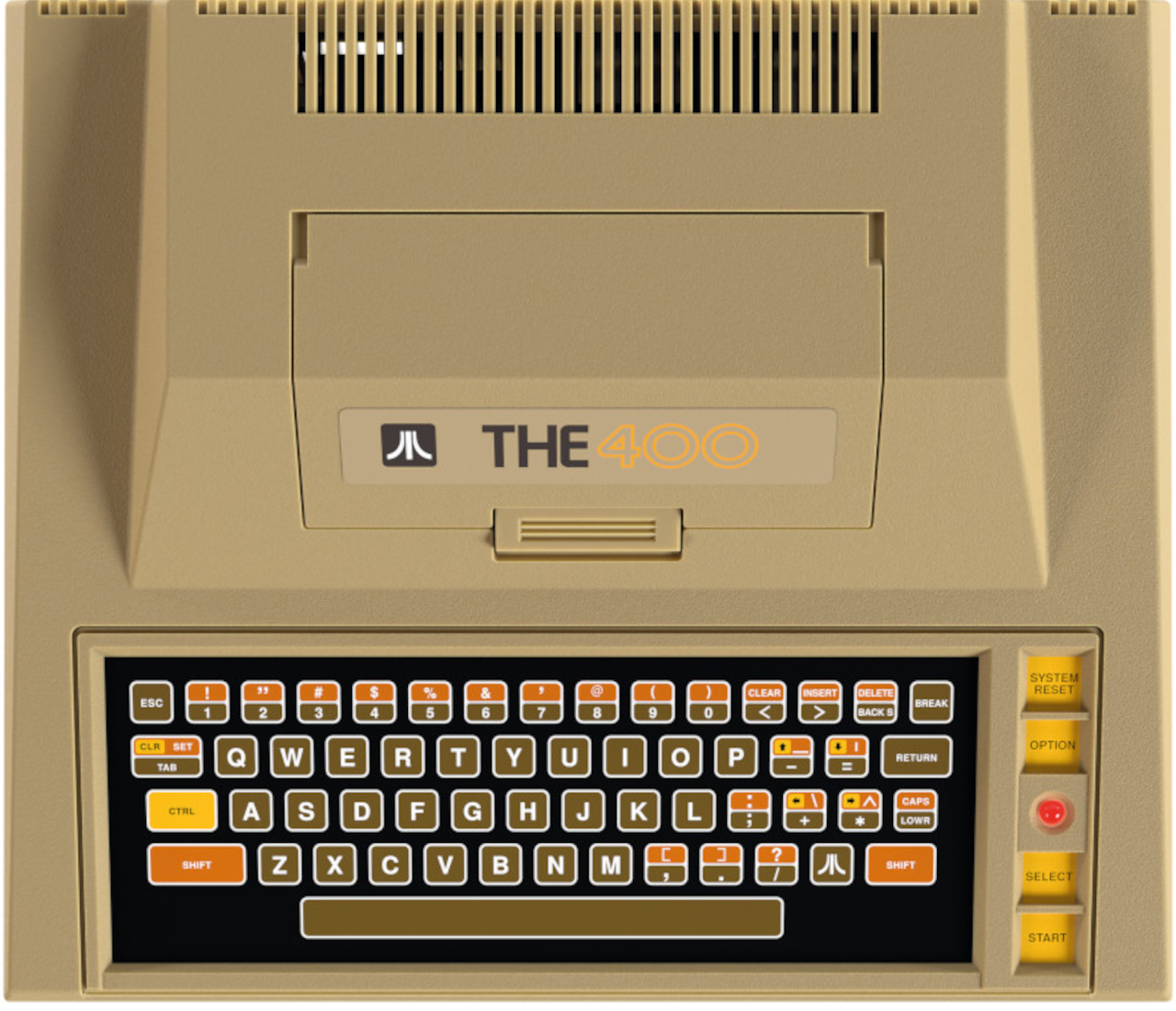
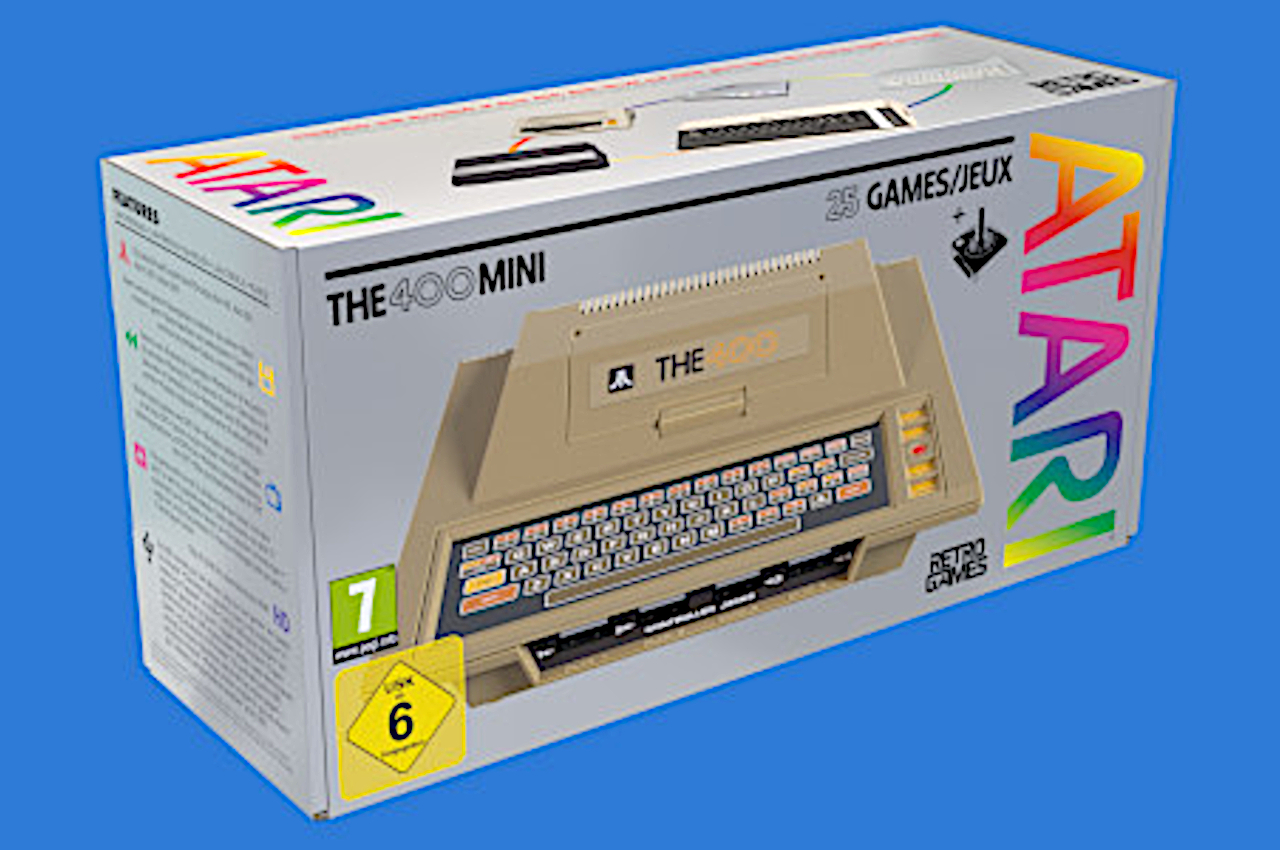
Most people today probably only know of the Xbox, PlayStation, and Nintendo Switch, but there was a time when the market was littered with countless gaming consoles, each with their own distinct designs. Many of them look almost outlandish by today’s standards, but it’s exactly because of these that these old machines have become today’s novelties again. The retro console craze has died down a bit, but it still exists and there are plenty of designs still left untouched. One of those is the rather distinctive Atari 400, which now finally comes in a mini recreation that brings yet another bunch of classic titles from one of gaming history’s biggest giants.
You might already be quite tired of hearing about all these classic games being made available to a newer, younger audience, but the console that this batch comes in is definitely worth noting. The Atari 400 and 800, after all, made many firsts in the industry, bringing what is practically a personal computer into homes with a focus on gaming. That objective was what informed the machine’s design, giving it a peculiar appearance even among its peers.
In essence, the Atari 400, or the 800 rather, looked more like a giant typewriter than a computer of any sort. Atari eschewed the typical joysticks and gamepads associated with gaming machines (and its own Atari 2600) and gave its first 8-bit family a keyboard for tasks beyond just playing. The Atari 400 itself was quite peculiar because it didn’t use real keys but a membrane keyboard, basically a seemingly flat, pressure-sensitive surface that could be considered the ancestor of touch-sensitive controls today. Suffice it to say, the typing experience was anything but enjoyable.
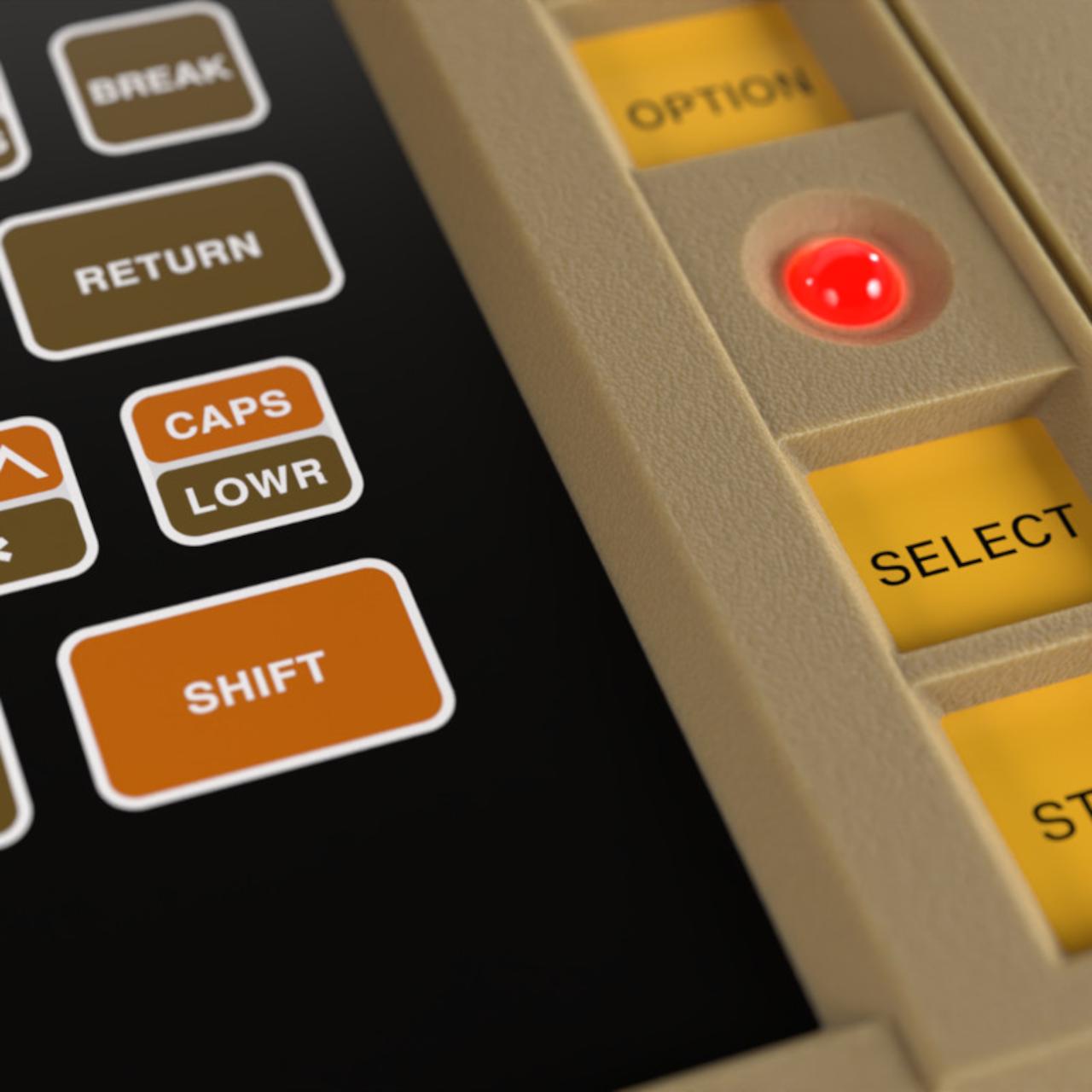
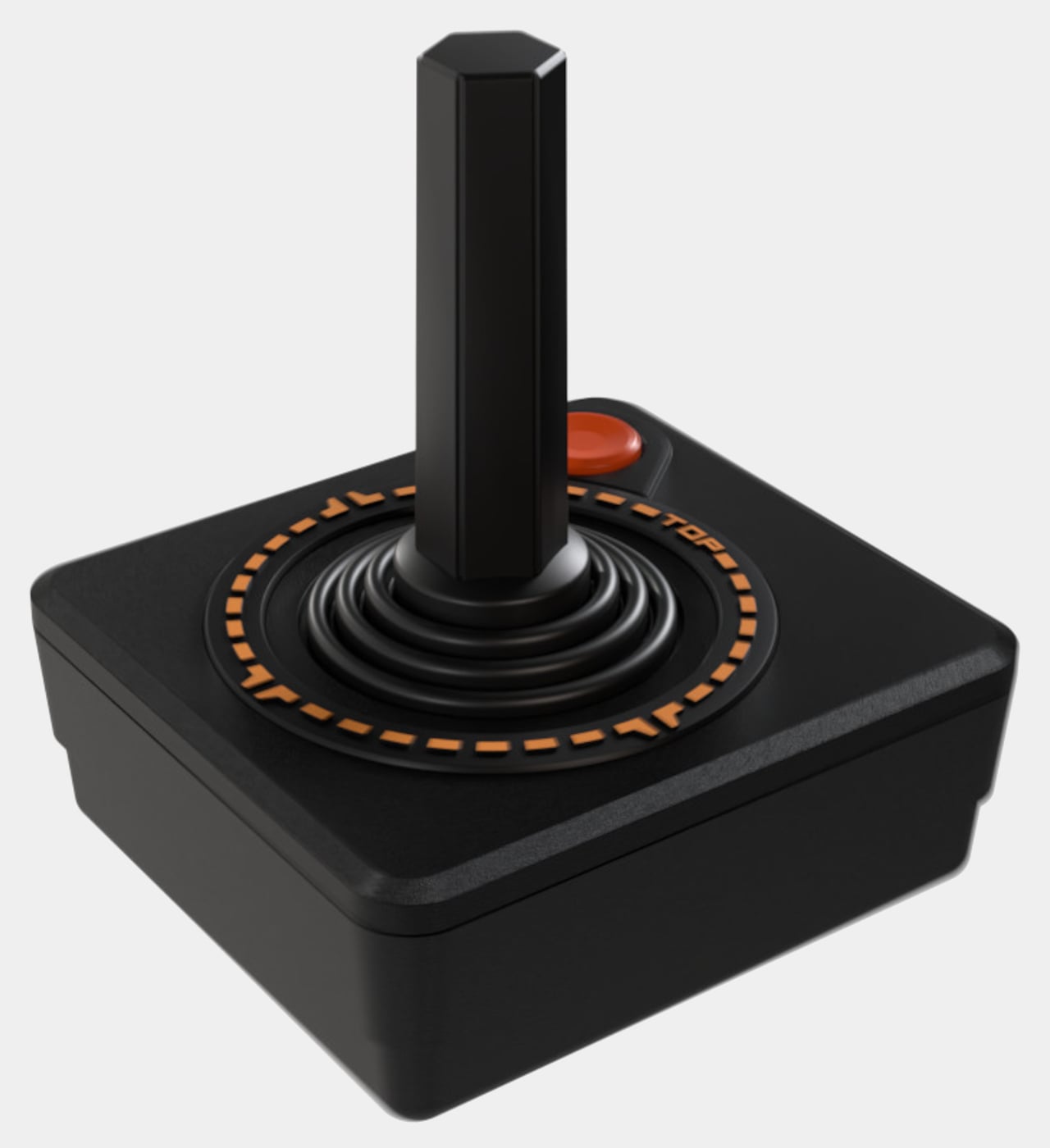
The Atari 400 Mini brings this one-of-a-kind design down to half the size of the 1979 original, which means you get all the looks but none of the quirks or the functionality. Yes, that miniaturized membrane keyboard is just for show, which is probably for the best. Imagine typing not only on a small space but also on a surface you have to press hard to even register a key. Fortunately, you can connect a USB keyboard if you really need to type something. With five USB ports, you can connect almost any controller, though thankfully the package ships one Atari CX-40 joystick for good measure.
The small machine comes with 25 titles from the original already pre-installed, though can also run other Atari classics provided you know how and where to get them. The Atari 400 Mini isn’t available yet, but you can already put down $119.99 to pre-order this recreation of a piece of gaming history before it hits the shelves on March 28th.
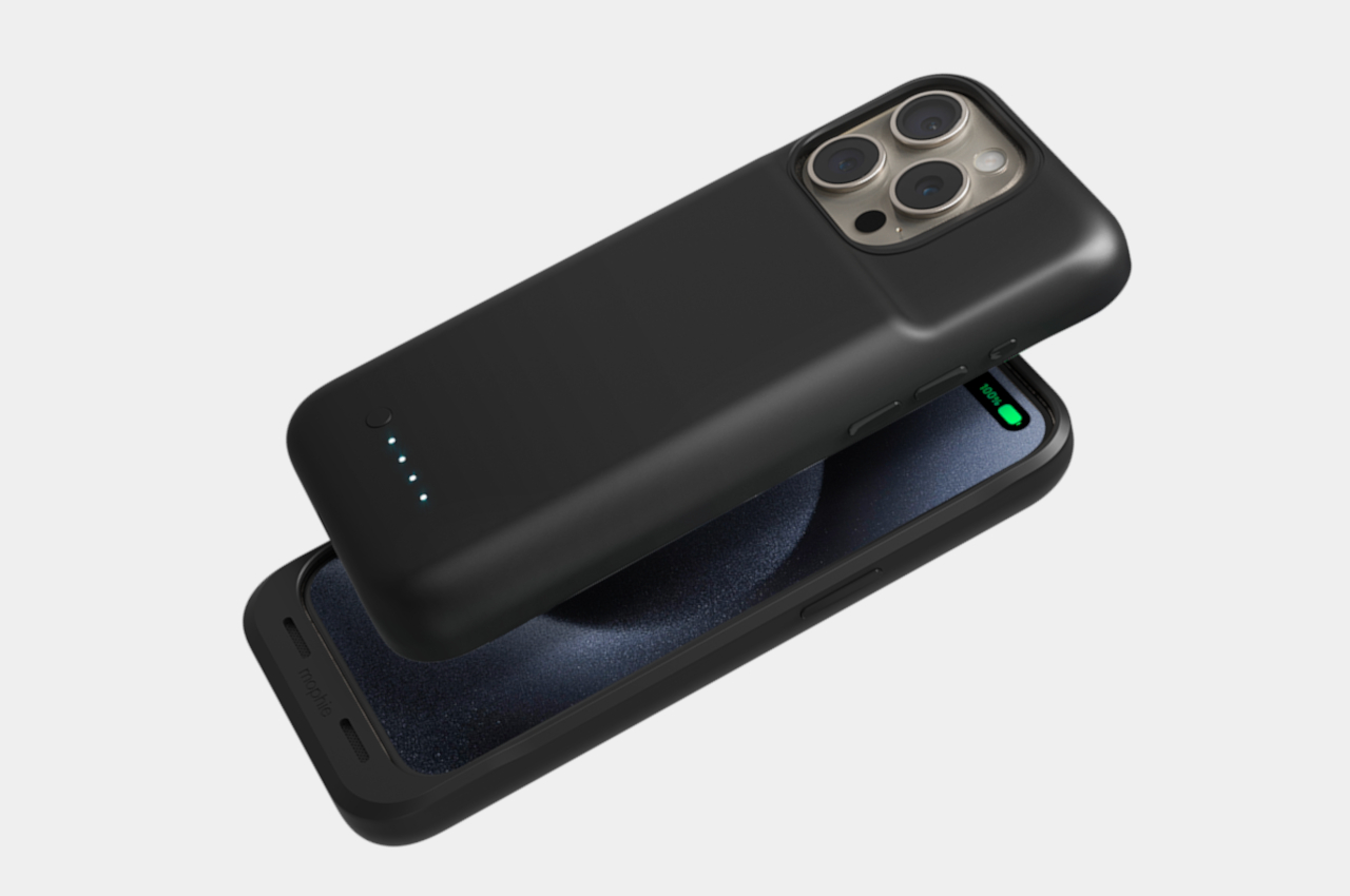
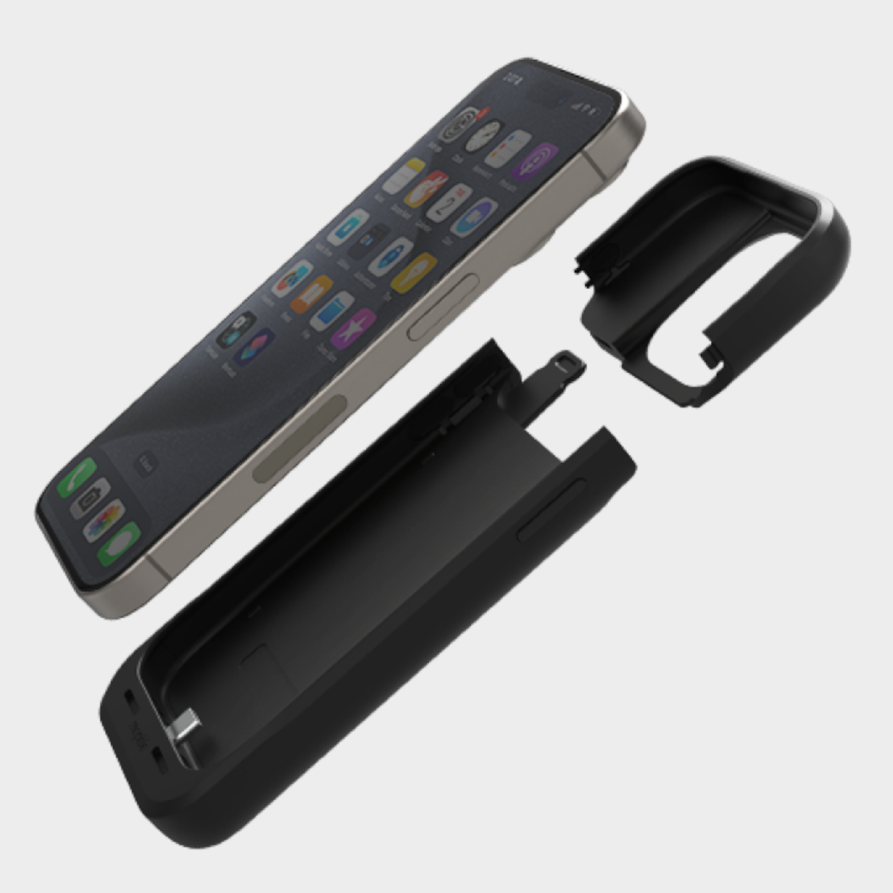
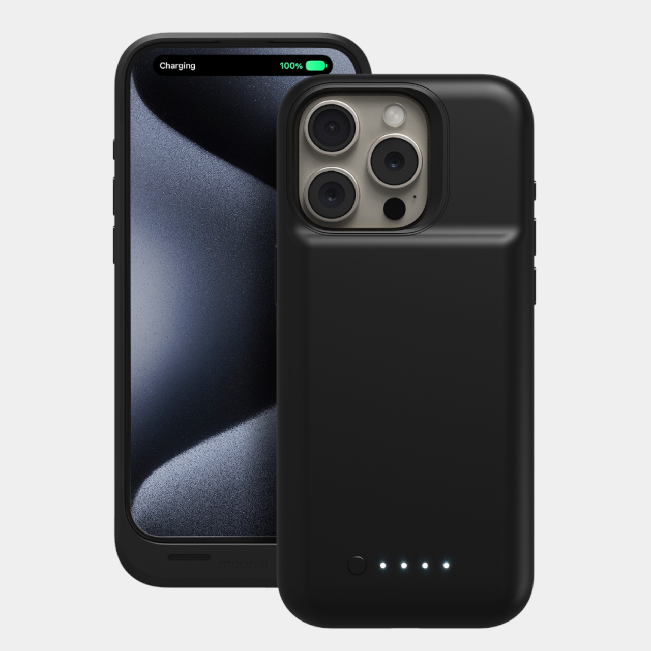
Power banks might be so common and boring these days, but there was a time when people thought they were more trouble than they were worth. Having to fumble around for a battery pack and cable to quickly plug in a phone may sound like too much of a hassle, so mophie, one of the oldest players in this game, came up with an alternative solution a long, long time ago. The battery case was the answer to that problem, making the iPhone “wear” its extra battery at all times. That design, however, hasn’t been seen for years, making you think battery cases have gone extinct. That was almost the case, pardon the pun, until the recent announcement that the mophie Juice Pack is making a comeback, but apparently only for three out of four iPhone 15 models.
When you first hear about it, battery cases sound like the best of both worlds. You get an extra battery to make sure your phone never runs empty, but you also don’t have to juggle with a separate pack like with a normal power bank. That’s theoretically true until you realize just how much that extra power will cost you in other aspects. Especially when you consider that batteries from five years ago were pretty thick despite having low capacities.
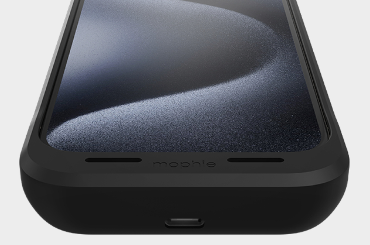
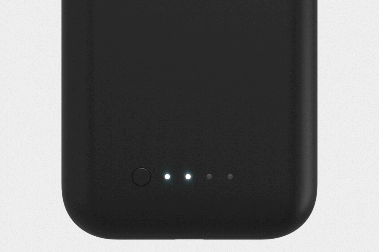
With significant improvements in this area, mophie thought it was time to bring its juice pack back to life, offering a battery case for the current generation of iPhones. The basic concept remains the same, with the battery “hiding” inside the sizable case that wraps around the iPhone like a very thick bumper. Of course, it also functions as a protective case, so that rugged and bulky appearance isn’t without its merits.
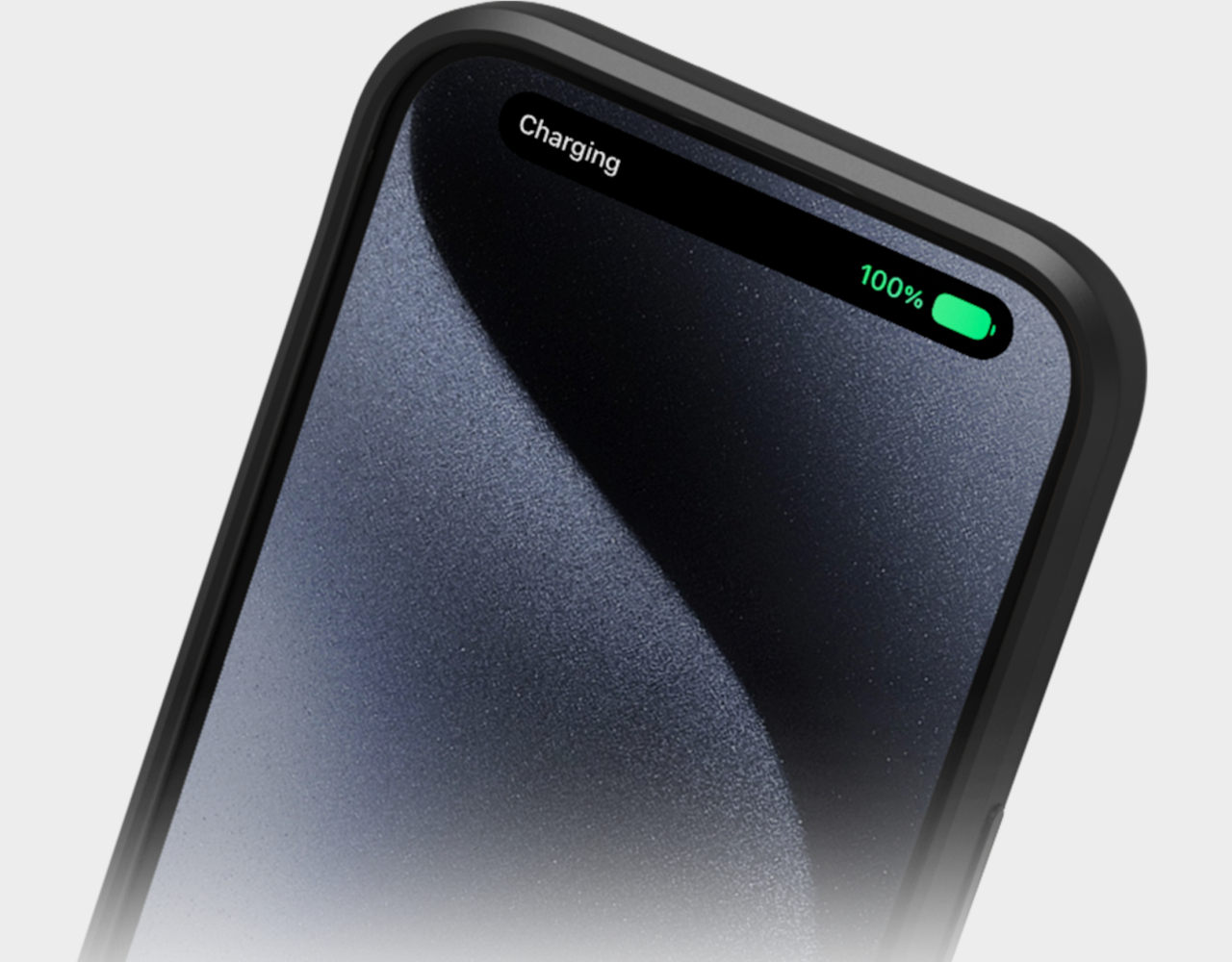
Like in previous iterations of the juice pack, there are LED dots on the back to indicate just how much charge the case has left. It also supports passthrough USB-C charging, so you don’t have to worry about having to remove the case just to charge the iPhone itself. That said, given the thickness that the battery adds to the back, it shouldn’t be a surprise to learn that it also prevents any sort of MagSafe functionality from working.
The mophie Juice Packs will go for $99.95 for all three iPhone models, though there are different capacities, starting at 2,400 mAh. The iPhone 15 Plus is notably missing from the list, apparently because mophie didn’t want to waste resources on a model that isn’t even selling well. Then again, it remains to be seen how many iPhone users will be willing to bulk up their phones and lose MagSafe compatibility at the same time just for the convenience of not having to plug in a power bank.
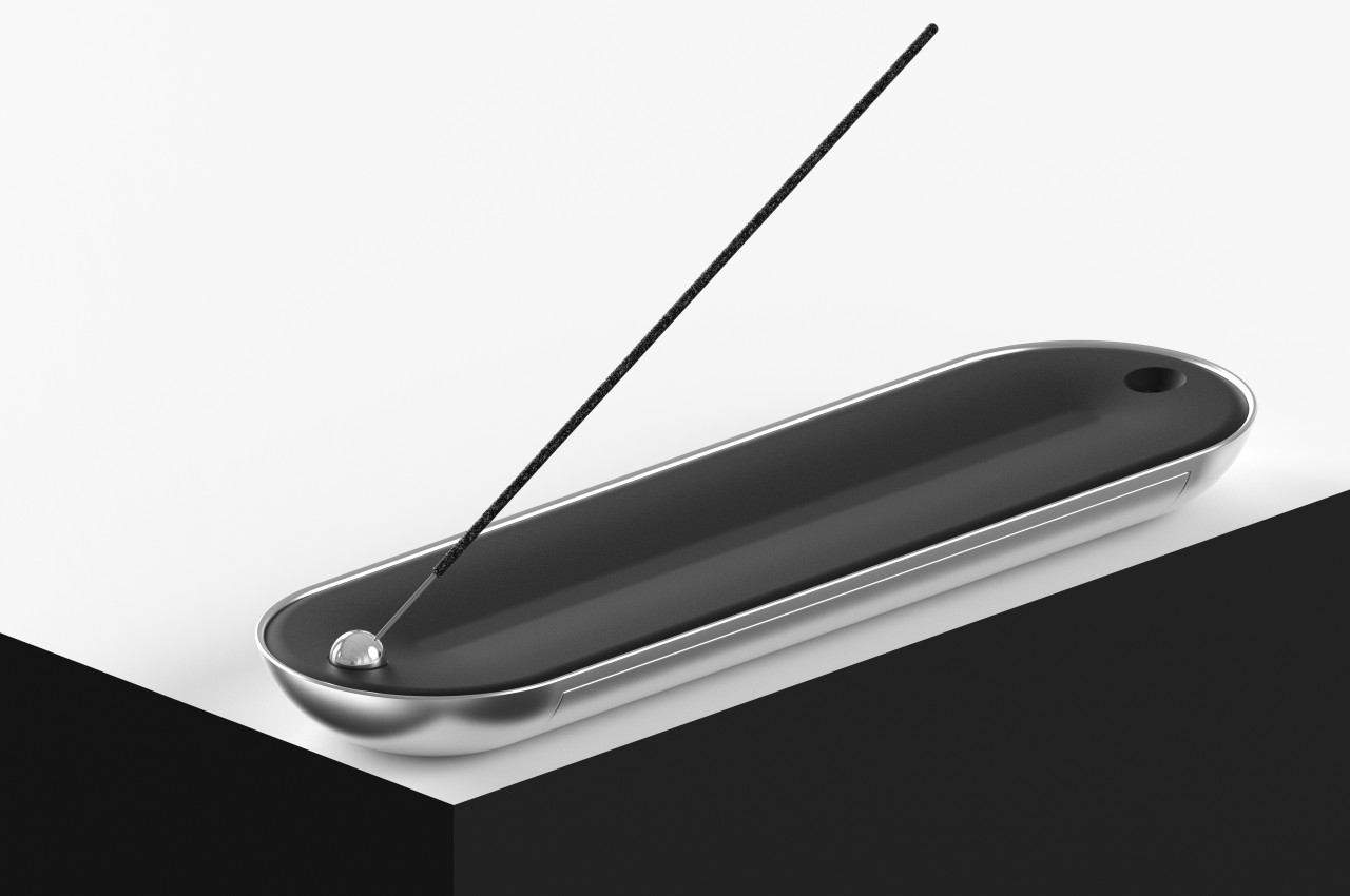
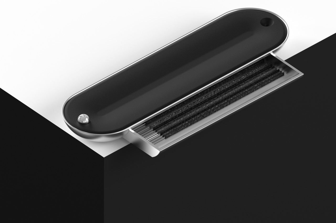
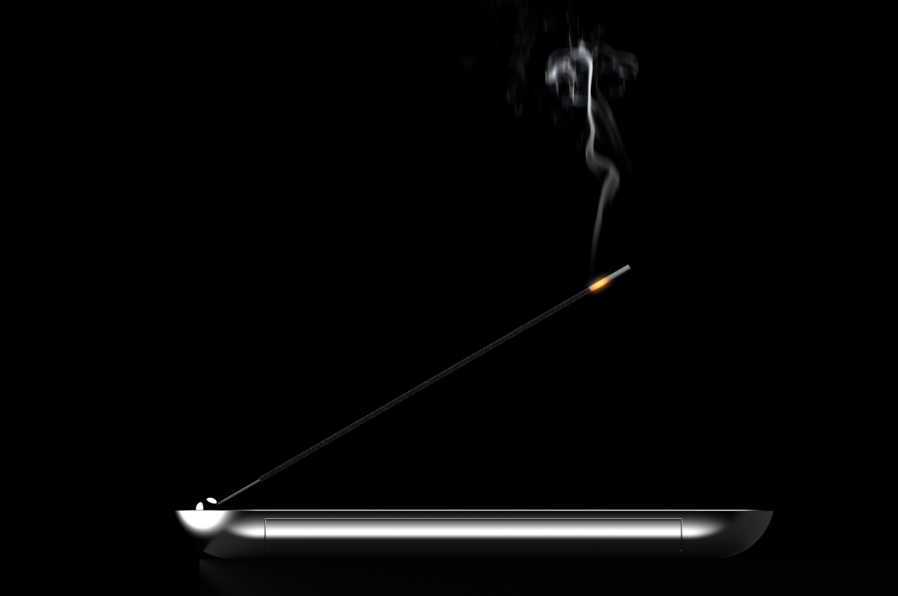
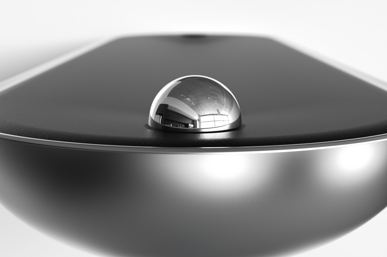
There’s a great deal of interest in essential oils and diffusers these days, but some people tend to prefer the distinct scent of incense. Incense sticks are simple and economical ways to enjoy such fragrances, but actually using and managing these very thin sticks can be a bit of a hassle, considering the different parts that could be involved. Some incense holders practice extreme minimalism to the point holding the burning stick is really all that they can do. These tend to try to match the incense’s aesthetic by utilizing wooden materials, but there is no hard rule that it is the only way to design incense holders, as this rather classy design concept tries to prove.
The most basic incense holder design is simply a strip of wood that can hold an incense stick at an angle so that its ashes fall in a single place only (presuming there’s no gust of wind). The shape is a bit concave to make sure that the ashes don’t simply roll or fall off. This simplistic design makes the incense holder itself extremely portable, but then you’d also have to carry around a container for unused sticks as well as a lighter or match for lighting the stick.
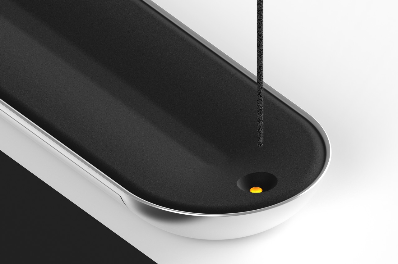
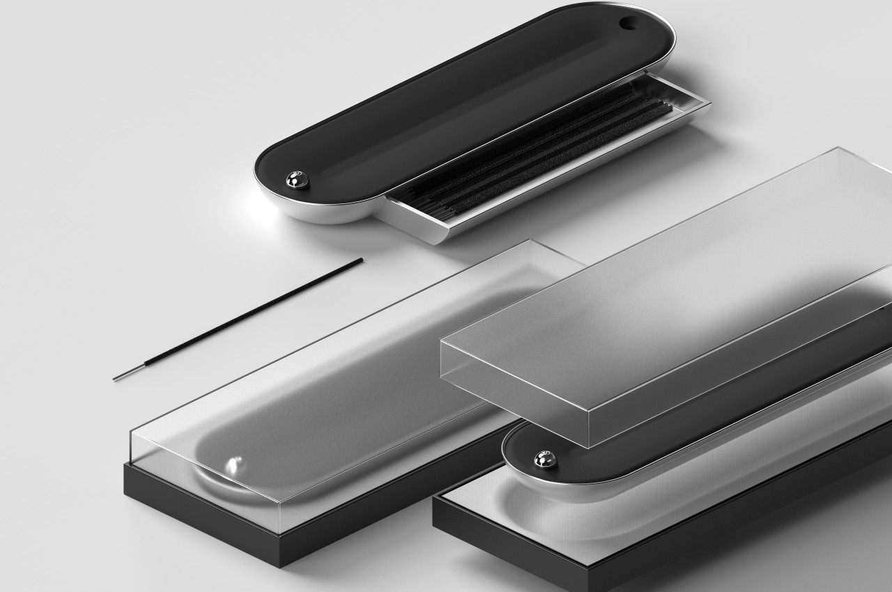
In contrast, this design concept incorporates all three elements into a single design that quickly sets itself apart not just in function but also in aesthetics. Instead of wood, the design uses metal, most likely polished aluminum, to give the incense holder a reflective and luxurious appearance. The black top surface is probably some heat-resistant material, but it doesn’t take away anything from the product’s elegant looks. The silver and black colors contrast and complement each other nicely, but there is also room for other color combinations as well.
Just as interesting as its uncommon appearance is how a single product performs three functions. A hidden drawer at the bottom reveals space for holding reserve incense sticks, while a hole opposite the spherical stick holder is actually a lighter. This way, you need to bring one and only one thing with you so that you can enjoy your favorite incense scents anytime, anywhere. It would have been nice, however, if there was also a way to store the ashes temporarily so that you can keep your area clean until you’re ready to throw away those ashes in a proper bin.
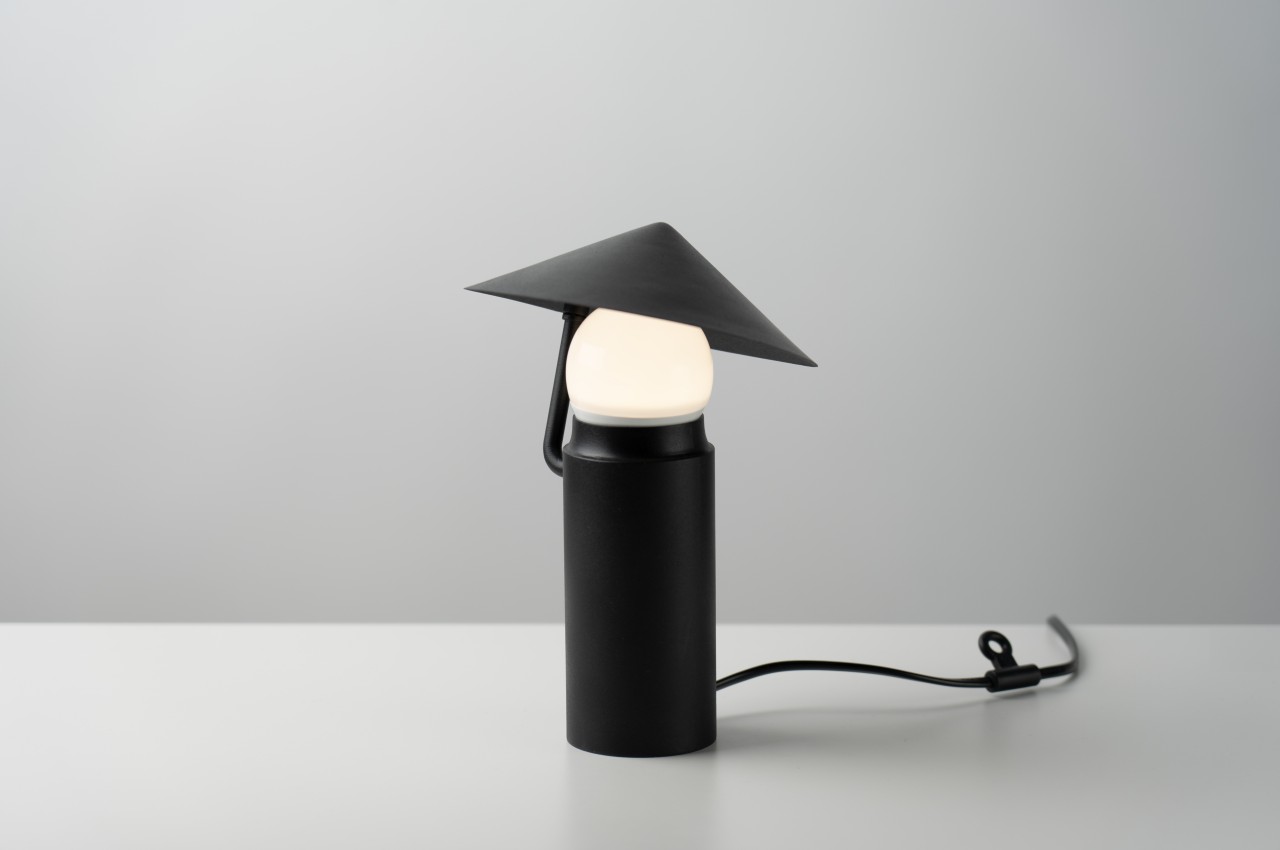
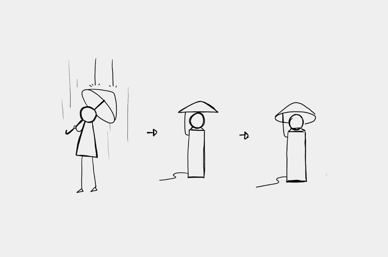
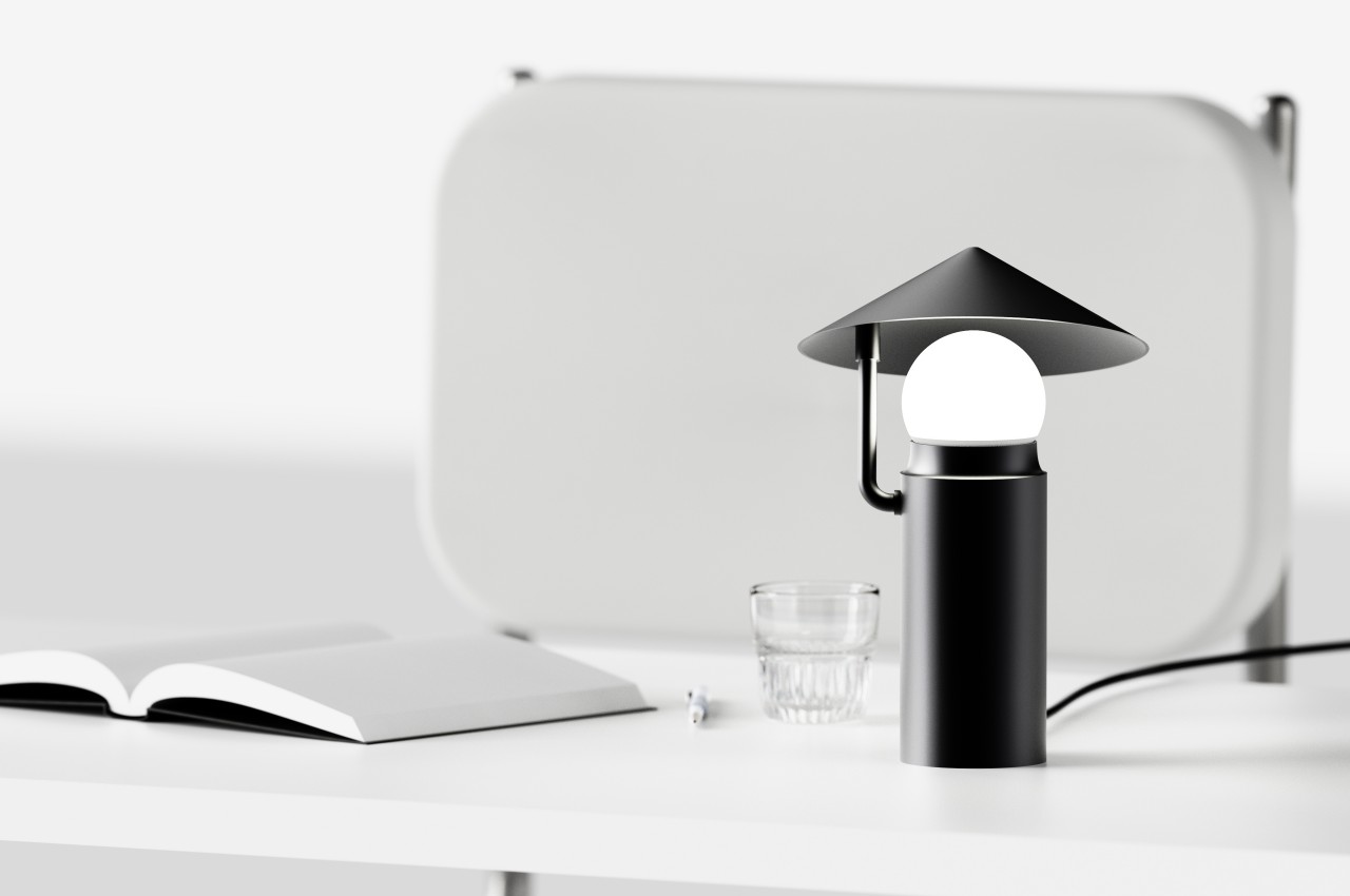
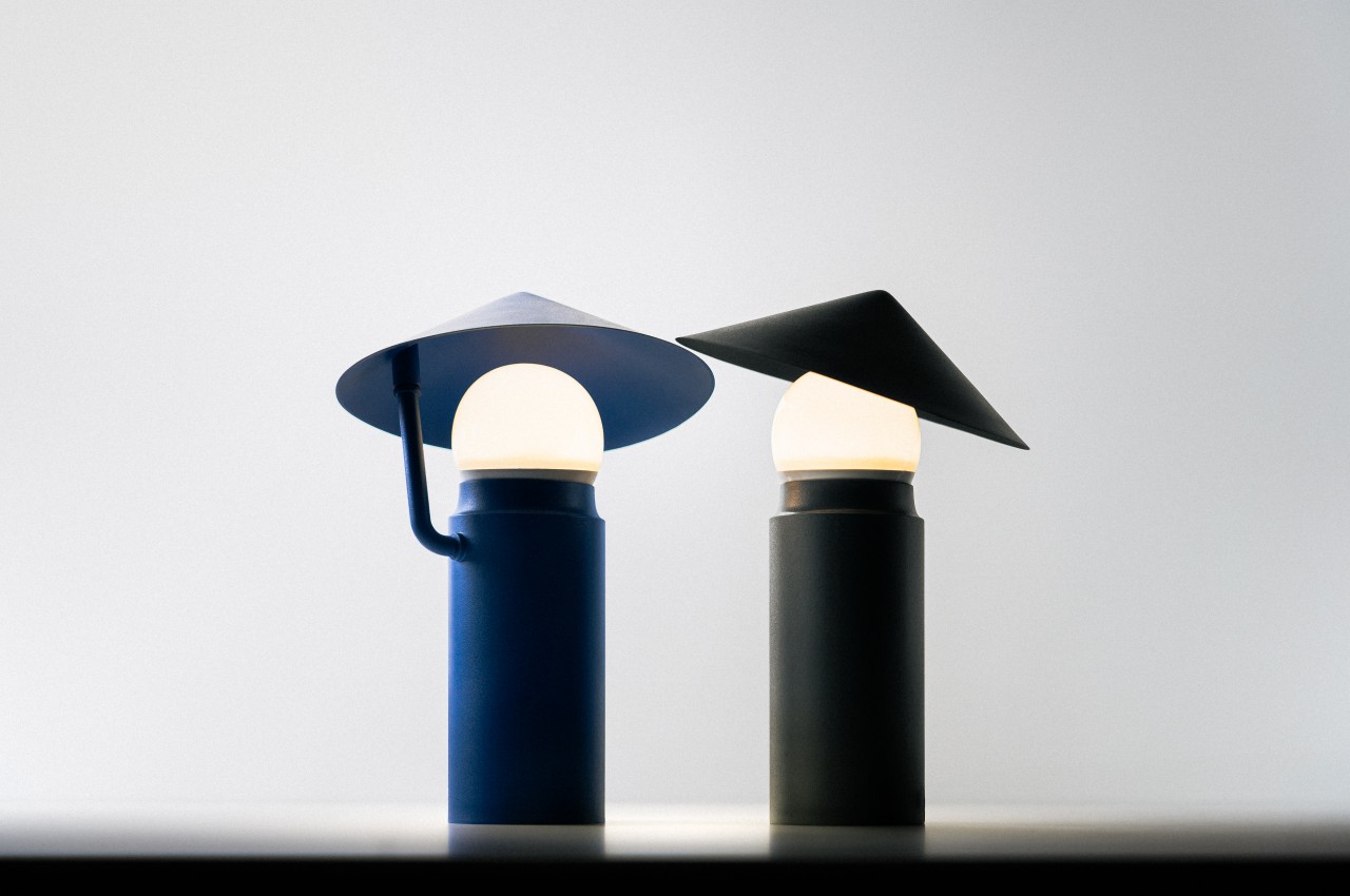
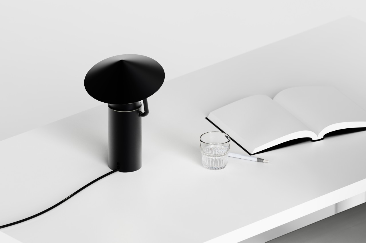
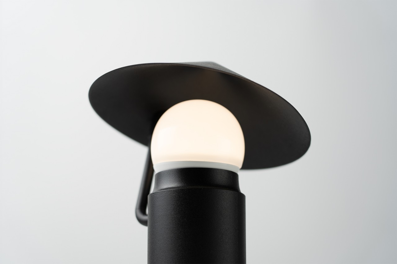
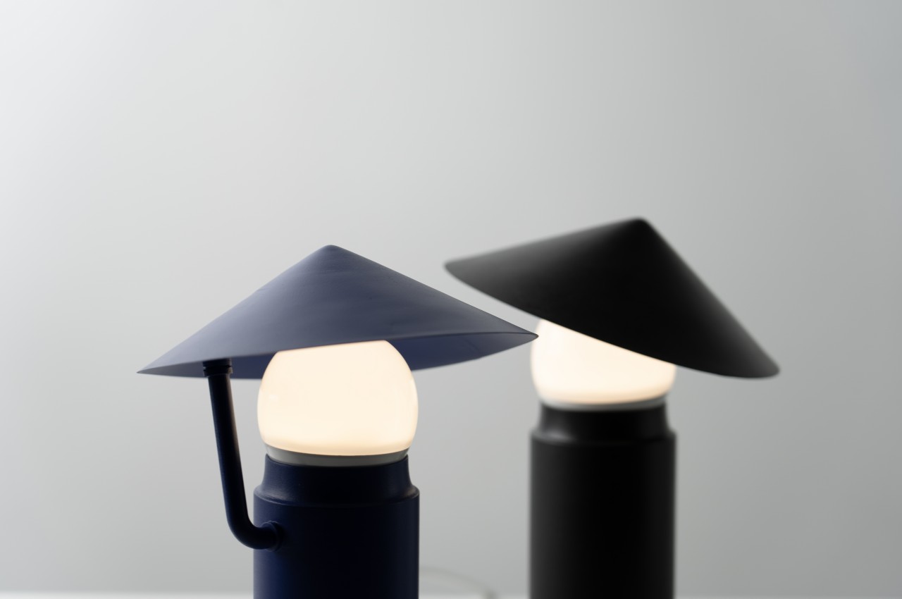
We can take a lot of ideas from nature, but sometimes the source of inspiration can be our own selves. The human figure, after all, is a truly complex design, and it’s capable of portraying a wide range of forms and emotions. Sometimes, that spark even comes from the most mundane of situations, like sitting on a park bench or walking under the rain with an umbrella. The latter is apparently what gave birth to a rather cute little lamp designed to stand on your desk, table, or shelf, generating a sense of playfulness and calm, emotions that some people feel on a rainy day.
Designer: Heeyeol Yang
Different people associate rainy days with different emotions. Some feel lethargic and sleepy while others are their most productive in the midst of the pitter-patter. Some feel a bit of anxiety, especially when trapped under the rain, but there are actually those who can stay still and calm while standing under an umbrella. This is the inspiration for Rain Man, a concept design for a lamp that is truthfully more open to interpretation than what the designer intended.
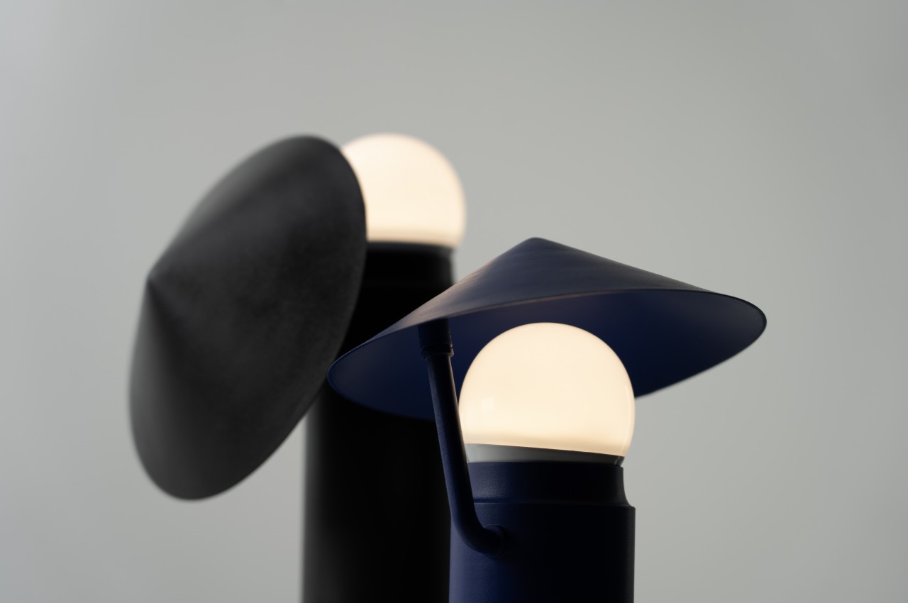
On the one hand, the name alone directly points to the form that the lamp tries to imitate. The flat cone on top is like an umbrella, while the lever that supports it is the figure’s arm. The lamp itself is an extreme generalization of the human head, and plenty of metaphors can probably be drawn from how a person’s face and presence can light up those gloomy, rainy days.
At the same time, it’s also possible to see the figure a bit differently if you don’t take the name into consideration. The umbrella becomes a wide-brimmed hat commonly found in Asian countries, held high in greeting when coming across another person. In either interpretation, the focus is on the human figure and its relationship with its surroundings, be it rain or shine.
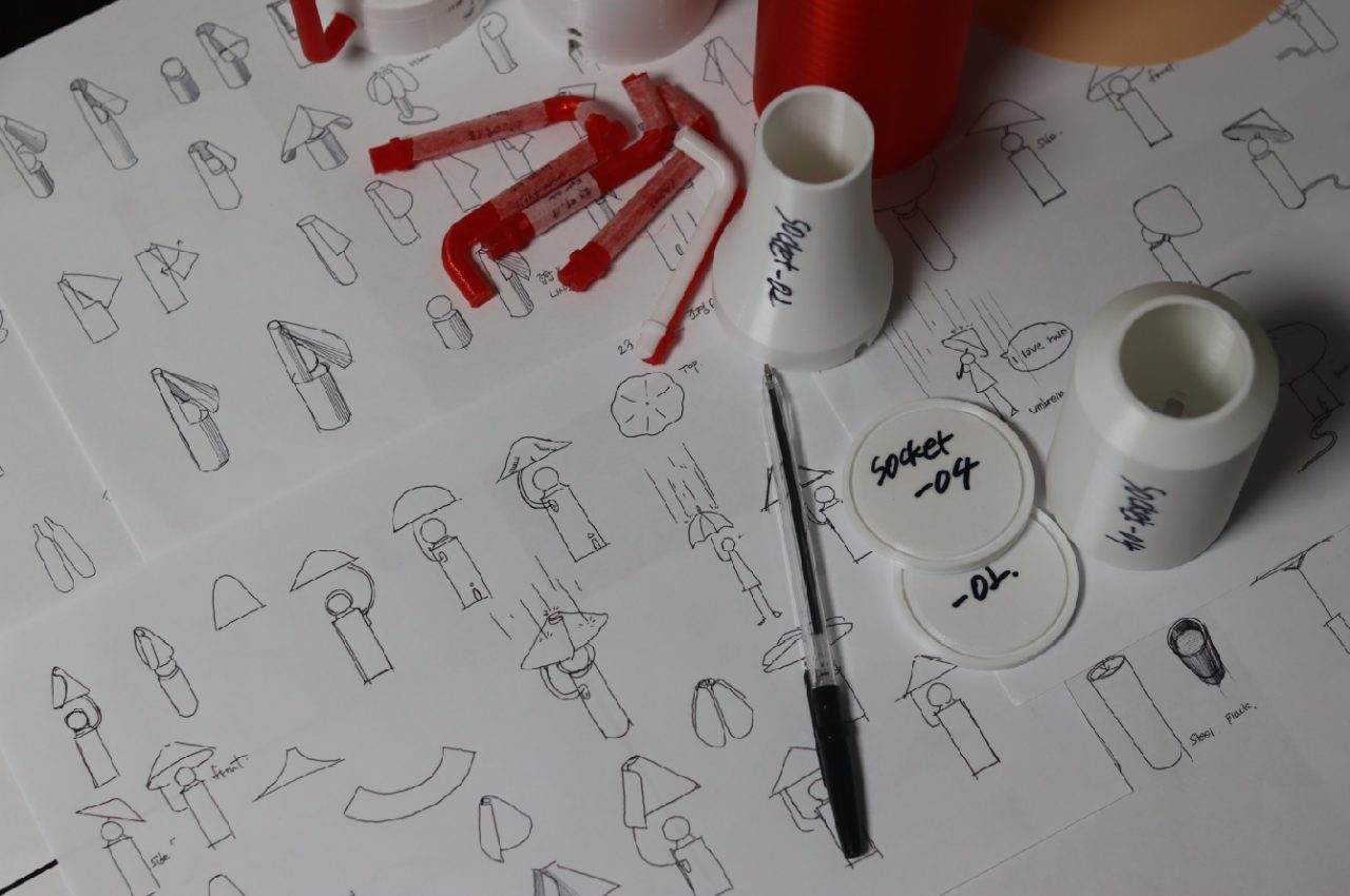
The concept design has other interesting features beyond its anthropomorphic shape. The umbrella (or hat) can be lowered or raised as desired, scattering the light or focusing it toward a single direction. Overall, the lamp has a certain charm that makes it a lovely piece for your living space, greeting you and your visitors with a simple, calm gesture.