PROS:
- Triple MEMS mic array with five specialized audio modes
- Strong imaging quality with 1/1.28-inch 4K Dual All-Pixel PDAF sensor
- AI Tracking 2.0 with intelligent framing and PTZ control
- Extreme compactness with flagship-level specs
CONS:
- Premium pricing
- Feature depth may overwhelm casual users
- Non-serviceable, integrated design
RATINGS:
SUSTAINABILITY / REPAIRABILITY
EDITOR'S QUOTE:
OBSBOT Tiny 3 treats audio and video as one design problem instead of forcing users to stack separate gear, creating a genuinely tiny studio that replaces an entire desk setup with one very capable box.
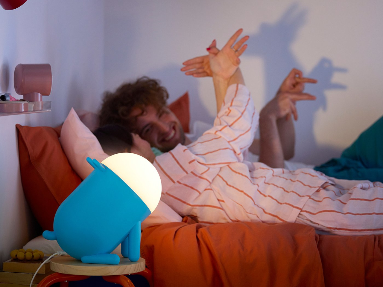
Most people who take video calls seriously have ended up stacking gear on their desks. A clip-on webcam, a clamped USB mic, software filters layered on top of each other, and a constant ritual of adjusting angles and leaning into microphones just to sound decent. Laptop webcams were never meant to carry this much weight, but the usual upgrade path still treats audio as something you solve separately, which means juggling two devices and hoping they play nicely together.
OBSBOT Tiny 3 approaches that problem differently. The 4K PTZ webcam wraps a triple MEMS microphone array, a 1/1.28-inch sensor, and a 2-axis gimbal into a compact, lightweight aluminum body. OBSBOT calls it a Tiny Titan, and claims it delivers studio-grade spatial audio, flagship imaging, and AI tracking in one very small package. Whether that actually holds up during everyday streaming, client meetings, and the occasional podcast is the question worth answering.
Designer: OBSBOT
Aesthetics
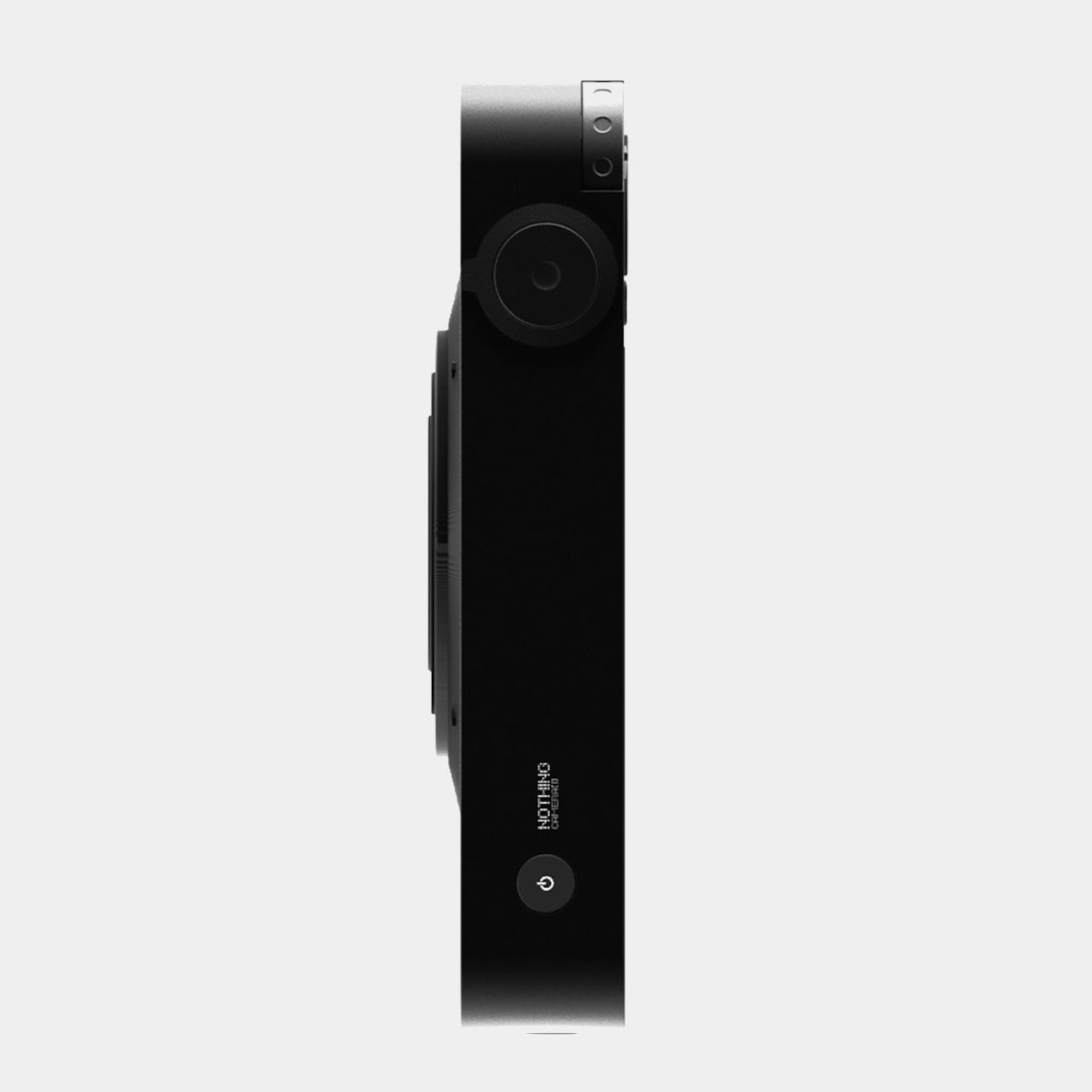
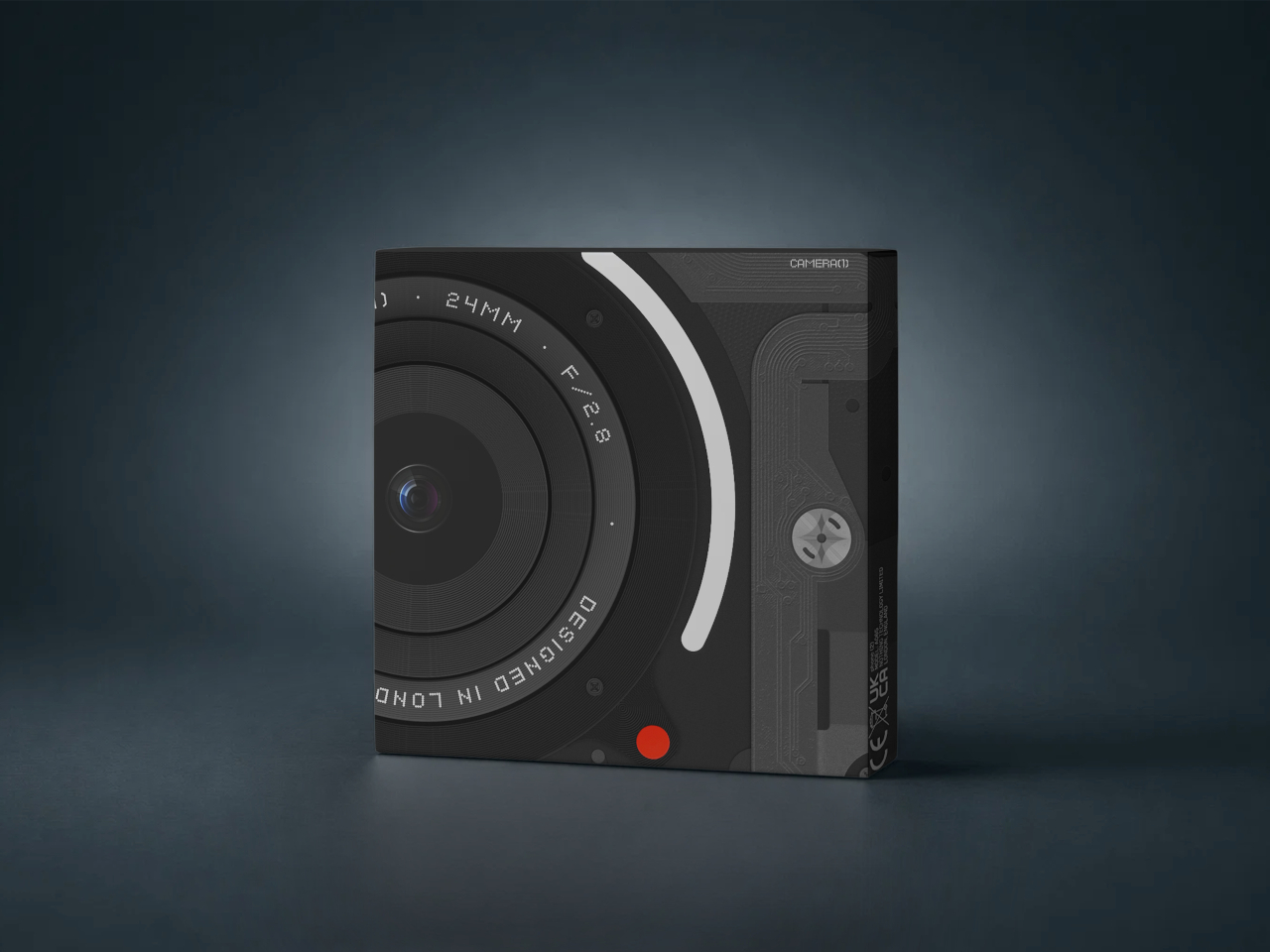
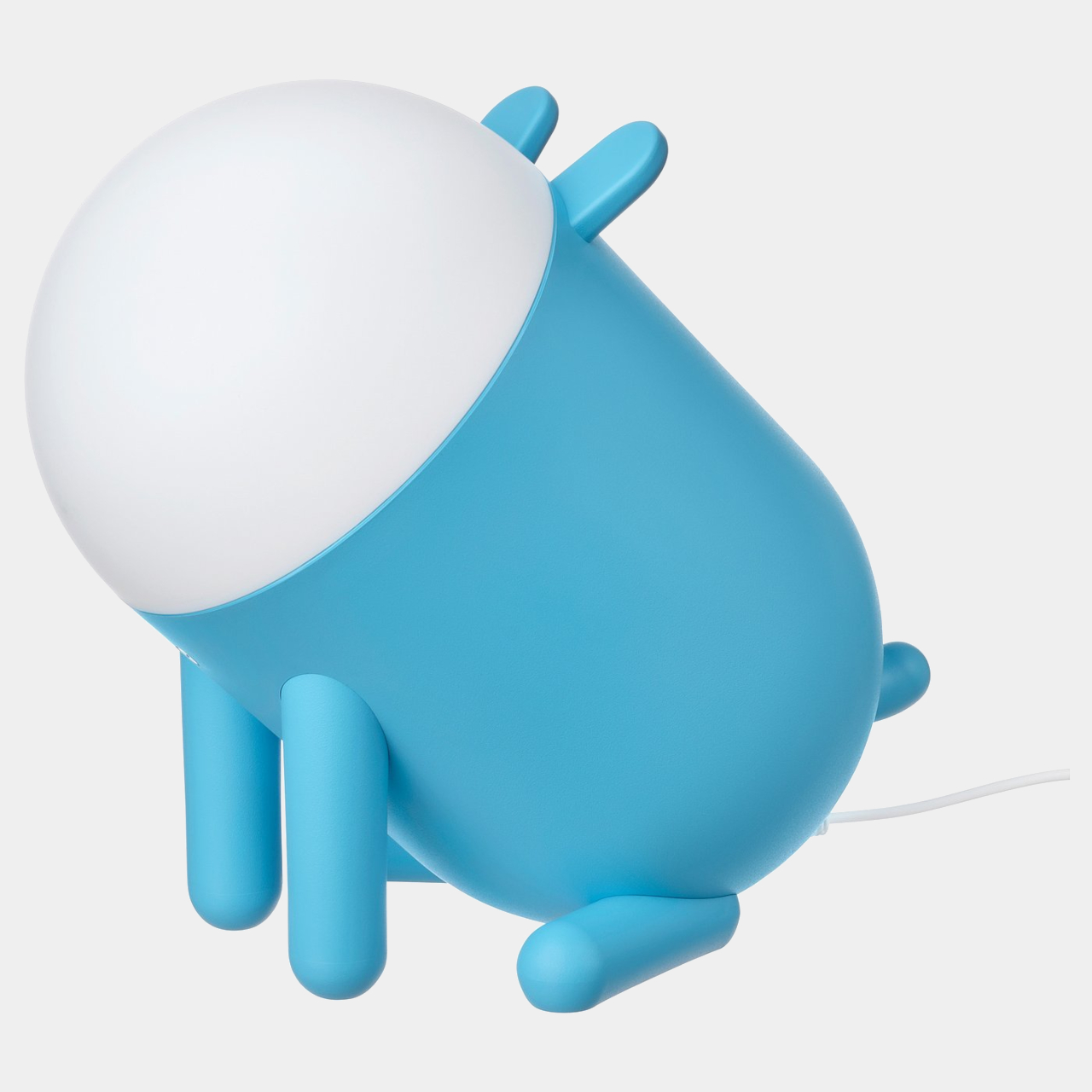
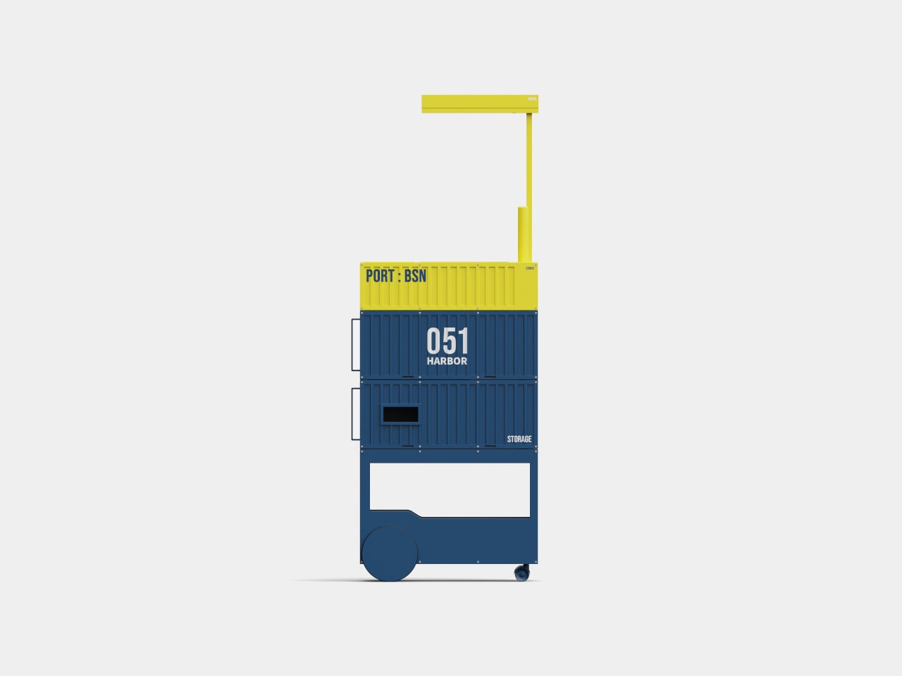
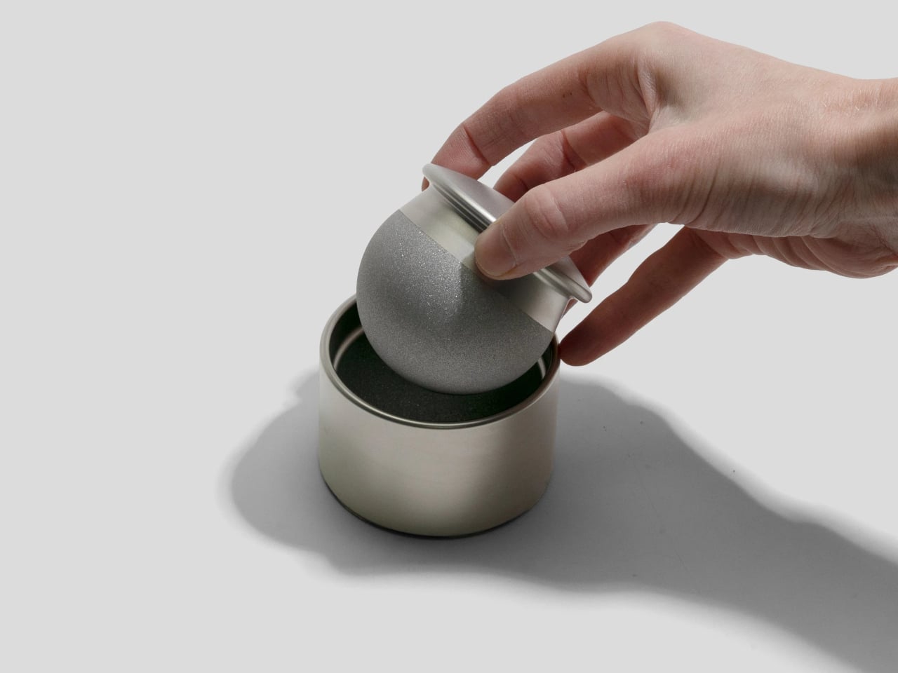
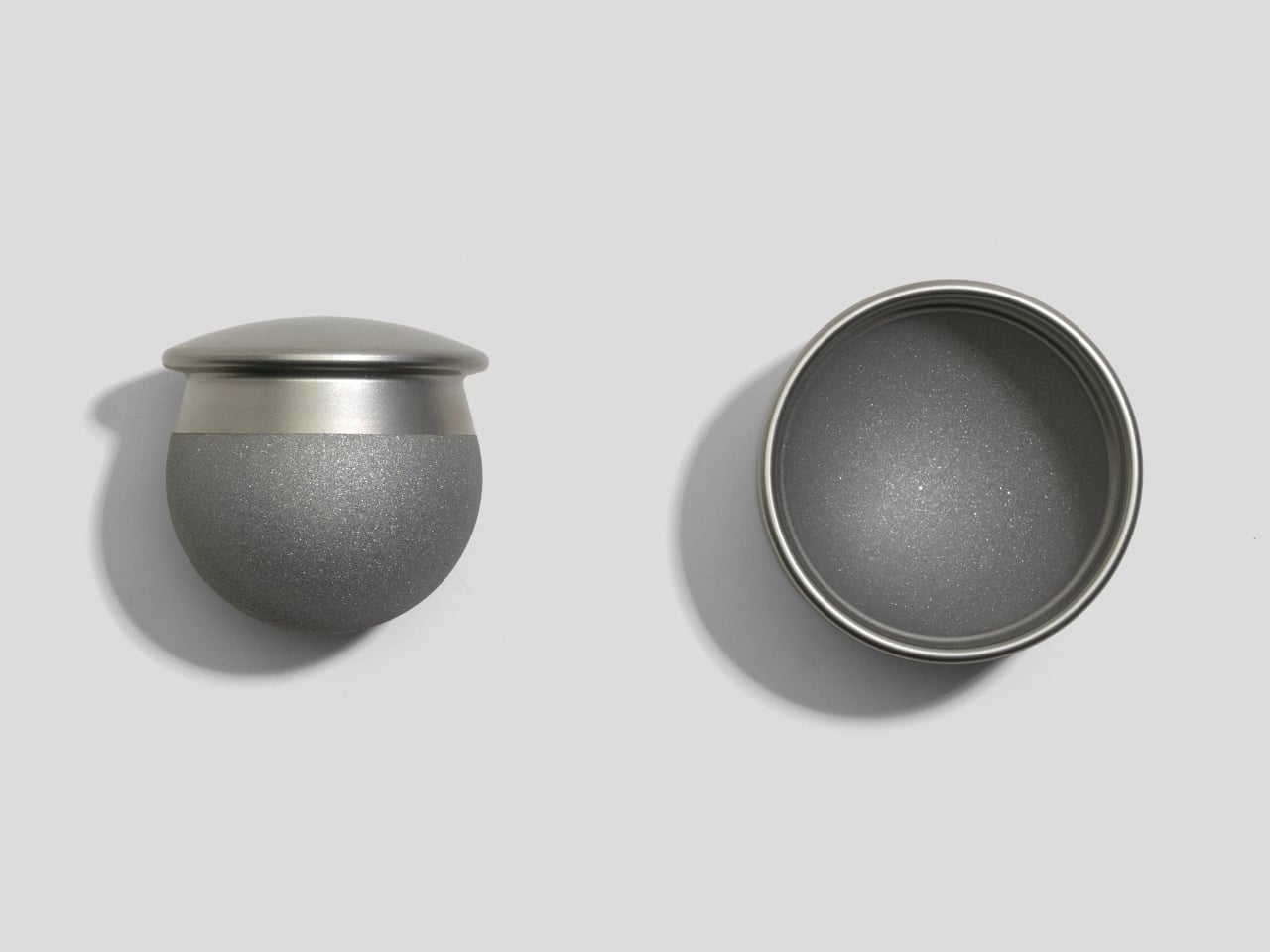
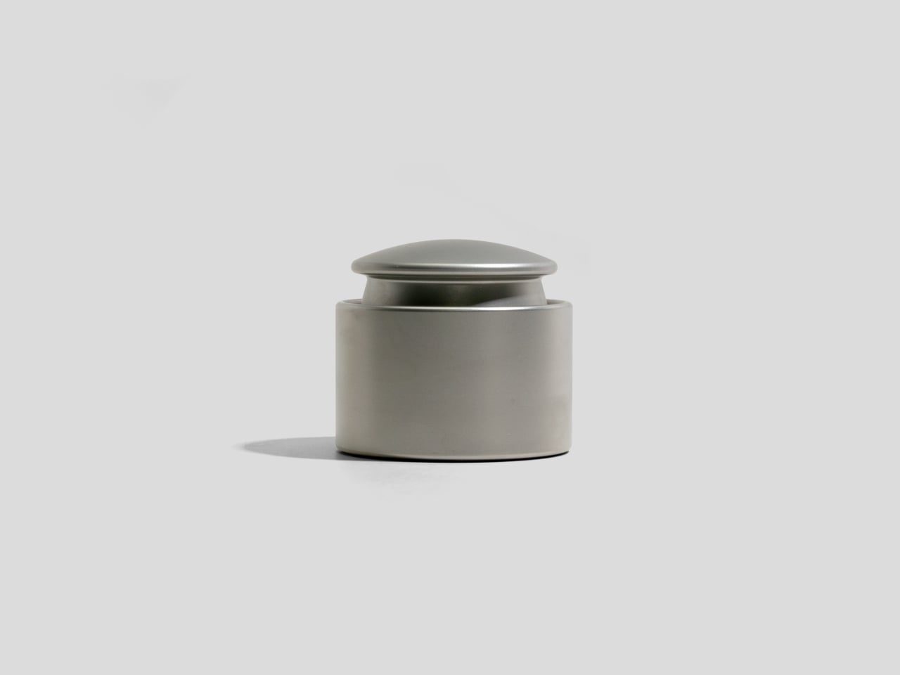
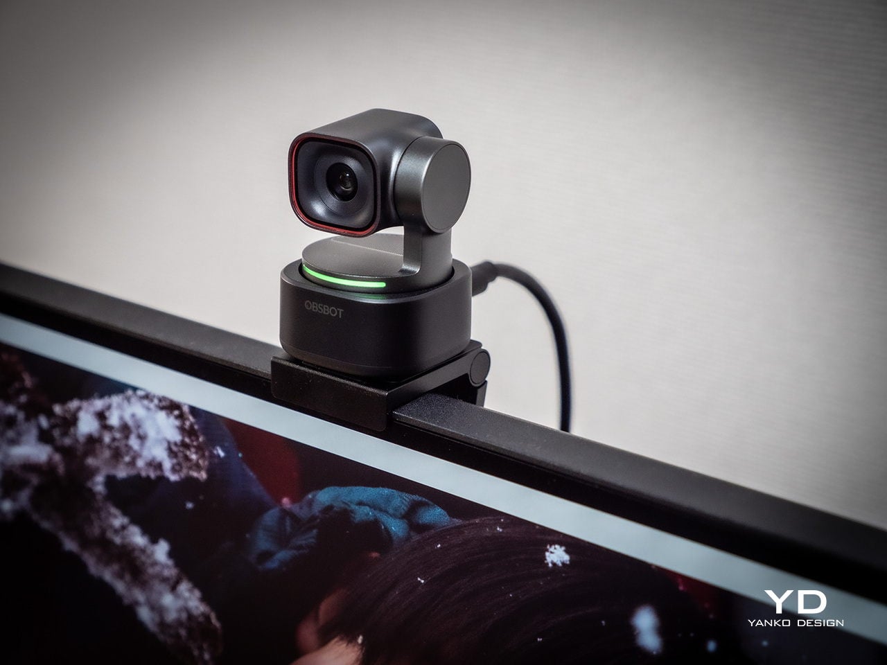
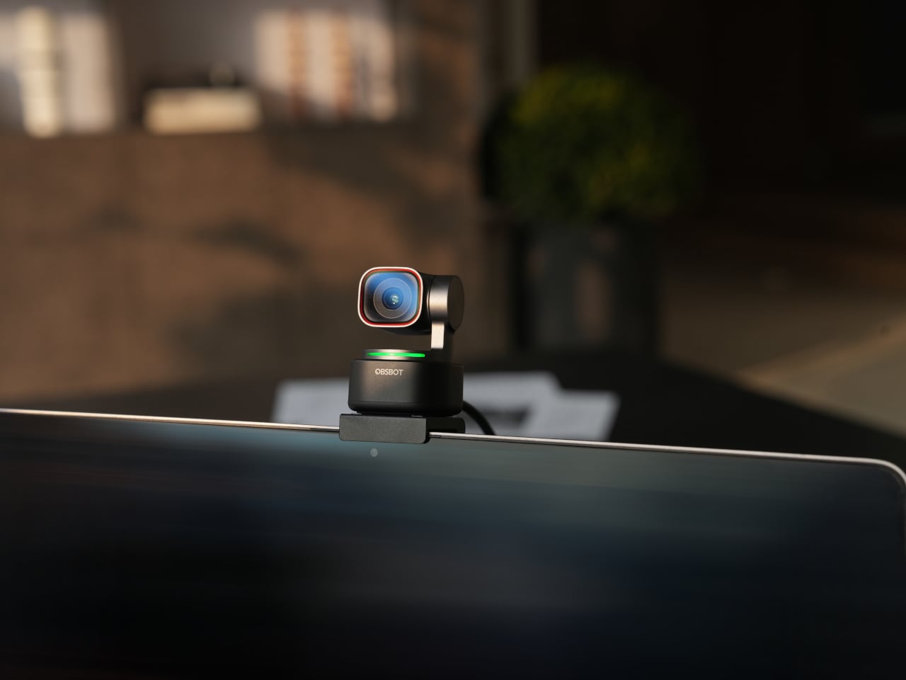
Walking into a room where the Tiny 3 sits on a desk, it reads less like a webcam and more like a miniature broadcast camera someone scaled down and parked on a tripod. The aircraft-grade aluminum alloy shell gives it an equipment-grade presence without being loud about it, landing somewhere between compact cameras and audio interfaces rather than the glossy plastic most peripherals use these days.
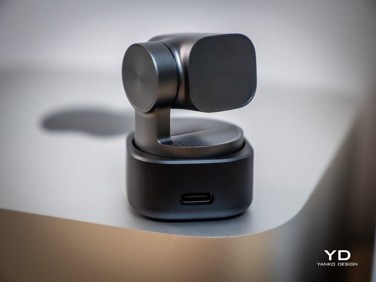
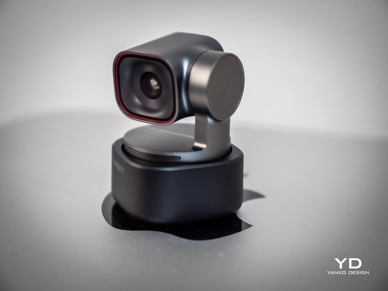
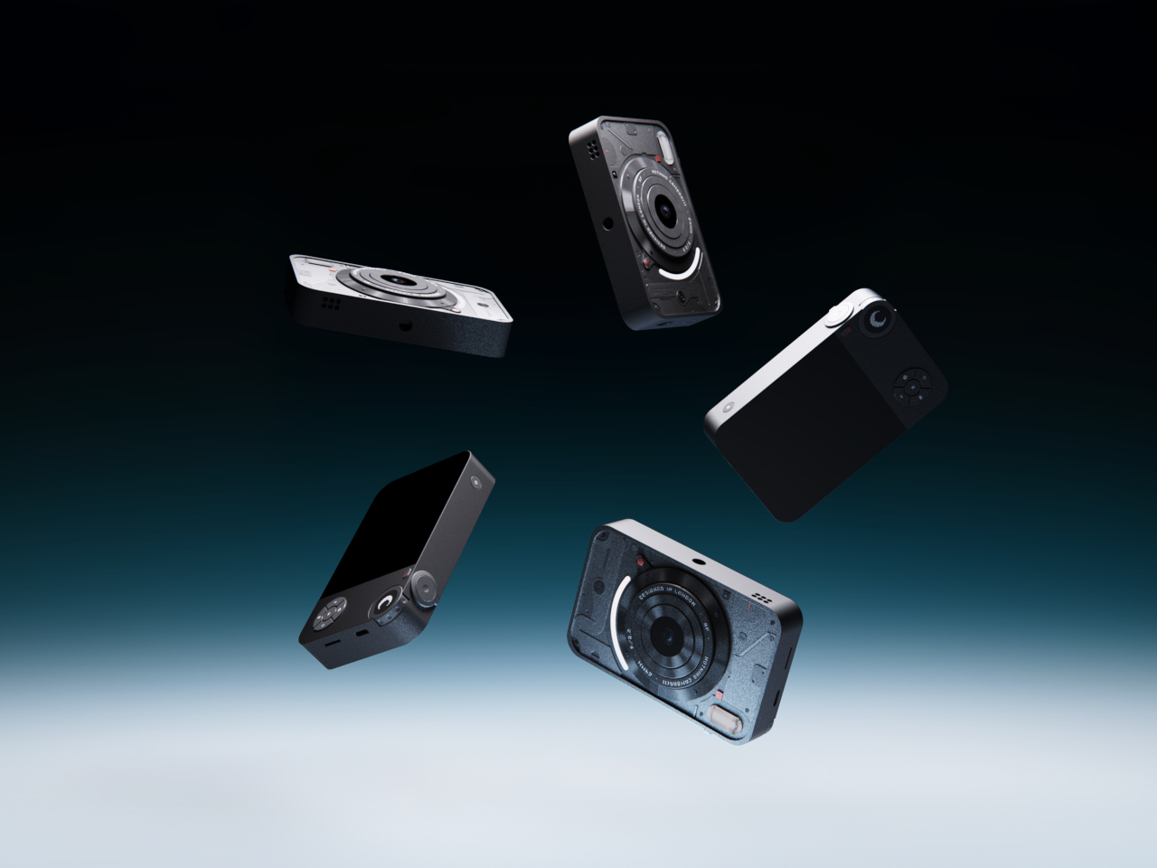
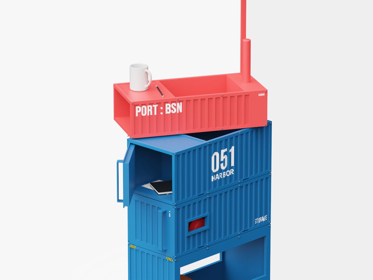
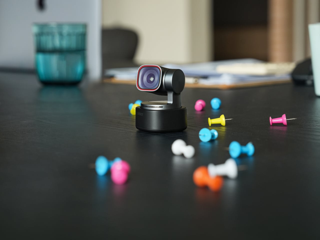
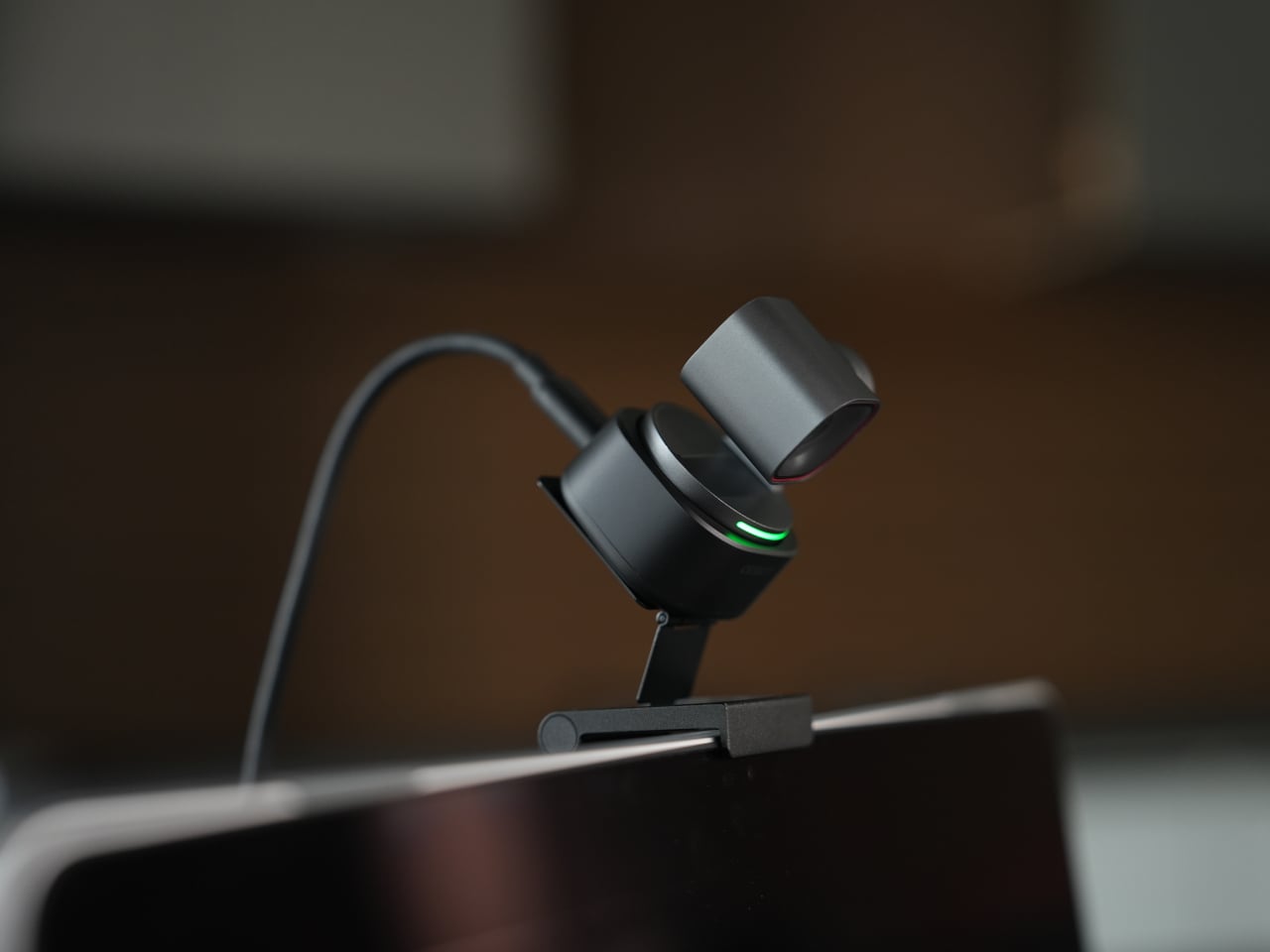
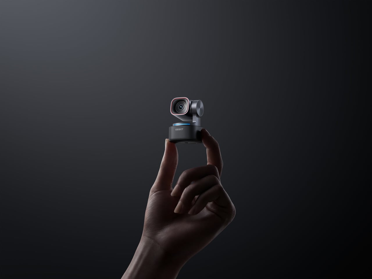
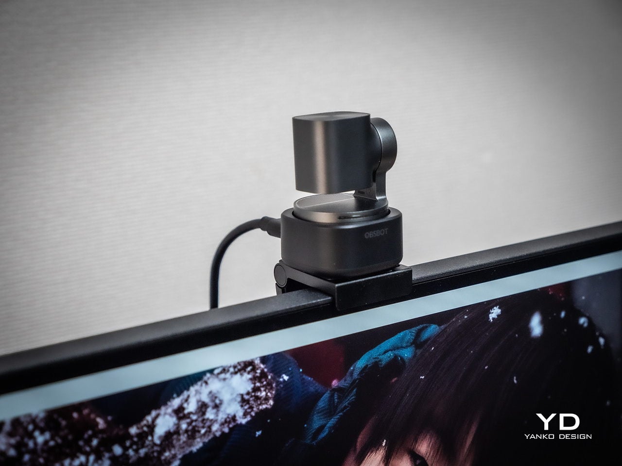
The proportions feel deliberately compact. At 37mm x 37mm x 49mm and 63g, it occupies roughly the same footprint as a large dice, but the dual-axis gimbal makes it clear this is meant to move and track rather than stare at one fixed angle. The satin metallic finish catches light softly without harsh reflections, and the minimal branding keeps it neutral enough to blend into creative or corporate setups without clashing with the rest of the gear.
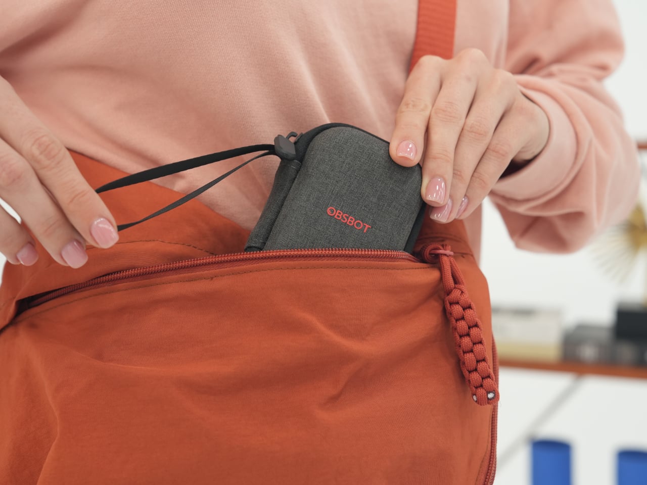
The included storage case and adjustable mount feel like extensions of the same design language rather than afterthoughts tossed into the box. The case is compact and rigid, protecting the camera in transit without eating up bag space, while the mount uses clean lines and a friction hinge that feels considered. These details matter to people who care about how tools look both during use and while packed away, which describes exactly the kind of person likely to spend more on a webcam in the first place.
Ergonomics
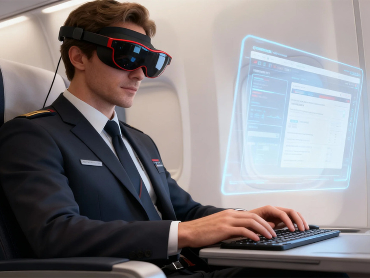
Setup is quick enough that you can join a meeting within minutes of opening the box. Plug the OBSBOT Tiny 3 into a USB-C port, wait a few seconds for automatic driver installation, and the camera appears as a standard UVC device ready for Zoom or Teams. Downloading OBSBOT Center later unlocks deeper controls, but the basics work immediately without forcing you into a setup wizard when you are already five minutes late to a call.
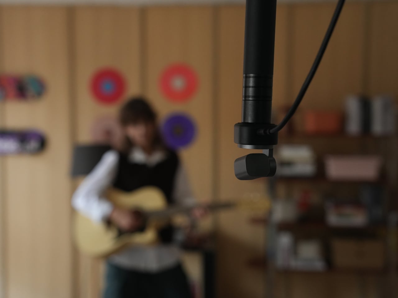
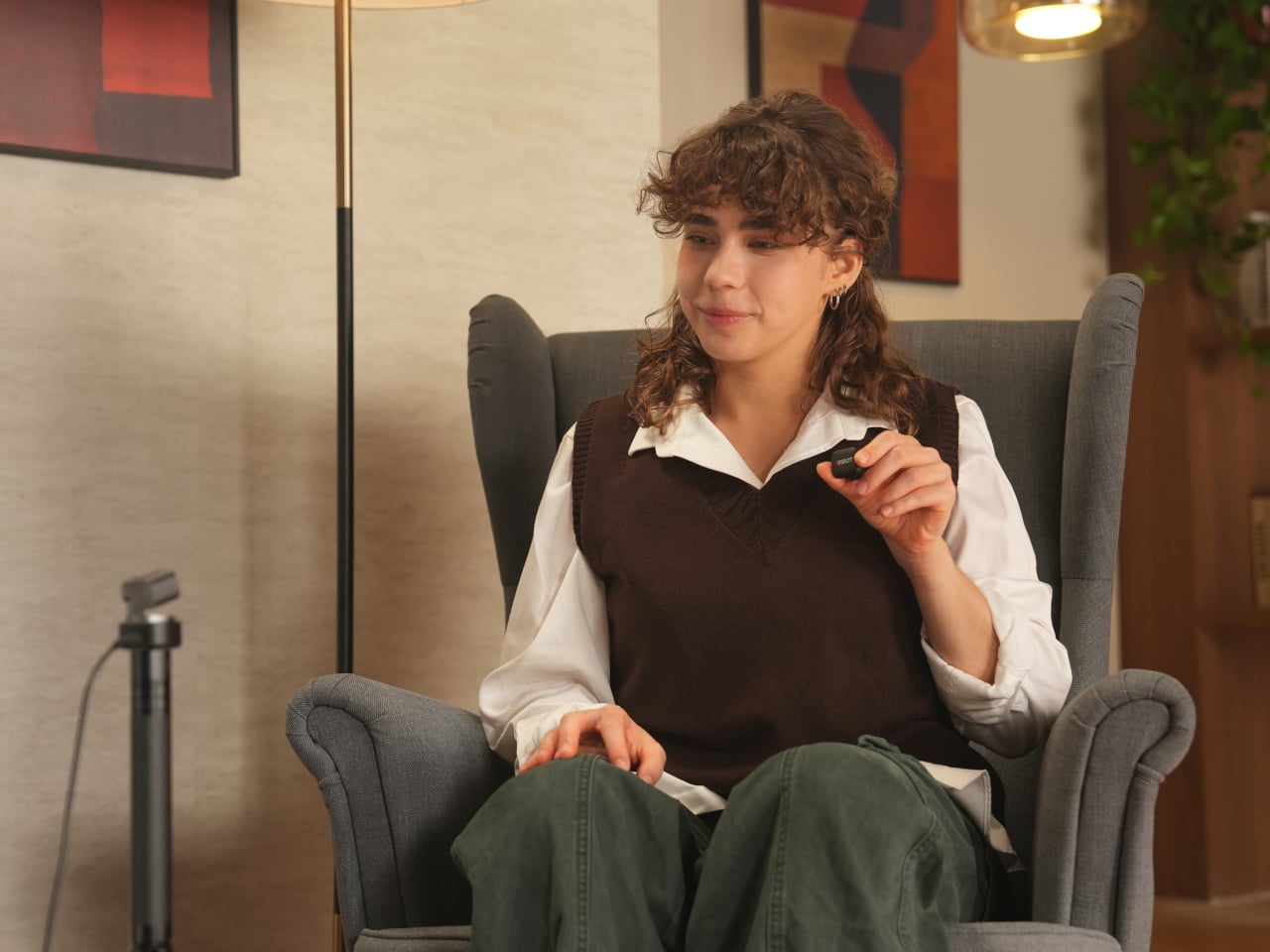
Mounting options give flexibility without requiring proprietary hardware. The adjustable clip grabs laptop lids or monitor bezels securely, while the built-in 1/4-inch thread accepts any standard desk tripod or arm. This means the Tiny 3 can shift from a quick laptop travel setup to a permanent studio fixture without needing different stands, which keeps things simpler when your workspace changes or you move between home and office regularly.
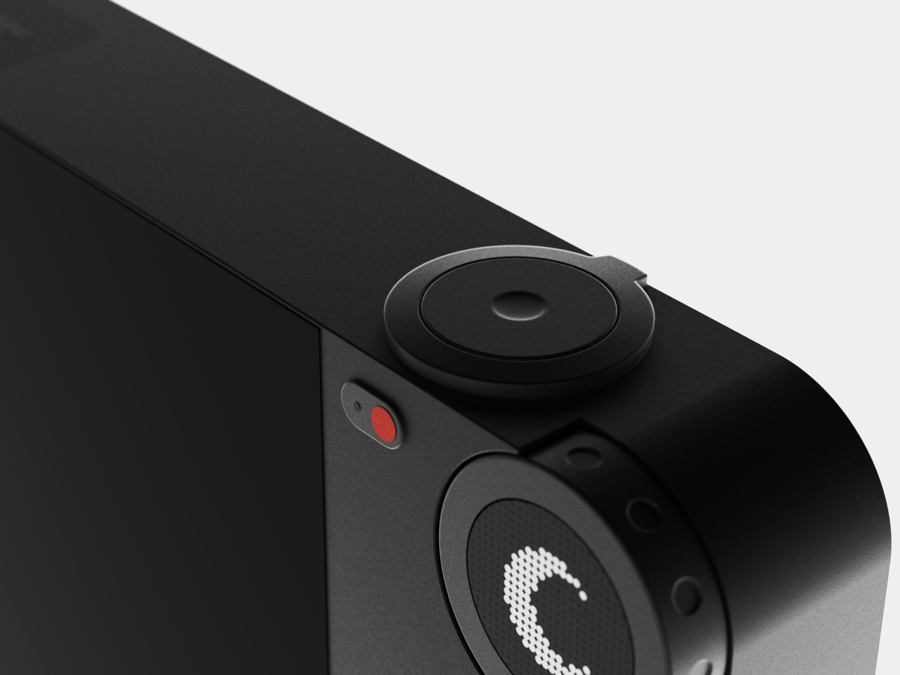
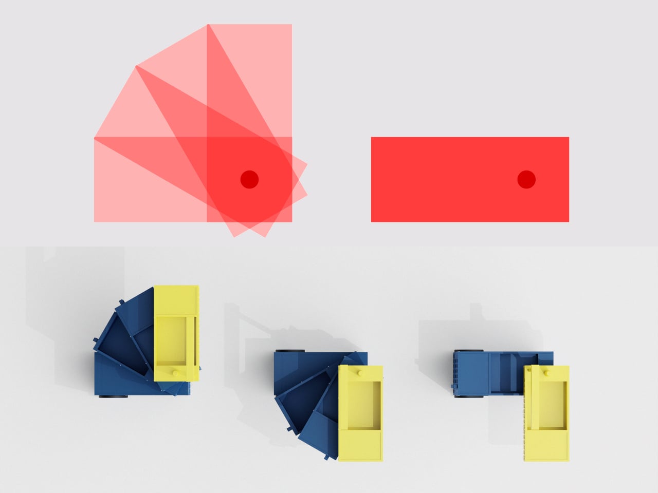
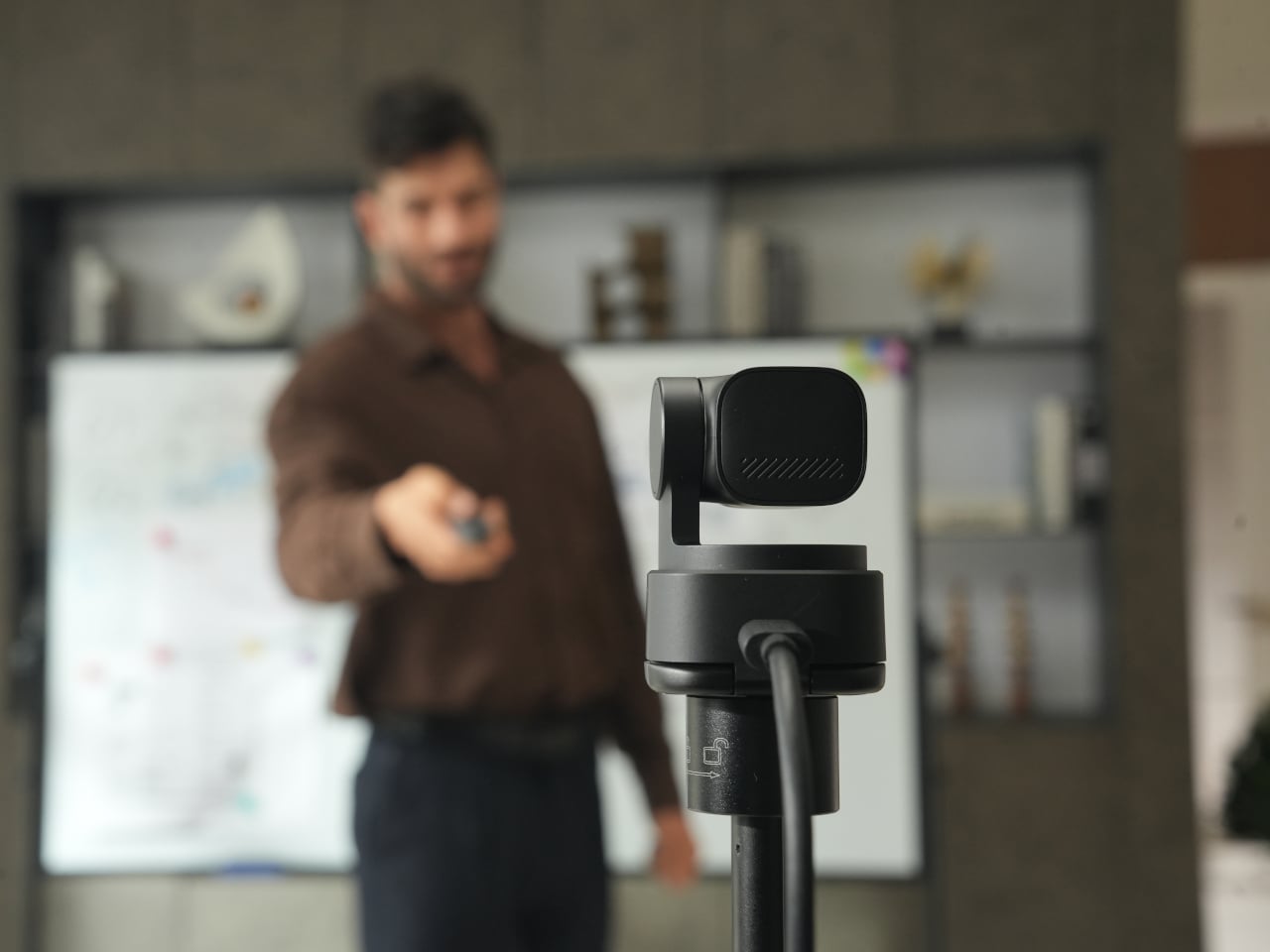
The 2-axis gimbal handles tracking smoothly once it starts moving. Pan range reaches ±130 degrees controllable, tilt goes from 32 degrees up to 60 degrees down, and the gimbal moves at up to 120 degrees per second. In practice, the camera can follow you across a room, reframe when you stand up or sit down, or snap to preset positions without feeling sluggish or overeager, more like a quiet camera operator than a webcam you nudge by hand every few minutes.
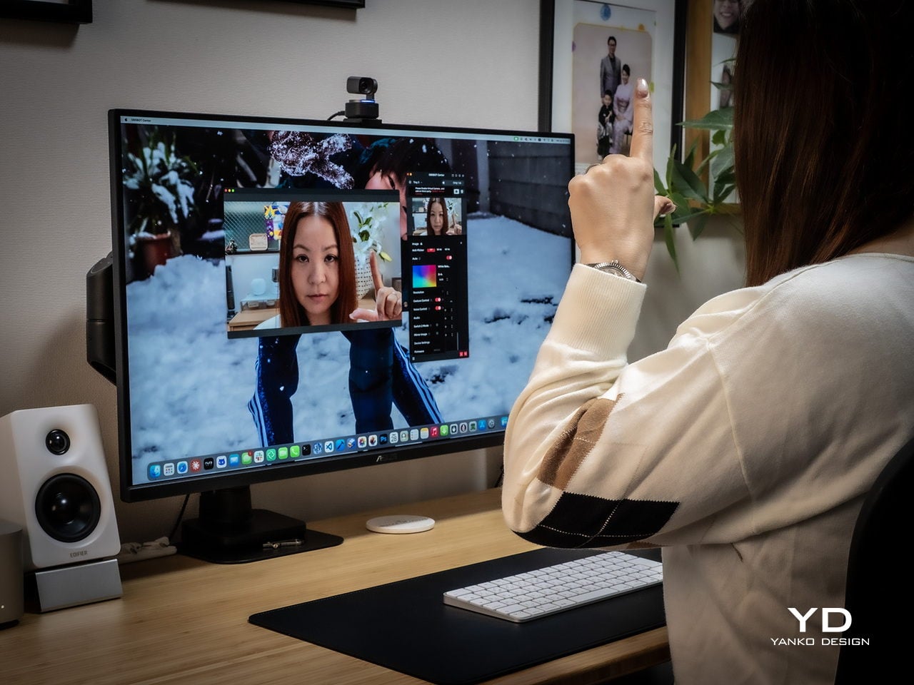
Voice commands and gesture control keep your hands free when it counts. Saying “Hi Tiny” wakes the camera, and from there you can trigger tracking, zoom in or out, or park the gimbal in preset positions by voice. Gestures work similarly: a raised hand or quick motion toggles tracking or zoom without leaning forward to click software buttons. This feels genuinely practical once you are mid-presentation and do not want to break flow by reaching for a mouse or keyboard.
Performance
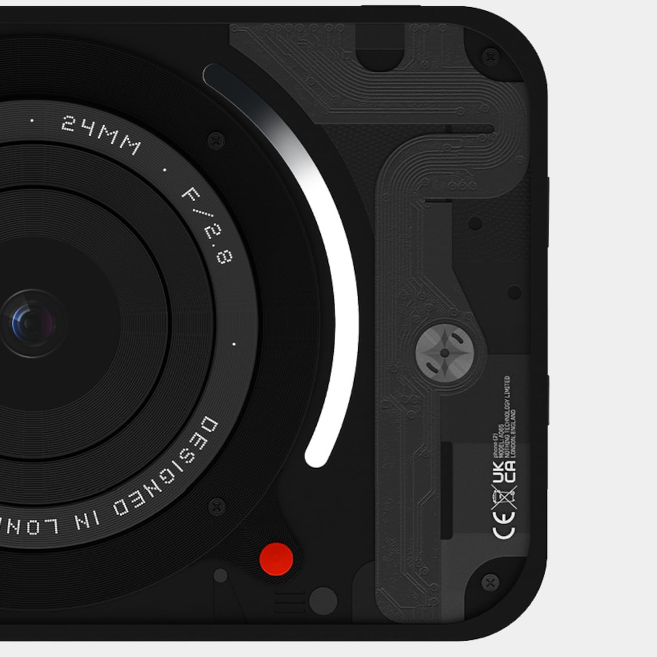
At the imaging core sits a 1/1.28-inch CMOS sensor with 50MP effective pixels behind an f/1.8 lens at a 24mm equivalent focal length. That sensor size is closer to what you would find in a decent smartphone camera than in most webcams, which immediately changes expectations for low-light noise, dynamic range, and how camera-like the footage feels compared to typical USB peripherals.
The OBSBOT Tiny 3 outputs 4K at 30 fps for sharp video, or drops to 1080p at up to 120 fps for ultra-smooth motion or slow-motion clips. That 120 fps mode is rare on webcams and genuinely useful for product demos, movement capture, or just making gesture-heavy content feel more cinematic. DCG HDR balances bright windows and dim rooms without the ghosting that makes some HDR modes unusable, which helps when you are stuck with mixed lighting.
Autofocus and exposure behave like a capable point-and-shoot rather than guesswork. Dual All-Pixel PDAF pulls focus quickly, whether you are showing a product, writing on a whiteboard, or pacing during a stream. ISO 100 to 12,800, capped at 6,400 in HDR mode, gives flexibility to stay clean in low light without the image collapsing into noise. Shutter speeds from 1/12,800 to 1/30 second handle fast motion or dim environments without aggressive software smoothing.

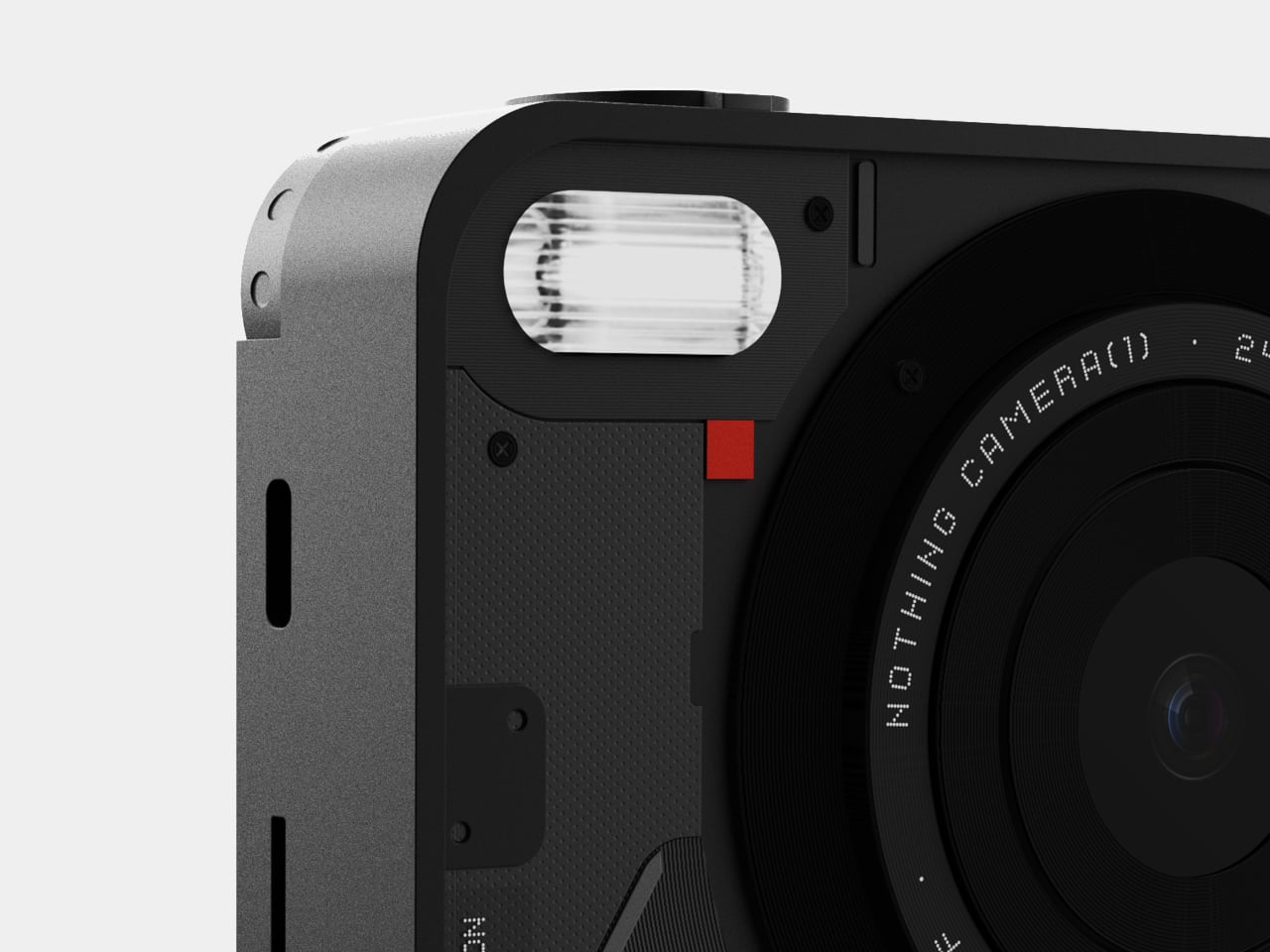
Audio is where the Tiny 3 genuinely stands apart from the field. The triple silicon MEMS microphone array includes one omnidirectional and two directional mics, operating at 24-bit sampling with 130dB SPL handling and a 69dB signal-to-noise ratio. In plain terms, the system captures quiet nuance and loud environments without clipping or filling the track with hiss, and noise reduction is strong enough to keep voices clear even in noisy spaces.
Five dedicated audio modes cover different scenarios without needing external hardware. Pure Audio delivers unprocessed stereo for music or ASMR. Spatial Audio enhances stereo separation for vlogs. Smart Omni balances voices and environmental sound for meetings. Directional focuses pickup in front while suppressing surrounding noise, ideal for solo podcasts. Dual-Directional captures front and rear while rejecting sides, built for interviews. Having all five built in lets you tune the mic to your environment instead of buying another device.
AI Tracking 2.0 brings framing intelligence you would usually need a camera operator to achieve. Human tracking offers Single, Group, and Only Me modes, the latter locking onto one person and ignoring distractions. Object tracking lets you box items in software and have the gimbal follow. Zone Tracking sets custom areas where tracking starts or stops. Auto Zoom adjusts framing from close-up to full body, while Face Framing detects which direction you are looking and shifts composition accordingly.
Sustainability
The aircraft-grade aluminum alloy body does more than look polished. Aluminum dissipates heat better than plastic, which keeps the camera cooler during long streams and reduces the risk of thermal issues or early component wear. The material also resists scratches and minor bumps better than glossy finishes, which matters when you are moving the camera between desk, bag, and tripod regularly without babying it.
The OBSBOT Tiny 3 is not user-serviceable in the traditional sense, but that trade-off buys integration and compactness. The non-removable gimbal, sensor, and mic array work as a single tuned system, eliminating external adapters, separate audio devices, and multiple mounting solutions. Over time, that reduces the number of peripherals cluttering your workspace and, eventually, the pile of obsolete gear heading toward e-waste when you simplify or upgrade.
Consolidation itself is a quieter sustainability angle. By combining high-quality video, spatial audio, and intelligent tracking in one device, the Tiny 3 can replace the typical webcam-plus-mic-plus-software stack many creators rely on. Fewer separate products to manufacture, package, ship, and discard adds up over the lifecycle of a setup, even if it is not the kind of sustainability story that comes with certification badges or bold recycled-material claims.
Value
With a $349 full price tag, the OBSBOT Tiny 3 sits in premium webcam territory. This is not an impulse replacement for a blurry laptop camera. It is aimed at people who make a living on video or spend enough time on calls and streams that a camera setup feels like professional infrastructure rather than just another peripheral. The price is higher than most consumer webcams, but it is also attempting significantly more than a fixed lens with a basic mic.
Value shows up through consolidation. At that price point, you get a 4K PTZ camera, triple-mic spatial audio system, and deep AI tracking in one device. Building something similar from separate pieces, a good standalone webcam, a quality USB microphone, plus software for tracking, can match or exceed that total when you add it up. The bigger benefit is simplicity: one cable instead of three, one piece of software, and one object on the desk instead of gear fighting for USB ports.
Comparing what $349 typically gets you elsewhere helps frame where Tiny 3 sits. At similar prices, you might find webcams with strong video but mediocre mics that still need separate audio solutions, or you might approach entry-level camera kits that require capture cards and external mics. Tiny 3’s combination of audio-first design, motorized PTZ tracking, and real-time AI framing is rare enough in this bracket that direct comparisons feel unfair in either direction.
The broader OBSBOT ecosystem adds value for people who grow into complex setups. Pairing the Tiny 3 with OBSBOT’s own Vox SE wireless mics, a physical OBSBOT Tiny Smart Remote 2, or adapters for HDMI and NDI output means the camera scales from simple desk calls to multi-camera streams without needing replacement. That spreads the initial investment over more scenarios and extends useful life, which looks more reasonable when you consider many people outgrow basic webcams within a year anyway.
Verdict
The OBSBOT Tiny 3 feels like a carefully engineered answer to the messy reality of modern video communication, where clear sound, smart framing, and reliable focus matter as much as raw resolution. The combination of a 1/1.28-inch 4K sensor, triple MEMS spatial audio, and a nimble PTZ gimbal packed into a, pardon the pun, tiny aluminum body makes it feel less like a webcam upgrade and more like a miniaturized studio camera that works over USB-C.
It is hardly the cheapest way to appear on screen, but it is one of the few that treats audio, video, and intelligence as a single design problem. For creators, educators, podcasters, and remote workers tired of juggling separate cameras and mics just to sound and look decent, the OBSBOT Tiny 3 makes a strong case for consolidating that setup into one very small, very capable box that disappears into the background while you get on with the work.
The post OBSBOT Tiny 3 4K PTZ Webcam Review: Audio As a First-Class Citizen first appeared on Yanko Design.